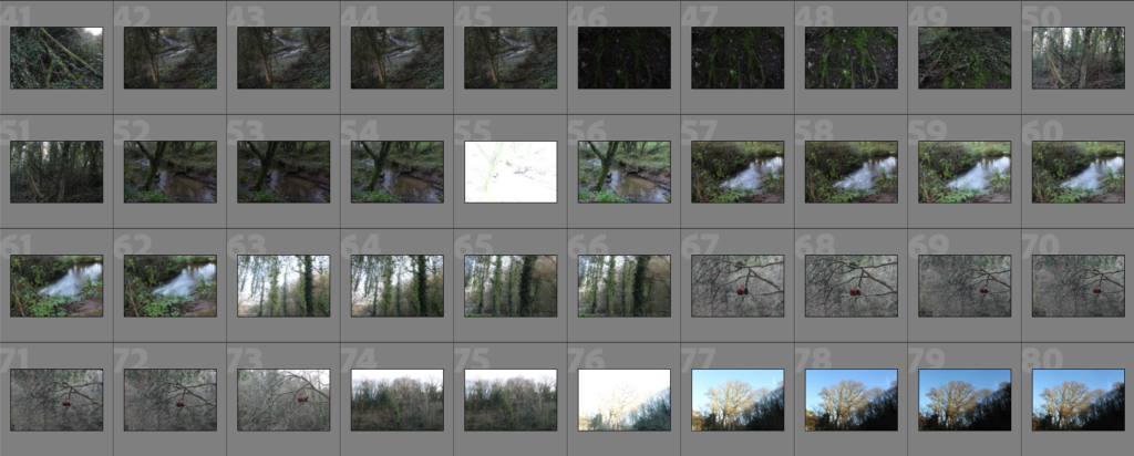
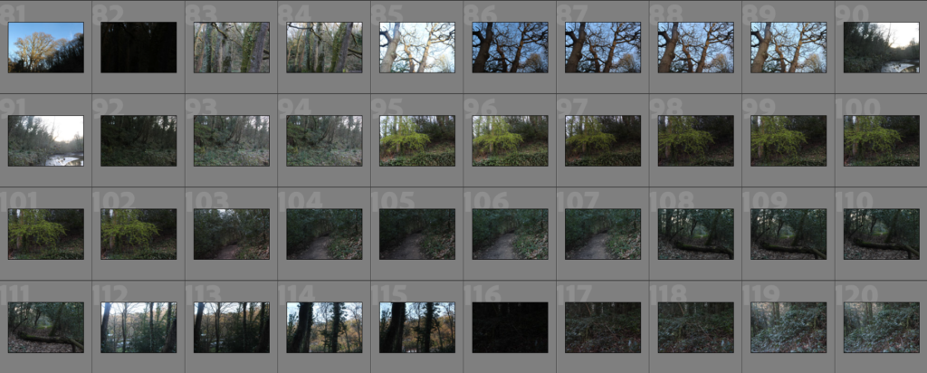
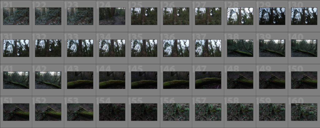
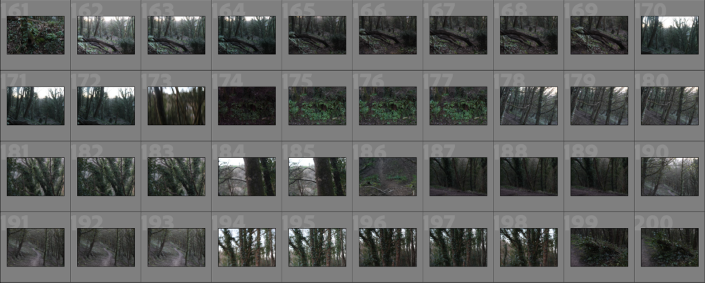
Woodland Photoshoot 1

The plan for this photoshoot is here: LINK

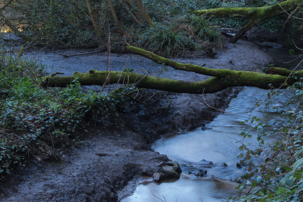
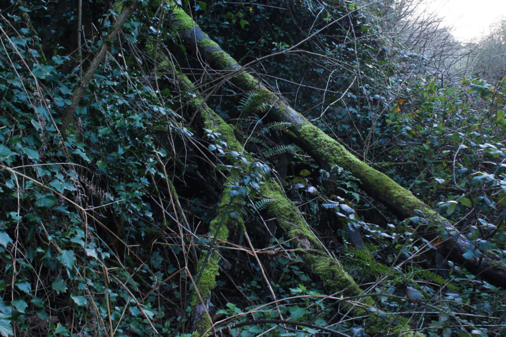
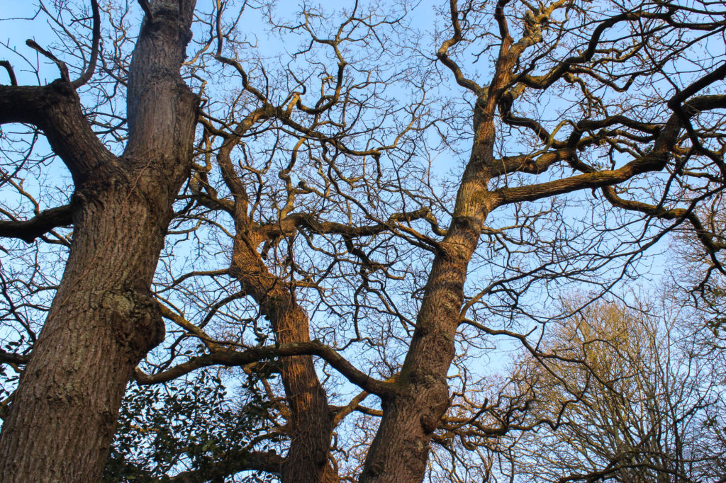
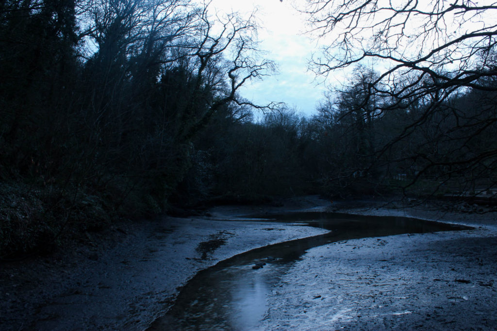
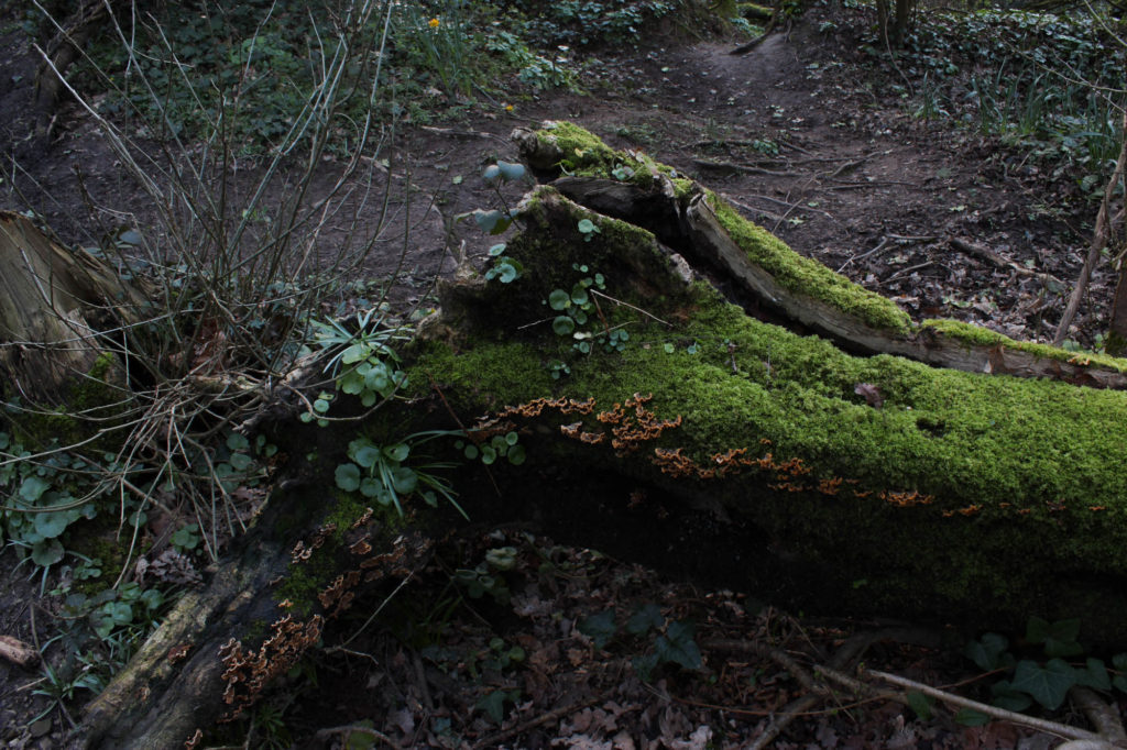
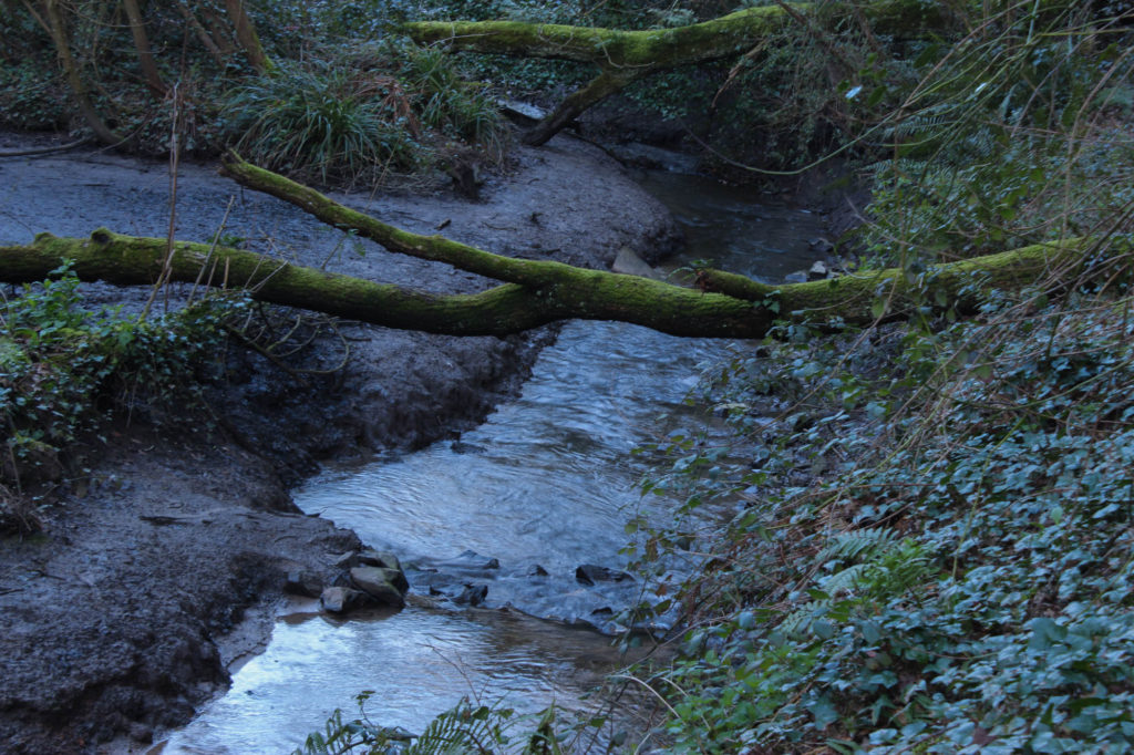
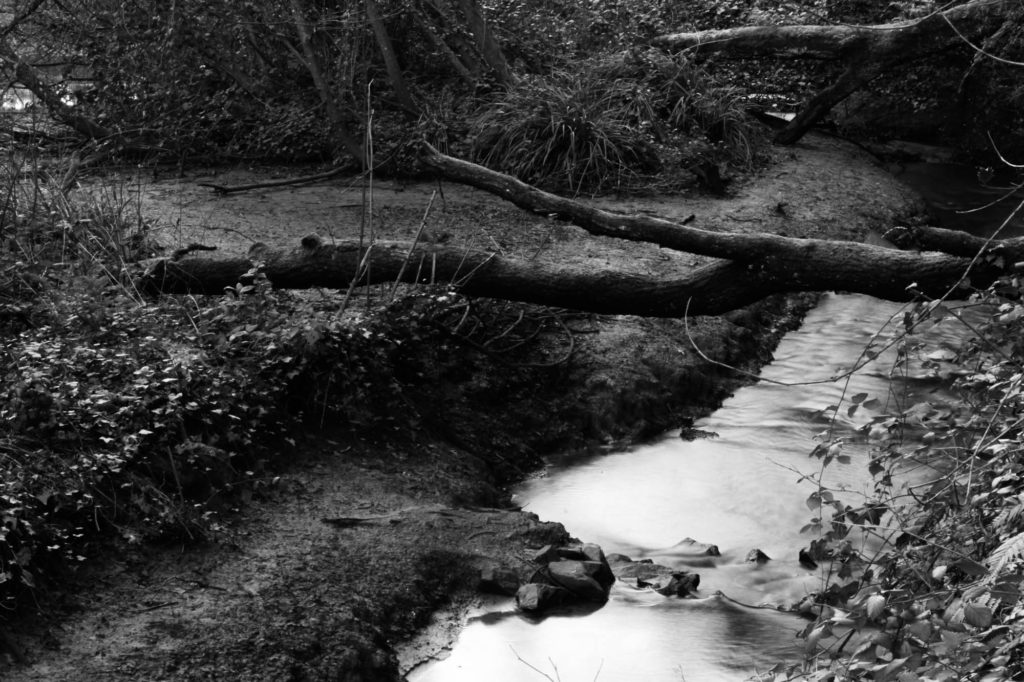
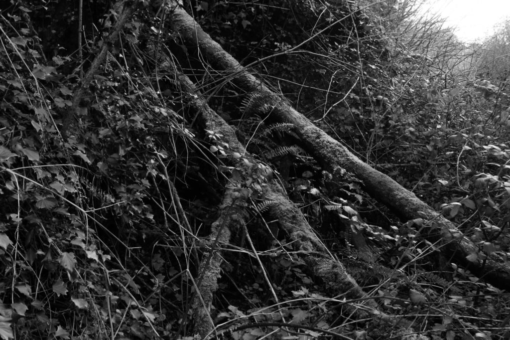
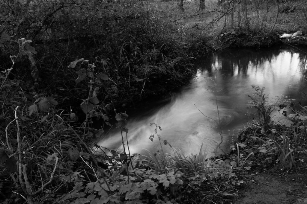
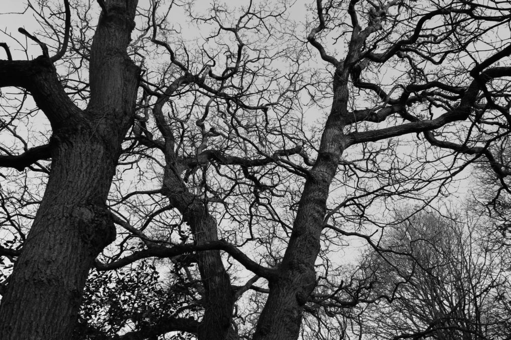
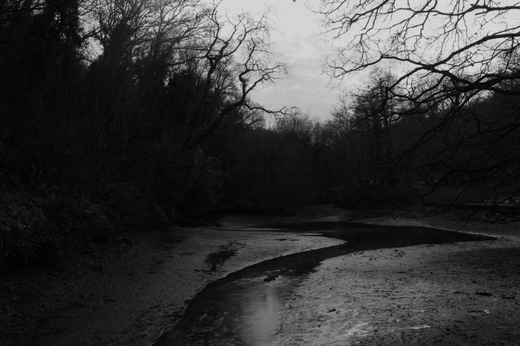
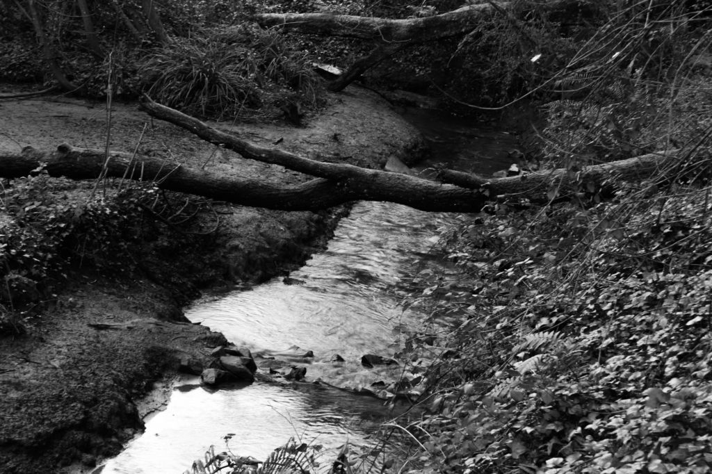
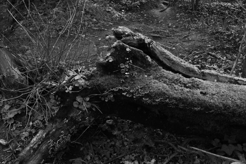
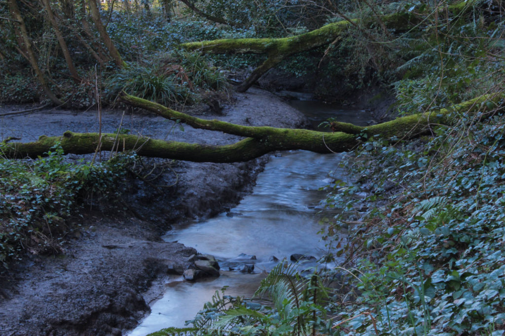
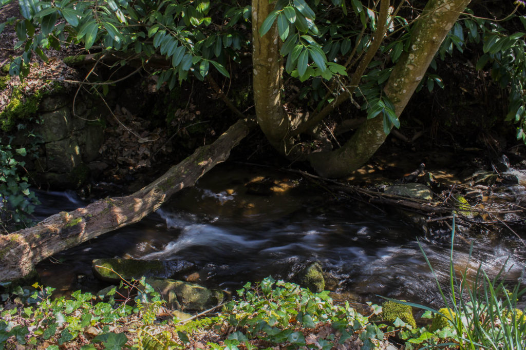
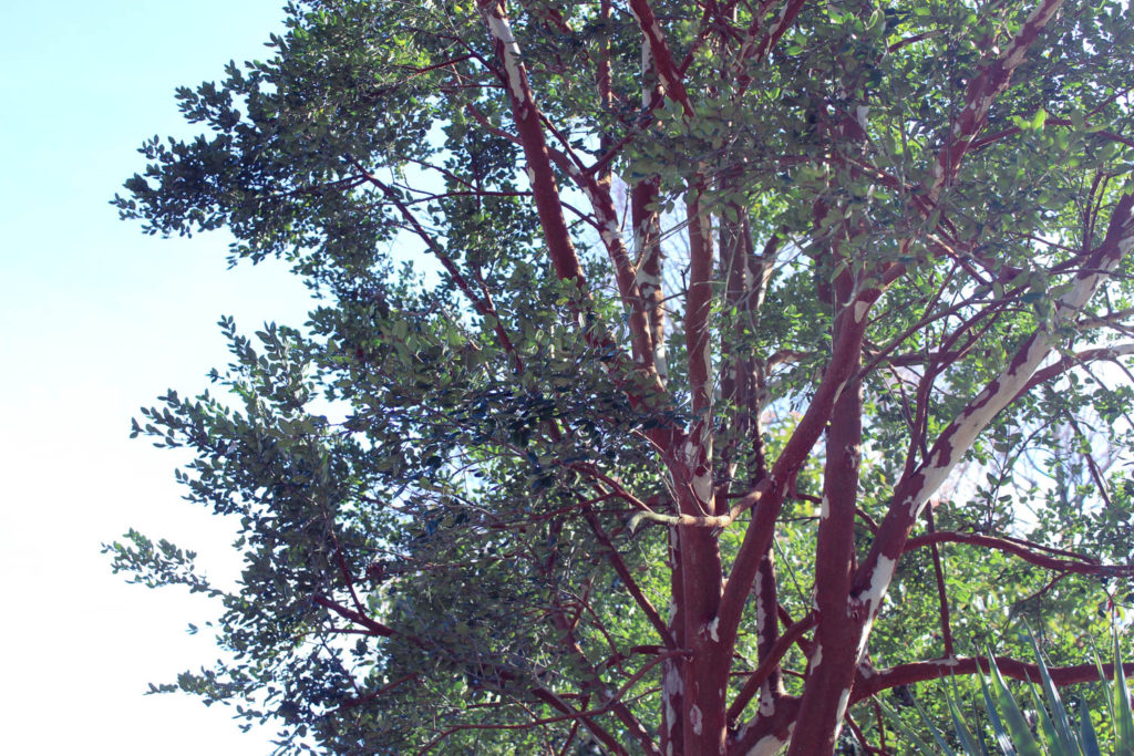
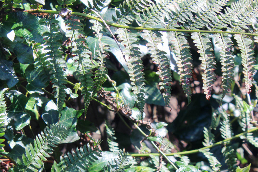
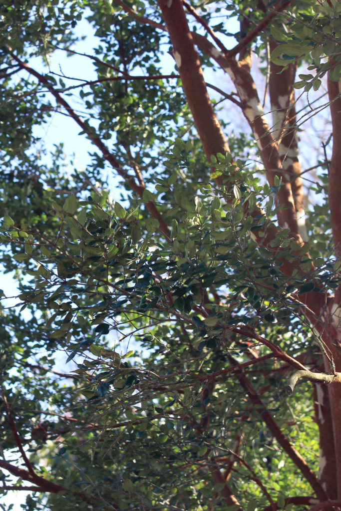
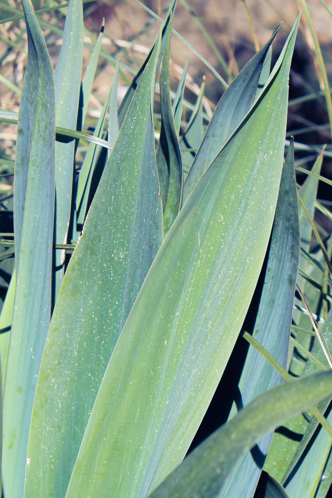
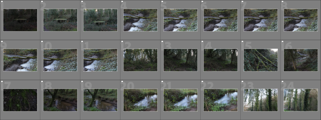
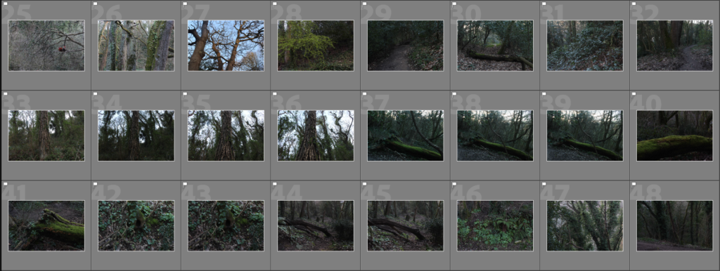
This was the first photoshoot I did for the woodland side of the project (as well as the project in general). I took images around a footpath in the valley, which provided me with primarily images of trees and bushes, however I also managed to find streams and a derelict building, giving more variety in the shoot. I took these images about an hour before sunset, giving me plenty of time to use the light, however the sunlight wasn’t always pointed directly at the subject, nor was it always visible, making some images a tad too dark or colourless. I feel like my camera handling for this specific shoot was some of the best I’ve done, as I was able to adapt the settings to changes in the lighting of the subject and positioning of the camera.


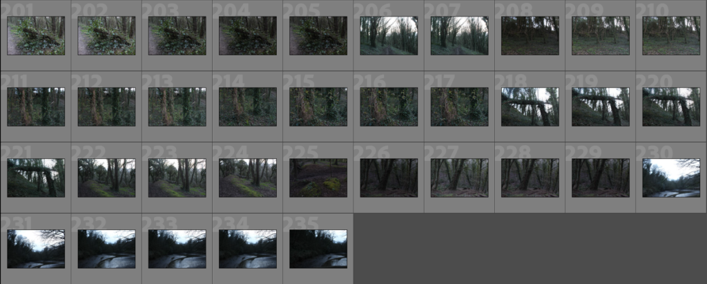
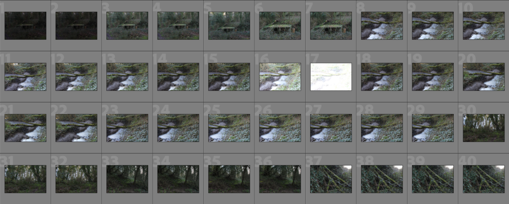
Contact Sheets

Editing

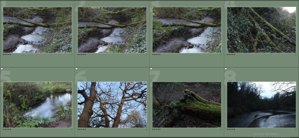
To start editing, I selected the images I thought were strong and removed any blurry or under/over-exposed images, leaving me with around 60 images to choose from as my final images.
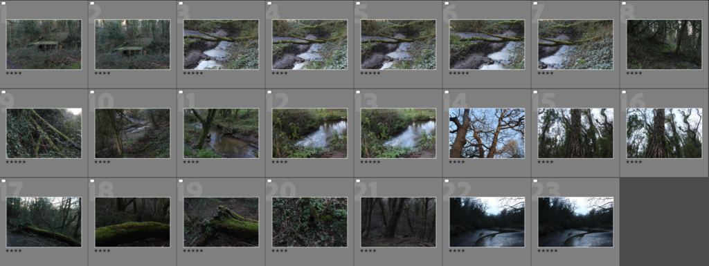
Next, I went through these images and applied a star rating to them, which will allow me to filter through to the images I think are the strongest. Below are all 4-star and higher rated images:
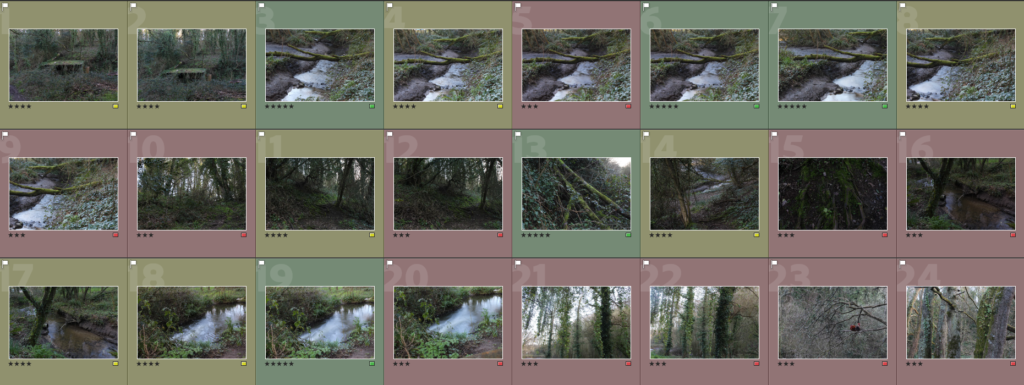
I also applied a colour to each image using the colour selection filter tool in Lightroom to help visualise my selection. Below is a screenshot of a selection of 3-star and higher images:

Best Images from this Shoot

These are the final images I ended up with after the selection process:
Edited versions:

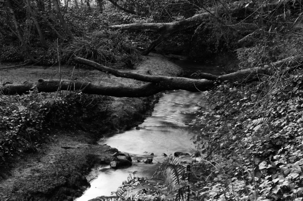
Black and white versions:

Comparison to Lebas’ work
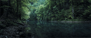
For this shoot, I made most of my images colder in tone as it fits with the aesthetic of Lebas’ work. I took these images during the later parts of the day during the golden hour, giving the images an effective lighting. However, many of the images were taken in the shade of the woodland, leaving the images with a colder tone and fairly low contrast. Some of Lebas’ images invoke a sense of danger in the way her landscapes seem to trap the viewer within the woodland, I feel like as I was focussing on both a cold tone as well as the sublime beauty of nature as opposed to danger. A difference between my images and Lebas’ is that she uses a wide-angle lens to capture a wide shot of the scene she is photographing, while I use a standard lens, giving my images a regular, rectangular shape.


Evaluation

I think this shoot was successful, as I managed to adhere to my plan and intentions for the shoot, providing me with images which will fit into my final outcomes. Due to the position of the sun, the lighting of each scene I photographed slightly changed, meaning I had to effectively use my knowledge on camera handling to make sure that each image had the correct exposure. For my next woodland shoot, I will aim to photograph more of the colours provided by the sun during the golden hour, as to make my images more vibrant and/or to increase the dynamic range of my darker images. I will also take pictures during the blue hour, as this will allow me to get the colours and lighting that are on Lebas’ images.

What went well:

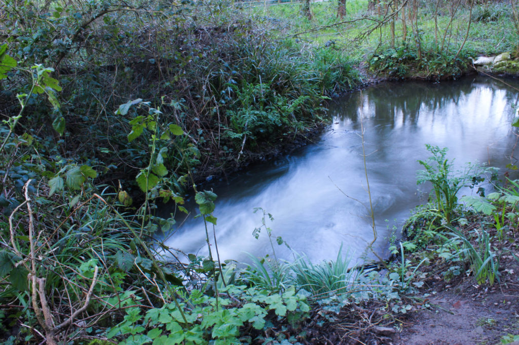
In particular, I am happy with the images involving the pond/stream I took at the start of the photoshoot, as I think those images offer a nice contrast to the rest of the images in terms of subject matter and composition. In those images, I was able to adjust my camera settings to allow for a long exposure, which would give the water a ‘misty’ look, this is a technique I have been wanting to experiment with for a while. I like the way the colours turned out on some of these images, some have a vibrant green which stands out among the browns and greys, while others have an orange due to the golden hour lighting, which gives a contrast to the green tones, as well as the darker images.

How I can improve:

I feel like the lighting could have been a tad better for this shoot, while I started these images an hour before sunset (the golden hour) I felt that I wasn’t fully successful in capturing that lighting in some of my images, leaving them bland and muddy. Some of my darker images, where I was trying to mimic the style of Chrystel Lebas, I feel like the vibrancy and contrast in Lebas’ work was not in mine, so for the next shoot I will aim to focus on those things.

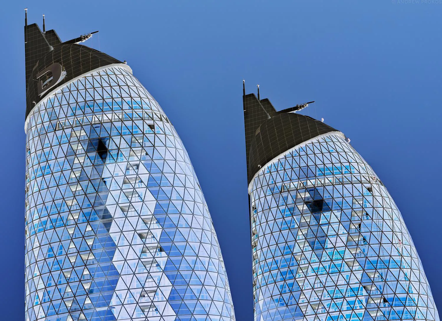
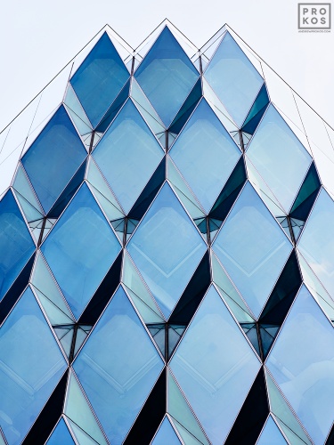
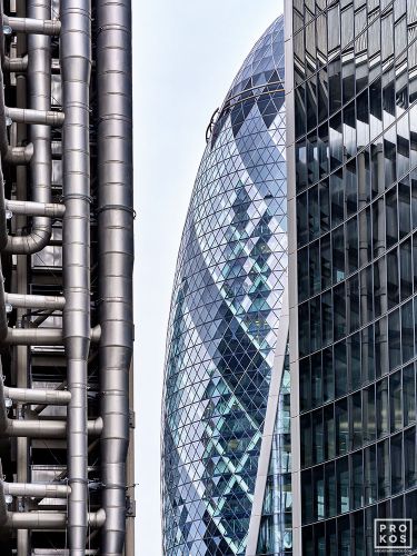
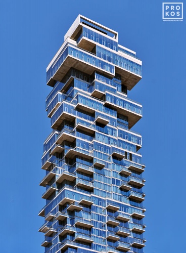
artist reference 3 – Andrew prokos

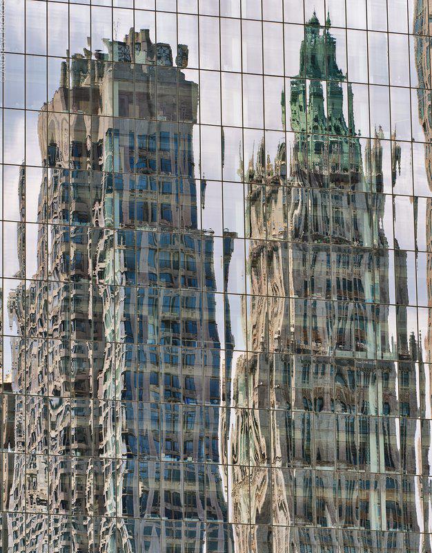
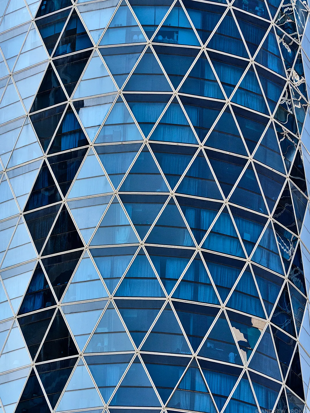
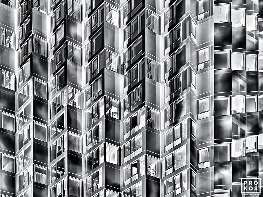
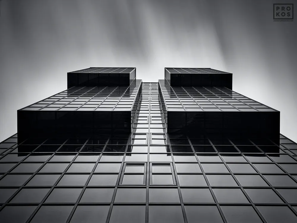
Andrew Prokos is an award-winning photographer specializing in large-format fine art photography in black and white and in color. His gallery-quality artworks are found in the homes of art collectors around the world and are purchased by interior designers, art advisors, and international galleries on behalf of their clients. Andrew’s fine art photographs have won numerous awards and honors and are featured in prestigious publications and interviews. The photography available for sale through this website is the product of his artistic vision and his almost twenty-year journey as a photographer. You can explore Andrew’s work using the curated photography collections below, which include; architectural photography, abstract photography, black & white photography, color photography, cityscapes, landscapes, long-exposure, and night photography.

https://andrewprokos.com/

Andrew has photographed iconic cities and locations in the Americas, Europe, and the Middle East for over twenty years. His collections of large-scale photographs capture the unique fabric of each location in high-definition and intricate detail. You can explore Andrew’s location photography in the curated collections below, which include photography of New York City photography, Boston, London, Dubai, Abu Dhabi, Rio de Janeiro, Brasilia, Continental Europe and the UK. Also included are locations in the American West such as Seattle, Colorado and Bryce Canyon, Utah. Andrew’s award-winning fine art photography series approach architectural elements and urban landscapes from a conceptual perspective. In his series Andrew touches on themes of transition and temporality, abstraction, and altered visual perception through the use of negative imagery. His series have won numerous awards at international photography competitions, and have been exhibited in museums, galleries, and corporate collections around the world.

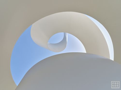
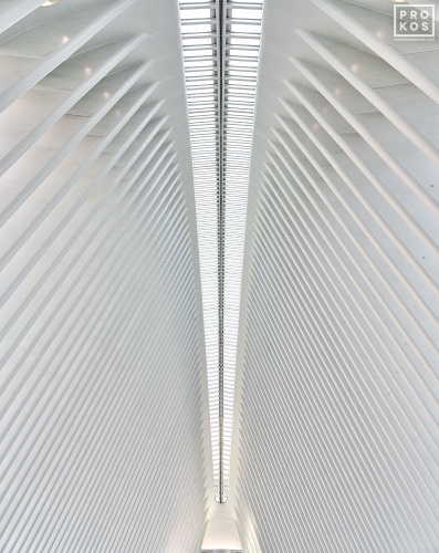
Andrews work differs from the simple side of this project with his images containing much more complex structures with interesting features. By studying this artist it can help me further understand the difference between the simple and complex architecture. However, some of Andrews images lead further over to the simple side of architecture by photographing simple but unique structures in a simplistic way. He ranges his photos from black and white to bright, unique colours reflecting off the buildings. He photographs interior and exterior parts of buildings to make sure he captures the whole building.

https://en.wikipedia.org/wiki/Andrew_Prokos

Image analysis:

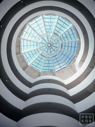
A color fine art photo of the Guggenheim Museum rotunda in New York City

In this image you can clearly see Andrew has photographed the interior of a building from beneath the main subject. He has positioned his camera nearly straight upwards but tilted slightly. He does this to make sure he captures the spiral staircase leading to the bottom of the building. The image involves a symmetric glass dome with light glaring though to complete the brightness of the inside. The image is clearly captured during daytime which creates the shadows on the staircase to make some sort of spiral pattern carrying through the whole image. I would declare this images more over to the complex side because of the unique, symmetrical dome that is unusual for buildings as such. The image was taken inside of the Guggenheim Museum located in New York City, a city filled with interesting and distinctive architecture.

unedited photoshoot #1

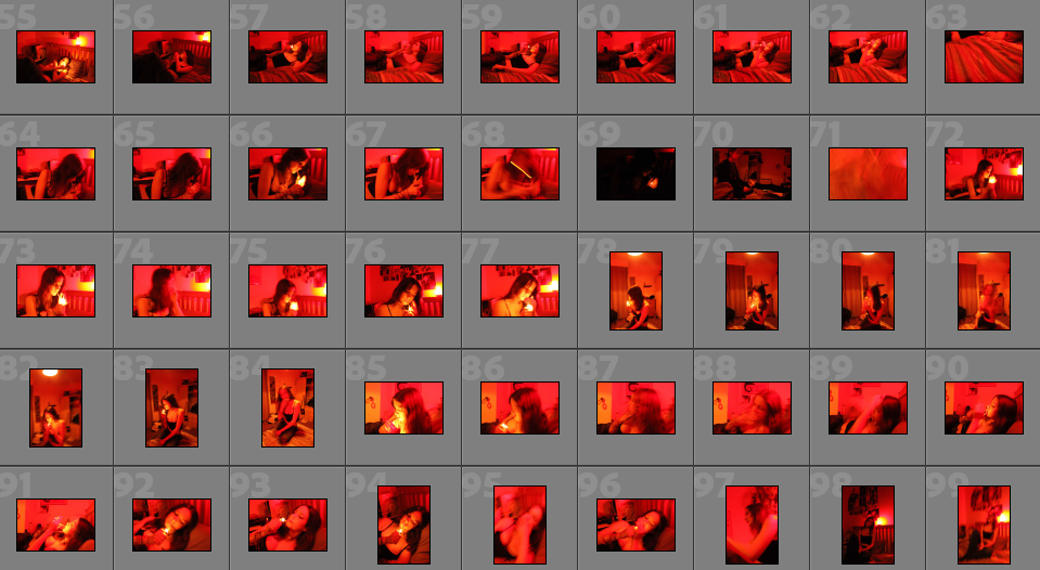
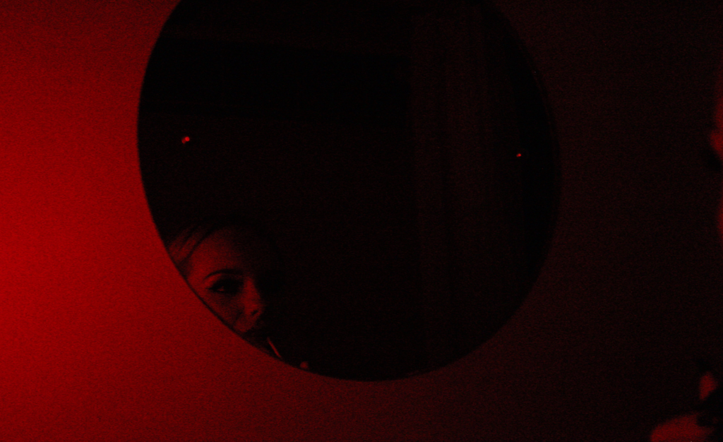
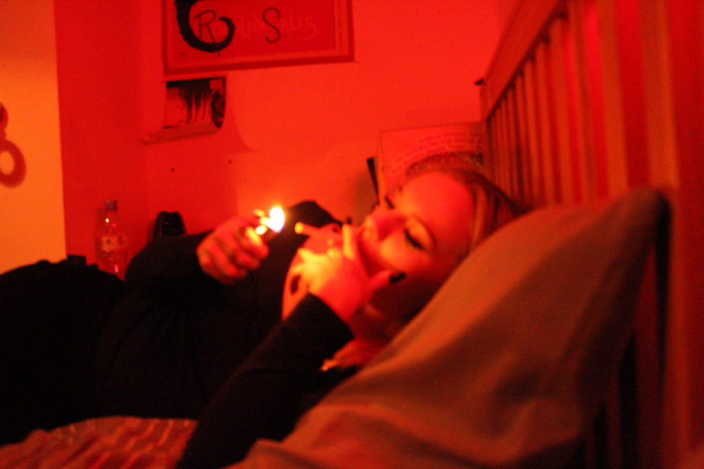
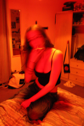
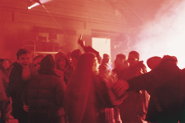
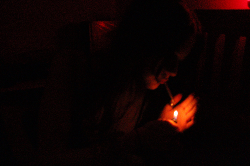
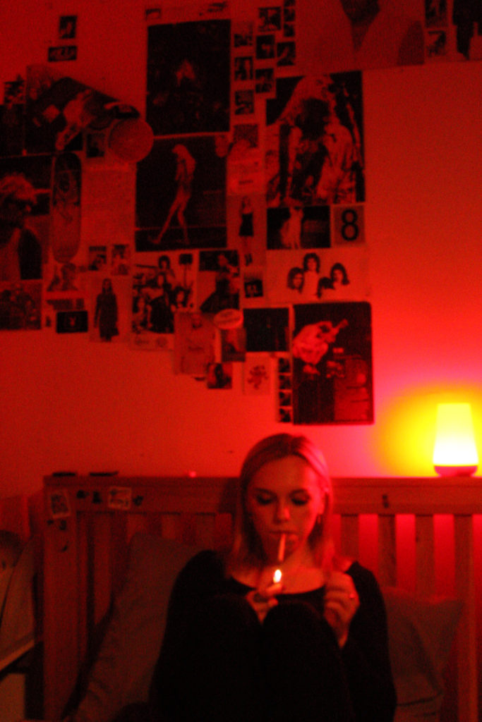
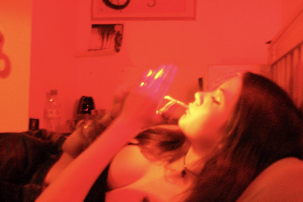
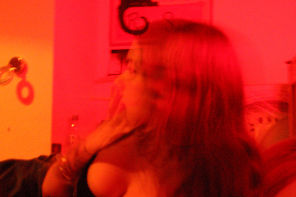
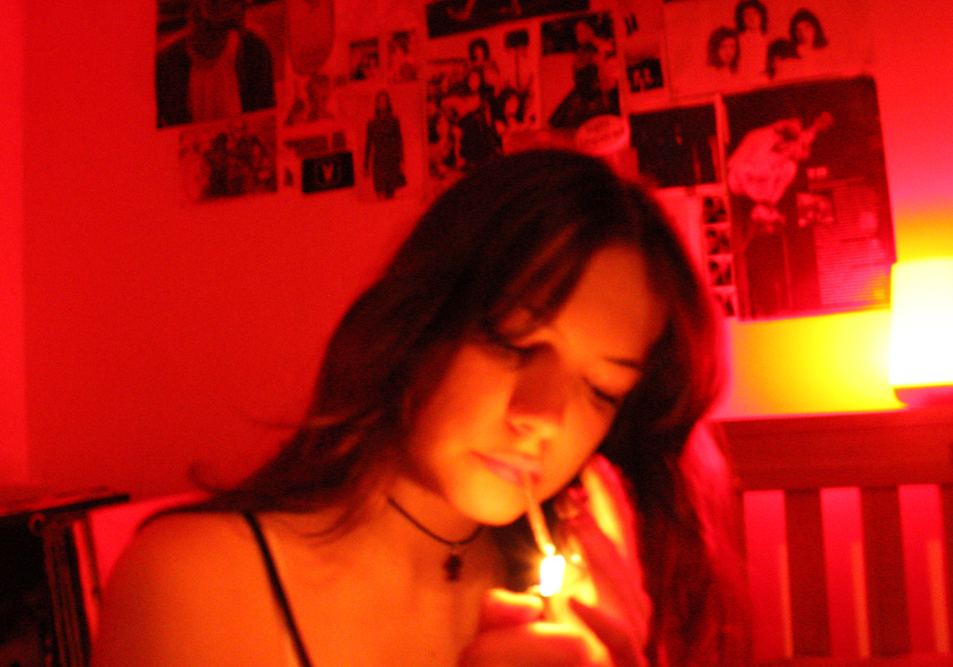
For my first photoshoot, I invited two friends and photographed one of them at different locations around my house using a portable LED light to provide colourful lighting that would enhance my image. Locations shot in my house included my bathroom, bedroom and a field opposite. Shot on TV mode without tripod or flash, the result was vibrant slightly grainy images that matched the aesthetic i was aiming for well. The downside of shooting on TV mode was the majority of my images turned out shaky or unfocused, but the upside was it enhanced the LED light well and gave an outcome i wouldn’t be able to achieve on any other shooting mode. I plan to leave the majority of these photos unedited although may potentially increase the vibrancy in some to make the lighting stand out more, or increase the exposure as since all my images were taken with the LED as the sole source of lighting, some of them turned out too dark. However for the most part I am satisfied with the outcome of my images.
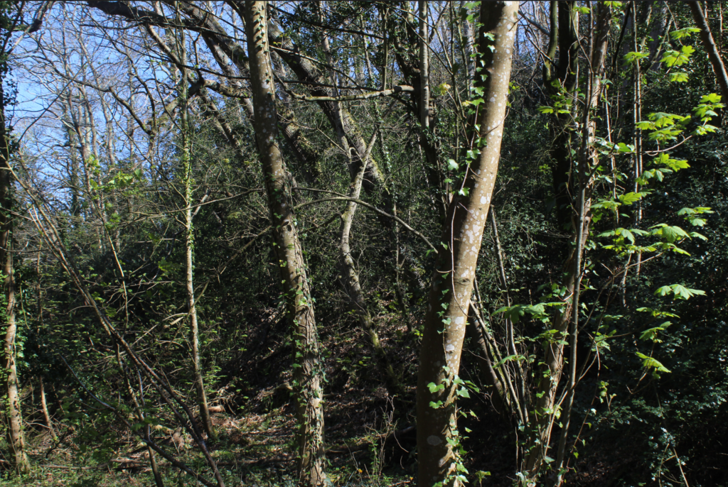
BEST IMAGES

Comparison to Vinca Petersen’s work

Out of all the photos in my shoot, the red ones stood out most to me as I feel they had the best outcome and communicated my artist references well. I used the red light to give my photos a more intimate atmosphere, especially due to shooting in my bedroom i wanted my photos to have the insider perspective to provide complexity, and through using the red LED i felt this better enhanced them – the underlying tones of orange, yellow and pink also compliment my images well and add a nice touch, and the grainy effect captured on some of my images provide a raw unfiltered perspective and reflect on the documentary / diaristic style I aim to portray in my photos.
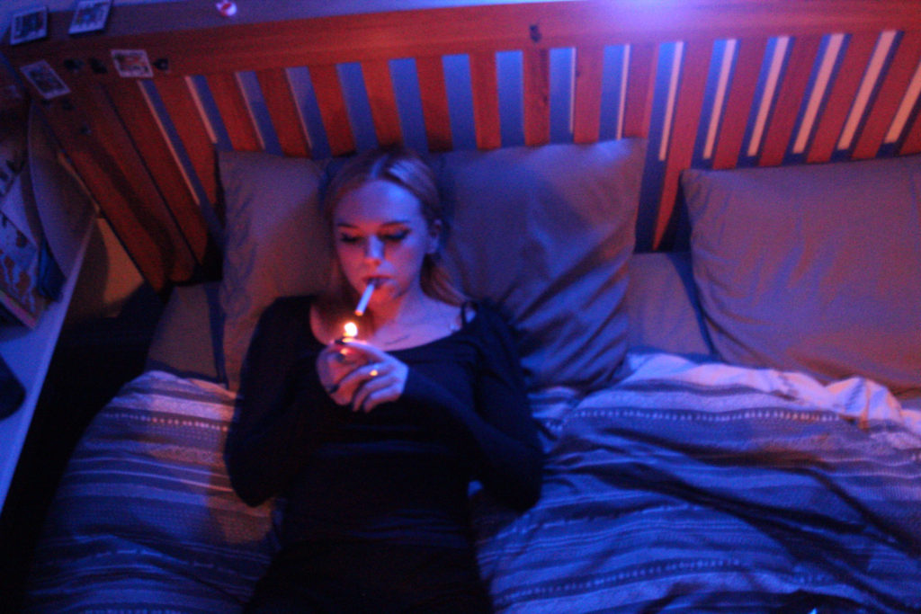
My purple / blue images showcase a completely different atmosphere to my red ones as they depict a calmer more peaceful atmosphere through the cool tones. These two images, both taken from the same position and angle, are example of how lighting can drastically change the setup of a photo. In the first one, the LED is the sole source of lighting which results in more shadows and darker tones around the model and borders of the photo – however in the second one, the use of a lighter provided a surprising amount of lighting change in my image – the flame illuminates the model and creates underlying tones of red and pink, and lessens the shadows around the image which results in the photo being more vibrant and colourful – this is why i prefer it out of the two.
AI Software Experimentation

As I plan to use AI software to help create some of my final outcomes, I researched the software I could consider using. Most AI software are locked behind a subscription fee, or have limited uses without subscribing to them, meaning I will research open-source/free-to-use software I can use to get a better understanding of how the prompting to create the images works.


Dream by WOMBO

Art created using this software

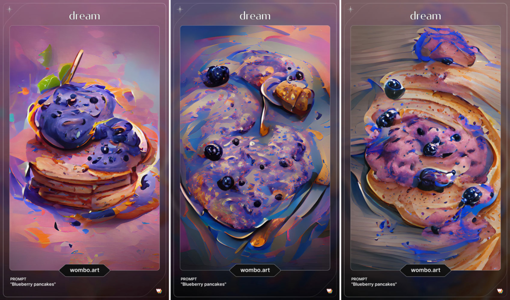
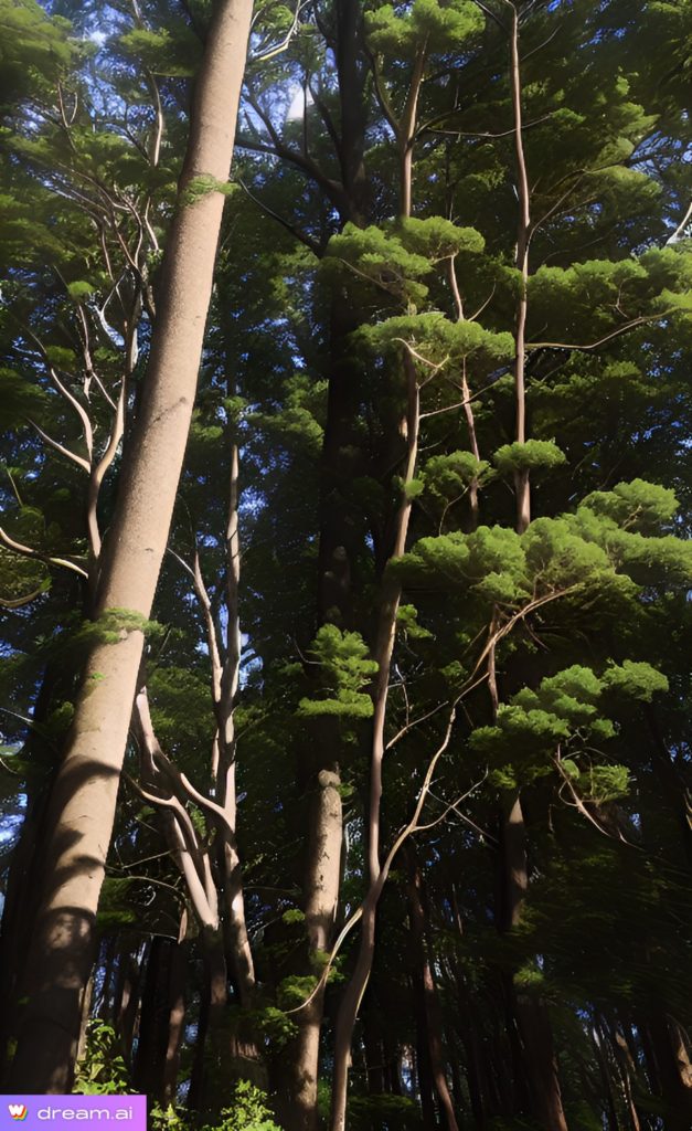
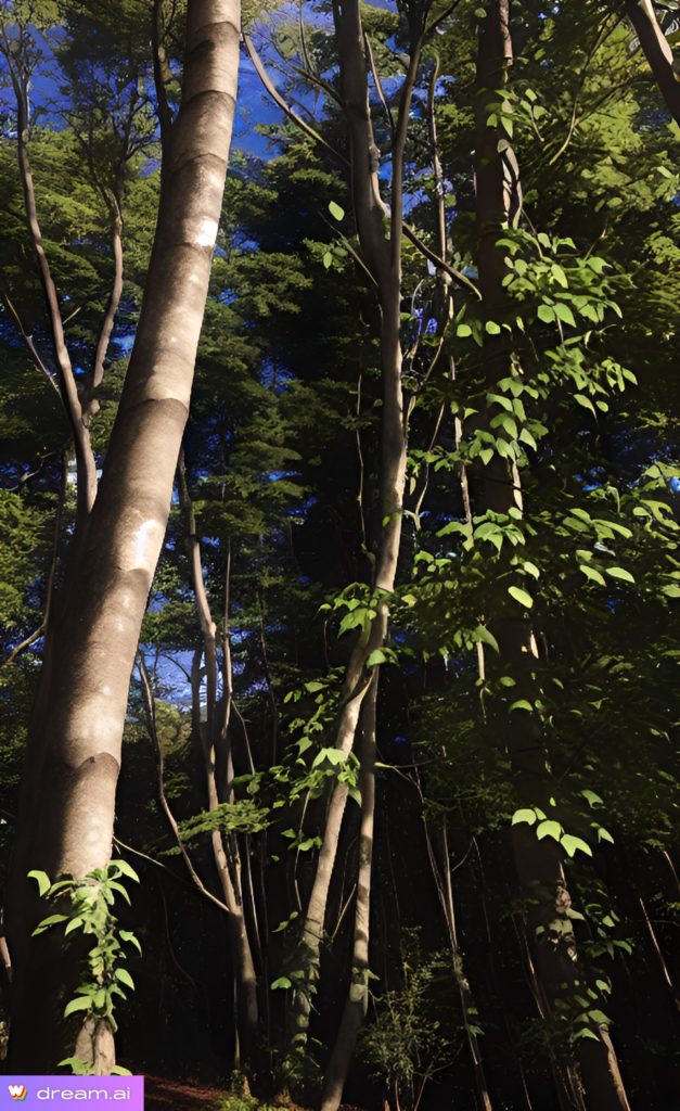
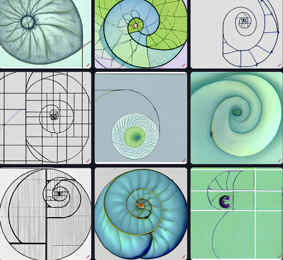
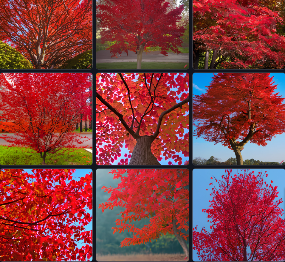
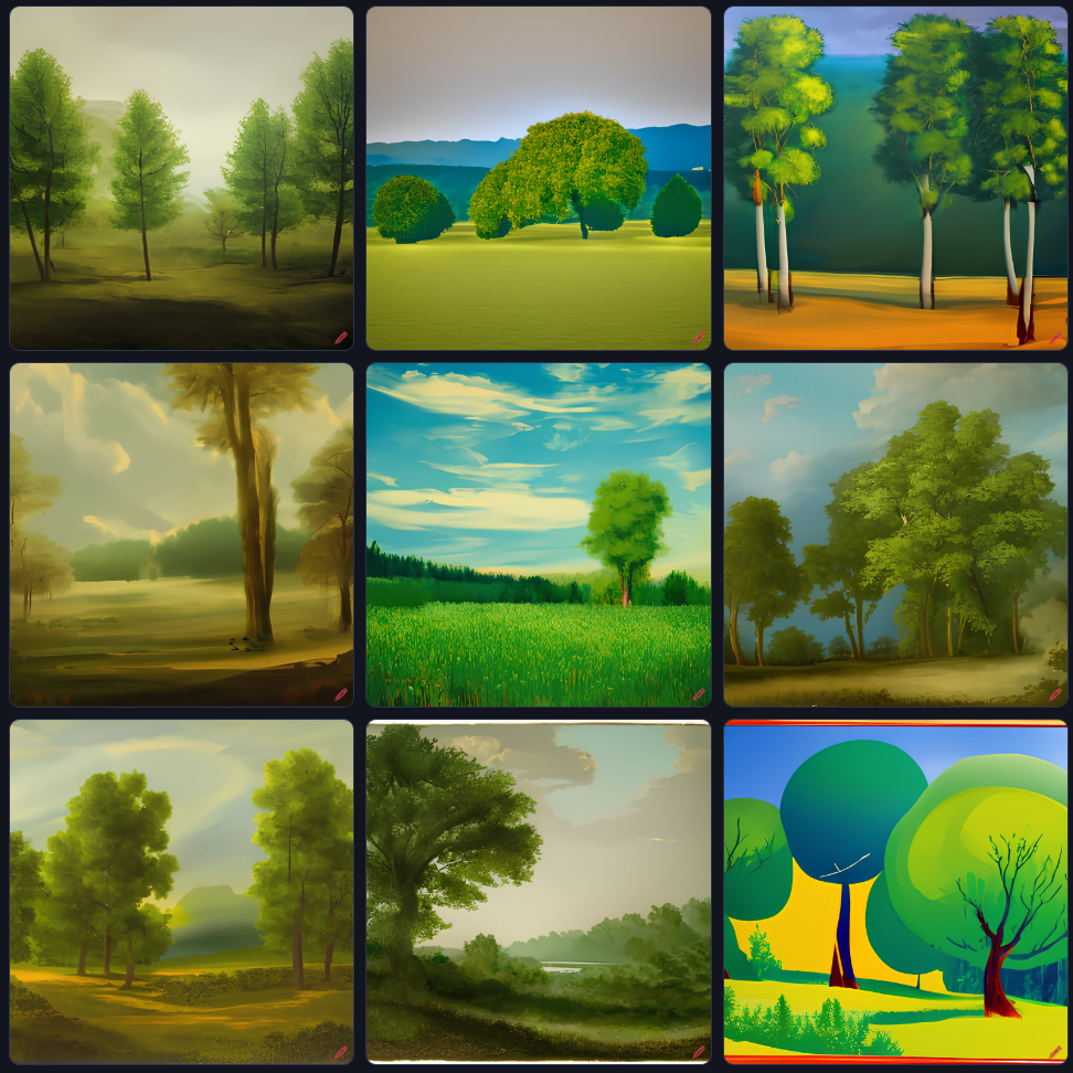
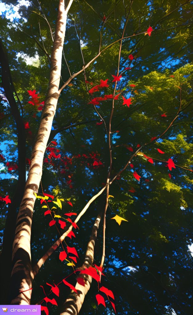
The first piece of software I used for experimentation was Dream. This software allowed me to input my own image to influence the image that the software generated, which adheres to what I am trying to achieve. The images created using this software is usually not the most detailed or accurate, which could provide a unique effect for my outcomes. These are images I have created using this software:

I used this image as reference for the images.

Prompt: ‘Trees with red leaves’
Prompt: ‘sublime landscape, fibonacci spiral, trees’
Prompt: ‘fibonacci spiral in sublime landscape with trees’

Craiyon

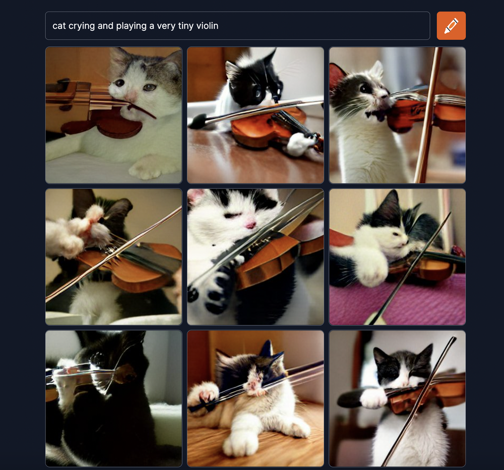
An image showing a prompt entered into the software, along with a grid of results

Craiyon is another free-to-use software which works similarly to Dream; you enter a prompt and the images are generated. This software (formerly known as Dall-e Mini) was popular as it was an online software that could be used on a browser, as well as the fact that the images it created were characteristically humorously distorted. These are images I have created using this software:

Prompt: ‘fibonacci sequence’
Prompt: ‘tree with red leaves in a sublime style’
Prompt: ‘sublime landscape with trees’

DALL-E 2 by OpenAI

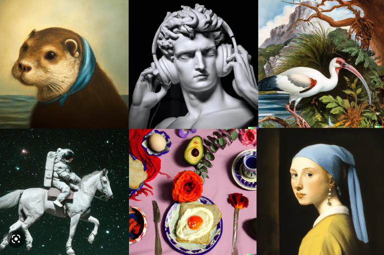
A collection of images created using DALL-E 2

DALL-E 2 is one of the more popular AI image generator software around as of now. DALL-E 2 provides users with free credits, allowing them to create a certain amount of images per month (with no fee), I will use these to experiment with prompting and perhaps create some final images in the meantime. These are images I have created using this software:

(I was unable to access this software due to its servers being blocked)


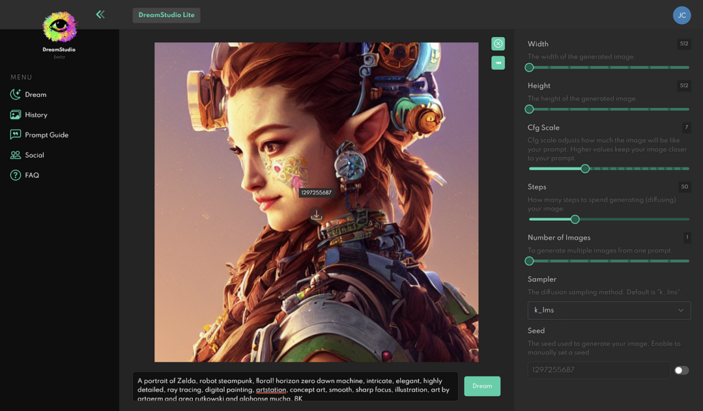
DreamstudioAI

An image of the image creation process using Dreamstudio AI

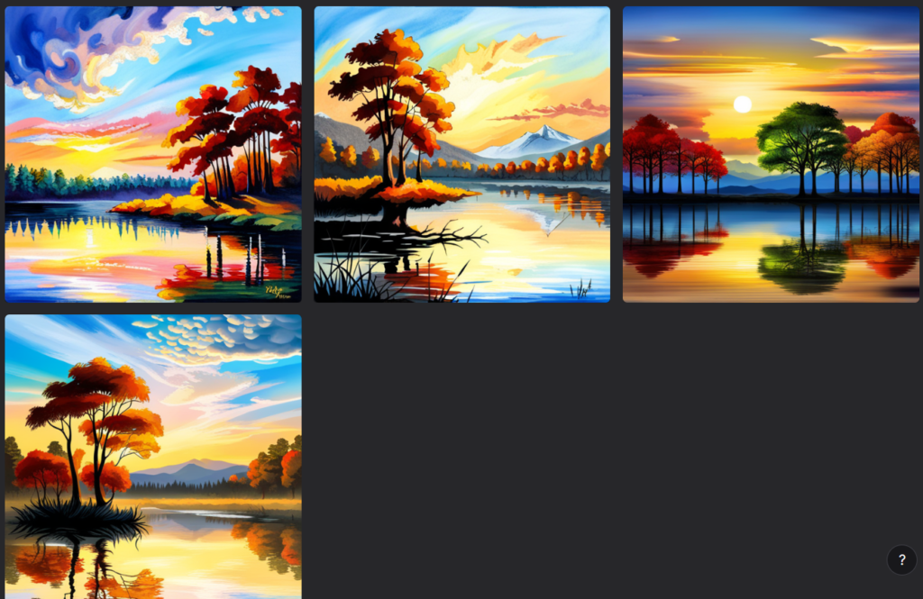
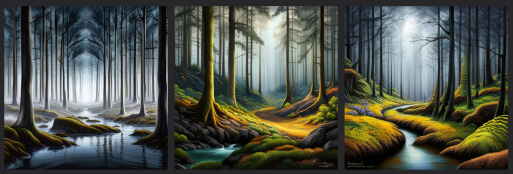
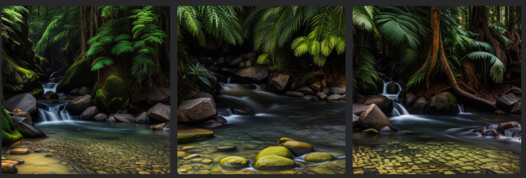
Dreamstudio AI is a web-based software that allows you to enter a prompt, an image for reference as well as the general style you would want in an image. The software uses a credits system similar to Dall-E 2. Below are some of the images I have created using this software:

Prompt: ‘Trees in a sublime landscape, grandiose sky with golden clouds, clear lake in the foreground, highly detailed’
Prompt: ‘Dangerous woodland landscape, cold tone, incorporate the fibonacci sequence into the landscape, detailed, highly detailed’
Prompt: ‘Breathtaking sublime landscape, serene stream of water, awe inspiring view, detailed, highly detailed’

These images used one of my images as a reference:

Photoshoot 2- Maritime Museum

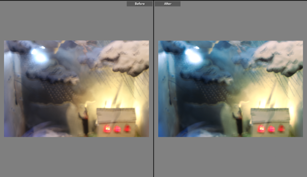
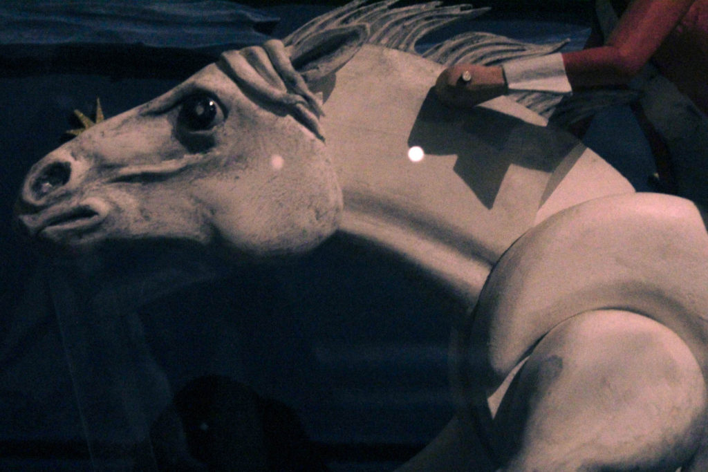
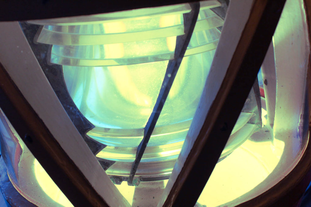
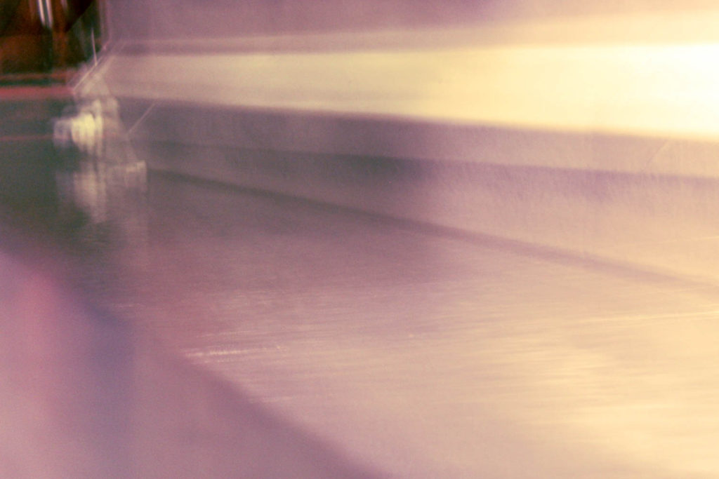
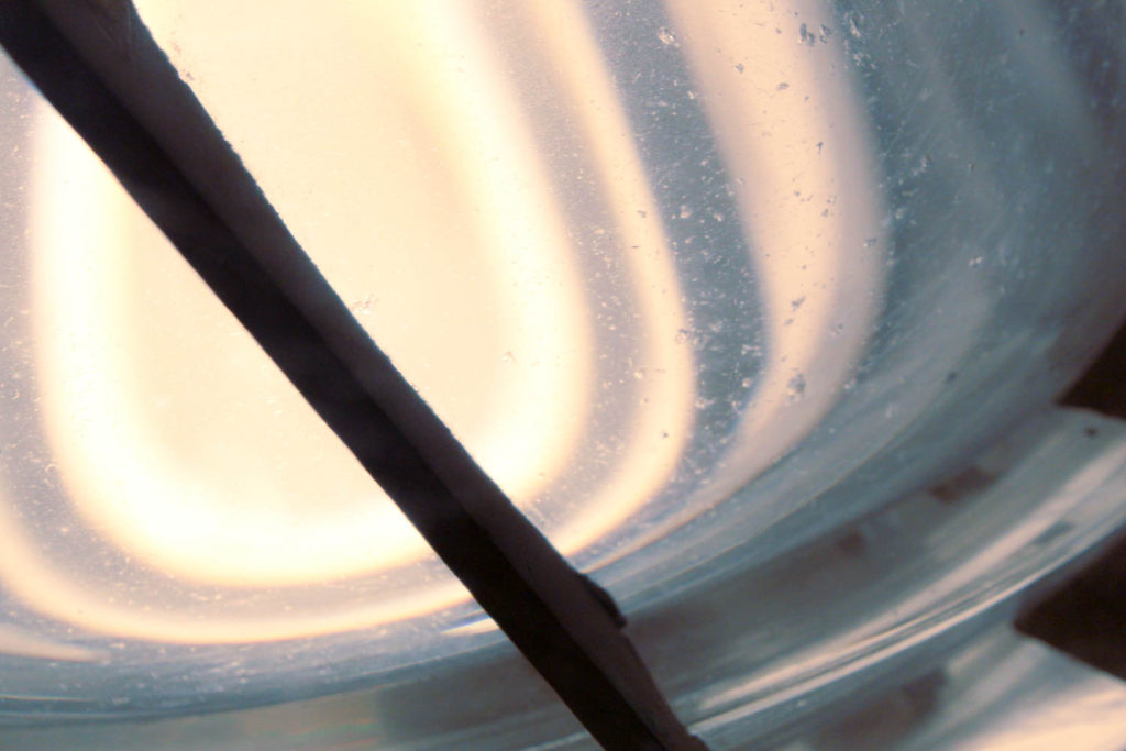
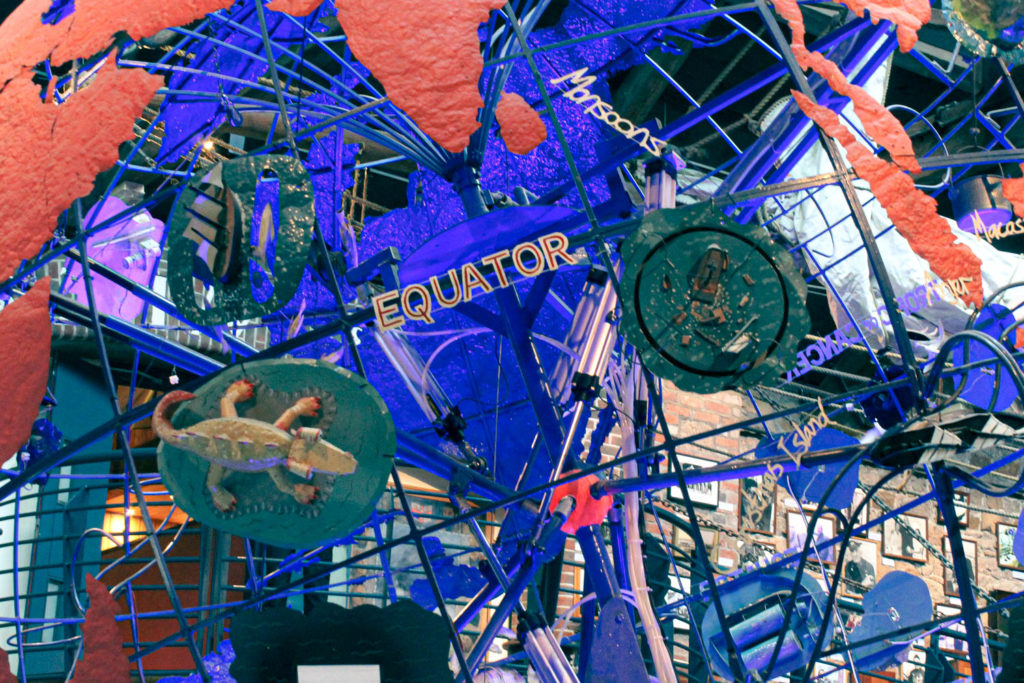
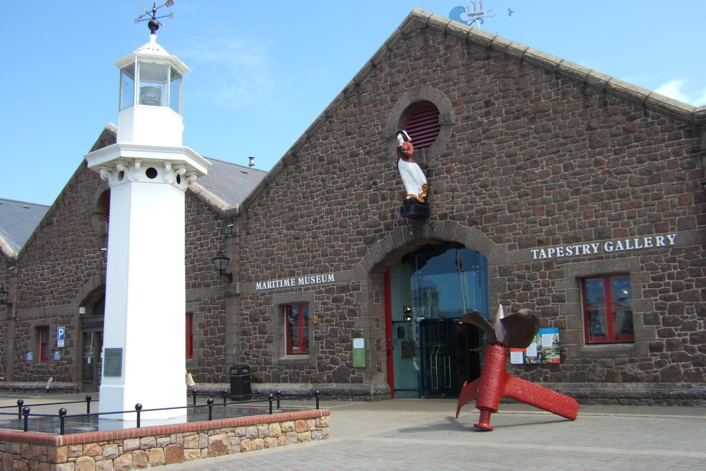
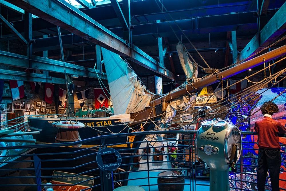
For my second shoot I went to the Maritime Museum which hosts an array of exhibits documenting Jersey’s history with the sea.

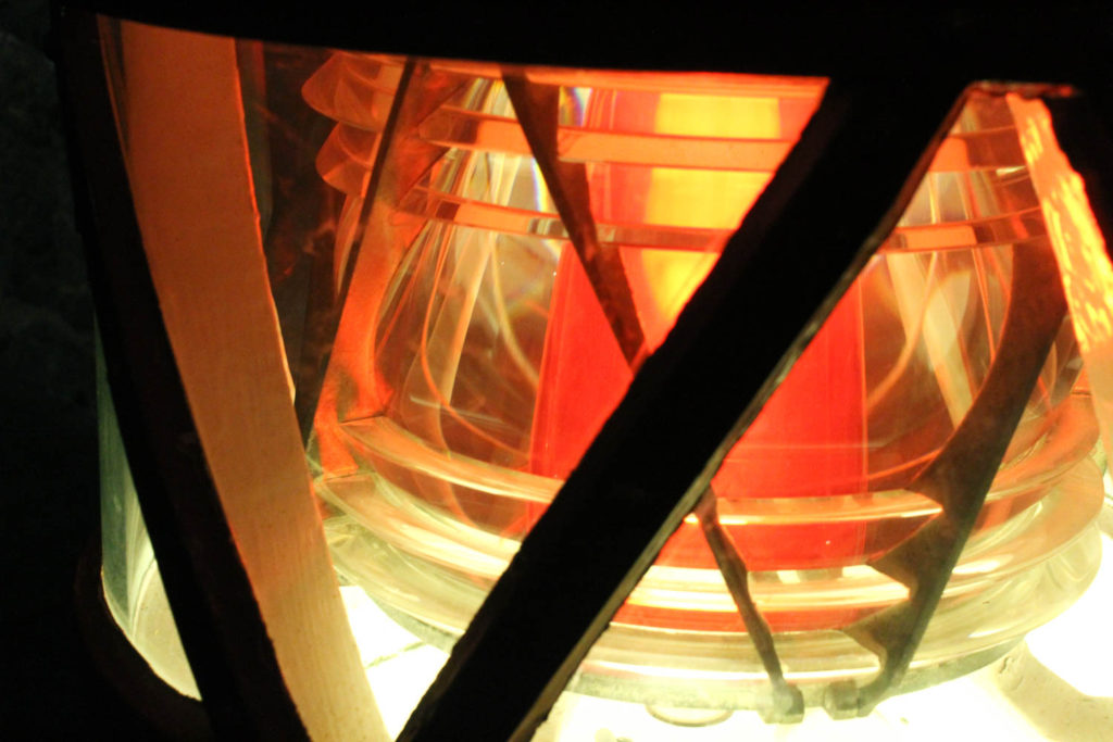
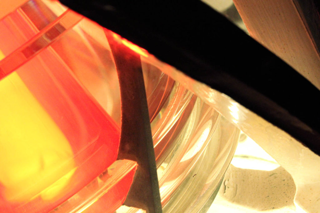
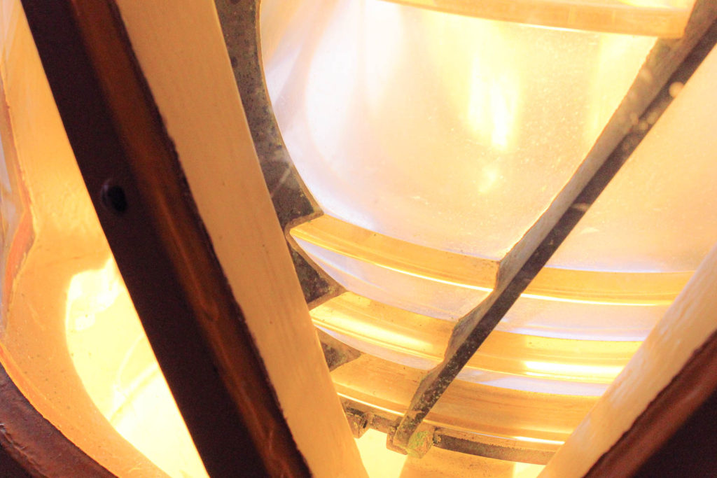
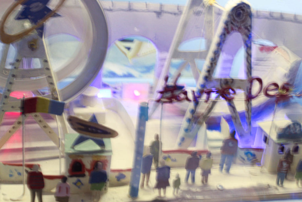
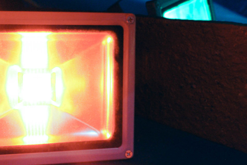
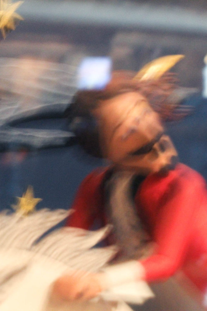
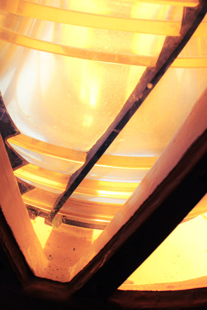
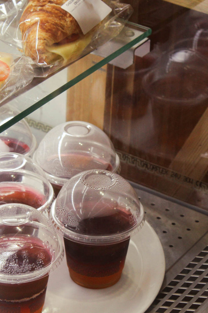
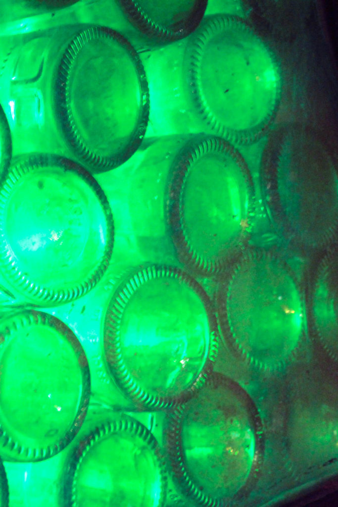
Like with my first shoot, I increased the saturation whilst editing and also used colour grading. While taking these images I also manually adjusted my shutter speed when taking pictures of the moving exhibits, giving them their blurred effect.

Photoshoot Plans

First Photoshoots

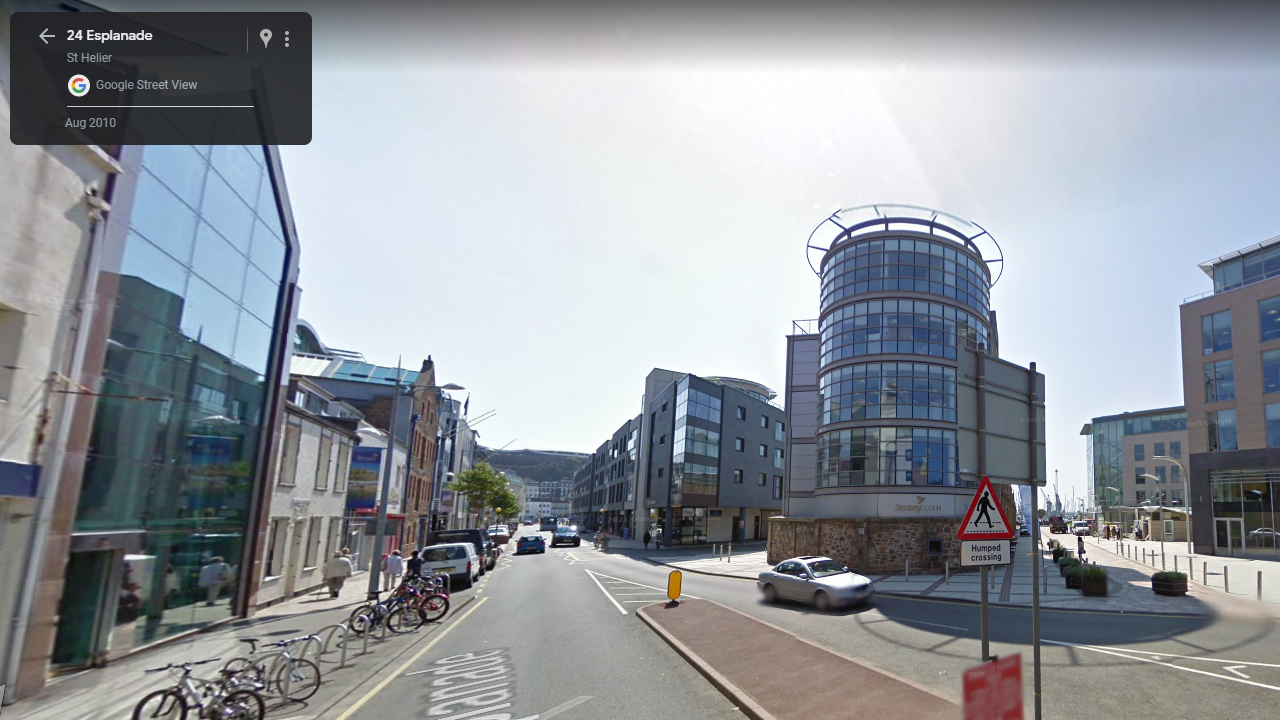
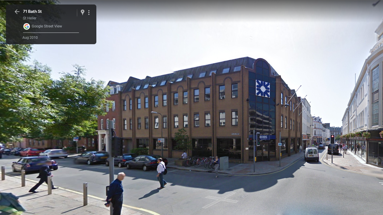
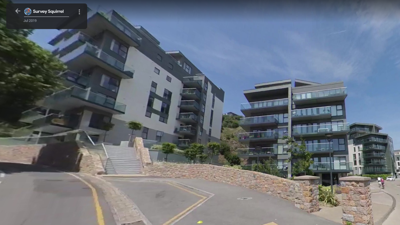
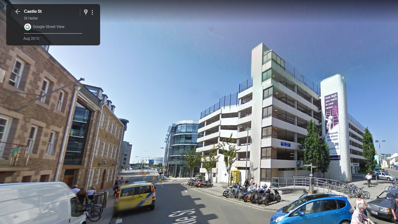
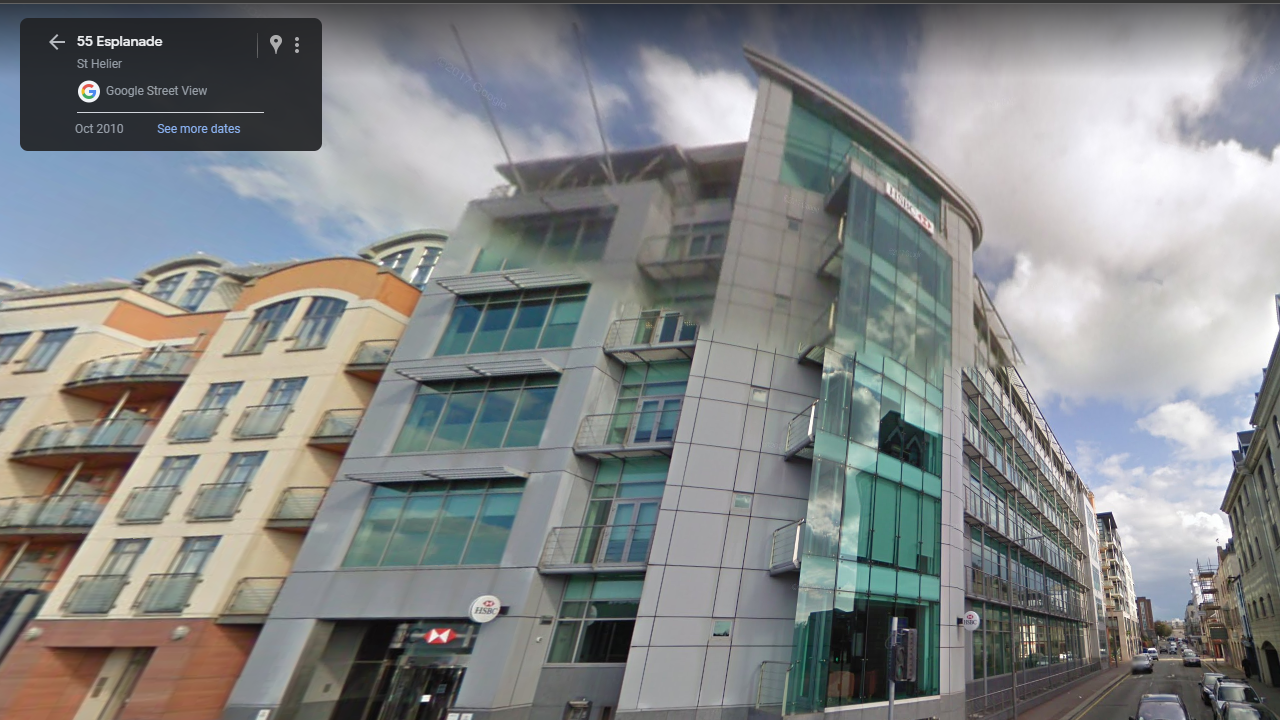
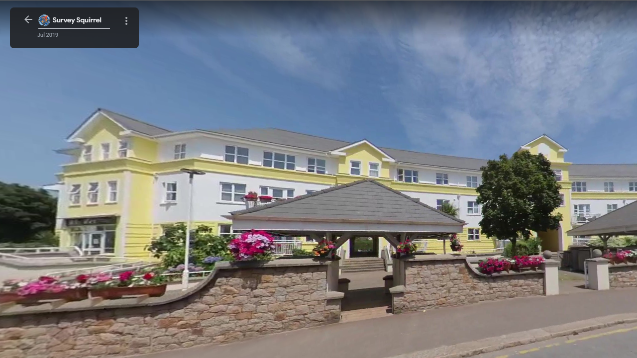
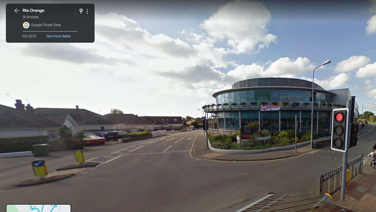
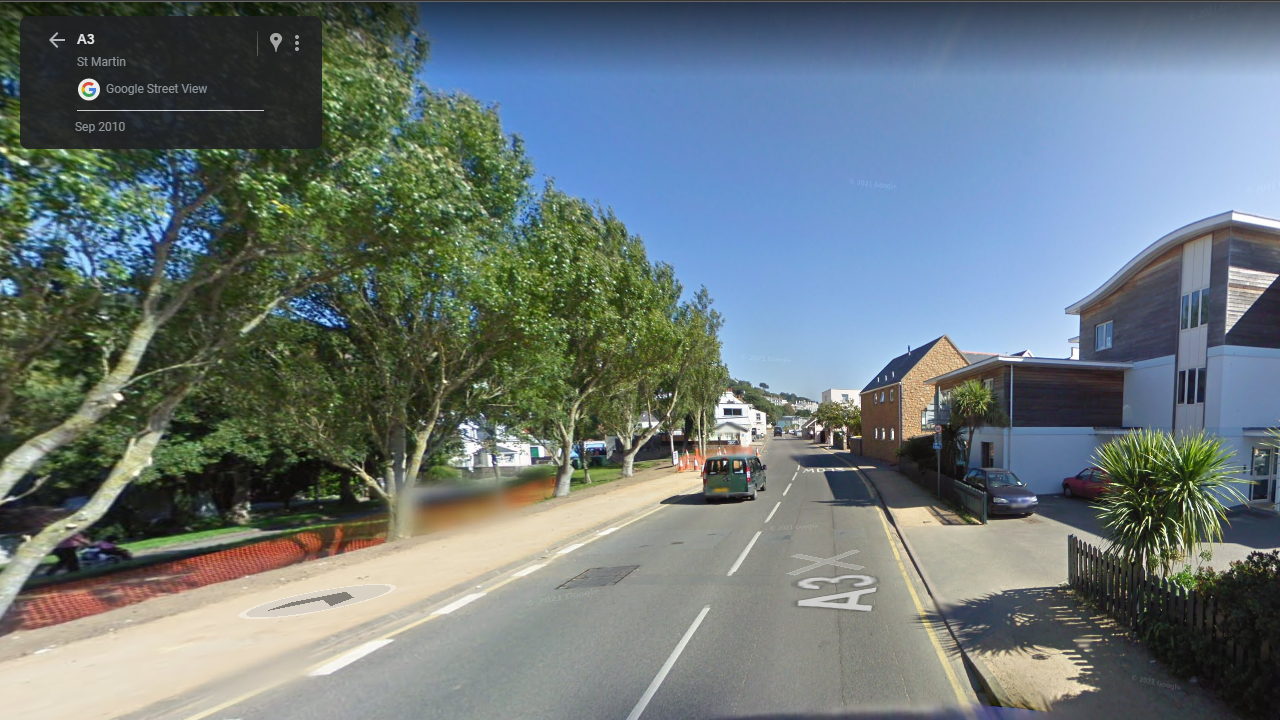
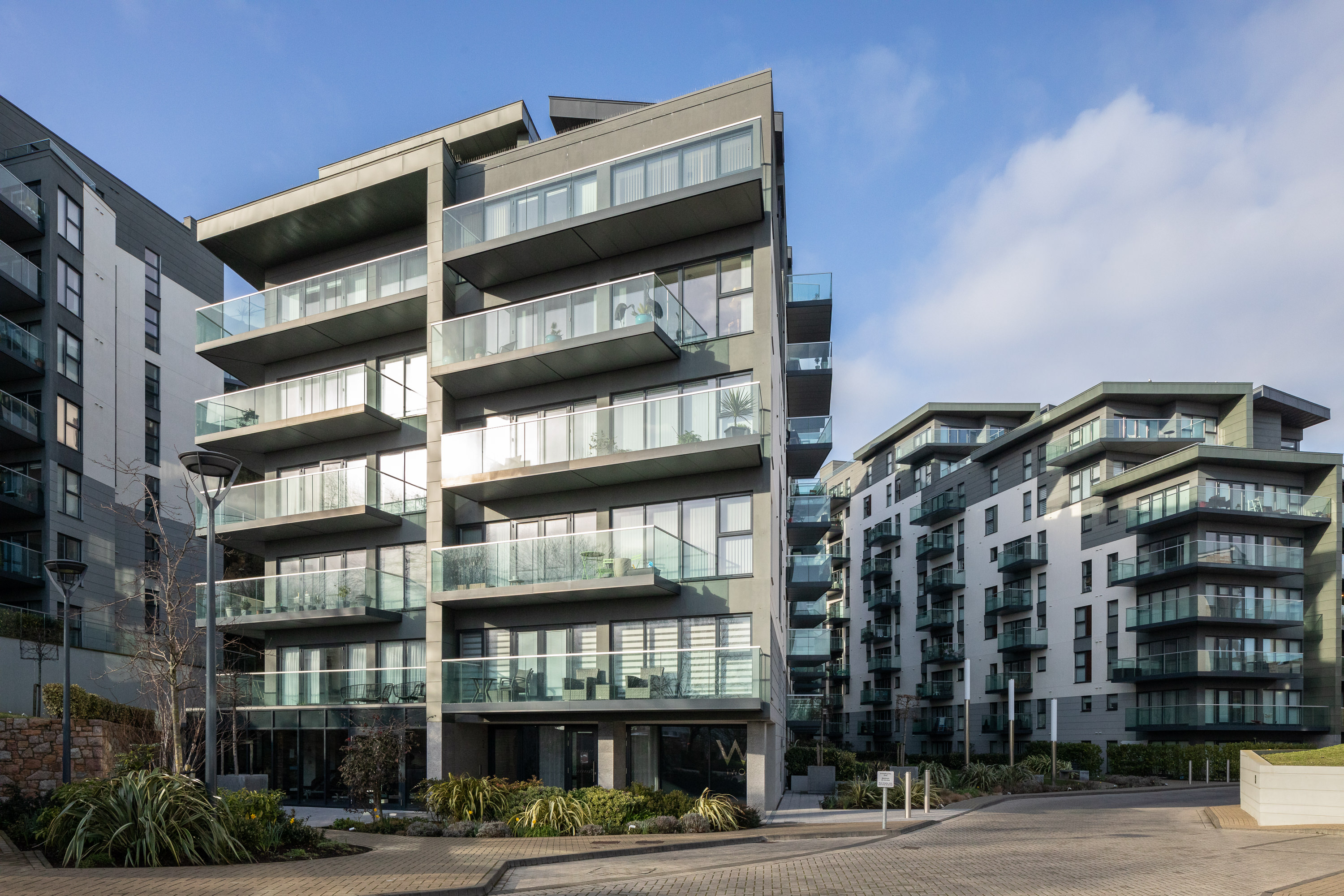
My plan for my photoshoots is to walk around different areas of St. Helier photographing the architecture using different angles and lighting to capture some interesting shots of buildings, as well as this I would like to photograph during different times of the day to create different results of images. Using google maps, I have screenshotted areas of interest within Jersey to photograph for my project. I am aiming to produce 3-4 photoshoots of the architecture around St. Helier.

Additional Photoshoots

For my additional photoshoots, If I wish to take more photographs, I will focus on out of town architecture, such as places like Gorey and Red Houses, I will do this to create a variety within my images.

Photoshoot 1- Jersey Zoo

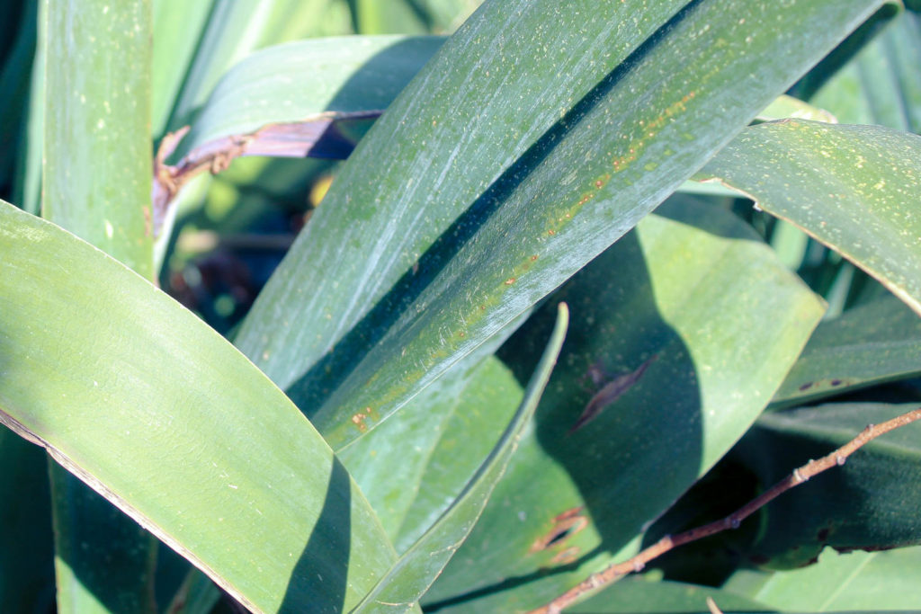
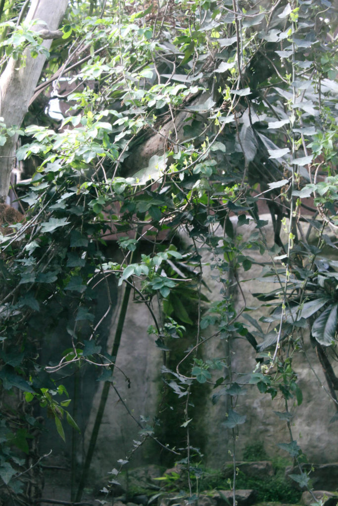
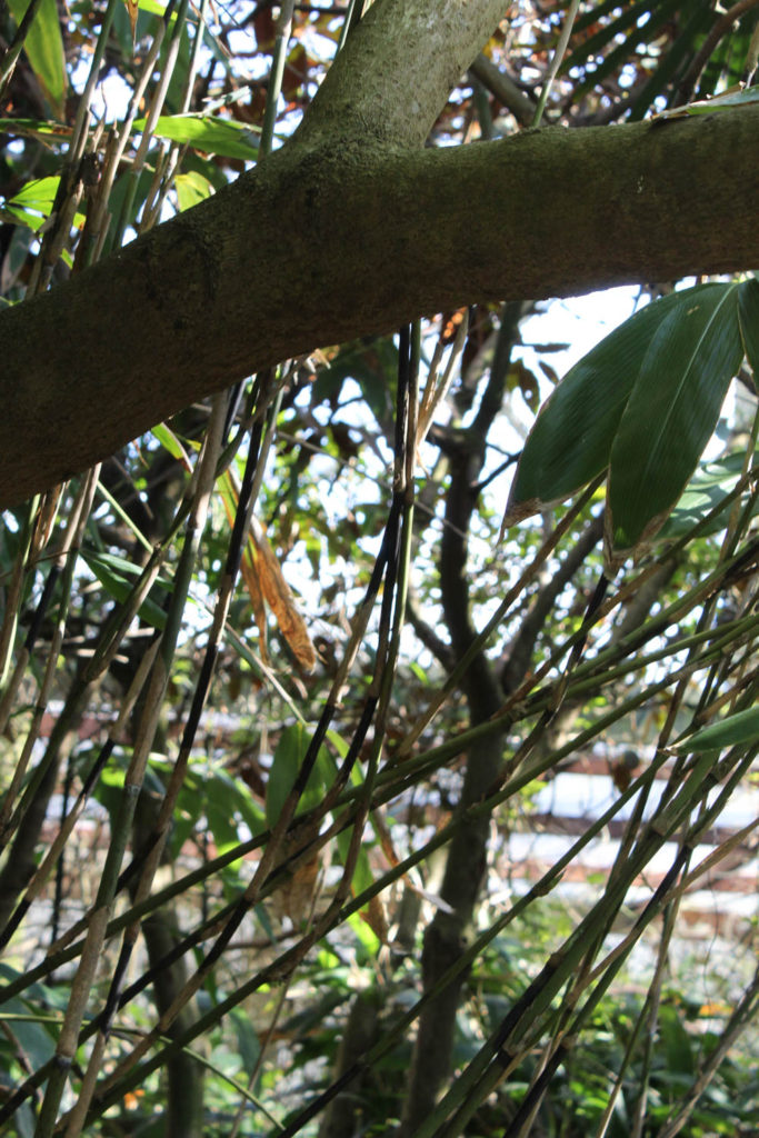
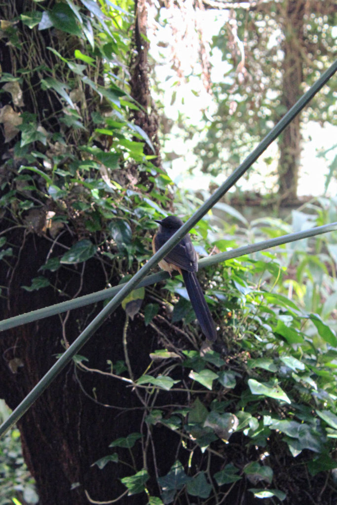
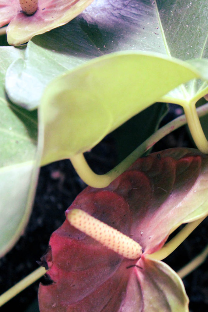
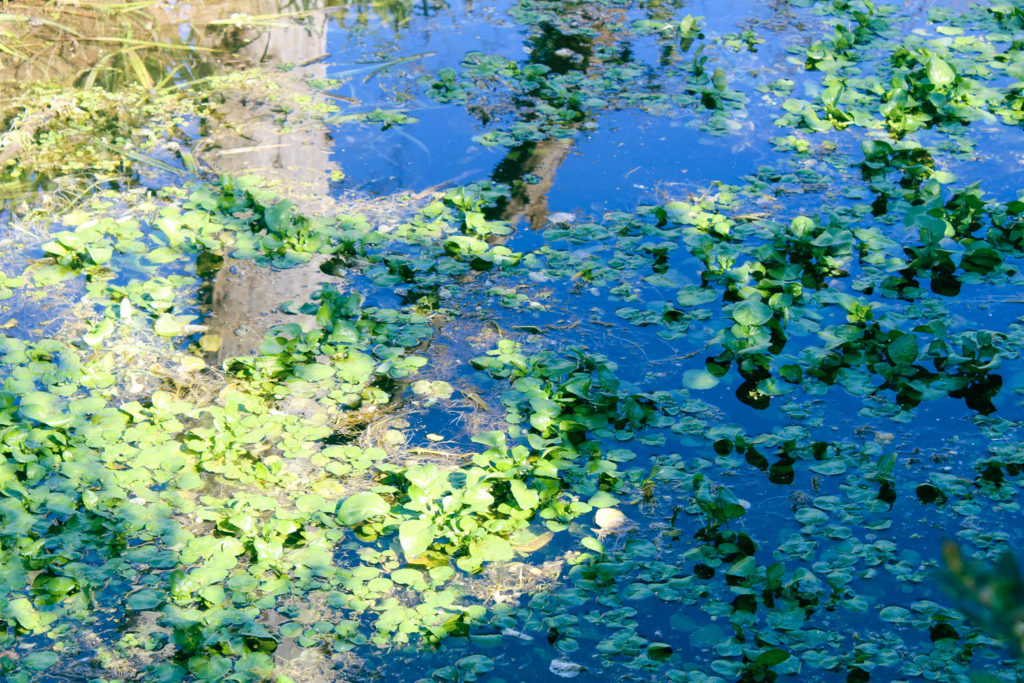
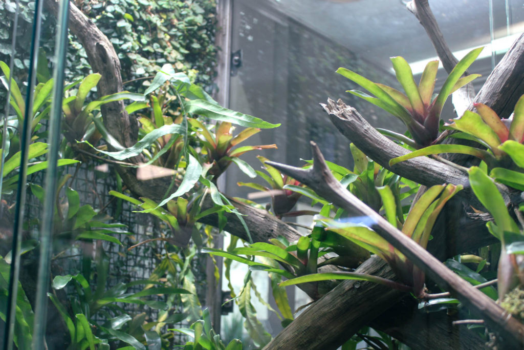
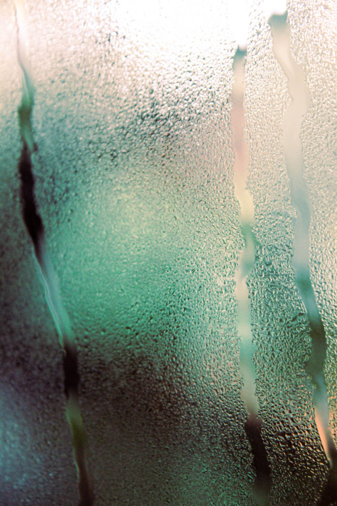
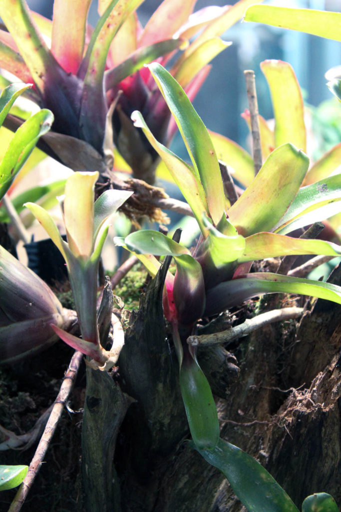
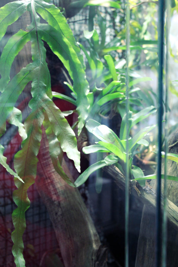
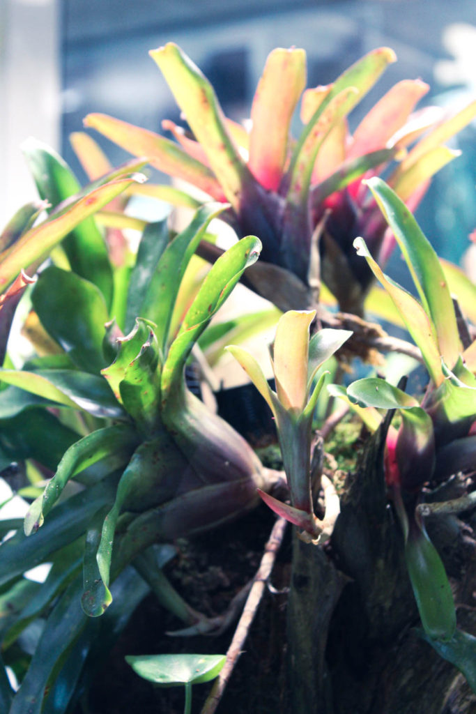
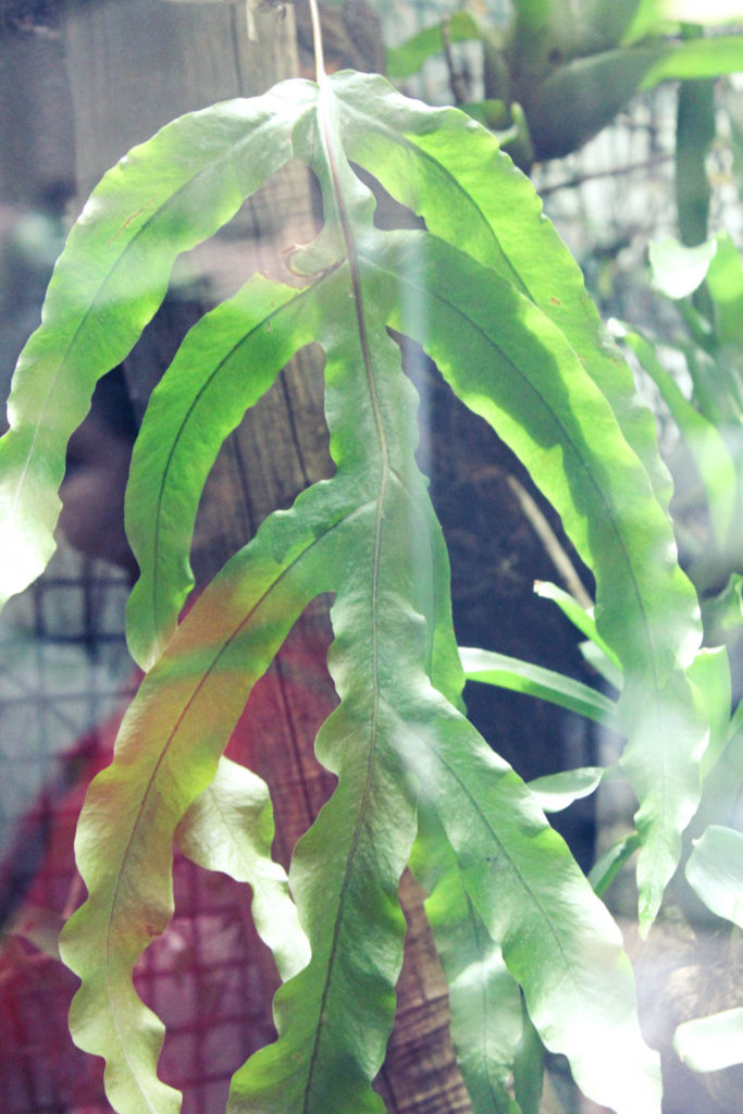
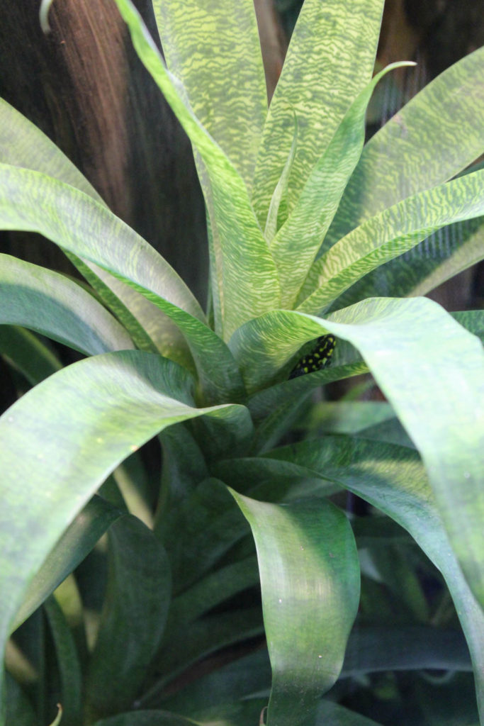
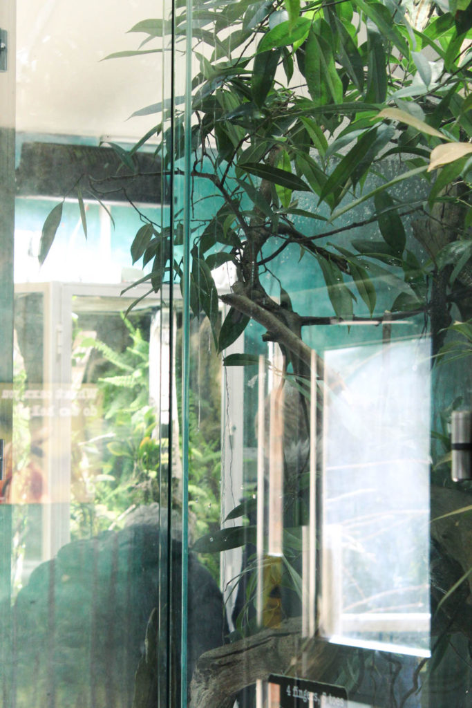
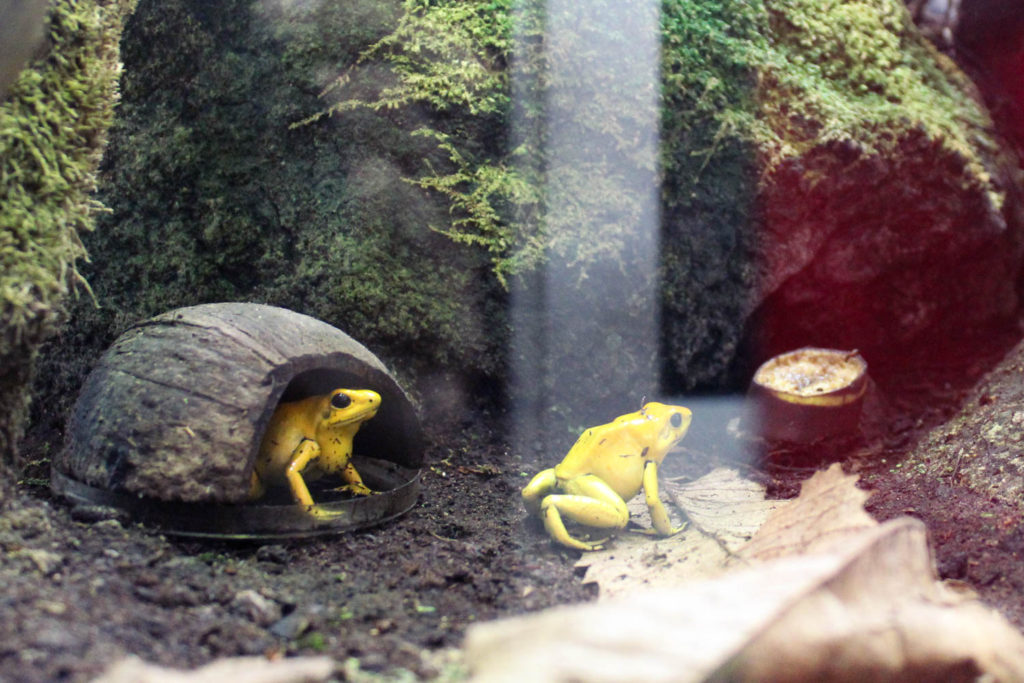
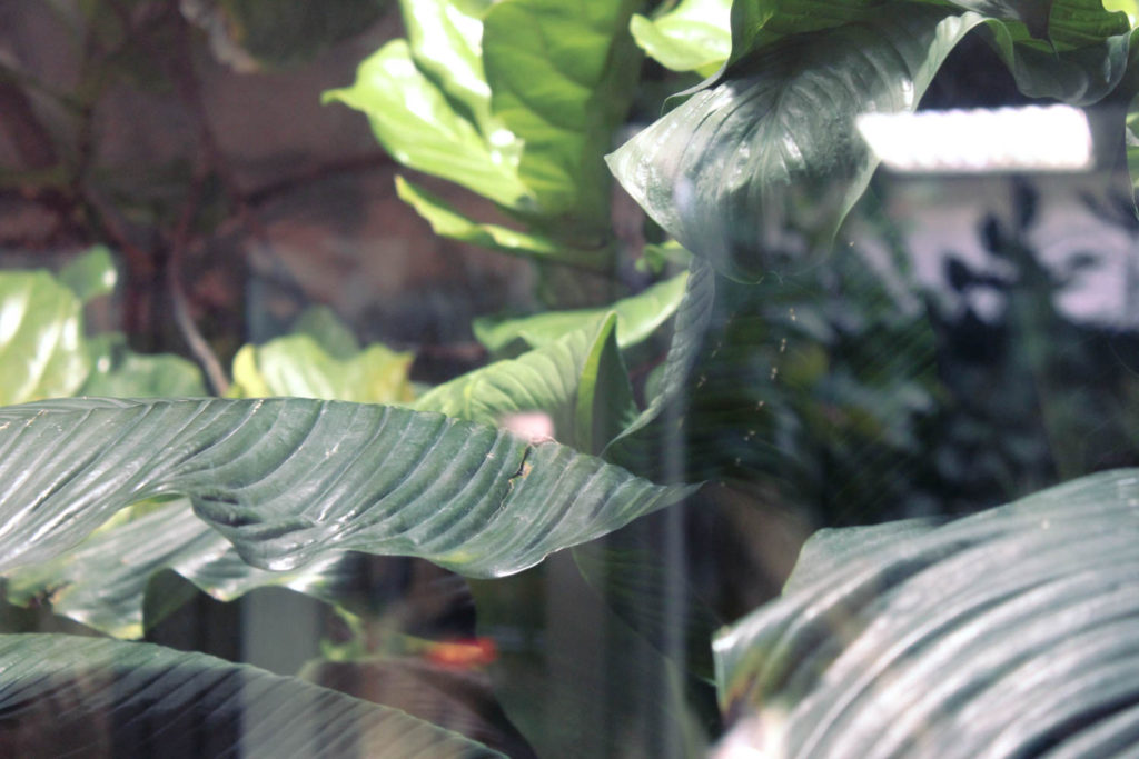
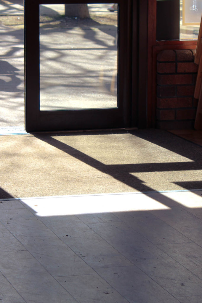
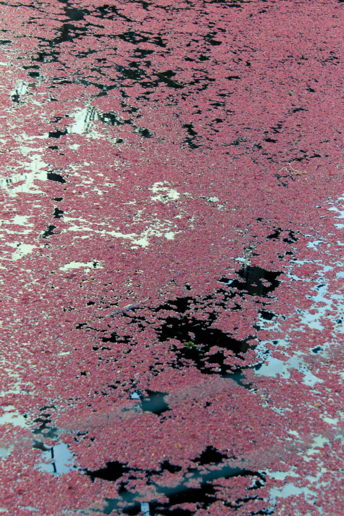
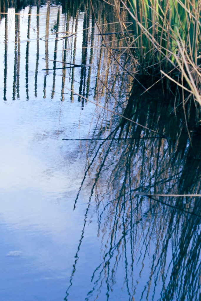
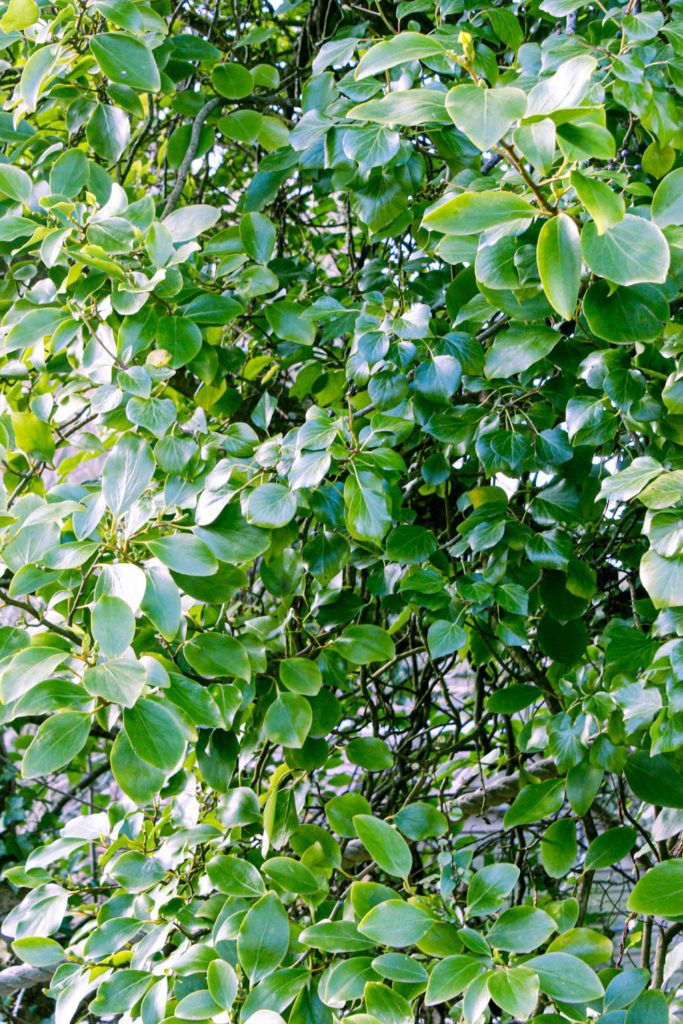
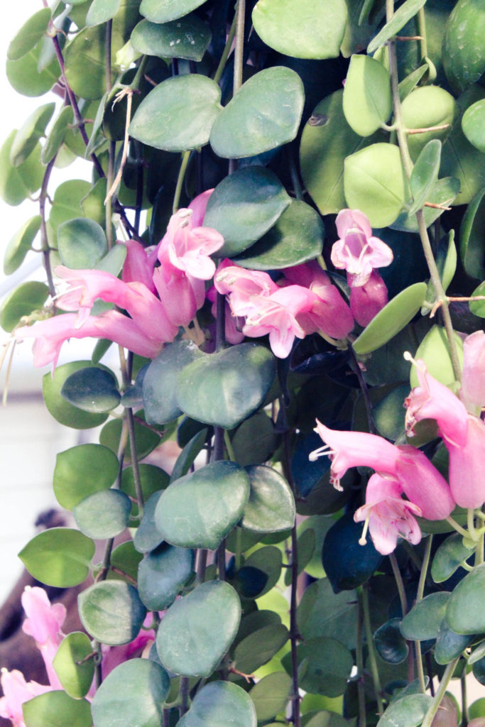
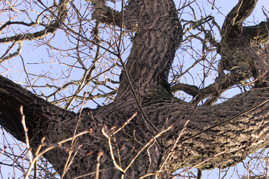
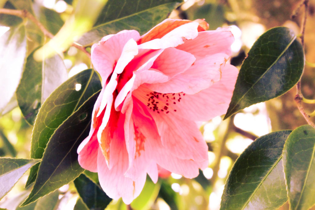
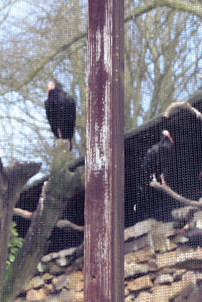
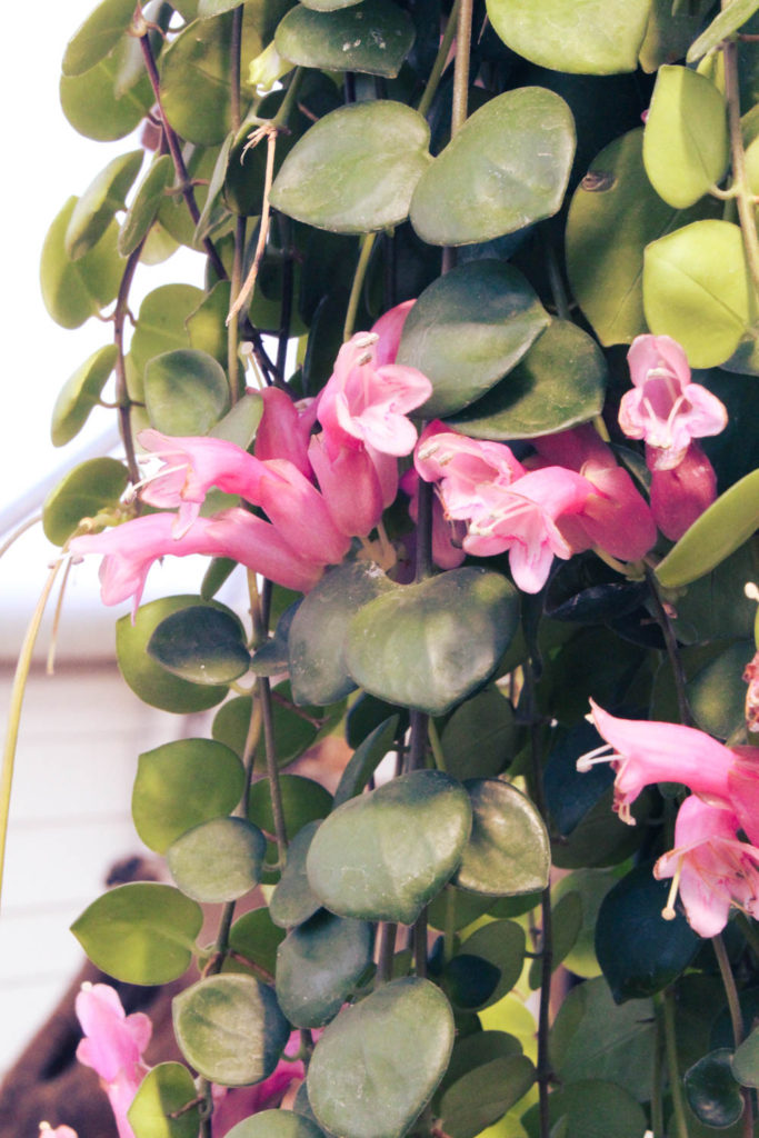
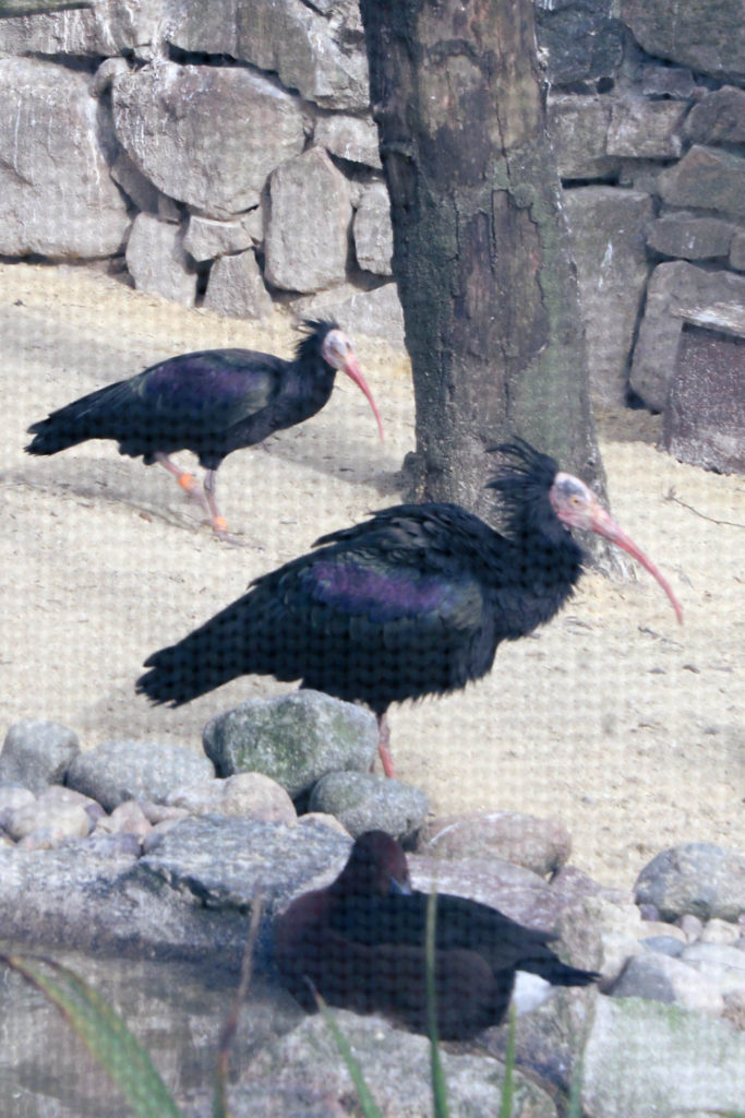
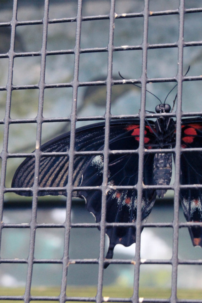
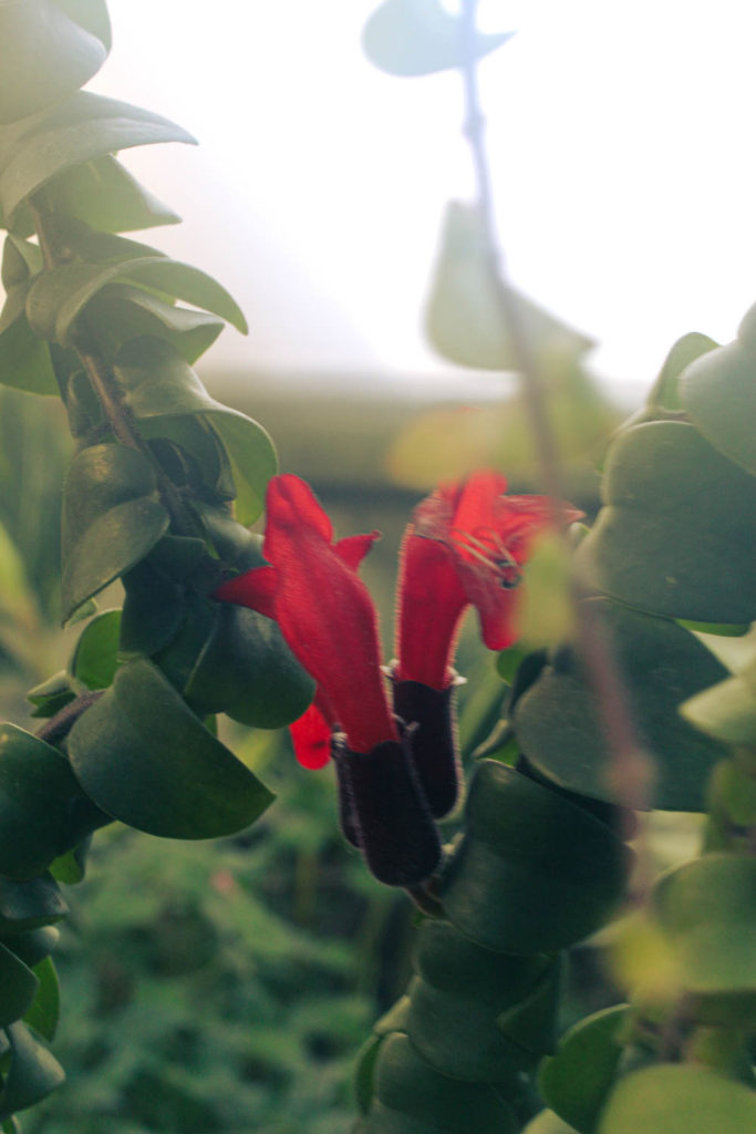
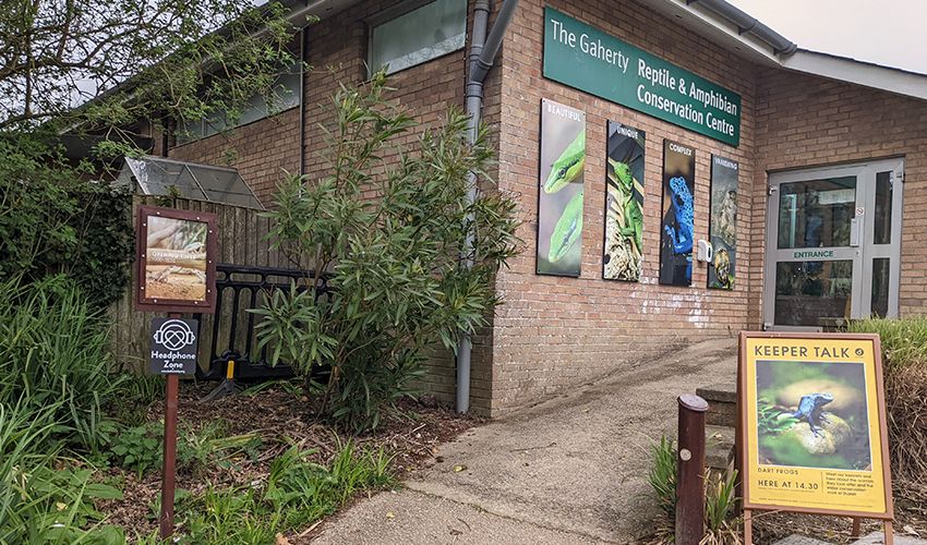
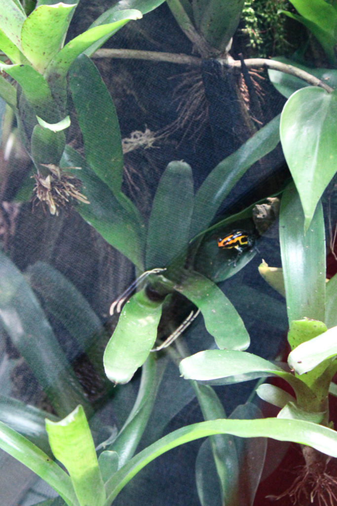
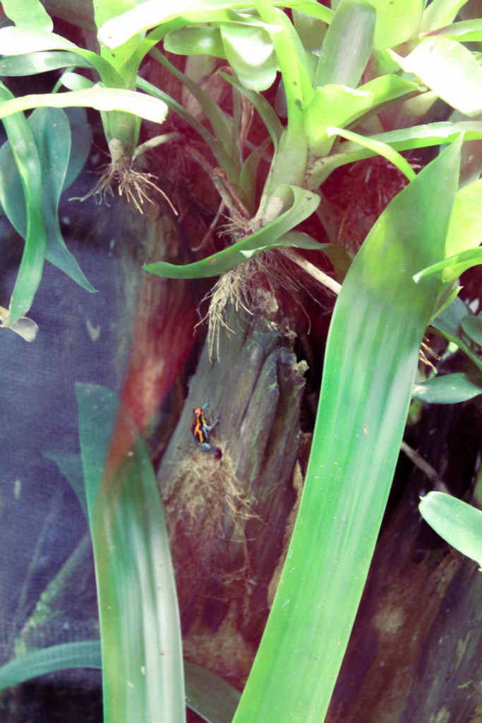
Whilst at the Jersey zoo I took an a lot of images, mostly focusing on plants and flowers being grown around the site, but also some of the animals enclosures. I wanted the focus on the natural shapes and colours found within the plants, and used Adobe Lightroom to edit my images, mostly increasing the saturation to make the images a little more visually pleasing.

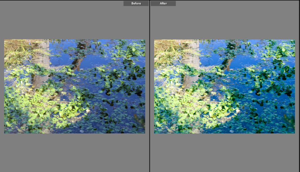
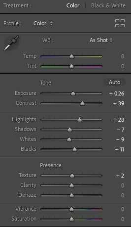
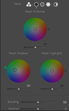
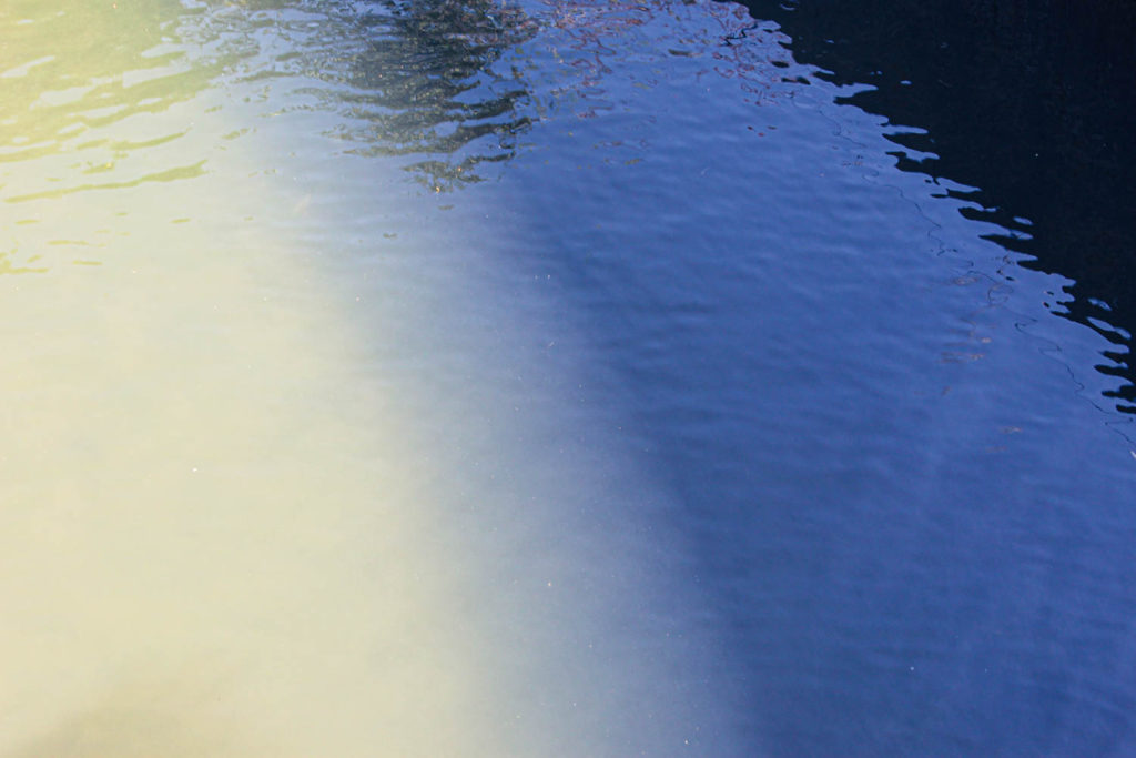
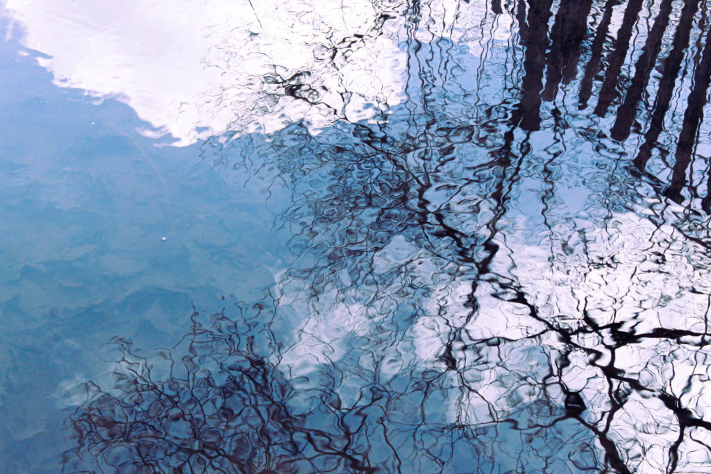
To begin, I only made a few small adjustments, increasing the exposure and contrast and eventually got into the more advanced editing settings, increasing the amount of blue in the shadows using the Colour Grading wheels. By increasing the blue I feel that I made the water a bit more pleasant to look at, as in the original image it appears to be quite murky.

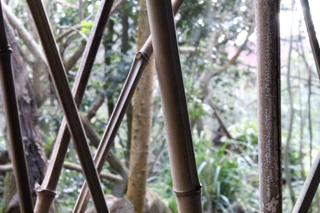
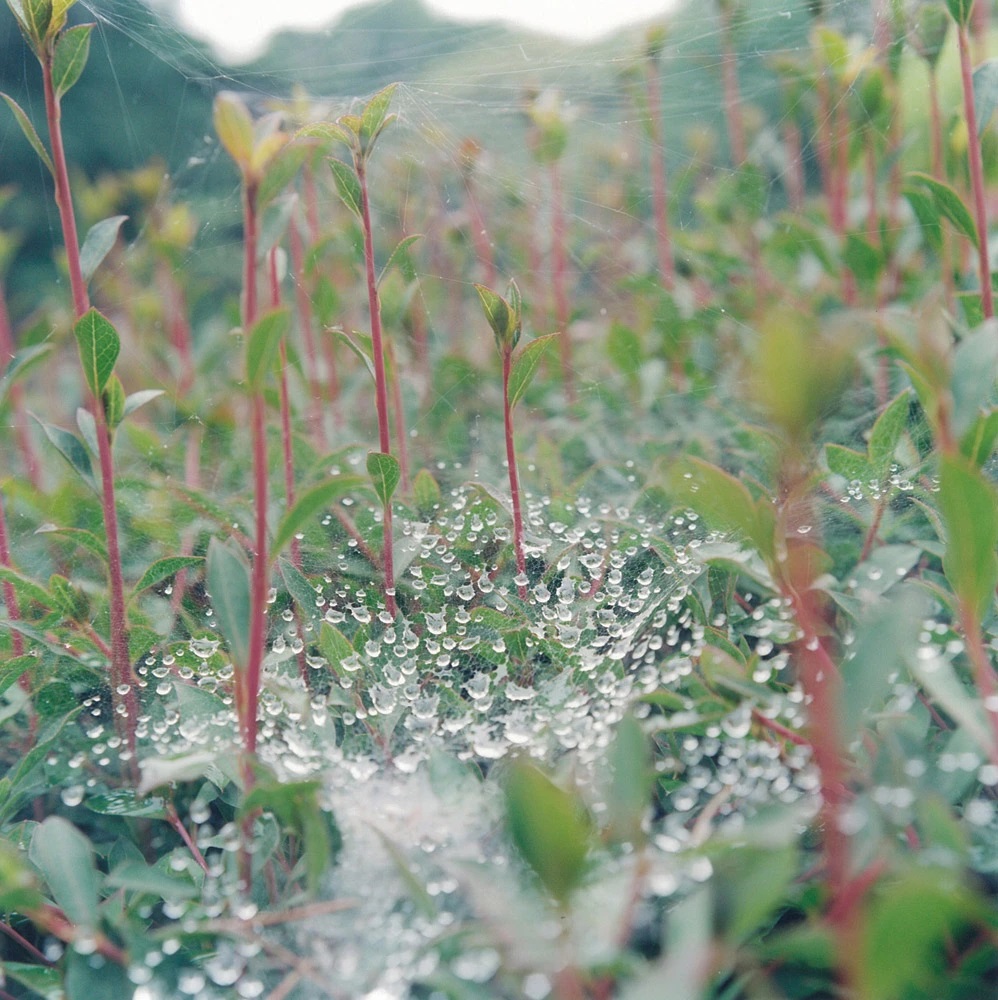
By comparing my images with Kawauchi’s I can see how successful I am in emulating the style of one of my artist references. Kawauchi’s image is from her photobook Illuminance, and depicts water droplets on a spider’s web, with plants surrounding it. These plants have red stems, which contrasts the green of the leaves and she uses a shallow depth of field to draw attention to the webs and the droplets. Kawauchi’s images are taken on film cameras and are square, contrasting my image which was taken on a digital camera and cropped to be portrait. My image has more of a focus on the texture of the leaves over colour but does also use a shallow depth of field. The image was taken through glass which leaves some of the reflection in the final image, which I feel adds an extra amount of visual interest.

statement of intent

  • What you want to explore?
  • Why it matters to you?
  • How you wish to develop your project?
  • When and where you intend to begin your study?

My aim off this exam project is to focus on the simple and complex features of architecture around many areas of Jersey. So far, I have researched 2 different artists, Matthieu Venot and Hélène Binet, who I believe both fit well with my topic as they both present their images in both simple and complex. This project matters to me because Jersey is where I grew up mainly surrounded by interesting structures which are rapidly evolving over time. I am aiming to carry out around 4-6 photo shoots of different districts around the island to make sure I have more than enough images in preparation for my final exam. At the moment, I have successfully carried out 2 photoshoots from Fort Regent and the Waterfront, gathering around 100 images so far. I am going to experiment photographing these structures in different weather conditions and different times from early day to night time. I want to carry out photoshoots all around St Helier from Westmount Apartments to the Jersey brewery to ensure I gain enough images for the final exam. Also, I am going to manipulate these images through the use of Adobe Photoshop and Lightroom to make sure I can present my images in the best of form.

Photoshoot Planning

I decided to plan out a series of photoshoots to carry out while outside of school. These shoots were inspired by my artist references and were taken in a variety of locations, giving me a range of images to work with for my project.

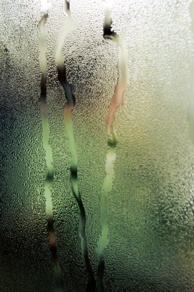
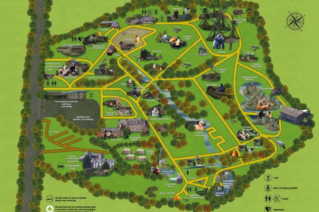
For my first shoot I decided to visit the local zoo, which has an array of interesting plants and flowers, alongside various rooms with steam and glass which I could use to create unique images inspired by my artist references.

I also decided to do another shoot at the Maritime museum as well, which has a variety of exhibits with interesting imagery, including interactive displays, themed around the island’s nautical history.