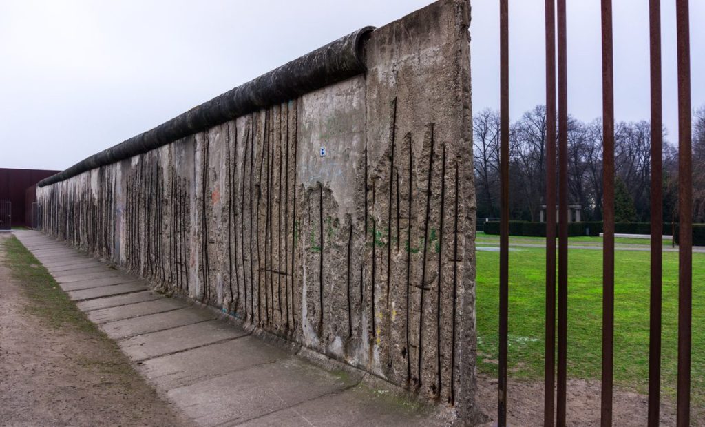
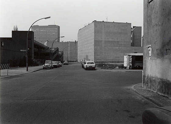
For my first photoshoot, I plan to take photos of the landscapes and environment during my trip to Berlin. I plan to base my subjects mainly regarding the wars and the overall impact that it had on the areas within the city itself. I would like to base my photoshoot on the works of Michael Schmidt and his interpretations of the aftermath of war within Berlin. I want to show the progress that Berlin has made throughout the times of the war and the aftermath of what it did to the city overall. I want to present the youth of the city and its buildings to capture how far it’s moved since the war ended.
Michael Schmidt – Berlin Nacht 39 (photobook)
Photoshoot 2
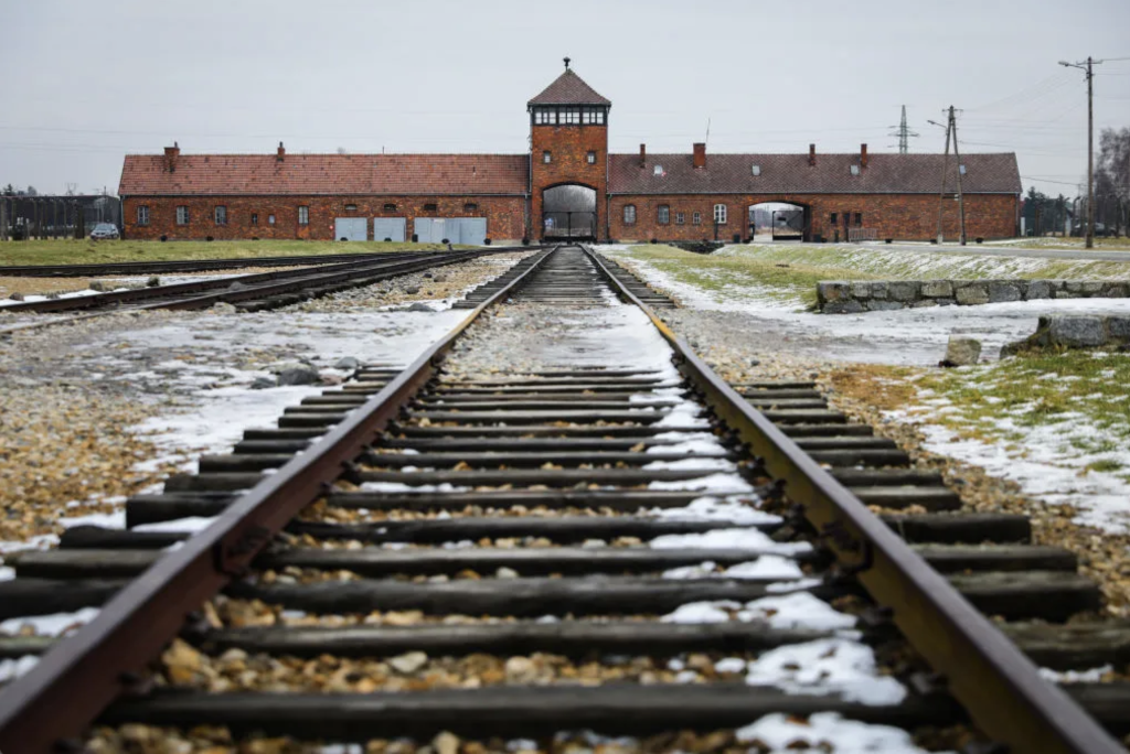
For my second photoshoot, I plan to take photos within my trip to Krakow. I would mainly like to include photos from the location of Auschwitz as it was a German occupied concentration camp. The link to the topic of war is still the main factor within the photography I would like to capture and I find this to be a very impactful image choice. Auschwitz was a very heartbreaking and incredible dark moment during the German occupation so I wanted to capture a real sense of how devastating the event was and the location it was held at.
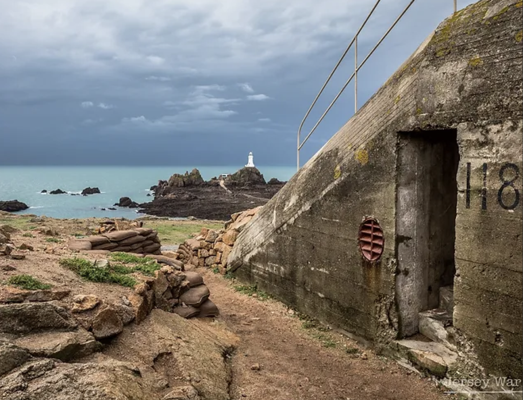
Photoshoot 3
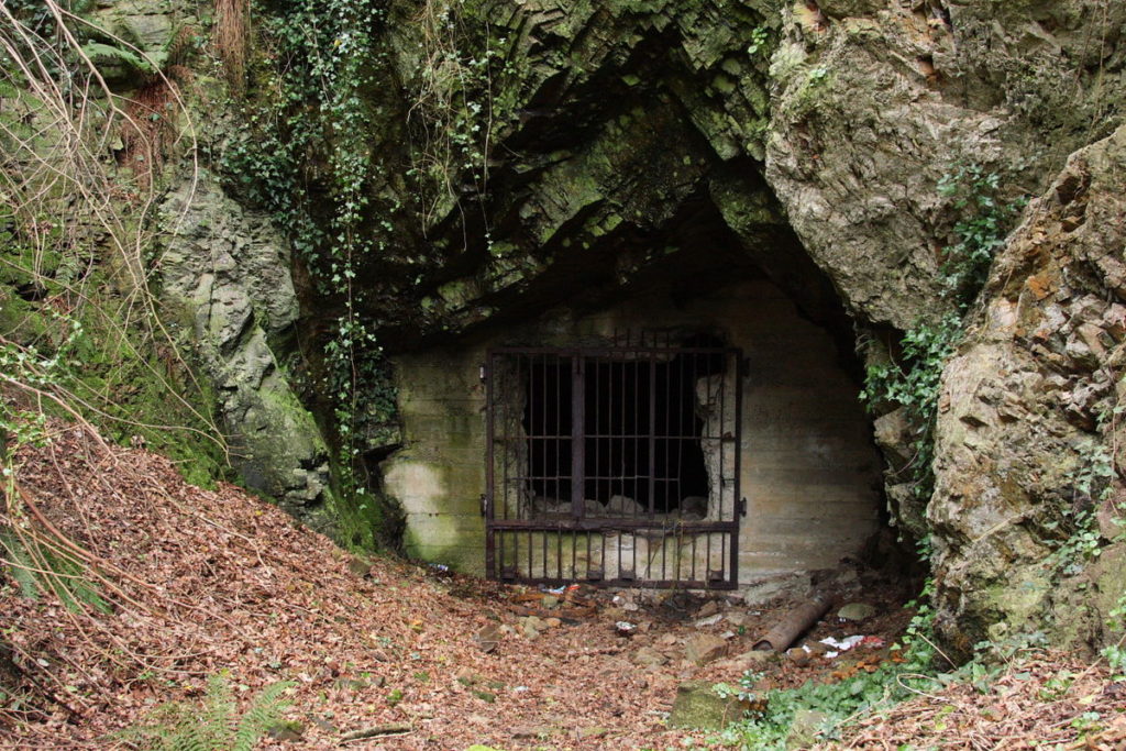
For my second photoshoot, I plan to take the route of photographing places in Jersey. I would like to still follow down a similar route to that of my first photoshoot, including possible war related subjects such as bunkers and castles. I will be exploring Jersey for a variety of bunkers, especially ones with graffiti on them, just to have that similar sense to that of Berlin wall and bunker images within the city of Berlin.
Above is a mind map which I created in relation to Andre Kertesz’s still life photography. While exploring his work, I decided that I liked his images which he created where he focuses on different shadows, such as in the image of the fork, and reflections, such as in the images of the flower and glassware. This is because I have decided that I wanted to explore photography regarding different shadows/reflections in different glassware and various kitchen objects as I want to represent the connection of women towards the stereotype of them being linked towards the kitchen as well. In relation to the mood board of the photo on the bottom left, I will also experiment with different objects besides ones that are within the field of the kitchen objects such as perfume, makeup, different accessories etc. I will also focus on how the shadows and reflections are able to be manipulated and changed.
Research on Andre Kertesz –
To gather inspiration for my mood board on Andre Kertesz, which is seen above, and to gather further research I used this website for reference. This was very helpful as it provided me with a deeper look into who Andre Kertesz is and how he developed his career as a photographer.
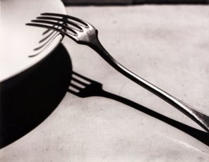
Andre Kertesz experimented with ‘Purist’ photography, this was where he produced images such as Fork (1928) in Paris, where he was able to build his reputation as a photographer.
In Paris, he held an exhibition of 42 photos in the left-bank gallery.
In 1928, he experimented with using the camera regarded as a Leica.
He moved to New York in 1936 where he began working within advertising with companies such as Vogue.
3 Key quotes –
To gather further information on Kertesz’s still life photography, I used this website for reference as well as this website. The first website provided me with , and the second website provided me with a different view towards Kertesz’s work and this was from , these are opinions are what I will use further in my image analysis as well.
1.
“He had an aim to transform the mundane into something poetic”
The quote above discusses the photographic aim that Kertesz intended when creating his different photographs as he didn’t want to make them appear to be the same as someone else’s in their characteristics, he wanted them to represent a poetical element within them, creating this subjective view on what it may represent. This can be seen in different images he has created such as on the mood board with the images of a flower in a vase, the flower instead of being full of life is droopy and sad, creating a gloomy and dark atmosphere of the photo.
2.
“He also made the use of monochrome lines which were bold and he used shadows as well as reflections to enhance his photographs.”
The quote above is used to discuss how Kertesz was able to make these bold, dark lines created from different shadows and reflections stand out amongst different still life works who have also experimented with the same techniques. This is because he was able to transform what they were able to represent and enhance the images which he was producing.
3.
“He illuminated The Fork (1928) under a harsh light to cast a grill of shadows through its tines, making the image stark and poetic at the same time: Kertész reveals that the fork is an object of beauty—without dissipating any of its essential forkness.”
This quote is used to discuss how the composition of one of the images called ‘The Fork’ in 1928 was created through the manipulation of different shadows from the fork and the plate as they bend around the side of the bowl but underneath there is a dark, bold and sharp image which is being show. This can re[resent how everything always ends up looking the same no matter what we want to see or believe, keeping that initial ‘forkness’ which is discussed above, which I will use for further analysis in my image analysis. This is what I would like to show in my work as well, the simplicity of still life kitchenware and glassware compared to the deeper meaning of how it links towards the stereotypical views of women in the kitchen.
Image analysis –
The Fork, Paris 1928, Andre Kertesz
I think that this image taken by Andre Kertesz called ‘The Fork’ in 1928 is a successful image and this is because I think that it shows the simplicity of still life photography yet visually there is a deeper, poetical meaning behind the shapes created through the different shadows casted on to the ground and bowl. This is discussed through the comment of Shonquis Monero, who looked at Andre Kertesz’s work, from the ‘Kinfolk’ website where it states “making the image stark and poetic at the same time“. This quote is used to discuss how Kertesz’s work follows a poetic manipulation yet uses objects which are quite plain or bare in their appearance, such as a bowl or a fork, and how they have a deeper meaning within them. This can be clearly seen within this photo as the fork and bowls shadow is dark and bold underneath but as you look as the bowl you are able to see how the shadow of the fork begins to curve and follow the bowl instead. Therefore, this can be used to represent how society cling to these older ideas of gender relating towards how you are viewed within a household role and then the top, where it begins to curve, can be used to show people beginning to move away from these different stereotypes. If I were to give a critic towards this image, I would consider how the background isn’t plain and looks somewhat grainy or dirty, although this may be a photographic choice from Kertesz, I believe that having a plain white background would make the objects shadows stand out more and create more of an effect, this is what I will be using within my work instead.
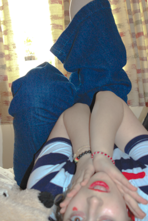
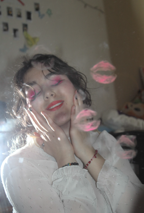
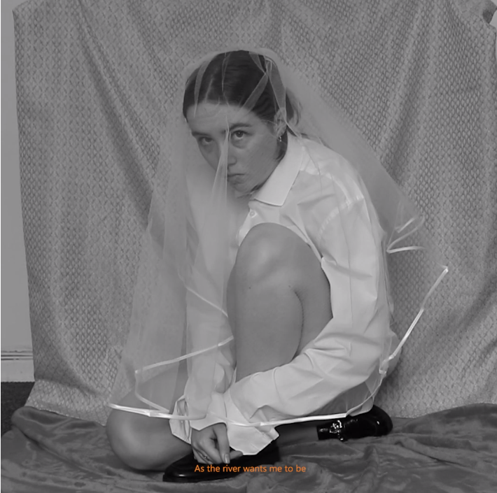
For this photoshoot, I aimed to create a series of images that focused on the more feminine side of the gender experience. I wanted to make sure that I spent time exploring femininity as I think it’s usually lost or dulled down within media, often changing the idea of femininity from women having fun to revolving around men [i.e: talking about or wanting to be with men]. Due to this, I wanted to create a photoshoot that would embrace the bright and fun aspect of femininity whilst avoiding the stereotypes often pushed upon women during this photoshoot.
Contact Sheets:
When I began the photoshoot, I was inspired by the idea of sailors and flight attendants and the fun colours/patterns that they reminded me of and tried recreating some of these ideas in order to help me to create a scene for my performative images. Then, as the shoot went on I began adding my own style as I saw fit [i.e: adding pink eyeshadow, a red heart etc] which helped me visualise where my project could go.
Later on, I decided to look at femininity through a different lens and decided to give myself a moustache/beard using make-up and dress more femininely, creating a contrast in the societal idea of femininity as my face was still covered in makeup despite being paired with a moustache and beard. I decided to do this in order to explore how femininity can be embraced by anyone despite being predominantly linked to women historically.
Some contact sheets:
Best Images:
Overall, I think this photoshoot was successful as I managed to create a variety of images with different perspectives, poses and compositions that I have started to form what my project will become whilst inspiring new ideas for future photoshoots.
Reflecting back on this photoshoot, I feel like I could try and focus on the lighting in my shots as some of my images feel dark or underexposed even after editing. Alongside that, I feel as though I could try and use more props throughout my photoshoots as I feel like they could create more interesting images that help to convey the topic of gender and gender roles – similar to some of Claude Cahun’s work – adding more meaning to each image. Ultimately, however, I feel as though this is more of a personal preference that I’d like to explore in a future photoshoot in order to improve the quality of my images. and maybe make the link to gender and gender roles a little less subtle.
Comparing my work to Sharn O’Donnell’s:
This photoshoot was heavily inspired by O’Donnell’s short film ‘Upstream’ where they use different items of clothing within their performative work to portray the masculine vs the feminine side of gender. I reconstructed this idea through the use of hair and makeup, drawing a fake moustache/unibrow to portray the more masculine side of gender alongside having my hair tied further back. I decided on this rather than clothing as I knew I wanted to explore feminine items of clothing even whilst presenting as a masculine figure which I tried to exaggerate further by keeping the heavy pink/red makeup.
My work differs from O’Donnell’s visually/aesthetically as I decided to use colour within my images whereas as they tend to keep their images & short films black and white. I wanted to use pops of colour to help distort the lines between the gender binary as I felt that using ‘feminine’ colours/looks with both the masculine and feminine characters would help to bring the two together as being similar yet different.. O’Donnell’s lack of colour helps to portray a sense of mourning towards what they are and what they could of been, the monochrome footage/stills taking away all distractions from the message they are trying to portray.
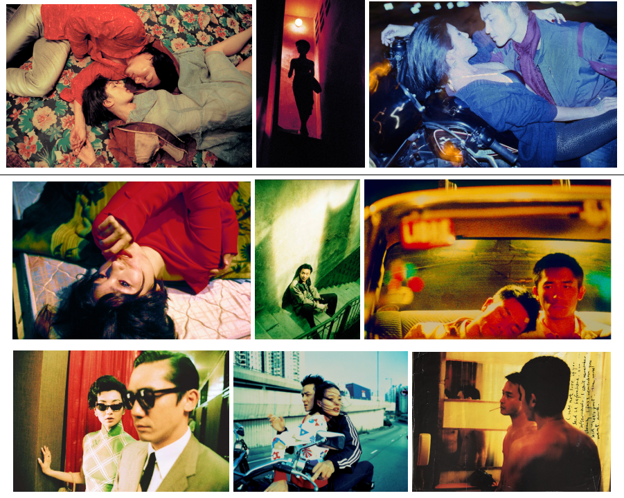
Mido Cafe 63 Temple Street Yau Ma Tei, from the collection “Left Behind”, 2014, Wing Shya
Wing Shya‘s skills are translatable between film, art and fashion. Born in Hong Kong 1964, completing fine art studies at Emily Carr Institute in Canada, Shya founded the award-winning design studio, Shya-la-la Workshop based in Hong Kong. Since then Shya has made his name in many publications (including i-D UK and Vogue Italia) and films (such as “Hot Summer Days,” 2010 and “Love In Space,” 2011).
Working with acclaimed director Wong Kar-Wai as a behind-the-scenes photographer on film sets (In The Mood For Love, 2000) Shya specialises in capturing the atmosphere surrounding his subjects- usually couples- while they are off camera in aestheticised scenes. I am highly interested in the use of cinematic prose throughout his images- showing a narrative from an outsider perspective with the camera rarely being acknowledged by the subjects except through a mask, like sunglasses (bottom left image of mood board above). Similar to my first artist reference (Claudia Andujar) I have decided to study Shya’s work as a response to the exam theme of simple v complex due to his use of cinematic compositions, including the lighting in a scene and the atmosphere the image creates, where a narrative and story can be taken from the image- Shya’s images, although cinematic, much like Andujar’s are not staged, Shya says himself “I won’t try to overshadow the moment. I always try to make myself as ‘small’ as possible. I just enjoy the process of photography; I want to take in the atmosphere and people I’m photographing.” (https://neocha.com/magazine/the-moments-in-between/, December 12, 2017 accessed 27/03/2023).
An image of Leslie Cheung and Tony Leung by Wing Shya on the set of “Happy Together” directed by Wong Kar Wai
This image taken on the set of “Happy Together” showcases the two main characters, as on movie sets, there can be no interruptions when a take begins Shya can only take images before and after filming- capturing the transition moment, where an actor takes their guard down and is between their character and their authentic self. There is a consistent theme of waiting and suspense in Shya’s work, proven in this image where there seems to be a narrative which has been captured in a moment (since the image is from a film set, this is the case). The image itself is saturated in colour; presenting vibrant purple, orange and red- usually quite positive colours- however the use of stark overhead lighting (artificial) to create bold shadows creates a more emotionally turmoil, impassioned image. This idea is shown through how the subjects are binary opposites, one veiled in shadow and the other in light: one seeming more aggressive and one seeming more open as portrayed through the lighting where the butterfly lighting technique is used- revealing very little about the subject itself. The image itself- although grainy- is in sharp focus to the subjects with no blur except in the background, making the surroundings look more hazy and dream-like. The red writing on the left side of the image is also a central focal point- drawing the viewers attention to the more open subject along with the draw of the purple wall.