Matthieu Venot is a self-taught French photographer whose pictures capture the urban environment in a most graphic and transformative of ways. Focusing on the part rather than the whole, his photographs abstract his surroundings into colourful graphical vistas turning the quotidian into the iconic.
Focusing his lens on architectural details and adopting fairly constructivist angles, the artist succeeds in creating abstract geometric images. He only photographs when the weather is incredibly good and thus Matthieu uses the immaculate sky like the background in a studio. This, he maintains, is his way of not disturbing the composition of his pictures : simple and graphic. Lines cross over and overlap. shapes stand out from this blue background and have us forgetting what we are observing : a roof, a wall, a railing, a balcony.

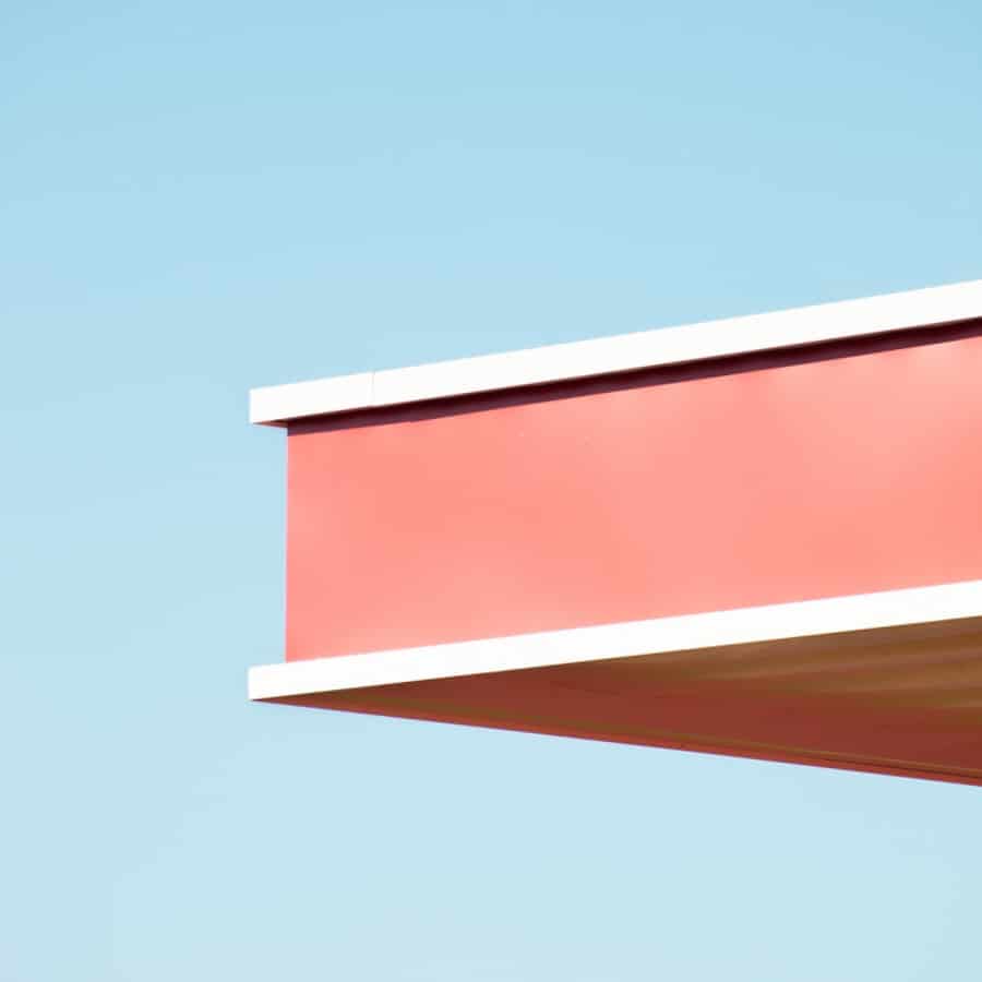


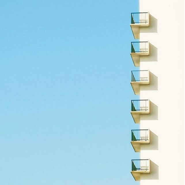

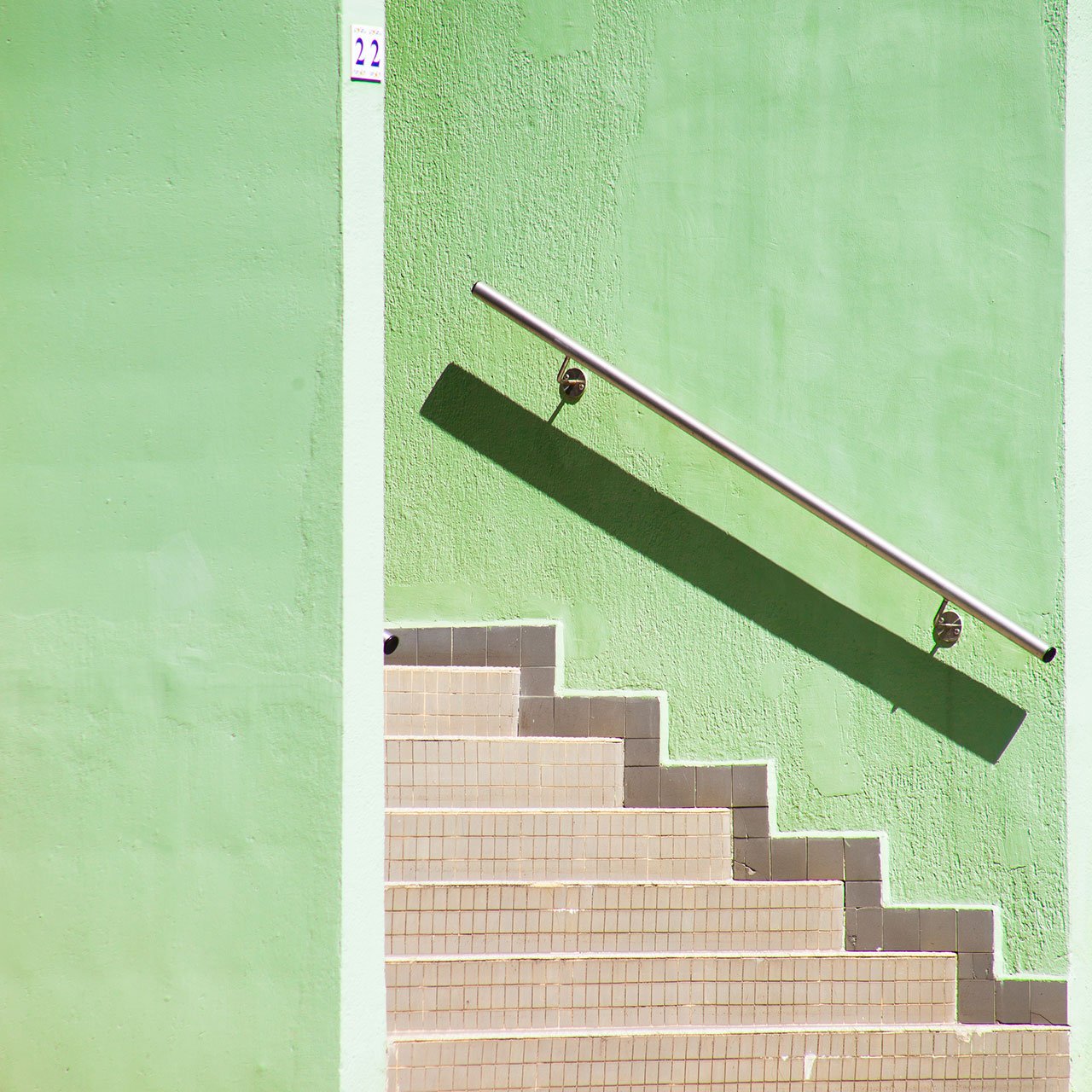

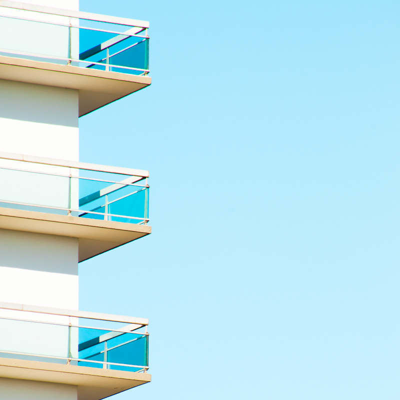
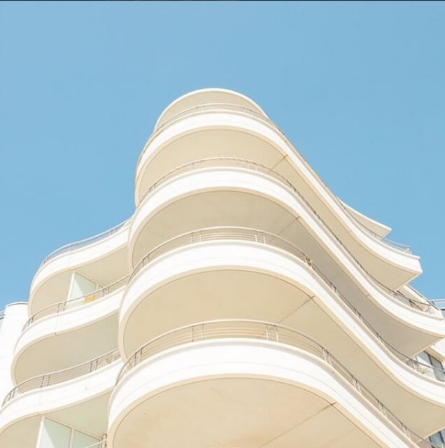


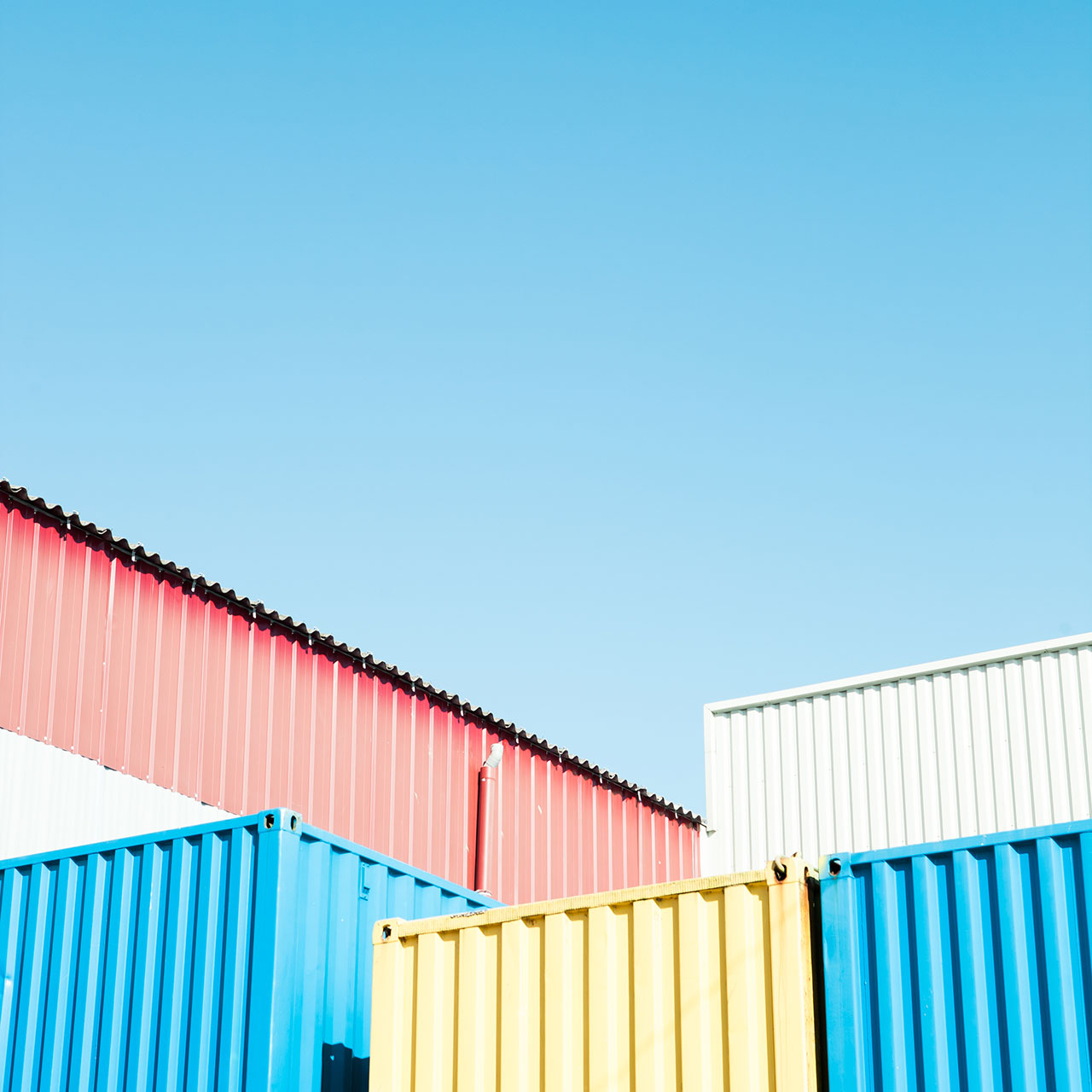
The blue sky background also enhances the colours. Colour is, in fact, of the utmost importance in Matthieu Venot’s photography. Excluding the Breton greyness, the photographer transforms the town and has us thinking more of California or Florida. According to the artist, the choice of pastel colours is a way of transmitting, through his photos, his own personal optimism.
Venots images are all taken during a sunny, bright day without any clouds. I think he does this to keep the pattern of the lighter shade of colour to create contrast between that and the sky. By using such vibrant colours allows Venot to capture the finest details with defined lines and exquisite geometric shapes.
Image Analysis:
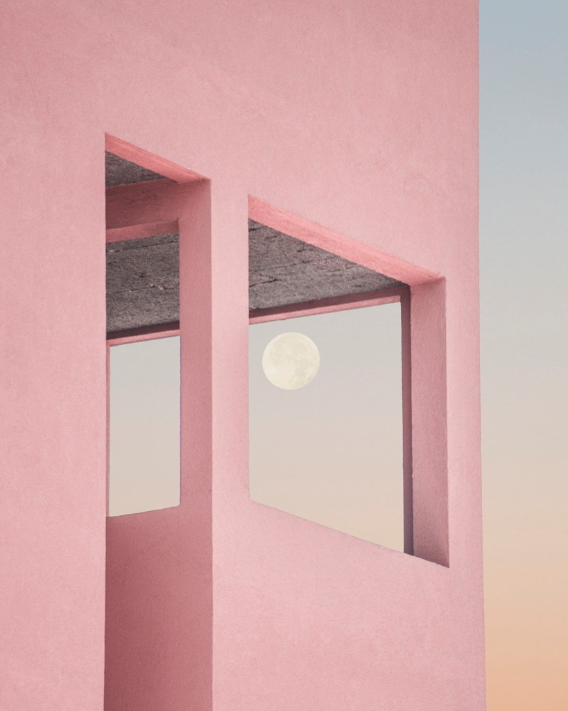
I have chosen to analyse this image due to the different approach of Matthias Venot by capturing this image in a slightly later time throughout the day, producing more colour. Instantly, you can notice the simplistic style Venot has attempted to follow. The image only contains around 5 different colours, all creating a great contrast between one another. This differs from Venots usual images as the sky is not completely blue, but rather displaying some colour from the sunset. The use of the colours from the sunset create an effective formation of the building due to the sky being a similar shade of colour. It seems as if Venot has positioned himself and his camera beneath the structure and heavily zoomed in. The full moon makes the image much more powerful due to it creating the sense of completion and transformation.
Charlie…have look at this artist’s work
https://www.co-berlin.org/en/program/exhibitions/anastasia-samoylova
…influenced by William Eggleston (use of colour)