Mood Board


Matthieu Venot is a self-taught French photographer whose pictures capture the urban environment in a most graphic and transformative of ways. Focusing on the part rather than the whole, his photographs abstract his surroundings into colourful graphical vistas turning the quotidian into the iconic.
Venot’s photographs are characterized by their bold use of color, clean lines, and strong geometric shapes. He often isolates a specific element of a building or structure and turns it into an abstract composition, removing it from its context and transforming it into a pure form. His images are often composed of a single primary color or a limited color palette, which creates a striking contrast against the white or blue sky.
Venot’s work seems heavily influenced by the principles of minimalism and abstraction. He is drawn to the simplicity and purity of geometric shapes and finds beauty in their harmony and balance. He takes a structured approach to his compositions, carefully framing and cropping his images to create a sense of order and symmetry.

To achieve this, he crops building parts out of context, zooms in on architectural detail or isolates certain building features thereby creating, in the process, strong geometrical compositions that have a life of their own. Balconies and staircases, for example, shed their utilitarian role to become two-dimensional flourishes while elsewhere façade segments lose their scale to become graphical abstractions.
Venot’s influence to go out and take photographs is perfect weather which ensures both a clean, flat background provided by the clear blue sky and more powerful, vibrant colours enhanced by the shining sun thus allowing for clearly defined lines, crisp geometric shapes and saturated colours.
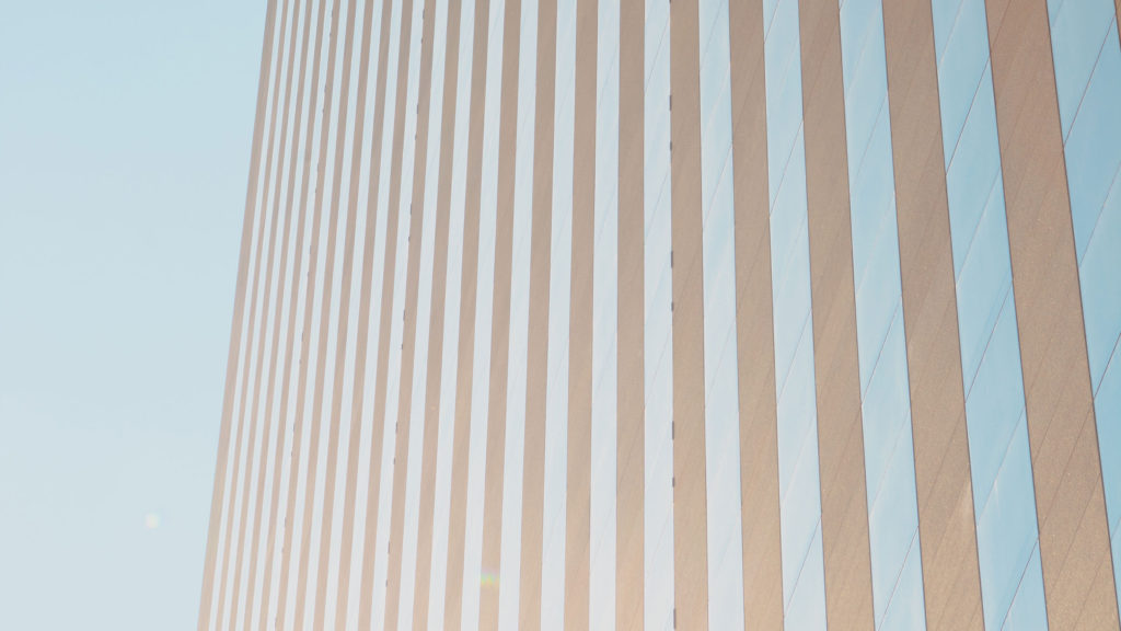
Image Analysis 1

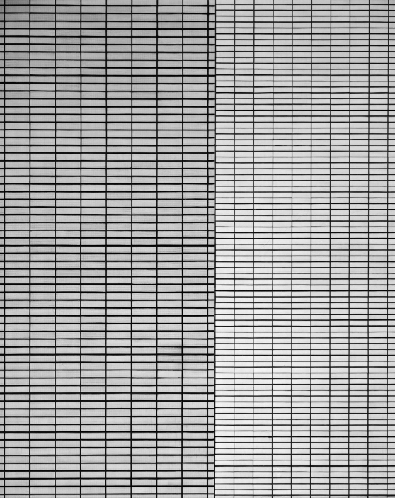
Straight away from looking at this image you can see the simplicity Venot has gone for. I can also notice that he has got an angle from ground level, looking straight up which warps the shape of the building and makes it thin out into the horizon. It seems to be somewhat of a wider-angled shot taken with a wide-angled lens. By taking this photo on a clear sunny day when the sun is positioned behind the building out of sight means there is no shadows, creating a sort of surreal vibe and making the image look hyperrealistic. This is a common theme in Vernot’s work
I have scouted several buildings in Jersey where I plan to take images similar to this one, and I will be experimenting with different weather and lighting to try and reflect the theme of ‘Simple’.
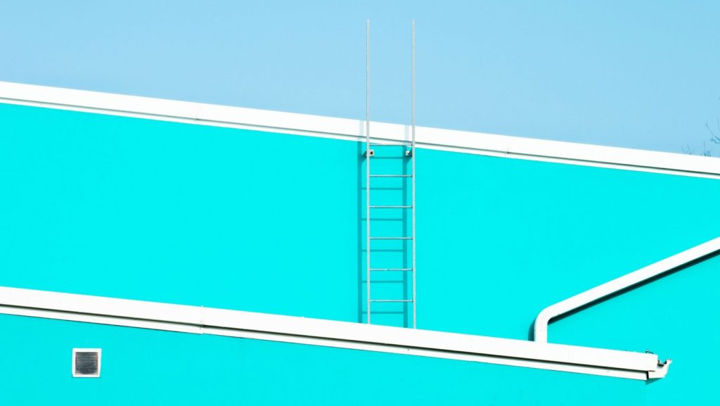
Image Analysis 2
I have chosen to analyze this image as well because I like how it follows Vernots theme of brightly lit simplistic architecture, however in this image he has used a slightly more complex scene- although I would still label it ‘simple’. The image is almost entirely shades of grey – bar the small splash of red from the handrail. I like this image as it comes off as somewhat intricate and complicated at first glance, however the more you look at the harsh lines and blocked colours the image gets simpler the more you look at it. By using a straight-on angle from what looks like around chest height- paired with the noon sun position he has captured enough shadows to make the photo interesting but not too much to where it takes away your attention from the architecture.
Comparison / Link to similar artists’ work

These two images are from Gerry Johansson‘s collection of images taken in Tokyo. I found these images interesting when compared with those of Matthieu Venot. This is because the majority of his work captures unique settings in black and white – but it still conveys the same motifs. They both capture similar images of normal scenes but using opposing extremes in their use of colour.
“I think my definition of beauty would be something I like and can look at for a long time.”
Gerry Johansson, in an interview with CPH Mag
I find this quote quite useful in understanding his work as it shows some of his reasoning for why he creates his images.
How I can reference Vernot’s work in my project
I have chosen to reference Vernot’s style in my project as I like that the way creates really bright and vibrant images with minimal shadows, making them look almost like artwork. I think that this style is perfect to showcase the theme of “Simple & Complex”, and will be a good contrast to the other half of my work which will feature more complex, darker pieces.
One of Venot’s signature techniques is to shoot his images directly from the ground, creating a unique perspective that emphasizes the geometry and symmetry of the architecture. This is something I can easily incorporate into my imagines and will be combining with different lighting during different times of the day. He also often shoots in the early morning or late afternoon, when the light is soft and creates long shadows that add depth and texture to his images.
Photoshoot Locations


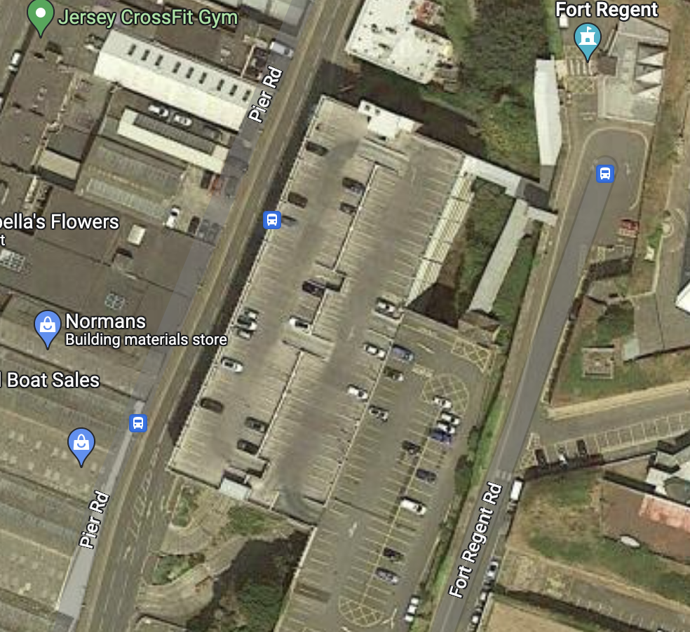

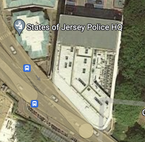
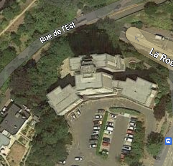
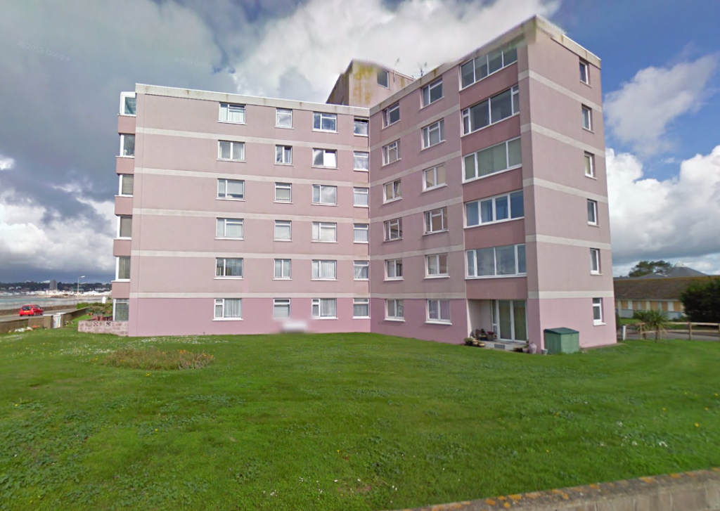
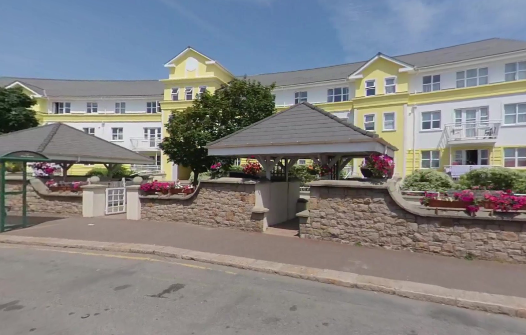

I have chosen these sites as they are all relatively big/tall buildings with varying styles of architecture. My hope is that with them being tall buildings, I can achieve the vanishing/warped effect Vernot has in my chosen analyzed image. They also feature things like large amounts of balconies and windows which appear frequently in Valmots work. Each location has a different position/angle with regards to the sun path and so each will have unique lighting.
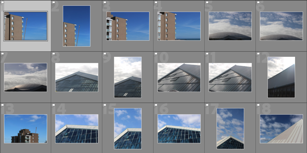
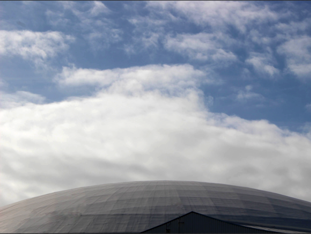
Response 1 – Fort Regent

Selections


Jon Setter
https://www.jonsetter.com/the-urban-text/tf8qym9u1s359kbwgw65kjb9v0t7pg
Nick Frank
https://www.graphicart-news.com/nick-frank-loves-architecture-amazing-sights/#.ZAnaKnbP02w