Rural Landscapes Photoshoot and Editing

Photoshoot Plan

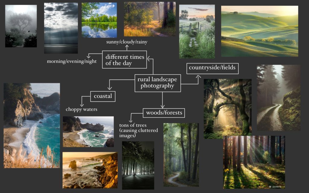
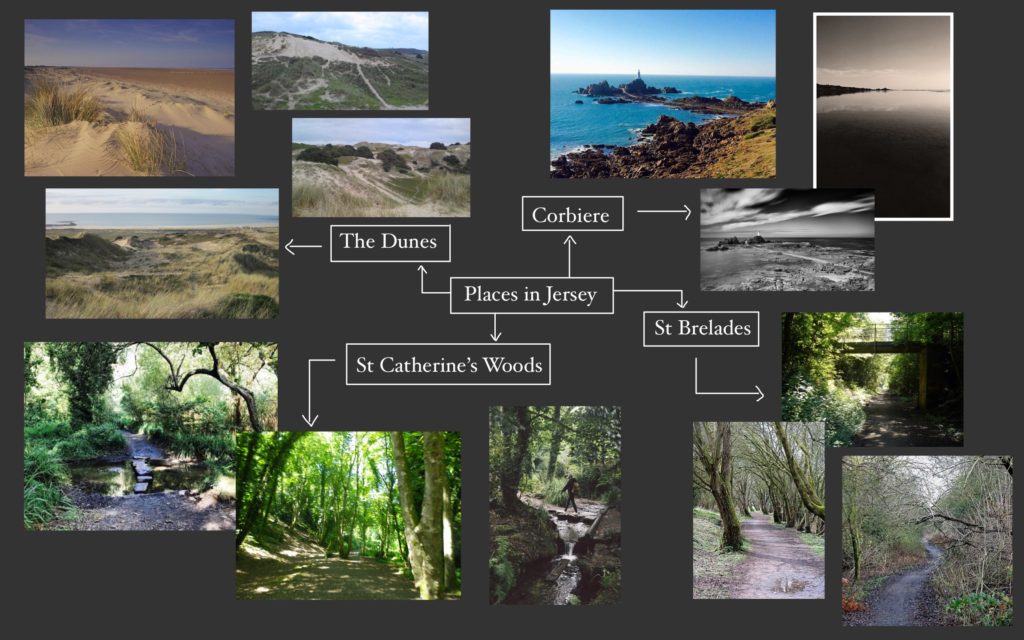
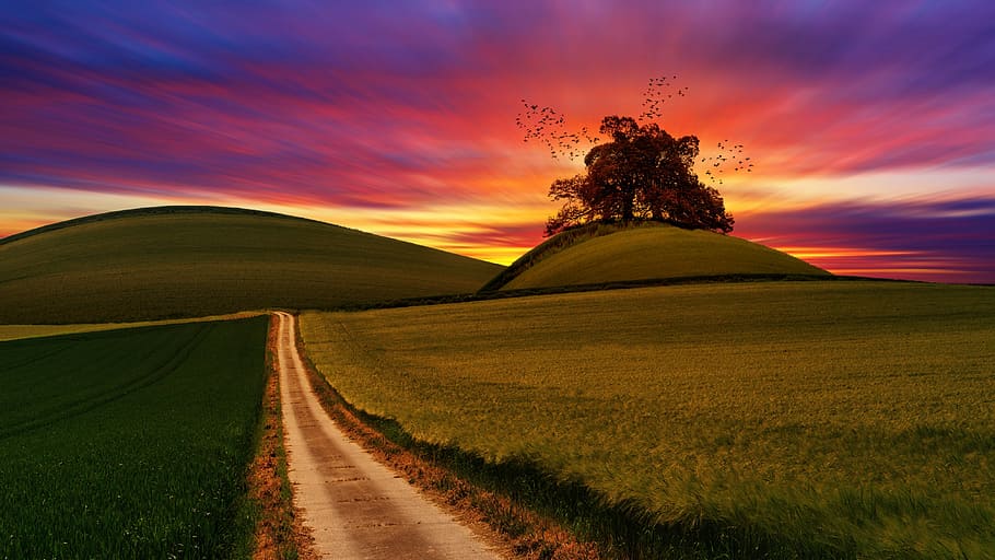
For my rural landscapes shoot, I am planning to take pictures above St Ouen’s bay in St Peter and St Mary. I’ll try to take photos on a sunny day, but I think that some clouds could add moodiness to my images which could improve them – for example, moody skies adding a more dramatic look to my images. In my images, I will feature fields and farmland to emulate the work of Don McCullin, one of my studied artists.
This image has an empty alt attribute; its file name is images-79.jpg
My photoshoot plan

Contact Sheets

Below are images of my contact sheets, pictured in grid view in Lightroom.
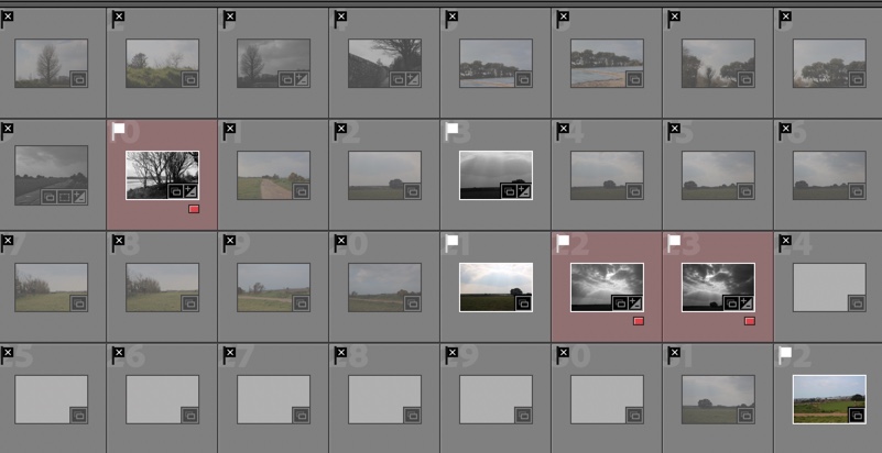
This image has an empty alt attribute; its file name is 5FA53CBD-4ADD-4EF4-B790-BE53E1F265B2.jpeg

In these images, I had trouble with overexposure – I fixed this by turning it down and changing the setting to manual focus on my camera which helped. After putting my images in Lightroom, I used the P and X tools to filter out my good and bad images. I then went through my selected images, picking a narrower selection, and using a red colour filter to highlight them.
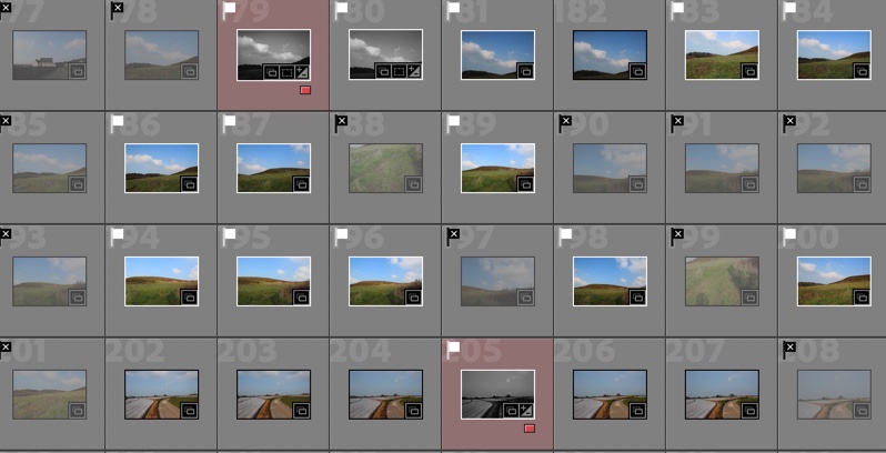
This image has an empty alt attribute; its file name is 5C58B8CD-B84F-4DE5-8314-31FA46D1266A.jpeg

Here I struggled with overexposure again, but went into manual mode and turned the exposure down which helped. Pictured in red are my best images, edited in black and white.
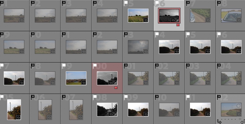
This image has an empty alt attribute; its file name is 00D20A6C-32C8-4C96-8950-CCCE0205A4DA.jpeg

Evaluation

Overall, I think this photoshoot had good and bad points. – The weather and cloud were quite variable which made the lighting inconsistent in some of my images. – This made them a little tricky to edit. This also caused some overexposure which meant the skies weren’t as moody and dramatic as I would have liked, but this was not noticeable in some images and was helped with editing later in my process. There were good bits about this photoshoot though too. In particular, in some of my better images, I achieved the moody skies and dramatic landscape look that I wanted. I also have some images that have some interesting leading lines like in Fay Godwin’s images, which I really like. If I was to redo this shoot, I would maybe shoot on a misty or foggy day, near some cliffs or the sea on a day with choppy conditions or some big surf, to respond more to the idea of romanticism.

Best Images

My best images edited and selected using colour filter and flagging in Lightroom.

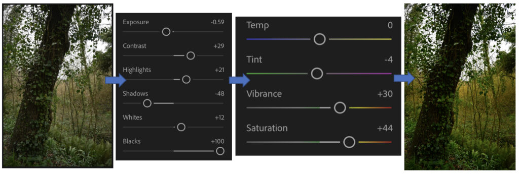
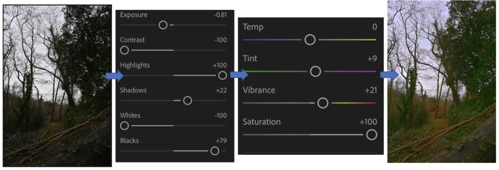
I then used Lightroom to adjust my images in black and white. I then found a pattern of editing that I found worked quite well for my images. I increased contrast, then decreased highlights to bring out the moody skies in some of my images. I did this to emulate the work of Don McCullin, who uses dramatic skies in his images, relating to the feature of the sublime in romanticism.
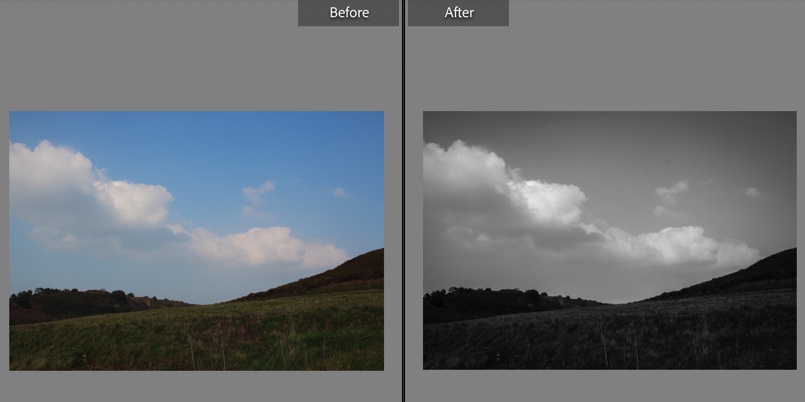
Here is a before and after of my editing process in Lightroom Classic

Also in my editing, I added grain and texture to my images to create a film-like effect. To make this effect even further in the future I could shoot in a black and white film camera on a landscape shoot.

Edited Final Images

This was taken in the back roads of St Ouen’s bay, near Bethesda nursery.

I chose this image as one of my best due to a few things. For example, I love the dramatic sky and how it looks like it is looming over the hills. The leading line that carries the eye from the left to the right over the top of the hill is my favourite thing about this image – It reminds me of Fay Godwin, one of my chosen artists. Furthermore, I think my editing was quite effective here. – decreasing highlights to make the sky work well here I think, as well as my use of contrast.

This was taken in St peter, near Mont Matthieu.

My favourite part of this image is the strong leading lines. These leading lines include the road to the right of the image, which bends into a circular shape to the right, creating circular shapes. The leading line of the field and the plastic wrap of the crops are broken up by a verge, which creates contrast between the bright white of the plastic, and the darker tones in the road and verges to the right. I also like how these lines lead to the vanishing point which features the tower in the distance. This tower is centred, which I think helps to keep a balanced composition in the image.
This was taken in St peter, above the bay.

I chose this image as one of my final ones because of the powerful sky, and also the interesting composition. The powerful sky in this image includes elements of the Sublime and the idea of romanticism. The composition is unconventional here: the sky takes over almost the whole image, which could show the power of nature. The contrast between light and dark tones in this image was achieved by my editing mostly, which helped to keep the sky dramatic and increase the contrast in the field too.

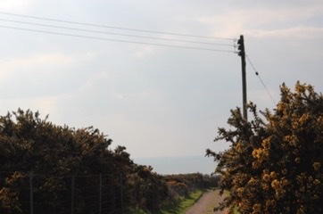
This image was taken near the image above, in St Peter’s above St Ouen’s bay.

I chose this as one of my final images due to the composition, and the way the eye is led down towards the horizon, with the sea. The trees and powerline frame the path in the middle nicely, and the clouds are slightly dramatic with light peeking through.

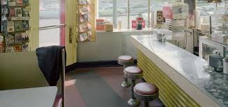
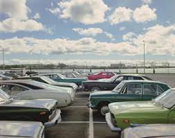
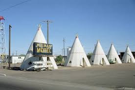
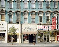
Stephen Shore

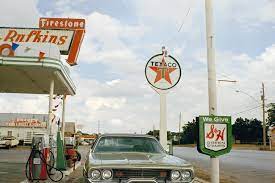
 is an American photographer who grew up in New York, known for his images of banal scenes and objects in the United States, and for his pioneering use of colour in art photography. His books include Uncommon Places in 1982 and American Surfaces in 1999, photographs that he took on cross-country road trips in the 1970s capturing the mundane aspects of American culture in straightforward, unglamorous images.

Shore has worked with many forms of photography, switching from cheap automatic cameras to large-format cameras in the 1970s, pioneering the use of colour before returning to black and white in the 1990s, and in the 2000s taking up the opportunities of digital photography, digital printing, and social media. He focused on capturing day to day aspects of an average Americans life such as fast food joints and housing he didn’t make an attempt to glamorise the human effects to a once natural environment this can be seen through his new Topographic images.

He was known as one of many new topographic photographers who killed romanticism in photography.

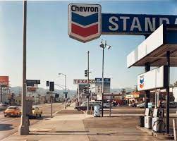
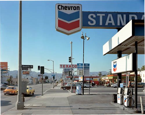
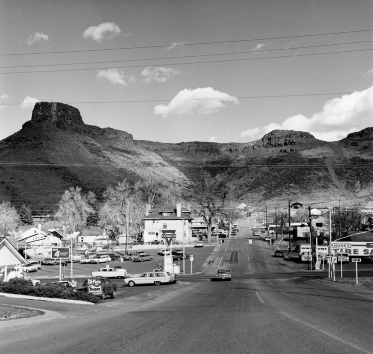
Beverly Boulevard and La Brea Avenue, Los Angeles, California, June 21, 1975

I really like this image as it doesn’t make an attempt to glamorise an aspect of day to day life the image captures movement on the roads which shows the hustle of living in the city in the 1970s. the mountain range in the back adds an element of what the garage could have looked like if it hadn’t been created by man kind the lighting creates a focus on the road which pulls you away from the signs which are scattered around in the foreground of the image and towards the mountain range in the horizon.

The new topographics

What is it and what is it raising awareness of?

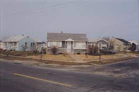
“The new Topographics” is a term which was made up by William Jenkins in 1975 to describe a group of 10 photographers such as Robert Adams, Lewis Baltz, Bernd and Hilla Becher, Joe Deal, Frank Gohlke, Nicholas Nixon, John Scott, Stephen Shore and Henry Wessel who brought in a new type of photography which was of urban landscapes with a simple aesthetic of black and white of various plain buildings.

Many of these new photographers were inspired by the man-made and wanted to show its beauty in different weathers/times of the day but also a way to emphasize how much the impact of industrial development has made to the natural landscape, an exhibition in the International Museum of Photography in Rochester, New York showed this feeling of unease towards this issue.

Examples –

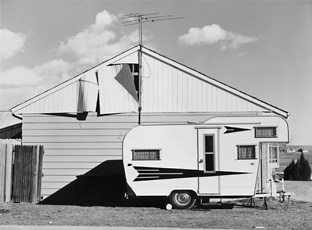
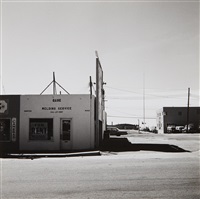
Robert Adams, photo of trailer in front of house
Robert Adams, Colorado 1974.
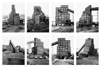
Belcher, grid of eight photographs of industrial building
Bernd and Hilla Becher, Pennsylvania, USA 1974.
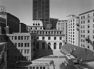
Nicholas Nixon, photograph of buildings in Boston
Nicholas Nixon, Boston 1975.

Topographics photographer research

Robert Adams –

“I think if you placed me almost anywhere and gave me a camera you could return the next day to find me photographing. It helps me, more than anything I know, to find home.”

Robert Adams
  • Born May 8th in 1937 in Orange NJ.
  • American photographer who’s most famous for his pictures of the always changing American west.
  • Published a book series in the 1970s-80s: The New West, Denver, What We Bought, Summer Nights. These focussed on the suburbs along Colorado’s front range of humanities imprint and nature fighting back.
  • Taken part in many exhibitions.

Examples of his work –

Analysis –

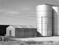
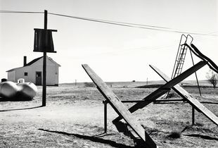
I think that this is a successful photo which I really like thattaken by Robert Adams in Colorado in 1966 of an urban landscape and will consider his style of work while photographing/editing my own work, showing “The New Topographics” influence throughout it. This is because the buildings are simple, yet show how human life has taken over and nature is trying to fight back against it which is what the aim was of Robert Adams work and this element of urbanisation in the photo is brought in through this photo through the use of the 2 metal cylinder towers which are next to the small farm buildings. I also like how the photo has been brought into black and white with a heavy contrast due to the sunlight which creates an overexposed effect to the photo but not to the point where the photo is lost in it, and many of the early topographic photographers used as it creates this important feeling of recognising the drastic development of industrialisation within the beauty of nature, which Robert Adams has done well as this would once have been a beautiful green field that was full of wildlife but due to humans this has been changed, for the worse.

Comparison to Ansel Adams

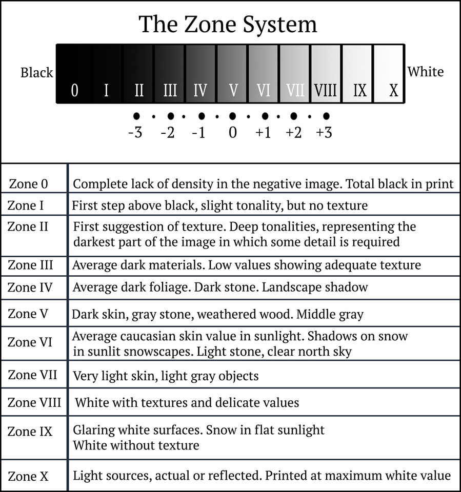
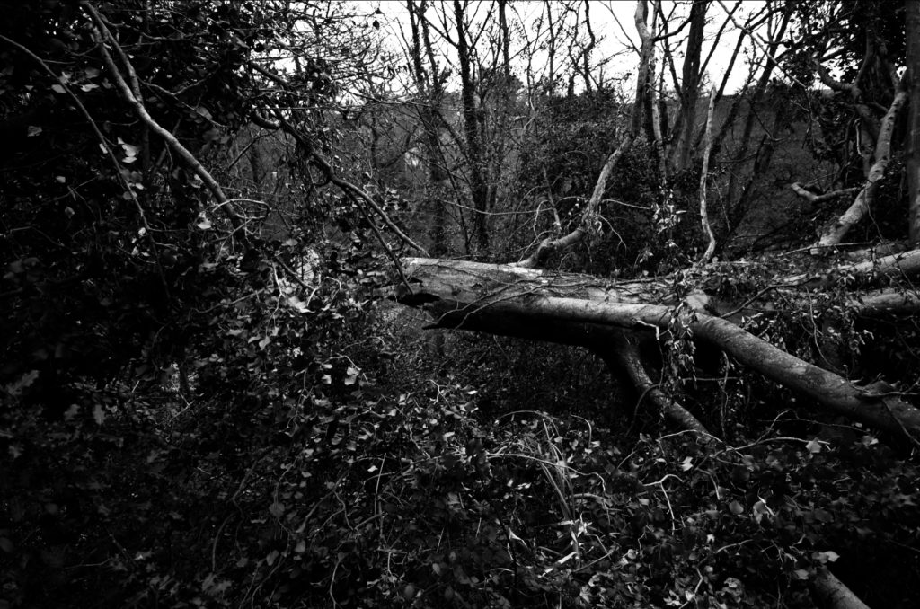
I think that my work was successfully able to show similarity towards Ansel Adams work. I have chosen to compare these 2 photos, as they both involve nature and include natural, woody, grassy, mossy values which create an earthy atmosphere. I think the similarities between the pictures such as the use of a woodland area, involving trees where both can use the background to create this dark and scary abyss but then use the tree branches/trunks to be able to bring some light into the photos as if it is showing and creating a feeling of hope. I also used “The zone system” which is also seen clearly in Ansel Adams work as you can see how we both have experimented with the 12 different tones of black and white within each of our photos. However, my photo uses a bright background whereas Ansel Adams doesn’t, personally I like this as I think that this helps to frame the nature and create a focus to how the natural course has been broken as you can see the broken tree trunk which could’ve been due to weather. It also helps to break up the darker tones to the lighter tones so that they don’t get lost in one another and create a break between them.

I really enjoyed working in the style of Ansel Adams and would use him for inspiration for “rural” landscapes in my photography because his work is unusual yet is able to highlight dangers which humans have created and show the world in a beautiful way but also be able to create a scary atmosphere through the use of the black and white filter which he uses.

Editing and final outcomes #2

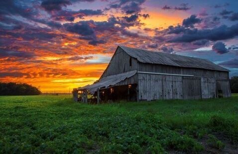
For these edits I was working in the style of Galen Rowell in my photography where he focuses on the beauty of nature through the beautiful bright colours which the sky and plants are able to create and how it can change a landscape through the use of sunsets/sunrises. I liked working in Galen Rowell’s style because it allowed me to experiment and try different ways of editing a photo to bring out the colours in them which I really enjoyed doing.

Throughout editing these photos I enjoyed it a lot because I was able to experiment with different colours and how to manage their vibrancies and how they may appear. This is because I found that while editing it was very easy to overexpose the image while I was changing the contrasts, exposure, highlights, whites, colours and their temperatures. I also found out how adding small bits of colours to the photos makes the colours be able to be bright and extremely vibrant because it changes the whole feeling of the photo, as many of the originals were gloomy and dark due to the weather but after they were edited, they came to life and created a happy and exciting atmosphere.

My favourite edit which I completed that I think is most successful and similar to Galen Rowell’s is the 1st one because I like how the sky turned out within the vibrancies of the blues and greens which work well together, I achieved this by bringing the contrast down so that the sky became darker then bring up the highlights which brings out the brighter colours in photos. I also like how I’ve been able to create hues of gold to come through small holes in the grass through bringing up the saturation and changing the temperature of the photo to make the sunlight appear golden through the cracks and where it can be seen in the corner. I also like in the photo how the grass is the main focus of the photo, as it creates an earthy and natural feel to the photo as it looks out on to the horizon. I think that this helps to frame the photo as the clouds create a sharp line of division and then the grass surrounds the bottom.

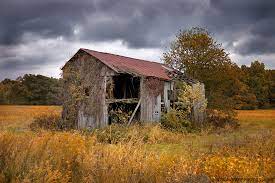
The photo which I think is the least successful which I created through editing is the 2n one, this is because I think that the natural landscape and whiteness in the background doesn’t work well together to bring out a vibrant, colourful landscape which would be similar to Galen Rowell’s work. If I were to try to edit this picture again I would try to make the sky appear to be a better, more defined blue as due to the weather on the day when these pictures were taken the clouds create this overexposed look as a background which is difficult to work with because it washes out the rest of the photo, which I don’t want to happen. Therefore if I was to create the effect that there is a sky behind it as in many of Rowell’s work, the sky is the main focus along with the surroundings.

I really enjoyed editing in the style of Galen Rowell as I was able to experiment with bringing colour into my work through different ways as each picture is different within the filter which I have created for them. I preferred working in Ansel Adams style with black and whites along with “The Zone System” because you are able to create a drastic, emotional atmosphere within one photo and raise awareness for the wildlife and nature.

Editing and final outcomes #1

Throughout my edits which I will complete on Adobe Lightroom by selecting them and creating new versions so that I am able to compare to the original and Ansel Adams work through the use of his “The Zone System” which is used in photography, where the photo has been turned into black and white, to show the variety of grey scaled colours which you should be brining in the create a perfect contrasted look.

I really liked how these edits turned out because I think that it shows how I have experimented in different ways with the various filters on Adobe Lightroom of black and white, similar to Ansel Adams work, I was able to change the intensity of the filter and experimented with the different ways I could create a large contrast between the grey/white/black colours which I used through the use of Ansel Adams “The Zone System”.

I really enjoyed creating these because I was able to experiment with the large scale of filters which can be found in Adobe Lightroom and then change them to how I thought was fitting by changing the contrast/highlights/exposure etc. If I were to do do these again I would take pictures at various times of day so that the background wouldn’t create an over exposed look which would be casted on to the photo, which many of my pictures had which I found very hard to work with.
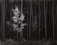
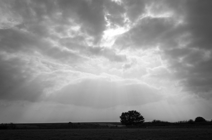
My favourite edit that I think is my most successful and similar to Ansel Adams work which is the last one, this is because of how the tree has fallen and you can see the rip from the trunk and how it is dangling off the side of the hill. It creates a dystopian atmosphere for the photo as it isn’t something that you see very commonly and can see how the wildlife has welcomed this in, as if it is a natural occurrence, as many plants have began to grow on to and around it. I also like in this edit you can see a range of grey scaled colours, many of which are found on “The zone system” which shows how I have considered this in photoshop to make sure there is a similarity to Ansel Adams work. This is clear to see on the trunk where I have been able to highlight various places of it where the nature hasn’t been able to take over yet, compared to the surrounding leaves which are seen around it because they appear very dark in colour which helps to create this image of a frame to highlight how this tree has been destroyed due to the weather through the dark abyss which surrounds this tree.
I think that my least successful photo is first edit which I attempted. This is because I left too much grey in the middle of the photo and there is barely any other colours around it which can contrast/highlight against it. If I were to try this edit again I would focus more on the clouds to make them appear darker and more drastic to create a feeling of gloominess on to the photo. I would also try to highlight the plants through the whites/highlights/contrast while editing which would make them appear more in focus more and easier to see as they aren’t able to be seen clearly due to the lighting and therefore this makes it look like a large, dark mark across the photo as there is no dimension to it to add that level of development to the photo to make sure that this effect of having something in the foreground to focus on rather than the background, so that it doesn’t get lost which it has done.

Robert Adams Case Study

Robert Adams born in 1937 New Jersey, is an American photographer who’s work is focused on the changing landscape of the American West. Adams moved to a suburb in Colorado with his family in 1954, this is where much of Adams photos and work are based. His work first became popular in the mid-1970s through his participation in the New Topographics exhibition. In the 1970s and 1980s Adams produced a series of books such as, The New West, Denver, What We Bought and Summer Nights these books focused on expanding suburbs along Colorado’s landscape, these books pictured huge rural developments but also the surviving light, size and shape of the natural world. 

Robert Adam’s work

Robert Adams photos portray how the new post-war developments of the modern world have spilled into the old American west. The photos show above depict newly developed buildings and structures that are still surrounded by nature and the old landscape, suggesting that nature is still around us all the time no matter how much humans build. The photos are all shot in black and white, which perfectly matches the locations that they are taken in, barren and empty expanses of land with small marks of human life and buildings.

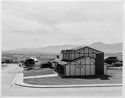
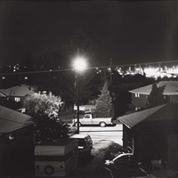
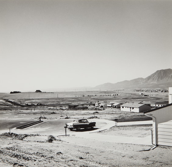
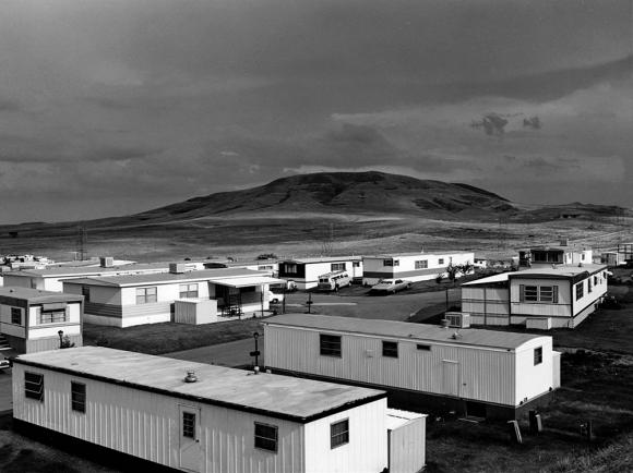
This photograph, taken in 1973 by Adams, depicts a mobile home estate in Colorado, with a huge mountain and barren landscape behind. Its almost as if Adams has put two images together, the top being the natural landscape of the world, and the bottom half being the ugly buildings that humanity have ruined the landscape with. Like all of Adams other photos, this photo is shot in black and white, which adds to the whole image. The lack of colours emphasize the vast location where the photo is taken, and adds to the separation between nature and man-made.

Romanticism Landscape – Artist Reference

Ansel Adams

Ansel Adams was an American landscape photographer and environmentalist known for his black and white images of west America as well as helping find Group f/64, advocating “pure” photography (sharp focus, use of the full tonal range of a photograph), he went on to develop an image making system called the Zone System through the deep understanding of how tonal rage is recorded and developed, resulting in clear, deep images. Ansel was a environmental conversation advocate and conveyed this through his photography.

redwoods bull creek flat ansel adams
Redwoods, Bull Creek Flat, California, 1960
moonrise hernandez ansel adams
Moonrise, Hernandez, New Mexico, 1941
ansel adams half dome blowing snow
Half Dome, Blowing Snow, Yosemite National Park, California, 1955

In 1916, at 14 years old, Adams photographed Yosemite National Park and developed his work at the Sierra Club where he would come back every summer of his life. In 1925 he became the director of the club till 1971. In 1980, President Jimmy Carter awarded Adams the Presidential Medal of Freedom for “efforts to preserve this country’s wild and scenic areas, both on film and on earth.”

Image analysis

This image by Ansel Adams presents the Grand Teton National Park in Wyoming. In the foreground we can see trees as well as the river which makes a good strong line, leading our eyes from the foreground, through the midground, all the way to the mountains and clouds in the background. The shot is taken from afar which distances the viewer and shows how small we are as humans in comparison to nature, it puts the power of the sublime in perspective and makes the viewer respect it. The image being black and white also creates a detaching effect by contrasting two colours; dark shades such as black feel further away than lighter shades. Humans don’t tend to see in black and white so this change of perspective can distance it from reality. A pallet of colours can often distract the viewer from the subject thus you can convey the meaning of a photograph in a more powerful manner using a monochrome format. This photo was taken using a natural light source, considering the clouds we can assume it was dull and cold light. The dark clouds contrast well with the bright clouds The textures, lines and shapes, such as the ripples in the water, appear more prominent since black and white create such a powerful contrast, this makes the photograph look harsh and cold. There is a lot of grey in the photograph which makes the tone sombre and dark. The overall mood is heavy and melancholic.

Just another Hautlieu Creative site