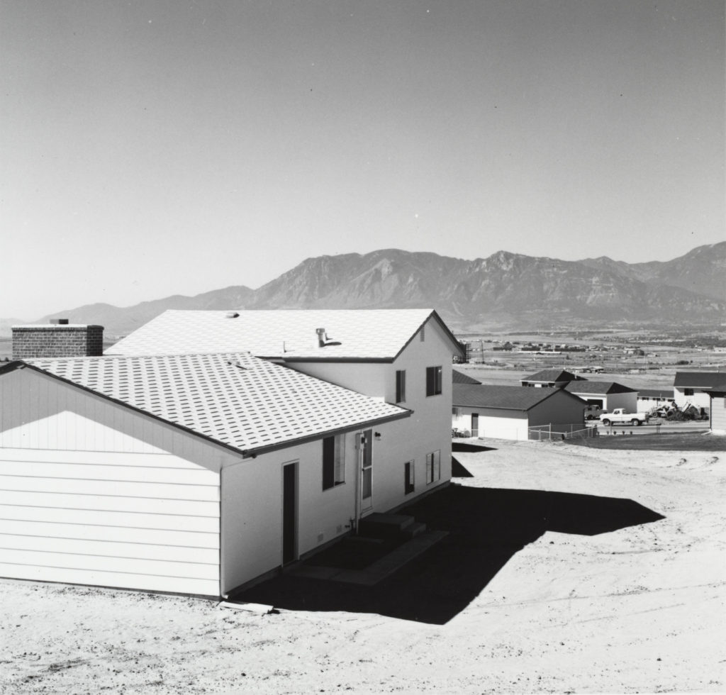
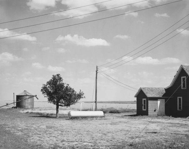
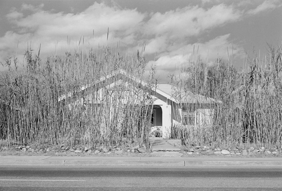
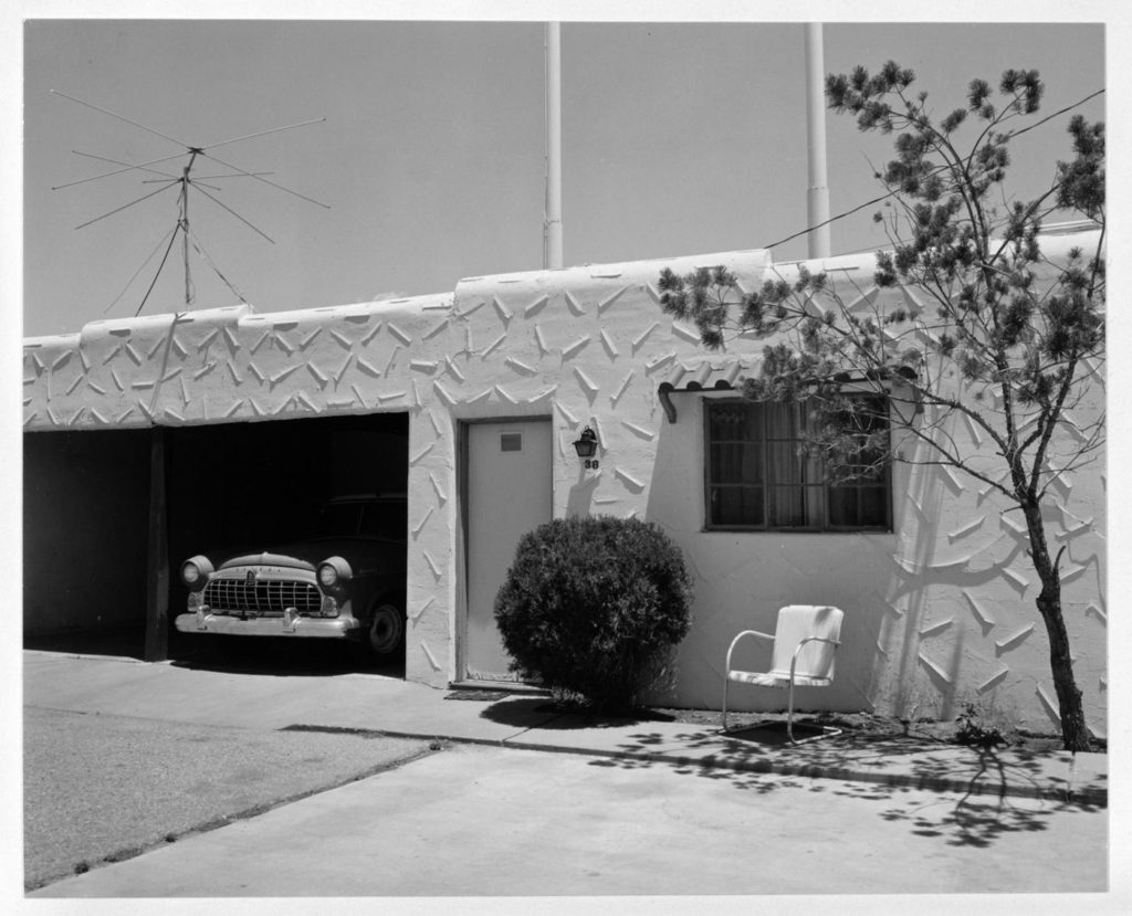
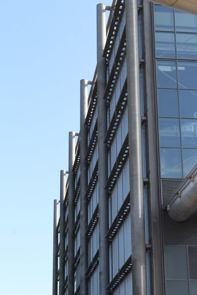
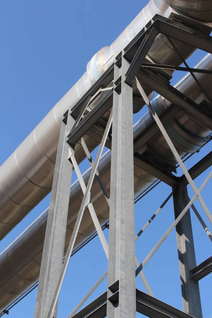
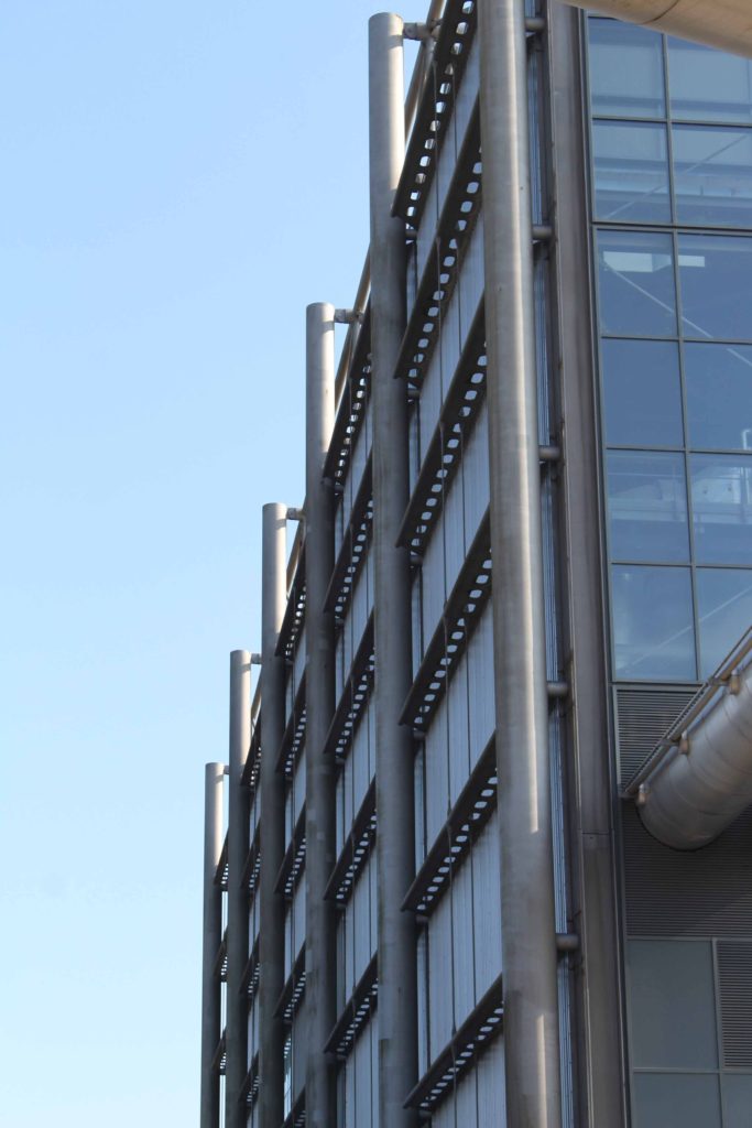
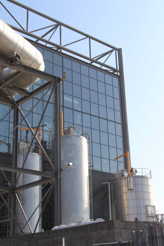
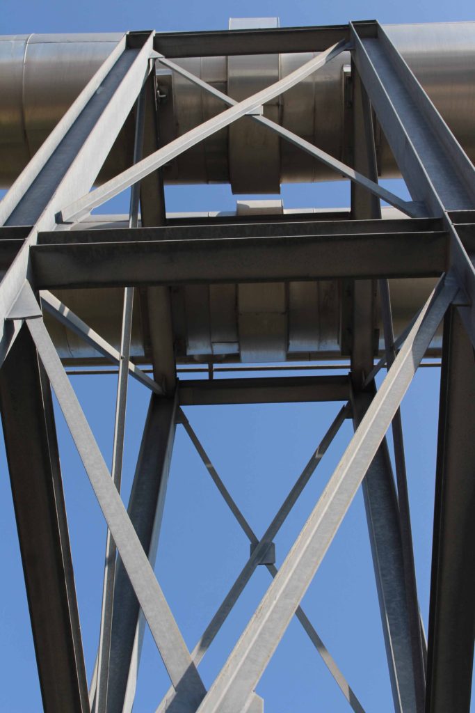
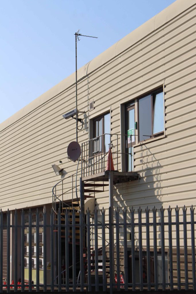
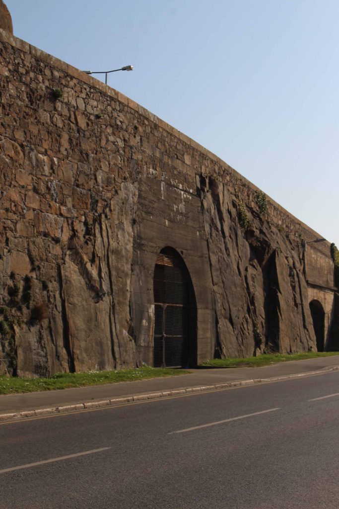
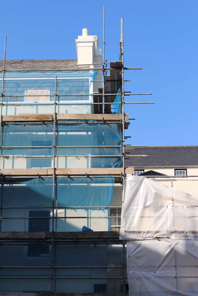
the new topographic

Introduction

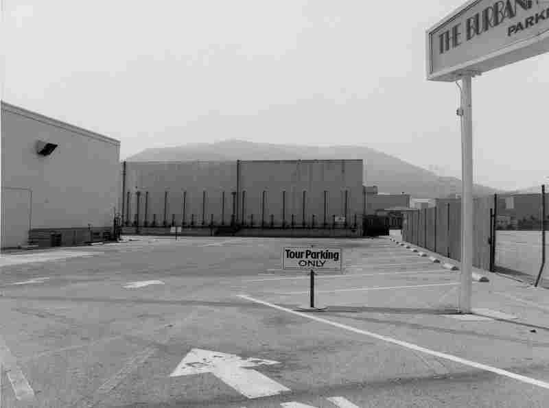
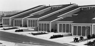
Many of the photographers associated with new topographic including Robert Adams, Lewis Baltz, Nicholas Nixon and Bernd and Hiller Becher, were inspired by the man-made, selecting subject matter that was matter of fact.

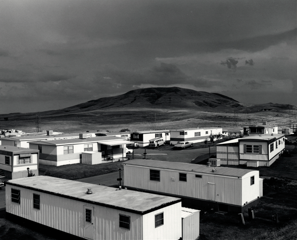
A turning point in the history of photography, the 1975 exhibition New Topographic signalled a radical shift away from traditional depictions of landscape. With its stark yet oddly romantic images of American factories, intersections and trailer parks, William Jenkins’s 1975 exhibition rewrote the rules of landscape photography. 

An exhibition at the International Museum of Photography in Rochester, New York featuring these photographers also revealed the growing unease about how the natural landscape was being eroded by industrial development.

On the one hand, New Topographic represented a radical shift by redefining the subject of landscape photography as the built (as opposed to the natural) environment. To comprehend the significance of this, it helps to consider the type of imagery that previously dominated the genre in the United States.

What the new topographic a reaction to?

Their stark, beautifully printed images of this mundane but oddly fascinating topography was both a reflection of the increasingly suburbanised world around them, and a reaction to the tyranny of idealised landscape photography that elevated the natural and the elemental.

Typologies

A photographic typology is a single photograph or more commonly a body of photographic work, that shares a high level of consistency. This consistency is usually found within the subjects, environment, photographic process, and presentation or direction of the subject.

Definition- 1 : study of or analysis or classification based on types or categories. 2 : a doctrine of theological types especially : one holding that things in Christian belief are prefigured or symbolised by things in the Old Testament. Other Words from typology Example Sentences Learn More About typology. The photographic typology has the ability to reshape perception, heighten and focus attention, and transform everyday objects into a thing of art. Ironically the process and execution, often cold and systematic can be extremely emotive, and a powerful tool of communication when contextualised.
Bernd and Hilla Becher

Who created typology in photography? The German artists Bernd and Hilla Becher, who began working together in 1959 and married in 1961, are best known for their “typologies”—grids of black-and-white photographs of variant examples of a single type of industrial structure.

Bernhard “Bernd” Becher, and Hilla Becher, née Wobeser, were German conceptual artists and photographers working as a collaborative duo. They are best known for their extensive series of photographic images, or typologies, of industrial buildings and structures, often organised in grids.

Water Towers', Bernd Becher and Hilla Becher, 1972–2009 | Tate
Name: Water Towers

Bernd and Hilla Becher first began their still-ongoing project of systematically photographing industrial structures – water towers, blast furnaces, gas tanks, mine heads, grain elevators and the like – in the late 1950s.

I like how these objects are placed how normal passport photos, this along with the black and white images gives the image an old fashion feel despite it not being very old at all. This gives the image depth and authenticity and I think that the contrast between the different shapes makes the image more interesting, You can also notice that the more cylinder shapes are symmetrical to each other with the forth and sixth images being simirla to each other, and the same goes for the first, third, seventh and last image.

Image Analysis
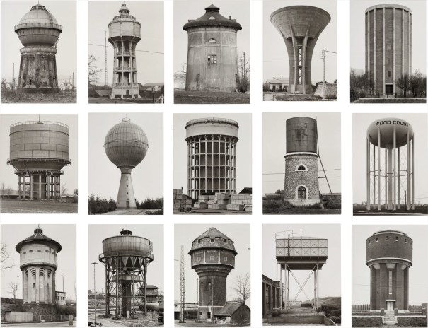
Bernd and Hilla Becher - 20th Century ... Lot 10 March 2017 | Phillips

I have selected this image of Bernd and Hilla Becher’s as I think that the grid layout of twelve and not nine makes for a more interesting image as there is more to looks at, and their is more opportunity to create more affective images as part of the final piece. Firstly, I think that the fact that these images are in black and white means that the image may appear more authentic and this highlights the different shadows and shapes within the water towers, for example the squares in the 8th image. Furthermore, the variety of shapes within this image creates a more exciting image, meaning that the contrast between the circles, rectangles and the cylinders placed next to eac other creates depth to the image.

Urban Landscapes: Editing in the style of Keld Helmer-Petersen

Keld Helmer-Petersen

Before and after edits in the style of Keld Helmer Peterson:

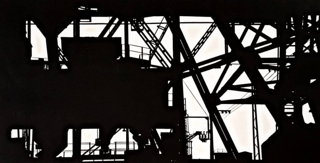
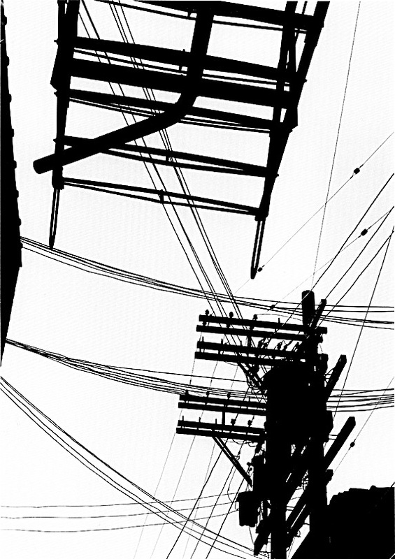
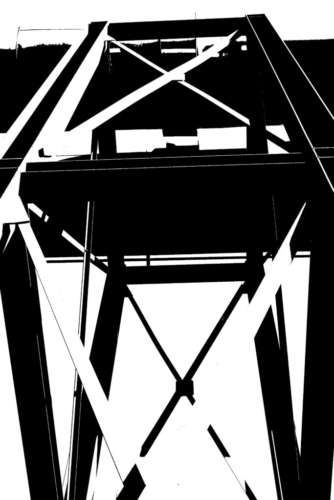
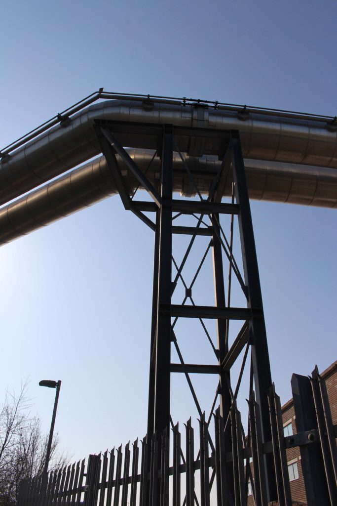
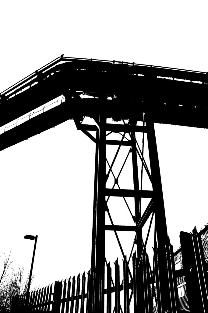
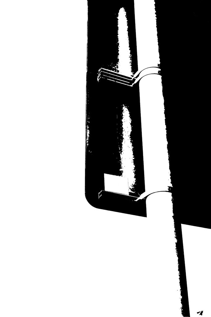
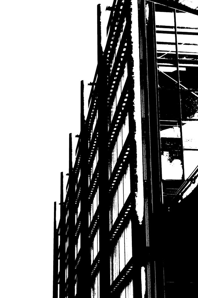
For my edits I was inspired by Keld Helmer Petersen’s work. I started by turning my images in black and white in Lightroom then exported them to Photoshop. I edited them by going over to “images”, then “adjustments” and clicked on the threshold tool. I then adjusted the threshold until I got something similar to Keld Helmer Petersen’s work.

before
after
before
after
before
after
before
after

Final Edits:

Urban Landscapes: Photoshoot 1 Havre des Pas

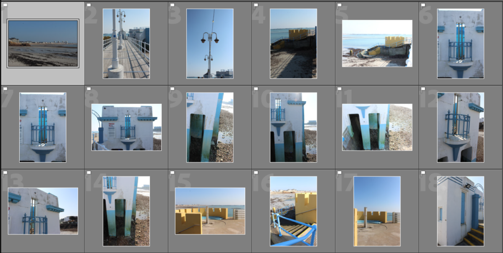
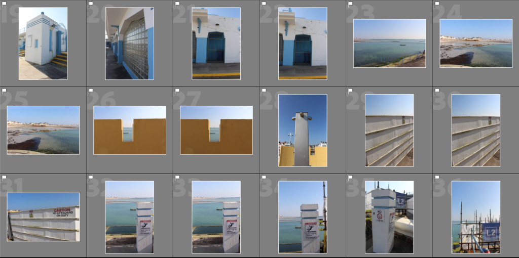
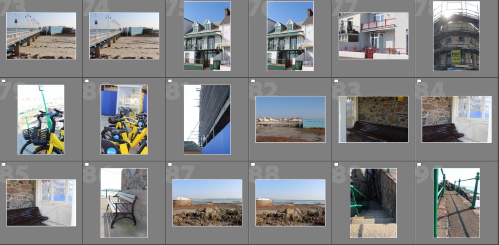
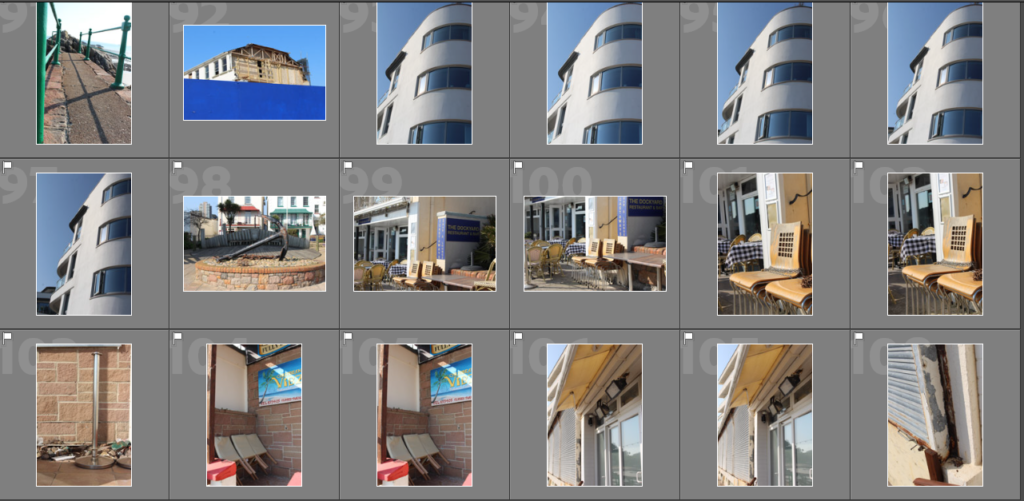
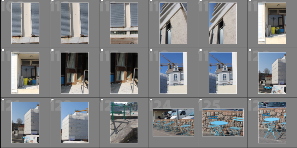
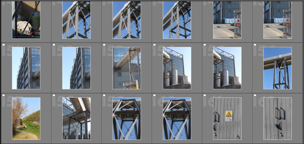
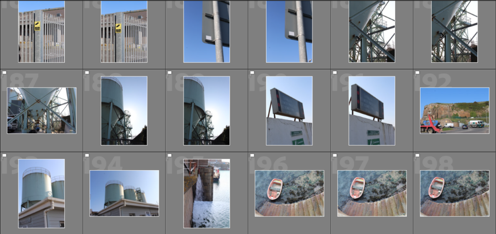
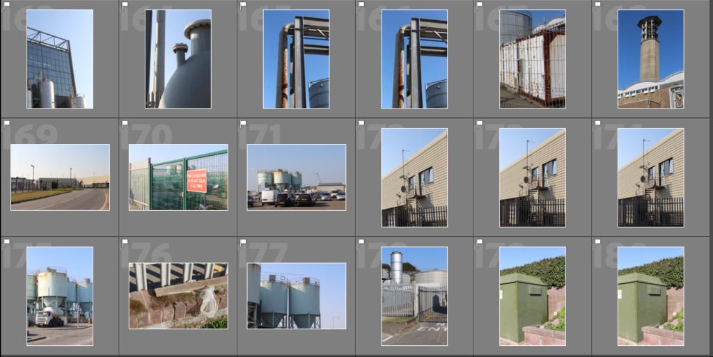
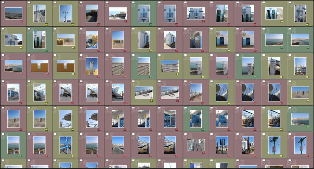
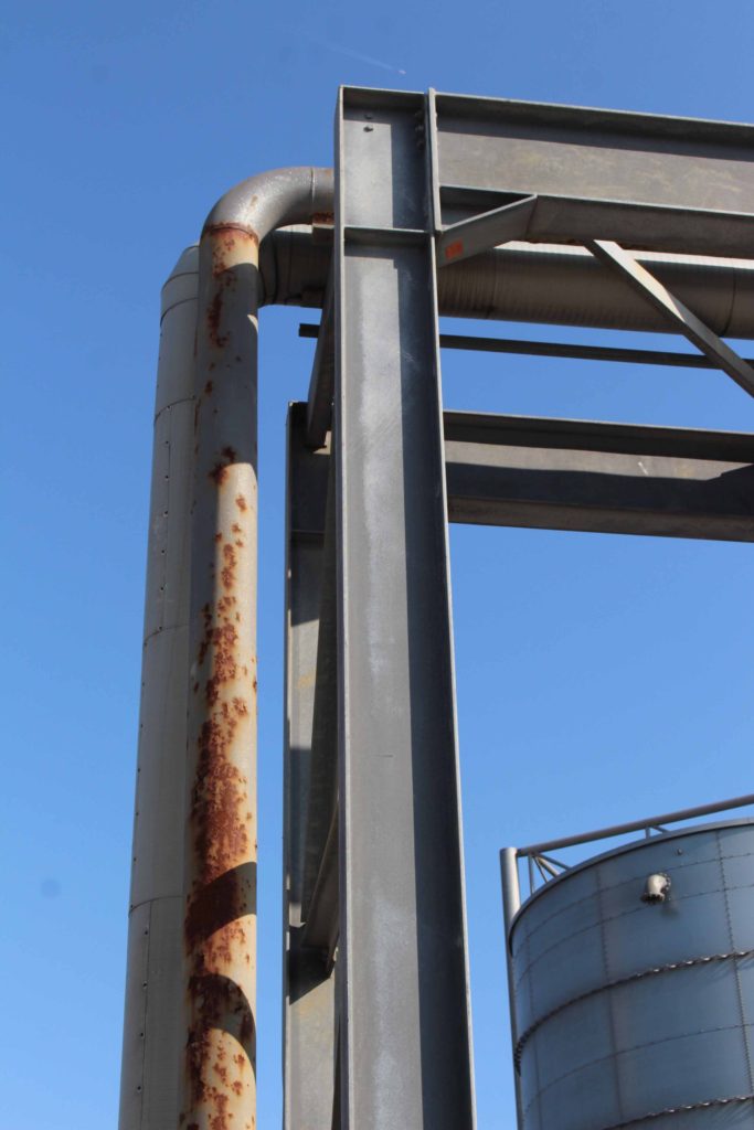
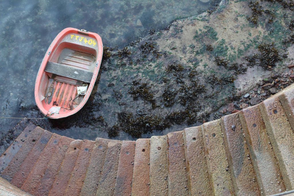
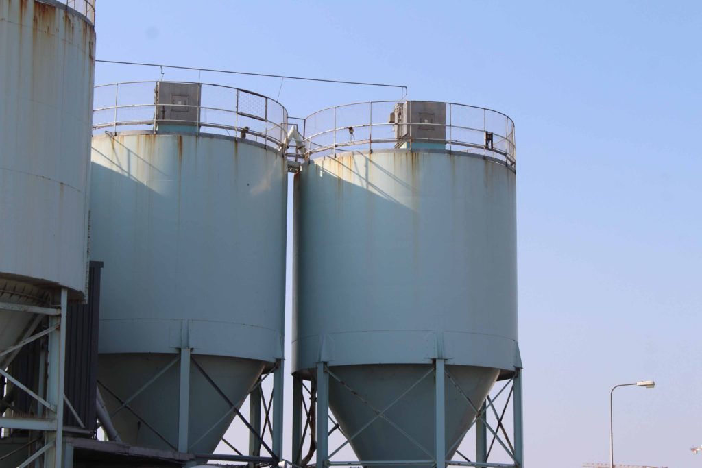
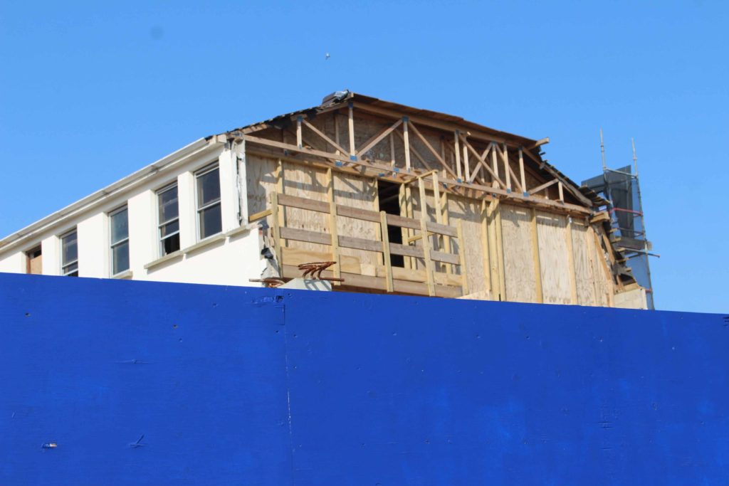
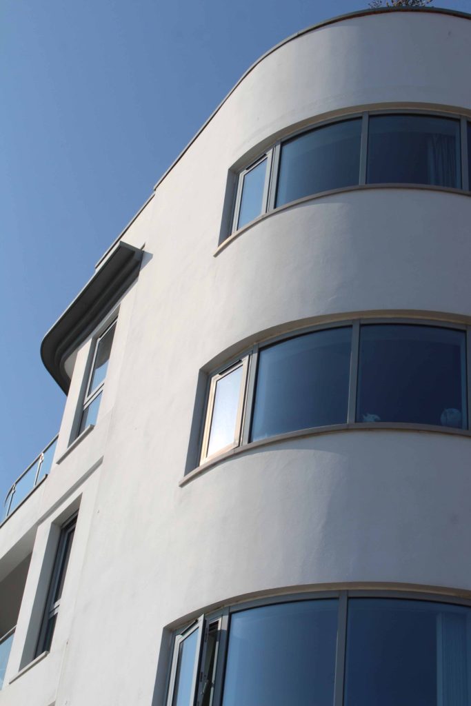
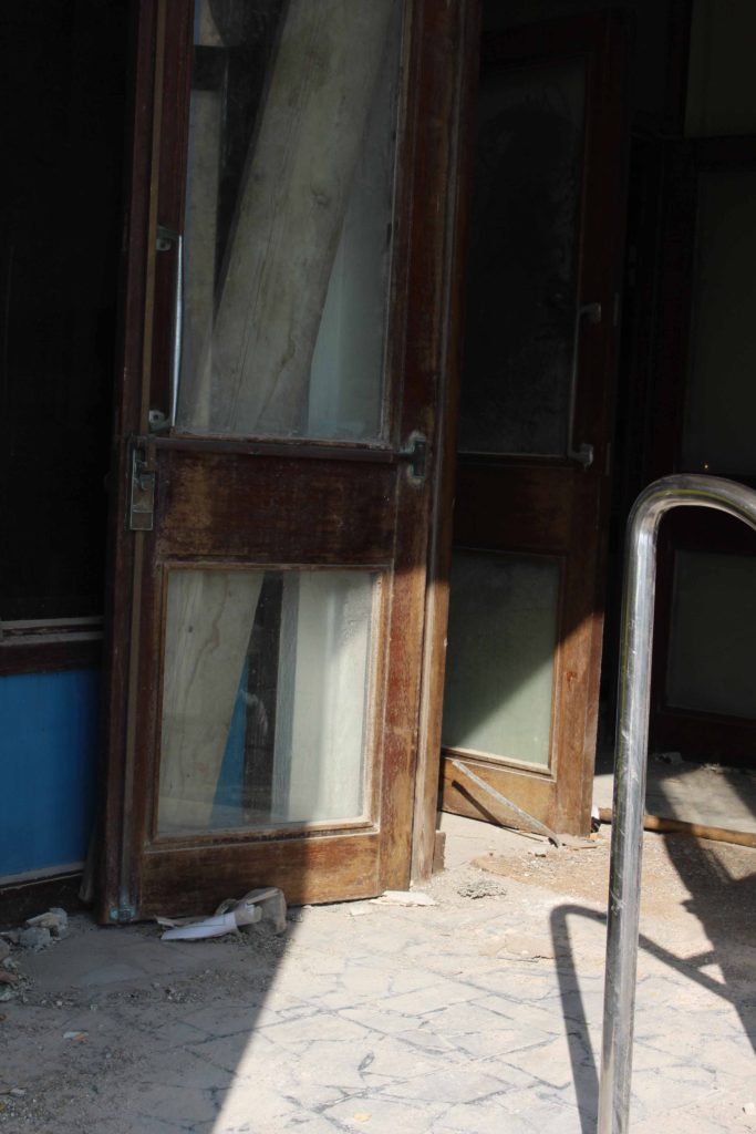
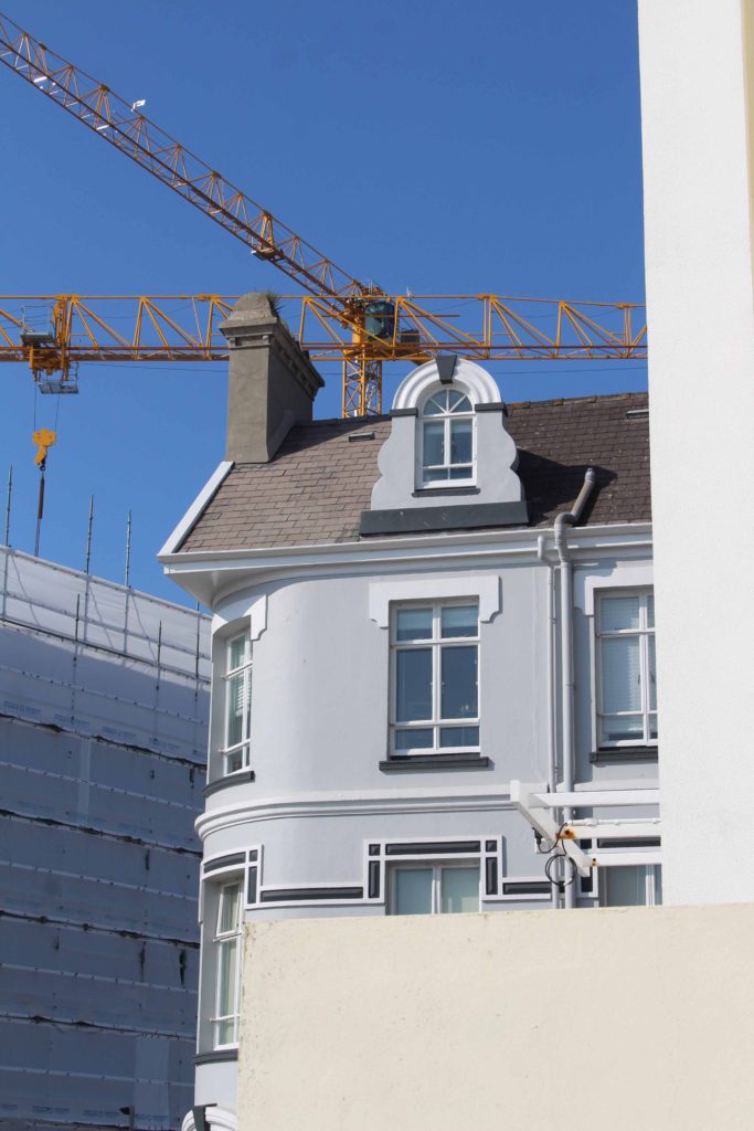
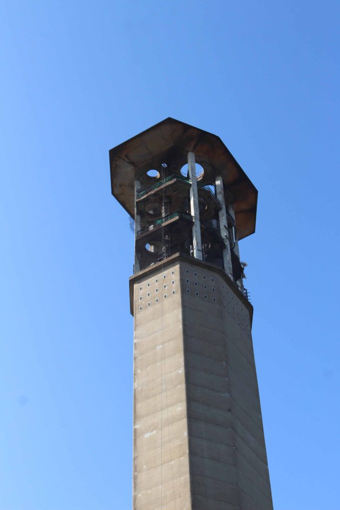
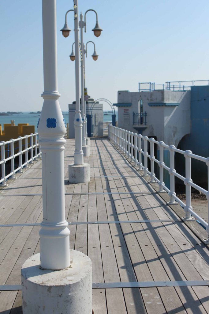
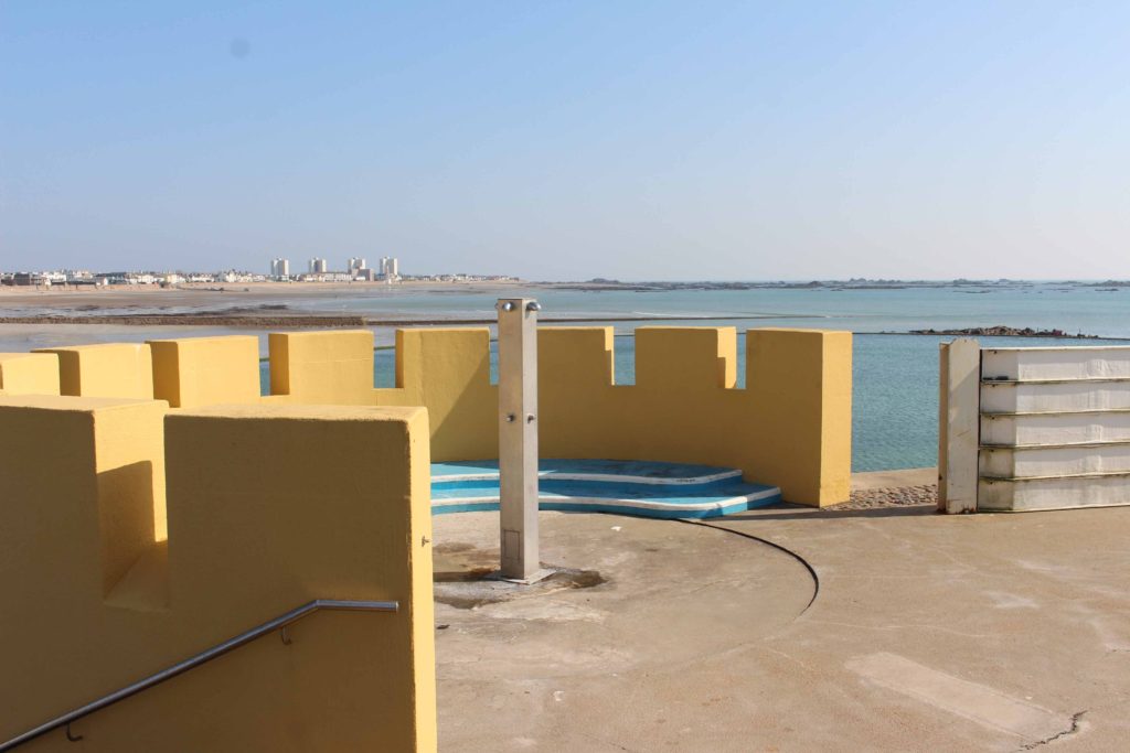
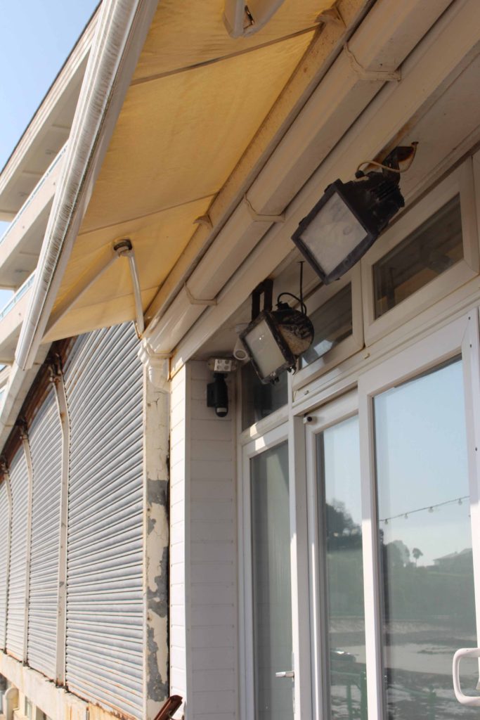
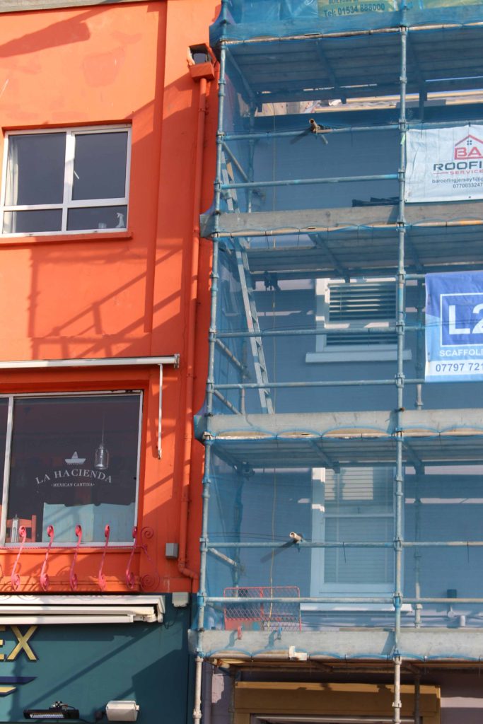
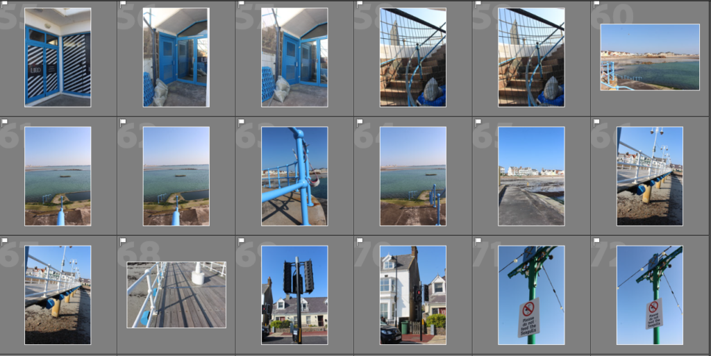
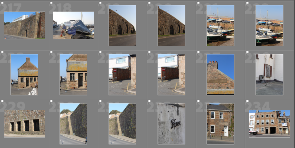
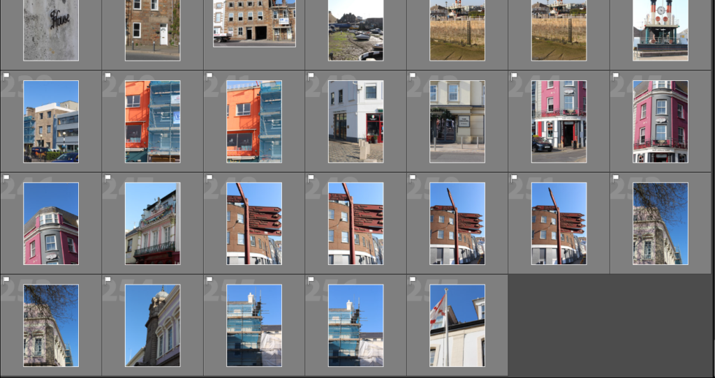
For this photoshoot we went on a walk from Havre des Pas, along the coast line and to the Collette. I took around 750 photographs of different buildings and my surroundings. At Havre des Pas I focused on taking images of the sea as well as the surrounding buildings. Then when we started walking, I focused on the residential area along the coastline. When we got close to the Collette my aim was to take a low and high angled industrial photographs.

Contact Sheets


Best Shots

Thomas Struth

  • A German photographer born in 1954.
  • Studied at the Dusseldorf school of art from 1973-80.
  • His work focuses on urban landscapes, such as industrial areas and deserted streets, so he can capture the conditions of society which are always changing through architecture and urban development.
  • Many of his older work was shot in black and white but he eventually began to use colour as of recently.
  • He has had many solo exhibitions in various places of the world.
Original Thomas Struth prints and lithographs for sale

Examples of his work –

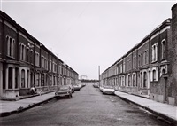
Clinton Road, Murdock Cottages', London, 1977, 1977
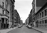
West 80th Street at Broadway, New York, 1978
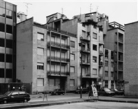
Via Emilio Cornalia, Milano, 1992

Analysis –

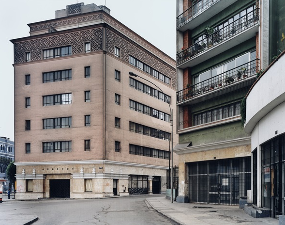
I think that this is a really successful picture which is taken by Thomas Struth of 2 buildings in a city due to the way that the sky is plain and white, which can be used to frame the buildings as it is able to highlight them because the building is a darker orange/brown colour with black accents which contrasts well against it. I also like in this picture how between the two buildings there is no gaps, like they are continuous, as it creates the effect where you aren’t sure where one might end or begin as it is unable to reveal how truly big both of these buildings are. This picture is also very deserted, there isn’t any humans to populate it which can help to create a story for the photo as it makes you wonder what day it is and what time of day it may be because it creates a very dystopian feel as both of the buildings look abandoned and forgotten to civilisation and there are also cracks in the road which shows how old this place may be because of how it is decaying over the years.

In my own work I would like to incorporate Thomas Struths use of the continuous building in my own photoshoots because I like the effect that it creates. I am going to do my photos at night instead of the day unlike Struths photos because I think that the dark contrast of the sky would work well against modern buildings which are usually white and professional looking due to the way they are built with slick square, uniformed shapes.

headhsots sequence.

Sequence photography is a technique of shooting a series of images in where the subject is captured in successive motion.

Henry Mullins started working at 230 Regent Street in London in the 1840s and moved to Jersey in July 1848, setting up a studio known as the Royal Saloon, at 7 Royal Square. he started in partnership with a Mr Millward. after the first year he was working alone and he continued to work out of the same studio for another 26 years.

Tracy Moffatt

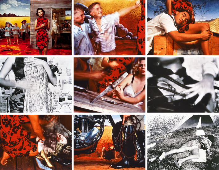
Tracy Moffatt: Something More, 1989

The nine images in Something More tell an ambiguous tale of a young woman’s longing for ‘something more’, a quest which brings dashed hopes and the loss of innocence. With its staged theatricality and storyboard framing, the series has been described by critic Ingrid Perez as ‘a collection of scenes from a film that was never made’. While the film may never have been made, we recognise its components from a shared cultural memory of B-grade cinema and pulp fiction, from which Moffatt has drawn this melodrama. The ‘scenes’ can be displayed in any order – in pairs, rows or as a grid – and so their storyline is not fixed, although we piece together the arc from naïve country girl to fallen woman abandoned on the roadside in whatever arrangement they take. Moffatt capitalises on the cinematic device of montage, mixing together continuous narrative, flashbacks, cutaways, close-ups and memory or dream sequences, to structure the series, and relies on our knowledge of these devices to make sense and meaning out of the assemblage.

ansel adams

Was Ansel Adams's Landscape Photography Influenced By His Male Gaze? - Artsy

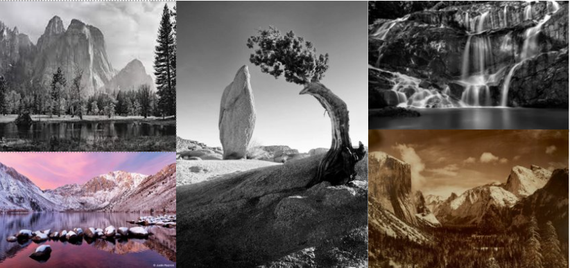
was an American landscape photographer and environmentalist, most known for his black-and-white images taken in Yosemite National Park. He was born in  February 20, 1902, he later died in April 22, 1984. he became a founder of f/64 group this group advocated ‘pure’ photography, this type of photography with sharp focus and a full tonal range.

ANSEL ADAMS (1902–1984), Monolith, The Face of Half Dome, Yosemite National  Park, c. 1926 | Christie's
Monolith, the Face of Half Dome

He is most famous for this image, On the chilly spring morning of April 10th, 1927, Ansel Adams set out through Yosemite’s LeConte Gully to capture an image of Half Dome, one of Yosemite National Park’s most iconic natural features.

This is a mood board to inspire me landscapes.

Lewis Baltz case study

Lewis Baltz was visual artist and photographer he then became a important figure in the new topographic movement. born September 12, 1945,  died November 22, 2014, he was manly based in Europe from 1980 but did travel frequently. Lewis Baltz focused on architecture of tract housing, office parking lots, and industrial parks.

“But my daily life very rarely took me to Point Lobos or Yosemite; it took me to shopping centres, and gas stations” this is a quote form Lewis Baltz that explains why he didn’t fall into the traditional landscapes because he wanted to show the beauty that everyone can see and don’t have to travel miles.

The language of Lewis Baltz | Financial Times
‘North Wall Steelcase 1123 Warner Avenue, Tustin’, 1974 © Lewis Baltz Archive/J Paul Getty Trust

I like this image because of the central symmetrical appeal of the circular in the centre of the image encased in a rectangle in a rectangular image.

Lewis Baltz « The Albertina Museum Vienna
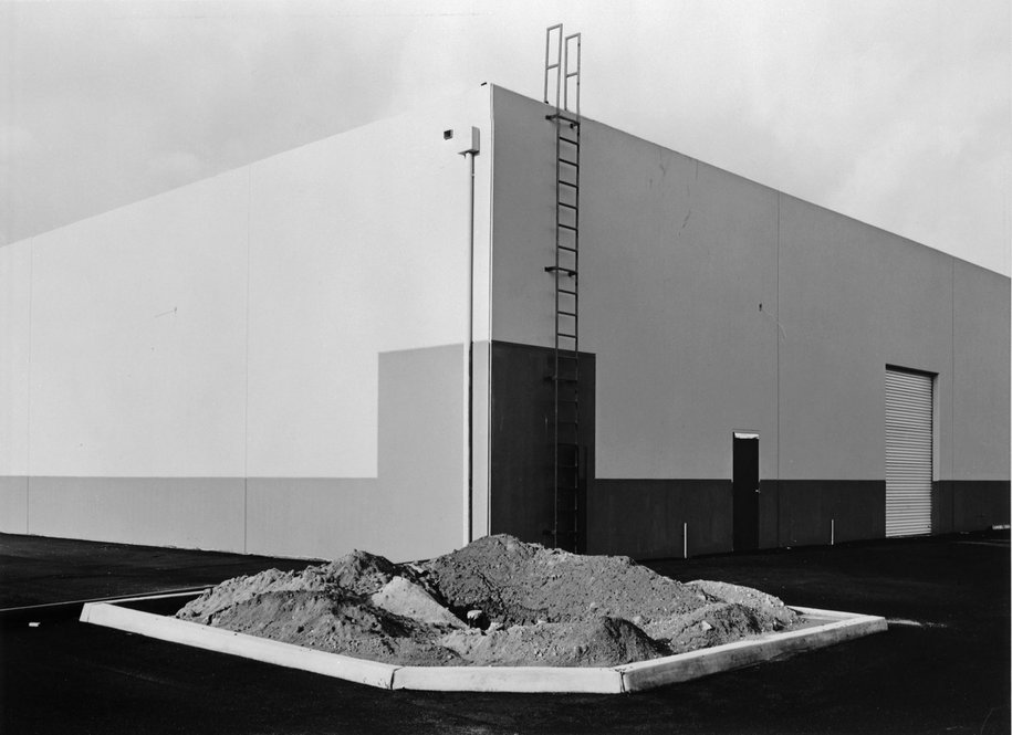
Lewis Baltz South East Corner, Semicoa, 333 Mc Cormick, Costa Mesa, de la serie The new Industrial Parks near Irvine, California, 1977. George Eastman Museum, Rochester, Nueva York. Donación del fotógrafo © The Lewis Baltz Trust

The sharpness of this images highlights the beauty in the normal everyday. i think this image was taken to highlight the beauty in the mundane and show that there is beauty everywhere not just 1000 of miles away.

‘Monterey, 1967’ by Lewis Baltz

this photo shows a light car positioned on a very dark background this looks like a shoot but to the left of the frame the dark wall stops and the road continues showing that this isnt just a car on a black backgroubd perfectly postioned in a studio it has natural beauty which is what Lewis Baltz and the whole new topographical movement is about.

link to romanticism + artist reference

My work’s link to romanticism

In this blog post I have included an artist reference with includes an analysis of my work vs Fay Godwins. I think that my research on Ansel Adams’ work helped me understand romanticism more before going out and taking my own images, meaning I could identify the best weather conditions so that romanticisable features such as clouds were more present.

Furthermore, shooting in black and white of editing my images in monochromatic meant that my final pieces have more of a dramatic feel and this helps demonstrate the nicer features of Jersey natural environments. I also think that the image that I have included in my artist reference is a good example of a romanticised image as it has some of the same features but is different from Godwin’s work. I took inspiration for her work and used this to take some of my own images down at the beach, making this artist reference easier to create.

Artist Reference- Fay Godwin

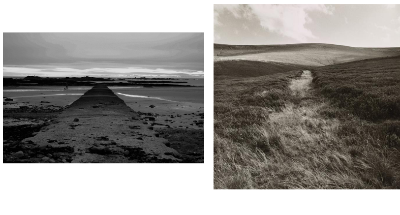
My WorkSimilaritiesFay Godwin’s
BeachLandscapesHills
RocksFocal pointGrass
Cool tonedClear SkyWarm toned
PeopleSymmetricalNo animals
Zone systemHorizon lineLighter image
Long structureRule of thirdsLimited tones
Straight horizon lineCloudsCurved horizon line
RocksClear foreground Textured
This image has an empty alt attribute; its file name is image-199.png

Image analysis- Fay Godwin

Similarities- I think its important to note that the main focal point of both of these images look very similar, and the centre of both pieces are a path or can have been created by humans. The horizon lines are also located further to the top of both images, meaning that the rule of thirds isn’t really followed in either photograph. Furthermore, I like that both of these images are symmetrical, with the landscape being just surroundings to the paths and this makes both more aesthetic and therefore catching you eye.

Differences- Despite our final pieces of work being quite similar there are multiple differences including the landscape locations themselves as might was taken down at the beach and Godwin’s looks like it was taken amongst some grassy hills, mine also includes a manmade structure as is more a visual representation of our modern world. Overall my piece is more cool toned and demonstrates more range of the zone system, whereas Godwin’s is a warmer tone with less components in the original photograph. I would say Godwin’s piece has more texture then my final image as the clarity of the glass in the foreground means that the natural features come through much more in comparison to the rocks in my image.

Link to romanticism- Despite Godwin’s piece being created during the romanticism era, I think that my piece along with her work together to demonstrate how the world and changed and is now more manmade, as my piece has a built structure and Godwin’s piece is only filled with natural features such as green land and hills. The work of Ansel Adams and the zone system is more obvious in my image as there is a wider range of contrast with the cooler tones of the image, as Godwin’s is more warm toner. Both of our images do romanticise the different landscapes and this is done well with the help of editing and Lightroom and my piece. I like that the monochromatic editing makes the images more dramatic and shows more of the natural beauty of the environment.

rural landscapes- final pieces

Final Images and Analysis

I have selected this as one of my final images as I think that there is many strong features of this image, starting with the perspective of the image, as I had to position the camera low down to the ground, and to make the structure of the image in the centre so that the final piece was symmetrical. Furthermore, the rule of thirds isn’t very present in this piece, but I like that the structure makes up the majority of the width of the image and then it disappears and gets smaller, this then nearly meets the horizon line and creates parallels within the image. I have made this image monochromatic and tried to make the contrast more clear so that the concept of Ansel Adams’ zone system is more present and the fact that this image has a large depth of field means that the wide range of tones is demonstrated all throughout.
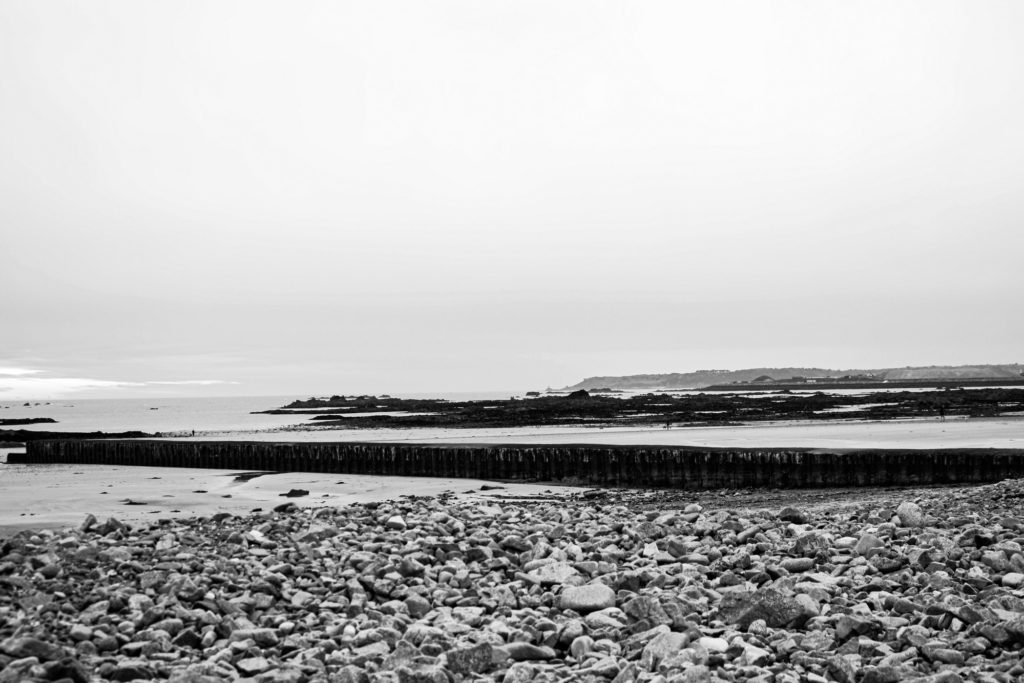
This image was originally one that I thought was unusable as I thought it looker very average in colour, which is why I have edited it in monochromatic. Additionally, I think that the fact that the sky lacks tones and is all white is an advantage as it just means that contradiction between the structures, rocks and sky is made more obvious, making the image stronger. I like that this final piece has lots of components so that the cluttered foreground contrasts with the background. Furthermore, I think that the lack of quality if the image gives it more depth as the it makes the shadows look slightly blurred despite me adjusting the dehaze in Lightroom. This piece does contain some weaknesses including the fact that it could be seen as boring as not true to the project as there is manmade structures in this piece.
This is another one of my good images from my photoshoot down at the beach, I have selected this as one of my final images as I think that the composition of the image wasn’t planned but turned out to be successful as I like how most of the image is the land and this contradicts with some of my other final images as they most contain sky. I think that the depth of field with this image is important to note as it means that a lot of the landscape is present and it really shows how important this is when taking landscape photos. Its important to note that this image has been edited so that the rocks are very dark and this contradicts with the light blue, yellow and blue sky. Furthermore, I think that the water which lays on the sand that appears blue on the sand and the blue sky help link the image together.
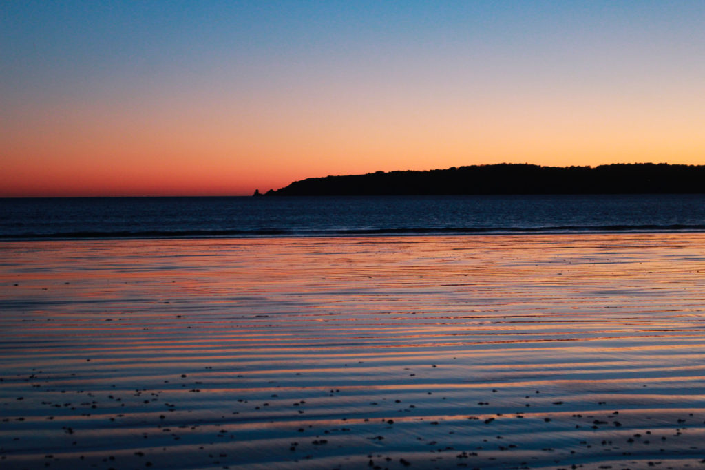
This photograph was taken during my photoshoot along St Aubins beach, the best part of this image is the colours, and I have enhanced these in Lightroom. I really like that the sunsets contains contrasting colours as the orange and the blue work well when reflecting back onto the sand. Furthermore, the composition of the image and the fact that half of the image is a fake reflection and half is natural features means that the photography itself would be seen as a contradiction. I think that the abundance of parallel lines within the image ties the whole image together they help the image become cohesive as its the only part of the image that matches together.

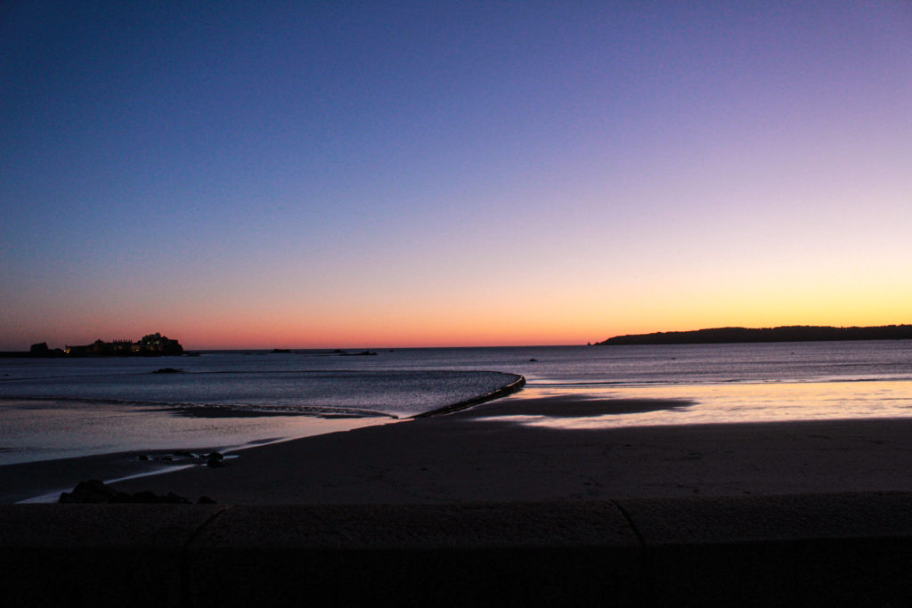
I have selected this final piece because I think that the perspective of the image is really important as it means that more of the natural landscape is in view and creates a straight horizon line and this image is symmetrical as the top half of the image is sky and the second half is land, structures and sea. Furthermore, I like that this image was taken at sunset as it means that the colours can be easily saturated and the blacks in this piece contradict with the yellows and the fact that everything is in focus means this is more clear. One weakness of this image could be that its very generic and many people have seen this type of landscape photography before but I think that the strengths of the image save it.

Just another Hautlieu Creative site