Overall I am satisfied with my outcomes for this project, as I feel that my photobook layout, alongside my final prints portrays the theme/ vibe that I was attempting to create. I used a good mix of representational images alongside some more abstract pieces to generate the contast. They layout of the photobook took some time to finalize as I was trying to get the images to flow between the pages so in the end I was happy with the final outcome. As for the print pieces, I went with more simplistic techniques so to compliment the simplicity of the pieces. I am also satisfied that I met my intentions, as my images and book represent the changes that cause the constraints of islandness/ island living. I do however think that if I was to do this project again I would try to create more dramatic pieces- possibly using darker colour pallets and less of an abstract style in order to focuses on some political/ social issues rather than physical constraints.
Throughout my project I have tried to pay homage to the artists who inspired my piece such as Shiroshi Sugimoto, by making images in a similar style of basing the image around the oceans horizon as well as Stratos Kalafatis by photographing areas of a habour when they are desolate.
Althought the processes I used (photoshop, lightroom) were somewhat simple I do think that they were effective. Playing with the order of the book and the alignment of the images for the prints definitely took a while and so if I did this type of work again I would definitely employ some form of system to aid me. Overall I really liked the colour palette throughout my work which includes lots of dark blues as well as sunset colours i.e yellows & orange hues. I think I followed the intentions I set out at the beginning well, but I also added some adaptations to the work as I went on throughout the process as I was testing things out but overall I am pleased with the result.
‘How is loneliness portrayed throughout Bill Armstrong and Pablo Caridad’s work?’
For my personal study, my project will be on ‘Island loneliness’ observing how images of derelict sites project not just an unsettling emotion but also another side such as loneliness. There will also be a range of portraits giving an understanding how our community can be affected by their own on-going issues and how their surroundings impact on their mood. My style of work will be in correlation to Bill Armstrong’s where I will follow and interpret his idea of using silhouettes and filling them with a certain colour to show the mood and Pablo Caridad’s with my landscapes. Armstrong’s work shows a great interest to me as his creations are subtle but effective and show meaning behind them by his use of contrasts and effects. I am trying to communicate responses to isolation throughout my images with my portraiture whereas my landscapes following Caridad’s work will be examining neglected residences and how overtime they slowly demolish until there is nothing left, which you could relate to a person’s emotions. My outcomes will be edited mainly with darker backgrounds so there is a bigger focus on the main subject and less distractions. My preferred way of photographing is landscape, but for this certain piece portraiture half body shots will be included more as it emphasises what I am trying to achieve a lot easier than landscape. I will be using both studio lighting and natural light, natural lighting will give a more dramatic outcome as the weather is a big factor of targeting and showing emotion. My editing on lightroom and photoshop will consist of using the blur tool with my portraits and enhancing colours in more of an abstract way whereas my landscapes the contrast and brightness will be reduced and maybe layering some images.
Armstrong is a New York based fine art photographer known for his blurred colour photographs. He grew up in Concord, Massachusetts. He is intrigued by the use of colour in exhibitions, and as a result he has been shooting with colour for three decades. Caridad was born in Buenos Aires in 1972, the Argentine photographer captures wildlife and nature in his photographs, as he studied biology, he took an interest in the flora and fauna which went towards aiding university publications.
Infinity series
Armstrong has many solo exhibitions, one in particular during 2002 catches my eye called ‘Spirit’ this relates to a statement made in one of his biographies where he is describing how he makes some of his outcomes, ‘It is a world just beyond our grasp, where place may be suggested, but is never defined, and where the identity of the amorphous figures remains in question. It is a world that might exist in memory, in dreams, or, perhaps, in a parallel universe yet unvisited.’ This is referring to how he transforms his original images and then photocopies, cuts and re-photographs them then uses blurring so the edges of each collage disappear so the images appear seamless to the eye creating the idea of a World which exists in memory. His title reflects this as ‘spirit’ seems to imply a secondary dimension, one in which he aims to display. This fits with my point I am trying to show with my images, the way your memory reminds you of certain things or times that you reminisce creating a sudden wave of loneliness and realisation which brings you back to the fear of reality.
Caridad’s photographs link in with his background of education in biology as he used his knowledge to combine with his work, when he would explore the outdoors to study his degree, he would include taking photos as he also took a liking to photography and was collaborating with local magazines where his work was exhibited, he then later decided to choose his photography over his education in biology. His most recent exhibitions have been selected for the National Hall of Visual Arts of the Festival de la Luz in Argentina. He is currently working as a commercial photographer whilst doing independent projects such as fine art photography portraying post- conflict zones and environmental issues. As he grew up in a poor economy, his surroundings were rather limited, such as having more run-down buildings which improvised on his work ethic. Caridad’s project is intertwined with mine depicting a type of loneliness because his perspective on the buildings and landscapes he captures often being absent of other people. His works also capture the desolated perception that is left with the surrounding, how the isolation is worthy of being photographed as there is history and background to what it once was. Although the idea of loneliness could be seen as someone who is content with themselves and therefore looks to find solitary solitude in an escape from the urban world.
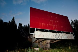
Bygone Olympic Days
Jersey infrastructure can be somewhat similar to what Caridad photographed but also has its own features. As some areas are very rural/ suburban and mostly less urban, however jersey is a very wealthy island and has a good economy, but abandoned buildings are still present which can be likened to Caridad, however this contrasts with the photographer as unlike Caridad the abandoned/rundown buildings are amongst nicer properties and offer contrast due to the fact most people who live in Jersey are professionals of the older demographic and have more disposable income when compared to the area in which Caridad takes his photos resulting in the derelict buildings being out of place in Jersey. His piece of work, ‘Bygone Olympic days’ was photographed in 2014, the isolated structures were part of the 1984 winter Olympic games, this was the first Olympic games hosted in a Slavic language speaking country. Due to weather complications the games were held back 4 days, the structures which were captured by Caridad are visibly damaged and this is not just because of how overtime it has decomposed but as there was a War which broke out in Bosnia and Herzegovina in 1992, this heavily damaged the city and the Olympic facilities. Some sites have been renovated after the war, but others remain abandoned leaving the bobsleigh track as one of the most well-known sites. This leaves the site as a place where you may go to pay respects and reminisce on the tragic incidents which took place somewhere which was once a happy environment and now a place of despair. As a former Soviet Union country Yugoslavia was tremendously underdeveloped both politically and economically which has continued to the time in which the photograph was taken.
After a period of political and economic crisis in the 1980s, constituent republics of the Socialist Federal Republic of Yugoslavia split apart, but the unresolved issues caused bitter inter-ethnic Yugoslav wars. Furthermore, the photos apply to the modern world in the fact that there is a declining number of countries willing and able to host the Summer and Winter Olympics due to cost vs revenue, observed recently in the 2016 Olympic games held in Brazil, much of the built stadiums and facilities are abandoned and no longer utilised, similar to the ones in Sarajevo. His love for nature and the environment led to him taking photos of these out of place, manmade structures which visually polluted the environment, something in which he feels strongly about.
Both his and Armstrong’s work links together in a way as their images both include singular focal points which you can depict and portray to fit with my theme of loneliness. Both photographers have their own unique way of how to portray an emotion that is normally just felt and not seen. My research sources for Caridad were very limited as lens culture was really the only reliable source, as his work isn’t that well known other than in Argentina. However, Armstrong had a lot more such as Wikipedia and his own websites where his different styles of work are exhibited online. I have been influenced by both styles of work as it is different way of interpreting how an emotion can deeply feel and take over you, I first started off with the idea of capturing dark settings for the effect of loneliness but then decided to get more creative and developing my unique style of work with deeper meaning and understanding of how feeling and being lonely can feel and look different to everybody inside their own mind and body. Depicting loneliness can be done in a variety of different ways, whether it be done through the use of neglected habitats in our environment by Caridad or by using bursts of colours for evaluating moods and blurred distorted effects on behalf of the headspace of an individual from Armstrong. I have learnt that expressing this topic has worked well in both styles and that there is not just one certain use of expression through photographs which can give a better understanding, though one style may be more eye catching to some and more meaningful depending on the viewer, beauty is ultimately in the eye of the beholder.
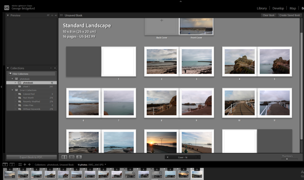
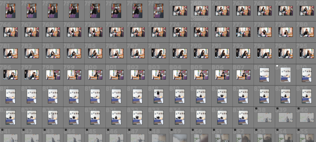
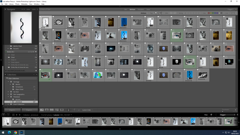
I began the process of creating my photobook by importing all my images into a folder in Lightroom so I’d have all of my images in one place, making the selection process much more convenient as I could easily switch back and forth between my images and between my photoshoots.
In order to differentiate between my good quality images and my less successful images, I used the ‘X’ key to reject images that I didn’t think were of a good enough quality for my photobook and the ‘P’ key to select images that were in focus and I would be useful for my project.
From there, I began some of the editing process, doing some small changes [such as turning them black and white, increasing the contrast etc] to improve images that I was considering for my final photobook. I made sure to add a blue colour label to these images so I’d be able to keep track of how many images I was considering, making it so locating the edits would be a quick process.
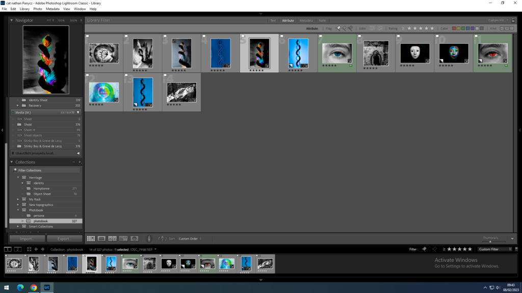
Next, I filtered out all my images so that only the blue ones would be seen and began organising my images into a rough layout, pairing images that I thought would work well together.
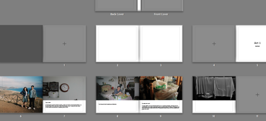
Then, I began the process of making my actual photobook, beginning to create the first few spreads whilst adding text in order to add depth to the images and book itself.
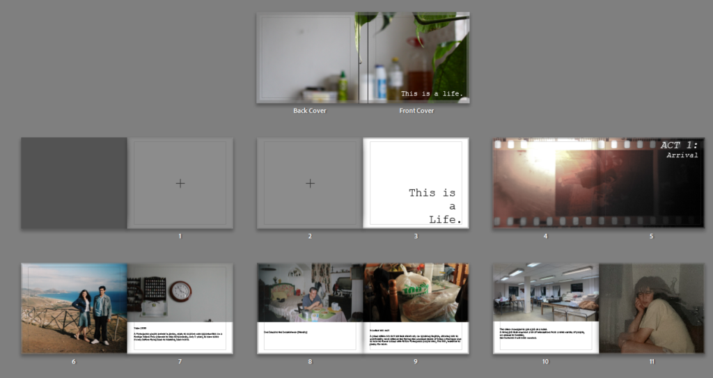
I put in a working cover whilst I began to figure out what I wanted the title to be and where I wanted it to be placed. I decided upon the phrase ‘this is a life’ as I felt like it fits quite well as it states what the book is about whilst setting the tone too.
I experimented with the layout of my spreads, pairing various images together so I could choose the ones I liked best and reuse the photos that didn’t fit in elsewhere.
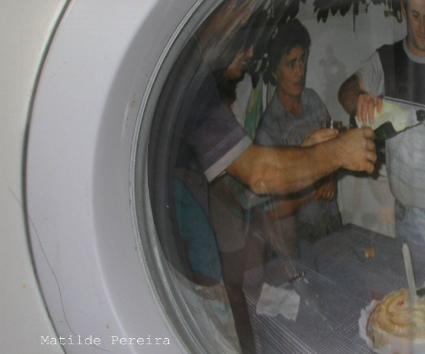
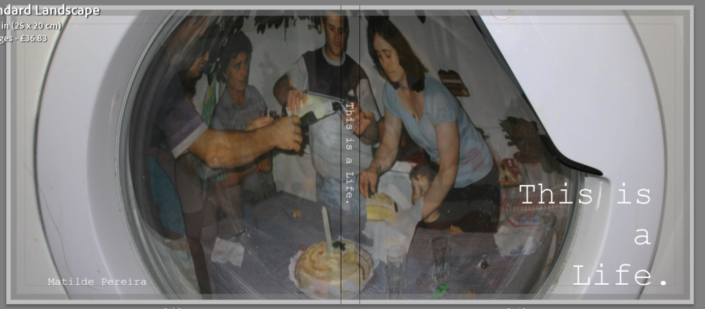
I then went into photoshop and created my front cover by taking an images of my family and editing it into a photo of a washing machine, lowering the opacity to create a more distant look. I chose a washing machine as Portuguese people are often stereotyped as cleaners and I thought it would be a subtle way of showing some of the stereotypes we face. Alongside that, I also though it looked like a window which would invite people to look into the book along with helping people understand how they’re looking into our lives as an outsider.
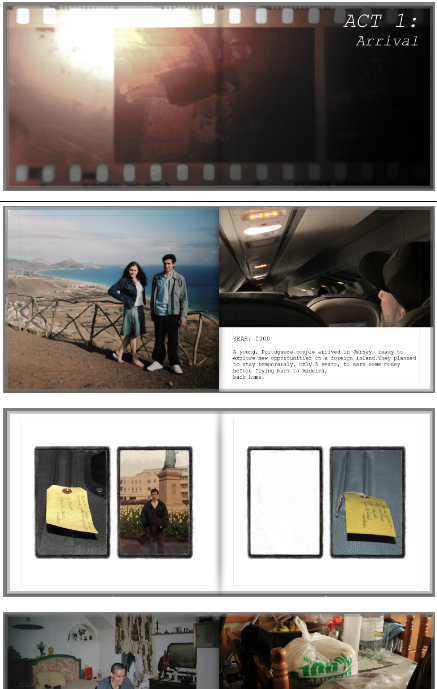
Then I continued adding and arranging images carefully, taking care with each spread to make them flow into each other rather than having each spread be really busy which would of made it difficult to look at each image and the story/reasoning behind them. I also tried to use text that would guide the viewer through the photobook, helping to piece together the narrative being portrayed in each act.
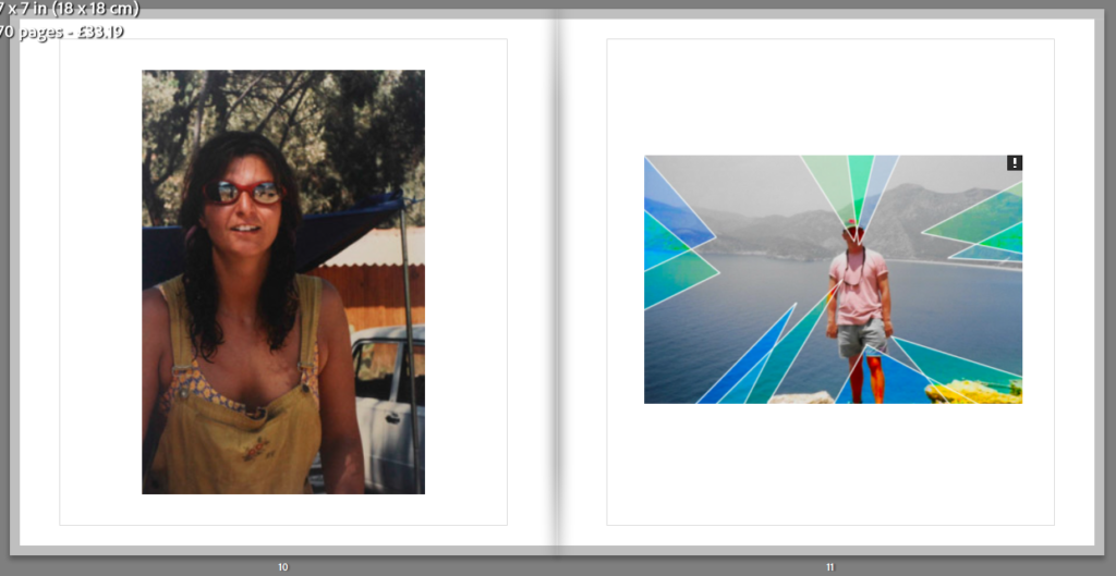
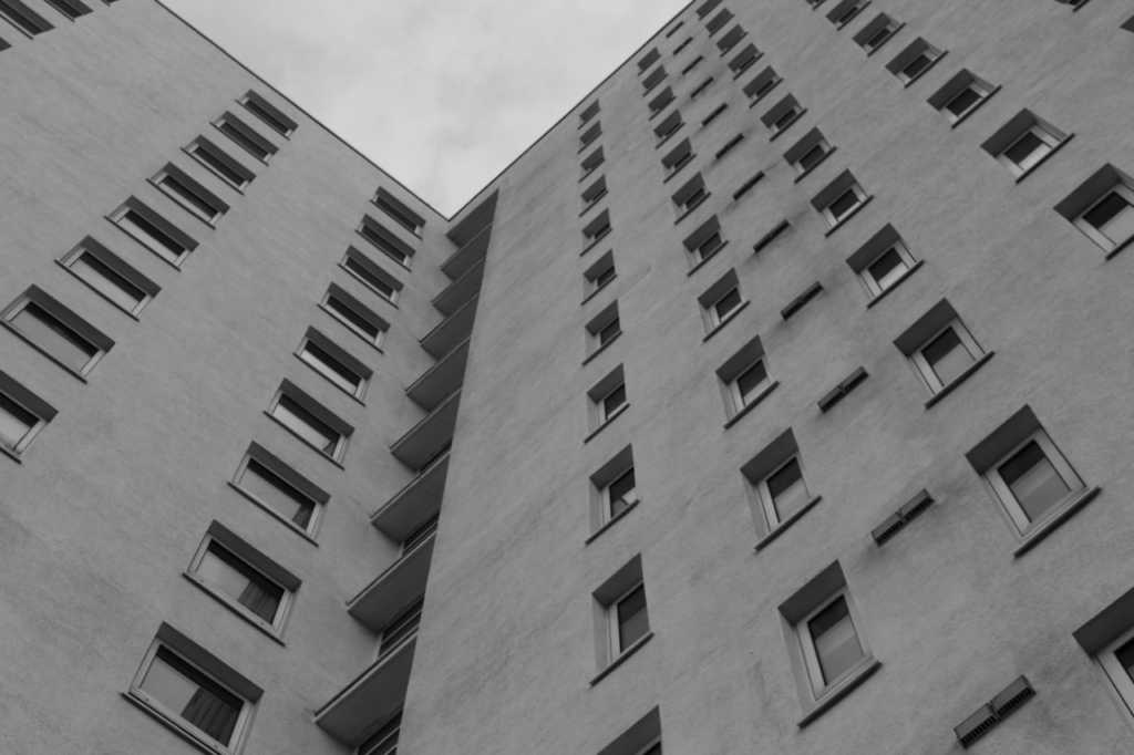
Below I have illustrated all of my final images, these are from all of my Personal Study project. These photographs are from my La Collette, Greenhouses, La Marais and St Clement’s photoshoots, this is because I believe that I have successful images throughout all of my attempts to explore the theme of Anthropocene in a variety of locations.
I have selected this as on of my final images as I believe that it is one of my most successful reflections of my personal study. This is because of the overall quality of the image, with the clarity being high and there being lots of natural saturation present. In my opinion, this is my strongest piece, and will be printed out in order to be displayed as an A3 piece, probably being laid out and stuck onto form board, as I believe this thick white background will match nicely with the colours in the image, and the white will enhance the saturation in the photograph. One feature of this photograph which really stands out is all of the parallel lines, both vertical and horizontal, that are being shown. These adds dimension to the image as all of the vertical lines in the foreground and all of the horizontal in the background means that there is also some level of juxtaposition.
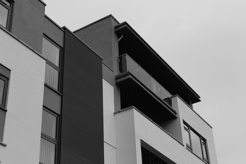
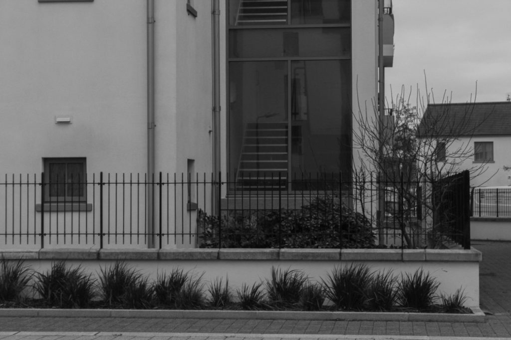
These two photographs have been placed next to each other in my photobook, and I have additionally decided that they would look good displayed together as well. This is because of the high amount of similarities within both of these images, they have some of the same brickwork as they were taken very close to each other, they have also been edited in the same way so that both of them have the same levels of texture and contrast throughout them, this is important as it helps with the flow between these two images, meaning that they link together well and can be presented next to each other. Furthermore, these are some of my most successful reflection of Lewis Baltz’s work as they are somewhat plain but do very much focus on the theme of Anthropocene, especially as the first image has both natural and manmade formations.
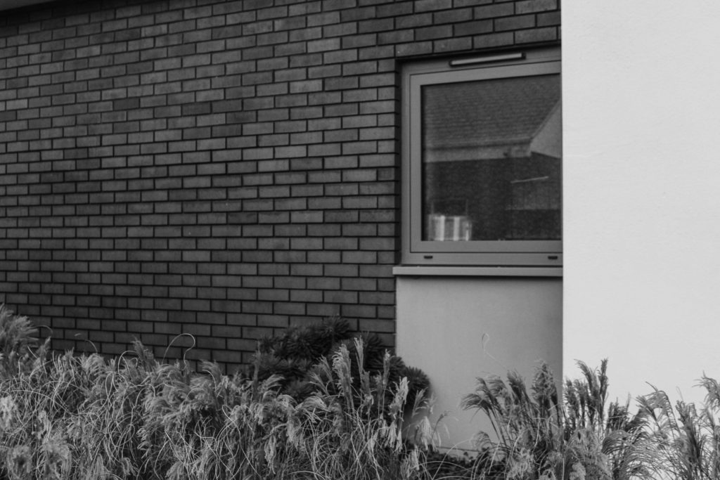
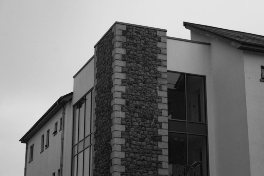
This photograph was taken at La Marais, from the ground looking upwards. I really like how this image has a unique and different perspective which is one that is different from the majority of my other work. Additionally, I think that this could be linked to the work of Lewis Baltz, this is because of the monochromatic editing but this image doesn’t have high levels of contrast, I think this is a good aspect as all of the details in the windows are still there, and there is some lighter shadows and darker tones. Despite all of this, it could be said that this image is very repetitive, and doesn’t contain a lot of interesting features to analyse and doesn’t necessarily convey the concept of Anthropocene,
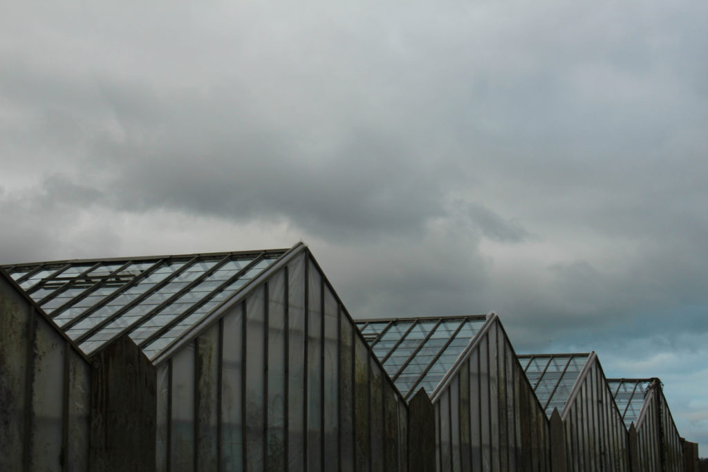
This image is one of my most successful from my Greenhouse photoshoot, and was featured as a double page spread in my photobook. I really like the colours and tones in this image, as there is mostly greens, blues and greys present and I think that these colours all match together well. Additionally, the perspective of the image means that the image is made more interesting, along with the soft textures of the sky contrasting with the harsh lines in the structure itself and the dark tones, The aim of this image was to respond to the the work of Richard Misrach, with the aspect of nature being present. His work is normally related to wide shot work with plain background, however I think the greenhouse structure itself means that I can relate to his work and makes clear differences and similarities.
These two final photographs, they have a lot of similarities as they were taken in close proximately to each other, I really like how they fit together, with the first image being a wider shot and the second image being very zoomed in and attempting to focus on the base of the building, and trying to highlight to parallel lines and detail within the building. I decided that these images would be more successful displayed in my final photobook, with them being displayed exactly in this composition. These image complement each other very well as I have attempted to edit them in the same way. I really like that these image have a lot of potential, as they could have been edited in any other way, in colour, as they appear above in black and white, and also using the ‘invert’ tool which can be found in photoshop, or the ‘colour’ tool in photoshop. As this editing means that all the brickwork turns different colours.
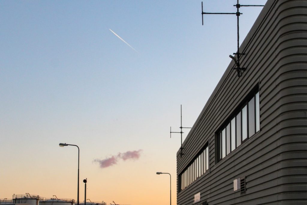
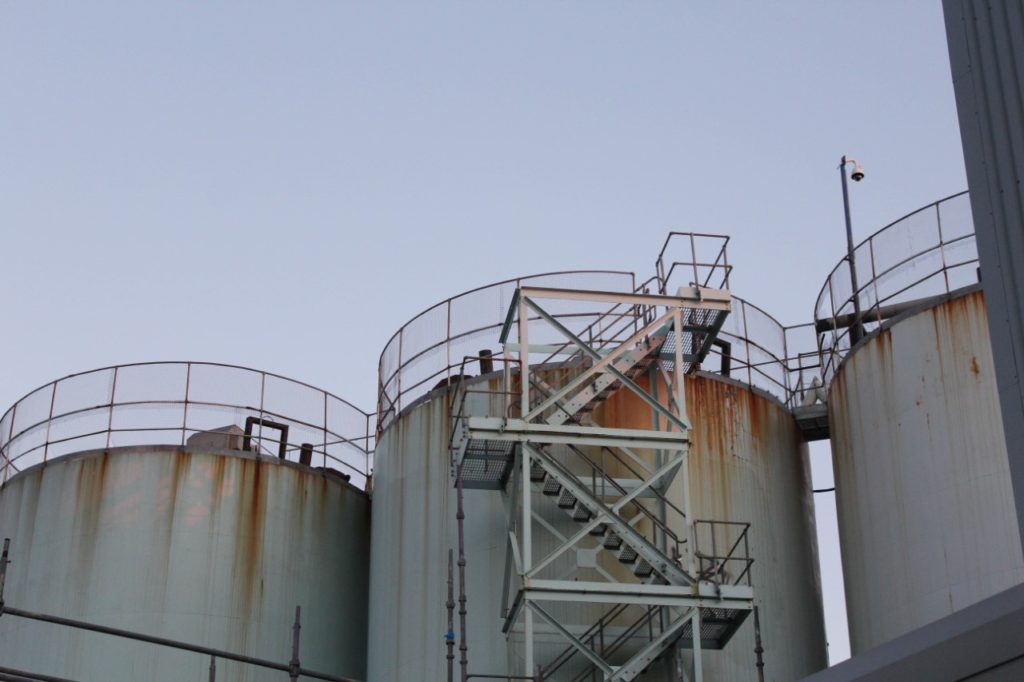
I have selected this as my final image, as overall I think that the aesthetic of this photograph means that this is one of my most successful images. In my opinion, this photograph looks good in my photobook because of the colours and tones throughout it, the warm tones along with the still blue background means that the image look more inviting. However, the composition of the image could be seen as challenged, as all three of these oil tanks are not all present in the image, with the first one being barely visible. My intention behind this image was to recreate some aspects of Misrach’s work, and I did not consider how the lack of the other tanks may still out. That being said I still like that the middle oil tank has the ladders on it, and because of this extra structural aspect, and the rust that comes along with this attaches attention because of the orange contrasting the blue.
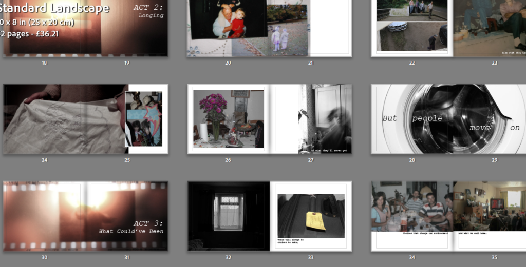
Below is my final photo book complete with my essay, created in Lightroom Classic.
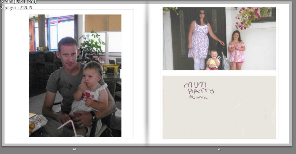
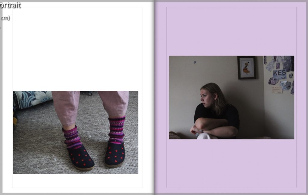
This is my back cover (left) and the front cover of my photobook. I decided to call my book “Pink Slippers”. This title was inspired by images in my book of my mother’s slippers – they are a special item to me, as putting my mother’s and grandmothers slipper’s is a fond childhood memory of mine, symbolising my relationship with them. I named the book specifically pink slippers due to the pink pages included in the book, but also because of the female subjects – the inclusion of a typical female colour on the cover, in the image, title and spine foreshadows the content.
The first image in this book is that of myself as a child – I have an inquisitive look on my face, which creates a simple start to the book, causing the viewer to perhaps feel the same. The pink tones of my t-shirt match the pink page of the title page previous, linking the pages together. This page was also placed at the start of my book to introduce the first subject and the different time frames used.
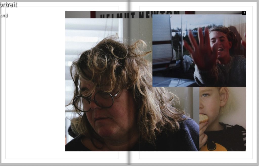
These 4 pages further introduce the subjects of my book and the inclusion of an archival image of my mother on the left spread leads well into the right, showing a passage of time in her life, including myself also.
These are two of my favourite spreads from my photobook, in sequence. The first spread is of an image from my identity project, featuring archival and new material of my mum. The collage has a reflective feel, as on the right she seems to glance at her past self – this nostalgic mood is helped by the background image of her old bedroom, and B and W colouring. The following double-page spread leads on nicely – the right image has a second reflective and sentimental feel to it, with the inclusion of the mirror picturing the subject looking wistfully at herself – I liked using a mirror for this project, as it enabled me to get lots of different perspectives from one shot, creating a multi-dimensional image.
These two sequenced spreads create a display of generational identity and age when placed next to each other. The spread on the left features images of my grandmother, which creates a contrasting collage (the process of making these in my previous post) of her life and story. The double page spread to the right is of my mother, shot in the same location as the image of my nana in the collage. Both these pages feature similar tones: red, orange, and beige. On the left, the sand of the bottom image link with the colour of the wall in the right spread, and the read of an image on the left match with the red and orange of the curtains to the right.
These two spreads are of my mother – the first on the left is a double-page spread taken from my identity project, possibly my favourite from the whole project. The warm tones in this spread are contrasted with the stark black and white of the next image. The right image is another of my favourites from this project. In my opinion, it gives a strong presentation of not just female identity, but identity in the home and through multiple generations. The image features objects on the table to the left that are important in my mum’s personal identity – the book and bookcase in the background to the left highlight her interest in them, as reading is and has been very important in her life. Her pose and facial expressions show her personality further, as she sits in her own house, looking unwaveringly at the camera. To me, this also represents her role in my life, as my sole caregiver and the source of knowledge and strength in my life This image paints a portrait of strong female heritage, including a photo of my great-grandmother. She was a very important role model in my mum’s life, and including her portrait felt crucial to me when documenting my home and also
These are the final spreads of my book – they are understated, quiet images which I spoke about in my previous post, to create a natural end to my book. The left spread features an image to the right which can be seen as a symbol of age, with a faceless image of my grandma, with only parts of her skin and white hair visible – this image is much different to others in the book, more secretive and understated. This image and spread can be seen to symbolise identity due to the feature of my nana’s simple pink hair clip, which symbolises one of the most important parts of her physical identity, both to herself and others. The spread on the right has one of the few object images in my book – it is that of a broken mirror from a memory box I used photos from. This mirror links to the images above taken in the mirror of my mother and grandmother but is broken. The broken mirror could connote a sense of altered or mixed-up time or identity, or just the changing of one’s personality. This links to the jumbled look of my photobook, which mixes up time scales and eras.
Above is the inclusion of my final essay in my photobook – I used pink pages again here to continue the theme through to the very end of my book, using the same font and text as the front cover and spine.
Final Prints
Below is a selection of my final prints – I have quite a lot for this project, due to my high volume of images. I have analysed most of them above, but there are a few images not seen in my photobook I decided to print also. I have decided to print most of them in A3, but the series of 3 self-portraits are going to be in A4, presented in a trio.
A3A3A3A3A3A3A4A4A4
Evaluation
(Photobook evaluated throughout final presentation above)
Photoshoots
The first shoots I completed were my self-portrait shoots. I found these to be overall successful shoots, with at least 5 successful images from each set but found it quite difficult to create quality compositions. I found it difficult to envision what I was capturing as I was in front of the camera, and coming forward to press my shutter for the timer for each set of 10 images became annoying. in future, if I was to create more self-portraits I would use a more effective setup, with a lead to press a shutter from my position in front of the camera, and perhaps a camera with a flippable viewfinder. Aesthetically these images improved in quality as I moved into my second shoot, shooting in a better light after evaluating my first shoot. Overall these first shoots were a useful starting point – directing myself in front of the camera made it easier to work with my two other subjects in my later photoshoots and also helped me to cope with difficult lighting at times.
A link to my post on these two shoots, including a full evaluation.
The rest of my shoots improved as I went along. I do feel that I took too many images – or that I did too many shoots, as I found it difficult working with such a large amount of images in my exam and fitting them into my book without having too many pages. When photographing my archival material, I’m glad that I used an array of types of images – this made it easier for me when experimenting with collages and layouts in my book and gave me more choice and room to experiment. I struggled a little with the compositional elements of my portraits but found I became more at ease with directing my family as the photoshoots progressed and I became more familiar with how the environments photographed. In this way, I’m glad I produced the volume of shoots I did, as it meant I had more room to improve and change my photography to match my ideas and create better outcomes.
Editing
I like to edit in black and white and also in colour, but found in this project I preferred a lot more colour images. A lot of my images had vibrant colours which matched well with the colours of my archival material. However, I still found B and W editing useful as it created nice contrasts with my other spreads.
Experimentation and Layout
I found making my photobook (analysed above and in the last post) initially difficult, but I think that as I got used to the layout and process and began to really enjoy it. I think this was also due to my previous experience of creating zines from my trip to America in September – this helped me to understand the layouts of my book more easily.
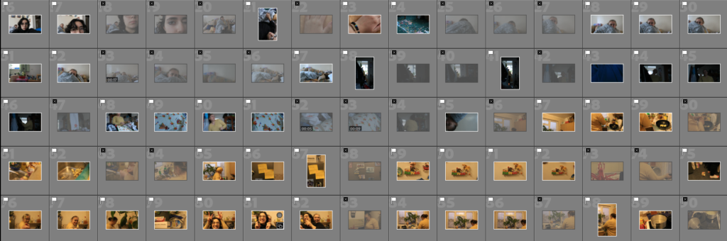
The photographs have been taken in 4 separate shoots
These photographs are the ones I considered usable based on sharpness and exposure.
I 5 starred my favourite photographs after comparing angle, shadows and sharpness more in depth.
Experimentation
I increased the contrast, saturation and vibrance as well as the shadows and blacks as I wanted to make the photograph look extreme and surreal. I decreased the highlights and the whites as i though it was a bit too much for the eyes considering the amount of colour. I decreased the texture and clarity in order to make the photograph feel more soft and liquid.
I converted the photograph to black and white as I felt colour to be unnecessary for communicating the message but rather a distraction. I used a radial filter in order to preserve the sharpness of the central image as I distort the surroundings by increasing texture and using dehaze. I wanted the photograph to look dark and gritty, a bit hard on the eyes, a total opposite of the pervious photograph as I created them to be displayed together.
For both photographs I used a glass to create the ring around the main object. I wanted to create a distortion, a ripple in reality to represent the polar extremes of delusion.
Final outcomes
I decided to include the essay in the final book as I though it would help me convey the point as well give some background and context to the photographs. The front cover was supposed to be inviting, a declaration of transparency as eyes are the window to the soul. The photographs on pages 12 and 13 portray the idea of the anima and the animus, or the femininity and masculinity, within the shadow. Page 16 touches on the theory of the tabula rasa, we are born without the filter we call the ego, however, on page 17 we can see the transition into the persona, formed by the preconceived notions, the filter of what is acceptable or desirable by its standards. The prism on page 23 is explained by the quote, it represent the idea that the fragmentation of the psyche happens due to the egos filters. The strands of DNA are meant to represent the collective subconscious and the universal elements originated in the inherited structure of the brain, all the parts of you encoded in you DNA, passed on for generation. The last photograph I thought would be a good closing as everything that begins must also end.
I feel that the photobook was able to convey the message successfully in combination with the essay. However, a lot of the meaning derives from the way the viewer interprets the photos for themselves. The message could potentially be delivered better if the photographs contained titles to narrow down the field for interpretation. On the other hand, the purpose of the photobook was to explore the subconscious and photographs open to interpretation offer the viewer the opportunity to take a dive into their own subconscious. It is similar to the work of the reference artist Roger Ballen, who inspired this project, in the way it explores the darker parts of the subconscious such as hallucination and delusion and the psychological shadow. The main difference between mine and Ballens work is that I portray the positive side of duality through colour as well as symbolism. Another difference is that I used editing tools quite heavily in order to portray the concepts in an abstract form. Evaluating the technical side of the project, I feel that I could have played more with lighting in order to communicate the nature of duality. Some photographs could have also been taken with more pressure on the technical aspects most specifically shutter speed and aperture as well as focus. Some pictures came out not focused enough or a bit blurred due to low shutter speed and movement while shooting handheld. Exposure could have also been improved by adjusting the shutter speed and the ISO depending on the conditions. For the future I will definitely use a camera stand as offers stability and gives me the opportunity to properly adjust my camera settings to a certain environment. Overall I am happy with my outcome, a few adjustments could have been made to improve the quality of my work however I feel the imperfections in the project help serve the overall purpose in that it relates to our own flaws.