INSIDE
BLACK AND WHITE
COLOUR
INSIDE

BLACK AND WHITE
COLOUR
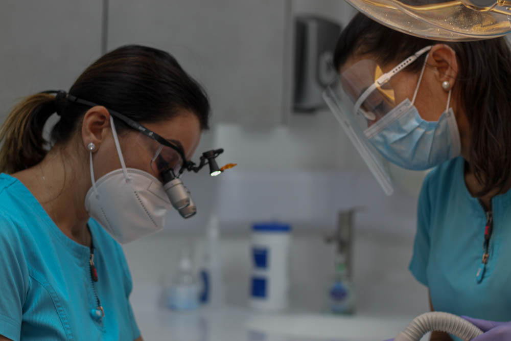
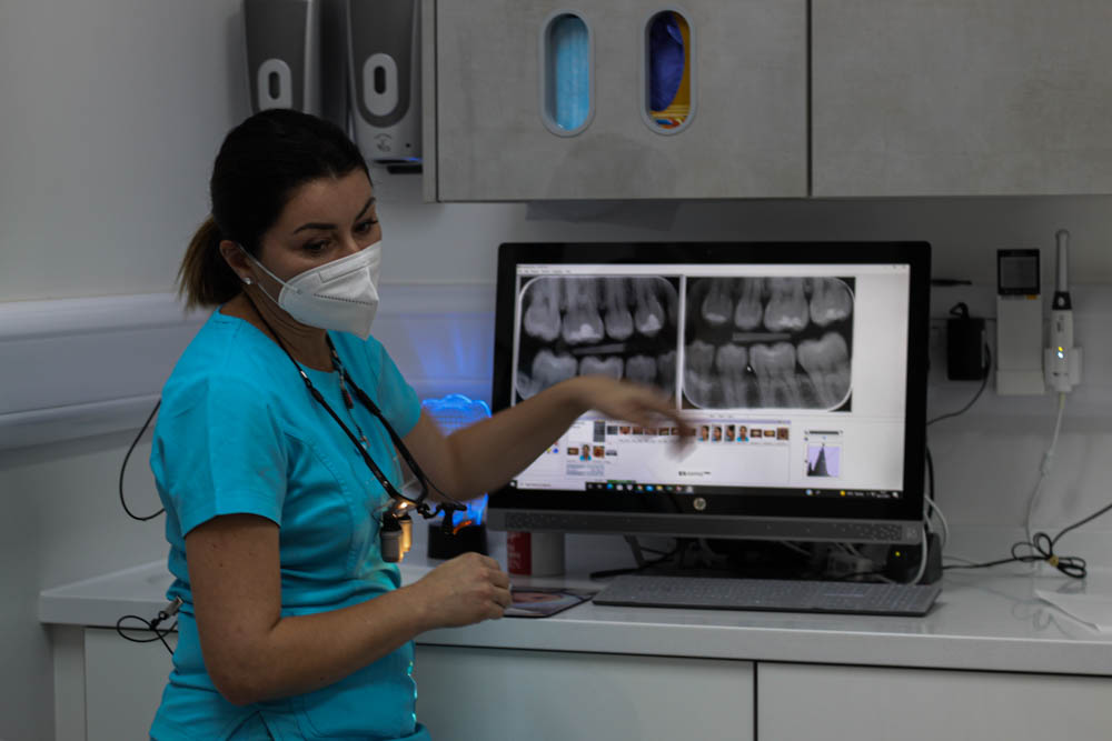
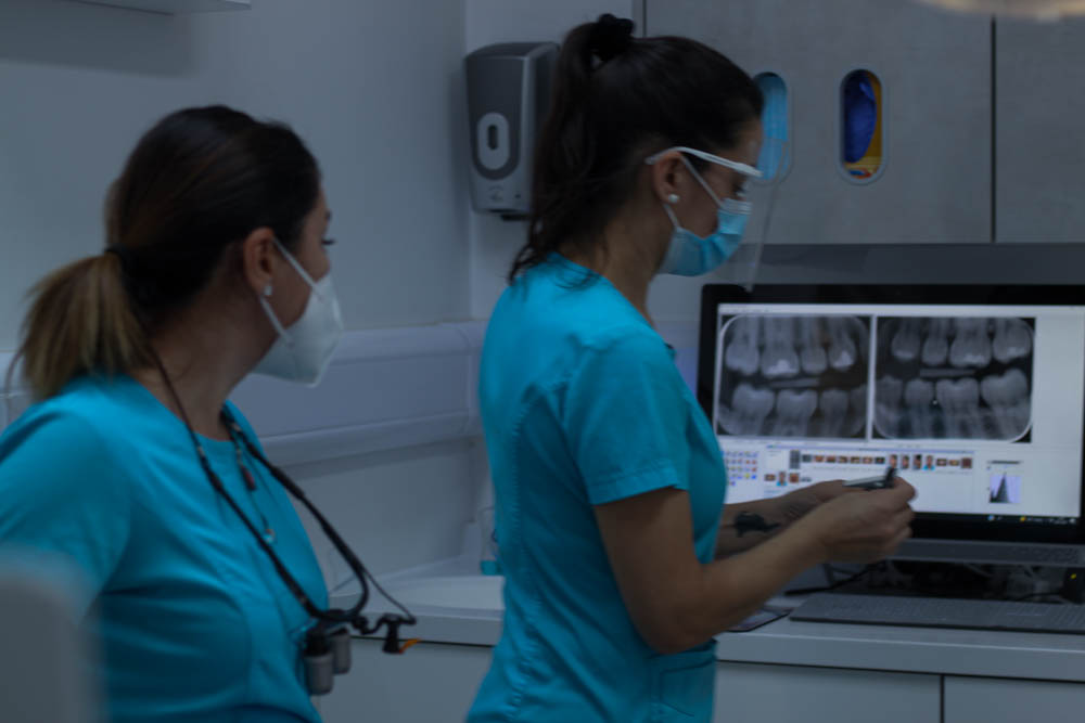
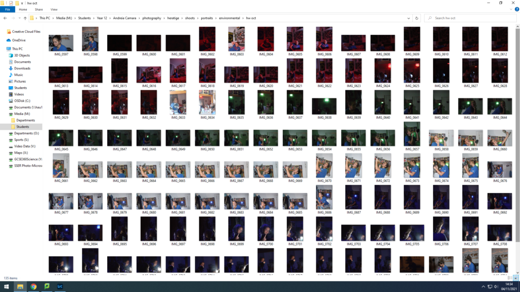
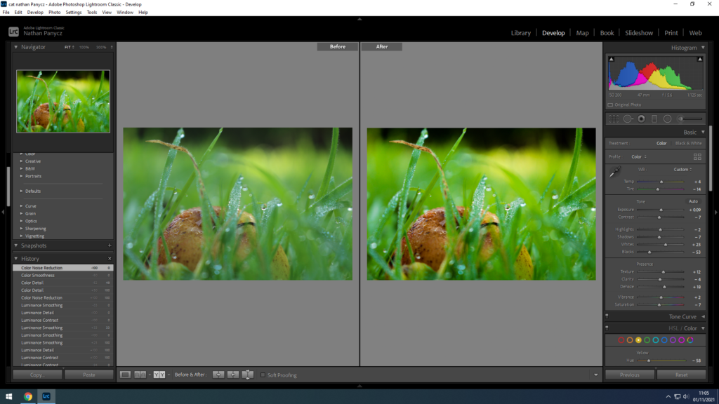
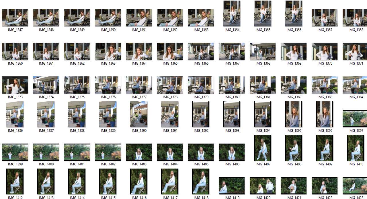
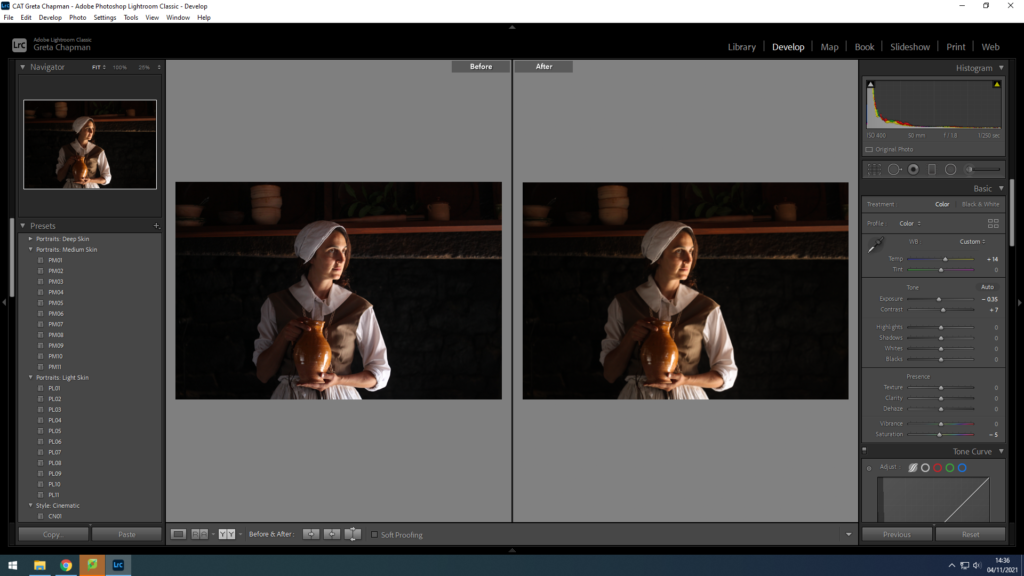
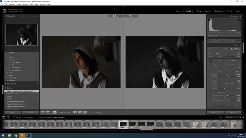
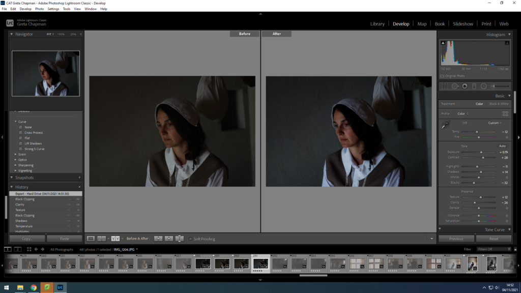
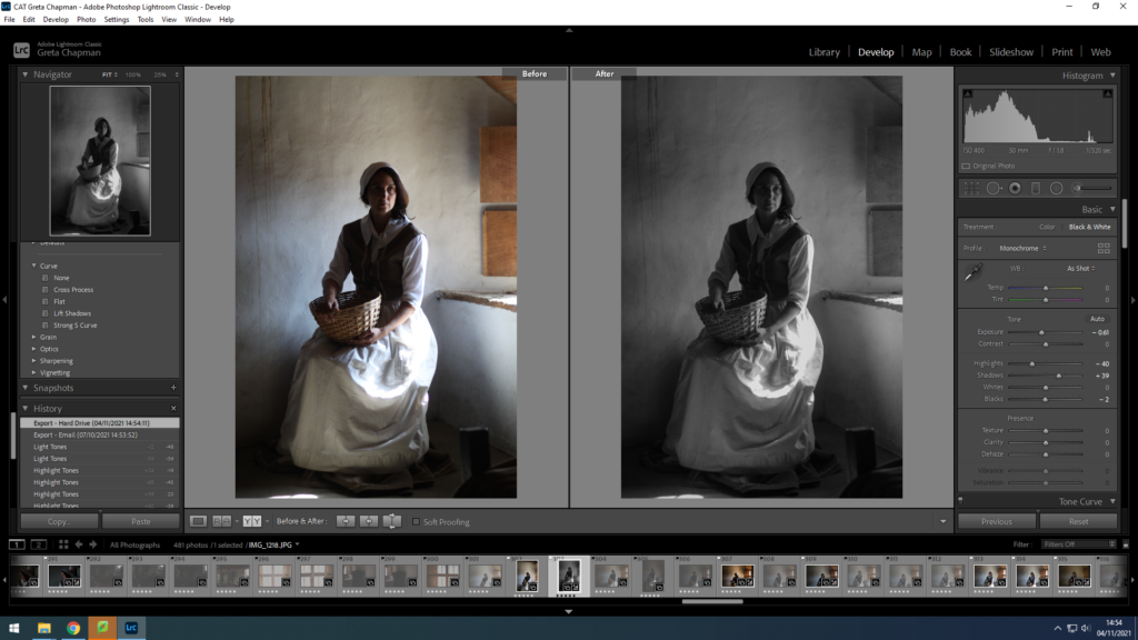
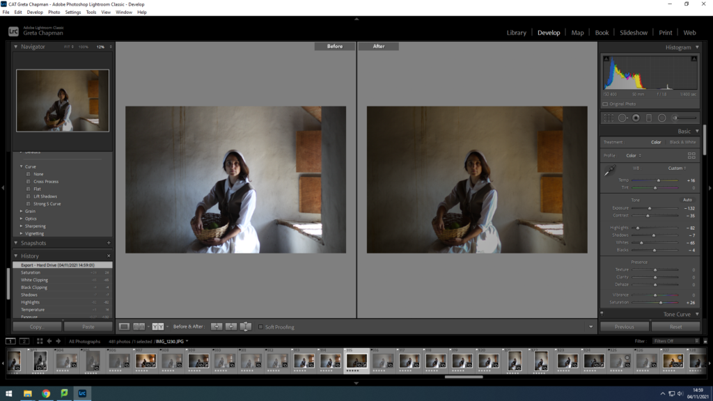
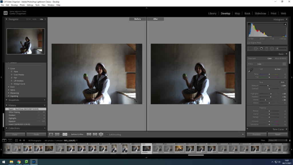
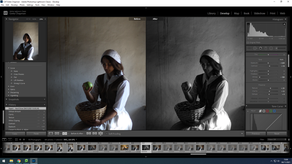
first I uploaded my portraits to the media drive
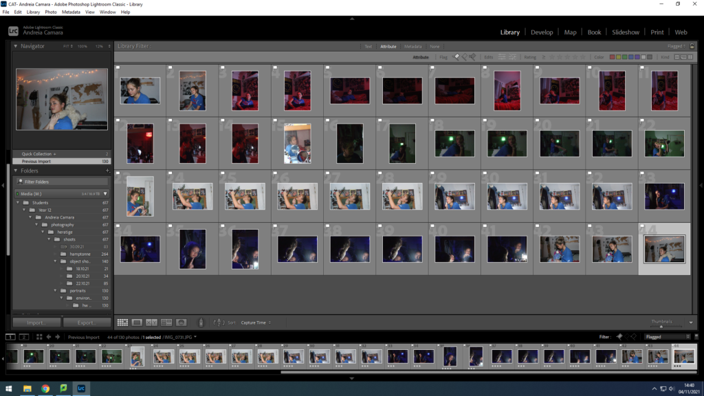
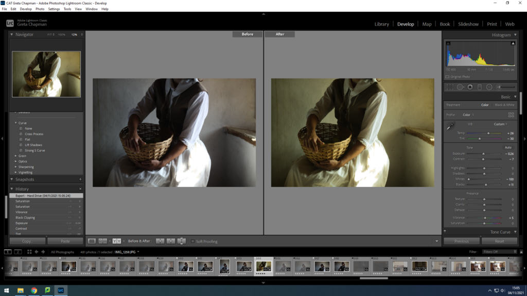
then I imported them to light room and selected them using p and x and refined this using the staring system.
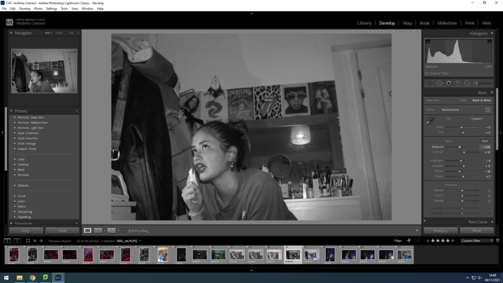
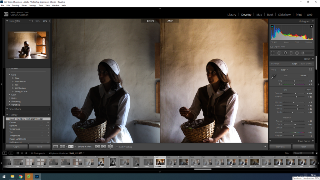
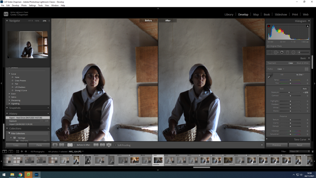
then I selected the images that were 4 or more stars and switched to develop mode in order to begin editing them. I adjusted the WB and the exposure to give the image more depth. To make my images feel like they were taken in the style of Ralph Morse.
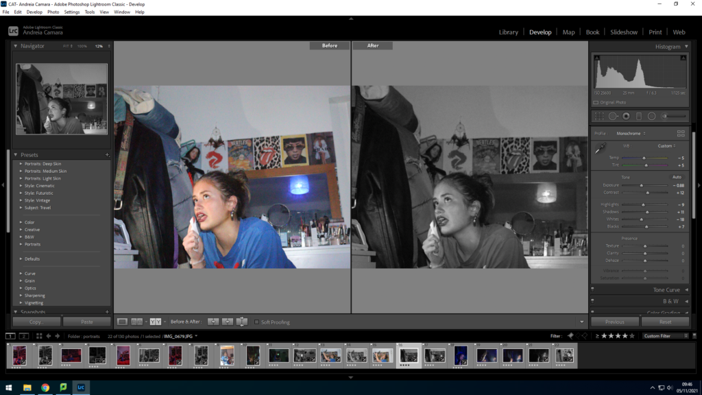
finally I cropped the image and adjusted the horizon.
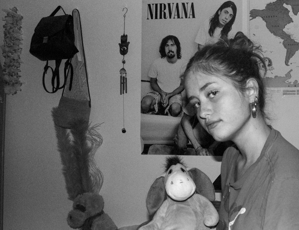

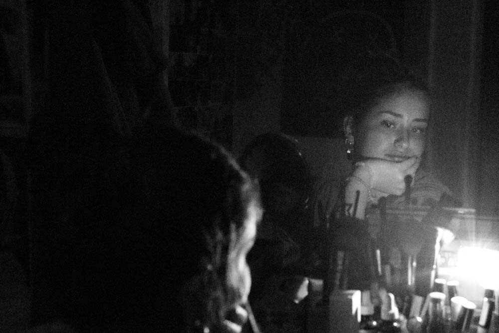
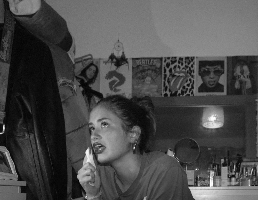
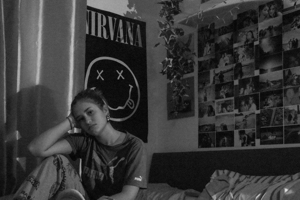
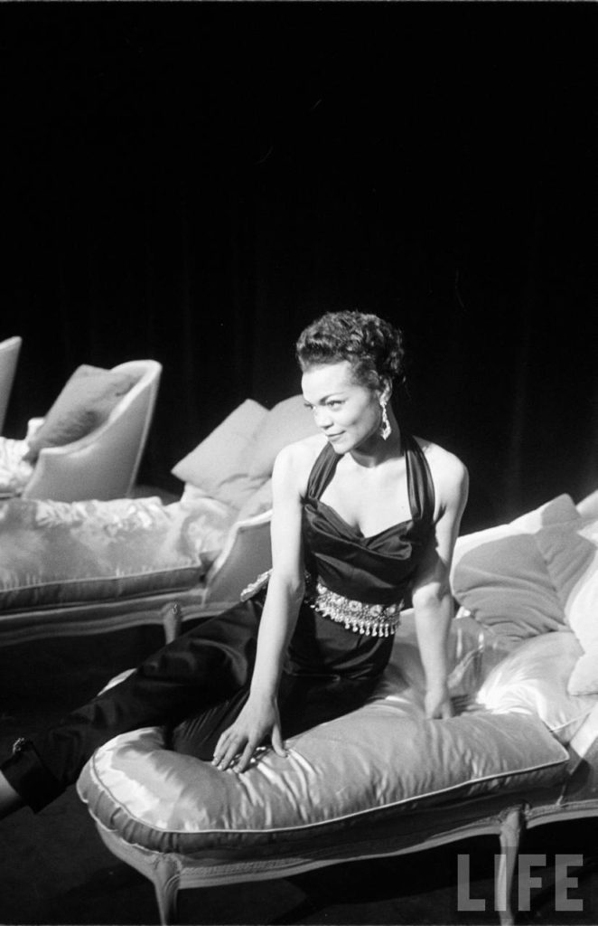
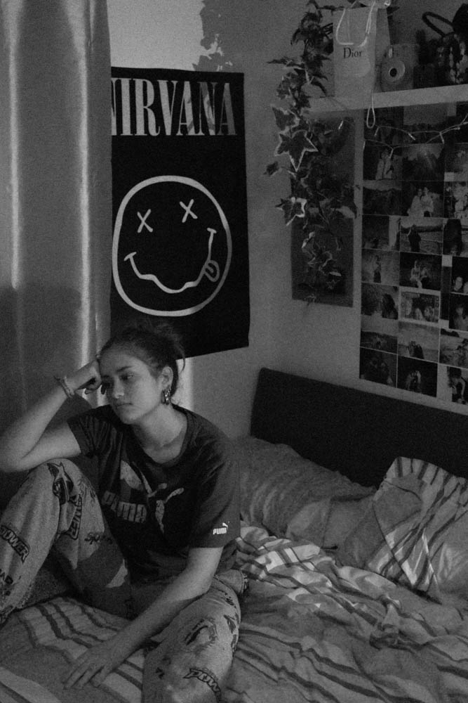
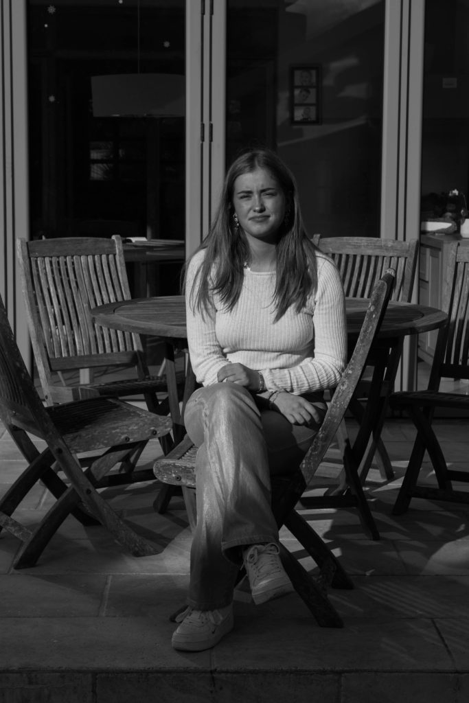
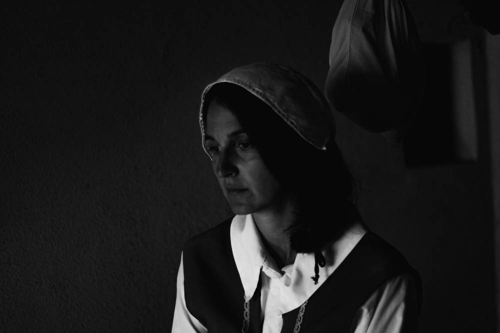
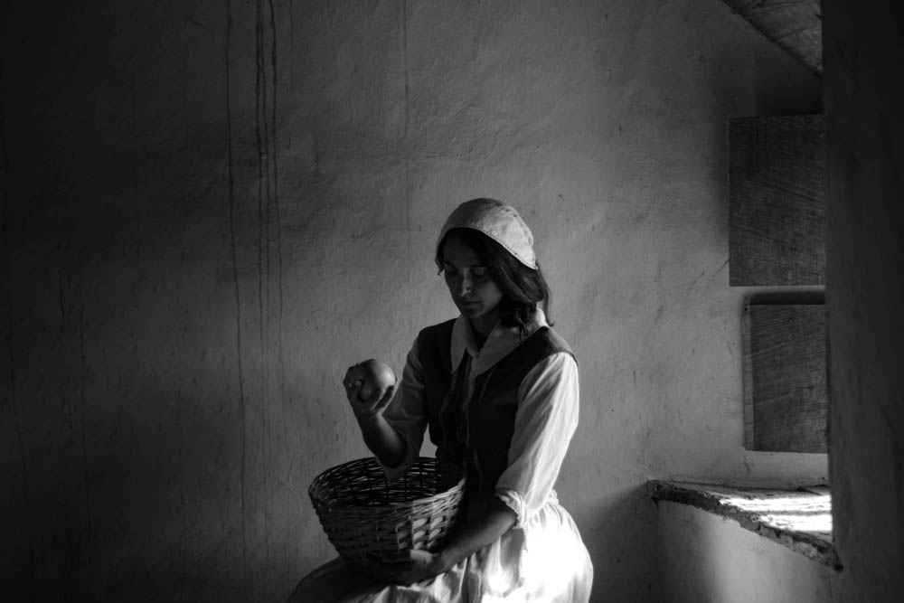
Although Ralph Morse manages to capture the job of his subject in the image I think I managed to give my portrait a similar feel through the angle and pose of the model. However the lighting in my image adds more of a dark feel unlike Morse’s where Eartha stands out compared to the dark background.


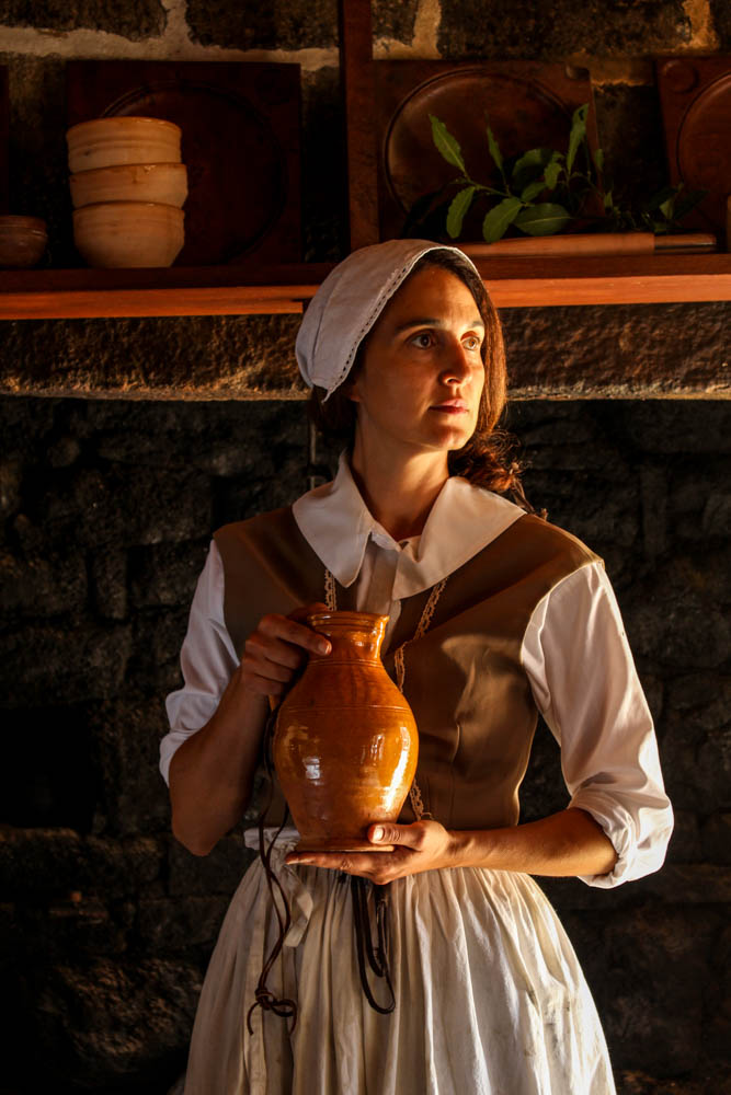
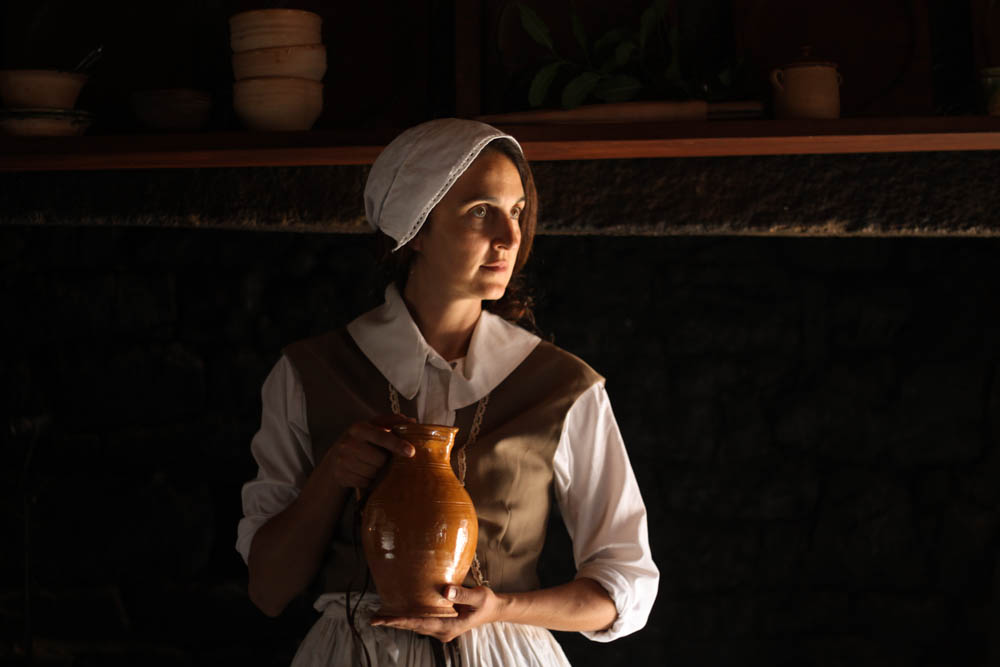
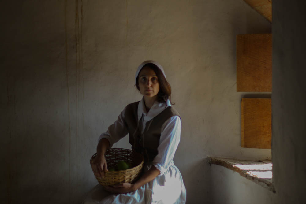
This is a photo of one of the live history actors at the Hamptonne Museum. It shows the lifestyle of people in Jersey a couple centuries ago, how they dressed and what they did. This photo was shoot with natural light coming in form a window to the right and so its very yellow, warm light, creating a golden hue. The light only hits half of the subjects face mean while the other half is shadow. This creates a nice contrast. The white dress also contrasts the dark background. The line in the photo would be the subjects hand positioned horizontally as well as the shelf in the background. Whilst the hand leads the eye to the vase held by the subject, the shelve brings the attention to the background and the rest of the historical objects. There is quite a few textures in the photograph. The wrinkles on the subjects clothes are sharp because of the light and shadow contrasting together, this is eye catching and helps to bring the attention to the subjects. The rough and bumpy stone wall behind the subject brings the focus to the background. Overall, the photo feels cluttered since there’s so many lines and textures and shapes that make it hard to concentrate on one object, there isn’t much space, this is supposed to represent the living conditions of people back in the day when the houses were tiny and families huge.
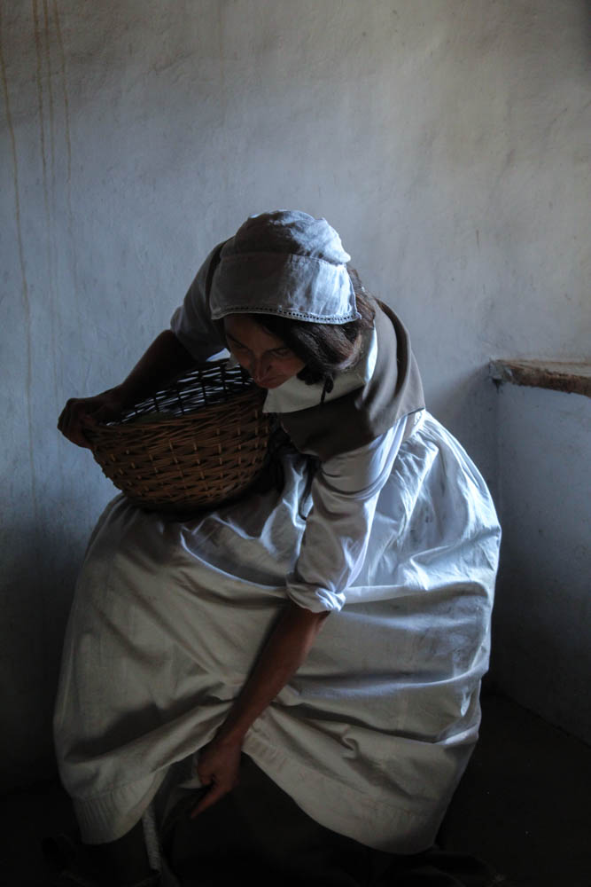
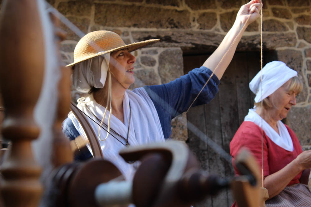
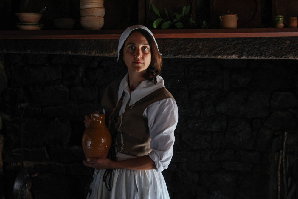
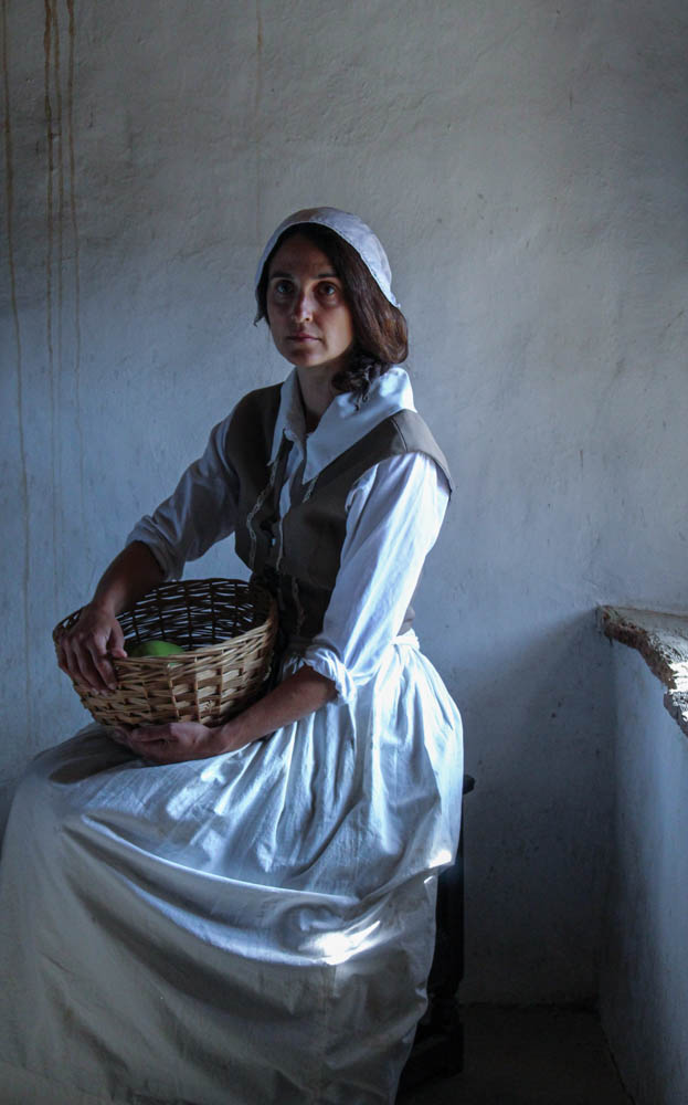
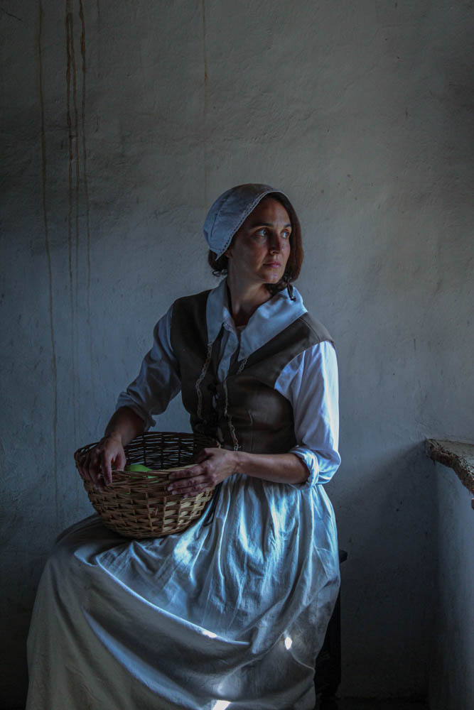
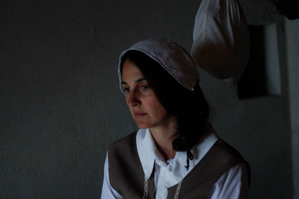
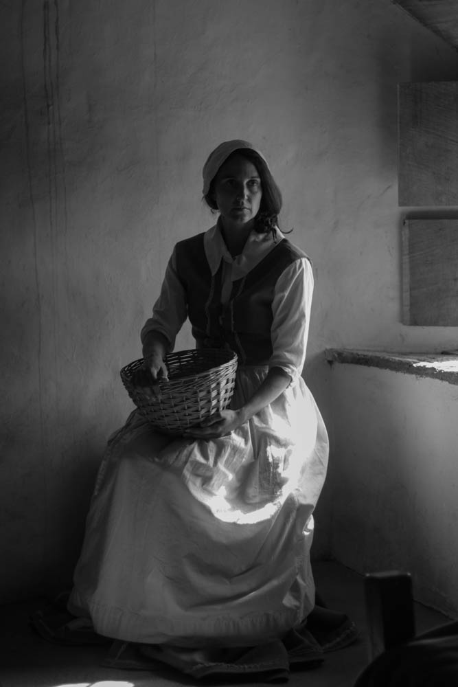
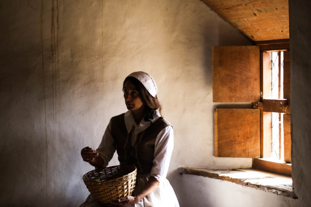
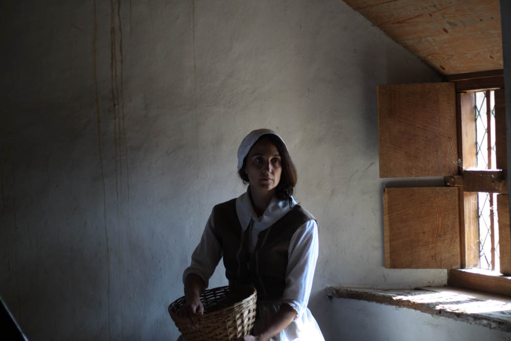
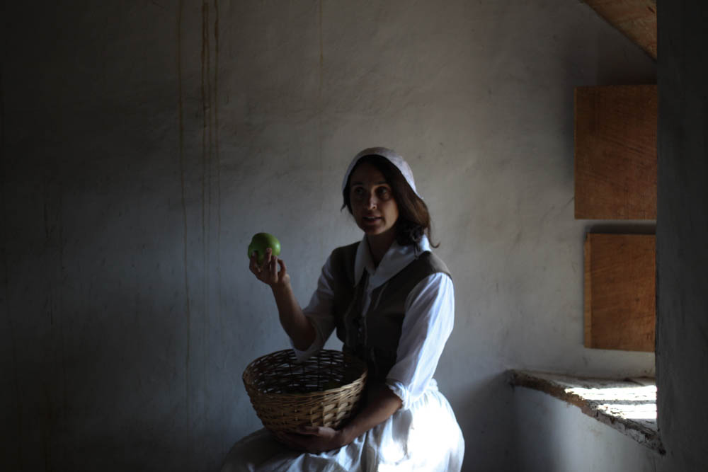
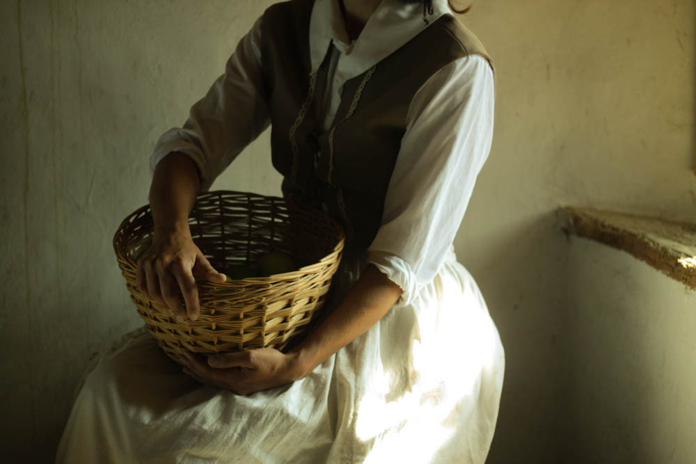
Here are my final images from the portrait shoot at hamptonne. I chose to add a cool tone to the woman next to the window as the light was hitting directly on her , and the cool tones bring out the bright whites of the skirt. I also did this because in those times, they wouldn’t have heating, therefore the room would’ve been quite cold all together. However in the portrait the top left (of the woman in the kitchen next to the fire) I chose to add warm tones as she is in the one room in the house with warmth. This represents the fact that, before the industrial period, they had to create their own heat to keep them warm and healthy, and i represented this through the tones of the images.

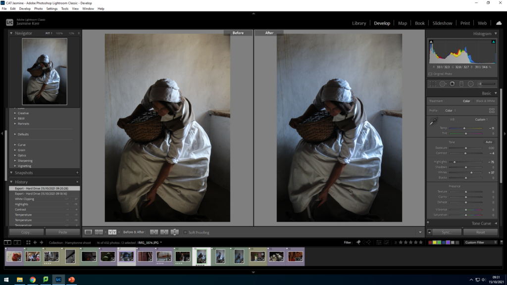
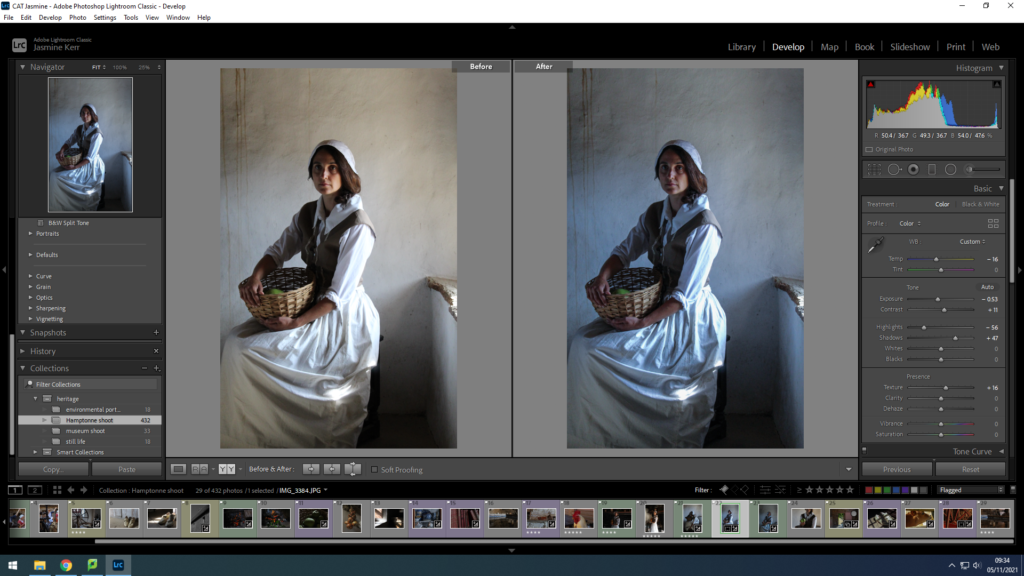
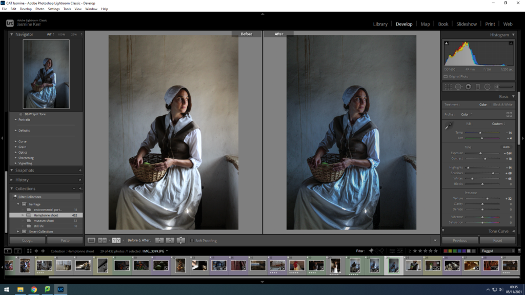
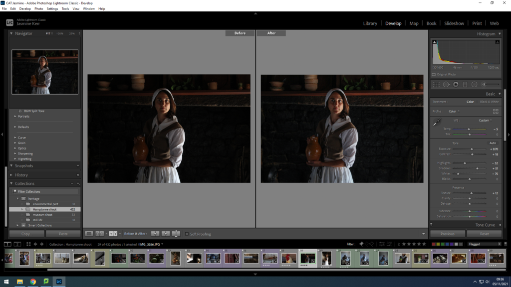
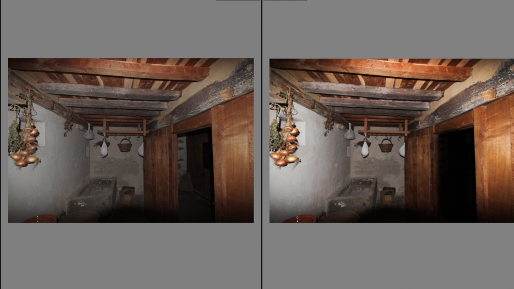
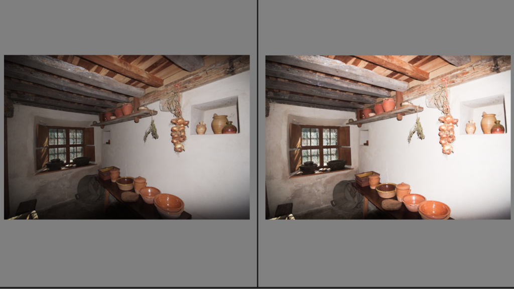
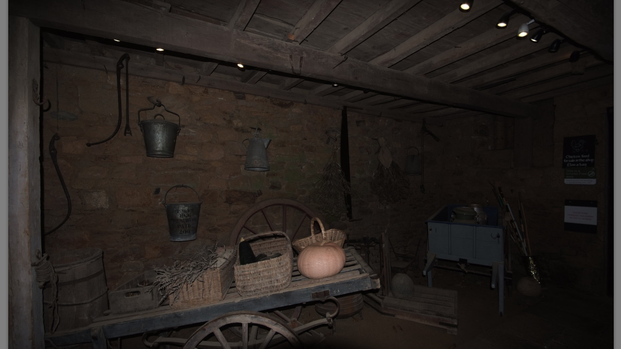
A selection of my interior photos I took at our trip to Hamptonne farm, the photos of show have been made to represent the before and afters of editing which were edited using Lightroom
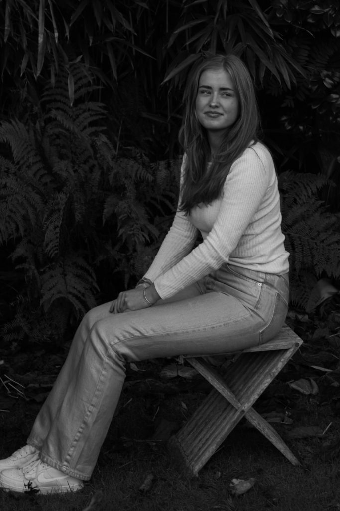
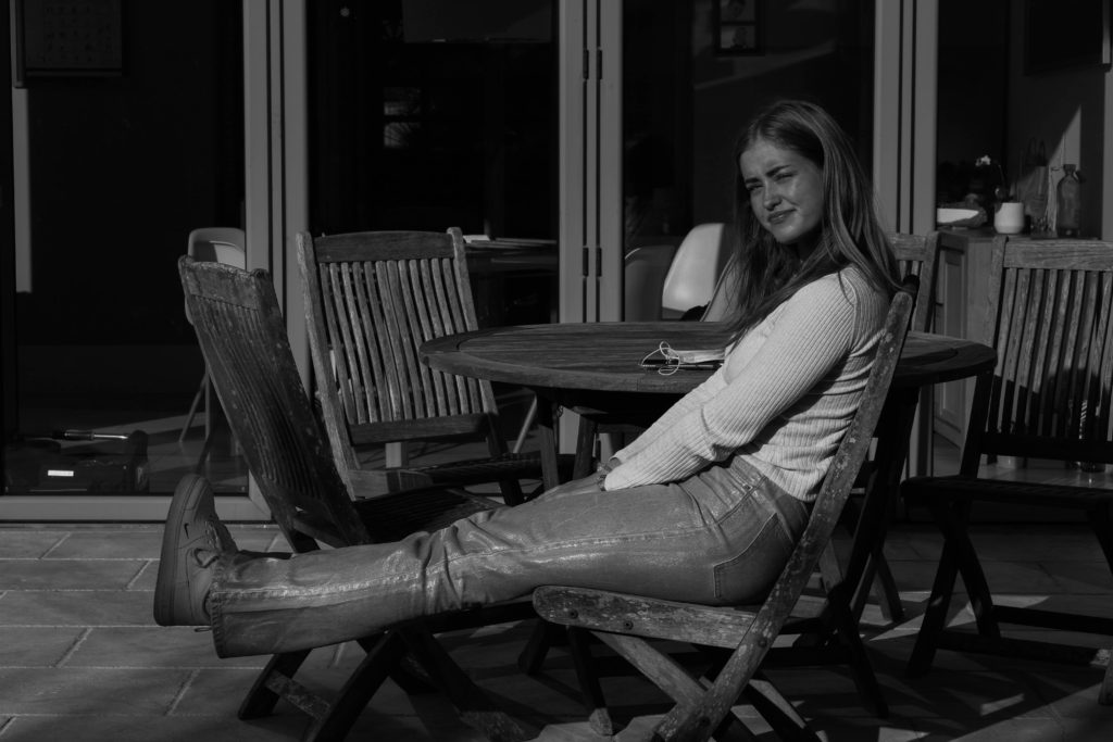
This is my outdoor Arnold Newman inspired photoshoot. I chose to photograph my friend Ingrid in her garden as it is a place where she spends a lot of her time during the warmer months, sunbathing and having barbecues with her family and friends.
Original photos – unedited
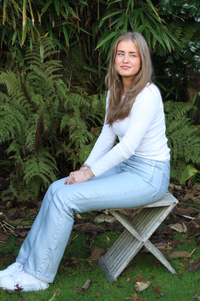
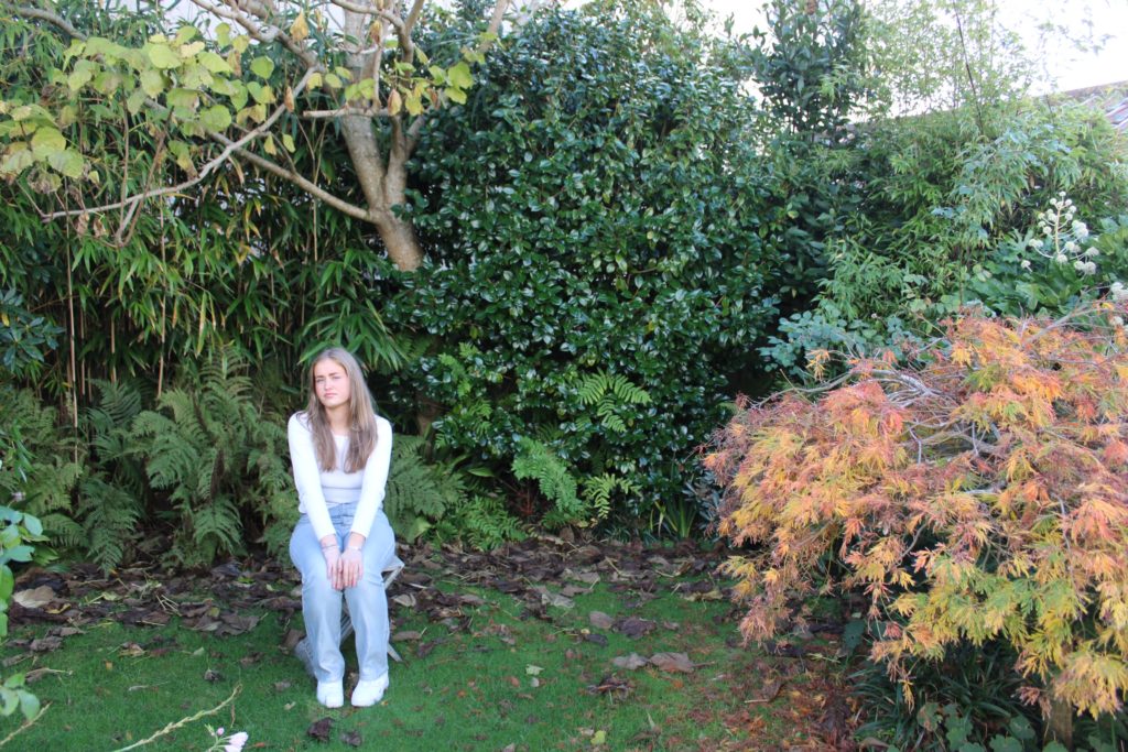
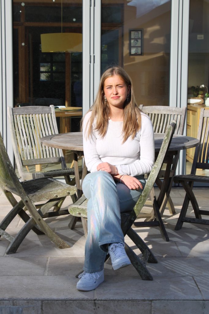
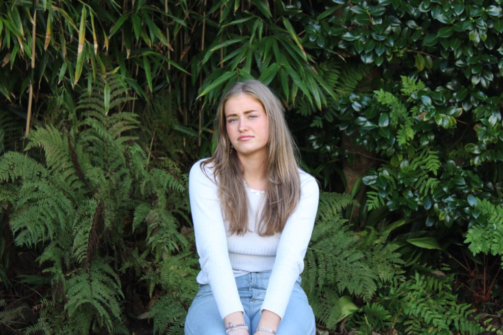
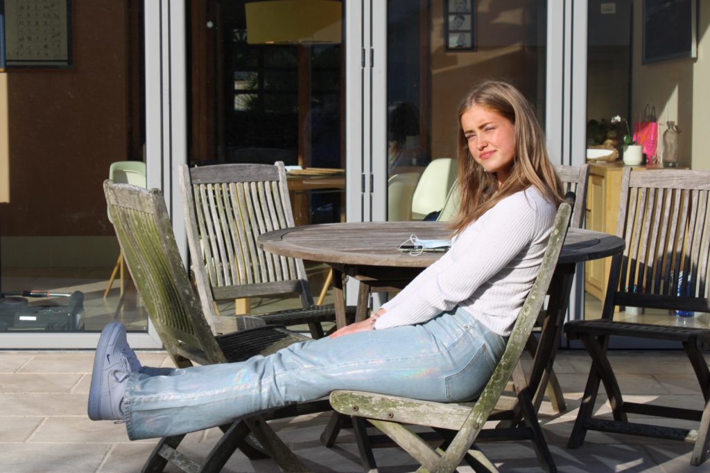
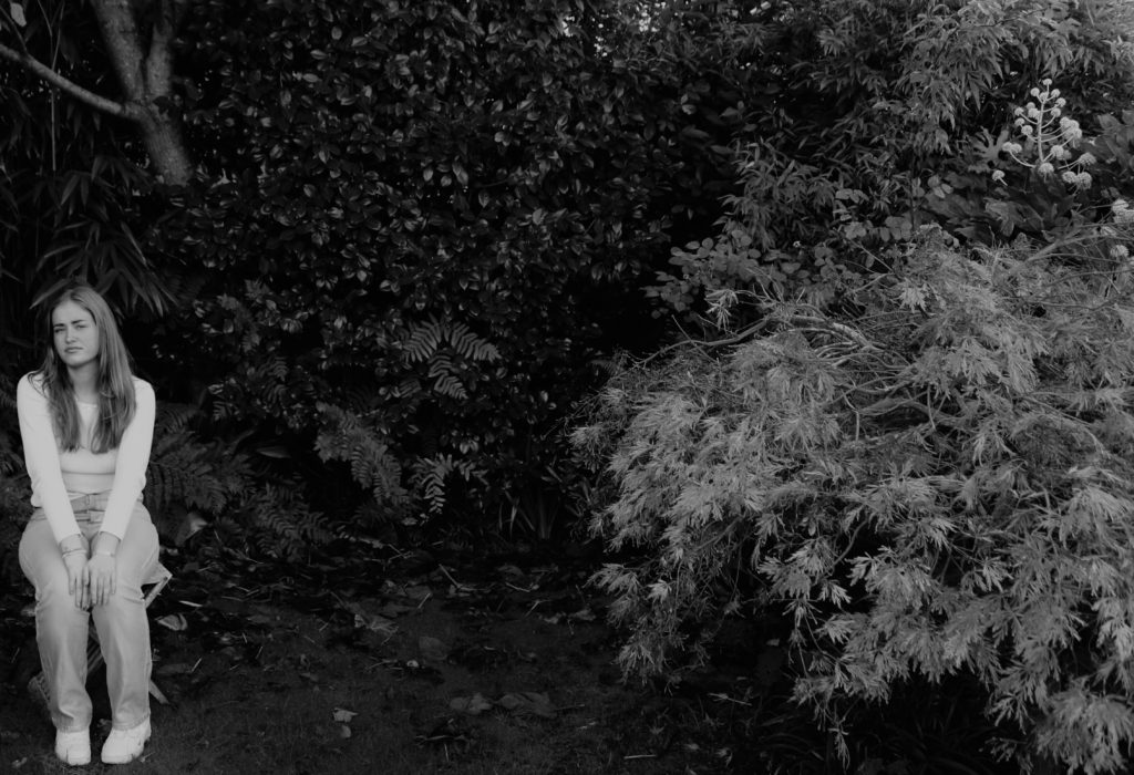
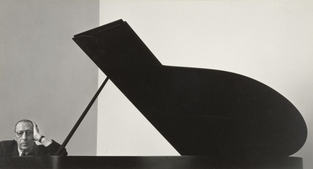
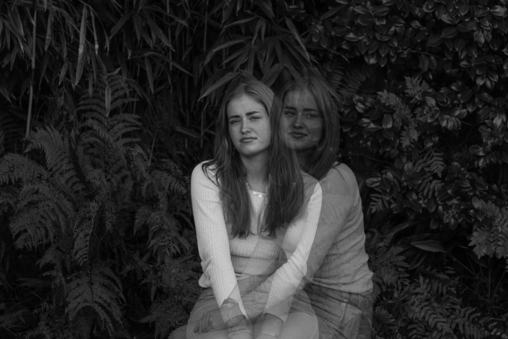
This image is inspired by Newmans ‘Igor Stravinsky’. I loved his placement in the image and wanted to emulate it. I believe the placement of having Ingrid small in the left hand corner could symbolise humans subordinate size compared to nature, or Meer size of the individual on earth.
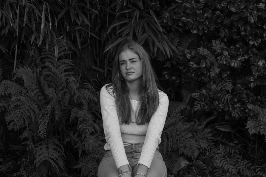
I love the contrast in this image of her light skin, hair and clothing compared to the ominous darkness of the vegetation behind her.
When I went on the Hamptonne trip, I noticed several interesting objects which stood out to me, so, naturally, I took pictures of them.

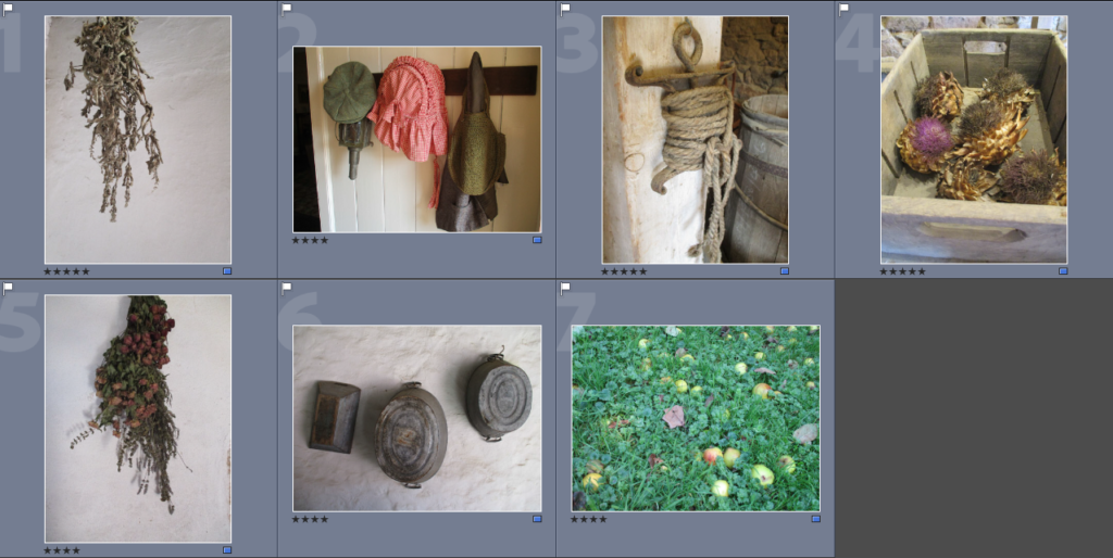
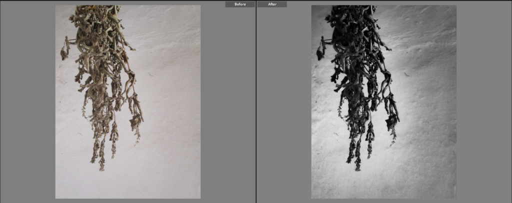
I chose this image because I like the way it is laid out, with the plant hanging from the top left of the image. I chose to make this image black and white because I wanted the shadows on the plant to be even more vivid, giving it more depth. The black and white also creates a contrast between the dark hanging plant and the light-grey background. I also decreased the images exposure slightly, which gave the background a grey-ish colour, which gets lighter the closer it is to the object, I like this effect as it makes the object stand out more. The background is fairly plain as it gives the object more of an emphasis.
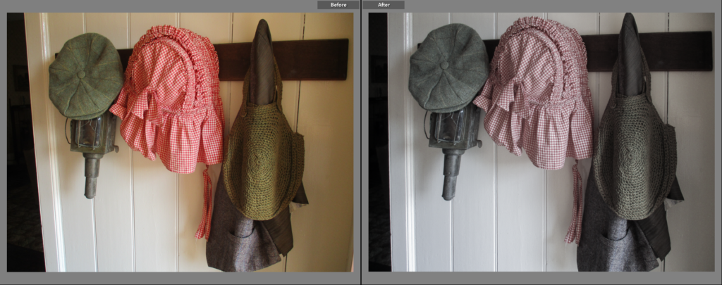
I chose this image because I thought the objects and the patterns on them were interesting. I decided to give the image a low saturation because it allows the colours to stay in the image, while also giving it a older look. I like the way the colours ended up, it looks close to a black and white image, but the faint colours gives it an interesting look to me. The lighting in this image is very soft, which doesn’t allow much shadow to come through, this makes the objects slightly clearer, while the shadow that is seen gives them an interesting pattern.
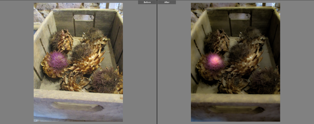
I chose this as a Final Image because the objects inside the crate intrigued me. I wanted to make the pink on the artichoke stand out from the rest of the image by making it more vibrant and appear glowing, I wanted to make the rest of the image have less colour and vibrancy in order to make a more noticeable contrast. I think the shape of the artichokes gives the image an interesting look by not only giving it a lot of sharp lines and patterns, but also giving it more shadow. I lowered the exposure a fair amount in this image because I thought it was slightly too bright, I think this makes the image look more mysterious, maybe alien-like.
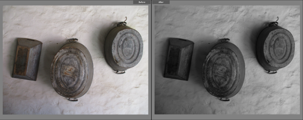
I chose this image because of its simplicity. I like how light is shown in this image: being at its brightest on the right and darkest to the left, the position of the light also gives the objects an interesting shadow. I think black and white goes nicely with the image as it makes the objects more vivid. I think the way the objects are almost in a line gives the image a nice composition. I decreased the exposure in this image slightly because I think it complements the black and white filter nicely, and also makes the difference in tone made by the shadow more noticeable.
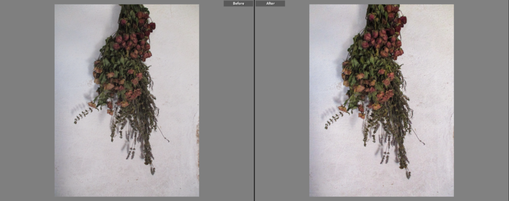
I chose this as a Final Image for similar reasons as the first picture on this post: how the object is left dangling from the top of the image and how the background behind the object is plain, this allows the object to ‘breathe’ by giving it space in the photograph. Because the colour on this image is more varied and stands out more than the other similar image, I decided to emphasise that colour by increasing the contrast and exposure slightly, making the reds and greens far more noticeable. I also made the lighting ever-so-slightly warmer to make the colours appear brighter and more healthy.
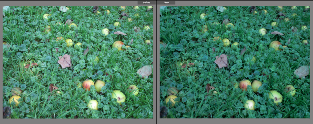
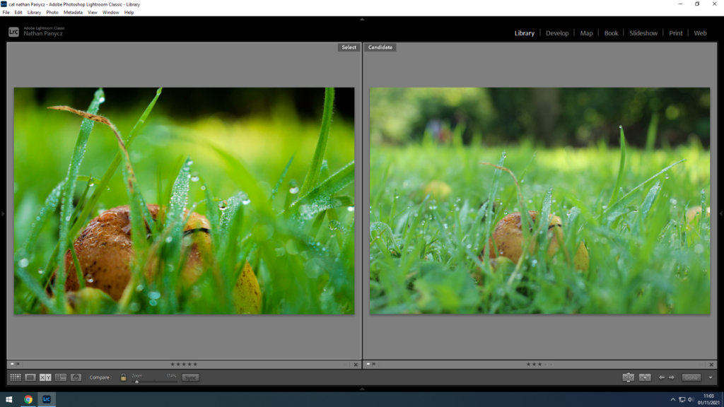
I chose this as a Final Image because I like how it has a lot of colour, probably one of the most colourful images in the photoshoot. When editing, I made the colour of the grass slightly darker, I did this because I not only prefer the darker, slightly blue-ish colour, but also because it makes the apples and leaves on the floor stand out, this makes the apples in particular look almost gem-like and creates a very noticeable or sudden difference in colour.
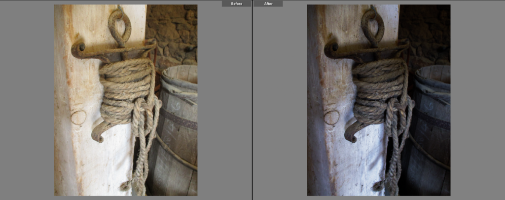
I chose this as a Final Image because I liked the angle that it was taken, as well as how the image is split between the beam the object is hung on, and the further away parts of the image like the barrels and the wall. I decided to make the image darker because I thought that the shadows were not as clear as they could be, it also creates a bigger difference in tone between the left/centre side (the beam and the object) and the right side. I made the lighting in the image slightly colder to give the image a wintery look.
PORTRAITS
INTERIORS
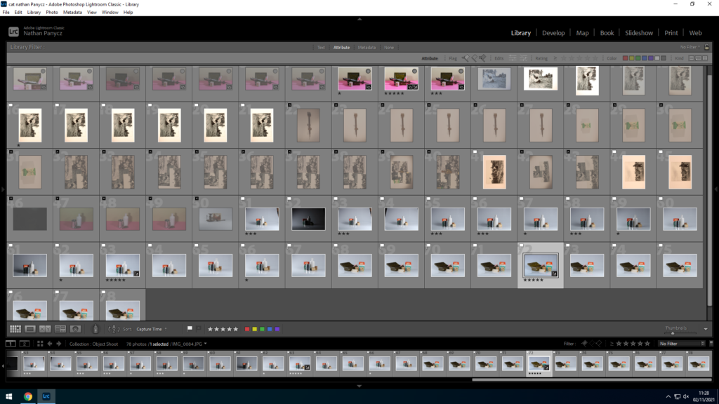
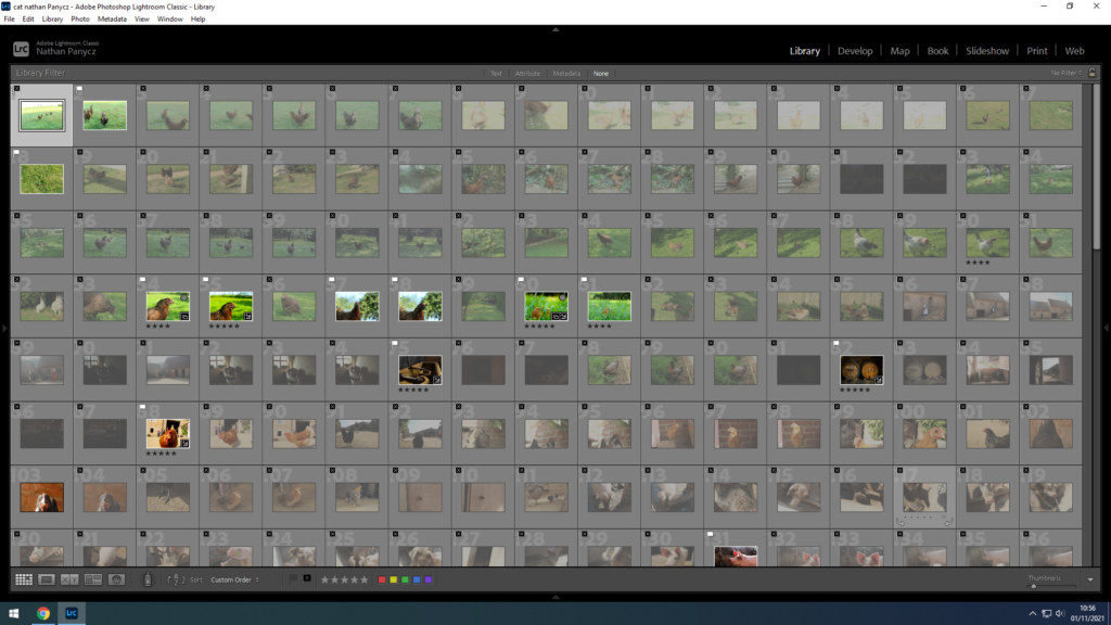
I flagged all the good pictures and rejected all they were too dark or not focused enough.

I selected the best images based on how focused they are, the shadows or lack of them and whether they are overall aesthetically pleasing.

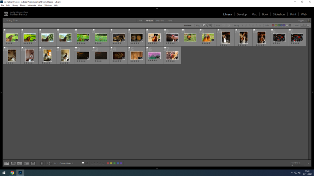
Those were my best picks which I then rated to further narrow down the selection


In this shoot I photographed historic objects as the topic of the shoot is heritage. The lighting in this were two LED studio lights on both sides (bottom right and bottom left). The light were bright and quite close (around half a meter) to the objects to get rid of any shadows, positioned a bit above the objects. The camera was pretty close as well to capture as much detail as possible. The overall temperature is pretty cool as there is a lot of blue-whites and a bit of green, the red peas box really stands out and contrasts the rest of the colours so it draws in the eye, its the first thing you initially see in the photo. The objects are placed in the middle and the camera was taking pictures at eye level rather than the bottom or top. There is a mix of textures from the roughed up edges of the box to the smooth surface of the bottle, I think that makes the picture more interesting.
Cyanotypes as a science-
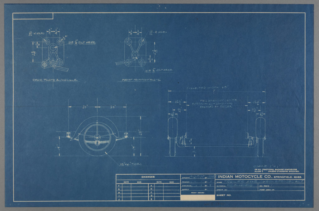
Cyanotypes are a form of printing that was discovered by Sir John Herschel in 1842. It was often used by engineers in the 20th century to make cheap copies of drawings, known as blueprints. When the mixture of iron compounds are exposed to UV light and then water, the paper will turn blue, giving Cyanotypes their name and signature look, and unexposed areas would be white.

Cyanotypes as an art form-
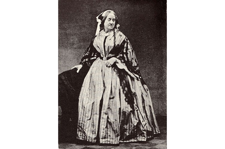
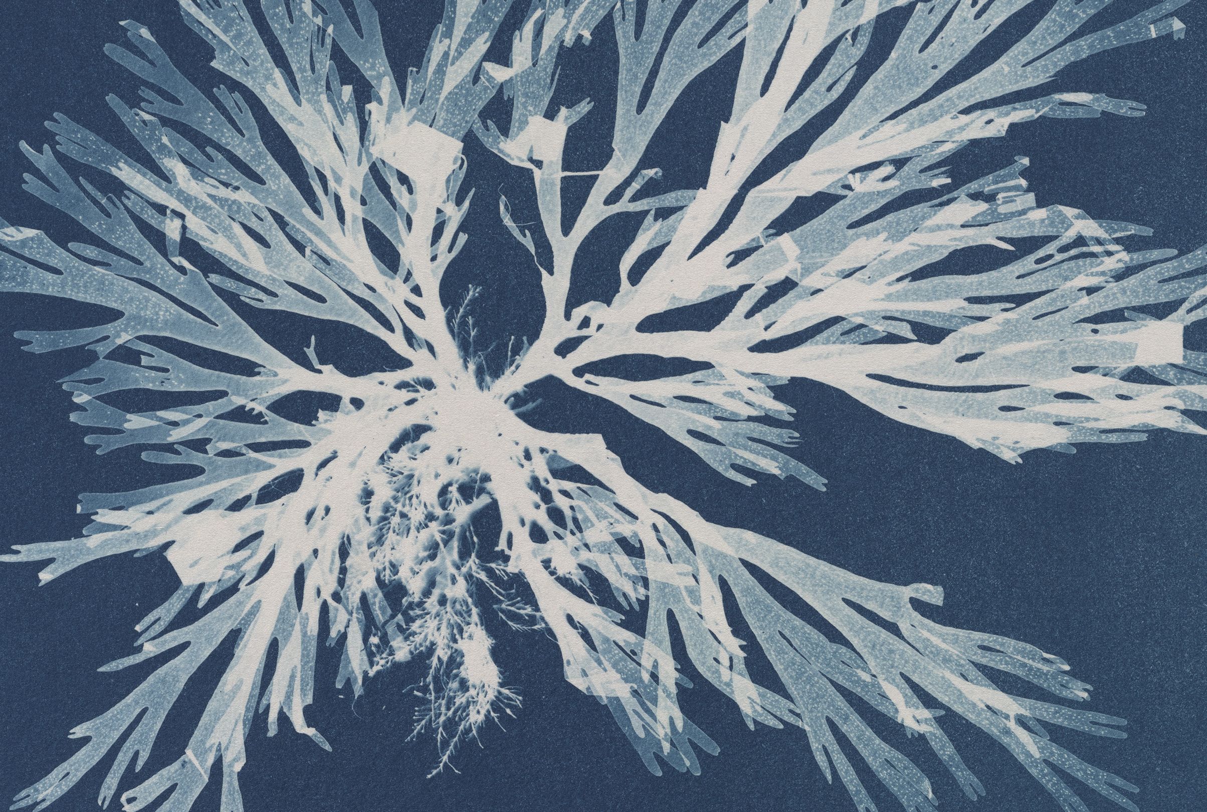
Cyanotypes can also be used as a form of art, with artists able to place interesting and beautiful compositions onto them. Anna Atkins was a British artist, collector and photographer who illustrated a book using cyanotypes, producing detailed blueprints of botanical specimens- this book was called Photographs of British Algae- Cyanotype Impressions and was released in 1843.
My Cyanotype-
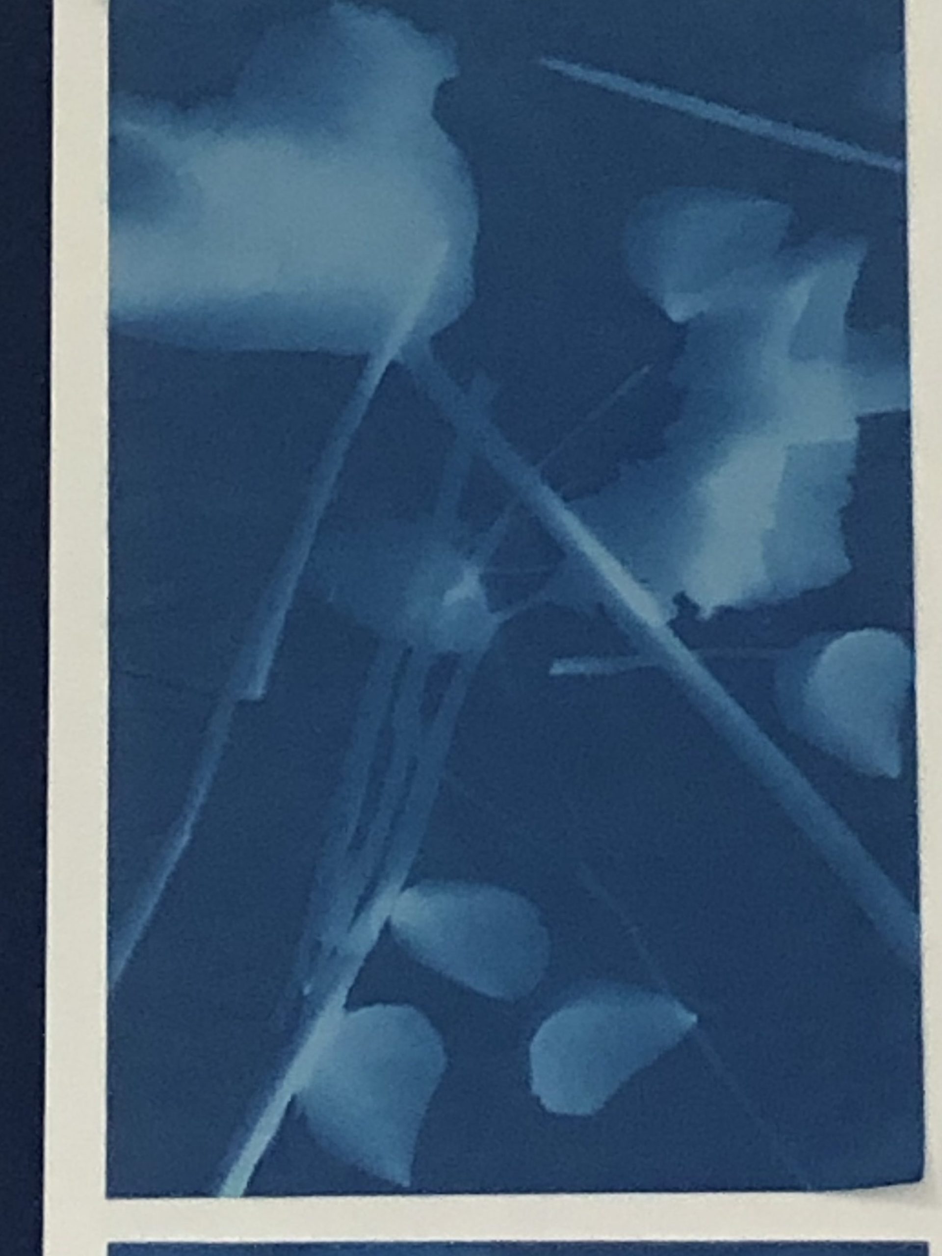
On the Hamptonne trip I had the chance to make my own Cyanotype, I used various things nearby for my composition, like petals and stones. The composition is a little faint but I enjoyed the process.
