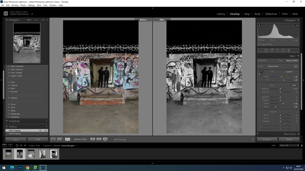
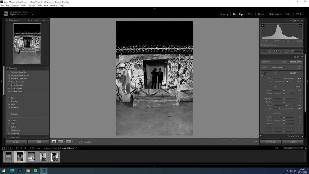
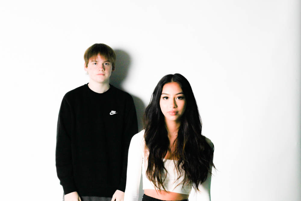
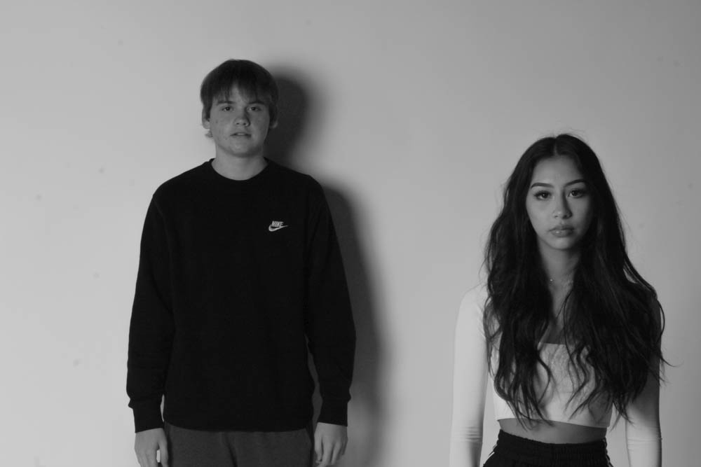
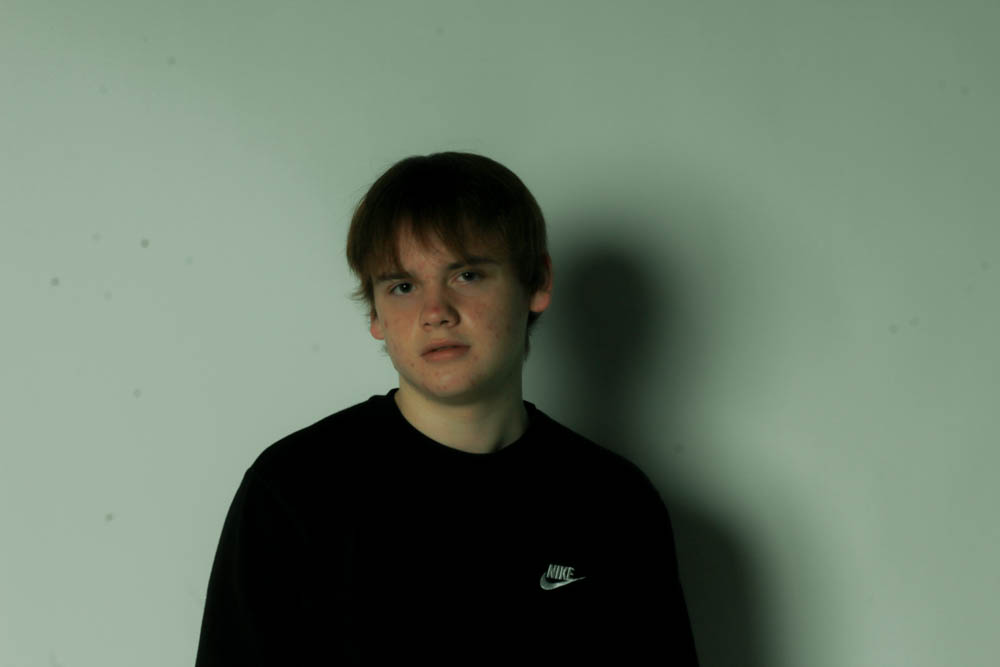
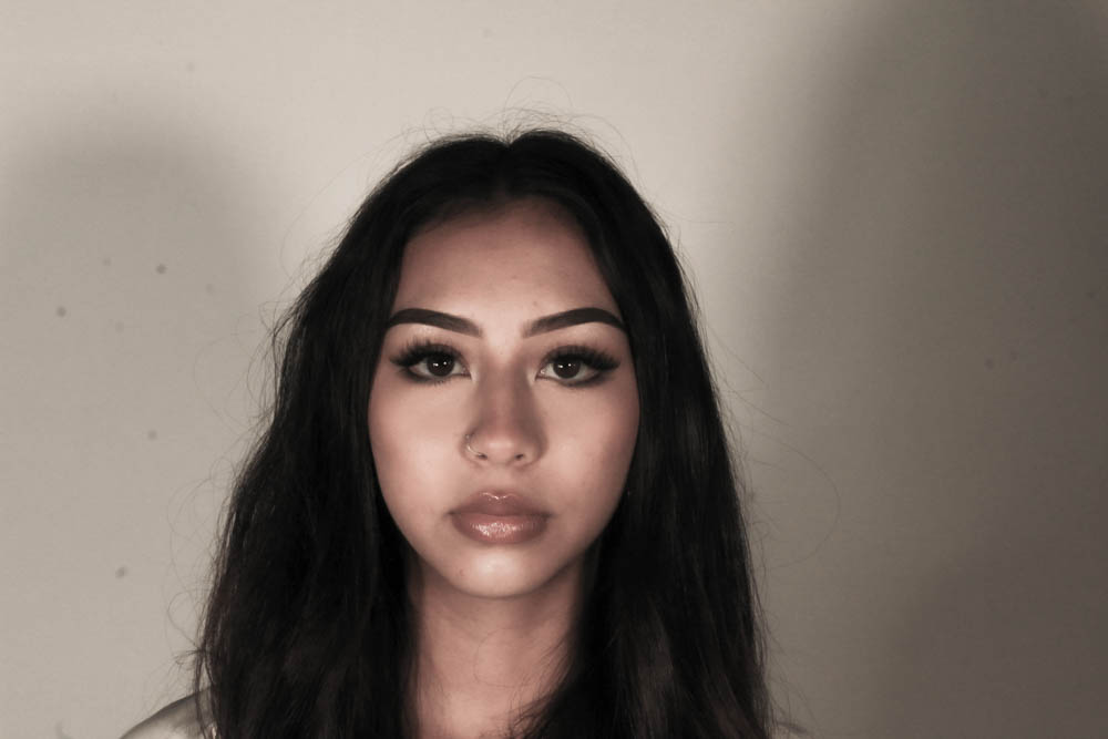
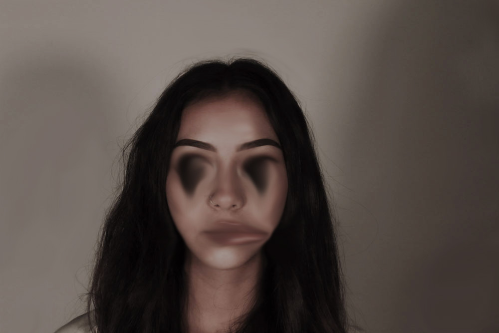
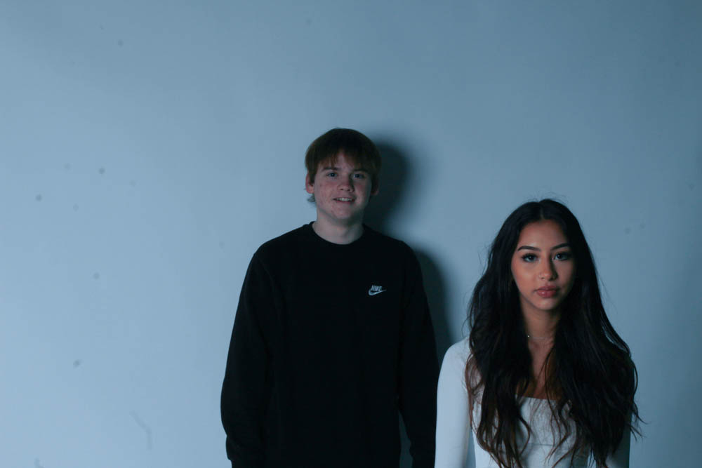
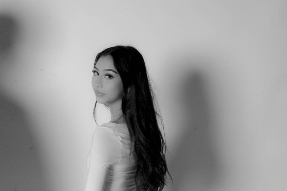
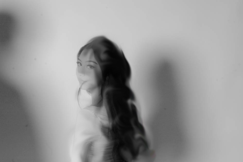
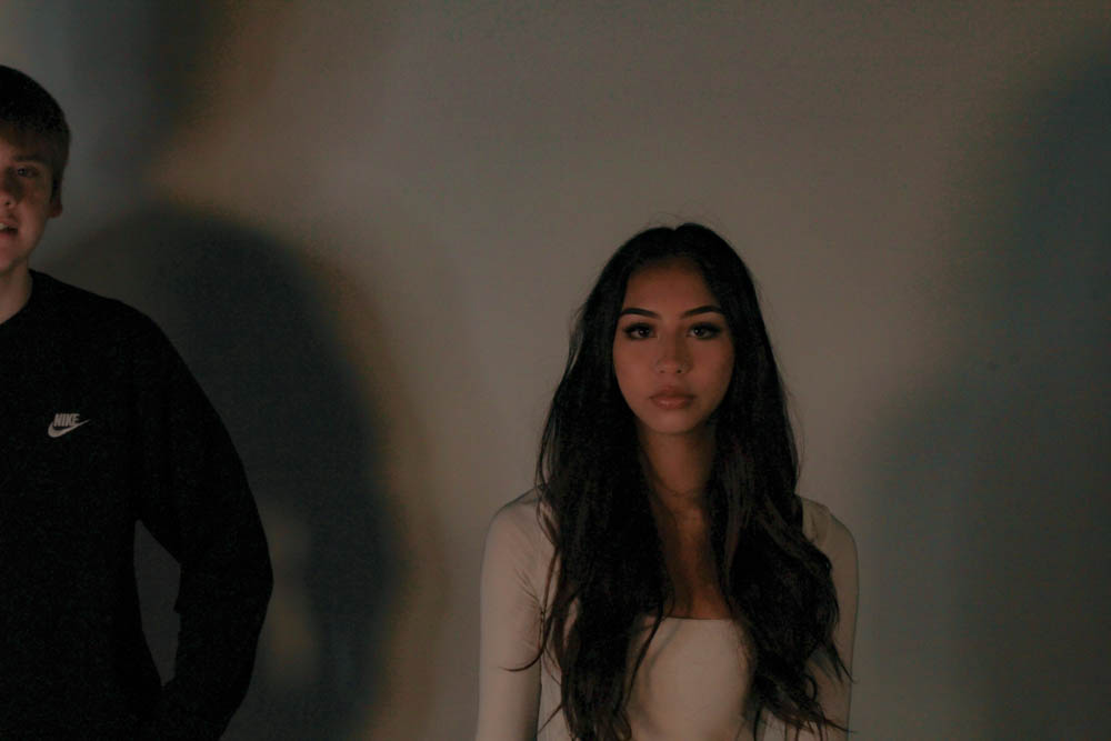
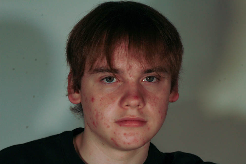
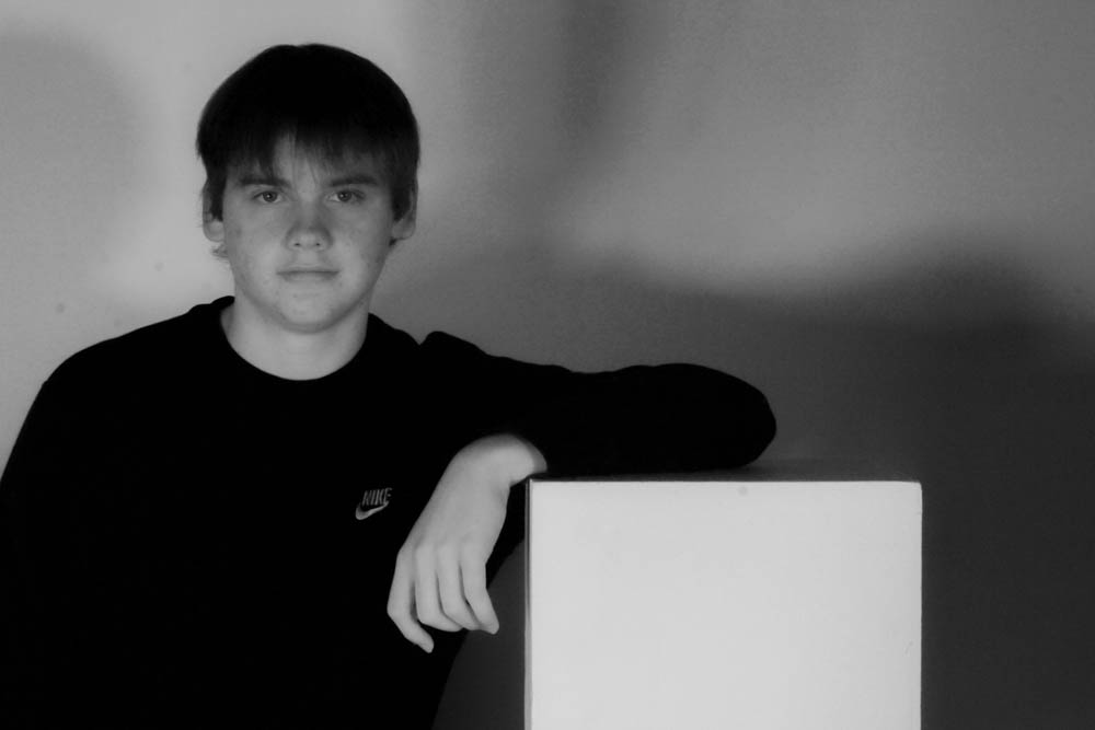
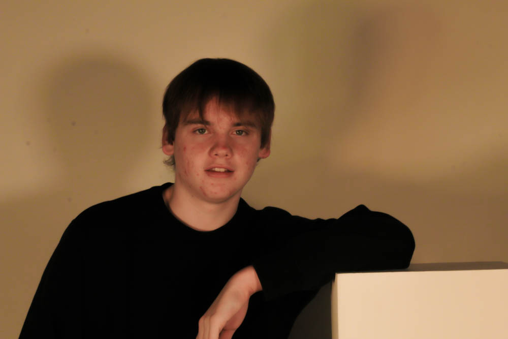
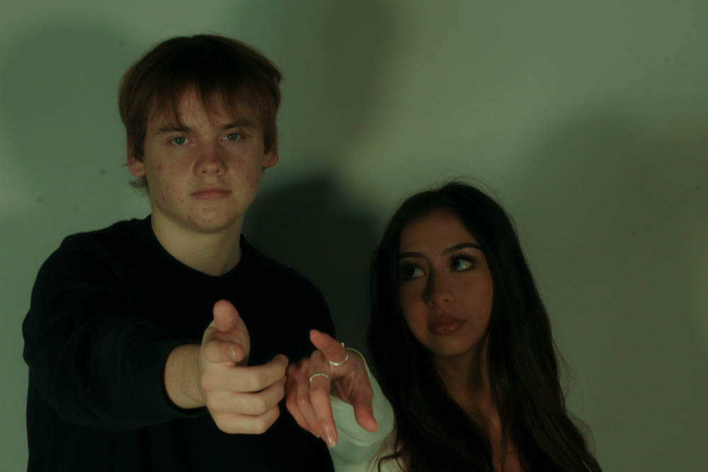
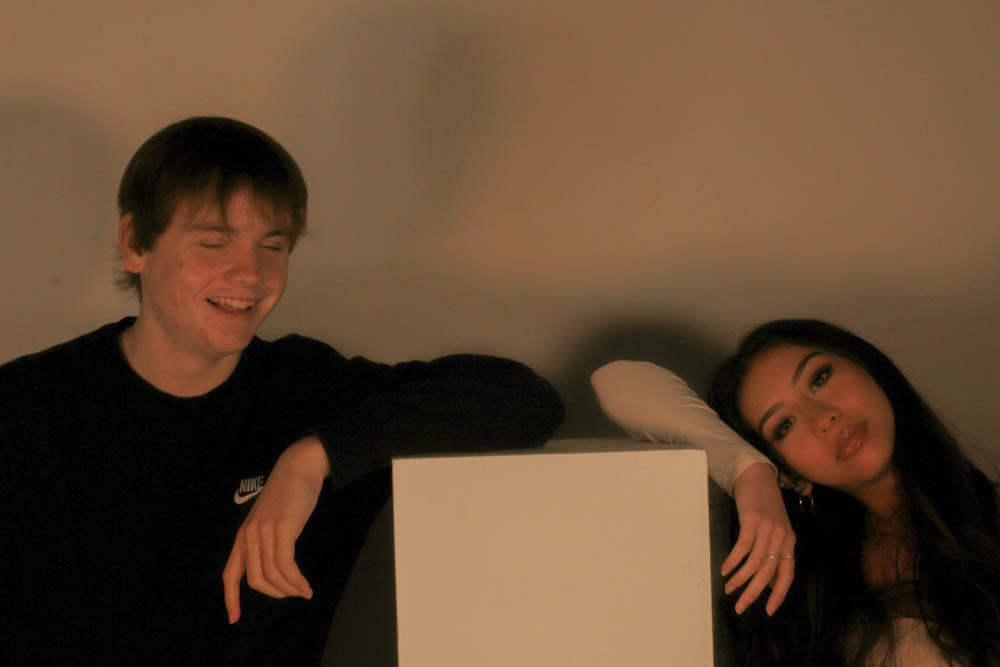
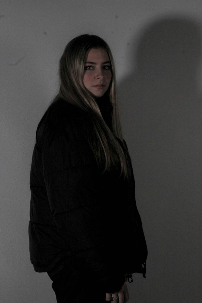
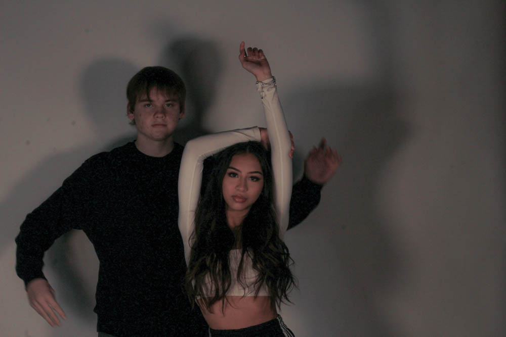
For this photo i changed it to black and and white while adjusting the temp and tiny very lightly and adjusted the whites and blacks
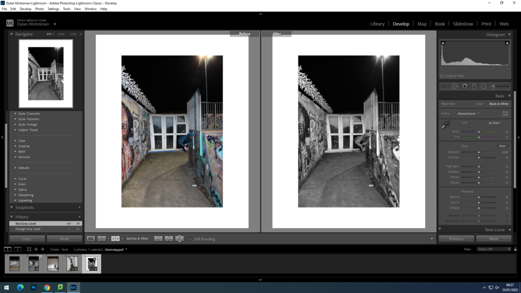
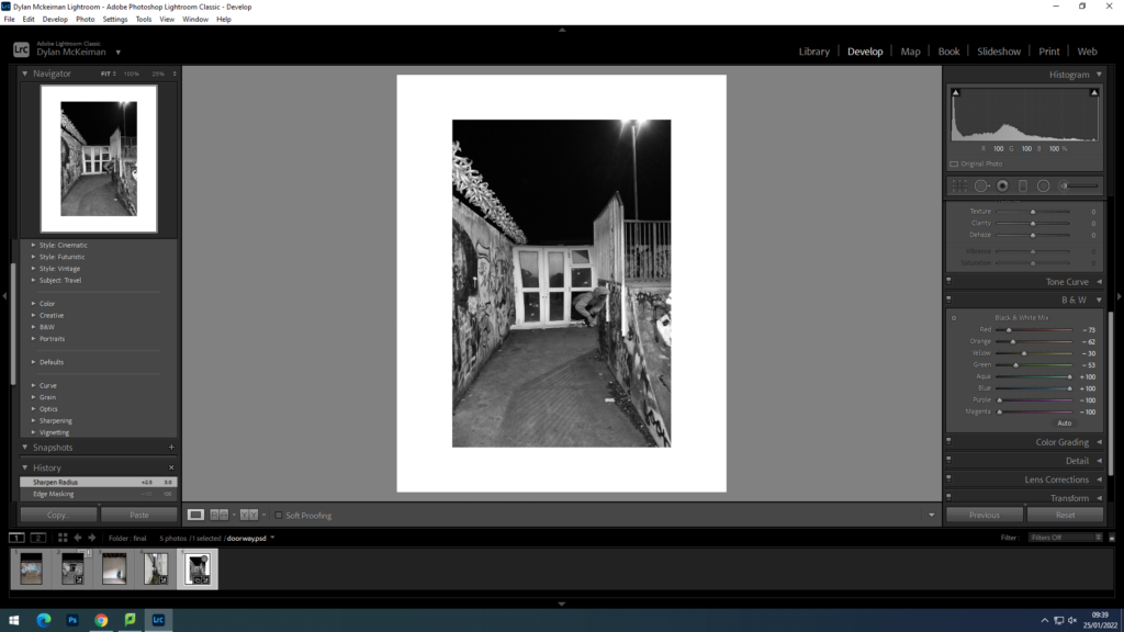
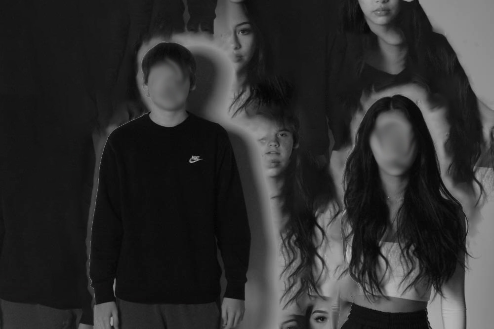
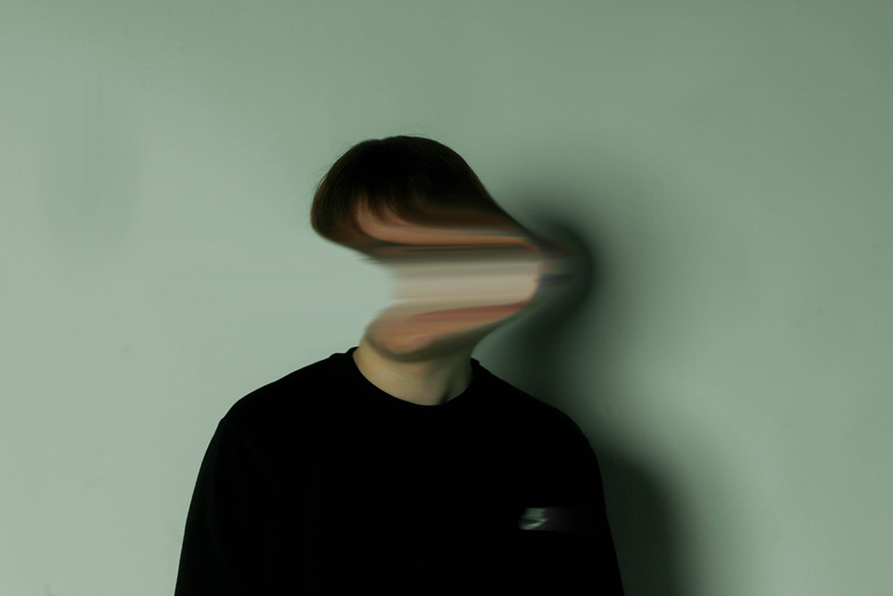
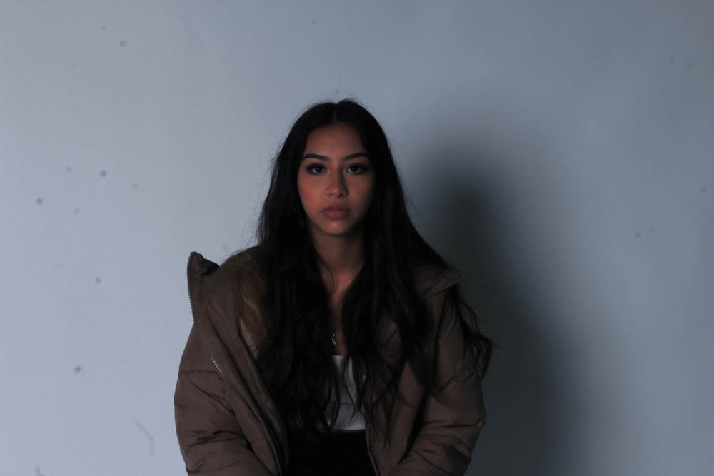
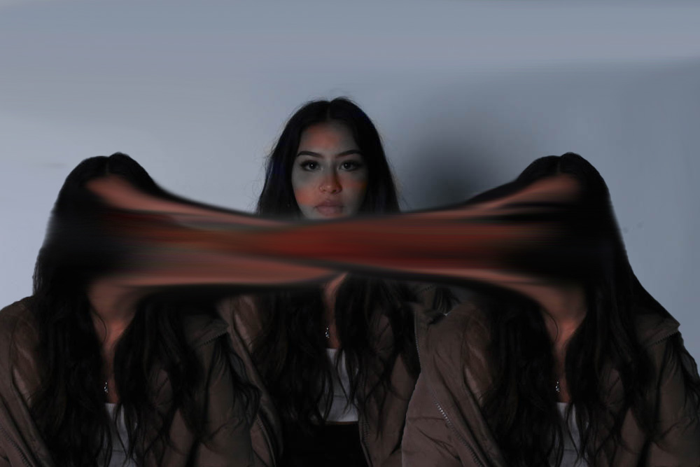
for this photo i adjusted the colour settings in more detail as well as make it black and white


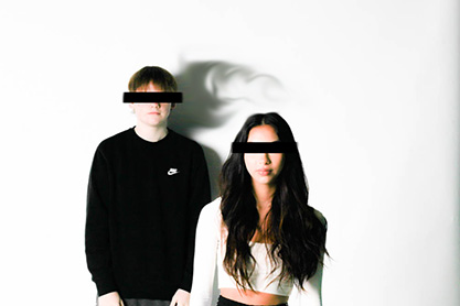
For this photo i changed it to black and and white while adjusting the temp and tiny very lightly and adjusted the whites and blacks


for this photo i adjusted the colour settings in more detail as well as make it black and white
A photograph resembles the likeness of what appeared before the lens. So, in the case of a profile picture, family album or mug shot, identity is based on the repetition of sameness that is evidenced by the image produced by the camera.
How do you show identity in photography?
Typical ways of expressing our identity include our choice of hairstyles, clothing, and make-up through to marks on our bodies including paint, tattoos, scars and piercings. Other aspects of identity such as language, race, ethnicity, religion and occupation are also powerful markers of cultural identity.
How does place affect a person’s identity?
Places also become imbued with symbolic meaning; they inform current self-concepts and can become an important part of an individual’s self-identity. Finally, individuals use aspects of place to support various identity-relevant projects, such as creating a continuous sense of self and self-worth.

Photography Ollie Murphy
for this photoshoot me and my friends went to the old waters edge hotel at bouley bay i mainly used natural lighting for this shoot to try show the real damage and story of a place like this
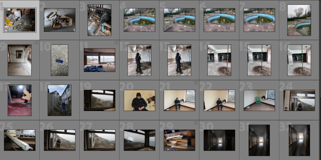
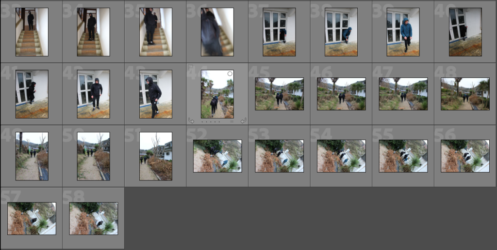
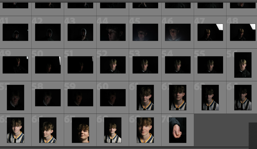
Identity is how you are perceived and what makes you who you are. A certain place you visit frequently can become a huge part of your identity, how you have grown up can play a big part on mental health which also creates your identity, sad looking/happy looking.

mood board


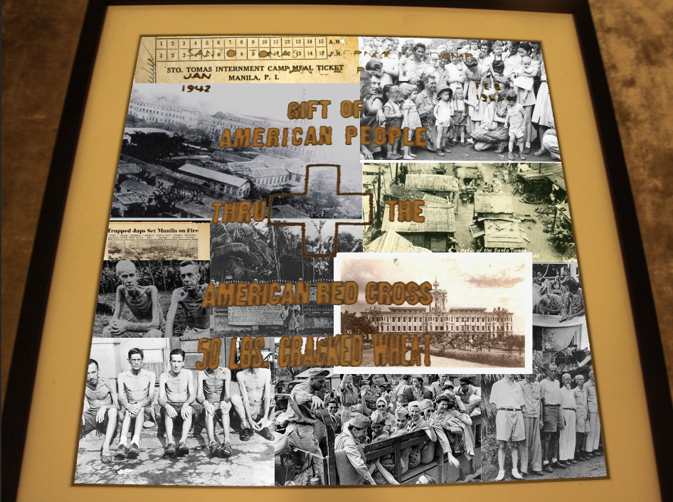
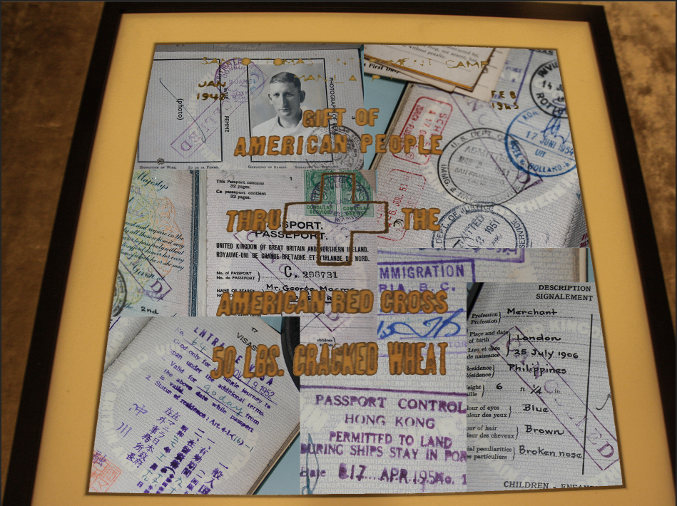
I focused my project on my grandads belongings. He died before I was born but he had an interesting life. I focused a lot one of his passports.
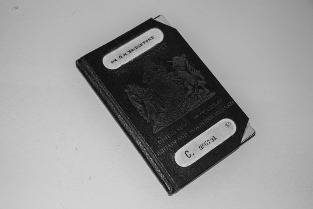
I chose one which was valid during a time he was working. I did this because he had a job on a boat, so the passport had many stamps from different locations across the world.
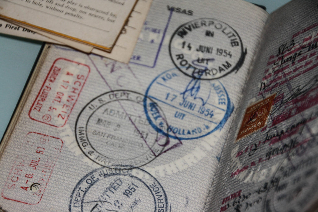
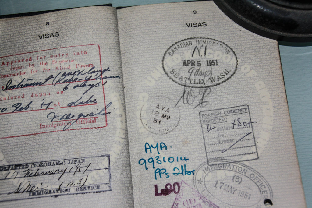
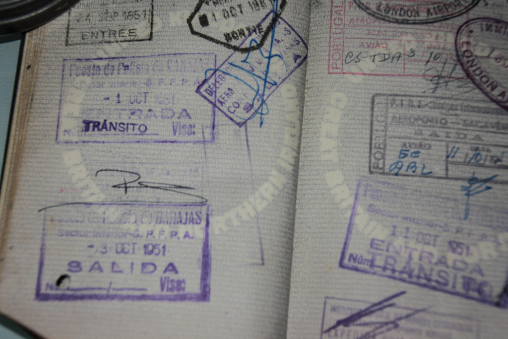
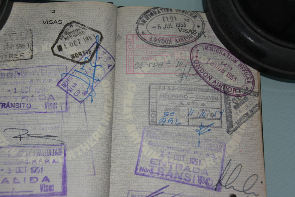
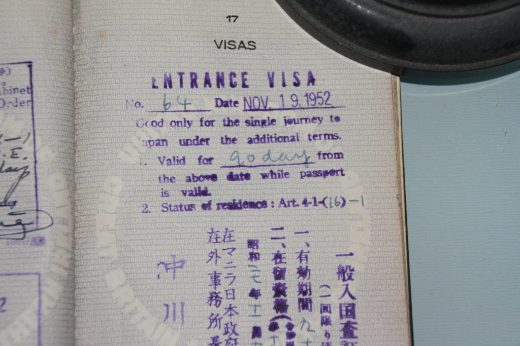
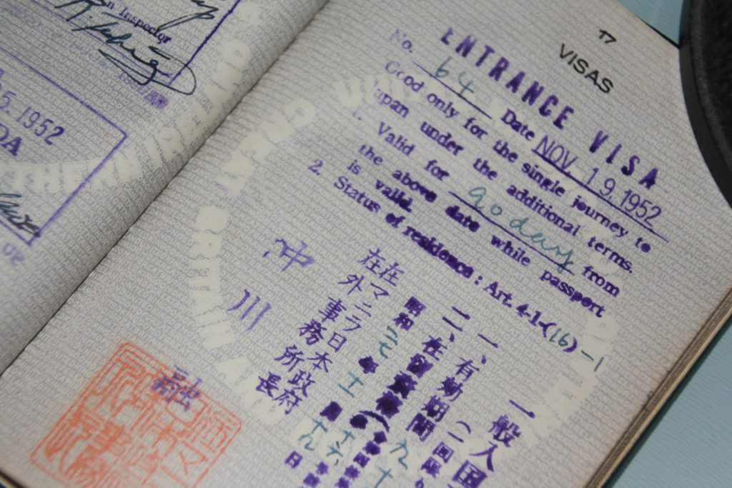
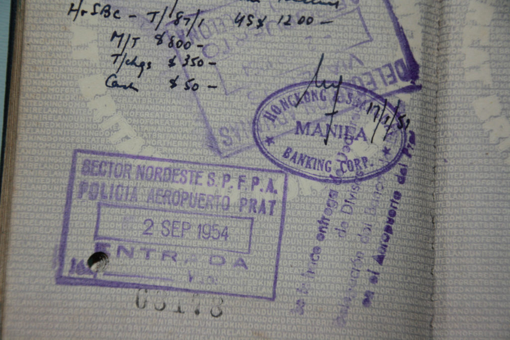
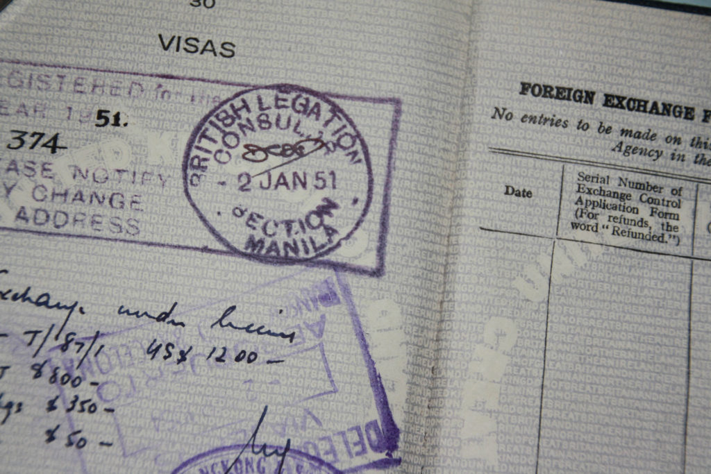
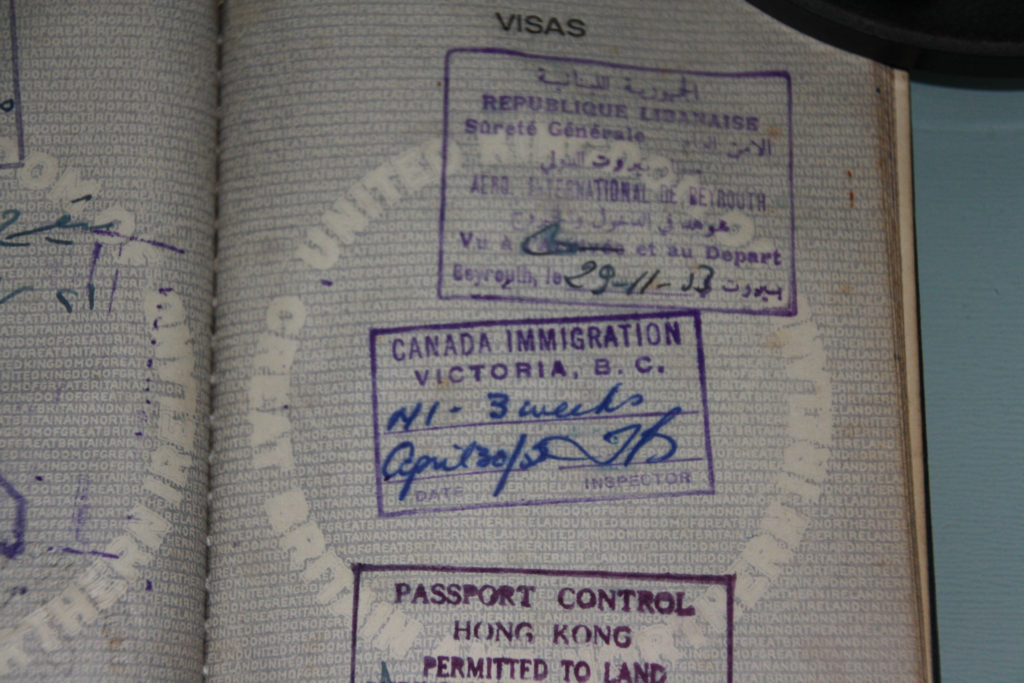
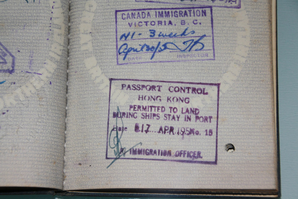
Part of the reason I chose to do my project on him is because I was named after him.
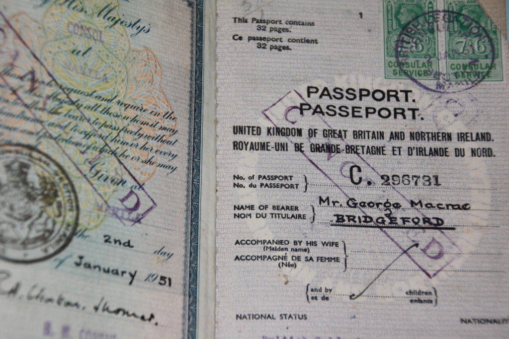
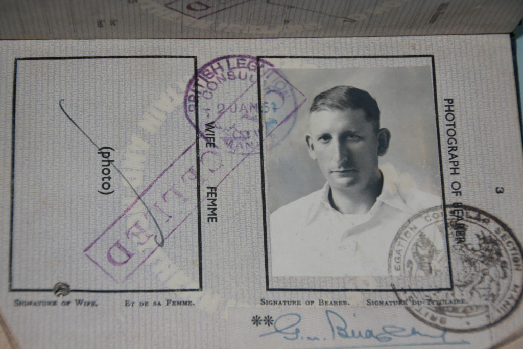
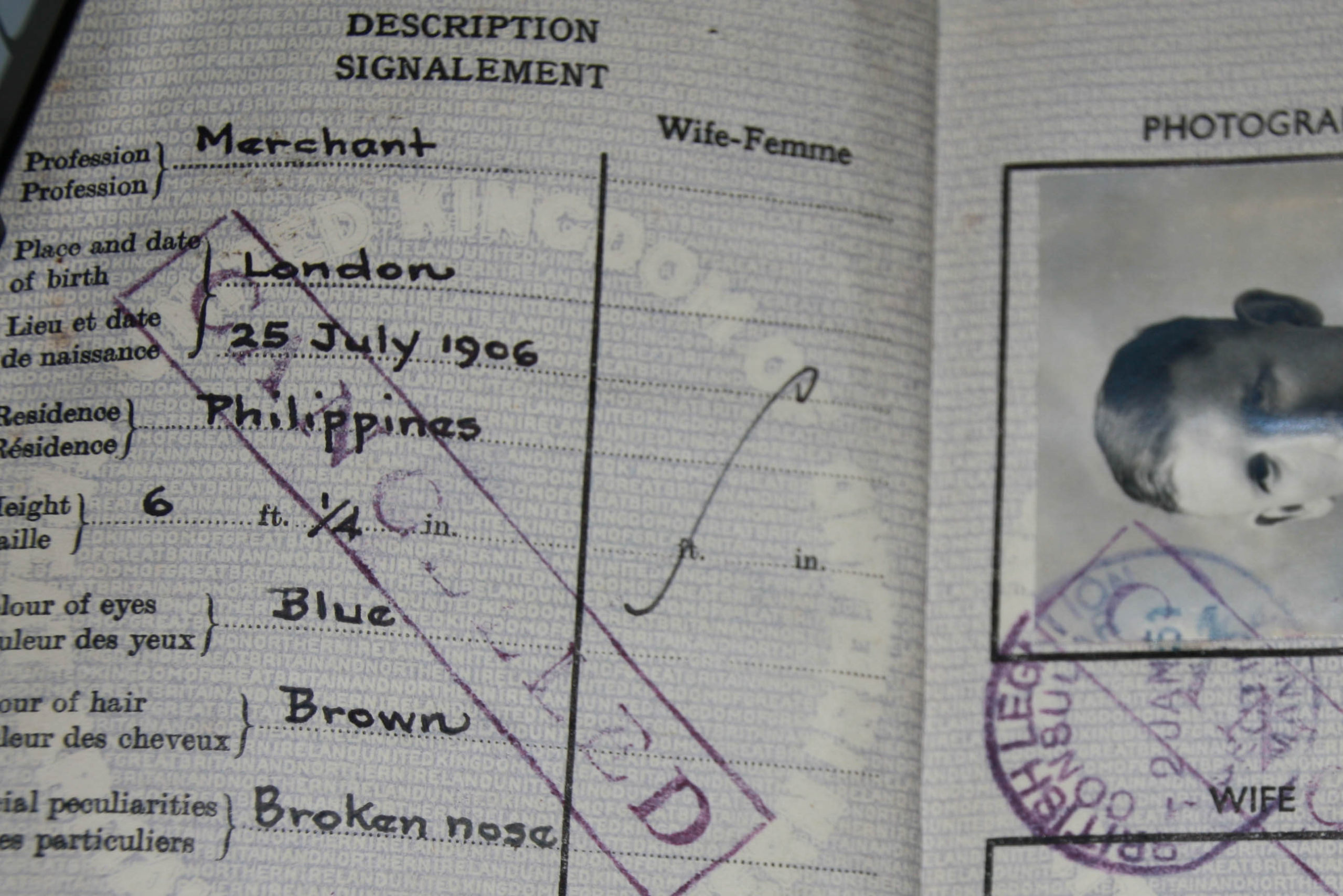
I also chose to base my project on this because he was captured in the war. While he was living in Manila, he was captured by the Japanese when they invaded. They put him in Santo Tomas Internment Camp, the biggest Japanese camp in the Philippines at the time.
It was not a concentration camp, but the conditions were very poor and prisoners barely got any food. This resulted in many dying from starvation. After the liberation by the Americans, they photographed the ones who survived.
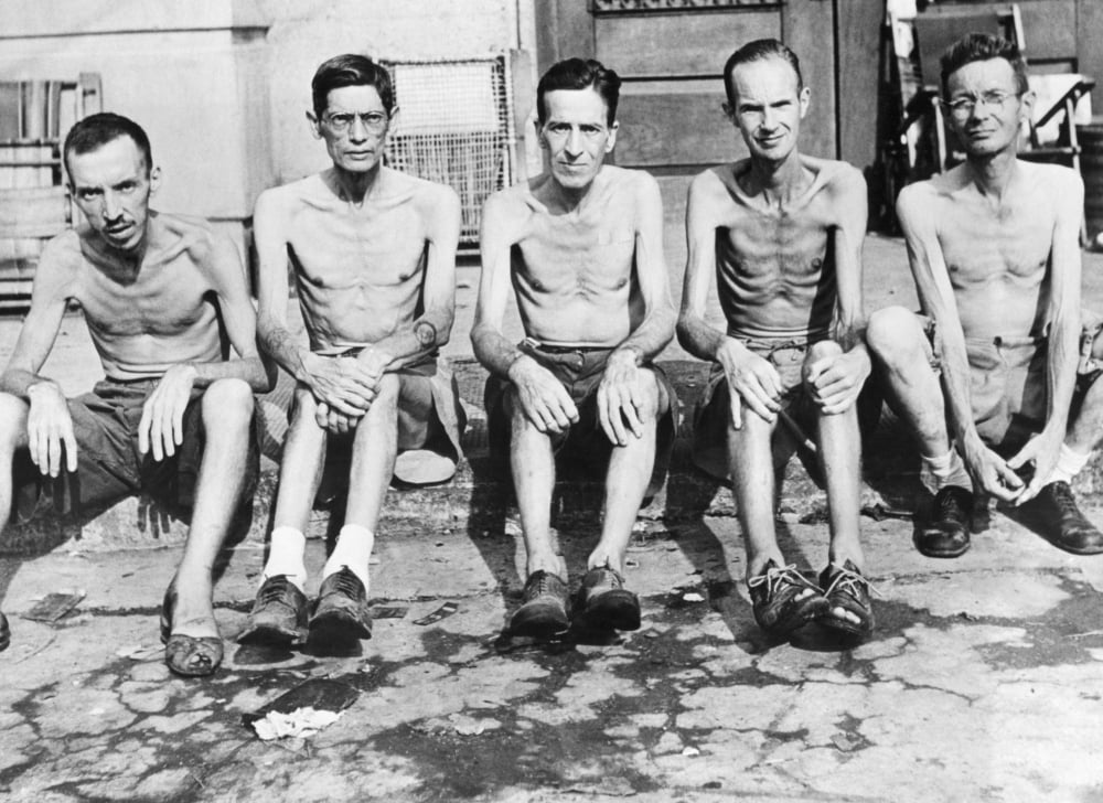
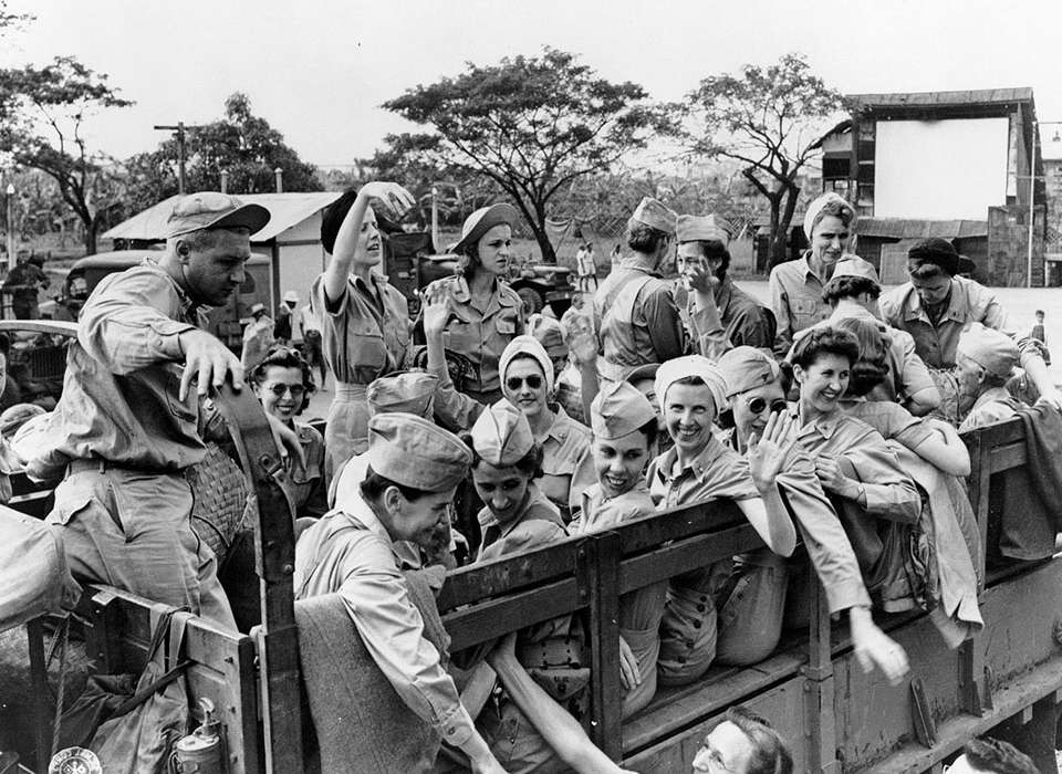
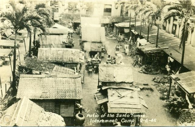
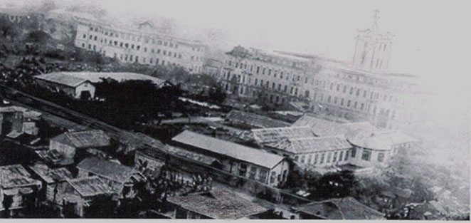
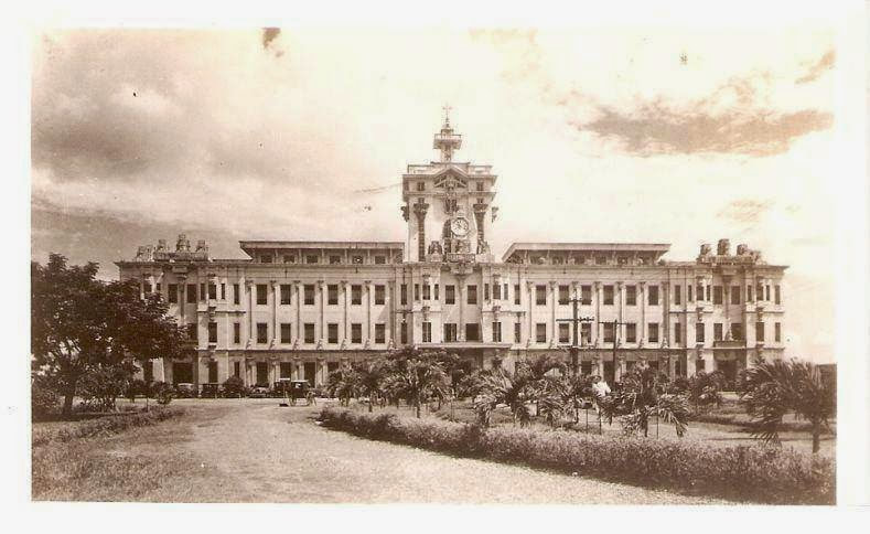
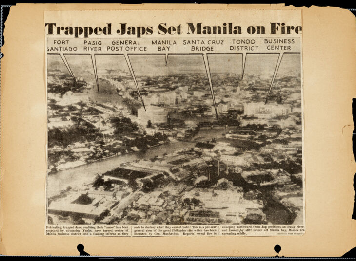
My grandad kept a declaration of wheat given by the Americans after they liberated Santo Tomas.
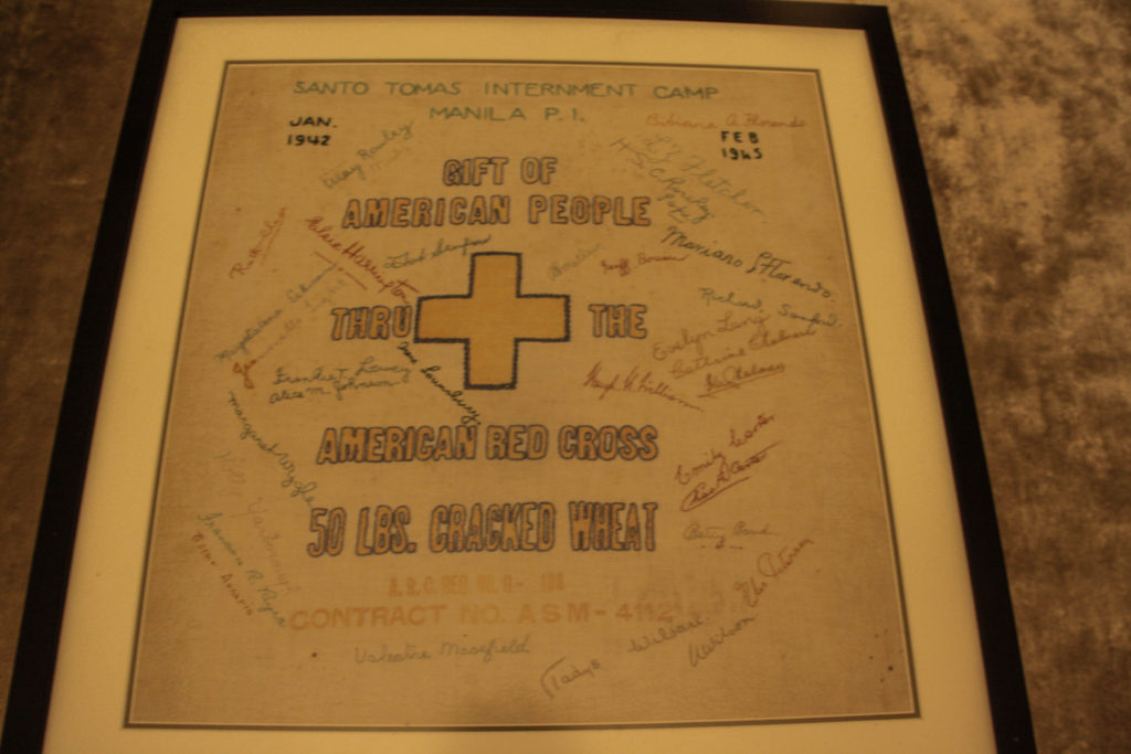
I used this as a backdrop to take some of my photos:
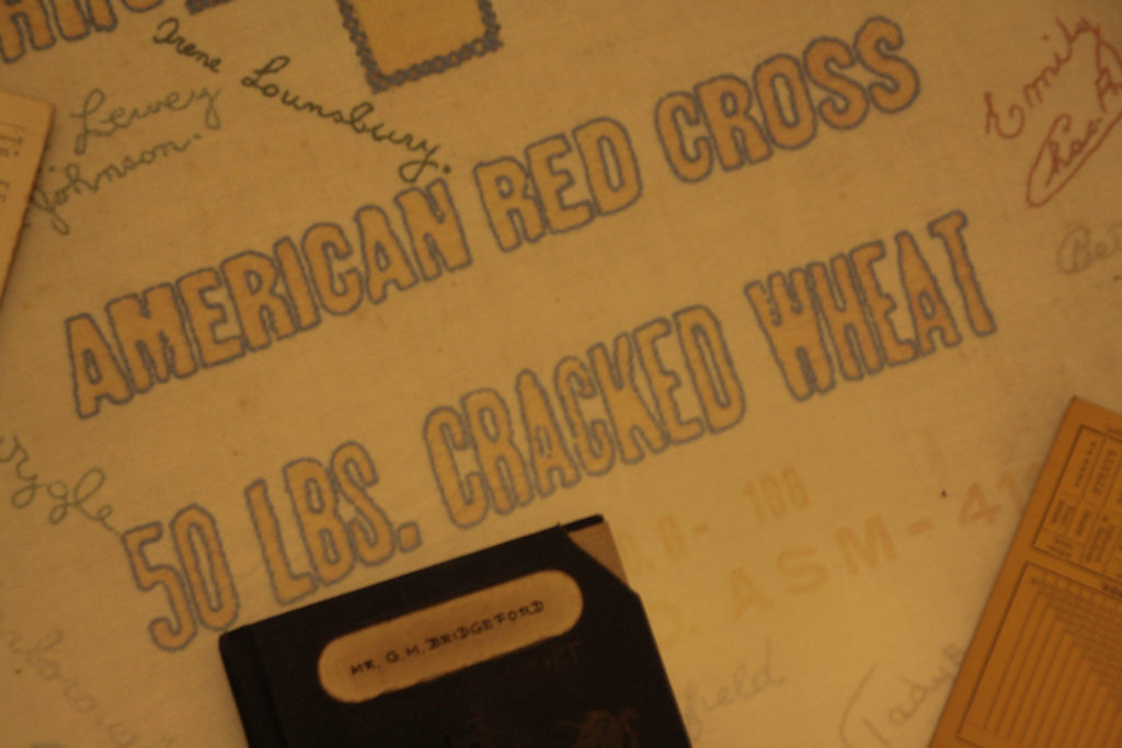
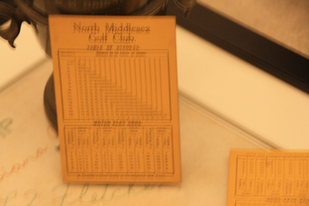
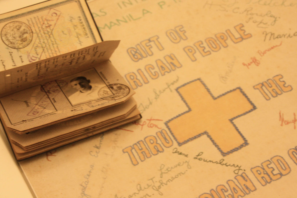
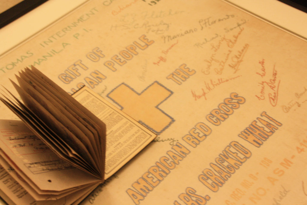
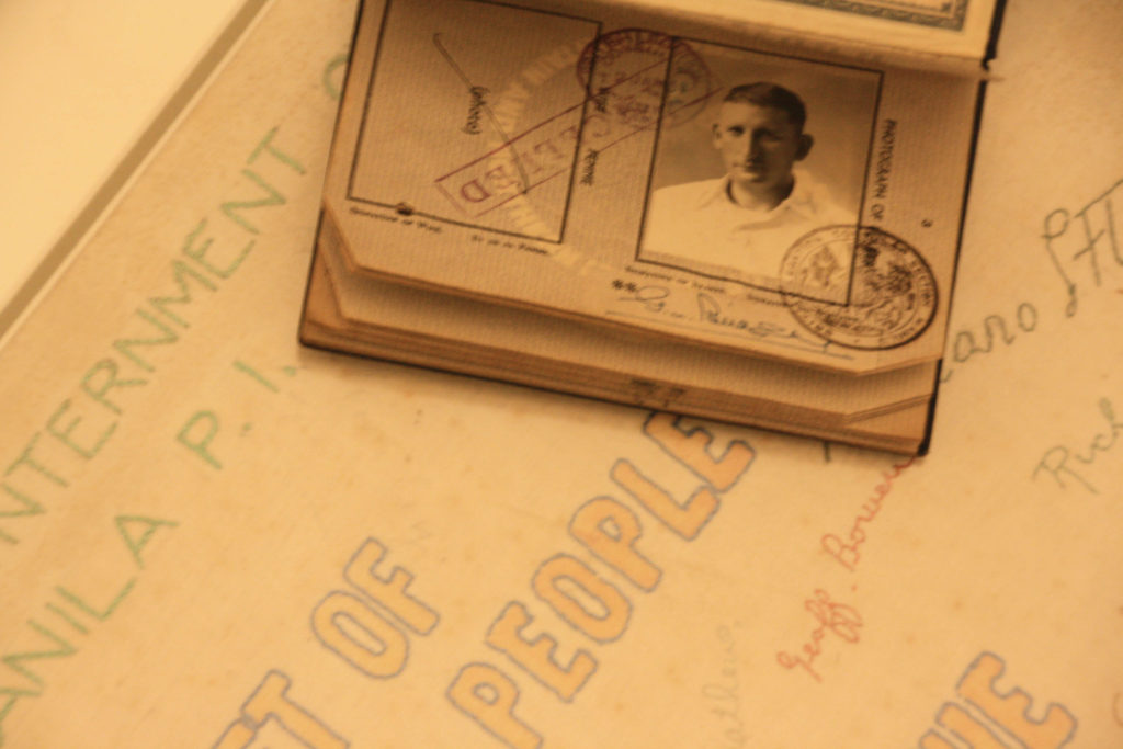
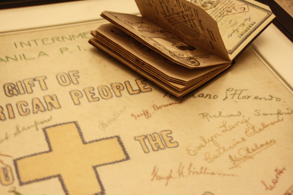
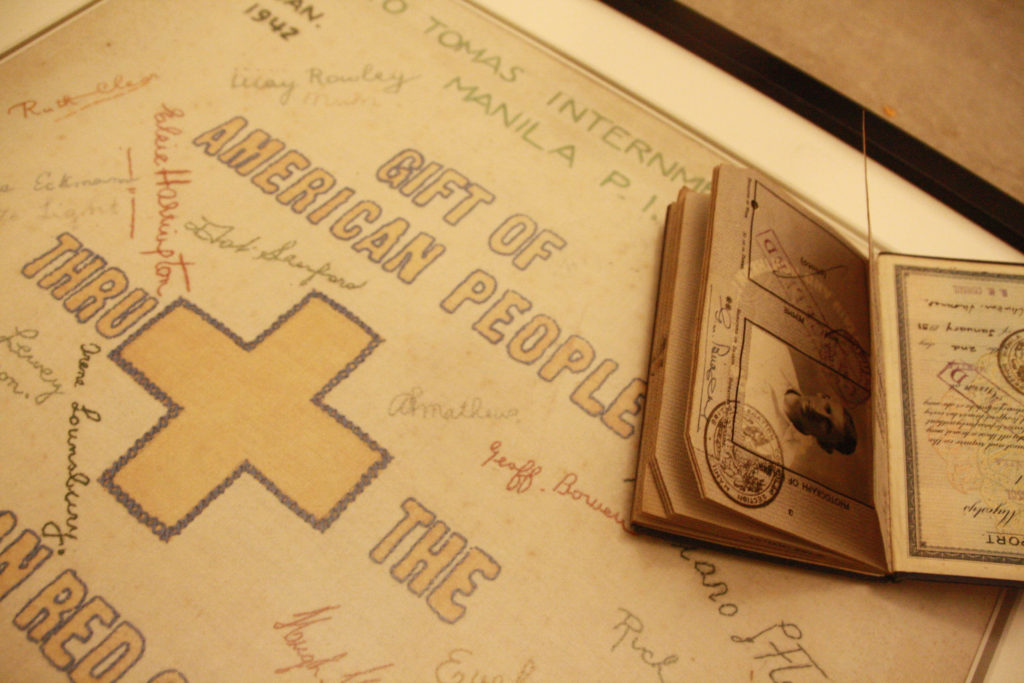
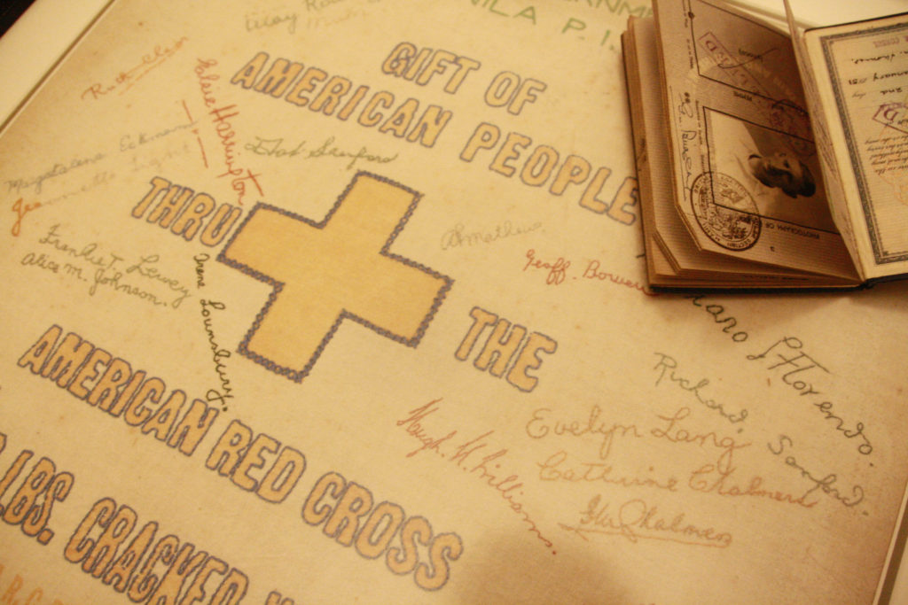
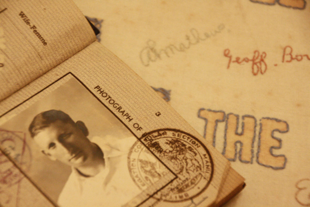
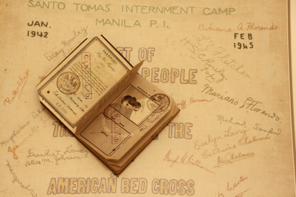
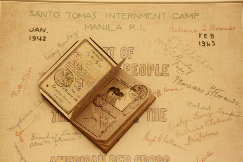
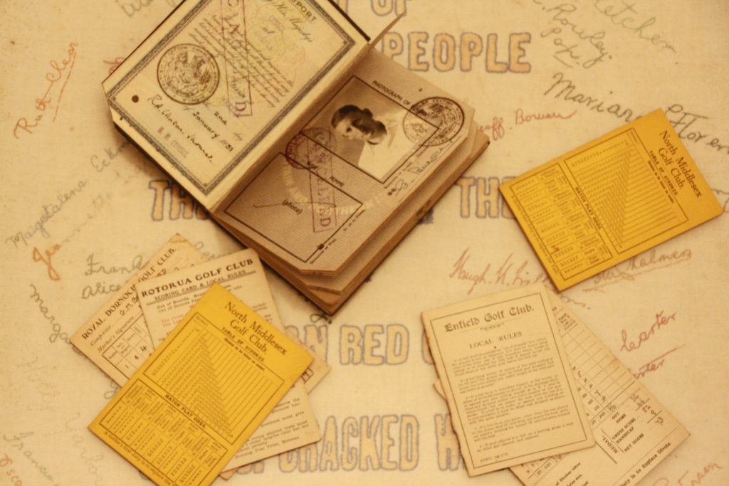
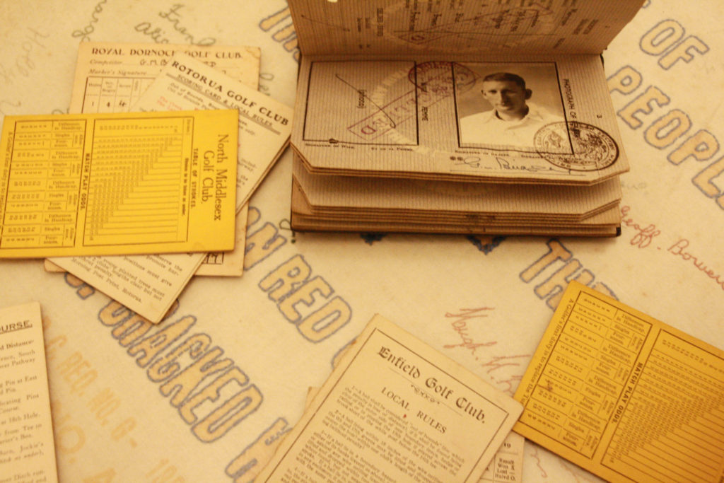
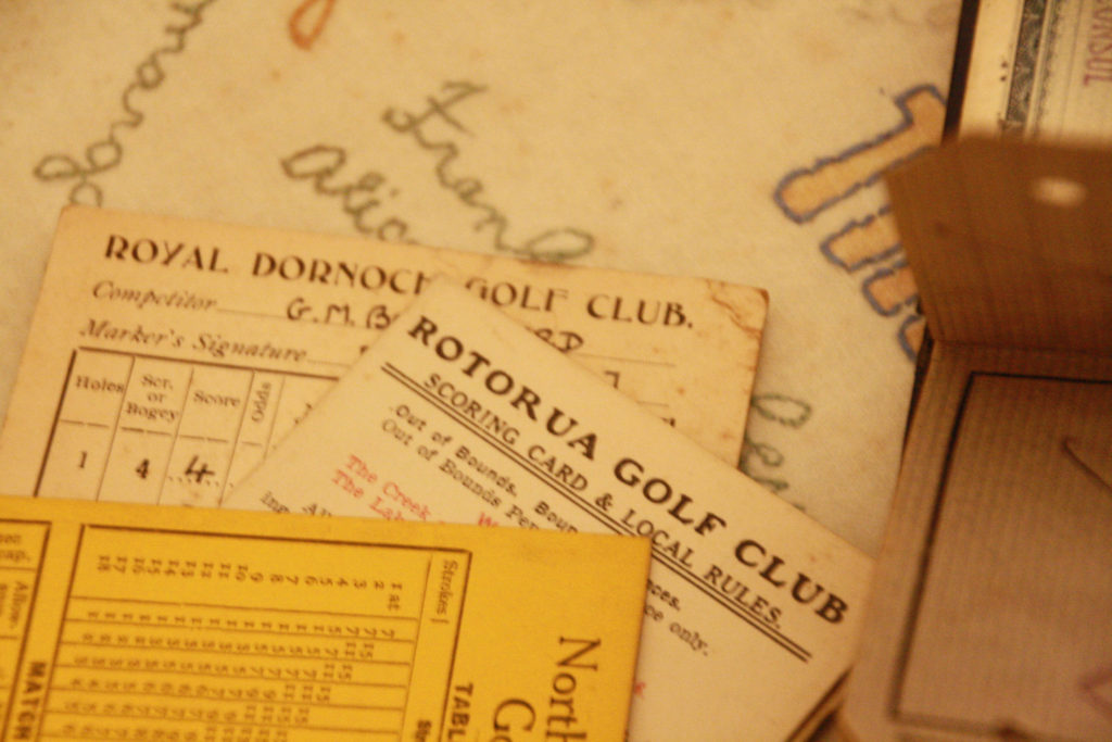
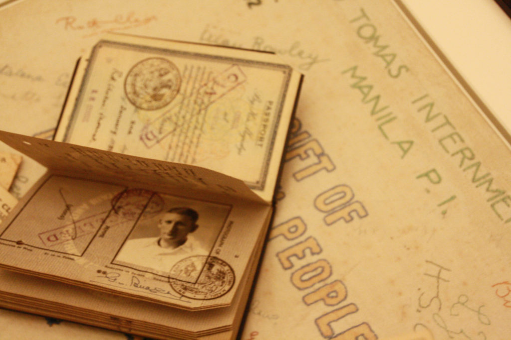
I also used this to edit other photos on to
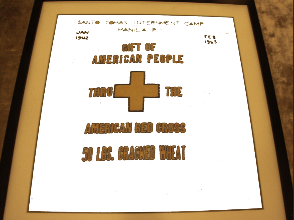

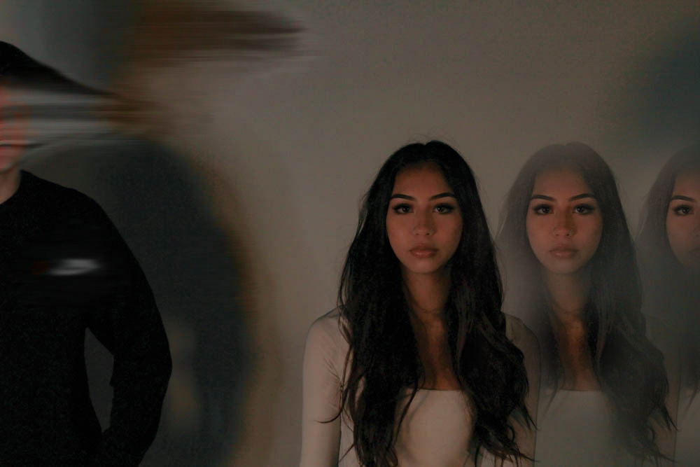
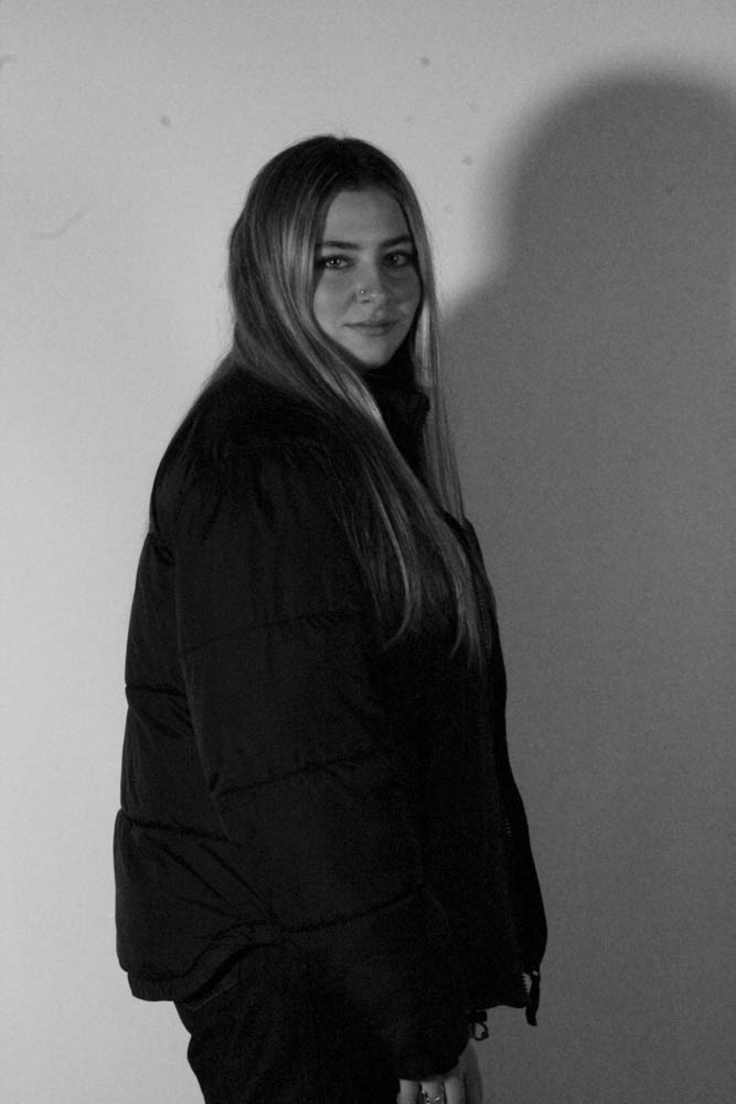
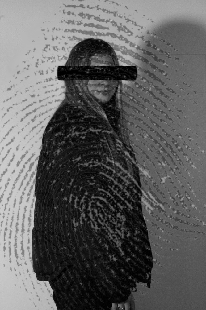
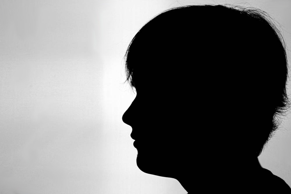
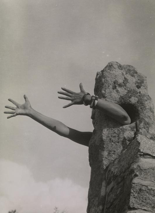
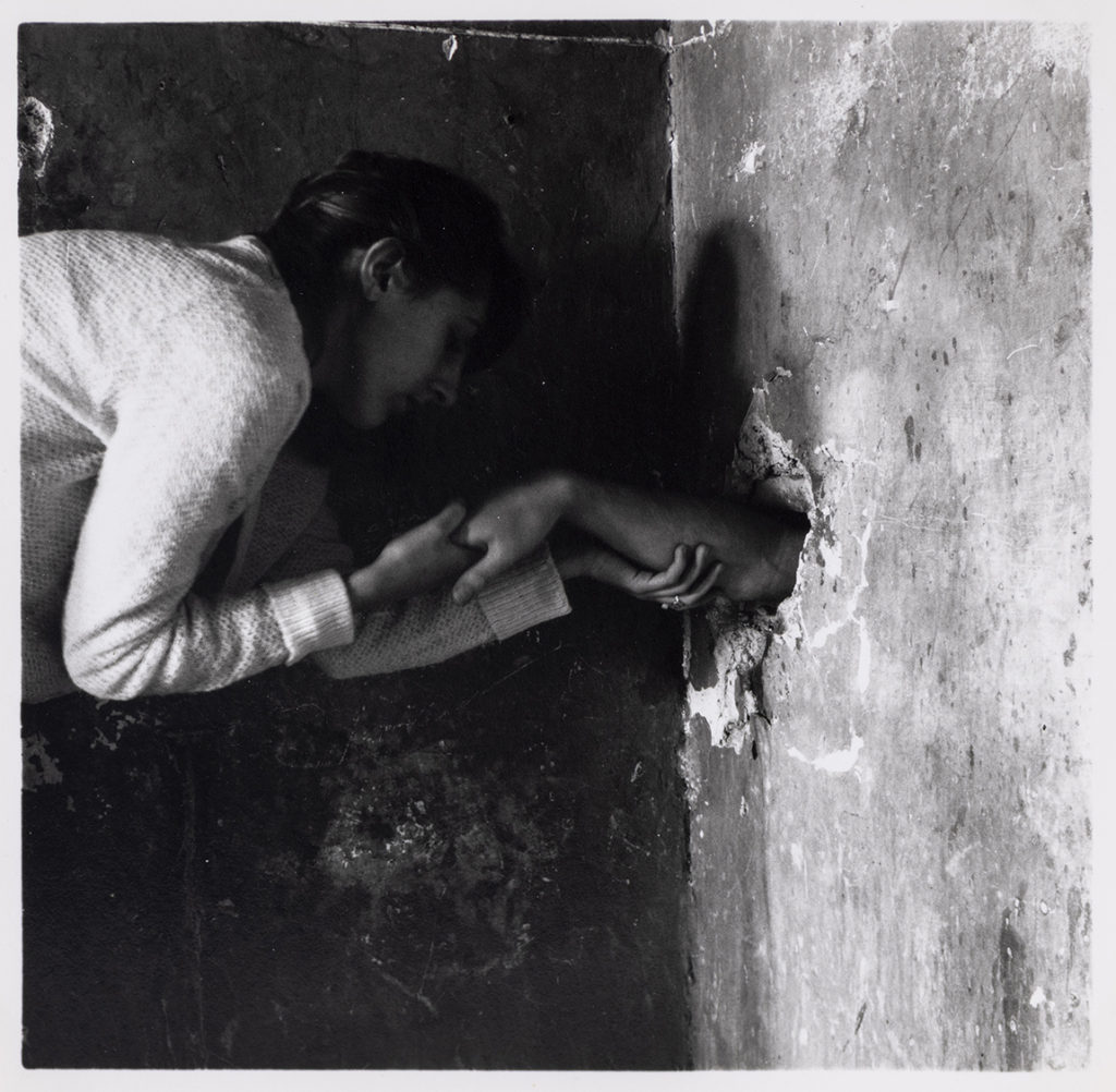
I have decided to compare Claude Cahun and Francesca Woodman’s work because both artists usually shoot in black & white, always have a hidden message in their pictures and they both struggle with their own identity.
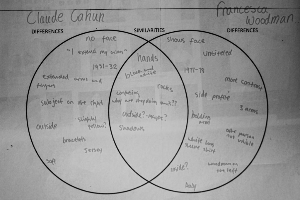
An obvious similarity between these images is that they are both in black and white however, Cahun’s image looks softer and has yellower tones (probably because of the cameras available during the 30s) compared to Woodman’s which has a high contrast between her white clothes and the dark background.
| Claude Cahun Differences | Both Similarities | Francesca Woodman Differences |
| no face | black and white | side profile |
| extended arms and fingers | hands | abandoned building? |
| artist on the right | outside? | artist on the left |
| 2 arms | rocks | 3 arms – 2 holding 1 |
| bracelets | shadows | white sleeves |
| 1931/1932 – France? | confusing – what is going on? why? | 1977-78 – Italy |
| “I Extend My Arms” | untitled | |
| 1 person | 2 people – 1 not visible | |
| naked? | high contrast |
As I mentioned in my plan, I was planning to edit two different ways – in the style of Bill Brandt, as well as Luigi Ghirri. – However, I found that Bill Brandt’s edits worked more with my archival pictures and my own pictures, and Luis Ghirri’s much more difficult and not fitting as well with my new pictures. Therefore I decided to only edit in the style of Bill Brandt, and pair these with my archival images. This type of editing will make up my final pieces, edited together in the style of Joachim Schmid.


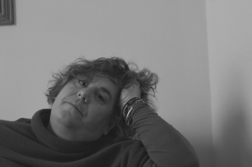

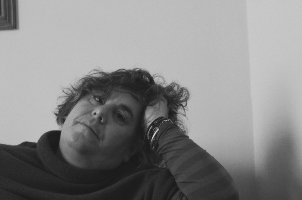
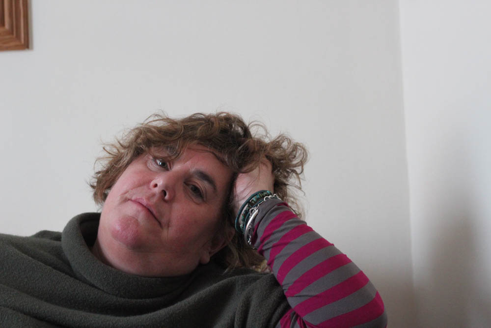
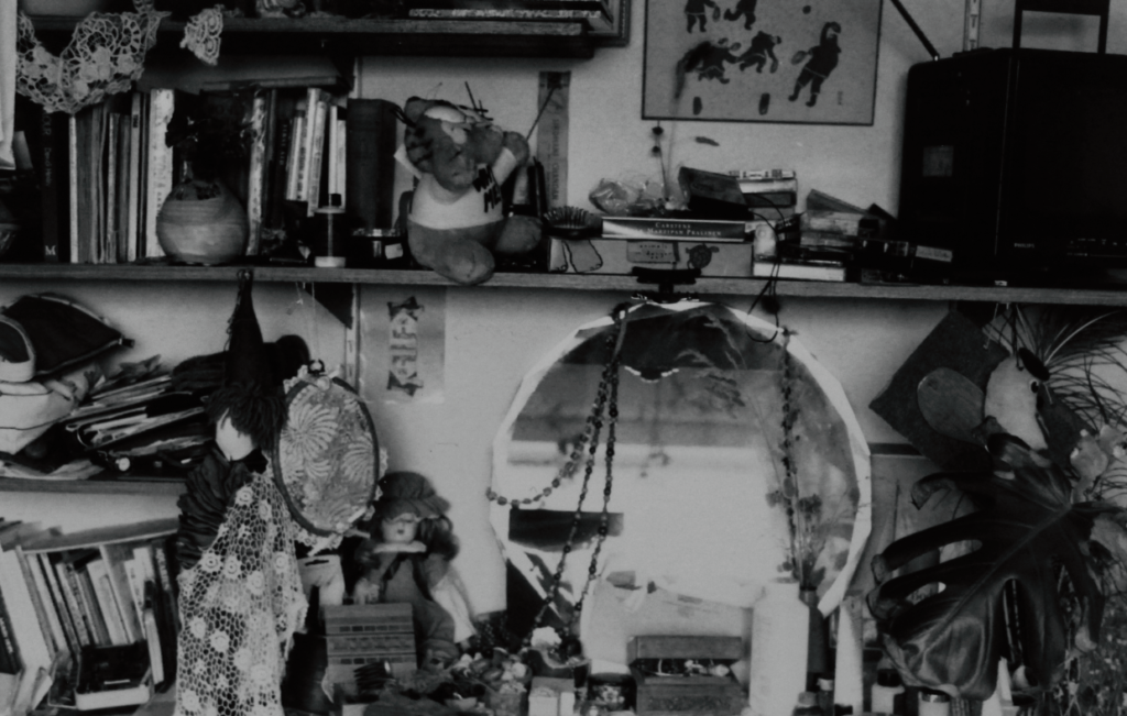

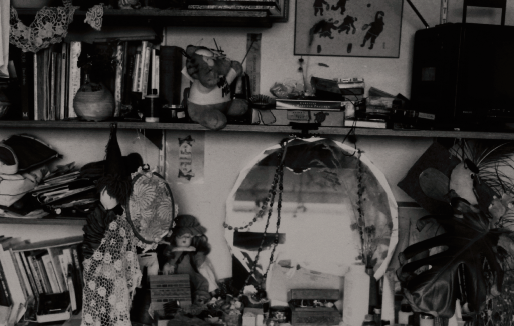


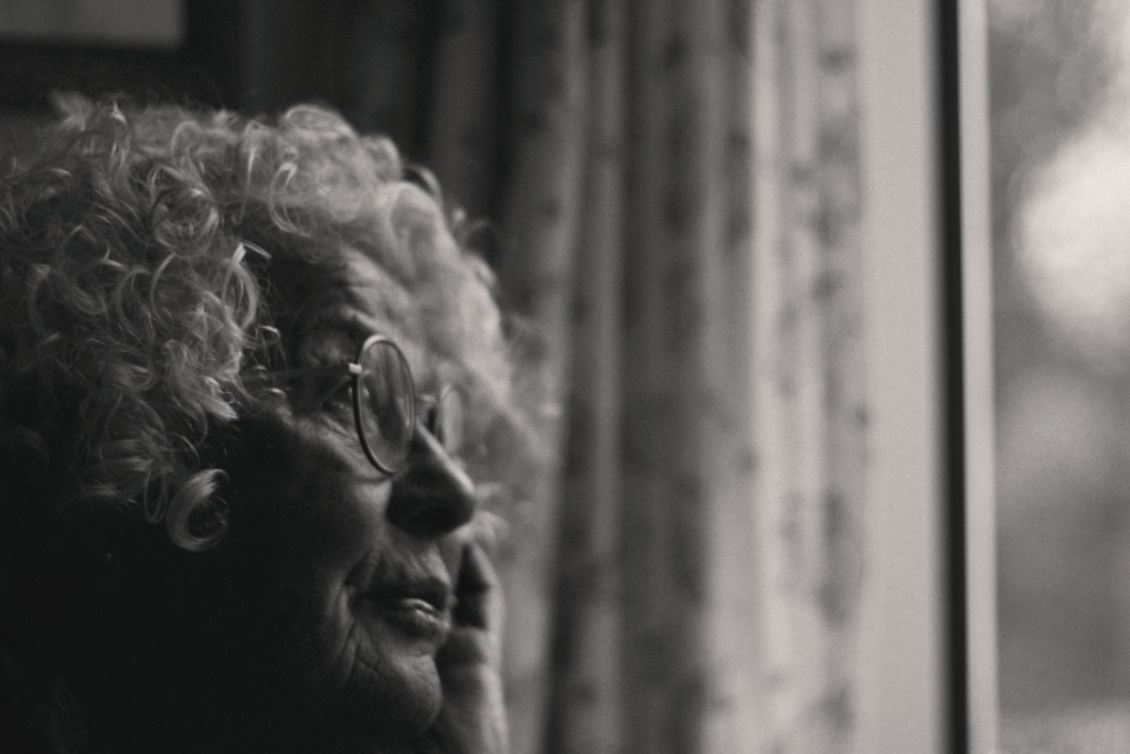


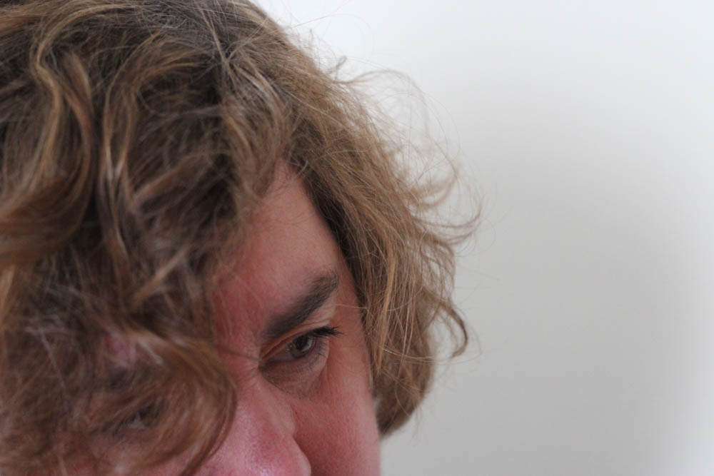

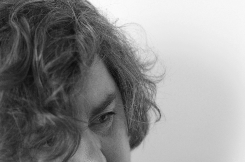
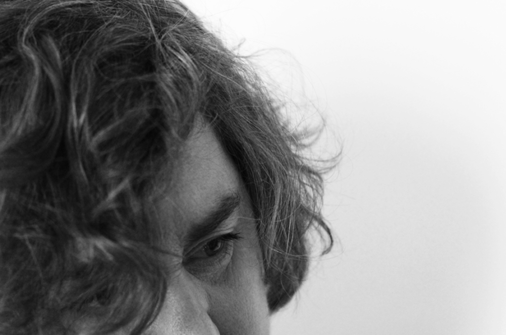
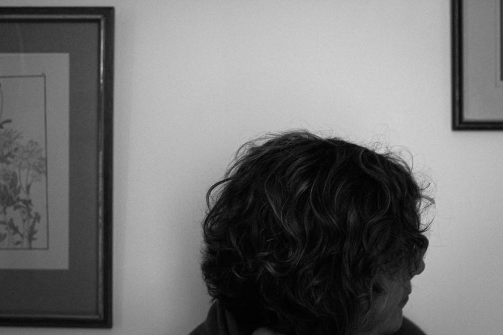
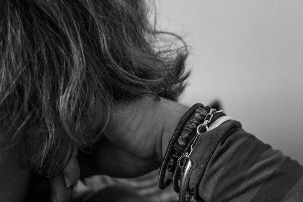
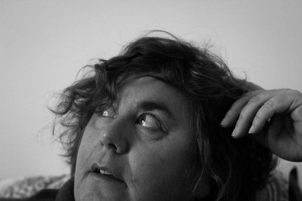
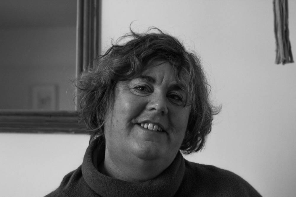
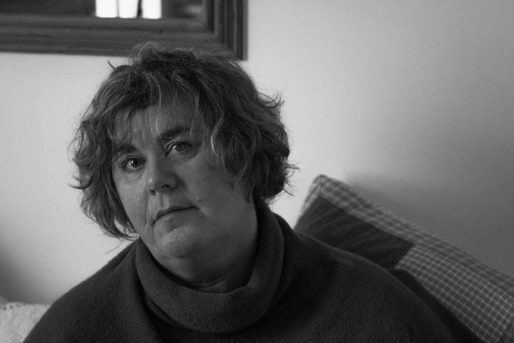
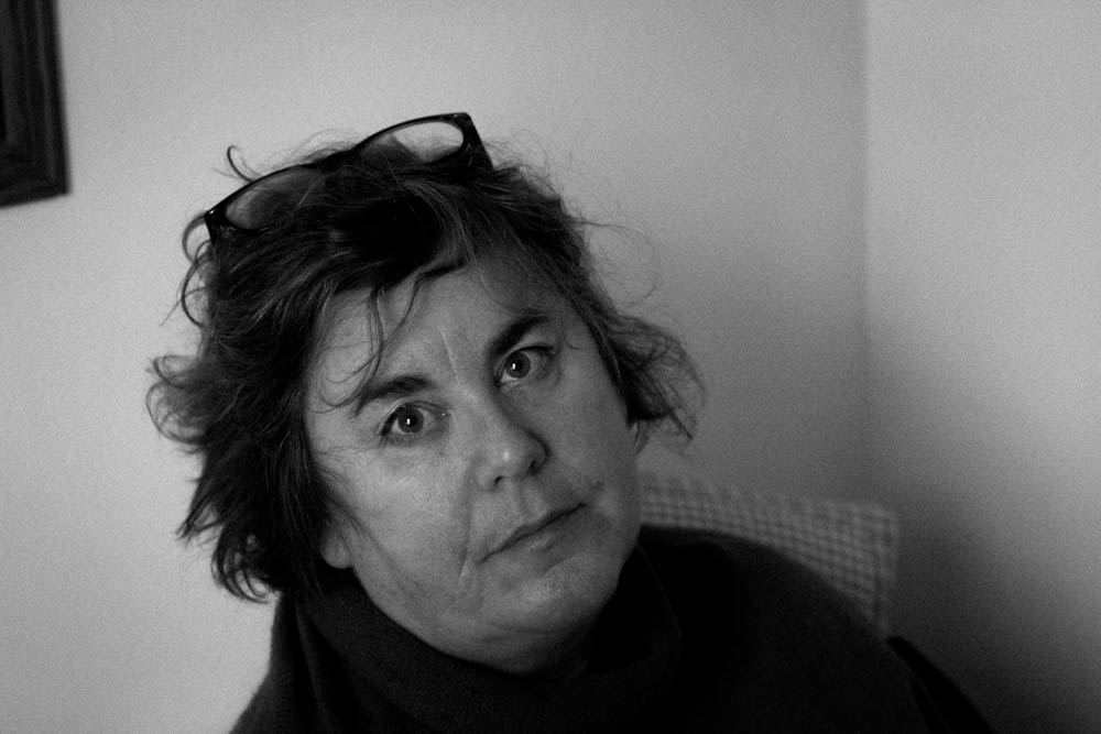
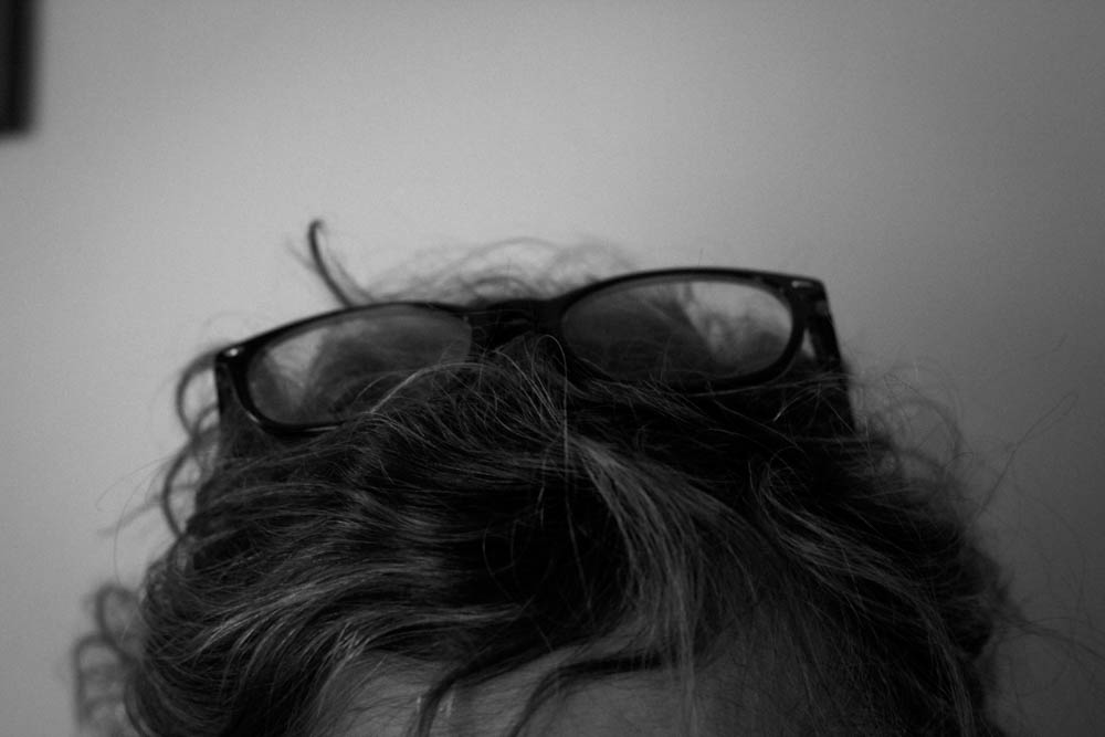
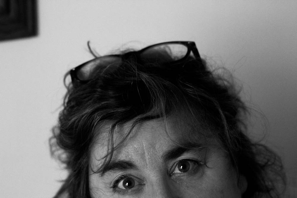
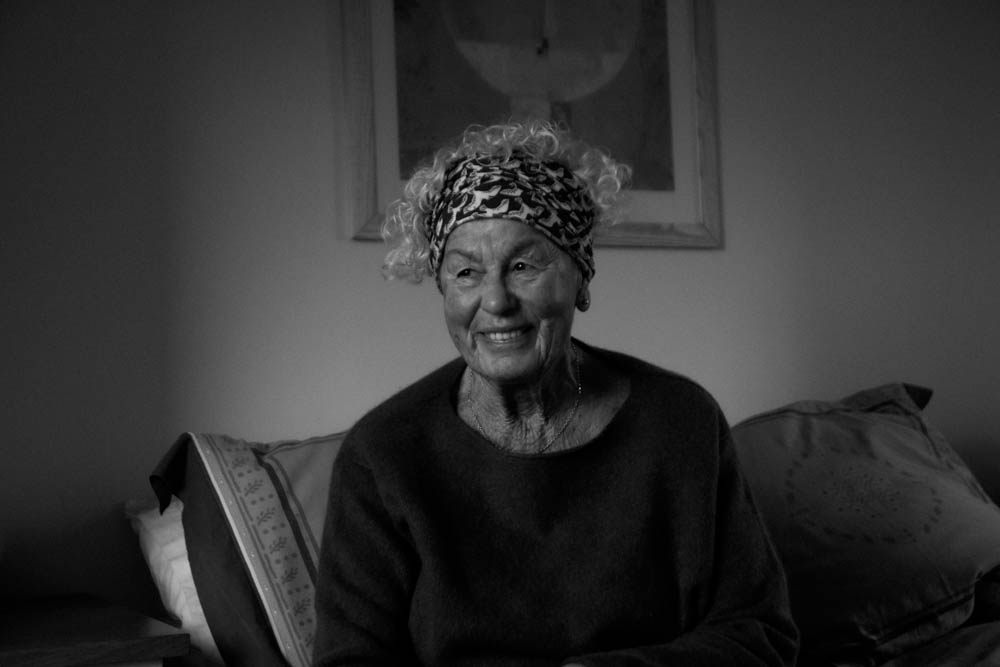
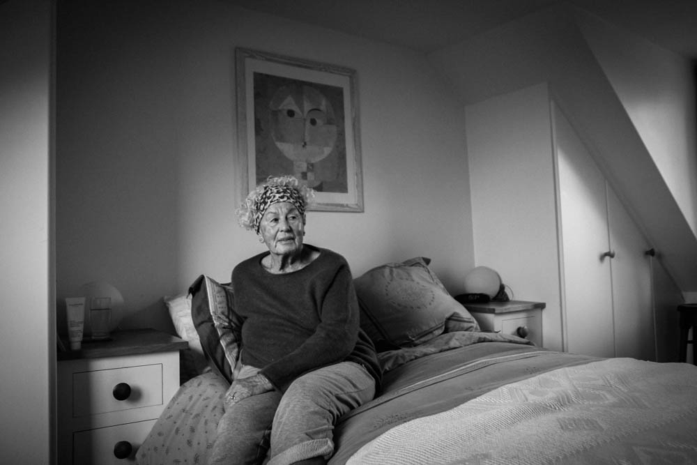
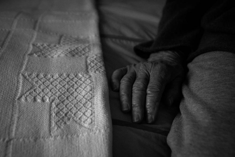

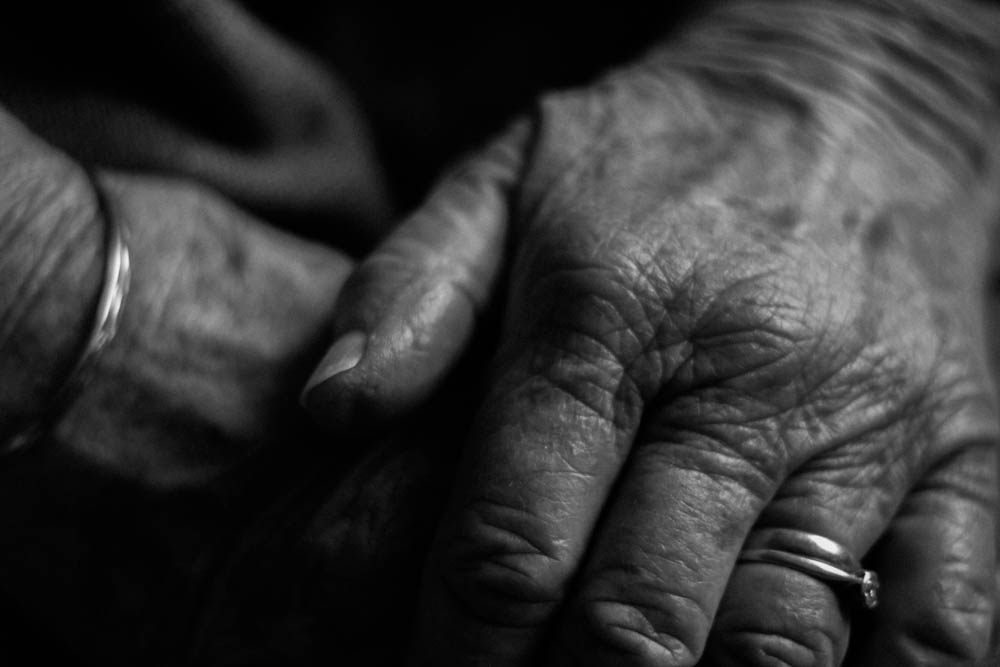
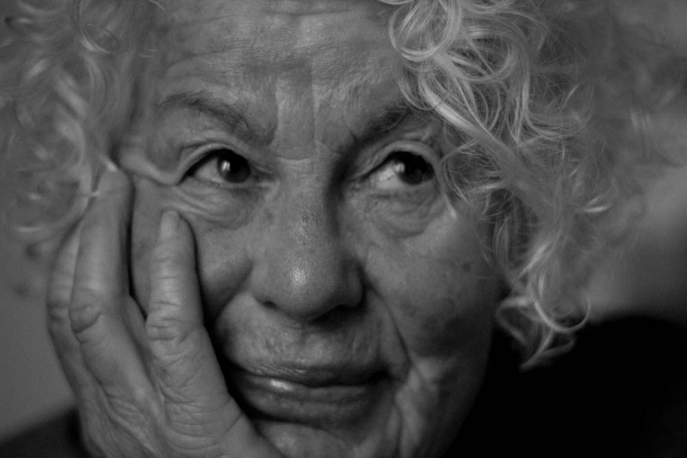
I’m glad I made the decision to only use Bill Brandt as my editing inspiration, as I think that they show the idea of age and generational identity better, and fit more coherently with my found images. This will make it easier for me to create my final pieces in the style of Joachim Schmid.
In this post I will be editing the three best shots which I chose from my 1st photoshoot in Adobe Lightroom, so that they can be used when creating my final pieces, I used a variety of different skills when editing these photos to show a range of diversity, then the editing which I like most I will apply to all to create a flowing dynamic in my final piece.
Experimenting
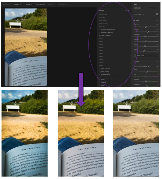
1st photo experiments –
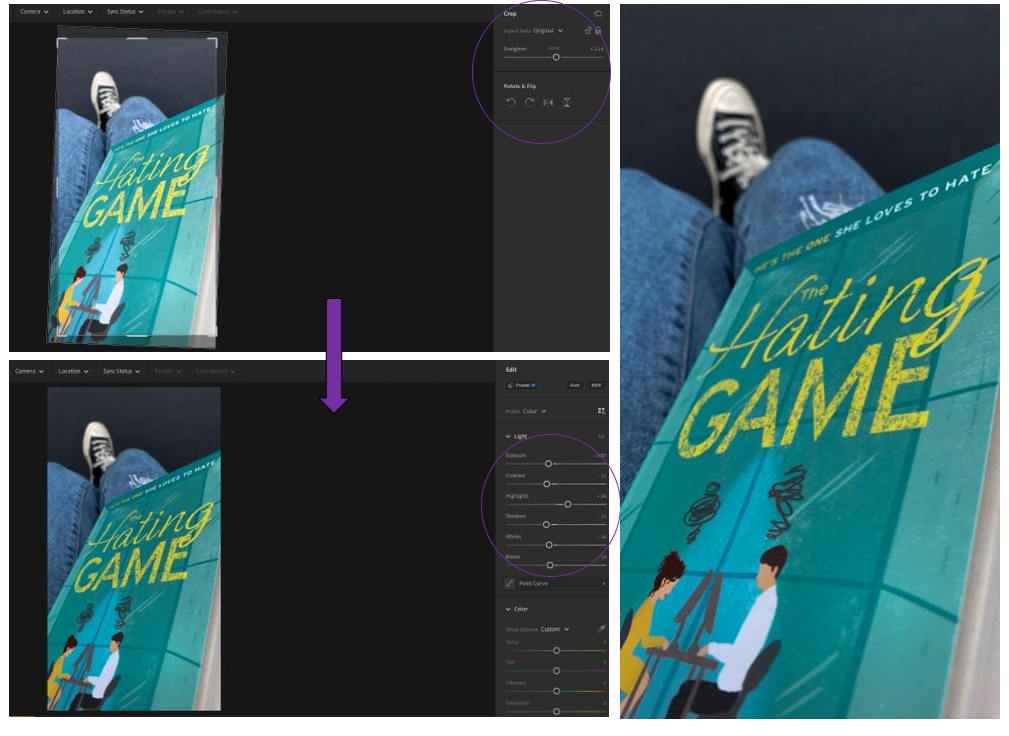
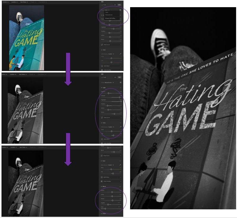
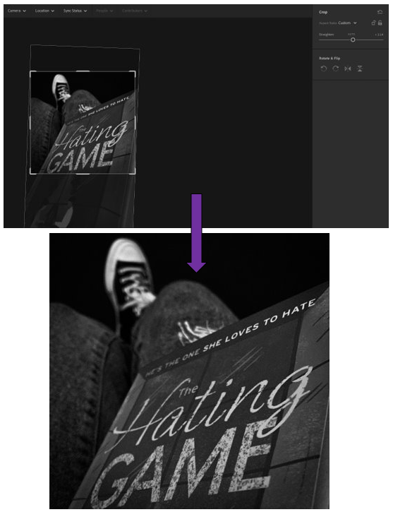
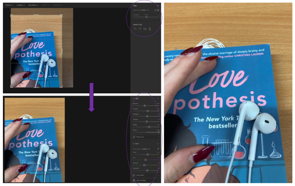
2nd photo experiments –
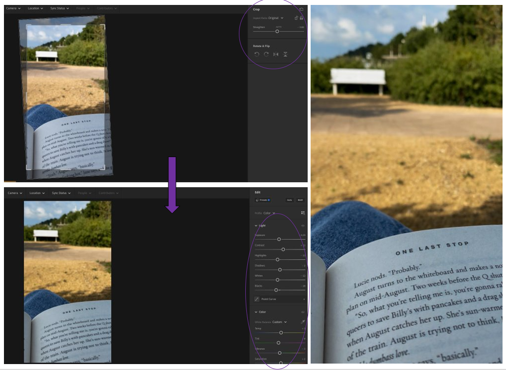
I decided that I was happy with the experiments which I had done with this one because I had previously cropped it in a way which I liked and thought worked well for the photograph.
3rd photos experiments –
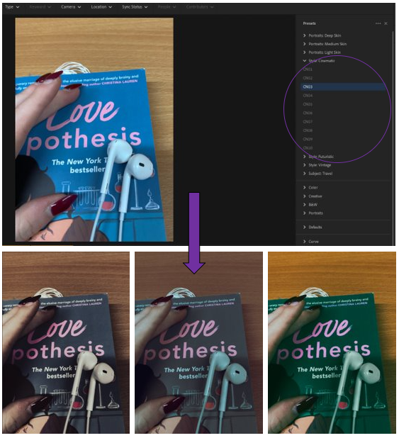
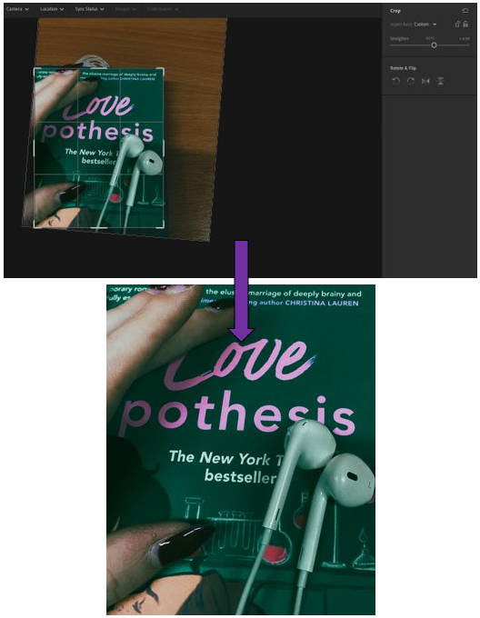

Facts –
Examples of his work –
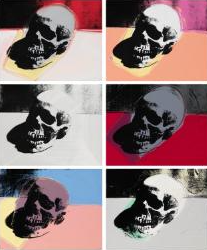
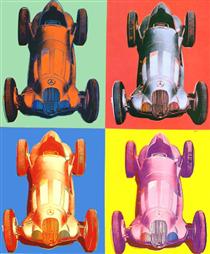
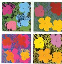
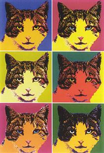
Image analysis –
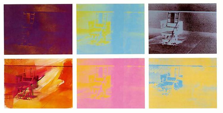
I think that this picture which has been manipulated into different colours by Andy Warhol in 1971, is very unique and usual which I really like. This is because he has taken a picture of an electric chair, which aren’t used in many places now due to the danger and inhumanity of them, and shown it in different colours. I think that these colours can help to represent different feelings people may have of it.
This can be ranged from; the blue (being sadness), red (anger), black (death/pain), pink (showing love from loved ones), yellow (happiness) and brown/red (revenge). I think that this is a very clever way to show this as it is subtle yet impactful due to the messages which it can create towards the audience.
Therefore for my editing in my second photoshoot, I will use this technique inspired by Andy Warhol because I like how he repeats the same/similar photos in bright colours to create this idea of “pop art” as it is unusual due to the objects which he photographs as many photographers would use a variety of them, whereas Warhol likes to focus on just one main subject photo instead because it creates a deeper message.