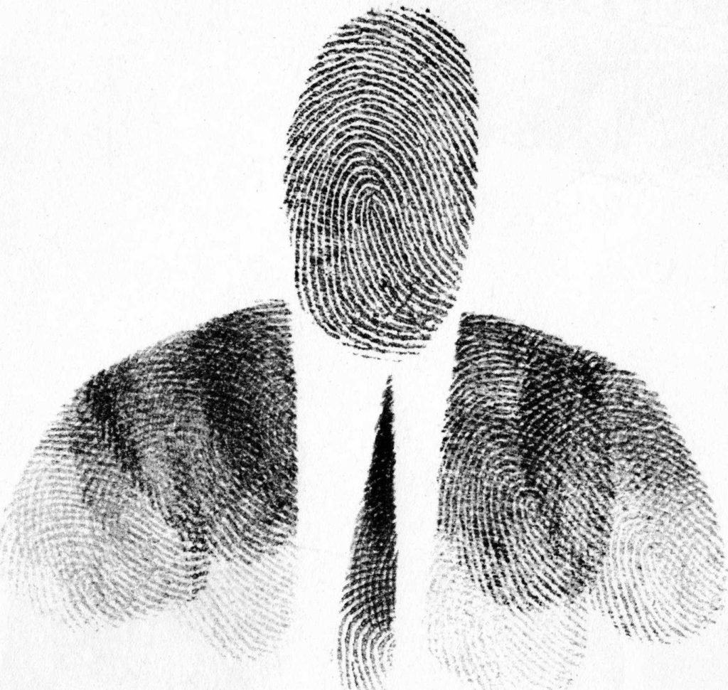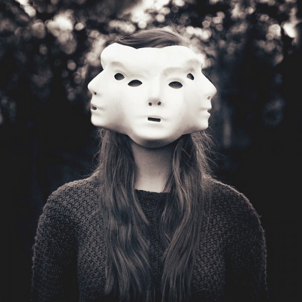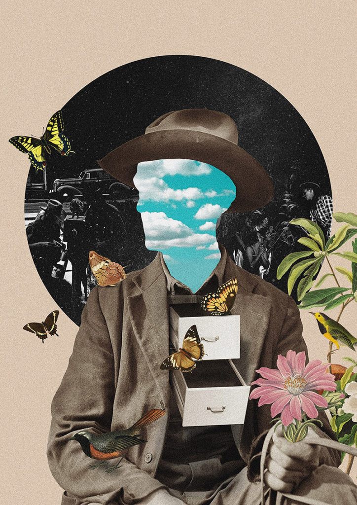
Identity

What is Identity?

Identity" is Dictionary.com's 2015 Word of the Year

To me, a person’s identity is how they describe/express themselves through aspects of their personality such as morals, emotions, appearance, morals, interests, which can effect how they act. What others describe someone as can also be considered a part of their identity, such as their fashion sense, ethnicity, etc… Sometimes some parts of a person’s identity can be kept secret from others for different reasons.

Identity can be influenced by the place a person lives in, as a place can provide a sense of community, which a person can identify themselves within or explore what they are/can be in that community. A place provides a person with a general culture to identify themselves with, while the people around them can heavily influence their personality, maybe through social expectations or norms, and other parts of their identity, such as likes/dislikes, how they present themselves etc…

I also think upbringing can play a large role in forming a person’s identity/personality, in the sense that a person can decide to be similar to their parents/family/friends, or completely different (which may leave some people feeling lost or confused about their identity)

Identity (or Identification) can also refer to how a person is literally identified, for example a person’s drivers license shows some information about that person, such as their date of birth, name, country they live in, etc…

Mood Board of General Ideas


Case Studies:

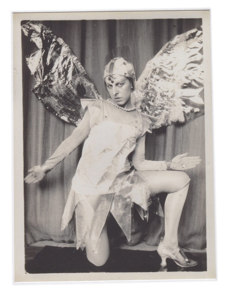
Claude Cahun

Claude Cahun: Jersey's queer, anti-Nazi freedom fighter

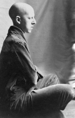
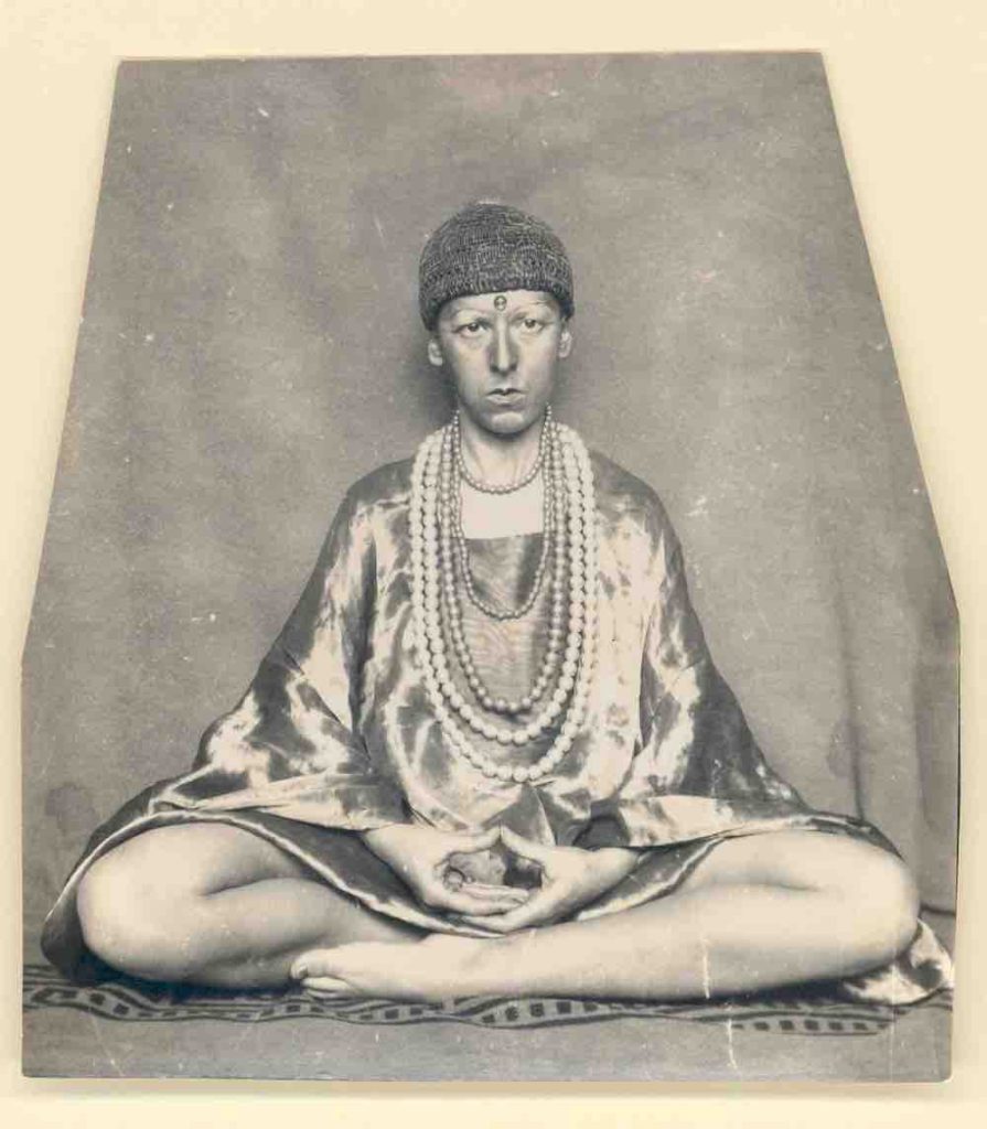
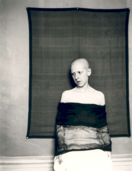
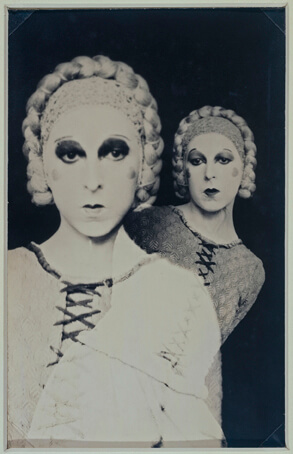
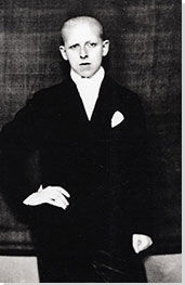
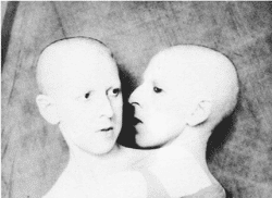
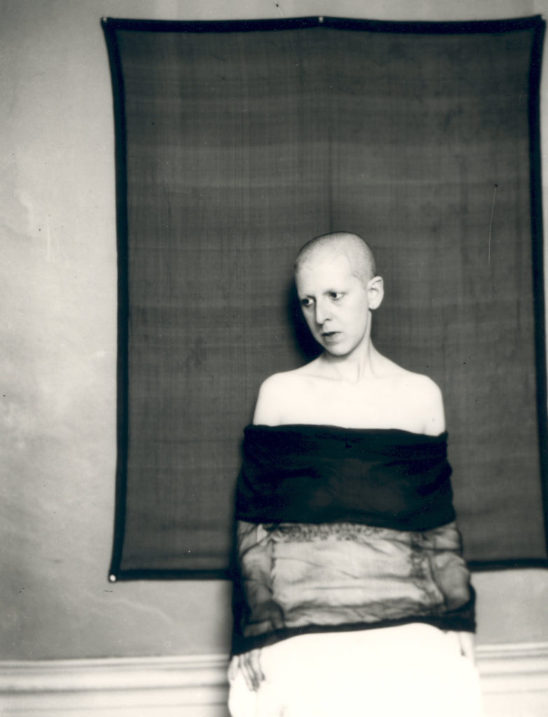
Lucy Schwob, better known as Claude Cahun, was a French, early-mid 20th century photographer, writer, sculptor and activist, who explored gender through surrealist photographs. They worked with their lover Suzanne Malherbe, better known as Marcel Moore, to create images which explored both masculinity and femininity. They moved to Jersey in 1937 as a way to escape from the fascist ideals in France. The pair opposed the German forces who occupied Jersey in 1940 by creating notes addressed to German soldiers with poetical messages to make them think about what they themselves want to do, a cryptic and almost surreal method. A few years after Jersey was liberated from the German Forces, they were recognised for their activism and resistance towards the Germans with a medal of French Gratitude in 1951. With the emotional and physical help of Moore, they continued to create thought invoking work.

Image Analysis

Claude Cahun: A Very Curious Spirit | AnOther
A self-portrait of Cahun taken in 1927

This image could be a way for Cahun to explore the male gender as being the more physically-focussed, not very romantic/emotional gender, as seen by the text “I am in training don’t kiss me” on their shirt, while also using lipstick and hearts to contradict, or perhaps mock, that less emotional/romantic view. Cahun’s body language in this image could also portray men as being more vocal and confident about their views compared to women, which could be a way for them to try and enforce equality of voices and freedom of speech between the genders. I like the way the white clothing worn by Cahun contrasts with the black backdrop, perhaps to emphasise the message (in this case literal text and drawings) she is trying to voice. The lighting in this image is not too harsh, with little to no shadow appearing on Cahun at all, Cahun probably did this to make themselves, and what they was exploring, clearer.

Other examples of their work:

Jesse Treece

jesse treece | Saatchi Art

Treece is a self-taught collage artist based in Seattle, USA, who was inspired to create collages when he found a box of old newspaper/magazine clippings and decided to create a visual story and express himself with them. He likes 70-80’s style comic book strips and magazines, which he takes inspiration from to create ‘disturbing’ imagery. He typically uses glue and scissors to create his collages manually, mixing ordinary and whimsical images together to create several unique and somewhat absurd collages.

Image Analysis

collage by jesse treece — “the sisters of mercy” hand-cut collage, a...

As this image is a collage, lighting varies between each image it uses. The lighting is soft on the background images, however on the image with the three hooded figures, lighting is slightly harsher, which allows shadows to form behind the creases in the clothes. The shadows on the left-most figure are the most dense and are the darkest point on the image, which allows that image to contrast more with the whole collage. The colour palette in this image is quite limited, the majority of it being made up of dark greys, however, there is some light red on the figures faces and the circle in the background, as well as a dark, faded blue tint in the background, which stands out from the rest of the image. There are a lot of lines on this image, from the hill like structures in the background, the building in the bottom right of the image, the horizon line where the water meets the hill and on the clothing of the three figures, however where there is colour, there are not too many lines, making them appear softer, while the black and white parts of the image look more jagged.

Other examples of his work:

Comparing Claude Cahun’s and Jesse Treece’s work

Similarities:

  • Both use portraits of people playing a role, perhaps of a job or hobby, in everyday situations
  • Both use objects/props/costumes/clothing as a way to make the image more interesting

Differences:

  • Cahun typically likes to use plain backdrops to emphasise the model in the image, whereas Treece uses backgrounds (usually) taken from one or more landscape photographs
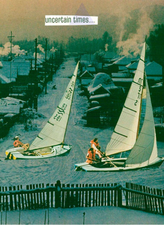
  • Treece’s collages explore scenes with unnatural and sometimes confusing imagery (such as people sailing in a village), while Cahun uses portraiture as a way to explore identity
  • Cahun mainly explores the theme of Gender through their photography clearly, whereas Treece’s images explore his own ideas and fictional worlds that he creates.
  • Treece uses a large colour palette and different types of geometrical shapes to create variety in his images, whereas Cahun mainly uses black and white (due to equipment at the time) portraiture
Statement of Intent:

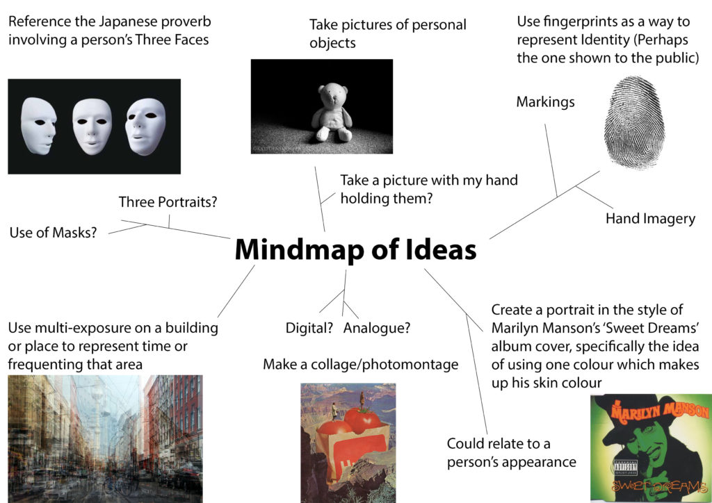
I intend to explore my own identity using a series of photomontages exploring the different ‘levels’ of my personality. I based this idea of ‘levels’ from a Japanese proverb, which regards a person’s identity as being made up of three faces: The First face being the one you show to strangers/the public, the Second face being the one you show to close friends/family/loved ones, and the Third face being the one you show only to yourself. With each face (with the First face being leftmost and the Third being the rightmost if I was to place them in order) getting more and more personal. I will use a collection of self portraits (with different facial expressions, poses and shot types (headshot, full body, etc…)), landscapes and objects to create the photomontages and plan to lay them out in a triptych or sequence.


Photoshoots

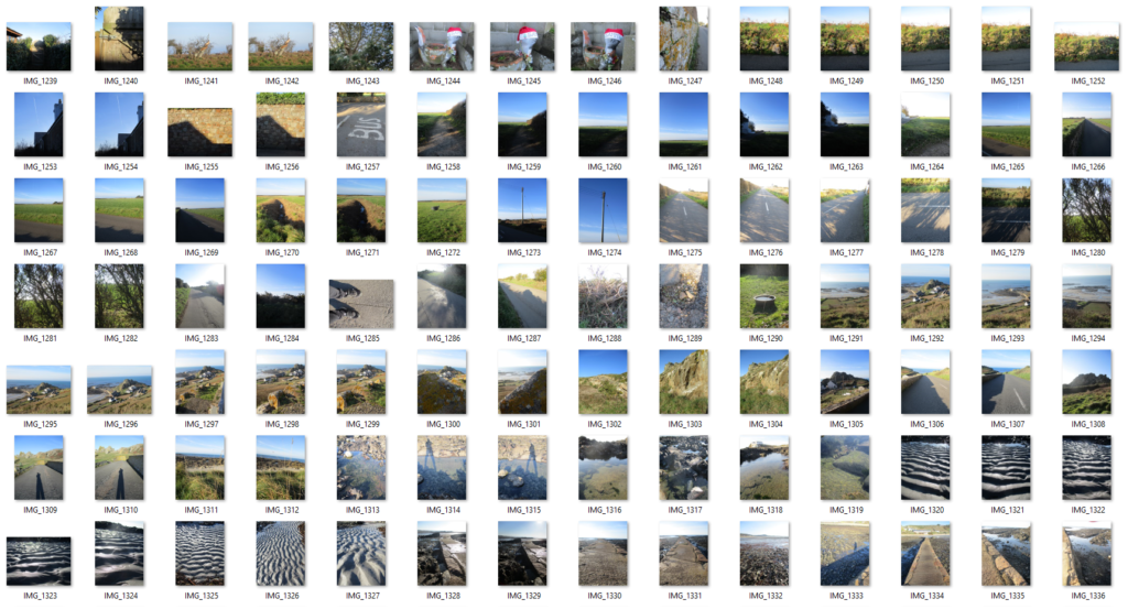
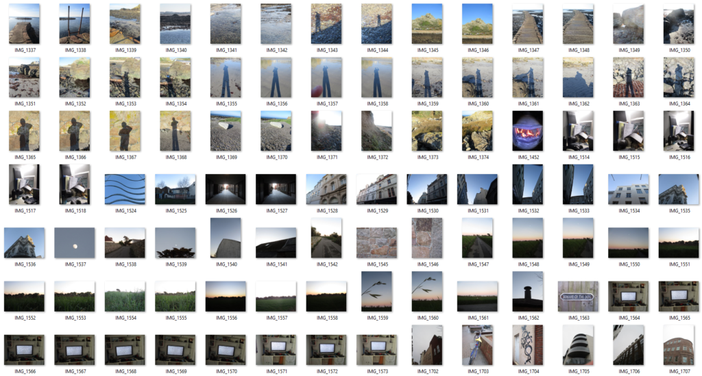
Photoshoot Plan 1 (Landscapes):

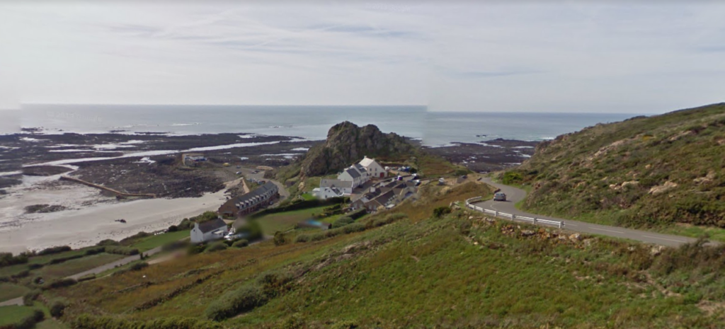
What?I will take pictures of the landscapes around this area, such as the fields, roads, beach and the view from the top of a hill downwards.
Where?The area around to my house with beaches, fields and houses.
When?When the sun is out so I can capture natural light in the images, around noon.
Why?I have lived around this area my whole life so it is special to me.
How?I will search for interesting parts of the different sceneries around this area.
The area I will take pictures of/around

Contact Sheet


Photoshoot Plan 2 (Objects):

What?I will take images of personal objects which can help identify me.
Where?At my home.
When?During the day to make use of natural light.
Why?These objects have different forms and shapes, which, if I use with a photomontage, will give my final images a more interesting look.
How?I will lay the objects on plain paper to get a clear white background and I will put it next to a window to make use of natural light.
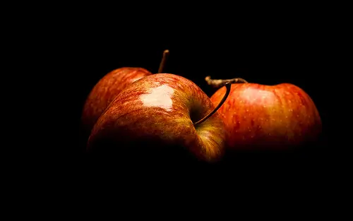
Photography Skills: How to Isolate an Object Against a Black Background |  Light Stalking
An example of object photography

Contact Sheet


Photoshoot Plan 3 (Portraits):

Who?Myself (Self-portrait).
What?I will take pictures of myself with different facial expressions or hairstyles to represent my identity.
Where?My home.
When?Likely during the day to make use of natural light.
Why?I think a self-portrait is an effective way of capturing someone’s own identity.
How?Maybe using a mirror or with someone else’s aid.
Portrait Photography by Ines Thomsen Photography - Portrait Photographer
An example of portrait photography

Contact Sheet


Identity

Identity

Identity from Latin means “the same”, and so in a sense it is the sameness of individuals that makes them belong, as well as the distinctiveness of character that makes a remarkable being, the sense of oneness we feel within ourselves. Identity can take years to mould and it determines our entire life; our job, our friends, the place we live in; in order to stay happy we need to live accordingly to our true identity. The desire to belong and be accepted in a society has always been here. We surround ourselves with so many influences it is hard to isolate what feels right and what is right. Being wanted and appreciated feels right but is it truly right when it requires us to conduct ourselves in a superficial manner. Factors that strongly influence identity include culture, language, religion, social status or race as often those shape the way we perceive the world; our views, opinions and practices. Identity also includes what we stand for, values such as kindness, honesty or trustworthiness. All those help us recognise what matters to you most and effect our everyday choices. Our upbringing can have a huge impact on our sense of self. The way our parents or the society lets us explore, learn and express ourselves and our desires. If we were shamed or discriminated for expressing our true selves our sense of identity can be distorted to the liking of others. A fair amount of individuals does not have a solidified sense of identity or suffer from identity loss due to some events in their life such as finding out truths about your family history.

Mood board

Claude Cahun

Born Lucy Schwob, later changed to a gender neutral Clause Cahun, in 1894 to a Jewish family in France the photographer explored gender identity and the subconscious mind, presenting neither masculine nor feminine. Their work dates back as early as the 1912. Cahun moved to Paris where they started experimenting in the Surrealist art scene and went on to collaborate with artists such as Man Ray, as well a co funding the Contre Attaque with Andre Breton and George Bataille, the Anti-Nazi Resistance group. In 1930 Cahun moved to Jersey where they lived disguised as non-Jew. Soon Claude was caught spreading anti-Nazi propaganda and sentenced to death. They avoided the death sentence and was freed when Jersey was liberated in 1945. Unfortunately Cahun never recovered from the mistreatment in prison and passed away in 1954.

I find Cahun inspiring because they knew what they stood for, what they believed and represented, without hesitating to show it. They influenced photographers such as Cindy Sherman, Gillian Wearing and Nan Goldin.

Bobby Becker

Bobby Becker is a Nashville based photographer who presents the thin boundaries between reality and illusion and does so in a simple yet powerful manner. By contrasting the black with the white he conveys the distance, the struggle for connection, the comprehension of all and nothing, light and darkness, the loss of identity and rediscovery.

I find those photographs inspiring because they convey the feeling of emptiness formed from the lack of identity, as if a piece of you is missing, or looking in the mirror and not recognising yourself for the person you are. They also represent the way identity is influenced. A significant influence on our identity being the media. I think the media forces individuals to uniformity in order to be accepted, by in a way, fabricating our identity, based on the standard image. The photograph presenting two people underneath a house to me represents the impact your family and upbringing can have on your identity and the idea of nature vs nurture as generally a big part of us is shaped by believes passed on to us for generations; the basic values and principles. What part is really your true nature and what is your parents views materialising through your actions? To me, the photograph of people trapped in a house portrays the struggle some individuals face in order to be able to express themselves in the way they desire. This can relate to certain cultural or religious believes our family holds. A great deal of individuals faces rejection and discrimination every day, as certain patterns of expression are viewed as socially or morally unacceptable. For example, the LGBTQ+ community as opposed to members of the older generation.

Ideas

shadows/ silhouette of identities, loss of identity, mask out of alter egos/ different people like pixel art, double exposure.

Photoshoot plan

Equipment needed: Drum set, guitar, microphone plus a stand, camera stand, warm, round light, white infinity curve.

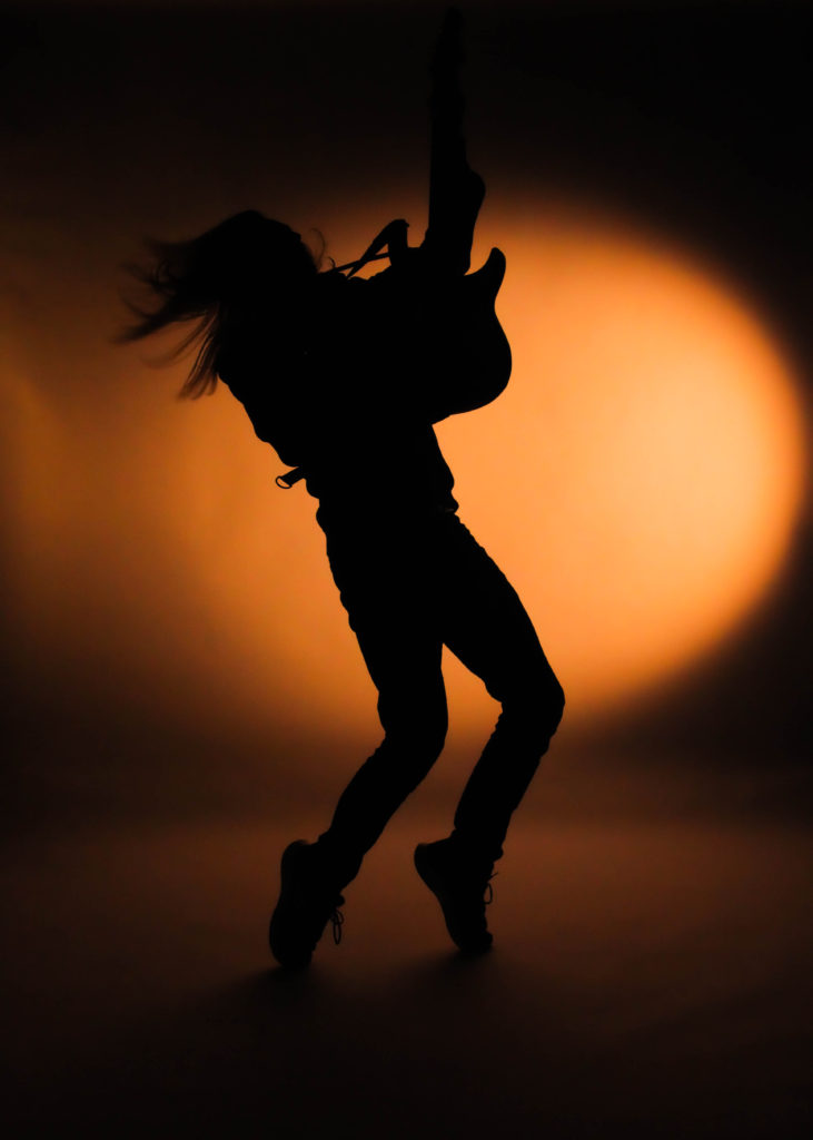
Photo series 1 = Subject 1 playing the guitar

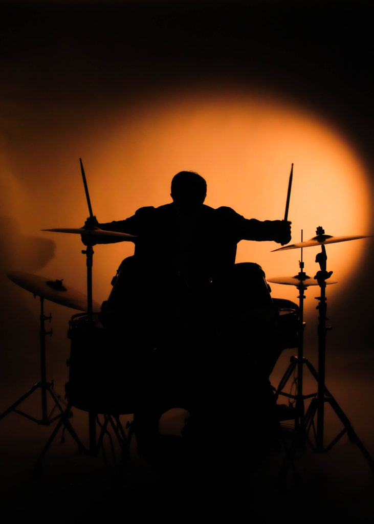
Photo series 2 = Subject 2 playing the drums

Photo series 3 = Subject 3 singing

Only light source being a warm light on the right, behind the subject creating the silhouette, warm and bright mood. Photos taken in the studio as space and equipment needed.

Contact sheet

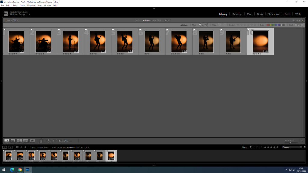
Those are all the photographs I took in two separate shoots. The first shoot was more for gathering ideas and setting up the lights and the camera settings.

Image selection

Those are the photographs I flagged as usable

Those are the photographs marked with 5 stars. I chose those because they were the sharpest silhouettes and had the right amount of asymmetry to help illustrate the movement.

Image editing

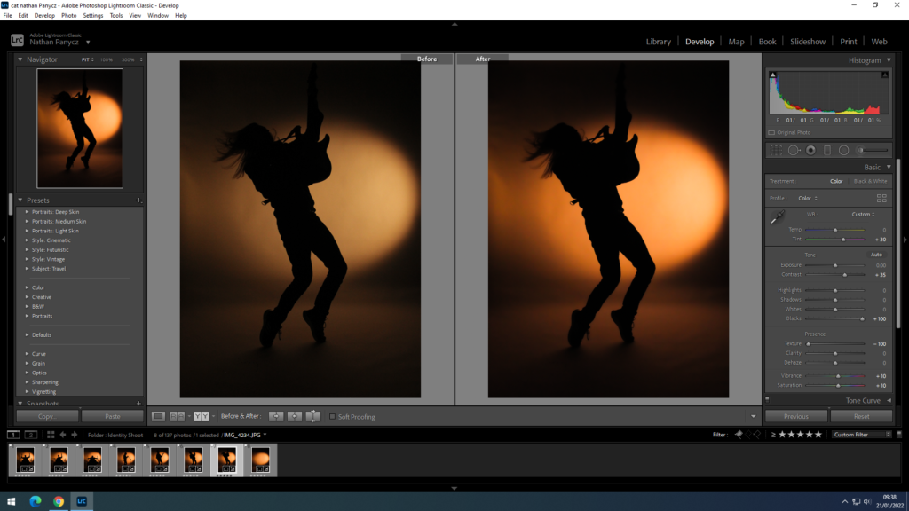
Firstly I cropped the image as at the top you could see the white infinity curve end. I increased the contrast because the photographs didn’t look deep and defined enough but rather bleak and washed out, I also increased the blacks to make the silhouette stand out more against the orange light. Since I shoot the pictures in the dark it was hard to get the right settings on the camera and all of the photographs came out a bit grainy so to smooth that out I turned down the texture. This also gave it a satisfying blur effect around the edges and the background, leaving the middle sharp, especially the model. The colours weren’t very defines as well and I wanted to get that yellow-orange sunset colour so I changed the tint to +30 and increased the saturation and vibrance to +10. I needed all the photographs to look the same for a triptych so I used the synch settings option to edit the pictures all at once with the same setting as the original one.

Experimentation

I converted my final photographs into black and white because I wanted to find out how powerful they would be if they followed Claude Cahun’s or Bobby Becker’s black and white theme. I personally found that too dull and apathetic, not really conveying the excitement of self discovery or the journey that comes with it.

Final outcomes

Visual Gallery

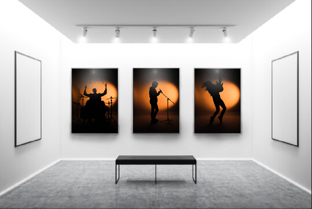
The overall idea behind those photographs was to show the loss of identity and finding a huge part of my identity in music. You can’t see the subjects but you can clearly see what they do and what they represent. This is because even when I feel like I can’t or find it difficult to express myself in front of others I always find ways to express myself in my music, whether it’s playing an instrument or lyric writing. The first and second triptych shows the progression of movement which makes it really dynamic almost like a video. In this I wanted to convey the journey to self discovery. The momentum in the third triptych on the other hand has a pause in the middle as the model singing is standing still without any movement, this gives it a subtle contrast and represents the doubts or struggles individuals face in their journey. The third tryptic also represents the idea of unity within identity and how it gives individuals a sense of belonging.

I decided on using warm, bright light to create that sunset vibe and because it is the most attention grabbing of the colours. Yellow also energises, helping convey the liveliness and movement and the orange hue adds enthusiasm and excitement. The position of the light source is behind the subject creating a silhouette and to the right, pointing at the background. This creates the smudge effect on the left side as the light fades helping express the concept of motion. The light reflecting onto the floor behind the subject adds visual depth and makes the photograph look 3D as well as the yellow/ orange hue contrasting the deep black as lighter colours tend to be perceived as close and dark colours as being further away. The space also makes the photograph feel light, not cluttered. Since the contrast between the light and dark is so high you can clearly see the outline of the silhouette, all the shapes such as the hair or shoelaces. This also creates space as sharp, well focused objects appear closer than blurry objects such as the background.

Comparisons

My photographs differ from Cahun’s or Becker’s in that I decided to use colour to help me convey the idea of a journey and included actual movement as opposed to my chosen photographers who take still, black and white photographs. On the other hand, I quite liked the idea of strongly contrasting two colours together like in Becker’s photographs to show the distance between losing your identity and rediscovering it. He shows that sometimes less can communicate more.

Evaluation

In my opinion, I did a good job with setting up the scene (lighting, background, props) as well as wording my ideas to the models to achieve the desired shots. I could have done a better job with the camera settings as the photographs weren’t as good of a quality as I wanted. The images came out a bit grainy because the ISO was too high as I needed to use fast shutter speed to capture the movement. I should have used a higher aperture to make up for the light lost with the high shutter speed instead of increasing the ISO so much. If there wasn’t a time limit I would have reshot the photos.

Piece 4

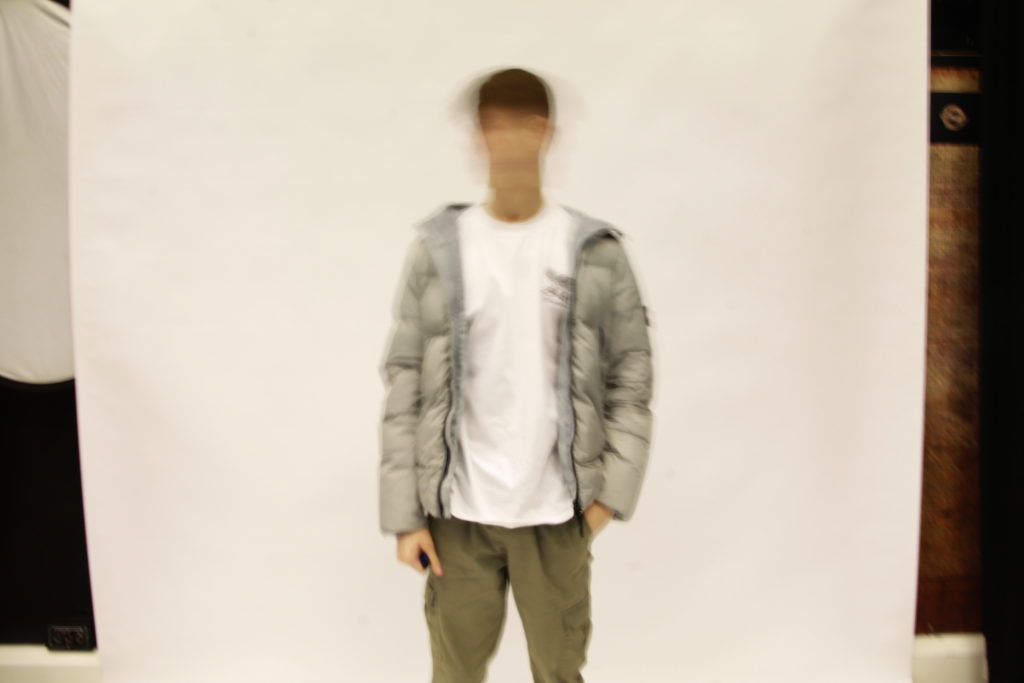
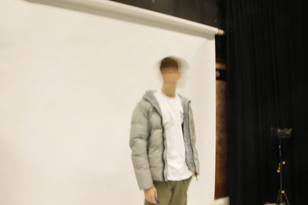
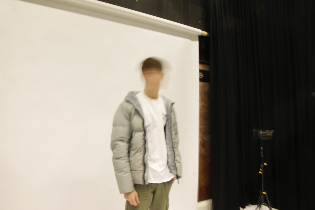
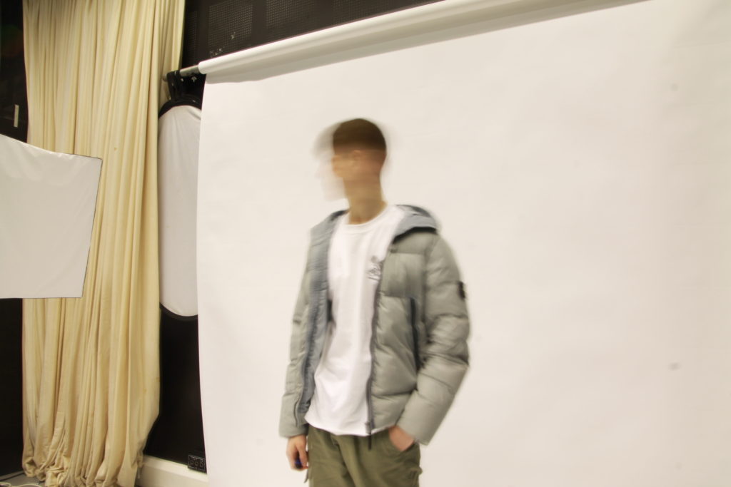
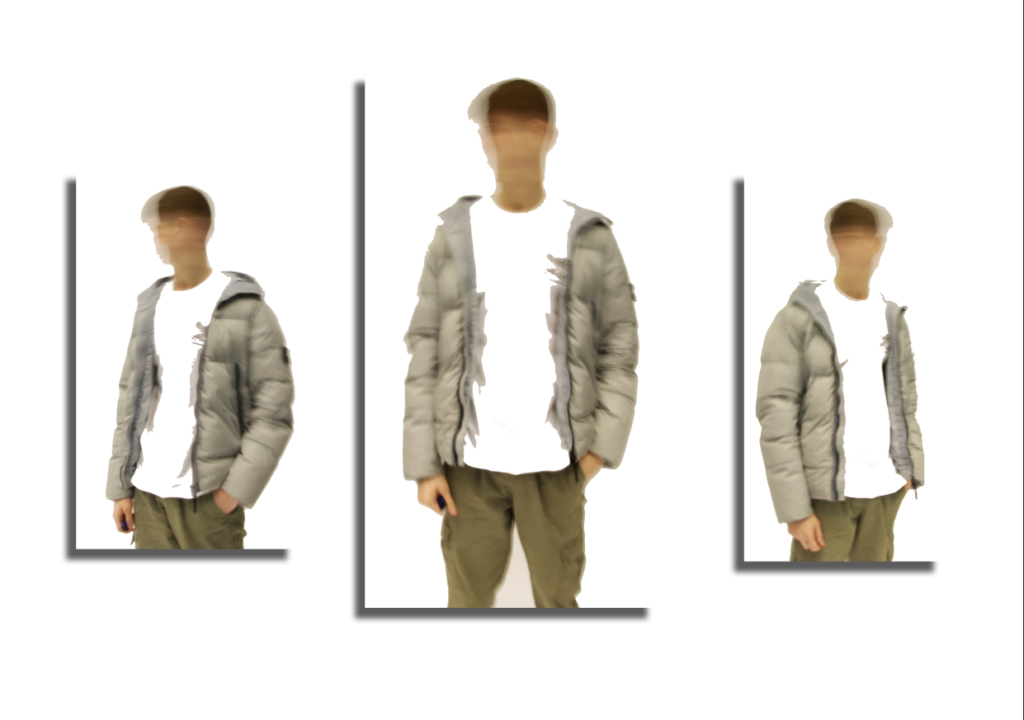
For this idea I used a studio environment to capture portraits with a low shutter speed which created motion blur when shaking your head.


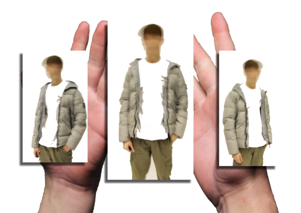
After opening these in photoshop and doing some cropping, I placed them into one image, added a drop shadow and arranged them in line creating a piece that show some movement.

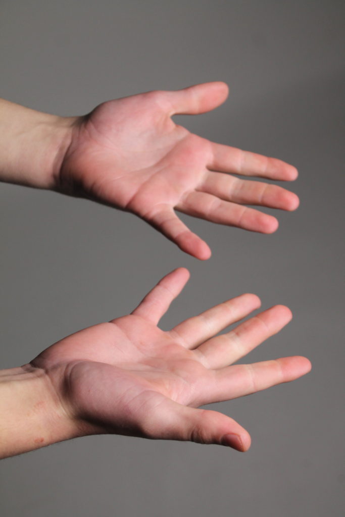
To finish I just added this shot of his hands behind to give depth and a more personal look.

To finish I just added this shot of his hands behind to give depth and a more personal look.


Final Piece

evaluation

What went well:

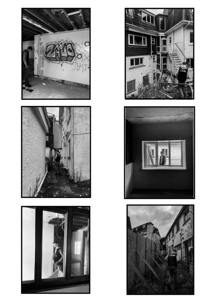
For my photography mock exam, I produced multiple images but only chose to use the collection of 6 and the single one as my final pieces. I am happy with the way all my images ended up coming out using photoshop and lightroom. I like the way I was inspired by multiple artists and used my own approach to create my own style of images. I am happy that I was able to include at least one of my images from when I went to the skatepark to take some photos because I think skateparks are a great place for phtoshoots

What didn’t go well:

For my next mock exam project, I will make sure to take a lot more photos so I have many more options to choose from in the future. I would’ve liked to include more photos from skatepark but most of the photos I took didn’t turn out in the best quality. Also, I would’ve liked to have more ideas for good edits on some of the photos I took.

Conclusion:

Overall, I am very happy with my final outcomes and the work I produced. and how i used my inspiration from tish murth to try show what kids do and followed her ideas in using the derelict buildings (the bouely bay hotel)

final image 1

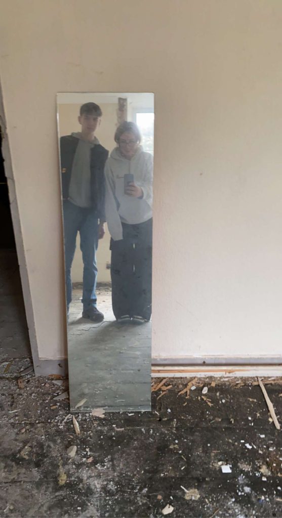
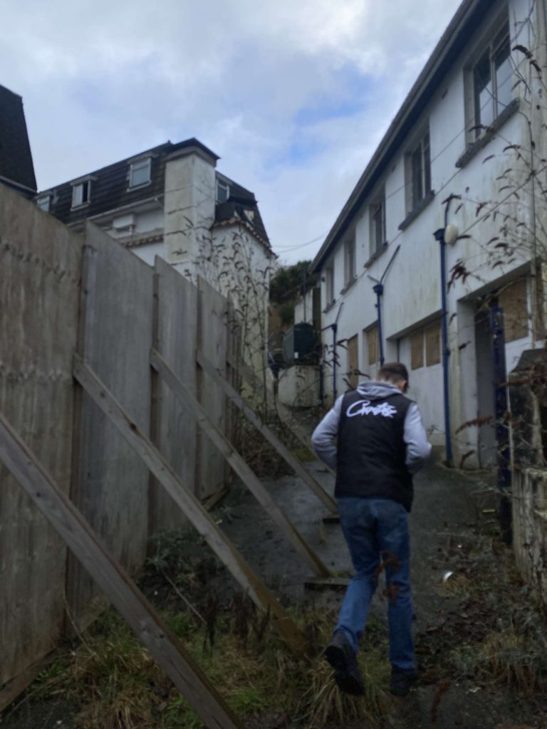
For this image i used 2 photoshoots one being the skatepark and the other being the old waters edge hotel

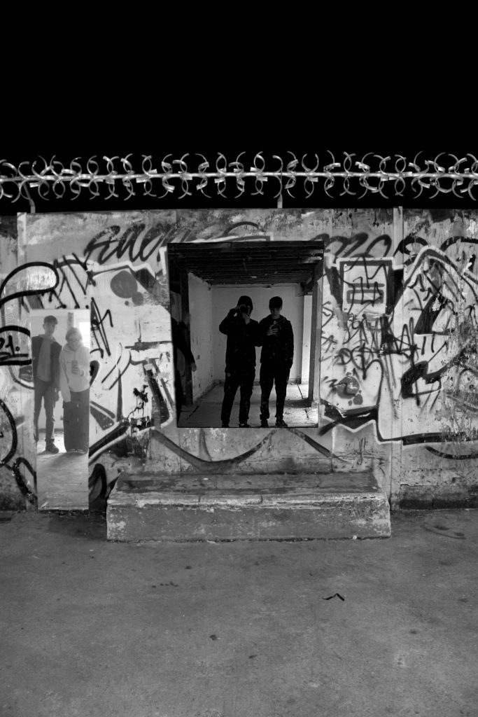
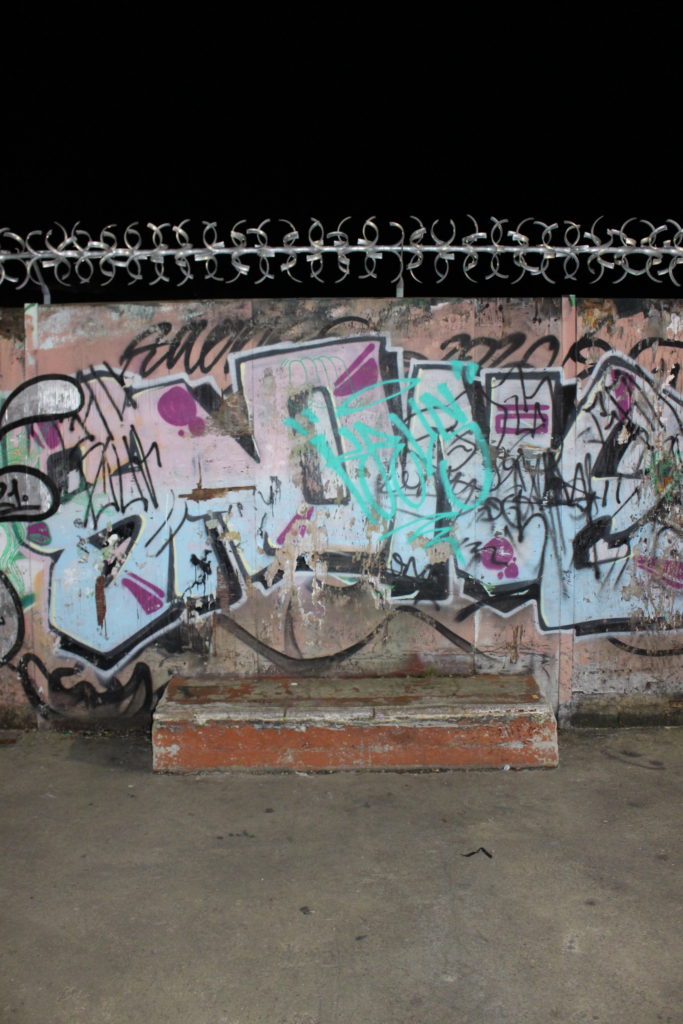
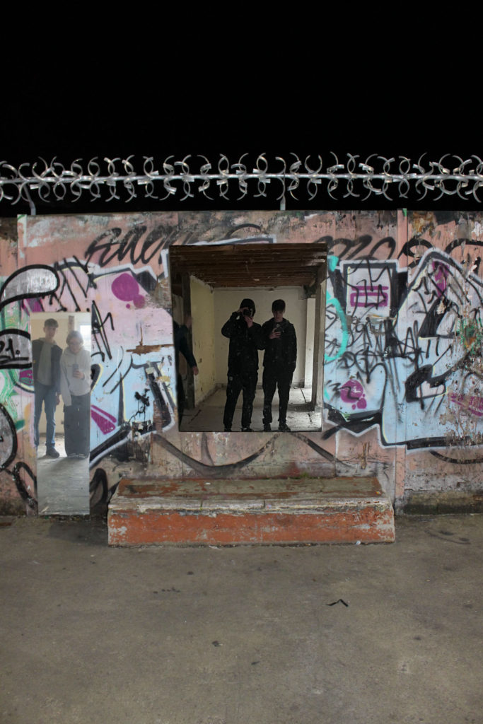
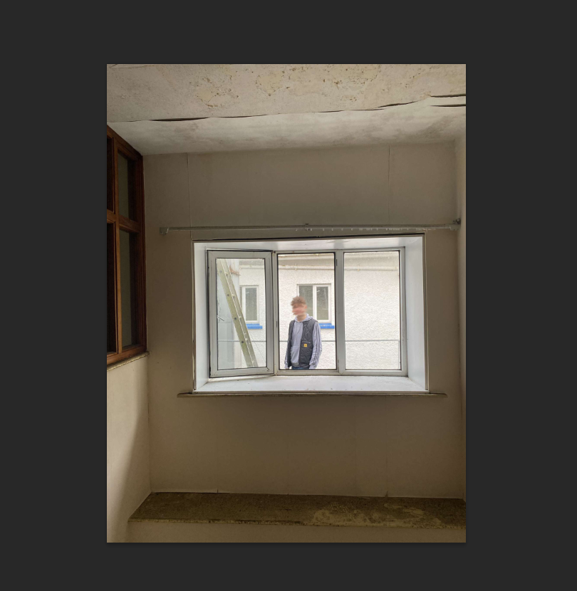
for this photo i edited to photos i took at the hotel over one at the skatepark to create an image of the three being one i took some inspiration form Tish Murtha and how she photos derelict buildings with children playing in them relating to the derelict buildings in the mirrors and where kids play at the skatepark

to do this i cut out the mirror in this picture

aswell as my second image

after cropping them out i placed them over this picture from the skate park

this is the image after that

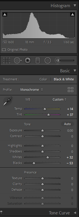
i then took it to light room editing it like this

to get my final image

Final Images- Identity

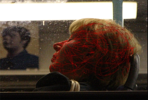
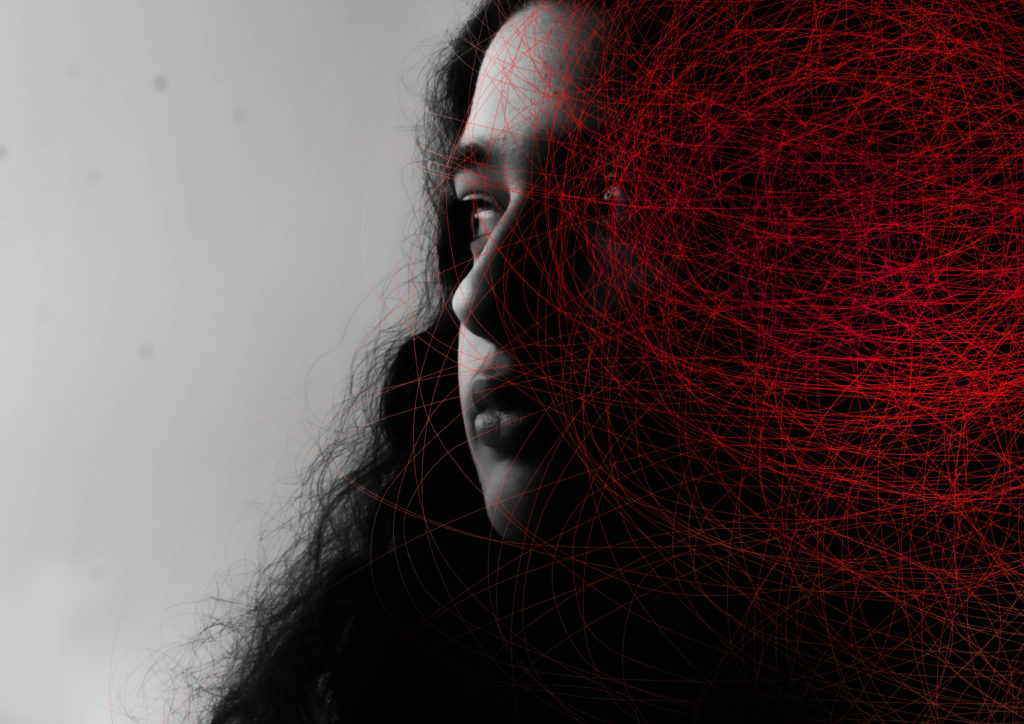
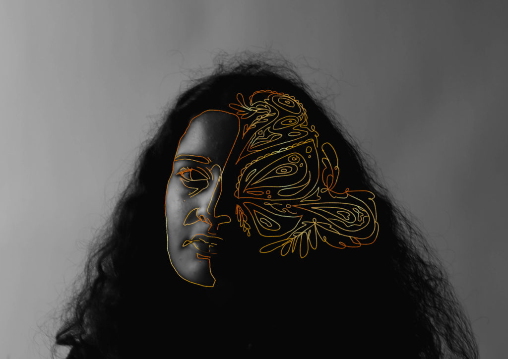
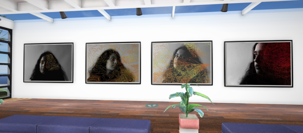
I liked the work of Dryden Goodwin and wanted to edit a portrait inspired by his style. I did it digitally by drawing on the lines in photoshop and then using an eraser tool to soften the edges. If I were to do this again I would probably do it on a physical print using a paint pen, so I can get more organic looking lines. Despite this, I still really like this image and enjoy the contrast between the monochrome and then the brighter red. I also coloured the edges to be lighter and made the inside of the red darker to make it more visually interesting.

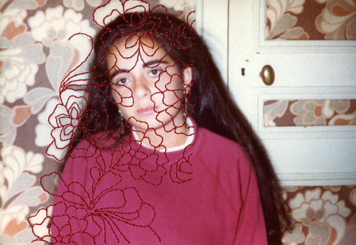
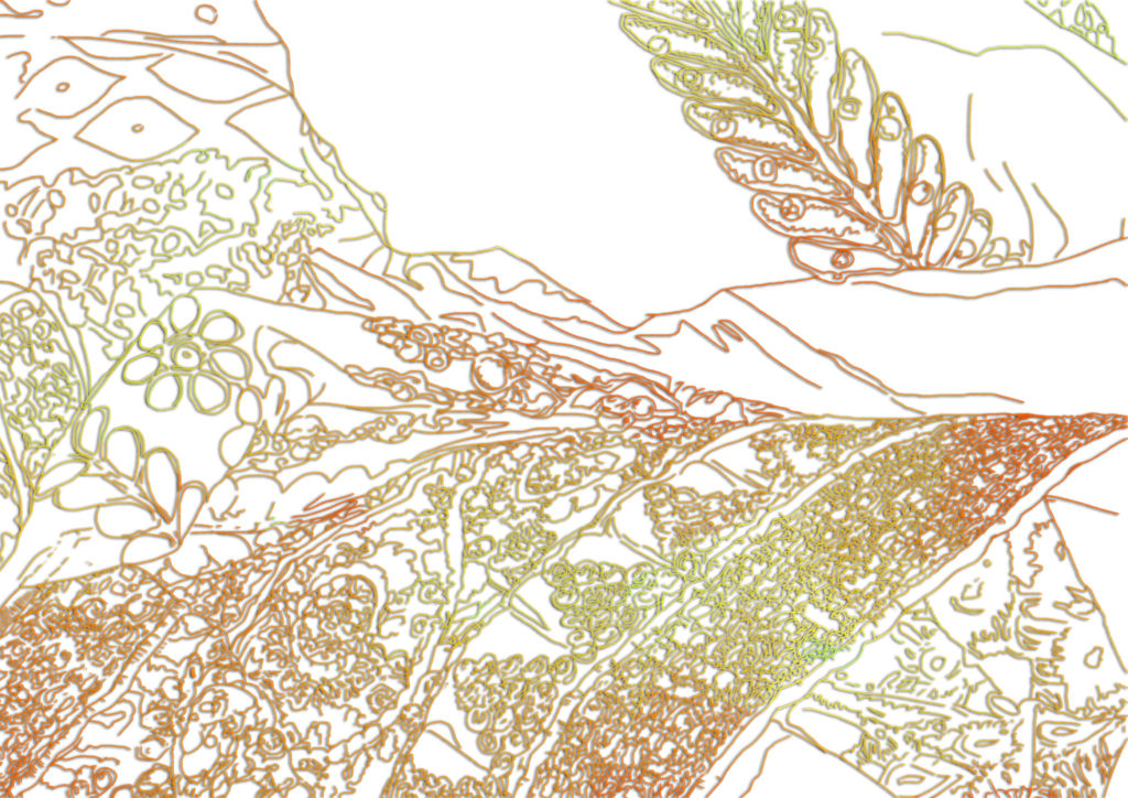
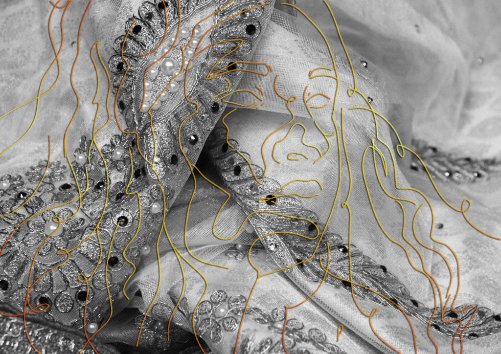
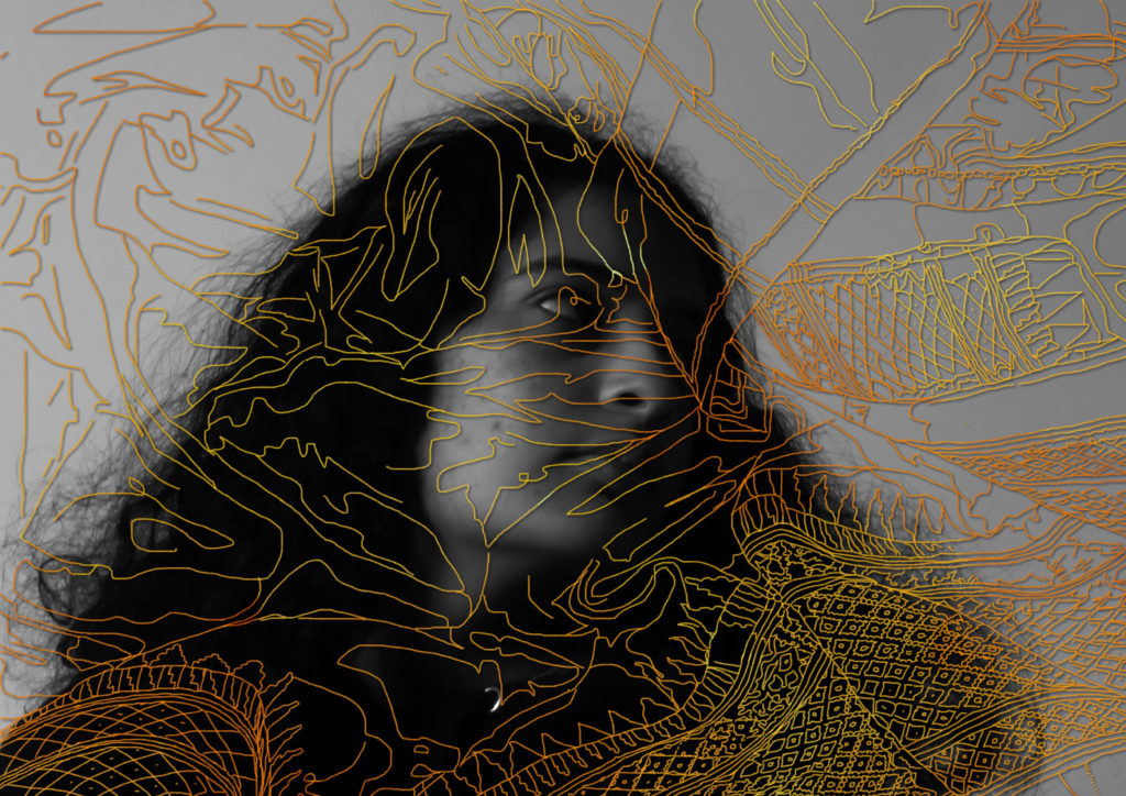
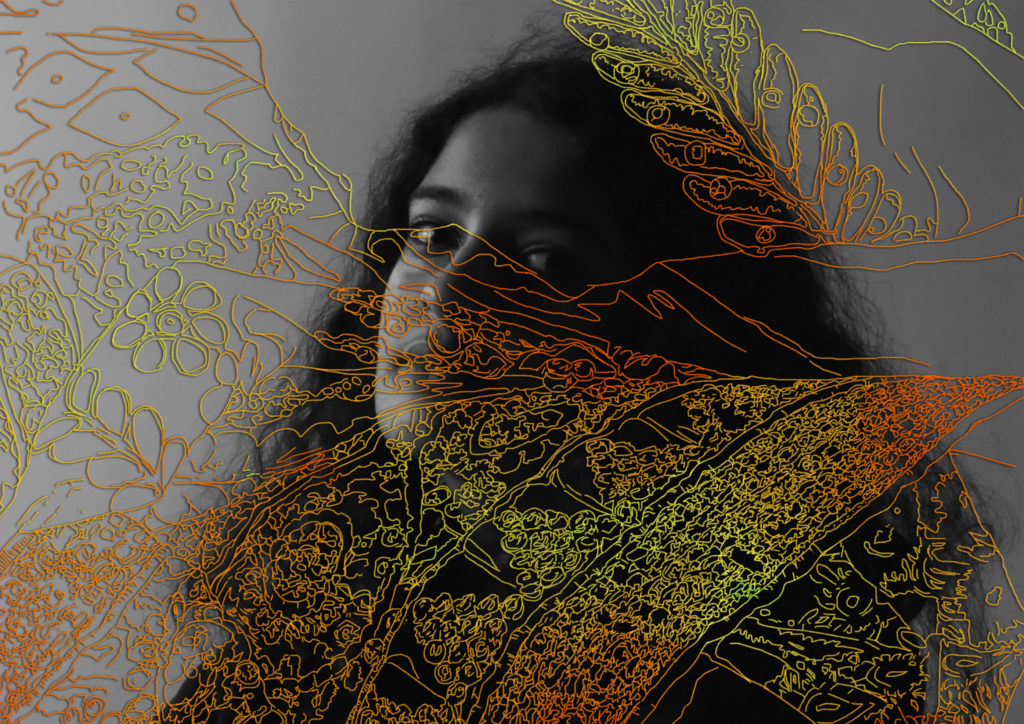
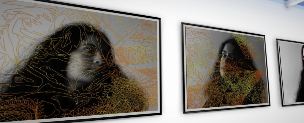
Here I drew over my portrait in photoshop (instead of embroidering them like I originally planned) in an attempt to recreate the style of Carolle Benitah. I traced over an image of one of my family’s saris and then placed it on top of a portrait of myself. I then coloured it gold and added a drop shadow to create some contrast in the areas where it just sits on the grey. The gold also creates some unity between this photo and others where used similar techniques. I enjoy how it looks and am glad I traced over the fabric shape as well as the actual patterns as well.

Overall I feel like I was successful with replicating the styles of the photographers I was inspired by and learned a lot during this project. If I were to do it again I would want to be slightly more prepared by printing out my images in advance so I could have a chance to edit them physically as well as digitally.

In this Experiment I did the reverse by drawing myself over a Sari picture but I do not like it as much.

Gallery Mockup-

identity project – editing on lightroom/photoshop

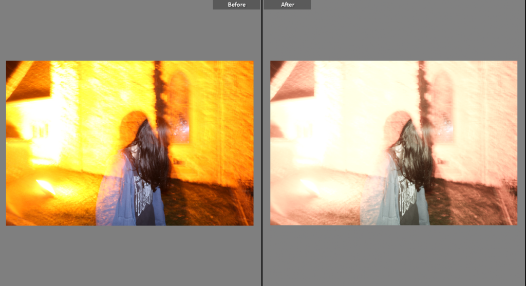
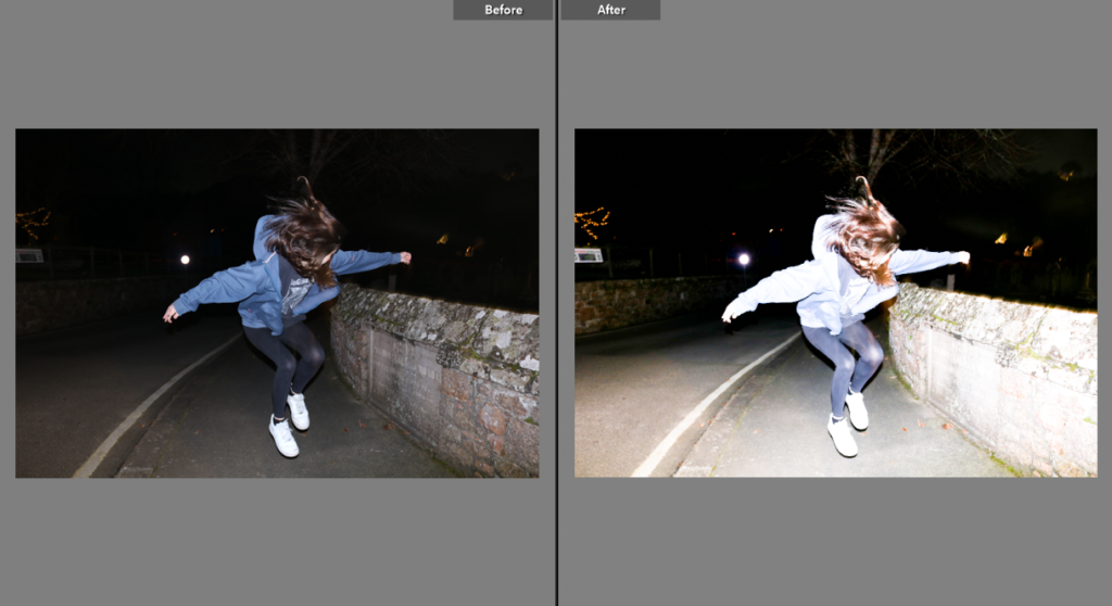
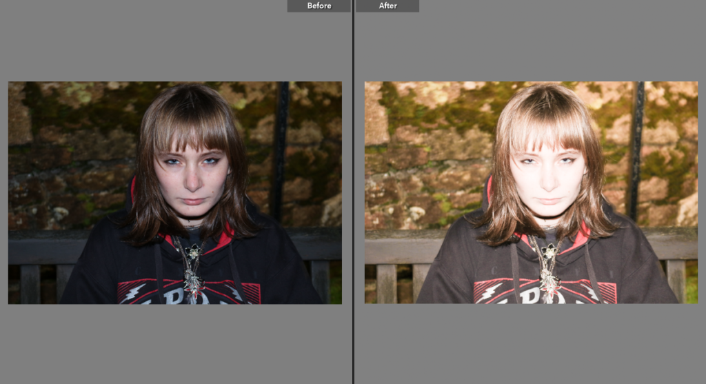
I began by editing my photo on Lightroom – for this I brightened the photo and lowered the saturation so that the yellow tones of the photo wouldn’t be so bright – I did this so that my photo had the same colour palette as the newspaper clippings I used to create the multiple exposure with.

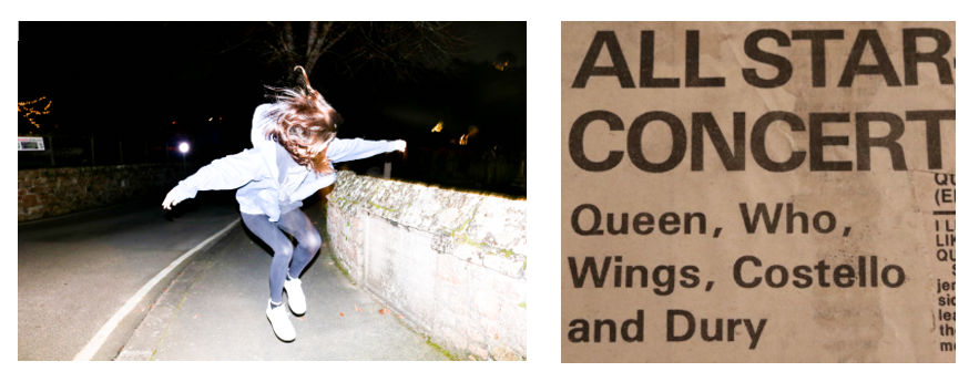
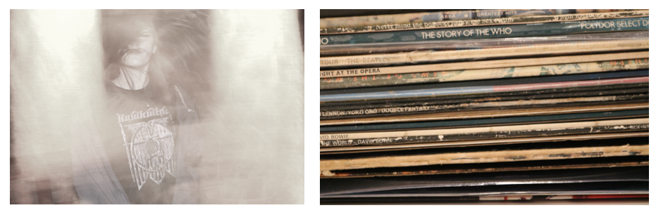
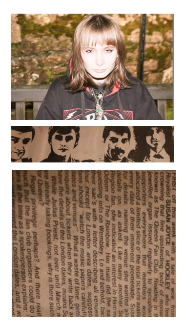
My three photos used to create the multiple exposure.

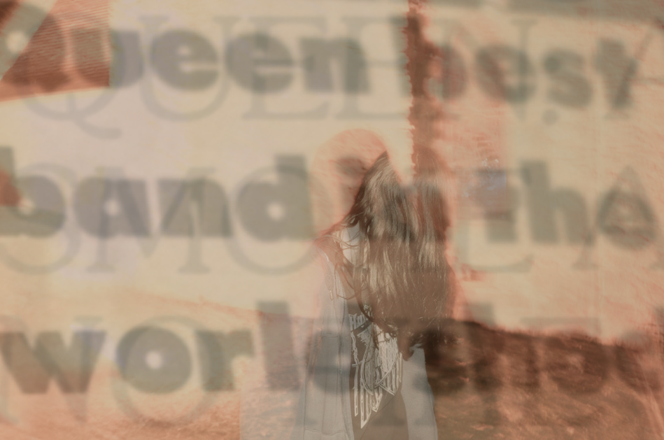
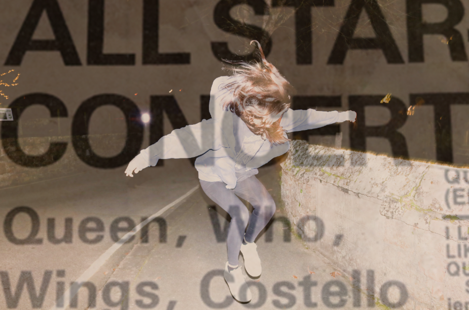
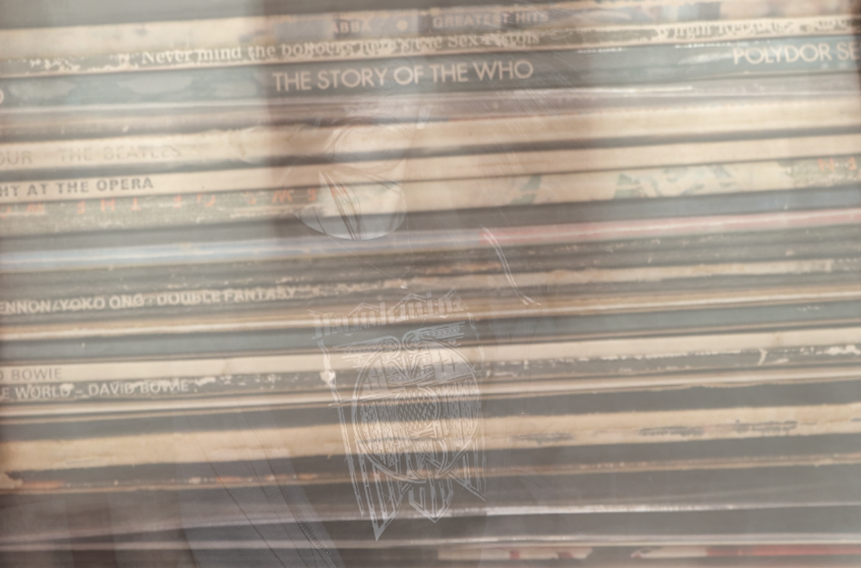
This is the final outcome of my first photo – I used the text to contrast with the photo, taking inspiration from Jim Goldberg’s use of combining text with images. The way this photo turned out makes it look vintage which I really like.

I had to choose one of the two photos of me jumping so i decided on this one – I brightened the image in attempt to make it look more like an action shot of 90s photography. The end result on Lightroom makes everything the photo look more defined.

I used another newspaper clipping from my scrapbook as the overlay – I chose this photo because of the bold headline ‘ALL STAR CONCERT’ and the featured artists including The Who which gave a further meaning to my theme of my attempt to recreate Pete Townshend’s jump. It relates back to my artist research on Bob Gruen – most of his work on celebrities features action shots e.g the photo of The Clash in the moving vehicle I used in a previous post.

I was originally going to keep the orange colours in this photo but decided to tone them down in order for them to fit with my other pictures. I lowered the saturation and vibrance slightly but still kept it as unedited as I could to try and narrate the theme of a candid stage photo – much like Bob Gruen’s photos of musicians performing.

I added the photograph of my record collection on top to convey my identity as these are my personal belongings and have sentimental value to me, as some are originals and were given to me by my parents. The two photos go very well together as they both fit the theme – one being representative of different music styles and what I listen to, and the other being the aspect of performance.

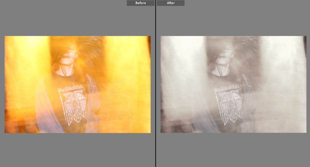
I changed more to the original image on photoshop than I did on Lightroom, but for this photo I again brightened the image and changed the hue to match the colours of my second image below of Queen.

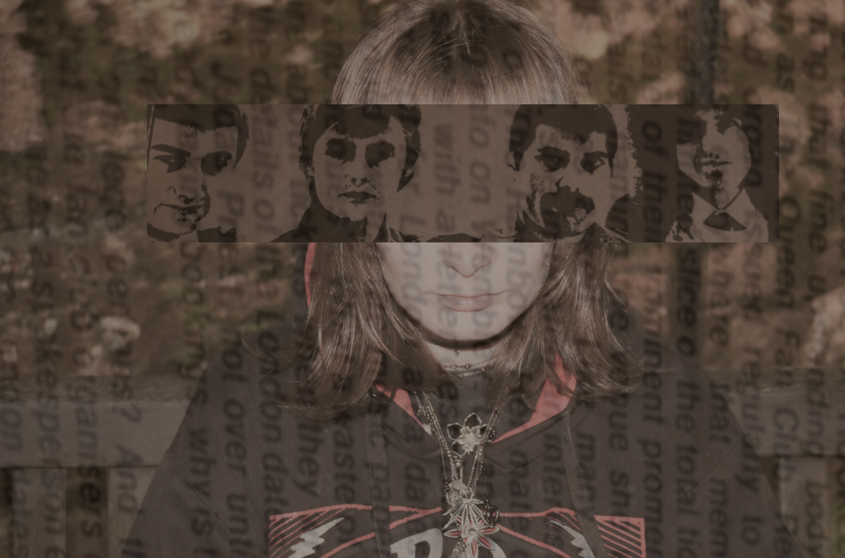
This is the outcome of the last photo after I edited it on photoshop. I began by lowering the saturation then putting the photo over her eyes – then I added the newspaper horizontally over the top and lowered the opacity so it had a faded look to it. My favourite part of this photo is the contrast between the photo of Alex and the one of Queen – the dark colours of the older photo combined with flash photography shows how music has aged but still has a legacy.

final image 2

for this image i used my photoshoot from the waters edge hotel where i used natural lighting which i feel was a very good photoshoot location as lots to capture

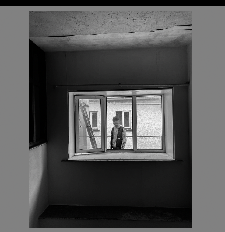
below was one of the originals

i then took it to photoshop and used the smudge tool to hide the head seen below

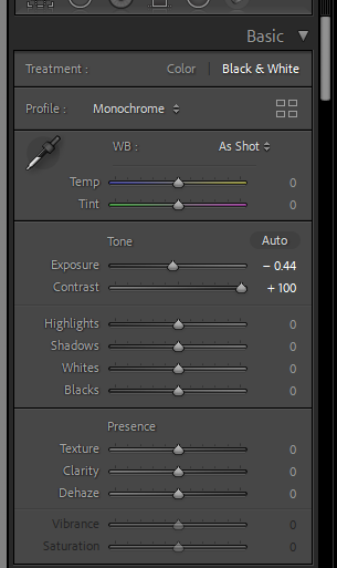
to further develop this i took it to Lightroom where i changed to black and white

and also changing the exposure slightly and the contrast

Just another Hautlieu Creative site