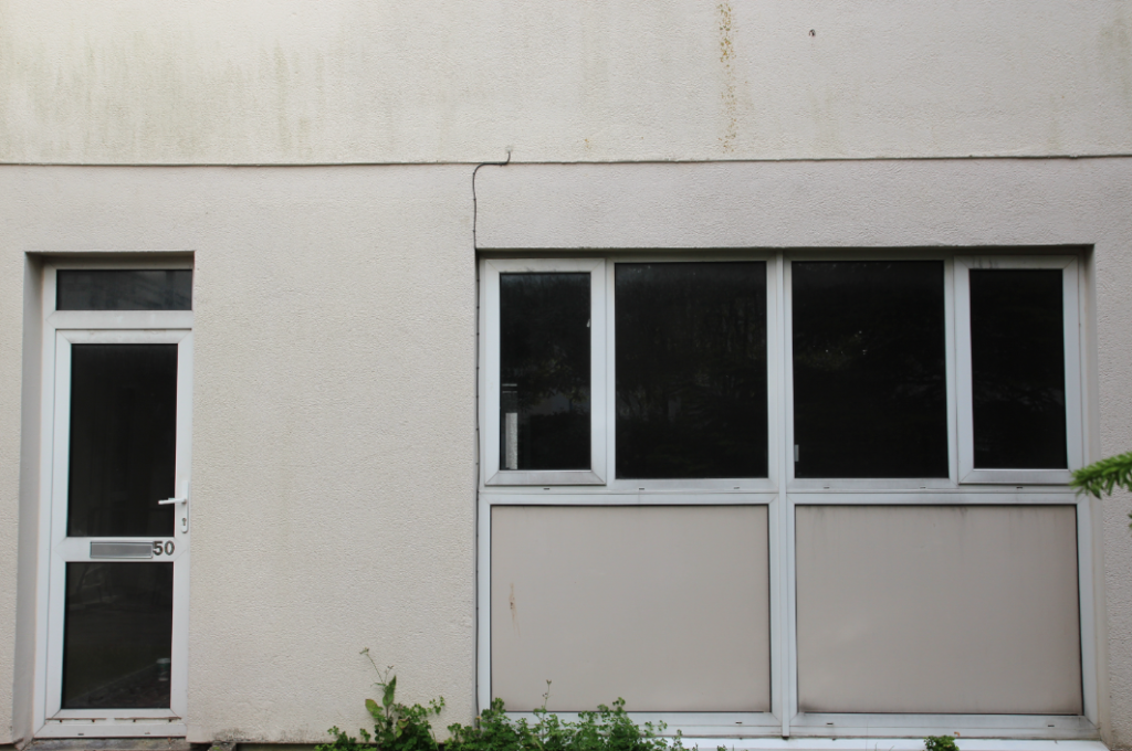
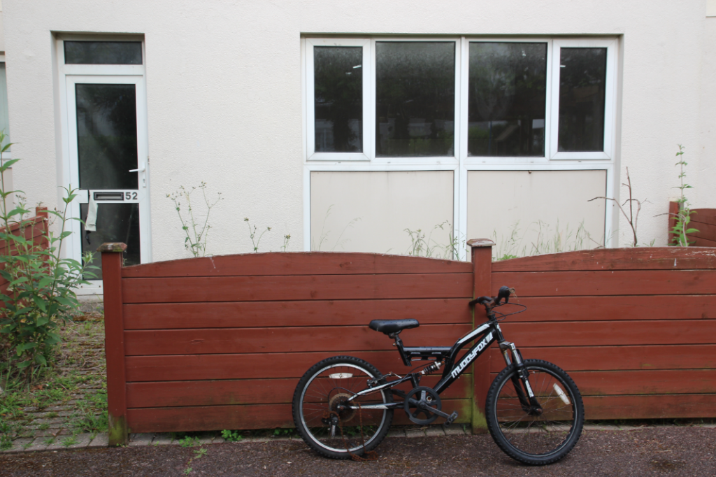
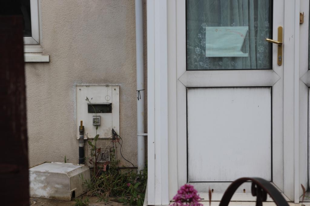
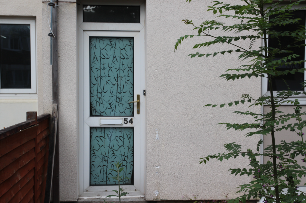
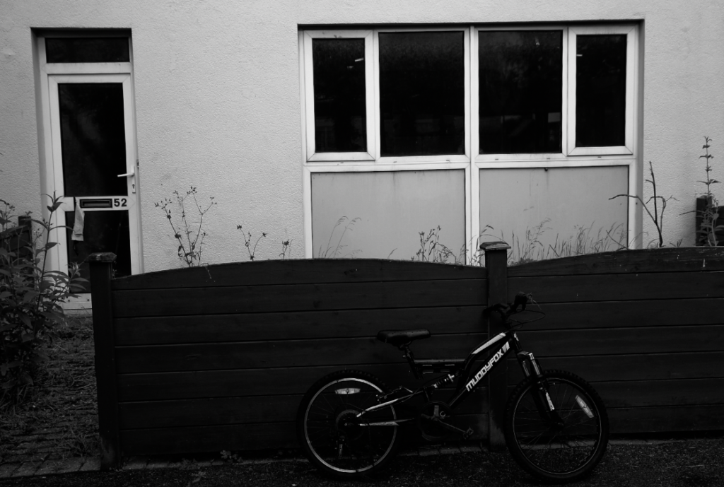
I am going to frame these photos as a set like this
Evaluation
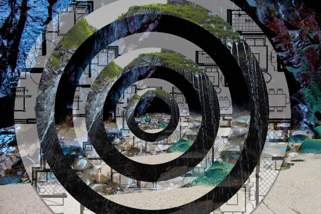
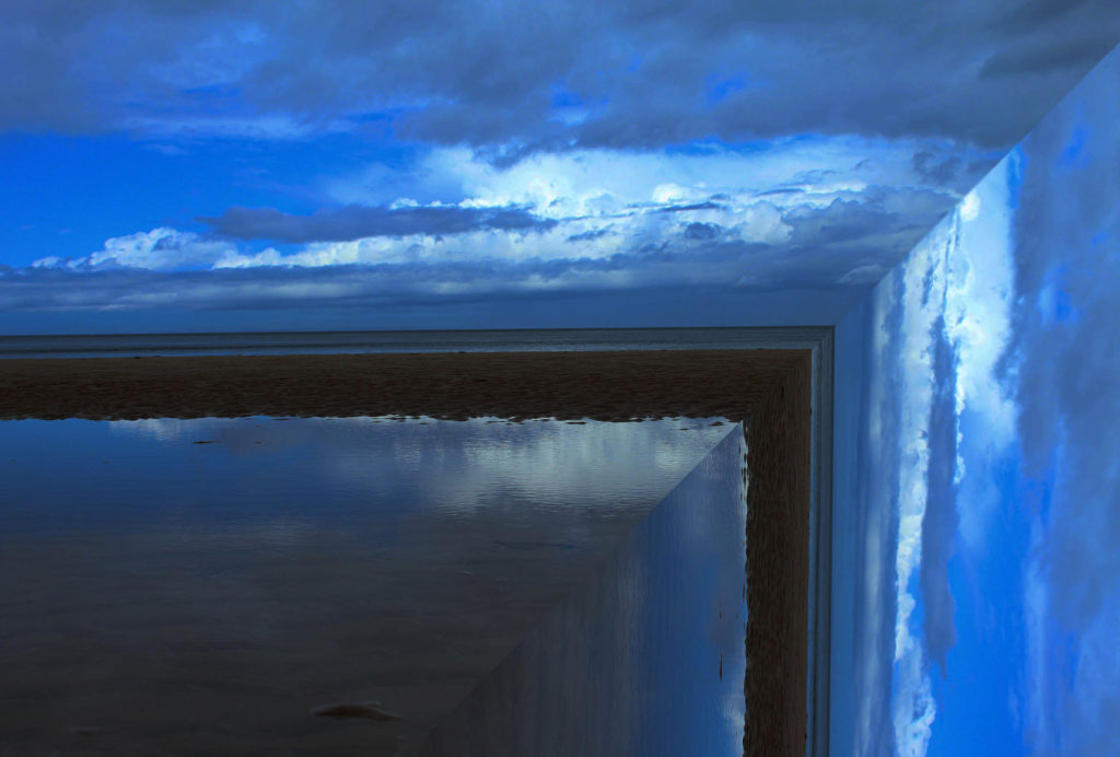
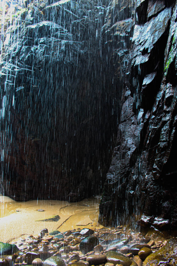
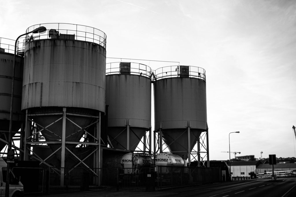
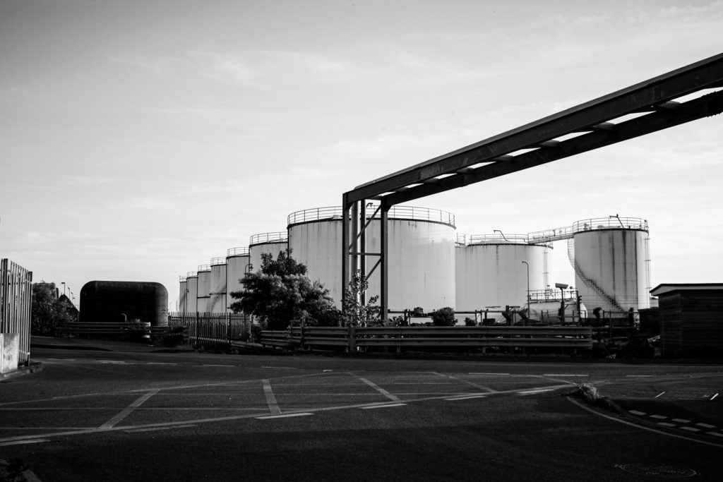
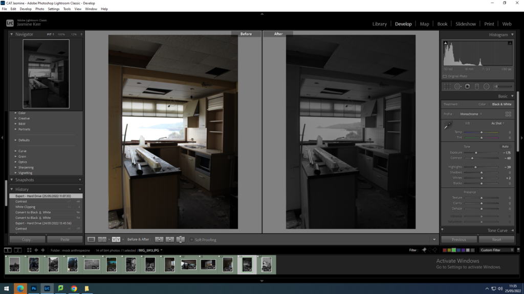
these images are a response to Charlotta María Hauksdóttir’ and george marazakis. In my opinion, this section of my product went well. the idea behind these images are to show the serenity and awe of nature, and that in the next years to come, these places are likely to be destroyed and turned into a building site. I wanted to emphasise the pure beauty of these palaces to make people react with shock. I chose to take these images in a place that almost everyone in jersey has visited at least once. When people go to Plemont beach they are usually going for leisure, to have a swim or sunbathe on the beach. A lot of the time people dont actually take in the scenery. After exploring this place in depth, and trying to look at it through a different perspective. i learnt to appreciate this landscape a lot more than I did before, and through these images I wanted other people to feel the same. My plan for this shoot was to respond the chosen artist using the same technique she did, by overlapping images and creating almost an optical illusion. After experimenting and researching another artist, I chose to keep some of these images without the overlapping effect .The first 2 images relate to Charlotta María Hauksdóttir’ due to the fact that I have distorted the natural images of serenity and nature. The bottom 3 images relate more to george marazakis, because they are normal landscapes which provide the viewer with a sense of awe and terror.
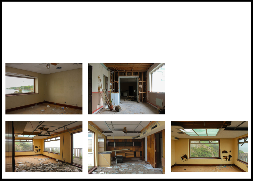
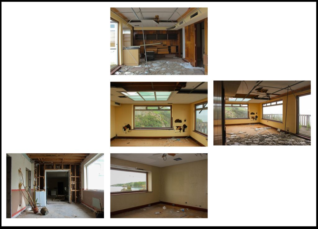
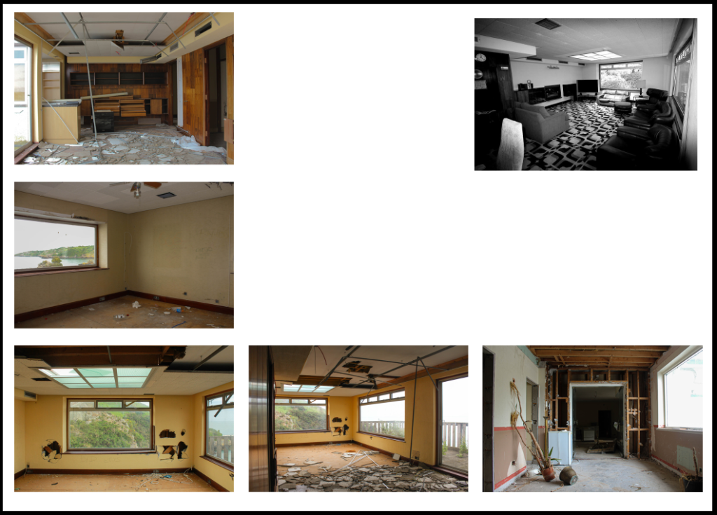
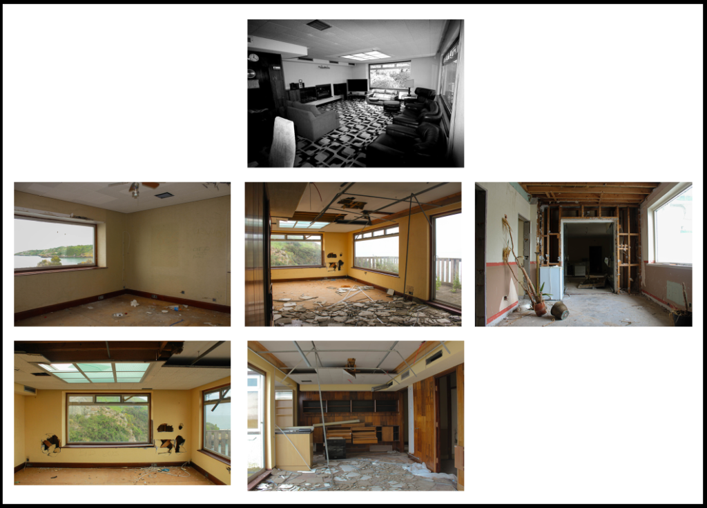
destruction
evaluation
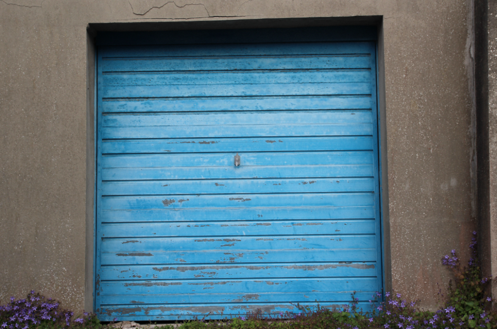
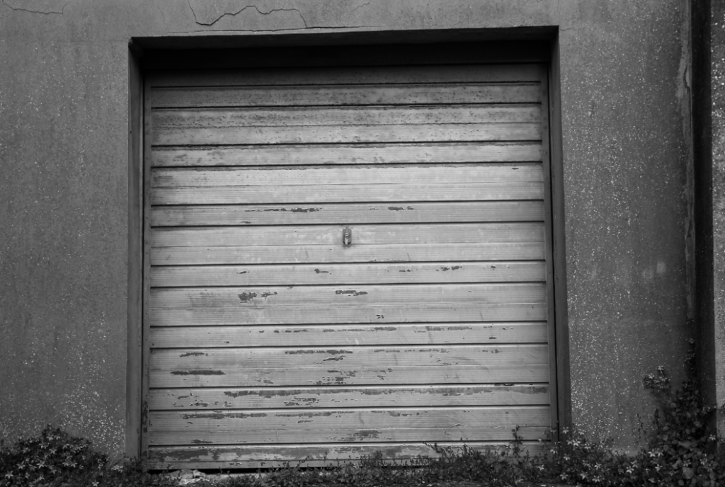
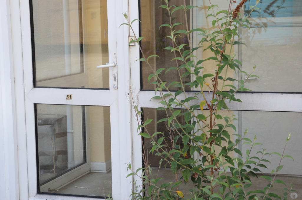
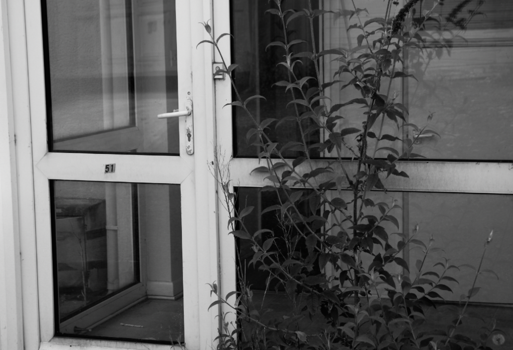
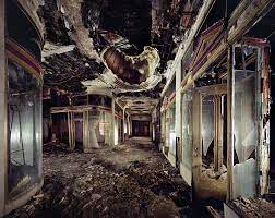
This section of my project I have named ‘destruction’, this is in contrast with the first section of my project. This section all went to plan however in future I would like to take some more landscape rotated photos as the majority of them are portrait. A variety of landscape and portrait would mean that they fit into a collection better. i like the contrast of coloured images and images in black and white. I chose to put some of these images in black and white because i wanted to express how sad and lonely this place is after being abandoned. This is also a place a lot of people have previously visited in jersey since it was open, and i am aware that it was a place that a lot of people loved. when i went on this photoshoot I bumped into an elderly man who was just stood staring at the pub part of the hotel in shock. he said to me ‘isn’t it such a shame what we do to the best places’. This quote inspired me a lot to take a look inside. I wanted to show how dilapidated and empty it was left. after being sat there rotting for 5-6 years people are still sad about its downfall. This wasn’t my original idea when I was given the assignment, but after doing some research on Andrew Moore i was drawn to this side of Anthropocene, the stuff that not everyone gets to see. These photos relate to Anthropocene because nature is overtaking this run down building, but so is mankind. there are things thrown everywhere, rust and mould, weeds growing all over the building and broken glass everywhere. Through these images i wanted to allow people to feel sad and slightly empty, just like i did when i entered the building.
Here I have demonstrated some montage work that I have created from the images above, a combination of monochromatic and colour work. I have also added descriptions and critiques for my work. All of these have been made in Photoshop using a type of cut and paste method to create new photographs from already existing ones.
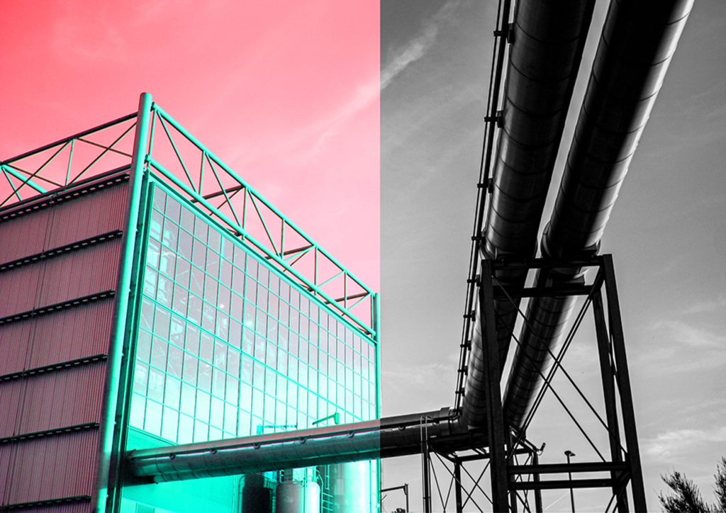
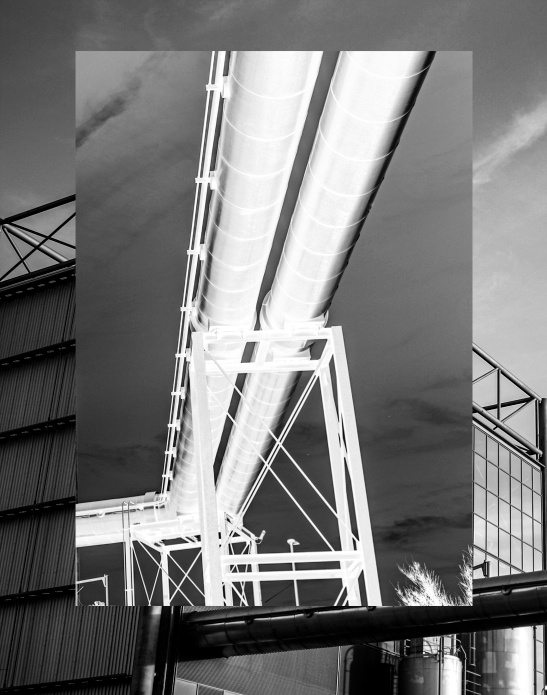
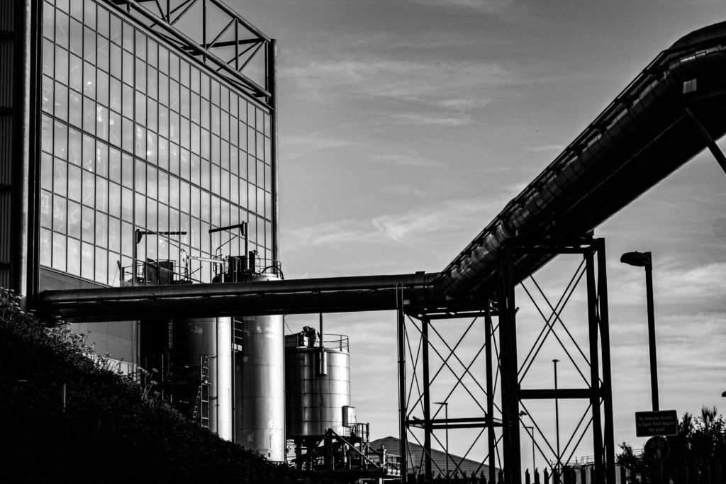
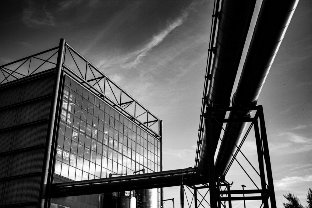
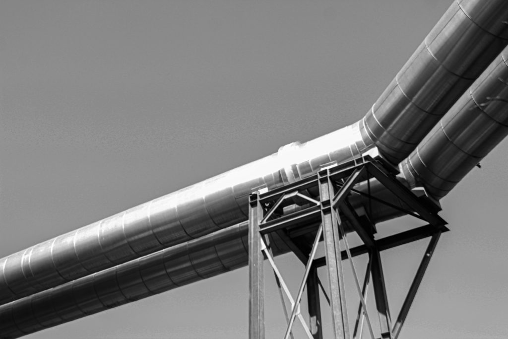
I had the idea to create a more interesting piece by combining two half of an image, edited in different way together to add contrast and attempt to make it more aesthetic. I decided to divide this image in this way as I think the incinerator looks better in colour and the contrast and textures in the metal pipes come through more when they have been edited in a monochromatic way.
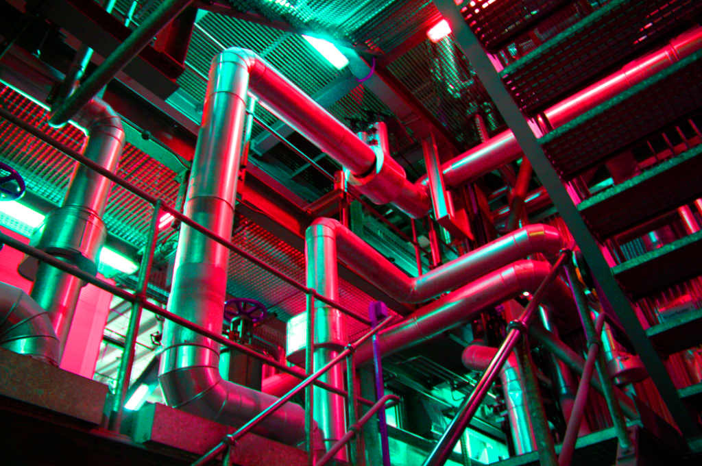
Here I have created a montage using two versions of the same images to create a juxtaposition, I used the ‘adjustments’ tool in Photoshop in order to create the pink image in the centre, as this changes the saturation within the image. Additionally, I chose blue and pink as blue is a cool toned colour and pink is a very warm toned colour. I think this image turned out aesthetic as the centre image has hints of green and blue in one section and this helps link the whole piece together, making it more cohesive.
Here I have mostly images from my first photoshoot in order to create these montages, I think that placing the colour images in the centre was a good decision as it creates an aesthetic focal point for the pieces. Furthermore, the photographs in the background of these get a bit lost but I think the overlapped images help combat this issue, deciding what size to make the central images was the most important part.
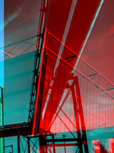
I have reused the first montage above to create this piece, meaning that only half of the image could be edited. The red and turquoise colours contrast well together, however this experiment didn’t turn out as well as expected as there’s not enough contrast or link each half of the photograph. However. I do think the colours bring out structures within the incinerator, such as the metal and glass.
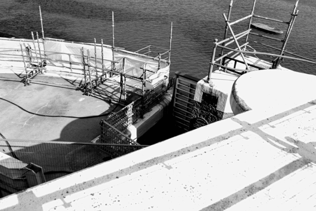
I have created these two montages, they would link well together as the first original image was taken from outside of the incinerator and the second was taken inside at the top floor, where there are massive glass windows, which enabled me to use the best natural light to take the image. I have layered half of the images over the other half. For the first image I changed the contrast but only for the overlapping image, whereas for the second I cropped the left half of the image, placed it over the centre of the right half of the image and then used the ‘adjustments’ setting to make all of the metalwork blue, with contrasts with the warmth of the yellow.
Multi-exposures
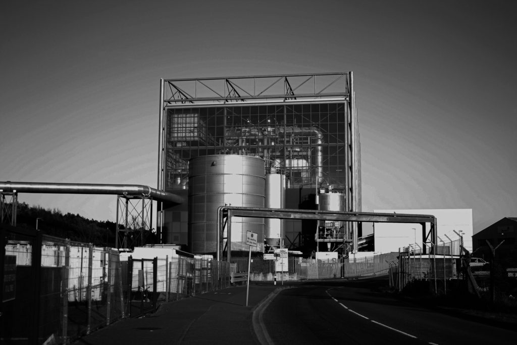
Below I have demonstrated some of my multi exposure ideas, using my photographs and photoshop I have overlapping certain parts of the image and then used the adjustment setting and the opacity to merge the image together, sometimes using colour to eventuate the images. The purpose of these multi exposures is to show how much progress humans have made when it comes to industrialising the island.
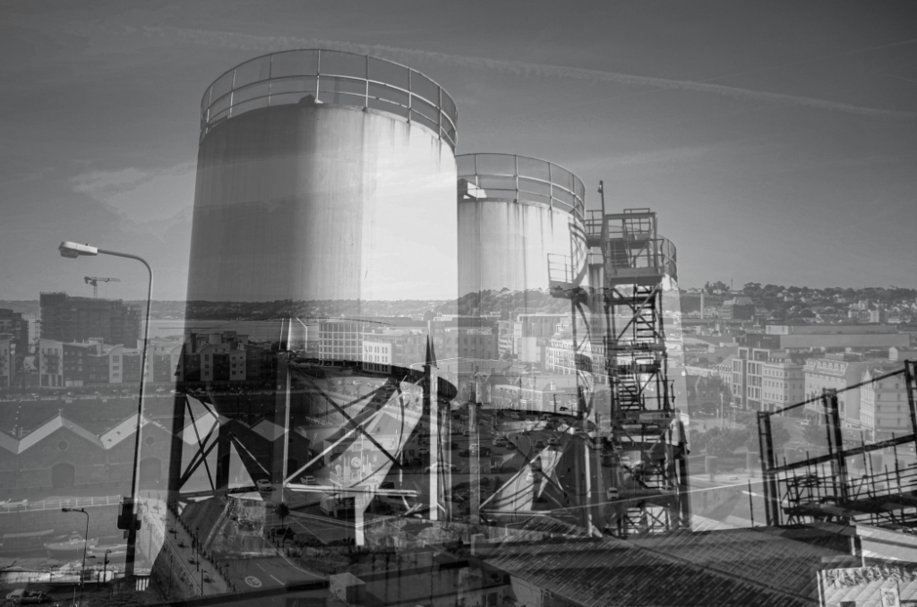
I think that creating a multi exposure using one very busy image with another that only has one focal point always makes for good multi exposures. For example above I have used one image with water tanks and another of the overlooking view of Jersey from the top of Fort Regent. I think despite being monochromatic this image turned out to be eye-catching as there is a lot of depth throughout this multi exposure. The top layer of the image has a lot of simple aspects and this contradicts well with the busy background.
This piece was created combining two halves of the same photograph, I think the red and blue colours compliment each other well. This piece could be hard to view as the structures and all of the lines do get muddy, but this could be seen as an abstract way to create a multiple exposure, as the colour adds more elements to the image, and therefore adds to the depth of the image.
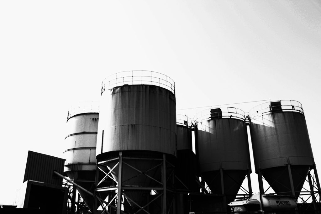
Above I have created a gallery containing an unedited multi exposure and then below the ones edited with colour. I really think the colour helps link to the project of Anthropocene, as the trees and grass often turn out to be contrasting colours, such as the red and blue in the third edit above. This helps us further visualise the difference between manmade and natural structures. I made the multi exposure so that the image of the incinerator was in the background, as I feel like this has been the focus of a lot of my work so far.
Colour Edits
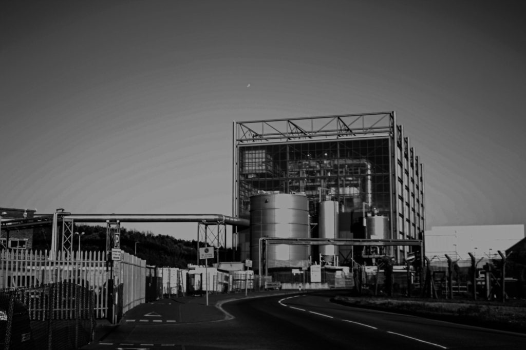
Below I have included some visual examples of my experimenting with the colour settings in Photoshop, sometimes only altering half or one section of the photographs, and other times attempting to illustrate how much of our environment has been shaped by people and how much is natural.
Coloured editing work best with my images which contain metal structures/ objects as the reflective material enhances the colours and makes the pinks and blues lighter. One of the only downfalls of this image is the fact that the original image was not of good quality, the clarity and exposure had to be edited before making this multi exposure, however I still think it turned out successfully as the final piece came out bold and clear. Additionally, the composition of the original photograph made this process easier as there is lots of little details that ended up being nicely edited with the colours.
To create this piece I have selected the area of the photograph which contains the incinerator in Photoshop, using the polygonal lasso tool. After I changed the colours in this part of the image to make them brighter. This has made the image more aesthetic because it looks like a cartoon part of the photo. It could also be viewed that it appears as though this part of the photograph has been hit more by the sun or taken at a different time of day. This created contrast within the image as the altered part looks fake and the rest of the natural surroundings look real.
This piece is very similar to the original photograph, as I haven’t done any other editing such as cropping and overlaying images. To edit this I have only changed the saturation of the image to a pink tone, and through this some green tones have appeared underneath the metal on the left side of the image. In my opinion this piece turned out successfully as I have used it to create a montage as well, the colours really eventuate the textures of the metals and I like how it looks like its surrounded by a glowing light, something unnatural to match with the pipes in the image itself.
Sequencing
Below I have included some ideas for sequencing, if one of these were to be my final piece, I would print them out at size A5 and then create a window frame with a black border, these ideas are just digital layouts of how I would do this. I have showed a range of formats for this grid so that I can show my thought process visually. For now I have just created a gallery to demonstrate the layouts, as I have tried to do so in Photoshop but the quality of the images decreased.
1st Attempt
I have created this layout for my first sequence considering the lighting in each of the images, I think that I have a good contrast between images with lighter and darker exposures. This was in an attempt to make the lighter images stand out and for the silhouette in the darker images to be the focus of them. I think this turned out successful but may be interpreted as random and created without an intention behind it. Furthermore, because the lighting pf the images isn’t the same it means it doesn’t as well to my Bernd and Hilla Becher artist reference.
2nd Attempt
This sequence was created with the intention of grouping images with similar objects/ structures next to each other, creating subsections within the sequence, I think this links well back to original purpose of sequencing (grouping together images of the same objects) and the lighter photographs have been placed in the central row of the arrangement in order to bring attention to this part of the sequence. This piece is probably the weakest out my experimentations as I think that the randomness of my other work is more aesthetic.
3rd Attempt
My third attempt at creating a sequence came out as one of my favourites, despite the randomness of this piece, I think that placing my stronger images in the centre of the arrangement or at the top creates a aesthetic focal point for the sequence. In addition, having images with less exposure around the outside and then lighter in the top centre means that your focus is drawn to all of the piece. Alternatively, some of my images look to dark in this piece and I could be viewed as having too much contrast.
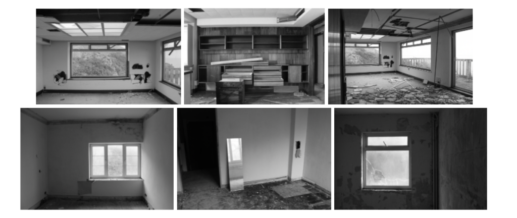
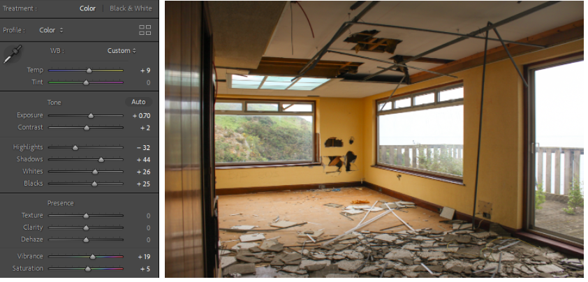
Within editing my images I wanted to present derelict buildings and abandonment through Sternfeld’s use of colour. A lot of the rooms in the derelict hotel I was photographing were yellow, leading to an interesting colour scheme throughout some images.
EXPERIMENTATION
First I experimented by changing the images to black and white.
A few examples of my images in black and white
I realised quickly that changing the images to black and white means I lose Sternfeld’s influence and the images quickly became boring so I decided to keep them in colour and concentrate on the yellow motif occurring throughout the images.
To maintain the yellow in the images I changed the temperature of the images to between +2 and +12, with this same rule going for the saturation and vibrancy of the images, this was so the images could be consistent in their colour scheme as some rooms were brighter than others.
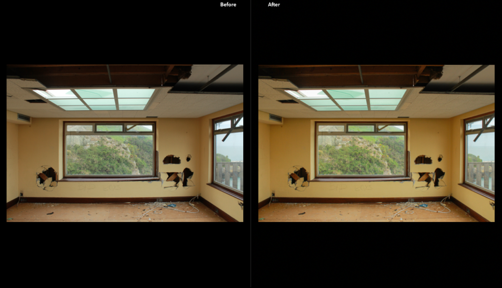
Before and after editing
I edited all the other images similarly, making sure to erase areas of over/underexposure depending on the lightning of the room by changing the exposure and contrast. I also levelled the images to ensure that the horizonal lines were straight.
#2 SUB-SELECTION OF IMAGES AND EDITING
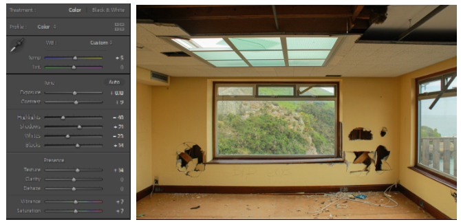
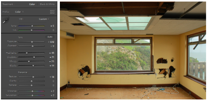
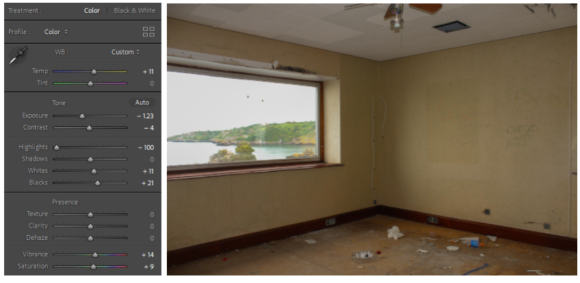
This was my favourite room in the hotel, in all my images I wanted to do minimal editing so I only turned up the temperature of the image to bring more notice to the yellow of the walls and also turning up the contrast, blacks and shadows in the image to exaggerate the holes in the walls. Turning down the whites also meant the slight element of overexposure was taken away from the view outside of the window- showing nature which I found a really interesting contrast in.
For this image I really liked the colour of the wood panelling so I turned up the saturation and vibrance to show the wood’s colour alongside the (once again) yellow of the walls. There was slight overexposure in the left side of the image so I turned the exposure down however some overexposure still remains but I decided to keep it in as the sharp white of the outside wall gives the image more depth as the background is quite dark and quiet.
Similarly to the first image, the only thing I really wanted to do for this image was keep its yellow theme while bringing notice to the damage in the room- especially the fallen pieces of ceiling tile as they looked like a mosaic on the floor. The outside is slightly over-exposed however I like the jump from the yellow to almost pure white outside the window.
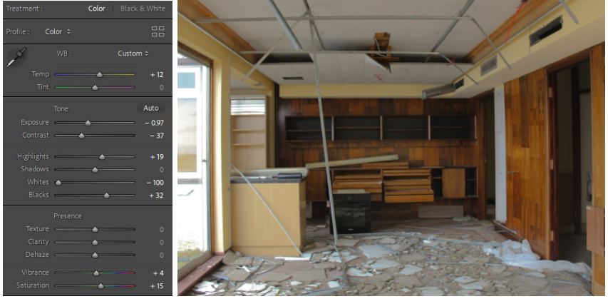
I turned the contrast on this image up to make the stains on the walls more apparent (e.g the dark rectangle on the wall where a mirror once was) and turned the temperature up to make the yellow more apparent. I also turned all the highlights down to make more use of the shadows and how dark the room was apart from the soft glow coming in from the window.
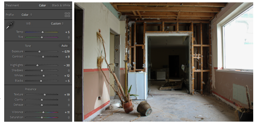
I really like the composition of this image, the plant leaning against the wall gives a break from all the horizonal and vertical lines- drawing focus away from them making the plant and the doorframe the main subjects. I did minimal editing in this image as I liked the way the lighting was coming in with soft shadows being displayed on the floor and ceiling compared to the dark of the background.
The images I decided to take out
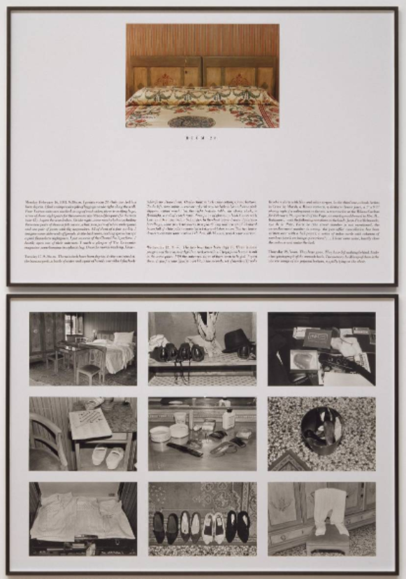
After editing all my images I did another sub-selection- finding inspiration from Sophie Calle’s ‘The Hotel, Room 47’, more specifically, the way Calle displayed her work- presented in a grid titled the room number of the hotel room she was photographing.
An example from Calle’s ‘The Hotel, Room 28’
The obvious similarity is that Calle and I are photographing a hotel however Calle’s work is displayed alongside extensive descriptions of what the room was like and the ownings of the room inhabitants and presented as a catalogue of documentary-style images in grid format- which I would like to do in photoshop as I really like the irony of displaying images of a derelict area as if it was brand new.
ADOBE PHOTOSHOP EDITING
First, I printed and cut out the images I wanted to use in a set and arranged them by hand until I liked the arrangement- next I tried to recreate this arrangement on photoshop.
First I opened a plain A4 page on Adobe Photoshop and opened all my other images on separate tabs.
Then I dragged each image onto the plain white page and resized and arranged them until they fit the page how I wanted it to be like.
The images ended up on the page like this however I was unsure of this layout so I continued with some layout experimentation.
I really like the inclusion of negative space in my experiments as it reminds me of blueprints of building plans- an interesting contrast between ruin and new buildings.
experiment #3
I also became interested in juxtaposing images of the hotel abandoned with images when it was still in business, as seen in the image above where a picture of the same penthouse room in the 2000s is distanced from pictures of the room in its current state by negative space- the black and white of the old image also being an interesting comparison as black and white is often linked to age- with old buildings often having been demolished quickly to make way for new buildings however in this case the black and white photo is showcasing the hotel when it was in a much better state compared to the yellow centred images- ironically, yellow being the colour that represents vitality and youth.
experiment #4
I ended up liking the last experiment (#4- seen above) the most as the arrangement reminded me of Sophie Calle’s work while the use of colour to Joel Sternfeld’s work and the depth of the images to Jeff Wall’s ‘The Destroyed Room’- especially in the bottom middle image. The negative space adds some abstraction to the piece which I find interesting as well.
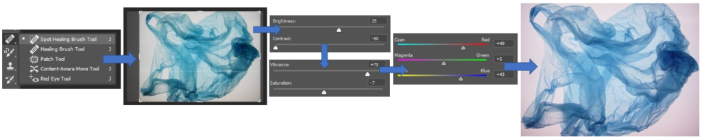
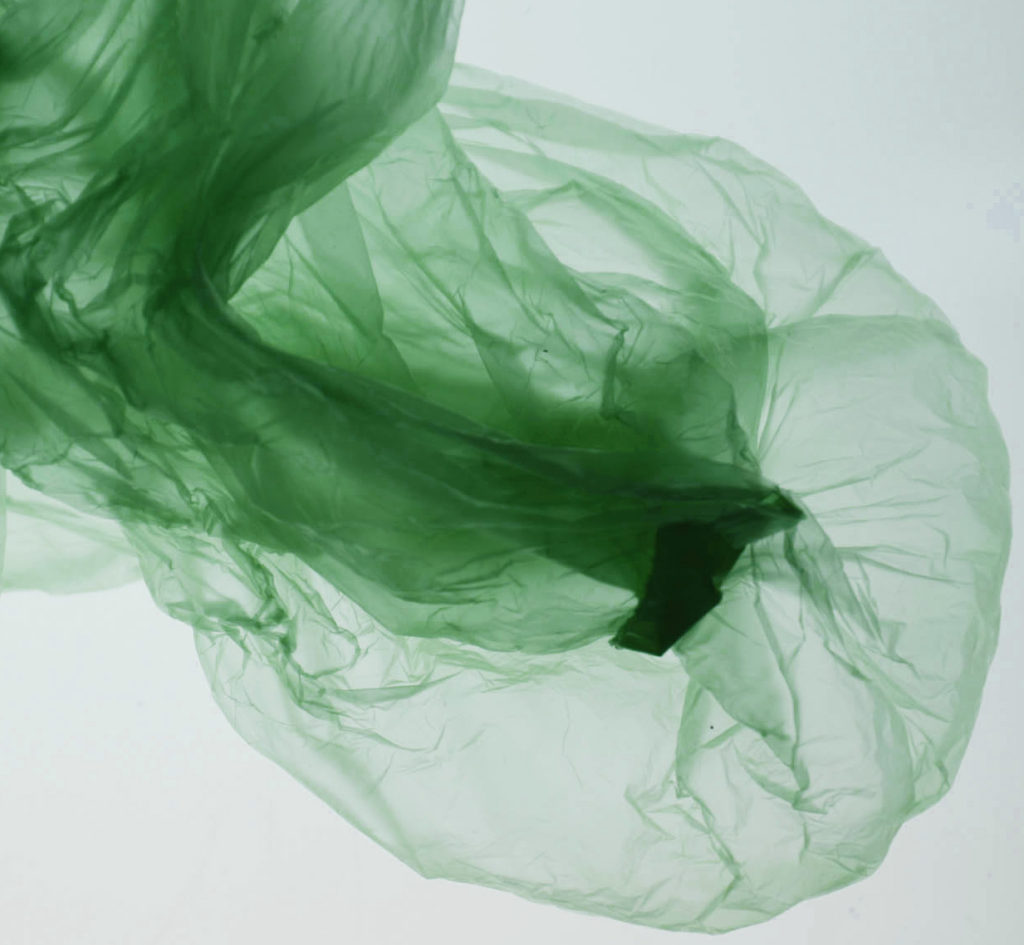
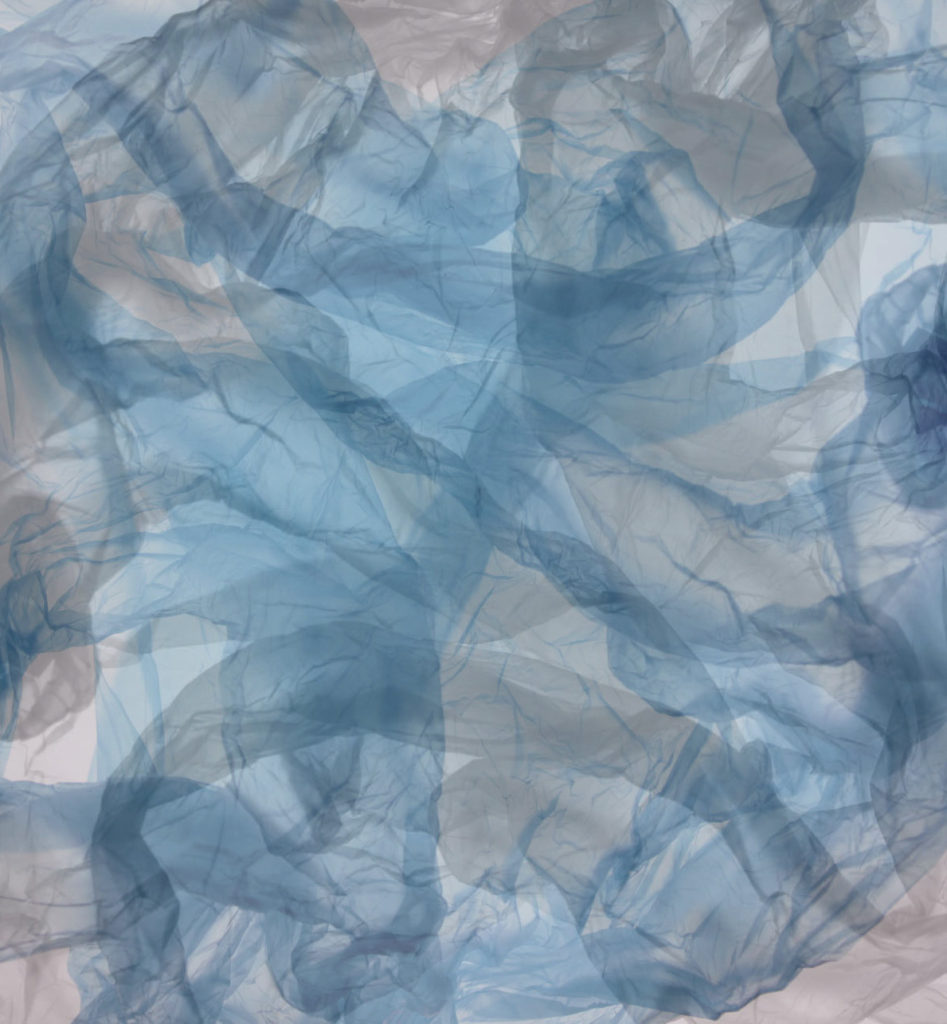
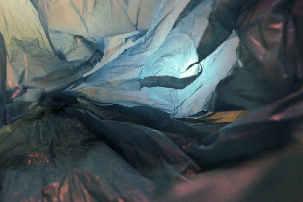
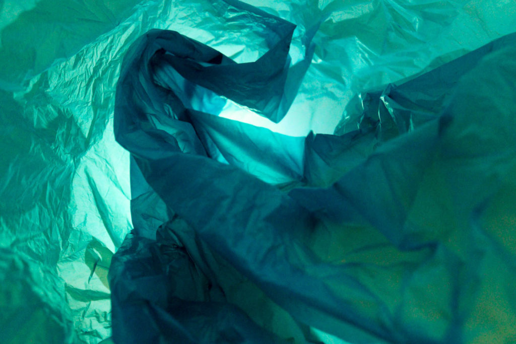
For this edit, I started off by using the spot healing brush which helped me to tidy up the photo where there were marks leftover from the lightbox I was using, then to make sure this was even better I cropped the photo to make sure there wasn’t much excess space. I also wanted to eliminate the slight yellowness in the background of this photo because I wanted the colour of the blue plastic bag to stand out well and having a white background would help this happening. I achieved this by using the brightness and contrast to transform the way the background was seen initially as grey with a yellow hue to it and then to keep the vibrancy of the blue in the bag I used the vibrancy and saturation to maintain this. I then used the hue/saturation tools which provided me with a way to adjust the colours in the photo to neutralise them which softened the background and gradually made it appear to be white, which I was extremely happy with.
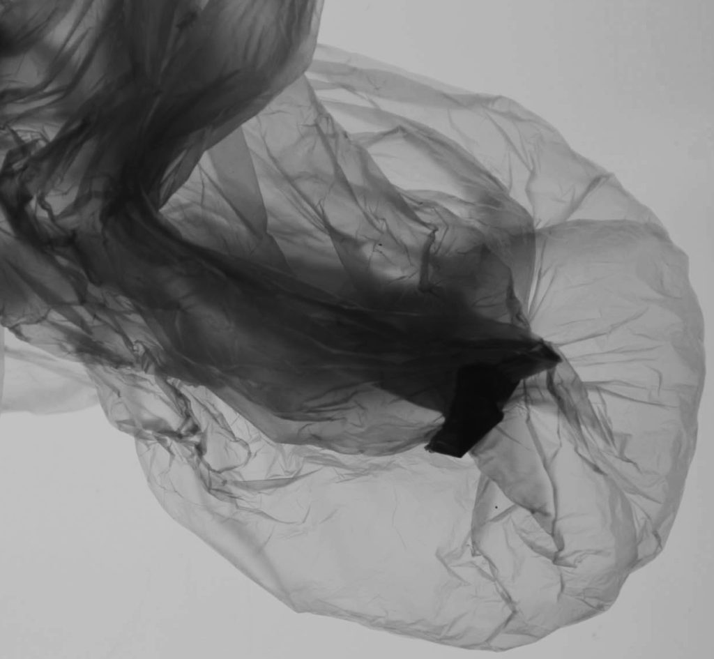
Experiment 2)
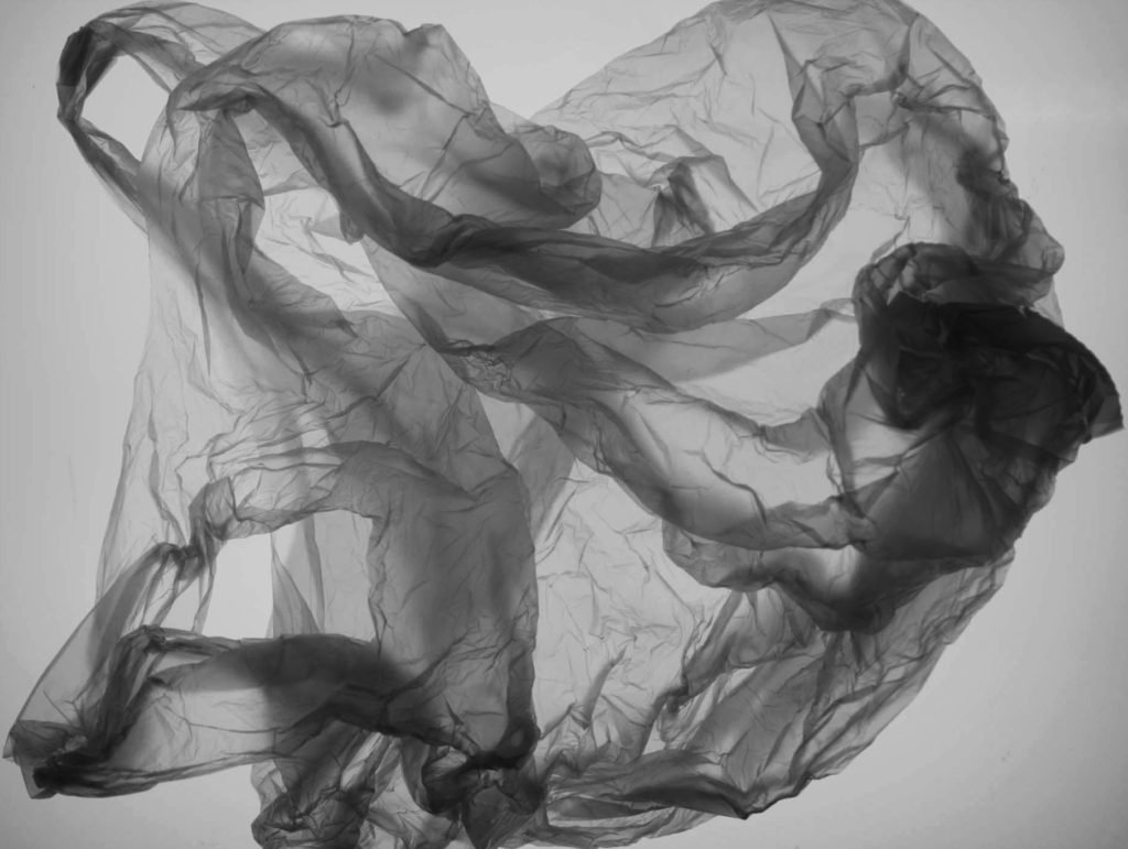
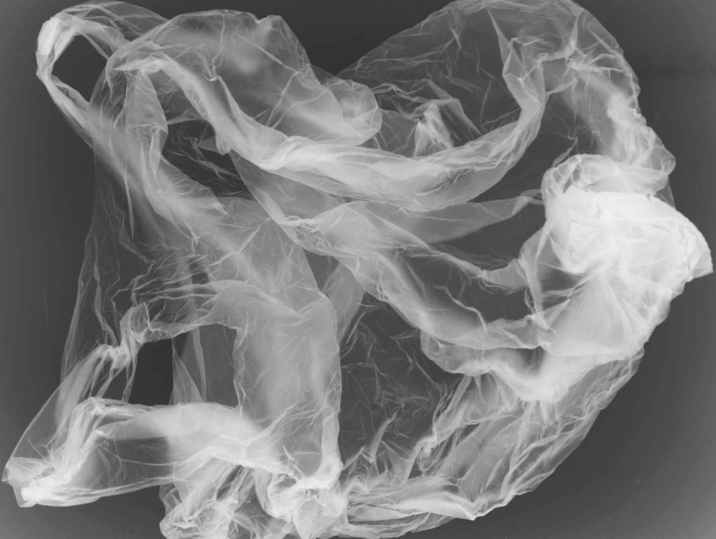
For these 2 edits I experimented with turning the photo into black and white on photoshop and this was achieved through bringing the hue, saturation and lightness down which drained all of the colour from the photo but it did appear more grey then black which I didn’t like so to adjust this slightly I used the brightness to brighten up the background and highlights then brought down the contrast which helped to balance this out as it made it darker. I was really happy with how the first edit turned out and I think that it is quite successful as the plastic bag is very defined through the use of the black and doesn’t get lost in the background which could’ve happened. I also decided to use the inverted filter on photoshop which transforms the photo so that the colours are changed to be the opposite so the black would be white and the white becomes black. I thought that this is similar to an old picture you would find of a jellyfish due to the way the bag is also positioned which can link into Anthropocene by showing how the environment is always going to be effected by plastic pollution due to how this photo has an old look to it.
Editing photo 4 –
Experiment 1)
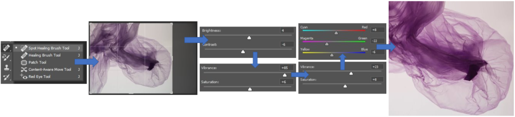
For this edit, I also started off by using the spot healing brush on photoshop to tidy up the photo where there may have been marks on it. I also wanted to bring out the colours of the plastic bag and to achieve this I used the magenta filter mainly on the channel mixer which made the colour gradually become more defined and to make sure it was secure in keeping this colour I adjusted the Vibrancy as well. I then decided to crop the photo twice throughout this process as I didn’t like how much extra space of white there was and I decided to zoom in. If I were to edit this photo again, I wouldn’t zoom in as much as I did because when I was experimenting with it with other photos and techniques the photo appeared to be quite blurry which I didn’t like.
Experiment 2)
1
2
3
For these edits I used the hue and saturation tool to change the colour of the image in various ways and then used the channel mixer to help brighten up these colours. I really like how 1 and 2 turned out as the colours don’t merge into a massive surface area and the finer details of the creases are still able to seen and don’t get lost in the photo. I don’t like how edit 3 turned out when changing it into black and white and think that it isn’t as successful as the others through manipulating the colour of it because it turned out to be more grey instead of black which doesn’t contrast as well against the white as it gets lost in the photo.
Further editing of both photos and others –
Experiment 1)
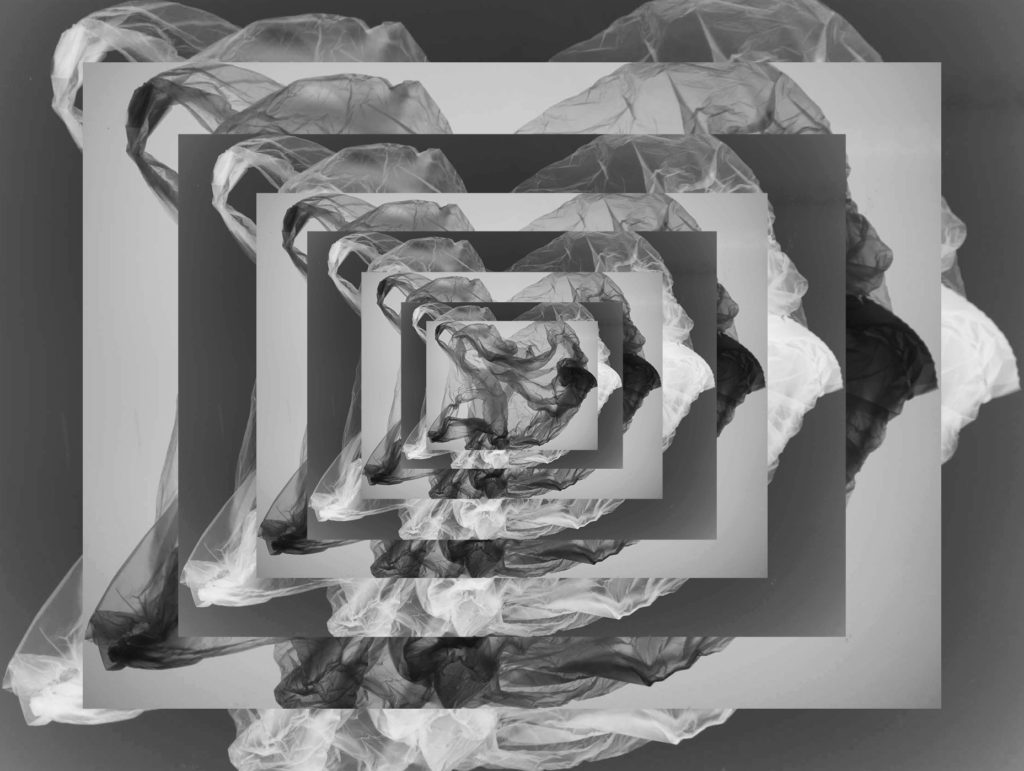
Layering
I enjoyed experimenting with this technique of layering 2 different photos in my work because I think that the use of them being inverted shows how they can create a successful contrast against each other and create the sense of an optical illusion when looking at the photo. I think that I have successfully been able to line up the photo each time to show how it gradually gets smaller and smaller but keeping consistent in lining up with the one previously.
Experiment 2)
1
2
Double exposures
I enjoyed experimenting with double exposure and I think that these 2 edits turned out to be quite successful because Double Exposure 1 creates the image of a flower through using an image I have edited previously as a base then layering this on top and changing the opacity of the image on photoshop, it can symbolise how the impact of Anthropocene is making the natural environment fade away. For Double Exposure 2, I think that it turned out quite well through using 2 different pictures on top of each other then faded into each other as it has created a cross in the middle through the merging of the layers and plastic, I think that this can symbolise how we need to stop and think about the dangerous effects of plastic pollution.
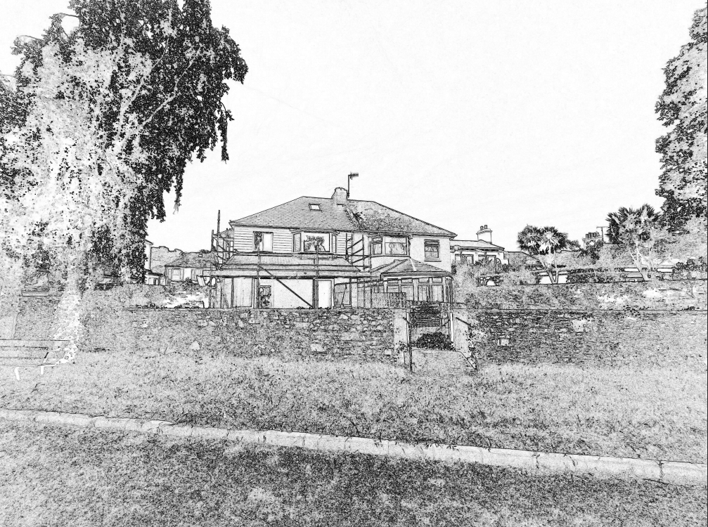
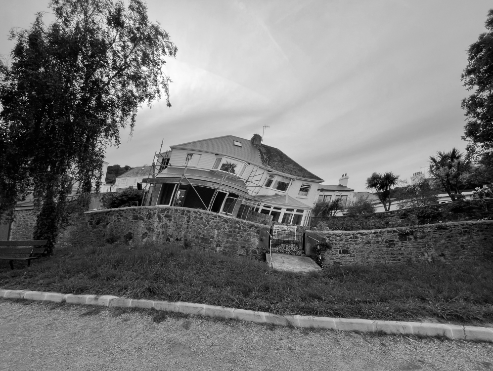
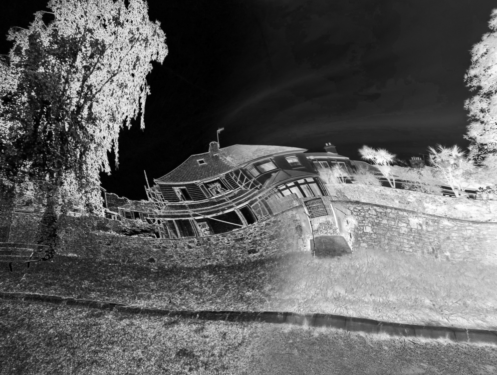
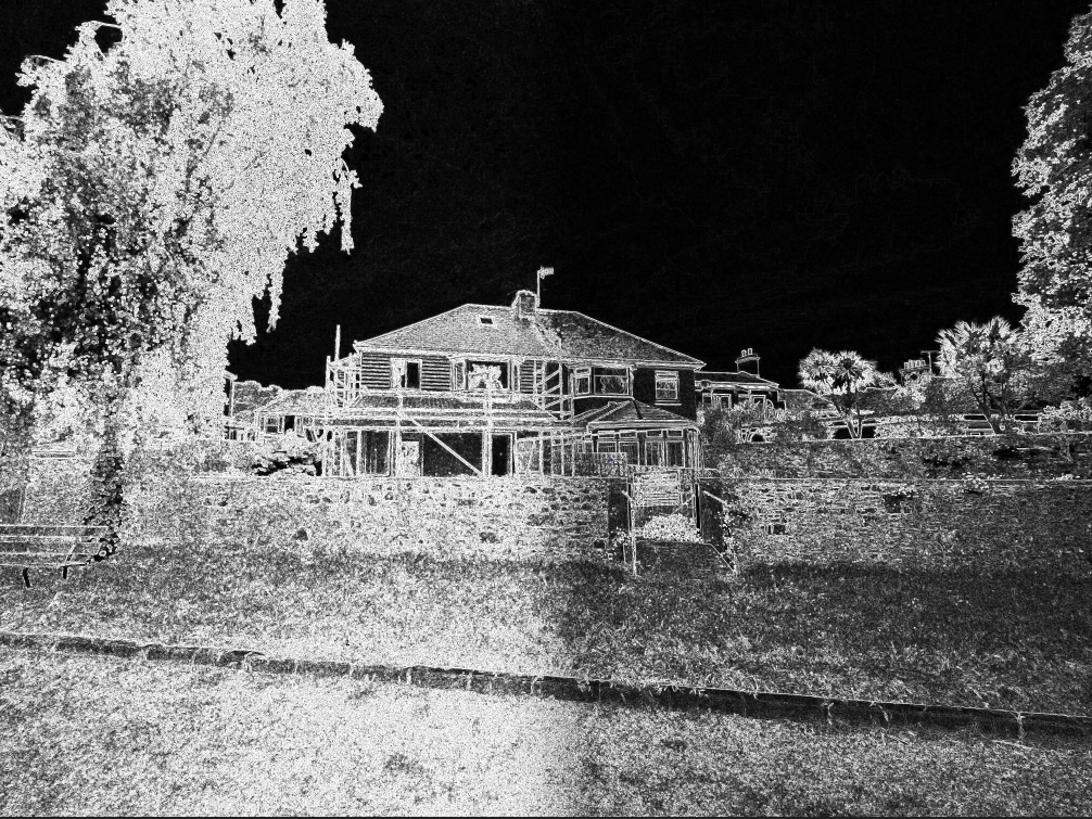
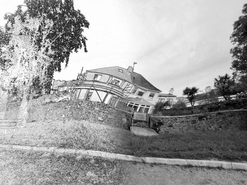
For my third and final main image I decided to head over to photoshop and test out some features such as, invert, find edges, pixelate and vibrance. This idea doesn’t have any inspiration from any artist.
Original image for idea #3
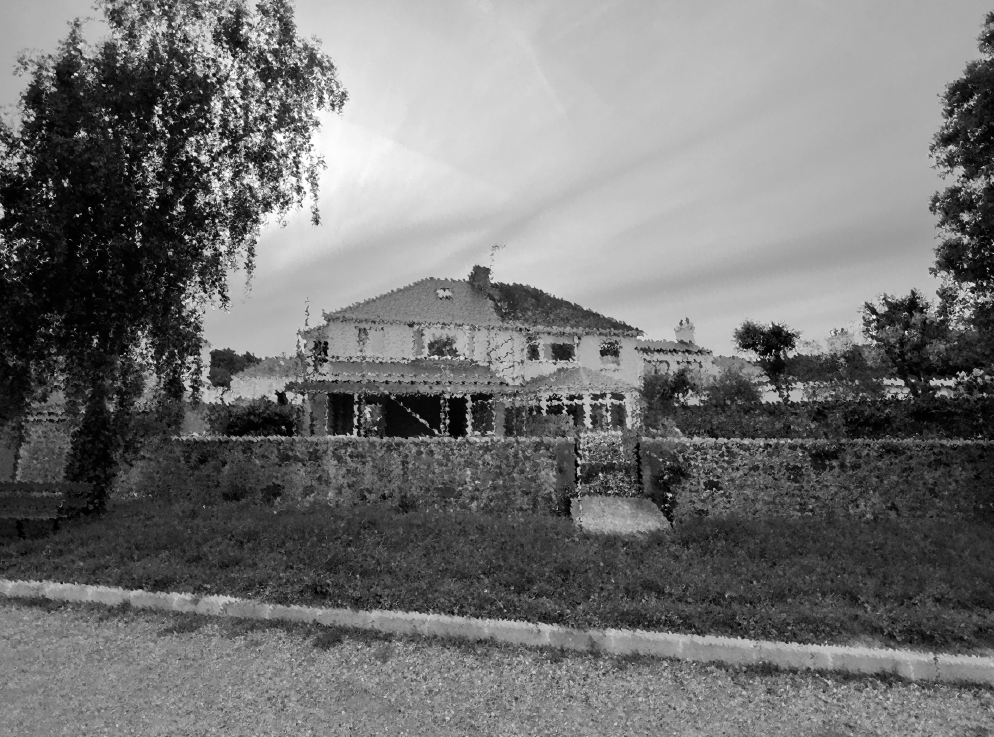
To begin, I tested out features to try and make the house stand out more in the image. Firstly I changed the whole photo to the colour scheme of black and white because it is much more effective on this type of image.
Next, I picked out 4 filters/ features and had to decide which one I am going to work with:
Colour effect
Invert effect
Find edges effect
Twirl effect
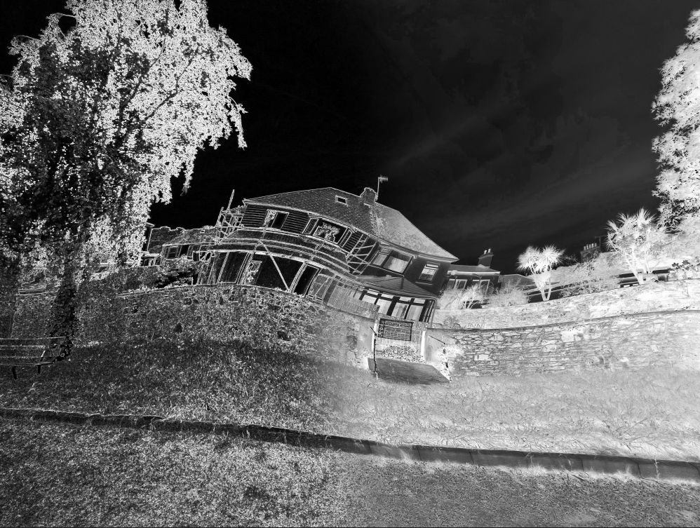
After trying to decide which one I preferred the most I ended up choosing the colour effect. I chose this because it makes the image a lot more interesting and eye-appealing with a different style of editing. I do really like the colour effect because it creates an unnatural feeling towards viewers.
I also tested out other filters such as ripple but I don’t think it was effective as the colour effect. Ripple experiment:
Ripple effect
I decided to try and mix 3 effects together and experiment whether it would look more intriguing. I also, tried to mix just two of the effects together to see the outcome. Here’s how they turned out:
Twirl, find edges and invert
Twirl and invert
Find edges and invert
Find edges and twirl
After making a hard decision I chose to pick the image with only the colour effect with black and white because it looks very clean and basic but stands out very well.
Final outcome:
Evaluation:
Overall, I am very happy with the way this image turned out because I feel this is a very good response towards the topic of Anthropocene. The colour in the image presents a man made structure however the black and white presents how nature has been damaged from human life.
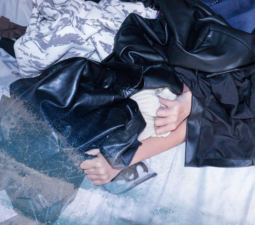
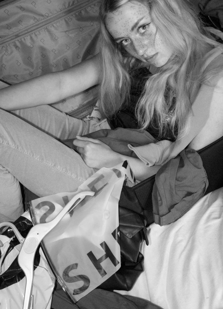
For my experiments I want to make a collection of 3 images that can be displayed together as a tryptic or alone and be just as effective and thought provoking.
First experiment wave overlay
For my first experiment I took an image from my 3rd shoot inspired by Marco Mori and his reusable fashion shoot to create this image:
for this image I used a PNG off google of a wave crashing to help show the effects that fashion has on the ocean I think this image is effective as it helps show how chemical waste and plastic debris from fashion ends up polluting the sea
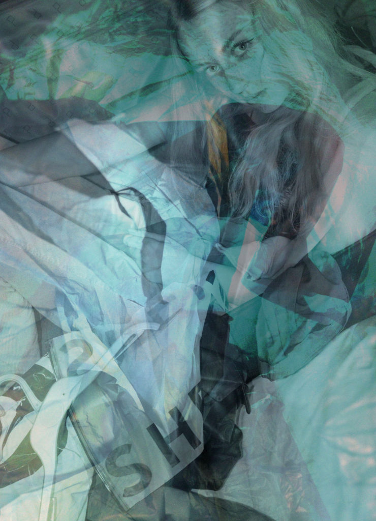
Images I used for my second edit multi exposure
for this image I used two of my images from my Vilde Rolfsen inspired shoot and one from my Marco Mori shoot to create the feeling that you’re looking through a plastic bag in order to emote how fashion can feel suffocating to society. through a multi-exposure image.
Third experiment
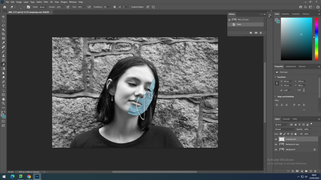
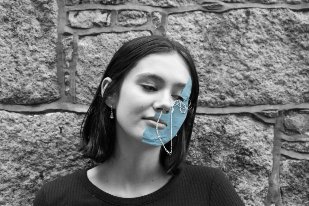
I took my image into photoshop and used a PNG of this blue fabric to create a mask over the models face and then I turned the opacity of the PNG layer down so I could rub out the excess of the image so it lays flat on the models face.
I wasn’t happy with my original composition so I went back and focused on fixing the awkward section around the mouth area until I was happy with my final image.
original edit
final edit
This edit was inspired by Craig McDeans mask image that I analysed in my artist reference.
Evaluation of experimentation
Over all I’m pleased with my final experimentation outcomes as I managed to achieve what I set out to do. Something I would do differently next time would be insure that I take more similar photos that I can edit in succession and take my own photos to use as overlays instead of relying on PNGs to edit my images, However relevance to my topic was achieved and overall I think these are good images that correlate with the theme of Anthropocene through fashion.
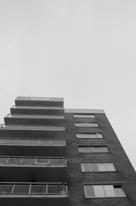
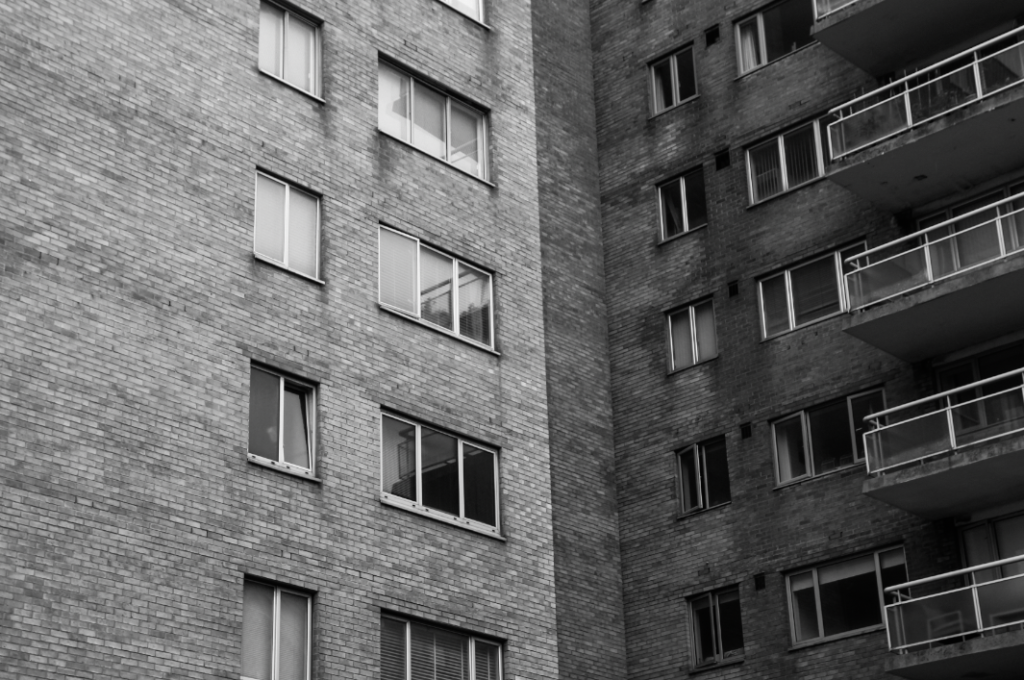
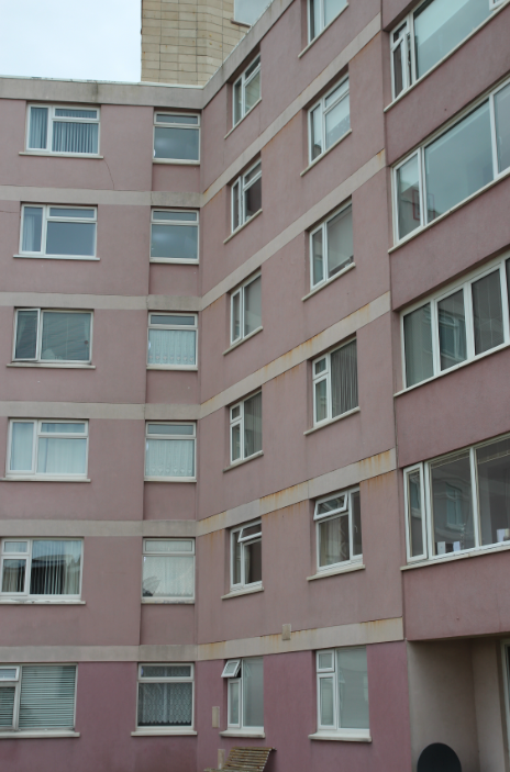
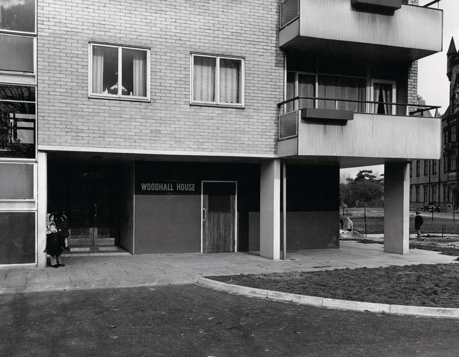
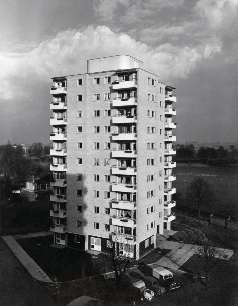
After reviewing my images, I have decided to move away from the idea of Laura Romero and Anastasia Savinova’s collages, and more into the documentary photography of my studied artists: Peter Mitchell, and Sharon O’Neill. However, I am still interested in the idea of compiling my images in a collage, so am still influenced by my collage artists. The aim of my photographs is to show the reality of the housing crisis, and evidence of the strong class and wealth divide in the island – my editing will not hide or ‘sugar-coat’ anything in my pictures. I am planning to edit some of my images in Black and White, and some in colour, with a grainy look that emulates my chosen artists’ work, a lot of which is from the 80s/90s, so was taken on film cameras.
Further evaluation of my shoots and their relevance
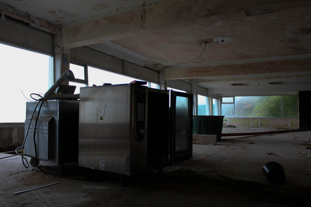
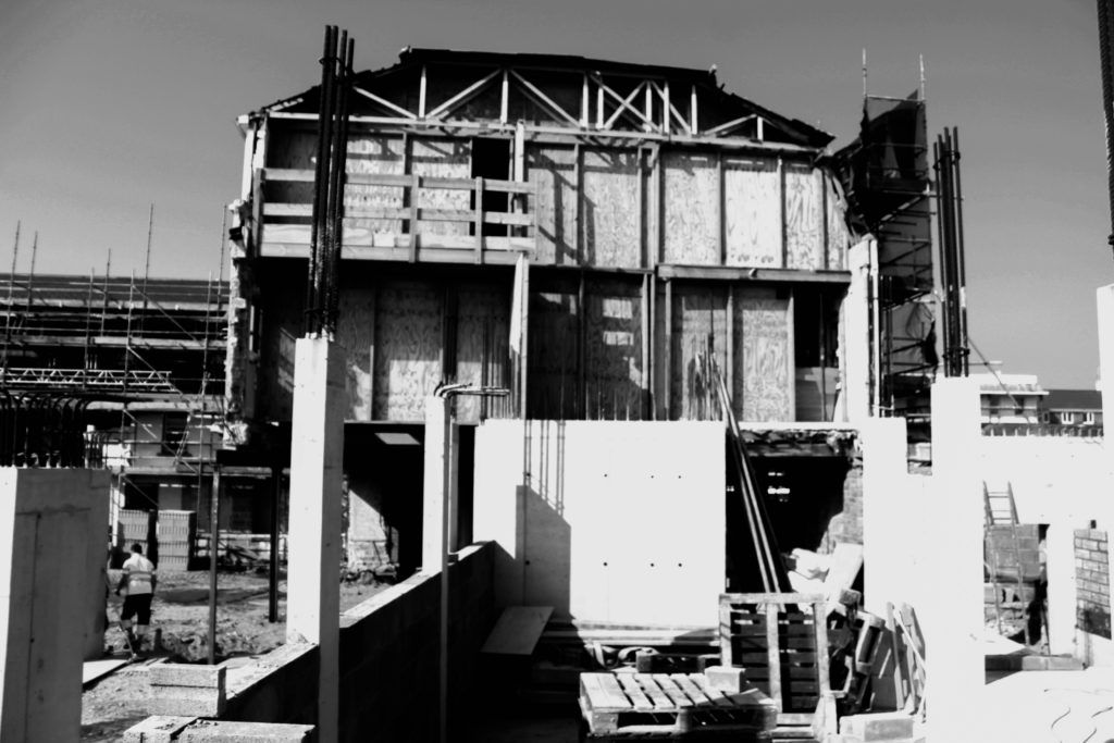
In the end, as I have changed my idea and moved away from the idea of including industrial buildings, my shoot of finance and other industrial buildings are probably not going to be used in my final outcomes for Anthropocene. – this includes my images of the abandoned warehouse. This is because, after researching the housing crisis further, and with my interest in documenting this issue increasing, they became less relevant to my idea. I want to produce carefully linked work that shows a clear outcome from my chosen ideas and pictures, so therefore I chose not to use my images of industrial buildings. However, I do not regret carrying out these photoshoots, as they allowed me to choose what I thought was going to work within my project, and then develop this into a further photoshoot.
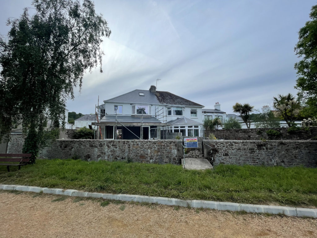
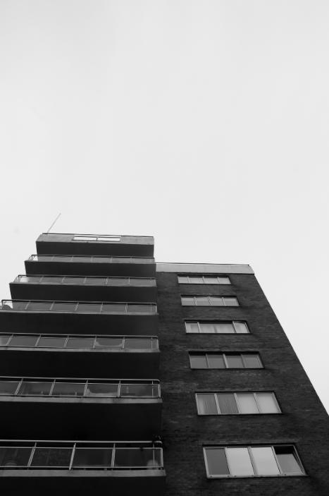
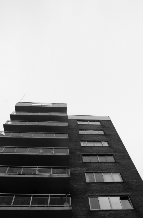
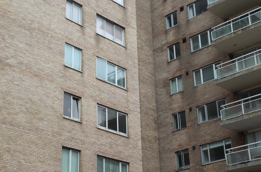
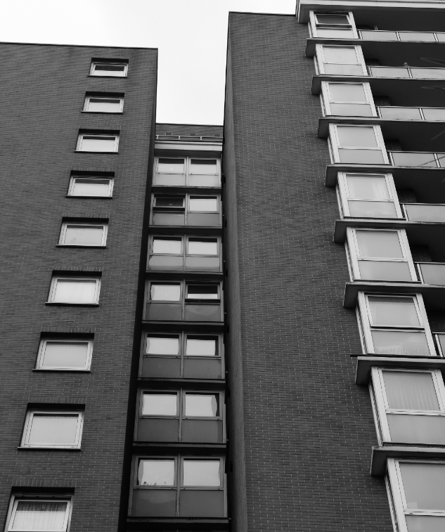
Edits from my first photoshoot: The cedars, Le Marais, and Marina Court
Original
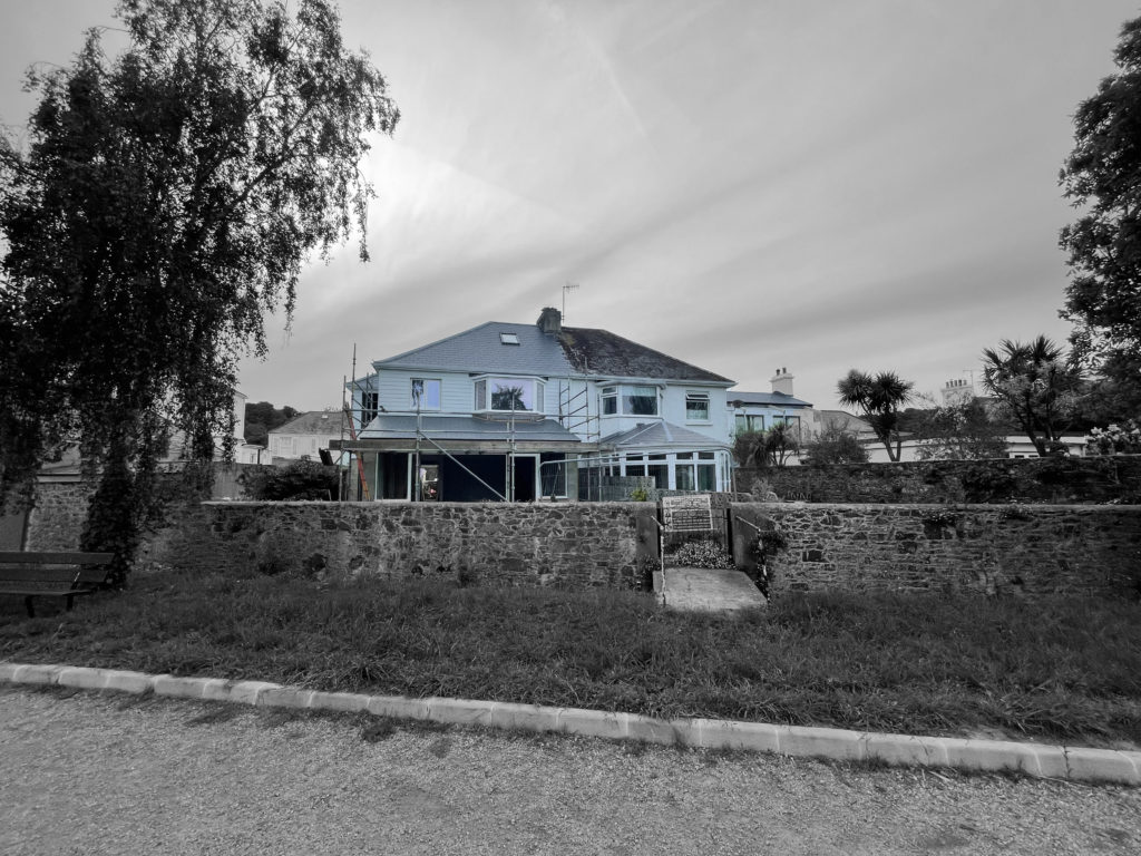
Edit
This edit is from Le Marais. I chose this image as one of my best images and to edit it due to the strong lines within the image – I also love the sense of repetition in the lines of windows in this image. In my editing, I used Lightroom to change my image to black and white, as well as adding higher contrast to the image. I think that adding contrast and adding shadow was important for this image – it helped to keep the harsh lines and repetition clear and sharp, which was important for me as they are what makes the image successful.
Turning black and white
Adding contrast
Shadows and whites added
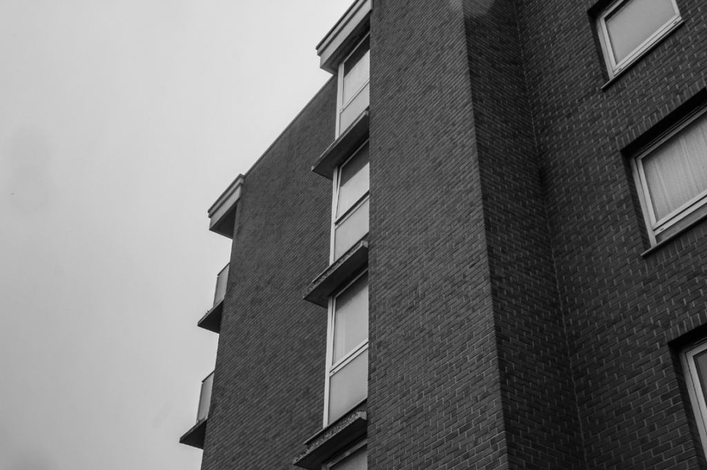
Due to the high contrast between the sky and the building in this image, I wanted to enhance this further in my editing. I did this by increasing the contrast, but most importantly adjusting shadows, and adding whites. This meant that the areas of white, the sky and windows of the building, remained bright, but the darker areas stood out with high contrast at the same time.
Original
Edit
I chose this image as one of my selections/to edit, due to the way the light hits on the left of the building, but not the right – this creates a contrast between the sides of the image, between light and dark which I really like. In my editing, I wanted to keep this light vs dark in the image, so did not increase the contrast too much – I added a little exposure too, to ensure the bright parts of the images stayed exposed correctly with the added contrast.
Original
Edit
I used heavy cropping in this image – I think this helped the image’s composition a lot, as the eye is drawn purely to the sky, which takes the focus away from the actual building. Therefore, I think my cropping was effective in removing unwanted distraction in this image.
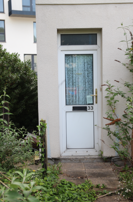
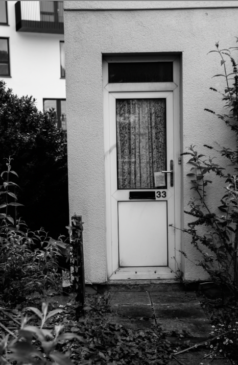
De Quetteville Images
Below are some examples of editing – completed on develop mode, in Lightroom Classic.
Before
After
This image of my third photoshoot is one of my favourites from my shoot at De Quetteville Court – I used slight cropping in this image to make sure that the bushes framed the house, which I think worked best compositionally. – I used high contrast and low exposure, but upped the whites slightly to enhance the darker parts of the images but also to keep the white of the door and building behind bright and intense. I think this helped the cohesiveness of the image – the new building looked starkly different in the original, but with my editing, it blends quietly into the background – this creates a soft comparison between the old, dilapidated estate, and the new, modern tower behind.
Colour edit
Black and White Edit
For this edit, the door had a really vibrant blue colour, as well as some purple flowers at the bottom which toned nicely with the blue – because of this, I edited in colour as well for this photo – I produced two edits using virtual copies in Lightroom.
Original
Edit
Original
Edit
This edit and the one below are my two deadpan style images from this series – I used black and white again for these, but slightly more muted – I kept the exposure and whites up, to ensure the image didn’t get too dark as I added contrast and blacks.
Original
Edit
Original
Edit
In this edit, I wanted to focus on the details in the image – I did this by using high contrast, but also using texture and clarity to ensure the fine details in this image stand out.
Original
Edit
In this image, cropping in my editing was very important. I wanted the main focal point of this image to be the door, so I cropped the image in tighter – I left a little of the leaves to the side, as the darkness of the leaves when in black and white toned in well with the darkness of the door and fence – therefore I think cropping and editing in Black and white for this image made all the parts work more cohesively together.
Original
Edit
Due to the strong sense of geometric shape and line in this image, I thought that editing in black and white with high contrast would fit well – the sense of line and shape in this image was strengthened by the use of clarity, texture, and contrasting blacks and whites.
Other examples of my editing
Evaluation of my editing
Overall, for this project, I think my editing was quite successful. As I was editing, I thought about each particular part of an image, and how the different parts would work together with different editing tools. I think that black and white was the right choice with my types of images – the high contrasted nature of my edits helped to highlight the strong sense of line and repetition in my images, as well as helping to contrast the light and dark elements of my images, which were often strong. These pictures were taken on overcast days, which produced bright and sometimes overexposed images – editing in black and white helped this, as it blended the blacks and whites in the whole image, not just highlighting overexposure in one area.
Links to my theme and artist references
I think that my editing links well to my idea of documenting the reality of the housing crisis – black and white allowed me to show the plain reality of my area I was photographing, without glossing over anything or hiding any ‘unwanted’ parts of my images. My work I think links closely with the work and comparisons of Sharon O’Neill. – both the images she was comparing to, and hers. Even though Sharon was comparing time directly in her series, by using archive images from the architect of the building, and I did not use direct comparisons, I think that my work still comments on the passing of time, and ‘desirability’ or ‘undesirability’ of an area, like Sharon O’neill did, – I showed how buildings that used to be ‘desirable’ when built, have now been discarded, overtaken by newer buildings – showing evidence of the lives of those who lived in flats, and also the architecture of those still lived in with my images from housing estates not abandoned.
Sharon O’neill
Sharon O’neill
My work
My work
Furthermore, although my images are not edited in colour, I think the deadpan style and angles, as well as the actual subjects, link very closely to Peter Mitchell. However, after comparing my image with Peter’s, I realise that to mimic his style of shooting, I should have used less zoom on my images, with the whole building in shot. However, I think that the theme of Peter Mitchell’s work, photographing the mundane, links heavily to my work – I tried to inspire my work by his in this aspect, by photographing the mundane reality of what parts of St Helier look like as a result of the growing housing crisis and wealth divide.
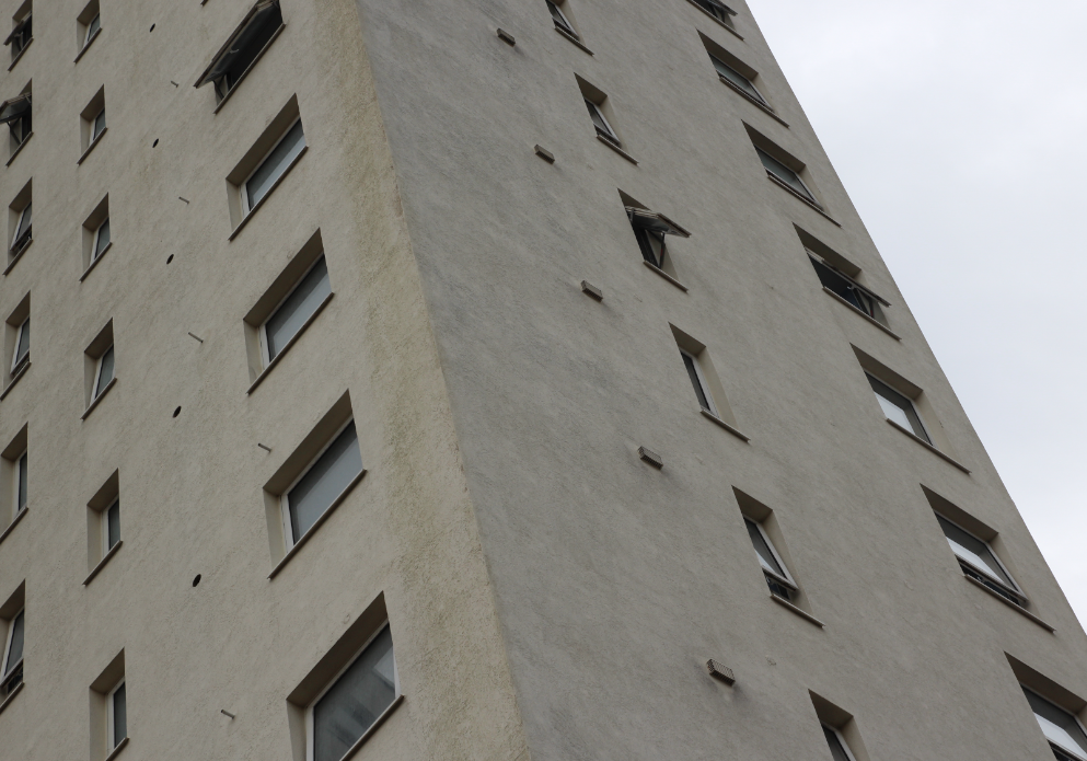
For this idea i am going to be using photos telling a story of rapid urbanisation and the left overs of the past generations and how the world is rapidly changing leaving the past behind i will be using YVES MARCHAND & ROMAIN MEFFRE as my artist reference because they photograph derelict buildings which i feel links with this strongly
YVES MARCHAND & ROMAIN MEFFRE work
CONTACT SHEETS
my idea – my idea is to use photos of derelict buildings and also building sites to show the speed of which our world is urbanising and changing
what i did
i started by narrowing down my images to a select few for this series
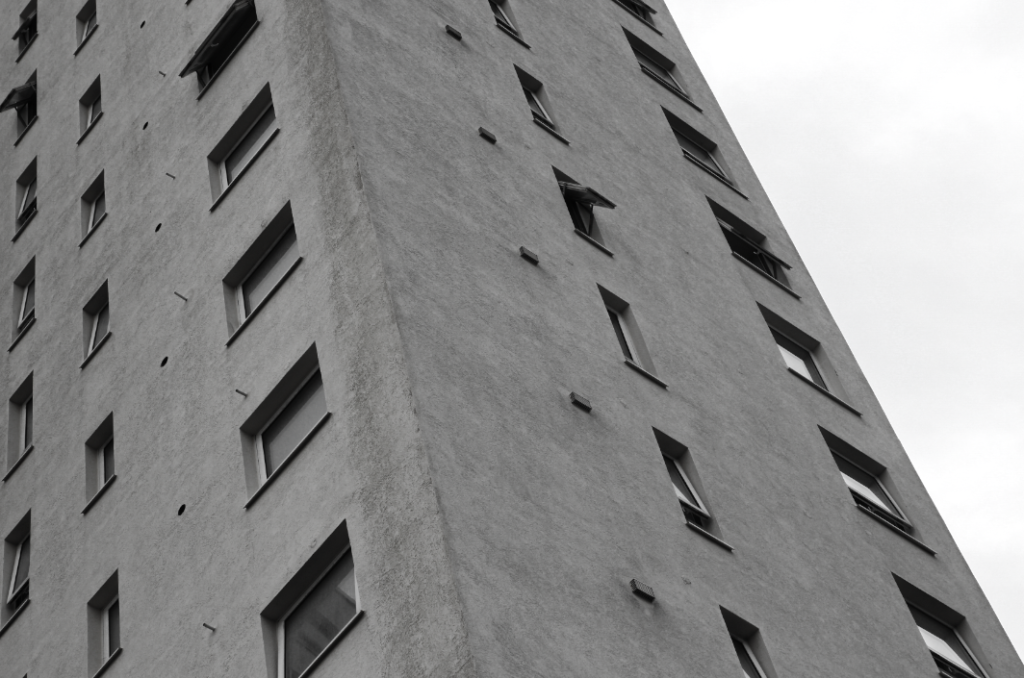
i then took the photos into light room for some editing
i decided to do something different to my artis reference by making the images black and white i then ruther edited in more detail to get the right final image
then repeating this for each one i was left with my final images
Final images
Evaluation & Comparison
overall i was happy with this idea and how it turned out I feel that i worked well with the theme of Anthropocene portraying the humans impact on the world and what’s around us which i thought to be a good way of showing this how ever i did change slightly to YVES MARCHAND & ROMAIN MEFFRE as there images are predominantly colour i decided to use black and white for my final images
photos in response to Charlotta María Hauksdóttir’ and George marazakis
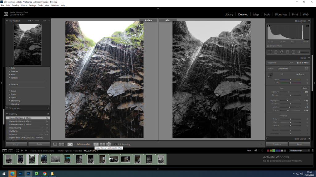
This image is in response to George Marazkis and Charlottas work. For this image I wanted to bring out the purple and yellow tones.I did this by increasing the saturation, decreasing the exposure to enhance the water dropping, and increasing the contrast to show the shar formations of the rocks.
This image is in response to George Marazkis and Charlottas work due to the serenity and awe of the natural landscape. firstly I reduced the exposure and increased the contrast to emphasise the different natural colouring in the rocks underneath the waterfall. I then lowered the highlights so that you could clearly see the rock and sand formations. i wanted this image to be slightly darker so that the gave looked like it could go on forever.
This image was also a response to George Marazkis and Charlottas work. In this image i wanted to reduce the brightness of the sky, due to it being a cloudy midday. However i chose to take this image on a cloudy day to create an ominous, dreamy effect. I then increased the contrast slightly so the rocks were more pronounced.
I am going to take this image into photoshop and distort it to make it look futuristic and almost like an optical illusion. I increased the contrast to make the sky appear more blue and increase the reflection.
photos in response to Andrew Moore
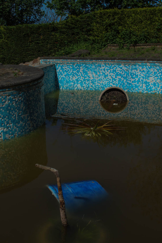
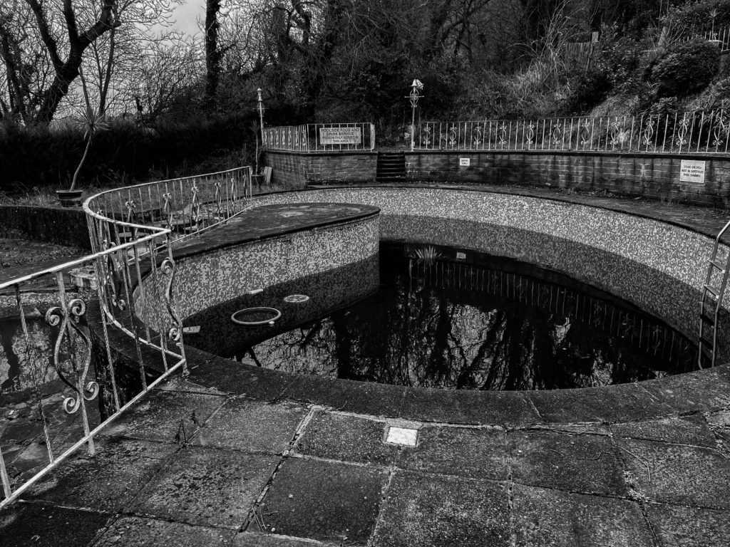
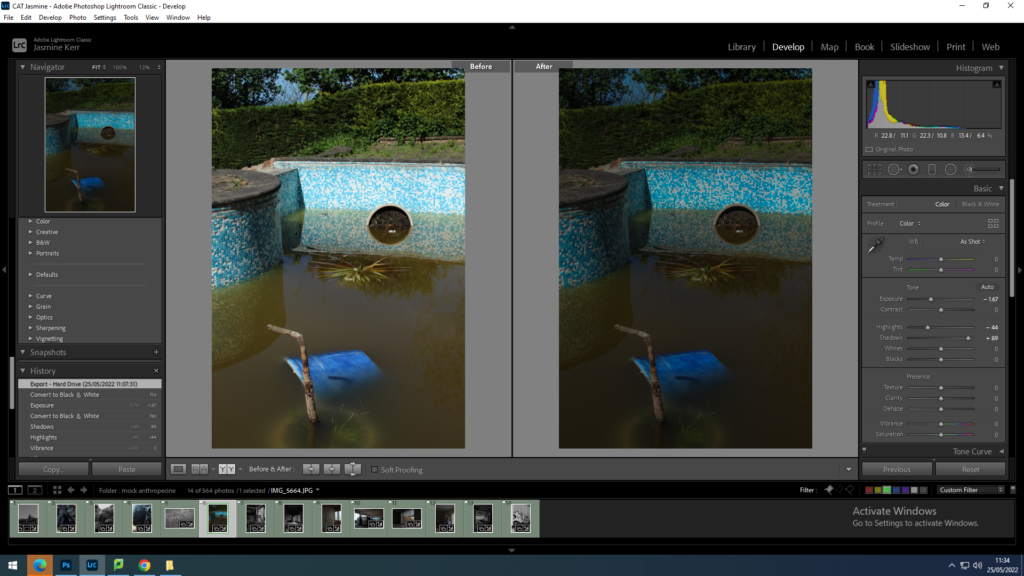
I kept this photo black and white to show the brightly coloured swimming pool, almost how it is viewed in a child’s eyes. i increased the contrast slightly to saturate the tiles around the pool. I also decreased the exposure to dim the whites slightly.
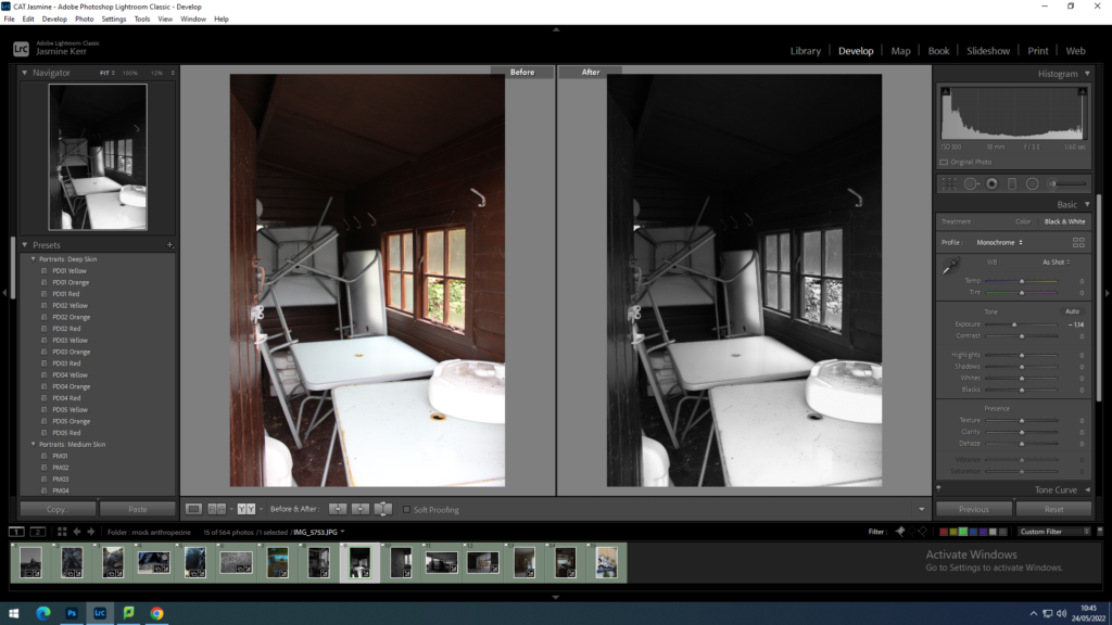
for this image i put it into black and white, to me this image is quite chaotic, which i quite enjoy. I decreased the highlights to that you can see the dirt on the tables.
this is another image which I find quite chaotic. I put this in black and white because the image is originally quite dull, apart from the overgrown green weeds. I decreased the exposure slightly and increased the contrast to show the shadows in this image better.
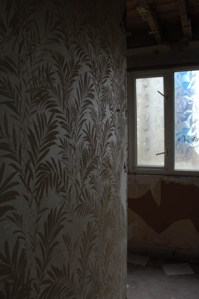
I wanted to keep this image in colour due to the bright blue from behind the windows. i increased the contrast and decreased the exposure to emphasize the wallpaper on the left of the image.
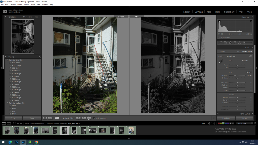
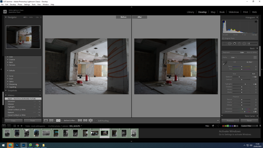
For this image I increased the saturation to highlight the fire extinguishers in the centre, and decrease the exposure and increased the contrast slightly so that it was the main focal point of the image.
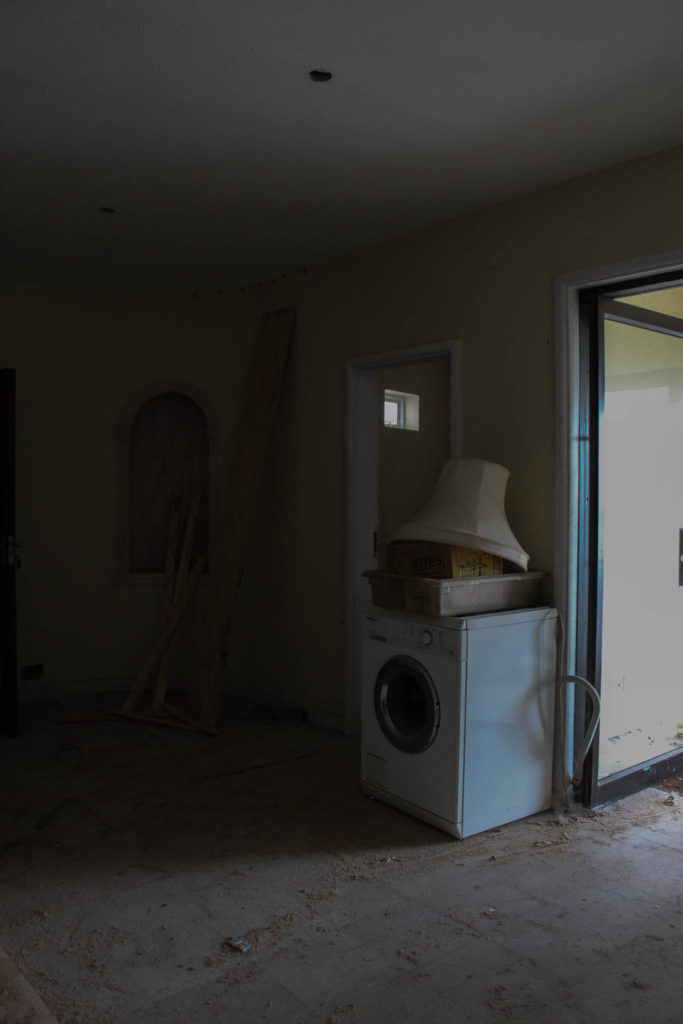
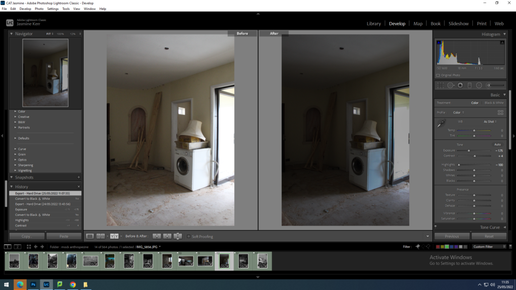
for this image I decreased the exposure and increased the contrast so that the light hitting the washing machine was cooler. i also decreased the highlights so that the whites in the image were dimmed.
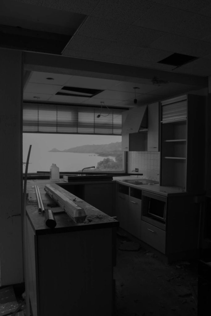
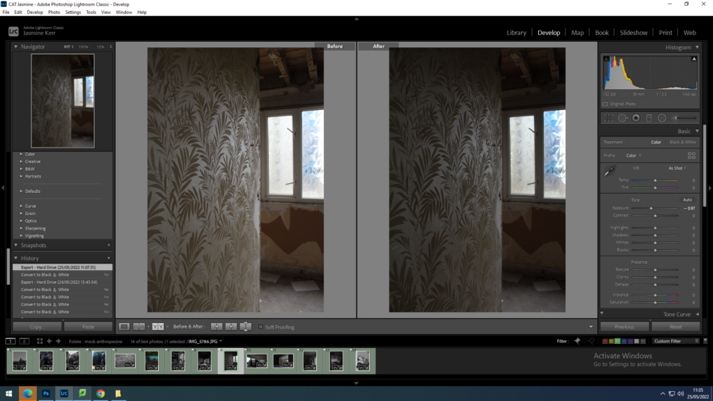
for this image I wanted to make the back in the window more clearer. I changed the image to black and white and decreased the exposure and increased the contrast so that the window almost looks like a painting or a television.
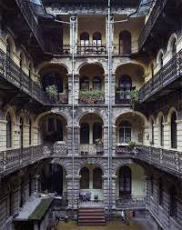
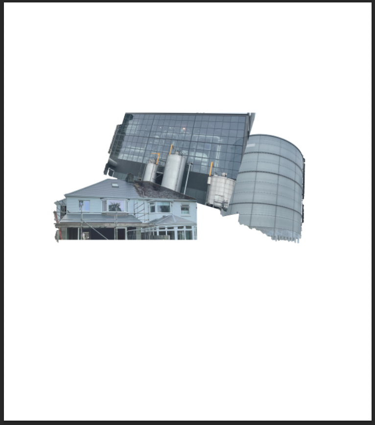
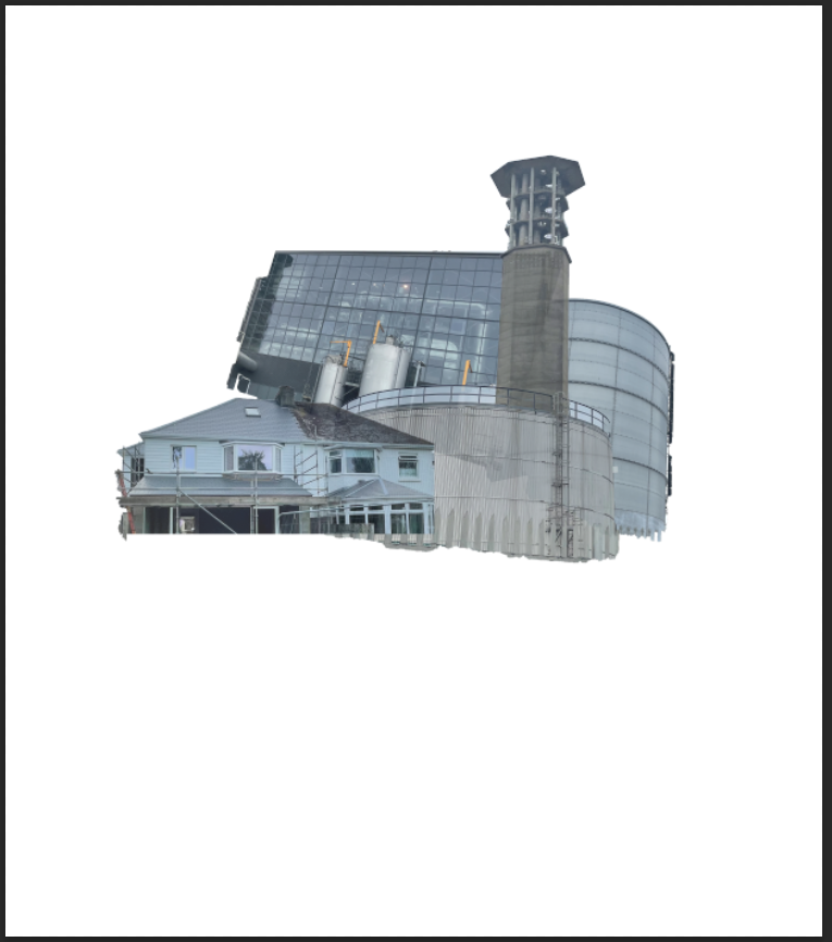
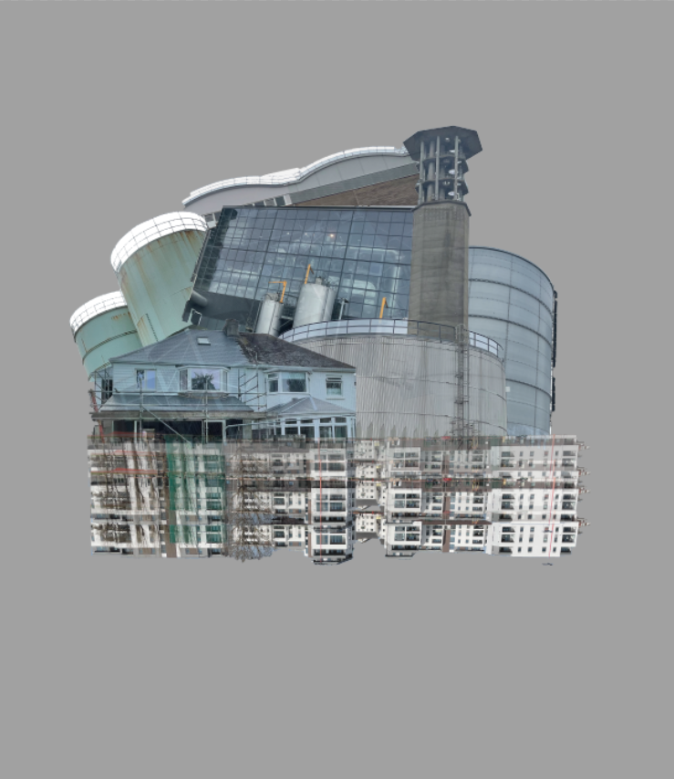
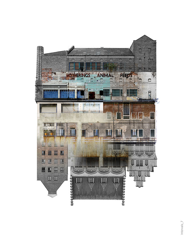
This idea was heavily inspired by Laura Romero and her topic ‘Intervals’ which is a combined image of multiple buildings/ structures to create one main building. I chose to use her ideas because of how aesthetically pleasing all of her work turns out. Also, the buildings she uses presents the idea of Anthropocene through the man made structures all being combined together. For my image I am going to try to accurately replicate one of her images with my own photos of buildings by using photoshop.
Example of Laura Romero work
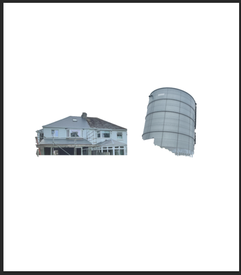
To begin I chose out 7 images that involved some sort of building linked to the topic of Anthropocene and made sure they would fit well within this edit.
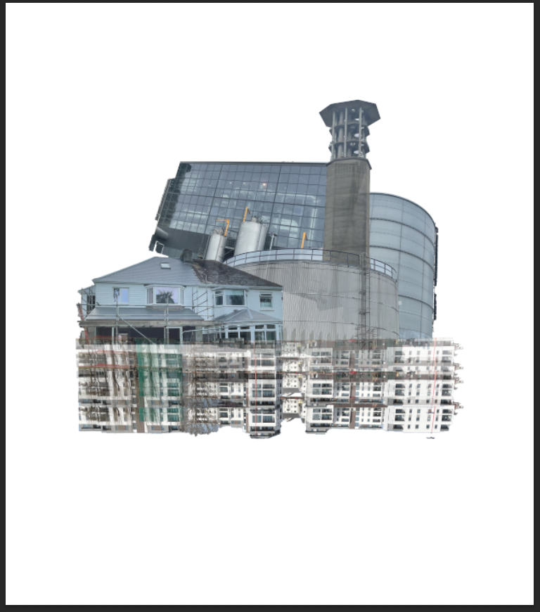
After correctly positioning my images I changed the opacity of each layer to try and seem as if each building slightly fades into one another. The use of changing the opacity helped the overall product really come together and link well. I put most layer opacity to 85-90% except for the building that are positioned upside down where I put the opacity lower as the buildings travel down.
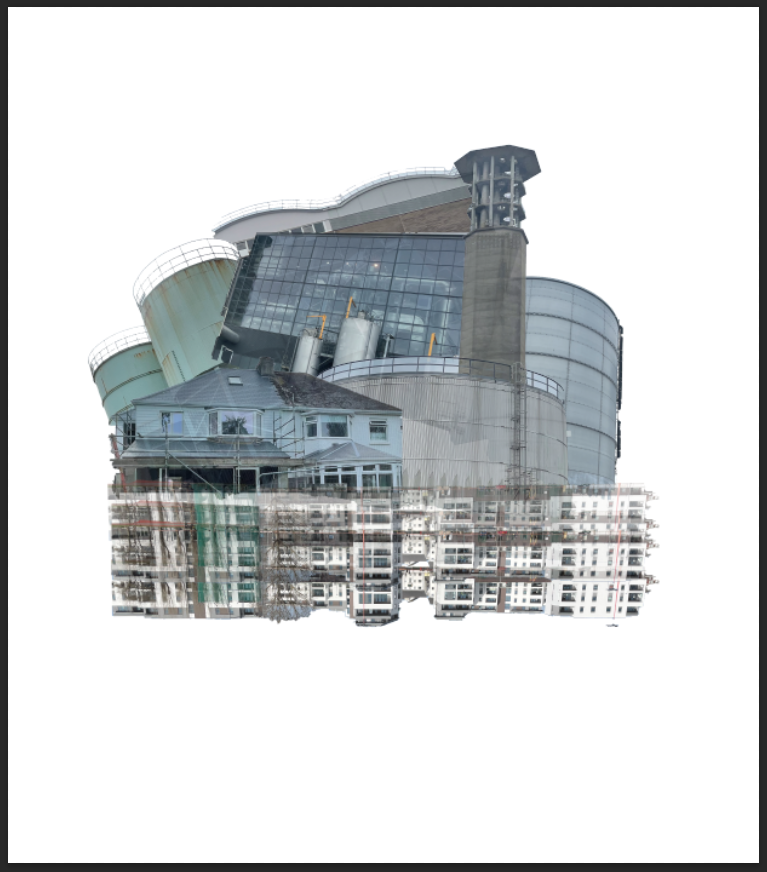
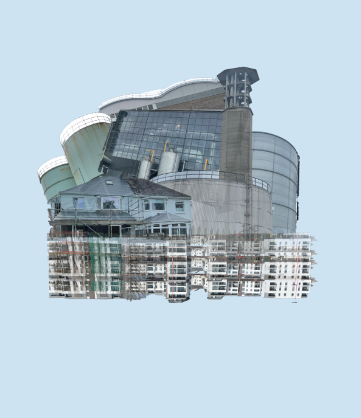
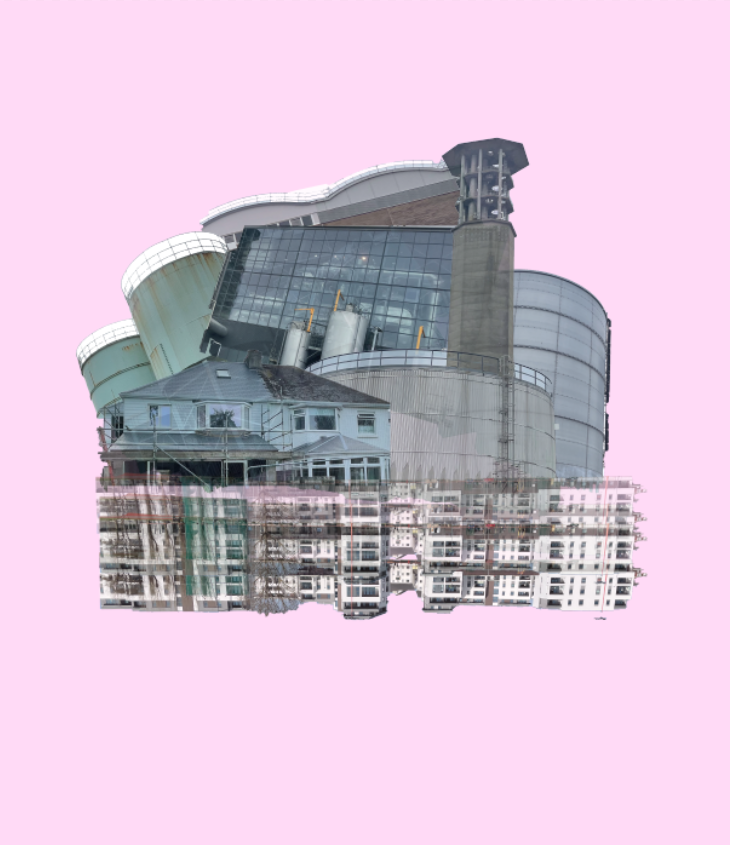
I then tried to experiment with different colour backgrounds to try and see if it would make it more effective. Here’s how some turned out:
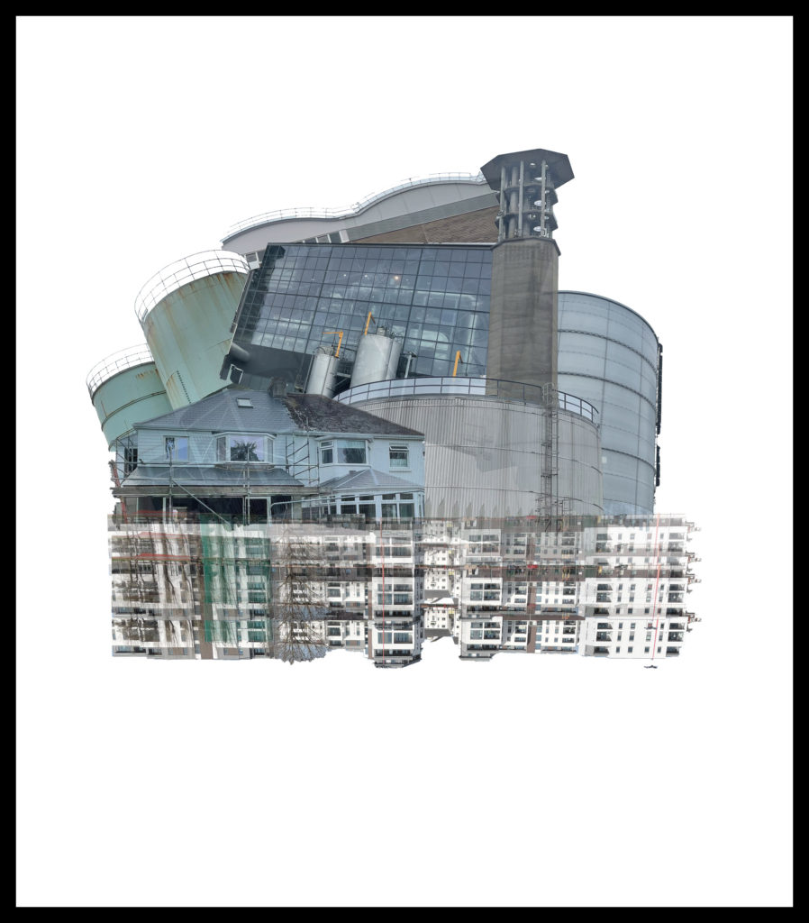
After seeing the results I quite liked the background colour being a light blue but still didn’t think it was as effective as the previous white background. Also, I think the pink background creates a vibrant and eye appealing effect towards the viewer due to the pink being the only vibrant colour displayed. I decided to keep the white background because of the blend it creates towards the structures.
Final outcome:
I really like the way my image has turned out through the inspiration of Laura Romero as I think it looks pretty similar to her style of work. I decided to add a black border around the image because it contrasts a great effect onto the main image focus.
Image comparison:
My final outcome
Laura Romero image
As you can see, mine and Lauras image have some similar features and some differences. In my image I added a black border around the image (side border has been cut-off by the blog) because it makes the image stand out more compared to Lauras. Also, Lauras image seems to have smooth edges with a slight fixed shape without many rough edges, however mine hasn’t been positioned together the same and has rough and uneven edges. Lauras image has buildings that are faded together nicely with mine only having buildings that overlay each other with a decreased opacity. My image has buildings that are industrial and cause harm to the world and Lauras has buildings that seem to be derelict on unused which can be noticed through the boarded up windows and the state of the buildings.