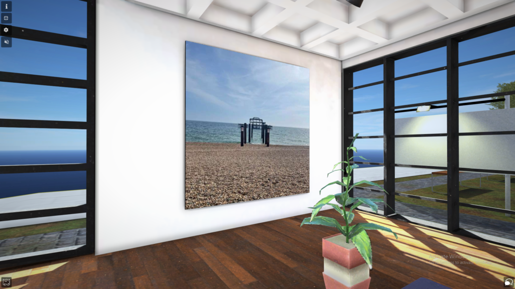

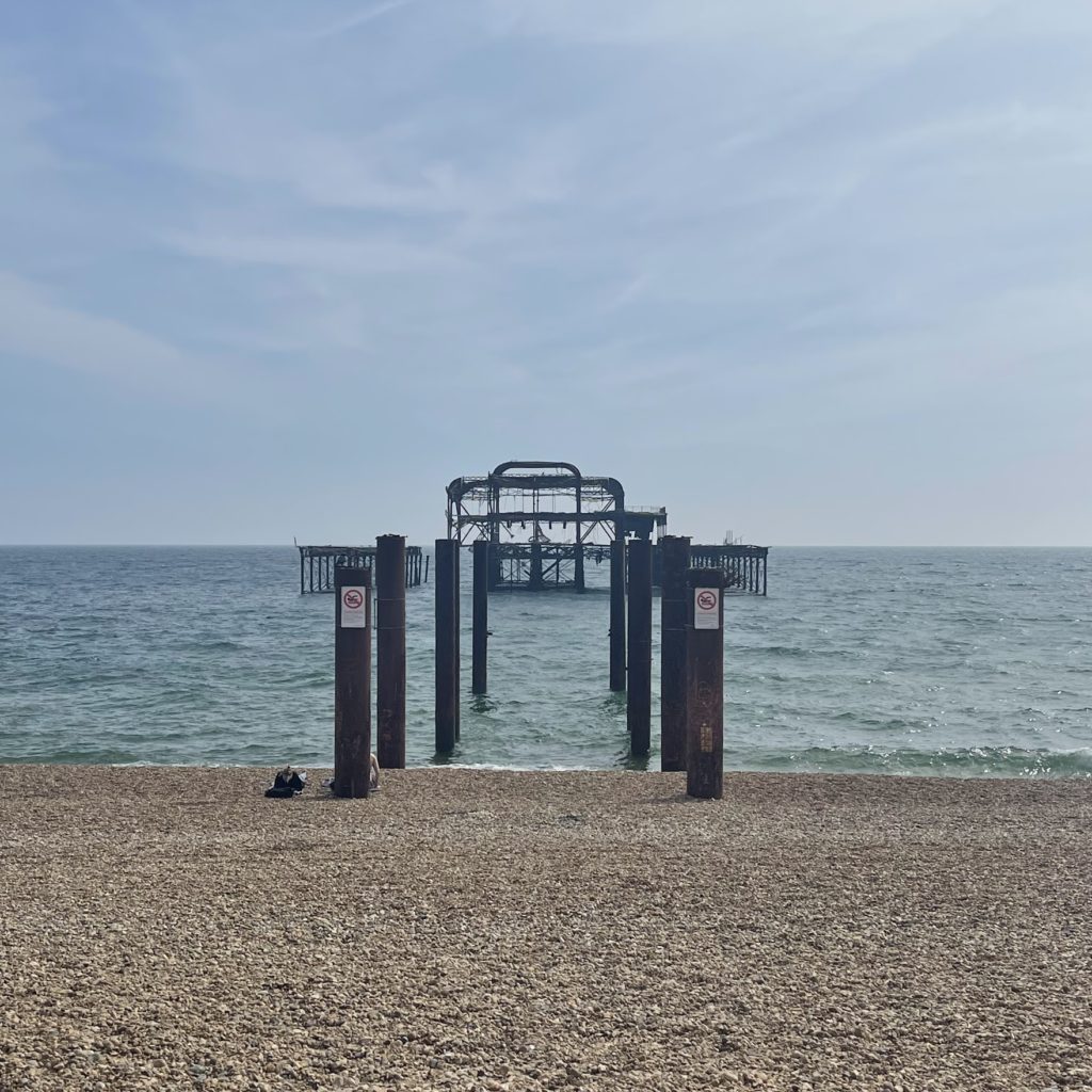
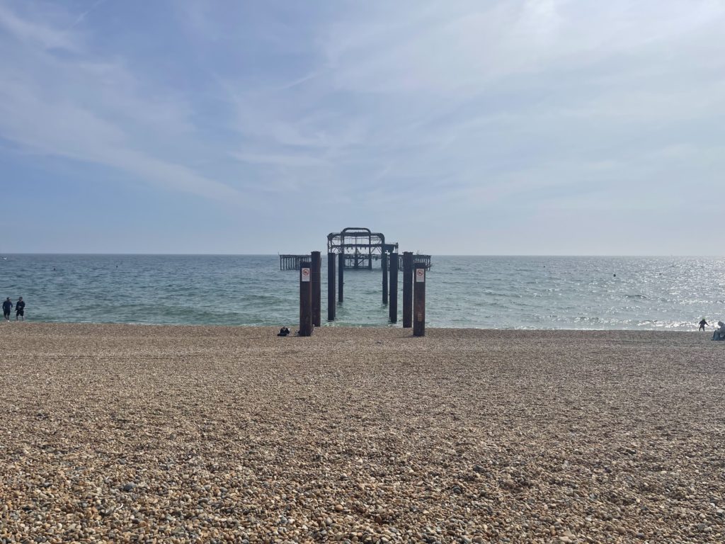
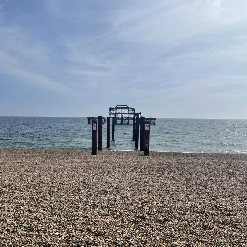
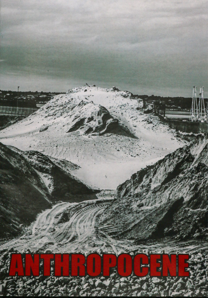
To fit in with the theme of Anthropocene and the impact humans have on the earth/ environment I wanted to include a piece on the old ruins of Brighton’s west pier. he West Pier is a ruined pier in Brighton, England. It was designed by Eugenius Birch and opened in 1866. It was the first pier to be Grade I listed in England and Wales but has become increasingly derelict since its closure to the public in 1975 as a result of a fire. As of present day only a partial metal framework remains.
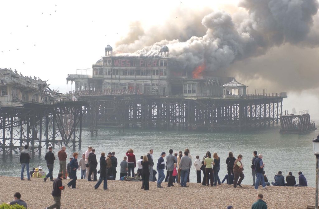
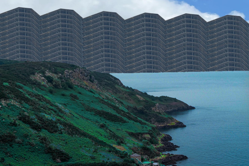
My aim was to keep it simple by taking a photo from straight on to capture the wreckage in contrast to the large open sea around it, and showing how it has just been left abandoned there.

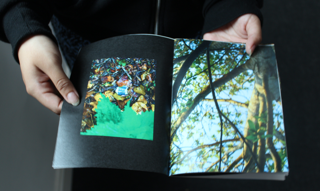
Overall i believe that this project based on Anthropocene vent well. I was very lucking to get the photoshoot opportunities that i did. The sites i got to visit gave me some very high quality photographs that came out amazing after some development. During this project i feel i could have done better in some areas. The first of these was the amount of images i took. Due to the photoshoots being on a working site my time was heavily limited. As a result of this I did not have the time to think deeply about all of my images which it turn meant that many of my images came out blurred or just not very interesting. However, I did manage to get a few great shots on both shoot that i am really proud of. During the image development stage i enjoyed using a specific style of editing that made my images look very industrial which is what i was aiming for and i am happy with the way they turned out. During the developing of my images i spent time on blog posts that explained my processes. One of my final pieces to display my work was a zine. I really enjoyed making the zine and i feel that it went really well and came out as a very high quality piece of work. The zine was compiled of my best images from both shoots. The images were displayed in different styles and sequences throughout the booklet which give the booklet some variety and makes it more intriguing. I am going to have a few of my best images printed and i am going to mount them on foamboard and mountboard which i think will make them look really nice.
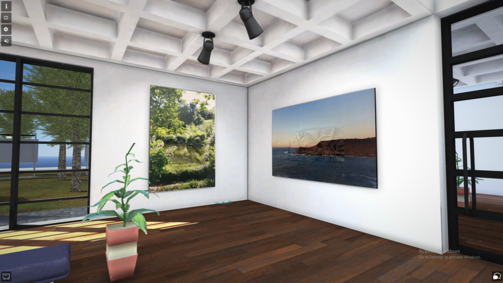
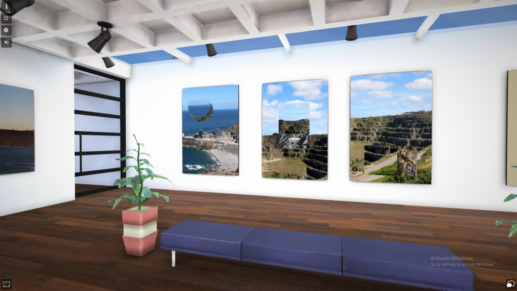
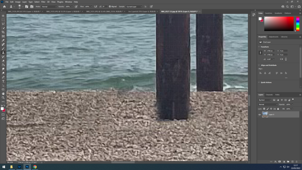
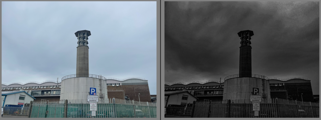
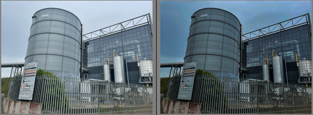
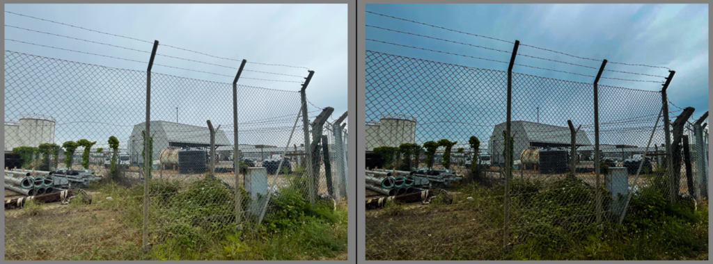
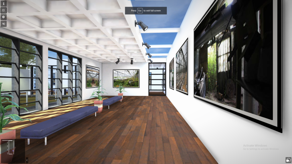
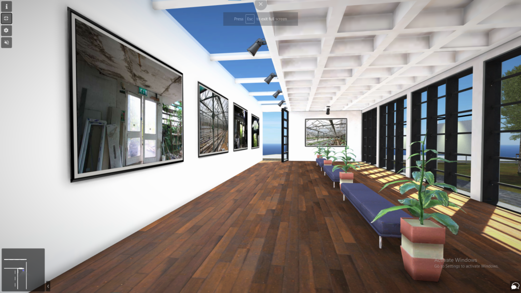
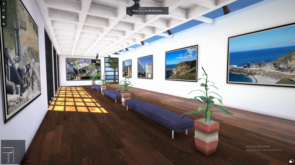
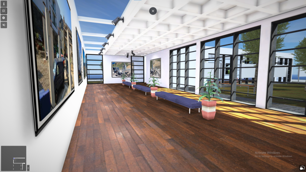
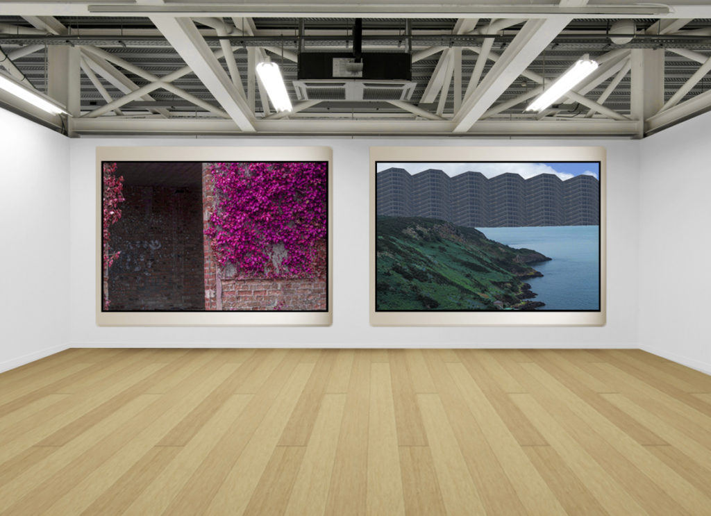
In this post I am going to be presenting all my editing and manipulating that I managed to achieve during my Anthropocene mock exam. Most of my edits have been done on Adobe Lightroom however a small selection of them have been edited on Adobe Photoshop. I am going to further present these images through a virtual gallery which will be found further down the blog post.
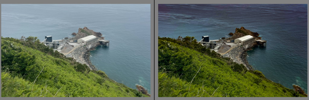
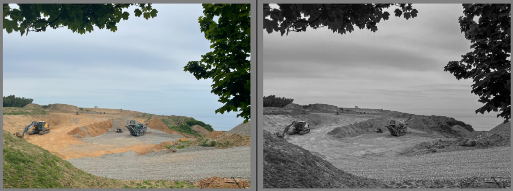
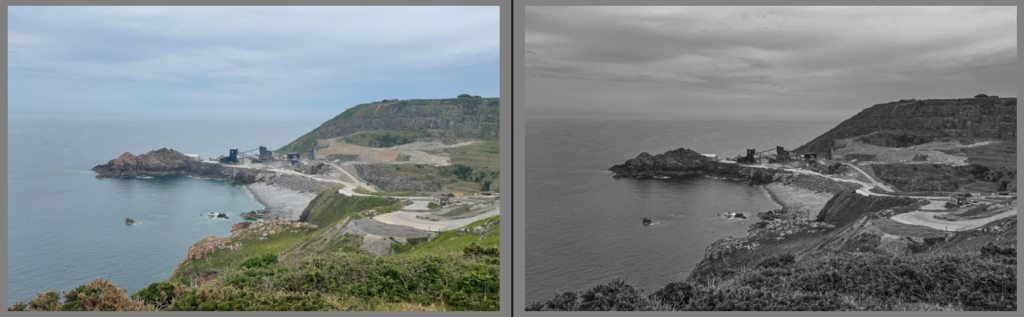
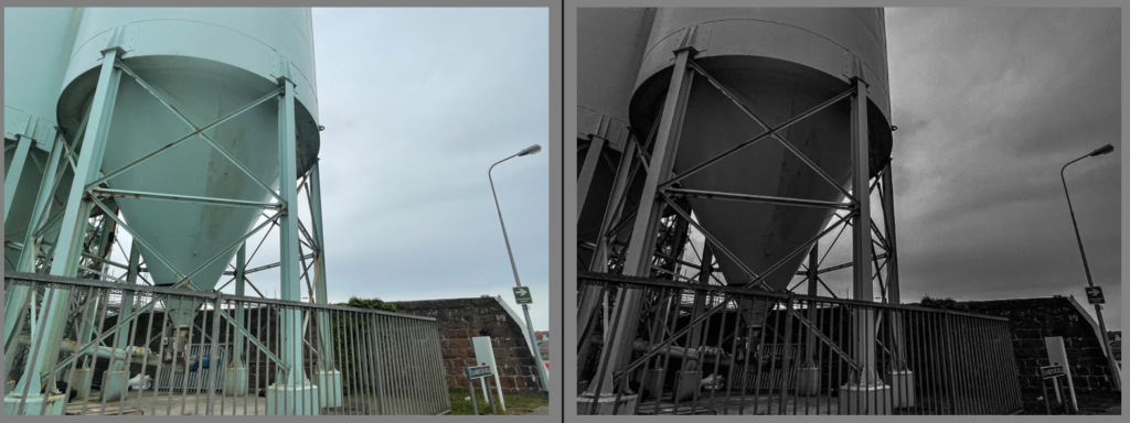
Lightroom Edits:
Photoshop Edits:
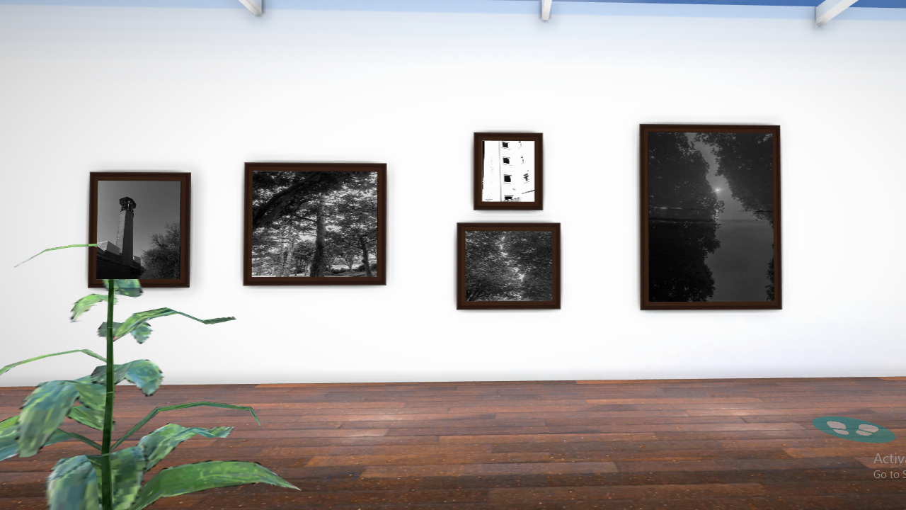
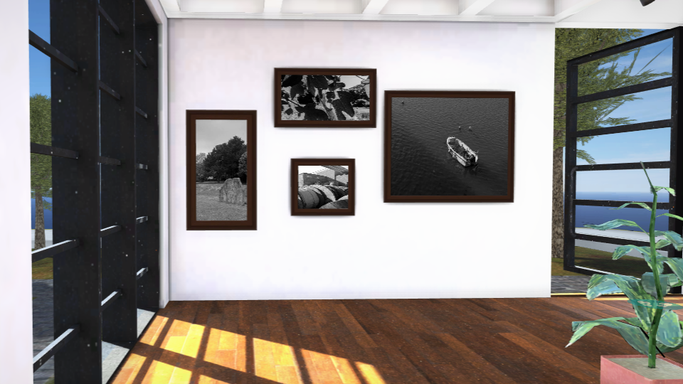
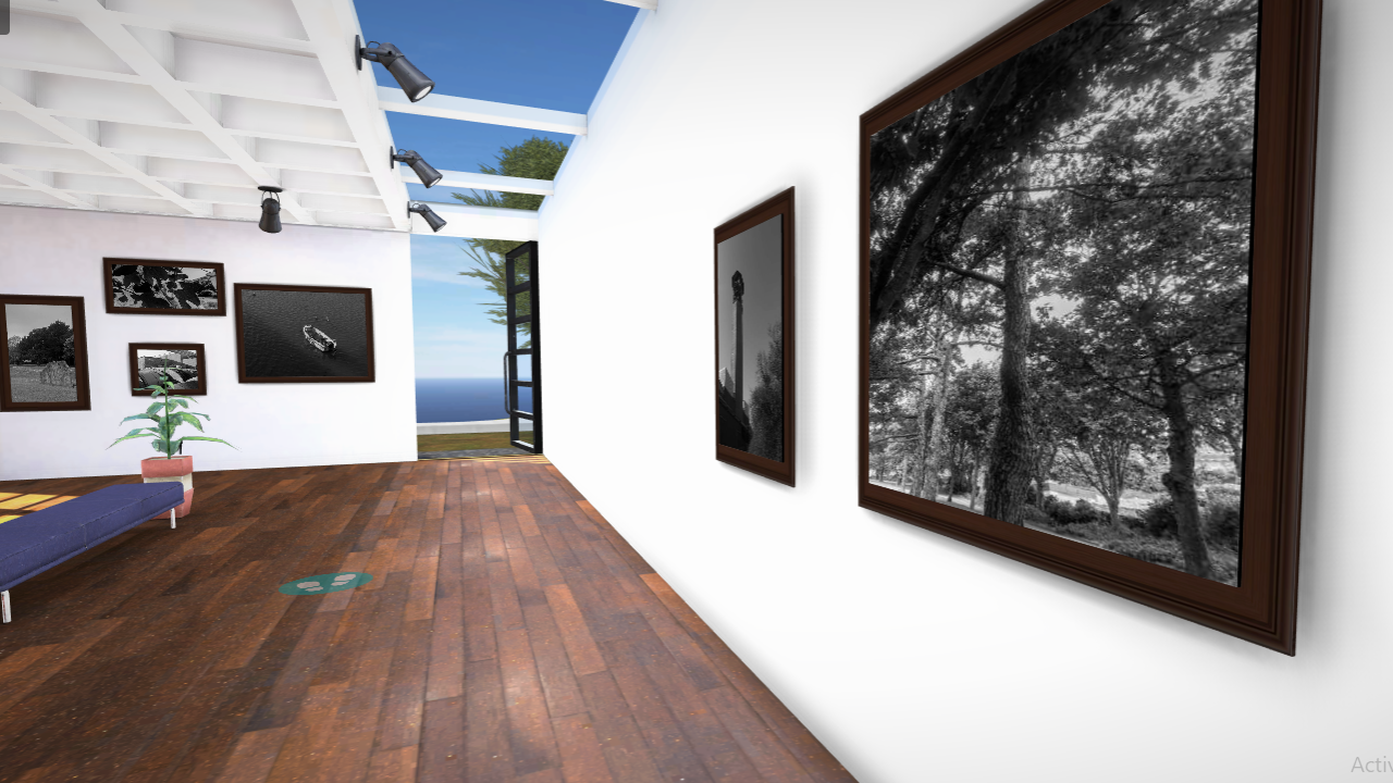
Virtual Gallery link: https://www.artsteps.com/view/628e295e3959903d57540f90?currentUser
Images after mounted:
Evaluation and Critique:
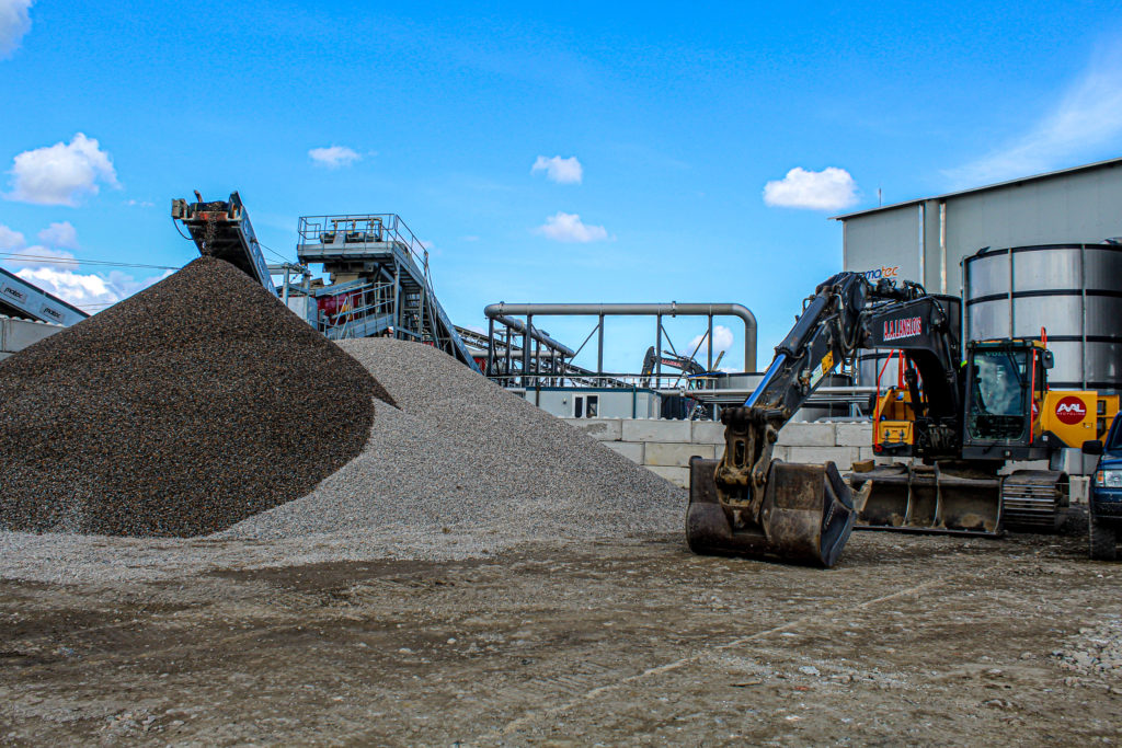
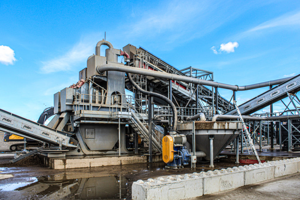
Overall, I am happy with how this whole mock exam went and my final edits. My edits I created are party inspired by artists I studied which I tried to replicate in forms of lighting, angles and photo looks. All of my images fit in well with the idea of Anthropocene because they all involve some sort of story explain the effect of humans on earth. My main aim was to create unique and attractive images with a lot of analysis and research. For preparation I travelled to locations such as, La Collette, the quarry, Gorey, and other industrial areas. I managed to collect around 250 photos overall in preparation for this exam. To improve in my next mock, I am going to make sure I get more photos from different angles, times of day and lighting. I feel as if I had enough photos to successfully follow the mock criteria. Also, I am going to make sure I am fully prepared next time by completing all my artist research before entering the exam. I feel as if I did very good with my edits, research and analysis.
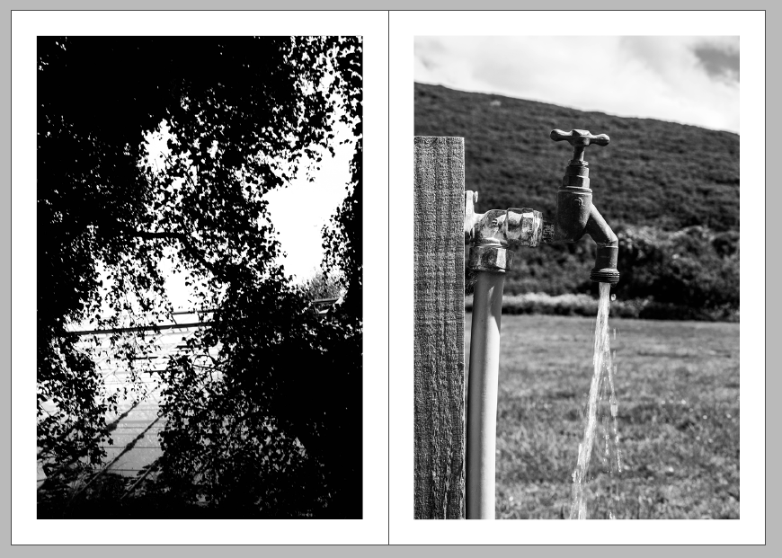
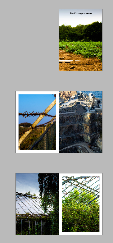
Design decision 1: I chose the first page to create a juxtaposition between the quarry and the barbed fence separating the world.

Annotate design :2 I experimented with making the right page a full bleed to represent the quarry being larger impact than the fence on the environment. I chose this option over the pervious for my final zine.
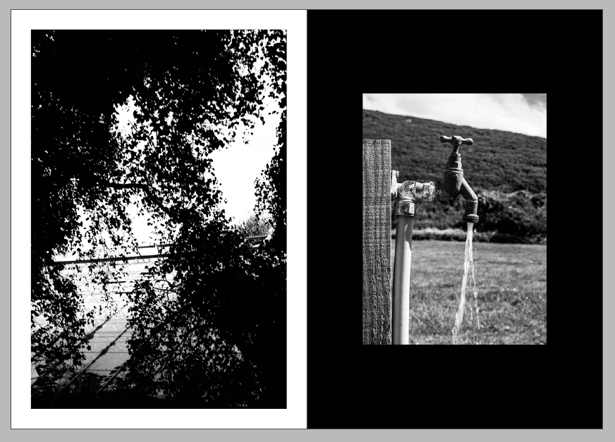
Annotate design 3: I chose these two black and white images to oppose each other in the zine.
Annotate design 4: I made the right image smaller because the image its self is so close up I thin filled the background using the rectangle tool to give more contrast to the image as it is lighter than the left image. these two white and black images oppose each other by a black photo on a white background opposing a lighter lighter image on a darker background.
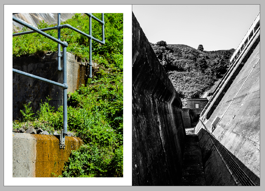
Annotate design 5: for these pages I decided to juxtapose a bright image and a dark image. the vibrant greens in the left image on a white background. to make the images even more separate from each other the right image I changed to be a full bleed.

Annotate design 6 I experimented with a double page spread for this image but I then decided I liked the juxtaposition next to the image.

Annotate design 7: I first put these two images together but I didn’t like how they looked together.
Annotate design 8: I then changed the pictures and i liked these two because they both match colour and cylindrical objects.

Annotate design 9: but then I changed the right image to a full bleed and I settled on this.

Annotate design 10: I experimented with another double page spread, I then decided against it because the subject of the photo would be lost in the fold of the zine.

Annotate design 11: the I put that image next to this image i like the link between the shine of the different materials.
Annotate design 12: I then made the left image a full bleed to give more distinction between the images.
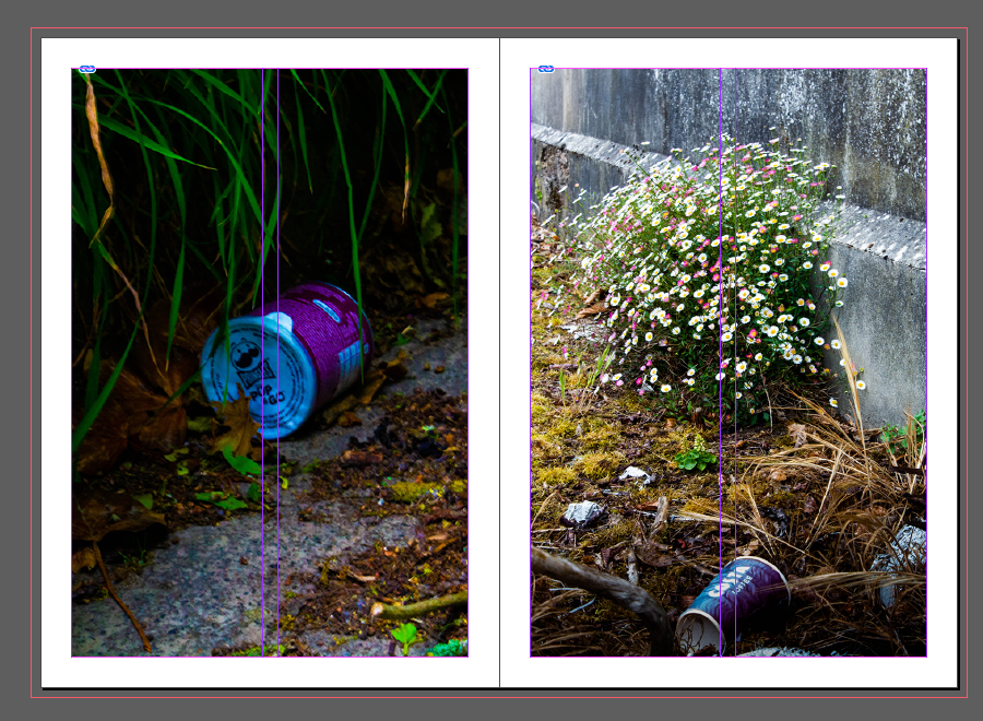
Annotate design 13: I decided to make another black background to fill the space between two colourful images to give more contrast to the page. I used the same smaller size image as the last black background.
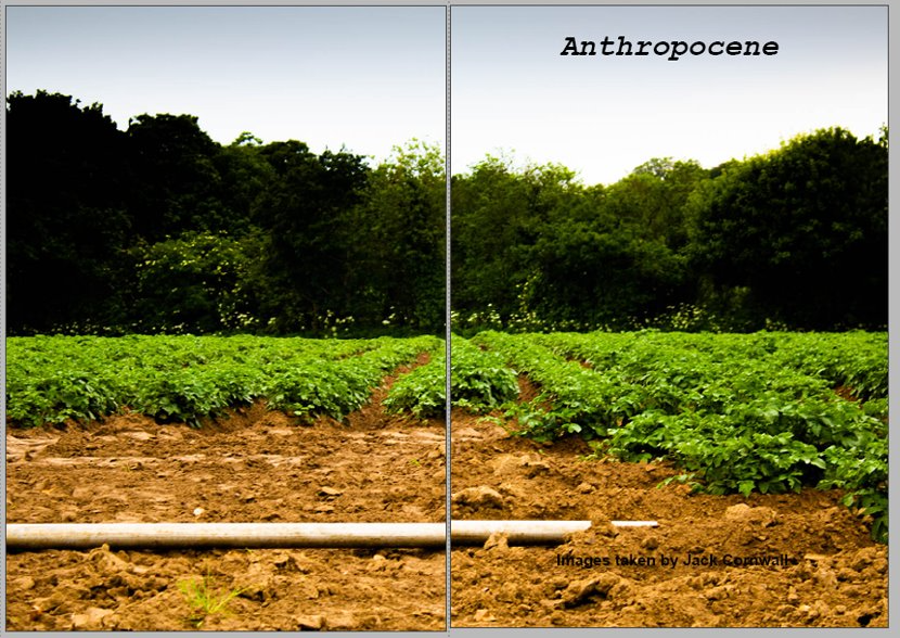
Annotate design 14: to use a double page spread of using a land scape image of farm land as the front an back page of my zine


This is how I will lay out my final zine. I Chose to have a alternating full bleed on either side of each page to give a coherent design to the whole design. it when through many iterations to come to this final layout.
I printed my zine folded it stapled it then trimmed the edges to create the final product.
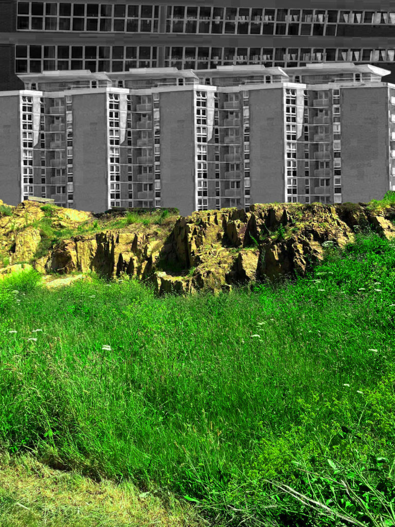
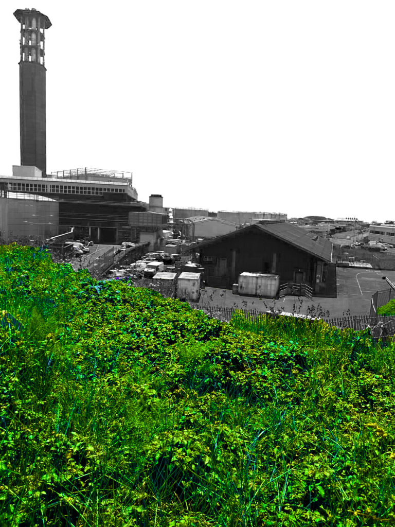

The idea behind my final images was to portray nature through the use of vibrant colours and derelict man-made structures. The contrast of colours creates this effect which makes the natural parts of the photo stand out as beautiful, while making the man-made parts of the photo feel very dull. This is to portray nature as very pleasant, unique and full of life, and to portray the man-made structures as very boring, repetitive and almost trying to shadow over nature. This portrayal through the images I believe relates to Anthropocene very well.


Artsteps Virtual Gallery:
https://www.artsteps.com/curate/628e26f11ca4f84865318175/5
Evaluation
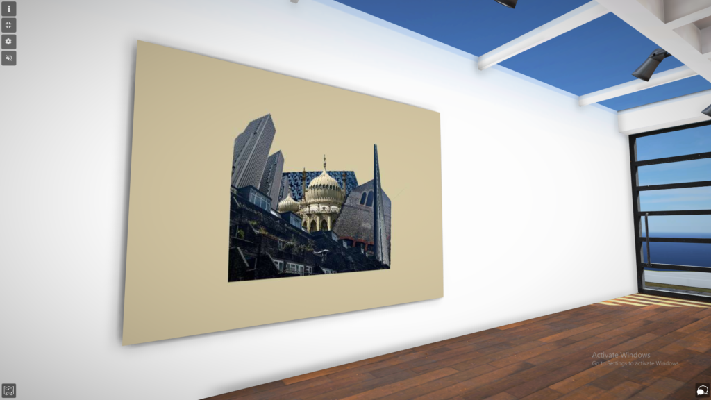
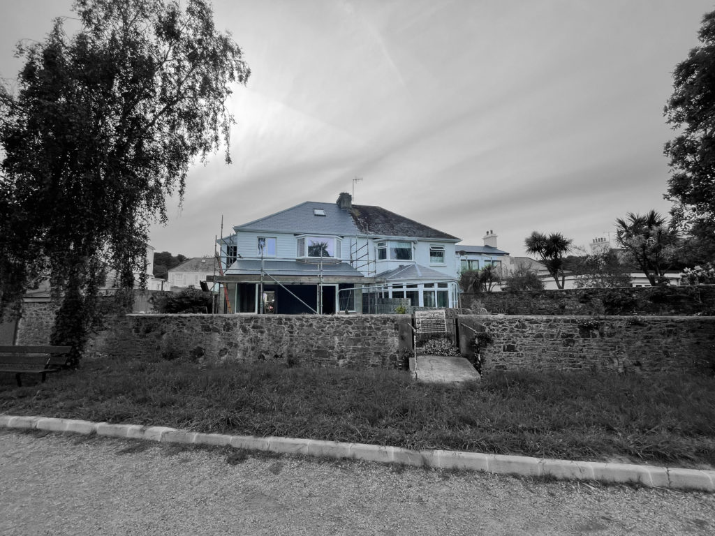
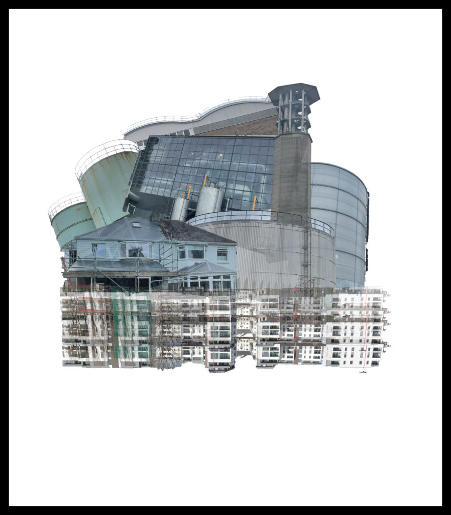
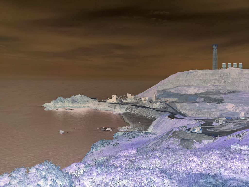
Overall, I am very happy with my final edits. The edits created which are inspired by the artists I studied greatly compare to them in everything from looks, lighting and the colours seen in the images. They also fit into the theme of Anthropocene very well in my opinion. My other edits, where I created photo-montage type images, I am also very happy with. My aim with them was to create unique and cool images which is exactly how I believe they turned out. These edits also fit into the theme of Anthropocene very well also. To improve my artist inspired work, I would have during different times of the day, such as early morning or at night-time. Doing this would have given my a wider range of images to edit. To improve my other edits, I would have taken more photographs of tall buildings, building sites and natural landscapes in order to be able to create more montages with buildings and landscapes like the two above.
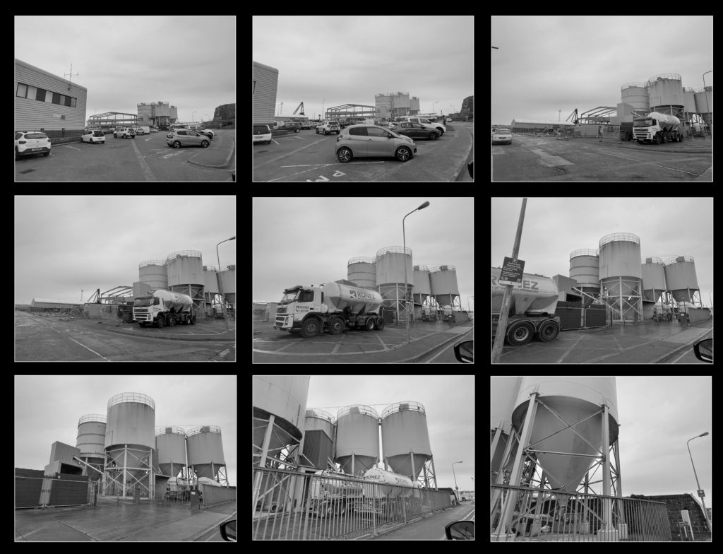
Although I aimed to take 3 photoshoots with at least 100 photos in each, I managed to get 2 photoshoots. Even though I only did 2 photoshoots I was able to get 222 photos in shoot 1 and 321 photos in shoot 2 which was well above the amount of photos I aimed to take. With a total of 543 photos I believe I have more than enough photos for me to create the most effective final images for the Anthropocene project. I believe the quality of the photos I have taken overall are quite good and I managed to photograph the locations I planned on photographing, a couple of photos I have taken have not come out as I would have liked as some have been blurry, too bright or too dark. Using the different filtering techniques on Lightroom I am happy with the final selection of images I will be using for editing and manipulation with Lightroom and Photoshop in order to come up with the best possible final outcomes I am able to produce.
Critique
I could have improved on my work by using more of the photos that I had edited in Lightroom, I chose not to use some of them as I was not sure how I would implement them into my work. If I was able to use them in my work I could have improved upon my final edits. I could have also done a third photoshoot to have more photos to work with to produce better or more final outcomes. If I also took photos during the night time I could have produced images which fit better with one of my researched artists, Troy Paiva. I was also not able to produce any photos inspired by another photographer I studied, Edward Butnysky, but a third photoshoot would have most likely enabled me to produce photos based off of his work. Overall I believe I did very well with the Anthropocene topic much higher than my expectations although there was room for improvement.

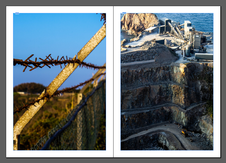
The image on the left, depicts a part of a derelict abandoned man made structure surrounded by nature. The picture on the right depicts old forgotten remains of a human, also surrounded by nature. Both pictures consist of forgotten dead things left by humans which have been surrounded by nature, or taken over by nature, portraying Anthropocene. The foliage of both images are a similar pinkish colour, which could be depicting the beauty of nature which contrasts well with the ugliness of the man-made parts of the photo. The differences in the photo are minimal, the one and possibly only difference is that one photo contains the remains of a human while the other contains remains of something humans have built. I prefer the image on the left as it seems to have a lot more going on, and there is more of a contrast between the natural side of the image and the man-made side of the image.
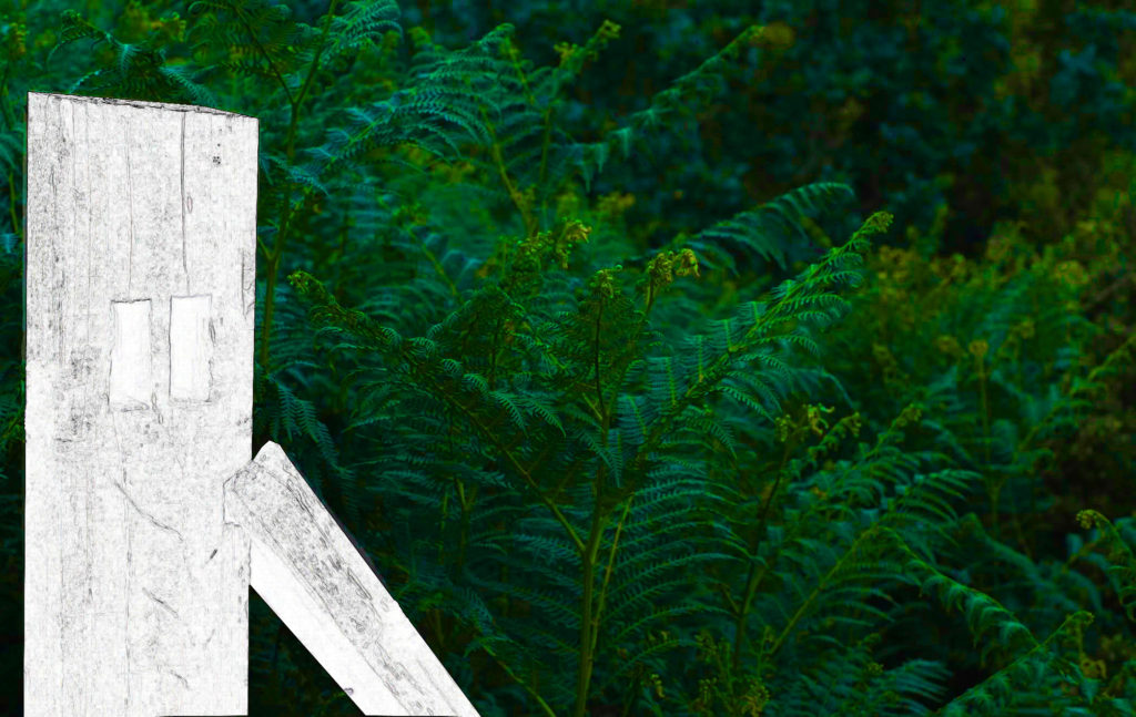

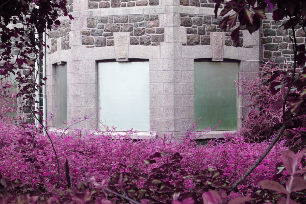
The image on the left, depicts a wooden beam which has been whitened surrounded by colourful plants and nature, this image is depicting how nature is full of colour and life while man made objects seem to be very dull and boring. The image on the right, depicts what seems to be an abandoned building in a rural area containing lots of bright colours, which could be depicting that even though the building is abandoned it still contains lots of life. Both images contain a lot of bright similar colours mostly the green colours. The image on the left depicts man made objects to be very dull and boring while the image on the right seems to be depicting man made objects to be very full of life and unique, the two images seem to be contrasting with each other in that way. I prefer the image on the right, as it contains a lot more colours and is a lot more interesting to look at than the image on the left.
below is a link to my virtual gallery show casing all my final images