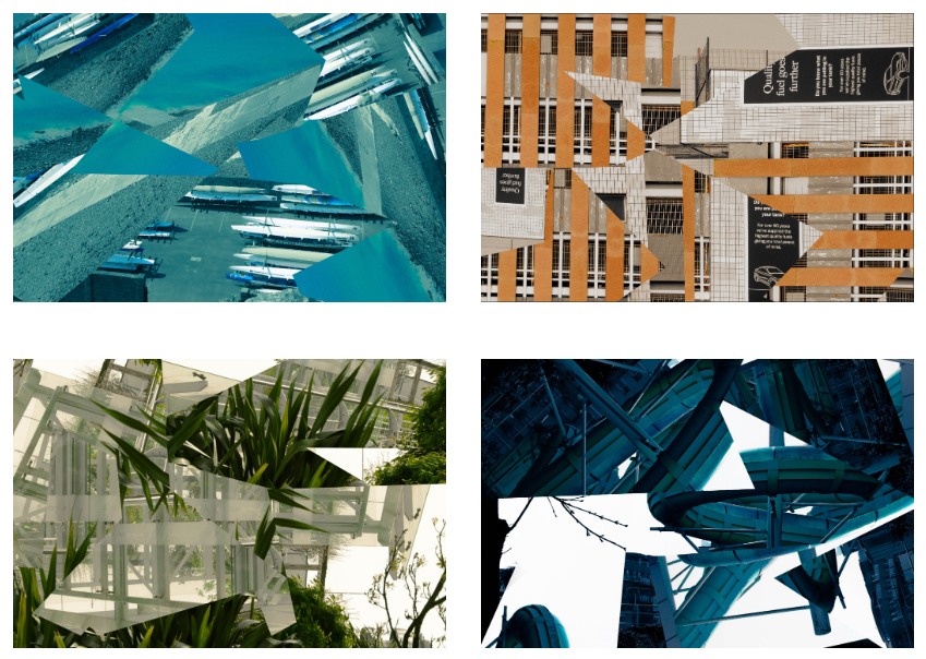
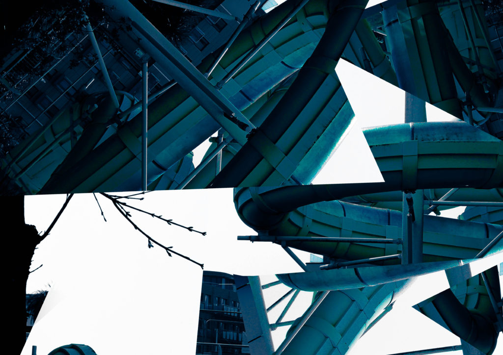
These are my final edits that have been inspired by Dafna Talmor. I really like how they turned out, especially as all my images are able to work together as one piece despite being so abstract and visually different from one another in terms of colours. I think my composition has enhanced my edits to be the best they can be whilst still looking visually appealing along with my use of jagged edges that create a contrast between the different tones within each edit.
Comparing my work to Dafna Talmor’s:
Dafna Talmor’s Work
My Work
Talmor has carefully taken apart her original image[s], making them all a variety of shapes, and pieced back together into a constructive landscape by hand, choosing not to have the different pieces line up perfectly and instead have leave some negative space in between certain parts of the image. I, however, took apart my image and pieced it together digitally. I chose not to include any negative space in between each piece, instead deciding to use the highlights and shadows to create contrast between the different areas of my image and make a different type of negative space.
We’ve both chosen to use colour in our work however we’ve both used different saturations. I decided to keep my photo a deep blue, aside from the white highlights and the darker shadows, allowing all the different elements in my image to merge together as one whilst Talmor chosen to keep her images their original colours, forming a more natural looking constructed landscape as all the pieces follow the same colour scheme.
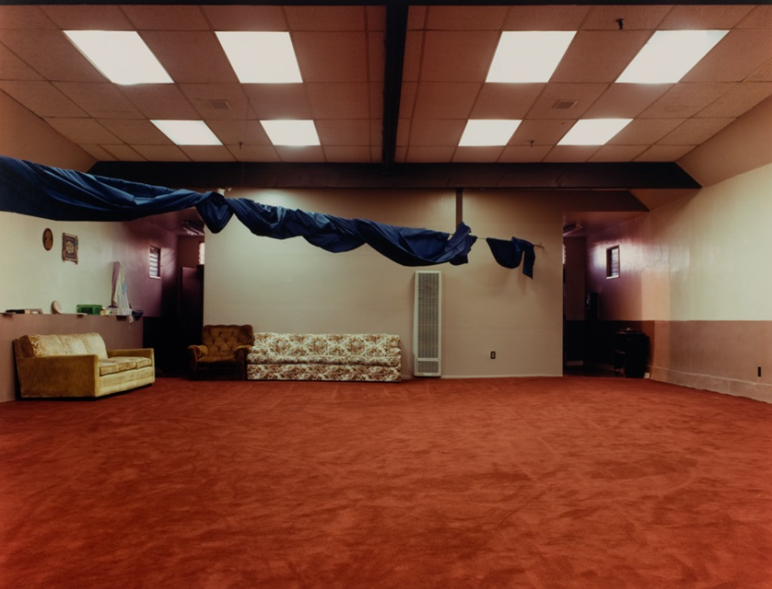
Joel Sternfeld- The Masjid-Al-Rasul, 11211 Central Avenue, Watts, Los Angeles, California
As contributing to Joel Sternfeld’s style, this image has a strong colour scheme- with the warm colours of the carpet, sofas and walls conflicting with the cool fluorescent lights and blue curtain hanging from the ceiling. The blankness of the room gives a sense of abandonment- although the room is not abandoned.
I am using my image of the penthouse as a comparison where similarities include yellow walls conflicting with the blues and greens of the outside and the ceiling. Both images show a sense of abandonment and eeriness however mine is an image of an actual abandoned room while Sternfeld’s is a dull room in the Masjid-Al-Rasul mosque in Watts, where “members of the Bloods and the Crips, rival Los Angeles gangs, negotiated and signed a truce on April 26, 1992”- both images share this sense of story where the room, although empty, has been used for and been privy to private, personal and intimate events which will never fully be known.
Even though I didn’t end up creating a collage in the style of Laura Romero or Anastasia Savinova, I am still grateful I chose them as my first artists – I found my locations to shoot from these two artists’ ideas, and wouldn’t have found my areas to photograph if it wasn’t for these two artists. I decided not to use collage with my images as I ended up realising the images I had taken would not respond to the artists’ work very effectively, and wouldn’t produce the quality of work that I wanted. After researching and realising I am more interested in documentary photography, such as Peter Mitchell and Sharon O’Neill, I began to research photographers who documented the wealth divide, social housing, economic issues, and poverty. I then found. two artists that I felt would help me to produce the best work I could, which would inspire my work.
Photoshoots
Photoshoot 1:
This photoshoot was mostly successful, however, I had trouble with the weather towards the end of my shoot so I had to reshoot the next day. The first part of the shoot was more successful, as there was no rain, and the overcast skies helped me to achieve the bold lines and intense shapes which I wanted to achieve in my images. On the other hand, I had trouble with overexposure in this shoot and found this an issue in my editing, which I will discuss below. To improve this shoot if I was to do it again, I would ensure the weather was better for my shoot further in advance, ensuring better exposure and brightness. (preferably sunny weather conditions with the low wind to ensure my images are not shaky or blurry).
Photoshoot 2:
This photoshoot, in which I took pictures of industrial buildings, was successful, but I did not end up using most of the pictures. I completed this photoshoot because initially, my idea was to produce collages of housing and business buildings, however, my idea developed into more of a photojournalism style, after researching further on the issue and related artists. Even if I didn’t end up using these pictures of industrial buildings in my final outcomes and the rest of my project, this photoshoot allowed me to further fine-tune my idea, and without this shoot, I may not have decided to alter my idea and complete a third photo shoot. Lastly, the Ann Street brewery that I photographed was next to De Quetteville Court, the main location of my third shoot – I would not have discovered my location for the third shoot, and it would not have been so successful – I would not have found a location that linked as closely to my chosen theme, and my final piece may not have been as effective.
Photoshoot 3:
I found this one to be the most successful of my three photoshoots. I think this is because I carried out this photoshoot after further research and had a more informed idea of what my project was becoming – therefore I had a clearer idea of the shots, areas and ideas I was trying to achieve when I took my images. These images, in my opinion, had more meaning behind them, with the help of my added research on the housing crisis and its’ relation to the area I was photographing. If I was to carry out this project and exam again, I would have done the same level of research before my previous photoshoot. This made the last photoshoot much more successful, and I think that if I had carried out the same level of research before ALL of my shoots, not just the last, the project would have been more successful.
Selections and Editing
Selections:
I selected my images using Lightroom classic. After importing my images, I put them into folders for each photoshoot. I then used p and x tools to select my favourite images – however, I did have to redo this process multiple times due to very similar images. Therefore, if I was to do my photoshoots again for this project, I would make sure to avoid very similar shots, as this was detrimental to my selection process and then my editing. Overall I think this selection process was effective but was too time-consuming so did mean I had less time for editing/creating my zine and final outcomes in the exam.
Editing:
I decided to edit in black and white in the end, but I had originally planned to do my collages, with some black and white and some in colour. Once I had moved away from this idea, I decided to not edit in colour, as I thought black and white images would help to bring out the strong lines and shapes in the architecture and buildings I was photographing, and highlight the strong monochromatic tones that were present in most of my images anyway.
Final Images
These images are the pictures I have selected as my best outcomes from the project – These will make up my physical outcomes, and also make up most of my zine as I showed and evaluated in my last blog post.
A3
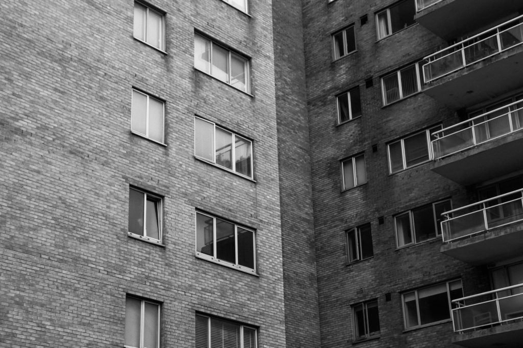
I chose this image as one of my final images due to the different tones within the image as well as the varying light and shadow. When I was shooting, the light was coming from the right, which can be seen in the image as the left side of the building is much brighter, contrasting with the right side which is much darker and moodier in tone. This creates a split tone effect in the image, as the split of light happens to fall just off the centre of the image. – This helps to balance the image compositionally. After reviewing all of my images, I would say this is one of my most successful images from this project, and in hindsight, I think this type of image worked better than others. If I was to redo this project I would take similar images to this of other buildings after seeing how successful this image was after my editing and final printing.
A4
I chose this image as one of my final because of the strong lines and shape. The image is split up into three parts in a way: the lower part of the house, the flats to the right, and the upper bit of the house. There is strong repetition in the apartment building with rectangular windows. This contrasts with the lines in the house, as they are more triangular. This creates a natural partition in the image. Although I chose this image as one of my final ones, I do think that looking back I should have not edited with such high contrast levels, as I think this makes the image a little too dark.
A4
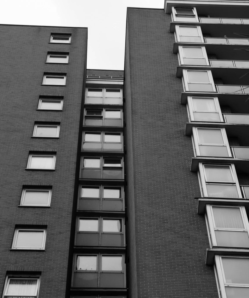
This image is one of my favourites from this project. I am super happy with the angle from which it was taken, which creates strong leading lines next to the windows, and along the bit of the building which juts inwards. I think my editing in this image was successful, as I didn’t overdo the contrast – this was a little bit of an issue with some of my other images. I think the composition of this image is an aspect that makes it one of my favourites, as I utilised the rule of thirds to make sure the composition was balanced.
A4
I chose this image as one of my best because of the sharp lines and high contrast between the building, sky, and features of the building. The building takes up most of the image, and even if the sky only features slightly to the right, the sharp line separating the two parts of the image is a key focal point. I think editing in black and white for this image was a good decision as it highlights the sharp lines and the highly shadowed windows.
A4
I chose this photo for a few reasons: I like how each window shows a different life in the building. This feature of this photo is unique in my project, which I wanted to include. Furthermore, there is strong repetition in this image: the windows create a rigid pattern, however, this is broken up due to the angle at which the photo was taken, slightly tilted. Also, my use of cropping plays a part in this angle. Originally, this image was not cropped enough for the effect I wanted to achieve, so to put more focus on the individual windows I cropped the image inwards quite significantly. Looking back, I think this was a good decision as I think it gives the image further depth and stops the image from looking too flat.
A4
This image is definitely one of my favourites from the Anthropocene project, so I decided to include it in my final prints. I think this image compositionally is really strong. This is helped by the way the overgrown garden frames the door of the house, and how these plants are seen in the foreground, midground and background of the image. I did use slight cropping in this image, as I think originally there were too many other parts of the house and apartment building in the background which made the composition too busy and distracted the eye from the door and garden which are the main parts of the image. I like this image also because at first glance, the house looks lived in, just a little overgrown. As you look closer, it is visible that the house is in fact empty, which I think is helped by the soft black and white editing (creating a feeling of emptiness in the image). I think my editing was really successful in this image, and if I was to do my editing again I would not change it.
A4
This is my last final image from the Anthropocene project. I like the deadpan nature of this image, showing the true look of the environment I was photographing. I used slight cropping to the right of this image, to ensure it was only one house in the image – this helps the image to be more balanced compositionally. In hindsight, I do think my editing was too dark for this image – there are too many blacks in the fence and windows, and if I was to re-edit this photo again, I would turn the blacks and contrast down slightly.
Final Zine
Creating my zine: I found creating the zine a little difficult at first – I had never used AdobeInDesign before, and I found it a little tricky to navigate at first. However, after getting to grips with it I found it very useful – the two kinds of lines around an image meant I could crop and move my images smoothly – this tool made my spreads much better, as I could fine-tune which parts of an image were the focus of a spread.
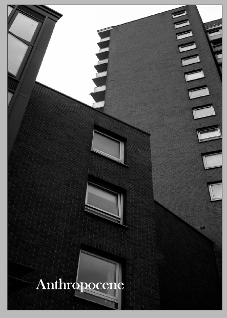
The front cover of my Zine
(Final presentation shown and evaluated in my previous blog post)
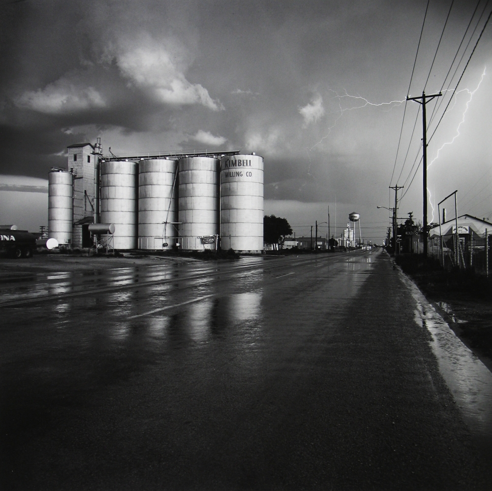
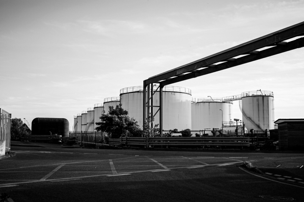
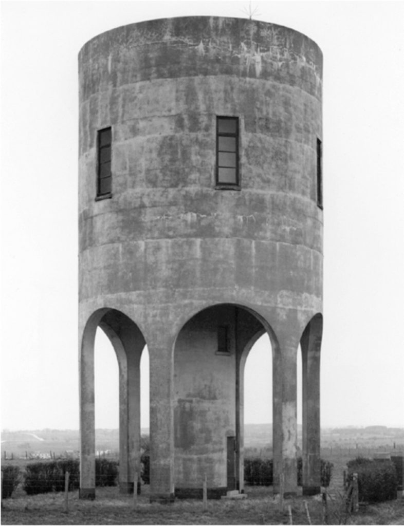
Similarities: Above I have demonstrated that I have been influenced by Frank Gohlke’s work. One of the main similarities in our work are the structures within our them, with us both having included tanks means that our work has a visual link to the topic of Anthropocene and the New Topographic, and these themes both explore how human life has impacted the natural environment. This message is reiterated when you think about the fact that the tank may contain naturally occurring substances such as water or oil, and these elements are contradicted by their surroundings, which are man altered metal and other features such as tarmac and houses (in Gohlke’s work). This means that the link between the image go beyond what is just visual. Additionally, the levels of contrast in both of the photographs, with the metal features appearing a range of tones and textures in the photographs. What’s also important to note is the perspective of both of these images, with the composition being similar yet not identical, its apparent that both were taken from afar. My work is a lot closer but the purpose that the tanks are the key focal point of the images is repeated.
Differences: The most apparent difference between my work and Frank Gohlke’s work is the sky. In Gohlke’s work this feature is full of contrast and a focal point for the photograph. I could have made the sky darker in photoshop to make the image stronger and more like Gohlke’s work. However, I still like that the sky is light in my image and it compliments the tones in the tanks, but it separates it from my artist’s work and creates differences. Additionally, the composition of our photographs are unalike as he has been taken from a distant viewpoint and mine is taken from a lot closer up, with mine following the rule of thirds more as mine is more symmetrical with a closer up focal point. Gohlke’s focuses more on a number on manmade objects and lacks a focal point with the tanks so far away.
Bernd and Hilla Becher
Their work
My work
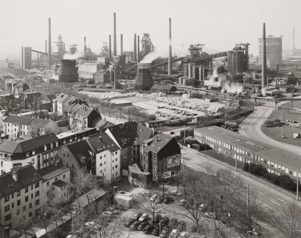
Similarities: I think comparison I have attempted to recreate one of Bernd and Hilla Becher’s pieces, with my photograph being taken at Fort Regent so I could get the best view of the reclaimed land. I like how similar these photographs are as the composition helps it feel as it they have been taken with the intention to look alike. The message behind both of out work has the same purpose, with both of the work demonstrating how much humans have changed the planet, but in this case focusing on cityscapes and how drastic the affects on industrialisation are.
Differences: The way that these images have been edited with there technology at the time is very different, obviously Bernd and Hilla Becher were more limited with what styles of editing they could do and the quality of images they could produce, but the fact that their image is dull and mine had to be greatly edited to match this is an indication of how much manmade technology has changed, and this example is just with cameras. I think this also means that their work turned out to be a more yellow toned image whereas mine has a cooler toned feel.
Overall I think my final outcomes were done well because i wasn’t rushed for time, and spent about 1-2 hours on each photoshoot which i think in the end really benefit me especially because it gave me a wider range of photos to choose from. Out of the two photoshoots i feel that the 2nd one was my strongest as it had a good range of location lighting and objects and i managed to capture the fascination i had in the hotel in my images. I think editing really helped make my photos better for both shoots as i played with colour exposure and texture to help make my piece stand out and showcase the detail put into my photos.
Another thing that I think went well was the standard of my final images, as none of them turned out blurry or shaky – in some instances i had to use flash as it was too dark to secure a good image but even then it turned out well and gave me the desired effect, however the ones i didn’t take with flash also turned out well especially for photoshoot 1 as the darker lighting helped me build on my theme of industrial architecture.
CRITIQUE
Although the majority of my images turned out well, one thing i felt faulted me was the fact i didn’t have a working camera for the first photoshoot so i had to use my phone, which meant some of my photos ended up out of focus or shaky and could’ve turned out better if i had used a camera. I also felt like with photoshoot 1 since using a phone i didn’t end up with much variation in the texture of my images. If i were to do it again I wouldn’t use my phone unless it was a daytime photoshoot because the quality doesn’t end up as good if the photos are taken during the night.
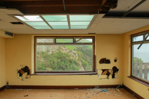
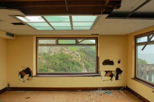
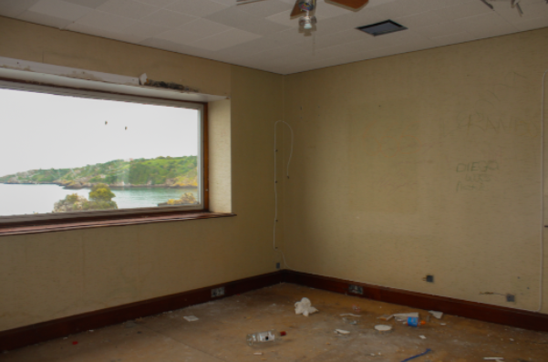
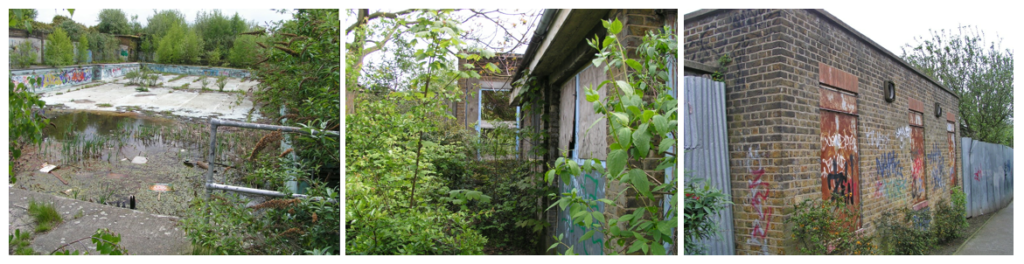
I like the yellow contrasted against the blues and greens of the nature through the window and the blue of the ceiling windows while attention being drawn to the dark tones of the holes in the walls which present a sense of depth as attention to drawn to the back of the room. The framing of nature through the window is interesting as the destruction and abandonment
CRITIQUE
The image is quite plain in its composition with not much happening. There is also a lot of darkness in the corners and top of the image as there are shadows and dark wood which looks unusual against the tone of the yellow.
EVALUATION
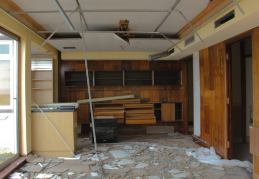
The image has depth as attention is drawn towards the back of the image, the theme of yellow is continued which looks interesting against the dark of the wood. The texture of the wood and floor is also very visible which is interesting to look at especially since there is such a large variety of colours.
CRITIQUE
The left side of image is overexposed and provides a large contrast between the dark tones of the wood, I could’ve cropped this out but the dimensions of the image would have been unusual.
EVALUATION
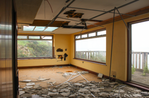
I like this image as destruction is shown throughout the image, with the ceiling tiles on the floor and the holes in the ceiling and walls, along with the obvious yellow motif.
CRITIQUE
The outside is overexposed which if I changed then the image would have been too dark to notice the yellow walls and soft lighting coming from outside.
EVALUATION
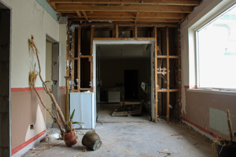
Attention is drawn towards the dead plant as it is the only slanted thing in the image, I find this interesting- especially as it is in front of the doorway- as it could symbolise the death of nature making way for human activity. I think this images has the best flow to it as composition-wise it is the most classic composition.
CRITIQUE
The right side of the image is overexposed but I didn’t want to lose the soft light coming in from the window so I decided to keep it.
EVALUATION
I like how the stains and graffiti on the walls is visible alongside the obvious signs of human interaction with the room contrasted with the view of nature outside the window.
CRITIQUE
The image has quite a plain composition and the outside is overexposed.
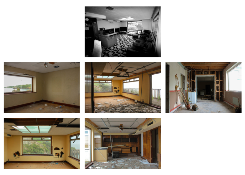
FINAL ARRANGEMENT OF IMAGES
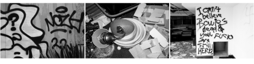
My final grid of images
EVALUATION
I like the contrast between the plain rooms scattered with destruction against the black and white original image of the room. I also believe the negative space between the images works very well as it looks like a blue print- with the slight motif of nature/the outside in every image compared with only viewing nature through a derelict room is interesting especially in the nature of a blueprint.
CRITIQUE
Overall I do not like my final set of images, I preferred my last mock exam as with the theme Anthropocene it mainly focusses on nature and how humans are changing the world- I prefer taking images of people as I find it more interesting.
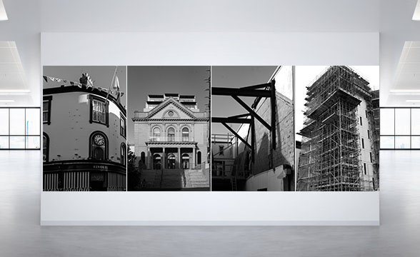
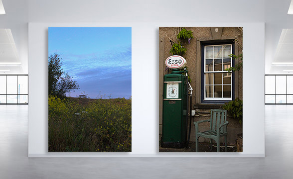
For my virtual gallery, I decided to have two sets of monochrome images and two colour images to show diversity. I also used a mixture of landscape and portrait photographs.
The first monochrome set consists of two landscape images that are opposite to each other on a white background. I paired them up as I thought they worked well together. The second set consists of four portrait images, one after the other in a straight line. I think they work together because they are all images of buildings and scaffolding.
The first colour set is another juxtaposition. In the image on the left there can be seen a bench in the distance and this links to the images on the right because the main focus of it is a chair. The second set is simply a landscape image of a roof with two chimneys. I like this image because the colours are nice and vibrant.
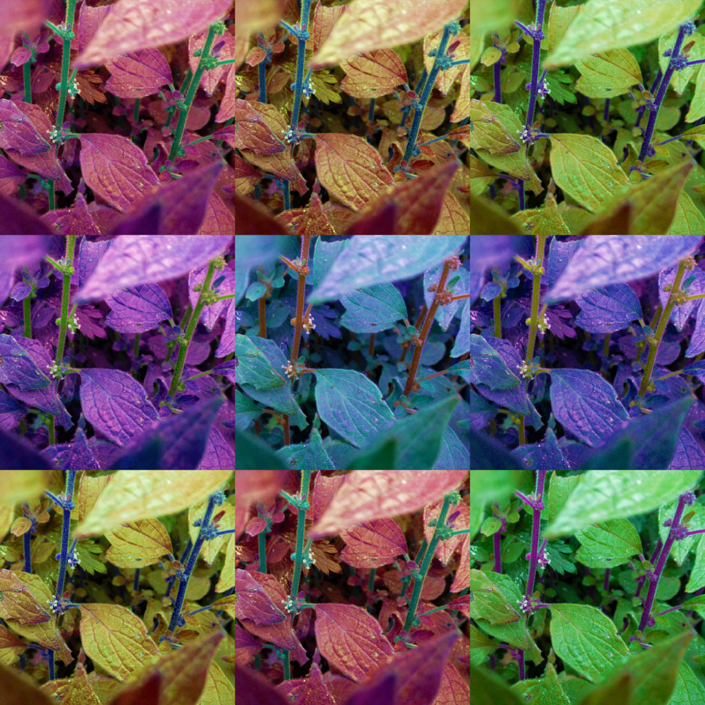
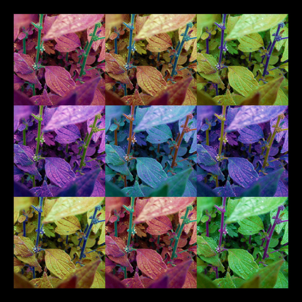
These two images are direct responses to Andy Warhol’s own artwork. I wanted to capture a style similar to his ‘Marilyn Diptych’ piece (the first image), as well as a more detailed style (the second image). For these two images, I wanted to focus on colour, both images have a lot of colour to help them appear more abstract, however the first image uses far darker colours and shades, while the second image is much more vibrant.
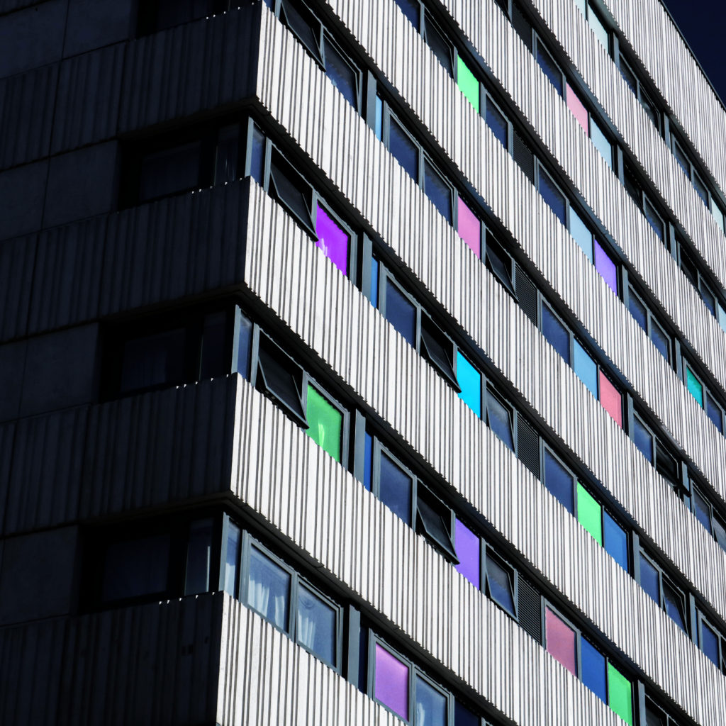
Similar to the last two images, I was inspired by Warhol’s work when making these images, seen by the bright and vibrant colours akin to his Marilyn Monroe portraits. I like the way these images use the straight lines from the urban building to separate colours and tones.
As for this outcome, I was inspired by both Warhol’s use of abstract shape and tones and Paiva’s light painting photographs, creating the different colours in some windows was an inspiration from some of Paiva’s images.
Presenting my Outcomes
For these two images, I am going to lay them out in a window mount, I have made a mock-up version of this with a white boarder to mimic this style.
For these images, I want to mount them separately on foam/mount board.
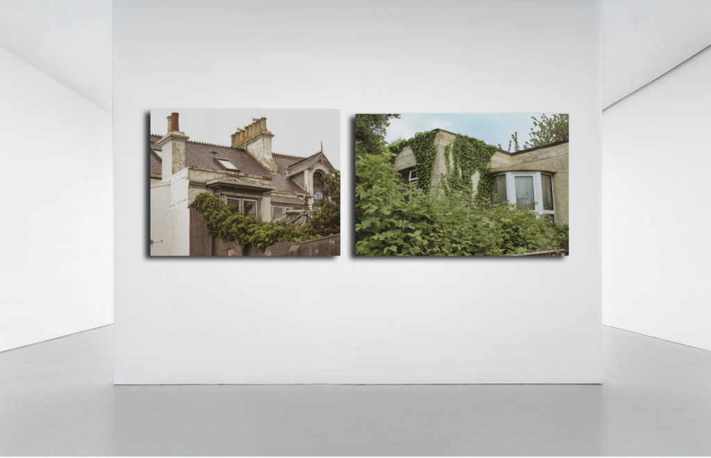
My Images in a Gallery
I have made two images that show what my images would look like if they were to be hung in a gallery.
My Final Outcomes
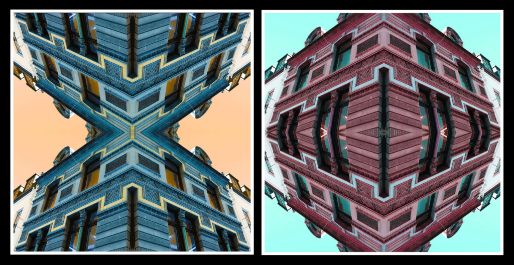
Comparing my Final Outcome to Reference Artist
Similarities
Both images use strong colours
Both images are abstract
Both images use a regular grid pattern
Differences
My image is far darker than Warhol’s
Warhol’s image has much less contrast
Warhol’s image is a portrait, while mine is more of an object/landscape image
Evaluation
Overall, I am very happy with the way this project turned out. I feel like this project was far more successful than the last mock exam, not only in terms of planning, but also, I felt that the quality of the images I took were far greater than the last project’s and that the final outcomes, in terms of editing and presentation was far stronger.
What Went Well:
I feel like the photoshoots for this project were very strong, I think this because I focussed more on the subject matter, why I was taking the images and what I was doing (in terms of how I took the pictures). I think my final pieces for this project are all strong and matched what I had intended from the start. I feel like my final images all match my referenced artists nicely, with each image bearing good resemblance to the work of those artists. While experimenting, I feel like I have learnt new ways on how to manipulate my images, as well as new concepts that I may be able to use in a future project.
What I can Improve on:
I feel like I could have been a bit faster in terms of producing the blog posts and final images, however I did manage to get them done during the allocated time. Because I didn’t get the project done in time for me to really go back and add even more detail to the blog posts, I also didn’t have enough time to make physical mock-up of how I would present my images in real life, I will try and aim to get to that point in the next project.