Category Archives: Uncategorized

Filters

Author:
Category:

shoot 1- l’etacq

Photoshoot Plan

I will be taking photographs at L’Etacq/ Stinky Bay, I would like to take these images round midday to ensure that I can have the best changes of having the correct lighting for this shoot, and making sure its not raining to make sure my only equipment, the camera, doesn’t get damaged.
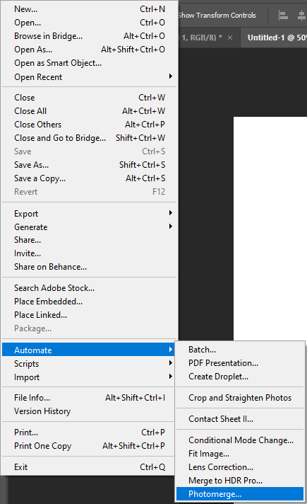
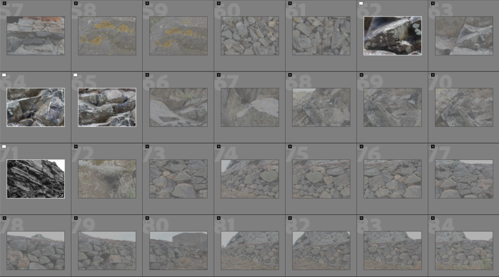
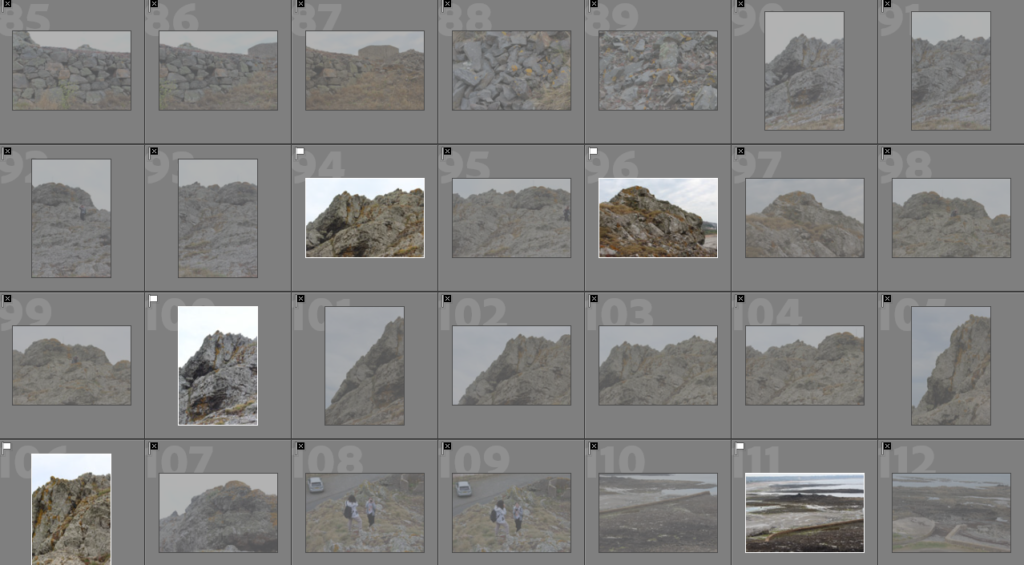
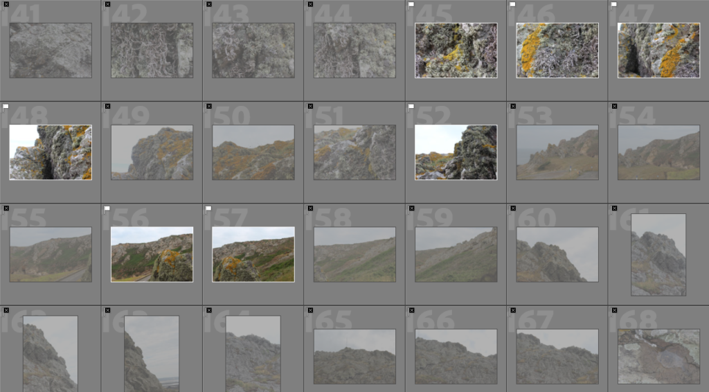
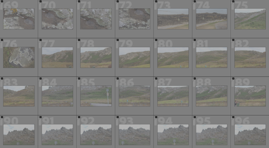
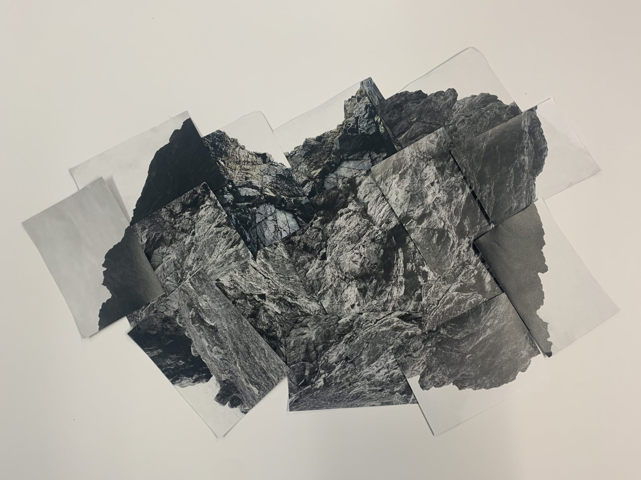
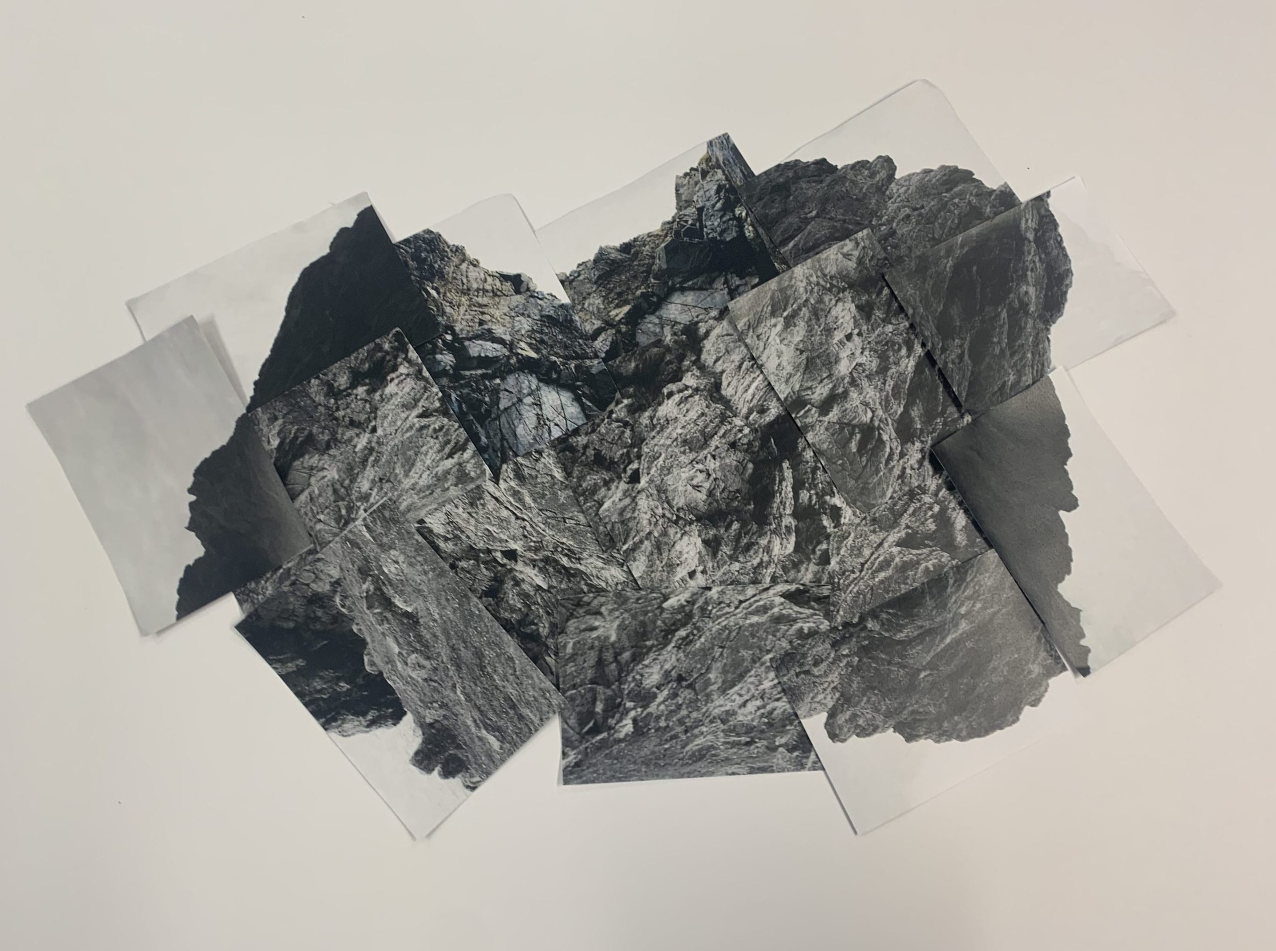
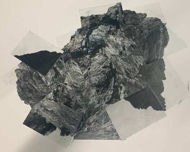
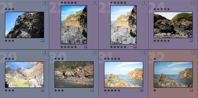
Contact sheets

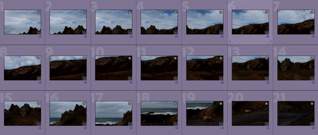
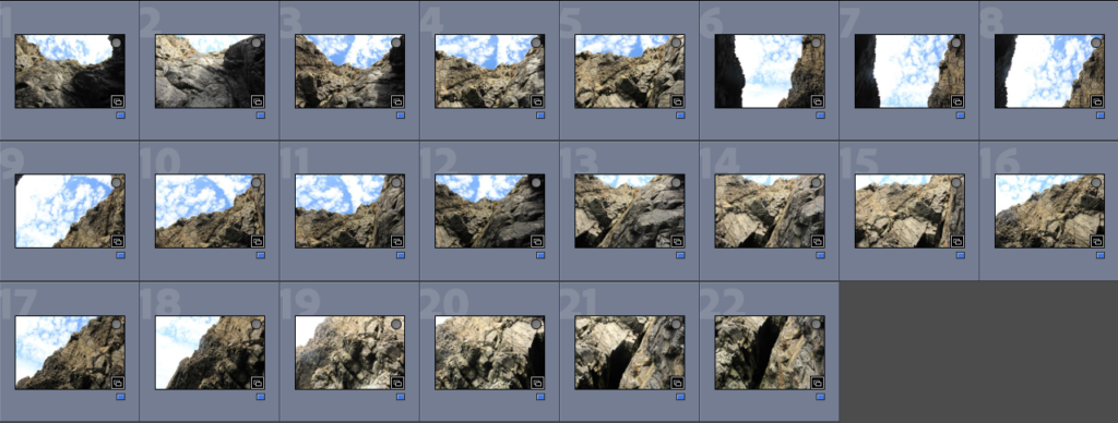
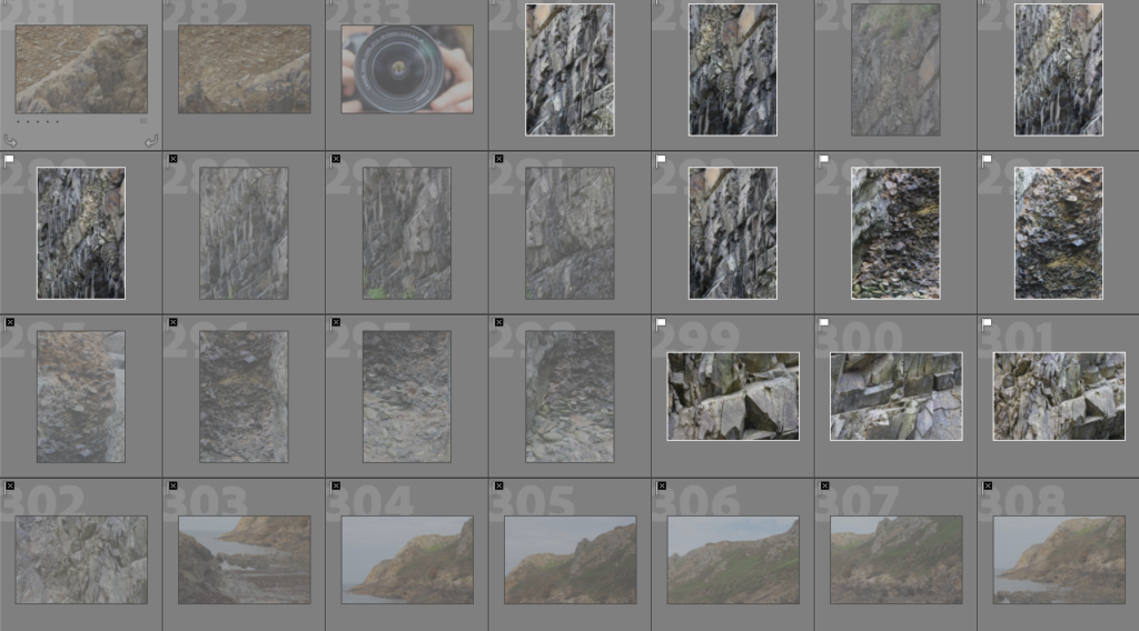
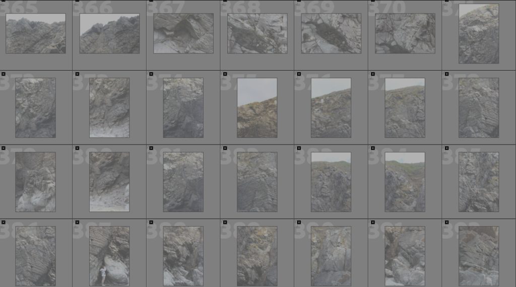
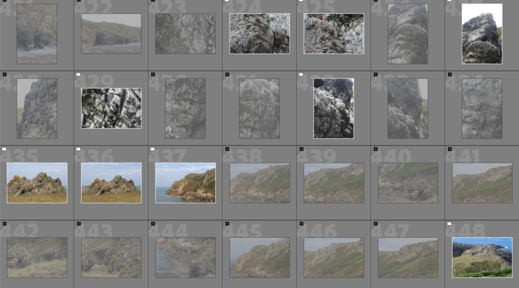
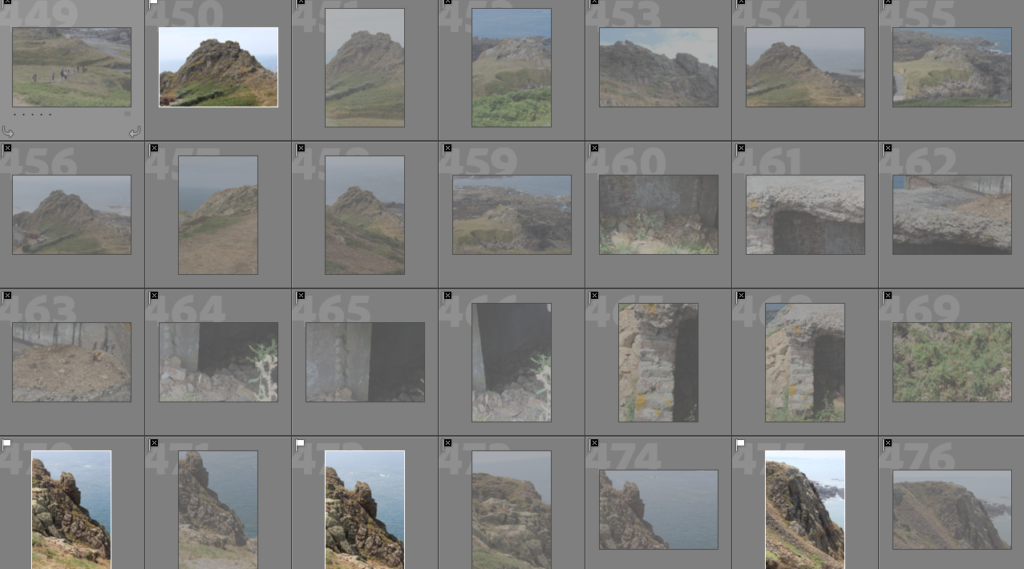
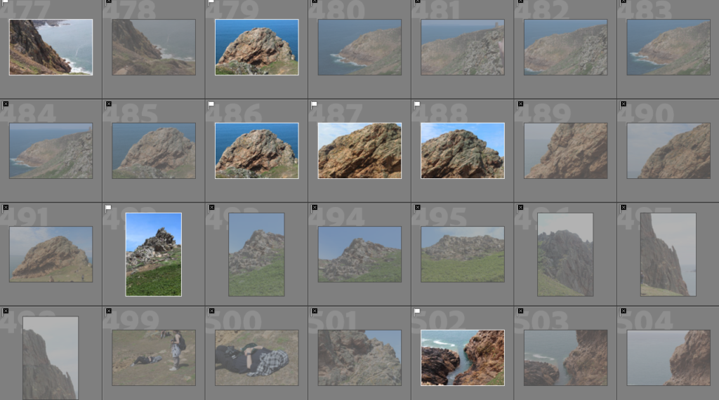
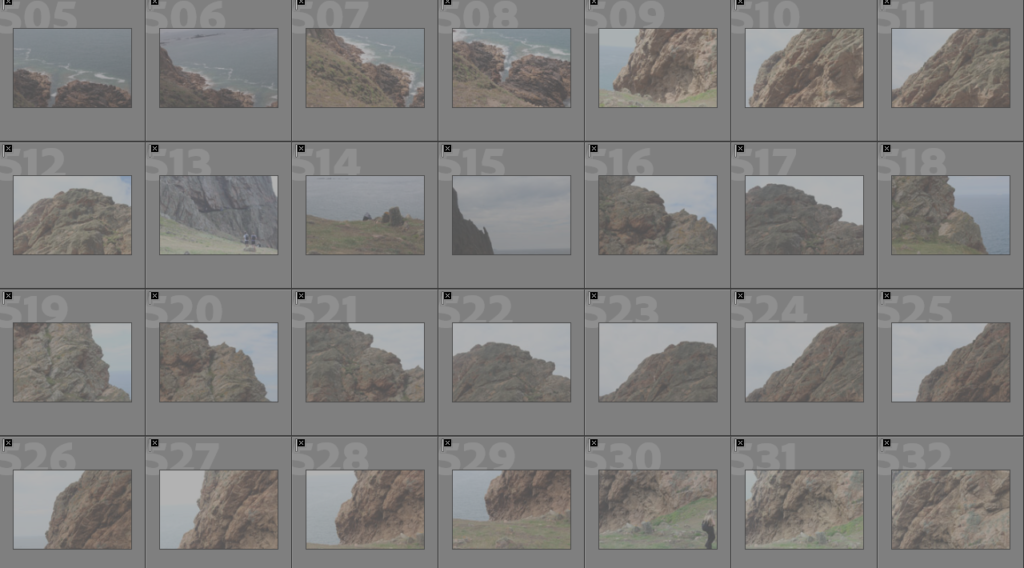
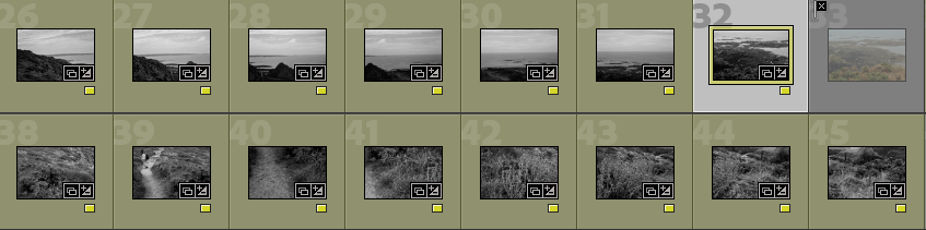
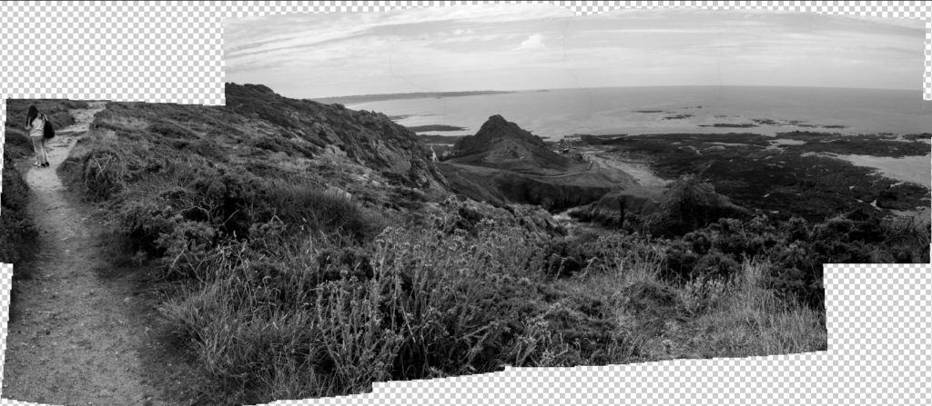
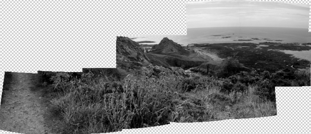
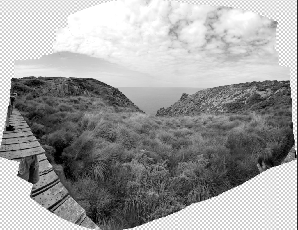
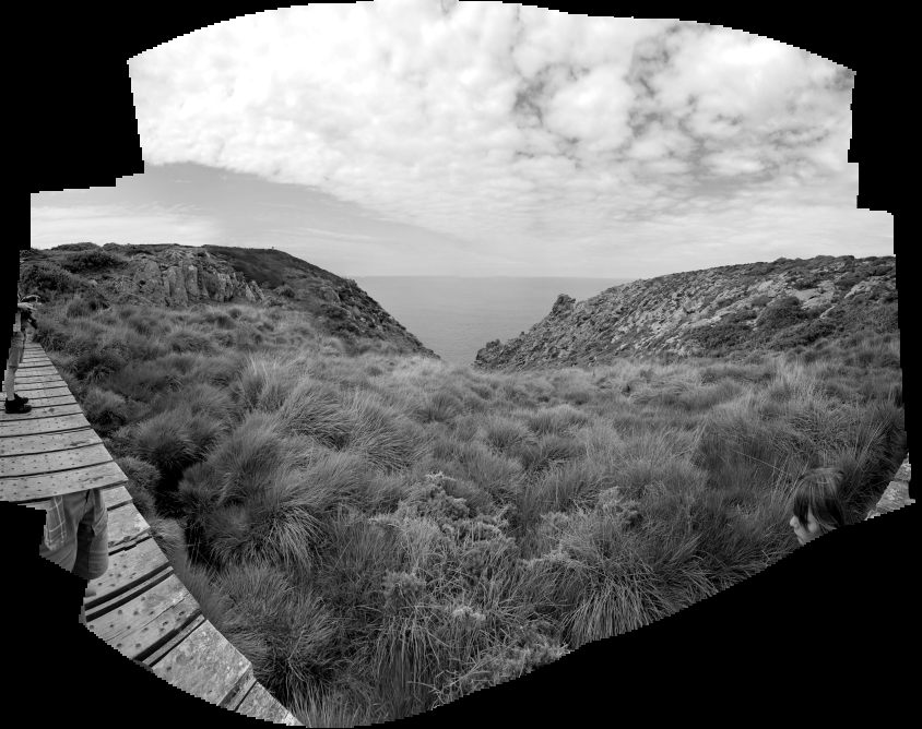
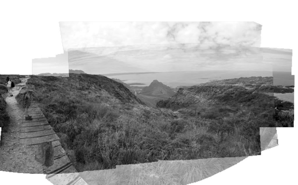
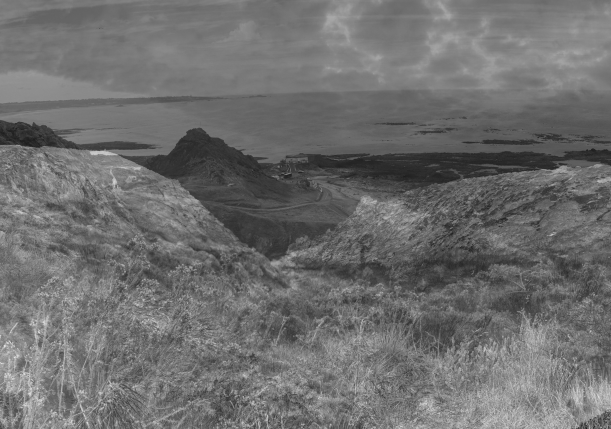
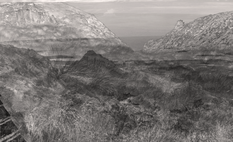
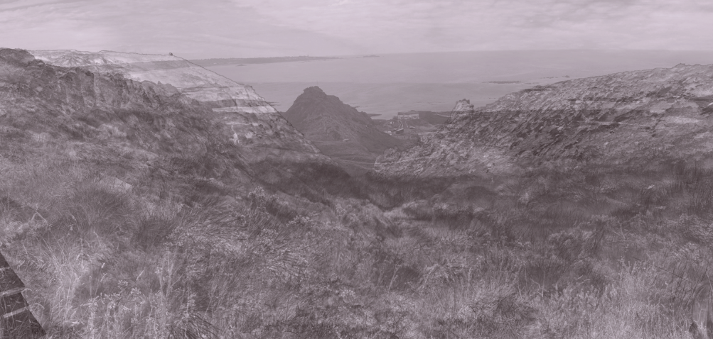
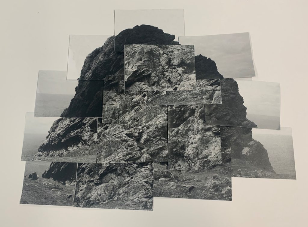
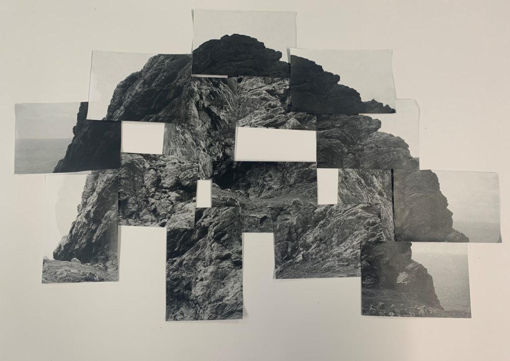
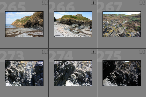
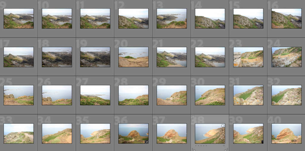
Below I have included some contact sheets displaying the wide variety of images from my L’Etacq shoot, this is important as it gives an indication of how many images I have from each shoot, and helps with the organisation before image sub selection.

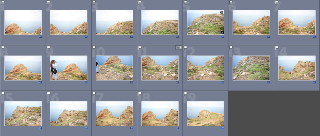
Colour Coding System

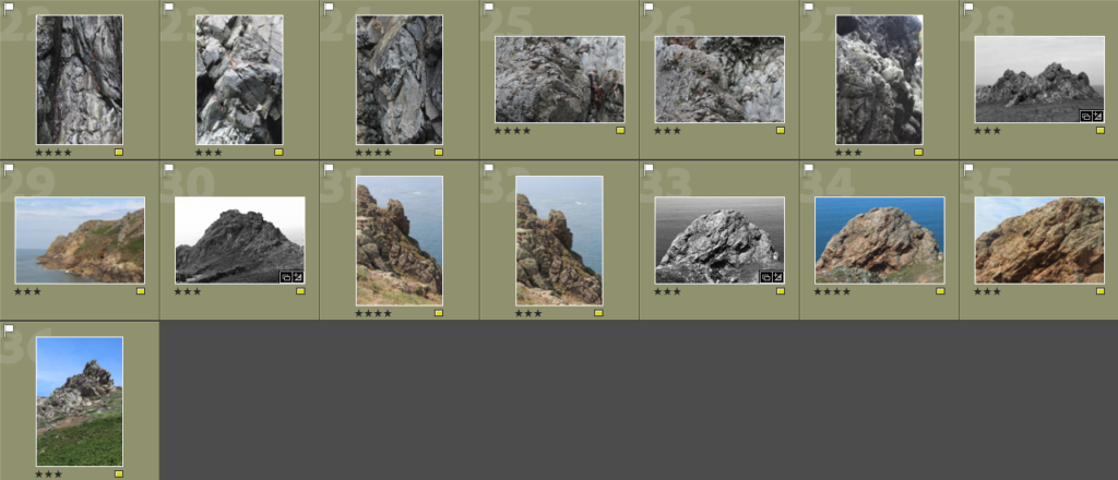
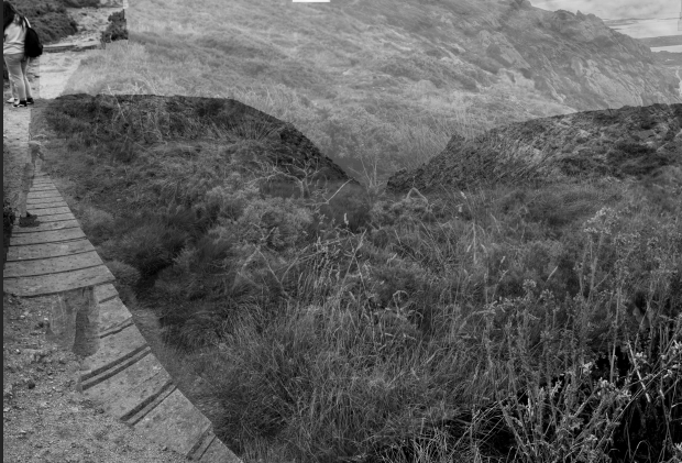
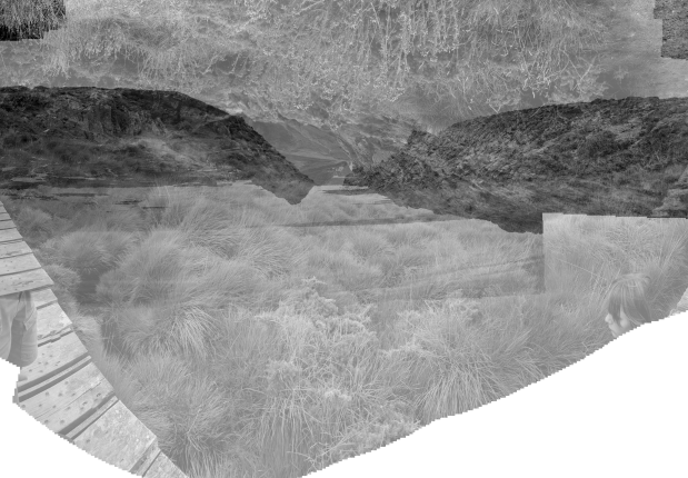
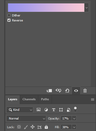
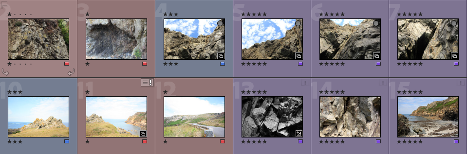
Below I have placed some screenshots of my colour coding my photographs, I have included an explanation of the system and how I have come to the image sub selection process, I really like this system as it ensures that I have a clear plan in my mind of which images I am going to edit. It also helps me predict my final images just from looking through them in Lightroom.

  • Purple- Best images
  • Blue- Average images
  • Red- Not so good images

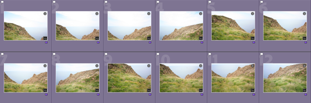
Best Images after Sub Selection

There I have taken some of the images from my ‘purple’ selection above and placed them in a gallery so that they can be more easily viewed, this also helps me consider whether or not they could be displayed as 9 images or just individually. Furthermore, this is before the editing process so lots of these photographs could be made to be of a higher quality afterwards.

Editing

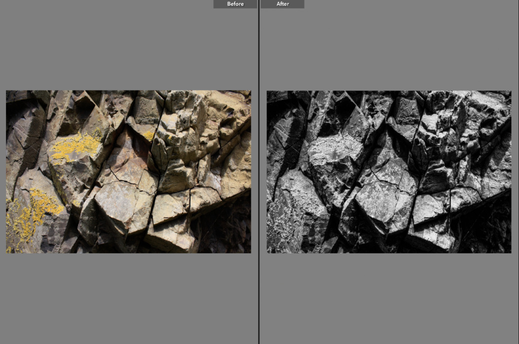
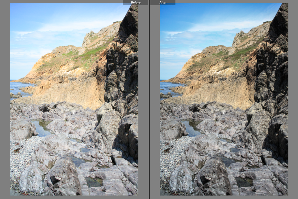
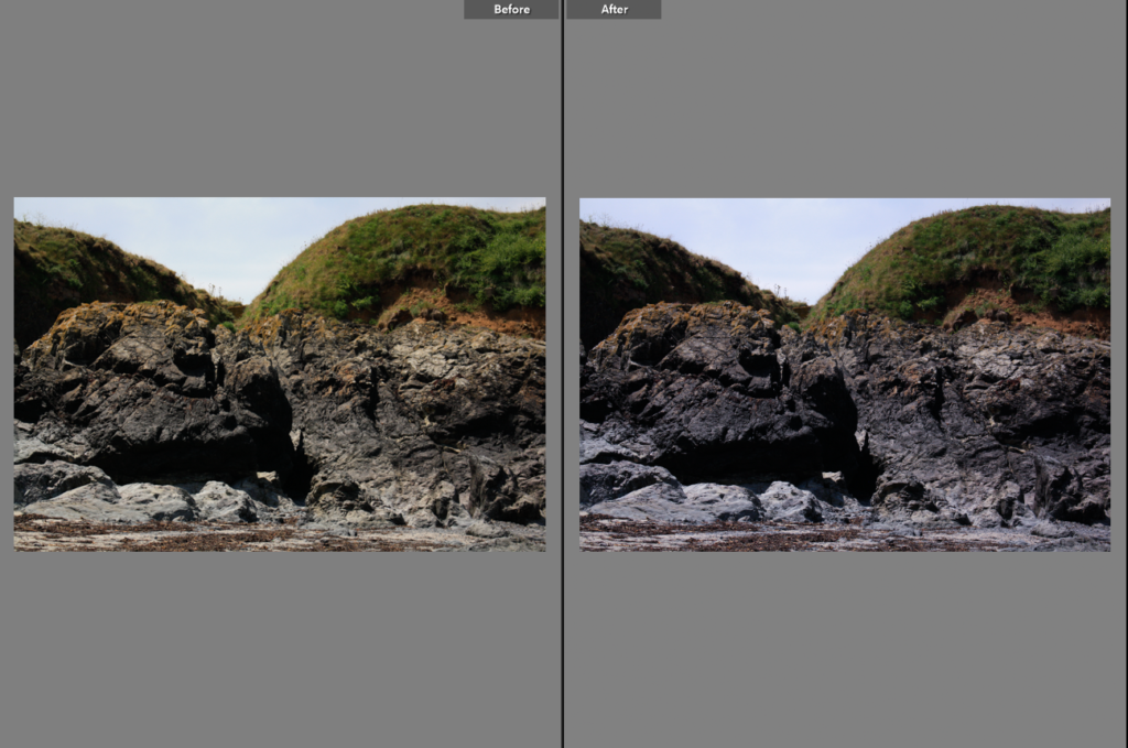
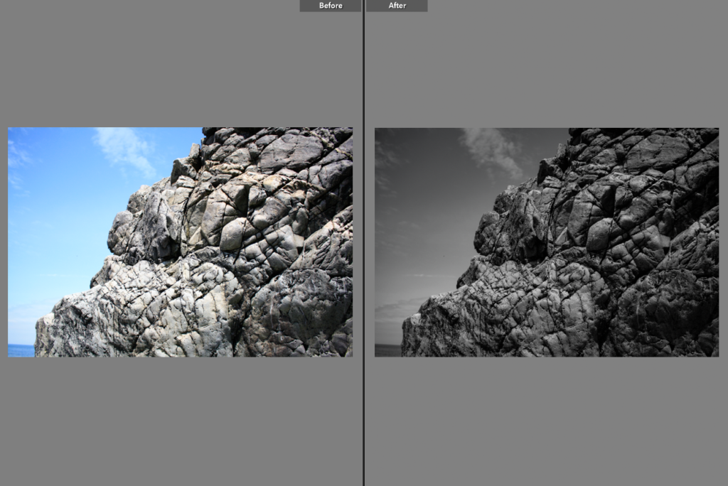
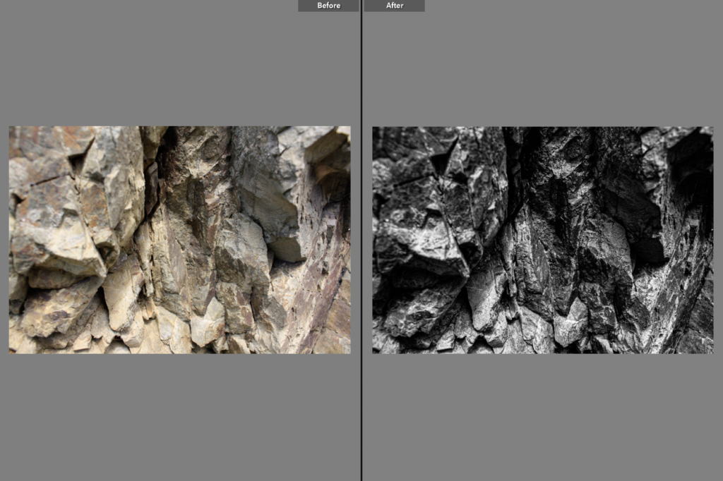
Below I have included before and afters of all of the images that I have decided to edit, I think that for the most part these images came out very well, I think I didn’t end up with a wide range of good images to edit, however I think the ones that I have are of good clarity and some exposures have been edited so that the images are more legible. Furthermore, I think that changing the undertones of the images to make them appear cooler/ warmer gives them a greater effect.

Final Images/ Analysis and Critique

For my final images I have decided that these are my best options, I have included evaluations for each of my images, with explanations for each stating the strengths and weakness of each.

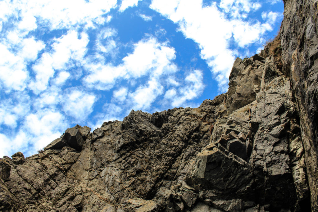
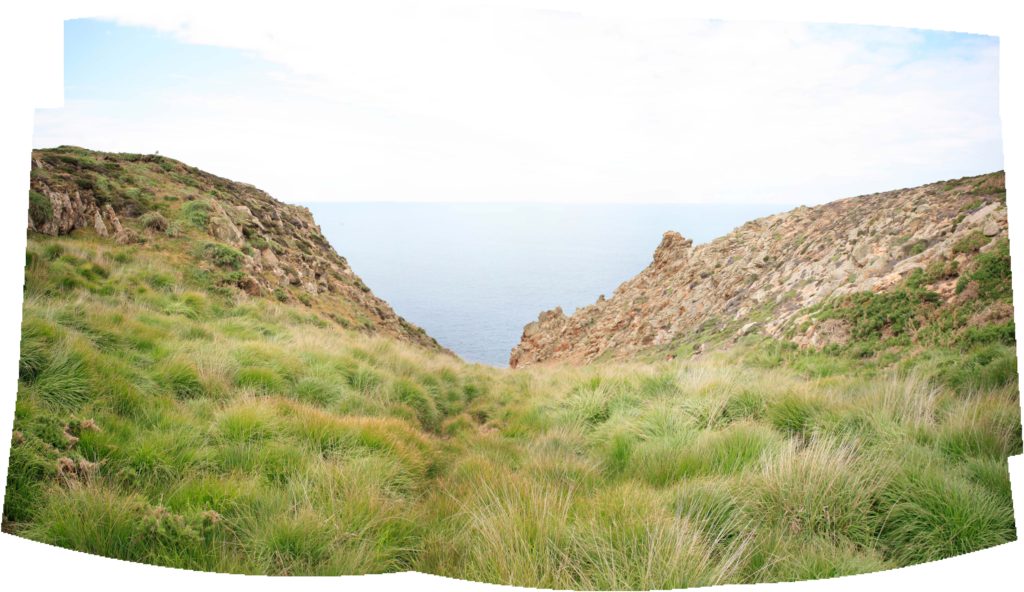
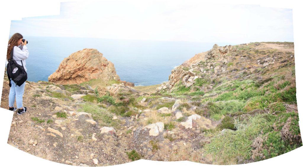
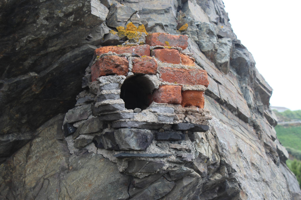
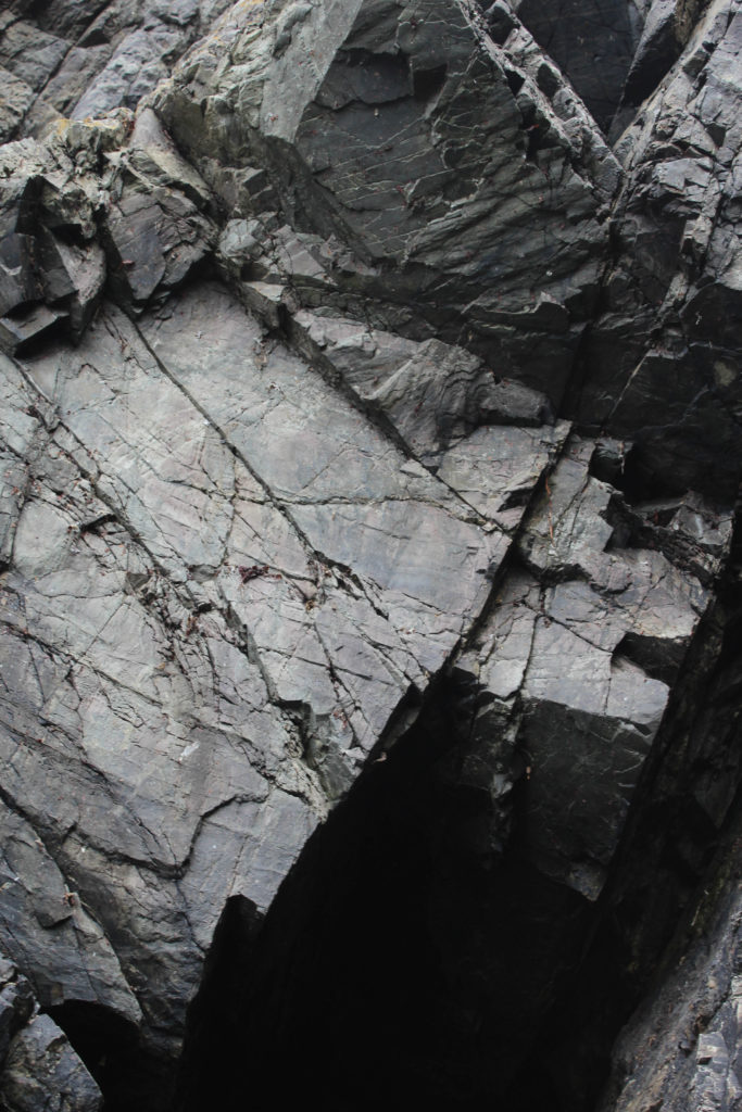
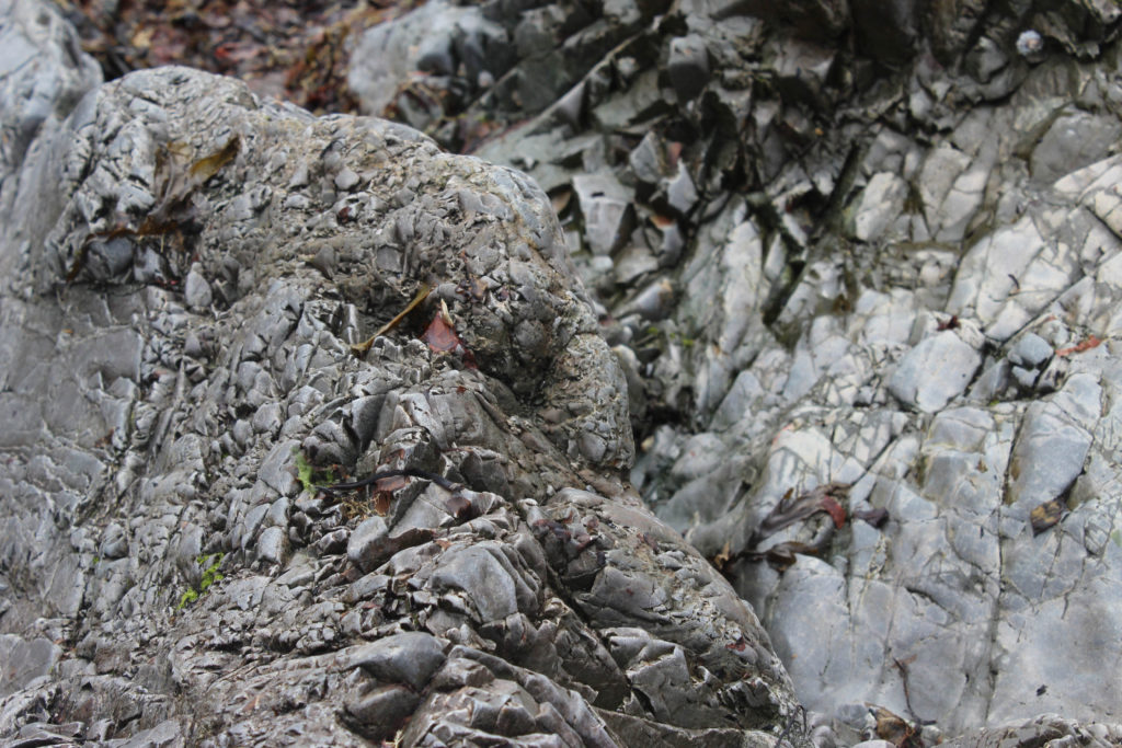
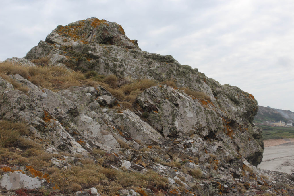
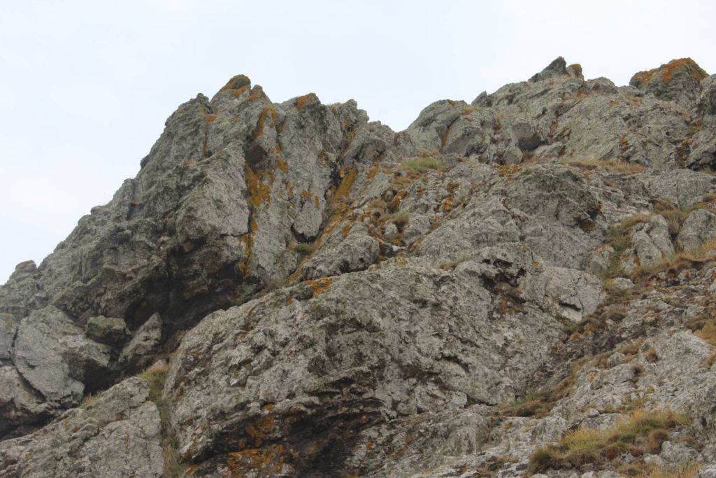
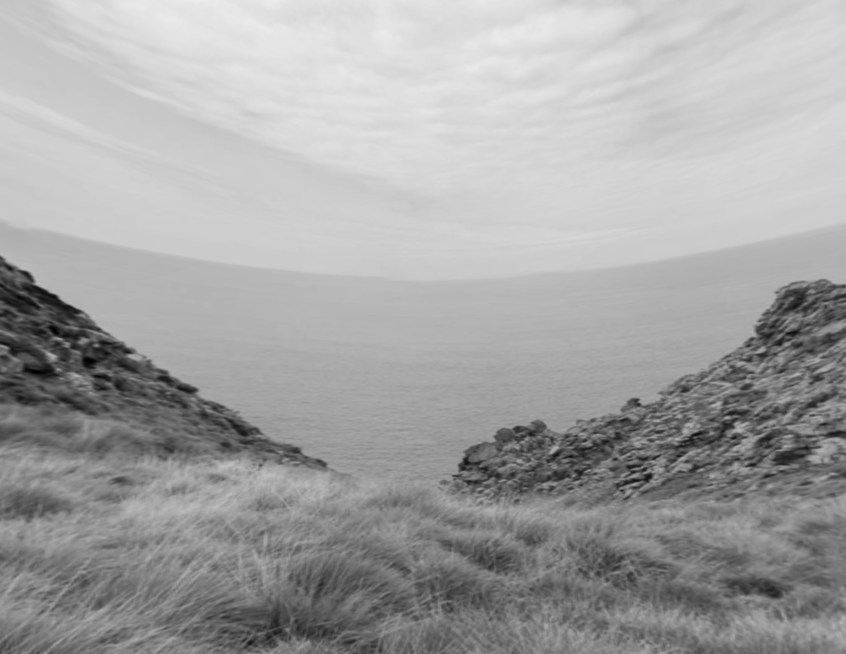
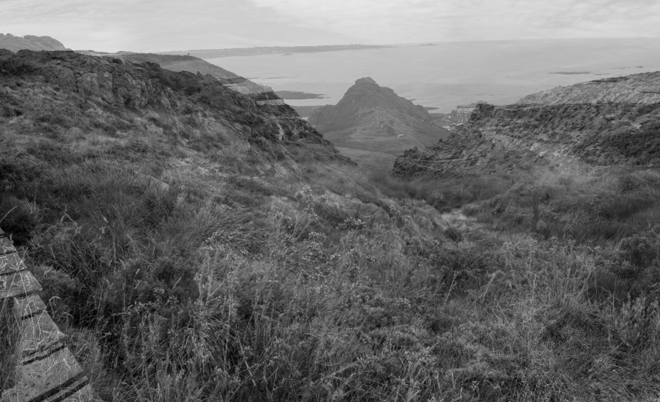
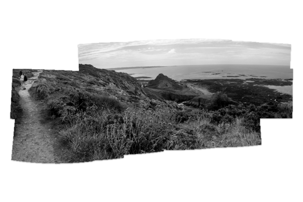
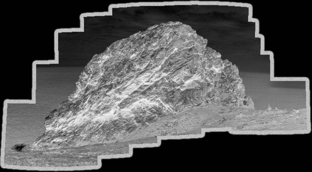
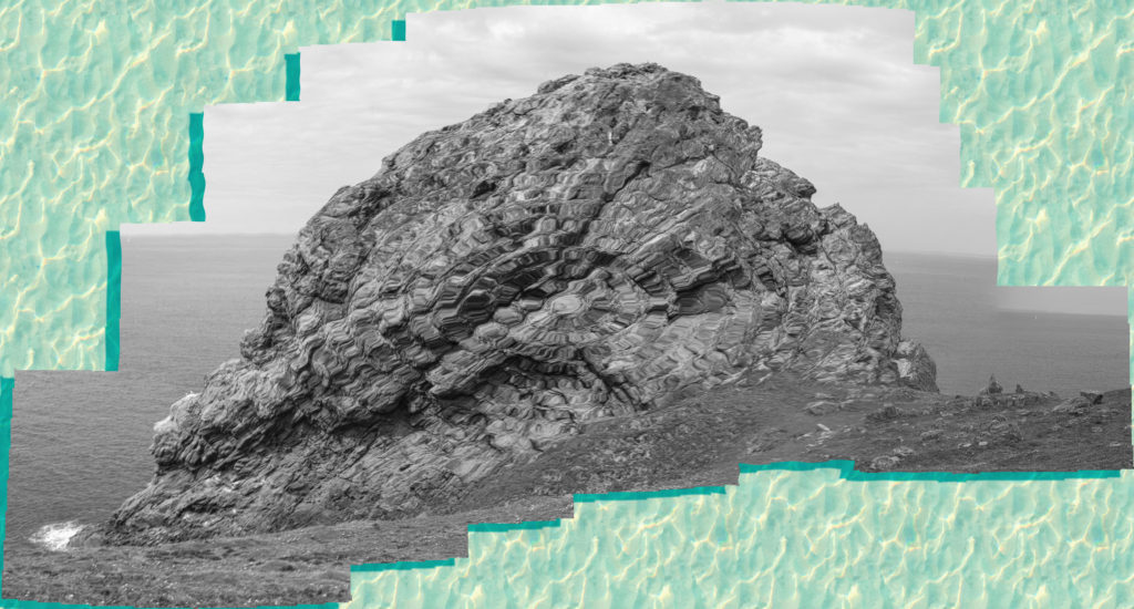
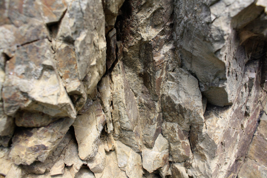
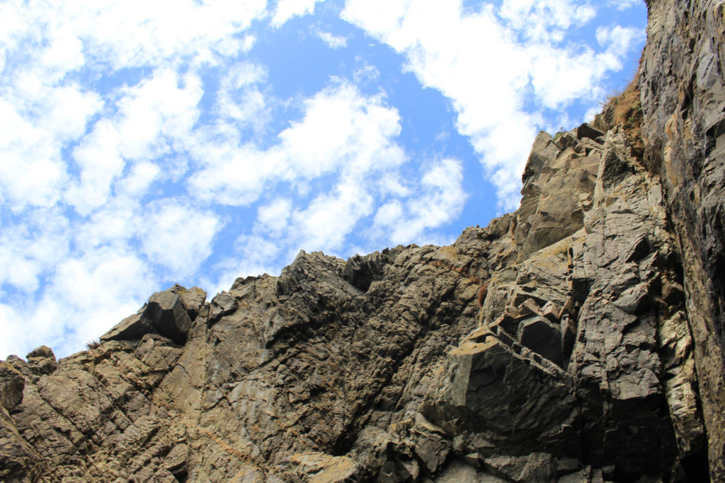
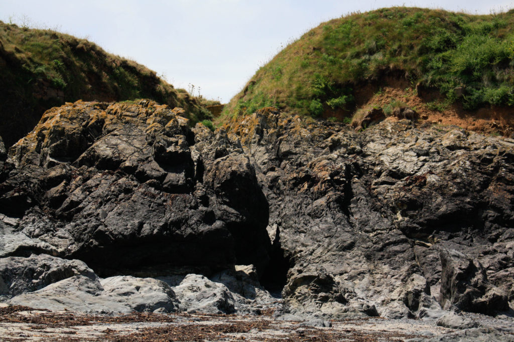
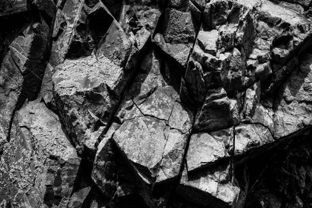
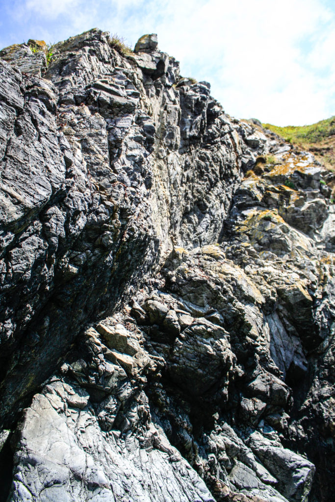
I have selected this as one of my final images from this L’Etacq shoot as I think that there is many interesting components to this image. Firstly, I think that there is lots of contrast between the rocks and the sky, as I have increased the saturation in order to enhance this. This effect is created by the interesting perspective of the photograph, as I took the image from the beach, looking up to the rocks and the sky. I like that this means that half of this image if rock and half is sky, and also the fact that each rock is visible in the image as the clarity is very high. Furthermore, throughout the photograph there is lots of texture created by the clear view of the rocks, this creates more depth of field within the piece.

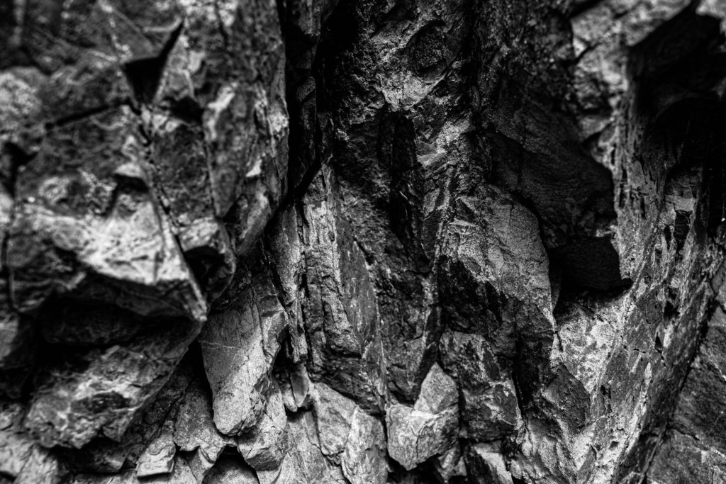
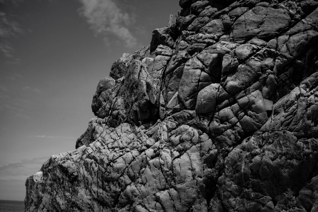
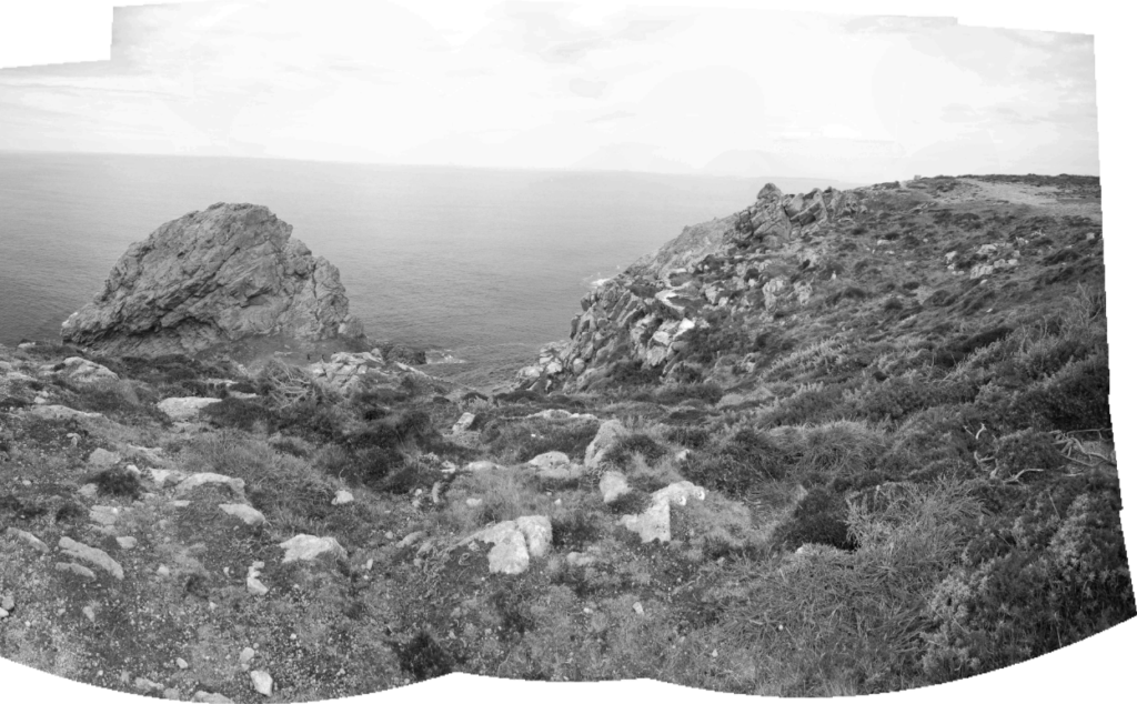
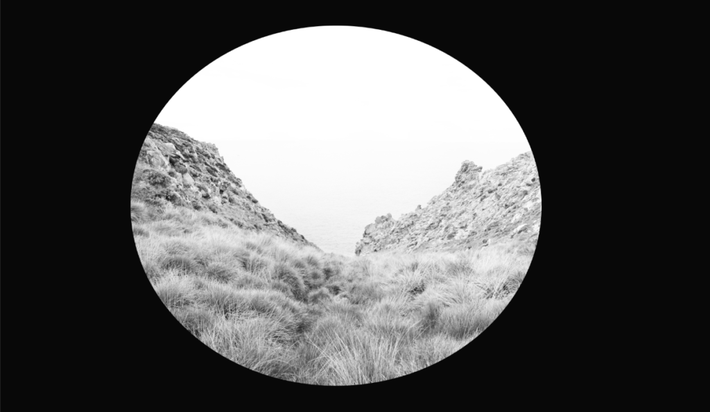
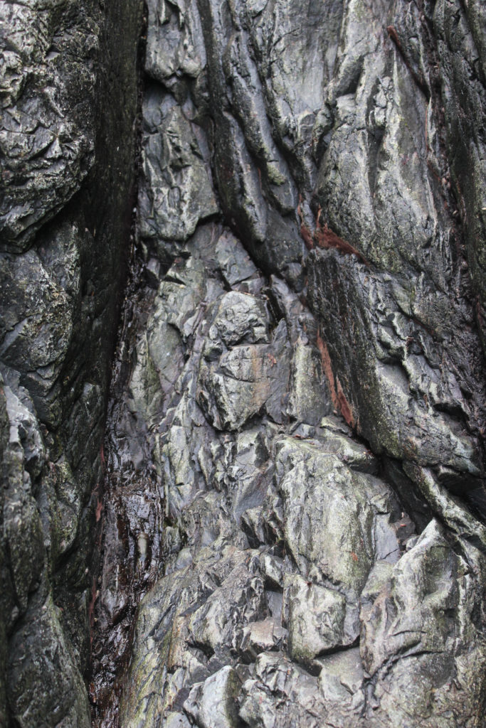
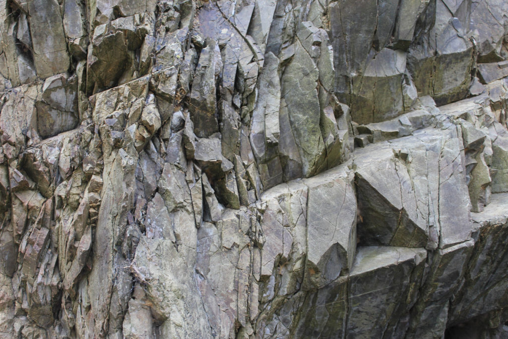
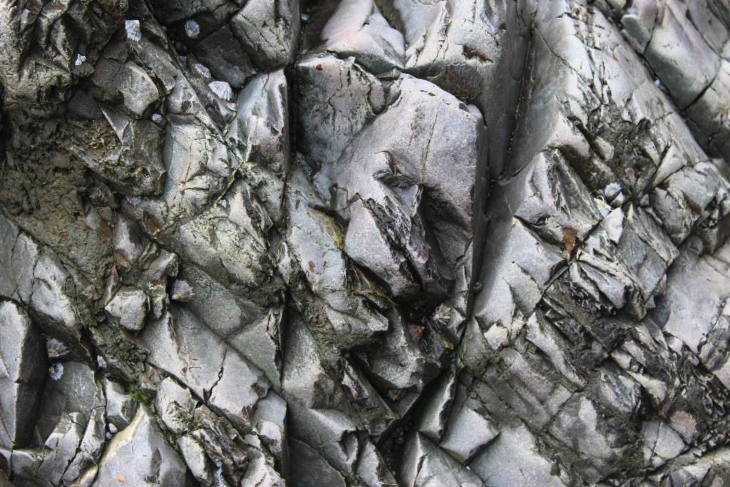
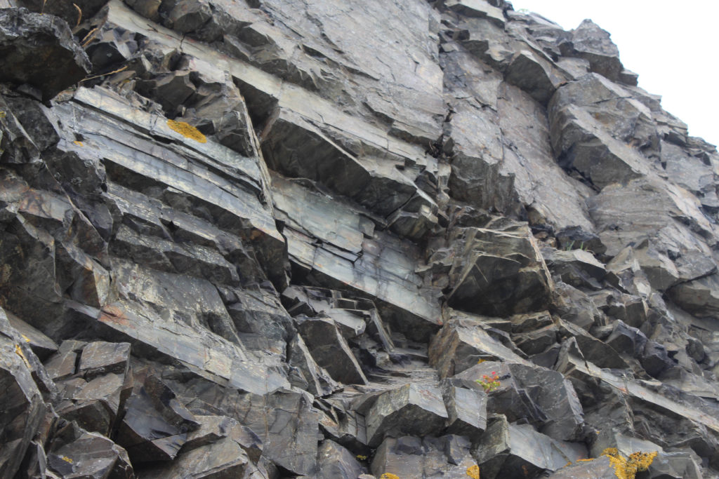
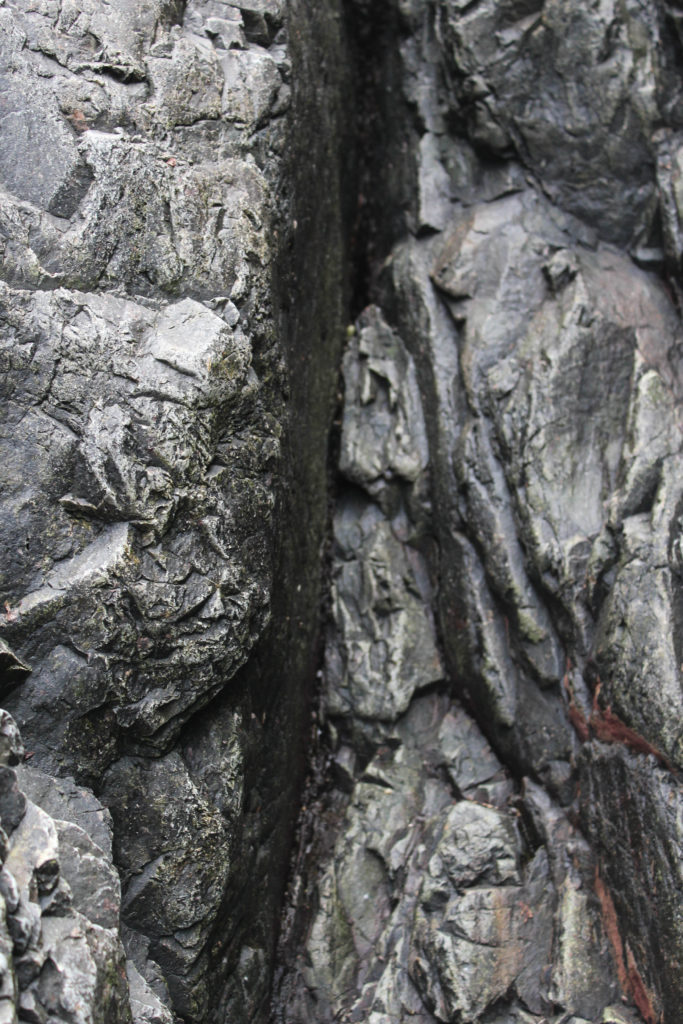
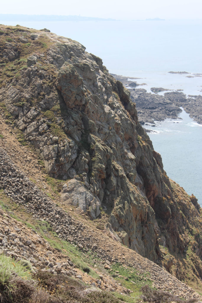
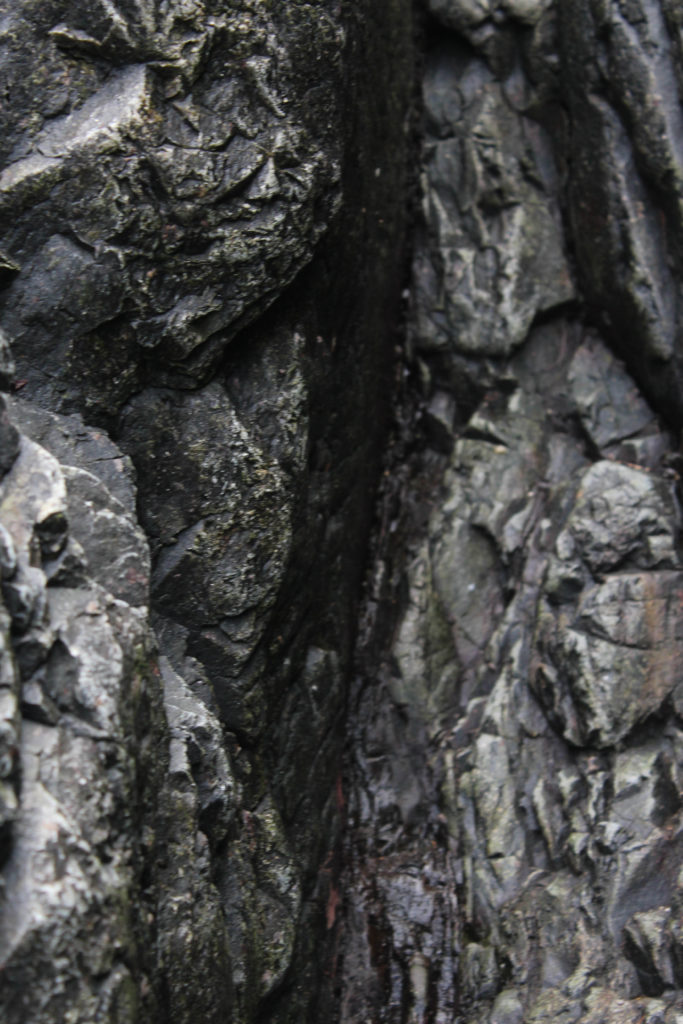
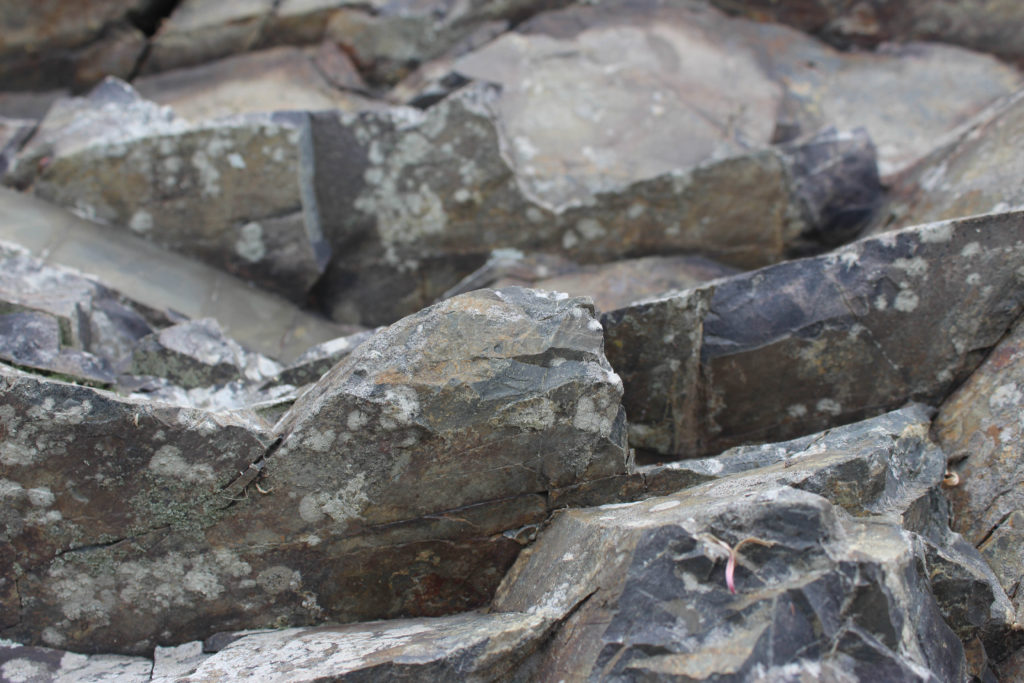
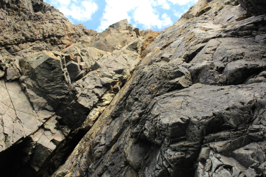
I have put all three of these final pieces together, arranged in this order as I think that if they were printed out onto materials such as foamboard they would look best this way. The most prominent feature of all of these images is the high contrast and increased clarity. They have all been edited to black and white so that this is more obvious, and I think that these are my most successful three images as they all link well, with the bottom one being slightly different yet still being linked through the ‘My Rock’ project. Furthermore, its important the note that the perceptive all of these images makes them more unique and I think this adds to the successfulness of these pieces. Alternatively, they could be viewed as more boring or generic as they are monochromatic, however, I think this reminds us of how old these rocks are.

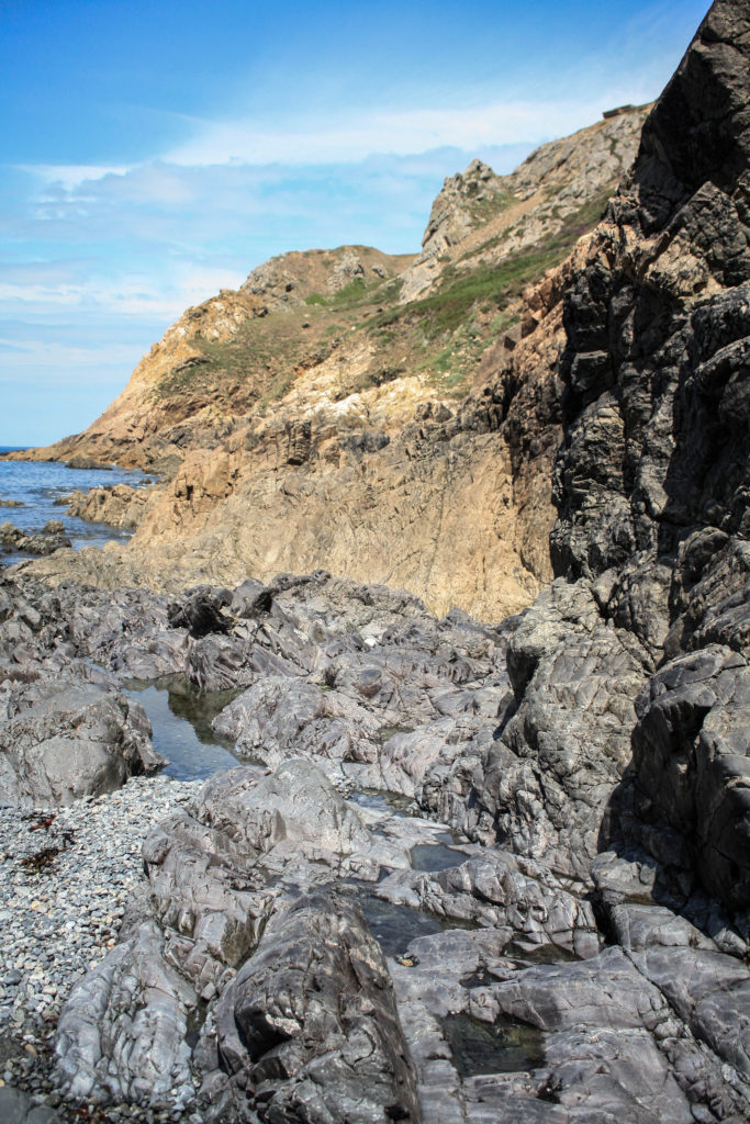
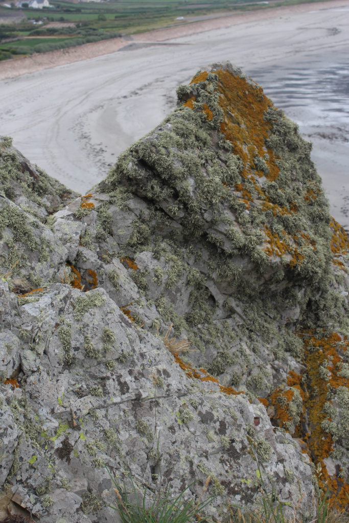
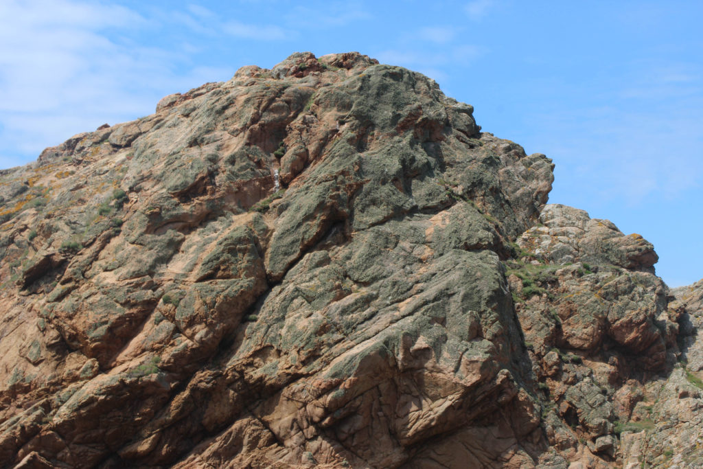
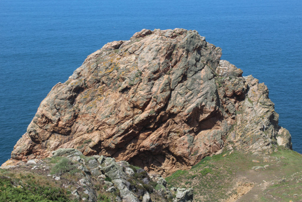
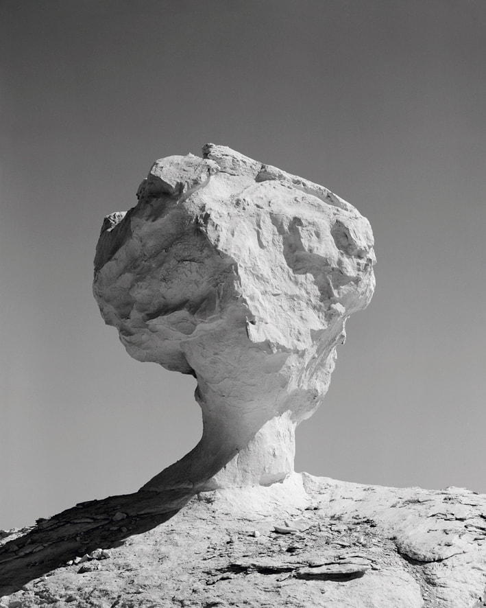
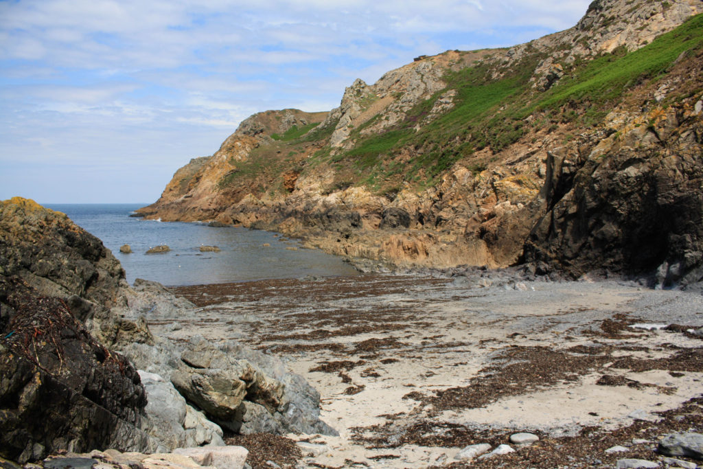
I have selected these as my last final two images as I think they have many similarities and differences. They were both taken at the same Jersey Sit of Special Interest, however features of these photographs such as the tones are very varied, as the one of the left is filled with warm yellow and green tones with nicely contrast with the greys in the foreground of this image. Alternatively, the one on the right is filled with cooler toned greys throughout the whole image with spots of colours such as the green in the background. However, I think that the clarity of these images could hinder there successfulness, as most of the increased clarity’s had to be increased through editing and weren’t part of the original images.

joiner experimentation

Process

Below I have included some images to help explain the process of how to produce a joiners, inspired by David Hockney’s work. Using Photoshop and the images selected from Lightroom, we used the Photomerge tool to digitally create the joiners. The main advantage of this process is that it’s quick and creates effective joiners as long as long as you use legible photographs.

Outcomes

To make the joiner we had to create a quick collection in Lightroom, creating the folder make it easier to export the images into Photoshop to create the joiners. Below I have added some contact sheets so that the process is more visual.

Joiner Collection

Evaluation: This outcome was created from good original images, the main disadvantage of this piece of its composition. As the angle of the image could be viewed as boring along with the fact that someone is in the joiner, meaning it distracts from the focus of the Sight of Special Interest. Despite this piece not being fully natural, the La Pinacle being in the background means that there is some variety within the piece. The photographs matching up perfectly means that the details in features such as the horizon and rocks aren’t lost.

Quick Collection

Critique: This joiner looks very much like my other one, which could be seen as a negative as there isn’t much variation in my work. Furthermore, I think these piece is a little over exposed and the fact that the angle captures more of the ground then the sky and rocks means that all you can see is grass. Despite this, the images used to create this are very legible meaning that the final piece turns out clear and aesthetic.

Joiner Collection

I think that this joiner is one of my best, as the warmer tones in the joiner adds to it’s effect. However, I think that the fact that there is a missing part in the bottom middle of the image creates a bad focal point for it. Despite this, I feel like with lots of editing this could become a lot more successful joiner as I like the location of Stinky Bay a lot, as I think that this is one of Jersey’s most aesthetic geoparks.

I thought that this would be my best joiner, however it didn’t turn out as successful as I anticipated, I think that the perceptive of this joiner is quite creative, however the final space of the image came out a bit strange and I think that changing the shape through editing wouldn’t fully fix the problems of this joiner.

Experimentation

Below I have taken my joiners and changed them into 3D shapes, I have altered some of their textures to add more depth and variety to my experiments. In my opinion, these make the joiners more fun but don’t really match with David Hockney’s work.

Original Joiner

Edited

I think that this joiner is a lot more successful in black and white, this is because more contrast is created between the actual joiner and the white background. I think that more contrast within the joiner there is, the more successful in the first place.

Original Joiner

Edited

The edit on the right is my favourite of all of my joiners, again there is lots of contrast as I have washed out the joiner by purposefully having a very white sky, this along with the circular shape means that there is lots of focus on the picture itself rather than the background.

Original Joiner

Photoshoot 1: L’Etacq

Closer view of where we went
Large-scale image of where we went

For this photoshoot, we all went on a geo walk along the coastline of L’etacq. We ended up starting around the carpark area, mainly capturing the big rock that is central in this image. After that was captured, we ended up strolling along the coast down to stinky bay. After taking photos down in the bay, we walked back up and proceeded to where the hills were to where we all ended up walking up them and walking along the hills to capture more images of the large-scale rocks.

The aim of this walk was to be able to capture what Jersey is as a whole from its rock formations, to capture what it means to live on such a beautifully sculptured service. I wanted to capture this by taking quite a few close ups of the structure and texture of the overall rocks but also to take an image full-scale to capture how extravagant it can be due to its size.

Contact Sheets – flagged and rejected:

Coloured and star rated images:

Green:

Yellow:

Red:

Best shoots from the photoshoot:

Darren Harvey Regan

Melding photograph and sculpture, Darren Harvey-Regan (b.1974, England) works in the liminal space where flat representation ends, and three-dimensional object begins. And with the photographic medium straddling object and representation simultaneously, such a place seems an astute location for Harvey-Regan to examine where the two meet. Perplexing, and at times humorous, his photographs act as the subject of his scrutiny but importantly also as the tool that he uses to carry out his procedure, constantly attempting to free himself from the constraints of photographic representation.

The Erratics (Exposure 3) – 2015

Darren Harvey-Regan is a graduate of the Royal College of Art. His work has appeared in exhibitions and publications internationally and is part of the permanent photography collection at the V & A Museum, London.

The Erratics (Exposure 4) – 2015

The Erratics

Harvey-Regan’s put together a collection of his images, displaying them all in a photobook named ‘The Erratics’.

Photobook: The Erratics

In geology an erratic is a rock that differs in type from those around it, having been carried over large distances by long-vanished glaciers. Harvey-Regan’s eponymous series questions the medium of photography and its ability to extract from contexts and alter perception.

Originating in the artist’s desire to liberate himself from the weight of representational imagery – a yearning for abstraction – alongside a converse desire to engage with appearances as only photography can, The Erratics began as a series of large format photographs in the Egyptian desert, capturing chalk monoliths in the most objective manner possible. These images were followed by months of meticulously carving and photographing chalk rocks in the studio, forcing a geometry and line to shape the objects towards the photographic surfaces they eventually become. 

The Erratics combines these sets of images within a new text work by Harvey-Regan that explores how the processes and concerns within the work might be further expressed and shaped through the act of writing.

Darren Harvey-Regan’s Photo Gallery

David Hockney

One of Hockney’s most famous joiners, ‘Pearblossom Highway’, which consisting of around 800 pictures. Every photo for this image was taken at completely different viewpoints, not just one central one. He took photos from all different positions such as up, down, sideways etc. Hockney ended up taking close ups of areas, as to make the viewer feel close and involved with the photograph. Hockney’s friends ended up thinking that this image was a painting rather than photography.

Pearblossom Highway

David Hockney (born 9 July 1937) is an English painter, draftsman, printmaker, stage designer, and photographer. As an important contributor to the pop art movement of the 1960s, he is considered one of the most influential British artists of the 20th century.

Hockney has owned residences and studios in Bridlington, and London, as well as two residences in California, where he has lived intermittently since 1964: one in the Hollywood Hills, one in Malibu, and an office and archives on Santa Monica Boulevard in West Hollywood, California.

On 15 November 2018, Hockney’s 1972 work ‘Portrait of an Artist (Pool with Two Figures)‘ sold at Christie’s auction house in New York City for $90 million (£70 million), becoming the most expensive artwork by a living artist sold at auction. This broke the previous record, set by the 2013 sale of Jeff Koons’ Balloon Dog (Orange) for $58.4 million. Hockney held this record until 15 May 2019 when Koons reclaimed the honour selling his ‘Rabbit‘ for more than $91 million at Christie’s in New York.

We Two Boys Together Clinging (1961)

David Hockney was originally famous for his paintings rather than his photography. He always returned to painting portraits throughout his career. From 1968, and for the next few years, he painted portraits and double portraits of friends, lovers, and relatives just under life-size in a realistic style that adroitly captured the likenesses of his subjects.

David Hockney’s Joiners

In the early 1980s, Hockney began to produce photo collages—which in his early explorations within his personal photo albums he referred to as “joiners” – first using Polaroid prints and subsequently 35mm, commercially processed colour prints. Using Polaroid snaps or photolab-prints of a single subject, Hockney arranged a patchwork to make a composite image. Because the photographs are taken from different perspectives and at slightly different times, the result is work that has an affinity with Cubism, one of Hockney’s major aims—discussing the way human vision works. Some pieces are landscapes, such as ‘Pearblossom Highway #2‘, others portraits, such as Kasmin 1982, and ‘My Mother, Bolton Abbey, 1982‘.

Creation of the “joiners” occurred accidentally. He noticed in the late sixties that photographers were using cameras with wide-angle lenses. He did not like these photographs because they looked somewhat distorted. While working on a painting of a living room and terrace in Los Angeles, he took Polaroid shots of the living room and glued them together, not intending for them to be a composition on their own. On looking at the final composition, he realised it created a narrative, as if the viewer moved through the room. He began to work more with photography after this discovery and stopped painting for a while to exclusively pursue this new technique.

Hockney has experimented with painting, drawing, printmaking, watercolours, photography, and many other media including a fax machine, paper pulp, computer applications and iPad drawing programs. The subject matter of interest ranges from still lifes to landscapes, portraits of friends, his dogs, and stage designs for the Royal Court Theatre, Glyndebourne, and the Metropolitan Opera in New York City.

One of David Hockney’s joiners

Over time, however, he discovered what he could not capture with a lens, saying: “Photography seems to be rather good at portraiture, or can be. But, it can’t tell you about space, which is the essence of landscape. For me anyway. Even Ansel Adams can’t quite prepare you for what Yosemite looks like when you go through that tunnel and you come out the other side.” Frustrated with the limitations of photography and its ‘one-eyed’ approach, he returned to painting.

The Crossword Puzzle

This was one of Hockney’s famous joiners named ‘The Crossword Puzzle’. It was a photograph of two of Hockney’s close friends and every photo taken of them was taken at a different time. He wanted to showcase the variety of emotions highlighted over a certain period of time. He quoted ‘The space is the illusion, but the time is not an illusion’. Also stating that ‘It’s real and accounted for in the number of pictures’, ‘You know it took time to take them, wait for them, put them down’. He explains how time is obviously highlighted throughout the process and the image itself as it displays the different amounts of emotions.

He explains more about the ‘Crossword Puzzle’ photograph in this video.

artist references

David Hockney

David Hockney (born 9 July 1937) is an English painter, draftsman, printmaker, stage designer, and photographer. As an important contributor to the pop art movement of the 1960s, he is considered one of the most influential British artists of the 20th century.

At the Royal College of Art, Hockney featured in the exhibition Young Contemporaries – alongside Peter Blake – that announced the arrival of British Pop art. He was associated with the movement, but his early works display expressionist elements, similar to some works by Francis Bacon. When the RCA said it would not let him graduate if he did not complete an assignment of a life drawing of a live model in 1962, Hockney painted Life aPainting for a Diploma in protest.

Hockney has experimented with painting, drawing, printmaking, watercolours, photography, and many other media including a fax machine, paper pulp, computer applications and iPad drawing programs. The subject matter of interest ranges from still lifes to landscapes, portraits of friends, his dogs, and stage designs for the Royal Court Theatre, Glyndebourne, and the Metropolitan Opera in New York City.

David Hockney auction record broken twice as paintings fetch almost £30m in  New York

David Hockney has been featured in over 400 solo exhibitions and over 500 group exhibitions. He had his first one-man show at Kasmin Limited when he was 26 in 1963, and by 1970 the Whitechapel Gallery in London had organised the first of several major retrospectives, which subsequently travelled to three European institutions. LACMA also hosted a retrospective exhibition in 1988 which travelled to The Met, New York, and Tate, London.

Joiners

What are joiners? a single image made up of multiple overlapping images. It is a photo collage, but not a traditional collage in which different photos are simply arranged together to form a patchwork piece. A joiner photo tells a single story. It is a composite of a single scene or subject made from multiple photos.

What makes a good joiner? He called these collages and photo montages joiners. This distinctive approach to image making was a reflection of Hockney’s dislike for photographs executed with a wide-angle lens. By creating his joiners, Hockney sought to reflect the process of seeing, creating a narrative based around visual experience.

Hockney’s Work

How did Hockney create his first joiner? He called these collages and photo montages joiners. This distinctive approach to image making was a reflection of Hockney’s dislike for photographs executed with a wide-angle lens. By creating his joiners, Hockney sought to reflect the process of seeing, creating a narrative based around visual experience.

Image Analysis: The neutral tones in this image give it a very subtle atmosphere, I think that the brown tones in the foreground and the lighter blue sky in the background, separated with a lot of land, make for an interesting composition for this joiner. I like the fact that you can see the original paintings, especially in the sky of this joiner, as i think that it adds a lot of depth and texture to this image, meaning it cannot be viewed as boring. Furthermore, I think that the perspective of the image is important to note, as it creates a different feel to the piece as objects such as the yellow and red sign become more eye-catching. This image is one of my favourites out of Hockney’s work as it carries more significant being the first joiner ever created, and additionally it made a huge impact on the photography community.

Emily Allchurch

Emily Allchurch, born 1974 in Jersey, Channel Islands, lives and works in Hastings, East Sussex. She trained as a sculptor, receiving a First Class (Hons.) degree in Fine Art from the Kent Institute of Art & Design – Canterbury in 1996, and an MA from the Royal College of Art in 1999, where she began working with photography as a material. Since then, she has exhibited regularly in solo and group shows in the UK and internationally.

Allchurch uses photography and digital collage to reconstruct Old Master paintings and prints to create contemporary narratives. Her starting point is an intensive encounter with a city or place, to absorb an impression and gather a huge image library. From this resource, hundreds of photographs are selected and meticulously spliced together to create a seamless new ‘fictional’ space. Each artwork re-presents this journey, compressed into a single scene. The resulting photographic collages have a resonance with place, history and culture, and deal with the passage of time and the changes to a landscape, fusing contemporary life with a sense of history. 

Emily Allchurch — GBS Fine Art

Her works are held in public and private collections worldwide, with a complete set of her Tokyo Story series in the permanent collection of the Minneapolis Institute of Arts, with a further set in the collection of Fidelty in Tokyo. In 2020, the Museum of London acquired a lightbox version of Babel London (after Breugel) to go on permanent display, when it opens at its new site in West Smithfields in 2025.

Her Work

What I like about her work: I think that her work is very unique, there is common theme throughout her work, which is creating building’s into painted joiners. Furthermore, I think that the fact that her work is easily identifiable means that her name is more widely known. In all of these pieces there is significant contrast between the buildings and the sky, with the buildings all containing bright colours and then the sky blending to cooler blues and greys, creating contrast between warmer and cooler toned colours, and adding a wide variety of colours to her work.

Image Analysis

This is one of my favourite image out of Emily Allchurch’s work, this is because of many components in the image, the first is the wide variety of colours and textures throughout the piece. With the bricks in the building with all of the heavy detail contrasting with the stale blue sky in the background, the lack of texture makes the building more eye catching and it more apparent that its the focal point for the image. Furthermore, I think that the composition of the joiner is significant as its a very busy piece, as the building is filled with depth, the foreground is filled with other aspects such as natural component such as people. This created more contrast and adds depth of field to the image.

Geoparks – Contextual study

What are Geoparks?

UNESCO Global Geoparks are single, unified geographical areas where sites and landscapes of international geological significance are managed with a holistic concept of protection, education and sustainable development. A UNESCO Global Geopark uses its geological heritage, in connection with all other aspects of the area’s natural and cultural heritage, to enhance awareness and understanding of key issues facing society, such as using our earth’s resources sustainably, mitigating the effects of climate change and reducing natural hazard-related risks.

By raising awareness of the importance of the area’s geological heritage in history and society today, UNESCO Global Geoparks give local people a sense of pride in their region and strengthen their identification with the area. The creation of innovative local enterprises, new jobs and high quality training courses is stimulated as new sources of revenue are generated through geotourism, while the geological resources of the area are protected.

UNESCO Global Geoparks empower local communities and give them the opportunity to develop cohesive partnerships with the common goal of promoting the area’s significant geological processes, features, periods of time, historical themes linked to geology, or outstanding geological beauty. UNESCO Global Geoparks are established through a bottom-up process involving all relevant local and regional stakeholders and authorities in the area

UNESCO Global Geopark Map

The Global Geoparks have until recently been concentrated in Europe and in China, but the last few years have seen the geoparks initiative spread worldwide so that there are existing UNESCO Global Geoparks, or active applications to become UNESCO Global Geoparks, on all continents. The UNESCO Global Geopark information sheets provide detailed information on the UNESCO Global Geoparks in the different countries around the world.

The Geoparks are about ‘more than rocks’ and the UNESCO Global Geoparks celebrate the links between people and the Earth.

In 2022, there were 177 UNESCO Global Geoparks in 46 countries around the world. United Nations Educational, Scientific and Cultural Organization (UNESCO) seeks to build peace through international cooperation in Education, the Sciences and Culture.

—— Jersey Geoparks ——

Jersey in particular is an incredibly strong contender for having exceptional Geoparks, with it’s important cultural heritage and amazing geology.

Jersey Geopark Exhibition

—— Jersey Geopark Map ——

On the Jersey Heritage website, there is a map which pinpoints all of Jersey’s Geosites around the whole island. Showing off every Geological sight of interest that highlights Jersey’s truly beautiful rocks. These rocks are what makes Jersey an incredibly fascinating island.

Map of Jersey’s Bedrock

Geological Sites of Interest

There was then a Jersey Geological Trail guide, produced by Dr. Ralph Nichols and Dr. Hill. It is a beginner’s guide to some lovely beach and cliff sections which reveal Jersey’s geological history. The beauty of Jersey lies in its cliffs, bays and inland valleys. This beauty is the result of the island’s geology, the colour and the different hardness and structure of the rocks, and their response to the changes of climate over the years.

Nichols geology lectures and practicals fascinated him and he felt that he was exceptionally lucky to be taught and inspired by the best Demonstrators, such as Ron Walters, ‘Sarge’ Jenkins and Tony Harris, who later all gained acclaimed doctorates and obtained top professional posts.

Dr. Hill helped Nichols mainly with the illustrations of the guide, highlighting a remarkable variety of rock types and structures exposed in such a small island.

Nichols joined the Geology and Archaeology Sections of La Société Jersiaise, later helping to establish the Jèrriais Section, and also GCSE and A Level Geology and Archaeology courses for night classes at Highlands College of Further Education. This enabled him to learn so much about Jersey which has a greater variety of things natural and historical than he has ever found in such a small area.

Making My Joiners

After selecting my images for my joiners in Yellow and red, I edited one image from a set in the desired way. In this case, it was black and white.

After selecting the one I had just edited, I then selected all of the images for that joiner, then clicked ‘Sync Settings. This edited all of the images in the same way. This was helpful for my joiners with lots of images, which would have been very time-consuming to edit separately.

My final joiner.

Here I tried removing and selecting random images from this joiner to create a different composition.

My second joiner – I like the way the true perspective of the cliffs have been manipulated – this links to the idea of space and perspective that are present in David Hockney’s joiners.

This joiner with a black background.

This is my joiner as a 3D sphere

Here I tried moving parts of my joiner around to create a ripped, disjointed effect.

This was a less successful joiner – I had not taken pictures of the right side and the horizon enough, so the horizon became wonky and blurry.

Here I cropped the joiner at the right, to remove most of the unsuccessful part of the joiner. I then ripped the parts of the joiner up. I don’t think this was that successful as an experiment.

Here I added one joiner on top of another, changing the opacity to show the different landscape underneath.

Experimenting with cropping of multiple exposures.

Different arrangement of multiple exposure.

Turning one joiner upside down and enlarging the two.

Inverting one joiner and enlarging both joiners, different opacities.

Final Joiners

Manual Joiners

In order to make my work seem more like Hockney’s, I decided to make some manual joiners by printing off my photos and rearranging them in in a variety of ways in order to create a new and unique rock. It took some trial and error as some of the pieces looked out of place but eventually I collaged my images in a way I liked and stuck it down.

Some of my ideas and experiments:

Experiment 1
Experiment 2
Experiment 3
Experiment 4
Experiment 5
This image has an empty alt attribute; its file name is image-358-edited.png
Final Joiner

Process + Evaluation :

Final Joiner

I like how my final joiner came out and found the process of making it quite enjoyable but quite time consuming as I didn’t know whether I wanted my photos to line up perfectly and look like the original rock I photographed or whether I wanted to create something new and more abstract but I eventually positioned & angled the photos to create an almost round shape which I found visually interesting. I think the contrast between some of the images helps brings the piece together as it adds more character, the darker shadows blending in to certain aspects of the joiner whilst standing out next to others.

Overall, I think my attempt at making a joiner manually has been successful as I didn’t rely on recreating the original rock into a big photograph but instead created my own image, similar to how Hockney himself does with his own work. There are still aspects I could improve on such as being more careful when sticking down my images as I tended to glue down my photos at an odd angle which led me to have to re-shape parts of the image in order to make it not look out of place. This also led to me smudging a lot of the glue, making it look less professional and a little bit messy. However, I am content with my final piece and enjoyed the process of making it.

MY ROCK: JOINER EVALUATION

Final Outcomes

Evaluation

These are my 3 favourite final outcomes from the edits I created from my joiner of la pinnacle. These are my 3 favourite edits because, I think they are very unique and can easily attract the attention of a viewer from the colours and the filters/editing used to create them. Overall I am very happy with how the original joiner came out, as well as all of the edits that I had created. I was sceptical with how the joiner was going to come out as I did not think I took enough photos for it, but it came out very well. I believe that my edits are very good and I am very happy with them as I believe they are very eye catching to viewers and they are also quite unique edits. Altogether I would give myself an 8/10 on the joiner project. To improve on this project, I would have taken more photos for the joiner, as well as taken joiner pictures of other parts of the landscape to create multiple joiners rather than just a single joiner.