Still life paintings dates far back to Egyptian and Roman times, while still making appearances in the Middle Ages and Renaissance Era. Although, it only became a genre of art after these time periods yet falls quite low on the hierarchy of visual art.
The timeline –
This low placement in the hierarchy of visual art for still life paintings was due to the 1699 historiographer, André Félibien. He created a system of categorisation for the different types of visual arts, starting from the highest than moving down to the lowest. These consisted of:
History Painting
Portraiture
Genre Painting
Landscapes
Still Life
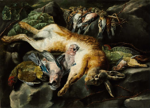
1615 Jacob Van Hulsdonck.
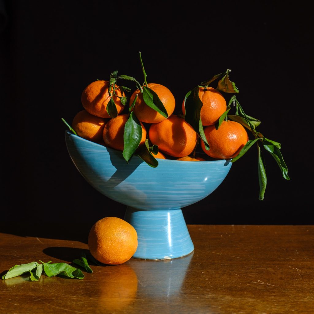
What is a still life?
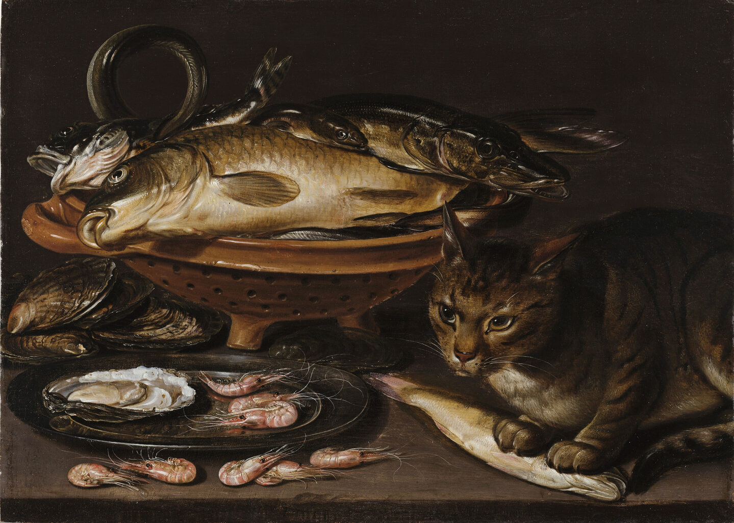
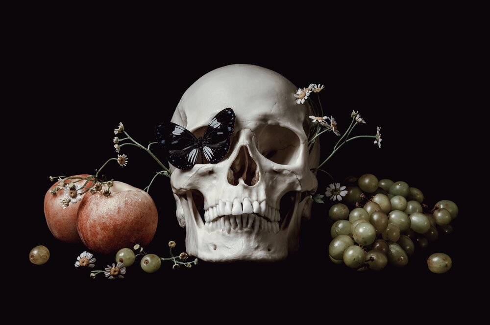
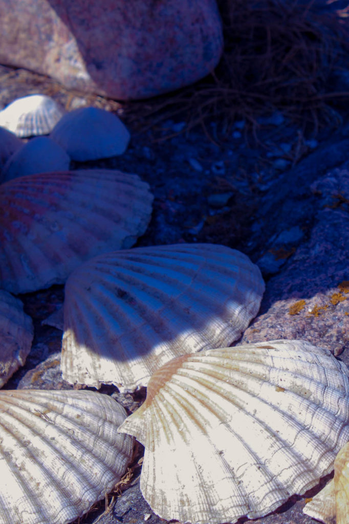
There are various types of still life’s such as flowers, banquets, breakfast, animal and symbolic. The style of Vanitas falls in to the Symbolic category, Vanitas are used to represent life and death, as it means “Vanity” in Latin and shows how life is short and we shouldn’t focus on the materiality side of life as it can be seen as vain. Vanitas may be more recognisable due to their use of skulls, watches and hourglasses which show the passing of life throughout time, they also used dice, wine, fabric, jewels etc in the artworks. Throughout time, Still Life has progressed from Ancient Egyptian to Modern which I will talk about below.
Example of a Vanitas.
Ancient Egyptian
Still Life for Ancient Egyptians included common foods/objects and were used as tombstone decorations. They were used to honour the dead and show what the person may have in the afterlife such as food.
Renaissance still life
Mainly religious artworks in a style with a symbolic meaning. Renaissance Still life were made to explore the natural world through observation which then was used to transform in to a painting and could be found in the backgrounds of religious paintings or illuminated manuscripts, but these were more common in northern Renaissance and Early Netherlandish paintings.
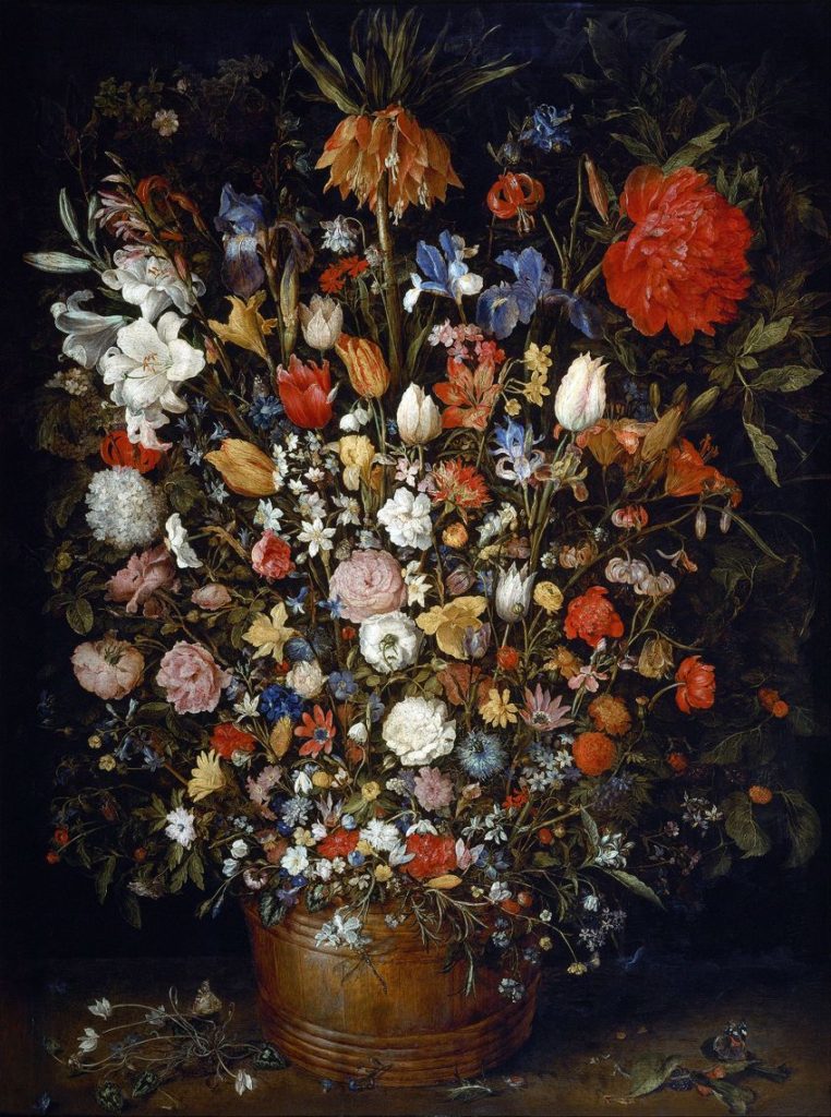
Dutch still life
Originated in the Netherlands or countries referred to as “Low Countries” such as Belgica and the Netherlands. Still Life became very popular during the Dutch Golden Age which was due to the Dutch becoming independent from Spain and creating the Dutch public. Artworks in this time had a specific style which was mainly flowers, and they were favoured as they showed everyday scenes of people and their lives which was relevant during the Protestant revolution throughout this time and this eventually became known as “Dutch Realism”. The common types of Still Life paintings were still popular this time such as Vanitas, florals and everyday still life pieces.
Modern still life
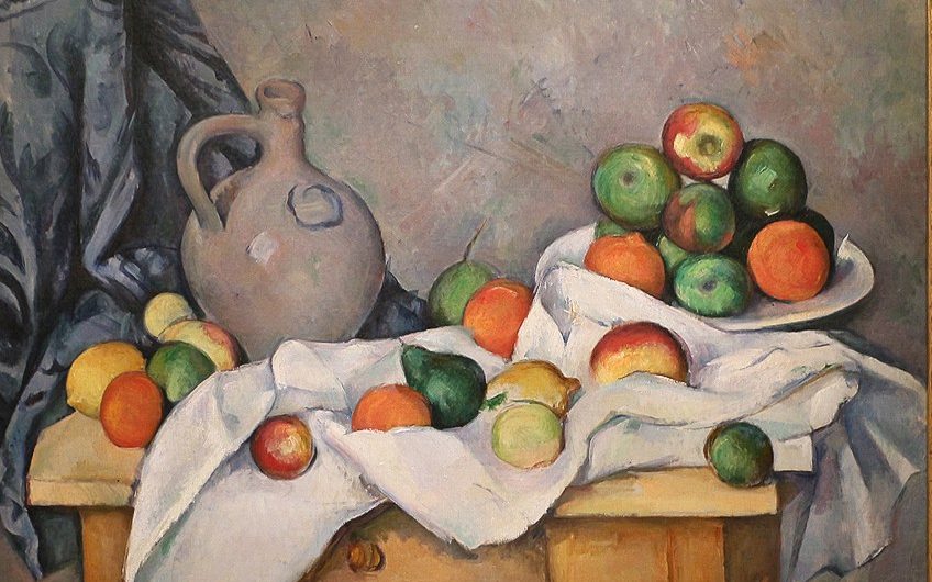
Modern Still life guided new artworks such as Impressionism and Post-Impressionism. This era of Still Life brought artists to life such as Vincent Van Gogh, who’s known for his expressive paintings of vases, flowers, etc. Many modern Still life’s still consisted of fruit, bread, wine but the way the work was created was different as these modern Still Life artists used larger brushstrokes, colours and a variety of different perspectives, seen from the picture below.
Vincent Van Gogh 1889.
Famous still life photographers –
Jan Bruegel
A Flemish painter and leading artist in the Still life Genre.
Born in Brussels, 1568.
Specialised in floral paintings and paradisal landscape paintings, which he is most known for as he gained the nickname “Flower”.
“Flowers in a Wooden Vessel”, 1606-1607.
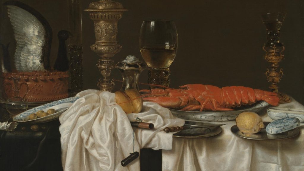
Willem Kalf
Born in Rotterdam, Amsterdam 1619.
Specialised in the style of Pronkstilleven, and was a popular artist.
His work has unique characteristics such as including porcelain Chinese bowls and jugs while paying close attention to detail which enhances the symbolism of composition.
Used a dark palette in his work and enhanced this with texture and light, for example how light bounces off silverware and the colour of lemons seen in the work below.
Still Life with a Silver Jug and Porcelain Bowl, 1656.
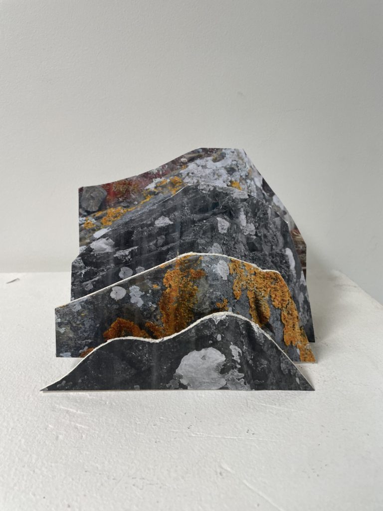
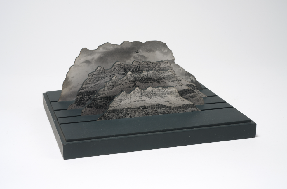
For this experiment I was inspired by Jody Powell and decided to make something similar to her. I like how she created a simple 3d sculpture using one image. For my sculpture I used the same picture I took on photoshoot at L’Etacq and used a black and white version of it and a colour version. I did this because I wanted my sculpture to stand out more by having colourful and colourless layers.
Jody Powell
I printed both versions of the image twice because I wanted four layers in total and decided I wanted my layer to go colour, black, colour black (from top to bottom). I used a glue stick to stick them on to some card paper then cut uniform shapes into the images using a craft knife and a mat. I started with the black and white picture at the front by cutting it smaller than the other images and making it in the shape of a mountain and repeated this process with the other images. The more I cut, the bigger the image became from the last one.
Instead of making a proper stand I used some spare paper that I had cut into strips and stuck them on to the back of each image, making a 90 degree angle so that it could stand up on its own. Then I placed all the pieces in front of each other starting with the biggest image and photographed the sculpture.
I like how the black and white images make the colour pop in the other images and how it looks because it’s a very simple design. I enjoyed making this sculpture because it was quick and easy. I will most likely re use this technique later on in my project and I’d make print the images in A3 and use more layers. I would also probably stick the images on to foam board and make a better stand so that the whole sculpture is more stable.
Experiment 2:
[figure 1]
[figure 2]
[figure 3]
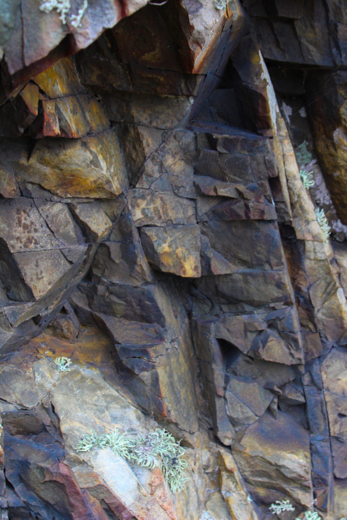
Original Images
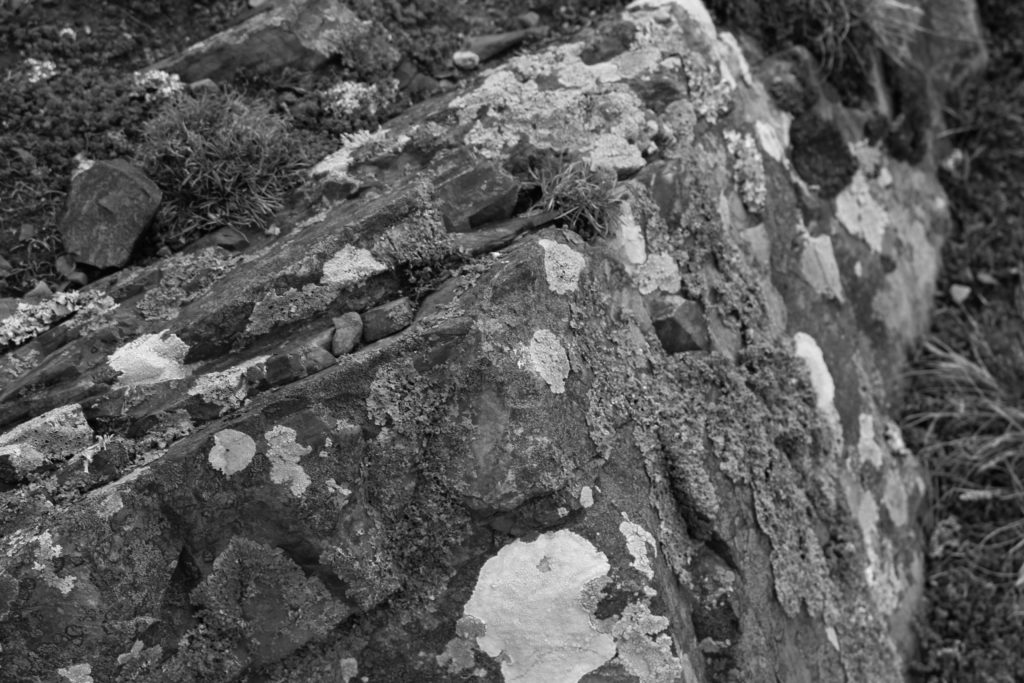
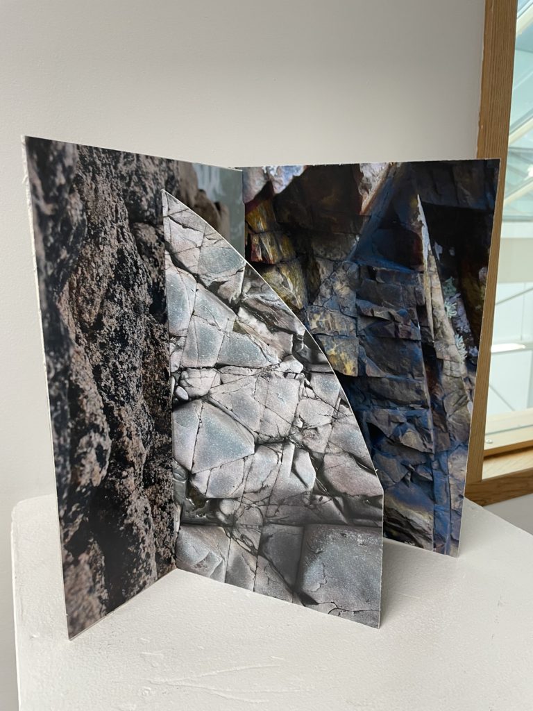
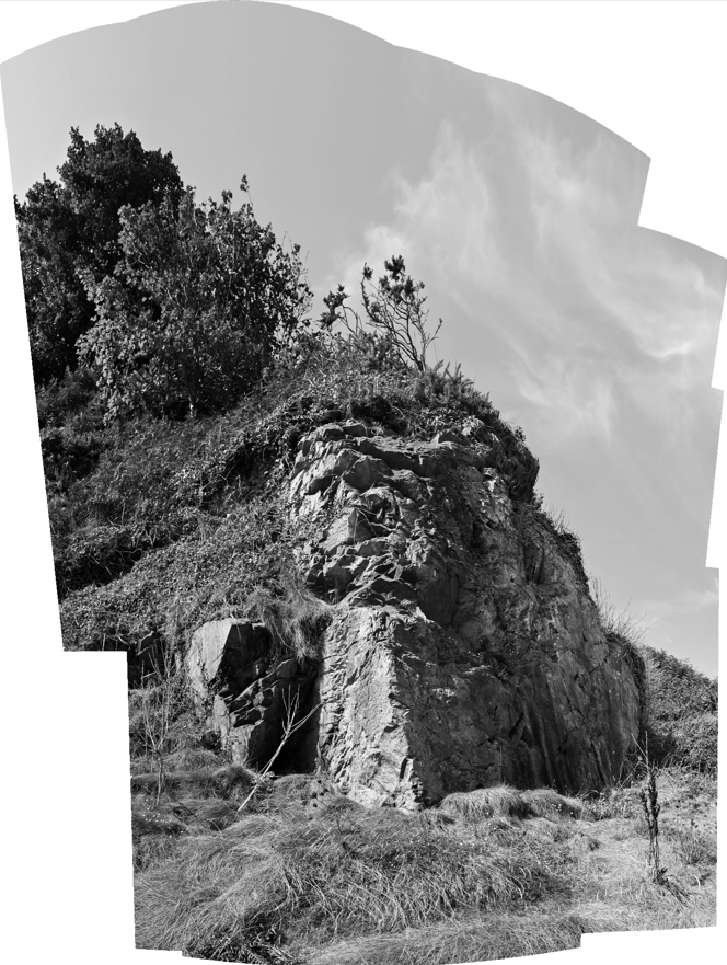
For my second experiment I was inspired by Letha Wilson who is a mixed media artist that works in photography and sculpture. I chose her because I liked the idea of having multiple layers and using them as a puzzle. For this edit I used 3 images (one from Plemont and 2 from L’Etacq).
I briefly edited my images in lightroom then printed them out. I stuck them on to some card paper using a glue stick and used a craft knife to cut them . I used card paper instead of foam board because I thought it would make it easier to cut and put together. I started by cutting a straight line through figure 1 using a craft knife because I knew I wanted to put another image through it. When I decided, I drew a curve on figure 3 and cut it off because Wilson’s sculptures usually have that curve and I wanted my work to be similar to hers in a way. To finish it off I made a slit into figure 2 on the left and attached it to figure 1.
It’s a bit tricky to put up at first because of the amount of pieces but once you get it to stand up it’s pretty stable. I like how it turned out because I think all the shapes of the rocks look interesting together. I enjoyed the process of making this and I would totally try it again by experimenting with multiple images and shapes.
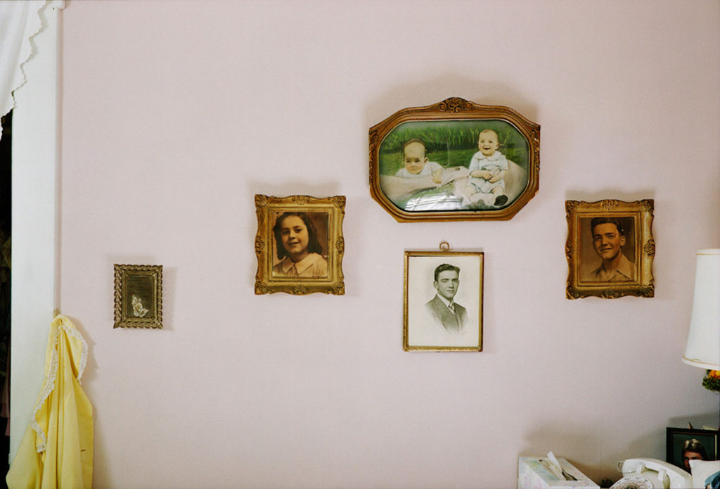
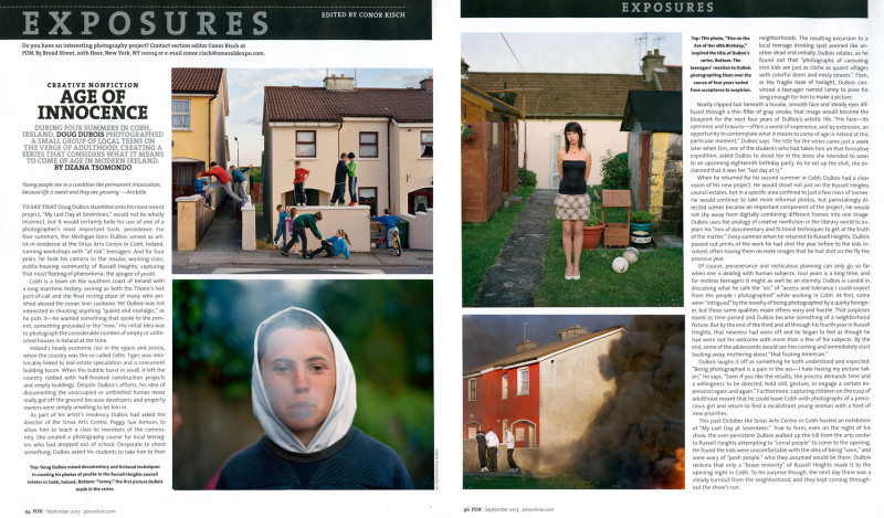
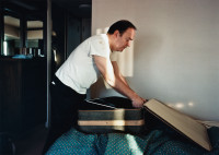
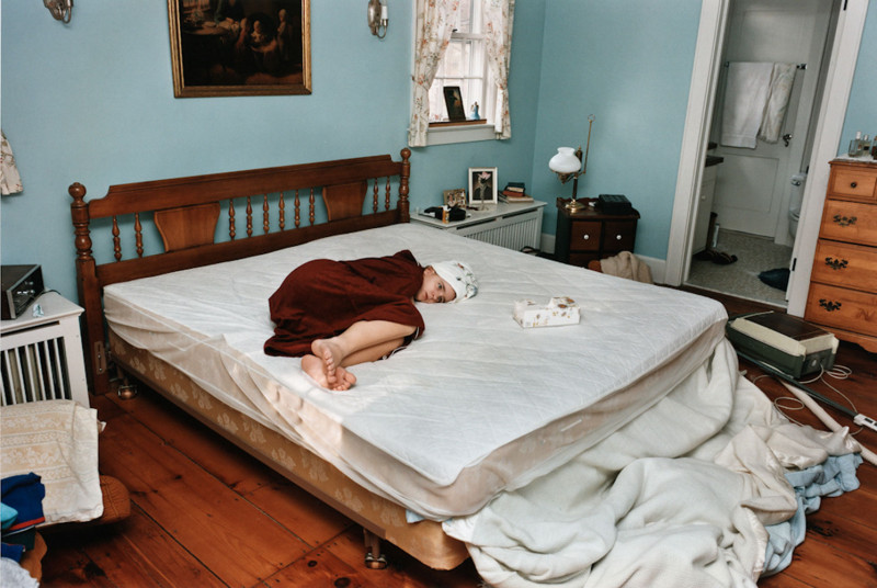
Doug DuBois, born in 1960, is an American photographer based in Syracuse, New York. He is an associate professor and department chair of Art Photography at the College of Visual and Performing Arts at Syracuse University. The bulk of DuBois’ photography is portraiture, and he is well known for photographs of intimate familial scenes. He creates re-imagined depictions of domestic spaces anticipated the transformations of family life among a “tidal wave of late-capitalist individualism and aspiration.” DuBois is a recipient of a 2012 Guggenheim Fellowship, and his work is in the collections of MoMA in New York, SFMOMA in San Francisco, LACMA and the Getty in Los Angeles, the Library of Congress in Washington, D.C., and the Victoria and Albert Museum in London.
“Last Day at Seventeen”
DuBois was born in Dearborn, Michigan and grew up in the suburban New Jersey community of Far Hills. As a teenager, he began taking photographs with a rangefinder camera he found in his father’s closet. He has a younger sister Lise and a younger brother, the composer R. Luke DuBois, who appear often in his early photographs. In between his undergraduate and graduate educations, his father suffered a near-fatal fall from a commuter train and spent several years convalescing in the home, and DuBois documented this process as a “kind of emotional protection.”
All the days and nights
These family portraits formed the basis of a body of work surrounding his family that would continue for twenty-four years and eventually come to be published by Aperture as a photo book titled All the Days and Nights. The photographs in this series document his changing family: his father’s recovery from his injuries juxtaposed with the descent of his mother, his father’s sole caretaker, into the depths of depression and mental illness, the subsequent dissolution of his parent’s marriage, as well as the maturation of his brother and sister.
“All the days and nights”
A video about the collection
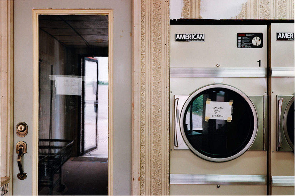
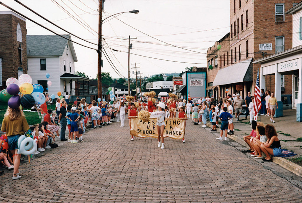
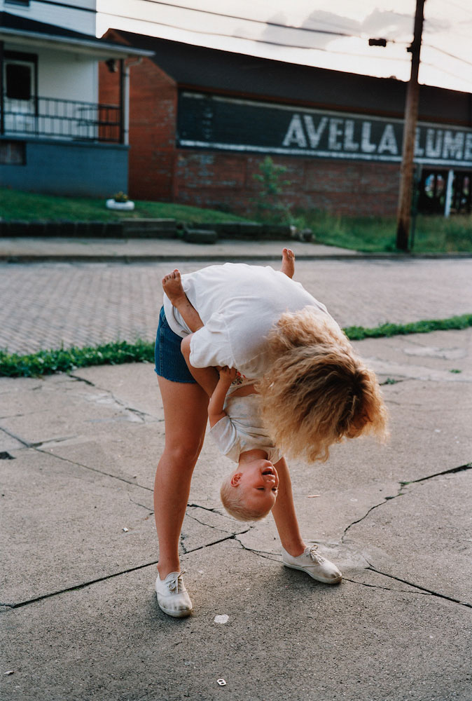
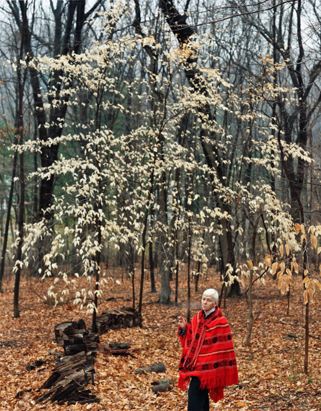
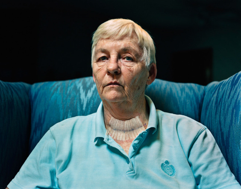
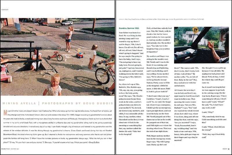
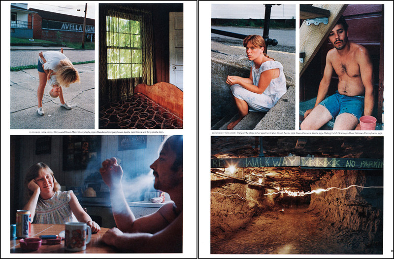
Avella
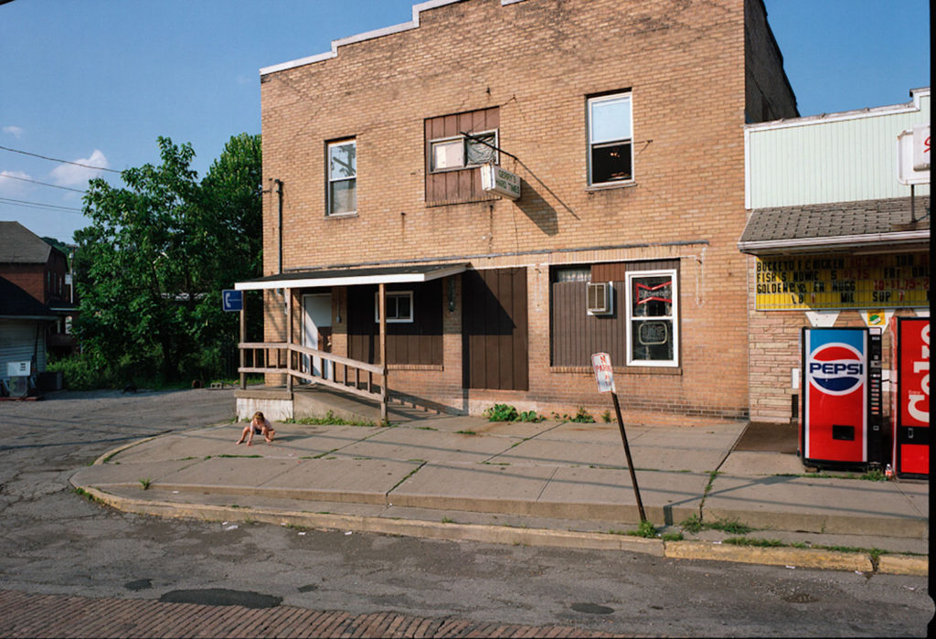
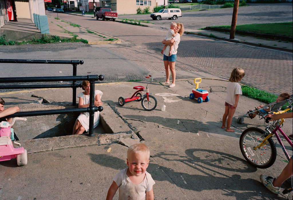
DuBois’s interest in the family, both his and others, is also evident in a subsequent photo series, “Avella,” which chronicles life in the deindustrialized coal-mining town of Avella, Pennsylvania, where his father grew up. To learn about his family’s hometown DuBois would drive his grandmother around in his aunt’s car while she identified local landmarks and told stories, often taking pictures as they travelled. He documents the decay and blight of the town, but also the families which live in such an environment of insularity and lack of opportunity.The photographs challenge American “myths” surrounding upward economic mobility and question how American families survive amid economic uncertainty.
Two editorial pieces based on Doug’s “Avella” work.
My last day at seventeen
A video with Doug, explaining this collection
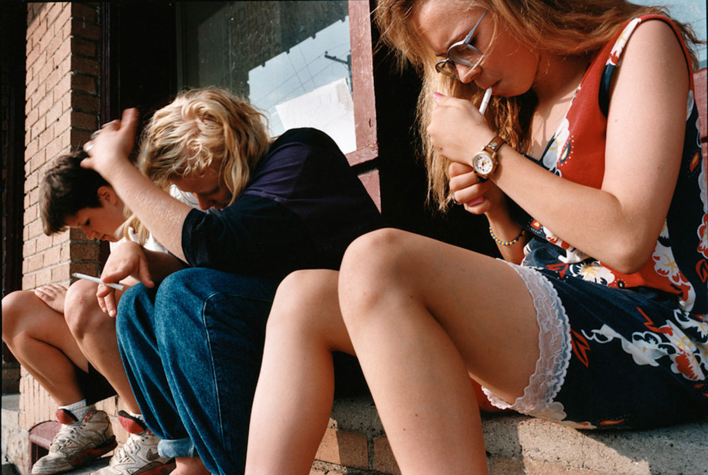
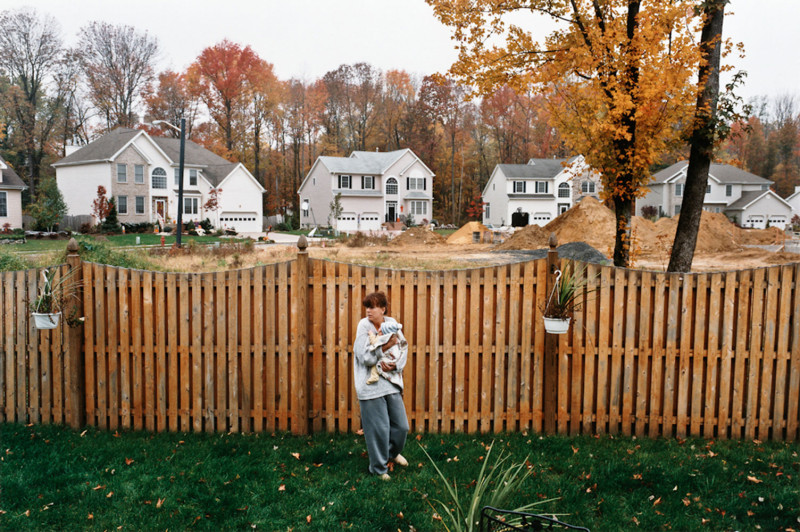
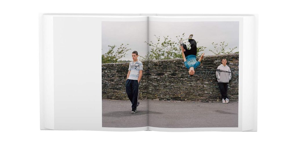
The themes of economic uncertainty and provincial life are likewise central to DuBois’ recent photo series, which was published as the book My Last Day at Seventeen. These photographs depict working-class teenagers in a housing estate in Cobh, County Cork, Ireland after the collapse of the Celtic Tiger economy as a result of the 2008 financial crisis. The series represents the anxiety inherent to the transition from adolescence to adulthood, and how the subjects’ anxiety regarding the future is mirrored by their economic uncertainty. Shot over five summers, the series presents an “endless summer” in which precariously-situated teenagers perform identities informed by an international popular visual culture but mediated through a local context.
“I’m not a social reformer. In shooting these pictures, I had no agenda. They might borrow from the rhetoric of documentary photography, but I’m not a documentary photographer or a photojournalist.” DuBois said that, instead, he found himself “working like a storyteller, creating something that was based in truth.” Sometimes, he explained, “I even gave the kids some direction, like one time when I asked one to jump up on a wall. That’s not journalism.”
One page of the photo book from “My last day at Seventeen”
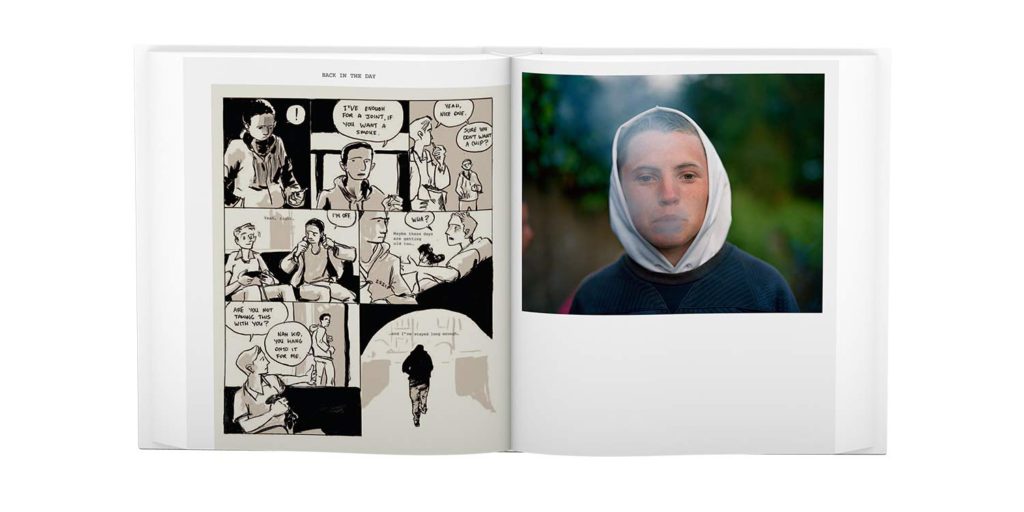
An unexpected component of My Last Day at Seventeen, which appears between various sequences of its colour photos, is a series of brief story vignettes presented in comic-book form. Drawn by the Irish illustrator Patrick Lynch, they feature the recollections of an unidentified narrator who looks back at incidents in his young life against the backdrop of the collective life of the Russell Heights group. Other characters appear, too, including two young women who go to a downtown shop to look at baby carriages. One of them is pregnant, with a baby due soon but without the means, either alone or presumably with the man who fathered her child, to afford the costly pram she covets. On the train back home, the two friends sit in silence, as the pregnant woman rubs her swollen belly.
Similarly, DuBois said that almost as soon as he began getting to know his young subjects, he could sense some complex, overlapping strains of real-life drama that bound many of them and their families together. Inevitably it informed the spirit of his photos. “I wasn’t trying to make a book about Irish youth or even the young people of Cobh or Russell Heights per se,” he explained. “What I created was fiction, a lyrical story set in summer about a moment we all know, when you’re just about to take that first step and become an adult. I’m basking in that moment.” In My Last Day at Seventeen, that moment is at once bittersweet and urgent, languorous and daunting — a slow-moving, time-killing, endless summer, in which, at least until life’s seasons irrevocably change, one can dare to dream of remaining forever young.
IRE_12_195_22 001
DuBois carefully composes his compositions with supplementary lighting and uses either a medium format or a large format folding camera with a cloak. He does not consider his work to be documentary, he views each photo as a collaborative endeavour between artist and subject which is based on truth. DuBois will often stage or recreate photographs, sometimes even alluding to visual works which are not his own, and has borrowed the literary term “creative nonfiction” to describe his work.
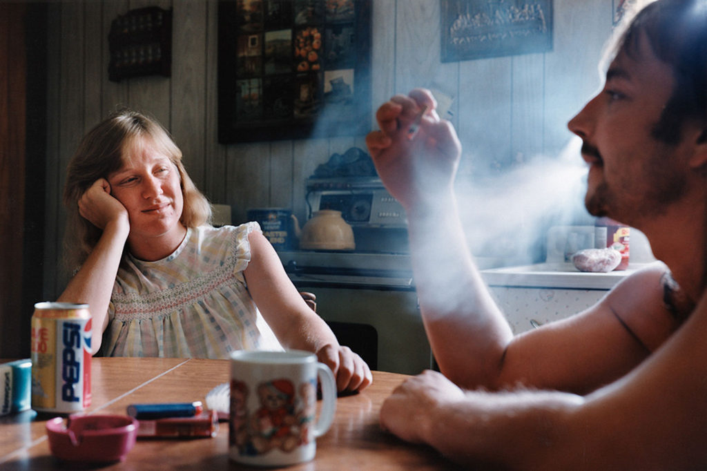
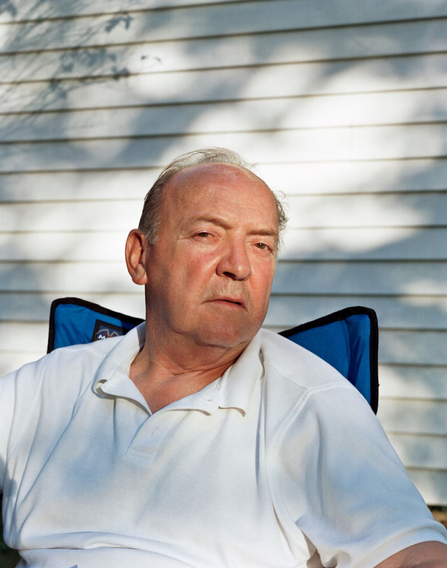
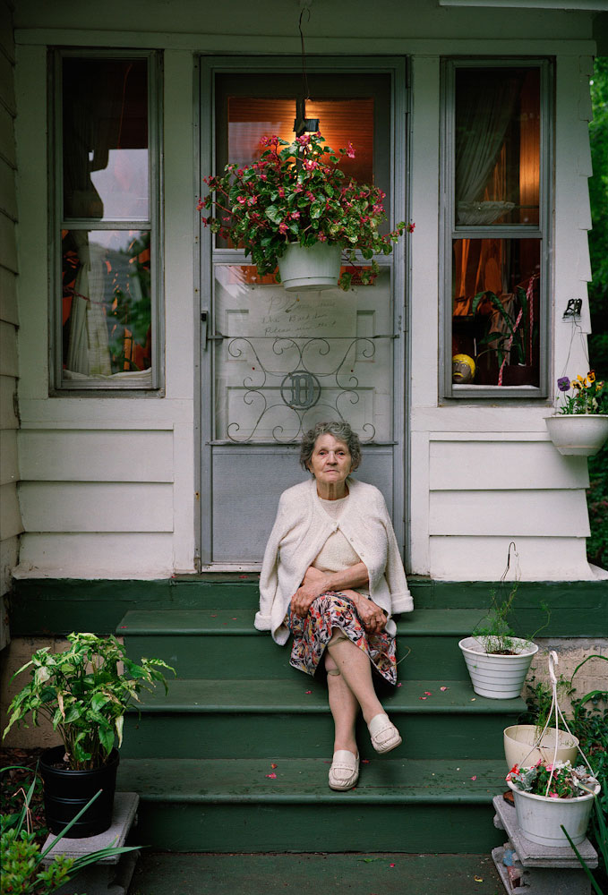
From Doug Dubois’ “Avella”
This is one of Doug Dubois’ images from his “Avella” collection. The tones in this image are warm, with orange and green, as well as red as the most vibrant. This image is a little dark, especially in the corners – the top of the image’s corners are the darkest. This darkest around the image creates a natural vignette and makes the subject and white surroundings more vibrant. In my opinion, this image does use the rule of thirds: the subject is situated almost directly in the middle of the image, slightly to the right of the middle third. This helps to create a balanced composition. The windows above the subject also fall perfectly within the middle third, as well as the steps in the bottom middle third. To me, the natural leading lines in this image lead the eye from the bottom corners of the image, up, past the flower pots up the steps and ultimately to the focal point, the subject. There isn’t much noticeable contrast in this image, except for the contrast between the green steps with the white outside of the house. This creates a feeling of separation in the image between the steps, the outside world, and the house. Although subtle, this contrast could relate to the town – after doing some research on the town in which the photos are from in the “Avella” collection, I know that it is a poor, ex-mining town, in the country. The contrast in this image could relate to themes of separation or a feeling of difference from other parts of the area, hinting at the struggle of the population of Avella.
Doug Doubois’ influence on my work
I plan to take inspiration from mainly the “Avella” collection, as it ties in with a style of photography that I like, and it also links to the area which I’m photographing. Although it is not an ex-mining town, Baker and its’ surrounding areas face the same small town, and rural issues, with a similar community outlook and landscape. I think it will be interesting to compare my images taken in Baker with those of Doug Dubois’.
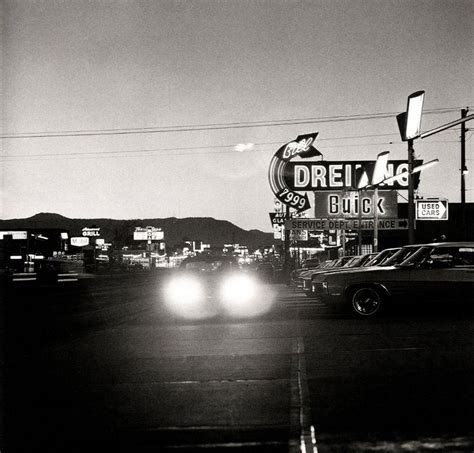
Robert Adams
“I think if you placed me almost anywhere and gave me a camera you could return the next day to find me photographing. It helps me, more than anything I know, to find home.”
Robert Adams
Robert Adams is a photographer who has documented the extent and the limits of our damage to the American West, recording there, in over fifty books of pictures, both reasons to despair and to hope. “The goal,” he has said, “is to face facts but to find a basis for hope. To try for alchemy.” Adams grew up in New Jersey, Wisconsin, and Colorado, in each place enjoying the out-of-doors, often in company with his father.
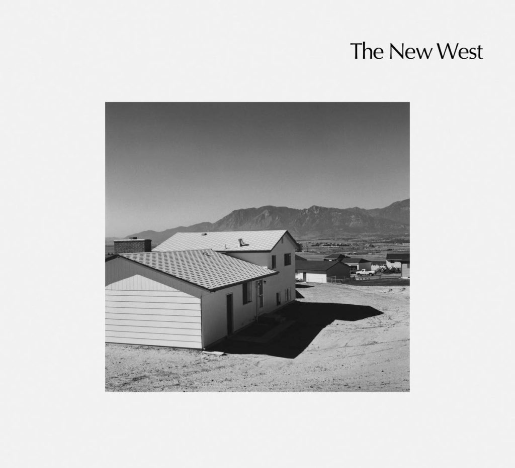
At age twenty-five, as a college English teacher with summers off, he learned photography, choosing as his first subjects early prairie churches and early Hispanic art, subjects of unalloyed beauty. After spending time in Scandinavia with his Swedish wife, Kerstin, however, he realized that there were complexities in American geography that were worth exploring. In the 1970s and ’80s, Adams produced a series of books—The New West, Denver, What We Bought, Summer Nights—that focused on expanding suburbs along Colorado’s Front Range, books that pictured heedless development but also the surviving light, scale, form, and silence of the natural world. He also examined this mixture of humanity’s imprint and nature’s resilience in the wider western landscape (From the Missouri West) and the Los Angeles basin (Los Angeles Spring, California).
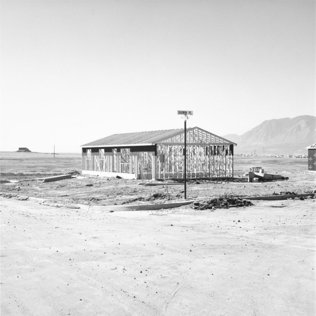
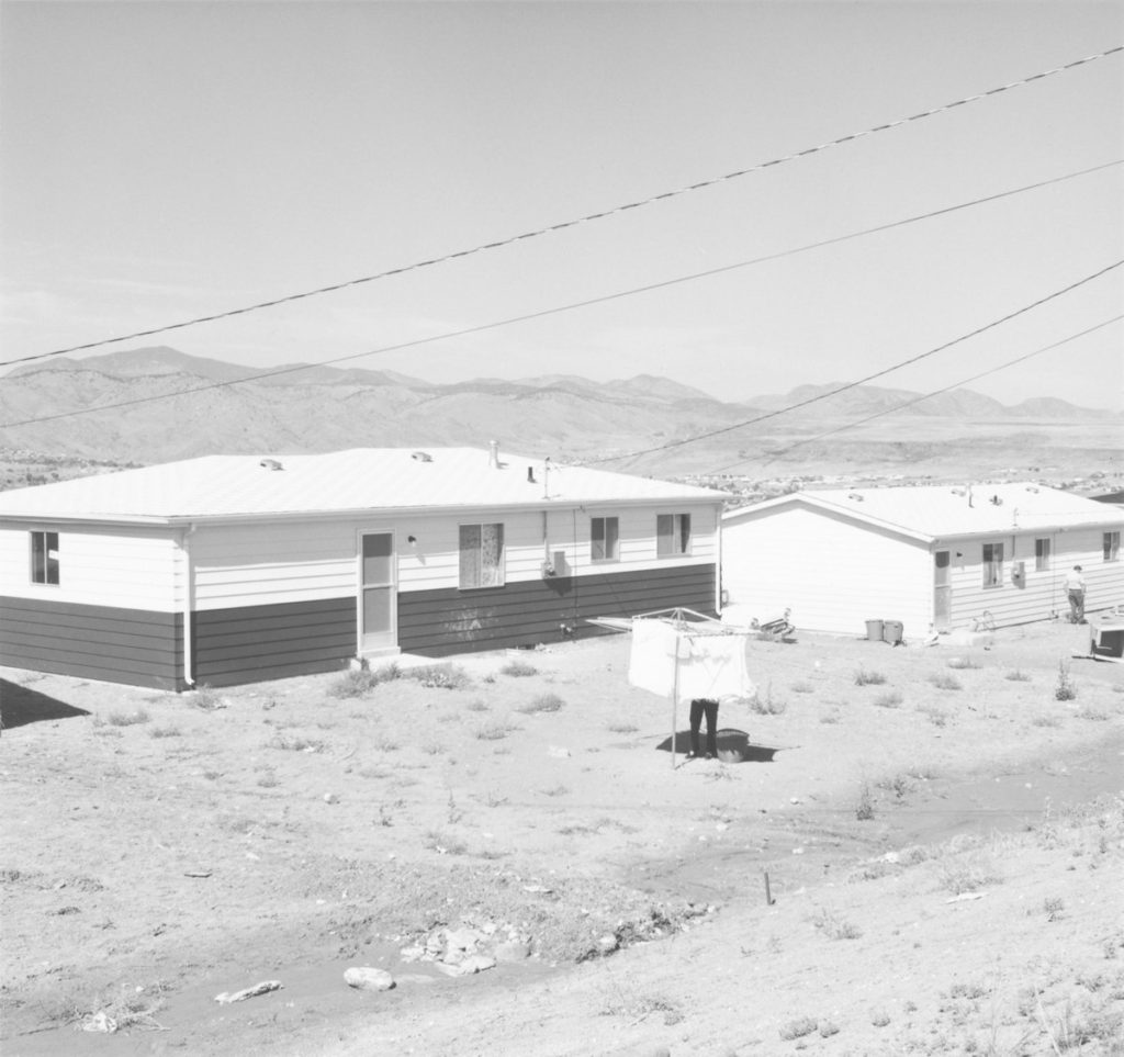
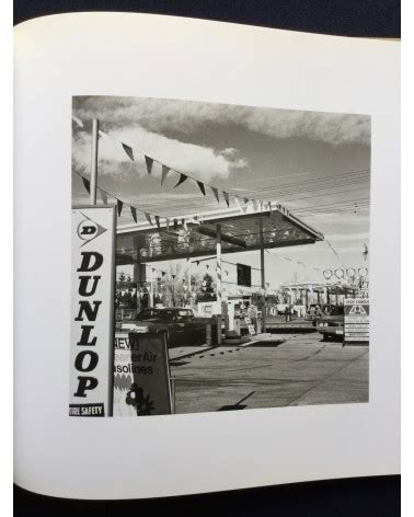
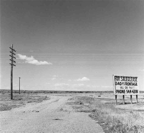
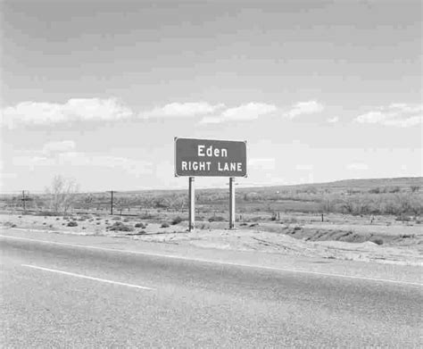
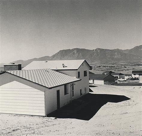
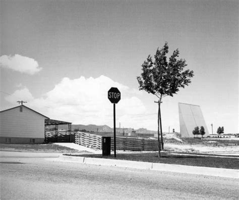
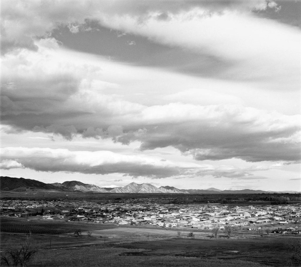
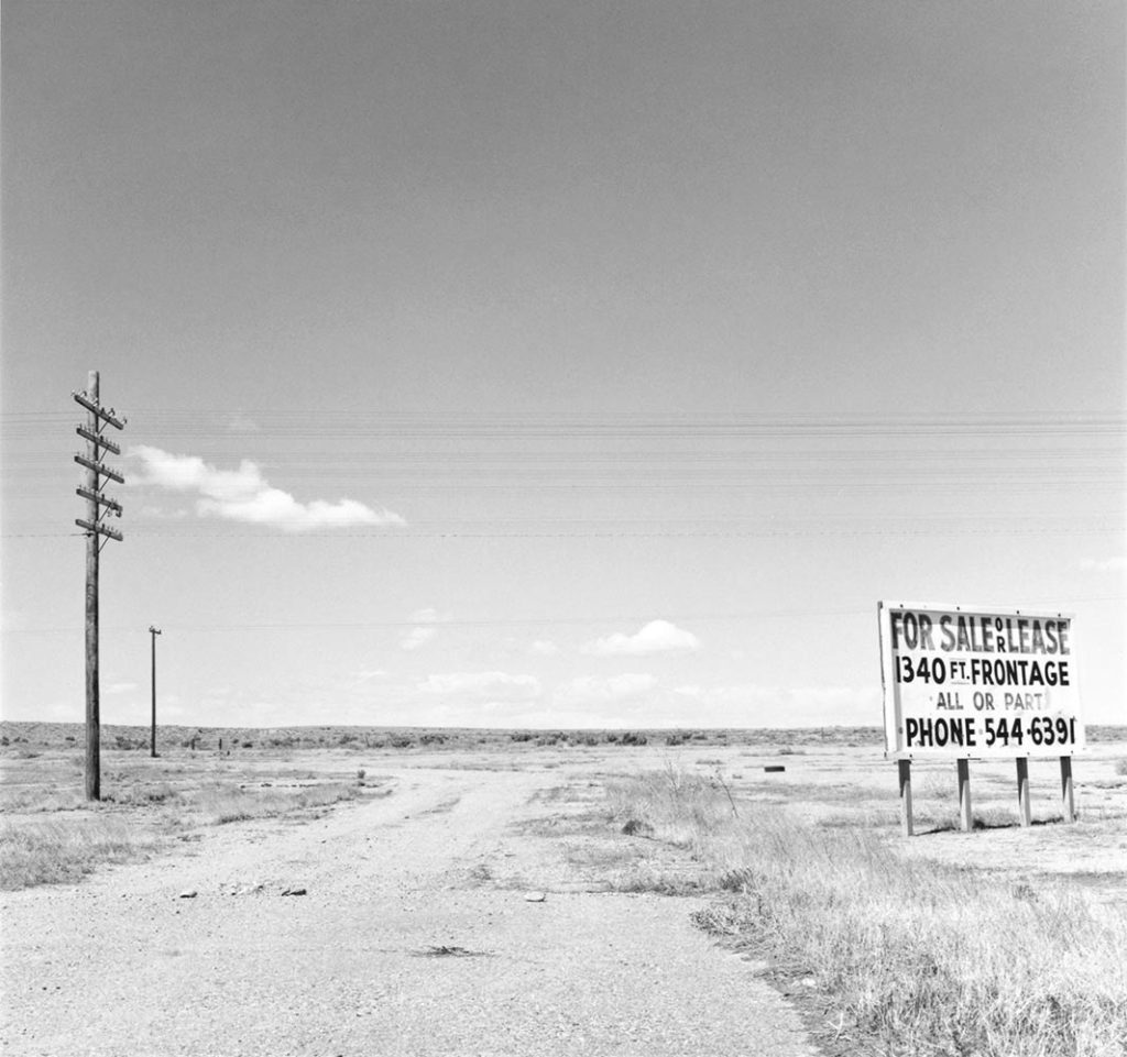
The turning point in Adams’ career was the publication of his highly acclaimed photo essay, The New West, in 1974, which catapulted the image-maker into the public eye. Divided into five sections, the book takes us along the front wall of the Colorado Rocky Mountains, presenting a representative sampling of the entire suburban Southwest. We are first confronted with two, light-drenched images of sprawling prairies, where the only sign of human intervention are electricity pylons and wooden fence posts. Then these open fields are shown bearing signs, first: No Trespassing, then: For Sale or Lease, and you begin to feel the shadow of commercial opportunism ominously approaching. Sure enough, the next section depicts the rapidly growing expanse of tract houses and mobile homes popping up along the Front Range, breaking us in with an image of the foundations of a single tract house being laid in a sparse stretch of land, before presenting us with an entire town of these compact white abodes, which nevertheless appear tiny and somehow insignificant against the backdrop of the towering mountains and an omnipresent sky.
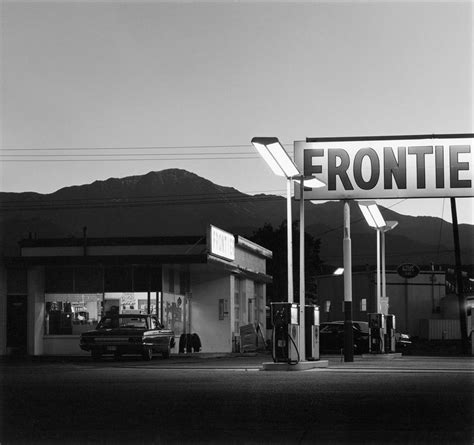
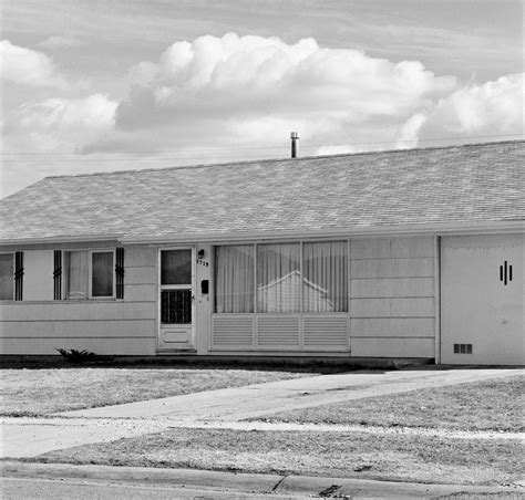
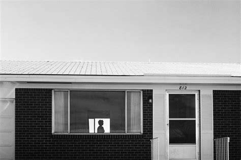
Depicting the unwavering presence and beauty of nature in the face of human intervention was, for Adams, a key element of the project. As he explains in the book’s introduction, “Why open our eyes anywhere but in undamaged places like national parks? One reason is, of course, that we do not live in parks, that we need to improve things at home and to do that we have to see the facts… Paradoxically, however, we also need to see the whole geography, natural and man-made, to experience peace; all land, no matter what has happened to it, has over it a grace, an absolute persistent beauty.” And indeed, even when Adams zooms in on the man-made – be it a woman strikingly silhouetted between two windows of her neat brick bungalow, a packed Denver car park or a peak-side gas station, complete with enormous sign – there is an inherent, inescapable allure, stemming from the photographer’s aptitude for composition and ability to encapsulate the atmospheric quality of light so unique to the area.
Robert Adams’ influence on my work
I chose Robert Adams as one of my photographers to focus on for this project due to similar themes in his work to what I plan on photographing – I plan to photograph the idea of the “new west”. The area in which I’m staying is an old gold mining town, known for its’ wild west – esque elements and I plan to photograph this historical element. Furthermore, Adams captured a lot of prairie land, which is similar to the landscape in my location – I think it will be interesting to capture similar landscapes to his in more recent times to compare and contrast. I want to include a photojournalistic element in my images also. I am going to try and capture living in the town in the modern day, and see if those wild west elements of Baker City are still present today – in this way, I am including history in my images and research, which I like as it helps me inform the ways I plan and execute my photoshoots.
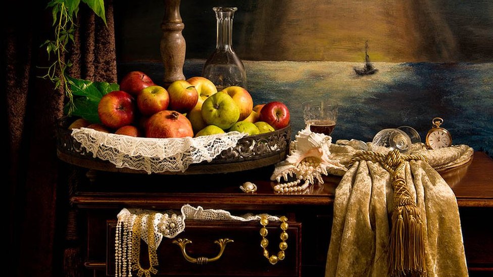
Still life in art date all the way back to the ancient Greaco-Roman paintings representing fruit and other provisions in the 16th and 17th century. Fruits are some of the most common subjects in still-life paintings over the centuries, paintings of fruit offered a variety of religious and mythical symbols. For example, in Christianity, apples symbolize Eve eating the forbidden fruit in the Garden of Eden. Skulls were also often depicted by artists in still life paintings over the centuries, expressing the transience of life and the futility of materialism, painting these skulls was also a striking reminder of the certainty of death. Silver and gold were often depicted in these paintings also, the inclusion of precious metals in still-life paintings may showcase an artist’s skill at accurately depicting reflective textures or a patron’s collection of expensive objects.
Still-life photography
Still-life photography’s origins reside in the early 20th century. Art photographers emerged such as Baron Adolf de Meyer, who was known for his highly artistic approach to photography. Still-life photography followed the same path of still-life paintings of using fruit and other provisions and produced many classical works. Photography even recorded the dead as a reminder of death and mortality.
There are two different types of still-life photography which are found still-life and created still-life. Found still-life is photography that contains a combination of found subject, symbolic objects, and natural lighting. The visual message is concerned with the transitory nature of life, and the inevitability of death. However, created still-life is when a photographer creates an image with almost full control over lighting, mood, and composition. Because photographers directly influence the image creation process, still life photos reflect the creativity and style of the photographers themselves.
Processed with VSCO with j5 preset
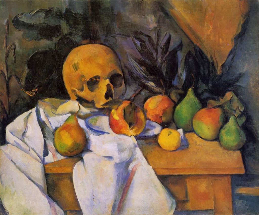
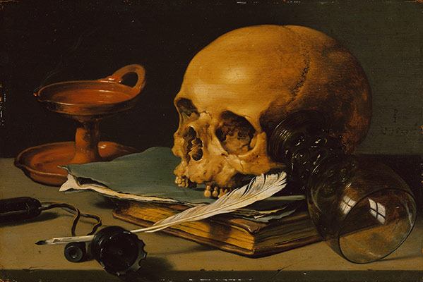
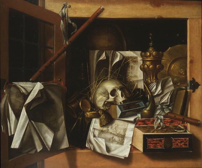
Painting analysis
This painting is made up of carefully placed objects, placed on a table in a dark room. The main object is a skull, which is placed on top of some books, with a writing quill placed in front and a glass goblet resting on the side of the skull. The skull represents death and mortality in the painting, while the goblet represents that even though life might be full of pleasures it still ends. The quill and books represent knowledge, but paired with the skull it portrays that this knowledge is worthless as life ends anyway. The subjects in the painting have quite a dark deeper meaning.
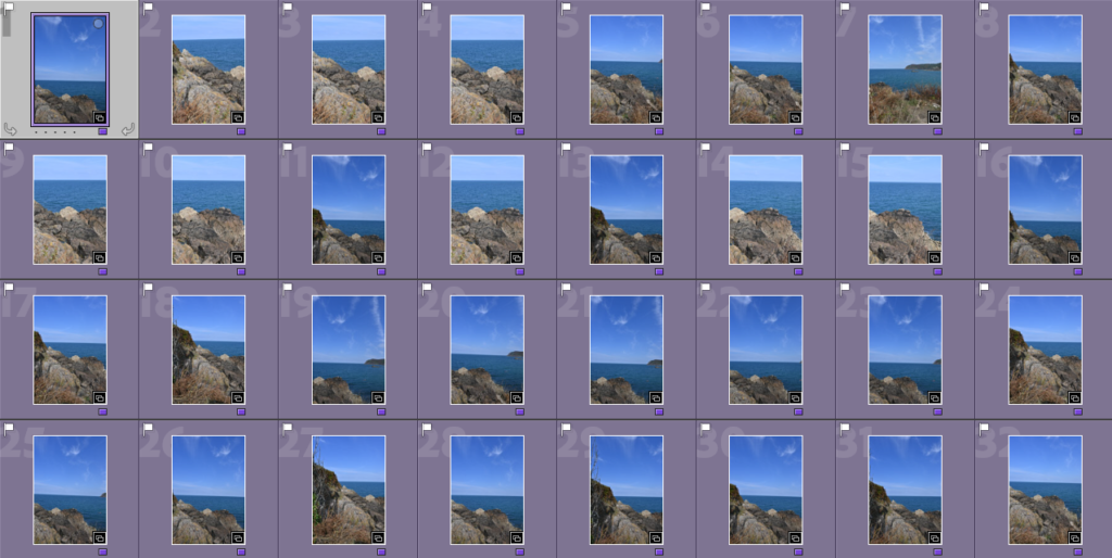
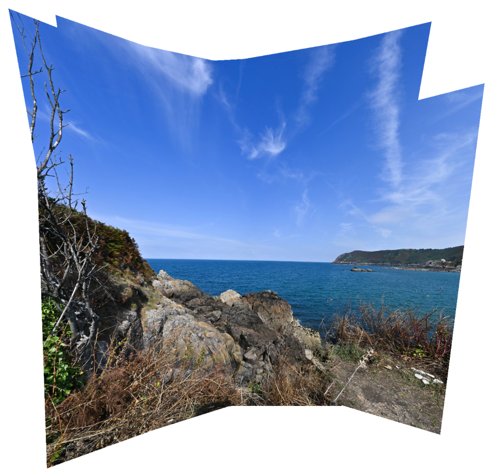
Throughout my photoshoot of Bonne Nuit, I also took an array of pictures which I could use further on in my work to create joiners. I was able to select these from my contact sheets by flagging them (P). This would show the photos which I thought were of good quality to use then colouring them purple, so I knew that they were to be used for my joiners, and putting them into a separate folder on Adobe Lightroom.
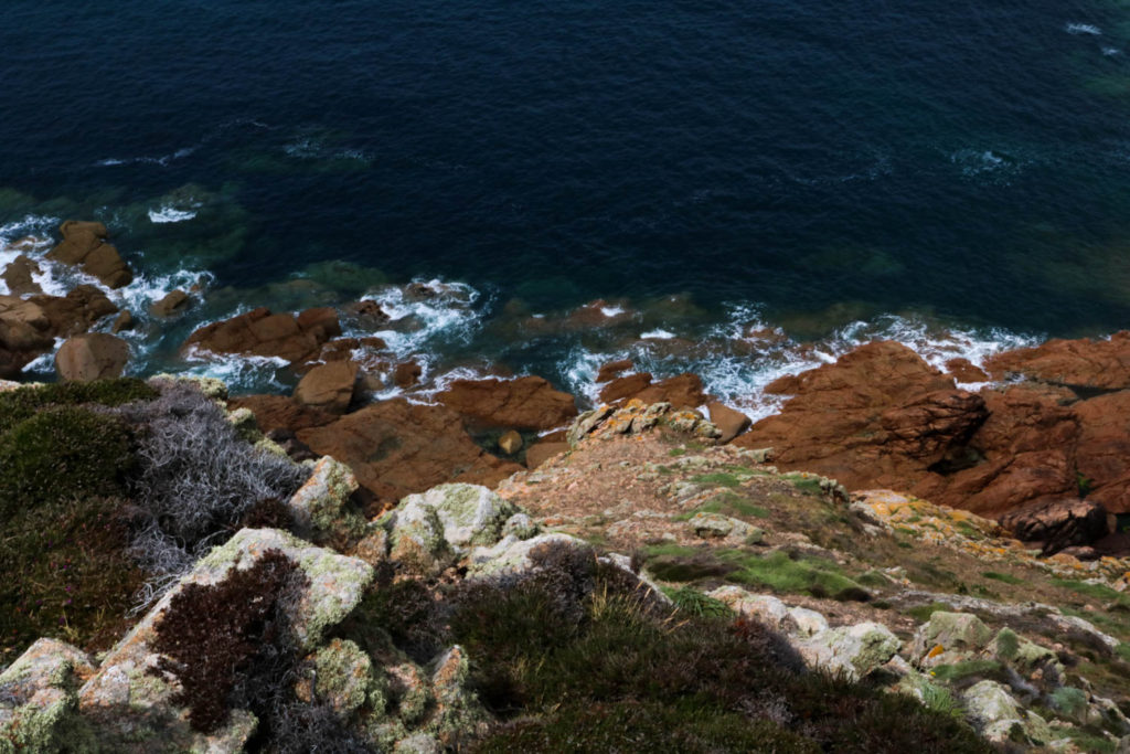
The first set of pictures which I took are of a rocky area to the side of Bonne Nuit in the headland, these turned out well due to the day I decided to go on as the weather was reliable and the sun wasn’t gleaming to the point where the photos would become overexposed. I liked this area because of the way the darker rocks, mainly to the left of all the pictures, because this creates a nice contrast between the two landscapes and how the horizon creates a gradient as it goes lighter at the bottom and darker at the top which creates a separation.
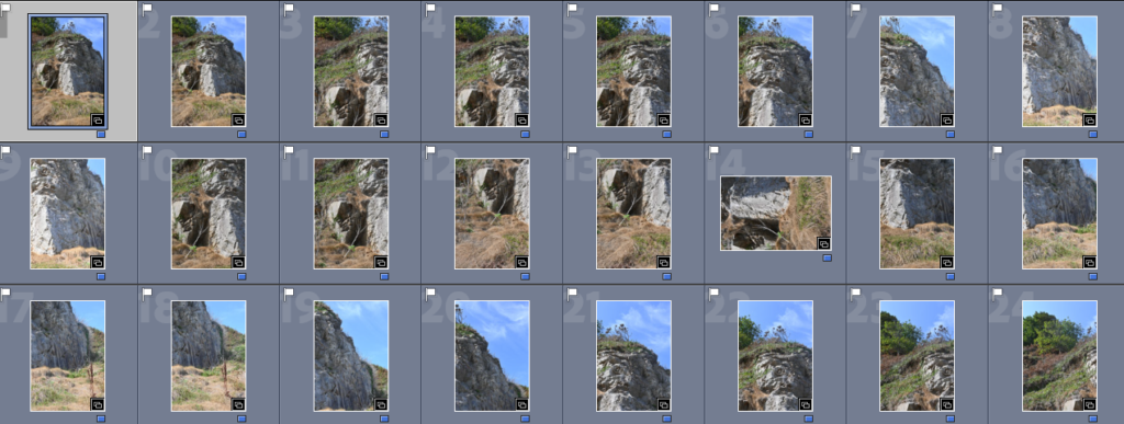
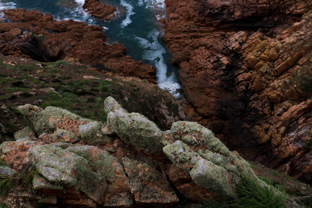
The second set of photos which I took to use for creating a joiner in photoshop consist of a large rock with a grassy headland above. I liked this as a possibility for a joiner because the rock had a variety of different textures on it which I thought would work well when creating a joiner, and the green of the headland contrasted nicely against the drier tones of the grass along with the brighter tones of the blue in the sky. If I were to take these pictures again I would make sure I took a larger selection so that I have more to work with.
Best shots –
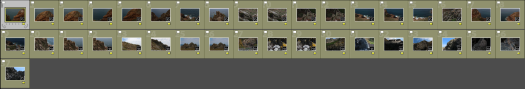
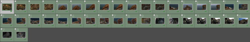
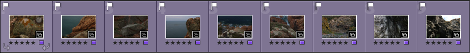
On Adobe Lightroom, I went through my photos which I thought were successful and sorted them by colour of: – Red, for photos which I will not use. – Yellow, photos which I think had potential but wasn’t sure on using them. – Green, photos which I want to use and think are the images which turned out best.
As you are able to see in the picture above, around 50 of my photos I decided were successful and made them green. Then to help me decide and organise the final 4 images I used the star rating system, where I went through the photos in depth for a final time and gave 5 stars to the ones which I thought were excellent in quality, contrast, lighting, textures etc and these can be seen below.
My 4 final images –
Joiners –
To create a secure basis for my joiners, I began by editing one picture to fix any lighting that may be over exposed and fix the colour balance too. Then I applied this to the other photos so that they would work well together, I also put one joiner in to black and white so that I could experiment with it.
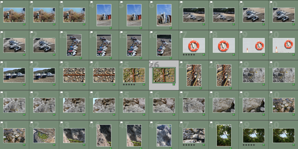
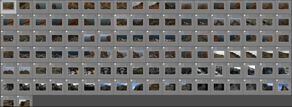
I have put below some contact sheets from the class trip to L’Etacq. I imported them to Lightroom and used the P and X tools to separate them between the ones I thought had potential and those that couldn’t be used as final images.
I was looking for clear images that are interesting to look at, as I found some of my pictures didn’t have much substance and weren’t eye-catching. I wanted to present different parts of the photo shoot through my final images so I tried to have a diverse range of photos.
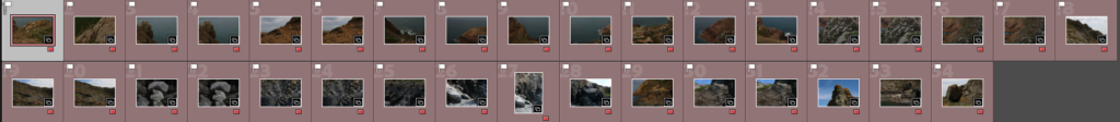
Colour coding / Rating
After using the P and X tool I then colour-coded and star-rated my images to help me narrow down my selection. As you can see above I have used the colours ‘red’ and ‘yellow’ which indicates the images that I won’t be using in my final images. These include pictures that were over/underexposed or didn’t have the quality I was looking for. I also didn’t use star ratings for these as I didn’t feel like it was necessary as I had already decided I wasn’t going to use them.
Following the colour coding, I have used ‘green’ to mark out the photos then I think I might use in my final images, this I when I included the star ratings as I need to use them as a final tool in narrowing down what photos I would pick to be apart of my final selection. I have put the photos that I have ranked the highest as purple so that I can easily make out which ones are for the final piece and which ones are not.
Editing
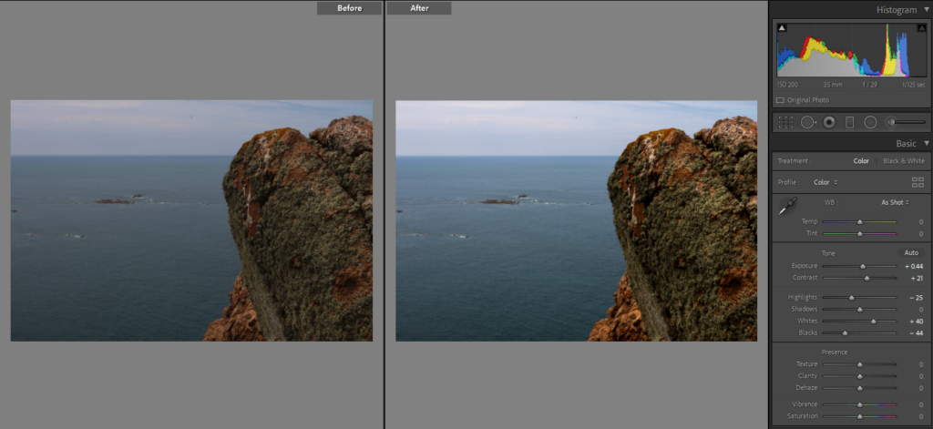
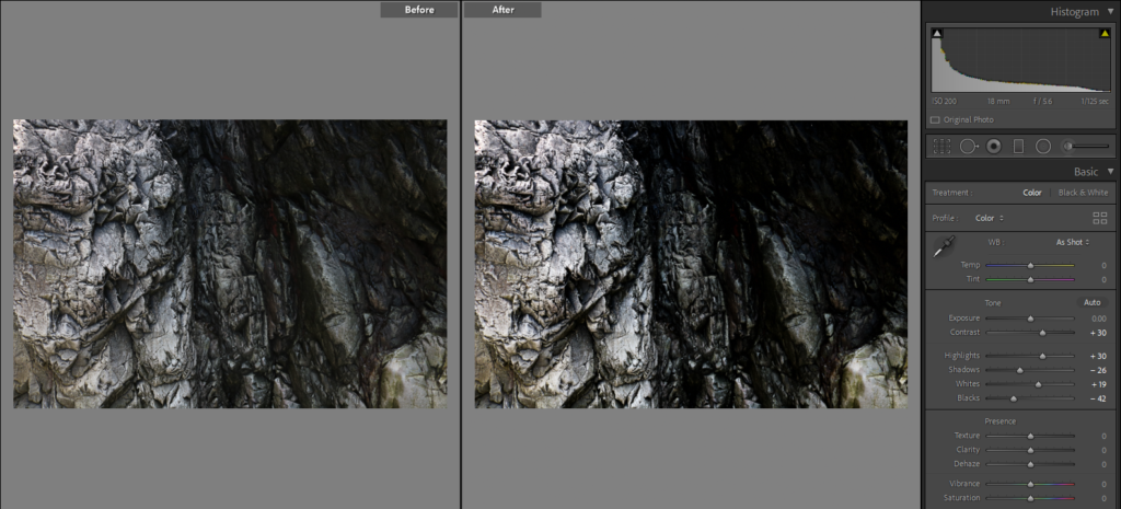
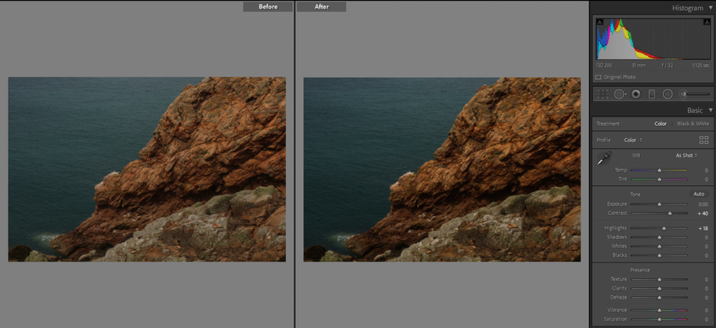
I edited my photos in Lightroom using the exposure and contrast tool to get richer colour tones.
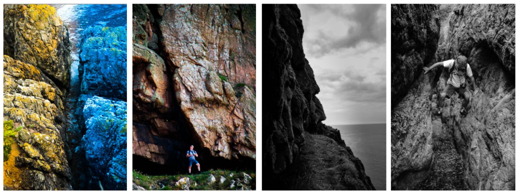
Best edits
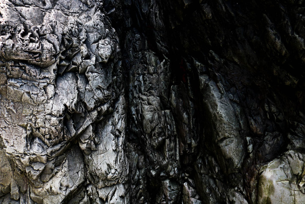
I have selected these as my best images because I like how each of them has vibrant colours especially the centre photo and the middle left photo as they have containing colours of the sea and the cliff face with the brown rocks. I like how there some similarities and differences between all of these images, as some photographs contain warmer tones and some are cooler. For example, the bottom middle image has lots of silver and black tones whilst some of the first images are filled with oranges and browns. Furthermore, there is a range of different images as the bottom three are from Stinky Bay and the other were taken at Le Pinacle.
Still life is an art of capturing inanimate objects (natural or man-made) for their qualities of form, colour, texture and composition. Early Netherlandish still life painting presented skulls, candles and hour glasses order to convey the transience of life and futility of materialism. Often combined with flowers or fruits of all seasons to symbolise nature’s cycle. Those more morbid themes represent a genre of still life called Vanitas.
History
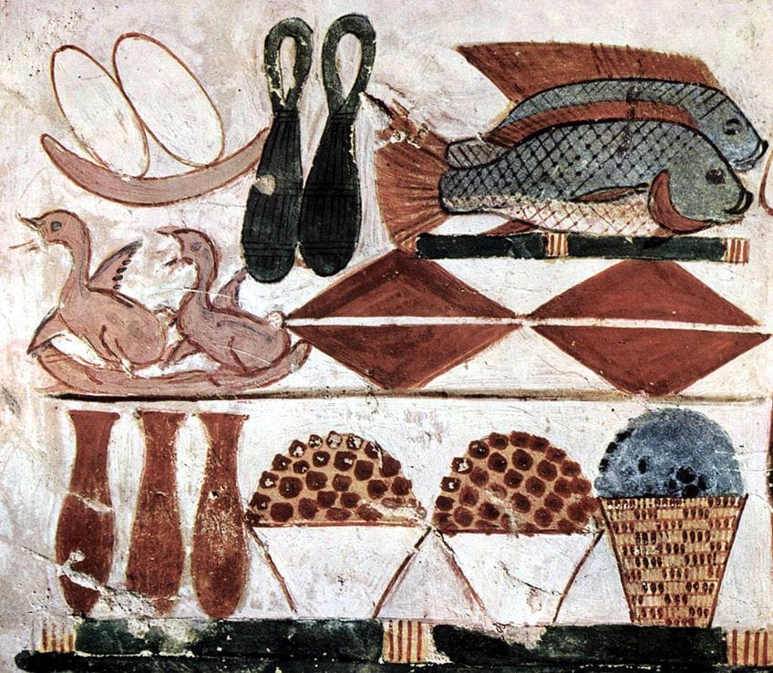
Still Life was first introduced in western art by the Egyptians 5000 years ago. In their ancient religious beliefs, when a person died, if they had lead a righteous life they would be rewarded with eternal life in the field of reeds. However, in order to retain eternal life the persons body had to retain the same physical appearance it had on earth (mummification). In addition, the tomb of the dead had to contain all the things they would need in the afterlife including food, and although actual food was put into tombs, it was limiting as a person living an eternal life would need a lot of it, so the ancient Egyptians also painted images of food on the tomb walls. Those paintings included the same items as most modern still life including fruit, vegetables, bread, fish and other animals as well as wine.
The Egyptian tomb paintings were created for religious purposes. However, during classical times (8th century BC – 6th century AD) still life became an object for home decoration and a display of wealth. Ancient Romans used Bodegones; representation of common objects of daily life including food: platers, glasses, jars, fish, vegetables and fruit; to decorate their kitchens. Bodegones remain a popular subject for still life in the modern times.
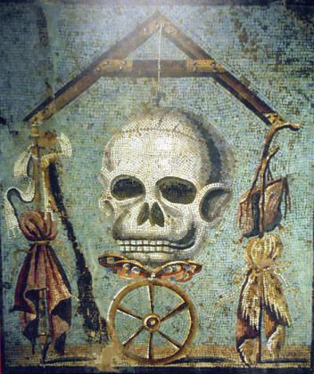
Other examples of ancient roman still life include the Memento mori, used on tomb stones as a reminder that no mater who you are death always happens. In the image below, the wheel symbolises the passage of time and the butterfly represents the transformation of the soul as it leaves the constrains of the earthy body. Those themes carry on in todays vanitas.
Although decorative still life fresco murals and mosaics occasionally appeared in antiquity it wasn’t until the Renaissance it became an independent painting genre. The first painting to be considered still life was painted by an Italian painter, Jacopo de’Barbari, in 1504.
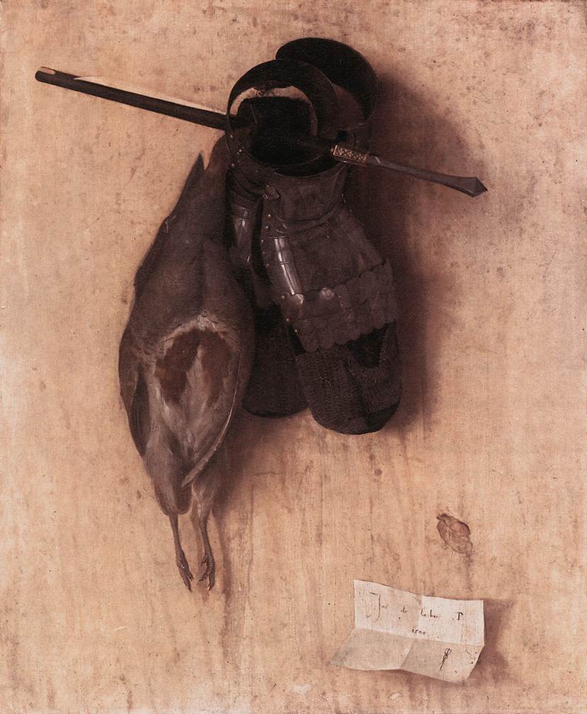
Still-Life with Partridge and Gauntlets by Jacopo de’Barbari
After fighting off the Spanish inquisition the Dutch Republic became an independent country over the course of the 17th century, dominating international trade, brining in staples and luxury goods from around the world. The rise of middle class who wanted to decorate theirs homes and an increasing demand for secular subjects in paintings other than portraiture are what contributed to the Dutch Golden Age of still life paintings. Amongst the famous Dutch and Flemish painters who specialised in still life art were Willem Claesz Heda, Wilhem Kalf, Jan Fyt, Frans Snyders, Jan Weenix…
Jan Fyt
Willem Kalf
Frans Snyders
Willem Heda
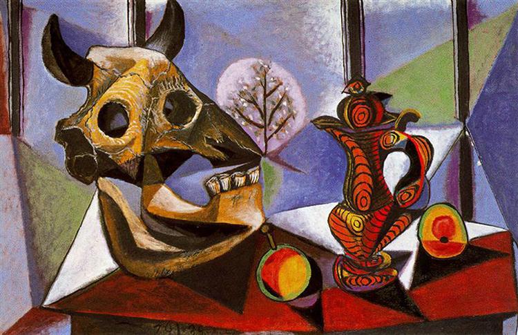
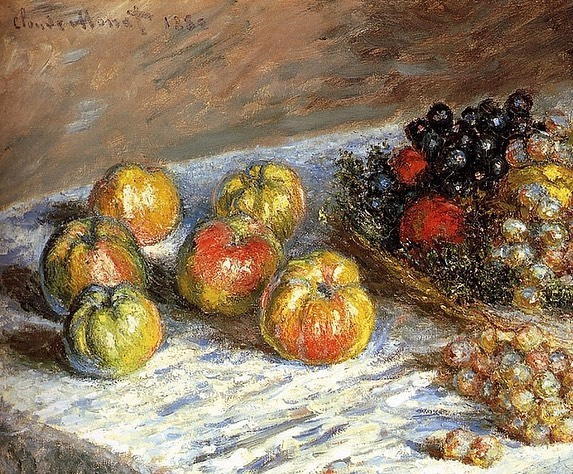
After World War II until the rise of Non-objective paintings, France became the centre of still-life painting, with artists such as J.B.S. Chardin, Eugene Delacroix, Gustave Courbet, Claude Monet, Vincent van Gogh or Pablo Picasso dominating the scene.
During the 1800’s still life emerged within Dutch and Northern European paintings. These paintings were heavily impacted by religious influence as well as the urbanization of both the Dutch and Flemish society’s, emphasising the use of personal possessions. The goal of a still life composition is to direct the viewer’s eye through a painting and lead them toward what the artist thinks is important. Artistic compositions of inanimate objects were considered the lowest form of art because they were decorative, lacked gravitas and could be appreciated without any intellectual effort.
It is alleged that the first still life was produced in 1504 by Jacopo De’Barbari.
Objects often used: burnt candles, human skulls, dying flowers, fruits and vegetables, broken chalices, jewellery, crowns, watches, mirrors, bottles, glasses, vases
“The transience and brevity of human life, power, beauty and wealth, as well as of the insignificance of all material things and achievements.”
Analysis
This painting produced in 1650 is an oil canvas painting by Vanitas. Although it is displayed in the background, I believe the focal point of this painting is the African servant, depicting the immoral and unjust status of the world at the time. The flowers which look as if they’re wilting represent the shortness of life and are meant to remind the viewer that existence is meaningless without the hope of salvation which from a modern viewers point of view could create a sense of hope for the servant who was probably treated poorly. As well as the skull Such a symbol is called a Memento Mori, a Latin phrase meaning “Remember that you will die. “On the other hand, the flowers are the only part of the painting which display vibrant colour and life. The use of the flowers being white lilies could be associated with purity and the Virgin Mary’s immaculate conception which correlates with the image of the virgin Mary which the slave man is holding. The objects in this painting such as a recorder instrument and a paint pallet could suggest that all of the servants belongings were in order to entertain the rich employer.
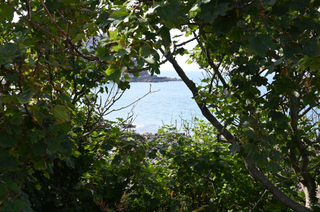
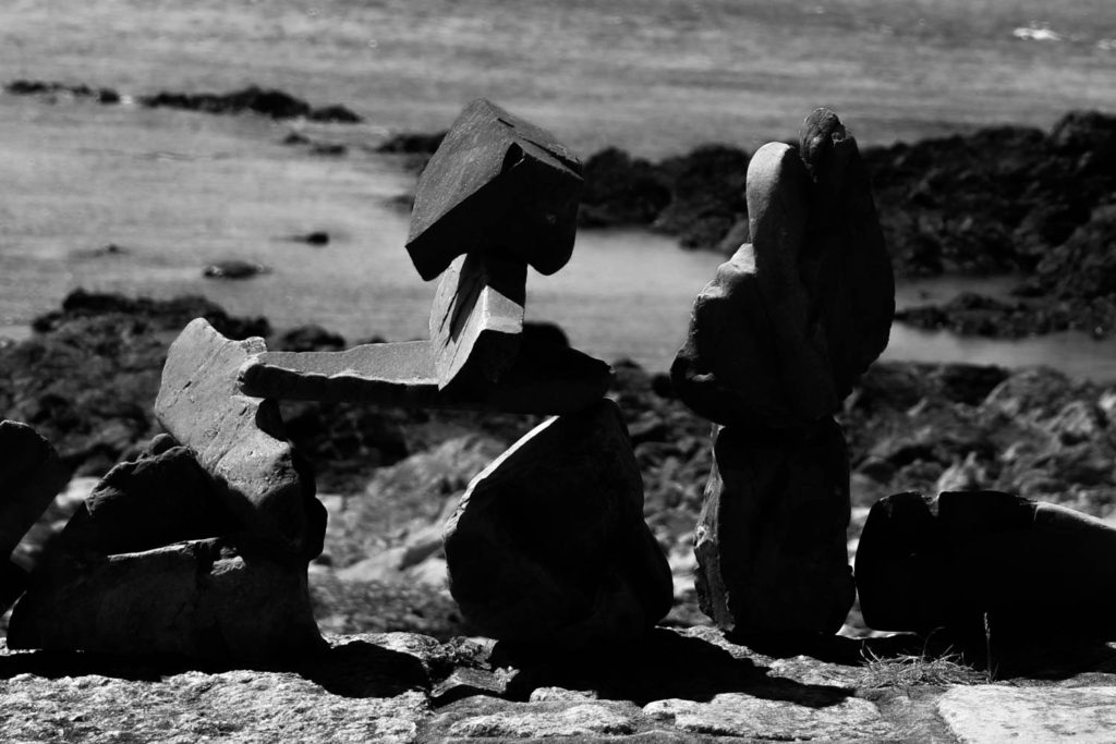
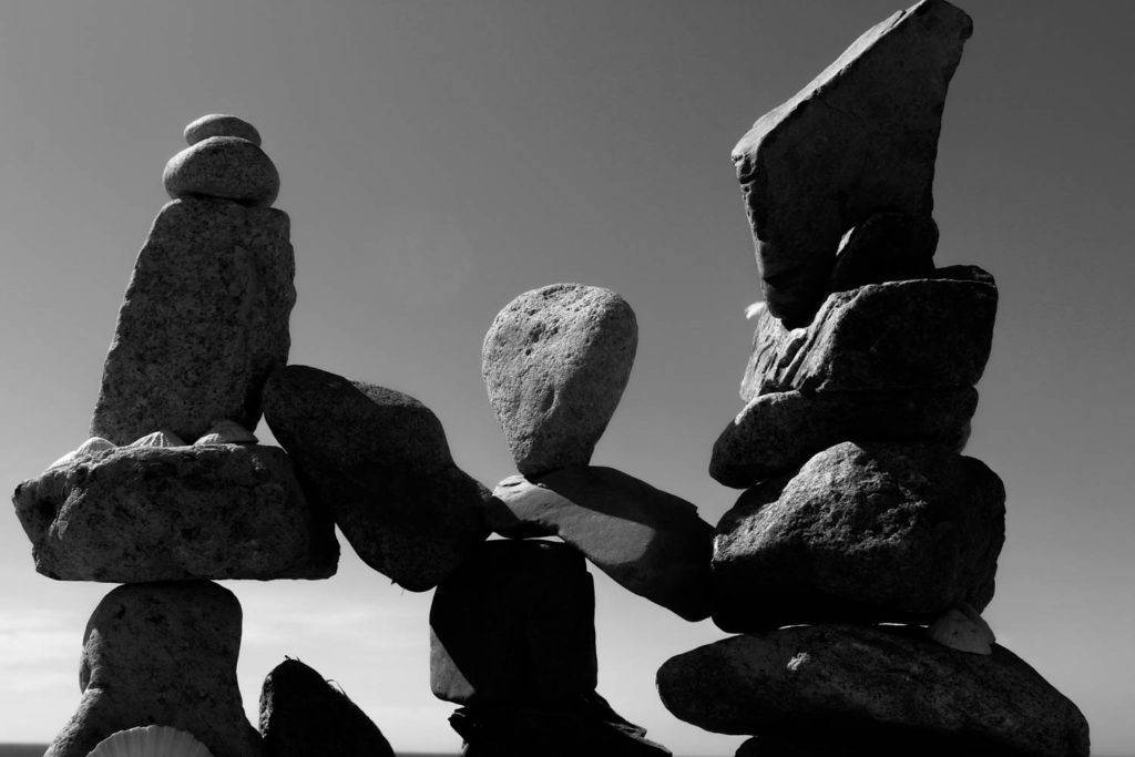
Over the summer I went back to St Ouen’s and did another shoot following a similar route to the one taken on the field trip previously.
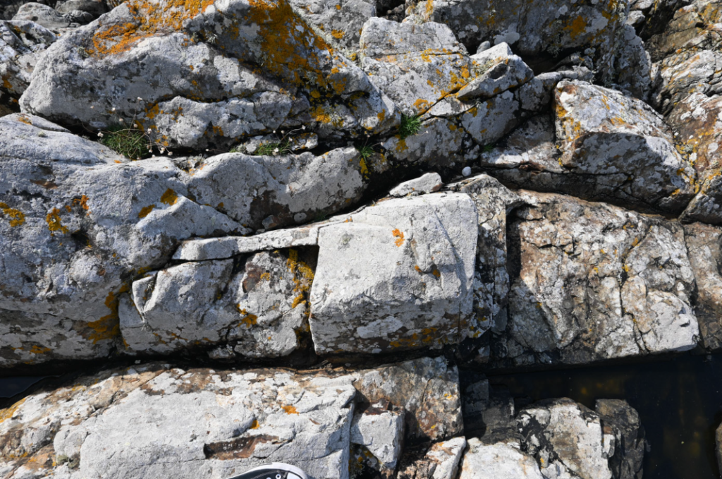
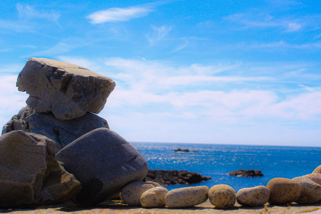
The weather was pretty clear and I was lucky to find some stacks of rocks that people had made between by visits, adding a new on-theme subject matter.
I tried to be more experimental with my editing, using a mix of monochrome and brightly coloured images, and I like having this much variety in my images. I also tried to vary what I took pictures of, as well as keeping the composition in mind.
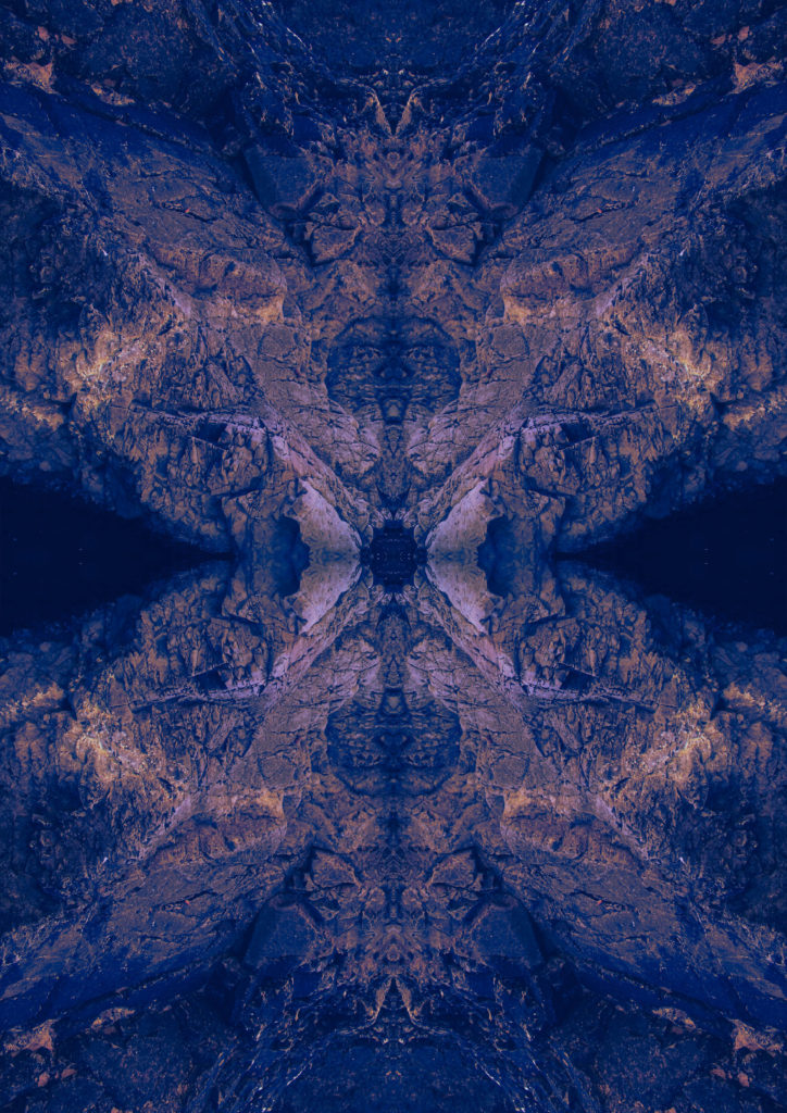
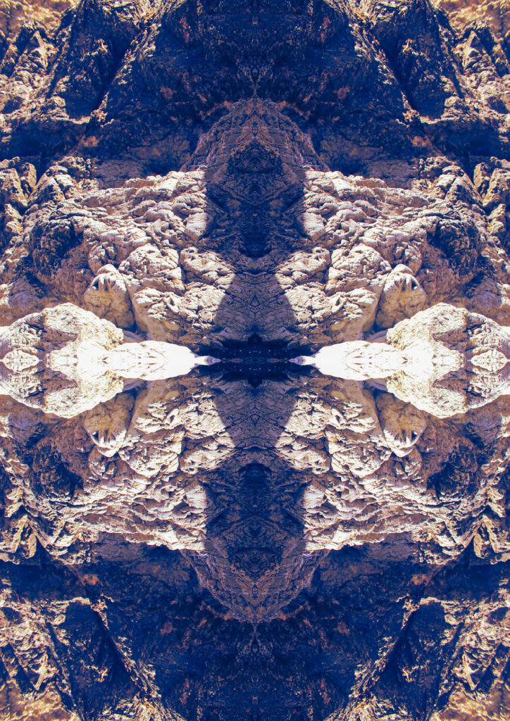
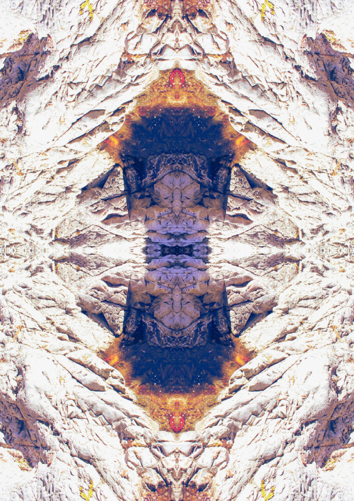
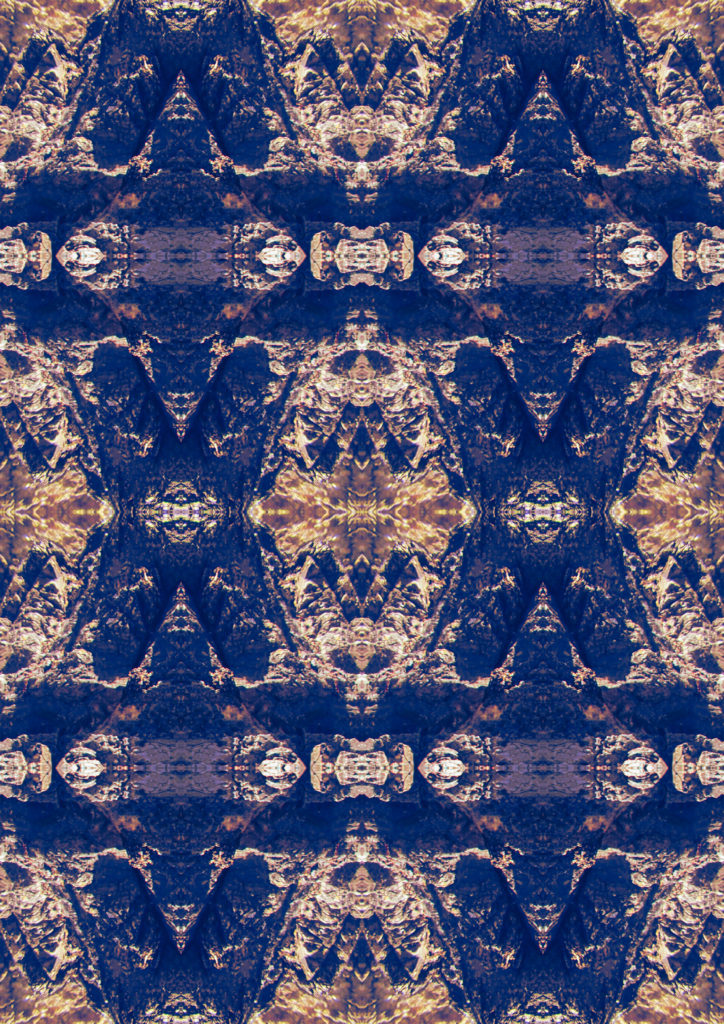
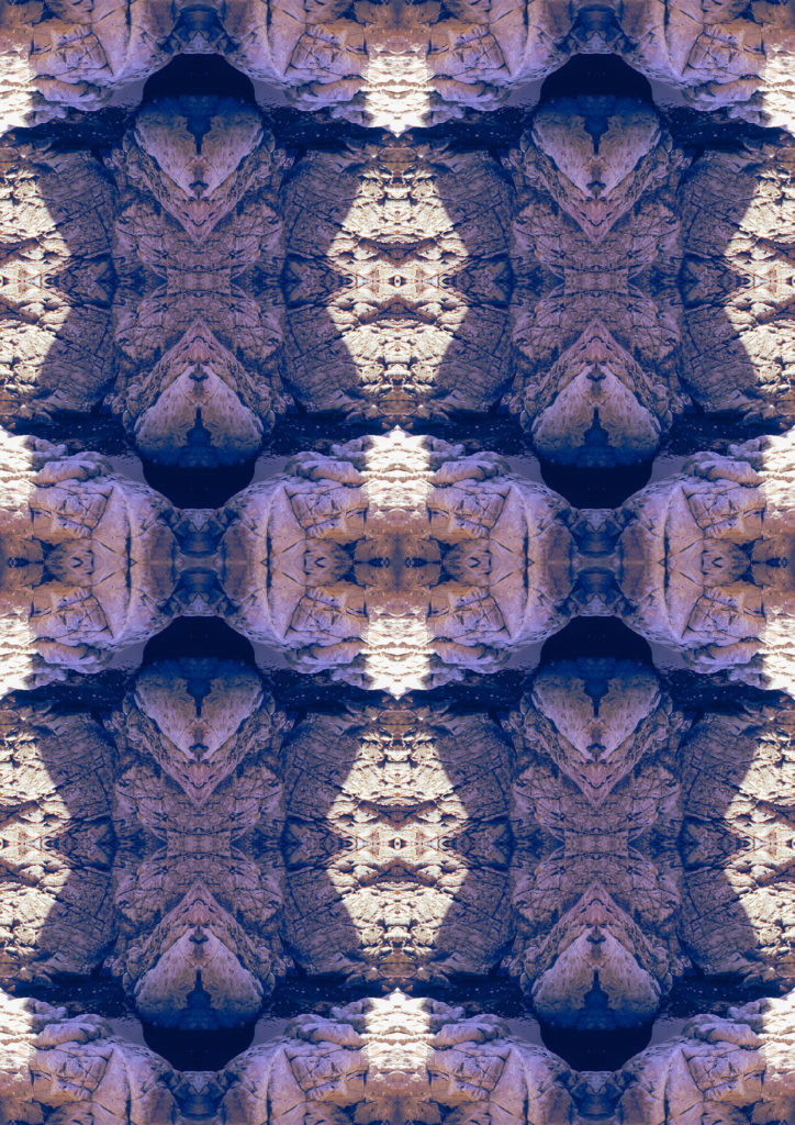
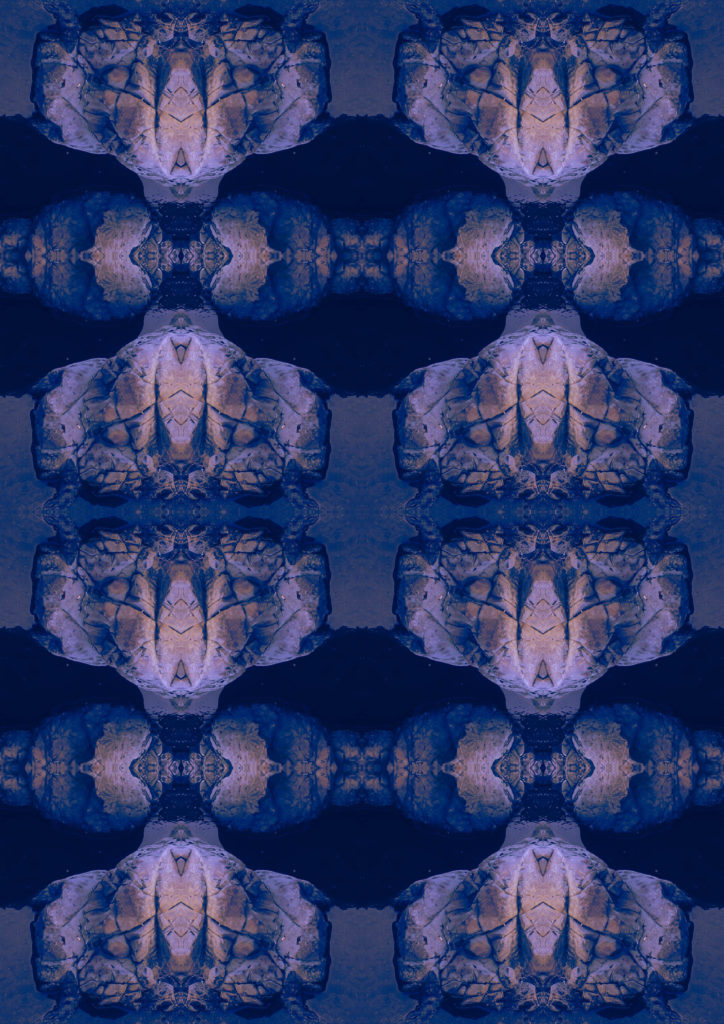
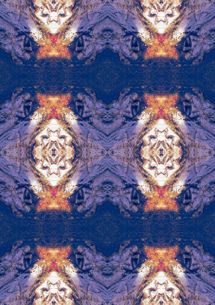
I also made some overlays in photoshop, as well as more reflected images because it is a style I really enjoy using.
If I had more time, I would of gone back multiple times trying to photograph the environment in different weather conditions, to create some more variety between shoots and give me more images. I also want to look into visiting the other SSI in Jersey, and photographing them, again to create more variety.
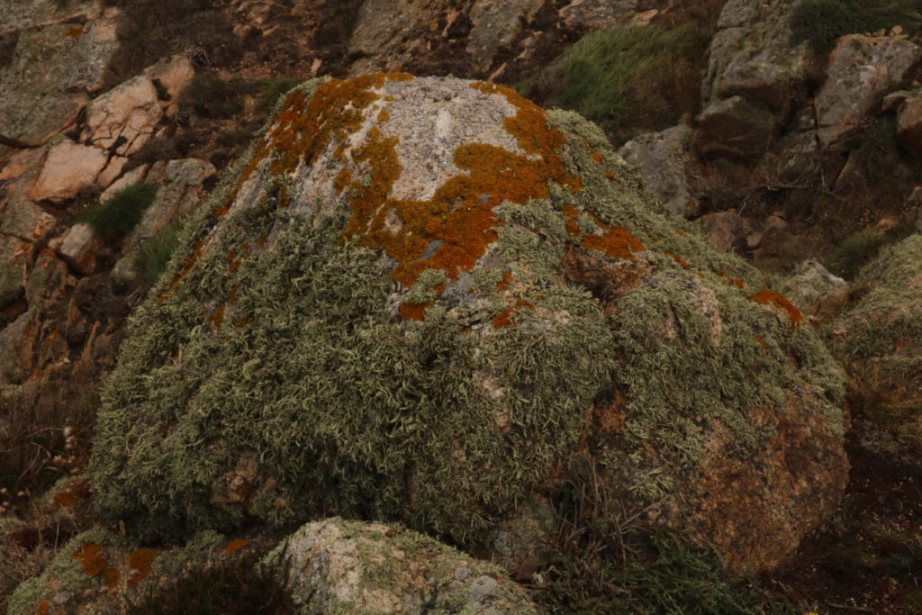
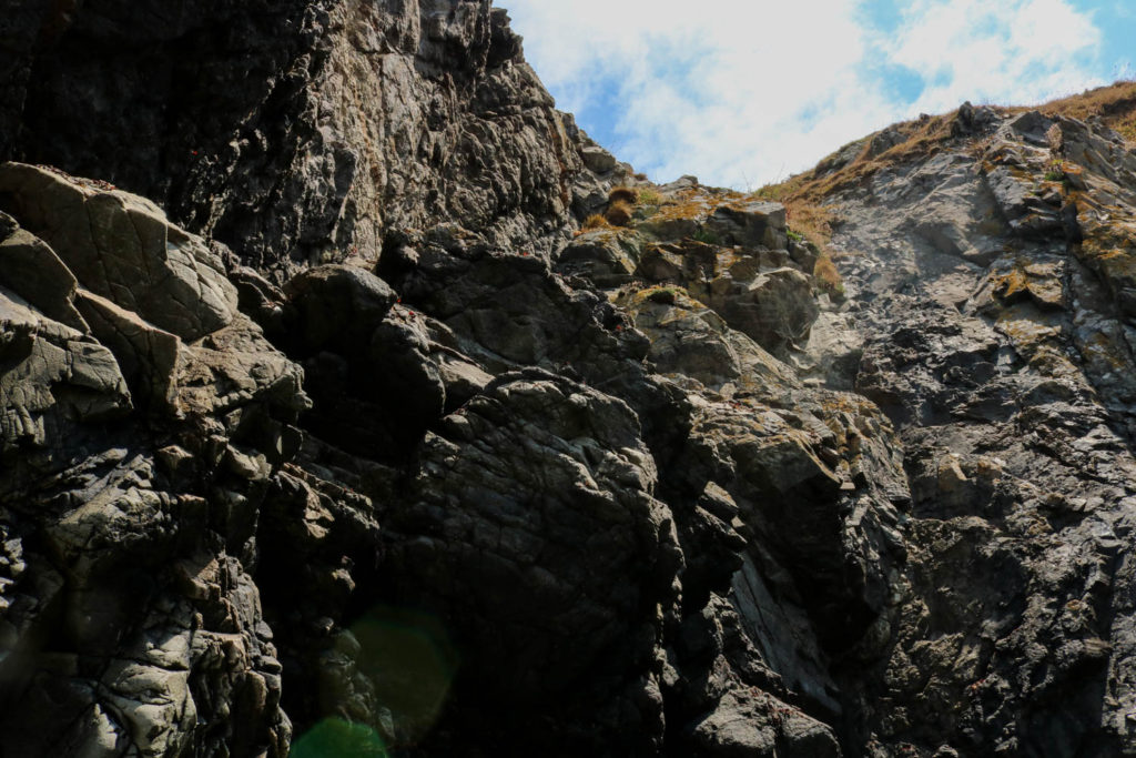
I like the perspective of this image because it is taken from a very low angle looking up at a small bolder. the perspective make sit look like it is towering above the surrounding landscape. I also like the depth of the image the grass in the foreground the bolder min the mid ground and the background of the cliff edge.
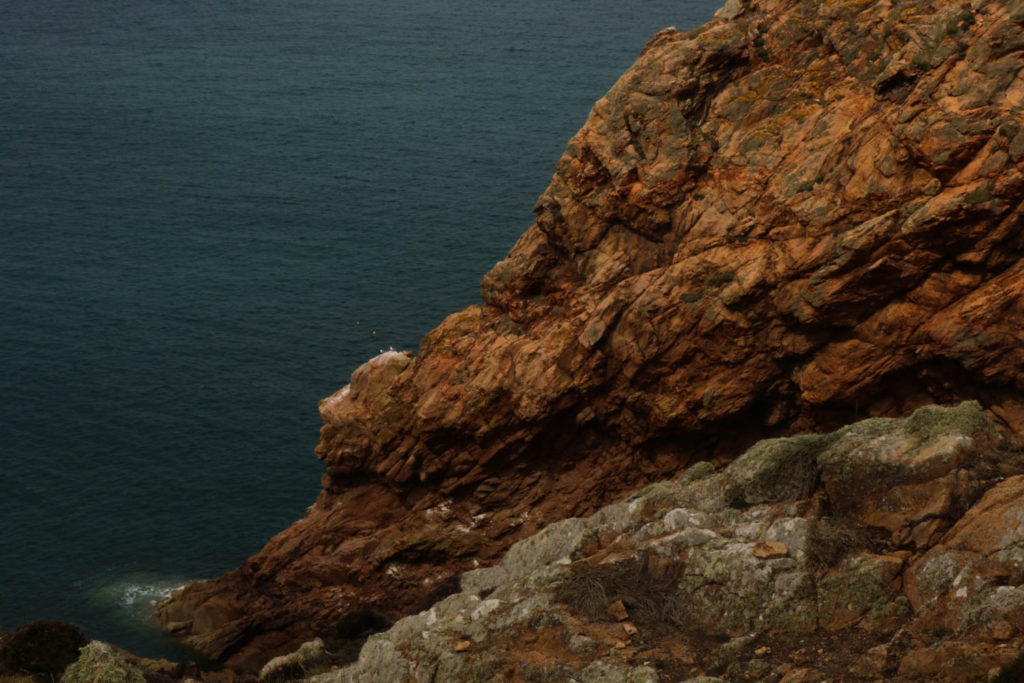
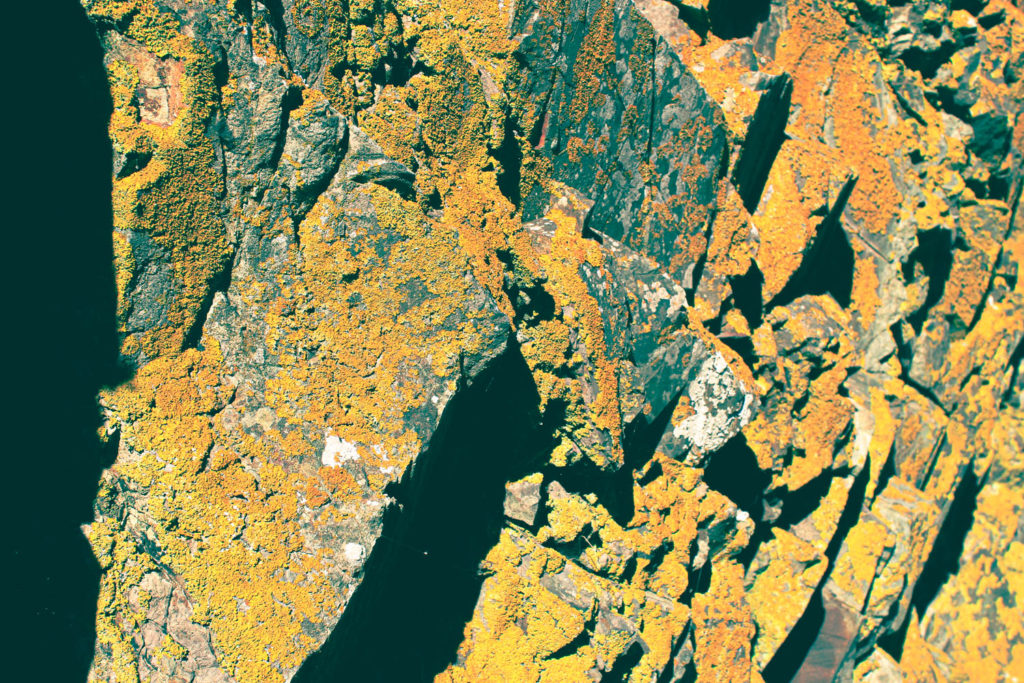
I experimented with this image a lot to bring gout the contrasting colours in this image I tried to increase the divide in the image created by the gap in the stone created by coastal erosion.
I chose to change this image into black and white because I like the reflections on the water in more contrast I chose to position the bird in the centre of the frame.
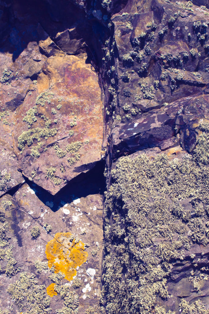
I put this image in black and white to create contrast between the dark divide in the rock I made the middle darker and the edges lighter to show it gets darker the deeper you go in.
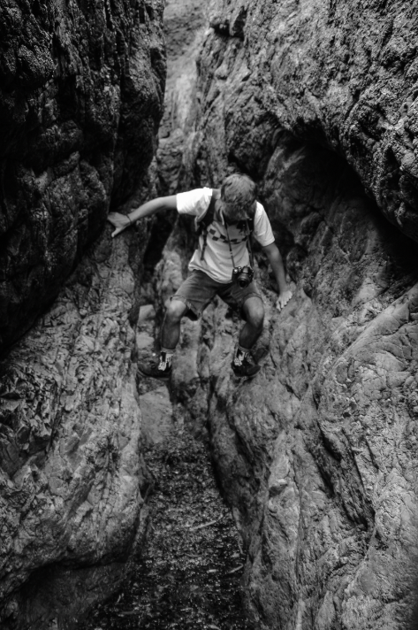
I took this photo of luca trying to cross the wet sea weed i tried to position him in the middle of the image. it creates the effect that he is levitating above the floor because he has wedged himself between the two rocks.
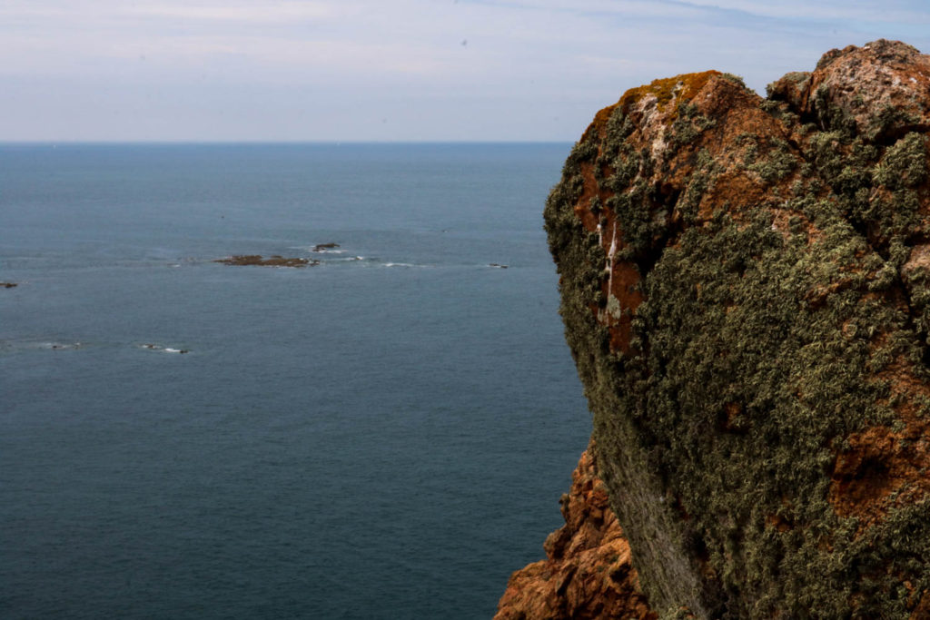
I like this photo because I didn’t realise into editing it that there was a sail boat positioned above the peak of the pinnacle this gives a lot of contrast between the dark rock and ocean and the bright white sail and boat.
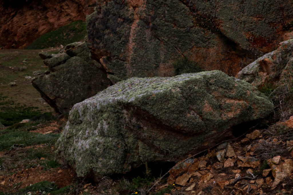
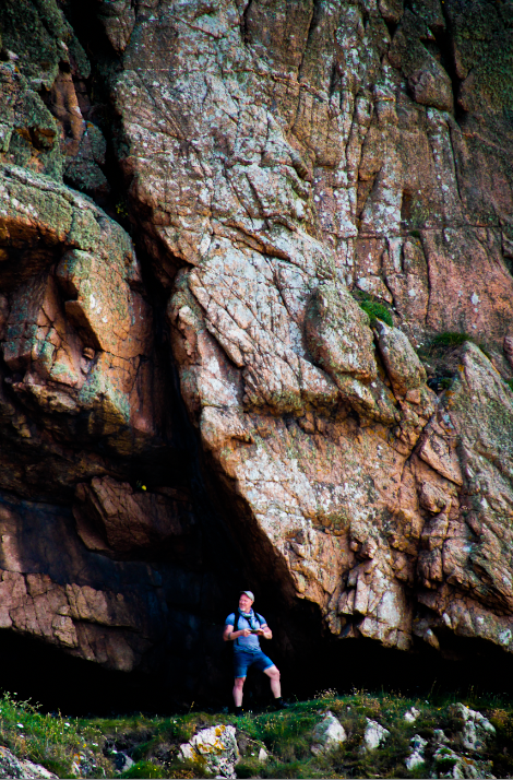
I like this image because it shows how big the rock is in comparison to Mr toft. the way the overhang slopes down cresting a darker background for him to stand out in front of .
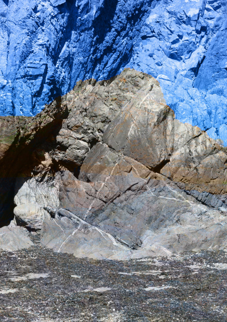
i like the way this image is divide into light and dark. it is almost a diagonal line separating the light sky and water to the darker rock and grass i made the rock darker but tried to keep some texture in the rock I think I did this well.
I have chosen these as my best images from that field trip.