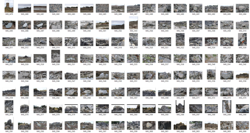
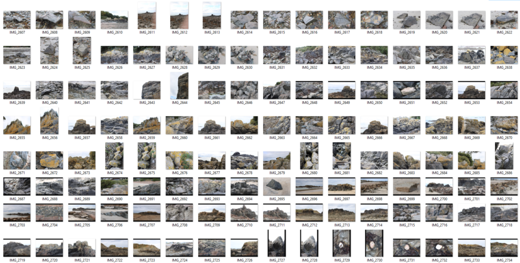
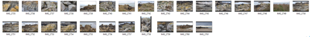
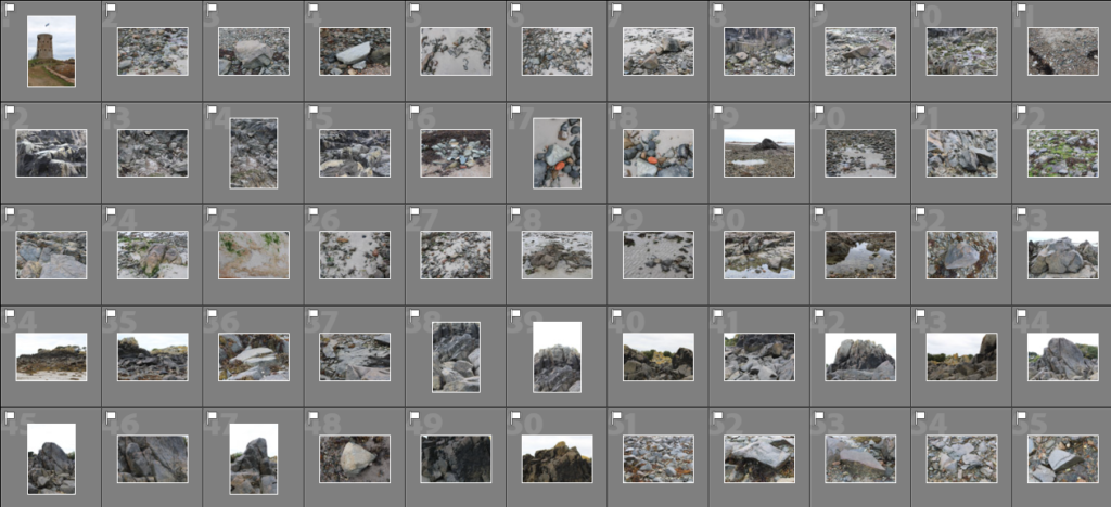
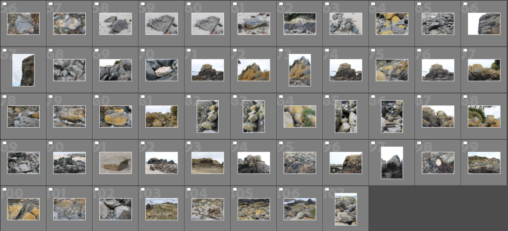
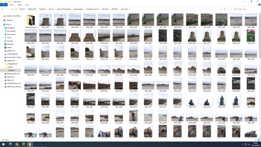
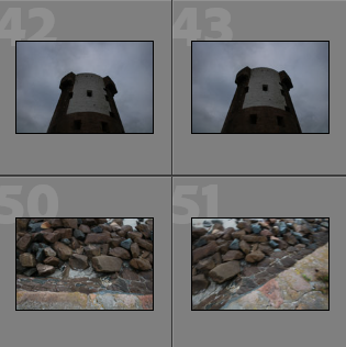
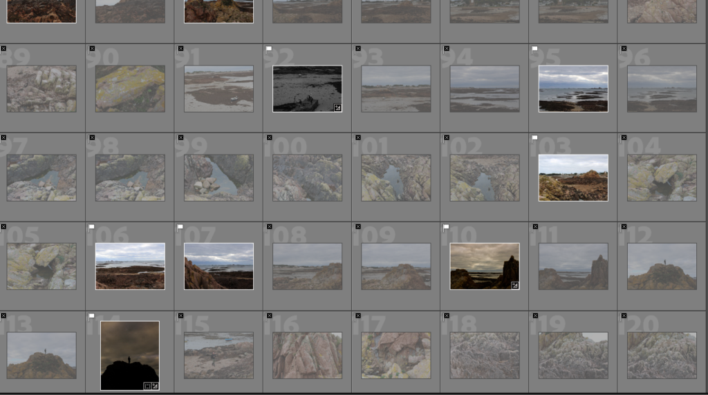
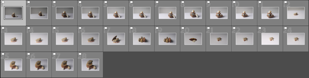
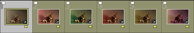
Contact Sheets
Continuious Lighting 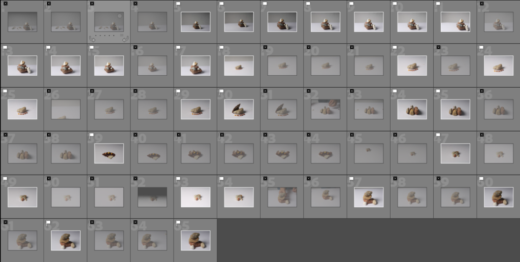
Flash Lighting
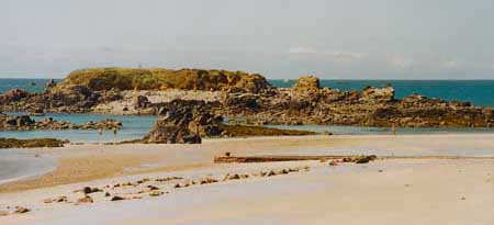
Above are two sets of contact sheets from my studio photoshoot. One is of the images using continuous lighting with a plain white background and the second is a set of images using flash lighting with a two-tone background.
Continuous and Flash Lighting
Continuous lighting: With continuous lighting, you can see how the light falls on your subject as soon as you switch it on. You don’t have to wait until you’ve taken a photo to get an idea of what kind of image you’re going to end up with

My Example
Flash Lighting: The biggest benefit to flash lighting is that type flash provides much more power and in a shorter burst that is less disruptive to a model/object. Also, some darkness and shadows are illuminated when using this type of lighting.

My Example
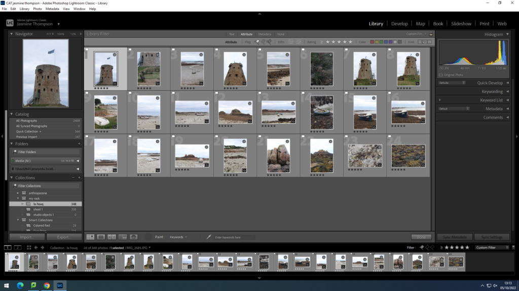
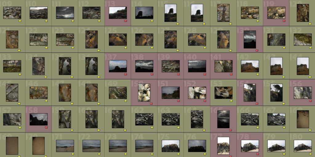
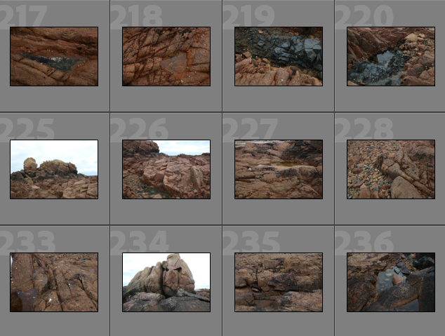
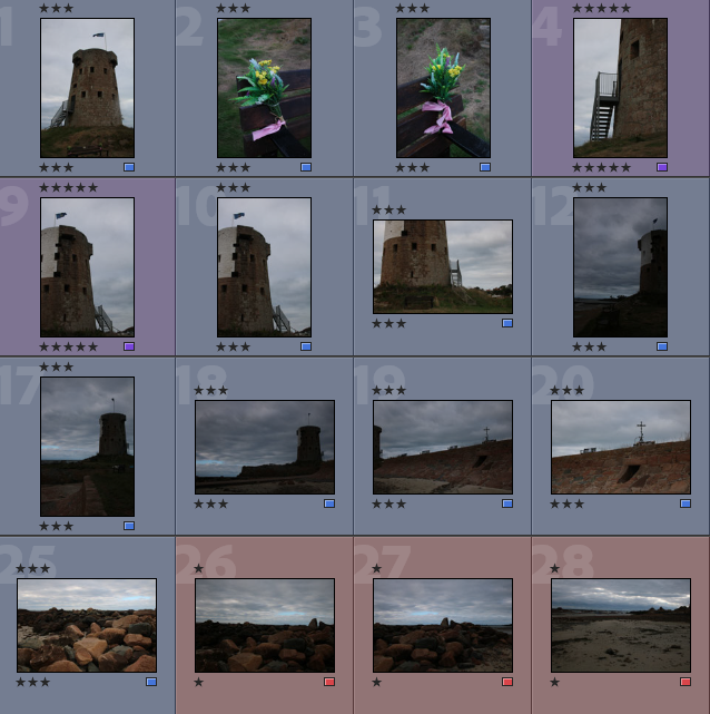
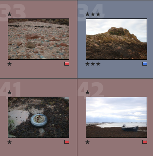
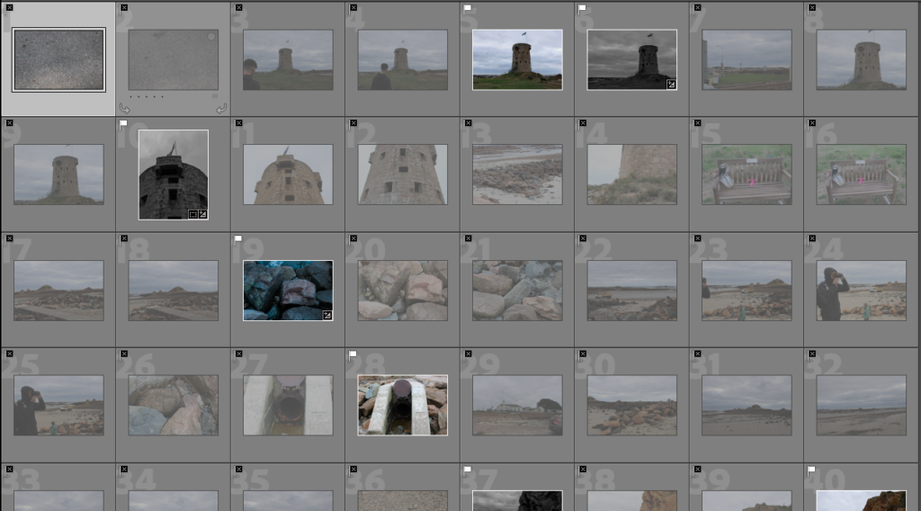
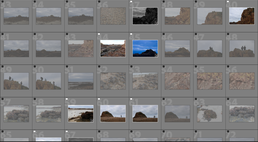
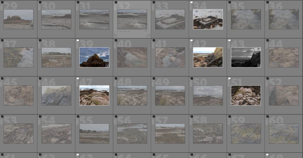
Selecting My Images (Flags)
Flash Lighting 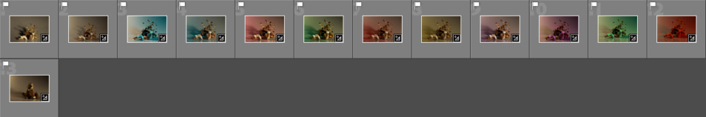
Continuous Lighting
To help with the selection of my images I have used the different flags to differentiate between the images I want to use and the ones I don’t. To do this I used the ‘p’ and ‘x’ tools, the ‘p’ tool put a white flag at the top of each photo which helps to indicate the ones I am using and the ‘x’ tool will put a black flag which will take the photo off the list of ones that I will be using.
Editing
Continuous Lighting 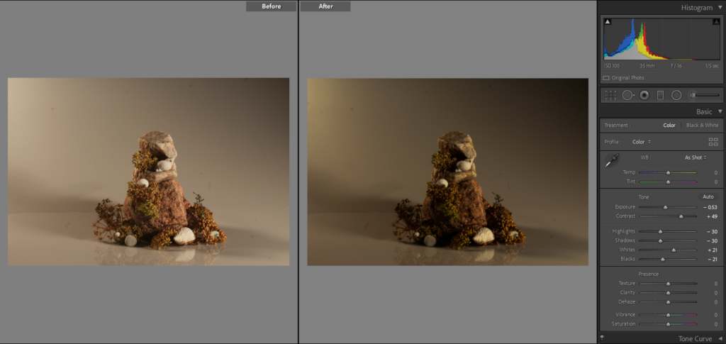
Continuous Lighting
Above I have put two edits to the continuous lighting photo shoot, I have put the transparent coloured sheet in front of the light to create different lighting and the other I have left the lights plain. In both, I have only slightly adjusted the exposure, but for the image on the left, I have decreased the contrasted, whereas I have increased it on the right to get the darker more exaggerated shadows. For the photograph on the left, I wanted it to be brighter and not so dull as when it was taken so I have adjusted the highlights and whites settings which have helped to get the desired look.
Flash Lighting 
Flash Lighting
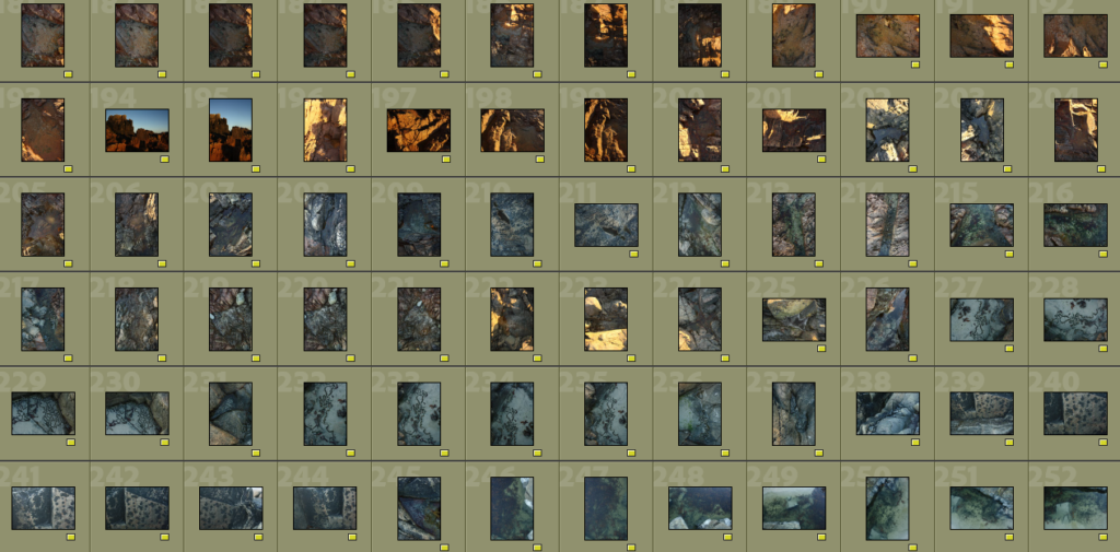
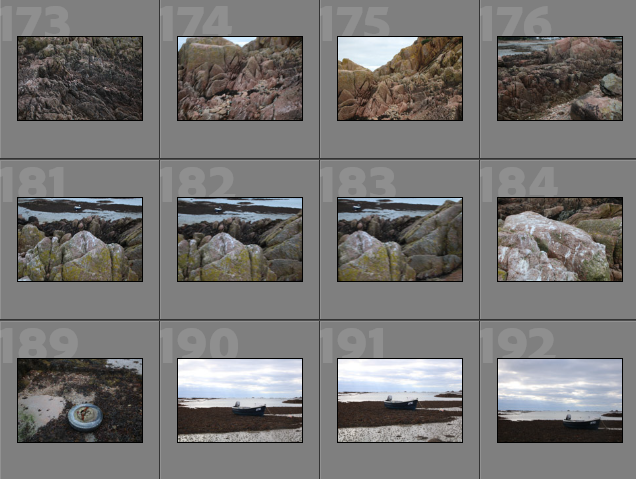
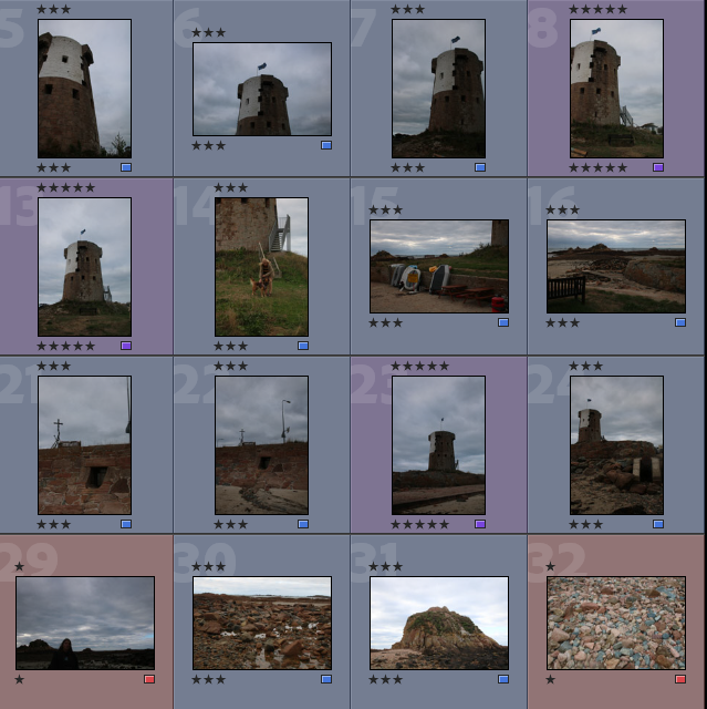
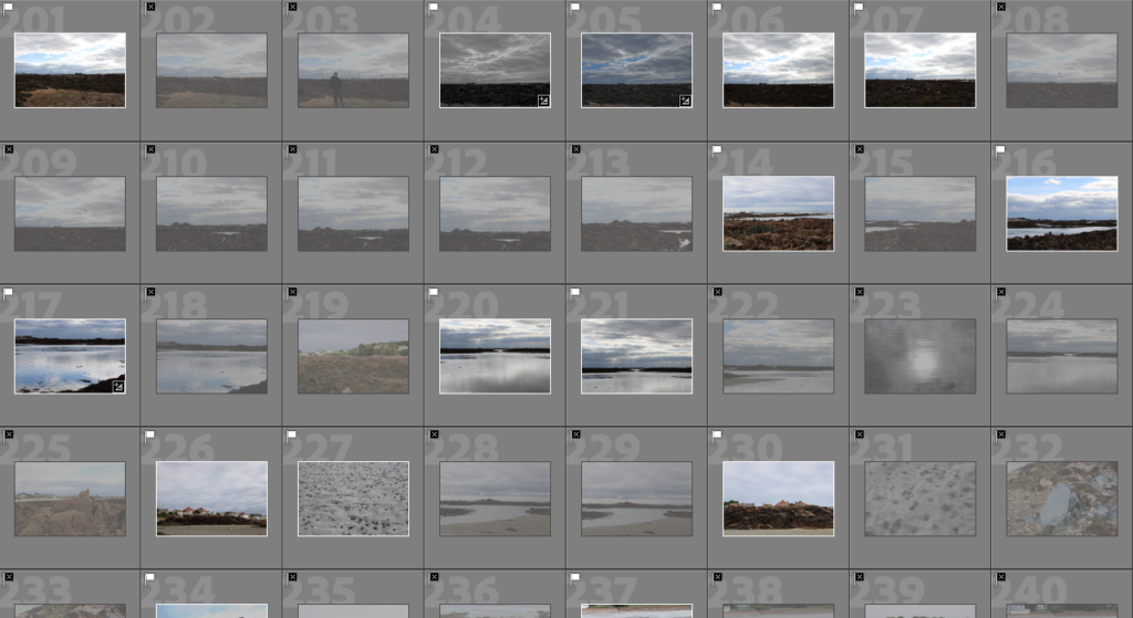
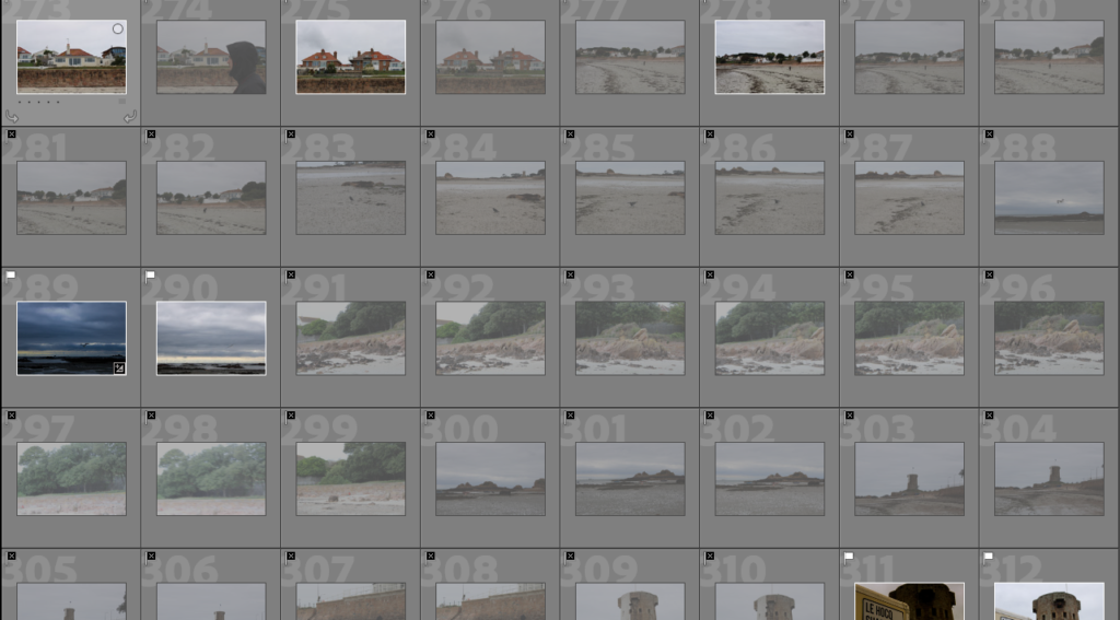
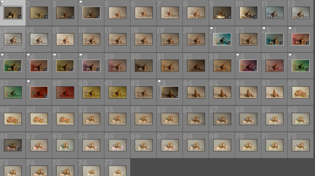
Sub selection (Colour coding)
Continuous lighting 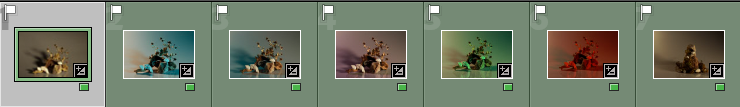
Continuous lighting 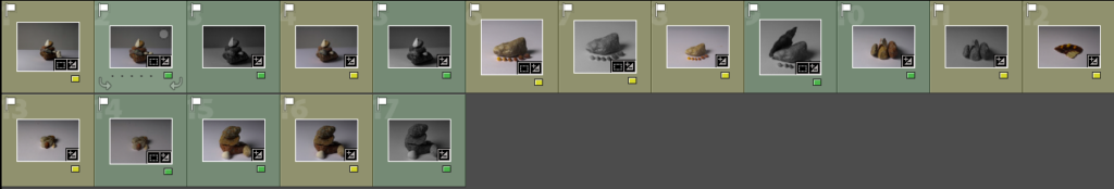
Flash Lighting
Above are some contact sheets showing how I have colour-coded my images to help select my final images. I have used YELLOW to represent the images I think are average, which I might use in my final images and I have used GREEN to highlight the photos I think are best to be part of my final image collection.
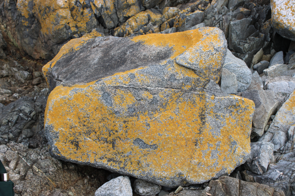
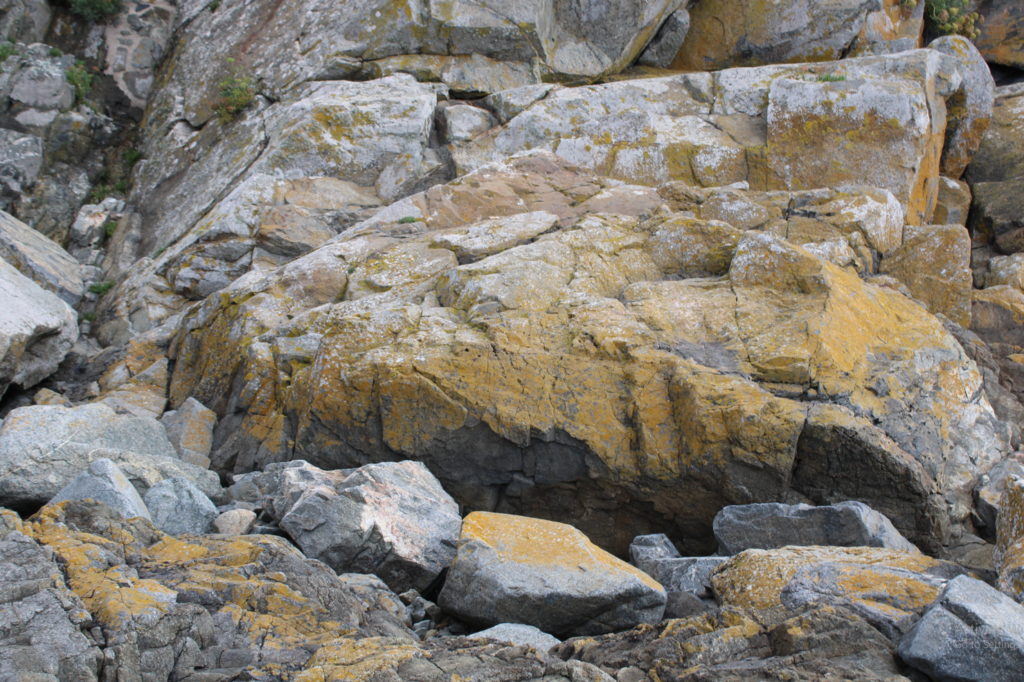
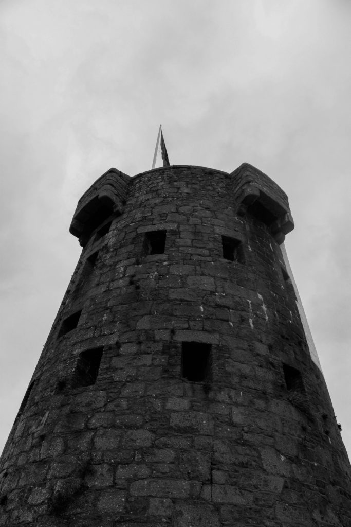
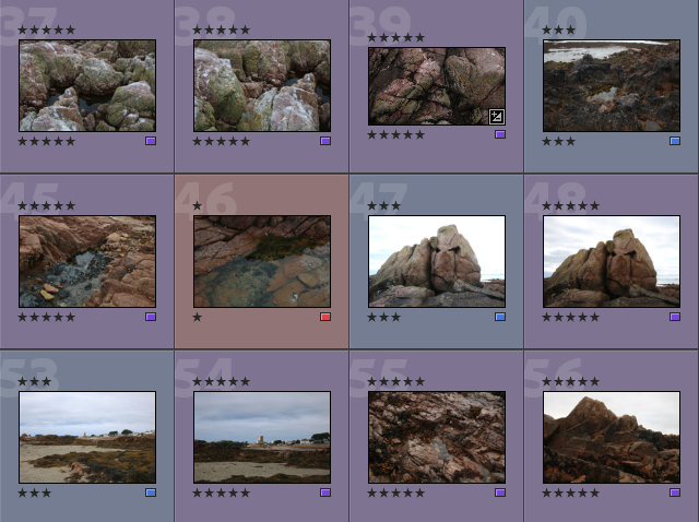
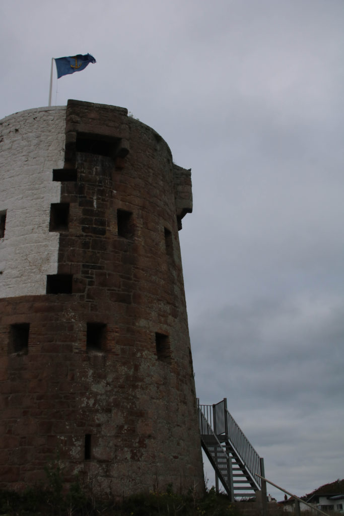
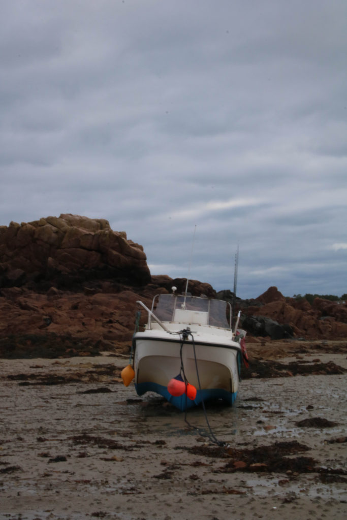
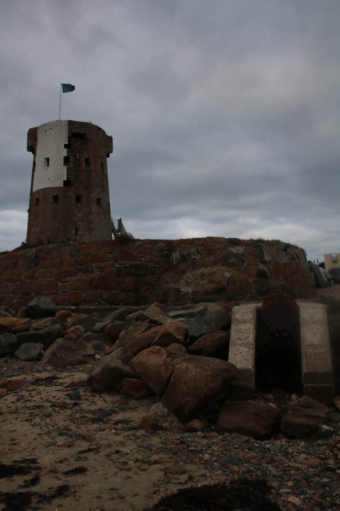
Final Images

1st 
2nd 
3rd
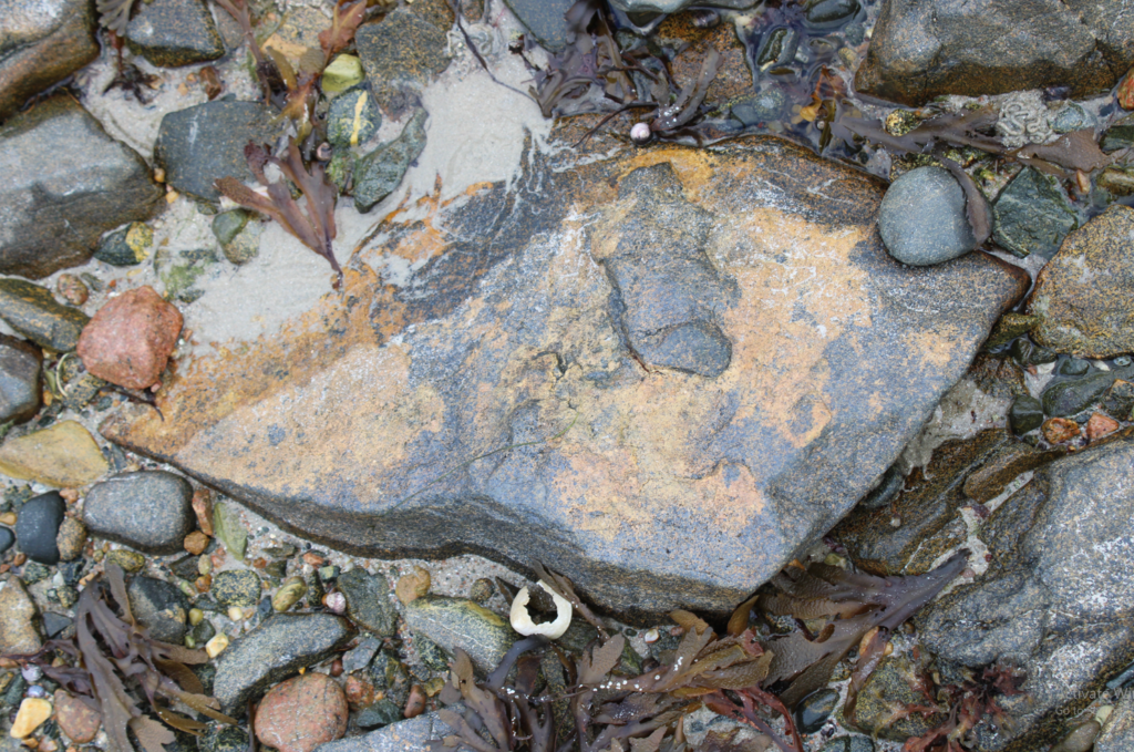
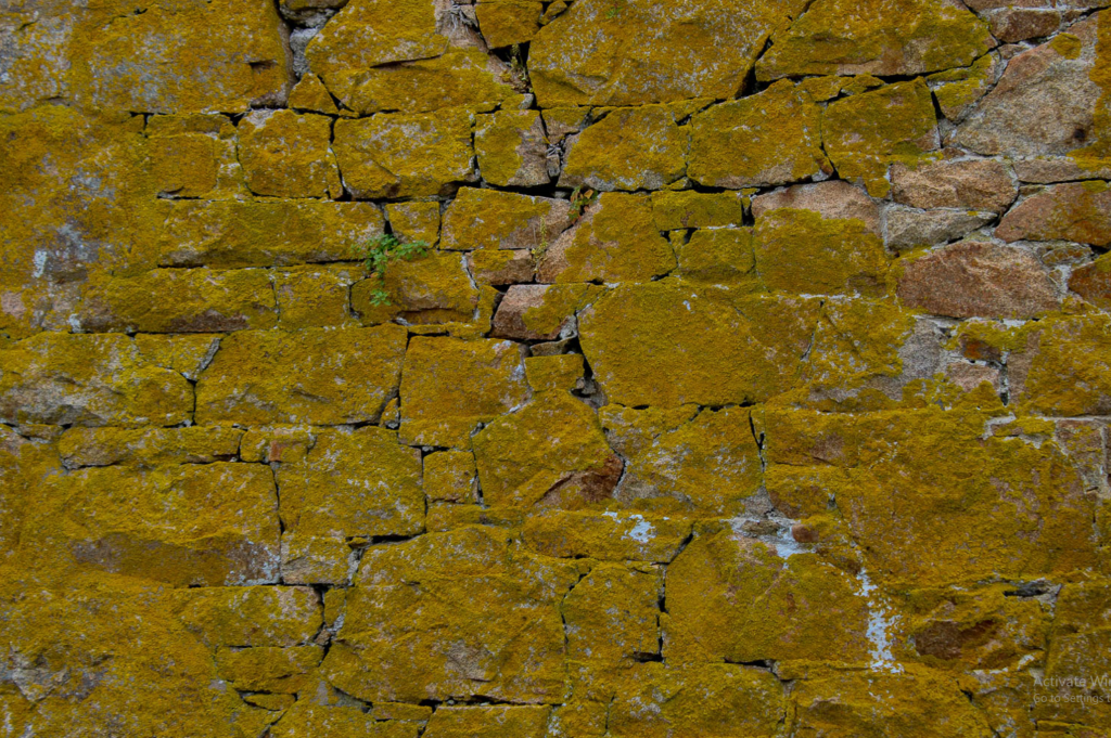
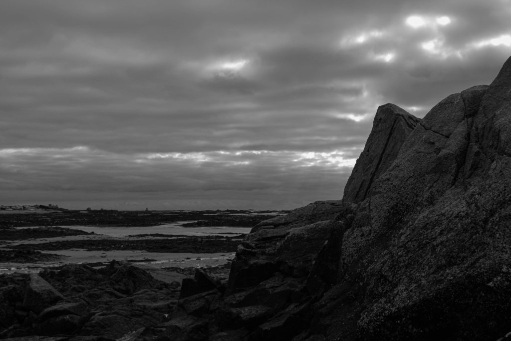
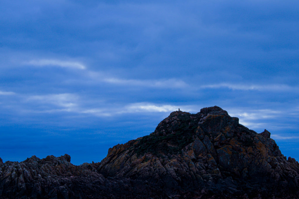
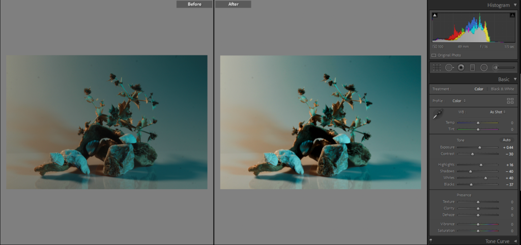
Here I have the first three images of my collection in the still life project, my first photo is one of the first designs I tried with the rocks also it’s my first attempt at continuous lighting, it also uses coloured plastic sheets. I like this image as I think the pink lighting on the left side compliments the more natural, beige shade of light on the right side. Also, the composition of the image is eye-catching which is enhanced by the different lights. Another example of continuous lighting is my second image, in this final piece I have kept to the yellow/beige lighting instead of using one of the coloured sheets. I enjoy how the light compliments the colours that the objects hold. Another feature which makes the photo more eye-catching is the stream of light that shines diagonally from the left side of the image, I feel as if it acts like a spotlight on the compilation of objects. Furthermore, I feel the placements of all the different objects make a nice composition that is satisfying to look at, it has a tall structure with leaves coming off the side to give the final piece dimension.
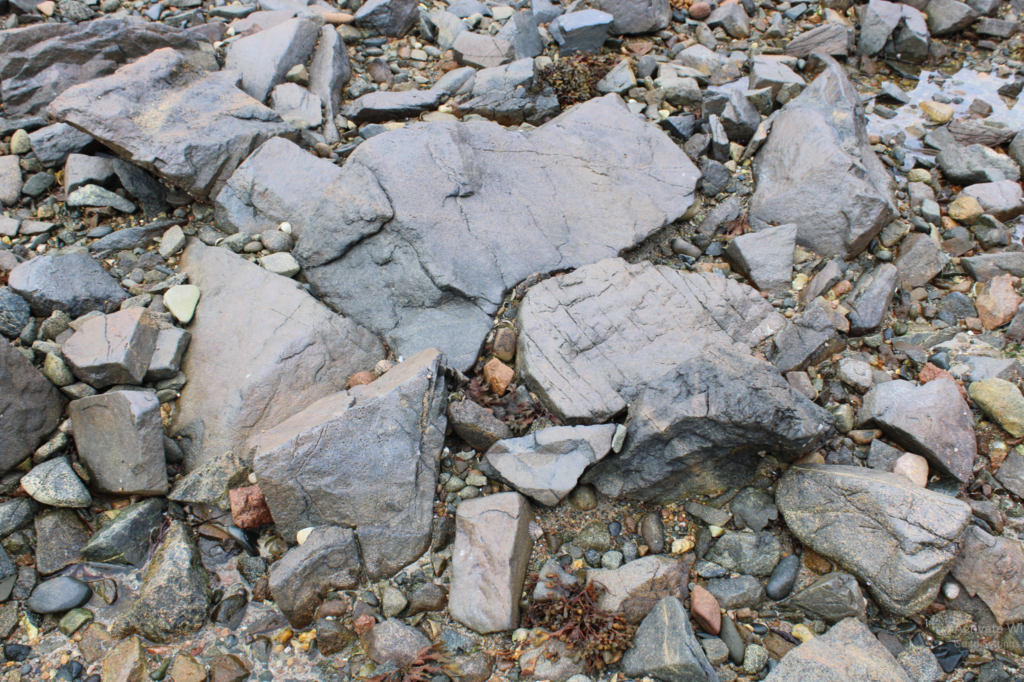
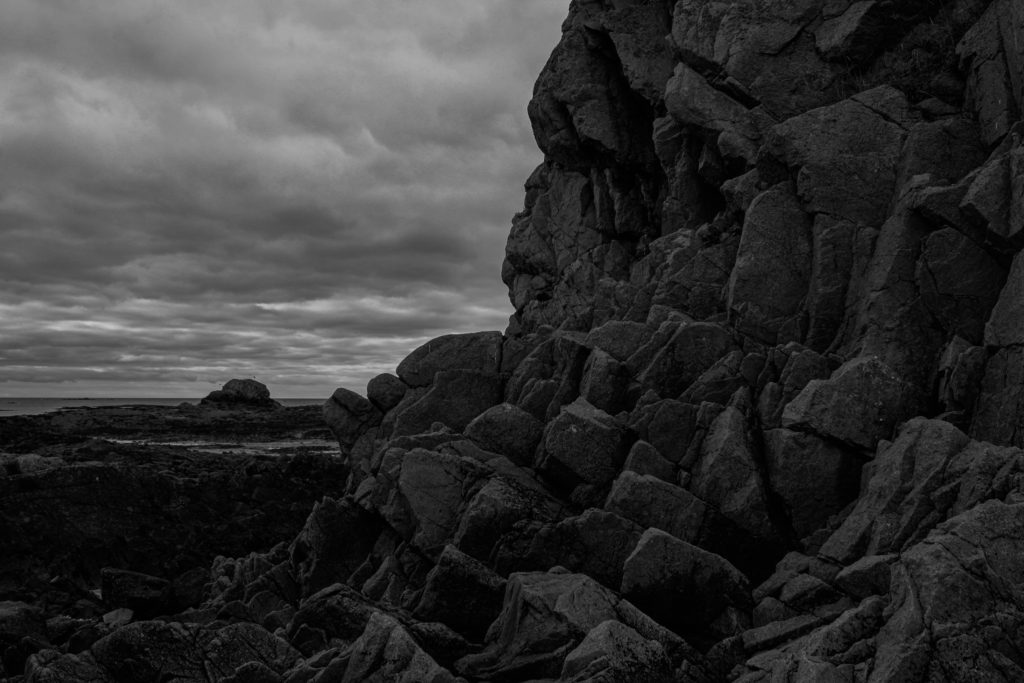
Lastly, for my third image, I have also used one of the red plastic sheets to change the lighting which gives the photo an eerie feeling as red is normally a symbol of danger, I feel the colour of the lighting adds to and compliments the composition of the structure. The composition of the photo is the same as the 1st in my collection but I think this lighting is more eyecatching and tells more of a story than the other. Another feature of this photograph which I think draws people’s attention is the shadows that sit in the background and foreground of the image. the shadow towards the front is more defined and prominent which gives the final image a mysterious feel. The background is faded but can still be seen, it also can add a lot to the image as it gives views more to look at and analyse as well as complimenting the composition.

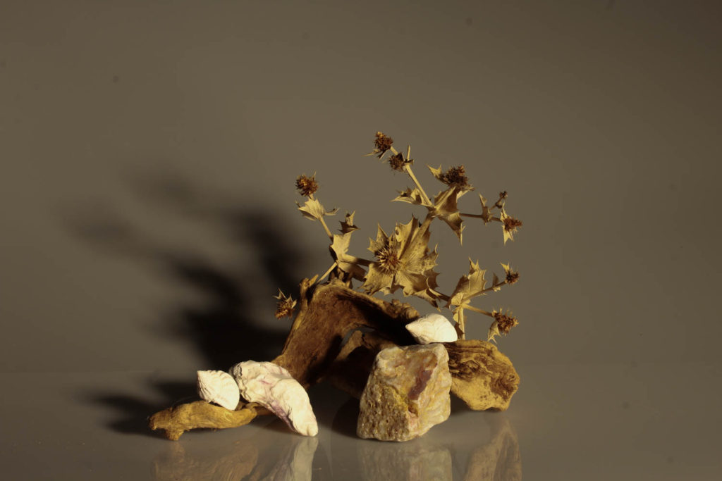
4th 
5th
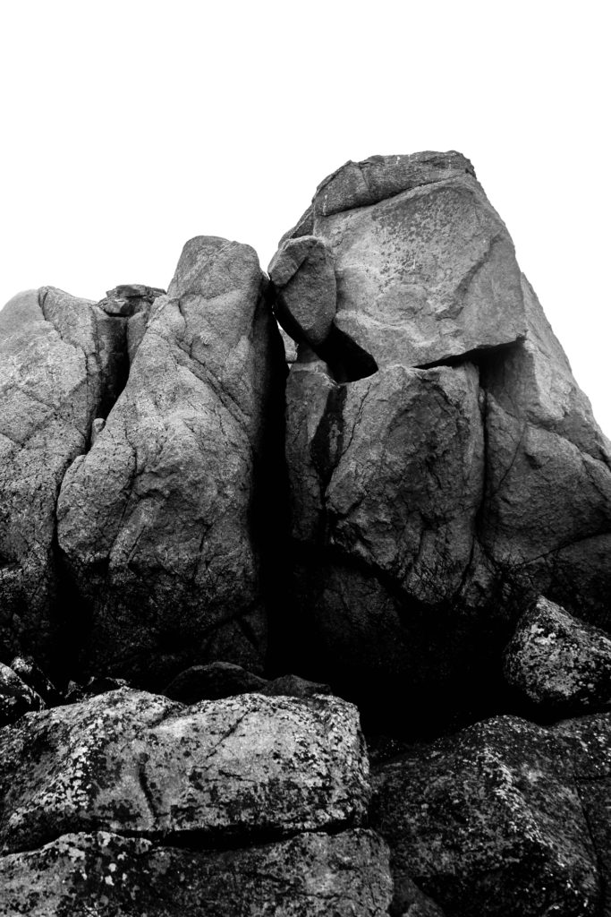
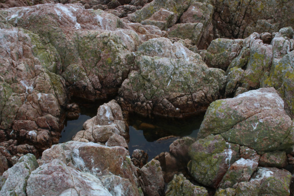
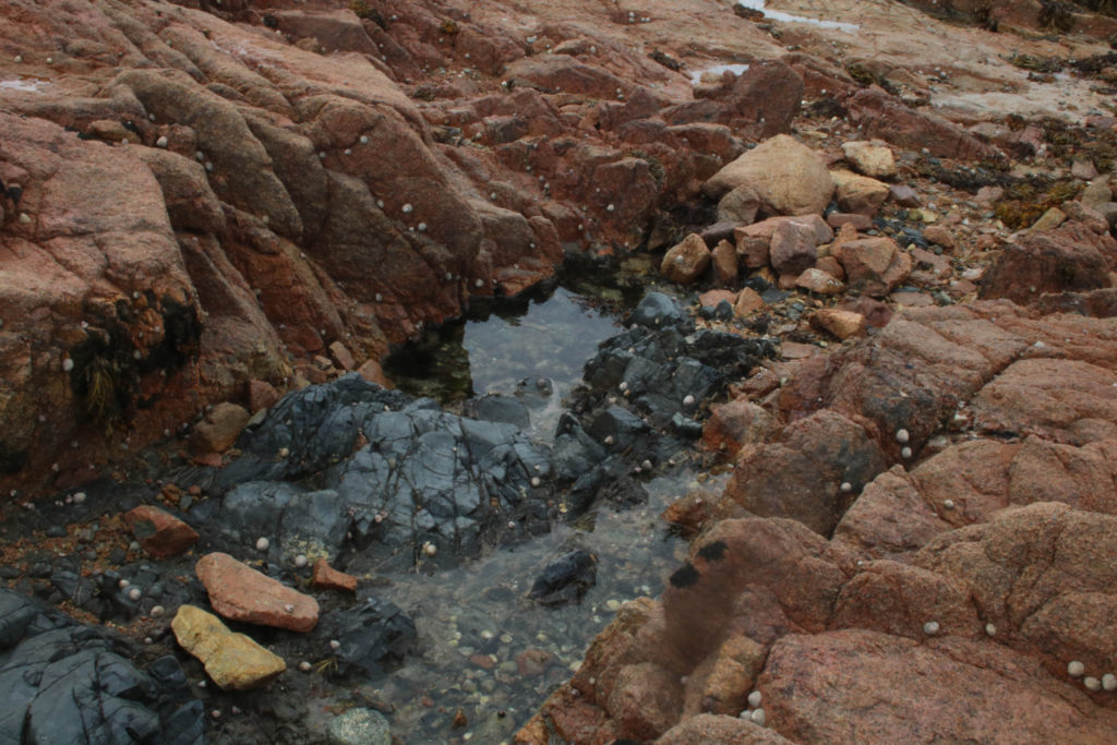
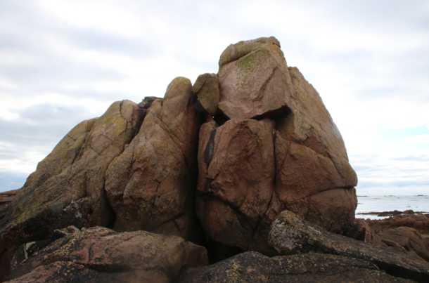
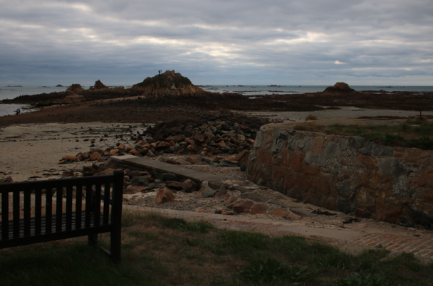
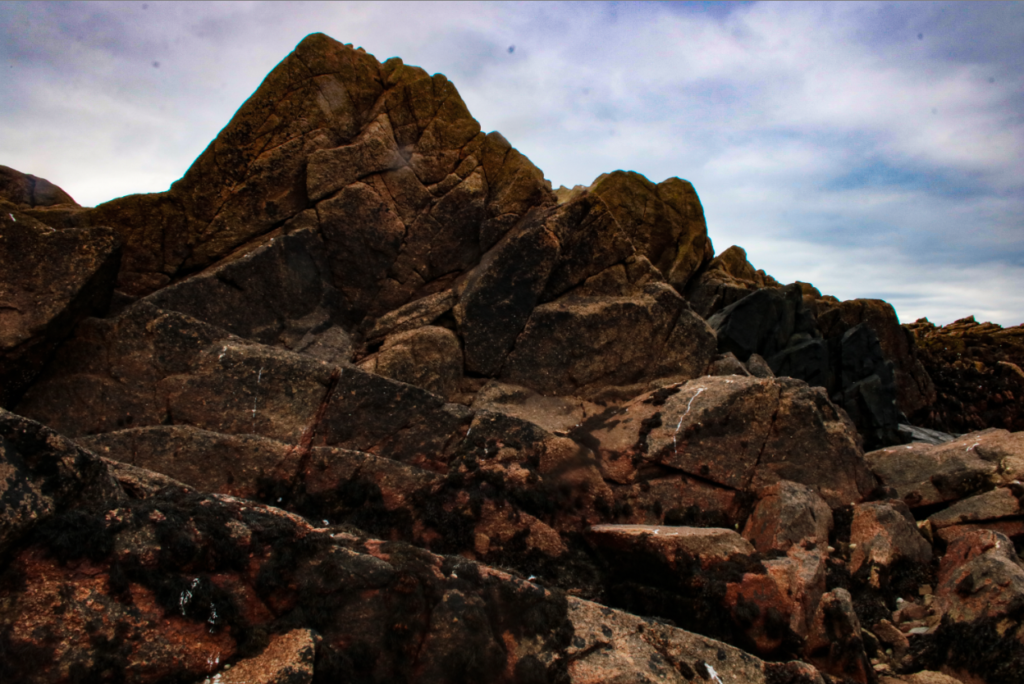
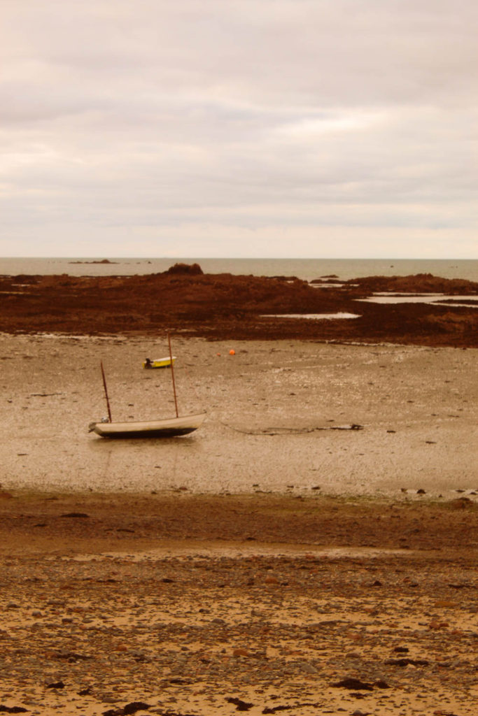
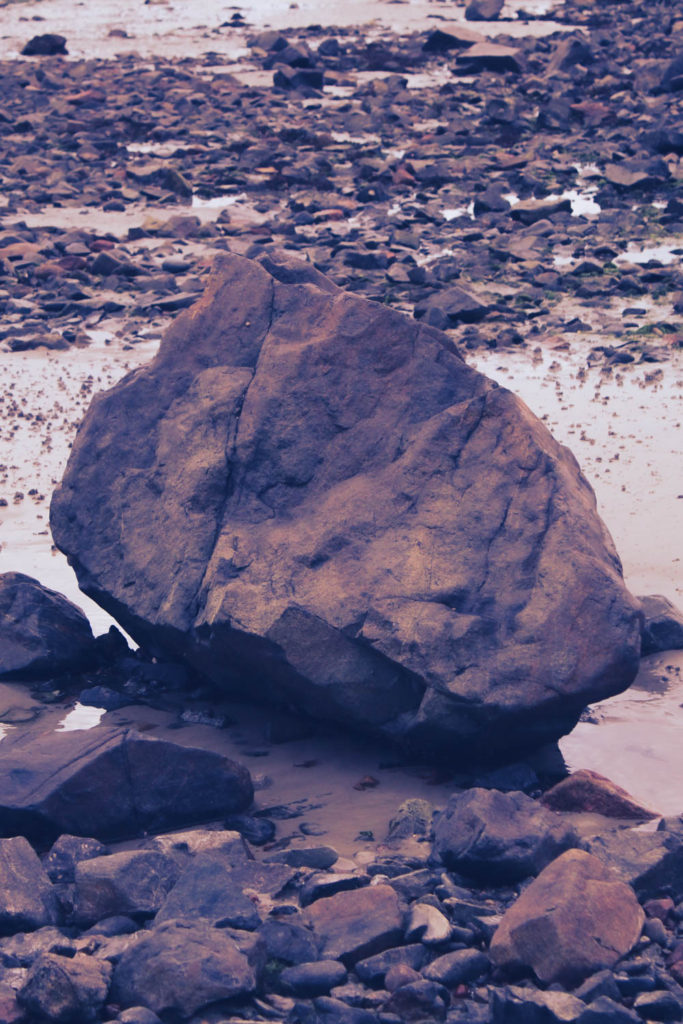
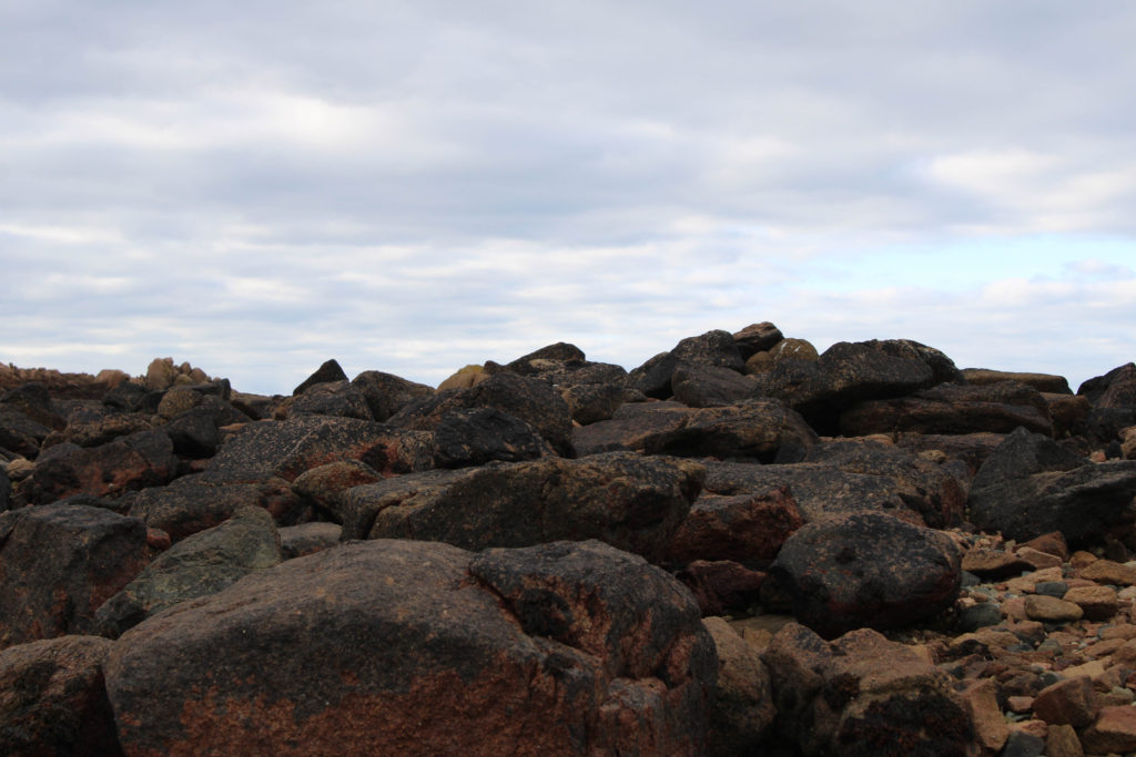
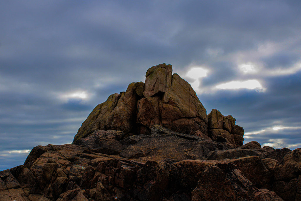
Above are my 4th and 5th images from my still life collections, for the photo on the left I have kept it in colour as I feel that the different colours form the rocks compliment each other as well as the shells that sit in front of them. One feature of the image that I especially like is the composition, how the rock have been stacked and placed together with the shells ling the outside. I feel that having the good composition helps to bring the final photo together as well as the warm tones from the yellows and reds which contrast with the cooler tones from the background.
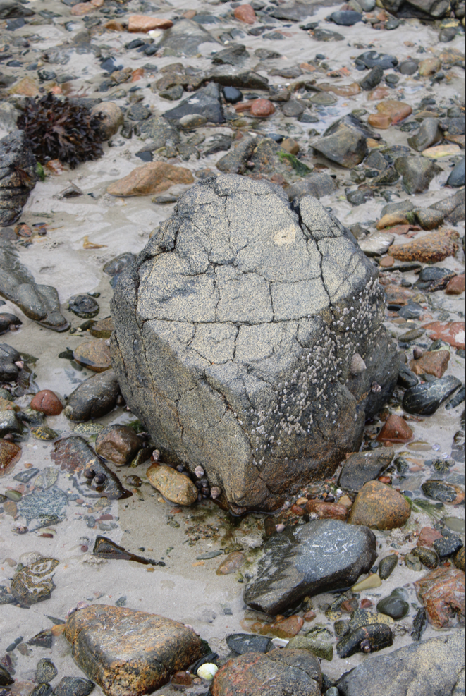
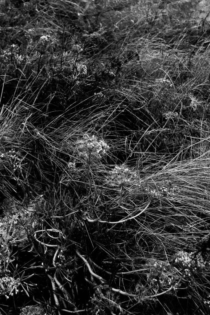
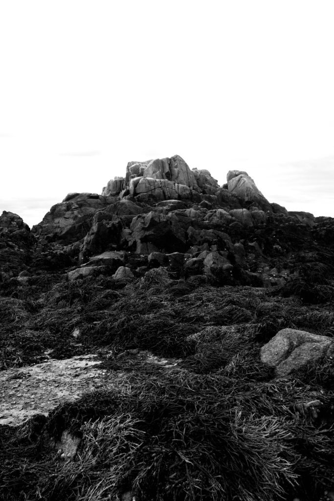
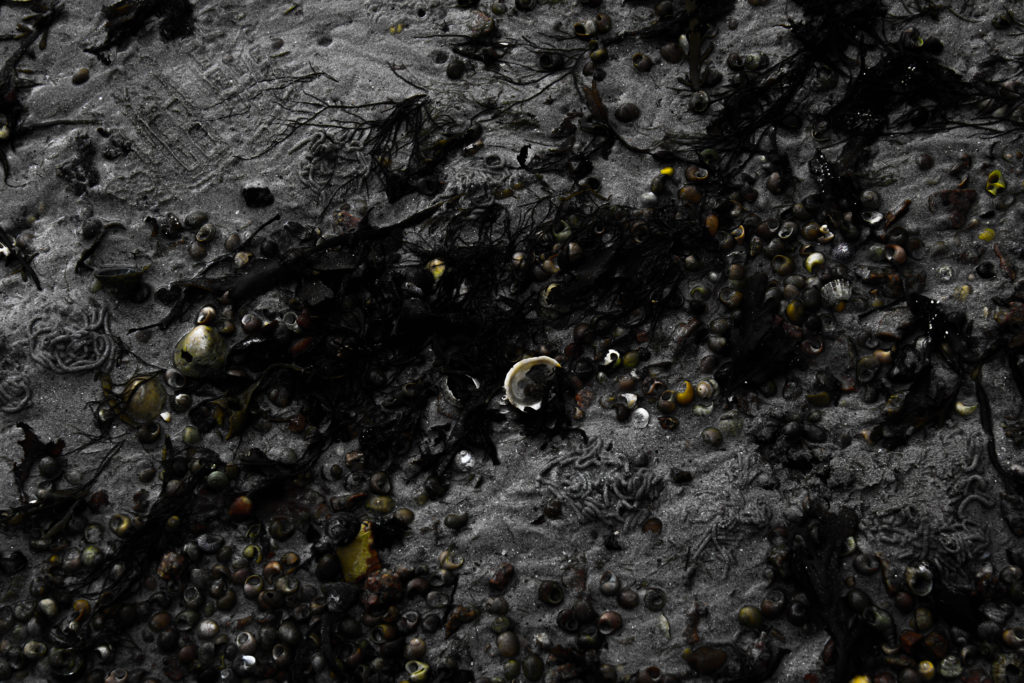
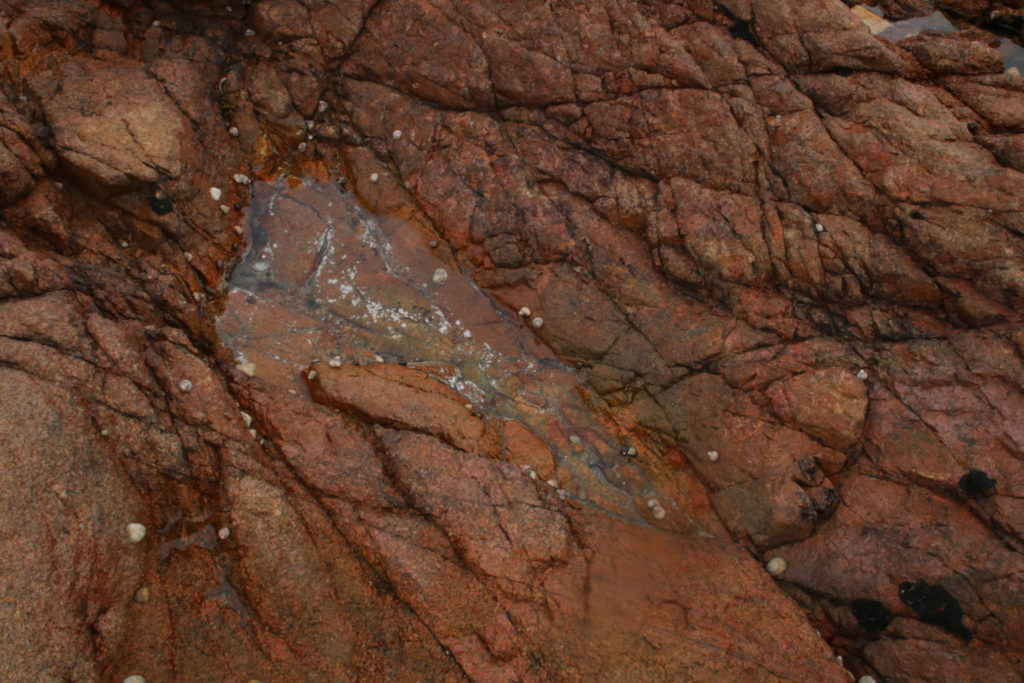
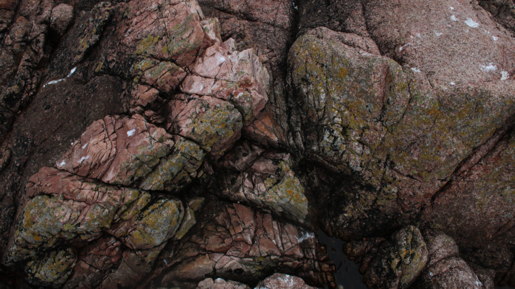
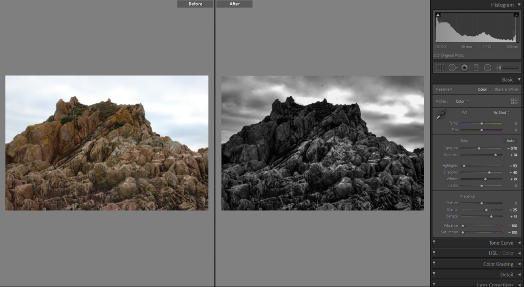
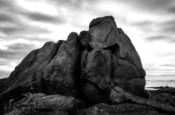
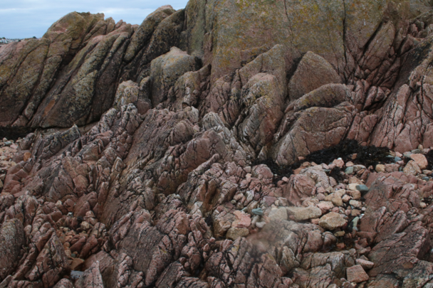
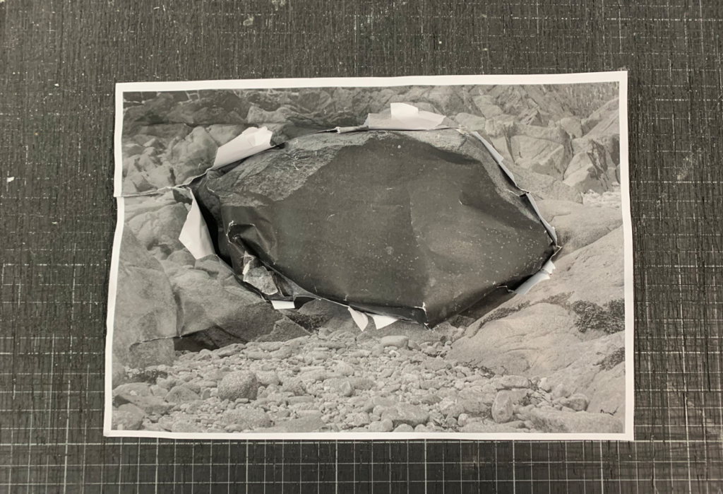
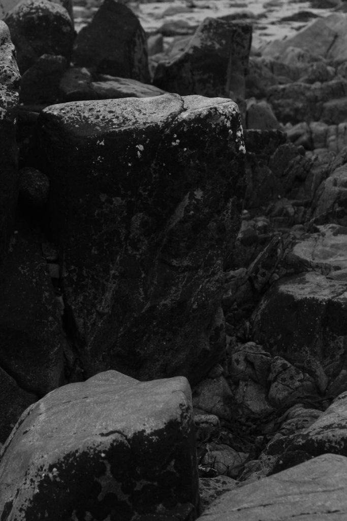
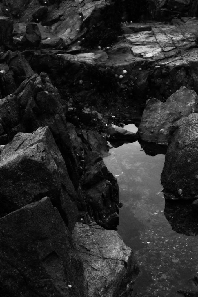
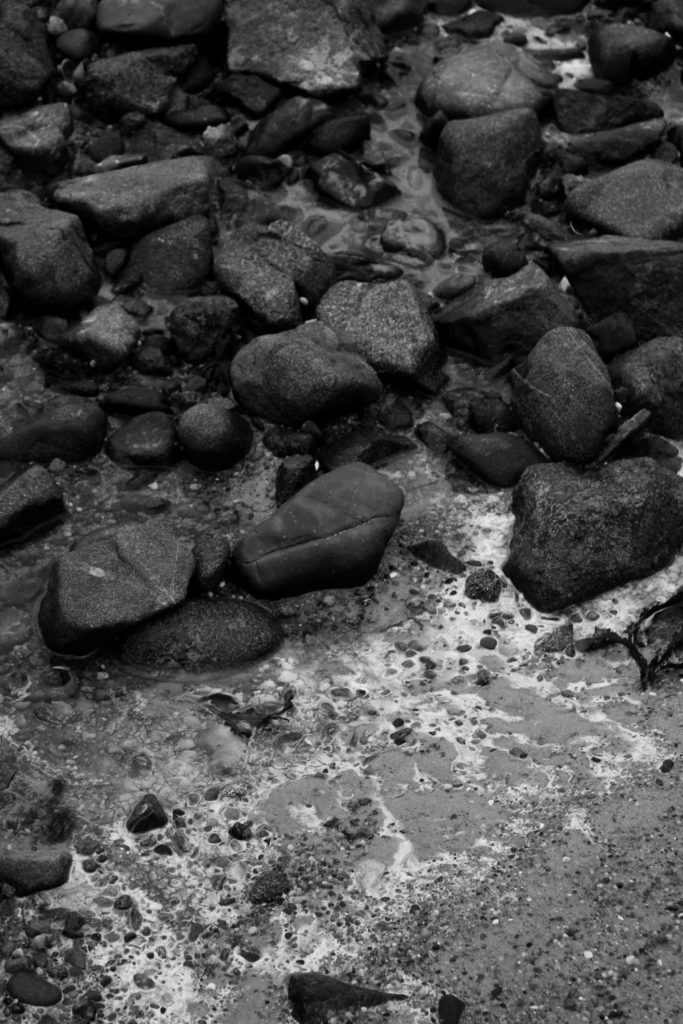
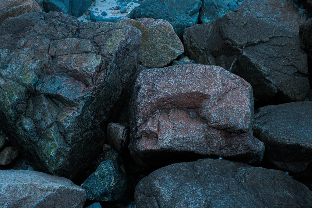
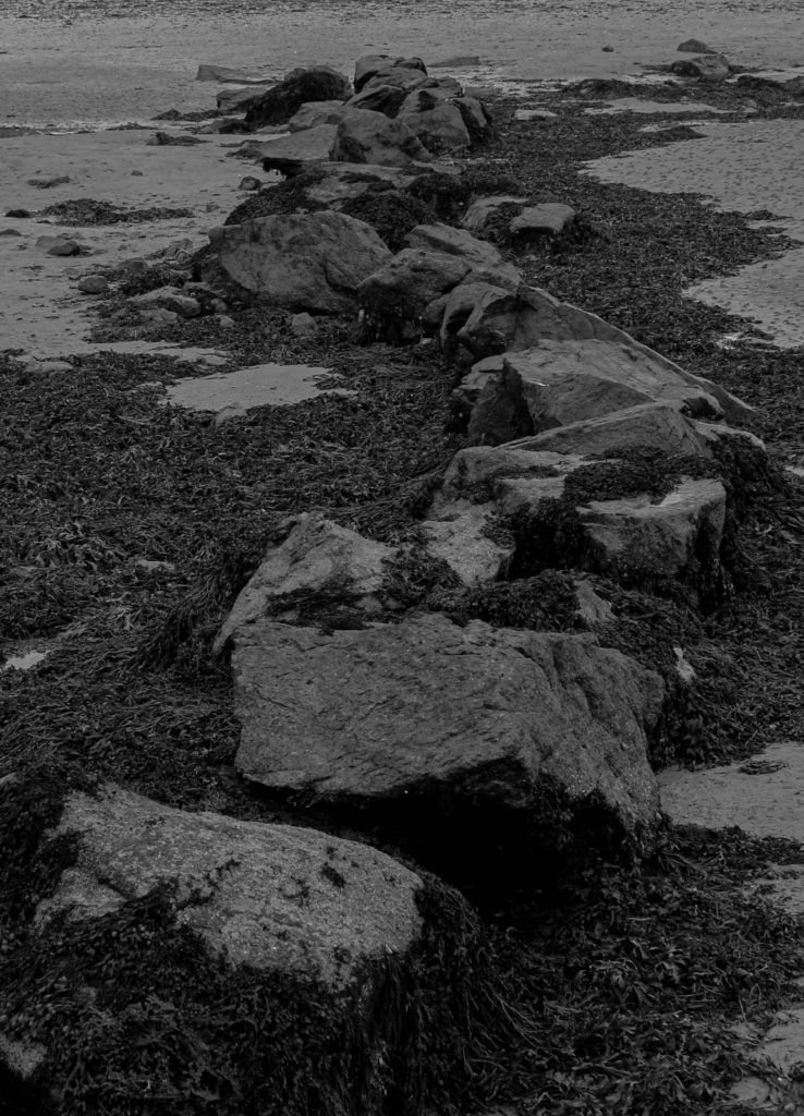
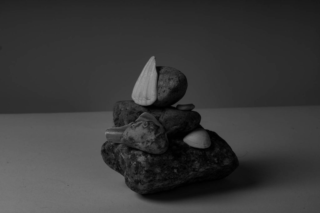
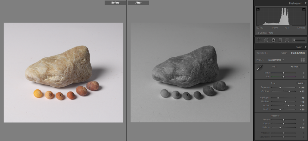
For my 5th photo I have converted it into black and white as I thought the monochromatic look would suit the composition better rather than leaving it in colour. I found that by doing this it makes the textures from the shells and rocks more prominent adding different viewing points. one feature I enjoy about this final image is the detail from the rock, it has a slight marble effect as there are some different lines that are a lighting shade the the rest of the rock. Furthermore, I also thing that the composition of the image compliments the objects that are being shown, in the foreground there is a line with different shells that are in colour order, lightest to darkest, I think this adds a really eye-catching feature to this photo.