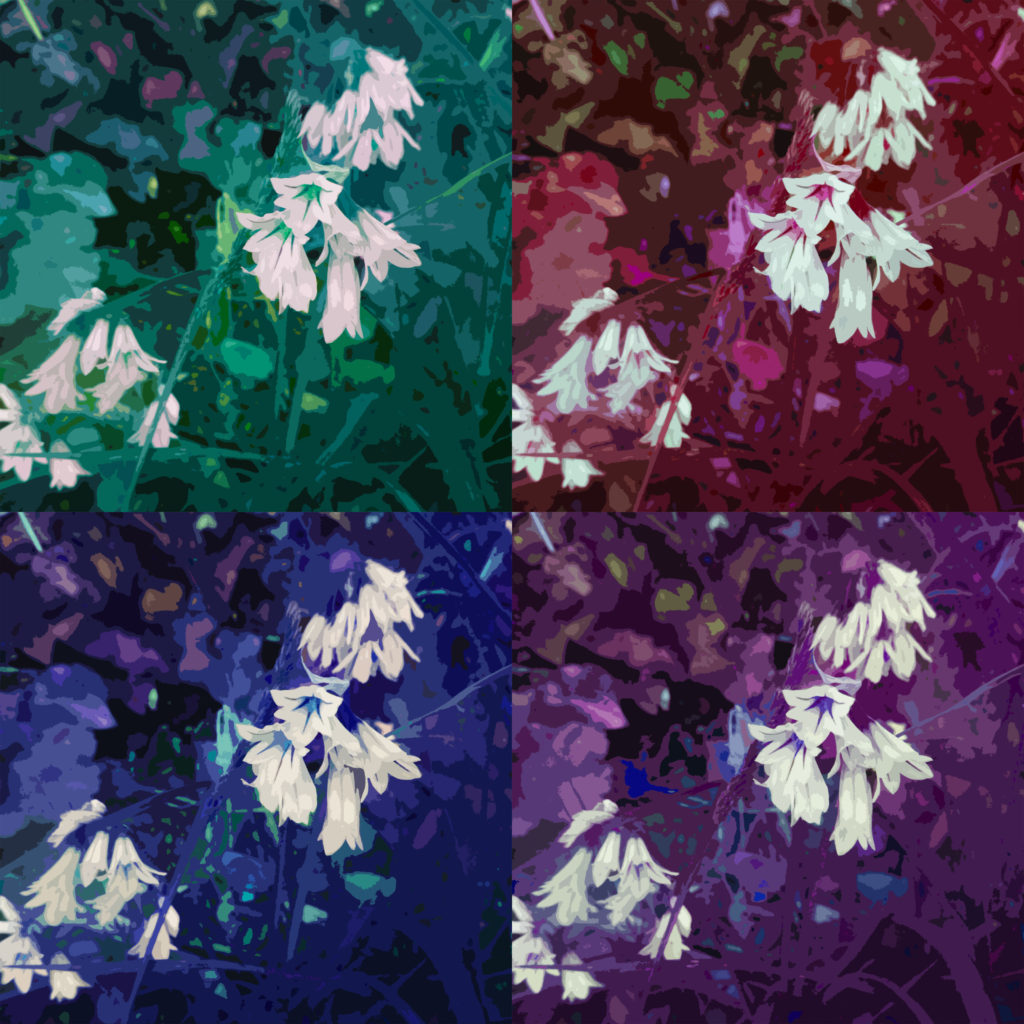
Category Archives: Uncategorized

Filters

Author:
Category:

Designing a Photobook

Image Selection

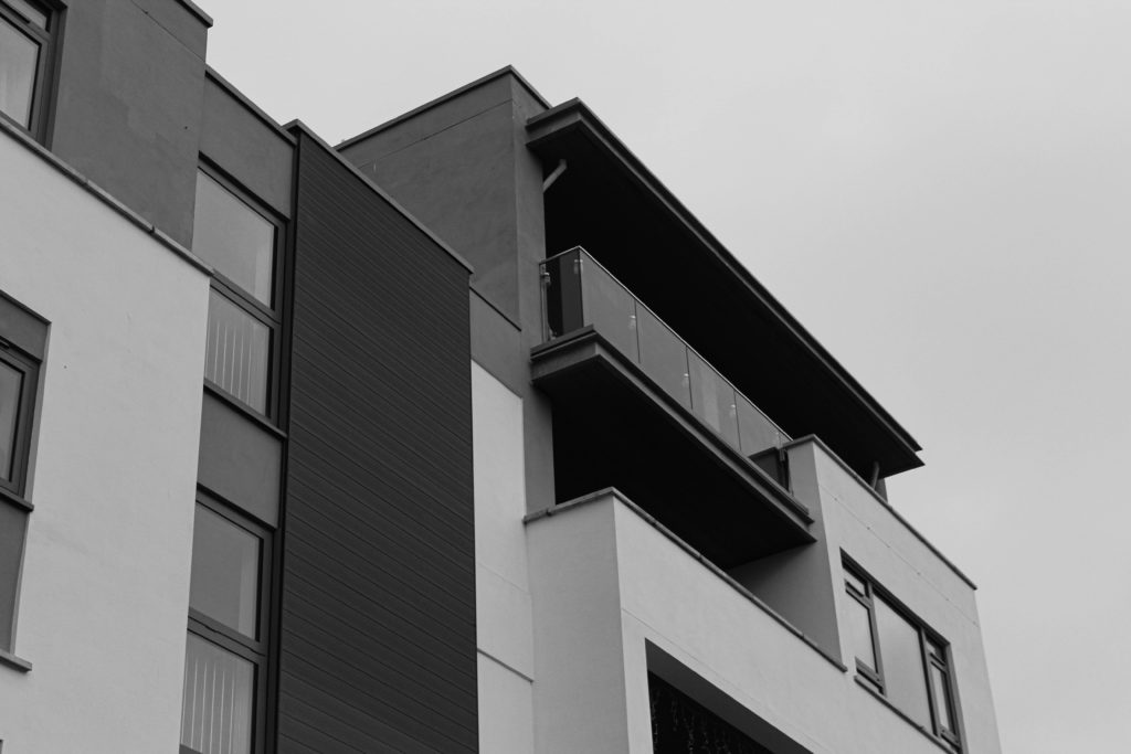
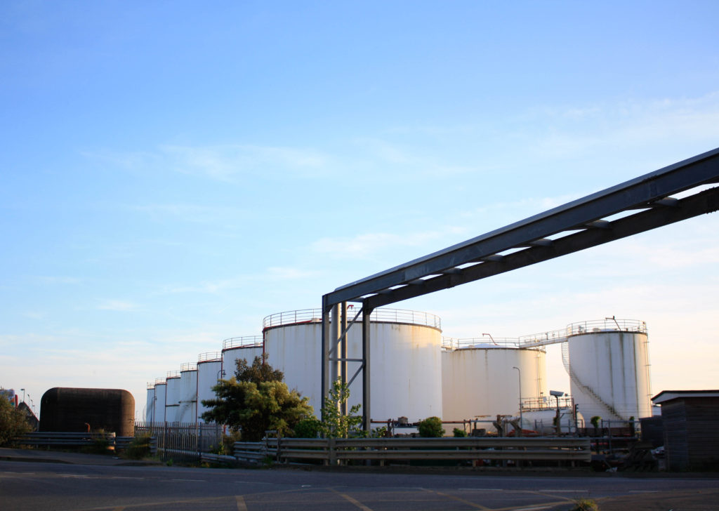
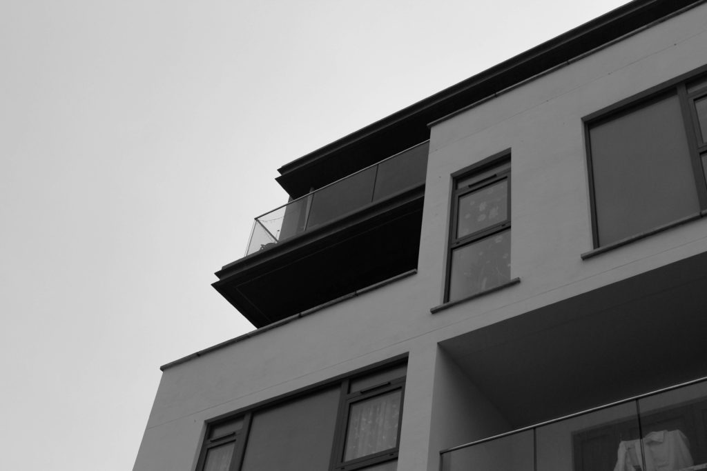
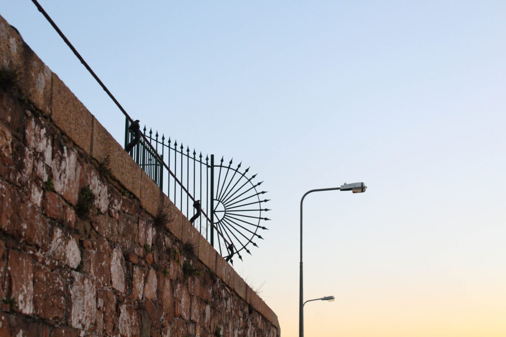
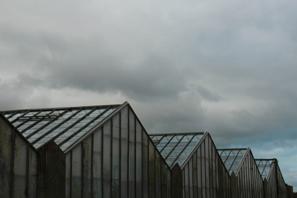
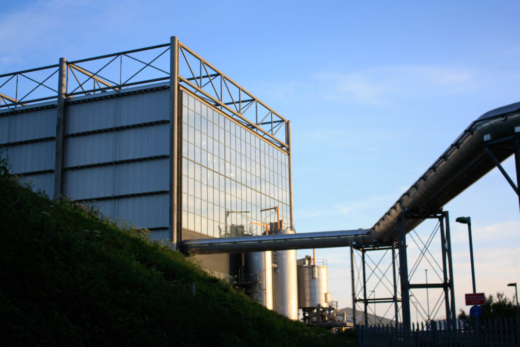
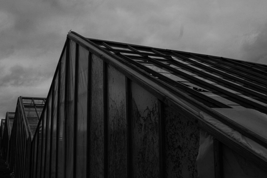
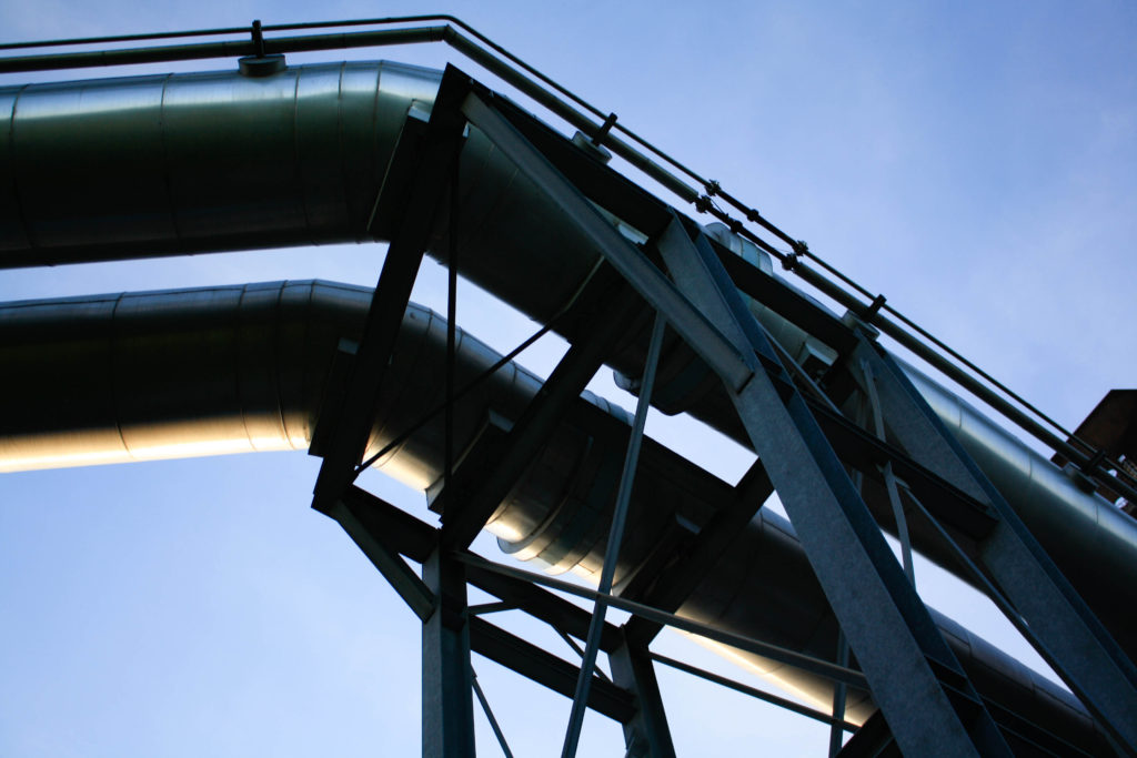
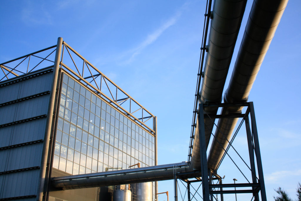
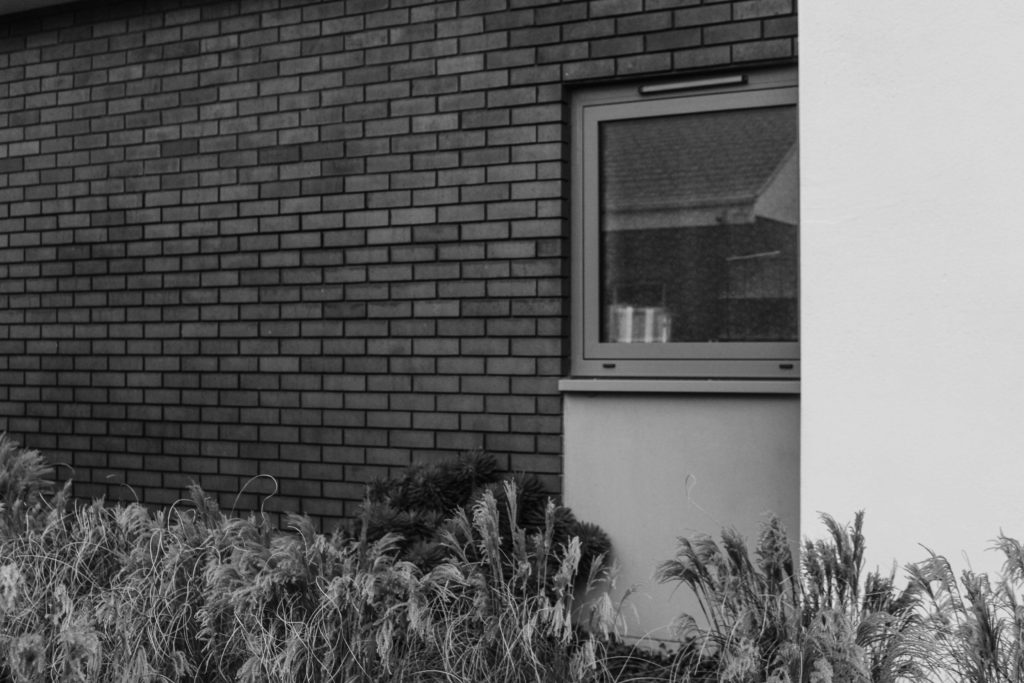
Below are some of the images that I would like to use in my photobook, these images are from all of my current photoshoots and some are older images that I will be reusing, this just means that I have more material to work with, and I think this will make more photobook better as I will have a larger final piece of work, with more higher quality images. Additionally, the older images are filled with colour and this will help me to create balance throughout my photobook, as many of my other photographs are black and white, as they have been edited in this way to better reflect the work of Lewis Baltz.
Process

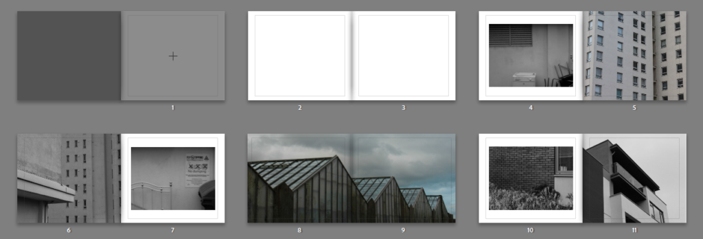
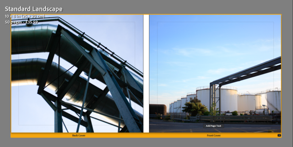
To create my photobook, I created a collection in Lightroom, which after clicking the ‘Book’ button allows for this setup below to appear, this allows for images that are in your final images collection to simply be dragged up into the spaces, there are also functions which allow for boarders to be larger to appear at all, and for also double page spread to be created, which is best for short and wide images.
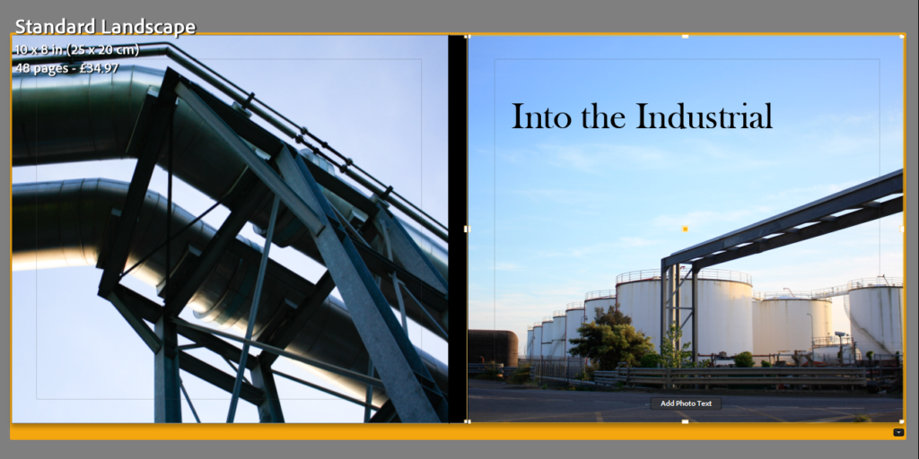
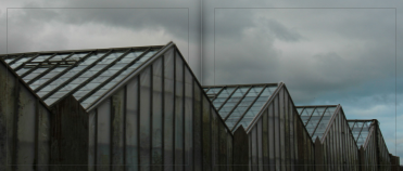
Double Page Spread

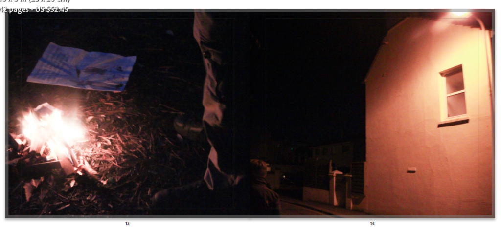
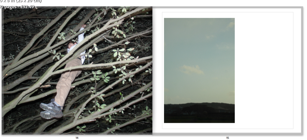
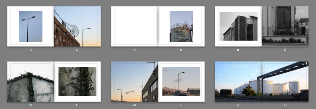
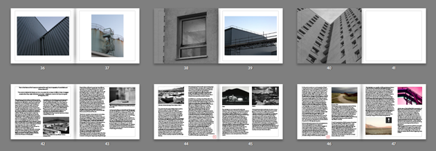
Throughout making my photobook I had to make lots of creative decisions, these were mostly regarding the compositions of images onto the page, and which images matched up or contrasted each other well. For example, pages 14 and 15 below took a long time to decide on, this is because sometimes too much negative space can wash out photographs, or simply not link with the purpose of the image itself. I liked that this blank page with just one image meant that all of the viewers attention is focused on this one photograph, and the subtle colours and warm tones throughout the image means that there is not too much contrast throughout these pages, but I think this plays well with the images. Furthermore, I think that the use of double page spreads throughout my photobook creates a nice balance, as the images that have been placed on these pages are ones which I consider to be my more successful, or ones with are very long and compositionally work better on this format or page.
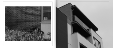
Most Successful Page

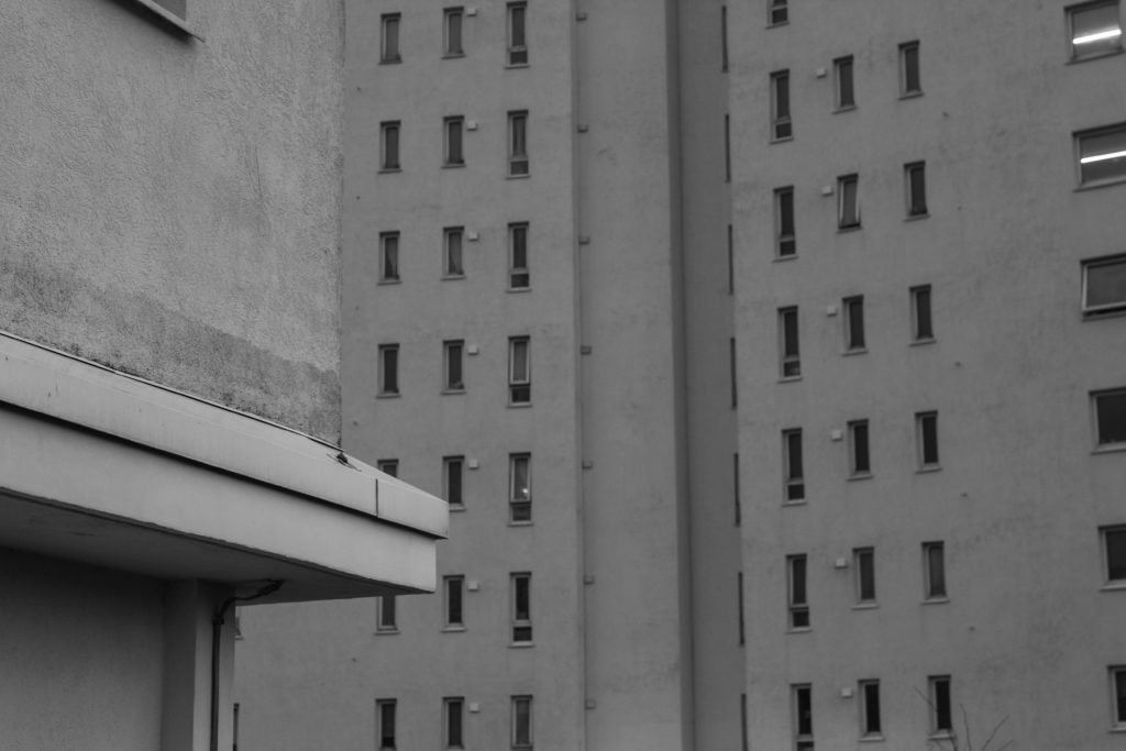
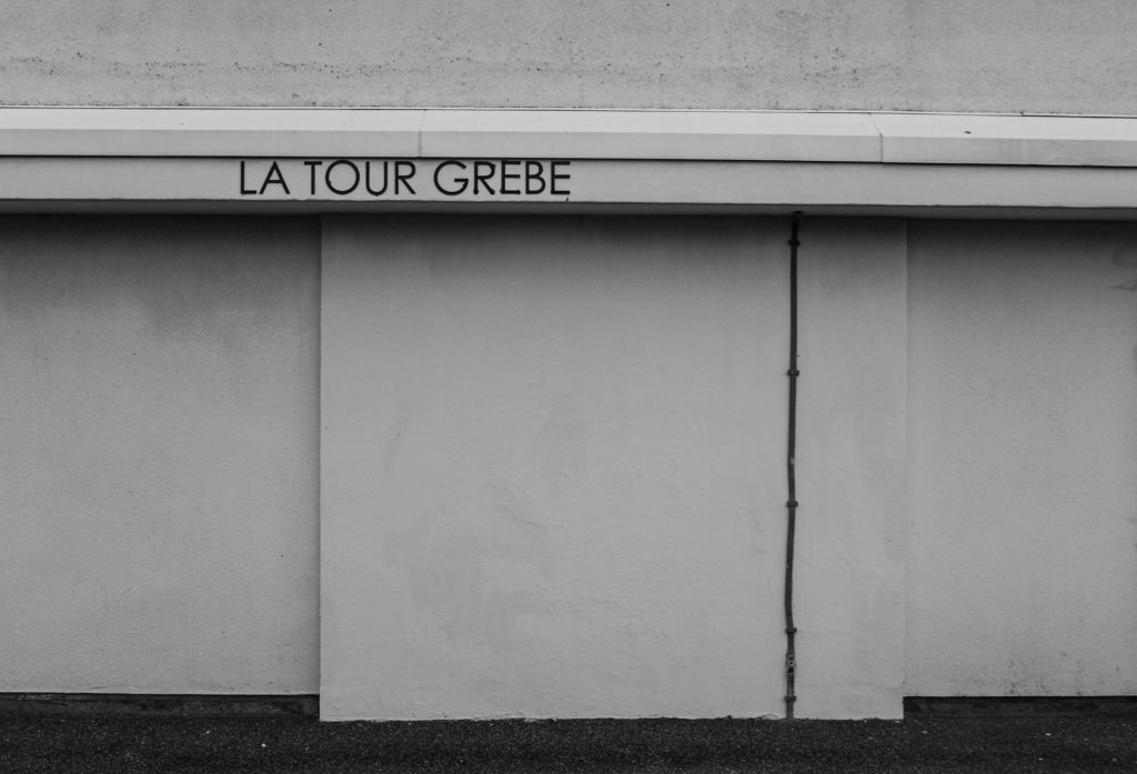
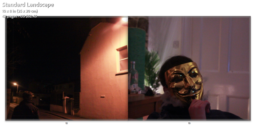
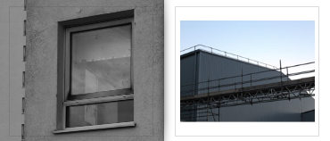
Above I have included an example of my most successful page spread from my photobook, this is because of the subtle links between these two images. Some example of this is similar windows which are present within these images, as the first image (on the left hand side) was taken at the base of the building with is shown in more detail in the second image (right hand side). This means that compositionally these images work very well together as they are not too similar, but still not too contrasting where the themes of them do not link. Furthermore, as this is the same structure in these two photographers, it means that there is the same brick work present in these two pages or my book. Subtle details like this make my book a lot more successful and aesthetically pleasing, as this can be the difference between the outcome of photobook and make the whole piece better.
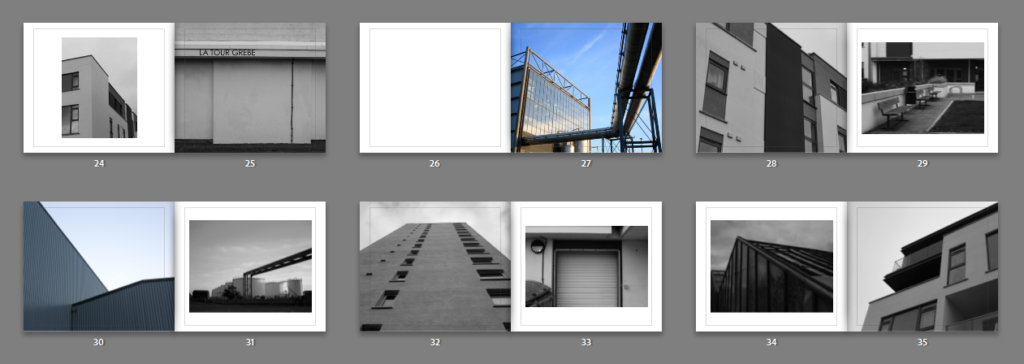
La Marais Images

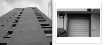
For these pages above I have decided to mix between monochromatic and colour images, as this creates contrast within my pages and maintains the balance throughout my book. I think that the white areas/ borders around monochromatic images looks more successful in comparison to using blank space around colour images. I think this is because the tones within the black and white image match with the surrounding white boarder, and this means that the composition of the whole page looks good together, and all components of the image work. Furthermore, using different angles/ perspectives throughout all my pages means that my book appears more appealing, I really like that different angles in images create depth throughout my book. I think that this looks really good placed on two connecting pages.
Contrasting Page

Finally, to conclude my photobook, I have included my essay, some of my artists images, and some more of my images demonstrating my previous Anthropocene project. I think this is a great way to finish my photobook as it wraps up my book very well and demonstrates that I had to learn a lot of information and knowledge regarding my photographers (Lewis Baltz and Richard Misrach) and communicate how they can link to my project and images, and additionally to my essay question and the thesis of my project. Overall, placing the essay in my book made it feel complete and made me realise how much much creating a photobook was a great way to illustrate my images.
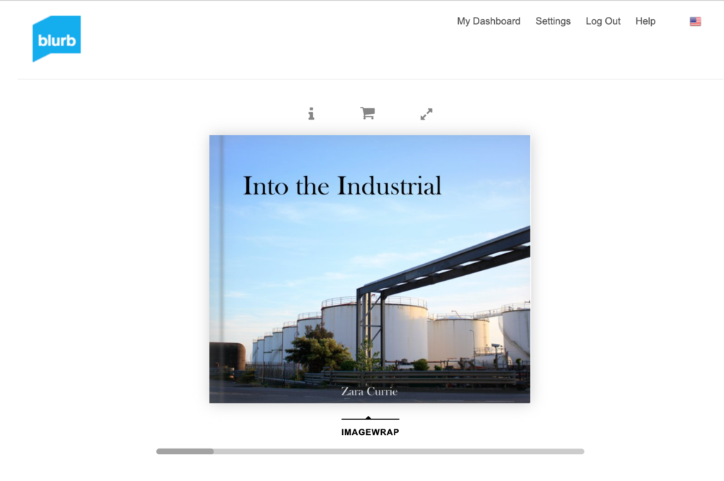
The last step was to send my book to Blurb after creating it in Lightroom, after paying for the book their is an option to buy a PDF version, I didn’t end up paying for this. There was another feature which involved getting a preview of my book (https://www.blurb.com/books/11475941-into-the-industrail) which allowed me to see my photobook in its digital form. This shows a version of the book where you can flick throughout all of the pages.

editing & experimentation

EDITING ON LIGHTROOM

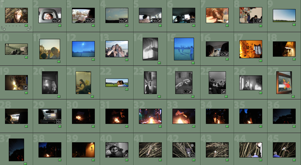
Whilst working on my project, I took roughly around 500-600 images, composed of about 4 photoshoots, along with a selection of random photos taken in other settings. Locations in my photoshoots included car drives with friends, fields & woods, and friends houses. After going through all my images, these were the ones that stood out most to me – however after editing I will narrow the images down.

I wanted to make sure all of my coloured images had similar tones to avoid them looking out of place, however some were too bright or dark, therefore I edited them on lightroom by turning up / down the saturation, exposure, and vibrance. My black and white images however were left for the majority unedited.

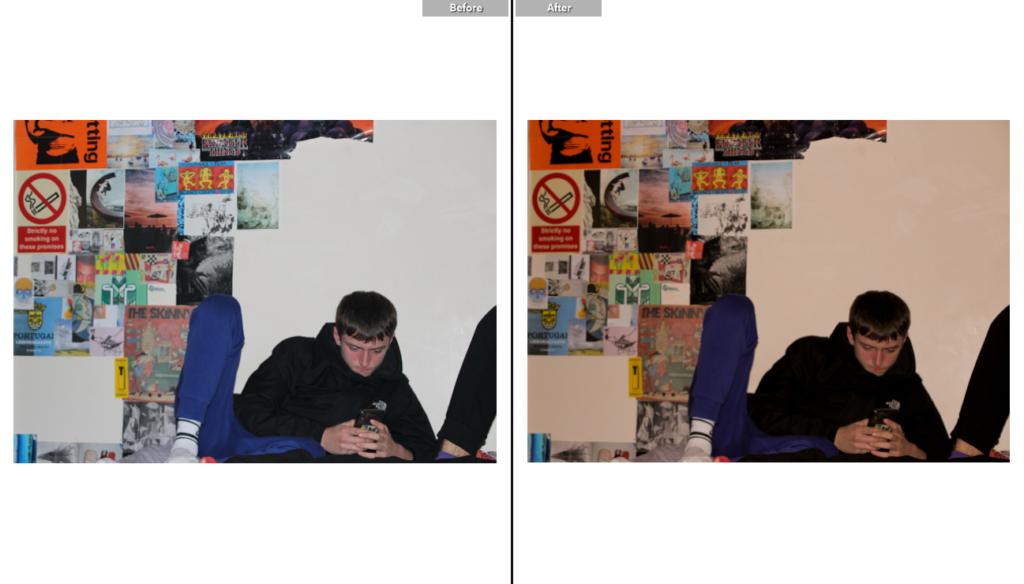
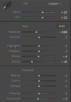
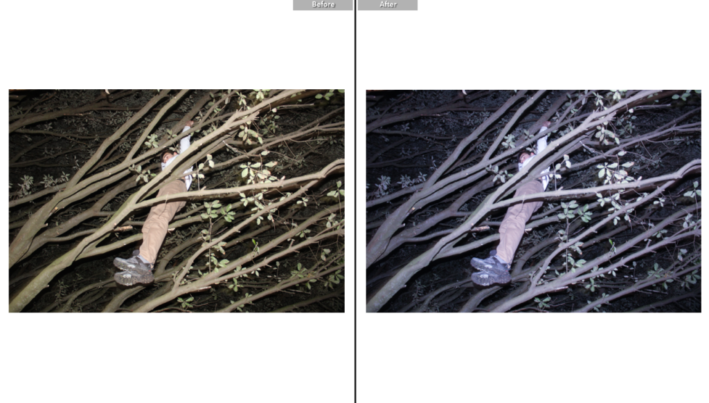
An example of adjusting the image to avoid an unwanted viewpoint. For this photo, I wanted the focus to be on my friend, however the posters were too bright and clashed with the white background, so I adjusted the hue to give a more yellow tone, and turned down the exposure to make his coat darker, therefore the viewers eye will immediately be drawn to him and any background ‘noise’ will be minimized.

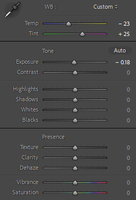
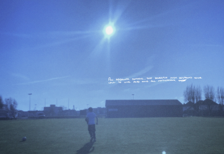
Another example of adjusting colour in lightroom. Opposite to the image above, I felt this photo instead had too many yellow tones and wanted to adjust it to fit the colours of other images in my book – I turned down the saturation and temperature and turned the tint to give the image a slightly purple hue.

EDITING ON PHOTOSHOP

An example of my editing on Photoshop.

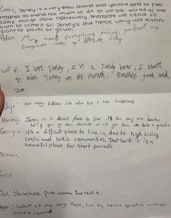
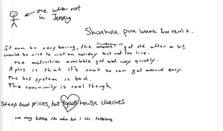
In my project I chose to incorporate text by tracing handwriting from a piece of paper – I had given it to my friends and asked them to write what they thought about Jersey. Instead of using a font I chose to replicate the handwriting as i felt it gave a more authentic feel to my photobook and took inspiration from Goldberg’s use of text in Raised by Wolves.

In order to do this, I screenshotted a particular bit of paper that I wanted on my image, then on Photoshop used the pen tool to draw over the layer. Deleting the photo after I was done left me with an overlay that resembled handwriting.

Example of how an overlay works in my editing process

Final outcome of editing on Photoshop. I like the way this page turned out as although it doesn’t feature a photo, it has a unique aspect i feel isn’t included in many other photobooks and it helps convey my theme of youth culture through different opinions. The handwriting also provides an authentic feel and looks as if it was written straight onto the page.

EXPERIMENTATION

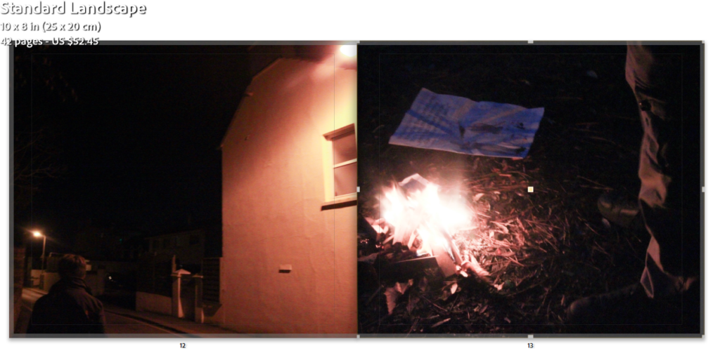
For these pages, I originally wanted to include two photos with similar yellow/orange undertones, but upon placement I felt that the two images clashed.

Replacing the image I felt this one looked better but the images needed rearranging.

I am satisfied with the final outcome of this page as I feel the first image transitions smoothly into the other and the colours compliment each other well.

I felt this page looked good and the colours corresponded to each other well, but something felt missing on the second page.

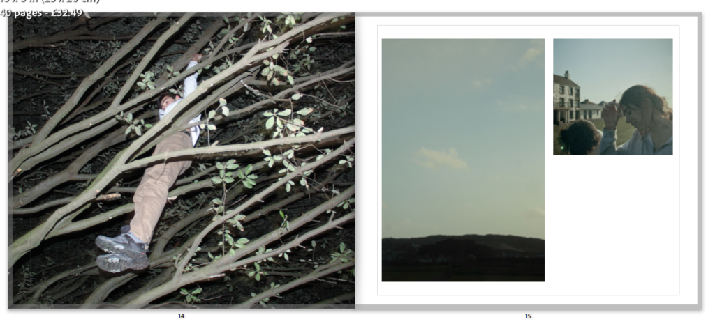
Adding a second image made the pages look more interesting. Considering placement i made it a lot smaller than the photo of the sky as that was the one i preferred therefore wanted it to draw more attention.

Final photobook layout

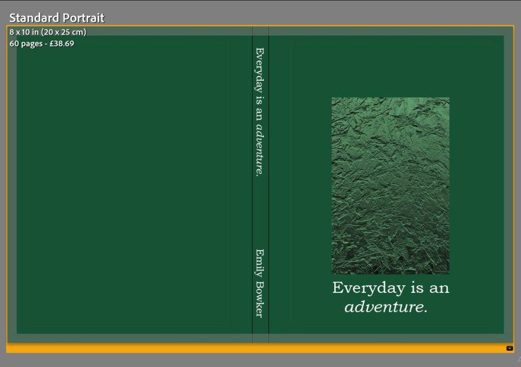
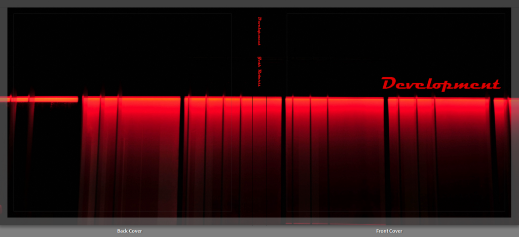
Front and back cover.
Essay pages.
Above is the final layout that I have chosen for my photobook. This process consisted of inputting the initial photos that I wanted to use to begin with into a plain book template, where it organises a layout of the individual photos on a page each to begin with. This made it easier and quicker for me to sequence my photos and remove the ones that I thought would work well but once bringing them into Lightroom, they did not look right amongst the others. Then I began deciding on the page spreads that I wanted to use, I decided to keep a flow throughout my photobook, I should use the same 4/5 different spreads throughout and I think that this makes the photobook seem as if it is more organised and professional. Then after I had decided on the layout and what page spreads to use, I inputted my essay which I had already previously written, this is because my essay shows a creative development and link into the theme of my photobook and this is natural landscapes and how the weather can transform them. Finally I decided to add in my front cover design, which I did in photoshop and transferred over to Lightroom where I decided on the size of the image and the background colour of the front and back covers of the book, I also added the title on the front cover and spine as well as creating an opening page that included this as well along with my name. I am really happy with the outcome of my photobook because I think that it tells a visual story, without the use of text throughout which keeps it simple, and represents how the weather does transform different natural landscapes in a variety of unique ways.

Blurb access link to virtual copy of my photobook

Creating a virtual gallery

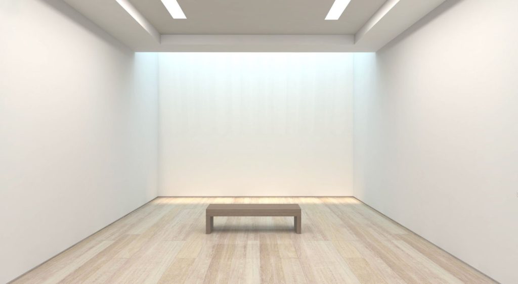
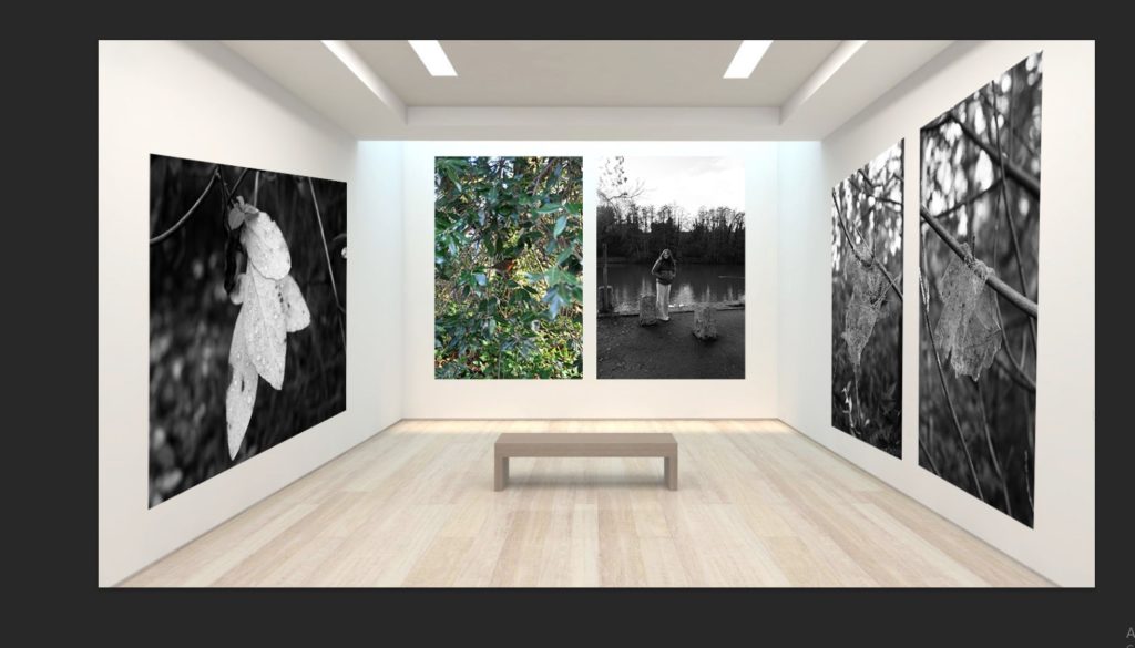
The gallery which I have chosen to use and why –

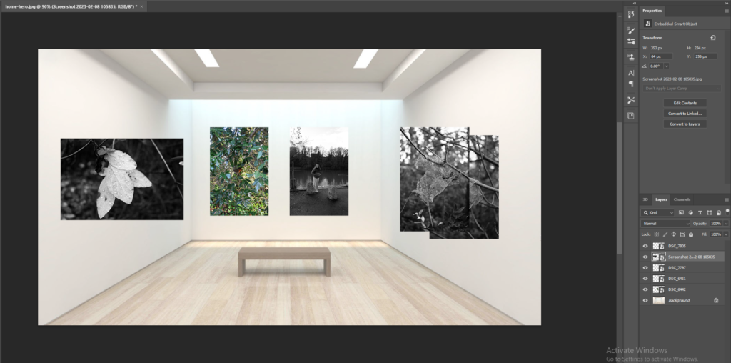
This is the gallery which I have chosen to use as my template to create my virtual gallery in photoshop. This is because I like how there are neutral, cream tones on the wall and floor, as the floor is wooden which makes it feel more homely and welcoming, and this is the effect which I wanted to create. I also like how simple yet still realistic the gallery looks because of the bright, white lighting that will make my picture seem as if they are being illuminated, through the drop shadow effect as well, and the bench which is in the middle of the photograph, which makes it seem like a real gallery once all of my photos have been added. The process which I did to bring this image into photoshop is by saving it from google, where it is automatically saved as a JPEG and then opening up Adobe Photoshop and opening the file within there, this allowed me to see the quality of the image and if it was big enough to use to produce my work with.

Image selection –

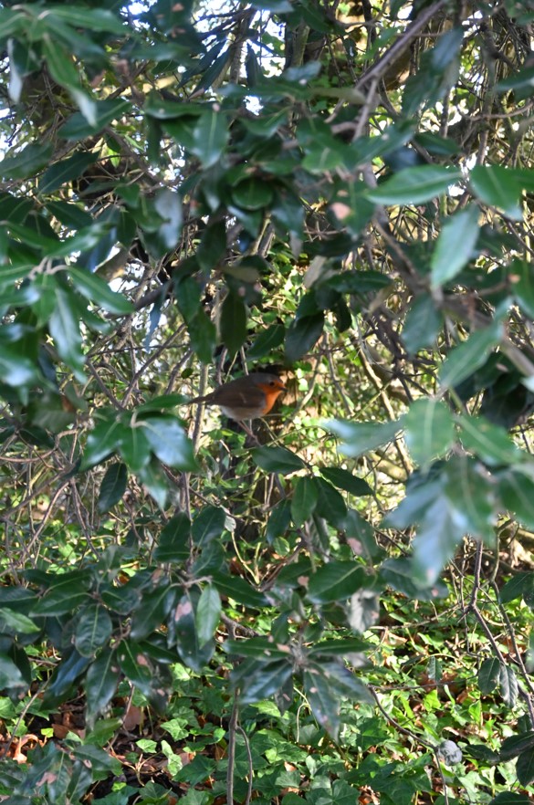
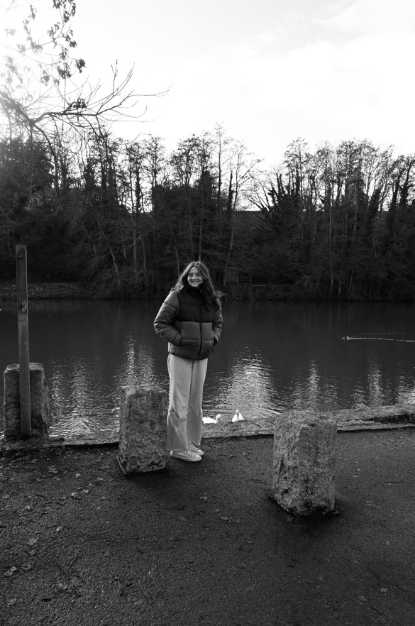
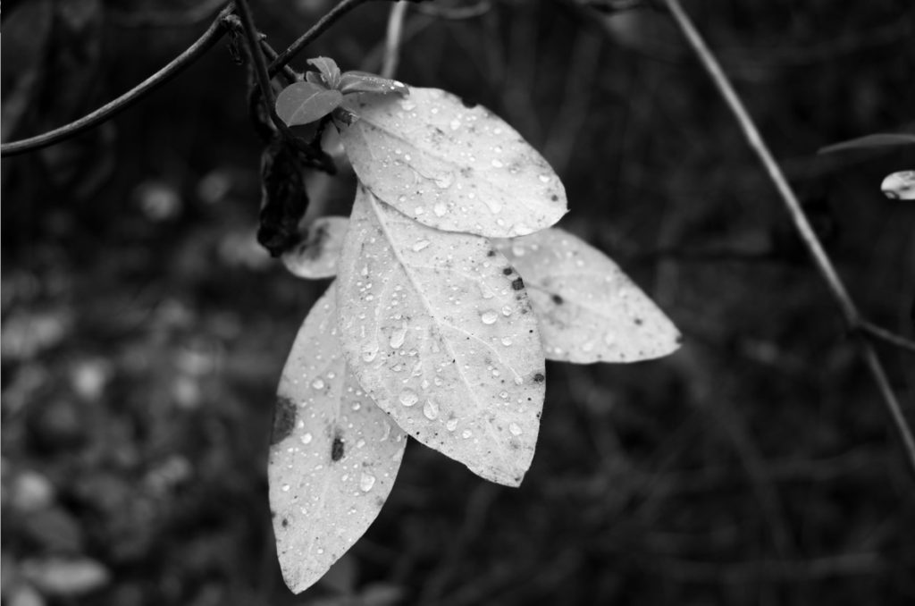
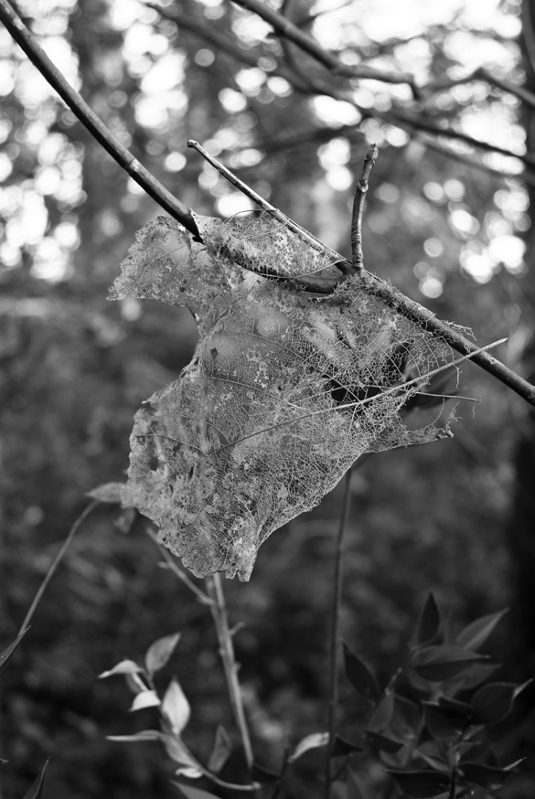
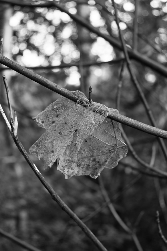
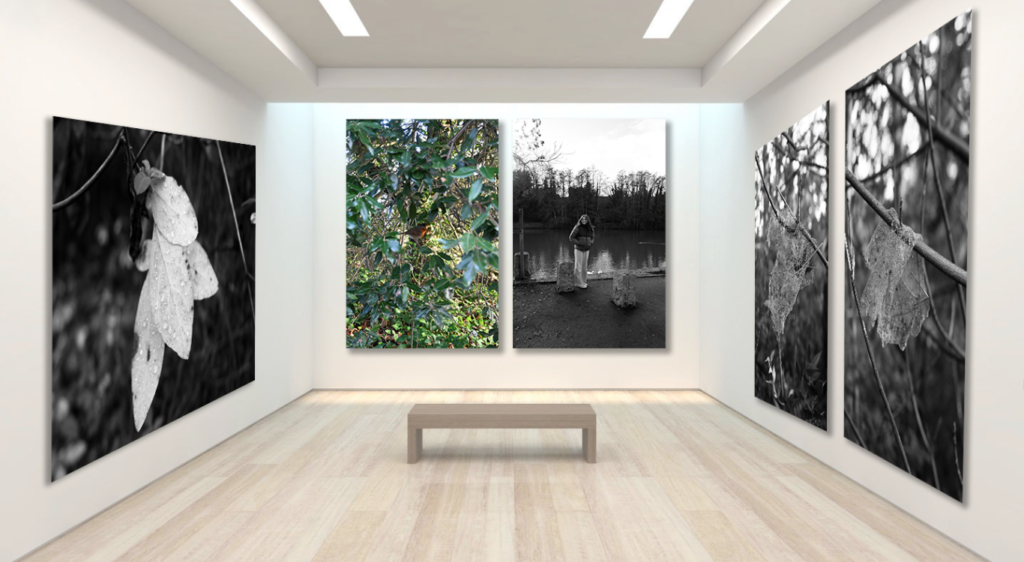
These are the images which I have selected to use, this is because the top and bottom sets of images that I have selected work well together as I have used them as pairs beforehand within my photobook. This is because they may be of same relation with what is in the photo, such as the bottom 2 photos of the leaves that are slowly decaying away naturally, or they may work well together due to their composition, this is seen in the top 2 images where the gaze of the person falls on to the small bird as if she is looking at it which I really like and wanted to carry throughout. The stand alone image is an image which I have chosen to use in my virtual gallery because I like how detailed the photo is, this is because you are able to see how the rain droplets fall on the leaf and I also like how the image is in black white, which will create a contrast within the virtual gallery as the warm, neutral tones will contrast against the cold, darker of the image.

Placement –

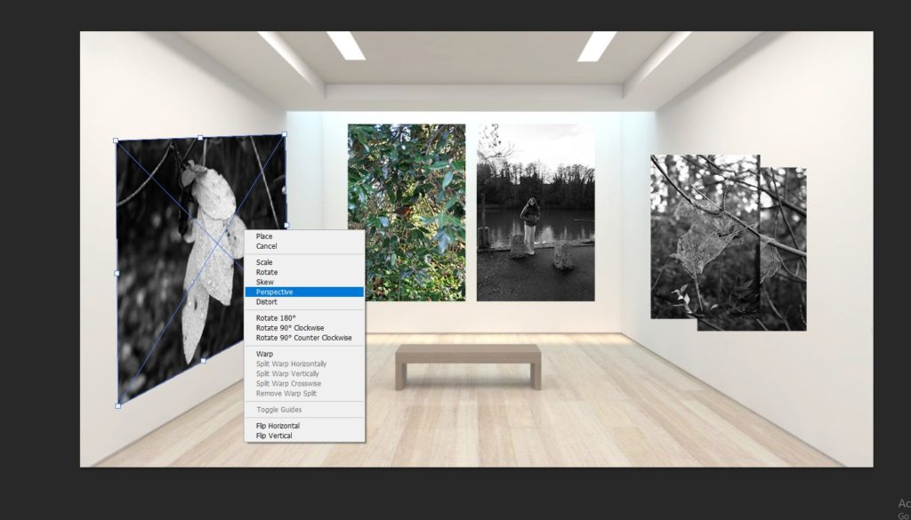
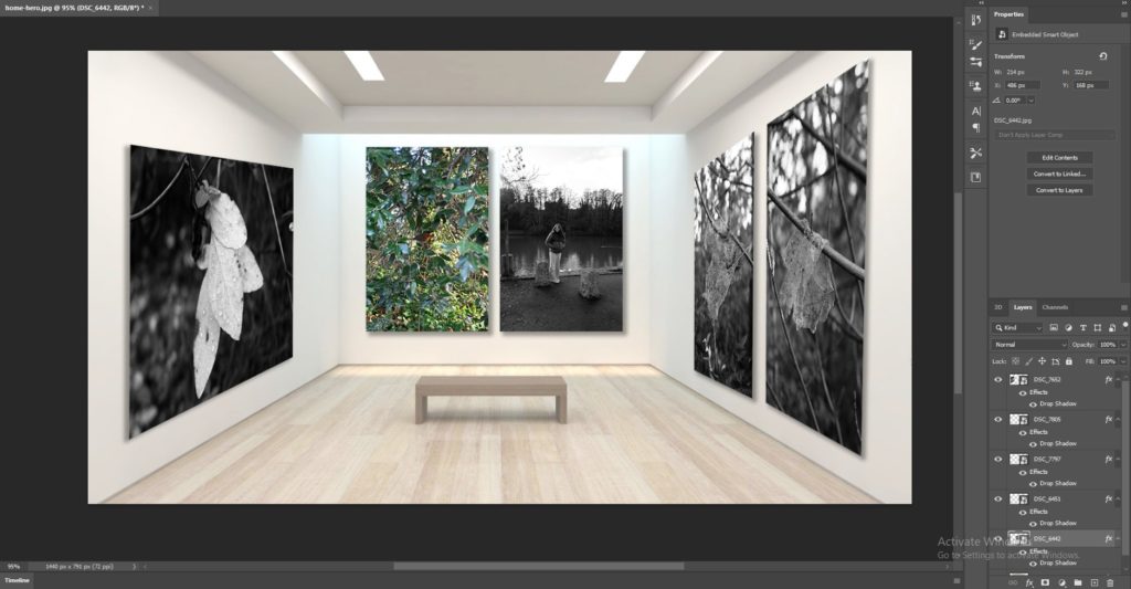
To begin the process of deciding the placement of my images, I strated ny opening the gallery file and beginning to input the photos which I had previously selected in to the file and placing them in areas whee I thought that they would wprk well. I chose to hvae the main set of images with the bird and the perosn in the middle of the gallery as iot had colour in it which would draw your attention towards the photo. Then I decided to put the other set of images on the right side and place them in the order of which they appear i my photobook, this is because I think that it creates a nice flow within my work. Then for the last image I decided to put it on the left side and make it lar

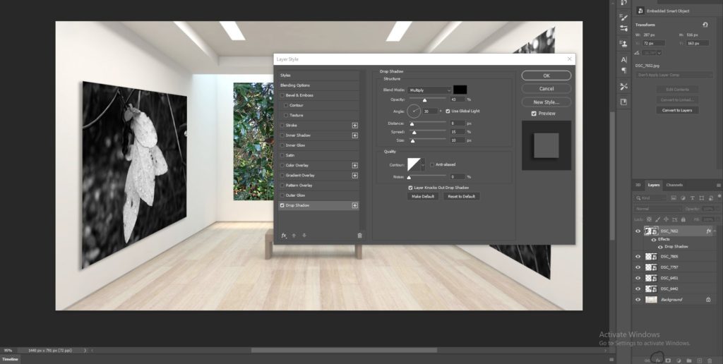
Adding a drop shadow –

To add a layer of realism towards my photos to create my virtual gallery, I decided to add a drop shadow on to each of my images. I did this through selecting the layer that the image is on and the choosing the ‘fx’ tool which provided me with a menu of options which I could use to create a drop shadow. I then altered the opacity, how far out I wanted the shadow to spread, etc and this made these images look as if the light was falling on to them and making a shadow underneath them. I really liked this effect because I think that it makes the images seem as if they really are mounted on to the walls which makes them more realistic. 
Final outcome/evaluation –

This is my final outcome of my virtual gallery which I have created on photoshop, I really liked how this turned out because I think that it represents the tranquil and simplistic side of nature and how the different formations, such as raindrops on leaves or the way a decaying leaf wraps itself around a branch, are unique and always so varied in how they are formed. The process to create the virtual gallery was tedious to begin with but became easier once I got the hang of it, and then it became quite easy and quick to do as I repeated the process of placing the images, adjusting their perspectives, and adding a drop shadow. I think that the blank gallery file with a small bench in the middle made it look quite realistic and this is why I chose to use it. This is because I think that it was good in the way that it compliments the photos which I have used. This is because the walls are plain and white and this makes the darker colours of the 4 black and white photos stand out well along with the photo of the bird which breaks up the darkness of the images and creates a break between them, which I really like.

Essay


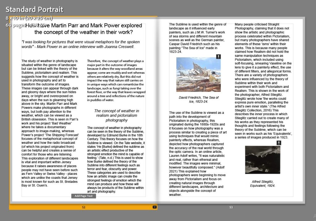
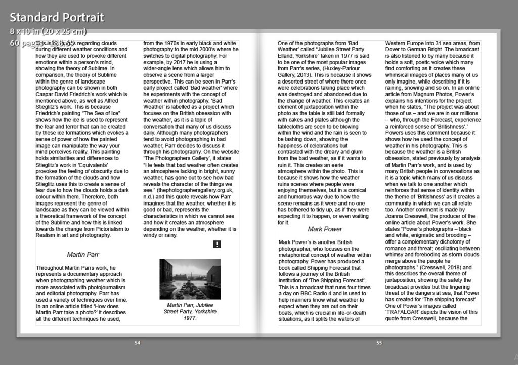
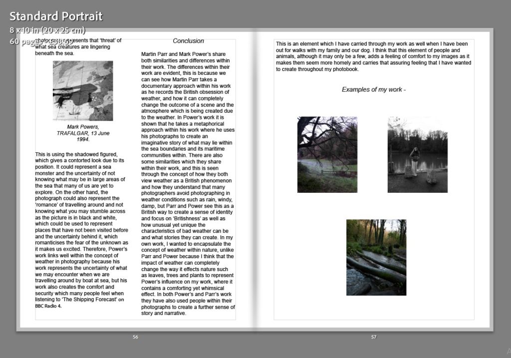
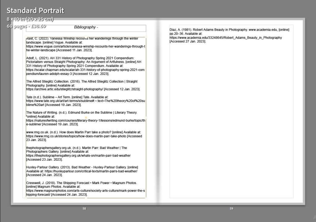
In what way do Rut Blees Luxemburg and Lewis Bush’s interpretations of modern landscapes portray development through the medium of photography? 

“There are footsteps in the mud, the human presence is absent. The city in my photographs is a structure in which the individual narrative does not dominate but becomes a template to try and locate something that can be described as common, such as a public shared stairwell to the river.” (Luxemburg, R.B, November 10, 2017) 

Throughout this essay, I plan to produce a direct and detailed answer to the question my hypothesis identifies. How can a theory of development and change be portrayed by one’s images? This theory is of personal interest as landscapes are my preferred subject for photography, as opposed to portraiture or still-life. The artist’s approach to photography can be compared to a modest degree. Bush and Luxemburg capture modern structures in such a way that the subject and focus of each image is instantly recognisable by the viewer. This is a result of the careful composure of each image, as well as the post-production/editing carried out either in a studio or using editing software, such as Adobe Lightroom or Photoshop. 

For my image comparison, I am going to analyse and draw connections between Lewis Bush’s Metropole collection and Rut Blees Luxemburg’s Liebeslied collection. This is because of how the collections complement each other. Luxemburg’s images are in colour; while Bush’s are black and white. Both sets of images are depicting a sense of loneliness; however, this is done in diverse ways. Bush’s images contain complexity and volume; on the other hand, Luxemburg’s feel emptier.  

Luxemburg moved to London in 1990 to study photography at the London College of Printing and then the University of Westminster. She was attracted to the cityscape surrounding her, as she had grown up in the German countryside. This project was created by taking photographs from peculiar perspectives. This included towering office blocks and abandoned structures. It portrays the nocturnal city of London in a literal different light. The photographer’s choosing of post-sunset photographs presents the city from new perspectives, “liberating spaces and structures from their conventional contexts.” 

“Liebeslied means love song in German,” says Luxemburg. The project encapsulates the photographer’s changing relationship to the city and exists as a visual love song dedicated to it. Where London: A Modern Project offered an outward study of the solid structures of modernity, Liebeslied: My Suicides evokes a sense of Luxemburg’s immersion in her surroundings. From rain collecting in gutters, to overspill from the Thames, water exists as an emblem of this throughout. In the image A Girl from Elsewhere, which will be on show at London Nights, liquid streams across the surface of a pavement. Bathed in the yellow light of a streetlamp, the photograph epitomises the unique colour palette that has come to define Luxemburg’s work. B.J.P. (23rd February 2018) Interview: London; A Visual Love Song. British Journal of Photography. 

Populated areas tend to change as we change as a species. As a large amount of people move to a new urban area, the landscape expands and develops with the population. Cities like Tokyo and London are notable examples of this. Jerry Johansson, a Swedish photographer who specialised in the architecture of well-known geographical locations, produced a book, Tokyo in 2016. The book holds a wide variety of all aspects of a city spread over 95 black and white images. All these photographs adopt the deadpan approach, which results in a simplistic and consistent theme throughout. There is a clear focus on the structure of the subject of each photograph. Johansson photographs the supporting structure of each building, or what is surrounding it.  
Images of a location or area can display the economy and wealth of that area. For example, in London, the price of living is one of the highest in the UK. This is a result of it being the capital city, as well as a convenient place to live. The structures in Bush’s images are mostly super-modern skyscrapers/tower blocks which portrays the city as a very built up and wealthy area, which it is. In contrast to this, Luxemburg’s images show an alternative to what is made out to be a city of luxury. Her images show the back alleys, abandoned structures and the mud that surrounds the river Thames. This shows how not everyone has access to a beautiful home in what is shown to be a post-modern city, resulting in a stunning comparison between the two artists. The reasons for the artist’s decisions may be due to their childhood. Bush himself was born in London in 1988. During this time, the city was expanding into a global financial centre, simply because it could afford to. Luxemburg had a slightly different upbringing. She was born in Germany in 1967 and grew up surrounded by the German countryside. When she moved to England in 1990, she was at once drawn to the architecture of her new surroundings. The subjects of her images are based more upon what she was used to when she lived in Germany. The same can be said about Bush as his images show he modern side of the city, which is what he grew up in. 
Jersey, the island I will be photographing, is similar to London in many ways. The quality of life is good for most people; however, the cost of living has skyrocketed in recent years, mostly due to the Covid-19 pandemic and the Russian invasion of Ukraine. It is now one of the most expensive places to live in the world. Many wealthy individuals, working or retired, come to Jersey to live as it has been branded as a ‘tax haven,’ meaning they move here to have little or no tax fees. Jersey is also a financial super-haven, as a substantial part of the island’s wealth can be tracked back to financial operations.  

In conclusion, I feel that Luxemburg and Bush’s work can be related to each other as well as my own work that I have previously produced earlier in my course. For my May 22 project Anthropocene, I displayed a variety of landscapes, structures and camera skills to an effective degree. I wanted to do this as I have found it a fascinating subject for my memorable lifetime. My work from this project can be compared to both artists, as my first photoshoot was of the built-up area of the Waterfront and harbour areas of Jersey, resembling Bush, and my second photoshoot consisting of a range of old structures from the era of World War II, resembling Luxemburg. These two artists based their image choice on their style of photography and upbringing during childhood, as did I. Both collections have a different story to tell which gives them a contrasting target audience, but outstanding outcomes regardless. For my own work from now on, I am going to aim to replicate the work I have studied, as this could encourage me to learn new camera skills/techniques and develop my all-round performance as an amateur photographer.  

Personal Study Project

Planning and Photoshoots

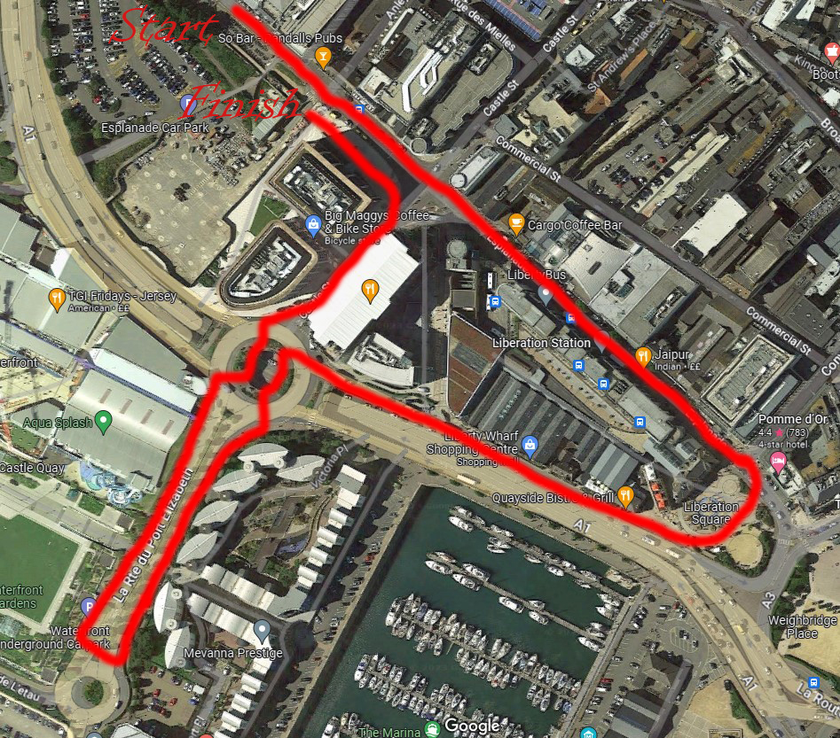
I started this project with a question. How can images be used to show development? This was a difficult topic to cover at first, but thinking back to my previous exam project gave me a few ideas. I wanted to show how Jersey had become a wealthy independency. The island’s economy relies mostly on the finance industry, as Jersey is considered to be a global finance centre, as well as a tax haven. I planned to take photos of the financial buildings front in town. My route consisted of the financial buildings, past Liberation Station, through Liberation Square and back up the other side of Liberty Wharf to the Waterfront area where a large pair of Christmas trees were located at the time. I chose this route as there were a few varying structures I felt could produce successful results. There were also a couple of locations in the town itself that I wanted to capture with my camera.

The route I took for my first photoshoot

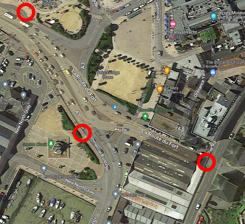
My second photoshoot was conducted nearby. I was eager to experiment with longer exposure times combined with smaller aperture, which is what my artists had used to produce their images. A great way to demonstrate the use of this technique is by photographing cars as they drive past for 2-3 seconds. Depending on which way they are driving, the headlights/taillights leave trails behind them. The car is also made seemingly invisible as it does not emit a large amount of light as the headlights/taillights do. If done well, the results can look amazing. I chose a few locations next to and above typically busy roads. My main three were above the tunnel near Pier Road car park, the side of the Esplanade by the steam clock, and at the pedestrian crossing by Liberation Square.
Primary locations used during my second photoshoot

Contact Sheets

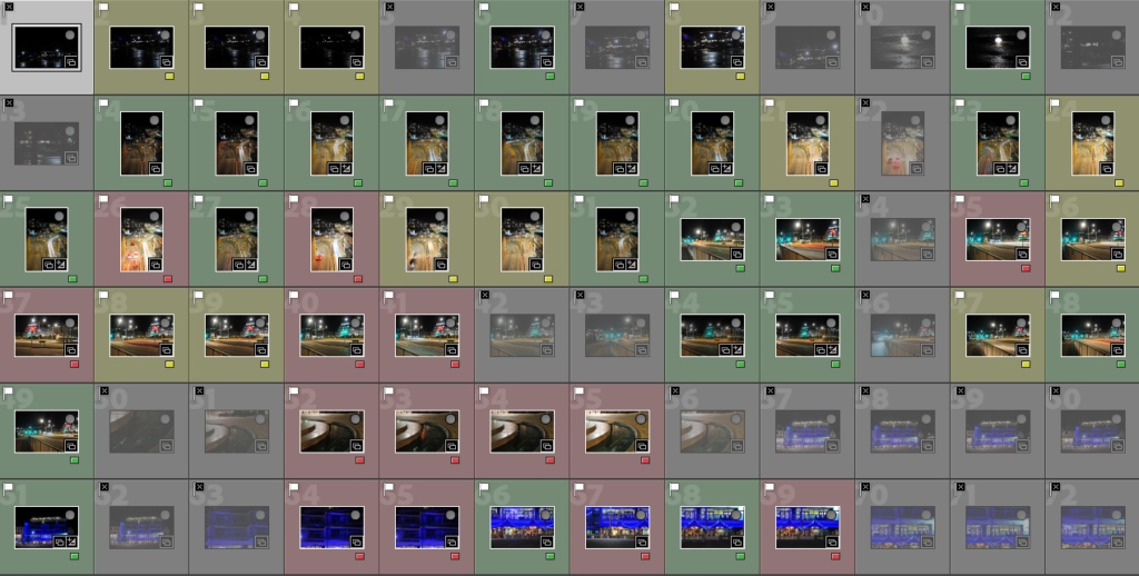
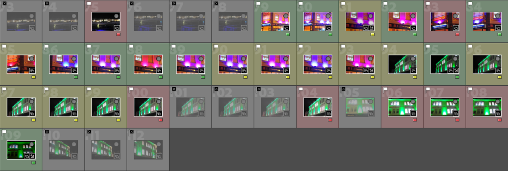
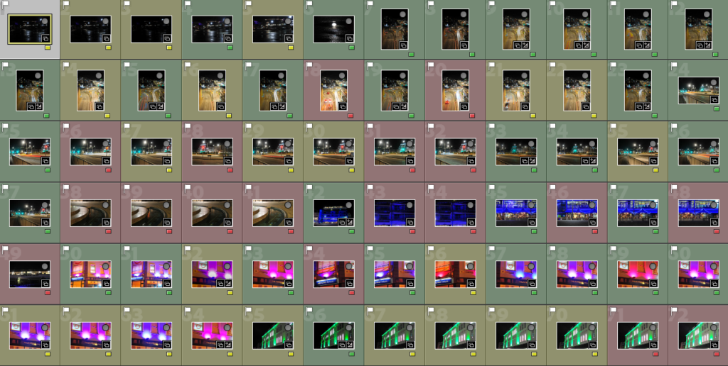
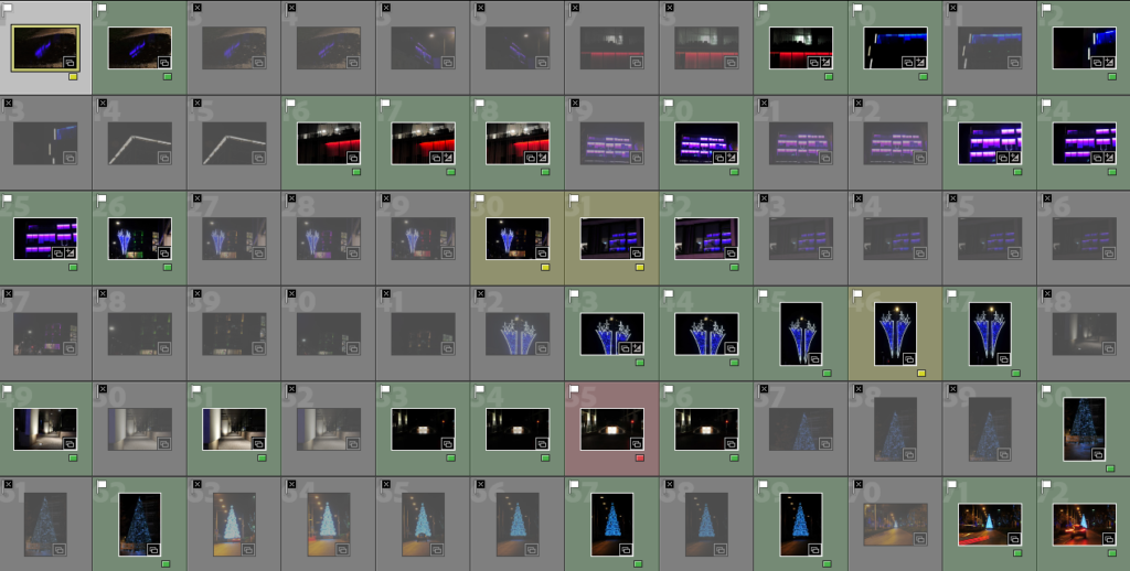
Once I had all of my images in Adobe Lightroom, I began my selection process. Initially, I chose which images I thought would be of use by using Pick (P) and Reject (X). For my first photoshoot, this narrowed my image count down to about 110 images to work with, which was satisfactory. The same was done with my second photoshoot. I then organised my remaining images by colour, with green being the photos that I would definitely use, yellow being the ones that I would consider including if I had some space left over, and red being the images I shouldn’t need to use, or use only as a last resort. This provided me with a visually pleasing and easy-to-use sorting system.

All images from Shoot 1
Selected images from Shoot 1
All images from Shoot 2
Selected images from Shoot 2

Post-Production and Photobook

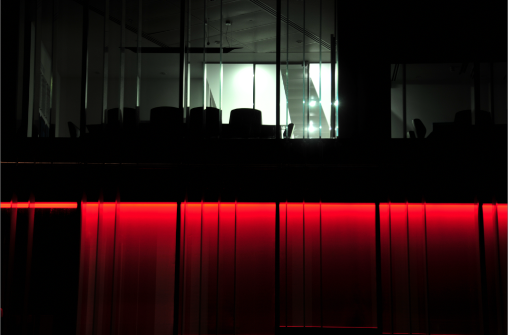
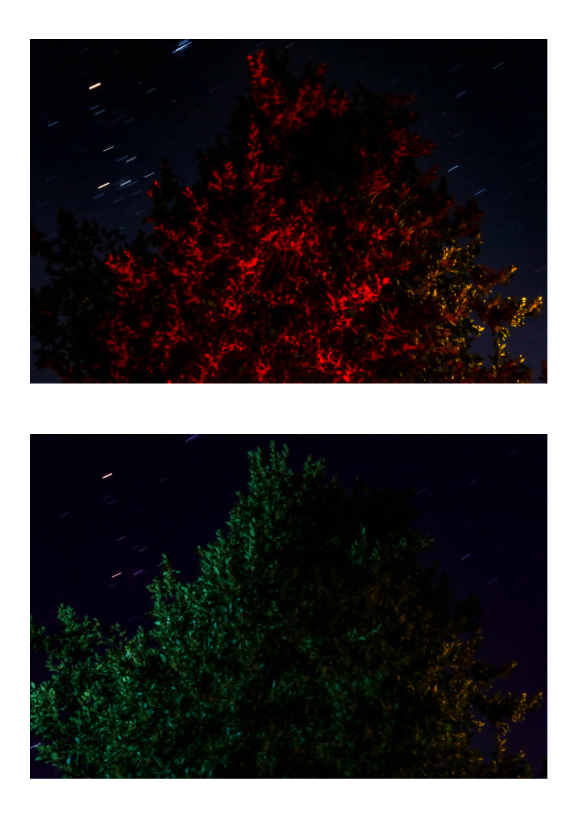
After choosing the images I wanted to use, I began my experimentation. This consisted of me selecting a single image that I wanted to use, adjusting numerous settings and touching up with spot removal/heal tool to produce a true developed final image. I went through all my selected images and adjusted the exposure, highlights, shadows, whites and blacks of each one I considered worthwhile. After this I was left with 65 final images to produce my photobook with. I wanted my photobook to stand out from the rest. There is no better way to do this than the use of bold and striking colours. I chose to start with the cover as it is typically the hardest decision to make when constructing a physical piece of work such as a photobook. I selected this image: 

I brought this image into Adobe Photoshop and took away all sources of light other than the red beams. This provided me with probably the most striking image I have ever produced. I then added my book’s title, ‘Development’ to the cover and spine of the book, as well as my name. I was very happy with the result. 

I then began to piece my photobook together. I experimented with varying options of how to display my images on each page, this a combination of single images, double-page spreads and a few multi-photo options. My final photobook looks like this:

After double-checking and triple-checking each page I was ready to send my book to Blurb, a photobook-creation website. The last step was just to pay for and order my book.

Conclusion

Overall, I feel that my project has provided an accurate and direct comparison between photography and an area’s growth and development. I have done this by clearly stating what my aim was not only in my essay, but also in the photoshoot planning stage of my project. This has resulted in what I feel to be a successful interpretation of how development and change can be represented through the medium of photography.

Photobook Design

Over the exam I decided to make a photobook using the images I took over this project. It took quite a bit bit of experimentation to find a layout that I liked but I am happy with the final design.

I decided on using a large square format to be able to show a mix of portrait and landscape images with borders alongside full bleed images on some pages, creating some variation and contrast. I also wanted to keep the flow of the pages based off of subject matter, composition and colour, to make the book more engaging and interesting to read.

I considered adding text like in Frazier’s photobook, The Notion of Family, however decided against it, feeling like many of the images work well without explanations. I also attempted to add in my essay, however I was having difficulties with the editing software and could not get a result that I liked in time for publishing.

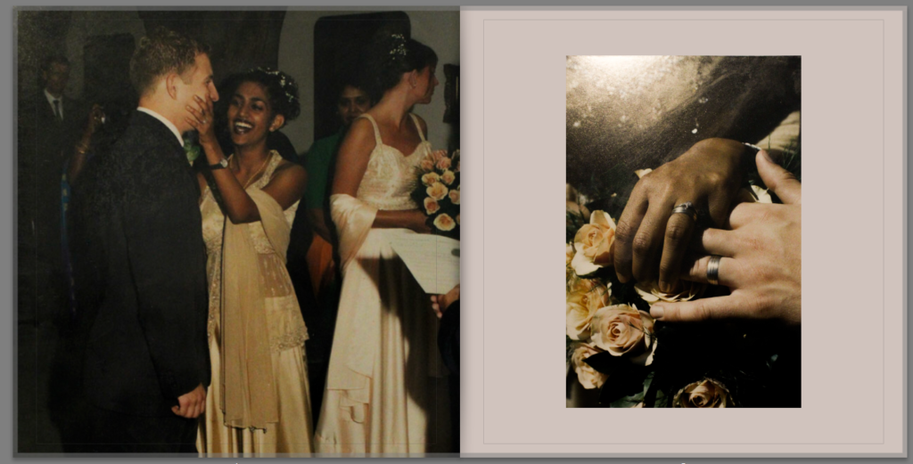
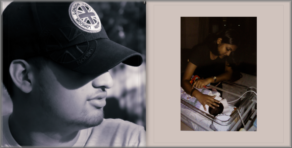
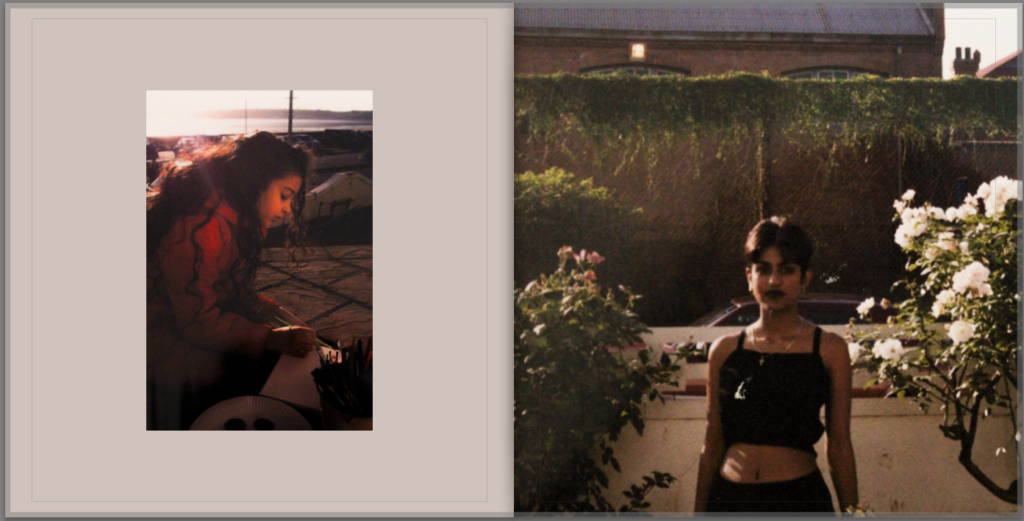
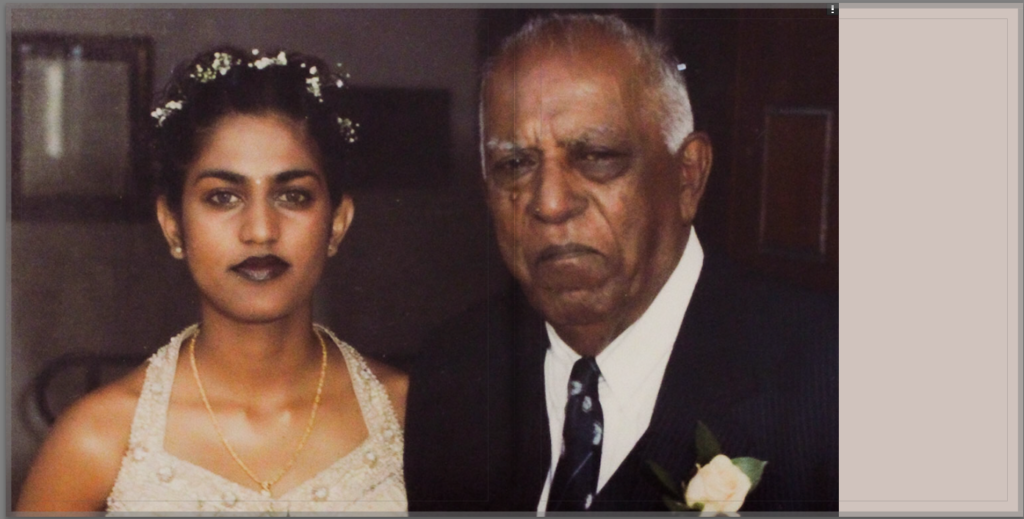
My photobook ended up including images ranging from images from my mum’s childhood in the 1980-90s to images I have taken myself in 2023.

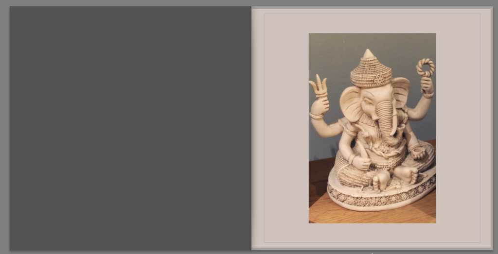
My final layout– it can also be viewed here– Tīvu

I decided to make the background paper an off white colour to fit into the colour scheme of the older images as well as making the book look older in general. I like the contrast it creates against the blue throughout the book as well.

For the title I decided on the name “TĪVU” which is the Tamil word for island, tying the photobook back to the overarching theme of islandness. Both of my great grandparents spoke Tamil but never passed it on to the rest of the family so I wanted to find a way to incorporate a part of the language into my photobook.

Overall I am very happy with the final result of my photobook, especially the contrast created by juxtaposing the older images with some of my newer ones. If I were to do this project again, I would definitely try to take more images, especially here in Jersey, perhaps photographing my family as we are now, alongside myself as there is only one image of myself in the entire book. Doing this might have tied my work more to that of LaToya Ruby Frazier, while I feel like I placed more of a focus on taking inspiration from Vasantha Yogananthan throughout this project, as I really liked how my edits inspired by Yogananthan look, and feel like they make the images much more striking and memorable.
Evaluation of Personal Study

Link to Digital Photobook

Here is a link to a digital version of my photobook.


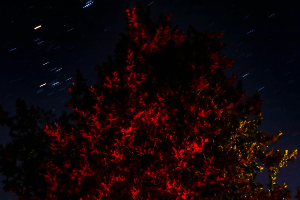
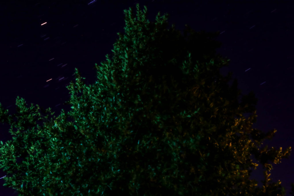
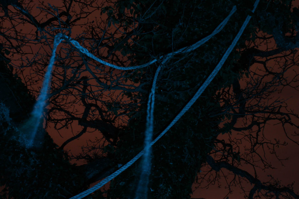
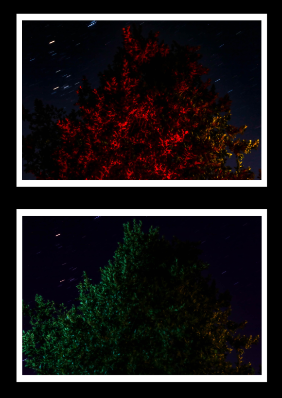
I think that this project and the final pieces I got out of it are a good note to end my coursework on. This project has shown me ways in which I have improved as a photographer since my first few projects on the course, such as the Hamptonne and Identity projects, I feel like my photographs now are of a much higher quality than they were then, due to my improved knowledge on camera handling/techniques as well as a refined aesthetic style. I have also learned new skills and explored new techniques on this project, such as night photography. In particular, I think the best part of this project was experimenting with night photography; it was a completely new way of taking photographs and using coloured gels and artificial lighting to light up the scene I photographed worked well with my interests (this and previous projects makes it quite clear that colour is one of my main focuses when it comes to photography). I also enjoyed constructing the photobook, I had some experience with zines in the past having made two previously, but this gave me the freedom to use as many images as was reasonable.

What went well:

To me, I think my photobook was a success, I was able to create intriguing page spreads which (most of them) have a connection to another page spread elsewhere, making the whole thing feel connected together. I feel like my night photoshoot was successful in the end, despite the first shoot not going as planned, I feel like the way I was able to learn from my mistakes and make even better images, which only made me enjoy the outcomes from that specific shoot even more.

How I can improve:

In terms of how I can improve to prepare for the final project, I feel like I could improve on how I plan photoshoots that link with the concepts that I have on the project better, I don’t feel like I did a particularly bad job at planning in this project, but I can always improve it to make better links within the project as well as the final piece.

Comparison to my other project:

It would be worthwhile comparing this project to my previous Anthropocene project, as it has a very similar theme to this current one, as well as the fact that the final outcomes are fairly similar aesthetically (and thematically as a result of the similar prompts). I think this project has a greater variety of the types of images I took than the Anthropocene project, in this project I was able to capture natural and urban landscapes, still life/object and night photographs, as such my final pieces and photobook are more interesting in that regard. I also feel like my images from these shoots, after looking back on the Anthropocene project (which I consider to be one of my strongest), were of a higher quality, I felt like the framing in particular gave my images a more professional look.

Here you can see the similarities between the two final images, in this project I wasn’t as focussed on the colour of the image, but it does have a lot more colour than the original image.

Final Images/Pieces

Final Images

These are the images I consider to be the best from this project, I will be using these images to create my final pieces that are separate from my photobook:


Final Pieces

I will be making three final pieces out of those images, one of them will have a sequence of four A4 images, and two will have a sequence of two A5 images, both pieces will be on a black backing.

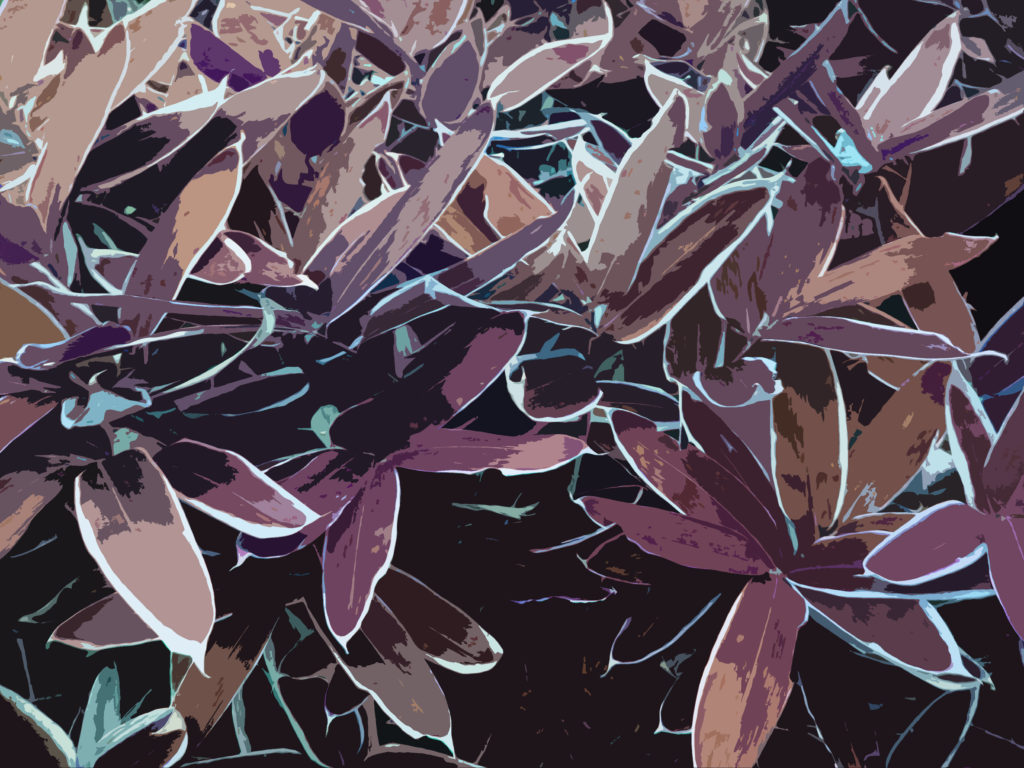
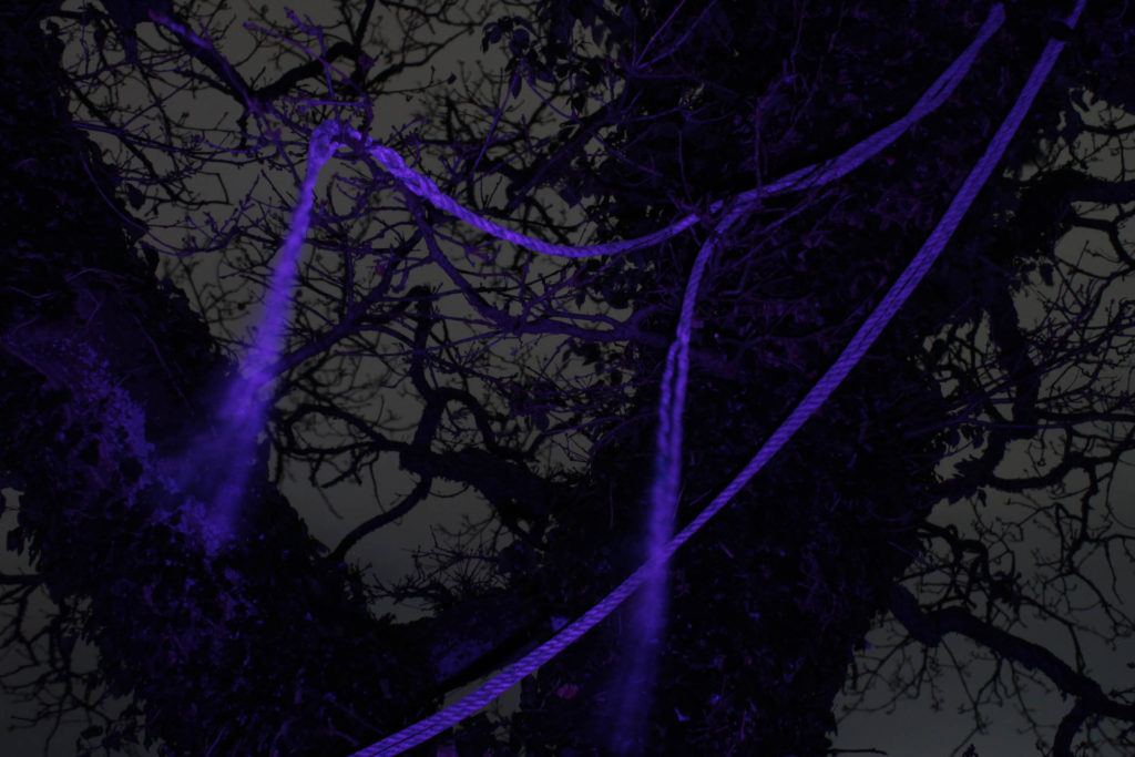
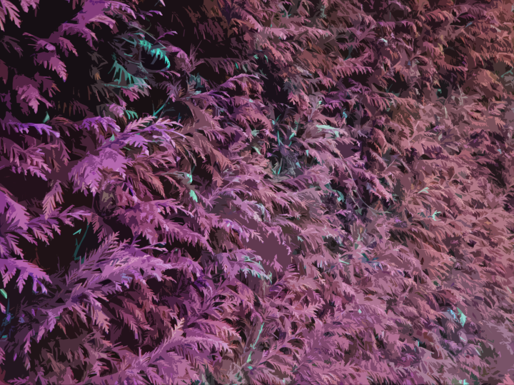
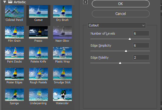
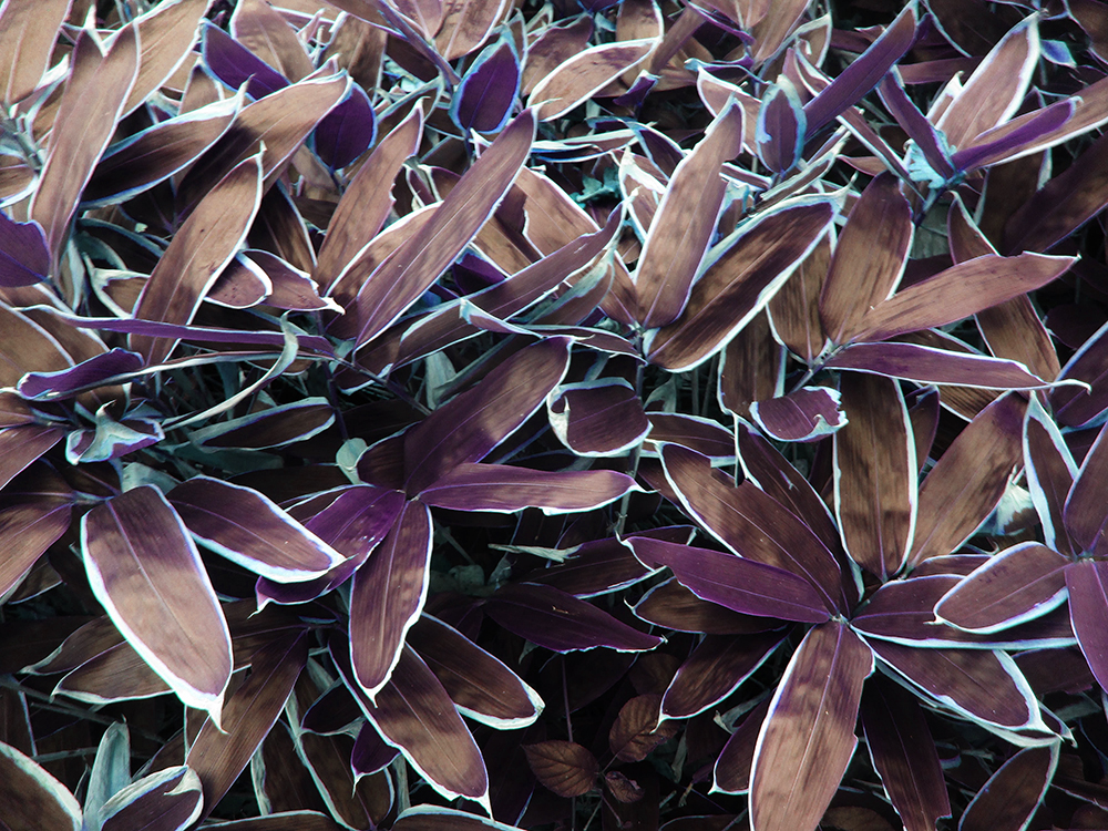
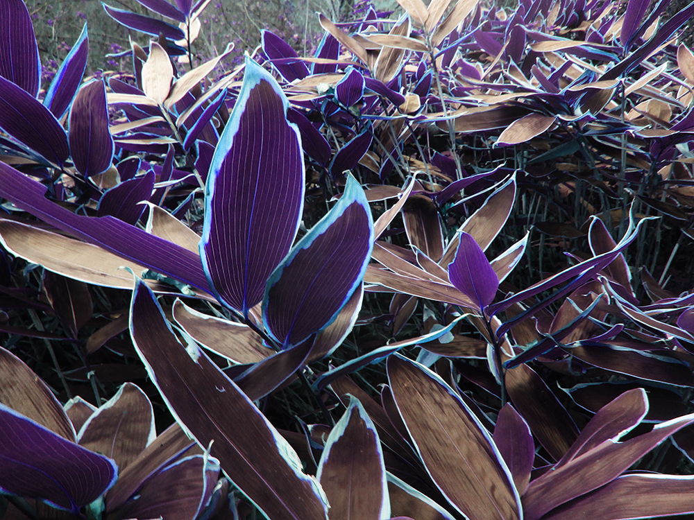
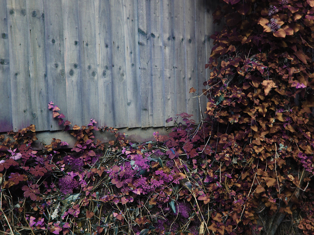
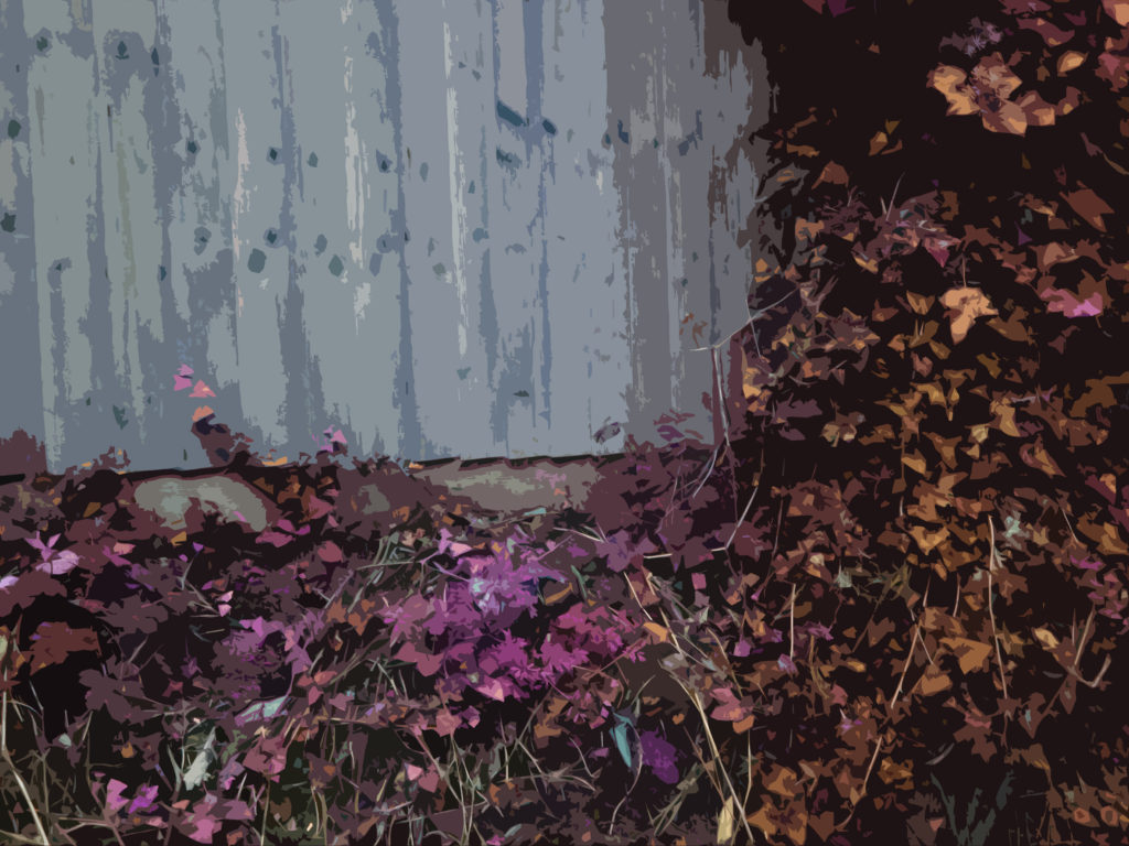
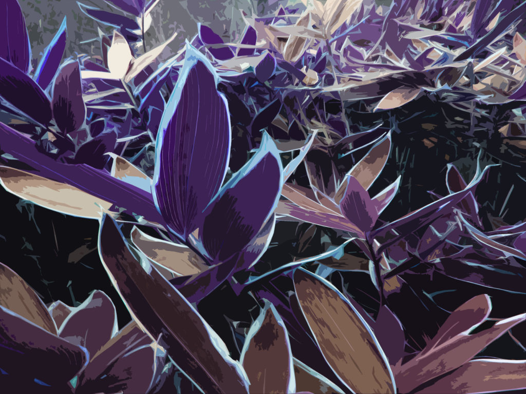
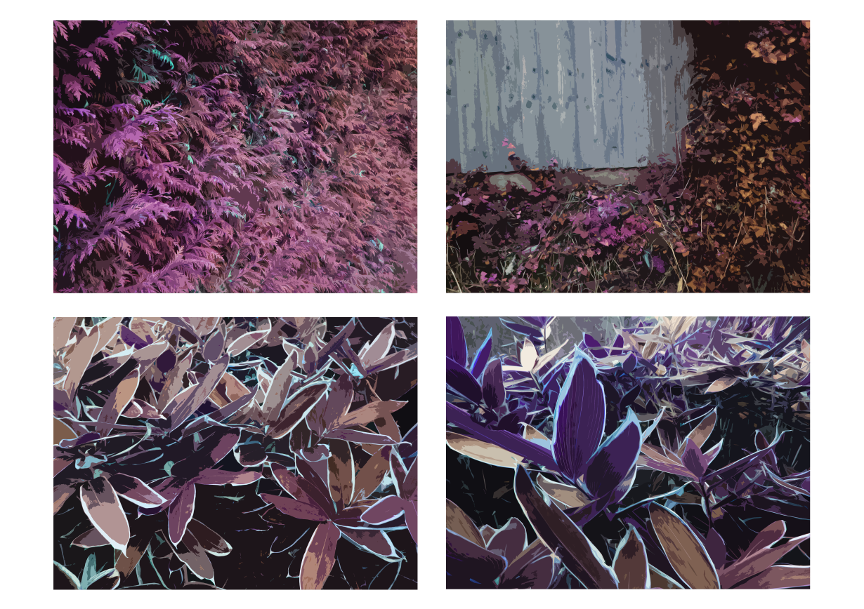
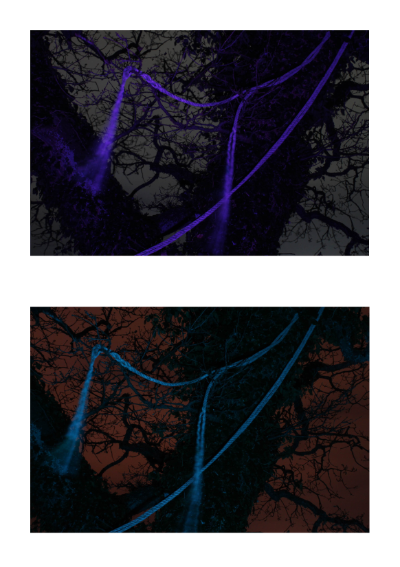
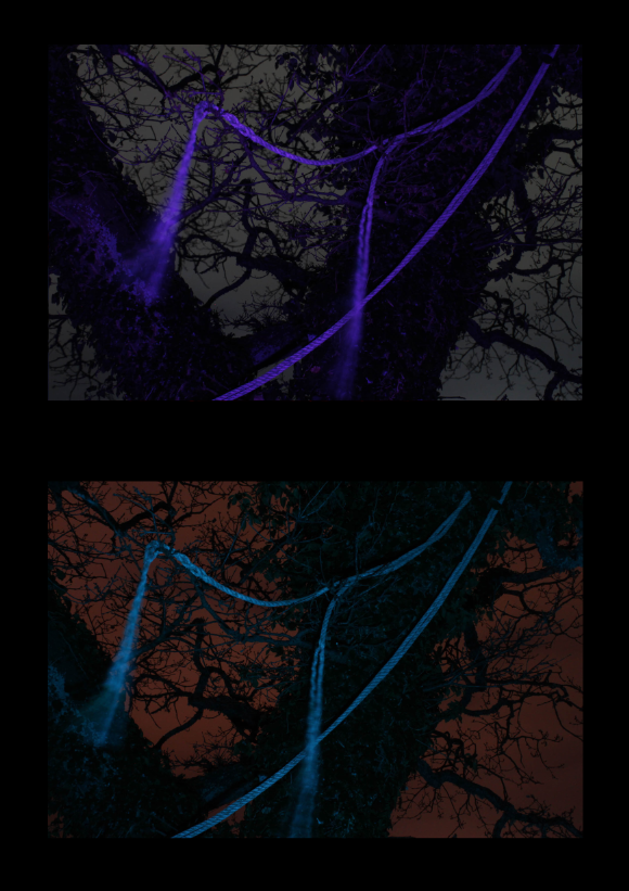
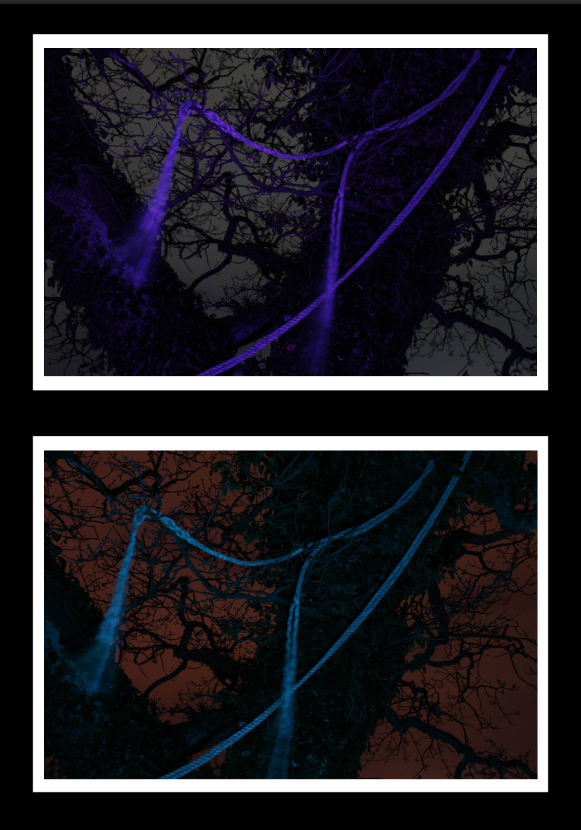
These final prints were inspired by the image on the cover of my photobook. I edited the images in the same way that I edited that image – using the ‘cutout’ filter on Photoshop and increasing the saturation to make it pop.

These are the images that I edited:

This is how they look after I have edited them (using the cutout/saturation method):

For my final piece using these images (including the image I used on the cover of my photobook) I would like to arrange them into a sequence:

This is how I would arrange them, I think this arrangement works as the lines in each image point towards the centre of the page. I put the two similar leaf images together as I thought it would make the sequence less erratic.

This is what the sequence would look like with a black backing, I think I will try to create something similar with my final piece. Unlike the next final piece, I don’t think using white foam board will ne necessary as these images are far brighter than the ones used in those, so it will reduce the effect of using the images with the black background to create contrast.


My next two final pieces will be laid out with one image above another in a sequence.

This is how this piece will be laid out

Here is what I would like the final piece to look like – I have decided to use black as it allows the bright parts of the image to stand out more.

This is an example of the layout with a white boarder on the images to separate the images from the black background – I think this will make my images clearer, so I will use foam board as a primary backing for my images and then mount that on a black board to create the image.


For the third piece I will do the same as the last piece:

Here is the layout of the images

This is what the sequence looks like with a black backing

This is what the final piece will look like, once again using foam board to separate the image from the black background.


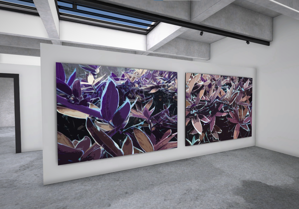
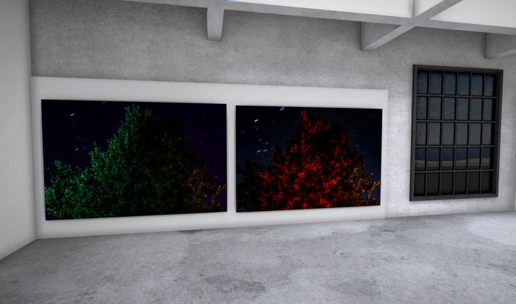
Virtual Gallery

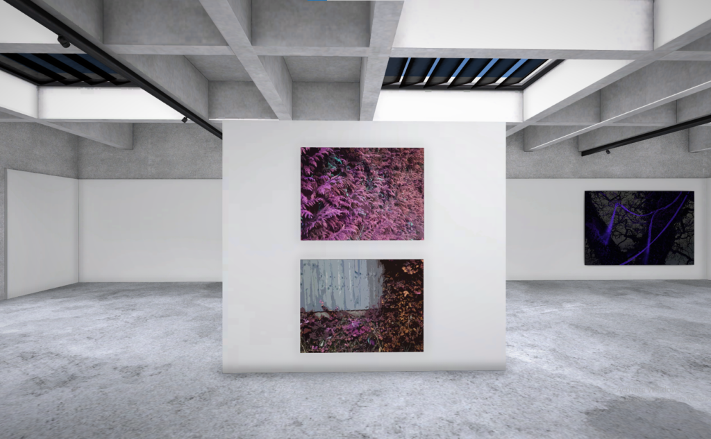
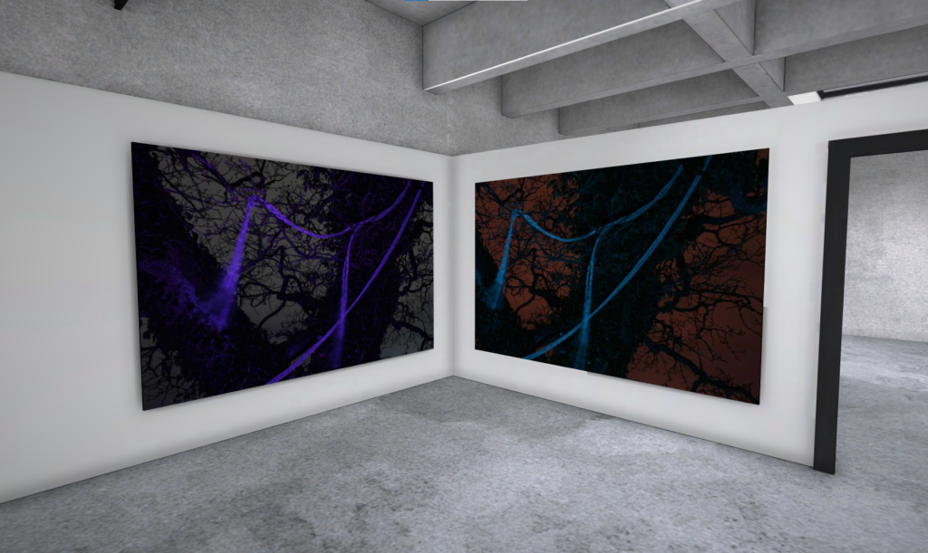
Here are some screenshots of my final image depicted in a virtual gallery setting

Photobook Layout

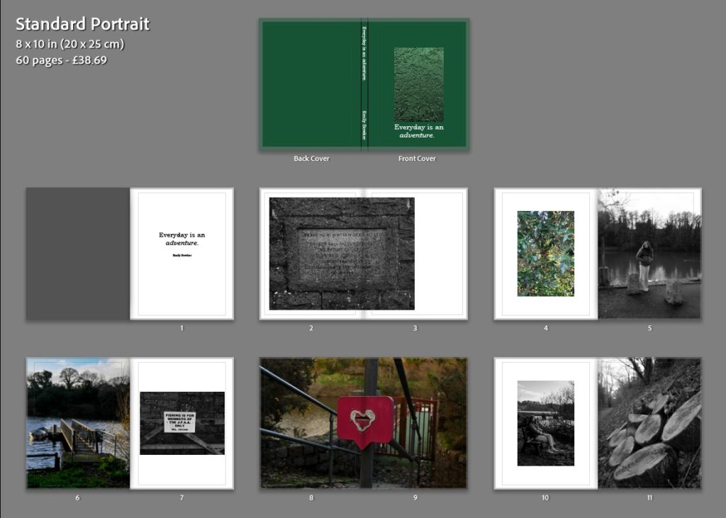
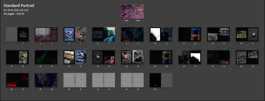
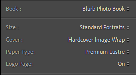
These are the settings I ended up using for my photobook, I like the feel of hardcover books and the image wrap will allow the image to appear on the front cover. I chose portrait as it fits the resolution of my images (especially on a double-page spread) better.


I started designing my photobook layout by first creating each page spread individually, without proper concern as to what went where at that point in time. However, I did take into consideration what spreads had already been made, so I could create a pattern of symbolism/motifs and the layout of the pages (for example each spread with a pigeon on it is made up of two images – the pigeon and a landscape from a Bhamra shoot, as a way to contrast them).

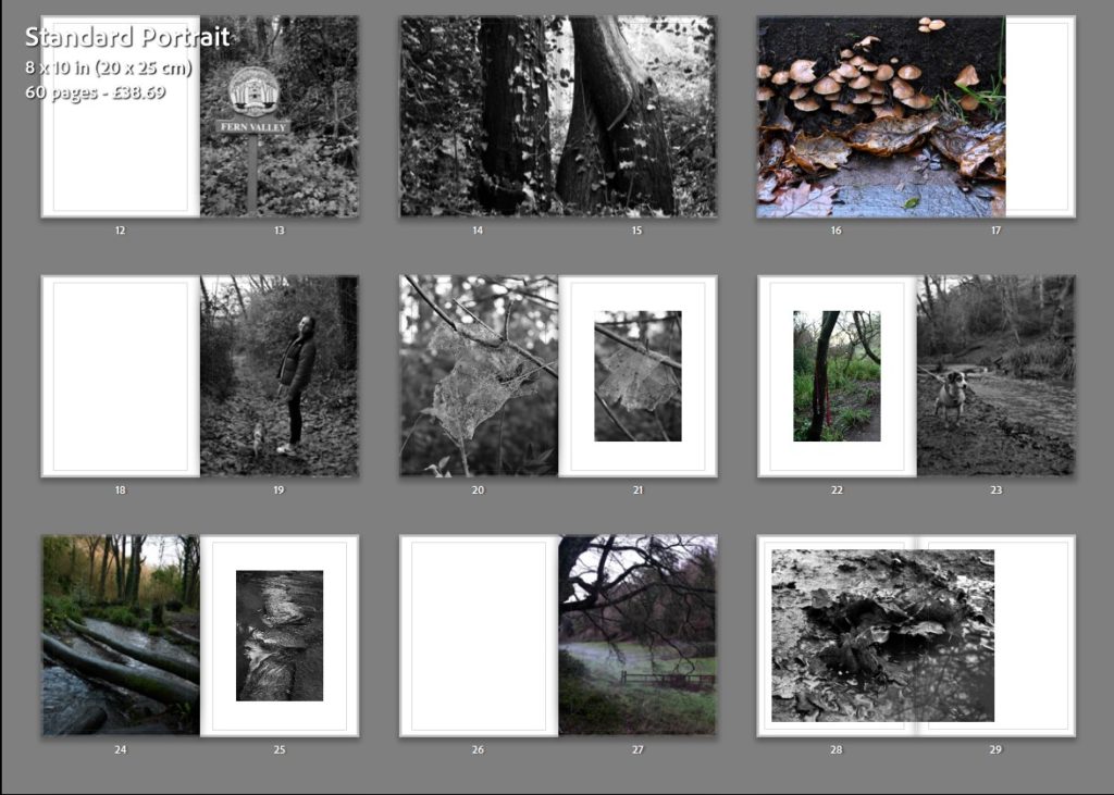
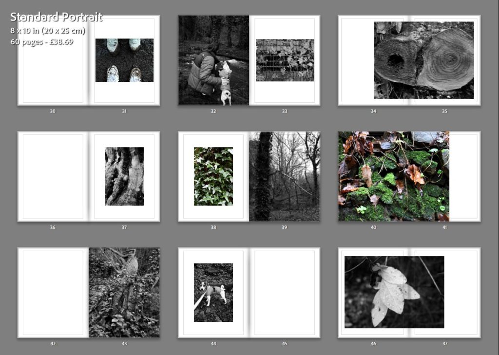
In this image you can see the final layout of my photobook. I tried to make my layout as symmetrical as I could (in terms of what images are placed where), which is something I have done for each zine/photobook I have created, as it allows me to visualise the sequencing of my images and ensure consistency.

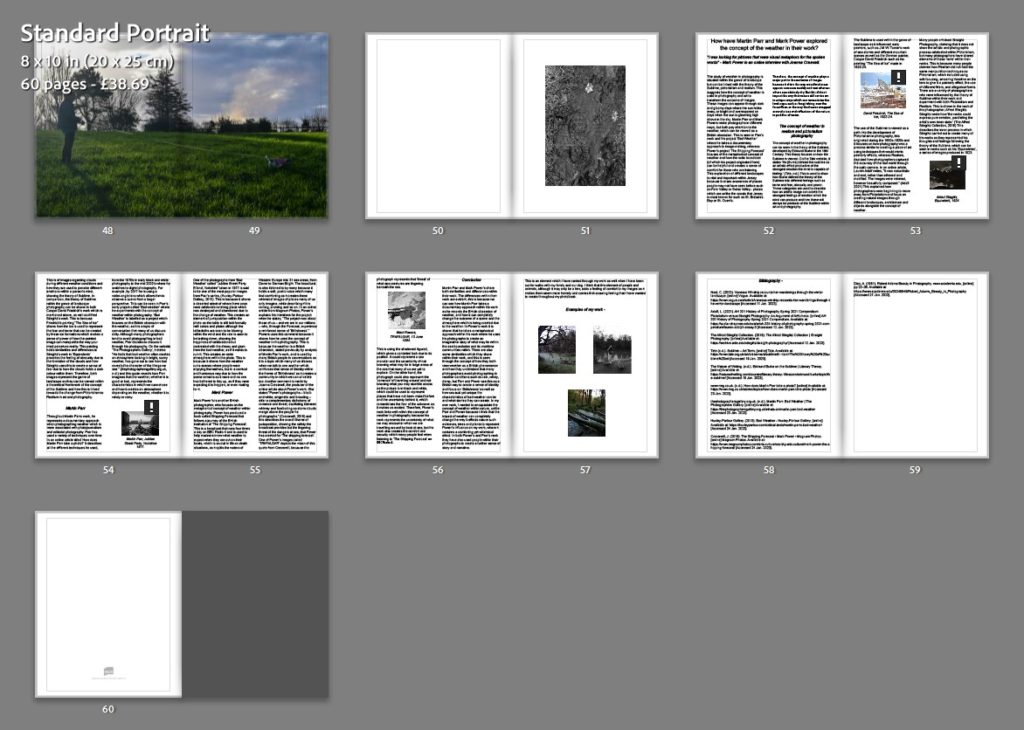
I eventually decided that black pages on my zine would be more effective than white, as it will allow the brighter points in my images (for the night images especially) to contrast better. The three grey page spreads at the end is where the essay will go (shown below).

Key Page Spreads:

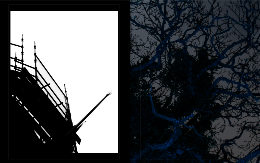
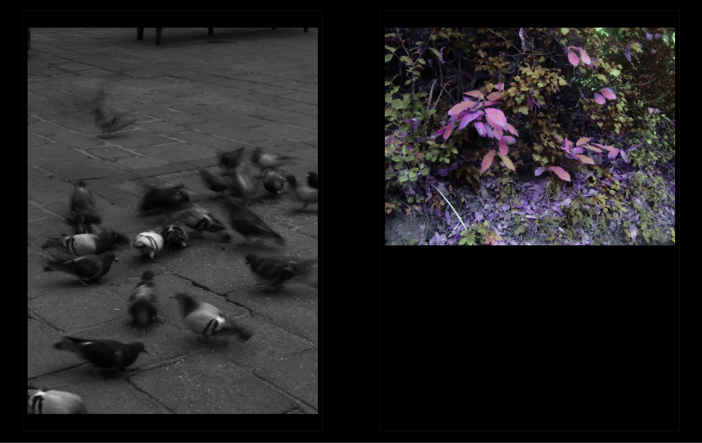
Here I will explain my thought process behind the key page spreads (those which have repeating motifs/meanings – one from each).

These spreads came from the symbolism with tree branches and scaffolding poles. To me they both look similar, the branches and the way they point towards the sky shares a resemblance with scaffolding. The two could also represent similar things, but in different contexts, such as growth, construction, etc., as well as support (for us scaffolding acts as a way to get to the top of buildings to help fix or build something, while a tree branch could be the location of a bird’s nest as an example). At the same time, they represent very different things, scaffolding – the growth of humanity, and a tree – something which is often destroyed to allow that growth, this dynamic was interesting to me so I decided to visualise it in my book.
The spreads involving images of pigeons and a colourful landscape setting represent the contrast between the organic and synthetic in a nutshell. To me the pigeons represent isolation within an unwelcoming and unnatural world, as well as a dependence on humans as a result, while the image of the natural world is depicted as being free and safe from disturbances. You would expect these birds to live within the natural setting, however, as shown here that is not the case – there are no animals to be seen in that landscape. I have also used colour symbolism to represent this, the pigeons within their urban setting are black and white, while the natural world is depicted as colourful to an almost exaggerated extent.

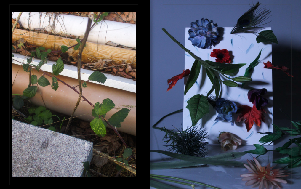
Here I have juxtaposed a scene that was not tampered with by myself (which involves elements of the natural and man-made), with an image of a scene created by me, comprised of synthetic plants and materials representing nature. Both images could represent the same thing – the contrast with the natural and synthetic, however paired together it could be taken to another level: the scene I found could represent something organic, while the scene I created could represent the synthetic.


Implementing the Essay

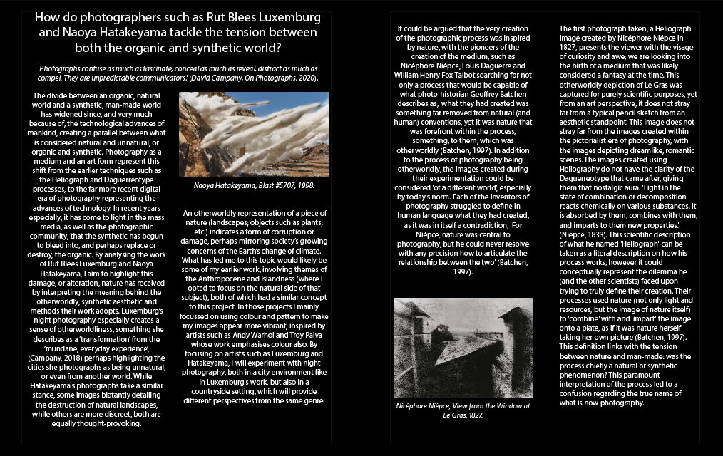
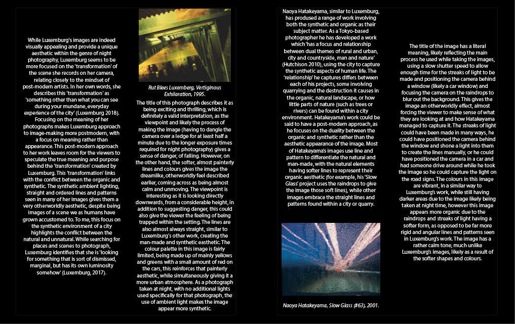
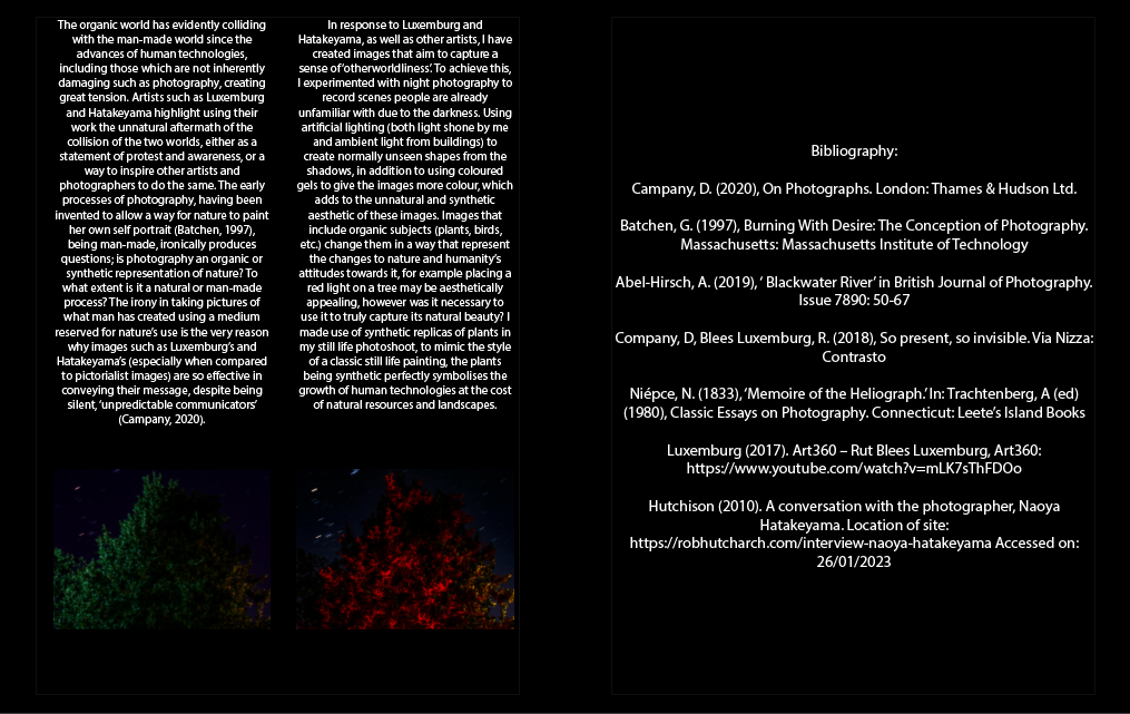
Having created the photobook, I will now put my essay into the pages at the end of the photobook, so that it does not disrupt the flow of the main photographs. The essay was separated into 3 page spreads, each page translating to one paragraph, this is how it looks in the photobook: