Category Archives: Uncategorized

Filters

Author:
Category:

essay analysis

‘Waste’ by Nicholas Gallery

Read the essay and comment on its overall written and interpretative quality as well as its use of critical, contextual and historical references.

Waste layout

Does the essay address its hypothesis?

The essays hypothesis was to show how 2 artists tackled the idea of ‘waste’ and ‘Anthropocene’ through close-up images of plastics and other objects relating to waste. I think this essay addresses its hypothesis in a great way.

Does it provide new knowledge and understanding?

The essay provides very good knowledge and understanding of the artists chosen and the topic of ‘waste’.

Is the essay well structured with a sense of an introduction, paragraphs and a conclusion?

The introduction of the essay begins with a quote from Salvador Dalisala who was a Spanish artist, “Have no fear of perfection – you’ll never reach it”. which I believe doesn’t have much reference to the essay. The essay is structured in a successful way by using paragraphs to represent the problems of waste. Also, I think the conclusion finishes of the essay in a perfect way by discussing how Mandy Barker and Keith Arnatt used these images of waste and turned them into images of ‘beauty’.

Use and flow of language, prose, punctuation, spelling.

The language used in the essay is very strong and informing, with good use of punctuation and spelling. The essay has a very good flow to it and is easy to understand and read.

Use of specialist vocabulary relating to art and photography.

There is a lot of artistic vocabulary used throughout, which explains the topic in an interesting way

Analysis of artist’s oeuvre (body of work) and key work(s).

Evidence of wider reading with reference to art history/ theory, political discourse and/or socio-economical context.

This essay involves a lot of detailed description of the history of this topic and also displays a lot of knowledge theory and artist references.

Use of direct quotes, summary or commentary from others to make an informed and critical argument.

He has included a various amount of quotes throughout such as a quote from Mandy Barker (the artist he has responded to) replying to her topic name ‘Beyond Drifting’, “because we are not beyond putting an end to the problem – but we are beyond salvaging what is already out there.” I believe Nick has used the use of quotes in an effective way with not including too many, but including a few important quotes.

Use of referencing system (eg. Harvard) and a bibliography.

Use of illustrations with captions listing name of artist, title of work and year of production.

I think the overall mark for this essay is 14 marks which is a level 5. This is because of how detailed and informing the essay, with a very interesting overall topic, and a good range of amazing images.

Essay Analysis

  • Does the essay address its hypothesis?

The essay’s hypothesis was to show how three different artists captured “the invisible” and reflecting a meaning of memory. I feel that this has been done to an acceptable standard.

  • Does it provide new knowledge and understanding?

The answer provided shows detailed and complex understanding of each of these artists, with an in-depth introduction and conclusion.

  • Is the essay well structured with a sense of an introduction, paragraphs and a conclusion?

‘Someone once said that you die twice; when you die the first time and when somebody finds a photo of you and no longer remembers who it shows.’ This is the response’s opening line. It is succeeded by the introduction paragraph that gives the reader a taste of what is to follow. The conclusion is similar. It is a summary/recap of what has previously been stated, yet from a more personal perspective.

  • Use and flow of language, prose, punctuation, spelling.

Language is excellent, with careful and precise use of varying and appropriate punctuation. Flow is also accurate and easy to read.

  • Use of specialist vocabulary relating to art and photography.

Specific and descriptive language of a varied range is used throughout.

  • Analysis of artist’s oeuvre (body of work) and key work(s).

The author clearly selected three artists to explore. Each of these artists has their own section in the essay with reference to their work and ideas.

  • Evidence of wider reading with reference to art history/ theory, political discourse and/or socio-economical context.

There is an in-depth paragraph of context for each artist. This proves that background research has been completed.

  • Use of direct quotes, summary or commentary from others to make an informed and critical argument.

Opening line, “Someone once said that you die twice: when you die the first time and when somebody finds a photo of you and no longer remembers who it shows.” Direct quote from Banksy, a British street artist.

  • Use of referencing system (eg. Harvard) and a bibliography.

This essay follows some guidelines of the Harvard Referencing System. It contains connections to three separate artists and the author’s surname, however a year of publication and page numbers are not featured.

  • Use of illustrations with captions listing name of artist, title of work and year of production.

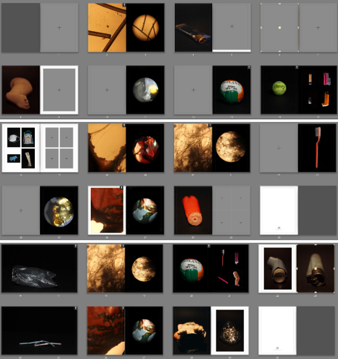
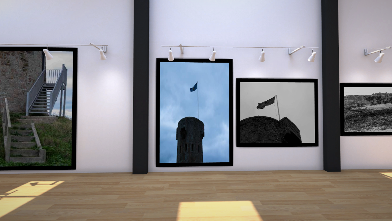
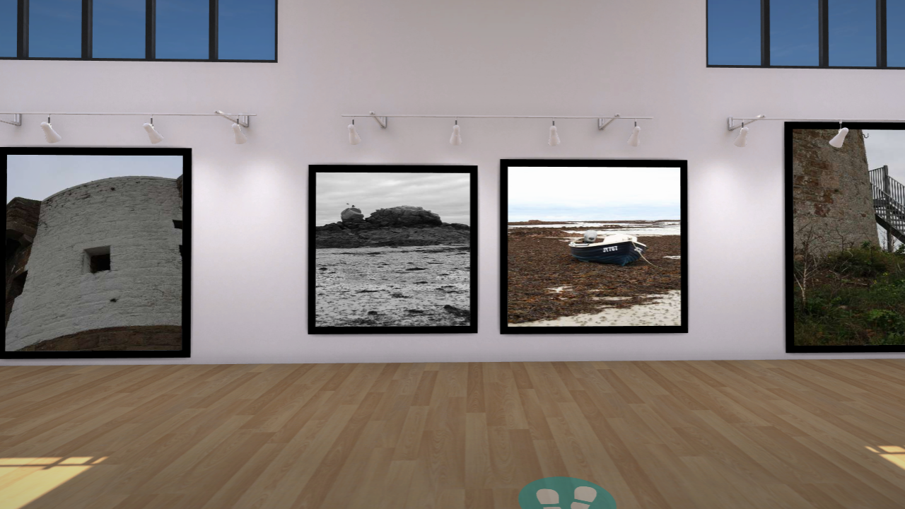
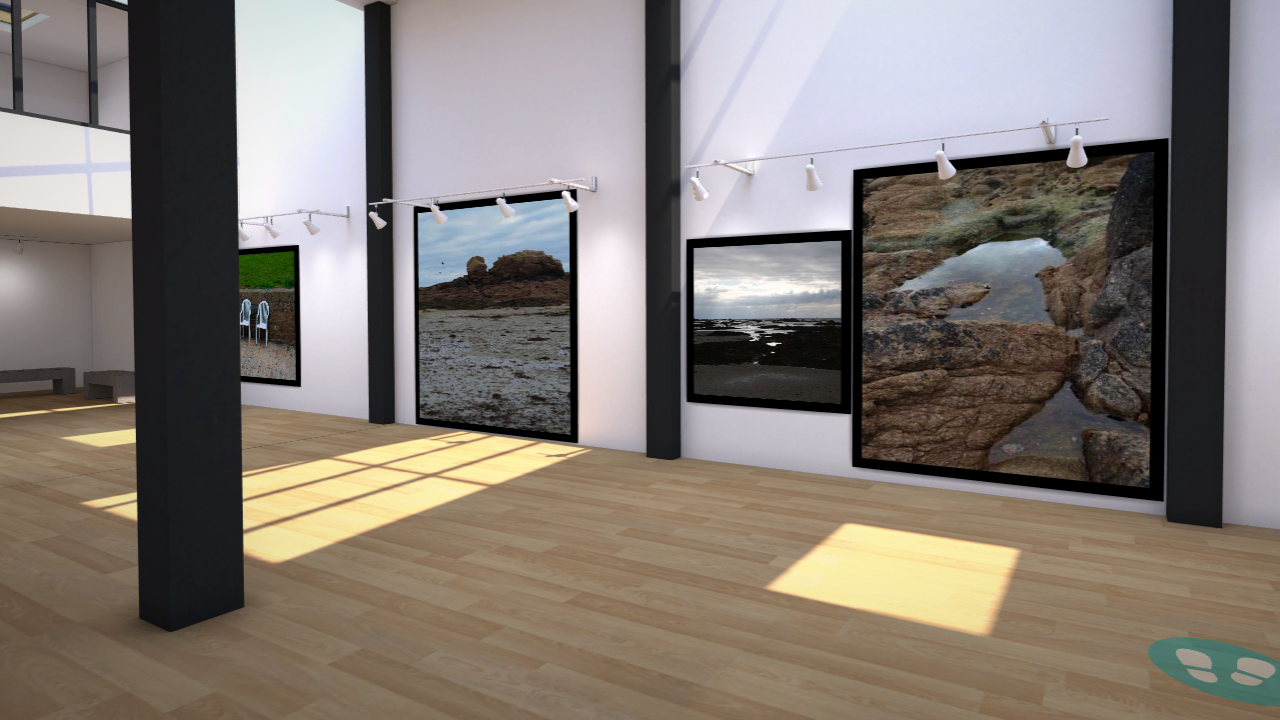
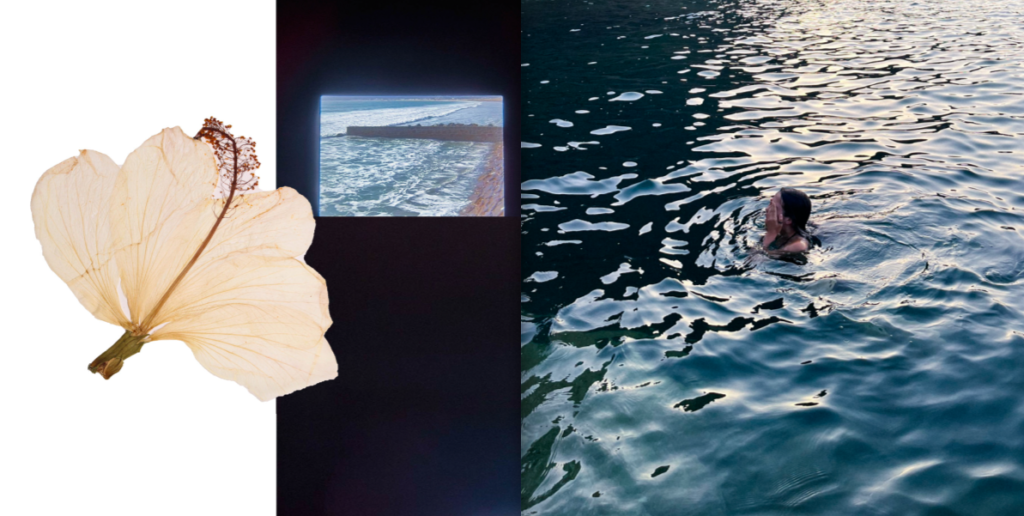
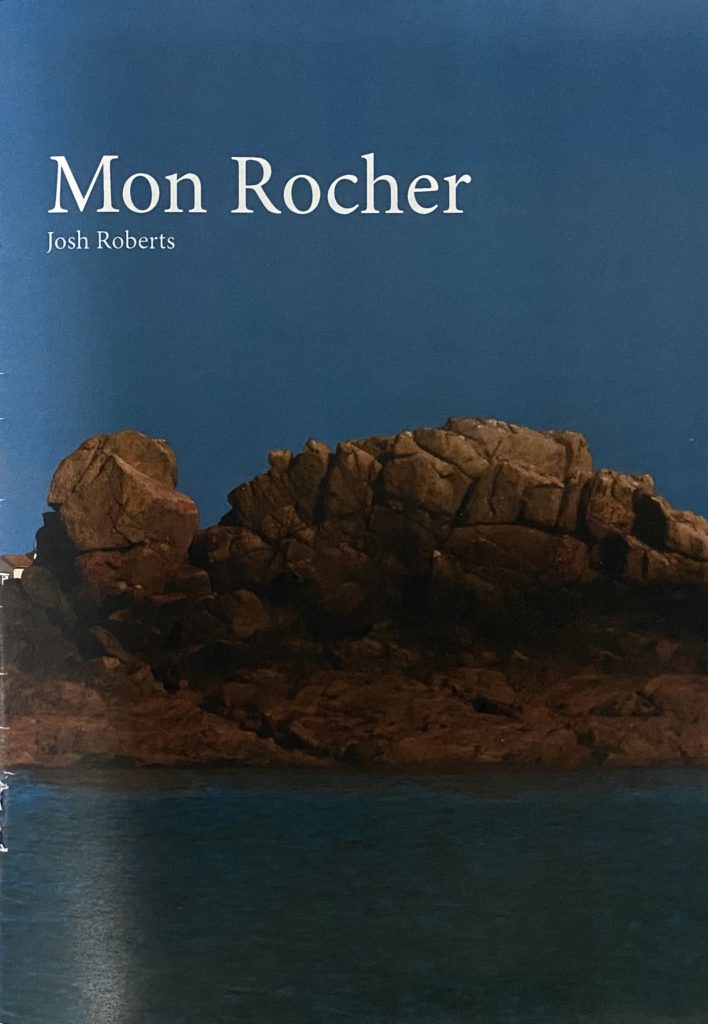
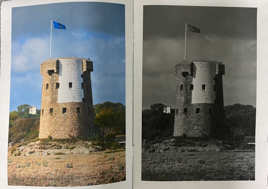
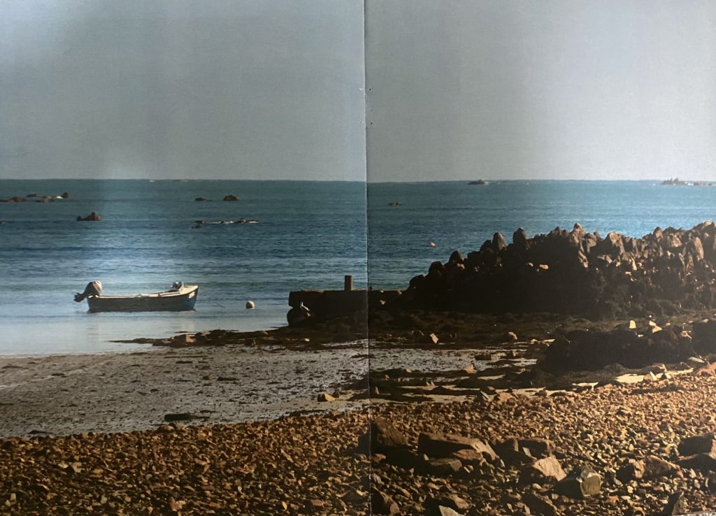
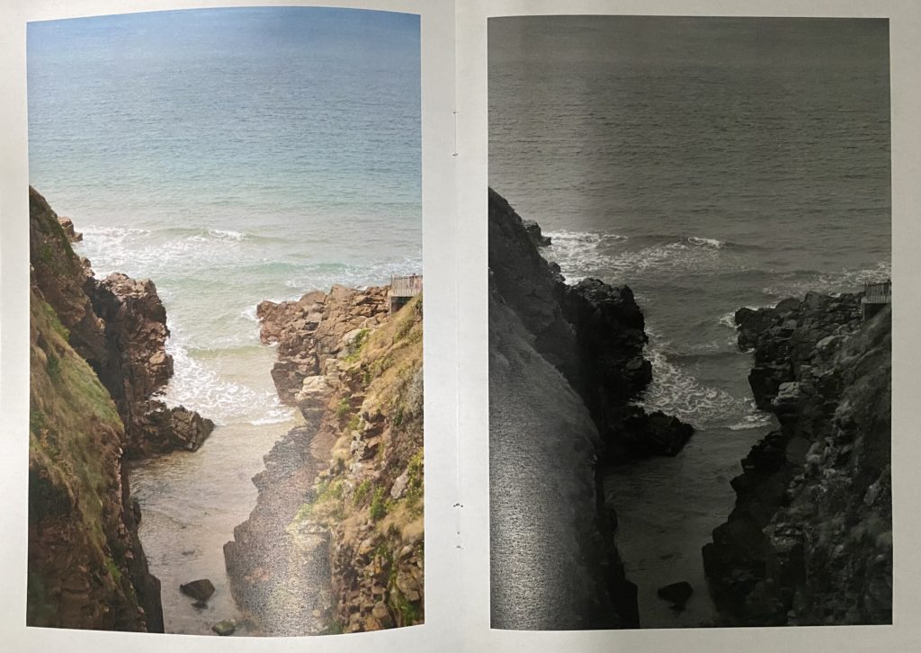
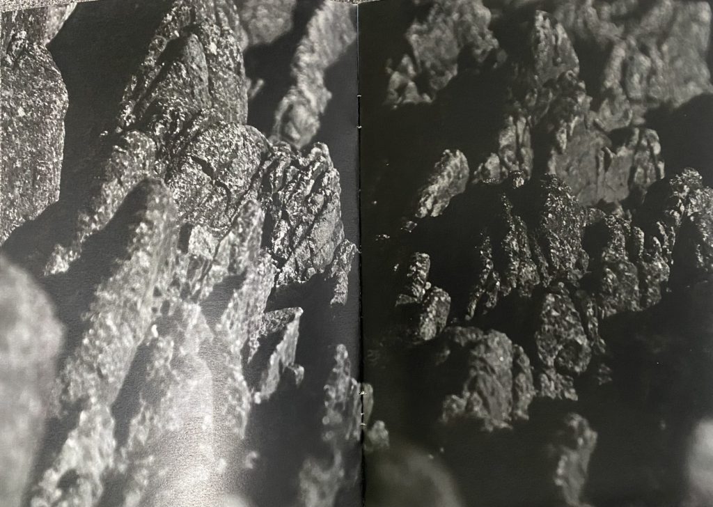
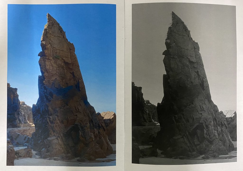
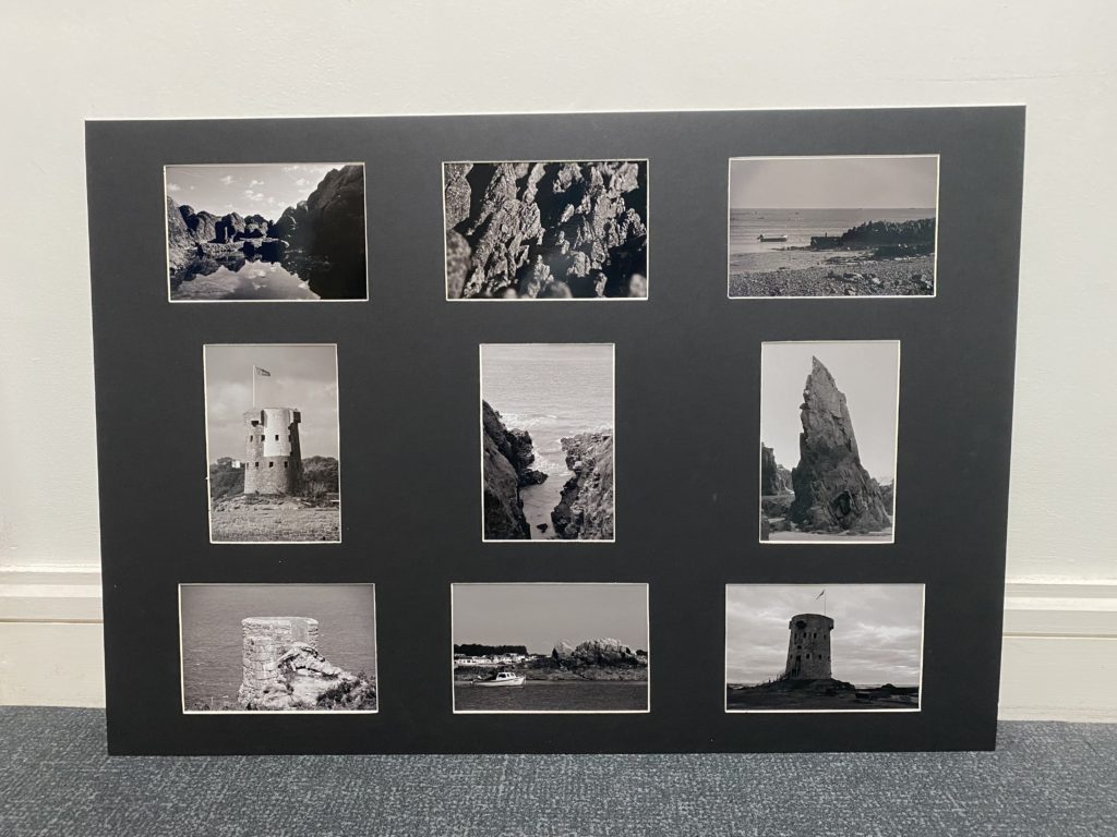
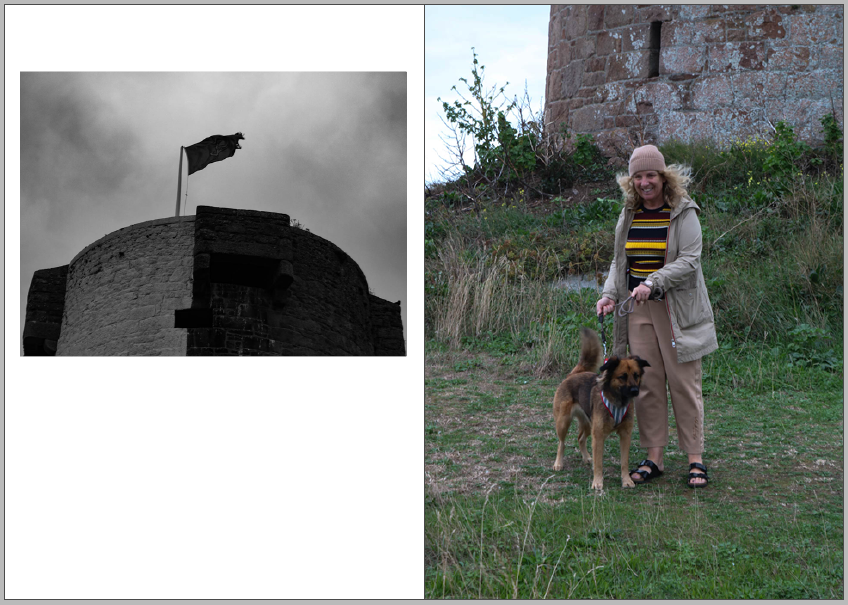
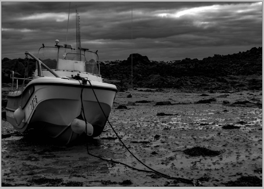
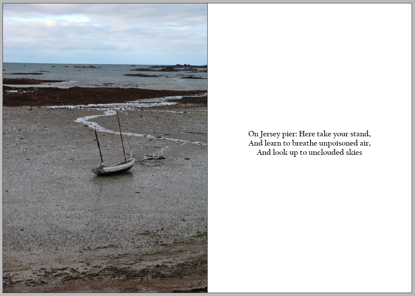
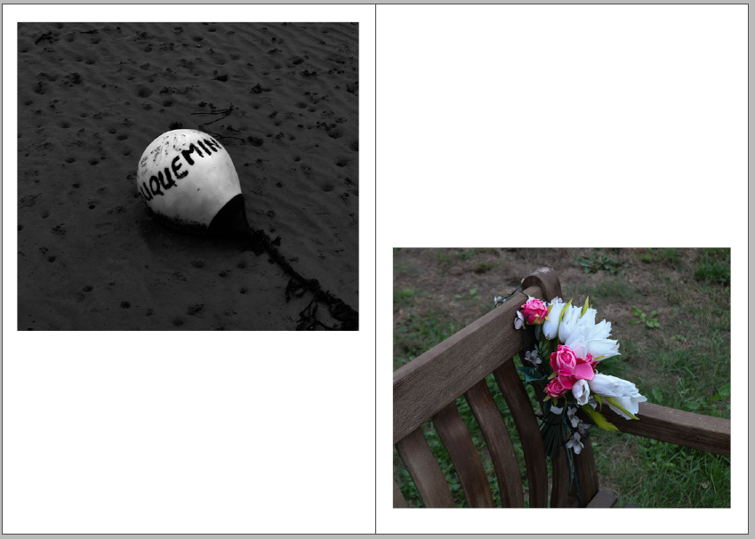
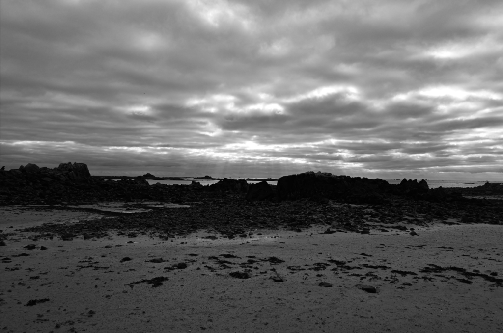
Majority of images have no caption, no year of production, but title of work is shown.

I would mark this essay a 16/18.

Question: How has Boltanski, Abril and Toroptsov represented the concept of capturing the invisible and reflecting the meaning of memory through the medium of photography?

‘Someone once said that you die twice: when you die the first time and when somebody finds a photo of you and no longer remembers who it shows.’

We are made up of fragmented memories and forgotten dreams. Our entirety rests in the fate of old letters, burnt photographs and meaningless possessions. We never question the invisible, it is as though we are on a relentless pursuit to try and capture what we cannot see.  We abide by the rules and limitations that are enforced by the concept of death. But what happens to those who become untouchable, those who are no longer part of the flux. Their existence becomes empty and lost, they are no longer perceptible to the eye. Yet we still feel impossible and unexplained connections to the spiritless. We yearn to cherish the ‘good’ memories and except the restrictions we are faced with, regarding mortality. In doing so, the feeling of life is created, the tangibility of pleasure and pain enters our worlds and consumes us. But, photographs hold heritage and meaning, they have a depth of knowledge and feeling to them. Photographs capture single moments of existence. They can tell a story of a second in a stranger’s life in an instance. Whether it be personal, isolated, private or rare, it is has an essence of being and timelessness. The allure of time, is its youthfulness. Time is the cure for it never fails to reveal the truth. ‘Human life is embedded in time: we remember the past, we plan for the future and we live in the present. We swim in an ever-rolling stream.’ 

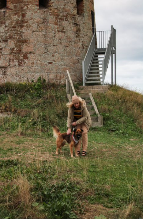
I am exploring how the invisible can be captured and portrayed through the medium of photography. And why memories hold such a powerful influence over our past, present and future. I want to find out what makes a photograph meaningful, what gives the photograph reality and how through photography the memory of a person can live on. My project focuses on exploring the invisible through three female generation’s memories; this includes my grandmother, my mother and myself. These distinctive viewpoints will enable my project to become more personal and really seek the depths of my grandfather’s life. I think memory is more than simply remembering a once present thought, but it is about connecting with the past in order for it to live on. 

Christian Boltanski, Laia Abril and Yury Toroptsov all delve into the idea of memory, seeking a way in which they can capture and meaningfully discover the rawness of an image and what it can represent. I took a considerable amount of influence from Laia Abril’s photo book ‘The Epilogue’, her scientific approach to the reconstruction of a young girl’s life and death is both moving and deeply insightful. The viewer becomes emotionally awakened by the tragic narrative. For there is no escaping the feeling of missing a cherished one. There appears to be no cure except for time, time is what has made the scar of the family’s loss more bearable. Laia Abril’s interpretation of the concept of memories is identified in her project The Epilogue. The narrative explores the Robinson family’s journey and aftermath of losing their beloved twenty-six year old daughter, Cammy, to bulimia. Laia Abril reconstructed Cammy’s life through the abstraction of memories. She beautifully and scientifically crafted the grief and suffering the family fought, as well as, the raw emotions which surrounded the topic of remembering a loved one. A book absent of clichés, emotionally awakens its audience by the sadness and intensity the story brings to the forefront. The individual becomes invested in each photograph, due to there being some sort of significance shown of the young women’s life. The cover of the piece offers the first simplistic reflection of the nature the narrative. Personal readings, letters and clippings brings Cammy’s life into reality and makes her existence more than a death certificate. Diaries, agenda books and medical records express her desperation she must of felt, proving she once had emotions and felt the way we feel today. Archive images of family members, friends, houses, locations and objects symbolize Cammy’s life history and her importance as well as her mark on the world. In particular images there is a sense of honesty and peacefulness. For Cammy did not live her whole life consumed by the illness, therefore, had childish memories, typically ones which we would expect at a younger age.

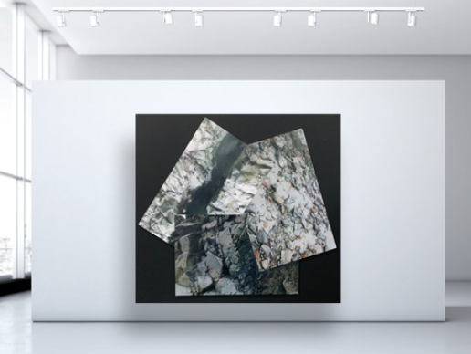
Abril photographs several aspects of Cammy and her family’s life, however, I think the most powerfully beautiful images are the ones which really project her innocence, vulnerability and regret. A memorial collage of photos of Cammy, which is in the living room of the Robinson’s house, is alike to a snapshot of Cammy’s life. It exudes life and happiness, although this may have not truly reflected her feelings and illness she faced at the time. It is there for the comfort of her family to know and remind themselves that she once was a content and fortunate child. Abril has included a pop up of an extract from what looks like a newspaper. It could possibly be a memorial or announcement viewable for the public, Abril has designed it to lie next to the collage and create a shadow over it slightly. Although this is a very subtle detail it translates a distinct message; it shows the favorable memories behind the harshness and rawness of her death. Moreover, Abril creates an interactional style which allows an audience to become involved in the memories and life of Cammy, as well as, the curiosity of knowing and desiring to understand more of the invisible. On the opposite page Abril has photographed the hundreds of letters of condolence the Robinson family received. Again this contrasts with the following photograph of the collage, Abril has created a book that is a constant rollercoaster ride of emotion. The archival images used have been chosen specifically to evoke a sense of feeling especially the ones of her as a child. The photographs have history and meaning to them; there is an essence of the past and remembrance reflected through each one. The individual archival images have importance and uniqueness which symbolize the compelling nature of memory. Abril’s work inspired the idea for my collage of archive images I had found and been given to my family members. The majority of photographs in my project are concentrated on the death of my grandfather and his absence, therefore I felt it would be beneficial in order to create a piece which reflected small moments of his extraordinary life in a simple flick of a page.

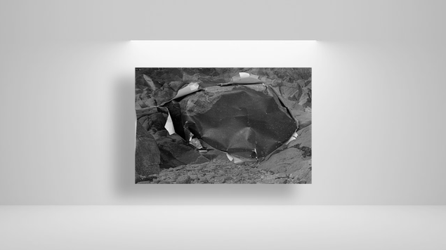
Similarly, Yury Toroptsov toys with the concept of creatively discovering the invisible. Deleted Scene focuses on a journey in search of a father he never knew was led by an invisible path. With a relentless pursuit Toroptsov traveled to Eastern Siberia in order to tell us a unique and complex story. Toroptsov’s project is parallel with Abril’s interpretation of making the invisible visible. Furthermore, mutually they have intertwined the character and personality of the ‘people’ they are ‘photographing’. The topic Toroptsov is tackling is one many may struggle with in terms of the emotional exposure. Toroptsov has taken a more poetic approach with his style in this particular photo book. Rather than displaying objects and using archival images in an almost scientific way, he has explored the idea of creating his story from metaphorical photographs. The meaning behind the photographs he has chosen are not simplistic nor are they easy interpretations. They are filled with emotion and desire to learn who his father was. The images are ones in which you need to consume yourself in so to speak. However, when it comes to the concept of memory and photographing the invisible Toroptsov has allowed his audience to deduce whatever they will from the photograph. In order to successfully answer the question I have posed, analyzing a single image from Toroptsov’s project Deleted Scene, will support me with grasping a more in depth comprehension of how he has managed to photograph such a complex conception. As I previously mentioned Toroptsov’s work takes on a much more poetic and metaphorical approach, therefore I thought it would be appropriate to analyze a one which symbolized this. The title page of Toroptsov’s project is a simplistic yet inviting opening to the narrative, this is a particular favourite of mine in comparison to other projects I have studied. I think it is very clever how the design of the front cover hides the individual’s face, which is their identity. Furthermore, the colour it has been edited to brings a vintage and classical style to it. Which is further emphasized by the Polaroid type of photograph chosen to be displayed on the initial page.

The third academic to be addressed when concentrating on memories and understanding the medium of photography is Christian Boltanski. Boltanki believes every individual is unique, because of each one comprising the capability to think and remember differently. Implying we consist of all these experiences and memories. ‘What is most important is most fragile.’ Boltanski wants to touch people, even make them weep, in order to stir emotions. The role of art today in Boltanski’s view is to move people, it is to ask people questions about good and evil, about disappearance after death and so on. Although Boltanski has claimed he has no answers for such questions. ‘In my view you can equate the photograph with a dead body, just like an item of used clothing; it has the memory of something, and it is an object where the person behind it has disappeared.’ I think Boltanski’s analysis of memory offers an alternative to traditional views, as well as his thoughts around the medium of photography. He genuinely thinks people should connect with the art work and attempt to have an understanding of it on a higher level. Therefore, when completing my project I focused on the importance of having meaning and intensity behind the image.

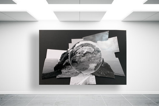
Overall, Abril, Toroptsov and Boltanksi all have their own individual techniques and thoughts on how to capture the invisible and convey the concept of memory, through the medium of photography. I have found each photographer to be heavily influential over the development of my photographic project. However, I have found Abril’s project The Epilogue to be particularly striking and relatable. Likewise, Toroptsov’s project, Deleted Scene, proved to be highly effective with regards to the poetic and metaphorical interpretation of the concept of memory. For example, I photographed specific places where I felt memories of my grandfather were the most prevailing. Places such as Queens Valley Reservoir are key remembrances which are where I feel closest to him. As I am personally not religious, the idea of remembering someone or wanting to feel closer to them is not directly linked the church or other religious pathways. Rather, my elucidation of a religion and having the opportunity to remember someone is to surround yourself with a place which reminds you on that individual. Boltanski opened a more intellectual and exclusive attitude to memory. His approach made me think more deeply about the type of photographs I wanted to produce, for example, I created a photograph of a set of photo frames my family have on the window sill.  I have combined both artistic styles of photography to create a photo book which shows the complexity and intricacy of photographing an individual who no longer exists. I wanted to include emblematic images in order to truly express the value, worth and beauty of my grandfather’s life. For the time my grandfather was alive is not the limit to his existence, the memories which are carried on through family members such as my grandmother and mother are what make his memory live on. The archive images, readings and objects which I has used all have some sort of relevance to his life. Their continuing existence enable my grandfather’s invisibility to be visible.

‘I believe in the importance of every single human being, but even the most important ones disappear quite quickly, especially their little memory. What is most important is most fragile.’

virtual gallery

I used artsteps gallery website to create my virtual gallery, i then imported my images and adjusted the height and width to my preferred look. After i made them how i want them to look a placed them onto the wall and added a frame for more effect.

I included the images that i used in my photo zine booklet, i edited them on lightroom and some on photoshop to adapt the bold colour and sharpness to my preferred outcome.

my rock- final outcomes and virtual gallery

Final Images

Below I have included a range of my final outcomes, including photographs and a vital gallery. This is good to show as it includes images from all of different photoshoots, including some images and then the virtual gallery to show just some of my final images in an arrangement.

These final pieces have been placed together as I think that they would compliment each other well together as they tell a mini story within only two photographs. With the first being a lot more zoomed in, focusing on one thing that happened outside of this castle, the lady with the dog is just one example of something that has occurred here, maybe making us think about what else may had happened here, such as war and conflict. The second image is placed here in order to put the first one into perspective as its a different point of view from the first. I think that the second photograph is of very high quality because of the clarity of it, with the bricks and grass being filled with texture and depth because of the clarity of the original image. However, in my opinion, this piece could be improved by adding more images to the sequence, as this would make the mini story more detailed and vivid.

I think this is my strongest final image as it many different visual components to it, this makes it more successful as the whole image is more eye-catching. The composition of the image means that there is many layers filled with different colours, the white shells have been placed so that they break up the colours in the composition so its not too busy. Furthermore, the textures in the image mean that the plain white matches with the arrangement of the rocks. To achieve this image we had to keep changing the angle of the camera on the tripod and this meant that some came out more blurry, however I think this image turned out to be high quality. The weaknesses of this piece include the fact that it could be viewed as a composition which is too simple, making this still life piece slightly boring, however I think that it links really well to the theme of ‘islandness’.

I have selected this as my first final image as I think that the composition of this photograph is it’s strongest point. Additionally there is lots of contrast within this piece, firstly with the warm tones of red and orange amongst the rocks in contrast with the blues in the sea. Also, there is a difference in texture between the smooth sea and the rough rocks, this means that the photograph is more eye-catching and there is more depth within the image. In my opinion this is my strongest out of all of my final images and this is mostly because of the clarity of the original image, meaning not much drastic editing was needed in order to make it successful.

I have put all three of these final pieces together, arranged in this order as I think that if they were printed out onto materials such as foamboard they would look best this way. The most prominent feature of all of these images is the high contrast and increased clarity. They have all been edited to black and white so that this is more obvious, and I think that these are my most successful three images as they all link well, with the bottom one being slightly different yet still being linked through the ‘My Rock’ project. Furthermore, its important the note that the perceptive all of these images makes them more unique and I think this adds to the successfulness of these pieces. Alternatively, they could be viewed as more boring or generic as they are monochromatic, however, I think this reminds us of how old these rocks are.

I have selected this as a final image as I think that the colours of this image are very aesthetic, this is captured by the original composition of the photograph as the yellow rocks in the foreground and the green and blues tones in the background, captured in the sea compliment each other well. Additionally, I like that the perceptive of this image is quite unique, this along with other features such as the rule of thirds, created by the outlines of the rocks all make this final piece successful. Alternatively, the weakness within this image is that the piece isn’t filled with interesting components, so they could be seen as boring or uncreative.

REFLECTION OF PREVIOUS WORK

ENVIRONMENTAL PORTRAITS

I believe I thoroughly researched my inspirations and lead photoshoots with intention- collecting a vast array of images. If I could redo this project I would be more experimental with my photoshoots, looking back I’ve found some images to be quite interesting but others, plain and boring- I could also improve my image selection process.

Click the image above for November 2021 final prints

IDENTITY

As the first main project we did, this is one of my favourite sets of images. I created a 3 sets of 3 images- each of which had its own photoshoot in different locations. I really liked this project and if I could redo it I would play with the use of colour, I feel like I was overusing black and white and it would have been interesting to play with colour.

Click on the image above for the full sets of images.

ANTHROPOCENE

I struggled with this project as I found the subject matter quite uninteresting, I did enjoy conducting the photoshoots as they involved visiting abandoned buildings however the images generated from these photoshoots, although fitting to the theme of Anthropocene, were quite plain and uninspired.

Click on the image above for final images

MY ROCK

I did not really enjoy this project as I don’t really enjoy taking landscape images as I find them quite boring, all my images were in black and white which to me made them look quite dramatic however this project didn’t massively interest me so I feel like I was not trying as much to create good images.

Click on the image above to view a shoot at l’etacq and best images

ZINE

I believe my zine was very successful, as my first instance of experimenting with colour and abstract style images which were of rockpools. It was this project which enabled me to further practise using colour in images as previous to this my images were primarily black and white- with quite plain compositions- this project was very helpful within learning how to use natural light to my advantage and how to emphasis and arrange images with colour.

Click on the image above to see the full zine

PERSONAL PHOTOBOOK PROJECT

My photobook project I believe was quite successful, using the skills I learnt when creating my Zine I concentrated on colour, light and abstract images except with a larger variety of main subjects in images (not just concentrating on still subjects) I believe this was successful as I used a variety of skills which I had learnt from my previous projects including using studio lighting (for images such as pressed flowers).

Click on the image above to see my final photobook

Final outcomes

Photo Zine

A zine is a collection of original images presented together in a small booklet, usually between 16 and 20 pages in length. The photos it contains mostly have links to a similar subject throughout. Numerous artists have produced a product like this or similar.

Photo Sculpture

For my photo-sculpture, my initial idea was a six-sided cube with each side featuring a different image of a rock. To produce this cube, I measured out six 10cm x 10cm squares on a sheet of foamboard. I used a bevel cutter along the edges to provide the 45° angled slopes that I needed for the sides to fit together properly. I had all six ready to connect at the end of one lesson, however when I returned the next day, three of them had become damaged somehow. I attached the three remaining faces together using masking tape to produce half of the cube, but then decided to treat this as a trial run so I could learn the process. I proceeded to then cut out some more squares from the foamboard. This time however, I made them 20cm x 20cm. After I had made three of these enlarged faces, I attached them in the same way I had done with the previous cube. This left me with two half-cubes, which I discovered could be arranged in several interesting ways. I printed out some images and glued them to the inside faces of the cubes, and I believe that the final product was rather intriguing.

Photo Mount

This is my main final product, an A1-size piece of card with my images placed in window mounts.

Final Zine

Analysis

Overall, I think that my zine was a successful project, as it has an aesthetic flow throughout the magazine which makes people want to carry on looking through it. I believe that this is the strongest point in my zine as I believe that composition is important when it comes down to a project that involves a zine. I like how my zine included both coloured and black-and-white photos which keep the zine interesting, the monochromatic look of the black and white images contacts nicely with the vibrant colours that they are placed next to them. Furthermore, I think that adding quotes was a very successful idea as it adds further details into the story of my zine. I also think its a nice way to break up some of the photos and gives the view a deeper understanding of Jersey and what my zine is about. In my opinion I also think that the quotes balances out the zine which helps to create an aesthetic composition throughout the pages, I also tried to put images with the quotes that will help views to expand on the story in their mind.

I believe that one of my most successful pages was 10 and 11 as I think that they photos fit really well with each other but are vastly different. On the right is one of my favourite black and white images from my La Hoqc photoshoot, as I believe that it has many eye-catching features and o the left is also one of my favourite photos as I think that very vibrant colours are intriguing and contrasts well against the black and white of the opposite page.

Critique

One of the weaknesses in my zine is the placement of some of the images, I wish I had been more creative with how I did the layout as I believe that having an interesting composition will help the view to tell the story in their head, it will also help to keep concentrated and drawn to the zine. I also think the colour placement of my images could be seen as one of the weaknesses as I didn’t put a lot of thought into how the black and white images would look as the zine was being looed through, this could been see has the images having no links between each other as the warm and cool tone photos were not strategically places on some of the pages.

Creating a virtual gallery

The process to create a virtual gallery in photoshop –

To begin the process of creating a virtual gallery to present my work, I found an empty gallery photo on google which I saved to my computer and then I opened it up in photoshop, this let me see the image clearly to make sure there was nothing within the photo that was out of place or blurry. I decided to use this gallery because I liked the perspective which this was originally taken from because where you are stood it looks as if you are looking down into the gallery. This emphasises the importance of the photos directly at the bottom as they are able to grab your attention, but then also allow you to explore the other photos on either wall.

Photo selection and placement –

These 5 images are the ones which I have selected, which were also used in my zine, to insert into my virtual gallery. I decided to choose these ones as I thought that they all worked well together with the dark grey/black/white tones which are within them. I especially like the photos which I used for my front and back covers as the image is the same yet inverted but they work well alongside each other as you are able to see the relationship of similarity between them yet they both hold a unique feel to them. I also decided that I wanted to include 2 photos of the scenery because it shows a journey and exploration which was taken when this photoshoot happened. I really liked the bottom left photo as the little boat which is in the corner is small yet very effective as it is solitary which adds a emotional feeling of solitude and sadness to the photo as it is quite dark and dreary, making you wonder where all the other boats have gone and why it is by itself. I also decided to use the bottom right photo because of how dramatic the sky is within it contrasted against the black of the rocks as it makes the bright colours which push through in between the clouds above stand out immensely well, which I really like. For the last photo, I really liked the formation and layout of the rocks within the photo as it looks quite abstract due to how there are dark pits of black which contrast heavily against the brighter grey/white tones which are found on the rocks which also create a geometric pattern on them due to their texture.

Once I began to bring my photos into the virtual gallery, I decided that it would be easier to adjust their perspective as I put each one in. This would make it easier to organise where I wanted them to be and if they flow well together, instead of doing it when all images have been imported. To do this I began by bringing an image in, which would create its own layer, and using ‘CtrlT’ to activate free transform where I was able to move the image freely as well as change it shape. Then I used the ‘fx’ button which is located on the bottom right of the screen and right clicked on the image which allowed me to select the option of ‘perspective’. This gave me the freedom of being able to manipulate the photos to look like they are framed and mounted on the wall as you could drag the sides up or down, or from one side to another which would alter its placement. I repeated this another 2 times for the other photos I have chosen to use and I think that they turned out successfully with the way that they are placed on to the wall as they give the illusion of mounted photos, as well as flowing nicely together.

Adding a drop shadow –

To complete the creation of my virtual gallery, I decided that I will add a drop shadow to each of my photos. I did this through using the ‘fx’ button once again and selecting ‘drop shadow’ from the box then altering the angle, position, size, etc of the shadow, then repeating it for the rest of the photos as I could set a baseline of settings to apply as a drop shadow to each one which I found to be easier then I went back through each one and altered it if needed. This gave the photos the illusion of the light creating a shadow from where it is falling on to the frame of the photo. I really liked adding this element into my work in the virtual gallery, as I think that it made it look more realistic and unique instead of quite uniformed and as if the photos are stuck against the wall, because the drop shadow adds a level of dimension to each photo.

Final outcome –

Here is my final outcome of the virtual gallery which I have created in photoshop, I think that this is a really successful presentation of my work and I enjoyed creating this as I was able to freely decide where I wanted my images and which ones I wanted to use. I like how I have a nice balance of scenery to images of rocks because it shows the in-depth surroundings of where I was while on my journey through the intricacies and details of the rocks, yet the scenery provides a way to visualise where I was and the path that I was taking. I also like how well the photos work together due to the fact that they are in black and white as it shows a continuation in my work as they are the same images which I have used from my zine, which I really like as it makes it look organised and not messy as I don’t have a mix of colour and black and white photos which I don’t like. I also like how the photo that I chose to use as my gallery is looking straight down at the two images at the bottom, I think that this is successful in drawing you eyes and attention to what they could be and why I have 2 of the same images yet one has been inverted because they are able to show the finer details and lines which have been formed within the rocks which I really like as it shows how each rock is different and unique and nothing defines them as a rock or a photo. Therefore, if I were to create this again to improve the final outcome of my virtual gallery even more, I would go into photoshop individually with each photo and add a slight border around each photo because I think that it would give the realistic illusion that they are framed which would make them look mounted directly to the wall and be able to highlight and draw your attention to each photo even more when studying it.

Checklist: personal study

Use this simplified list to check that you are on task. Every item on the list represents one piece of work = one blog post. It is your responsibility as an A-level student to make sure that you complete and publish appropriate blog posts each week.

Final outcomes & Deadlines:
Essay (2000 words): Mon 30 Jan 2023
Photobook / Film / Prints: Last day of Mock Exam WED 8 FEB

SUMMER TERM

WEEK 9: 9-13 Nov
1. REVIEW & REFLECTION: overview of past projects

WEEK 10: 14-20 Nov
1. RESEARCH: ‘islandness’ – produce mindmap & moodboard
2. HOMEWORK: Jersey – a Crown Dependency
Deadline: Wed 23 Nov

WEEK 11: 21-27 Nov
1. Statement of Intent
2. Artists References – case-study 1
3. HOMEWORK: Contextual Studies 1: Conversations on Photography
Deadline: Wed 30 Nov

Week 12: 28 Nov – 4 Dec
1. Artists References – case-study 2
2. HOMEWORK: Photoshoot 1 – plan and record response to initial ideas/ artists studies
Deadline: Wed 7 Dec

Week 13: 5 – 11 Dec
1. Art movements and isms: write 500 words + illustrations
2. HOMEWORK: Response to art movements and isms
Deadline: wed 14 Dec.

Week 14-15: 12 – 16 Dec
1. Literary Sources – select 3-5 key texts
2. Essay Question – formulate 2-3 variations of hypothesis
3. Essay Plan – define each paragraph
4. Practice: Plan at least 3 photoshoots over Xmas in response to your project. what, why, how, when, where?

XMAS Break: 17 Dec – 5 Jan
1. RECORDING: Produce a number of photographic response to your Personal Study and bring images from new photo-shoots to lessons in January.
2. READING: Key texts (interviews, reviews, articles etc.) about your subject, photo-history and chosen artists in preparation of writing your essay in January.

Week 16-17: 5 – 15 Jan
1. Essay: Introduction
2. Essay: Paragraph 1
3. Practice: Edit photoshoots and evaluate

Week 18: 16 – 22 Jan
1. Essay: Paragraph 2 & 3
2a: Photobook: Select book and deconstruct narrative, concept and design
2b: Film: Select film and deconstruct narrative, editing and sound

Week 19 – 20: 23 Jan – 3 Feb
1. Essay: Conclusion, bibliography, proof-read
DEADLINE: Hand in draft Mon 30 Jan
2a: Photobook: Write a book specification; narrative, concept and design
3b: Photobook: Moodboard and create Blurb account
2b: Film: Storyboarding; narrative, visuals and sound
3b: Film: Moodboard and begin editing

Week 21: 6 – 8 Feb MOCK EXAM
1. Essay: Publish final essay with illustrations and a bibliography
2a: Photobook: Complete design and include essay in Blurb
2b: Film: Complete editing film, export and embed on blog
3. Print: Select a set of 5-6 final prints for mounting
4. Blog: Review and complete all supporting blogposts
5. Statement: write 100-200 words and save in folder