‘Inked’ by Bethany Mildren.
Does the essay address its hypothesis?
The essay addresses its hypothesis and this is seen in the introduction when it states “I wish to explore the intimacy that portraiture allows the viewer to have with the subject model in the photograph,”.
Does it provide new knowledge and understanding?
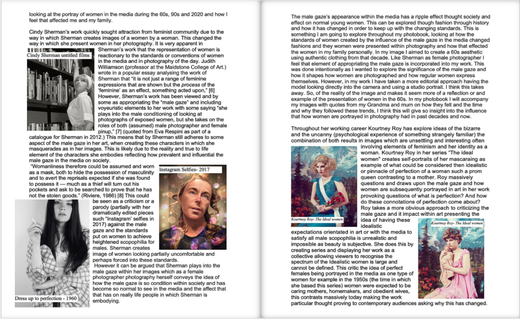
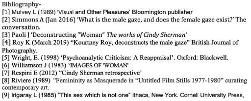
The essay provides a good understanding of new knowledge about the history of portraiture, discussing their origin and how it has been used for many years to show someone’s identity, going as far back to the Egyptian times. It also discusses her 2 photographers, Jono Rotman and Danny Alexander, work and the differences between the two then goes on to further analysis of their photographs later on in the essay.
Is the essay well structured with a sense of an introduction, paragraphs and a conclusion?
I think that the essay is well structured to an extent as there is an introduced which addresses her overall question for her essay then goes further to explain what she wishes to explore, in the first sentence “I wish to explore the intimacy that portraiture allows the viewer to have with the subject model in the photograph, with particular focus on body adornments such as tattooing.” Then the paragraphs which follow indicate a nice flow of progression towards her conclusion as they discuss the history behind portraiture, who she is studying and why then an analysis of a photo taken by each photographer. The conclusion is clearly stated which shares her overall comparison of the two photographers, providing an opinion on what she thinks they could have improved on as well indicated by ‘Overall, I believe that Jono Rotman and Danny Alexander successfully use portraiture to represent different identities to a certain extent.”
Use and flow of language, prose, punctuation, spelling.
I think that the flow of language throughout her essay is successful as it creates a good development to how she ends up with her conclusion and links it back to her main question. The spelling and punctuation works well as the sentences are not too long and wordy and the punctuation is used well too.
Use of specialist vocabulary relating to art and photography.
The specialist vocabulary which she uses that relates to art and photography is extensive throughout and this can be seen in numerous ways such as:
– “Subject model in the photograph”
– “Photographic gaze”
– “Experimenting with different expressions, poses, settings, styling (clothing and make-up), angles and lighting techniques.”
– “Portraiture is the best technique to capture the essence of ones identity due to the uses of lighting, backdrops, instructing the model,”
– “Mongrelism”
– “However, Danny Alexander takes his portraits in a studio setting,”
– “Personally, I feel that Alexander could have explored his idea in more detail,”
– “However, Rotman uses his techniques to instead leave the emotions of the model open for interpretation instead of their identity,”
Analysis of artist’s oeuvre (body of work) and key work(s).
Evidence of wider reading with reference to art history/ theory, political discourse and/or socio-economical context.
There is a strong evidence of wider reading and reference to art history throughout her analysis in the personal study. This is seen through the quote “Portraiture is an old art form going back at least to ancient Egypt, where it flourished from about 5,000 years ago.” therefore this backs up how portraiture has been used for a long time to represent peoples different identities and other factors which she states “They have been used to show the power, importance, virtue, beauty, wealth, taste, learning or other qualities of the sitter.” I think that this strengthens her analysis into portraiture and its representations as it shows how versatile it is when describing and representing other ways people have used it for their benefit.
Use of direct quotes, summary or commentary from others to make an informed and critical argument.
There is use of direct quotes from each photographer which she has decided to study which she uses in her analysis of the photos which she chose to look at. For Rotman she uses, “he felt the weight of precedence of photography depicting people seen as other” which further develops her analysis on how Rotman uses portraiture in his work, moving away from traditional documentary photography. For Alexander, the quote which is used is “highlight the dualistic nature of body art; on one hand body art can be and often is self-expressive but much like any art can be interrupted differently by each viewer” this quote discusses how he understands and sees subjectivity in photography and furthermore in his work which he produces.
Use of referencing system (eg. Harvard) and a bibliography.
At the end of the essay, which is found on the last few pages, there is a clear and well developed bibliography using the Harvard referencing system, although there is not a heading which suggests that it is one which would have been helpful to add in to make it clearer. This shows where she got the photos, information about her photographers and history about tattoos.
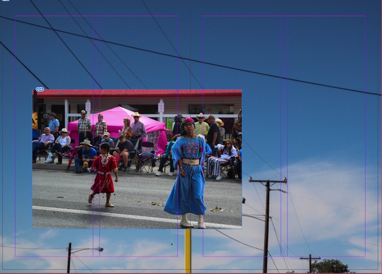
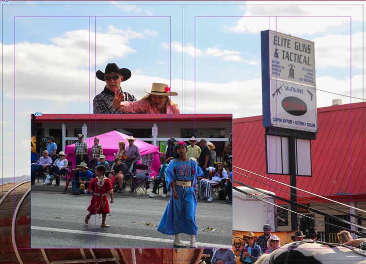
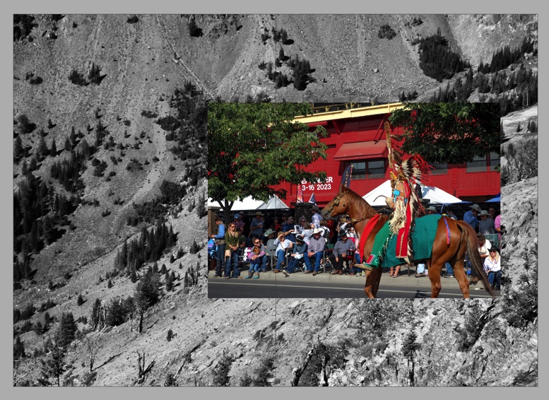
Use of illustrations with captions listing name of artist, title of work and year of production.
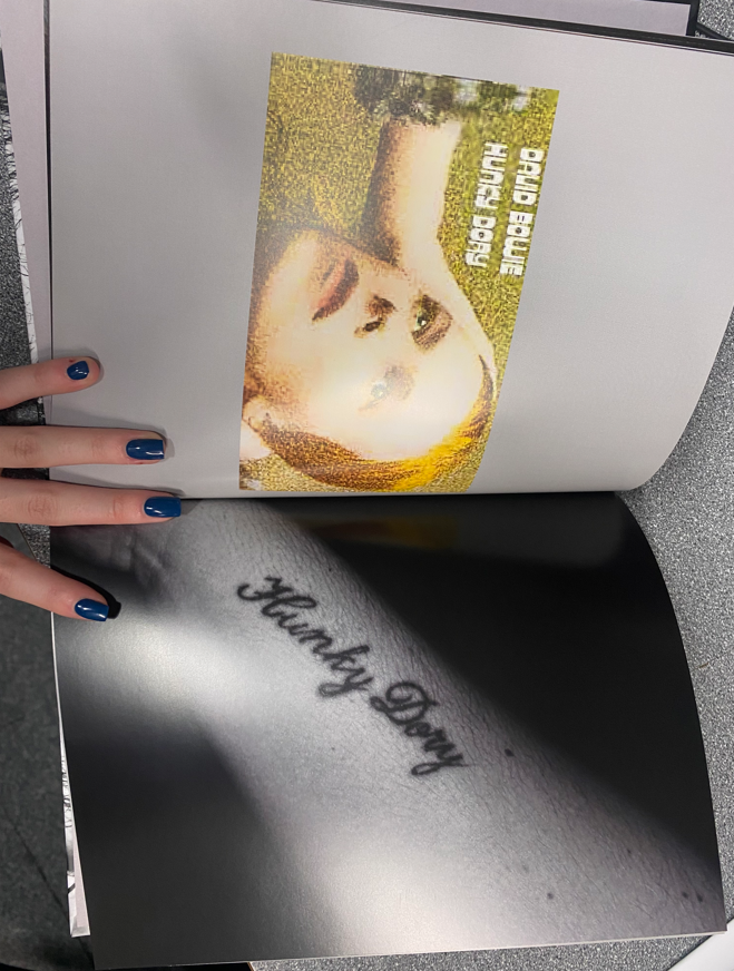
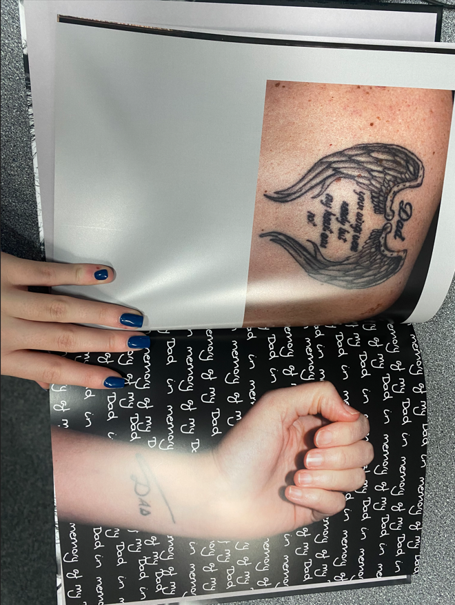
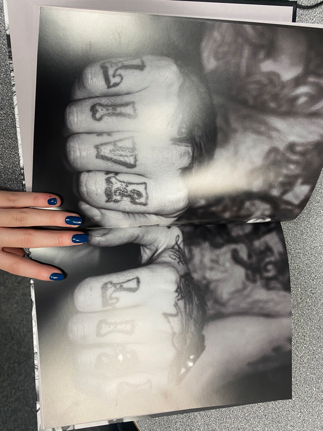
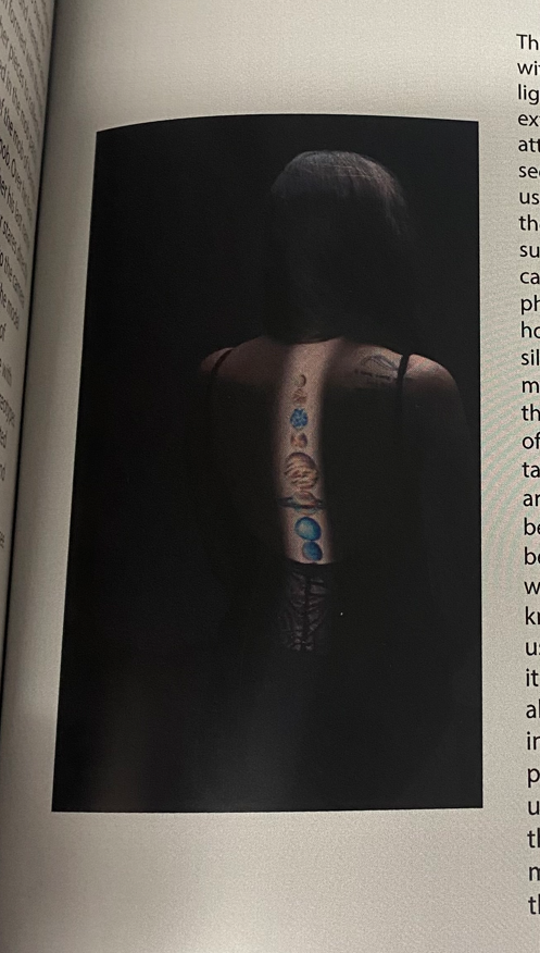
There is evidence of illustrations which she uses to show her development throughout her personal development but there is not any captions which list the name of the artist, title and year of production as they are found within the bibliography. I think that it would have been better for her to do this to add some more visuality in to her work as the reader may want to know what the picture is and what collection it is from.
Using the mark scheme –

This was the mark scheme which I referred to when marking the personal essay. The grade boundaries for awarding the grade which they got were:
-E=1
-D=6
-C=9
-B=11
-A=14
-A*=17
I gave Bethany Mildren’s personal study about “How does Jono Rotman and Danny Alexander use portraiture to represent different identities?” an 11/18 which is a B grade and she actually got 12/18 which is also a B. This is because their is a strong understanding and deeper dive into the historical knowledge and how each photographer uses individual techniques to create their work as well as a good analysis of each photo from the photographers that she studies who she chose to provide a deeper analysis into. What I think would have upped her grade was if she used more citations which she could have added to her bibliography, which she could have also given a title. I also think that she could have included more of a visual aspect with photos that she used as well as providing their titles, dates of publication, where they were from and what set they could have been apart of and who created them.