I decided to look a bit into Rita Puig-Serra because I really liked how personal her work felt and wanted to see if I could create something similar. I also like the simplicity of her photobook layouts and use of juxtapose.
Sam Harris [The Middle of Somewhere]
Sam Harris’ photobook ‘The Middle of Somewhere’ caught my attention very easily. I was not only intrigued by the title but also by the images within the book. This is because he focuses on taking mainly snapshots and doesn’t worry about the images being perfect. The book felt like a personal photo album which I really liked and I’d hope to create something similar if possible.
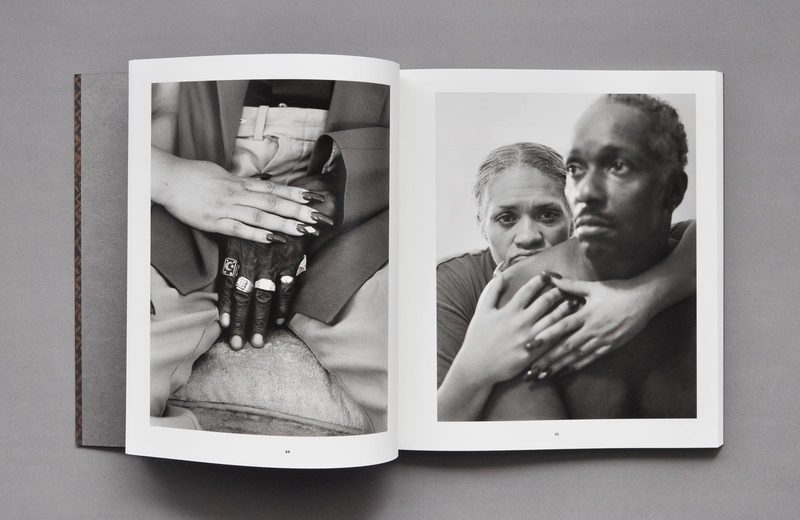
LaToya Ruby Frazier[The Notion of Family]
I chose to look at Latoya Ruby Fraizer because she focused on immigration and family which is a big part of my project as well. I thought her portraits were very nicely done and framed.
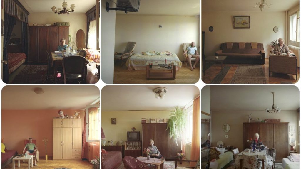
Bogdan Girbovan [10/1]
I also tried looking at photographers from Europe, other than just English and American ones. Bogdan Girbovan is a Romanian photographer that created the project ’10/1′. In this project, he focused on taking pictures of every flat in his old communist-styled apartment building. I found this very interesting because even though all the flats have the same structure, the personality of each individual can be seen through the furniture. I could do something similar by taking pictures of my house (a Romanian) and compare it images of my friends’ houses (English, Portuguese etc)
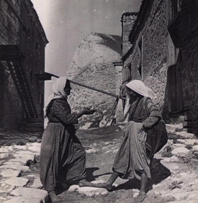
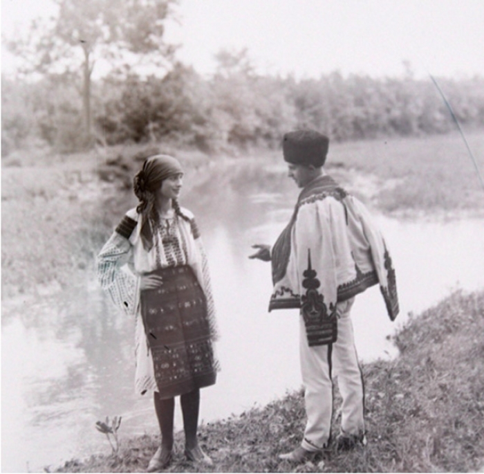
Iosif Berman
Iosif Berman is another Romanian photographer that I thought was interesting as most of his images consist of either elderly people or people in old traditional clothing. Thought it could help to look at his work as I am focusing on my own family history.
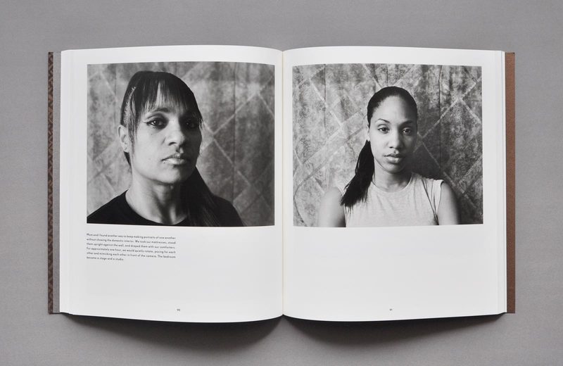
I really like the way Dragana Jurisic photographs because her images look almost surreal and out of a fairy tale. i think the colours used are really beautiful and calming.
There are three island territories within the British Isles that are known as Crown Dependencies; these are the Bailiwicks of Jersey and Guernsey which make up Channel Islands, and the Isle of Man. The Crown Dependencies are not part of the United Kingdom, but are self-governing possessions of the British Crown.
The Bailiwick of Jersey is a British Crown dependency, which means that it is not part of the UK but is rather a self-governing possession of the British Crown. However, the UK Government is constitutionally responsible for its defence and international representation. In each Bailiwick The Queen’s personal representative is the Lieutenant Governor, who since the mid-eighteenth century has acted as the channel of communication between the Sovereign and the Channel Islands’ government.
In the Channel Islands The Queen is known as The Duke of Normandy. At official functions, islanders raise the loyal toast to ‘The Duke of Normandy, our Queen’.
The Queen has visited the islands on various occasions, most recently in May 2005 to mark the 60th anniversary of their liberation from German occupation.
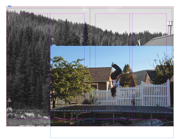
these are the first two pages in my zeen i placed two full bleeds on the same side juxtaposed to smaller image.
I re arranged it to be alternating sides which will be a full bleed. the other small images are not the same size either. I liked the large white border on the bottom left image.
I liked the 4 edited images juxtaposed next to each other so I made another full page 4 juxtaposition to link the beginning of the zeen to the middle. after this page i placed.
neither of these images are a full bleed I chose to have a large amount of this page to be white which juxtaposes the images because there is a lot of colour. i chose not to have a full bleed on this page becasue there next page is.
A full page spread of a landscape image, I chose to make this a full page spread because I wanted to fit as much of the image as possible
these pages follow the pattern of alternating full bleeds and every other page is a full page spread
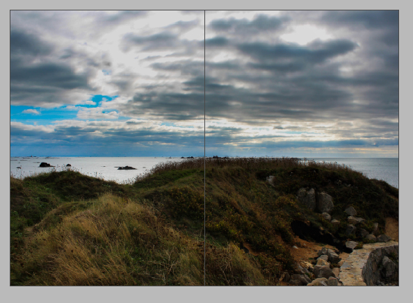
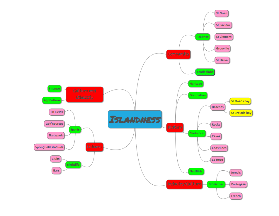
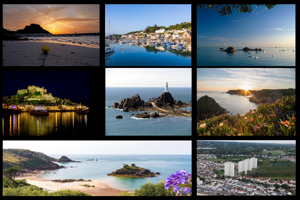
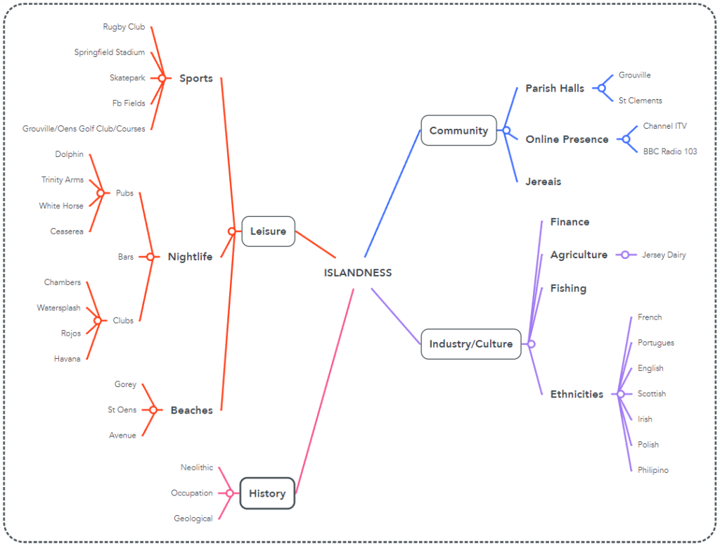
Islandness is the property of being or belonging to an island, especially insofar as it affects society and culture. An example is the island of Jersey which has a range of beautiful landscapes and heritage relating to the theme of islandness.
There are three island territories within the British Isles that are known as Crown Dependencies; these are the Bailiwicks of Jersey and Guernsey which make up Channel Islands, and the Isle of Man. The Crown Dependencies are not part of the United Kingdom, but are self-governing possessions of the British Crown. They have their own directly elected legislative assemblies, administrative, fiscal and legal systems and their own courts of law, they are also not represented in the UK Parliament. The United Kingdom government is responsible for certain areas of policy such as defence and foreign affairs.
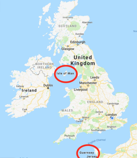
Map of the UK. Crown dependencies are circled in red.
Channel Islands – History and Background
The Channel Islands were part of the Duchy of Normandy when Duke William, following his conquest of England in 1066, became William I.
In 1106, William’s youngest son Henry I seized the Duchy of Normandy from his brother Robert; since that time, the English and subsequently British Sovereign has held the title Duke of Normandy.
By 1205, England had lost most of its French lands, including Normandy. However, the Channel Islands, part of the lost Duchy, remained a self-governing possession of the English Crown.
While the islands today retain autonomy in government, they owe allegiance to The Queen in her role as Duke of Normandy.
How did Jersey become self-governing?
UK flag on the left. Jersey flag on the right.
In 1204 King John lost the Battle of Rouen against the French King Philippe-Auguste. The defeat signalled the loss of continental Normandy, united with the English Crown since the invasion of England by William the Conqueror in 1066. The Channel Islands, part of the Duchy of Normandy for more than a hundred years at that point, might have been expected to align themselves with the French King in 1204 but they were persuaded by a combination of reward and punishment to side with King John instead.
Among the privileges which the King granted Islanders was the right to be governed by their own laws and he instructed them to select their 12 best men as Jurats who, sitting with the Bailiff, became the Island’s Royal Court. A warden, later to become governor, was appointed by the King to organise the defence of the Island.
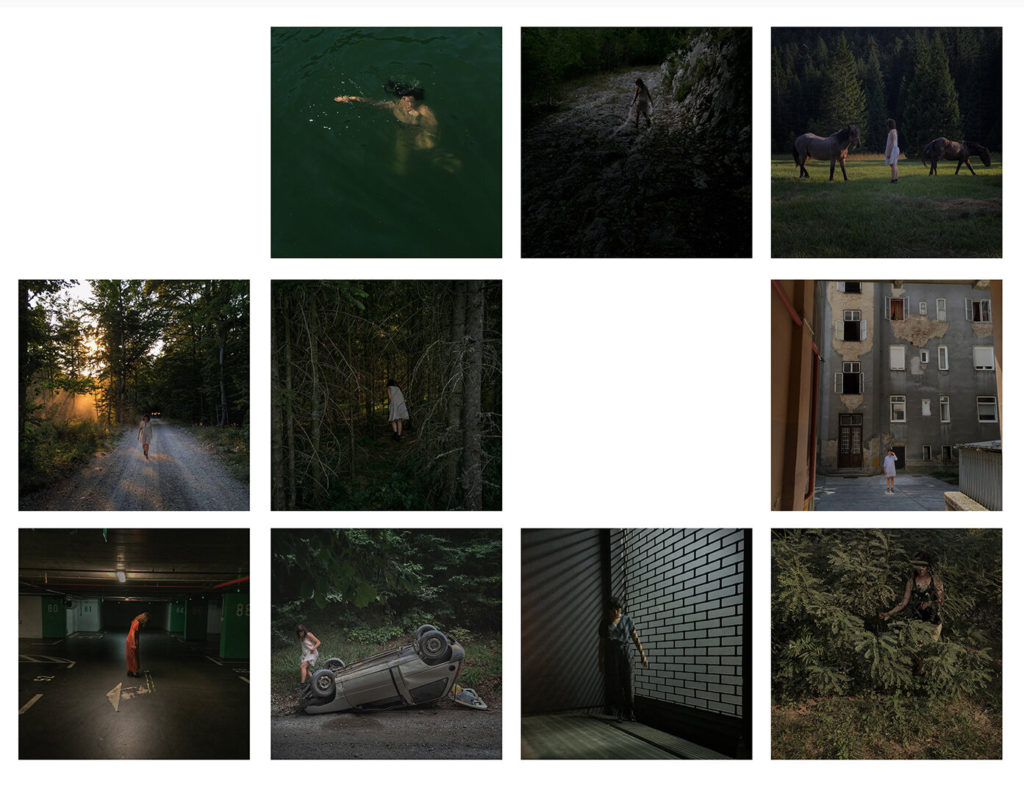
In my last zine for the My Rock project, I am including more personal, intimate images from my trip away this September. In this zine I wanted to document rural American life through my perspective, capturing my experiences as an outsider, but also where I stayed and things in my immediate environment.
Final Images for this Zine
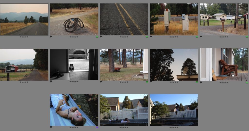
I compiled my images for this zine from my flagged image from each photoshoot. I then put them into a separate folder for this zine “zine 2” and gave them all ratings, as well as edited them in a similar style – I used sync settings for a few images to keep my style of editing consistent.
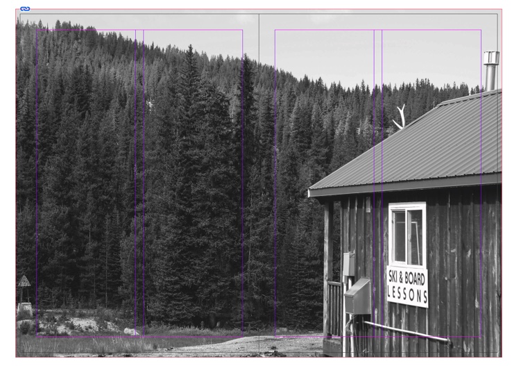
Designing my zine – experiments
In this experiment, I was using a series of two images – I was stuck on presenting them with different layouts. I started with two on one page, then decided to do one on each. I tried first with one image of each page but then thought there was too much white space.
I decided to add another image underneath, and I wanted to use one that was not too busy. I then tried this but decided I didn’t like it, so I tried the images differently, below.
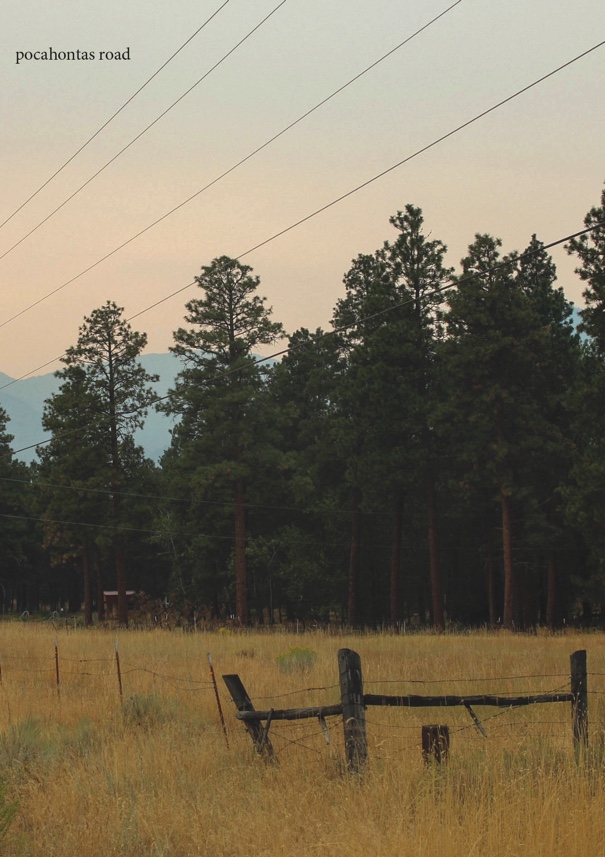
I then switched both images back to the original placement, with one embodiment higher on one page, than the other at the bottom – both had the same alignment to keep the composition balanced. I then, after adding my title to the front, decided to experiment with text on this page. I used the coordinates of the road where I lived next to this image. I liked it but felt it didn’t fit with the rest of my zine as there was not much space on my other pages for text – I wanted to keep my zine as cohesive as possible so didn’t end up including the text in the end. This is something that I want to include in the future though, in my study photobook.
The final layout of the two images that I was experimenting with – one out of the two, with the final sequence below.
Final Zine
Front Cover
My front page for this zine. I used cropping tools in InDesign when placing the image onto my front cover, which helped me to create my desired composition. I think that putting my title so small at the top of my cover helped to not distract from the rest of the image, and I like how it is quite understated – this is a theme throughout this zine and I like how I’ve introduced this on the front cover. I think my editing was successful. It is an example of how I tried to edit my images for this zine – I wanted to create warm, faded images with a bit of grain, to show the quiet and understated nature of these images.
Pages 2 and 3
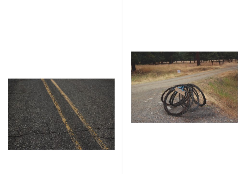
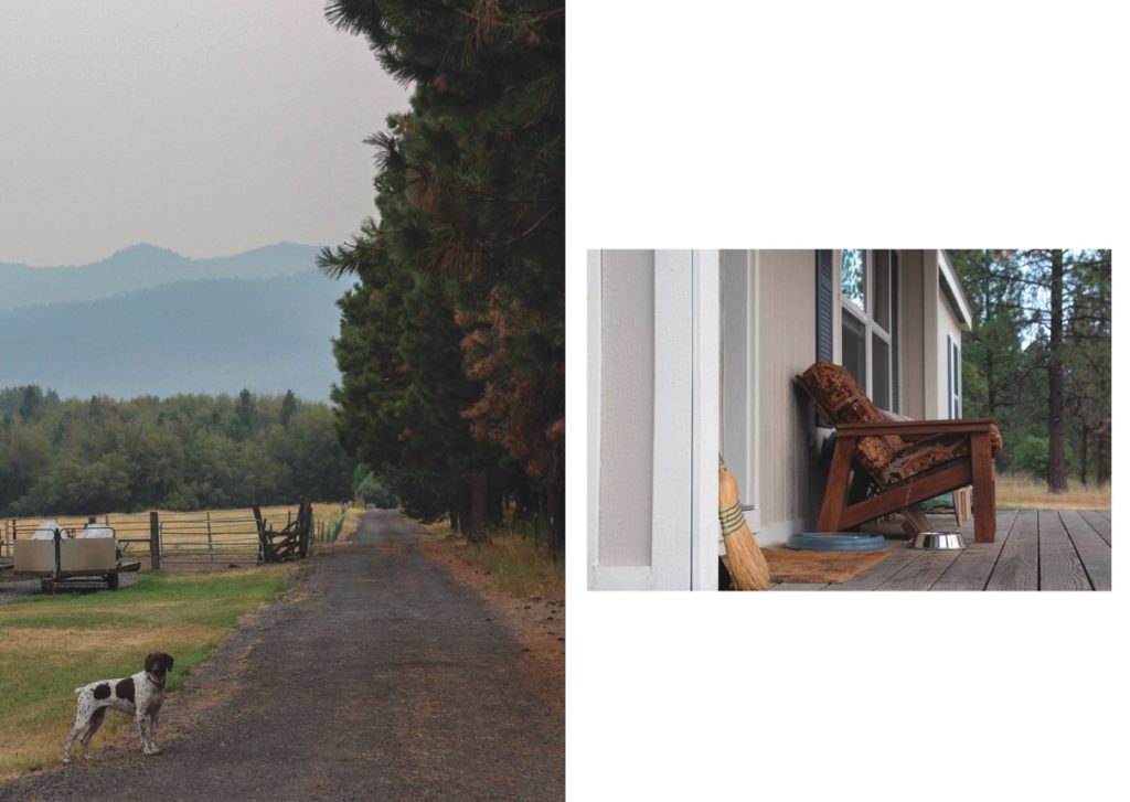
This is a unique set of two images, my first page in my zine. Both these images are taken from the surrounding roads from where I lived, on a loop of roads called the “Proffit Loop”. I placed these images together due to their similar features. They both feature strong leading lines, in different directions, which creates a balanced composition for the spread. The left image’s leading lines are the perpendicular road markings, leading off to the left. I also like this image due to its more macro composition – I don’t normally take images like this, and I like this unique image in that way. The yellow road markings in the left image tone with the yellows and greens in the right image, which ties the two coherently together. The right image’s leafing lines are off to the right. This image ties further with the left because of the grey wire – the smaller amount of grey in this image ties nicely with the entirely grey image next to it, making for opposite images in a way, and an interesting comparison.
Pages 4 and 5
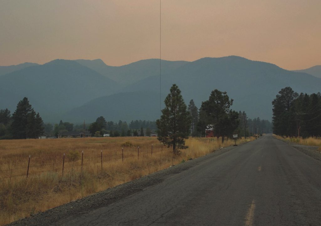
This image is one of my favourites from my whole trip away. I think this composition is really good and features a unique landscape which is really unlike anything I’ve photographed before. I think this image uses the rule of thirds very well, and there are strong leading lines. The angle at which I took the picture created the strong leading lines from the left, leading to the right middle of the image. The leading lines to the right create a triangle shape to the left, which ends with a clear line through the middle. This cuts the darkness of the mountains off, creating a separation between the different parts of the image.
Pages 6 and 7
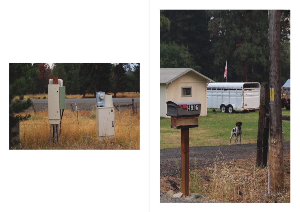
I chose to include these two images next to each other due to their similar tones and subjects. Both images feature beige and white tomes – the image on the left features these in the two electrical boxes, and the image on the right is in the cattle trailer. Both images also have similar backgrounds of the same type of tree – this is because they were both taken on the same photoshoot, which brings them coherently together with similar settings. I think that both images paint a unique picture of rural life in the US, with the old-fashioned electrical boxes and mailboxes, as well as hints at the farming industry in the right image.
Pages 8 and 9
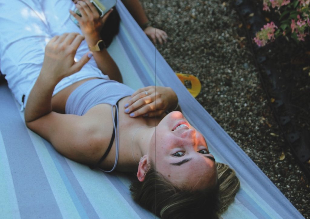
This image is unique compared to other images in this series. I didn’t take many portraits while away, and this is one of my few. This image was strong as a raw image due to the lighting at the time of my shoot – I shot during golden hour, actually with an impromptu photoshoot, in which I photographed my fellow exchange students in one of our last evenings in the USA. I tried to capture my subject naturally in this image, to create unstaged images. In my editing of this image, I used several filters in lightroom with high amounts of grain and soft tones. I like the playful, child-like nature of this image and my other two portraits in this Zine, which shows a sense of how we all felt during our time away.
Pages 10 and 11
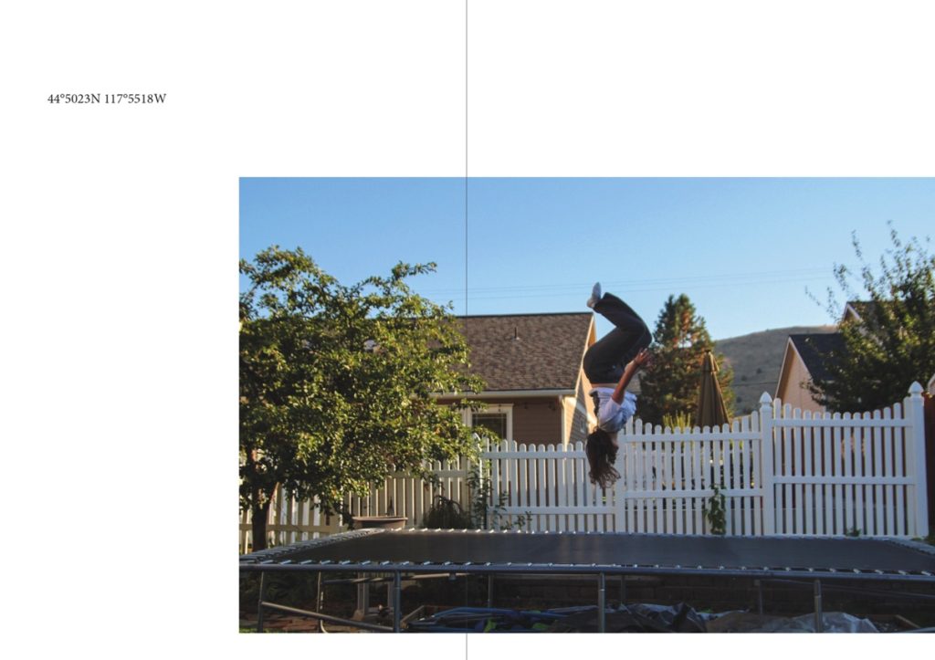
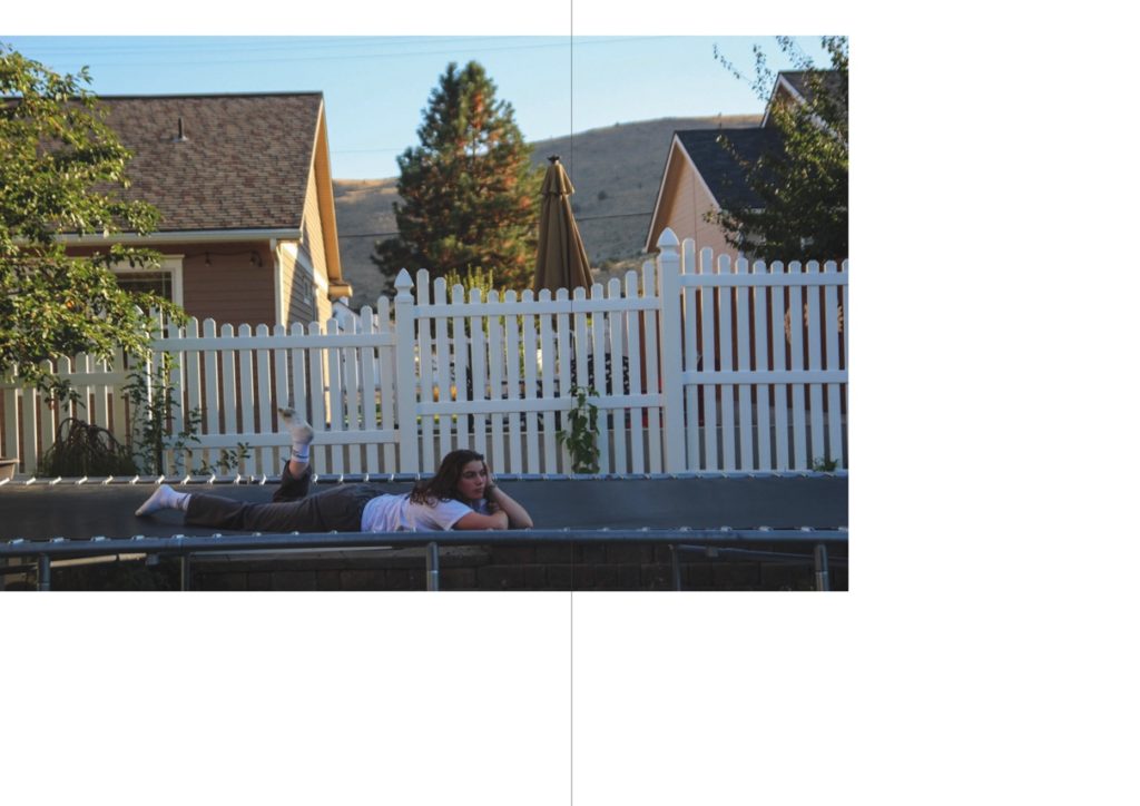
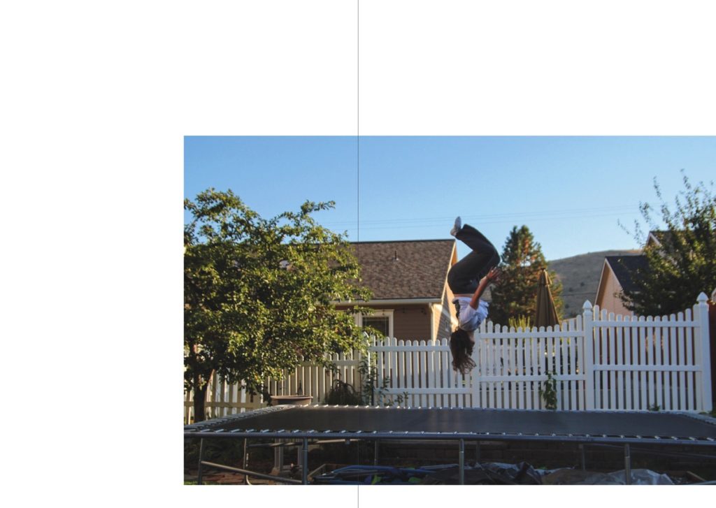
This spread is that of a sequence of two. The other image is placed after my next double-page spread. I think that including a sequence of two images separated from each other creates a logical thread throughout the zine, and helps to keep a cohesive theme between all my images. This image was edited like most of my others in this zine, with soft tones, reduced contrast and added grain. I wanted to create a peaceful mood and thoughtful image in this image, that matches the expression of my subject. This is quite fitting as it was the end of our trip, our last evening altogether – it all felt a bit surreal, and this can be shown with the confusing landscapes of a suburban house and a trampoline with mountains in the background. I used negative space in this image, as well as its counterpart two pages over, to symbolise the vastness and size of how America felt to us during our stay, and to create and experiment with different layouts that I hadn’t used before.
Pages 12 and 13
This is my last double-page spread. Both these images, in my opinion, are quiet images, that show a more intimate side to my personal experiences. The left image features the dog looking inquisitively like the outsider, standing outside his house. This represents in a way, how I felt at times during my trip: an outsider. The right image is one of the home where I stayed. This is the only actual image of the house that I stayed in, and in hindsight, I feel like I should have included more.
Pages 14 and 15
This is the second image from my sequence of two. This is the more playful image of the two, as I spoke about in my evaluation of the other image. Having this image as my last in the zine, also in a sequence, meant it created a clear end to the project.
Back cover
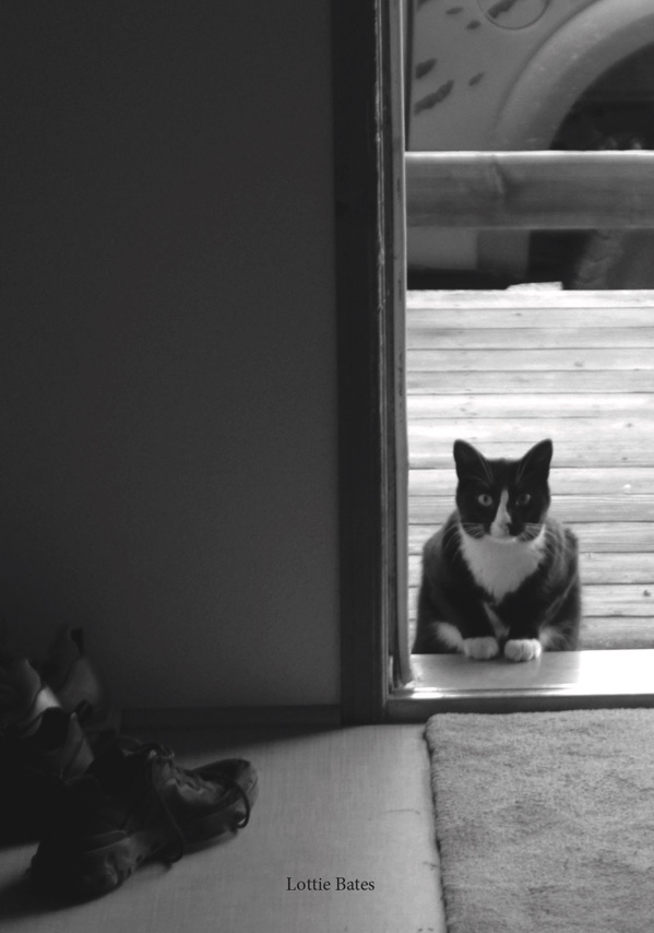
This is the back cover from my second zine. This image is from where I stayed, and the feature of the door signifies the end of a journey and the end of a project to me. Even though this is the only black-and-white image in this zine, I think it worked perfectly with the tones in the image and creates a quiet end to my zine.
Evaluation
Overall I think this zine was very successful. I like how it showed a more personal side to my trip and included images that documented my own personal experiences in a new country, with new people and places. I also like how I touched on how I felt during the trip in these images. I love how thoughtful some of these images are, and I think they show my improvement as a photographer throughout the course in the ways of design choices and editing, and overall as a photographer.
“Waste” is a photobook by a past student from Hautlieu, as a task I will be assessing this piece of work- including it’s personal study essay (viewable in link)
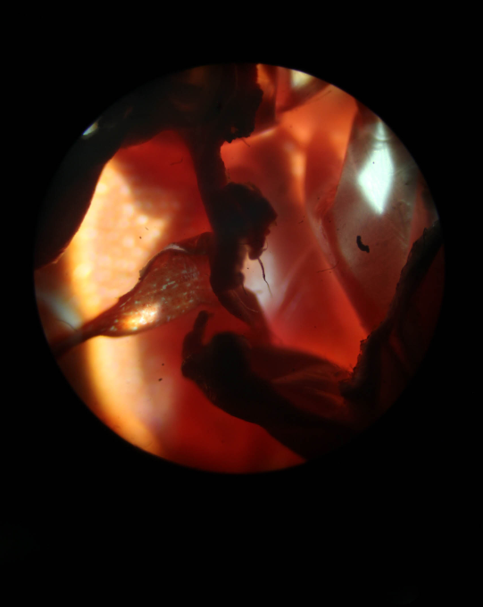
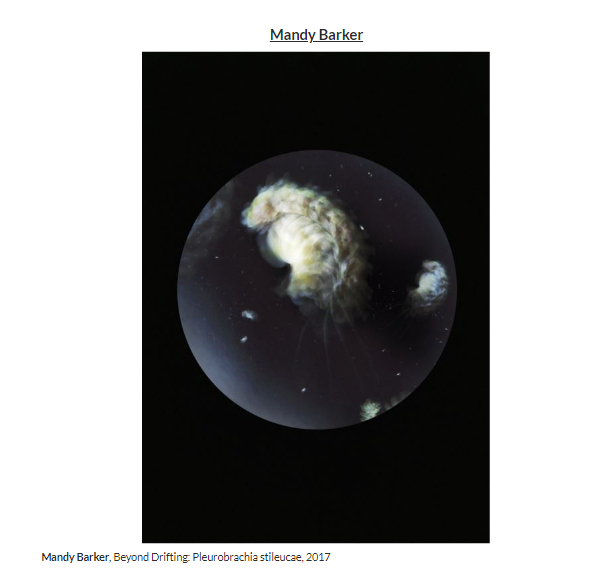
An image from the photobook
The photobook concentrates on themes such as human’s impact on the environment and Anthropocene through abstract, close-up images of human rubbish such as lighters, discarded toys and even goes so far as to present microscopic images of plastics.
ESSAY QUESTION: IN WHAT WAY HAVE MANDY BARKER AND KEITH ARNATT EXPLORED THE CONCEPT OF ANTHROPOCENE IN THEIR WORK?
Does the essay address its hypothesis?
The essay displays a great knowledge of Anthropocene and how it is presented in art and photography using many examples from their chosen artist references- including images making the essay very visual so the inspirations for their work are accessible.
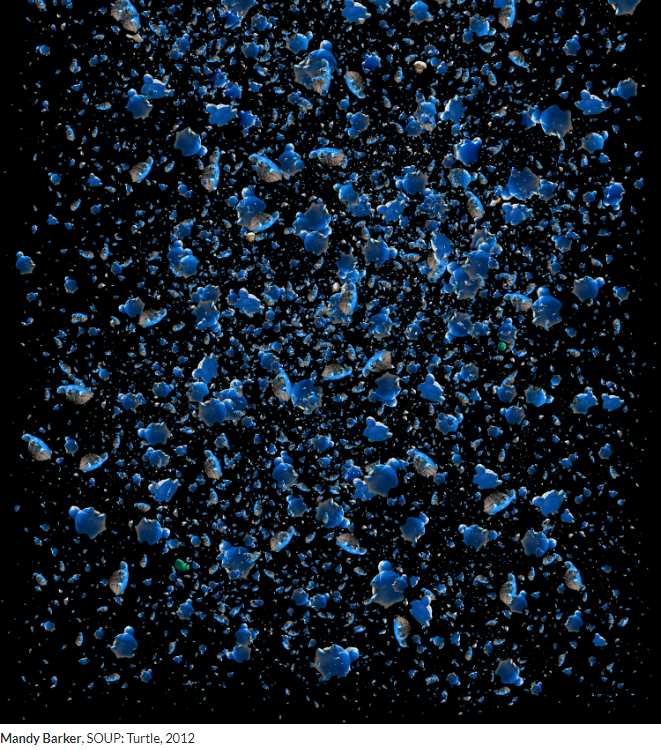
One of their artist references.
Is the essay well structured with a sense of an introduction, paragraphs and a conclusion?
The essay has a good sense of structure- including an introduction, a section on historical context, two paragraphs on chosen artists, a conclusion and a bibliography.
Use and flow of language, prose, punctuation, spelling?
Used, punctuation used correctly, spelling accurate, specific vocabulary and language used.
Use of specialist vocabulary relating to art and photography?
Used
Analysis of artist’s oeuvre (body of work) and key work(s)?
An analysis of the chosen artists’ work was present, with analysis’ of key inspirations which they then responded to.
Evidence of wider reading with reference to art history/ theory, political discourse and/or socio-economical context?
Evidence was presented in the form of a historical context paragraph.
Use of direct quotes, summary or commentary from others to make an informed and critical argument?
This was not present.
Use of referencing system (eg. Harvard) and a bibliography?
A referencing system has been used- including a bibliography, sources of images and a quote from Salvador Dali.
The bibilogprahy
Use of illustrations with captions listing name of artist, title of work and year of production?
Used in all images present.
An artist’s image
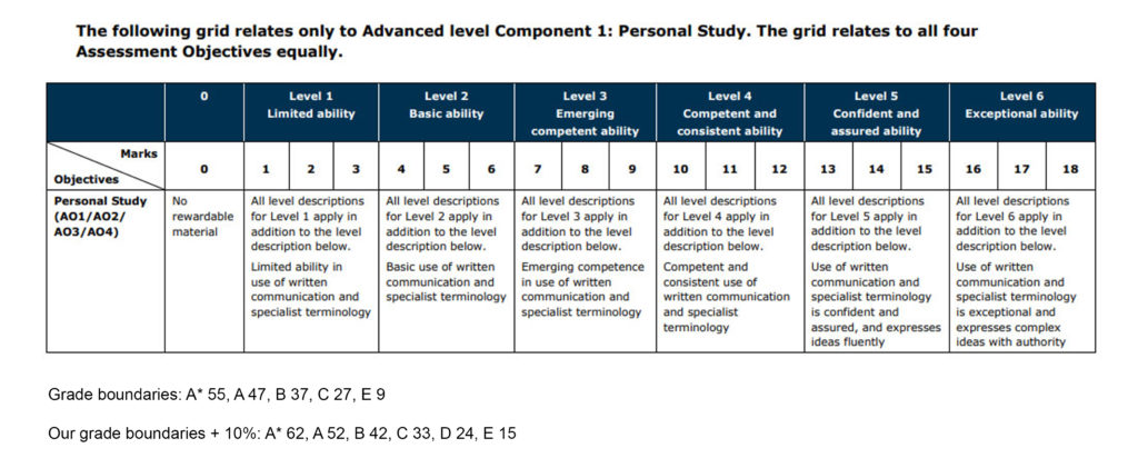
Make an assessment using the mark sheet and calculate a grade.
Overall I would give this essay 14/18, when marked by a member of the school the essay was given a 15/18.
Lesson task Thurs:Personal Study Read the essay and comment on its overall written and interpretative quality as well as its use of critical, contextual and historical references, eg.
Does the essay address its hypothesis?
yes this essay hypothesis is about the idea of photographs not just being manufactured memories but are also expressions of our desire to hold on to something through all the links to memories her grandad still holds onto
Does it provide new knowledge and understanding?
yes she has a very very strong knowledge of photography and the topic of her book she Cleary understands the context and language very well
Is the essay well structured with a sense of an introduction, paragraphs and a conclusion?
yes this essay is cvery well structured with different coloums of text wrapping around selected images
Use and flow of language, prose, punctuation, spelling.
she uses very strong language showing an in depth understanding of language and very good use of punctuation
Use of specialist vocabulary relating to art and photography.
yes she uses strong photography showing an in depth understanding through out the essay
Analysis of artist’s oeuvre (body of work) and key work(s).
yeah i feel like she has shown an in-depth knowledge of her artists refences work through out the book and essay with lots of useful information about there work while also linking it back to her
Evidence of wider reading with reference to art history/ theory, political discourse and/or socio-economical context.
yes she links a lot of her wok to very early photographic technology and artists for example she talks about the daguerreotype made in 1839 along with many other smart links to the history and theory side of photography
Use of direct quotes, summary or commentary from others to make an informed and critical argument.
she has lots of quotes through out the essay correctly punctuated as well as references of where to find them
Use of referencing system (eg. Harvard) and a bibliography.
yes she has used good refrencening throughout the essay and then also in the bibliography as well with links to articles and books she had used for information
Use of illustrations with captions listing name of artist, title of work and year of production.
yes she has alto of photos through out the essay of her work and others and then linking it back very well to her own work and of other examples of the techniques she has used
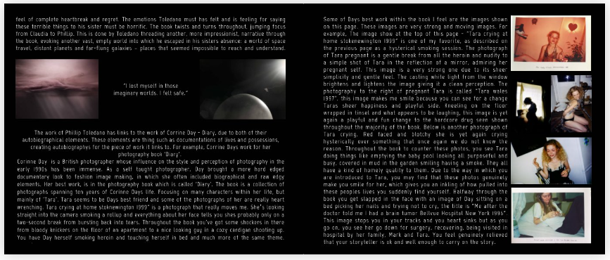
Yes, the essay clearly addresses the hypothesis is, as she goes into detail about how her two photographers have made their work autobiographical. She also gives examples on how she feels and links hers work to these photographers and has expanded on their ideas to make her own work autobiographical. The hypothesis has also been answered consistently throughout the whole of the essay which helps to build and secure her conclusion on this hypothesis.
Does it provide new knowledge and understanding?
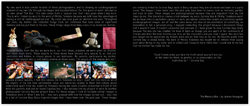
Yes, there is clear understanding of the topic and of the photographers that were chosen, there is extensive evidence of research and understanding of each photographers’ projects and how she has used then to enhance her project and personal study. She has also explained the background of each photographer and what inspired them to start their projects. For example, on photographer -Phillip Toledano- did his on his sister who died when he was six, but his family never talked about her, but when his parent passed, he found a box containing the belongings and photos of his sister.
Is the essay well-structured with a sense of an introduction, paragraphs and a conclusion?
Yes, the essay starts off with a quote from Corrine Day which is one of the photographers that was used for inspiration in this personal study, if feel this is a great way to open an essay as it is a way to get the reader intrigued about what they are about to read. If then goes into the introduction on the main part of the hypothesis, autobiographies and explains what they are and the photographers she has chosen. This gets followed with the introduction of the first photographer, Phillip Toledano. Throughout the essay it is broken up through paragraphs and quotes which will keep the readers interested as there are so many new and interesting elements to the piece of work. The essay is completed with her own small autobiography about what inspired her to do her project on her memory box.
Use and flow of language, prose, punctuation, spelling
There is a good structure to the writing but at times it can be simplistic and lack complex vocabulary which could potentially make the essay more interesting. This isn’t throughout the whole study there are parts where certain words have been used which shows her understanding of the project as well as her extended vocabulary which enhances the final piece. There is also a good use of punctuation in the essay which can really help keep the reader invested and what to carry on reading.
Use of specialist vocabulary relating to art and photography.
In the essay there isn’t a great abut of vocabulary relating to art and photography but it does pop up in some bits of her work. She uses this vocabulary mainly when she is describing the photographers background and meaning behind their projects but lacks it when evaluating their images, even her own. There is good detail i her evaluations but it is missing the photographic vocabulary that could really enhance the personal study.
Analysis of artist’s oeuvre (body of work) and key work(s)
This was one of the strong points in the essay as she goes in to great detail about both photographers that she had chosen, you really learn about them, their past and their different projects that she had taken inspiration from. There is defiantly evidence that there has been extensive research done into these photographers and that she took real interest into their work. Each photographer got an introduction and she picked out key images from their work which she analysed and explained why she had picked the specific photos.
Evidence of wider reading with reference to art history/ theory, political discourse and/or socio-economical context
There is not any evidence that research into art history, political discourse or socio-economical context has been done, but I feel this is mainly about the topic that she chose to do her personal study on. I feel that there was little room for sub jects such as politics of socioeconomics could have been brought into this project, but she could have done some research on the meaning behind the key features of her personal study, such as the memory boxes or other well know photographs that relate to the topic of friends and family as well as community.
Use of direct quotes, summary or commentary from others to make an informed and critical argument
The actual essay is opened with one of the quotes from the photographer Corrine Day, “Good friends make you face the truth about yourself, and you do the same for them, as painful, or as pleasurable, as the truth may be.” – Corinne Day, Diary, 2000.‘ This is also how the essay is finished as she states that this is a ‘favourite’ quote. The essay is also concluded on how she relates to both photographers and what they have made her feel after looking at their pieces of work. Different quotes are also used throughout the essay to breakup certain chunks or to introduce new photos which I believe is a great way to structure this piece of work as it invites new ideas and different meanings to the final project.
Use of referencing system (e.g., Harvard) and a bibliography
There is no evidence of a bibliography or of a referencing system such as the Harvard systems. I feel that this is a disadvantage as having a referencing system can really enhance the final product as the viewers can research deeper into the topics that they are looking at.
Use of illustrations with captions listing name of artist, title of work and year of production
The artist’s name is displayed at the end of her essay and in a few of her photos throughout the book but there is no other evidence of this being her project, there is also no date presented so without knowing Jemma or looking away back through the blog, her projects might not have been found. Lastly, Jemma has displayed the tile of her book across her blog posts and in the page, you see when you open her picture book but is not shown on the front cover.
Overall Analysis and Mark
6=D grade 9=C grade 11=B grade 14=A grade
I would give ‘The Memory Box’ 12/18 marks as I feel that she has displayed a clear and consistent personal study, that provides new knowledge on her different photographers as well as herself. Jemma goes in-depth into her chosen inspirations such as Corrine Day and Phillip Toledano, she also conveys her emotions throughout the whole essay as she can relate both photographers back to herself which I fell is a really strong link that helps to bring the project together. The overall book is also very good quality with pictures that relate back to her personal study and which she can explain in specifics why she has chosen to use them. Jemma’s structure of her essay, I find is very interesting, although she missed out on some specialist terminology it is very enjoyable to read as well as the presentation of quotes and pictures.