


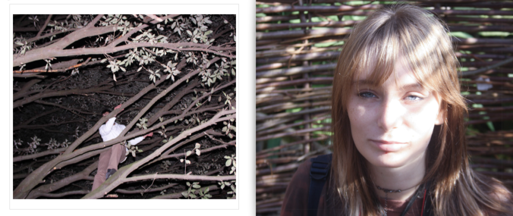




Throughout my project, i took roughly around 500-600 images. I didn’t stick to a schedule of doing planned photoshoots, instead I took my camera around whenever i was with my friends and took images when something interesting caught my eye. Lighting and setting was a key element whilst using this method as i feel those are the main components for creating an eye-catching photograph.

My photoshoots consisted of three main settings; car drives, forests/parks, and in houses. Other images i took were photographed at random places, either around town or further out in Jersey.

This is an example of one of my better outcomes of photographs taken on car drives. I like this photo because there is a viewpoint, the subject is making eye contact, and there is a distinctive square-shape around her head which catches the viewers eye. The background is devoid of any unwanted objects, and the colour of her hair and eyes is brought out by the blander colours surrounding her.

This image is part of a mini-photoshoot I took outside this shop. Although i liked how the silhouette looked in contrast to the bright lights of the shop, i felt there were too many focus points which made the photo look chaotic and messy.

When out at night in forests with my friends, it was more difficult to get the outcome i wanted with my images due to lighting – therefore I had to adjust the ISO and shutter speed whilst taking my photos. This is an example of one of the better images i took whilst at this forest, a setting where i composed the most photographs. I like this photo because of the silhouette of the trees and singular star in the sky that catches the viewers eye if they look hard enough. I also think the red from the fire illuminating my friends faces looks good with the photo as the colours correspond well to each other.

This image is an example of wrong ISO and shutter speed and the outcome it will have when taken in dark lighting. I was disappointed with this image as i felt it could’ve turned out well and had good elements of colour and focus, but was too blurry to use in my photobook.

This image is an example of a better outcome because it represents my theme well. A persons bedroom and how they decorate it is a reflection of their identity, so by capturing photos of my friends in their rooms i can communicate my theme without directly showing it as portrayal of youth culture through small details. Lighting is also a key element in producing a good photo and i felt the lighting in this image was the right colour and brightness to get the image i wanted.

Since the main source of lighting in the room was only coming from a certain point, i had to take into consideration angles i photographed at whilst making my image. This photo is an example of how a poor angle can reflect badly on lighting – the image itself is too dark, and places the focus on the lamp, whereas instead i wanted myself to be the viewpoint of the image.


I used photoshop to create my collages, as developed from my identity project in year 12. – In this project, I tried to make use of more creative layouts and to create a stronger narrative of generational identity in my collages.
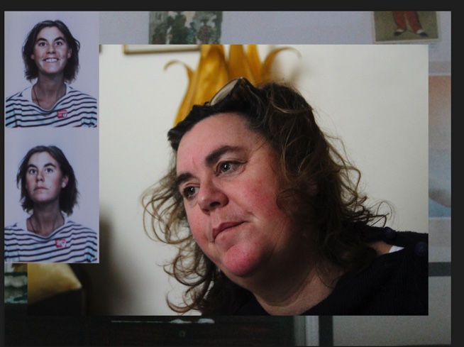
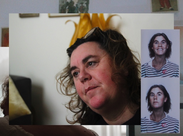

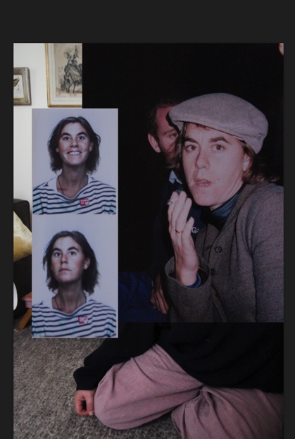
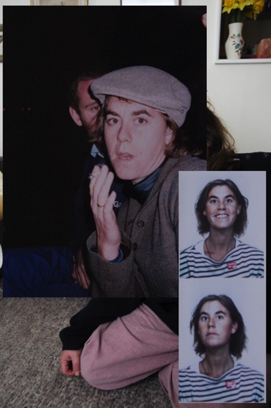
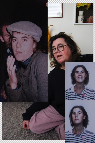

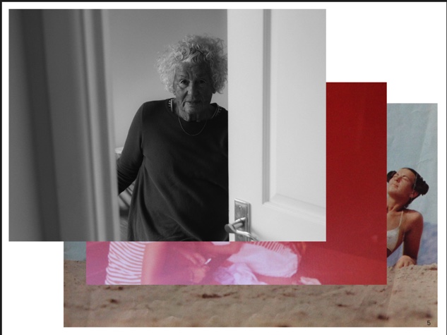
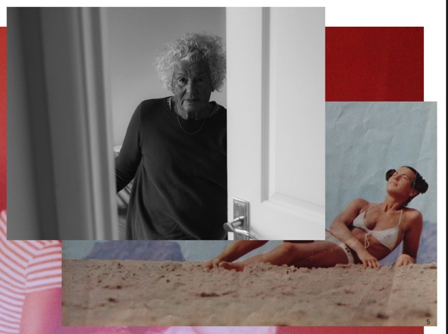


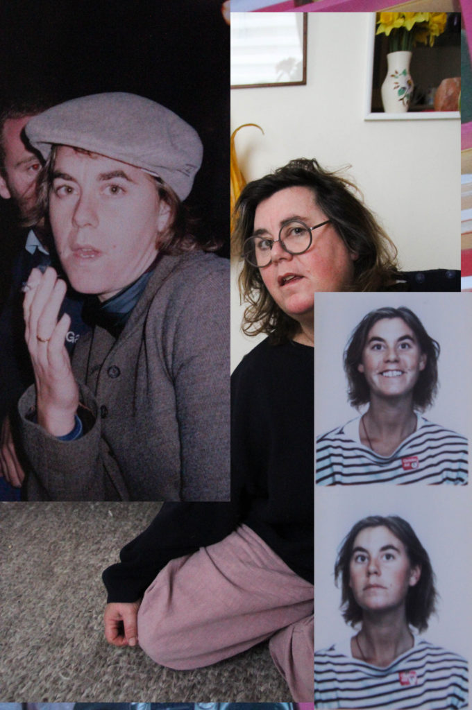
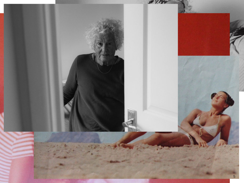

These collages were a development from the collages I produced in my year 12 Identity project. I developed my pieces in this project by using different types of images, especially including myself and different archival images – creating new presentations of generational identity through solely female perspectives. I created much more simple collages in this project, in order to keep these outcomes in line with the whole layout of my book. Using similar images to those used in the rest of my book in these collages helped the cohesion of all parts of my book, making sure the book flowed well from start to finish. I like how my final collages are vibrant and colourful, which to me represents the characters of both my grandmother and mother – vibrant colours are a running theme in my photobook, which represent my childhood, and my upbringing in many different places and within nature as a child. Creating a photo book with personal meaning and with my own perspectives was important to me as women are often silenced and ignored when telling their own stories – presented in a way that is not truth and only for the benefit of the onlooker. Therefore, by producing these collages and this project altogether, I feel that I am producing my own stories, with female truth.

I started with 50 pages but as I began to add images, I realised I needed more pages. In the end, I had 70 pages – I feel that this is slightly too many but due to the volume of my images and the different layouts I wanted for my book, I am happy with this amount. Having this amount of pages has enabled me to create the narrative which I had envisioned for my book, creating a cohesive beginning, middle and end of my book.
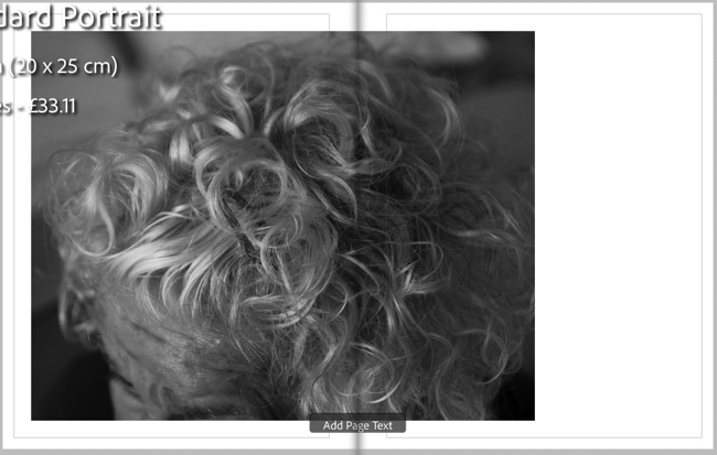

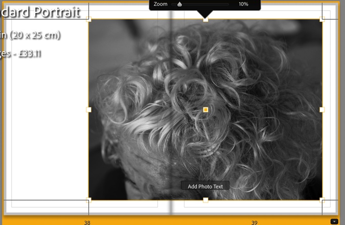


In this first bit of experimentation, I was getting used to the layout of the book format in Lightroom, experimenting with different image layouts. I didn’t want to create a book that was too busy, with too many different layouts of images – I tried to use consistently similar layouts: single and double-page spreads, with some images smaller and larger.


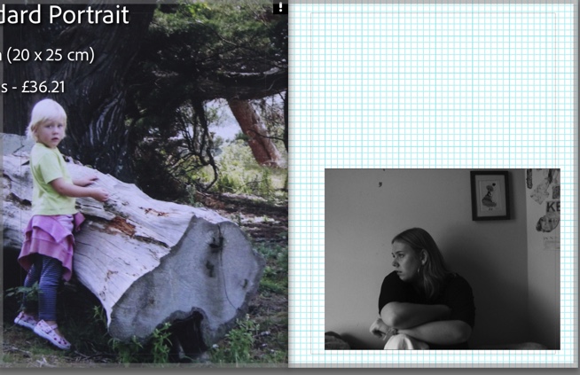
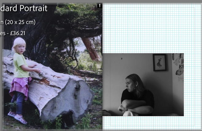
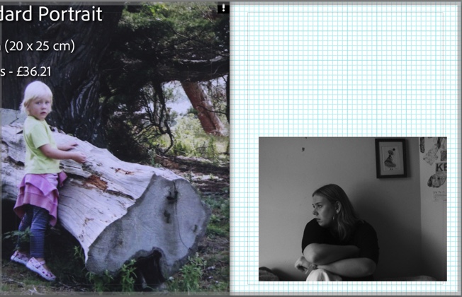
I found it initially difficult to deal with a large volume of pages, and working on lots of pages at once was overwhelming at first. To combat this, I focused on certain parts at a time – for example, the start or end parts. This also helped me to continue the narrative and story in the book that I was trying to create. I included my strongest images in the middle, placing importance on the middle spreads. Towards the beginning and end of my book, I used understated, gentler images to vary the types of photographs used.


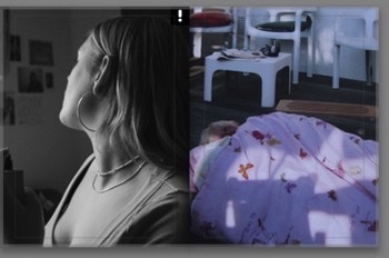
This was a collection of my final experiments with my book. When adding some images to my book, and previewing the outcome altogether, I realised some images were not edited quite to the quality I wanted. I was able to make editing adjustments right from the book into develop mode. (seen above) It was helpful to make quick adjustments to potential images in my book and also helped me to narrow down my selections of quality images. This allowed me to keep the highest quality work in my book. Also in this final set of experiments, I experimented with colour pages. I decided to include these colour pages throughout my book, roughly every few pages. I included these pages in a pinky-purple colour: it matched well with the amount of pink and purple tones in the book, but also can be seen as a symbol of femininity and childhood – this links well to my project as I wanted to touch on the idea of pre-conceived ideas of femininity and mother figures, and present these ideas through my own experiences and family, flipping the gaze into that of the female gaze, opposed to the traditional male gaze seen in the mainstream media.
(Full evaluation of my book and images in a separate blog post.)
I went back to my mum’s part-time job with my camera after a week or so and retook some of the images I took on my phone with my camera, spending time on the composition of each image and looking out for any small details that could make an interesting photo that I hadn’t thought of/taken at my previous shoot.
Contact Sheets
I tried to use the lights available to my advantage which ended up being a slight struggle due to how spaced out they were in certain areas, creating dark images unless I used my flash which would occasionally leave my images overexposed.


Best Shots: Post Editing
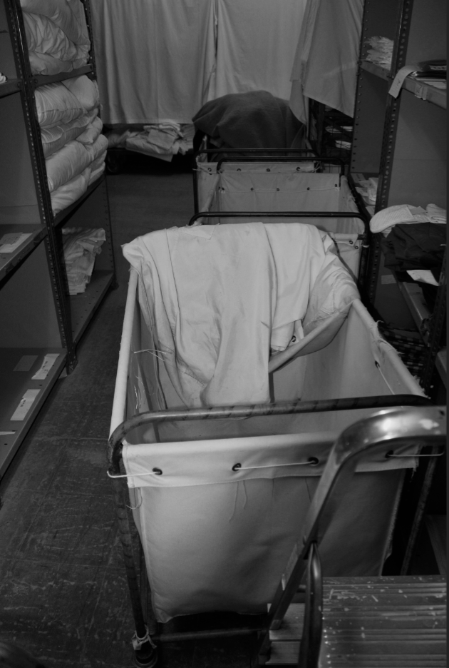


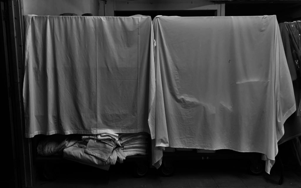


How is a sense of hidden beauty explored in the work of Robin Friend?
Jersey is an exceedingly small island with a lot of beauty but there are so much more than all the tourist places. these extra special places just require a bit of exploration to find even greater views that I will try to capture with my camera to create impact full images about the hidden beauty in the mundane everyday parts of jersey.
To do this I will go out with my camera to sites/places that have been forgotten/ less talked about. I will do this to try and find the less seen beauty of the island. this area of work interests me because I have a great passion for exploring and finding new and interesting places. all my life I have spent adventuring Jersey through all its valleys, castles, coves, cliffs, woodlands, and buildings in search of something interesting to make it worth the time. Every time there is a view, a moment, or an object that I see/find that makes it worth the effort of going out to try and find it. I come home from these little expeditions feeling accomplished at what I have seen, heard and experienced. It is like a hunt for the beauty in the mundane, boring environment that the rest of Jersey drives by daily never thinking to climb though a bush to see what is on the other side or climb up a wall to see the view from the top.
Through this project I hope to prove beauty can be found and captured, everywhere and anywhere if you just look. I am looking at Robin Friend I am particularly interested in his book “bastard countryside” which feature images from 15 years of his own personal explorations. These images mainly focus on unkept areas of the countryside. Where humanity has affected the landscapes and left it to decay into the natural environment. this creates visually pleasing images that portray a very un-appealing truth that documents how time and nature effects the degradation of manufactured objects and structures into the land.
Robin Friend aged 40 was born in the Uk but lived in Australia from an early age. He moved back to the Uk with his family when he was a teenager then went on to study photography at university of Plymouth.
This projects link to my other projects because I have already explored many other less seen areas of Jersey for other projects throughout this course that have related to different themes/assignments at the time but are remarkably like this project.
I went to three location that have been left to decay back into their landscapes. I spent along time photographing each area from many different angels and views I ended up with 569 images that I then sorted using light rooms star system. from these sets of image I used 43 of my best edited images to create a photo that shows the beauty in the decaying fabricated environment.
I made one book with my final set of edited images, then I made another with the same images to see if I could find a way to display them in a better way.
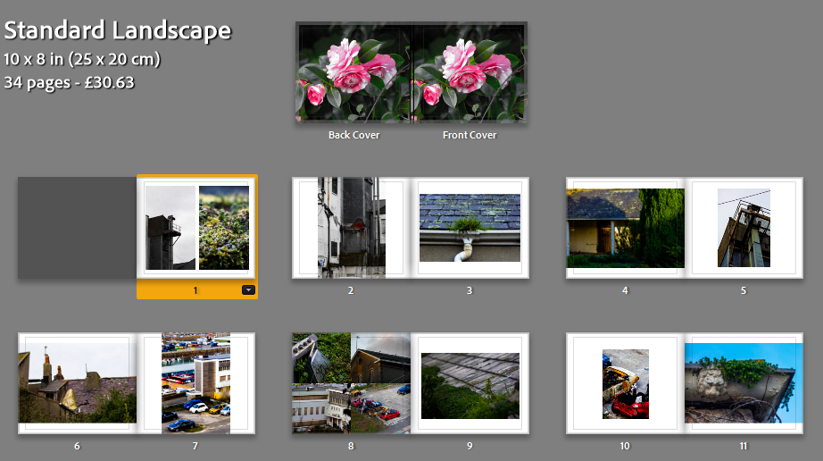
this is the first few pages of my first attempt at my photo book. at first I liked this design I tried to use images that would contrast against each other on each page and yet they still all have a link between them.

this is the first few pages in my second attempt at a photo book I like this on more because I feel there is more contrast between the images on each page. I used a triplet on one of the pages because I felt this was better than the 4 grid of images I used on the previous book because it feels less cramped when viewing the pages.

this is the last few pages of my first attempt at a photo book at first I did like how I juxtaposed a full bleed images against a smaller image on every page. however I believe it can sometimes be more impactive to give a more variety of image sizes against each other.

this is the last few pages in my second attempt at a photo book I like they way I have displayed these images better than my first attempt because of the 2 page spreads I have incorporated towards the end of the book. I still used full bleed images contrasting against smaller images. which I feel gives a interesting perspective to some of the images. the final image on this page I am very happy with as I took it at the end of my last shoot as the sun was setting, I feel it wraps up the book nicely.


for my final book I have chosen my second attempt because I feel I have better displayed my images through out the book. I also moved my double pages spreads top be in the middle and end of the book as a link through out the book.
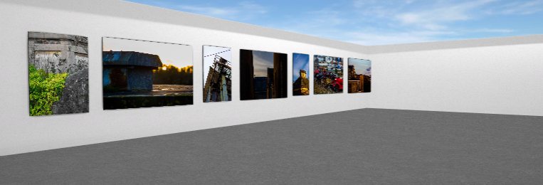
I have produced a virtual gallery of some of my best images from these shoots. I created a gallery using Artseps online website then put final images in to create the effect of seeing my work in a real exhibition.
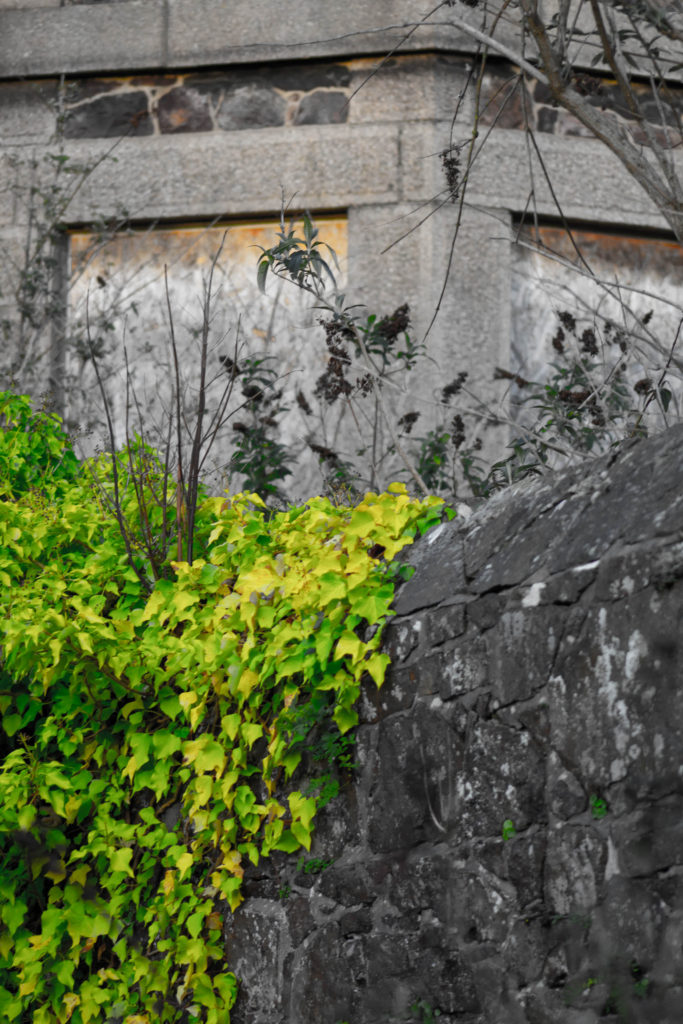
This is one of my final images that i took of a wall inside the old hospital grounds. I edited this image to reduce the saturation and increased the vibrancy to bring out the greenery climbing the wall. I like how the man made structure of the wall is much duller and darker except for the little pieces of plans growing through the cracks that will eventually completely overtake the wall and bring the granite back to nature.

this image was also taken from of a decaying out building on the old hospital site the peak of the roof really intrigued my eye and I spent along time focusing my lens on this roof. I also liked the interesting lines created by the flaking tiles and rotting wood at the top. a lot of interesting colours have been created by the moss growing on the tiles. I like the way the light has hits the roof and the edges cut of the image to break it up into section of bright warm light and darker side contrasting against the light blue sky with airy white clouds. I brought out the brightness in the sky by reducing the highlights I this image.

I like this image because I was on my way into a decaying site and i found a lost parking cone peaking through the bush. the bright yellow caught my eye through the rest of the overcrowding leaves that surrounded and encased the cone. i edited this images to best bring out the contrasting colours of the natural green leaves against the synthetic bright yellow hiding underneath. I focused my lens deep into the bush to create a slightly blurry foreground with the leaves.

this image is of the roof of the old hospital. I really liked how there are whole gardens growing in the gutters and corners on the roofs of the buildings I went up to get a good angle. The contrast between the hard lines of the roofs edges and tiles that juxtapose the soft green shapes created by the plant matter that is now trapped up on the roof 20m above the ground and yet still thriving with life and colour. I liked the perspective of this image looking up which follows the pitch of the roof. I also positioned another smaller roof in the foreground of the image to give a lot of depth to the image. i edited it to bring out the natural colours from the grass, plants and lichen.
Virtual Gallery: https://www.artsteps.com/view/63e378bbc0a4cb48a04807a8


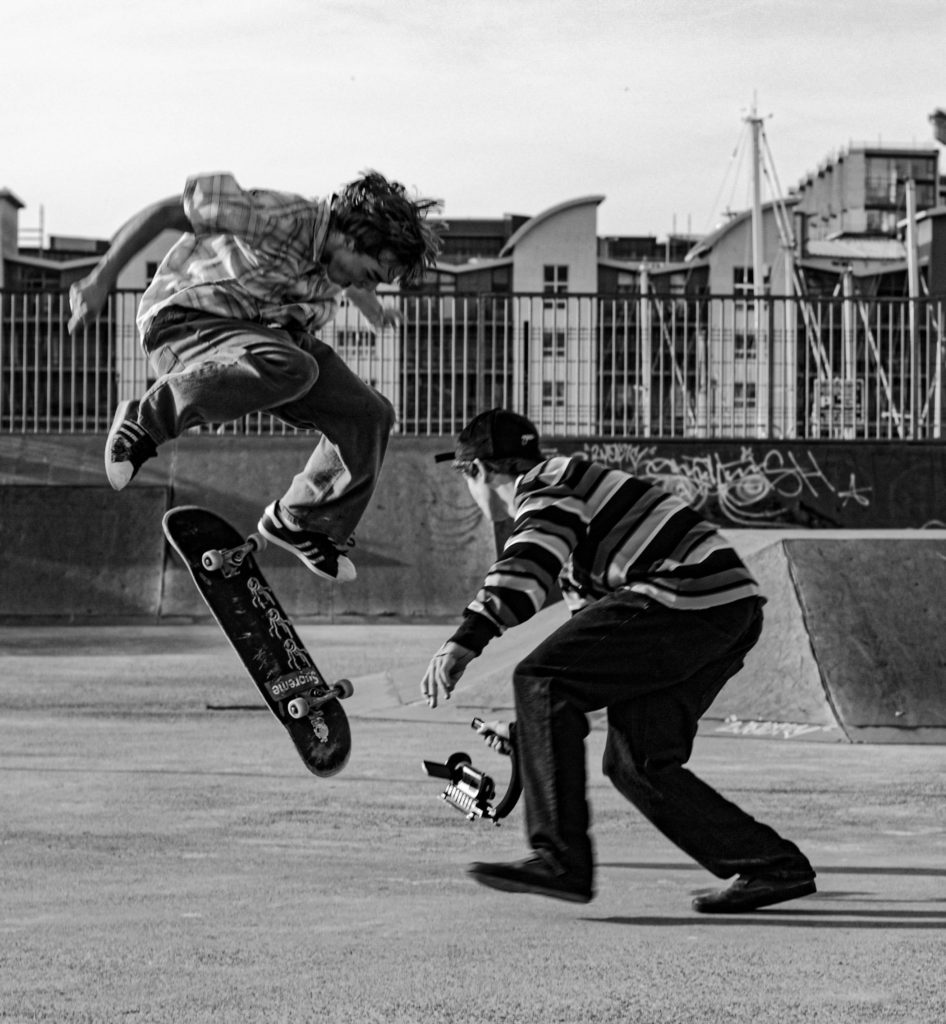


I chose these images as my favourite from my personal study. I chose these images as I believe that they relate to my personal study the most out of my images, as well as this I personally just prefer these images to my others. I think that they are very effective in showcasing the movement in skateboarding and that they present my whole study very well.
Overall, I am very happy with my final edits. The edits created which are inspired by the artists I studied greatly compare to them in everything from looks, lighting and the colours seen in the images. They also fit into the theme of my personal study well in my opinion. My aim with them was to create unique and cool images which is exactly how I believe they turned out. To improve my artist inspired work, I would have created more photoshoots at more locations. Doing this would have given my a wider range of images to edit.
Contact Sheets
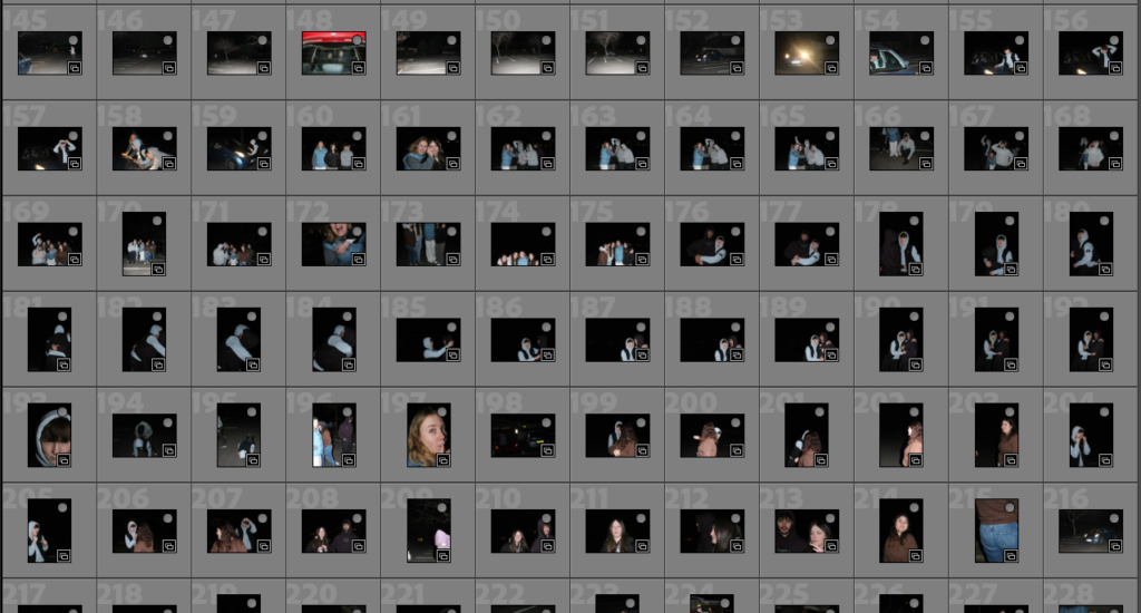
Here is the contact sheet for my fourth photoshoot, I decided to include my friends into this project to shop some development through generations in my photobook. In the start of the book will be images of my parents with their friends and as I was to create something like a photographic timeline I thought that by adding my own friends I would be more pull together. This photoshoot was conducted down at St Brelades as it is a place that my group of friends go a lot, this shoot was done at night so the flash was used in the photos but I like how they turned out and feel that they will be interesting to edit. I want to do a similar editing style to the way I have edit my parents and their friends to help link them together.
Sub Selection
I wanted to pick the best images out of my collection that I thought would go together in my photobook and help to make a structured narrative. I used the flag tool to pick which ones I wanted to edit and maybe included in my selection of images, I followed this by using the green colour tool to pick out the photographs that I was going to use and edit in photoshop.

Editing
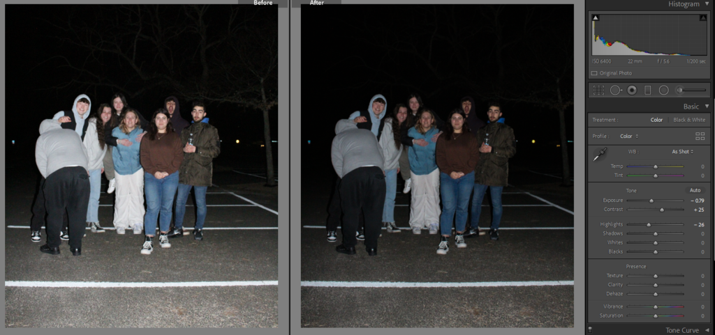
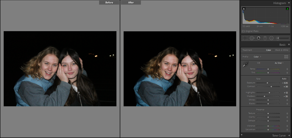
Below are some of my editing which I conducted in Lightroom, as my photographs were take outside and at night I did not have any lighting tools or natural light to work with so I had to use the flash on the camera. By using the flash it caused some of my images to become over exposed leading to some of the people looking washed out, to combat this I decreased the exposure and increased the contrast so that the images appear to be darker.
Photoshop Experimentation
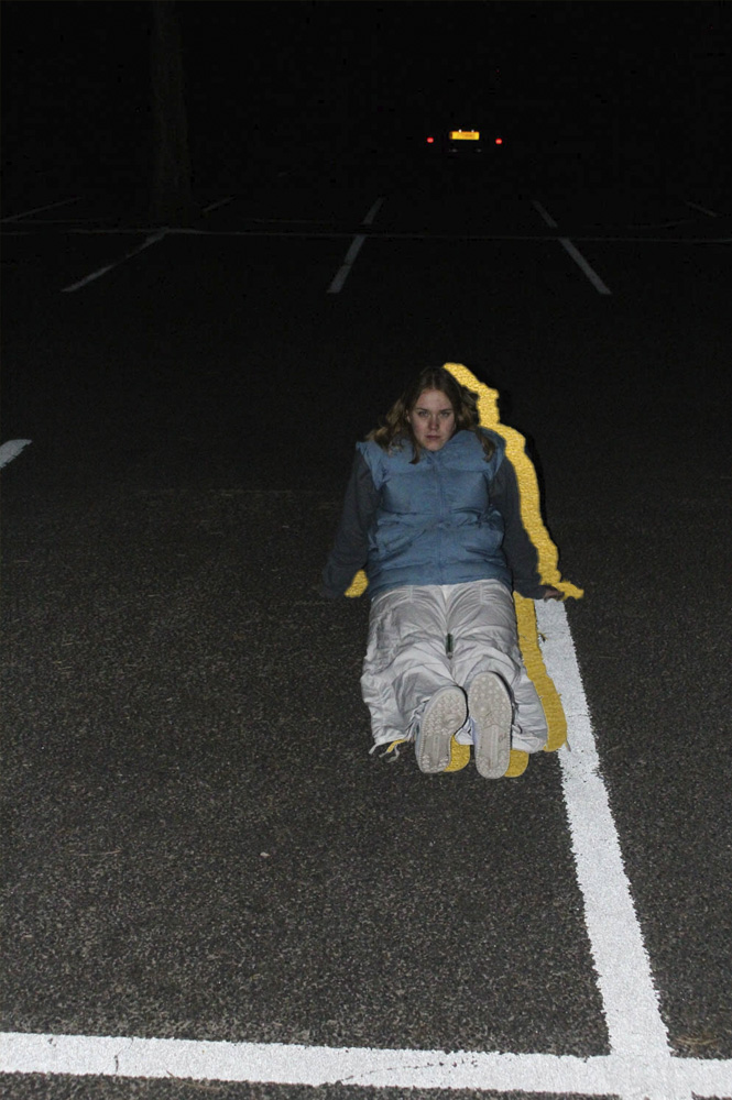
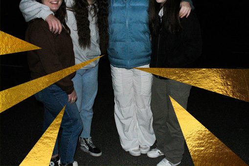
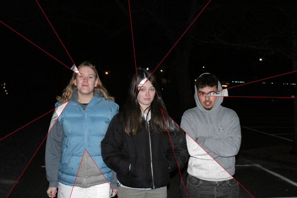
For these photographs I wanted them to be edited with either the gold under layer or with coloured line work, I have done some experimentation with some of my images which are shown below. For my one portrait image I used the gold underlayer and put the original photo over it, I followed this by using the object selection tool to outline the induvial in the image. I didn’t want to completely remover from the photograph so I slightly moved her to the left so that the gold could be seen underneath her. I think this helps connect the images throughout my photobook.
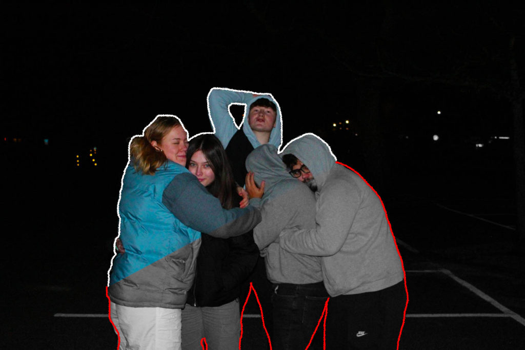
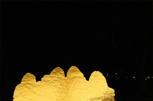
Below are some more of my experimentations in photoshop, the two middle images I plan to have together in my photobook as I think that its an interesting and unique way to display a group photo. I have tried to make them link my using the gold background in both but in different styles. The second photo I have completely removed our upper bodies while in the third I have old used the polygonal lasso tool to create the triangles that have been shown in my earlier photoshoots with editing.
Evaluation
This photoshoot was my favorite to do as I felt that it was easy to portray the care free narrative of teenage life, I wanted to make a connection to the start/middle of my photobook where it show my parents and their friends as these photos were placed at the end showing the element of friendship and how important these relationships are. I like how this images turned out as there was a contrast between the foreground and the background of each image, as I used flash the subjects were highlighted which made them stand out against the darker background. I found these images interesting to edit as I didn’t want to do too much and I wanted them to still link with each making the books narrative flow consistently.