Category Archives: Uncategorized

Filters

Author:
Category:

experimentation

Introduction

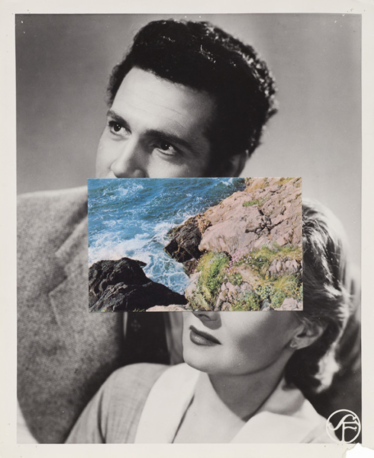
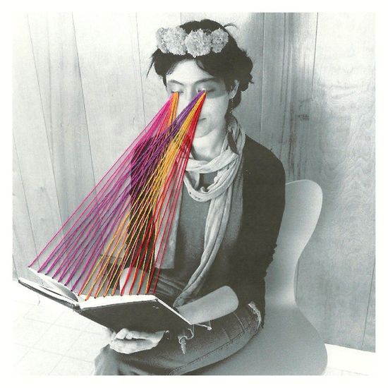
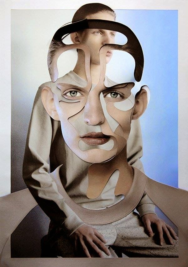
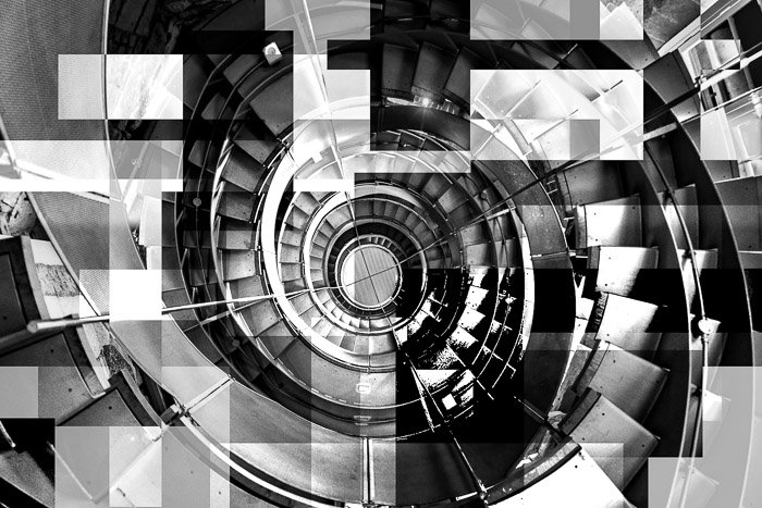
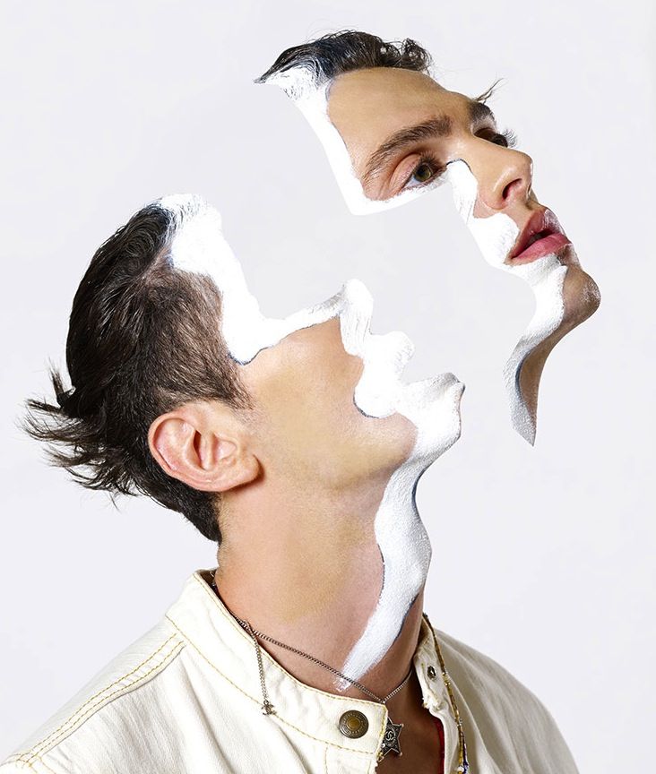
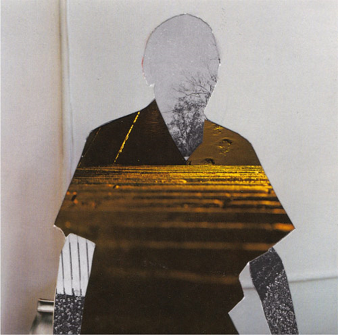
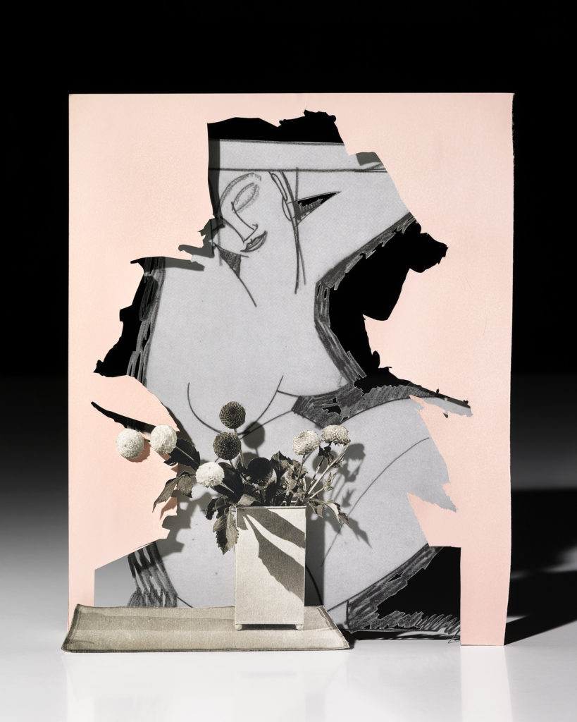
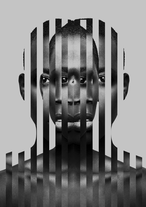
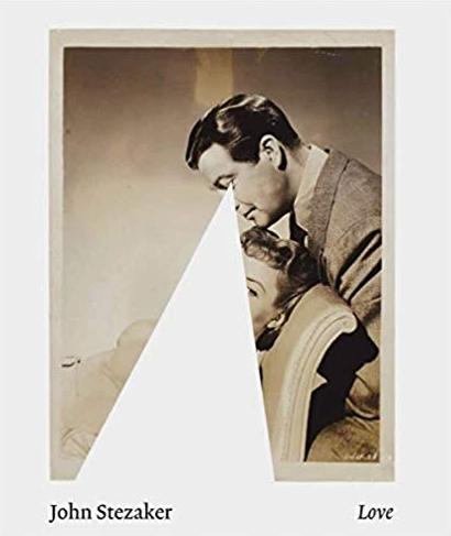
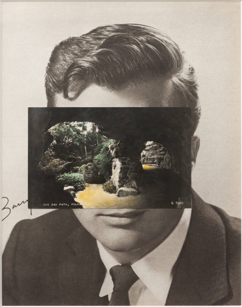
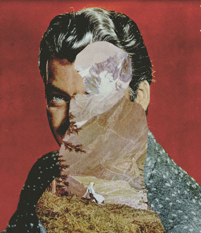
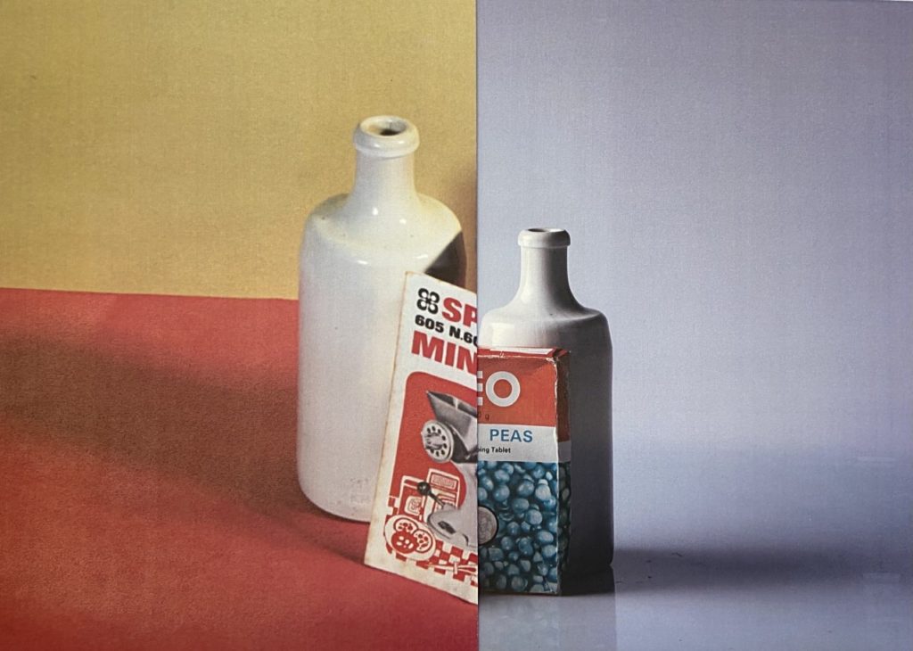
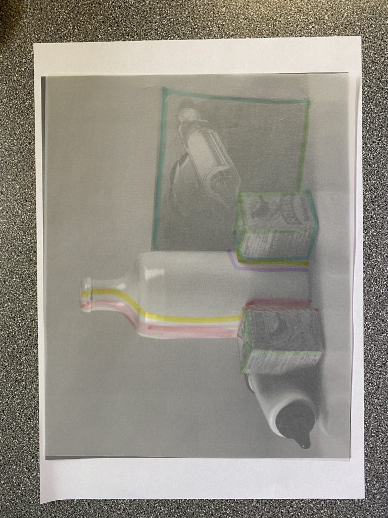
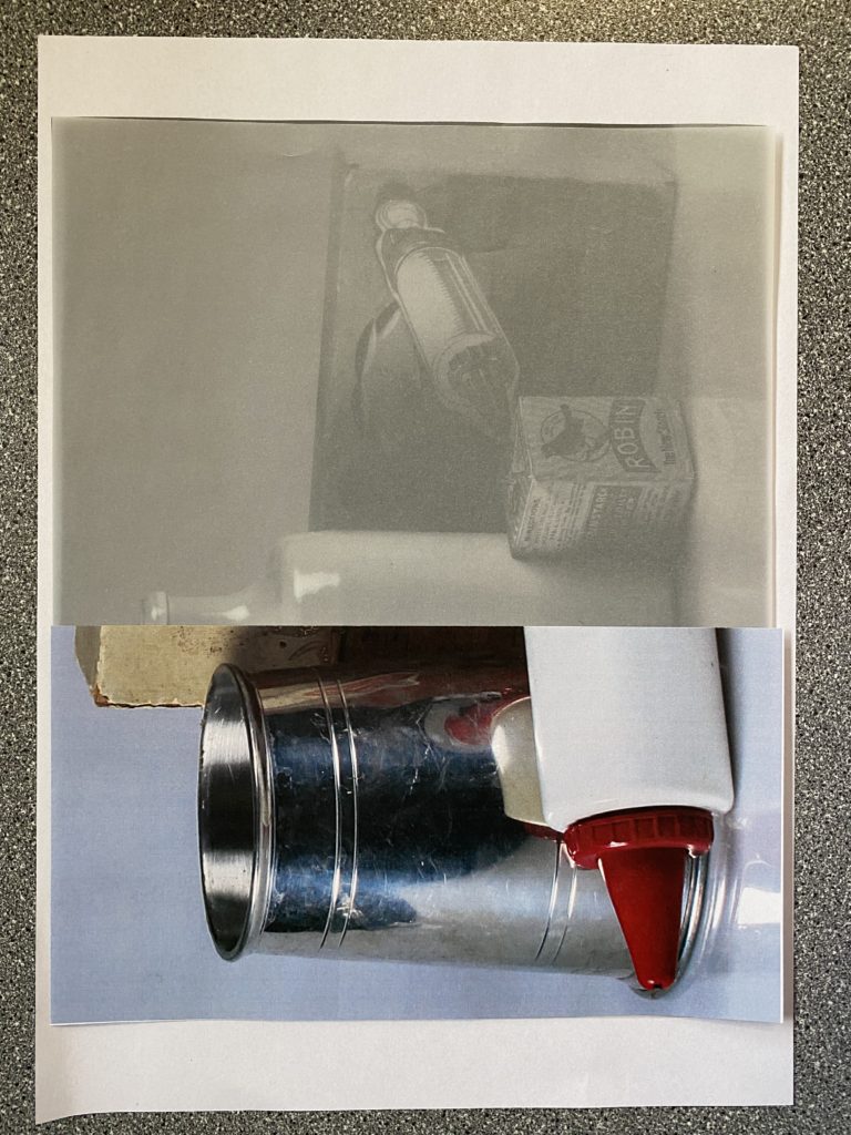
Below I have placed some of my favourite examples of different experimentation methods, I like the contrast of layering coloured images on top of monochromatic ones as it creates depth and adds vibrancy to the images. Furthermore, the use of 2 different images that are sliced together creates a brand new cohesive image as 2 images are visible despite the image not being formed as one.

John Stezaker

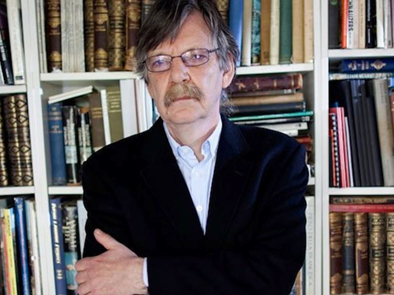
Stezaker attended the Slade School of Art in London in his early teens, he graduated with a Higher Diploma in Fine Art in 1973. In the early 1970s, he was among the first wave of British conceptual artists to react against what was then the predominance of Pop art. Solo exhibitions for Stezaker were rare for sometime, however, in the mid-2000s, his work was rediscovered by the art market; he is now collected by several international collectors and museums.
John Stezaker | Ocula Conversation

His work is surreal in tone and is often made using collage and the appropriation of pre-existing images such as postcards, film stills, and publicity photographs. Art historian Julian Stallabrass said, “The contrast at the heart of these works [by Stezaker] is not between represented and real, but between the unknowing primitives of popular culture, and the conscious, ironic artist and viewer of post-modern images.

John Stezaker - Person - National Portrait Gallery

This image below is named Third person by Stezaker and I have included this for inspiration as I like how it gives us at glimpse at two peoples lives, as the piece is composed of two very different people, one being the man smoking in the background/ surroundings and the other being the upper class lady, maybe even royalty. sitting in a palace. the contrast between smoking, lower class act vs maybe even the queen in the middle highlights the contrast between lifestyle. I can infer that the contrast between the blues in the gentleman and the red in the lady are also there to show this.

His work

Handmade Experiments

Below I have demonstrated some of my own experimentations using still life images, Hamptonne portraits and images of buildings. These show how the examples of experimentations posted onto the blog can be recreated using my won images and how some turned out to be more successful than others.

Photoshop work

Advantages of photoshop: It allows you to create and edit images for both print and web. Photoshop itself gives the user complete control over all kinds of image manipulation, editing and special effects and can be used for exact calibration of images for all output methods.

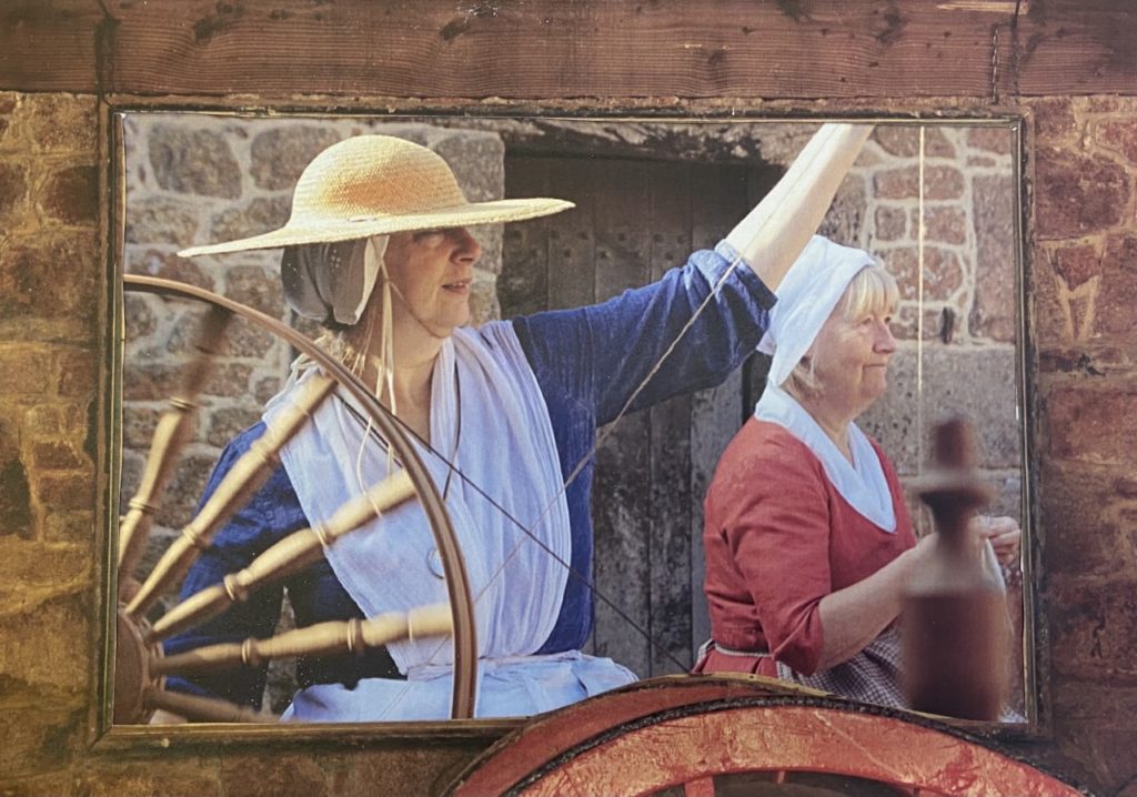
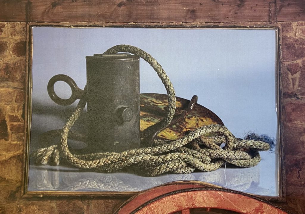
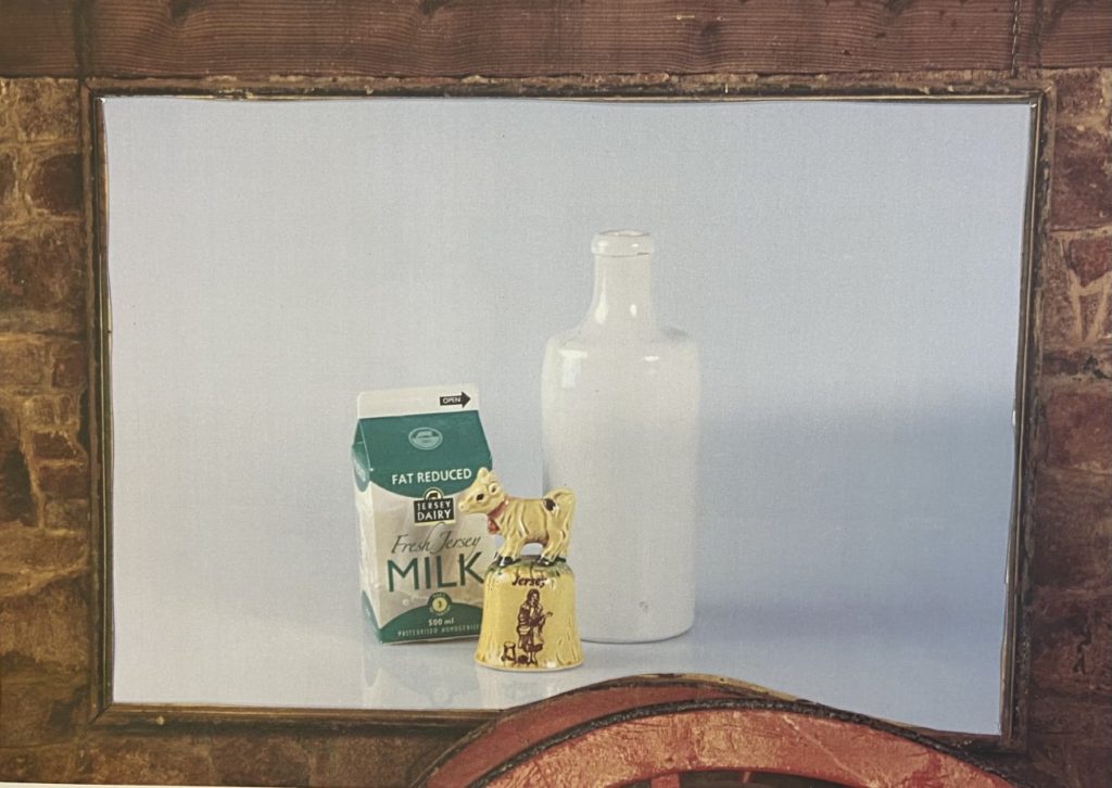
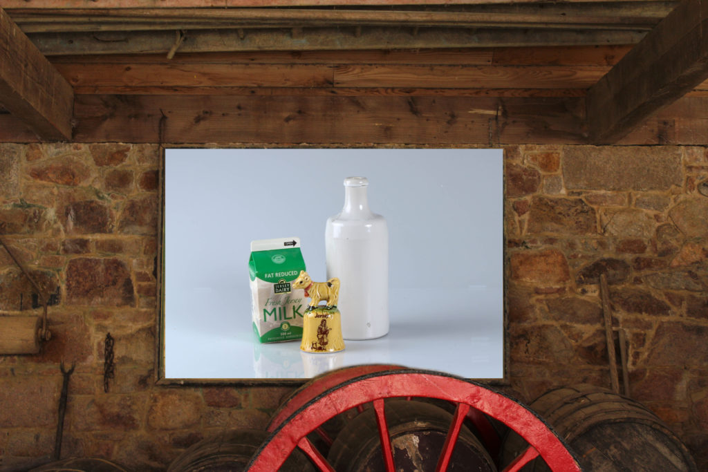
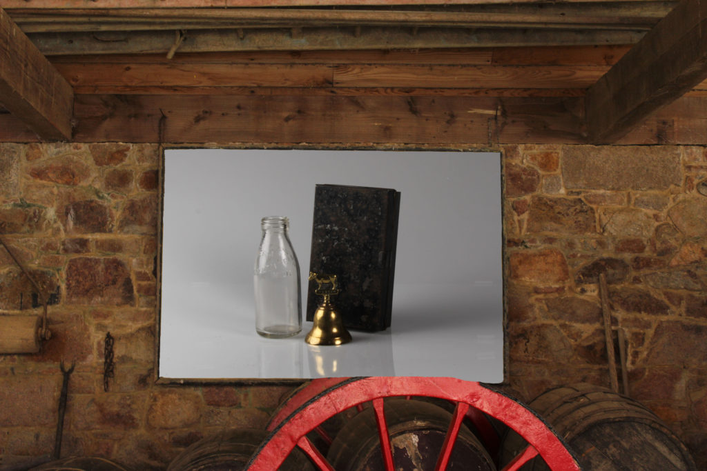
Combining still life images and Hamptonne images I have created multiple experimentations in Photoshop, I used inspiration from the Haulieu blog and came up with the idea for the image with the barn as a frame by myself. Furthermore, I got to learn the basics of photoshop and how to layer images to create new pieces of work.

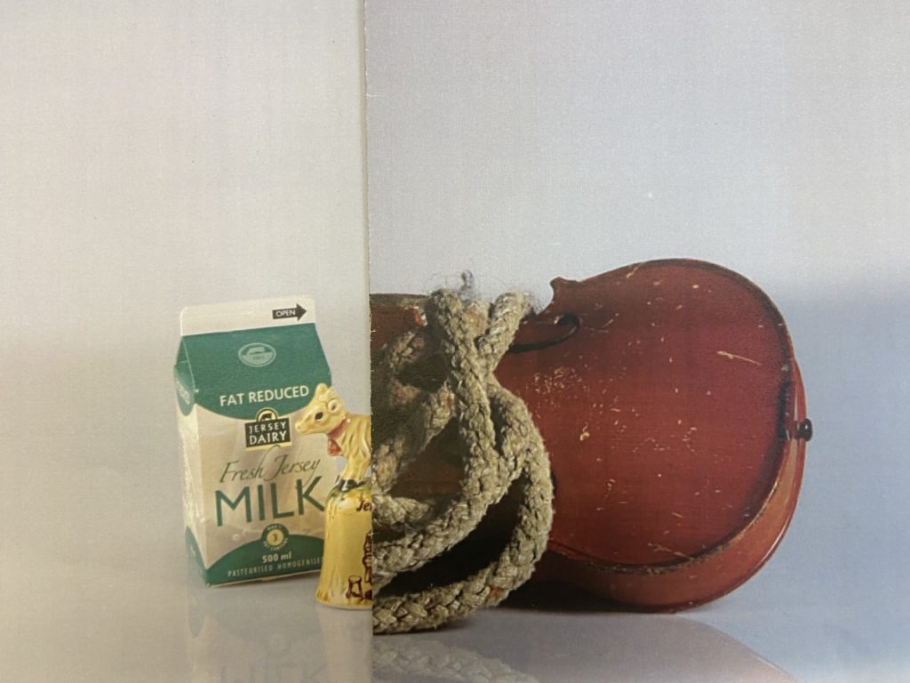
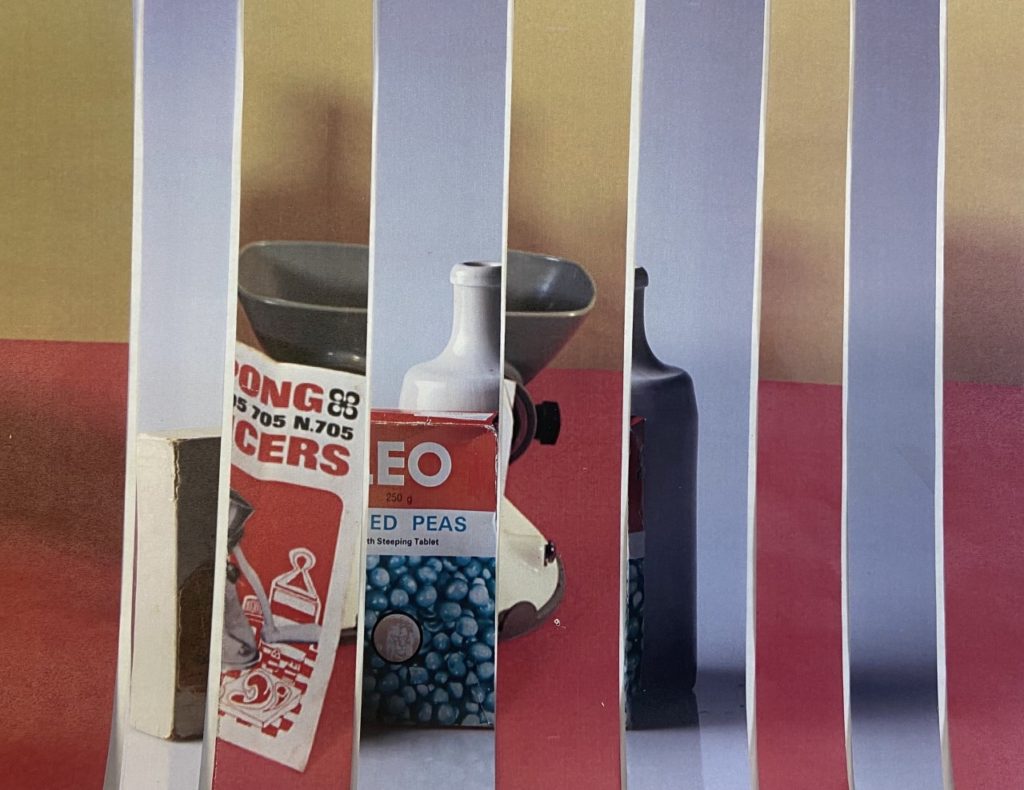
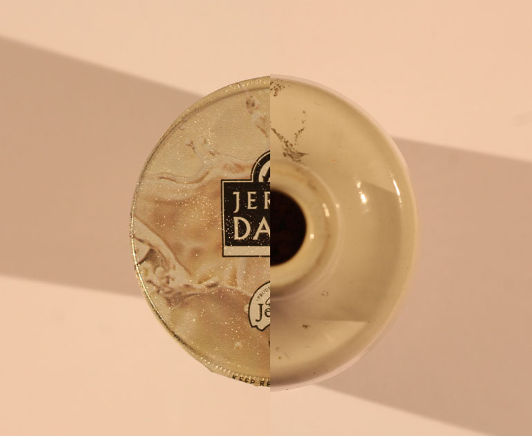
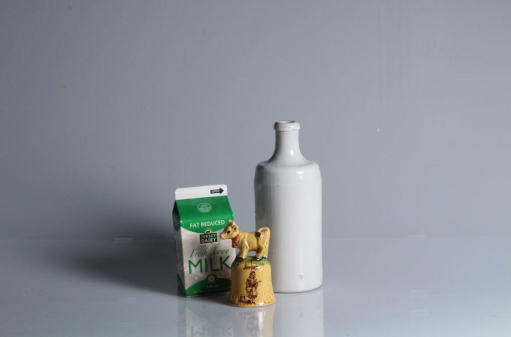
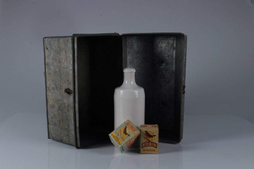
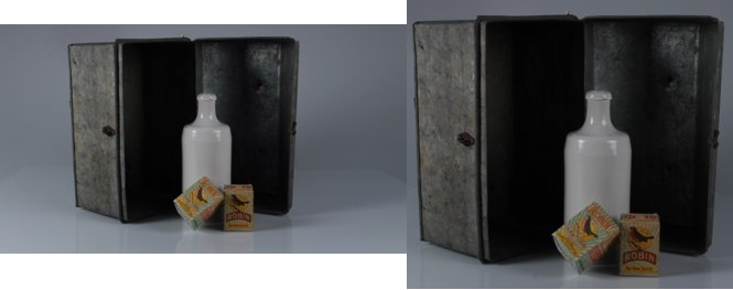
I like how the images with the Hamptonne barn interior as a boarder came together as it creates a contrast between the barn which is hundreds of years old and the new still life images which are modern as they were taken recently. The shadows in the second image are unintentionally diagonal and match up well, I also positioned the two circular objects (Jersey old yogurt pot and white vase) so that the shaped lined up well, creating an effective final product. The other still life experimentation (bottom left) was an attempt to create the half and half affect, but in my opinion this isn’t my strongest piece as the objects don’t really line up and the colours don’t compliment each other.

Studio and still life work

PROCESS

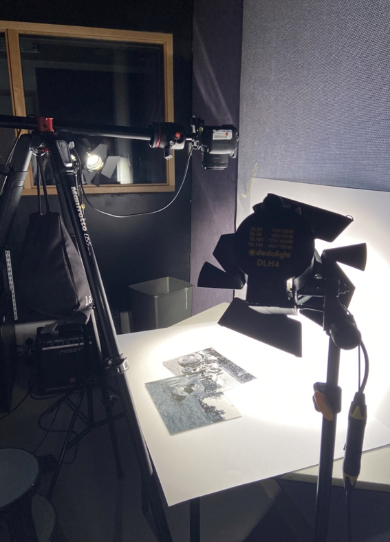
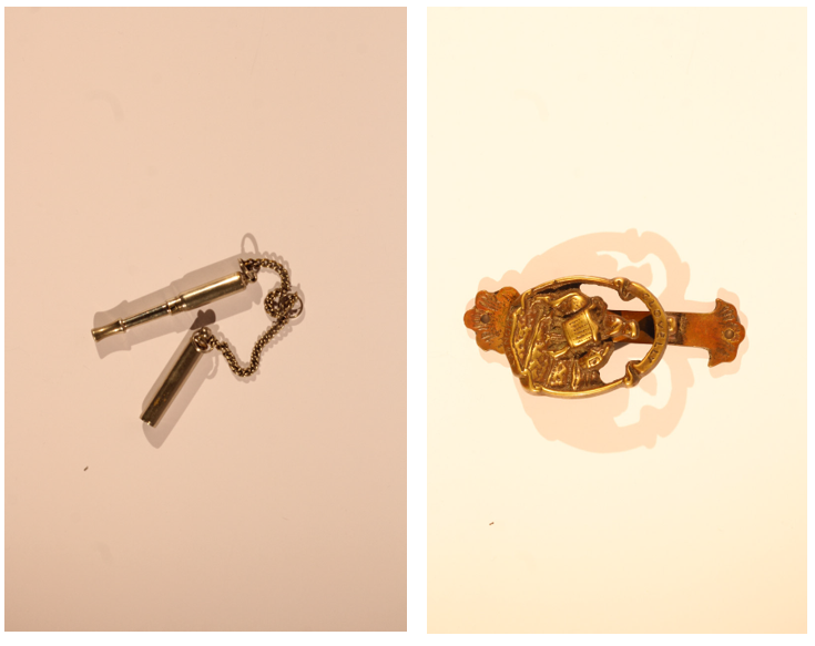
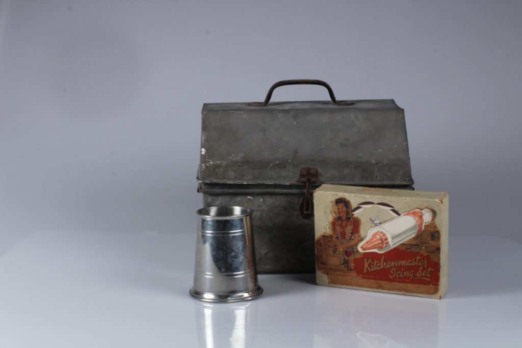
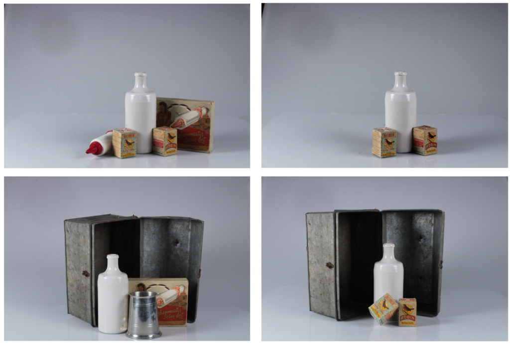
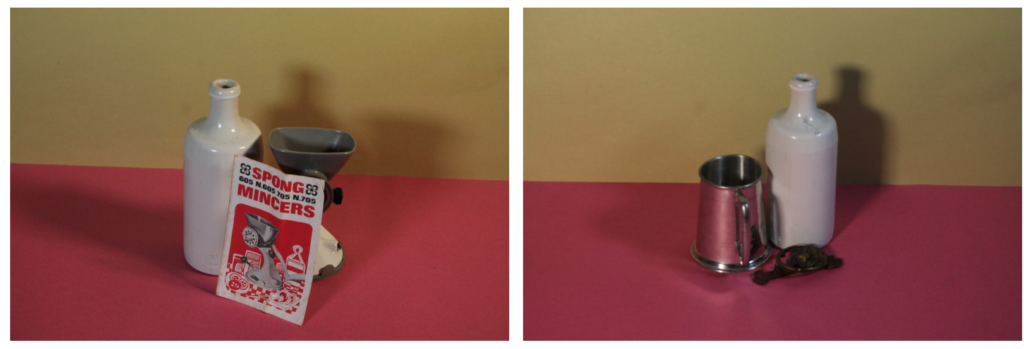
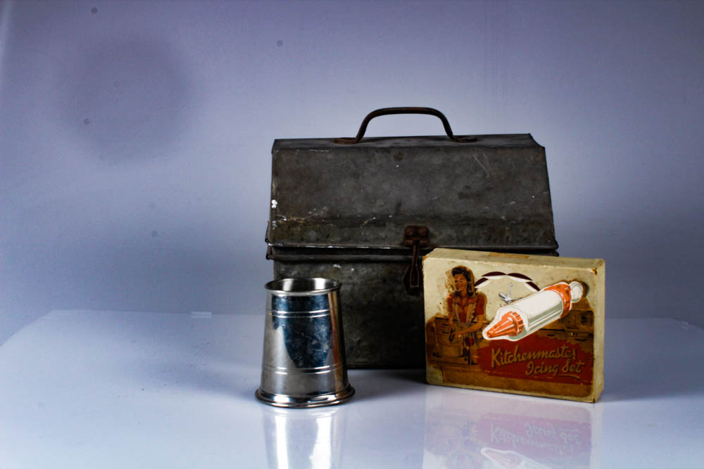
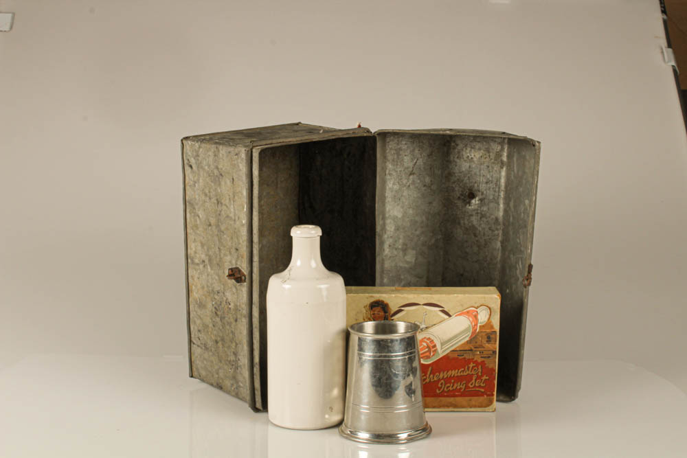
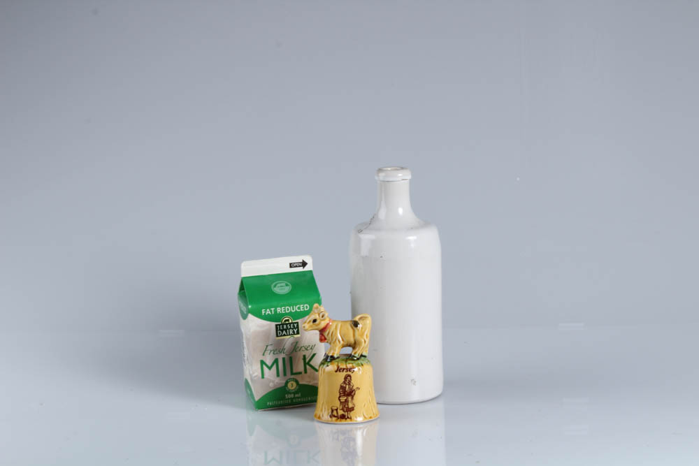
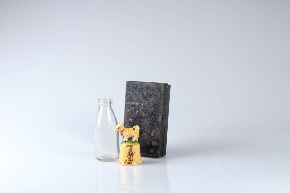
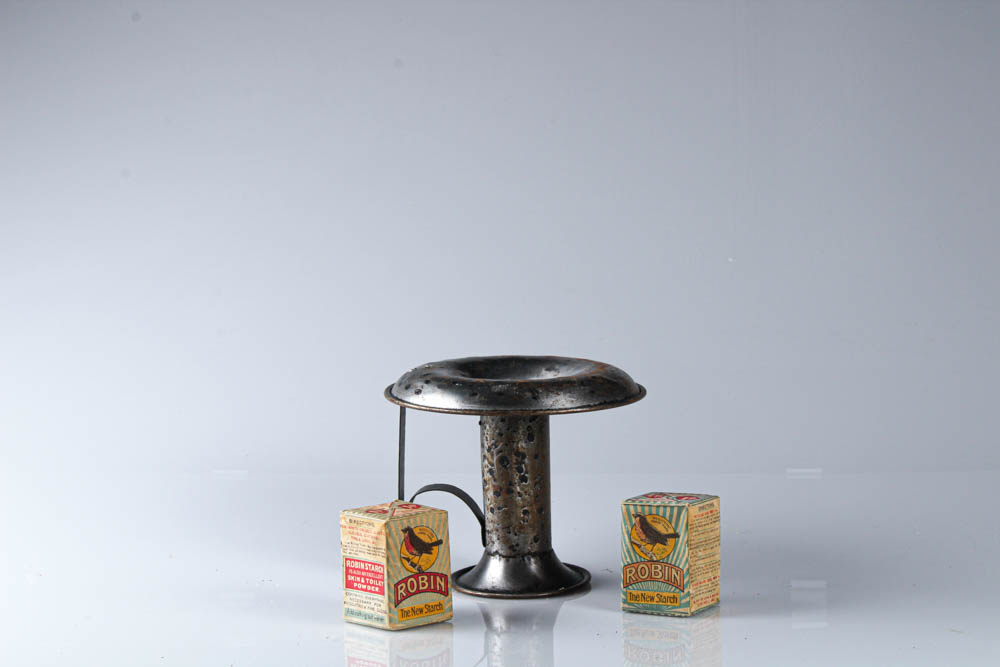
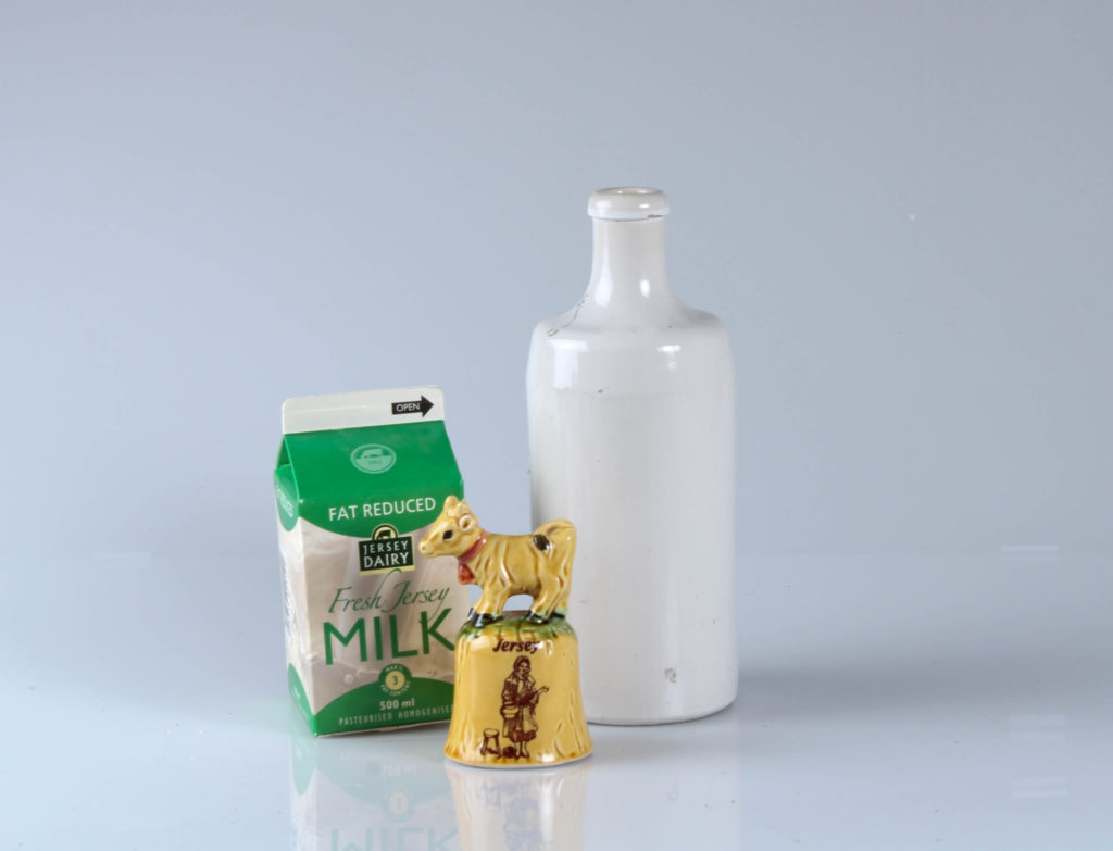
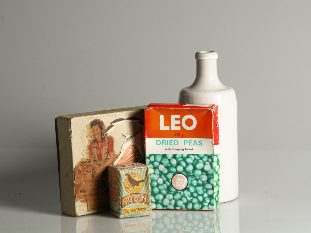
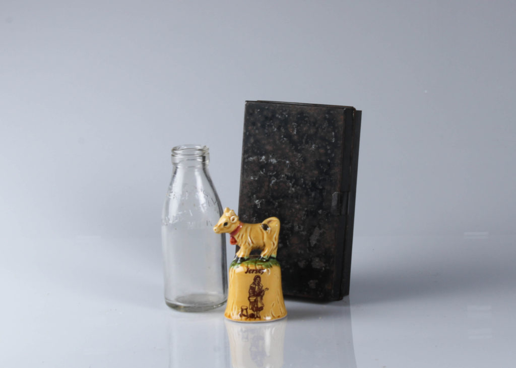
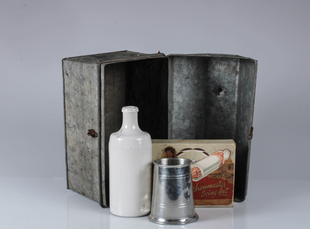
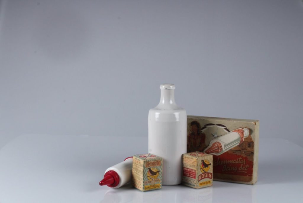
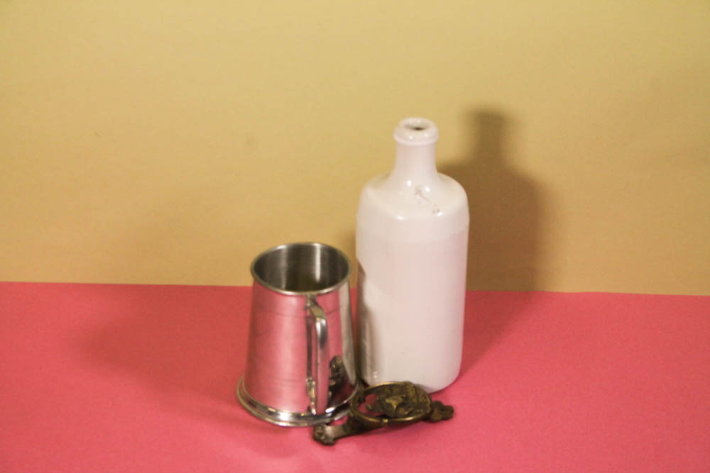
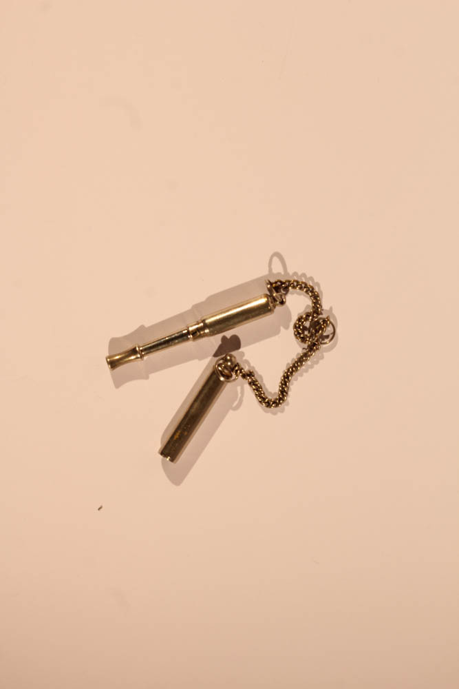
We went into the studio and took some photographs of objects provided by school and the Jersey Heritage. Three different stations were set up, one camera positioned at a birds eye level, one with a white background and another with a pink and yellow background to create a horizon type effect. We could alter all the settings, but mostly the IOS and stutter speed, when the shutter speed is increased, images become darker as there is less time for light to enter the camera when taking a photograph.

This image has an empty alt attribute; its file name is image-147.png

IMAGES

This image has an empty alt attribute; its file name is image-149.png
This image has an empty alt attribute; its file name is IMG_5221-1024x683.jpg

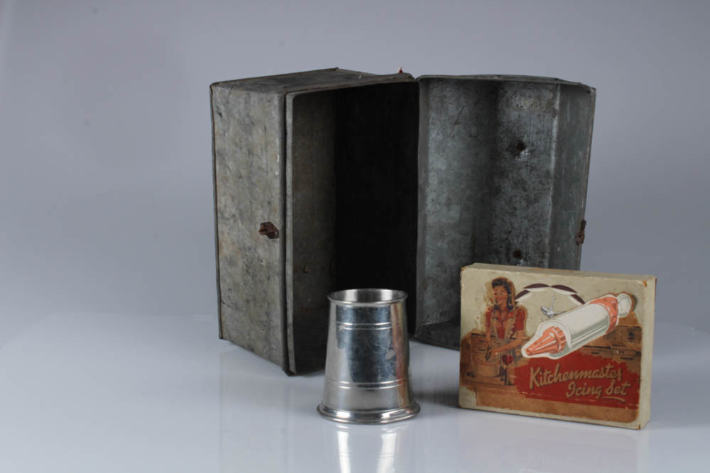
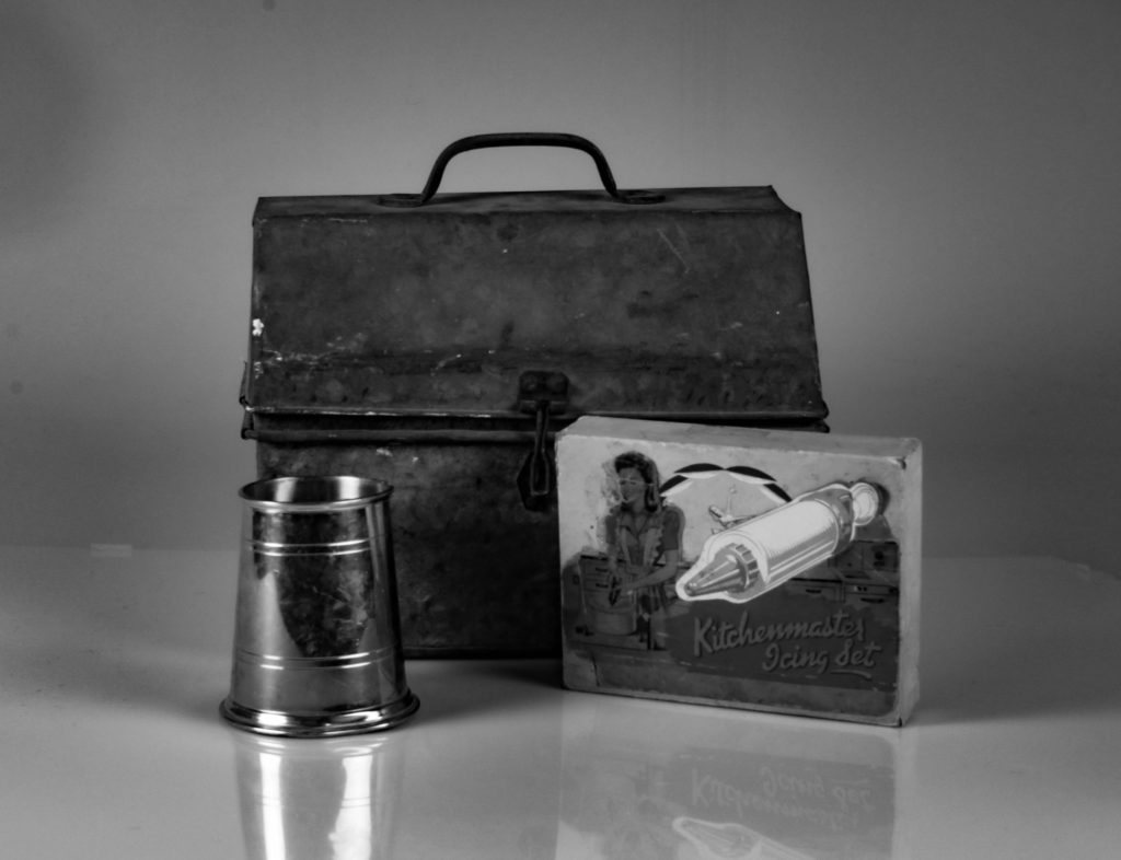
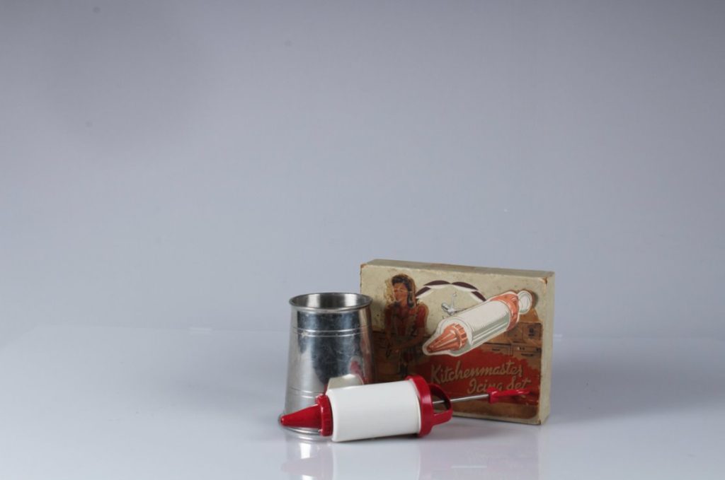
I think this image is somewhat effective as it’s unintentionally off centre but I ended up liking this image as the different objects create texture. The old metal of the box versus the shiny metal on the tin can, and against the cardboard box.

This image has an empty alt attribute; its file name is Screenshot-2021-10-29-at-14.55.41-1024x698.png
This image has an empty alt attribute; its file name is image-3-1024x683.png
This image has an empty alt attribute; its file name is Screenshot-2021-10-29-at-14.44.33-1024x349.png

EDITING

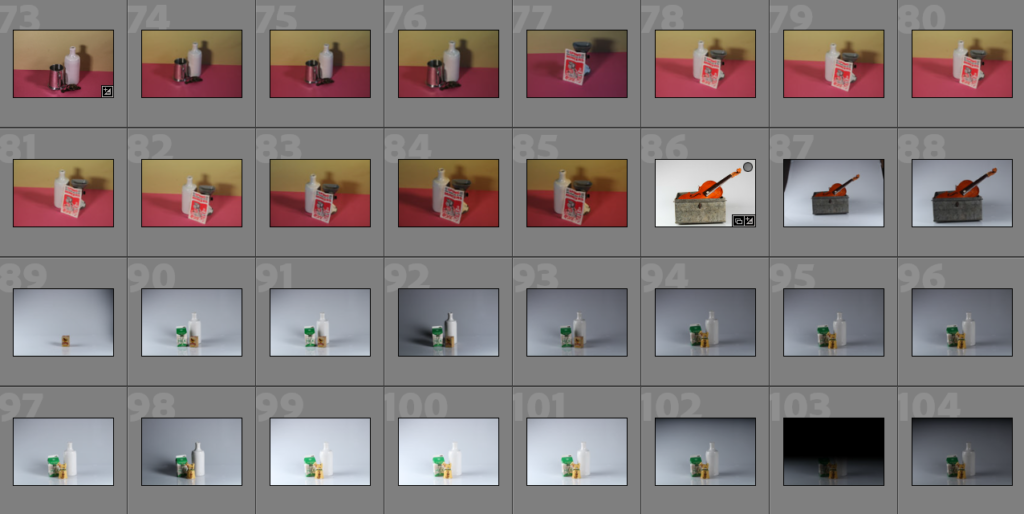
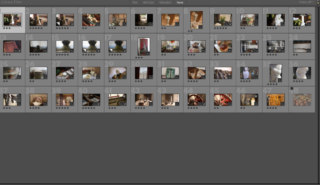
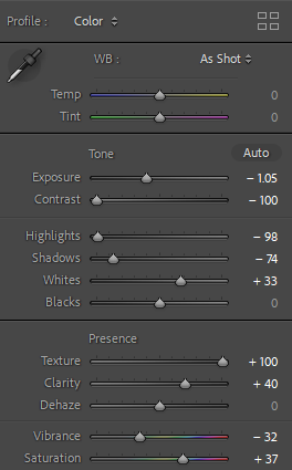
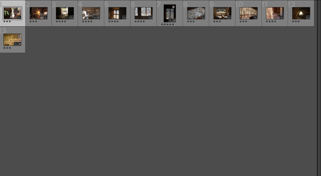
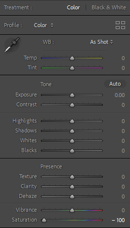
Below I have added in a contact to show how the images are displayed in Lightroom and how this organisation helps me editing with blog posts easier and images easier to find and therefore to export. In addition, I like this layout as the thumbnails of the images can be increased or decreased to make the larger and more visible, this means that I can locate my final images easily and this aids with creating galleries in blog posts.

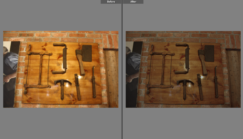
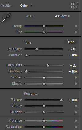
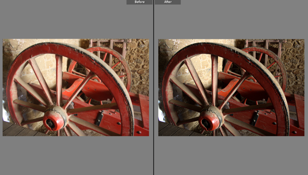
Here I have selected some of my best images from the still life photoshoot to edit, and I have chosen the images with the best shadows, meaning they have more depth and contrast than some other images. Furthermore, these photos are the ones that turned out the most successful without editing- meaning the objects are placed in the centre (unless its otherwise intentional), the lighting is bright and the camera is focused. During this photoshoot, in groups we took turns adjusting the lighting, ISO and shutter speed along with other functions.

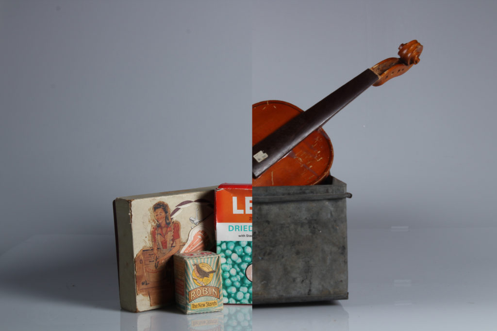
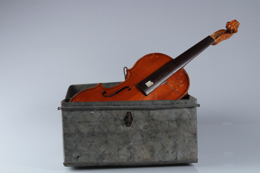
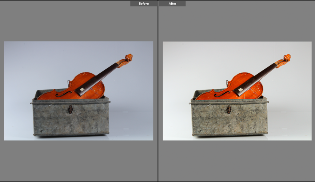
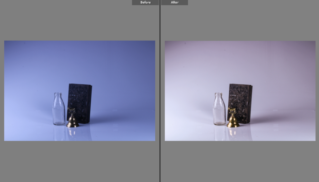
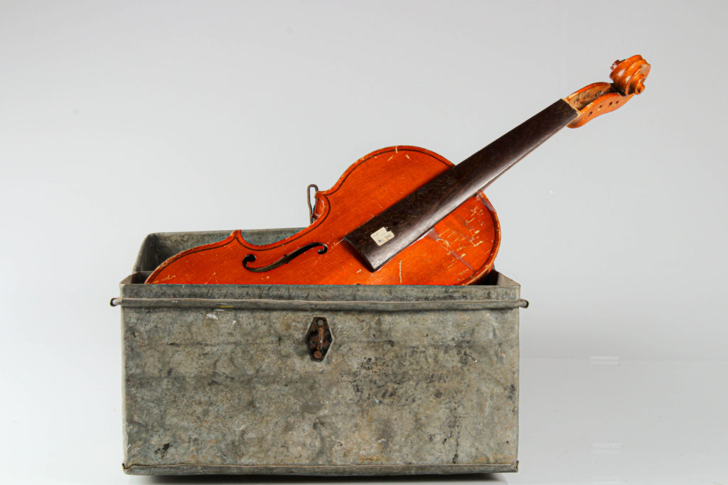
Below I have selected 4 of my final edited images as i think these are the most aesthetic and the edited has helped adapt these images the most. In addition, I think that the image of the guitar is one of my best as the the bright orange next the stale grey creates contrast in colours and tones along with the hardwood violin against the metal. I also like how the clear glass milk bottle against the completely opaque objects creates a distinction between the different objects, meaning the solid objects are more present in my final image. These images illustrate how we can take photos but also make them, as the editing can make the images more eye catching, or the original photograph can already be of a good quality.

FINAL EDITED IMAGES

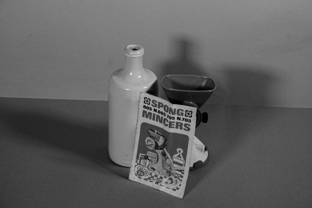
I have selected and edited these 6 images as my final ones as in my opinion they have the best compositions , and the use of three different objects in a couple of these images demonstrates how an odd number of objects is effective when taking still life images. Furthermore, I like the contrasting colours in some of these images as the oranges and green make the images come to life, making them more eye-catching. I have one image monochromatic to show that images with originally limited colours can look more aesthetic when edited in this way.

Still life Objects (Part 2)

Mary-Ellen Bartley

Research –

  • Born in New York, 1959.
  • Her photography is known to have an abstract take on it.
  • Her work is found in numerous exhibitions across the USA.

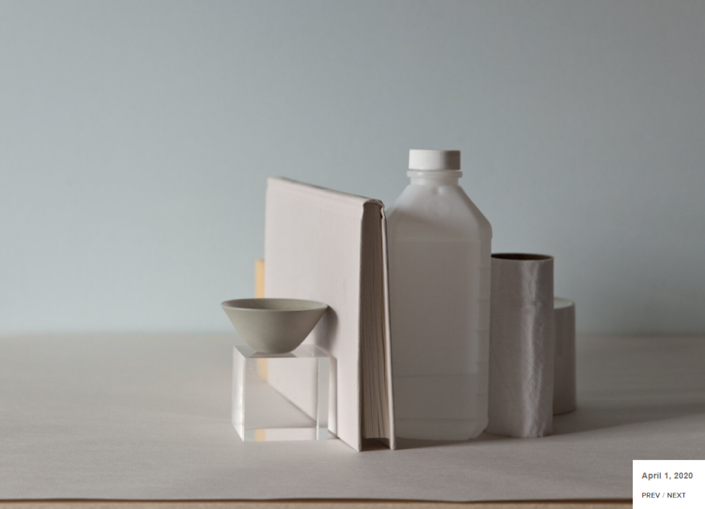
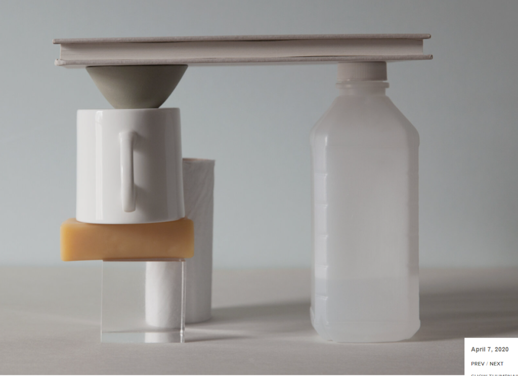
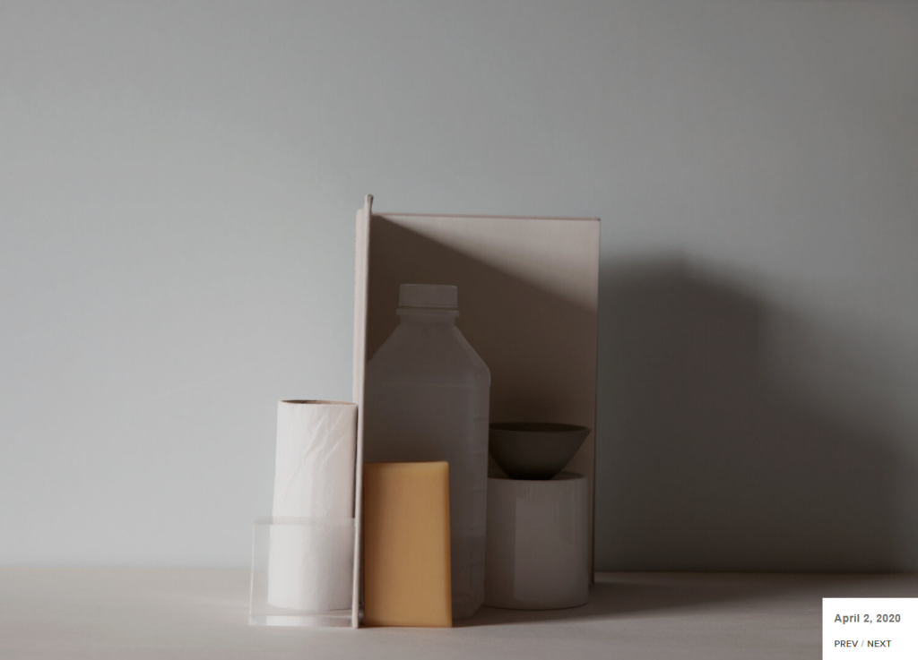
“7 things again and again” is a project which Bartley made where she uses the same 7 various objects over and over again which are photographed in different ways.

Here are some examples underneath of some of the work she has created:

I like the way that Bartley has grouped these items together because the soft, natural lighting highlights their colours well and they don’t get lost in each other as shadow which has been made from the book creates a contrast against the white highlights. It looks as if the book is trying to hide some objects inside to protect them or keep them as well.

Photomontages

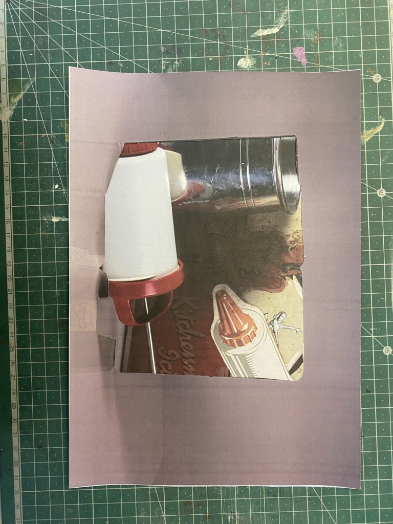
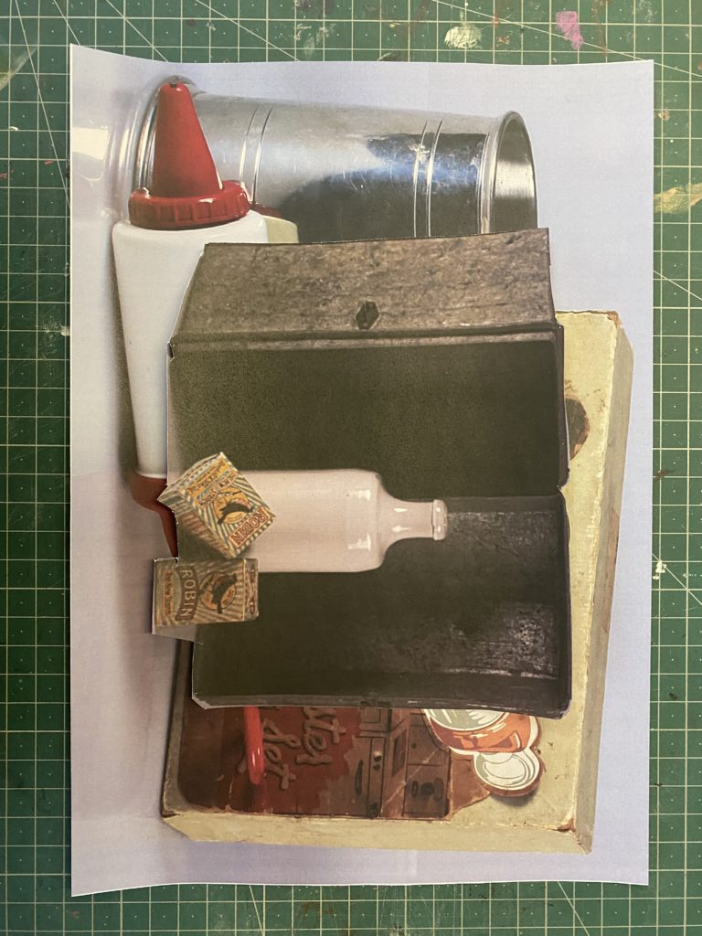
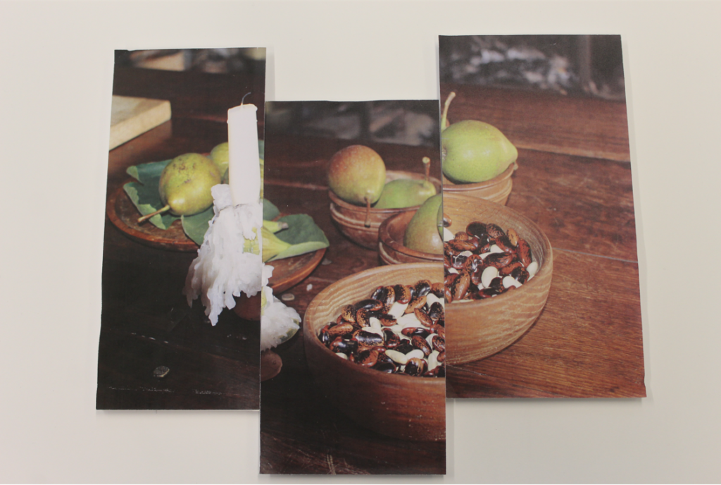
Here is an example of Bartley’s photomontage which she created that I will take inspiration from when making my own. I will create it by using the previous photos of 7 objects which I have taken from my favourites on Adobe Lightroom, printing them out and ripping them apart then sticking them back together onto a sheet of paper.
4 photos that I will use –

Edits –

For this edit, I used the pre-set filter “Ch04” which came under the “Cinematic” Style section which gave it this green, vintage filter which I really like as it is really unique and different and would create a cool toned contrast against the other pictures. Then I cropped it and straightened it so that the objects were centred and straight.
For this edit, I used the pre-set black and white filter then changed the exposure and shadows a little bit to make the darker colours more defined and changed the highlights, contrast and whites to make the white highlights to stand out more. I also cropped it so that there was a lot of negative, white space which was drowning out the objects in so that they wouldn’t get lost.
For this, I edited it so that the colours were more vibrant on the object, which make the metal object shinier and slightly more exposed which I like. Then I cropped it so that image became centred in the middle of the photo and not have as much negative space which drowns it out.
For this edit I simply cropped it which made it become centred as I like how the lighting was already on the object as it is quite dark compared to the other photos, which will create a dark toned contrast.

An experiment of my work similar to theirs –

This image has an empty alt attribute; its file name is 5AE30929-C5AE-41A6-B988-FE34D64A6984-edited-1-scaled.jpeg

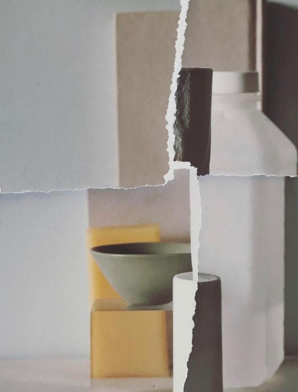
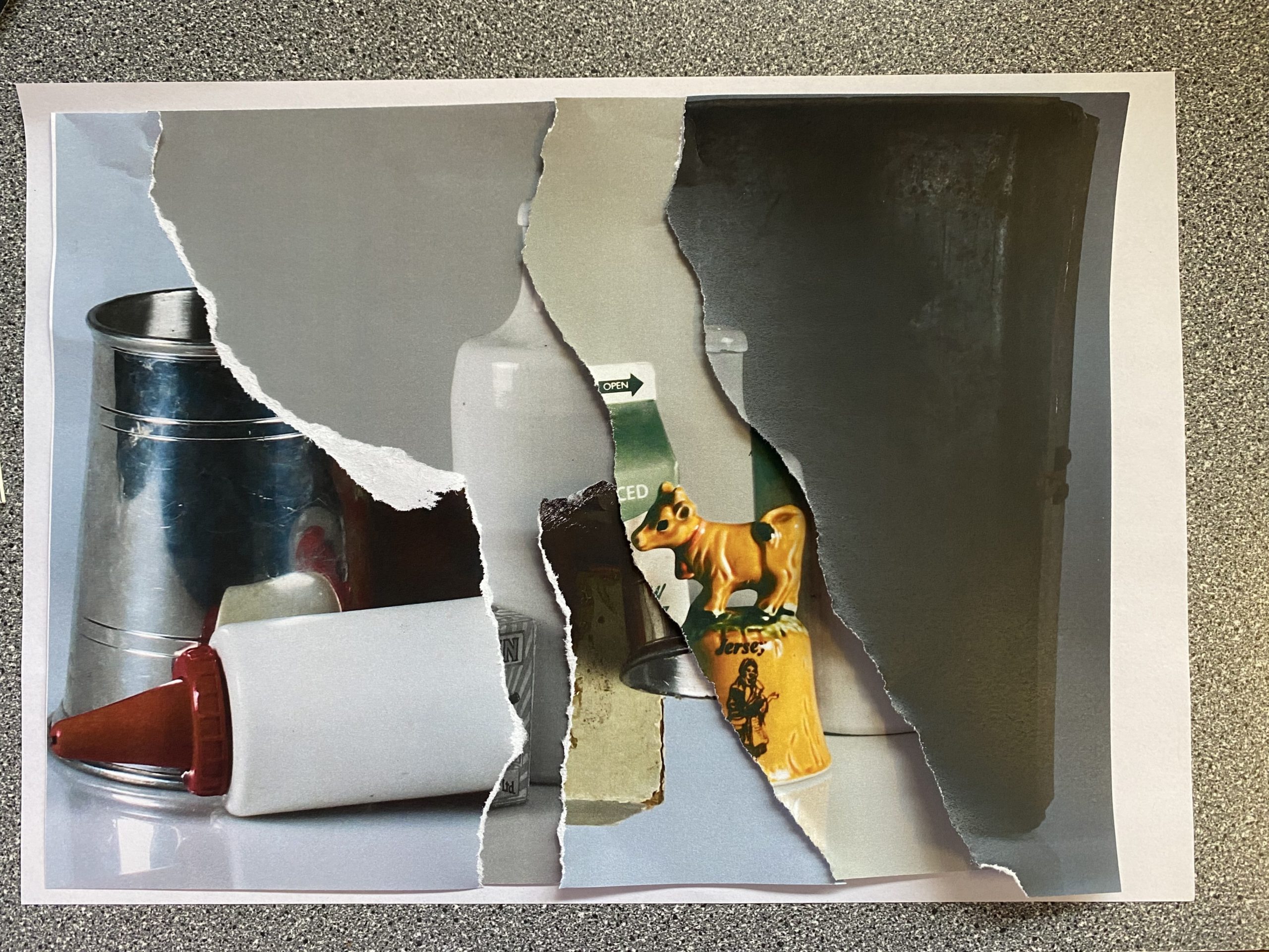
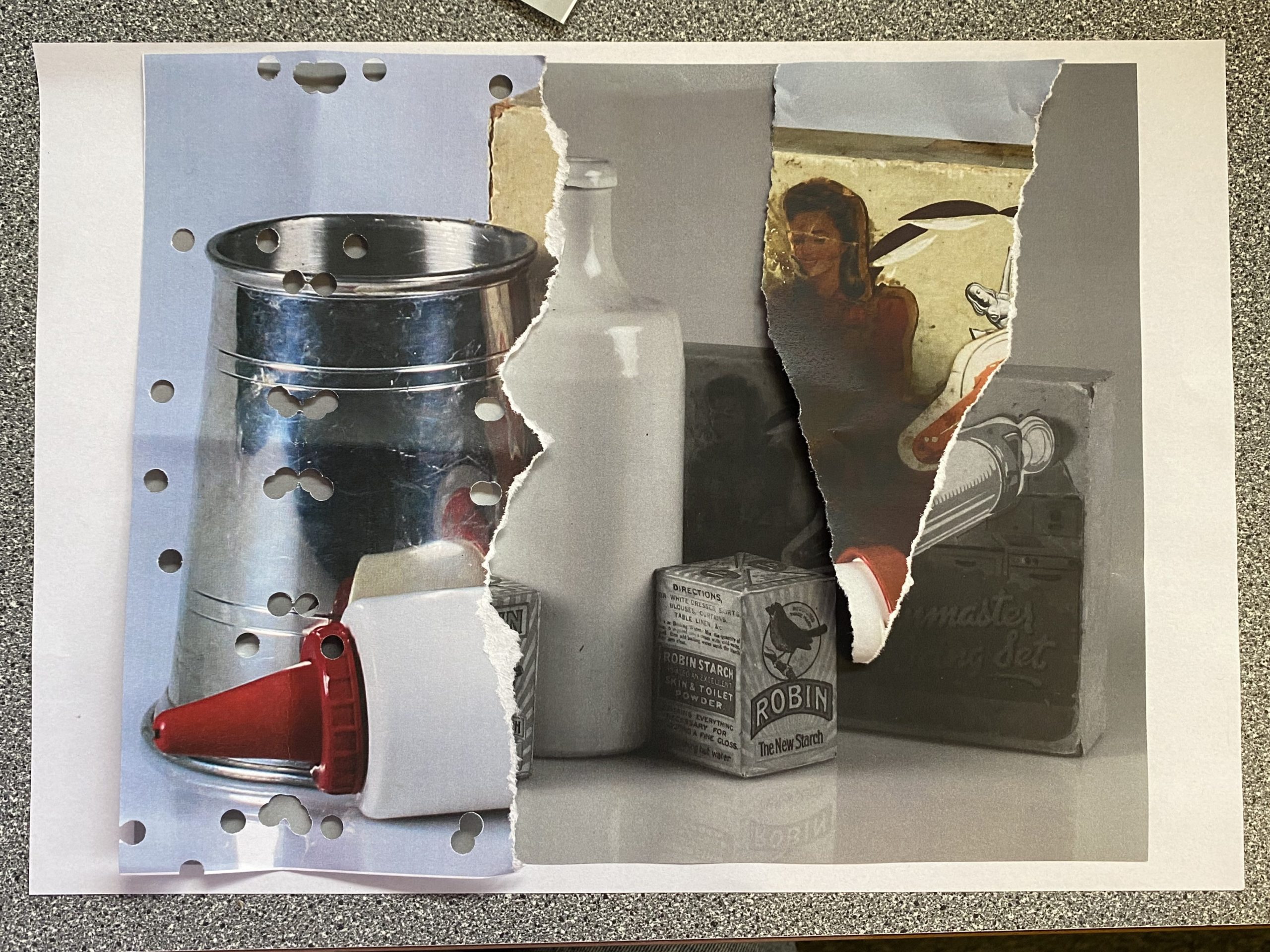
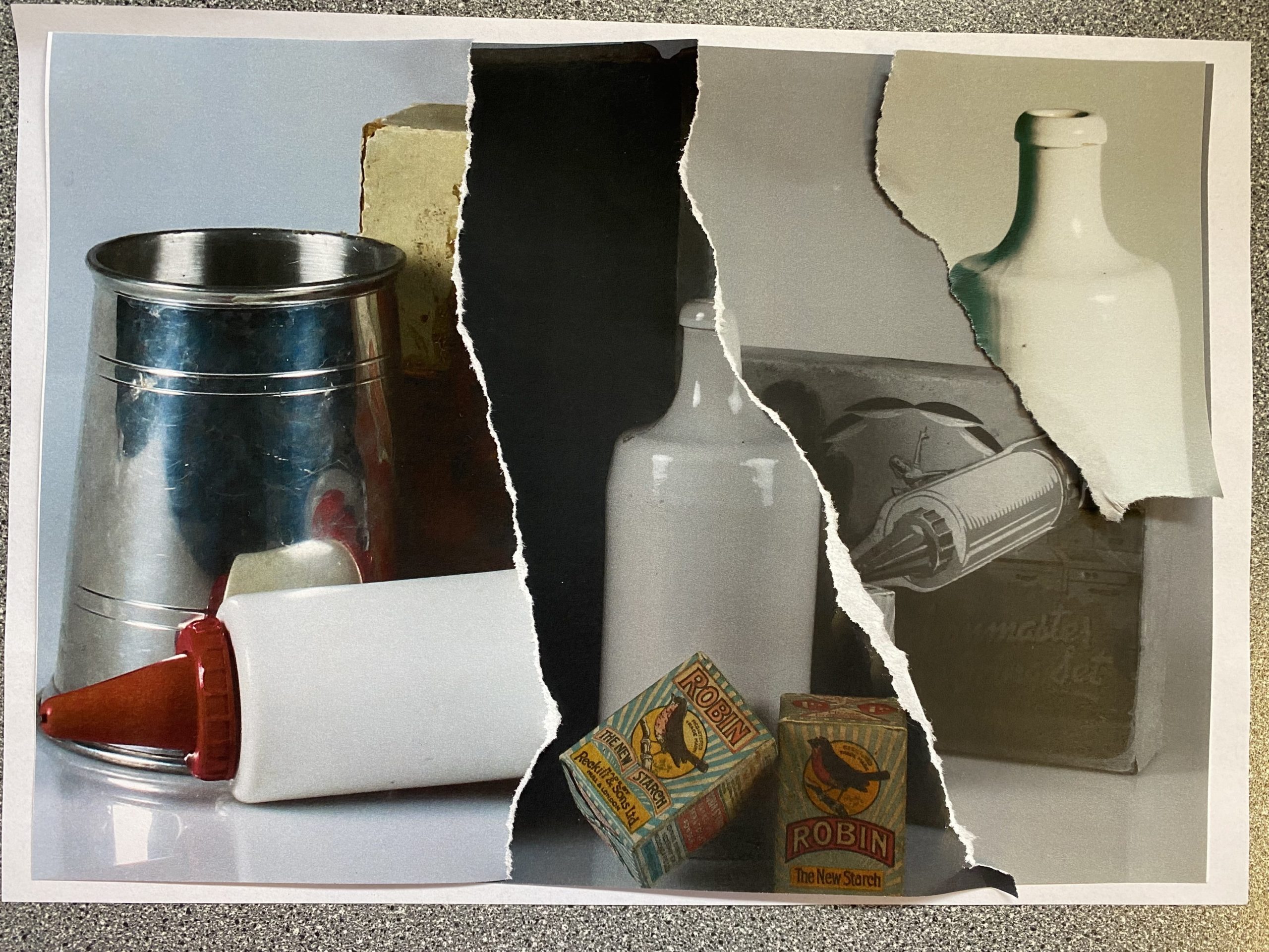
Here are the images which I created inspired by Bartley’s work. In my opinion I really like how these turned out because they all show different the different filters of the images printed which I edited on Adobe Lightroom, which makes them work well together as they create a good contrast against one another with the lighter and darker tones.

My favourite edit would be the first one because it has a 3D element to it, which I created by not sticking them down, I really like it as it shows the different layers and images which I have combined together that I have produced through me tearing and raping the images which is similar to Bartley’s work. I enjoyed creating these and using Bartley’s technique of these type of photomontages and would use it again in the future.

Letha Wilson

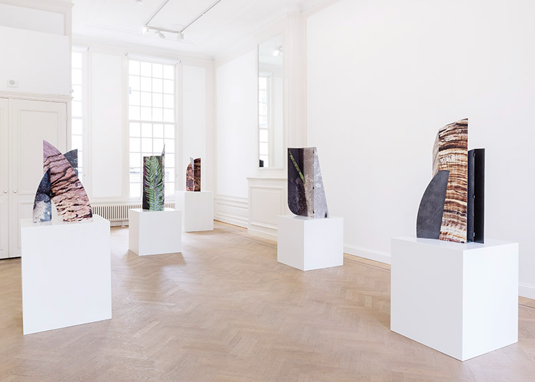
Example of her work –

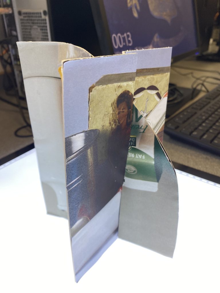
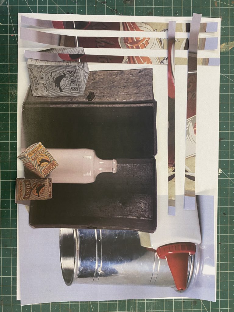
I will be using the same 4 pictures from before to create these interlocking cut outs, like Wilsons work, I will experiment with different filters on Adobe Lightroom on a couple of them to create a contrast when I edit them.

My work inspired by her –

For my first attempt this is how my sculpture turned out and to create this I used a Stanley knife to size and cut the pictures so that they would fit on to the mountboard which I also cut to be in a specific shape, which is unusual but works quite well as the lightbox underneath helps to illuminate it. Although, I think that the pictures get lost and aren’t seen clearly which isn’t how I wanted to present them.

Therefore If I were to do this experimentation of Wilsons work again I would use foamboard, making the shapes more precise and not as messy then I would print the pictures out more so that they would be bigger are clearer to see, catching your attention better.
Other experimentation of photomontages

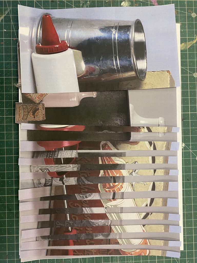
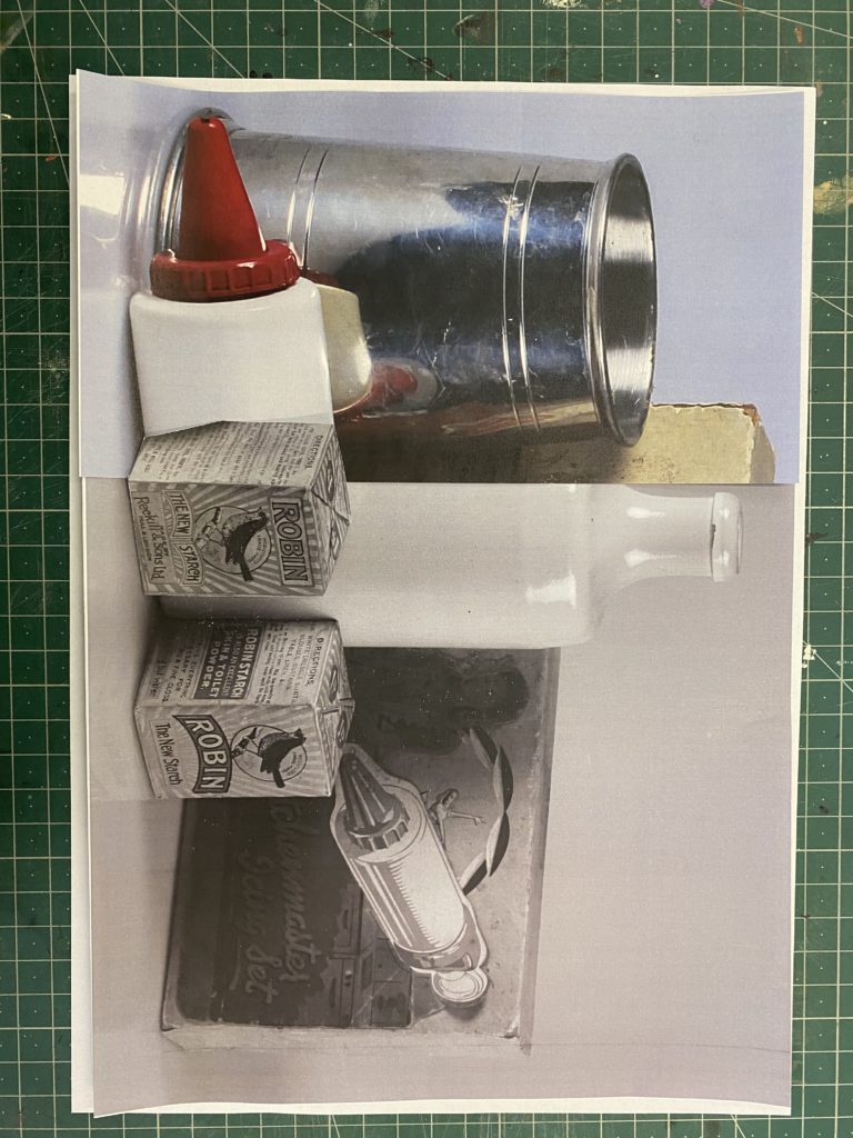
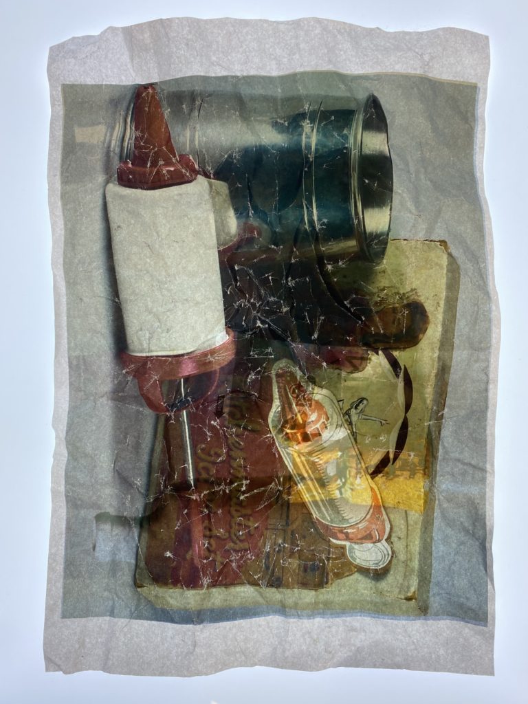
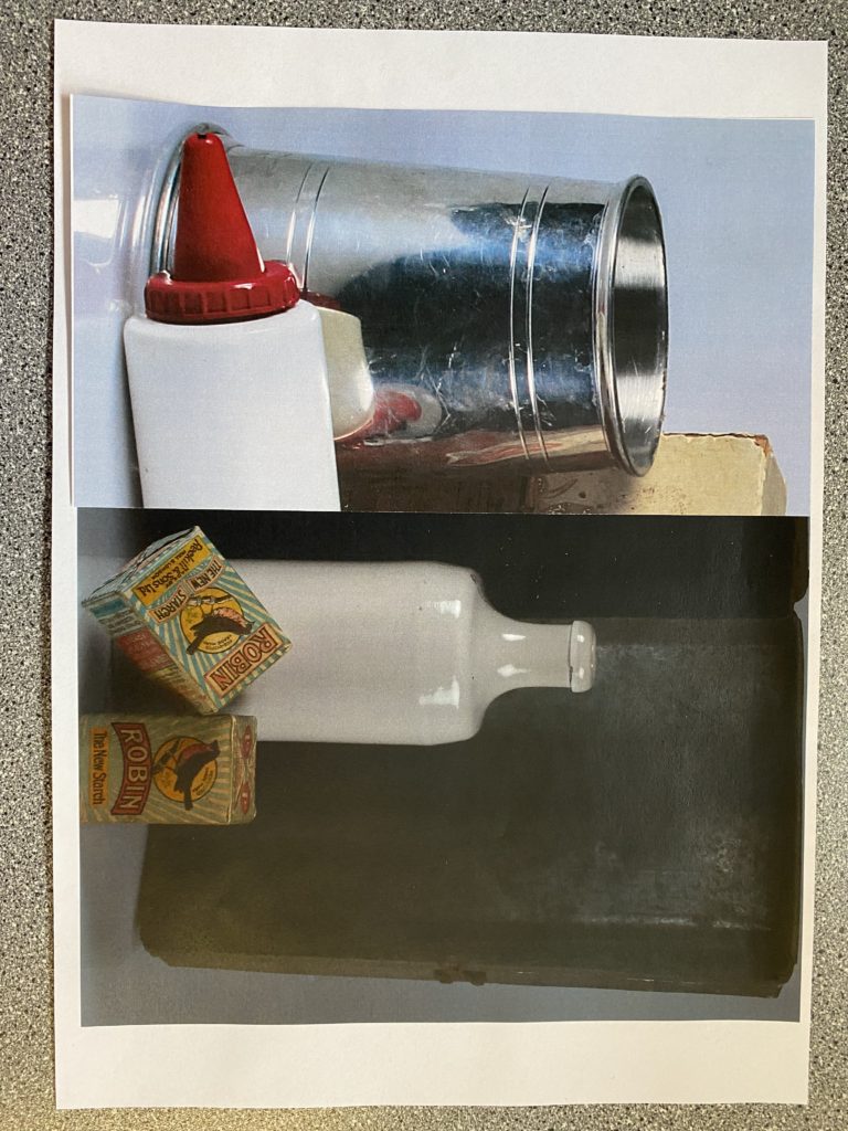
I also experimented with different variations of photomontages while editing by hand, I really like how some of them turned out as they are really unique and individual.
For the photos above, It shows how many variations of transforming photographs through techniques which I used in the caption.
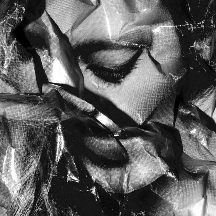
I think that there a few successful ones such as the crumpling technique where it manipulates the photo which creates this old, crinkled look to a photograph that makes it look quite vintage, due to the objects which are used in it, and as if it was taken a long time ago. Another technique which I enjoyed experimenting with was the slicing technique as it makes the two photos look as if they have been woven together as you can see how the pieces all gradually go together throughout the photo, which resembles a puzzle.

Photo Montage

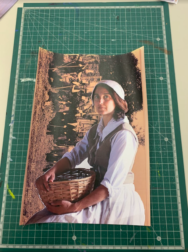
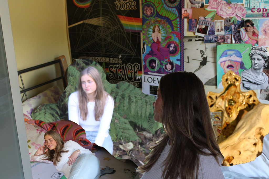
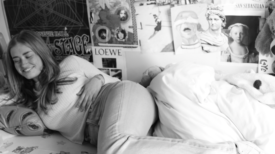
For this project I printed out various photos from a previous photoshoot and used the guillotine, craft knifes and foam boards to make different photo montages. Photo montage is  is the process and the result of making a composite photograph by cutting, gluing, rearranging and overlapping two or more photographs into a new image. Sometimes the resulting composite image is photographed so that the final image may appear as a seamless physical print.

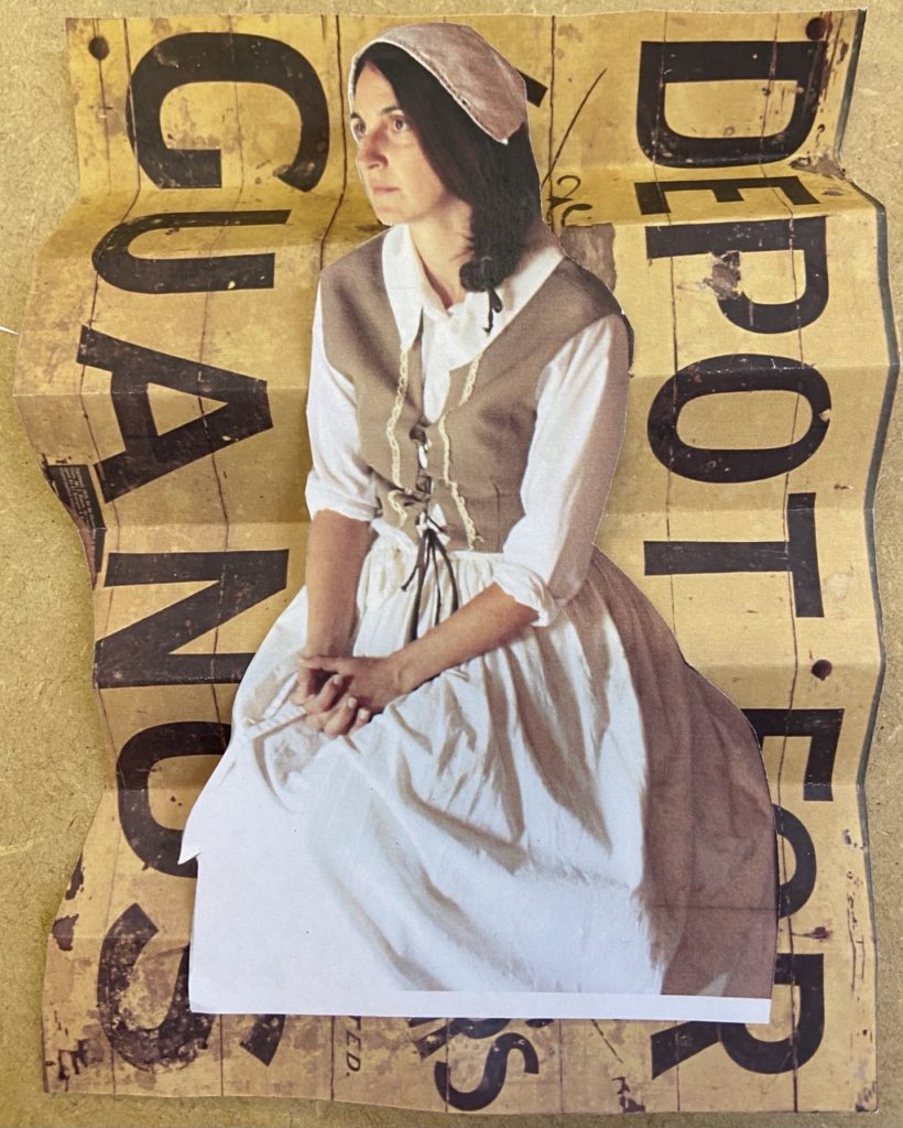
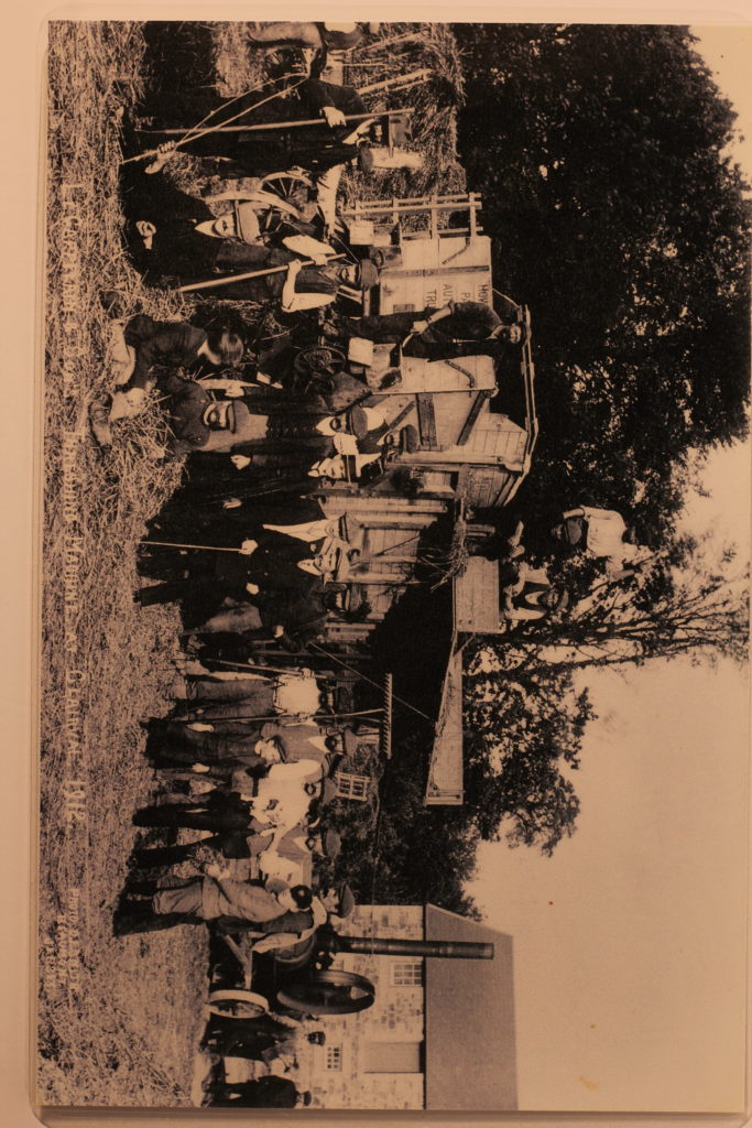
Once I printed these photos out I used a craft knife to cut out the women in my portrait and placed both over a the background photo of old workers from Hamptonne given to us by Jersey Heritage. These will be

For this second piece I used a photo I took at Hamptonne which I then cut into three so that I could re-arrange them after mounting them onto foam board.

Final Pieces

hamptonne interiors

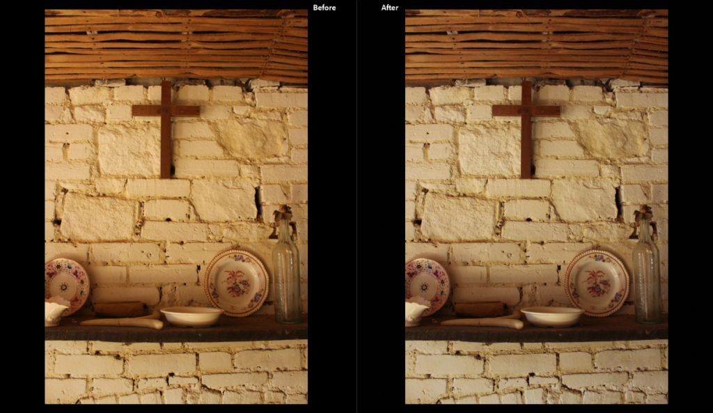
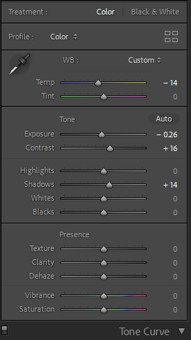
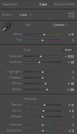
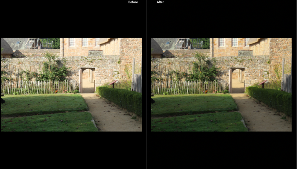
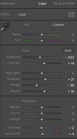
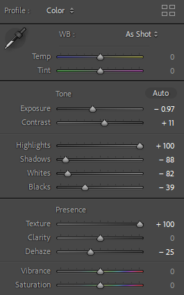
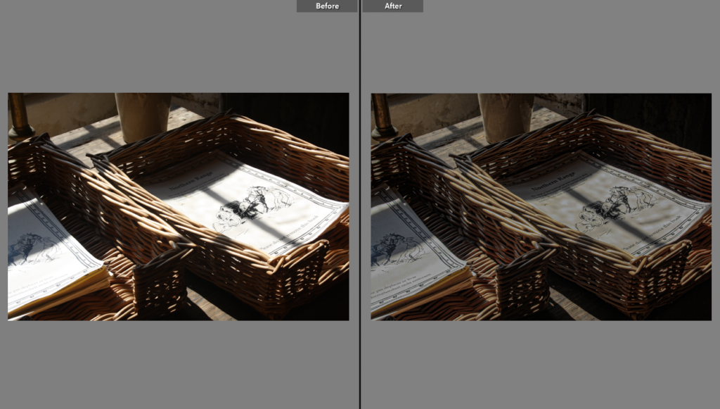
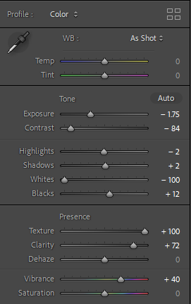
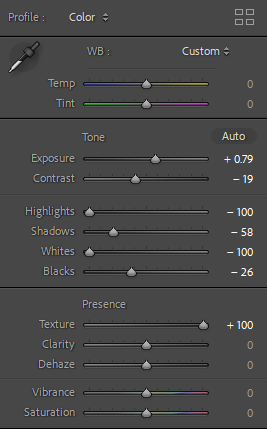
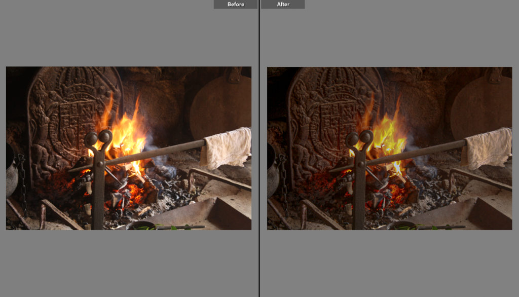
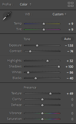
In this image I tried to reduce the yellow tones so I turned down the photo temp, I also turned up the shadows because I didn’t like how dark the objects on the shelf were.

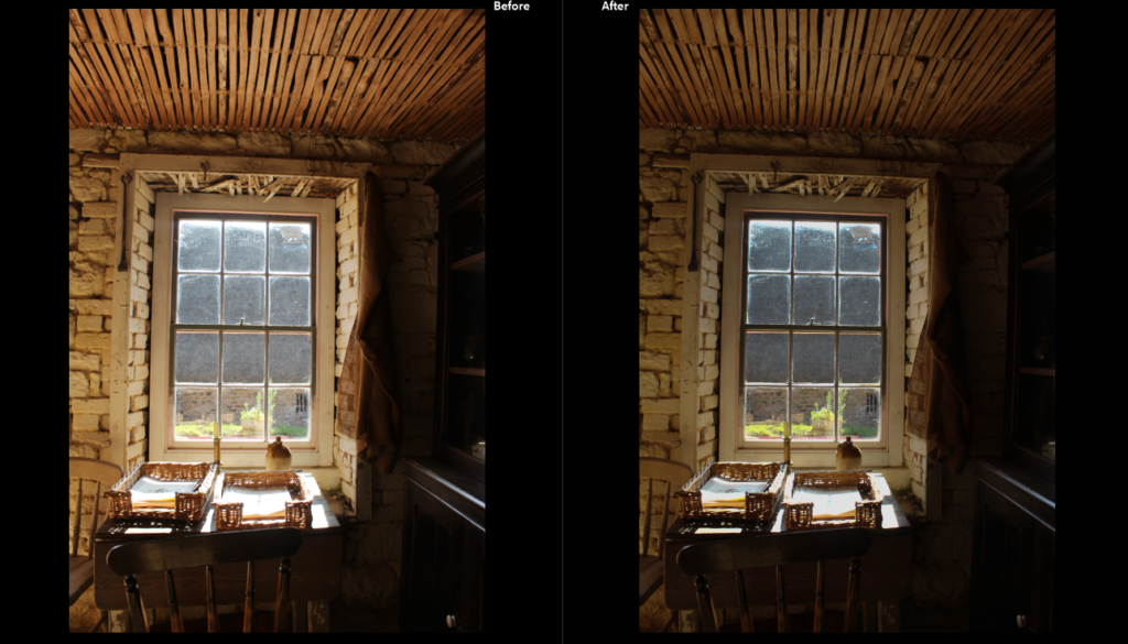
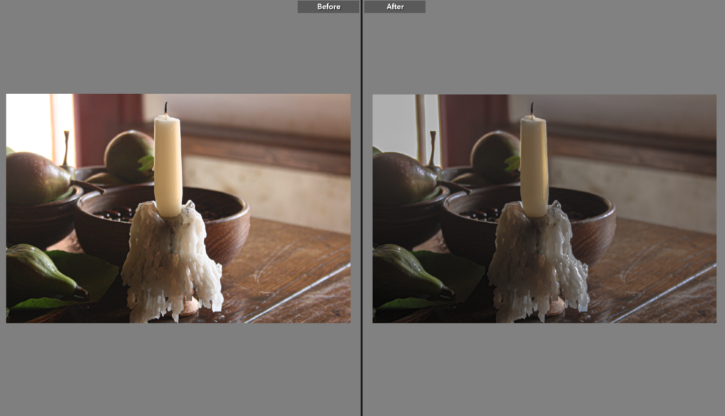
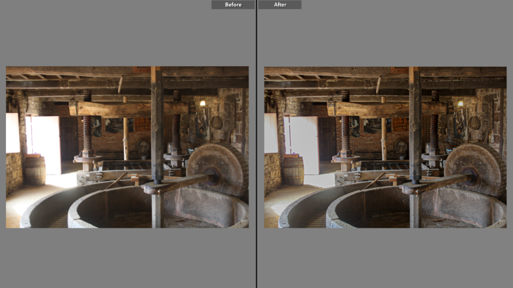
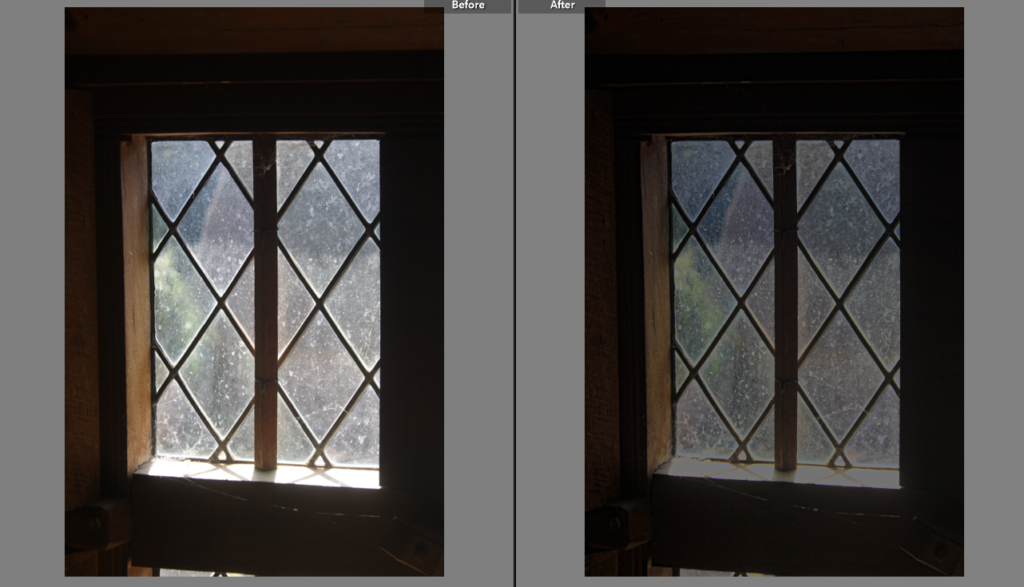
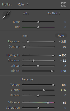
I wanted to make use of the natural light coming in through the window in order to frame the objects on the desk and to make the greenery outside the window more clear so I lowered the exposure to make the surroundings beside the light darker so the light is more concentrated.

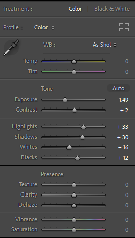
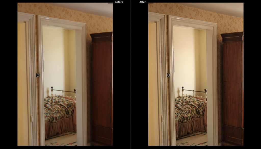
In this image I really liked how the doorframe framed the bed and made it the centre subject. I also really like the shadows and light in the image so I tried to make the shadows more visible.

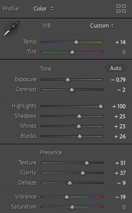
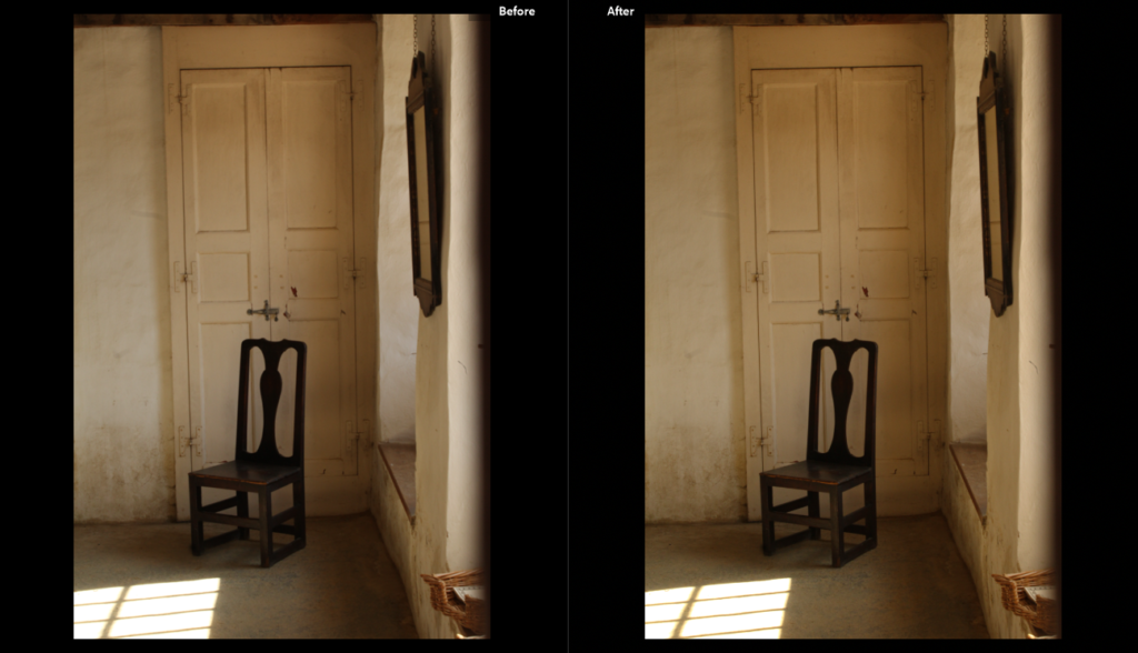
This is one of my favourite images so I tried to do the most minimal editing for this image because I really like how the walls and light almost frame the chair in the middle. I tried to edit the image so the natural light was more included.

hamptonne exteriors

HAMPTONNNE FARM BUILDINGS

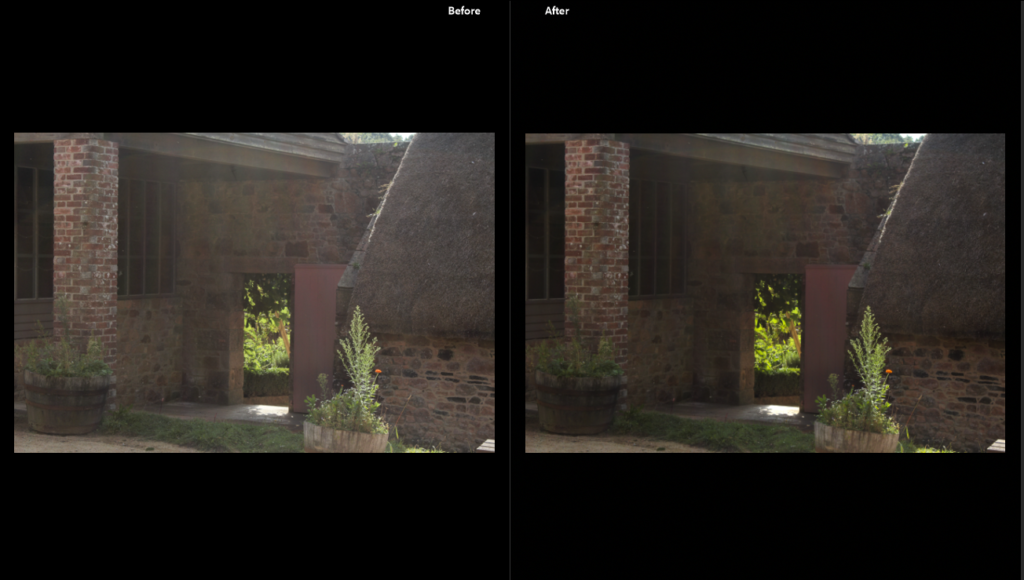
I edited this image so the natural light in the photo was highlighted, this involved turning down the exposure and raising the contrast so the main subject (the doorway) and the plants looked more significant in the photo.

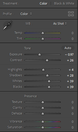
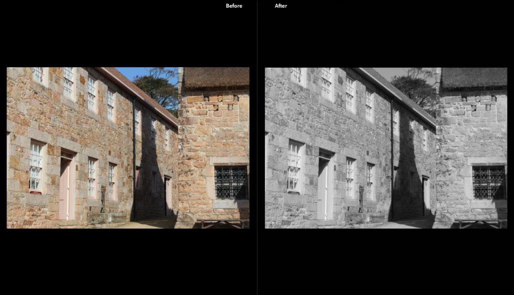
I changed this photo to just black and white because I really like the contrast of the shadow between the two buildings and how the two building almost look attached due to the perspective the photo was taken from.

In this photo I really liked how idyllic the setting looks so I edited the image to have brighter colours to create an almost “dreamy” haze. I also really liked how the shadow stops just before the door and wall- bringing more attention to the top of the image- so I turned up the contrast so the shadow would be more exaggerated.

Still life Research

Walker Evans

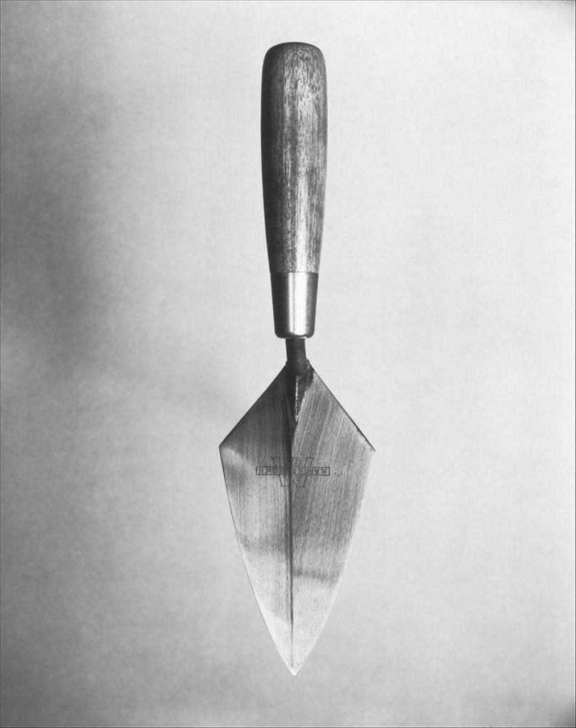
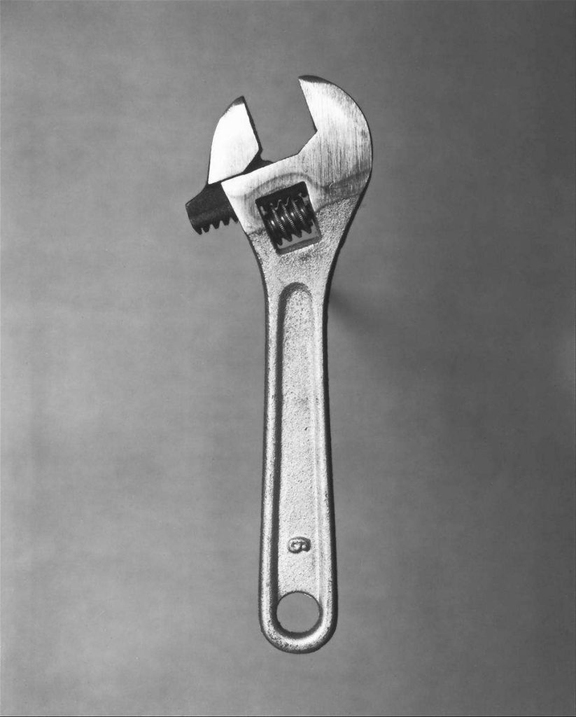
Walker Evans was an American photographer who was best known for one of his portfolios ‘The Beauty of the Common House Tool’ where he photographed a variety of household objects using framing and lighting in order to create a visually appealing set of photos.

His work was consistent – each object being monochromatic, centred and taken from a birds eye view throughout the whole portfolio, accentuating the symmetry, or in some cases lack thereof, of each tool. In order to eliminate the objects’ shadows, he’d lift the object off the backdrop by using small balls of tape, helping the object stand out against the background despite the image being black and white.

Darren Harvey-Regan

Darren Harvey-Regan is a British photographer who was heavily inspired by Evans’ portfolio, so much so that he created montages of some of Evans’ work before sourcing similar tools and split/cut these photos in half in order to match similar looking images together, creating a new photo for his portfolio ‘Beauty of the Common House Tool, Rephrased‘.

For example:


A trowel and scissors have been combined together in order to create one final image

In Harvey-Regan’s work, it’s clear that he’s been inspired by Evans, making sure to take care with the lighting in order to eliminate the shadows whilst keeping he objects centred therefore emphasizing what each tool looks like. Unlike Evans, he chose to use a plain white background, most likely to make splicing the images together easier and make the final result more coherent.