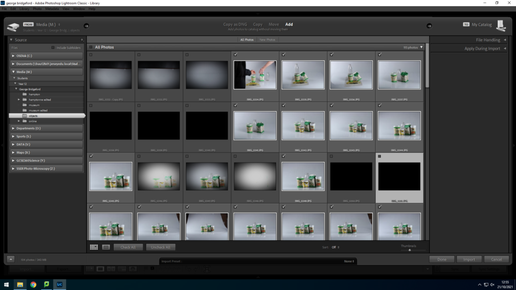
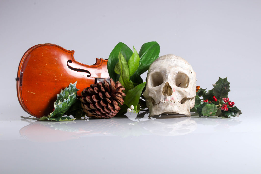
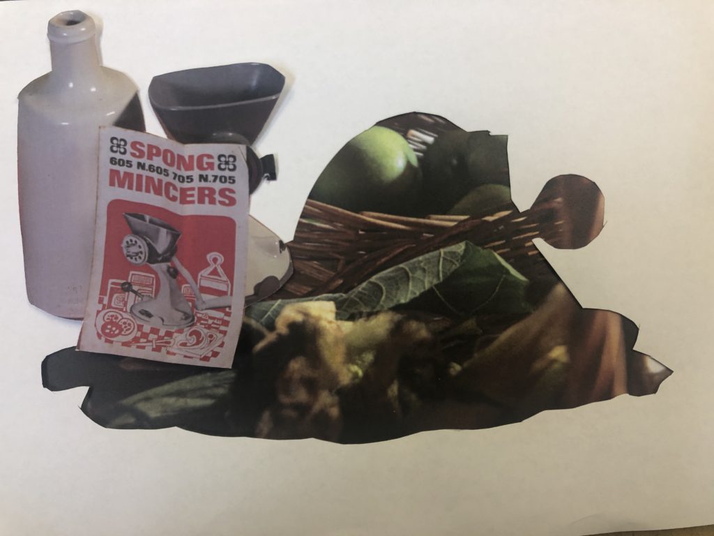
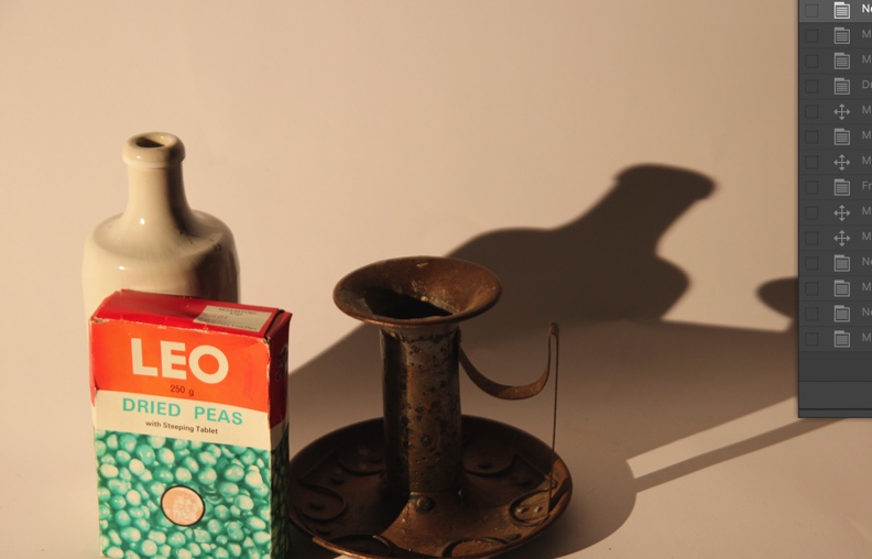
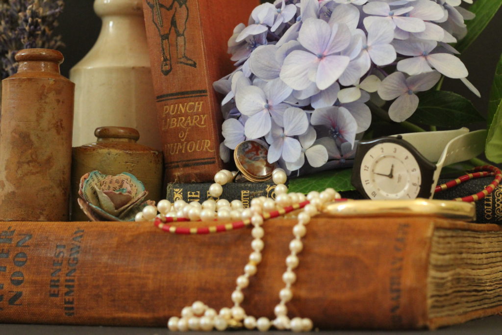
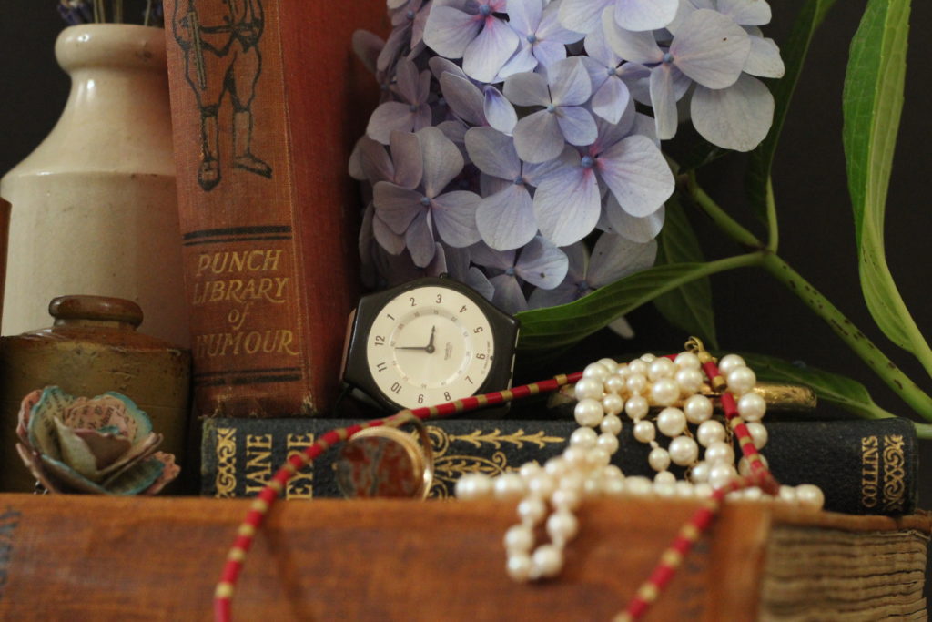
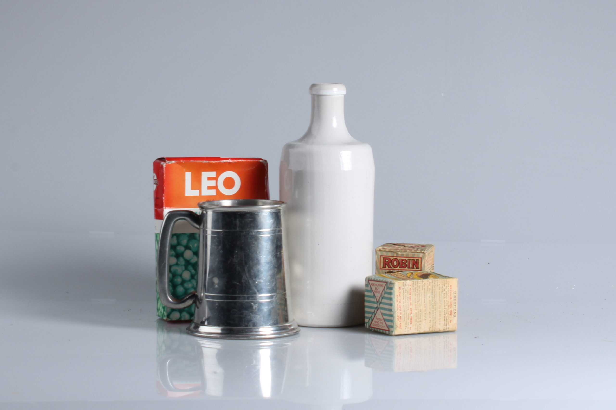
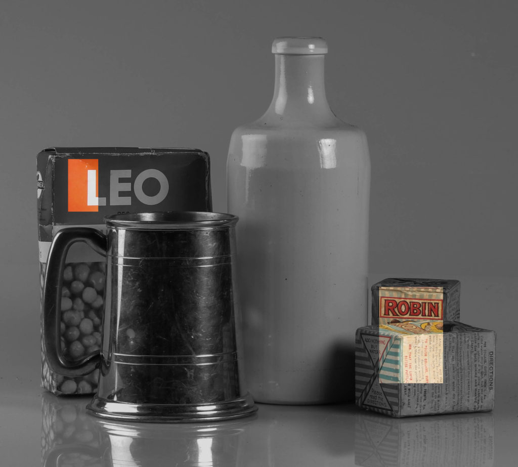
We used products given to us by Hamptonne which represented Jersey’s heritage in some way

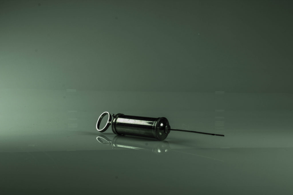
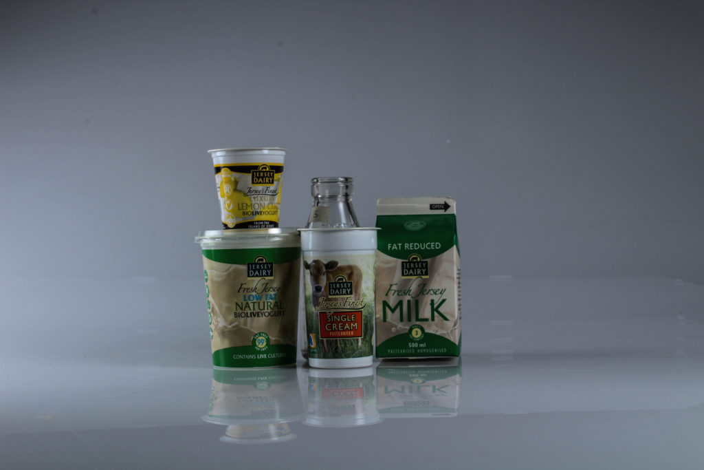
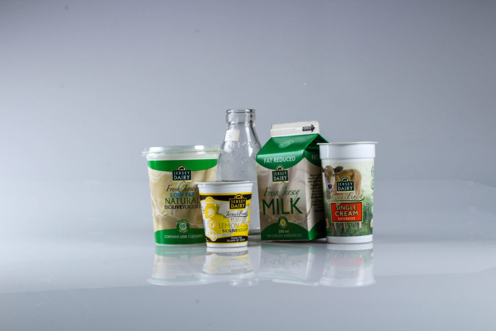
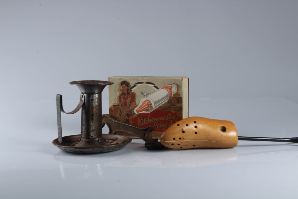
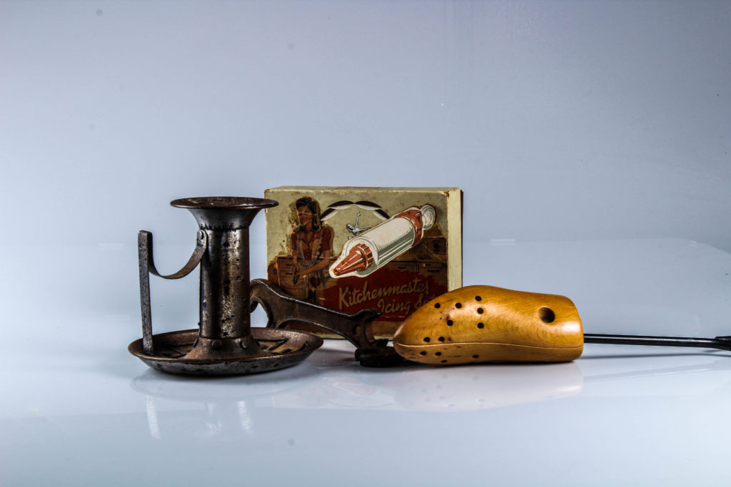
We used products given to us by Hamptonne which represented Jersey’s heritage in some way
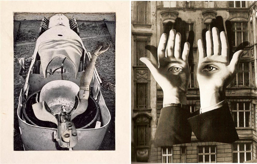

Dada photomontage
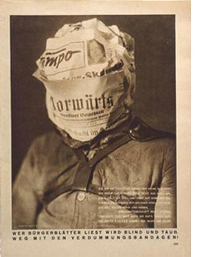
Photomontage is often used as a means of expressing political dissent. It was first used as a technique by the Dadaists in 1915 in their protests against the First World War.
Photomontage first emerged in the mid-1850s as experimental photographers aspired to create images that could rank alongside fine art. The idea of the composite image was thought to have been first proposed by the French photographer Hippolyte Bayard who wanted to produce a balanced image in which the subject was superimposed on a background that brought the two together in an idealized setting. Since a photograph was regarded as the record of truth, however, his approach attracted controversy amongst the photographic community who did not warm to the blatant misrepresentation of reality.
The first commercial photomontages were produced during the mid-Victorian era when the practice was given the name “combination printing” by Oscar Gustave Rejlander, a self-appointed artist in this new field. Rejlander started working in portraiture, but he also created notorious “erotic” artworks featuring circus models and child prostitutes. His famous Two Ways of Life (1857) combined over thirty images in a single photograph to create a moralistic allegory contrasting a life of sin with one of virtue. Showing two boys being offered guidance by the patriarch, the print initially caused controversy for its partial nudity. That objection notwithstanding, the print was a success and helped secure Rejlander’s admission into the Royal Photographic Society of London.
Dada artists are usually credited with pioneering the use of “non-narrative” photomontage. (Not without a little conceit) George Grosz reflected that “When John Heartfield and I invented photomontage in my South End studio at five o’clock on a May morning in 1916, neither of us had any inkling of its great possibilities, nor of the thorny yet successful road it was to take”. Hannah Höch, meanwhile, explained how she and her partner Raoul Hausmann came to adopt the idea, not from Heartfield or Grosz, but “from a trick of the official photographers of the Prussian army regiments [who] used to have elaborate oleo-lithographed mounts, representing a group of uniformed men with a barracks or a landscape in the background then inserted photographic portraits of the faces of their customers, generally coloring them later by hand”. Though these commercial efforts were intended to create a seamless illusion, Höch used the technique rather to draw attention to the absurdities and inequalities of modern German society.
Photomontage would become a dominant technique within the Berlin Dada movement, redefining the very role of the modern artist (as the Dadaists saw it at least). As Raoul Hausmann said, “We called [the] process ‘photomontage,’ because it embodied our refusal to play the part of the artist. We regarded ourselves as engineers, and our work as construction: we assembled our work, like a fitter”. The art critic Brian Dillon added that the technique established “the aesthetic of liberation, revolution, protest And in the hands of these artists it became intensely ideological, a defence in times of tyranny and a weapon against injustice”.
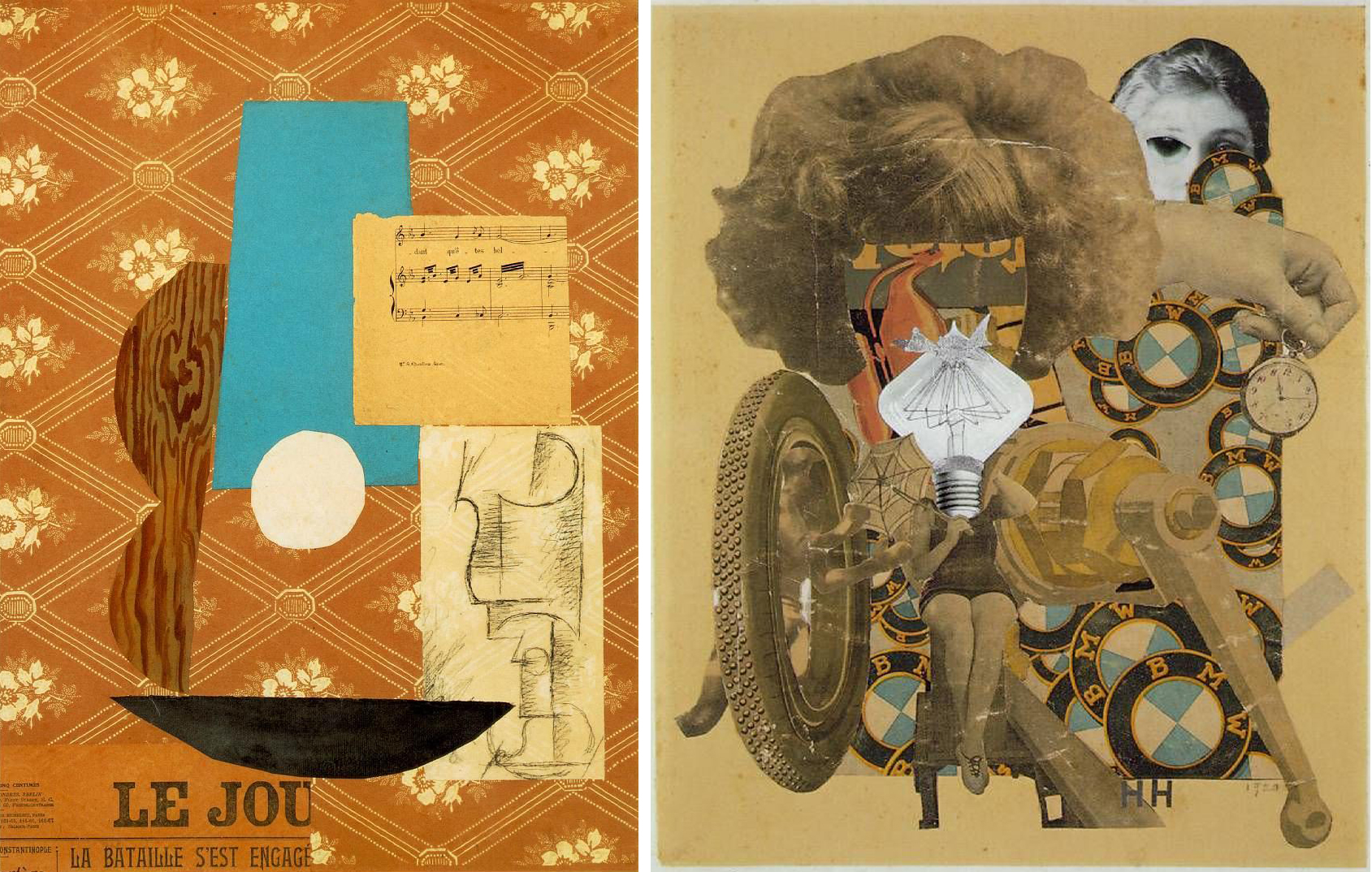
Constructivism
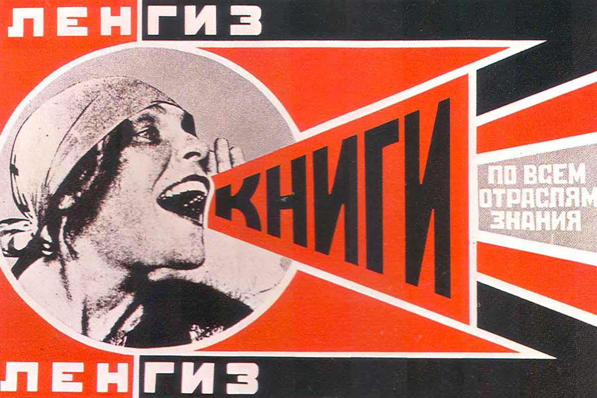


The idea of photographic formalism was the central tenet of Constructivism, and as art historian Craig Buckley remarked, while the “beginnings of avant-garde photomontage are commonly traced back to the context of Berlin Dada after World War I the technique was adopted almost simultaneously by constructivist artists and filmmakers in the Soviet Union”.
El Lissitzky, Alexander Rodchenko, Gustav Klutis, Valentina Kulagina, and Varvara Stepanova (who defined photomontage in 1928 as “the assemblage of the expressive elements from individual photographs”) created photomontages that synthesized images with graphic design to support the Russian Revolution and the new Soviet Government. Constructivist works were inherently propagandist, as exemplified in Rodchenko’s posters which, with their bold colours and dynamic geometric design, transformed the art of graphic design into something revolutionary. El Lissitzky’s photomontages, which combined his photographs in multi-layered compositions, exemplified a more aesthetic Constructivist approach, while also influencing the New Vision movement, Bauhaus photography, and prominent artists such as László Moholy-Nagy.
Surrealism montage
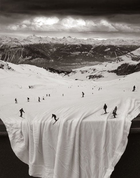

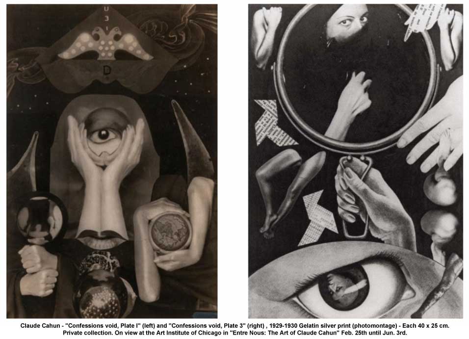
Surrealism montage
Photomontage was valued amongst Surrealists for its ability to create uncanny scenarios that disturbed and provoked by probing the human subconscious. Former Dada artists, such as Max Ernst, carried the technique over into the new movement. Ernst described photomontage as “the systematic exploitation of the accidentally or artificially provoked encounter of two or more foreign realities on a seemingly incongruous level – and the spark of poetry that leaps across the gap as these two realities are brought together”. Surrealism also pioneered collaborative photomontage through the cadaver exquis (exquisite corpse) technique whereby the various participants contributed to the piece while remaining unaware of the origins of the previous contribution. Some Surrealists, such as Dora Maar, were known primarily for their photomontage, though many leading Surrealists, including René Magritte, Man Ray, and Salvador Dalí included the technique in their repertoire. Their works also exercised an important international influence, as seen, for instance, in Harue Koga’s Sea (1929) which helped pioneer Surrealism in Japan. He too used the collage technique to create what have been called “photomontage paintings”.
Between 1899 and 1909 the grammars of cinema entered a chaotic period of experimentation in which filmmakers hurried to test the possibilities of editing individual shots of film together into something more meaningful. Between 1909 and 1919 one D. W. Griffiths almost singlehandedly developed the method of montage that gave rise to the Classical Realist Narrative; known otherwise as the Classical Hollywood Film. A profoundly problematic figure for historians given his supremacist and pious worldview, through films like The Birth of a Nation (1915) he devised a system of montage that was so sophisticated he placed the spectator in the world of a feature length film.

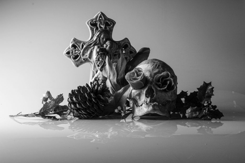
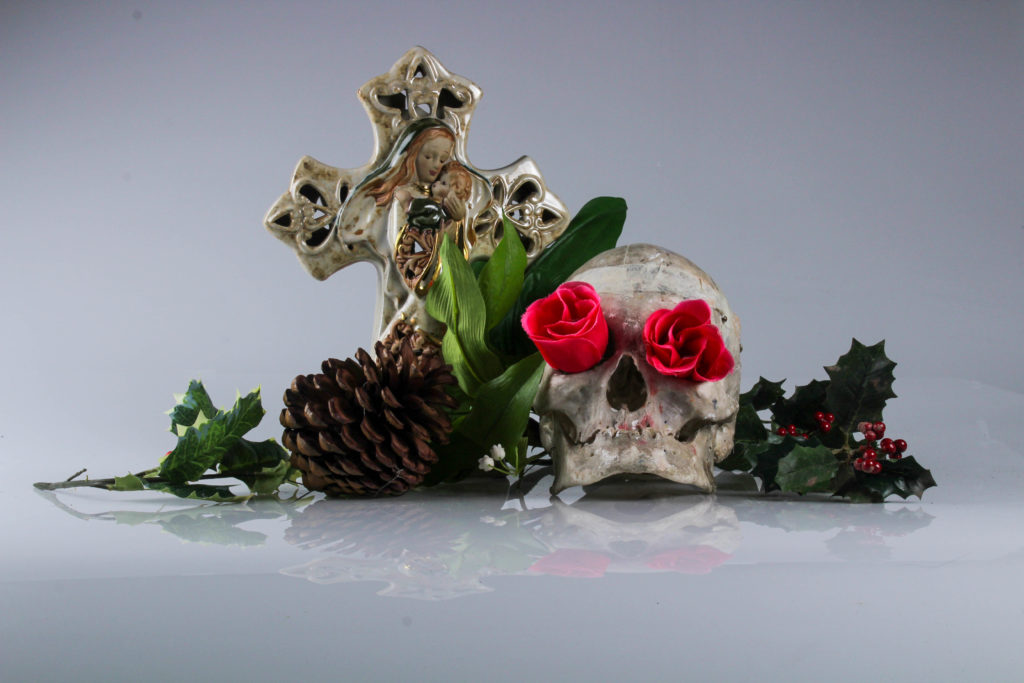
I selected these images because I liked the depth and story that they created as each image has a subtle change to lighting and tone.
first I uploaded a portrait and one of my final object shoot images to photoshop in order to create a collage.
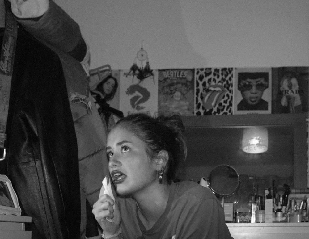
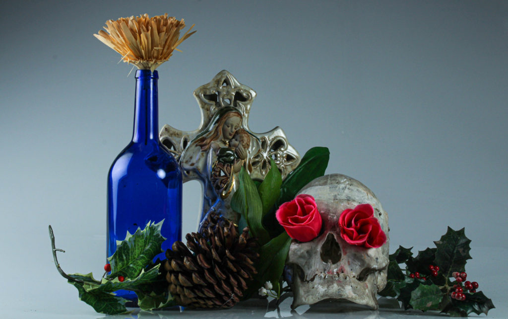
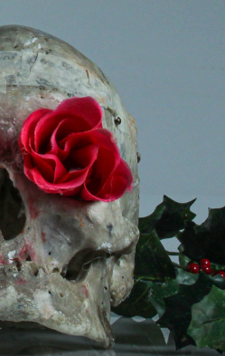
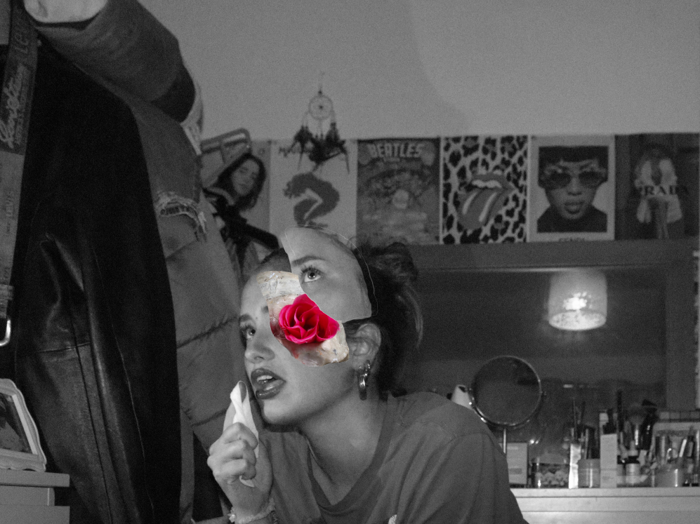
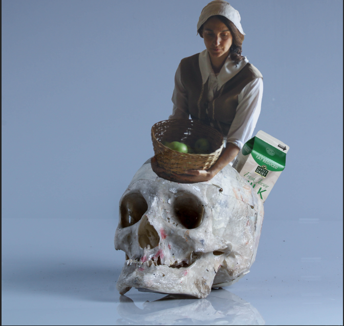
A photomontage is the result of combining two or more pictures together in order to make a new image. This can be done through cutting, pasting, ripping, rearranging and overlapping. Photomontage are usually used to convey a message, whether that be a commentary on political, social, or other issues. The credit for photomontages is given to Dada artists in 1916 but it emerged in the mid 1850s due to artist trying to make photography fit into fine art.
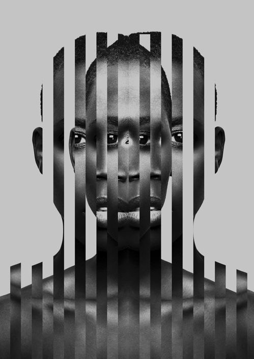
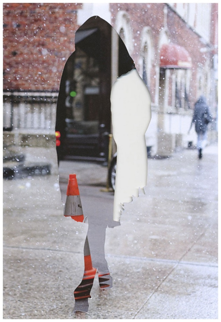
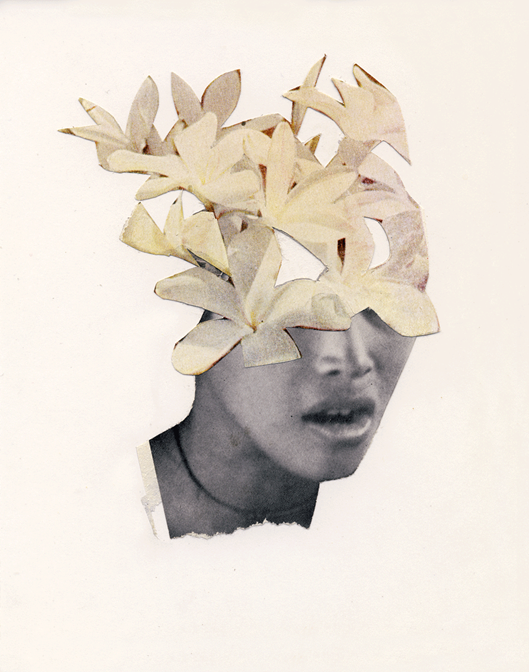
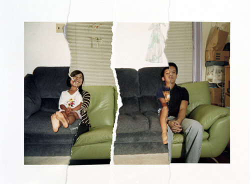
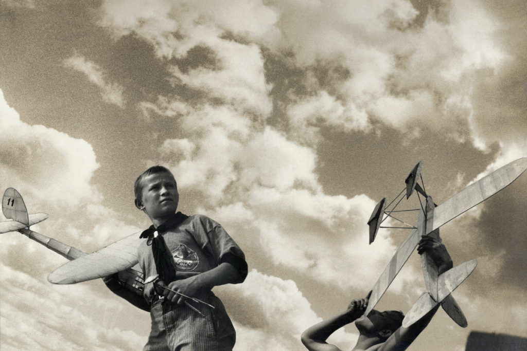
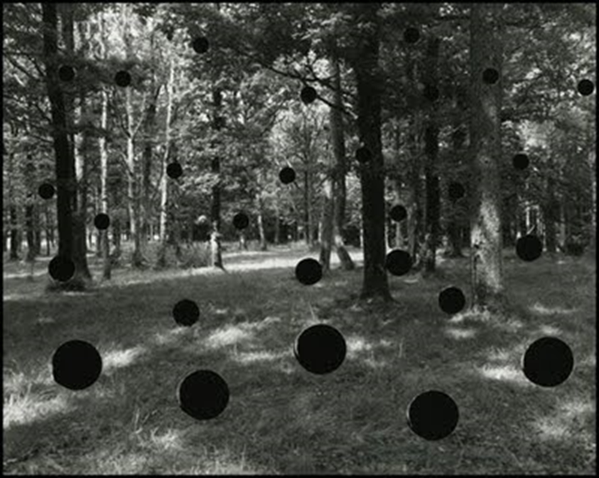
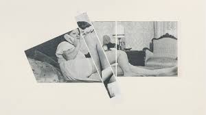
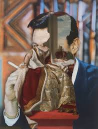
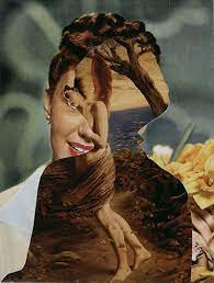
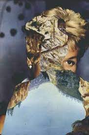
John Stezaker
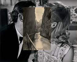
John Stezaker is a British conceptual artist know for his collages using images found in books, magazines, and postcards. His work re-examines the various relationships to the photographic image: as documentation of truth, purveyor of memory, and symbol of modern culture. Through his elegant juxtapositions, Stezaker adopts the content and contexts of the original images to convey his own witty and poignant meanings.
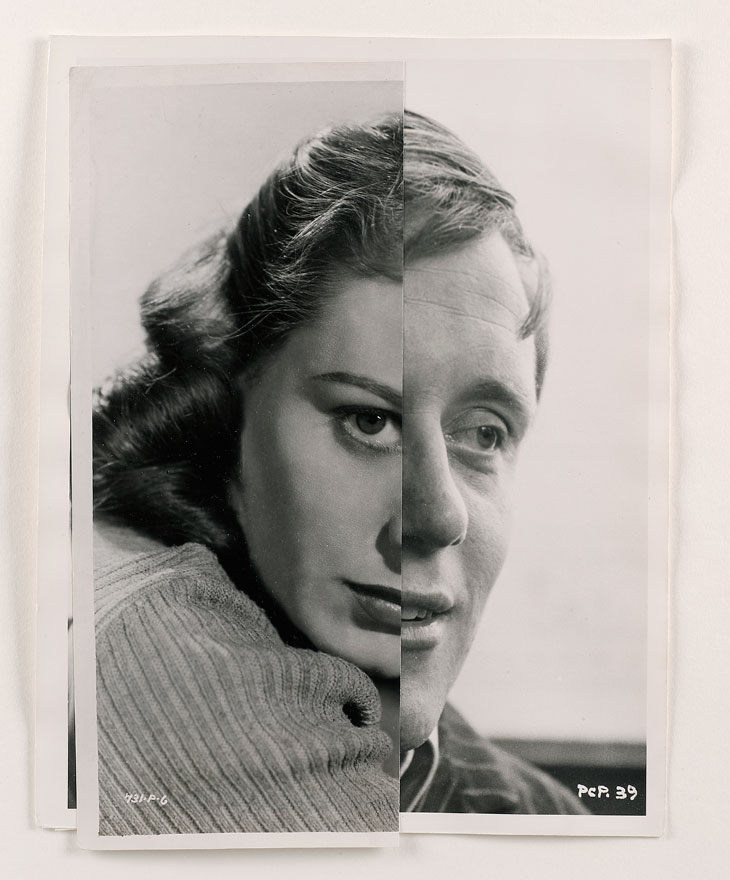
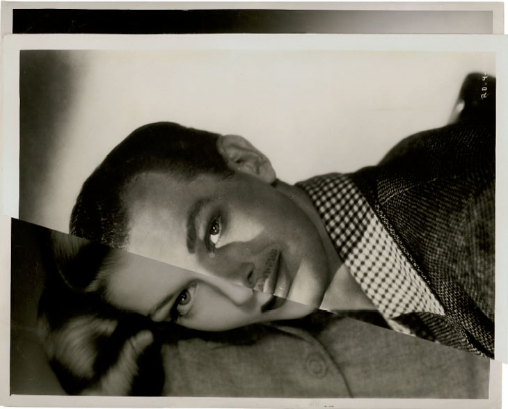
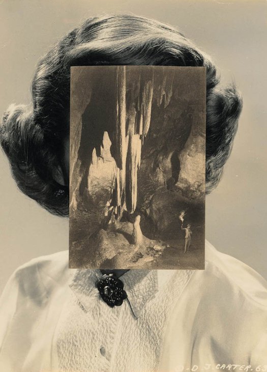
I hate this one I don’t even know what I was trying to do and its just looks bad. the line in the middle is like too clean? and the chicken instead of the apple looks out of place. And I know that’s the point but I hate it
Ultimately , you are aiming to produce a range of high quality images that will be printed professionally. These are your final outcomes (Assessment Objective 4) You must add your high resolution files to the print folder…found here
M:\Departments\Photography\Students\Image Transfer\PRINTING Yr 12 Heritage Nov 2021
What you should be printing…
You can choose A3 , A4 and A5 size prints…and may want to combine some into a set, or group…

This will ensure you have the correct ASPECT RATIO
Ensure you label and save your file in you M :Drive and then coip across to the PRINT FOLDER / IMAGE TRANSFER
For a combination of images, or square format images you use the NEW DOCUMENT + PRINT PRESETS on ADOBE PHOTOSHOP to help arrange images on the correct size page (A3, A4, A5)
The process for your project so far should include blog posts like this…

Photomontage is often used as a means of expressing political dissent.
It was first used as a technique by the dadaists in 1915 in their protests against the First World War. It was later adopted by the surrealists who exploited the possibilities photomontage offered by using free association to bring together widely disparate images, to reflect the workings of the unconscious mind.
In 1923 the Russian constructivist Aleksander Rodchenko began experimenting with photomontage as a way of creating striking socially engaged imagery concerned with the placement and movement of objects in space.
Other key exponents of the medium are John Heartfield, the German artist who reconstructed images from the media to protest against Germany’s Fascist regime and Peter Kennard; whose photomontages explored issues such as economic inequality, police brutality and the nuclear arms race between the 1970s and the 1990s.
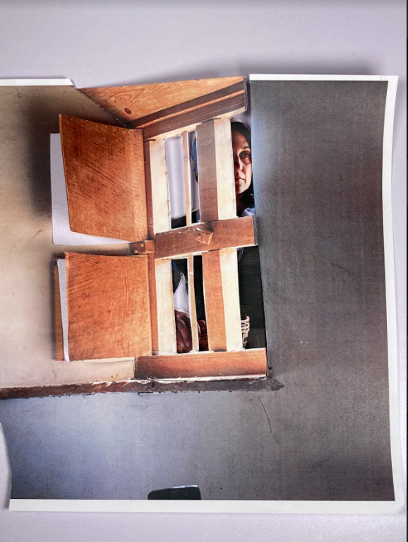
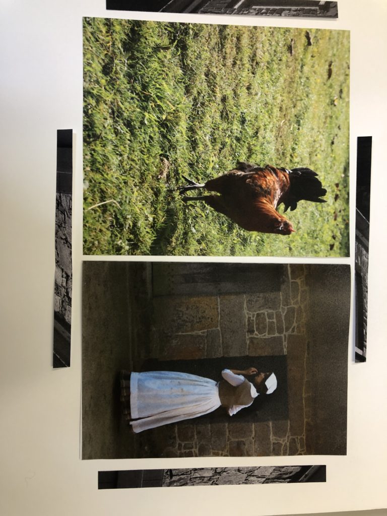
With this image I tried to depict the woman looking through the window into her house
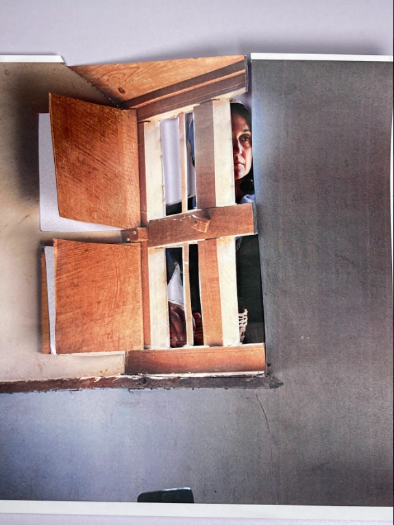
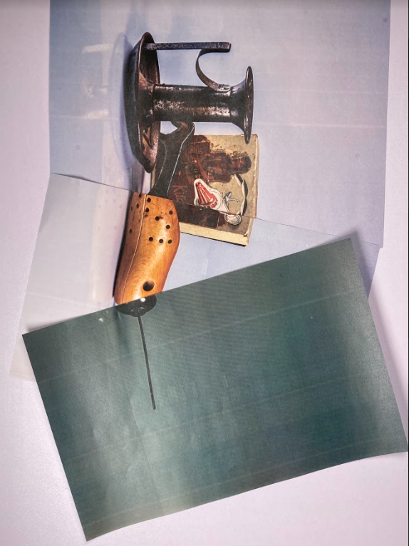
This montage is inspired by Harvey Regan idea of using two photos and merging them into one.
Here is some of Harvey Regan’s work that inspired me to take these photos

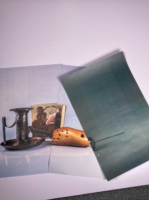
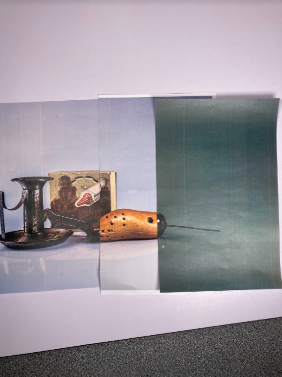
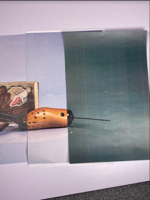
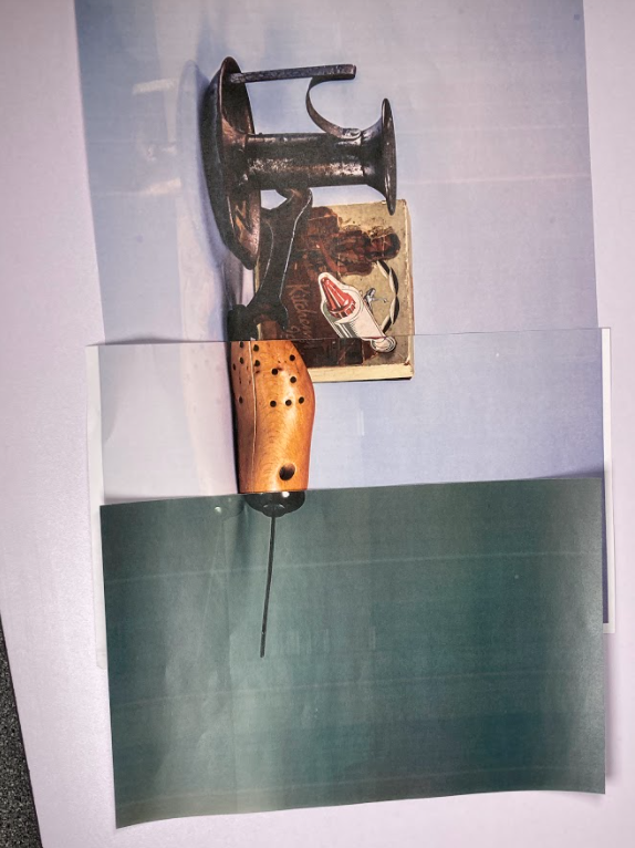

This is the setup I used to take some of these photos

Here I am picturing the woman on the window sill.
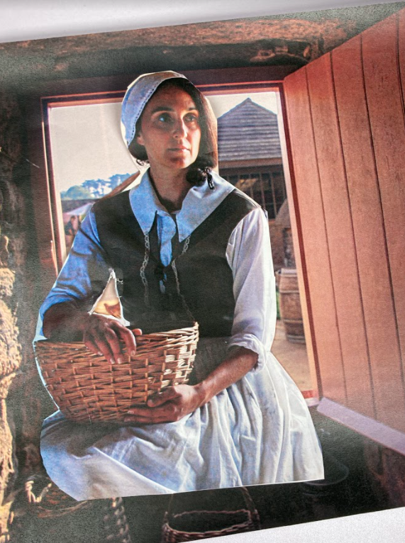
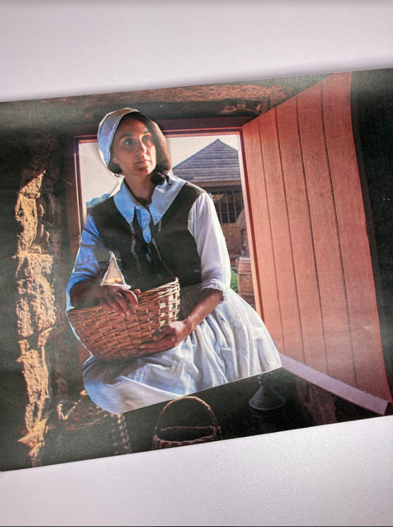
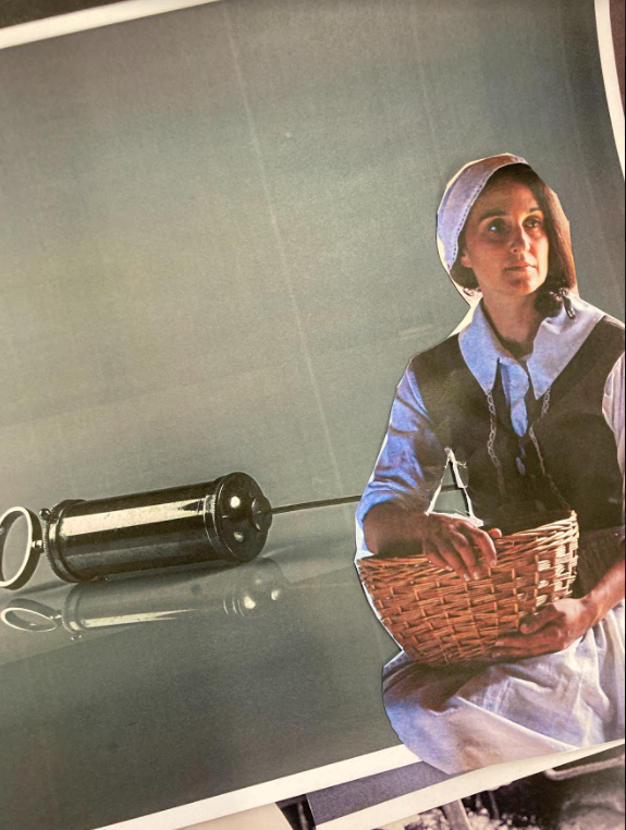
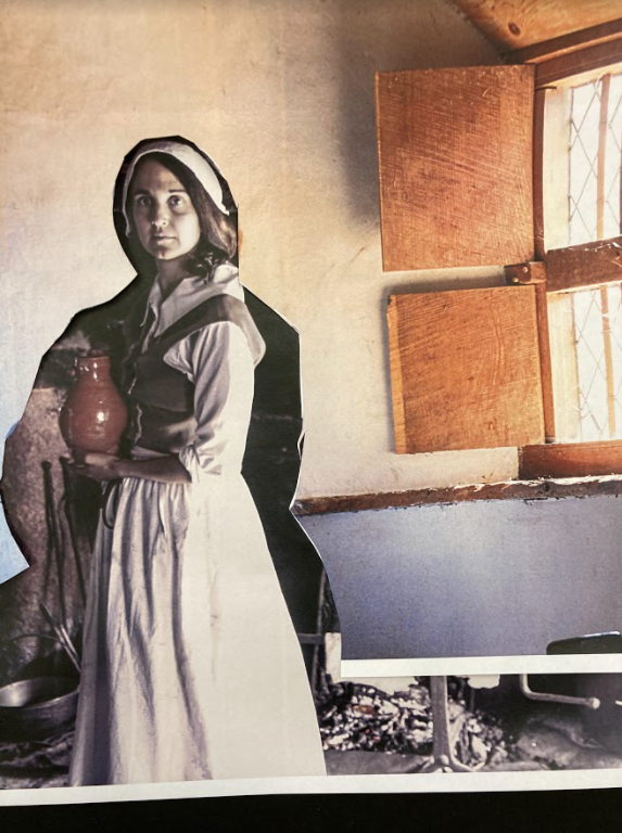
Here I used a separate black and white image to show how the old fashion actor is standing in the present time
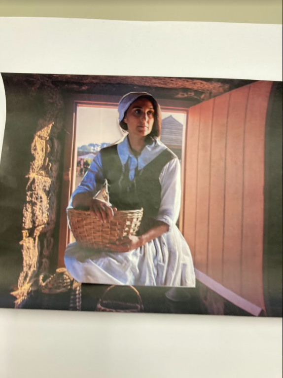
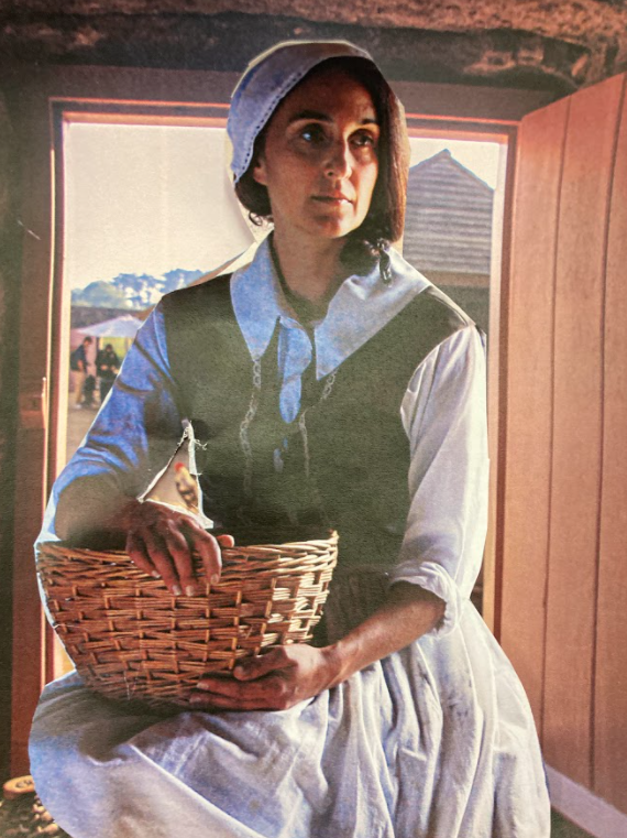
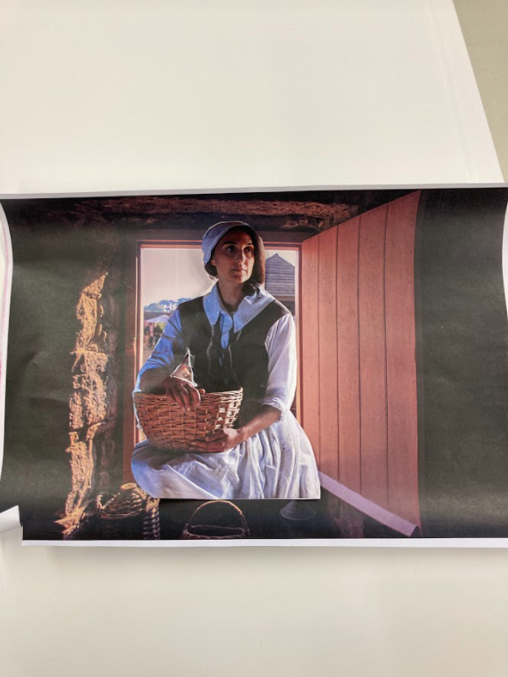
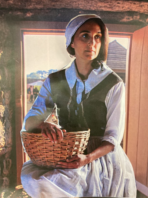
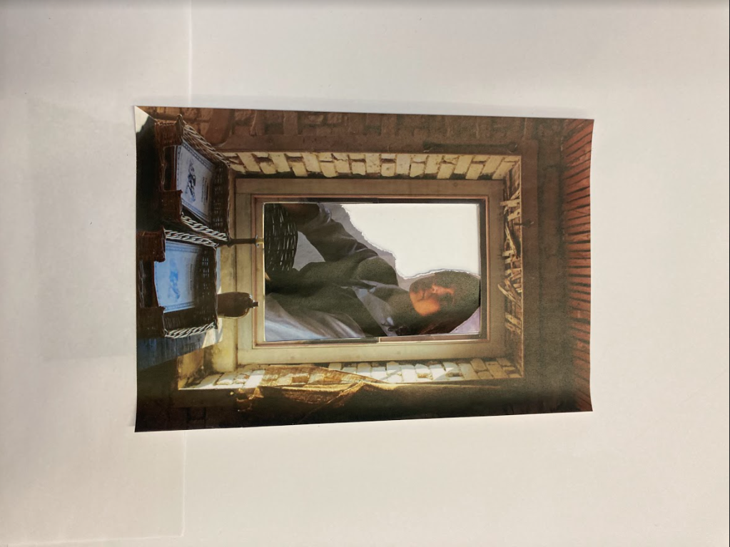
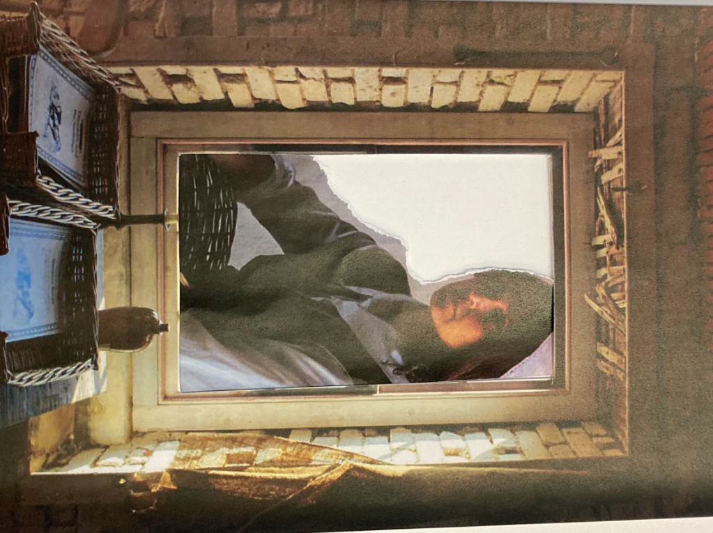
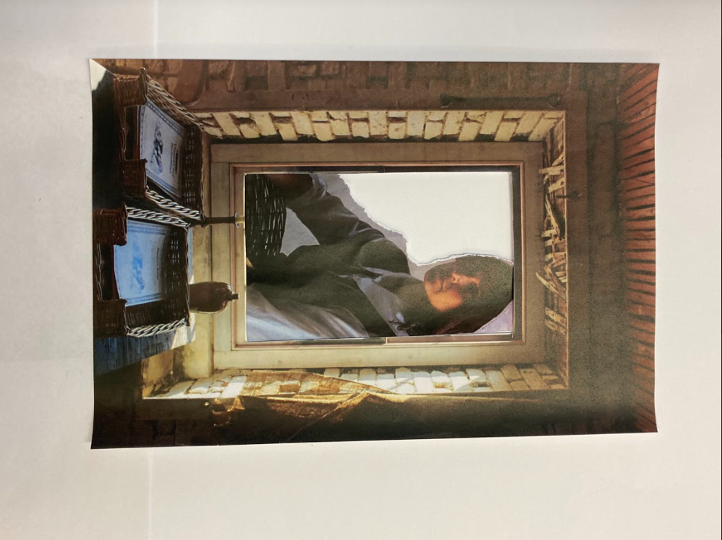
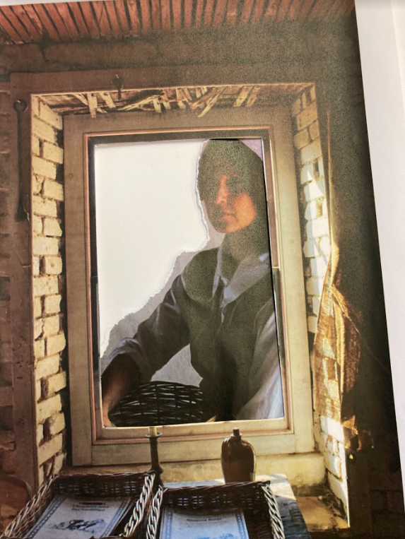
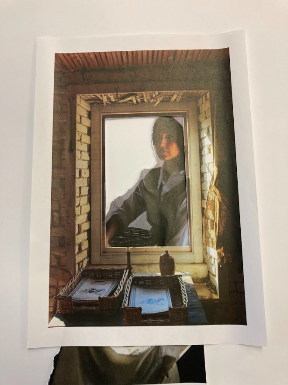
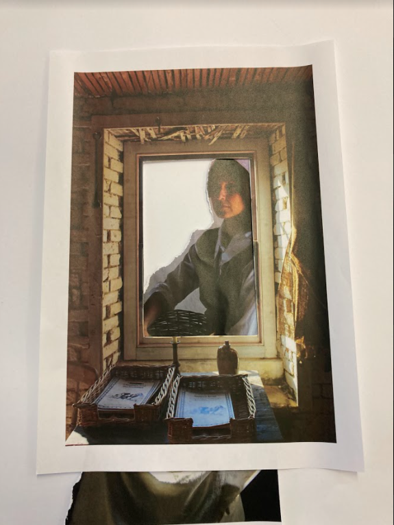
Photomontage is the combination of two or more photographs, or pieces of them, to form a single image. The technique came to prominence as a Dadaist form of political protest during the First World War and was later adopted by Surrealist and Pop artists. Photomontage is often used as a means of expressing political ideas and upset. It was first used as a technique by the dadaists in 1915 in their protests against the First World War. It was later adopted by the surrealists who exploited the possibilities photomontage offered by using widely disparate images, to reflect the workings of the unconscious mind.
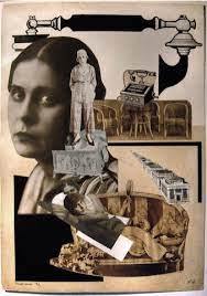
In 1923 the Russian constructivist Aleksander Rodchenko began experimenting with photomontage as a way of creating striking socially engaged imagery concerned with the placement and movement of objects in space. Other key artists are John Heartfield, the German artist who reconstructed images from the media to protest against Germany’s Fascist regime and Peter Kennard, whose photomontages explored issues such as economic inequality, police brutality and the nuclear arms race between the 1970s and the 1990s.
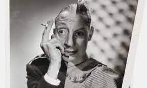
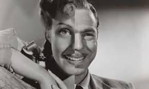
John Stezaker is a contemporary British Conceptual artist best known for his collages of found images taken from postcards, film stills, and commercial photographs. Stezaker’s work resembles early-serrealist and Dada collages made by artists like Kurt Schwitters and Hannah Hoch. In his collage series “Marriage”, juxtaposed portraits of classic films stars create newly formed but disjointed characters.
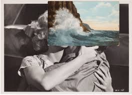
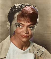
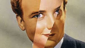
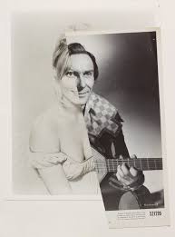
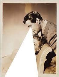
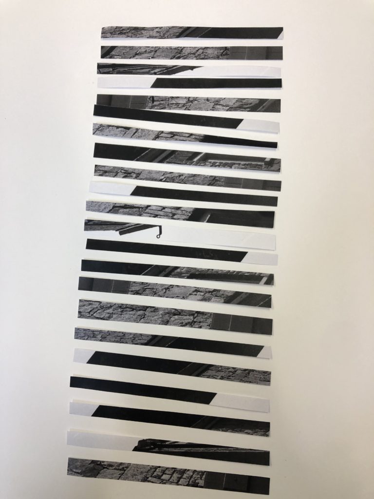
After editing and printing my images from my still life and Hamptonne shoots, I created handmade experiments as well as some on photoshop.
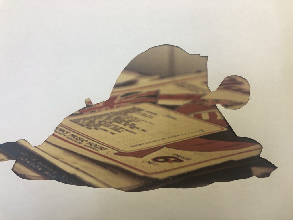
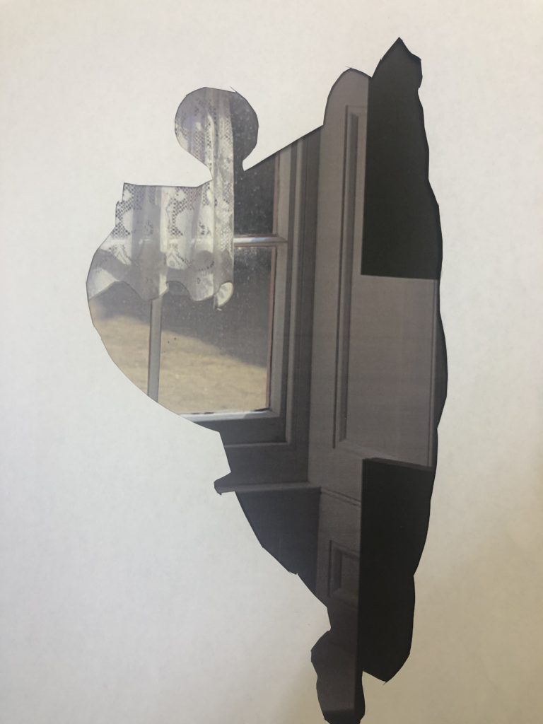
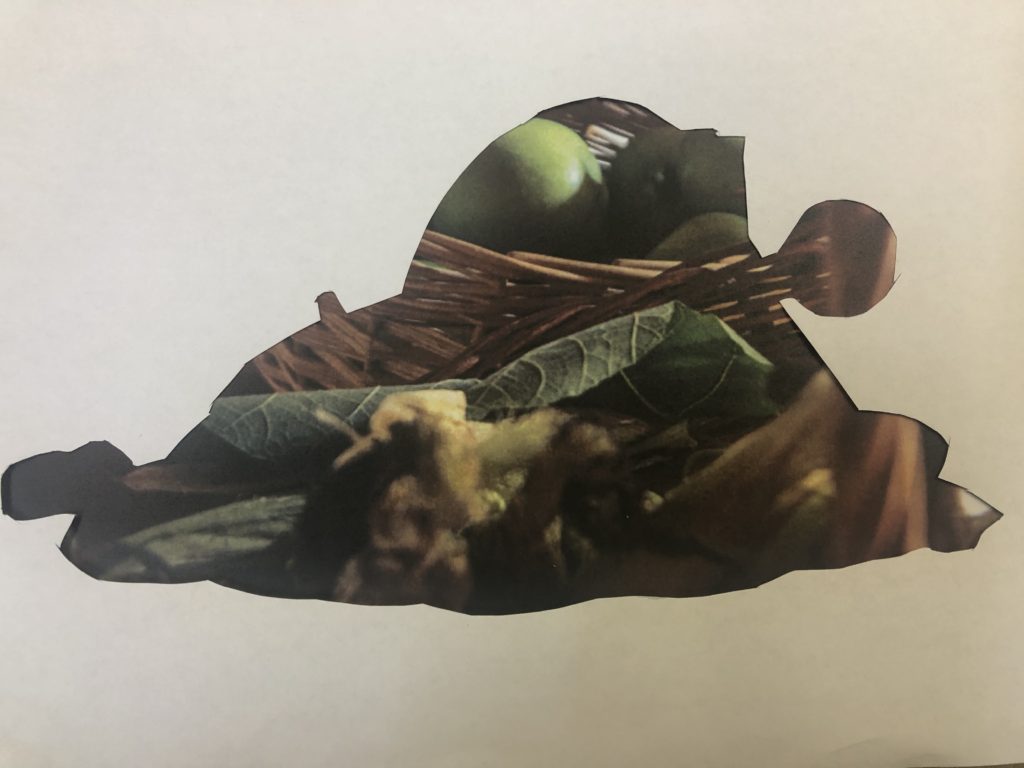
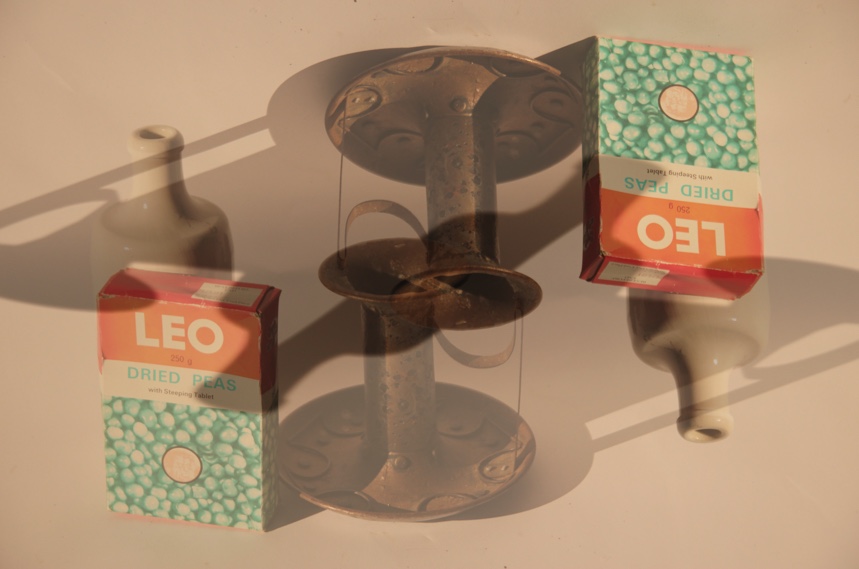
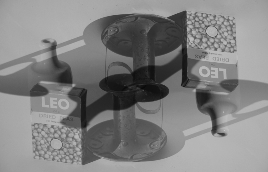
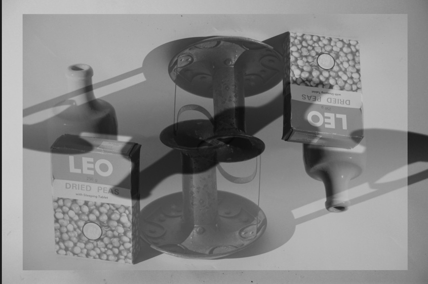
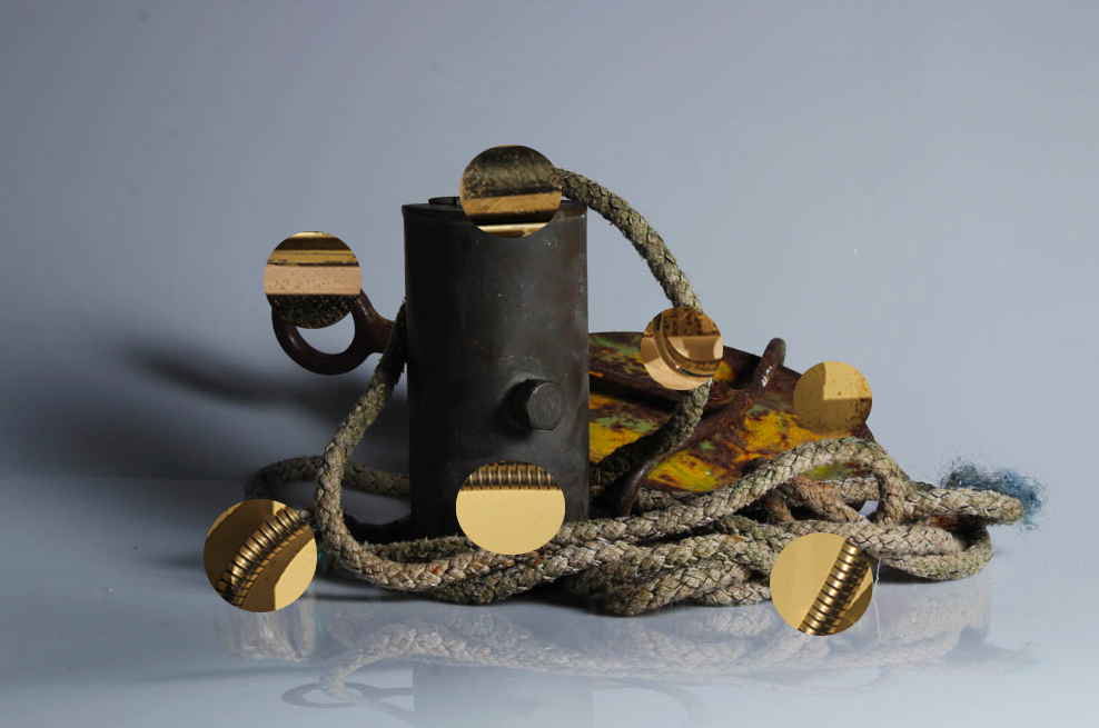

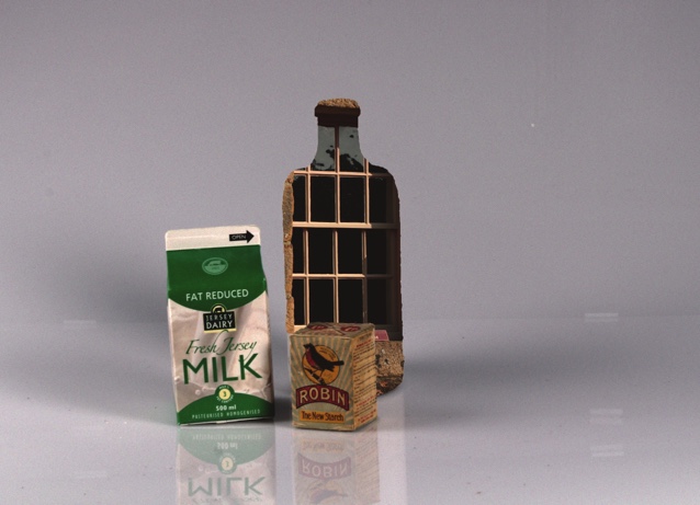
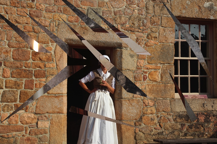
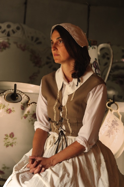
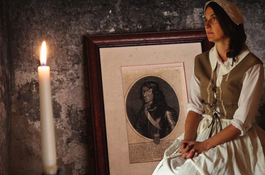
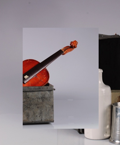
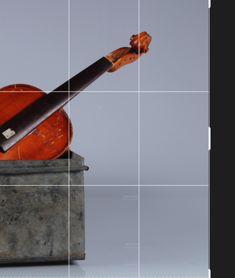

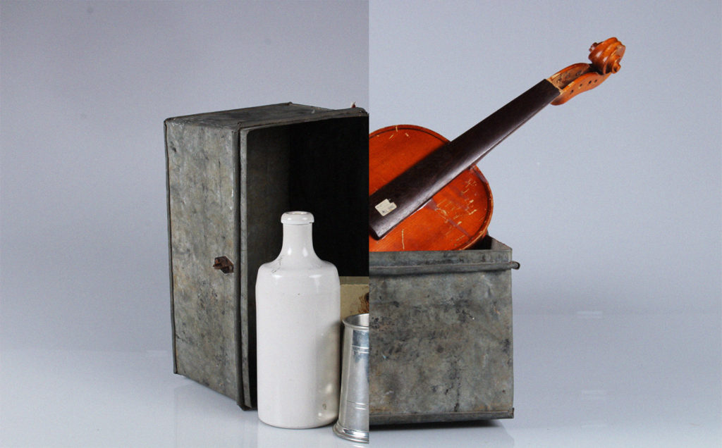
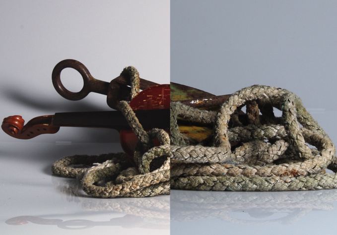
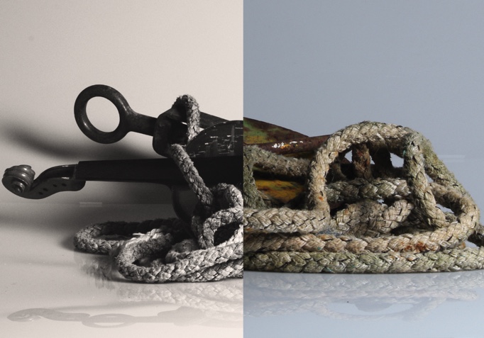

To make my gifs, I made a layer for each image, and made frames for each layer. I adjusted the delay for each image and changed the window to forever, then saved the GIF for web.
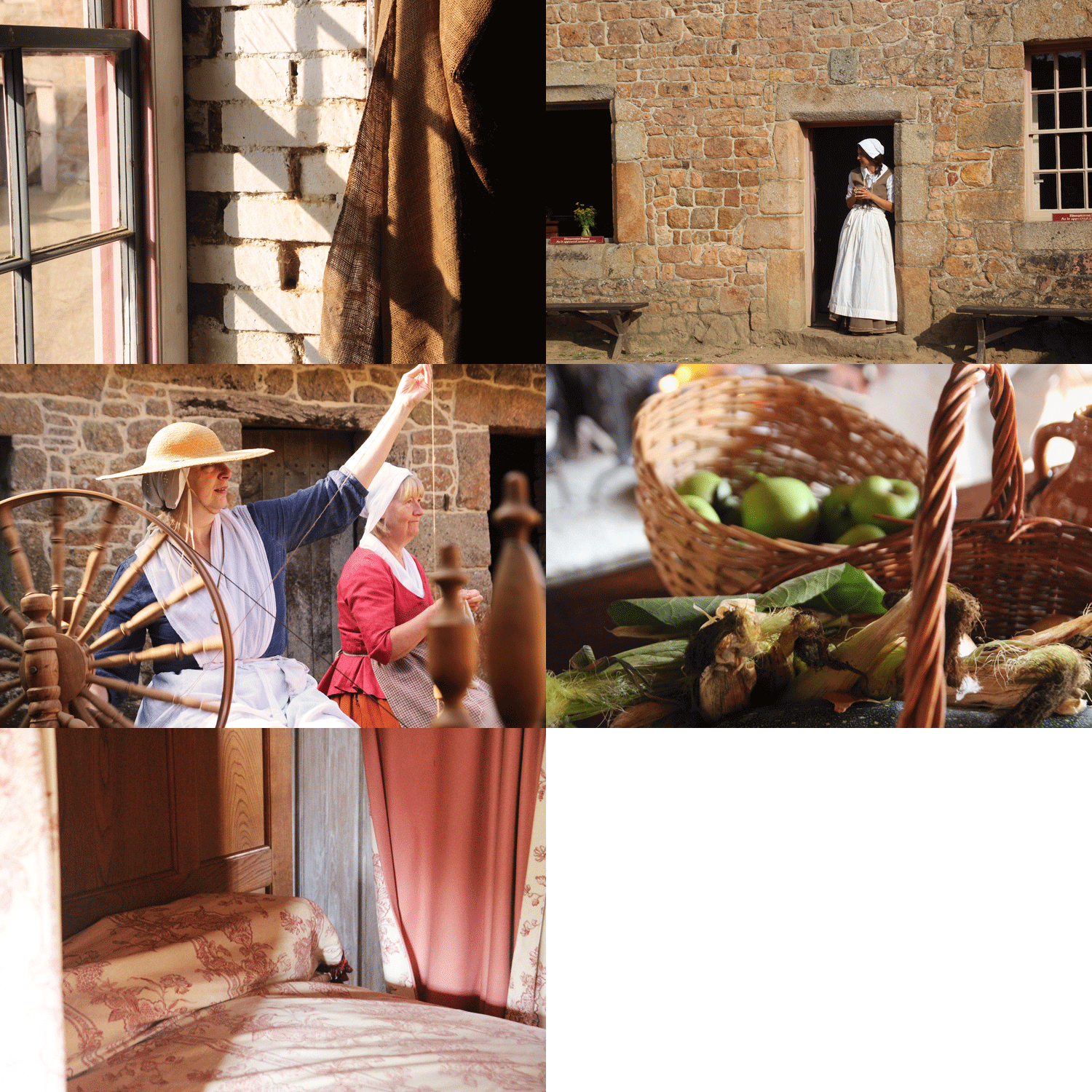
I then made another, using the same method.
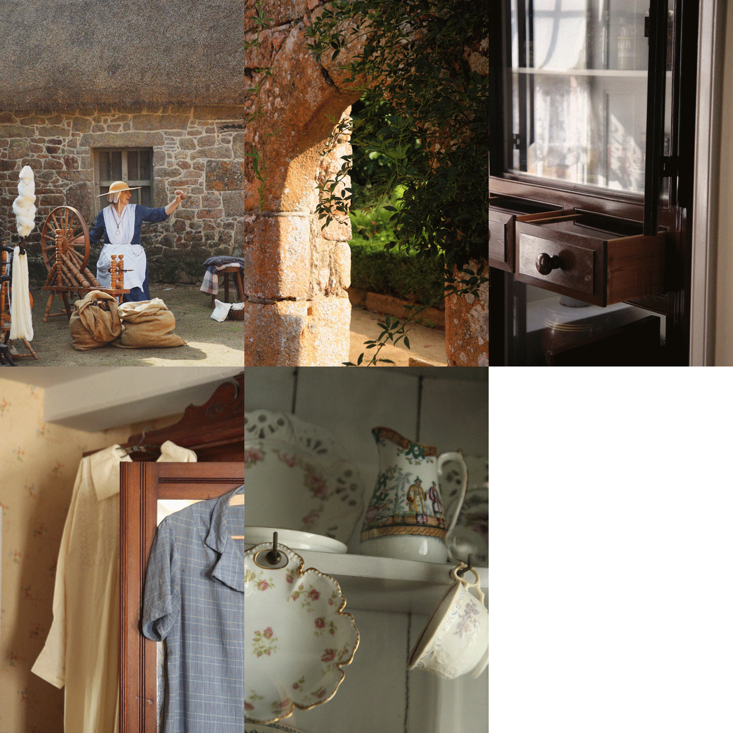

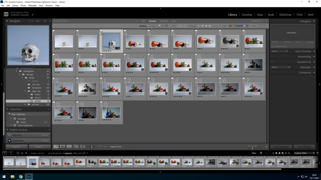
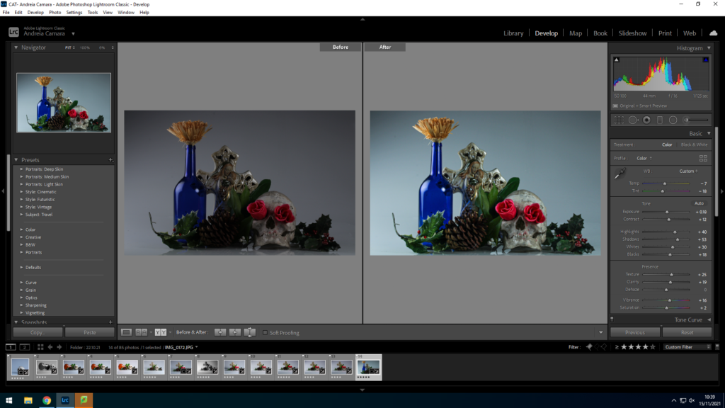
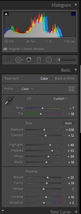
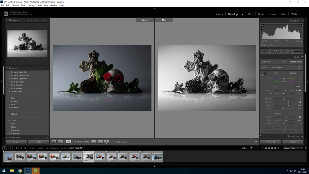
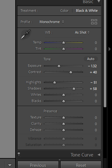
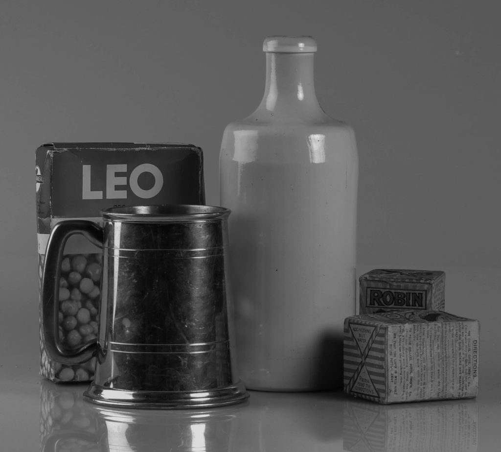
After selecting my best images, I edited them in Lightroom classic.
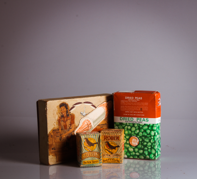
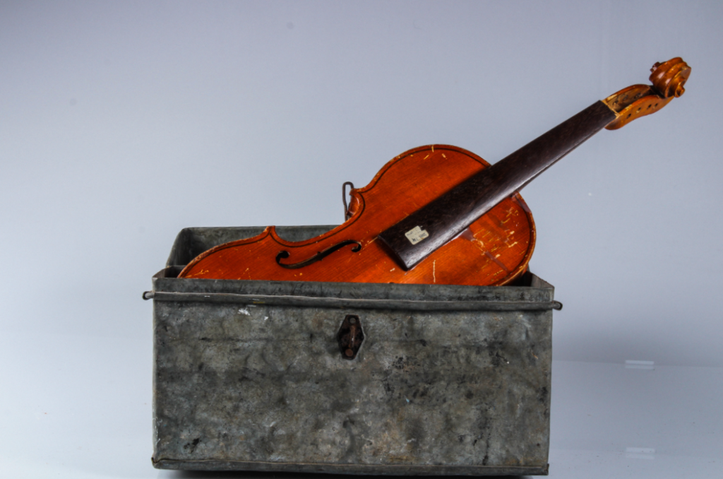
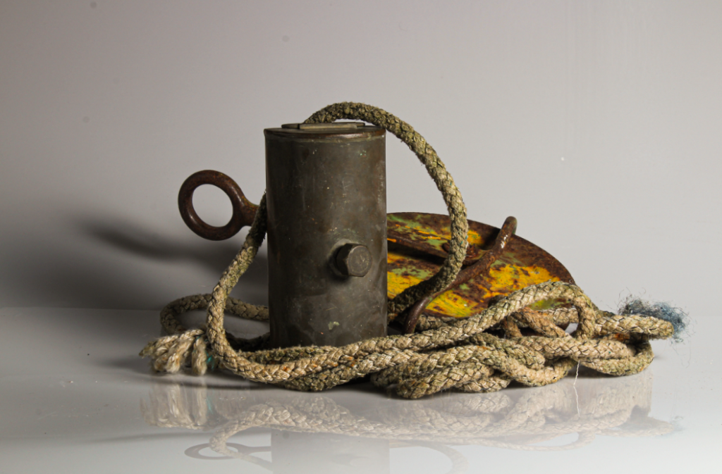
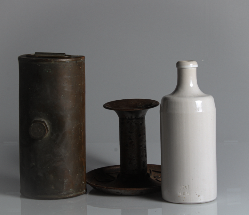
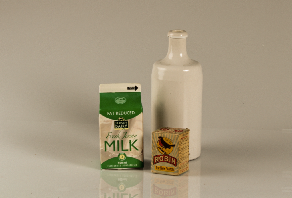
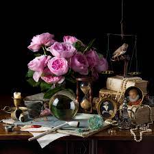
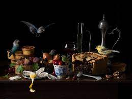
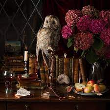
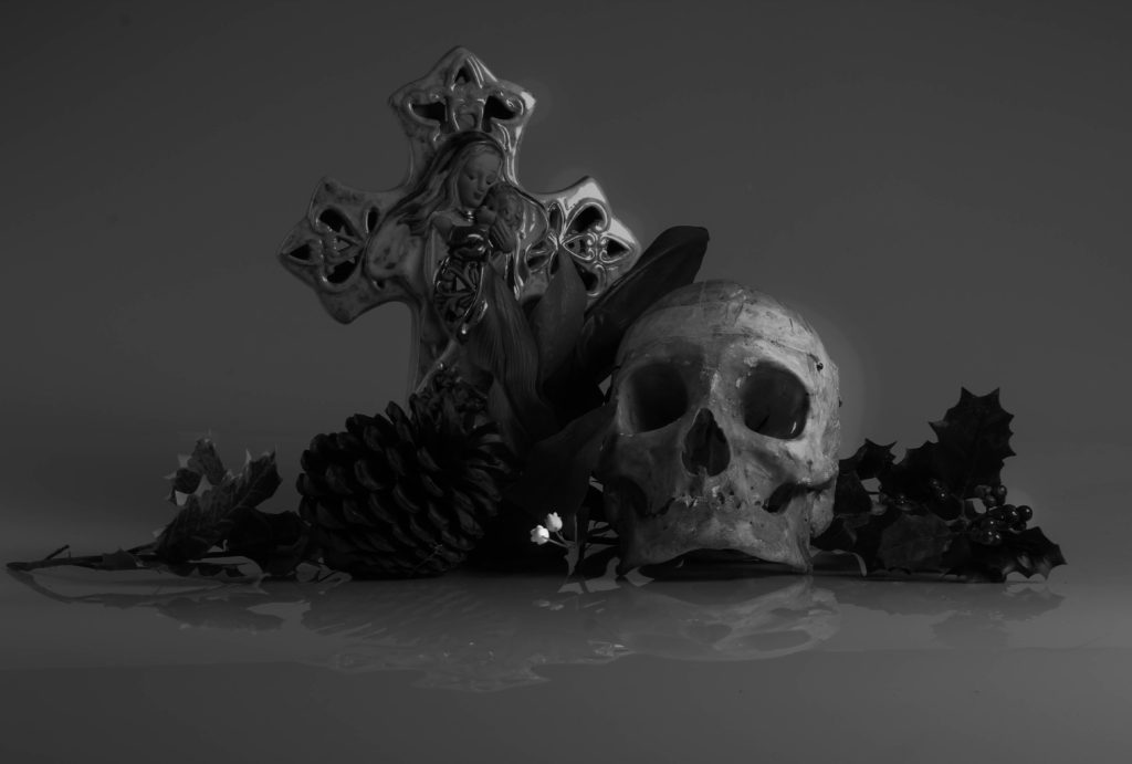
My images are influenced by the photographer Paulette Tavormina. Paulette Tavormina is a an american still life photographer who lives and works in the city of New York. She spends lots of her time in the city’s rich markets, searching for the beautiful florals that add delicate character to her still life photographs. Paulette is heavily inspired by 17th century Still life painters: Giovanna Garzoni, Francisco de Zurbaran, and Adriaen Coorte. She particularly takes inspiration from Zurbaran’s use of mysterious and dramatic light, Coorte’s unique placement of objects, and Garzoni’s clever compositions and rich colour palette.
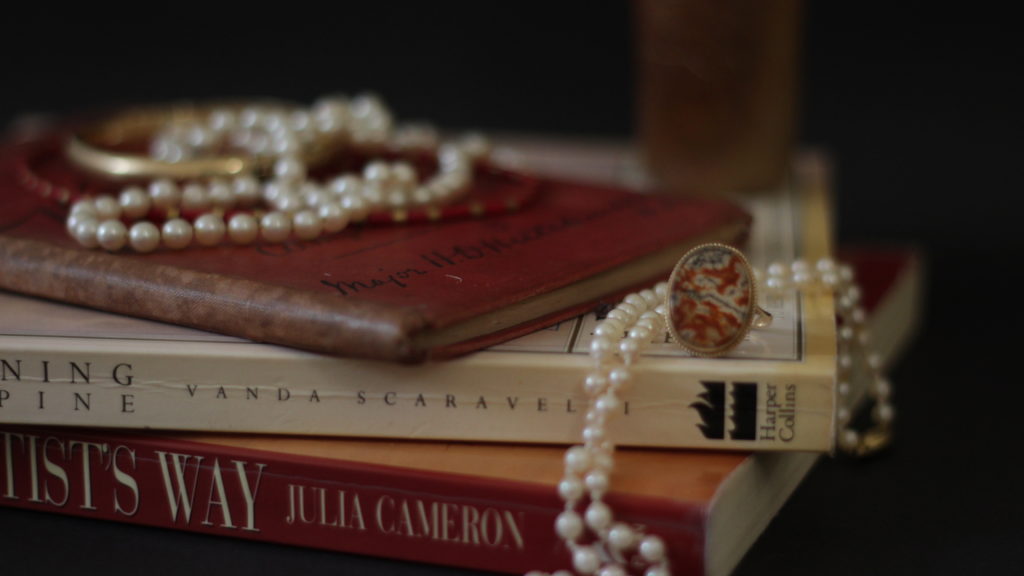
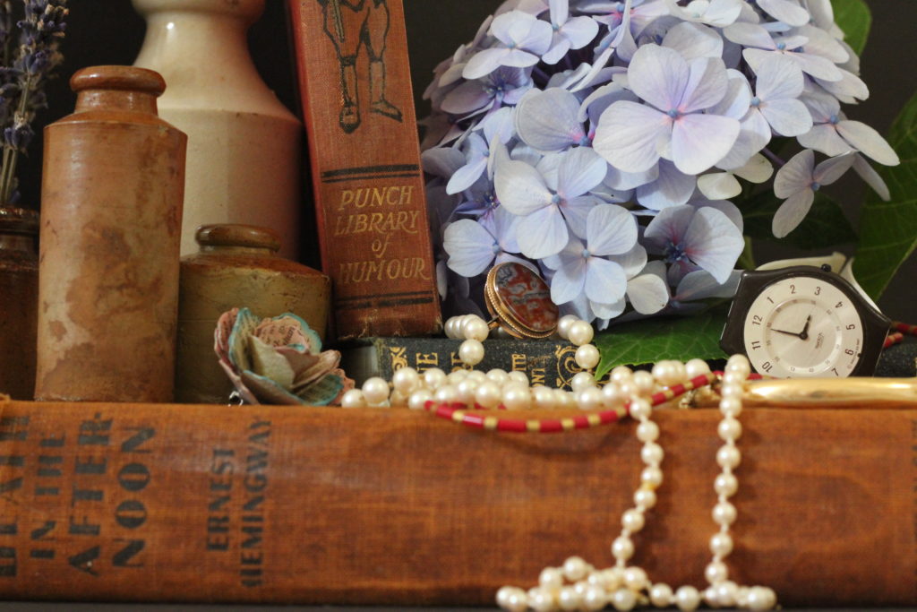

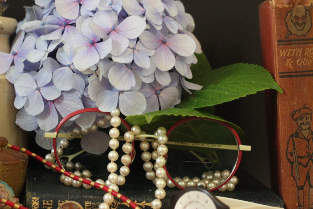
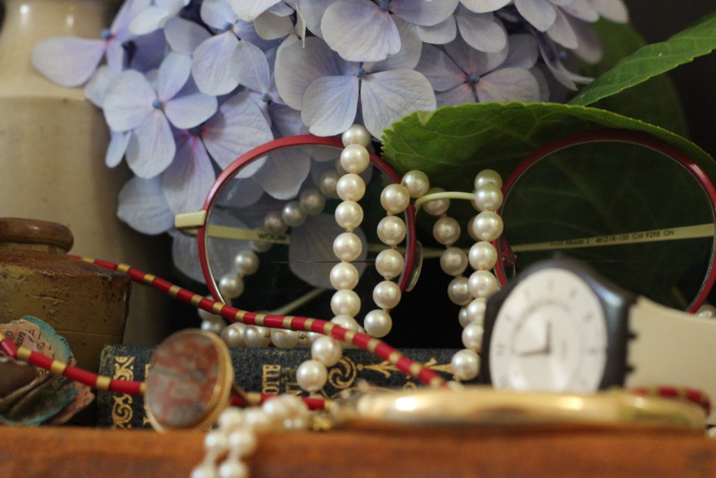
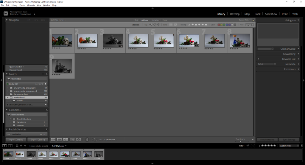
I categorised my images using the star system – 1 star for no, 5 stars for yes and 3 stars for maybe.
Basic Edits
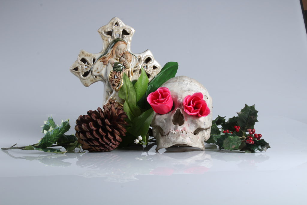
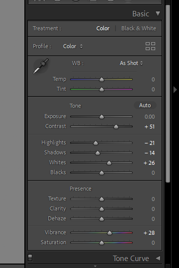
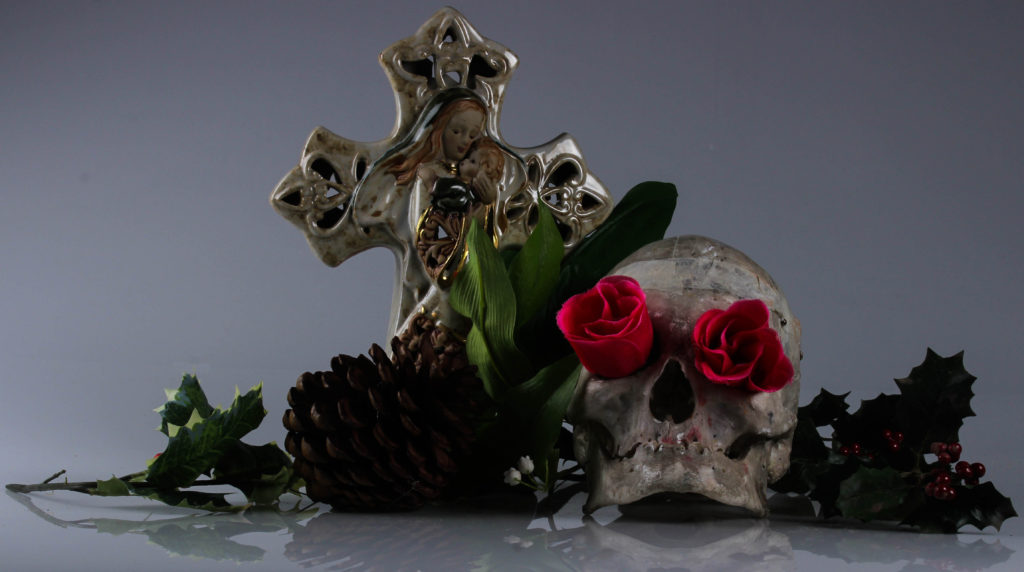
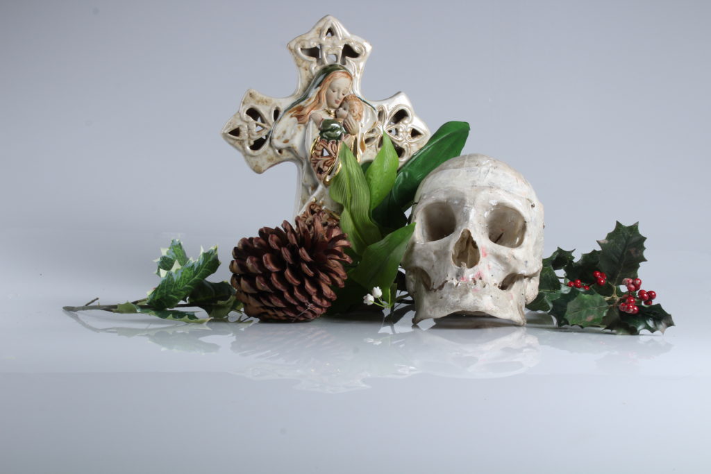
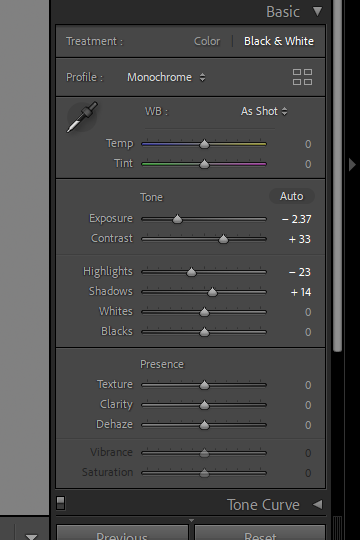
Further Experimentation
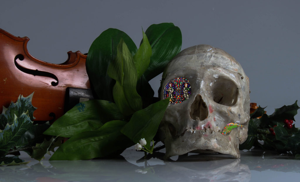
I decided to place a stained church glass design in the eye socket of the skull to represent the link between death and the church.
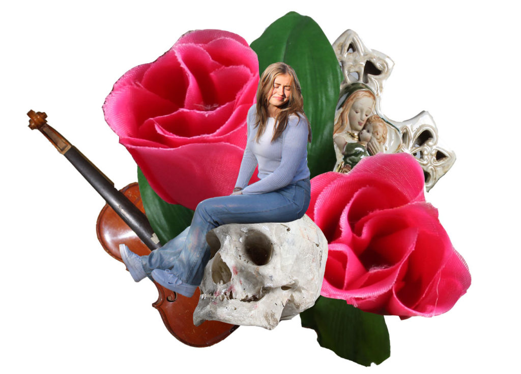
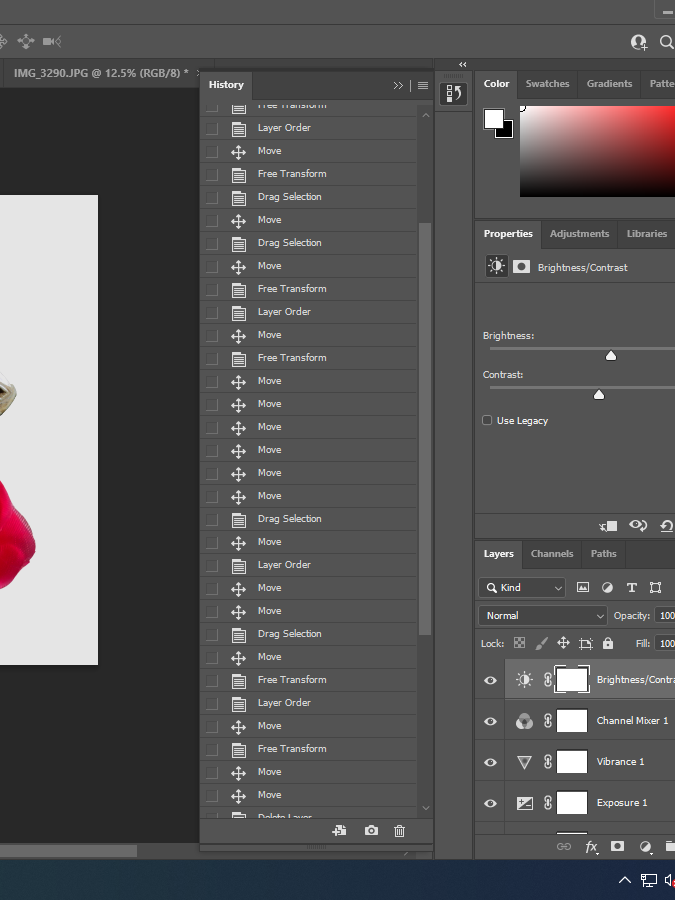
For this image i wanted to include an image from my environmental photography shoot, i decided to make a collage of different images from different object shoots and merge them together into this Vantas style still life montage.
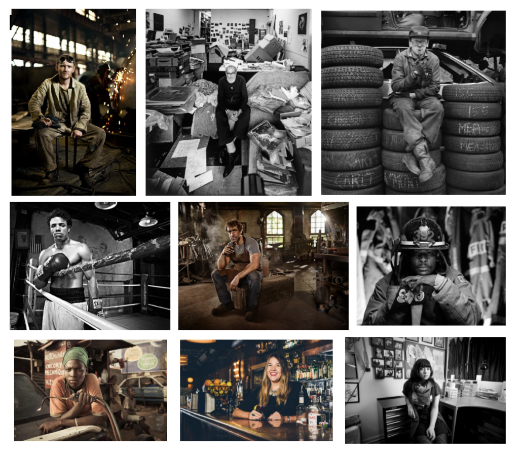
An environmental portrait is taken of someone who is in their natural environments such as their workplace or home. It could also be in an environment that they are associated with like a sport or another hobby. A good environmental portrait tells the story of the person and the surroundings will show their personality through the photo.
Mood-Board
Arnold Newman
Newman was an American photographer who was well known for his ‘environmental portraits’ of artists and politicians. He is often credited for being the photographer who articulated and consistently used the genre of environmental portraiture. Arnold Newman normally captured his subjects in their most familiar surroundings with representative visual elements showing their professions and personalities.

“I didn’t just want to make a photograph with some things in the background,” Newman told American Photo magazine in an interview. “The surroundings had to add to the composition and the understanding of the person. No matter who the subject was, it had to be an interesting photograph. Just to simply do a portrait of a famous person doesn’t mean a thing.”

“There are many things that are very false about photography when it is accepted without question,” he once explained. “You must recognize and interpret it as you would any other art form, and then maybe it is a little more than real.”
One of the things I like about Arnold Newman’s work was that he was able to capture peoples personalities in his photos even without them being in colour. I also like that his work is minimalistic with only photographing the key objects which show who the person is. For example, Agnes de Mille, who was a dancer and choreographer in the 40s and 50s, Newman photographed her in one of the dance studios which she might have taught at and Igor Stravinsky who was a composer, Newman photographed him next to his grand piano and a plain white background so that the harsh black can stand out against it.

Newman was best known for his black and white portraits but he often used colour, one of his most signature images in black and white was of Igor Stravinsky who was a composer in New York sat next to a grand piano.
Some of Newman’s well-known subjects include Max Ernst, Alfred Stieglitz, Georgia O’Keeffe, Marilyn Monroe, Alfried Krupp, Pablo Picasso and Jean Cocteau. Newman published many of his portraits in magazines such as Harper’s Bazaar, Time, Look, and Life.

Arnold Newman photographed a lot of celebrities from different industries such as Max Ernst, Piet Mondrian, Marcel Duchamp, Man Ray, Francis Bacon and David Hockney. Some of the people he got to photograph only allowed very few artists to do so, for example, Henri Cartier-Bresson was another photographer known for being camera shy.
Plan
1st Photoshoot (Outside)- I will ask a family friend who is a dog walker, I will try and get a photo with both her and some of the dogs that she works with.
2nd Photoshoot (Inside)- I am going to a family friends bar and will try and get so photos of them standing behind the bar and getting portraits of the waist up.
3rd Photoshoot – Because I wasn’t able to photograph two or more people I have chosen to photograph one of the workers at a food truck down by the harbour. I would like to get photos of them behind the counter, having them in front of their drinks or some food.
Homework
Contact Sheets:
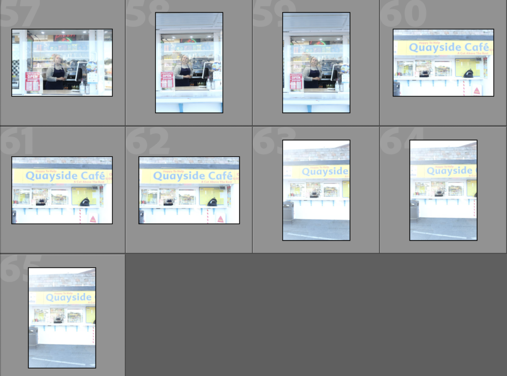
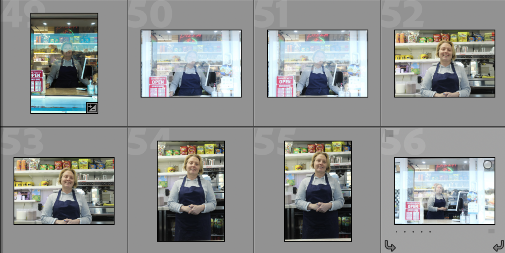
These are the contact sheets from my three different photoshoots, in these, I have got different lighting, shading and angles of the different subjects. I have chosen to do a dog walker, pub owner and food truck worker. These show a range of different occupations and working environments which has made me have to adapt to different scenarios when taking pictures.
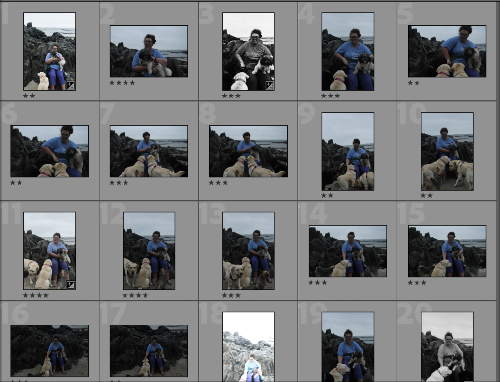
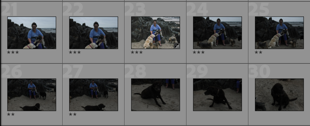
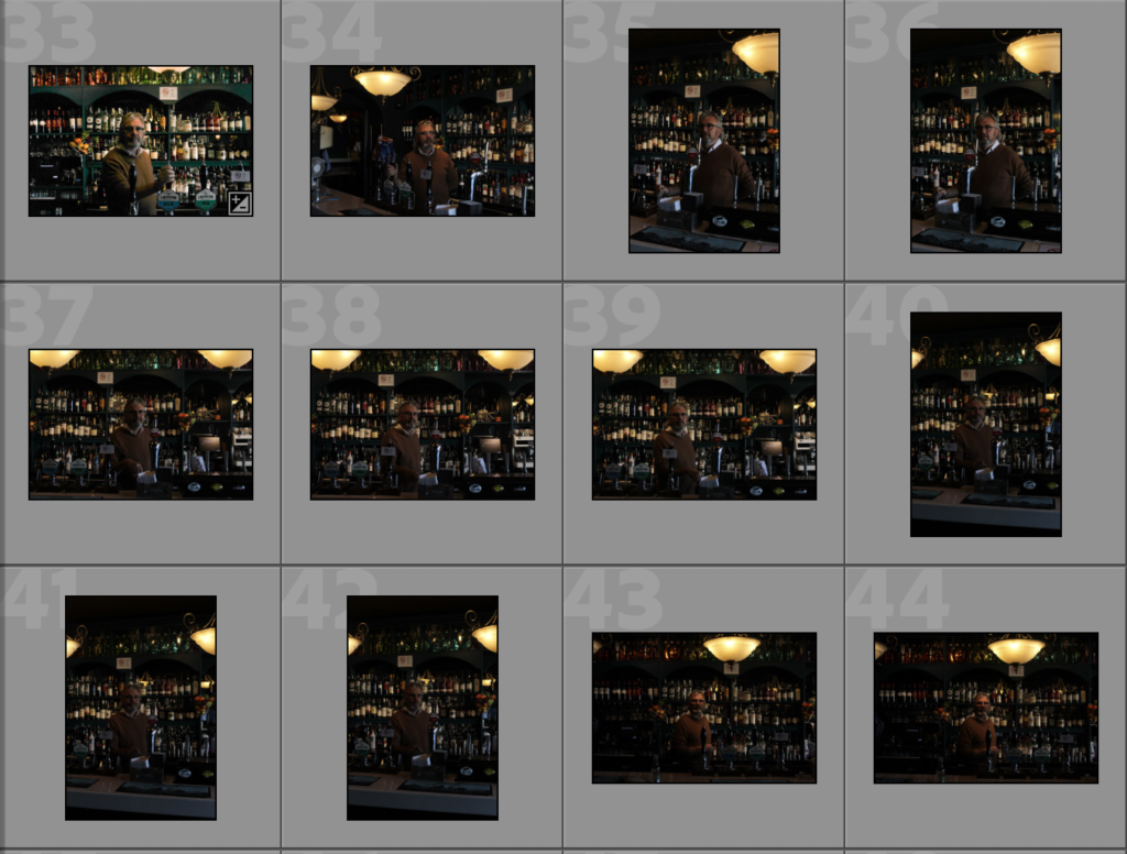

1st Photoshoot
For my first photo shoot, I chose to do Vanessa Heath who is a dog walker, I have photographed her on a rock on St Clements because it is the main place she walks the dogs. I have tried to have the dogs sitting around her in order to make her the main object of the image. In most of the photos, only one or two dogs were looking towards the camera and it was hard to try and keep them sitting down but I think it gives a better representation of her job and gives the photo a more fun and relaxed environment. I had photographed Vanessa in the morning around 11 o’clock, but it was a cloudy day so the images came out darker and duller.
Editing:
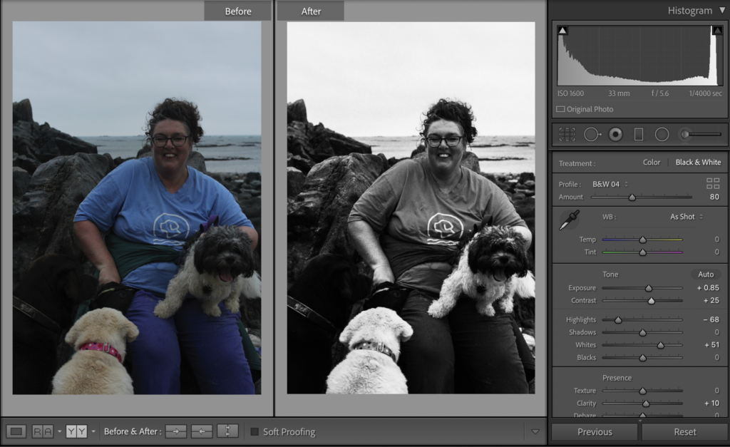
I have edited my photos in Adobe Lightroom, I have increased the exposure and contrast I’m most of my photos so that Vanessa and the dogs can be seen more clearly, it also helped that background look less dull and gloomy.
In the top photo, I have only increased the exposure and contrast slightly, for this photo I wanted the blacks of the rocks to be harsh and the grey/white sky to be brighter, I decreased the highlights and increased whites to get this effect.
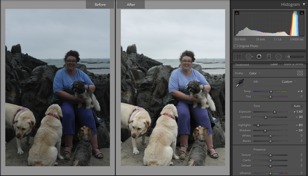
In this edit, I increased the exposure and decreased the contrast, as well as tweaking the highlights and temperature. This brightened the image and corrected the slight underexposure in the image.
Final Images:
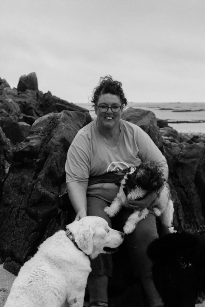
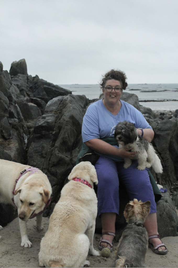
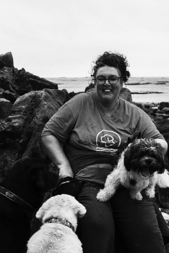
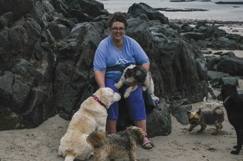
I have chosen these as my final photos because I feel these each have qualities that show Vanessa working environment. Each of these photos also has the best compositions as Vanessa is sitting in or near the middle which allows the focus to be mainly on her and the dogs. The top left photo is not as saturated and is more washed out than the others which it didn’t find as aesthetic. The bottom photo is my favourite out of the four because I think is the most vibrant and saturated which I like, it also represents the fun environment that you can see in the photo. I also really like how the blues and purples in Vanessa clothes stand out against the grey rocks and the beige sand. Even though the dogs are not looking at the camera and running around it gives the photo life and excitement but also shows the busy atmosphere that comes with being a dog walker.
2nd Photoshoot
For my second photoshoot, I decide to do one of my Dads friends, Noel Flood, he is the owner of the troubadour in St Helier. I have photographed Noel behind the bar so that you can see all the bottles and the beer pumps which are all key parts of his job. I like how in the coloured photos that the bottles behind Noel are bright and eye-catching even though they are in the background.
Editing:
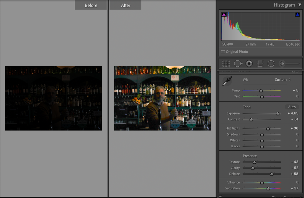
Most of my photos were very dark due to the lighting in the bar so in those photos I have increased exposure and decreased the contrast so that Noel can be seen more clearly. I have also slightly increased the saturation so that the colours are bolder and stand out against that darker green on the shelves.
In the photo above I have had to adjust the texture and clarity because it had come out grainy after moving around the photo. I have also slightly increased the tint which is also helping the colours to become brighter.
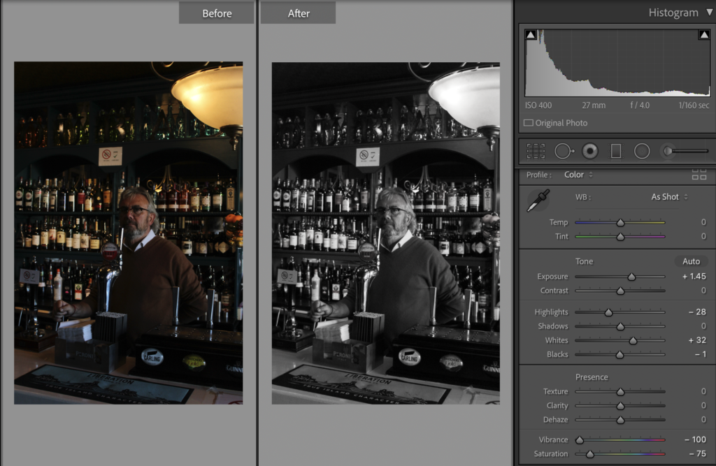
In this edit, I have turned it black and white as well as increased exposure, whites and shadows. I have also decreased the highlights so that some parts of the photo comes out darker.
Final Images:
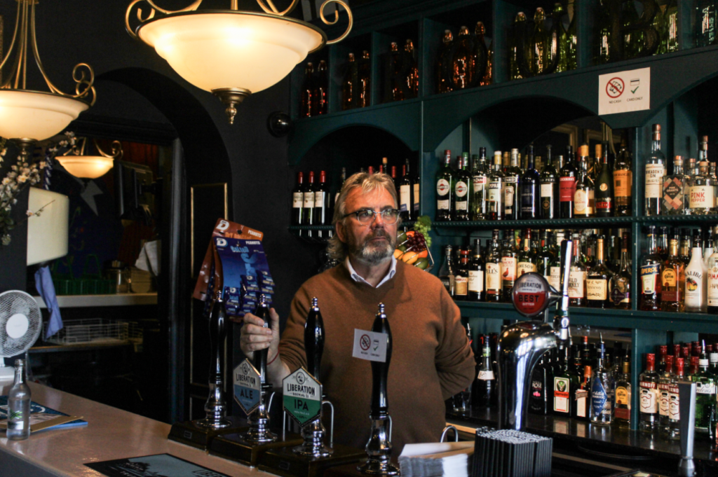
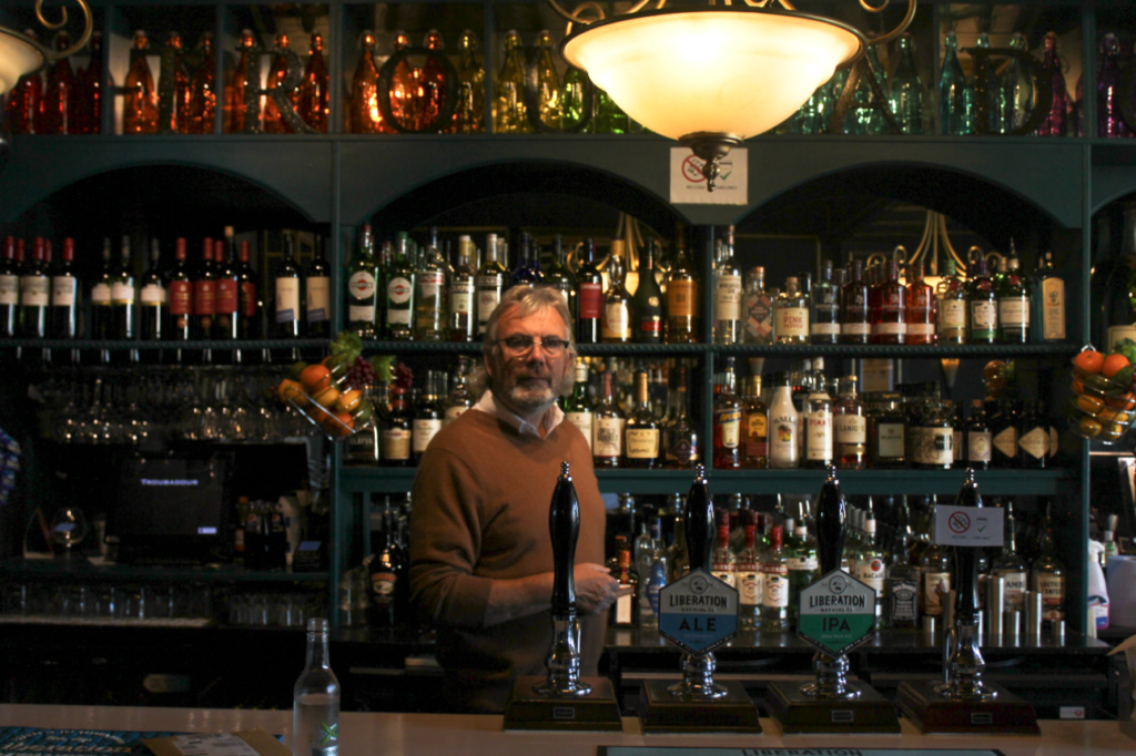
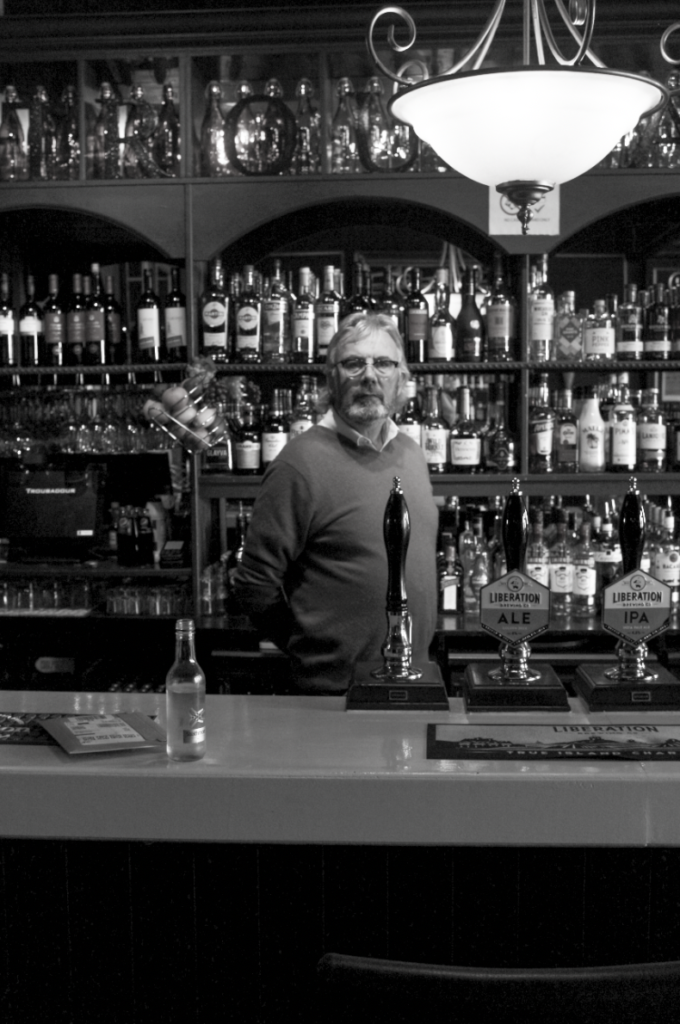
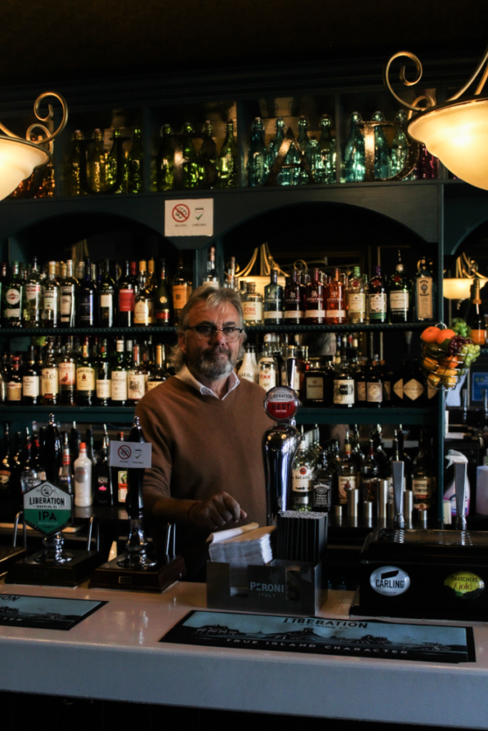
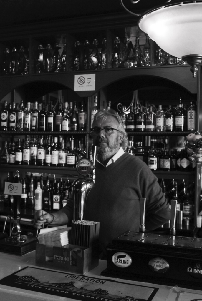
I have chosen these as my final images because each of them have Noel standing in the middle making him the main focal point. Also in all the photos except the top left and bottom right, Noel is looking into the camera which is also helping him be the main focus. Even though in the two other photos Noel isn’t looking at the camera they are still captivating, it also makes the photo stand out more because they are slightly different to the other photos I have taken. I have turned the two of the bottom black and white, with the bottom right being of my favourites, I really like the harsher and darker blacks in it and how the brighter whites contrast with them. In the coloured photos the I like the dim lighting because it is not as harsh and gives off a glowy look around the bar.
3rd Photoshoot
For my third photoshoot, I chose to do the owner of Quayside cafe down by the harbour. I have taken two sets of photos one with the lady standing behind the screen and one with the camera inside the kiosk so that there is no screen blocking the lady’s face. I like how the screens give off a neon effect due to the blue tint and the ‘pizza’ sign just above the lady. I also like the photos without the screen because you can get a better view inside the kiosk and shows a bigger picture of the owners everyday working environment.
Editing:
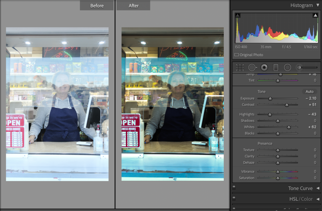
One of the main issues with this shoot was caused by covid, most places now have screens protecting both the customer and the worker. In the photos with the screen, it was difficult to see that lady’s face due to the lighting and reflection so in most of them I have decreased exposure and increased contrast to make it clearer.
In the top photo, I have also decreased highlights and increased whites, this editing has given the final edit a neon look. I really like how it brings more colour to the photo as well as makes the owners face easier to see.
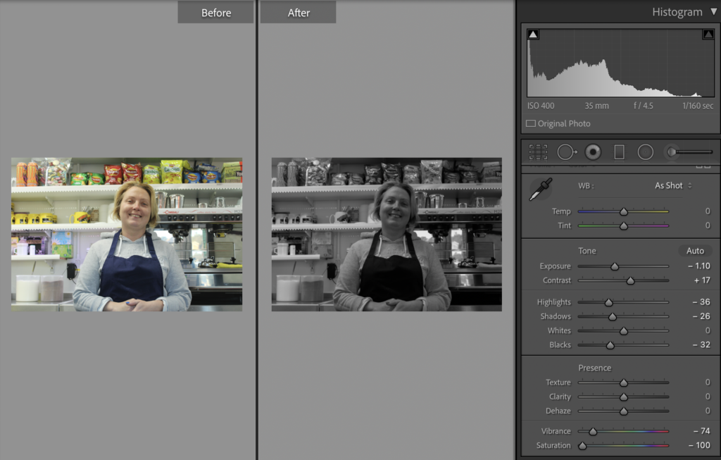
In the photo above I have changed the photo to black and white, I have increased the contrast slightly to make the photo darker, I have also decreased the highlights, shadows and blacks. I wanted this edit of black and white to be darker and have the blacks stand out more than the lighter shades.
Final Images:
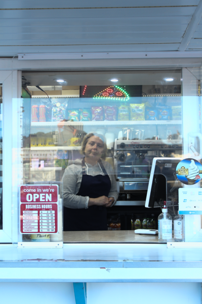
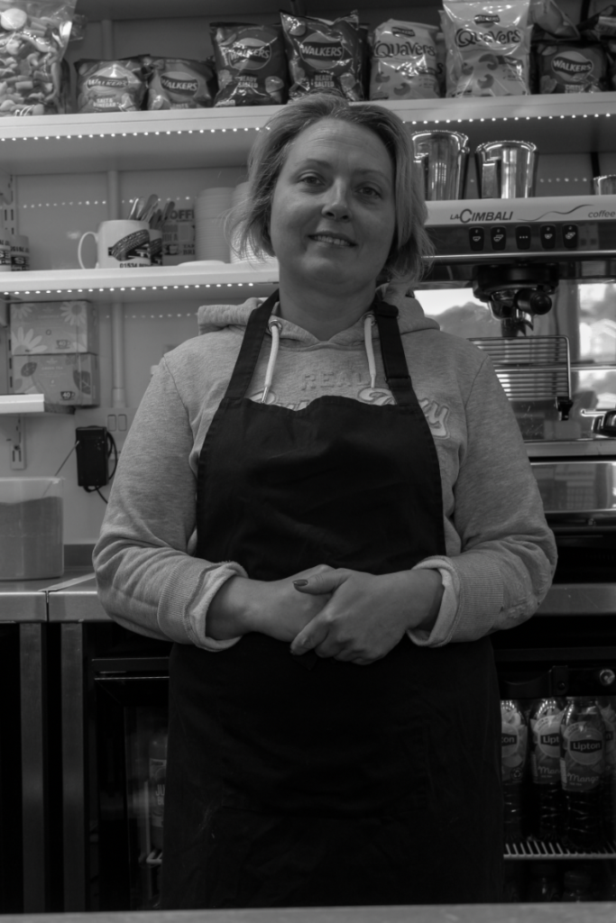
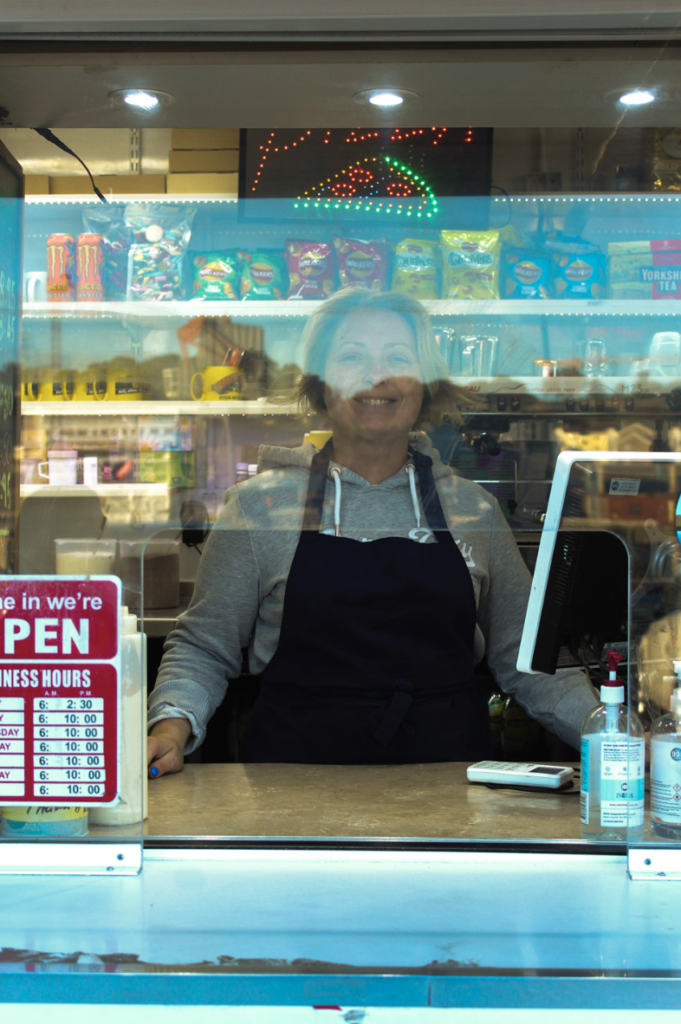
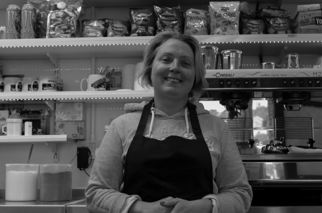
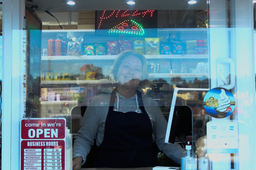
I have selected these as my final images because they show the owner and her day to day working environment clearly. They also have the lady standing in the middle which is making her the main focal point. In the coloured photos, I like that they all have a blue tint which is interesting to look at and is eye-catching. I also like how two of the screen photos has a yellow tint to the background which contrast nicely with the blue in the foreground. In the two black and white photos you have a better view of the inside of the kiosk and there is no reflection which was interfering with the view of the lady. I think that the landscape photo is better because it has less black space at the bottom of the photo and gives a wider look at the environment. Another thing that I like about the black and white photos is how the harsher and more prominent black of the apron sits nicely on top of the grey hoodie.