Category Archives: Uncategorized

Filters

Author:
Category:

edits for shoot 2

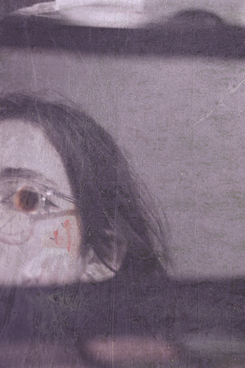
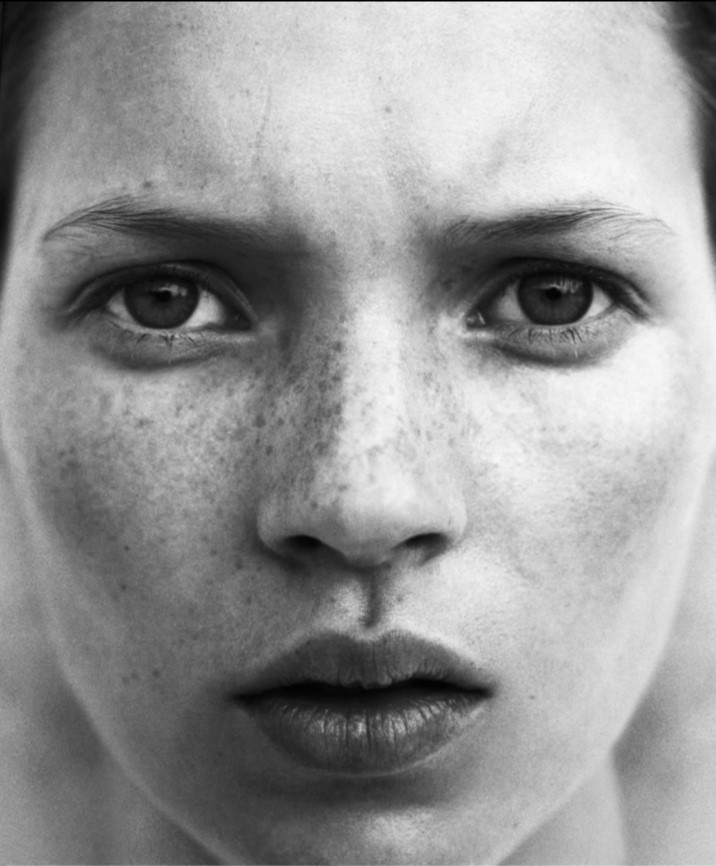
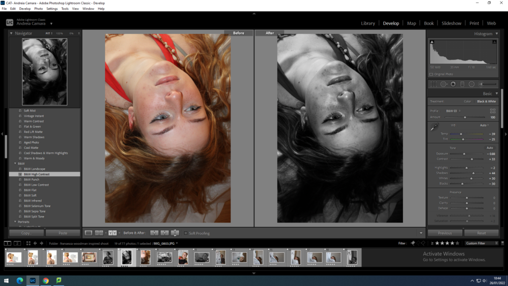
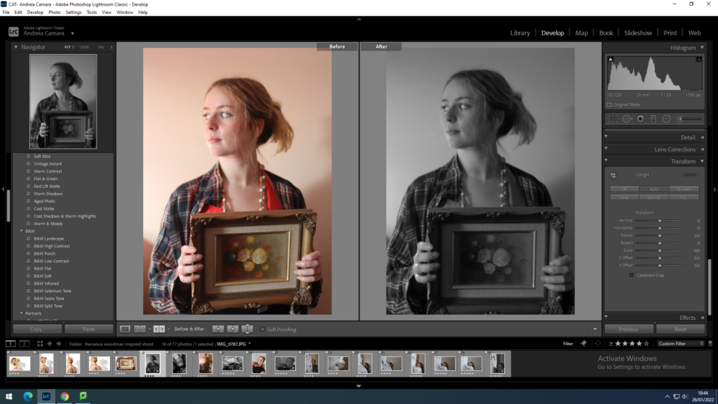
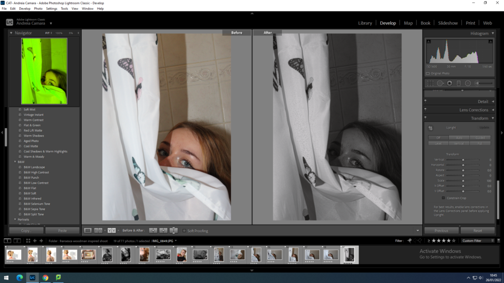
initial edits in Lightroom

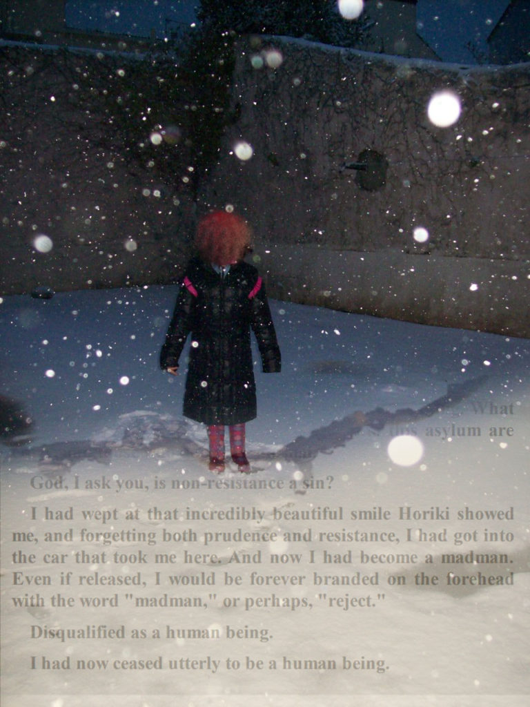
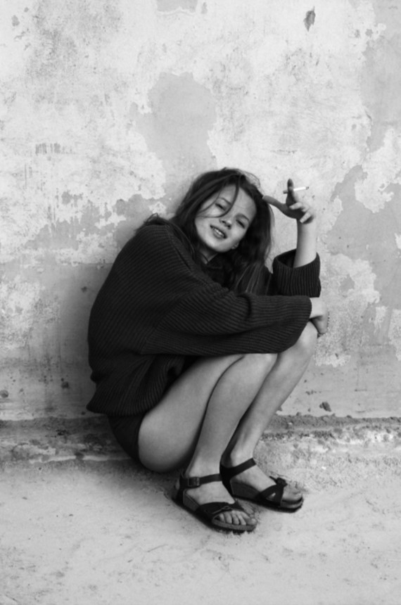
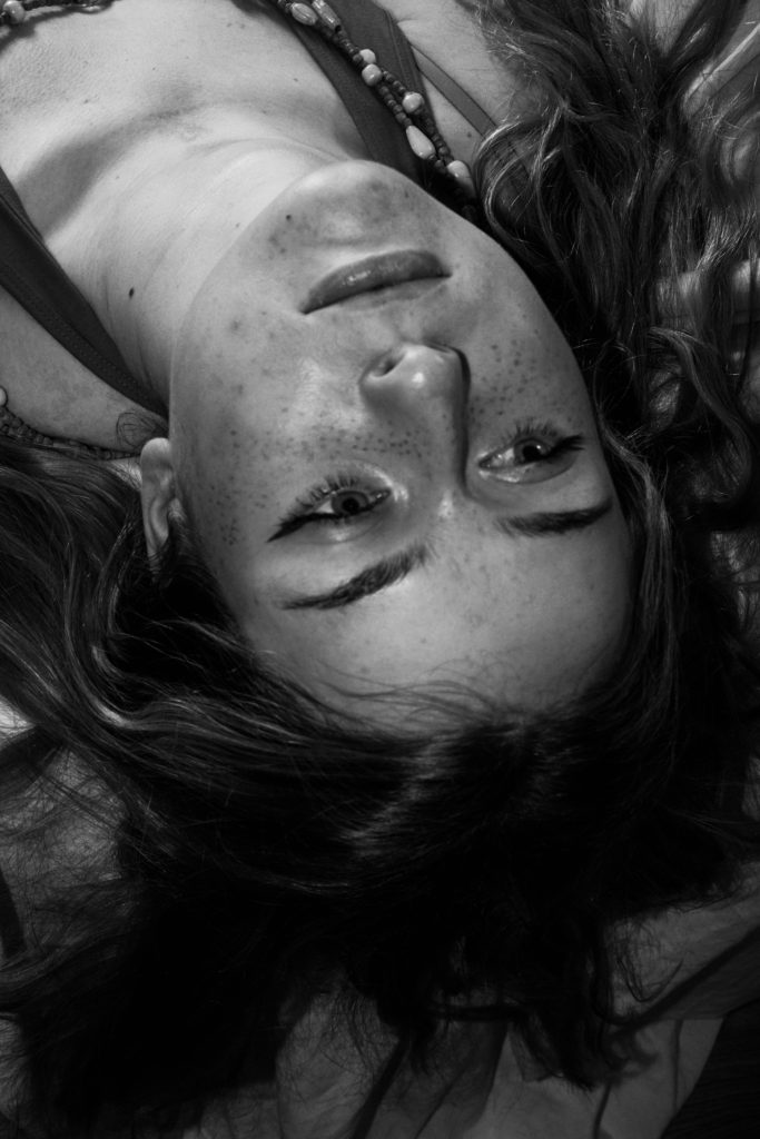
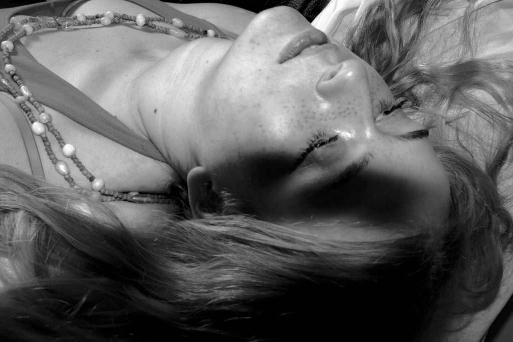
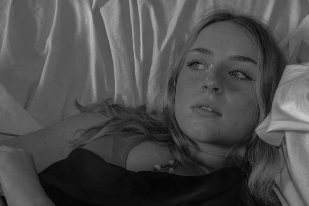
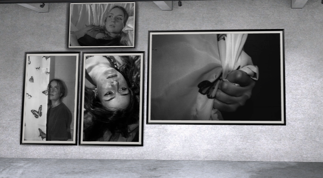
for my final images I wanted them to also be black and white in order to keep them similar to my artists work by playing with softer daylight and shadows on multiple colour backgrounds it will help the tones of the images to vary just like Francesca woodman’s work. And to help stick with the theme of loss of identity

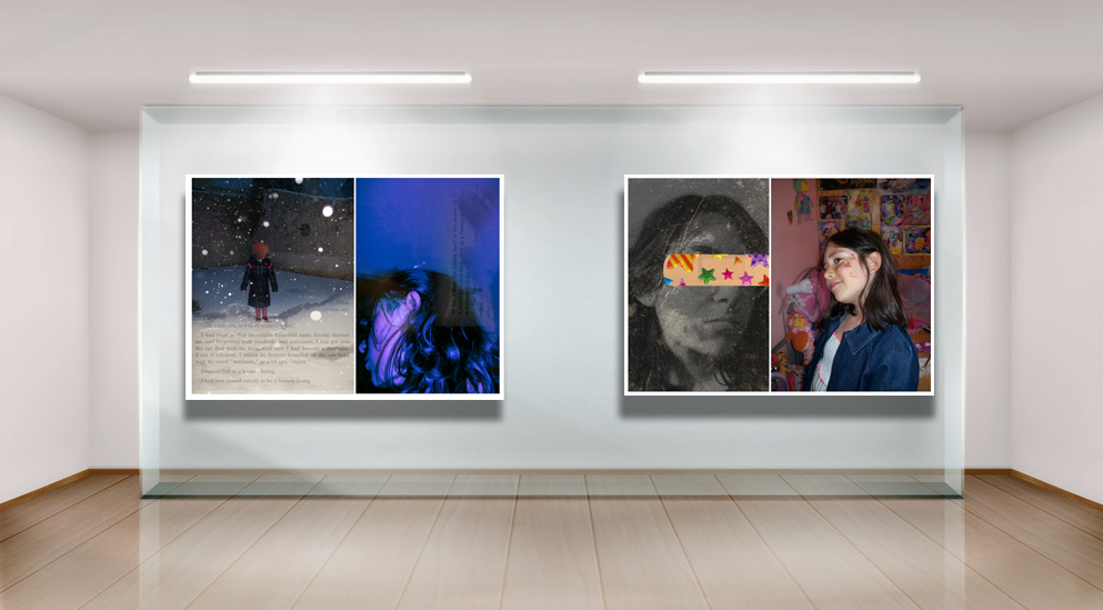
by having only 2 images with darker shadows it allows me to portray a better story as they slowly become darker as the loss of identity occurs similar to Woodman’s later work where tones and shadows were much deeper than in her early projects.

I wanted these images to have a timeless feel as the tones are varied and they leave the images up for anyone to interoperate in their own way.

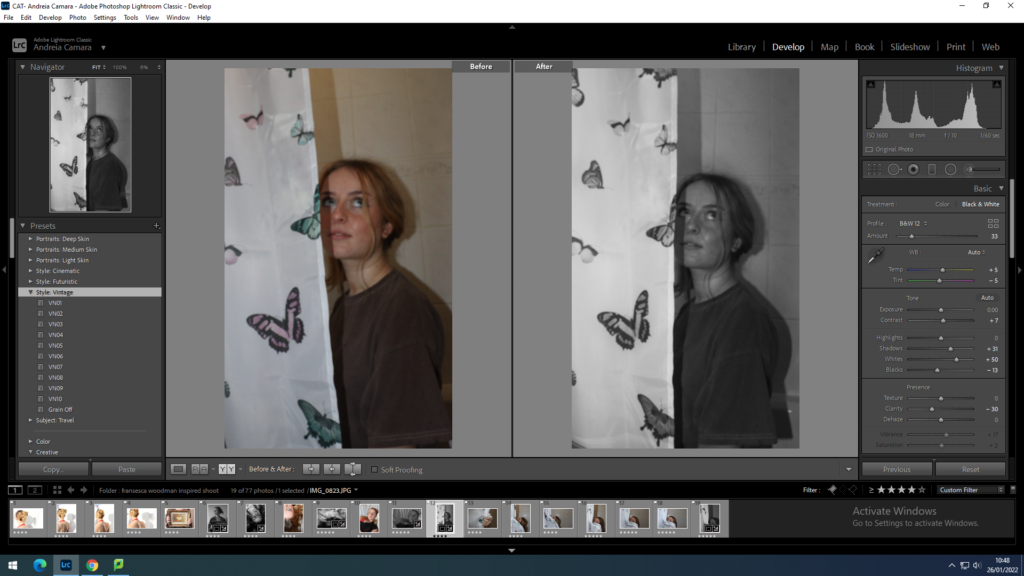
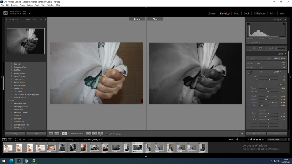
final images after Lightroom
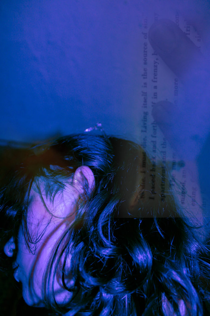
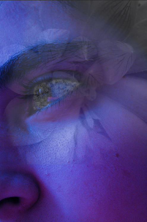
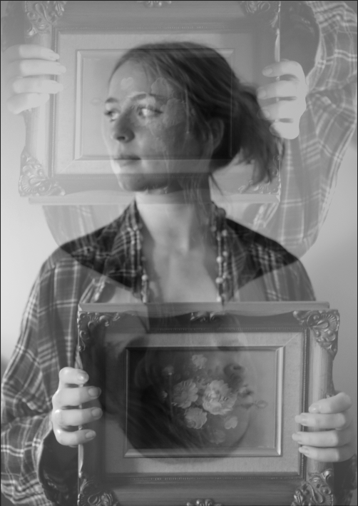
Reworking ideas

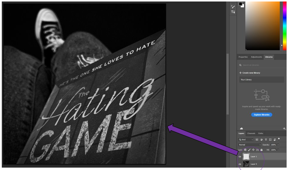
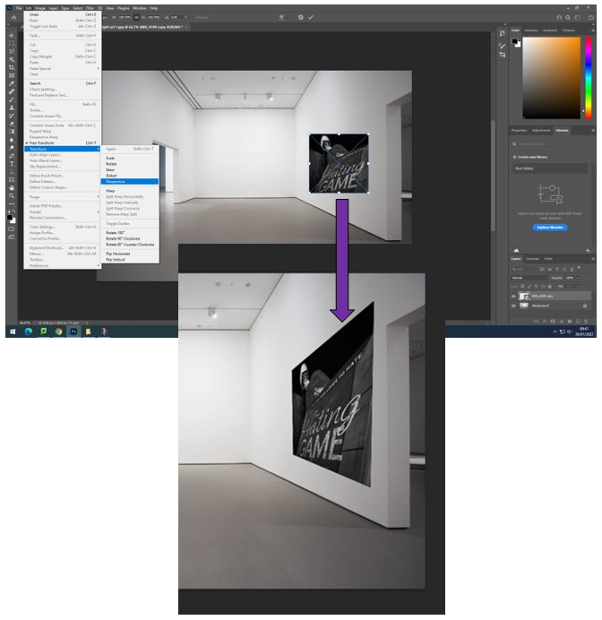
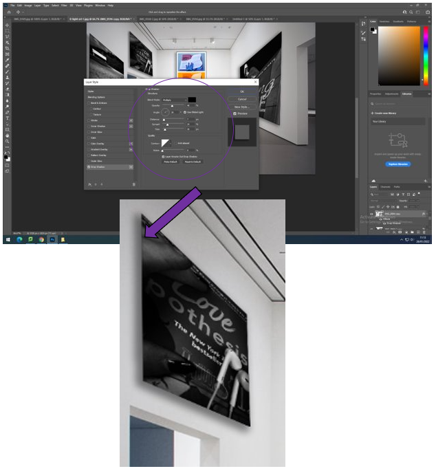
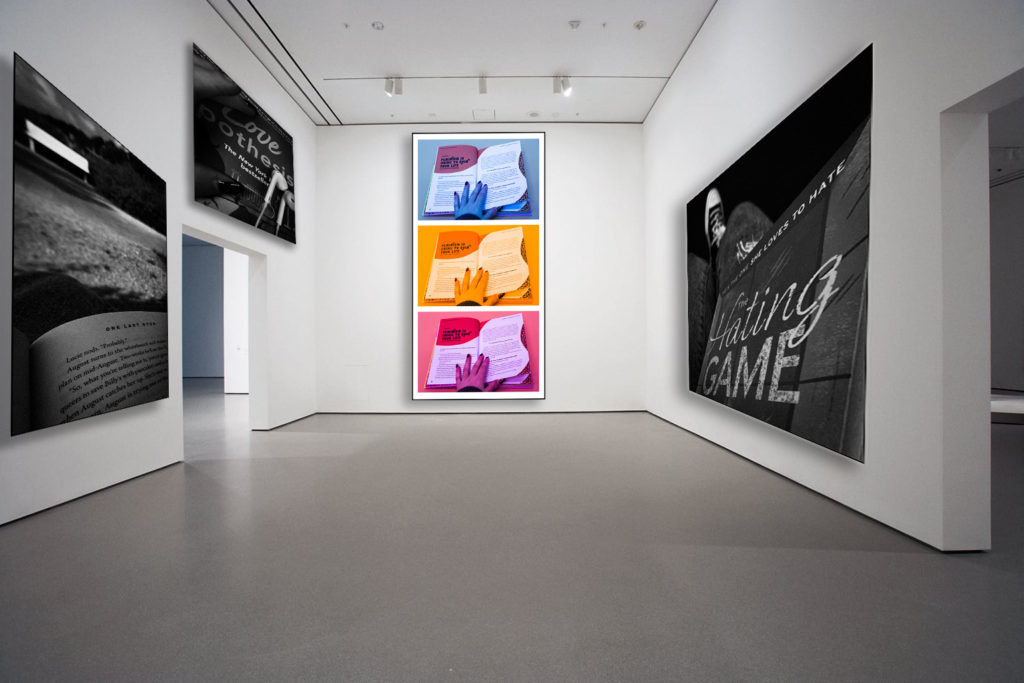
for my reworking I went on photoshop and played around with multiple layers to create some more

This image has an empty alt attribute; its file name is image-924.png

Comparison

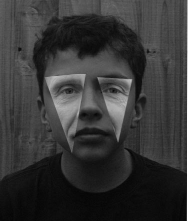
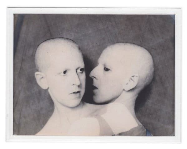
Both mine and Woodman’s work have an almost awkward layout with the objects in the image I think I managed to give my image a feel of her work through the lighting and camera settings I also used a double exposure to emote her other work which is often taken with a slow shutter speed.

However my image is slightly softer than Woodman’s hers shows a deeper insight into her identity as a person as it is a self portrait.

compare and contrast

Kensuke Koike

Here I have recreated one of Koike’s pieces of work using photoshop. To make this piece I took two original images of my dad and brother, edited them so make them monochromatic and them took triangle sections from my dads eyes and placed them over my brothers face to create a weird optical illusion. the fact that my dad has so much more facial texture than my brother makes for an interesting image as contrast is created through the difference between smooth and uneven skin.

Furthermore, I like how these two pieces are so similar yet so different, as Koike’s piece is composed of three different people whilst mine is only made of two, but, they both still link to the idea of family identity. I think that the second piece in this gallery is the most successful as the tones are subtle, even though this isn’t as much like Koike’s work, I still think that it came out as a good artist reference as it clear I have mostly copied his work. In addition, I took his style of image and created it in colour, but it think the texture in this image isn’t as visible, so it lacks depth.

Yoshikatsu Fujii

I have combined two old family photographs, one from my mums side and one from my dads. I created this piece by placed these images into Photoshop, then taking a image of an red string from google and placing in it the middle, so it would look the same as Koike’s. The main reason for me recreating his work is because I am intrigued by his ‘Red String’ project, which is based on the distance in his family after his parents separation.

Red String project

Here I have selected two images of my grandparents when they were young, one from my mums side and one from my dads. On Photoshop I cropped both of these images, cropping out some people that weren’t as influential to me and my parents lives, so I was left with less of my family members. Afterwards I used the brush tool, adjusted the side using the bracket keys, and took many attempts and drawing a line down the middle to represent the string in the image above, as there was no images that were useful on google.

The idea behind this piece is that my dads side of the family would contrast with my mums, the piece on the right is composed of photos of my grandad, dad, uncle and brother. Whilst the right is of my uncle, aunt, and mum, the red string from my dads side not connecting to my mums, the message of this is to represent how these sides of my family are so different, and you can even see which facial features my dads side of my family share.

comparison

I chose Andy Le Gresley as my artist reference he is most famous for his land scape photography of jerseys coastlines. my images are on the left and Andy Le Gresley’s images on the right.

I think i have linked my images to my artist reference quite well.

Experimenting: Pairing photos

I knew there were certain photos I wanted to pair with each other so I decided to spend some time choosing what photos would be paired together.

Experimenting

—Experiment 1:———

Here, I was trying to pair a photo of me as a kid with a bright, colourful one in order to get a big contrast between both images and exaggerate how much has changed from then until now.

I like the way that both of these images work together as the paper helps create a connection between them, however, I’m unsure as to whether the paper makes them too similar to each other, making the pairing look busy/tacky.


I think these two images work well together as neither image is too busy, allowing both to stand out instead of competing with one another. I decided to pair a simpler version of the older image as the final version was too busy for my liking and didn’t work well whatsoever with the other edit.

–Experiment 2:———

Here, I was trying to pair a photo from when I was little. I knew exactly what photos I wanted to try pairing with it as I attempted to recreate the butterflies on my face during my final photoshoot.

I decided to change this image slightly by adding some vintage overlays on top of the already edited image and decided to add a burn mark to the eye, helping the photograph seem aged. I did this in order to create irony between the 2 images to make the most recent image looks the most worn down.
This image has an empty alt attribute; its file name is 102_1089-768x1024.jpg

I really like how the images look paired with one another, especially as it looks like both images are looking at each other, creating an almost sad atmosphere surrounding the images due to how different they are from one another and how their positions/completions should be switched.

For this image, I also decided to add a vintage overlay, however, I decided I needed to make this image more dramatic so I chose a more intense overlay.

I also really like how this pairing looks. I think the lack of colour helps bring both photos together as it makes the contrast between them more dramatic whilst the small pop of colour from the plaster and stickers stops the images from being too different from one another.


As my final pairings, I decided to go with these pairings:

I really like the way that the two photos connect together via the book page, showing how some things never change despite how different things may look and showing how difficult it is to erase who you once where.
I chose this pairing as I like how dramatic the contrast between the two looks. I think the two images work really well next to each other and add on to the message in the other pairing.

evaluation

What went well:

For my photography mock exam, I produced multiple images but only chose to use 4 as my final pieces. I am happy with the way all my images ended up coming out using photoshop and lightroom. I like the way I was inspired by multiple artists and used my own approach to create my own style of images. I am happy that I was able to include at least one of my images from when I went to Bluey Bay hotel to take some photos because I think abandoned/derelict buildings are one of the best areas to go to for a photoshoot.

What didn’t go well:

For my next mock exam project, I will make sure to take a lot more photos so I have many more options to choose from in the future. I would’ve liked to include more photos from Bouley Bay hotel but most of the photos I took didn’t turn out in the best quality. Also, I would’ve liked to have more ideas for good edits on some of the photos I took.

Conclusion:

Overall, I am very happy with my final outcomes and the work I produced.

A virtual galllery

To show all of my edited best shots, I wanted to create a virtual gallery. This will showcase them before I create my physical final outcome, with a select few images instead, which would be done by hand.

I will follow these steps in photoshop –

  1. Download an empty gallery file.
  2. Insert your images and place them on the walls of the gallery.
  3. Adjust the perspective, size and shape using CTRL T (free transform).
  4. Add things like a drop shadow to make the image look more realistic.

Creating the virtual gallery

I began by bring my edited photos into photoshop and adding a border around them. I did this by adding a layer, selecting the whole photo then using the tool “Stroke” where I could change how big I wanted the border to be using a different number of pixels as well as changing the colour of it, for this I chose black. I repeat this process for the rest of my photos.
Then I brought my photo into the empty gallery file which I took from google, adding the photo which I had just made. Then I sized it down to a suitable size, which I alter as I go through, and choose “Transform” then “Perspective” to change how it appears on the wall to give a real life perspective, repeating this for the rest of my photos.
After I had brought every picture into the gallery where I wanted them to be, I selected each picture, right clicking it which brings up this menu where I choose “Drop shadow”. This adds a realistic touch towards the photo as if there is light shining down on it, making it look 3D.

Final piece –

For this outcome of my final pieces, I am really pleased with how it turned out. This is because I like where I have places the photos, as they fit nicely and don’t make the picture seem too overcrowded or busy, which gives it the impression that this has been a picture which someone has taken from inside a real gallery that you would see in real life. The with the use of the drop shadows, I really like how they transform the photos to look as if they are realistic frames around them which the lights are transforming as it makes them look 3D.

I also like how there’s a slight pop of colour in the middle because it shows how even if you’re in solitude, which can seem sad or lonely, you can also use books to show the positive side of reading due to the stereotype of it being depressing and shows how it is used to spread positivity and impactful/meaningful messages towards people to spread awareness of these issues. I really liked creating this “Virtual Gallery” in Photoshop because I think that it is a unique way to present your ideas, which makes it look real.

Photo Montage Project

This was by far the biggest piece of work I have done for this project. I had to individually import, crop, export, edit, resize and insert 54 different photographs. This was a very time-consuming process, but I believe it was worth the time. It is telling a story of my entire family’s ancestry, going back as far as my great-great grandfather. It also includes my grandparents as children, growing up to have their own children, being my parents, leading to my parents with me.

Whilst producing my collage, I wanted it to contain one central, bordered image that would have a lasting effect on whoever was browsing my work. For this reason, the image I chose was of the flowers lain on my Grandad’s coffin. Soft, but powerful. I applied a border by drawing a rectangle around the photo after the collage was complete. I coloured the rectangle black and applied a white border stroke around the edge to make it stand out more.

After this, all that was needed was some slight readjustments to some of the images as there were a couple of minor gaps that needed filling. Once that was done I had a resulting product that I was happy with.

Final collage

Identity

What is identity (in photography?)

(Social identity and loss of identity focus)

Identity itself is the fact of being who or what a person or thing is. Identity in photography is more about how a photograph resembles the likeness of what appeared before the lens. So, in the case of a profile picture, family album or mug shot, identity is based on the repetition of sameness that is evidenced by the image produced by the camera.

Identity can be influenced by many things including where you grew up, the people you are around, your heritage etc.


Mind Map


Carole Benitah

is a French Moroccan photographer, who worked for ten years as a fashion designer before turning to photography in 2001, explores memory, family and the passage of time. I find these images very interesting as they are a fresh take on displaying emotions such as grief and the feeling of not belonging while using old family photos to link in heritage. I will definitely be using this as inspiration for my project.

Carolle Benitah | Chez le photographe, At the photographer studio (2009) |  Artsy

Corrine Day

was a British fashion photographer, documentary photographer, and fashion model. She was a photographer whose influence on the style and perception of photography in the early 1990s and onwards has been immense. Self taught, Day brought a more documentary look to fashion imagery, in which she often included autobiographical elements. She has projects on vitality / pressures of youth.


Diana Markosian

takes an intimate approach to her photography and video storytelling, Her work is represented by Galerie Les Filles du Calvaire in Paris, France and Rose Gallery in Los Angeles, California. She has projects that focus on cultural, geographical and political identity. For example in the photos below she explores unseen parts of foreign culture and the “forgotten” people from older generations who still remember and embrace century old traditions and ideas. For example the first picture was taken on the outskirts of Havana, neighbours gathered in the street waiting for a girl to emerge from her house for her quinceaƱera. She uses wide shots to show the scale of the gathering, which I think she has done purely to emphasise how important this is in their culture.


Claude Cahun

Who is Claude Cahun?

Claude Cahun was a French surrealist photographer, sculptor, and writer. Schwob adopted the artist name Claude Cahun in 1914. Cahun is best known as a writer and self-portraitist, who assumed a variety of performative personae.

About her work

Cahun’s work is both political and personal and also focuses on creating work linked to the surrealist movement. Although she made sculpture, embedded herself within activism and wrote extensively, Cahun is mostly synonymous for her contributions to surrealist photography, particularly her striking self-portraits, in which she questioned societal expectations of gender years ahead of her time