Category Archives: Uncategorized

Filters

Author:
Category:

Photoshoot 1- La Collette (Baltz and Misrach)

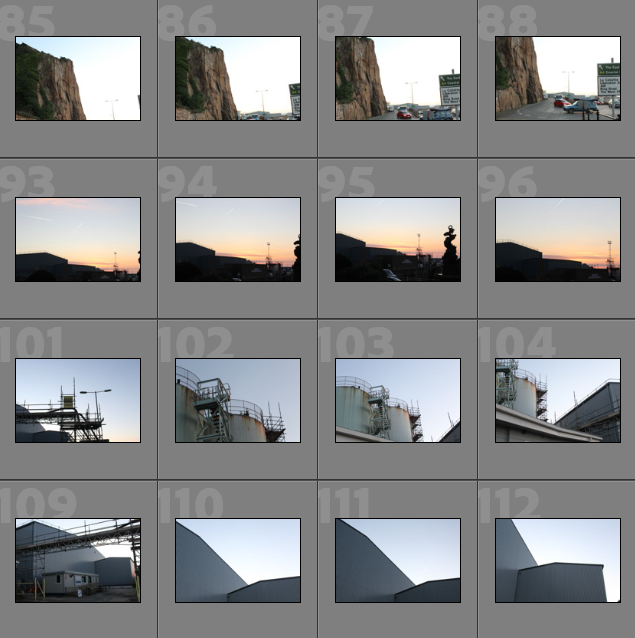
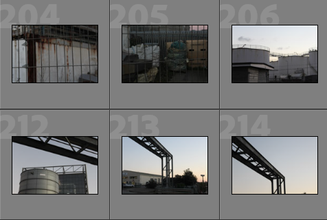
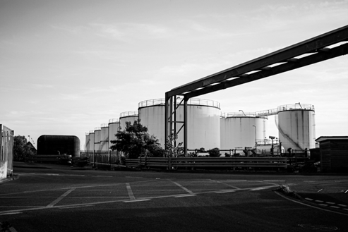
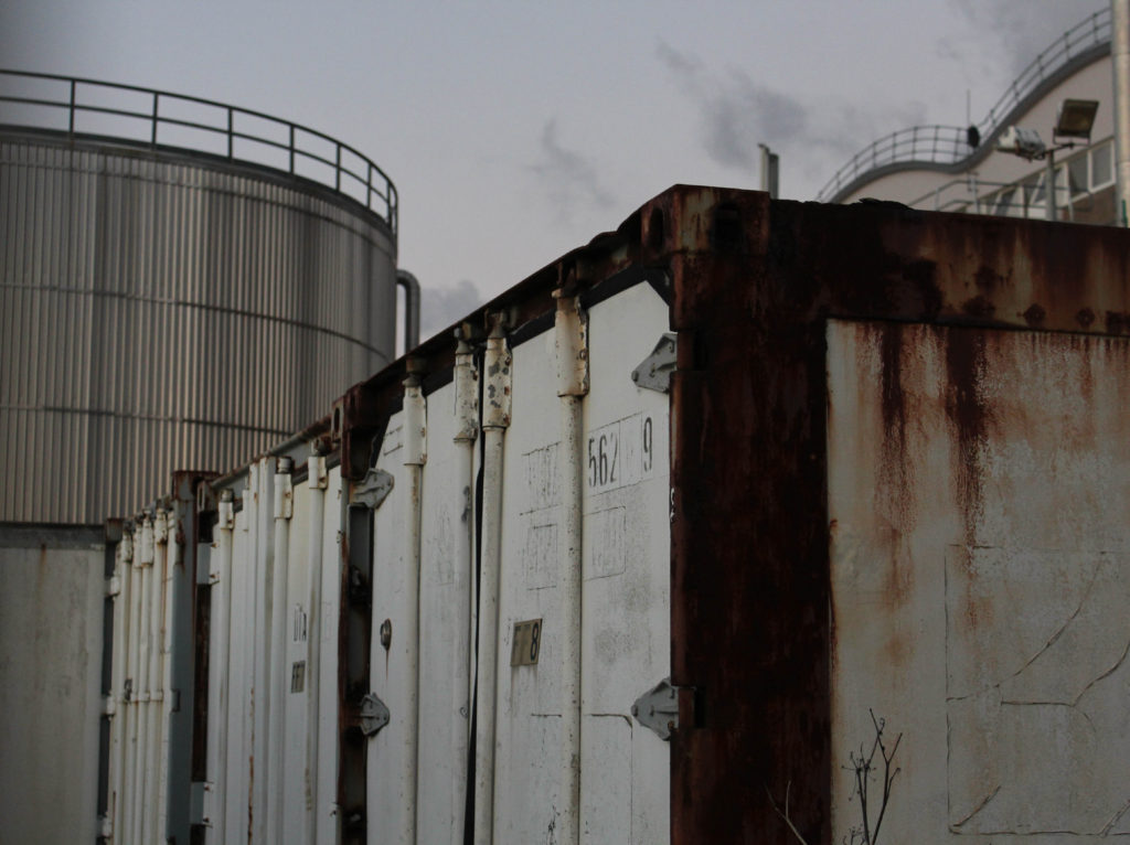
Photoshoot Plan: For this photoshoot I would like to explore the area of La Collette and its close surroundings. The main aim of this photoshoot would be to create high quality images of an industrial are, particularly ones which would look good edited in a monochromatic style, as this reflects the work of artist Lewis Baltz, who I have been researching and writing about throughout my essay. Additionally, this photoshoot was aimed to be done throughout sunset, as the golden lighting can create reflective effects and interesting shadows. I will not be using other equipment apart from the camera as I believe that my shutter speed will not be low enough for me to need to tripod. I will be attempting to recreate work similar to those of Lewis Baltz and Richard Misrach, this makes this photoshoot my most important of the three that I will be doing, as the others mostly focus on just one of these artists,

Contact Sheets

Image Selection

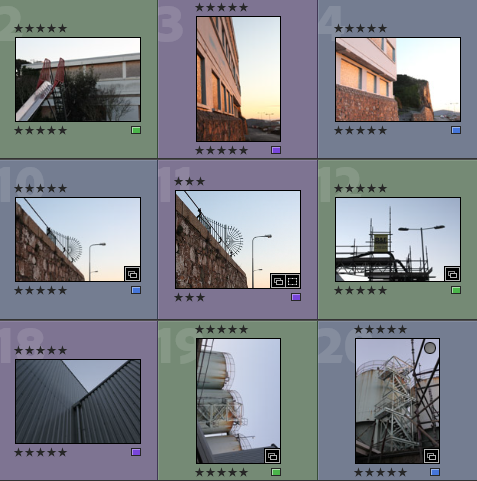
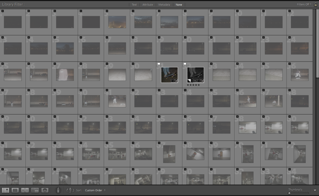
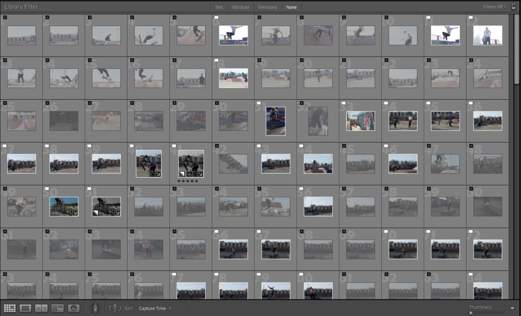
In order to begin my image selection process, I went through all of my images and rated them with stars, this ensures that I can later filter out of my unsuccessful and only focus on the ones I have rated 5 stars. The next step to this process is using a colour coding scheme which helps me determine which images out of my strongest images have the most relevance to my project and are of the best quality. This means that the editing process is made so much easier as I have already selected the best images and these mostly have high levels of quality, meaning that some types of editing, such as monochromatic, don’t turn out grainy.

  • Purple- images with most potential
  • Blue- images that could be used
  • Pink- images with least potential

Why I like this method of image selection: This method is an easy way to determine how much I like all of my images individually and how I can visualise them coming together as a sequence. It helps me consider how all my photographs will be arranged in my photobook and which images match up the best.

Best Images Before Editing

Below I have created a gallery to illustrate my images with the most potential, as I believe that these images do not need a lot of editing and are high quality without adapting the ‘clarity’ and ‘dehaze’ settings in Lightroom Classic. I would like to use these images in my photobook as the saturation of these images will look aesthetic in my book as the natural colours provide contrast to the amount of monochromatic photographs I would like to include.

Editing

I have created a gallery to demonstrate the different ways in which I have edited my images, this also shows that not every photo needs a lot of adjustments/ changes to them. I found that the case with so many of my images from this photoshoot as the images had good levels of saturation and vibrancy so they didn’t need a lot of work done to them.

The images from this photoshoot were more difficult to edit than I expected, this meant that making them appear monochromatic sometimes was not as successful as I would have hoped, this means that selecting images to place on the blog was more challenging and there was not many good black and white images to place into this editing gallery. I would like to majority of my monochromatic images to come from my other photoshoots so I’m not too concerned about this.

Final Images and Evaluation/ Critique

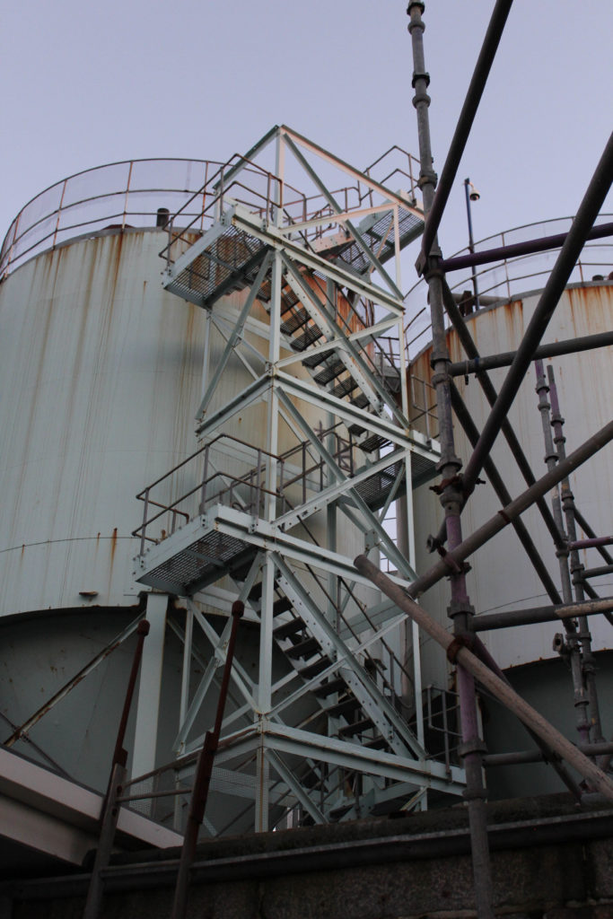
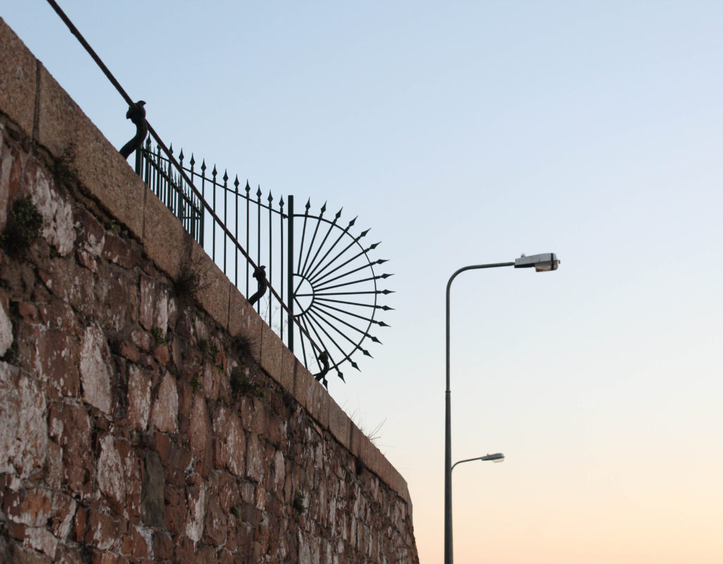
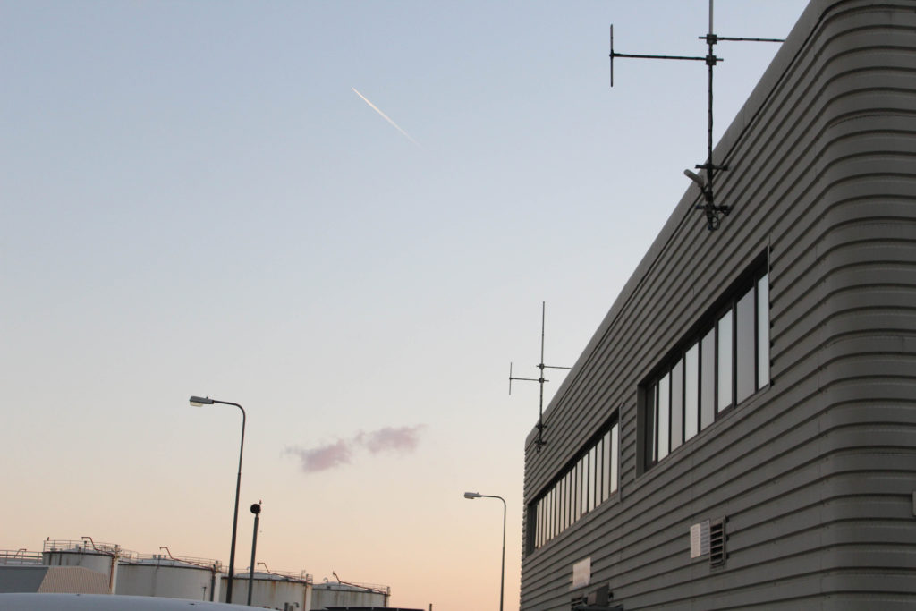
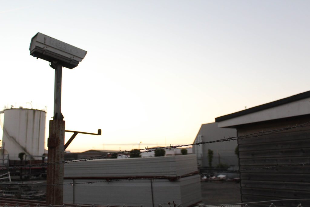
This section will include all of my final images from this photoshoot, this demonstrates that exploring around La Collette was successful when in regards to creating new images for my photobook. The most important aspect of this photoshoot is the fact that I am responding to both of my artists and these images are important when it comes to illustrating my understanding of both of my photographers work.
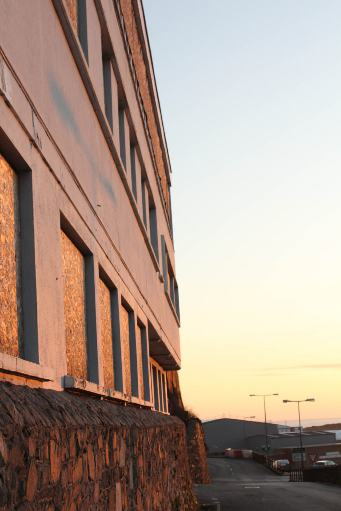
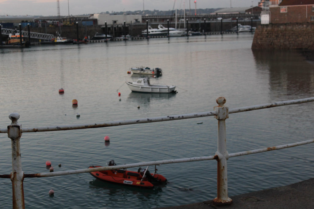
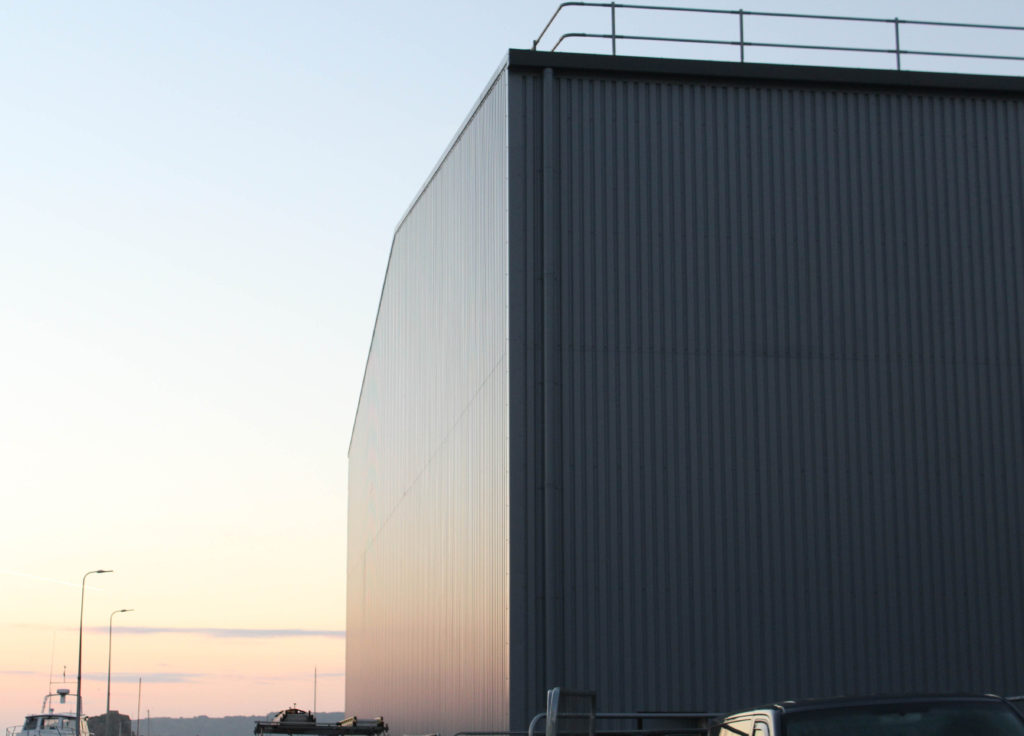
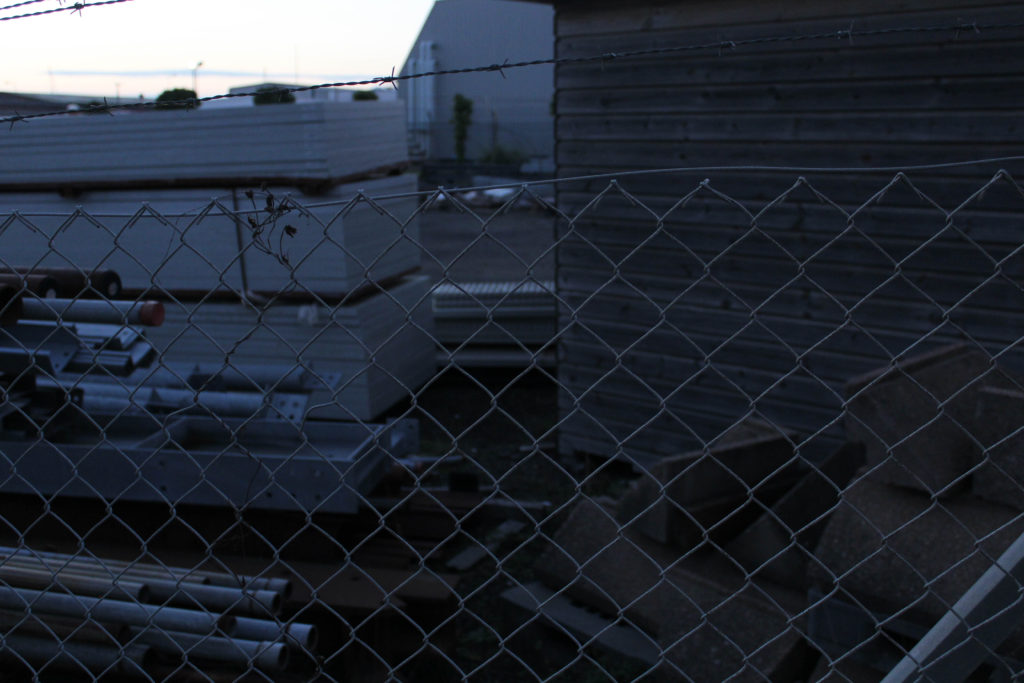
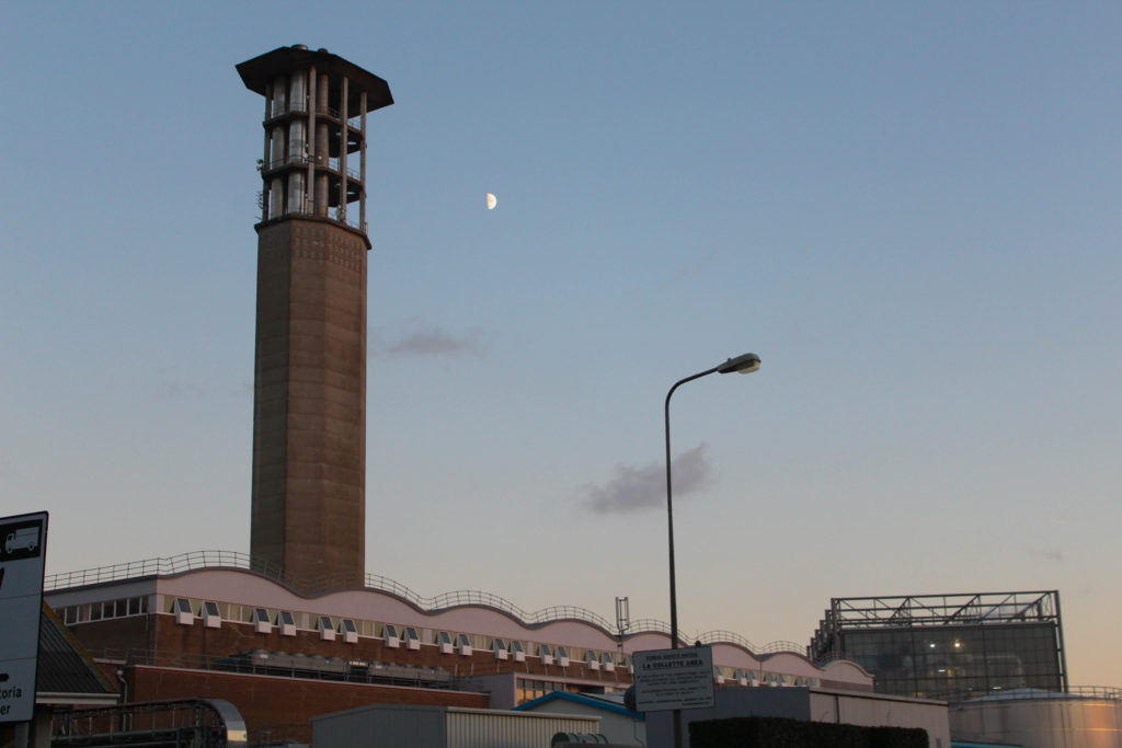
I have decided to place these two final images together as they both have a warm tone and blue aspects to them, the background throughout the first image matches the sky in the second. The first image is like a zoomed out wider perspective of the second one, and this creates a story of exploration throughout these images. This is important as it shows the narrative and thought put into taking my images in La Collette and its surroundings. The overall look of the photographs is one of high quality and dimension, in my opinion these are some of my successful photographs as they didn’t require a lot of editing and cropping. These images are a good reflection of Baltz’s style of photography along with the angles and saturations that Misrach uses, making them great example of how I have tried to explore the work of both photographers in my own way.

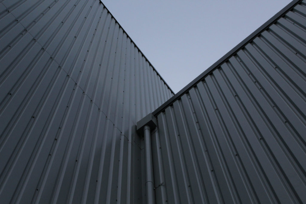
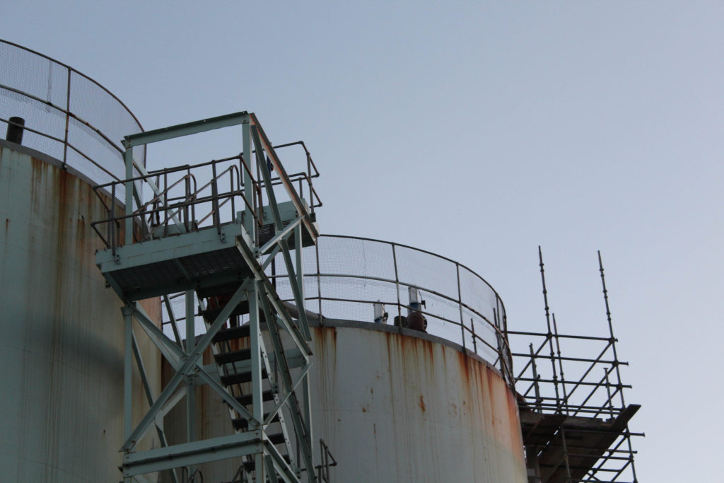
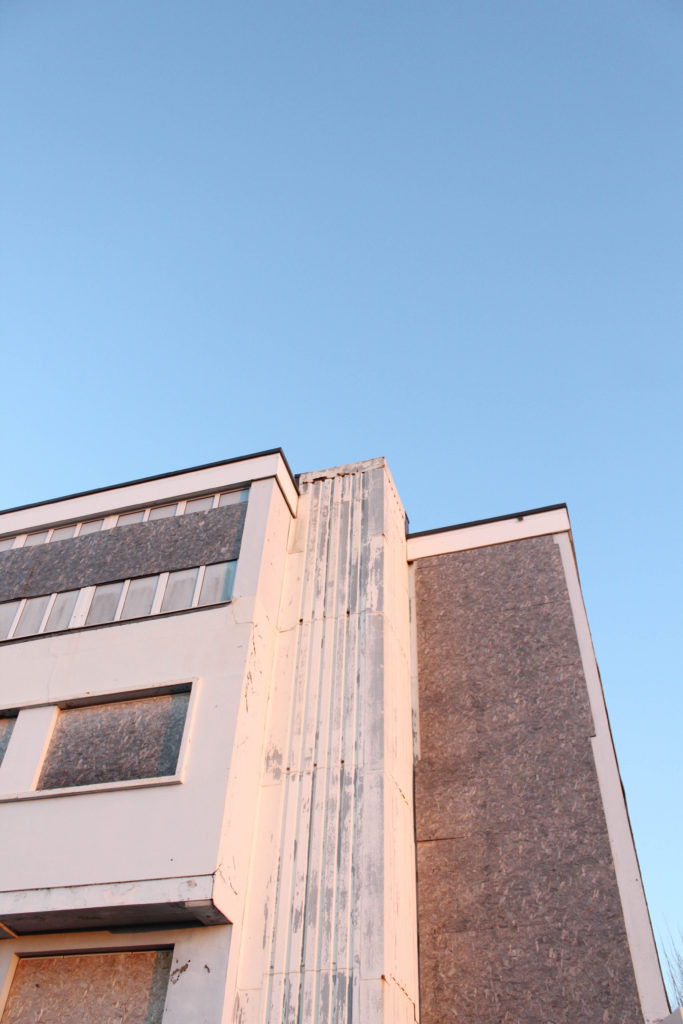
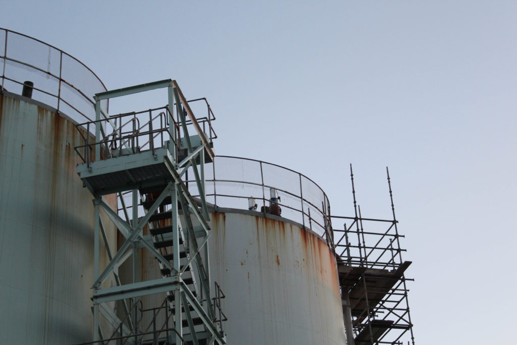
I have selected this as one of my final images as I think it reflects the work of Lewis Baltz very accurately, the infrastructure and use of parallel lines means that it reminds me of his work and could be compared and contrasted to his work in an effective way. Furthermore, the point of view in which the image was taken is very interesting as it is from the ground looking very high up, using this unique perspective means that I had more control of the composition of the image and how much sky was left to be exposed. Overall, I think that the cool tones in the image mean that the greys and blues play off each other very effectively and this creates a very authentic feel to the whole image, and the greys in the metal work creates light shadow and reflecting aspects across the majority of the photograph. Its important to note that overall the complexity of the image is limited, but this doesn’t necessarily mean this makes the image less or more successful, its more just an observation when thinking about how much time was put into considering how this image would turn out.

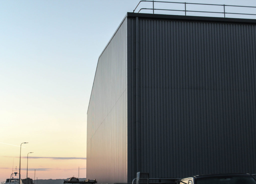
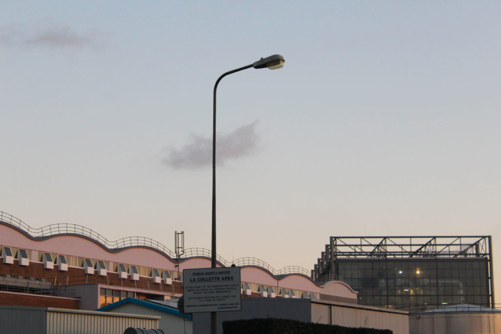
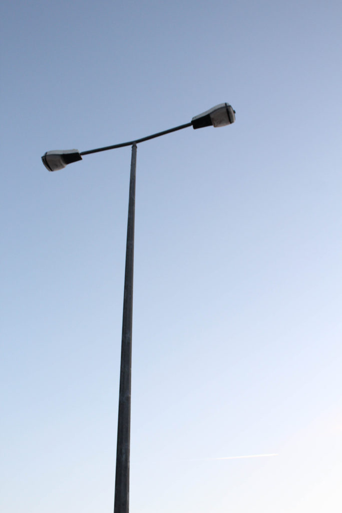
These final images were taken straight across from each other which explains why the sky is slightly darker in the first image as it is facing away from the sunset, and also explains why there is lots of light reflecting off of the metal structure in the second image. In my opinion these photographs fit well together as they both represent work from both of my artists, along with showing how similar and different their work is at the same time. Furthermore, the composition of both of these images makes them more successful as the lamppost is in the middle of the image, and the side of the metal building takes up half of the photograph on the right hand side. These image link well as they both contain parts of La Collette which look similar but have different functions. for example the incinerator in the background of the left image and the lamppost in the background of the right photograph. A critique for these images could be that the first one could of been more zoomed in, along with changing the ‘F’ setting on the camera, the image could of been a lot clearer.

Compare and Contrast
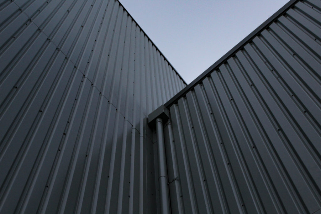
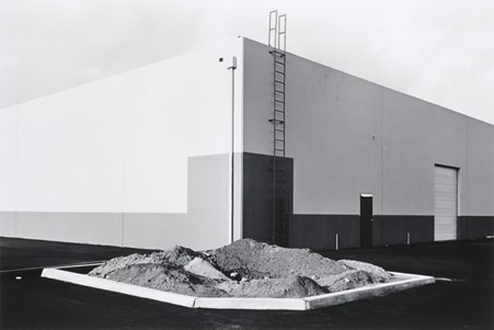
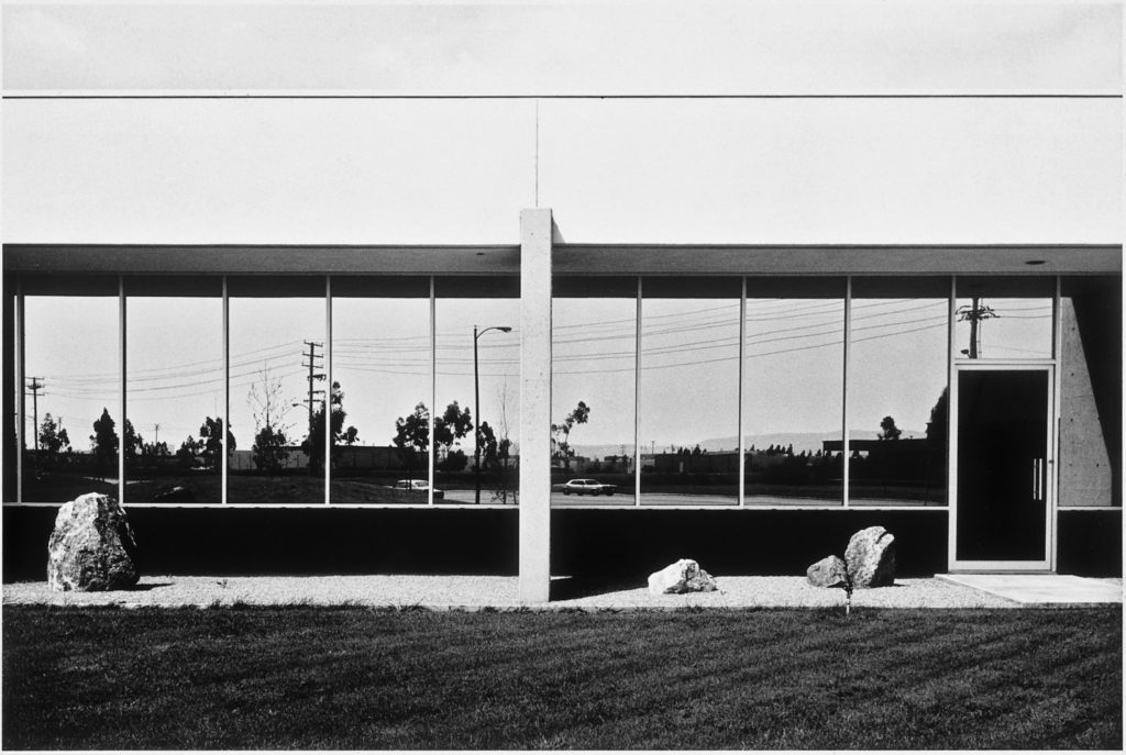
Similarities: Below I have placed an example of my work in comparison to the work Lewis Baltz, this is in an attempt to illustrate that I can take inspiration from an artist and show I can create examples of their work in my own style throughout their photoshoots, this means that I have some work which is like Baltz’s and some which is more like Misrach’s, or even some that reflect my own style of photography. The main similarities in these two photographs is the parallel lines in each of the photograph, as the empty space which is present to create contrast, such as the sky in my image and the bushes and pavement which are places at the very foreground of Baltz’s image. This illustrates that both work was taken in industrial areas which have been heavily built my mankind and may be continue to develop.

Differences: My work in comparison to Baltz’s is not monochromatic and contains less cluttered parallel lines, this means that along with the lack of free space in his image his work looks more busy and full of life, it could be argued that my work is of lower quality in comparison. My photograph only focuses on one part of of the structure and the metal work, whilst Baltz’s image looks at some surroundings, such as the pavement and the rocks in the foreground of the image. In my opinion, this makes his work focus more on the general aspects on Anthropocene and it could be interpreted that my work is just focusing on industrial areas and not that natural oandscapes that have been destroyed.

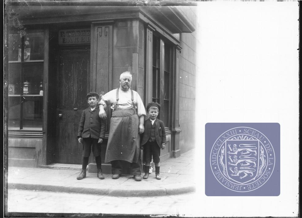
Photoshoot locations

PLACES:Pitt StreetDumaresq Street

Now
Pitt Street
Dumaresq Street – google earth

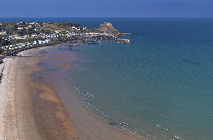
Royal Bay of Grouville Now – google earth

Cheapside
St Helier Now google earth

SJPA/000053 Parade Place

SJPA/001545

SJPA/032856 Burrard StreetDon Street

urrard StreetDon Street google earth

Personal Study Shoot 2

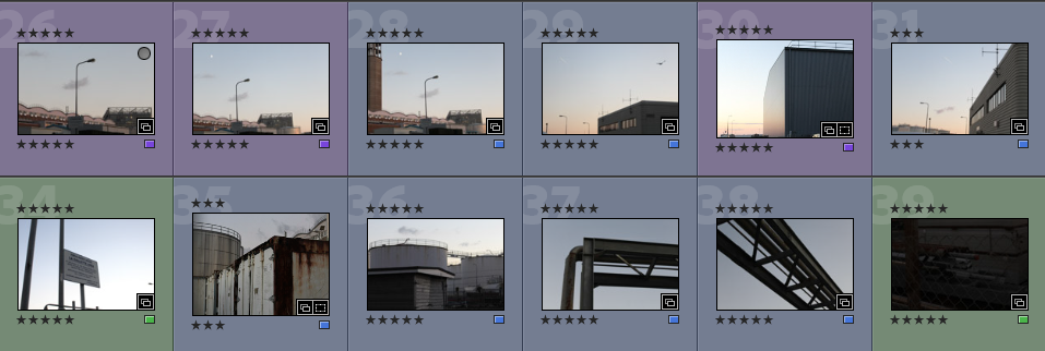
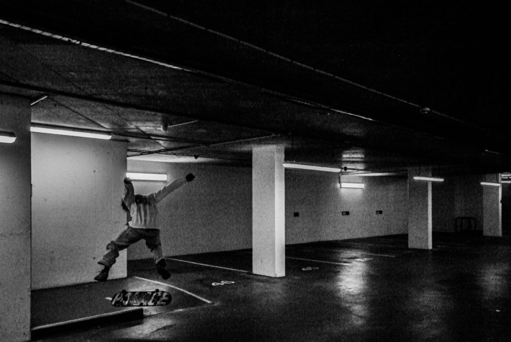
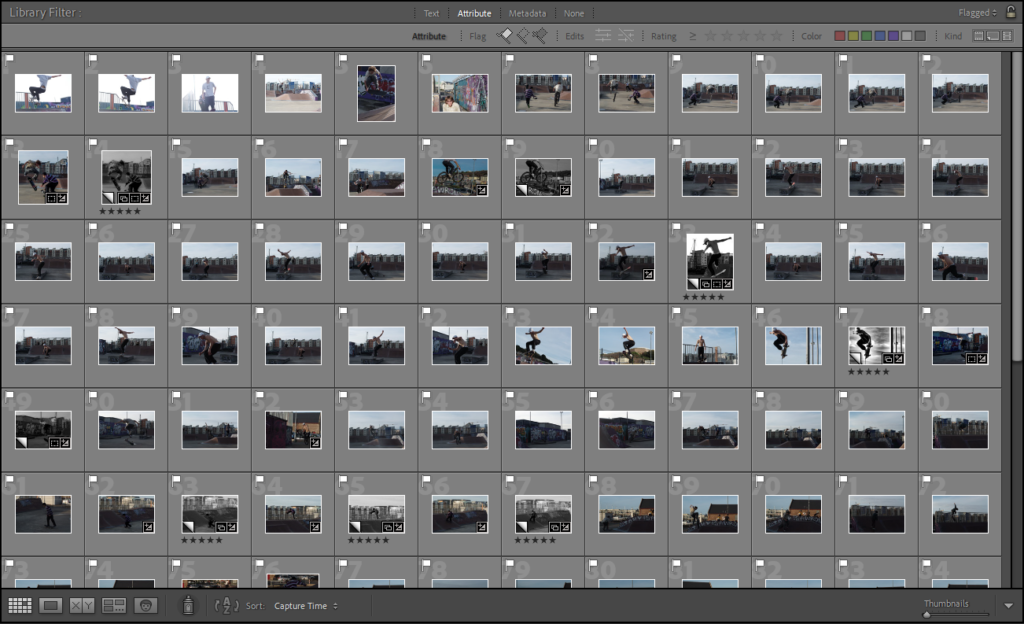
For my second photoshoot I planned on taking photographs of street spots around St. Helier, but it started raining, so I found myself in an underground carpark near the harbour photographing. I managed to take 199 photos during this photoshoot. Using the flagging option in Lightroom I managed to narrow it down to 36 photographs.

I then once again used the rating option in Lightroom to narrow down the 36 images, which left me with 13 of the best images taken during this shoot. While selecting these 13 final images to use in my photobook I made multiple edits of each as well as editing photos which were not rated.

Best Shoot 2 edits

Once again I decided I wanted to use mostly black and white images, as I believe it looked a lot more effective, I found photographing in an underground carpark was unusual scenery wise, as it all looked the same and was very repetitive, although it did lead to some interesting images.

PERSONAL STUDY SHOOT 1

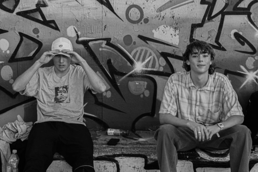
For my first photoshoot, I took photographs down the harbour skatepark over the course of a day and took 318 photographs over this day. I used the flagging option in Adobe Lightroom to narrow down the images taken which left me with 123 photographs, which were still too many.

I then took the photos which I flagged and then used the rating system in Lightroom to narrow down the images again to my favourite, which left me with 11 final images, while narrowing down the images I edited a lot of them but only kept my 11 favourite edits to use within the photobook I am creating for this study.

The majority of my final edits were mostly action shots of skateboarders, but also included a couple images of the skateboarding community in the skatepark.

Best Shoot 1 Edits

I decided that most of the images that I wanted to include within my photobook to be black and white, this is because I believe it made a lot of the images look a lot more effective. It also draws the eyes of the viewer towards the skateboarders within the photographs, and not anywhere else on the image where there may be distracting colours or other subjects. I selected these images as my best edits as, I believe they are the most interesting photographs I took during this shoot and look the coolest out of all of them.

Photobook: Deconstructed

1. Research a photo-book and describe the story it is communicating  with reference to subject-matter, genre and approach to image-making.

“Tokyo is a visual journey through a city at once futuristic and obsolete, its visionary design worn out – like that of a past era. Gerry JOHANSSON uses photography to index the city, finding form and pragmatic order through accumulation and sequence, revealing the city’s hidden, modular logic: lego-like segments, a basic square unit repeated indefinitely and in various sizes. These images are unpeopled, showing only the architecture of the city, a container of 13 million people, organised around mass movement and the funnelling of human traffic. Between the concrete, glass and steel, the occasional green life sprouts – miniature gardens in the narrow alleyways, or a cluster of flower pots lining the sidewalk. The architecture creates its own topography, and the city is glimpsed as the last outpost of a fading, mechanised world.”

2. Who is the photographer? Why did he/she make it? (intentions/ reasons) Who is it for? (audience) How was it received? (any press, reviews, awards, legacy etc.)

Jerry Johansson is a Swedish photographer and author. He is known for his publications of geographical locations in a straight and pragmatic form. He first picked up a camera at age 11 and began printing at age 15. Almost all of his 31 publications are defined by the geography featured in the images.

3. Deconstruct the narrative, concept and design of the book and apply theory above when considering:

Photobook Specification

Narrative: What is your story?
Describe in:

  • 3 words

City, Buildings, Development.

  • A sentence

  • A paragraph

For my photobook, I would like the hardback feel and page layout of ‘Tokyo’. This is because of the quality-product aesthetic. I want my photobook to feel like a quality product, and am happy to spend the money to receive a good quality product.

photobook specification

1. Write a book specification and describe in detail what your book will be about in terms of narrative, concept and design with reference to the same elements of bookmaking as above.

Narrative: What is your story?
Describe in:

  • 3 words
  • loneliness, forgotten, isolation
  • A sentence

how a certain place may have impacted you or been a special place but is now just a distant memory.

  • A paragraph

how perhaps the weather and certain lighting can make places feel lost and lonely.

Design: Consider the following

  • How you want your book to look and feel

hardback cover and rectangular shape. grey background on the front and back cover.

  • Paper and ink

some dark green ink colours on the text inside the book, plain white coloured pages.

  • Format, size and orientation

small text set in paragraphs beneath my images.

  • Binding and cover
  • Title 

Island loneliness

  • Structure and architecture
  • Design and layout
  • Editing and sequencing
  • Images and text

mood board-

Photobook Specification

Ideas for my Photobook

Narrative: What is your story?
Describe in:

  • 3 words– Anthropocene throughout time
  • A sentence– A photographic journey throughout the island which illustrates Anthropocene through time
  • A paragraph-My book will illustrate the human effects that have changed our environment. I will use images that I have taken from multiple different locations, this is to reflect the fact that Anthropocene is present everywhere in our island life. Overall, I hope that my book is an aesthetic reflection of my photography A level.

The story of my photobook will focus on how Jersey has experienced Anthropocene and how the island’s environment and climate will be ever-changing. The layout of the book will illustrate the changes the environment has gone through, as there will be images of natural and unnatural landscapes, and I plan to put edited mages of these two concepts together into my final photobook. The end of the book will contain my essay along with Robert Adams’, Lewis Baltz’s and Richard Misrach’s images, this relates to the information I will be analysing and referencing throughout my work.

Design: Consider the following

  • How you want your book to look and feel
  • Paper and ink
  • Format, size and orientation
  • Binding and cover
  • Title 
  • Structure and architecture
  • Design and layout
  • Editing and sequencing
  • Images and text

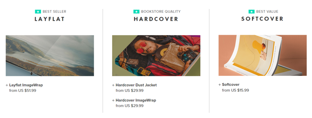
I would like the front of my photobook to be a hardcover book which is a medium size, the cover of book will be a smooth wrapped image, with the will spread around both the front and back of the book. My aim is to make the front of the book as aesthetically pleasing as possible as the smooth textures will contrast will the heavily textured and busy photograph which I will place along the front. The majority of my book will contain black ink with some coloured and some monochromatic images, this is in an attempt to make the book more aesthetically pleasing as it will be filled with contrast and editing.

Furthermore, I would like some pages of my book to contain small areas of black writing (with the white writing in the background). The purpose of this will be to show where an image was taken and when, and to give information on how much Jersey’s production of unsustainable substances such as oil has increased since the 1970’s onwards. As this was the decade where Lewis Baltz was first part of the Topographic, and this helps me relate my photobook to his work.

I would like to structure my photobook using a variety of photographs and blanks space to create flow throughout my work. There will some very busy spaces and then some completely blank pages to even out the layout of the book. The pages will also flow well as I will place heavily edited images next to natural/ unedited images, this will allow for my photobook to show off some Photoshop and Lightroom editing skills, right alongside camera skills and demonstrating that I understand the settings and functions of the camera.

Mood Board

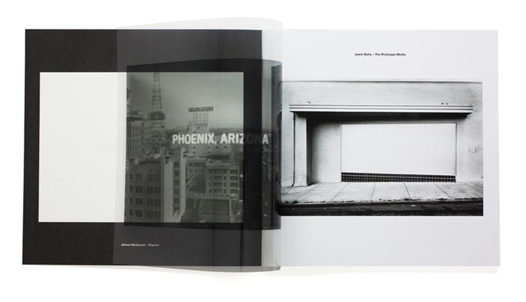
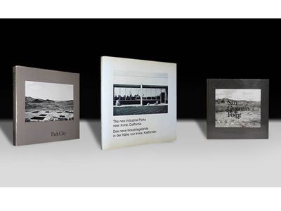
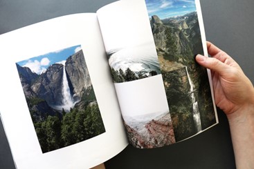
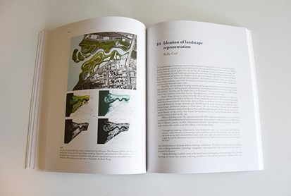
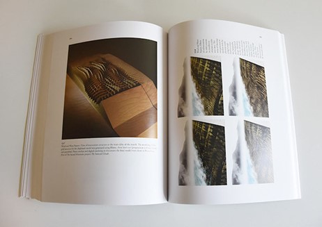
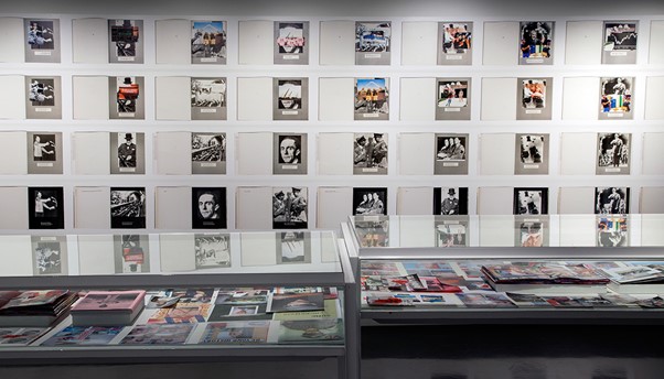
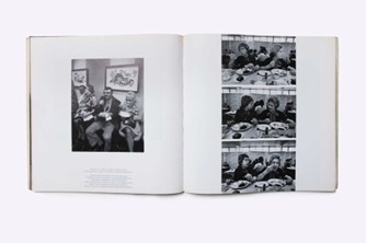
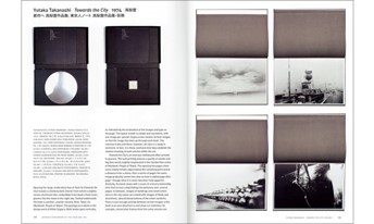
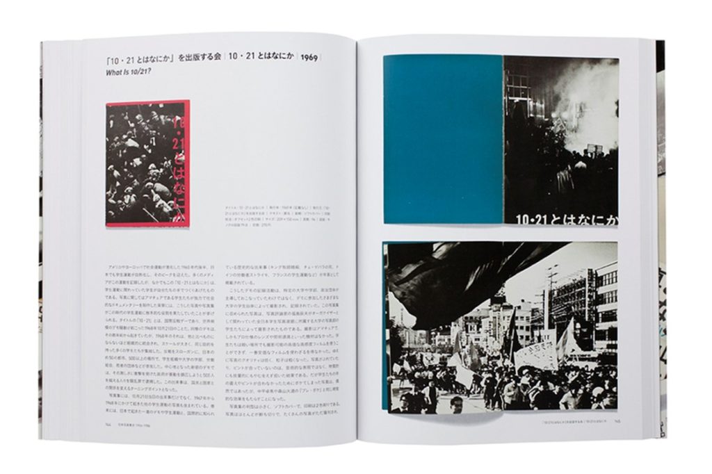
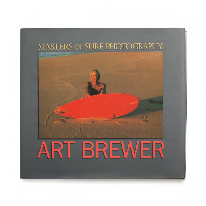
I have created this mood board in order to visually demonstrate some photobooks that I find inspiring and some I would like to take aspects from. This is important as it helps me demonstrate where I have got some of my first ideas from and shows the multiple different types of photobooks that I would like and recreate. At the moment my ideas are quite plain so creating this mood board has helped me consider in more detail and with more creatively how I would like my final photobook layout to look like visually.

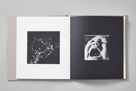
My main focus when creating my photobook is to showcase my most successful photographs, and I hope that I will be able to create balance throughout my book taking inspirations from some of the layouts in this mood board. For example, I really like the bottom right as the high levels of contrast throughout this image means that the viewers attention is draw to the book and they will want to look at the rest of this photobook. Furthermore, I think that having more than one image on one side creates a very aesthetically pleasing look, and especially along with a black space/ page next to it.
Creating my first layout

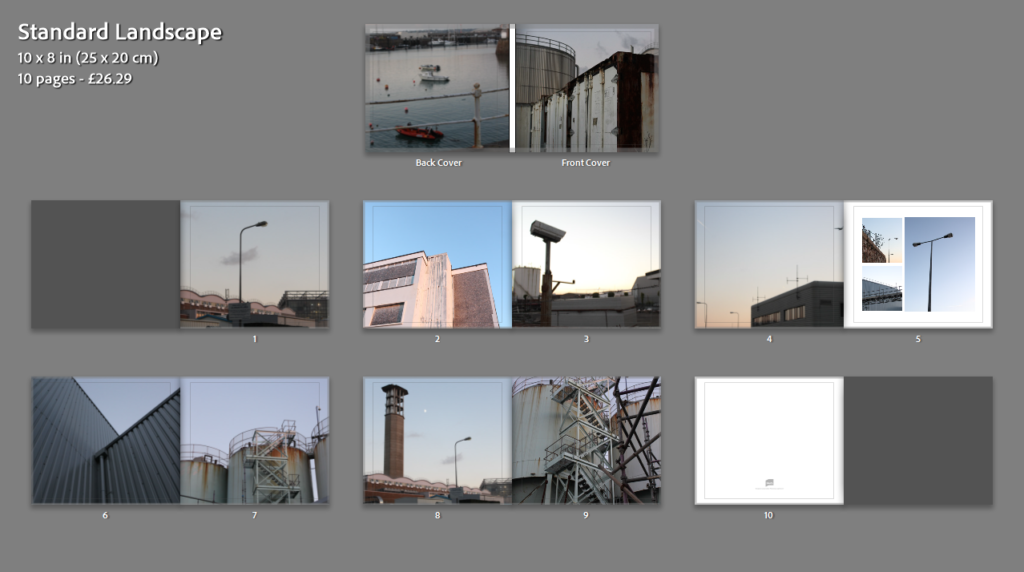
To create my draft layout I used a website called Blurb which first allows you to look at others photobooks before you sign up, this was helpful as it meant that I could create some more ideas before creating my first draft layout. Additionally, this website provides details regarding the pricing of different quality, size and paper which could be used when considering the overall look and feel of the book.

Before creating my first draft layout of my photobook I have created a collection in Lightroom which illustrates all my best images and the ones I would like to include in my final personally study. Despite these images being from many different photoshoots, I think that I will be able to link them together very well, like one of my inspirational artists, Richard Misrach. I would hope that the book is split so that I can reflect that I have been inspired by both Lewis Baltz and Misrach, as the images I have used in my first draft of my photobook reflect Misrach and focus on his work more closely. Whereas my second section will be more inspired by Lewis Baltz and Robert Adams.

Below I have created my first experimentation of my photobook, the main purpose of this was to get used to using Lightroom as a method of creating my book, as Blurb is only used to print and buy the books. Lightroom is an easy and effective way to create a photobook, it is helpful as you can move the images around and see how the final product and layout will appear when it is printed.

During the exam I will be creating my book using Lightroom as well, along with doing this you can put two-six images on any page of work, and add blank pages and small text around and next to the images. I think that this will make my book more aesthetic and successful. I like that the book can be previewed and the arrangement can be changed as frequently as needed.

Essay Draft

Essay question:

opening quote:

Intro: In this essay I intend to investigate the differences and similarities of how photographers Vasantha Yogananthan and LaToya Ruby Frazier each explore the concepts of identity and heritage in their work. I have chosen these two because I feel that I can relate to aspects of their work, due to being a person of colour myself, and find that they have both approached the subject with their own unique style and technique. Yogananthan often taking images of strangers, blurring the lines between fiction and reality, as well as implementing the technique of hand painting film images, something particularly important to photography’s history in India. His work stands between an outsider and an insider’s perspective, (try and find a quote from Solomon-Godeau text in inside/ outside) while being a stranger and photographing a world he is not entirely familiar with while also reconnecting with his own culture and restabilising the portrayal of South Asia through photography. Frazier focusing on documenting her family, very much from the idea of an insider looking at world that she herself as black woman inhabit growing up in a steel mill town, taking her images using a monochrome film camera, giving them a timeless feel.  

(add describe what and how you are going to respond with your own project – be respectful)

Pg 1: Yogananthan and Frazier use two incredibly contrasting styles to explore the subjects of heritage and identity in their work, Yogananthan relying on traditional techniques and creating images evocative of the Pictorialist photo movement of the late 19th, early 20th century, made up of key figures like Alfred Stieglitz, Heinrich Kuhn and Frank Eugene, employing the help of painter Jaykumar Shankar to help hand colour his black and white images to give them a soft and dream-like appearance, through his use of colour and composition.

(think about why he is inviting a local painter to colour his images -both collaborating and sharing ownership of creative process + by asking to add his creativity he is also providing him with a financial reward by paying him for his services)

His work is a way for him to reclaim his Sri Lankan heritage after being born and raised in France, by choosing to approach The Ramayana through a Pictorialist lens, a style crucial to European photography’s history, Yogananthan creates a series that draws inspiration from both sides of his heritage, while also depicting the mythology in a more fantastical way. 

(find a quote that defines what pictorials was, its aim/ objectives etc)

In contrast, Frazier takes inspiration from a variety of artists who were part of a movement known as social realism, using straight photography, defined as “Photography that attempts to depict a subject in sharp detail and focus and emphasising photography as a medium outside of art like painting and sculpture” (Reference using Harvard system), to explore ideas of societal injustice. Some of these photographers include Dorothea Lange, Walker Evans, and Kathe Kowalski- Frazier’s mentor until her death in 2006. Frazier’s exploration of societal injustice came from her experiencing environmental racism first hand, and how it affects not just her but the wider community of Braddock. 

Photobook Specification

Describe your photobook in:

A Paragraph:

My photobook is going to be about the Portuguese experience in Jersey and how it affects our sense of belonging due to the cultural differences. I’m going to use self-portraits of myself and some images of my parents paired with some text in order to portray this experience to the best of my abilities. I’m hoping that I’ll be able to capture aspects of our culture despite the fact that we’re quite separated from it due to that fact we live in Jersey whilst the rest of our family is in Madeira, making embracing our culture to its fullest quite difficult.

A Sentence:

My photobook is going to use a mixture of portraits in order to express the sense of belonging and separation as a Portuguese person living in Jersey.

3 Words:

Culture, separation, belonging

———————————————————————-

Design your photobook:

I want my photobook to have a short, blunt title in a mid-sized font to catch the attention of the viewer, allowing for intrigue from the title alone. I’d like for it to be a hardback with a black and white image on the cover, setting the theme/tone of the book right from the beginning.

I’m going to try arrange the images inside in a similar way that Larry Sultan did in his photobook ‘Pictures from home’ [1992] as I like how he displays his images alongside his text, allowing the images to be displayed in different layouts on every spread rather than place every image the same way on every page.

Photobook specification


  • 3 words

Isolated peaceful loneliness.

  • A sentence

Representation of the darker themes of islandness.

  • A paragraph

My book is going to be a unique take on island living, somewhat specific to Jersey. It consist of several collections of images based around the coast of the island, most with minimal editing. I will be trying to convey Jersey in a lonely, yet peaceful place as I believe these two themes will either be a nice contrast or complimentary to each other depending on how you choose to perceive it. I want my book to be landscape, with a canvas cover and a larger metal binding. I want to have the title, Disconnected, to span from the front cover to the back cover, with my name in small writing below it. I will be putting the essay on the back few pages and I will choose a stand out image to go on the very last page.


Photobook Mood Board