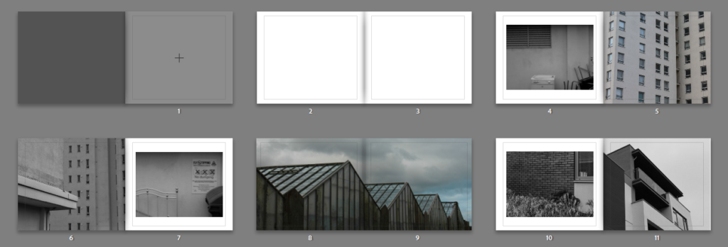
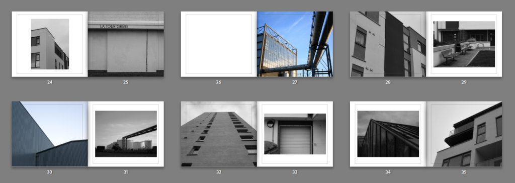
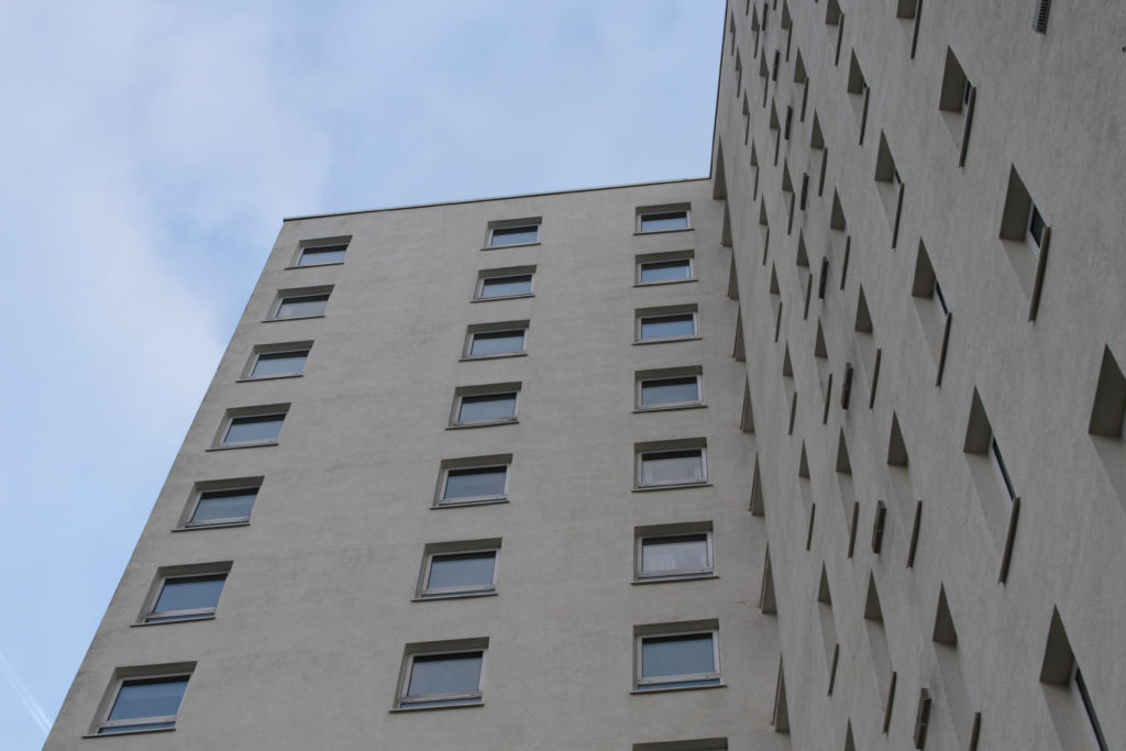
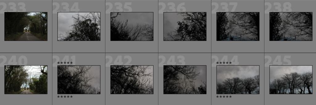
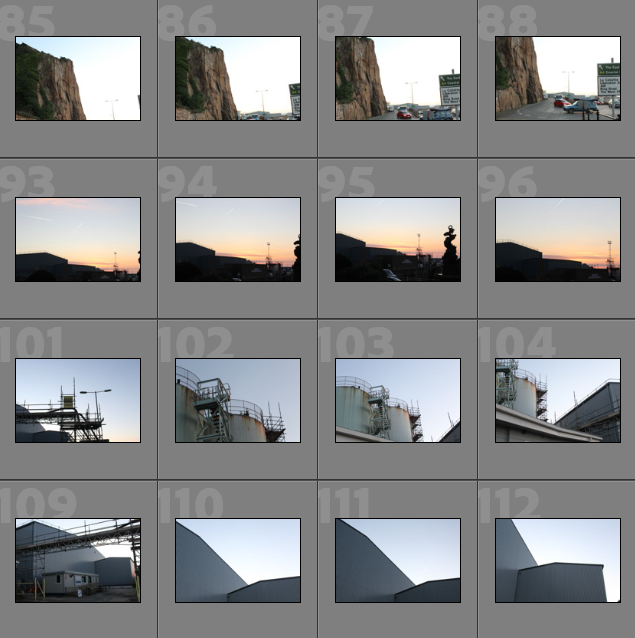
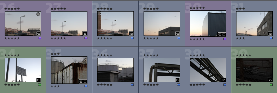
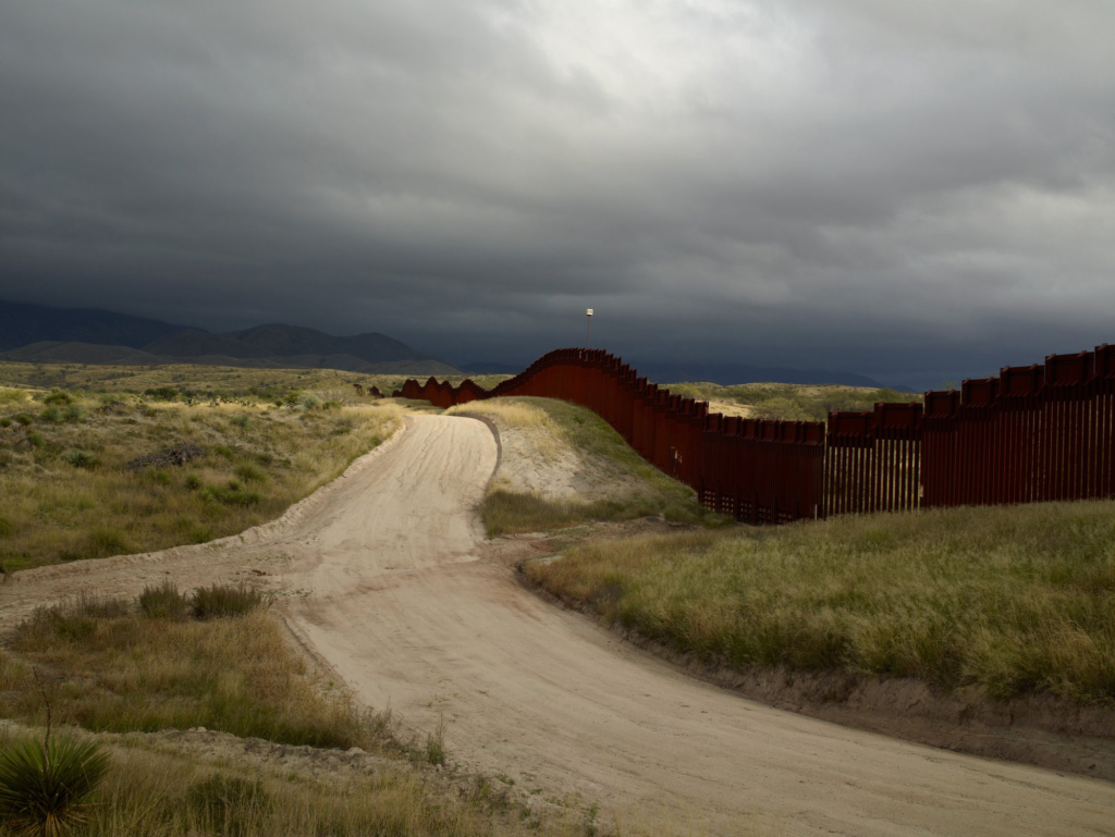
Below I have illustrated all of my final images, these are from all of my Personal Study project. These photographs are from my La Collette, Greenhouses, La Marais and St Clement’s photoshoots, this is because I believe that I have successful images throughout all of my attempts to explore the theme of Anthropocene in a variety of locations.
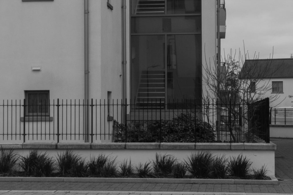
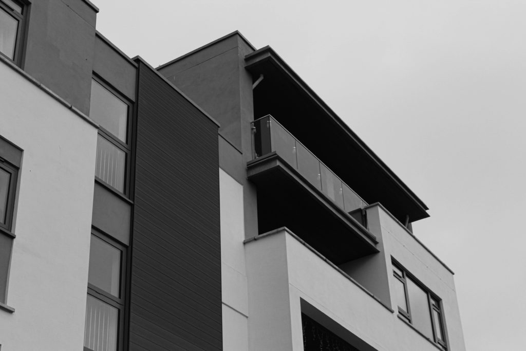
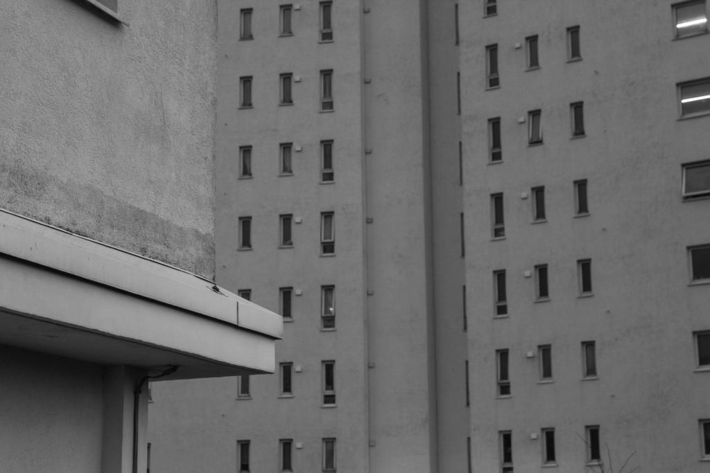
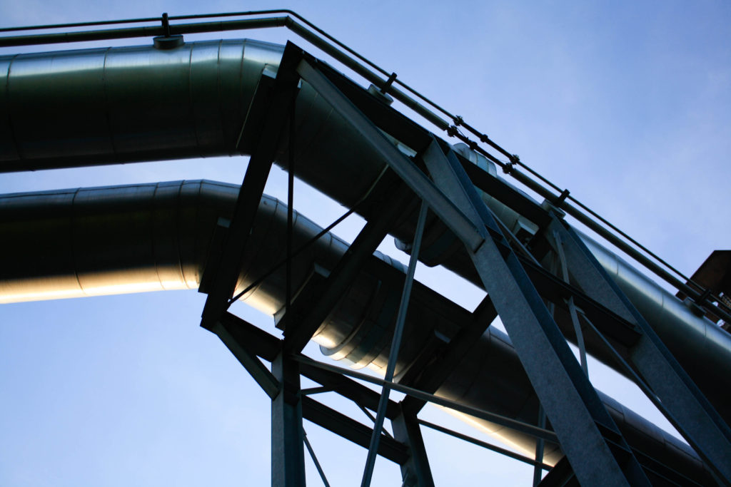
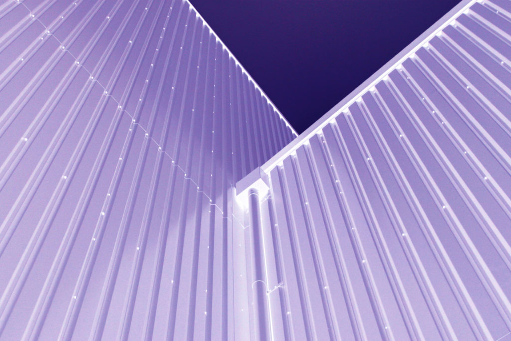
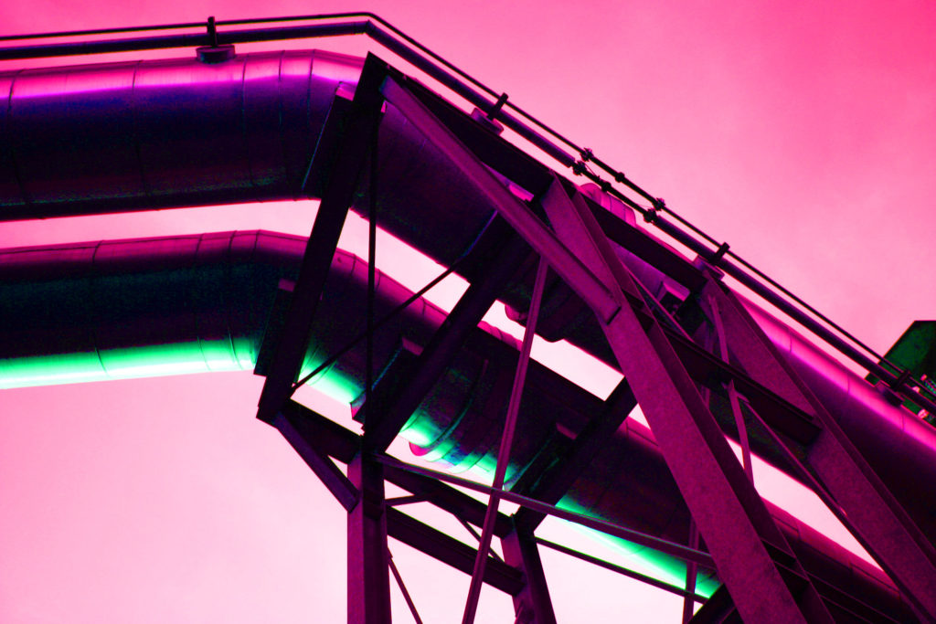
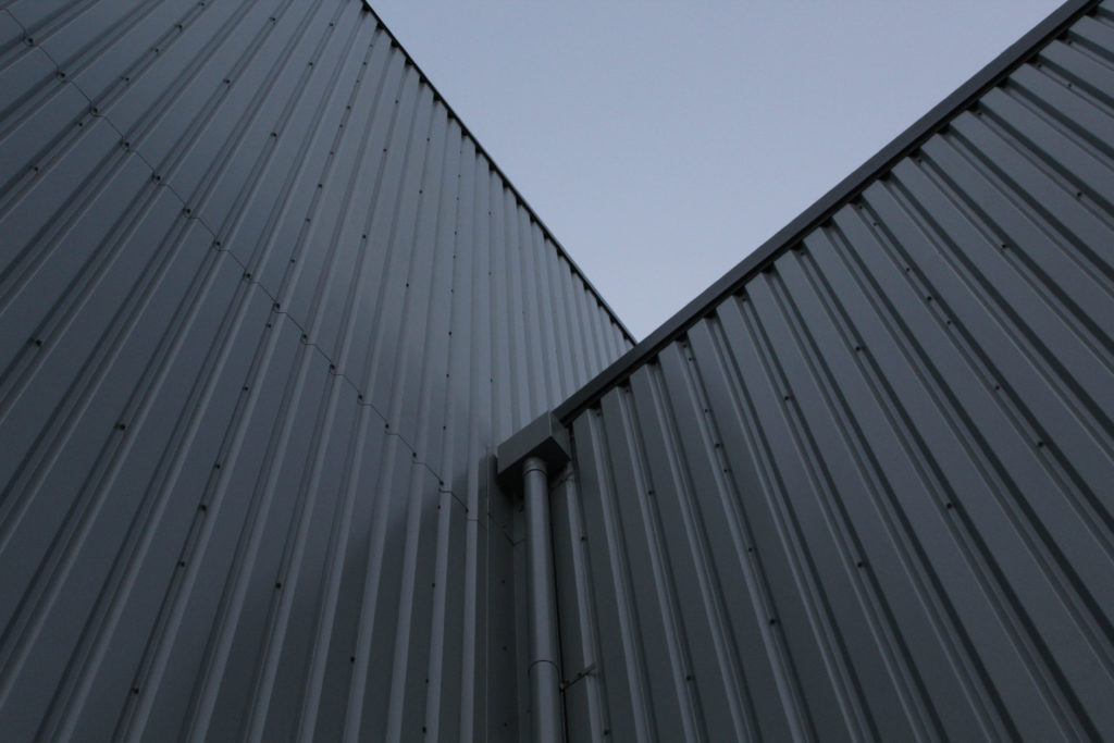
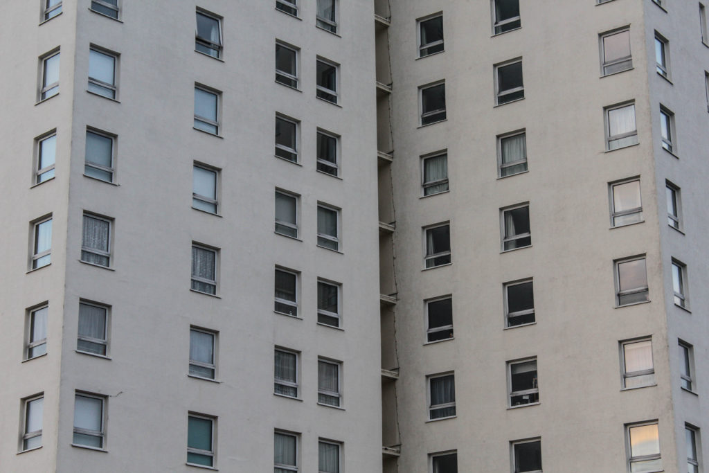
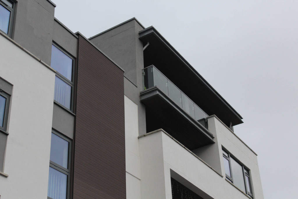
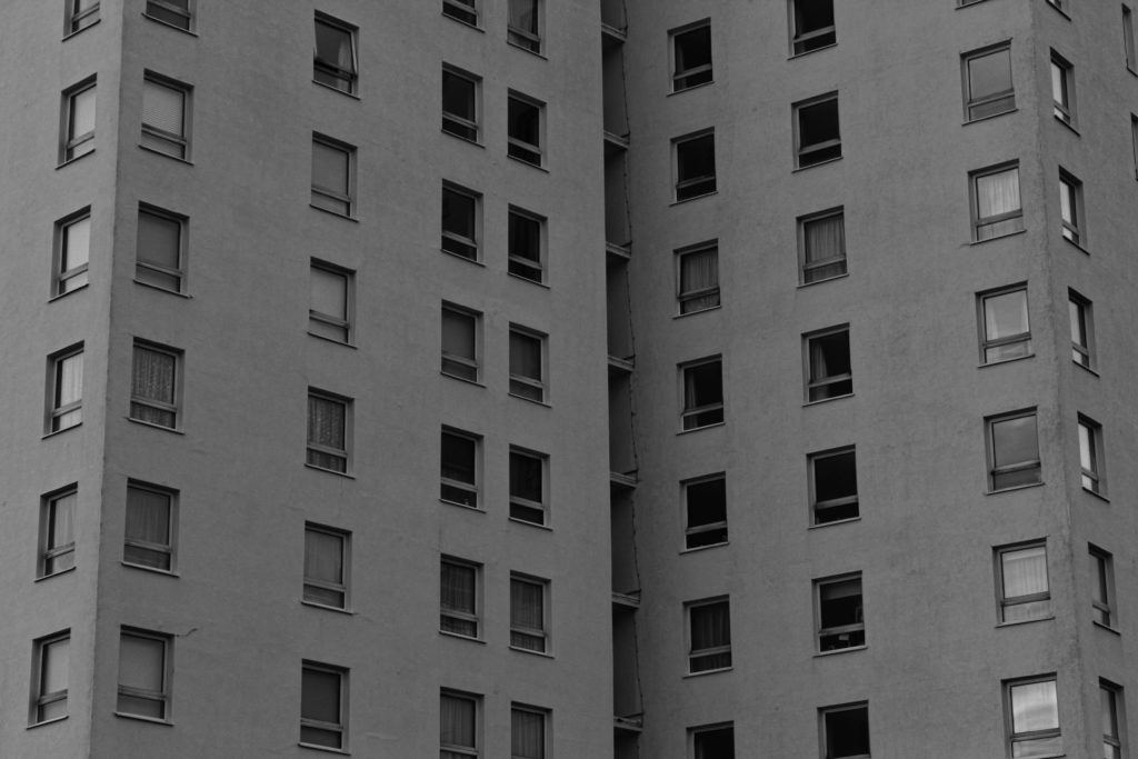
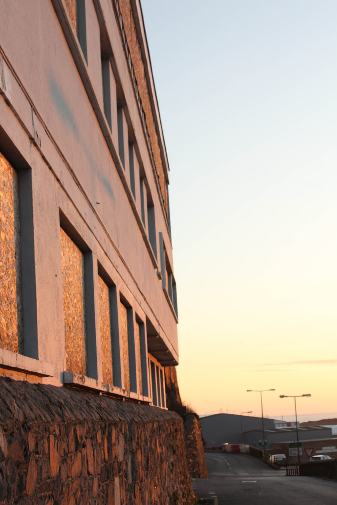
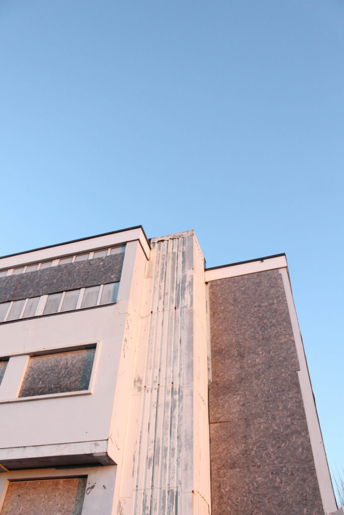
I have selected this as on of my final images as I believe that it is one of my most successful reflections of my personal study. This is because of the overall quality of the image, with the clarity being high and there being lots of natural saturation present. In my opinion, this is my strongest piece, and will be printed out in order to be displayed as an A3 piece, probably being laid out and stuck onto form board, as I believe this thick white background will match nicely with the colours in the image, and the white will enhance the saturation in the photograph. One feature of this photograph which really stands out is all of the parallel lines, both vertical and horizontal, that are being shown. These adds dimension to the image as all of the vertical lines in the foreground and all of the horizontal in the background means that there is also some level of juxtaposition.
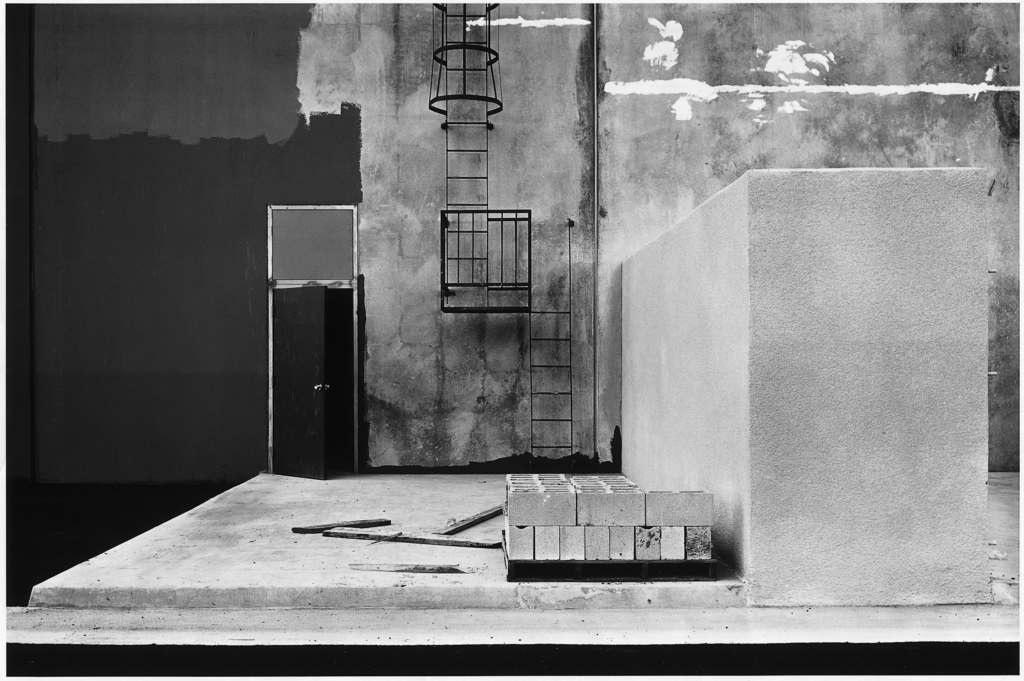
These two photographs have been placed next to each other in my photobook, and I have additionally decided that they would look good displayed together as well. This is because of the high amount of similarities within both of these images, they have some of the same brickwork as they were taken very close to each other, they have also been edited in the same way so that both of them have the same levels of texture and contrast throughout them, this is important as it helps with the flow between these two images, meaning that they link together well and can be presented next to each other. Furthermore, these are some of my most successful reflection of Lewis Baltz’s work as they are somewhat plain but do very much focus on the theme of Anthropocene, especially as the first image has both natural and manmade formations.
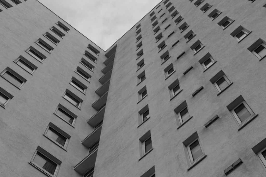
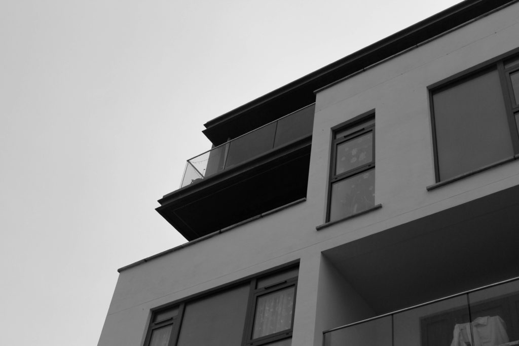
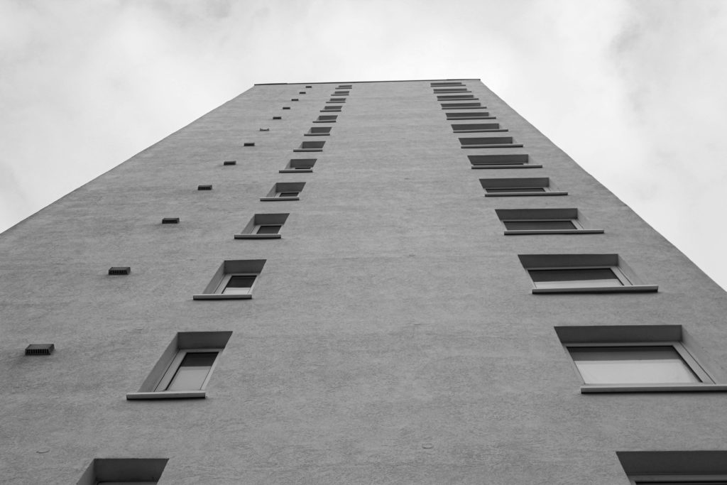
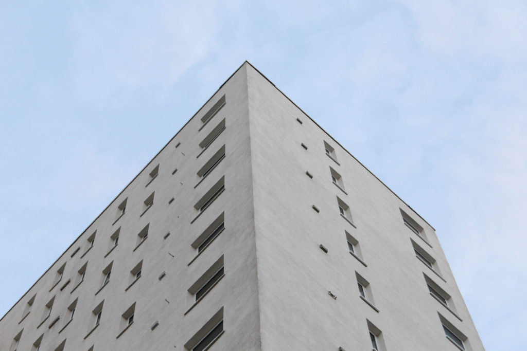
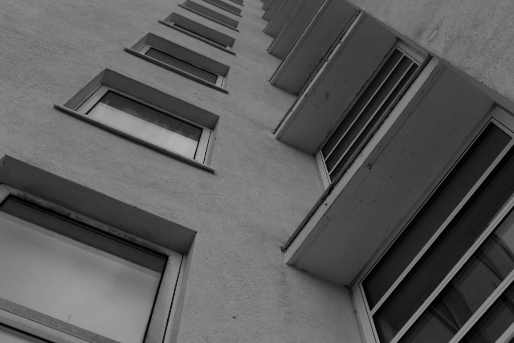
This photograph was taken at La Marais, from the ground looking upwards. I really like how this image has a unique and different perspective which is one that is different from the majority of my other work. Additionally, I think that this could be linked to the work of Lewis Baltz, this is because of the monochromatic editing but this image doesn’t have high levels of contrast, I think this is a good aspect as all of the details in the windows are still there, and there is some lighter shadows and darker tones. Despite all of this, it could be said that this image is very repetitive, and doesn’t contain a lot of interesting features to analyse and doesn’t necessarily convey the concept of Anthropocene,
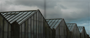
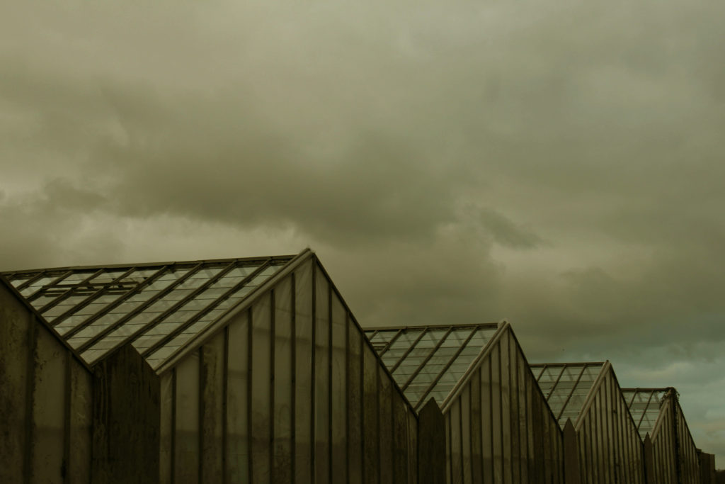
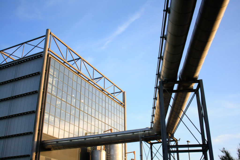
This image is one of my most successful from my Greenhouse photoshoot, and was featured as a double page spread in my photobook. I really like the colours and tones in this image, as there is mostly greens, blues and greys present and I think that these colours all match together well. Additionally, the perspective of the image means that the image is made more interesting, along with the soft textures of the sky contrasting with the harsh lines in the structure itself and the dark tones, The aim of this image was to respond to the the work of Richard Misrach, with the aspect of nature being present. His work is normally related to wide shot work with plain background, however I think the greenhouse structure itself means that I can relate to his work and makes clear differences and similarities.
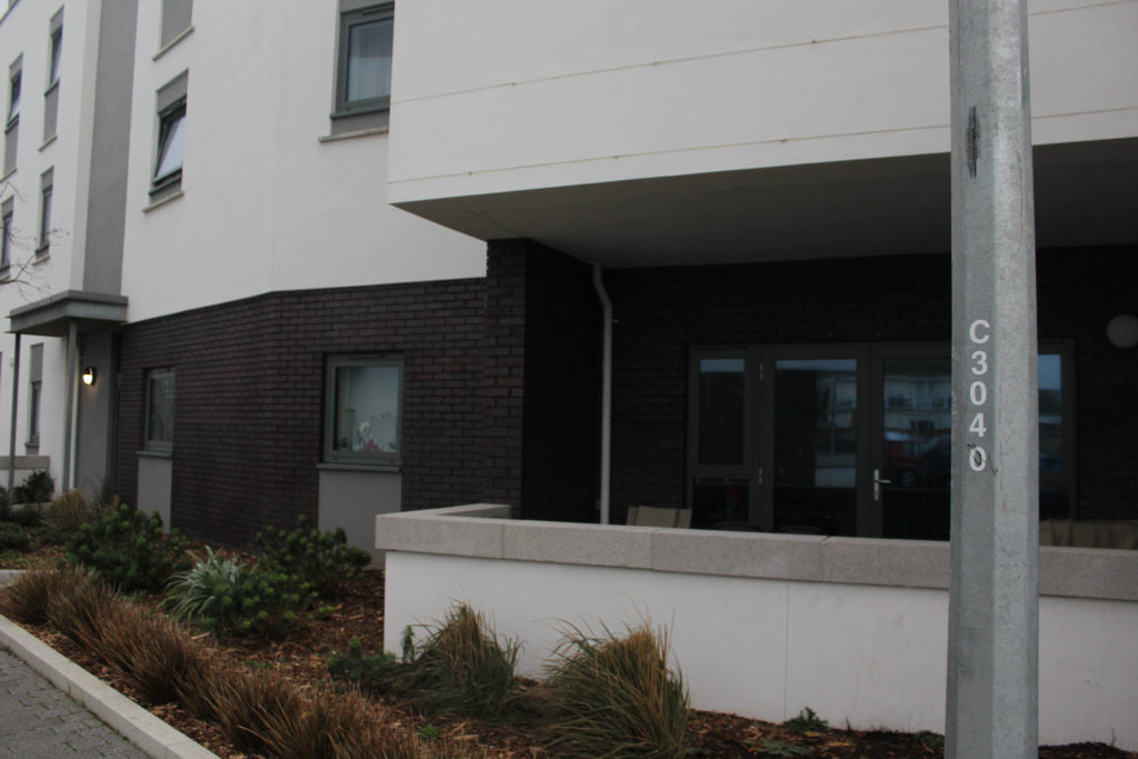
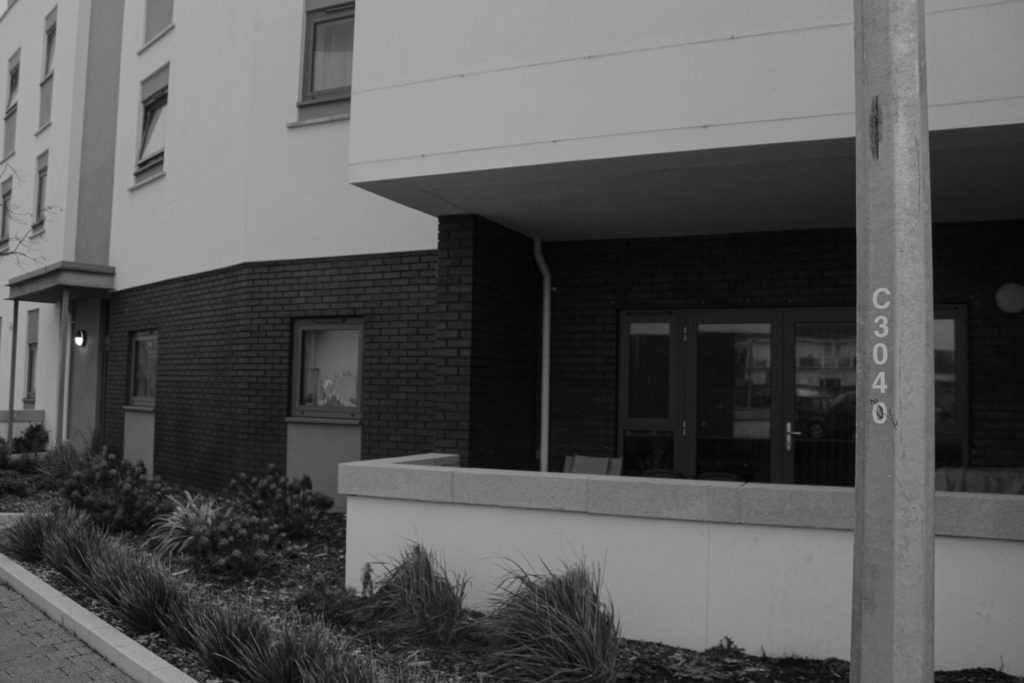
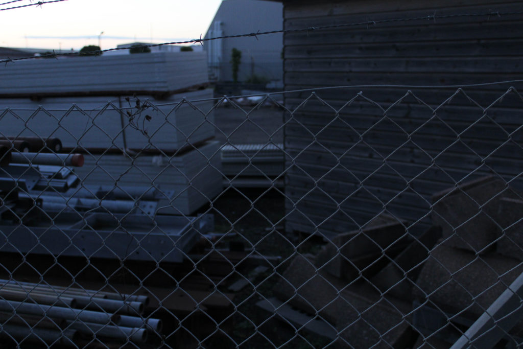
These two final photographs, they have a lot of similarities as they were taken in close proximately to each other, I really like how they fit together, with the first image being a wider shot and the second image being very zoomed in and attempting to focus on the base of the building, and trying to highlight to parallel lines and detail within the building. I decided that these images would be more successful displayed in my final photobook, with them being displayed exactly in this composition. These image complement each other very well as I have attempted to edit them in the same way. I really like that these image have a lot of potential, as they could have been edited in any other way, in colour, as they appear above in black and white, and also using the ‘invert’ tool which can be found in photoshop, or the ‘colour’ tool in photoshop. As this editing means that all the brickwork turns different colours.
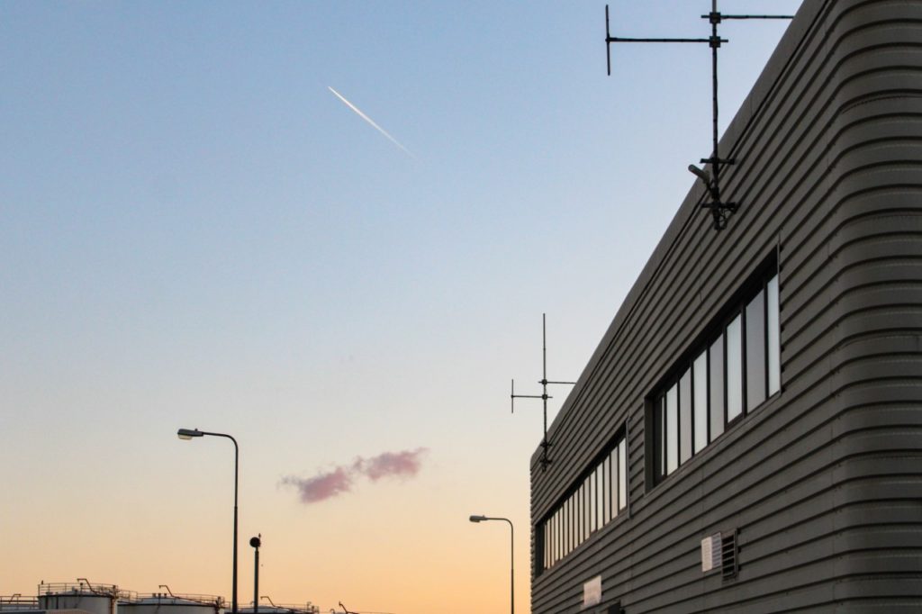
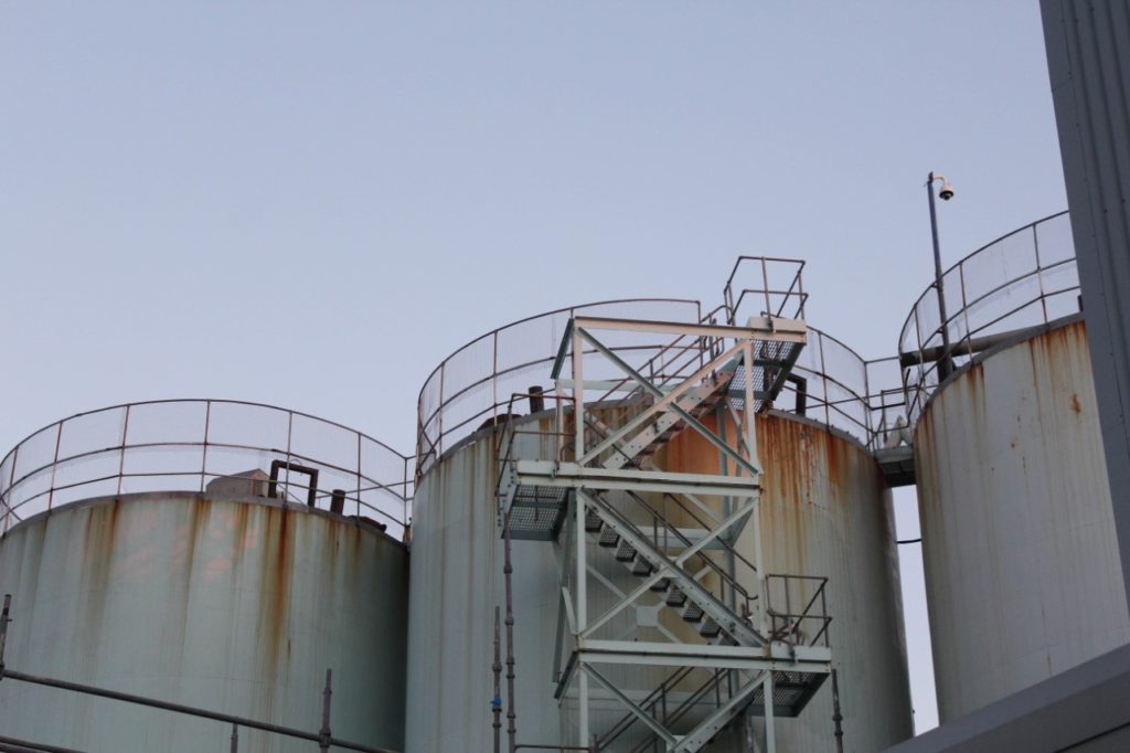
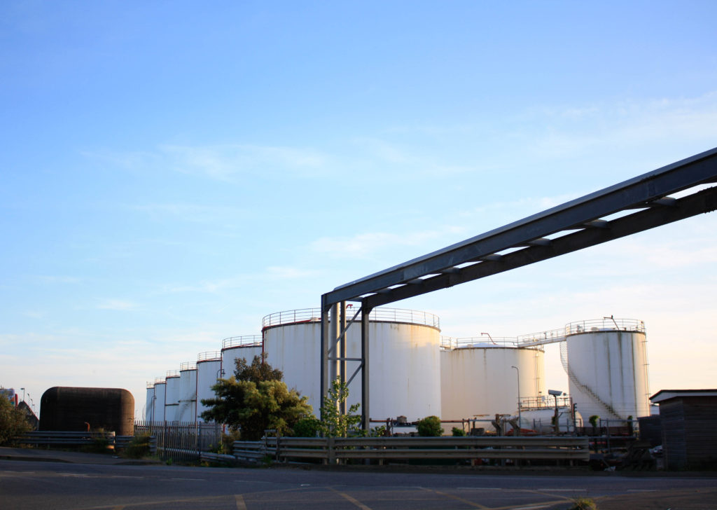
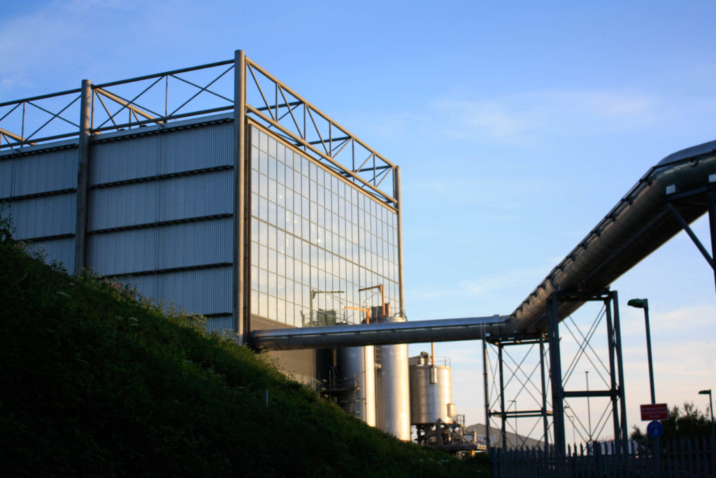
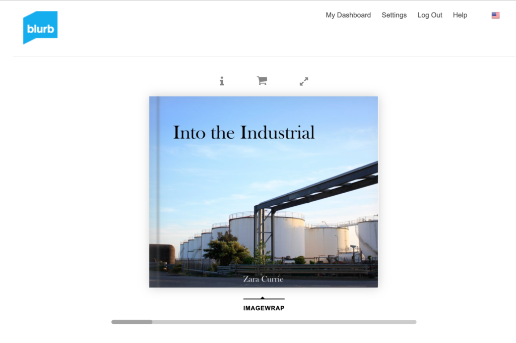
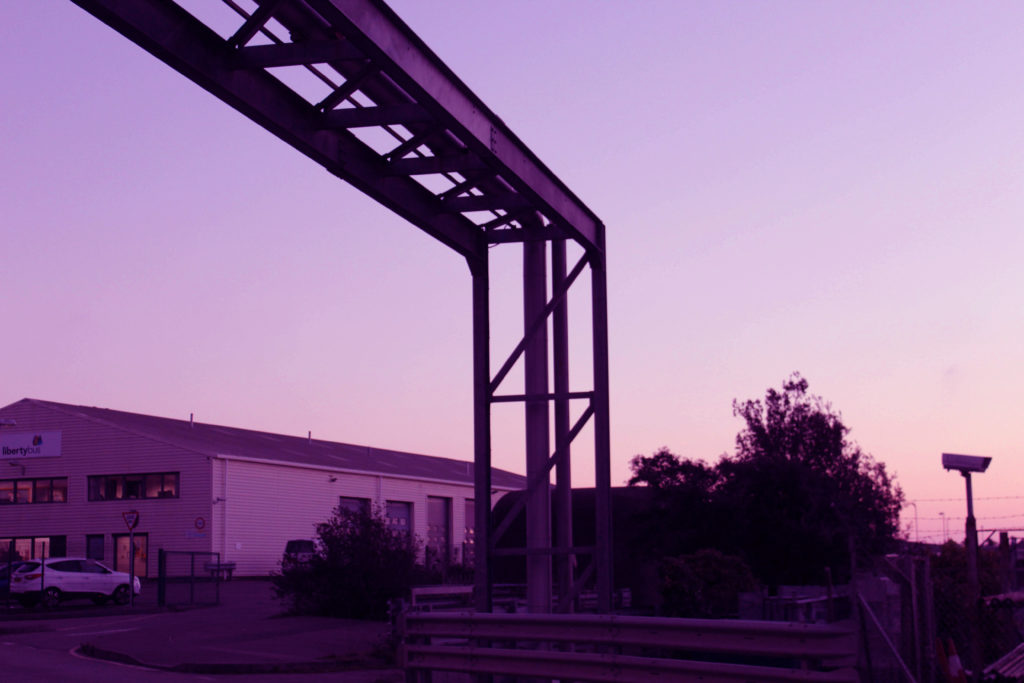
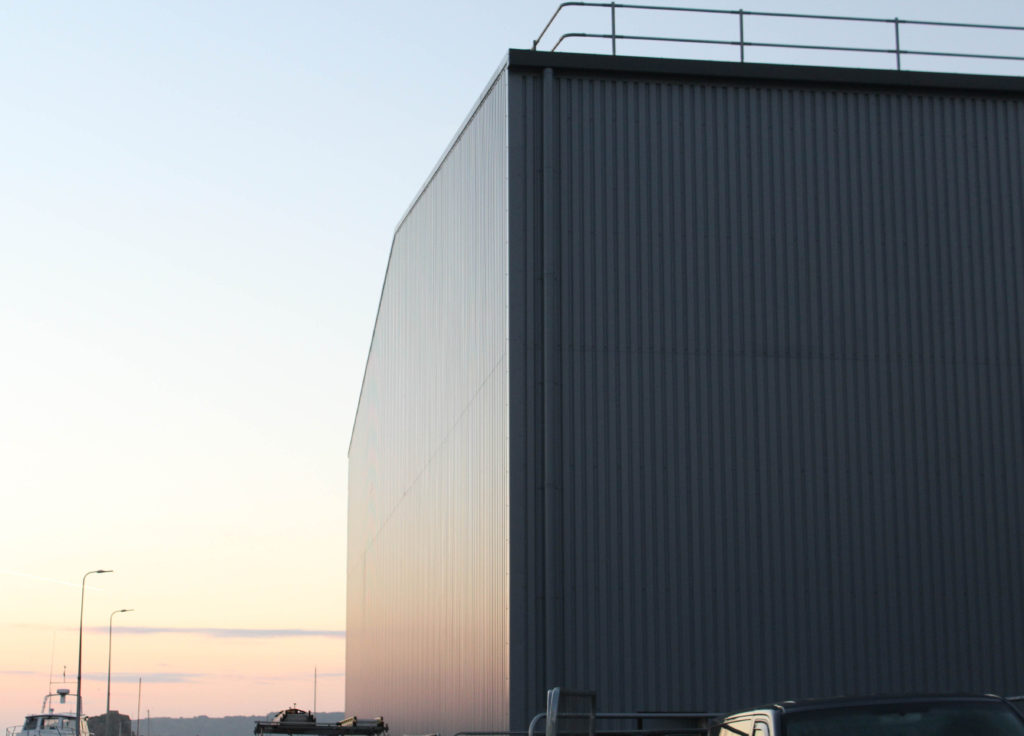
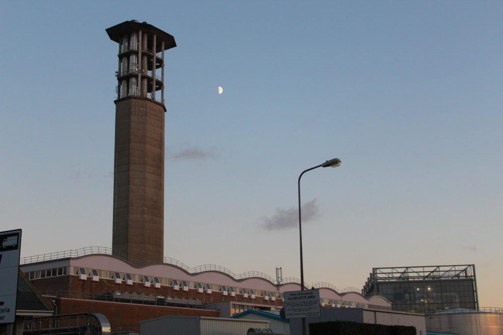
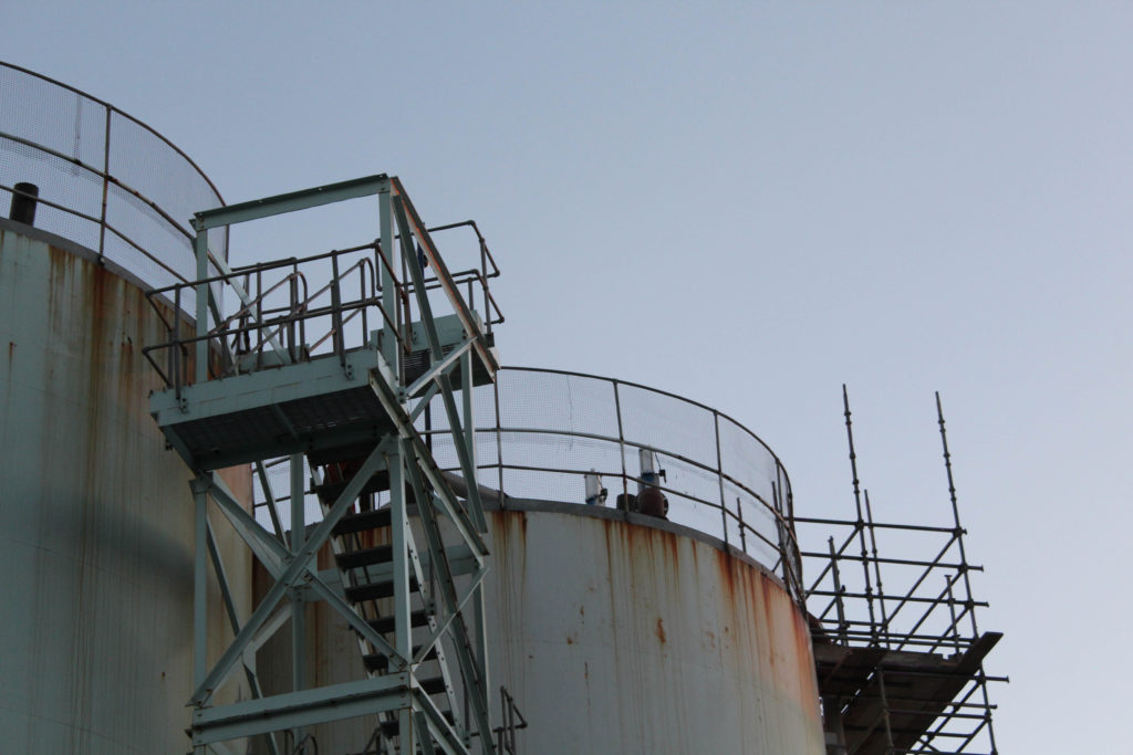
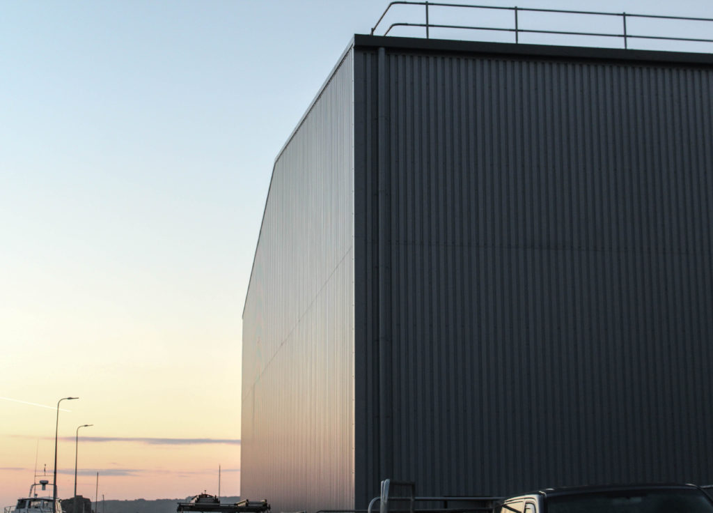
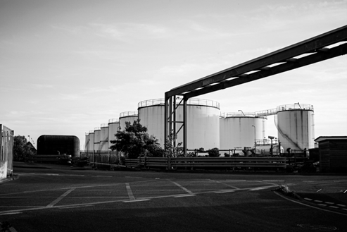
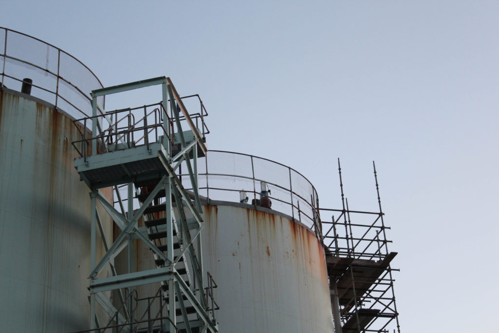
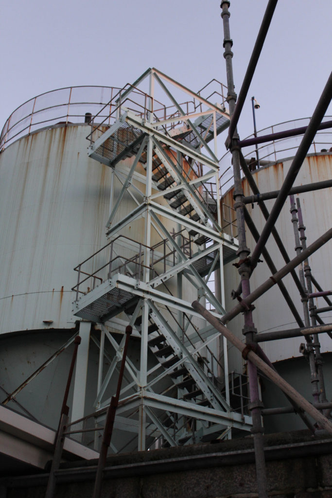
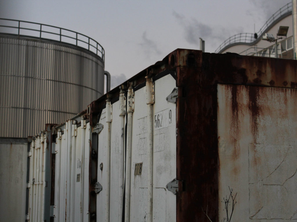
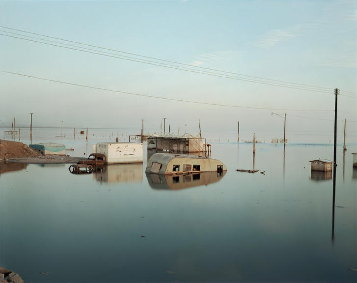
I have selected this as my final image, as overall I think that the aesthetic of this photograph means that this is one of my most successful images. In my opinion, this photograph looks good in my photobook because of the colours and tones throughout it, the warm tones along with the still blue background means that the image look more inviting. However, the composition of the image could be seen as challenged, as all three of these oil tanks are not all present in the image, with the first one being barely visible. My intention behind this image was to recreate some aspects of Misrach’s work, and I did not consider how the lack of the other tanks may still out. That being said I still like that the middle oil tank has the ladders on it, and because of this extra structural aspect, and the rust that comes along with this attaches attention because of the orange contrasting the blue.
Below are some of the images that I would like to use in my photobook, these images are from all of my current photoshoots and some are older images that I will be reusing, this just means that I have more material to work with, and I think this will make more photobook better as I will have a larger final piece of work, with more higher quality images. Additionally, the older images are filled with colour and this will help me to create balance throughout my photobook, as many of my other photographs are black and white, as they have been edited in this way to better reflect the work of Lewis Baltz.
Process
To create my photobook, I created a collection in Lightroom, which after clicking the ‘Book’ button allows for this setup below to appear, this allows for images that are in your final images collection to simply be dragged up into the spaces, there are also functions which allow for boarders to be larger to appear at all, and for also double page spread to be created, which is best for short and wide images.
Double Page Spread
Throughout making my photobook I had to make lots of creative decisions, these were mostly regarding the compositions of images onto the page, and which images matched up or contrasted each other well. For example, pages 14 and 15 below took a long time to decide on, this is because sometimes too much negative space can wash out photographs, or simply not link with the purpose of the image itself. I liked that this blank page with just one image meant that all of the viewers attention is focused on this one photograph, and the subtle colours and warm tones throughout the image means that there is not too much contrast throughout these pages, but I think this plays well with the images. Furthermore, I think that the use of double page spreads throughout my photobook creates a nice balance, as the images that have been placed on these pages are ones which I consider to be my more successful, or ones with are very long and compositionally work better on this format or page.
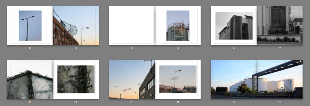
Most Successful Page
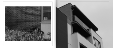
Above I have included an example of my most successful page spread from my photobook, this is because of the subtle links between these two images. Some example of this is similar windows which are present within these images, as the first image (on the left hand side) was taken at the base of the building with is shown in more detail in the second image (right hand side). This means that compositionally these images work very well together as they are not too similar, but still not too contrasting where the themes of them do not link. Furthermore, as this is the same structure in these two photographers, it means that there is the same brick work present in these two pages or my book. Subtle details like this make my book a lot more successful and aesthetically pleasing, as this can be the difference between the outcome of photobook and make the whole piece better.
La Marais Images
For these pages above I have decided to mix between monochromatic and colour images, as this creates contrast within my pages and maintains the balance throughout my book. I think that the white areas/ borders around monochromatic images looks more successful in comparison to using blank space around colour images. I think this is because the tones within the black and white image match with the surrounding white boarder, and this means that the composition of the whole page looks good together, and all components of the image work. Furthermore, using different angles/ perspectives throughout all my pages means that my book appears more appealing, I really like that different angles in images create depth throughout my book. I think that this looks really good placed on two connecting pages.
Contrasting Page
Finally, to conclude my photobook, I have included my essay, some of my artists images, and some more of my images demonstrating my previous Anthropocene project. I think this is a great way to finish my photobook as it wraps up my book very well and demonstrates that I had to learn a lot of information and knowledge regarding my photographers (Lewis Baltz and Richard Misrach) and communicate how they can link to my project and images, and additionally to my essay question and the thesis of my project. Overall, placing the essay in my book made it feel complete and made me realise how much much creating a photobook was a great way to illustrate my images.
The last step was to send my book to Blurb after creating it in Lightroom, after paying for the book their is an option to buy a PDF version, I didn’t end up paying for this. There was another feature which involved getting a preview of my book (https://www.blurb.com/books/11475941-into-the-industrail) which allowed me to see my photobook in its digital form. This shows a version of the book where you can flick throughout all of the pages.
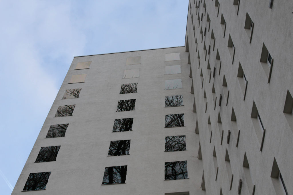
Below I have shown some of my images which are much like that of the works of Lewis Baltz, and then how I have edited them in Photoshop and Lightroom to either make them more creative, or adding another image to them in an attempt to create more depth within the images created from this project. I would like for someone to look at my final images and consider the work of Lewis Baltz’s work next to mine, as I have attempted to stay within the rules of his work so that I could create more thoughts in regards to the compare and contrast posts.
I particularly like this photograph above, and believe it is among most more successful pieces throughout all of these images. This is because of the composition of the image and how the simplistic look can be associated with Baltz, but the smooth tones and colours could be representations of Misrach. I believe that having some photographs which can correlate to either or both of my artists increases the quality and final pieces that my photoshoots create.
Inspired by Richard Misrach
To demonstrate how I have taken inspiration from Misrach, I have selected some edits and showed how I have edited some images in photoshop to create my own versions of Misrach’s work. These images are some of my most successful from all of photoshoots, and additionally I think that they represent Jersey well, as these photographs all show the island in a beautiful way, especially as the sunsets are so appealing and contrast a lot of Baltz’s work. I like that Misrach’s work is a lot softer and somewhat more elegant than Baltz, and it could be said that this is because of the variety of smooth shades and colours, which I have been trying to recreate in the image below.
These photographs are from both my La Collette and my Greenhouses photoshoots, I really like the fact that these pieces of work are good quality examples of his work, whilst also having elements of my own style of work. For example, the first and last images and angles of structures that I like to continuously recreate in my shoots, whilst Misrach only uses wide shot images of buildings/ landscapes, with lot of negative and free space throughout his photographs. This is mostly how our work differs as I have taken inspiration from the types of landscapes and lighting, however the compositions of our work are very different.
Editing Process
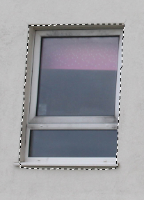
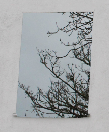
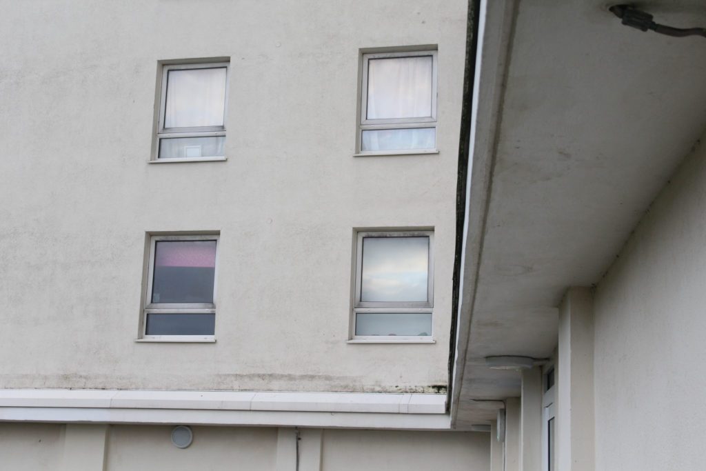
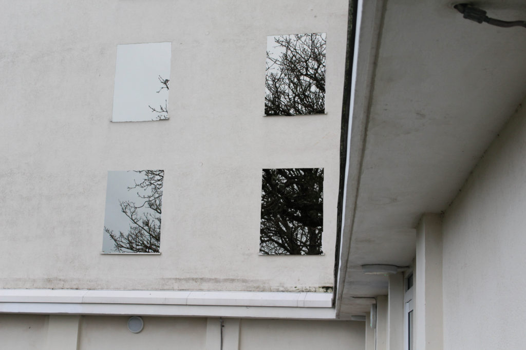
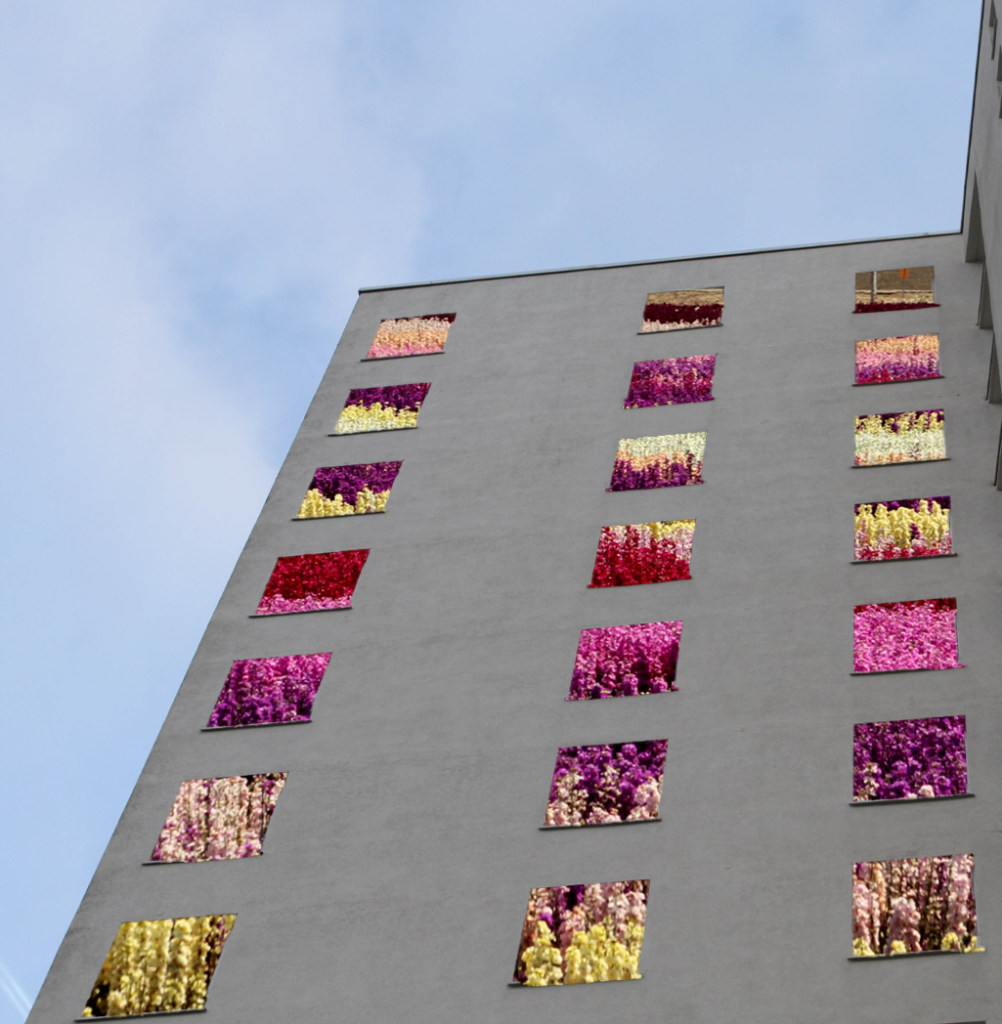
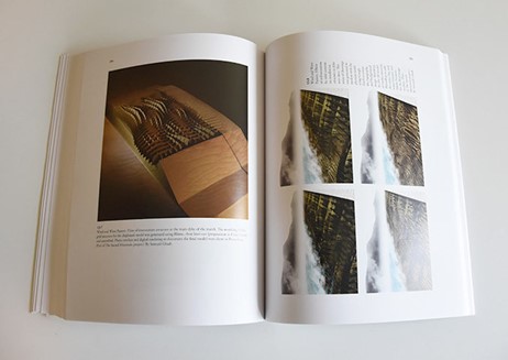
Below I have demonstrated how to cut out parts of images from photoshop and place an image behind, the aim of this was to create visually interesting edits which could be presented as final pieces onto form board or placed in virtual galleries. I had this idea as soon as the project began and thought that these pieces could have a lot of potential and depth behind them. To create this I had to use photoshop in order to cut of the squares using the ‘object selection tool’.
Overall, I don’t think that these pieces came out successfully at all, they didn’t come out to be the way that I expected, maybe this was because of the images that I have used in the background (one being from my Greenhouse photoshoot and the other being from google) as they seem to look good against the tan/ warm tone of the block of flats. I think that these images did not appear to come out as I would have hoped, however I think that this isn’t a bad thing as I can recreate this technique with maybe a different image of the flats.
Inspired by my previous project
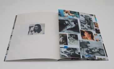
My last Anthropocene Project included lots of inverted and colour editing, and after creating photographs that are much like Lewis Baltz and Richard Misrach, I have decided to include some both original and edited images from all of my photoshoots which don’t necessarily relate to any of these artists. The whole purpose of this is to show some of my own creativity outside of the inspiration I have taken from both of my selected photographers. I would like to showcase the experimentation that I have done which may not be as successful or even featured in my book, but demonstrate that editing images can make them more interesting.
This is my first example of using the invert filter, I think that this image doesn’t look as good invert as all of the subtle colours and tones are lost throughout. I like that this image is very bold representation of Anthropocene, there is still a gradient of brown to orange and yellow throughout the image and I think this adds to the complexity of the photograph, and shows that this kind of editing can be very successful or not worth it, In my opinion, its a good way to change images that you would like to be bold and ones you would like to present as stand out images.
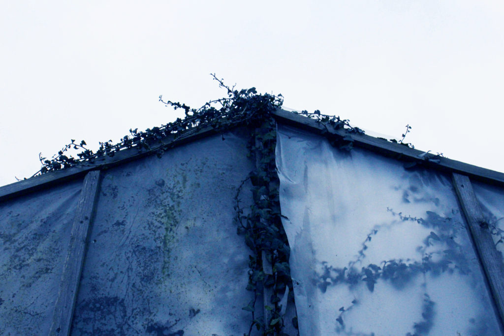
What is the purpose of this editing and how does it link to Anthropocene? This editing below is created by changing the ‘Colour Balance’ setting in Photoshop. I like this editing as I think that it makes metal framework and structures look like more successful/ higher quality pieces of work. The purpose of this harsh editing is more supposed to be used on images of natural landscapes. This is because this editing looks very drastic and unnatural, and changing images of natural objects in a unnatural way is a microcosm of the human impact on natural life. This is important for my project as these small bits of editing relate to a bigger and much more serious topic; Anthropocene. Which greatly affects out world today, and will one day affect how we live and the limits we have to exist in.
Previous ProjectCurrent Project
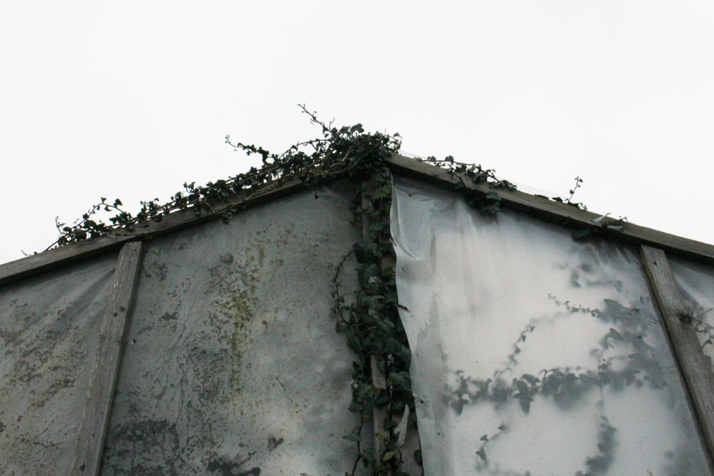
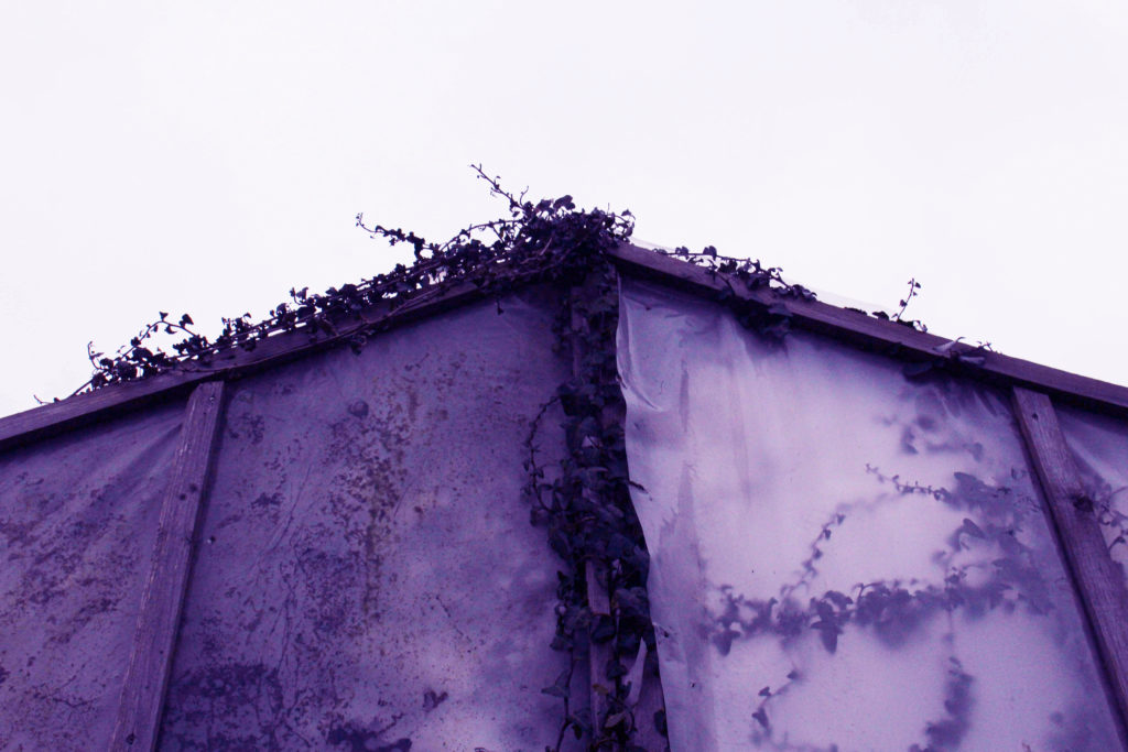
For example, this image relates to my paragraph above, this is both a human and a natural structure, as it has been unused for many years and now natural has reclaimed its place at this location, with all of the plants/ ivy growing back where it used to be. This sequence above demonstrates how these photographs still have their original quality, the colour editing only adds a message about the consequences that human life has had on the environment.
In my opinion, this editing does look better on photographs of industrial landscapes rather than natural landscapes, however, the purpose and message behind the editing is more related to natural features and I think that I should stick to this as it relates to my project a lot more.
Overview: I think that this editing is mostly successful, but is only needed with plain images or ones that are too simplistic. I think that busier images with already good editing done to them do not need this kind of drastic editing. Overall, I do think that some people would not understand the premise behind this type of editing when first looking at my work. However, I think that they turned out better than I expected, but not as successful as my photographs/ edits of work from my last Anthropocene project. Besides some downfalls to this work, in my opinion it was worth doing as it allowed me to demonstrate that creativity doesn’t always create high quality and useable outcomes. Furthermore, I don’t think that I will be using these pieces in my photobook as I think that my book will mainly consist of monochromatic images. I still wanted to illustrate how my plain photographs can be changed drastically to better fit the concept of my project.
Photoshoot Plans: For these photoshoots I am planning to go to La Marais flats in St Clement, and them take some images of the surrounding estates. This is so that I can show how not all people that have impacted the planet live the same lives or have the same possessions, and that some individuals have had a lesser impact on our environment. Like the other photoshoots, I will be using the school camera and I hope that I can create the best outcomes possible from walking through these areas. These photoshoots will attempt to recreate the work of Lewis Baltz, as I have done of research in his life and work and now have become inspired by his work.
Contact Sheets
Photoshoot Overview: These photos are mostly successful, some of the images from walking around St Clement housing are fuzzy but I still think that if I wanted use them they could be altered in photoshop. Overall, I think that my images of La Marais are a lot better and can be related to my project more thoroughly.
Image Selection
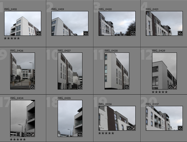
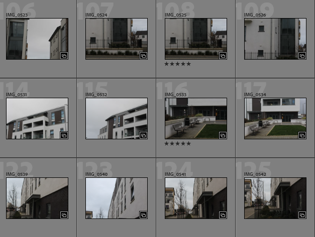
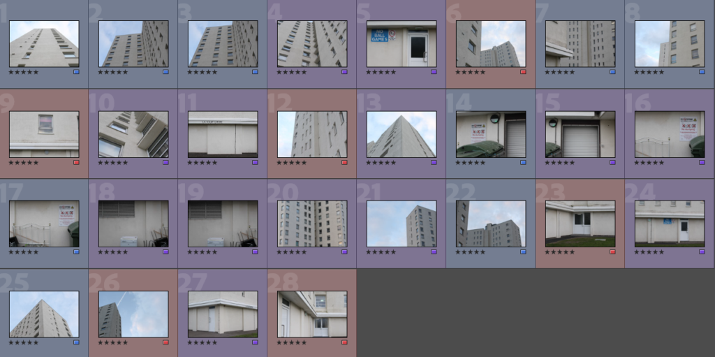
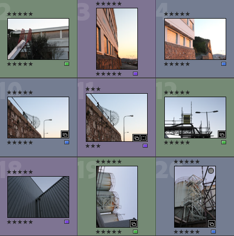
In order to begin my image selection process, I went through all of my images and rated them with stars, this ensures that I can later filter out of my unsuccessful and only focus on the ones I have rated 5 stars. The next step to this process is using a colour coding scheme which helps me determine which images out of my strongest images have the most relevance to my project and are of the best quality. I have also used a star rating system followed by a colour coding system to show my better photographs.
La MaraisSt Clement Housing
Purple- images with most potential
Blue- images that could be used
Pink- images with least potential
Best Images Before Editing
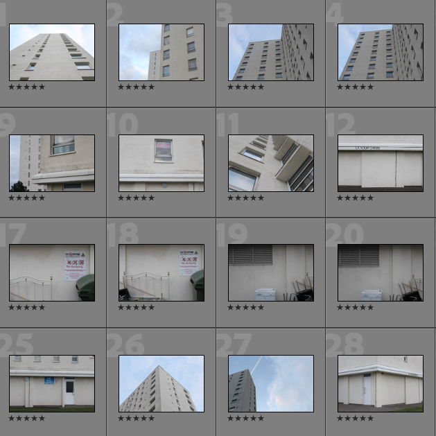
Below I have created a gallery to illustrate my images with the most potential, as I believe that these images do not need a lot of editing and are high quality without adapting the ‘clarity’ and ‘dehaze’ settings in Lightroom Classic. I would like to use these images in my photobook as they highly reflect the work of Lewis Baltz, as this infrastructure is some similar the buildings present in his work. I think that I have done well in taking accurate inspiration from his work and then being able to create photographs like his with Jersey’s structures.
Editing
I have created a gallery to demonstrate the different ways in which I have edited my images, this also shows that not every photo needs a lot of adjustments/ changes to them. I found that the case with so many of my images from this photoshoot as the images had good levels of clarity and exposure so not much needed to be adjusted, the next step is to make sure that this level of clarity is maintained when I now convert my images to black and white.
I have chosen to edit all of these images in black and white and in my opinion this makes my photographs more successful, this is because this editing seems to increase the clarity of the images, despite this not being true I think that my photographs occur to be more like Lewis Baltz’s work when they have been edited and this is vital when it comes to creating marks for this project.
Final Images and Evaluation/ Critique
This section will include all of my final images from this photoshoot, this demonstrates that exploring around La Marais was successful when in regards to creating new images for my photobook. The most important aspect of this photoshoot is the fact that I am responding to Lewis Baltz very accurately and now create strong comparisons to his work and how they have influenced my thinking throughout my photoshoots.
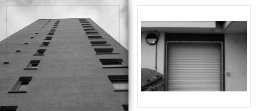
I have selected this as my last final image as I think this is the photograph that best reflects Lewis Baltz’s work, this is because the angle of the image is much like some of his work. Additionally, I think that the editing of this image is much like that of his images, and the clarity of this image demonstrates that I have really considered the outcome of this image before it was taken, I believe that this has great potential throughout my project, as it could be arranged in a group of photos only inspired by Baltz. The composition of this images is very important as it creates contrast within the image, there is lots of area for shadows, areas with large blank areas of white, and then the thin amount of concrete in the foreground means that there is a lot of areas of black. This contrast with the stark white above and means that the photograph becomes more successful as they more appealing to look at. I could be analysed that some areas of this piece are distracting, with the peak/ corner of the building not being in the centre of the image, meaning that it could be less aesthetic. Also with the singular window in the top right corner not really matching with the rest of the photograph.
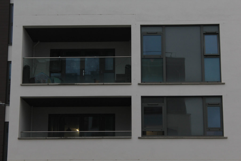
This photograph is one of my favourite shots from my La Marais shoot, this is why I have chosen it to be featured in my final images collection. In my opinion, this image is one which is very striking, with the composition of this image being its strongest feature. The fact that the windows are so close to the lens of the camera means that they can be in good focus, creating this high quality images. I really like the fact that a reflection can be seen on all the windows on the left hand side as you can see the clarity of the sky in this reflection. All of the parallel lines in the windows, as the high contrast was created by increasing the ‘blacks’ and ‘whites’ settings that are found when editing in Lightroom, means that the photograph has been made more successful. However, I could be interpreted that not a lot of consideration was put into the composition of this image, as the overall concept of this shoot was simple and the layout of this image was last minute and the influence of Lewis Baltz wasn’t really put into consideration when taking this image, and I think this is obvious as it can’t closely be related to his work.
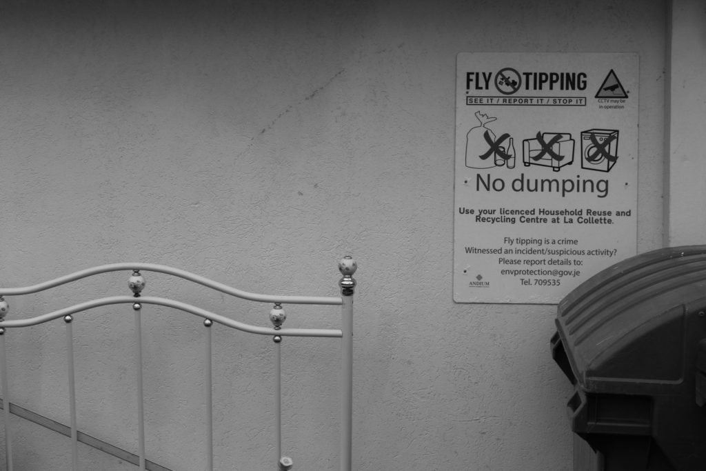
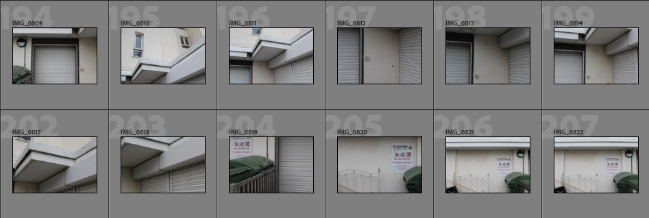
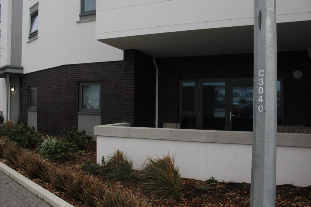
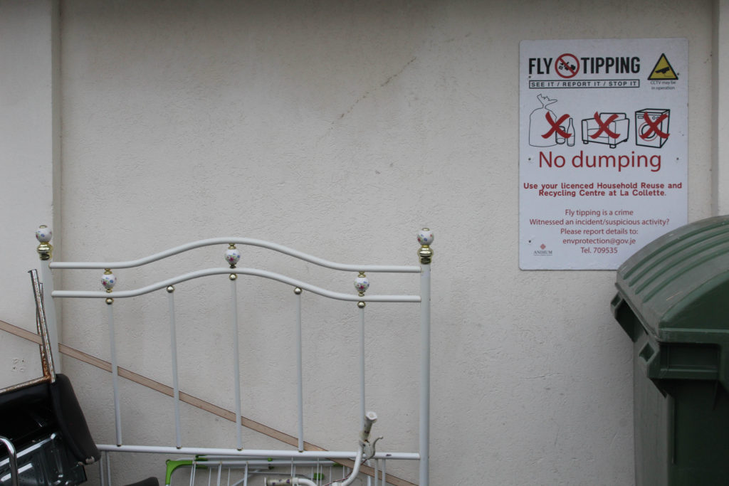
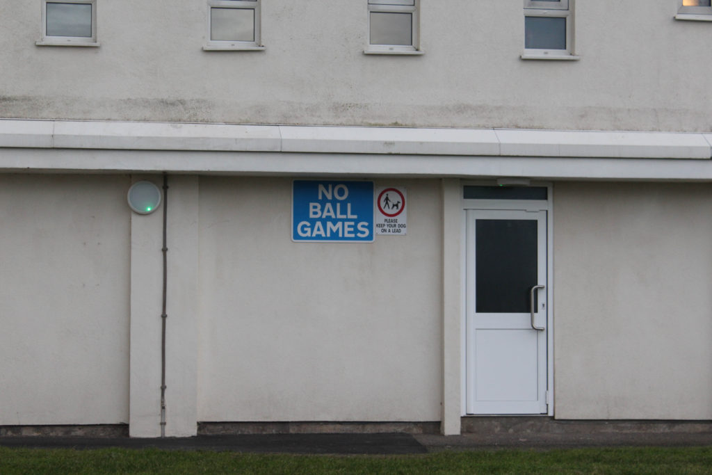
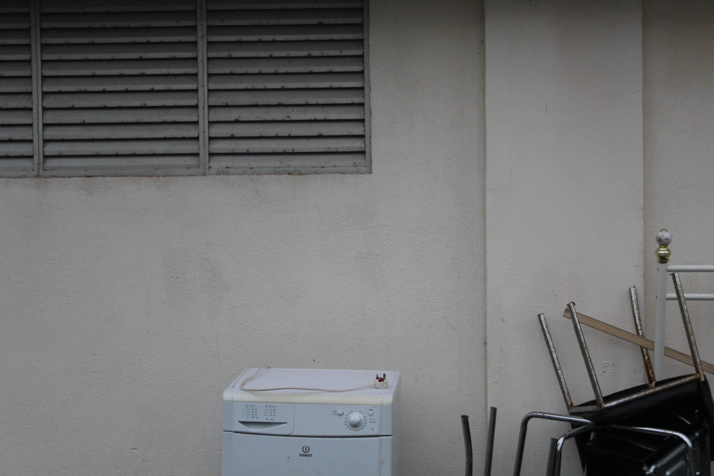
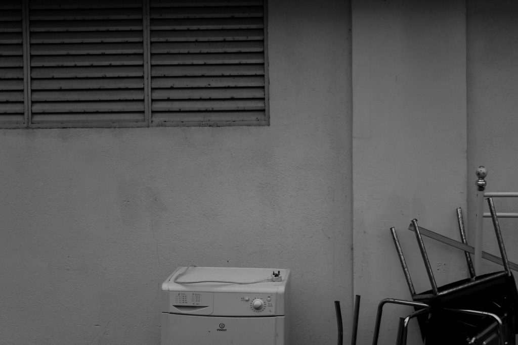
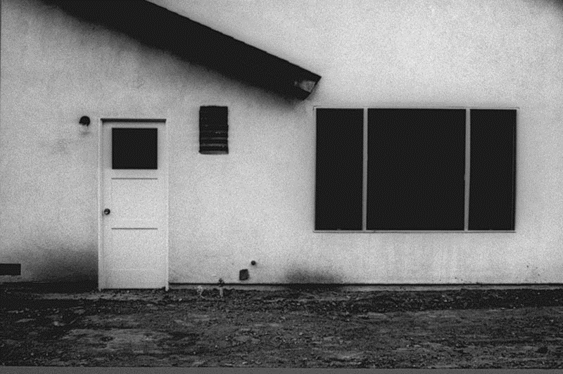
This photograph was taken at the base of one of La Marais’ flats, with all of these objects being carelessly dumbed at the bottom of this block of flats. The composition of this image is mostly minimal, with their being lots of blank space of white wall in the background and the tipped objects in the foreground. This image best demonstrates Anthropocene as it shows the carelessness that people have when it comes to discarding rubbish in an unsustainable way, as the furniture could of been resold and therefore could of been used again instead of adding to Jersey’s waste. I think that the lack of objects to look at throughout this image means that people have to pay attention to parts of our environments that are not so beautiful, and makes humans realise that not everything we are surrounded by is as good as it may seem.
I have selected this as my last final image, as I think despite it not being my most successful out of my whole photoshoot, it best reflects the more accurate in between of recreating Baltz’s work, and my photoshoots reacting to the theme of Anthropocene. So in that respect this could be said to be my most successful image. However, overall I think that this photograph is not that interesting, as the components and composition isn’t very eyecathing at all. There aren’t aesthetic aspects to analyse in this piece, or any that would catch people’s attention. If I were to go back and retake this image I would get a high or low angle in an attempt to create a piece that is more visually interesting and could be used to other parts of my project such as my vital gallery. I think that the plants in the pot get lost as the black fence is behind the, as everything is the same tones it means its hard for a background and foreground to be determined throughout the middle section of the photograph.
Photoshoot plan: For my second photoshoot I would like to explore some areas of farmland in an attempt to recreate the work of Richard Misrach. To do so I will be taking some images of green houses in some fields, I would like to create high quality images with an eerie effect to them and some which can be drastically edited using the ‘invert’ tool in photoshoot. To do so I will be exploring this area during the early afternoon in order to get good sunset which creates clear images whilst still being not too bright. The only equipment I will be using will be the school camera, as I don’t think that it is necessary to use a tripod. This is because I think that more interesting images can be created without the tripod as more creative angles can be gained.
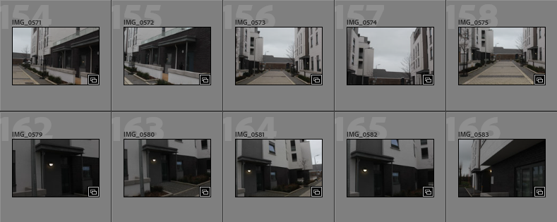
Contact Sheets
Below I have included some contact sheet which illustrate all of the different angles and compositions I have achieved during this photoshoot. I think this is important to demonstrate as it helps me look through all of images and start to understand how many successful ones I have taken.
Overview of photoshoot: In my opinion this photoshoot is filled with a lot of images of high quality and potential but there is some images which are too over or under-exposed to be able to edit or use throughout my book, however, I still think that these images will come in useful when it comes to creating creative edited pictures.
Image Selection
In order to begin my image selection process, I went through all of my images and rated them with stars, this ensures that I can later filter out of my unsuccessful and only focus on the ones I have rated 5 stars. The next step to this process is using a colour coding scheme which helps me determine which images out of my strongest images have the most relevance to my project and are of the best quality. I have also used a star rating system followed by a colour coding system to show my better photographs.
Purple- images with most potential
Blue- images that could be used
Pink- images with least potential
Best Images Before Editing
Below I have created a gallery which contains some of my best photographs before I have cropped or edited them. This is in an attempt to show that some good unedited images have come from this photoshoot. I also like filtering out all of my images so I can see which have the highest natural clarity.
Editing
Editing these images came to be more difficult then expected, as some of them were so grey that it was hard for any other colours and tones to comes through in the images. However, I have demonstrated some editing I have done throughout these images and how this has impacted the photographers in a positive or negative way.
I think that overall my editing has been good, and only adds to the strength of my images that I have taken. This way of monochromatic editing is my favourite as it adds dimension and contrast. The lighter and darker tones are more evident and this means that the shadows are more clear as well. I think that my photoshoot has become even more successful after looking at these edited photos.
Final Images and Evaluation/ Critique
This section will include all of my final images from this photoshoot, this demonstrates that exploring the fields was successful when in regards to creating new images for my photobook. The most important aspect of this photoshoot is the fact that I am responding to Misrach more then Baltz, but this photoshoot could be compared to both.
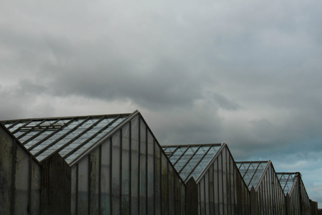
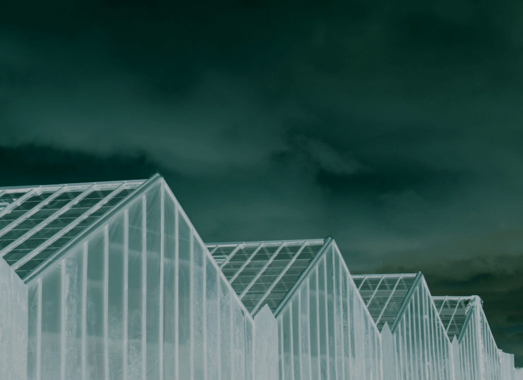
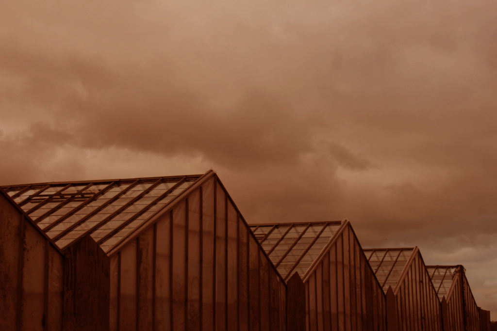
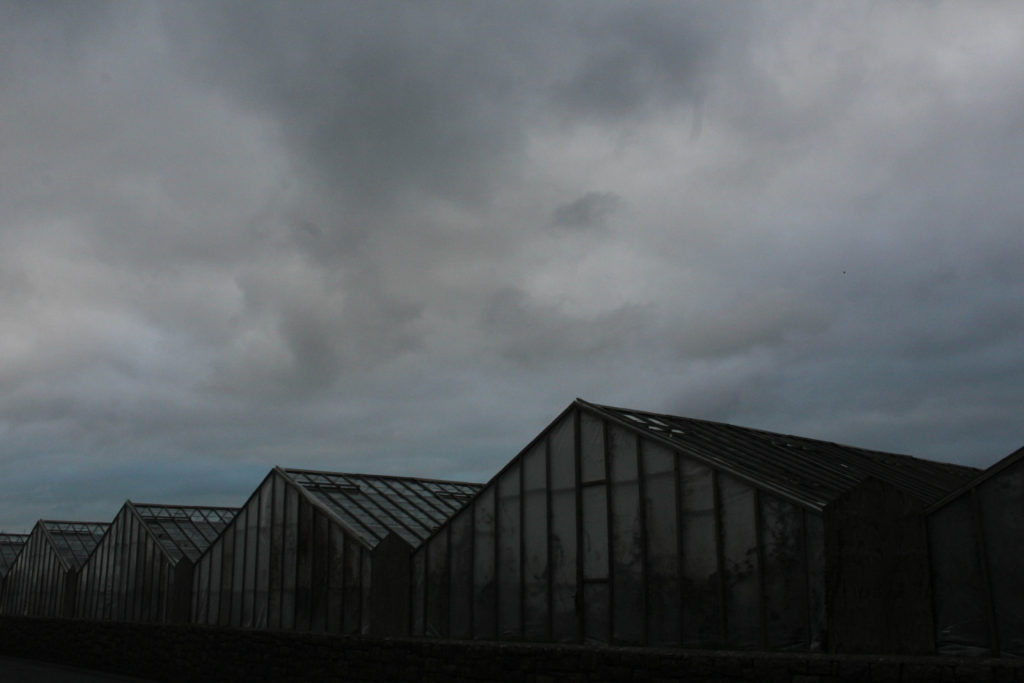
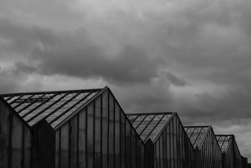
I have selected this as my first final image as I think that this is my most influential image, it shows all of the greenhouses that are present in all of my other images. I like that there are different textures present in this image. This monochromatic editing means that the clouds create different shapes with soft texture in comparison to the parallel dark lines in the greenhouses with lack of texture with lots of dimension. I really like the composition of this images as it allows for half of it to be composed of sky, whilst half of the image is composed of the greenhouses themselves. Lots of this image is filled with dark tones and very harsh lines, whilst the sky is very subtle, this creates contrast within the image and makes it more appealing. Most importantly I think that this image relates more to Lewis Baltz in comparison to Richard Misrach, and this means that this photoshoot links to both of these artists and strengthens the concept of my project.
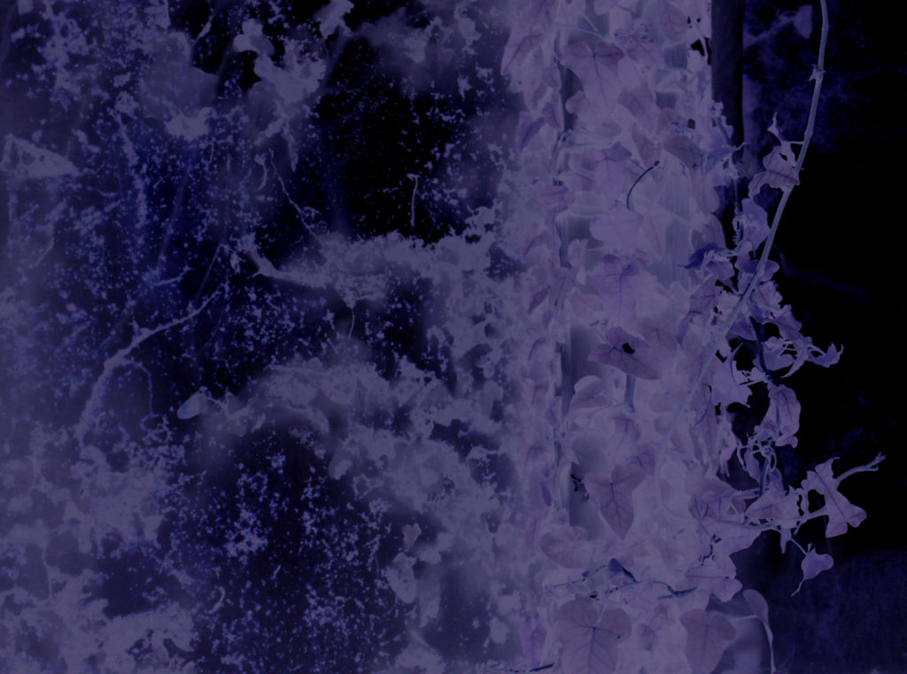
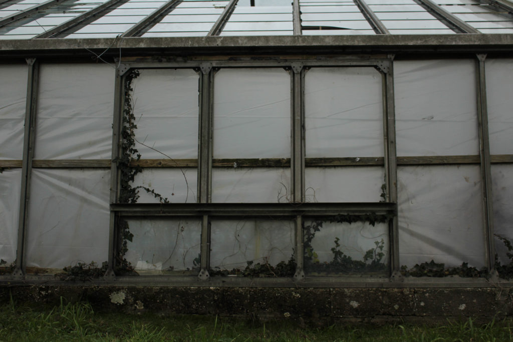
I would like for both of these images to put together when they are being displayed as I think they compliment each other well, with these images being two perspectives of the same structure. I have tried to edit them so they are the same and appear to have similar lighting. I have purposefully make the first image quite over exposed, so that the sky is brighter and the texture of the leaves is more prominent. I think that these are two of my strongest images as the second also contains a lot of detail and texture within the leaves. The purpose of these photographs relating to my project was the fact that they represent manmade structures being built on a natural landscape, and then the natural landscape taking back the scape that us humans has taken for our own benefit, this is important as it links to Misrach’s concept of educating people surrounding the climate crisis we are always facing.
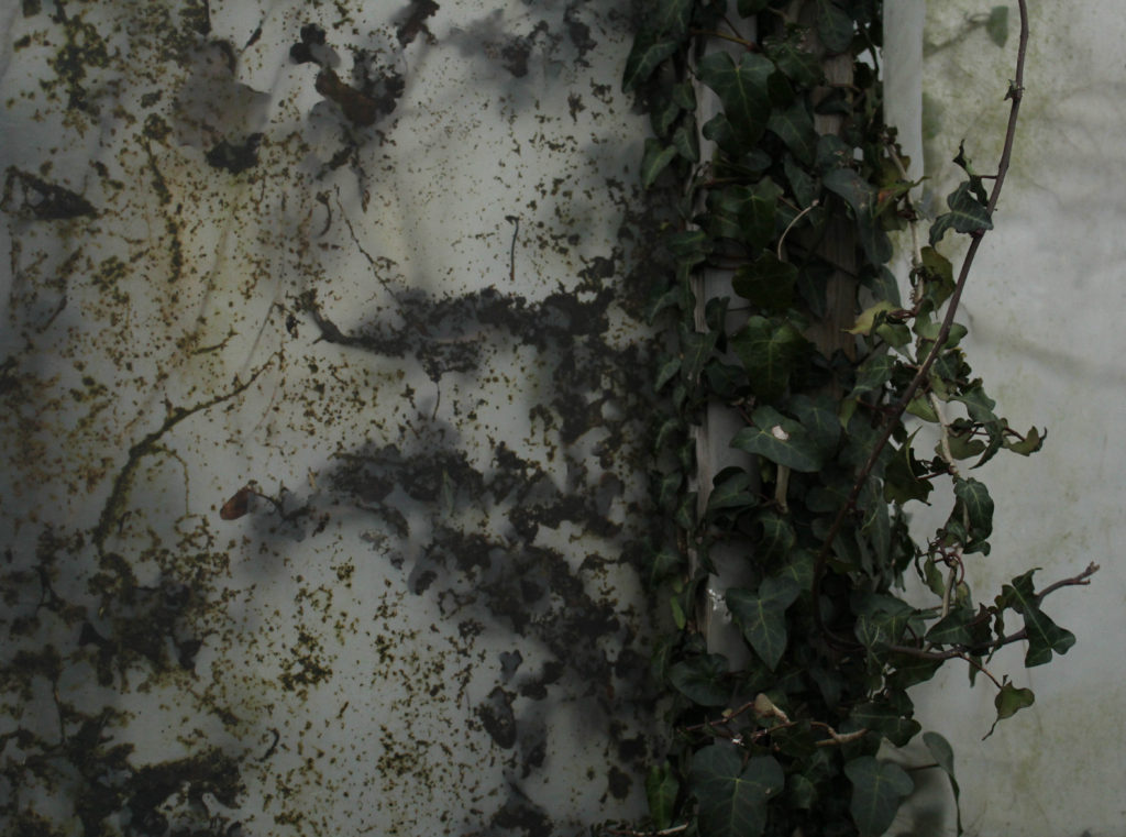
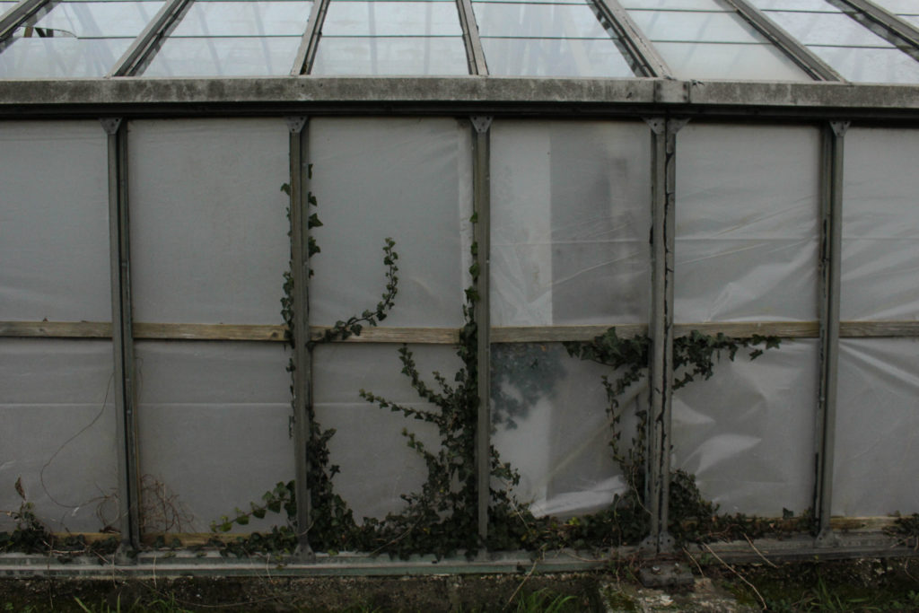
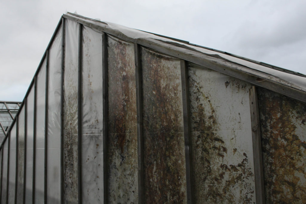
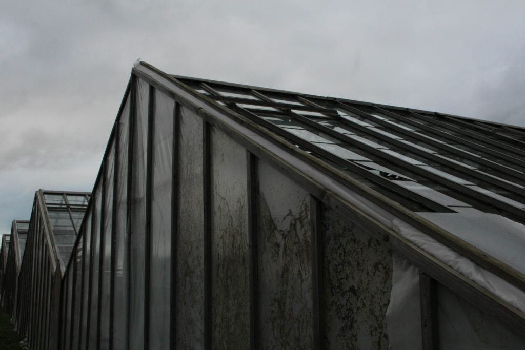
I have selected this as another final image as it represents how strong manmade structures can be, as the structure has obviously lasted a significant amount of time, throughout all the natural events that could have occurred, and this is shown through all of the dirt and moss that can be found on the outside of these greenhouses, highlighting the longevity of their lives. This links to the fact that the damage that manmade life has caused is mostly one which is irreversible and cannot always be controlled. Additionally, this image remained more aesthetic without monochromatic editing, and I like how the colours in this image show how much natural life can still go through and survive regardless of the circumstances.
Compare and Contrast
St Helier (2023) Petrochemical America (2012)
Similarities: I have now included a compare and contrast of my work versus that of Richard Misrach, this shows where I have got my inspiration to photograph natural landscapes from. The clarity of this images reflects how I have considered my work being compared to his, as I wouldn’t want to take inspiration from his work and then begin to produce low quality outcomes to comparison. Lots of cool and green tones are evident in both of these pieces of work, with natural aspects such as leaves and foliage in both of these pieces.
Differences: I think that these two images have many differences and this is because of the composition and objects that are present in each other the photographs, they have completely different looks with just a few links to each other. Additionally, Misrach’s work is filled with a wider variety of wide shot images, whilst I have more examples of more zoomed in images, attempting to focus on one part of the greenhouse. Despite there being visual differences in my work, their are different conceptual approaches to our work, this means that Misrach has focused on a whole area (Cancer Alley in this photograph above) in an attempt to educate people and bring attention to out current climate crisis. On the other hand, throughout my work I am heavily trying to relate my project to very specific and somewhat overlooked areas of Jersey (like this photoshoot specifically). In my opinion this dramatically affects the outcomes that our work will create, the message of my work is more related to how the landscape itself has changed, and how the environment has continued to adapt.
Photoshoot Plan: For this photoshoot I would like to explore the area of La Collette and its close surroundings. The main aim of this photoshoot would be to create high quality images of an industrial are, particularly ones which would look good edited in a monochromatic style, as this reflects the work of artist Lewis Baltz, who I have been researching and writing about throughout my essay. Additionally, this photoshoot was aimed to be done throughout sunset, as the golden lighting can create reflective effects and interesting shadows. I will not be using other equipment apart from the camera as I believe that my shutter speed will not be low enough for me to need to tripod. I will be attempting to recreate work similar to those of Lewis Baltz and Richard Misrach, this makes this photoshoot my most important of the three that I will be doing, as the others mostly focus on just one of these artists,
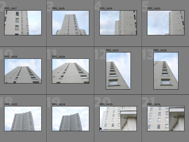
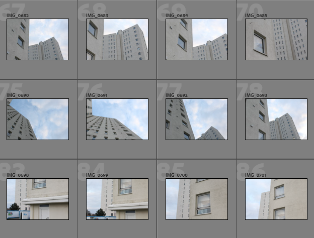
Contact Sheets
Overview of Photoshoot: Overall, I think that this photoshoot generated some very successful and high quality images, and most importantly I now have images which can reflect both Lewis Baltz’s and Richard Misrach’s work. I think that it was a very good decision to take this photoshoot during sunset as the warm tones of the image makes them a lot more aesthetic and unique. However, I wish could have generated more images from this shoot because the ones I have will relate very well to my project in my opinion.
Image Selection
In order to begin my image selection process, I went through all of my images and rated them with stars, this ensures that I can later filter out of my unsuccessful and only focus on the ones I have rated 5 stars. The next step to this process is using a colour coding scheme which helps me determine which images out of my strongest images have the most relevance to my project and are of the best quality. This means that the editing process is made so much easier as I have already selected the best images and these mostly have high levels of quality, meaning that some types of editing, such as monochromatic, don’t turn out grainy.
Purple- images with most potential
Blue- images that could be used
Pink- images with least potential
Why I like this method of image selection: This method is an easy way to determine how much I like all of my images individually and how I can visualise them coming together as a sequence. It helps me consider how all my photographs will be arranged in my photobook and which images match up the best.
Best Images Before Editing
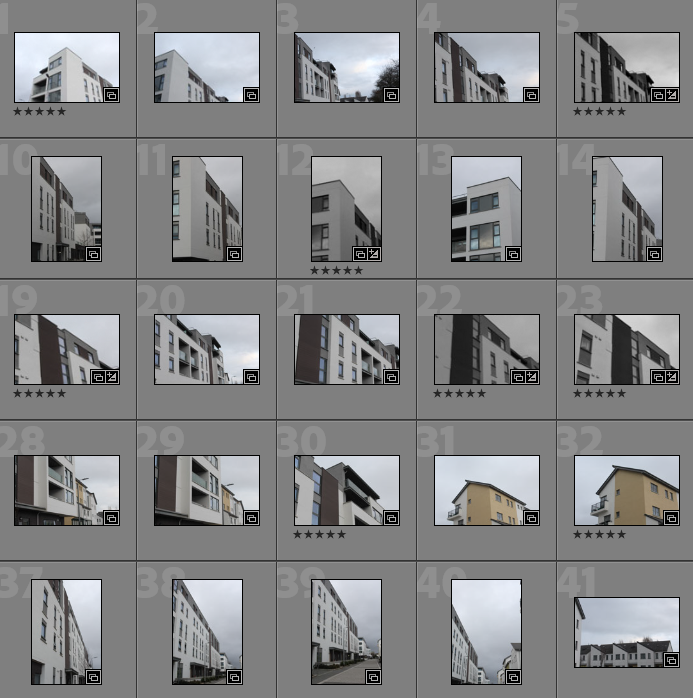
Below I have created a gallery to illustrate my images with the most potential, as I believe that these images do not need a lot of editing and are high quality without adapting the ‘clarity’ and ‘dehaze’ settings in Lightroom Classic. I would like to use these images in my photobook as the saturation of these images will look aesthetic in my book as the natural colours provide contrast to the amount of monochromatic photographs I would like to include.
Editing
I have created a gallery to demonstrate the different ways in which I have edited my images, this also shows that not every photo needs a lot of adjustments/ changes to them. I found that the case with so many of my images from this photoshoot as the images had good levels of saturation and vibrancy so they didn’t need a lot of work done to them.
The images from this photoshoot were more difficult to edit than I expected, this meant that making them appear monochromatic sometimes was not as successful as I would have hoped, this means that selecting images to place on the blog was more challenging and there was not many good black and white images to place into this editing gallery. I would like to majority of my monochromatic images to come from my other photoshoots so I’m not too concerned about this.
Final Images and Evaluation/ Critique
This section will include all of my final images from this photoshoot, this demonstrates that exploring around La Collette was successful when in regards to creating new images for my photobook. The most important aspect of this photoshoot is the fact that I am responding to both of my artists and these images are important when it comes to illustrating my understanding of both of my photographers work.
I have decided to place these two final images together as they both have a warm tone and blue aspects to them, the background throughout the first image matches the sky in the second. The first image is like a zoomed out wider perspective of the second one, and this creates a story of exploration throughout these images. This is important as it shows the narrative and thought put into taking my images in La Collette and its surroundings. The overall look of the photographs is one of high quality and dimension, in my opinion these are some of my successful photographs as they didn’t require a lot of editing and cropping. These images are a good reflection of Baltz’s style of photography along with the angles and saturations that Misrach uses, making them great example of how I have tried to explore the work of both photographers in my own way.
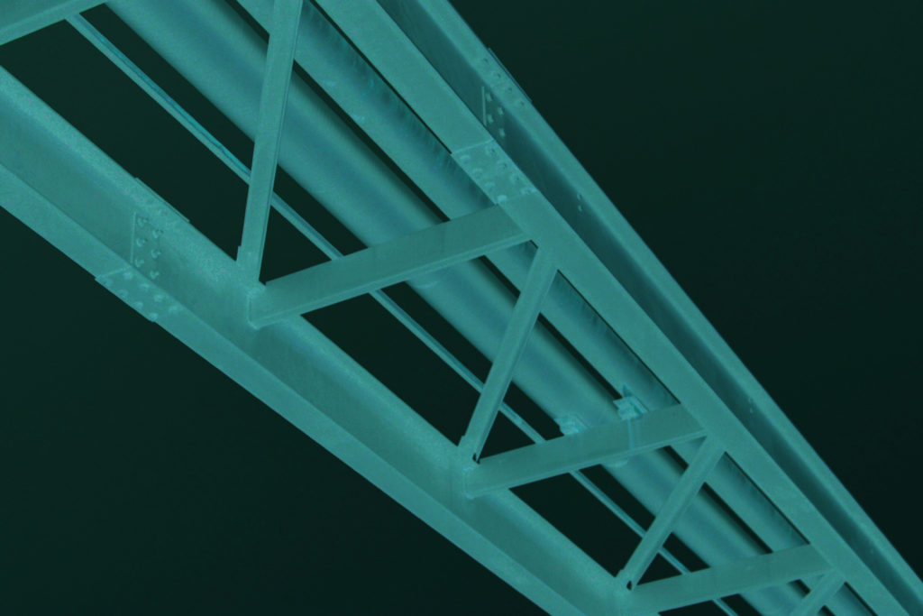
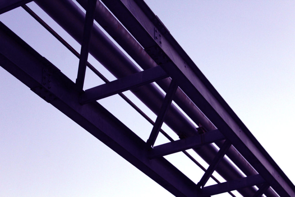
I have selected this as one of my final images as I think it reflects the work of Lewis Baltz very accurately, the infrastructure and use of parallel lines means that it reminds me of his work and could be compared and contrasted to his work in an effective way. Furthermore, the point of view in which the image was taken is very interesting as it is from the ground looking very high up, using this unique perspective means that I had more control of the composition of the image and how much sky was left to be exposed. Overall, I think that the cool tones in the image mean that the greys and blues play off each other very effectively and this creates a very authentic feel to the whole image, and the greys in the metal work creates light shadow and reflecting aspects across the majority of the photograph. Its important to note that overall the complexity of the image is limited, but this doesn’t necessarily mean this makes the image less or more successful, its more just an observation when thinking about how much time was put into considering how this image would turn out.
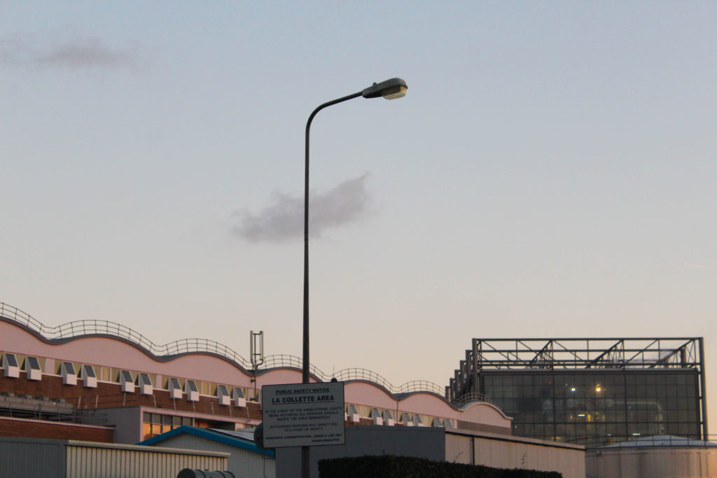
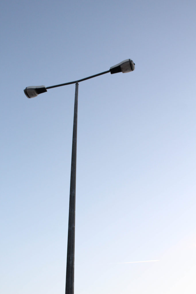
These final images were taken straight across from each other which explains why the sky is slightly darker in the first image as it is facing away from the sunset, and also explains why there is lots of light reflecting off of the metal structure in the second image. In my opinion these photographs fit well together as they both represent work from both of my artists, along with showing how similar and different their work is at the same time. Furthermore, the composition of both of these images makes them more successful as the lamppost is in the middle of the image, and the side of the metal building takes up half of the photograph on the right hand side. These image link well as they both contain parts of La Collette which look similar but have different functions. for example the incinerator in the background of the left image and the lamppost in the background of the right photograph. A critique for these images could be that the first one could of been more zoomed in, along with changing the ‘F’ setting on the camera, the image could of been a lot clearer.
Compare and Contrast
My Work (La Collette, 2023)Baltz’s Work (West Wall, 1974)
Similarities: Below I have placed an example of my work in comparison to the work Lewis Baltz, this is in an attempt to illustrate that I can take inspiration from an artist and show I can create examples of their work in my own style throughout their photoshoots, this means that I have some work which is like Baltz’s and some which is more like Misrach’s, or even some that reflect my own style of photography. The main similarities in these two photographs is the parallel lines in each of the photograph, as the empty space which is present to create contrast, such as the sky in my image and the bushes and pavement which are places at the very foreground of Baltz’s image. This illustrates that both work was taken in industrial areas which have been heavily built my mankind and may be continue to develop.
Differences: My work in comparison to Baltz’s is not monochromatic and contains less cluttered parallel lines, this means that along with the lack of free space in his image his work looks more busy and full of life, it could be argued that my work is of lower quality in comparison. My photograph only focuses on one part of of the structure and the metal work, whilst Baltz’s image looks at some surroundings, such as the pavement and the rocks in the foreground of the image. In my opinion, this makes his work focus more on the general aspects on Anthropocene and it could be interpreted that my work is just focusing on industrial areas and not that natural oandscapes that have been destroyed.
A sentence– A photographic journey throughout the island which illustrates Anthropocene through time
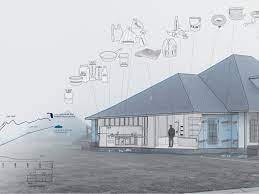
A paragraph-My book will illustrate the human effects that have changed our environment. I will use images that I have taken from multiple different locations, this is to reflect the fact that Anthropocene is present everywhere in our island life. Overall, I hope that my book is an aesthetic reflection of my photography A level.
The story of my photobook will focus on how Jersey has experienced Anthropocene and how the island’s environment and climate will be ever-changing. The layout of the book will illustrate the changes the environment has gone through, as there will be images of natural and unnatural landscapes, and I plan to put edited mages of these two concepts together into my final photobook. The end of the book will contain my essay along with Robert Adams’, Lewis Baltz’s and Richard Misrach’s images, this relates to the information I will be analysing and referencing throughout my work.
Design: Consider the following
How you want your book to look and feel
Paper and ink
Format, size and orientation
Binding and cover
Title
Structure and architecture
Design and layout
Editing and sequencing
Images and text
I would like the front of my photobook to be a hardcover book which is a medium size, the cover of book will be a smooth wrapped image, with the will spread around both the front and back of the book. My aim is to make the front of the book as aesthetically pleasing as possible as the smooth textures will contrast will the heavily textured and busy photograph which I will place along the front. The majority of my book will contain black ink with some coloured and some monochromatic images, this is in an attempt to make the book more aesthetically pleasing as it will be filled with contrast and editing.
Furthermore, I would like some pages of my book to contain small areas of black writing (with the white writing in the background). The purpose of this will be to show where an image was taken and when, and to give information on how much Jersey’s production of unsustainable substances such as oil has increased since the 1970’s onwards. As this was the decade where Lewis Baltz was first part of the Topographic, and this helps me relate my photobook to his work.
I would like to structure my photobook using a variety of photographs and blanks space to create flow throughout my work. There will some very busy spaces and then some completely blank pages to even out the layout of the book. The pages will also flow well as I will place heavily edited images next to natural/ unedited images, this will allow for my photobook to show off some Photoshop and Lightroom editing skills, right alongside camera skills and demonstrating that I understand the settings and functions of the camera.
Mood Board
I have created this mood board in order to visually demonstrate some photobooks that I find inspiring and some I would like to take aspects from. This is important as it helps me demonstrate where I have got some of my first ideas from and shows the multiple different types of photobooks that I would like and recreate. At the moment my ideas are quite plain so creating this mood board has helped me consider in more detail and with more creatively how I would like my final photobook layout to look like visually.
My main focus when creating my photobook is to showcase my most successful photographs, and I hope that I will be able to create balance throughout my book taking inspirations from some of the layouts in this mood board. For example, I really like the bottom right as the high levels of contrast throughout this image means that the viewers attention is draw to the book and they will want to look at the rest of this photobook. Furthermore, I think that having more than one image on one side creates a very aesthetically pleasing look, and especially along with a black space/ page next to it.
Creating my first layout
To create my draft layout I used a website called Blurb which first allows you to look at others photobooks before you sign up, this was helpful as it meant that I could create some more ideas before creating my first draft layout. Additionally, this website provides details regarding the pricing of different quality, size and paper which could be used when considering the overall look and feel of the book.
Before creating my first draft layout of my photobook I have created a collection in Lightroom which illustrates all my best images and the ones I would like to include in my final personally study. Despite these images being from many different photoshoots, I think that I will be able to link them together very well, like one of my inspirational artists, Richard Misrach. I would hope that the book is split so that I can reflect that I have been inspired by both Lewis Baltz and Misrach, as the images I have used in my first draft of my photobook reflect Misrach and focus on his work more closely. Whereas my second section will be more inspired by Lewis Baltz and Robert Adams.
Below I have created my first experimentation of my photobook, the main purpose of this was to get used to using Lightroom as a method of creating my book, as Blurb is only used to print and buy the books. Lightroom is an easy and effective way to create a photobook, it is helpful as you can move the images around and see how the final product and layout will appear when it is printed.
During the exam I will be creating my book using Lightroom as well, along with doing this you can put two-six images on any page of work, and add blank pages and small text around and next to the images. I think that this will make my book more aesthetic and successful. I like that the book can be previewed and the arrangement can be changed as frequently as needed.
1. Research a photo-book and describe the story it is communicating with reference to subject-matter, genre and approach to image-making.
Petrochemical America
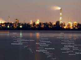
Petrochemical America is a book created by Richard Misrach and Kate Orff and focuses on in-depth analysis of the causes of decades of environmental abuse along the largest river system in North America. Even more critically, the project offers an extensively researched guidebook to the way in which the petrochemical industry has permeated every area of contemporary life. This focuses on the how the landscape has been altered because of the chemicals that are now used in American society have changed the appearance and health of their environment.
In 1998, the High Museum of Art in Atlanta asked Richard Misrach to produce work for their “Picturing the South” series. Misrach decided to focus on “Cancer Alley,” the Mississippi corridor that is a hundred and fifty miles between New Orleans and Baton Rouge, a decade later, the Museum asked Misrach to return to Cancer Alley to shoot, and then combined this new work with the original series for an exhibition and book called “Petrochemical America,” published by Aperture. In re-approaching the project, Misrach hoped to find avenues of environmental and structural change in this region and for the nation.
2. Who is the photographer? Why did he/she make it? (intentions/ reasons) Who is it for? (audience) How was it received? (any press, reviews, awards, legacy etc.)
Richard Misrach is one of the most influential photographers of his generation. In the 1970s, he helped pioneer the renaissance of color photography and large-scale presentation that are in widespread practice today. Best known for his ongoing series, Desert Cantos, a multi-faceted approach to the study of place and man’s complex relationship to it, he has worked in the landscape for over 40 years.
Petrochemical America represents a unique collaboration between photographer Richard Misrach and landscape architect Kate Orff. Presented in two parts, the first features Misrach’s photographs of the Mississippi River industrial corridor, stretching from Baton Rouge to New Orleans—one of America’s most industrialized places, and a region that first garnered public attention as “Cancer Alley” because of the unusual occurrences of cancer in the area.
3. Deconstruct the narrative, concept and design of the book and apply theory above when considering:
Book in hand: how does it feel?
Paper and ink: use of different paper/ textures/ colour or B&W or both.
Format, size and orientation: portraiture/ landscape/ square/ A5, A4, A3 / number of pages.
Title: literal or poetic / relevant or intriguing.
Narrative: what is the story/ subject-matter. How is it told?
Structure and architecture: how design/ repeating motifs/ or specific features develops a concept or construct a narrative.
Design and layout: image size on pages/ single page, double-spread/ images/ grid, fold- outs/ inserts.
Editing and sequencing: selection of images/ juxtaposition of photographs/ editing process.
Images and text: are they linked? Introduction/ essay/ statement by artists or others. Use of captions (if any.)
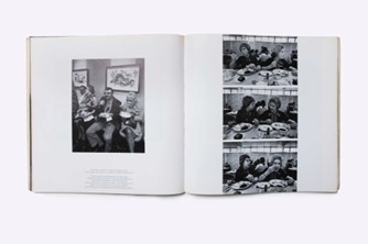
This book contains images of Cancer Valley, prints of oil patterns, ‘swamp and pipeline’ throughout Louisiana, a locational map of industrial land map along river road, Prairieville (Louisiana), Mississippi. There is also constructed images of landscape impacts of petrochemistry and land patterns of the industrial corridor over time which gives details regarding how much the landscape has changed.
The whole book is formatted in a landscape form, with the first section of the book having the location of the image on the left hand side of the page and then the full size colour image on the right hand side. The second part of the book is filled with images like the one above, not taken by Misrach but constructed as part of the book as it adds more purpose to his images, and gives a clearer indication of how much humans have changed the landscape.
The whole cover of the book is hardback with a printed image and contains in my opinion, one of the most successful of all of Richard Misrach’s images, this means that the cover is very eye-catching and draws in the viewer. Furthermore, the title of the book is pretty intriguing as it makes you want to explore what Misrach and Orff’s definition of ‘Petrochemical America’ is and whether this relates to a positive or negative event or theme. As the title is very explicit, it increases curiosity within the reader. The story is told in a very clever way, as the first part illustrates the beautiful and natural landscapes, and then afterwards many scientific like images and placed in, with lots of accurate information regarding chemicals population increases. Continuing, the book travels back to the natural landscape images, however, these images aren’t as aesthetic, this third section is also very much focused on cities and industrial life.
Despite the images above being filled with dark colours and tones, the majority of the pages in the first section are pretty blank, with only one sentence of just the title of the images written down, all of the text in the next sections are very relevant to the images shown, and all description’s are detailed but clear. I think its important to note that all of the sections are well organised, section one and two very much juxtapose each other, whilst section three is a very good mix of both, this is good as it makes you feel like the general consensus of the book is coming to an end, with everything being well finished off.
‘How is the theme of Anthropocene explored through the photography of Lewis Baltz and Richard Misrach?”
“I’ve come to believe that beauty can be a very powerful conveyor of difficult ideas. It engages people when they might otherwise look away”– (R.Misrach, Look at this if you love great photography, 2021)
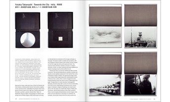
Throughout my personal study I would like to explore to theme of Anthropocene, looking at how the growing population has affected our natural environment and utilised our natural landscapes to build housing and support the islands economies, such as the finance district and the recycling centre. The relevance of Anthropocene today has elevated my interest in this concept and highlighted the importance of our climate surviving. It is imperative to consider the impact that the growing population previously had on the planet and how this issue only increases. As stated in my opening quote, I will be attempting to analyse how Anthropocene helps bring positive attention towards “difficult ideas” and how photography has highlighted issues of urban expansion. Throughout my project my main aim is to highlight the severity of our current climate crisis and look back at how artists such as Lewis Baltz and Richard Misrach have explored Anthropocene in their work. To illustrate this, I will be going into detail regarding modernism and post-modernism approaches to photography, in particularly how the celebrated work of Ansel Adams and his contemporaries in Group f.64 influenced a new group of post-war landscape photographers who was put together in the landmark exhibition in 1975, New Topographics held at the George Eastman House’s International Museum of Photography.
Robert Adams Mobile Homes, Jefferson County, Colorado, 1973
Lewis Baltz was in this select group of photographers and in this study I will investigate what motivated himself and Richard Misrach to turn their camera on man-made landscapes. In Fotogalleriet Oslo’s book ‘Conversation on Photography’, Baltz states ‘Whether being legitimate or illegitimate, photography was still a product of the industrial revolution.’ (Baltz 2018:74). This quote could be considered controversial as the revolution had a strongly negative impact on our landscape, but without this advancement in technological thinking, the camera may have not been created for Baltz to use. Despite Baltz and Misrach appearing in two different movements, I think they complement each other well. This is because I would like to merge their styles of photography together, using simple compositions and then editing images and colours in subtle ways. I will be responding to their works be recreating some of their images using different photographs from my La Marais and St Clement photoshoot. These will then be edited in monochromatic, to reflect Lewis Baltz’s work, or, manipulated using the ‘invert’ colour tool in Photoshop. The hypothesis above, which addresses how Anthropocene has been explored by Baltz and Misrach will be developed by taking images of highly industrialised areas with natural formations still occurring throughout and surrounding them. This will help me demonstrate that Anthropocene is a constant change in the environment, despite the human population destroying the planet, there is some hope that any natural life can still flourish.
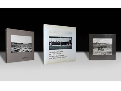
“The new Industrial Parks near Irvine, California.” Lewis Baltz- 1974
The historical context and development surrounding the concept of Anthropocene is one that is very detailed and complex. It all began with the renowned photographer Ansel Adams and his celebrated images of the American west. Throughout his photographic research, Robert Adams states in David Bate’s book, Photography The Key Concepts that ‘photography can be spilt into four stages; Experimental, Factual, Pictorialist and the New photography’ (D, Bate. 2009: 97), along with ‘Pictorialism’ being the term given for disputes regarding whether photography was an expressive form or art of a scientific study. Later, the concept that photographs could be facts were introduced, and during the 1970’s, the ‘New Topographic’ movement started to emerge, with artists such as Robert Adams and Lewis Baltz (among others) involved in making new images responding to changes in the natural and man-made landscape. Photography was not only regarded as art, but as a way of recording how the environment was changing too. This is a key factor in my project as this was a major turning point for photography, as Robert Adams was vital in making sure that these photographers work was not disregarded as ‘recordings’ but was also important art works. Focusing on landscapes which were man-made but now considered part of human’s natural cycle meant that understanding the importance of the gradual change in the landscape was vital. As the landscape changed; so, did photography. For example, the term ‘picture perfect’ started to be considered, as this wouldn’t have occurred without the development of technology of landscape.
Colorado, Colorado Springs, Robert Adams- 1968-71
It is evident that throughout Robert Adams’ work he would as a modernist artist, including formal characteristics such as stark lines and dark shadows. There is also an aspect of minimalism in this image above as aesthetically it is increasingly interesting, it could be interpreted that this photograph reflected how industrial features and increasing levels of housing was now becoming a mundane and repetitive feature of society. With the condition of the late 1960’s appearing to be one which Robert Adams has shown as ever-changing, the relevance of modernism fades as more aspects of new ways of thinking about art and culture in general, the term ‘post-modernism’ begins to emerge. The conditions in which post-modernism formed are some which could have been previously predicted, as this new interpretation of photography was build on the foundation that modernism was preoccupied by the vision of a utopian world that could be captured through art, and as photography can be an illusion, creating a dreamlike world through the lens. The consequence of this was the next era being more focused on idealism and reason, whilst suspicion still occurred surrounding the fact that post-modernism left less area for creative thought and higher perspective. Despite post- modernism supposedly being a contemporary mindset in which art was formed, it could also be said that post-modernism is filled with too many dark and serious themes.
AdamsBaltz
Lewis Baltz was a contemporary photographer who focused on adapting the American environment and how the concept of Anthropocene began to emerge in the American west where lived and worked. His explorations led him through California, Nevada and Park City. In 1975 Baltz took part in a travelling photography exhibition inspired by a minimalist approach to landscape photography, the ‘New Topographics: Photographs of a Man-Altered Environment’. He was given the opportunity to show his images from ‘The New Industrial Parks’ and the aim of this exhibition was to illustrate that the industrial revolution had come to an end. This exhibition was a major turning point in his career and it identifies the shift from his ‘conceptual photography’ to ‘minimalism’. The main purpose of his images, in his words, was ‘searching for beauty in desolation and destruction’ (https://www.metalocus.es/en/news/beauty-desolation-and-destruction-work-lewis-baltz-photographer) as he states in and this refers to the destruction that human life had caused. The US population had increased from around 23 million in 1850 to approximately 150 million in 1950. This is vital to consider as it demonstrates how the climate would change to such a state of ‘destruction’. By looking at Baltz’s images it can be interpreted that he enjoys photographing urban infrastructure and this is one way in which he likes exploring Anthropocene. Additionally, he has explored many different geographical areas, this demonstrated his passion for photography and how this translated through to the many different types of images he created.
Ansel Adams Lewis Baltz
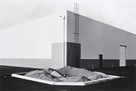
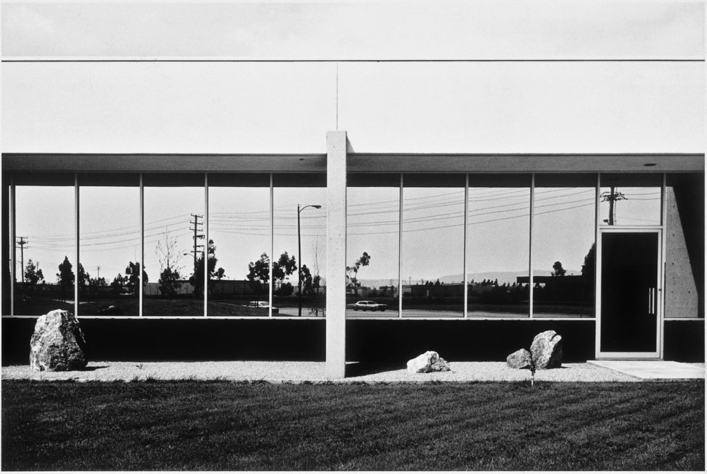
Pictured above is one image from Baltz’s Nevada collection. I think this is one of his most influential pieces as it is the most visual representation of the reaction to Ansel Adams’ and Edward Weston’s work, an adequate representation of Anthropocene. The layout of the image itself illustrates how Baltz explores Anthropocene throughout all of his work, this is because the type of photography attempts to communicate the message that human habitation has little regard for the natural landscape. The house being placed in the foreground and the hills being very dark in the background could suggest that Baltz was exploring how Anthropocene had changed not only the environment but humans mindsets too. This may be because consideration for preserving the landscape was decreasing, as the increasing population needed to use up these precious areas for themselves as the light within this image highlights the house and not its surroundings, meaning that the focus was now catering for human life and its needs. Baltz has discussed that architecture has been a huge part of his work, in Remi Coignet book Conversations, Baltz says that ‘I have a curiosity and interest for architecture because I am interested in the world. And architecture is the largest. most durable part of the manmade world, so that not too mysterious’. This comments helps us to unwind the reasons why Baltz began his work to begin with, but additionally shows that his interest in the world may have been why his work regarding Anthropocene has been so successful and reveered in the contemporary photography world. Furthermore, this provides evidence that Baltz has approached the concept of the planet changing in a way which focuses not on the decrease of natural landscape still available, but the increase of architecture and how much space humans have immersed in.
Arizona, 2014
‘In life, you’re in motion on a path somewhere. There’s always momentum, but a photograph defies that linear quality of time; it stops us so that we can contemplate something we normally wouldn’t pay attention to.’- on Landscape and Meaning (Misrach 2021: 26). From the perspective of Richard Misrach throughout the 1970’s, he explains that a vital part of life is being on a so called “path” and this is a metaphorical representation of how he perceives his photography. This is demonstrated in some of his work like the image above taken in Arizona. This path is just one example of how his words are reflected in his work. Misrach’s first project depicted homeless residents of Telegraph Avenue in Berkeley, California but it had limited success. This is important and it highlights a turning point in his career because without this failure he may not have begun his longest and more developed project; Desert Cantos. Beginning in 1979, Misrach focused on taking photographs of natural life such as cacti, and took wide-angled images of the desert both in the day and night. It can be interpreted that Misrach explores the theme of Anthropocene because of his amorality for natural life and structure when he states that the reason for this project was: “I was in search of the miraculous” Misrach 2021: 26) as this quote identifies the motivation behind his passion for landscape photography.
Desert Cantos- Misrach (1979)
After considering the origins and reasoning behind his desire to photograph the western American environment, the question of why he Misrach engages in exploring Anthropocene begins to emerge. This contemplation is one which can be explained through Misrach’s awareness of the deterioration the planet has been undergoing. He states that ‘photographs are reminders that they is no way to avoid the stark realities the viewer may wish to ignore, ranging from the cost environment of nuclear testing to the harm caused by industrial development and petrochemical production’ (Padley2021: 195). This explains that Misrach interprets photographs as a method of educating people by communicating that our current climate crisis cannot be ignored. Misrach’s work is a visual representation of these ‘stark realities’, and it could be interpreted he is aware of the influence his work has on his audience. Publishing such damaging photographs of the plummeting environmental conditions may be his way of exploring Anthropocene as this method is identifiable and direct.
BaltzMisrach
Overall, the exploration of Anthropocene throughout Lewis Baltz’s and Richard Misrach’s work is a very interesting journey. The main aspect to highlight would be the fact that Baltz and Misrach takes very different approaches to their photography. For example, Misrach focused on photographing natural landscape which has been negatively effected by mankind, whilst Lewis photographs natural areas which have been transformed into beautiful architecture, as he attempts to illustrate that these forms are the new ‘natural’. This highlights a very significant difference between the two artists as the way in which they geographically explore Anthropocene means that there is a noticeable difference in their interpretation and visualisation of this concept. They both physically explore very effected areas, but with Baltz exploring California and Misrach exploring Arizona’s deserts, this allows for a lot of creative freedom and difference between their style of work and its objectives. It is evident that Baltz was searching for beauty in the destruction of the world, and Misrach was attempting to make more people pay attention to the destruction that was occurring around them where they lived. I think this holds a lot of importance as both artists have conveyed Anthropocene as a subject which is undergoing constant change, whilst individually highlighting that the destruction occurring throughout our planet is an idea which needs to be addressed with more sensitivity and less misconduct.
My response to the ‘Anthropocene’ project
I have included a visual example of my work throughout my own project which focused on Anthropocene. This image demonstrates alongside the work of Baltz that industrial areas are a great way to explore the topic of Anthropocene, as they provide lots of areas that catch the viewers eye, along with lots of detail throughout the infrastructure of the building. Both my example and Baltz’s work include detail in metal work, with plain backgrounds to contrast the structure and draw attention to the focal point of the image: the construction. However, this piece could still be comparable to the work of Misrach as the warm lighting is very much like this work. Furthermore, I can relate my work more towards the mindset and thought process behind that of Richard Misrach, this is because he believes that he’s “…come to believe that art is a really important way of communicating, not only with current generations, but future generations.” (https://news.artnet.com/art-world/richard-misrach-art21-1946853). I fully support this concept and it relates back to the purpose of my whole personal study, with me attempting to communicate and bring awareness to what has been happening to the climate.
Bibliography
Baltz, L. (2010) Lewis Baltz Texts. Germany: Steidl
Baltz, L. (2001) PHOTO PHAIDON 55. New York: Phaidon Press
Campany, D. (2018) Conversation on Photography. Rome: Contrasto
D, Bate. (2009) Photography. New York: BERG
Misrach, R. (2021) on Landscape and Meaning. New York: Aperture
Jones, K. (2014) Remi Coignet Conversations. Paris: The Eyes Publishing
Misrach. R/ Orff. K (2012) Petrochemical America. New York: Aperture
Padley, G. (2021). Look at this if you love great photography. London: Ivy Press.
S, Verlag. (2009) New Topographics. University of Arizona: CCP
Szarkowski, J. (1966) The Photographers Eye. New York: The Museum of Modern Art
Respini, E. (2009) into the sunset PHOTOGRAPHY’S IMAGE OF THE AMERICAN WEST. New York: The Museum of Modern Art
Research and identify 3-5 literary sources from a variety of media
Begin to read essay, texts and interviews with your chosen artists as well as commentary from critics, historians and others.
Take notes when you’re reading…key words, concepts, passages
Write down page number, author, year, title, publisher, place of publication so you can list source in a bibliography
Walker EvansPaul StrandLewis W Hine
Movements and Isms: I would like to take some inspiration from the Straight Photography movement as I think that artists which reflect this era of work, such as Rut Blees Luxemburg, have created some very influential and important work. Throughout one of Luxemburg’s interviews she mentions how her images how a public privacy to them, which relates to the outside work and being in an urban environment. This work is very important as it illustrates that straight photography can be demonstrated in many different types of locations, and don’t just need to be images of people.
Quotation and Referencing:
Why/ What should you reference?
To add academic support for your work
To support or disprove your argument
To show evidence of reading
To help readers locate your sources
To avoid plagiarism
Anything that is based on a piece of information or idea that is not entirely your own.
That includes, direct quotes, paraphrasing or summarising of an idea, theory or concept, definitions, images, tables, graphs, maps or anything else obtained from a source
Shea, D. (2018), 43-35 10th Street. Baden: Kodoji Press
In-text refencing examples:
Direct Quote: In his book on ‘Conversations on Photography’. Baltz writes ‘It seemed almost like magic to me how somehow you could make a replica. And you could represent the world, or a large piece of the world, without ever having to mess around with drawing…’ (Baltz 2018:8)
Paraphrasing/ summarising: Baltz (2018) states that he thinks its magic that objects can be replicated through the camera rather than drawing.
Literary Sources
Lewis Baltz– This article provides some of the information that I have included in my overall blog post about Lewis Baltz, this website is good for finding out information such as where his first photoshoots took place, his nationality and his life becoming a new topographic photographer.
Lewis Baltz’s Work– This website is more effective when researching information about the countless works that Baltz did throughout his life, how they are displayed and where the pieces of work are now. This is an important as it provided an insight into how much work Lewis Baltz has produced.
Richard Misrach– I think that this is one of the best websites for information about Richard Misrach, this is because it provides clear and concise information about the life of Misrach with only relevant facts.
Richard Misrach- Quotes and Work– This source provides information about the details and inspirations of Richard Misrach surrounding his work. This is a great source as I can see the levels and concepts throughout his work and how the quality of his ‘Petrochemical America’ book.
PetrochemicalAmerica
Additionally, I have selected Lewis Baltz’s ‘So present, So visible: Conversations with Photography‘ extract, which contains many quotes that would help me select many of the quotes that could be part of my essay. As there each paragraph is supposed to contain 2 quotations that are both relevant to the essay question and artists that I have selected, this screenshot belong is part of the book that I would like to explore and include in my personal study.
Essay QuestionIdeas
‘In what ways do Lewis Baltz and Richard Misrach explore how people have impacted our planet and environment?’
‘How do Lewis Baltz and Richard and Misrach consider the theme of Anthropocene?’
‘Considering how we are currently experiencing an environment crisis. How do artists Lewis Baltz and Richard Misrach illustrate this?’
‘How is the theme of Anthropocene explored through the photography of Lewis Baltz and Richard Misrach?’
‘How are the environmental changes occurring throughout our planet illustrated through Lewis Baltz and Richard Misrach’s’ work?
Opening Quote Ideas
“I’ve come to believe that beauty can be a very powerful conveyor of difficult ideas.”
“In a sense it was a dream life. Of course, it appeared it was a dream because it was mostly a romantic fiction.”
“Whether being legitimate or illegitimate, photography was still a product of the industrial revolution”
Why select Straight Photography?
The whole concept of Straight Photography is one that appeals to me much more than other types of ‘isms’ such as post-modernism. I think that this is because this style of photography is one which relates (or can be made to relate to) the theme of Anthropocene, which I will be exploring throughout my personal study. The importance of Straight Photography is one which I hope to reflect in my work as although Lewis Baltz focuses more on the concept of modernism, in my opinion straight photography is more relevant to my work.