All posts by Sonny Bertram

Filters

Author:
Category:

JOINERs

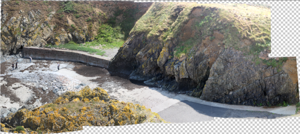
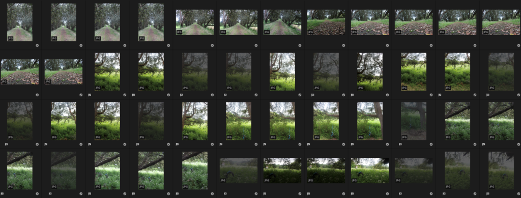
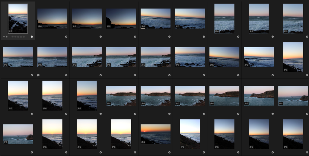
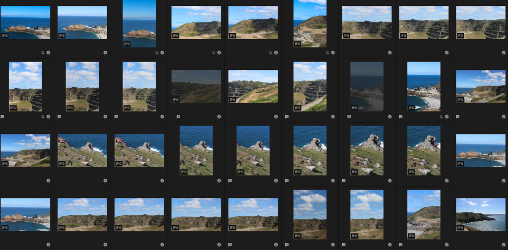
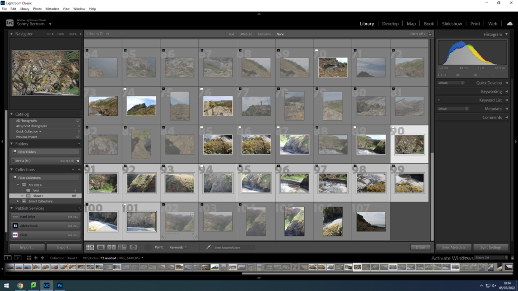
Start by selecting images in Lightroom
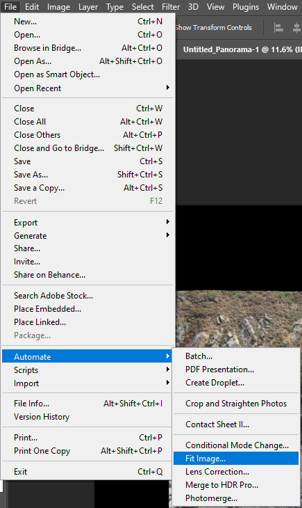
File, automate, photomerge
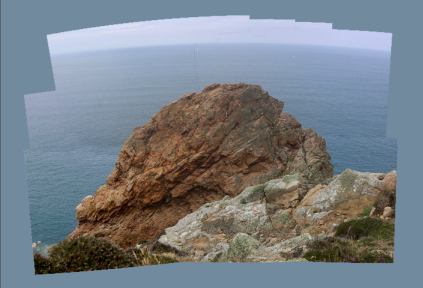
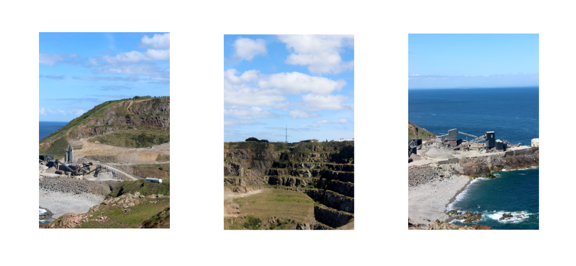
Result
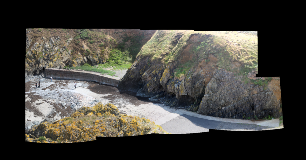
Background added
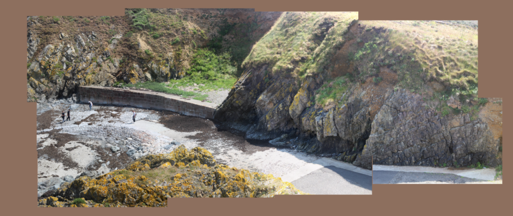
Experimenting with different colours

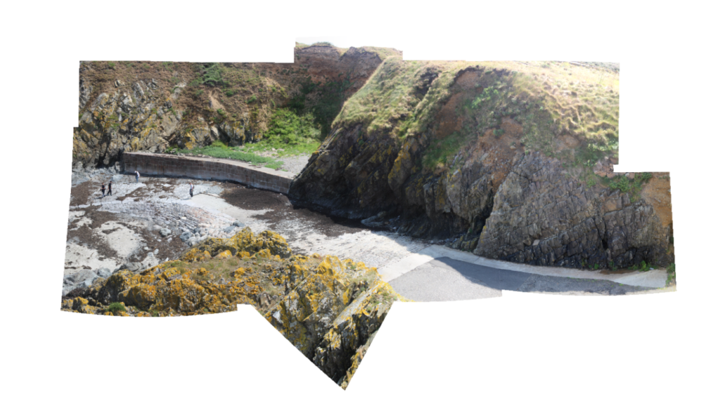
After creating this first one I decided to add in more photos because I noticed how good photoshops algorithm is at piecing them together.

Version 2

By using the propette tool in photoshop I selected the blue colour from the sea to help

3rd Joiner

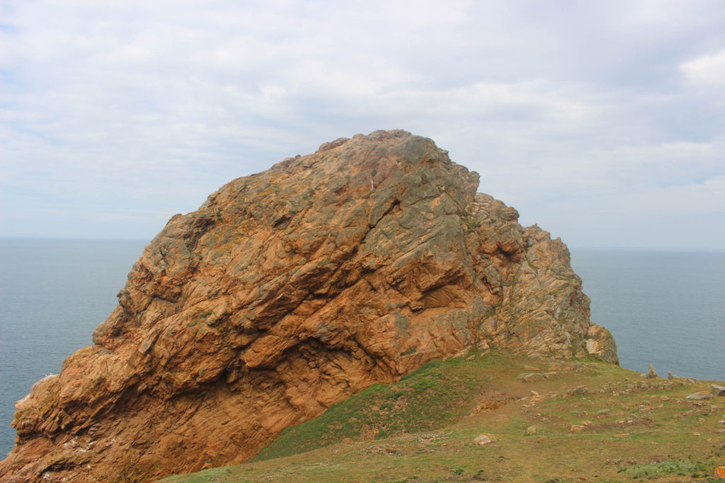
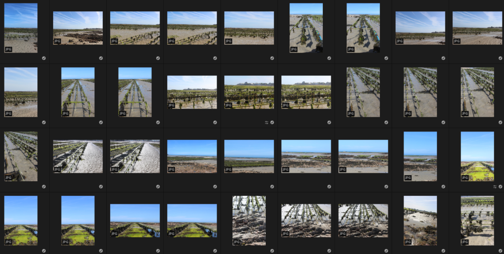
After analysing and comparing my previous experiments I went out to a different site and took a lot more pictures than I previously had as I could see how the more photos you use the more interesting the image comes out.

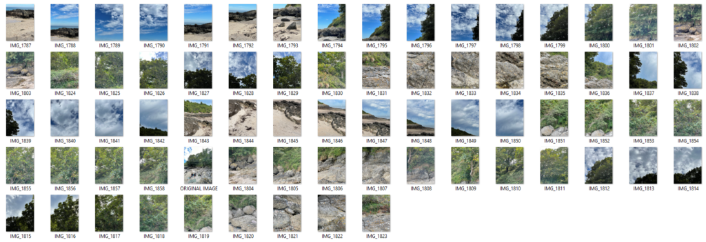
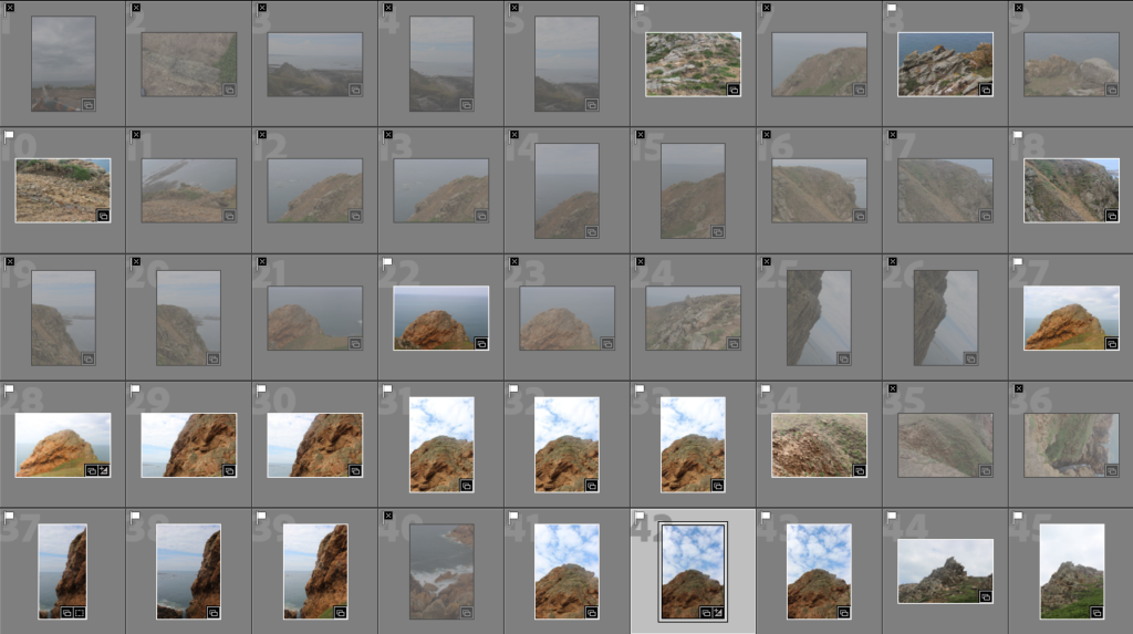
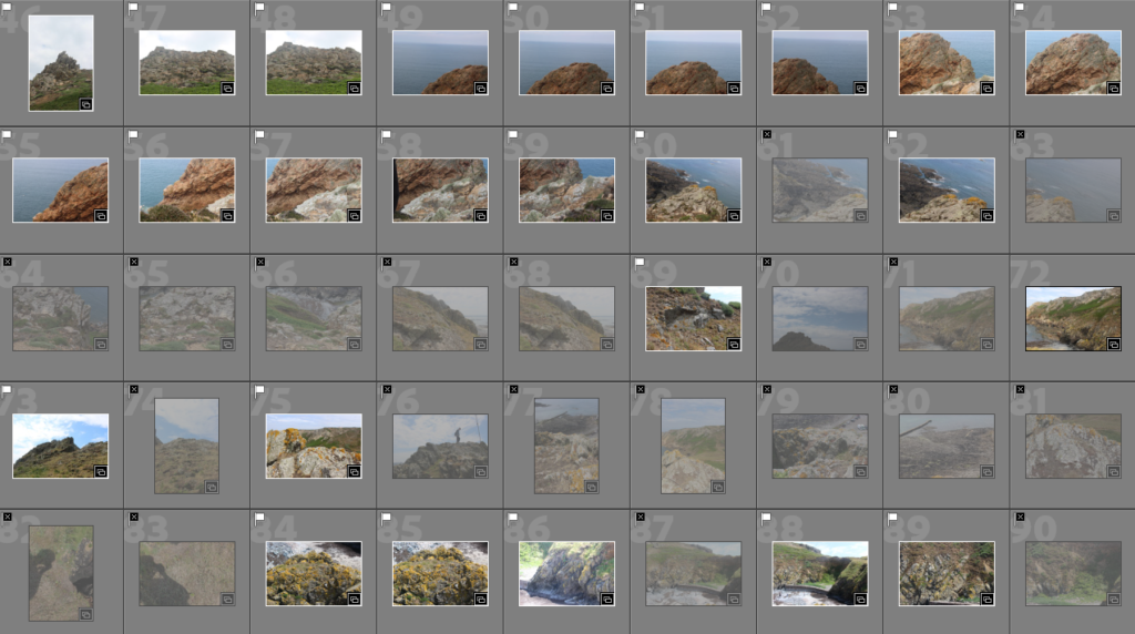
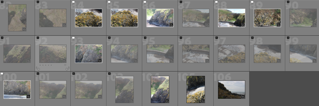
Contact sheet

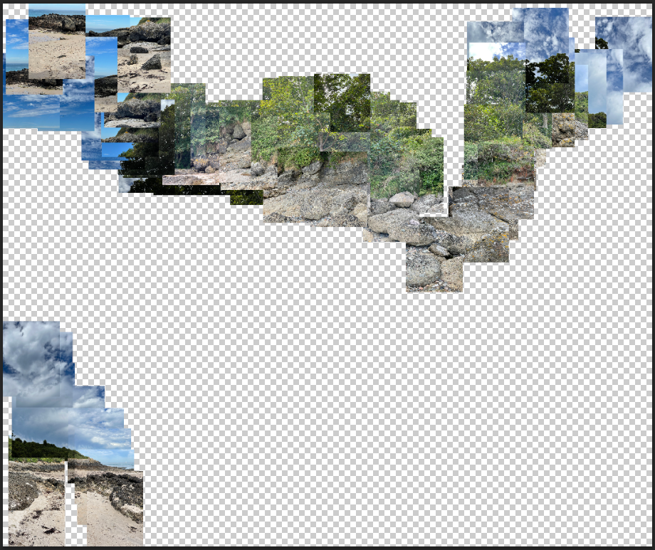
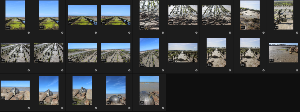
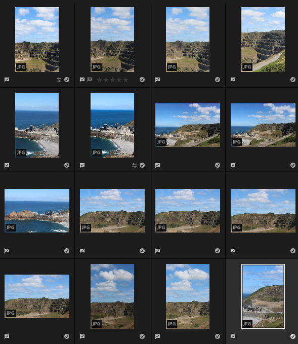
After waiting 20 minutes my image didn’t come out exactly as planned so I went back to the site to take the images again from different angles.

geopark photoshoot selections


What is a geopark?

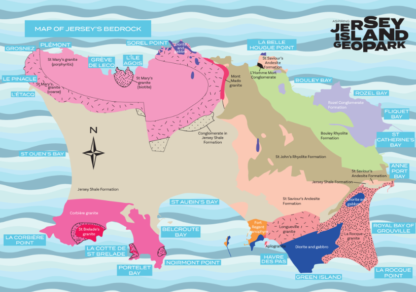
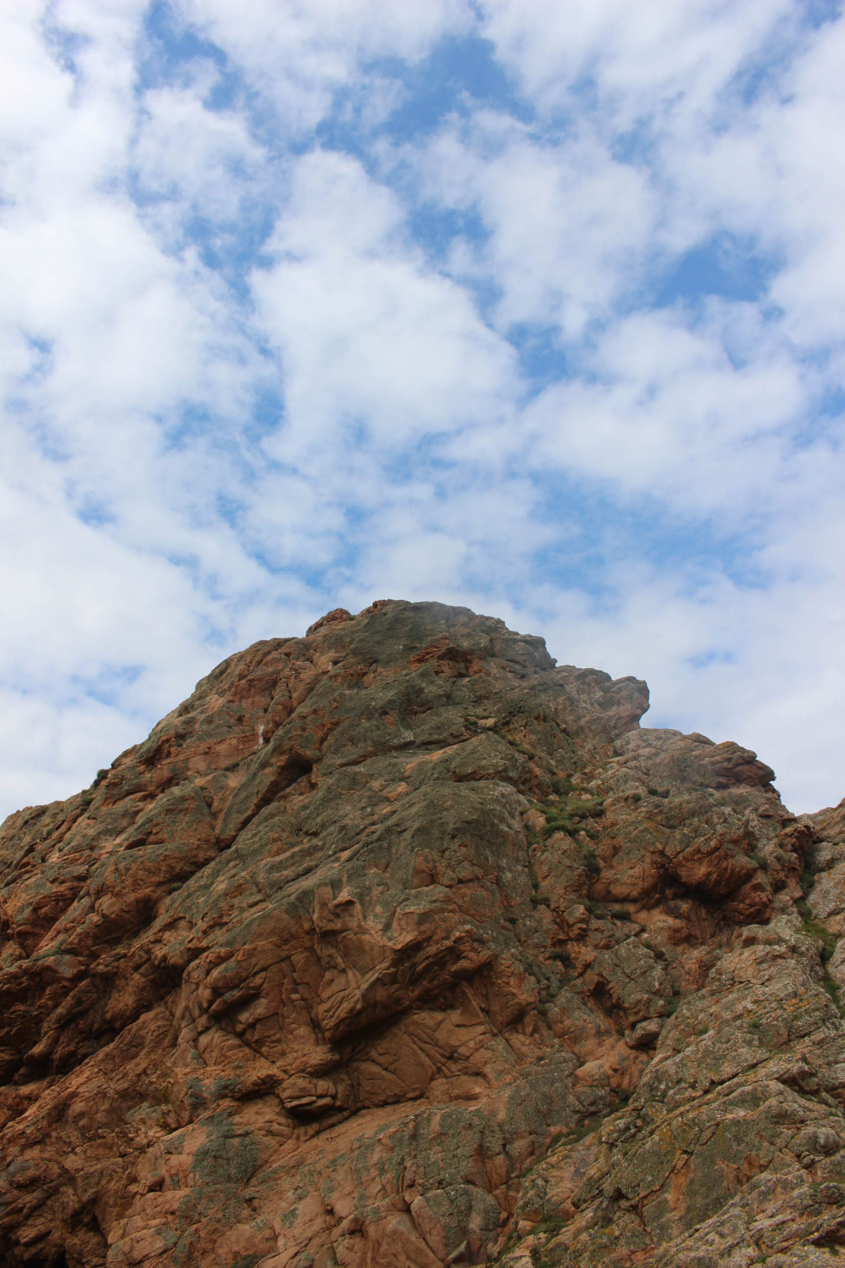
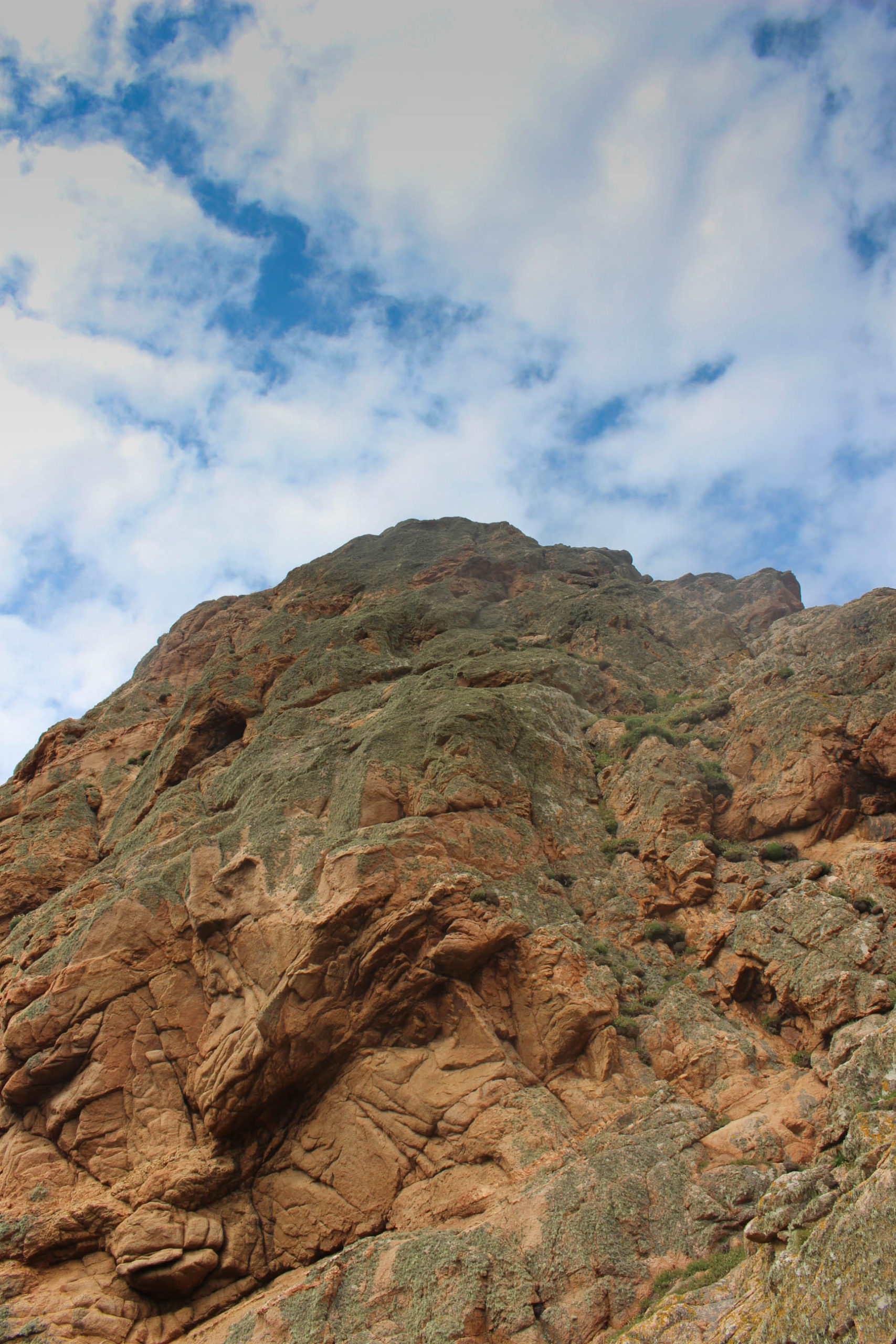
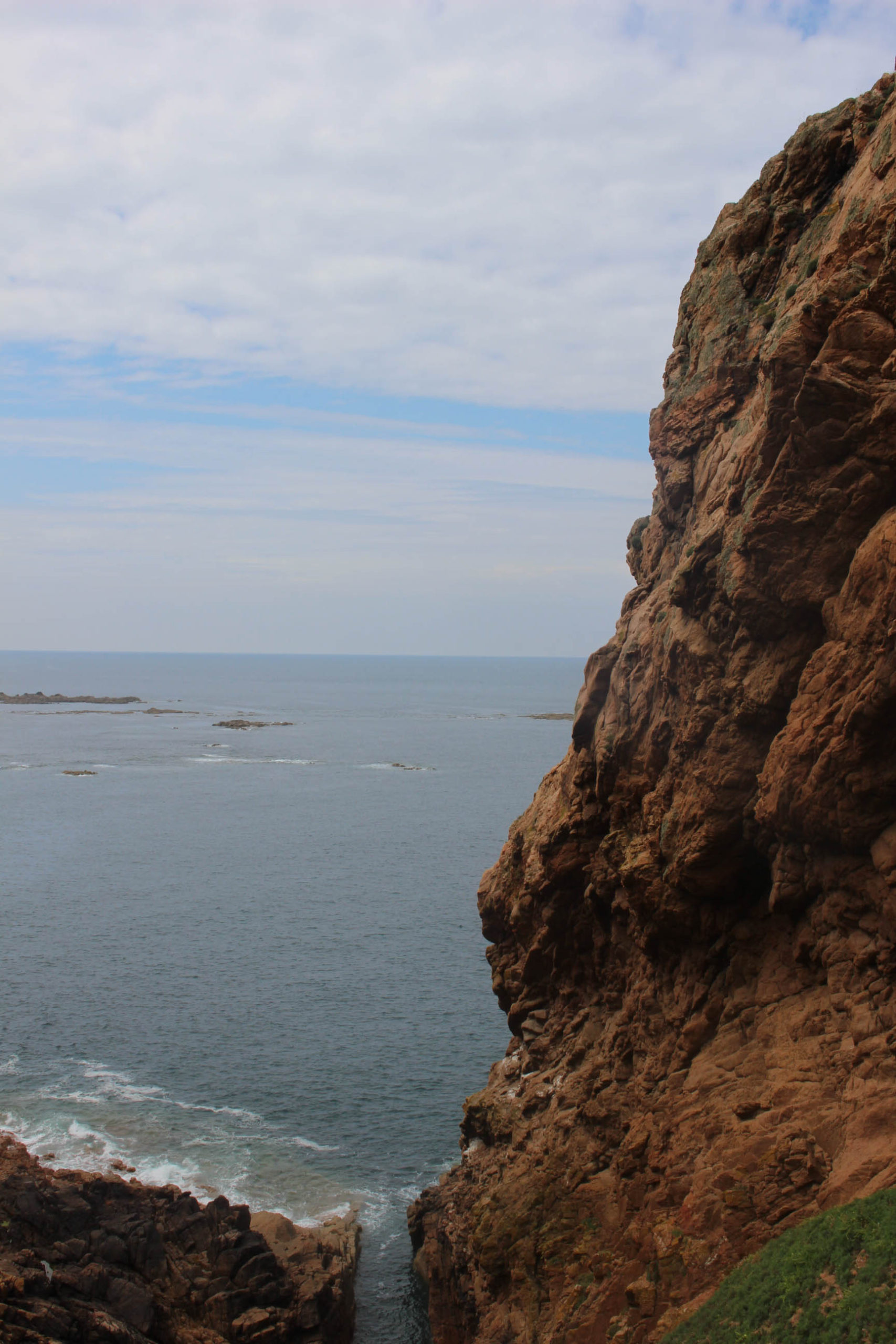
a UNESCO(The United Nations Educational, Scientific and Cultural Organization is a specialised agency of the United Nations aimed at promoting world peace and security through international cooperation in education, arts, sciences and culture.) -designated area containing one or more sites of particular geological importance, intended to conserve the geological heritage and promote public awareness of it, typically through tourism. A Geopark is about more than rocks. Jersey is a strong contender for this special designation because of our Island’s exceptional geology and our important cultural heritage which forms the outstanding surroundings we enjoy every day. Whether exploring Jersey’s diverse landscapes or seascapes there is lots to discover and inspire


My Goal


Evaluation

Planning

Before the exam I had curated a plan to create 3 blog posts, featuring my artist of choice for that piece, all which I felt had successfully explored the idea of Anthropocene and humans effect on the planet in a way that was new and interesting to me. I had also decided on some places I was going to go to photograph that clearly show real life examples of changes in landscape caused by humans such as a quarry, a residential pond, a large scale oyster farm and a city. I wanted to replicate George Marazakis style of showing humans leaving their mark far out in nature- and then abandoning it there, Ingrid Weyland’s theme of projecting nature’s vulnerability & fragility, and Laura Roemero style where she documents how building styles change and over time develop a places (city’s) identity. At first I was just wanting to edit my photos the same as these artists did, but after some further research and looking through my catalogue I later decided to slightly change these ideas.

Photoshoots

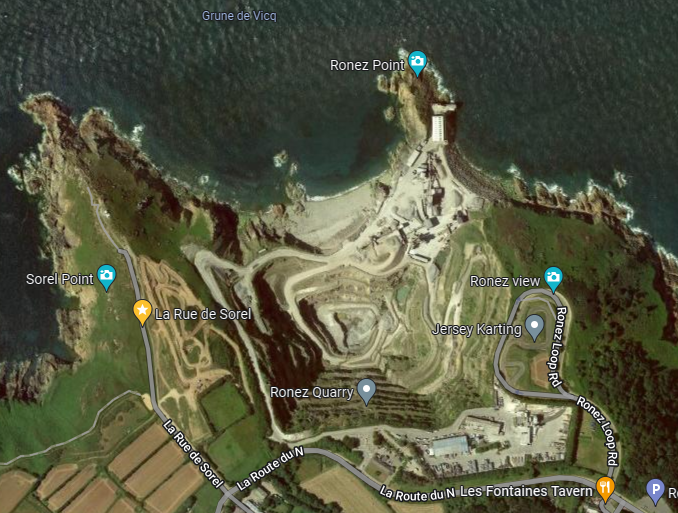
When I went to take these photos I often found myself struggling to be satisfied with the angles and lighting that I had originally planned for them to have to be similar to that of my chosen artists- and so I had to adapt and try out various different angles to overcome certain barriers. For example when I went to photograph Rosnez Quarry I found that I wasn’t actually allowed in and down to the quarry area, obviously because it is a large industrial operation- so I had to go to Sorrel point to take pictures from above and I found that I could actually get different angles by going further down the cliff path.

Selection Process

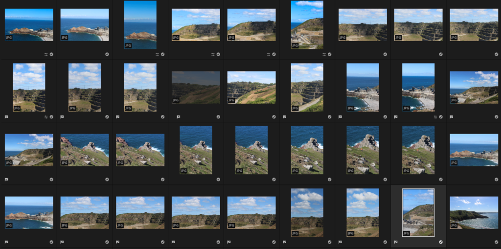
After uploading my photos to light room, I quickly found that I would only want to use about 30% of them, however I was satisfied that all of the ones I had taken do clearly show changing landscapes caused by humans- which is something all of my chosen artist’s work has in common.

Editing Process

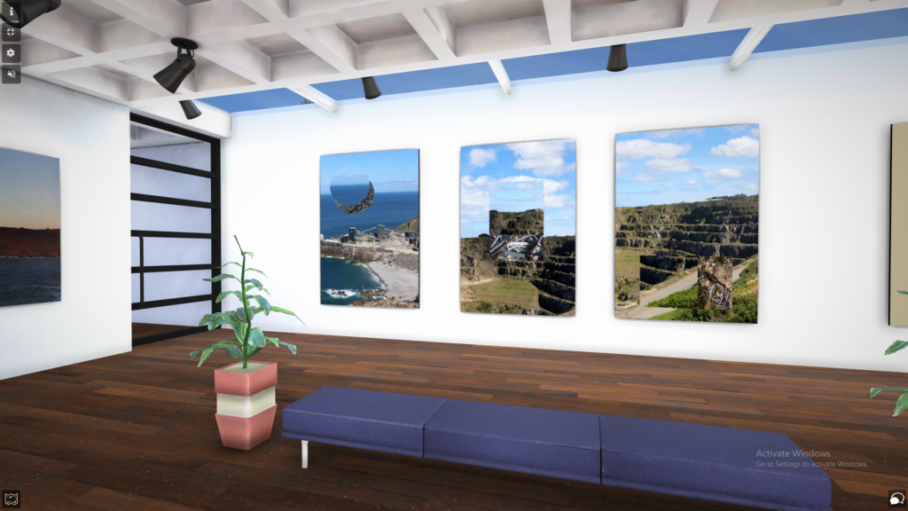
While I originally planned for my first piece inspired by George Marazakis to be a showcase of plain images, I quickly found that since my photos weren’t of such large, dramatic spots, that I had to add another layer (the ‘windows’ I made in photoshop) to them to give them more depth and insight into the topic of Anthropocene. However I had only come to that final editing choice after experimenting with various other editing and display choices which can also be seen on the blog post.

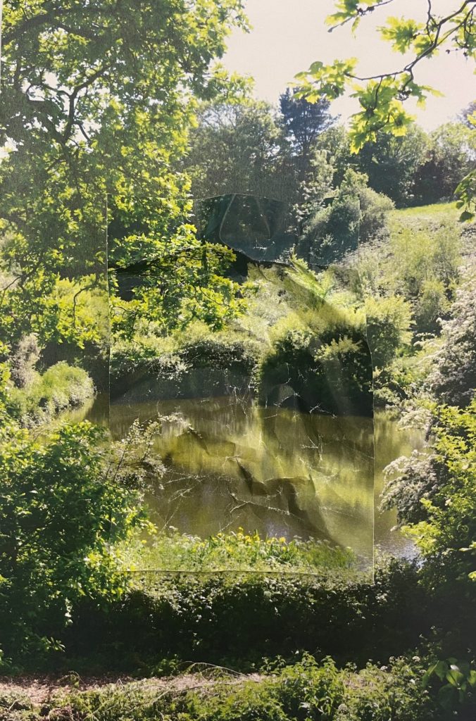
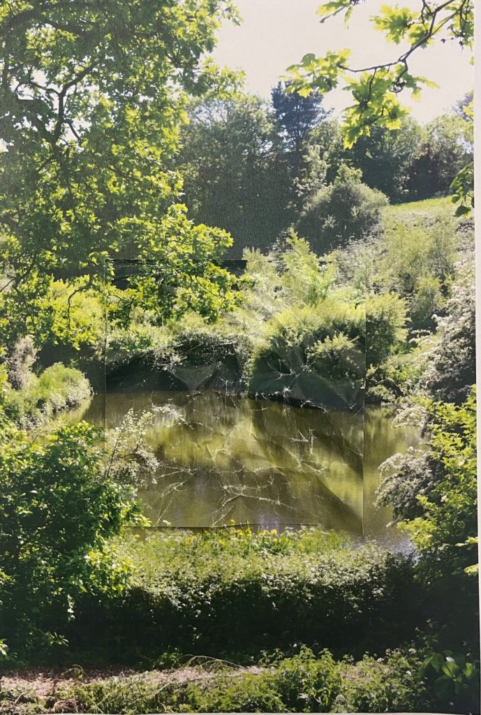
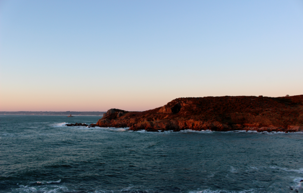
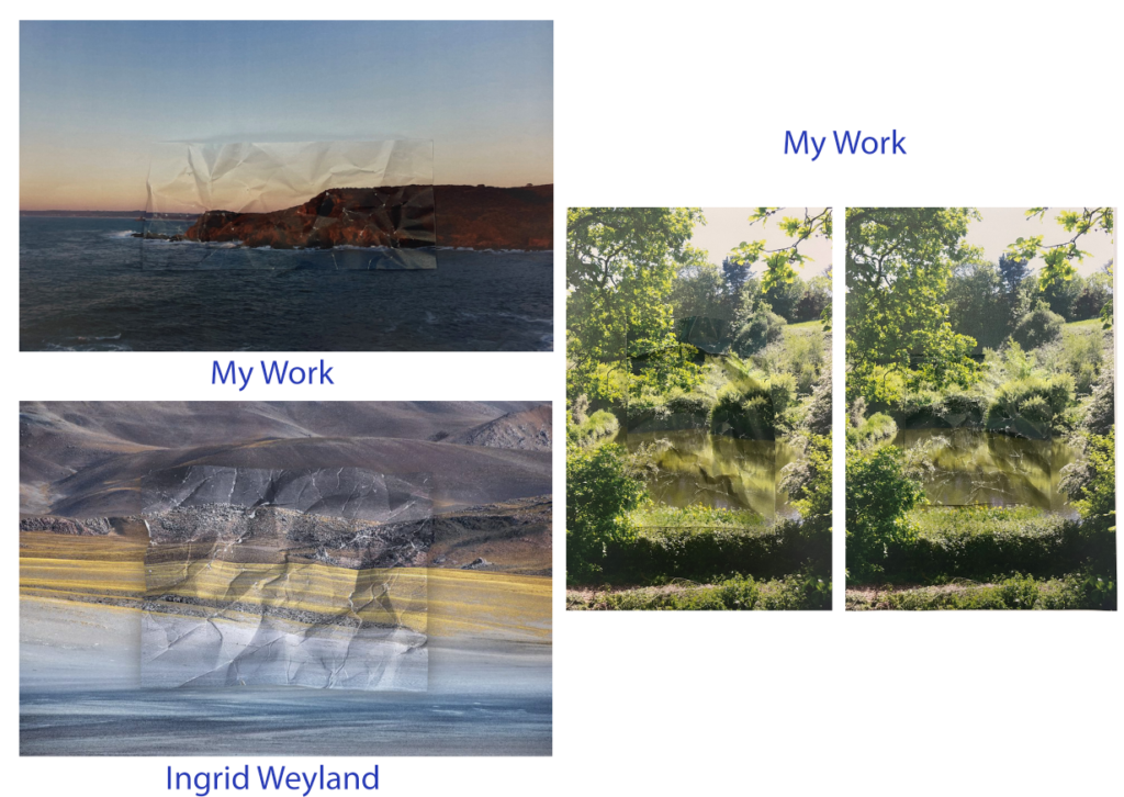
For my second piece I had printed of a section of the photo to edit which came out good and looked similar to the work of Ingrid Wesely, after framing, taking a picture and uploading to photoshop to touch up I wanted to further develop this piece and so I made the distorted section of the image slightly smaller-which I actually think looked better as it took up less of the whole image and so contributed to the message about nature being fragile. Since this first image came out so good, I decided to try this process again on another image, and so I looked through an old project and found a series of photos along the coast of St Oens which I felt were relevant to the theme of Anthropocene. I repeated the process again and it came out just as good so all I had to do was take a photo of it and touch it up in photoshop, removing the harsh edges to make the distorted section blend in better with the image- as Ingrid’s photos look.

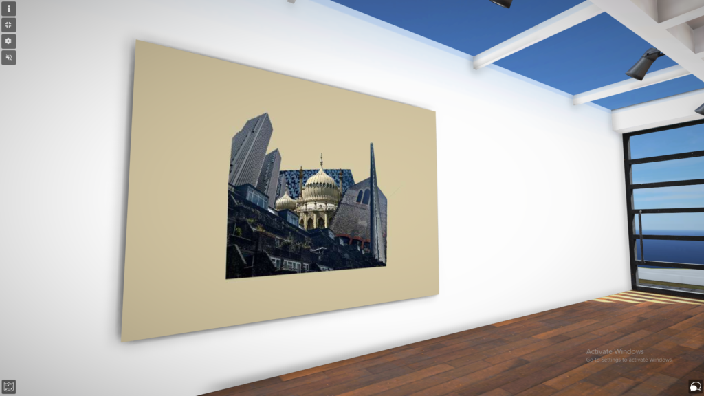
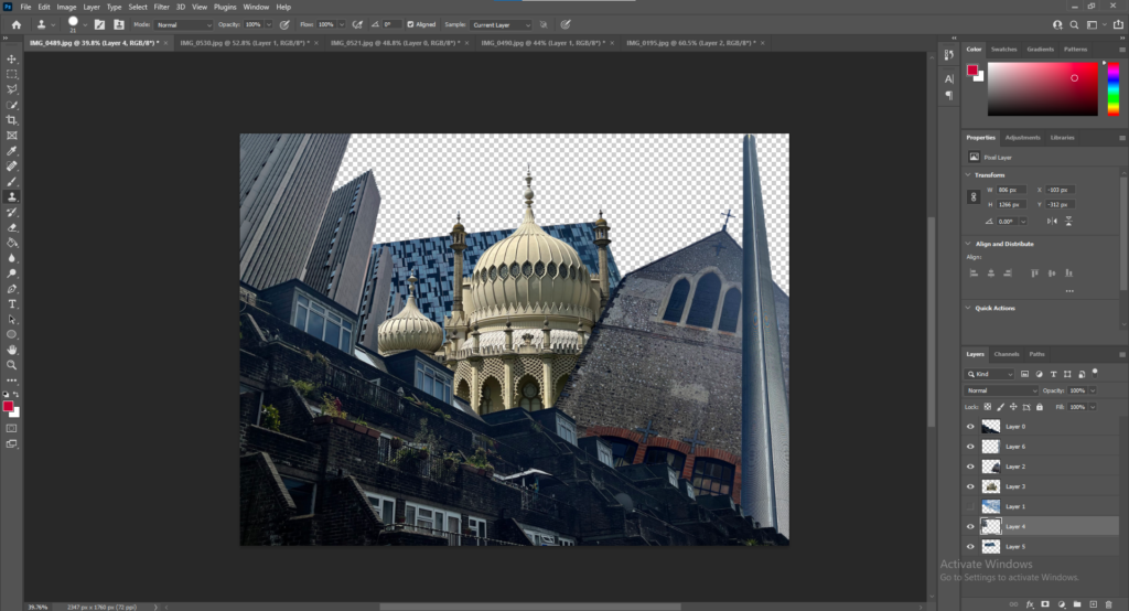
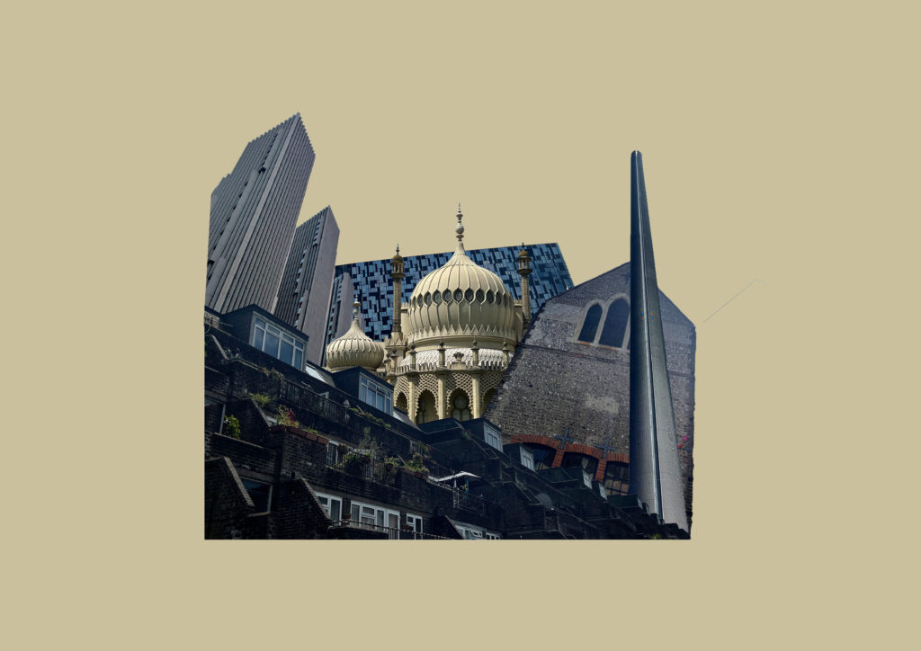
For my third piece, after looking at Laura Romero’s dystopian collages of buildings I wanted to create something similar in that I wanted to Include various different types of buildings with different architectural styles and from different times. This piece was quite simple as I just had to cut out each building and adjust them together one document. Although it was simple I do think that it portrays the theme of changing identity’s and landscapes, and Anthropocene efficiently and so I didn’t have to make any further changes to this apart from giving it a background (which is made with colour from the predominant building on the piece- The Royal Pavilion.

Display

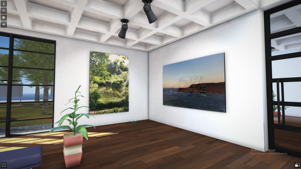
I decided to display my work in a virtual art gallery, which I have included a link to in a seperate blog post, as well as screenshots for those who may not be able to access it. I have decided to do this as I think that my work would best be displayed in a modern art gallery because it would be a great contrast to the gritty urban and rural landscapes I have depicted in my work.
Idea 4- Brighton west pier

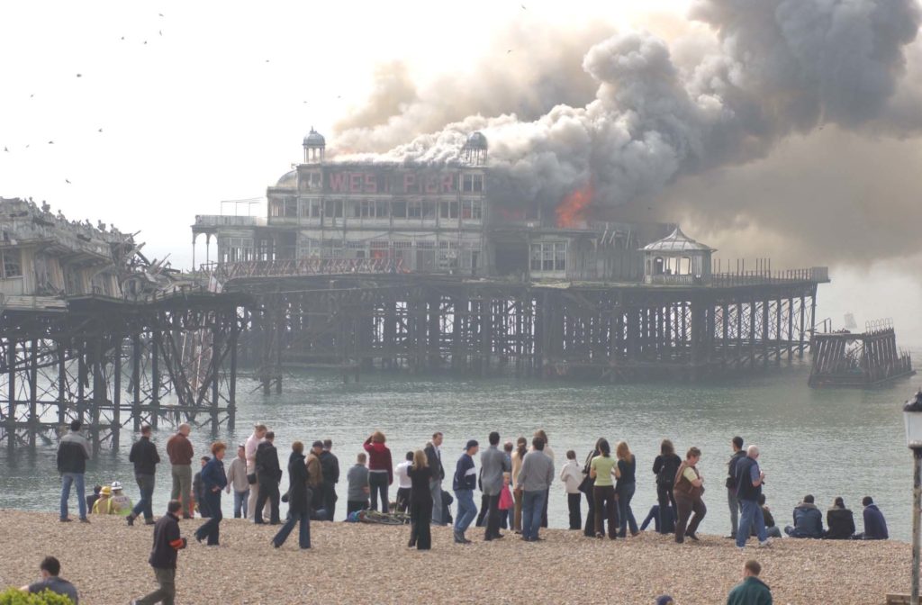
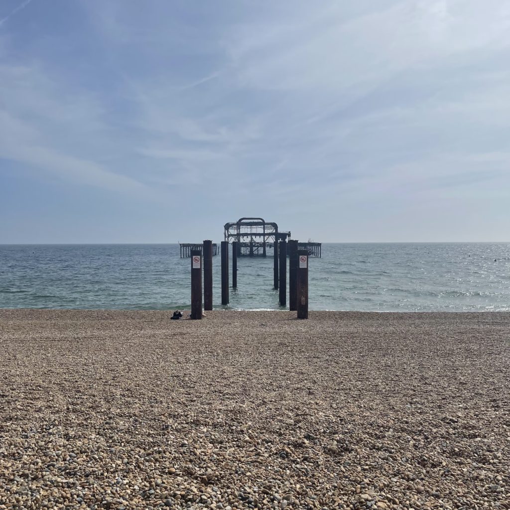
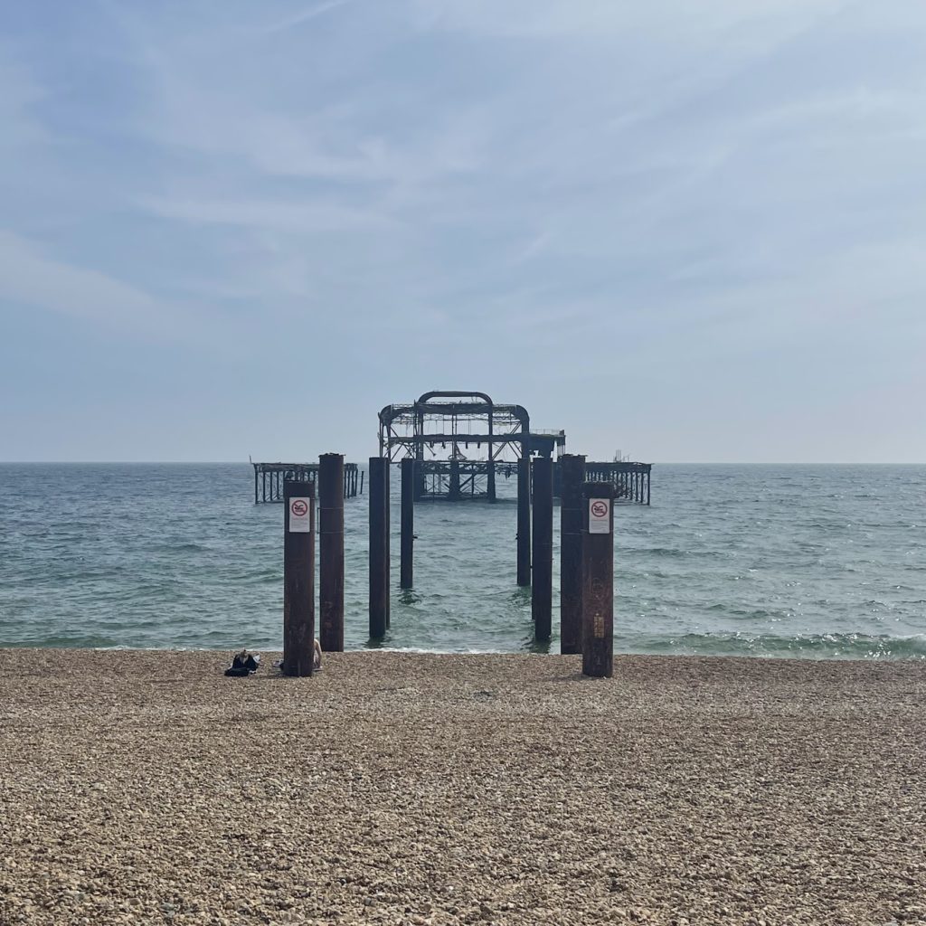
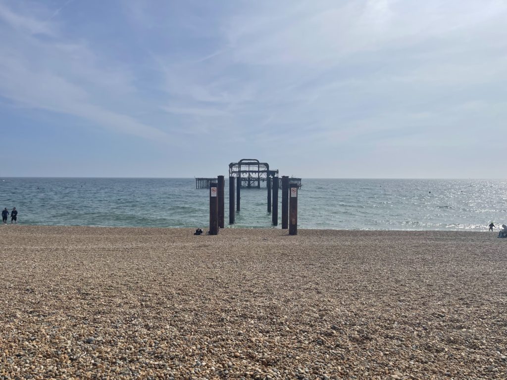
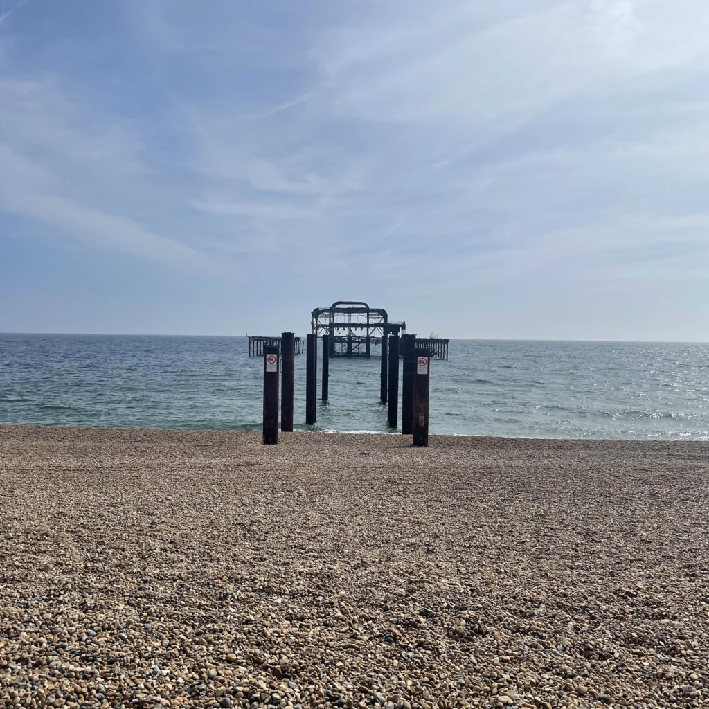
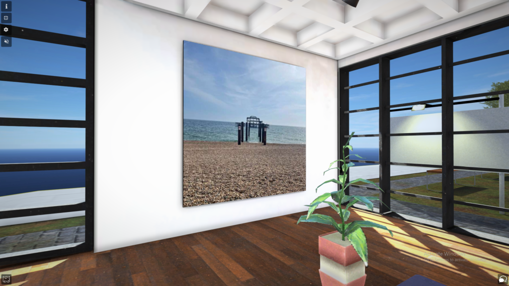
To fit in with the theme of Anthropocene and the impact humans have on the earth/ environment I wanted to include a piece on the old ruins of Brighton’s west pier. he West Pier is a ruined pier in Brighton, England. It was designed by Eugenius Birch and opened in 1866. It was the first pier to be Grade I listed in England and Wales but has become increasingly derelict since its closure to the public in 1975 as a result of a fire. As of present day only a partial metal framework remains.

The West Pier in Brighton on fire (The Argus News)

My aim was to keep it simple by taking a photo from straight on to capture the wreckage in contrast to the large open sea around it, and showing how it has just been left abandoned there.

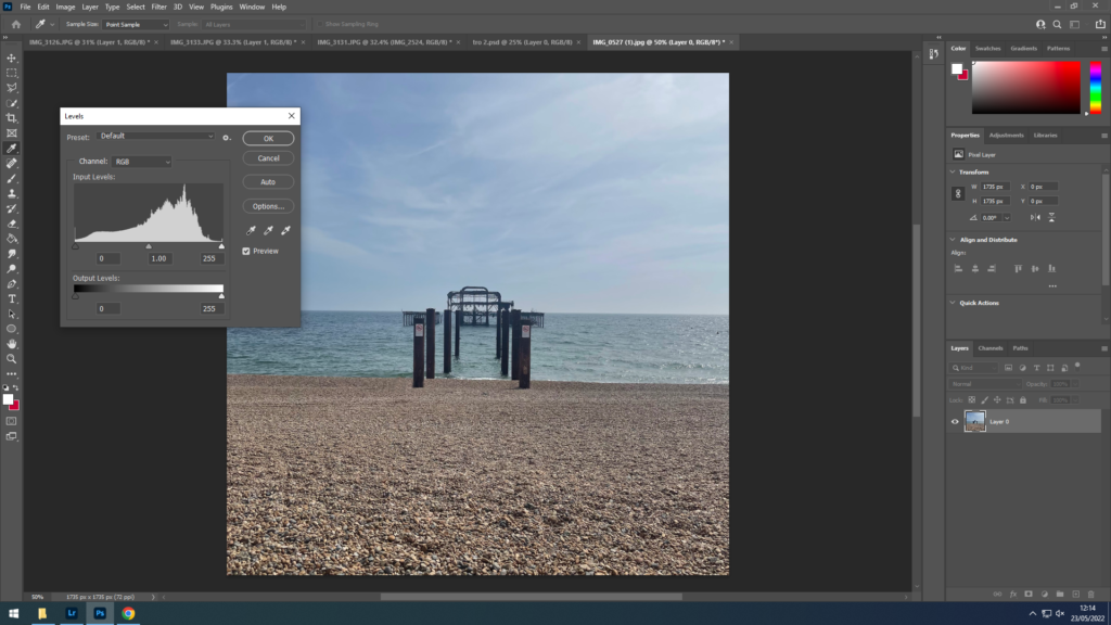
First I levelled the image to sharpen the colours as it was a dark and overcast day
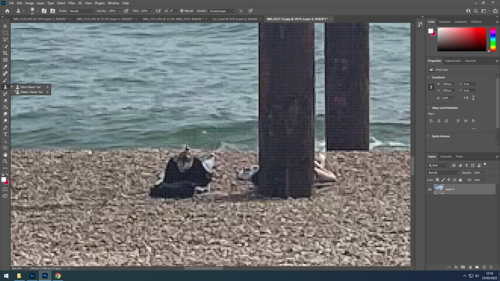
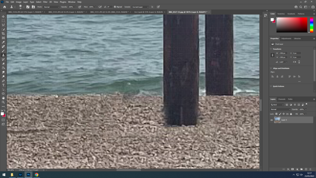
Decided to remove people from the beach using the clone stamp tool as I didn’t want them to distract from the meaning of the image

Final Image

idea 3- Architectural montage

For this piece I looked at Laura Romero and Emily Allchurch’s work, to cover the development of urban areas, as well as the identity of them. I used photos from Jersey as well as Brighton.


Laura Roemero

Image analysis


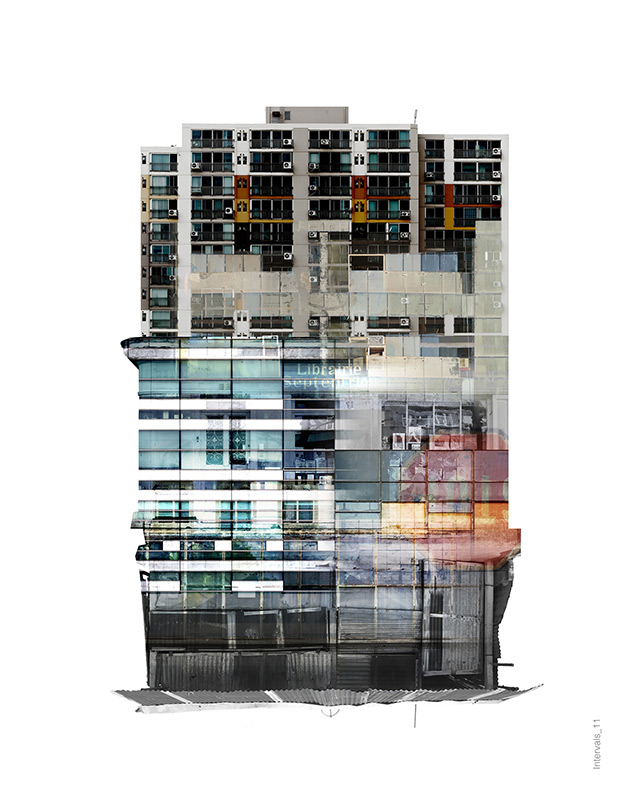
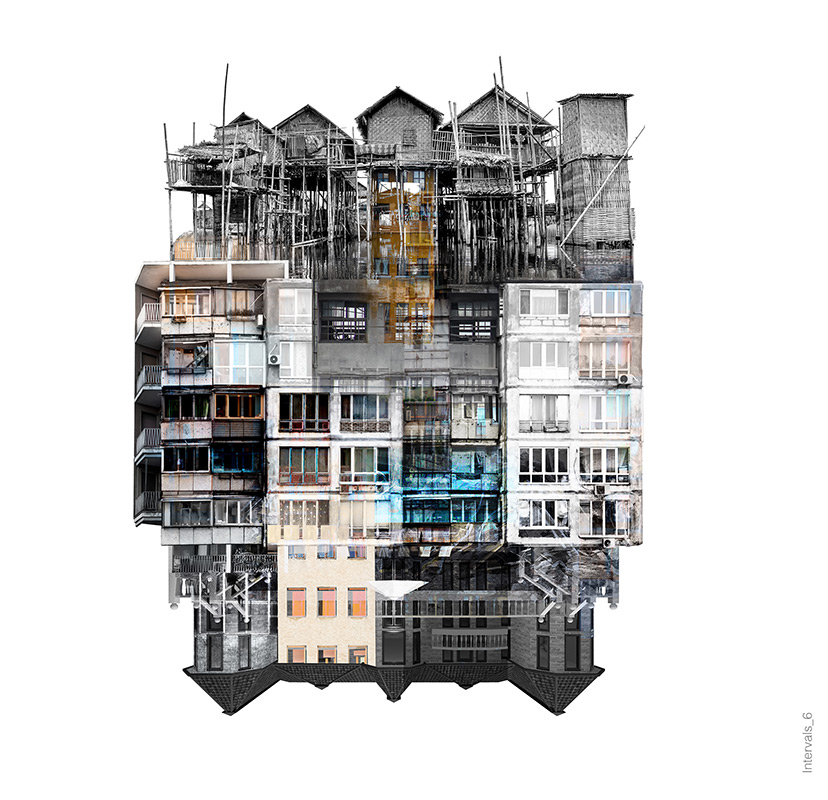
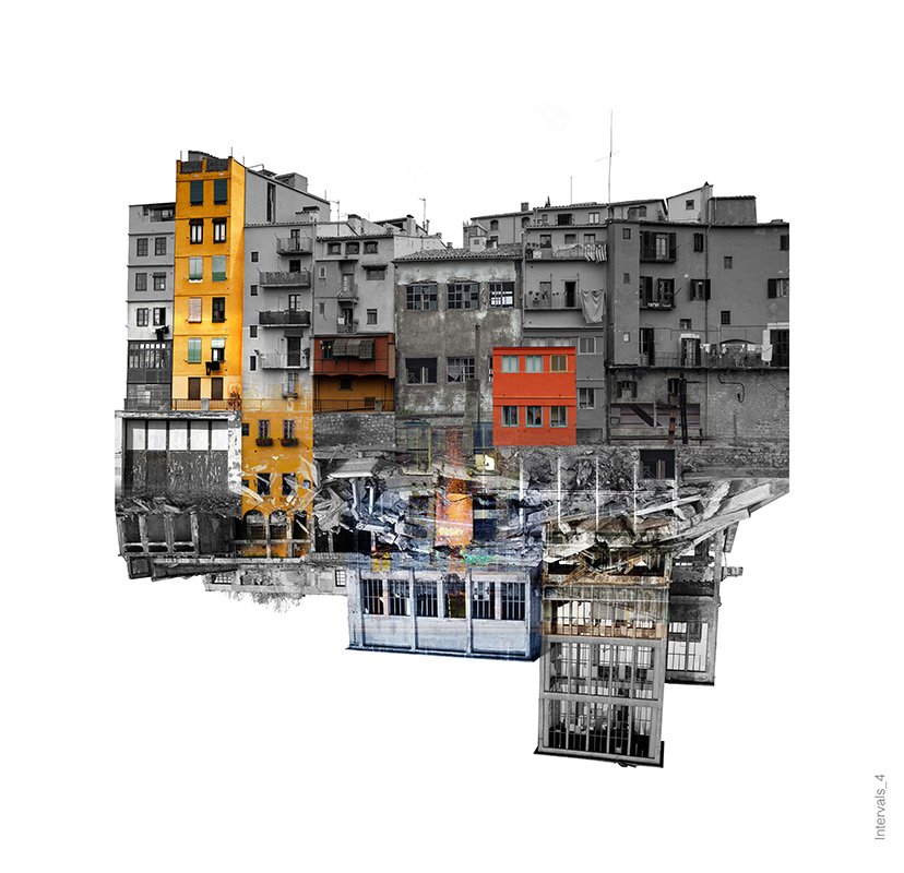
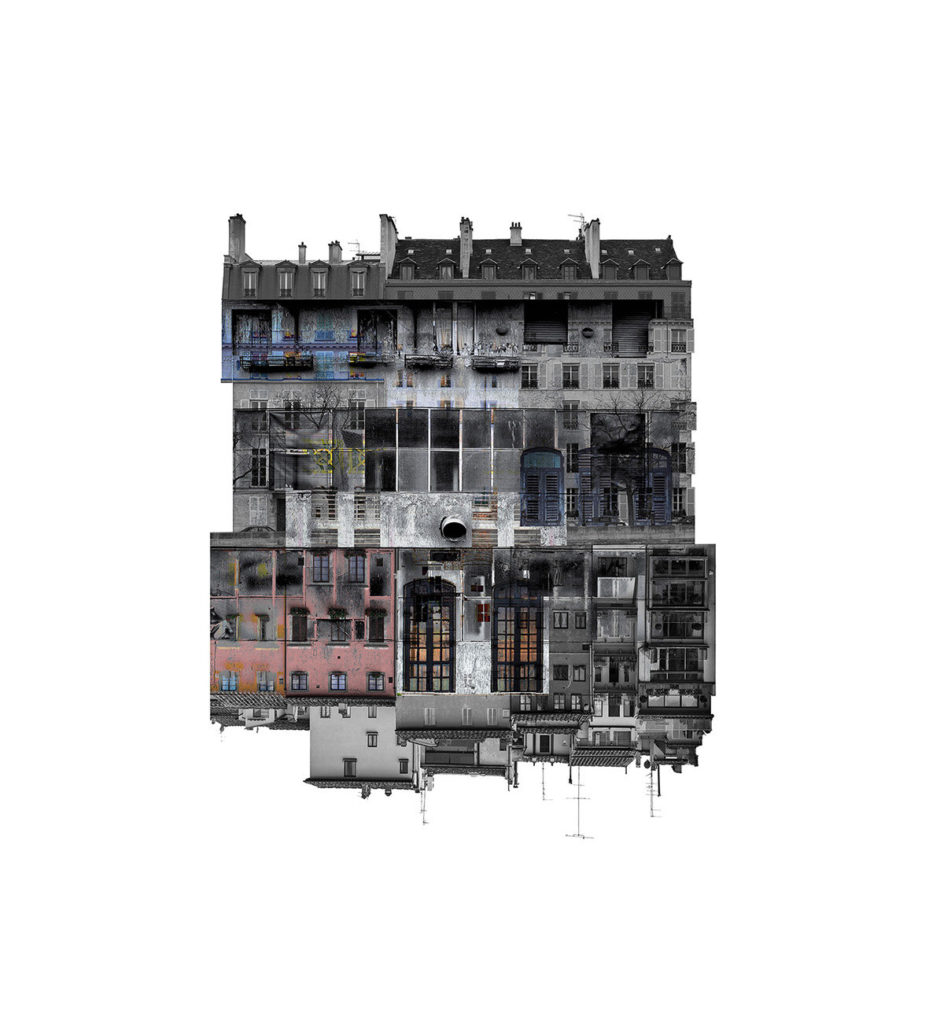
From looking through her work and reading her bio’s I can see how she uses her photography to study the identity of the world around her and in doing so she also finds her. She also uses it to document and interoperate how things change around her such as the buildings. This is something I think I can also show, through the use of abstract, constructed landscapes such as city’s. In this image she has edited together a collection of photos of buildings from her city, as well as changing the colours of them to make them black and white to contrast the brightly coloured buildings to keep it interesting- and also keeping it geometrical / symmetrical.

Laura’s Work

Emily Allchurch

Series Analysis

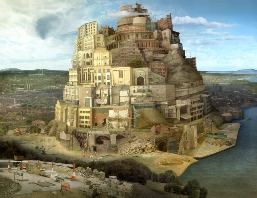
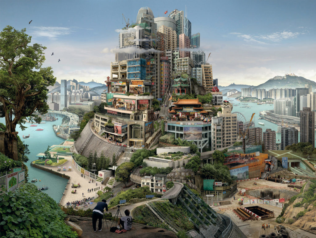
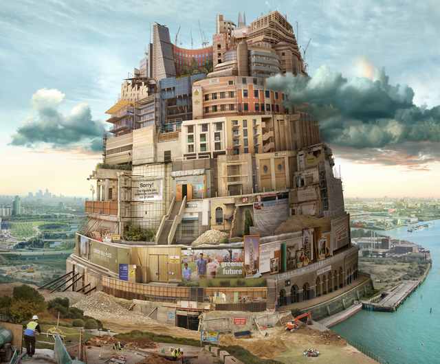
Emily’s series ‘Towers of Babel’ is a project in which she attempts to portray city’s in a single photo, showcasing the different history, development and viewpoints within. While not a photographer, Emily creates her work based off of a collection of images which she recreates as one. Her work features old and new architectural styles, which is something I am attempting to include in my final piece too. Throughout this series she really highlights how how the scenery around us is becoming a constructed landscape, a concrete jungle.


The Myth of The Tower of Babel

Emily’s title for her series “Towers of Babel” isn’t just a random name she thought was fitting- it actually refers to ‘The Myth of Babel’ which theorises the origins of multiple languages. It mentions how blasphemed by building the tower of babel to avoid a second flood, and so God created multiple languages so that humans were bound to different linguistic groups and couldn’t understand each other. I think that this is almost a metaphor for how some of the worlds richest people live high up in expensive skyscrapers above the normal people and are so different that we could almost speak different languages- in the form of our lifestyles. This is something Emily captures very well in her series as she includes various different types of buildings from different “classes” of life


Contact Sheet


Idea

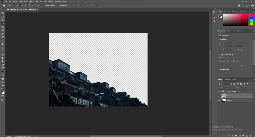
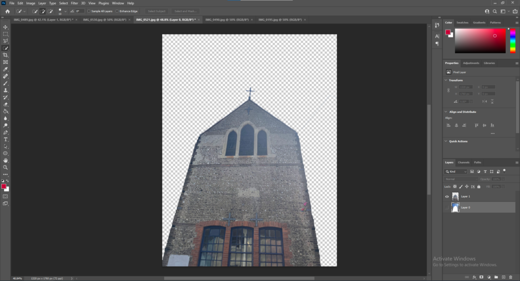
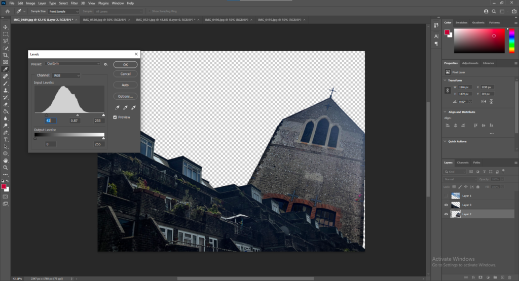
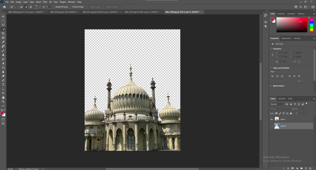
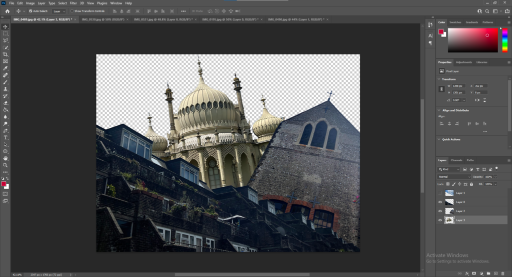
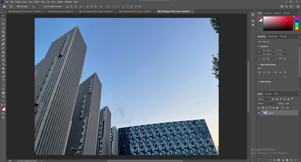
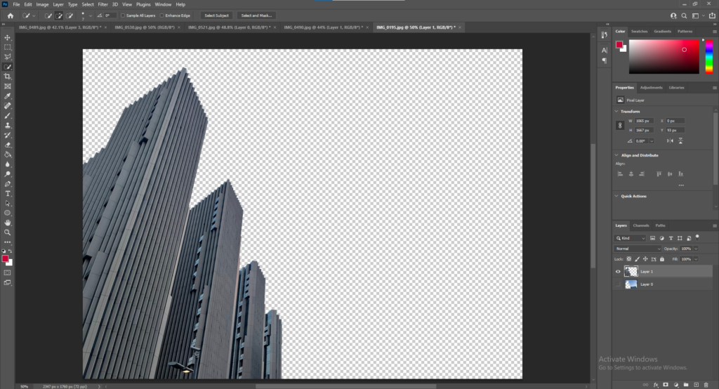
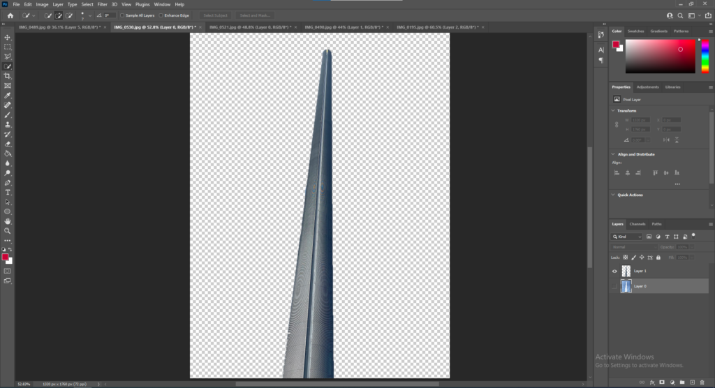
My idea was to use a combination of photos to edit together in photoshop similar to the style of Laura Romero by placing photos of various different architecturally styled buildings over a photo of a brutalist-style flat block.


Final Piece & Process

Base image – background
First Image- Background
First Image Over Base
Second Image – Background
Second Image Over Base
Flipped Image around
Third Image – Backgorund
Fourth Image – Background
All Images
My Final Piece

Evaluation & Comparison

I feel like this piece definitely displays various different architectural styles from different time periods, such as the Chinese/gothic/indo-saracenic style of the Royal Pavillion pictured in the centre, as well as the ultra modern skyscrapers of the London skyline– and some brutalist styled flat blocks. In this piece I have combined Laura Romero’s style of stitching together different building styles as well as Emily Allchurch’s theme of combining buildings from different times in history- all to create a sense of how an areas identity can develop over time.


Idea 2- Topographics of Fragility

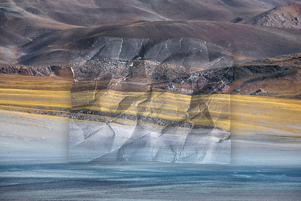
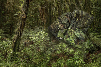
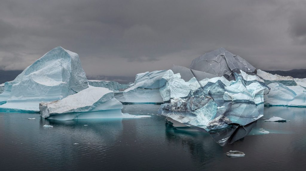
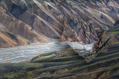
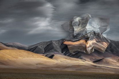
For this piece my idea was to make something similar to the work of Ingrid Weyland, an Argentinian photographer who expresses the fragility of the natural environment through her work.
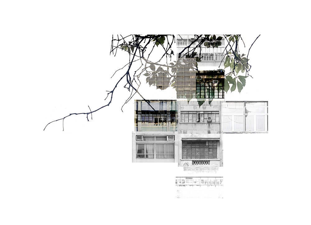

Image analysis

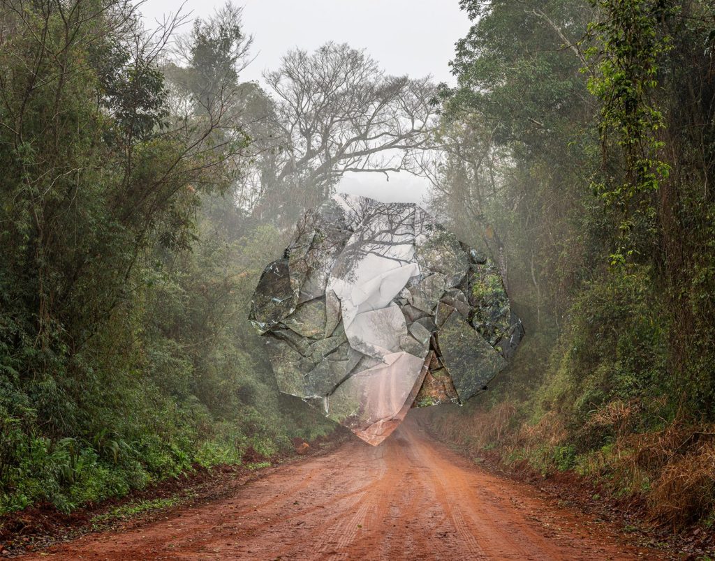
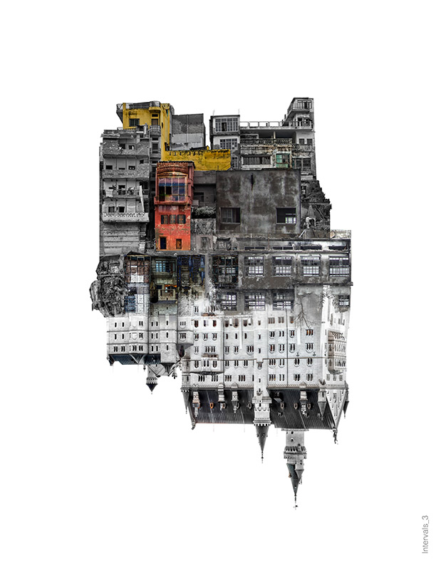
For this image analysis I looked at this photo from Ingrid, showing a road through a forest/ jungle, however Ingrid has added scrunched up print of the photo. This was most likely done to show humans effect on the land. The picture was taken on a misty day, and has the road centred most likely to emphasise the effect it has had on the forest as it breaks right through it. The rough texture of the paper ball gives a good contrast to the softness of the background image.
Ingrid Weyland

Contact sheet

Fauvic Marsh
Fauvic Marsh
Petite Port
Final Images
Final Images

Chosen Image

Final Piece & Process

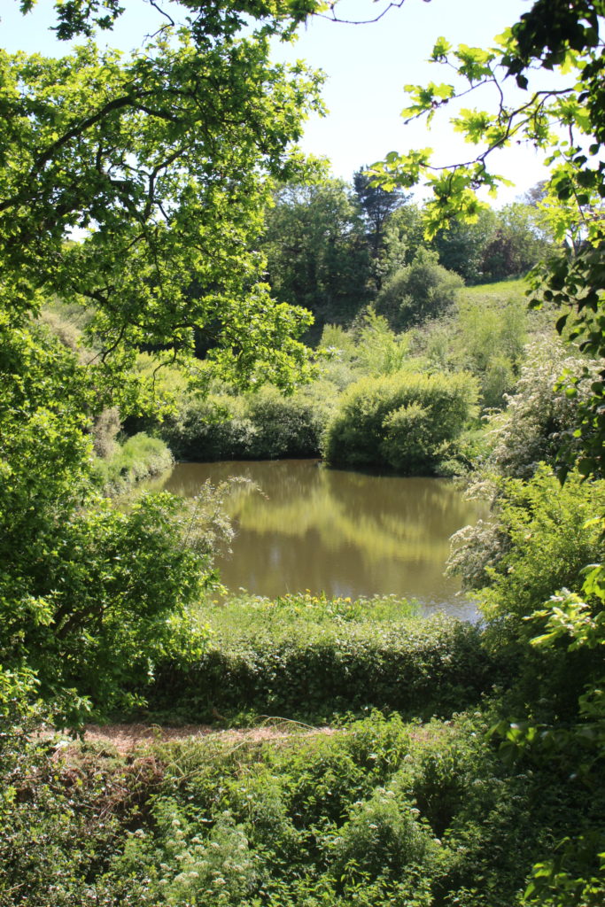
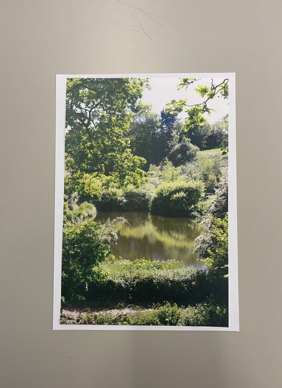
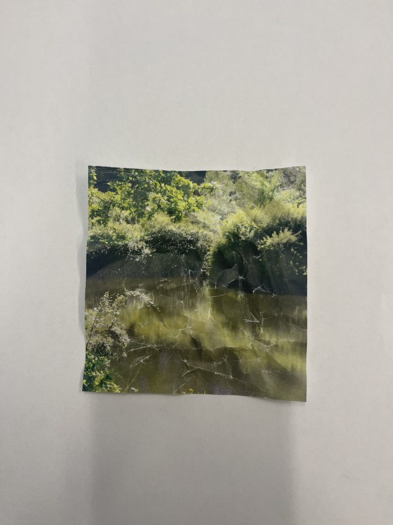
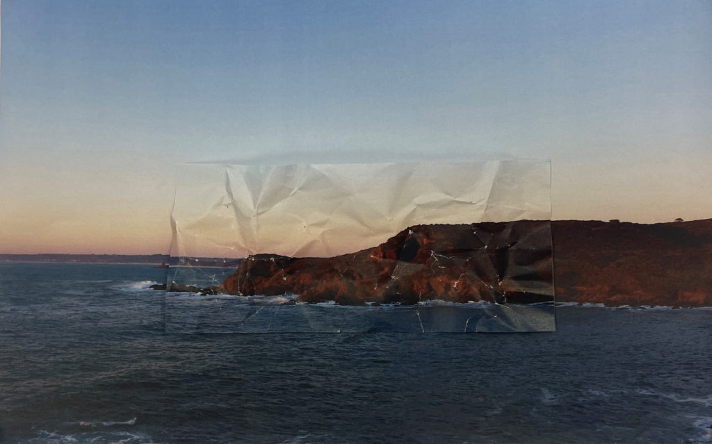
To make this piece I started by printing out the original image, and then a section of the original image to then crease and layer over it.

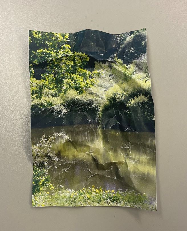
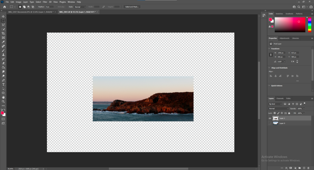
Once I printed out the cut out I played with it, making it look creased and distorted.

Final Piece one

After making the first version I decided to see what it would look like if I made the distorted portion smaller so I reduced it using a guillotine.

Final Piece 2

Overall I think these two both came out well, so i decided to try on another landscape photo by repeating the same process with a different shape


New image from old project
Cut-out
Final Image

Evaluation & Comparison

Overall I think that these pieces came out very good and mostly how I planned, they are similar to the work of Ingrid Weyland, not only in the process used to create but also in the way that they represent “the fragility of the natural environment” with the distorted paper patches representing the impact humans have on the earth because paper is a “fragile” material- so it shows the “fragility” of these topographics”


Idea 1- Ronez Quarry

I am going to be going up to Sorel Point to take pictures of Rosnez quarry- illustrating humans affect on the coastal landscape. I will have straight on images of the new hillside as well as using the rule of thirds to frame the equipment, sea and landscape. I will be taking inspiration from George Marazakis for this piece.

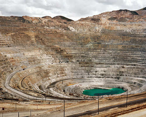
George Marazakis– I will be focusing on Georges collection of images titled “A cure for Anthropocene” in which George addresses the critical issue of climate degradation, which he hopes his series can shed light on the possibilities of finding a ‘cure’. He describes humans effects on earth as an “autoimmune disease attacking its own body”.


Image Analysis

For my inspiration I mainly looked at this photo form George taken half way down a large quarry. Its a simple straight on shot most likely aimed to show/exaggerate the vast size and scale of the quarry and the effect it has had on the landscape. It was taken on a cloudy/ overcast day which makes it more impactful by making it look darker and vilified. The bright colour of the water collected at the bottom gives a good contrast to the bleak colours found in the rest of the image and is useful to give an idea of the scale of the quarry. and the overall effect on the earth.

This image has an empty alt attribute; its file name is Foto-Antro-2.jpg

Contact Sheet


Final Image Choices

Editing Experimentation

edit 1
edit 2

Final Idea

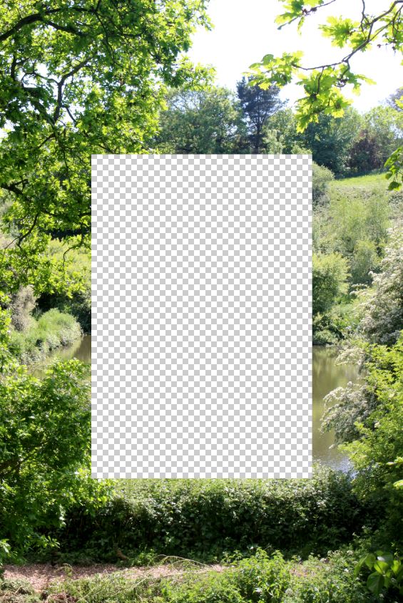
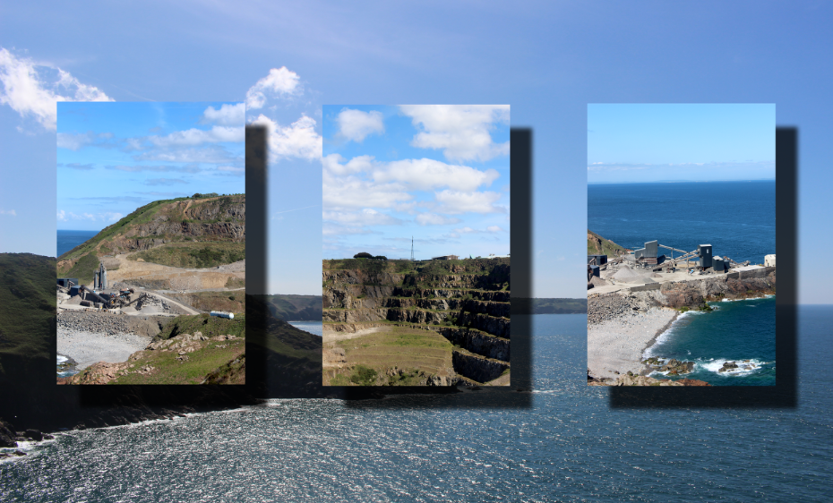
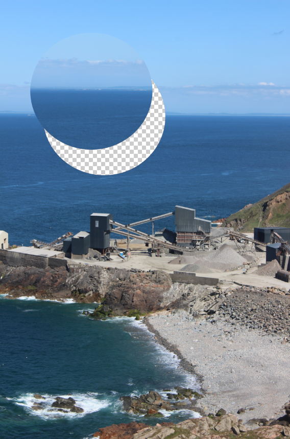
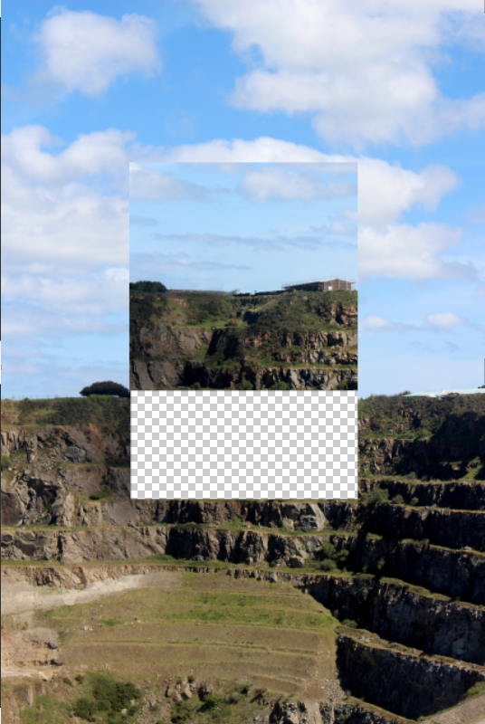
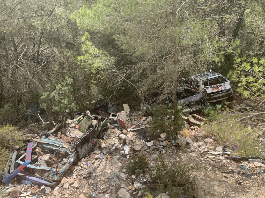
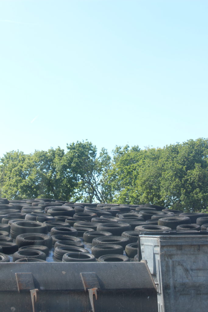
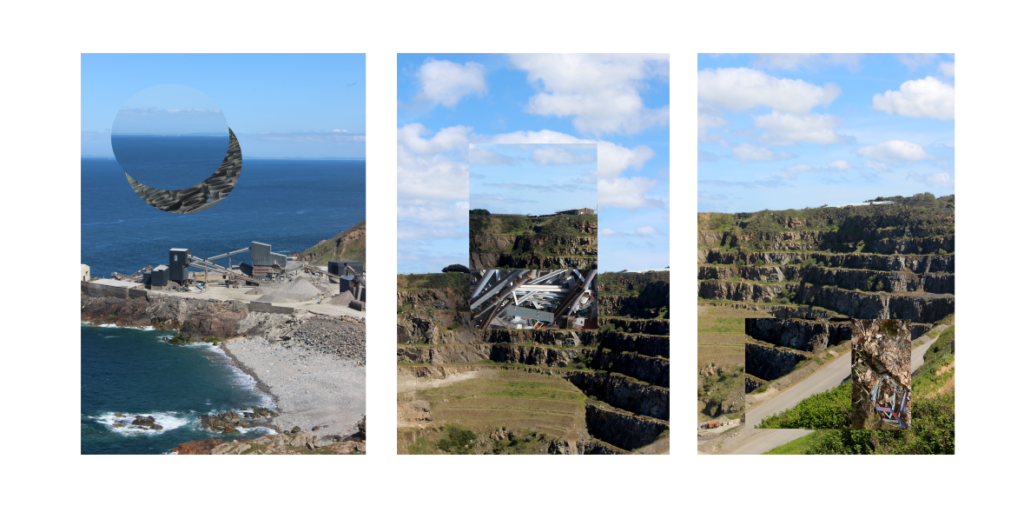
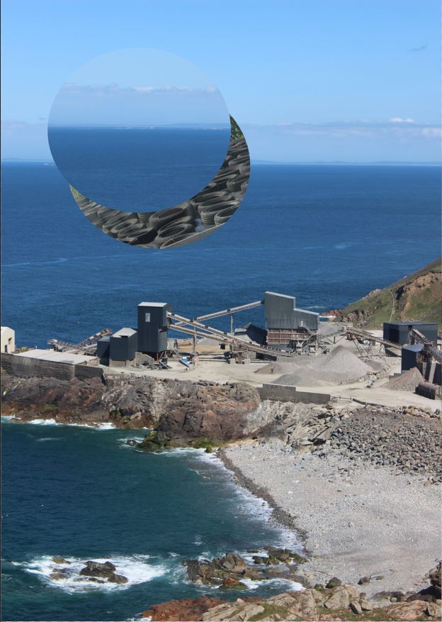
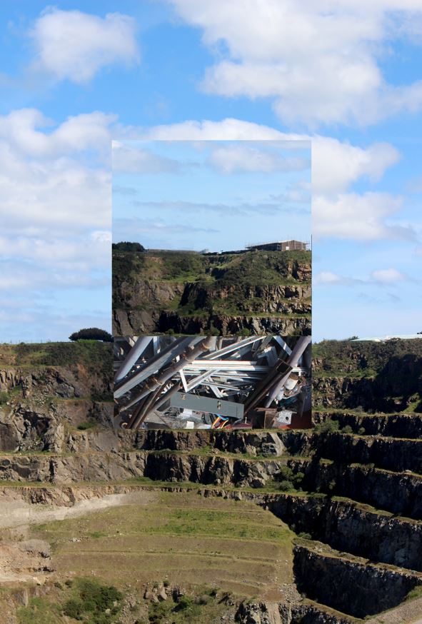
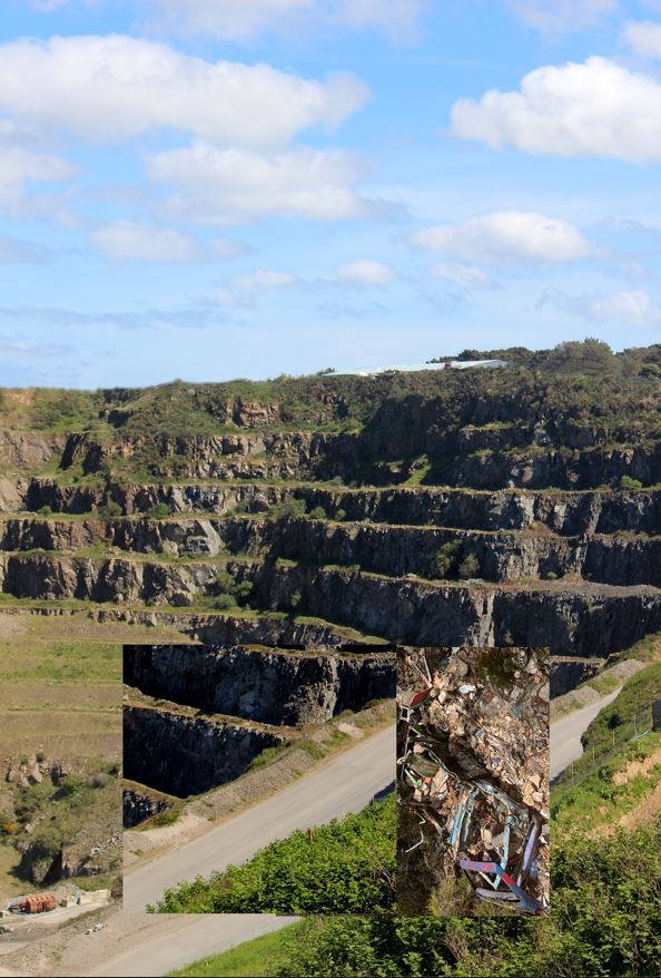
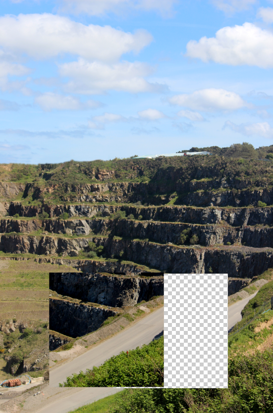
After being inspired to shoot a quarry upon looking over my final images I didn’t feel like they fully portrayed the idea of Anthropocene as it was obviously a much smaller quarry; so after levelling these 3 images I decided to add in windows behind shapes in each image. I used these windows to place a photo of some industrial waste to try and showcase how large industrial operations such as mineral mining in quarry’s affect the world by what they leave behind.

I used the rectangular and elliptical marquee tools for the square and circle cut-outs, and the polygonal lasso tool for the triangle.


Finial Idea/ Piece

Evaluation

Overall I think that this piece came out better than expected as I was originally just planning to present the raw photos, but once I saw that they weren’t really portraying the idea of “Anthropocene” and humans impact on the earth and its effect on the natural landscape so I added the “windows” into some of the waste that gets left behind on these large industrial operations.


experimental photo editing


I have used my best images from my 3rd photoshoot to experiment on photoshop with different editing techniques.


Photoshop Idea 1:

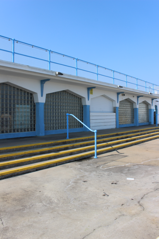
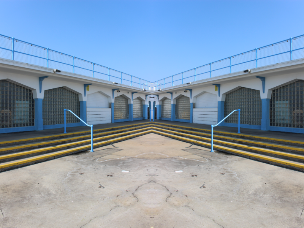
I used this photo of harve des pas swimming pool by mirroring it adjacent to itself in an attempt to show the symmetry and sameness of current architecture.

My original image
End result

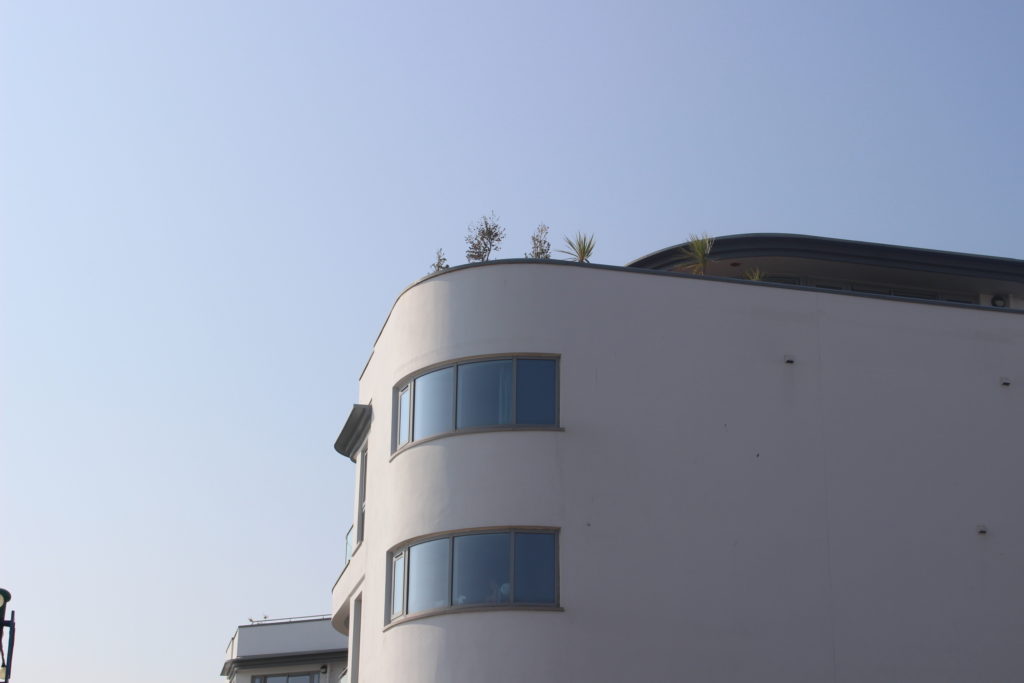
Photoshop Idea 2:

My plan for my second photoshop idea is to display the way that the millennial era buildings are bland and similar in the style and shapes used that from certain angles they all look the same.