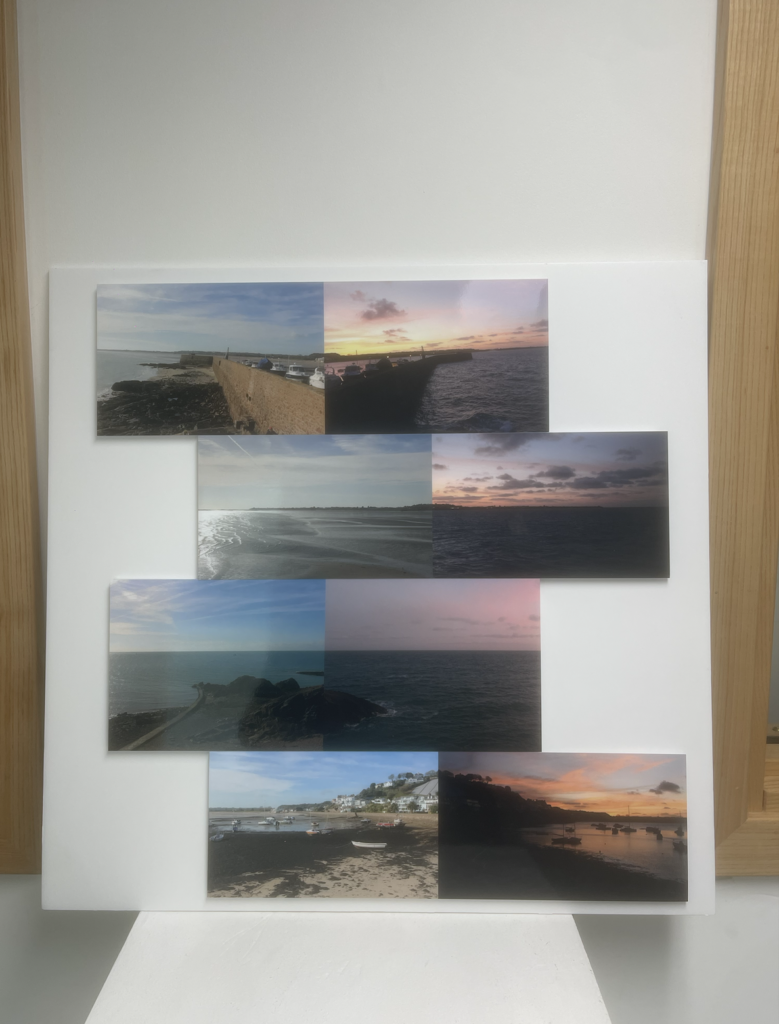
I went with this layout as I wanted to present these photos alongside each other, but rather than just lining them up I wanted to add some contrast/variation so that they are presented more as individual pieces.
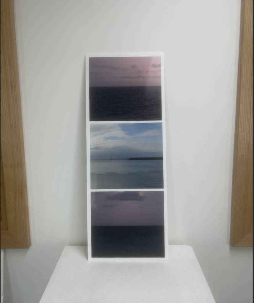
The same goes for this piece, I wanted to create something slightly different to my inspiring artist Hiroshimo, and so I mounted them in a verticle orientation instead of horizontle.
Overall I am satisfied with my outcomes for this project, as I feel that my photobook layout, alongside my final prints portrays the theme/ vibe that I was attempting to create. I used a good mix of representational images alongside some more abstract pieces to generate the contast. They layout of the photobook took some time to finalize as I was trying to get the images to flow between the pages so in the end I was happy with the final outcome. As for the print pieces, I went with more simplistic techniques so to compliment the simplicity of the pieces. I am also satisfied that I met my intentions, as my images and book represent the changes that cause the constraints of islandness/ island living. I do however think that if I was to do this project again I would try to create more dramatic pieces- possibly using darker colour pallets and less of an abstract style in order to focuses on some political/ social issues rather than physical constraints.
Throughout my project I have tried to pay homage to the artists who inspired my piece such as Shiroshi Sugimoto, by making images in a similar style of basing the image around the oceans horizon as well as Stratos Kalafatis by photographing areas of a habour when they are desolate.
Althought the processes I used (photoshop, lightroom) were somewhat simple I do think that they were effective. Playing with the order of the book and the alignment of the images for the prints definitely took a while and so if I did this type of work again I would definitely employ some form of system to aid me. Overall I really liked the colour palette throughout my work which includes lots of dark blues as well as sunset colours i.e yellows & orange hues. I think I followed the intentions I set out at the beginning well, but I also added some adaptations to the work as I went on throughout the process as I was testing things out but overall I am pleased with the result.
While starting to make my photobook I decided I wanted to make it slightly smaller and into more of a photo zine as I had been focusing on specific photoshoots and edits. A theme in my book is showing coastal points in jersey before and after the tide changed, as well as capturing the horizon over the coast.
Cover
I tried to keep the first 4 pages in a similar style in order for them to flow off of each other – but I included 1 variation to keep it interesting to look at
The last photo contrasts the first 3, however, upon turning the page it links into the following photo as the tide appears to “rise” under your hand.
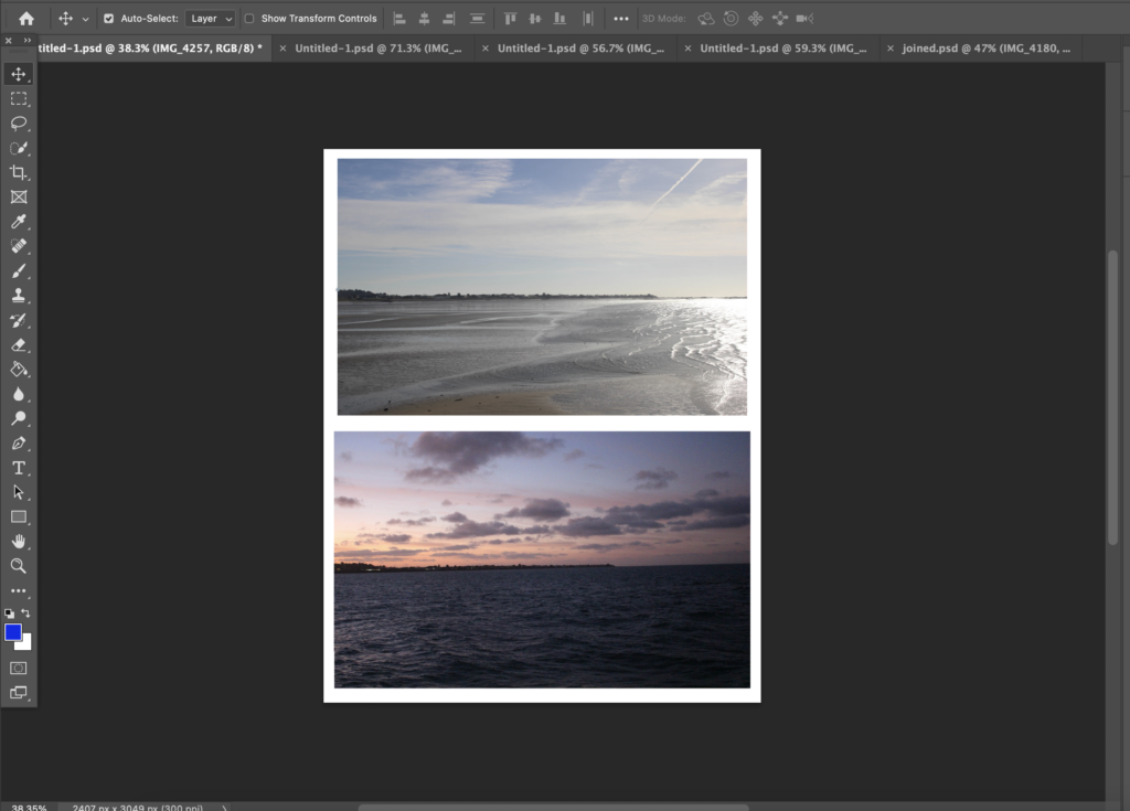
This part of the zine is where I introduce my edits, however I decided to change the bottom 2 spreads around as it makes more sense for the images to flow into the sunset.
I decided to end with this photo as it completes the zine’s transition from daytime into night.
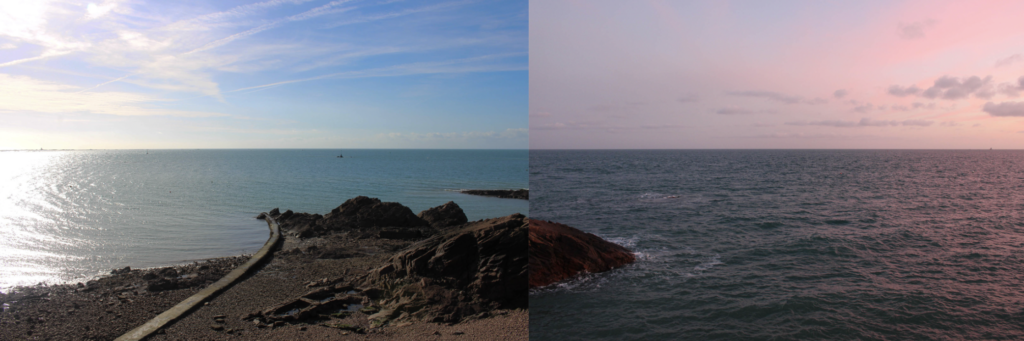
The goal for these photoshoots was to come out with some images similar to those of Hiroshimo as discussed in previous blog post where I showed my first attempts at creating these images.
Cropped + ColourCropped + Monochrome
I have been experimenting with colour grading and filtering with this set of images as some of the images look a lot cleaner in monochrome, and some of Hiroshimo’s images are black and white too.
While Hiroshimos work is a collection of images of the sea/sky horizon I wanted to include some elements related to Jersey such as rocks, buoys, piers, boats etc.
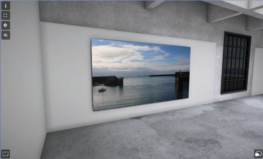
I plane to arrange these images in a 2 page spread grid in my photobook with all the horizons level.
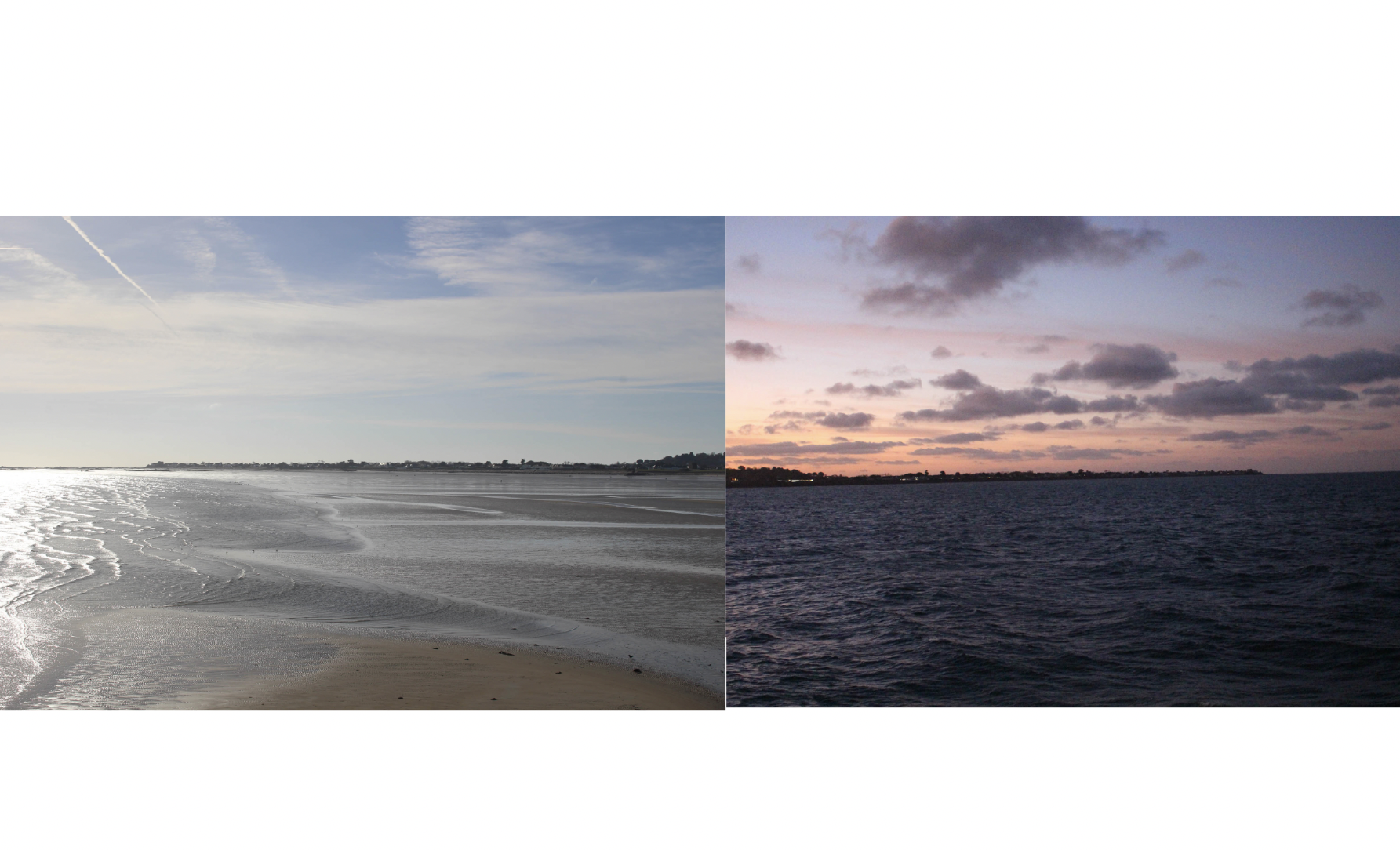
This photoshoot was capturing different spots around Gorey Harbour at low tide then again at high tide, in order to pair the two together similar to the technique used by Michael Martin.
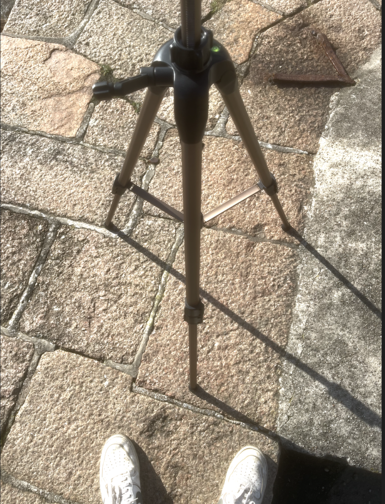
To achieve the effect that I hadn’t moved the camera between tidal changes I strategically marked and positioned my tripod, using photos to record exactly where I had it positioned. (Pictured below)
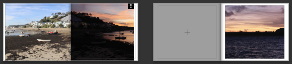
My original plan was to place the before and after images next to eachother in my photobook, however after playing with different layouts I found that this didn’t convey the dramatic type of effect that I was aiming for and so I decided that for some of my images I would flip one and place them back to back.
First variant of arrangement
Second variant of arrangement
Even after placing the images back to back as seen above I noticed I didn’t get the angles and framing completely perfect, and so the two images didn’t line up perfectly. I fixed this by adjusting the cropping of the two images so the horizon lined up how I wanted it too.
Final adjusted variant of arrangement
I am happy with how thee edits came out and I believe they are going to be a good feature in my photobook as I think that the back to back nature of the image will flow nicely as the viewer turns the pages, and it goes through time. My plan is to have two of these edits per page, stacked on each other.
Throughout this essay I intend to cover the ways in which I have observed the theme of islandness and its links to isolation and disconnection primarily through the physical aspect of island living. “Little islands are all large prisons: one cannot look at the sea without wishing for the wings of a swallow” – Richard Burton. Through my project, I am aiming for a clear representation of how the island is cut off from the mainland continents by the sea- which is a focal point in the study. I will be attempting to portray how the sea is the rough, brutal and somewhat impenetrable barrier between us and the rest of the world, but alternatively also capture the peace and beauty it brings to where we live. This is a topic of interest for me as not only have I lived on an island around the sea my whole life, but I am now understanding how there is a lot more to the world/life than living on an island and so comes some frustration- which is what I am trying to carry across into my project. To add some depth and contrast I will also be including elements that challenge my main focus and show that it’s not all bad as island living can be nice too. I will be drawing inspiration from the work of artists such as Hiroshi Sugimoto & Stratos Kalafatis both cover themes similar to what I have discussed. I will be linking my work to previous projects I have completed, as a common theme in my work is using the coastline of the island to my advantage in terms of linking to ideas.
I’d like to start with defining the meaning of “Disconnected”. By definition it means having had a connection broken, which is a good analogy for the island of Jersey’s physical status. I say this because Jersey is a volcanic island formed several millions of years ago. It was in an area near a volcano, and was once connected to France by a low, flat coastal plain before tidal levels rose and cut it off from mainland Europe. However, in this essay I am not just discussing the physical nature of Jerseys, but also the cultural and societal separation between Jersey and the mainland and how it can be portrayed through image as in the end it does all stem from a physical feature of where we live. For example I have been drawing inspiration from photographers such as Stratos Kalafatis, whom has an extensive collection based around archipelagos, in which he captureselements of island living such as ferries; which are a crucial part of life in places separated from mainland countries as it is where the majority of supplies come from and in some cases may also be the only form of transport. I chose Stratos as I can appreciate the way that he captures these images in a way that portrays the eerie loneliness, especially around the sea which obviously surrounds islands completely. A common theme throughout this series of images is the small number of colours present in each image, which is limited to blues, blacks and some whites/dark greys. I would link this particular set of images to themes of realism, due to the accurate, detailed, unembellished depiction of contemporary life.
Stratos Kalafatis, Archipelagos
This image from Stratos’ ARCHIPELAGOS collection is a perfect example of the themes of loneliness that come linked with essential parts of island life as it shows a deserted ferry, in an eerie shot as it crosses the connecting body of water around a Greek island. In contrast, there are photographers such as Michelle Sank who has a collection called Insula focussing on showcasing the uniqueness that comes from island culture in a positive light in relation to history and ethnicity.
Michelle Sank, Insula, 2013
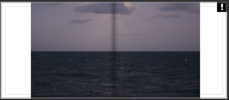
While my project is mainly based on portraying the slightly somewhat negative and borderline depressing side of island life – I found another photographer with a series of images based around islands who gave me a more unique perspective regarding the calmness and zen that comes with being surrounded by the ocean and upon looking through his series “Seascapes”. In this series Hiroshimo Sugimoto creates a number of images in the style of realism, capturing the blending point of the sea and the sky which comes out with a nice effect without any editing.
While reading a somewhat recent interview with Hiroshimo, he came out with the phrase “I’m inviting the spirits into my photography. It’s an act of God.” Kennedy, R. (2012), Hiroshimo: Girl Pictures. New York; New York Times. I found this really useful in understanding his work as at first I saw them as contemporary attempts at pictorialism (an approach to photography that emphasizes the beauty of subject matter, tonality, and composition rather than the documentation of reality)- however after reading this quote and more into his takes on his work, they came across differently. His work appears to look like a painting at first, but they are in fact photos- which is a sort of effect achieved by adjusting camera settings such as exposure. This combined with the photos being taken at night is how he is able to have his images look so clean and painting-like. Another reason I particularly like this set of images is because it has shown me how I can take photos of simple things like the horizon and make them into pieces of art which can evoke emotions and represent specific meanings.
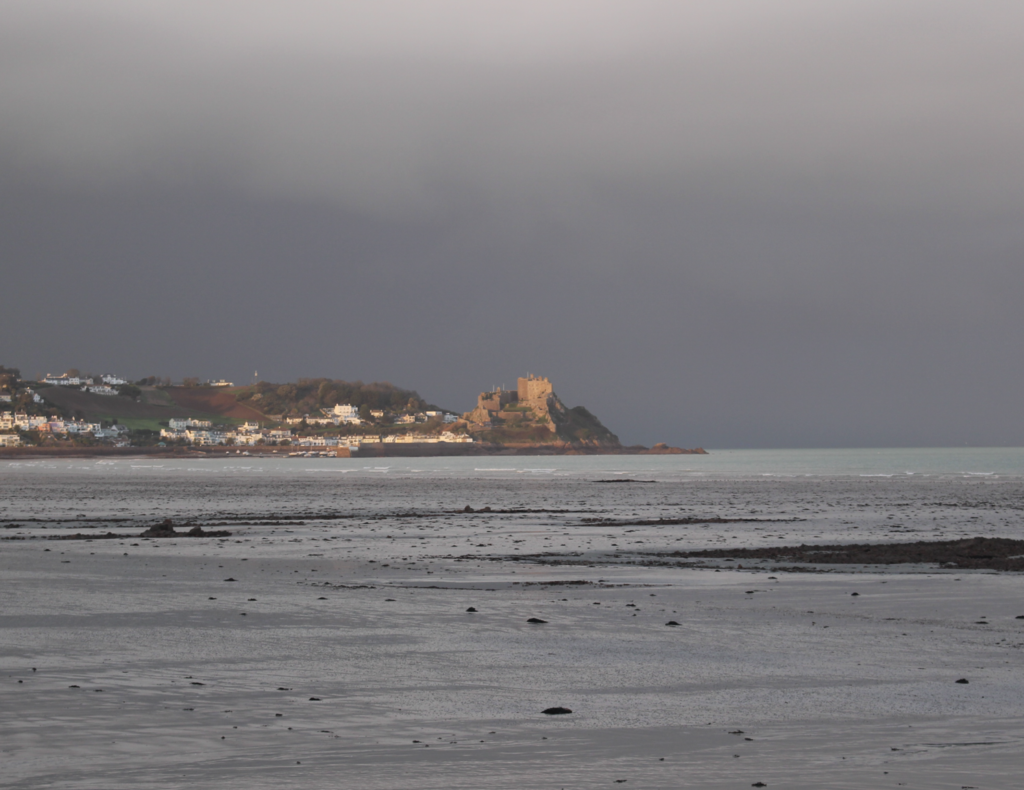
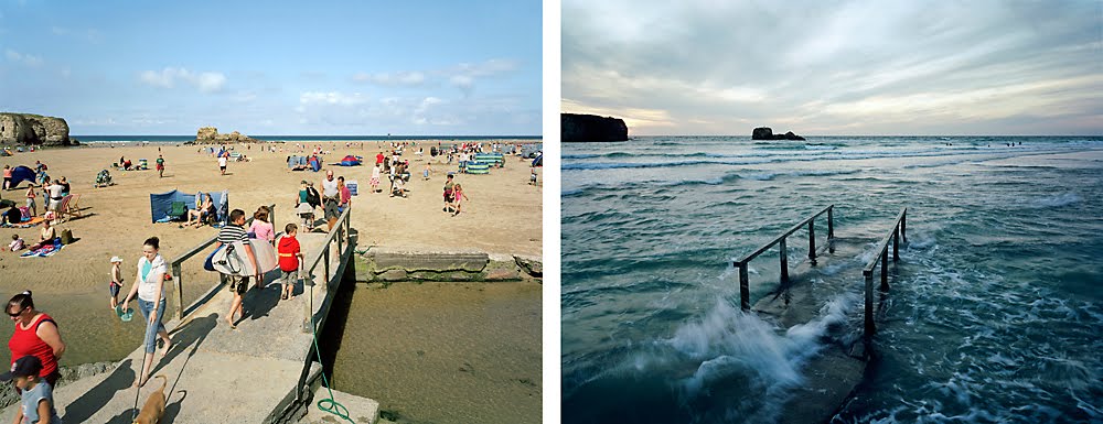
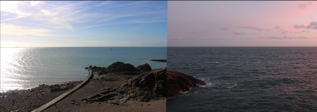
Another artist whose work I am looking at in relation to my is Michael Martin, a British landscape photographer who focuses a portion of his work on photographing changing tides, through which he creates these dramatic images showing the movements of tides along the British coast with before and after photos which he manages to align perfectly in order to make it look like he never moves.
Example of Martin’s work
I feel his work links to my question as his portrayal of drastic tidal changes showcases how the ocean can make a place somewhat untouchable to humans as nature pleases and so cuts off islands from larger populations/communities as I have mentioned previously- ultimately disconnecting them. This image I have used for reference shows how a beach full of people paired with the same beach at high tide- linked together by the focus of the framing of the bridge. The lighting in the first picture is much brighter conveying a more pleasant tone whereas the second image contrasts that with a nighttime setting and darker colours/lighting. I really like how he has created this contrast and it is something I am attempting to recreate in my own set of images of the Jersey coastline as it is a perfect example of how I am trying to describe the negative connotations associated with island living and how the sea is ultimately the root cause. While Martins work is radical, I do find Hirsohimo’s to be slightly more poignant, which I feel links more to the themes of lonliness however I will deffinately be including my shoots inspired Martin as they perfectly show off how tidal ranges cause Disconnection.
One of my first attempts
As a result, I have found that there are photographers who have portrayed themes of loneliness and disconnection through their work in photographing archipelagos which has motivated me to go further down the route of portraying this through my own images. However, through this research I have also found that another theme that comes along with these motifs is elements of peacefulness and tranquility which I found to be present in a lot of the work I looked at and used for reference. While it was difficult planning & capturing Jersey’s massive tidal range I found it an effective way of portraying my hypothesis. I have definately been influenced by the work of photographers such as Hiroshimo as his collections have shown me that my photos dont always have to be landscape photgraphs and that I can make things such as the horizon into surreal “art” pieces. I also found that you dont always get the shoot right on the first try and so it may take multiple attempts in order to get the desired effect.
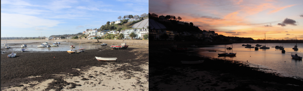
The aim for this photshoot was to create 3 or 4 pieces inspired by Michael Marten, and capture the changing of the tide in the harbour of Gorey. I used photos of my tripod positioning to get the same angles and framing for both pictures as shown below.
Representation of the darker themes of islandness.
A paragraph
My book is going to be a unique take on island living, somewhat specific to Jersey. It consist of several collections of images based around the coast of the island, most with minimal editing. I will be trying to convey Jersey in a lonely, yet peaceful place as I believe these two themes will either be a nice contrast or complimentary to each other depending on how you choose to perceive it. I want my book to be landscape, with a canvas cover and a larger metal binding. I want to have the title, Disconnected, to span from the front cover to the back cover, with my name in small writing below it. I will be putting the essay on the back few pages and I will choose a stand out image to go on the very last page.
Photobook Mood Board
The Meadow1% Privilege in a Time of Global InequalityBy Myles Little
This was my first photoshoot down at the harbour in which I planned to try and get some images similar to those of Stratos and Michael Marten- however I timed my visit wrong as it was actually low tide, and the ferry which I wanted to shoot wasn’t in port.
I did however successfully capture the first part of a piece I’m planning on doing inspired by Marten, in which I want to show the dramatic change in the tide by capturing images before and after the tide has come in.
My images
Michael Marten’s Work
I will be returning to capture the after image when the tide is right and the weather is similar to the original image in order to achieve similar lighting.