All posts by Niamh Reilly

Filters

Author:
Category:

Carolle Benitah – Artist Reference

Carolle Benitah

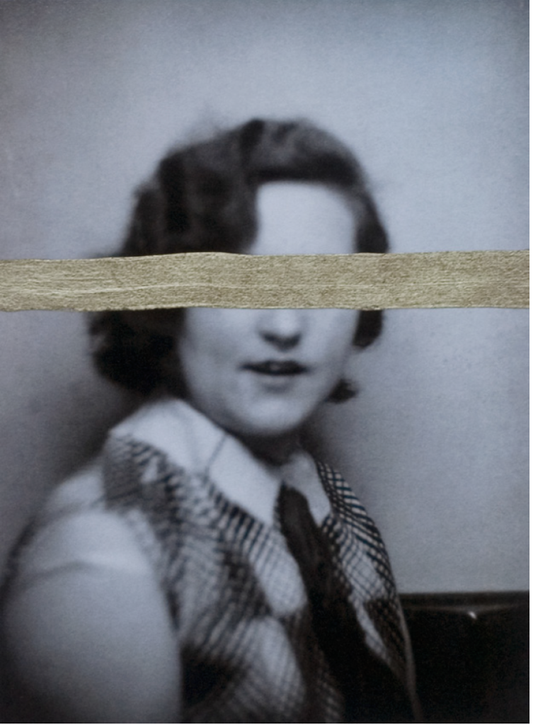
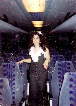
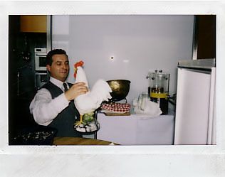
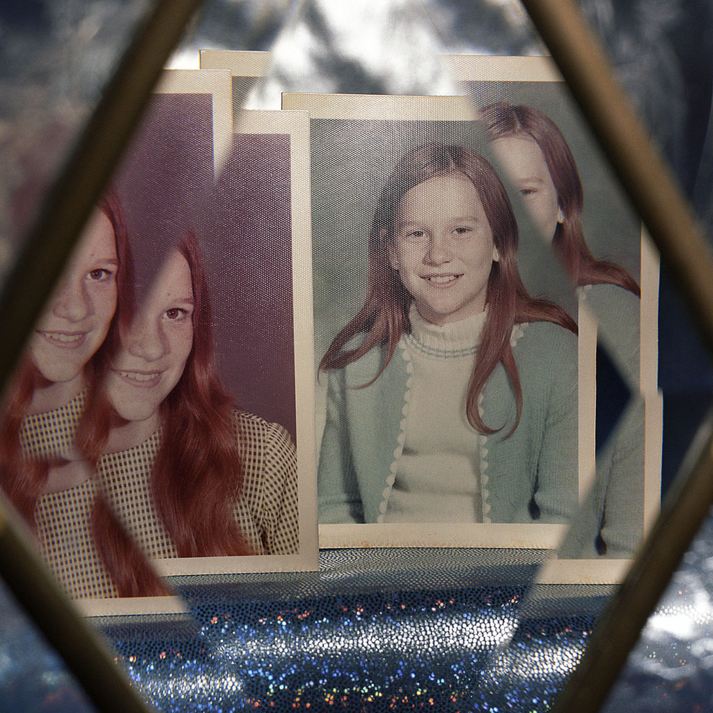
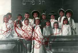
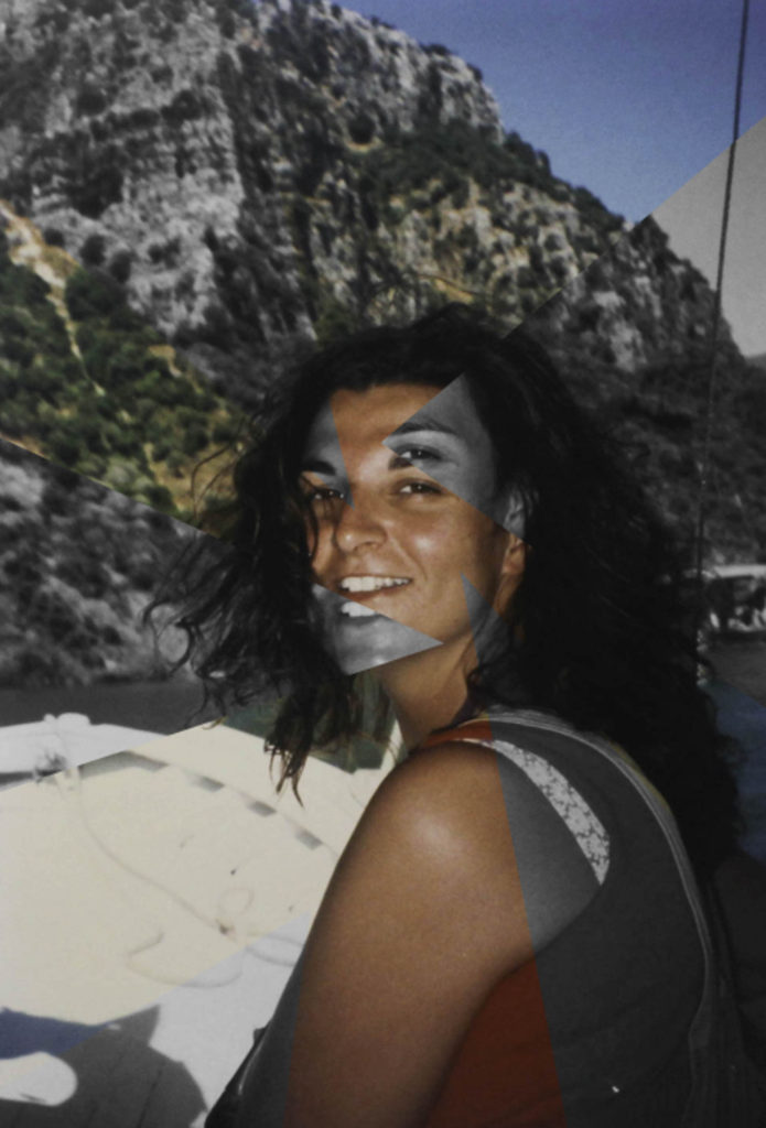
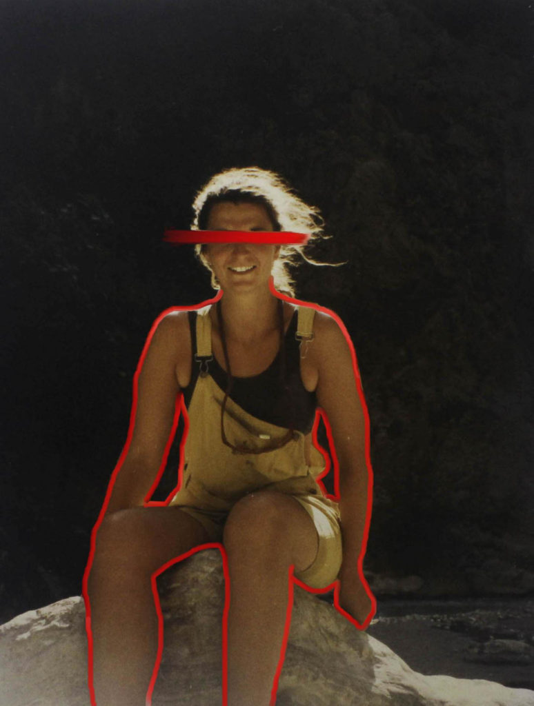
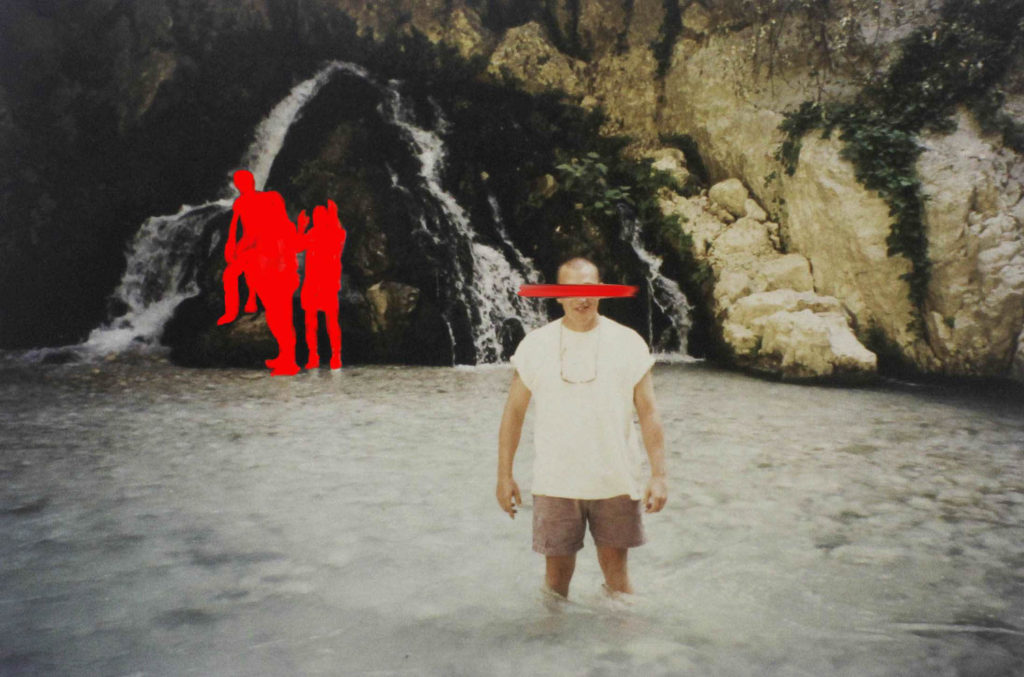
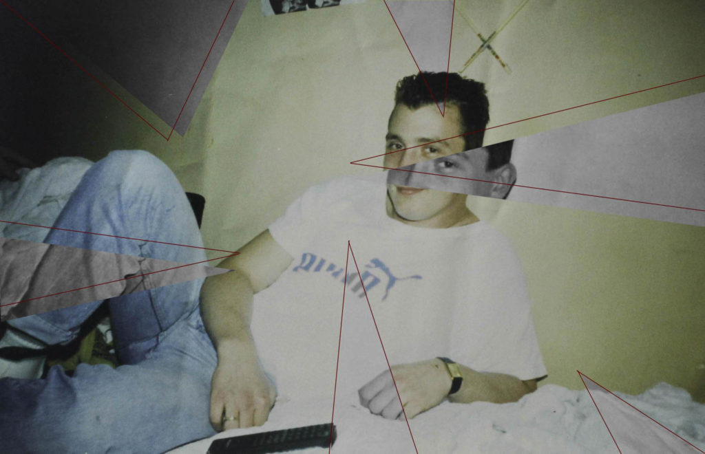
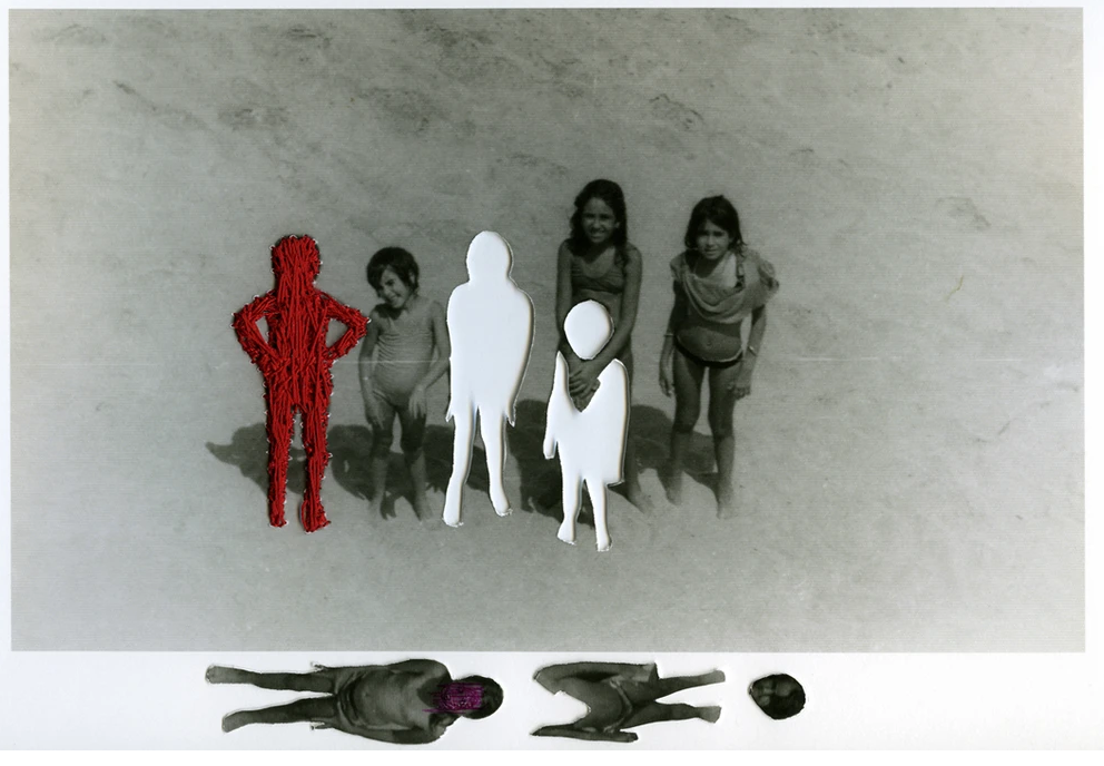
Carolle Bénitah was a French Moroccan photographer, who worked for ten years as a fashion designer before turning to photography in 2001 she explores memory, family and the passage of time. Often pairing old family snapshots with handmade accents, such as embroidery, beading and ink drawings, Bénitah seeks to reinterpret her own history as daughter, wife, and mother.

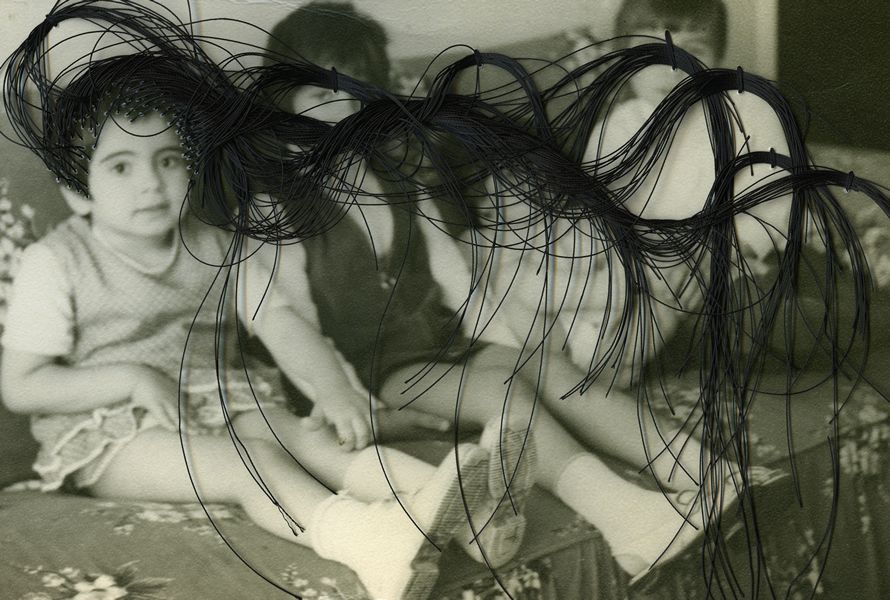
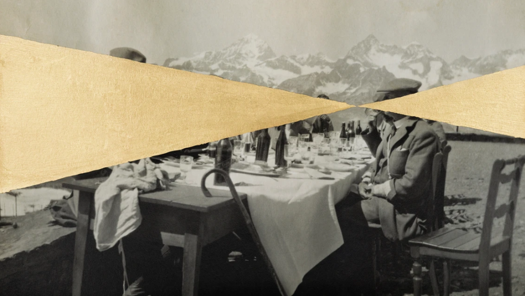
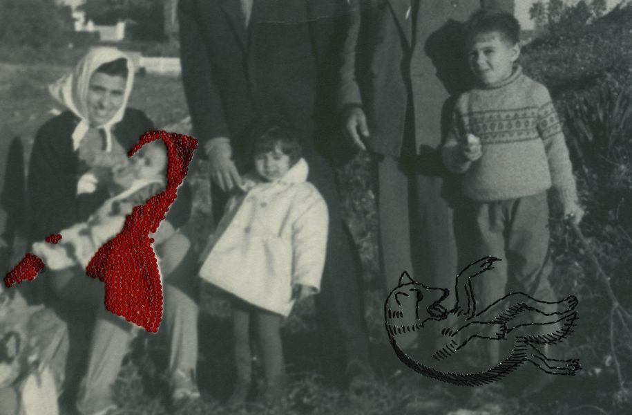
Benitah took old family photos and made them into new ones but with her version of the story and her feelings towards the people and the photos. She used different styles to re-interpret her own history. For example, she used embroidery on many of her pieces as a way to express her thoughts and experiences, or on some, she used gold paint to cover a part of somebody or she would cover everyone and leave the background black and white.
“Those moments, fixed on paper, represented me, spoke about me and my family told things about my identity, my place in the world, my family history and its secrets, the fears that constructed me, and many other things that contributed to who I am today”
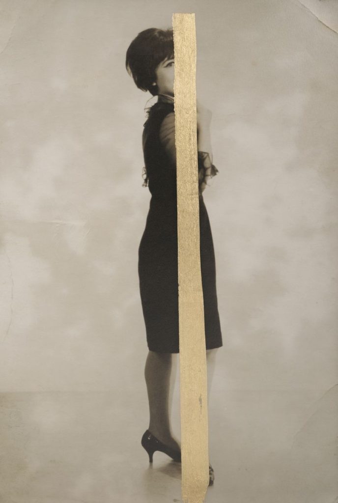
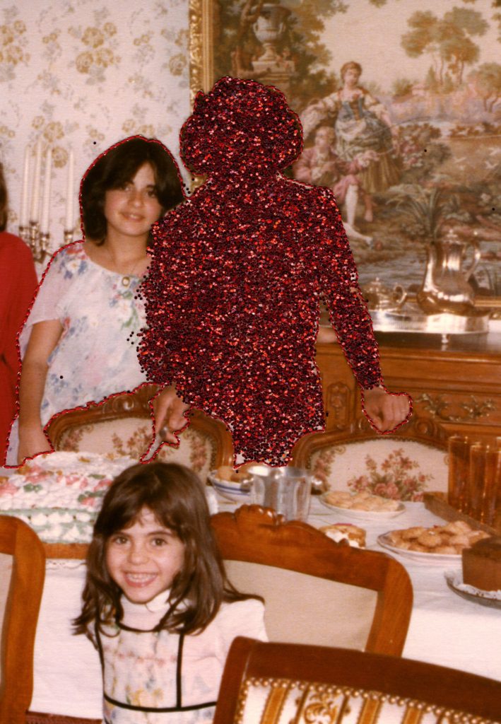
Benitah started to become interested in her old family photos when she was looking through a family album, the photos she was looking at were taken 40 years earlier, but she could not remember the moments that were in these images and what followed those special moments. Benitah felt that those photographs represented her, showed things about her family as well as told people about their identity and her place in the world. She stated those photos “contributed to who I am today”.

Benitah decided to explore the memories of her childhood so that she could understand who she was and define her identity. She started by looking into the photos that she found in her family albums. She chose snapshots because they related to memories and to loss. She saw these photos as fragments from her past, she ordered them, scanned them and printed them so that she didn’t do anything directly to the original photographs. Once Benitah made the image choice she wanted to start telling her version of the story, she then turned her attention to her own history with a new perspective as there were 40 years of distance and life experience.
“I make holes in paper until I am not hurting anymore.”

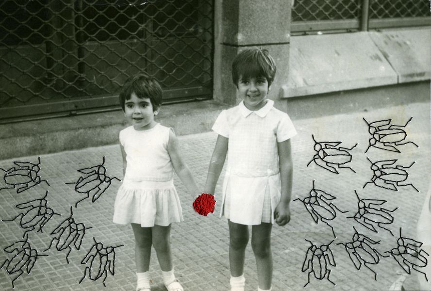
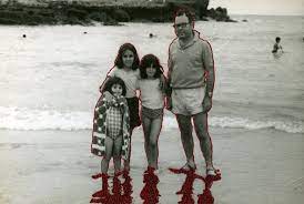
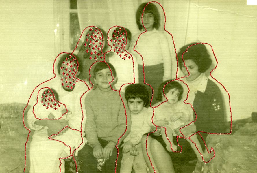
One of Carolle Benitah’s most unique features of her work is the way she manipulates the photos, she uses needlework, embroidery, beads and ink. She wanted to use embroidery as it is a primarily feminine activity and in the past women embroidered hoping for the man’s return to the home. This style was linked to when she grew up as a girl in a “good family” and used to learn how to do this. Even though Benitah knew that there was nothing subversive about embroidery she wanted to twist it with her purpose. she uses this style of work as a decorative function so that she could re-interpret her own history and expose its failings. The activities she put into her work to dispute the stereotype of embroidery being a sign of a good education with well-behaved girls, a wise spouse and a loving mother.

Carolle Benitah believed that each stitch she made with the needle, that each hole is putting death to her demons and she states that it’s like an ‘exorcism’.

Carolle Benitah – Information

Image analysis

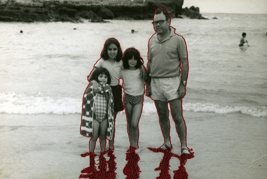
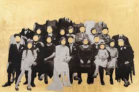
I like how this photograph is manipulated in such a smile way, such as the stitching around each person and the shadows but can convey such a powerful message. Benitah claimed that she liked to use stitching in her photos as she felt that with each hole she was putting death to her demons. When I look at the picture I think that when growing up she had strict parents which had a very specific way they raised their children which could have led to Benitah feeling suffocated and trapped within her family. I enjoy that she is able to portray this through a simple activity such as the stitching with red string. Another feature that I feel brings the full manipulation together is the colour of the sting, red. Red is a colour that can be linked with anger, danger and love which I think a the feelings she wanted to put forward in her projects as she wanted to show case her family and how she grew up and was raised.

Joachim Schmid – artist reference

Joachim Schmid

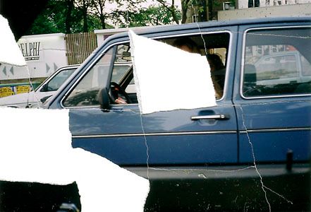
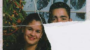
Joachim Schmid is a Berlin-based conceptual artists who collects and re-uses photographs that other people throw away. He uses these discarded, ripped and mundane images as a way to create artwork that is alluring, intriguing and captivating. He says that he has a passion for ‘visual trash’. He enjoys using other peoples photos that they throw away in public especially if it to be seen to be done with animosity and intense feeling.

“People are doing it everywhere in the world now!”

Schmid is very much a modern-day anthropologist who tries to understand contempered cultures by studying its visual rubbish. One of the projects he started was Pictures from the Street, (Bilder von der Straße, in German). This was in the early 1980s and it still is continued today. For this project he keeps and classifies each photograph or fragment of a photograph he finds in a public space, the collection now has more than 900 images. If one of the images Schmid finds has been ripped to pieces, he will re-assemble what he can so that he can be re-photographed. Schmid notes the date and place here each photo was found, this helps with imaging the stories behind the images. By looking at this collection it is impossible not to think of the back story, about who once owned these photographs, who’s in the photos and why they were thrown away.

“For the first time in the history of photography, we can study the real-time production of snapshot making – globally!” – Joachim Schmid

Another project that Schmid created came out of a prank which he started by posting what looked like a serous notice in a public newspaper about the ecological dangers of unwanted photographs and negatives. He went on to create an “institute” that offered to safely recycle or re-use dangerous film and photos. This “institute” became publicised worldwide and Schmid was bombarded with parcels of photos and negatives that people wanted to dispose of.

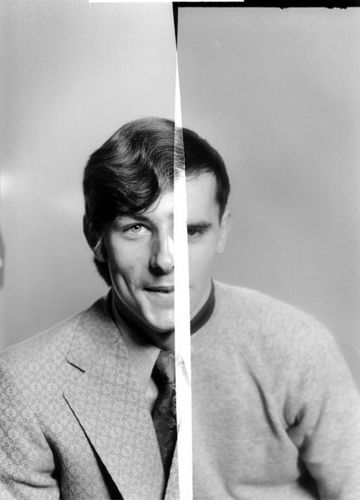
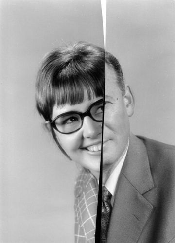
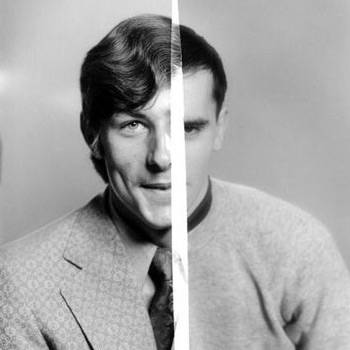
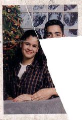
In one of these parcels, he discovered decades worth of medium format negatives from a professional photo studio. But they were all sliced in half in an effort to destroy their value. Schmid found that he could put together the left half of a negative with the right half of another negative to come up with a bizarre composition that was uniformly lit and fit together. It was also helpful that the photo studio always positioned its lights in the same way for years and never moved the camera closer or further way from the model.

Image analysis

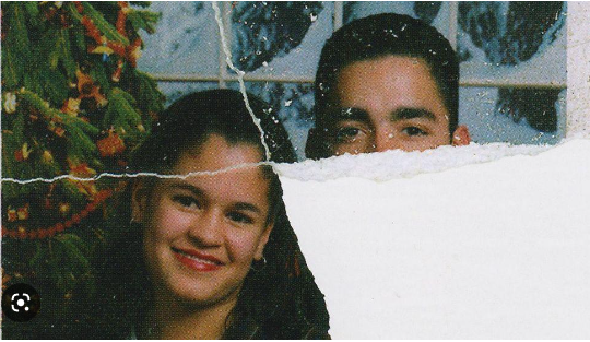
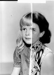
This image is a mix of two halves of different negatives to create one final piece, I like how this manipulation of a photo allows for there to be many different elements in one smile photograph. This image consists of one side of the negative being a women in black and white with glasses with a wide smile compared to the other half which is presented as an older man in a smart suit with a closed lipped smile. I like how different each side of the image is but also how they seem to fit together and create a good composition making it pleasing to the viewer. Another element of the final piece which I find intriguing is how the left side of the photo is bigger then the right, this makes me think that Schmid wanted the women and her facial features to be more present in the photograph compared to the mans features.

Birthe Piontek – Artist Reference

Birthe Piontek

Birthe Piontek is a German photographer who moved to Canada in 2005 after she received her MFA from the Folkwang University of the Arts in Essen, Germany. Piontek’s work has been exhibited internationally in both solo and group shows and is featured in many worldwide collections.

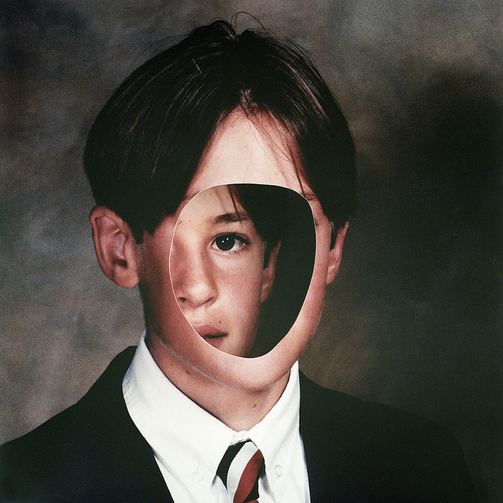
One of my favourite projects of Piontek is ‘Mimesis’ as she uses it as a way to make a fictional world that represents our relationship to reality and the way we perceive images of ourselves and other people. Piontek wanted Mimesis to expose how mirrors and pictures are just one version of the self, versions that can be cracked and reshaped. She reinterpreted the original photos through collage work and photoshop additions as her work invites viewers to look beyond the surface images, especially of ourselves and other people to help us realise that everyone has many sides to them.

Birthe Piontek – Mimesis

Birthe Piontek – Information

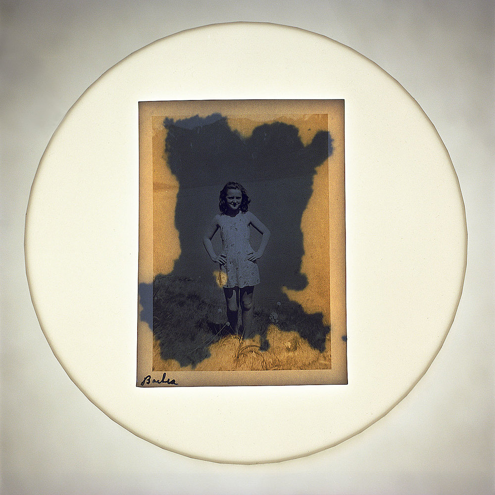
Another one of Birthe Piontek’s projects that I will be taking inspiration from is ‘Her Story’, I really like how she has manipulated the photos in each one of her final pieces as you can tell how the women are represented throughout the edits. Piontek created this project as an approach to the topic of her mother’s and grandmothers’ loss of memory due to Dementia and Alzheimer’s disease. Piontek stated that she had many thoughts about memory and memory loss, which seemed from her personal connection and emotional involvement with these topics. She also wanted to explore these subjects as she has always had the same question and fear that she might carry the disease, she also enjoyed how she could express her thoughts around the lineage and heritage not only within her family but also on a bigger scale: how humans interact and are connected by collective memory, as well as how our memories shape our identities. The nature of memory Birthe has always sounded fascinating and has always been a lifelong obsession of hers.

Birthe Piontek – Her Story

Birthe Piontek – Information

Image analysis

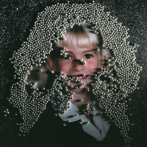
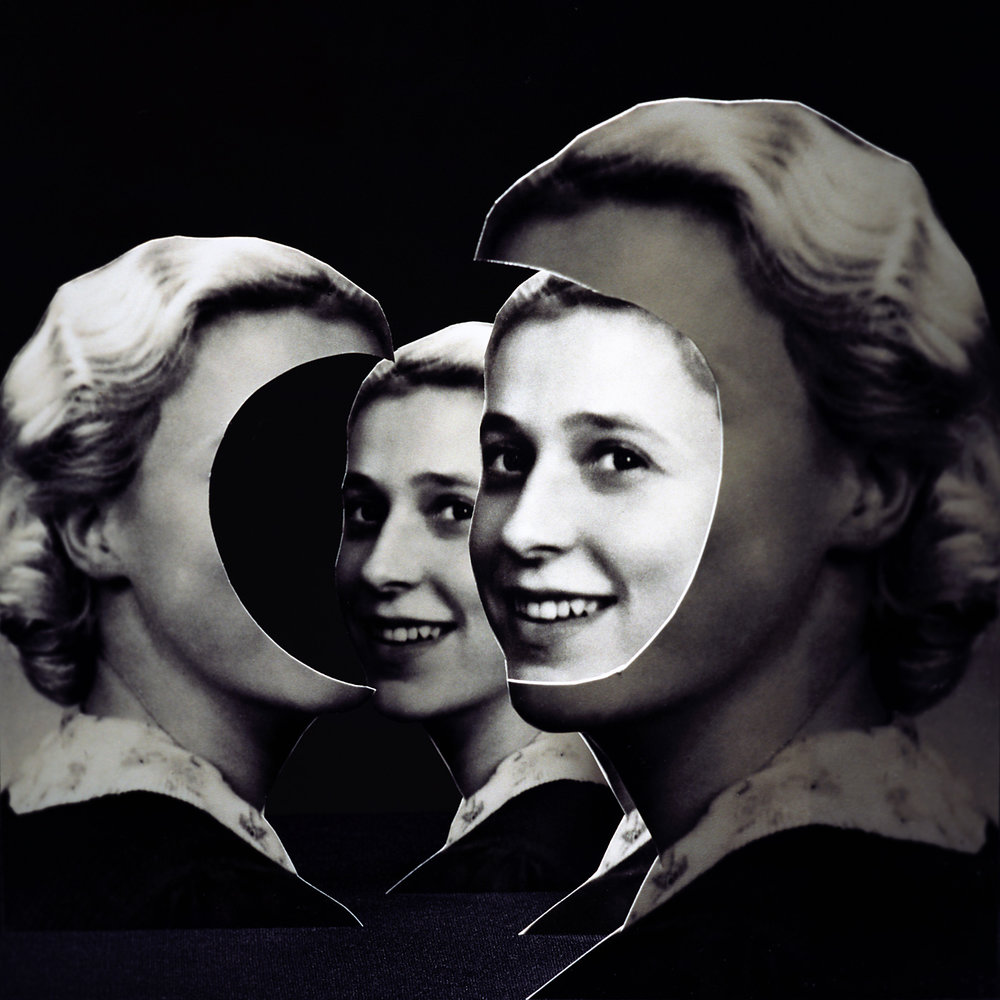
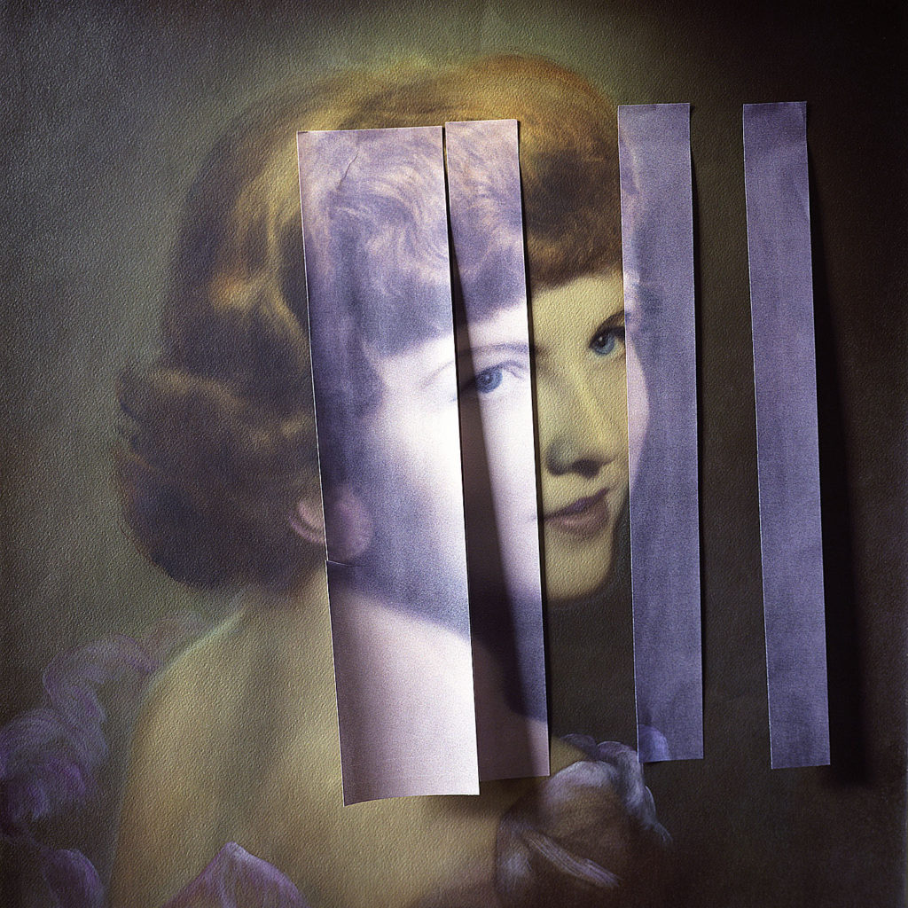
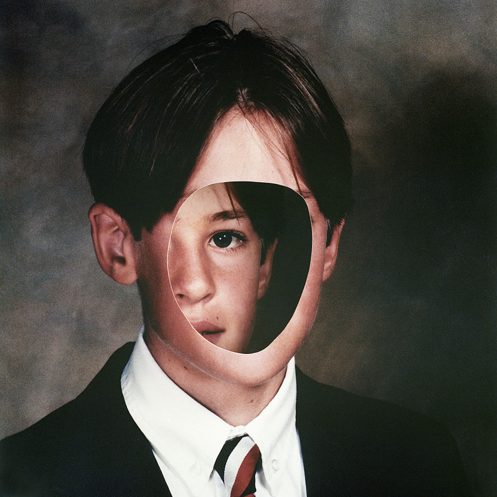
Above is a photo from Birthe Piontek which I think is able to portray a deeper meaning without having to have extravagant features with a lot of elements. Piontek used a single tool such as a pencil, pen or pin tack to create these holes in the photo of the woman. I like how much emotion this image conveys as there is clearly anger behind this, which makes the backstory even more interesting. Even though Piontek hasn’t released a meaning behind this photo being able to make a story in your head keeps viewers interested. One feature that I enjoy about this image is the contrast of light from the dots behind the photo compared to the darkness of the background and the actual photo o the woman.

Statement of intent

Write a Statement of Intent that clearly contextualise.

What do you want to explore?

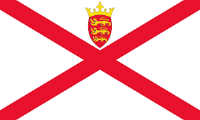
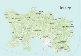
I would like to explore the theme of identity and how being on an island can disconnect us from other countries which could affect how connected we are with our families. This has led me to think about how we can make our own ‘Jersey family’ with the people we and our parents and meet along the way. I would also wish to explore the past and use older photos of both sides of my family and slowly merge them into recent photos of my ‘Jersey Family’.

Why it matters to you?

I have decided on this idea as my project as I feel that showing how these people have gone from my parent’s friends when they first came over to Jersey and turned into people who I consider family as I have grown up around them. I also feel that this is a good way to show how I feel about Jersey and what islandness represents to me.

How do you wish to develop your project?

I would use old family photos which are of my parents when they were younger, something similar to my identity project, these photos will also be of my family from both my mum’s and dad’s sides. This is so that there can be a visual transition between the ‘blood family’ and the family that we made in Jersey. I will then take photos of my ‘Jersey Family’ which will include natural images where they don’t realise that they are being photographed so it shows them in a natural state, there will also be posed images, for example, portraits and group photos. I have chosen to use a few different styles of editing which will be similar to my identity project, but also manipulating pictures I had and rephotographing them. I will also explore collaging new and old photos to create new images that will be able to show many different images layering over one another.

When and where do you intend to begin your study?

I would start my project by looking into old family photos which include when my parents didn’t live in Jersey and when they did. I will use individual photos of some of my relatives from both sides of the family as well as group photos to show my whole family being together. I enjoyed doing this in my identity project so I thought I would carry the idea over into this project. I would then merge photos together and edit them in a similar way to the photos above and below to make more creative pieces of work that will be eye-catching. I will also experiment in collaging with a combination of old and new photos. For my new photos, I will set up photoshoots with the different models I want to include where I will take portraits of some and include group photos which I might edit together. Furthermore, I will also photograph different family events where I will be able to capture photos of the people in my life who are natural and relaxed. I like this technique as I am able to create images that show a different side of a person which contrasts with the more posed images. I will try and photograph my posed images with a background that relates to my representation of Jersey, such a place which have meaning behind them to me and my ‘Jersey Family’.

Make sure you describe your how you interpret the theme of ‘islandness’, subject-matter, topic or issue you wish to explore, artists references/ inspirations and final outcome – photobook or film.

You may wish to consider:

What makes Jersey special to you?

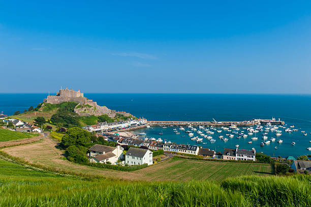
Jersey is a special island to me, as it has been my home for my entire life, and I have never known different. Jersey is the place where I grew up and found people who have helped to shape me into the person I am today, it has also given me friends and a family who have always been by my side, even if I move away Jerse will always be the special place I was raised. Jersey is also special due to its unique beaches, beautiful views and the amazing summers that have helped me make memories for life.
What are the distinct qualities of island life?

Living on an island is a very unique experience that not many can say that have done, it has qualities that most people love and that bring people to the island life. Living on a small island allows you to have friends and family close (if they also live on the island) without having to travel far to get to them. Island life is also very safe which is appealing to people wanting g to start families or who have young families as they know there are low crime rates. One of the main qualities that draw people to living on an island is the beautiful scenery, especially the summers, with the amazing beaches and coastal walks. But Island life also has its downfalls where it can be very claustrophobic as there can be limited things to do as well as everyone knowing everyone. Overall, living on an island is a totally unique and surreal experience that not many people get to witness especially having grown up in that special environment.

Crown Dependency

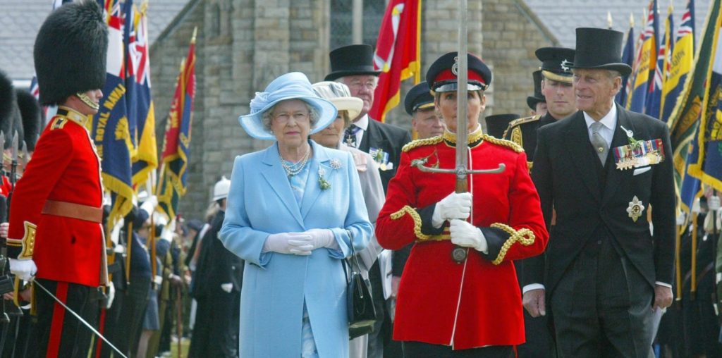
The Crown Dependencies are not part of the UK but are self-governing dependencies of the Crown. This means they have their own directly elected government and legal systems and their own courts of law. The Crown Dependencies are not represented in the UK Parliament. There are three crown dependencies the Bailiwick of Guernsey, the Bailiwick of Jersey and the Isle of Man, tis means they are not member states of the Commonwealth of Nations but they do have a relationship with the Commonwealth, different international organisations and are members of the British-Irish Council.

The Channel Islands is comprised of two Crown Dependencies  the Bailiwicks of Jersey and Guernsey. The Bailiwick of Guernsey is comprised of the Islands of Guernsey, Alderney, Sark and Herm. They have wide powers of self-government, although primary legislation passed by the assemblies requires approval by The Queen in Council (Privy Council).  The United Kingdom Government is responsible for the defence and international relations of the Islands and the Crown is ultimately responsible for  good governance.

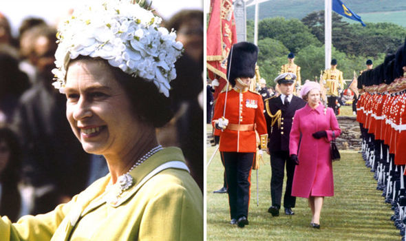
Jersey is a British Crown Dependency and is defended and internationally represented by the UK government. Today, the Lieutenant-Governor of Jersey is the personal representative of His Majesty the King here in the Island. “The Crown” is defined differently in each Crown Dependency. In Jersey, statements in the 21st century of the constitutional position by the Law Officers of the Crown define it as the “Crown in right of Jersey”, with all Crown land in the Bailiwick of Jersey belonging to the Crown in right of Jersey and not to the Crown Estate of the United Kingdom.

Why is Jersey a Crown Dependency?

Jersey is classified as a Crown Dependency, since the Island’s relationship stems from the sovereignty of the British Crown, as opposed to the UK Parliament or HM Government. In practice, this gives the Island constitutional rights of self government and judicial independence.

Jersey is not part of the UK and is not represented in the UK Parliament. The UK Parliament does not legislate for the Island without consent, however, the UK Government, on behalf of the Crown, does retain formal responsibility for the Island’s defence and, to some extent, its foreign affairs. 

In May 2007, Jersey’s Chief Minister signed the International Identity Framework Document with the UK Secretary of State for Constitutional Affairs. The framework is intended to clarify the constitutional relationship between the UK and Jersey. The framework recognises that Jersey has an international identity which is distinct from that of the UK and outlines the UK’s support for the development of Jersey’s international identity.

How did Jersey become a Crown Dependency?

The Channel Islands were part of the Duchy of Normandy when Duke William, following his conquest of England in 1066, became William I. In 1106, William’s youngest son Henry I seized the Duchy of Normandy from his brother Robert; since that time, the English and subsequently British Sovereign has held the title Duke of Normandy.

By 1205, England had lost most of its French lands, including Normandy. However, the Channel Islands, part of the lost Duchy, remained a self-governing possession of the English Crown. While the islands today retain autonomy in government, they owe allegiance to The Queen in her role as Duke of Normandy.

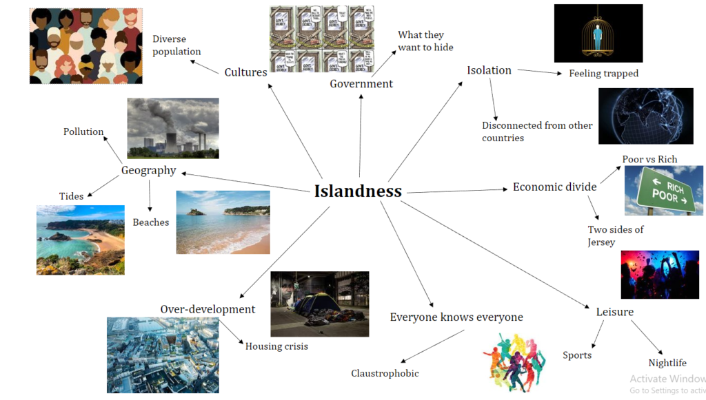
Islandness – Mind Map

I have included my first mind map for my project on ‘islandsness’, these are the ideas that first come to mind when thinking about what I want to include in my project. Creating the mind map has helped me to think and plan out what I could do for each idea, it has also allowed me to figure out what will be the best idea for the future project. the mid-map has also helped to pick the ideas that are actually doable and the ones that will be harder to portray through photographs.

Mood board

Idea 1:

My first idea is to photograph the economic divide that we have in Jersey, I would include images of the types of housing showing the upper class, middle class and lower classing. For this idea I would also include environmental portraits and I think that there are a lot of different occupations in Jersey which I most cases show the level of class. I will be able to make binary opposites collages which will create a more interesting final project. This is also a strong way of showing what island life is like for different people.

Idea 2:

For my second idea i would use the theme of identity and wok in how living on a small island disconnects us from other counties and even our families that live in different places. Many people who live in Jersey have moved away from the home counties where their families are, meaning that they are alone here which can sometimes have major effects on these relationships. Living in Jersey can also be claustrophobic as some do not have a connection outside of the island. Similar to my mum and dad when they moved over here they only had friends while their families wee back in England and Ireland, for most people this is where your friends become you family. This is similar to my situation, where I have my ‘Jersey Family’ and then my blood family. For editing I would take inspiration from my identity project as I enjoyed the editing process and found the experimenting in photoshop interesting. Finally, I have chosen some photographers that I might include in my project, Carolle Benitah, Birthe Piontek, Joachim Schmid and Diana Markosian.

Review and Reflect

Strongest work

Environmental Portraits

ENVIROMENTAL PORTRAITS

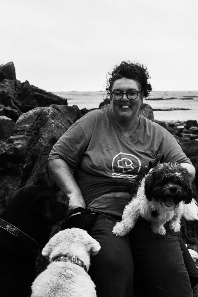
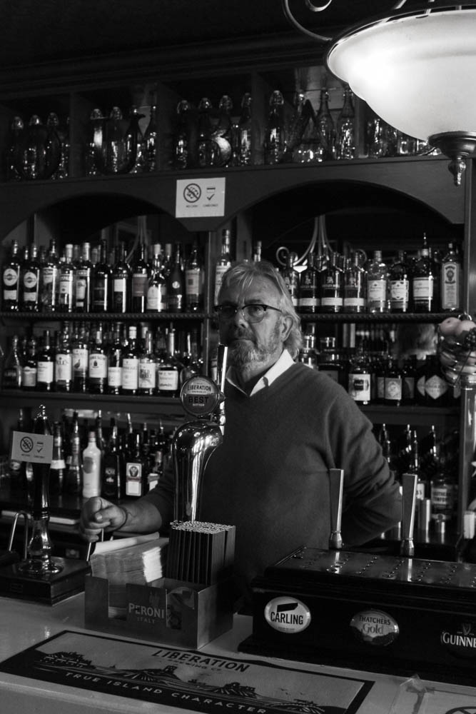
I think this project produced some good-quality images even though it was the first project we had to do alone as it was a homework task. I liked the freedom I got during this project as we were able to pick where and who were photographed, I also think that it allowed me to be more creative with my images and try and go out of my comfort zone with talking and photographing different people. This project really interested me as portraiture is one of my favourite photography styles.

Portraiture

HEADSHOTS

PORTRAITS

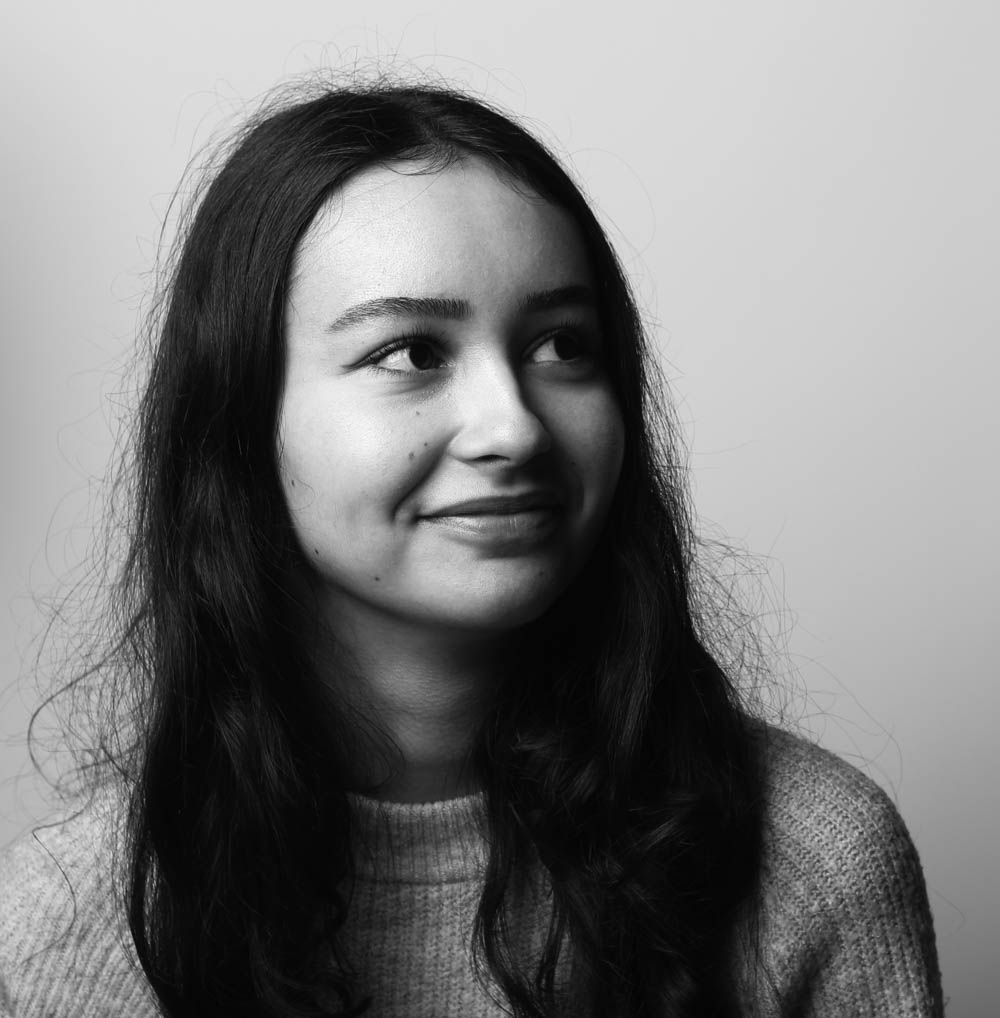
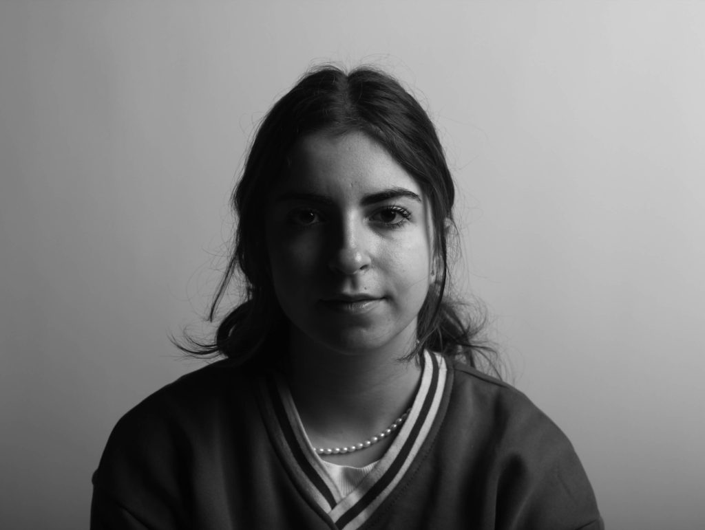
Above are images from my portrait project which I found that I enjoyed as I like having a model that was able to move around I found that I was able to portray more emotions through portraits than in my other projects. I found that most portraits, when trying to get a dramatic look, are better in black and white rather than in colour. Furthermore, I liked experimenting with the different shadows that could be created by placing the lights at different angles around the studio.

Identity

FINAL OUTCOMES

EDITING

My identity project, was the most interesting and my favourite project to work on, as I got to use a lot more of the editing and technology side of photography. For my final images above I used photoshop which helped me to experiment and expand my knowledge of the software and I think that my pictures came out really well. I enjoyed this project as I also got to learn and hear a lot more about my parents and extended family. Further, I really liked having and transforming old images into newer versions of themselves with some added features. For my personal study, I think I will take inspiration from the editing of my identity project and it was one of the main features that I liked working on during this time.

Islandness

La Hocq

Plemont

Stinky Bay

My islandness project, I believe was one of my strongest as I have become more comfortable with the camera and have developed my skills throughout year 12 and into year 13. I liked this project as i was able to visit different places around Jersey and I had the freedom to photograph what I liked instead of being as restricted. I found that I could have been more creative with some of my final images as I didn’t take enough photos and struggled on how to edit them. Overall I found that the final photos that I produced are aesthetic and make a good final product.
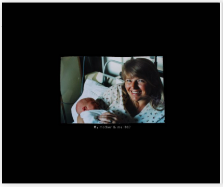
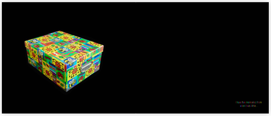
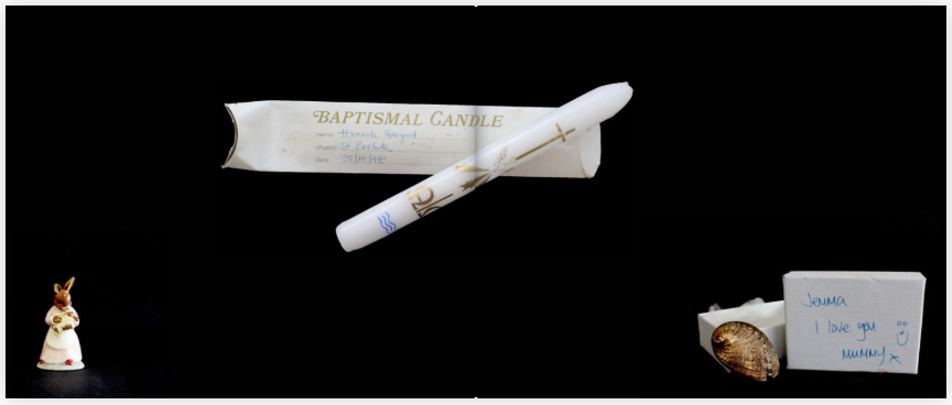
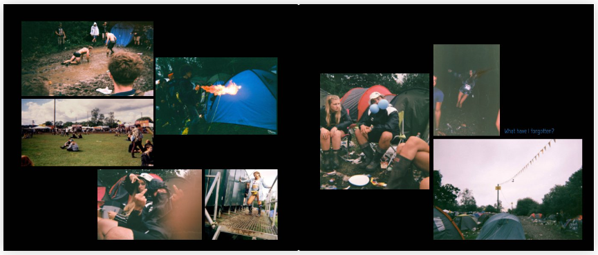
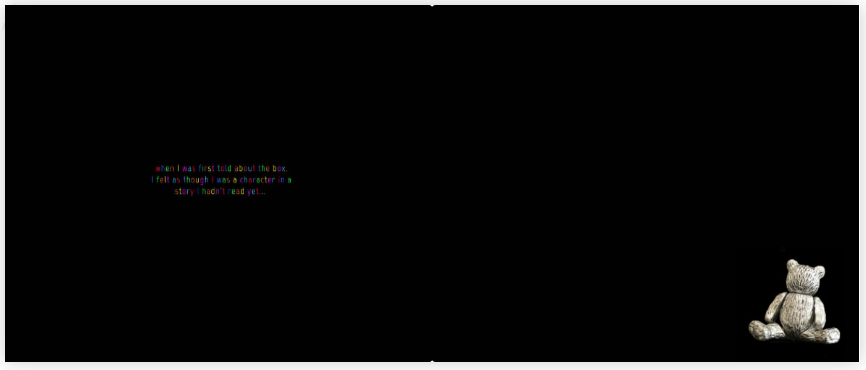
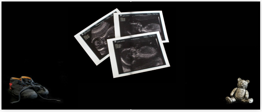
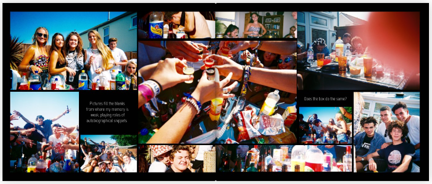
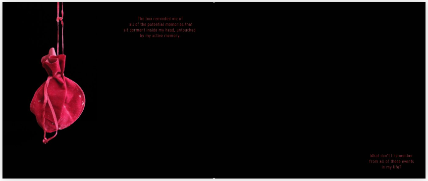
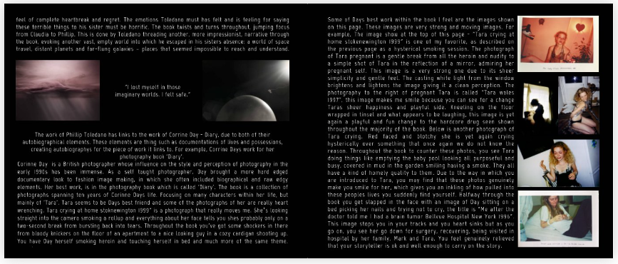
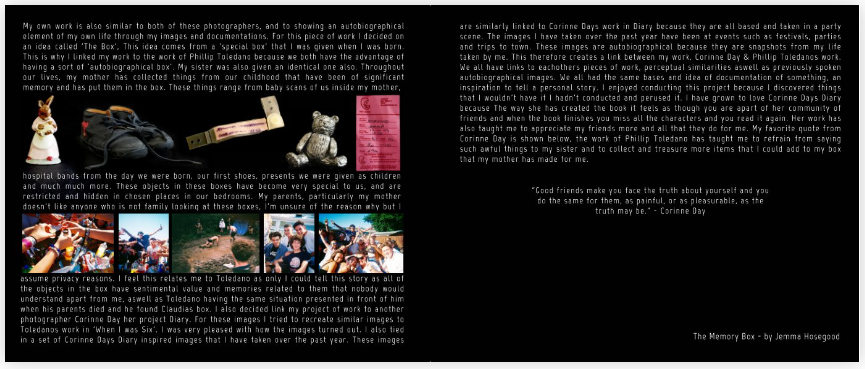
The Memory Box – Jemma Hosegood

Jemma Hosegood ‘The Memory Box’

Does the essay address its hypothesis?

Yes, the essay clearly addresses the hypothesis is, as she goes into detail about how her two photographers have made their work autobiographical. She also gives examples on how she feels and links hers work to these photographers and has expanded on their ideas to make her own work autobiographical. The hypothesis has also been answered consistently throughout the whole of the essay which helps to build and secure her conclusion on this hypothesis.

Does it provide new knowledge and understanding?

Yes, there is clear understanding of the topic and of the photographers that were chosen, there is extensive evidence of research and understanding of each photographers’ projects and how she has used then to enhance her project and personal study. She has also explained the background of each photographer and what inspired them to start their projects. For example, on photographer -Phillip Toledano- did his on his sister who died when he was six, but his family never talked about her, but when his parent passed, he found a box containing the belongings and photos of his sister.

Is the essay well-structured with a sense of an introduction, paragraphs and a conclusion?

Yes, the essay starts off with a quote from Corrine Day which is one of the photographers that was used for inspiration in this personal study, if feel this is a great way to open an essay as it is a way to get the reader intrigued about what they are about to read. If then goes into the introduction on the main part of the hypothesis, autobiographies and explains what they are and the photographers she has chosen. This gets followed with the introduction of the first photographer, Phillip Toledano. Throughout the essay it is broken up through paragraphs and quotes which will keep the readers interested as there are so many new and interesting elements to the piece of work. The essay is completed with her own small autobiography about what inspired her to do her project on her memory box.
Use and flow of language, prose, punctuation, spelling

There is a good structure to the writing but at times it can be simplistic and lack complex vocabulary which could potentially make the essay more interesting. This isn’t throughout the whole study there are parts where certain words have been used which shows her understanding of the project as well as her extended vocabulary which enhances the final piece. There is also a good use of punctuation in the essay which can really help keep the reader invested and what to carry on reading.

Use of specialist vocabulary relating to art and photography.

In the essay there isn’t a great abut of vocabulary relating to art and photography but it does pop up in some bits of her work. She uses this vocabulary mainly when she is describing the photographers background and meaning behind their projects but lacks it when evaluating their images, even her own. There is good detail i her evaluations but it is missing the photographic vocabulary that could really enhance the personal study.

Analysis of artist’s oeuvre (body of work) and key work(s)

This was one of the strong points in the essay as she goes in to great detail about both photographers that she had chosen, you really learn about them, their past and their different projects that she had taken inspiration from. There is defiantly evidence that there has been extensive research done into these photographers and that she took real interest into their work. Each photographer got an introduction and she picked out key images from their work which she analysed and explained why she had picked the specific photos.

Evidence of wider reading with reference to art history/ theory, political discourse and/or socio-economical context

There is not any evidence that research into art history, political discourse or socio-economical context has been done, but I feel this is mainly about the topic that she chose to do her personal study on. I feel that there was little room for sub jects such as politics of socioeconomics could have been brought into this project, but she could have done some research on the meaning behind the key features of her personal study, such as the memory boxes or other well know photographs that relate to the topic of friends and family as well as community.

Use of direct quotes, summary or commentary from others to make an informed and critical argument

The actual essay is opened with one of the quotes from the photographer Corrine Day, “Good friends make you face the truth about yourself, and you do the same for them, as painful, or as pleasurable, as the truth may be.” – Corinne Day, Diary, 2000.‘ This is also how the essay is finished as she states that this is a ‘favourite’ quote. The essay is also concluded on how she relates to both photographers and what they have made her feel after looking at their pieces of work. Different quotes are also used throughout the essay to breakup certain chunks or to introduce new photos which I believe is a great way to structure this piece of work as it invites new ideas and different meanings to the final project.

Use of referencing system (e.g., Harvard) and a bibliography

There is no evidence of a bibliography or of a referencing system such as the Harvard systems. I feel that this is a disadvantage as having a referencing system can really enhance the final product as the viewers can research deeper into the topics that they are looking at.

Use of illustrations with captions listing name of artist, title of work and year of production

The artist’s name is displayed at the end of her essay and in a few of her photos throughout the book but there is no other evidence of this being her project, there is also no date presented so without knowing Jemma or looking away back through the blog, her projects might not have been found. Lastly, Jemma has displayed the tile of her book across her blog posts and in the page, you see when you open her picture book but is not shown on the front cover.

Overall Analysis and Mark

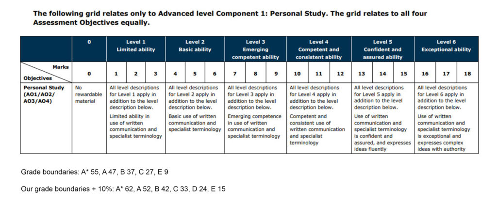
6=D grade 9=C grade 11=B grade 14=A grade

I would give ‘The Memory Box’ 12/18 marks as I feel that she has displayed a clear and consistent personal study, that provides new knowledge on her different photographers as well as herself. Jemma goes in-depth into her chosen inspirations such as Corrine Day and Phillip Toledano, she also conveys her emotions throughout the whole essay as she can relate both photographers back to herself which I fell is a really strong link that helps to bring the project together. The overall book is also very good quality with pictures that relate back to her personal study and which she can explain in specifics why she has chosen to use them. Jemma’s structure of her essay, I find is very interesting, although she missed out on some specialist terminology it is very enjoyable to read as well as the presentation of quotes and pictures.

Final Zine

Analysis

Overall, I think that my zine was a successful project, as it has an aesthetic flow throughout the magazine which makes people want to carry on looking through it. I believe that this is the strongest point in my zine as I believe that composition is important when it comes down to a project that involves a zine. I like how my zine included both coloured and black-and-white photos which keep the zine interesting, the monochromatic look of the black and white images contacts nicely with the vibrant colours that they are placed next to them. Furthermore, I think that adding quotes was a very successful idea as it adds further details into the story of my zine. I also think its a nice way to break up some of the photos and gives the view a deeper understanding of Jersey and what my zine is about. In my opinion I also think that the quotes balances out the zine which helps to create an aesthetic composition throughout the pages, I also tried to put images with the quotes that will help views to expand on the story in their mind.

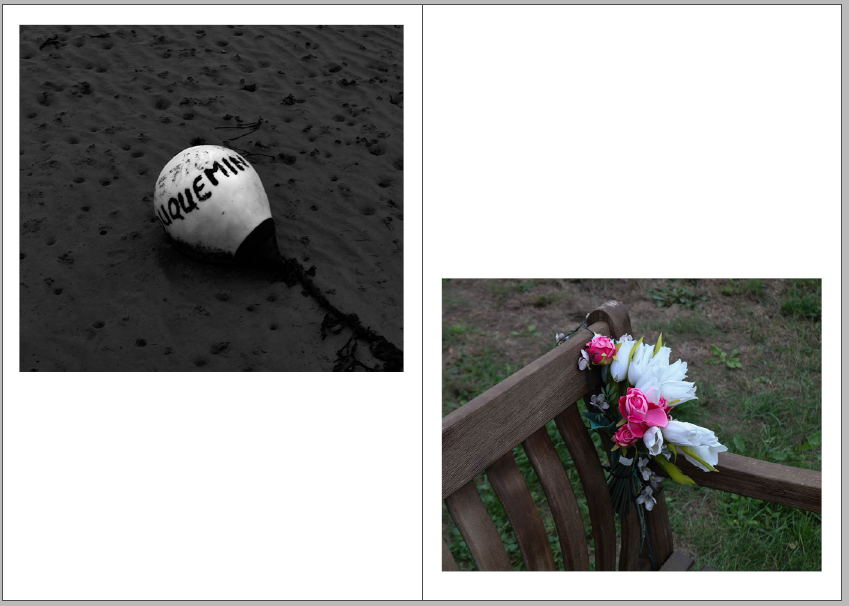
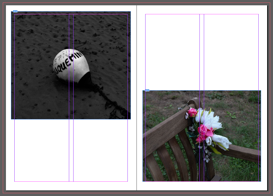
I believe that one of my most successful pages was 10 and 11 as I think that they photos fit really well with each other but are vastly different. On the right is one of my favourite black and white images from my La Hoqc photoshoot, as I believe that it has many eye-catching features and o the left is also one of my favourite photos as I think that very vibrant colours are intriguing and contrasts well against the black and white of the opposite page.

Critique

One of the weaknesses in my zine is the placement of some of the images, I wish I had been more creative with how I did the layout as I believe that having an interesting composition will help the view to tell the story in their head, it will also help to keep concentrated and drawn to the zine. I also think the colour placement of my images could be seen as one of the weaknesses as I didn’t put a lot of thought into how the black and white images would look as the zine was being looed through, this could been see has the images having no links between each other as the warm and cool tone photos were not strategically places on some of the pages.

Zine Design

Images Used in my Zine

Here I have two galleries of the photos I have used in my zine, this allows me to see how the images work together and which I should place on the same page. This also helped to pick the photos that I liked the most out of my selection of final images and which will go with the story of my zine. Furthermore, seeing the bigger versions of my pictures allows me to think about the order and placement of my images on the pages.

Creating a Zine

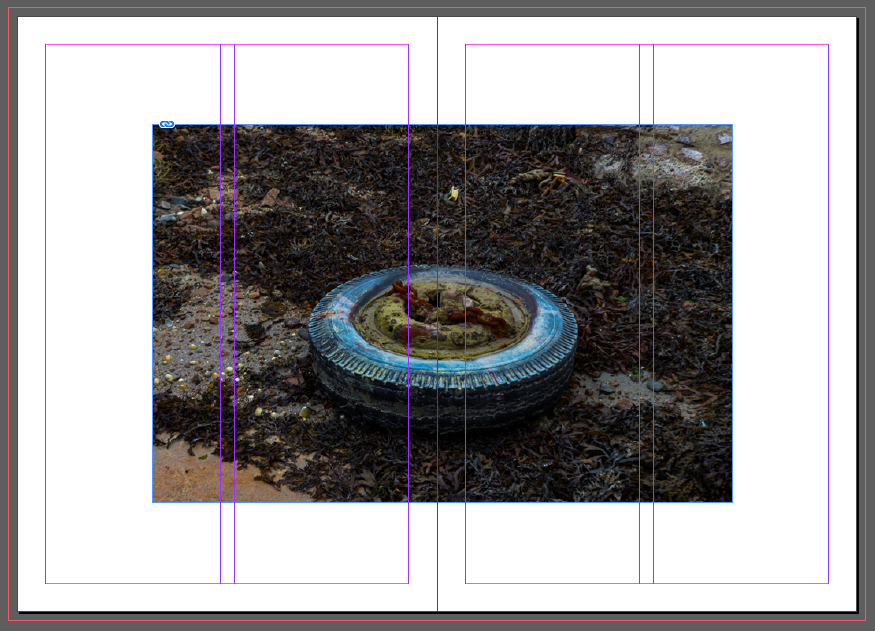
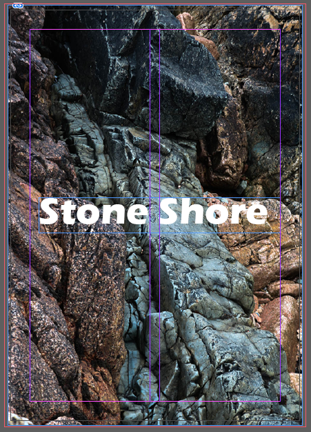
Below I have included the first draft of my zine, this is during the editing process in InDesign. Being able to edit the placements of my images on each page made it easier to come to the final decision on which images I wanted to use and how I wanted to view them on the pages. InDesign is a software created by Adobe, to create the zine template we had to input the settings to get the correct size and page numbers. After editing the final images in Lightroom we used Ctrl+ D to place each of the photos into the blank zine.

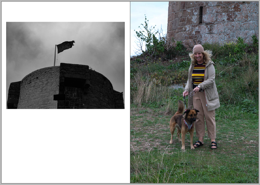
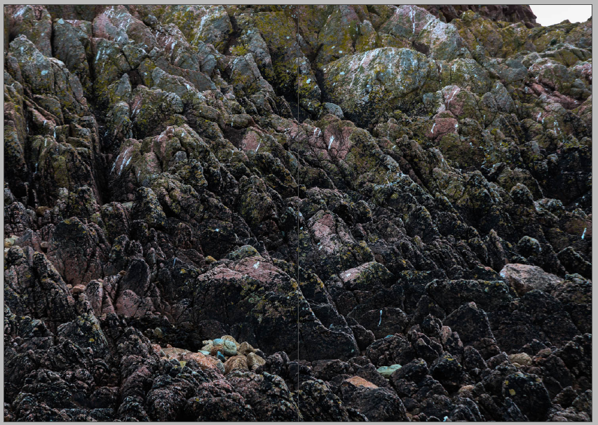
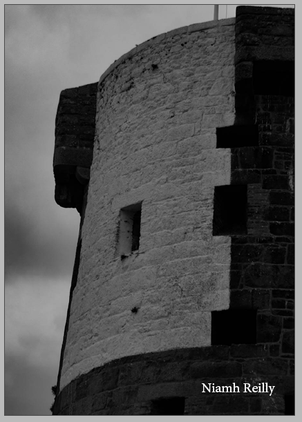
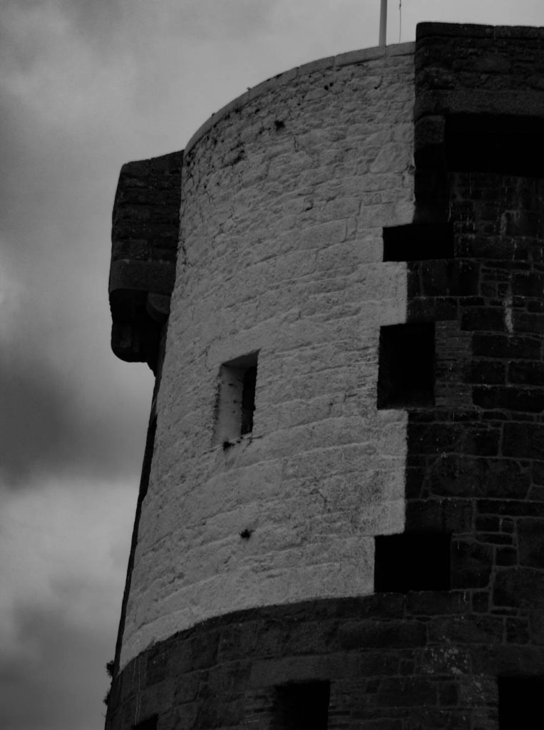
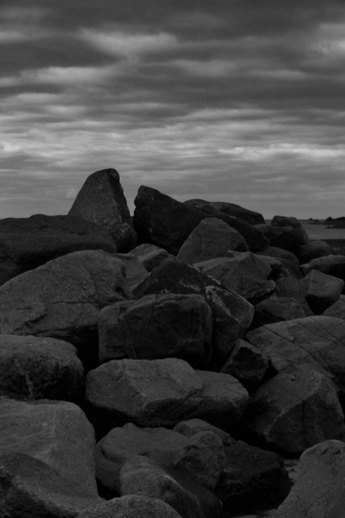
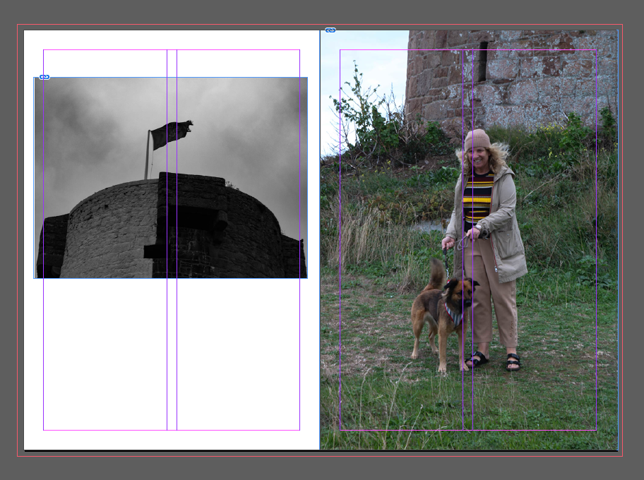
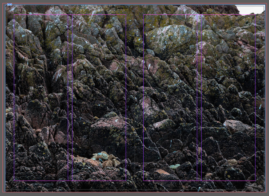
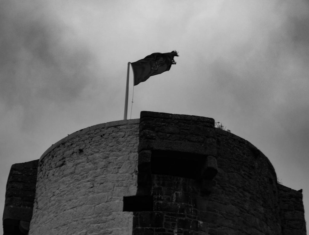
Above I have attached the first two pages of my zine, on the left side I have included one of my photos of La Hocq tower, as I couldn’t fit the photo correctly on one page as it is the landscape I decided to use half the page, I have taken the photo past the original bleep the was input, which was 3mm as I wanted the image to take up a bigger amount of the page. On the right I have included another one of my La Hocq photos, here I have extended the image all the way to the edges of the page as I felt the full page covered complimented the white borders on the page beside it.

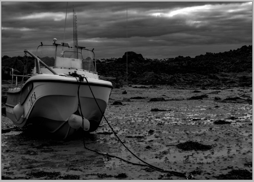
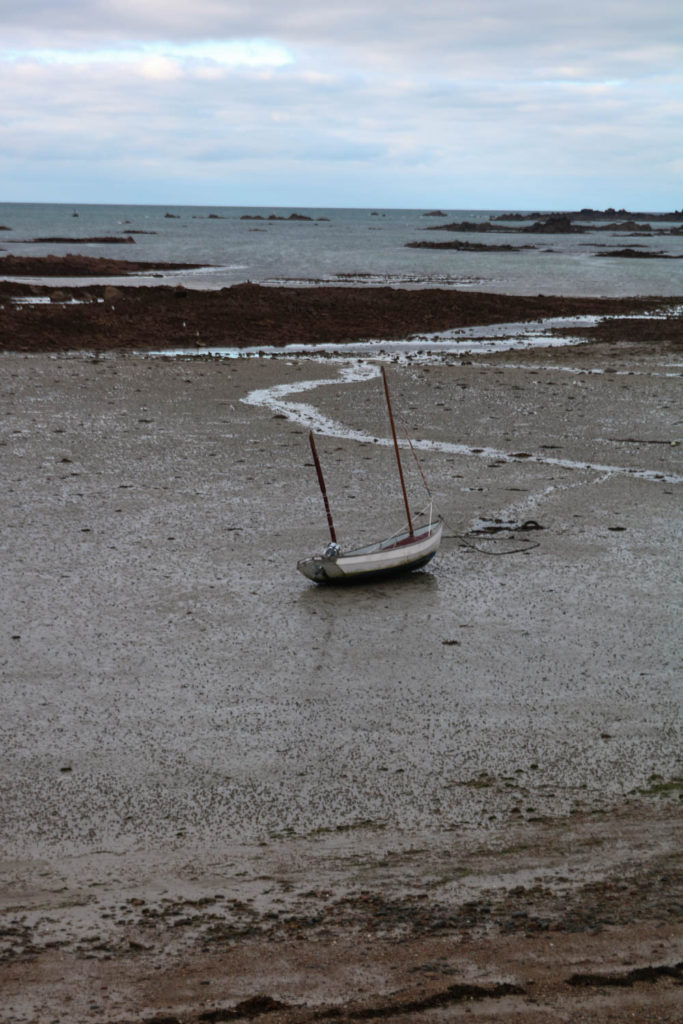
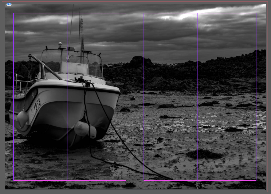
I have chosen to use one image which has been spread over both my third and fourth pages as I wanted this single image to be displayed on a bigger as I found that it was one of the better images that I had taken and edited. I like how the black and white helps me to use different tones and shades throughout my zine as I will be swapping between colour and black and white. Furthermore, I like how the boat which is one of the biggest features of the image fits perfectly onto one page which can give the effect of two images.
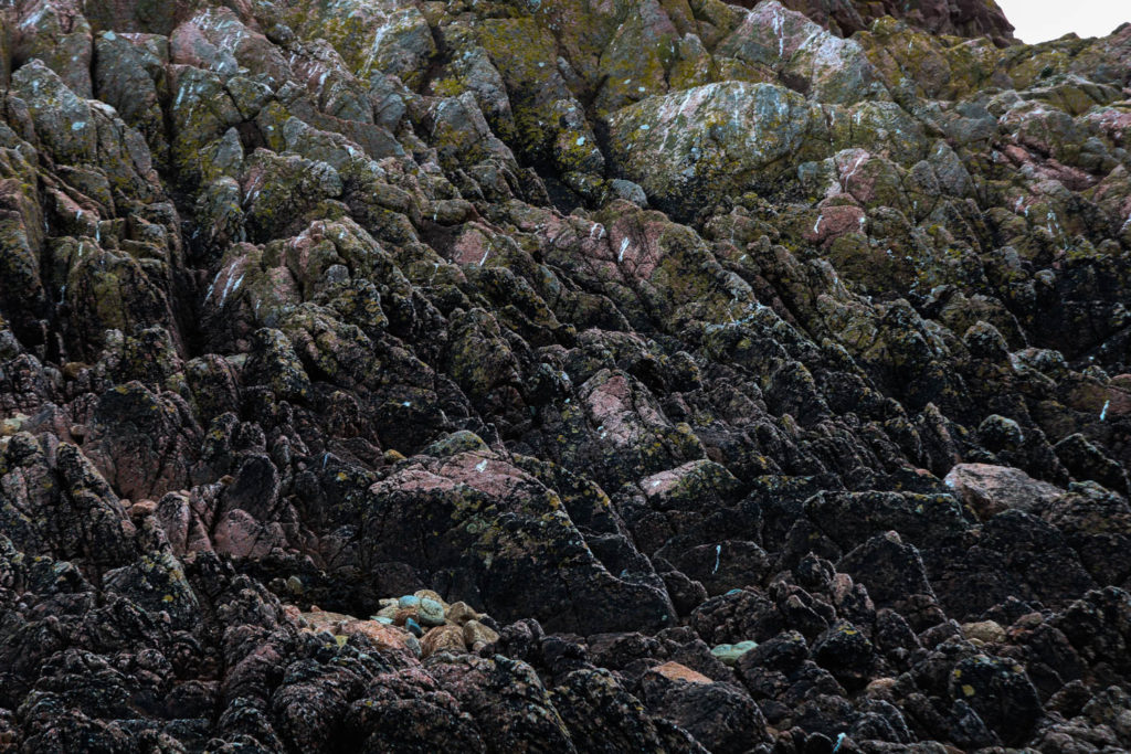
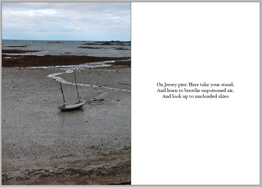
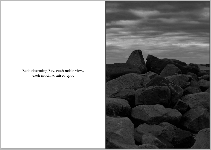
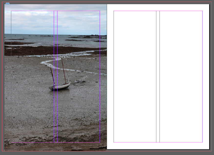
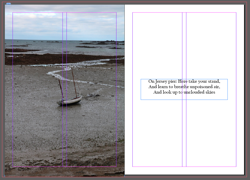
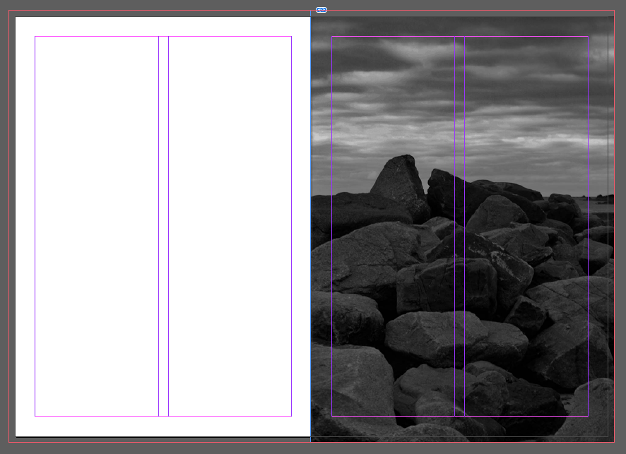
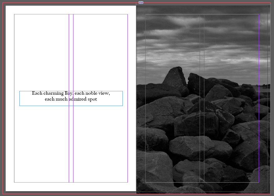
Here, on my fifth and sixth pages, I have inserted one of my images for La Hocq which I have taken to the edges of the page, and I have also included a quote on the right side. I like the contrast between the fully covered page with the photo compared with the blank white background with a quote. I also feel the quote helps to tell the story of my zine and also adds a break between the photos.

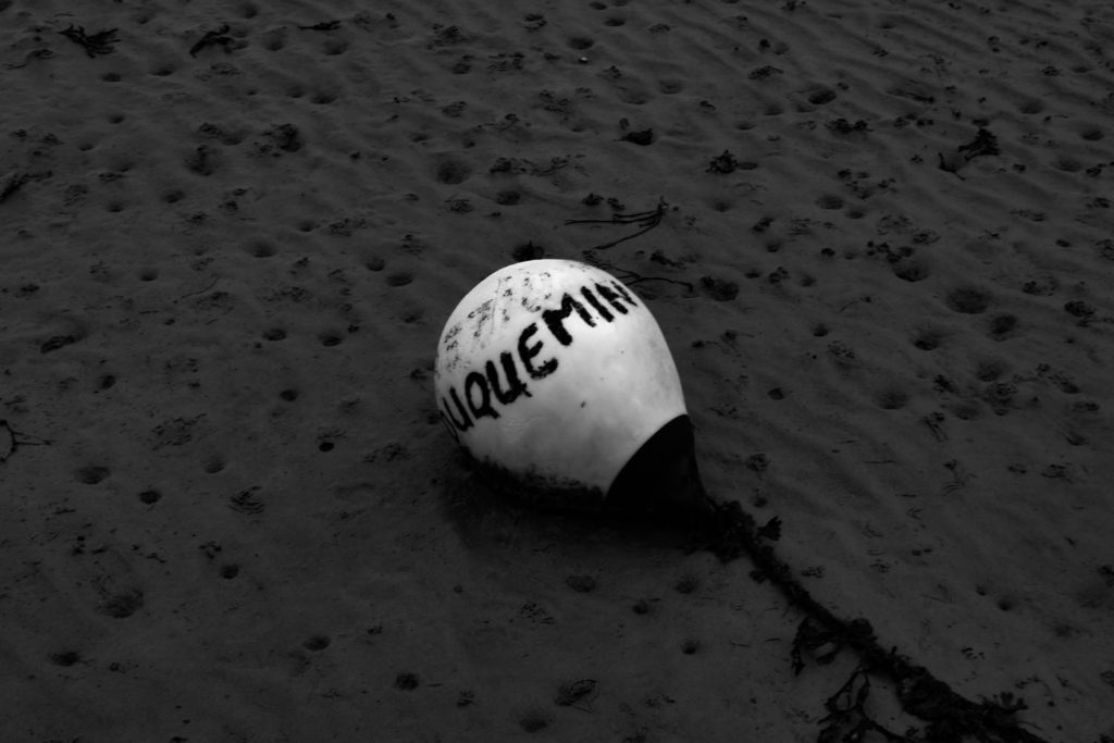
Above I have another image that I decided to cover both my seventh and eighth pages with. I have chosen to do this as I wanted as much detail to be seen and didn’t feel as though that would have been achieved if I had chosen to present the image smaller. I also feel by doing this, breaks up the colours from the white backgrounds which are on most of my pages.

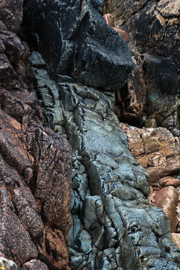
Above, is my ninth and tenth pages which are personally my favourite out of the whole zine, I like the contrast between the black and white tones on the left and the intense colours on the right. Furthermore, the difference between the objects also can help tell the story of my zine and La Hocq as there can be two sides, which can display extremely different features. I think that the composition of the pages with opposing placement of the images helps to bring the final pages of the zine together.

Here, I have presented my eleventh and twelfth pages, which are similar to my fifth and sixth pages but have swapped around the layout with the photo now being on the right with the quote on the left. I like this type of composition as it gives the viewer something else to think about, other than the many photos that they would have seen. Having a quote can also help provide insight into the story and give the viewer time to digest what they have been looking at.

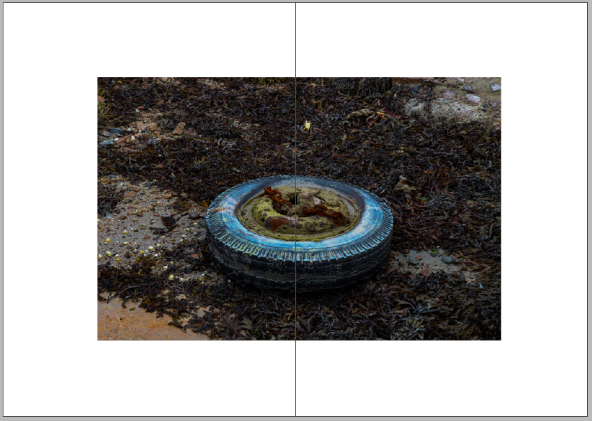
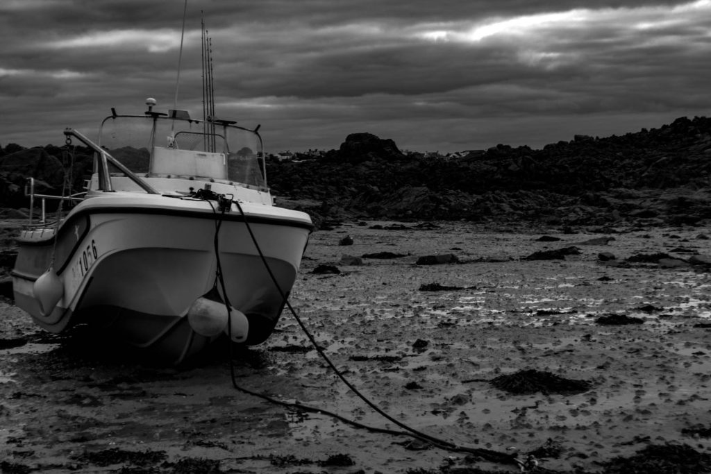
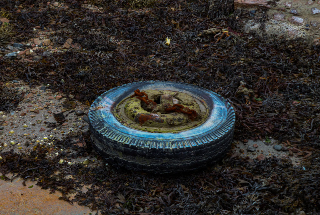
Finally, I have my thirteenth and fourteenth pages, I have gone with the same concept I have before, spreading one photo over two pages, but I have slightly changed it on my last page. I have decided to leave a white border around the photo as I wanted to try a new composition, which I believed worked well with the photo. A feature that I like about this page is the contrast between the colours from the oil on the wheel together with the which as it switched from bold and eye-catching to plain.

Title Experimentation

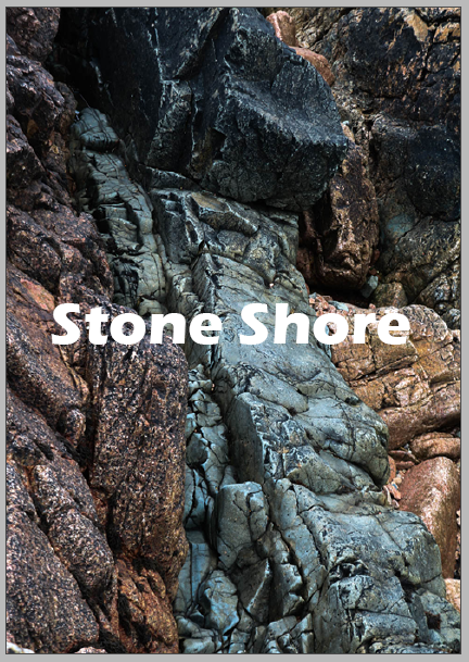
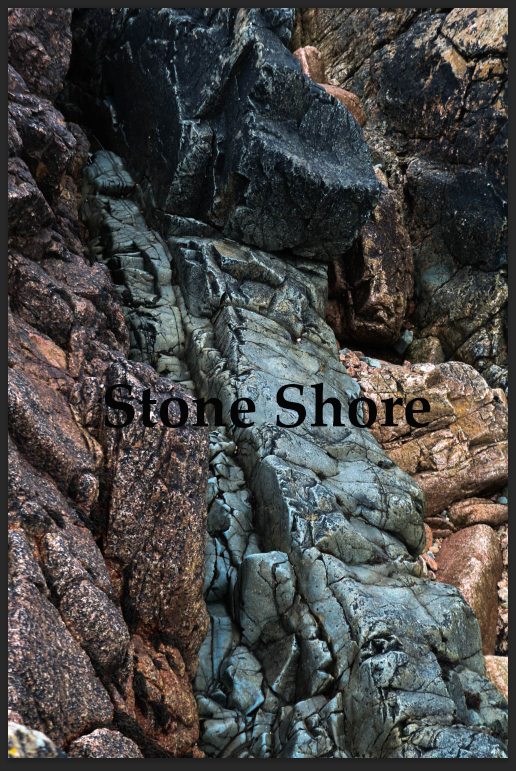
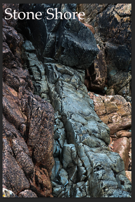
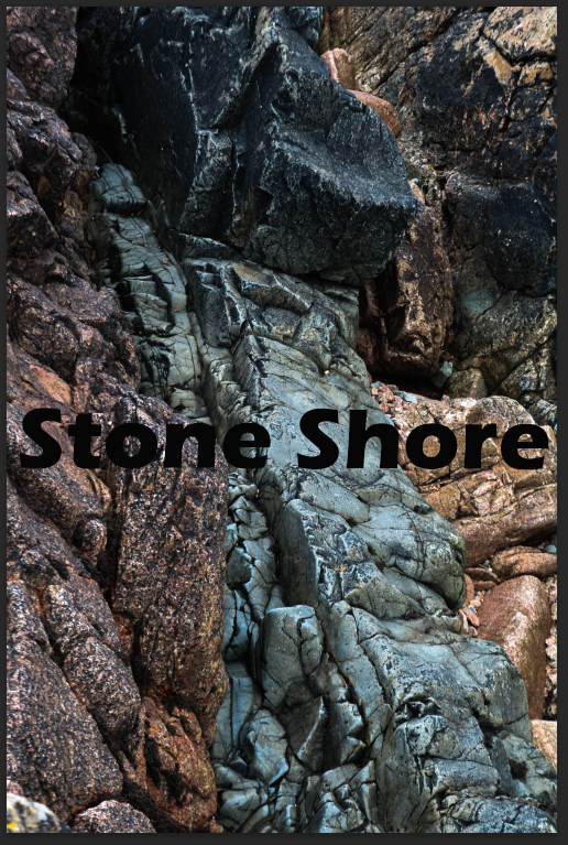
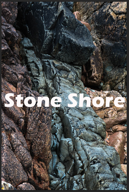
Above I have four different edits for my title, I first started off by choosing that title for my zine ‘Stone Shore’, I took inspiration from one of the poems I was reading for the quotes in my zine. I then started to experiment with different fonts I settled with the fonts that are displayed in the 3rd and 4th examples. Once I found the font that I liked and thought fit well with the title I moved on to the colour. I had already decided it was either going to be black or white so I decided to play around with the placement and where the title would fit best. I moved on the placement before picking the colour so places on the title page looked better with black writing whereas other placements looked better with white. Finally, I had chosen to place the tile in the centre of the page and I had gone with white as my title colour as I found it stood out more against the background as it is darker toned.
Front/Back Cover

I have displayed the final edit of my front cover, compared to the 4 edits above I have only made a few small changes, I still kept the same placement, font and colour but I have changed the sizing. I have made the title smaller as once the zine is printed out I would need to cut some of the edges, so I downsized the title to stop from anything getting cut off.
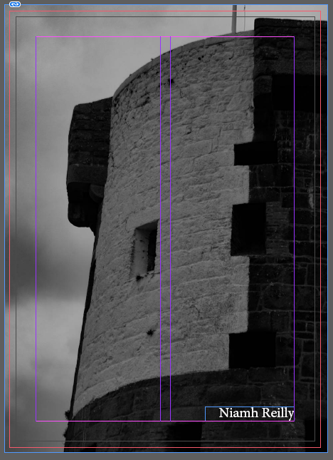
Below is my back cover which is a black and white photo of La Hocq tower. I think this is a good photo to end on as it compliments the colours of the front cover but is a great photo in itself. I have also added my name to the bottom of the page, I have also experimented with the font, colour and placement, but eventually came to the conclusion to keep it simple with a neat font with white lettering.