Moodboard
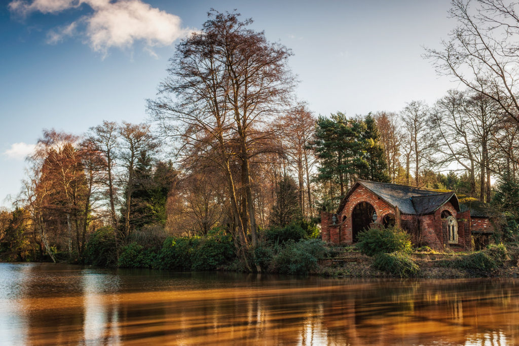
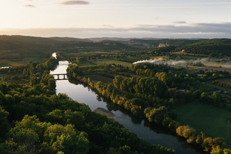
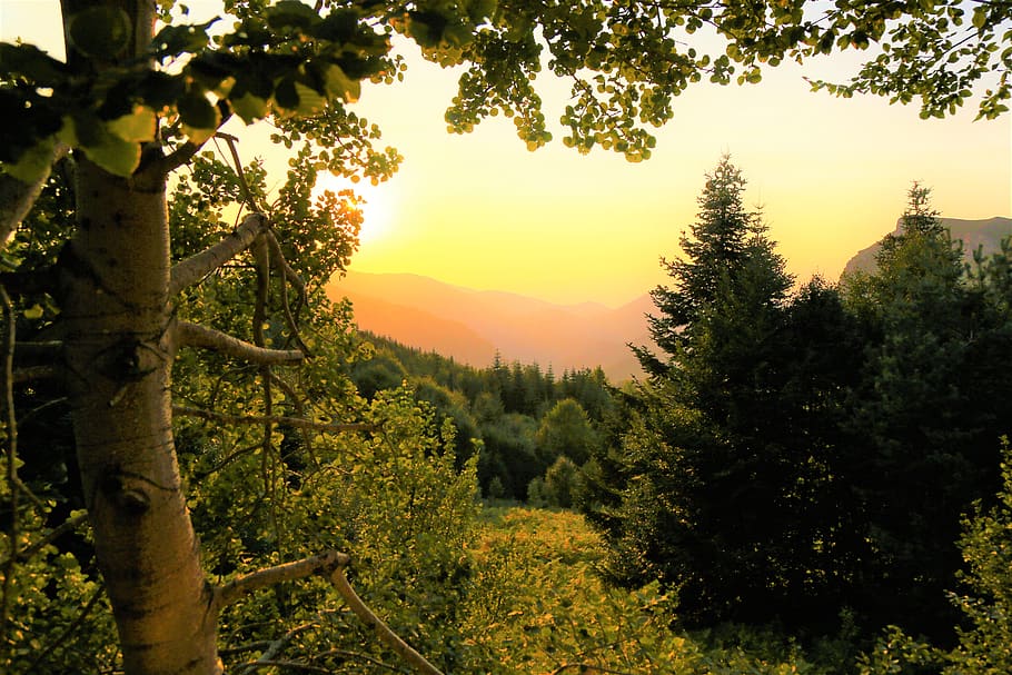
Mindmap
Moodboard


Mindmap

Comparing my work to Roger Fenton’s

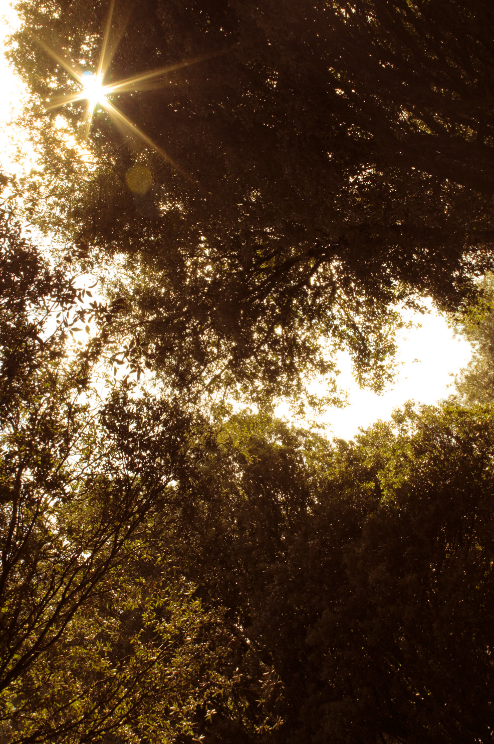
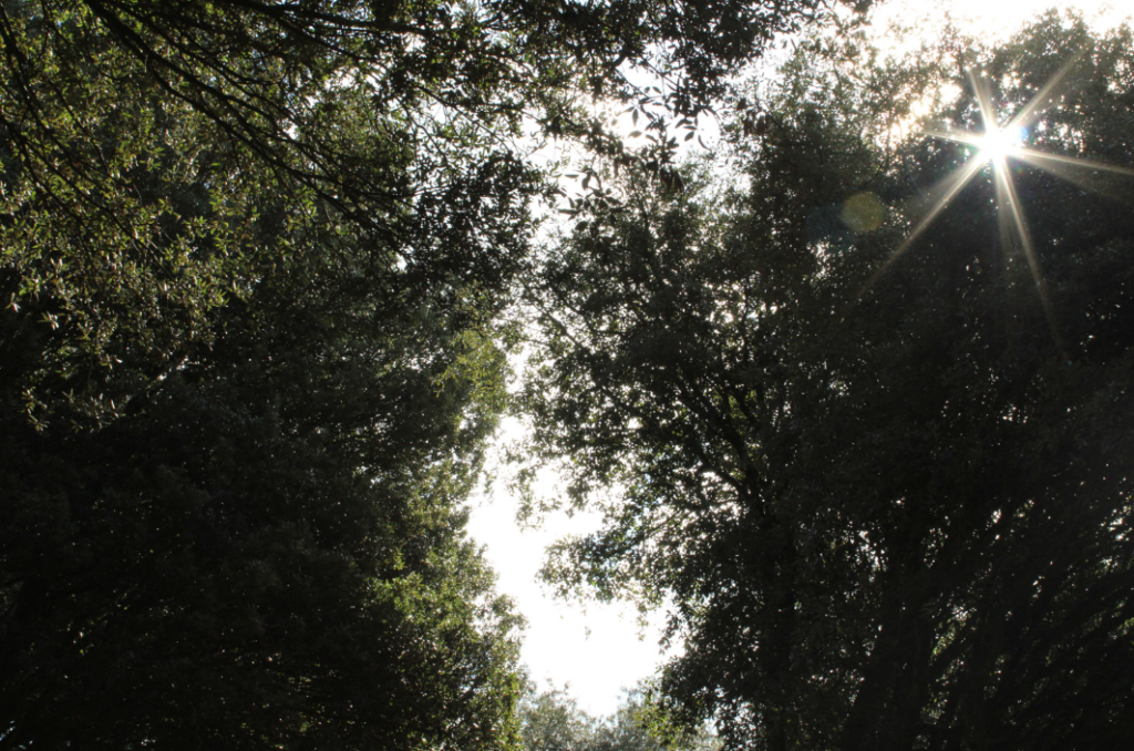
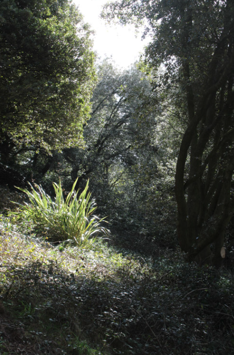
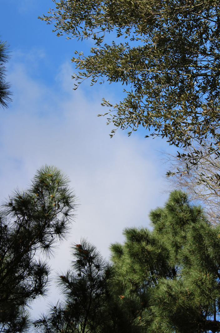
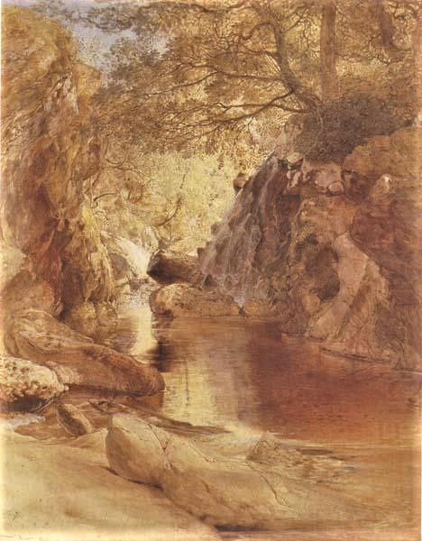
I think our work shares some similarities as we’ve both used trees in our photos in order to frame our image and add character to it – the leaves on the trees create an interesting pattern which makes our images more visually interesting [though the trees are more prominent in my photo]. Along with that, we’ve both used the sky to add contrast to our work, making the shadows more prominent whilst drawing attention towards the other features in our images.
However, there are also a lot of differences between our work. For example, Fenton’s work uses a lower contrast, making the shadows appear lighter, creating a dreamlike feeling due to how light and airy the image looks. I, on the other hand, use a stronger contrast, causing my shadows to appear dark and overpower most of my image which draws attention towards the leaves in the centre of the image that overlap and start to create a pattern.
Romanticism
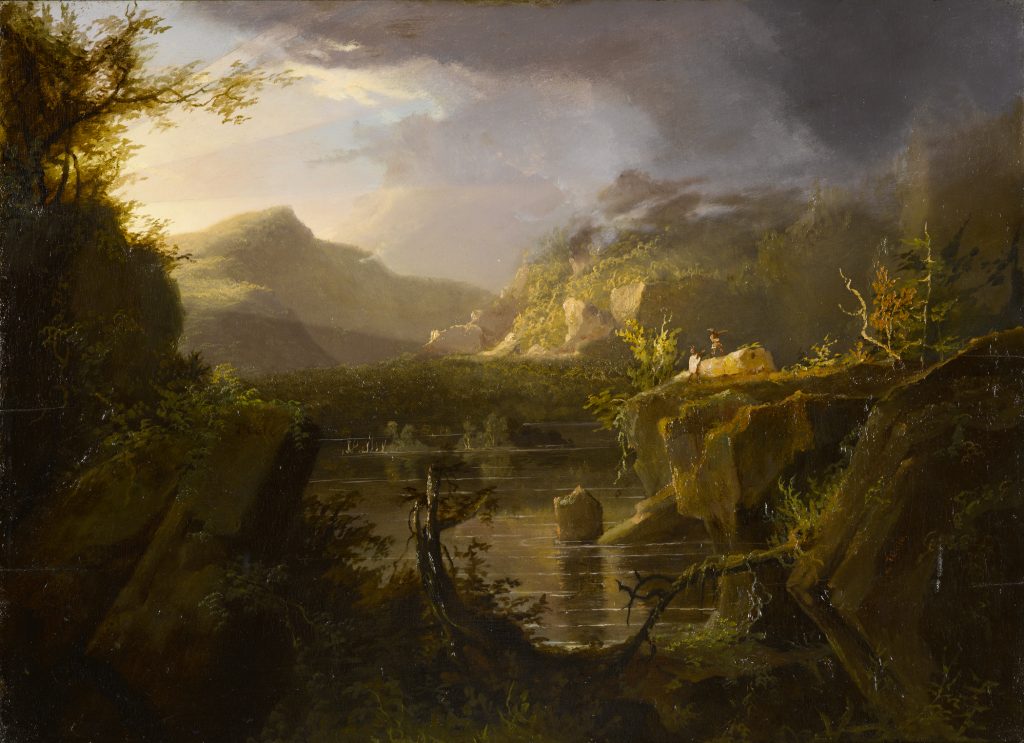
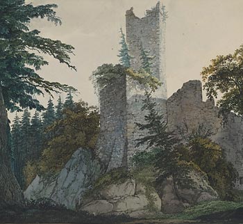
Romanticism started off as an art movement in the late 18th Century that emphasized individualism, imagination and freedom rather than sticking to life. Due to the popularity of both landscape photography and romanticism at the time, it was only a matter of time until both combined to create romantic landscape photography. Romanticism in photography tends to focus on emotion, usually creating a ‘moody’ image in order to project how the photographer feels about the environment they’re photographing.
——— Romanticism in Art: ——————————-

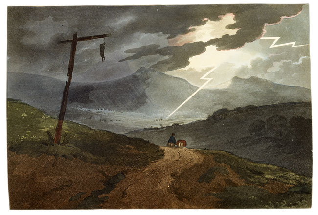
——— Romanticism in Photography: ——————————-


Contact Sheets
In order to take these landscapes I went on a walk and made sure to capture as many landscapes as I could from a variety of angles and distances, creating variation in my work. This also allowed me to capture moments when the lighting changed slightly and moved some of the shadows around, giving me more opportunities to take interesting landscapes.


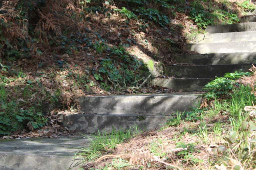
Best Shots
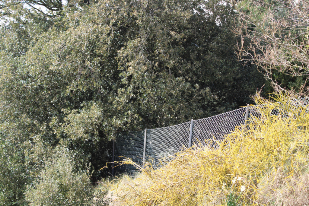
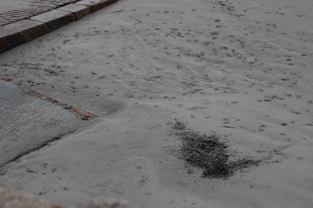
I went through all of my images and picked out my best shots, making sure to have a variety of angles, lighting and focal points within my images so they weren’t identical to one another and so they all looked visually interesting.








Juxtaposition
A juxtaposition involves pairing 2 or more images together to show similarities or differences between the them. It often involves positioning the different subjects next to each other [for example a tall and short person] and photographing them in order to present how the differences/similarities between them.
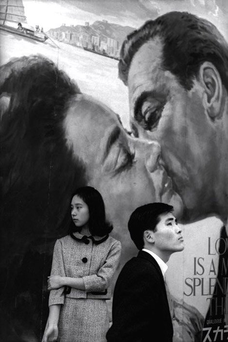
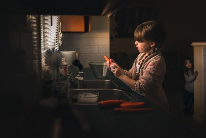
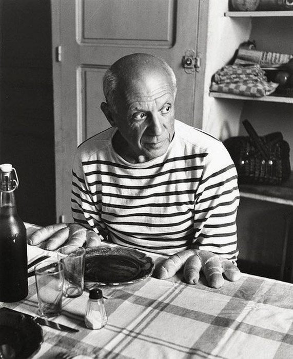
One way of doing this is by recreating an older photo by posing the model in a similar way to the older image. This would be a juxtaposition as it’s comparing the past to the present and showing the differences in life through a similarity [the positions of the models]. The website ED.EM.03 presents Henry Mullins [mid-1800’s] and Michelle Sank’s [2013] work on portraiture side by side, emphasising how things have changed over time from the camera quality to the type of clothing being worn.

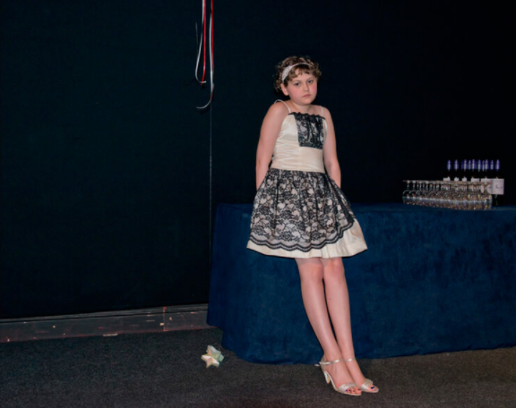
My Juxtaposition


For this juxtaposition, I found an old photo of me as a child and decided to take some photos of myself with the butterflies on my face. I kept the older photo the same but decided to lower the saturation on the remake other than the orange of the butterflies, drawing attention towards them, in order to create a contrast between the colourful and bright nature of the older image. This way, I was able to establish a juxtaposition through the age of the images and through some of the visual aspects too.
Up Close
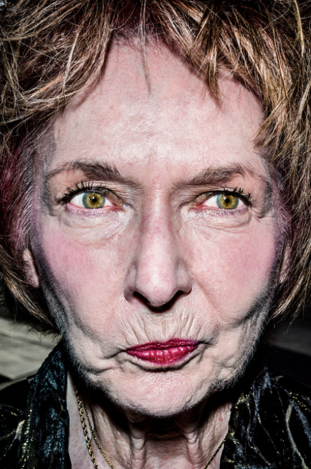
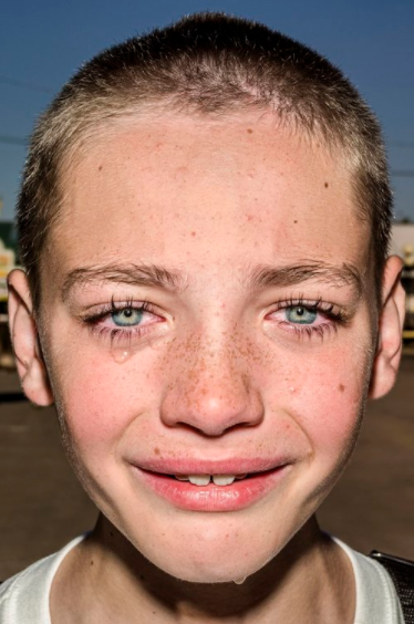
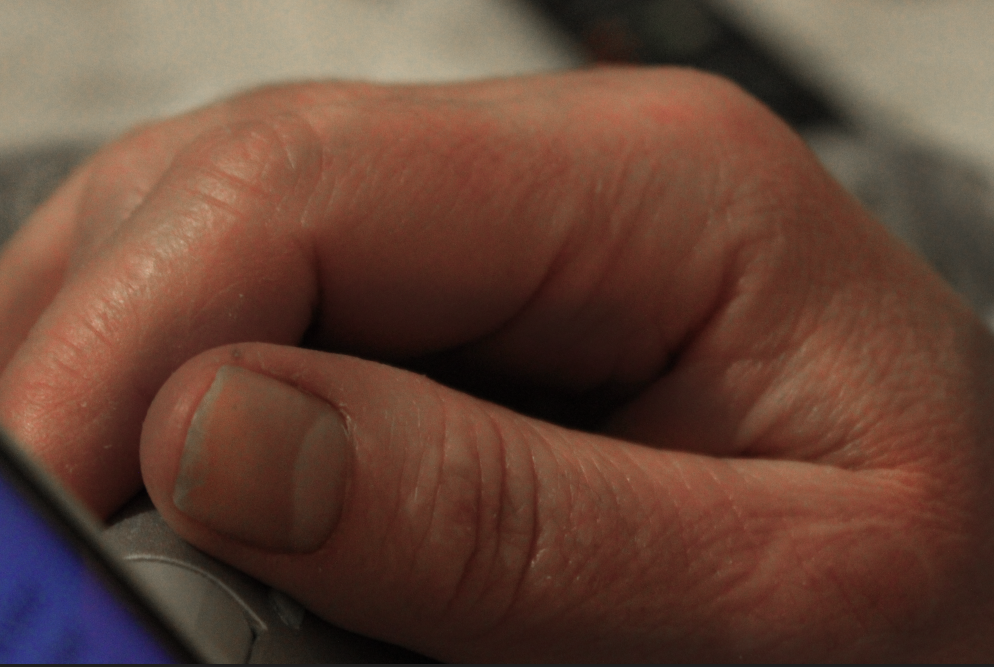
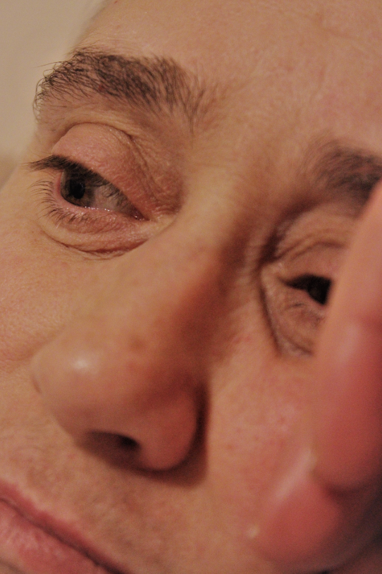
Up close photography involves taking sharp and detailed photos of the subject, usually isolating the subject so that it’s the only thing in frame which draws a lot of attention towards all the details [such as texture, scratches etc] in the final image.
Taking up close portraits usually creates interesting results as the wrinkles/texture in the skin are exaggerated in a way that emphasises the persons features as they are. Japanese photographer Satoshi Fujiwara is a good example of this as he secretly takes extremely close up portraits of passengers on trains in Berlin and edits them to make the ‘models’ unrecognisable, emphasising on their skin, imperfections and obscuring their individuality.
“I set out to obscure the individuality and specificity of the subjects in the pictures/images in this series. In facial close-ups, I used framing and trimming to make it difficult to identify the individual by eliminating elements such as clothing and personal effects.” –Satoshi Fujiwara
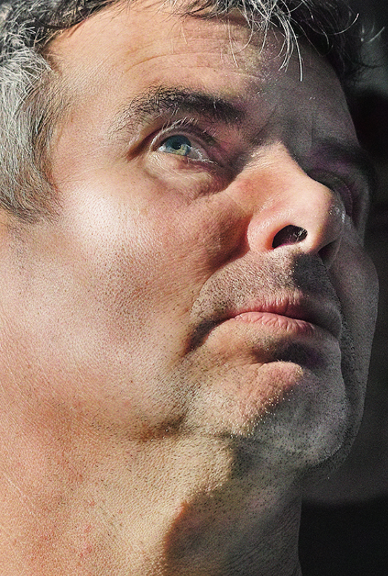
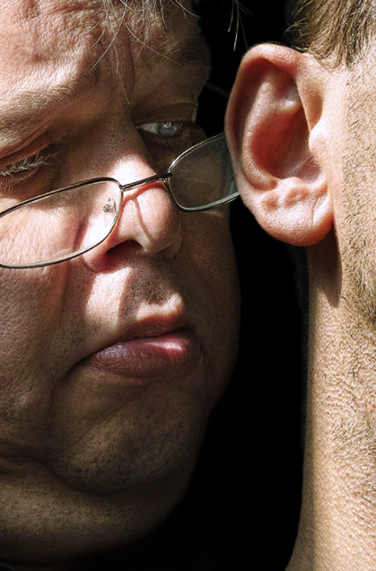
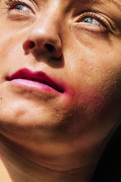
Another photographer who takes interesting, up close portraits is Bruce Gilden, an American photographer whose goal is to take unflattering photos, with the help of a flashgun, of random people he sees in a variety of places from New York, France, Russia and many more. He originally started by taking photos in black and white but has gradually switched to shooting in colour, allowing him to truly capture the people he sees.
“I’m known for taking pictures very close, and the older I get, the closer I get” -Bruce Gilden

My Portraits
In order to create these edits, I increased the saturation and clarity of the images, giving them a more distant and unrealistic feel. I then increased the sharpness of the images to make sure each detail was clear in the area that was in focus [as I used a shallow depth of field for my photos].
Rural Landscapes
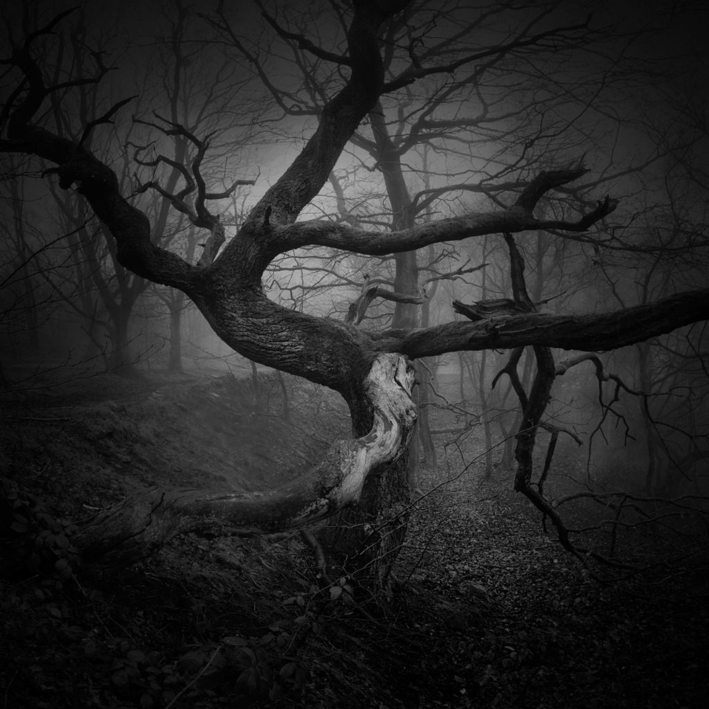
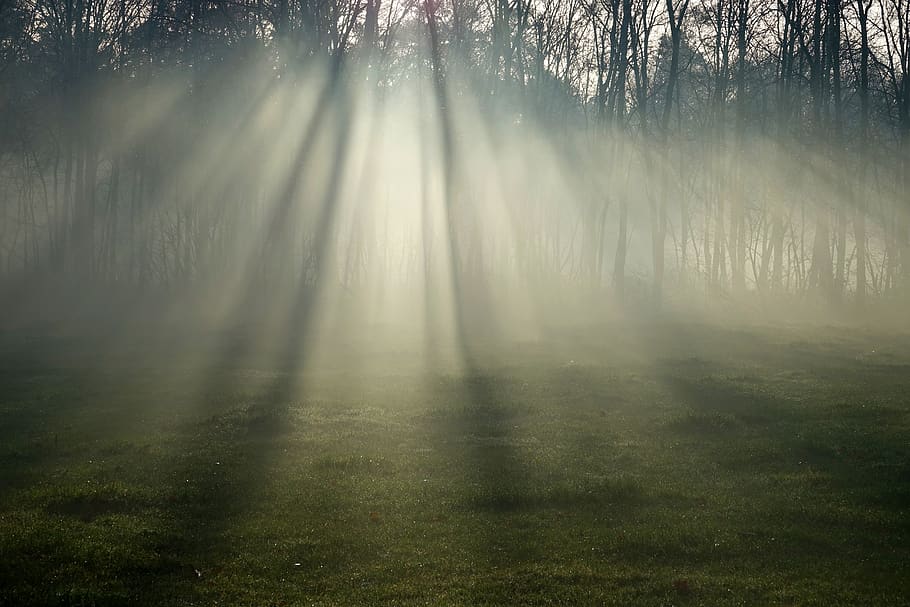
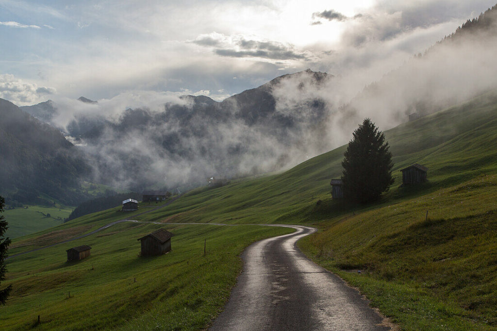
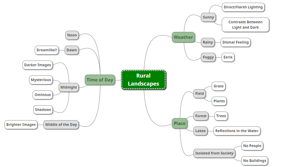
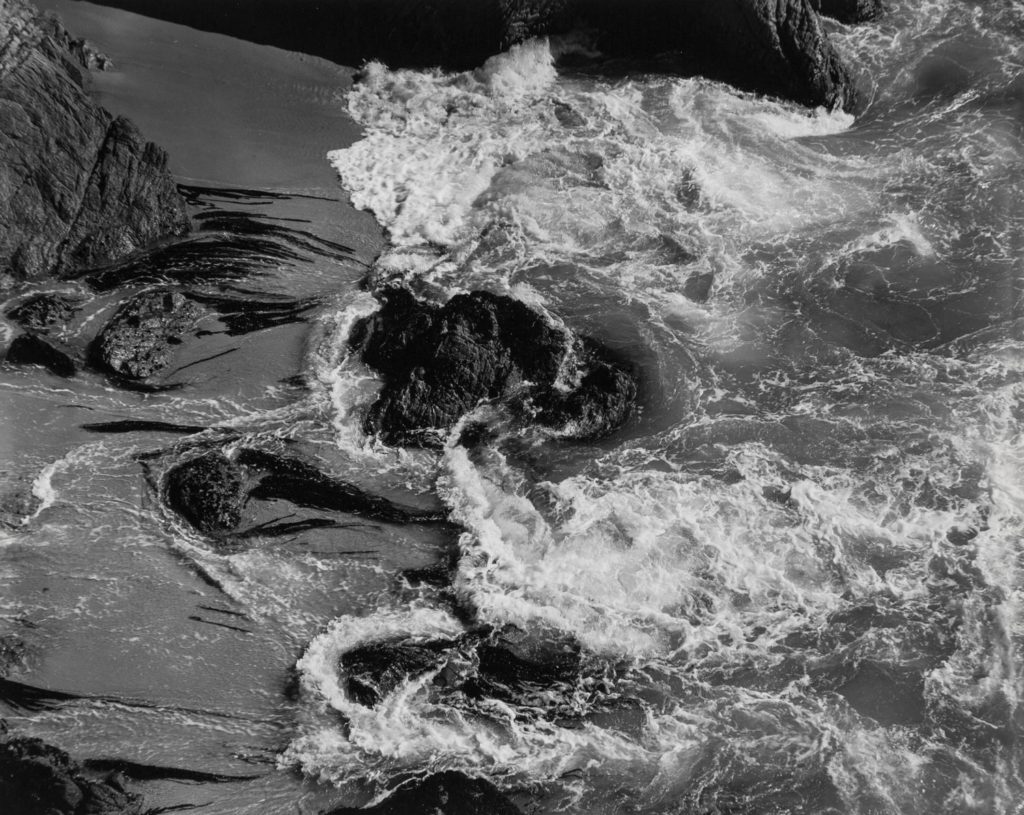
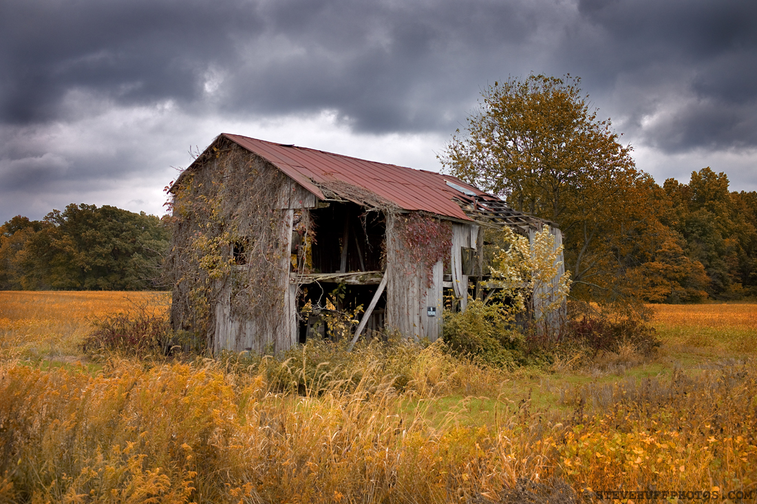
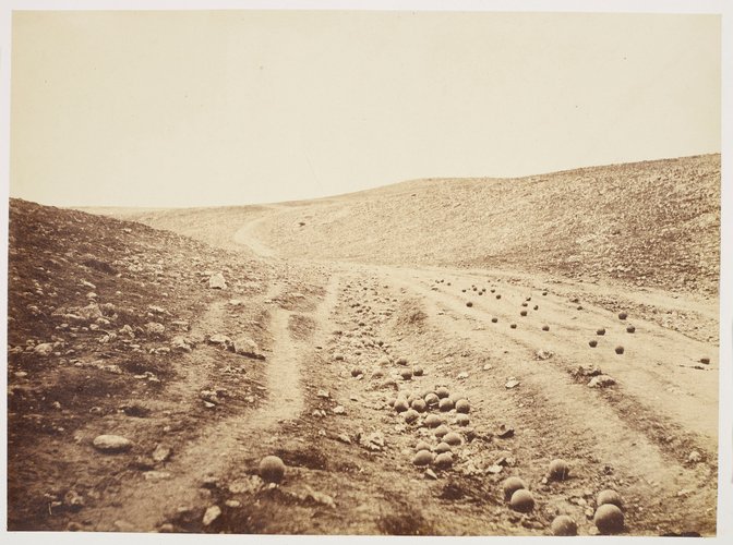
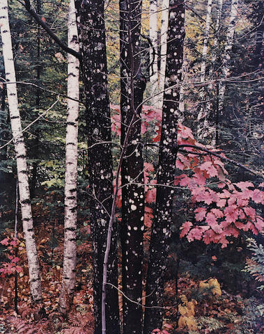
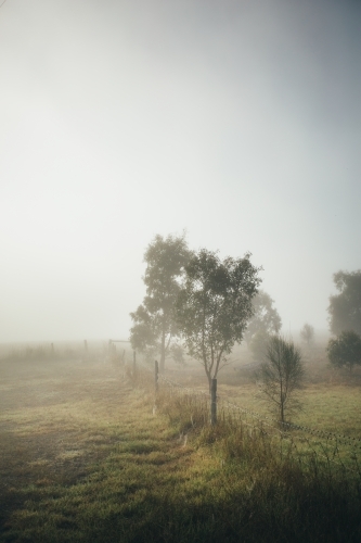
Rural landscape photography focus’ on places that are open and less populated, such as the countryside, and capturing the life in these areas which can include photographing trees, mountains, rivers, lakes etc along with its surrounding environment. They can be photographed at any time of day regardless of weather as different types of lighting/weather can change the atmosphere and can even enhance the mood being captured in each image [i.e: shooting in rainy weather at 9pm will create a darker mood compared to shooting in sunny weather at 3pm].
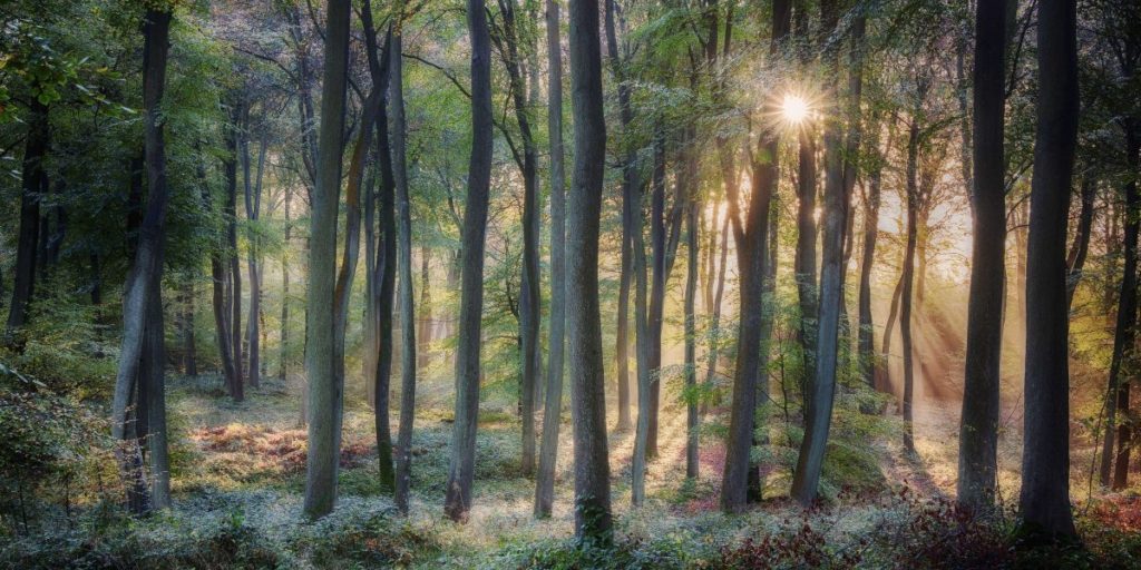
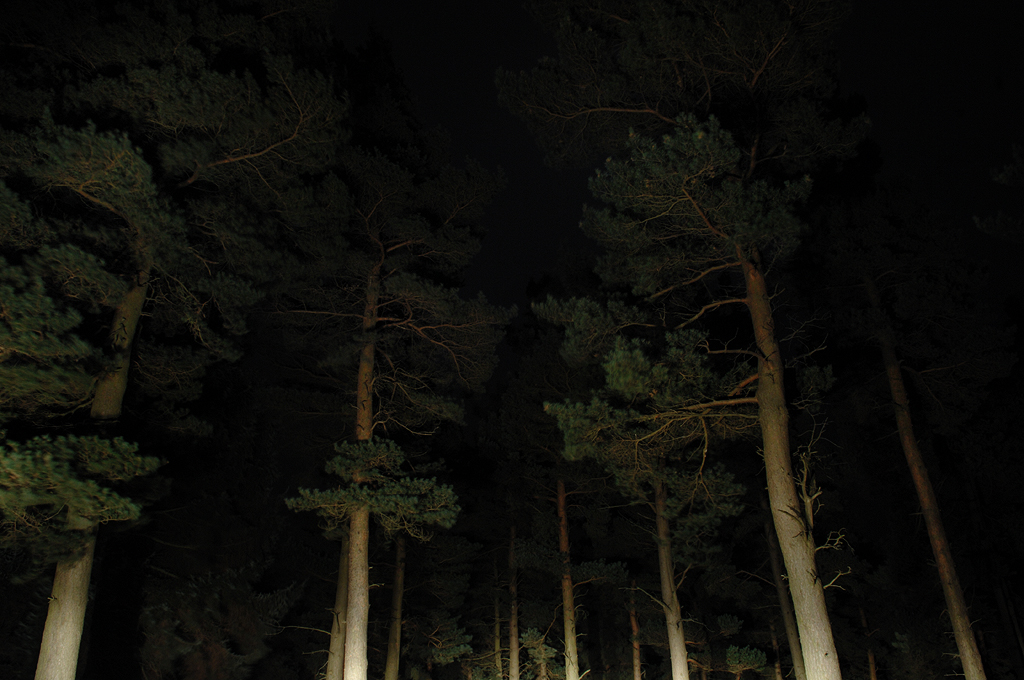
Some more examples of rural landscapes are:
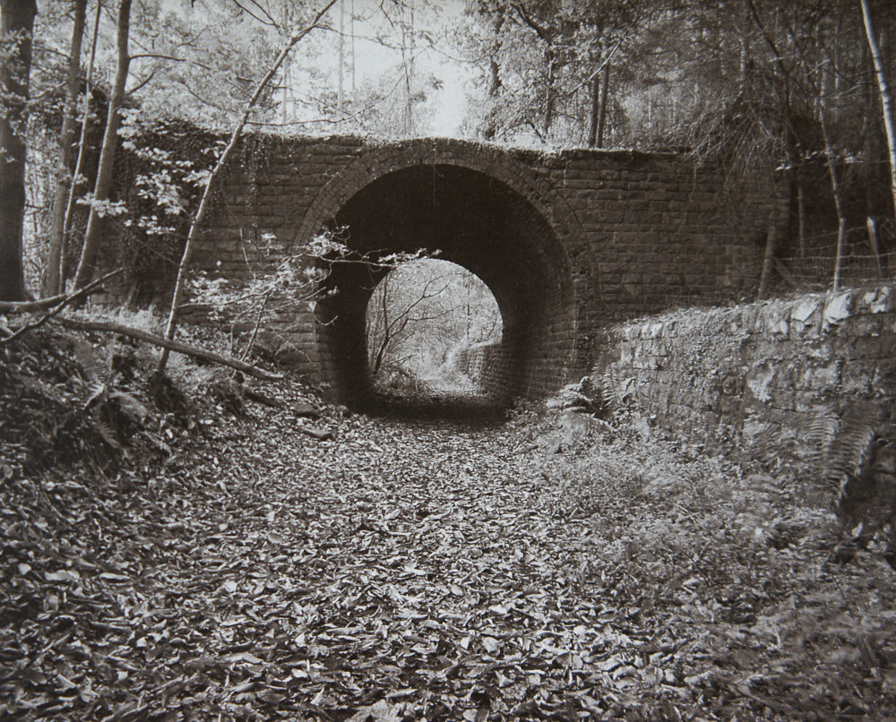
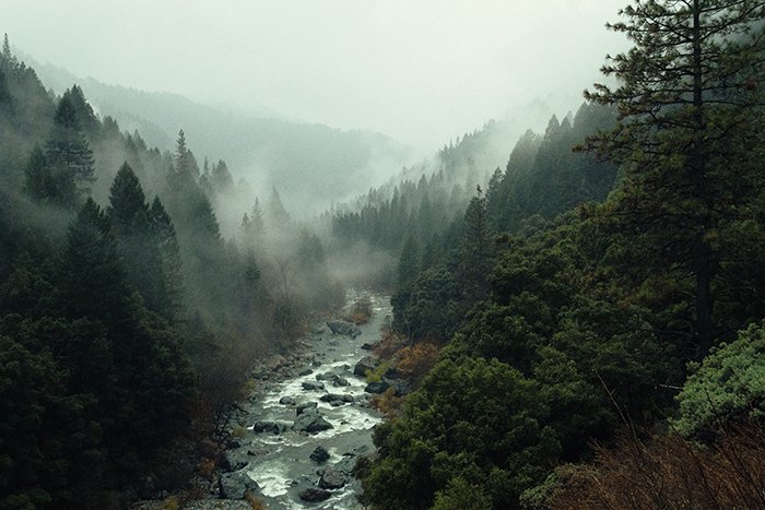
Angela Kelly

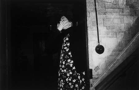
I’m comparing one of my images to one of my original inspirations, Angela Kelly, as I think we’ve got some similarities in our work, despite them looking so different. We’ve both used photos of ourselves and hidden our faces however have gone about it in different ways, I used photoshop to blur out my face post-photoshoot whilst Kelly has used her hand to hide hers during the photoshoot. We’ve also used full body photos of ourselves with the background still in view, taking attention away from us and almost allowing us to become apart of the background of our own photos.
Despite all this, we also have a few differences in our work such as the editing style. Kelly has made sure to increase the contrast in her image which allows the shadows to take control of the image and almost consume her into the background whilst I’ve decided to keep my image in colour, allowing all the details from the photo to stand out against one another and create different points of focus due to how busy the photo looks. Alongside that, Kelly has a more naturalistic style, keeping her images simple and lifelike as if someone had taken a photo of her leaving the room whilst I’ve edited a page out of a book to my work, taking away the naturalness of my original image.
Robin Cracknell

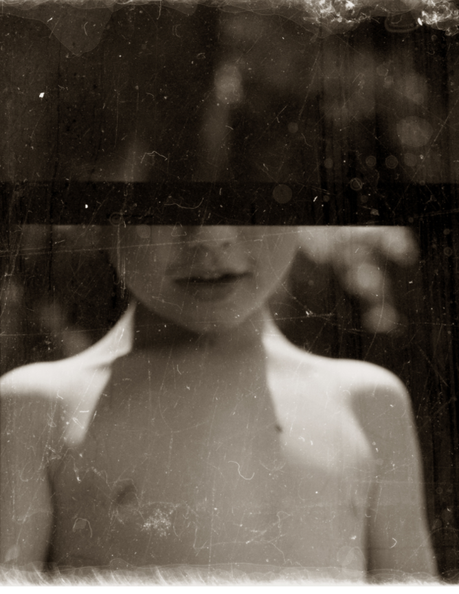
I’m comparing my some of my work to Robin Cracknell’s as both our images look dramatic and vintage, mine through the use of an overlay and his through he use of a vintage camera. This adds to our work, making it look older and almost like a memory which links back to both of our themes. Both of our images are centred, helping to draw attention towards the figure, aka the focal point of the image, despite both of us using different profiles in our portraits – his using a front profile whilst mine is more of a side profile. Along with that, we’ve both hidden part of the face in our photos, although we’ve obscured a the face in very different ways – I used an image of a plaster whilst he used his vintage camera to his advantage and purposefully framed the photo to create a line across the face.
i
[

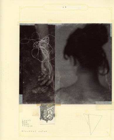
Here, I think our work also shares similarities as we’ve both chosen 2 of our photos and placed them next to each other, allowing them to work as one piece instead of individual images. Along with that, we’ve both used paper to help enhance and bring the 2 images together, however, I’ve used photoshop to blend the paper into the photo whilst Cracknell’s printed out his images and stuck them down onto a piece of paper, adding to the vintage manner of his work.
There are also some clear differences between our work such as the amount of colour in my work vs the lack of colour in Cracknell’s work. His lack of colour creates a dismal atmosphere surrounding his images, almost as though the viewer is supposed to mourn/pity the girl in the image which is emphasized by the lack of focus in the image as it’s almost as though the girl is hiding from the camera, especially as her back is turned away from the camera in one photo and her arm is the only visible proof of her in the other.
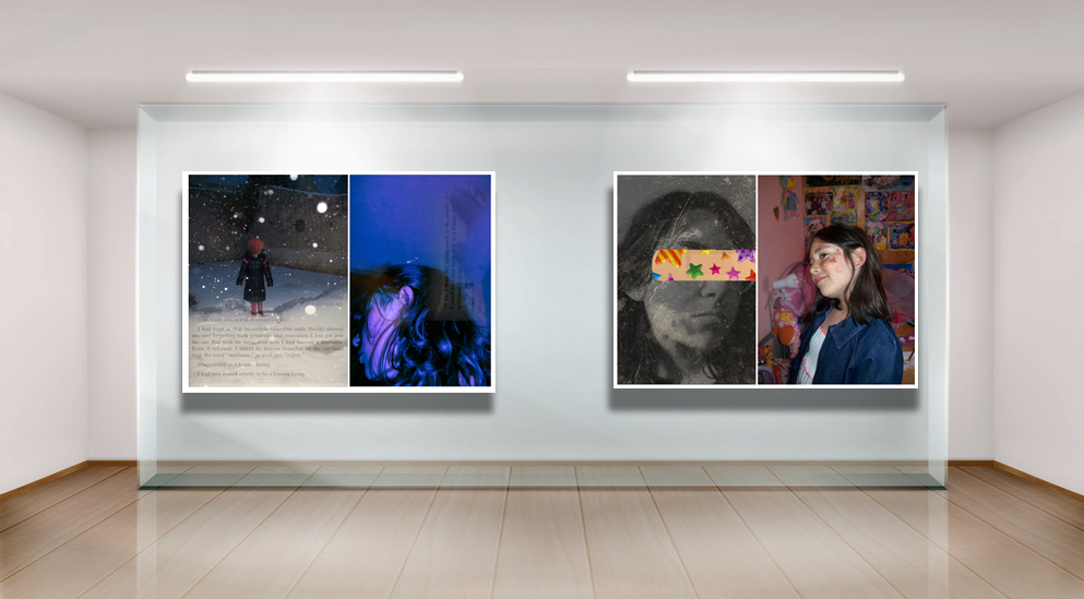
Final Images:
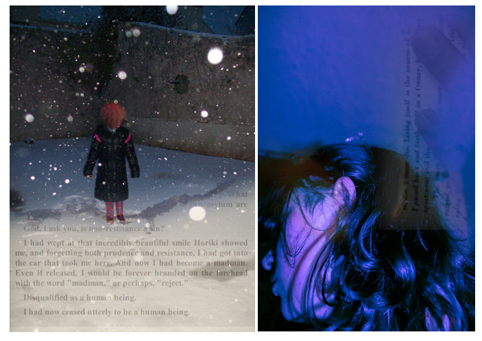

I knew there were certain photos I wanted to pair with each other so I decided to spend some time choosing what photos would be paired together.
Experimenting
—Experiment 1:———
Here, I was trying to pair a photo of me as a kid with a bright, colourful one in order to get a big contrast between both images and exaggerate how much has changed from then until now.
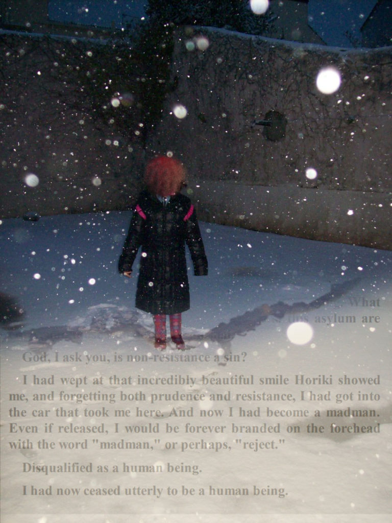
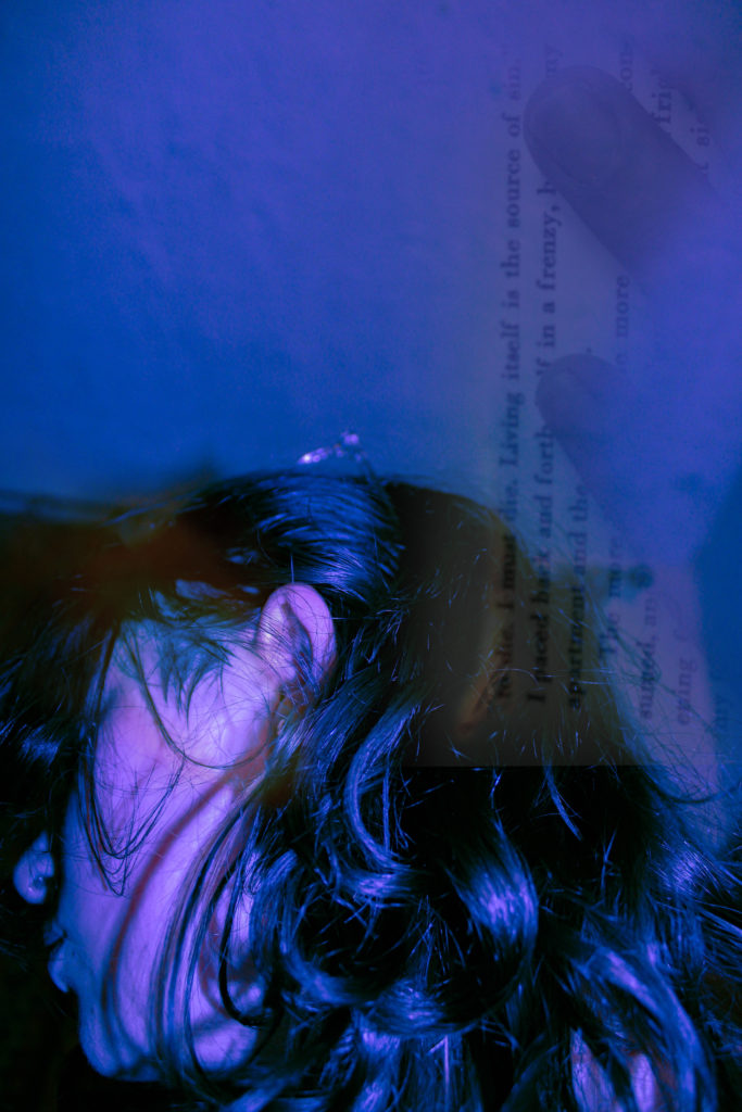
I like the way that both of these images work together as the paper helps create a connection between them, however, I’m unsure as to whether the paper makes them too similar to each other, making the pairing look busy/tacky.

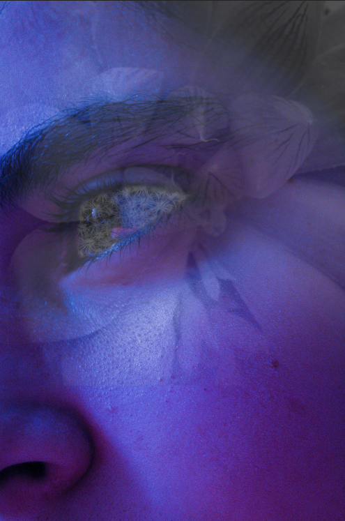
I think these two images work well together as neither image is too busy, allowing both to stand out instead of competing with one another. I decided to pair a simpler version of the older image as the final version was too busy for my liking and didn’t work well whatsoever with the other edit.
–Experiment 2:———
Here, I was trying to pair a photo from when I was little. I knew exactly what photos I wanted to try pairing with it as I attempted to recreate the butterflies on my face during my final photoshoot.
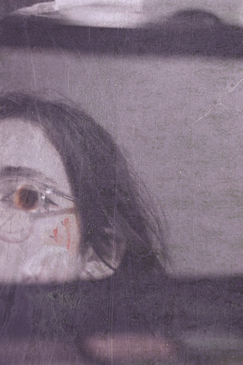

I really like how the images look paired with one another, especially as it looks like both images are looking at each other, creating an almost sad atmosphere surrounding the images due to how different they are from one another and how their positions/completions should be switched.

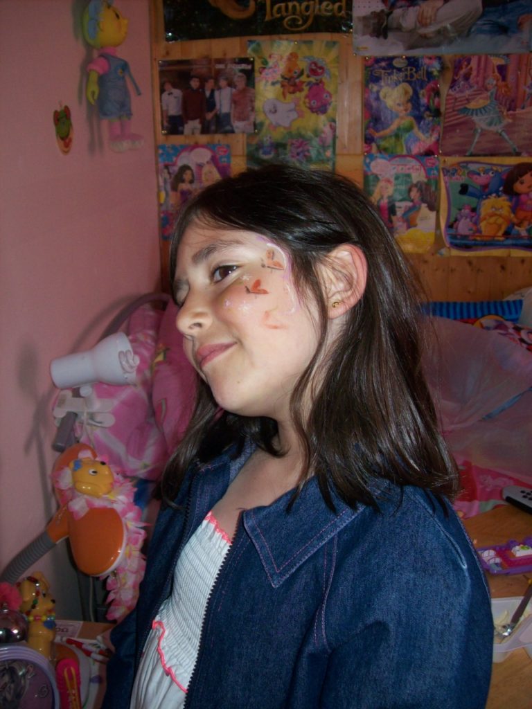
I also really like how this pairing looks. I think the lack of colour helps bring both photos together as it makes the contrast between them more dramatic whilst the small pop of colour from the plaster and stickers stops the images from being too different from one another.
As my final pairings, I decided to go with these pairings:

