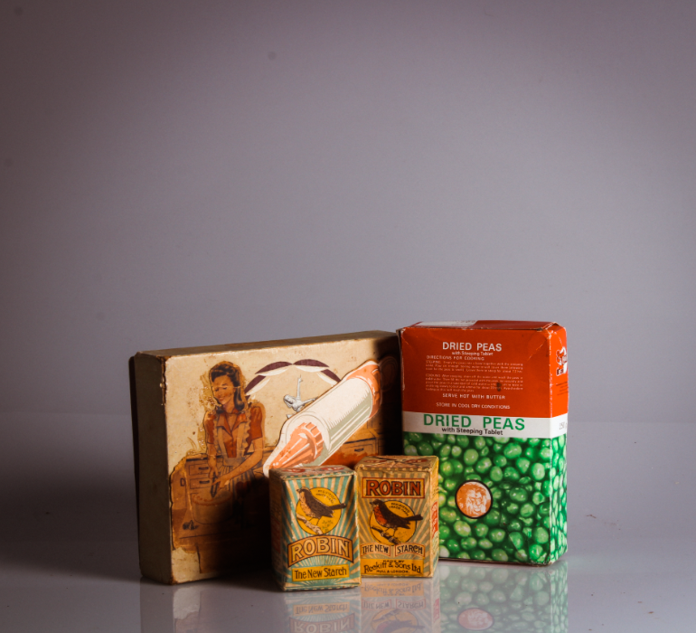
All posts by Lottie B

Filters

Author:
Category:

Final images

After all of our photoshoots, editing and research, I collected my final images from this project.

Final Images
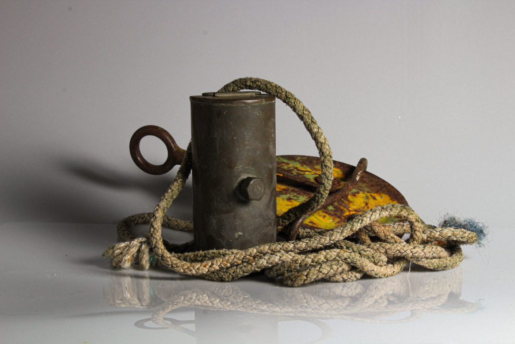
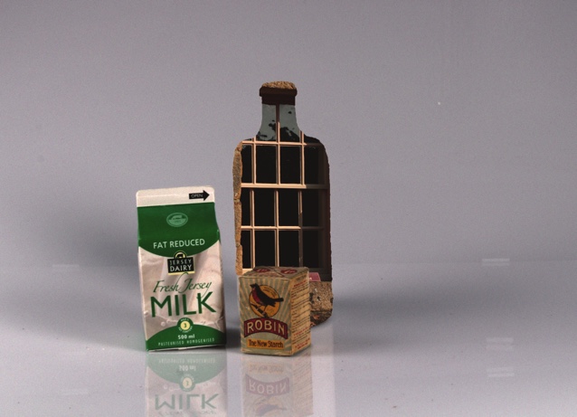
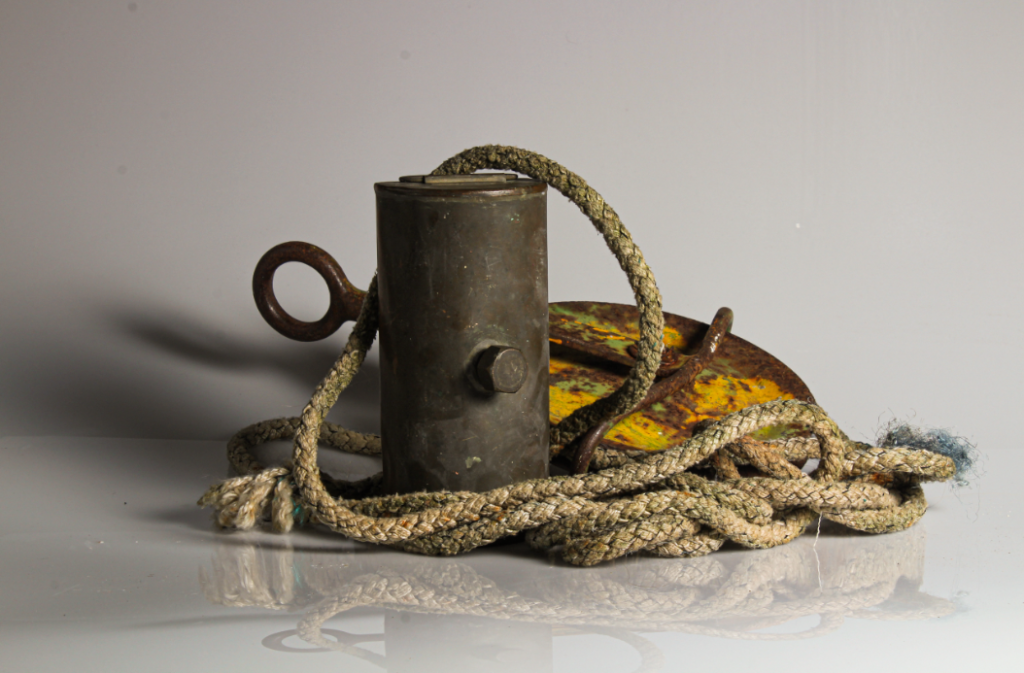
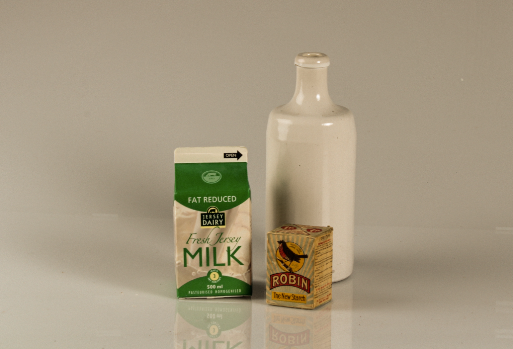
I chose this image firstly due to the reflection created in the bottom of the image, as well as the darker toned shadow to the left of the image. I also like the arrangement of the subject and the centring of the image.
I used two point lighting to photograph this image, using a perspex infinity screen to create the reflections. I think that the focal point in this image is the orange and green rusted part of the subject, which I think is due to the vibrance and different textures in that part. The image is slightly underexposed to the left in the area of shadow – however I think this adds depth to the image. The tone in this image is lighter in the background and right side, and darker to the right.
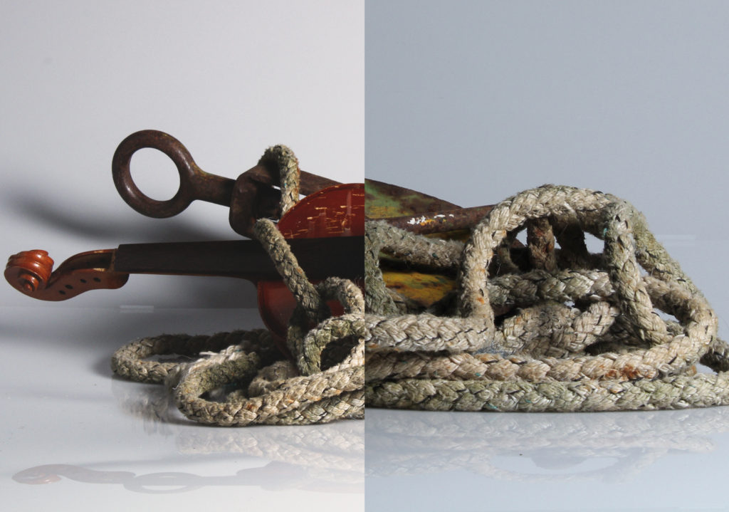
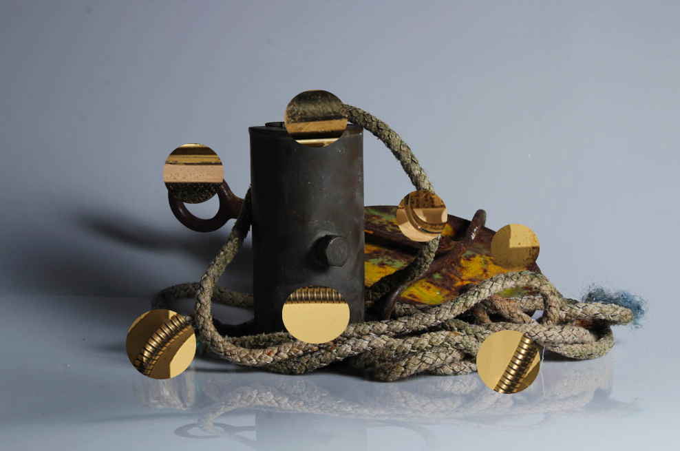
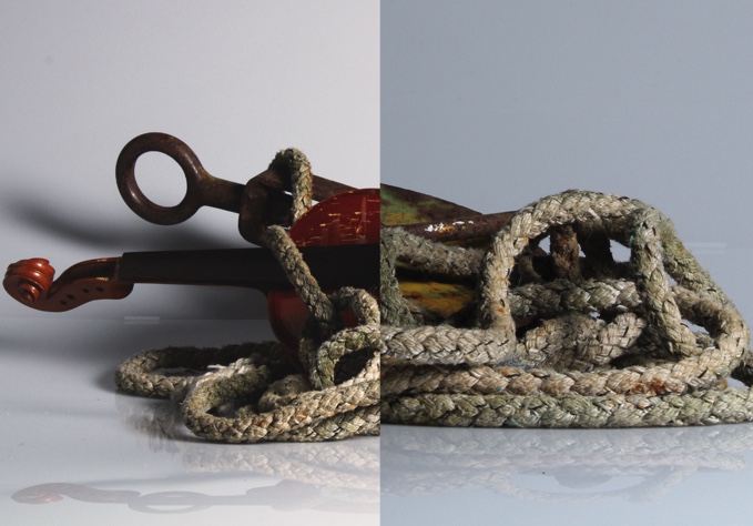
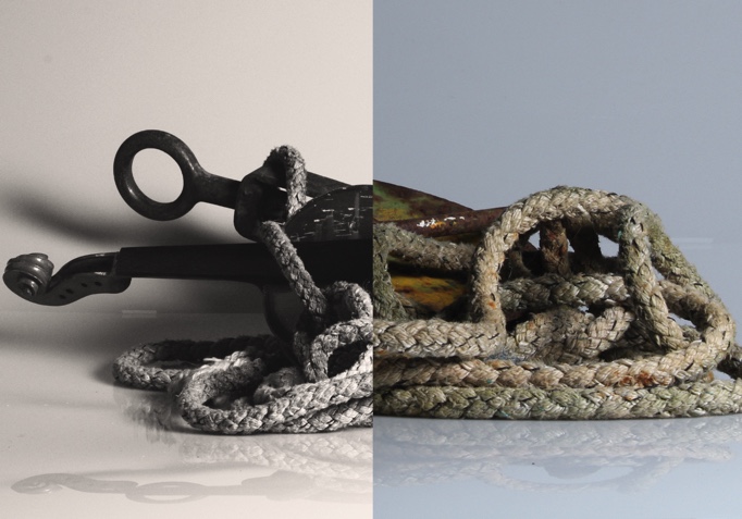
This image is one of my own photomontages, inspired by Darren Harvey Reagan. I chose this image due to the depth and contrast in each part of the image, and the different shapes that the spliced image creates.
The two images used to create this image were also taken with two point lighting, using an infinity curve. This helped to create the shadow along the bottom of the montage which I love – I put this montage together using photoshop. To the left, a part of the violin is underexposed, however I think this adds to the high contrasted effect of the image. The leading lines in this image lead the eye around the ropes, and across to the shadow next to the violin.

Darren Harvey Regan’s work – comparison

Darren Harvey - Regan - C Ø P P E R F I E L D
Darren Harvey Regan’s splicing work

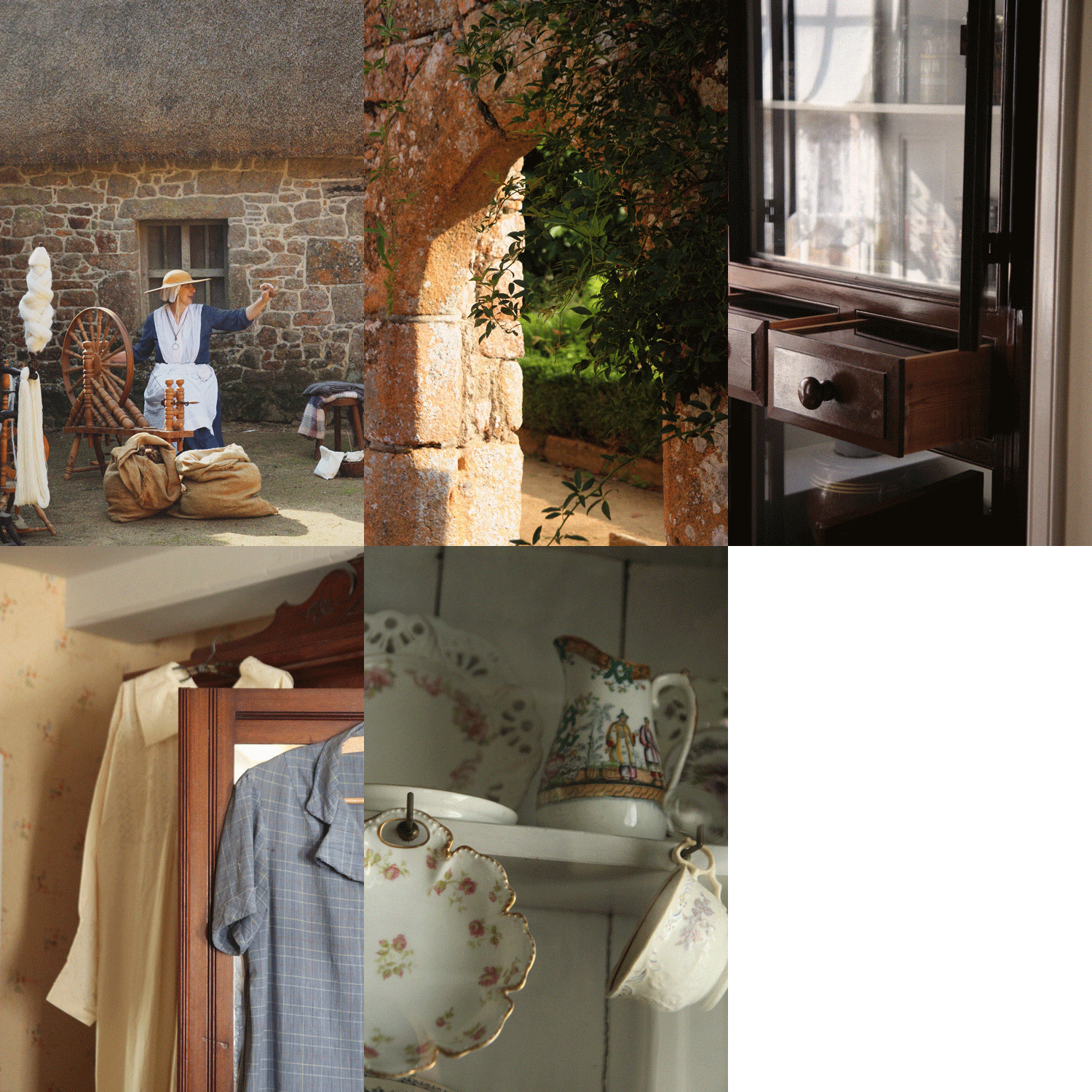
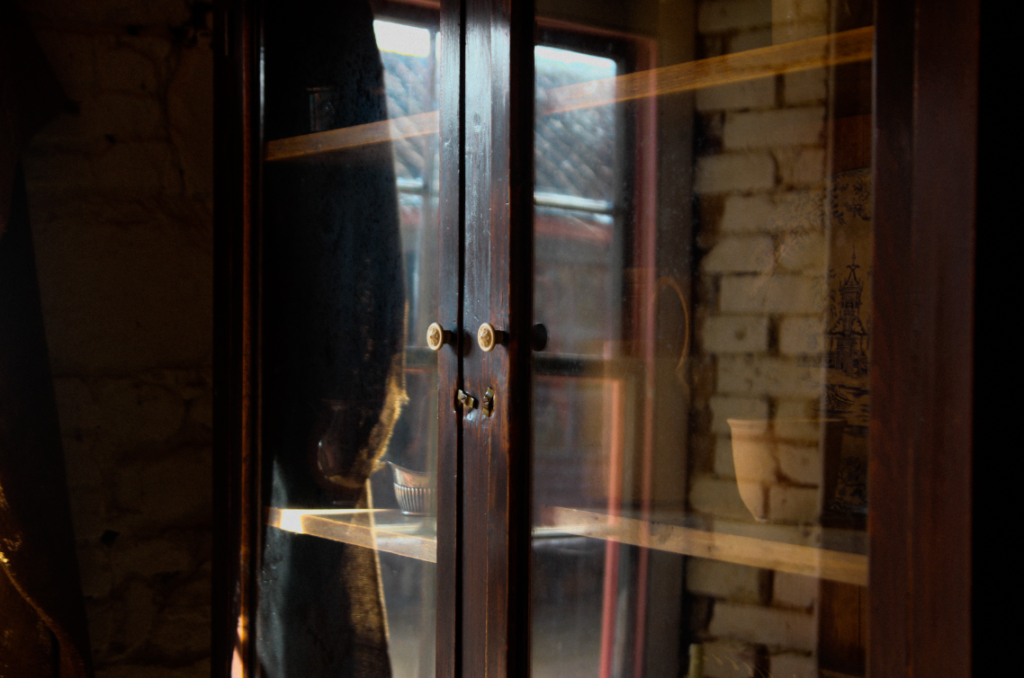
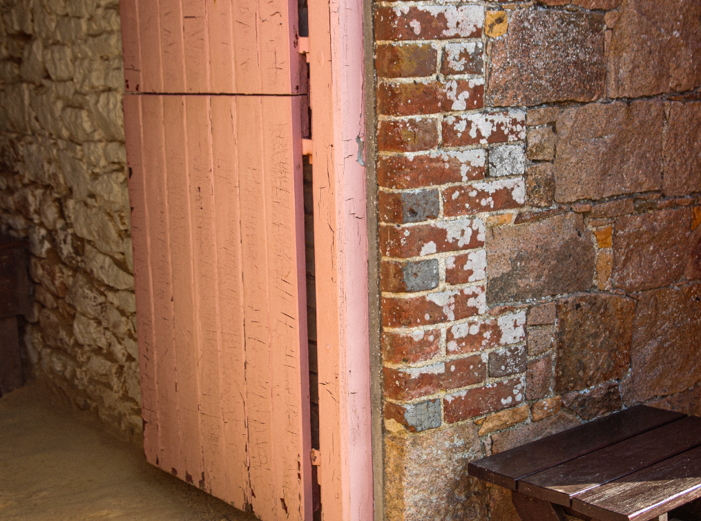
This image, part of my collection of pictures from hamptoune, is my favourite image from our heritage project. This is because I think that it clearly shows the interiors of hamptoune, and the architecture.
The lighting in this image is natural window lighting. This lighting creates interesting geometric shapes and shadow, creating a natural focal point. The lines within the window and bricks lead the eye from one edge of the image to the other, with the underexposure to the right creating framing, and helping to balance the composition.
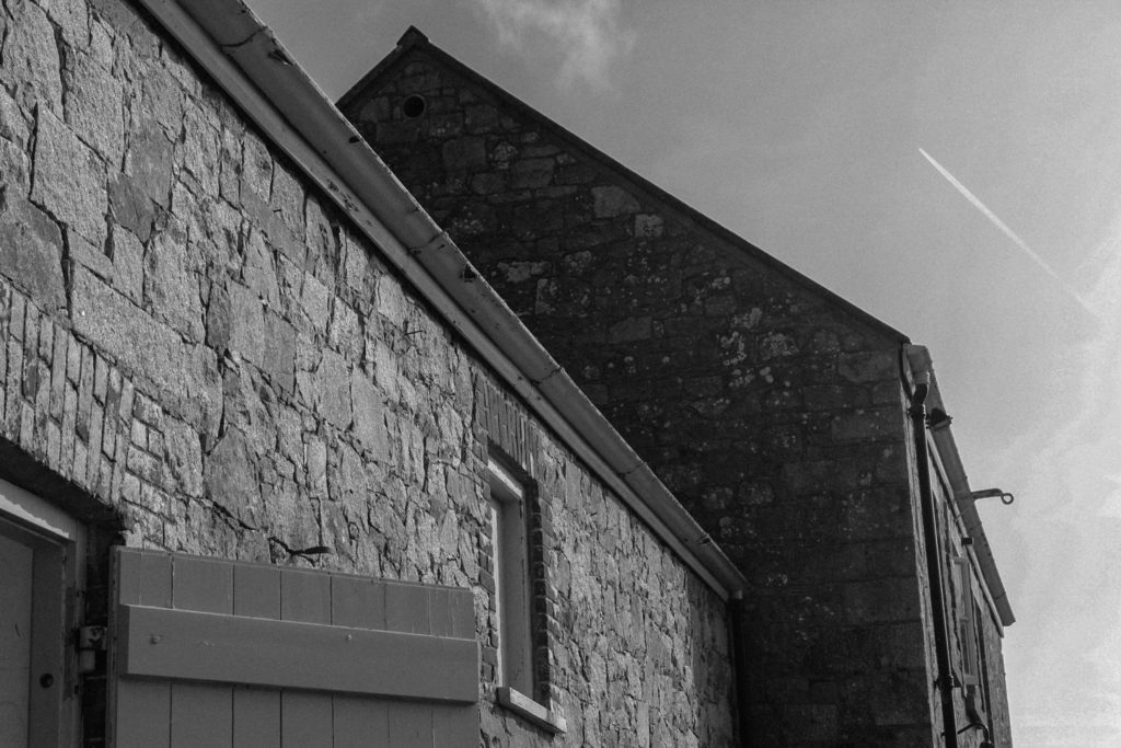
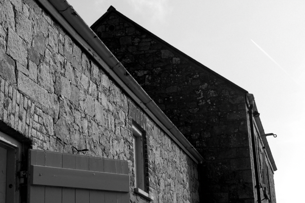
This image is also from my hamptoune collection. I chose this as one of my best due to the shapes created by the buildings, and how they show the surroundings of Hamptonne, as well as an insight into the heritage of the location. This image uses natural lighting. The buildings in the image create deeply contrasting shapes into the sky, and dramatic areas of shadow in some parts – for example in the middle of the image, to the left of the second building. I turned this image monochrome in photoshop, to really bring out the high levels of contrast and all the different shapes.
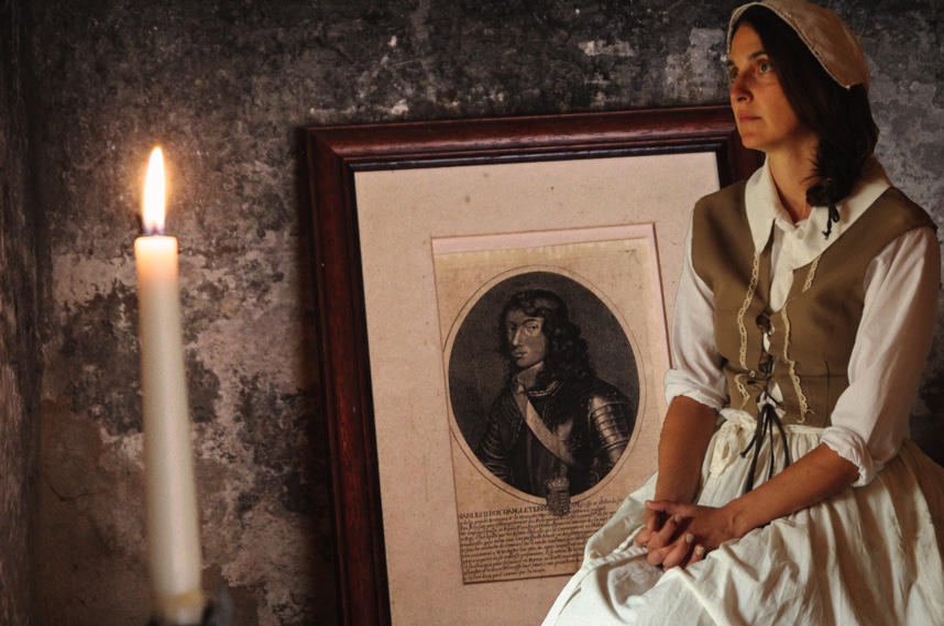
I chose this image as one of my best as it shows an insight of the goodwyf’s life at Hamptonne in a previous time – I think that it also it has a well-balanced composition. This image has a semi yellow tone, with a warm temperature. There is slight shadow coming across the subject’s face, coming from the underexposed area in the doorway. The contrast between this area and the brightness of the subject’s dress makes her a natural focal point, and creating a frame for her.
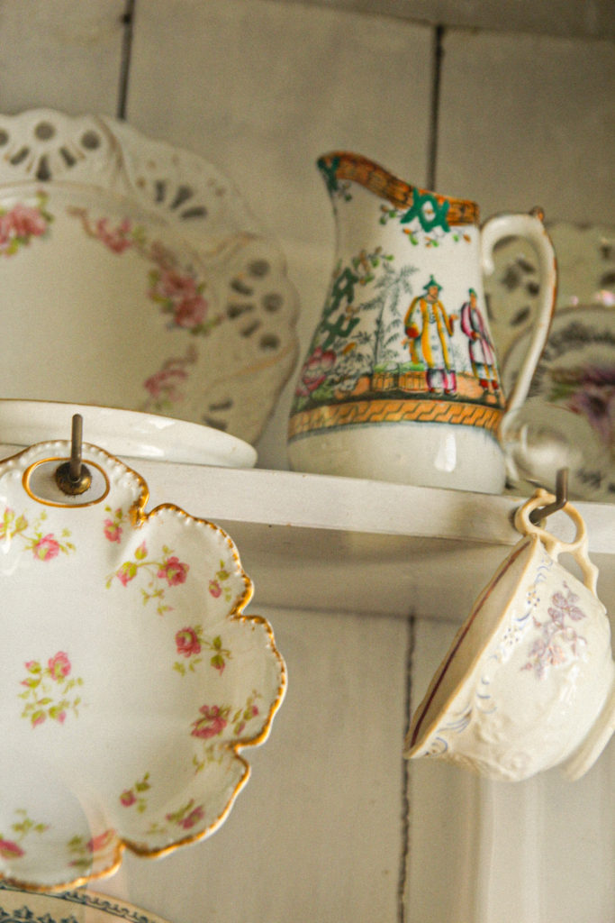
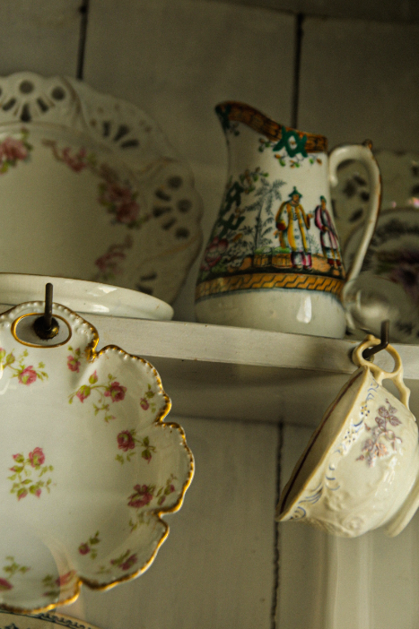
Another from my hamptonne collection – I chose this image because of the angle it was taken at, as well as the arrangement of the different subjects.
The lighting was natural in the image. The image is more highly saturated in the detail on the cups, with increased temperature here too. This image uses the rule of thirds well, adding structure to the composition. I believe that the focal point in this image is the middle jug. – the detail on the jug attracts the eye.
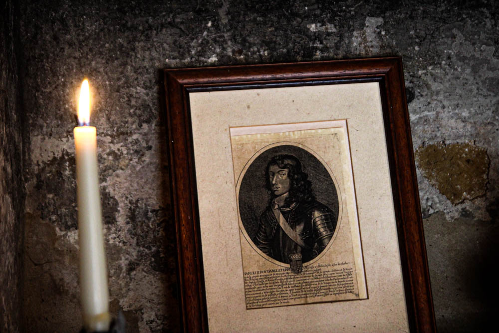
One of my more abstract images. I like this image because it is kind of mysterious – it gives a peak into the houses of the time in which Hamptonne was a functioning farm. The image has a dark, faded tone, which creates an aged look. The picture inside the background creates a frame for the rest of the image. The edges of the image are a little underexposed, which also creates a natural vignette. In the foreground, the texture of the lamp adds to the realistic outlook of the era in the image.
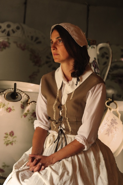
One of my images inspired by Tom Kennedy – I like this image due to the dramatic lighting on the subject’s face. This lighting comes from window behind the subject. This image is underexposed to the left, creating vignette. The subject’s expression, her dress and object she is holding helps to create a picture of how life was for those on the farm in the era. In my opinion the focal point is the subject’s face, due to the different shadow.
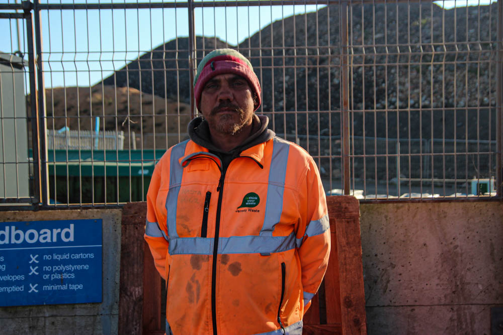
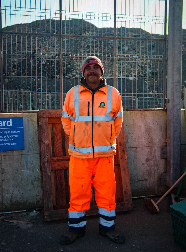
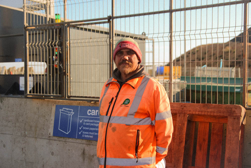
This is one of my environmental portraits – inspired by Michelle sank. I tried to recreate Michelle’s work by capturing my subject in his normal environment, with no manipulation. I like this image due to its rawness – I like how it captures my subject in his natural working environment. The colours are vibrant in some areas- for example the suit of the subject’s. The high level of contrast in the image helps to bring forward the subject’s face, showing his personality.
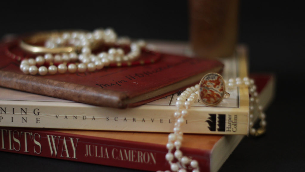
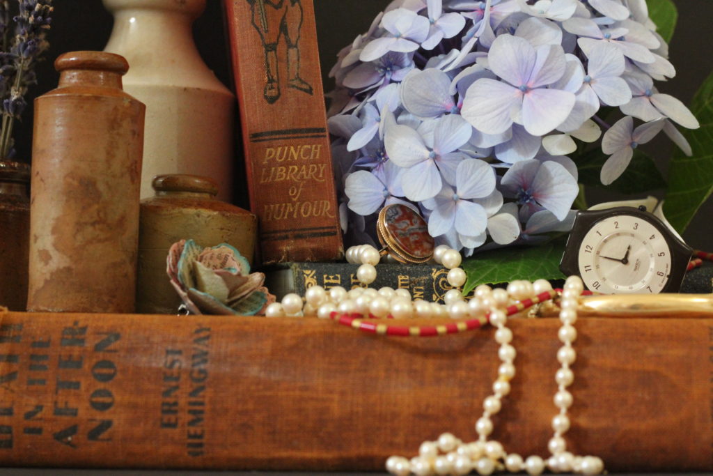
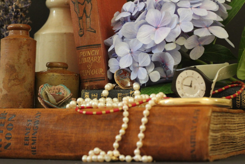
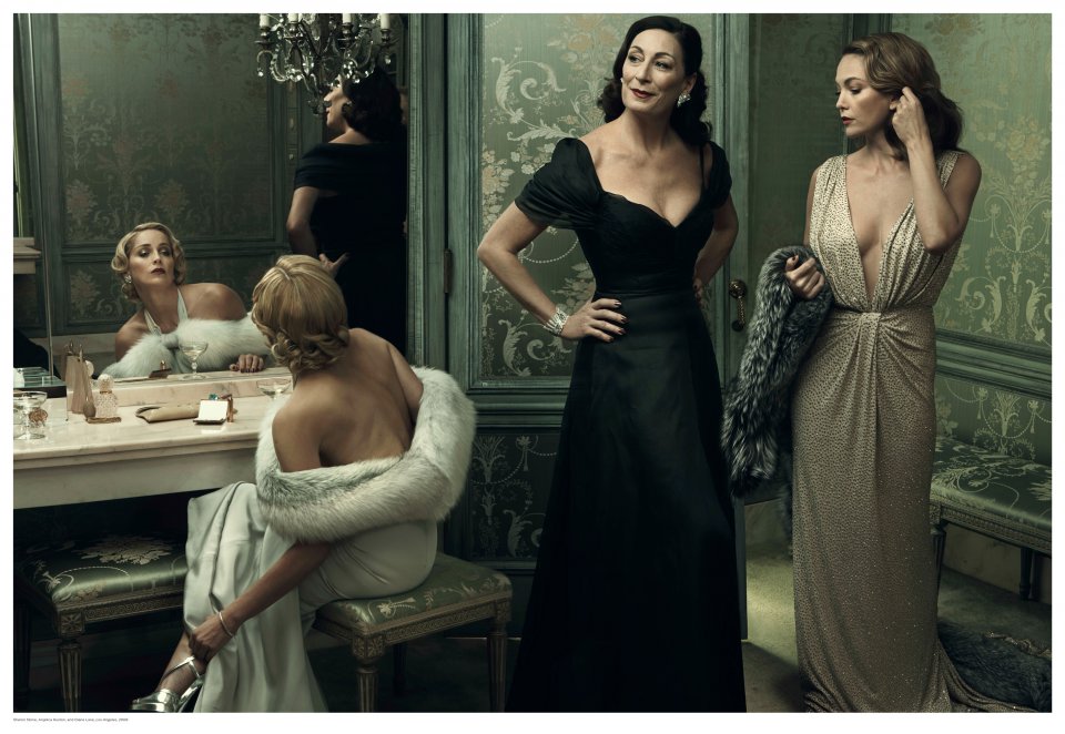
This image is one from my vanitas collection – inspired by Paulette Tavormina. This image has high levels of highlights – creating a natural focal point. The use of jewellery in this image links to the idea of wealth and power, which my studied artist also draws inspiration from.
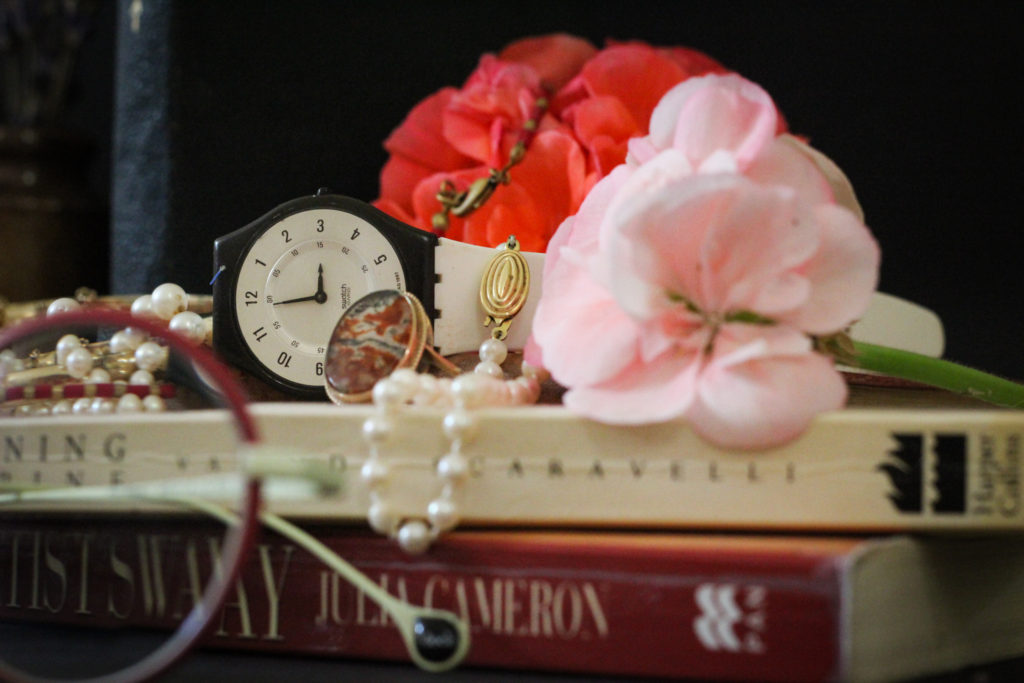
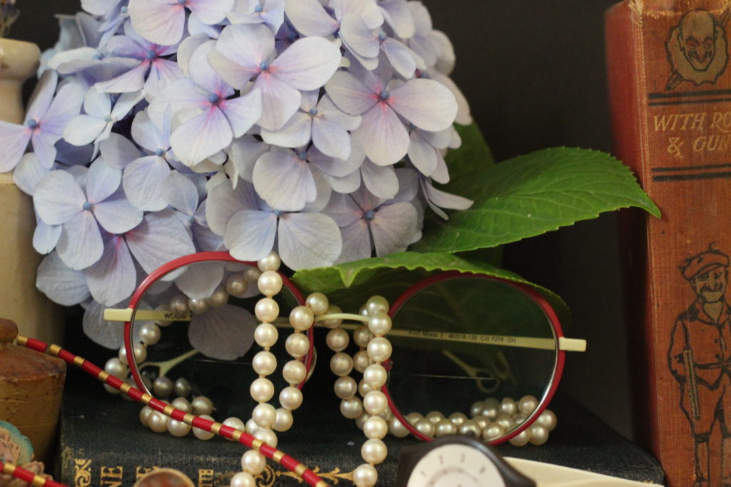
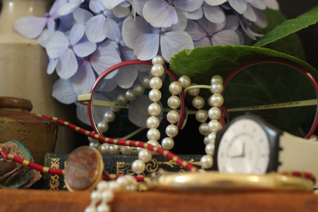
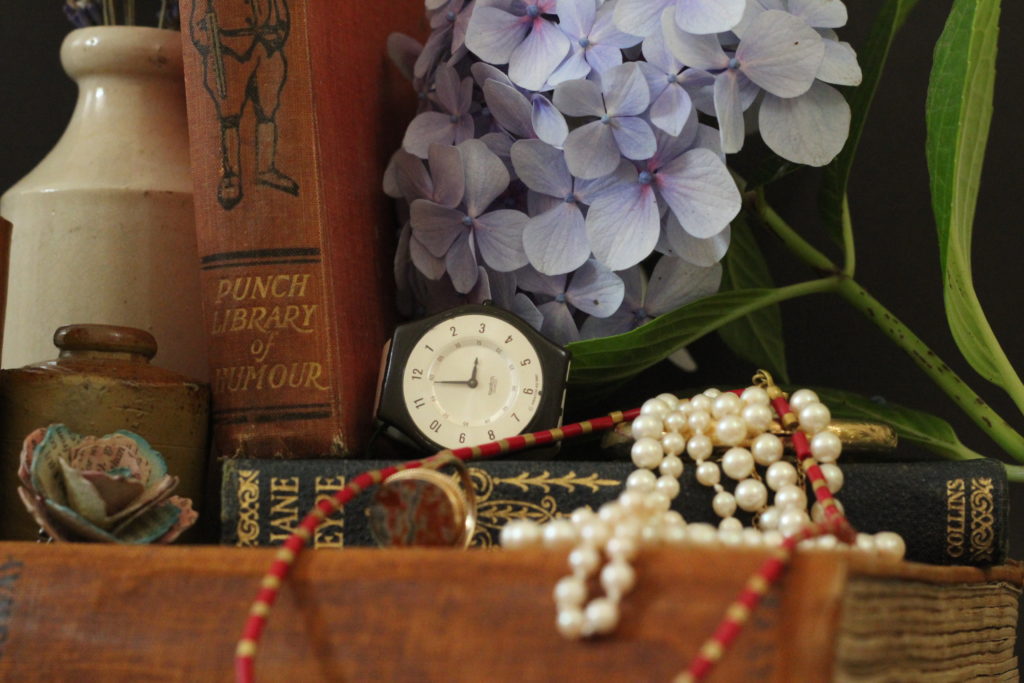
Another one of my Vanitas images – I chose this due to the composition, and the arrangement of the objects, as well as the colours.
The focal point in this image is the centre – the flowers, watch and jewellery – these items link further to the ideas of materialism, life and time, which link to the works of Tavormina. The leading lines in the image take the eye from the top left hand corner, over the top of the flowers and down to the bottom right. The foreground is slightly blurred, shifting the focus to the items in the background and centre. There is also slight vignette in the image, in the corners – these underexposed areas frame the brighter images nicely.

Paulette Tavormina’s work – comparison

Seizing Beauty | Photographs by Paulette Tavormina // Snite Museum of Art  // University of Notre Dame
Paulette’s work

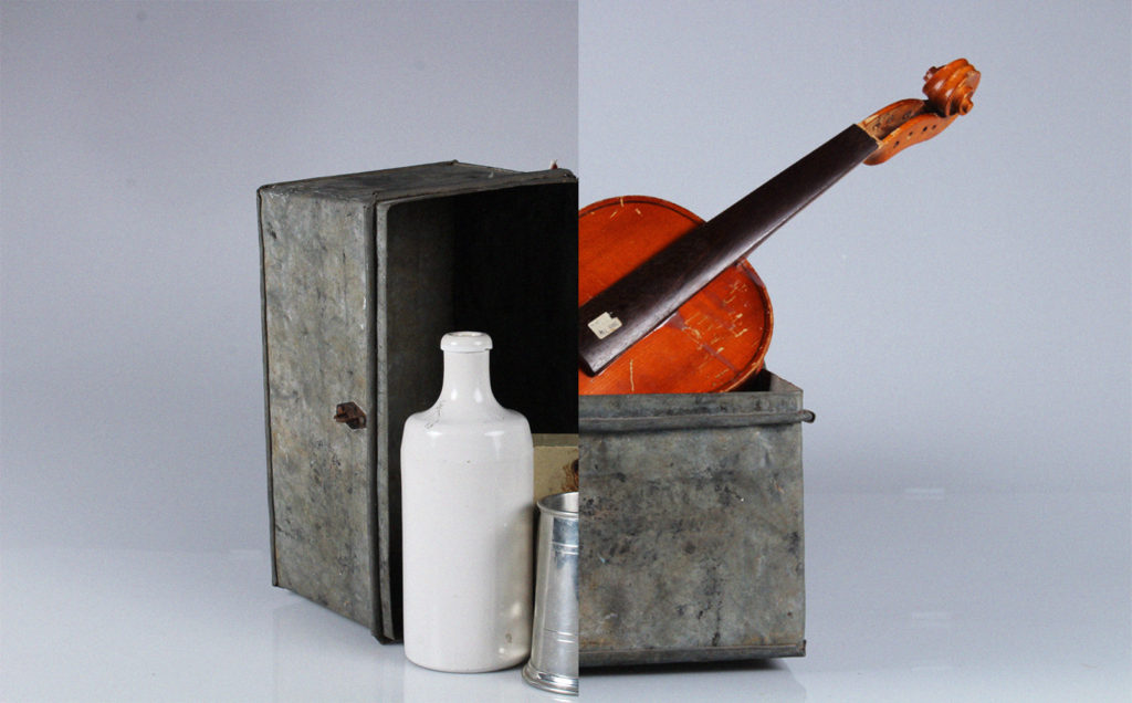
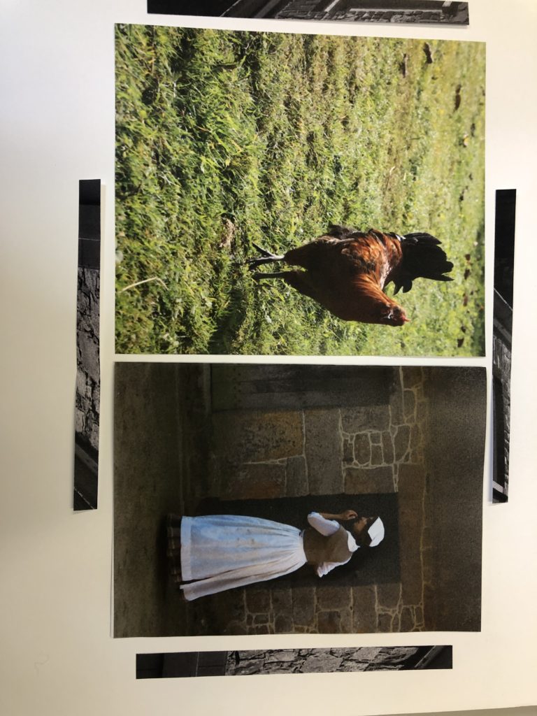
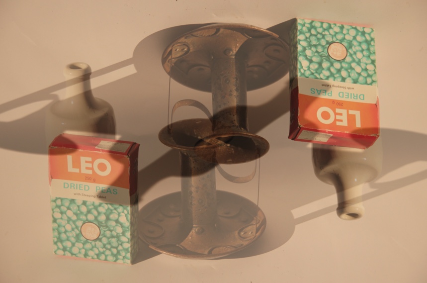
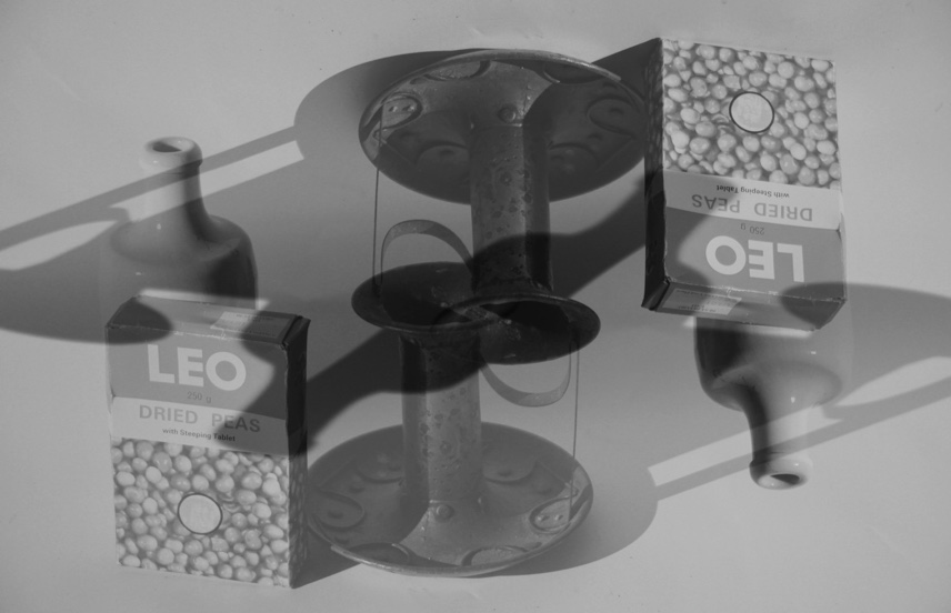
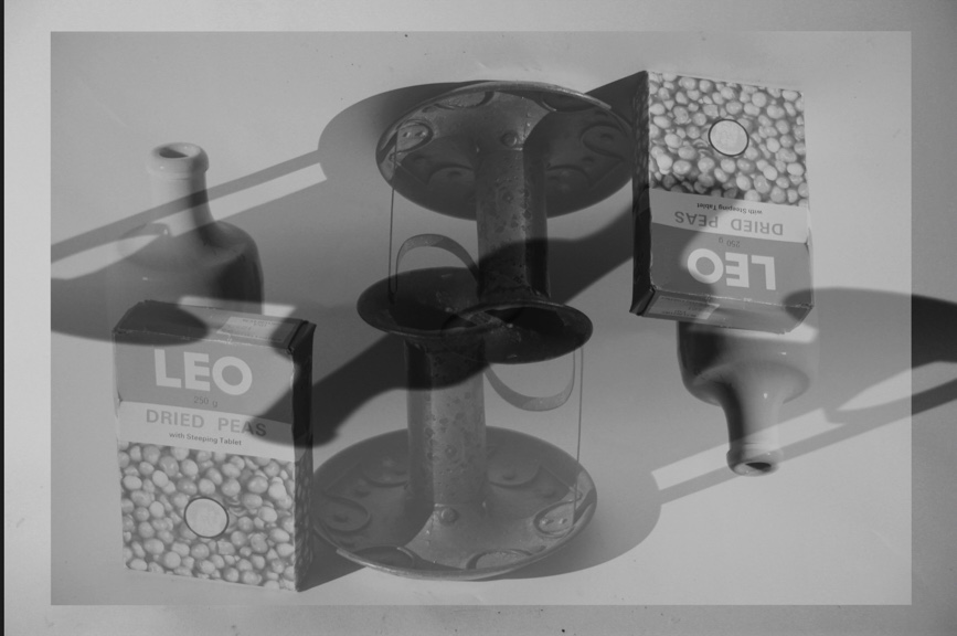
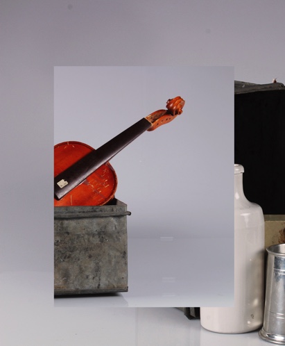
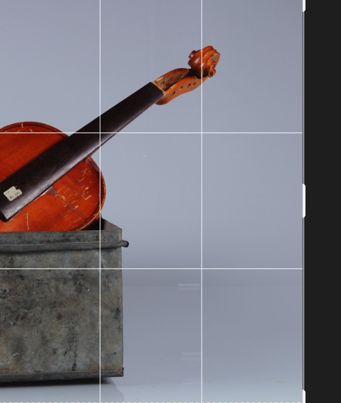
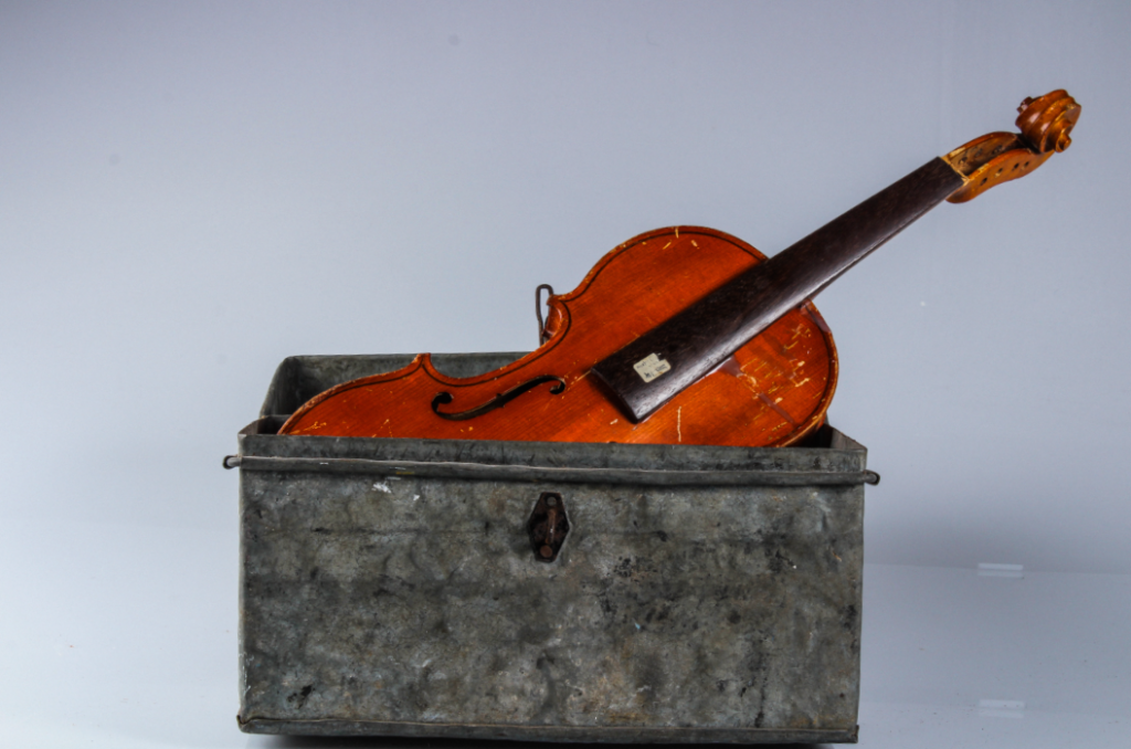
This is another of my photomontages. I like this one because of how the two pictures fit together almost seamlessly. Further more I think these images fit well together as a pair because of how they both feature the same metal box – it ties them together well while highlights the differences between the two.
This image uses the rule of thirds – the left and right objects fit perfectly, as well as the split between both images directing the middle third. I used two point lighting to photograph each image – creating shadow and light on each side differently. The right is slightly higher saturated, with the violin becoming the focal point due to its bright orange colour. There is underexposure to the left, inside the metal box, however this contrasts nicely with the stark whiteness of the jug.
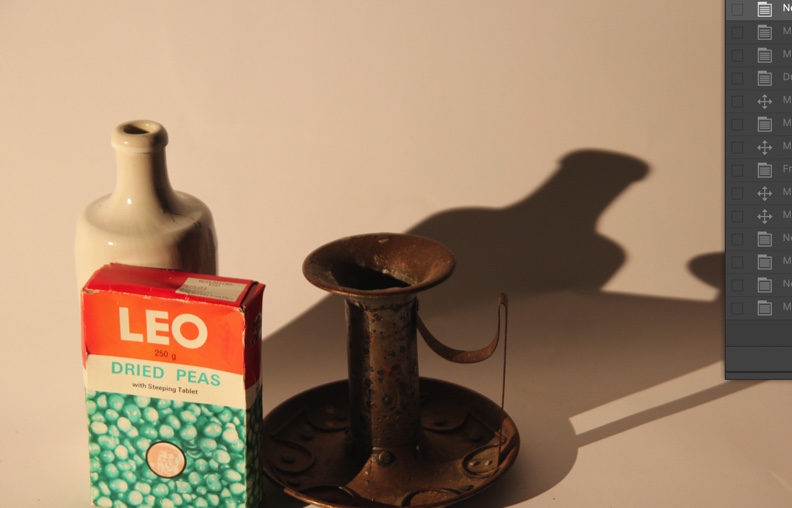
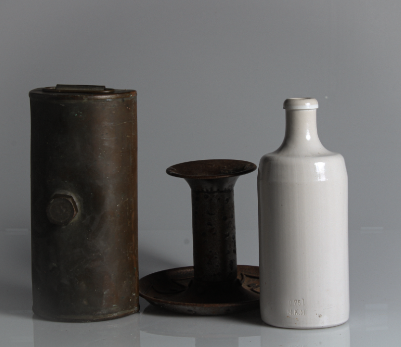
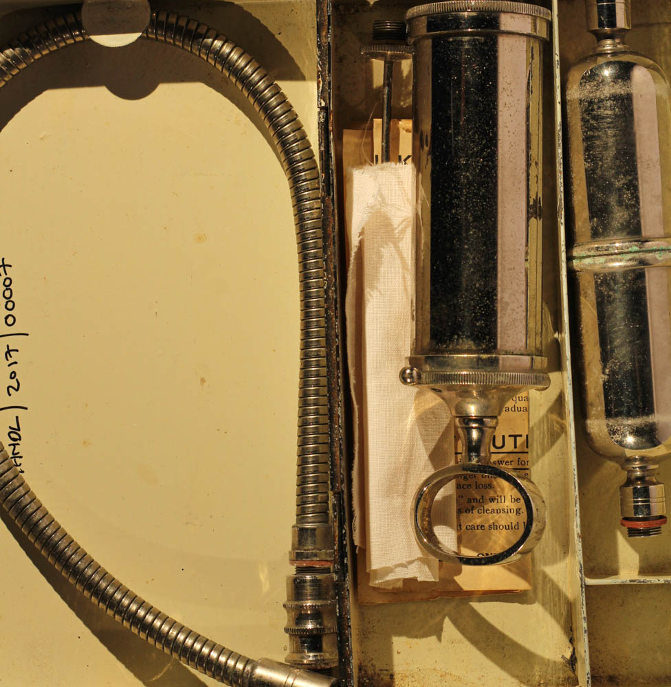
Another of may photomontages – I chose this image because of the arrangement of the images. think that the placement creates interesting composition, along with the shadows created with the infinity screen. I created this montage along with my others in photoshop, using another of my images from my hamptoune collection. I think that combining two different collections creates a stronger sense of heritage, and creates links between the places and the products created in the island.
The tones in this image are light, except from the darker ones in the window pane – this darkness creates a contrast with the lighter background. This window pane becomes a natural focal point because of this contrast. The eye is also drawn to the reflections at the bottom of the image.

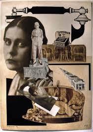
Still life – photomontage and experiments

Photomontage

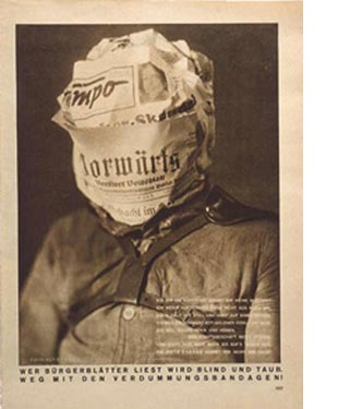
Photomontage is the combination of two or more photographs, or pieces of them, to form a single image. The technique came to prominence as a Dadaist form of political protest during the First World War and was later adopted by Surrealist and Pop artists. Photomontage is often used as a means of expressing political ideas and upset. It was first used as a technique by the dadaists in 1915 in their protests against the First World War. It was later adopted by the surrealists who exploited the possibilities photomontage offered by using widely disparate images, to reflect the workings of the unconscious mind.

Alexander Rodchenko

In 1923 the Russian constructivist Aleksander Rodchenko began experimenting with photomontage as a way of creating striking socially engaged imagery concerned with the placement and movement of objects in space. Other key artists are John Heartfield, the German artist who reconstructed images from the media to protest against Germany’s Fascist regime and Peter Kennard, whose photomontages explored issues such as economic inequality, police brutality and the nuclear arms race between the 1970s and the 1990s.

John Heartfield

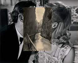
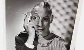
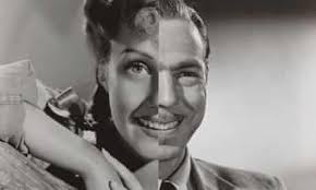
John Stezaker

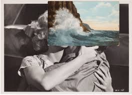
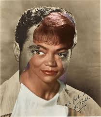
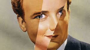
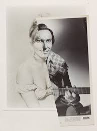
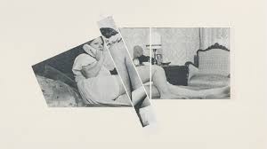
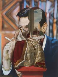
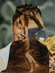
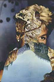
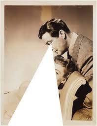
John Stezaker is a contemporary British Conceptual artist best known for his collages of found images taken from postcards, film stills, and commercial photographs. Stezaker’s work resembles early-serrealist and Dada collages made by artists like Kurt Schwitters and Hannah Hoch. In his collage series “Marriage”, juxtaposed portraits of classic films stars create newly formed but disjointed characters.

After editing and printing my images from my still life and Hamptonne shoots, I created handmade experiments as well as some on photoshop.

Handmade Experiments

Photoshop Experiments

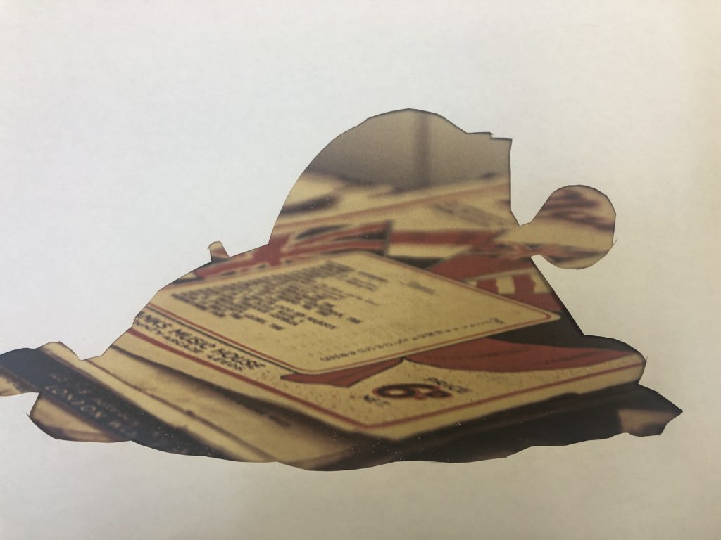
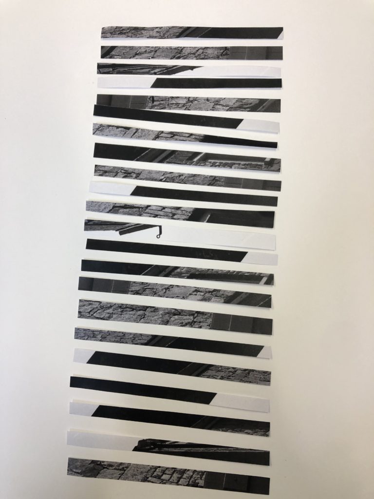
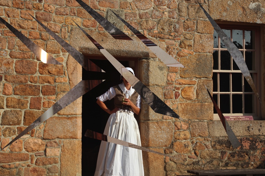
Cutting out circles and placing another image underneath

Inspiration

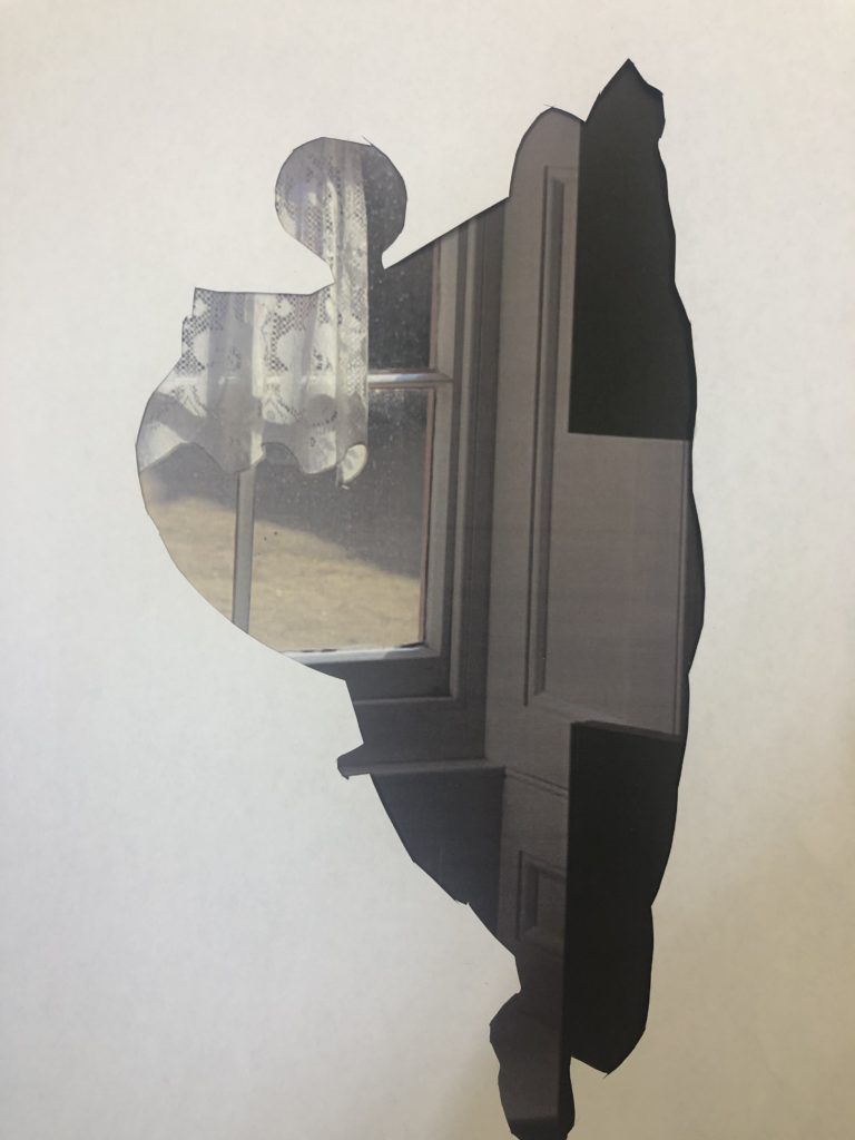
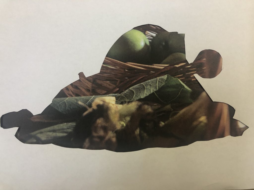
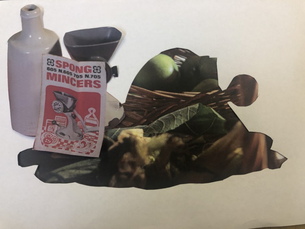
Cutting out shape of object using lasso tool, adding Hamptonne image underneath.

Using Lasso tool and splicing image – adding another underneath

Using marquee tool to add a portrait onto an object image

Adding portrait onto another image
Final edit
Final Edit

GIFS

To make my gifs, I made a layer for each image, and made frames for each layer. I adjusted the delay for each image and changed the window to forever, then saved the GIF for web.

My final edited gif

I then made another, using the same method.

My second gif

still life photoshoot

One of my contact sheets – using the P and X tools to pick my best and worst images and to filter them.

Best Images

After selecting my best images, I edited them in Lightroom classic.

Adding contrast, decreasing exposure, adding vibrance and grain as well as adding vignette.

Adding contrast and vibrance, cropping and decreasing offset

Adding vibrance, warming filter and adding contrast

Adding highlights, blacks and adding exposure and slight grain.

Adding warmth, increasing temperature and grain – decreasing exposure

Adding warmth and highlights

My vanitas images

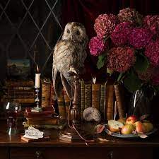
My images are influenced by the photographer Paulette Tavormina. Paulette Tavormina is a an american still life photographer who lives and works in the city of New York. She spends lots of her time in the city’s rich markets, searching for the beautiful florals that add delicate character to her still life photographs. Paulette is heavily inspired by 17th century Still life painters: Giovanna Garzoni, Francisco de Zurbaran, and Adriaen Coorte. She particularly takes inspiration from Zurbaran’s use of mysterious and dramatic light, Coorte’s unique placement of objects, and Garzoni’s clever compositions and rich colour palette.

environmental portraits – best images and editing

I edited all my images in Lightroom, after organising them.

First shoot

Due to the lighting and weather conditions on the day, many of my images were quite overexposed – I combatted this in my editing by increasing g shadow and contrast as well as decreasing exposure.

3/4 shot

Full body shot

In this image, slightly different to the others, I added warmth and slight fade to increase the blue and yellow tones.

Headshot

2 people

Second Shoot

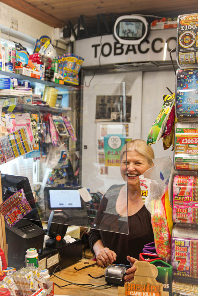
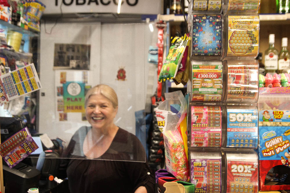
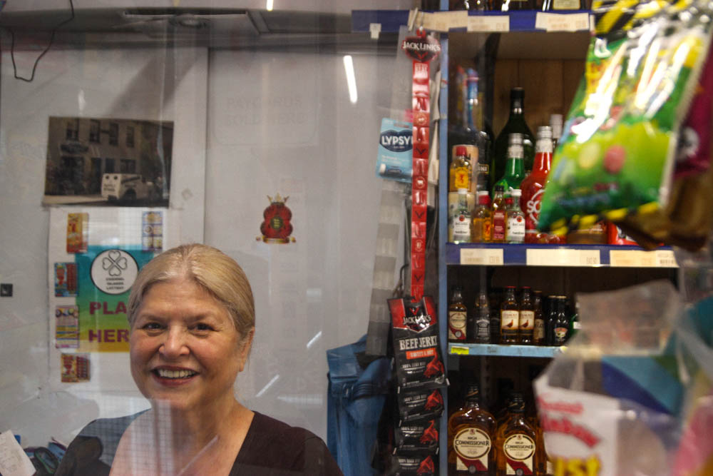
In this shoot I had difficulty with the screens in front of the tills – they added unwanted shadow to the image which made them quite tricky to edit – to combat this in the future I would maybe take the images from a different angle or in a different area.

Adding saturation and contrast to bring out the vibrant colours of the sign and items in the background.

Adding warmth and increasing contrast

Third Shoot

In this shoot, the same as the last, I had to trouble with the screen in front of the till. To combat this I tried to shoot slightly to the side of it. In my edits, I added contrast and warmth as well as saturation and vibrance to bring out the vibrant colours in the products inside the shop.

Still life research + photoshoot

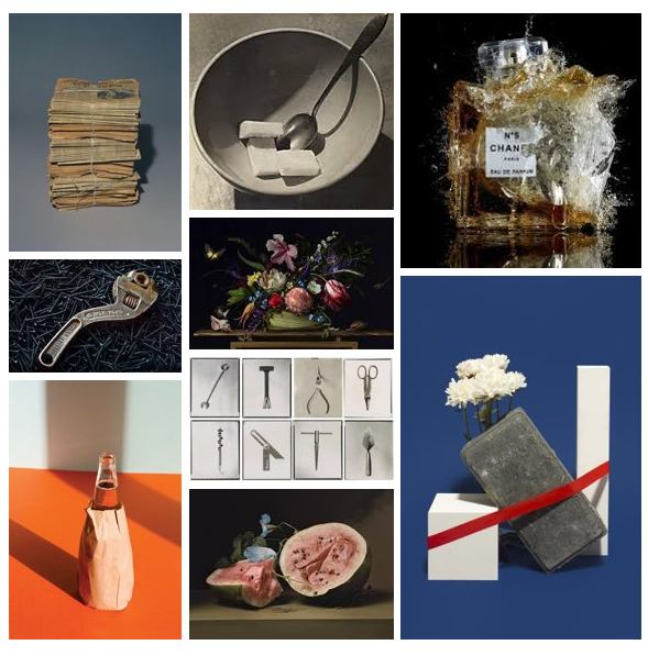
Moodboard of varying still life photos

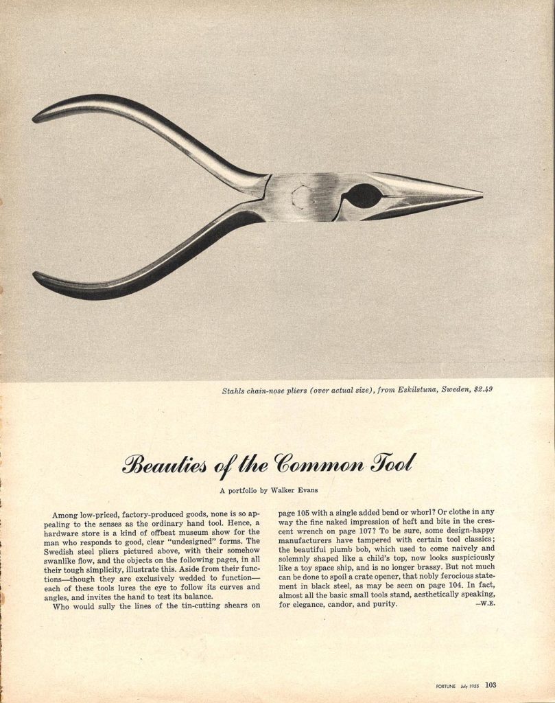
Walker Evans

Walker Evans' Beauties of the Common Tool – greg.org

While a staff photographer at Fortune magazine, Walker Evans produced a photo essay titled, “Beauties of the Common Tool,” which ran in the July 1955 issue. Dr. Chris Mullen has scans of the five-page spread as published, on his Visual Telling of Stories website. Images of a reamer, an awl, a bill hook, an auger, various pliers, a couple of variations on a T-square ,some wrenches and a trowel were among the tools used in the collection.

Darren Harvey – Regan

‘The Erratics’ (2015) by Darren Harvey-Regan

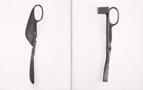
Harvey-Regan first constructed a montage of Walker Evans’s images to make new forms. He then sourced matching tools, cut them in half and re-joined various halves together, with the resulting physical objects being photographed to create his final work. The montaged tools become both beautiful and bizarre objects, in which a ratchet wrench is combined with a pair of pliers and a Mason’s trowel joined with a pair of scissors.

Harvey-Regan finds photography that photographs objects – whilst in itself being an object – interesting as a concept. “It’s a means of transposing material into other material, adding new meaning or thoughts in the process. I think photographing materials is a way to consider the means of creating meaning, and it’s a tactile process with which I feel involved. Touching and moving and making are my engagement with the world and my art”.

Darren Harvey-Regan: A Shifting Sense of Things at Sumarria Lunn Private  view Wednesday 30th January 2013 - FAD Magazine
One of Harvey-Regan’s reimagined images of Evans’

Photoshoot

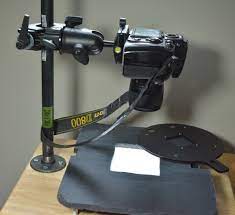
In our photoshoot, we used 3 different types of lighting: a copy stand, soft boxes, and flash. We used an infinity curve as well as coloured background on a product table. We used 1 and two point lighting, allowing shadow to be manipulated in our images.

DIY copy stand for DSLR scanning - Hardware - discuss.pixls.us
Copy Stand
Photon dome photo table with infinity curve – Dynamic Choices
Infinity curve table set up
Types of Film Lights (and How to Use Them)
Example of 2 point lighting

Environmental Portraits – contact sheets

Here are my sets of contact sheets for my first shoot – my first sets of images at the dump, my second at the plant waste site, and my third at a local food kiosk. I used the P and X keys to select my best and worst images, and used the loupe tool to go through my images one by one – I then used the grid tool to take my contact sheets as below.

Contact sheet for dump shoot and a few kiosk pictures.

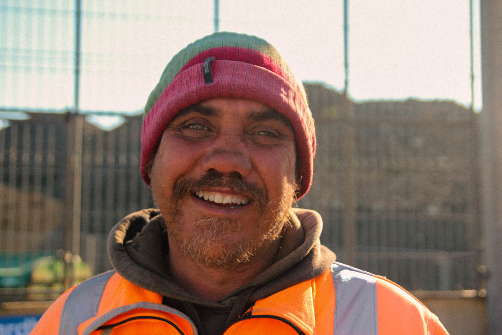
My first two sets of subjects were taken at the dump in St Helier – my first subject is a well known character, who always has his favourite hat on, with his name on. He was more than happy to be photographed and directed. My issue with my pictures of him is that the backgrounds of some of my images are overexposed – it was a very bright day. To combat this, in the future, I would try to shoot on a slightly more overcast day. However, I did the best I could to capture my subject in a way that he was not overexposed.

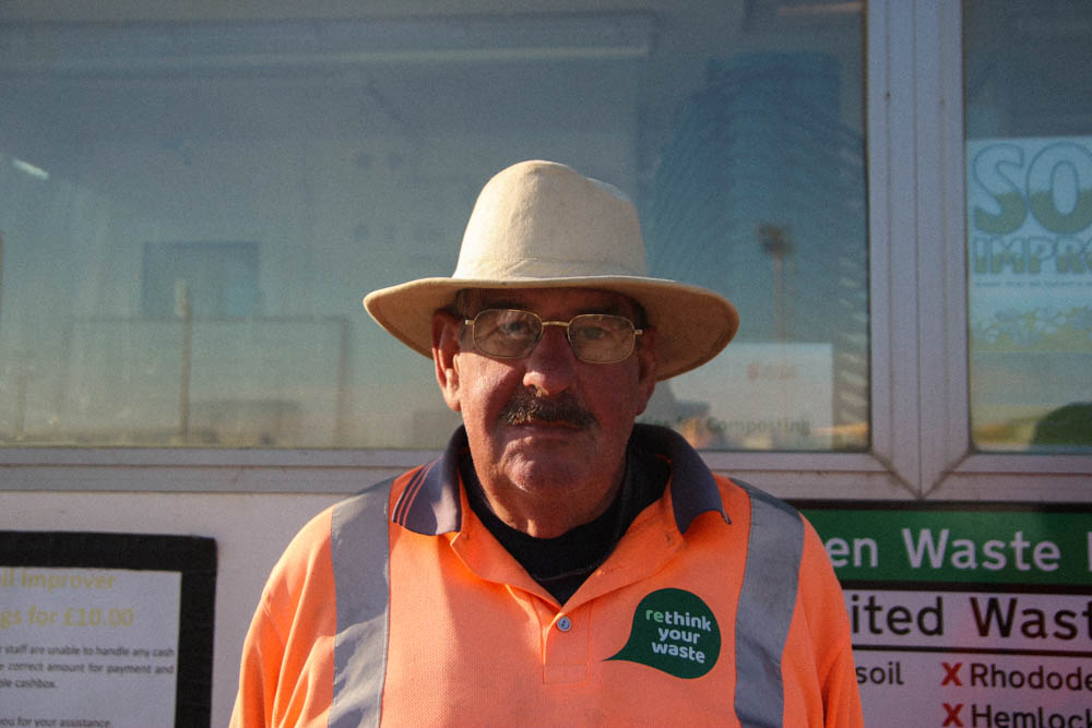
My second pair of subjects for this shoot, were two workers at the plant waste dump. They were slightly more shy on camera, but I did my best to photograph them how I wanted. The two gentlemen are good friends, so I wanted to photograph them together for my two or more people shoot. Furthermore, I decided to do close up shots of each subject to capture the interesting hats they both had on.

Contact sheet for Kiosk Shoot

My last set of subjects for these tow shoots were the owner and employee of the Quayside Food Kiosk: Steve and I decided to photograph these two because as a regular of the kiosk, I wanted to capture the funny working relationship between the two, as well as the lady’s kind and giggly nature. One issue I had when photographing was, because of Covid, the shop window had a screen – it created too much reflection in my images. To combat this, in future, I would photograph my subject elsewhere in the surrounding environment relating to their workplace.

Contact sheets for my last shoot – in my local shop.

For my last set of images, I shot in my local corner shop, Bay Stores. I chose this location because of the interesting items within the shop, and the representation of those employees and workers who people often forget we need in the island. Again, I had trouble with a screen in front of the till, but in future I would photograph away from the till maybe.

In this shoot, I tried to photograph those in Jersey who we often forget in the background – who the island wouldn’t be the same without.

Environmental portraits

August Sandler

Steve Mc Curry

Mary Ellen Mark

Mary Ellen Clark

Mary Ellen Clark

Mary Ellen Clark

Bert Teunissen

Bert Teunissen

What are environmental portraits?

An environmental portrait is a portrait executed in the subject’s usual environment, such as in their home or workplace. They typically highlight the subject’s life and surroundings.

My mind map of ideas for the genre and idea of environmental portraits

Michelle Sank

Michelle Sank, introducing her project titled “Breathe”

Michelle Sank is a social documentary photographer, based in Exeter, in the UK. She was born in Cape Town, and left there in 1978. During her childhood in Cape Town, her family were jewish immigrants, who faced high amounts of antisemitism and witnessed the awful era of the Apartheid. Because of her experiences in South Africa, she became interested in documenting people and their situations both in the UK, where she is based, and elsewhere, for example the USA and Ireland.

Insula

Insula is one of Michelle’s many projects. These images were taken both in Jersey, as well as Guernsey.

“Insula eschews a specific brief though the work responds to the wealth of nineteenth century portrait photographs within the Jersey Photographic Archive that it now joins as a powerful point of interpretation. The beguiling qualities of these new photographs call to mind the position that Lewis Baltz found for photographic series, ‘somewhere between the novel and film.’ As such, Sank’s photographs offer a visual poem to the island”.  Gareth Syvret

A potato farm worker, Grouville

A jockey, Les Landes Racecourse

Images from Michelle’s other collections

Water’s Edge

Teenagers Belfast

This image, along with many of Michelle’s other images, has a very striking background. This helps to make the subject appear more striking, creating a natural focal point to the subject’s face. This photo features an overcast and slightly overexposed background, which helps to contrast the dark tones in the subject’s outfit. The tones in this image are muted, except from the harsh black tones within the subject’s outfit. The image is slightly cool tones, with grey and very slight blue tones coming from the sky and water.

The image also has a wide depth of field, and slightly lower light sensitivity, leading to a slightly grainy image. Furthermore, I think that by capturing thus image, Michelle is commenting o what it is like to be a teen in Belfast when the picture was taken, as well as class and social aspects – Belfast after the era of the troubles, and how it affected the younger generation.

My photoshoot plan

Inside ShootOutside ShootMultiple People Shoot
Location ideasCondor Ferries Terminal, Skills Jersey offices, Local Corner Shop, Cafes, Shops such as Butchers, Boots, The Quayside food kiosk.Rubbish Dump, Building
Sites.
Rubbish Dump, Green Waste dump.
Subject(s)Employees, owners, bar staff, waiters.WorkersWorkers
Shot TypesFull body, 3/4 length, headshotFull body, 3/4 length, headshotFull body, 3/4 length, headshot

Hamptonne Interiors

On my hamptonne visit, I took many pictures of the insides of the buildings, in order to capture a snapshot of the era in which the building was on display as, and to document the life at the farm at the time.

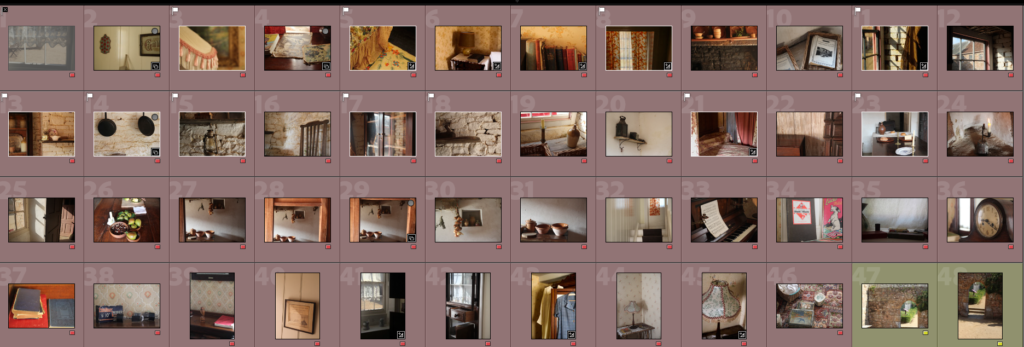
Contact Sheet

My contact sheet of my favourite images of interiors – using flagging system and colour reg to sort them.

Best Images

I edited my favourite images, using Lightroom Classic.

Edited – highlighting the shadow within the image, using contrast, blacks, whites, texture, cropping and warmth.

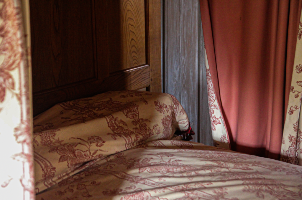
Edited – Heightening contrast, increasing vibrance and texture , and adding grain. This image shows the style of design and interiors in the post war period, at Hamptonne.

Edited – Using adjustment of blacks. whites, contrast and grain. I chose this image as one of my best because of the shadows created in the glass cabinet, creating interesting lighting.

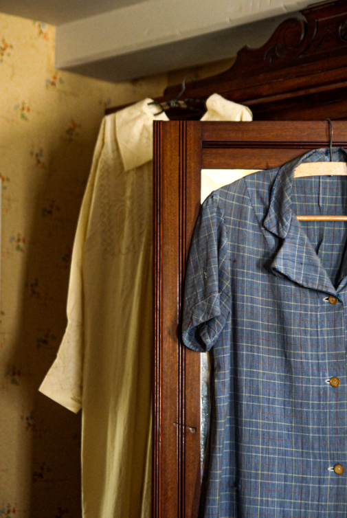
Edited – increasing texture, clarity, contrast, decreasing exposure and adding grain. I chose this image due to the high shadow in the background, the rich colours and the composition.

Edited – using basic editing tools like decreasing exposure, adding blacks and decreasing whites, adding contrast and grain. I also used a vignette to help frame the picture, after cropping it. This helps to create a balanced composition.

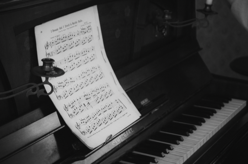
Edited – after turning B and W using the preset: “Soft B and W”, I increased the temperature, added vignette, and increased exposure. I chose to turn this specific image black and white because of the strong blacks and whites in the sheet music and piano itself.

Hamptonne Exteriors

Contact Sheets

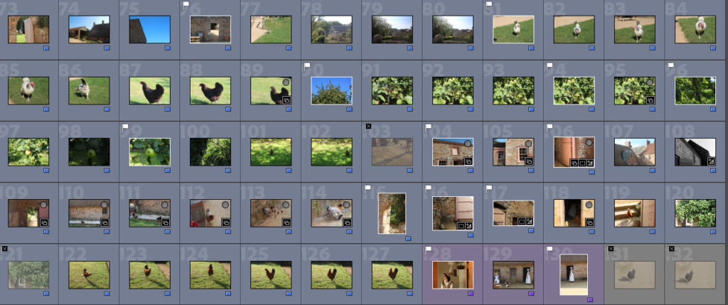
I used colour flagging, as well as the p and x tools to hide and flag my least and most successful images.

Best Images

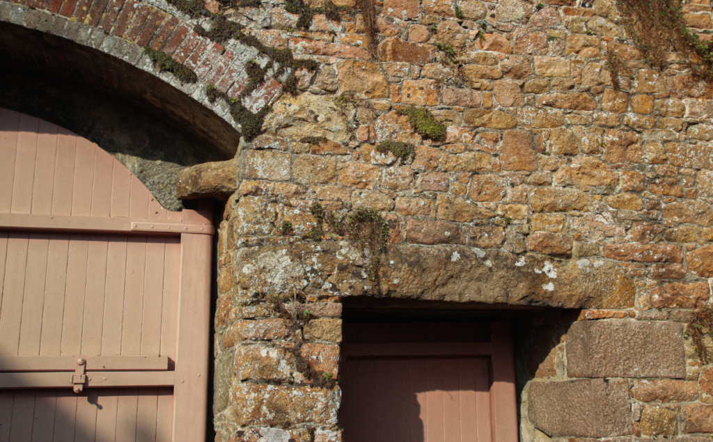
Edited – For this edit, after cropping, I focused on adding warmth, decreasing exposure and adding contrast to exactuate the areas of shadow. The reason I selected this as one of my favourite images is due to the way the way the Jersey granite and architecture is highlighted.

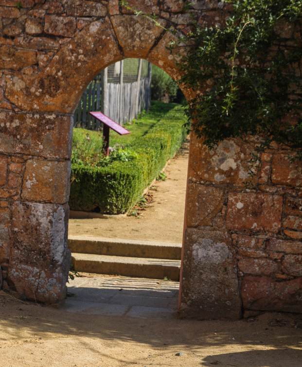
Edited – In this image, I focused on adding vibrance and saturation, as the photo was originally not very bright. I chose to do this to highlight the green tones in the hedge and plants on the archway, and added contrast to enhance the shadows in the foreground.

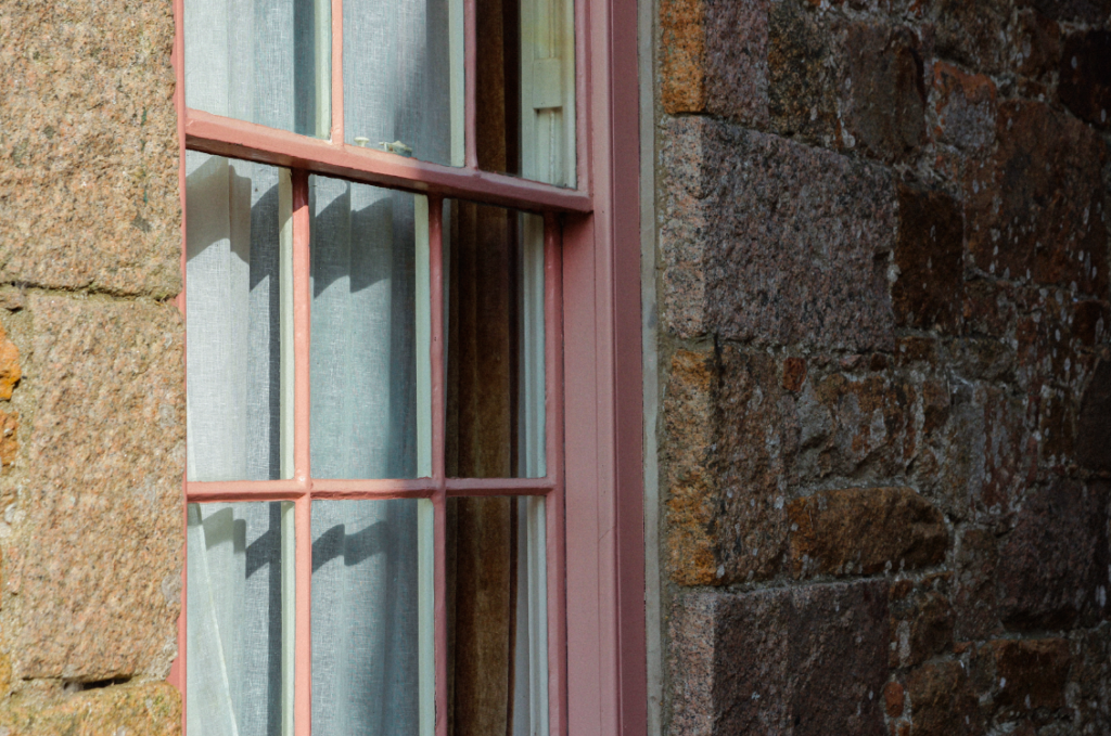
Edited – when editing this image – I focused on adding contrast and whites to show the rich colours of the building and to highlight the shadows in the window.

Edited – I chose this image as one of my best as it shows the intricate architecture of the buildings. I focused on adding light and warmth to this image when editing.

I edited this image black and white – I used a black and white preset and then focused on editing contrast and highlight to exaggerate the shapes and shadow within the image.
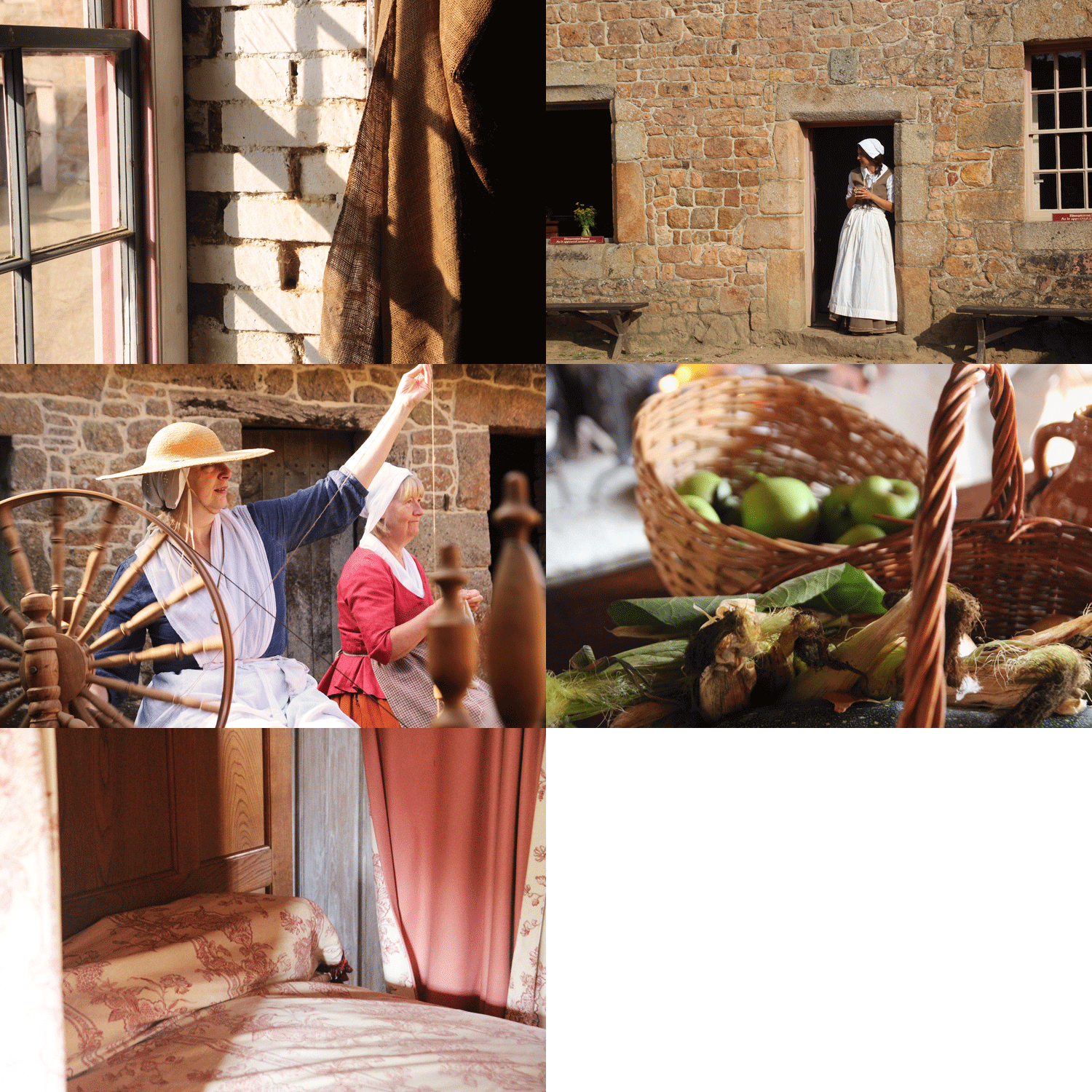
Hamptonne objects

During my visit to Hamptonne, I took pictures of objects within and around the farm. These objects were a mix of things such as crockery, food, clothing, personal objects and books.

A contact sheet of my object images: using colour label (green) to set images apart from one another. Also using white flags to show my best images in my selection.

My Best Images

Edited – adding things like grain, shadow and contrast. I also changed temperature and tint in this image to combat the overly yellow tones, by adding cooler blues and adding contrast. This im age is lit from the right – the objects were inside a glass cabinet which created interesting reflections on the objects and added unusual shadows.

Edited – added basic editing tools but also grain and vignette to add depth and mood. This image was lit from the right naturally from a window – this created soft shadow and light, helping to add shape and aided my image to not be as flat.

Edited – I struggled with this image due to the backlit nature of the picture. I combatted overexposure in the corners of this image with increasing vibrance of warmth to really bring forward the green, brown and orange tones.

Edited – i turned this image black and white – I did this to accentuate the high shadow and dark tones, and to help to combat the yellow tones in the image. I also added grain, and after adding a preset “high contrast B and W”, I added further grain and contrast, as well as a slight vignette.
The before and after – shadows are shown better and overly yellow image corrected.
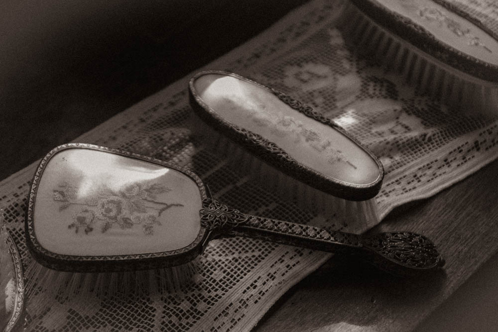
Edited – after increasing contrast, and decreasing exposure, I used a preset: “sepia toned B and W” I then added grain, shadows and slight highlights to show the light on the top of the brushes, coming from the window that is lighting the image.