All posts by Lottie B

Filters

Author:
Category:

Art Movements and Isms

PICTORIALISM

Time period: Early 1880s-1920s

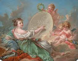
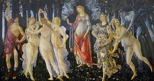
Influences: Allegorical paintings had a big influence into pictorialism, with subjects in the photos representing things such as greed, charity, or envy. It is a figurative mode of representation conveying meaning other than the literal. The underlying meaning has moral, social, religious or political significance. Allegorical painting was dominant in Italian Renaissance art in the 16th century and continued to be popular until the Pre – Rephalialite Brotherhood in the mid 19th century.
Key characteristics/ conventions:
meant to have darkness, looked like art. To make photography art. Photography was thought as very scientific up till this time, and photographers wanted to change this. Images of this time period had romantic and nostalgic settings, and mostly were staged. Pictures had to be “made”. Often nudes, photographs were often of women as there were more male artists than female. Photographs also often had biblical references, with moral stories.
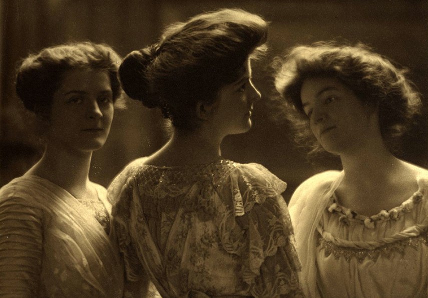
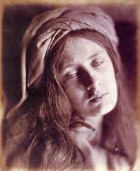
Artists associated: Alfred Steiglitz, founding “Photo Secession, New York. Clarence H White, Julia Margeret Cameron, Peter Henry Emerson – published a book titled “Naturalistic Photography”, used to promote photography as an art rather than a science. The handcrafted prints were in visual opposition to the sharp b/w contrast of the commercial print. The Vienna Camera Club, Brotherhood of the Linked Ring.
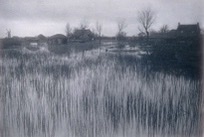
Peter Henry Emerson – Naturalistic Photography


Key works: “Morning” – Clarence H White, “Equivalent” Alfred Steiglitz, Emerson’s “Naturalistic Photography”


Methods/ techniques/ processes: smearing vaseline on lenses, scratching negatives. Using chemicals. They wanted to make the photographs seem like paintings and drawings. Pictures had to be constructed.

REALISM / STRAIGHT PHOTOGRAPHY

Time period: 1920s


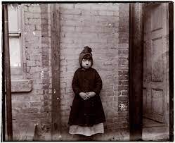
Key characteristics/ conventions: facing reality, providing accurate and descriptive depictions of the visual world. Objectively recording the real world. Went on to include documentary photography, lead by Walker Evans. Linked to the birth of documentary photography and photojournalism, as photographs were used to tell the truth in the media early on. Sometimes included abstract geometric forms and structure.
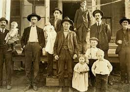
Lewis H Hine


Artists associated: Paul Strand, Walker Evans, Edward Weston, Ansel Adams, Dorothea Lange, Lewis W Hine, Jacob Rils, Alfred Steiglitz.


Key works: “Hale County” Walker Evans, pictures during the Great Depression in the 1930s, Jacob rils “How the other half lives.”
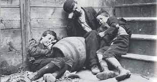
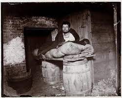
Methods/ techniques/ processes: Careful selection and framing, no changes after the picture is taken.

MODERNISM

Time period: First half of 20th century

Influences: Reaction to the enlightenment, different ideas of society. Influenced by scientific progress. By the beginning of the 20th century, with the diffusion of illustrated magazines and newspapers, photography was a mass communication medium. Photojournalism acquired authority and glamour, and document – like photographs were used in advertising as symbols of modernity. Photography is a modern form of image – making, contributing to the development of modernism.
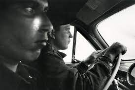
Robert Frank


Key characteristics/ conventions: Rejection of realism, emphasising the true immateriality of art. The meaning of the work was in the art. Photography itself was a modernist thing. A backlash against modernity. Modernism rejected the dominance of older movements in favour of a new experimental way of producing art. The common trend was to seek answers about the nature of art and the human experience. Modernism was concerned with object rather than subject, form rather than content, and creator rather than spectator. It made references to things inside the work itself for example form, composition, medium, material, techniques and processes.


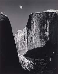
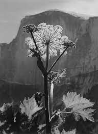
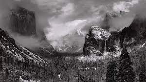
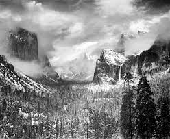
Artists associated: Ansel Adams is considered one of the most important modernist artists. His landscapes stemmed both from his fascination with the natural environment, and from his conception of it as a space of spiritual redemption. He took his first photographs on visiting Yosemite National Park in 1916, aged 14 and later set up a studio there, He photographed at different times of day and different seasons, exploring the effects of changing patterns and intensities of light.
Walker Evans is often considered to be the leading Amercian documentary photographer of the 20th century. He rejected pictorialism and wanted to establish a new photographic art particularly based on a detached and disinterested look. He was particularly interested in the vernacular of American architecture, but his most celebrated work is his pictures of three Sharecropper families in the American South during the 1930s Depression.
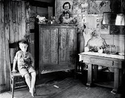
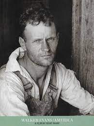
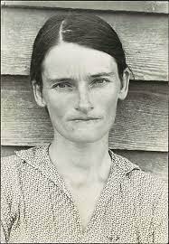
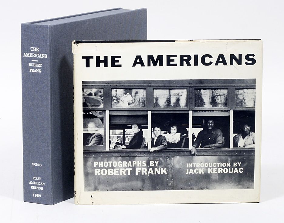
Key works: Many Are Called – Walker Evans, Ford Plant, River Rouge – Charles Sheeler, The Americans – Robert Frank


Methods/ techniques/ processes:
Modernist photography celebrated the camera as an essentially mechanical tool. 

POST-MODERNISM

Time period: Late 20th century

Influences: Responses to society after the second world war. A reaction to modernism. Response to colonialism also. Architects took the lead in the development of postmodernism. They criticised the international style of modernist architecture for being too formal, austere and functional. Postmodern architects felt that international style had become a repressive orthodoxy.


Key characteristics/ conventions:
Modernist ideals cannot be attained. Relativism, attacked the modernism ideals of universality, and objectivity. Belief in identity. Postmodernists see all kinds of things as text, including photographs, and insist that all texts need to be read critically. Post modernism also explores power and the way economic and social forces exert that power by shaping the identities of individuals and entire cultures. Unlike modernists, postmodernists place little or no faith in the unconscious as a source of creative and personal authenticity. They value art not for universality and timelessness but for being imperfect, low brow, accessible, disposable, local and temporary. While it questions the nature and extent of our freedom and challenges our acquiescence ti authority, Postmodernism has been criticised for its pessimism: it often critiques but equally often fails to provide a positive vision or redefinition of what it attacks.
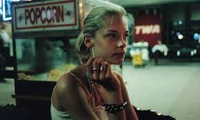
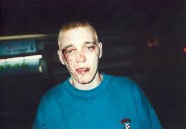
Artists associated: Sam Taylor Wood – her rich baroque style is often used to create bohemian and dandyish characterisations entwining aspects of her own life, including her close friends, in her staged photographs, Taylor – Wood plays the role of a contemparty court painter, portraying an artistic and social elite of which she is part.
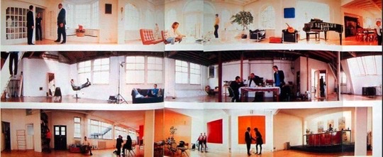
Sam Taylor Wood

Jeff Wall, a Canadian artist, has since the 1970s problematised the relationship between photography, documentary. and art in his dramatisations of appsrnretly ordinary street scenes and social encounters. His carefully composed tableau depicts everyday social relations, for example “Passerby” 1996, a b and w photograph of a spontaneous street scene which looks like a candid moment caught on camera but is a pre conceived and staged act.
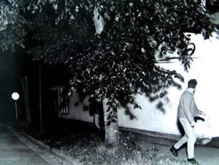
“Passerby” 1996, Jeff Wall


Key works:
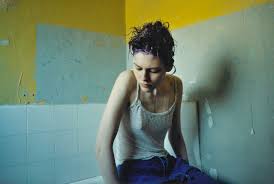
Passerby – Jeff Wall, Five Revolutionary Seconds – Sam Taylor-Wood, Living in Hell and Other Stories – Tom Hunter, Insonmia – Jeff Wall, Diary – Corrine Day, Untitled (your body is a battleground) – Barbara Kruger.


Methods/ techniques/ processes:
Recycling, Bricolage, Pastiche, Eclectism (mixing art forms, mixing cultures, mixing styles.), parody, collaboration, mixing high art with pop culture.

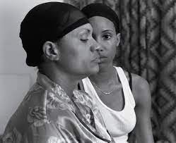
Contextual Study – LaToya Ruby Frazier

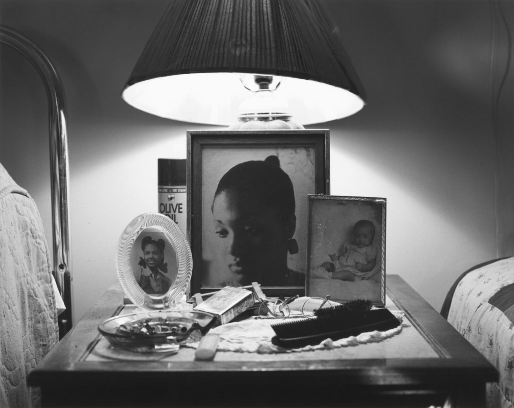
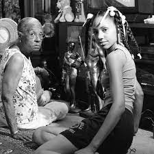
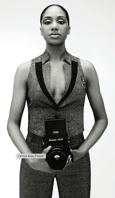
LaToya Ruby Frazier was born in 1982 in Braddock, Pennsylvania, and currently lives and works in Chicago. An artist and activist, LaToya Ruby Frazier uses photography, video, and performance to document personal and social histories in the United States, specifically the industrial heartland. Having grown up in the shadow of the steel industry, Frazier has chronicled the healthcare inequities and environmental crises faced by her family and her hometown of Braddock, Pennsylvania. The artist employs a radically intimate, black-and-white documentary approach that captures the complexity, injustice, and simultaneous hope of the Black American experience, often utilizing her camera and the medium of photography as an agent for social change. Her 2016 Flint is Family project traces the lives of three generations of women living through the water crisis in Flint, Michigan.

A portrait of LaToya Ruby Frazier, by Robbie Fimmano

“Flint is Family”

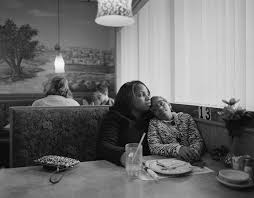
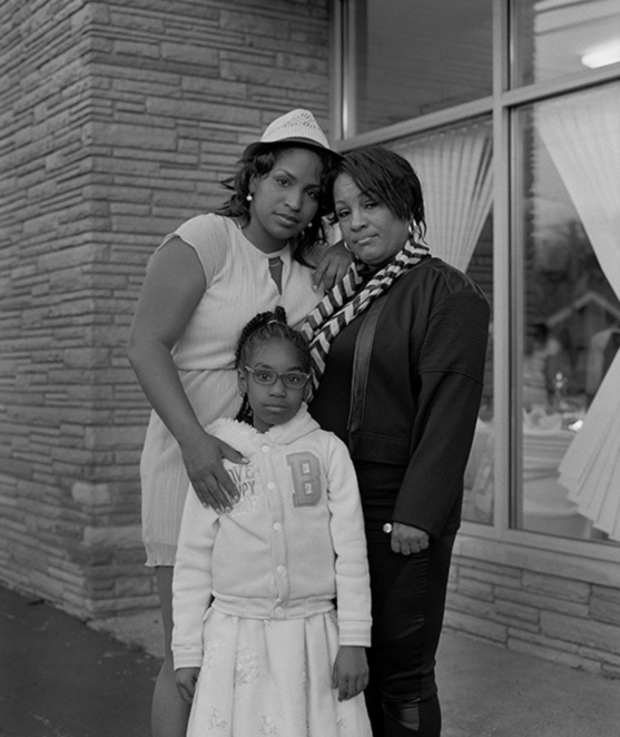
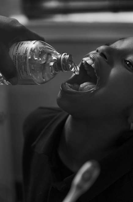
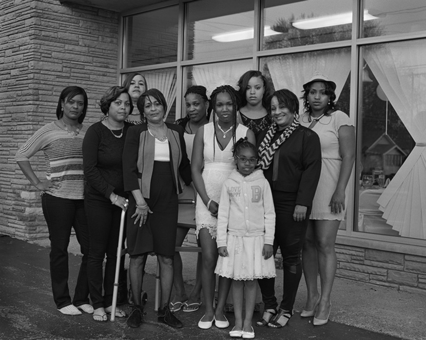
In 2016, LaToya Ruby Frazier spent five months living in Flint, Michigan with three generations of women–the poet Shea Cobb, her mother Renee, and daughter Zion–observing their day-to-day lives as they endured one of the most devastating ecological disasters in US history: the water crisis in their hometown. The artistic result of Frazier’s time there is reflected in the works presented in “Flint is Family,” opening August 2019 at the Newcomb Art Museum of Tulane University.

A video explaining the moving images she made for her project “The Notion of Family.”

“Through photographs, videos, and text I use my artwork as a platform to advocate for others, the oppressed, the disenfranchised,” says Frazier. In “Flint is Family,” Frazier explores at the level of community, the effects of the water crisis in Flint–where black residents make up 54% of the population and 40% of the population lives below the poverty line. “When I encounter an individual or family facing inequality, I create visibility through images and story-telling to expose the violation of their rights.”

By portraying the daily struggles of the Cobb family, Frazier used a tight focus to create a story about the impact of a systemic problem disproportionately affecting marginalized communities. Citing the social documentary work of Gordon Parks’ and Ralph Ellison’s 1948 “Harlem is Nowhere”–which highlighted the social and economic effects of racism and segregation–as an influence, Frazier rejected the voyeuristic photographs that emerged from outside media sources and instead collaborated closely with her subjects through photographs, capturing intimate moments along with the myriad challenges the family faced without access to clean water. In September 2016, Frazier published her images of Flint in Elle magazine in conjunction with a special feature on the water crisis. Like Parks, Frazier used the camera as a vehicle and agent of social change.

“By hosting the Louisiana premiere of Frazier’s work at the Newcomb Art Museum,” says Monica Ramirez-Montagut, museum director, “we are bringing meaningful, enriching, and transformative exhibitions of socially-engaged art that explores the concerns of communities both on and off campus, as well as recognizing underrepresented communities and the contributions of women to the field. Frazier’s artistic practice centers on the nexus of social justice and cultural change and tells an important story of the American experience that certainly echoes with our own Louisiana environmental crisis and pollution.”

LaToya Ruby Frazier’s TED talk on the topic of this project.

“The Notion of Family”

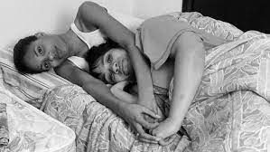
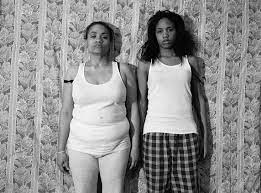
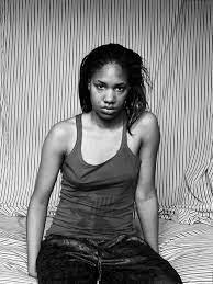
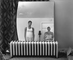
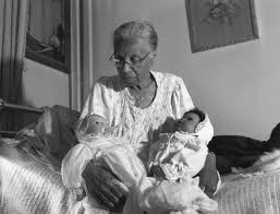
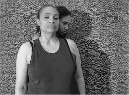
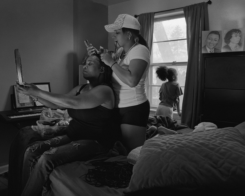
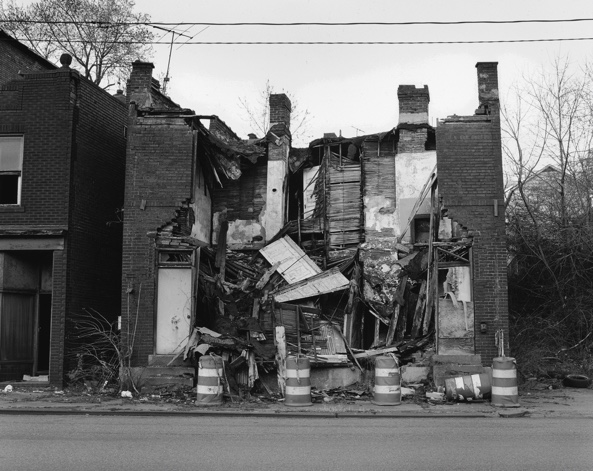
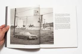
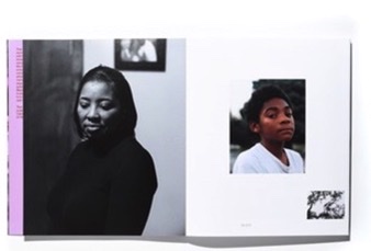
In 2015, her first book about how she, her mother, and grandmother survived environmental racism in historical steel mill town Braddock, Pensylvania, The Notion of Family, received the International Center for Photography Infinity Award. The Notion of Family, documents the decline of Braddock, Pennsylvania—a once-prosperous steel-mill town that employed generations of African American workers—alongside the hardships of Frazier’s family, who grew up there. Issues of class and race underscore the mostly black-and-white photographs in the collection, which is arranged as a kind of family album: intimate, collaboratively produced portraits of Frazier and her mother in mirrors and on beds, are presented with derelict scenes of collapsed buildings, vacant lots, and boarded-up stores.

“One of my goals is to disrupt the privileged point of view that only educated and elite practitioners can create work about the poor or disenfranchised,” she tells the artist Dawoud Bey in their interview for the book. “My mother did not have to read Roland Barthes to understand death in a photograph.”

LaToya on the subject of her first monograph, “The Notion of Family”

Frazier provides short texts with each image—wistful snippets of memory and anecdote merge with facts and statistics. Illness is nearly a constant. As Laura Wexler points out in an accompanying essay, Braddock’s hospital, which eventually housed the town’s only restaurant and therefore became its de facto meeting place, “is as much or more a fixture in this album and this family than the school, the factory, the library, the market, the taxi stand, the pawnshop, or any other institution.”

LaToya talking about her projects.

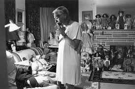
Throughout the book, Frazier shows her influences from Depression-era images, such as Dorothea Lange’s “Migrant Mother” (1936); Frazier has openly wondered what Florence Owens Thompson, Lange’s subject, might’ve said had she been invited to collaborate in documenting her family’s plight. Self-determination rarely figures in the social documentary tradition, and in many ways Frazier’s work seeks to change this. She defines her photography as a “conceptual documentary” practice speaks to her continued faith in the camera as a vehicle for both social change and aesthetic possibility: beauty, in her work, does not preclude protest any more than education presumes awareness.

https://latoyarubyfrazier.com/work/ – a link to LaToya’s website, with all her different pieces of work.

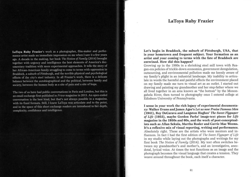
LaToya’s interview in “So Present So Visible”

This quote from the start of the article really stood out to me, as it describes LaToya’s artistic process which I think is really unique. It is useful for me, studying this photographer to understand her motivations for her project and her creative process behind her images. Understanding the reasons behind LaToya’s photography helps the viewer to understand the social context of her images, and the messages she is trying to show.

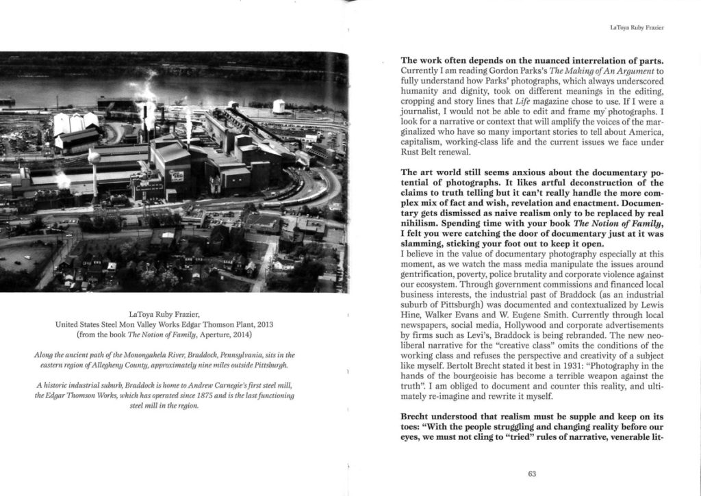
This quote from the interview speaks about the narrative and text in her book. I find the fact that she says: “the text functions as an image and the photograph becomes the visual language that creates a tension” very interesting. This is a perspective I haven’t thought of before and will be helpful when constructing my essay. The change of the text as an image and the image of text highlights the important of the social context in LaToya’s work. There are clues in the images, mostly not obvious that lead the reader to the context of the subject of her work – this links to the prejudice and media representation that Frazier talks about in the text of the book, and solidifies her points – “The text functions as an image and the photograph becomes the visual language that creates a tension.”

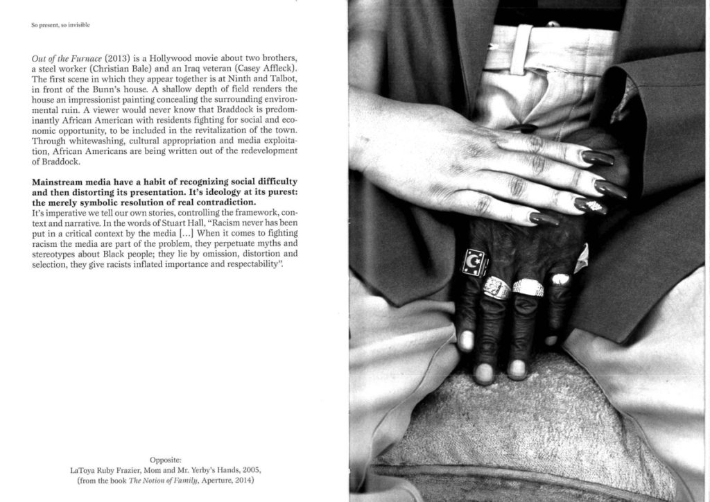
This quote is an important part of the interview. In this quote, LaToya speaks about the experiences of herself and people in her hometown of prejudice and racism towards their community. She speaks about how the media has portrayed her town and its residents – this has been extremely bias and negative, and through her work she sought to change this narrative: “counter this reality” – the reality presented by the media, and to “ultimately re – imagine and rewrite it myself.” This explains LaToya’s moral standpoint behind her images and the influence issues that affect her have had on her work.

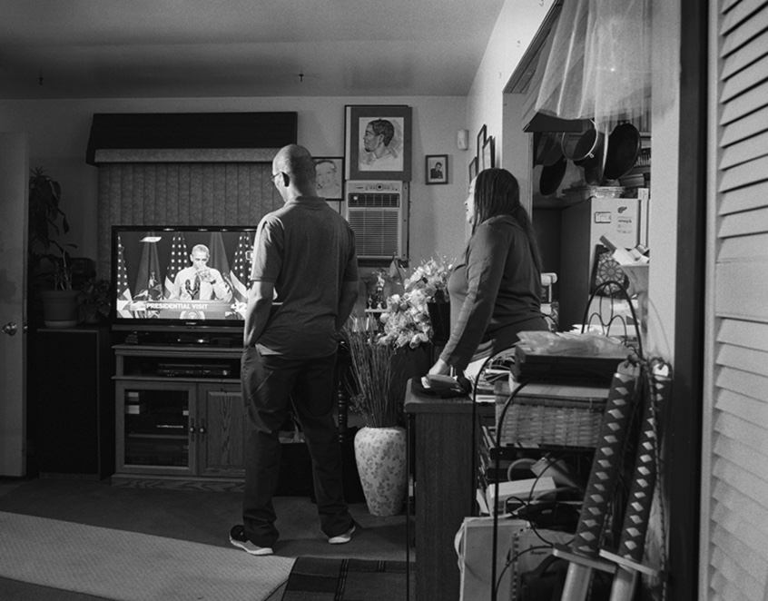
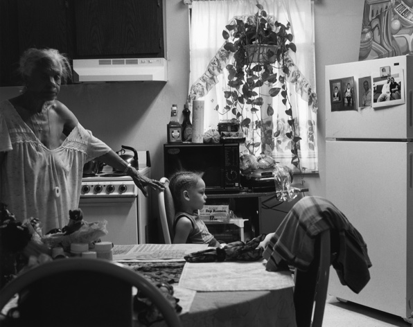
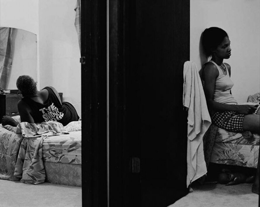
An image from LaToya’s “The Notion of Family” project.

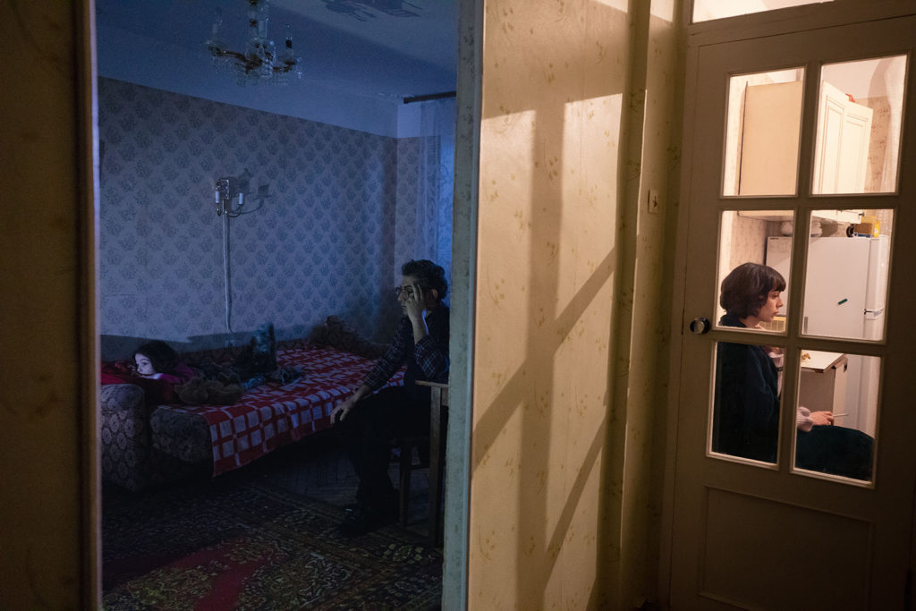
This image is black and white, which creates stark contrast within the image. For example, in the middle of the image has a large amount of black tones. This creates a clear division between the two parts of the image. This could signify a dividing factor in the family which drives the two subjects apart, which could be why LaToya chose this composition. This black-toned area of the photo matches with the black of the t-shirt of the subject to the left, creating a link between these two areas of the photograph. This image clearly uses the rule of thirds which can be seen all parts of the image: in the left the start of the black doorframe, creating the first third, the whole of the black doorframe creating the centre third, and the rest of the image to the right creating the last third. The focal point in this image is the door, which creates a high amount of contrast with the different tones of the white towel. The two subjects looking away from each other and the lack of faces in the image draws further attention to the area of dark space in the middle of the image – The exclusion of faces and the body language of the two subjects could signify tension between the two characters orunsettled feelings. To me, there is a sense of thoughfulness and nostalgia in this image, helped by the presentation of the two subjects but also the aesthetic qualities of the image: the image was shot on film and in black and white which creates a more sentimental image of family to me.

Statement of Intent

What do you want to explore?

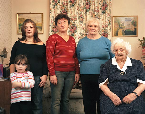
In my personal study, I want to explore my immediate family, specifically the women I grew up with. I want to explore the generational female identity of the women in my family, the unique relationship they each have with the island, their life experiences, and their relationships with me. I want to try and photograph and respond to the complex relationships between mothers and daughters, but through multiple generations.

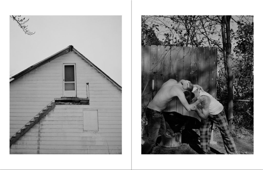
Hannah Altman, Kavana

Why it matters to you?

Photographing my grandma and my mum is important to me as they are the two most important people in my life. My mum brought me up with no help and the presence of strong women has always been something present in my life, which is why I wanted to focus on it for my personal study. I want to document my experiences of growing up with only women around me, telling a story of my life so far as well as my grandmother’s and my mum’s. I think I have had quite a unique upbringing with the strong influence of women in my life, and I want to show this in my work.

Hannah Altman, Indoor Voices, “Thanksgiving”

https://www.hannahaltmanphoto.com/indoorvoices#28 An artist I am inspired by for this project, who documents the delicate relationship between a mother and daughter – Hannah Altman and her project “Indoor Voices.”

How do you wish to develop your project?

I am going to develop my project with lots of different types of shoots and ideas. I want to develop my project from my previous work photographing my mum and grandmother, which I think was my most successful work so far. I enjoyed photographing my family and it made the process a lot more enjoyable as I was producing work with personal meaning. I would like to produce multiple series of portraits of my mum and grandmother, in their homes and places significant to them and their lives in Jersey. I also want to use archive images as part of my project, which is something I included in my last project with my family which I loved. I want to create images of important places for my family as well, such as my home and my grandmother’s. As well as photographing landscapes, I want to photograph closer-up still-life images of particular things in my house as well as my grandmother’s, specifically things linked closely to family and personal identity.

An article I read which helped me gain inspiration for my project as well as artist reference ideas.
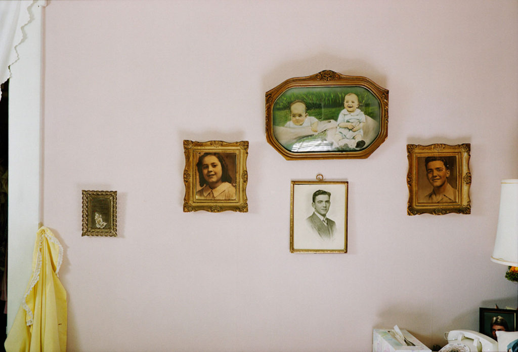
Doug Dubois

I also want to conduct interviews with both members of my family on the subject of family, and also other things related to my project. I will do these handwritten, so I can include them in my photo book and create photo collages. Photocollages are a medium which I love to use in my photography and have been previously successful in my past work on family, and I want to develop this in my personal study. I want to incorporate the words and ideas from my interviews with my family into my later work, both to help me with the direction of my shoots and also actually include them in photomontages.

An example of the kind of photomontage I like, is Savannah Dodd, “Thanks, Gd”

Below is a link to my previous photomontage work, an example of successful outcomes on the idea of family previous to this personal study.

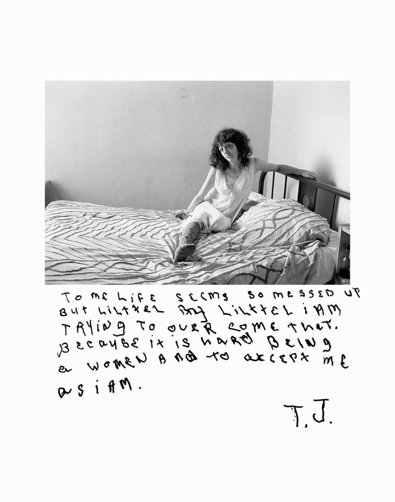
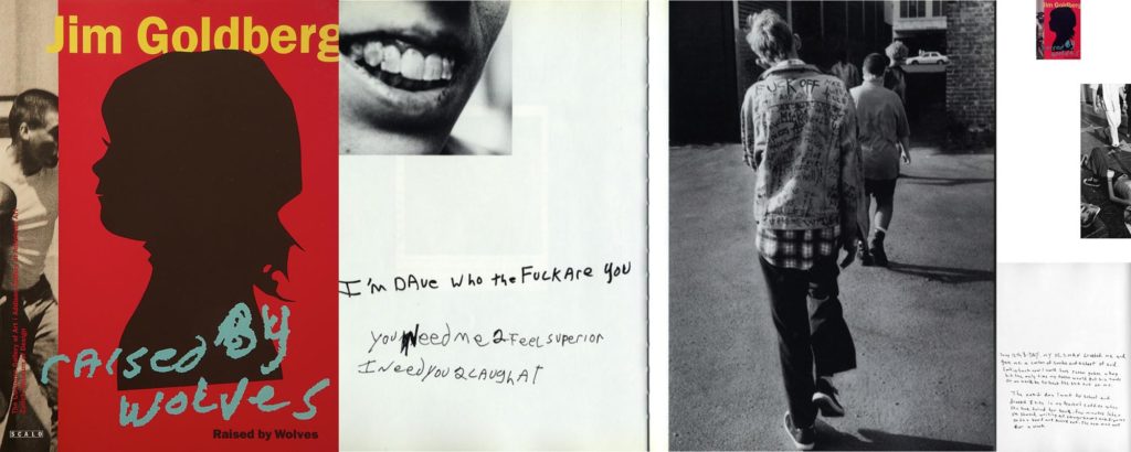
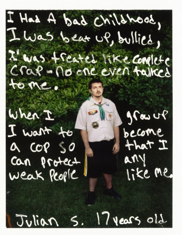
As well as this, I am interested in the idea of having my family write on images of themselves and each other, and contrasting the ideas they write of each other and themselves. This is inspired by the photographer Jim Goldberg, who used this technique in his projects, specifically Raised by Wolves, and Rich and Poor. This inspired me as the subject’s opinion of a photo of them or someone else in the project is often overlooked, and I think in my documentation of family, this is an interesting way of showing relationships and different feelings towards ourselves and each other.

When and where do you intend to begin your study?

For my personal study, I want to begin by gathering images of my own home and my grandmother’s home, as well as objects within the home more closely. After that, I then plan to begin portraits of my mother and grandmother, both separately and then together. An important part of my family is the relationship between the two, and I want to include a series of the two together in my grandmother’s house. It is tricky when photographing your own family, and am doing some research into the problems that can occur when doing this. So far, I have read this article, which I found super helpful.

https://witness.worldpressphoto.org/the-ethics-of-documenting-your-own-family-7225ca8bd59a

I am thinking of starting with photographing around the homes which I’m focusing on because this will familiarlise me with the light in both my house and my grandmother’s, and will also help me to gain inspiration for places to shoot in both homes and the further direction of the project. Another starting point for my project is starting with portraits, specifically double portraits. The idea is that I could include myself in these portraits, to produce outcomes all 3 generations of women in my family in front of the camera. This will be challenging as I haven’t made self – portraits before, but it is something I’m willing to try. If it doesn’t turn out well, I still can show all 3 generations but without me in front of the camera.

Make sure you describe how you interpret the theme of ‘islandness’, the subject matter, topic or issue you wish to explore, artists’ references/ inspirations and outcome – photobook or film. 

What makes Jersey special to you?

Jersey is special to me because of the way it influences Identity. I think that my family, the focus of my project, have especially been influenced by Jersey – the environment, the attitudes towards things here, the way they act and their interests. I think Jersey has unique characteristics and attitudes towards things, making it very special to me.

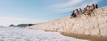
Beach culture in Jersey

What are the distinct qualities of island life?

There are lots of defining qualities of island life in my opinion. For example there is a strong sense of community in the island, within different cultures and parishes. Furthermore, in Jersey there are outstanding areas of natural beauty which make the island unique.

Plemont Bay

A sense of place and identity?

For a lot of islanders, there are specific places that feel at home to them. This may be a beach, a parish, a home or even within a community. These places give comfort and hold strong memories for Jersey residents and are crucial parts of many people’s identities.

Surf Culture in Jersey – an important community in Jersey and also within my family and its’ history

Jersey – A Crown Dependency

What is a crown dependency?

https://assets.publishing.service.gov.uk/government/uploads/system/uploads/attachment_data/file/863381/crown-dependencies-factsheet-february-2020.pdf – the Ministry of Justice’s fact sheet on the UK’s relationship with the Crown Dependancies.

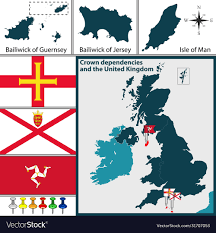
The Crown Dependencies are not part of the UK but are self-governing dependencies of the Crown. This means they have their own directly elected legislative assemblies, administrative, fiscal and legal systems and courts of law. The Crown Dependencies are not represented in the UK Parliament. Crown Dependencies have the international status of “territories for which the United Kingdom is responsible” rather than sovereign states. The relationship between the Crown Dependencies and the UK is “one of mutual respect and support, i.e. a partnership”. There is a significant gap between the official and operational relationship between the UK and the islands.

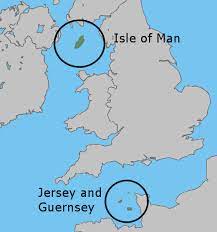
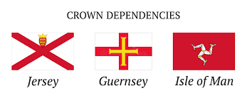
Crown Dependancies in the British Isles: Jersey, Guernsey, The Isle of Man, Alderney, and Sark.

Crown Dependancies have not been colonies of the UK, and they aren’t Oversees Territories like Gibraltar. (these have a different relationship with the UK). The Constitutional relationship of the islands is maintained through the crown, but not in a formal constitutional document. HM UK government is responsible for the defence and international relations of the Islands. The Crown, acting through a council, is ultimately responsible for ensuring their good government.

A video about British crown dependancies

Jersey’s history as a Crown Dependency

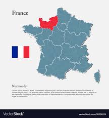
The Channel Islands were part of the Duchy of Normandy when Duke William, following his conquest of England in 1066, became William I. In 1106, William’s youngest son Henry I seized the Duchy of Normandy from his brother Robert. Since that time, the English, and subsequently British Sovereign has held the title Duke of Normandy. By 1205, England had lost most of its French lands, including Normandy. However, the Channel Islands which were part of the lost Duchy remained a self-governing possession of the English Crown. While the Islands today retain autonomy in government, they owe allegiance to the Crown in their role as Duke of Normandy.

Normandy, France.

Each island has total control over its laws – including setting its own public holidays, which meant that even though King Charles III approved the day of his mother’s funeral as a bank holiday in the United Kingdom, both Jersey and Guernsey’s governments had to give their approval before the change came into effect there. The 1973 report of the Royal Commission on the Constitution – which examined the structures of the constitution of the United Kingdom and the British Islands – referred to the constitutional position of the Crown Dependencies as ‘unique’. It stated: “In some respects, they are like miniature states with wide powers of self-government, while their method of functioning through committees is much more akin to that of United Kingdom local authorities.” A 2010 Justice Committee report highlighted the “essential independence” between the Crown Dependencies and the UK and “their independence from each other”.  The same report emphasised that the Crown Dependencies’ relationship is with the Crown rather than the UK.

Jersey’s Government as a Crown Dependency

Because Jersey is a dependency of the British Crown, King Charles III reigns in Jersey. “The Crown” is defined by the Law Officers of the Crown as the “Crown in right of Jersey”. The King’s representative and adviser on the island are the Lieutenant Governor of Jersey – Vice-Admiral Jerry Kyd since 8 October 2022. He is a point of contact between Jersey ministers and the UK Government and carries out some functions in relation to immigration control, deportation, naturalisation and the issue of passports. In 1973, the Royal Commission on the Constitution set out the duties of the Crown as including ultimate responsibility for the good government of the Crown Dependencies; international representation, subject to consultation with the island authorities before concluding any agreement which would apply to them; ensuring the islands meet their international obligations, and defence.

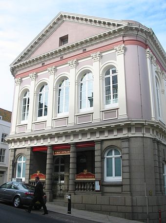
The States Building in St Helier

Jersey’s unicameral (one assembly of voting)  legislature is the States Assembly. It includes 49 elected members: 8 senators (elected on an island-wide basis), 12 Connétables (often called ‘constables’, heads of parishes) and 29 deputies (representing constituencies), all elected for four-year terms as of the October 2011 elections. There are also five non-voting members appointed by the Crown: the Bailiff, the Lieutenant Governor of Jersey, the Dean of Jersey, the Attorney General and the Solicitor General. The Bailiff is the President (presiding officer) of the States Assembly, head of the judiciary and as civic head of the island carries out various ceremonial roles. The Council of Ministers, consisting of a Chief Minister and nine ministers, makes up the leading body of the Government of Jersey.  Each minister may appoint up to two assistant ministers.  A Chief Executive is the head of the civil service. Some governmental functions are carried out in the island’s parishes.

Islandness Mindmap and Moodboard

Mindmaps

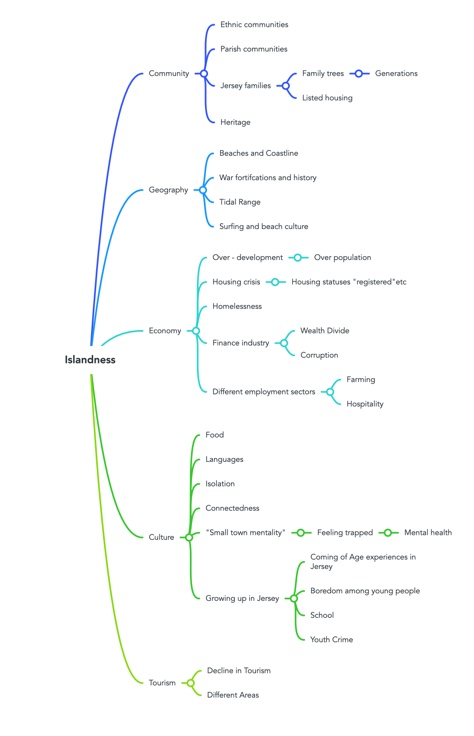
Islandness mindmap

Above is my mind map of general ideas about Islands, and all the different ways I could think about the topic. I tried to keep this mindmap broad and open to multiple aspects of things to do with the topic, as this would make it easier to make my own mindmap and decisions on my topic of choice for my study. I tried to include both positive and negative things on the topic of islandness, to give myself ideas on the kind of story I want to tell in my study. I wanted to ask myself the question of whether I wanted to show the good and bad aspects of living on an island, or one or another. These aspects of my above mindmap helped me to narrow my ideas down to a mindmap of my own ideas.

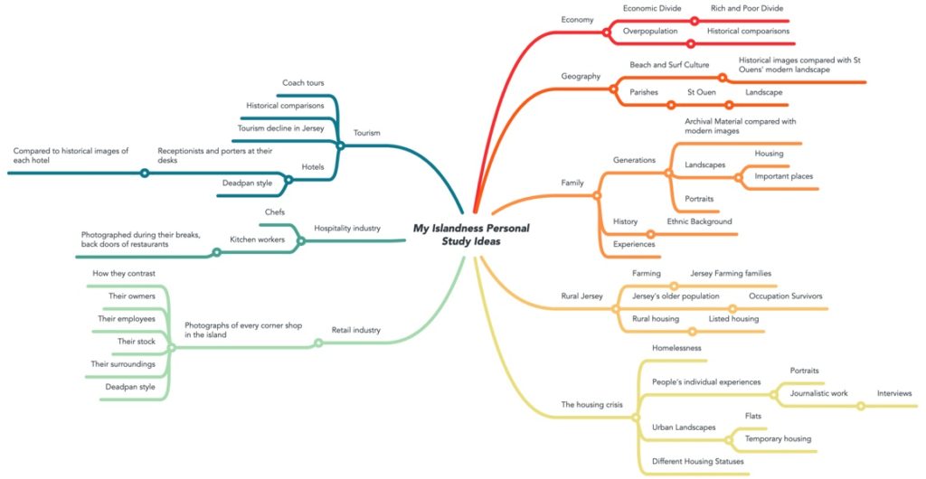
This mindmap is an overview of all the ideas I have for capturing the idea of Islandness in my personal study, as well as ideas about how I would produce each idea in further detail. These include options such as portraiture or landscapes, styles, journalistic elements and locations. This mindmap was also influenced by my review and reflect blog post, in which I discussed the strengths and weaknesses in my current and previous work. I evaluated the success of all my projects and my development as a photographer throughout the course.

Therefore, I have developed a mood board of my ideas for my personal study, of styles, photographers and topics for my work.

Moodboard

In this mood board, after looking further at my mindmap, I have collected images with ideas on Family, and generational identity, as well as stylistic ideas which I like: for example Jim Goldberg’s work, which isn’t really related to what I’m focusing on for the project. However, I included his work as I really like how he includes text in his work, which is something I really want to include in my photobook. Doing this moodboard and looking at varied artists related to my ideas has helped me realise what I want to photograph, who I want to photograph and the stories I want to tell through my images and overall project. Using my review and reflection post to help me was really useful as I have decided to build on one of my projects from year 12 on family, which I enjoyed the most and thought was my strongest work so far. I have included photographers that use grainy, warm editing, mostly all shot on film, as this is the style that I like to use for my pictures when editing, to create a sentimental and nostalgic feeling in my work.

Review and Reflect

Objective: Criteria from the Syllabus: “Essential that students build on their prior knowledge and experience developed during the course. Develop your written dissertation in the light of your chosen focus from the practical part of previous coursework and projects.” Below, I have analysed my thematic work, my use of technologies, as well as different methods, and how I have progressed throughout years 12 and 13.

Themes

Identity

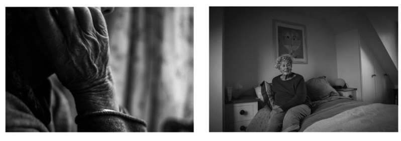
One of my final pieces of my Mum
One of my final outcome set of images – my Grandmother

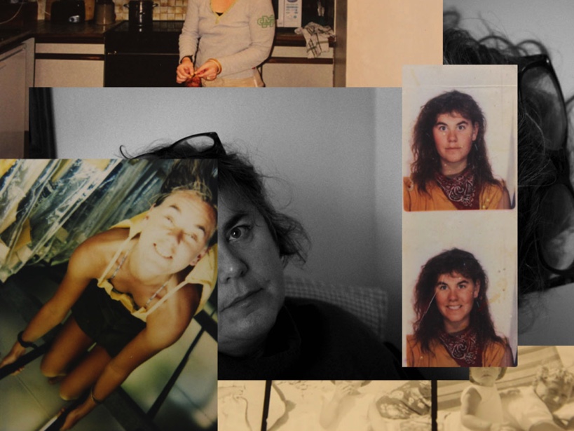
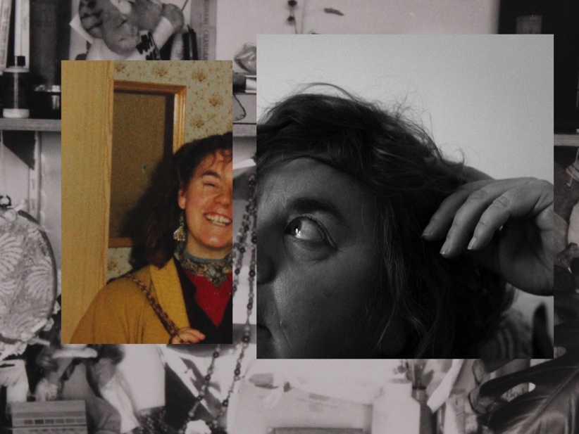
I think that overall my Identity project has been my most successful project. This was my first exam project in year 12, however, I already had some skills from GCSE photography which gave me a basic understanding of things such as editing and camera handling. Leading up to this exam, and also in GCSE, I developed a liking for photo collages and montages, and I decided to focus on this for my Identity project. I think that my raw images were successful for this project due to my use of a portrait lens, as well as by controlling the lighting. This helped to make my editing and experimenting process easier and improve the quality of my final outcomes.

I think that focusing on a topic such as my own family helped me to become passionate about this project, and want to produce the best quality of work I could. I think part of what made this project good was my use of archival material, photographed using a copy stand. Using a copy stand correctly in my project ensured my archival images were captured in the highest resolution possible, keeping the quality of my work consistent throughout. Furthermore, I think that each piece or set of pictures tells a specific story about my grandmother or mum, and I think this made my outcomes more mature and thoughtful. I am proud of these outcomes, and I think they show a unique family history through generations.

Anthropocene

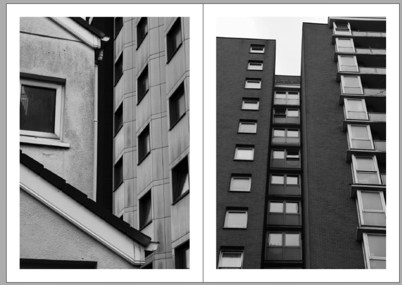
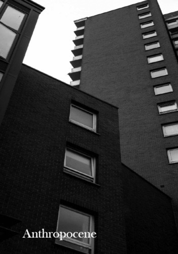
For my Anthropocene exam, I focused on the housing crisis in Jersey. Although this project was still thriving, it wasn’t my best work. I liked my actual images, but my planning wasn’t the best – I had originally decided to create photo collages in the style of Laura Romero, but after my first day in the exam I realised this was not realistic, nor something that was in my desired style of photography. I then produced artist studies of other photographers that were more relevant to my desired outcome and ended with a project on the housing crisis. I think that my overall outcomes were successful, but were slightly rushed due to my change in ideas in the middle of the exam. I’ve learnt from this in my projects since, and try to plan realistic ideas that fit what I like to photograph and what I can achieve in reality.

Another project I had in this project was my editing. In a few of my images, I think I edited too dark with my black-and-white settings in lightroom. This gave me some images that were a bit too dark for my liking, which I only realised when I had received my images from the printers. To stop this from happening again, in my personal study I will use test prints of my final images before finalizing them to make sure they are up to the standard I want them to be. On the other hand, one thing I like about this project is the journalistic element. I found it interesting to research the housing crisis, and then go out and respond to my research with photographs. To take this even further, if I was to do this project again, I could interview people affected by the housing crisis and put this next to my images in my outcome.

One page of my zine for Anthropocene

Romanticism and Rural Landscapes

This is some of my less successful work. I think my rural landscapes were not as successful partly because they aren’t something I like to photograph. I find it much easier to photograph things that I like, and this helps me to come up with more ideas and better images. Even if I didn’t like the subject of these images, photographing different environments has helped me to figure out what I like to photograph, and what my strengths are.

My Rock

My final zine and final pieces for My Rock are pieces of work which I’m proud of. I’m glad I had the chance to make another set of zines for this project, as it allowed me to reflect on the previous zine I produced for Anthropocene. I produced a much larger amount of images for this project, on my trip away in the US. The experience and excitement of a new place helped with this, as everything was so new and interesting to me – I wanted to photograph this. I ended up with over 8000 images from my trip, allowing me to select a wide range of images to use in my final zines. Having this amount of images took a lot of sorting and organising, but through my use of lightroom, I sorted them all into their unique categories. I think that the wide range of images I had for this project added more depth to my work, with different styles and ideas.

Technologies

Lightroom and Photoshop – Editing and Experimenting Skills

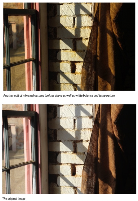
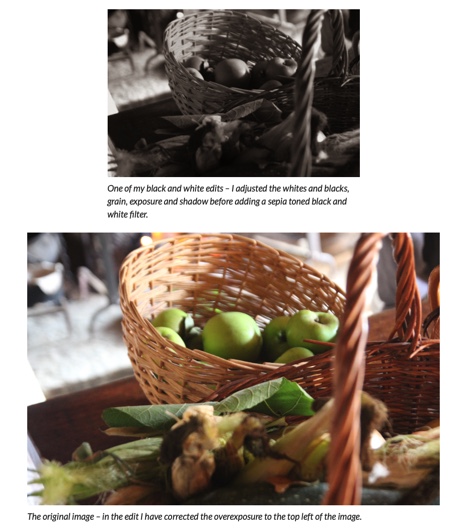
This is my most recent work. My proficiency with Lightroom Classic has significantly improved, which can be seen in this editing. I now can use things such as ‘Sync Settings’ to ensure all my edits are consistent, which was useful in the “My Rock” project when creating a zine. If you contrast my editing in this project with the editing in my Anthropocene project, there are vast differences: in my Anthropocene project, my edits were often too extreme: too dark, or too much contrast, ruining the quality of the images a little. I also found in my Anthropocene project that a lot of my edits turned out quite different from one another, which was not something I wanted in my “zine – now, looking back I can see I have improved my editing skills since then and can produce more consistent, high-quality edits.

This was my first editing post of the whole A – Level. I had experience with basic editing skills from GCSE photography, however, I had never used Lightroom Classic before. I found it a little difficult to get used to at first, but once I had gotten used to it, I found it a great organisational tool for my images as well as editing. In my first post here, I only adjust a few things in each image and don’t explore all of the tools. After getting to grips with most aspects of the software, I can use it to the best ability and produce effective edits.

This was some experimenting done in photoshop with my still-life images in Year 12. I had begun to develop my skills in photoshop by this point, and through this work on photomontage, I discovered a love for this type of work – I developed this after a little experience with this medium at GCSE in this blog post, and experimented with both handmade and digital montages. After creating several digital montages for this Still Life project, I liked this medium and decided to use it in my Identity exam, where I used photoshop to put them together. This gave me another chance to better my photoshop skills, especially when dealing with multiple sets of images on different layers and documents.

Indesign

Anthropocene

My Anthropocene work was my first attempt at using Indesign, and I found it quite difficult. I didn’t know how to use all of the menus properly and didn’t know how to format my `zine correctly or package it for printing. I hadn’t had a chance to research this beforehand as I decided to use this presentation style in the actual exam, so in hindsight, if I had decided earlier to use this outcome I probably would have found it easier with background research and ideas.

My Rock

This was my second attempt at making a zine, in my My Rock project. I created two zines. I decided to do this because I had a lot of images from this project, of different themes and styles. I wanted to challenge myself with the decision to make two zines, and I think this paid off in my final zines. I like how they show two different sides to my exchange trip, and I think I produced two meaningful outcomes for this project.

In these two zines, I experimented more with different layouts in my zines, such as larger and smaller images on double pages, and different kinds of text on my front covers. I liked using different kinds of layouts in this project, and I found this easier and easier after developing my skills with Indesign. However, I think I still need to develop my experimenting skills in all of my projects and take more creative risks. This is the feedback I have had from multiple assessments, and something I want to develop within my work in my personal study.

Making my Final Zine and Evaluation


Zine 2

In my last zine for the My Rock project, I am including more personal, intimate images from my trip away this September. In this zine I wanted to document rural American life through my perspective, capturing my experiences as an outsider, but also where I stayed and things in my immediate environment.

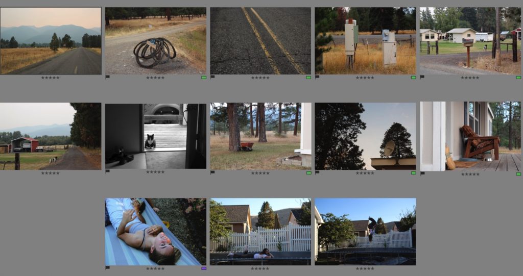
Final Images for this Zine

This image has an empty alt attribute; its file name is 98FFCCC5-F515-4391-9D56-AACAC15F5CC1-1024x541.jpeg

I compiled my images for this zine from my flagged image from each photoshoot. I then put them into a separate folder for this zine “zine 2” and gave them all ratings, as well as edited them in a similar style – I used sync settings for a few images to keep my style of editing consistent.

Designing my zine – experiments

In this experiment, I was using a series of two images – I was stuck on presenting them with different layouts. I started with two on one page, then decided to do one on each. I tried first with one image of each page but then thought there was too much white space.

I decided to add another image underneath, and I wanted to use one that was not too busy. I then tried this but decided I didn’t like it, so I tried the images differently, below.

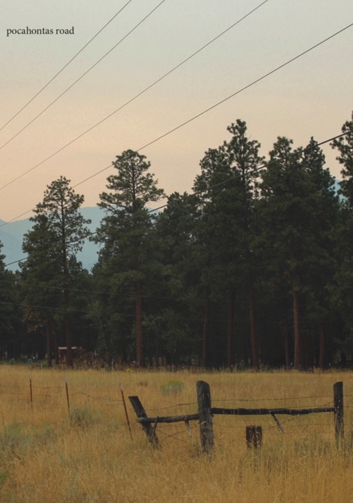
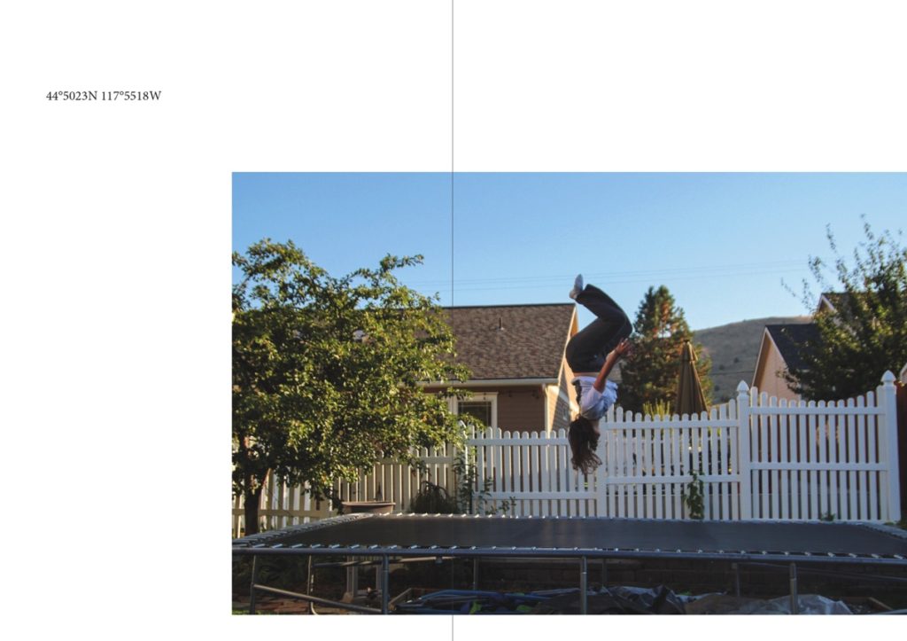
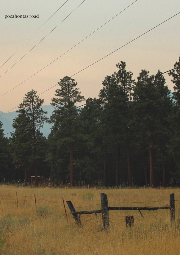
I then switched both images back to the original placement, with one embodiment higher on one page, than the other at the bottom – both had the same alignment to keep the composition balanced. I then, after adding my title to the front, decided to experiment with text on this page. I used the coordinates of the road where I lived next to this image. I liked it but felt it didn’t fit with the rest of my zine as there was not much space on my other pages for text – I wanted to keep my zine as cohesive as possible so didn’t end up including the text in the end. This is something that I want to include in the future though, in my study photobook.

The final layout of the two images that I was experimenting with – one out of the two, with the final sequence below.

Final Zine

Front Cover

My front page for this zine. I used cropping tools in InDesign when placing the image onto my front cover, which helped me to create my desired composition. I think that putting my title so small at the top of my cover helped to not distract from the rest of the image, and I like how it is quite understated – this is a theme throughout this zine and I like how I’ve introduced this on the front cover. I think my editing was successful. It is an example of how I tried to edit my images for this zine – I wanted to create warm, faded images with a bit of grain, to show the quiet and understated nature of these images.

Pages 2 and 3

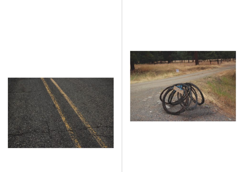
This is a unique set of two images, my first page in my zine. Both these images are taken from the surrounding roads from where I lived, on a loop of roads called the “Proffit Loop”. I placed these images together due to their similar features. They both feature strong leading lines, in different directions, which creates a balanced composition for the spread. The left image’s leading lines are the perpendicular road markings, leading off to the left. I also like this image due to its more macro composition – I don’t normally take images like this, and I like this unique image in that way. The yellow road markings in the left image tone with the yellows and greens in the right image, which ties the two coherently together. The right image’s leafing lines are off to the right. This image ties further with the left because of the grey wire – the smaller amount of grey in this image ties nicely with the entirely grey image next to it, making for opposite images in a way, and an interesting comparison.

Pages 4 and 5

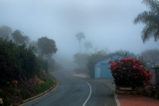
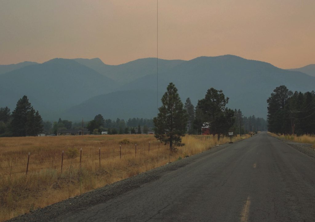
This image is one of my favourites from my whole trip away. I think this composition is really good and features a unique landscape which is really unlike anything I’ve photographed before. I think this image uses the rule of thirds very well, and there are strong leading lines. The angle at which I took the picture created the strong leading lines from the left, leading to the right middle of the image. The leading lines to the right create a triangle shape to the left, which ends with a clear line through the middle. This cuts the darkness of the mountains off, creating a separation between the different parts of the image.

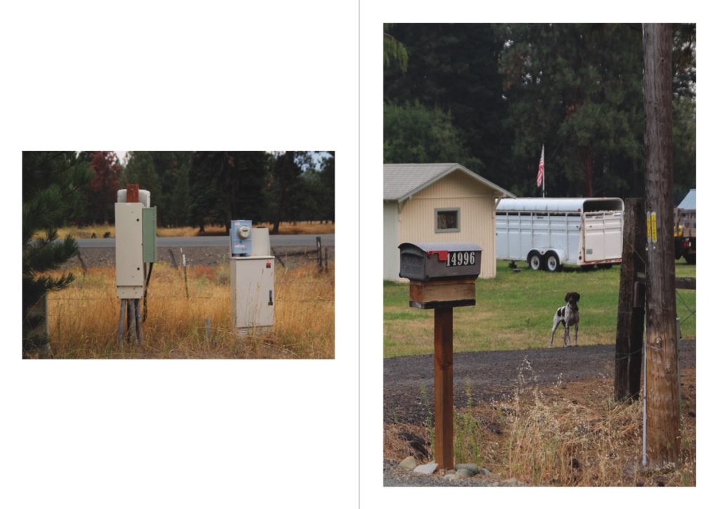
Pages 6 and 7

I chose to include these two images next to each other due to their similar tones and subjects. Both images feature beige and white tomes – the image on the left features these in the two electrical boxes, and the image on the right is in the cattle trailer. Both images also have similar backgrounds of the same type of tree – this is because they were both taken on the same photoshoot, which brings them coherently together with similar settings. I think that both images paint a unique picture of rural life in the US, with the old-fashioned electrical boxes and mailboxes, as well as hints at the farming industry in the right image.

Pages 8 and 9

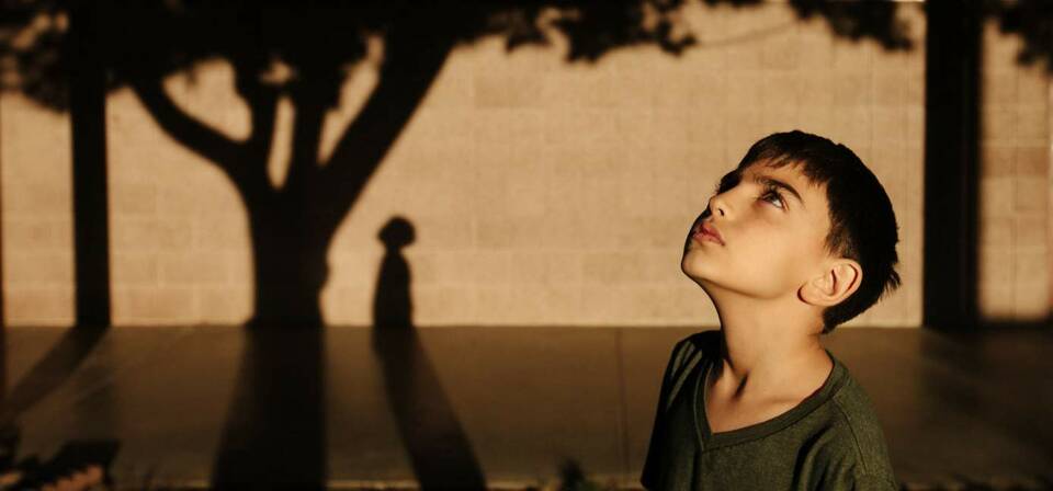
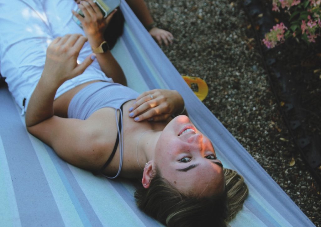
This image is unique compared to other images in this series. I didn’t take many portraits while away, and this is one of my few. This image was strong as a raw image due to the lighting at the time of my shoot – I shot during golden hour, actually with an impromptu photoshoot, in which I photographed my fellow exchange students in one of our last evenings in the USA. I tried to capture my subject naturally in this image, to create unstaged images. In my editing of this image, I used several filters in lightroom with high amounts of grain and soft tones. I like the playful, child-like nature of this image and my other two portraits in this Zine, which shows a sense of how we all felt during our time away.

Pages 10 and 11

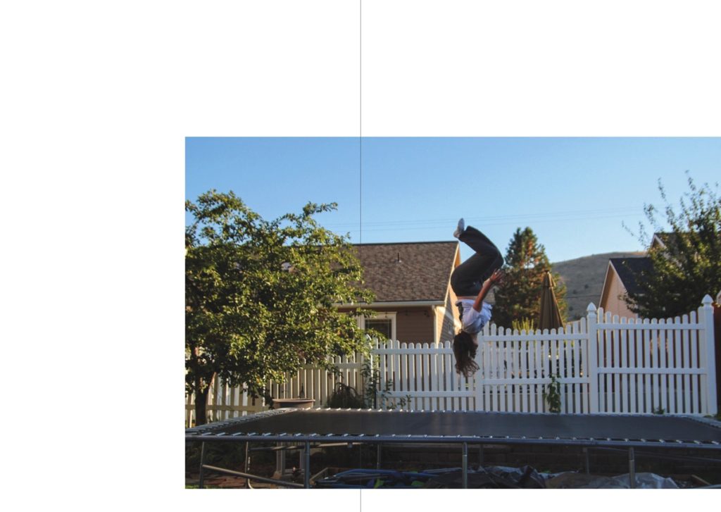
This spread is that of a sequence of two. The other image is placed after my next double-page spread. I think that including a sequence of two images separated from each other creates a logical thread throughout the zine, and helps to keep a cohesive theme between all my images. This image was edited like most of my others in this zine, with soft tones, reduced contrast and added grain. I wanted to create a peaceful mood and thoughtful image in this image, that matches the expression of my subject. This is quite fitting as it was the end of our trip, our last evening altogether – it all felt a bit surreal, and this can be shown with the confusing landscapes of a suburban house and a trampoline with mountains in the background. I used negative space in this image, as well as its counterpart two pages over, to symbolise the vastness and size of how America felt to us during our stay, and to create and experiment with different layouts that I hadn’t used before.

Pages 12 and 13

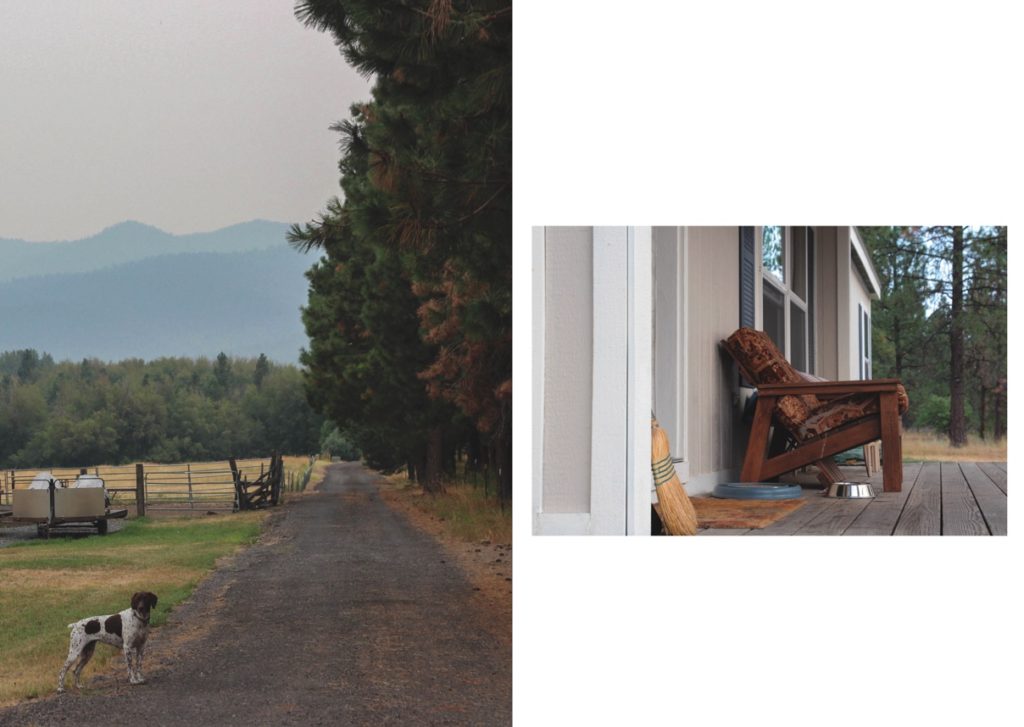
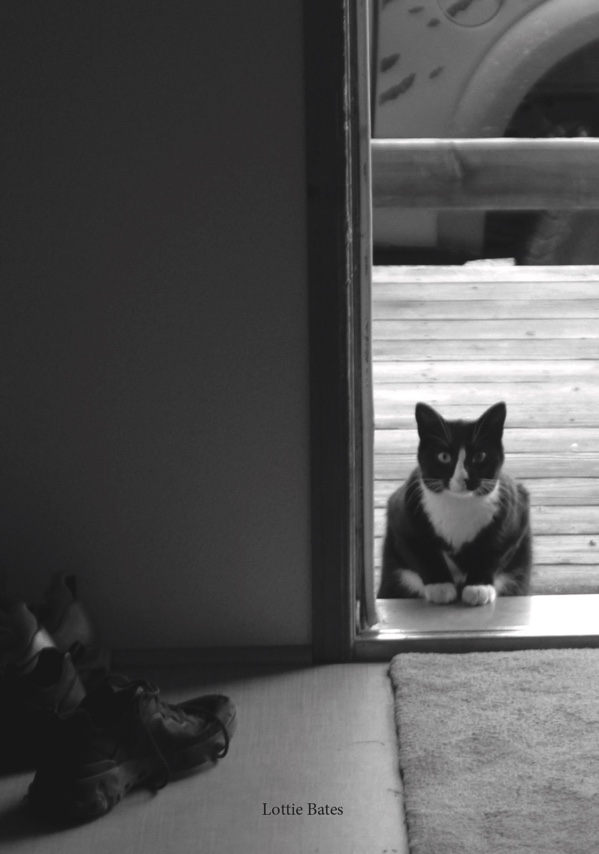
This is my last double-page spread. Both these images, in my opinion, are quiet images, that show a more intimate side to my personal experiences. The left image features the dog looking inquisitively like the outsider, standing outside his house. This represents in a way, how I felt at times during my trip: an outsider. The right image is one of the home where I stayed. This is the only actual image of the house that I stayed in, and in hindsight, I feel like I should have included more.

Pages 14 and 15

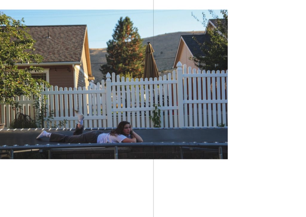
This is the second image from my sequence of two. This is the more playful image of the two, as I spoke about in my evaluation of the other image. Having this image as my last in the zine, also in a sequence, meant it created a clear end to the project.

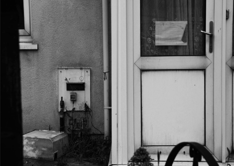
Back cover

This is the back cover from my second zine. This image is from where I stayed, and the feature of the door signifies the end of a journey and the end of a project to me. Even though this is the only black-and-white image in this zine, I think it worked perfectly with the tones in the image and creates a quiet end to my zine.

Evaluation

Overall I think this zine was very successful. I like how it showed a more personal side to my trip and included images that documented my own personal experiences in a new country, with new people and places. I also like how I touched on how I felt during the trip in these images. I love how thoughtful some of these images are, and I think they show my improvement as a photographer throughout the course in the ways of design choices and editing, and overall as a photographer.

Making my First Zine and Evaluation

Zine 1

In my first zine, as discussed in my research and ideas post, I am including mostly impersonal, architectural or urban landscapes. This zine is documenting mostly a more touristic view of my trip, definitely more than my other zine which will show a more personal side.

Final images for this zine

Design

After selecting all my final images for my first zine, I made a zine document in Indesign. Below is my setup.

My set-up in Adobe Indesign

After that, I began to place my images into pages – at first, I used rough placement to figure out a pattern for my double-page spreads and single-page images. I left the front and back cover, and the middle spread until the end as these are the most impactful pages in my zine.

Placing my into my blank zine using the ‘place’ tool above.

Starting to place images in, and experimenting with orders.

Originally, I had this image as a double-page spread. After placing other images into a more defined order and pattern, I realised that it didn’t really fit the pattern or idea of my zine as a stand-alone image on a double-page spread.

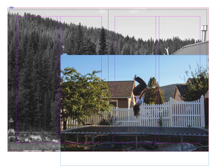
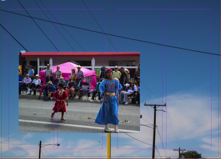
Even though I didn’t want the image as a double-page spread, I still wanted to include it. I decided to make a sort of collage, as I had done with an earlier set of images (see my final zine below). First, I thought that this image would look better with a plainer image behind it, to not distract from the business of the main image. However, I found that this image did not look right with my image of the two girls – the tones in the image clashed and did not work.

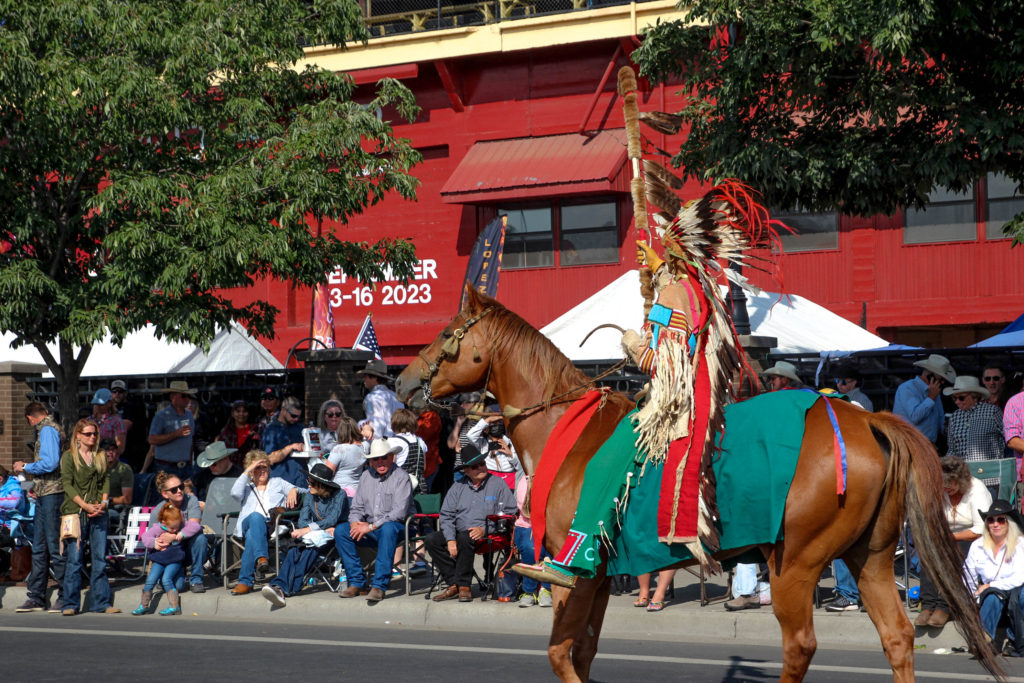
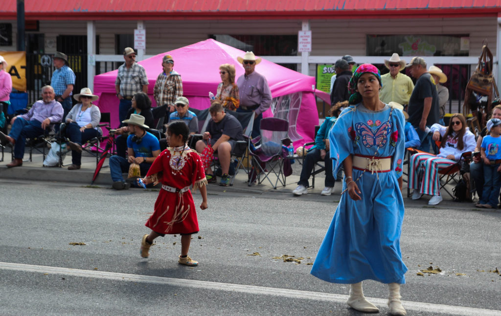
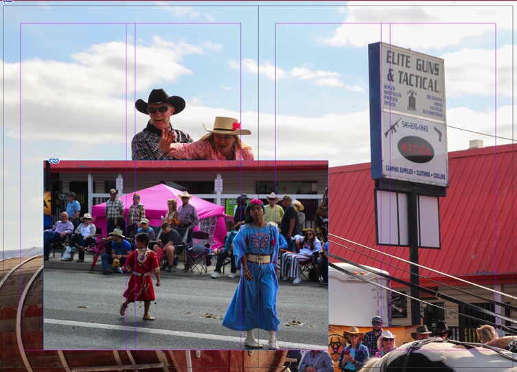
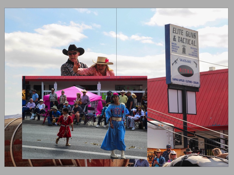
In the end, this was my final page. I used a more busy image, from the same spot in the parade. Not only does this image work better with the tones in the other image, but it also creates a quite stark social commentary on the treatment of Native Americans in today’s society in the US. – I have analysed this below in my final zine.

Final zine

Front cover

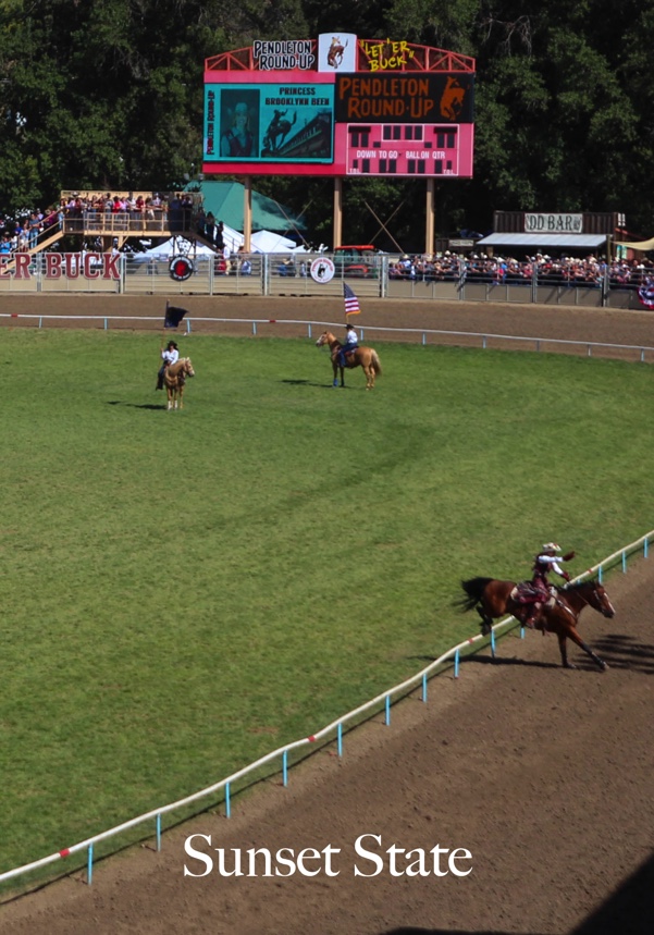
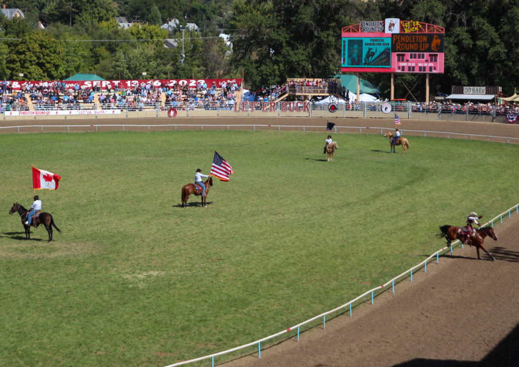
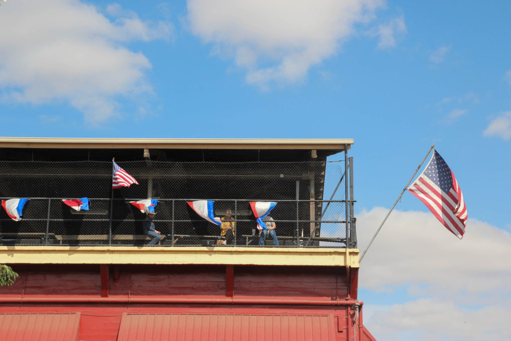
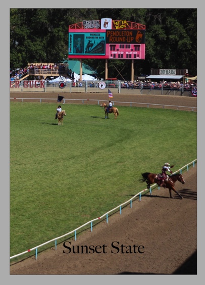
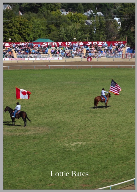
This is the front cover of my first zine. I created my front cover by cutting an image in half – the other half is my back cover. This creates a coherent start and end to my first zine. This image I think works really well as a start to my work – the picture itself was actually from the start of a rodeo that I photographed, and I feel like the flags represent my journey quite well to the viewer of where I went, but also signal the beginning of something. I like how the horse jumping over the fence on the outside of the image kind of signals the reader to turn the page – I think it helps to start the flow of my zine. I tried to edit this image, along with almost all of my others for this zine, with vibrant, crisp tones.

Page 1 and 2

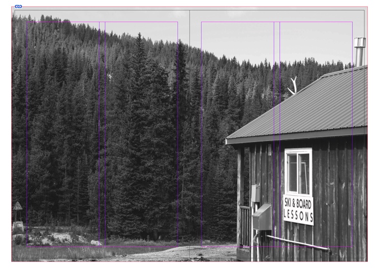
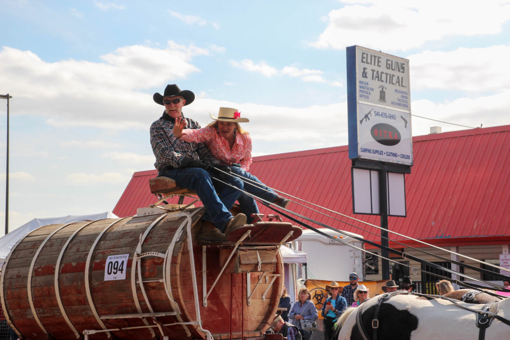
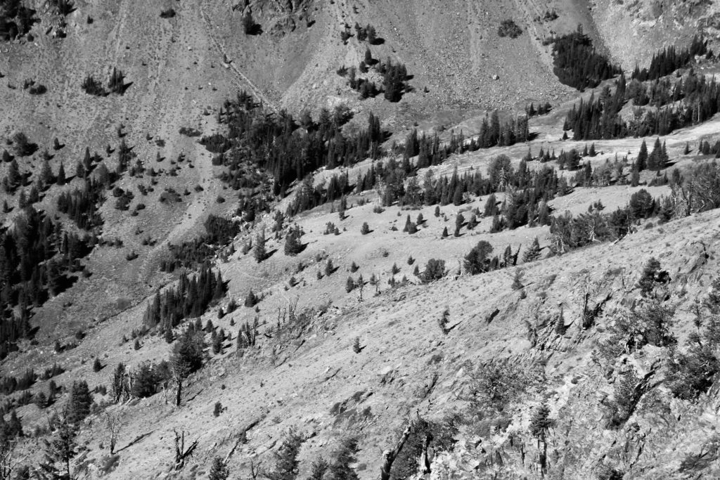
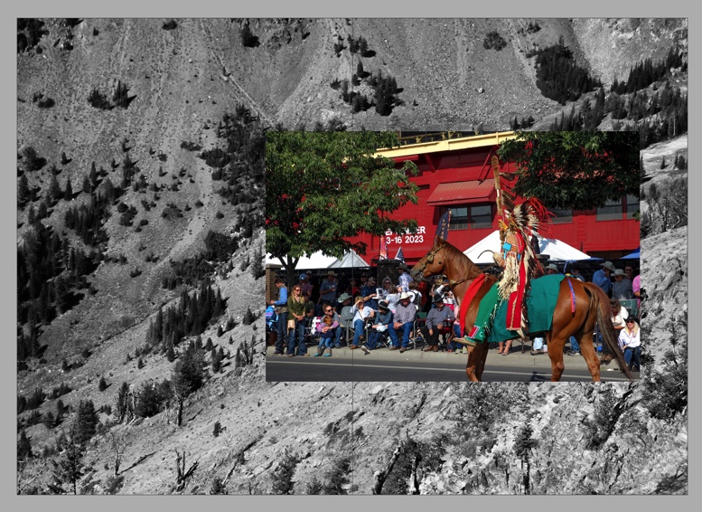
This is the first double-page spread in my zine. The image in the back of the spread is in black and white – I made this decision to highlight the shapes of the trees, as well as the contours of the mountains in the background. In my editing of this image, I cropped it quite a bit – this helped to bring more attention to the detail in the landscape and balance the composition. The image on top is another one from the parade which I photographed. I think the vibrant red tones in this image contrast really nicely with the black-and-white image below it, and help to highlight the subject in the top image. I think this collage also followed nicely from the front cover as it features similar tones to the front, as well as also featuring a horse and rider. This helps the zine to flow nicely. Also, the combination of the horse and rider in traditional Native American dress with the image of the wild mountains signifies the traditional landscape in which Native Americans lived, and how they have been pushed out of their native land by the white people – who now watch them for entertainment in parades such as the one I watched. I noticed quite a tense atmosphere throughout this day, as relations between the Native Americans and white people in the US are still difficult – I wanted to show this in my zine, as it reflects the real America that I saw, and my own personal view of what I photographed and the issues that lie beneath the surface.

Page 3 and 4

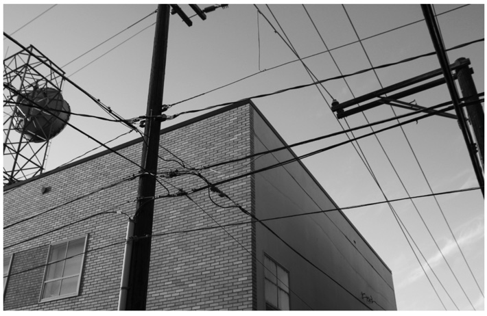
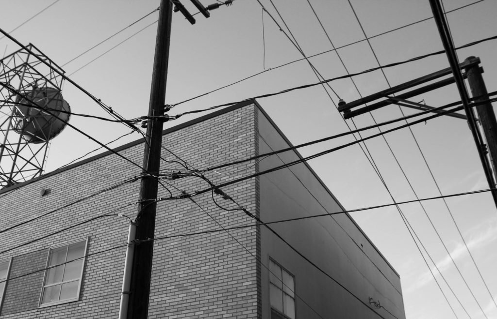
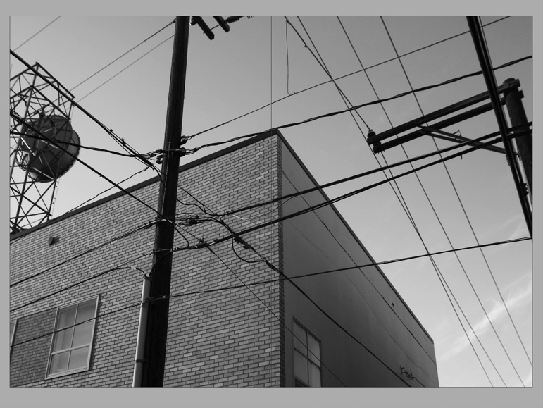
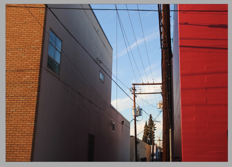
This is the next spread in my zine. I like how this image is in black and white, as it follows nicely from the black and white element of my last pages. I think this is one of my strongest images out of my whole work from my trip to the USA – I particularly like the strong shapes in the image: the rectangular shapes of the building, as well as the perpendicular lines of the power lines. The leading lines are really strong in this image and take the eye from the focal point, the left third of the image with the pole and end of the building, towards the edges on both the left and right corners. I think this creates a really unique composition, which is what I like about this image.

Page 5 and 6

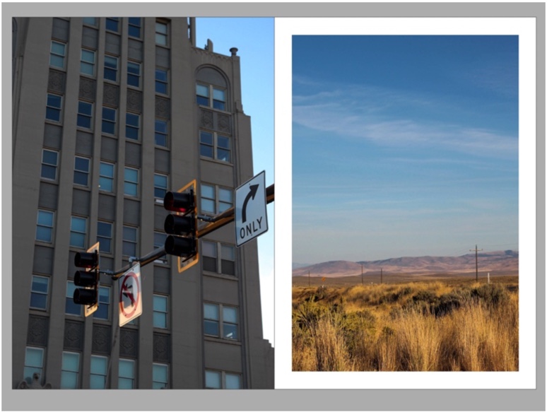
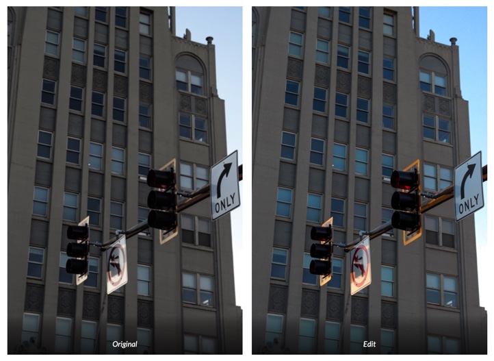
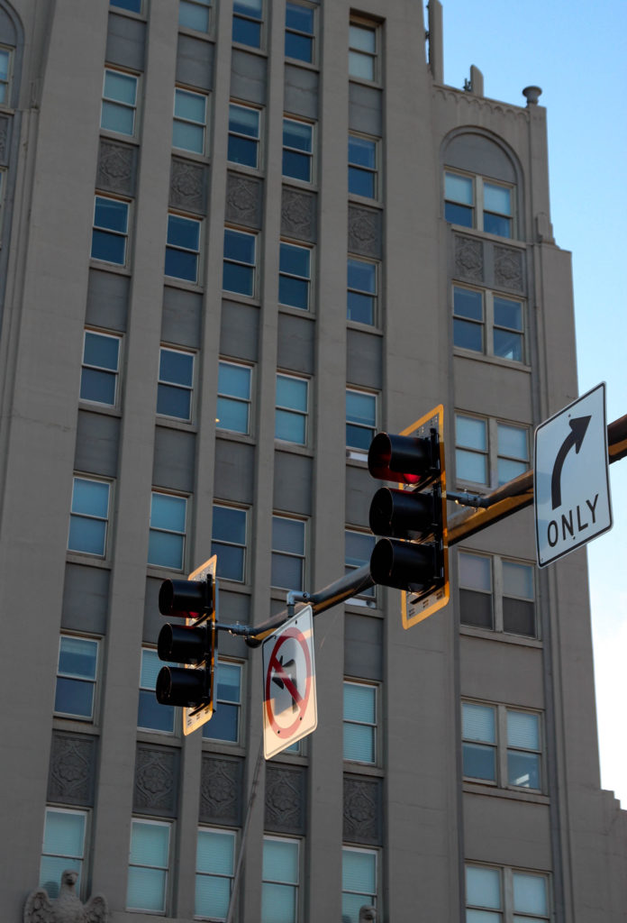
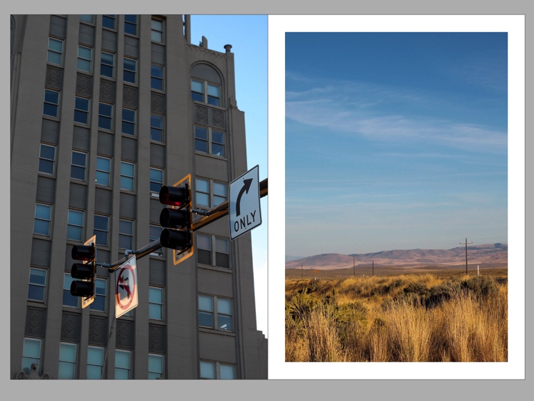
This is my first double image spread in my zine – I used these images together because of their stark contrast – the left image shows the urban landscape of the town, which is quite a classic image, but I like how even looking at the signs in the image, you know it’s America. I liked how this was documented in a few of my images actually, as I think it tells a story of how the US presents itself to tourists, even in rural areas like the ones I photographed. The image on the left is again I think one of my best images, as I like the way in which the light subtly reflects onto the road signs, and the overall composition – I haven’t got many images from this shoot taken in portrait, and this one I like. I think that these two images work really well together also because of the similar tones, especially the orange and yellow tones in the picture on the right which match the colour of the border of the traffic lights.

Page 7 and 8

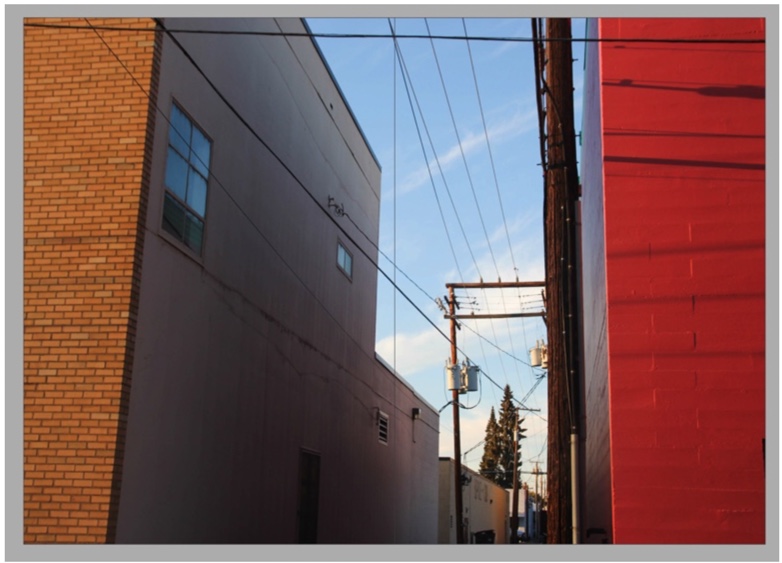
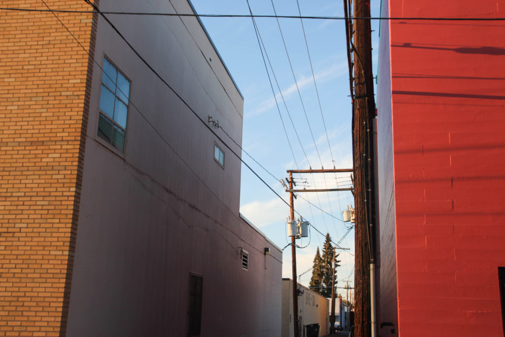
This image is another double page spread from my zine. I think this is also one of my strongest images from this project. I really like the colours in this image, which I enhanced with my editing. I like how at the opposite sides of the images, the colours are completely different. This creates leading lines down through the middle of the image, that lead to the bottom middle of the image. This was helped by my use of cropping, to ensure my image was compositionally correct and fitting into the rule of thirds. The bold colours in this image as well as the composition were why I put this image as a double page spread.

Page 9 and 10

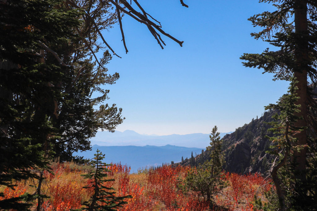
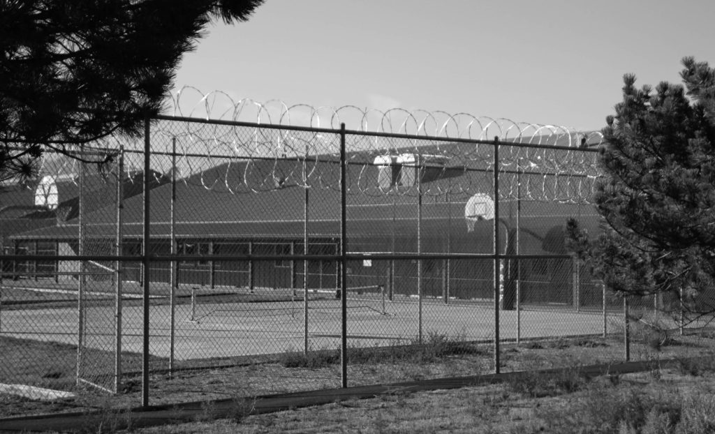
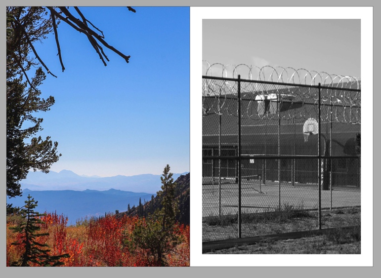
In this double page spread, I wanted to show two sides of the American landscape that I visited. I chose the image on the left due to the vibrant colours of the foreground, as well as the mountain ridge in the background, with the varying blue tones which I like. I also really like the way the trees to the left create a natural frame for the landscape, and tone in with the bushes on the right. The right image, although contrasting with the vibrant colours in the left image, I think the darker tones of the trees on the left match well with the black on the right. Furthermore, I picked these images together to show the contrasting sides of the places I visited: on the left, a picturesque landscape, and the left, the stark image of the town’s prison. I think that this documents the two different sides to the place I visited, and different people in their society’s experiences.

Page 11 and 12

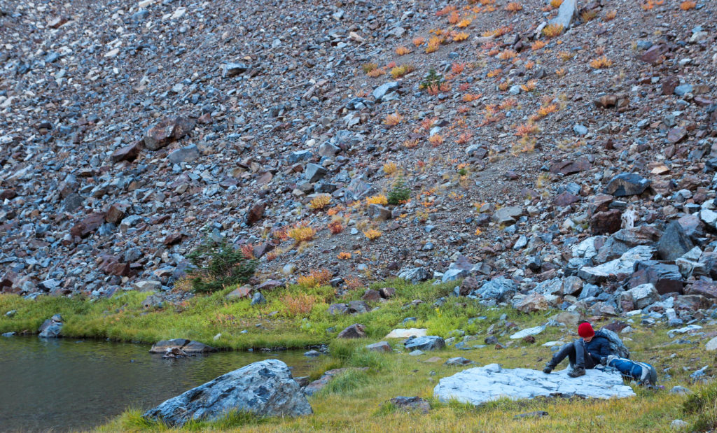
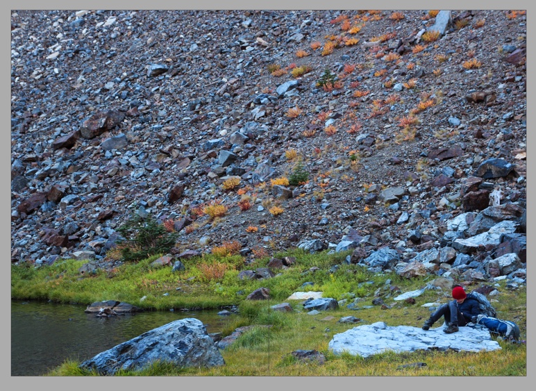
Another double page spread from my zine. I chose this image particularly because of the composition. Even though if you look at the image with the rule of thirds it may appear unbalanced, I like how the figure in the bottom right appears so small, against the rock face in the background. I created this unique composition through my use of cropping – this helped to create a more clear focal point in the image – the edge of the lake on the left and the figure on the rock to the right. This fine detail was also helped by my editing, in which I focused on adding highlights, vibrance and clarity into the image.

Page 13 and 14

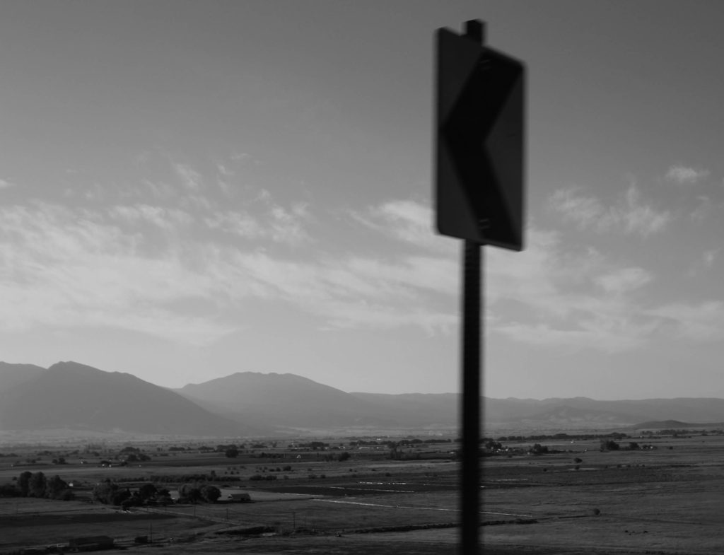
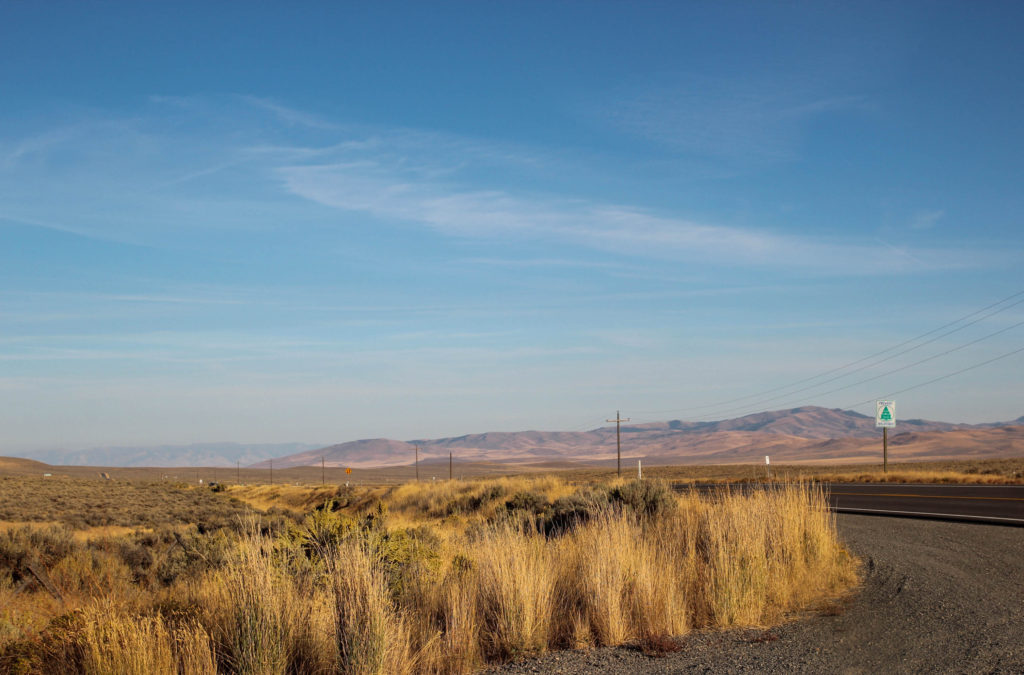
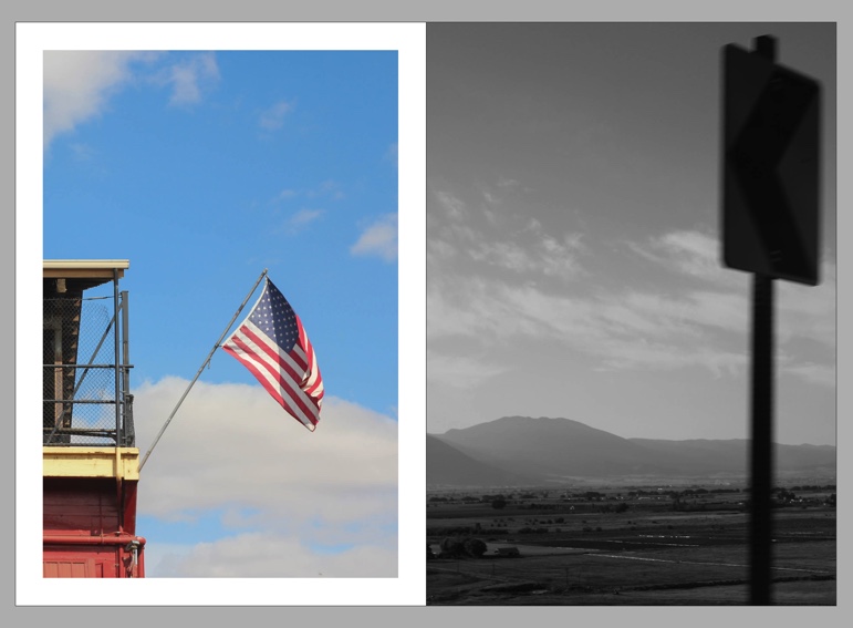
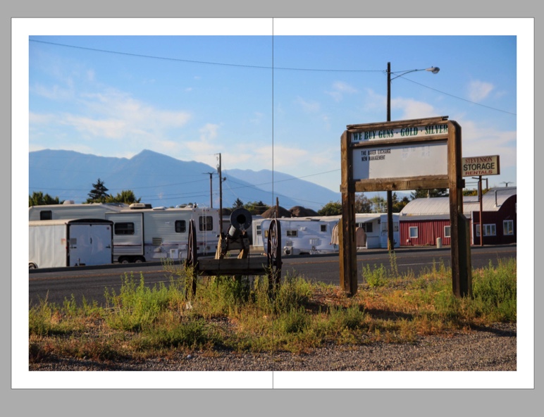
This is my last double image spread in my zine. I chose these two images as a pair because of their similarities: they both feature similar lines and rectangular shapes, which makes them coherently match. The colours contrast in this page, but the pair of images still fit together because of the similar skies with wispy skies – they also both feature similar structures: on the left, the classic American flag, and the right the road sign. I’m glad I edited the right image as I think it ties in well with the quite historical landscape in the image- this image was taken on a road which overlooks the tracks of the Oregon Trail, and I wanted to create a more historical “vintage” looking edit with this image.

Page 15 and 16

I think this is the most meaningful spread in my zine – there is strong social and historical context that lies behind the surface of this image. Aesthetically, this spread works together because of the similar tones and locations in which they were shot, and similar editing. However, I placed these two images in a montage because of deeper reasons. The placement of the white cowboys on top of the girls in Native American traditional clothing highlights the oppression that Native American’s face in modern day America, on their own land – stolen from them. Not only that, it also signals the tensions at the time I was photographing: during my day photographing this parade, the rodeo, and the Native American play that was on afterwards, I witnessed the reality of modern day Native and White relationships – Heckling and abuse given by the white people to the Native Americans, as well as a general feeling that some White people feel above those who they stole land from, and the misinformation that is so clear. – This is partly a result of the government and political beliefs that is most popular in rural parts of the US, such as Eastern Oregon (where I visited). I wanted to show this interesting observation in my work, and create a journalistic element to my work. In this spread, I think I did this quite successfully, and want to continue using aspects of photojournalism and social context in my personal study.

Page 17 and 18

I think this is a highly successful image in my zine – I particularly like the shadows and light in this image. This image was taken from my most successful photoshoot, in which I shot in golden hour – This helped me to achieve the light in this image which I really like. This image also uses the rule of thirds successfully, which creates a balanced composition.

Back Cover

My back cover of my zine is the other half of my front cover. I think this was a smart decision as it wraps up my zine with a sysinct ending – it links to the front cover, and also has similar tones to many of my images in my zine. This helps to create a clear idea and thread of similar style of images throughout my zine, making sure all images work well together from beginning to end.

Evaluation

Overall, I think this zine was really well. I was really happy to be creating a zine, as for my Anthropocene project for my last mock exam I made one which I really enjoyed creating. I think in this body of work I was able to develop my zine-making skills from my last exam and create a zine which tells the story of my travels through Oregon, which I think I have arranged quite well. When arranging my images, I used new techniques I didn’t think of using in my last zine, for example, photomontage on two pages. I think this added dimension to my project, and social context to the images that I was creating and the history of the places, as I was learning about them. I like my vibrant editing in this project – I normally like to edit in a more grainy, vintage style, but for this project I wanted to highlight the really American colours and places in my editing – I think this was quite successful. To improve my zine, if I was to do it again, I could have included blank pages or filled pages mixed in with objects from my trip such as tickets or receipts, to tell a more personalised and meaningful story. However, overall I think I produced quite a successful zine and developed my skills with Indesign further which I am happy about.

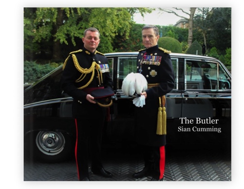
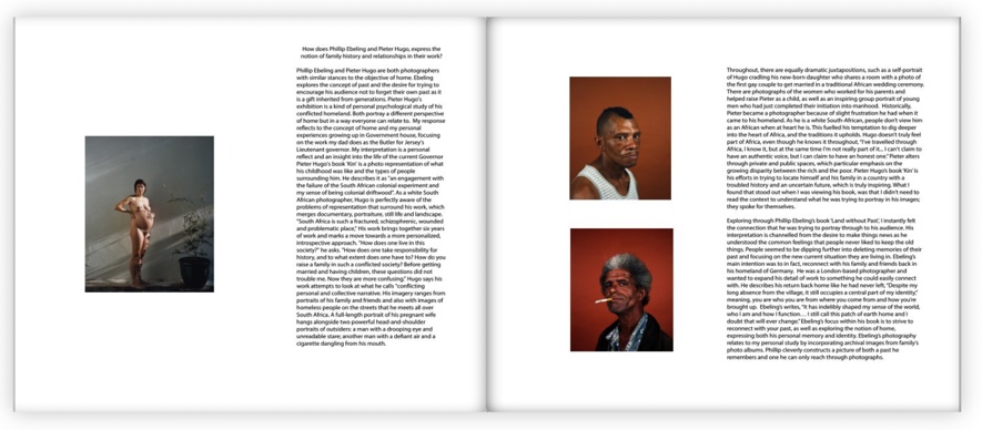
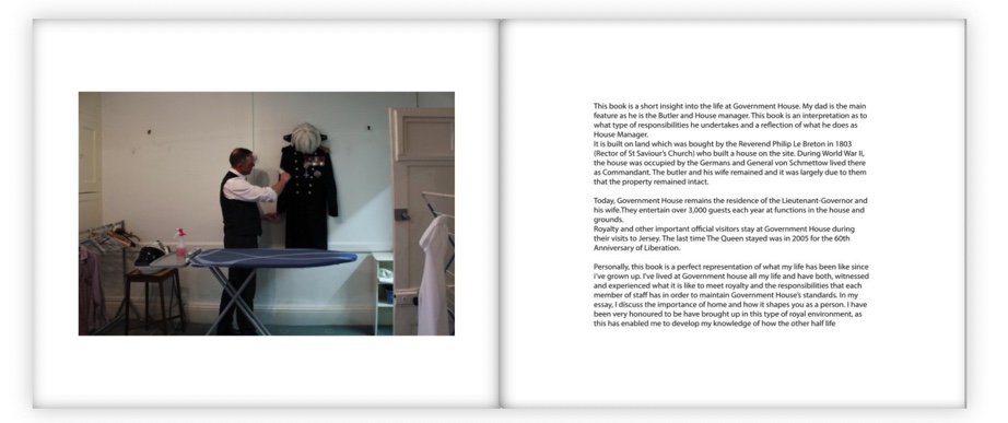
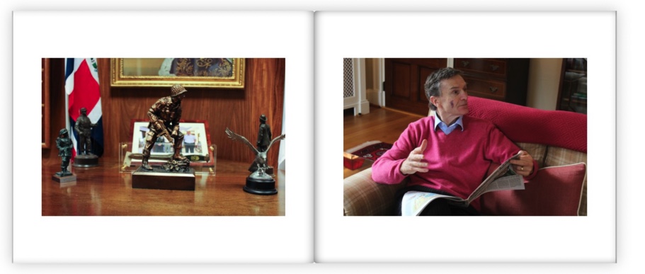
Past Photobook and Essay Analysis – The Butler by Sian Cumming

Analysis of “The Butler” by Sian Cumming

The Butler – Sian Cumming (2016)

Link to the full book: https://www.blurb.com/books/6950946-the-butler

Does the essay address its hypothesis?

The hypothesis in this essay: “How does Phillip Ebeling and Peter Hugo express the notion of family history and relationships in their work?”

I think the essay does mostly address this hypothesis, but more the notion of relationships and general history than specifically family history. For example the student explores Peter Hugo’s images talking about socio-economic problems in South Africa, as well as a very poignant image of his pregnant wife, telling the story of his family. I think that this essay could have been improved more by linking the artists studied to her subject in the conclusion a little more.

Does it provide new knowledge and understanding?

To me this essay provides a lot of new knowledge and understanding. It explores history and context behind the artists used for inspiration very well, and provides the reader with new and intriguing historical elements. This links well to the historical work of the students book, where they have included archival material. This creates, I think, a well linked and well researched book.

Is the essay well structured with a sense of an introduction, paragraphs and a conclusion?

Yes – the essay features an introduction which talks through both photographers chosen: Phillip Ebeling and Peter Hugo, and how they each address the topic of home and family. The essay then goes on to talk about the first photographer, Peter Hugo, and his book “Kin”. The essay talks then about the context behind his work, and how it relates to her own work. The second paragraph focuses on the second photographer, Peter Ebeling, his work and social context behind his work. The links to social context and history in this essay I think are very good, and created and informative and interesting piece to read – they link well to the historical elements of the book the artist created, and the subject, her father and his job at Governement House.

The Butler – Sian Cumming (2016)

Use and flow of language, prose, punctuation, spelling.

The essay flows generally well, with good links between the beginning and end of new paragraphs. There is a few spelling errors, one on the first page, which is a shame when you open the book. There are a few grammatical errors in the essay itself, which cause the essay to not flow as well at times. There are a couple of missed commas as well within the essay, which create quite long sentences. Overall the essay flows well, but it has a few errors which stop the flow a little.

Use of specialist vocabulary relating to art and photography.

The student has used some specialist vocabulary, however not much. I feel like their analysis could have been improved using more photographically technical vocabulary.

The Butler – Sian Cumming (2016)

Analysis of artist’s oeuvre (body of work) and key work(s).

The student didn’t really analyse the artists’ work that much – she gives basic descriptions of them but doesn’t go into much detail except the social context of the images. However she did analyse her own work, archival images, in the end of the essay – this was slightly limited though, and lacked specialised vocabulary.

Evidence of wider reading with reference to art history/ theory, political discourse and/or socio-economical context.

There is evidence of wider research within the artists used for inspiration and the reasons behind their work. For example, Peter Hugo’s work in South Africa, and the social context behind his work – his experiences as a white south African, and how this influenced his life and work. The student explores this really well, including quotes from both artists. For example from Peter Hugo, on what he calls his work – “conflicting personal and collective narrative’. I think that, after looking at the photos in the book itself, the student used this in her own work as well.

Use of direct quotes, summary or commentary from others to make an informed and critical argument.

The student has used multiple quotes in this essay, which help to inform her arguments and provide context and evidence to the reader. Thry have used commentary and summary as well from both artists studied, which helps to show an informed argument.

The Butler – Sian Cumming (2016)

Use of referencing system (eg. Harvard) and a bibliography.

In this essay, there is no referencing or bibliography. There is references to specific books but within the essay, and not in a separate part. To improve this essay, the student who did this essay and photo book could have included references and a bibliography.

Use of illustrations with captions listing name of artist, title of work and year of production.

There is a use of illustrations in this essay which have been referred to. However, they are not captioned, with the title of the work, artist or year of production. The year of production is referred to in the essay, but not captioned.

Overall marking for the essay

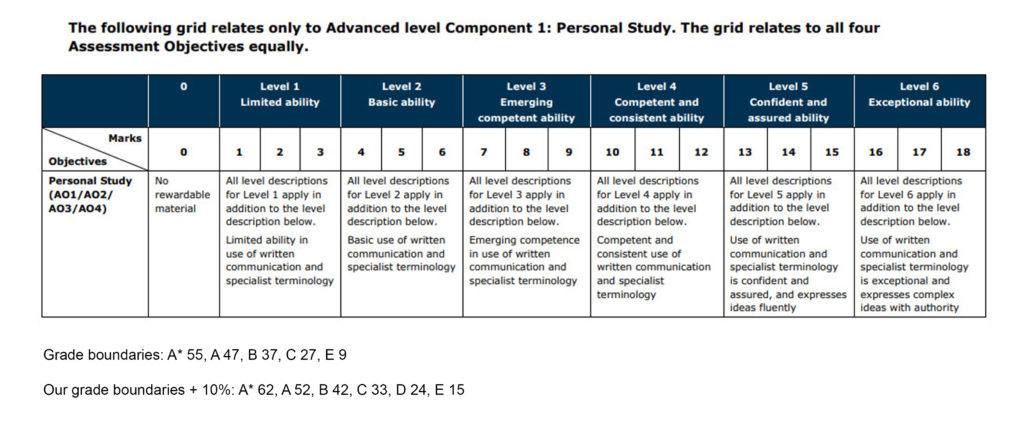
D – 6, B – 11, A – 14, A*-16.

Marking criteria for the essay.

Overall, I would give this essay 13/18, a B grade. – Level 5, confident and assured ability. “All descriptions for level 5 apply in addition to the level description below. Use of written communication and specialist terminology is confident and assured, and expresses ideas fluently.” The student was able to express their ideas fluently, using evidence from artists through images and quotations, as well as references to social context. However, the essay lacks specialised vocabulary, which is why I did not give the essay an A grade. The overall written communication in this essay was fluent and competent, but had a few grammar and spelling errors that stopped the flow of the essay at times – This is another reason why I didn’t feel this essay was A grade level. Overall I think the essay was good, and gave me new information and historical knowledge on her chosen topic, however I think it didn’t answer the hypothesis fully and could have had deeper analysis using technical vocabulary – the use of a referencing system and bibliography would have improved it too.

Photobook Specification and Moodboard

Write a book specification and describe in detail what your book will be about in terms of narrative, concept and design with reference to the same elements of bookmaking as above.

Narrative: What is your story?
Describe in:

3 words

Generational female identity.

https://www.shashasha.co/en/book/how-we-see-photobooks-by-women – an article I used to look at notable photobooks by women, in order to gain inspiration for my own.

A sentence

My project focuses on the personal and generational identity of women in my family, using archival and new material.

A paragraph

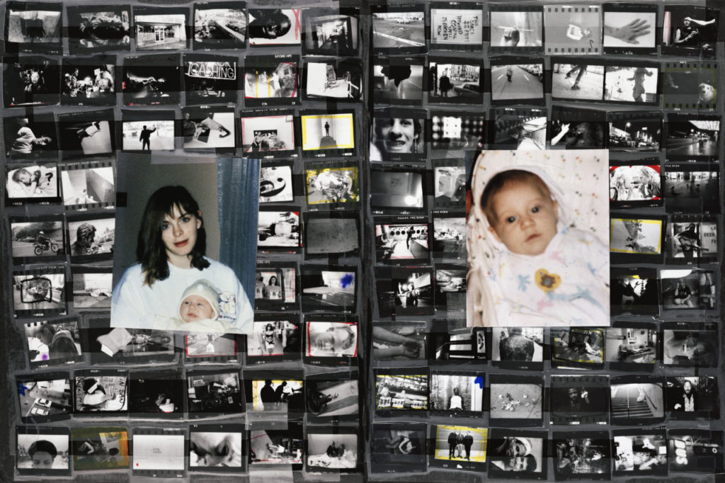
This project looks at different facets of identity, both in the past and present. More specifically, the project explores the personal identity of each of three subjects: my mother, grandmother and myself. Then, through the use of collage, it shows how each person’s identity links with each other. – The past also plays a role in my project, with the use of archival images a key part, used for comparison to the present day for my collages. The use of collages is inspired by my previous identity project, which formed the basis of this project. My personal study draws a lot from identity within a place as well, such as within the home: whether it be a past or present one.

Design: Consider the following:

How you want your book to look and feel

I want the book to have a soft, gentle feel. I think using vintage style, faded colours and fonts will suit the style of my work and editing style. I want to use classic colours and fonts to give my photobook a vintage/ timeless feel to it. – this is influenced heavily by my use of archival material, as well as my editing style, using high grain and faded tones. In this photo book, I have chosen to take inspiration from classic photo albums and books – I was heavily influenced by this after looking through my own family’s photo albums from the 70s, 80s and 90s which will help me to design my own.

Paper and ink

I plan on using white paper with black ink, creating a timeless feel. – I plan to use matte paper, to keep my style consistent. Furthermore, I think that using matte paper will help to keep the detail and unique features of my archival images throughout – using glossy paper may draw attention from small details of the images, such as creases, folds, and rips in the images. I am interested in keeping these imperfections intact to keep the authenticity of the images and to create a more tactile and immersive feel to my photobook. When adding my essay to the photo book, I have seen the idea of using different colour pages that fit with the theme. I like this idea as it would create a distinction between my pages with images and those with my essay and the images that accompany it.

Format, size and orientation

I’m going to choose the orientation based on my front and back cover choices – Probably either portrait or square. However, with still more images to make, I may change my mind – I tend to have more landscape-orientated images, which would also influence a choice of a landscape-orientated book. For these reasons, I’m still undecided. Having thought about this more, I have decided on a portrait format book. However, when creating my photobook

Binding and cover

I plan to use archival or collage images for my front and back cover, either slicing an image in half or two separate images. I want the front cover to be tactile, and heavy.

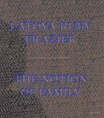
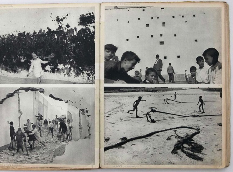
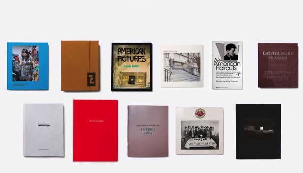
Some front covers of famous photobooks were used for inspiration – including “The notion of Family” by Latoya Ruby Frazier, one of my main inspirations for this project.

Title 

I’m still thinking of a title to do with my family or to do with the content. I think that I might need to focus on the content of the photobook first, and when I know what that looks like I will come back to the title. As for ideas, I was thinking of something linking back to my own family and its’ history, or to do with the content. For example “The Albums” or “80-18” – (The difference in ages between the 3 subjects in my book at the time of completion.)

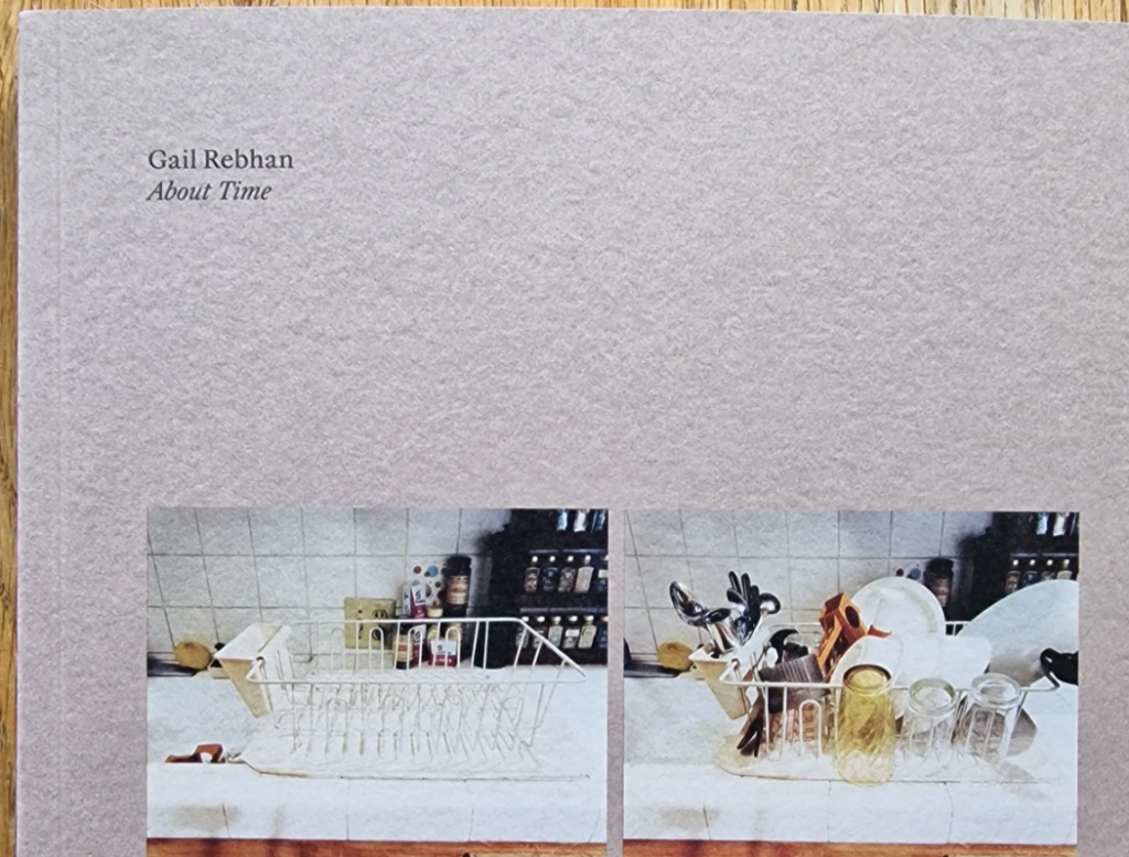
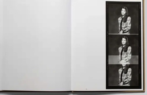
A simple title used by Gail Rebhan – I like the double meaning: the book is both about time and uses a colloquial phrase which adds humour. I also like the understated presentation of the cover of this photobook.

Structure and architecture

https://gatekeeperpress.com/types-of-binding-for-a-self-published-book/ – an article I used to find more information about book architecture.

I am considering different types of architecture for my photobook: a softcover, with a smooth image, wrapped front cover, or a hardcover, with a more vintage style cover, with either two images wrapped onto the outside or just a single image wrapped on to the front and back cover. I have decided against the use of a dust jacket for my book, as I want the image to be wrapped in the book.
Design and layout

An article I used to help me figure out some inspirations and design choices for my photobook.

After completing my previous zines for the ‘My Rock’ project, I have gotten a better idea of what kind of design I would like in my project. I am going to use a mix of double-page spreads, specifically my strongest image on the middle page of my book. I want to utilise blank space in my photograph, creating unique compositions with different shapes and sizes of images. I have thought of lots of different layouts. For example: double page spreads, two image spreads, images on opposite ends of double page, single images on double and single pages, and arrangements of different sizes and orientations.

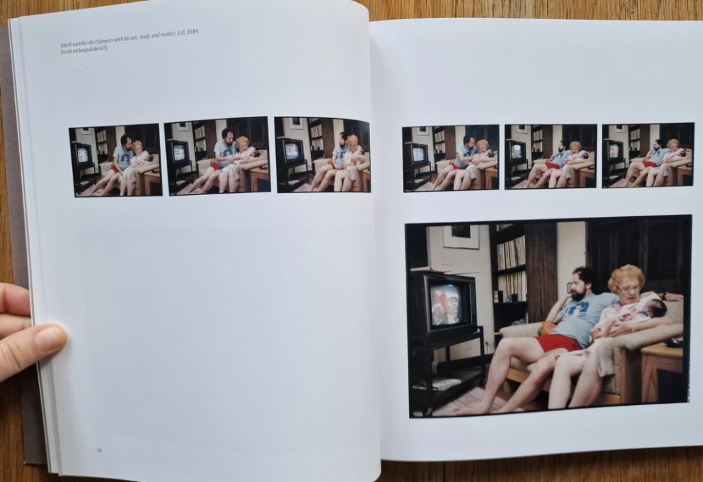
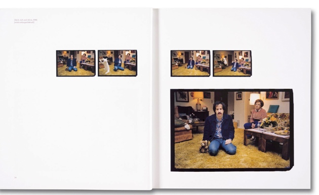
Gail Rebhan, 2023 “About time”

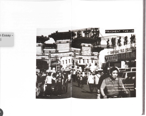
Jim Goldberg – USA. San Francisco and Hollywood, California. 1982-1986. Raised by Wolves. “101 Pictures”.

Editing and sequencing

My editing for my self-portraits is in B and W, along with some of my other portraits – most of my portraits are in colour, along with almost all of my archival material. I plan to create collages, as well as juxtapositions of multiple images. I will sequence these evenly with normal portraits and single archival images.

An example of one of my archival images to be included in the book – an image of my mother.

Images and text

I might use text on top of my images, narrating the photos or adding context. I first thought of this idea after looking at Jim Goldberg’s project: “Raised by Wolves”, in which he asked subjects to write on their own photos after being given them back. I think this idea links really well to my project as I wanted to find a way of including my subjects’ own ideas of the images and my project in my work. As well as asking my subjects (my mother and grandmother, and me) to write on their own images, I plan to write little captions or paragraphs in my own handwriting about the content of some pages and their meaning. This is also influenced by my interest in photocollage, and other artists using text in their images.

Jim Goldberg – USA. San Francisco and New York. 1989. “Echo’s Map.”

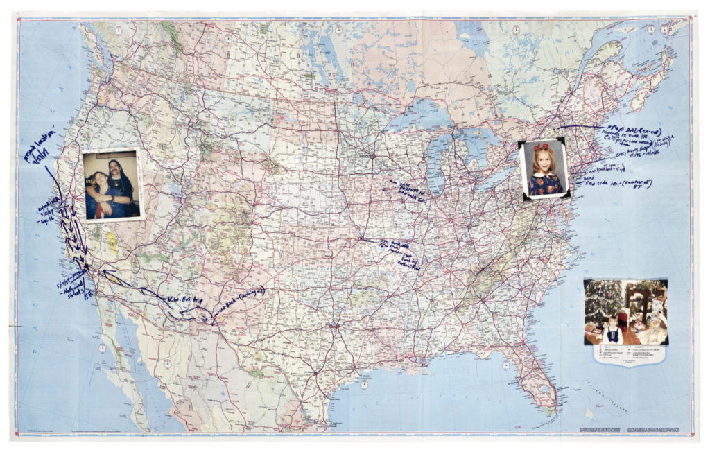
I also have an idea of including drawings or annotated images, in the same style as Jim Goldberg above – possibly a family tree, or a map of Jersey, UK and France to map out my family’s origins and homes. I think that this idea links well with my interest in photocollage, as it is another part of mixed media art.

Jim Goldberg – the text of my images will not my of this nature – just a narration / comment on the images.