“UNESCO Global Geoparks are single, unified geographical areas where sites of intranational geological significance are managed with a holistic concept of protection, education and sustainable development”. There are 169 of there geoparks in 44 countries around the world. They carry geological heritage, tell us about the history, events and processes that formed it.
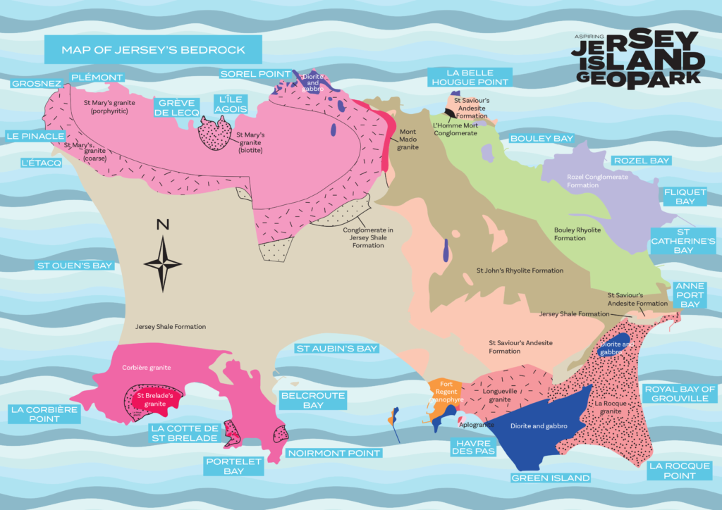
MINERALS OF JERSEY
Minerals are made from elements like silicon, oxygen, aluminium, iron and other metals. They are the fundamental building blocks of all rocks. As magma (molten rock) cools, minerals such as quartz and feldspar form crystals. The longer the cooling process takes, the larger the crystals. Minerals can also be carried through rocks by water, forming crystals as the water evaporates.
JERSEY SHALE FORMATION
The shales are the oldest rocks in the Island. You can see them in the west, across the centre and in the south of Jersey. They were formed by mud, silt and sand brought together on the sea floor about 600 million years ago. These sediments were transformed into rock by being pushed together, hardened and folded.
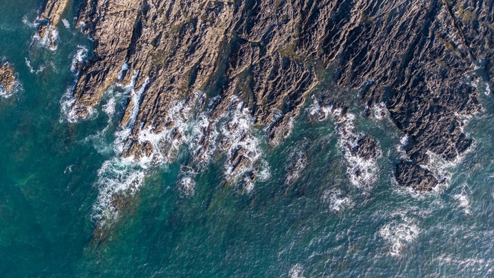
JERSEY VOLCANICS
Volcanic lavas and ashes can be seen along the north and northeast coasts of the Island. These andesites and rhyolites formed as a result of volcanic eruptions occurring 580 million years ago.
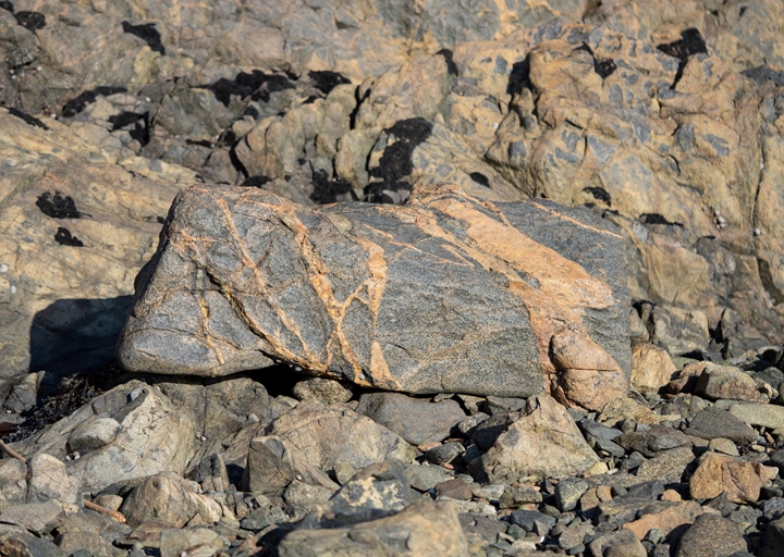
JERSEY GRANITES
Jersey is famous for its granites, which have been favoured as a building material for thousands of years. These major intrusive or ‘plutonic’ rocks were formed between 580 and 480 million years ago by molten rock cooling and solidifying between the Earth’s surface. They are only visible once the overlying rocks have been eroded away. The dark rocks known as gabbros are the oldest, and are rich in iron and magnesium. The true granites, visible along the northwest and southwest coasts, are lighter in colour, and consist of three main minerals: quartz, feldspar and mica. On the southeast coast, where granites have broken through the Earth’s surface into older gabbros, a mixed rock called diorite has formed.
ROZEL CONGLOMERATE
Formation Conglomerate can be seen along the northeast of the Island and is made up of beds of pebbles which have been cemented together. They were formed around 400 million years ago and are the youngest hard rock formation in Jersey. Conglomerate is also known as ‘pudding stone’ because the rock formation is made up of lots of pebbles, probably from eroded and worn mountains. Streams with fast flowing water carried the pebbles and sand down valleys and left them behind before they cemented together.
JERSEY’S OFFSHORE REEFS
Jersey is surrounded by offshore reefs bursting with marine life, Les Pierres de Lecq to the north, Les Écréhous to the northeast and Les Minquiers to the south. Local fisherman enjoy fishing around these reefs which often prove dangerous to larger ships.
HOW OLD IS THAT ROCK?
At low tide Les Minquiers reef is bigger than Jersey. On this large reef, the rock is mostly made up of types of granite. These granites have features older than the Jersey granites. Could this mean that Les Minquiers reef is older than Jersey?
SEA LEVELS AND CLIMATE CHANGE
The world’s climate fluctuates as a result of changes in the sun’s activity affecting the polar ice caps, the dome-shaped sheets of ice found in Greenland and Antarctica. These effects occur gradually over time, making sea levels change as ice caps melt or cool. This cycle of cold and warm periods has repeated itself several times over the past two million years. Since 10,000 years ago, sea levels have risen to make Jersey an Island once more.
GLACIAL
In a cold period, global temperature becomes cooler causing the ice caps to grow. This traps much of the world’s water, causing sea levels to drop as much as 200 metres. Just imagine the English Channel disappearing with Jersey and Guernsey as only hills in a vast coastal plain.
INTERGLACIAL
In a warm period, global temperature becomes warmer causing the ice caps to melt. Sea levels rise as freshwater is released back into the oceans. Evidence for past changes in sea level and the shifting of the Earth’s tectonic plates can be seen today in the many raised beaches in Jersey. The highest raised beach in the Island is at South Hill.
Jersey’s Geological Heritage – Sites of Special Interest (SSI)
Sites of special interest are places of zoological, ecological, botanical or geological significance. Jersey’s geology is very much different than that of the United Kingdom and other Chanel Islands. The States of Jersey has chosen 22 of the islands most important areas as Sites of Special Interest so that they can be protected from development for future research.
Written by Dr Ralph Nicholas and Samantha Blampied
This booklet introduces you to Jersey’s geological SSI, covering information about their location and basic descriptions and photographs which highlights each site’s significance defining features.
The Aspiring Jersey Island Geopark Visitor Centre presents the story of Jerseys geological heritage.
Geopark Ambassadors
Geopark Ambassadors represent some of the organisations working with Aspiring Jersey Island Geopark. One of the ambassadors is Ralph Nicolas, a Geologist Société Jersiaise Lecturer, Teacher, Secretary for the Geology, Archaeology and Jèrriais Sections of Société Jersiaise.
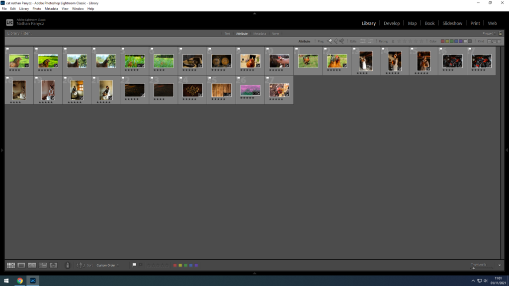
Those photographs were taken at two seperate shoots, in St Helier. I experimented with different angles and ideas.
Those are the photographs I thought came out the best after considering sharpness and exposure.
The first three photographs and the ones with 4 stars are my experimentation. Number 4 and 7 are the ones I chose as most appropriate for this project taking in count my reference artists.
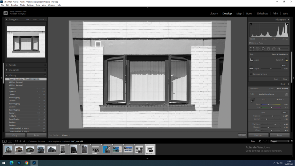
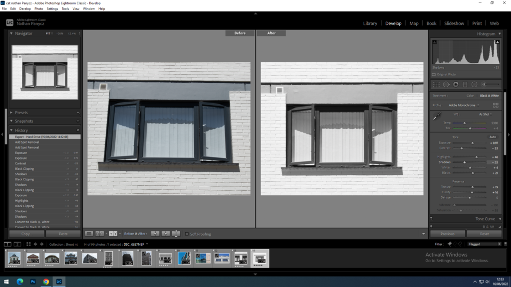
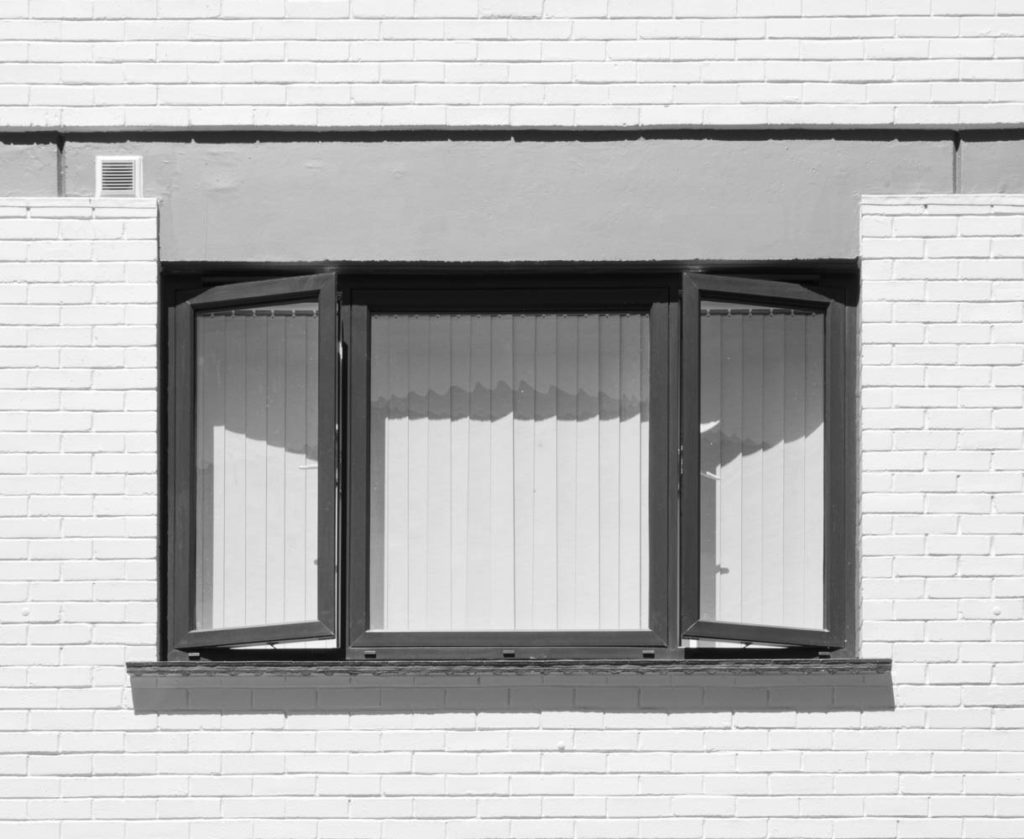
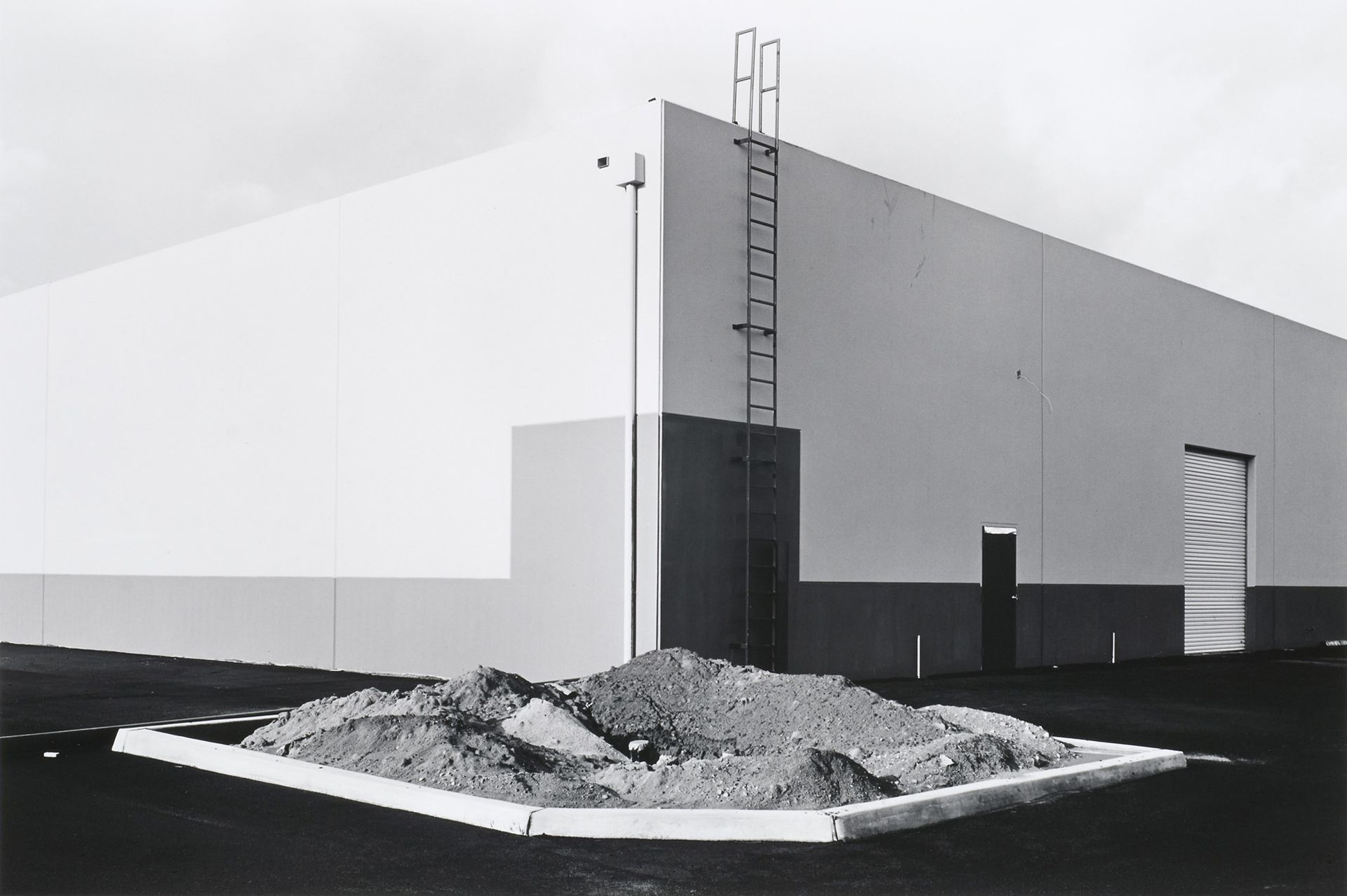
Considering there is no squares in my shot I decided to crop the picture into a square format to give it a similar sense of stability as the square window frame in Blitz’s Claremont, 1973. I used the transform tool to achieve symmetry and bring the window more to the eye level like in Blitz photograph.
I chose the black and white format because simplicity usually carries the strongest messages. I shoot this outside during a sunny weather at around 11 am, with the sun above me slightly to the right which created nice symmetric shadows below the window cell. I had the ISO set to 100 as it was a very bright and sunny day and the camera was pointing up. In addition the white wall reflected all the light back at the camera. I wanted to get as much detail in as possible so chose a small aperture of f/26 for a higher depth of field (so that the top wouldn’t be blurry as compare to the bottom). To compensate the exposure for the small aperture I set the shutter speed at around 1/60 which is still a value at which I could shoot handheld with no blur. I used the auto development option to get the process started, I then increased the exposure to match the style of Blitz photograph. I turned decreased the contrast, increased the whites and highlights, as well as reduced the saturation to narrow down the tonal range. Since the contrast was low, the detail and texture was limited so I decided to turn up the clarity and texture as the reference photograph, although not very refined in the reflection, does have prominent textures outside of it.
Final Outcomes
In this photograph I tried to convey the way humans are able to find a sense of peace and stability in this hectic and crowded world. Even in Jersey where housing is limited and problematic, we are still inclined to call it home.
In comparison to the Lewis Blitz’s Claremont, 1973, this photograph is much more complex due the near absence of negative space; loads of shapes including the rectangular window frames and textures such as the bricks in the wall. The gray wall above the window makes for a great line as the viewer is drawn to it because of the polarity it poses against the positive space; It offers a safe space for the eyes to rest. It leads the eye to the focal point eventually as it dips downwards. As a result of the antithesis between the tones, the window frame also makes for a great line leading the eye around the main subject. While the horizontal lines create a sense of stability and stagnation, the vertical lines convey growth and determination. Metaphorically, this represents the conflict between environmentalism and The New Topographics movement. The open window creates diagonal lines which induce tension within the photograph, this engages the viewer as they try to resolve it. In addition convergring, diagonal lines add depth to the photograph. Unlike the Lewis Blitz photograph, this one is also rich in shadows which bring out dimensions, this is due to the angle at which the photograph was taken. Blitz also gives us insight into someone’s personal life as well as a reflection of the outside world. In my photograph no reflection is present and the curtains block the scene behind the window creating a sence of uncertainty.
Overall I think I did a good job with creating a sense of space through lines and shadows. The symmetry also makes the picture look tidy and balanced although the air vent on the upper left side causes a bit of a disruption. Using the monochrome format took away any distractions caused by colour allowing the message to be conveyed lightly but firmly.
This photograph was inspired by both Lewis Blitz and Nicolas Nixon.
Nicholas Nixon is an American photographer, one of the pioneers in new topographic. He began his career in 1970s as a photography student. He shot his first major series, City views, in Boston and New York, these were included in the New Topographic exhibition in 1975. One of Nixon’s key themes is time. From the beginning he worked on series that show the interaction between humanity and time passing, one of them being The Brown sisters series. Nixon approaches his subjects with great intimacy, showing parts of life the viewer can connect to.
The Brown Sisters, 2016
Clementine and Bebe, Cambridge, 1986
F.K, Boston 1984
Dr. Robert Sappenfield with his son Bob, Dorchester 1988
Nixon’s style is very much defined by the large format cameras he uses (4 x 5, 8 x 10 and 11 x 14). Although it is a very slow way of working, the sharpness and clarity of the resulting photographs lets the viewer see the details otherwise unclear to a naked eye.
Image analysis
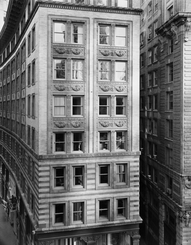
Nicholas Nixon first photographed Boston in the mid 1970s, as the city was in a process of transforming itself. His earlier photographs were taken from a distance, showing the unfamiliarity and disconnect from the city as he viewed it from an outsider’s perspective. This photograph was taken a quarter of a century later, from up close. The View of Washington Street, Boston, not only shows a few story building but also represents Nixon’s journey, from introduction to intimacy, in photography. Close up shots help the viewer feel the same familiarity and connection to the subject, the photographer felt at a time of the shoot. It draws in the viewer, highlighting the importance of what is being conveyed, and adds to the message by focusing on the details. New Topographics is all about how urban landscape photography reflects the presence of humanity in nature, as a part of nature. Just like buildings, humans also have walls. Nixon often likes to frame his photographs in a way so that the building is cut off from it surroundings or the rest of itself. This conveys that no matter how intimate and familiar we are with a person or a thing, there will always be a part of it that we can’t see. The light and dark windows also portray this idea. The dark windows are the focal point in this photograph due to the high contrast they pose compared to the rest of the image. They represent all that happens “behind the close doors”, all the thoughts we do not have the access to. The intense black creates a state of curiosity within the viewer. The bright windows really catch the viewers eyes and symbolise the insight we have into another person. The windows reflect the surroundings, emphasising how humans are a product of our environment and how what we are allowed to see by others isn’t necessarily what they actually identify with. The Windows gradually getting brighter show the transition from curiosity to enlightenment. Black and white photography strips away any colours that may distract the viewer from the meaning of the photograph. It also brings out the contrast, focusing on the details such as textures, shapes and patterns. Black and white photographs have a detaching effect as by strongly contrasting two colours we create a sense of distance which conveys struggle for connection. Especially in a big city like Boston, it’s difficult to identify with others and nature which as a result can make us feel empty, a void, just like the dark windows. The general tone of this image is on the darker side. However, this photograph is a mixture of low key, dramatic, deep, dark tomes at the bottom and some clear, high key, bright gray, almost white tones at the top. This really makes the photograph feel three dimensional as dark tones give depth and light tones make objects appear more closely. In addition, this makes the textures defined. Considering this photograph was taken outside, natural light was used. The camera was positioned in such way so that the top windows reflect the light, creating a brighter focal point as compared to the shaded windows at the bottom. Although the photograph is a bit on the darker side, I think it’s due to post editing choices rather than an unbalanced exposure as there is no loss of detail in neither the dark nor the lighter areas of the photograph. In this picture you we have a few lines. One of them is the, bright column in between the top windows. It gives a sense of movement and leads the viewers eye from the bottom to the lop of the building. This flows well with the two parallel columns on either side and juxtaposes strongly with the darker, perpendicular cordon. The overall mood of the photograph is serious, melancholic, and actually quite daunting as it might be hard for some to deal with the changes caused by modernisation of landscapes.
Lewis Baltz
Lewis Boltz, known for taking black and white photographs of parking lots, office parks was a young photographer who has come to influence a new movement in American photography during the time of urban expansion, The New Topographics. Baltz produced geometric, minimalistic and aesthetic photographs, mostly portraying bleakness of the man-made landscape of Southern California, where he grew up. His most known photographs do not include people, as if humanity ceased to exist, reflecting the power of humanity in architecture and pointing out the effects of urban architecture on humanity.
Construction Detail, East Wall, Xerox, 1821 Dyer Road, Santa Ana (1974)
South Corner, Parking Area, 23831 El Toro Road, El Toro
South corner, Riccar America Company, 3184 Pullman, Costa Mesa, 1974
Image analysis
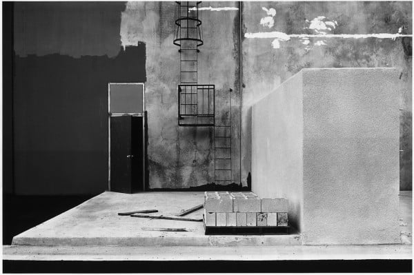
Claremont, 1973 represents the reflection of humanity’s relationship with nature through a man made object. Like most of his older photographs, this one is also in black and white. At an interview for the Smithsonian Archives of American Art Baltz said “I used photography to distance myself from a world that I loathed and was powerless to improve.” By using the black and white format he conveyed a sense of distance, hopelessness and melancholy deeply. The type light used seem to be natural light on a cloudy day as we can see the clouds in the reflection, coming from behind and slightly to the left of the photographer because the shadows casted fall below and on the right side of the window. The ISO is most likely to be around 400 because we can start to see grain in the darker part of the image, it was probably chosen as it seems the day wasn’t too bright. The aperture used was most likely f/5.6 – f/8 because we can still see the poster and the inside of the house on the right ride of the window even though the photograph was taken from a far enough distance to capture the window and the wall. Considering the aperture I would say the shutter speed was around 1/60 as it’s not super sharp, we can see the tree in the background blur as its moved by wind. 1/60 is a speed at which you can still shoot hand held without blurring, hence the rest of the picture seems to be sharp enough. In addition I think this photograph might have been overexposed for creative effect, emphasising the emotion of desolation and sorrow. The tonal range in the reflection isn’t too wide as the darkest parts are only dark grey shadows without blacks. This means low contrast, low detail and texture. We can see some texture in the walls; it’s not very refined and feels fluffy rather than gritty. This can be seen as a result of the lower shutter speed whilst hand shooting and the big aperture in relation to distance. The window frame is the brightest part of the photograph making it a good leading line, bringing the viewers attention towards the reflection. The horizontal lines represent stability and vertical lines communicate strength, power and hierarchy, by moving the viewers eyes up and down the photograph. The bottom line is emphasised to create a starting point, and dynamics that take the viewers eye from the bottom left to the right which help transition into the scene behind the reflection. The leading lines connecting back together also creates a feeling of restriction as it separates nature and man. In this context it might be a response to environmentalists wanting to impede the urban expansion that was occurring. The frame being square helps convey human presence because geometric shapes are generally man-made. In addition, squares evoke feelings of stability. There is a lot of negative space around the window meanwhile the window itself is busy, providing us with more to focus on, making it the focal point. Negative space conveys the emotion of calm, peace, isolation and emptiness as opposed to positive space which induces the emotions of strength, intensity, chaos, power and movement. This results in good balance, highlighting the intention behind the photograph. No shadows, very little shapes, textures and low contrast makes the photograph very two dimensional. This creates detachment as humans are used to perceiving the world in 3D. In addition, the scene behind the window gives us an out look into human presence, however, the reflection of nature and human activity are overlapping. Overall the photograph conveys that human and nature should not be separated as it is futile.
“The New Topographics: Photographs of Man-Altered Landscape” was an exhibition that started a movement in American landscape photography. It was a response to environmentalism and the idealised landscape photography that praised the natural and elemental. The artists were inclined to lose the objective of romanticism and artistic beauty. Photographers such as Robert Adams and Stephen Shore found a different understanding of the natural world that showed landscapes and human activity as interconnected. Plain documentation of human presence in nature as a part of it.
Shooting during a sunset, a sunrise or at night in a full moon is a good idea because it will really bring out the darks and the whites like all the romanticism visual arts, the strong contrast will help to convey the power of the sublime. A cloudy, rainy, foggy and windy day would also be a good setting for the shoot as it would present nature at its finest. Photographing a path in the woods or a side road would make a good lines in the photograph.
Potential shoot locations:
devils hole, fern valley, grantez headland, any ruins, bunkers, forests, the sea, lighthouses, cliffs, sand dunes.
Ansel Adams was an American landscape photographer and environmentalist known for his black and white images of west America as well as helping find Group f/64, advocating “pure” photography (sharp focus, use of the full tonal range of a photograph), he went on to develop an image making system called the Zone System through the deep understanding of how tonal rage is recorded and developed, resulting in clear, deep images. Ansel was a environmental conversation advocate and conveyed this through his photography.
Redwoods, Bull Creek Flat, California, 1960
Moonrise, Hernandez, New Mexico, 1941
Half Dome, Blowing Snow, Yosemite National Park, California, 1955
In 1916, at 14 years old, Adams photographed Yosemite National Park and developed his work at the Sierra Club where he would come back every summer of his life. In 1925 he became the director of the club till 1971. In 1980, President Jimmy Carter awarded Adams the Presidential Medal of Freedom for “efforts to preserve this country’s wild and scenic areas, both on film and on earth.”
Image analysis
This image by Ansel Adams presents the Grand Teton National Park in Wyoming. In the foreground we can see trees as well as the river which makes a good strong line, leading our eyes from the foreground, through the midground, all the way to the mountains and clouds in the background. The shot is taken from afar which distances the viewer and shows how small we are as humans in comparison to nature, it puts the power of the sublime in perspective and makes the viewer respect it. The image being black and white also creates a detaching effect by contrasting two colours; dark shades such as black feel further away than lighter shades. Humans don’t tend to see in black and white so this change of perspective can distance it from reality. A pallet of colours can often distract the viewer from the subject thus you can convey the meaning of a photograph in a more powerful manner using a monochrome format. This photo was taken using a natural light source, considering the clouds we can assume it was dull and cold light. The dark clouds contrast well with the bright clouds The textures, lines and shapes, such as the ripples in the water, appear more prominent since black and white create such a powerful contrast, this makes the photograph look harsh and cold. There is a lot of grey in the photograph which makes the tone sombre and dark. The overall mood is heavy and melancholic.
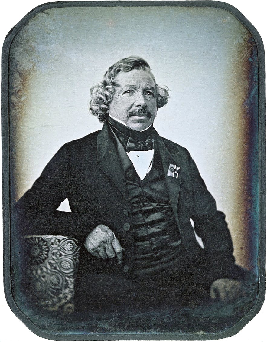
Louis Daguerre was a French artist and photographer who after the death of Joseph Niépce, his partner whom he helped perfect the Heliography process, invented the daguerreotype process in 1839. The process involved the use of a silver coated copper plate, exposed in iodine vapour before being exposed to light. Some argue the date to the start of modernism, the is no doubt however that Daguerre’s invention market the turning point in the history of art and started a new era of experimentation and innovation. Aside from being know as one of the fathers of photography, Daguerre was also an accomplished painter.
Daguerreotype of Louis Daguerre by Jean-Baptiste Sabatier-Blot
HenryWilliam Fox-Talbotwas an English chemist, linguist and archaeologist trained at the university of Cambridge, who too was motivated to formulate a photographic process. Talbot could not draw his scientific observations even with the help of a camera lucida. He invented the process called Calotype, consisting of coating a sheet of paper with silver chloride and exposing it to light in the camera obscura. From there Talbot discovered that you can produce numerous positive images using the method of contact printing which involved placing the negative, emulsion side down on top of the light sensitive surface.
Henry Mullins was an English photographer who moved to Jersey in July 1848 setting up the Royal Saloon studio in the Royal Square. He was popular with the officers of the Royal Militaria Island of Jersey who liked having their portraits taken as well as their families. Mullins specialised in Cartes de visite (type of small photograph), today the archive of La Société hold a collection containing 9600 of his photographs.
A photograph of Mr Bolton by Henry Mullins
Exploring techniques
Lighting is one of the most important factors when it comes to photography, not only it determines the brightness but also sets the tone, mood, atmosphere. Tts important to control the light in a way which allows for best textures, vibrancy of colours, intensity and harshness of the lines and shapes.
Diffusion of light
Diffusion of lightrelates to hardness or softness of light and determines the intensity of the shadow. Hard light produces harsher shadows and contrast between light and dark making the object stand out where as soft light diffuses the shadows producing soft edges that wrap around the object.
Hard light usually comes from a single, bright source, relatively small to the subject. A focused light will produce sharp shadows as it makes the light rays more parallel.
The softness of light increases with the size of the light source as the light travels in many directions moving towards the subject. you can create a soft light by using diffusion material or bouncing the light of as surface. Soft light makes colours more vibrant.
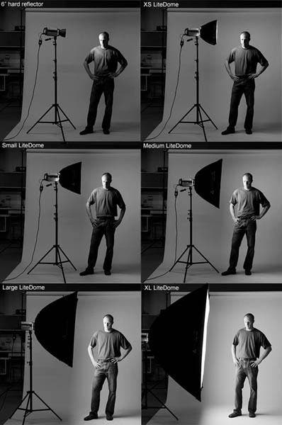
Hard light vs Soft light
Natural light
Natural light photography uses sun as a light source. the amount of light you get varies by the time of the day. A lot of sun provides a lot of light while a cloudy day is good for photographing textures. Many photographers like the time of day knows as “the golden hour”. It’s the point just before sunset. It creates a warm, yellow light. At midday the light is much cooler, blue-white tone. The light turns blue half an our after the sun sets but there’s still light in the sky. The light changes colours over the day from oranges and yellows to blue light so it’s important to choose the right time and weather to suit it’s purpose.
Direction of light
The direction of the light refers to the way the light falls onto the subject. Front light evenly illuminates the subject without harsh shadows creating a flattening effect making the subjects features smaller and less noticeable such as wrinkles. In addition its extremely simple to use and widely available making it perfect for landscape images as well as portraits. Back light usually results in a silhouette or a blurry background. It can be used to emphasize the depth behind the subject as well as creating dramatic contrast between the subject and the background which makes it great for outdoor portraits.Side light illuminates the subject from the left or right this helps to show the texture, shape and form, it creates the strongest sense that the subject is three dimensional. since one side is more illuminated than the other the contrast will be stronger the harder the light. Overhead lightgenerally isn’t great for photography because of the unpleasant shadows it produces sometimes resulting in “raccoon eyes”, deep shadows in eye sockets. Street and architectural photographers use it often as it creates interesting, contrast heavy shadows. Upward light lights the subject from below. This light is usually used in horror films, it makes us feel uncomfortable as its not natural. Sometimes portrait photographers use the upward light to get rid of shadows caused by highly positioned main light.
Here you can find out more about light direction and emotions:
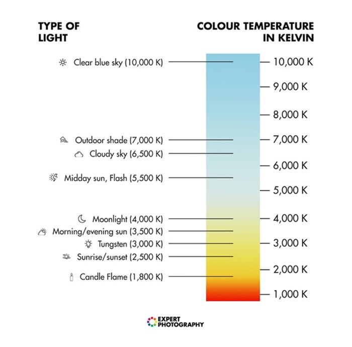
Colour temperature is a way of measuring the hue of different light sources and it’s measured in kelvin. Visible colour temperature ranges from 1700 kelvin to 12000 kelvin (you cannot see infrared or ultra violet light).
Colour temperature scale showing the Kelvin temperatures of many light sources.
The right colour temperature is important to achieve wanted results. Yellow and orange light creates a warm vibe where as blue light produces cold feelings.
https://expertphotography.com/color-temperature/
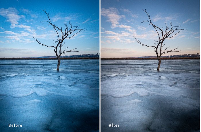
Human eyes adjusts to different type of light so that it looks somehow normal and so we can see a white object as white even if the light is tinted. A camera on the other hand captures the real colour. In order to see whites as whites on camera you can adjust your white balance in three ways. To automatically adjust the white balance on your camera you have to engage the Automatic White Balance mode (AWB), this way the camera will try to correct it using sensors. Another way to adjust the white balance is manually. This can be done by thanking a picture of a white piece of paper as a reference point. Next, you choose the photo of the piece of paper and adjust your settings. If you plan on shooting in the same conditions as before, your cameras white balance should be correct. a third way to adjust you white balance is to do it in post processing using software such as adobe light room or photoshop, regulate the white balance using the temperature slider. Last way to adjust the white balance is by the presents on your camera, you have many options to choose from including daylight, shade, cloudy, tungsten, flash and even fluorescent light.
Using reflectors
There is two types of light you can use when it comes to photography, natural light and artificial light. Light can be tricky sometimes especially when using natural light. One of the most underrated tool is a reflector. Reflectors can be used to bounce or diffuse or flag the light.
When choosing the right reflector for your purposes there’s a few things you need to consider. First off, decide on the size of your reflector. For individual portraits and small work a smaller reflector might be best, although a big reflector might create a large are a of soft light, they are usually harder to handle so if you’re planning on using it mostly outside it might be a bit difficult to fold and carry. A 42″ reflector is the most used as it provides you with ease of use and good light. Choosing the reflector colour is the next step. This might be tricky as depending on the conditions of your environment one colour might be superior from the other. A silver reflector can increase highlights resulting in a high contrast image, its best for videos, product shoots and black and white photography. A gold reflector gives out warm natural light, its great for indoor portraits. White surfaces give out white, natural coloured light, its great as a fill light source. Black reflectors don’t actually reflect light but rather absorb it, it can be used as a flag to block out the light. Translucent reflectors are used to diffuse light resulting in a larger soft light source. When it comes to choosing different brands and shapes you might consider putting in the extra money if the product includes handles, brackets or frames, it might pay off in the future. There’s plenty ways to handle a reflector. You can hold it yourself, have an assistant hold it, or even have the subject hold it. You can also buy a stand designed to hold the reflector.
Methods of lighting
Key lighting – The primary source of artificial light. It allows for control over the atmosphere and style of the photos
High key lighting refers to evenly lit scenes that posses a lot of whites and light tones whilst having very minimal mid-tones and blacks. It minimises shadows, creates a bright and happy mood.
Optimal high key lighting set-up
To produce high key lighting photographs you will need two background lights set at least one stop higher than the key subject light and a fill light set to half the brightness of the key light. Placing the light at at least 5 feet from the subject and about 30 degrees out from the camera is usually the optimal set up. Placing the light directly in front of the subject will flatten everything. Using large light sources as well as soft boxes and diffusers is effective for brightly lighting the scene without any harsh shadows.
High key lighting is best used in portraits, family or fashion photography as well as product photography and such, as it evens the surface, minimalizing any flaws or winkles.
Low key lighting emphasises the dark tones, blacks and shadows, increases contrast and minimalizes the mid-tones and whites creating a dramatic and mysterious effect.
In order to achieve a low key lighting you’ll need to use a small, intense light source and place it closer to the subject than you would with high key lighting and off to one side. You can experiment with additional light sources and reflectors as well. Place the subject a bit away from the backdrop to the light doesn’t illuminate it. Since white backgrounds easily reflect light, low key lighting photographs look best with a dark background. You can also use additional black fabric to help absorb the unnecessary light.
Low key lighting is best for dramatic close ups such as journalism and documentary photography or when emphasising a feature. It also works good for sports photography in very intense action.
Fill lighting– Used to light up the shadowed parts of the setting. It fills in the high-contrast shadows created by the key light making the photograph look natural. Different ways to achieve fill lighting include:
Lighting units
Reflectors
Walls/ ceilings
Fabric
Flash
Negative fill
Spill fill
A fill light works best positioned at an opposite angle to the key light on the other side of the camera. The fill lighting should be less bright than the key light so if it starts creating its own shadows it means you should turn its brightness down.
Back lighting – Involves positioning the main light source behind the subject. It creates a rim of light around the subject giving a greater sense of depth as well as a strong dramatic effect.
When shooting with backlighting its important to correctly adjust the camera settings. A wide aperture, an ISO of around 100 and a shutter speed between 1/100 and 1/640 is a good place to start. Position the light directly behind the subject or high enough so that it’s not in the frame or shining directly into the camera.
Three-point lighting – It’s a method of lighting a subject in a scene with three different types of light: key light, fill light and back light.
The way a three-point lighting is set up isn’t fixed, it depends on the subject, the scene and the emotions we’re trying to evoke. This type of lighting gives the photographer a lot of flexibility to create an interesting dynamic, make the subject look multidimensional or flatten any imperfections, brighten the mood or make it dramatic, all by controlling the shadows.
Types of lights
Soft-boxes – Designed to fit around a light. The reflective interior intensifies the light and projects it out through a layer of diffusion material, resulting in an even and soft light without harsh shadows.
Soft boxes can be used as Key light or Fill light. The bigger the light source in relation to the subject the softer the light projected. As to the shape, rectangular soft boxes cast window shaped lights in reflective objects, its not ideal for portraits as the reflection in the eyes of the subjects doesn’t look natural. Square soft boxes are great for low ceiling shootings as well as head and shoulders portraiture or small group photographs. The strip box is great for rim lighting to separate the subject from the background as well as product photography as they create long, satisfying highlights in glassware and other reflective objects. Octagonal soft boxes have a large surface area, projecting very soft light. It’s great for portraiture as it produces circular catchlights in the subjects eyes, having the most natural look.
Flash lighting – Flash is not only used for brightening a scene or a subject but also to set the mood, add emphasis to certain elements and create special effects. Shooting outside can be especially difficult as its hard to modify such a light source. Flash allows you to control the amount of light, direction of light, quality of light and the colour of light.
There’s two types of flash and its important to understand the difference as in photography you want as much control and precision as possible
TTL – Works by taking a measurement of the light reading and fires the flash at the intensity that should properly expose an image. The benefit is that its automated so you don’t have to do all the work, the downside is it doesn’t allow you any control.
Manual – Allows us for full control over the parameters.
When using flash its important to balance it well with ambient light. Lower flash power with longer shutter speed makes the photographs look more natural and higher flash power with short shutter speed will produce more dramatic results. Focus on how you want your background to look, working with the parameters of your camera’s flash sync speed. Once you have that, add in the flash, your aperture will determine how much of the flash gets to the sensor (If you chose a wide aperture for your background, you’ll need less flash power for the ideal exposure).
It might also be useful to understand The Inverse Square Law which states that the power intensity per unit area from a point source, if the rays strike the surface at a right angle, varies inversely according to the square of the distance from the source. Meaning, if you set up a light 1 meter away for the subject you get 100% of this light hitting the subject. Moving the light one meter away means you lost 75% of the light that initially hit the subject.
Lighting techniques
Rembrandt Lightning – Dramatic light, takes its name from a Dutch painter who was a master of the chiaroscuro technique, typically used it in self portraits. This type of lighting suits low key photography.
It is a split light set up, meaning the light falls on the subject perpendicularly, illuminating only half a face, creating a triangle of light under the models eye on the shadow side. Because of the contrast between light and dark the viewers eyes will be drawn to where the triangle came from. This can add mystery to the image. To achieve Rembrandt lighting, place the key light to the side of the models face at 45 degrees in relation to the nose. Lift the light above the subject and point it down. Adjust until a triangle of light is visible under the subjects eye. Make sure it is not bigger than the eye and does not extend bellow the nose.
Chiaroscuro lighting – Dramatic lighting technique used to create the illusion of depth. It is all about bold contrasts and emotions.
Its great for portrait photography as well as food, still life and fine art photography. to achieve chiaroscuro lighting make sure you only use one light source and light your subject horizontally as this will allowed you to worth with different gradients. lighting the subject directly means you wont be able to create fading highlights and shadows that are important in chiaroscuro photography. Those photographs usually have a black or dark background.
Camera Settings
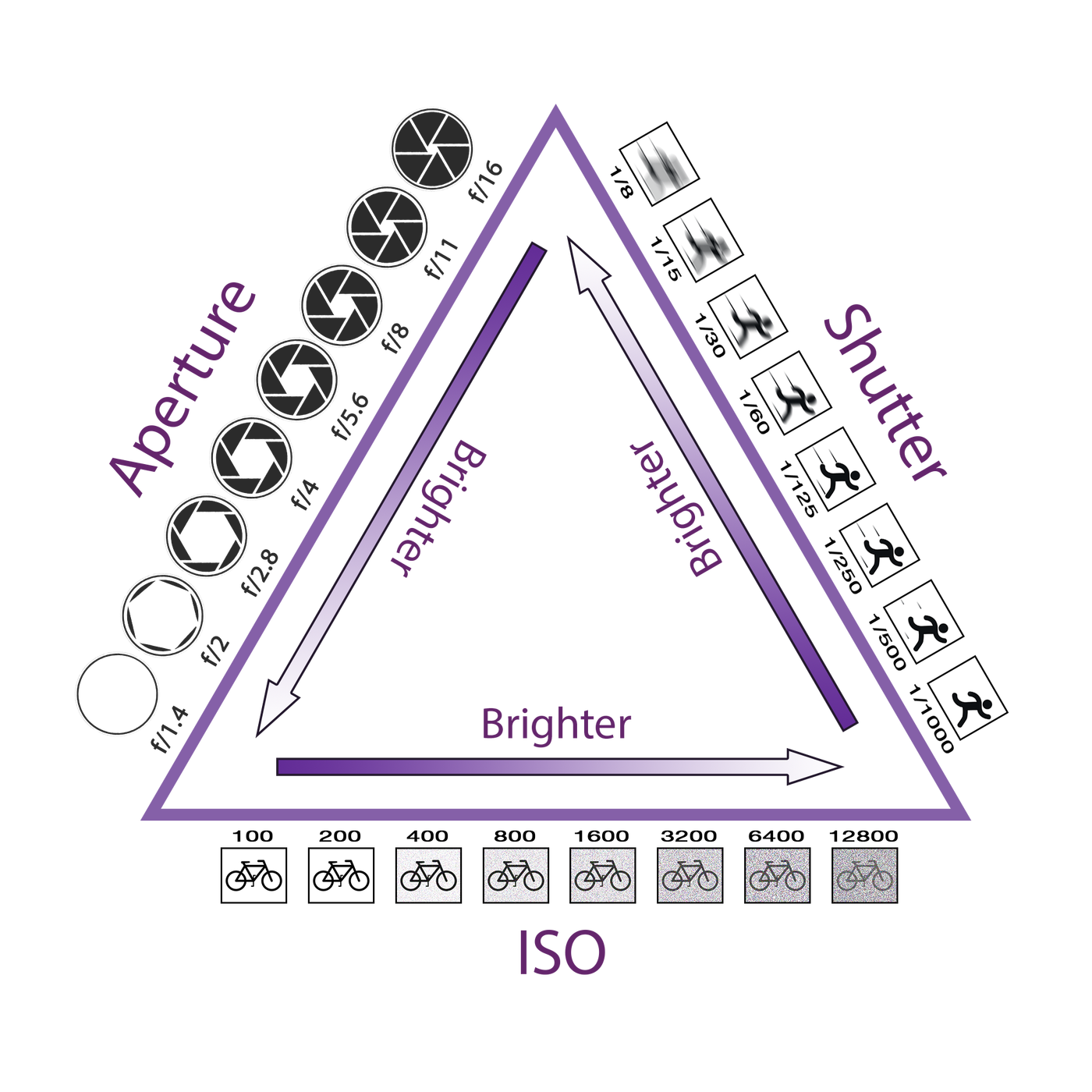
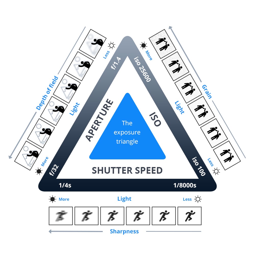
ISO – controls the amount of light by the sensitivityof the sensor. The ISO settings tell the camera how much light it needs to be able to produce an image. The higher the ISO, the faster the shutter speed you can use in low light situations whilst using the same aperture.
100 ISO
Benefits:
Low noise and good resolution
Good colour saturation
Good tonal graduation
Disadvantages:
Not very sensitive
Needs to be used with a fast lens or tripod in very low light
Best uses:
Studio
Still life with a tripod and natural light
Outdoors on a bright day
200 ISO
Benefits:
Good noise/ sensitivity balance
Acceptable sharpness, colour and tone
Can be used with a good range of apertures and shutter speeds
Disadvantages:
Slightly less quality capable by camera
May not be fast enough in low light or action scenarios
Best uses:
General hand held shooting
400 – 800 ISO
Benefits:
Very sensitive
Can be used with fast shutter speeds, smaller aperture numbers
Disadvantages:
Grainy Noise start to appear in the picture
Speckled colours in shadow areas
Best uses:
Low light situations with no flash
Indoors
Shutter speed – controls the amount of light by the length of time. It can be measured in seconds, minutes and sometimes hours. The most used /shutter speeds are:
1/1000 sec
1/500 sec
1/250 sec
1/60 sec
1/30 sec
1/15 sec
1/8 sec
1/4 sec
1/2 sec
1 sec
High shutter speed, such as 1/500, allows for sharp shots of moving objects frozen in action where as low shutter speed, such as 1/8 often requires a tripod and is best for motion blur photography as well as night time photography. The main rule of thumb to achieving sharp photos is to use higher shutter speed than your lens focal length.
Aperture– controls the amount of light by the intensitythrough a series of different sized openings just like the pupil. The smaller the aperture the brighter the exposure and the smaller the depth of field. Small f-stops such as f/4 represent larger aperture and bigger f-stops such as f/16 represent smaller aperture.
Identity from Latin means “the same”, and so in a sense it is the sameness of individuals that makes them belong, as well as the distinctiveness of character that makes a remarkable being, the sense of oneness we feel within ourselves. Identity can take years to mould and it determines our entire life; our job, our friends, the place we live in; in order to stay happy we need to live accordingly to our true identity. The desire to belong and be accepted in a society has always been here. We surround ourselves with so many influences it is hard to isolate what feels right and what is right. Being wanted and appreciated feels right but is it truly right when it requires us to conduct ourselves in a superficial manner. Factors that strongly influence identity include culture, language, religion, social status or race as often those shape the way we perceive the world; our views, opinions and practices. Identity also includes what we stand for, values such as kindness, honesty or trustworthiness. All those help us recognise what matters to you most and effect our everyday choices. Our upbringing can have a huge impact on our sense of self. The way our parents or the society lets us explore, learn and express ourselves and our desires. If we were shamed or discriminated for expressing our true selves our sense of identity can be distorted to the liking of others. A fair amount of individuals does not have a solidified sense of identity or suffer from identity loss due to some events in their life such as finding out truths about your family history.
Mood board
Claude Cahun
Born Lucy Schwob, later changed to a gender neutral Clause Cahun, in 1894 to a Jewish family in France the photographer explored gender identity and the subconscious mind, presenting neither masculine nor feminine. Their work dates back as early as the 1912. Cahun moved to Paris where they started experimenting in the Surrealist art scene and went on to collaborate with artists such as Man Ray, as well a co funding the Contre Attaque with Andre Breton and George Bataille, the Anti-Nazi Resistance group. In 1930 Cahun moved to Jersey where they lived disguised as non-Jew. Soon Claude was caught spreading anti-Nazi propaganda and sentenced to death. They avoided the death sentence and was freed when Jersey was liberated in 1945. Unfortunately Cahun never recovered from the mistreatment in prison and passed away in 1954.
I find Cahun inspiring because they knew what they stood for, what they believed and represented, without hesitating to show it. They influenced photographers such as Cindy Sherman, Gillian Wearing and Nan Goldin.
Bobby Becker
Bobby Becker is a Nashville based photographer who presents the thin boundaries between reality and illusion and does so in a simple yet powerful manner. By contrasting the black with the white he conveys the distance, the struggle for connection, the comprehension of all and nothing, light and darkness, the loss of identity and rediscovery.
From the History series by Bobby Becker
I find those photographs inspiring because they convey the feeling of emptiness formed from the lack of identity, as if a piece of you is missing, or looking in the mirror and not recognising yourself for the person you are. They also represent the way identity is influenced. A significant influence on our identity being the media. I think the media forces individuals to uniformity in order to be accepted, by in a way, fabricating our identity, based on the standard image. The photograph presenting two people underneath a house to me represents the impact your family and upbringing can have on your identity and the idea of nature vs nurture as generally a big part of us is shaped by believes passed on to us for generations; the basic values and principles. What part is really your true nature and what is your parents views materialising through your actions? To me, the photograph of people trapped in a house portrays the struggle some individuals face in order to be able to express themselves in the way they desire. This can relate to certain cultural or religious believes our family holds. A great deal of individuals faces rejection and discrimination every day, as certain patterns of expression are viewed as socially or morally unacceptable. For example, the LGBTQ+ community as opposed to members of the older generation.
Ideas
shadows/ silhouette of identities, loss of identity, mask out of alter egos/ different people like pixel art, double exposure.
Photoshoot plan
Equipment needed: Drum set, guitar, microphone plus a stand, camera stand, warm, round light, white infinity curve.
Photo series 1 = Subject 1 playing the guitar
Photo series 2 = Subject 2 playing the drums
Photo series 3 = Subject 3 singing
Only light source being a warm light on the right, behind the subject creating the silhouette, warm and bright mood. Photos taken in the studio as space and equipment needed.
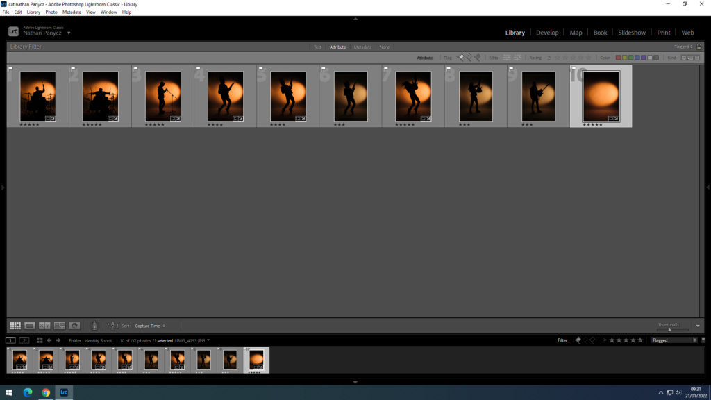
Contact sheet
Those are all the photographs I took in two separate shoots. The first shoot was more for gathering ideas and setting up the lights and the camera settings.
Image selection
Those are the photographs I flagged as usable
Those are the photographs marked with 5 stars. I chose those because they were the sharpest silhouettes and had the right amount of asymmetry to help illustrate the movement.
Image editing
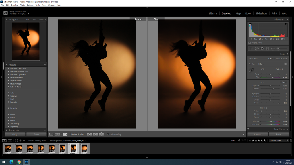
Firstly I cropped the image as at the top you could see the white infinity curve end. I increased the contrast because the photographs didn’t look deep and defined enough but rather bleak and washed out, I also increased the blacks to make the silhouette stand out more against the orange light. Since I shoot the pictures in the dark it was hard to get the right settings on the camera and all of the photographs came out a bit grainy so to smooth that out I turned down the texture. This also gave it a satisfying blur effect around the edges and the background, leaving the middle sharp, especially the model. The colours weren’t very defines as well and I wanted to get that yellow-orange sunset colour so I changed the tint to +30 and increased the saturation and vibrance to +10. I needed all the photographs to look the same for a triptych so I used the synch settings option to edit the pictures all at once with the same setting as the original one.
Experimentation
I converted my final photographs into black and white because I wanted to find out how powerful they would be if they followed Claude Cahun’s or Bobby Becker’s black and white theme. I personally found that too dull and apathetic, not really conveying the excitement of self discovery or the journey that comes with it.
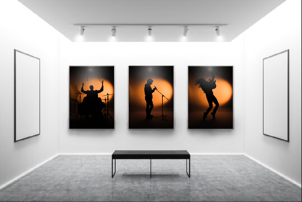
Final outcomes
Visual Gallery
The overall idea behind those photographs was to show the loss of identity and finding a huge part of my identity in music. You can’t see the subjects but you can clearly see what they do and what they represent. This is because even when I feel like I can’t or find it difficult to express myself in front of others I always find ways to express myself in my music, whether it’s playing an instrument or lyric writing. The first and second triptych shows the progression of movement which makes it really dynamic almost like a video. In this I wanted to convey the journey to self discovery. The momentum in the third triptych on the other hand has a pause in the middle as the model singing is standing still without any movement, this gives it a subtle contrast and represents the doubts or struggles individuals face in their journey. The third tryptic also represents the idea of unity within identity and how it gives individuals a sense of belonging.
I decided on using warm, bright light to create that sunset vibe and because it is the most attention grabbing of the colours. Yellow also energises, helping convey the liveliness and movement and the orange hue adds enthusiasm and excitement. The position of the light source is behind the subject creating a silhouette and to the right, pointing at the background. This creates the smudge effect on the left side as the light fades helping express the concept of motion. The light reflecting onto the floor behind the subject adds visual depth and makes the photograph look 3D as well as the yellow/ orange hue contrasting the deep black as lighter colours tend to be perceived as close and dark colours as being further away. The space also makes the photograph feel light, not cluttered. Since the contrast between the light and dark is so high you can clearly see the outline of the silhouette, all the shapes such as the hair or shoelaces. This also creates space as sharp, well focused objects appear closer than blurry objects such as the background.
Comparisons
My photographs differ from Cahun’s or Becker’s in that I decided to use colour to help me convey the idea of a journey and included actual movement as opposed to my chosen photographers who take still, black and white photographs. On the other hand, I quite liked the idea of strongly contrasting two colours together like in Becker’s photographs to show the distance between losing your identity and rediscovering it. He shows that sometimes less can communicate more.
Evaluation
In my opinion, I did a good job with setting up the scene (lighting, background, props) as well as wording my ideas to the models to achieve the desired shots. I could have done a better job with the camera settings as the photographs weren’t as good of a quality as I wanted. The images came out a bit grainy because the ISO was too high as I needed to use fast shutter speed to capture the movement. I should have used a higher aperture to make up for the light lost with the high shutter speed instead of increasing the ISO so much. If there wasn’t a time limit I would have reshot the photos.
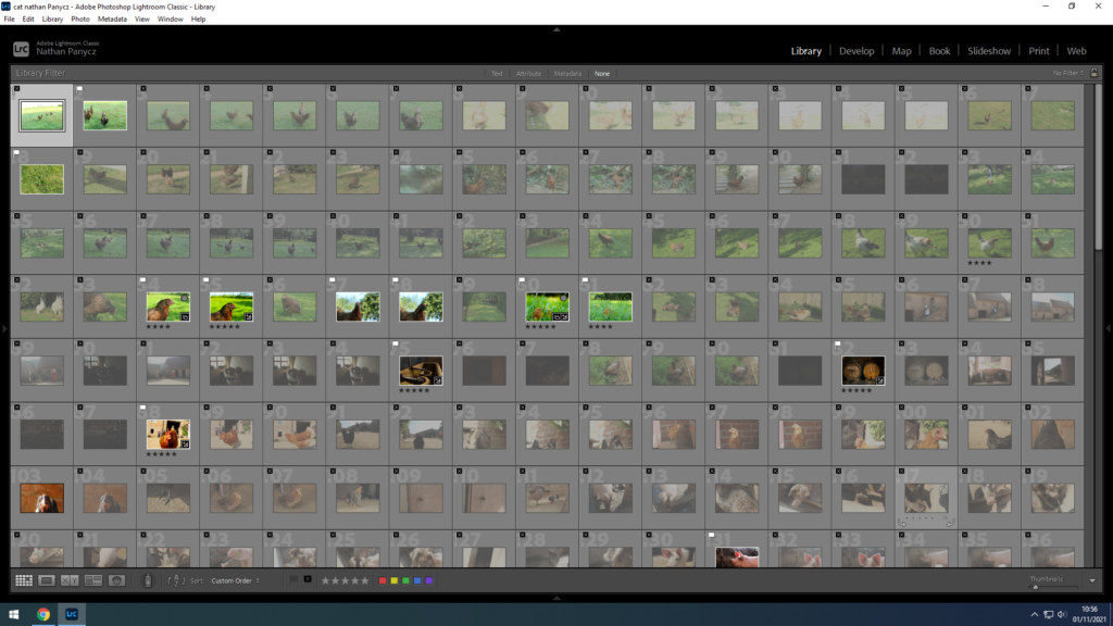
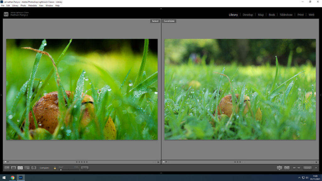
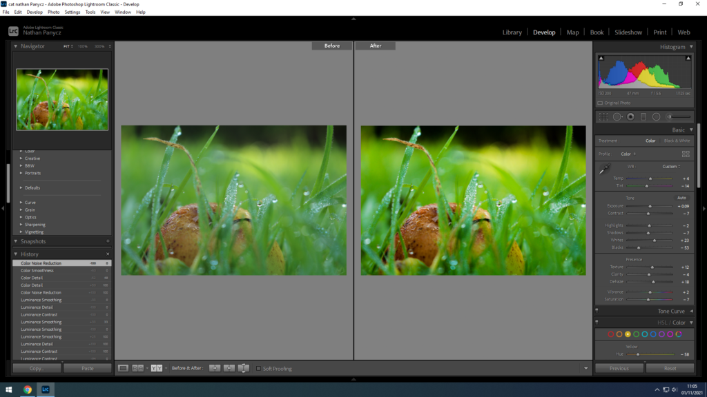
Firstly, I sorted the photos by flagged the best ones Then I rated them 5 stars for the best, 1 star for worseI did this by comparing them side by sideThen I used the before and after setting and adjusted the whites and blacks to add a bit more range and used dehaze to add some clarity to the picture. I also turned up the texture so that the water droplets, grass and little details could be seen. I turned down the hue in yellow because it was too bright and there was too much yellow.
Those are my final picks, edited.
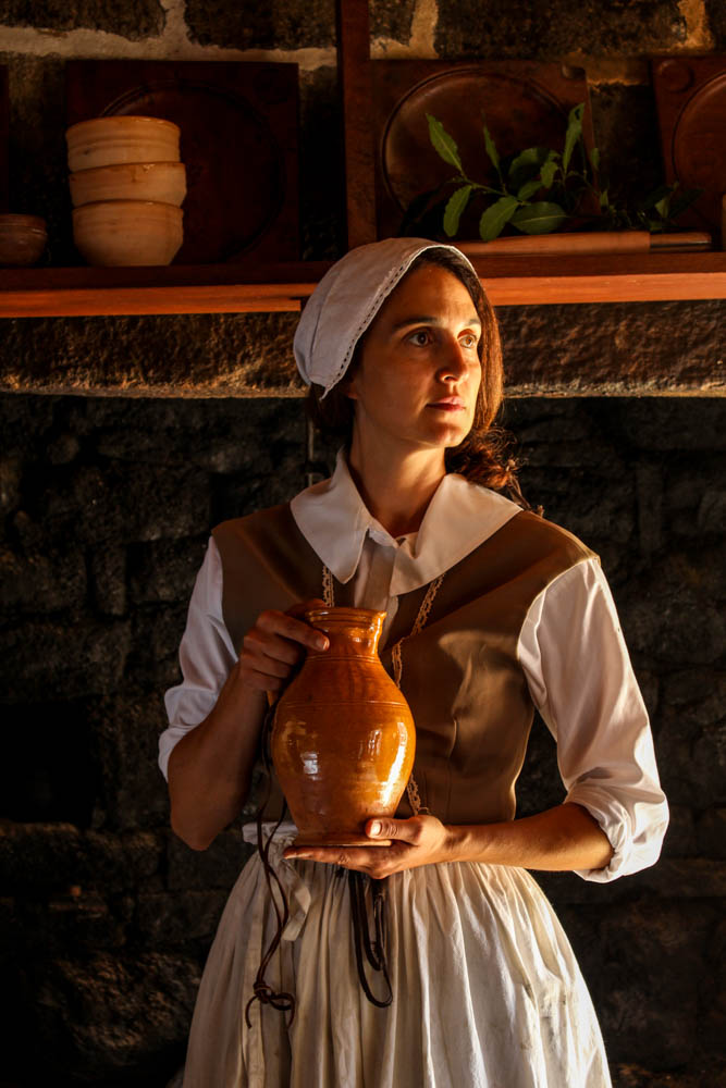
This is a photo of one of the live history actors at the Hamptonne Museum. It shows the lifestyle of people in Jersey a couple centuries ago, how they dressed and what they did. This photo was shoot with natural light coming in form a window to the right and so its very yellow, warm light, creating a golden hue. The light only hits half of the subjects face mean while the other half is shadow. This creates a nice contrast. The white dress also contrasts the dark background. The line in the photo would be the subjects hand positioned horizontally as well as the shelf in the background. Whilst the hand leads the eye to the vase held by the subject, the shelve brings the attention to the background and the rest of the historical objects. There is quite a few textures in the photograph. The wrinkles on the subjects clothes are sharp because of the light and shadow contrasting together, this is eye catching and helps to bring the attention to the subjects. The rough and bumpy stone wall behind the subject brings the focus to the background. Overall, the photo feels cluttered since there’s so many lines and textures and shapes that make it hard to concentrate on one object, there isn’t much space, this is supposed to represent the living conditions of people back in the day when the houses were tiny and families huge.