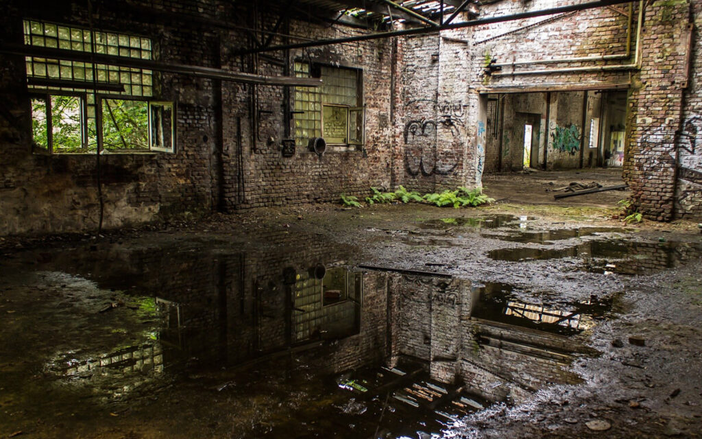
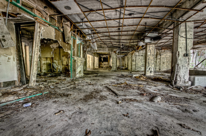
Here I have my final images displayed in a virtual gallery

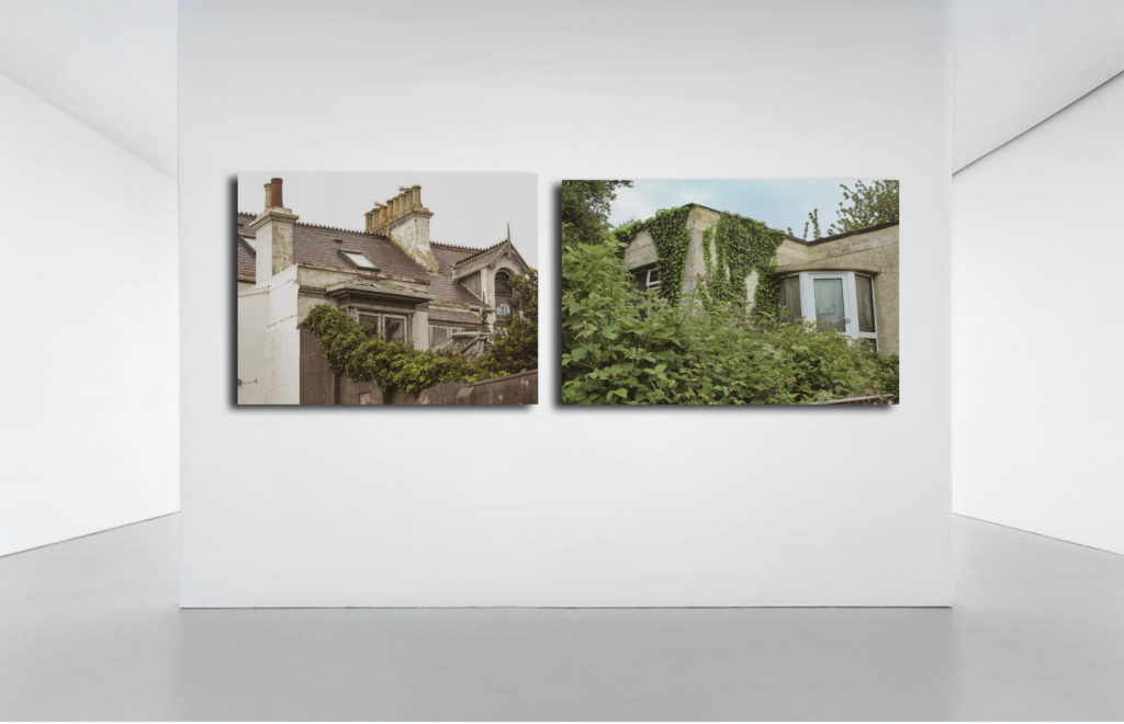
Here I have my final images displayed in a virtual gallery


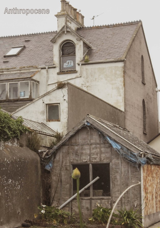
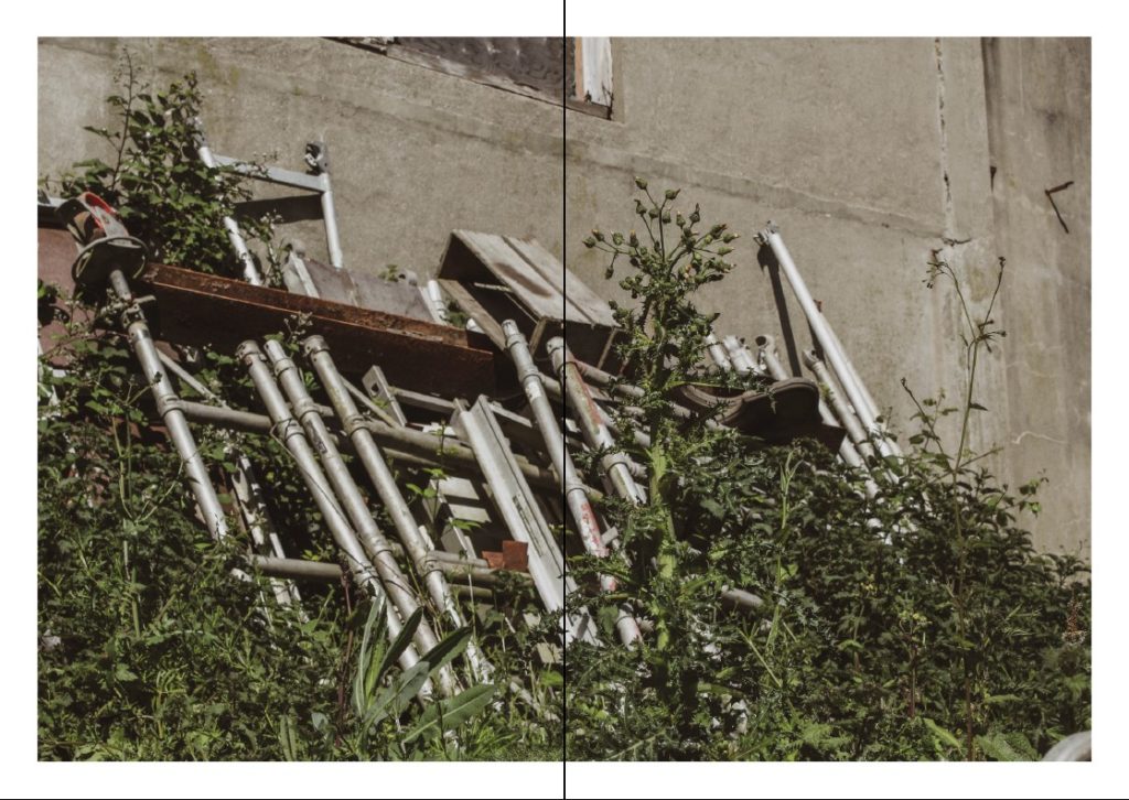
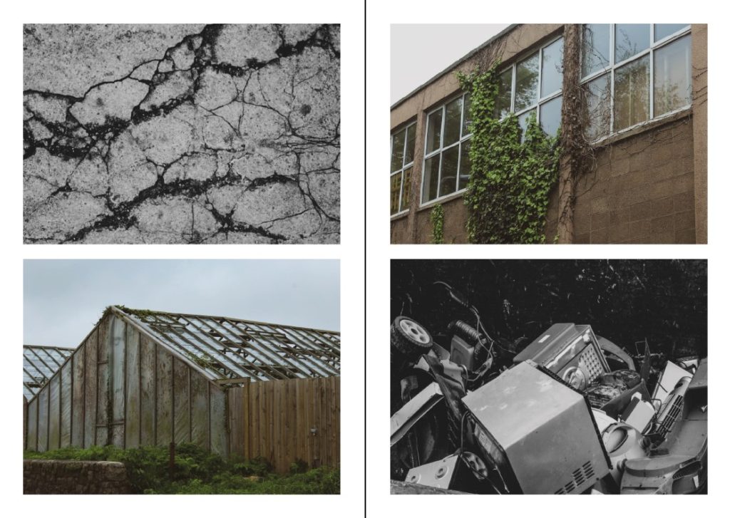
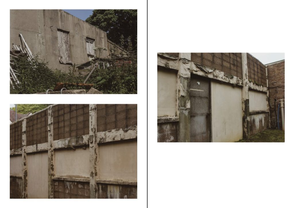
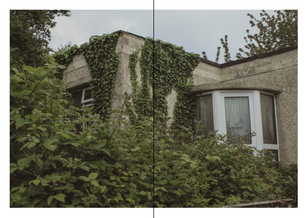
I decided to make a zine so that I could display a few of my main photographs for Anthropocene. I used the software Adobe InDesign, so that I could create a layout and correct size to display my zine in. My zine contains 16 pages and will showcase a variety of images that highlight Anthropocene in Jersey, showing the impact that humans have on nature and what nature is capable of doing.
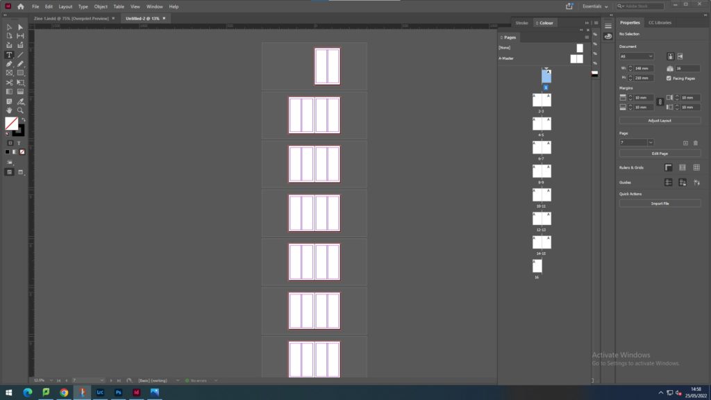
Here I began with 16 blank pages as to be able to display my images throughout the zine. I wanted to present my best images from both photoshoots.
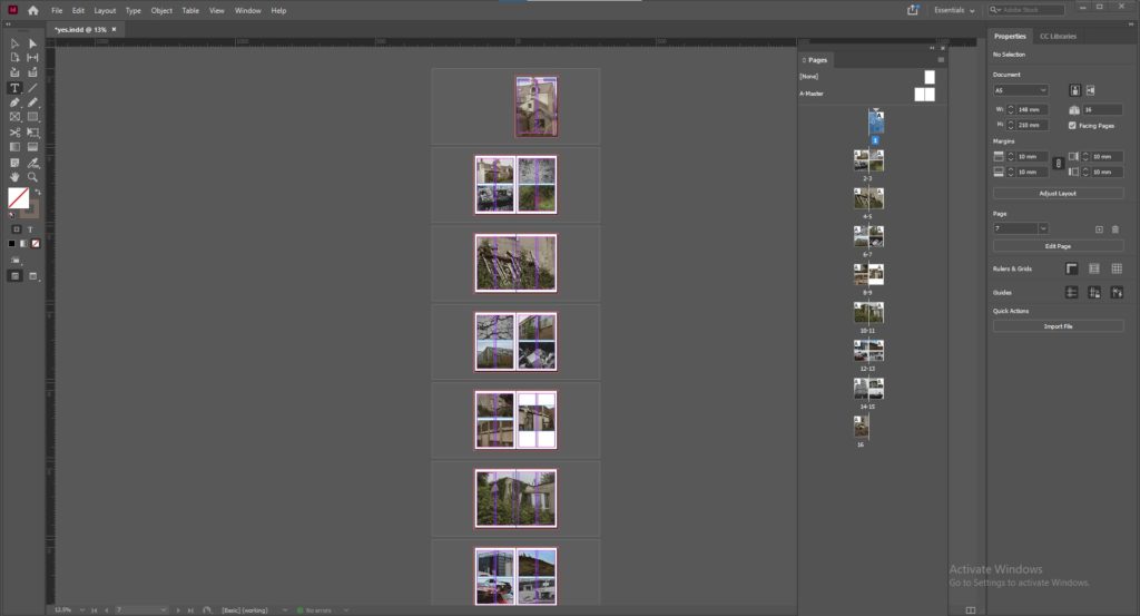
My first zine attempt
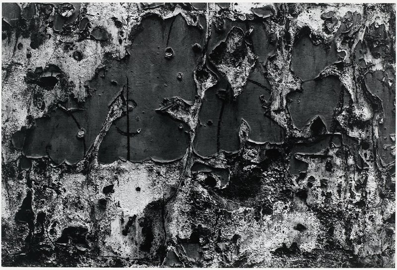
——- Aaron Siskind ———————-
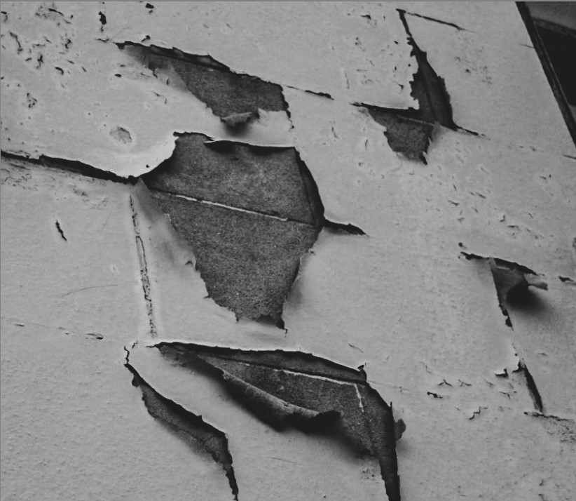
| Aaron Siskind (differences) | Similarities | My own photography (differences) |
| A lot harsher texture | Both display signs of peeling wall paint off a building | A lot softer in colour |
| Contains a lot more holes and peeling paint | Both share the same colour scheme | Contains not as much peeling paint |
| Monochrome colouring is a lot harsher | Peeling paint is quite spaced out |
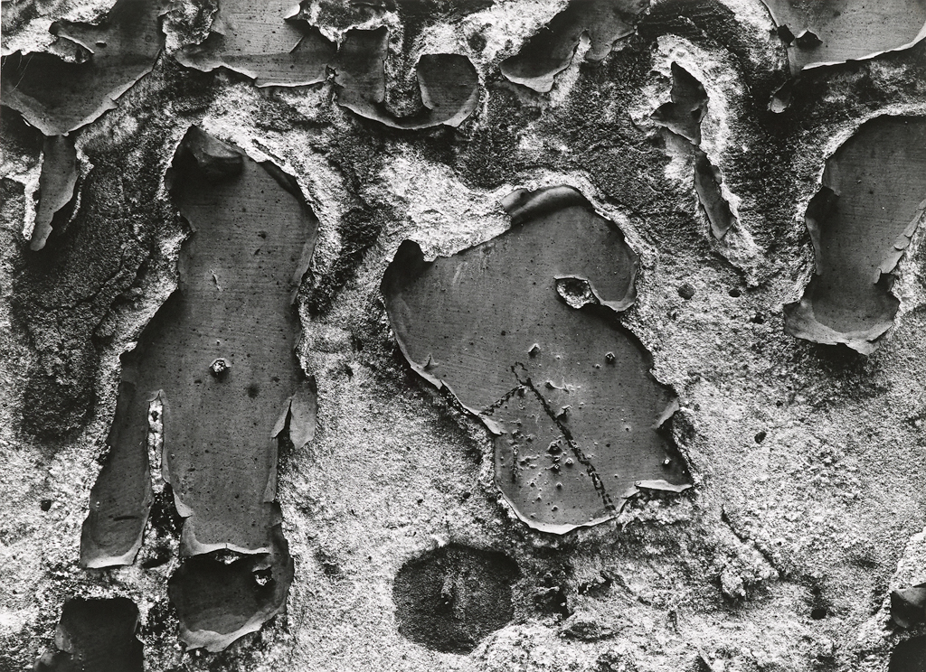
Both these images share a range of similarities and differences. To compare the two images, one being done by Aaron Siskind and one being done by me, I can first of all see that both of the photographs display the clear sign of a deteriorating building with peeling paint marks.
What I can also point out, is that both images share a very similar monochrome black and white colouring and tone. They’re both quite harshly coloured on the brick behind the paint and the paint itself.
Although I can also spot some differences between the two images such as Siskind’s work being a lot harsher and textured whilst mine on the other hand, is a lot softer and smoother. My photograph has presented that the peeling paint marks are very spaced out and contains not as many, whilst Siskind’s displays the marks being incredibly packed together and roughly carved out by old age.
——- Yves Marchand & Romain Meffre ———————-
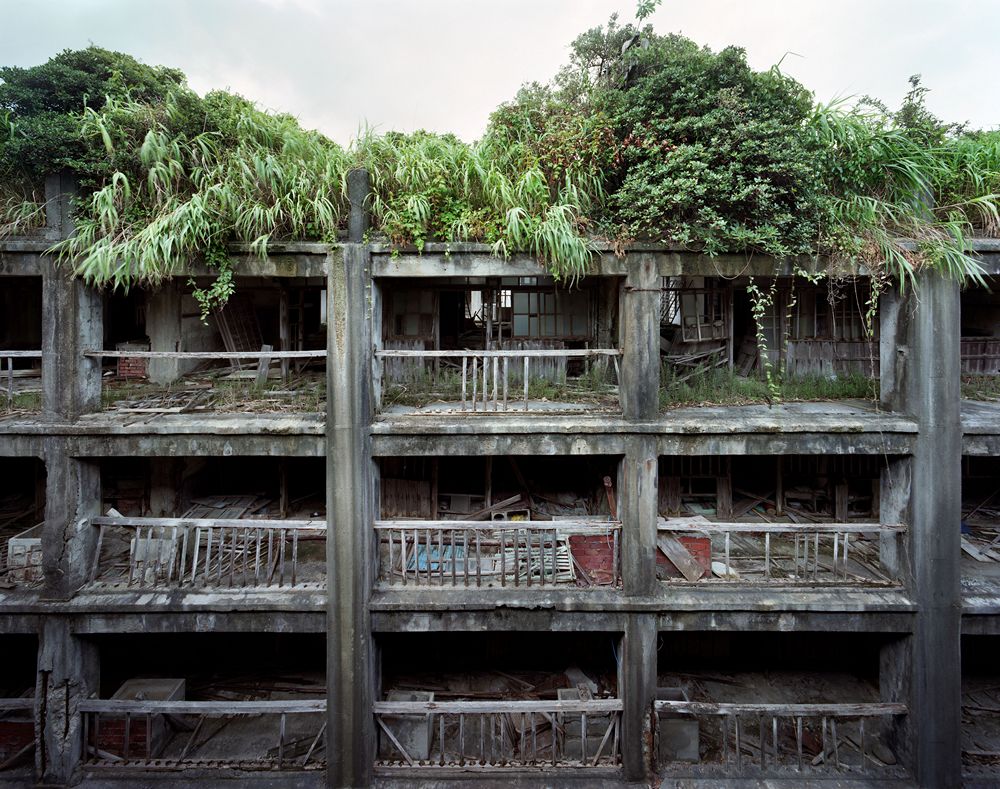

| Yves and Romain (differences) | Similarities | My own photography (differences) |
| Incredibly harsh colouring on the building due to old age | Photograph of abandoned buildings | The plants block out more of the entire structure, blocking its view |
| Contains way more damage on the structure | Highlight the sense that nature has taken over the structure | Colouring of the overall image is a lot warmer than the other photographs |
| Central photograph | Taken at an angle | |
| Plants aren’t in front of the actual building | Plants are blocking a portion of the building |
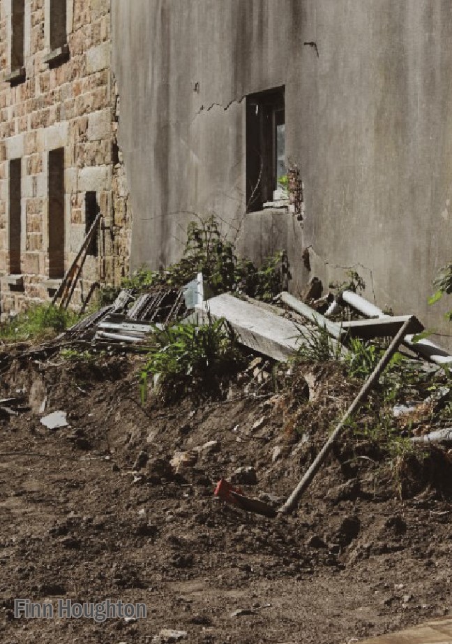
Both these images share a range of similarities and differences. To compare the two images, one being done by Yves Marchand & Romain Meffre and one being done by me, I can first of all see that both of the photographs resonate around abandoned and derelict structures.
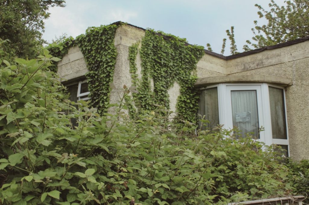
I have also noticed that both images highlight the obvious impact that nature is having on the infrastructure itself. They are both being drowned in an abundance of greenery and plants. This clearly shows that nature continues to overpower humans and what they are willing to create.
Some main differences between the two photos however, are that the colouring for both images is different. My image is a lot warmer on the colouring of both the plants and the house itself, whilst the other photograph by Yves and Romain, is a much cooler tone and gives the building a slight greyer tone of colour. One other difference I have spotted, is that in the corner of my image is a huge pile of plants that block off a portion of the house, making it harder to see. Whilst the other photograph, contains the whole photograph in frame with nothing blocking its view. My photograph has also been taken at an angle whilst the other one is displayed in a perfectly central manner.
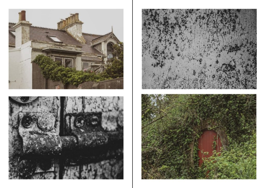
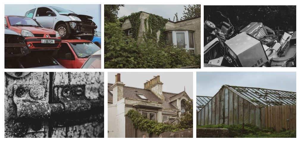
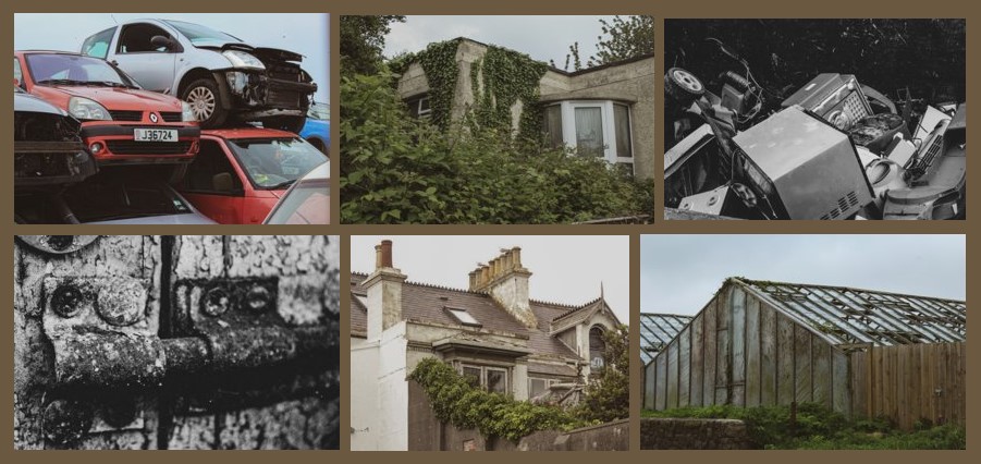
Here I have displayed my best images from both photoshoots. I wanted to include a combination of different photographs just to show different perspectives of Anthropocene, from the full sized abandoned photos, to the small scale close ups of deteriorating landmarks.
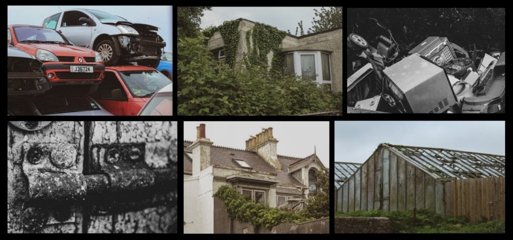
Process for final piece choices
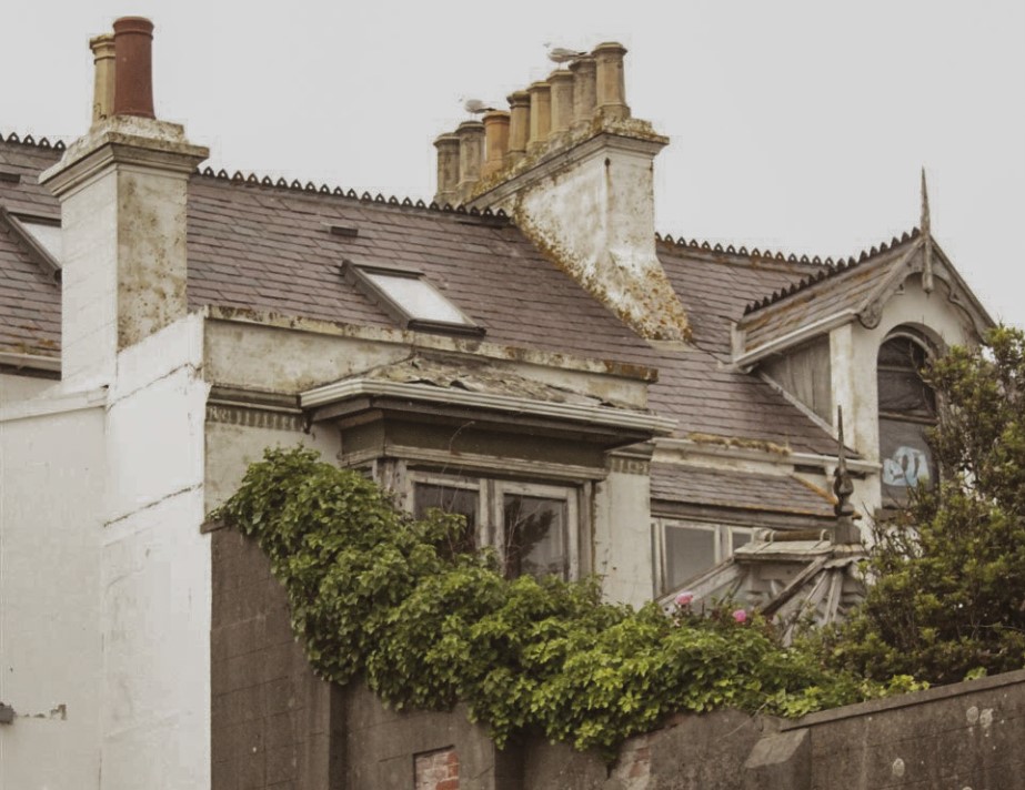
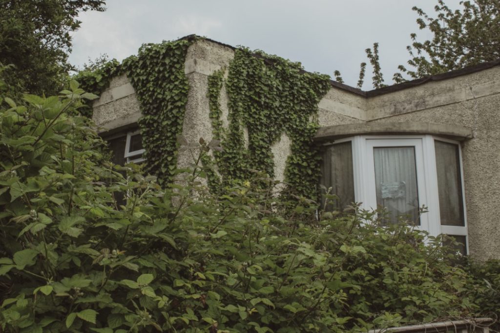
These photographs here were inspired by Yves Marchand and Romain Meffre’s series: Gunkanjima (2008-2012)
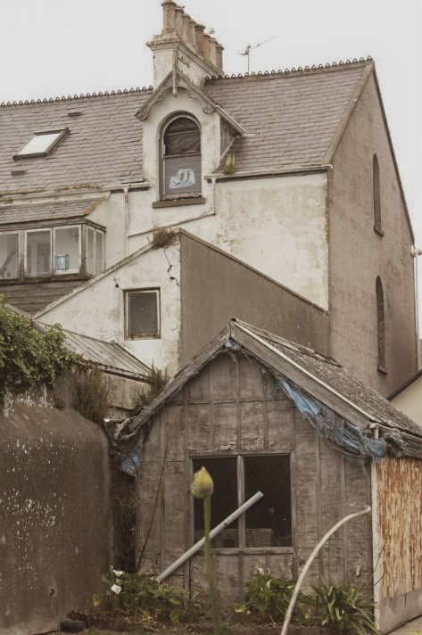
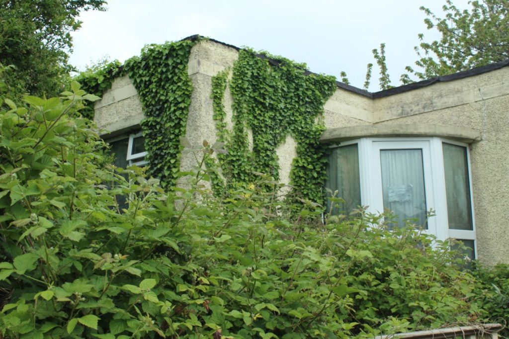
For my first photograph, I ended up photographing an old, decaying house than was almost completely consumed in an abundance of nature. I enjoyed the overall look of this house as it gave off quite an eerie sense of living, showing that eventually life will take over buildings and structures made by humans if left unkept. I wanted to only crop off a certain portion of the overall photograph as I wasn’t happy with how the full image looked on it’s own. After I cropped the image, I edited the image to my liking, being inspired by Yves and Romain throughout the process.
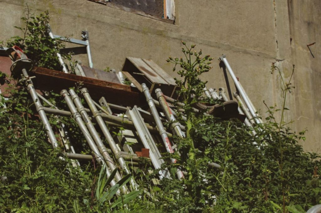
For my second photograph, I once again decided to choose an abandoned and decaying house as my focus for this image as I wanted to follow a similar theme to that of the first one. I wanted to capture as many of the plants in the image as possible, just to highlight how powerful nature has been towards this building. I ended up editing this photo in the exact same way as image 1, loving how it turned out.
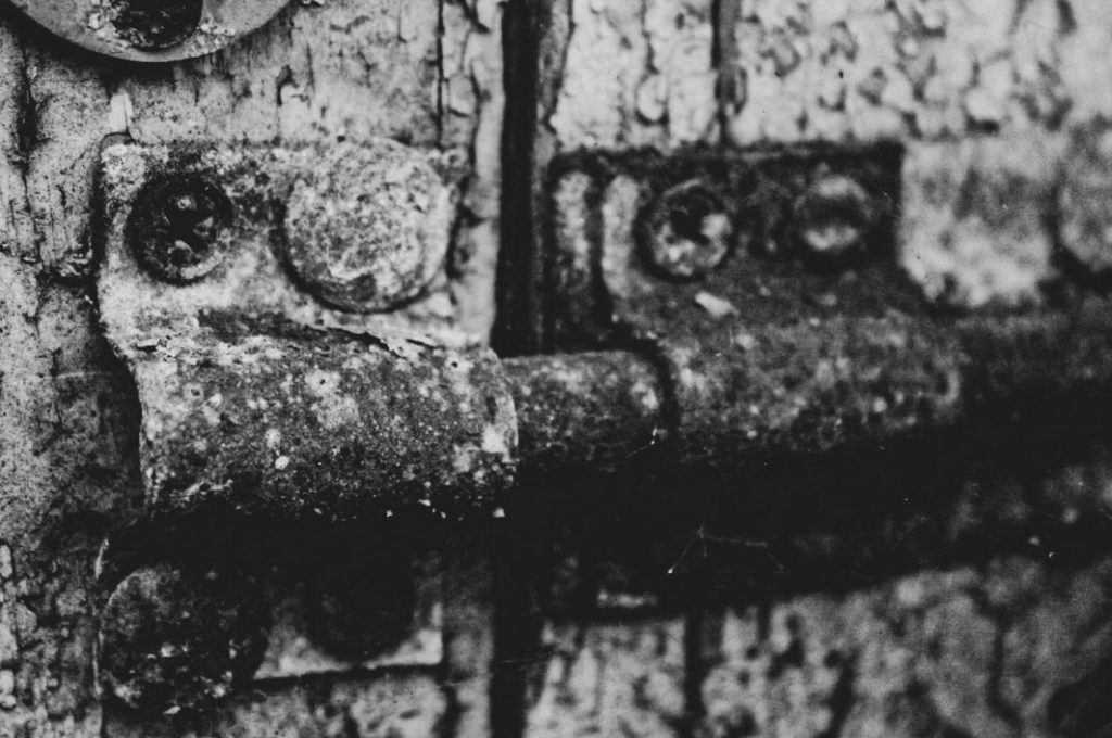

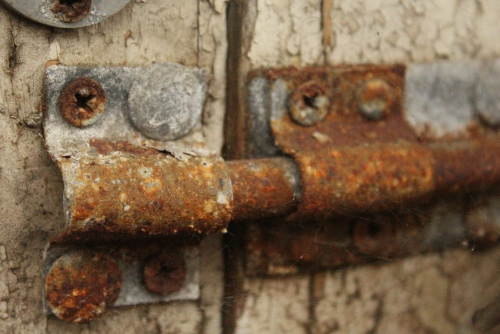
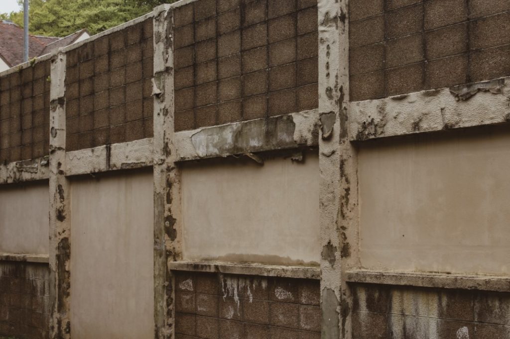
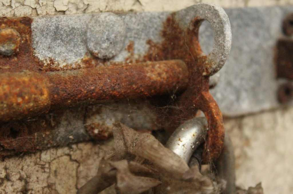
For my third photograph, I ended up going for a slightly different approach with the style of the image and the way I decided to edit it too. For this image, I decided to take a more abstract approach as I was inspired by Aaron Siskind’s work and wanted to display mine as being somewhat similar to his. I went for a close up shot of a lock which clearly shows some rusting and aging due to its texture and markings. Aaron’s work tends to consist of difficult to complex close up images that make it hard to decipher what he is actually taking a photo of, followed by a black and white filter. I wanted this photograph to follow a similar theme and show how over time, these objects will decay and no longer be of use in the world.
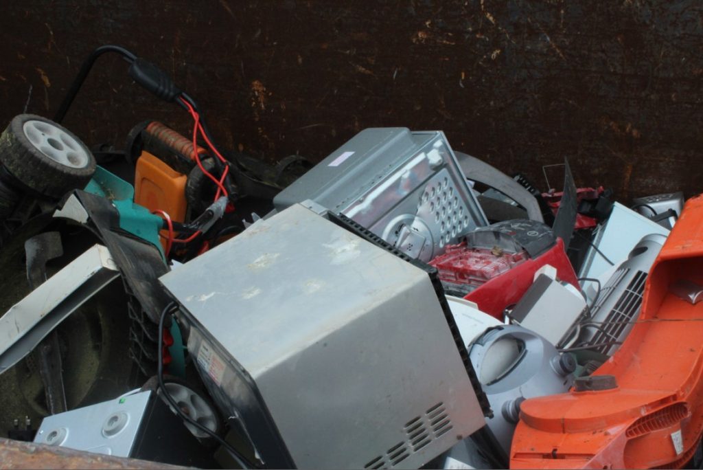
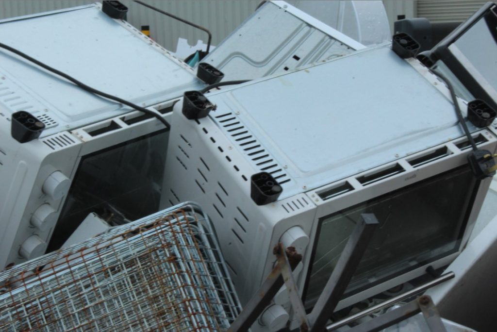
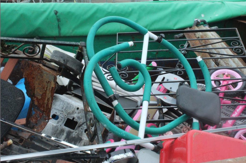
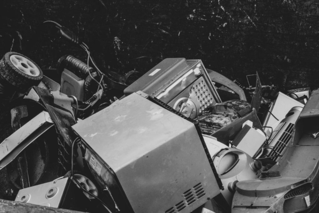
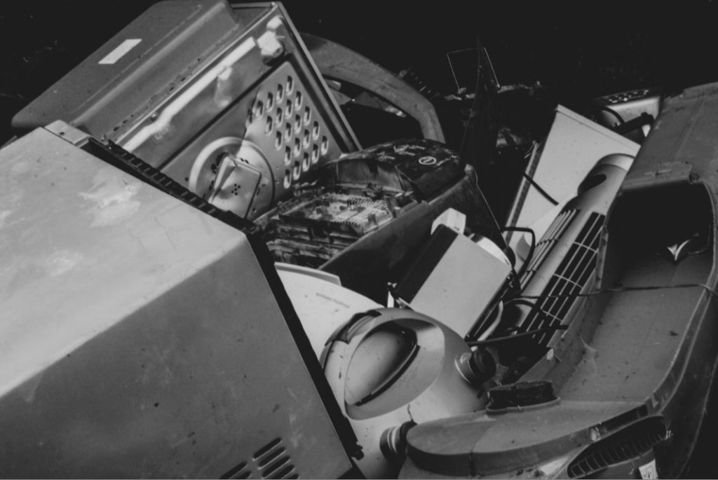
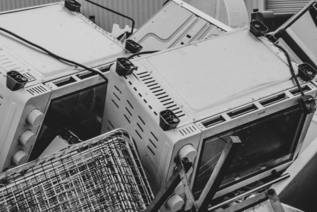
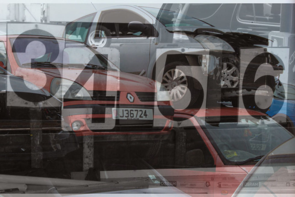
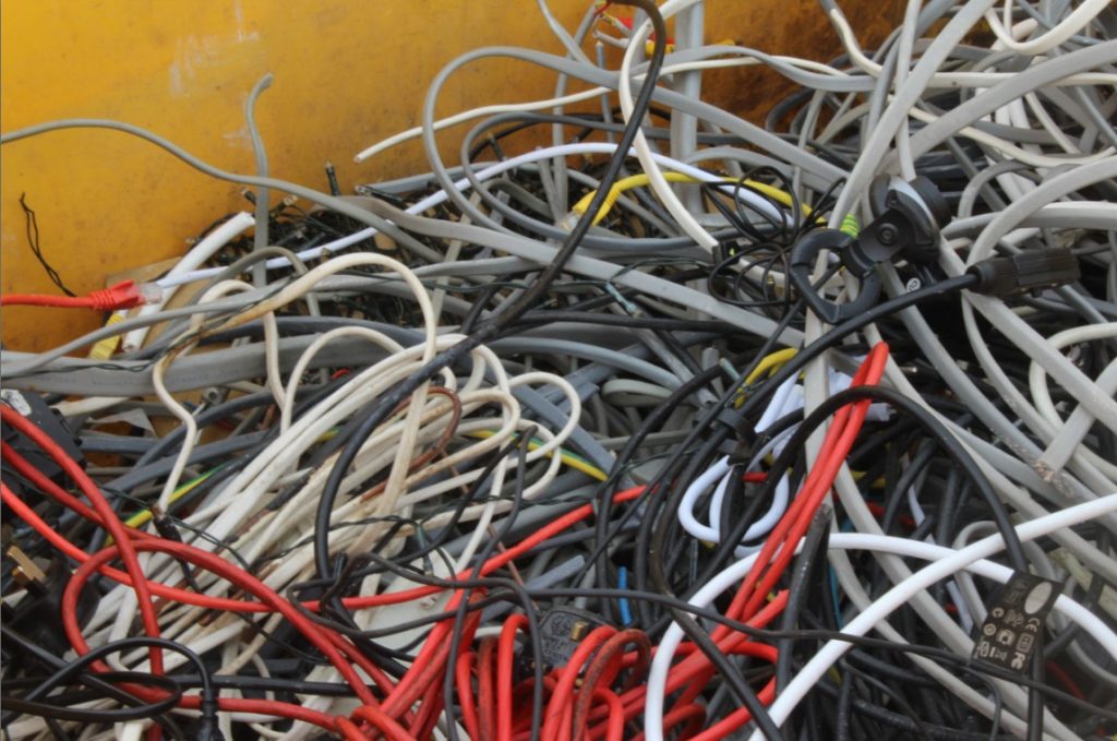
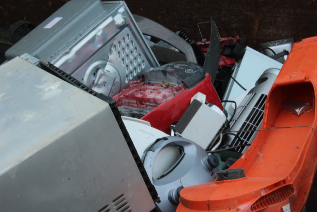
For my fourth photograph, I decided to photograph a pile of mainly electronic devices that had been thrown into a trailer at the recycling unit. I wanted to capture just the sheer amount of waste that tends to occur everyday which continues to pile higher and higher, causing for pollution to become increasingly worse for the environment due to such large items being incinerated. Once again I decided to add on a black and white filter, just to make the image look a lot more dispiriting and to show the negative impact this has on the environment.
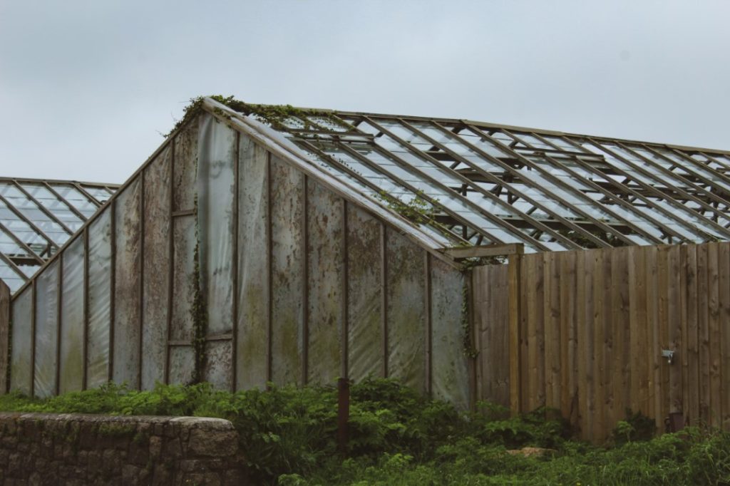

For my fifth photograph, I decided to capture the image of an abandoned looking greenhouse. This I believed was very well linked to anthropocene in the sense that greenhomes are suppose to allow plants and nature to thrive and grow much better so that the environment doesn’t stifle, but instead, the entire place has been completely given up on and abandoned, leaving the plants inside to overcome the structure and grow around everything. A place that is supposed to allow plants to grow more successfully, ended up being taken over by nature itself.
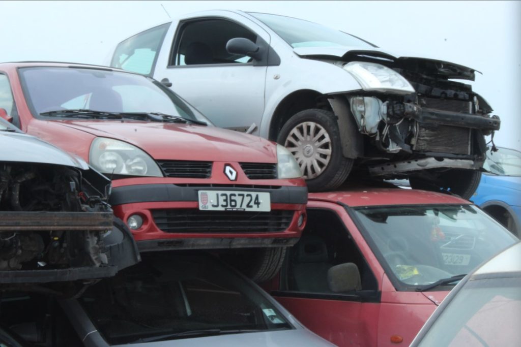
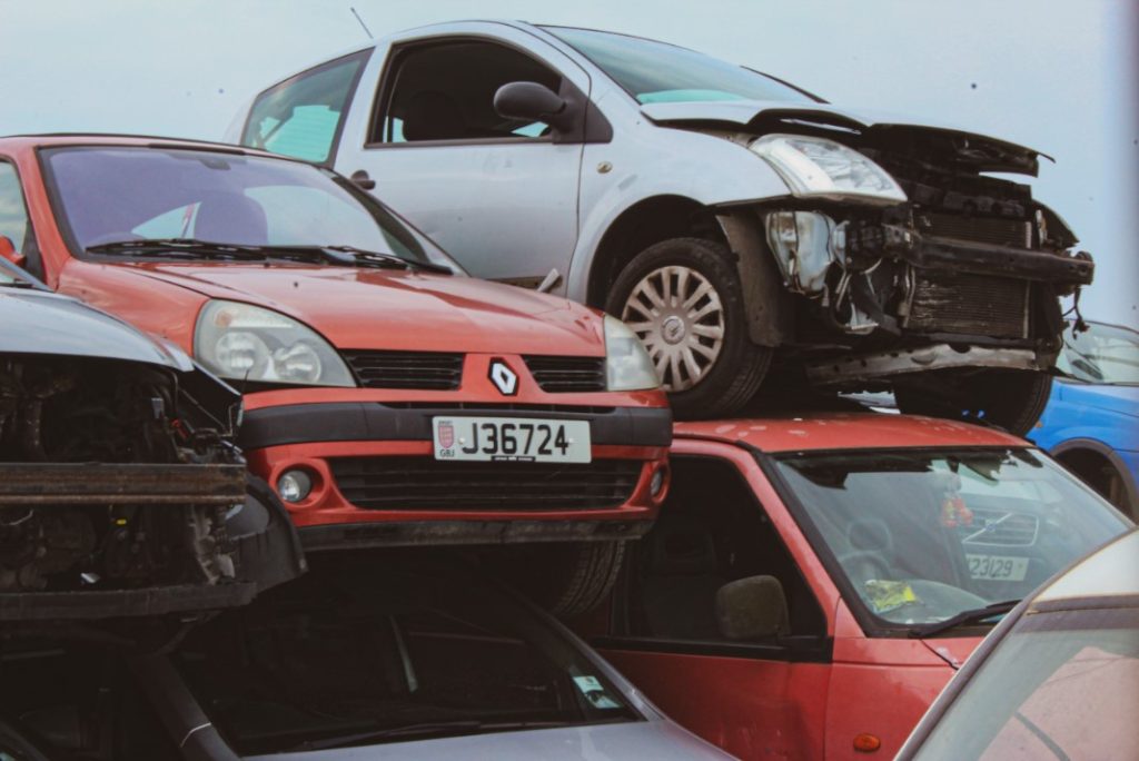
For my final, sixth photograph, I decided to take a photograph containing a variety of broken down cars. This links to my fourth photograph in the sense that it symbolises how easily humans dispose of polluting items and cause for the environment to suffer more damage and increasingly become worse.
Evaluation and Critique
Evaluation:
I am very happy with how my overall photographs turned out. I am incredibly interested in places that are decaying and almost ethereal so I was extremely happy that I was able to execute this so well during my edits of the images.
What Went well:
I believe I was able to execute what I was envisioning and was very happy with the final results of each photograph taken. I wanted to have my work heavily inspired by Yves Marchand, Romain Meffre and Aaron Siskind which I believe I was able to achieve when editing and finalising my photographs.
Critique:
What I would have done differently however, is I would have explored maybe the insides of abandoned areas more such as the greenhouse. I should have possibly researched more into certain locations to see if I was able to enter them as to get better photoshoots. I wanted to show the real aftermath of what nature can do on the inside of unoccupied areas.
Unedited photoshoot 1 pictures:






Unedited photoshoot 2 pictures:




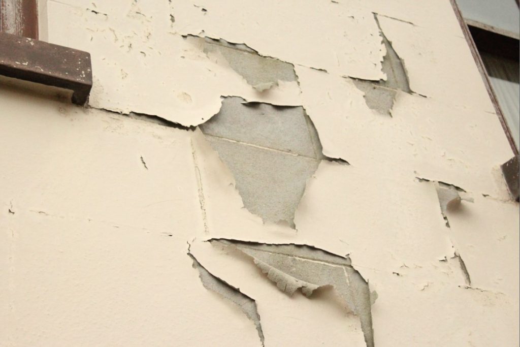

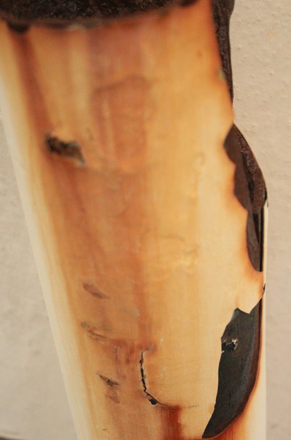

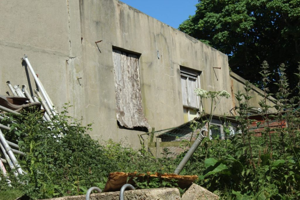
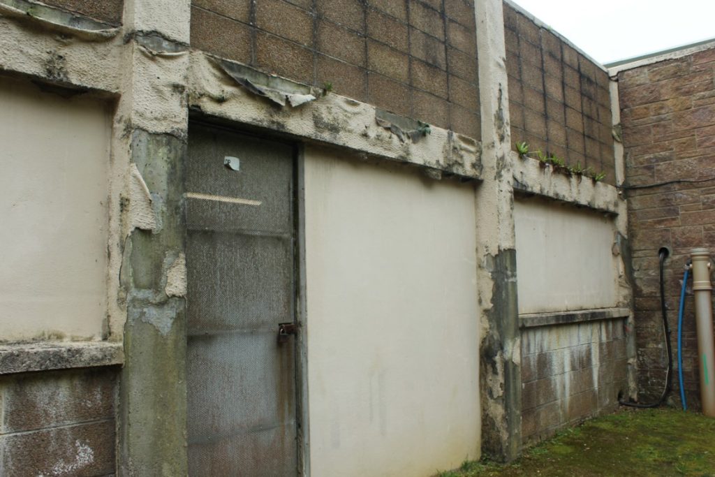
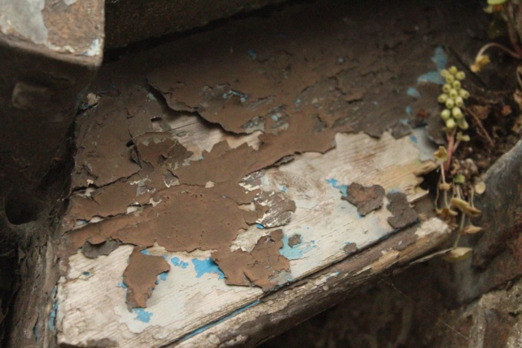

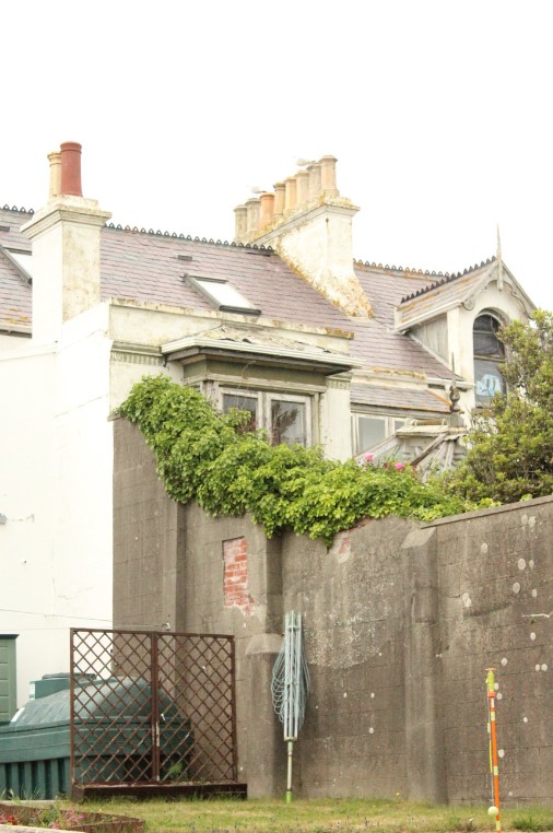
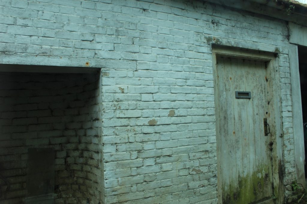
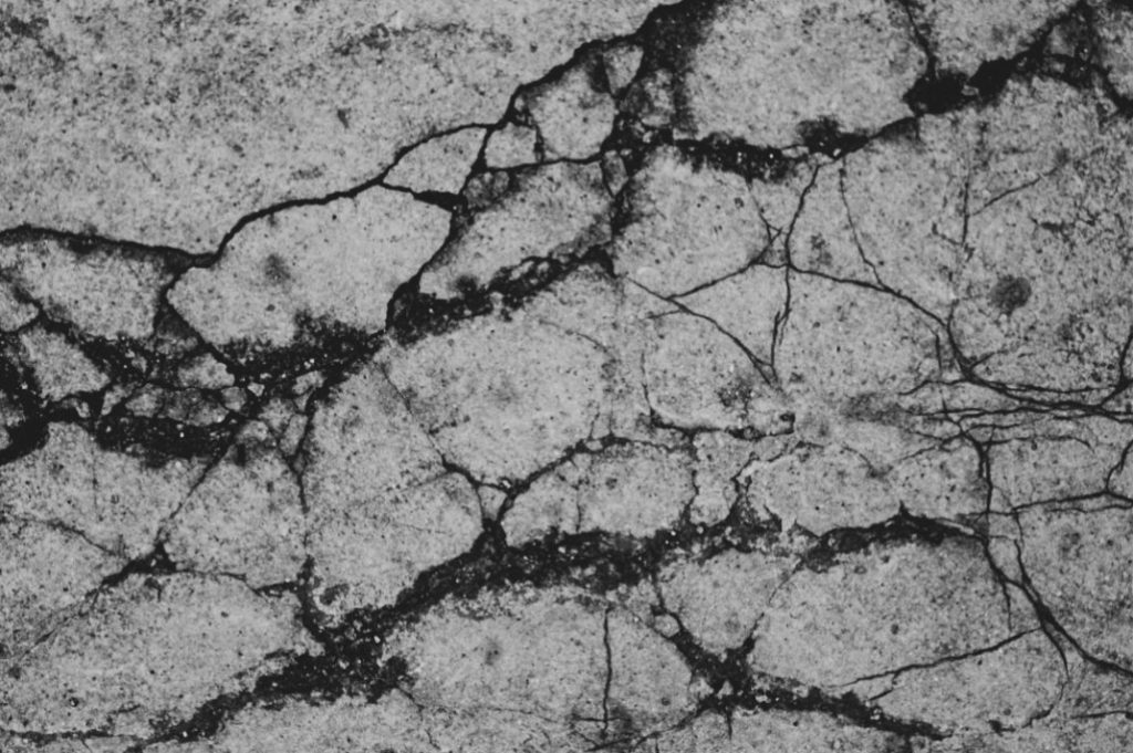
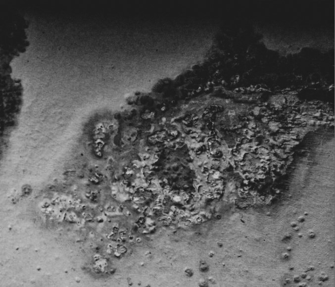
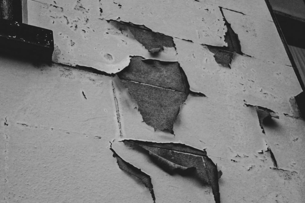
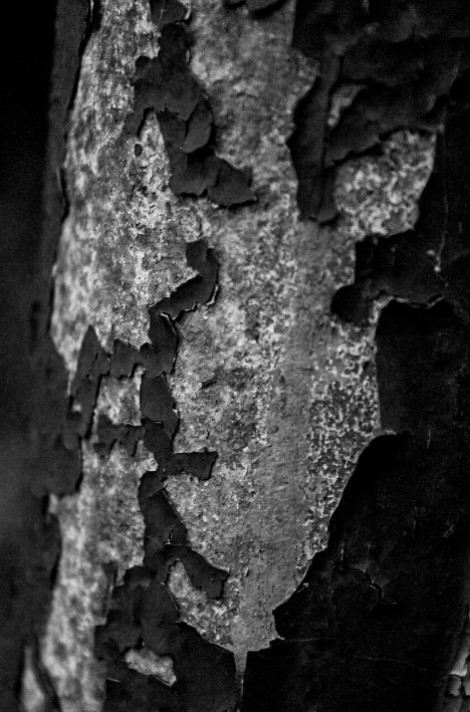
Abstract:

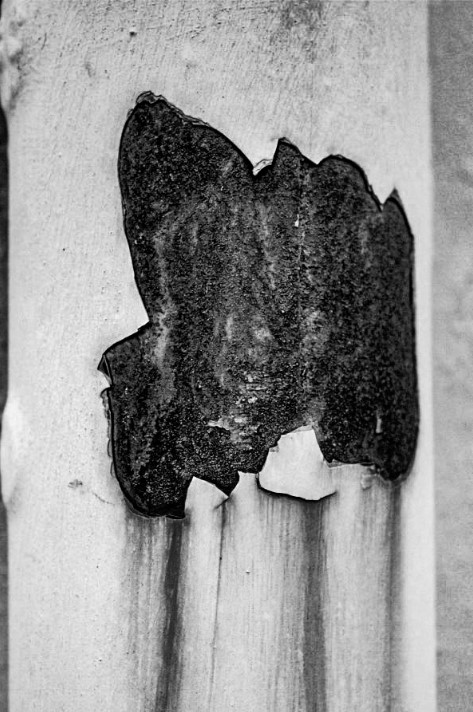

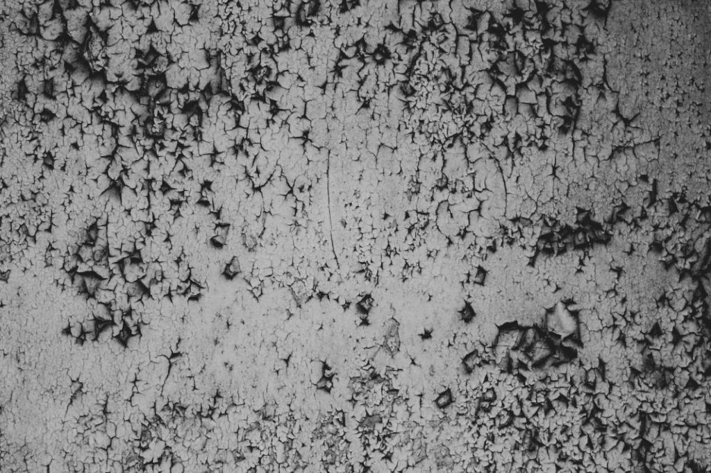
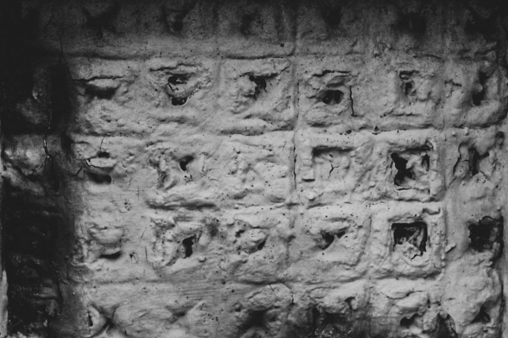
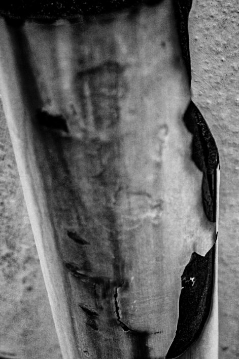

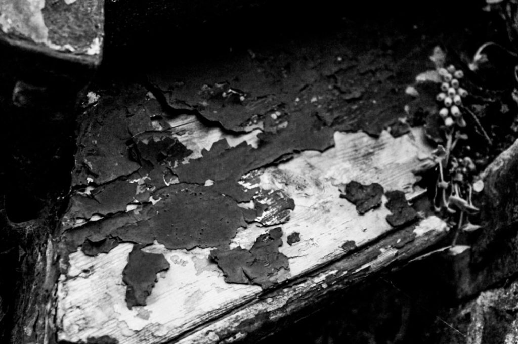
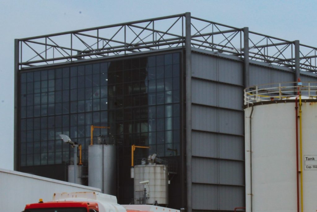
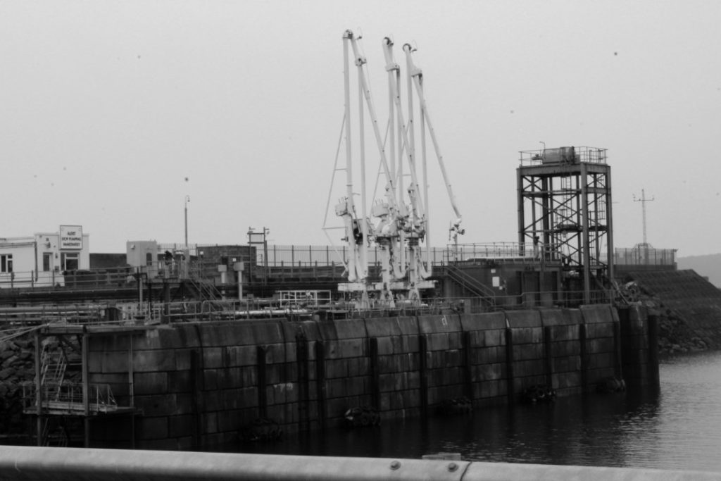
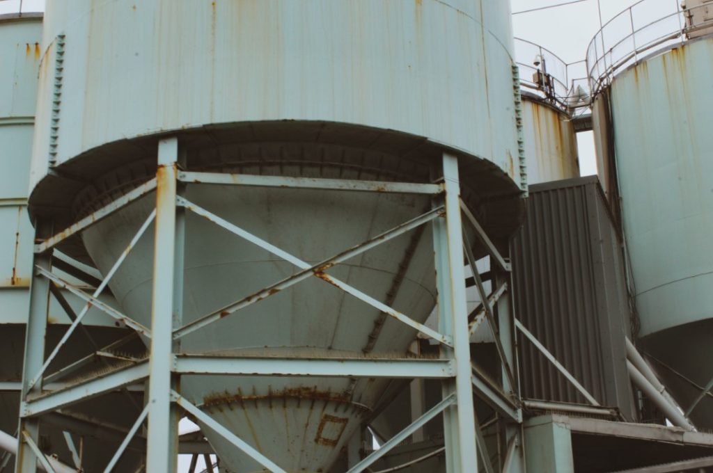
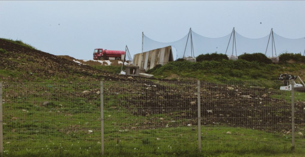
Industrial:
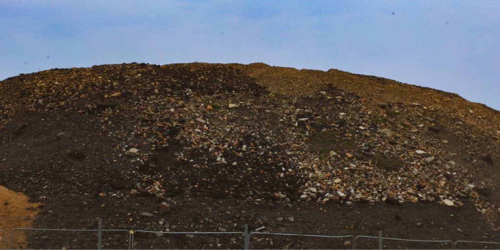
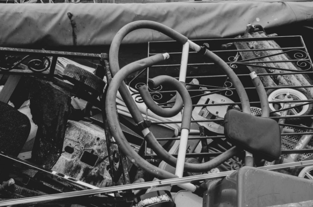
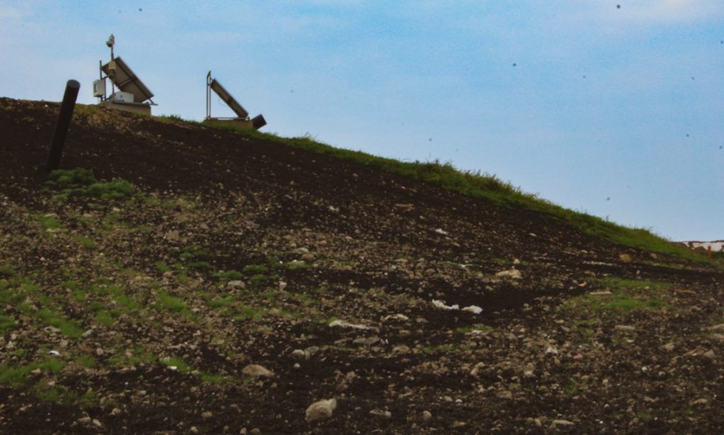
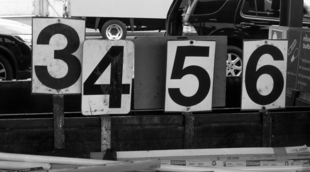
Dystopia:


Highly edited/Re-constructed:
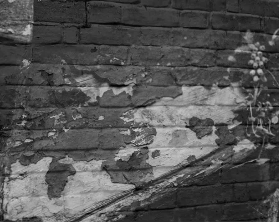
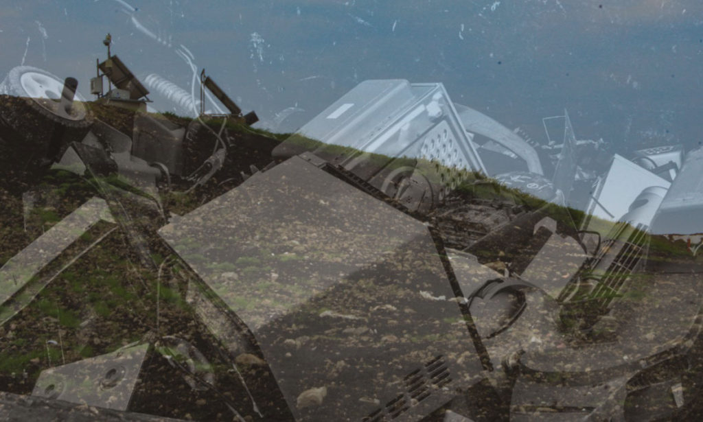
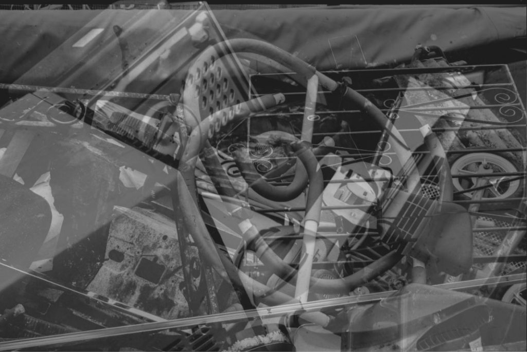
Inspired by Aaron Siskind
——- EXPERIMENT #1 ——-
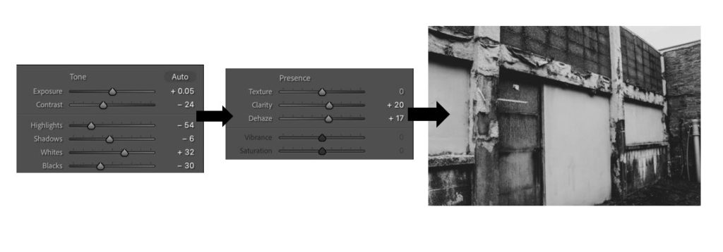
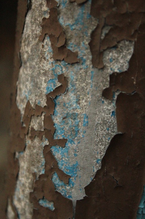
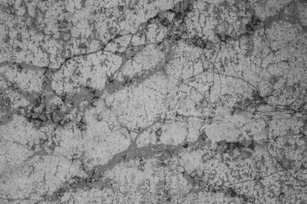
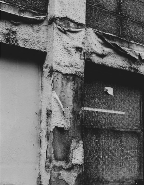
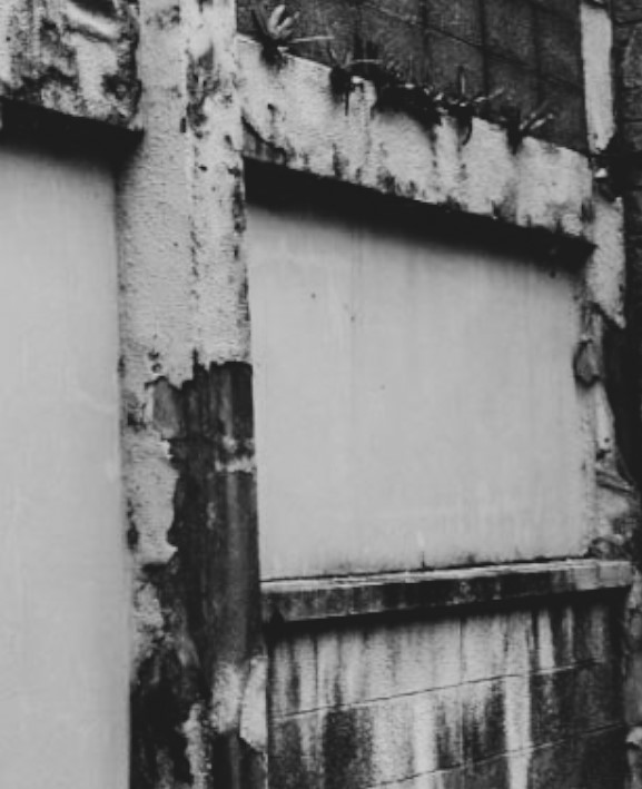
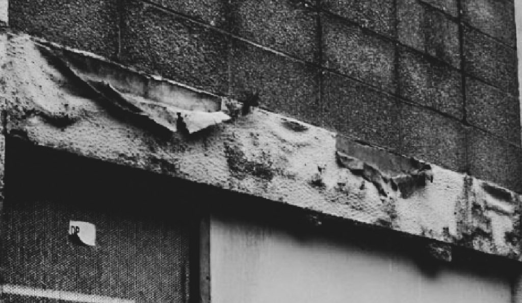
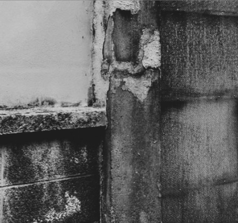
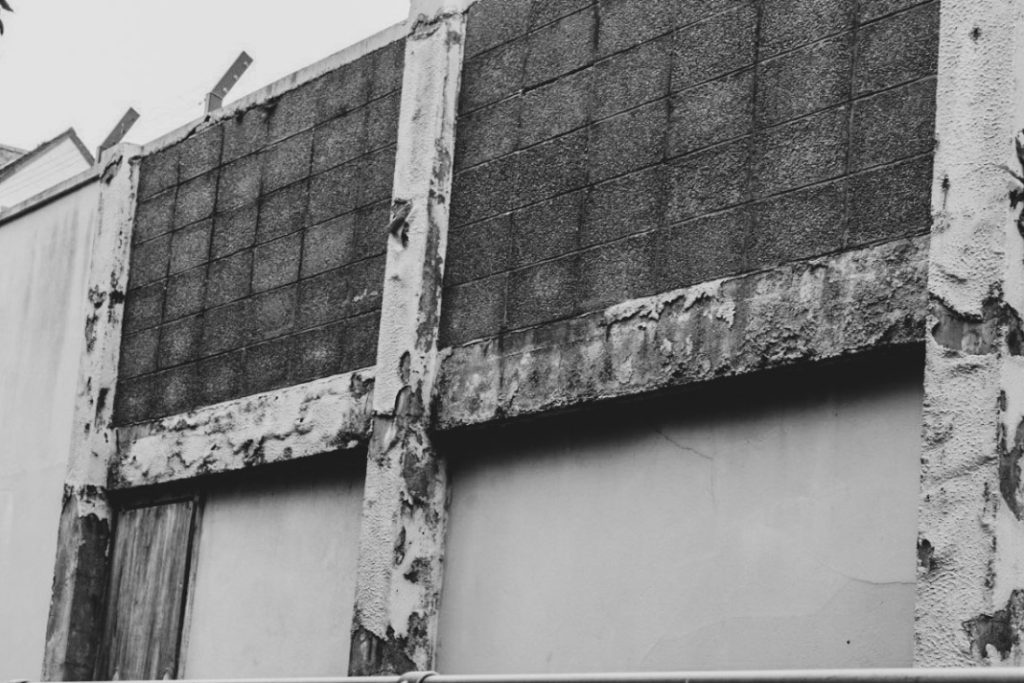
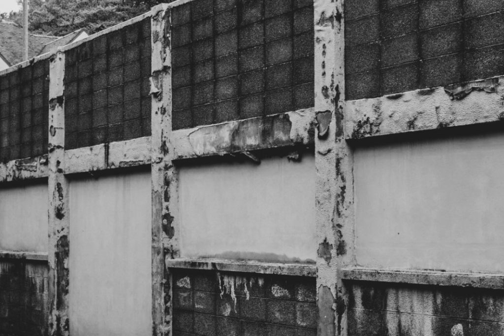
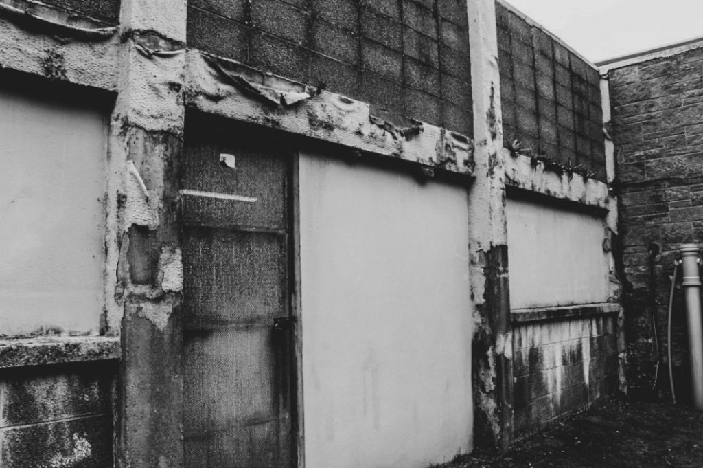
For my first experiment, I chose to apply a black and white filter, such as the ‘Flat’ filter, on top of this image followed by a few more adjustments to make the image a lot more textured. I was inspired by Aaron Siskind whilst editing this image and wanted to secure a similar abstract photograph. I then cropped it in different areas of the photograph, like that of Siskind, but I still wasn’t very satisfied with the result.
Cropping experiments ————–
Black and white experiments ————–
I tried experimenting with all the best images I took at this certain location. I definitely thought that the texture of the peeling material, looked extremely similar to that of Siskind, however I am not very happy with the results and prefer for it to be edited in a different manner.
Inspired by Yves Marchand, Romain Meffre
——- EXPERIMENT #2 ——-

For my second experiment, I wanted to take on the inspiration of Yves Marchand and Romain Meffre. To achieve this type of style I had to apply the ‘Vintage Instant’ filter and adjust the settings to my liking until I was happy with how it looked. I particularly liked how dishevelled everything looked after I edited it this way, making it almost look as if it was among a dystopian-like world.
I much preferred this way of editing compared to my first experiment as I just prefer how uncanny everything looks with the other inserted rather than the image purely being black and white. I preferred this particular image to be linked more in the way of looking like the work of Yves Marchand and Romain Meffre rather than Aaron Siskind. The image I took was a full image rather than a close up, abstract type of photograph so I thought it was better to have these inspired by Yves and Romain.
Coloured experiments ————–
Here are my final experiments inspired by Yves and Romain. I think I’m going to go along with these versions over the black and white photographs.


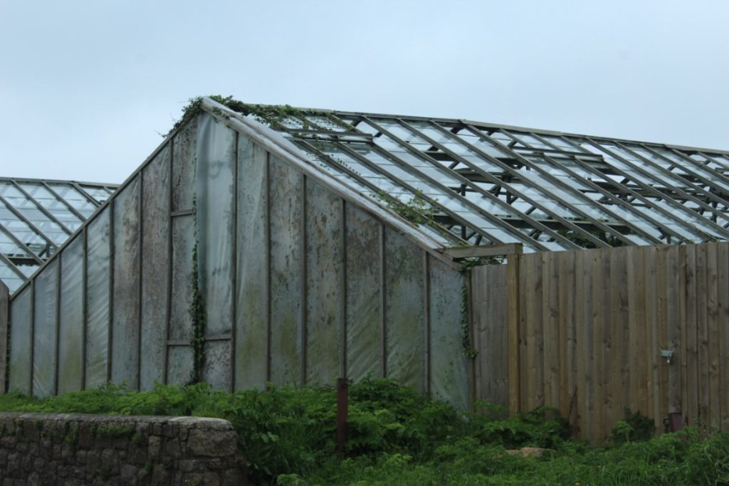

I’ve made very subtle changes to this image, but I wanted to make the colours a bit more vibrant in the photograph. To achieve this, I applied the ‘Vintage instant’ filter in the creative section. I then adjusted a few other aspects such as the exposure, shadows and more, until I was happy enough with how it looked.
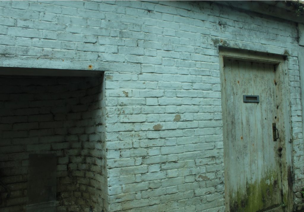
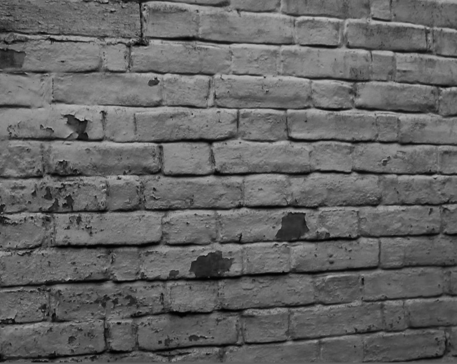
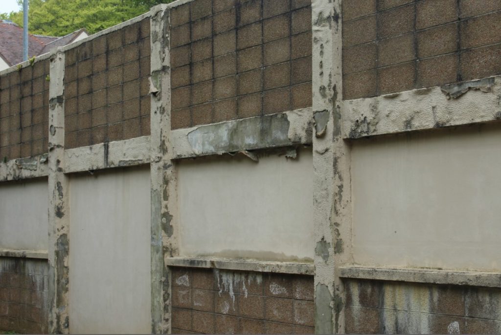
What I have done here is I have cropped the pictures down to a small section of the brick wall so that it can easily display the textures and obvious signs of decay on the building itself. After I cropped it, I added on the ‘High contrast’ black and white filter and adjusted a few other areas such as exposure and shadows.

Once again, I have used the ‘Vintage instant’ filter on this image much like the first edit I did. I have also cropped the image down to make it look much cleaner and less cluttered.
Abandoned locations and abstract signs of decay
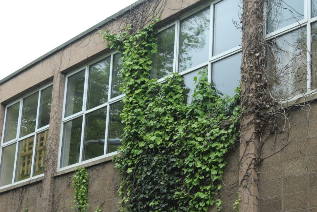
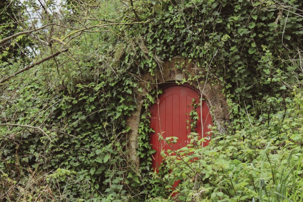
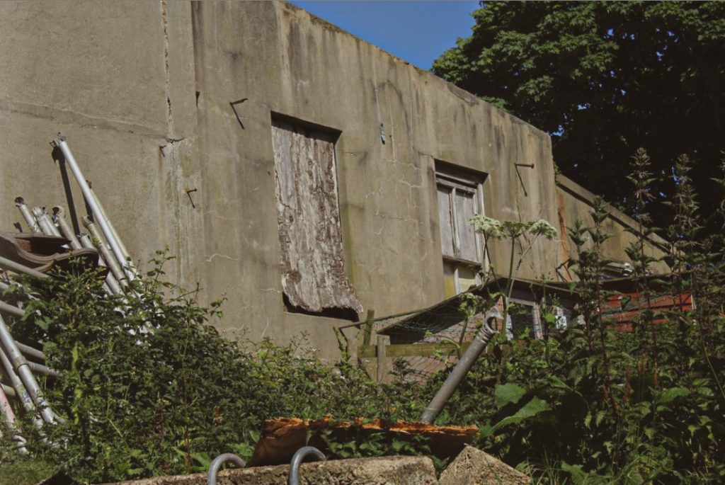
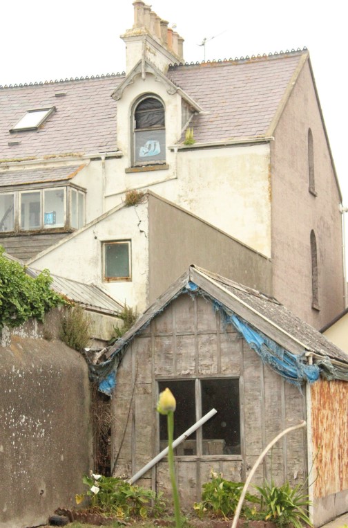
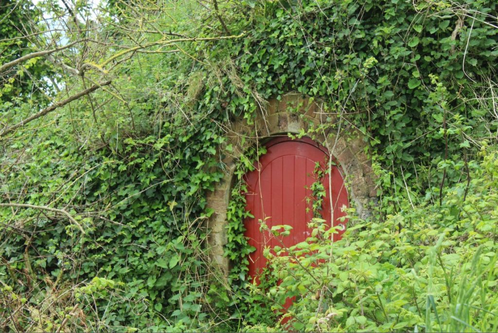
What I did for my first photoshoot was headed towards St Catherine’s Bay and around the area, I began to notice a few abandoned and decollate places such as an abandoned shed or hut covered with greenery. I wanted to photograph this in particular as I thought it displayed the sense of nature fighting back against the structure that was built on top of it. I soon came across an abandoned looking warehouse near the government house, which displayed some clear signs of aging. Soon I began to explore St. Saviours which is where I came across the abandoned looking greenhouse that I enjoyed the look of.
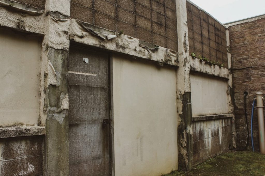
Another area I decided to visit was this abandoned pub that lies near the industrial tanks and the recycling unit. I visited this area once before during my urban landscape photoshoots as I was also exploring slightly abandoned structures. This place in particular, I thought would be a perfect photo opportunity to take more abstract photoshoots, following the inspiration of Aaron Siskind. Along the esplanade road, I also discovered an abandoned home that I decided to photograph, which was extremely run down and contained falling pieces and a teeming amount of plants that were consuming the view of the building.
For my photoshoots, I would most likely follow a similar style to that of Yves Marchand & Romain Meffre as I particularly enjoy their style of photography. They make abandoned places look quite lifeless and decrepit, almost displaying a somewhat dystopian location.
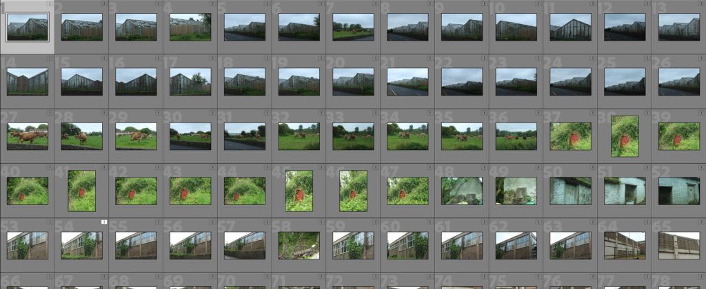
————- Contact sheets ————-
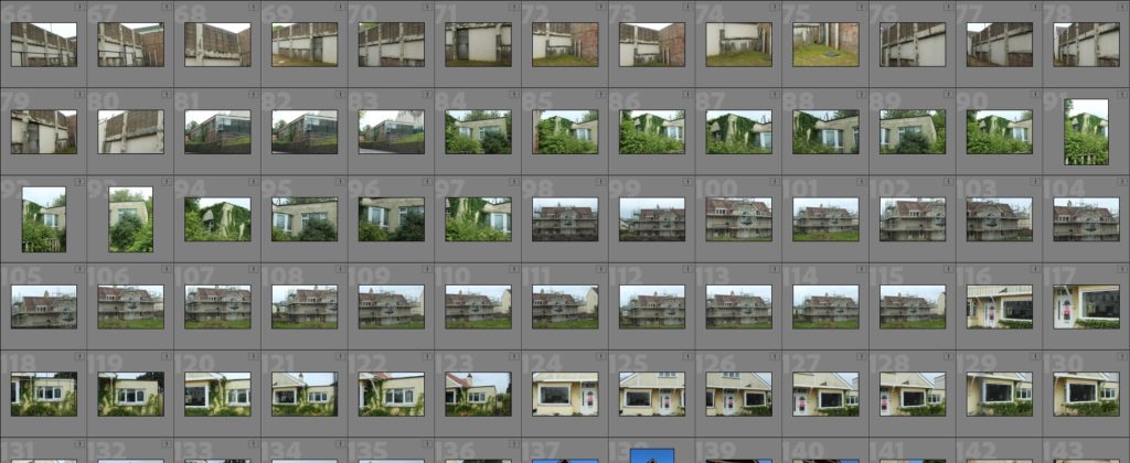
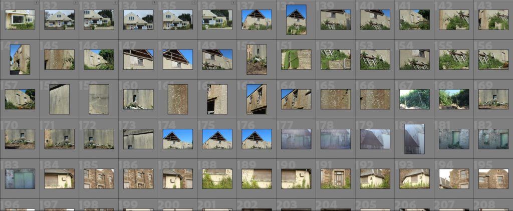
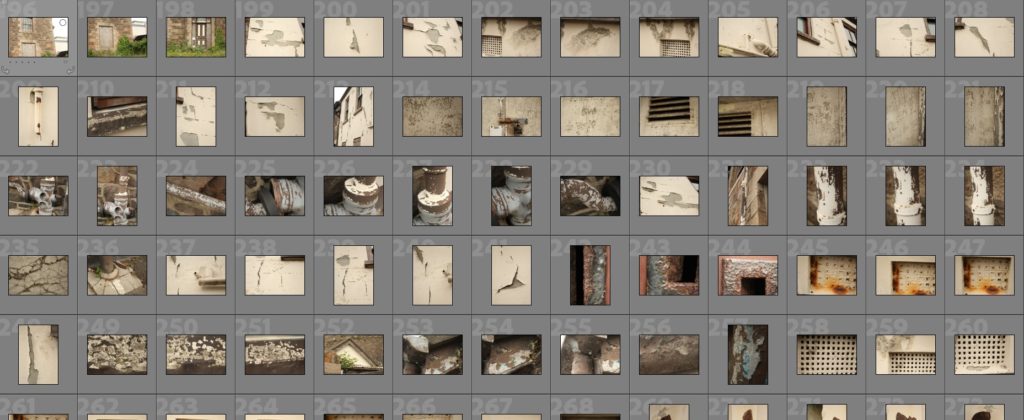
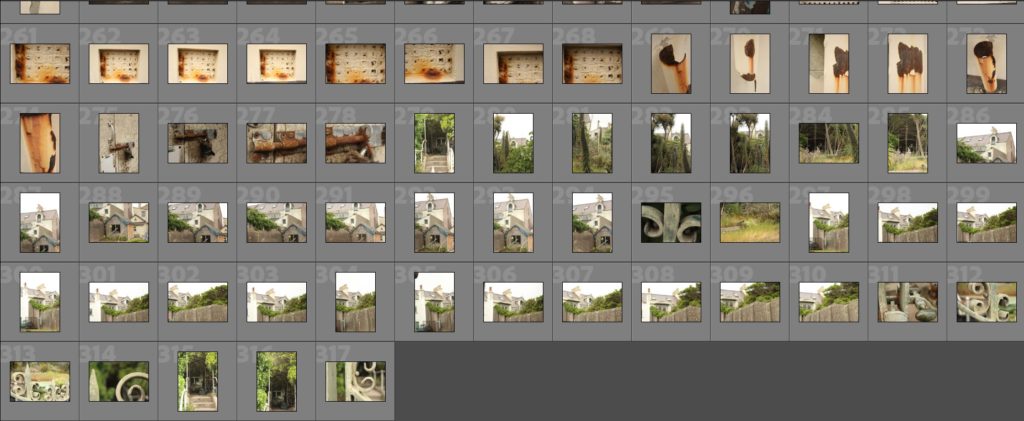
————- Rejected and flagged images ————-
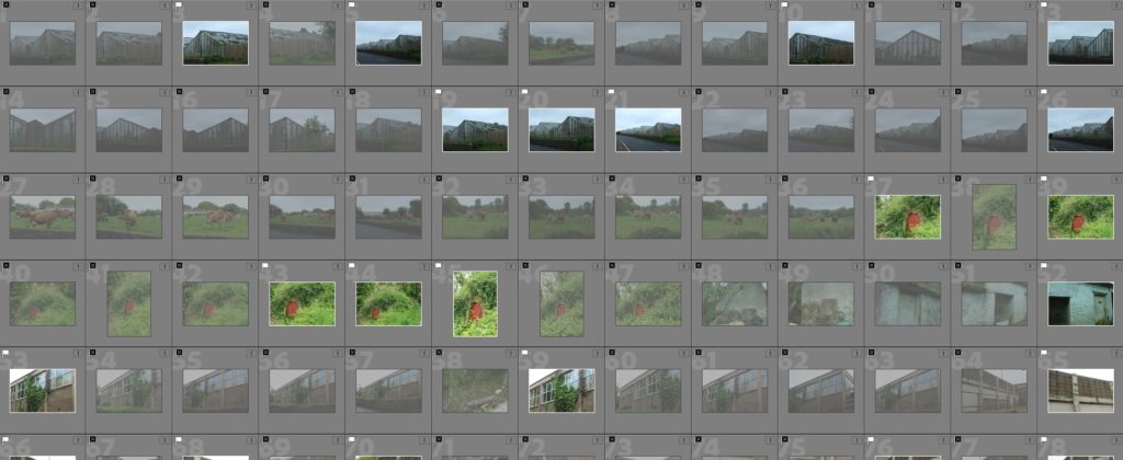
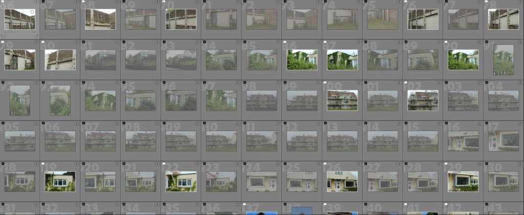
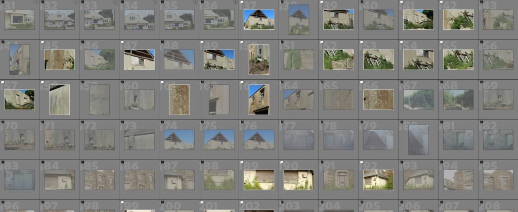
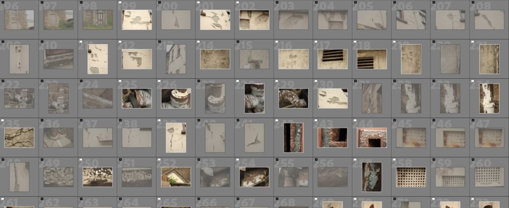
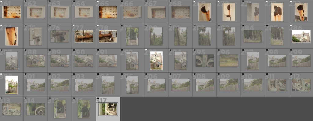
Flagged images:

———— Colour coded and star rated images ————
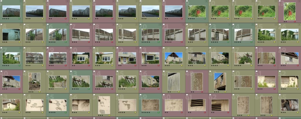

These are all the images that I have colour coded and added a star rating to. The photos I have here are my final selection for me to choose between, and I have flagged and rejected the images that I took throughout my entire photoshoot.
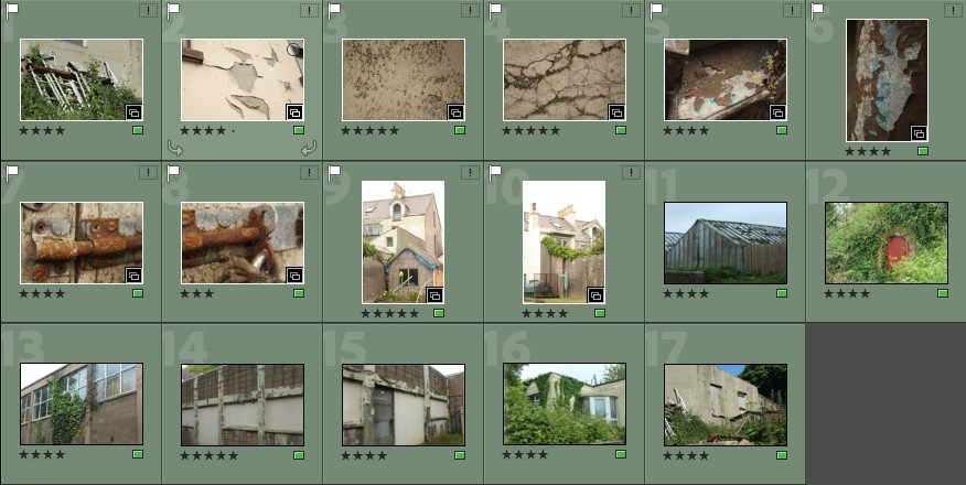
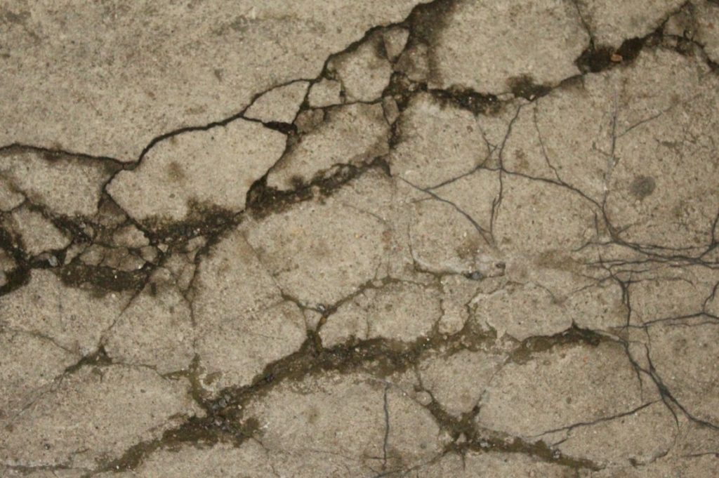
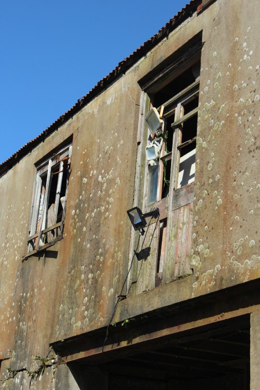
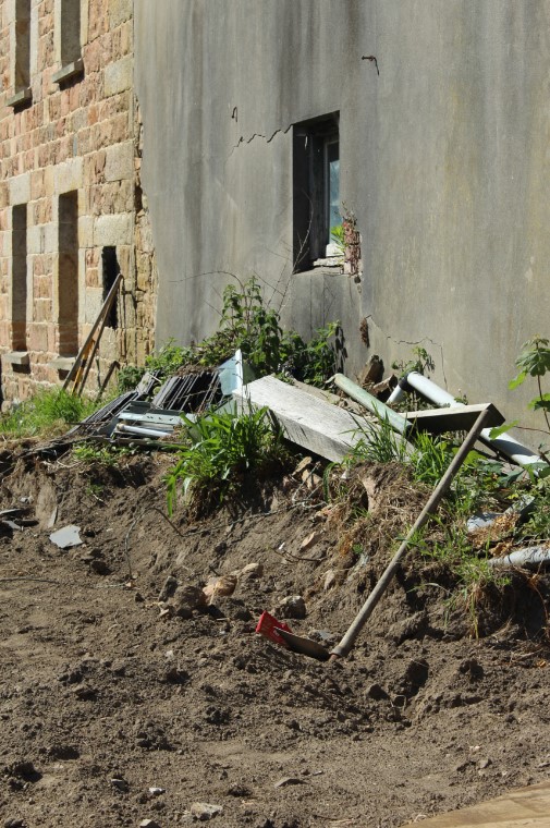
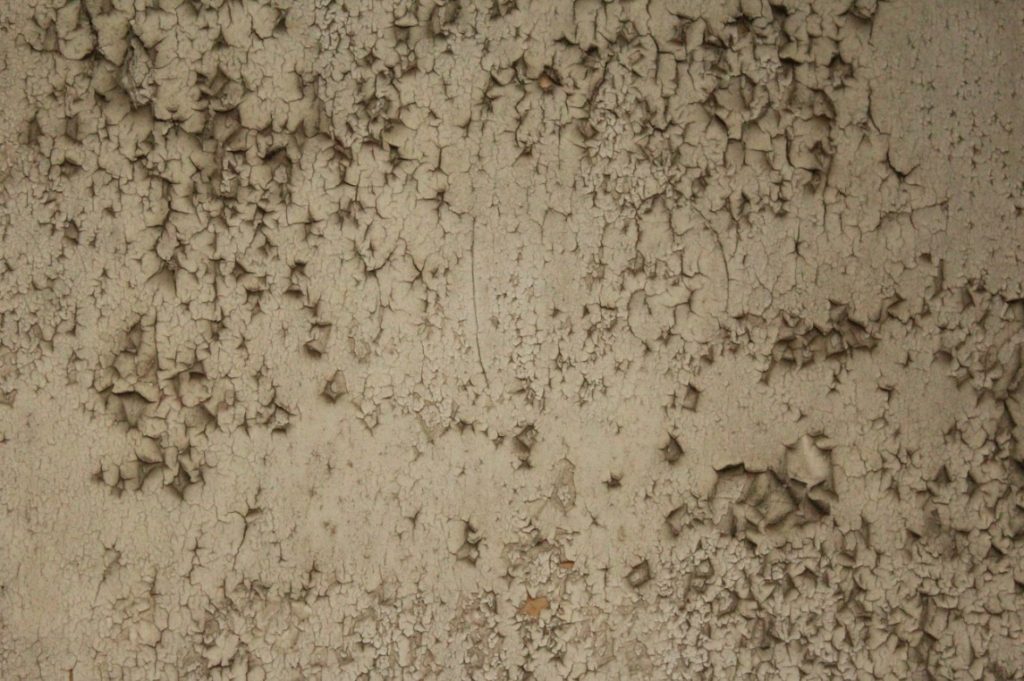
My green labelled images here, showcase a range of different areas and close up, almost abstract patterns from decaying sections of buildings and other materials I discovered. I particularly liked how these images turned out compared to many of the images highlighted in my yellow, colour coded section and the red section too. They display a somewhat, dystopian sense to them, presenting that nature is still a very prominent aspect of life and will continue to fight back against the urban areas.
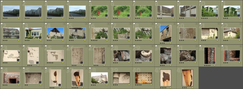
Here I have my yellow labelled images which once again, display a variety of different focal points, although, some of these images haven’t been as successful as my green ones. A few of the images, which I labelled as yellow, I will be using however, as I enjoy the result of a couple. They link to the theme I am trying to achieve with my images when presenting Anthropocene. I will have to do a bit of editing however, to get them to a degree which I find acceptable.
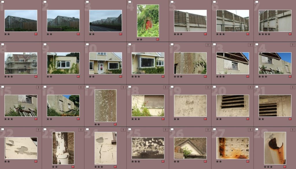
Finally, I have my red labelled images which didn’t turn out quite like I wanted them to. I ended up highlighting these as being my unsuccessful shoots. They were either quite blurry, didn’t show the message of Anthropocene in Jersey, or just weren’t particularly exciting photos. They didn’t capture the vision I was going for
Best images:
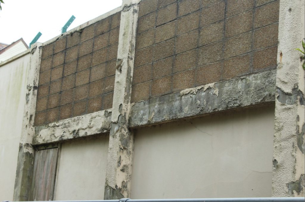
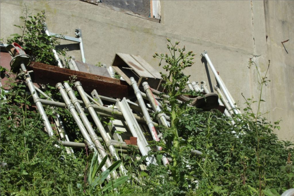




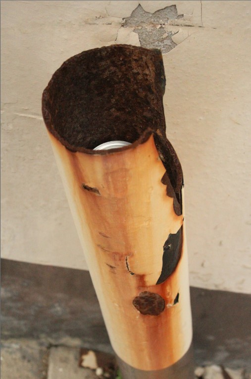

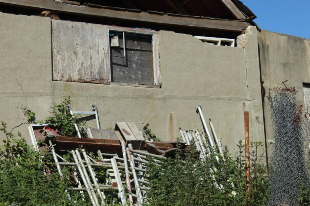
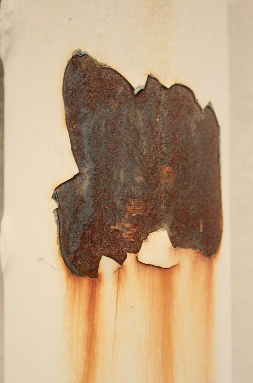
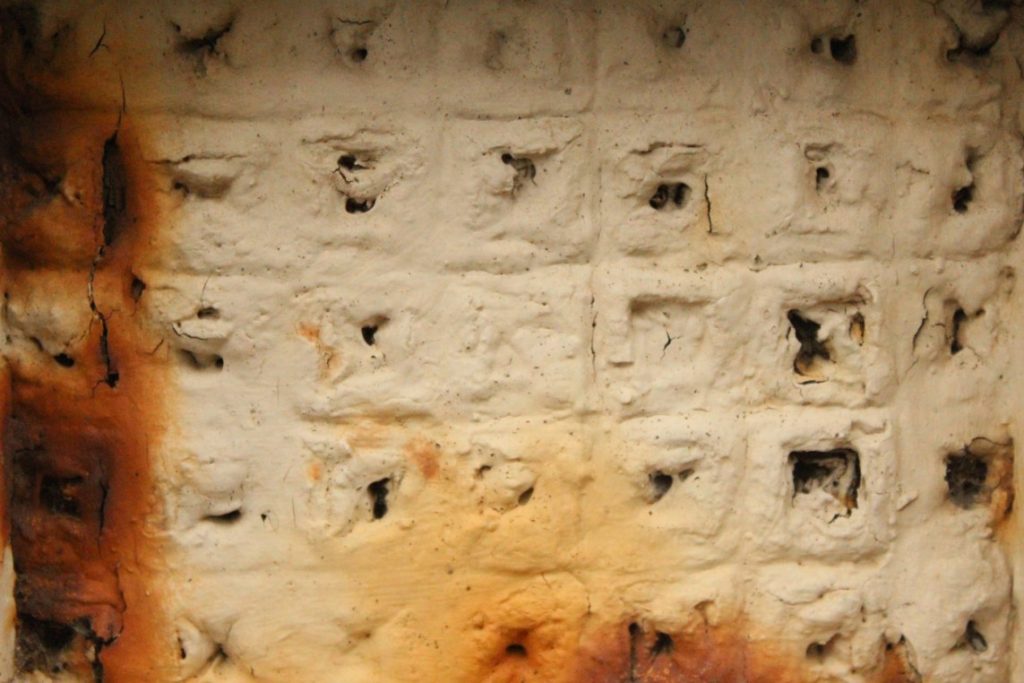


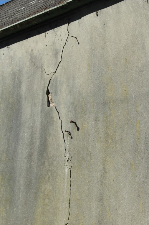
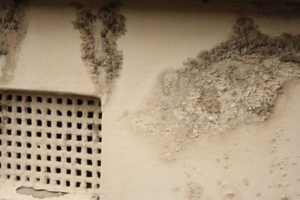
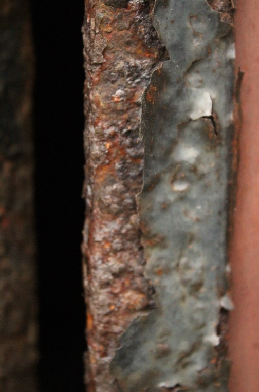
Industrial landmarks and pollution
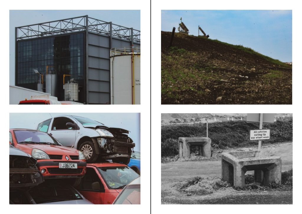
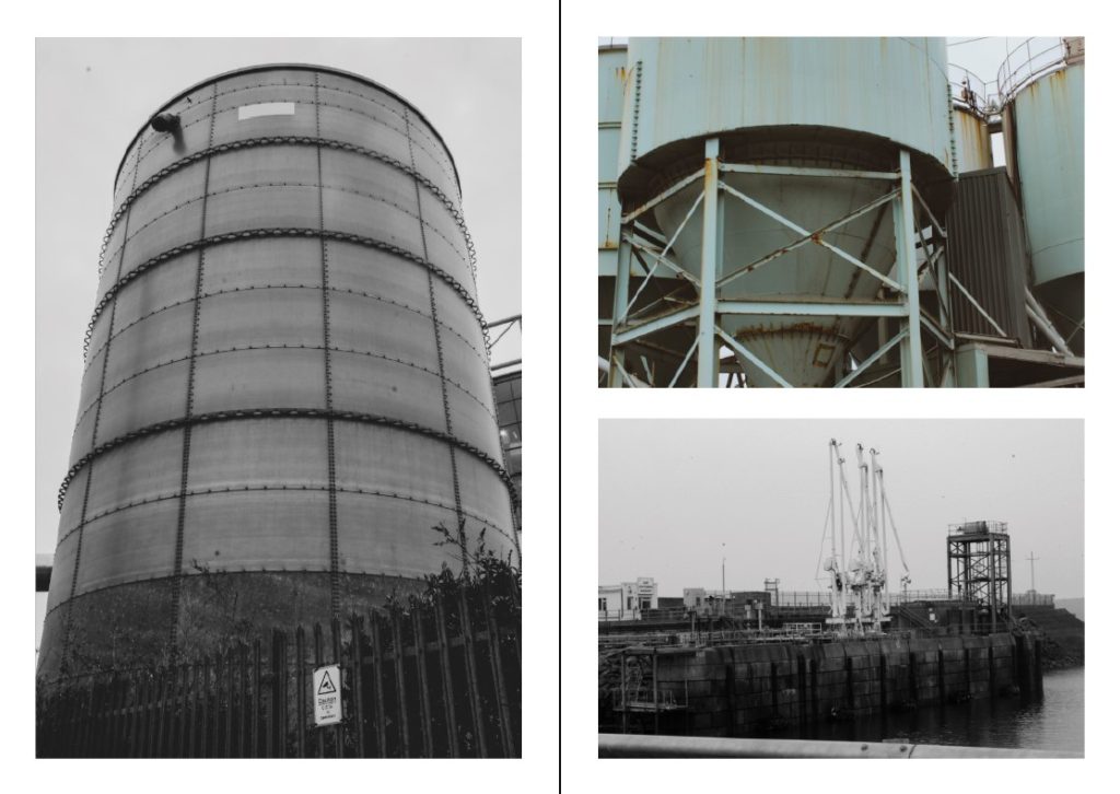
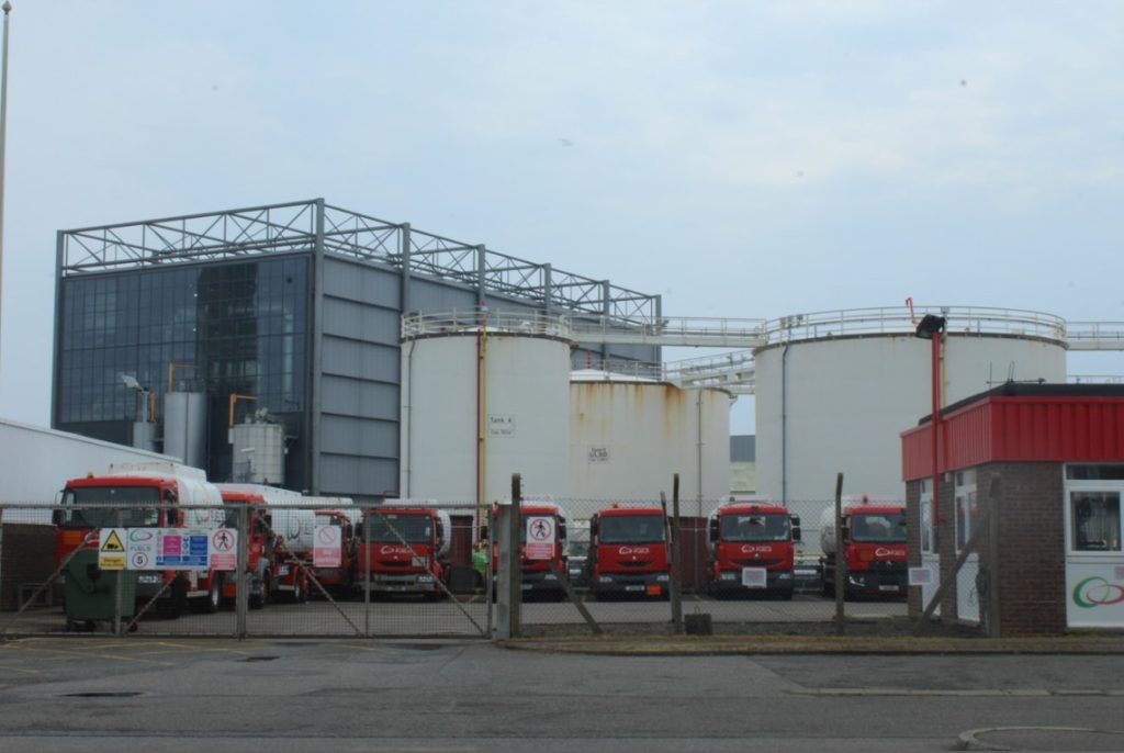
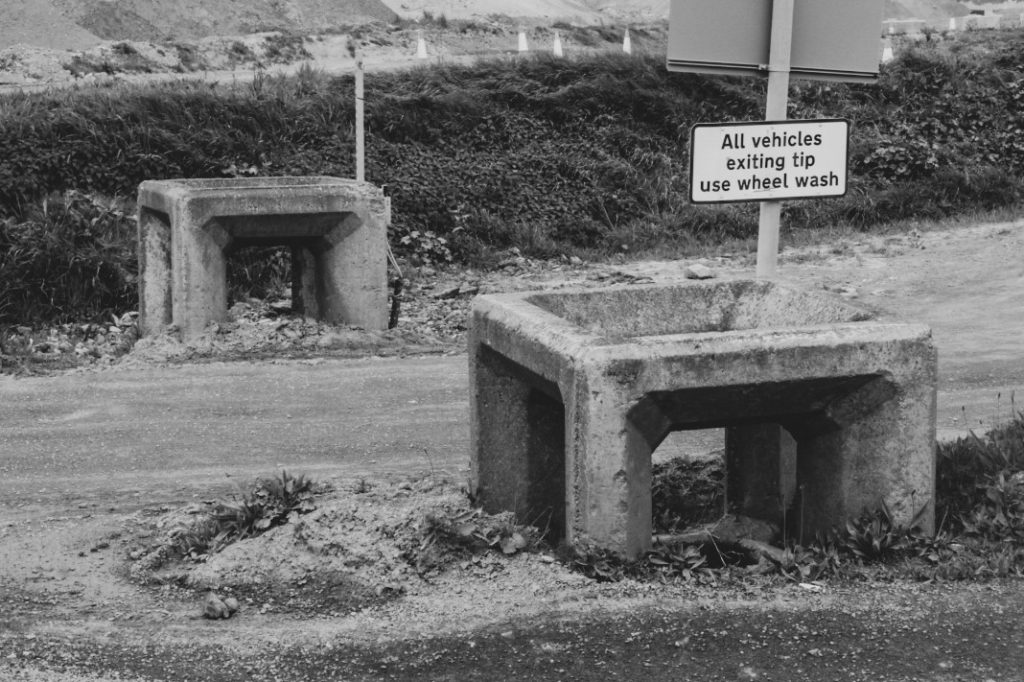
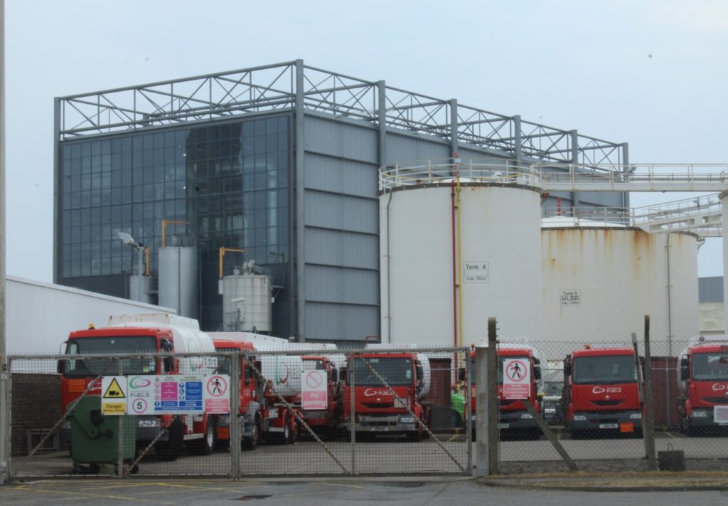
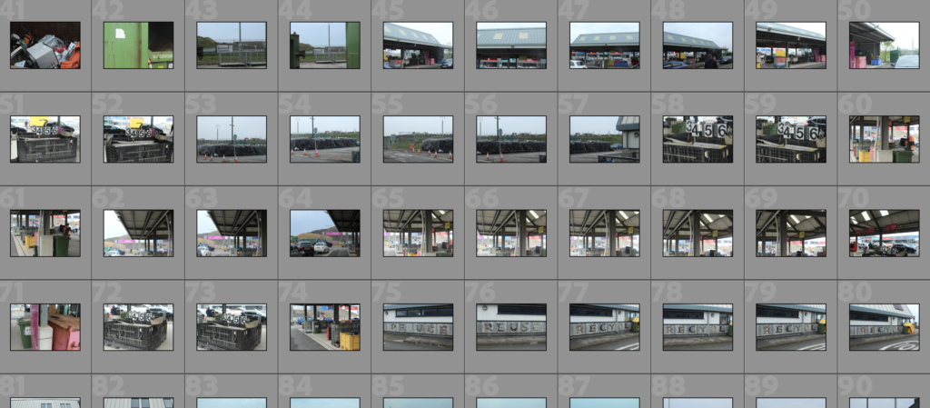
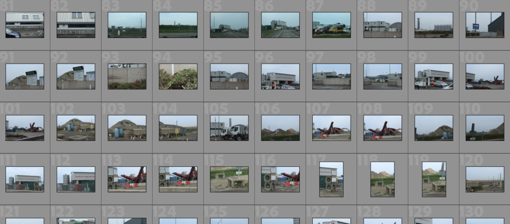
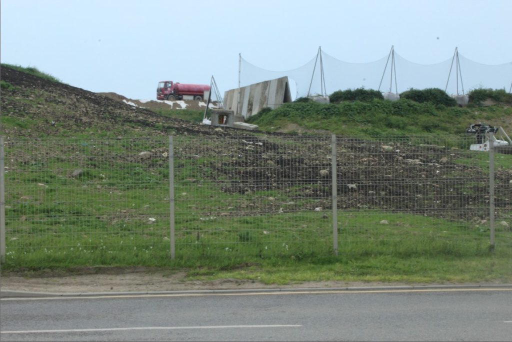
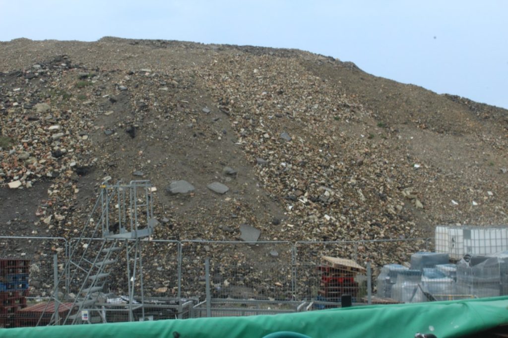
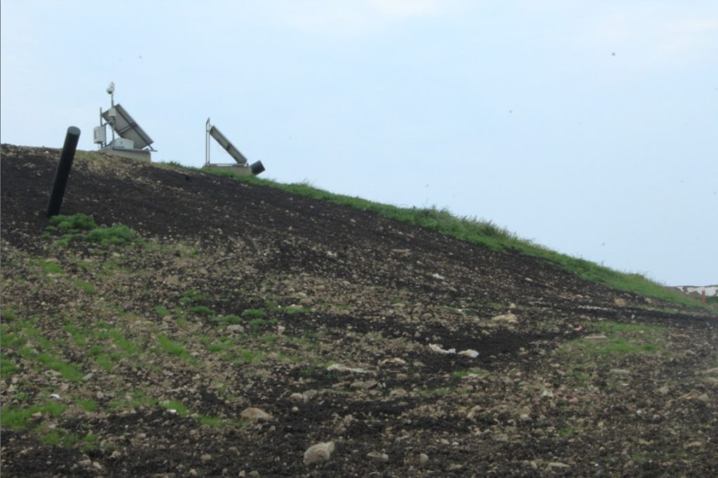
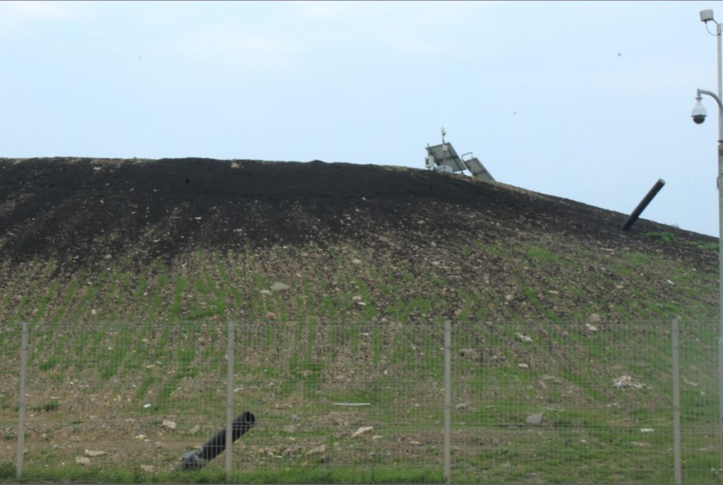
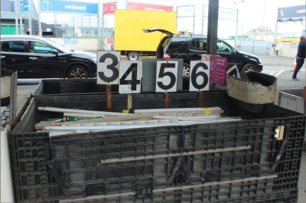
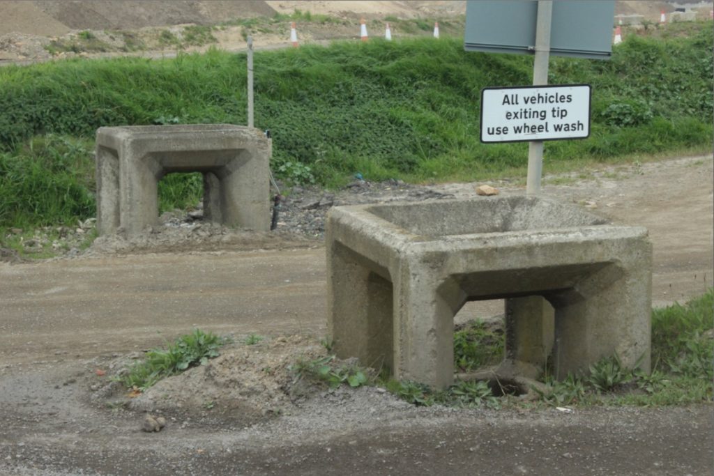
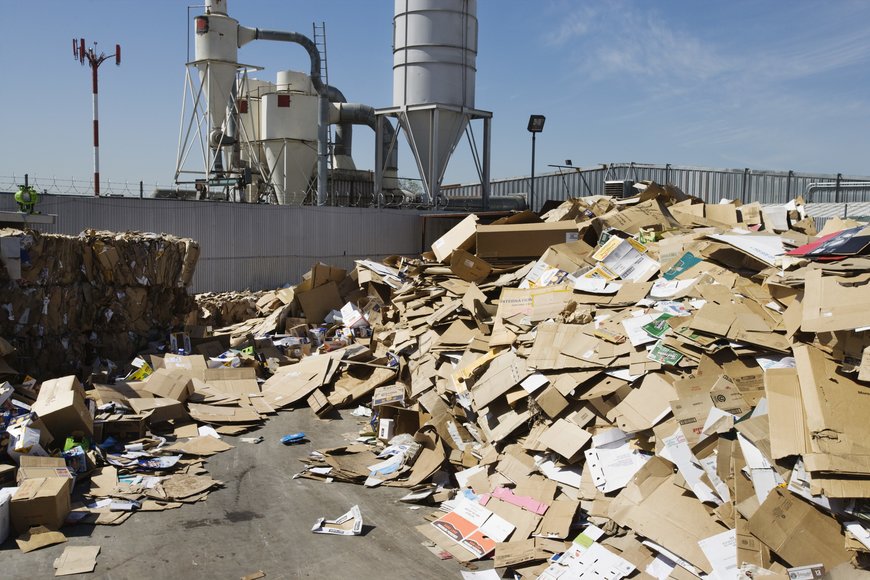
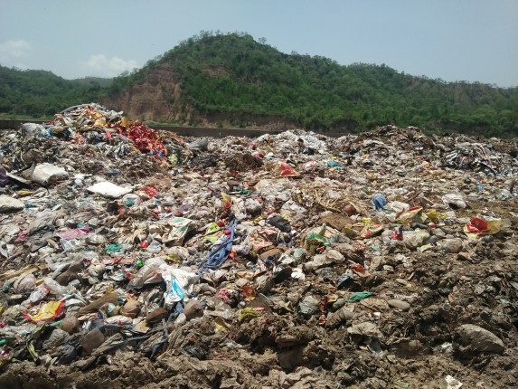
What I did for my first photoshoot was I visited the recycling centre in town, where I got the opportunity to photograph all the waste that had been thrown away by many people. I thought this was a perfect way to capture the sense of Anthropocene as it really shows that man-made items and objects, get easily disposed of and cause for pollution to resonate. Electrical items, metal and other materials, are very difficult to dispose of, so they must be incinerated which causes for pollution to occur in the air, damaging the environment as we know it. I wanted to focus on capturing the incinerated pile of debris and also the broken items that had been thrown into the massive heaps of rubbish.
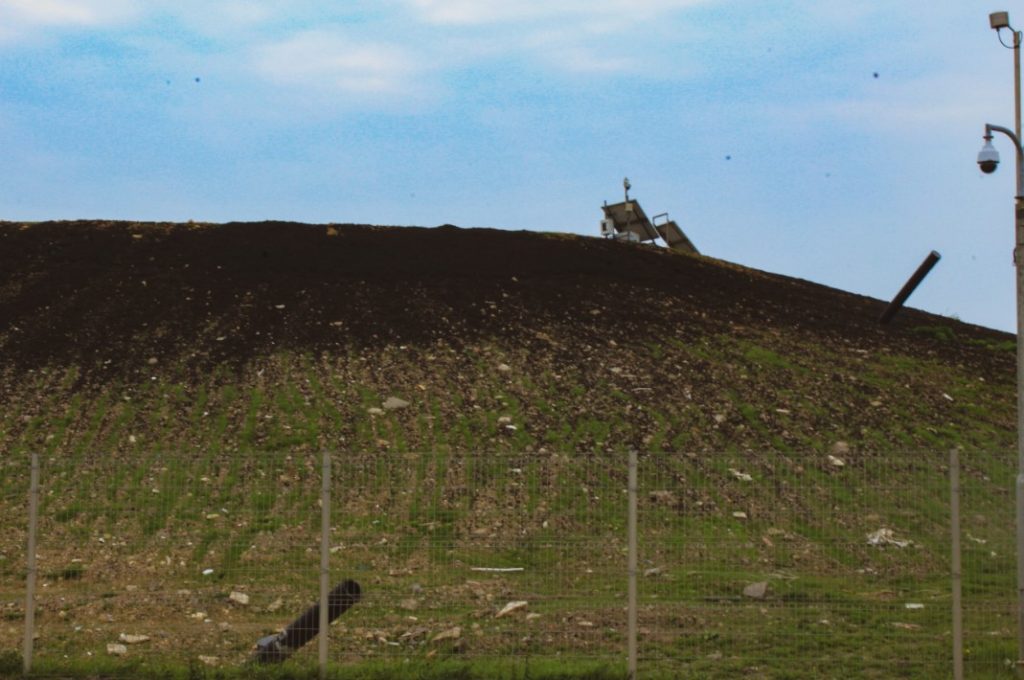
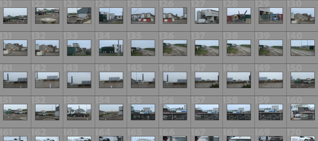
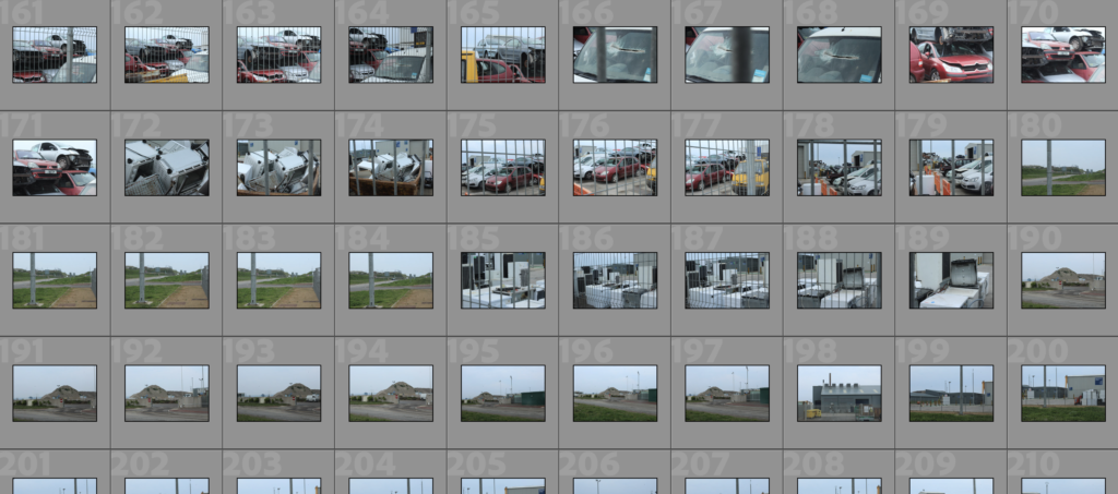
I then continued to take photos around the same area but moving more towards the composting unit next. Around that area, I began to spot zones that contained abandoned and broken down cars that clearly looked unfixable. I wanted to capture how easily they’ve been disposed of, showing that humans tend to use up extremely polluting items in such a short period of time.
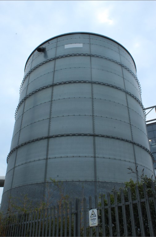
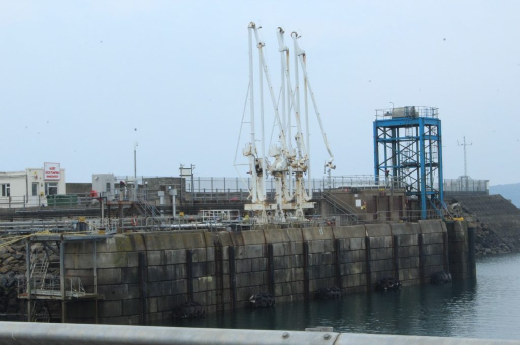
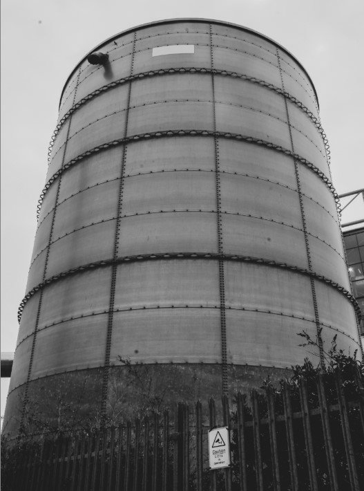
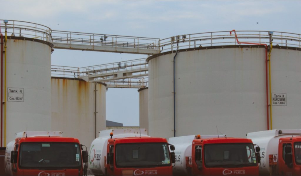
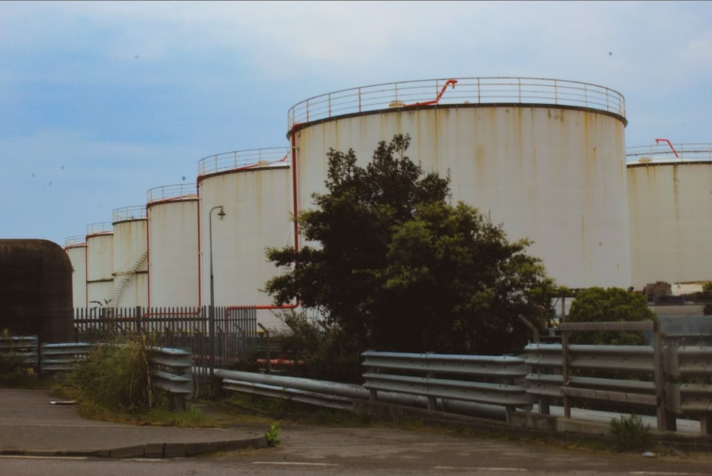
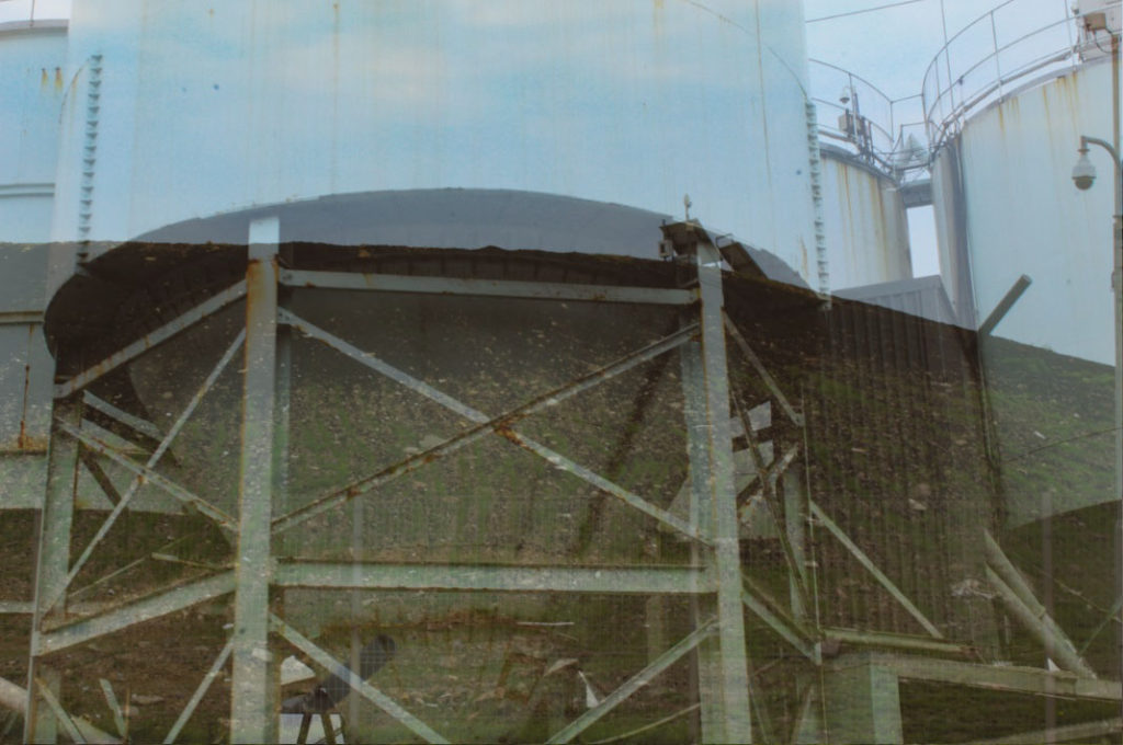
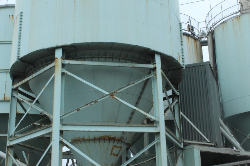
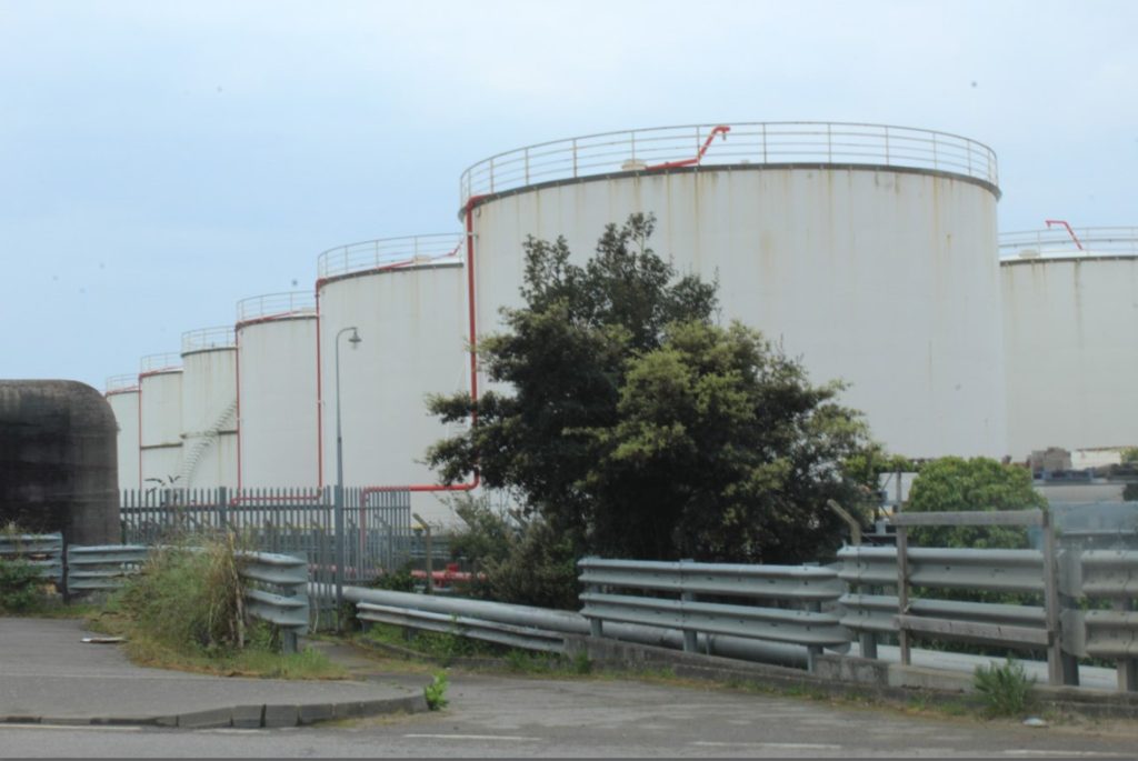
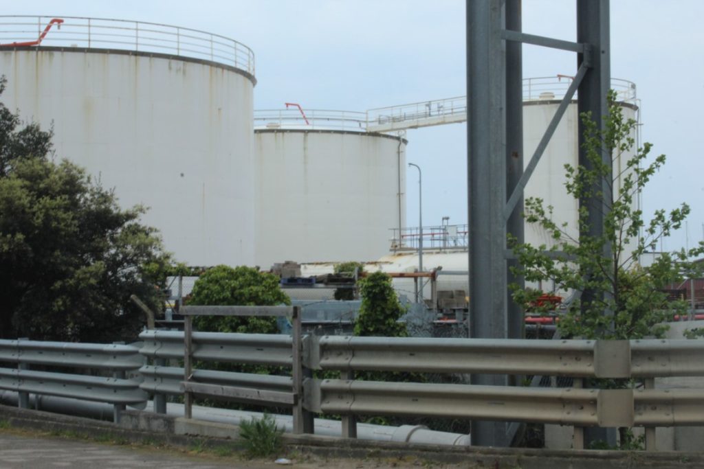
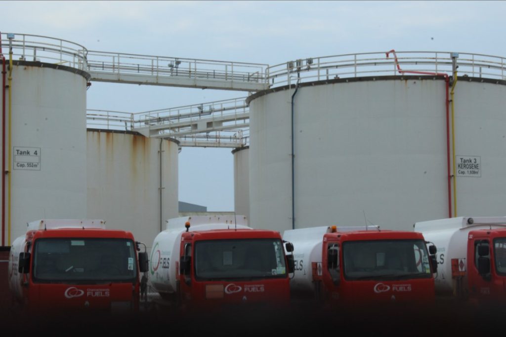
Soon after leaving these sites, I continued to stay among the same area but decided to head down the side of where more industrial tanks and machinery was. Trying to mainly keep the structures central and remain as the focal point of the entire photograph.
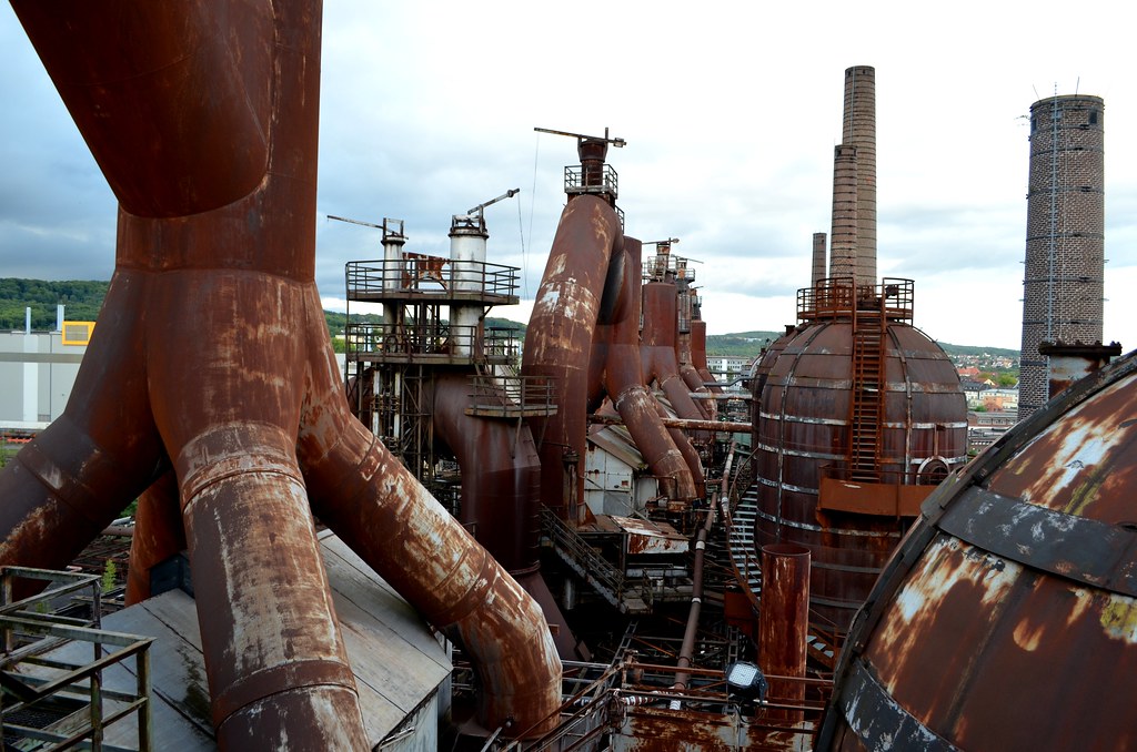
Artists that I would particularly like to use as my focus for this photoshoot is Edward Burtynsky who dives into the world of industrial photography. His series of photographs that he took whilst in China, display a perfect sense of industrial pipes and manufacturing units that damage the environment around us. I would also like to take on Bernd Becher and Hilla Becher as my other inspiration who I created an artist study on in my previous topic ‘Urban Landscape’.
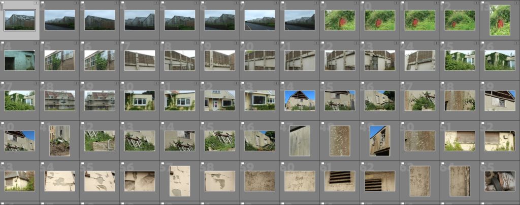
————- Contact sheets ————-
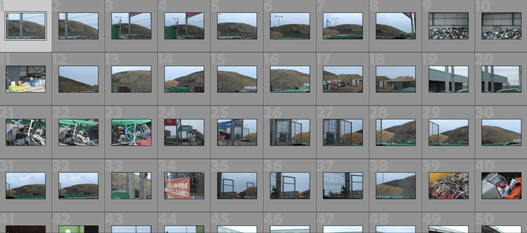
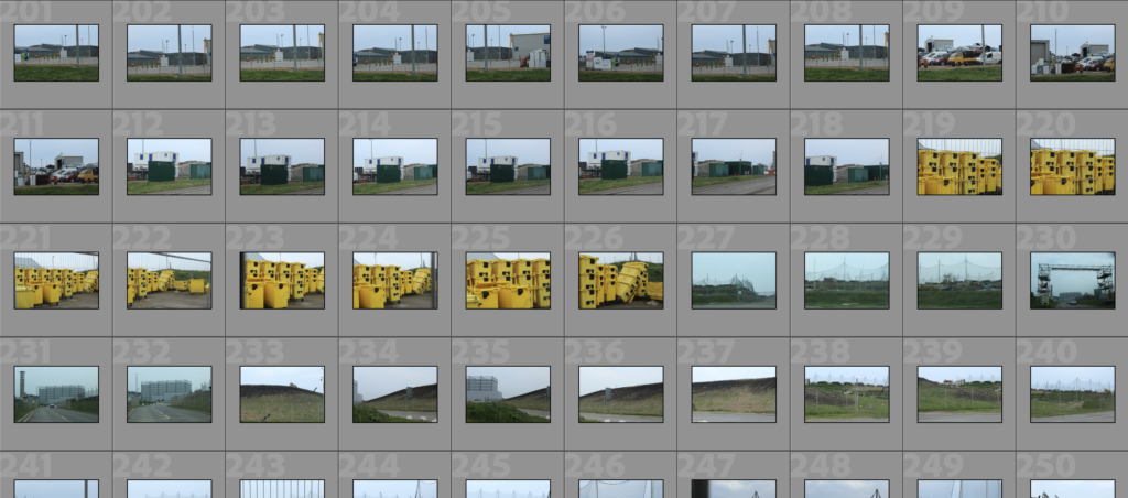
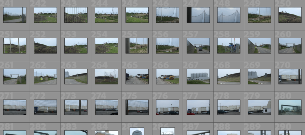
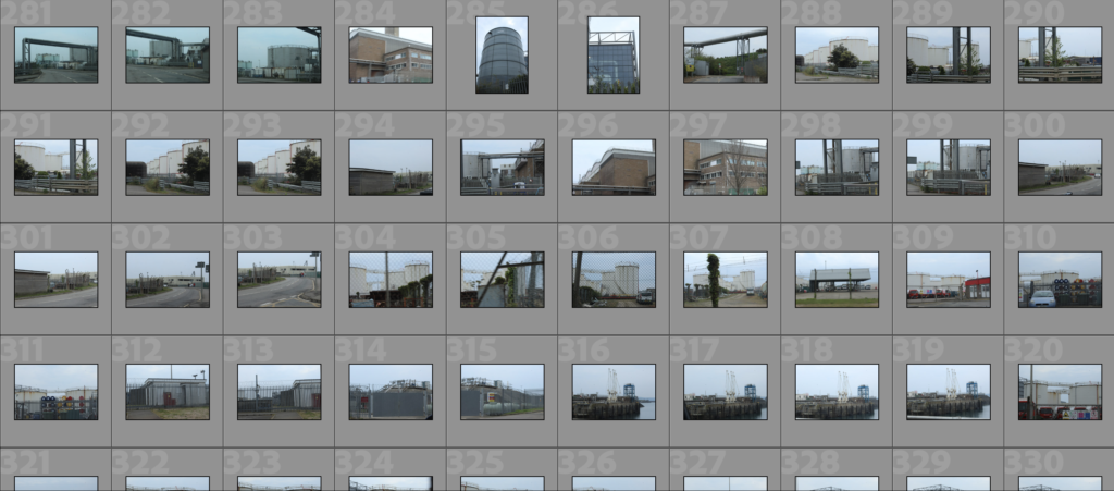
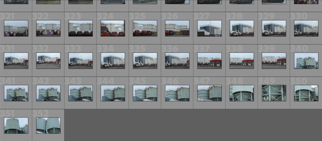
————- Rejected and flagged images ————-
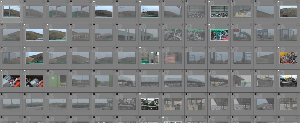
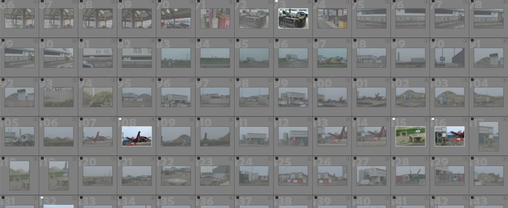
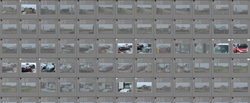
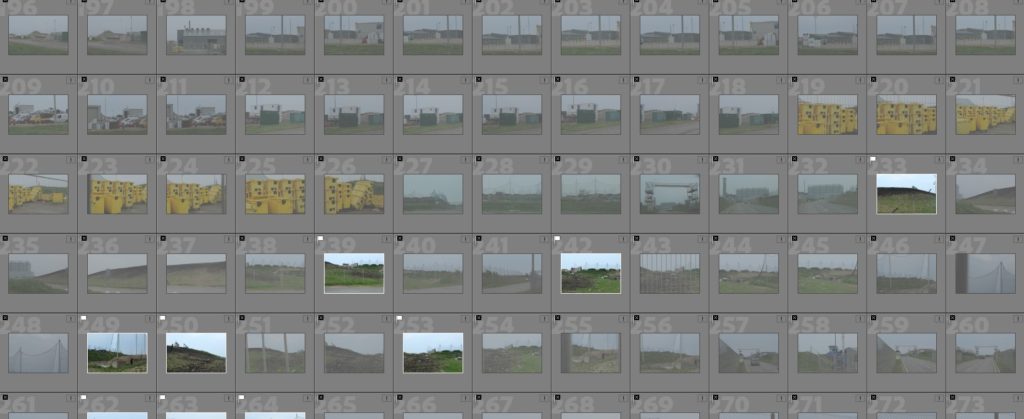
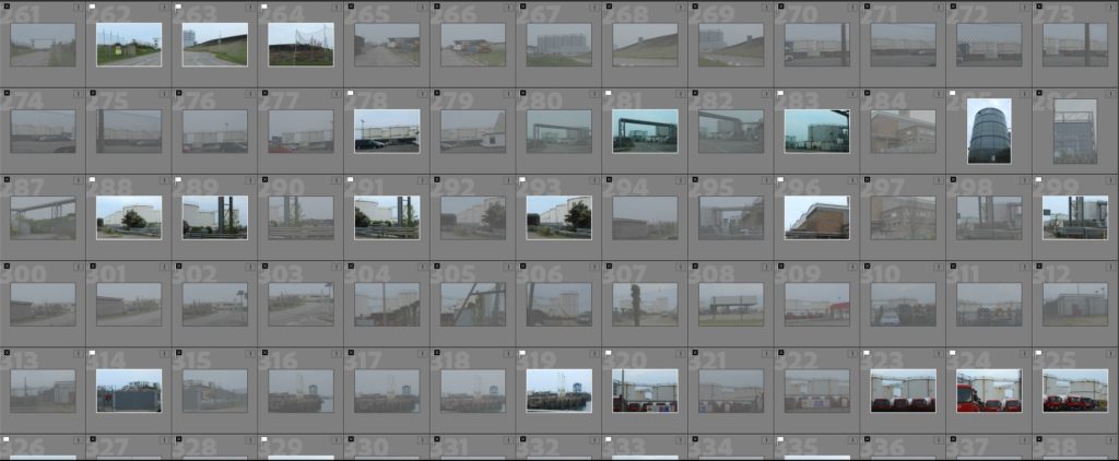

flagged images:
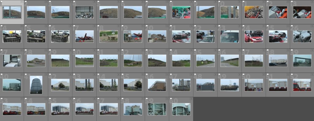
———— Colour coded and star rated images ————
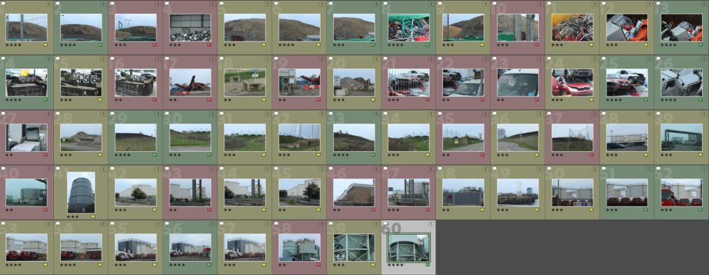
Here I have all the images that I have colour coded and added a star rating to. These are the narrowed down selection that I have flagged and rejected from my entire photoshoot.
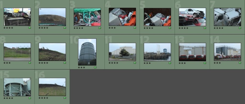
My green labelled images display a variety of different areas among the location I decided to carry my shoot out in. I particularly liked how these images turned out as I believed that they highlight the sense of Anthropocene more, showing the heavy impact humans have on the environment.
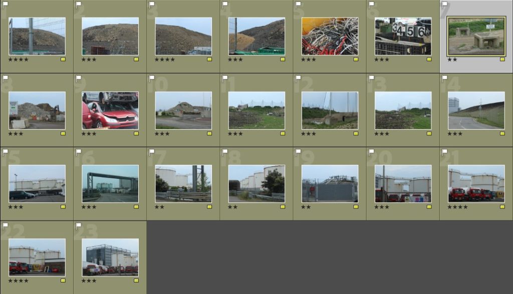
My yellow labelled images display once again, a variety of different focal points, but some of them haven’t envisioned exactly what I wanted to achieve. A few of the images, which I labelled as yellow, I will use, but I will have to do a bit of manipulating to get them to a degree which I find acceptable.
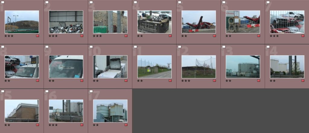
My red labelled images didn’t turn out quite like I wanted so I have highlighted these as being my unsuccessful shoots. They were either quite blurry, didn’t show the message of Anthropocene in Jersey, or just weren’t particularly exciting photos.
Best images:
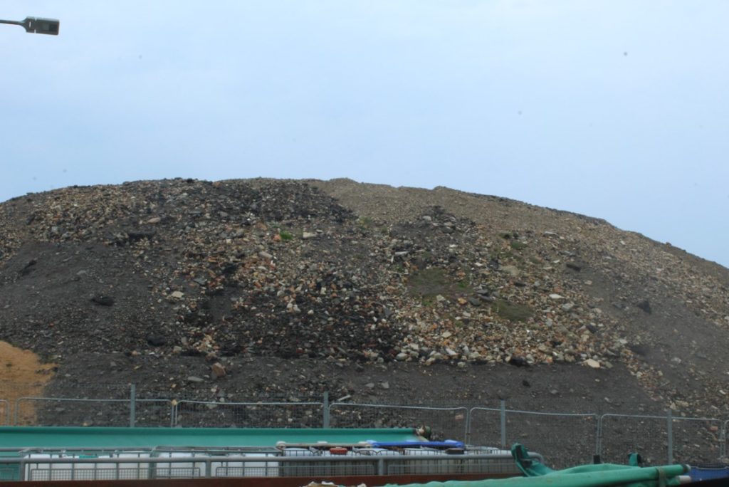


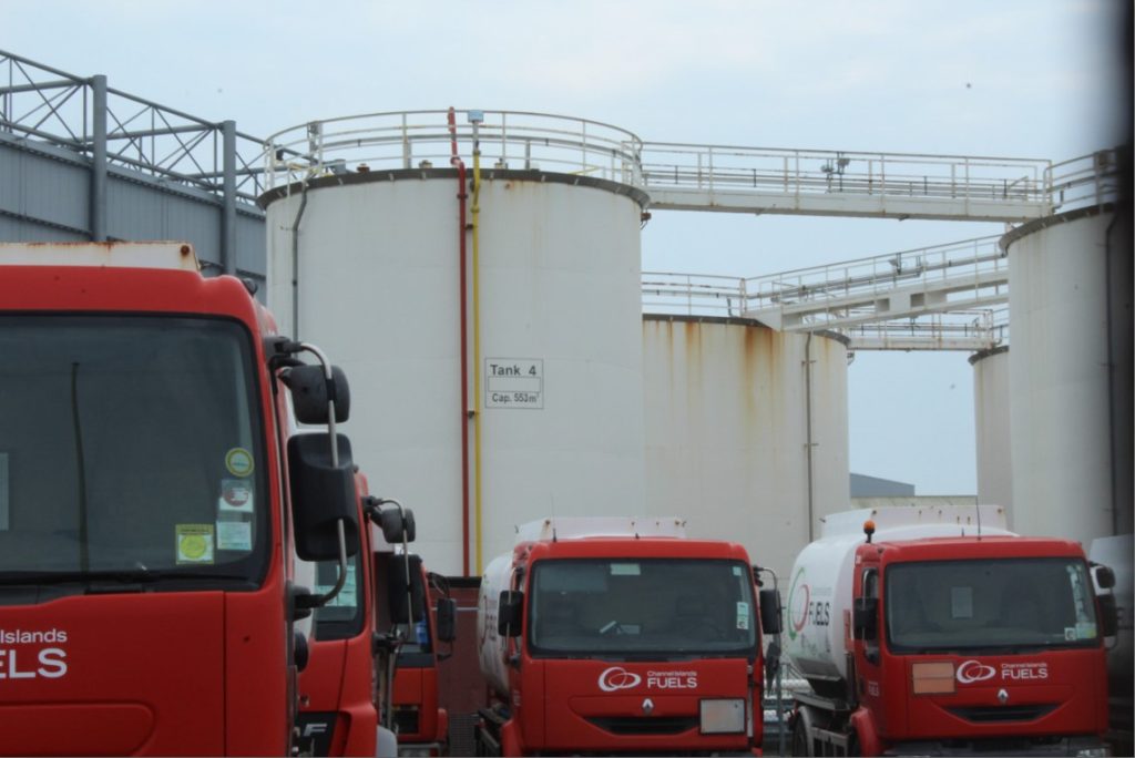





Photoshoot 1:
For my first photoshoot, I would like to focus on photographing industrial based areas and landmarks that include pollution that was caused by factories and human manufacturing.
Photoshoot 2:
For my second photoshoot, I would like to focus on taking photos of abandoned buildings and destinations, looking for locations that contain plant-ridden structures just to symbolise that nature is fighting back against the man-made structures.
