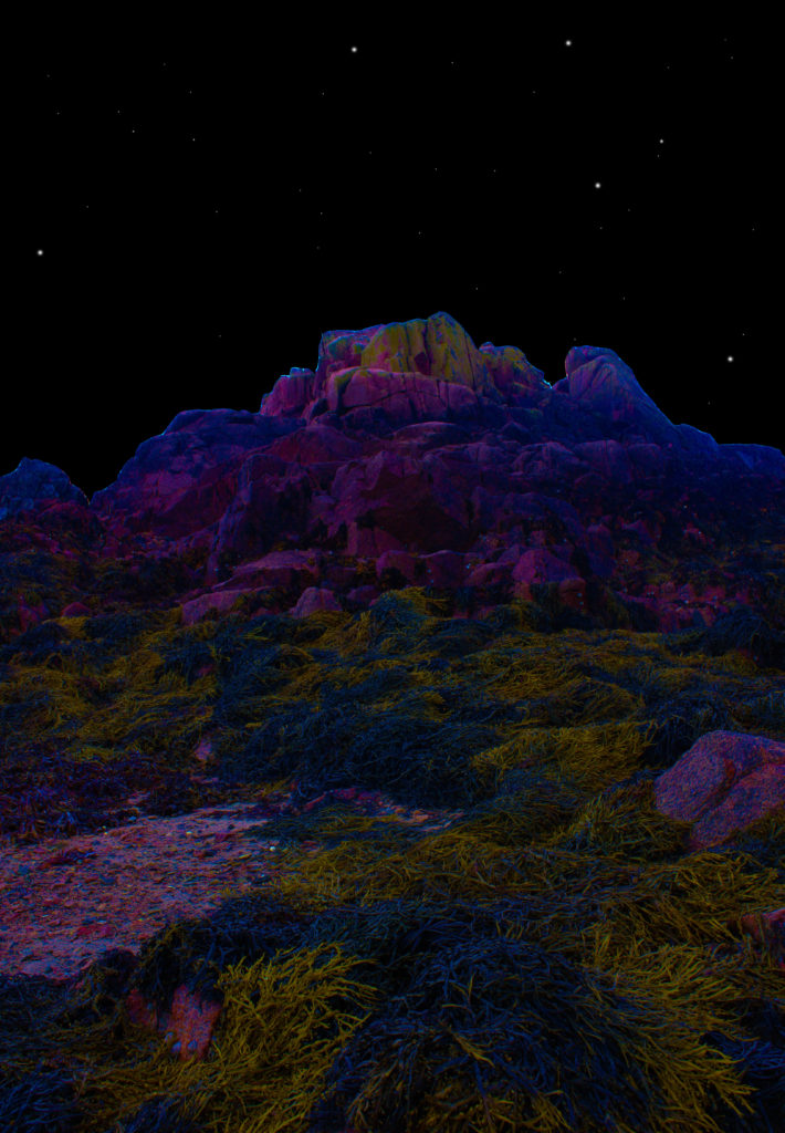
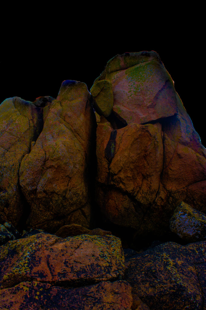


Final image selection
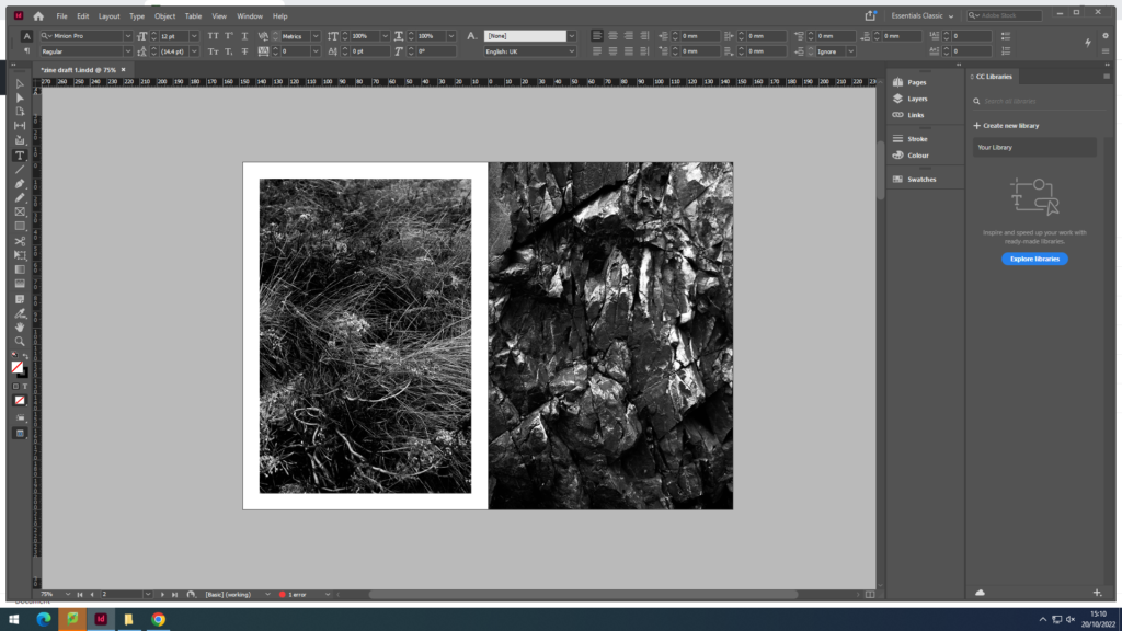
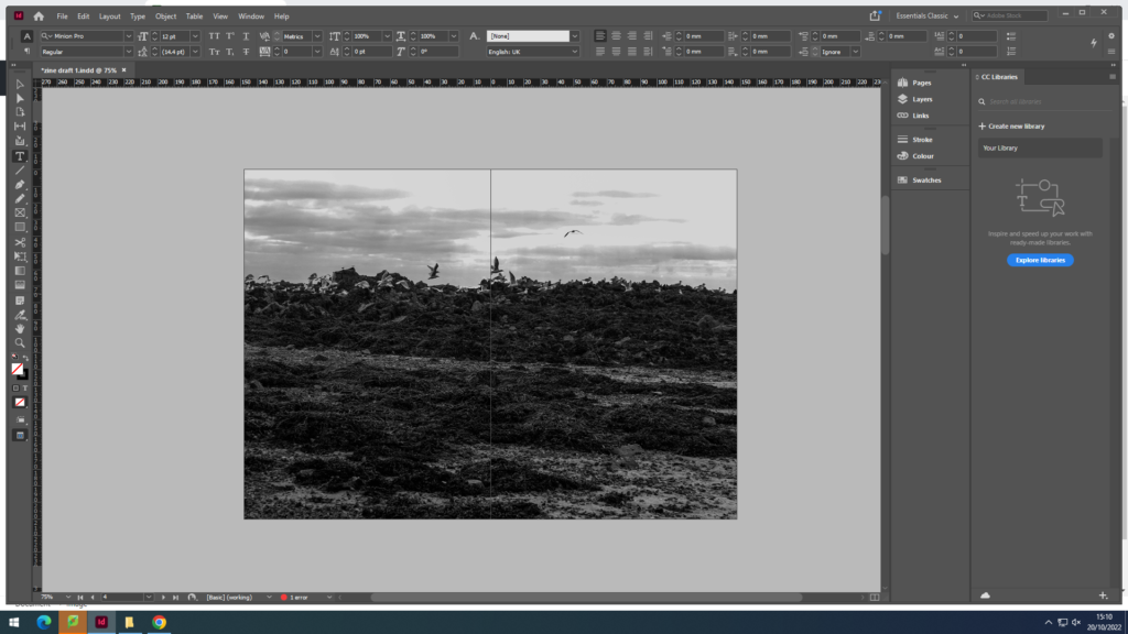
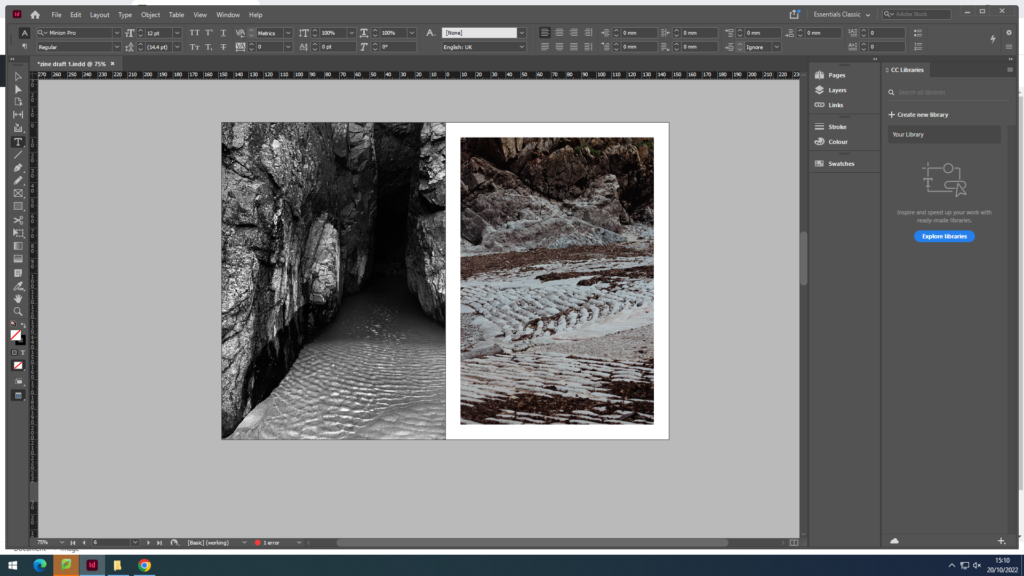
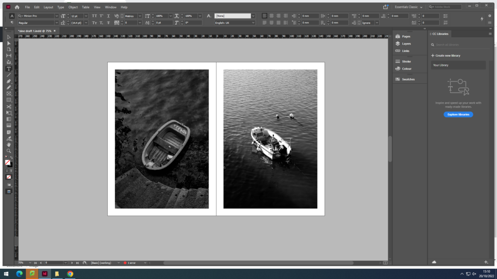
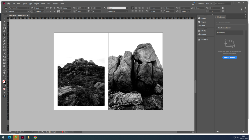
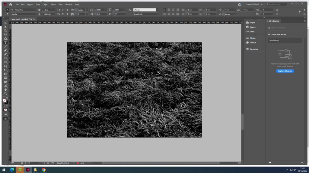
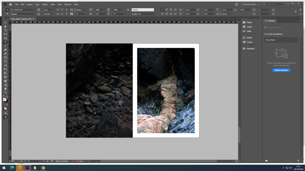
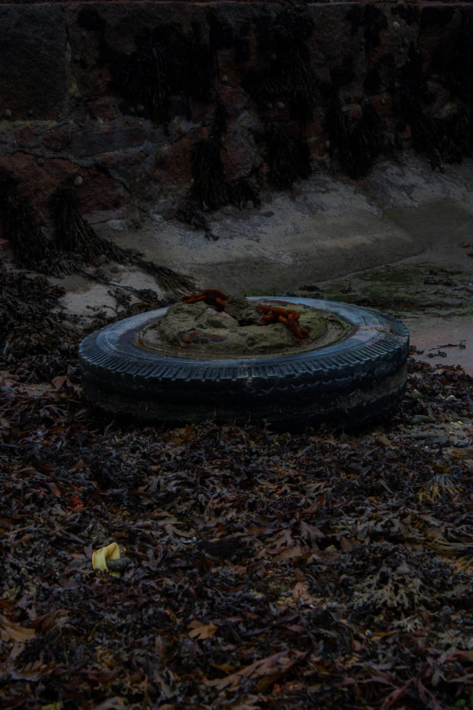
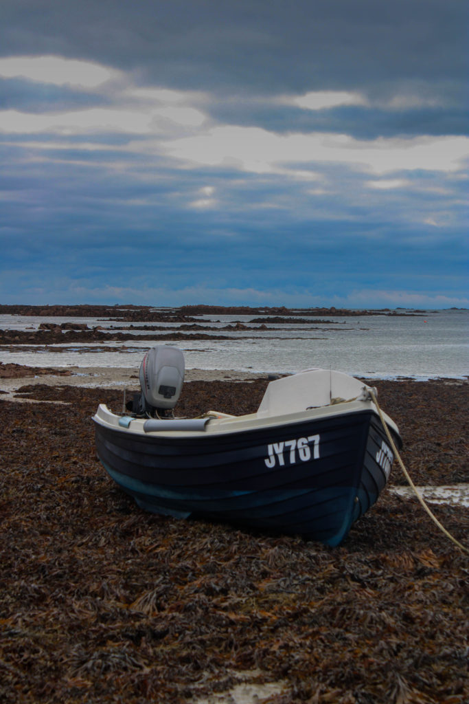
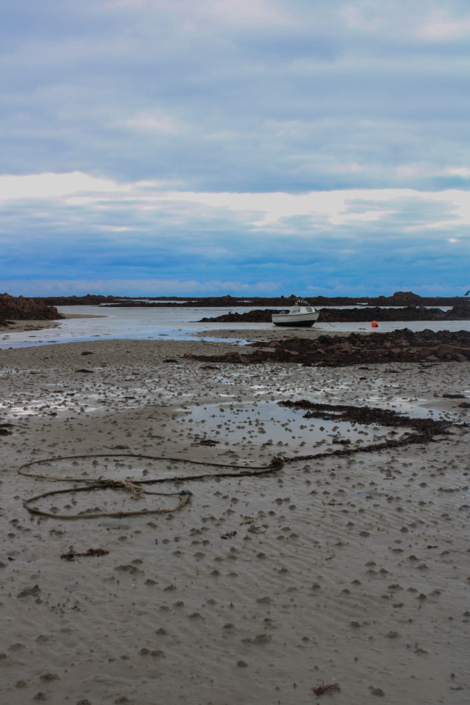
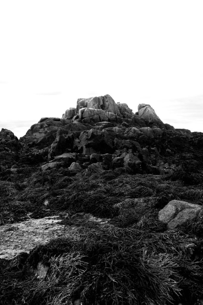
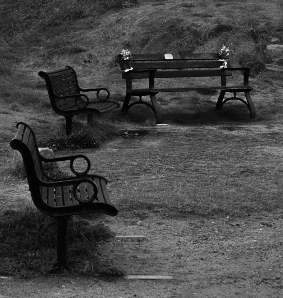
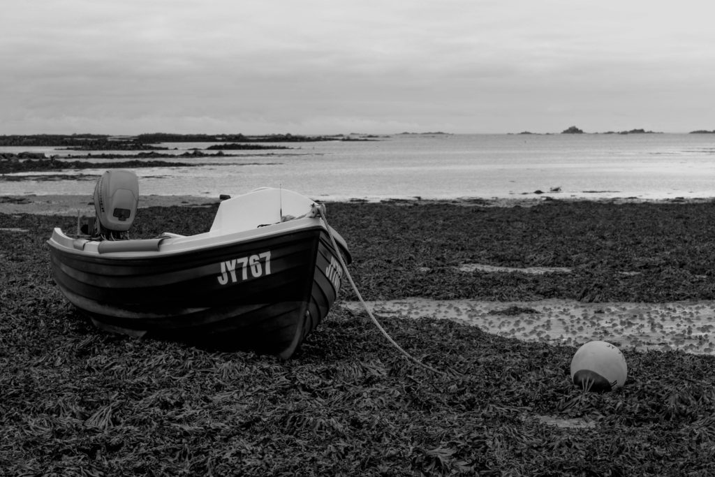
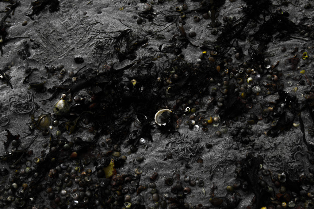
I chose these images as they all follow a similar theme of texture and patterns.

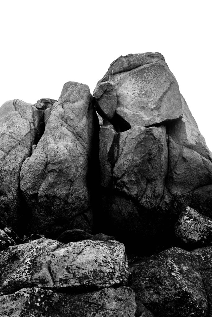

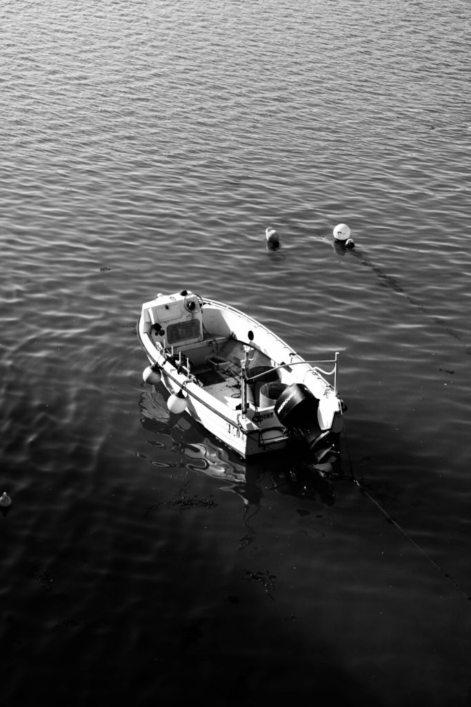
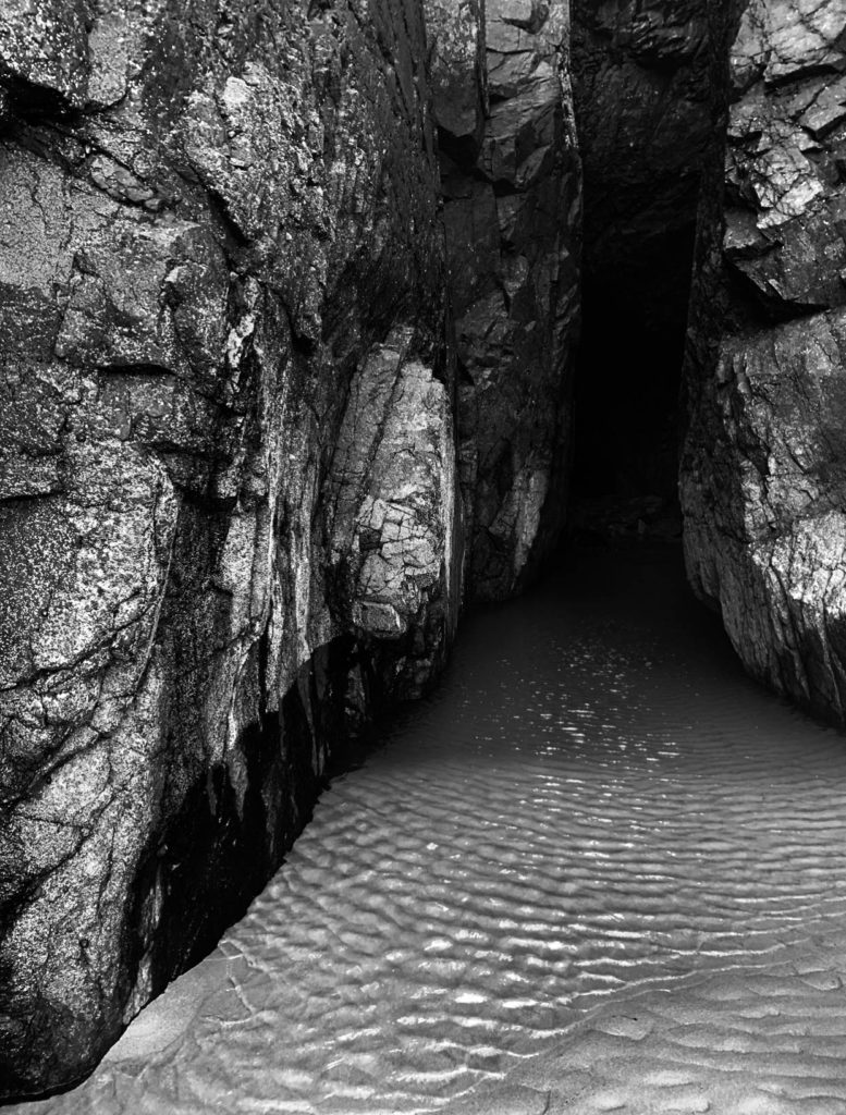
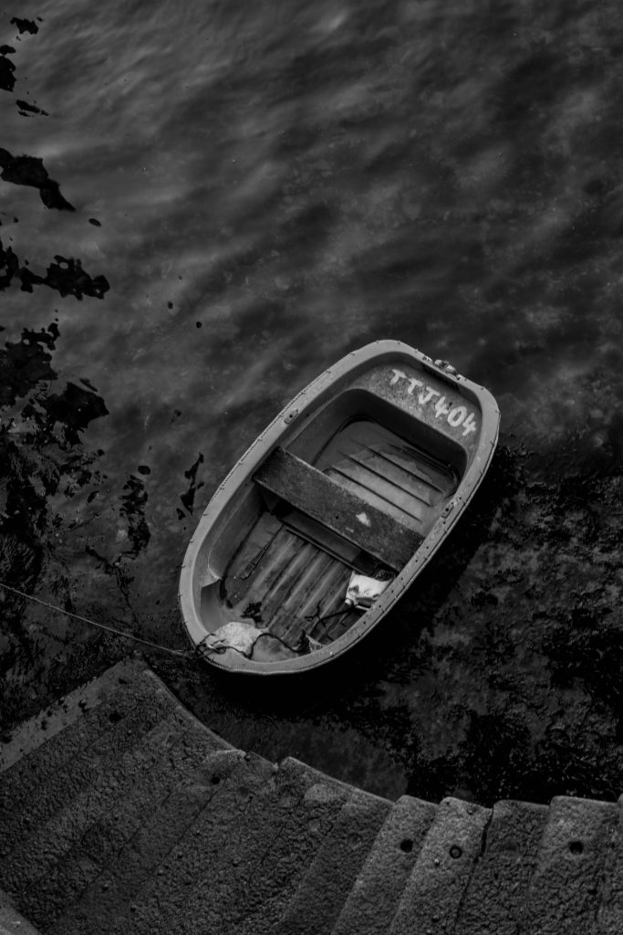


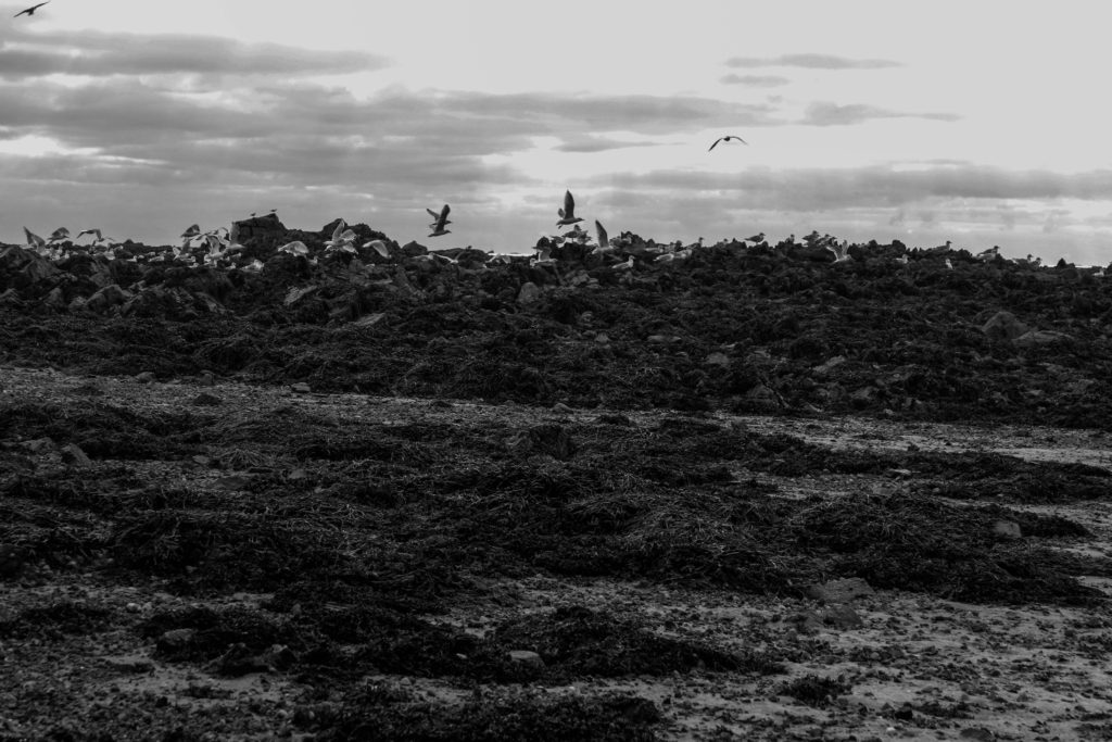


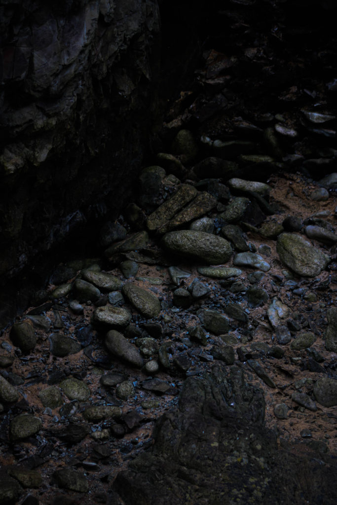
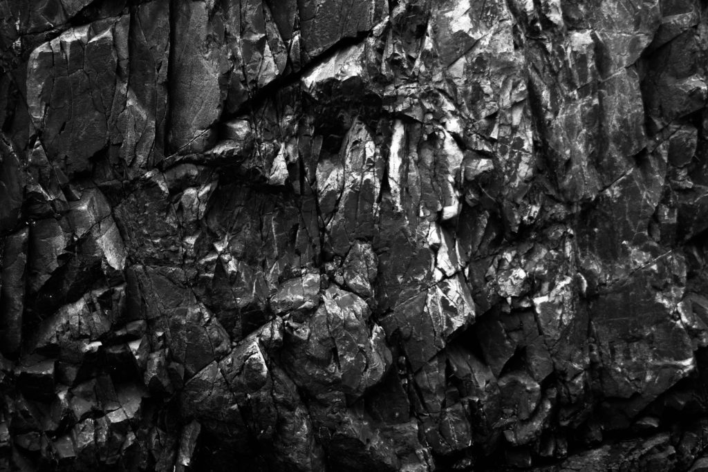
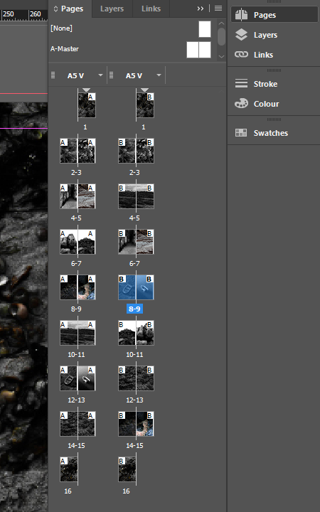
I have created 2 possible layouts for my zine in order to change, compare and get the best results.
First zine draft
my first zine follows a pattern of having a white boarder around all the images, I like this style as it looks very clean. However, it lacks difference throughout the zine and makes it quite boring.

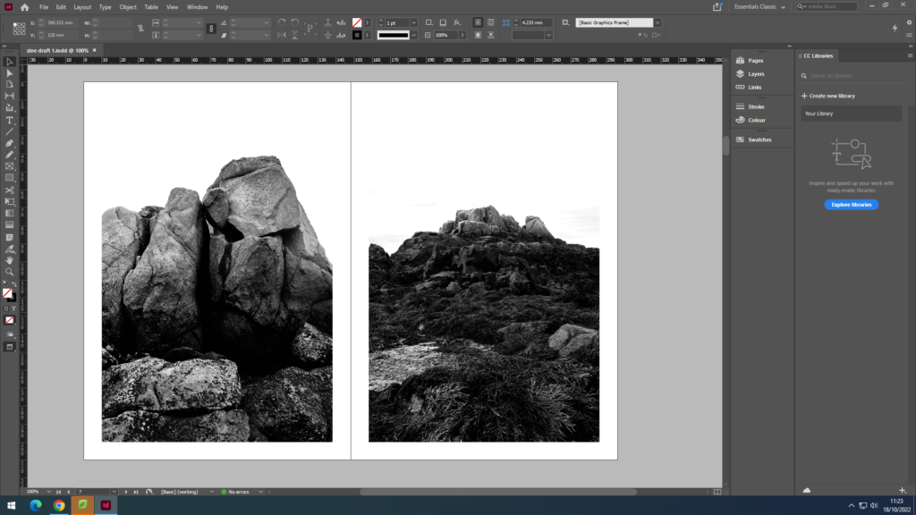
My second zine draft
for my second draft, i have decided on a pattern of having some with a border, and some without to create difference and fluidity throughout the zine.
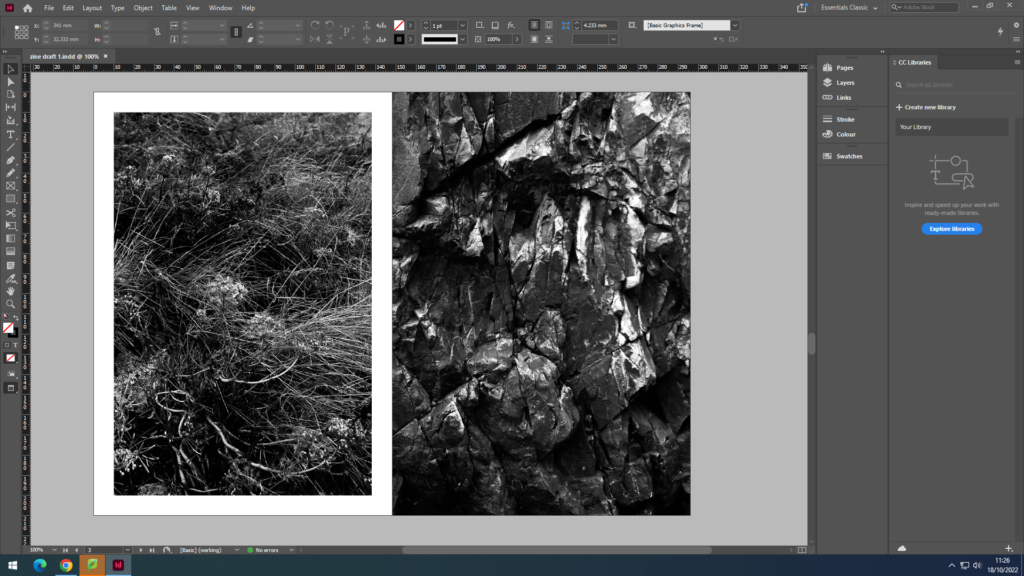
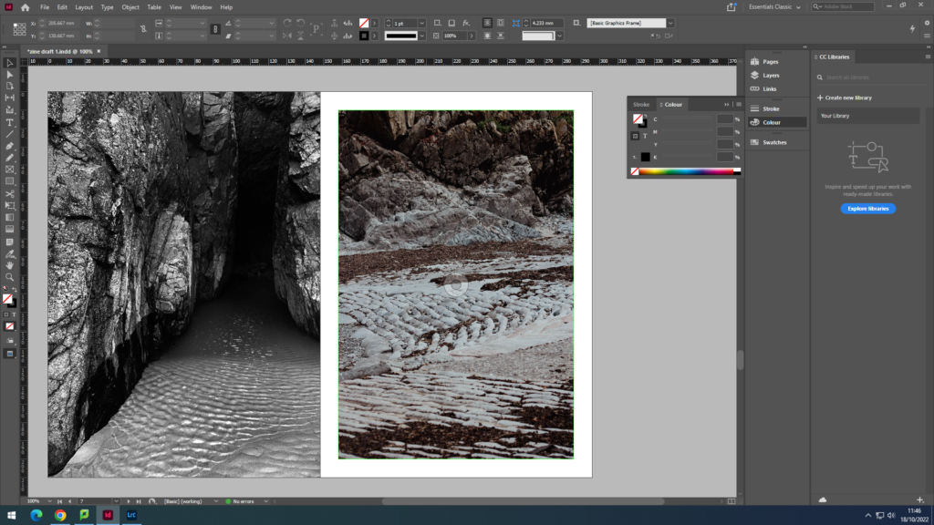
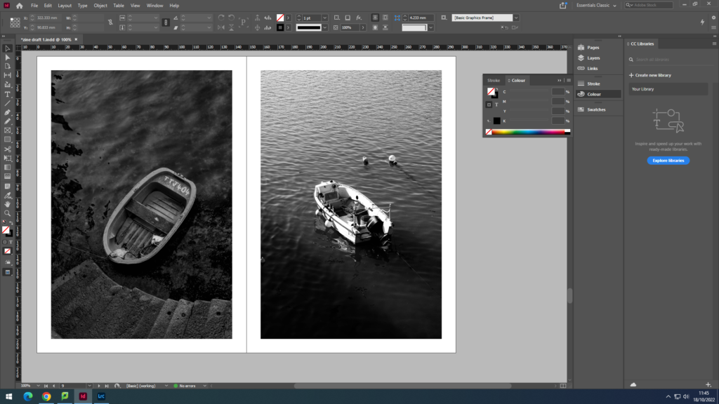

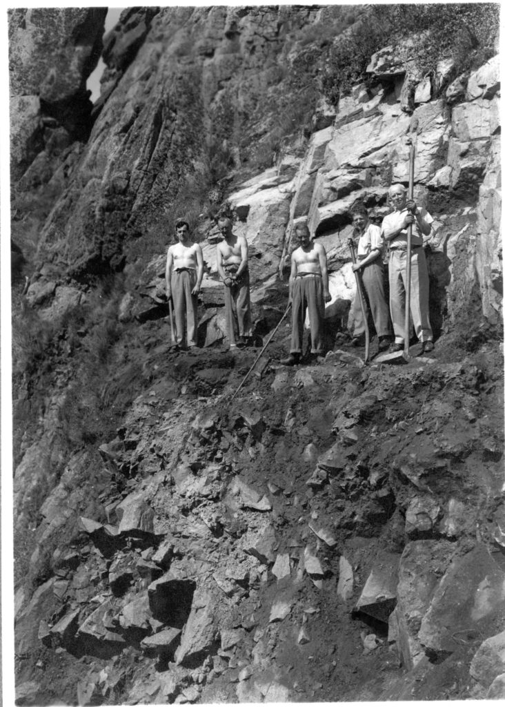
Within my zine I will be including an image from Guiton to link to our study.
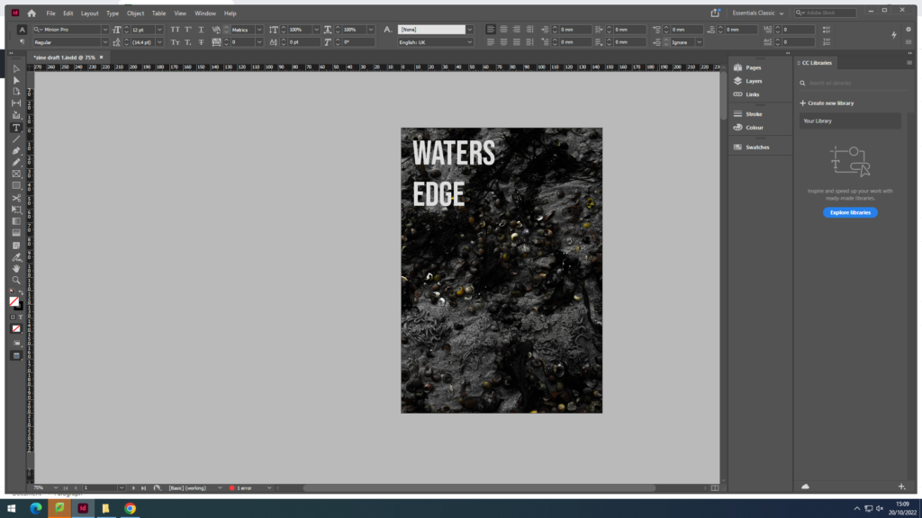
Final product
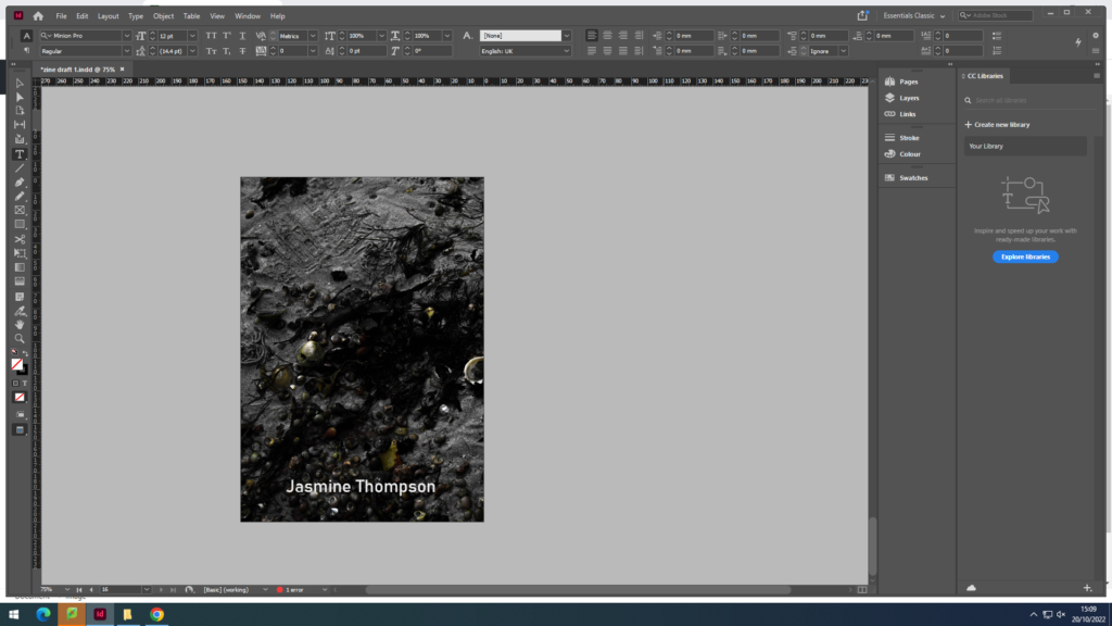
Evaluation
I named by zine ‘Waters Edge’ it tells the story of the different textures, patterns and general things you would see next to the sea. Within my zine, I follow the black and white style similar to Emile F Guiton to relate to our theme of ‘my rock’. I love my use of textures and patterns which highlight the imperfect natural formations of the earth, and juxtaposing those images with different images, some of which are from different beaches across the island. For example, pages 6 and 7, the ripples of water juxtaposes with the sand ripples of the slip. In my printed zine, some of the pages are slightly wonky and slightly shows the white boarder where it isn’t meant to be, to improve this next time, I would thoroughly check that all my pages are lined up straight before folding and stapling.
Société Jersey was established in 1873. The charity which produces and felicitates research of the islands history, is also home to the Jersey photography archives. Since 1993 the jersey archives have acquired over 300,000 archives including: diaries, financial and legal documents, photographs, and moving image and sound recordings.
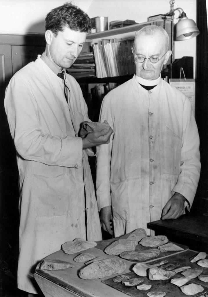
We spoken to Patrick Cahill, an archivist, he discussed with us the need for archives as well as the things they hold. He introduced us to the photography work of Emile F Guiton and the historical excavations he photographed, in particular, La Motte and Le Cotte.
During our talk with Cahill, we were shown some of the zines which had been produced by Société Jersiaise with the help of Mr Toft, these gave us greater understanding of zines and also allowed us to see different styles and eras of photography held at the archives.
Emile F Guiton
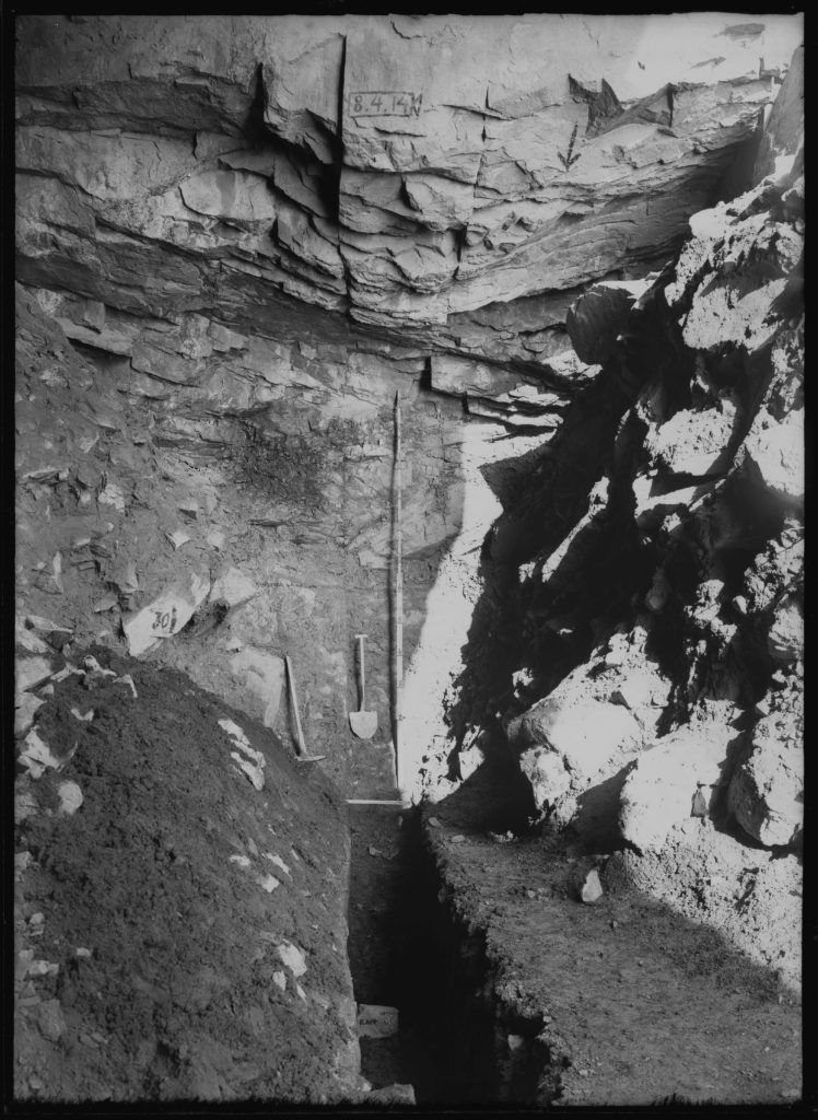
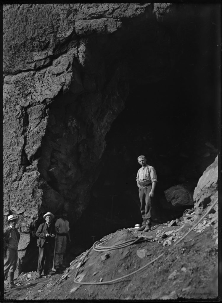
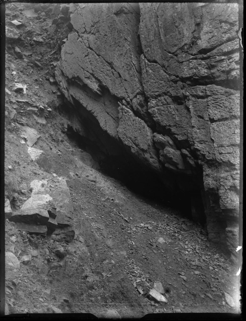
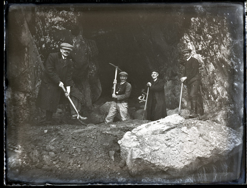
Honorary Curator of the Museum and Editor of the Annual Bulletin, he is considered to be the founder of the Photographic Archive at the Société Jersiaise. Emile was also an excellent photographer making use of a rapidly expanding medium in the early 20th century to record important historical sites, events and objects. He was the principal photographer at La Cotte de Saint-Brélade, one of the most important Palaeolithic sites in Northern Western Europe on numerous archaeological excavations producing images dating from 1910 to 1950s. Photo-Archivist, Patrick Cahill comments; ‘For over a century the Société Jersiaise has been involved with the archaeological excavations at La Cotte de Saint-Brélade.
La Cotte
Situated on a granite headland on Jersey’s south west coast, the collapsed cave and granite ravines of La Cotte de St Brelade provided a home for Neanderthal hunters-gatherers for over 200,000 years.
Since ancient stone tools were first found at the site in 1881, stunning discoveries have been made by successive generations of archaeologists. La Cotte provided early fossil evidence for Neanderthal people, exciting records of their use of fire, and heaps of bone which showed how they could work together to hunt Ice Age megafauna such as mammoth and woolly rhinoceros. It is now time for a new era of investigation and a new generation of archaeologists are about to embark on an exciting and ambitious programme of scientific research and discovery.

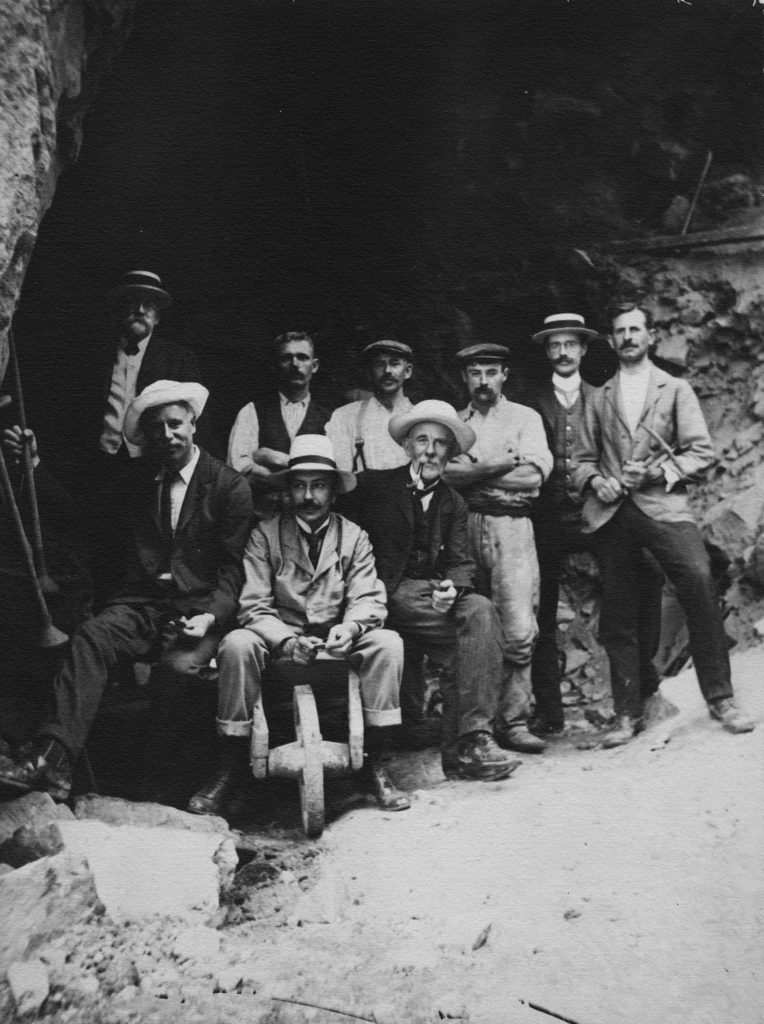
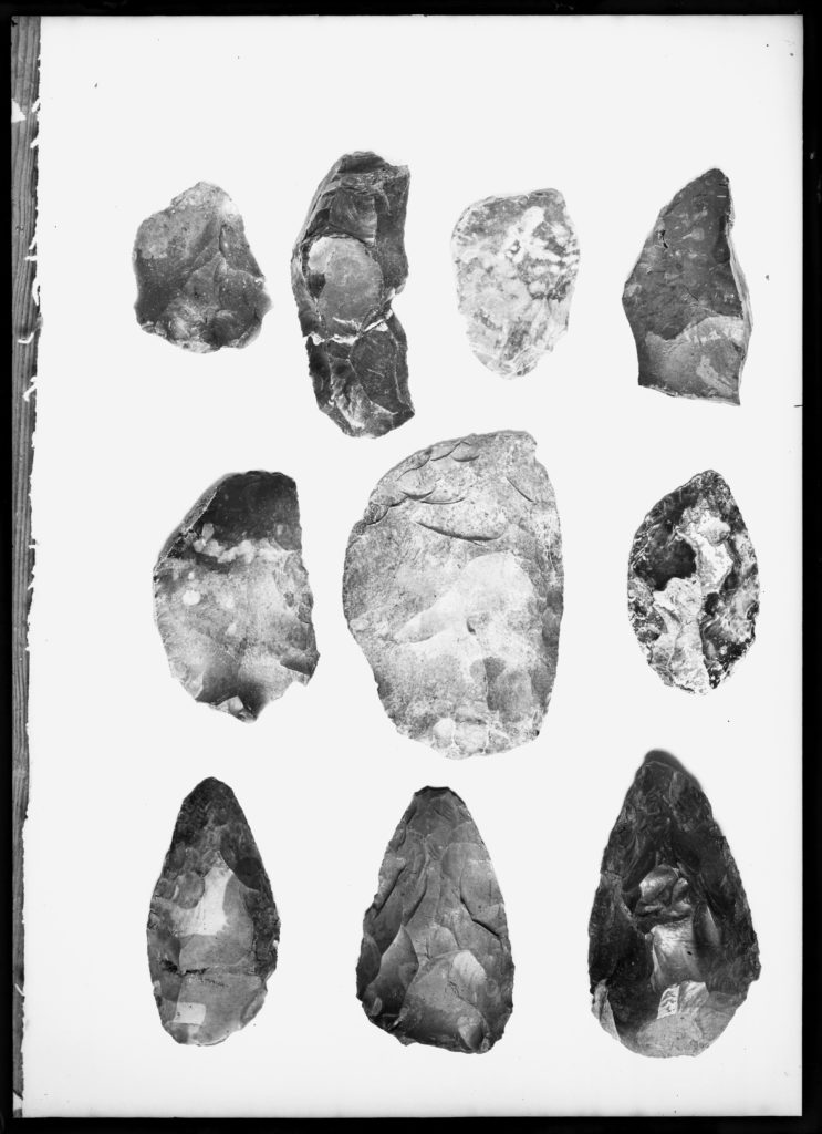
La Motte Excavation
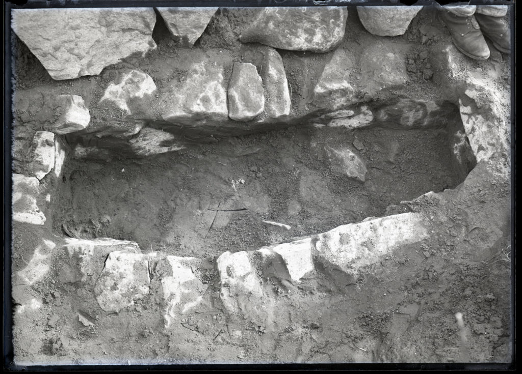
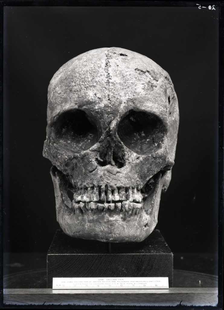
Excavations by archaeologists in 1910 – 1911, based on the large amounts of flint and pottery found around La Motte, revealed the tiny islet to be rich in archaeology. They discovered 18 cist graves, some of which contained human remains thought to be in excess of 4000 years old. Some of these have been removed to the grounds of La Hougue Bie.
Erosion from heavy rain in 1910 revealed small and roughly constructed cist graves. When excavation began, these were found to be the open ends of a “sepulchral chamber”, consisting of two graves covered by capstones. When these stones were removed, the researchers found “no relics of art or industry” as the acidity of the clay had dissolved any remains.
As exploration continued, more cist graves began to be discovered about 5 feet north of the last, though again, no lasting remains had been found. By the end of the excavation, 15 cist graves had been discovered and recorded by the Société Jersiaise excavators. Grave number 14 contained the most intact skeleton, and three graves bore intact skulls. Grave number 6 contained two skulls, and graves 2, 5, 9 and 15 contained the remains of children.
The view of the researchers, reflected in the 1912 edition of the Société Jersiaise Bulletin, was that the graves were likely Neolithic in origin. However, this view was criticised when revaluated in the 2002 Bulletin by Archaeologist Mark Patton, who identified the graves as Medieval cist graves dating between the 4th and 11th centuries AD.
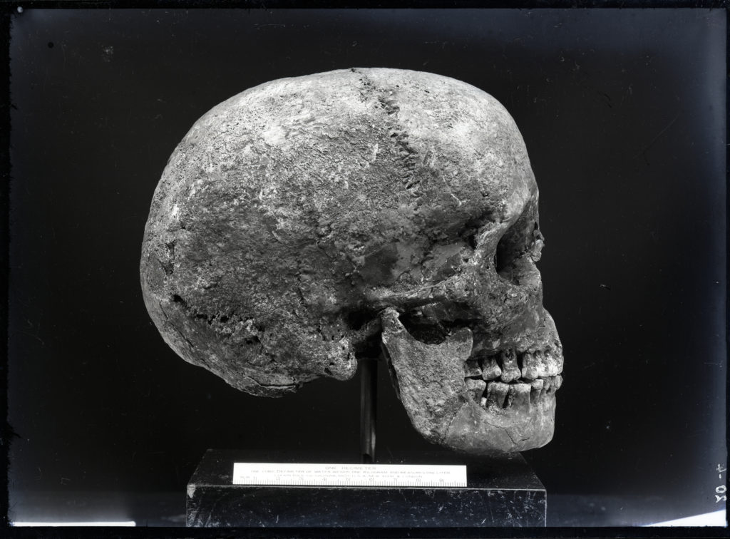
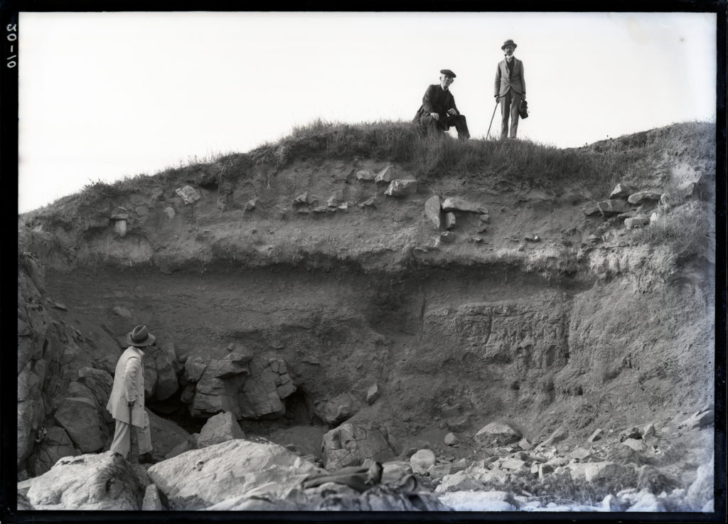
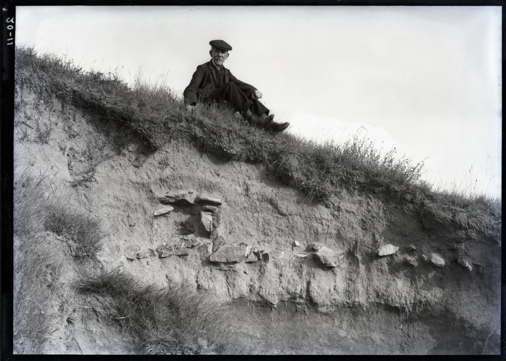
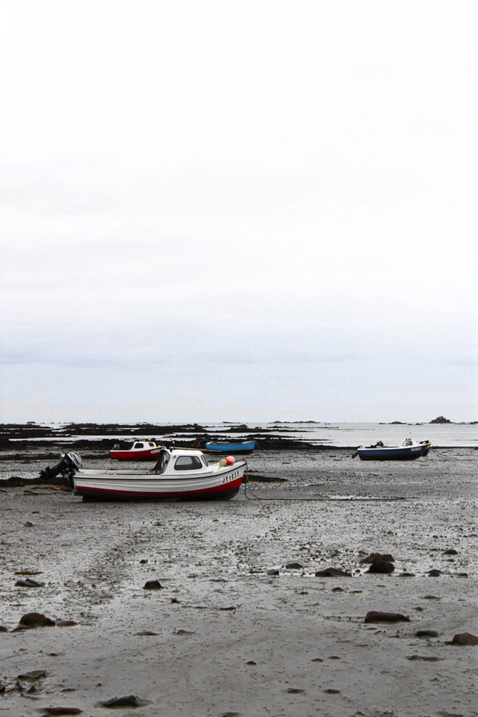
These are my images from our trip to Le Hocq. We went down to Le Hocq to capture images which relate to our theme of ‘my rock’ in particular we emulated the style of Emile F Guiton, an important historical photogapher for our heritage.
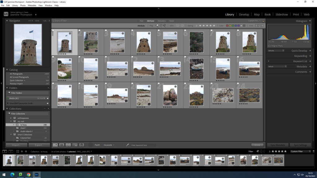
My selection and edits
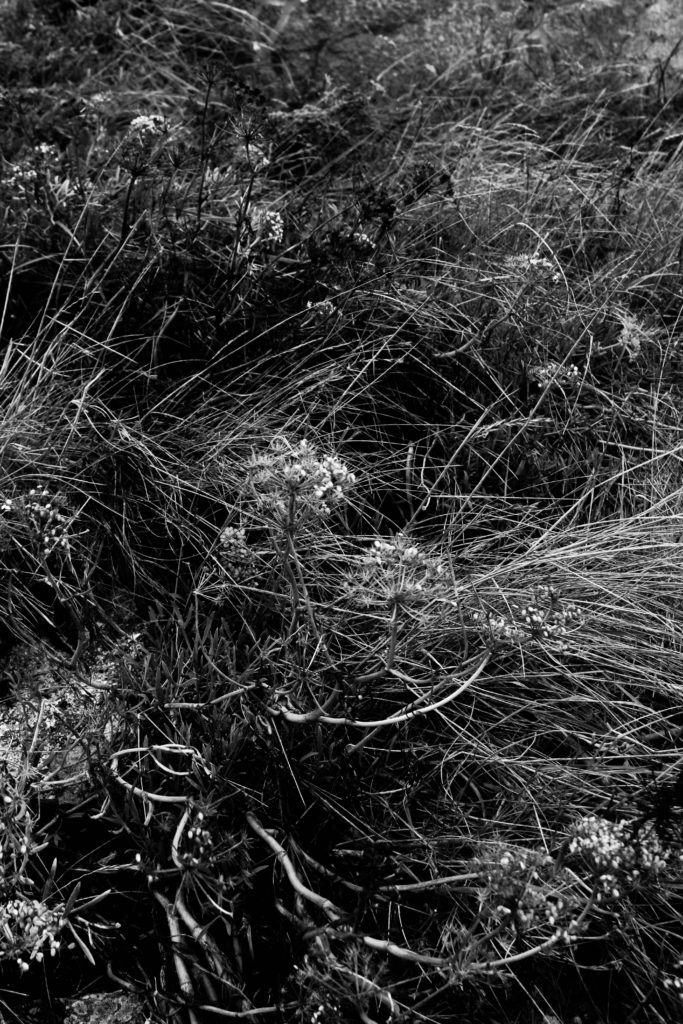
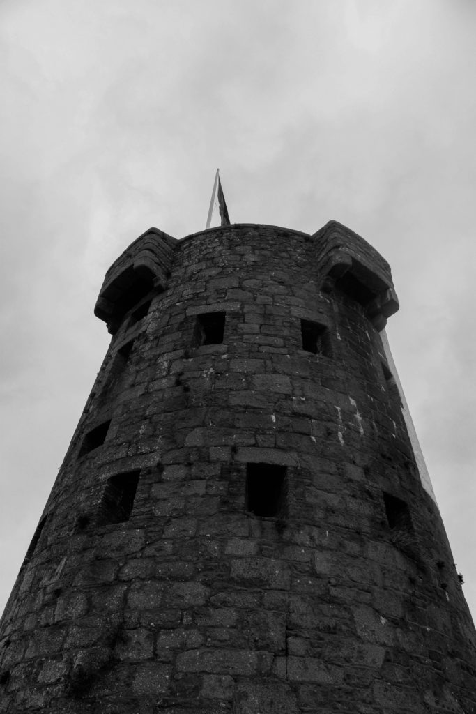
I decided to edit these rock images in black and white to emulate the style of Emile F Guiton



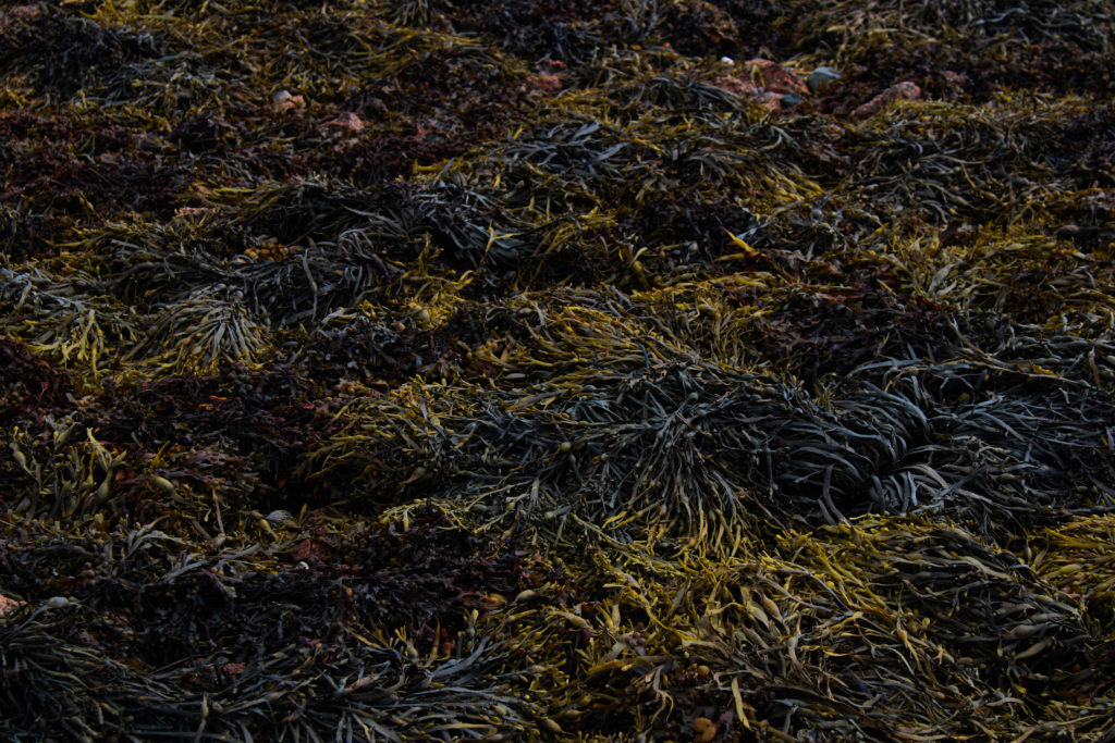
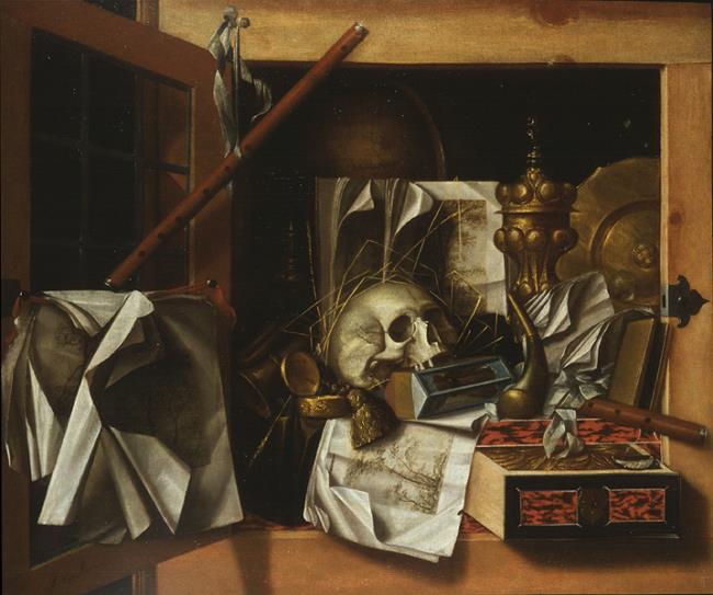
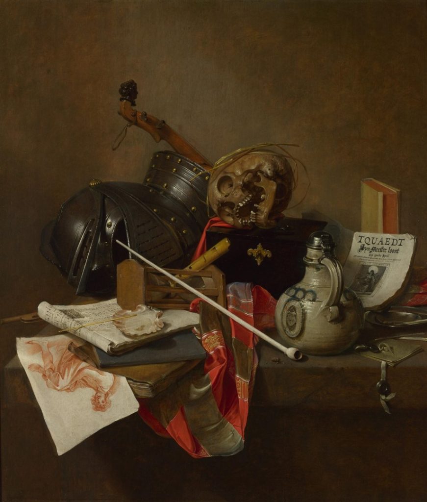
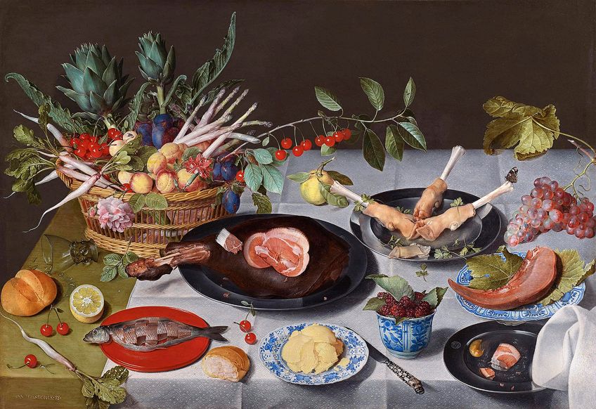
During the 1800’s still life emerged within Dutch and Northern European paintings. These paintings were heavily impacted by religious influence as well as the urbanization of both the Dutch and Flemish society’s, emphasising the use of personal possessions. The goal of a still life composition is to direct the viewer’s eye through a painting and lead them toward what the artist thinks is important. Artistic compositions of inanimate objects were considered the lowest form of art because they were decorative, lacked gravitas and could be appreciated without any intellectual effort.
It is alleged that the first still life was produced in 1504 by Jacopo De’Barbari.
Objects often used: burnt candles, human skulls, dying flowers, fruits and vegetables, broken chalices, jewellery, crowns, watches, mirrors, bottles, glasses, vases
“The transience and brevity of human life, power, beauty and wealth, as well as of the insignificance of all material things and achievements.”

Analysis

This painting produced in 1650 is an oil canvas painting by Vanitas. Although it is displayed in the background, I believe the focal point of this painting is the African servant, depicting the immoral and unjust status of the world at the time. The flowers which look as if they’re wilting represent the shortness of life and are meant to remind the viewer that existence is meaningless without the hope of salvation which from a modern viewers point of view could create a sense of hope for the servant who was probably treated poorly. As well as the skull Such a symbol is called a Memento Mori, a Latin phrase meaning “Remember that you will die. “On the other hand, the flowers are the only part of the painting which display vibrant colour and life. The use of the flowers being white lilies could be associated with purity and the Virgin Mary’s immaculate conception which correlates with the image of the virgin Mary which the slave man is holding. The objects in this painting such as a recorder instrument and a paint pallet could suggest that all of the servants belongings were in order to entertain the rich employer.
My Joiner
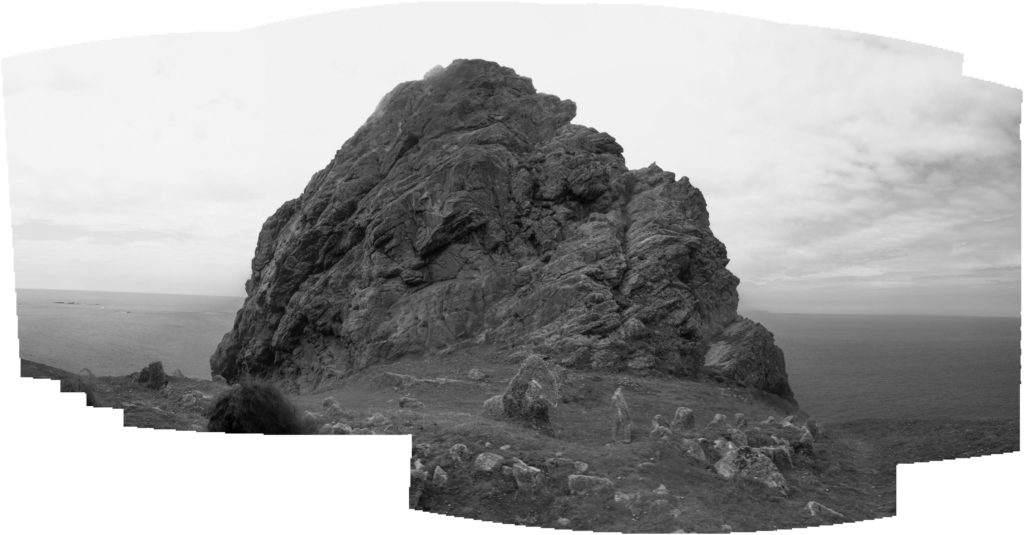
This is the first joiner i made, i decided to make the images black and white to capture the depth and shadows within the rock. I also feel the black and white compliments the solitary feeling of the lonely rock.
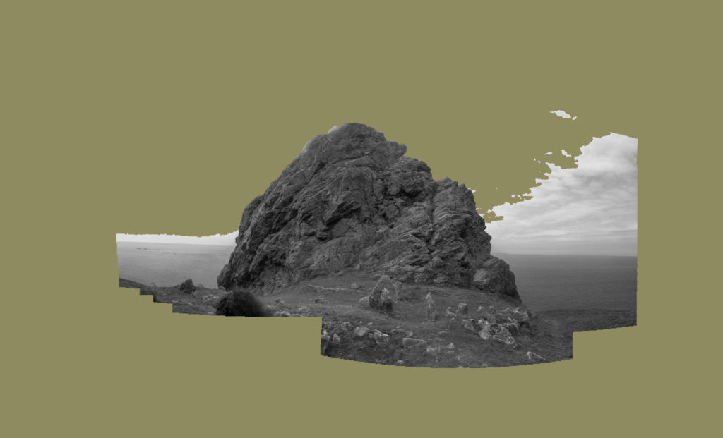
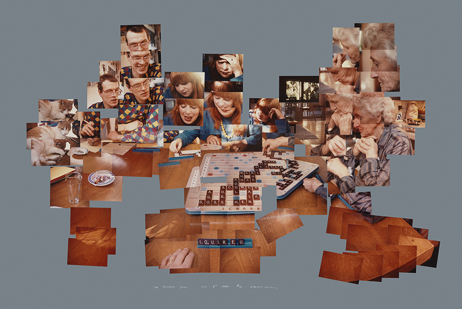
I decided to include a muted green background to emulate the style of Hockney.
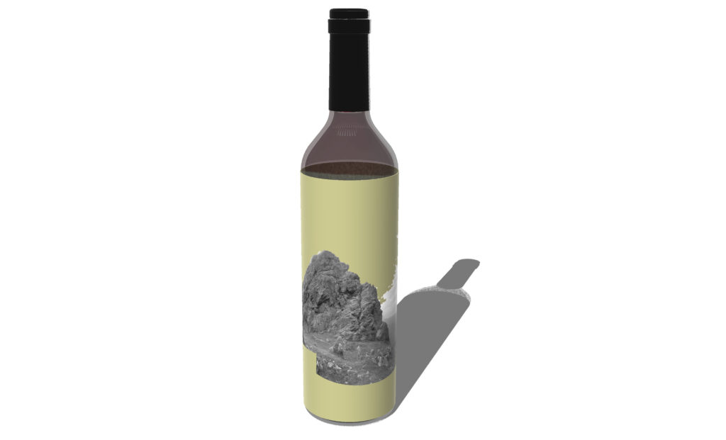
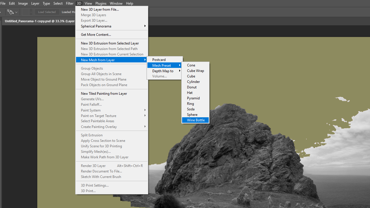
Using photoshop i created a mock up of what my image would look like on a wine bottle.
Overall, I believe my joiner turned out well, however, to improve I would take more images so i could make more joiners and test different editing styles. I would also make sure I capture more of the landscape such as the grassy and rocky surface in the foreground.
David Hockney was famous for his unique style of photography. In the 1980s, he began making photograph collages and he use to call them, joiners. He used Polaroid photos and soon 35mm prints in color. Hockney cleverly composed a patchwork of images.

Interested in how 3-dimensional space can be portrayed in a 2-dimensional image. Joiners aimed to create an image that was able to show reality how we experience it (in fragments, not as a whole), and to show the passage of time.
Image Analysis
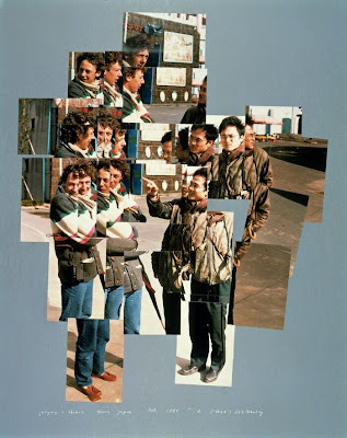
This image is a joiner by David Hockney, the genre is documentary portraiture. The lighting in this image is natural outside lighting which projects shadows of the subjects. The focal point of this image is the pointing finger in the very middle which i circled in red. The Mice-en-scene of this image shows two middle aged men having some sort of discussion where they are pictures laughing and smiling, perhaps looking at something in the distance. This image is created by putting together many different polaroid images which Hockney calls a ‘joiner’. I believe Hockney’s joiners are so interesting as they are 2D images which emphasise movement and shape. Hockney’s joiners create a still video like image where you can easily understand the scene and act as a timeline.
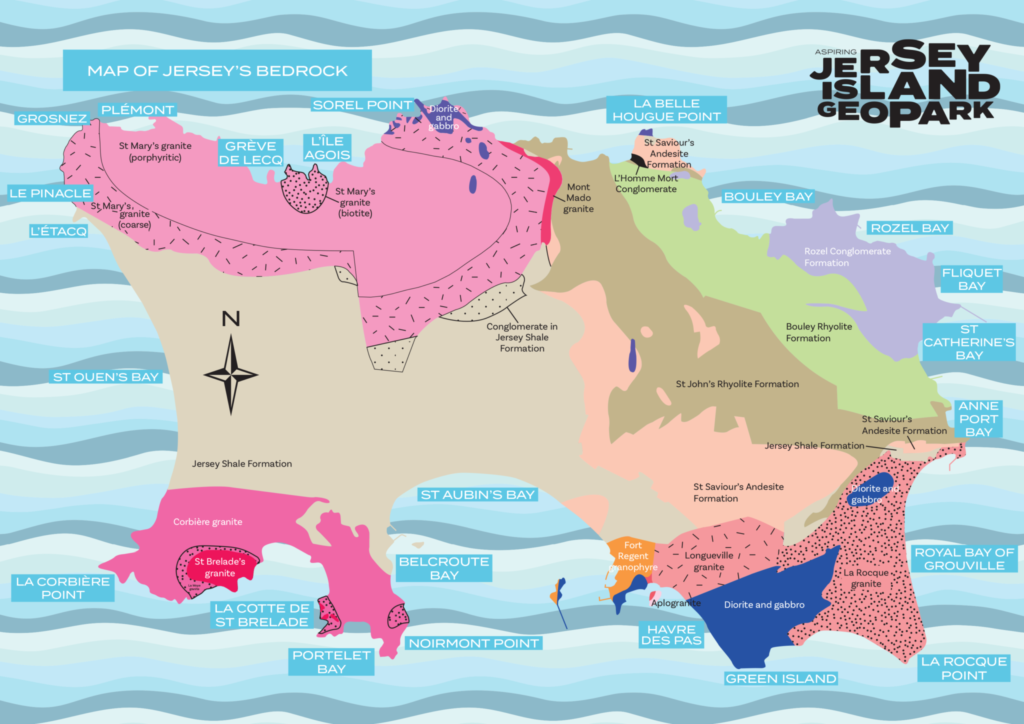
A Geopark tells the whole story of an area, right from the very beginning.
We spoke to Jersey Geologist Ralph Nicholls and Museum curator Millie Butel at the Jersey Museum.
The Aspiring Jersey Island Geopark Visitor Centre tells the story of Jersey’s geological heritage, with the aim of encouraging Islanders and visitors to explore Jersey and see first-hand how geology has shaped the Island we know today.
Millie Butel, Jersey Heritage’s Landscape Engagement & Geopark Development Curator, explained that Geoparks celebrate the links between people and the Earth. The Visitor Centre will show people why Jersey’s outstanding landscapes and seascapes could make the Island a candidate for future designation.
She said: ‘Jersey is more than just the rock it is made of – our Island is an incredible combination of natural, built and intangible heritage. A Geopark can tell the whole story and, if Jersey is successful in achieving a designation, it will be a statement of commitment to protect the Island we all love and to promote the landscapes, seascapes and heritage that are important to Islanders.
MINERALS OF JERSEY
Minerals are made from elements like silicon, oxygen, aluminium, iron and other metals. They are the fundamental building blocks of all rocks. As magma (molten rock) cools, minerals such as quartz and feldspar form crystals. The longer the cooling process takes, the larger the crystals. Minerals can also be carried through rocks by water, forming crystals as the water evaporates.
JERSEY SHALE FORMATION
The shales are the oldest rocks in the Island. You can see them in the west, across the centre and in the south of Jersey. They were formed by mud, silt and sand brought together on the sea floor about 600 million years ago. These sediments were transformed into rock by being pushed together, hardened and folded.
JERSEY VOLCANICS
Volcanic lavas and ashes can be seen along the north and northeast coasts of the Island. These andesites and rhyolites formed as a result of volcanic eruptions occurring 580 million years ago.
JERSEY GRANITES
Jersey is famous for its granites, which have been favoured as a building material for thousands of years. These major intrusive or ‘plutonic’ rocks were formed between 580 and 480 million years ago by molten rock cooling and solidifying between the Earth’s surface. They are only visible once the overlying rocks have been eroded away. The dark rocks known as gabbros are the oldest, and are rich in iron and magnesium. The true granites, visible along the northwest and southwest coasts, are lighter in colour, and consist of three main minerals: quartz, feldspar and mica. On the southeast coast, where granites have broken through the Earth’s surface into older gabbros, a mixed rock called diorite has formed.
ROZEL CONGLOMERATE
Formation Conglomerate can be seen along the northeast of the Island and is made up of beds of pebbles which have been cemented together. They were formed around 400 million years ago and are the youngest hard rock formation in Jersey. Conglomerate is also known as ‘pudding stone’ because the rock formation is made up of lots of pebbles, probably from eroded and worn mountains. Streams with fast flowing water carried the pebbles and sand down valleys and left them behind before they cemented together.
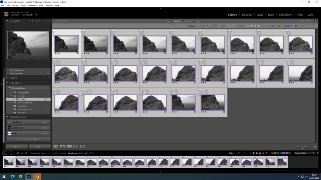
On our trip to Le Etacq, i photographed around 300 images.
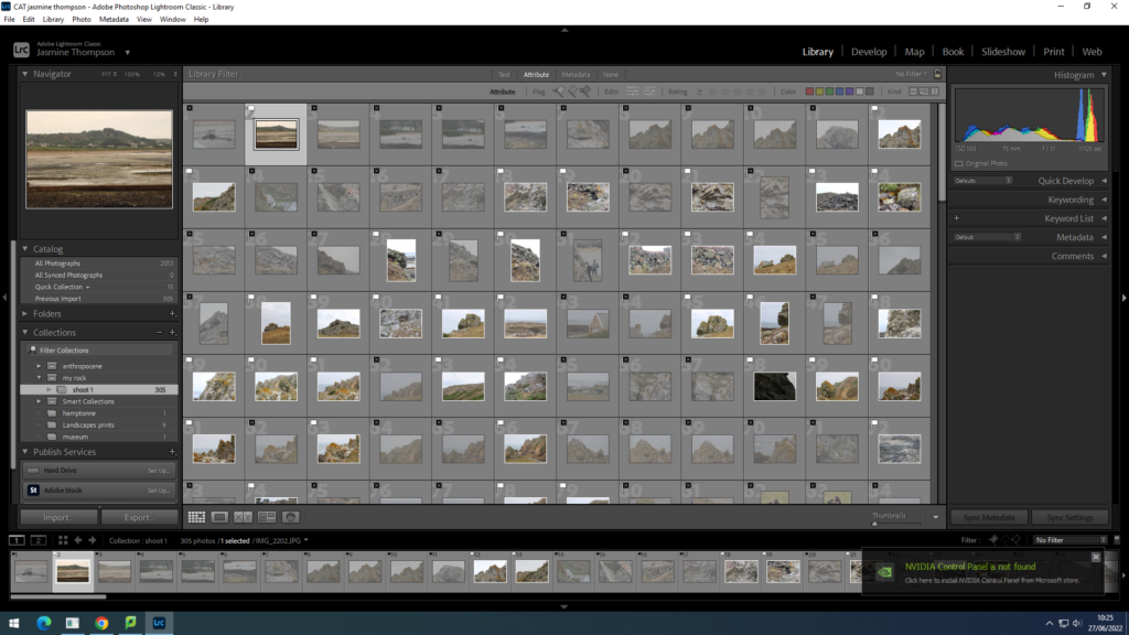
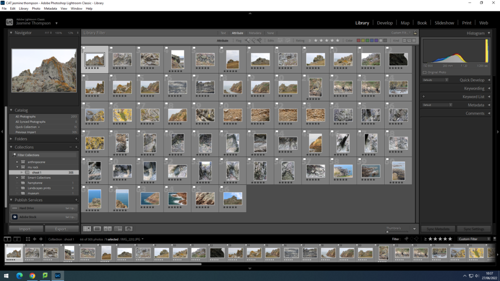
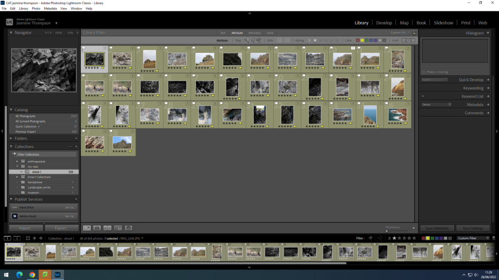
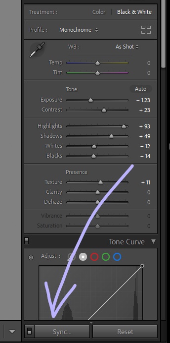
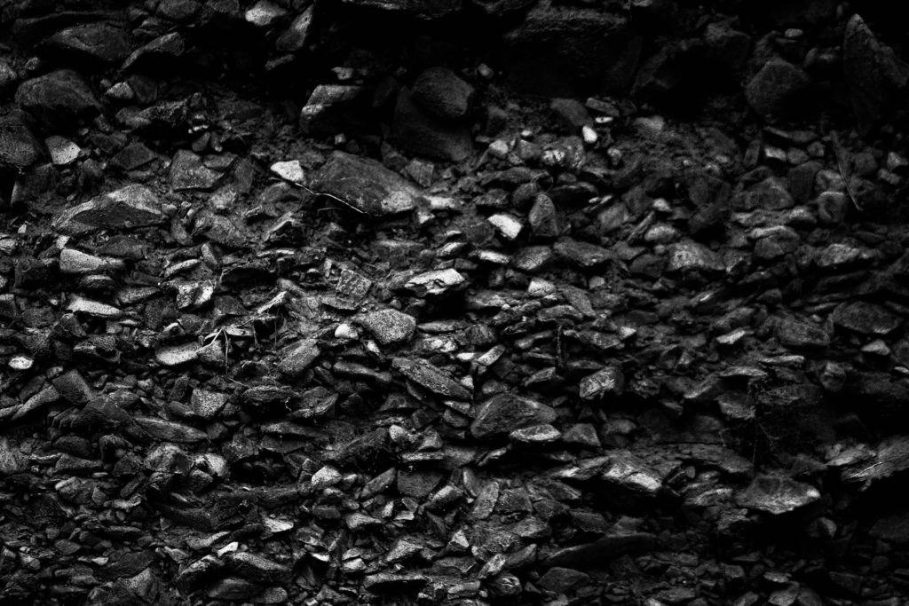
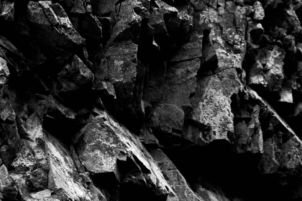
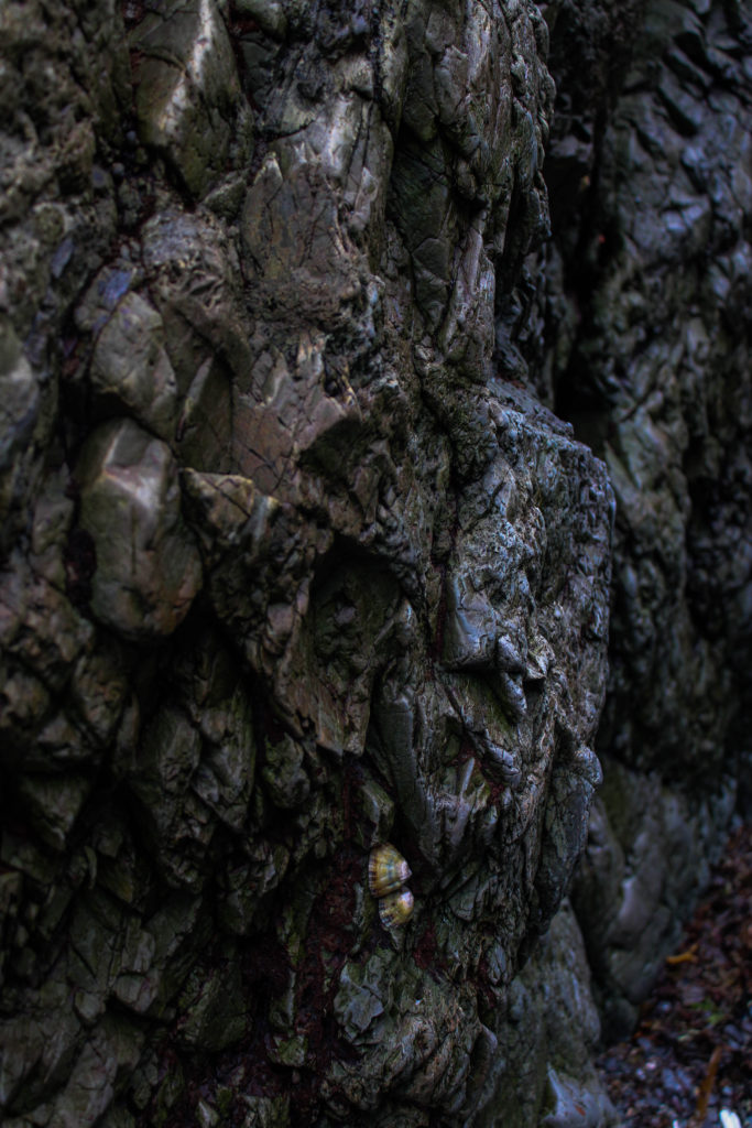
Edits

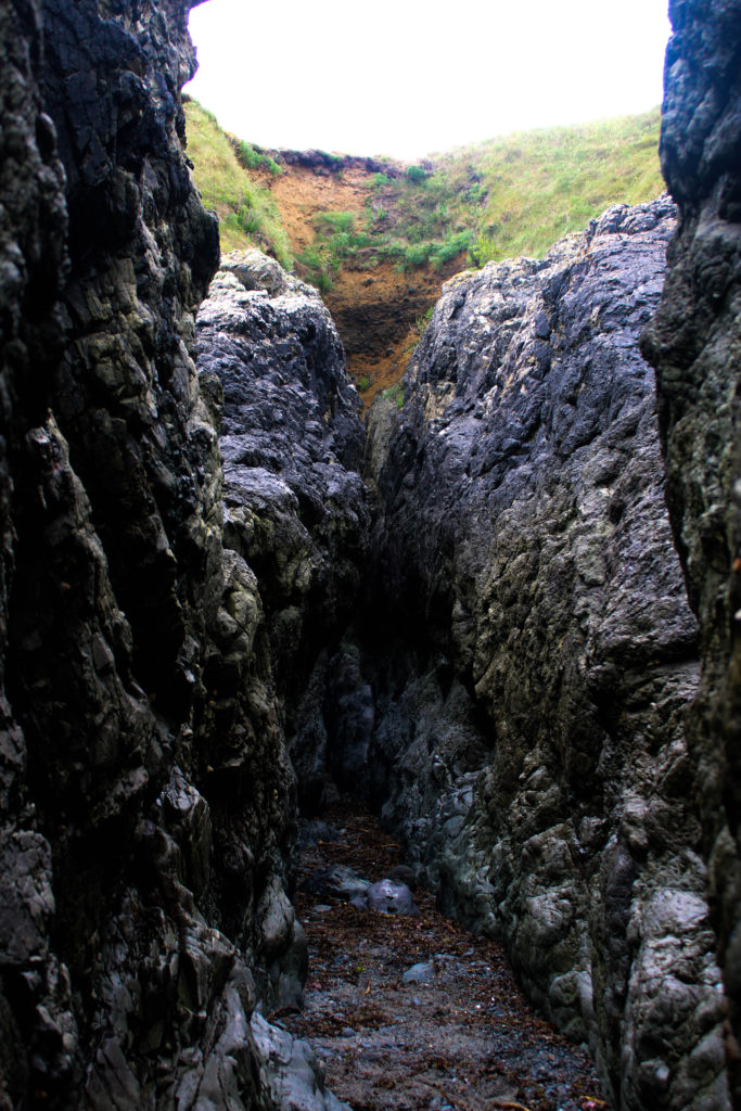
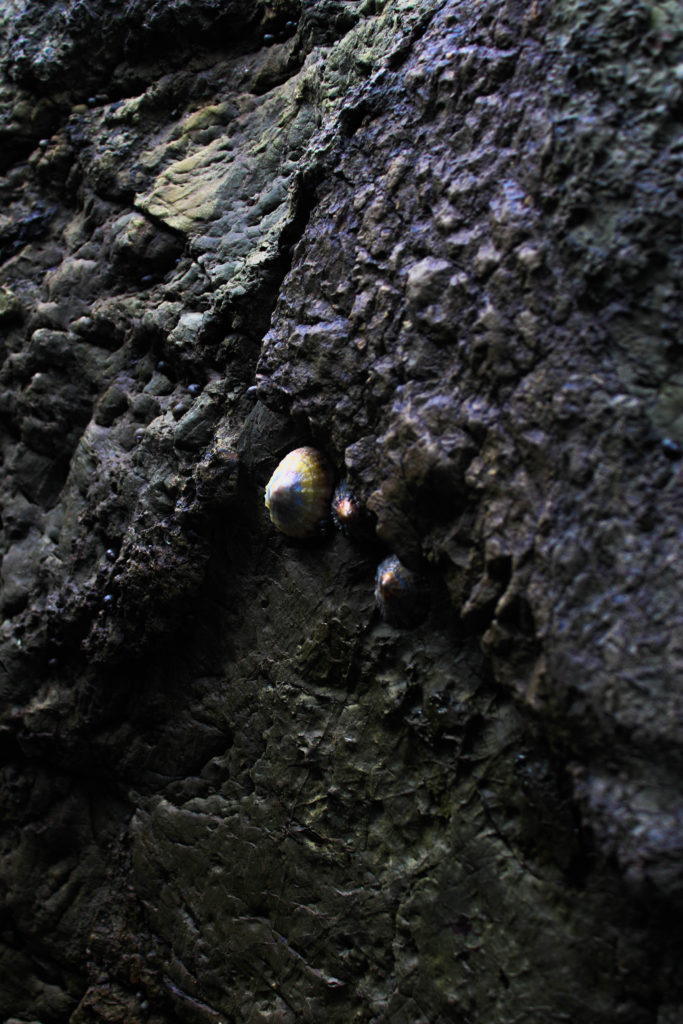
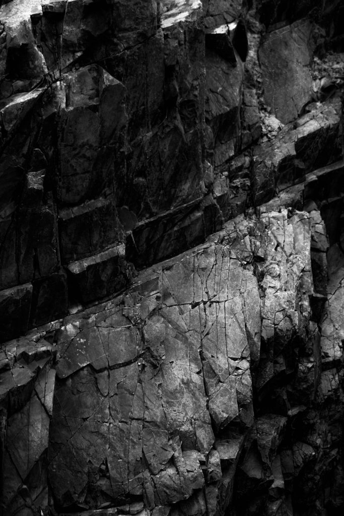
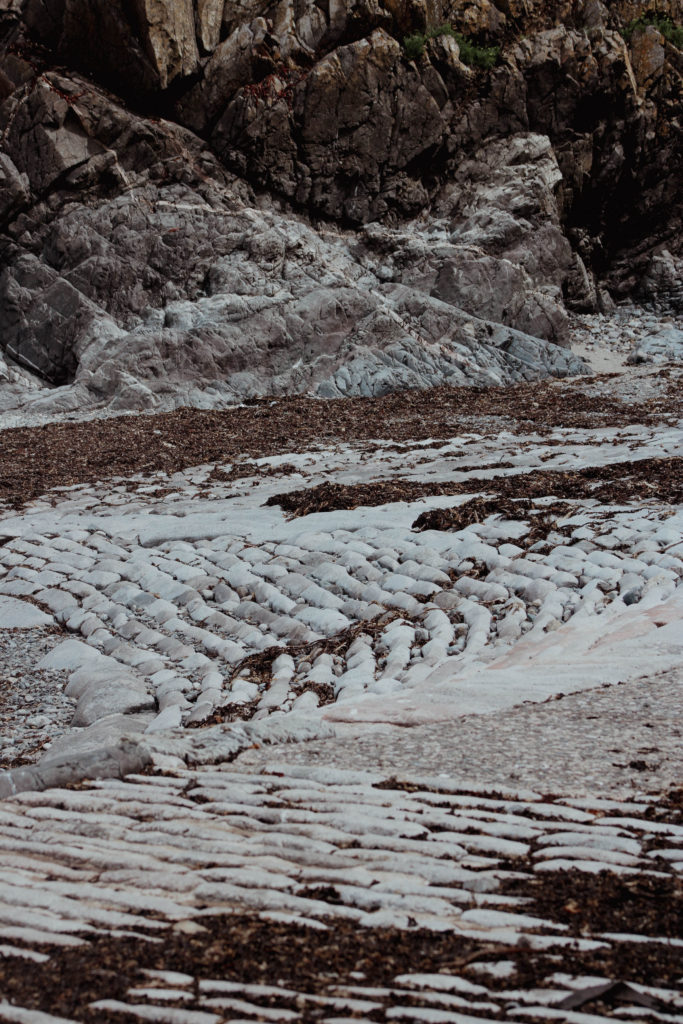

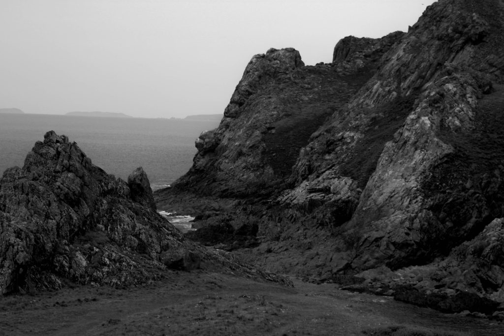
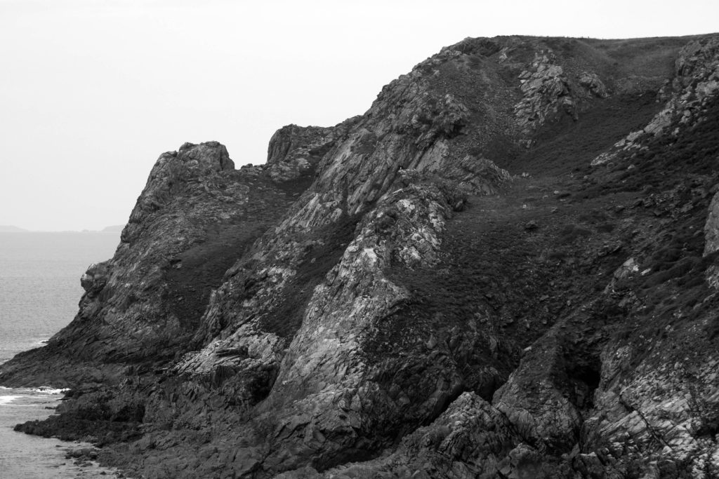
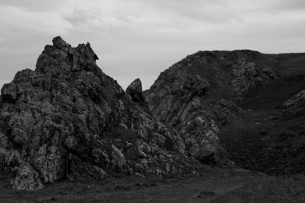
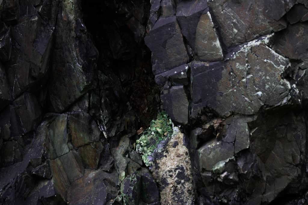
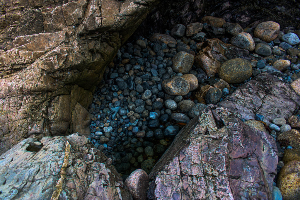
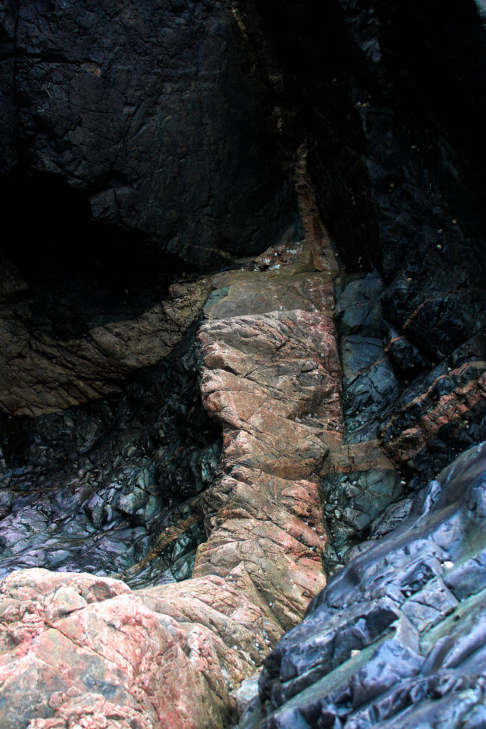
Photoshoot evaluation
my images turned out well but they lack in variation, a lot my images are close ups of the rock shapes but not as many of the landscape. I believe due to the overcast that day, some of my images lack in texture and depth due to a very flat lighting, to improve this, I would go out on a sunnier day and capture more of a shadow.
Andreas Franke
Andreas Franke, based in Vienna, is a passionate diver and award winning photographer. For Luerzer‘s Archive he is among the 200 Best Photographers. He is the founder, owner and chief photographer of Staudinger+Franke He worked for great brands like Ben&Jerry’s, Coca-Cola, Ford, General Electric, Gillette, Heineken, Nike, Visa or Wrigley‘s. His still life’s and his surreal effects are famous. In his pictures every little detail is planned precisely. There is no space left for fortuity. Andreas Franke is a traveller. He travels through the world and between the worlds. His job frequently leads him to several countries on several continents. So does his passion the scuba diving. In his pictures Franke crosses the borderlines between fantasy and real life.
Frankes work focuses on having a plastic free ocean.
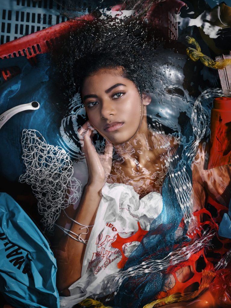
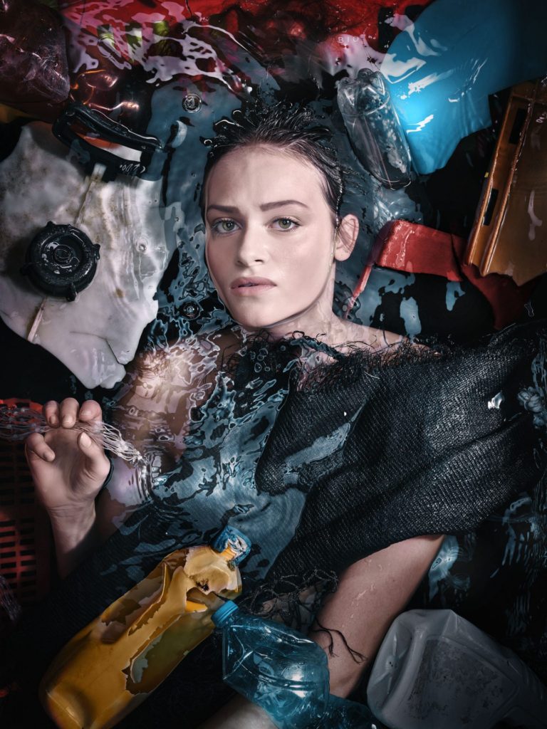
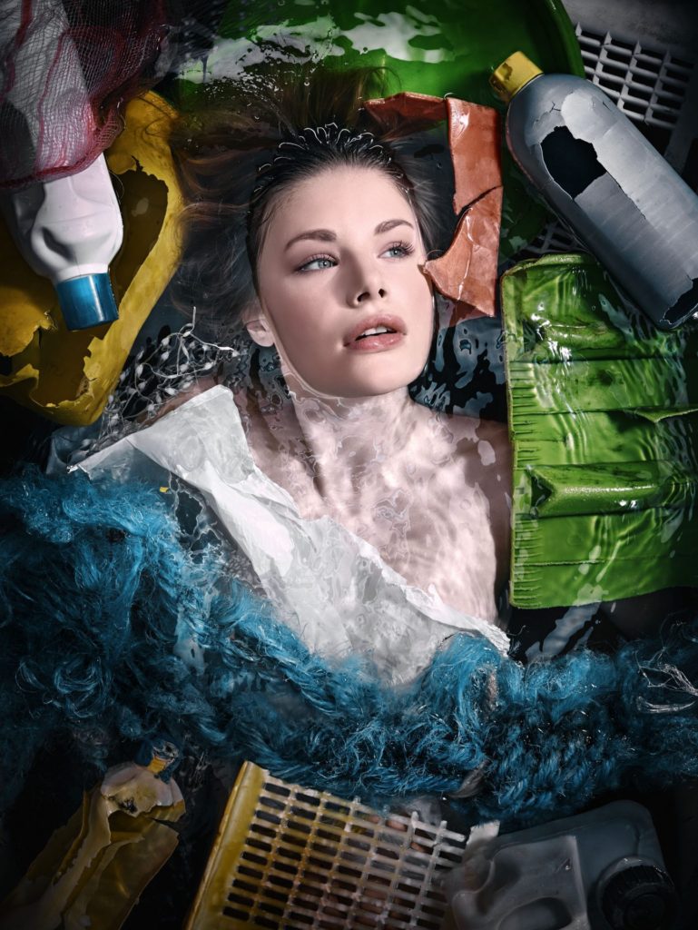

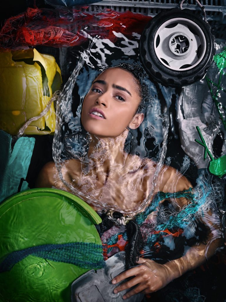
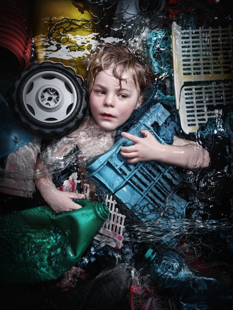
My idea
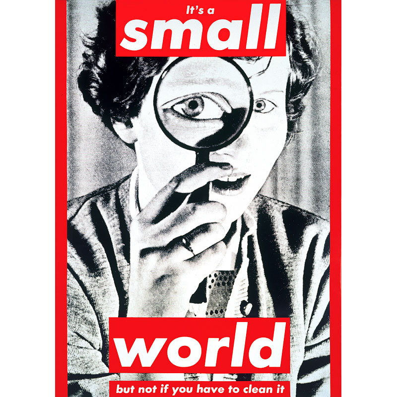
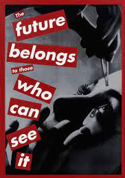
My idea was too emulate the work of Andreas Franke while also taking inspiration from Barbra Kruger and Jeremy Carroll. I wanted to highlight the human impact on the ocean, through plastic pollution. To do this I collected various pieces of plastic off the beach, some of which were harmful e.g. poisonous waxy debris off of cargo ships which could kill an animal if eaten, chemical bottles, plastic bottles, plastic nets, rope. I wanted to create a piece which was ominous to add a fear factor to the images which would emphasise the impact of humans.
My edits

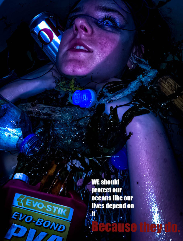
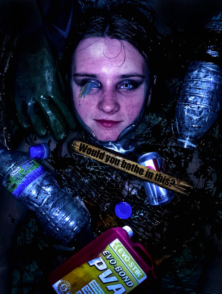
Black and White
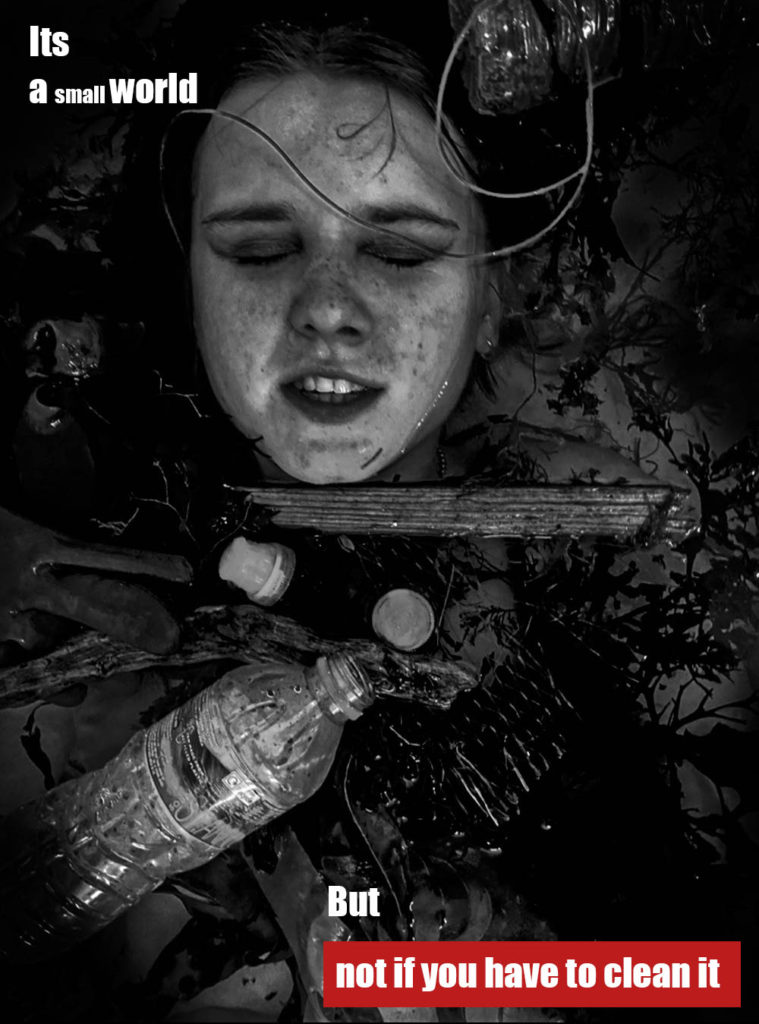
This image was heavily inspired By Kruger, while still containing the Franke style of image. I used a caption from Kruger, “its a small world, but not if you have to clean it”.
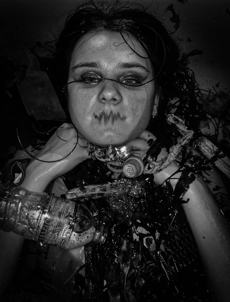
In this image, blurred the mouth to represent how we are the voice of the ocean and the ocean life, they cannot speak for themselves, so we must.
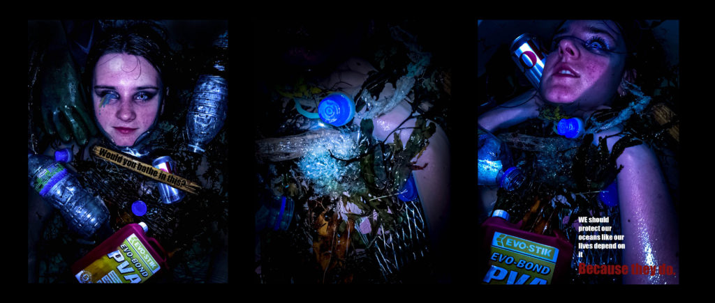
My final 3 images
I have cut down my final images to these 3 here, i feel they work together as a trio down to their, colour scheme and messages.

I have decided to include this image as I believe it outlines the message of plastic pollution clearly. The phrase ‘would you bathe in this’ makes the viewer realise that the sea life have to live in such conditions. I believe it emulates the work of Andreas Franke while also featuring my own twist which was the rhetorical question inspired by Barbra Kruger.

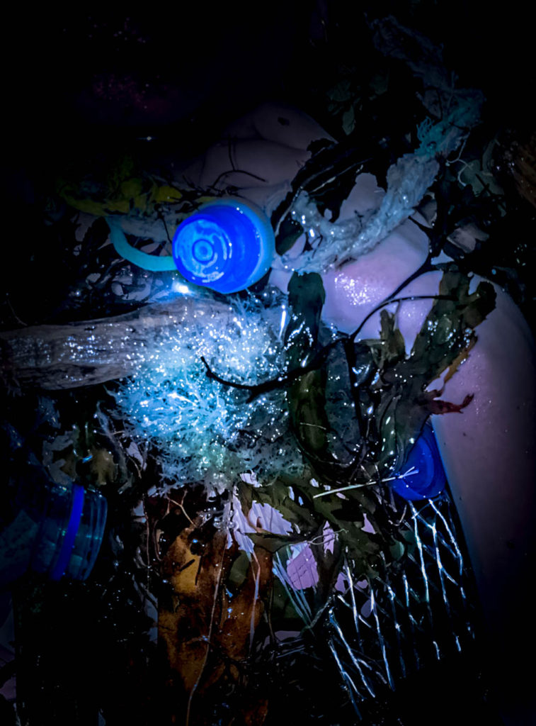
This image shows a hand trapped in the seaweed and rubbish, this is to represent that the plastic pollution is only only massively negative on the sea animals, it will as well affect humans badly -Endocrine disruptors like bisphenol A (BPA) will increase our risk of certain cancers, can cause hormonal issues, and even increase risk of infertility and birth defects. As well as the ocean life, we as humans will also be torn down by plastic pollution.

I decided to chose this image as it reverses roles, it looks as if the person is being strangled by the rope and the plastic similar to how sea life are caught in plastic waste. The rope around her kneck, is inspired by Jeremy carols work.
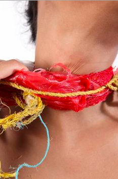
Image compare and contrast
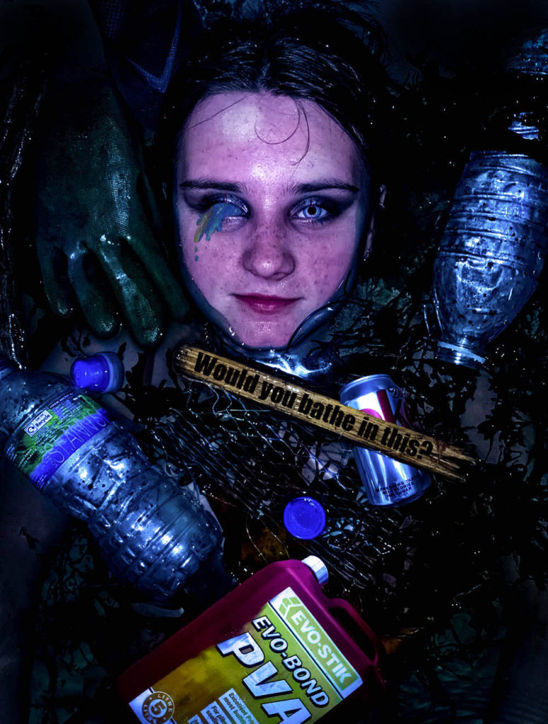
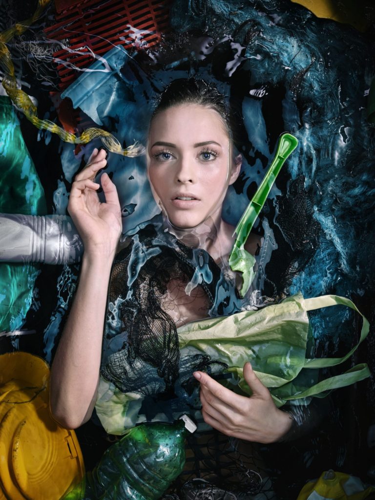
I was inspired by Andreas Franke to create this ocean plastic pollution themed photoshoot. I emulated her style of a human submerged in water filled with plastic waste. The images are both similar in the sense that they are both in water, surrounded by rubbish. Both of the images create a feeling of sinking and depth, possibly symbolising the depth of the problem. Both of the images are coloured images which follow a theme of exaggerated colour on a dark pool of water. The placement of the people are similar, most of the body submerged, the face showing. In contrast my image includes a message ‘would you bathe in this’, inspired by Barbra Kruger, adding more context.
Presenting
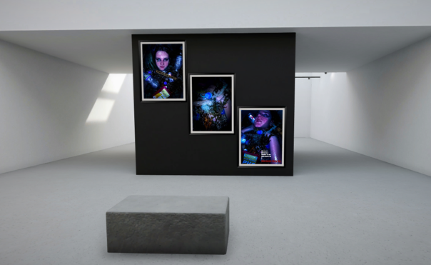
Evaluation
I believe my final images came out good. They fit the theme of plastic pollution. I believe I tackled the theme of ‘Anthropocene’ correctly and focused on ‘human impact’. I think my idea was thought through well and I am happy with how they look. I think to improve my work i could’ve taken my images on a camera instead of my phone camera as the images would’ve come out better quality. I also think I was quite inconsistent within my photoshoot as some of my images were flash and some without which meant the lighting was different for some photos. I think my final outcome could’ve been better if I had more images to work with, I had enough images, however some of them were very similar to each other, meaning I would’ve ended up creating things that looked the same as each other. I believe I could’ve made these images better by taking the image from a higher point to allow myself more room to add additional plastic items similar to hers.