All posts by Joshua O

Filters

Author:
Category:

Urban Landscape Photoshoot 1

Possible Photoshoot Locations:
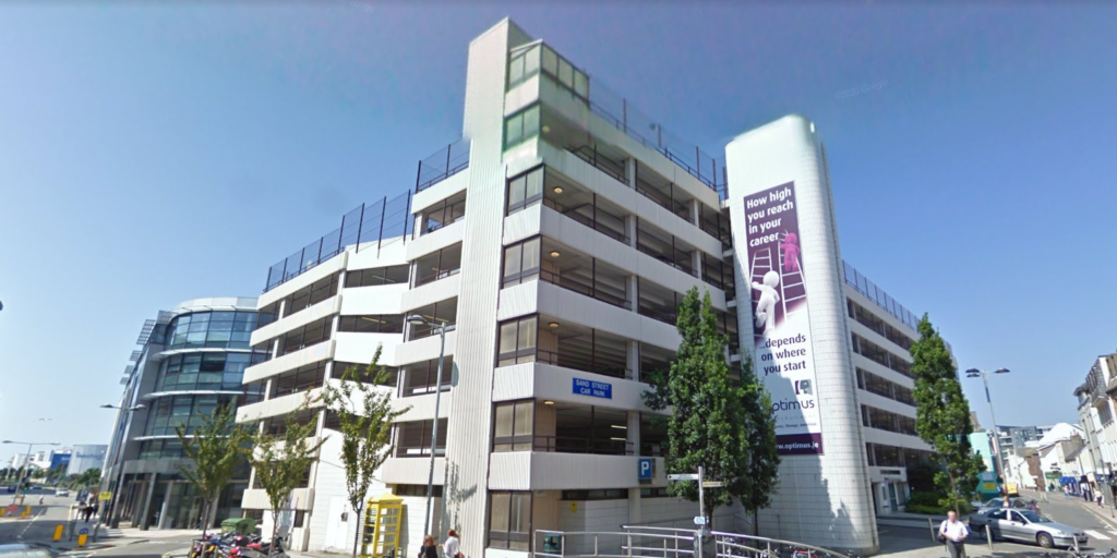
For this photoshoot, I went around St. Helier and took pictures of the buildings in it from different viewpoints, such as from the top of car parks looking downwards/at the horizon or at the foot of buildings looking upwards.

Contact Sheets
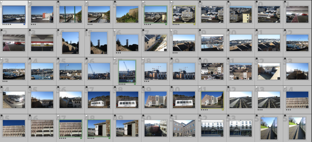
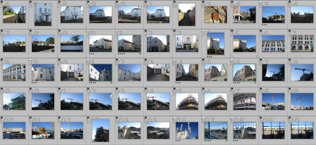
Contact Sheet of my Best Images

To select the best images I used the ‘Pick’ and ‘Reject’ feature on lightroom to determine which images are ‘good’ and ‘bad’, then I used the start-rating system to see which ones were the best out of those. I have settled on 11 total final images.
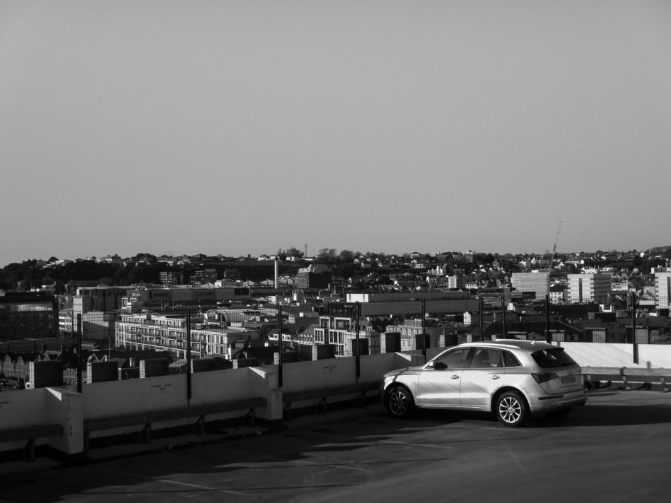
I copied each final image and created a black and white version to mimic the style of the photographs shown in the New Topographics exhibition.

Final Edited Images

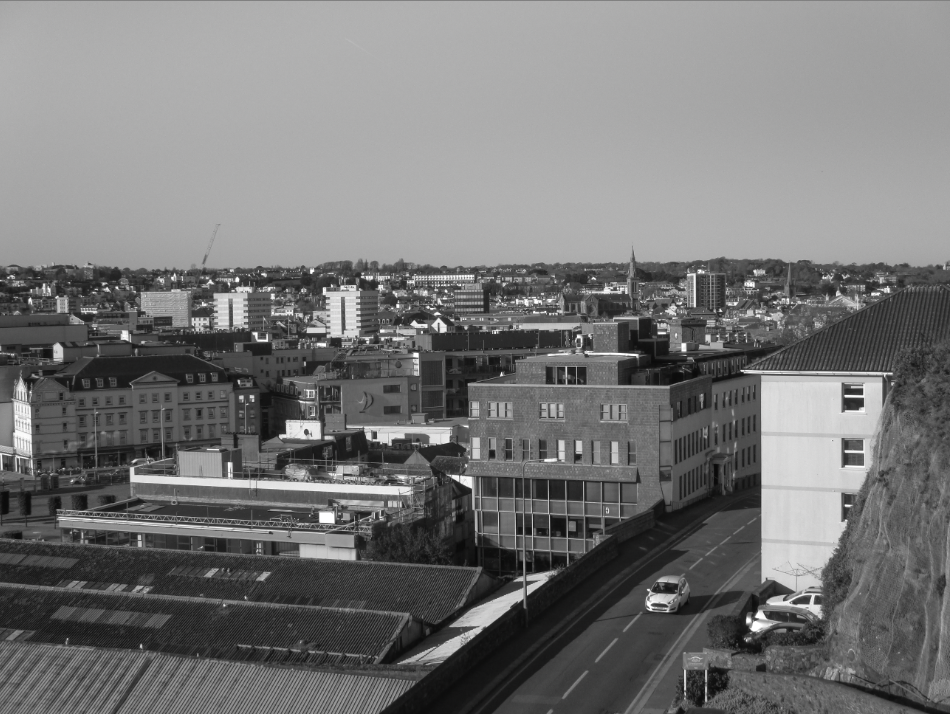
I chose this as a Final Image because I like the way it uses distance and scale to show how large the urban landscape is in comparison to a car. I also think it is interesting how the foreground, due to the fact that the building is high up, is much larger than the buildings on the background (in terms of scale in the image), which creates a very clear divide between the foreground and the background. There is also a clear divide between the top and bottom halves of the image due to the top half being a clear blue and the bottom half having many lines and a mix of greys, greens and browns. The car acts as the focal point in the image, due to how it’s silver paint reflects light into the camera, making it the brightest part of the image. This image follows the rule of thirds as the car is positioned at the bottom right corner.


I chose this as a Final Image because I like the relationship between the car in the bottom right and the buildings that surround it. It creates a sense of life that would not be seen if the car was not there. The difference in scale between the car and the buildings also shows how vast the man-made landscapes are. Due to the fact that there are many buildings that can be seen, there are many lines in the image, giving it an unnatural look, however the road the car is on has noticeably less lines on it, creating a contrast that allows the car to be seen more clearly.


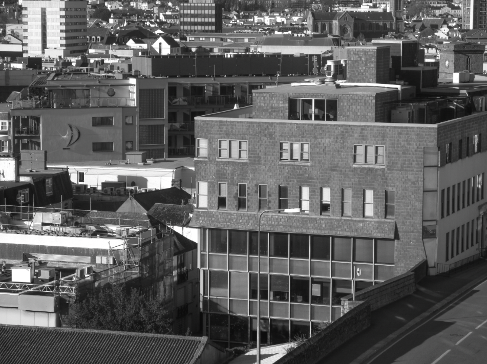
I chose this as a Final Image because I think the clear lines on the larger building on the right gives the image an urban look, however there are considerably less lines on the building than on the background of the image, making it stand out more. When editing, I made the tone of the image slightly more warm to make the greys more vibrant. I also like the way the low sun allows large shadows to form behind the buildings, while the faces of the buildings facing towards the sun are given a highlight.


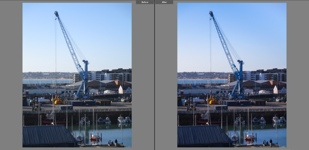
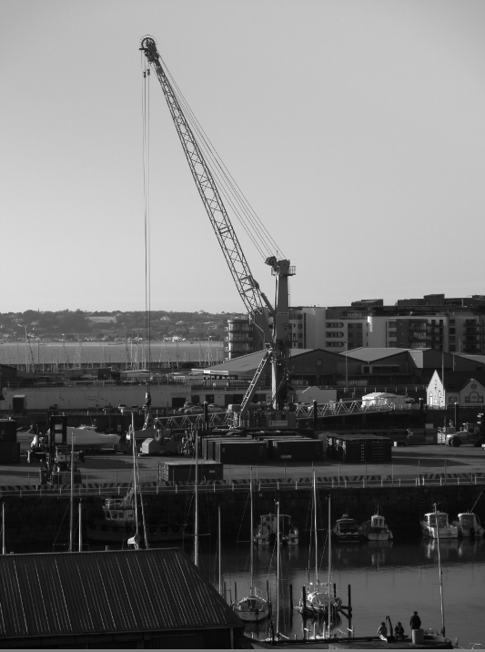
I chose this as a final image because I like how the foreground, midground and background are displayed, each separated by water. The foreground contains a building’s roof and 3 people by the edge of the water, this compared to the crane in the midground creates a huge difference in scale, while the background shows a distant bay/headland which aligns almost perfectly with the buildings on the right creating a horizon line of sorts. I think the fact that the image is made up primarily of blues gives the image a unique look for an image displaying an urban landscape.


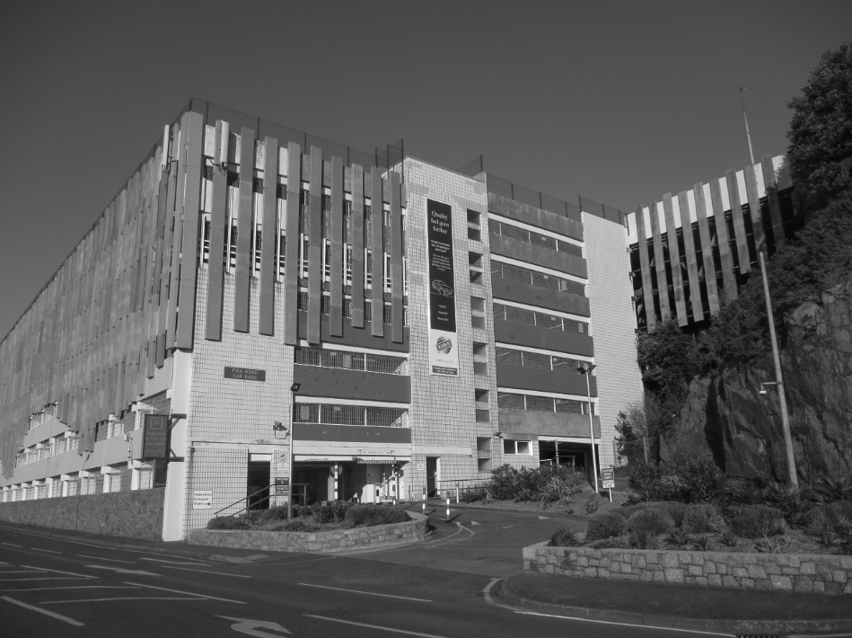
I chose this as a Final Image because I like the simplicity of the subject of the image, being simply the entrance to a car park, I think that simplicity makes the image link to the New Topographics. When editing I made the the image slightly warmer to help give the image more colour, especially in the greens and browns. I think the blue sky in this image creates a large contrast between the upper and lower half of the images.


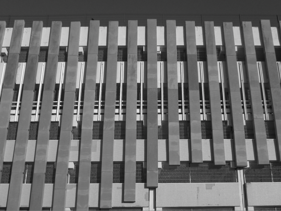
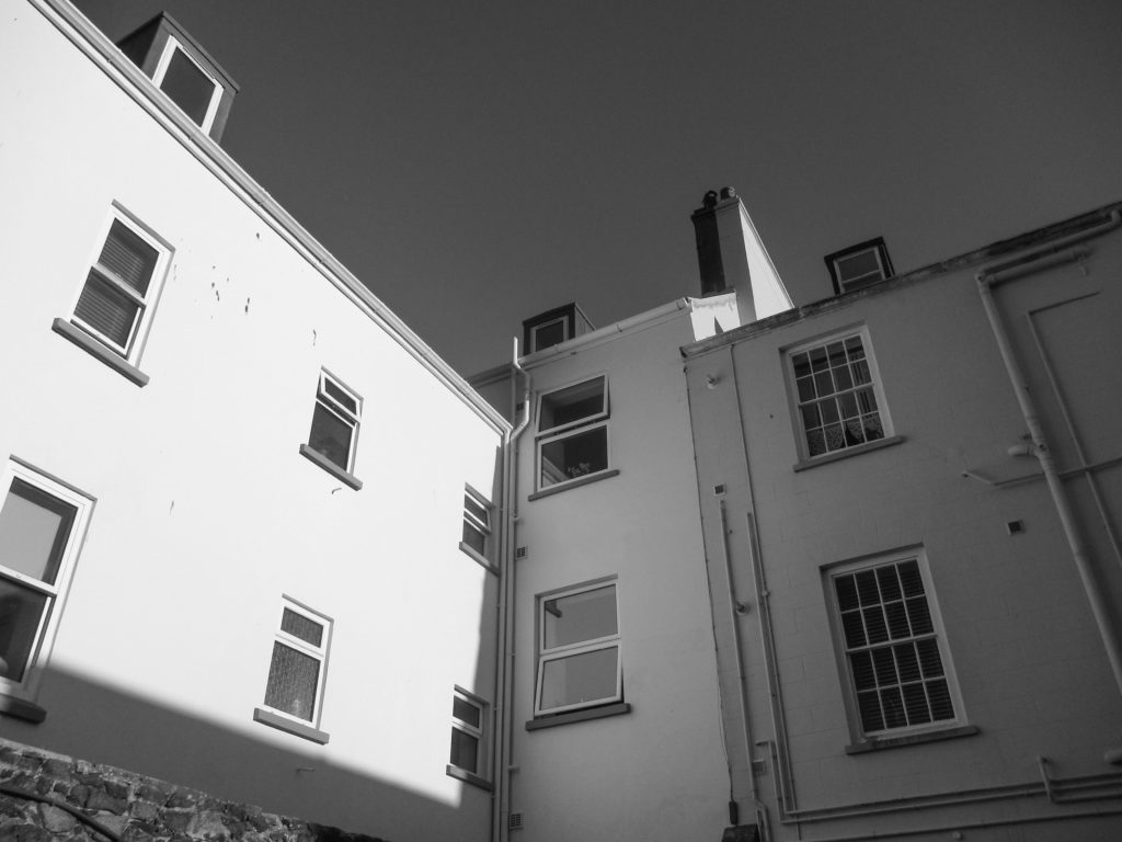
I chose this as a final image because I thought the regular lines and shapes gave the image an unnatural look which I think represents a ‘man-made landscape’ nicely. The way that the building is cut of by the frame of the image, as well as how an upwards angle was used when taking the shot, gives the image a closed-in feel. I think that the blue sky may ruin the image’s industrial aesthetic, however the black and white version may resolve this.


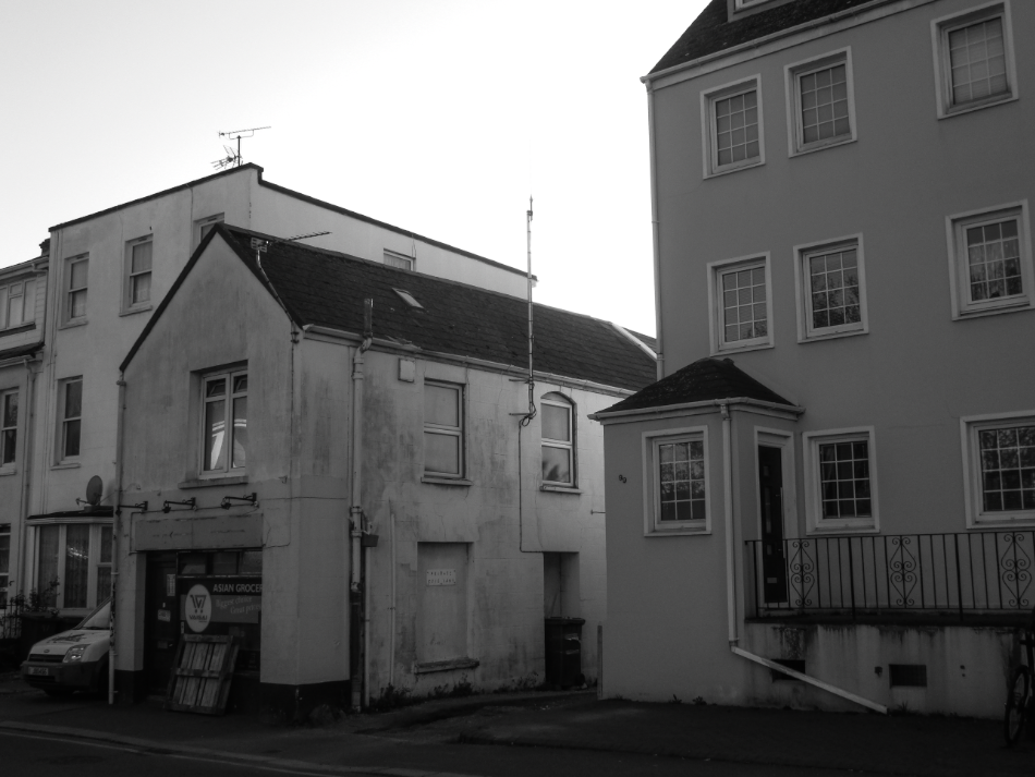
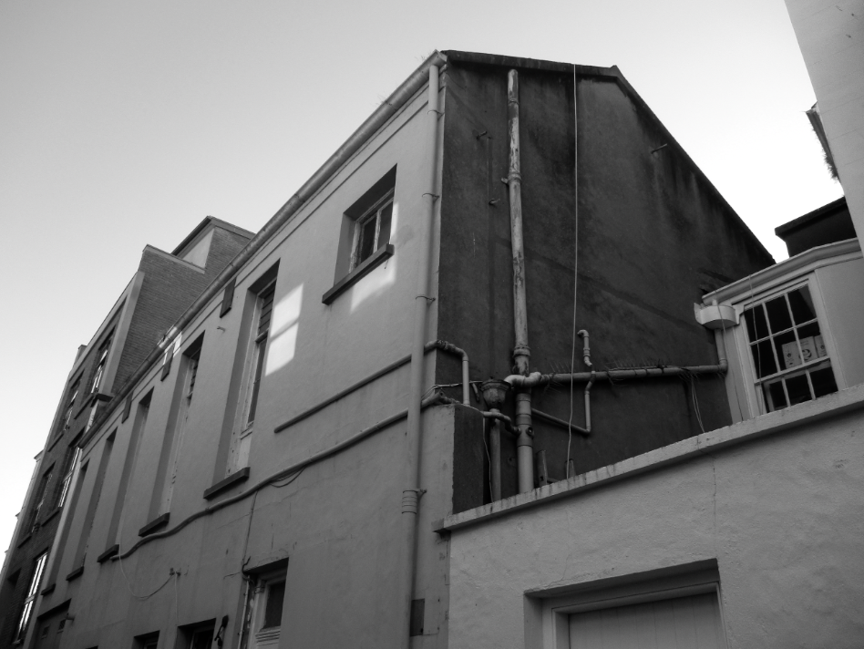
I chose this as a final image because I thought the gritty, dirty marks on the walls gave the image a very industrial/urban look, when editing I increased the contrast slightly to enhance those darker parts. The straight lines and regular shapes, as well as the limited colour palette containing mainly creams and browns, also give the image an urban look. The image was taken facing the sun, with the buildings partially obscuring it, this puts the part of the buildings shown in the image in the shadows, meaning there are no parts that are obscured from the viewer.


I chose this as a final image because I think the way part of the building has a shadow cast over it and another has sunlight shining on it creates a nice contrast between those two points. I think that the piping around the building makes it more interesting to look at as it gives it extra lines to break up the plain flat surfaces of the building. Because of the sky, as well as the way the light is reflected in this particular area, there is a lot of blue within the image, which, to me, gives the image a unique and colourful look for an image of an urban area.


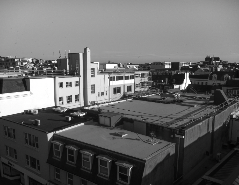
I chose this as a Final Image because I think the brown and cream colours of the buildings, the dirt/soot on the roof of the buildings, as well as the shape of the buildings, being made up of regular lines, gives the image a very urban look to me. I also think that the piping on the side of the brown building adds to this effect. I think the focal point of this image is the left face of the brown building, as it is fairly bright, as well as the fact that there are leading lines created from the pipes and window frames that point towards it.


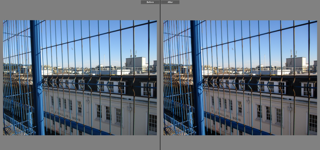
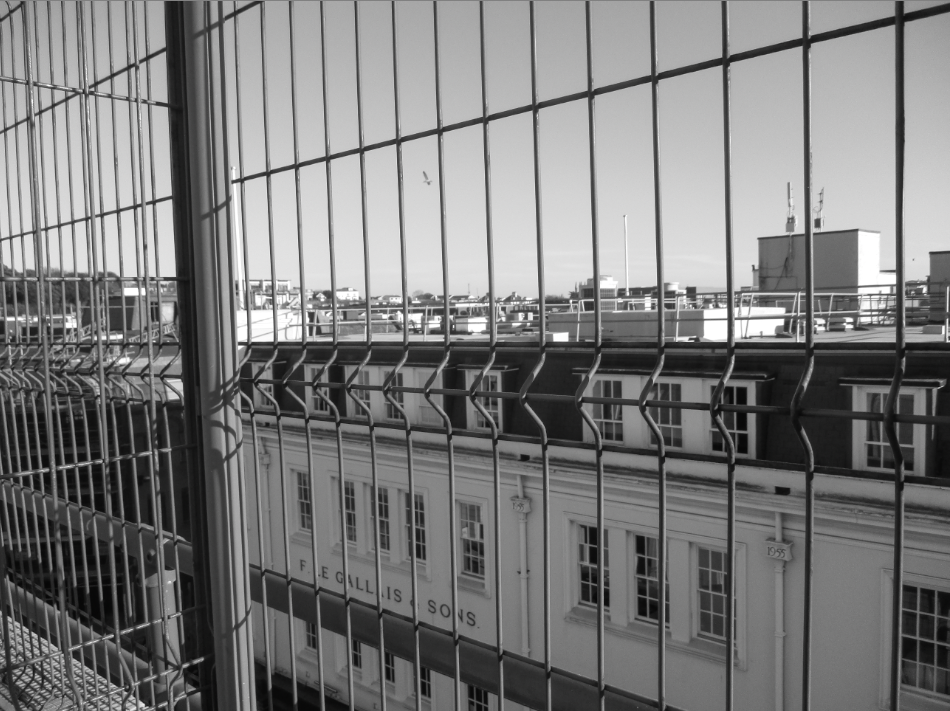
I chose this as a Final Image because I thought looking at a large cityscape horizon through a wired mesh gives the image an urban aesthetic. I like the way the top, dark division of the building is enveloped by a protrusion in the wires – it helps separate it from the rest of the image. When editing I made the tone of the image slightly warmer to give the buildings behind the mesh more colour. This warmer colour, paired with the blue of the sky and the mesh, creates a nice overall colour palette, giving the image an unorthodox look in relation to other urban images.


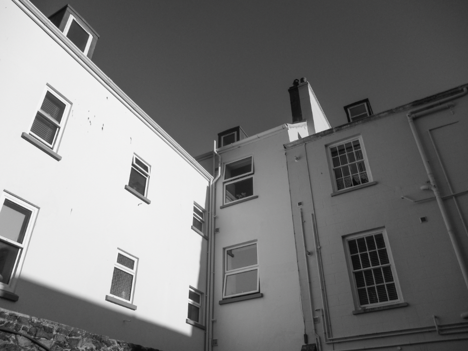
I made this a final image because I like the way deep shadow is used to create a harsh contrast between the faces of each building. I made the image slightly warmer when editing to give the image more of a ‘golden hour’ look, which I think helps separate this image in style in comparison to other urban images. The focal point, the bright row of faces from the left, stands out from the rest of the image since it is very bright due to how it is facing the sun.


Comparison to Henry Wessel

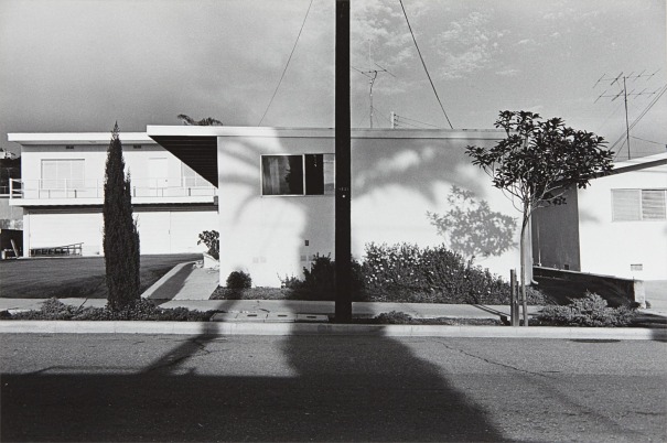
I chose this picture to compare to Henry Wessel because I thought the viewpoints were fairly similar and both of these images use light and shadow to create a contrast between the different faces of the buildings. Since Wessel mainly took pictures in California, the skies in our pictures are different, with his appearing far lighter due to the harsh sunlight California experiences. I tried to use light and shadow to expose the faces of the building like Wessel does, and I like how that exposure creates a nice, pure white on the face of the building. Wessel’s picture focuses on a far wider range of buildings (which puts more of an emphasis on the landscape), while mine focuses on one/two buildings (which focuses on the little details such as pipes and patterns in urban environments), however in other images I have made in this photoshoot have a wider scope. Wessel makes use of plants such as trees in his images, while (some of) mine do not, I like the effect of contrasting nature with urban landscapes.

The New Topographics

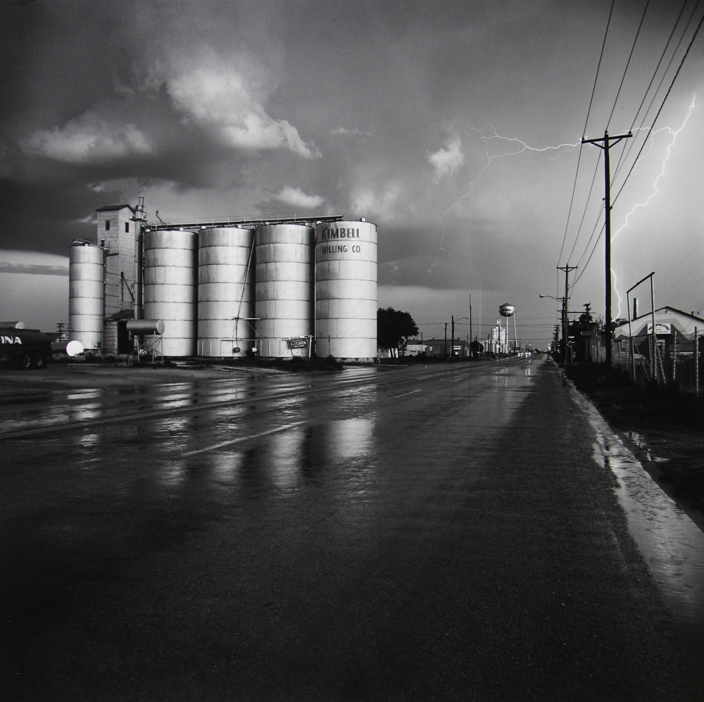
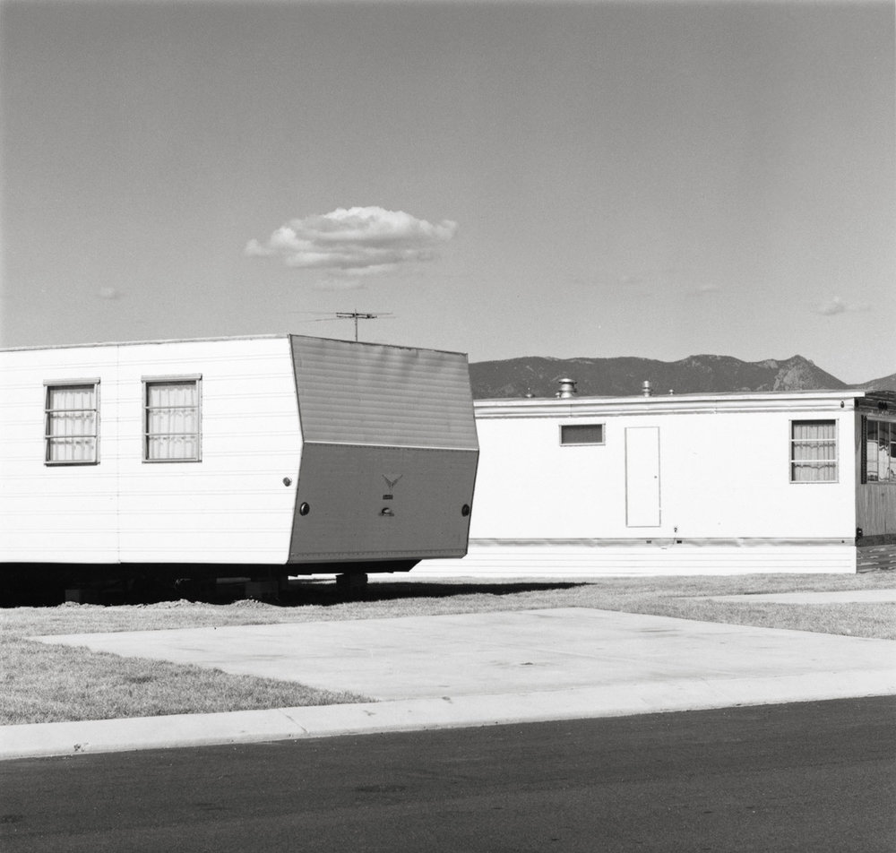
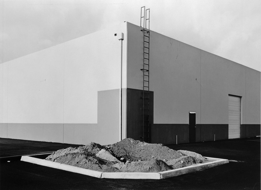
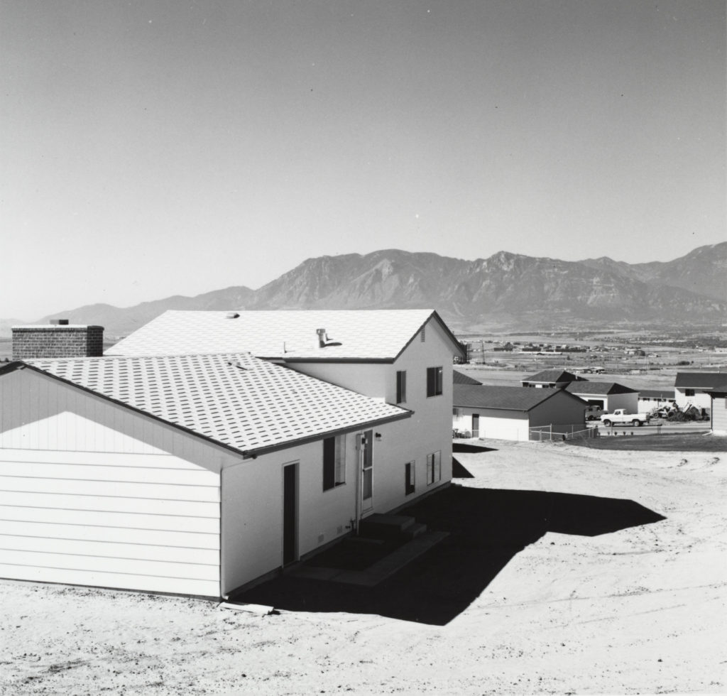
‘The New Topographics’ is a term that refers to a group of American Photographers (as well as the artistic movement) in the late 1970’s (Including Robert Adams, Lewis Baltz, Nicolas Nixon, Stephen Shore, etc…) who explored an unconventional view on landscape photography, involving how humans affected nature around them.

These photographers typically produced black and white images which are taken with a derelict, almost boring aesthetic. However, they also had their own sense of beauty in their formality, much like traditional landscape photographs, this beauty was likely derived from the regular lines and patterns created from man-made buildings, which, when paired with natural elements subtly included in the backgrounds of these images, creates a clear juxtaposition between the natural irregular shapes.

What was The New Topographics a reaction to?

In 1975, at the International Museum of Photography in Rochester, New York, William Jenkins gathered 10 photographers whose work documented a “man-altered landscape” in an exhibition called ‘The New Topographics’. The New Topographics as a movement was a reaction to how man had impacted the natural landscapes around them, not only physically, but also artistically, which is very clearly shown in the isolated and banal aesthetic that the photographs used. Unlike photographers such as Ansel Adams, these photographers embraced the idea of depicting nature as being “altered” (the implication being negative to a certain extent) in order to get their message across, rather than displaying nature as “un-altered” to promote conservation.

In a recent review in the Guardian newspaper, photography critic Sean O’Hagan suggested that ‘they were photographing against the tradition of nature photography that the likes of Ansel Adams and Edward Weston had created’


Case Study: Henry Wessel

Henry Wessel · SFMOMA

Henry Wessel was an American photographer who’s work was a part of the original New Topographics exhibition. Wessel’s career in photography was inspired by a book he found in a shop near Pennsylvania University which he was studying at at the time. He started photography career seriously in 1967. Wessel mainly explored the landscapes of California, due to its harsh sunlight which created dense shadows and gave his images a brighter, higher-exposure look. His photography typically creates a deadpan aesthetic which matches nicely with the works of the other photographers who were featured in the New Topographics exhibition.

Image Analysis:

Museum of Contemporary Photography

This image, due to California’s harsh sunlight, is slightly over-exposed, with the only dark parts of the image being the shadows and tree leaves. This brightness gives the image a very clear contrast between the dark and bright parts of the image, in addition, the white, bright shades on the buildings are very similar to the colour of the sky, this effect is made clearer due to the image being black and white, giving the image an almost other-wordly look. Both plants and buildings can be seen in this image, with the plants having a far more irregular shape compared to the regular buildings, creating a contrast, or divide, between those aspects. The plants are also far darker in colour compared to the buildings, giving them a contrast in terms of lightness. This image follows the rule of thirds as the focal point, the dark trees, are in the bottom left of the image. While not as obvious as other photographs, the leading lines in this image, such as the cables hung between the poles and the shadow of an off-screen building, do point towards the trees.

Perhaps the meaning behind this image, like the other photographs shown in the New Topographics, is to show humanity’s affects on the natural world. I think Wessel does this effectively through his use of scale/distance, with some buildings being closer than others, and his inclusion of trees in the image.

Rural landscape photoshoot

Possible Photoshoot Locations:

Contact Sheets

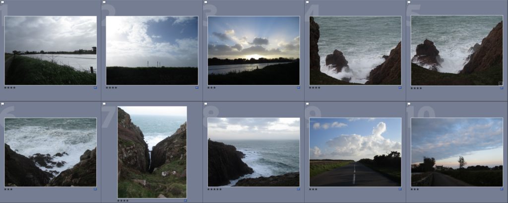
Contact Sheet of my Best Images (Unedited)

Here I have selected the images I thought were the strongest from the photoshoot, I have selected 10 final images. I made this selection using lightroom’s filtering settings.
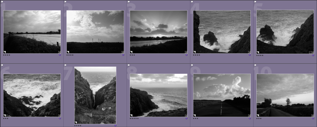
For each image I also created a black and white version, giving them a similar look to Ansel Adams’ work

Final Edited Images

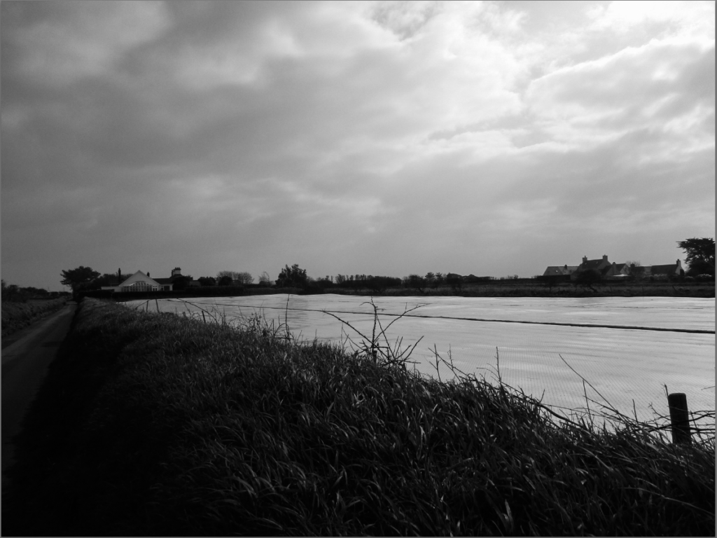
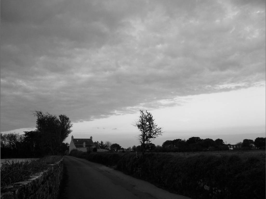
I chose this as a final image because I think the overcast, grey sky, paired with the grass on the bank, which seem windswept thus implying movement, gives the image a more chaotic look. I think it is interesting how the road on the bottom left of the image has a darker tone, while the sky in the top right has a much lighter tone, it creates a parallel/contrast between the two points. I also think that the plastic covering on the field having a similar colour to the sky creates an interesting link between the sky and the land.


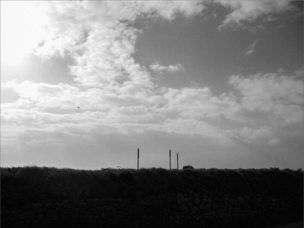
I chose this as a final image because I liked its composition, with a bank/wall covering about 1/4 of the image in a darker shade of greens/browns, the three poles emerging from that in the centre and the rest of the image being a sky made up of patterns of cloud formations. I edited the image to look warmer and made the bank slightly brighter, while maintaining the stark contrast it gives to the rest of the image. Because of this warmness, I think it gives it a slightly larger colour palette that has a pleasant mix of blues greens and browns. The image was taken from a lower down viewpoint, which allows more of the bank and sky to be seen.


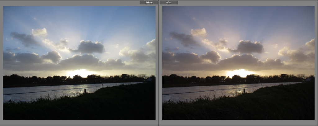
I selected this to be a final image because I found the way the sun, the horizon of trees and the clouds above/surrounding the sun correlate with each other to be a more grandiose scene. I think the slight glare of the sun also makes it appear larger in the image, as well as the bright rays of sunlight that are emitted off of it give it a more sublime or exaggerated look. When editing, I made the images tone slightly more warm, giving it a more exaggerated, sunset-like tone. I kept the contrast between the dark foreground and the sun, as to make the sun itself and the sky the main focus of the image, however I did make the grass slightly brighter to allow more detail to be seen.


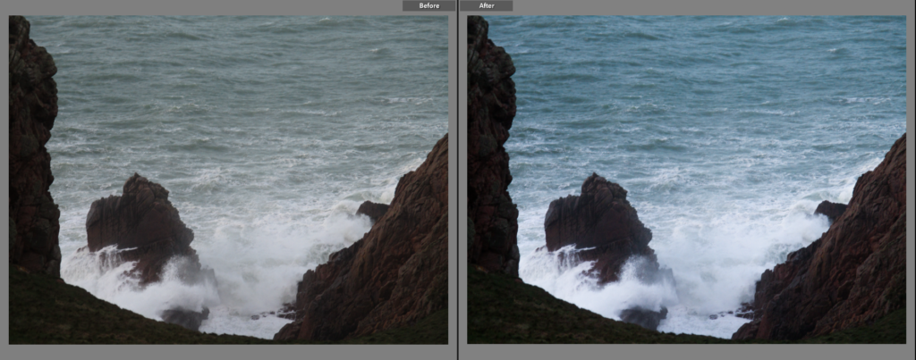
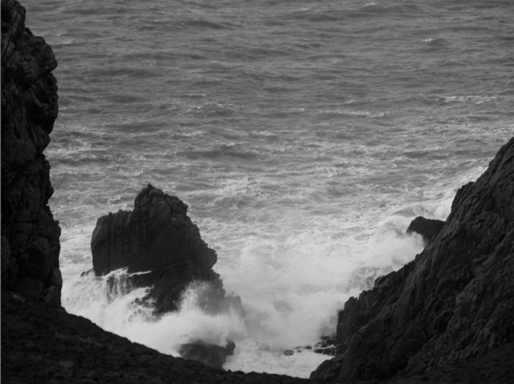
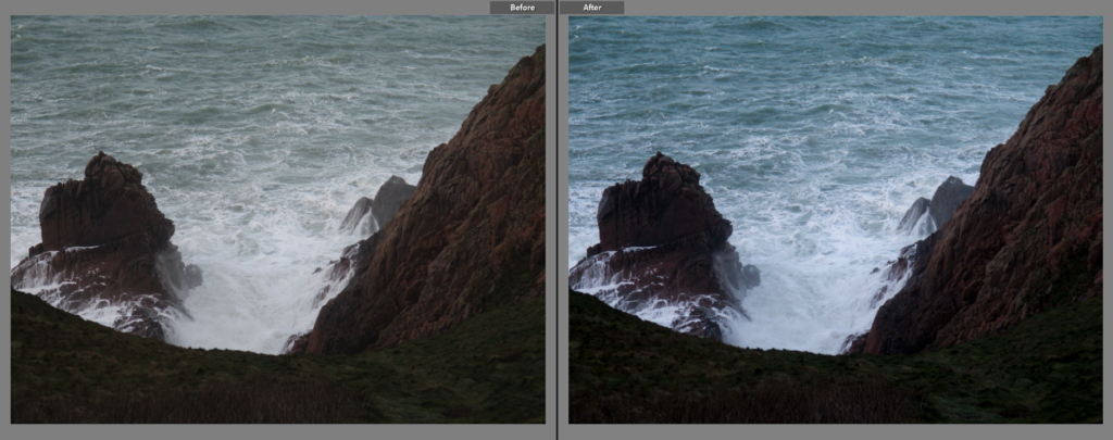
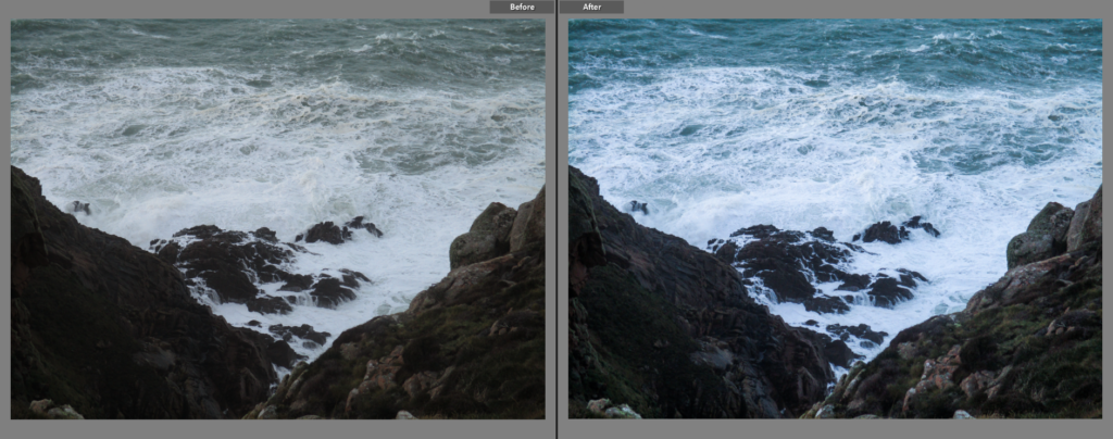
I made this a final image because I thought the spray of water in front of the rock, as well as the general roughness of the tide, gave the image a sense of the sublime. I like the way the white part of the water contrasts with the darker tones of the rocks, which I increased slightly during editing, as it helps separate the two further. While editing, I also made the image slightly colder, not only helping to make the rocks look darker, but also giving the sea more colour. I think the way the rocks on the left and right of the image frame it quite nicely, however I think I could have positioned the camera slightly lower down to capture a bit more of the rocks below.


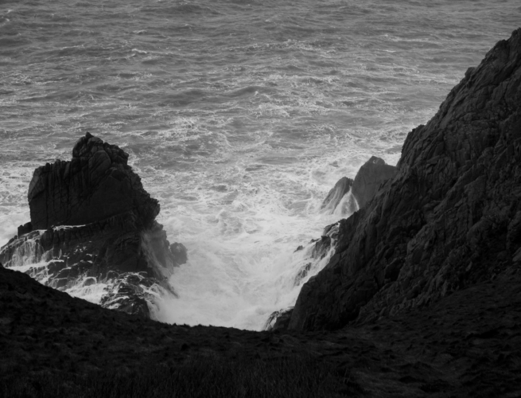
I chose this image for similar reasons for the image above, however I think this image is slightly stronger, due to the framing of the image being slightly better in my eyes. I wanted to keep the contrast the image above had, so I made this image colder to make the white in the water brighter and the browns of the rocks darker. I also gave the rocks themselves a greater contrast, this makes the grooves and nooks in the rocks more defined, giving it a more angular and jagged look. This image also uses a rough sea with breaking waves to create a sense of the sublime within it.


I chose this as a final image because I think the roughness of the sea, paired with the natural jaggedness of the rocks, gives the image a very romantic look. When editing, I made the tone slightly colder, to give the water a slightly more lively aesthetic, and the rocks slightly more exposed, while maintaining their contrast with the white of the sea. The focal point, the rocks in the centre of the image, contrast greatly with the water surrounding them, making them more noticeable, in addition, the rocks on both sides of the image create leading lines towards the rocks in the centre.


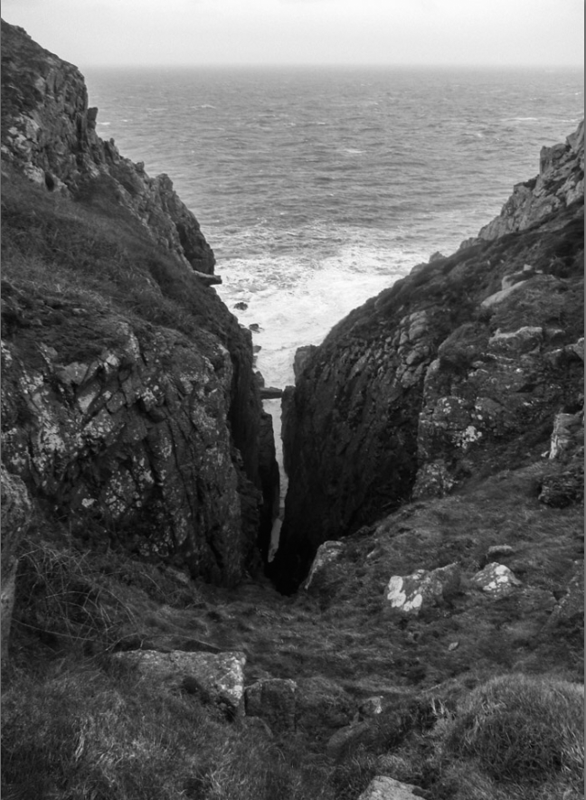
I chose this as a final image because I like its composition, with the rocks facing diagonally down into a narrow gulley in which a line of water can be seen, separating the two headlands. I chose to take this picture in a portrait orientation so that this relationship between the rocks and the sea remains the primary focus of the image. The colours in the foreground are somewhat dulled, which creates a contrast between the brighter/more vibrant colours of the ocean, which I made slightly more vibrant when editing by changing the tone of the image to be slightly colder.


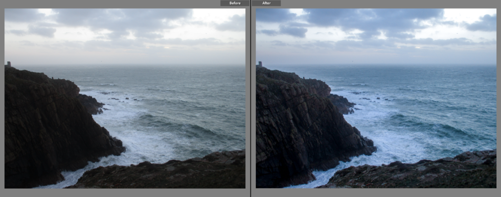
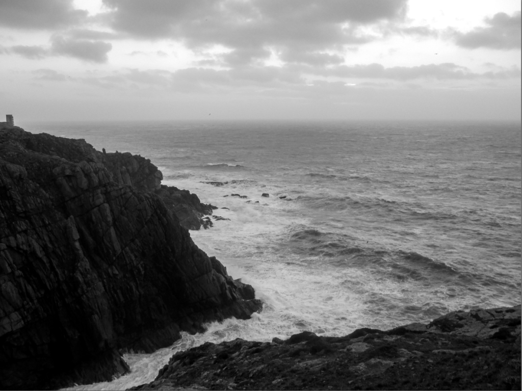
I think this image is one of the best from the photoshoot, thus I chose it as a final image. I think the crashing waves, the irregular shape of the headlands and the clarity of the clouds gives the image a romantic aesthetic. When editing, I made the image slightly colder, giving the clouds and sea slightly more colour, I also made the headlands slightly brighter, making the lines and patterns on them more noticeable. I like the way the headland in the foreground (on the right) and the headland in the background (on the left) are separated by a line created by the sea as it gives the image more clarity in its composition.


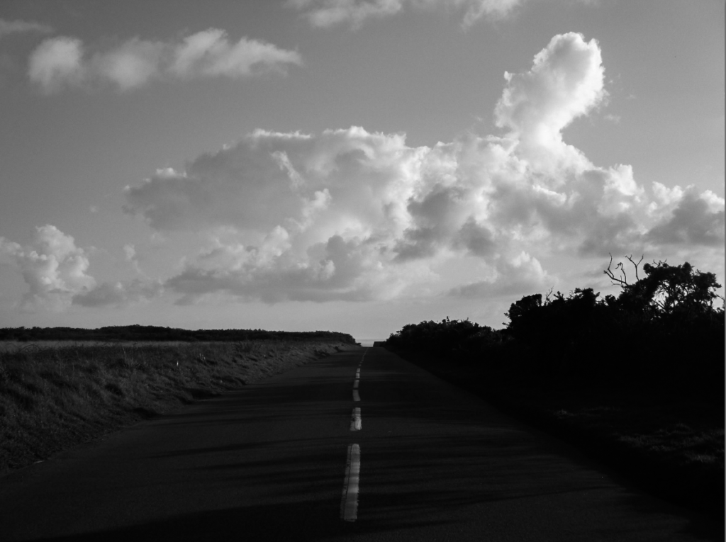
I chose this as a final image because I like how there is a clear division (made by the horizon line) between a landscape made predominantly by straight or jagged lines and a skyscape which uses far softer and irregular lines and shapes. This difference in look, as well as the clear difference in brightness between the halves (with the bottom half being darker due to the shadows that cover it), creates a contrast between those parts of the image. I think the warm tone of the image, the blue sky with clear cloud formations and the long road gives the image an almost endless, dream-like aesthetic.


I made this a final image because I liked the relationship between the clouds and the road/banks, as they both point diagonally down towards the house near the bottom left of the image. When editing, I made the image wildly different from the others by giving it a warmer, pinkish tone, which can be seen very clearly in the clouds. I think the tone of the image paired with the soft shape of the clouds gives the image a slightly romantic aesthetic. There is a contrast in brightness between the trees and the sky, which separates the land and sky more clearly.


Comparison to Ansel Adams

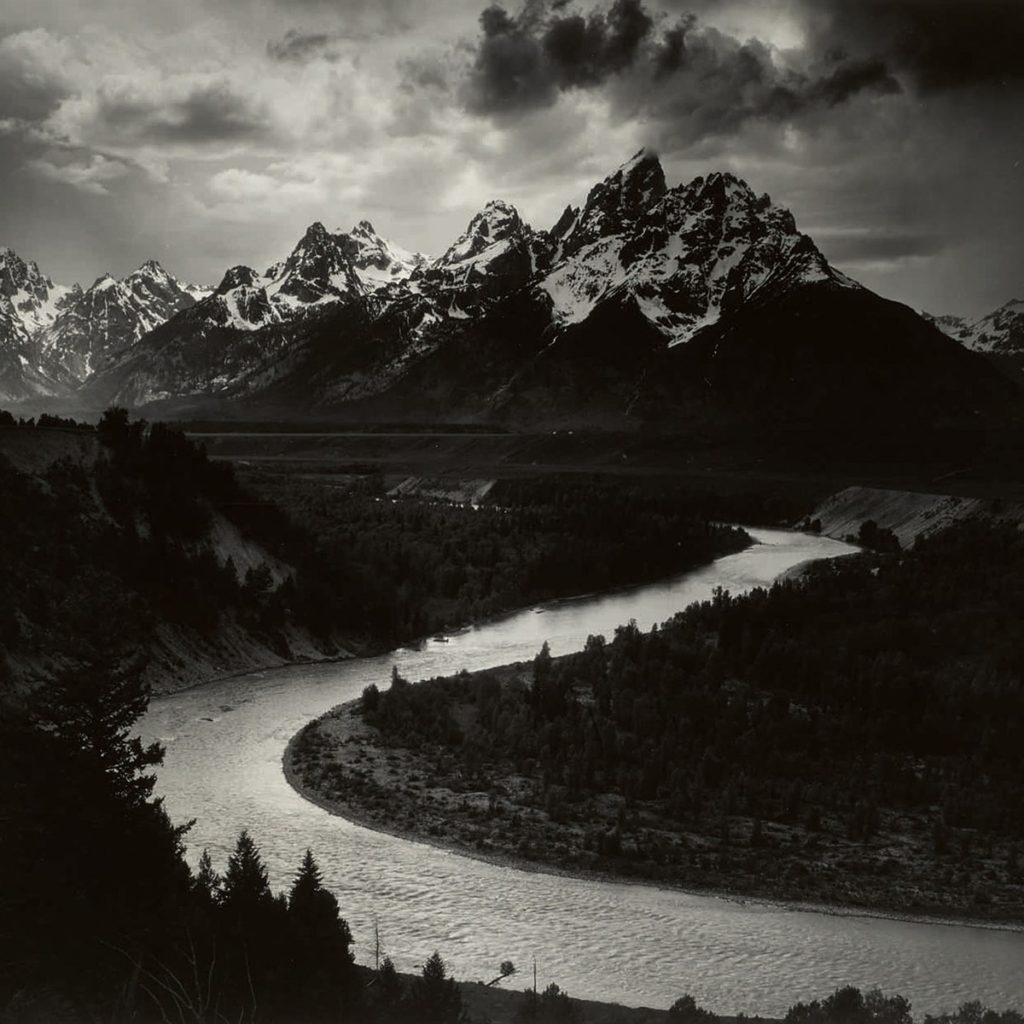
I thought this image had the closest resemblance to Ansel Adams’ work because it has elements of romanticism within it, with the breaking waves crashing on the vast headlands, as well as the fact that the little surge created between the two headlands loosely mimics the river in Adams’ own image. I also think that the mountains in Adams’ image, specifically their angular shape, are similar to the shape of the headlands in my image, giving them a link in that sense. The sky in Adams’ image is slightly more dramatic than in mine, due to how there is a greater contrast between the lighter and darker parts of the clouds, while my image has less of a contrast. I also think it is interesting how the water and land have a similar relationship in both of the images, with the water being far brighter than the land, creating a contrast that clearly outlines the flow of the water.

Landscape Photography

Rural Landscape Photography

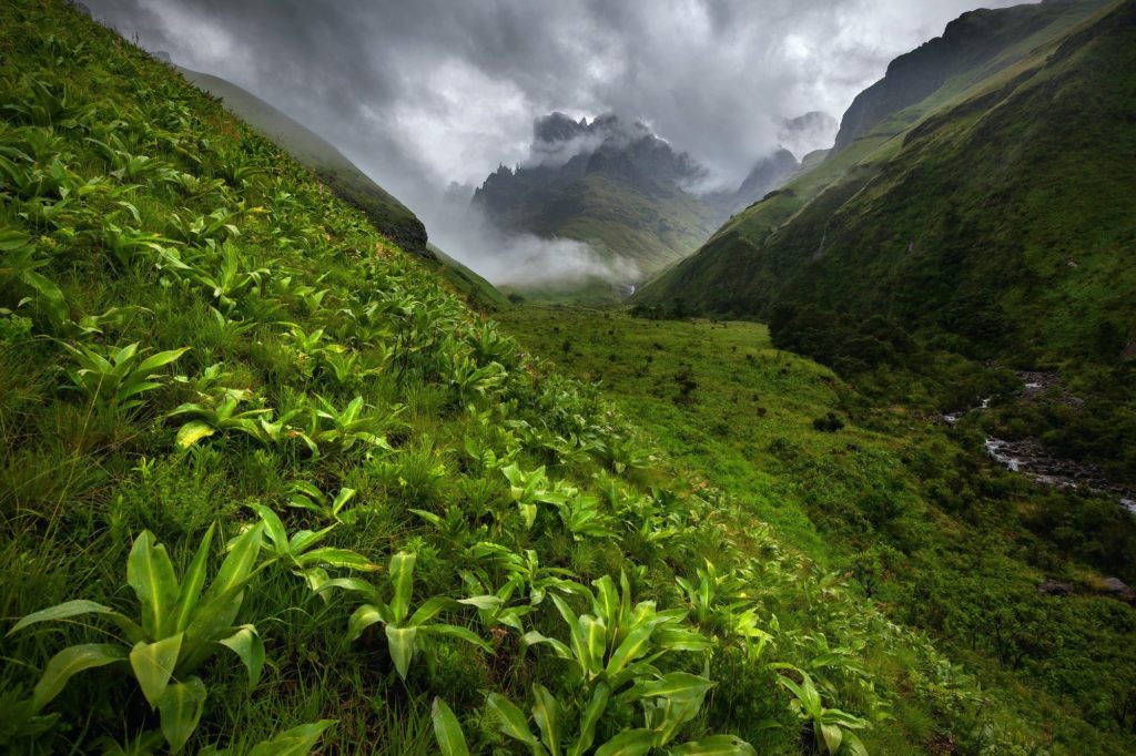
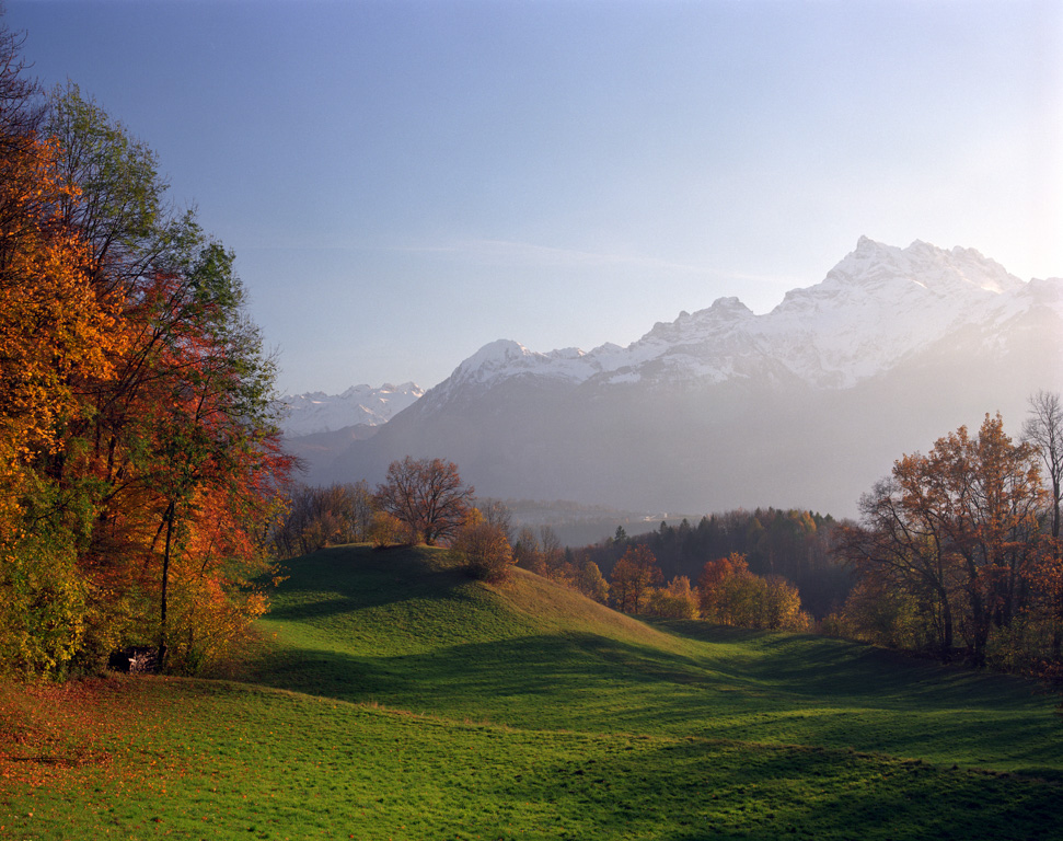
A Rural Landscape photograph is an image of a rural/countryside or natural area, which tend to be less built-up which gives the images a primary focus on nature.

Ansel Adams in a New Light - The New York Times

Rural Landscapes Moodboard

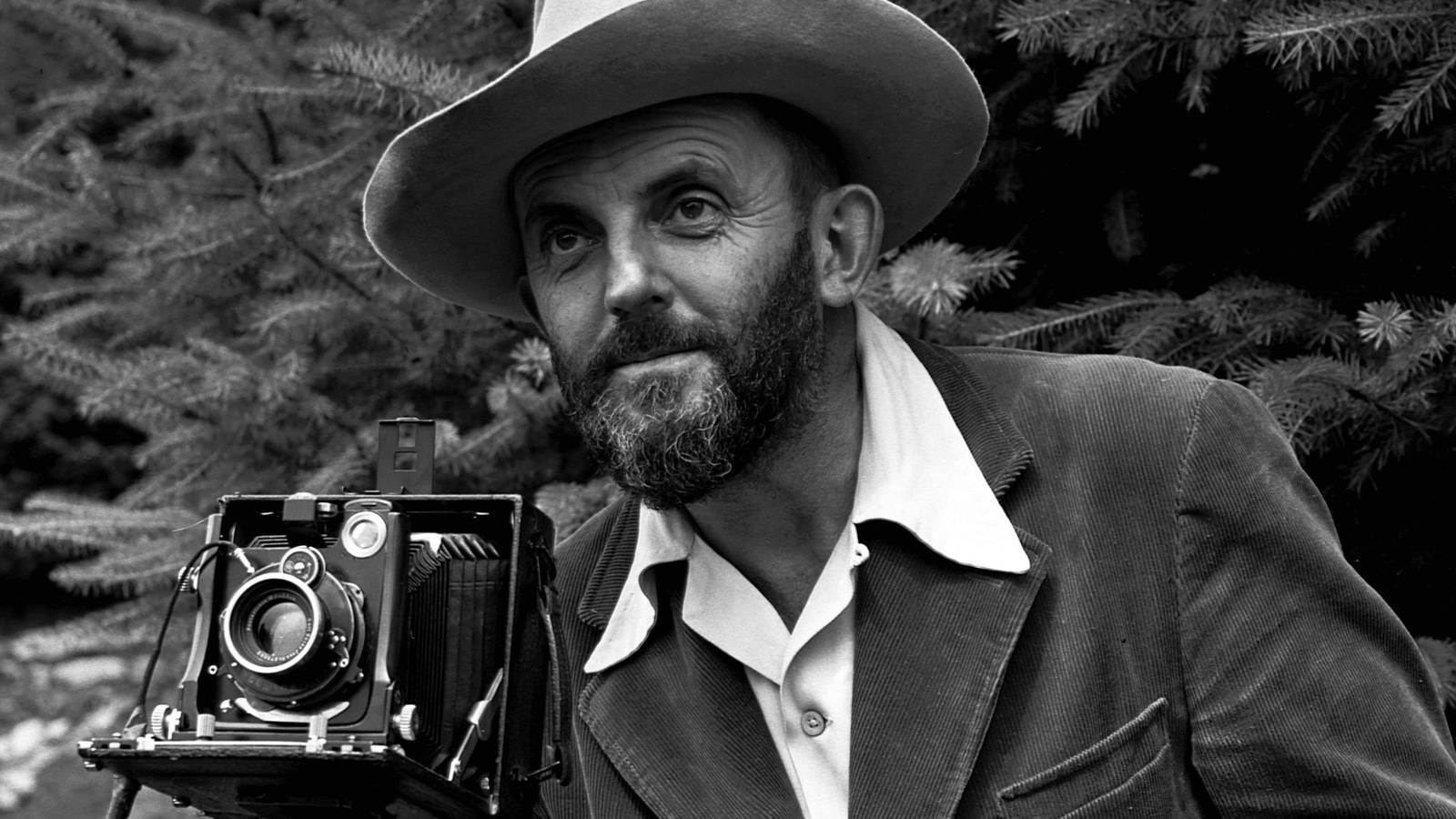
Ansel Adams

A Silent but Most Effective Voice': Ansel Adams and Advocacy · National  Parks Conservation Association

Adams was born on the 20th February 1902, he was considered one of the most important and influential landscape photographers of the 20th century. He worked as a photographer and environmentalist who used his photography to promote the conservation of untouched natural areas, he also worked to promote photography as a fine art to the general public. Adams was considered a talented and technical photographer who ‘revelled in the theory and practice of the medium’. He worked in several national parks over his life-long photographic career in order to promote their conservation and as a result, he was awarded the Presidential Medal of Freedom in 1980. Adams was a key advisor in the setting up of the photography department in the Museum of Modern Art, as well as various other awards for his photographic and conservational work, he also founded the Aperture photographic magazine.

Image Analysis

Iconic Ansel Adams image sells for nearly $1M at Sotheby's auction, total  sales of $6.4M: Digital Photography Review

This image is in black and white (likely due to the restrictions of the technology at the time), which allows the darker and lighter parts of the image, namely the darker trees/mountain base and lighter river/sky, to have a greater contrast between each other. This lack of colour also gives the image a more ‘epic’ (perhaps ‘romantic’) atmosphere about it, especially in the clouds and jagged shape of the mountain. This image uses the river not only as a way to give the image more contrast, but also acts as a leading line towards the focal point: the mountain. This image also follows the rule of thirds, as the mountain (at around it’s highest point) is positioned on the top right of the image, it could also be argued that the river, which is positioned on the bottom left, acts as a focal point, as it is arguably the brightest part of the image. The sky in this image appears to be cloudy, this would mean that the lighting would be not as strong as if the weather was clearer. This gives the overall image a darker look, however there are little to no shadows apparent in the image, giving the image a clearer look. This image was likely taken from a high vantage point, allowing trees to appear in the foreground, while also showing much of the river, which leads into a mountain which, due to the high vantage point as well as distance, can be fully seen with enough room to breath.

Perhaps the meaning behind this image is to promote the conservation of the natural landscapes within the world by using nature’s beauty to inspire people.

Romanticism

Age of Enlightenment (approx. 1700-1800)

The Enlightenment was a philosophical and intellectual movement in the late 17th to 18th centuries which focused on the pursuit of knowledge through reason and science, as well as a separation from the church/religion in favour for science/reason. This lead to a steep rise in political revolutions throughout western societies. In terms of art, people began to become interested in classic Greek/Roman artworks which people used to create neo-classical art, depicted focus on classical antiquity.
Age of Romanticism (approx. 1800-1850)

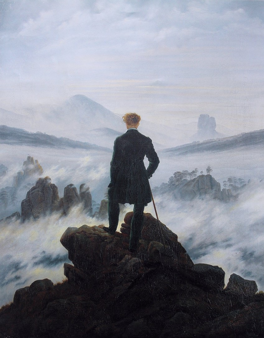
Romanticism was a movement in art, music and literature in the late 18th to 19th centuries. Romanticists focused on the power and beauty of nature, as opposed to the industrial/scientific views brought about by the Age of Enlightenment. Romanticism emphasised emotion in its aesthetics, promoting emotions such as terror and awe by confronting the aesthetical category of the Sublime through its mediums.
The Sublime

Romanticists describe the sublime as the feeling of awe and terror when faced with the scale and power of nature. It’s aesthetics derive from an incalculable/unfathomable greatness in what it is depicting, while simultaneously depicting humans/the viewer as small and weak by comparison.

At once tiny and huge: what is this feeling we call 'sublime'? | Aeon Ideas

Moodboard of Romantic Landscape Photographs


Romanticism in Photography

Romanticism in photography focuses on nature and emotion, typically through landscapes, with the photographs evoking emotions such as awe and sometimes terror from the beauty and vastness the landscape offers. Some photographers may choose to slightly modify an image’s hue or contrast to give the image a more grandiose look, while not making the image look unrealistic.

Old Romantic Painters | Landscape Photography | On Landscape

Romanticism in Art

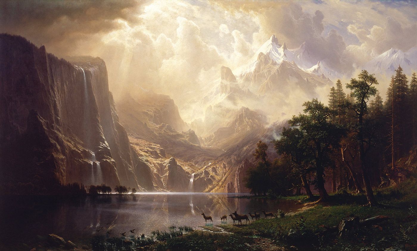
In art, romanticism again offers both feelings of terror and awe from the vast and beautiful landscapes it depicts, however artists have the freedom to exaggerate certain features within an artwork, such as great natural formations or powerful winds/tides, both seen typically looming over a considerably smaller human.

Famous Romanticism Paintings - The Best Examples of Romantic-Era Art

Image Comparison

A Comparison using a Venn Diagram

Written Comparison

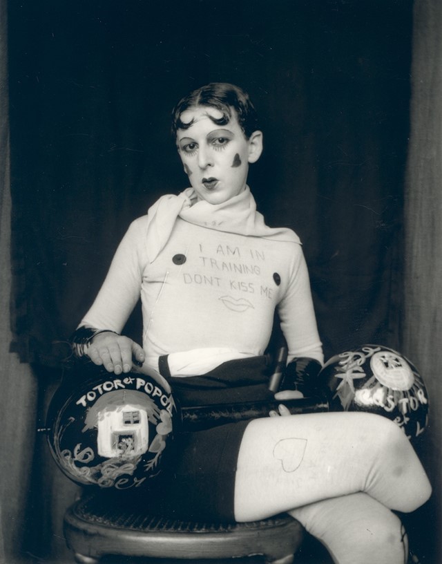
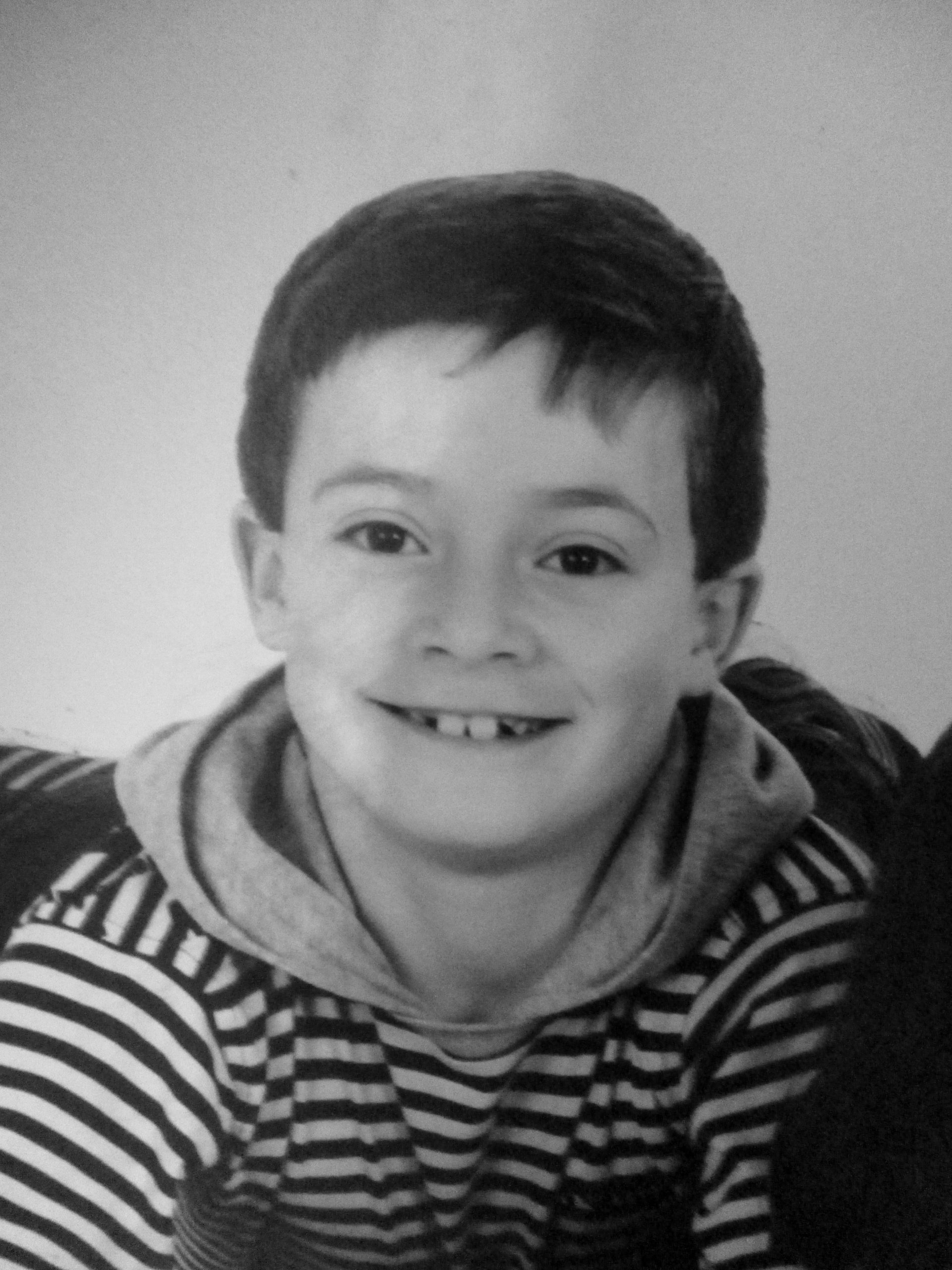
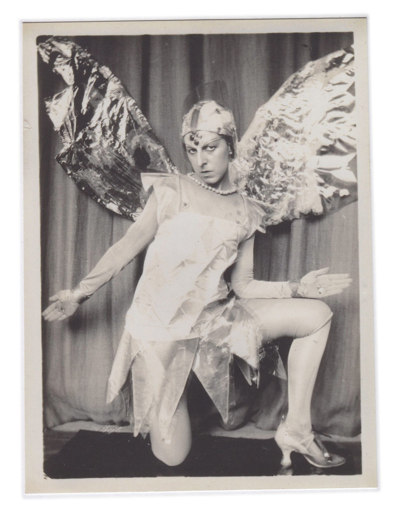
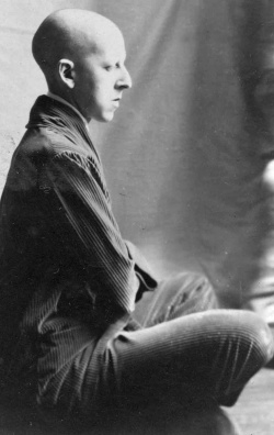
The image on the left is a self portrait of myself. It is a black and white, head and shoulders shot with a plain background. The image on the right is called “I’m training, don’t kiss me” by Claude Cahun in 1927. It is also a black and white portrait image with a plain background, however this image is a full body shot.

Similarities

Both images are black and white portraits, which helps emphasize the features of the model. They both use a plain background to create a contrast not only in colour but also detail, allowing the model to attract the attention of the viewer. There is also a contrast between the lightest and darkest parts of the image, made clearer by the black and white filters.

Differences

My image uses a male model wearing casual clothing, the image is a head and shoulders shot, allowing the face and hair of the model to take up most of the image. The model is looking away from the camera to the side, however there is no clear message behind the image. There are no props in this image.

This image uses a model who’s gender is not made explicitly clear, they are wearing a costume depicting the male bodybuilding stereotype. The image is a full body shot with the model looking directly at the camera. This image has a clear narrative about gender. with the use of lipstick, props, writing that is meant to be seen as mocking, drawings of hearts, etc…

Identity Project – Final Images and Evaluation

Final Images

(These are the images I included in the Zine)


Comparison to Artist Reference

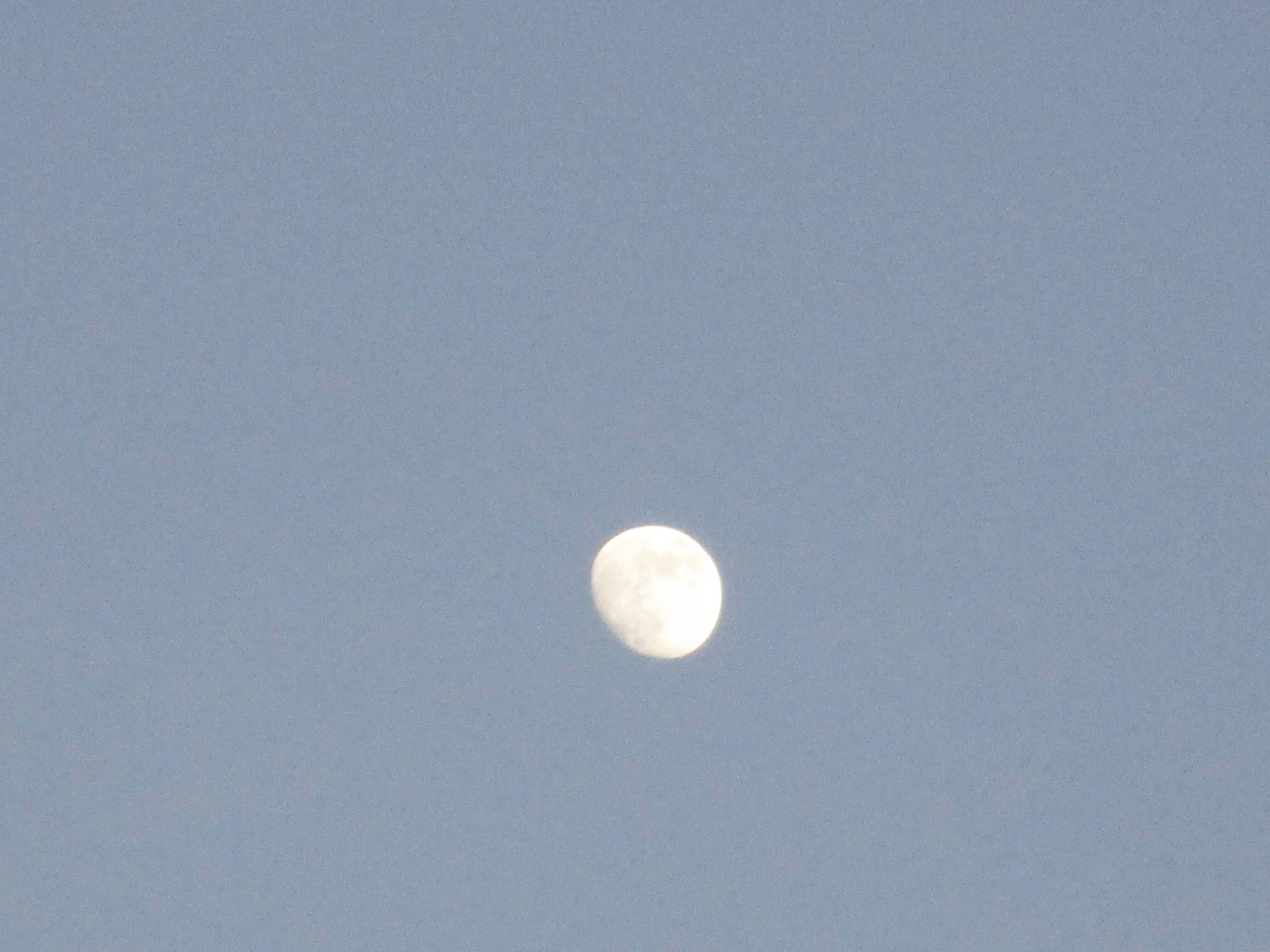
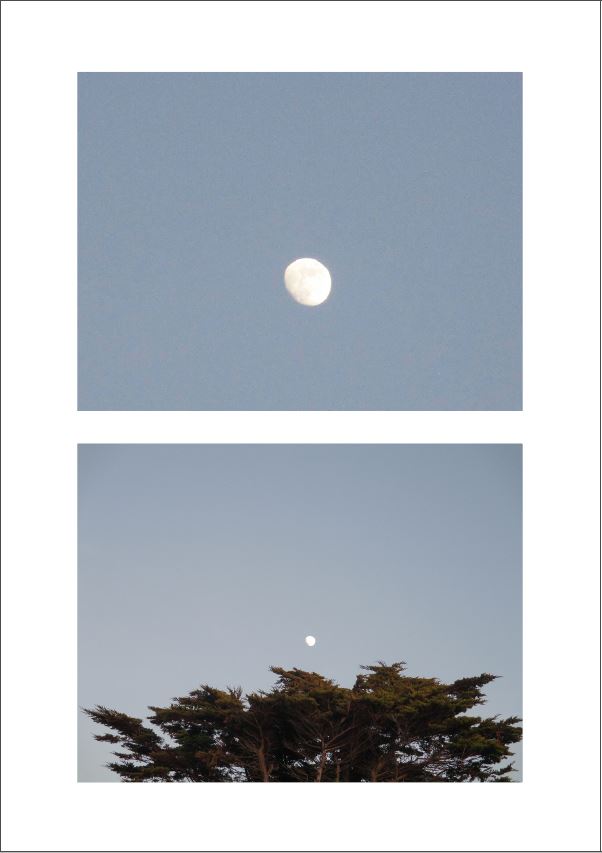
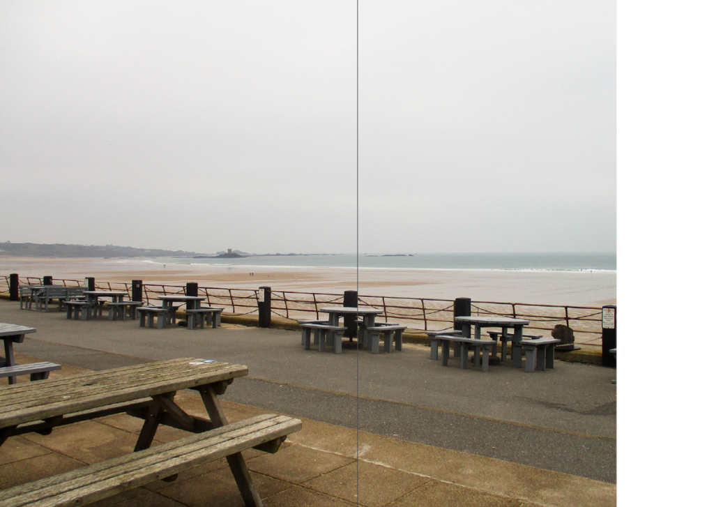
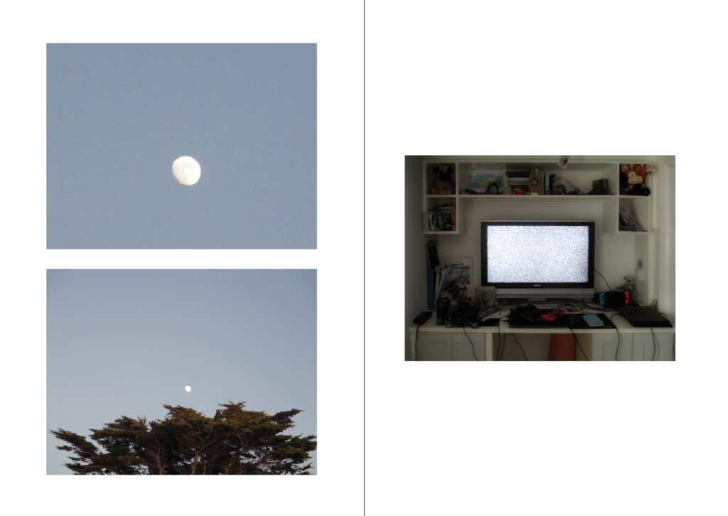
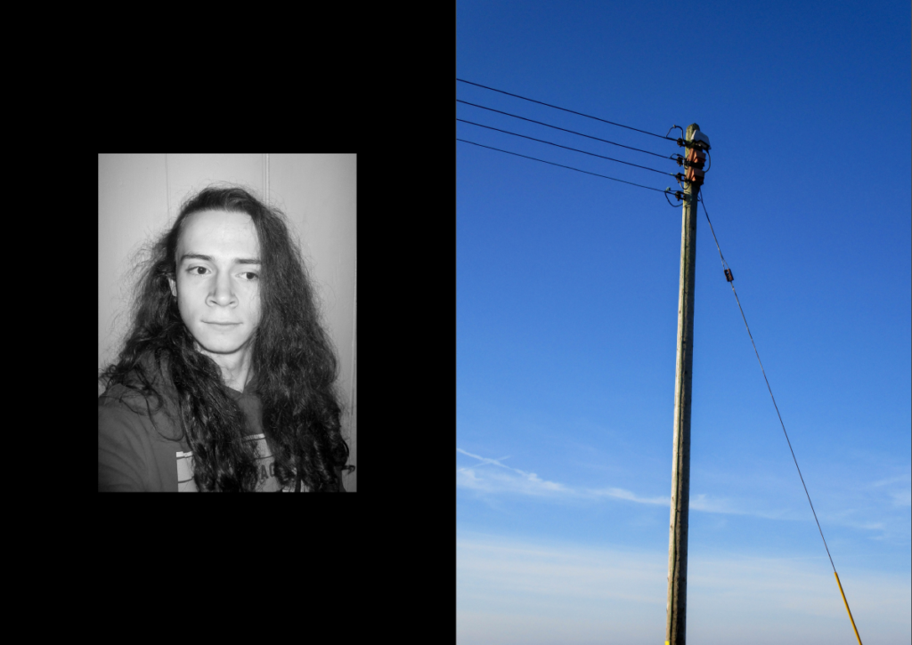
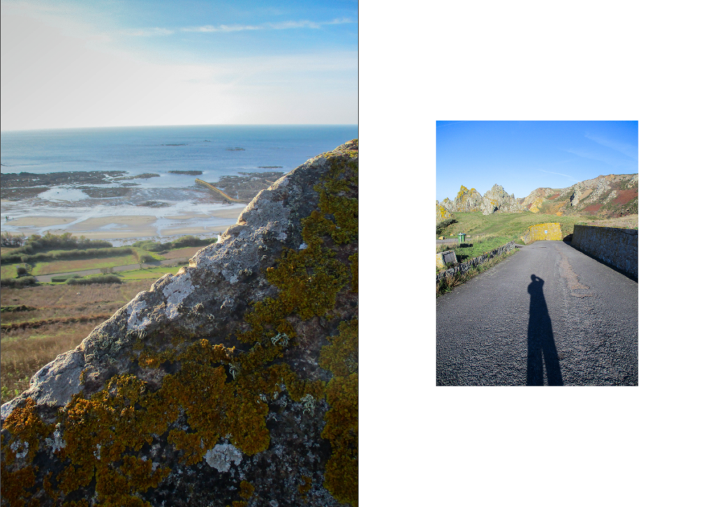
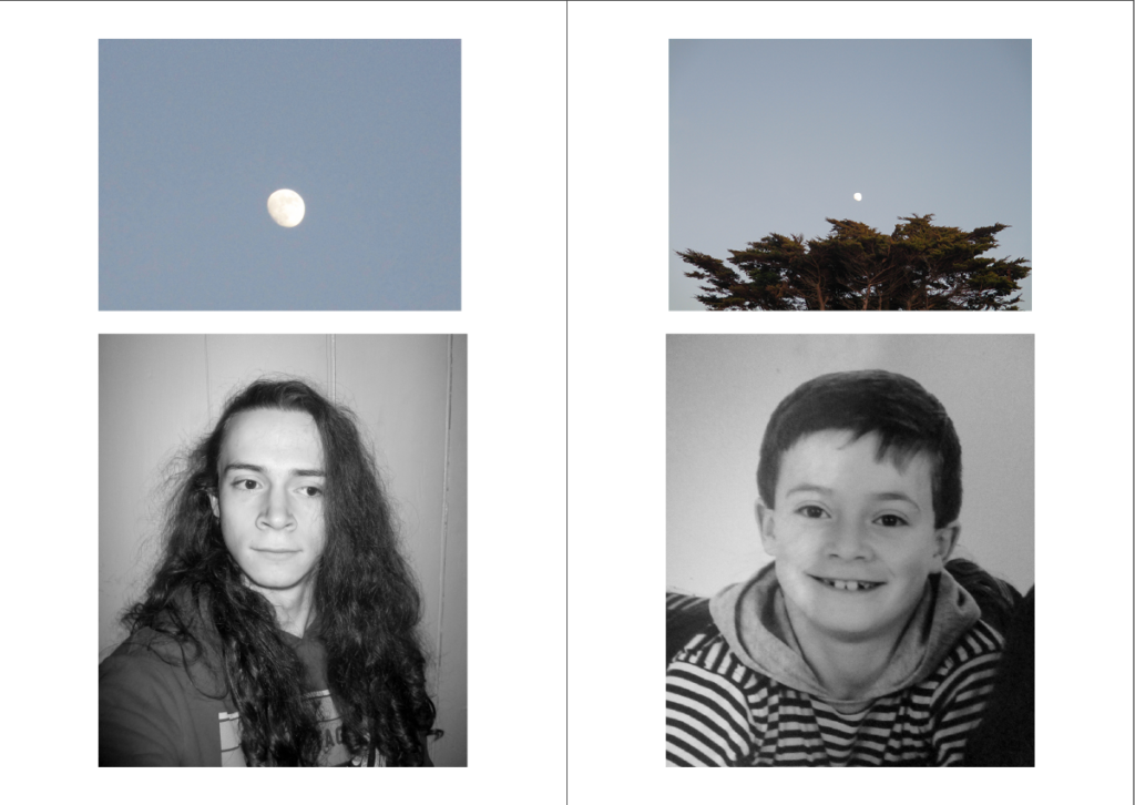
As I deviated from my original plan of photomontages during the exam, my final outcomes turned out to be wildly different to that of Jesse Treece’s work, with only one image (or page from the Zine) roughly mimicking it. This page is arguably the most unusual/different compared to the other images shown in the Zine as it is simply a picture of the moon, however the placement of the moon could very loosely resemble photo montaging.


The Finished Zine

Notes:

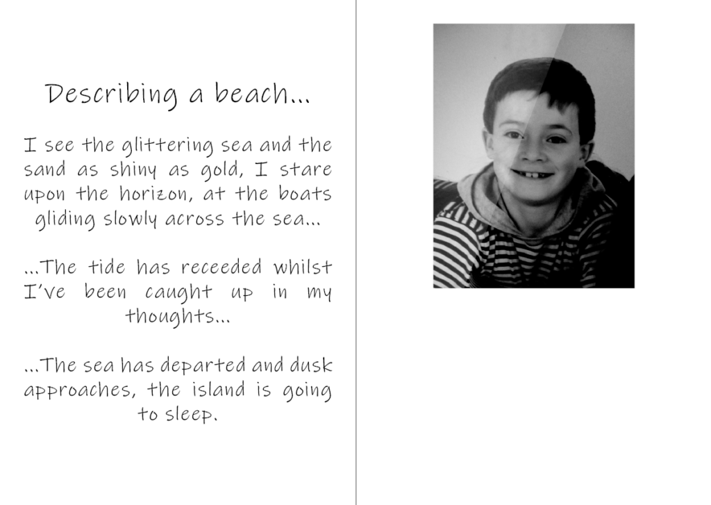
– In the Zine (on page 6) I used segments from a poem I wrote when I was around 11 years old for the text , which describes a dream-like scene of a beach.

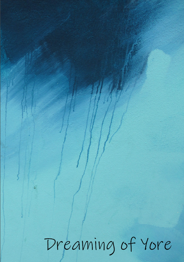
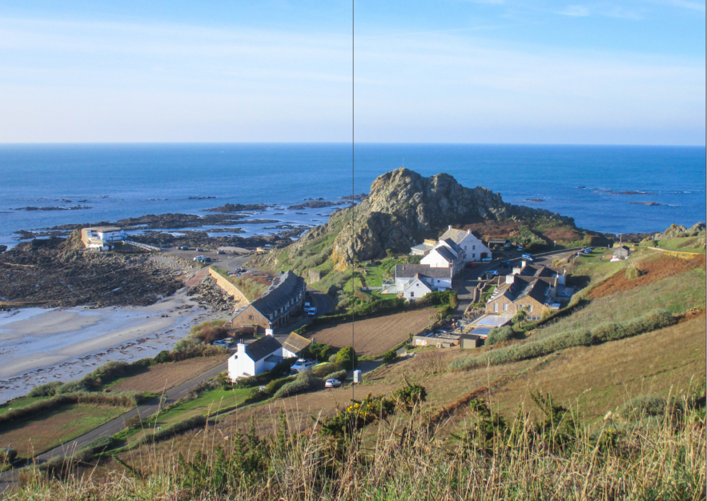
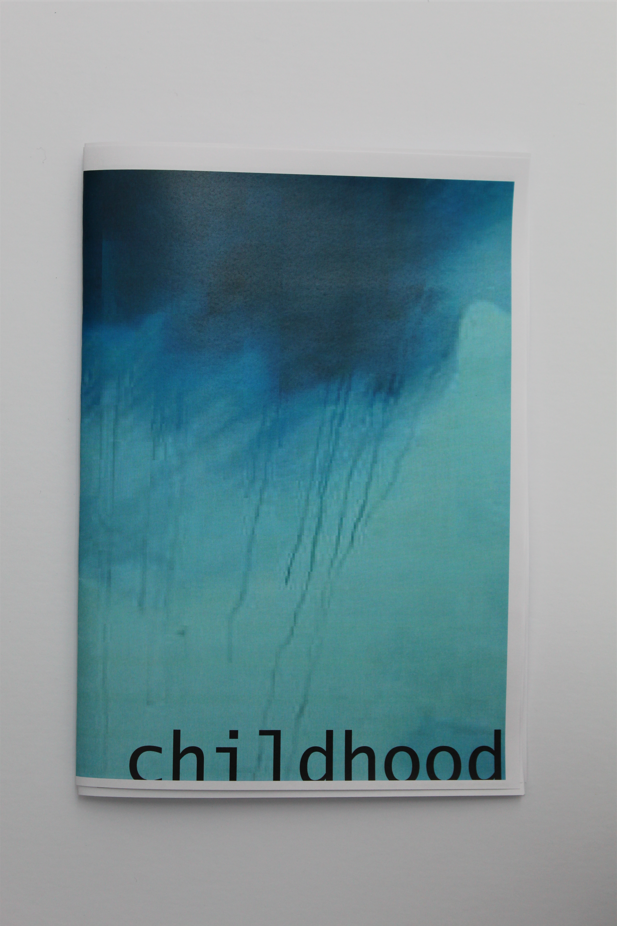
– The title: ‘Dreaming of Yore’ was used because a lot of the photographs in the Zine are of places from my past/childhood.


Other Ways of Presenting my Final Images:

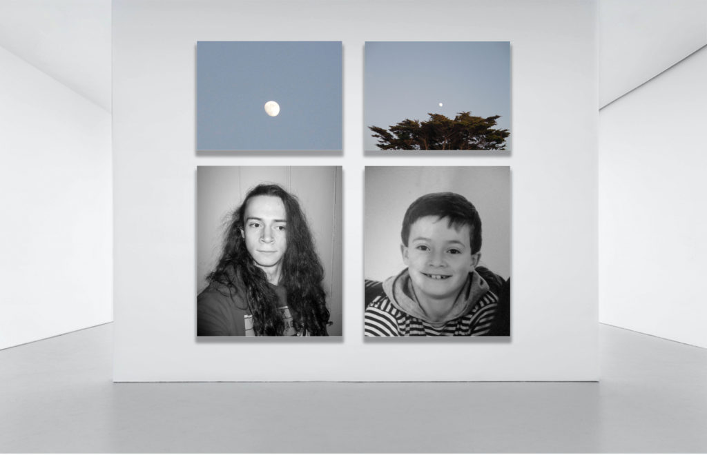
Virtual Gallery Presentation

Here I used an image of an empty art/photography gallery which I edited on photoshop to include some of my Final Images. I used the ‘drop shadow’ and ‘stroke’ to make the images look like they were actually hung.
Window Mount

On photoshop I made a window mount using a black background and some of my Final Images. I used the ‘Drop Shadow’ and ‘Stroke’ blending options to make it seem more realistic.

Evaluation

Overall, I think the project worked out well in the end, despite the slight detour in what I was making, however there is definitely room for improvement in my planning stages. While I was taking images for the project, I specifically tried to be general so I would have had a lot of material to work with which, looking back now, only made things harder, however with this knowledge I will be able to plan a future photomontage project more effectively. I think ordering the images I took in a sequence to create storytelling was more effective than creating a photomontage.

What went Well:
Over the course of the exam, I learnt how to create a Zine which gave me a better understanding of how I can put my images in a sequence and what techniques I can use while doing so, which I can perhaps use in later projects. I think I now have a clearer idea of how I should be taking my photographs, with a greater focus on what I had planned.

What I can Improve on:
I can definitely improve on my planning of the project and what I was making, I should have been more specific with what I was photographing and why, which would have allowed me to produce images of a higher-quality that linked together better. Next time I will come up with a more detailed plan and take more focussed images that link to that plan better, I will also make my final outcomes closer to the work of my artist study.

Identity Project – Zine Making

After my experimentations with photomontages, I concluded that my original idea was not as strong at conveying a message/question as I thought it would be. I looked to ordering my images into a sequence and try to tell a story, after looking over my images by printing them out and ordering them, I thought a Zine would be an effective way of ordering them.

Zine Case Study

Nihon Photography Zine on Behance

A Zine is a small (A4 – A5) booklet in the style of a magazine containing usually images and text, due to their size they can be mass-produced if desired. Zines are made to tell a visual story with the photographs/text that it contains and the links that bind them. Techniques or relationships typically seen in a sequence or grid (or other examples of a collection of images) such as Juxtaposition, repetition or other details can also be seen in a Zine, however the viewer would have to turn a page, allowing the photographer to use that knowledge (of what image they will see first) to their advantage.

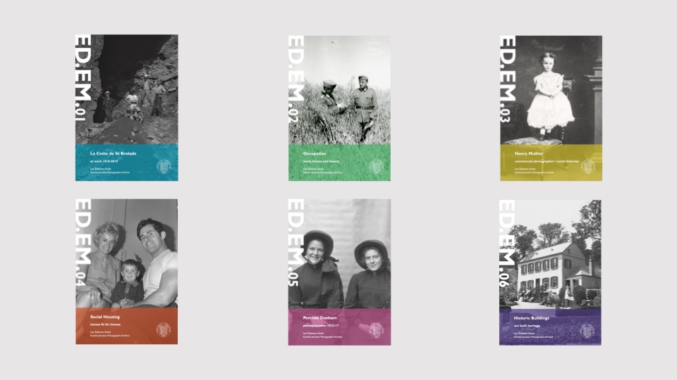
Jersey’s ED.EM (or Éditions Emile) is an example of a Zine, each containing images from The Société Jersiaise Archive, that is published around 3 times a year, each with different themes from different collections.


Editing

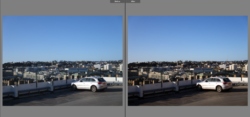
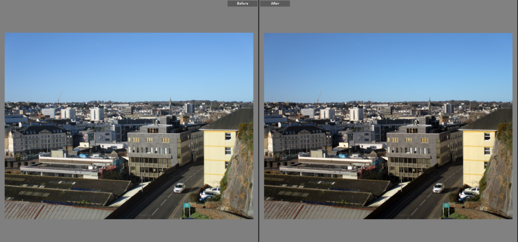
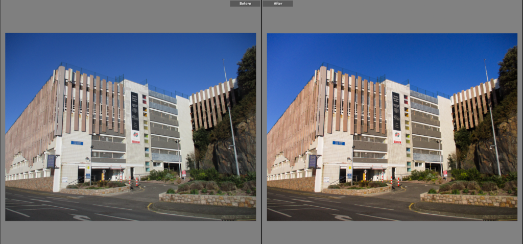
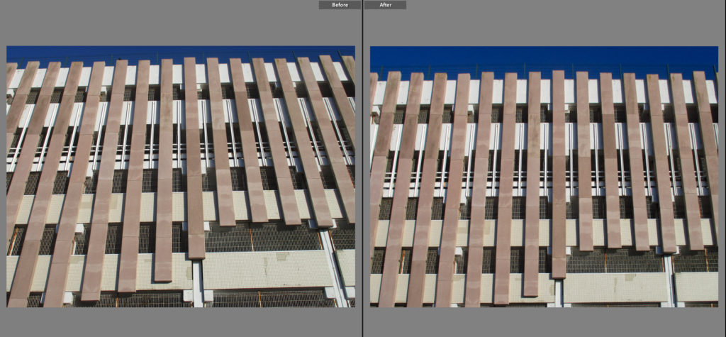
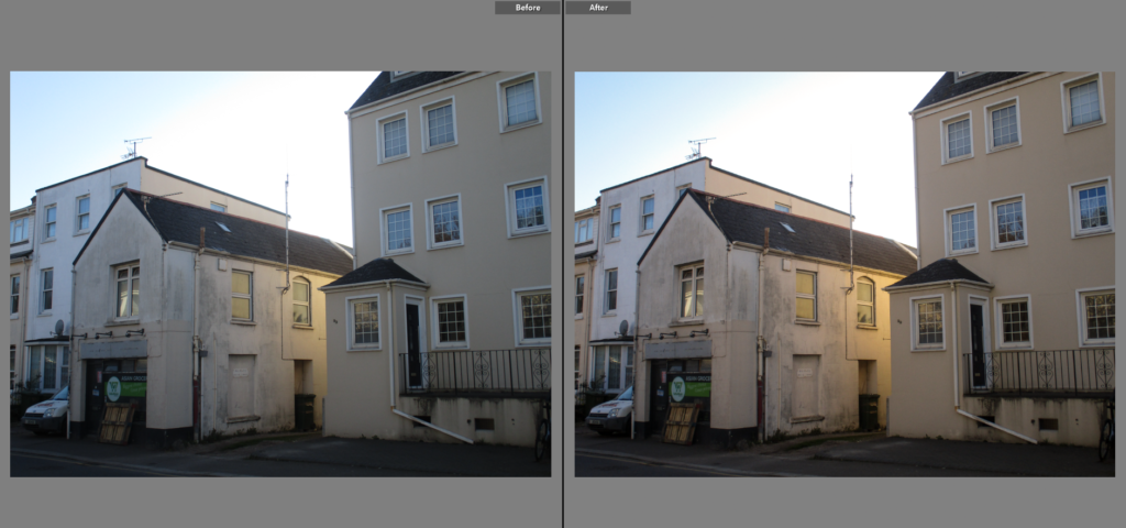
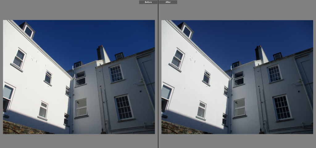
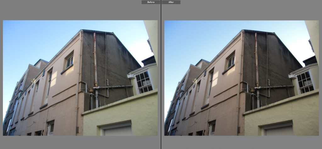
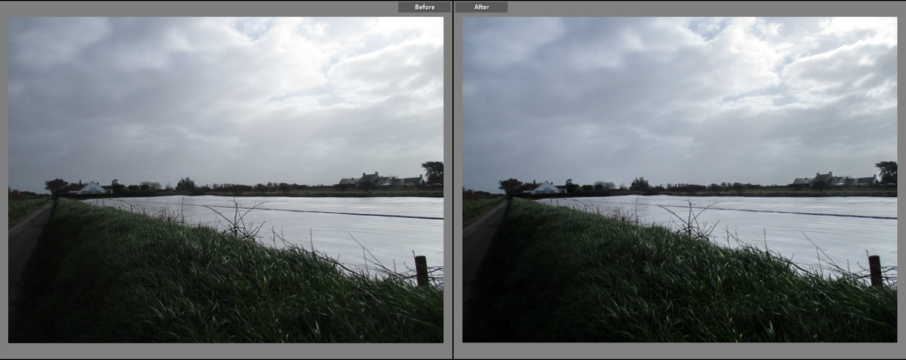
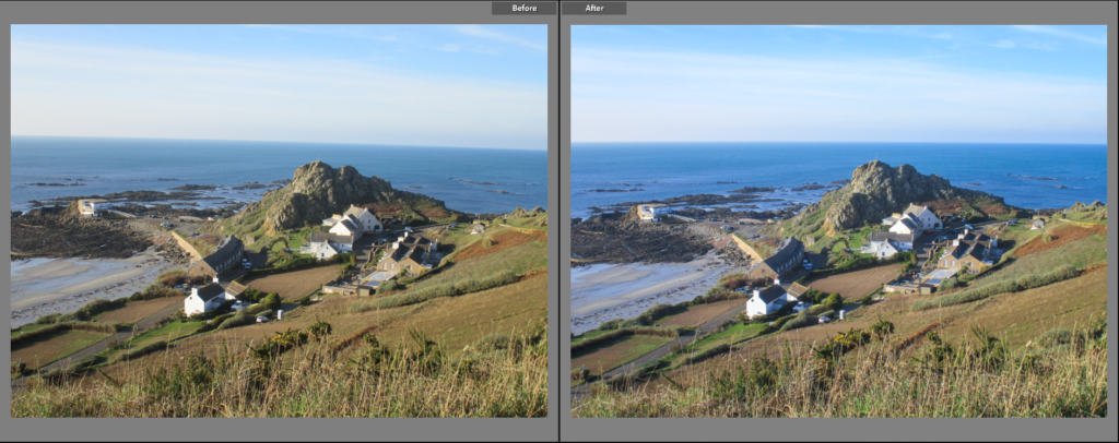
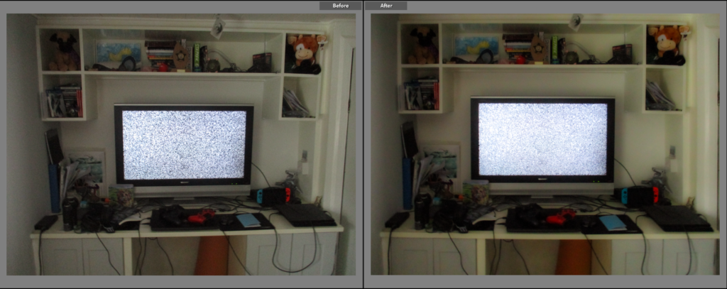
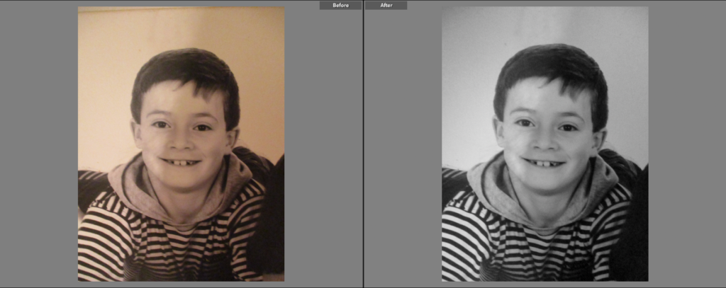
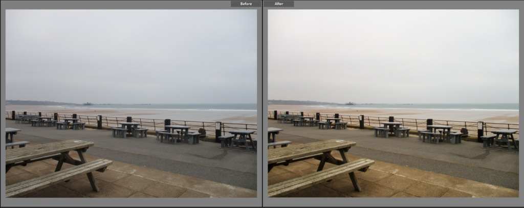
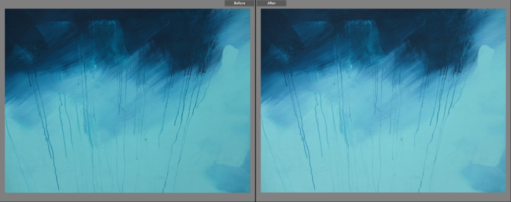
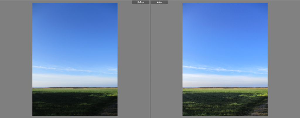
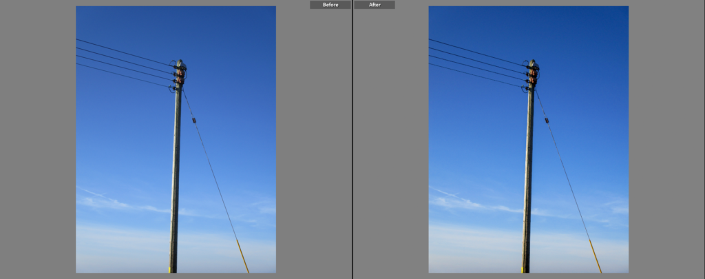
These are the images I selected as my best. Here I show the original and after-editing versions of each image.

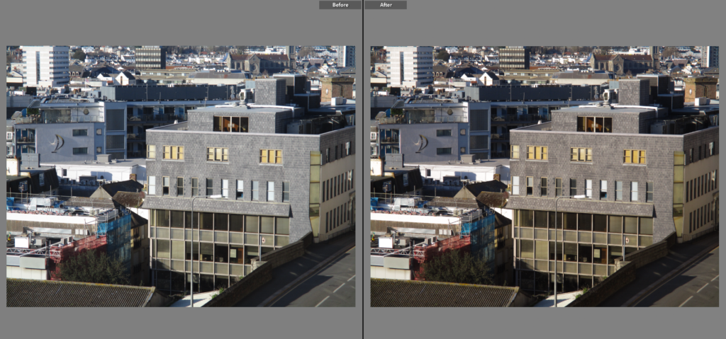
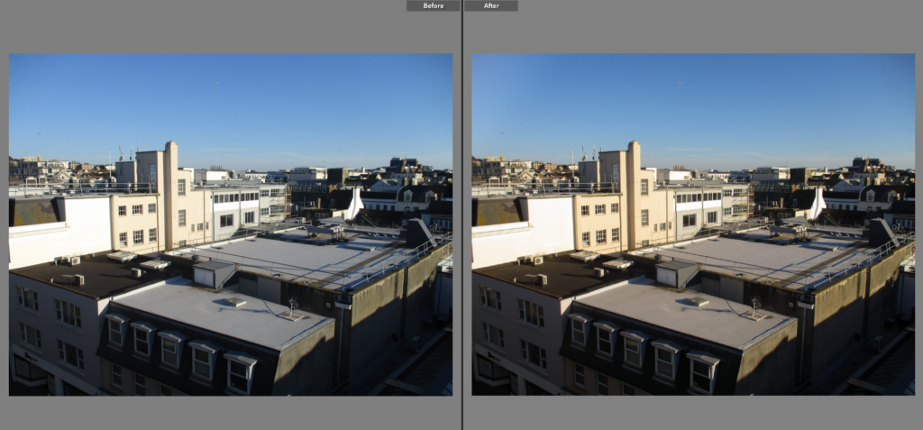
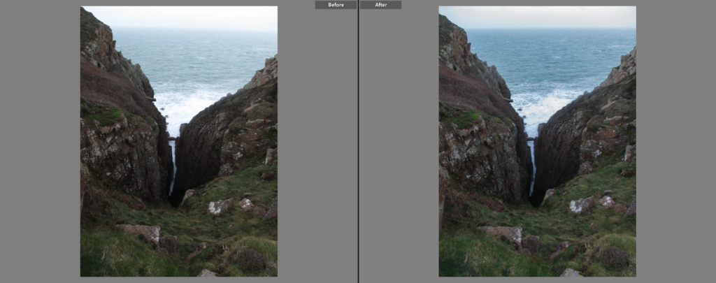
Here, I simply increased the ‘shadows’ and ‘blacks’ sliders to make the shadows less dense, while keeping the sky roughly the same colour, making the overall image look softer.

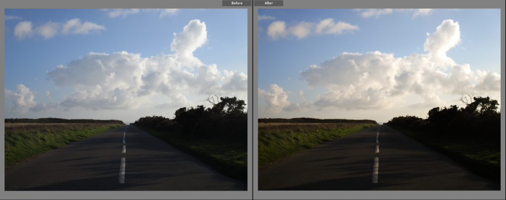
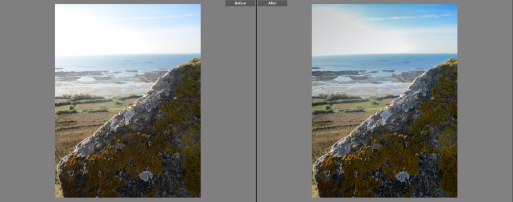
I did not make massive changes to this image, however I increased the contrast slightly, making the dark side of the pole darker.

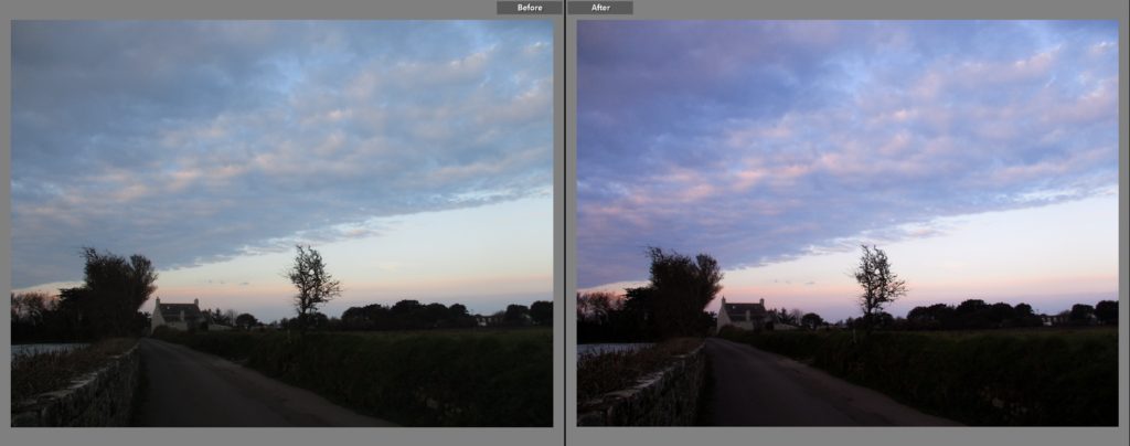
For this image I reduced the contrast and made it slightly cooler, giving it a softer look overall.

Here, I reduced the exposure of the sky by using the ‘Graduated Filter’ tool on Adobe Lightroom. I also made the overall image slightly darker by reducing the highlights and increasing the contrast.

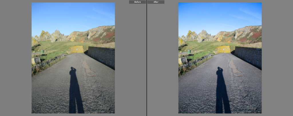
I made this image slightly cooler to make the tarmac stand out more from the green/yellow in the background. I also increase the contrast to make the shadows denser.

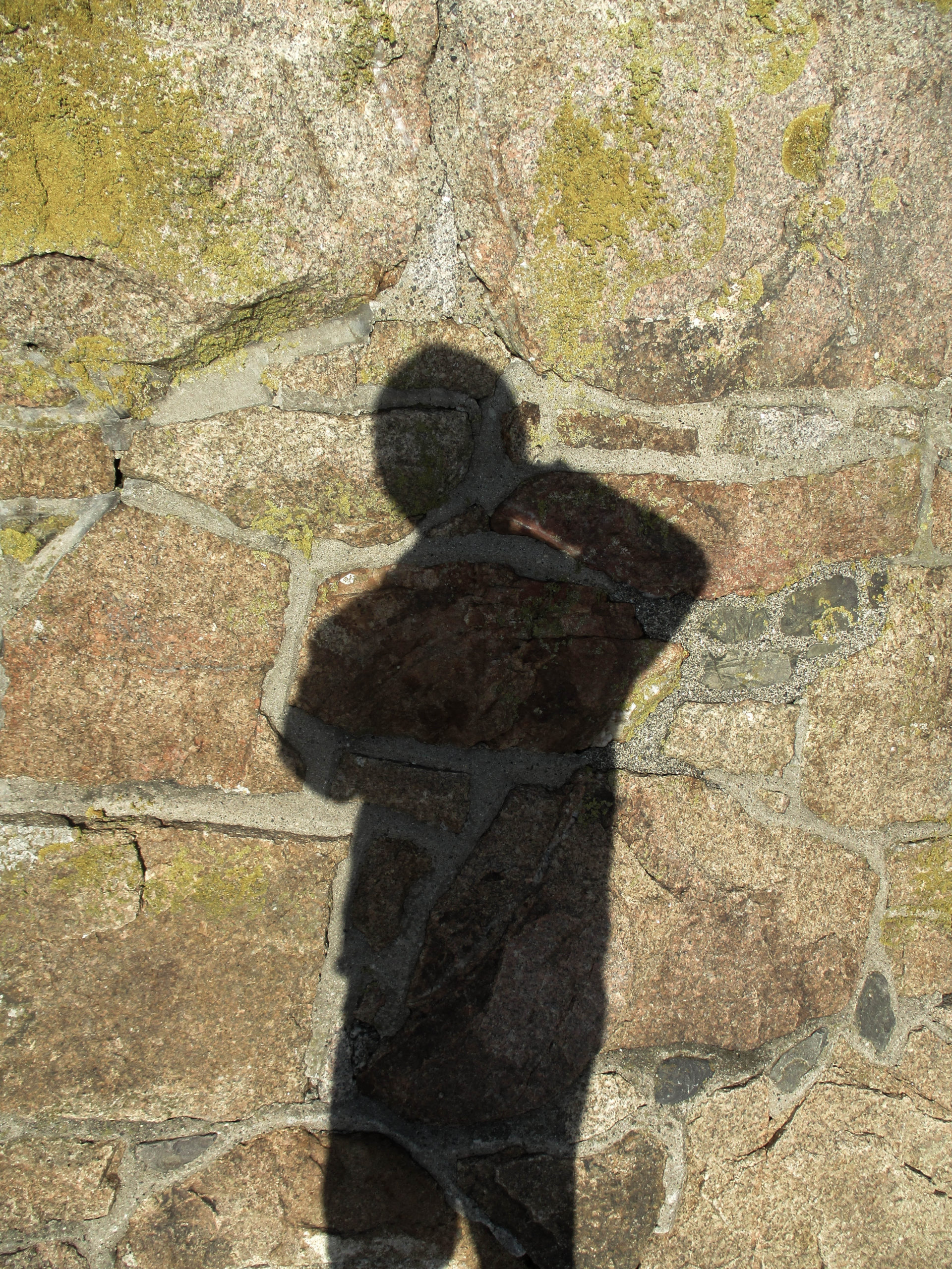
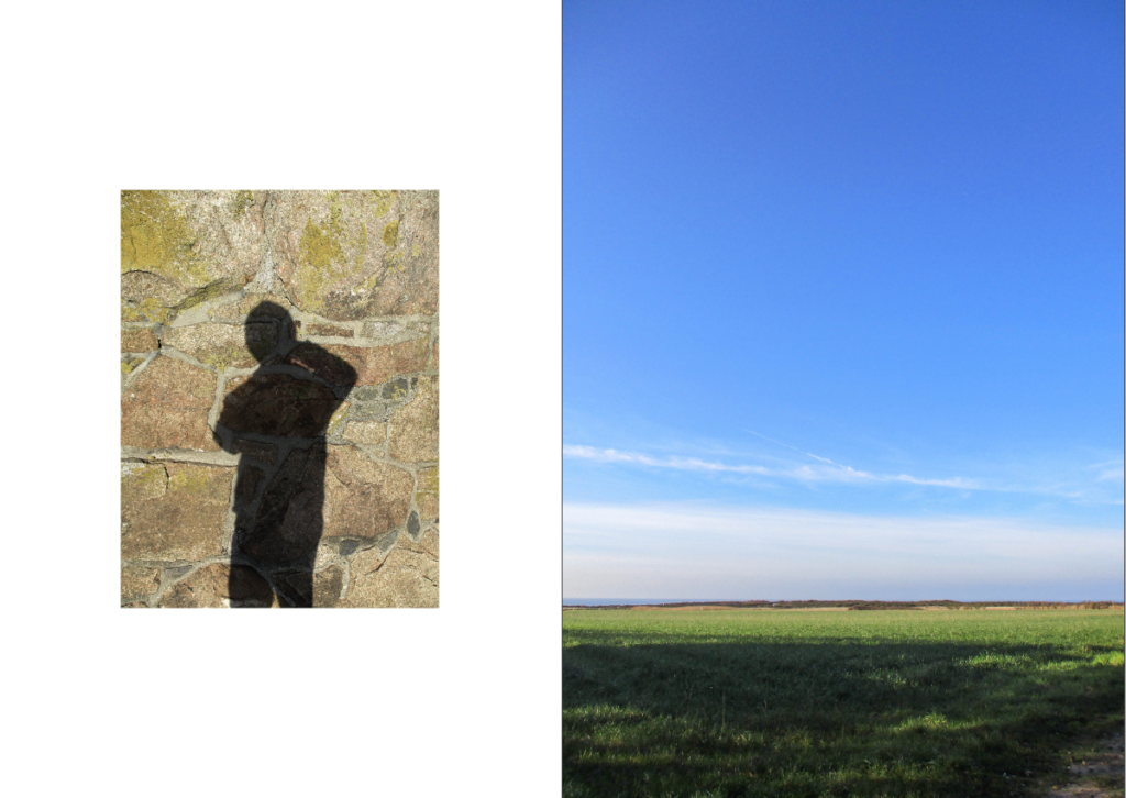
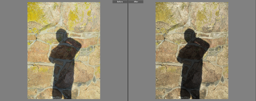
For this image I increased the contrast to make the shadow more dense, I also lowered the saturation of the image slightly to further make it stand out.

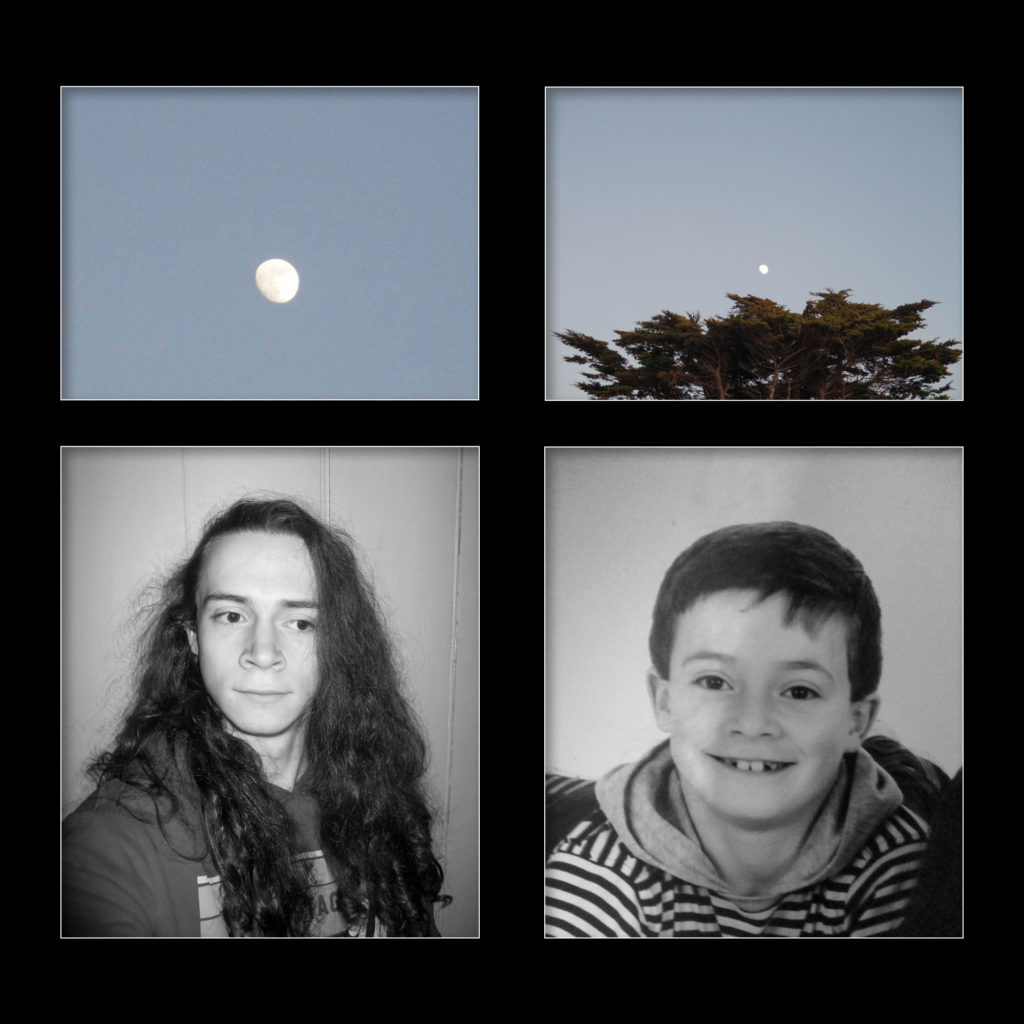
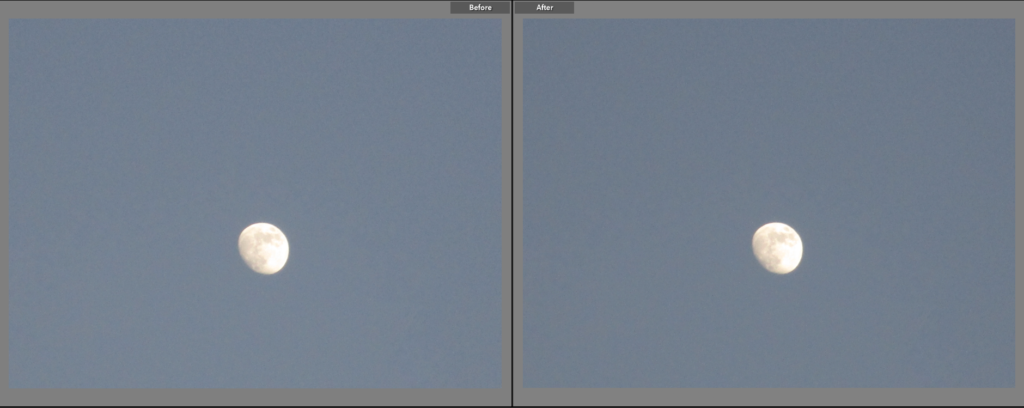
I didn’t change this image too much, however I did make the exposure slightly lighter in order to match the other moon image (below).

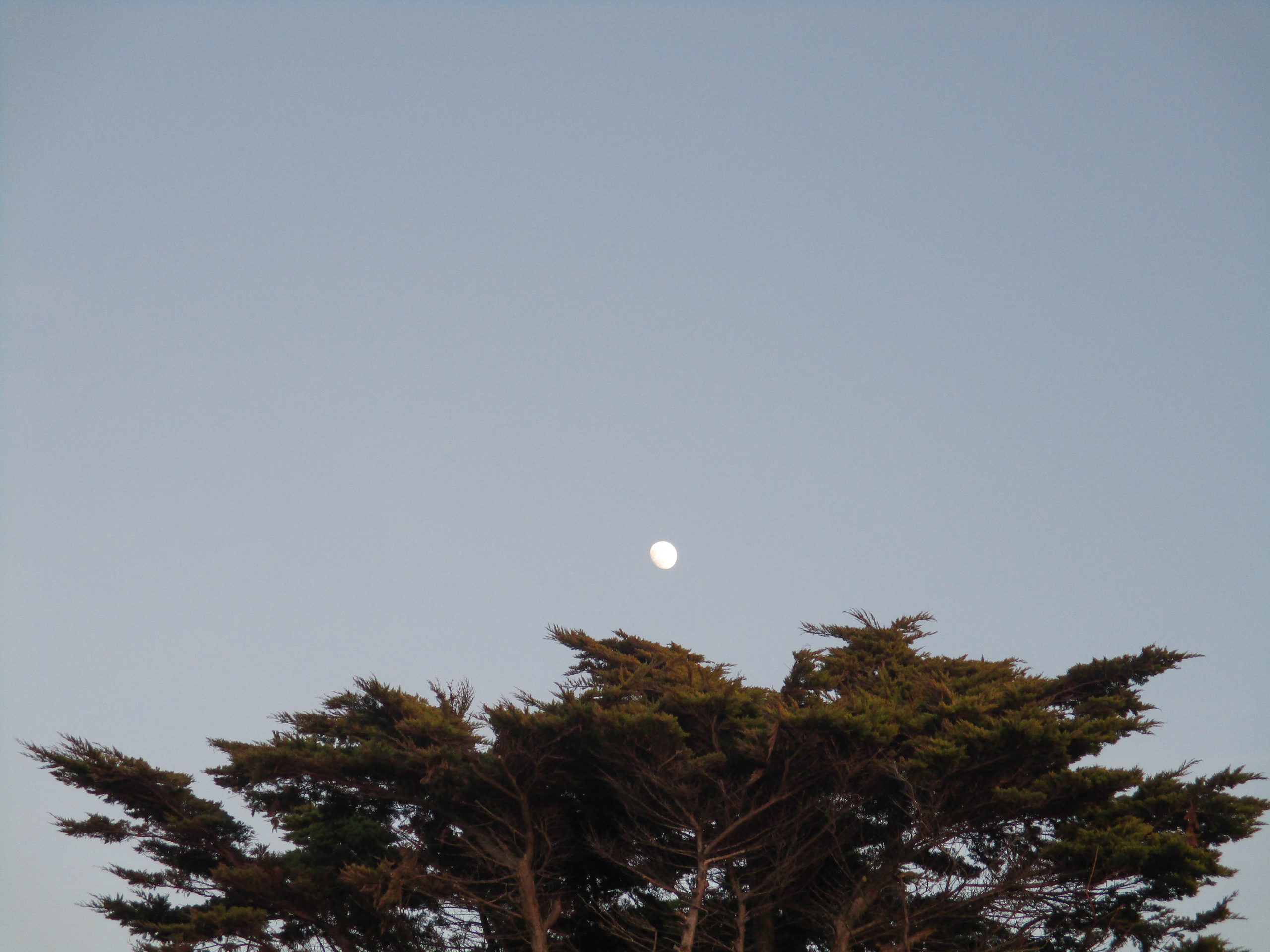
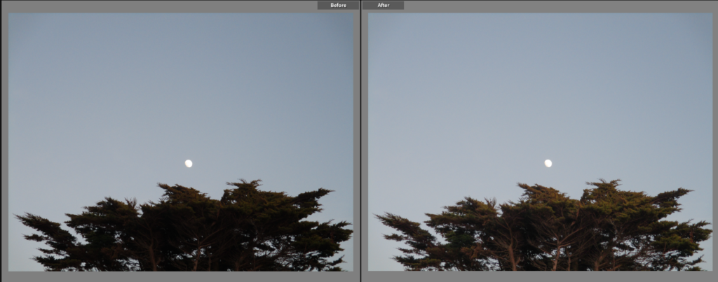
For this image I made the exposure slightly lighter and reduced the shadows to give the trees more detail.

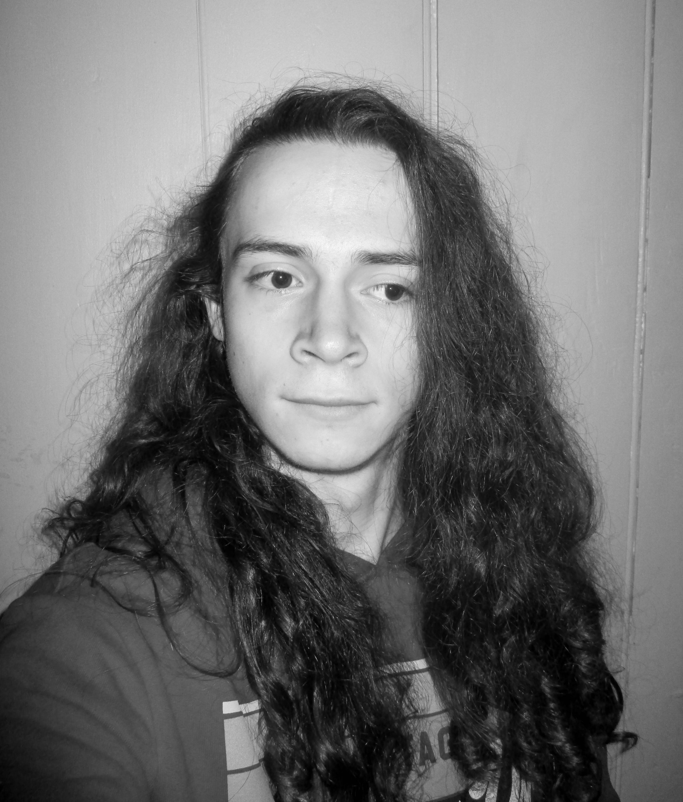
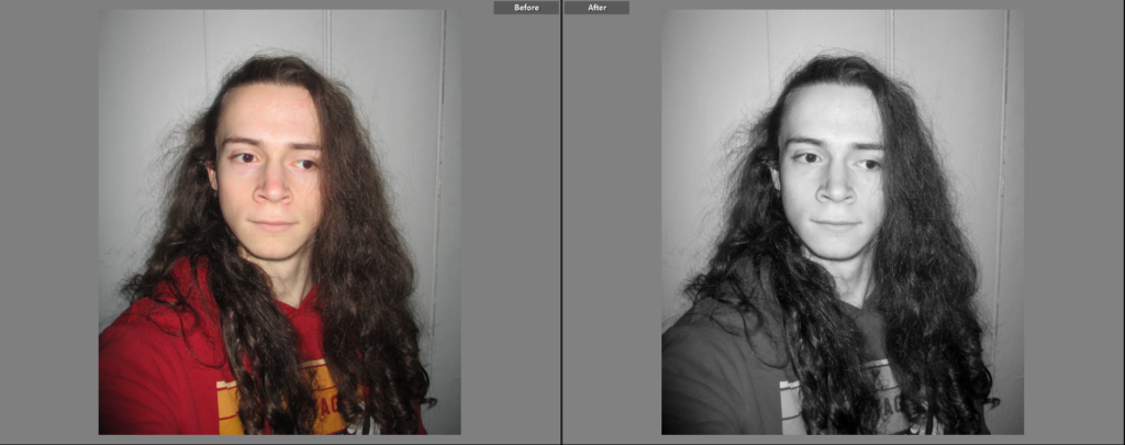
I simply made this image black and white to allow the lighter parts of the image (such as my face) to contrast more with the darker parts (my hair).

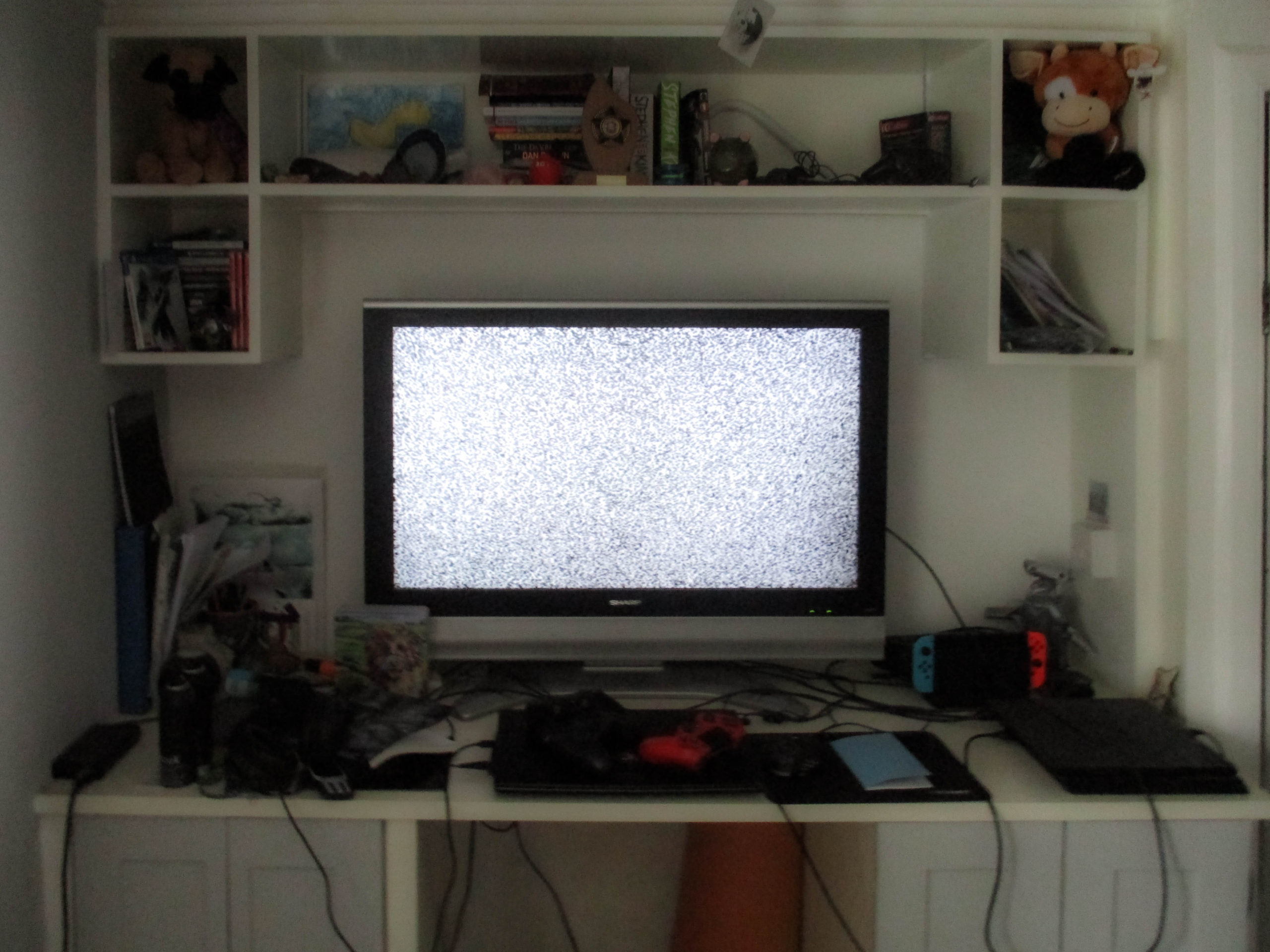
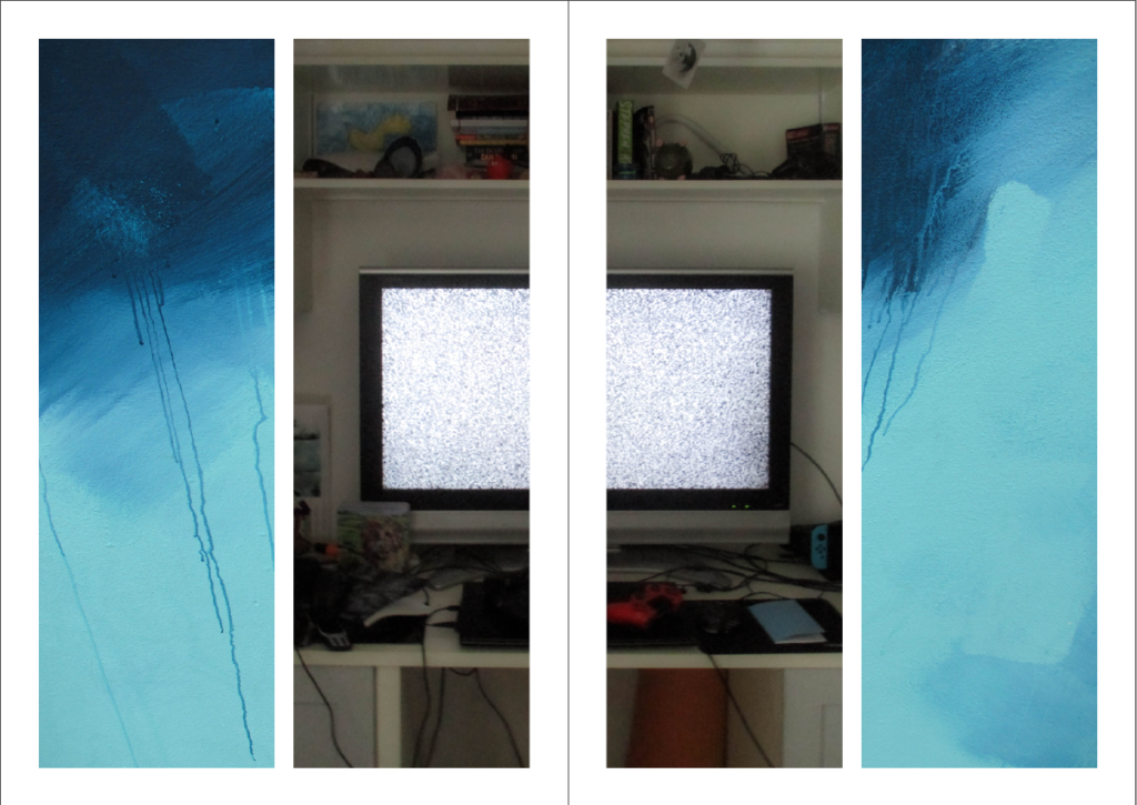
Here, I adjusted the ‘horizon’ of the desk. I also increased the contrast to make the TV screen stand out more.

I simply made this image black and white to match the other portrait image.

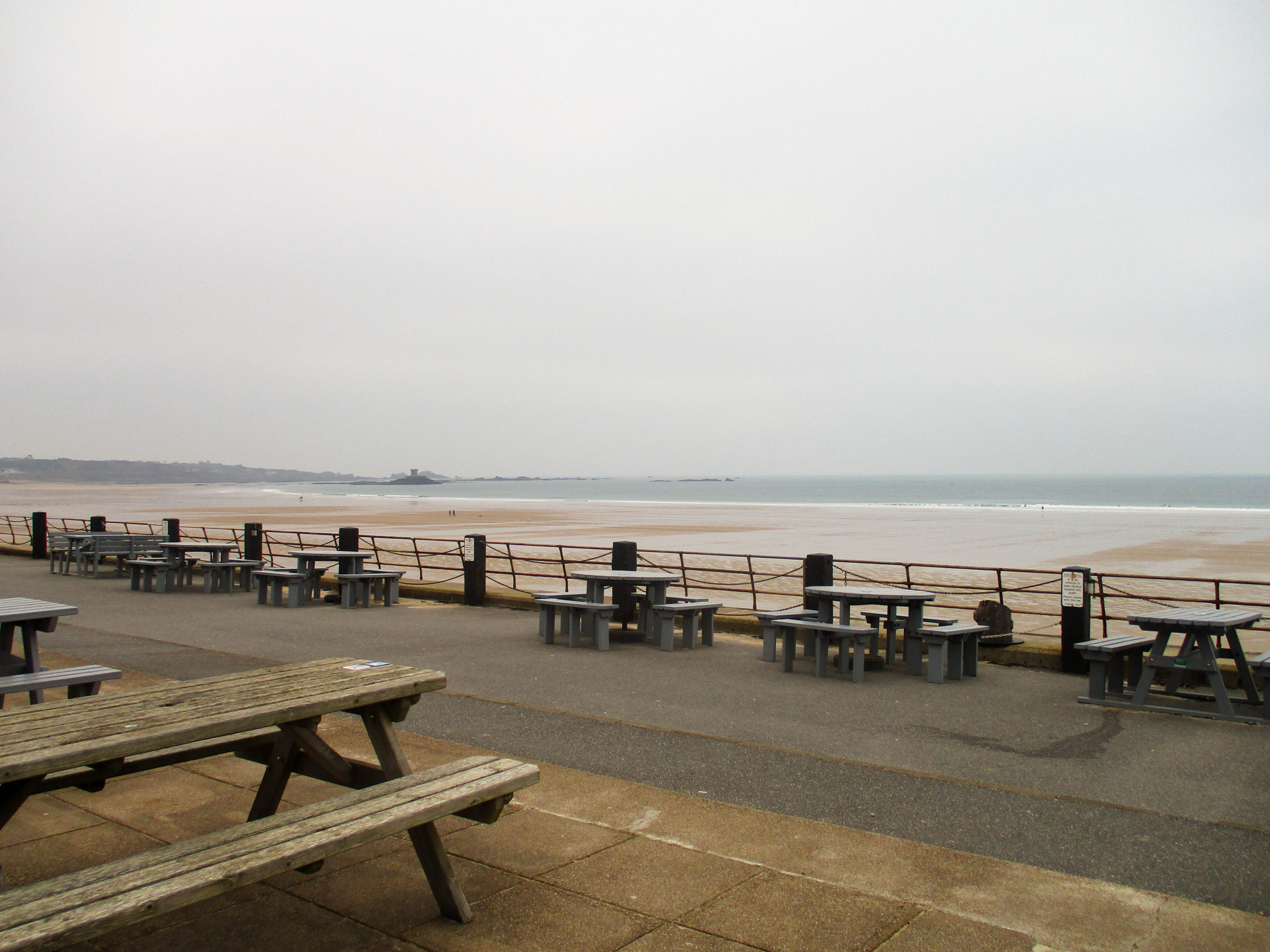
Here, I made the image slightly warmer and slightly increased the exposure.

I simply made this image slightly lighter to emphasise the difference between the light and dark parts of this image.


Experimentation

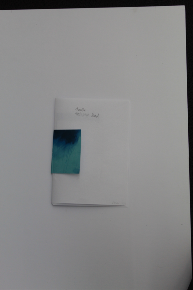
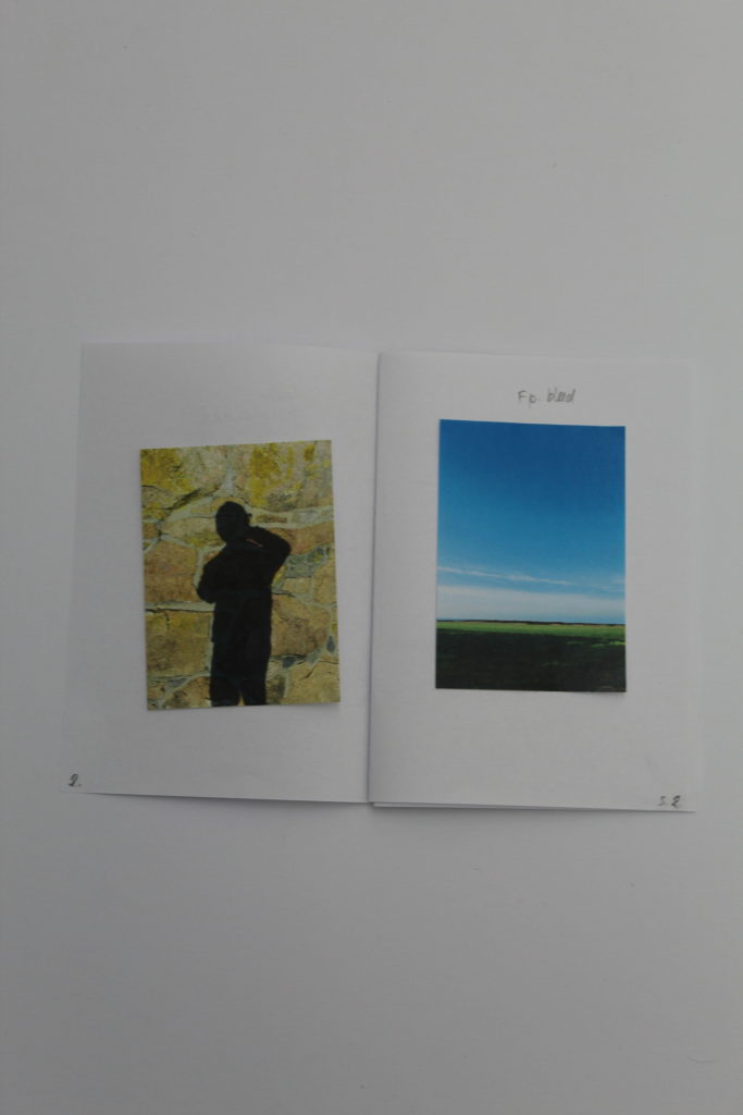
First, I made a mock-up example of a 16-page zine by folding 4 A4 pieces of paper in half and stacking them, then numbering the pages, placing the images on the pages that they could go on, lastly, I noted the specifics of each image (such as whether the image is full/double page, etc…).

Then I remade that mock-up on Adobe InDesign so I could get a better/clearer idea of what the zine would look like, with the correct sizes of images being used.

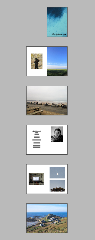
The Digital InDesign version of the Zine (Some pages excluded and the Title is a placeholder)

Layout Experimentations

On InDesign, I experimented with some ways of how I could present the images in the Zine.

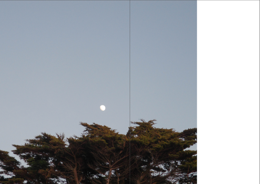
Here, I left a small gap on the right of a double full page spread image which can be used to link to the next page with the colours of the background, or to simply place text or another image.

Here, I did the same as before, but on the bottom of the double page, giving text that could be placed there a more traditional caption look.

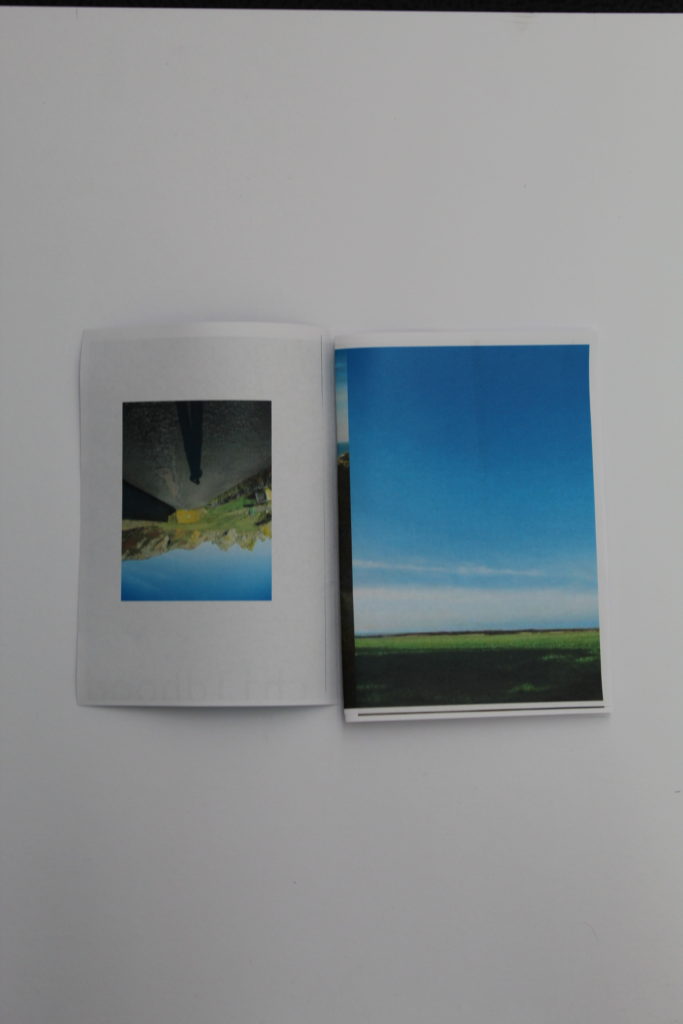
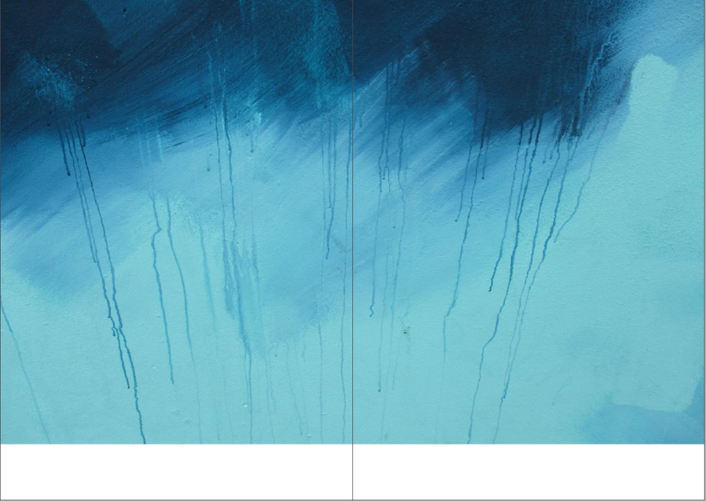
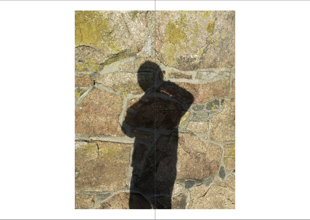
This experiment was to see how an image (with boarders on the top and bottom) would look in the centre of a double page, this gives the image more space (making it the main focus of a page) and allows text to be placed if desired. The warping of the image due to how it is placed in the gutter can also be used to physically manipulate an image.

Here I experimented with splitting an image within a box and placing it on opposite ends of a double page spread, giving the image a more abstract look.

This experiment was to see how I can create links between the images on one page, then link those images to the page adjacent to it.

Identity Project – Photomontage Editing and Experimentation

Editing

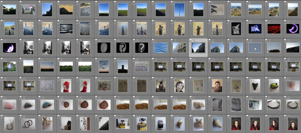
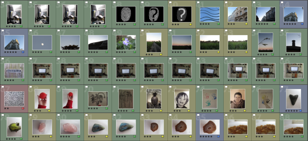
To start my editing process, I went through all my images and used the ‘Pick’ and ‘Reject’ buttons to select what I thought are the best images.

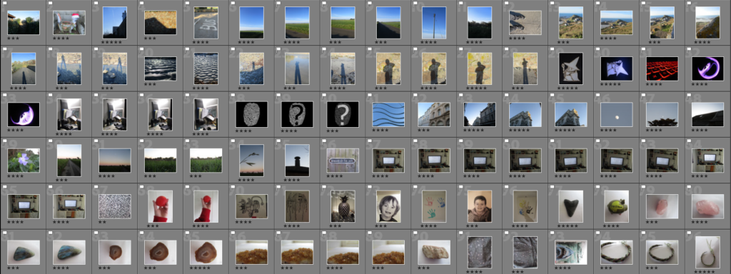
Next, I went through my ‘Picked’ images and ranked them by giving them a number of stars out of 5, with 5 being the images I will use, and 1 the images I will not.

After, I went through my images again and assigned them a colour, with red being the images I won’t use, yellow and green being the ones I may use and blue being the ones I will use.


Experimentation

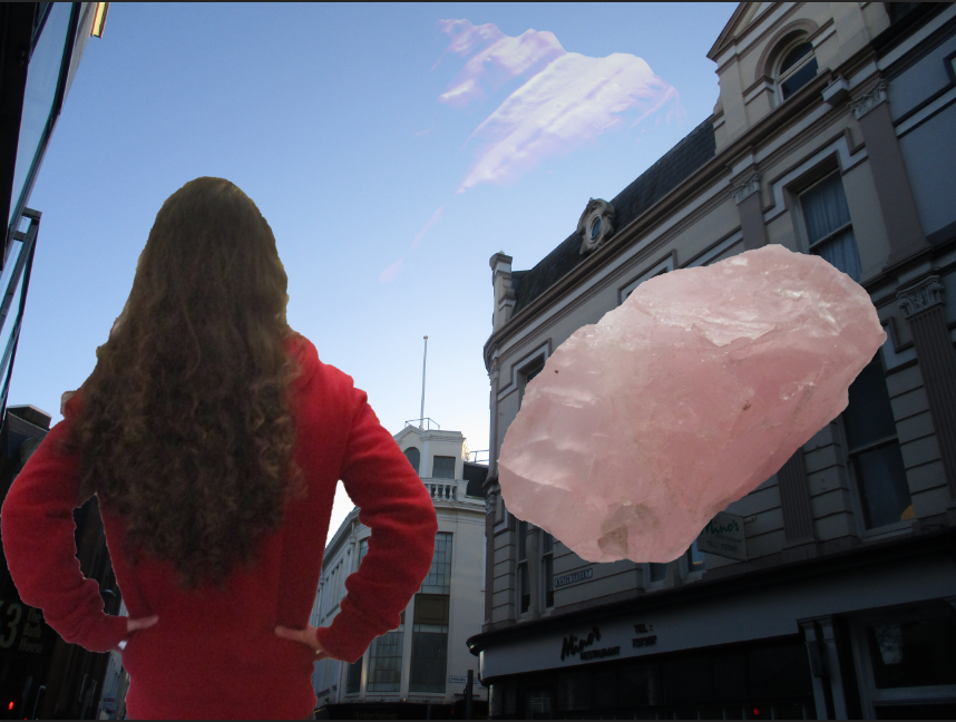
For this image I was experimenting with how I would place myself and the objects, while also dabbling a little into layer blending options.

For this experiment I wanted to explore how I can place the portrait and the object photographs together by cutting parts off of the portrait (the legs) and by using different blending options for the object.

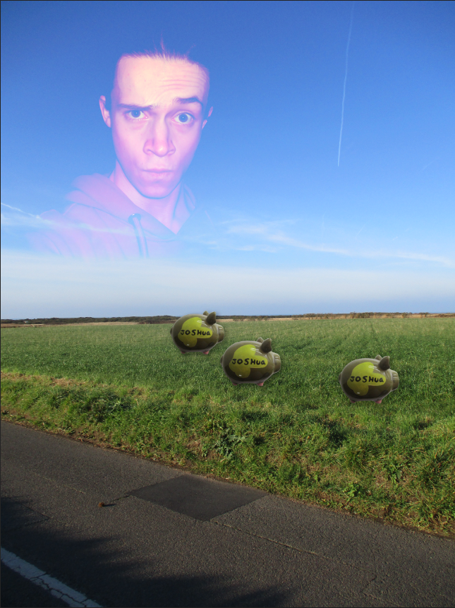
Here, I was experimenting with how I could connect the object photographs to the landscape photographs, while also testing how layer blending options affected the portrait image.

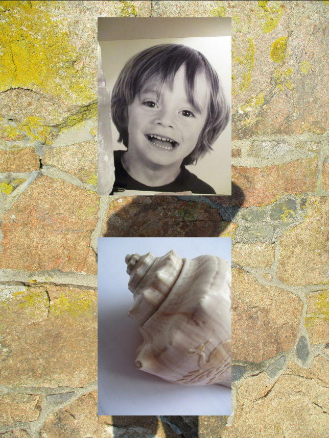
This is where I started to approach my ideas in a less ‘chaotic’ way. Here I wanted to see how ordering my images over a background would look.

Here I experimented with how many images I should use to overlay, as well as seeing how much of the background should be visible.

Identity

What is Identity?

Identity" is Dictionary.com's 2015 Word of the Year

To me, a person’s identity is how they describe/express themselves through aspects of their personality such as morals, emotions, appearance, morals, interests, which can effect how they act. What others describe someone as can also be considered a part of their identity, such as their fashion sense, ethnicity, etc… Sometimes some parts of a person’s identity can be kept secret from others for different reasons.

Identity can be influenced by the place a person lives in, as a place can provide a sense of community, which a person can identify themselves within or explore what they are/can be in that community. A place provides a person with a general culture to identify themselves with, while the people around them can heavily influence their personality, maybe through social expectations or norms, and other parts of their identity, such as likes/dislikes, how they present themselves etc…

I also think upbringing can play a large role in forming a person’s identity/personality, in the sense that a person can decide to be similar to their parents/family/friends, or completely different (which may leave some people feeling lost or confused about their identity)

Identity (or Identification) can also refer to how a person is literally identified, for example a person’s drivers license shows some information about that person, such as their date of birth, name, country they live in, etc…

Mood Board of General Ideas


Case Studies:

Claude Cahun

Claude Cahun: Jersey's queer, anti-Nazi freedom fighter

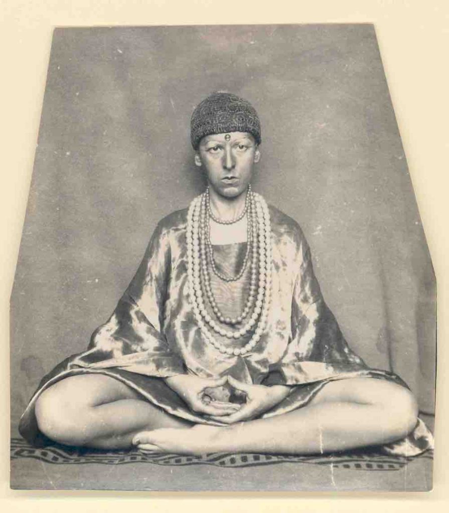
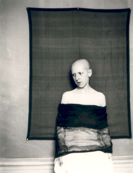
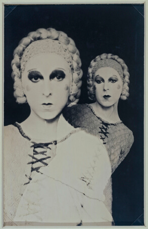
Lucy Schwob, better known as Claude Cahun, was a French, early-mid 20th century photographer, writer, sculptor and activist, who explored gender through surrealist photographs. They worked with their lover Suzanne Malherbe, better known as Marcel Moore, to create images which explored both masculinity and femininity. They moved to Jersey in 1937 as a way to escape from the fascist ideals in France. The pair opposed the German forces who occupied Jersey in 1940 by creating notes addressed to German soldiers with poetical messages to make them think about what they themselves want to do, a cryptic and almost surreal method. A few years after Jersey was liberated from the German Forces, they were recognised for their activism and resistance towards the Germans with a medal of French Gratitude in 1951. With the emotional and physical help of Moore, they continued to create thought invoking work.

Image Analysis

Claude Cahun: A Very Curious Spirit | AnOther
A self-portrait of Cahun taken in 1927

This image could be a way for Cahun to explore the male gender as being the more physically-focussed, not very romantic/emotional gender, as seen by the text “I am in training don’t kiss me” on their shirt, while also using lipstick and hearts to contradict, or perhaps mock, that less emotional/romantic view. Cahun’s body language in this image could also portray men as being more vocal and confident about their views compared to women, which could be a way for them to try and enforce equality of voices and freedom of speech between the genders. I like the way the white clothing worn by Cahun contrasts with the black backdrop, perhaps to emphasise the message (in this case literal text and drawings) she is trying to voice. The lighting in this image is not too harsh, with little to no shadow appearing on Cahun at all, Cahun probably did this to make themselves, and what they was exploring, clearer.

Other examples of their work:

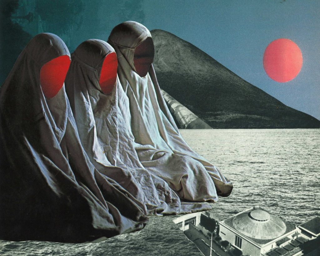
Jesse Treece

jesse treece | Saatchi Art

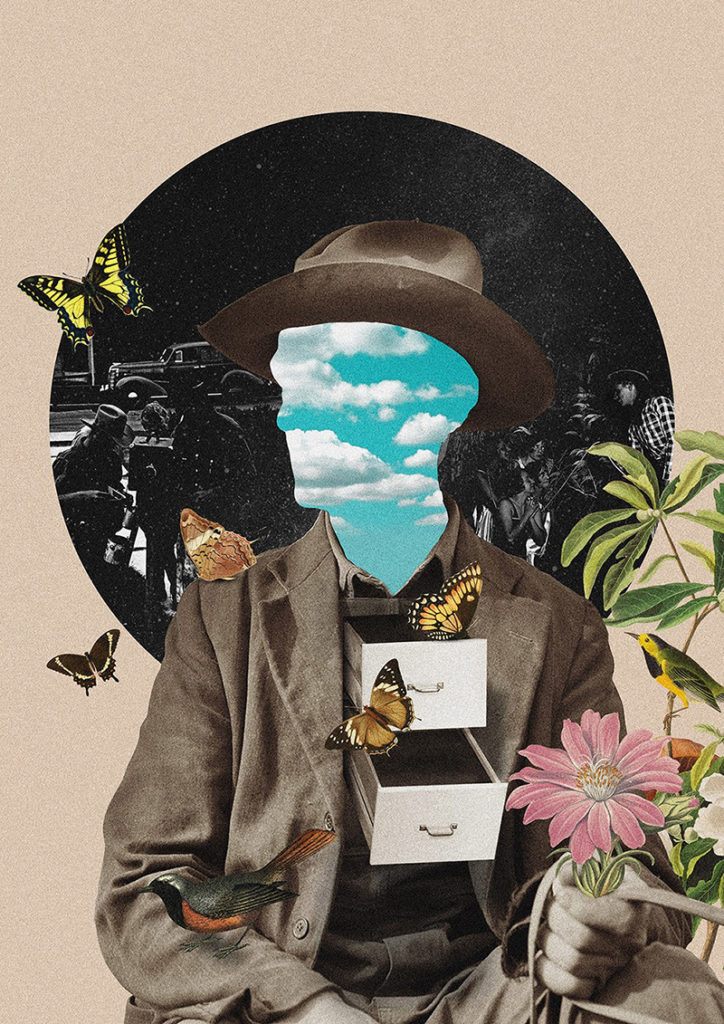
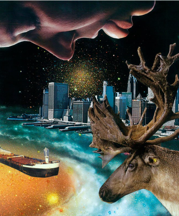
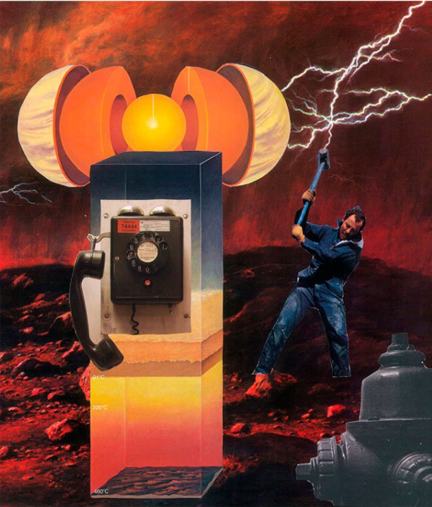
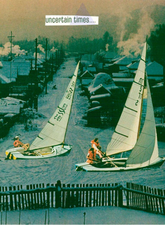
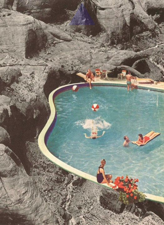
Treece is a self-taught collage artist based in Seattle, USA, who was inspired to create collages when he found a box of old newspaper/magazine clippings and decided to create a visual story and express himself with them. He likes 70-80’s style comic book strips and magazines, which he takes inspiration from to create ‘disturbing’ imagery. He typically uses glue and scissors to create his collages manually, mixing ordinary and whimsical images together to create several unique and somewhat absurd collages.

Image Analysis

collage by jesse treece — “the sisters of mercy” hand-cut collage, a...

As this image is a collage, lighting varies between each image it uses. The lighting is soft on the background images, however on the image with the three hooded figures, lighting is slightly harsher, which allows shadows to form behind the creases in the clothes. The shadows on the left-most figure are the most dense and are the darkest point on the image, which allows that image to contrast more with the whole collage. The colour palette in this image is quite limited, the majority of it being made up of dark greys, however, there is some light red on the figures faces and the circle in the background, as well as a dark, faded blue tint in the background, which stands out from the rest of the image. There are a lot of lines on this image, from the hill like structures in the background, the building in the bottom right of the image, the horizon line where the water meets the hill and on the clothing of the three figures, however where there is colour, there are not too many lines, making them appear softer, while the black and white parts of the image look more jagged.

Other examples of his work:

Comparing Claude Cahun’s and Jesse Treece’s work

Similarities:

  • Both use portraits of people playing a role, perhaps of a job or hobby, in everyday situations
  • Both use objects/props/costumes/clothing as a way to make the image more interesting

Differences:

  • Cahun typically likes to use plain backdrops to emphasise the model in the image, whereas Treece uses backgrounds (usually) taken from one or more landscape photographs
  • Treece’s collages explore scenes with unnatural and sometimes confusing imagery (such as people sailing in a village), while Cahun uses portraiture as a way to explore identity
  • Cahun mainly explores the theme of Gender through their photography clearly, whereas Treece’s images explore his own ideas and fictional worlds that he creates.
  • Treece uses a large colour palette and different types of geometrical shapes to create variety in his images, whereas Cahun mainly uses black and white (due to equipment at the time) portraiture

Statement of Intent:

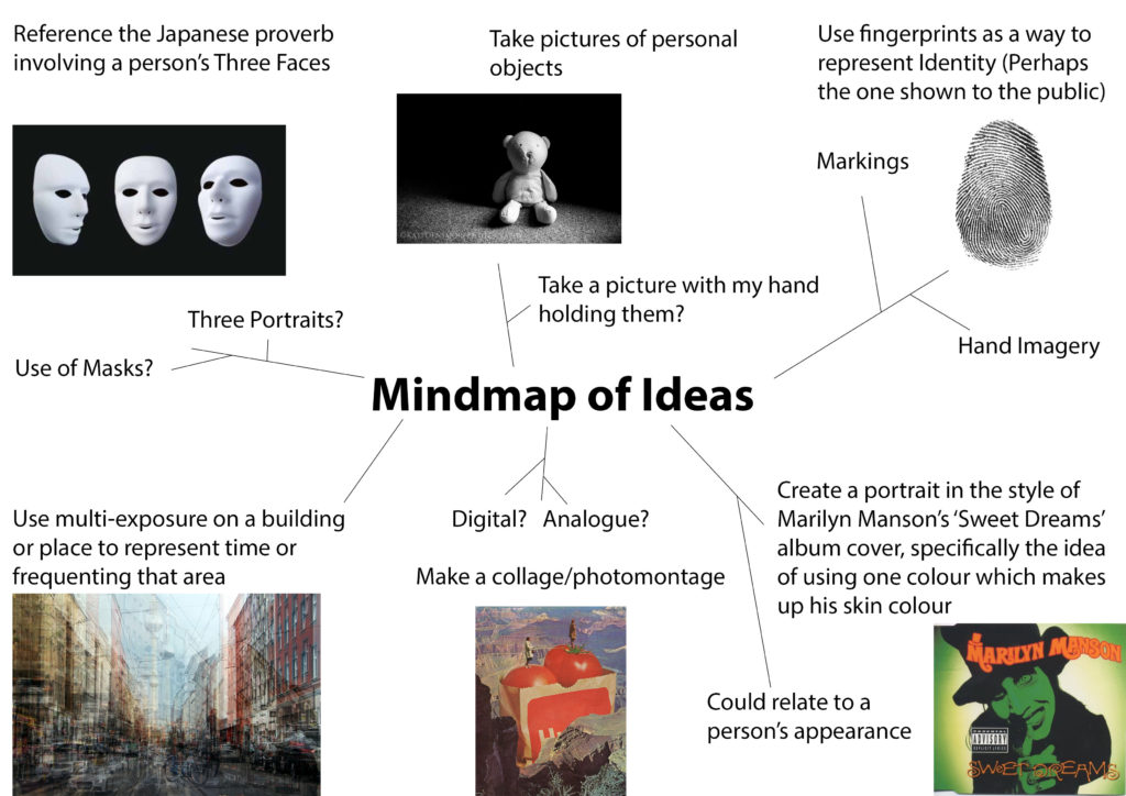
I intend to explore my own identity using a series of photomontages exploring the different ‘levels’ of my personality. I based this idea of ‘levels’ from a Japanese proverb, which regards a person’s identity as being made up of three faces: The First face being the one you show to strangers/the public, the Second face being the one you show to close friends/family/loved ones, and the Third face being the one you show only to yourself. With each face (with the First face being leftmost and the Third being the rightmost if I was to place them in order) getting more and more personal. I will use a collection of self portraits (with different facial expressions, poses and shot types (headshot, full body, etc…)), landscapes and objects to create the photomontages and plan to lay them out in a triptych or sequence.


Photoshoots

Photoshoot Plan 1 (Landscapes):

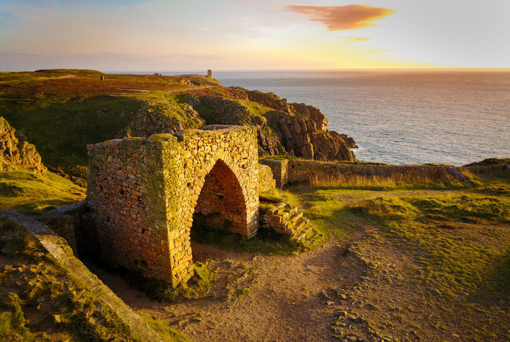
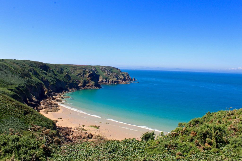
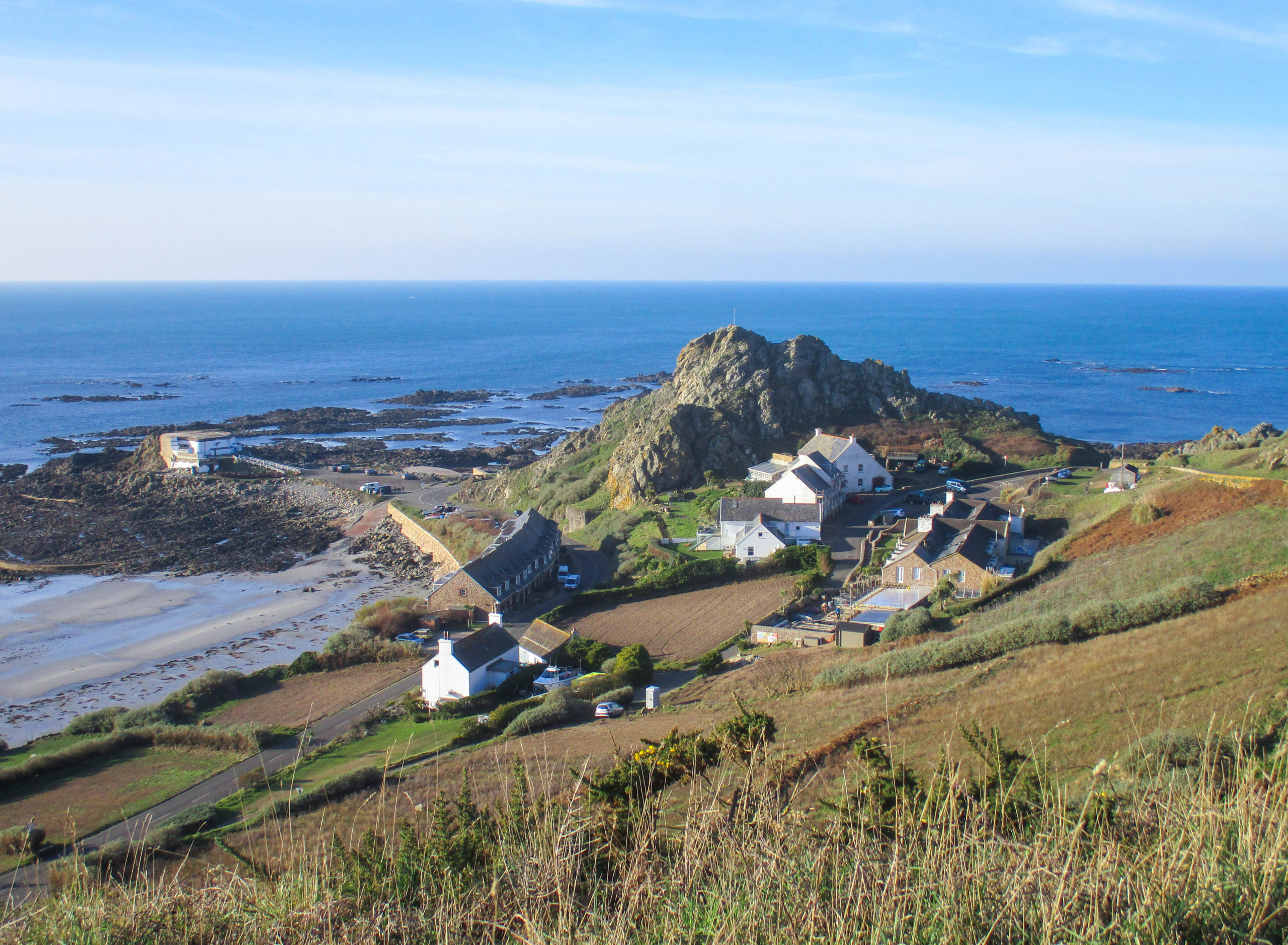
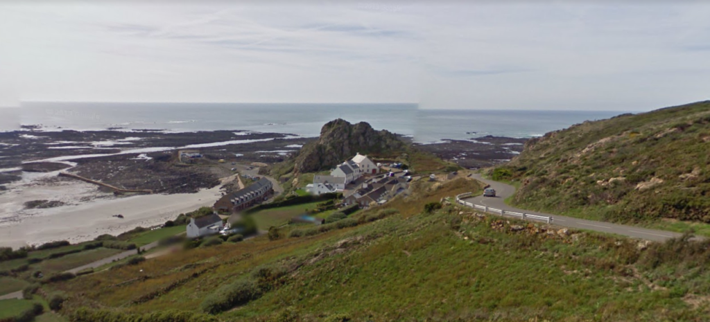
What?I will take pictures of the landscapes around this area, such as the fields, roads, beach and the view from the top of a hill downwards.
Where?The area around to my house with beaches, fields and houses.
When?When the sun is out so I can capture natural light in the images, around noon.
Why?I have lived around this area my whole life so it is special to me.
How?I will search for interesting parts of the different sceneries around this area.
The area I will take pictures of/around

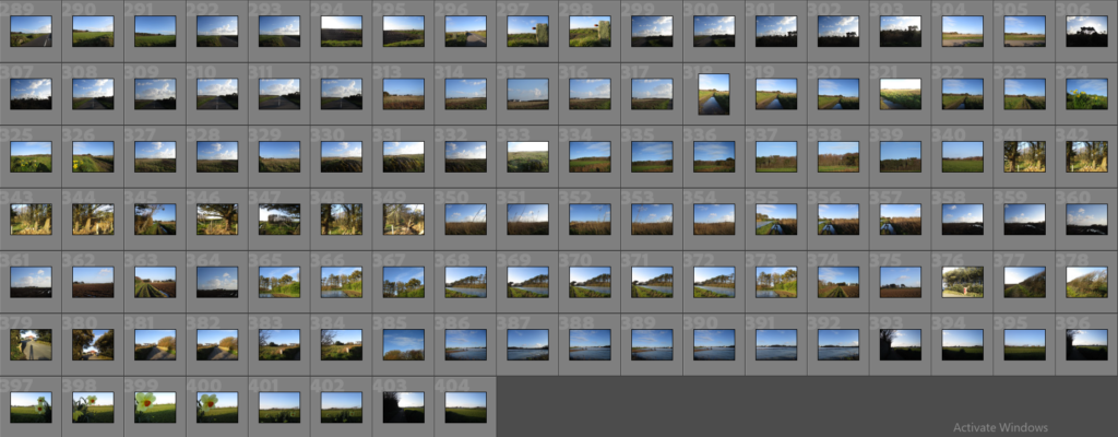
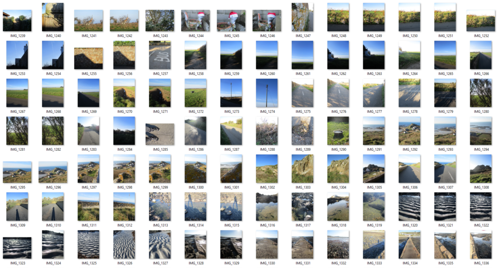
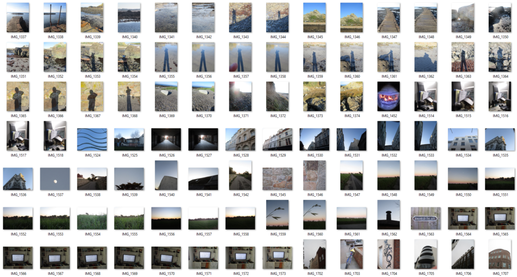
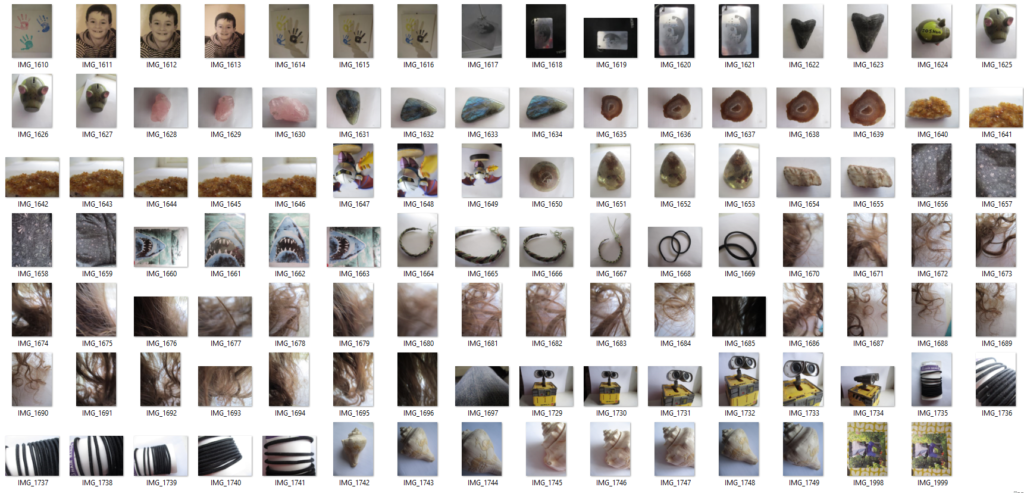
Contact Sheet


Photoshoot Plan 2 (Objects):

What?I will take images of personal objects which can help identify me.
Where?At my home.
When?During the day to make use of natural light.
Why?These objects have different forms and shapes, which, if I use with a photomontage, will give my final images a more interesting look.
How?I will lay the objects on plain paper to get a clear white background and I will put it next to a window to make use of natural light.
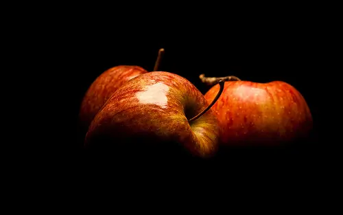
Photography Skills: How to Isolate an Object Against a Black Background |  Light Stalking
An example of object photography

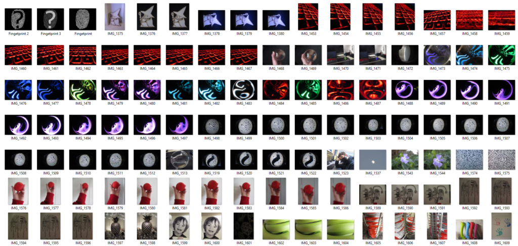
Contact Sheet


Photoshoot Plan 3 (Portraits):

Who?Myself (Self-portrait).
What?I will take pictures of myself with different facial expressions or hairstyles to represent my identity.
Where?My home.
When?Likely during the day to make use of natural light.
Why?I think a self-portrait is an effective way of capturing someone’s own identity.
How?Maybe using a mirror or with someone else’s aid.
Portrait Photography by Ines Thomsen Photography - Portrait Photographer
An example of portrait photography

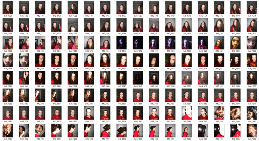
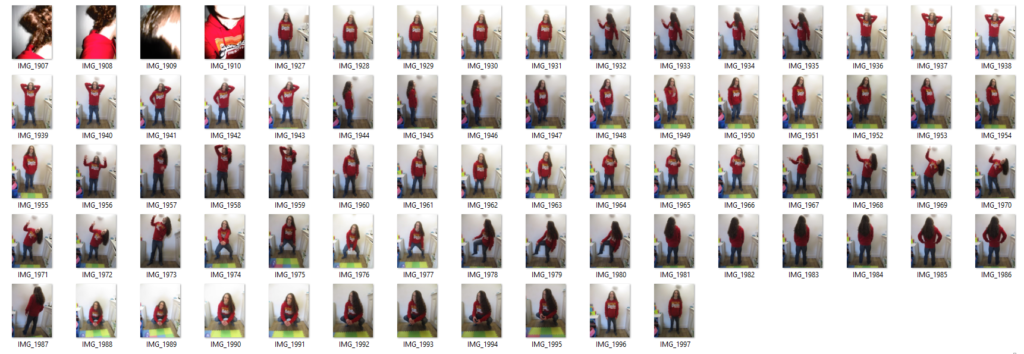
Contact Sheet