All posts by Joshua O

Filters

Author:
Category:

Statement of Intent

What you want to explore?

For my personal study I would like to explore the relationship (similarities and differences) between nature and the man-made, which will likely have a greater focus on nature (natural landscapes, trees, objects, etc…) with mad-made elements (such as objects, buildings, infrastructure, etc…). I would also like to explore landscapes (and maybe some still-life) from the genre of surrealism and abstract photography, which will blend the ideas of nature and man-made together to create something otherworldly. I chose these genres as they are the genres that I enjoy photographing the most, which will then make the project more enjoyable and will produce stronger final pieces.

Why it matters to you?

I think that, like many others, climate change and man’s affects on nature has become a concerning issue that needs to be at least attempted to be helped. By photographing nature and perhaps some parts of human existence (cities/towns/etc…), I hope to learn more about, and connect myself to, nature and mans effects on the earth. By using surrealism, the themes will be combined to show the affects of mankind on nature, showing something unfamiliar, showing how the modern world has affected humanity’s view on nature itself and highlighting the damage already one.

How you wish to develop your project?

I want to develop my project into a statement about the affects people have on nature and using an abstract/surreal aesthetic to represent these, turning it into something perhaps beautiful, while simultaneously being disturbing in the sense of being otherworldly.

When and where you intend to begin your study?

I will start by searching for photographers who specialise in surreal landscape photographs to give me ideas and inspiration for what kind of photographs I will take, how, and to what effect. I will likely choose to photograph an area close to nature for my first photoshoot, such as woods or coastlines, both of which will provide a very different landscape.


Moodboard of Early Ideas
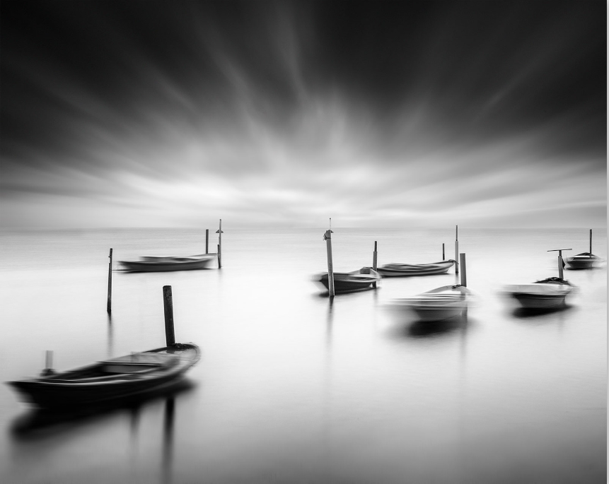
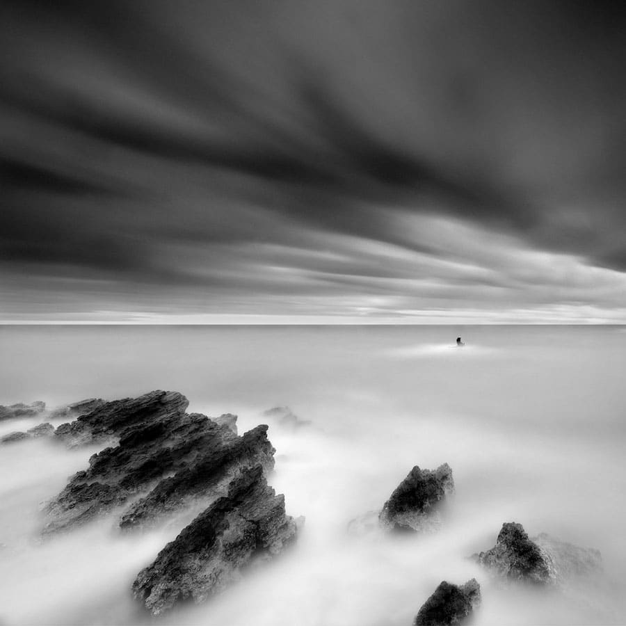
Surreal Nature Photography by George Digalakis Is Mysteriously Minimalist

I like these images as the use of a slow shutter speed gives the water an almost ‘misty’ look instead of what would usually be seen, giving it a very surreal/otherworldly feel. I will probably not try to make images exactly like this as these seem to be more ‘artistic’ than contemporary.

SHFT | Surreal Landscape Photography by Randy Scott Slavin

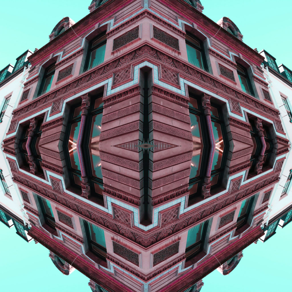
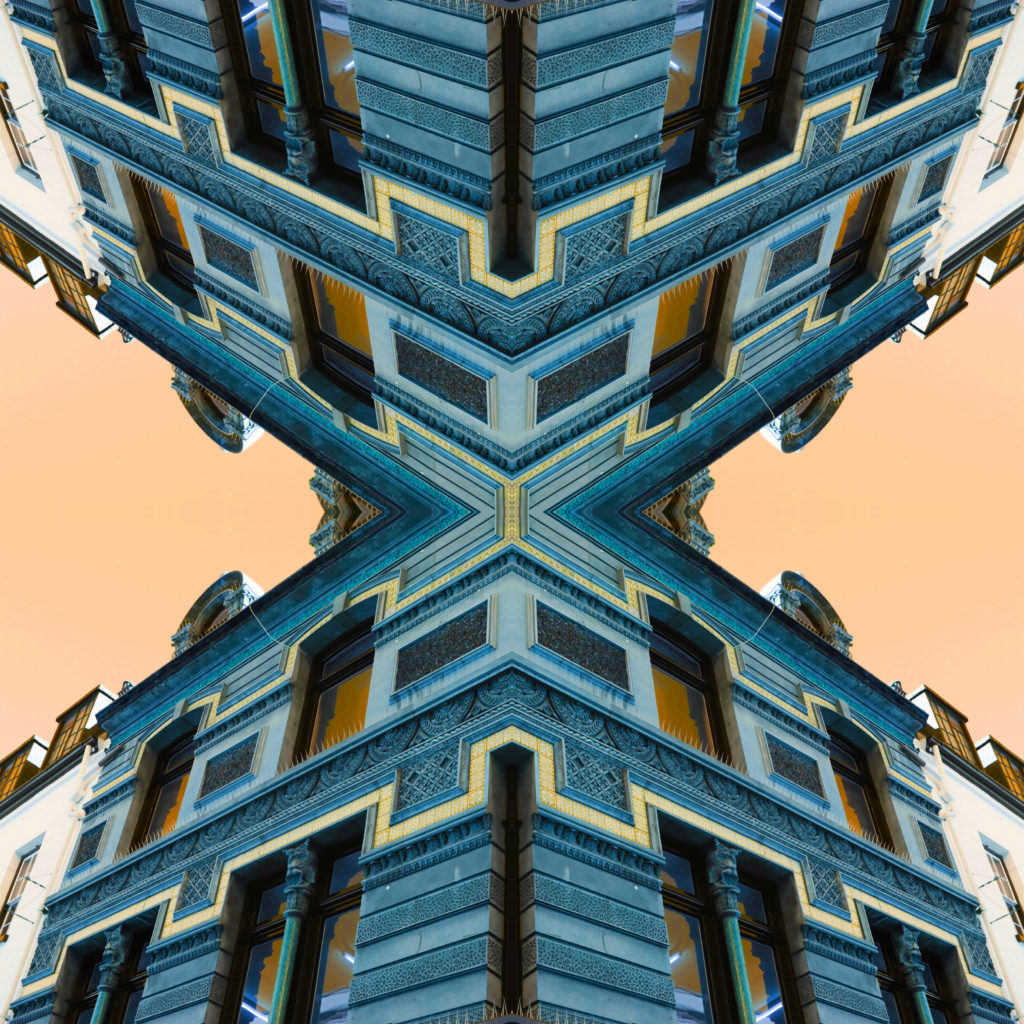
This is a simple effect that I can create on photoshop which gives the image an odd effect, especially when the image includes a sky, as it gives it a literal otherworldly look. I will likely not do something like this but it is something to think about.

Surreal Landscape Photography | Fstoppers

I like how this image uses an artificial light as it gives an otherwise cold setting (a snowy forest) a warm tone, giving a nice contrast which would be nice to explore under this scope.

Dariusz Klimczak's Surrealist Photography: Landscapes of Illusion

I think the way this image uses the water’s reflection to mirror the landscape above it, while also having the leaves floating in the water in the shot gives the image a unique look which would be interesting to recreate in this project.
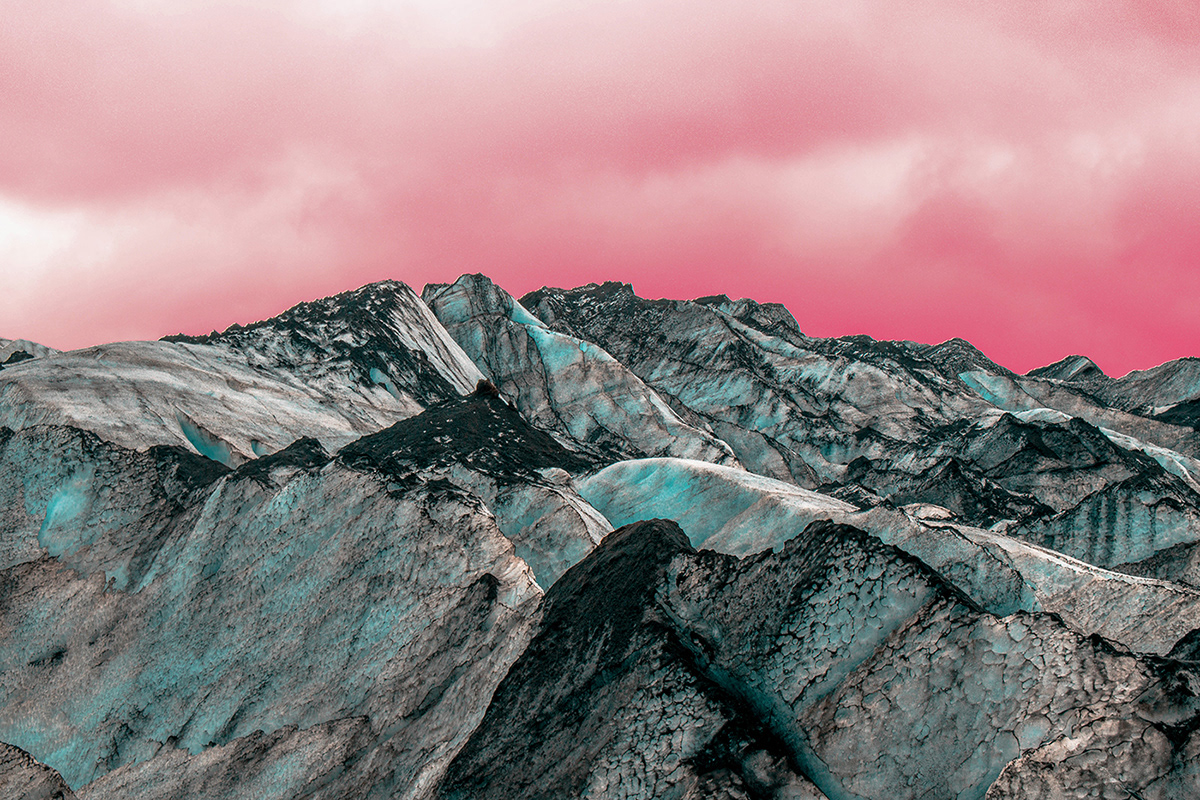
Sleepwalking in Outer Space (II) on Behance

I think the way the photographer has manipulated the colour in this landscape is something I could take inspiration from, as it gives the image an otherworldly look

Final Piece Ideas (Photographers)

These are some photographers I have found which I could use as inspiration for my final pieces at the end of this project:

Debe Arlook

Gert Motmans

Tong Lam
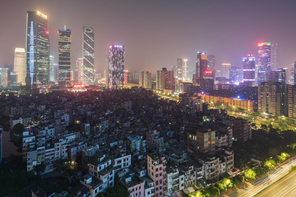
Effie Paleologou

Contextual Study 1: Rut Blees Luxemburg

For my first contextual study for my personal study project, I had a look at an interview between Rut Blees Luxemburg and David Campany from his book So present, so invisible. I read through the interview and selected key quotes that I thought were interesting and chose one of Luxemburg’s photographs and analysed it. I used the quotes from the interview to look deeper into the context and concept of the image.

So Present, So Invisible: Conversations on Photography by David Campany

Quotes selected from Luxemburg’s interview with David Campany:

Rut Blees Luxemburg - Sell & Buy Works, prices, biography

This image’s colour palette is limited to yellows, oranges and greens, giving it an urban and surreal aesthetic. The image also makes use of a strong contrast between the dark blacks and browns and the brighter yellows and oranges, further amplifying the themes of the surreal and urban in a beautiful yet simultaneously disturbing. These tones and colours are due to how Luxemburg used a very low shutter speed in the evening/night, with a tripod. The lines and shapes in this image are mainly very straight, regular and vivid, further removing the subject from nature and giving it a somewhat fixed, almost surreal aesthetic.

For context as to why Luxemburg creates her images this way, she explains that ‘the camera allows what is called a transformation. Something other than what you can see during your mundane, everyday experience of the city can emerge.’ Her use of a long shutter ‘transforms’ the image, making what would be otherwise be a much darker, less detailed image, a detailed, vivid and almost surreal feel. This seems to also transform the city shown into something completely different to what the inhabitants would typically see in their day to day lives, into something unknown or unfamiliar. I think Luxemburg does this to not only give her images an artistic flair, it could also be use to show the artificiality of a city landscape.
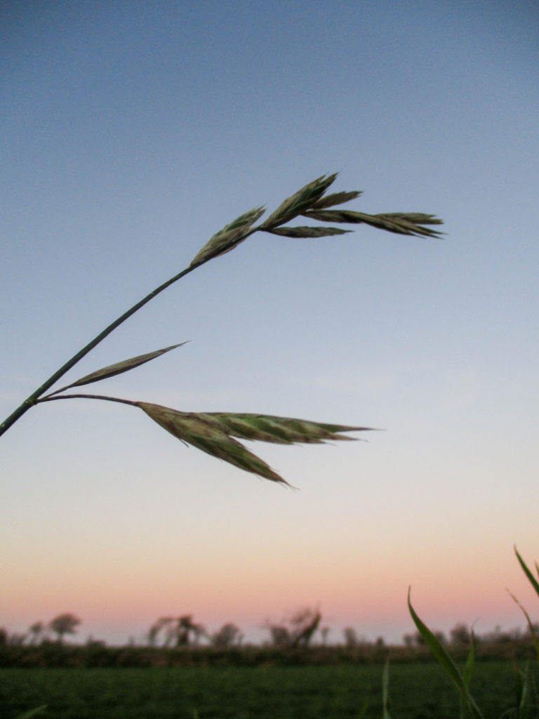
Luxemburg describes walking around the city, the way she finds the places she photographs, to ‘induce a certain state of mind. It’s not dreamlike, but it is almost meditative’, solidifying the idea that what she photographs is very much real and could be realistically considered both beautiful and perhaps dangerous, while the use of a long shutter speed does affect the emotions differently to what would be seen without it. The idea of walking also gives a sense of danger and wonder, perhaps suggesting the dangers of living in a large city and how that affects its inhabitant’s lives.

‘It’s not so much a fascination with photography, but a fascination with the possibilities of the large format camera and the long exposure which allows me to let chance enter the work.’. This idea of chance may very well link with how Luxemburg’s images give off a surreal aesthetic, by letting the camera and city decide how the picture will look, instead of the artist. The control Luxemburg has over her images is much smaller in comparison to a still-life/object image in a studio, seemingly creating conflict between the idea of the subject matter being controlled, while the artist capturing this is not in control of that image. To me, this is a lot of the reason as to why Luxemburg’s images look the way they do, and I think that she knew this very well when taking her images.

Binary Opposites Photoshoot

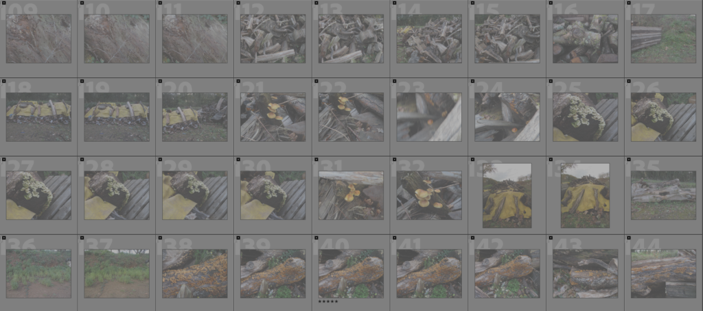
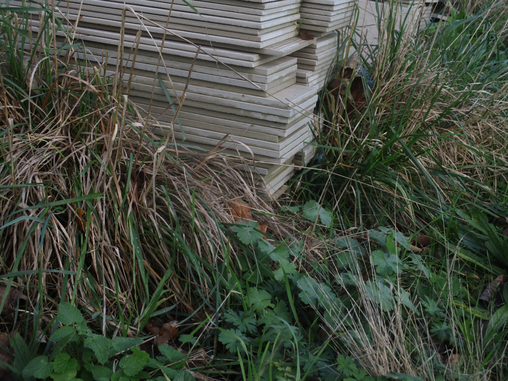
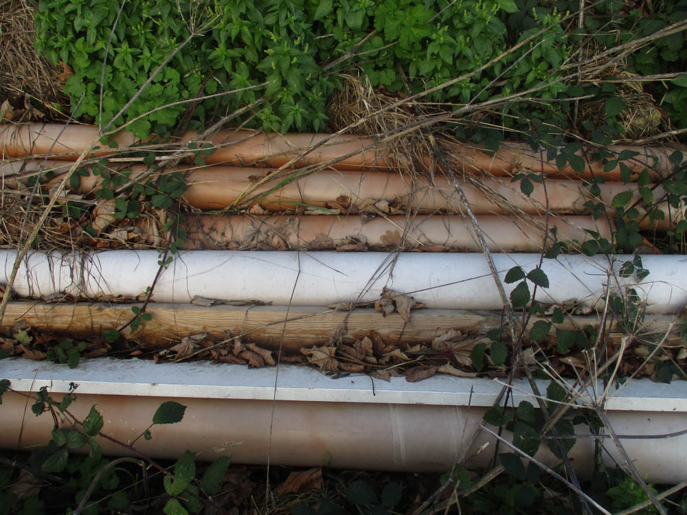
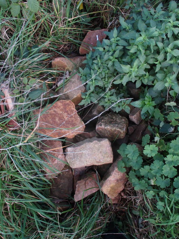
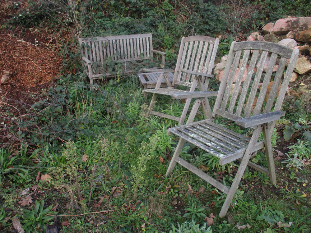
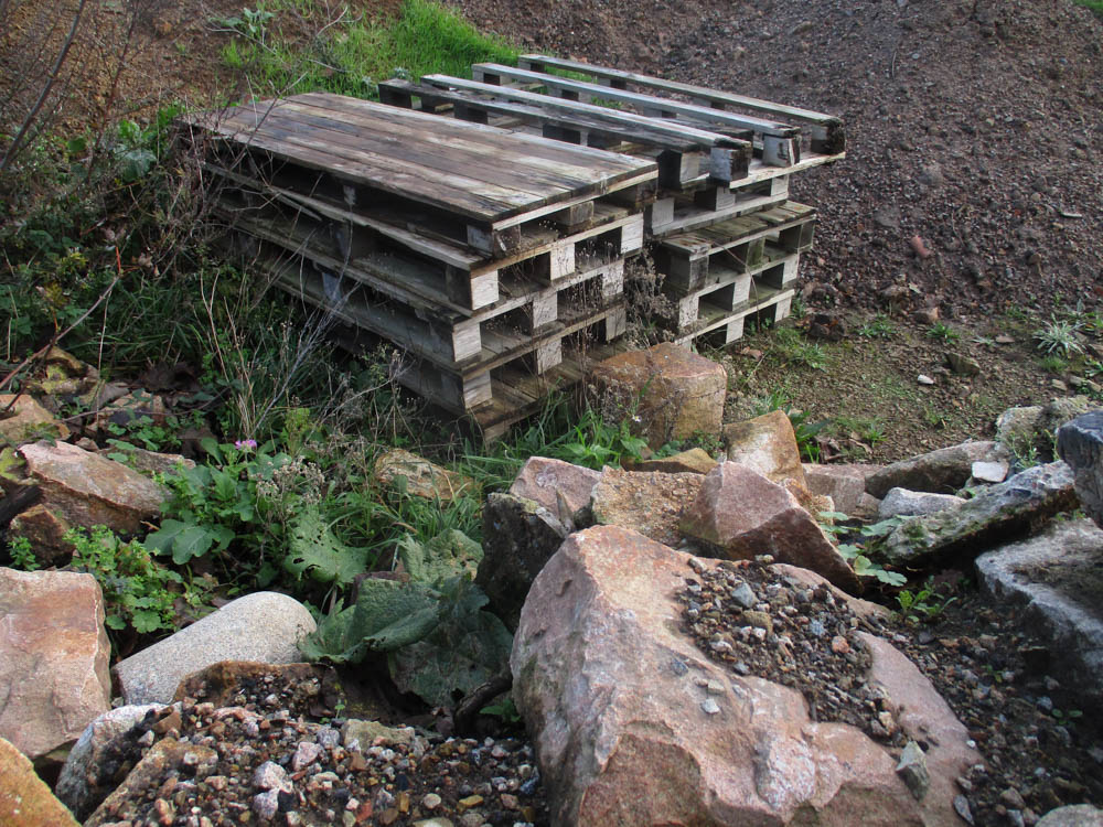
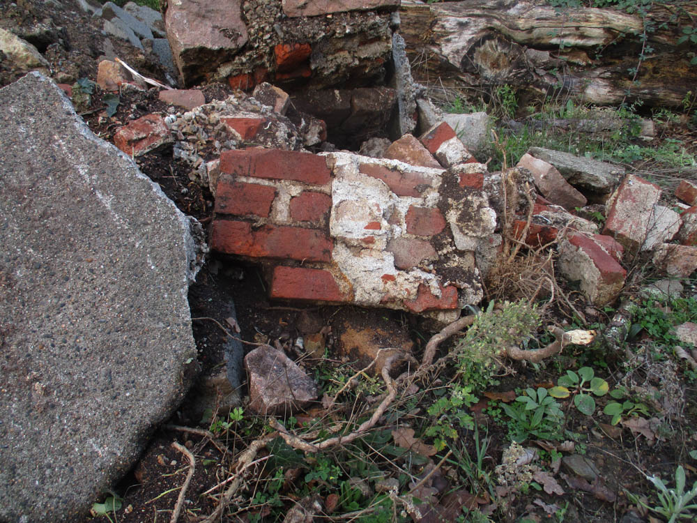
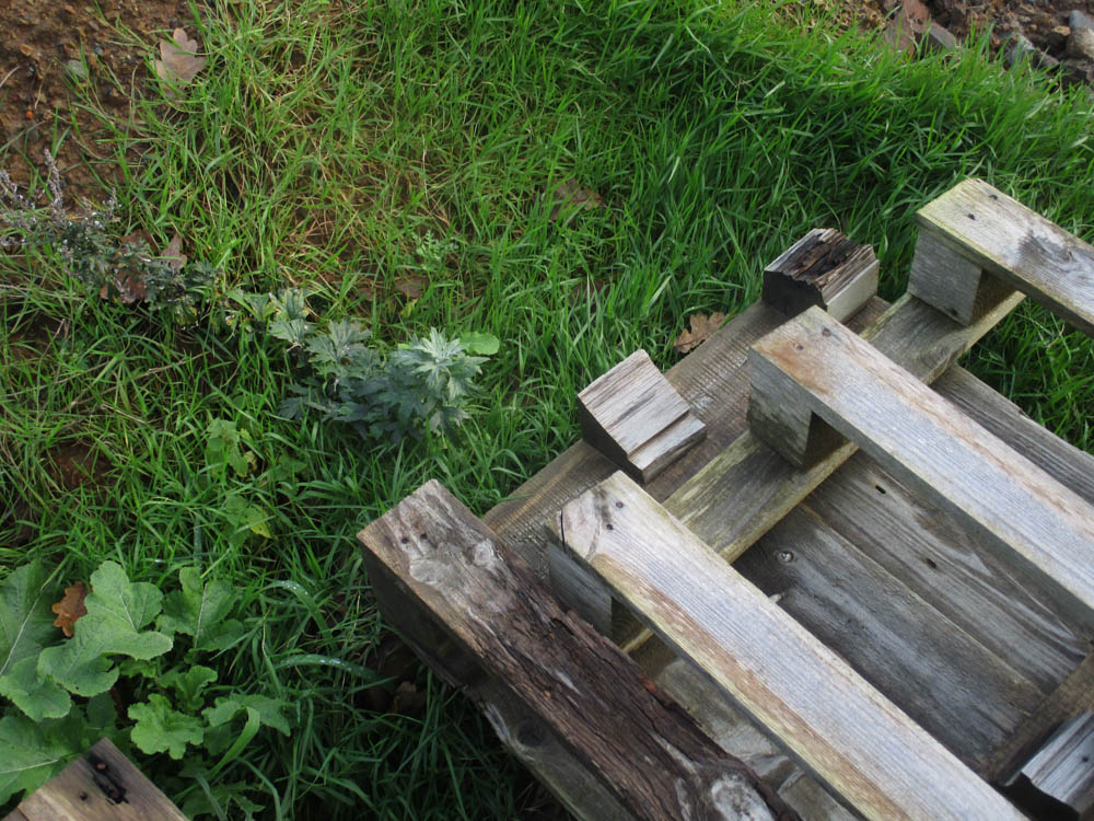
For this project, I wanted to take pictures of a timber pile near my house. I think this will fit with the idea of binary opposites as the pile is in a field and contains man made objects, such as wooden grates, plastic covers, pipes and chairs. Furthermore, I think it will fit with the theme of ISLANDNESS as it mirrors the idea of natural vs. man-made or nature vs urban, which is important for Jersey’s residents.


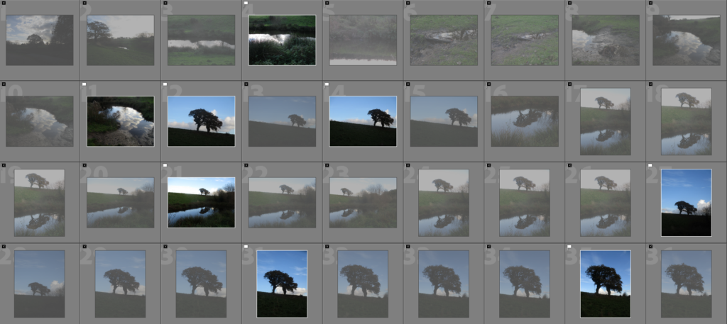
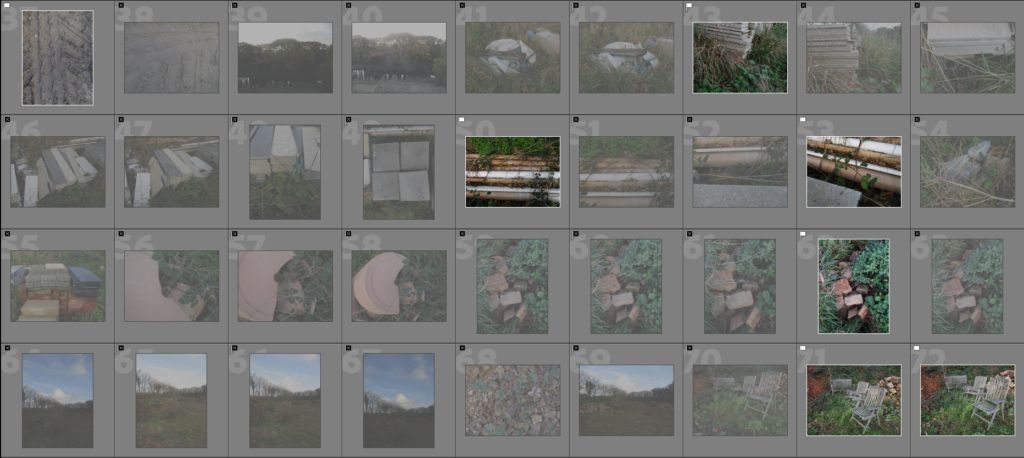
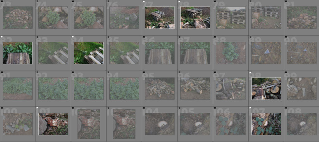
Contact Sheet


Editing Process

From the contact sheet, I narrowed my image selection down to around 20 images

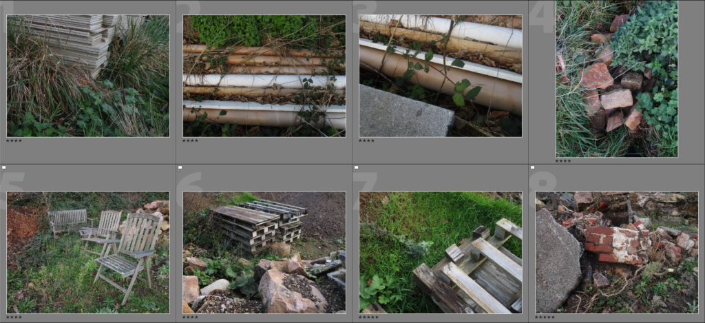
I also gave the images a star rating to further narrow down the selection


Best Images

From this photoshoot, I have ended up with these images which I consider the best from this photoshoot. I like these images because each of them have elements from both a natural and man made subject matter, as well as that they look visually pleasing.


Evaluation

I’m happy with this small project as I think the images, as I have said prior, match with my initial idea of using the binary opposite of nature and man-made subject from within the same image. I think the effect this creates is effective and could link well to my personal study, I could revisit this site for that project with a different theme/topic at a later date for my personal study. I took these images at a later time in the day, so the colours in the natural parts of the images such as the grass, trees and leaves, are vibrant and contrast greatly with the darker, less colourful man-made objects.

Jersey – A Crown Dependency

Crown Dependencies issue further guidance on economic substance - The  Sovereign Group
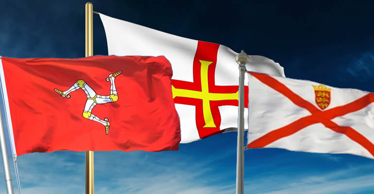
The flags of (from the left) the Isle of Man, Guernsey and Jersey

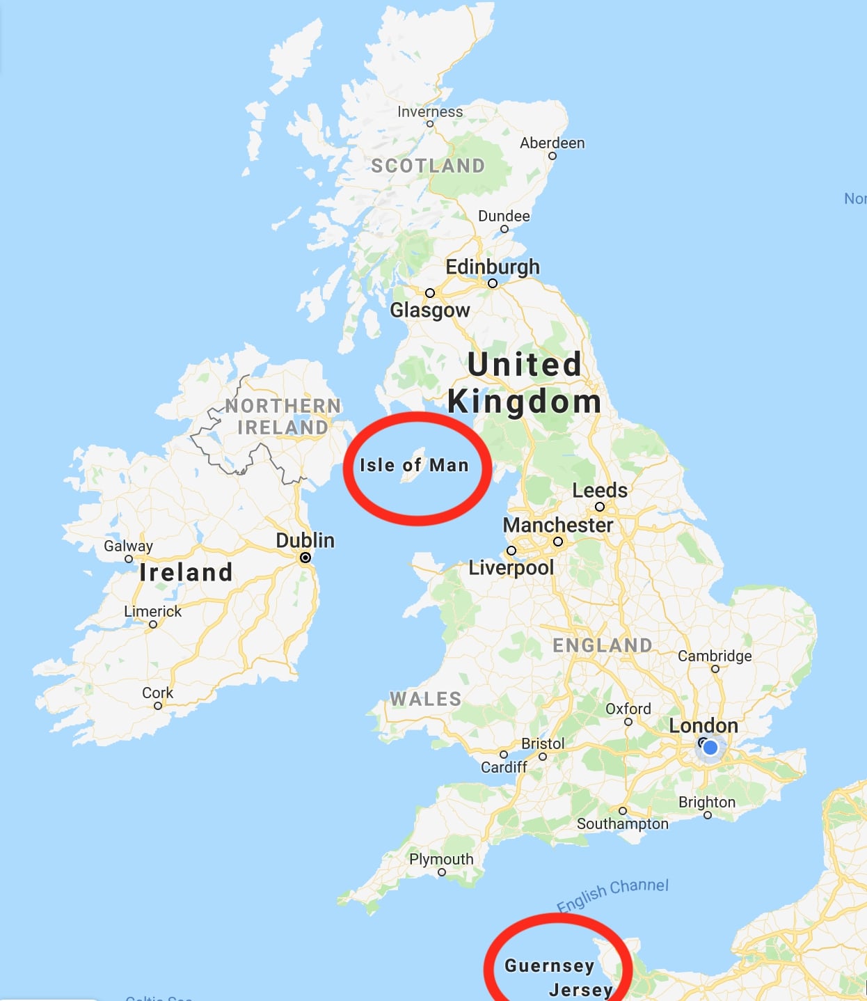
A Crown Dependency is defined as being not a part of the UK, but are owned by the British Crown as self-governing islands. The crown dependencies include Jersey, Guernsey and the Isle of Man. Being self-governing, each island has its own laws, parliament and currencies, giving them an independence while being connected to the British crown.

Briefing: UK immigration law and the British Crown Dependencies - Free  Movement
A map of where the crown dependencies are.

Jersey as a Crown Dependency

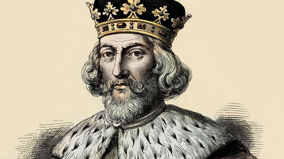
In 1066, Duke William of Normandy had become King William I following his conquest of England, meaning the Channel Islands became a part of the Duchy of Normandy. In 1205, following the Battle of Rouen involving English King John and French King Philippe-Auguste, Normandy was lost to England, as well as the Duchy of Normandy.

King John: Magna Carta, rebellion and myth | Live Science
A portrait of King John

As a result, Jersey was persuaded to align themselves with English rule, as opposed to the French whom had been ruling them for over 100 years. The English King granted them the right to be self-governed, making their own laws and having their own court. Since, a governor, or warden, was appointed by the Kings/Queens to represent them in Jersey.

Jersey Parish Tea Towel - Crafty Quilters Jersey
Stamps of each Jersey parish

The royal court would consult with the Constables (Connétables) of each parish to connect with the people living in Jersey, as well as the church. This led to the States of Jersey being formalised due to the connection with the people, church and courts of Jersey. Eventually, Deputies and Senators were introduced to the states in favour of Jurats and rectors.


Response to Crown Dependencies: Binary Opposites

In response to the idea of crown dependencies, that seem to oppose (or be opposite to) some things from the mainland, we were tasked with the prompt of taking pictures to do with Binary Opposites. A binary opposite is are terms/things that are a direct opposite to each other. To get some ideas for the themes I could take pictures of, I will list some binary opposites below:

  • Good vs. Evil
  • Nature vs. Culture
  • Rural vs. Urban
  • Inside vs. Outside
  • Day vs. Night
  • Cold vs. Warm
  • Public vs. Personal
  • Up vs. Down
  • New/Young vs. Old
  • Male vs. Female
  • Body vs. Mind
  • e.t.c…

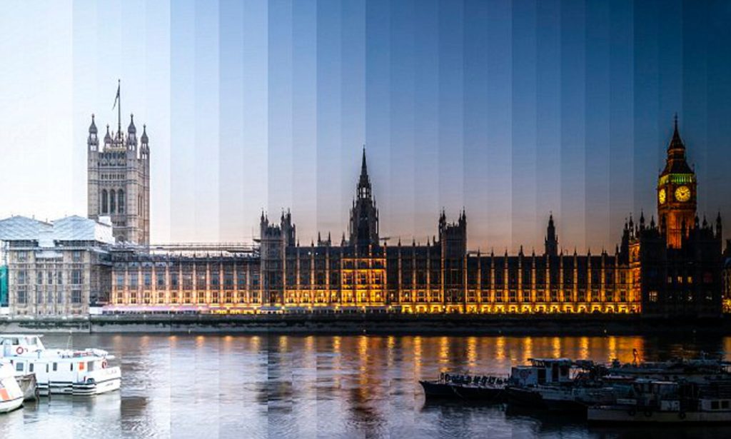
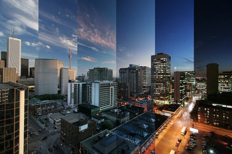
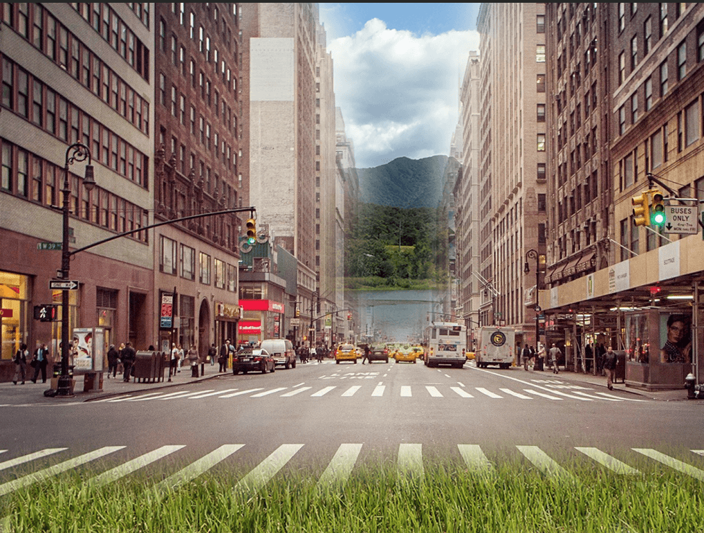
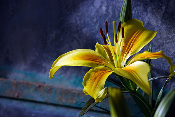
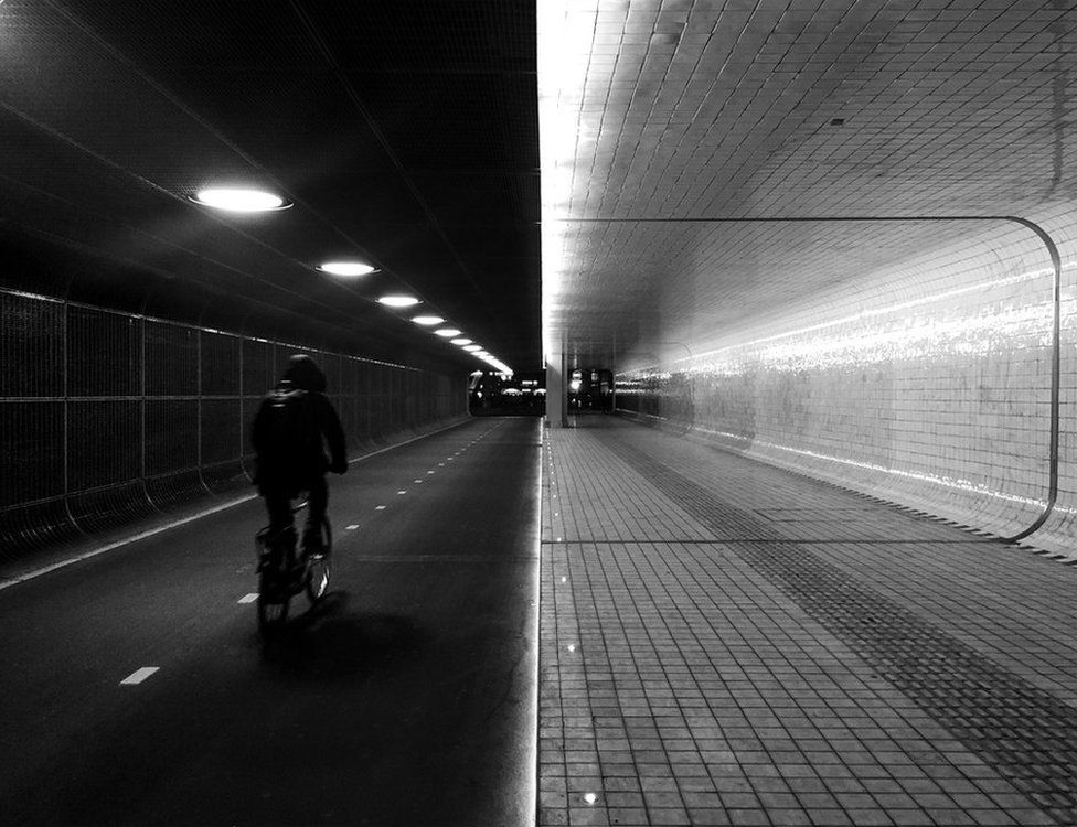
Here are some photographs I have found that I can use to give me ideas for the idea of binary opposites. I looked for images that are opposite in colour and tone, as well as themes such as urban vs. rural and day vs. night. I think these are the types of images I want to take for this photoshoot, as they are simple opposites to understand, while allowing for creativity in the photos themselves. In particular, I think an urban vs rural theme would fit into the idea of ‘Islandness’ and Jersey as a Crown dependency and its relationship with the UK.

Review and Reflect – Past Projects

HERITAGE – IDENTITY

This was the first major project on this photography course, as such, the outcome of the project was not the best, and the path the project took was not straight forward at all. The photographs themselves were of a good quality, some of which I still think are strong as of writing this (I particularly thought the image on the top row on the right of the images below was a good concept that could be re-visited). I have written about how/what this project taught me, such as to be better at planning and more focussed on my photoshoots, and I do think that this was a vital step for my growth as a photographer. For my current personal study project, the landscape images in this project, which I consider some of the strongest, could provide an inspiration and starting point.


NEW TOPOGRAPHICS – ANTHROPOCENE

This was the second, and what I consider to be the strongest and most-enjoyable-to-produce, project of the course. The outcomes resembled the artist I was researching, the images were strong, interesting and adhered to my success criteria and the photoshoots themselves were very fun to take. This project allowed me to explore some of my favourite genres in photography, being abstract and landscape (and a mix of the two), in addition, due to referencing Andy Warhol, I experimented with colour, which I also find interesting. From the project, I learned that nature and landscape photography are what I find enjoyable and I would like to include them in my current personal study. Some of these themes can be included and improved upon in my personal study.


ISLANDNESS – MY ROCK

My Rock was the last big project before starting the personal study. This project included trips to multiple SSIs in Jersey (such as L’etacq, Le Pinnacle and Green Island) which gave me further insight not only into the island and some of its history, but also SSIs around the world and their function. As a whole, I enjoyed this project as landscapes, the genre that makes up a large majority of this project, is one of my favourites to photoshoot. I think the outcomes for this project were successful, the photomontages I created made me realise how many different directions I could take when creating a final piece and the zine gave me a better understanding of how photobooks are created and stories are told from them, which will help me greatly in my personal study.

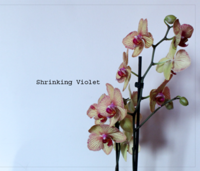
Shrinking Violet – Shannon O’Donnell Personal Study Analysis

In order to get a better understanding of how I am meant to write my own personal study, I read through Shannon O’Donnell’s personal study ‘Shrinking Violet’, which aims to challenge the perceived role of women in a western society. As of now, I do not know what the theme of my personal study will be, so I may or may not consider this as a theme for when I do create my own personal study.


Does the essay address its hypothesis?

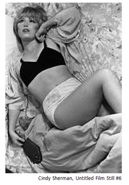
O’Donnell’s essay very clearly addresses their hypothesis, as they clearly mention, and link to, Claude Cahun and Cindy Sherman’s work throughout, as well as linking them to the theme of gender politics and female stereotypes as outlined by the hypothesis.


Does it provide new knowledge and understanding?

The essay provides a large amount of context into feminism, its role and history, as well as Cahun and Sherman as artists and feminists, without swaying from the subject of the hypothesis.


Is the essay well structured with a sense of an introduction, paragraphs and a conclusion?

O’Donnell’s essay is very clearly structured, it has a clear introduction that explains the main points of her essay before they go into further detail, the paragraphs are clearly separated and informative and the conclusion offers the main point of the essay with links to the hypothesis.

A snippet from the clear conclusion at the end of the essay.

Use and flow of language, prose, punctuation, spelling.

The use of language and grammar in this essay is very clear and portrays O’Donnell’s points very clearly.


Use of specialist vocabulary relating to art and photography.

There is some usage of specialist vocabulary which O’Donnell uses in order to point out how the photograph/painting portrays women and/or gender stereotypes.


Analysis of artist’s oeuvre (body of work) and key work(s).

O’Donnell’s main images (from the photobook tied to the personal study essay) clearly link to the theme of the essay, and also matches the style of Cahun and Sherman’s work, suggesting they stuck close to the ideas presented in the essay.

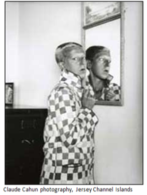
An image of Claude Cahun’s analysed in the essay

Evidence of wider reading with reference to art history/ theory, political discourse and/or socio-economical context.

O’Donnell links her points to historical events and figures, such as the suffragettes, Claude Cahun’s activism during Jersey’s occupation, as well as the traditional perception of women’s role in society.


Use of direct quotes, summary or commentary from others to make an informed and critical argument.

O’Donnell clearly uses several quotes from both artists mentioned in the hypothesis, as well as from other appropriate persons, to strengthen her main points.

A quote taken from Claude Cahun used in O’Donnell’s essay

Use of referencing system (eg. Harvard) and a bibliography.

The essay does not include a bibliography (on the same document(s) as the essay is shown on), however it does include suitable footnoting.

The footnote on the first page

Use of illustrations with captions listing name of artist, title of work and year of production.

O’Donnell’s essay does include images portraying her point(s) and selected images from the artists chosen all with captions.

An image used by O’Donnell in the essay

Marking the Personal Study

In order to get a better understanding of how the mark scheme works and how to apply it to a body of work, I marked O’Donnell’s personal study.

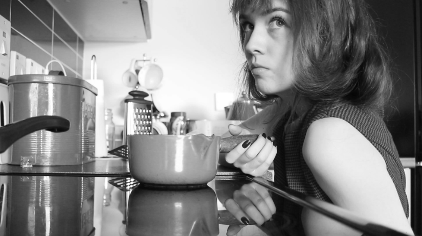
One of the images included in O’Donnell’s photobook

After reading and reviewing O’Donnell’s personal study, I can safely say that the marks would be within the Level 6 range (16-18), as they can clearly communicate their point using specialist art/photography terminology that expresses complex ideas. O’Donnell’s response is clearly well thought out, personal and meaningful response. I would give it a 17/18 for the personal study

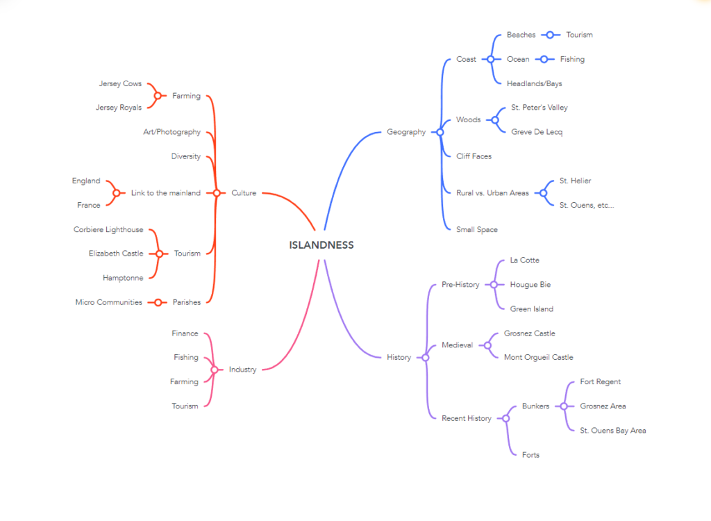
Islandness – Mindmap

Here I have made a mindmap of topics that fit within the theme of ‘Islandness’, in order to get a better idea of the subject matter of the images I will take for this project.


Moodboards

As of right now, I think the theme that interests me the most would be ‘Geography’, as it contains a lot of subjects such as the coast, woods and rural vs. urban that I would be interested in exploring further.

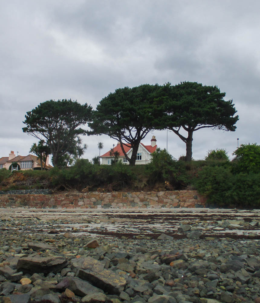
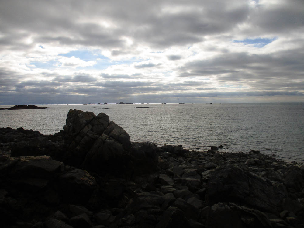
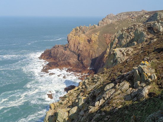
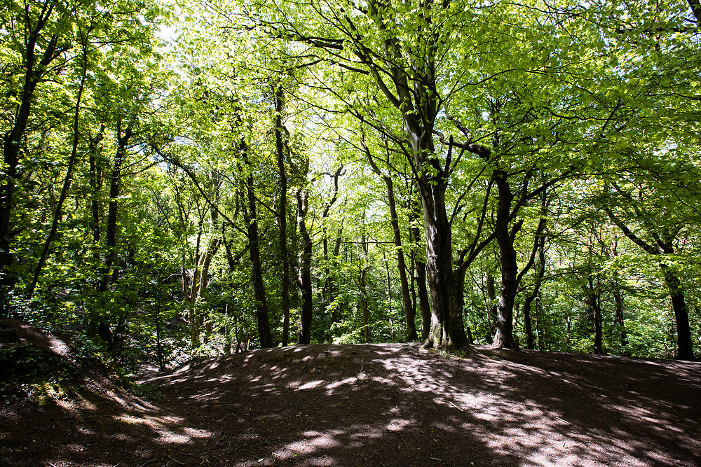
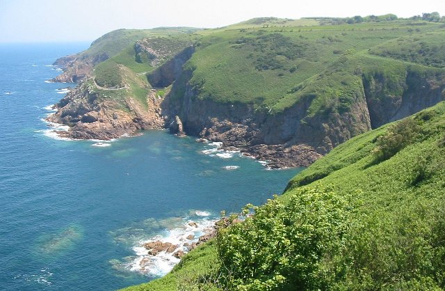
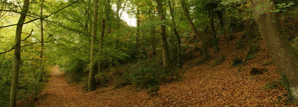
Here are some images of Jersey’s coasts and woods for some inspiration

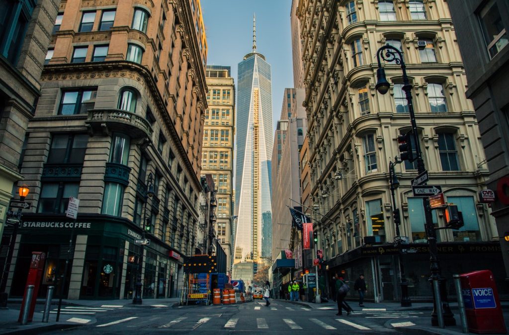
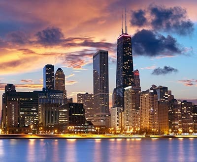
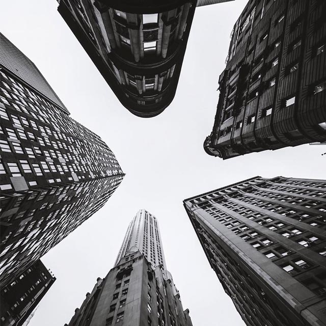
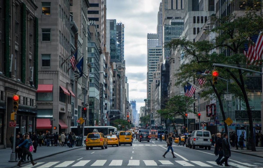
Here are some ideas (the images are not from Jersey) of cityscape photography.

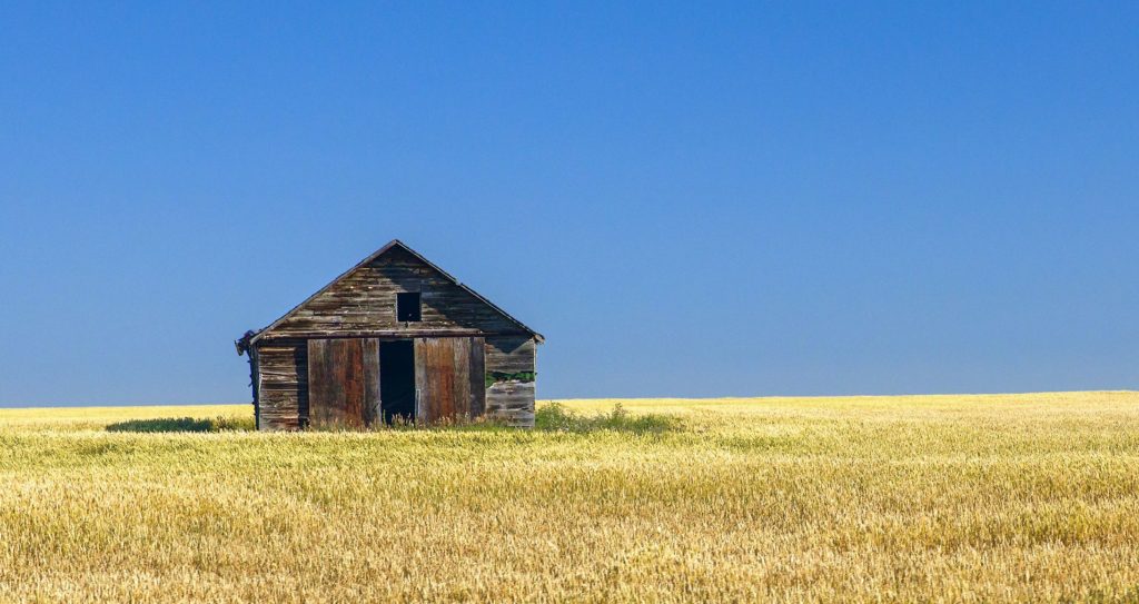
These are ideas for a rural photoshoot (the images are not from Jersey).

Zine Evaluation and Virtual Gallery

Virtual Galleries displaying some of the best images from this project


Evaluation

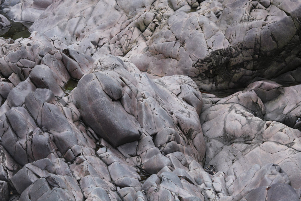
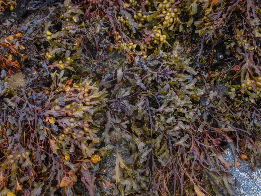
I think this project turned out to be a success as my zine was successful with regard to following the success criteria, as well as a direct improvement not only (in my opinion) in subject matter/photographic presentation of the images, but also how I planned and constructed my zine to make it into what it turned out to be. Knowing this, I now know that I have improved my skills since then, which will help motivate me to do better in the next project, whether or not I create a zine in it. As for the success criteria, I was able to include a mix of close-ups and landscape images, which adheres to my initial plan for the zine. While perhaps not as colourful and vibrant as I made it out to be, I think my idea of ‘vibrancy’ was met with most (aside from the BNW images in the zine) of the images included. After viewing some of my peers’ works on the blog, I have noticed that a lot of them use vibrant colours in ways that intrigue me, I would like to use their themes and aesthetics as a means of inspiration for my next project also. As for the intended subject matter for my zine, I definitely included a focus on rocks and seaweed, which I found creates a contrast within natural substances.

What went well: 

I think my zine stuck close to my original plan I laid out for it, which meant that I was able to accurately follow my own success criterion. As my second zine, I think I have improved how I plan and create my zine from the last time, as the zine followed a sequential order, theme and narrative that I think was much stronger than my first. With this zine, I learnt how to better order my zine, as well as the image selection, to give it a story. I was able to include an image taken by Guiton in my zine, which gave it a link to the archive itself, as well as the history of Le Motte.  

What I can Improve on: 

I think one of the weak points of my zine was also one of the stronger points: the (almost) symmetrical order it has. Because of this, I felt like my experimentation was not as in depth as it could have been, especially when it comes to the layout of the images. Next time I will be more experimental with how I lay out my images on each page, such as leaving space to place text in and so on.  

Zine Making – Constructing the Zine

In order to construct the Zine digitally, I will use Adobe InDesign to lay out each image on each page, as well as include any text and experimentations digitally. My Zine will be 16 pages, some images will take up a two page spread, while others will be one image per page.


Image Experimentation

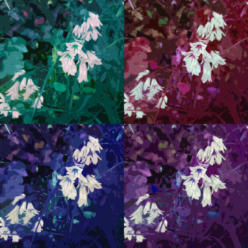
This is a simple experimentation on one of the images. As the image itself was fairly dark in tone, I thought it would be a good idea to see how the image would look if I inverted it. I don’t think this was that effective so I won’t use this in the zine.


Despite my zine focusing on the vibrancy of the images, I want a few black and white images at certain points in the zine to create a contrast. These are the black and white images I plan on using:

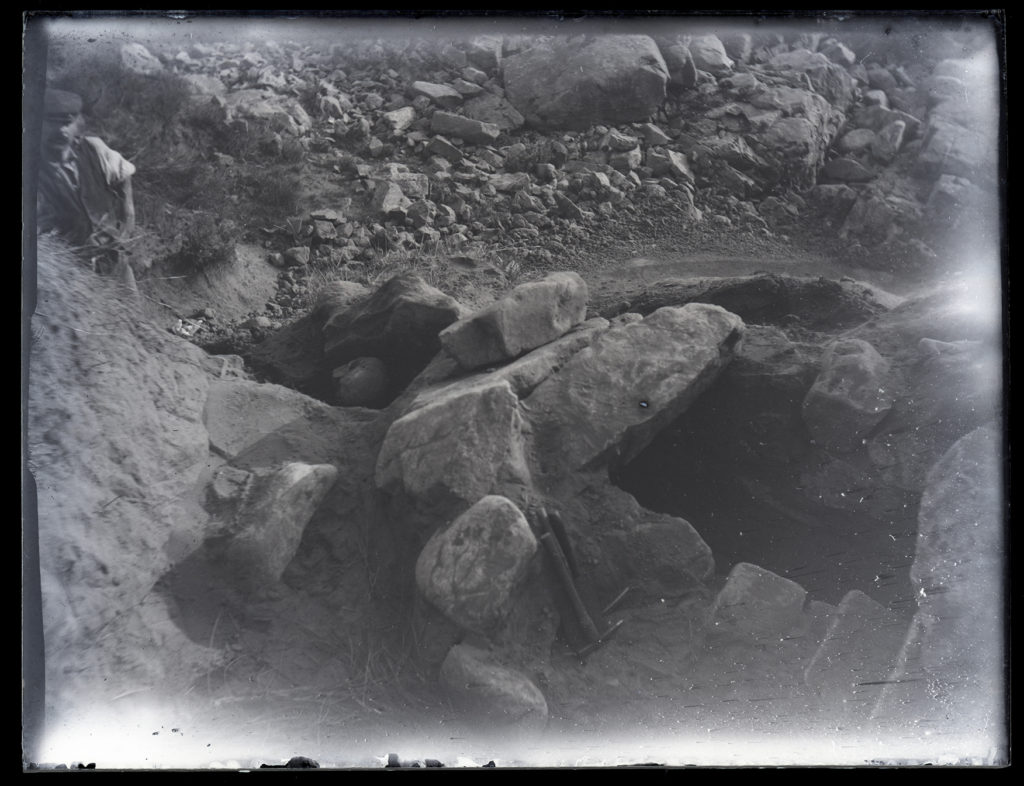
As well as these images, I will be using an archived image taken by Emile Guiton showing the La Motte Excavation:

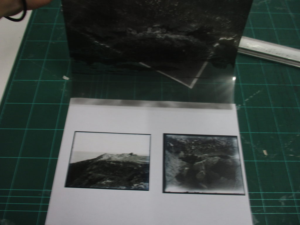
For the seventh page spread, I am planning Guiton’s image on top of it, to create the symmetry that the zine has (the second and second-to-last spreads are both large double-page spread images that are black and white). I will use one of my own images of green island and place an image by Guiton on top. I want to have the viewer lift Guiton’s image up (from tape) to reveal the new image underneath. I think this interaction will create a sense of turning back time, linking nicely to the archive. Above is Guiton’s image I will use.


For my original experiment, I had two images from Guiton on the original Zine and having one of my images being placed over it:

This is the original page spread, with two images of Green Island from the archive.

This is the page spread with my image printed in acetate laid over it.

This is that same image but with the acetate lifted as a demonstration of how it would work.

This is my image as a plain piece of paper laid over the original spread.

This is another demonstration of me lifting the page to see how it would work.

I think swapping the layout of this spread around (so my image is on the zine and Guiton’s is the interactable addition to the page) will be more effective as it will give my image more of an emphasis, it will also fit with the symmetry of the zine better.

Here is an example of the new layout:

This is what the layout looks like on the printed zine:


Zine Layout

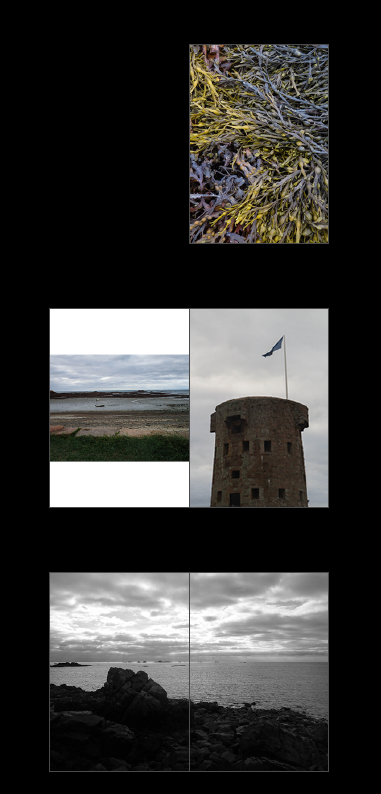
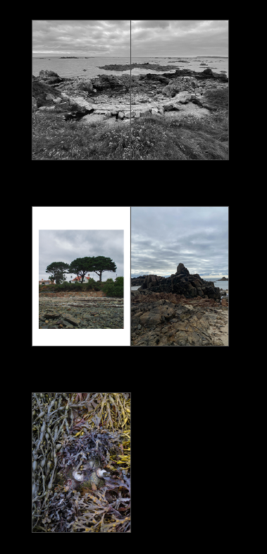
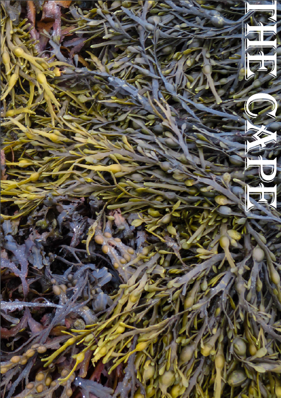
For the front and back page I used one image of seaweed spread between the two. I chose this because it is a colourful image with striking lines and textures. I chose the tower as the main image on the second page spread because it marked the start of the journey of the photoshoot, but also acts as a way to point towards the other image on the left (with the flag). I chose the third image to be a double page spread because it contrasts with the previous pages and the next because of how it is laid out, as well as the fact that it is black and white.

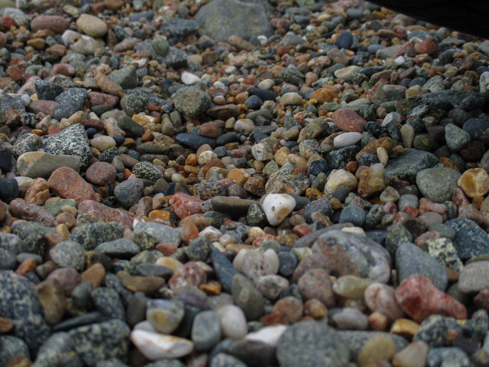
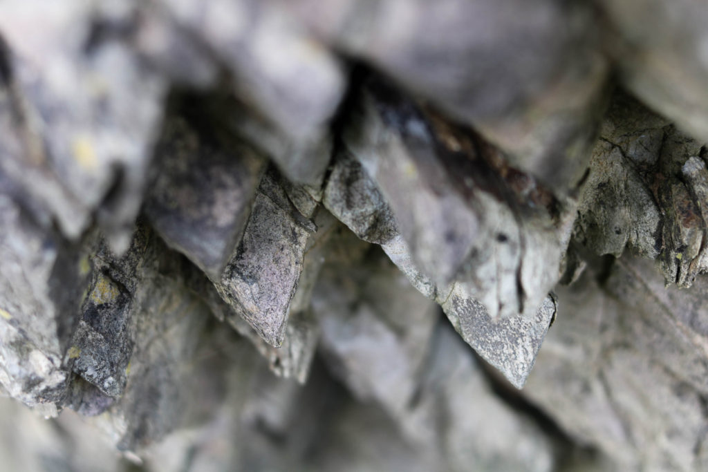
For the fourth page spread, I chose this layout because it fits with the almost ‘endless’ amount of small rocks and pebbles, which is represented by the higher amount of these images in the page. I chose the seaweed to take up a double page spread next because it continues the sequence of the large seaweed images, contrasts with the previous and next page spreads due to it’s colour. The sixth page spread is similar to the fourth (with the sequence reversed) to mirror the other pages. It is also worth mentioning that the zine’s viewpoint is getting closer and closer until the fifth page spread (which is the middle of the zine) where it then starts to zoom out.

On the seventh page spread, I chose two images by Emile Guiton and put them on each page in a uniform sequence, similar to how a document contact sheet would be laid out. The next page spread consists of two images (the one on the left has a frame) which the horizon line of it leads into the image on the right which is a full page image of a rock. The boarder creates an emphasis on the image on the left. The back of the zine is the other half of the image on the front cover.


Name of the Zine

While thinking of a name for my zine I wondered what Le Hocq meant in modern English. After searching it up, I found that Le Hocq means ‘the headland’ or ‘the cape’ in English.

I think I will use one of these (perhaps with or without ‘the’) to name my zine.

Text:

As for the placement of the title itself I had a few ideas of where to put the text, the font I will use and the orientation of the text.

I think I will use the layout of having the title in the centre of the page, as it gives the text enough space to stand out, it also isn’t too light/dark as to obscure parts of the font.


In terms of the font, I will use ‘Algerian’ as it is a nice serif font that will give the title an older aesthetic, which I think is fitting for the subjects of the zine.

I also experimented by using an underline to divide my name and the title of the zine.


Final Front Page

Zine making – Narrative and Image Selection

What is your story?
Describe in:

3 words: Rock, Seaweed, Bay

A sentence: A journey through the bay with sights of rocks and seaweed.

A paragraph: Mirroring my own photographic ‘journey’ through Le Hocq, my story will (somewhat) follow the path I took through Le Hocq. The story will start out with wider landscape photographs and slowly zoom in towards the finer details, until it will zoom back out again to resemble the end of a journey.


Points to Consider for my Zine

How you want your design to look and feel – I want to put a focus on the rocks and seaweed found on the bay. I also want to make my images appear more vibrant, as opposed to a more documentary-like aesthetic, however I may include some black and white images as well.
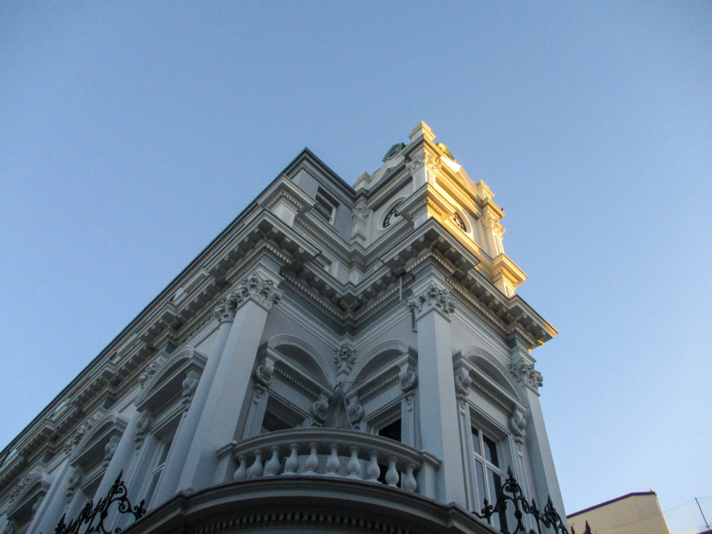
Format, size and orientation – I will experiment with page spreads and how big the images are in comparison to the page (1/2, 2/3, Boarder Single, Single No-boarder, etc…).

Narrative and visual concept – I want my zine to be a journey of Green Island and the bays around it, including both close up and landscape images to show the wider scale, to the smaller details one might miss.

Design and layout – I will aim to make my zine ‘symmetrical’ in the sense that the first page spread (page 2 and 3) will mirror the eighth page spread (page 14 and 15) in terms of layout and aesthetic. I think this will give a structure to my zine that will help it tie into itself.

Rhythm and sequencing – As stated above I want the rhythm of my zine to be ordered (symmetrical) so that the rhythm, sequence and narrative of the zine is displayed by the arrangement of the images.

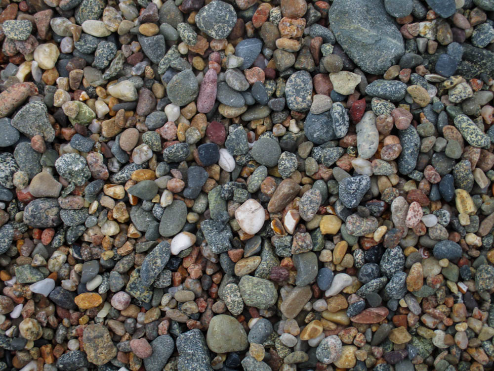
Images and text – My images will be mainly landscape images of the bay at Le Motte, including close-ups of stones.

Title and captions – I want my zine’s title (and captions if I decide to include them) to involve the idea of a bay/rocks/seaweed in some way, perhaps a description of all three at once.


Moodboard

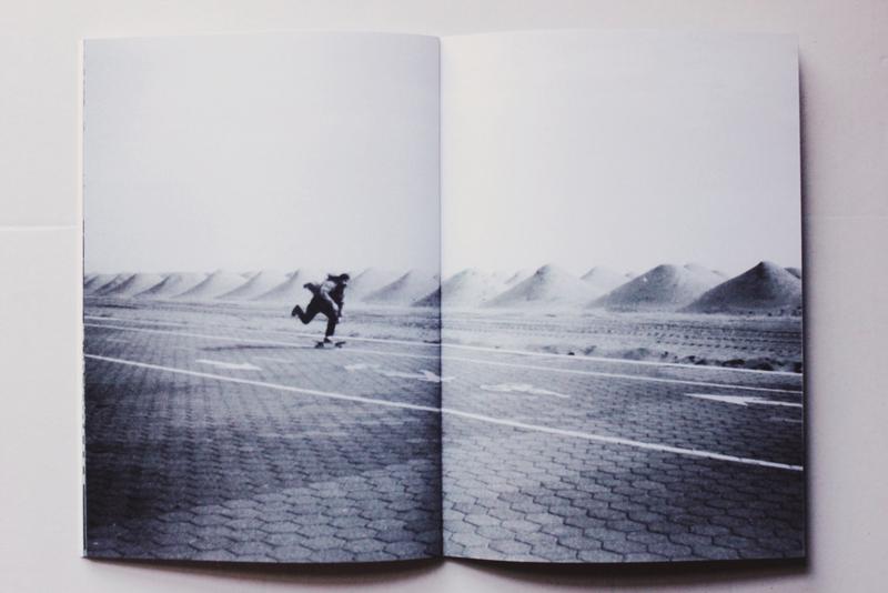
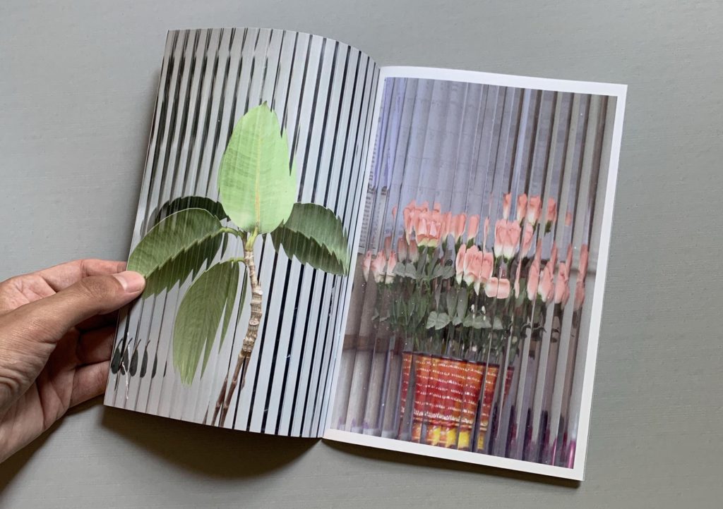
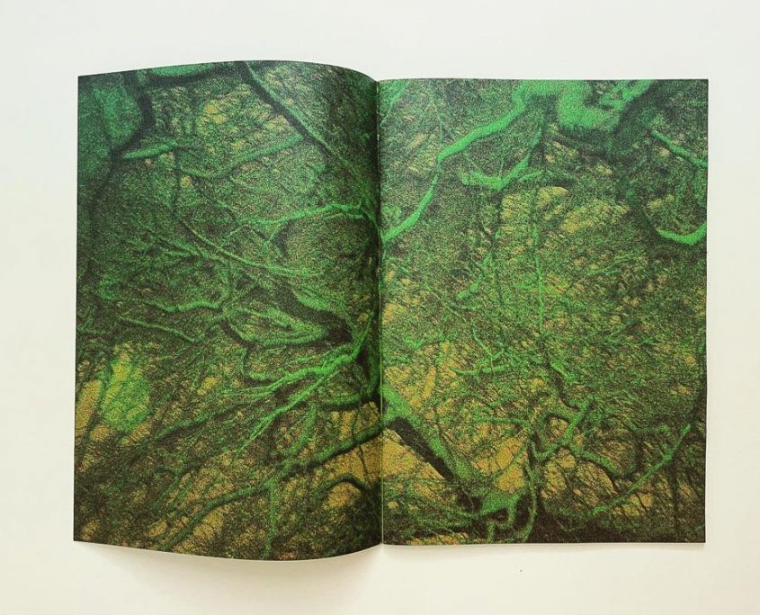
As stated above, I want my Zine to be on the vibrant side, so these are zines that I found that match that description. I will also use some black and white images to create a contrast with the more vibrant ones. The bottom image (largest) in the moodboard fits what I am going for, however this may change during the experimentation/creation stage.


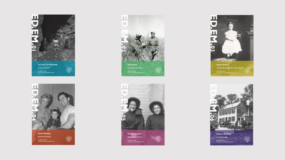
These are some examples of published zines created by the Société Jersiaise: Éditions Emile, which was named after Emile Guiton whom I have written about before. These zines are produced twice a year, each with links to the archive and the history they have recorded. The zines include images stored in the archive (some perhaps taken by Guiton), and some images are created in the modern age for the zine.


Image Selection

These are the images I will be using to create my Zine (all of the images are edited, some with black and white or cropped versions).