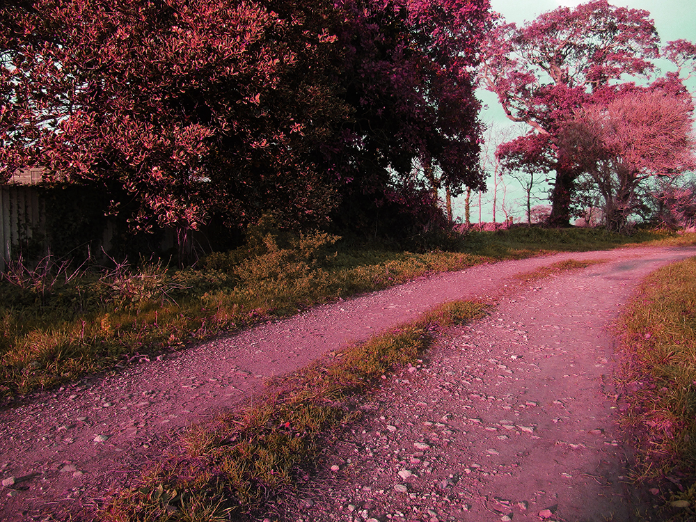
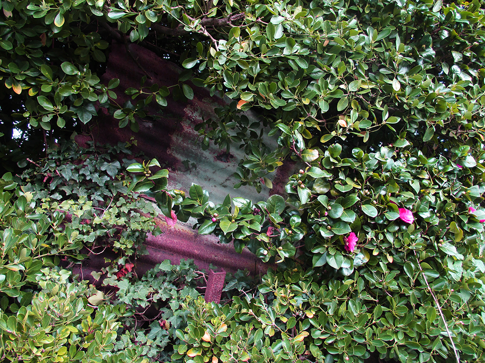
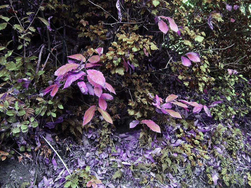
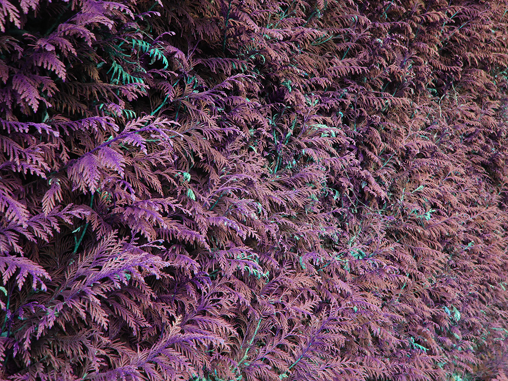
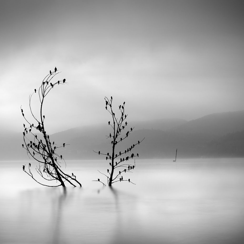
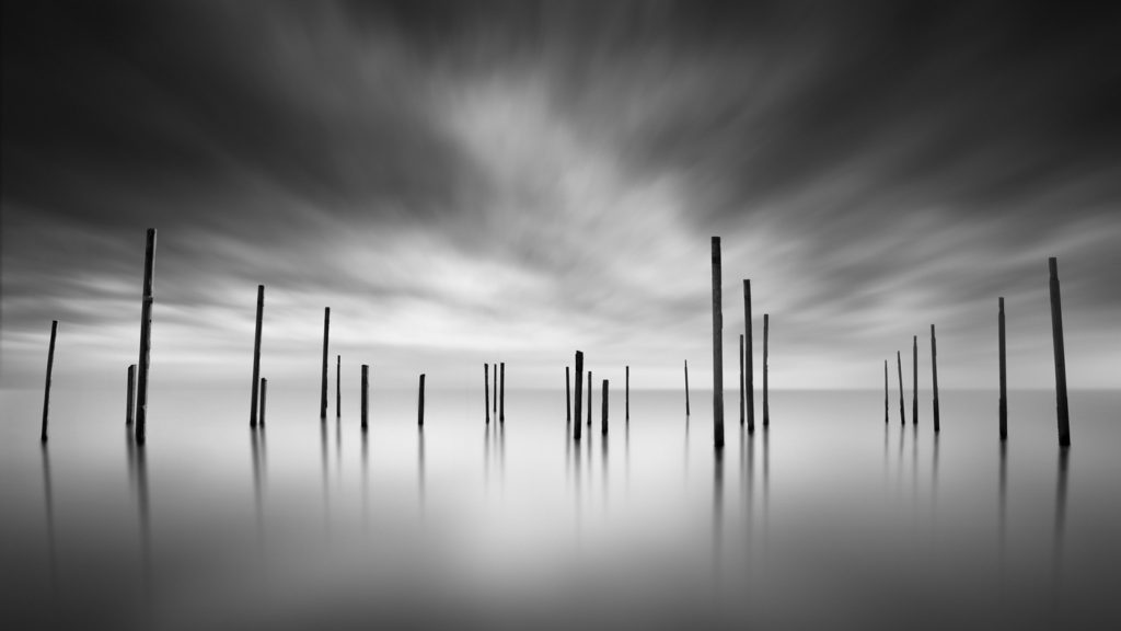
All posts by Joshua O

Filters

Author:
Category:

Essay Writing

Academic Sources:

  • Research and identify 3-5 literary sources from a variety of media such as books, journal/magazines, internet, Youtube/video .
  • Begin to read essay, texts and interviews with your chosen artists as well as commentary from critics, historians and others.
  • It’s important that you show evidence of reading and draw upon different pints of view – not only your own.
  • Take notes when you’re reading…key words, concepts, passages
  • Write down page number, author, year, title, publisher, place of publication so you can list source in a bibliography

Bibliography

List all the sources that you have identified above as literary sources. Where there are two or more works by one author in the same year distinguish them as 1988a, 1988b etc. Arrange literature in alphabetical order by author, or where no author is named, by the name of the museum or other organisation which produced the text. Apart from listing literature you must also list all other sources in alphabetical order e.g. websites/online sources, Youtube/ DVD/TV.

Quotation and Referencing:

Why should you reference?

  • To add academic support for your work
  • To support or disprove your argument
  • To show evidence of reading
  • To help readers locate your sources
  • To show respect for other people’s work
  • To avoid plagiarism
  • To achieve higher marks

What should you reference?

  • Anything that is based on a piece of information or idea that is not entirely your own.
  • That includes, direct quotes, paraphrasing or summarising of an idea, theory or concept, definitions, images, tables, graphs, maps or anything else obtained from a source

How should you reference?

Use Harvard System of Referencing…see Powerpoint: harvard system of referencing for further details on how to use it.


Bibliography

Examples of Referencing:

Bibliography:

Paiva, T. (2008), Night Vision: The Art of Urban Exploration. San Francisco: Chronicle Books LLC

Online Source:

Direct Quote:

In his recent book, Paiva writes about the ‘relentless drive of humans to both build and explore’. (Paiva 2008: 9)

Paraphrasing:

Paiva (2018) writes about the drive humans feel to build and explore.


Abel-Hirsch, A. (2019), ‘ Blackwater River’ in British Journal of Photography. Issue 7890: 50-67


Essay Plan

Essay Question:

Subject matter: Technology/Light/Aesthetics

In what way has Rut B-L and Robbie L made images at night that references an otherworldly effect?

In what way does Rut B-L and Robbie L use artificial light to create a surreal tone?

Opening quote

Introduction (250-500 words): 

What is your area of study? Surreal and abstract photography that displays nature as damaged/overrun/etc… within the genre of landscape/night/object/studio photography

Which artists will you be analysing and why? Robbie Lawrence as his ‘Blackwater River’ project has images that are akin to what I am aiming to produce (the theme of the project isn’t exactly the same but some of its roots are similar). Rut Blees-Luxemburg as I have interpreted her work as representing the relationship between humanity’s effect on nature.

How will you be responding to their work and essay question? I will aim to create my own work with motifs of theirs, while linking it with this project’s theme and essay question.

Pg 1 (500 words): 

Historical/ theoretical context within art, photography, visual and popular culture relevant to your area of study. Talk about Surrealism/Abstractionism Make links to art movements/ isms and some of the methods employed by critics and historians. Modernism 

Pg 2 (500 words)

Analyse first artist/photographer in relation to your essay question. Present and evaluate your own images and responses.

Pg 3 (500 words):

Analyse second artist/photographer in relation to your essay question. Present and evaluate your own images and responses.

Conclusion (250-500 words):

Draw parallels, explore differences/ similarities between artists/photographers and that of your own work that you have produced

Bibliography: List all relevant sources used

Photoshoot 2: Dávid Biró Inspired Shoot

The plan for this photoshoot is on this blogpost.


Editing

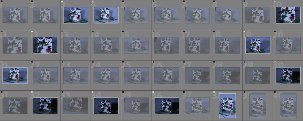
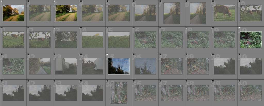
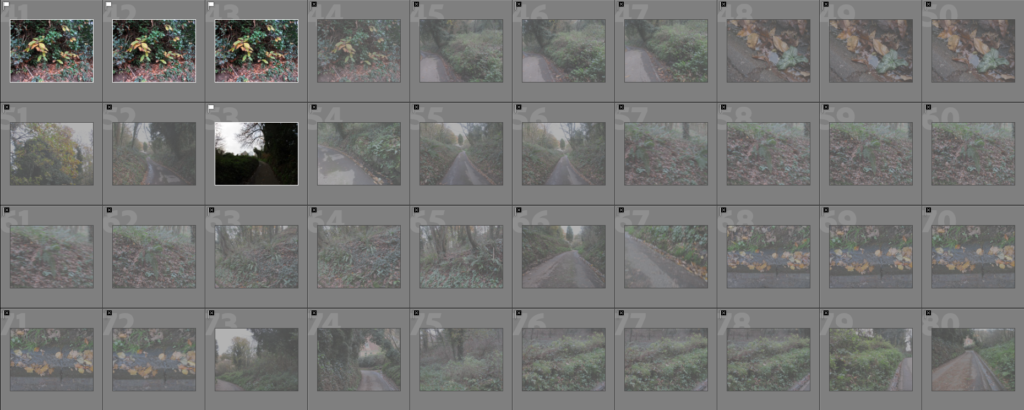
Contact Sheet


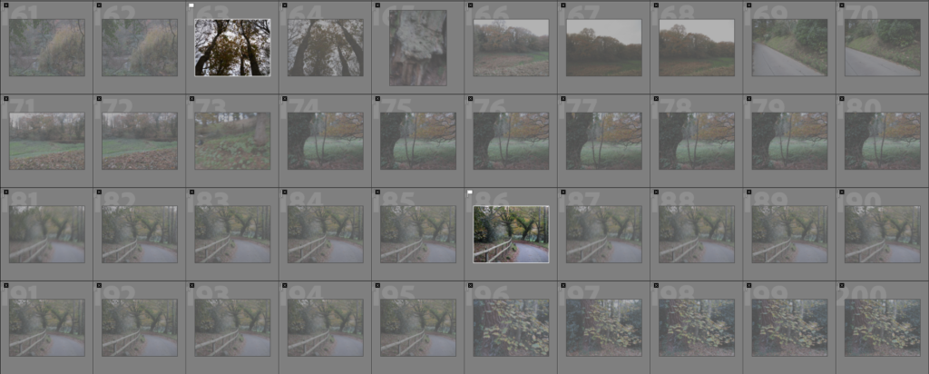
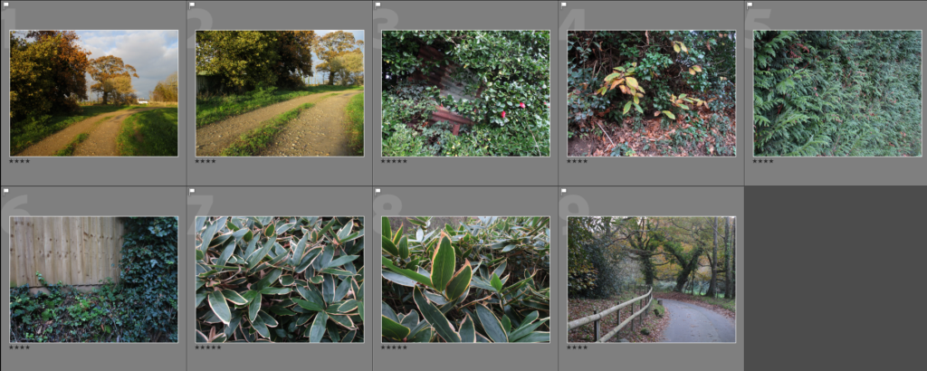
To start editing, I narrowed my image selection down by using the ‘Pick’ and ‘Reject’ tool on Lightroom.

I then used the Star Rating feature to further narrow it down.

Out of this selection, I selected the 3 images that I gave a five star rating, as these would be the best images out of the set.


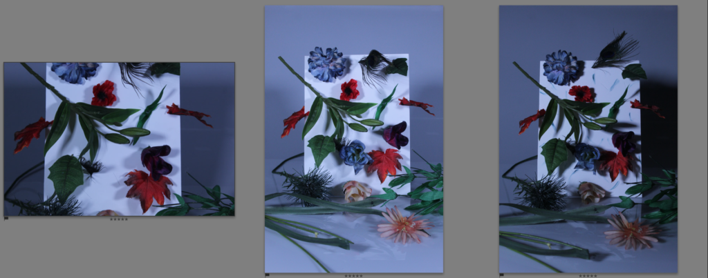
Final Edited Images

These are the best three images from this photoshoot after being edited:

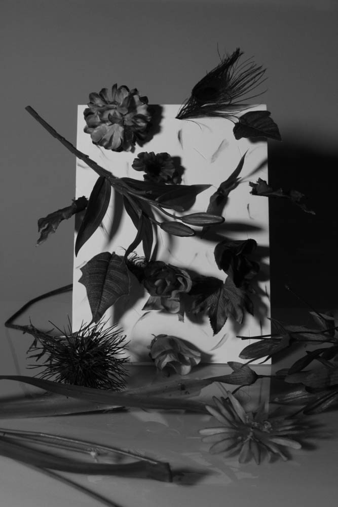
I have also made some black and white versions of these images:


Comparison to Biró’s work:

As I was inspired by this image in particular, I tried to make my images resemble this one as much as I could, I used a coloured (blue) background to mirror the pink in Biró’s image, I used a white board with ‘plants’ poking through, creating some similarities between the two. However, I tried to make my image differ from Biró’s as much as I could: first, I made my images appear colder using the cold light, giving it a far less welcoming aesthetic. Biró’s image depicts a whole plant in a pot poking through the white board, however my image depicts many parts of a plant (leaves, flowers, stems, etc.) poking through in an erratic fashion, with some lying on the floor, mirroring themes of destruction and death of plant life. I made use of harsh lighting to create shadows, giving my image more contrast and a far darker look.


Evaluation

I think this was a successful photoshoot as I was able to mimic the style of Biró’s work, while also applying my own style and ideas onto it, creating something unique in the process. I am not the most experienced when it comes to object/studio photography so this was a good way to improve my skills in this area, I think my ability to create a set to photograph has improved as well. I have matched my success criteria for this shoot well, my idea for putting a twist on Biró’s work by making the lighting more intense has been executed successfully, giving the shoot a more serious tone, which will fit nicely into this project’s theme.

What went well:

I think the final images for this shoot are strong, and will fit into my project involving humanity vs nature, as the images provide an artistic, painterly feel of older still life photographs, as well as a darker, slightly more surreal tone. I like the way these images look similar to a still life painting, with the scene purposely created and not found, which perhaps acts as another way to make the images appear even more unnatural. Even though the colours in these images are darker than what I would normally do, they are still very much present in these images, which gives them a more vibrant sense of life.

How I can improve:

For this photoshoot I only used one piece, with the only difference being some ink smeared on the board to give it more colour/shapes, if I were to do something similar to this in the future, I could try and create another piece to create more variety. I could have also made use of gels to give the images more colour as a means of experimentation.

Response to Movements and Isms – Modernism

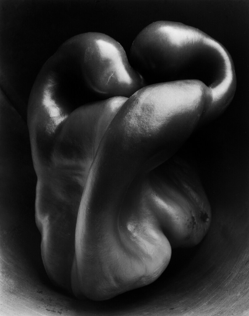
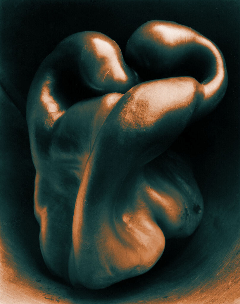
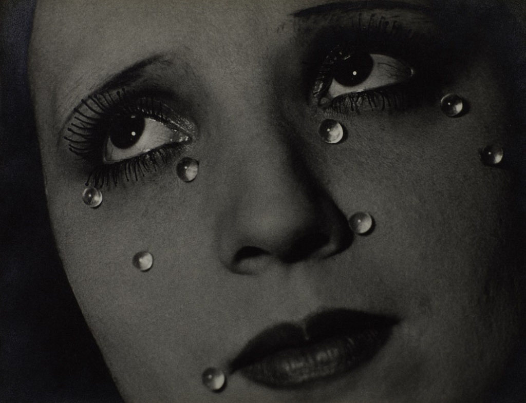
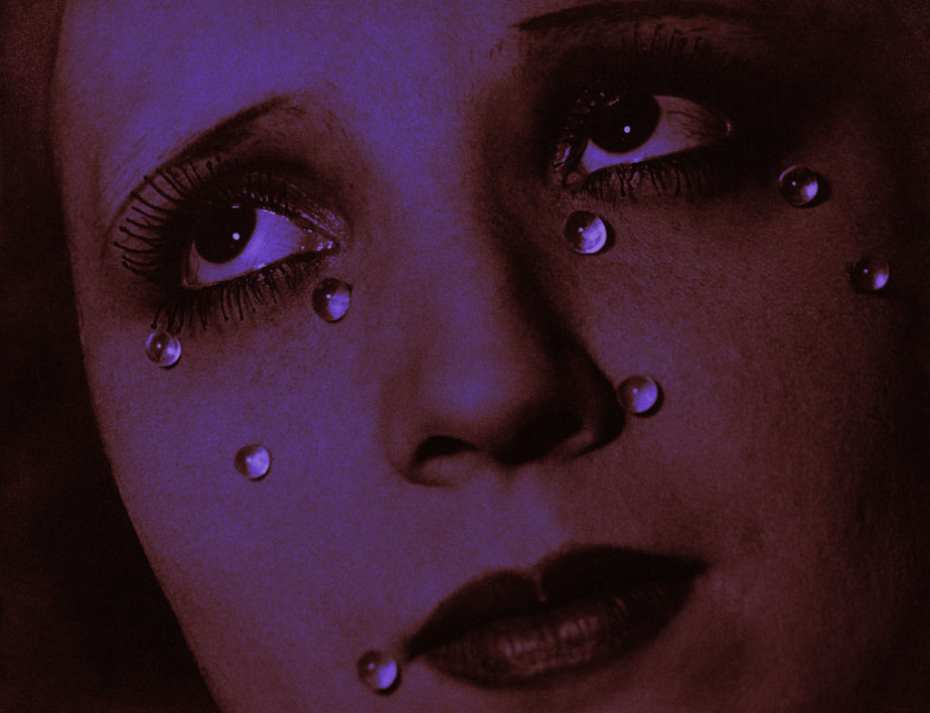
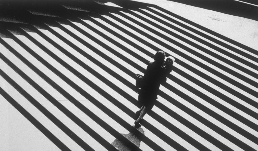
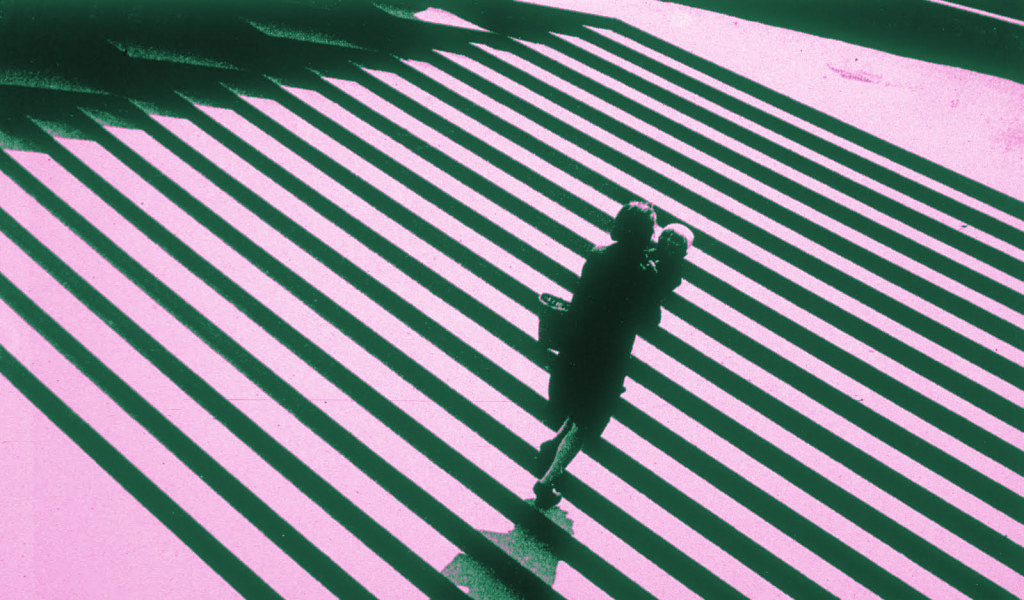
To respond to one of my previous blog posts regarding the main ‘isms’ of photography, I created some edits of photographs taken during the rise of photography’s ‘Modernism’ phase. I chose to edit the images using a (experimental) duotone technique in photoshop (photoshop does not, as of writing this, have a duotone function), which gives the otherwise black and white images more colour. I did this because I have always liked the look of the duotone effect, and I think applying it to older modernistic photography would give them a more modern, colourful twist. I would also like to develop my technique to perhaps use in a later project.

This is a portrait with a duotone effect placed on it. Notice how the highlights are one colour, while the darker shades are a purple/blue.

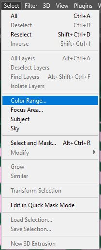
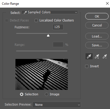
To create this effect, I used my understanding of photoshop to divide the image into its lighter shades and darker shades using the ‘Colour Range’ select tool

In the menu, I set the ‘Fuzziness’ slider to 125 to select a greater amount. I then used the cursor to select the brighter parts of the image and pressed ‘OK’, this gave me a selection of only the light parts of the image, which I then copy and pasted onto a new layer.

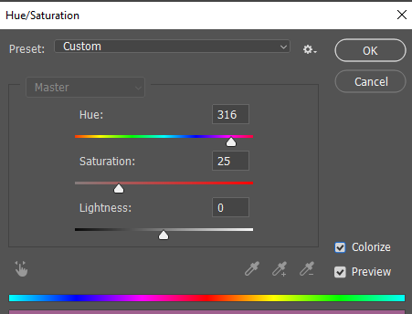
I then used Hue/Saturation on the new layer and selected ‘Colourize’ which applies one colour to a layer, creating a monotone effect. I would then repeat this process on the darker colours and selected a different colour to create the duotone effect.


Edit 1

Original Image

Edited Image

Edit 2

Original Image

Edited Image

Edit 3

Original Image

Edited Image

Personal Study Photoshoot Plan(s)

Photoshoot 1

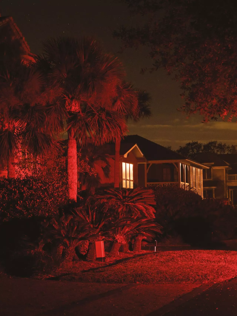
For this photoshoot I want to take images similar to some of Lawrence’s images that make use of artificial lighting to illuminate a subject (such as the one below). I think this would be good to photoshoot as it will give me more experience in creating images using this method, in addition, it will create images that are wildly different than what I will be otherwise creating for this project.

What?For this photoshoot I will try to mimic Lawrence’s images that involve night photography in nature using artificial lighting. I will take pictures of plants and trees under an artificial light, which will give the plant/tree a surreal tone. I will be using coloured gels to give the light source a colour, which will help make my images ‘pop’ more.
Where?I will do this photoshoot in an area with a lot of vegetation, mainly trees and other tall plants such as a woodland.
When?I will do this photoshoot in the evening/at night to try and mimic the images by Lawrence. Night time will be good for the lighting as it will create a bold contrast between the lightest parts illuminated and the black parts of sky and shadow.
Why?I think this will be a good type of photoshoot for this project as it links nicely into the theme of nature vs man-made as the subject matter will be of nature (trees, grass, etc…) while the artificial lights (as the name suggests) will give the image a sense of artificiality.
How?I will use a camera set up on a tripod and set it on a low shutter speed to allow the camera to take the pictures at night without the image turning out blurry. I will likely have the camera set up facing slightly upwards in order to get a mix of the higher branches and the night’s sky.

Photoshoot 2

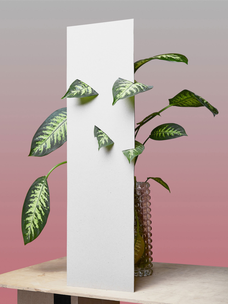
For my second photoshoot I will be taking images inspired by this image by Dávid Biró, on his ‘Front End’ project. I think this image is fitting for this project as it gives plants and nature a feeling of artificiality, and an almost ‘tampered with’ feel, which matches my idea of the relationship between man and nature, and, as an extent of that, the affects of man on nature. I also think this will give the project more variety as it (object/still life photography) is a genre of photography that I am not as experienced at compared to landscapes.

Image by Dávid Biró, Project – Front End
What?I will be taking pictures of artificial plants (leaves, flowers, etc…) and similar objects that are poking through white foam board, similar to Biró’s image. I will be taking these images with a still-life-like aesthetic.
Where?I will do this photoshoot at the school’s studio, as the artificial lighting will give my images an intensity which will give the images more contrast.
Why?I think the way this image was taken, with the natural plant being obscured (as well as surrounded by) an artificial object and setting, which creates a contrast thematically that links into my project.
How?Unlike Biró’s image, I will aim to make my images darker and more contrasting at the bright and dark parts, in an almost vanitas tone, which gives the image a less ‘playful’ and ‘energetic’ tone which Biró’s image has.

Photoshoot 3

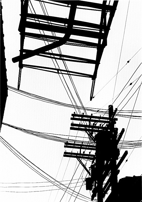
For this photoshoot I aim to take photographs in an urban setting to create a contrast with the other images I have taken, which will give my photobook a larger variety of images. My main focus will be on scaffolding as their form is similar to trees, I would like to capture this similarity within my photobook (However I may also include some images of other scenes found in an urban setting). For the scaffolding images, I will be using Keld Helmer-Petersen’s images as a form of inspiration (Blogpost on him).

Keld Helmer-Petersen, Black Light.
What?I will take images in an urban setting with a focus on subjects such as scaffolding and wires. I will edit some of those images in the style of Helmer-Petersen, which will give the images greater contrast to the other images in my photobook.
Where?In an urban setting such as St. Helier, there are several building sites and other urban scenes which will be useful to photograph and contrast with the more natural scenes I have already photographed.
When?I will take the images when it is overcast, which will provide me with the correct sky to create the bright white that is seen in Helmer-Petersen’s images.
Why?To me, the lines and patterns created by scaffolding mirror those created by tree branches in the winter seasons. I think this contrast between the two subjects links nicely with my theme of organic and synthetic.
How?I will look for scaffolding and use a low viewpoint which will separate the higher parts scaffolding from the building they surround, giving it a clear background of the sky.

Sonia Bhamra Photoshoot

The plan for this photoshoot is here


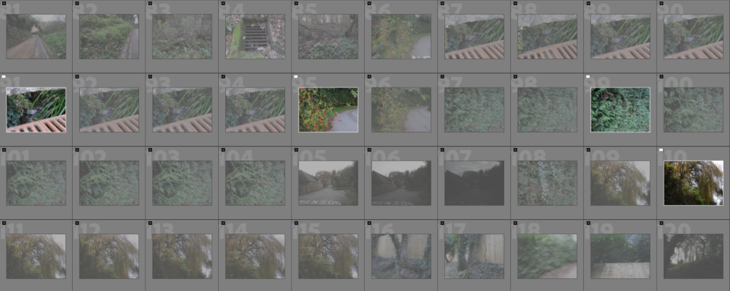
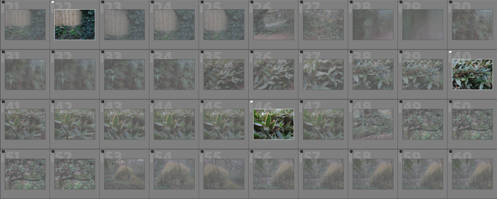
Contact Sheets


Editing/Selection Process

Selection:

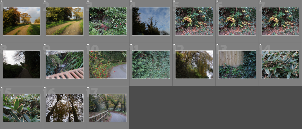
As always, I started editing the images on Lightroom by using the ‘Pick’ and ‘Reject’ functions to narrow my image selection down.

My ‘Picked’ images

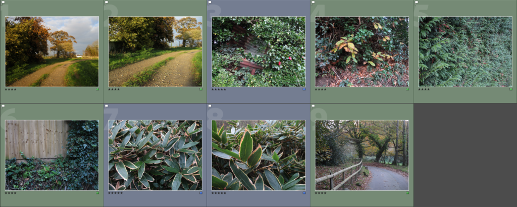
Next I used the Star Rating feature to choose the best images from this selection, which narrowed my selection down to these images.

Images with a 4 star or higher rating

I also applied a colour filter to make it easier to see which images I think are the strongest.

Editing:

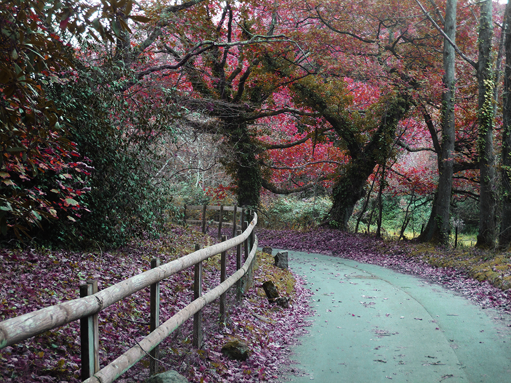
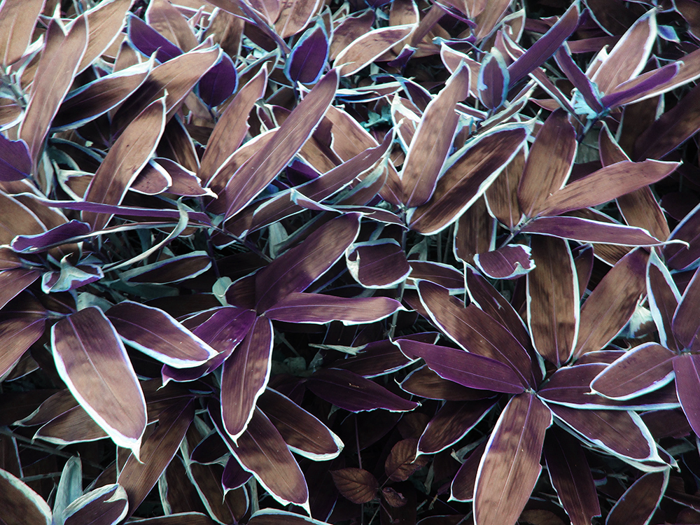
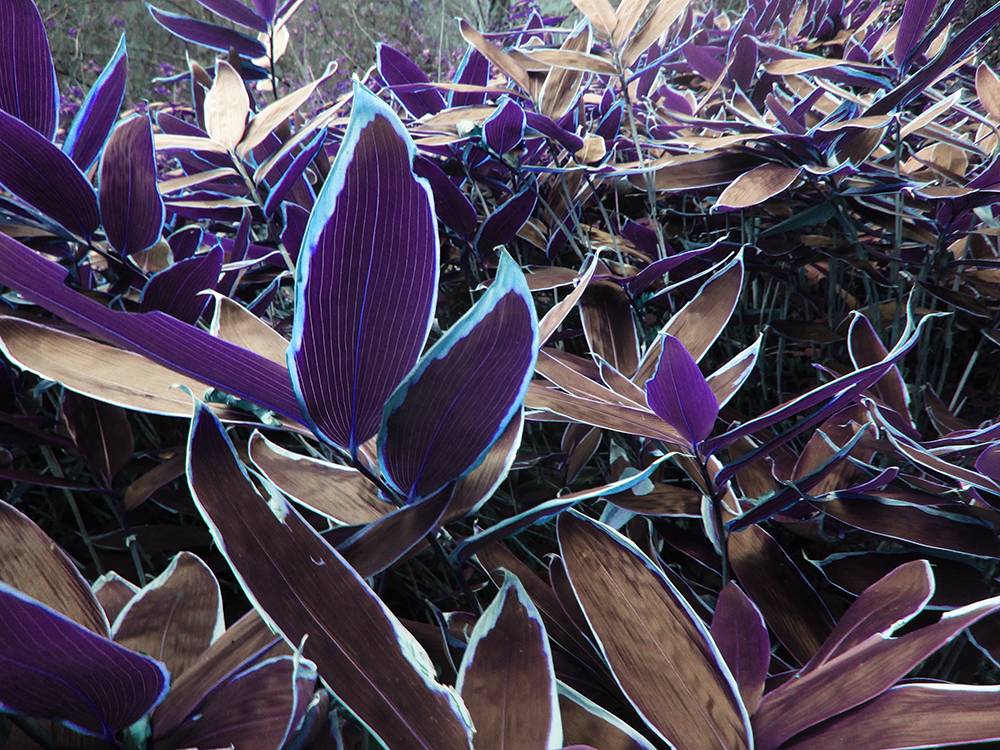
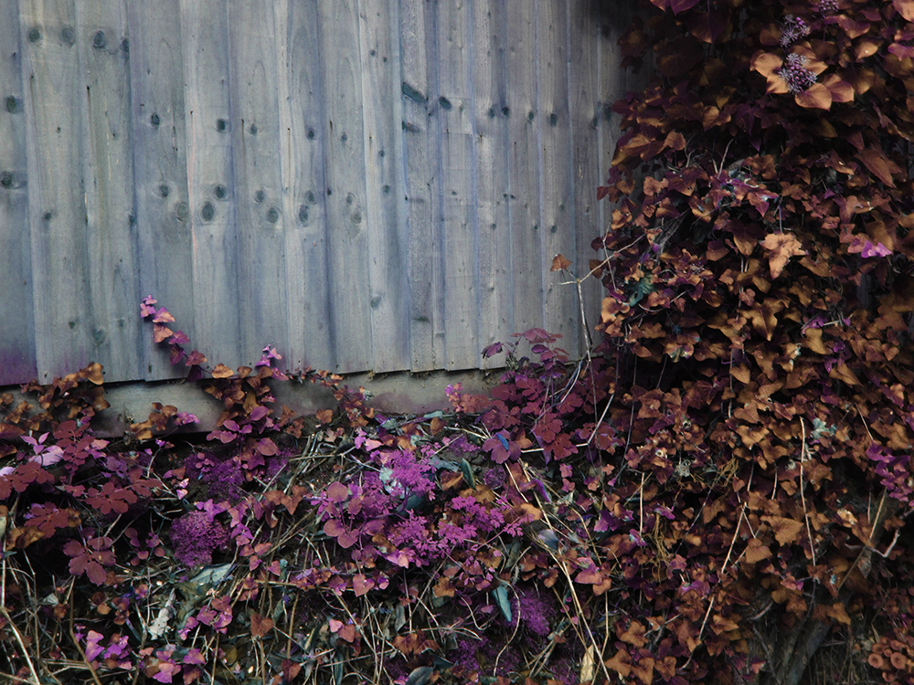
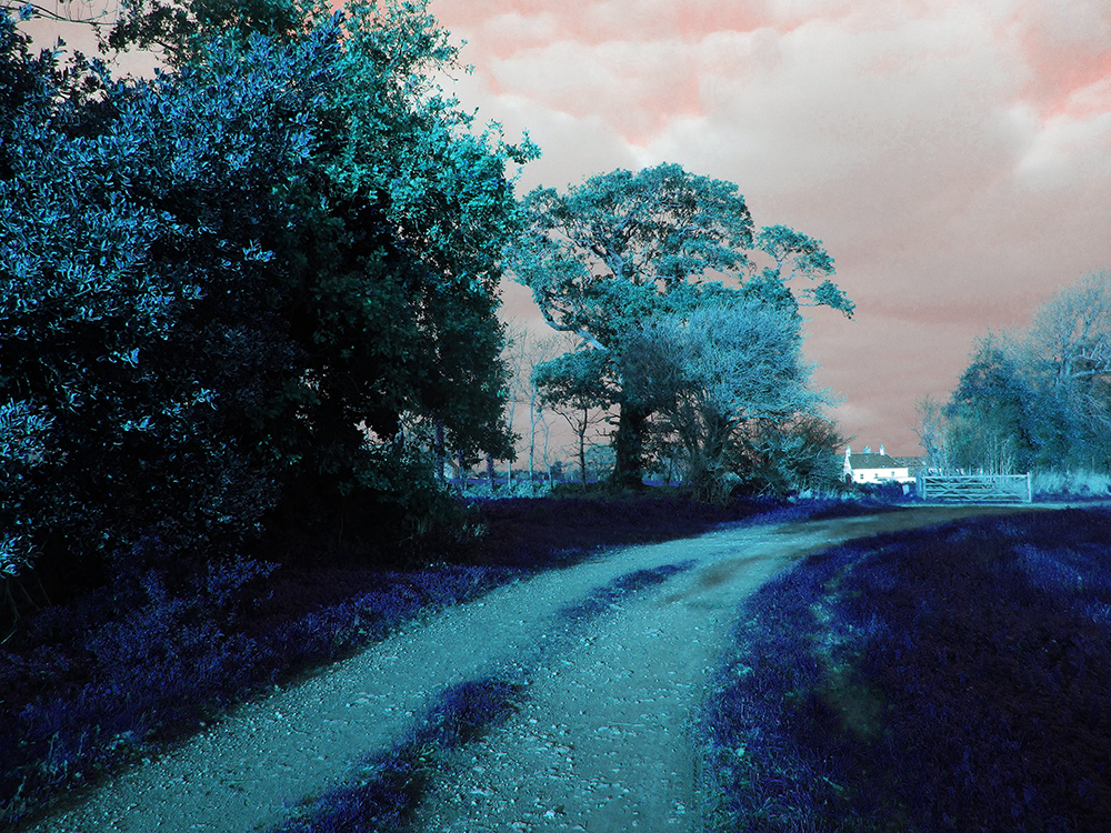
To edit the images to make them appear like Bhamra’s Images, I used the Hue/Saturation and Brightness/Contrast sliders on Photoshop to adjust the images to match the colour and contrast of Bhamra’s images. These are the selected images after being edited this way.

Next, I added a ‘Dark Stroke’ filter to each image to make them seem closer to the dark shapes that can be seen in some of Bhamra’s images.


Best Images


Comparison to Bhamra’s work:

I think my images adopt the likeness of Bhamra’s effectively, both images use strong, almost overpowering colour to create their otherworldly aesthetic, however, Bhamra’s use of colours are far more vibrant than my own. Bhamra’s images have a greater contrast between the lightest and darkest tones in the image, with her images including a hard black and hard white a large majority of the time, while I went for a slightly less contrasting aesthetic. In my photoshoot, I decided to take close up images of plants and parts of the landscape, which I think blended with the other images quite nicely; Bhamra does not include any close-up shots in her project (as far as I can see). To me, Bhamra’s images have a painterly tone, which is created by the use of colour and contrast (the blacks on the trees in the image above for example could resemble brush/pen strokes), while images appear solidly rooted within the genre of photography.


Evaluation

I am happy with the way this photoshoot came out, as it allowed me to take pictures in a way I find the most fun, that being landscape photography. I think the images I have made for this small project are strong and match with the artist I have studied, while giving them my own touch. The photoshoot involved mainly wide landscape shots and medium shots of nature, which fits the criteria I set out for this shoot.

This photoshoot will fit well into my project as it fits the genre of landscape photography, while also having a surreal tone to give it a bit more life and variety. The time in which I chose to do this photoshoot worked well as it gave the colours especially a more intense feel. I think the photos without the editing were good and had some variety.

Sonia Bhamra Photoshoot Plan

This photoshoot will be a response to Sonia Bhamra’s ‘A Surreal Landscape’ project, which, in a generalised sense, is a series of surreal/abstract landscape images that involve nature and colour. Bhamra’s final images each have an unnatural/surreal colour scheme, which gives it an abstract feel, however, the images themselves, with no editing, are fairly traditional in terms of subject matter and composition.


Photographs from Bhamra’s Project:

These are the style of images I will aim for at the end of this photoshoot (as well as the editing process).


Plan:

What?I will take landscape images within a natural environment (woods). Like Bhamra’s work, I will aim to make these images seem like regular, non-surreal (pre-editing) images so that I can focus on the composition of the original images rather than the editing part.
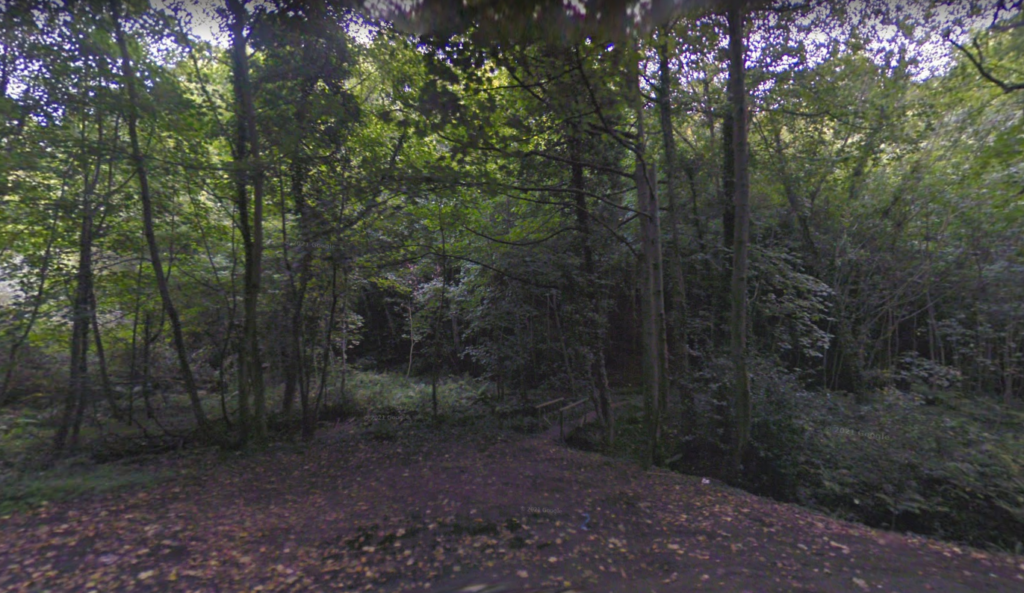
Where?I will take pictures of a woodland area near my house as it has landscapes similar to those depicted in Bhamra’s work (minus the odd colours). These areas will give me access to a different kind of landscape to Bhamra’s work as well as it has some rural roads/paths which could offer an urban contrast.
When?I will try to take pictures later in the day in order to get a greater contrast in terms of light and shadow. More intense sunset lighting will also help bring out the colours in the landscape which will translate nicely into what I am aiming to turn the images into.
Why?I think Bhamra’s work and the message it portrays is similar to what I am trying to achieve in this personal study, as such I think studying her work and responding to it will be a good way to start off my project.
This is a screenshot (from Google Maps) of the area I will take photographs of for this photoshoot.

Artists Reference 3: Robbie Lawrence

Robbie Lawrence - Freelance - Photographer and Photo Editor | LinkedIn

Overview of Lawrence’s Work: My Interpretation

Lawrence’s work features harsh shadows that often completely obscures some parts of the image, creating a stark contrast between the otherwise bright and colourful images he produces. Lawrence’s work ranges from landscapes that delve into the surreal and abstract to heavy portraits that symbolise beautifully the subject Lawrence is portraying. Most of Lawrence’s work features nature and/or the church, sometimes linking them together, giving each of his images a powerful message, in particular, his ‘Blackwater River’ project clearly depicts themes of nature, culture, politics and religion, with most of the images featuring heavy shadow and bold colours.

Moodboard of his Work


Image Analysis

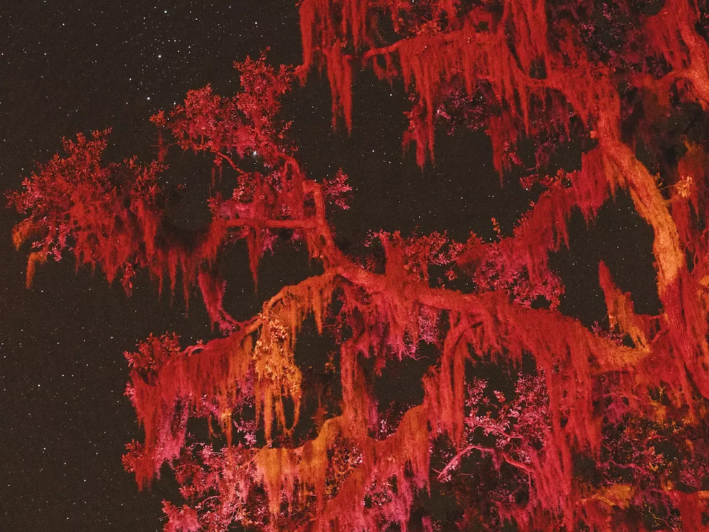
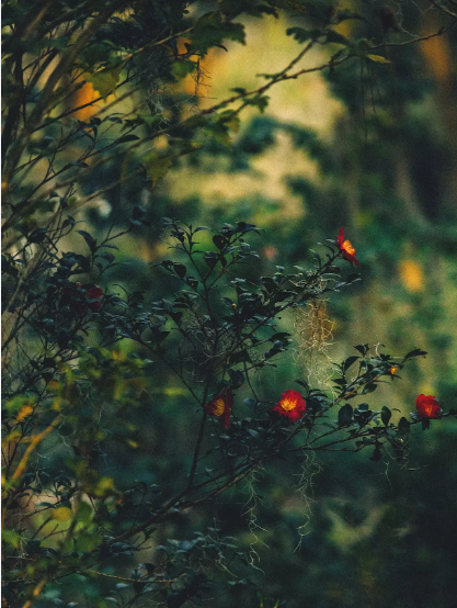
This image was taken in Lawrence’s ‘Blackwater River’ project, which involves both landscape and portrait images. This acts as the cover for the photobook, and it seems to encapsulate Lawrence’s style greatly; using harsh shadows (the version of the image above is lighter than the original print) to contrast with the lit-up red flowers. With regards to shadow, Lawrence says ‘I am fascinated by how shadow can construct a narrative’ which outlines Lawrence’s reasoning for producing his images the way he does, as being dark, almost chiaroscuro in some images. I like the effect the flowers create as it not only gives colour to the image (which Lawrence also frequently uses), it also gives the image a sense of mystery and perhaps artificiality. The use of a shallow depth of field puts further emphasis on the branch and gives the image a more otherworldly feel. Similarly to Rut Blees Luxemburg, Lawrence allows ‘light to dictate some of the form or the context’, which is the idea that, when using a low shutter speed, the image you create will not be fully in your control, as the lighting will not be exactly as you imagine it.


Source:

Abel-Hirsch, A. (2019), ‘ Blackwater River’ in British Journal of Photography. Issue 7890: 50-67

Art Movements and Isms

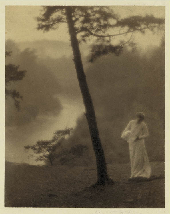
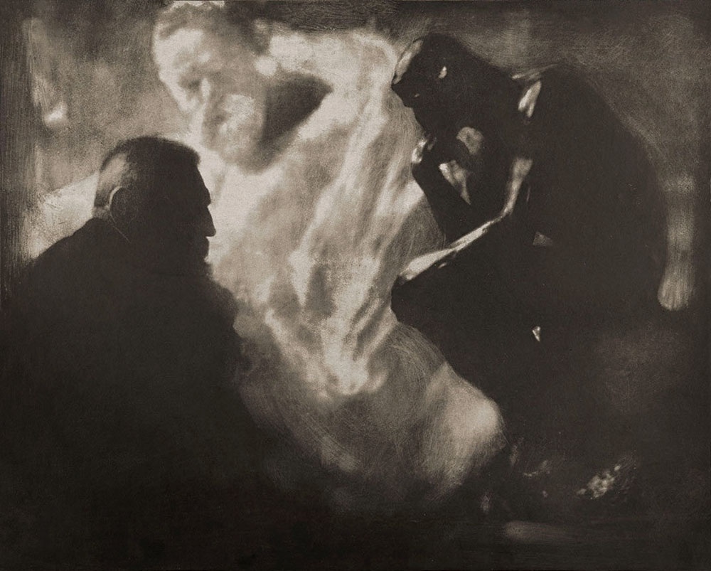
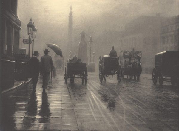
PICTORIALISM

Time period:

1880-1920s

Key characteristics/conventions:

To make photography an accepted art form, as it was considered to be less serious, easy to do (accessible) and quick (snapshot, as well as education-wise). The ease of use is seen in the affordable Kodak, meaning everyone can afford/use it. It was also considered to be not done by humans, by the camera itself.

Photography started out as a scientific form rather than an artform.

Influences:

Allegorical paintings – Paintings which depict hidden meanings (allegories) with often biblical/mythological imagery. As well as other perhaps religious or cultural paintings/art.

Artists associated:

Alfred Stieglitz, Julia Margaret Cameron, Hugo Henneberg, Frank Eugene, Clarence H. White, F Holland Day

Key works:

Methods/techniques/processes:

Scratching the negatives/plates, putting Vaseline on the lens and painted chemicals over the photograph were done to give the photographs colour/manipulate the tonality of the images, which gives it a closer link to traditional art. The idea that art is ‘handmade’ is also tended to by using these methods.


REALISM / STRAIGHT PHOTOGRAPHY

Time period:

1915 – Present

Key characteristics/conventions:

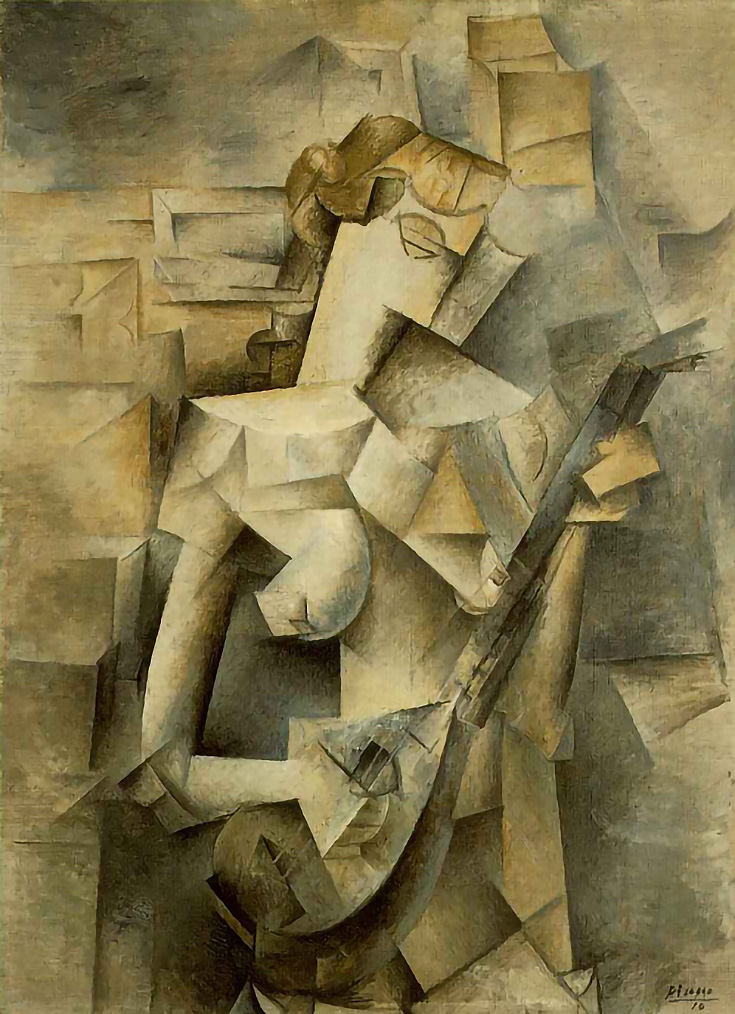
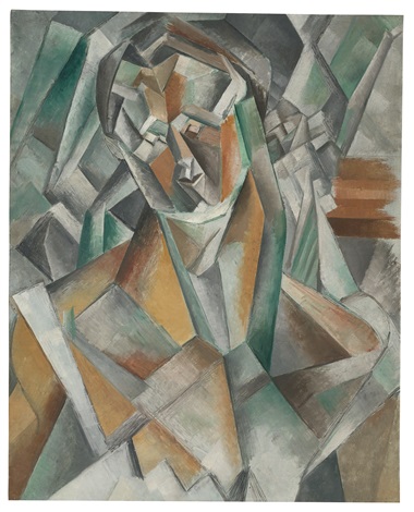
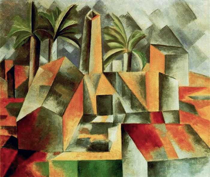
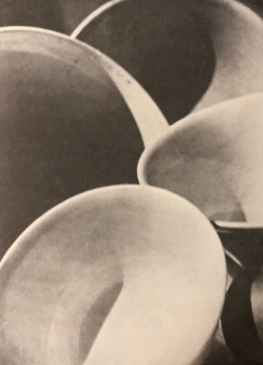
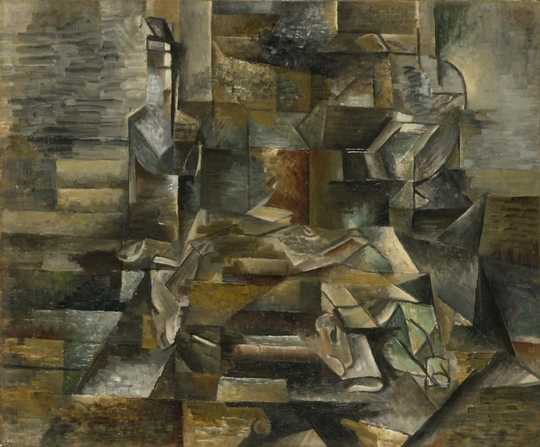
Not manipulating the images in the darkroom to create sharp, realistic, abstract images – linking to cubism. Abstraction was created at this time, Strand was inspired by cubism, Picasso/Brandt.

Influences:

People wanted to go back to the documentary side of which photography was made for. This led to cubism being implemented into photographs to create what is now known as abstract photography.

Artists associated:

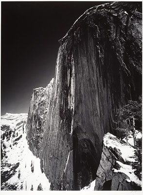
Paul Strand, Edward Weston, Walker Evans, Ansel Adams, Alfred Steiglitz

Key works:

Methods/techniques/processes:

To produce sharp images with a lot of detail without manipulation – Returning to the documentary style that photography was originally intended for. They used the camera’s detail to record art in a way that traditional forms such as painting cannot.


MODERNISM

Time period:

Late 1800s to late 1900s

Key characteristics/conventions :

Modernism refers to the focus on the industrialisation and the new issues as opposed to traditional Victorian values in an effort to create something new and different from what was expected from art at the time. This often led to the images becoming abstract or surreal in an attempt to create something original.

Modernism focuses on the art itself and the artist’s technical ability to not only construct an image but to also evolve their own art forms to create something new and original. Object rather than subject and form rather than context.

Influences:

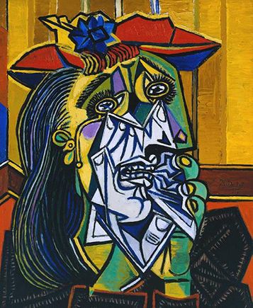
Cubism can be said to be an influence (as well as a product) of modernistic aesthetics. Artists like Picasso and Braque wanted to remove themselves from traditional art into something completely different – hence cubist paintings/art were produced by them and various other artist.

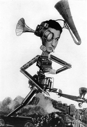
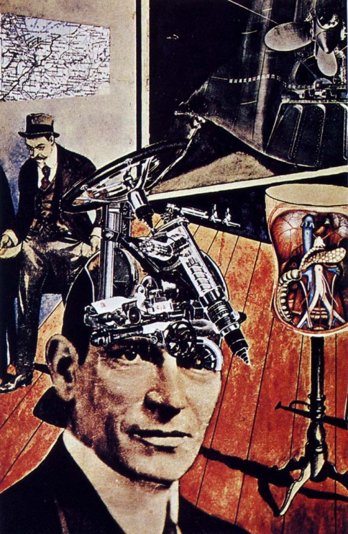
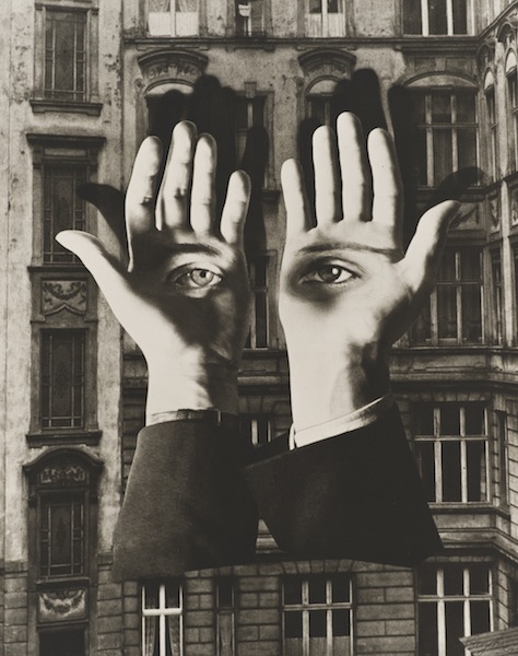
Montaging seemed to become very popular during the times of modernism as it allowed artists to further experiment with the mediums they chose, which led to their images being more modern aesthetically.

Artists associated:

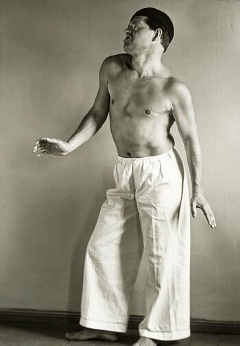
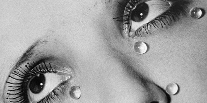
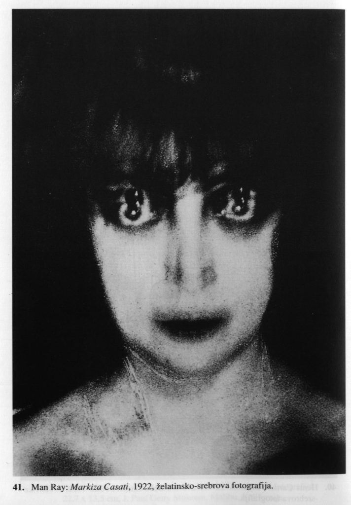
Picasso, Paul Strand, Alfred Stieglitz, Man Ray, Claude Cahun, etc…

Key works:

Methods/techniques/processes:

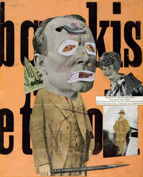
Photomontaging was used where parts of images (and other forms of media such as newspapers) were spliced and placed onto one big image. This seemed to give some images (such as the montage above) to have an urban, surreal and artificial feel. These montages also seemed to be a parody on media such as newspapers to give the photographs a political or social context.

POST-MODERNISM

Time period:

1970s – Present

Key characteristics/conventions :

Post-modernism focuses on themes outside of the art form and the art, bringing political, cultural, social, historical and physiological themes into the context of the artwork. Context of audience and subject reception is also key in post-modernistic art. Post-modern work makes references to previously hidden agendas within the art community, especially from art critics and museums.

Subject rather than object and context rather than form.

Influences:

Post-modernism is a response to modernism, while modernism focused on finding the ‘timeless masterpiece’, post-modernistic art aims to separate itself from the idea, creating something temporary, accessible and imperfect. This pedestalizes the idea of art being a form of expression as opposed to something cold and meaningless.
Artists associated:

Roy Lichtenstein, Andy Warhol, Cindy Sherman, Frank Gehry, etc…

Key works:

Methods/techniques/processes:

Post-modernism, due to its links to social contexts, incorporates many different techniques to achieve different imagery depending on the context, such as eclecticism, parody, collaboration, reconfiguration, recycling work, bricolage, among others.

Artist Reference 2: Sonia Bhamra

Sonia Bhamra

Overview of Bhamra’s Work – My interpretation

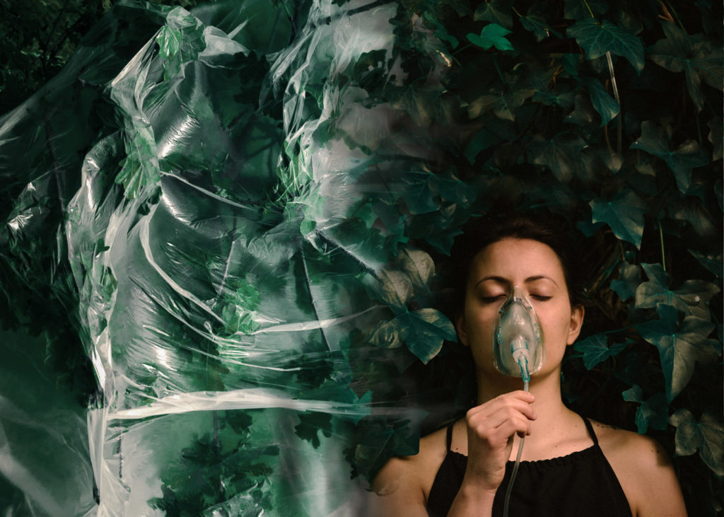
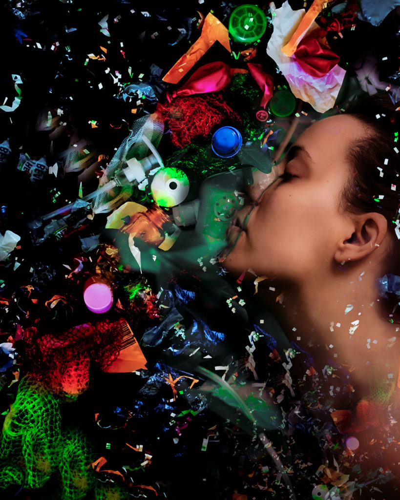
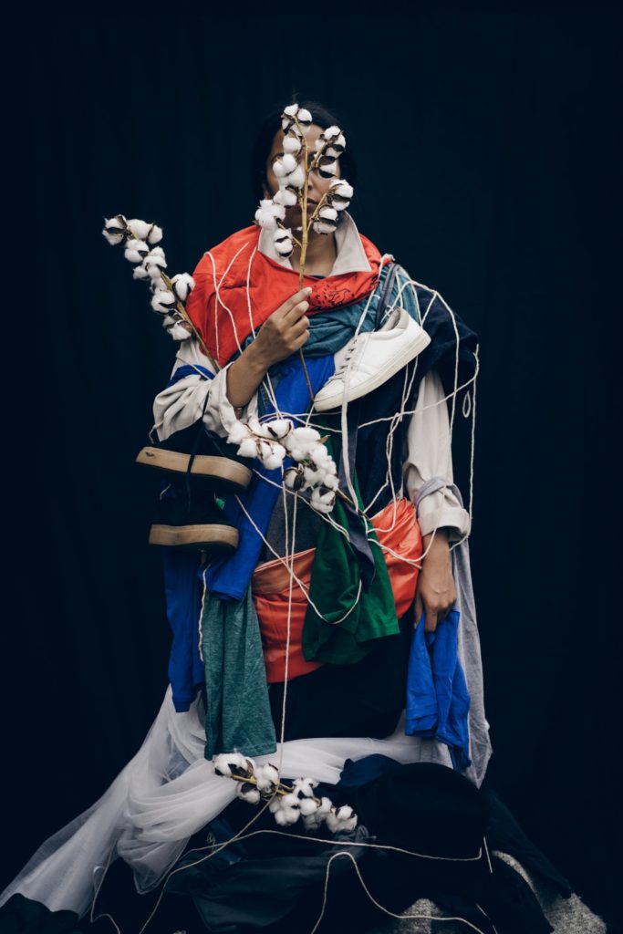
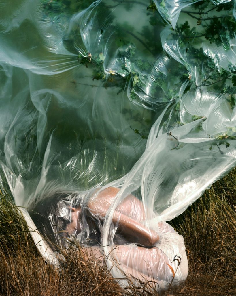
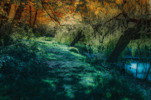
Bhamra’s work, in her own words, explores the ‘terrain of the subconscious mind’ with images that provide a surreal aesthetic. Some of her work involves portraits of people and plastic as a way to highlight climate change and environmental damage caused by humans. Her landscape images (which I will now mainly be referring to) provoke similar themes and ideas to her portraits, however, they incorporate the idea of imagination to not only allow surreal and almost alien landscapes, but also promote a change in the way mankind treats nature by inviting people to ‘create a new environment for ourselves… which will then reflect in our outer world’. Her images incorporate an unusual colour scheme which adheres to her description of an imaginative world and gives them an artificial tone. Perhaps the reason she uses colour like this is to show that the artificial/unnatural nature of mankind’s creations is directly damaging nature.
Sonia Bhamra - A Surreal Landscape | LensCulture

While these landscapes are likely not a result of using coloured lighting (which would also link to the idea of the artificial landscapes she portrays), the images are still close enough to reality to perhaps create a feel of urgency in the landscapes she creates. To further this, the main parts of the images that have had their colours altered are the natural parts, such as grass, leaves, trees, bushes, etc…


Moodboard of their work:


Image Analysis

I think it is interesting that the focal point of this image is the orange path (or water) on the bottom right of the image, as not only does it lead the viewer up the image into the darker trees and other plants, but it also represents a man-made part of the landscape (assuming that it is a path and not a stream). The image has some contrast between the darker tree trunks and the lighter oranges, yellows and blues. To me this represents the ‘dream’ like part of the landscape, however the vibrancy of the oranges itself could represent the artificiality of man-made substances. This image does not include any hard/straight lines at all, due to the landscape itself being a natural one. It seems like the depth of field is fairly shallow in this image, as the large tree on the left seems to be more in-focus than the trees behind it.

This image is from Bhamra’s project called ‘A Surreal Landscape’, which, as I mentioned above, is a way for Bhamra to shine a light on climate change and environmental damage caused by mankind. The unnatural colours on this image represents this damage by making the landscape itself seem man-made, depicting ‘elusive imagery of dreams’ in order to correct it.

Sources:

https://www.vogue.com/photovogue/photographers/204480

https://the-dots.com/projects/a-surreal-landscape-511555

Artist Reference 1: George Digalakis

About page of George Digalakis' Photo Art
A portrait of Digalakis

Overview of Digalakis’ Work – My interpretation

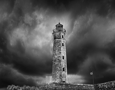
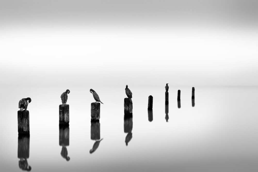
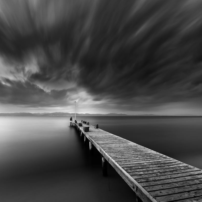
Digalakis’ work leans to a surreal side of landscape photography, with his images using striking subject matter made more intense by his use of a black and white colour palette. A lot of his work involves water, be it from the seas, lakes, streams, or otherwise, that he makes smooth and almost dream-like by his use of a slow shutter speed to capture the movement of the waters over a longer period of time, giving it a misty, unnatural, yet calming aesthetic. A similar effect is achieved in some of the skies in his images as well, sometime making the waters and the skies seem eerily similar. Some of his images involving water has a subject that emerges from it, such as a rock or tree, which puts an emphasis on the subject not only due to the contrast it creates (with the water usually being a white and the subject being black), but also to perhaps put focus on nature as a whole. In addition to this, some of his photographs include animals, such as birds, to give life to this otherwise desolate landscape he creates.
Fine art, black and white photography by George Digalakis
Distant Mountains – Birds of Paradise – 2019

As stated earlier, in some of his images Digakalis uses a slow shutter speed to let in more light over a longer period of time, the effect of this is to make the skies and waters more smooth and unnatural. Because of this, and due to how he seems to take his images during the day time (some on overcast days, some on clear days), he would likely increase his camera’s aperture and use a tripod to make sure the image does not look blurry or too light. For my own personal study, I think it will be interesting to attempt to recreate his style on a Jersey coastline.


Moodboard of his work


Image Analysis

This is one of Digalakis’ images that makes use of a long shutter speed to make the water and sky softer, giving the image a surreal, yet calming aesthetic. However, not only the water and sky has been affected in this image, but the boats as well. Due to the shutter speed being slower, the movements of the boats has made them look blurry, furthering the surrealism in the image. I like the effect this creates as it seems to blend the boats to the water, meaning the image itself has little contrast outside of tone. This image may have been taken on an overcast day, which gives the sky a darker tone than the sea, effectively framing the scene and giving the image a more intense feel. With regards to Digalakis’ work, Hussein Najem says, ‘he reinforced the works, a smooth silky introduction, that came due to the long exposure, giving the recipient calm, serenity, and reassurance’, suggesting that it is Digalakis’ use of a slow shutter speed that gives his images a serene tone.

The blurred boats could represent a sense of time and movement at a surface level, however it may also represent unfamiliarity, a loss of identity or, in the boat’s case, purpose. As for the capturing of time, Digalakis explains that this effect moves the images ‘away from reality, introducing the sense of passing time and eliminating details from the background’.


Sources:

https://www.shutterbug.com/content/behold-serene-minimalist-bw-landscapes-greek-nature-photographer-george-digalakis

https://vipacontest.com/special-winners-george-digalakis/