Robert Heinecken
Robert Heinecken was an American artist who referred to himself as a “paraphotographer” because he so often made photographic images without a camera. He was born on October 29th 1931 and died on May 19th 2006.
examples of his work


Heinecken extended photographic processes and materials into lithography, collage, photo-based painting and sculpture, and installation. Drawing on the countless pictures in magazines, books, pornography, television, and even consumer items such as TV dinners, Heinecken used found images to explore the manufacture of daily life by mass media and the relationship between the original and the copy, both in art and in our culture at large.
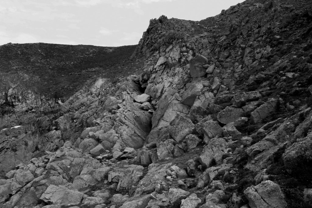
Image analysis

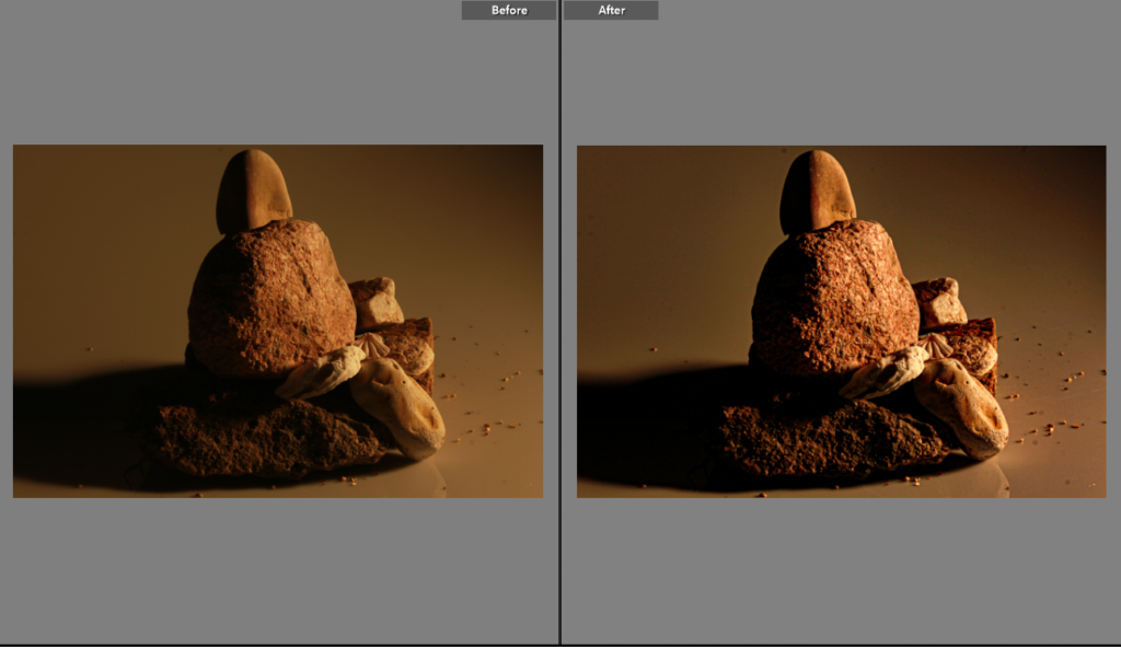
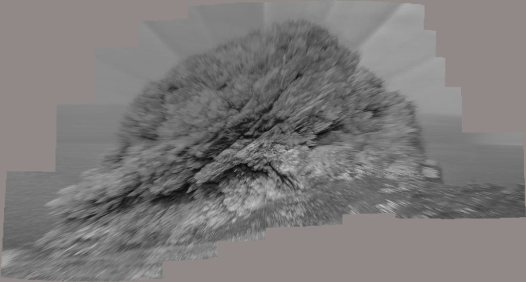
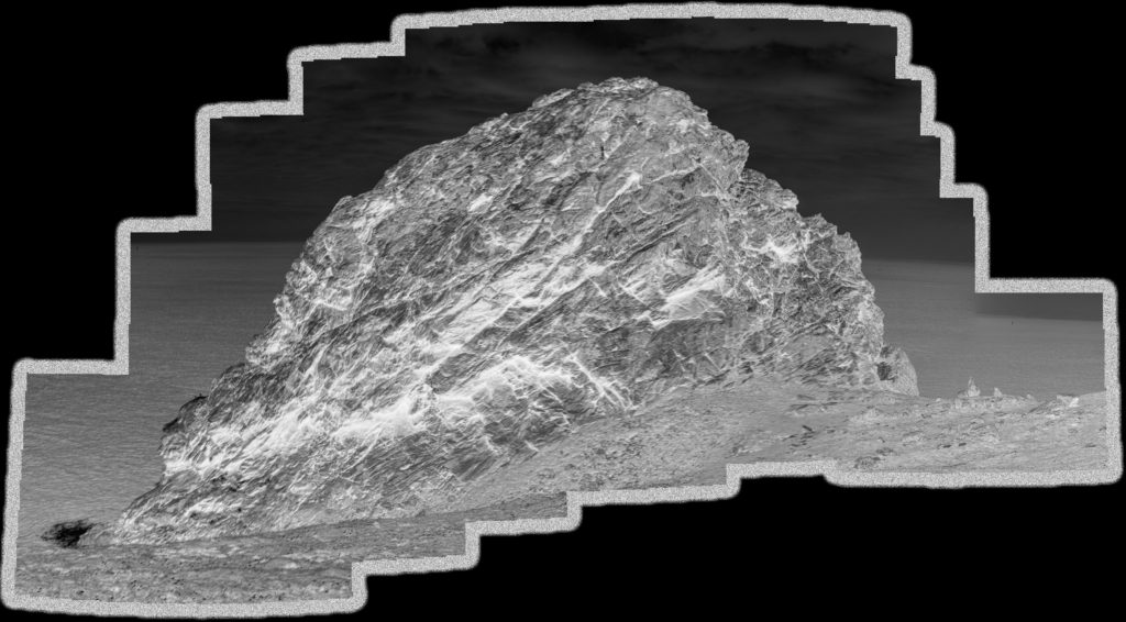
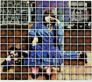
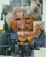
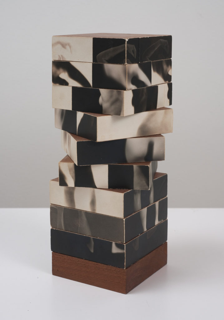
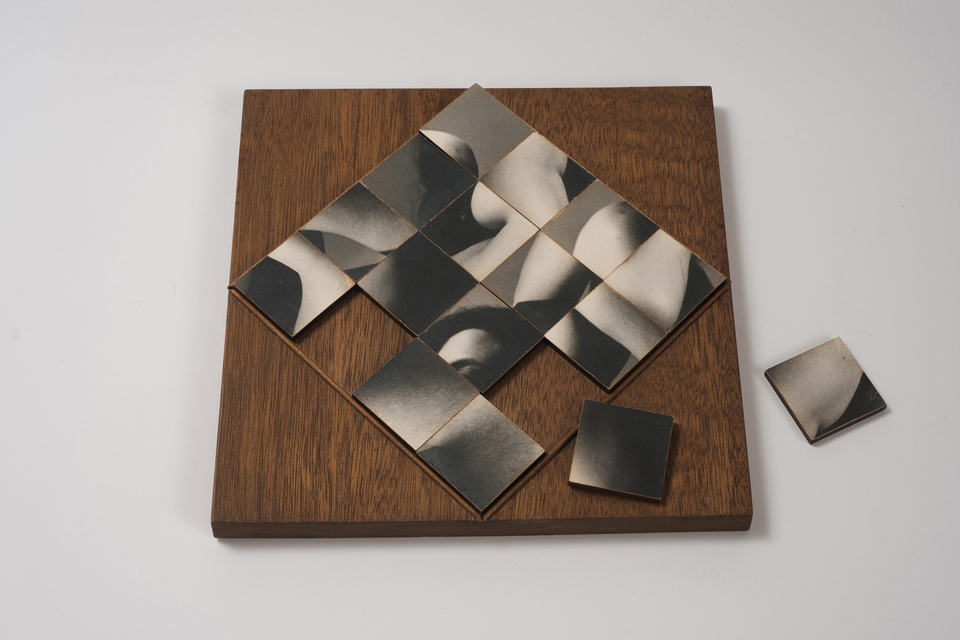
Fractured figure sections 1994
This image/sculpture shows a stack of rotating images which create multiple images when aligned in different ways, like a puzzle. the images created by the puzzle are pictures of the human form and can be rearranged to create different forms. This could be suggesting that the human form is just like a puzzle and can be very confusing at times.
Lauren Pascarella
Lauren Pascarella was born in Hollywood, FL in 1984. She studied at New World School of the Arts in Miami, Florida from 2003 to 2007, majoring in Photography. She is currently working in cross-disciplinary genres, including New Media and digital photographic installations. She lives and works in Brooklyn, New York.
examples of her work


Pascarellas process utilizes photographs of printed and manipulated photographs, “I have the ability to shift perspective”. At times, the flat photographic images behave just as if they had the depth of their real world counterparts. In other instances, they are arrayed in a manner that wouldn’t be possible without shedding a dimension. “When examining my work, the viewer is confronted with an unsettling situation that demands correction. Whether the subject is a single item or a cluster of disjointed objects, the mind will attempt proper placement, but without satisfaction”.
Image analysis
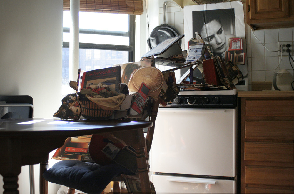
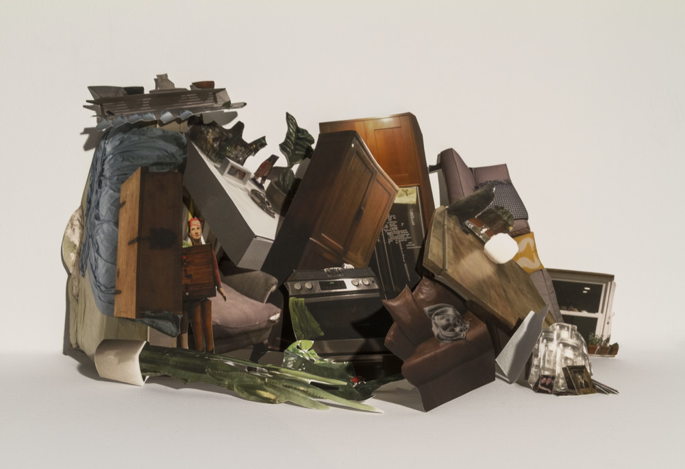
Kitchen, 2007
The image above shows a lot of clutter in the kitchen of the artists house which looks like it is placed very random at first. As the artists states, “When examining my work, the viewer is confronted with an unsettling situation that demands correction”, in this case the unsettling situation being a lot of clutter which the viewer wants to clean up. This idea could be backed up by the photo of the woman in the back of the photo who also looks unsettled or even frustrated. The clutter has been placed this way with a purpose, to create a unique sculpture like image where the viewer wants to correctly place the objects where they belong, but without satisfaction.