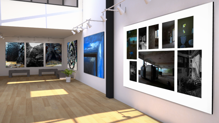
gallery


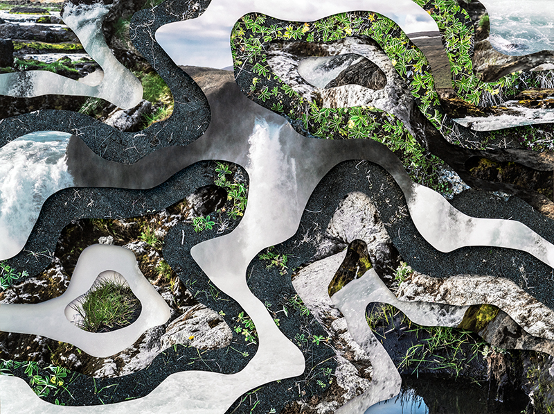

Visually, my image compared to Charlottas looks quite similar. Both images provide an optical illusion effect, In my image i decided to use rings instead of unique cutouts, to provide the image with perfection, just how i viewed the waterfall when I saw it. However, charlotta uses random shapes to show that nothing in nature is ever the same. Both images portray the idea that we are actively destroying the planet, this is literally shown by how in both of the images, the original photos are untouched natural landscapes but myself and charlotta have altered them to portray humans impact on nature. In some of charlottas other work, she uses texts about climate change and global warming , however in my piece i decided to incorporate building plans or a house. i did this to show that this landscape will chang eover the next few needs, due to the fact that jersey has an overpopulation crisis, and the need for housing is more important now than it has ever been. Charlotta took these images also in her home town in iceland , to show that her home is changing drastically due to climate change. The lighting in charlottas images has a warm tone, which is similar to mine, this insinuates the idea that these places are warm and considered home to us, and we want to protect them. In both of our images, the textures vary and stand out a lot, charlotta uses the different sharp textures of rock in comparison to the soft textures of the water, which is very similar to my image.
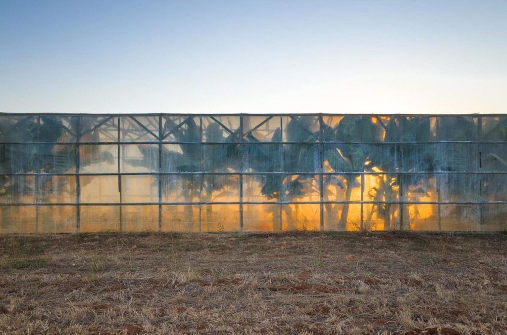
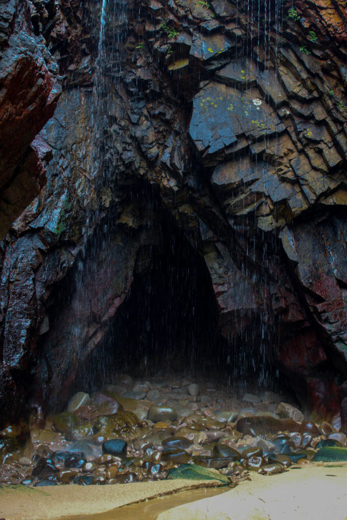
Both images here are Landscape images. there are many differences between these images but the concept behind them is actually particularly similar. both images relate to the idea of Anthropocene by providing the audience with a sense of awe and terror. In these images we have both portrayed the idea of natural beauty. however in my image, the manmade destruction does not yet exist, i wanted to shows what the environment looks like before it is altered. In Georges image he show what happens after man has come in contact with nature and the sad reality behind it. In both images we have saturated the colours to allow them to be seen better then they actually look in real life, this is to highlight how much we should protect nature. A difference between the 2 images is that Georges image uses high exposure and low contrast whereas my image uses high contrast and low exposure so that the colours pop from the rocks, and that the image appears sharper.
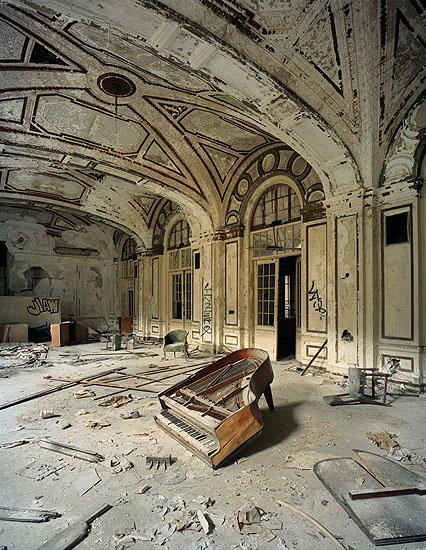

both of these image highlight destruction as the key theme behind the photos. In Andrews image, the key focal point is the piano in the centre, in my image, the key focus is on the objects left in the dirty pool. Both images are warm toned to show that these places were preloved and a safe space in the past. In andrews image, the exposure is quite high to show the natural light coming through the windows, however in my image the exposure is low, making the image look more saturated and almost how a regular swimming pool is viewed through a child’s eyes in a nightmare. i decided to make my image darker to highlight the sad reality of abandoned places, whereas george uses a light image to show that this place was once a place of happiness. Both images show natures effect on manmade objects, in my image on the left, the water in the pool is from rain and is that colour due to dirt and mould growing overtime. You can also see that nature is taking over by growing weeds around the once immaculately maintained patio around the pool. In andrews image, this place has been destroyed by nature, shown by the dulling of colours in the room from the sun, however has also been destroyed by man. This is shown by the broken piano and rubble on the floor. i am very happy with how this image turned out as I wanted to highlight the sadness of an abandoned place, but also anted to make it colourful as if it was seen by a child.
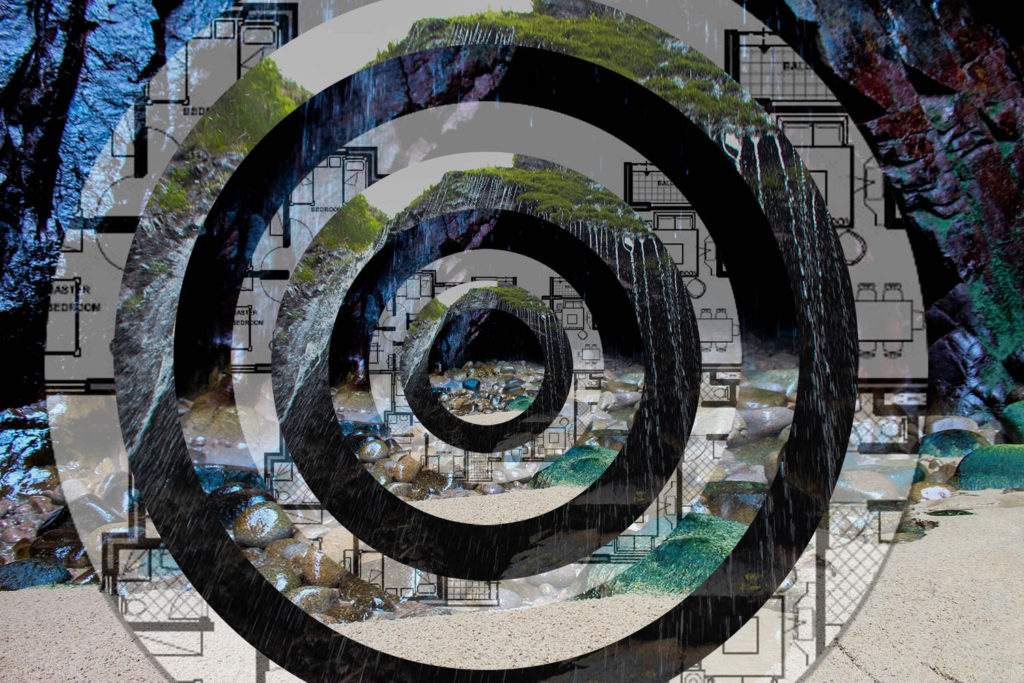
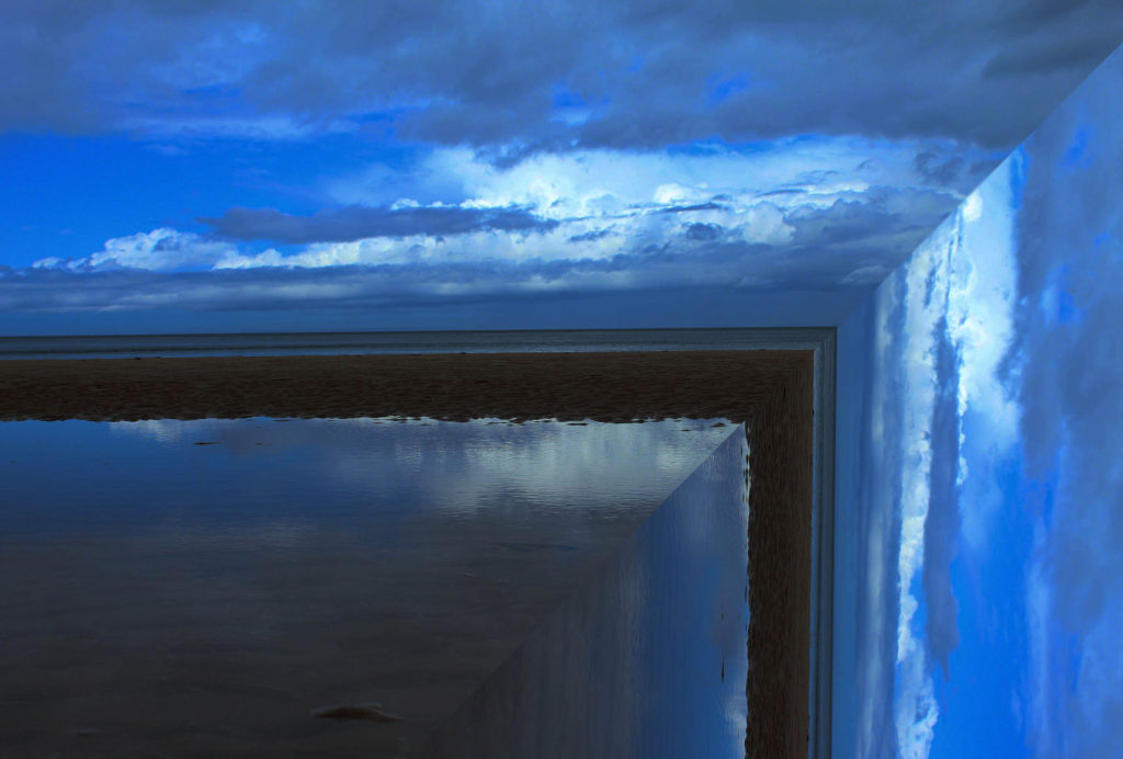


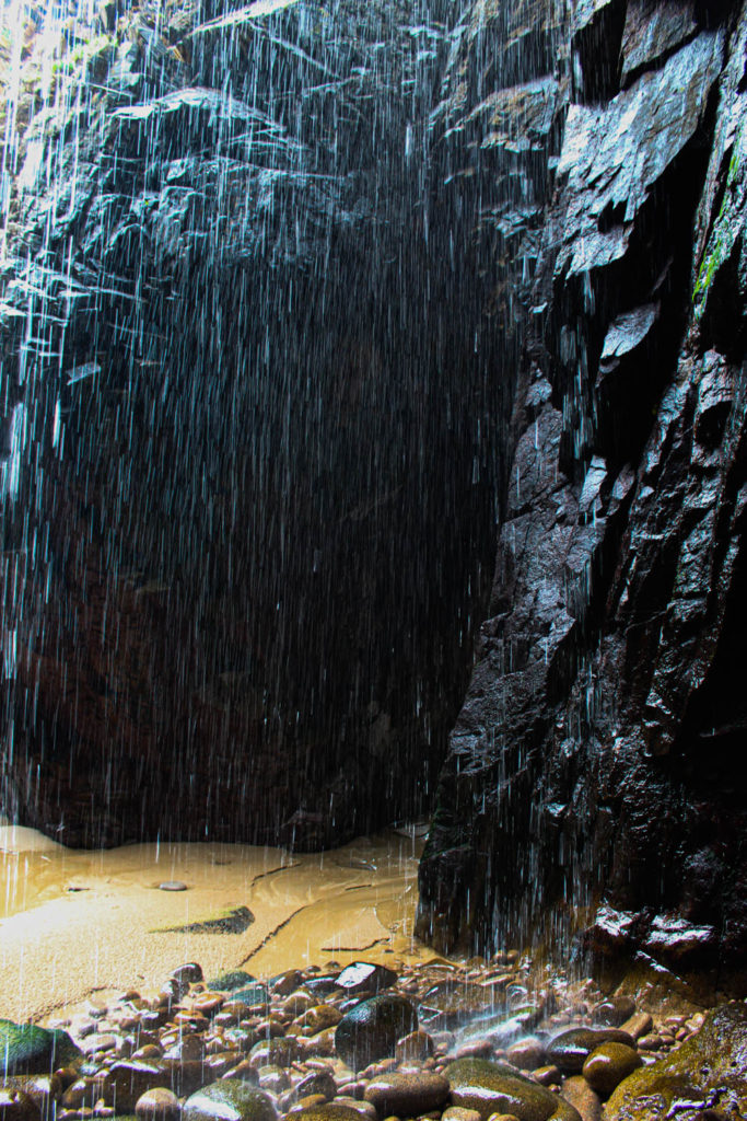
these images are a response to Charlotta María Hauksdóttir’ and george marazakis. In my opinion, this section of my product went well. the idea behind these images are to show the serenity and awe of nature, and that in the next years to come, these places are likely to be destroyed and turned into a building site. I wanted to emphasise the pure beauty of these palaces to make people react with shock. I chose to take these images in a place that almost everyone in jersey has visited at least once. When people go to Plemont beach they are usually going for leisure, to have a swim or sunbathe on the beach. A lot of the time people dont actually take in the scenery. After exploring this place in depth, and trying to look at it through a different perspective. i learnt to appreciate this landscape a lot more than I did before, and through these images I wanted other people to feel the same. My plan for this shoot was to respond the chosen artist using the same technique she did, by overlapping images and creating almost an optical illusion. After experimenting and researching another artist, I chose to keep some of these images without the overlapping effect .The first 2 images relate to Charlotta María Hauksdóttir’ due to the fact that I have distorted the natural images of serenity and nature. The bottom 3 images relate more to george marazakis, because they are normal landscapes which provide the viewer with a sense of awe and terror.
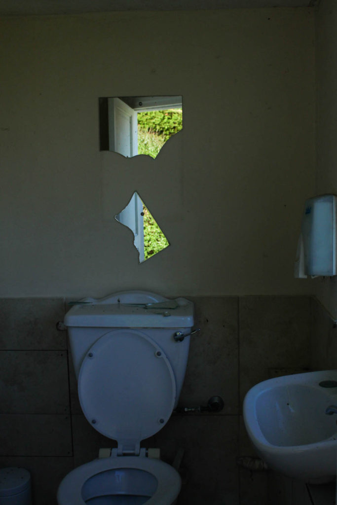

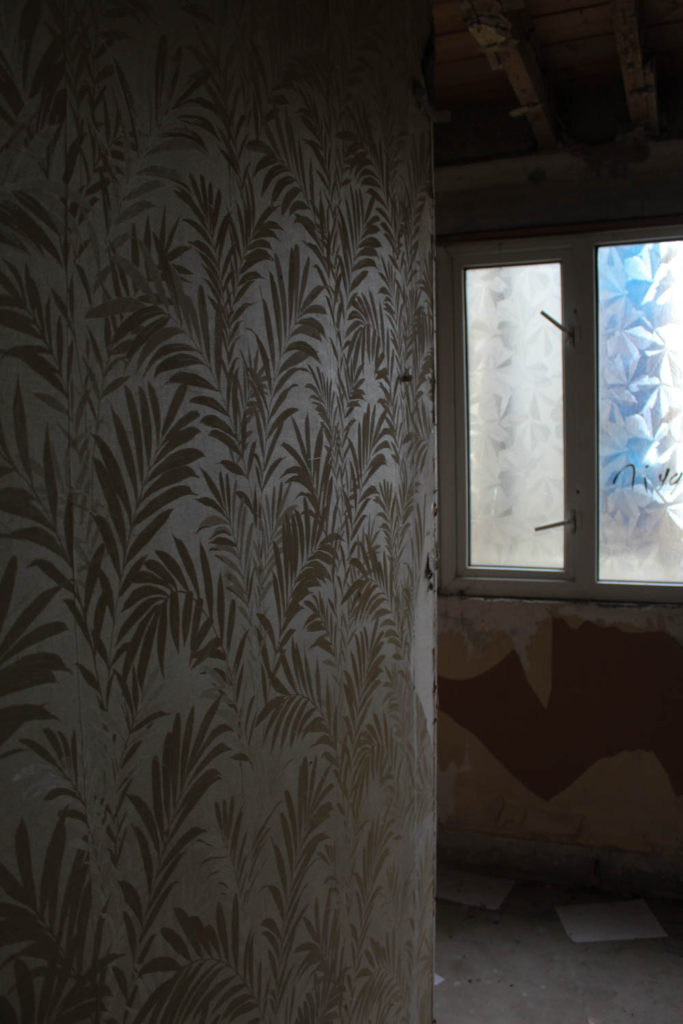
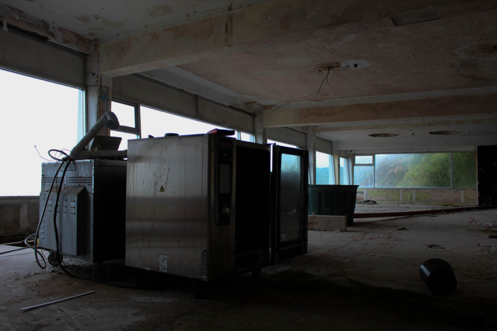
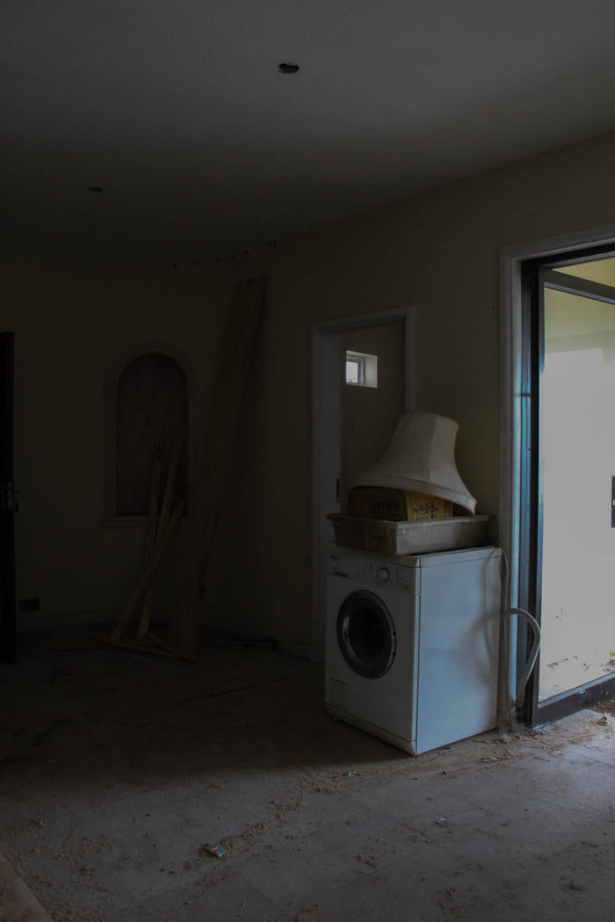
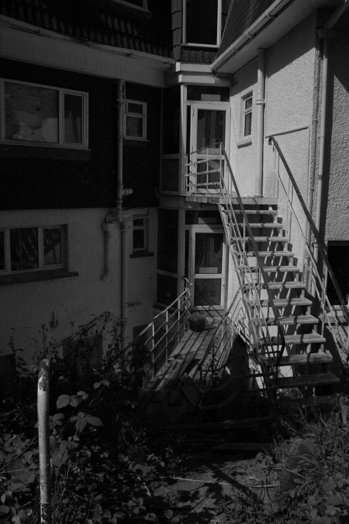
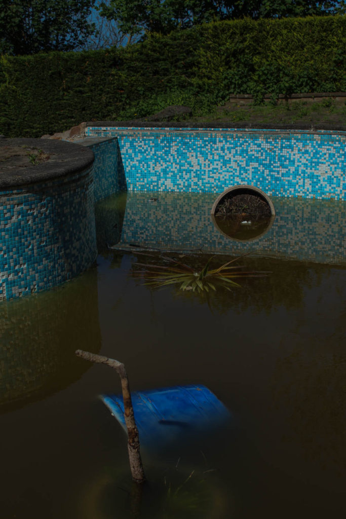
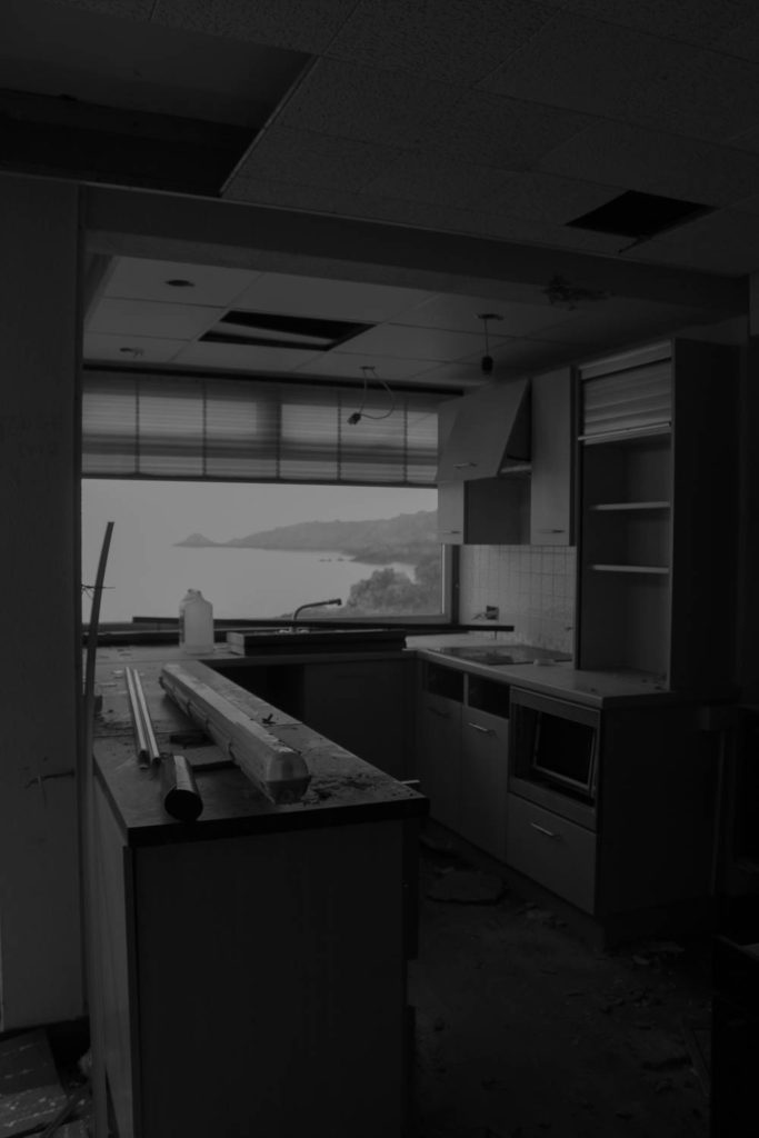
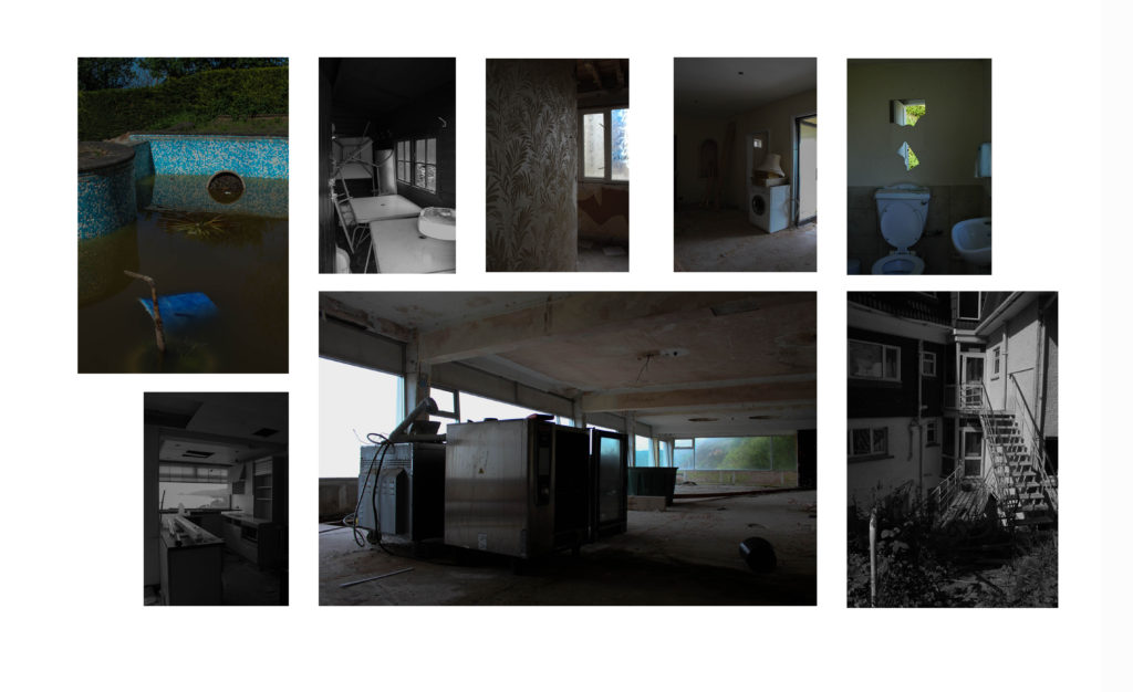
This section of my project I have named ‘destruction’, this is in contrast with the first section of my project. This section all went to plan however in future I would like to take some more landscape rotated photos as the majority of them are portrait. A variety of landscape and portrait would mean that they fit into a collection better. i like the contrast of coloured images and images in black and white. I chose to put some of these images in black and white because i wanted to express how sad and lonely this place is after being abandoned. This is also a place a lot of people have previously visited in jersey since it was open, and i am aware that it was a place that a lot of people loved. when i went on this photoshoot I bumped into an elderly man who was just stood staring at the pub part of the hotel in shock. he said to me ‘isn’t it such a shame what we do to the best places’. This quote inspired me a lot to take a look inside. I wanted to show how dilapidated and empty it was left. after being sat there rotting for 5-6 years people are still sad about its downfall. This wasn’t my original idea when I was given the assignment, but after doing some research on Andrew Moore i was drawn to this side of Anthropocene, the stuff that not everyone gets to see. These photos relate to Anthropocene because nature is overtaking this run down building, but so is mankind. there are things thrown everywhere, rust and mould, weeds growing all over the building and broken glass everywhere. Through these images i wanted to allow people to feel sad and slightly empty, just like i did when i entered the building.
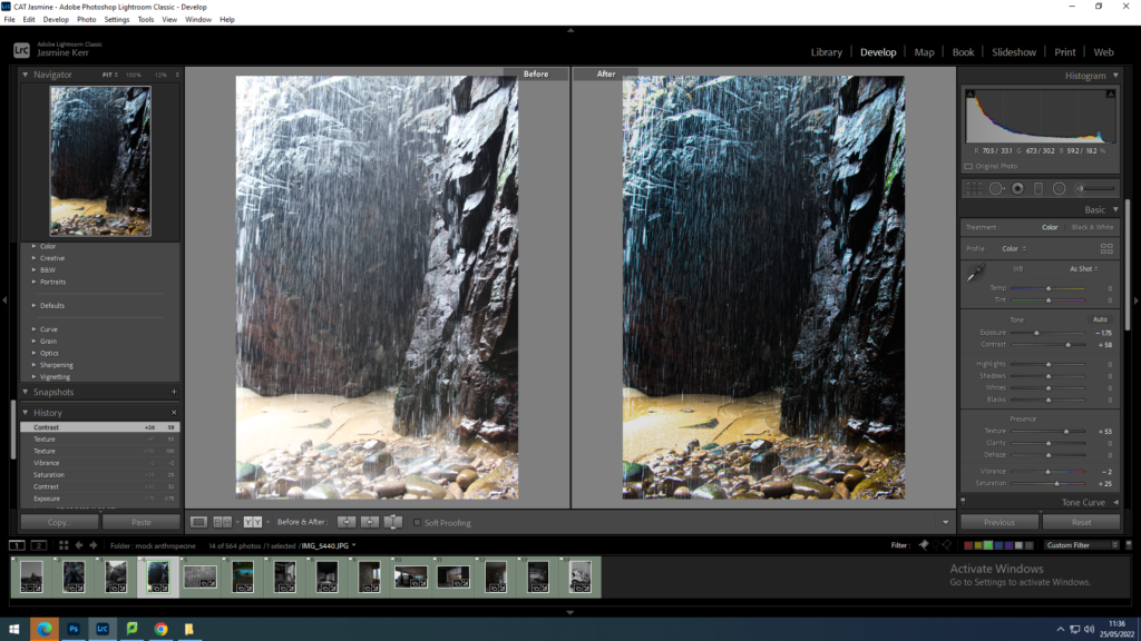
This image is in response to George Marazkis and Charlottas work. For this image I wanted to bring out the purple and yellow tones.I did this by increasing the saturation, decreasing the exposure to enhance the water dropping, and increasing the contrast to show the shar formations of the rocks.
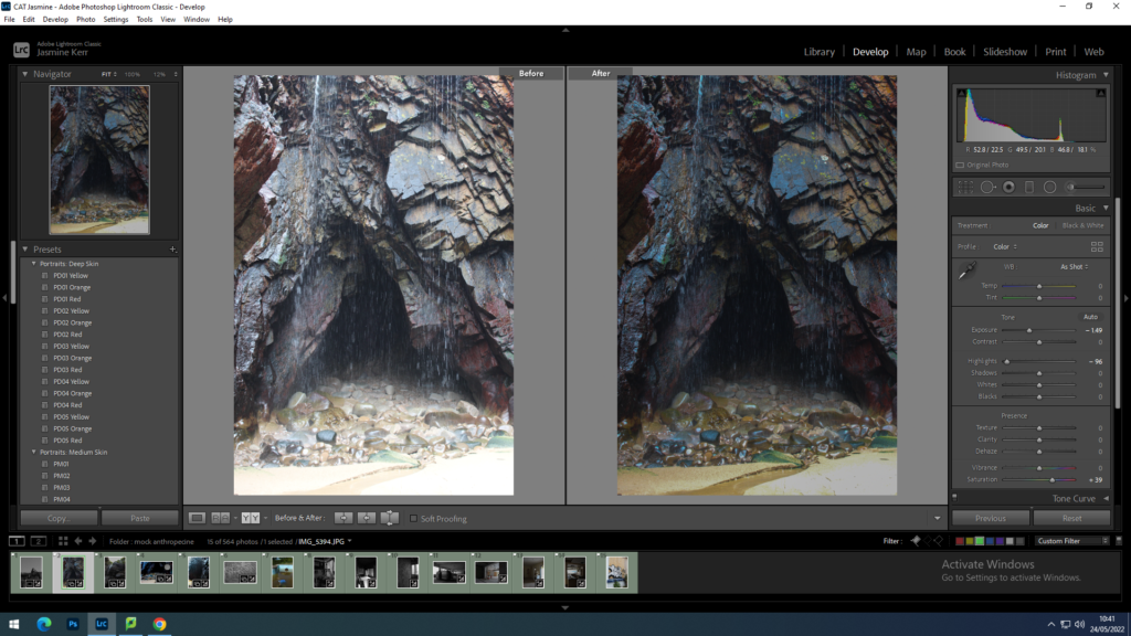
This image is in response to George Marazkis and Charlottas work due to the serenity and awe of the natural landscape. firstly I reduced the exposure and increased the contrast to emphasise the different natural colouring in the rocks underneath the waterfall. I then lowered the highlights so that you could clearly see the rock and sand formations. i wanted this image to be slightly darker so that the gave looked like it could go on forever.
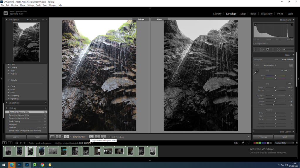
This image was also a response to George Marazkis and Charlottas work. In this image i wanted to reduce the brightness of the sky, due to it being a cloudy midday. However i chose to take this image on a cloudy day to create an ominous, dreamy effect. I then increased the contrast slightly so the rocks were more pronounced.
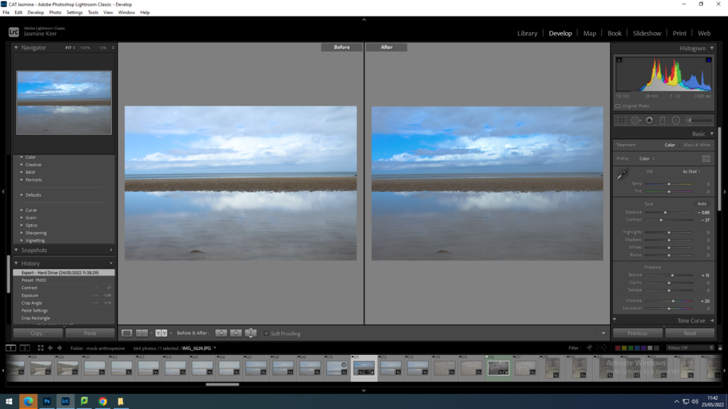
I am going to take this image into photoshop and distort it to make it look futuristic and almost like an optical illusion. I increased the contrast to make the sky appear more blue and increase the reflection.
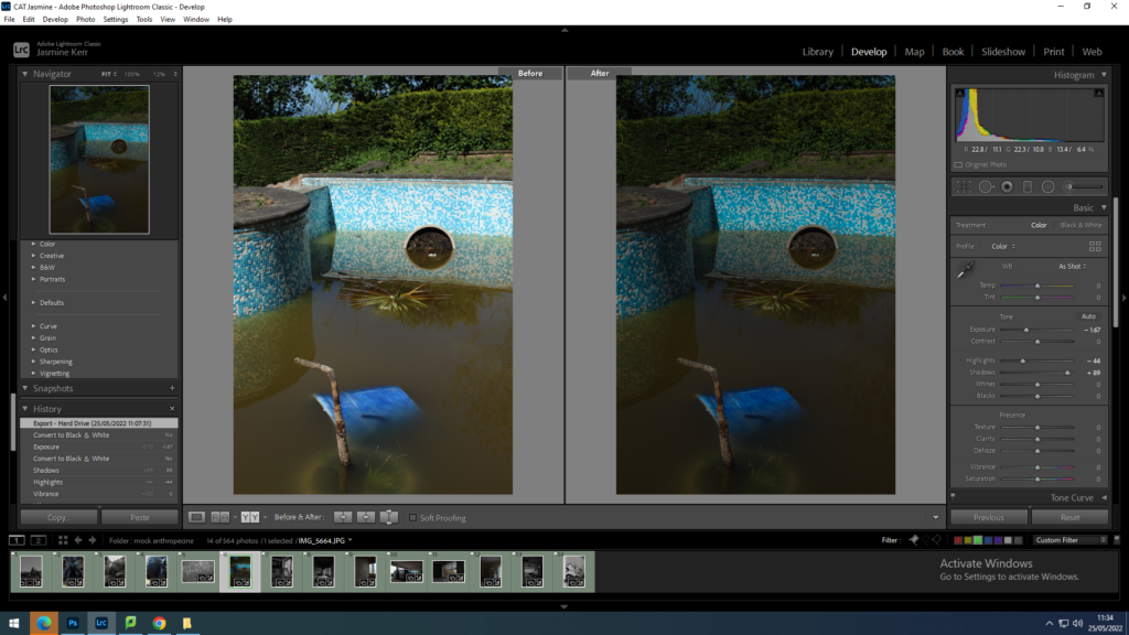
I kept this photo black and white to show the brightly coloured swimming pool, almost how it is viewed in a child’s eyes. i increased the contrast slightly to saturate the tiles around the pool. I also decreased the exposure to dim the whites slightly.
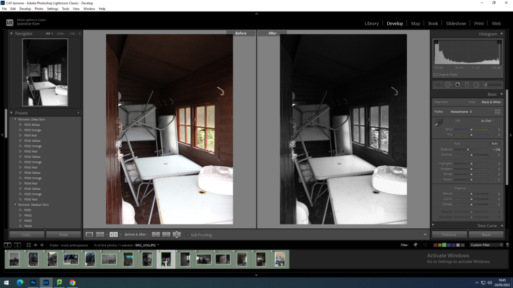
for this image i put it into black and white, to me this image is quite chaotic, which i quite enjoy. I decreased the highlights to that you can see the dirt on the tables.
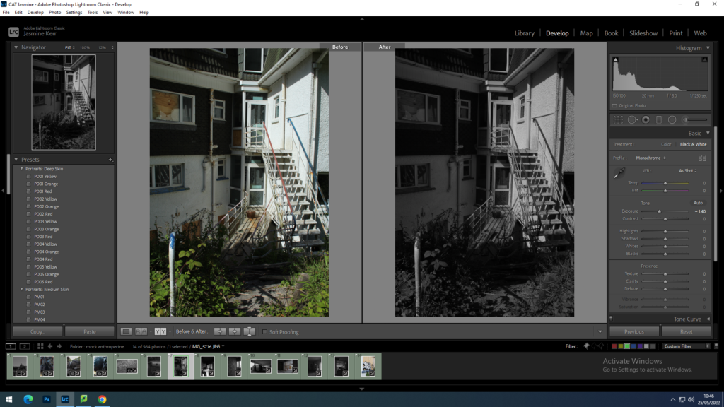
this is another image which I find quite chaotic. I put this in black and white because the image is originally quite dull, apart from the overgrown green weeds. I decreased the exposure slightly and increased the contrast to show the shadows in this image better.
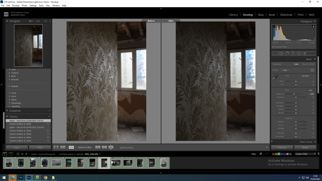
I wanted to keep this image in colour due to the bright blue from behind the windows. i increased the contrast and decreased the exposure to emphasize the wallpaper on the left of the image.
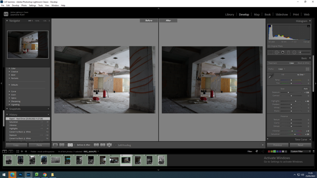
For this image I increased the saturation to highlight the fire extinguishers in the centre, and decrease the exposure and increased the contrast slightly so that it was the main focal point of the image.
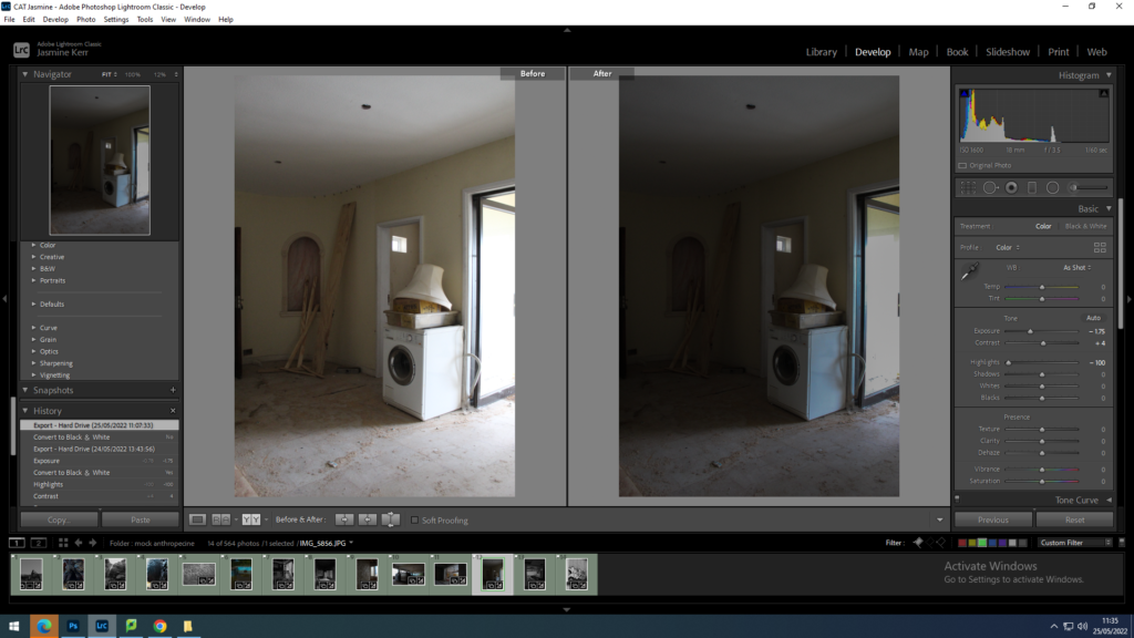
for this image I decreased the exposure and increased the contrast so that the light hitting the washing machine was cooler. i also decreased the highlights so that the whites in the image were dimmed.
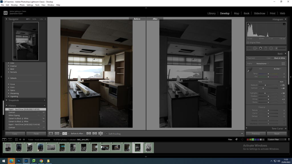
for this image I wanted to make the back in the window more clearer. I changed the image to black and white and decreased the exposure and increased the contrast so that the window almost looks like a painting or a television.
Statement of intent: I am going to take a mixture of urban and rural landscapes, with the key feature of destruction, whether that be already within the image, or manually destructed using photoshop or cutting and sticking techniques.
photoshoot 1: Plemont bay
I am going to take photos of natural beauty, focusing on the rock formations, waterfalls, patterns in the sand etc. I will then use inspiration from Charlotta’s work to layer the images and show the natural beauties that we are all collectively destroying. As well as this I will choose one or two of my best landscape photos to create the crumpled paper effect done by Ingrid Weyland.
photoshoot 2: Bouley bay
I am going to try and find access into the abandoned hotel called ‘waters edge hotel’ down at Bouley Bay. I have chosen this spot because this place has been left abandoned and alone for around 5-6 years. Therefore you can see nature trying to fight back to us humans, leaving the hotel decaying and overtime becoming dilapidated and broken.
photoshoot 3: walk
I am going to walk around St Clements and take pictures that show destruction, I will walk along the coast, all the way along to La Collete in the hope that I manage to find a building sight or destryoed urbanisation.
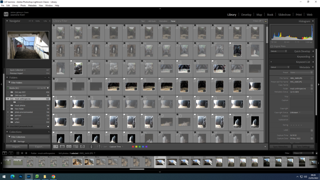
Firstly, I uploaded all 700 of the images from 3 different shoots to the Media drive that I managed to take during my photoshoots at Bouley bay, Plemont bay and various different places.
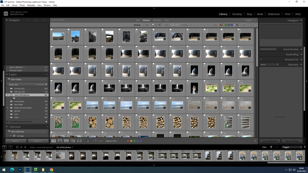
I then used ‘shift x’ to hide the images that weren’t so good and ‘shift p’ to flag the images that had potential. I was then still left with 200 photos at this point.
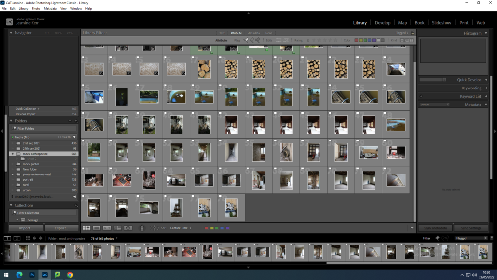
from 200 photos I then reduced them to 78 photos but still needing to reduce the photographs by quite a significant amount
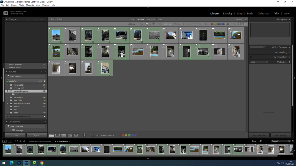
Here I am starting to select which images I am going to use as my final images by colour coding them with green.
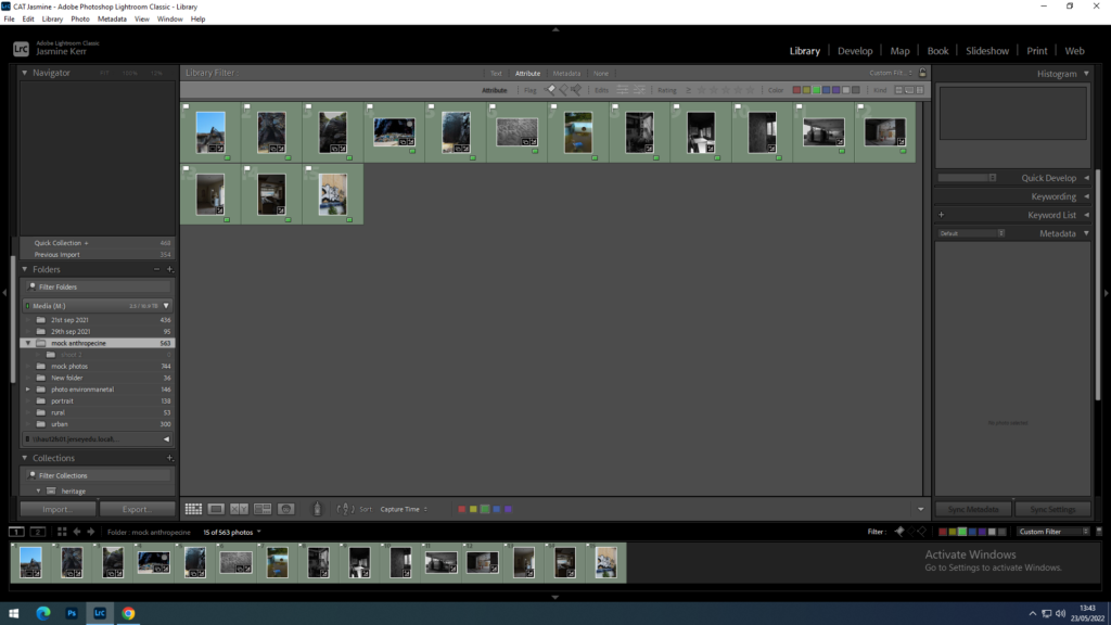
Now that I have reduced the images from 700 to 15, I am going to begin to experiment with lighting and photoshop in correlation to my chosen photographers.

Greek photographer, George Marazakis, takes the Anthropocene as both concept and title for a series that looks at a new epoch engendered by the greed of mankind. George Marazakis born in 1976 in Crete Island Greece where he lives with his wife and their son. He studied Mechanical Engineering and works for the Greek Ministry of Justice. He produced his photographs behind he idea that after 12,000 years of stable climate, the current geological period—Holocene—is ending, humanity’s effect on Earth has been so catastrophic that it has caused a new epoch to begin.
“an external observer could describe it as an autoimmune disease attacking its own body.”
this quote symbolises the earth as our body, and that we are actively attacking our own chances of survival, ultimately ending in devastation.
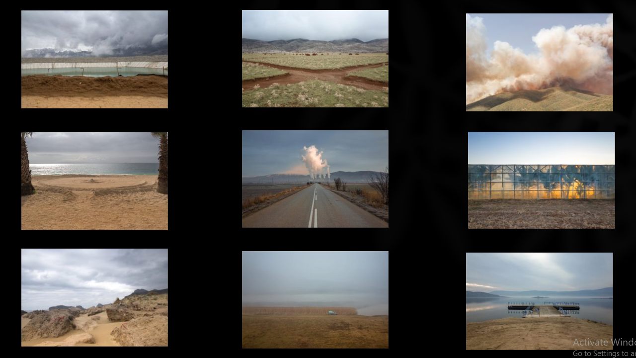

This photograph of George’s really interests me for many different reasons. The main connotations that I perceive from this image is that the man made cross in this image represents that anything humankind touch or tamper with, will never be the same as it was before. George highlights the ideas that we are destroying our earth automatically without thinking about the consequences. The cross, dug out in a serene and beautiful landscape, is showing that we always have some impact on our earth. As well as this, the cloudy, stormy looking background shows the idea of global warming and pollution, again, caused by us human. The low saturation and dullness of this image is almost suggesting that the more we tamper with our planet it slowly ‘fades to grey’ and almost dies. It also provides us with an ominous feeling, the photography people usually see idolises landscapes, upping the saturation and making it look almost dreamlike. However this looks more like it comes out of a horror movie or nightmare. George is originally from Crete Greece, however his image challenge the stereotypes of sunny colourful Greece. I chose to study George because his landscapes are truly mesmerizing, but highlight the idea that change is coming faster than we think. the images he takes are almost surreal and tell a different story in each one.
American photographer Andrew Moore (born 1957) is widely acclaimed for his photographic series, usually taken over many years, which record the effect of time on the natural and built landscape. These series include work made in Cuba, Russia, Bosnia, Times Square, Detroit, The Great Plains, and most recently, the American South.
Moore’s photographs are held in the collections of the Metropolitan Museum of Art, the Whitney Museum of American Art, the National Gallery of Art, the Yale University Art Gallery, Museum of Fine Arts Houston, the Smithsonian American Art Museum, and the Library of Congress amongst many other institutions. He has received a fellowship from the John Simon Guggenheim Memorial Foundation in 2014, and has as well been award grants by the National Endowment for the Humanities, the New York State Council on the Arts, and the J M Kaplan Fund.
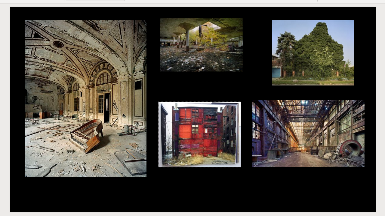
in this specific section of photographs, Andrew Moore photographs the effect of time on the natural and built landscape, his images highlight the dilapidated and ominous parts of Detroit. he shows the impact of nature on man made buildings and objects, also showing how nature can destroy places over time. Time is one of the biggest destroyers of urban landscapes, for example things like rust, decay and mould. nature is trying its hardest to fight back for their space by slowly taking down man made objects, just like how earth was designed to be. His images relate to the topic of Anthropocene because he is showing the impact of human actions on nature, more and more places are becoming abandoned due to the fast destruction of buildings cause by nature and time. I chose this artist because I have a particular interest in old and abandoned places, I find tranquillity in places that have once been loved. In my opinion, a abandoned building tells a much bigger story than a building that is still running. It makes you question why it was left, who stayed here and many other things.
particular image that interests me is:
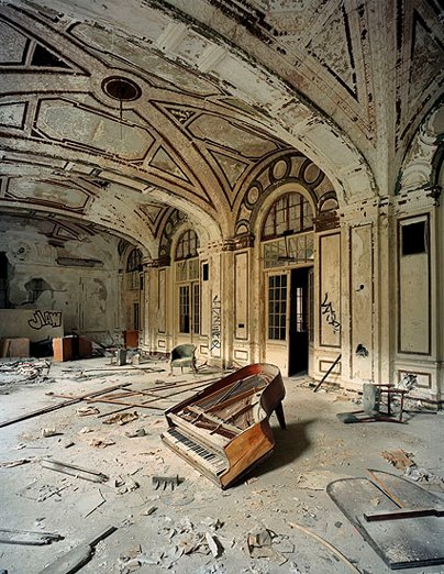
This photographs has a lot of character, it is almost quite sad as this place seemed to formally be someone’s home, but it has been destroyed over time. The piano is the centre focus of the image. A piano is known to be an expensive, well kept and precious item, but it has slowly been destroyed by nature and us. The lighting in the image is natural light coming through the windows of the room, this lighting exposes the fact that there are no man made lights in this place anymore after being abandoned. This photo was taken as a wide landscape shot, the photographers does this to show the sheer size of the destruction in this building, the image is calm yet chaotic in a way. There is a lot going on in this image, from broken windows, collapsed walls, and graffiti toa huge layer of dust. however, the piano being in the centre of the image, solitary, connotes to the idea that nature is working alone with no help anymore. due to the fact that us humans are not nurturing it anymore. the warm hue of the image indicates the natural sunlight coming into the room, but also symbolises the idea that this place used to be cared for and a place of comfort. The textures in this image are all very harsh and sharp instead of soft and dreamy, showing the harsh reality of time and nature breaking down our buildings.


Charlotta’s work focuses on rural landscapes, specifically nature that provides the theme of awe and terror. Charlotta uses the technique of overlapping layers of fragmented landscapes , printed words and fingerprint patterns. Her work explores a new perspective on her personal memories and the collective impact that we have on the environment. She uses the globally recognised finger print to signify the human presence on earth. she states that ‘It speaks to our impact on nature and nature’s impact on us.’ she also uses snippets of text about global warming and the effects humanity have on nature, this is a subtle but clever way to get show the message behind the photographs. Global warming has become and increasingly important subject over the past 10 years and charlotta shows this throughout her images in many different ways. she photographs different natural landscapes that are almost mesmerising, but cuts them up to show how we destroy the earth constantly. I chose Charlotta as an ispiration for my project due to the fact that I am very interested in the idea behind the images, how they have been torn appart to symbolise human impact, and how the images almost create an illusion and draw you to look into them.
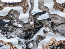
I was particularly drawn to this image of Charlottas. Her use of text and different textures of nature shows the beauty of the world and what we are rapidly destroying. The text used in this image is a piece about global warming. Global warming is a key feature of Anthropocene due to the fact that global warming is caused by humankind. Her use of different coloured and textured stones, rock and gravel give the image a pure feeling of nature and the natural, untouched beauties of earth. The layering also has connotations of big rock formations that you see on big cliffs that have been eroded by water and waves. the exposure used in these images is quite high, leaving the images bright and cheerful, this symbolises the way charlotta views nature. The temperature of this image has a cool hue, giving connotations of sadness. Charlottas images were taken in Iceland, a place that is heavily effected by global warming and climate change. This image is almost like a call for help, she shows the erth and nature but never really anything with snow or the weather that is normally expected in iceland. This is a particularly personal study for charlotta, because she is from Iceland and her home is rapidly being destroyed.
Dictionary definition : The Anthropocene Epoch is an unofficial unit of geologic time, used to describe the most recent period in Earth’s history when human activity started to have a significant impact on the planet’s climate and ecosystems
The topic of Anthropocene has become more and more relevant as the world became more populated, polluted and urbanised. Collectively, we have impacted earth in ways that are inevitable, but irreversible. The rise in temperature and sea levels is due to increase in use of greenhouse gasses, rising into the atmosphere and warming the planet. By doing this, the temperatures rise, sea levels rise, ice caps melt and animals lose their natural habitats. We are rapidly destroying the earth due to greed, for example making money by cutting down trees, again leaving animals homeless, and destroying the levels of oxygen that our planet has naturally sourced. The overpopulation in many countries is causing the need for more and more housing, therefore to make room in these overpopulated areas, we are having to invade earths natural beauties to make room for us. overtime, this process will become catastrophic to the earth, many species will become extinct, maybe even ours. many photographers are focusing on this topic a lot more than usual, exposing the damage we are causing and protesting for change. In my study of Anthropocene, I want to highlight earths natural beauties that May not still exist in the future due to the need to build more houses, and want to show the destruction and ignorance that humans have towards nature. I also want to show how nature fights back against our actions, by trying to rot, erode, overgrow and dilapidate man made objects, but also how we as humans, destroy and waste our own creations.

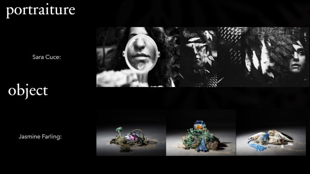

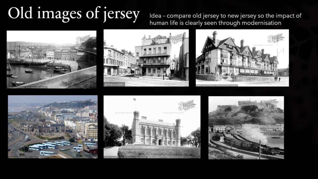
I have decided to produce my Photography exam using landscape photos, with inspiration from Charlotta Maria Hauksdottir’ and ingrid weyland.
Keld Helmer-Petersen is one of the most influential Danish photographers in the 20th Century. He was an international pioneer in colour photography and was a central figure in not only Danish but also European modernist photography. His career spanned 70 years and he had strong interest in modern architecture, industrial areas and structures. He was very prolific and continuously experimented and challenged the many possibilities of the photographic image
Keld Helmer-Petersen is recognised as a pioneer of colour photography. His self-published book 122 Colour Photographs, appeared in 1948. The photographs were ground-breaking in their use of colour as subject and their abstract qualities. As Martin Parr observes ‘…for the 1940s it was sensational – way ahead of its time.’
I don’t want my pictures to ‘look like something’. They should just look like pictures.
Keld Helmer-Petersen, Life, November 28, 1949
But significantly, over a career that spanned six decades, the vast majority of Helmer-Petersen’s work involved black and white photography – often portraying a very graphic sensibility achieved by exposing high-contrast film negatives.

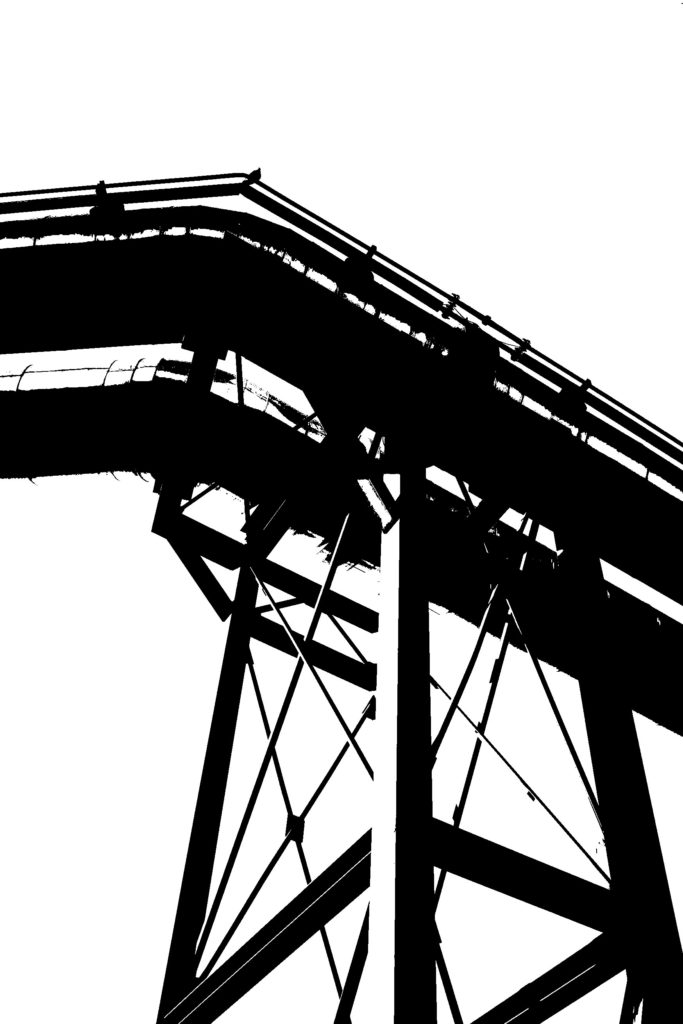
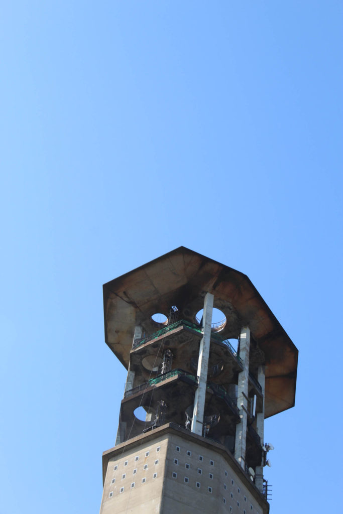

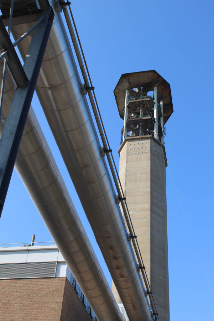
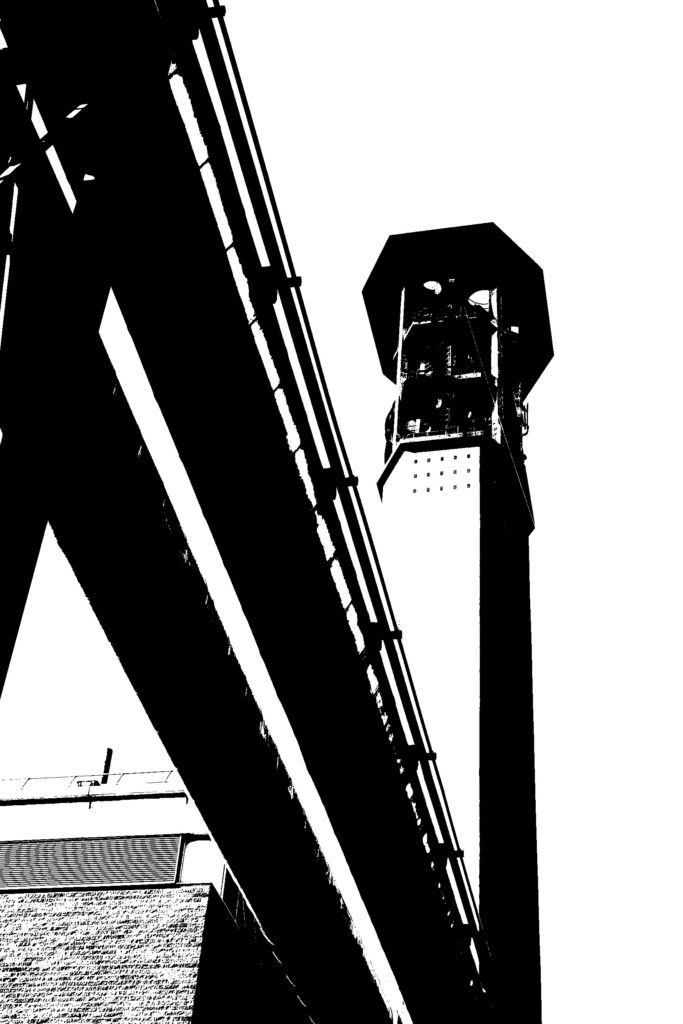


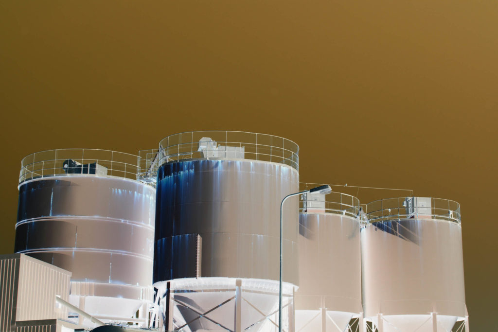

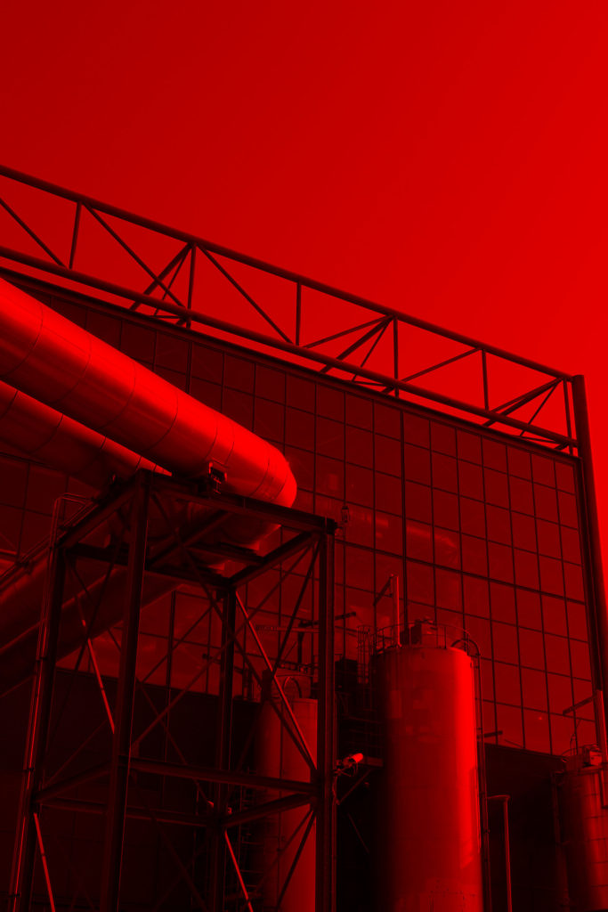
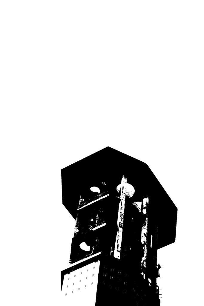

As well as experimenting with high contrast black and white images, I also experimented with colour gradients and invert to really bring out the shape of the industrial buildings.