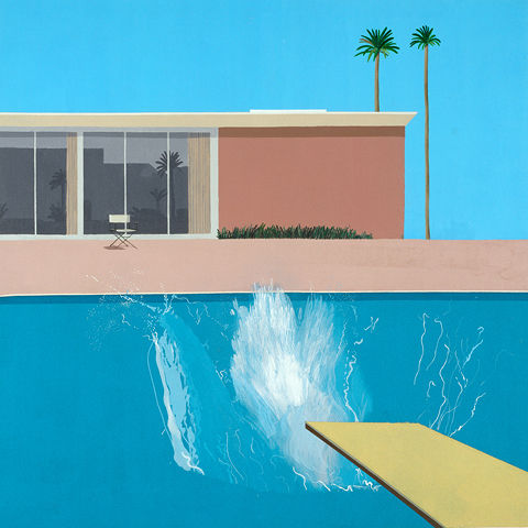
was a English painter born on July 9, 1937 (age 84 years). the painter was inspired by the old masters of Western art to start photography. his photography style came from cubism, he created joiners which used many smaller images put together to create a greater abstract image.
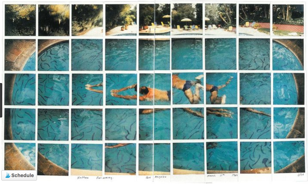
these image show David Hockenys joiner that he made by rearranging them by hand because he was before the digital age. I like the way the square grid distorts the more organic shaped swimming pool. the persons swimming stroke has been documented in many positions in on overall piece.
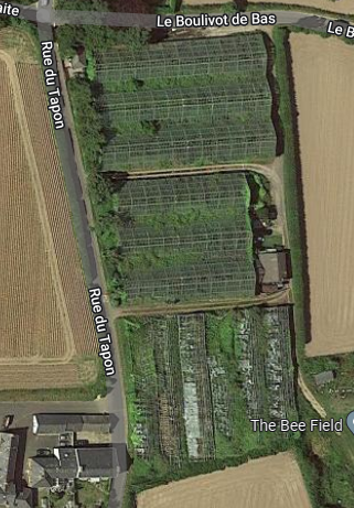
What is a Site of Special Interest? A (SSI) or a Site of Special Scientific Interest (SSSI) in Great Britain broadly mean the same thing; they are conservation designations placed on sites to protect their special biological or geological features. Some areas, such as the sand dunes of Les Blanches Banques or the heathlands of Les Landes can encompass entire landscapes and are familiar to most Island residents, who visit them for walking and enjoying the wildlife and landscape.
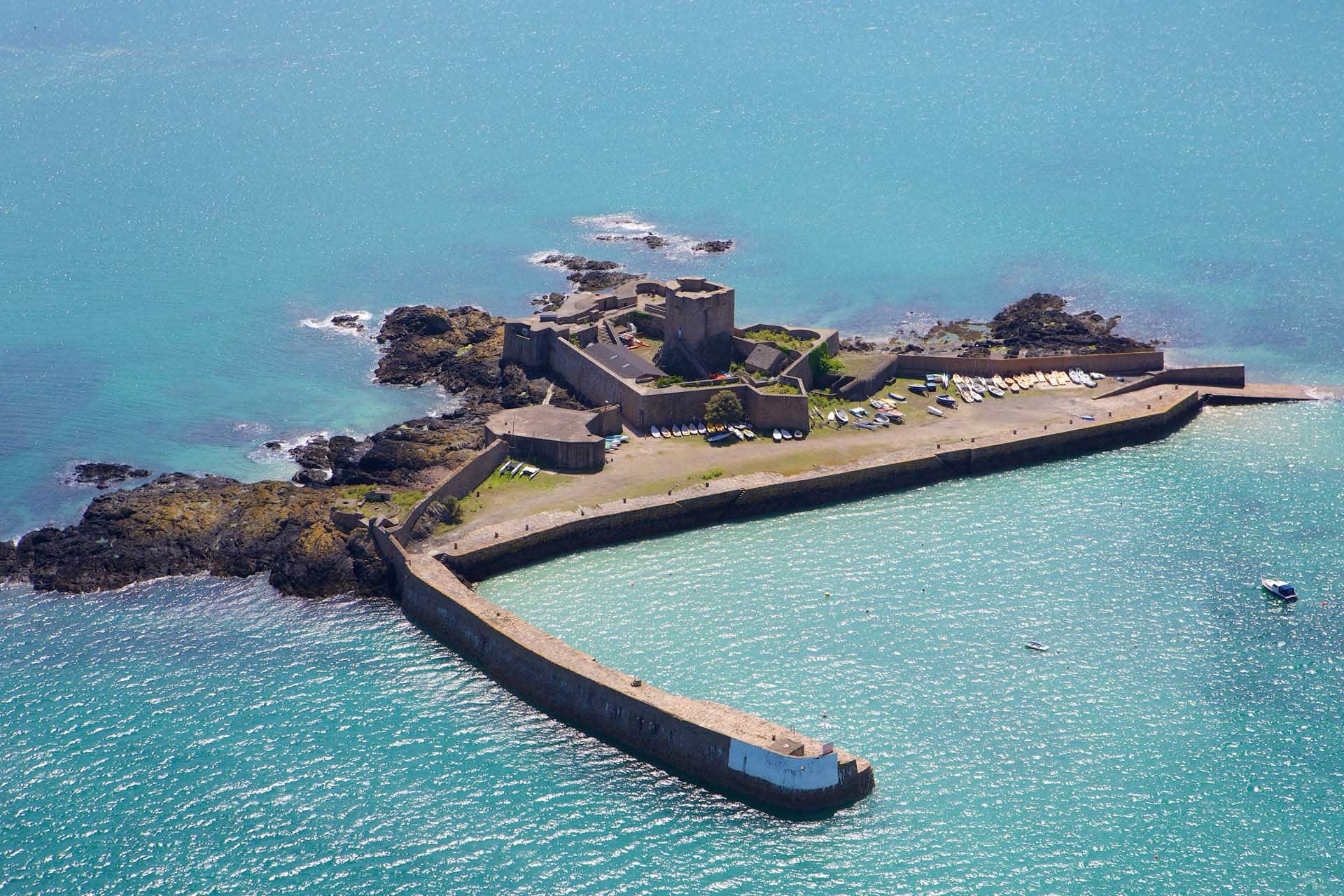
Jersey has 22 SSIs the first was designated in 1996. one of them is st Aubin’s fort
ST Aubin’s fort was originally built in 1540 to defend Jerseys main port at the time it was then added to and used by the Germans in 1940-45.
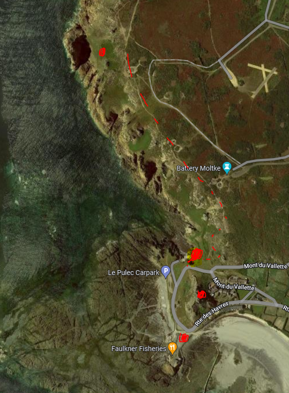
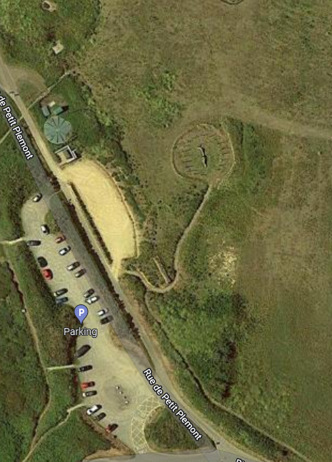
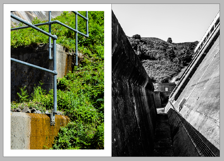
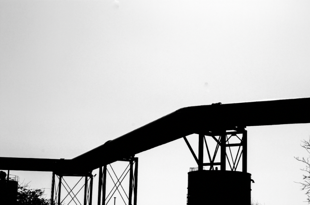
this shows where I took my images from on the photoshoot. I started taking shots looking up at le Grande l’etacq then I went out the top to get a better point of view along the cliffs. then I went down to stinky bay and explored the coast line and the interesting curves created by the coastal erosion. The ravine and crevasse provided a lot of substance for me to focus my lens on. we walked along the cliff paths taking photos of the protruding rocks along the coast line to le Pinnaccle.
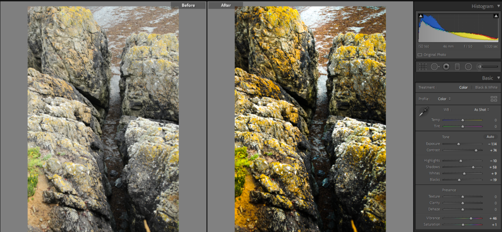
I liked the way I edited this image to proved a deeper range of colours to the image but I decided to experiment with this image in black and white, overall I decided I like the colour image better because the contrast between cold blue sea and the warm yellowy granite.
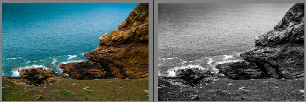
Another image I edited until I was happy with it but then i decided to experiment with the Midtones to proved a tinted colour to the image. I chose a reddish pink which brings out the rich colour in the dirt holding the conglomerate together. i liked this image a lot but i thought a more natural look was better suited to the image.
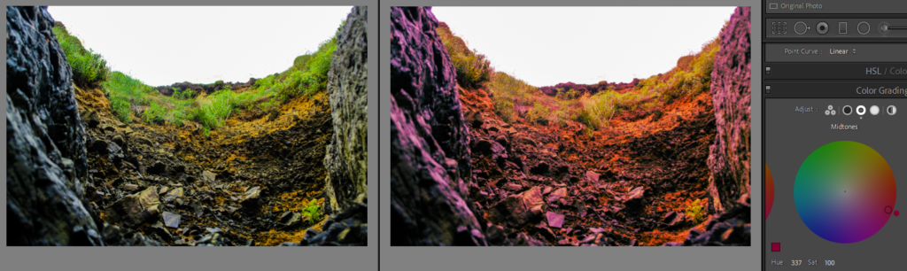
I chose image to put in black and white which gave it a dead pan aesthetic with high contrast between the lighter bolder and darker coloured background. I experimented with changing the tonal curves to change the overall colour of the image. i liked the red effect as it looks alien as if it doesn’t belong in our planets natural environment.
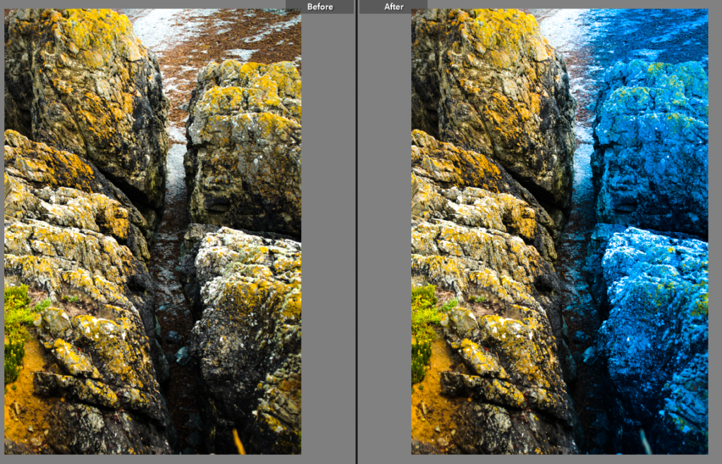
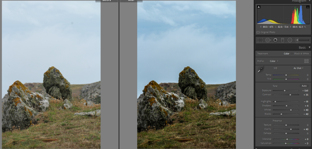
I really like this image of a crevasse which I increased the vibrance to bring out the yellow from the lichen on the rocks. I then used the graduate filter tool and decreased the temp to give a warm side and a cold side to the image with a gap in the middle represented by the divide created by coastal erosion. i liked the way this image turned out.
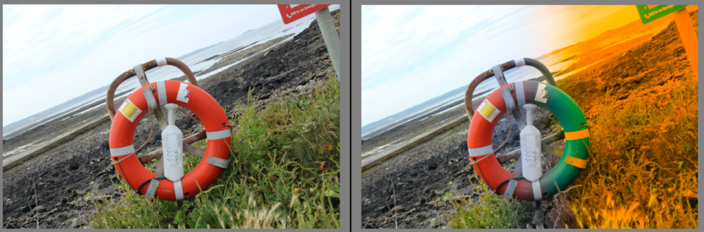
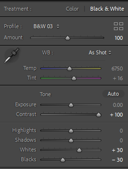
I liked the effect i created on the last image so I tried a similar effect on another image i placed the graduate filter tool in the centre of the life ring then decreased the temp and increase the hue this created a multi colour effect between the life ring and its surroundings which I thought was very interesting.
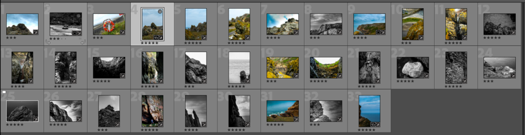
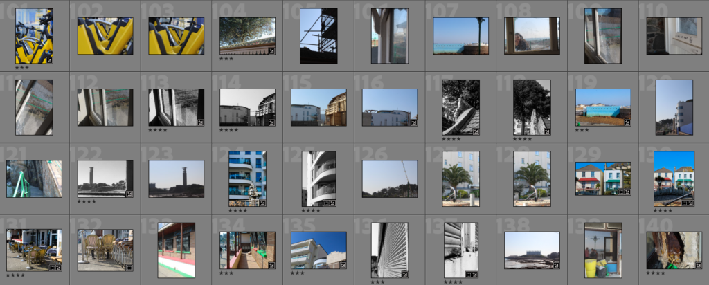
out of 701 images I took on the trip then used the star ratings to find only the good images then I kept refining to find my best images.
these images are my best 19 I selected from that photoshoot.
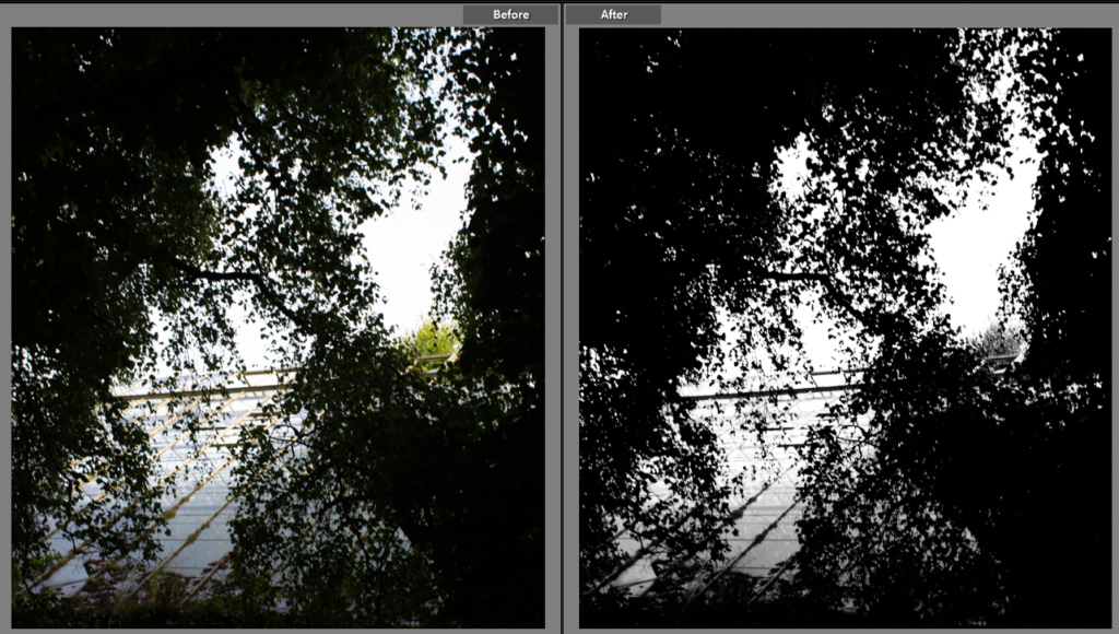
I increased the contrast and decreased the highlights to give more depth to the image. I did this to give better distinguish between the rock, the moss and the grass. decreasing the highlights bring more contrast into the sky giving it slightly less overcast effect.
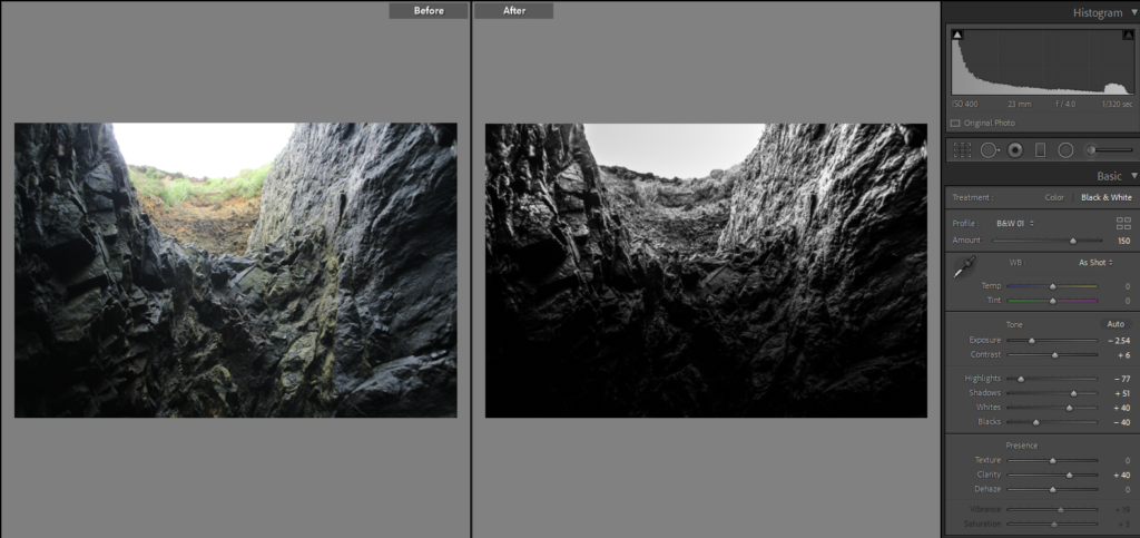
i liked the way the light Shon down into the craves so I put it in black and white to give better contrast between the two tones light and dark. I then used the graduated filter tool to make the bottom of the image darkest so that it slowly fades from over exposed white at the top shining down until complete darkness at the bottom.
This photo was taken from above looking down into the crease I increased the vibrance to bring out the bright yellows in the lichen. increased the shadows to create the effect of a deep dark crevasse.
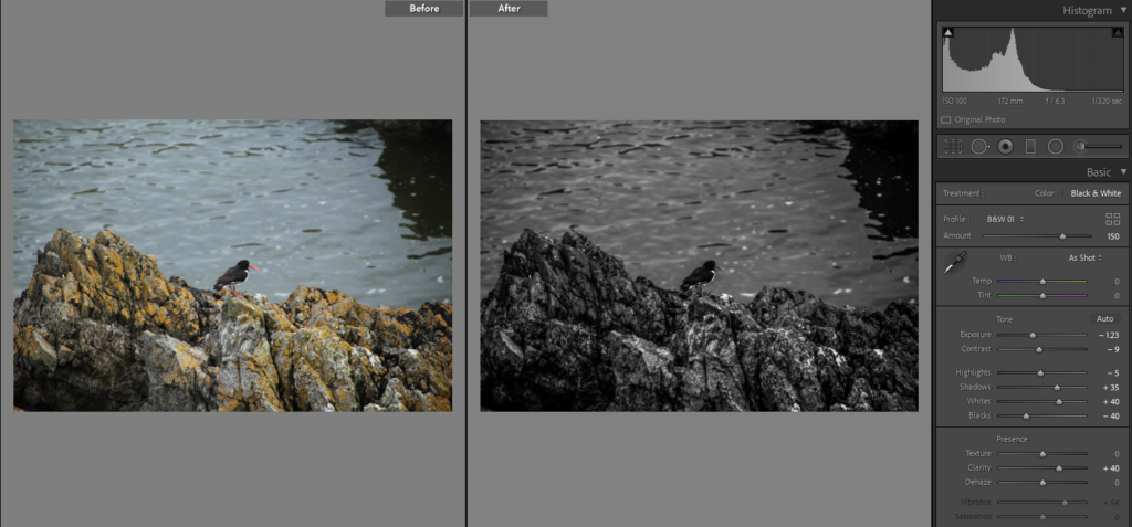
I liked the reflection in the water so I decided to put the image into black and white to create a distinct contrast. this contrast gives a more mysteries effect because the oyster catcher is facing with its back to the lens.
I cut multiple window mounts and mounted a mixture of A4 portraits and A5 which gives a good contrast between the images.
I mounted this A3 image by itself against a black window mount to give extra contrast to the light image. I made the window smaller to get rid of the white border o that the image directly juxtaposed the black card.
This is a A3 portrait image that I mounted this image and left the white border because I like the buffer between the dark image and the dark card.
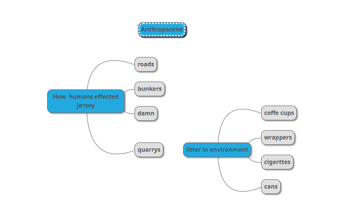
Anthropocene is the unit of time, that describe the most recent period in Earth’s history when human activity started to have a significant impact on the planet’s climate and ecosystem.
In this project I am going to explore how humans effect the environment, this can be shown in many different ways for example litter is a direct way humans toxify the natural environment with harmful chemicals from man made packaging’s and products.
Mindmap
Eadweard York artist reference
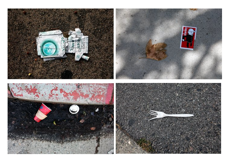
Edward York is a photographer that takes images of litter where it lies in streets and roads. he is most know for his image that show a “society on the verge of destruction”.
His street litter project inspired me to go out and take images of litter where I find it this relates to Anthropocene because humans drops foreign objects in and the environment showing disrespect tot the earth, litter harms the planet by adding toxins from plastic and chemicals used in the manufacture of packaging’s and products that leak in the environment meaning a less healthy environment for plants to grow. I will respond by going out around the my local areas to find litter and photograph it where it lies.
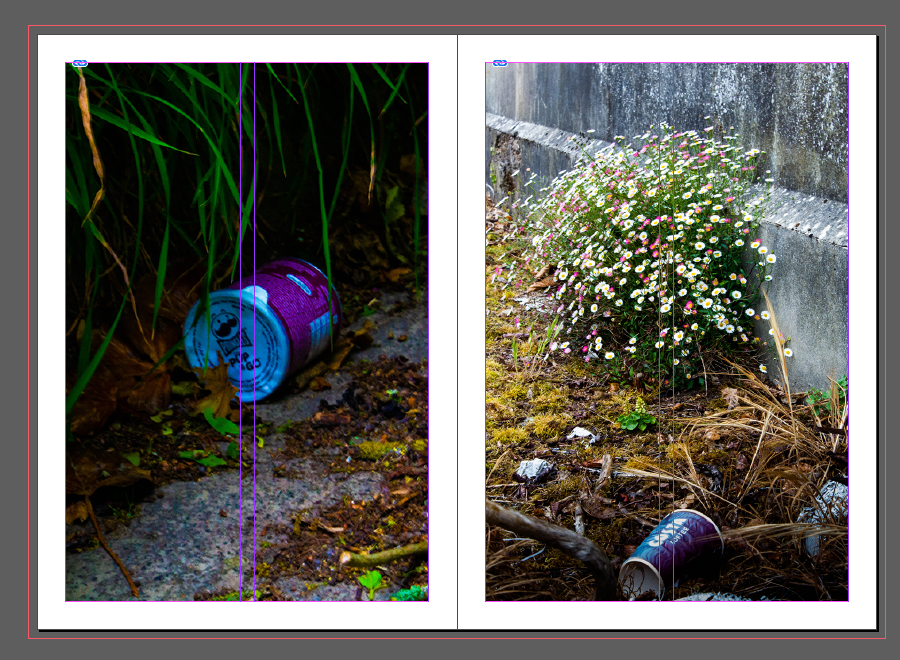
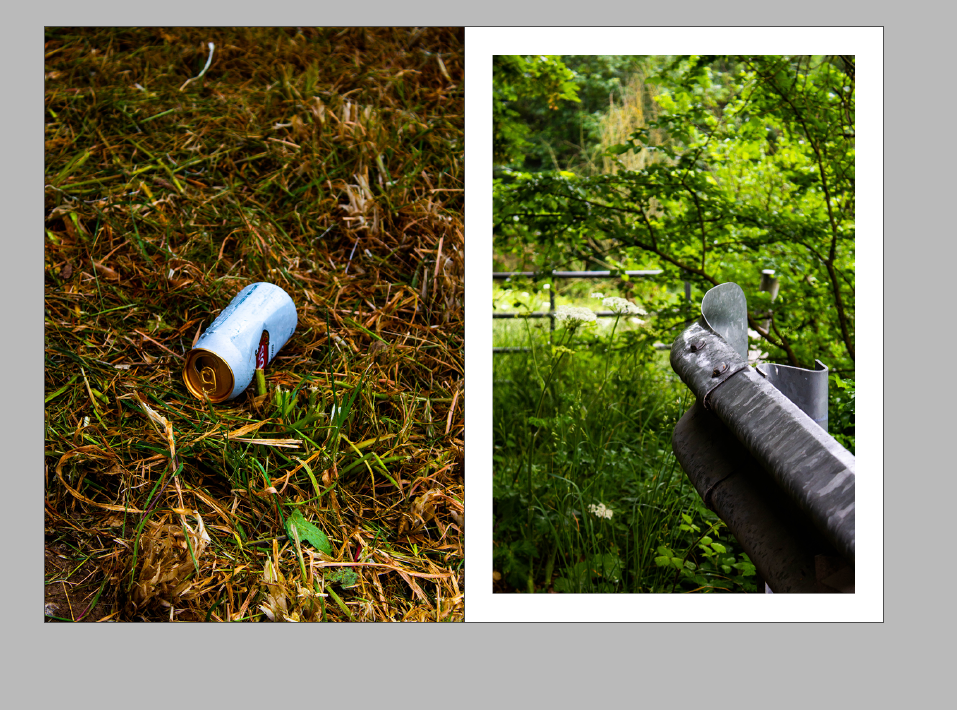
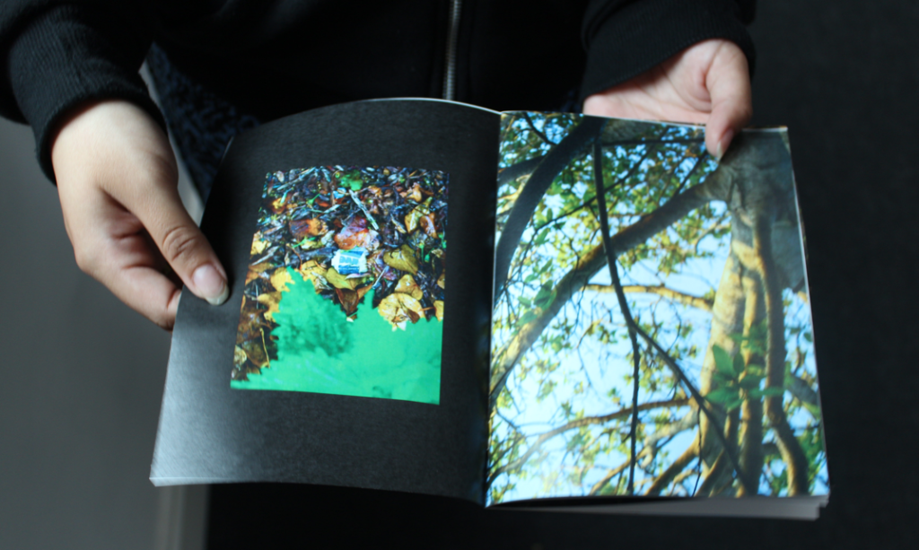
I like this image because it shows how out of place litter is because it isn’t made for these environments. the contrast between the clean bright coloured, loud packaging against the dull rugged environment. there isn’t a lot of grass in this image which represent the impact that humans plastic pollution is effecting the environment.
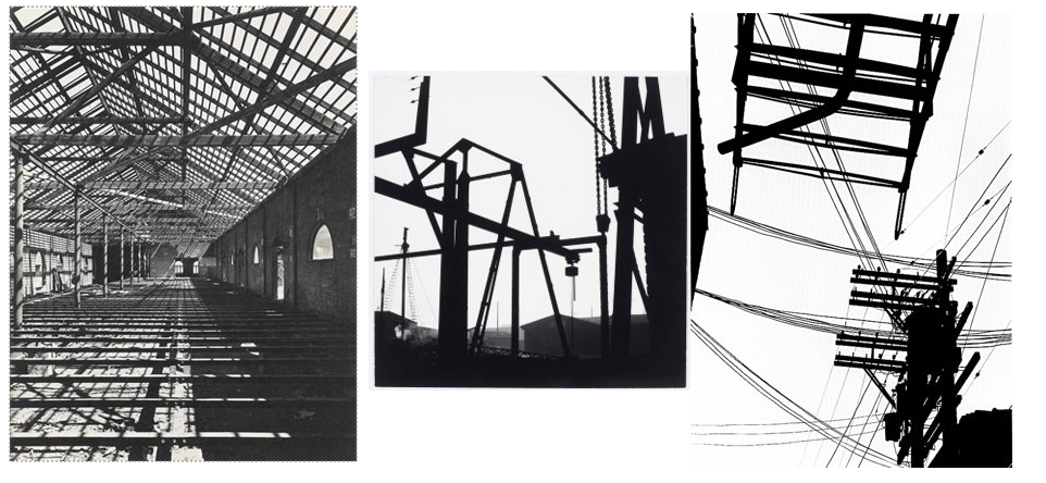
Keld Helmer-Petersen
Keld Helmer-Petersen was a Danish photographer who achieved widespread international recognition in the 1940s and 1950s for his abstract images. He is recognised as the pioneer of colour.
most of his image are on black and white high contrast film negatives. these images relate to Anthropocene between the hard black shapes of man made structures juxtaposing to the pure white sky that fills the rest of the image. I will respond by experiment using this effect on my images.
https://www.keldhelmerpetersen.com/
Image Analysis
https://www.keldhelmerpetersen.com/
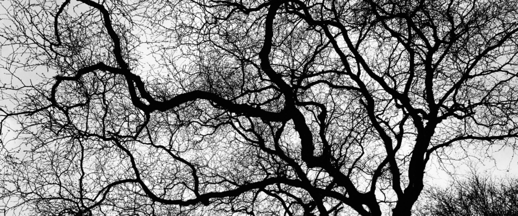
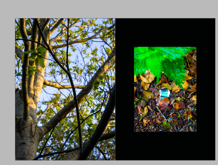
I like the intricate in this image how the infinitely splitting branches break up the white background creating more of a flat image. this image was taken of a tree out of season becasue it has no leaves. the darker parts of the image are where the trunk is thicker, and where the the tree once grew from.
George Marazakis
George Marazakis is a Greek photographer, born in 1976 in Creta Island Greece where he lives. He studied Mechanical Engineering and works for the Greek Ministry of Justice. He uses Anthropocene as both concept and title for a series that looks at a new epoch engendered by the greed of mankind. planet, plastic pollution, and power stations.
Image Analysis
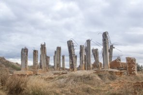
‘A cure for anthropocene’ George Marazakis
This image uses dull colours and a bright image to convey a lifeless, meaning the there is no cure for Anthropocene and the earth will be left lifeless if humans continue having such a large impact on the environment. the image shows a concrete ruin. concrete is very hard to recycle and is one of the most used materials on the planet. this image was taken to show that what we abandon does not disappear. it was taken to make more people aware of this ever growing problem.
Photoshoot
1 I will go to Plemont to photograph the area trying to convey a similar meaning through my images as George Marazakis.
2 I will go to a green house and take images of the inside and outside I am hoping to convey the how green house gases are effecting our planet.
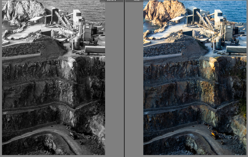
3 I will go to a quarry because it is a very large area that shows how humans have taken a large area
4 I will walk around and take photos of litter that is see along my way.
5 I will go to a an estate to capture images of man made structures.
Contact sheets
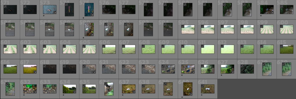
In preparation I took 641 images in 5 locations i first started by going through my images and rating them to best suit my artist reference.
Image selection
Image sub selection, then refined my selection even more to get 47 images
I then started to edit my images and make duplicates to experiment different ideas on this example is an image of the quarry in St Ouen that I took from the car park above the quarry. the downward angle the image was taken provides more perspective than a affect on would have been. I edited this image until I was happy with the result then I made a duplicate to see how the images would look in black and white, George Marazakis uses colour in his images so I decided to go with the non black and white version.
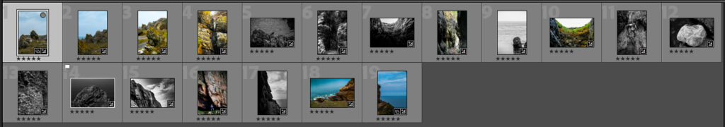
I further more refined my selection down to 19 images that will then be refined further into my final images.
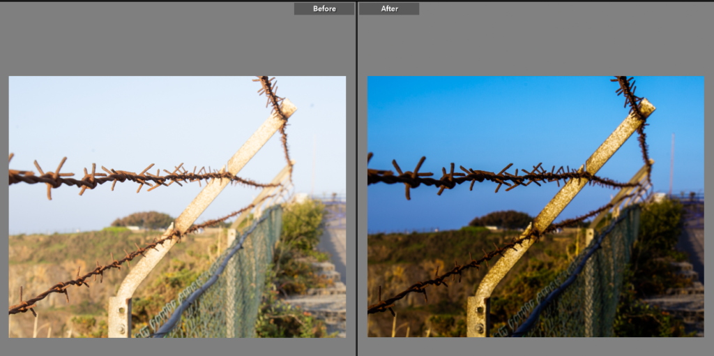
I really like how this image turned out after I edited it to reduce how over exposed the image is then I increased the contrast and shadows to give better definition and depth to the image. I like the way the natural blue sky contrast with the harsh spikes of the barbed wire fence. I decreased the black to give a clearer image.
I edited this image to bring out the greens of the overgrown bushes in the green house. to do this I increased the contrast and saturation. to bring out the brighter tones in the image.
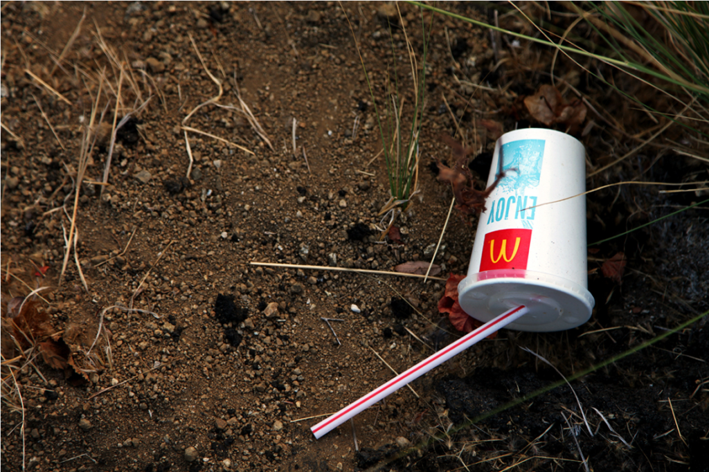
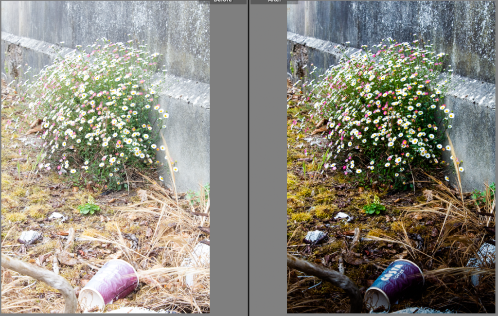
This was an over exposed image of a coffee cup left to contaminate the natural environment. I used the graduate filter on Lightroom to reduce the exposure at the bottom of the image i increased the shadows and decreased the highlights to give the image more depth. the dark foreground blends into the lighter background with lighter brighter coloured flowers growing out a crack in the concrete.
I edited this image to better relate to Keld Helmer-Petersen i used the graduate filter tool again to create a better contrast between the black shapes against the white sky’s.
experiment
I experimented to better relate to Keld Helmer-Petersen, I decided his abstract style would look good on this image because of its interesting shapes created by the gaps in the leaves and the light reflecting of the glass roof that blends with the white sky. I increased the contrast and changed the image to black and white to create this effect. this effect brings out the leading lines in the image that bring your focus into the image.
experiment
I increased the tint to experiment with colour in the whole image, to appear out of its context. this brings out a more vibrant tone to the object in the image. I dislike the less natural look to this image it looks like it has been over edited.
Comparing my artist reference
my image A cure for anthropocene’ George Marazakis
George Marazakis image inspired me to got to this location in Plemont that reminded me of his image. my image has a slightly more colourful tone because it the location is surrounded by forest and streams that give more colour to its natural environment. the sticks in the ground have a similar shape to the twisted concrete pillars in his image. His image where taken from a lower angle which gives extra contrast to the pillars because they are on the lighter sky background. I decided to take a higher perspective of the sticks so that I could fit all of them in the shot.
my image George Marazakis ‘the anthtoponce’
His image of a green house inspired me to go out and photograph a green house, the green house that I went too was actually abandoned and overgrown. however they way the plants where pressed up to green house which is exhibited by the plants growing up the green house. my image was taken after his image so it shows how time can effect the structure of a man made building and how the environments take backs its land. the over grown bushes are a metaphor for time. time between humans effecting the land scape by putting up structures and how the environment slowly takes back its land.
my image Keld Helmer-Petersen
Keld Helmer-Petersen image shows the line the shadow makes is similar to the lines the railing makes in my image. I like these zig zag lines to lead your focus through the image his lines are made by a straight line shadow falling on different surfaces but . however his image is of a black shadow on dull concrete steps. My image is shows the lively green over throwing the dull concrete, the railing adds more structure to the image.
my image http://www.dripbook.com/eadweard/photography-portfolio/street-litter/#22
Eadweard York‘s image of a contrasting coffee cup in a dark place relates to my image of a coffee cup in a more natural pace. our images are different because the subject of his image ‘the coffee cup’ is bright where as mine is been faded by the glare of the sun. my image uses the flours to juxtapose the abused natural environment with flowering growth.
final images
I arranged my final images into this format to best portray the images in terms of size in relation to the others. I chose to make certain images larger because those image look better when superimposed next to the rest of the collection.
I then created a virtual gallery and put my images in. I did this to see what it would be like to see my image in a real gallery’s.
Evaluation and critique of my work
@jack cornwall
I like this image a lot but in the I could improve on this image next time by adjusting the aperture to get more of he content in focus. which would give better definition to the image. this image relates to the theme as it represents how humans act while on this planet this image features a barbed wire fence meaning that not all humans are on the same side which shows why we have such a big impact on the environment because humans create to many other problems on this planet that they can not deal with the wellness of this planet.
@jack cornwall
I like the angle and perspective of this image. I edited this until I was happy with the colour tones of the image, I did this to create contrast between the vibrant greens and the lifeless grey steel beams providing cover and shelter to the weeds. If I took this image now I would have taken I from more inline with the roof to get a longer effect to the image which would lead the focus in. this is image relates to the human race by showing that the plants are out growing their environment which is having a large impact on the environment (in this case breaking glass)
@jack cornwall
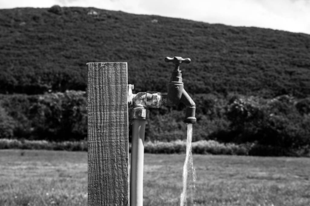
I like how I framed the tap with in this image. I was thinking of amore deadpan style when I was framing this image so I experimented with it in black and white which I ended up choosing over the colour copy. If I did took this mage again I would have taken more images form different distances and angles which would have given me more to explore with. this image relates to Anthropocene because it shows how humans have dug up a natural land scape and disturbed wild life so that they could have amore convenient water source.
@jack cornwall
I like this image, the shapes the railings make in this image creates a interesting effect that draws the focus into the image. when framing the image I tried to create a half an half image to give juxtaposition from the overflowing ground and the hard concrete shapes. If I took this image again I would have have taken an extra step back and positioned more of the railing in the frame to incorporate more of those leading lines. this image represents that we can have as much as on impact as we like but nature will always be in charged, as it shows in this mage the ferns over taken these hard man made structures.
@jack cornwall
I like the way the rain creates an extra shine on the metals in this image. I increased the highlights to bring out that shine just a little bit more. if I took this image again I would take it at a later time to create a darker effect use man made lights to bring out that shine even more to create even more contrast between the natural green environment. this relates to Anthropocene because it shows how that man made structures stick out in nature because they do not belong.
@jack cornwall
I like this image but I wish it had a wider view to show more of the scale of the effect we have on the land. I like the way I have edited this to bring out the saturation in the plants and have the trees fade to darkness which is a metaphor how humans disrupting natural land to create their own food, which juxtaposes the natural trees fade to black because they are being chopped down all over the globe to be turned into farmland which has a very large effect on the green house gasses i the environment.
overall in this project I feel I have done well to improve I could learn more in depth about how the camera settings can effect an image better or worse to level up the quality of my work.
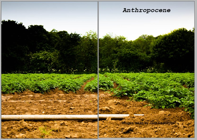
Design decision 1: I chose the first page to create a juxtaposition between the quarry and the barbed fence separating the world.
Annotate design :2 I experimented with making the right page a full bleed to represent the quarry being larger impact than the fence on the environment. I chose this option over the pervious for my final zine.
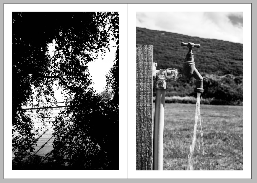
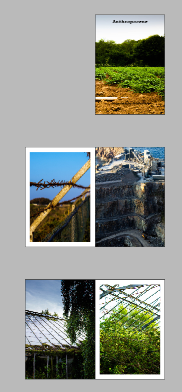
Annotate design 3: I chose these two black and white images to oppose each other in the zine.
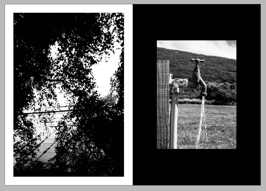
Annotate design 4: I made the right image smaller because the image its self is so close up I thin filled the background using the rectangle tool to give more contrast to the image as it is lighter than the left image. these two white and black images oppose each other by a black photo on a white background opposing a lighter lighter image on a darker background.
Annotate design 5: for these pages I decided to juxtapose a bright image and a dark image. the vibrant greens in the left image on a white background. to make the images even more separate from each other the right image I changed to be a full bleed.
Annotate design 6 I experimented with a double page spread for this image but I then decided I liked the juxtaposition next to the image.
Annotate design 7: I first put these two images together but I didn’t like how they looked together.
Annotate design 8: I then changed the pictures and i liked these two because they both match colour and cylindrical objects.
Annotate design 9: but then I changed the right image to a full bleed and I settled on this.
Annotate design 10: I experimented with another double page spread, I then decided against it because the subject of the photo would be lost in the fold of the zine.
Annotate design 11: the I put that image next to this image i like the link between the shine of the different materials.
Annotate design 12: I then made the left image a full bleed to give more distinction between the images.
Annotate design 13: I decided to make another black background to fill the space between two colourful images to give more contrast to the page. I used the same smaller size image as the last black background.
Annotate design 14: to use a double page spread of using a land scape image of farm land as the front an back page of my zine
My final Zine
This is how I will lay out my final zine. I Chose to have a alternating full bleed on either side of each page to give a coherent design to the whole design. it when through many iterations to come to this final layout.
I printed my zine folded it stapled it then trimmed the edges to create the final product.
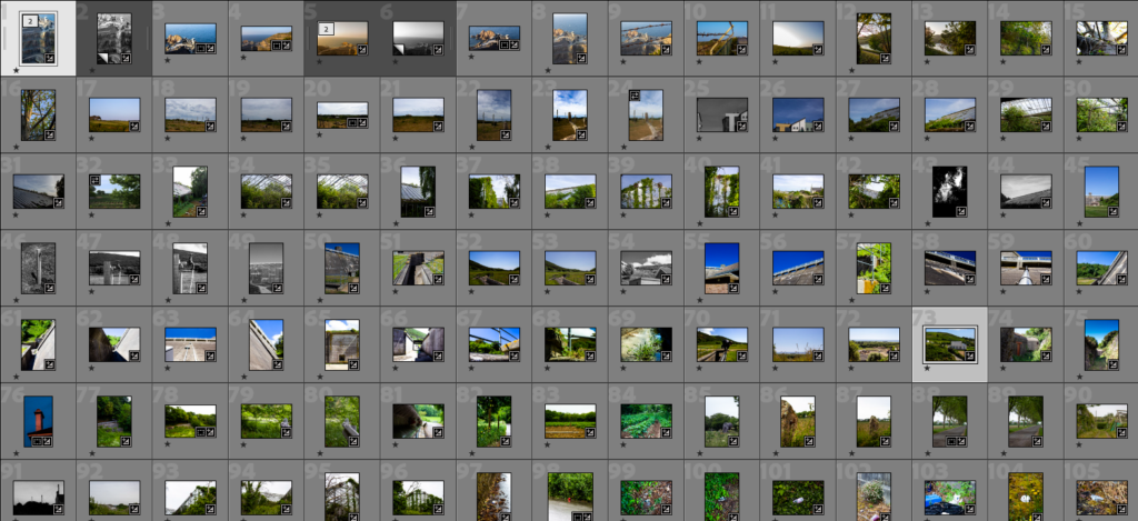
I took 292 images then spent a long time going through them using the rating system to find the best suited to my artist reference.
final outcomes
Keld Helmer-Petersen was a Danish photographer who achieved widespread international recognition in the 1940s and 1950s for his abstract colour.
keld helmer-petersen Jack Cornwall
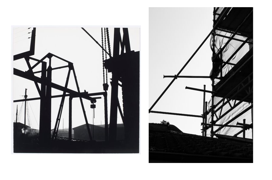
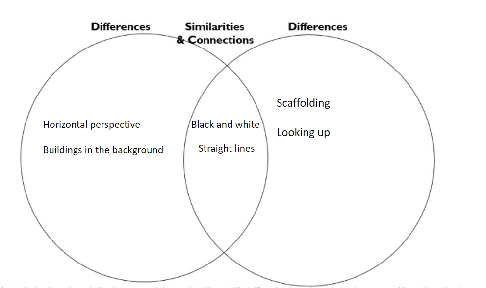
the first image is a specific style from Keld helmer-petersen that inspired me to edit my own images in this style. i did this by incresing the blacks and shadows in the image to show the most contrast between the overexposed white sky and the underexposed scaffolding which creates a black and white effect.
Jack Cornwall
I liked her style so I continued to edit more of my photos into her style. this image is of a duct running from the furnace. I thought the supports holding up the duct would look good in this style, that is why i chose to edit this image in this way.
Jack Cornwall
this image is of the underside of the duct taken from inside the support so that I could get a very symmetrical view. I decreased the highlights in this mage to give more contrast between the ducts and the sky behind. i like the way all the different shaded of greys contrast against each other giving a good amount of depth to the image.
Jack Cornwall
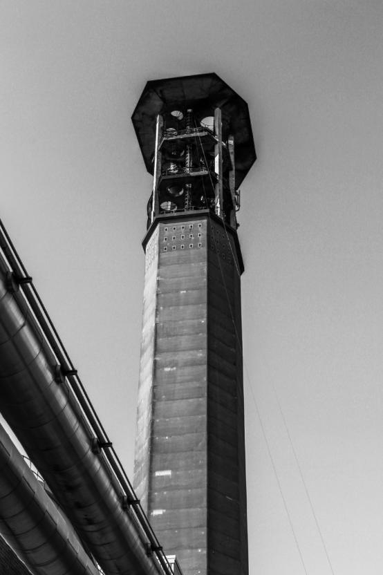
this image was taken from underneath the duct looking up to give a looming perspective of the chimney. i made sure took multiple images of from this perspective some with out the duct but I decided that the duct provides depth to the image showing a foreground (the duct) a mid ground (the chimney) and a background (the sky).
Jack Cornwall
I like this image because the contrast between the hard white shapes against the vast dark expanse of the sky. I positioned my self dead on with the building to get more of a dead pan effect then situated the building slightly of centre of the image to give more contrast to the darker coloured sky against the building.
Jack Cornwall
this image shows the barriers at Hav de pa and expanse of land to le Marie flats. i like the way the text is so bold which contrast to the rest of the image which is less sharp. the flat barrier also frames up the horizon which then highlights the development of the land and the high rise flats protruding from the horizon. i positioned these four buildings above the righting to draw your attention from the text up to the building with the large expanse of sandy midground in-between. I converted this image into black and white to give more contrast to the image.
Jack Cornwall
this image shows a very industrial side of the island. I took this image from behind the large spiked fence keeping people out of this industrial area. I like the perspective it gives to the image. i took different images where the chimney was in focus instead but I then decided that I like the this image more because of the less sharp background contrast to the sharp fences.
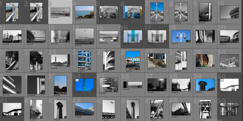
I used the star rating sytems to decide the good from the bad images.
Then I am left with my 5 star images which best relate to new topographics.
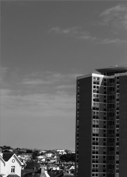
I took this image from the top of MT Bingham of the flats on green street I chose my position carefully to get a higher perspective of and over the surrounding buildings. i positioned the skyscraper slightly of centre of the image to provide juxtaposition to the the rest of the smaller residential buildings. I then used the vertical straightening tool to correct the image and changed the image into black and white to relate to the original photographers of the new topographical movement.
this image shows the contrast between the two different building designs, the contrast between the point triangular design and the curves of the the adjacent building. there is beauty in the straight and the organic cloud shapes which I increased the contrast to bring out. this photo is taken from a lower angle to provide a better perspective to the image. the contrast between the natural and the unnatural link to the movement because it is about the beauty that can be found in the everyday urban environment however i believe there is also beauty to be found in the average day, the pattern made by the clouds showing a unsymmetrical, un even, un predictable motif.
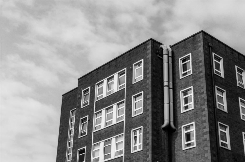
this really like this image because of the contrasting brick work and lighter window frames reinforcing the idea of the beauty in the mundane. this image is of the older wing of the hospital with its ‘boring’ square shapes so i decide to photograph this i would need to find a good angle to show of the best angle to create a god image from a seemingly boring building. i liked that this wall wasn’t flat and it had some depth, i also liked the pipes coming from the building back into the building. i converted this image into black and white to better match the original artists of the the new topographical movement.
i like this iage becasue a construction site is in the transition between natural
Sequence photography is a technique of shooting a series of images in where the subject is captured in successive motion.
Henry Mullins started working at 230 Regent Street in London in the 1840s and moved to Jersey in July 1848, setting up a studio known as the Royal Saloon, at 7 Royal Square. he started in partnership with a Mr Millward. after the first year he was working alone and he continued to work out of the same studio for another 26 years.
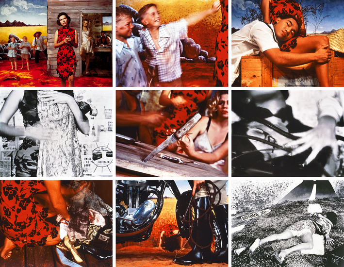
Tracy Moffatt
Tracy Moffatt: Something More, 1989
The nine images in Something More tell an ambiguous tale of a young woman’s longing for ‘something more’, a quest which brings dashed hopes and the loss of innocence. With its staged theatricality and storyboard framing, the series has been described by critic Ingrid Perez as ‘a collection of scenes from a film that was never made’. While the film may never have been made, we recognise its components from a shared cultural memory of B-grade cinema and pulp fiction, from which Moffatt has drawn this melodrama. The ‘scenes’ can be displayed in any order – in pairs, rows or as a grid – and so their storyline is not fixed, although we piece together the arc from naïve country girl to fallen woman abandoned on the roadside in whatever arrangement they take. Moffatt capitalises on the cinematic device of montage, mixing together continuous narrative, flashbacks, cutaways, close-ups and memory or dream sequences, to structure the series, and relies on our knowledge of these devices to make sense and meaning out of the assemblage.