All posts by Jack C

Filters

Author:
Category:

Essay

How is a sense of hidden beauty explored in the work of Robin Friend?

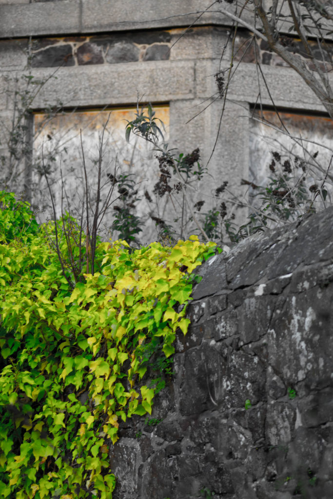
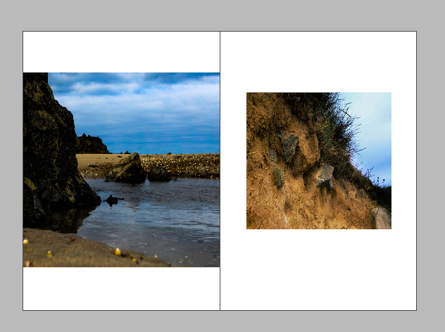
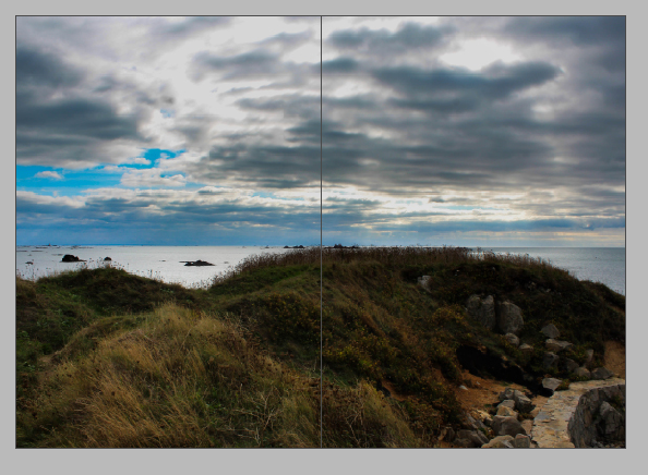
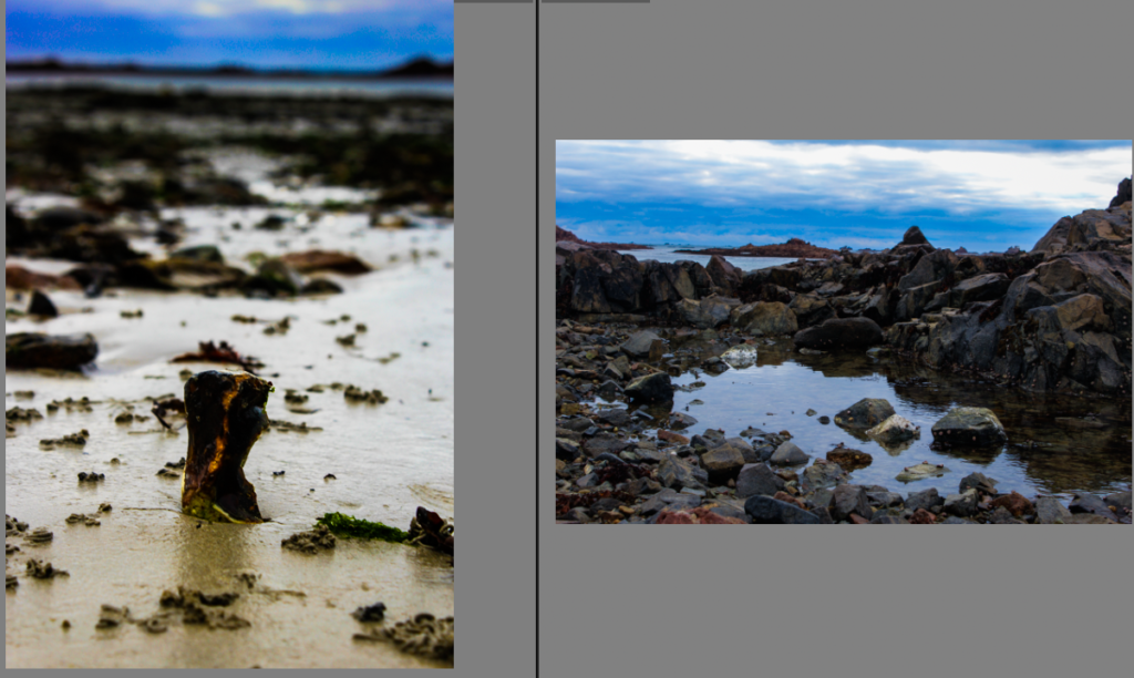
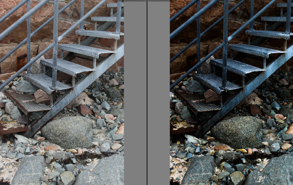
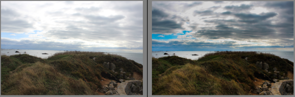
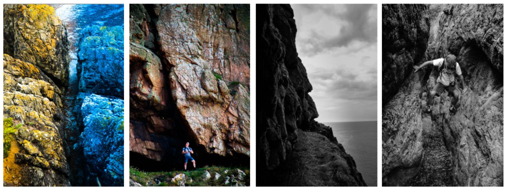
Jersey is an exceedingly small island with a lot of beauty but there are so much more than all the tourist places. these extra special places just require a bit of exploration to find even greater views that I will try to capture with my camera to create impact full images about the hidden beauty in the mundane everyday parts of jersey.  

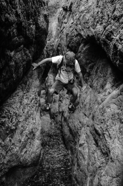
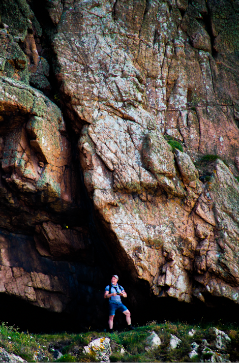
To do this I will go out with my camera to sites/places that have been forgotten/ less talked about. I will do this to try and find the less seen beauty of the island. this area of work interests me because I have a great passion for exploring and finding new and interesting places. all my life I have spent adventuring Jersey through all its valleys, castles, coves, cliffs, woodlands, and buildings in search of something interesting to make it worth the time. Every time there is a view, a moment, or an object that I see/find that makes it worth the effort of going out to try and find it. I come home from these little expeditions feeling accomplished at what I have seen, heard and experienced. It is like a hunt for the beauty in the mundane, boring environment that the rest of Jersey drives by daily never thinking to climb though a bush to see what is on the other side or climb up a wall to see the view from the top. 

Through this project I hope to prove beauty can be found and captured, everywhere and anywhere if you just look. I am looking at Robin Friend I am particularly interested in his book “bastard countryside” which feature images from 15 years of his own personal explorations. These images mainly focus on unkept areas of the countryside. Where humanity has affected the landscapes and left it to decay into the natural environment. this creates visually pleasing images that portray a very un-appealing truth that documents how time and nature effects the degradation of manufactured objects and structures into the land. 

Robin Friend aged 40 was born in the Uk but lived in Australia from an early age. He moved back to the Uk with his family when he was a teenager then went on to study photography at university of Plymouth.  

This projects link to my other projects because I have already explored many other less seen areas of Jersey for other projects throughout this course that have related to different themes/assignments at the time but are remarkably like this project. 

photo book

I went to three location that have been left to decay back into their landscapes. I spent along time photographing each area from many different angels and views I ended up with 569 images that I then sorted using light rooms star system. from these sets of image I used 43 of my best edited images to create a photo that shows the beauty in the decaying fabricated environment.

I made one book with my final set of edited images, then I made another with the same images to see if I could find a way to display them in a better way.

this is the first few pages of my first attempt at my photo book. at first I liked this design I tried to use images that would contrast against each other on each page and yet they still all have a link between them.

this is the first few pages in my second attempt at a photo book I like this on more because I feel there is more contrast between the images on each page. I used a triplet on one of the pages because I felt this was better than the 4 grid of images I used on the previous book because it feels less cramped when viewing the pages.

this is the last few pages of my first attempt at a photo book at first I did like how I juxtaposed a full bleed images against a smaller image on every page. however I believe it can sometimes be more impactive to give a more variety of image sizes against each other.

this is the last few pages in my second attempt at a photo book I like they way I have displayed these images better than my first attempt because of the 2 page spreads I have incorporated towards the end of the book. I still used full bleed images contrasting against smaller images. which I feel gives a interesting perspective to some of the images. the final image on this page I am very happy with as I took it at the end of my last shoot as the sun was setting, I feel it wraps up the book nicely.

for my final book I have chosen my second attempt because I feel I have better displayed my images through out the book. I also moved my double pages spreads top be in the middle and end of the book as a link through out the book.

final outcomes

I have produced a virtual gallery of some of my best images from these shoots. I created a gallery using Artseps online website then put final images in to create the effect of seeing my work in a real exhibition.

This is one of my final images that i took of a wall inside the old hospital grounds. I edited this image to reduce the saturation and increased the vibrancy to bring out the greenery climbing the wall. I like how the man made structure of the wall is much duller and darker except for the little pieces of plans growing through the cracks that will eventually completely overtake the wall and bring the granite back to nature.

this image was also taken from of a decaying out building on the old hospital site the peak of the roof really intrigued my eye and I spent along time focusing my lens on this roof. I also liked the interesting lines created by the flaking tiles and rotting wood at the top. a lot of interesting colours have been created by the moss growing on the tiles. I like the way the light has hits the roof and the edges cut of the image to break it up into section of bright warm light and darker side contrasting against the light blue sky with airy white clouds. I brought out the brightness in the sky by reducing the highlights I this image.

I like this image because I was on my way into a decaying site and i found a lost parking cone peaking through the bush. the bright yellow caught my eye through the rest of the overcrowding leaves that surrounded and encased the cone. i edited this images to best bring out the contrasting colours of the natural green leaves against the synthetic bright yellow hiding underneath. I focused my lens deep into the bush to create a slightly blurry foreground with the leaves.

this image is of the roof of the old hospital. I really liked how there are whole gardens growing in the gutters and corners on the roofs of the buildings I went up to get a good angle. The contrast between the hard lines of the roofs edges and tiles that juxtapose the soft green shapes created by the plant matter that is now trapped up on the roof 20m above the ground and yet still thriving with life and colour. I liked the perspective of this image looking up which follows the pitch of the roof. I also positioned another smaller roof in the foreground of the image to give a lot of depth to the image. i edited it to bring out the natural colours from the grass, plants and lichen.

islandness mind map

States of Jersey Police - Jersey Map Design Competition 'Policing in My  Parish'

after I created this mind map I put together a mood board of different images that I feel express islandness. The property of being or belonging to an island, especially insofar as it affects society and culture.

virtual galleries

I used the art steps website to create a virtual gallery I then imported some of my favourite images from my zeen then displayed them in this gallery.

I placed three landscapes images together on the biggest wall I created. i juxtaposed the walls with white and black i displayed all my images on the black walls.

I placed this one image alone in the middle of this wall.

this wall I placed two portrait images very far apart however on the same wall.

zeen

these are the first two pages in my zeen i placed two full bleeds on the same side juxtaposed to smaller image.

I re arranged it to be alternating sides which will be a full bleed. the other small images are not the same size either. I liked the large white border on the bottom left image.

I liked the 4 edited images juxtaposed next to each other so I made another full page 4 juxtaposition to link the beginning of the zeen to the middle. after this page i placed.

neither of these images are a full bleed I chose to have a large amount of this page to be white which juxtaposes the images because there is a lot of colour. i chose not to have a full bleed on this page becasue there next page is.

A full page spread of a landscape image, I chose to make this a full page spread because I wanted to fit as much of the image as possible

these pages follow the pattern of alternating full bleeds and every other page is a full page spread

green island photo shoot

we walked from le Hocq along the coats line to green island along this walk I positioned my lens onto the coast line, rocks and out to see. from this trip i took 464 images. after I went through all my images and rated them i ended up with 102 mgood image that i felt was worth editing i then edited them and continued to work my way through refining them down every star level.

the day we went out it was very over cast so I used the graduate filter tool on almost all of them to reduce the exposure in the sky portion of the images, so that the image is not over exposed.

whilst we where walking around i was experimenting with a lot of very low perspectives which made the rest of the landscape seem more impressive.

I found some graffiti on the sea wall at the end of green island.

I created many virtual copy’s of this image and continued to manipulate them to appear in different colours, using the different hues in the image and saturations levels. I then had the idea to juxtapose four of them in different colours.

these show all my best images from this shoot that I have rated to 5 stars.

when I found these stairs going on to the beach I went over because I liked the interesting wear that has been put on these stairs from rocks bashing against them in the waves and the interesting rust colours created by the salt water corroding the metal. I took a few images of these stairs however I liked this image the most because the leading lines of the stairs which lead your eye up and across the image. this image is much more clos up than the other images I took. I then edited it to bring out the shadows to give more depth to the image. I also bring out the highlights on the stones on the floor.

I found a rock pool far down the beach at le Hocq where a very interesting pattern was formed by moving water sand on top of a rock which created this very organic intricate pattern. I positioned my lens straight above it to give a deadpan aesthetic.

I then edited it to bring out the pattern as much as possible by increasing the contrast and vibrance. I decreased the exposure to darken the image because it was a very over cast day that i felt didn’t work with this image.

I took this image from the top of green island I tried to position some of the sea wall on the back side of the island to give contrast to the rest of the very natural environment. I used the graduate filter tool to reduce the exposure of the sky so that there is better balance to the image I also reduced the highlights in the sky to give depth and bring out definition in the clouds.

3d photo sculpture

I experimented with how flat images can be physically manipulated, how they can be made to interact with others in a 3 dimensional sculpture using basic material such as foam board, paper and glue.

Image preview

I created this 3d sculpture using foam board, paper, masking tape, spray adhesive and a cutting knife. I started by rolling the image of jerseys coast line to create a cylindrical image then I thought of away for it to be protruding from another image of a rock which i turned upside down to give interesting perspective then attached another piece of foam board with the sky behind. I like the way the rock opens up where it has eroded over time and the contrast with the sky that I used to fill the space.

Image preview

this is two images the background is a landscape photo that I placed on its side. I then cut out a black and white image of a seagull standing on a pinnacle I like the white edge that the foam board gave wilts I was cutting it out. I attached legs at the back to hold up at a slight angle.

Image preview

I thought of this idea from a vase of flowers. from this I curved foam board with an image of the sky on it. I like the jagged curve created by the folding foam board. I then used colourfully offcuts and shaped them to be wider at the top like the silhouette of a flower. i used spray adhesive to connect the images to the foam board and masking tape to hold the foam board in place.

Image preview

I started with one image of a crevasse at stinky bay that i edited to be two diffident colours on either side I then cut out the middle and spread the two side of the rock then used more edited images of boulders that I cut out and layered behind the crevasse. there are two rectangular piece of foam board attached to the back of the boards that hold it all together, I used masking tape to attach these.

evaluation and final outcomes

I like the perspective of this image because it is taken from a very low angle looking up at a small bolder. the perspective make sit look like it is towering above the surrounding landscape. I also like the depth of the image the grass in the foreground the bolder min the mid ground and the background of the cliff edge.

I experimented with this image a lot to bring gout the contrasting colours in this image I tried to increase the divide in the image created by the gap in the stone created by coastal erosion.

I chose to change this image into black and white because I like the reflections on the water in more contrast I chose to position the bird in the centre of the frame.

I put this image in black and white to create contrast between the dark divide in the rock I made the middle darker and the edges lighter to show it gets darker the deeper you go in.

I took this photo of luca trying to cross the wet sea weed i tried to position him in the middle of the image. it creates the effect that he is levitating above the floor because he has wedged himself between the two rocks.

I like this photo because I didn’t realise into editing it that there was a sail boat positioned above the peak of the pinnacle this gives a lot of contrast between the dark rock and ocean and the bright white sail and boat.

I like this image because it shows how big the rock is in comparison to Mr toft. the way the overhang slopes down cresting a darker background for him to stand out in front of .

i like the way this image is divide into light and dark. it is almost a diagonal line separating the light sky and water to the darker rock and grass i made the rock darker but tried to keep some texture in the rock I think I did this well.

I have chosen these as my best images from that field trip.

joiner


i found my images and set a purple colour label to distinguish my joiner from the rest of my image. then i edited 1 image and synced the rest so that the whole joiner will have the same edits.

I put my images into the file automate photo merge then I put my images into the photo merge which

under file automate photo merge then I put my my images into this section then the computer

I then reedited my image to be black and white and resynchronized the images to re do it and create the same image but in black and white.

This image has an empty alt attribute; its file name is image-198.png

this is the end product of the black and white joiner i have created.