All posts by Emily Bowker

Filters

Author:
Category:

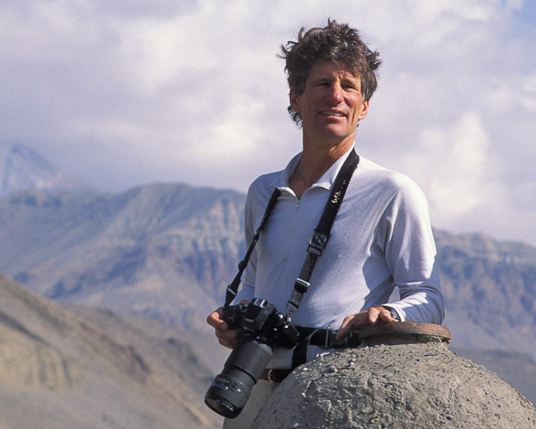
Galen Rowell

  • Wilderness, adventurer, mountaineer photographer.
  • Born on August 23rd, 1940 and passed away on August 11th, 2002.
  • Never formally trained in photography, began taking photos as a way to share his experiences with others and by 1972 it became his full time job.
  • Worked with many publications such as National Geographic, Outdoor Photographer, Life, etc.
  • Won the Ansel Adams award for Conservation photography in 1984.
  • His photography style included taking photos of “dynamic landscapes” of the Natural world by capturing them with the fast changing nature of light.
What Camera Would Galen Rowell Use if He Were Still Alive Today? | Dan  Bailey's Adventure Photography Blog
Galen Rowell.

Examples of his work –

Analysis –

I think that this photo taken by Galen Rowell is quite effective because of the light from the sun which has been created as it is setting/rising. This is because it creates the feeling of a forest fire which is rising between the trees and getting worse as it takes control of its surroundings, like it is infecting them. I also like how in this photo there are various points where the sunlight is much warmer and vibrant which could be used to signify the heat of the fire and how intense and dangerous it is. This photo can be used to show the dangers of forest fires/global warming and raise awareness of them to the community as they are damaging to the wildlife which live in these areas where everybody is ignoring them and not giving this issue the support and care which it needs.

In my own work I will consider using the techniques which Galen Rowell uses with natural light and how it can be used to show the beauty and dangers of landscapes/natural life. I will go to various locations at different times of the day such as sunset and sunrise, when the sun is high in the sky, at night, etc (when it is sunny) and try to capture the way the light is created naturally in different ways.

Alfred Stieglitz

  • Born on January 1st 1864, passed way on July 13th 1946.
  • An American photographer.
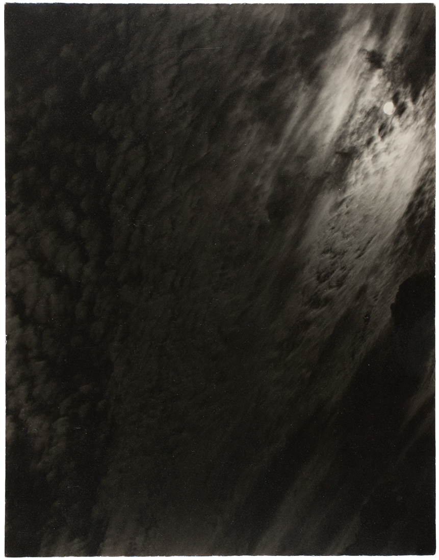
  • Focussed on taking photos of cloud formations in the sky, which made him one of the most influential and popular photographers in history.
  • Stieglitz called these photos “Equivalents” to parallel the artists own inner state.

Examples of his work –

Equivalent (1926).
Equivalent (1929).
“Music: A sequence of 10 clouds”.

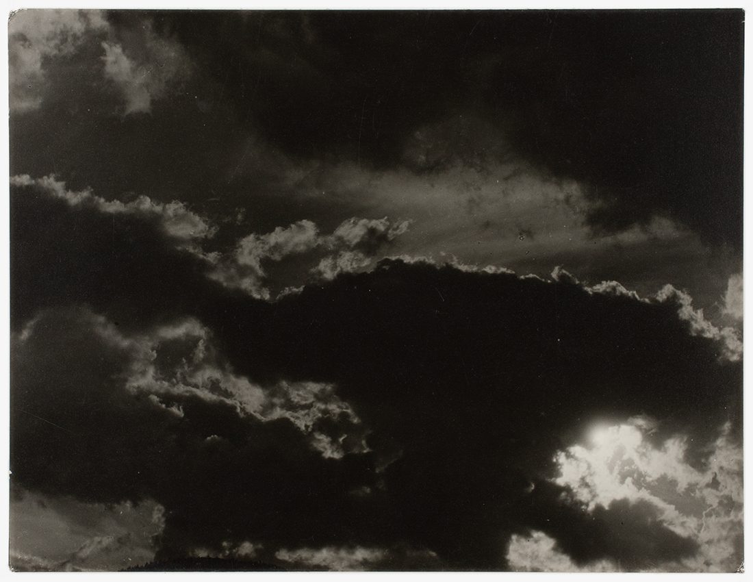
Analysis –

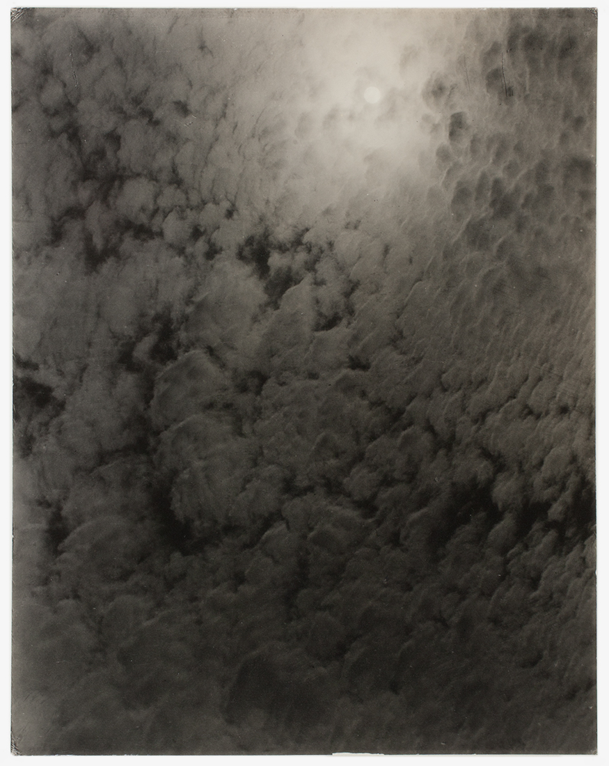
Equivalent (1927).

I really like this photo from Alfred Stieglitz because of the contrast of dark to light tones within the clouds which looks as if there is a solid, jagged line in-between which separates the 2 areas, as if they are in a fight as it can show danger and fear. This atmosphere has been created through the photo because of how dark the tones are at the edges as if they are in a war with each other and are protecting what is theirs. I also like in this photo how there is a small glimpses of light created through sunlight on the smaller clouds and especially in the bottom right corner as when taking the photo as the bright, white tones can show a signal of hope and calmness to a war which feels like it might not end as if it is the light at the end of the dark tunnel.
In my own work, I would like to focus on cloud formations as I like how interesting they can be and the shapes which they are able to form. I will do this by taking various pictures at different times of the day in different locations to get a range of photos. I will then bring my photos into photoshop and change them into black and white contrasts just like Alfred Stieglitz’s work.

Ansel Adams

  • An American photographer, who really began to focus solely on photography in the 1930s.
  • Born February 20th 1902 in San Francisco, California.
  • Formed a group of photographers, Edward Weston and Imogen Cunningham, called “f/64” who wanted to elevate photography into a high art instead of being used for documentational purposes.
  • Travelled throughout the country to take various pictures of different environmental nature sites.
  • Sadly, Ansel Adams died on April 22nd 1984.
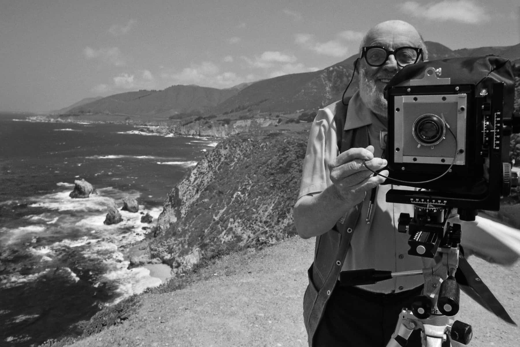
How Ansel Adams used his creativity to harness the communicative power of  photography | The Milwaukee Independent
Ansel Adams.

Examples of his work –

Horizontal Aspens, 1958
Horizontal Aspens, 1948.
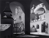
Arches, North Court, Mission San Xavier del..., 1968
Arches, North Court, Mission San Xavier del…, 1968.
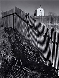
The White Church, Hornitos, California, From , 1946
The White Church, Hornitos, California, 1946.
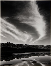
Winter Evening, Owens Valley, 1962
Winter Evening, Owens Valley 1962.

Analysis –

The White Church, Hornitos, California, From , 1946
The White Church, Hornitos, California, 1946.

I really like this picture taken by Ansel Adams in 1946 because of the way he uses the darker and lighter tones which are contrasted well against each other and have been created due to the sunlight which creates this shadow on the floor which is wavy and looks very strange, like when water is reflected onto something which makes it create this calm yet bust atmosphere for the viewer. It really attracts your attention well as the lines in-between have been highlighted through the sunlight fighting through the gaps in the fence as if it wants to be seen. I also like how the church in the background stands out extremely well due to it being grey which contrasts heavily besides the white, and this shows how it is not lost within it and guiders you to focus your attention on it as it is a really bright white which is due to the black and white filter which Ansel Adams uses in his photographs as well.

In my work, I’m going to use a black and white filter, similar to Ansel Adams. This is because I want to create a deep contrast of black and white and make it looks strange yet looks like it works perfectly which he portrays well within his work and create shapes/lines which you wouldn’t normally see as well. I think that this would work with clouds, and their formations in the sky and horizon views where you cant see much besides a small part at the bottom of houses/trees.

Natural landscape photography

What is rural landscape photography?

Natural/rural landscape photography consists of photos which are taken outside in various locations such as beaches, forests, streets, etc. The photos can also include wildlife, plants, close ups of natural scenes and textures with a variety of weather such as mist, rain, sunshine, cloudy, during the evening or night, etc which can add drastic effects to the photos which can be used in a representational, abstract, romanticised or impressionistic way.

These factors can help to make you feel like you are there within the photos landscape, when looking at various photos from different photographers, therefore these can also create a lot of different emotions for the viewer like happiness, sadness, excitement, calmness, etc. Landscape photography can also be used to share important messages such as showing the impact of global warming on the world and how humans are destroying natures natural beauty for creating large scale buildings for industry purposes or how rubbish can impact wildlife and plants.

Mood board

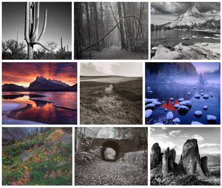
This is my mood board which includes photos from photographers Ansel Adams and Galen Rowell, who are photographers which work I really like, they are both landscape photographers who use the beauty and power of nature in their work but the difference in their work is heavily noticed as Rowell focuses on using contrasting bright colours in various landscapes whereas Adams creates photos in black and white showing a heavy contrast between the objects within it to create a dramatic effect.

I also included some photos from Fay Godwin because I like how she uses the same technique as Ansel Adams, which is using the black and white filter to show the contrasts created by lighting and objects in landscapes. I feel like Godwin’s work looks more natural then Adams which I like as the black and white filter isn’t as heavy on the eye compared to Adams which creates a more natural feeling and calmness to the photo where Ansel’s is quite harsh.

Final Comparisons and evaluations

Henry Hargreaves

Comparison –

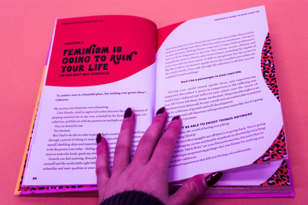
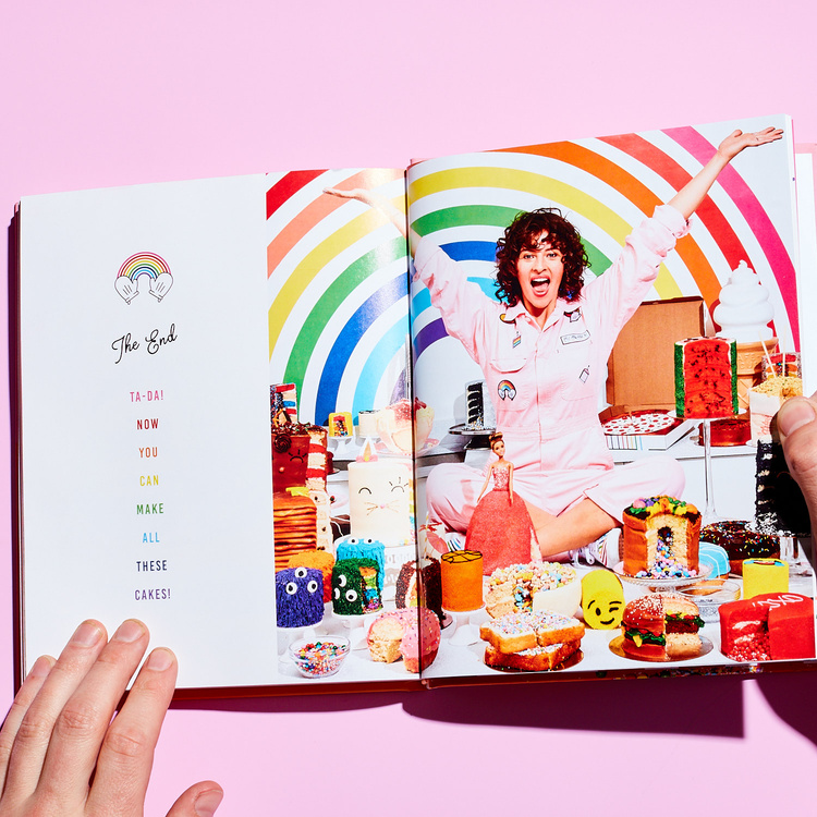
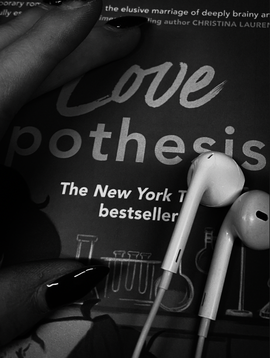
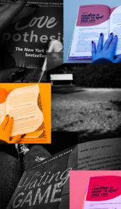
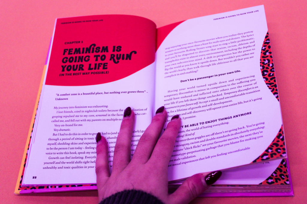
I think that my work reflects Henry Hargreaves influence well within my photos, this is because they both use the hand of another person who is going through a book that has a message which it wants to show to their audience. It also uses the brighter colours and bold works in my book too, which Hargreaves work has but not as intense as his photograph of the book doesn’t have as much writing. I prefer having more writing as it creates a story from the book about feminism which I used and people will want to read it as the title of the chapter is bold and eye-catching.

Evaluation –

I am happy with my final pictures and how they turned out in the style of Henry Hargreaves because I enjoyed working in his style of photography, because it let me experiment and learn how to use the idea of identity in an interesting way where you don’t need to have a persons face, or a full body picture of them as you can use a part of the body instead, like a hand because they are able to signify who someone may be just by looking at them and then with the influence of the book that they are reading it can reveal a lot to you about a person which you may not have known, which was how to influence others yet also keep it light-hearted and not emotionally deep which can happen.

Claude Cahun

Comparison –

I think that my work shares some similarities to Claude Cahun’s work because I have changed the photos into black and white, similar to their style as I like how it adds a dramatic effect to the picture as it makes the picture feel as if it is creating an emotional and meaningful message in what they are trying to highlight to their audience. I also like how in my work I use objects such as books, places, surroundings, etc to show who I am as a person whereas Cahun uses their self instead because I think that it reveals much more about a person instead because you are able to find out their opinions/views/perceptions/etc of what they do in their everyday lives.

Evaluation –

Throughout this project, I have taken into consideration of how Claude Cahun uses photography in their own style throughout their work which I can then put into my own, in a personal way. I think that this has been successfully conveyed as you are able to see a connection between our photos as they both create authentic and genuine messages in different yet similar ways how we want to be perceived as a person.

A virtual galllery

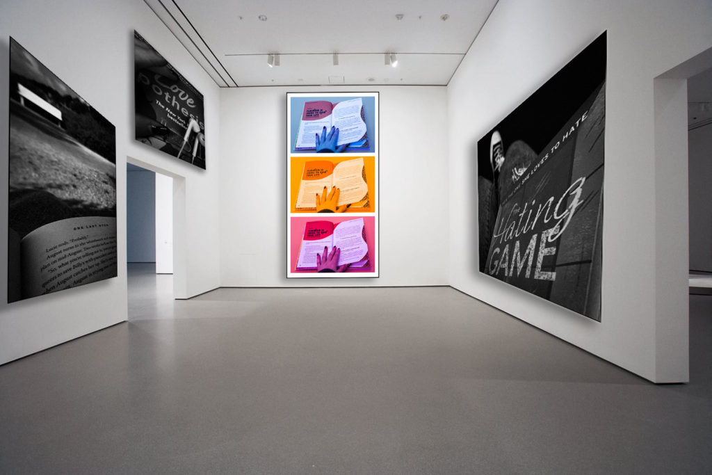
To show all of my edited best shots, I wanted to create a virtual gallery. This will showcase them before I create my physical final outcome, with a select few images instead, which would be done by hand.

I will follow these steps in photoshop –

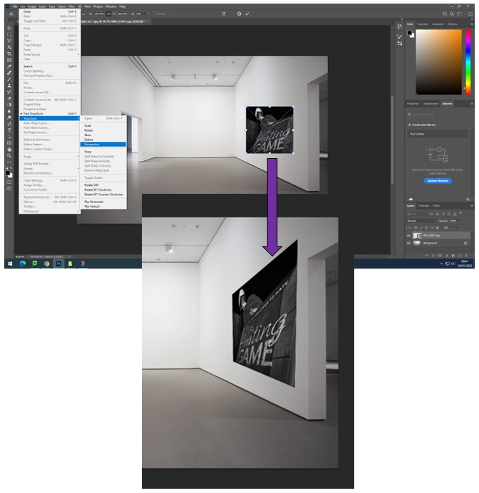
  1. Download an empty gallery file.
  2. Insert your images and place them on the walls of the gallery.
  3. Adjust the perspective, size and shape using CTRL T (free transform).
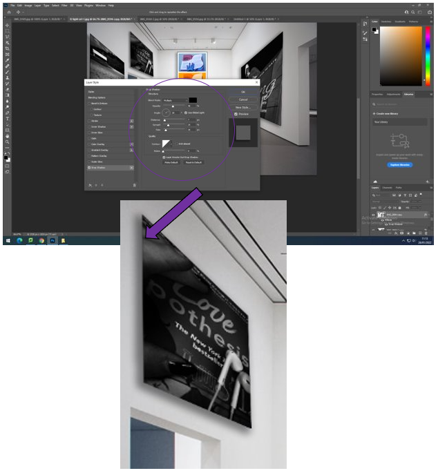
  4. Add things like a drop shadow to make the image look more realistic.

Creating the virtual gallery

I began by bring my edited photos into photoshop and adding a border around them. I did this by adding a layer, selecting the whole photo then using the tool “Stroke” where I could change how big I wanted the border to be using a different number of pixels as well as changing the colour of it, for this I chose black. I repeat this process for the rest of my photos.
Then I brought my photo into the empty gallery file which I took from google, adding the photo which I had just made. Then I sized it down to a suitable size, which I alter as I go through, and choose “Transform” then “Perspective” to change how it appears on the wall to give a real life perspective, repeating this for the rest of my photos.
After I had brought every picture into the gallery where I wanted them to be, I selected each picture, right clicking it which brings up this menu where I choose “Drop shadow”. This adds a realistic touch towards the photo as if there is light shining down on it, making it look 3D.

Final piece –

For this outcome of my final pieces, I am really pleased with how it turned out. This is because I like where I have places the photos, as they fit nicely and don’t make the picture seem too overcrowded or busy, which gives it the impression that this has been a picture which someone has taken from inside a real gallery that you would see in real life. The with the use of the drop shadows, I really like how they transform the photos to look as if they are realistic frames around them which the lights are transforming as it makes them look 3D.

I also like how there’s a slight pop of colour in the middle because it shows how even if you’re in solitude, which can seem sad or lonely, you can also use books to show the positive side of reading due to the stereotype of it being depressing and shows how it is used to spread positivity and impactful/meaningful messages towards people to spread awareness of these issues. I really liked creating this “Virtual Gallery” in Photoshop because I think that it is a unique way to present your ideas, which makes it look real.

Sequencing and Grouping

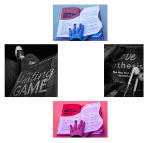
Sequencing – A sequence is created by using editing software such as Photoshop, to combine all photos into a single image. This single image can then show the path of an object or subject.

Grouping – Grouping pictures lets you rotate, flip, resize, or arrange pictures together, as if they were one picture. They will often be from the same set of photos, having similarities or can be used to show differences.

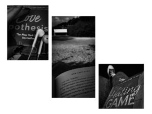
Using photoshop, I practiced sequencing and grouping of my photos in various ways, these were:

  • Separately, to show the two different photoshoots.
  • Using all photos together.
  • In a group of three.
  • In a group of four.

Experimentation

I liked how some of these tuned out, but due to the sizes of the images and how they were all different. I found it difficult to group/organise them well, therefore in the future I don’t think that I would use grouping/sequencing with these images again in the future for my final piece.

Edited photos to use

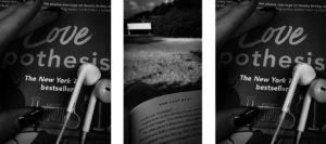
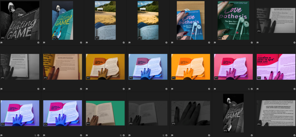
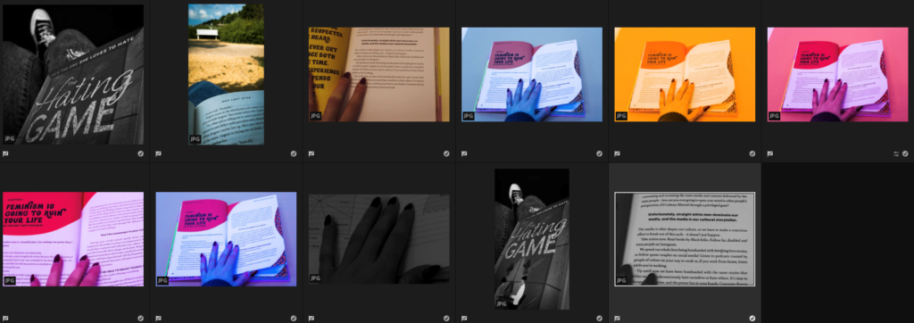
Here are all the edited versions of the images which I created on Adobe Lightroom, I will use “Z” to pick my favourites.

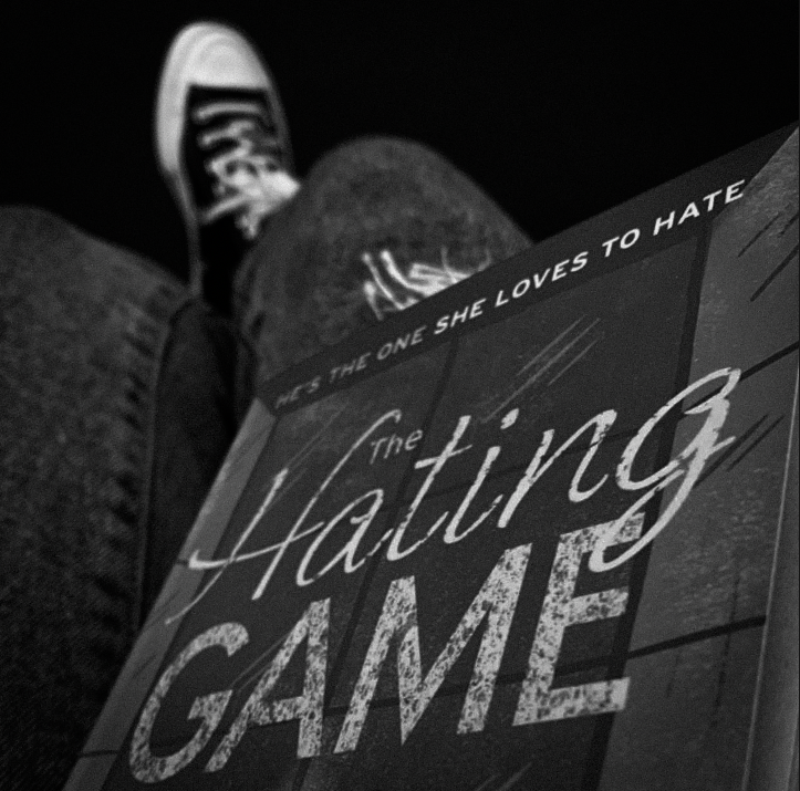
I really like how these particular edits turned out because they show a range of creativity within them using different editing skills/features. For my 1st photoshoot, I really liked how the photo looked in black and white, so I will use the edits with slight cropping, to use for a part of my final piece. In my opinion from my 2nd photoshoot, I really like the brightly coloured ones of the books and will crop the rest of the pictures which are related to that book to use within my final piece.

The edited images

1st Photoshoot images –

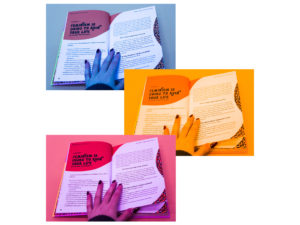
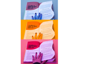
2nd photoshoot images –

Editing and experimenting #2

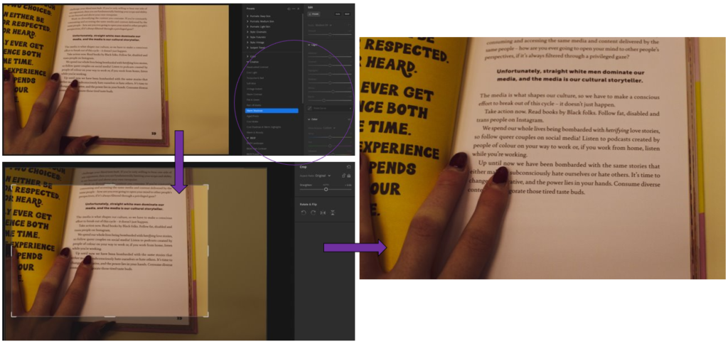
In this post I will be editing the three best shots which I chose from my 2nd photoshoot in Adobe Lightroom, so that they can be used when creating my final pieces, I used a variety of different editing skills when manipulating these photos to show a diverse range.

1st photo experiments –

– Used the pre-set filter of “Warm shadows” from the “Creative” section.
– I really like how it gives a pink, sunset tone towards the picture giving it a soft atmosphere.
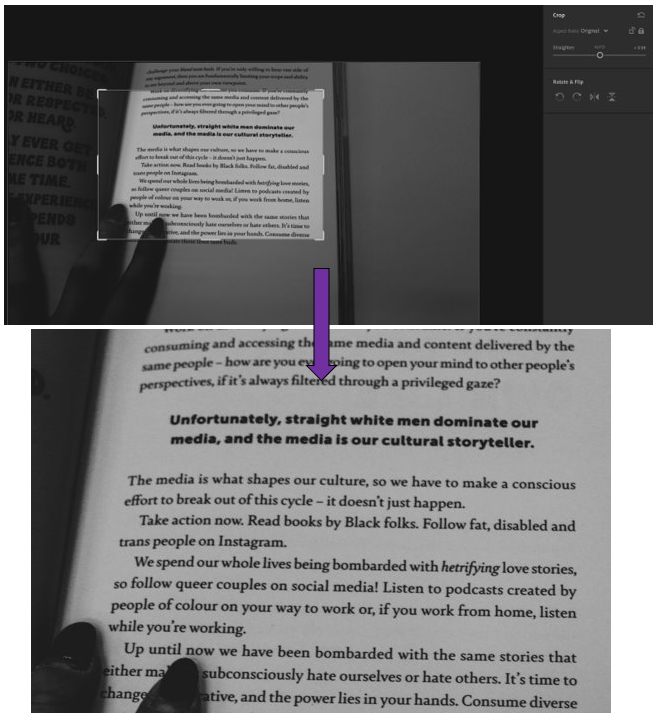
– Then I cropped it, similar to below, so that the message in bold is highlighted yet there is still my fingers in it to give it that personal touch of identity.
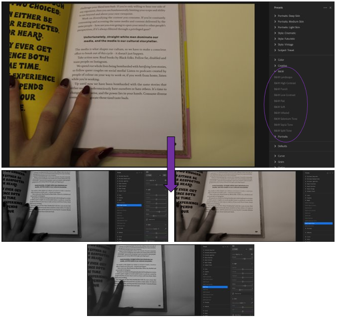
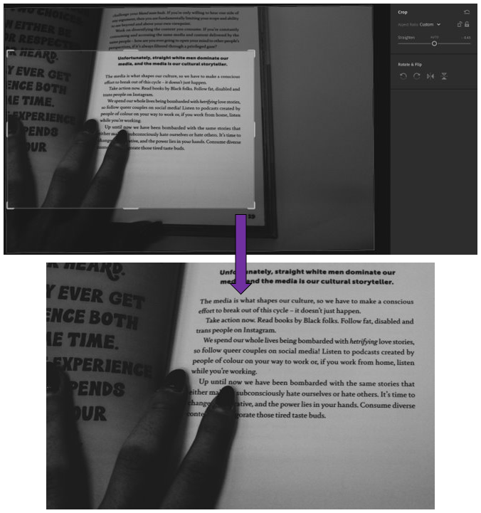
– For this edit, I wanted to move away from Henry Hargreaves style of bright colours and use the contrast of black and white tones instead.
– Used the pre-sets of B&W on Adobe Lightroom to see which edit I liked the most.
– 1st= B&W high contrast, 2nd= B&W Sepia tone, 3rd= B&W Flat.
– In my opinion, I like the 3rd edit using the pre-set B&W Flat as it shows a heavy, dramatic contrast to the photo which I like.

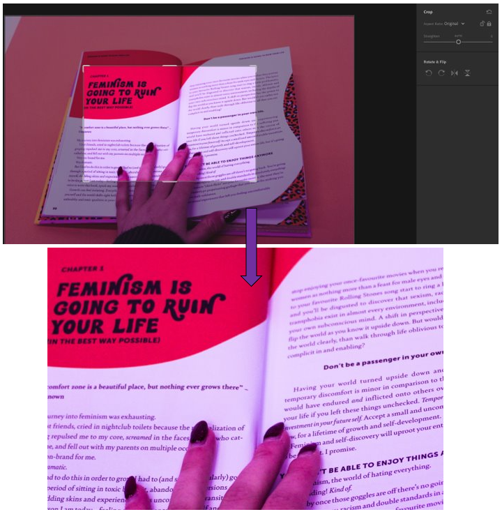
2nd photo experiments –

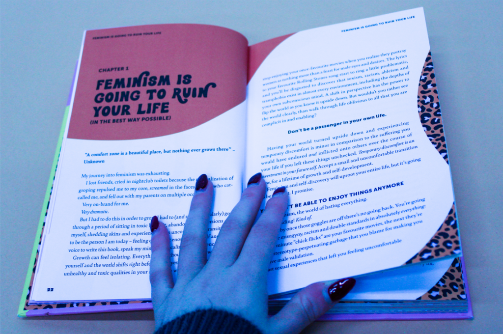
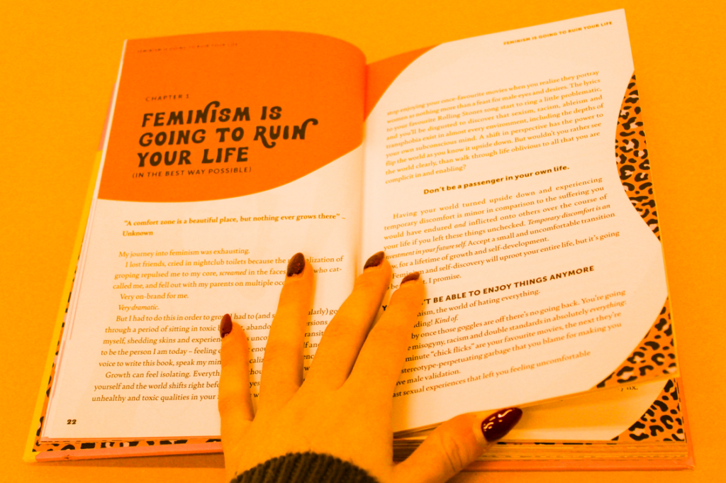
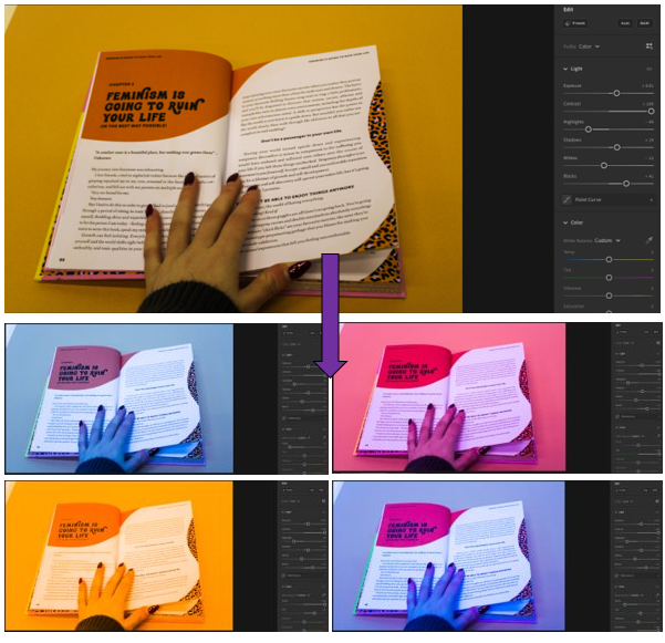
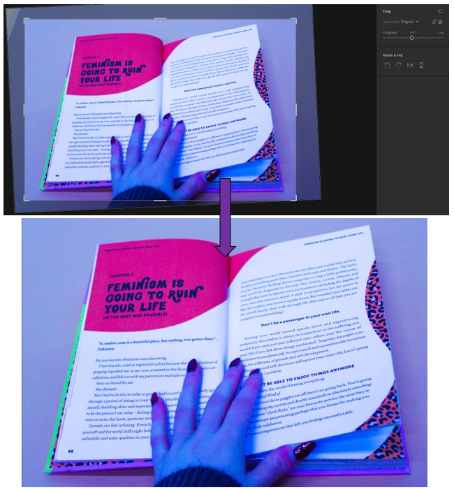
– I experimented with different coloured filters on Lightroom, I achieved these various colours by changing the temps, tints, vibrancy and saturation.
– I really like how they turned out because they resemble Hargreaves work where he uses brighter colours but instead of as a background its over the whole photo.
– My favourite is the purple or yellow one as the colour is mainly all over the photograph.
– I took inspiration from Andy Warhol’s work, which is similar using bright colours to transform repeats of the same photograph.
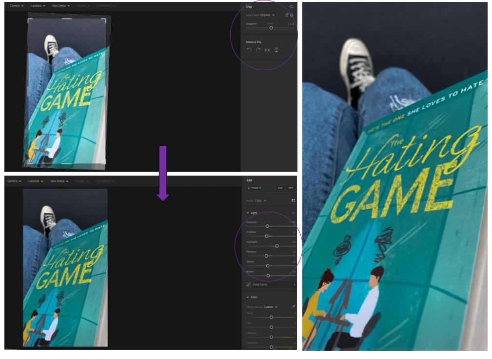
– For this edit of the purple coloured photograph, I wanted to keep it simple.
– Straightened it up and brought it in so that the corner where there was a bit of white coming through was gone.
– For this cropping, I wanted to have it focus on a specific part of the book instead, which I really lie.
– The filter helps to make the bolder words stand out more and makes you want to read more about it.
– Still a level of individuality and personality in it as my fingers are are the bottom, showing identity.

3rd photo experiments –

– For this image, I did a range of editing skills within this photo.
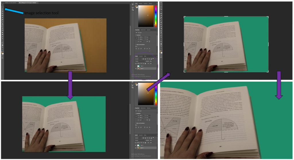
– I started off by bringing the photo into photoshop, then using the image selection tool so that I could highlight the part of the image that I wanted to change.
– Then I filled it with a colour that I though went quite nicely with the object, which was turquoise.
– Then I cropped it to get rid of the parts of the image where the old background colour was still coming through, to make it look tidier.
– I think that this came out quite well, but it is not my favourite technique which I have done, so I will not be using it again in my work.
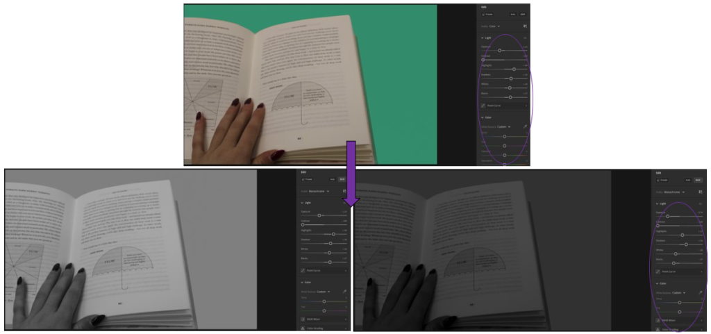
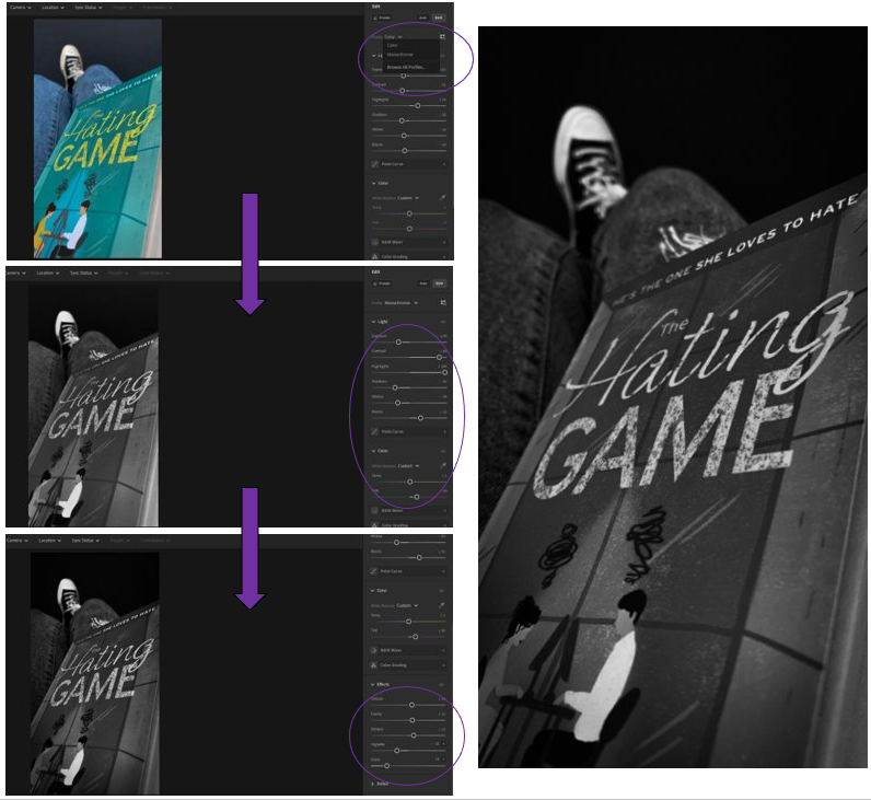
– I brought the edited photo into Adobe Lightroom then I began by editing the settings so that it looked more natural.
– Then I changed it into black and white as I wanted to see what that looked like, I really like it.
– Then I adjusted the settings again to make it darker and more contrasted.
– I like how this turned out because
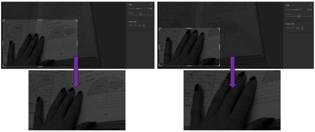
– In these I experimented with 2 different ways of cropping the image to see which way I liked better.
– For the 1st way, I wanted to focus on the little umbrella, as well as the hands as hands are able to show a lot about someone and how hard they work.
– I like how it turned out because it creates a story of who the person may be.
– For the second image, I wanted to focus entirely on the hand, which I really like. This is because you are able to see fully, the identity of the person who is reading the book and what they may be like, with the context of the book to help.

Editing and experimenting #1

In this post I will be editing the three best shots which I chose from my 1st photoshoot in Adobe Lightroom, so that they can be used when creating my final pieces, I used a variety of different skills when editing these photos to show a range of diversity, then the editing which I like most I will apply to all to create a flowing dynamic in my final piece.

Experimenting

1st photo experiments –

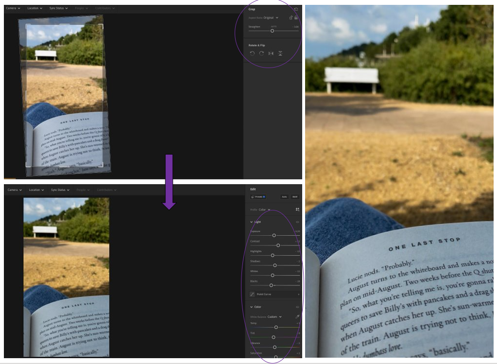
– I cropped it so that the photo became more centred and straight.
– I brought the exposure down so that the colour of the pages became more defined and clearer to see.
– I brought the colours down using the contrast to reduce the glare from the lens to the book then I used the whites and highlights to brighten it up slightly.
– Used the monochrome filter to change it into black and white.
– Then changed the contrast by a lot to make the darker tones stand out better against the lighter ones.
– Then to help the white tones I changed the highlights all the way up which made the white really bright.
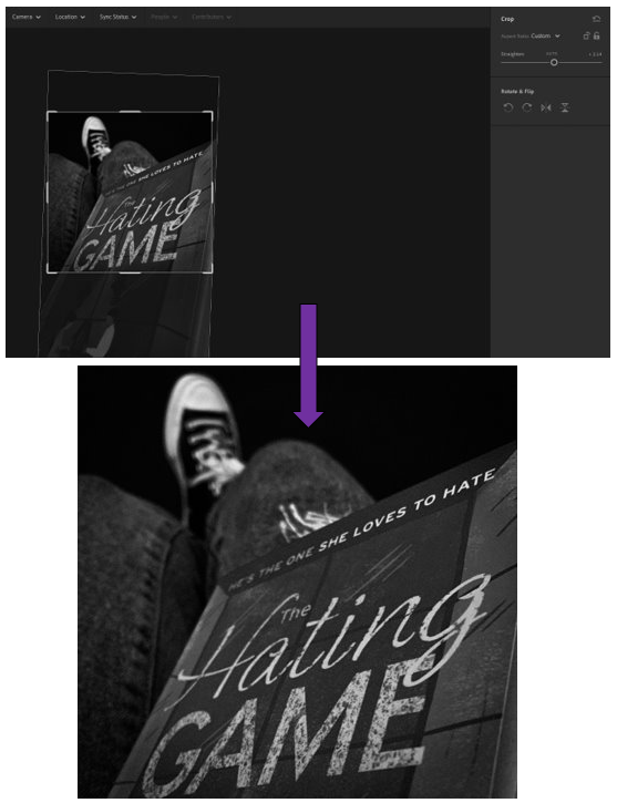
– I added a slight shadow around the edge of the photograph using the “Vignette” tool, then added some texture with the “Grain” tool.
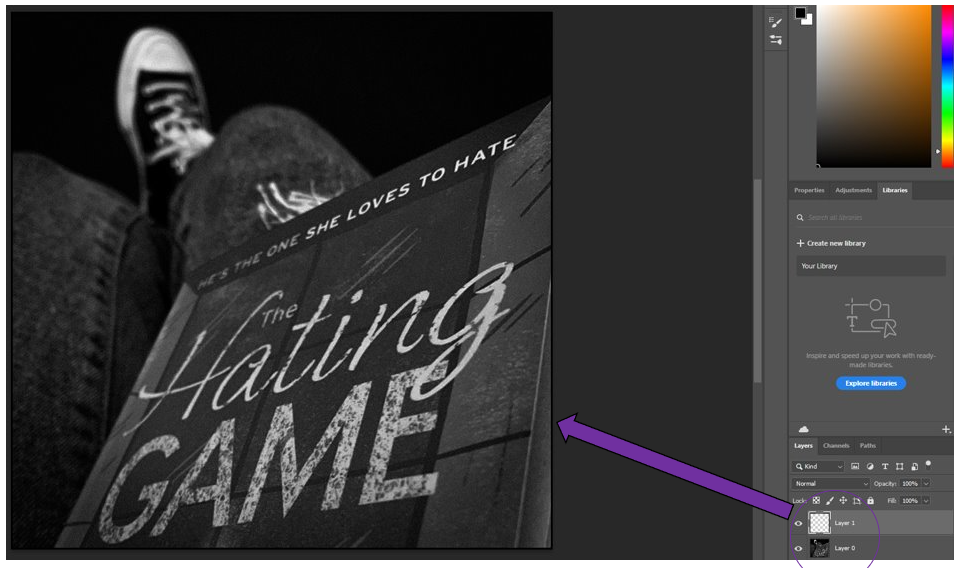
– I cropped it like this so that it creates a dramatic feeling with the title of the book as the rest of the cover isn’t able to be seen.
– As if someone has stolen it from you, preventing you from knowing more.
– Makes you want to know more about the book, as covers are usually good ways of describing it.

2nd photo experiments –

– I cropped it to get rid of the slope in the photograph which was there initially.
– I then slightly brought up the contrast for the darker tones along with the temp which made the photos ‘temperature’ appear warmer.
– I brought down the exposure, whites and highlights to make it less bright, form the sunlight but only slightly.
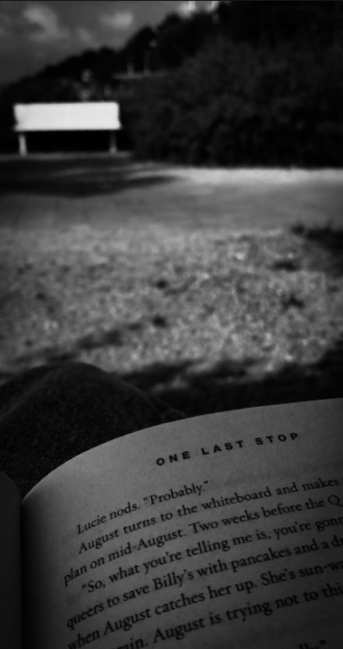
– I also brought down the shadows because I liked how it made the shadows more defined as it creates an unusual pattern on the floor which adds character to the photo as it shows its landscape.
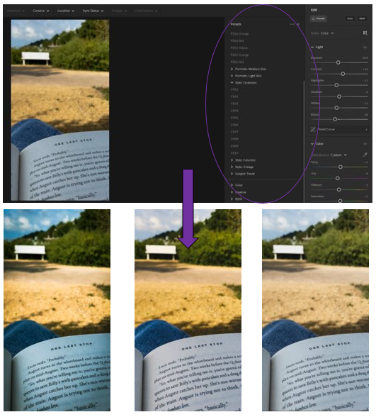
– Experimented with the pre-set setting on Adobe Lightroom.
– Chose from the “Cinematic” area of choice which gives them a dystopian, rural theme.
– 1st=PD04 Yellow, 2nd=PD05 Orange, 3rd= PD02 Yellow

I decided that I was happy with the experiments which I had done with this one because I had previously cropped it in a way which I liked and thought worked well for the photograph.

3rd photos experiments –

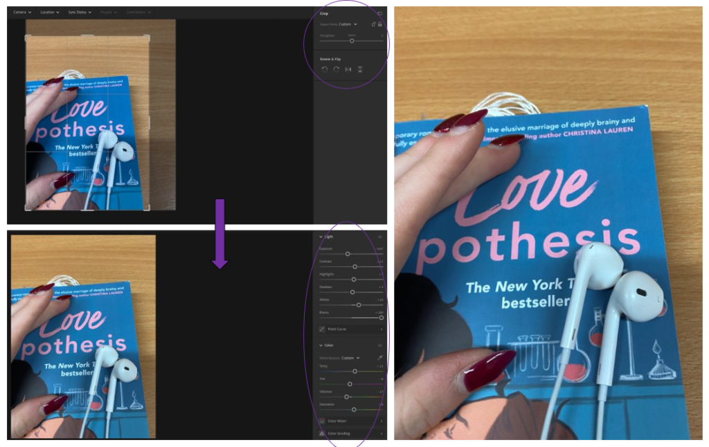
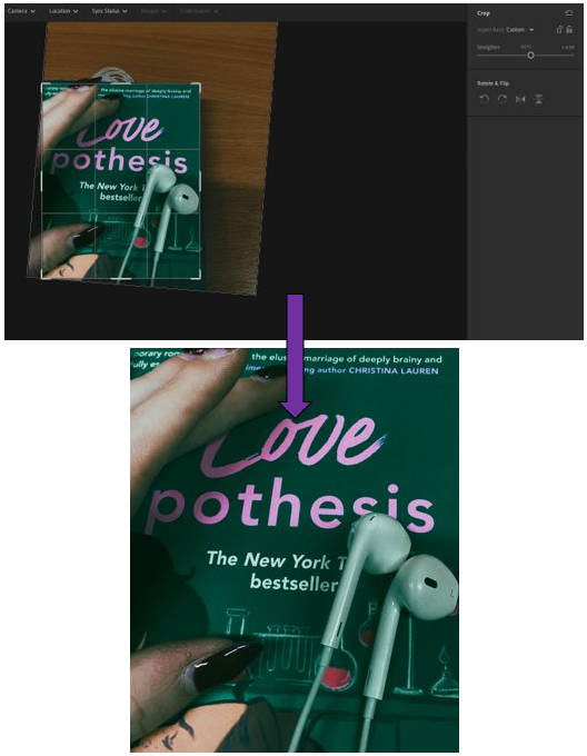
– Cropped the photo so that the sides and top didn’t have as much extra space.
– Brought up the contrast so that the colours from the wood of the table and the colours from the book that I changed using the temp, tint and brightness so that they would create a nice difference between each other in a subtle yet brightened way.
– Made the headphones more defined using the exposure, whites and highlights then the blacks to create a shadow – and make it more defined.
– Simple yet effective.
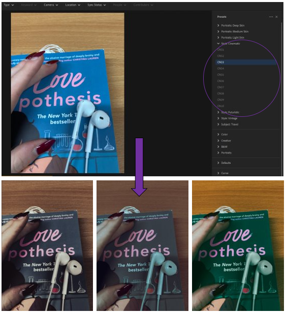
– Experimented with the pre-set settings from the theme of “Cinematic” on Adobe Lightroom.
– Created an old, cinematic look that you would see in older films where there isn’t that much colour.
– Used the filters = CN03, CN07, CN09.
-CN09 is my favourite as it creates this beautifully vibrant tone with the wood in the background which contrasts well against the book which has been transformed in a blue/green colour.
– I cropped it like this to create a main focus for the photograph, so that your attention is only to the middle of the photo.
– Photos and headphones add a level of personality to the photo, as the hands can tell you a lot about someone and who they are.