All posts by Emily Bowker

Filters

Author:
Category:

The new topographics

What is it and what is it raising awareness of?

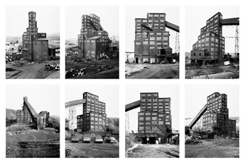
“The new Topographics” is a term which was made up by William Jenkins in 1975 to describe a group of 10 photographers such as Robert Adams, Lewis Baltz, Bernd and Hilla Becher, Joe Deal, Frank Gohlke, Nicholas Nixon, John Scott, Stephen Shore and Henry Wessel who brought in a new type of photography which was of urban landscapes with a simple aesthetic of black and white of various plain buildings.

Many of these new photographers were inspired by the man-made and wanted to show its beauty in different weathers/times of the day but also a way to emphasize how much the impact of industrial development has made to the natural landscape, an exhibition in the International Museum of Photography in Rochester, New York showed this feeling of unease towards this issue.

Examples –
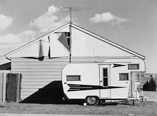
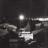
Robert Adams, photo of trailer in front of house
Robert Adams, Colorado 1974.
Belcher, grid of eight photographs of industrial building
Bernd and Hilla Becher, Pennsylvania, USA 1974.
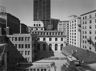
Nicholas Nixon, photograph of buildings in Boston
Nicholas Nixon, Boston 1975.

Topographics photographer research

Robert Adams –

“I think if you placed me almost anywhere and gave me a camera you could return the next day to find me photographing. It helps me, more than anything I know, to find home.”

Robert Adams
  • Born May 8th in 1937 in Orange NJ.
  • American photographer who’s most famous for his pictures of the always changing American west.
  • Published a book series in the 1970s-80s: The New West, Denver, What We Bought, Summer Nights. These focussed on the suburbs along Colorado’s front range of humanities imprint and nature fighting back.
  • Taken part in many exhibitions.

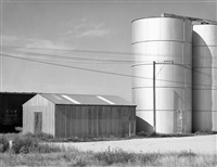
Examples of his work –

Analysis –

I think that this is a successful photo which I really like thattaken by Robert Adams in Colorado in 1966 of an urban landscape and will consider his style of work while photographing/editing my own work, showing “The New Topographics” influence throughout it. This is because the buildings are simple, yet show how human life has taken over and nature is trying to fight back against it which is what the aim was of Robert Adams work and this element of urbanisation in the photo is brought in through this photo through the use of the 2 metal cylinder towers which are next to the small farm buildings. I also like how the photo has been brought into black and white with a heavy contrast due to the sunlight which creates an overexposed effect to the photo but not to the point where the photo is lost in it, and many of the early topographic photographers used as it creates this important feeling of recognising the drastic development of industrialisation within the beauty of nature, which Robert Adams has done well as this would once have been a beautiful green field that was full of wildlife but due to humans this has been changed, for the worse.

Comparison to Ansel Adams

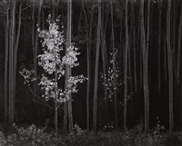
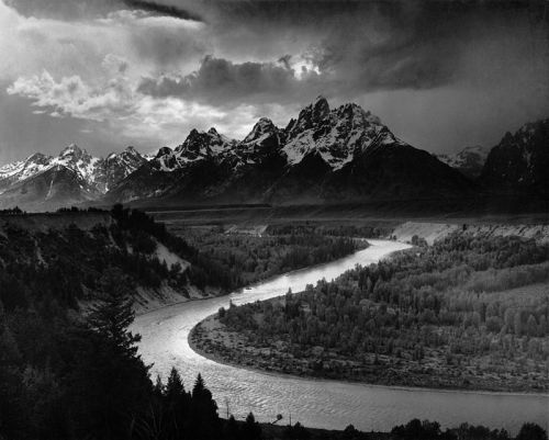
I think that my work was successfully able to show similarity towards Ansel Adams work. I have chosen to compare these 2 photos, as they both involve nature and include natural, woody, grassy, mossy values which create an earthy atmosphere. I think the similarities between the pictures such as the use of a woodland area, involving trees where both can use the background to create this dark and scary abyss but then use the tree branches/trunks to be able to bring some light into the photos as if it is showing and creating a feeling of hope. I also used “The zone system” which is also seen clearly in Ansel Adams work as you can see how we both have experimented with the 12 different tones of black and white within each of our photos. However, my photo uses a bright background whereas Ansel Adams doesn’t, personally I like this as I think that this helps to frame the nature and create a focus to how the natural course has been broken as you can see the broken tree trunk which could’ve been due to weather. It also helps to break up the darker tones to the lighter tones so that they don’t get lost in one another and create a break between them.

I really enjoyed working in the style of Ansel Adams and would use him for inspiration for “rural” landscapes in my photography because his work is unusual yet is able to highlight dangers which humans have created and show the world in a beautiful way but also be able to create a scary atmosphere through the use of the black and white filter which he uses.

Editing and final outcomes #2

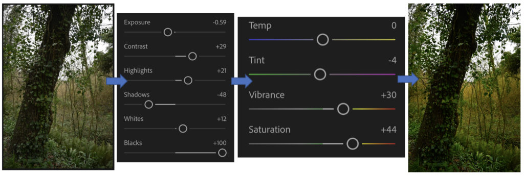
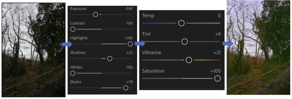
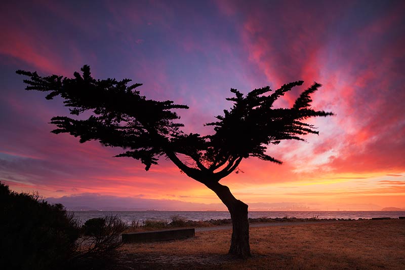
For these edits I was working in the style of Galen Rowell in my photography where he focuses on the beauty of nature through the beautiful bright colours which the sky and plants are able to create and how it can change a landscape through the use of sunsets/sunrises. I liked working in Galen Rowell’s style because it allowed me to experiment and try different ways of editing a photo to bring out the colours in them which I really enjoyed doing.

Throughout editing these photos I enjoyed it a lot because I was able to experiment with different colours and how to manage their vibrancies and how they may appear. This is because I found that while editing it was very easy to overexpose the image while I was changing the contrasts, exposure, highlights, whites, colours and their temperatures. I also found out how adding small bits of colours to the photos makes the colours be able to be bright and extremely vibrant because it changes the whole feeling of the photo, as many of the originals were gloomy and dark due to the weather but after they were edited, they came to life and created a happy and exciting atmosphere.

My favourite edit which I completed that I think is most successful and similar to Galen Rowell’s is the 1st one because I like how the sky turned out within the vibrancies of the blues and greens which work well together, I achieved this by bringing the contrast down so that the sky became darker then bring up the highlights which brings out the brighter colours in photos. I also like how I’ve been able to create hues of gold to come through small holes in the grass through bringing up the saturation and changing the temperature of the photo to make the sunlight appear golden through the cracks and where it can be seen in the corner. I also like in the photo how the grass is the main focus of the photo, as it creates an earthy and natural feel to the photo as it looks out on to the horizon. I think that this helps to frame the photo as the clouds create a sharp line of division and then the grass surrounds the bottom.

The photo which I think is the least successful which I created through editing is the 2n one, this is because I think that the natural landscape and whiteness in the background doesn’t work well together to bring out a vibrant, colourful landscape which would be similar to Galen Rowell’s work. If I were to try to edit this picture again I would try to make the sky appear to be a better, more defined blue as due to the weather on the day when these pictures were taken the clouds create this overexposed look as a background which is difficult to work with because it washes out the rest of the photo, which I don’t want to happen. Therefore if I was to create the effect that there is a sky behind it as in many of Rowell’s work, the sky is the main focus along with the surroundings.

I really enjoyed editing in the style of Galen Rowell as I was able to experiment with bringing colour into my work through different ways as each picture is different within the filter which I have created for them. I preferred working in Ansel Adams style with black and whites along with “The Zone System” because you are able to create a drastic, emotional atmosphere within one photo and raise awareness for the wildlife and nature.

Editing and final outcomes #1

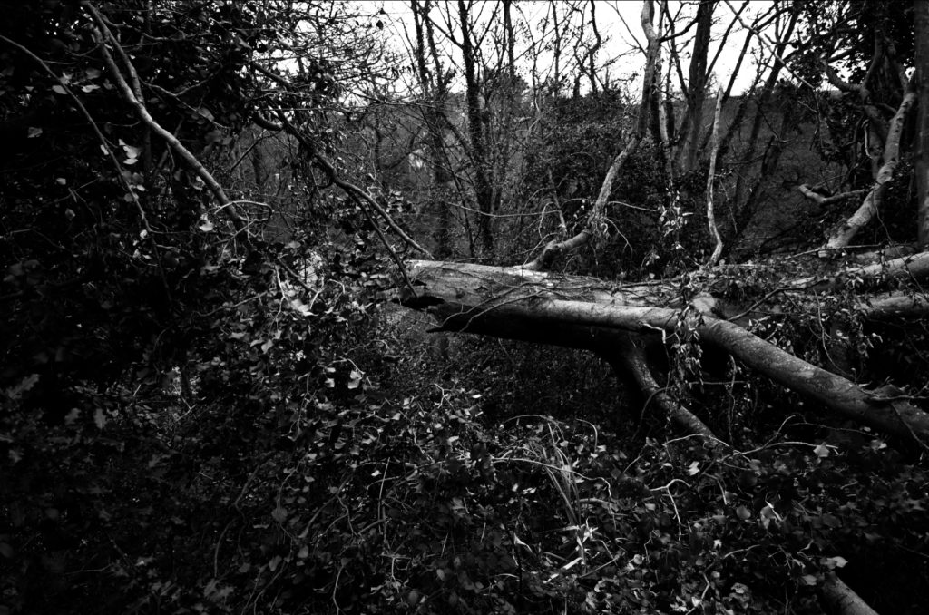
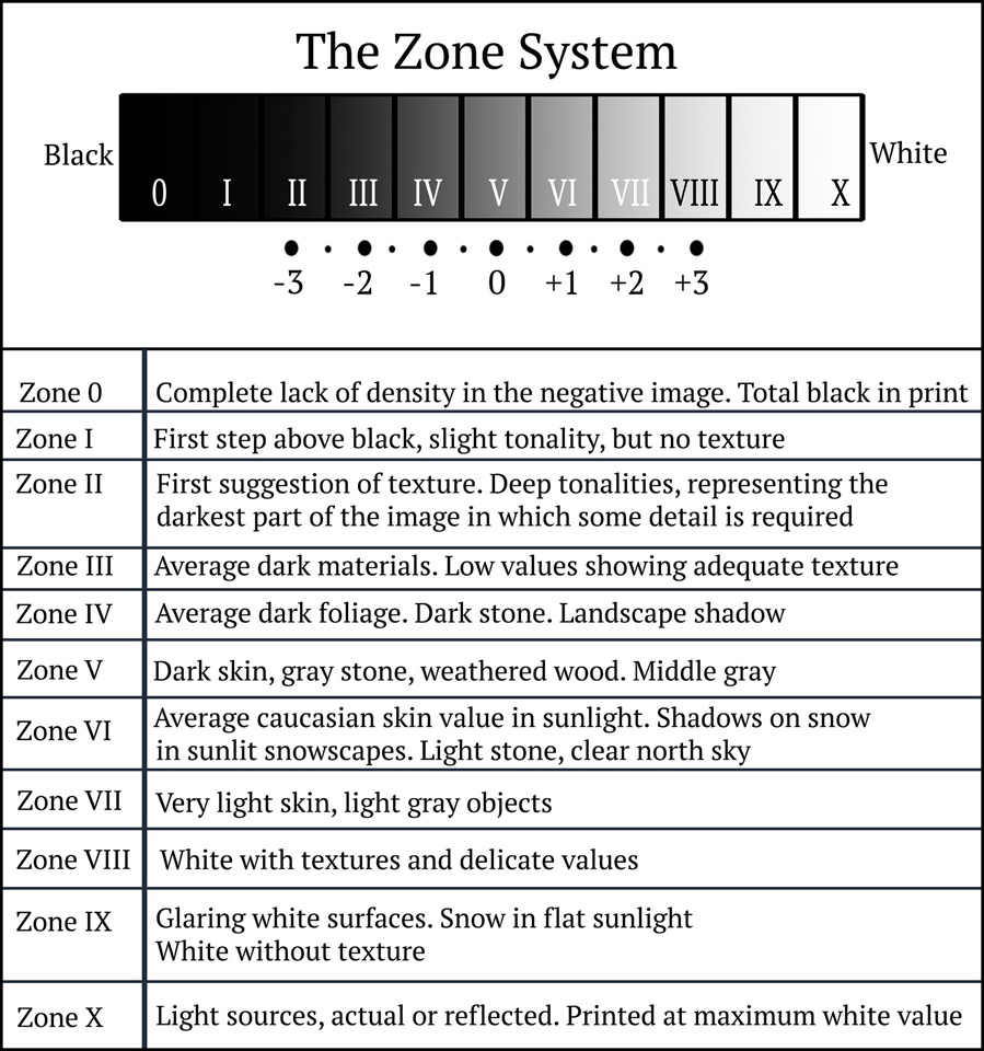
Throughout my edits which I will complete on Adobe Lightroom by selecting them and creating new versions so that I am able to compare to the original and Ansel Adams work through the use of his “The Zone System” which is used in photography, where the photo has been turned into black and white, to show the variety of grey scaled colours which you should be brining in the create a perfect contrasted look.

I really liked how these edits turned out because I think that it shows how I have experimented in different ways with the various filters on Adobe Lightroom of black and white, similar to Ansel Adams work, I was able to change the intensity of the filter and experimented with the different ways I could create a large contrast between the grey/white/black colours which I used through the use of Ansel Adams “The Zone System”.

I really enjoyed creating these because I was able to experiment with the large scale of filters which can be found in Adobe Lightroom and then change them to how I thought was fitting by changing the contrast/highlights/exposure etc. If I were to do do these again I would take pictures at various times of day so that the background wouldn’t create an over exposed look which would be casted on to the photo, which many of my pictures had which I found very hard to work with.

My favourite edit that I think is my most successful and similar to Ansel Adams work which is the last one, this is because of how the tree has fallen and you can see the rip from the trunk and how it is dangling off the side of the hill. It creates a dystopian atmosphere for the photo as it isn’t something that you see very commonly and can see how the wildlife has welcomed this in, as if it is a natural occurrence, as many plants have began to grow on to and around it. I also like in this edit you can see a range of grey scaled colours, many of which are found on “The zone system” which shows how I have considered this in photoshop to make sure there is a similarity to Ansel Adams work. This is clear to see on the trunk where I have been able to highlight various places of it where the nature hasn’t been able to take over yet, compared to the surrounding leaves which are seen around it because they appear very dark in colour which helps to create this image of a frame to highlight how this tree has been destroyed due to the weather through the dark abyss which surrounds this tree.

I think that my least successful photo is first edit which I attempted. This is because I left too much grey in the middle of the photo and there is barely any other colours around it which can contrast/highlight against it. If I were to try this edit again I would focus more on the clouds to make them appear darker and more drastic to create a feeling of gloominess on to the photo. I would also try to highlight the plants through the whites/highlights/contrast while editing which would make them appear more in focus more and easier to see as they aren’t able to be seen clearly due to the lighting and therefore this makes it look like a large, dark mark across the photo as there is no dimension to it to add that level of development to the photo to make sure that this effect of having something in the foreground to focus on rather than the background, so that it doesn’t get lost which it has done.

Comparisons to Alfred Stieglitz

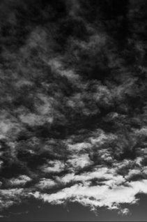
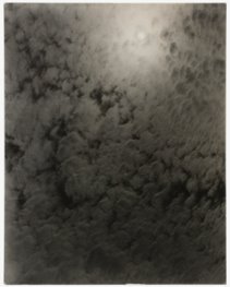
I think that my work which I completed in the style of Alfred Stieglitz is a successful way of showing his influence within my work when I photographed and edited these cloud formations because similar to his I have a part of the photo where the sunshine has caught it and began to bring a large amount of light onto the clouds, which are also similar, which makes it appear brighter than the others in a fading way throughout the photo. I also like how my photo is more of a darker contrast of black/white/grey tones because it creates this impact where you are able to see clearly of how the clouds form these strange, yet effective formations whereas in Alfred Stieglitz’s work he has more of a green/grey tone to his photo which I didn’t really like and didn’t want to use in my own work. I really liked working in the style of Stieglitz because it made me consider how the weather and other factors can really determine the way the clouds are formed in different patterns and none are ever the same which makes them unique.

Editing cloud formations

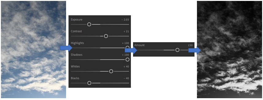
For these edits, which I completed in the style of Alfred Stieglitz, I experimented with different filters which are premade then edited them how I preferred similar to Stieglitz on Adobe Lightroom. I really enjoyed editing these photos because I think that it brought the photos to life and you are able to see the unique and intricate details which are hidden within the clouds as the black and white contrasts help to show these. They are able to create a different, complicated yet dark and gloomy atmosphere in each photo which I think helps to make them successful as Alfred Stieglitz says these are able to reflect somebody’s mind through the way they photograph cloud formations.
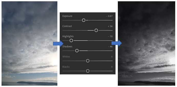
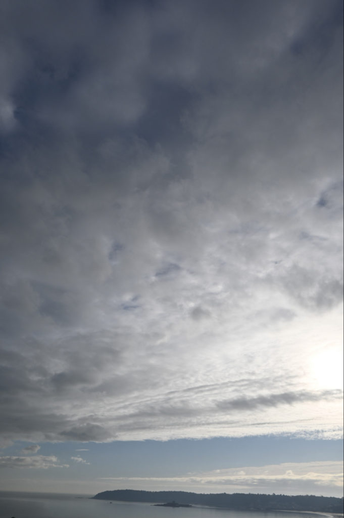
In my opinion, I think that I have successfully been able to show Stieglitz influence in my work through my most successful edit that I completed on Adobe Lightroom was the 3rd photo. I really like the way that this photo turned out through the way that I have edited it because I think that it is able to show diverse a range of black/white/grey tones which work well yet create a fluid contrast between them as they look as if they are climbing up the photograph, as if the light from the bottom of the photo wants to be noticed and bring that joy and happiness to the darker and more gloomy parts at the top. I achieved this effect through selecting a present which I think was a good base to work with as it changes the photo into black and white, then I changed the whites, highlights shadows mainly as this creates a contrast between the brighter and darker parts of the photo and then I changed the contrast slightly to help this change be able to see. If I were to try this edit again, I would try to bring down the brightness slightly at the bottom to avoid it looking a bit overexposed which was created through the sunlight previously, besides that I think this is a really successful edit.

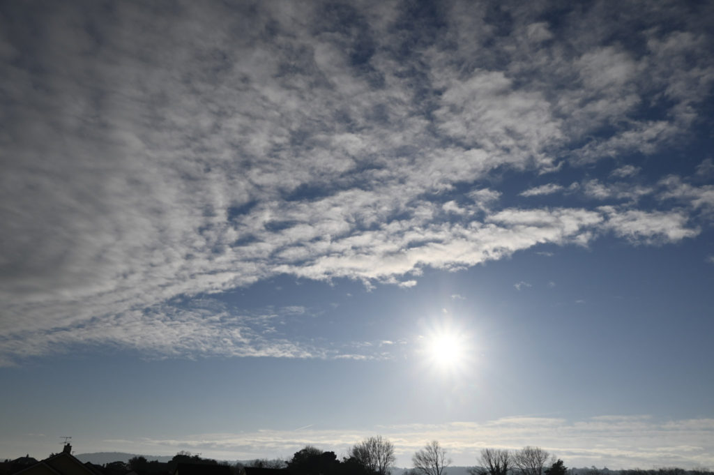
I think that my least successful edit which I completed on Adobe Lightroom was the first picture which I experimented with, this is because I think that due to the way which I edited it through choosing a pre-set called “monochrome” then further editing the exposure, contrast, white balance created a dark grey hue over the photograph, especially in the corner as you can’t see the cloud formations, which I don’t like as it stops the darker and brighter tones being able to create a fluid contrast between them which works well. If I were to do this edit again in adobe Lightroom I would make sure that I am able to make the brighter whites and darker tones stand out well and not get lost through using the highlights, whites and exposure better by bringing them up. I also don’t like how the sun ion the corner creates this random burst of brightness in the corner of the photo because it appears to be quite exposed compared to the rest of the photograph and if I were to change this again I would make sure that the sun is defined enough to an extent where the brightness doesn’t become so overexposed.

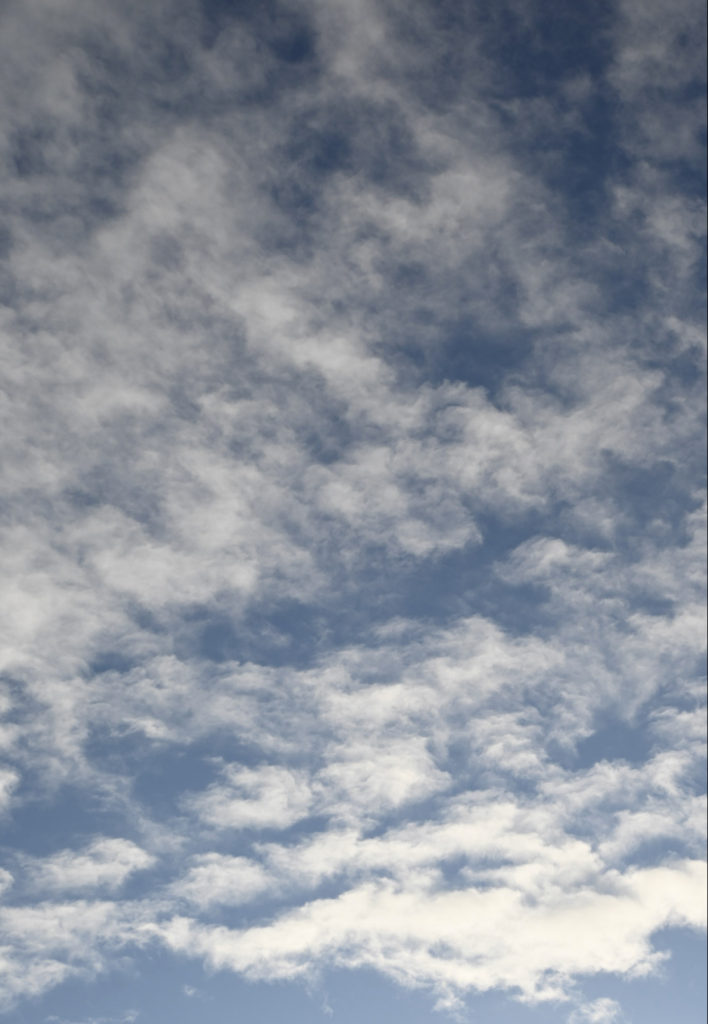
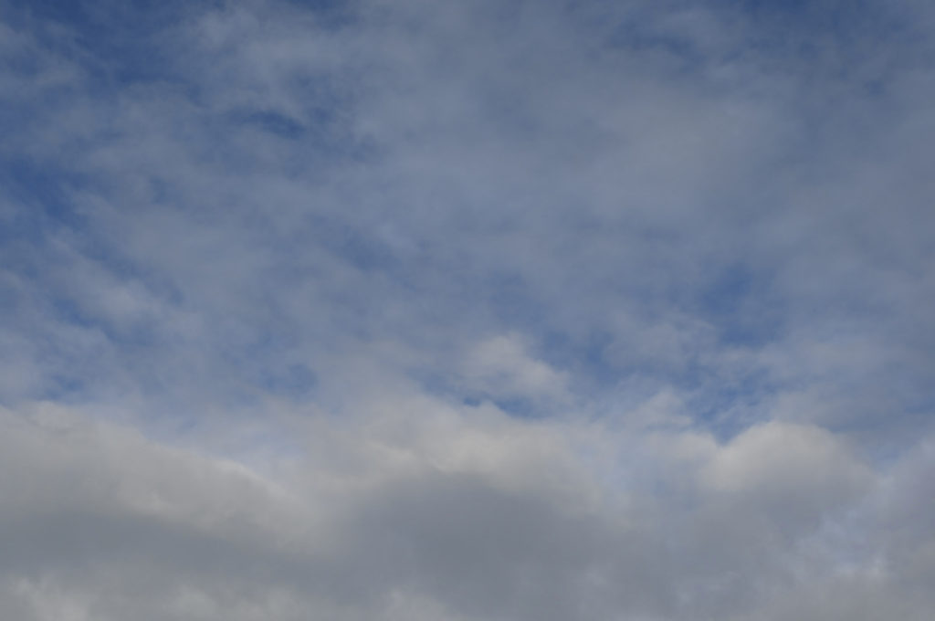
Best shots (cloud formations)

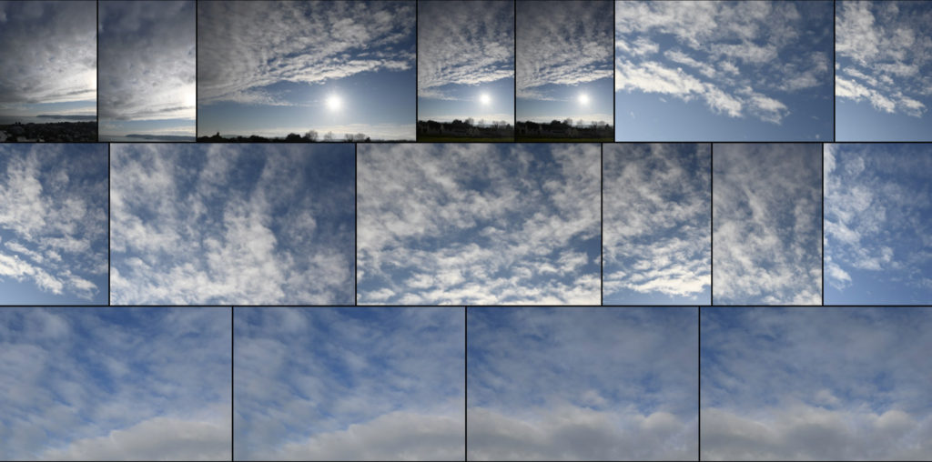
These are the photos which I have selected which I think will work well to compare and edit towards Alfred Stieglitz work because I like the way the clouds have formed and the different patterns which have been created because of this, in Adobe Lightroom I’m going to choose 4 photos to focus on and edit in detail.

Selecting my 4 best photos –

These are the 4 photos which I have decided to focus and edit in detail in the style of Alfred Stieglitz this is because I love how there is a variety of differences and similarities between each photo. There is a different pattern which is formed by the clouds in each photo and I think that this is going to create a defined use of being able to see how the sky is able to create beautiful formations while editing, there is also the use of bringing in a small piece of land in the first 2 because I think that it helps to create a feeling of depth within the photo as it can help to frame and add texture to the picture.

Best shots of natural landscapes

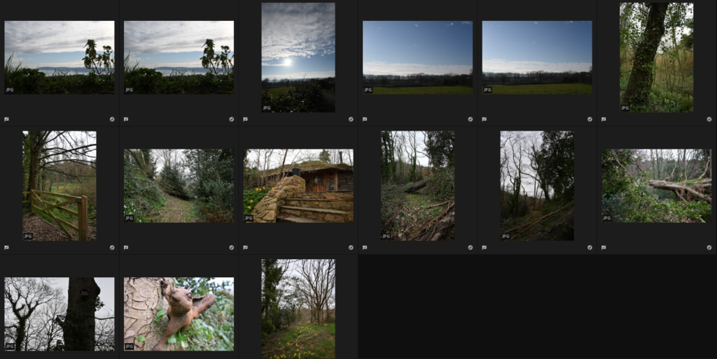
Through my 2 photoshoots which I did out of school, I gathered these 15 images as my best shots of a romanticised rural landscapes. I chose them by going through each album which I made and picking them with “Z” then added them all to a separate album where I had them all together as it will be easier for me to organise and edit on Adobe Lightroom to fix the lighting/experiment with the filters/etc. I will be choosing 4 of these pictures to do an edit of in depth where I experiment with different filters, relating to my chosen photographers work.

My first photoshoot I focussed on going on a walk, where I took pictures which showed a progression but the photos came out more industrial than I wanted as there were many buildings included in them. I really liked the way the clouds add extra detail to my photos from this photoshoot as it was a nice day as it completely changes the atmosphere of the photos.

For my second photoshoot I focussed on going through another walk through a natural landscape in Jersey which is quite hidden and natural due to the wildlife throughout it, due to the weather the clouds made the background quite bright and overexposed in some pictures, which I will be editing in Adobe Lightroom but I think that it will help to develop my photos to be similar to Ansel Adams. I really liked doing this photoshoot as I got a variety of photos from flowers, trees, bridges, etc.

Romanticism in art and photography

Romanticism in the arts was brought in during the 18th-19th century as a movement, it strayed away from the classical art form and brought in the use of nature, emotion and imagination. It was used by painters, writers, poets and photographers later on, it was used as symbolism to show how nature has changed and how industrialisation had taken over in many areas.

Romanticism artists

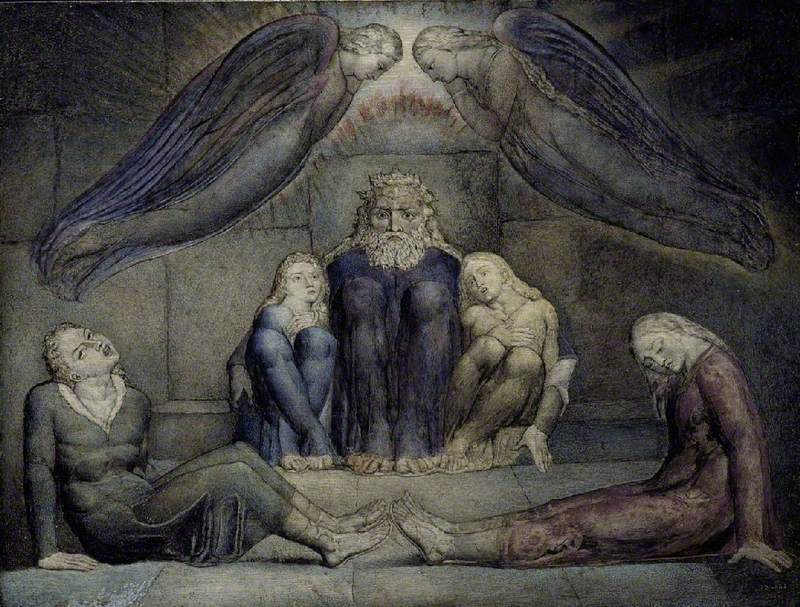
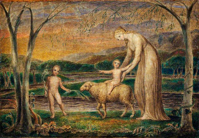
William Blake was one of the first English artists who used romanticism in their artwork, he created powerful and unique images where he used colour and was able to create a lot of hand-drawn books. In Blakes last decade before his death, he recognised how there was a whole new generation of romantic artists who supported and liked his work for inspiration, these included John Linnell, Edward Calvert, Samuel Palmer, etc.
Here are some examples of his work:

Ugolino and His Sons in Prison
William Blake (1757–1827)
Our Lady with the Infant Jesus Riding on a Lamb with Saint John
William Blake (1757–1827)

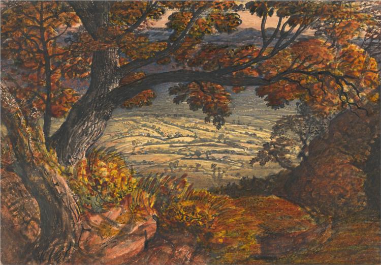
Further along, Samuel Palmer took inspiration from William Blake in his work which led him to becoming one of the most influential landscape artists who focussed on romanticism. His art mainly included watercolours and the rich, calm colours of nature, similar to Blakes which can be seen throughout his work.
Here are some examples of his work:

The Gleaning Field - Samuel Palmer
Samuel Palmer (1833).
The Weald of Kent, 1834 - Samuel Palmer
Samuel Palmer (1833).

This eventually fell into photography, which I will discuss below.

Romanticism photographers

By the 1900s, photographers such as Ansel Adams began to experiment with romanticism in photography. He photographed images of the American West, which he is most famous for and created the group of photographers we know today as f/64. He favoured dark contrasts in his work and focussed on the darker aspects of tones, which led to him creating Zonal System. Just as romanticism was used to show a movement within art, it can be seen in photography as Ansel Adams uses it to show environmental protection.
Here are some examples of his work:

Ansel Adams (1942 USA).
Ansel Adams (1949).

Ansel Adams work also inspired the work of many other romantic landscape photographers such Fay Godwin, Don McCullin, Edward Weston, Galen Rowell, etc.

Galen Rowell focuses with colour mainly within his work with landscape photography. He captures the sunsets, sunrises and other various natural landscapes from different point of views.
Here are some examples of his work:

Galen Rowell | Master Photographer | On Landscape
Galen Rowell Prints - Opinion | Fine Art Photography Prints