All posts by Emily Bowker

Filters

Author:
Category:

Editing in the style of Naomi White, Photos 1 + 2

About –

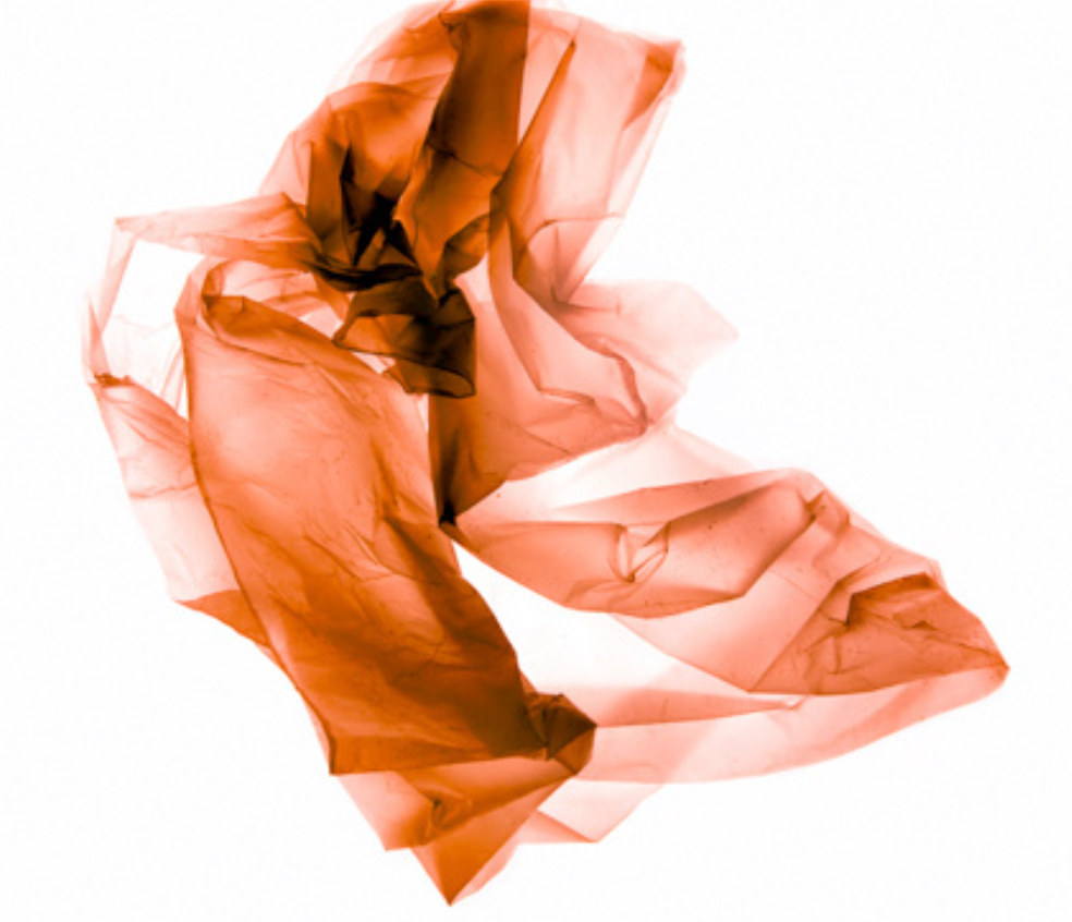
Naomi Whites photography consists of using light to transform a plastic bag image fluidly, such as a water current will do as it is a continuous movement which is being forced, so that it becomes organic instead of non-biodegradable that threatens nature. Naomi White states how there are endless possibilities with using plastic in photography as it allows to begin recognising the way it responds to touch, surface, its weight, etc and how it may cling to other elements and create the effect of something which can be seen as out of this world through what it creates. In my own work, I have focussed on using a plain background, consistent of Whites work, but I will also move into photoshop to experiment with different filters and techniques of editing to create different ways of showing the weird yet unique way plastic bag photography can be used to show how it is damaging nature.
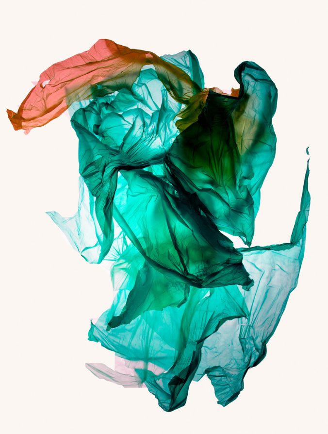
Editing photo 1 –

Experiment 1)

For this edit, I wanted to start off by adjusting the photos brightness and vibrancy which helped the photos vibrancy of colours to stand out well so that they wouldn’t get lost when I adjusted the contrast and saturation because I wanted to get rid of the yellow hue at the bottom of the photo because I wanted it to be white. To help further this edit into having a white background I adjusted the hue and lightness slightly which began to control the yellow hue more then to make sure that it was gone I adjusted the colours of the photo such as the cyan and blues which helped to make the colours more vibrant, similar to Naomi Whites work. I really like how this edit turned out because I will use it further in my work as a basis when editing further because I think that this will make the photos appear as if they are stronger and finer in quality.

If I were to do this edit again, I would change the positioning of the photo through the use of flipping it upside down as I think that it could create an image of an iceberg or icy area as the darker parts of the plasti9c bag that have been layered on top of each other create darker areas which add dimension towards the photo to make it appear as if it is 3D and a mountainous landscape.

Experiment 2)
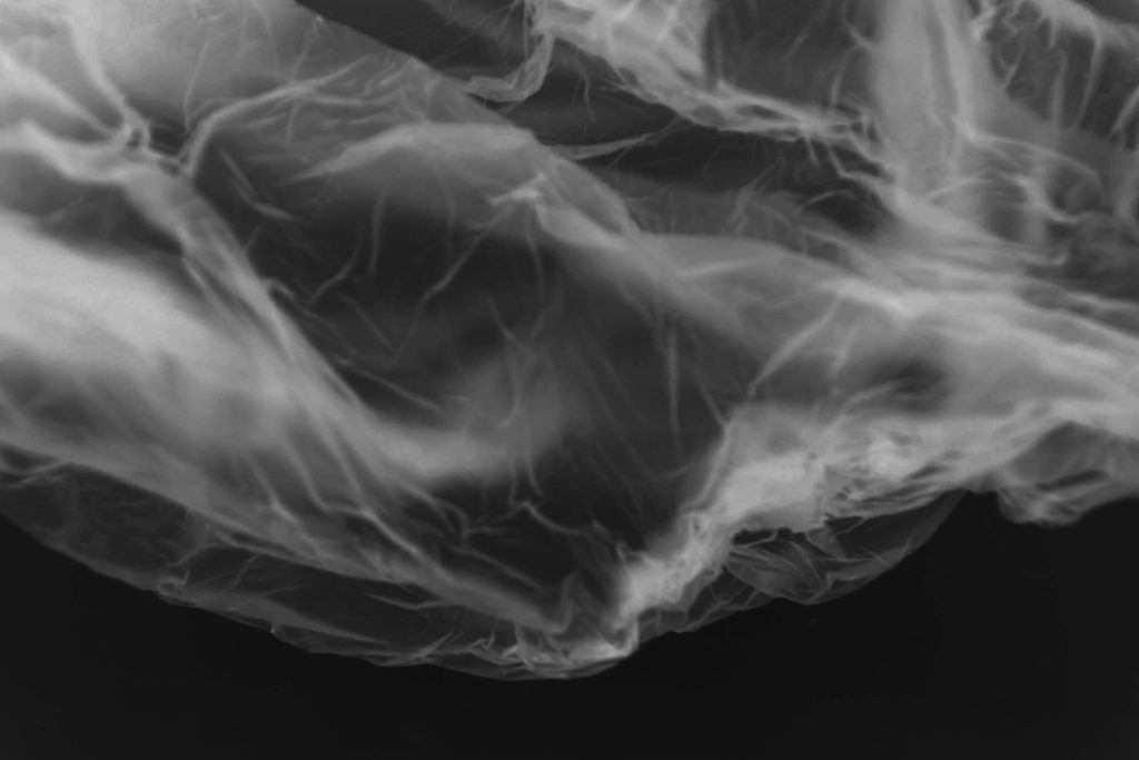
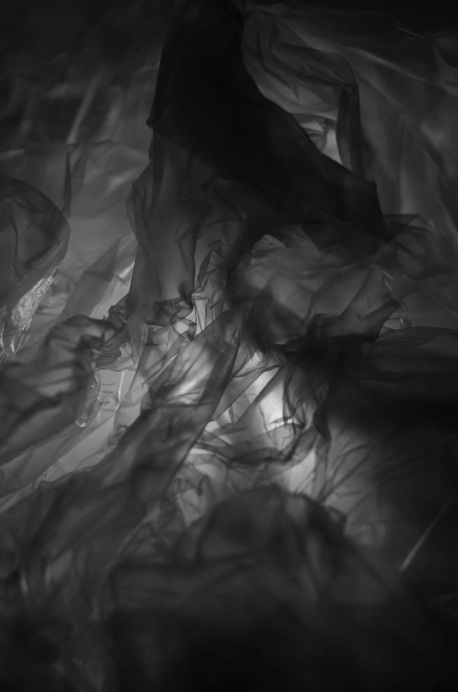
For this edit, I really liked how it turned out began by inverting the image on photoshop which gave it this effect of an X-Ray, I thought that this was really effective because it makes the creases of the plastic bag more defined and as if you are looking at an X-Ray of something peculiar which helps to create a story of what it could be. I then began adjusting the contrast because I wanted the highlights of the creases to be made easier to see but not be too harsh so to stop this from happening I brought down the contrast because it helped to control this effect. As there were colours which were still beneath the overlay of being inverted, I was able to adjust the hue and saturation because I was able to control the blue/cyan/white colours in the photo underneath which made the darker blues appear brighter when inverted whereas the cyan and whites became darker as it switches them around. If I were to do this edit agai9n, I would bring it back into photoshop and experiment with different ways of cropping the photo because I think that there are various creative ways which the image could be manipulated which could help to drastically change the emotions created by the image.

Experiment 3)
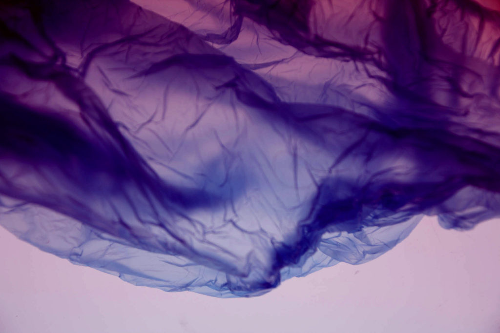
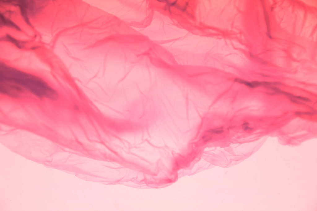
For these edits in photoshop, I think that edit 1 is my most successful because I used the ‘Colour balance’ where I selected ‘Mid tones’ which helped me to be able to adjust and transform the different colours and how strong they may be. I started off with the cyan which made the bottom of the photo brighter in colour but then I decided to change the magenta colour which created this effect of an Ombre throughout the photo which starts off as pink to purple then blue. I really like the way that edit 1 came out as I think that the white at the bottom, which I didn’t want to change, contrasts against the colours well and makes them stand out as it provides a bright white background for the colours to fall nicely against. Therefore I think that this is able to show Naomi Whites influence throughout my work because of the bright colours which I have chosen to use in an way where they fade into each other, which can be seen in some of her work and I like how this can manipulate the feelings created by the image as it makes it feel as if it is softer and the message of how Anthropocene is impacting the world is considered to a degree but not pushed onto you in a harsh way which can happen.

My least successful experimentation of these coloured images of plastic bags is edit 3 and this is because the pink tones of the photo which I have created in photoshop when using the channel mixer as I brought the red tones of saturation up which made the pink become more distinct in areas such as the left where there are darker parts of the photo, which can be seen to add dimension, but can also merge together and create a large area of colour where there may be no distinct way of determining if the creases of the photo have been brought to life through them as well, which I have wanted to achieve and keep constant throughout my work. If I were to do this edit again, I would make sure to bring in another colour plastic bag when taking the photo through taking photos of them or editing in through photoshop because I think that it would help to bring in a diverse range of colours instead to the photo so that they don’t end up merging and getting lost in itself.

Editing photo 2 –

Experiment 1)

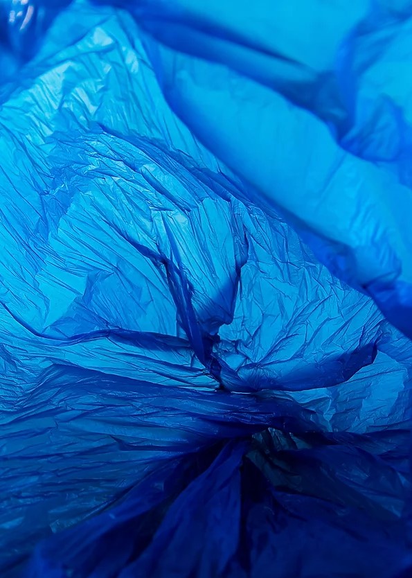
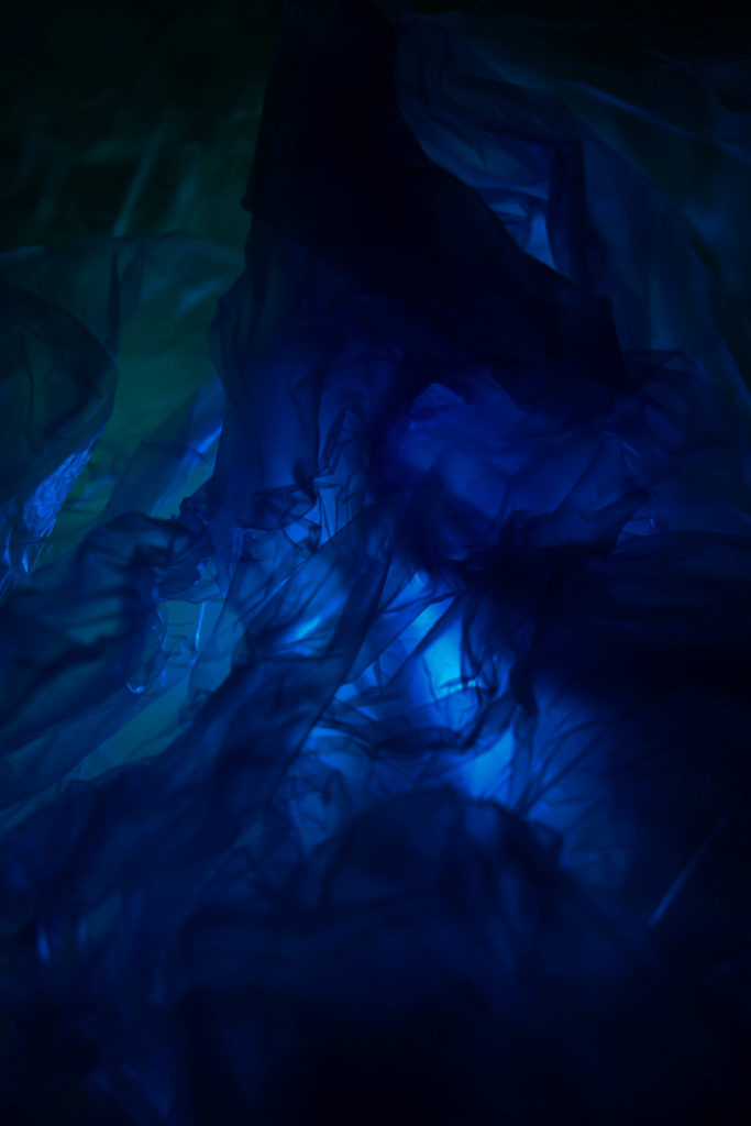
For this edit which I will use as a basis when editing further I wanted to keep Naomi Whites influence fluent throughout my work which I think that I have done successfully as I have been able to control the brightness of the blue plastic bag while making the vibrancy of the blue stand out well and contrast against the lighter colours and the white which surrounds the image which makes it look as if it is floating, which can also be seen in Naomi Whites work. I also cropped the photo because I felt as if there was a lot of excess space from the plastic bag which wasn’t as solid or dark in colour which I would have liked as I can distract the eye from the handle of the blue plastic bag which I really like as it adds this curve to the photo which contrasts well with the other shapes as it gets darker due to the contrast and brightness of the photos against layering of each other.

Experiment 2)
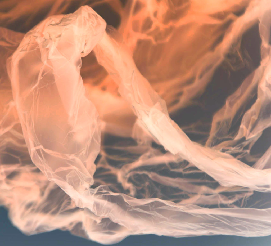
For this image I began by inverting the colours from the blue which made them transform into the opposite ones such as orange/different shades of yellow and orange when it is darker or lighter. To further this effect, I added a tint to the photo which I decided I wanted to be yellow because it would help to soften and smoothen out where there may be a block of darker colours being created such as in the back where the colour falls to a darker orange due to layering of plastic bags which I think helps to create a rustic feel towards the image such as when something has been burnt. I also like how the blue background is constant and solid throughout the back of the photo as it can make the photo appear as if it is floating through an area, which I believe makes this image successful through the way I have edited it because it makes it seem unnatural and strange.
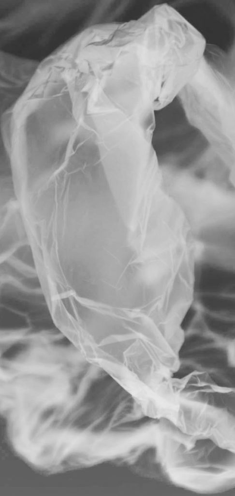
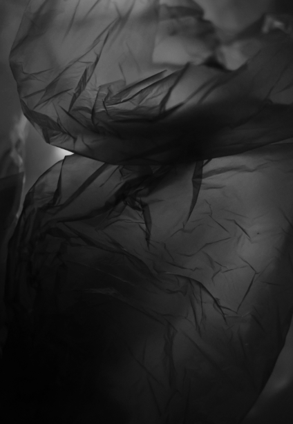
I also wanted to experiment with bringing the image into photoshop and transforming it into black and white because I think that it helps to create the impact of an X-Ray towards the photo and to help create this feeling, I further transformed it through bringing the brightness down in photoshop which made the darker areas contrast heavily against the white which I used to brightness to create this effect by adjusting it. I also decided that I think that cropping this image would make it appear to be more effective as an X-Ray of a plastic bag, I decided that this section of the photo would be most effective to crop to create this effect as it is where the plastic bag is most in focus and makes it appear to be the centre of the photo which could symbolise how dangerous it is due to what it is made out of.

Experiment 3)
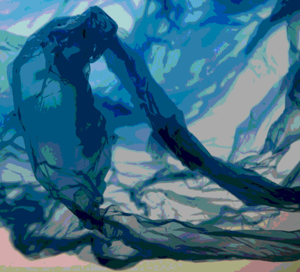
For this edit, I experimented with the ‘Posturise’ effect in photoshop which manipulates the photo into appearing to be cartoon like as the blocks of colour become solid, making it look 2D instead of 3D which I have done previously throughout my work. To control the colours of the shades of blue I adjusted the ‘blue’ on channel mixers in photoshop and the ‘green/yellow’ as it neutralises them to an extent where they don’t become too overpowering, which I don’t want to happen in the photo as it begins to have the colours in the photo merge together in to one instead of having a controlled individual block of colour. didn’t like using this effect as I don’t think it was successful in showing the beauty of plastic bags which is what I have wanted to keep fluent throughout my work so I would not use this technique when editing photos again in my work for the theme of ‘Anthropocene’.

Editing in the style of Vilde Rolfsen, Photos 3+4

Editing photo 3 –

Experiment 1)

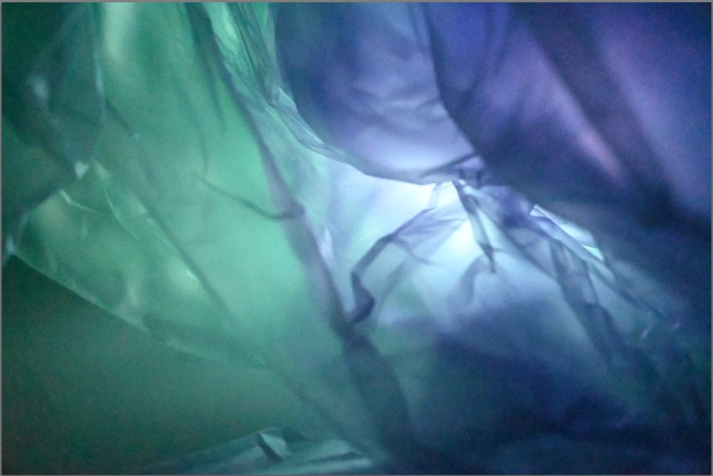
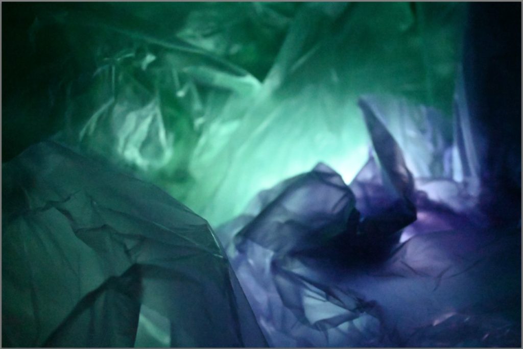
For this edit, I began by creating a base to use further, like I have done previously because I think that it helps me to know what I am doing and see how I have edited a picture and what I can do to expand on it further. I started off by bringing the photo into photoshop where I adjusted the contrast and brightness as I wanted to show the fluidity and vibrancy of these 2 coloured plastic bags and how well they work together. I also wanted to try and control the corner where the flashlight was a little too bright in colour so I changed the Vibrancy and colour which brought the brightness of it down but also the picture so to equal this again to bring back the pop of colour in-between I used the hue and saturation tool which allowed me to edit the colours and how bright they were through the saturation for red, hue for blue and lightness overall. To push the colours that extra bit further in showing their colours I adjusted the brightness ands contrast again as well.
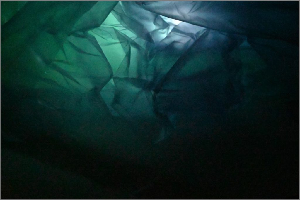
I really like how this edit turned out because I like the purple hue which has created a subtle effect in the photo between the mixing of the two plastic bags as it makes them look as if they are one and provides fluidity throughout the photo for this effect. If I were to do this edit again, I think that I would crop the photo slightly so that the corners on either side don’t have huge blocks of colour.

Experiment 2)

For this edit, I began by turning it into black and white on photoshop as a basis then I used the different colour mixers to be able to balance it out through adjusting them slightly which means that the colours which may still be prominent such as red or blue mainly can be controlled and become darker if I bring the filter down or brighter to create a contrast if I brought them up. After this, I decided that if I cropped the photo I would be able to create a greater focus point for the photo which I wanted to do previously. I decided that the best place to crop would be the middle part because that is where the branch between the two plastic bags is the main part of the photo and I like how the middle is darker than the rest of the photo but also still be able to show the creases pf the plastic bags. If I were to edit this again, I would add a little more highlight into the photo through the contrast and brightness because I think that this would help the structure of the plastic bags be clearer to see and to give them more depth.

Editing photo 4 –

Experiment 1)

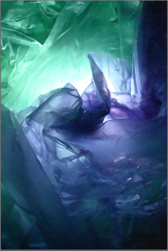
This is how I edited this photo to provide me with a basis for future editing as I really liked how this turned out, even if it is a little darker on the outside, unlike Rolfsen’s work who’s is much lighter, because it creates a highlight in the middle which pulls your attention in instead as the purple and pink tones are eye-catching due to how bright they are.

Experiment 2)

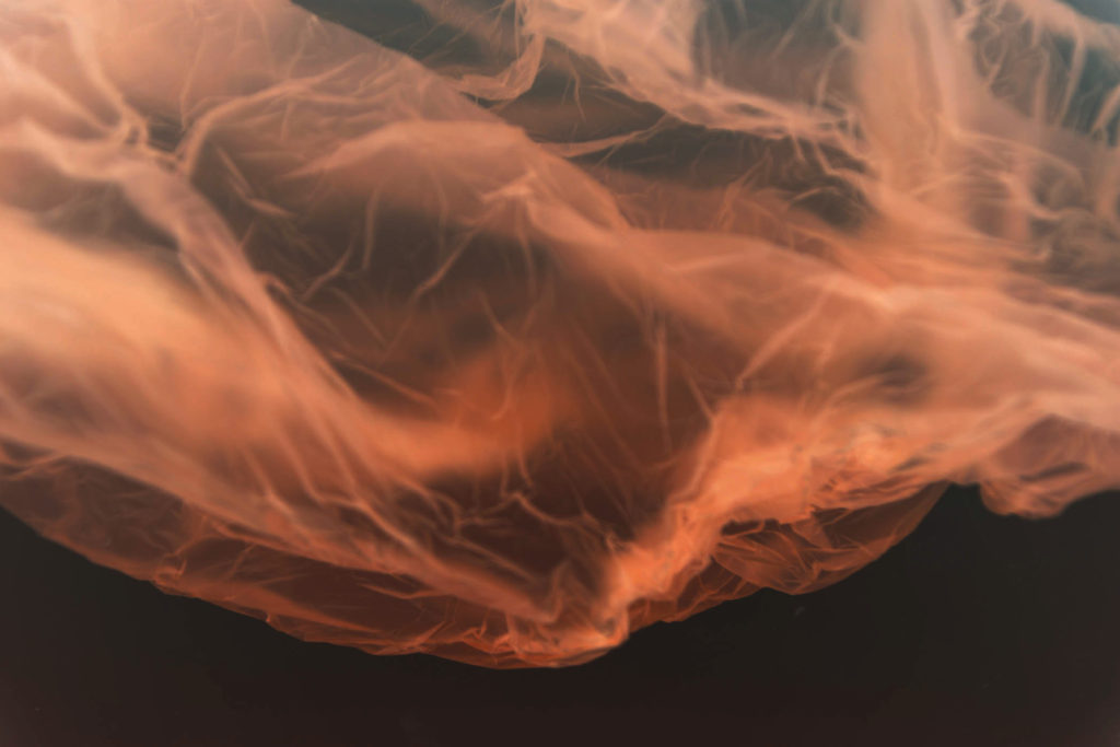
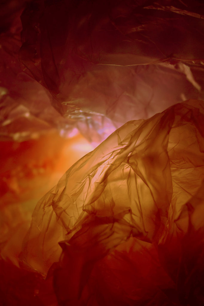
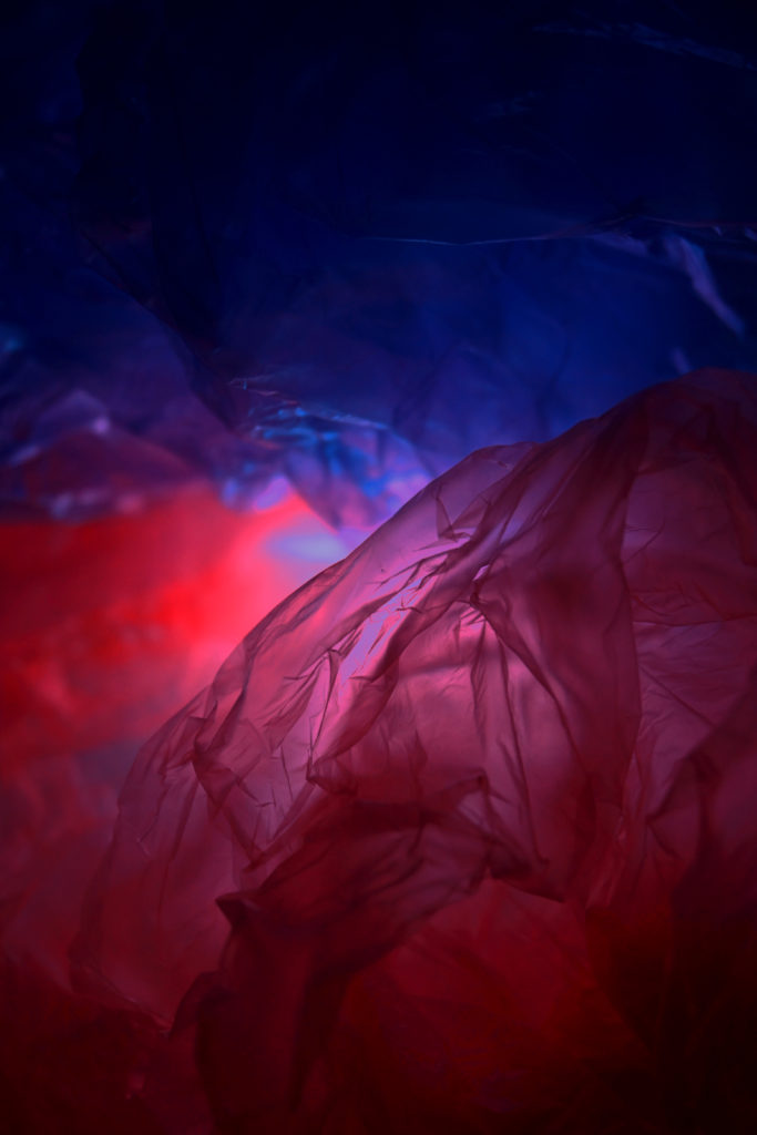
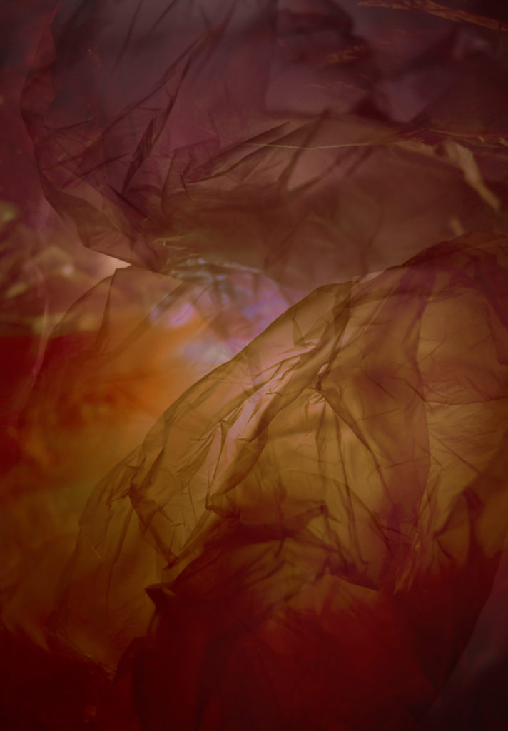
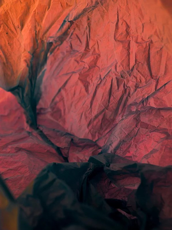
I really liked the way these 3 edits in photoshop have turned out with changing the colour of them because it makes them look different and very unique each time. My most successful edit out of these 3 I think is the 1st one, this is because of the way there are many different tones/shades of orange inside of one photo which helps to add a layer of dimension towards it because it creates a pathway throughout the photo which looks like it is leading towards towards the entrance. I really like this because it can also make it look as if this pathway has caught fire as the orange can resemble flames and as they turn darker the fire is getting more and more intense which can also sow how wildlife is also being impacted with the contribution of fires and how it can destroy natural habitats such as forests. The photo which I think is the least successful out of these is the 2nd because of how the light and exposure has overexposed in the middle while editing and has become too dark on the top/bottom, if I were to fix this I would make sure that the vibrancy of the colours is shown throughout the photo making adjustments where it may be needed to fix and prevent this issue from happening again. I do like how there is a divide in the colours of red and blue which can be used to symbolise the dangers of plastic pollution during the ‘Anthropocene’ similar to Vilde Rolfsen’s work where she uses 2 different colours to captivate and signify this.

Different types of experimentation –

For these edits, I wanted to experiment with all the photos I have edited so far through the use of the multi/double exposure technique. I really enjoyed using this technique as I was able to reflect back on the different photos which I have produced so far and see where there may be strong/weak points in them.

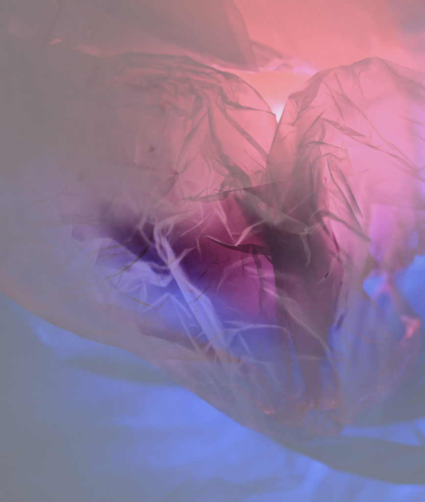
My favourite edit is the double exposure 1 because I like how I have used the bright colours behind the white of a photo because it resembles Vilde Rolfsen’s work where a few may have colours which aren’t as bright due to having either a white plastic bag over the top which can mute the colours slightly or going through photoshop and adding that white filter on top. I also like how the white highlights from the photo on top make the photo create the effect of it looking similar to a rose with the darker part being a stem underneath and the petals falling around it.

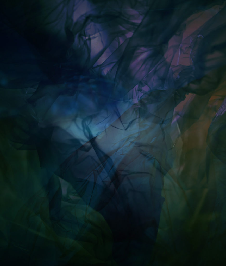
My least favourite edit the multi-exposure and this is because I think that it looks quite messy and unorganised because you aren’t able to see all of the different layers which I have introduced in the photo clearly and the some of the colours overlap creating darker parts such as in the top left corner which I don’t like, However, I do like the use of the colours at the bottom which I have used as they have merged together and made a few earthy tones come through such as green and blues, even a slight hint of purple as well. If I were to do this one again, I would make sure to make the opacity of the layers more dominant so that they are able to be seen so that they don’t mix into the plastic and start to get lost and look as if they are apart of the creases.

Layering

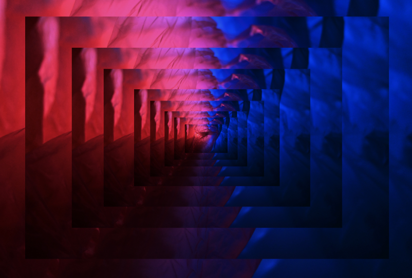
I really liked experimenting with the technique of layering in my work because it creates a 3D effect as if you are looking beneath you where there are different platforms which look as if they are not going to and and I think the darker shadows which contrast well against the bright colours of red, blues, pinks and purples help to create this illusion towards the photograph. If I were to experiment with this technique again I would want to introduce using a mix of 2 photos which work well together because I think that it could make them contrast well against each other (depending on the colours of each photo) which could create a layered effect that shows 2 different ways how the theme of ‘Anthropocene’ is impacting the world through the beauty of plastic bags which is what Vilde Rolfsen does as well.

Editing in the style of Vilde Rolfsen, photos 1+2

About –

Vilde Rolfsen’s photography consists of editing her plastic bag photography to successfully bring the photos to life through the vibrancy and beauty of the plastic bags, which is what I will experiment with in my own work while editing in the style of her. I will attempt to do this in photoshop by cropping the photos, to make the finer details/patterns of the creases more visible which will help to see the colour of the plastic bags which I have chosen to use. To create the beautiful mix of colours which Rolfsen presents in her work as well, I will experiment with the vibrancy, contrast, hue/saturation, channel mixer to transform into a singular colour, etc. Further more, I will also move away from Rolfsen’s style to experiment with changing the colours of the photos into black and white or create a faded look with them through the gradient map, curves etc.

Editing photo 1 –

Experiment 1)

The process of editing the photo.

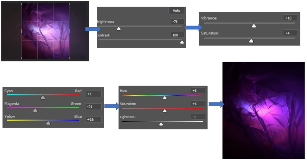
For this edit, I began by editing the photo to get rid of the excess space on the edges of the photo where the plastic bags weren’t quite in focus and had a large surface area, which I didn’t like. After this, I wanted to bring out the vibrancy of the purple plastic bag yet keep parts of it darker, which can be seen in Vilde Rolfsen’s work at the creases and folds. I used the brightness at the start to bring the photo down to a more controlled level of brightness and then brought the contrast all the way up to keep the vibrancy of the purple fluent throughout the photo which can be seen when I was using the vibrancy and saturation which I didn’t need to change as much, due to this. Then to make sure the purple was as bright as it could be, similar to Rolfsen’s work, without overexposing it I used the colour balance to make sure the colours weren’t getting lost in each other due to one colour being too overpowering. This photo is what I used as a basis for editing the photo further on and this is because I really like how it turned out and I think that it would be a good photo to use to experiment in different filters with because there are light and dark points of the photo, similar to Rolfsen’s work.

Experiment 2)

For this edit, I inverted the photo on photoshop and adjusted the density and feather tools a little bit, which created this image which I really like because I think that due to the editing on the basic photograph I had used beforehand made the creases more defined which creates the image of a leaf. I really like how this has been created because similar to a leaf, it shows the intricate little formations which a leaf may have to show its uniqueness. This can also link quite well into the theme of ‘Anthropocene’ as the outdoor environment is another element which is being heavily effected by it and due to the way the lighting is, which makes the surrounding of the photo a bright, plain white makes the leaf appear as if it is fading away more and more, which can show the dangers which are effecting the environment and how if we keep acting as we are, there won’t be much left. I also like how the middle of the leaf appears darker then the rest as it adds a layer of dimension to the photo to make the leaf look realistic as this is where the stem would be on the underneath. If I were to edit this photo again, I would make sure that there is more green involved in the picture which I would edit in the channel mixers and vibrancy/hue because I think that it would add that extra level towards the photo which would make it stand out well, highlighting the fact that it resembles a leaf.

Experiment 3)

Edit 1
Edit 2

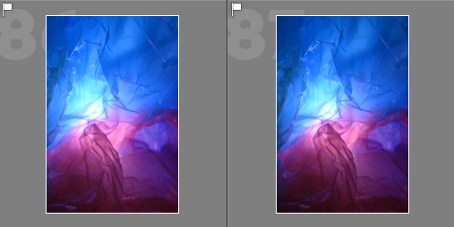
For these edits, I experimented with the black and white filters on photoshop. I used these to transform the photo, highlighting the middle where the flashlight was which makes it become the main area of attraction to someone’s eye and then the black highlights the creases in ways where it makes them defined so that they stand out, creating the effect that you are looking down into a valley or mountainous area.

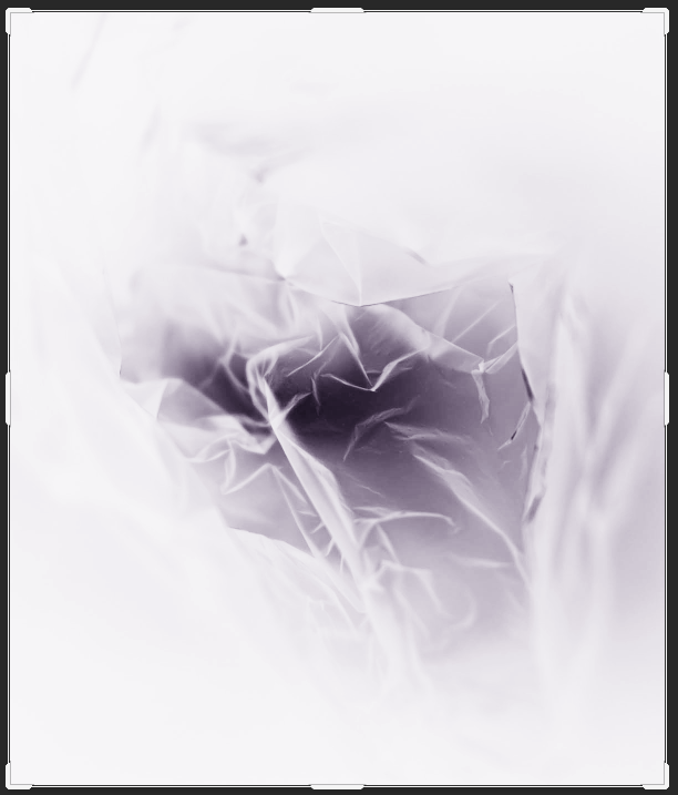
Then for the second edit, I inverted the black and white photo on photoshop which creates this X-Ray effect which I think is really effective as it creates a miniature landscape inside of itself where the brighter parts can be seen to be higher areas covered in snow whereas the darker bits are where the land falls down, but if I were to edit this further I would have cropped the photo to make the main focus be the small landscape which has been created as I think that the bright, overexposed area from the lighting previously around it makes the focus being taken off of it.

Editing photo 2 –

Experiment 1)

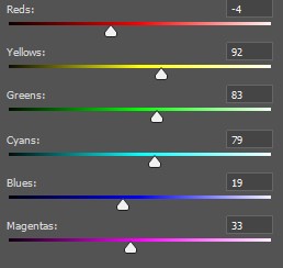
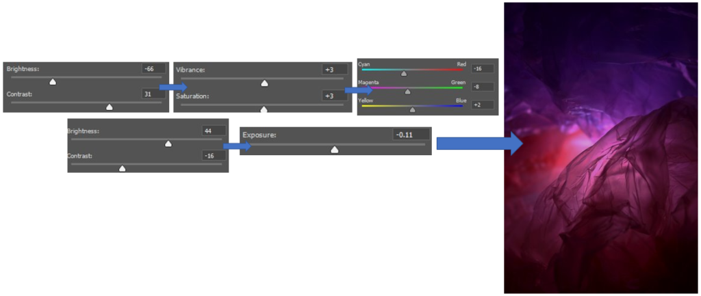
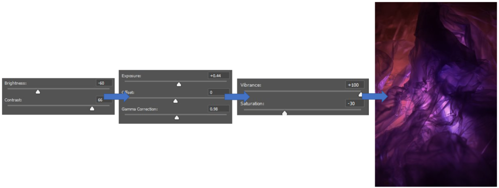
For this edit, I wanted to keep it quite simple to begin with as previously because I think that the base was a good starting point which I really liked and wanted to experiment further with in different ways. I began by bringing the brightness down to try and neutralise the glow of the flashlight a little bit as I thought that it was quite overpowering, but this also made the photos colours become a bit dim so to keep them vibrant I brought up the contrast. Then I used the exposure and gamma correction, a small bit, to help bring out the darker colours but to an extent. I wanted to also extenuate these colours further as I felt that they had gotten a little bit lost while editing, so I brought up the Vibrancy and to keep it stable/equal I brought the saturation down.

Experiment 2)

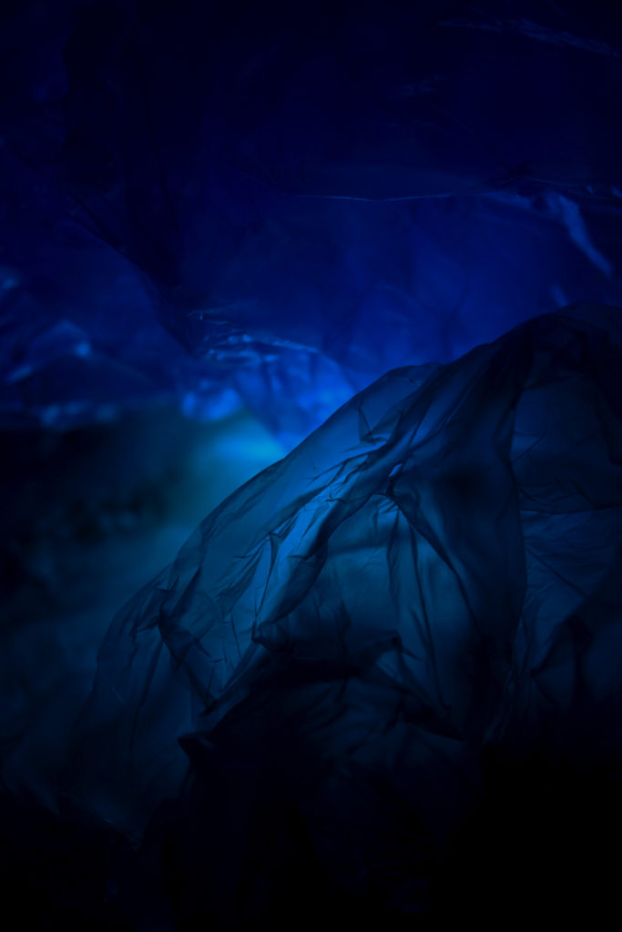
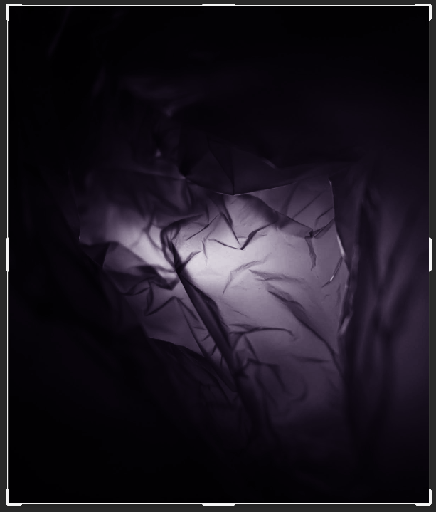
For this, I brought the photo into black and white as I wanted to experiment with dragging the colour put of the photo, as it was a really vibrant photo. I liked the effect that the flashlight brought to the middle of the photo as it adds a gradual change throughout the photo from light to dark which makes the photo appear to be quite sinister in the effect as it creates a tunnelled illusion which makes you wonder what could be down the small gateway which is leading downwards throughout the photo, also adding a 3D element.

Experiment 3)

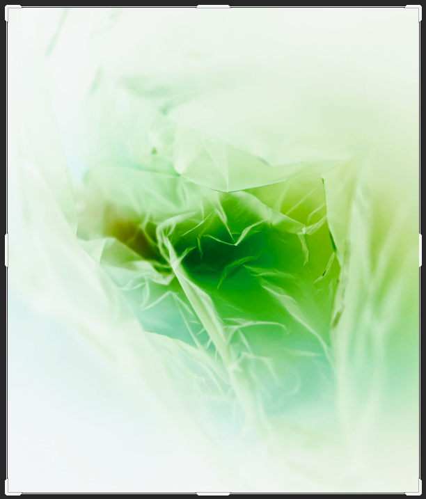
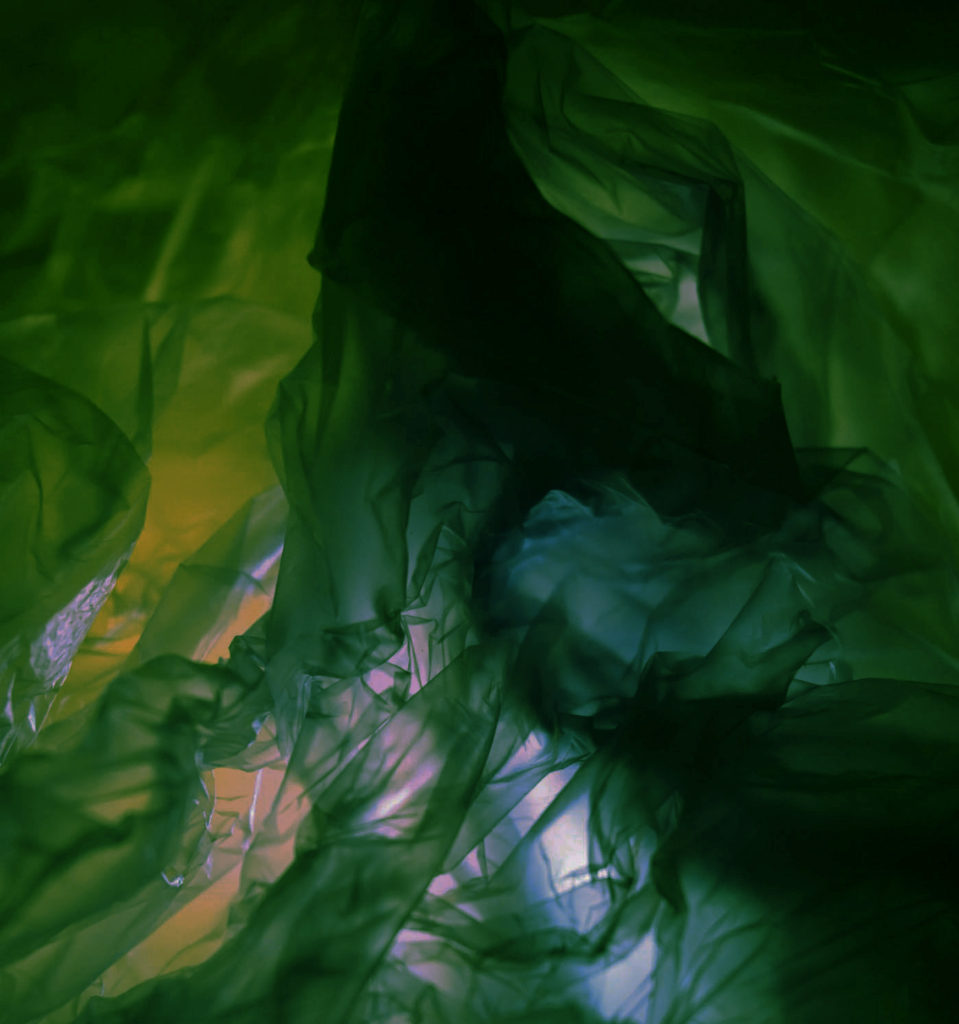
For these edits, I wanted to experiment with changing the colour of the photos completely through the use of the channel mixer in photoshop. I really liked how the blue one came out as it shows a similarity to Rolfsen’s work of a blue plastic bag which I really liked, the blue effect is able to add a sufficient amount of contrast throughout the piece because it is able to level out the light and dark points so that they don’t become too overpowering and bright. If I were to do the photo again, I would crop the photo to get the focus to the middle of the photo where the most creases of the plastic bag are, which I really like, I tried this in the green edit which I think worked quite effectively as it got rid of the excess plastic similar to the first edit of this photo which I did.

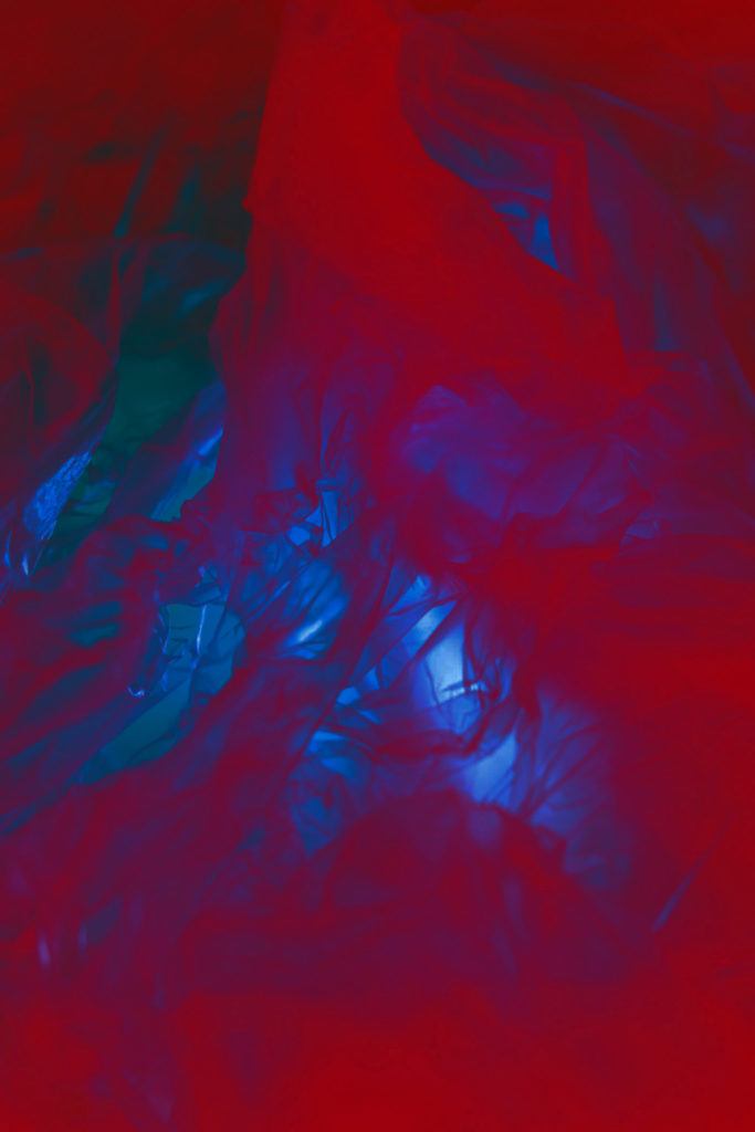
I’m really happy with how these 2 turned out because I liked experimenting with transforming the photo into different colours but the third edit where the photo shares elements of red and blue fading into each other, I wasn’t happy with the way that this had turned out because I think that the red has become too overpowering and doesn’t show the details of the creases which I wanted to have fluid throughout these edits. If I were to do this edit again I would make sure that I change the contrast and saturation to control these levels to make sure that they don’t merge into one.

P2 Anthropocene best shots and why

4 best shots I will use and why –

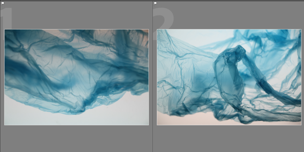
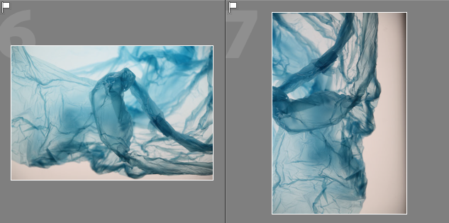
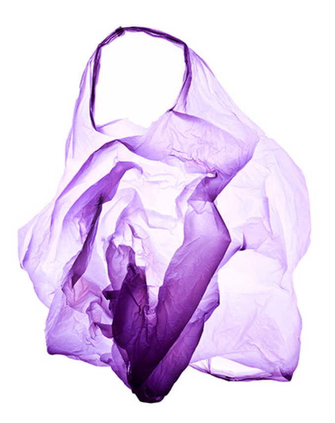
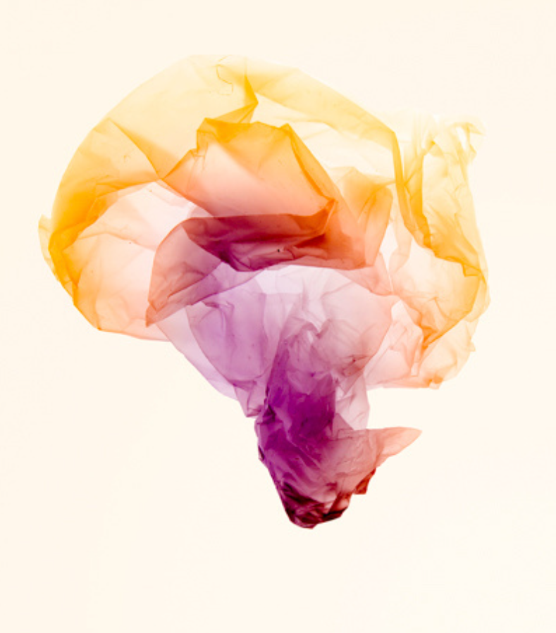
1 – I have chosen this photo to edit further in Adobe Lightroom because I think that it is a similar representation to an iceberg/glacier, which is similar to Naomi Whites work where she makes objects/places out of plastic bags in her work and then I will manipulate this further in photoshop through experimentation with other photographs and how it may work in different tones/filters.

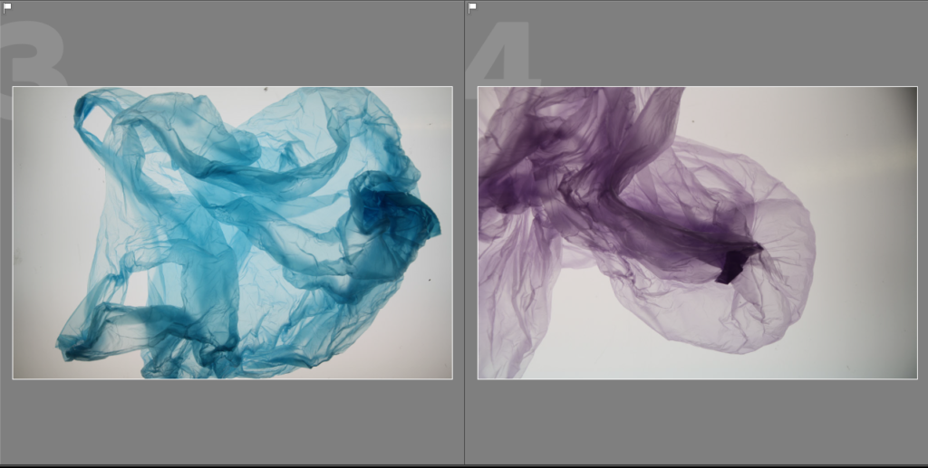
2 – I chose this one because I like how the plastic bag looks as if it is floating underwater and the creases and folds gives it a texture of it being in the sea, which I really like as it can be seen as if it is a piece of debris floating around and I will experiment with this further through editing the tones, contrasts, lighting, etc and getting rid of any blemishes it might have from the lightbox.

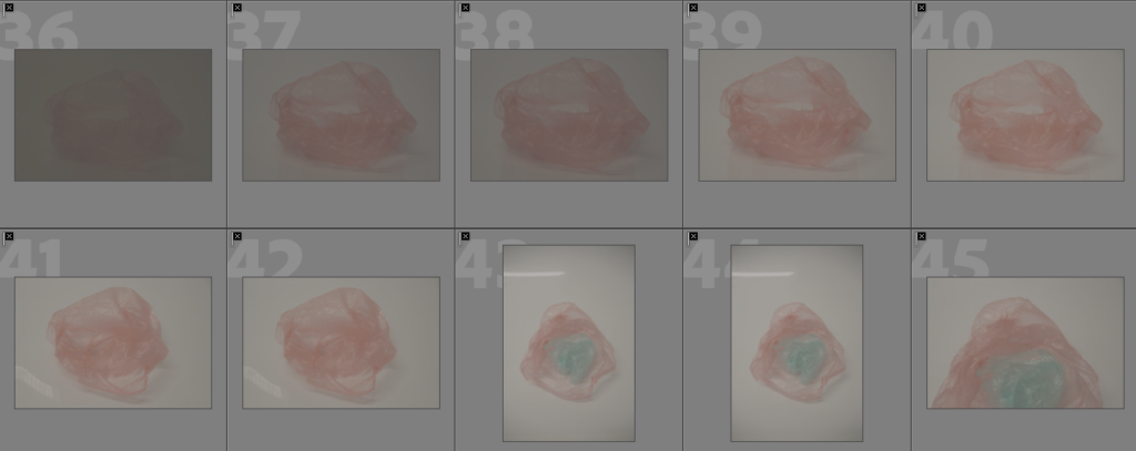
3 – For this photo, I chose it because I think that it looks as if it is a jellyfish which is moving freely in the ocean due to the way the plastic bag has been positioned and I think that this is a good way to manipulate it with photos, from this photoshoot and the one before to show the harmful effects plastic debris has caused to the oceans. On photoshop I will also fine tune the smaller details from the lightbox where there may be marks on it or darker corners which I want to brighten up.

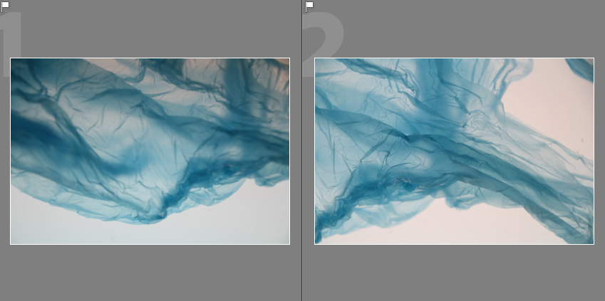
4 – For this photo, I think that it shares a similarity to number 3 with looking as if it is a jellyfish in the sea because of the way the plastic bag has formed around itself, in photoshop I want to experiment with layering these 2 images or more in various ways because I think that the 2 different colours could look effective together which I really like. I will also crop and brighten the photo to get rid of the darker edge which has happened due to the small surface area of the Lightbox which I was using.

2nd Antropocene photoshoot evaluation

I imported these photos of my 2st photoshoot on to Adobe Lightroom where I was able to view them and decide whether they were successful photos or not, I am glad with how a few of these photos have turned out while working in the style of Naomi White taking inspiration from her ‘Plastic Currents’ photoshoot.

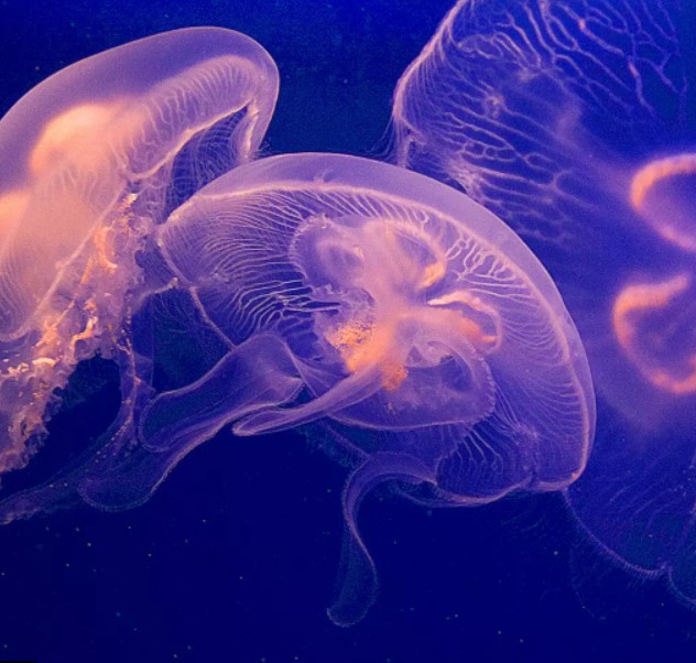
During this photoshoot, I used an infinity curve and lightbox to create a bright, plain white background in my photos similar to Naomi Whites work and this has allowed me to be able to experiment with f-stop and ISO while in brighter lighting to capture the colour of the plastic bags. These photos also turned out to look similar to Jellyfish, this is very effective and in style with the theme of ‘Anthropocene’ as plastic pollution is a heavy part of contribution towards it so this raises the issue of how plastic is dangerous towards sea life.

How does plastic pollution affect marine life? - Fauna & Flora International

More information on dangers of plastic pollution to sea life.

Least successful photos –

These are the photos which I have picked in Adobe Lightroom to be the least successful from my 2nd photoshoot, this is because the lighting would sometimes cast a yellow tone over and the picture would also be out of frame and focus. This happened due to the lightbox which I was using being quite small so the black/darker marks on the sides of the photos are created because of this which can be seen in photos 7-12 and 19-24 and this can contrast against the white heavily and make the photo/colour of the plastic bags appear to be quite dim in colour.

From photos 36 onwards, I experimented with using the infinity curve in class, but because this wasn’t as bright due to the lighting the photos and colours weren’t as bright as I had liked them to be and faded into one another which made them get lost in each other along with the finer details such as the creases on the plastic bags, I also didn’t like the angles which I had taken the photos from.

If I were to do this photoshoot again, I would make sure that I have a bigger lightbox so that there is more surface area which would make the pictures easier to frame and take and when using the infinity curve to have a source of light such as a lamp which would make the photos brighter to make the colours of the plastic bags more effective and vibrant.

Most successful photos –

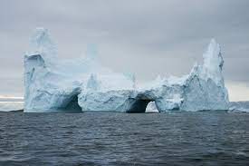
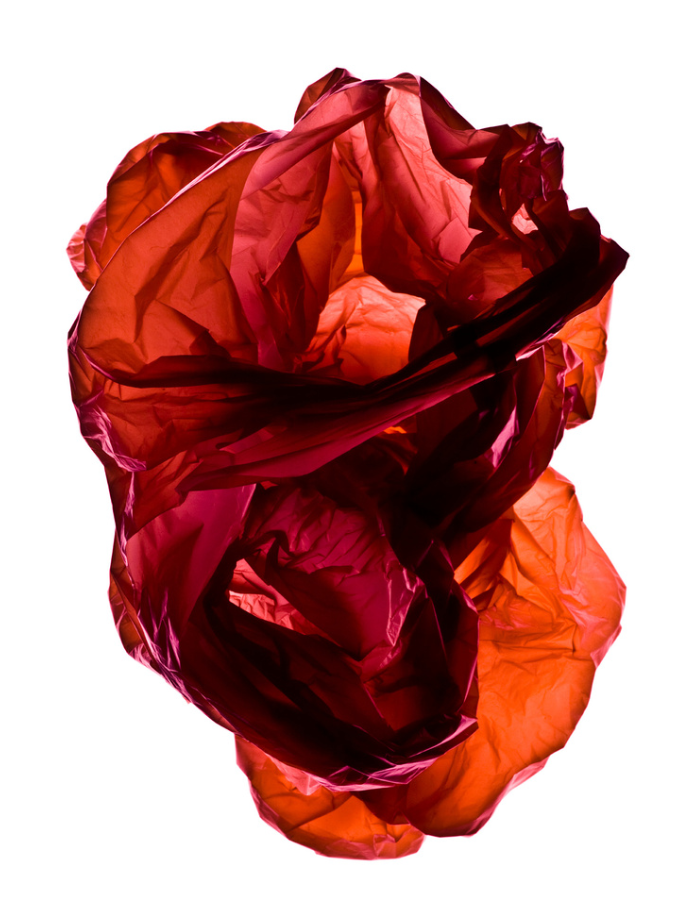
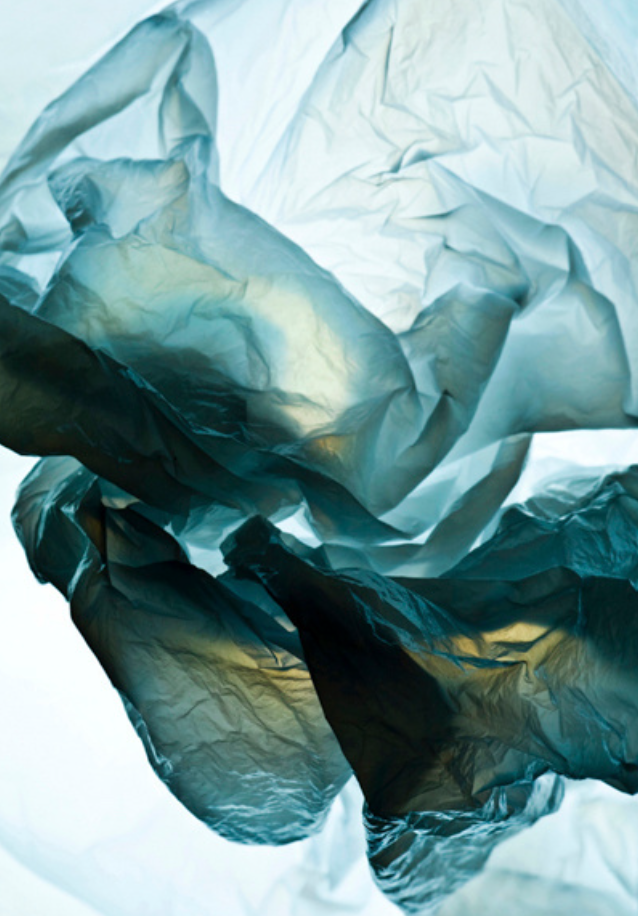
These are the photos which I have selected in Adobe Lightroom to be my most successful from my 2nd photoshoot because I think that they are able to represent the effect of Glaciers/Icebergs well with the shapes that I have created and photographed. This is because of the way the plastic bag can fold on itself which can make it look like the top of an iceberg, like in number 7 or 1, or the underneath of a glacier such as 2 and 6. I am really happy with how these have turned out and will only edit them slightly with cropping, light and exposure then experiment in Adobe Photoshop with layering them on top of each other to make them look even more abstract and similar to glaciers/icebergs.

I think that these photos also came out quite well because they are able to share similarities to jellyfishes, which can fit quite well within the theme of ‘Anthropocene’ because they are an animal which will suffer due to plastic pollution because of it. This means that I have the beauty in these photos while also showing the dangers that they have to the wild life. I really like number 9 and 12, which shares a really close resemblance towards a jellyfish who may be moving around in the sea whereas photos 10 and 11 may look like ones who have been washed up on the beach from the sea and have died. I will edit these slightly in Lightroom but will also experiment with various ways of manipulating them through layering with the other photos above.

Here are some facts about Jellyfish and Glaciers/Icebergs.

P1 Anthropocene Best shots and why

4 best shots I will use and why –

This image has an empty alt attribute; its file name is image-262-1024x509.png

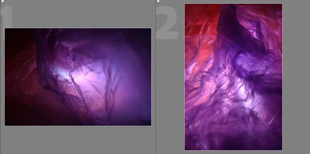
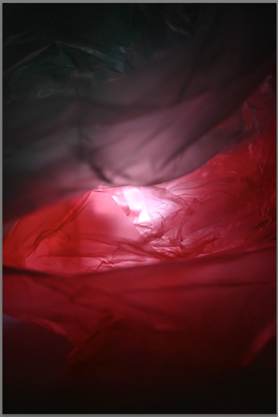
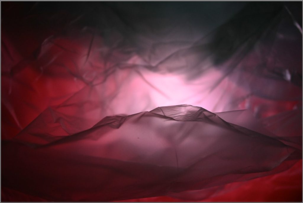
Photo 1 – I have chosen this photo because I think that it only needs a little bit of editing with the lighting and some slight cropping so that it can be experimented with through manipulation in photoshop. I also like how the red and the purple work well together through creating a subtle glow which highlights the creases around the flashlight.

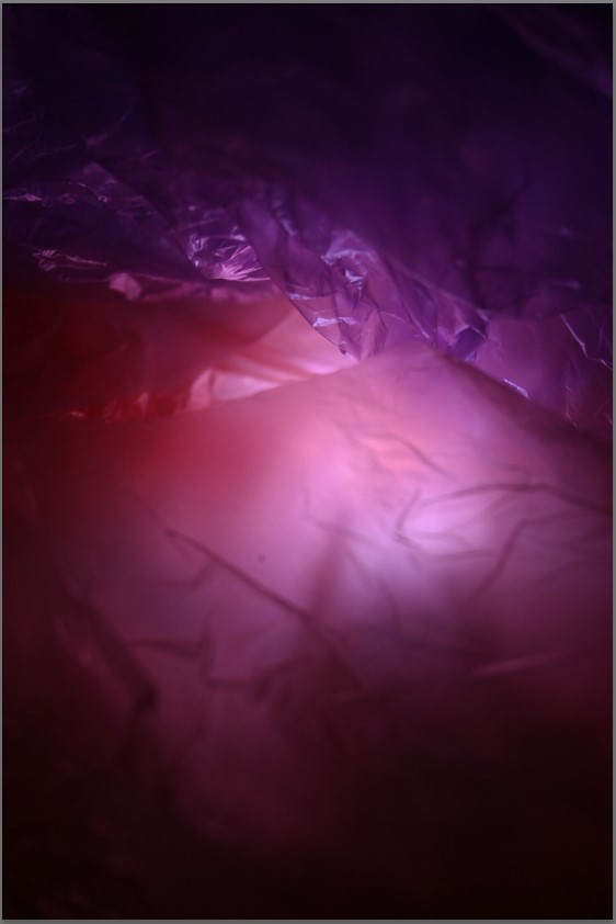
Photo 2 – I have chosen this photo because I think that the amount of creases which have been created can create a beautiful ‘crystal’ effect with a few adjustments to the lighting and contrasts in editing.


This image has an empty alt attribute; its file name is image-263-1024x510.png

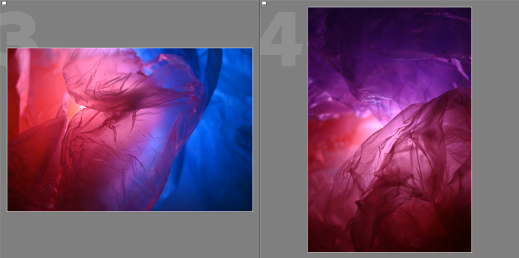
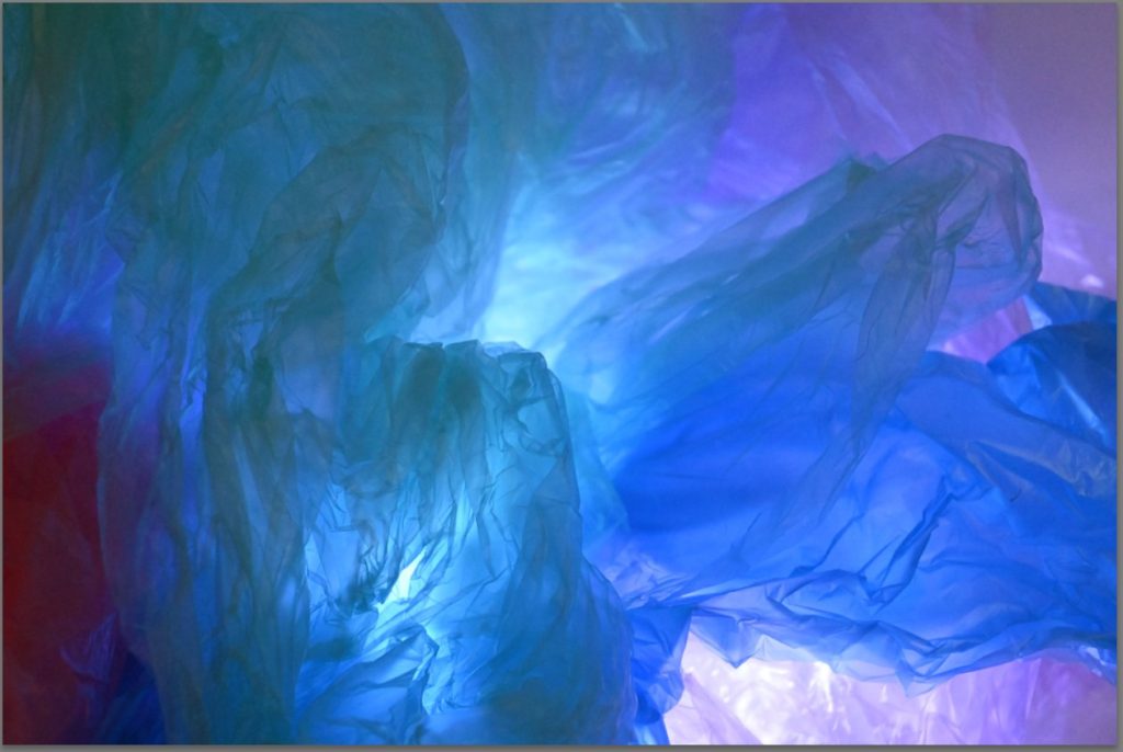
Photo 3 – I have chosen this photograph to move further with in editing on Adobe Lightroom/Photoshop because I really like how the two plastics bags have merged together to create a fade to purple in the middle, creating a branched effect in between which I think can resemble a crystal or marble through the folding and creases of the bag.

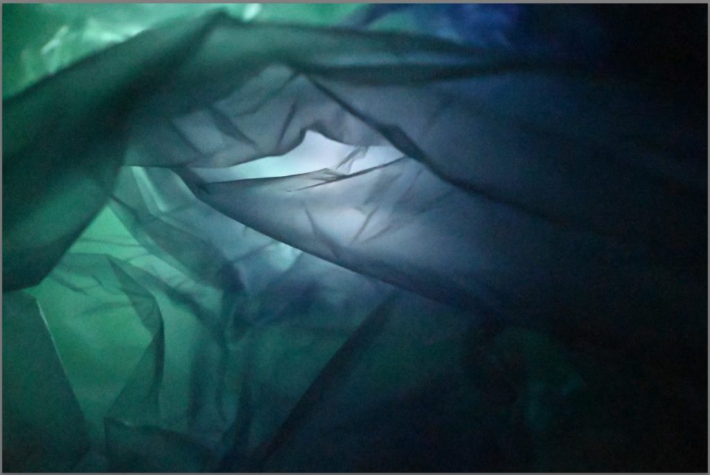
Photo 4 – I have chosen this photo to bring into Adobe Lightroom/Photoshop for further editing because I like the tunnel effect which has been created due to the light and I think that with slight adjustments to the lighting, to make it a little less overexposed it can make the effect of the tunnel really distinct as if you are following a path in a cave, which I really like.

1st Anthropocene Photoshoot evaluation

I imported these photos of my 1st photoshoot on to Adobe Lightroom where I was able to view them and decide whether they were successful photos or not. I used ‘Z’ to reject the photos which I didn’t think were good and ‘P’ to pick the ones which I think were good and what I could go further with in editing, I am glad with how most of these photos have turned out while working in the style of Vilde Rolfsen.

During this photoshoot, I created a plain white ‘infinity curve‘ background with some card which I had and this allowed me to be able to experiment with f-stop and ISO while in darker lighting as it provided a clean and plain background. In my work, I also used a flashlight underneath the layered coloured plastic bags to create a main point of the photo, which creates a tunnel effect and I think that it has worked well in most of my photos.

Least successful photos –

These photos are the ones which I think are my least successful, this is because of the camera settings not being right for the lighting settings, which can make the photos appear grainy due to the dark lightning which can be seen in the first 10-15 photos as I was experimenting with the different camera settings on my camera to see what worked well with the lighting,

I used forced, harsh lighting in my photos which can be seen through pictures 148-168 but I didn’t like how it made the colours seem dim and created a yellow tone throughout them.

A few of the photos also came out blurry or too overexposed due to the use of the flashlight which I didn’t like as it washed out the photo and the creases of the plastic bags, which was a small detail I really liked due to the effect which it adds to the photo, wasn’t defined enough as I was too close and the camera lens wasn’t able to focus effectively due to this.

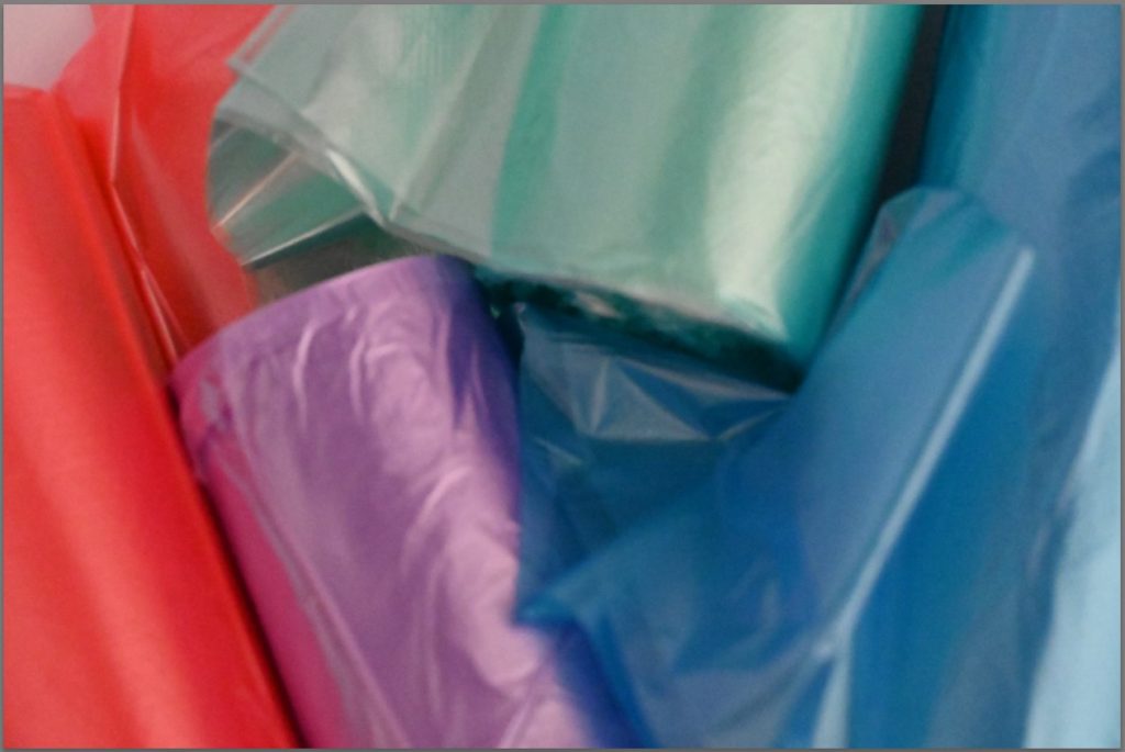
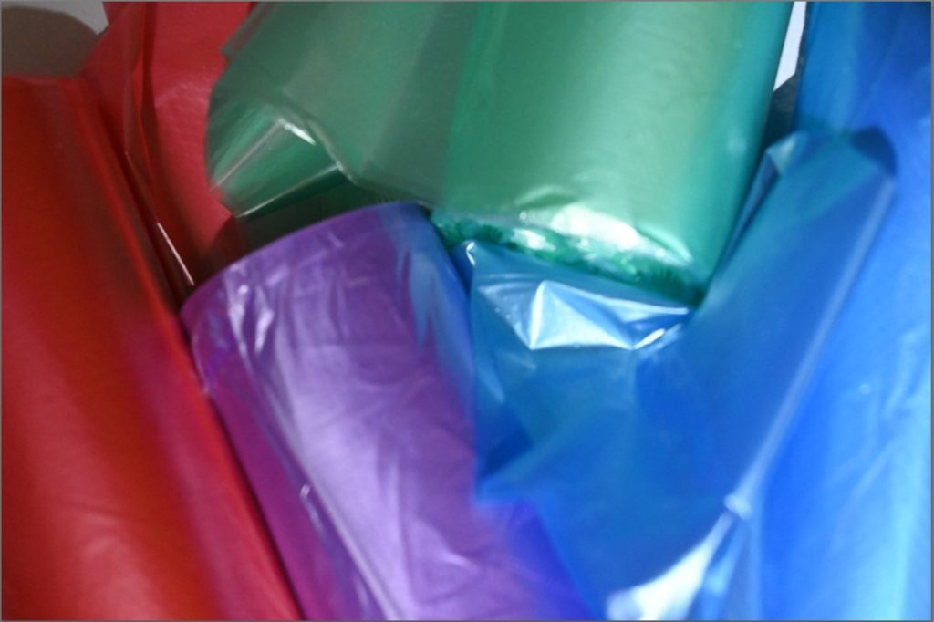
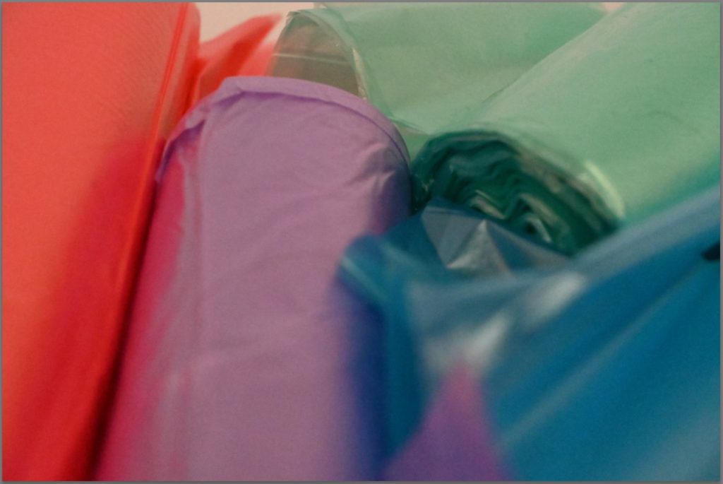
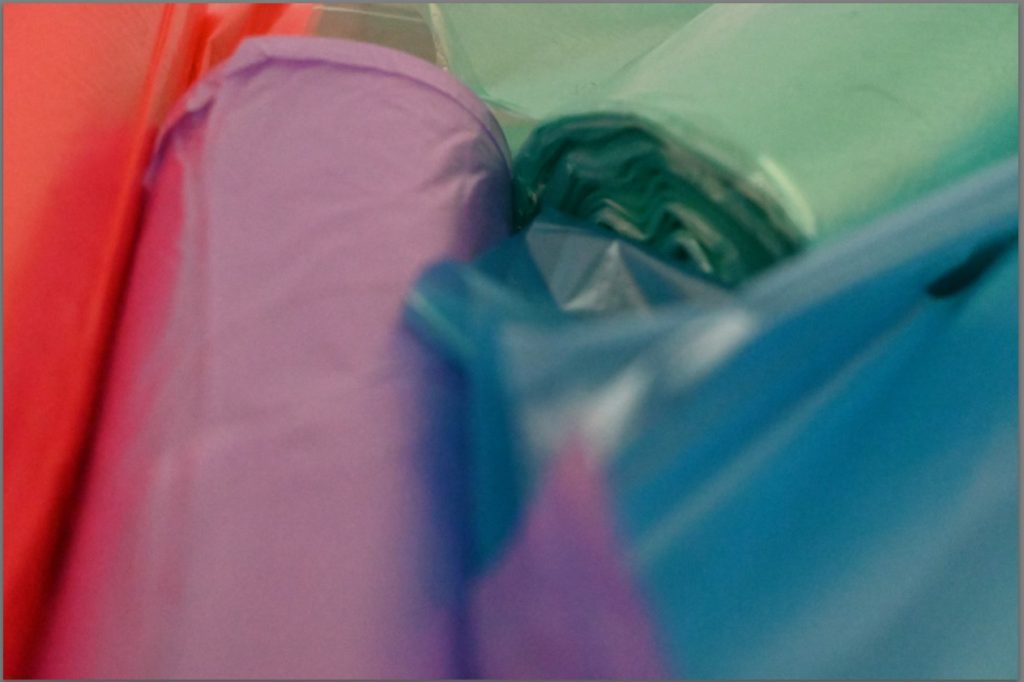
At the end from photos 157-181, I also experimented with taking photos of the rolls of plastic bags which I had but I didn’t like the way any of these photos had turned out because of the lighting which I was using which made it appear grainy and created a yellow tone, which I explained beforehand. If I were to do this photoshoot again I would make sure that the lighting is either dark with minimal light or bright, natural light as I think that it would create a lighter, less forced effect on the photos which still makes the colours vibrant and pop out, which I really liked.

Most successful photos –

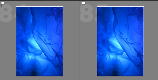
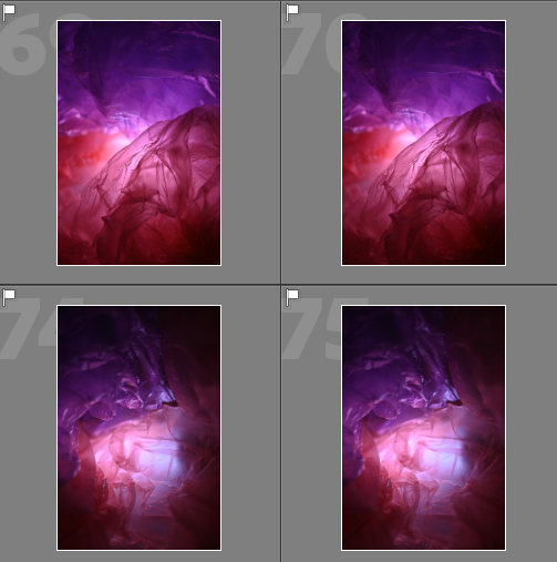
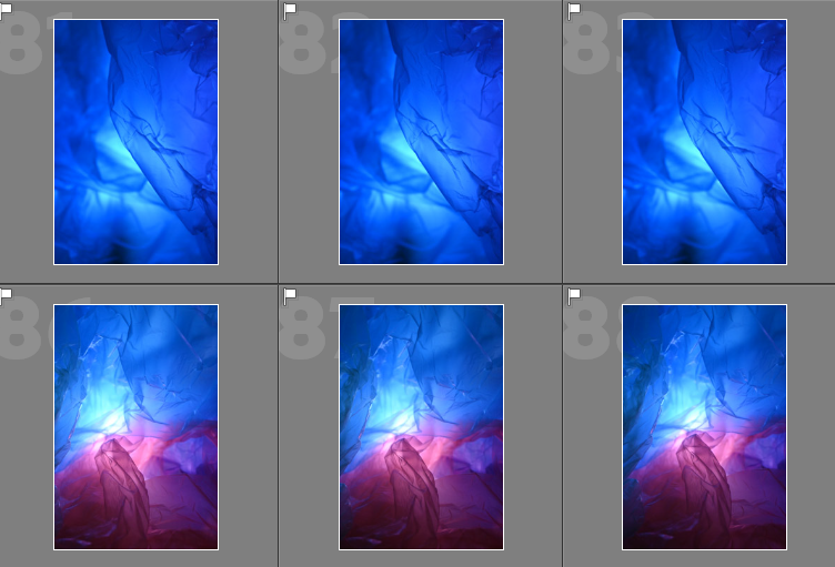
These photos are what I have chosen to be my most successful towards the theme of ‘Anthropocene’ in the style of Vilde Rolfsen on to edit on Adobe Lightroom because of how they have focussed while I was taking them, creating the effect of a tunnel which is what I wanted to do, which can be seen in photos 72-75 and 86-85.

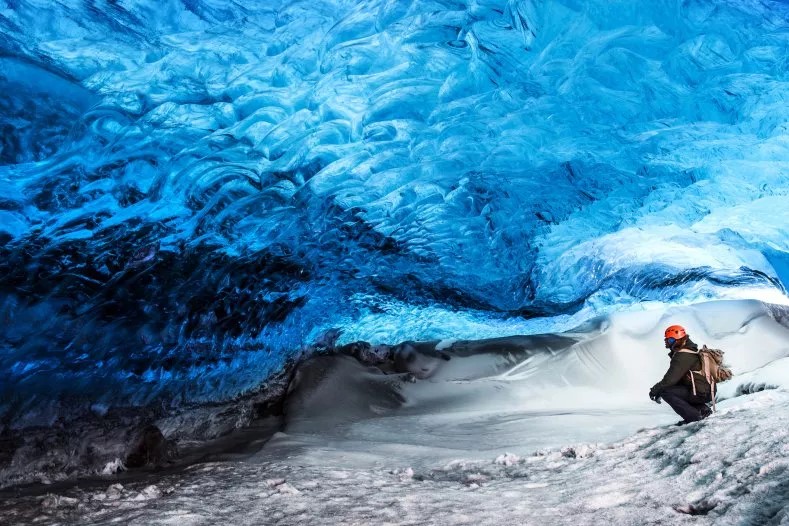
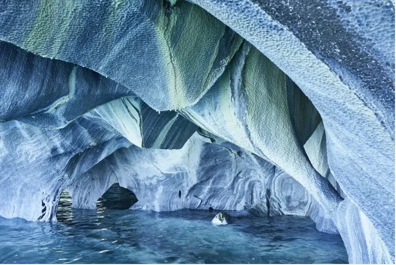
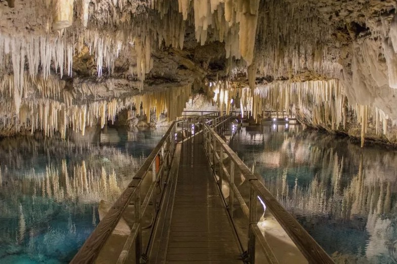
I also like the way the crinkles in the photos have created the effect of a crystal/marble/ice tunnel or caves which you can find in certain places of the world due to the use of the colours which I chose to put together and layer with the coloured plastic bags as I thought that they would work well in creating this effect, this can be seen in the photos above.

I think that I also successfully created a whirlpool effect, which is also another idea which I wanted to experiment with while carrying out this photoshoot and I think that can effectively be seen through photos 1, 2, 3, and 57-60 as the creases and positioning of the plastic bags which I have done creates a swirling motion which I really like that can link back to the Anthropocene and how the rubbish is effecting the ocean yet we are just letting it stir and stir, creating this whirlpool motion.

Here is some more information on different caves which I have discussed.

To edit these photos further in Adobe Lightroom, I will choose 4 which I think are the most successful and experiment with the lighting and making them darker/lighter which will control the lighting in some places and make the finer details, such as creases, more defined and able to be seen clearer so that they don’t get lost as I think that they add an extra level of effect to the photo as they help in creating all of the different shapes, and then I will also bring them into Photoshop where I will layer them on top of each other through changing the opacity of the photos.


Naomi White

  • An artist, and educator, working on creating ideas of political ecology and photography.
  • Addresses complex issues within her work from history, questioning ethics and capitalistic models.
  • Won an award and has held many exhibitions/had her work published.
Naomi White | Saatchi Art

Her work –

Analysis –

This image has an empty alt attribute; its file name is image-72.png

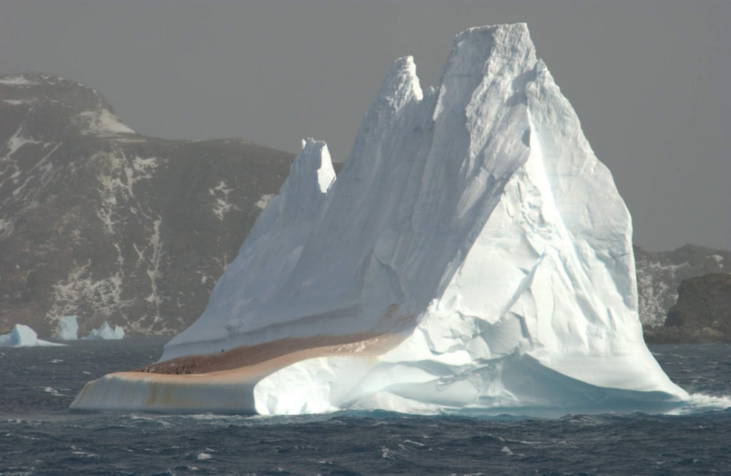
I think that this picture taken by Naomi White as part of her ‘Plastic Currents’ is a successful photo showing a theme of Anthropocene, which is what we are studying, because the photo could represent a glacier/iceberg due to the colour of it. This has been created, and this could have been created through the use of the plastic bag on top of a lightbox for a bright background which would amplify the effect where she has positioned it which creates it to be darker on the bottom and lighter on the top, through the use of layering the bag on top of itself in various ways. White has also used a subtle glowing golden/yellow light, layered underneath, which can be used to show how these areas are being effected more and more due to the Anthropocene and how global warming is slowly beginning to impact the earth more and more in places. I also like how Naomi White can make these plastic bags, which are becoming more dangerous, look beautiful as it would grab your attention and once you realise that it is a plastic bag and what she is symbolising, it would make you think twice when you go shopping to bring a reusable bag instead as you would have this reminder in your mind and how you’re contributing towards the Anthropocene.

In my own work, I’m going to use Naomi Whites style for inspiration when taking photos and I think that this will get me to consider the shapes that I am creating when using the plastic bags and how effectively I can use them. Similar to Whites work, I will experiment with using a lightbox and an infinity screen to create the bright, white background which she also has as I think that it is able to make the coloured plastic bags stand out well and catch your attention as well as highlighting all of the different creases which have been created by the bag.

Vilde Rolfsen

  • Norwegian fine art photographer from Oslo, Norway.
  • One of her biggest and well known photoshoots is “Plastic bag landscapes” where she raises awareness of the throw-away culture while also extracting its beauty.
  • She hopes that her work inspires viewers to think twice about their consumption of plastics.
  • The inspiration grew from living in London and the vast amount of waste.

More info on Rolfsen here.

Her work – ‘Plastic bag landscapes 2014’

Plastic bag hell #3 WEB.jpg
PBL_1-1-5.jpg
PBL_15.jpg
PBL_2.jpg

Analysis –

Plastic bag hell #3 WEB.jpg

I think that this photo taken by Vilde Rolfsen as part of her 2014 project called ‘Plastic bag Landscapes’ is quite successful in conveying the message which she is creating of raising awareness of plastic bags through their beauty. She is able to make this effect efficiently through her photography by using the effect of layering two different coloured plastic bags on top of each other which have various crinkles in them to create a messy and ruffled effect to the photo. The blue plastic bag in this photo can be used to symbolise the ocean or other areas of water such as lakes, ponds, etc and how the dangers are hidden underneath as the creases due to the positioning of the bag create a whirlpool effect which can show how everything always falls into each other and links together which have bigger consequences in the long run to humans who will live on in the future. The use of the red/orange plastic bag layered underneath and how many people tend to ignore the dangers of pollution which humans are creating as we don’t want to admit to our mistakes and how we have this hidden guilt underneath as we have all contributed towards this problem in some way. I also like how the bag can be seen to be slightly illuminated in the background which can emphasize the red plastic bag and what it symbolises as it creates a sense of urgency as it is highlighted to be in your face.

In my own work, I will consider how Rolfsen uses plastics bags through layering and how she uses the crinkles which have been created through the coloured plastic bags that she manipulates using the lighting in her photos as I really like the effect which that is created from this as it adds a layer of emotion and sensitivity to the photos as it will create a thought process for the viewers. I also want to experiment with the plastic bags being taken individually, similar to Naomi Whites work because I think that it would be a good way to expand on the beauty of plastic bags theme as well as creating mountains or glaciers which are being affected by global warming.

Moodboard and mindmap of Anthropocene

Mind map –

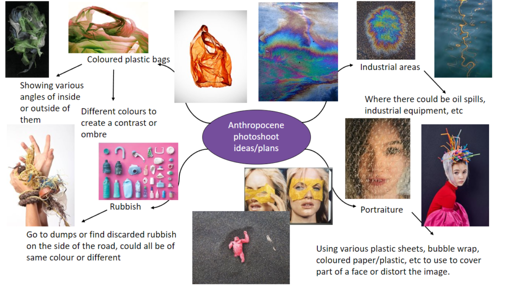
This is my mind map of ideas to carry out for my photoshoot for the theme of Anthropocene. I think that this is a really broad theme which I will enjoy because it allows a lot of creativity, I have decided to focus on coloured plastic bag photography as I think that it can create beautiful patterns and illusions while also using something that damages the environment and is a huge problem towards the Anthropocene. It can be used as a way to highlight the importance through difference colours such as red, for danger, or blue, for the sadness which it creates.

Mood board –

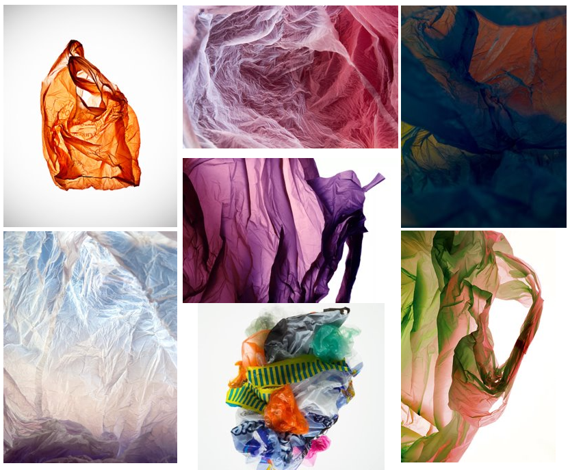
Further more on focussing on plastic bag photography, I have created this mood board to better explain the inspiration which I will be using in my photoshoots and how I will expand on this in my own way. These photos mainly come from exploring the work from the photographer, Vilde Rolfsen and Naomi White.

Photoshoot ideas –

For my photoshoot, I will create a mini studio out of plain white card to have a crisp background for the photos and I will be using coloured plastic bags that I’ll experiment layering with by placing them on top of each other to create a mix or illusion of an Ombre of colours to highlight certain problems with the dangers of plastic bags, I then will use a flashlight underneath the plastic bags to create a main point to focus on in the photo as it can create the illusion of a tunnel or centre. I will experiment with the f-stop while taking photos which will help darken/lighten the pictures and highlight the creases well in the plastic bags, making them more defined.

My second photoshoot, I will focus on taking pictures in the style of Naomi White of plastic bags. I will create this by using a lightbox to create a bright white background which will contrast well against the coloured plastic bags and experiment with different angles and changing the colours of the bags used as well. I will also use a infinity curve as another way to experiment with having a plain white background, I think that this way will make it look nice and smooth whereas the lightbox won’t have as big of a surface area.