For this comparison I chose a photo, from one Photoshoot which I though was the most successful and edited it in Adobe Lightroom in a similar way to Oliver Dorans work.
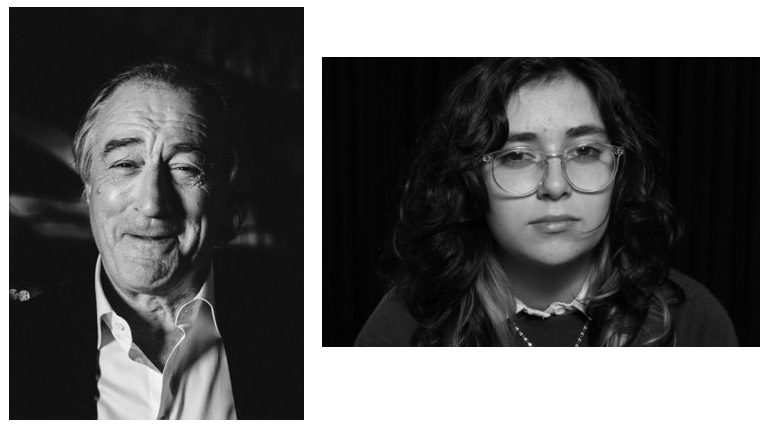
For this comparison I chose a photo, from one Photoshoot which I though was the most successful and edited it in Adobe Lightroom in a similar way to Oliver Dorans work.

Throughout this Photoshoot, which we also did with Oliver Doran in the second week, this is where we focussed on producing photos using the 2 point lighting technique and flash which I have explained in a previous blog post.
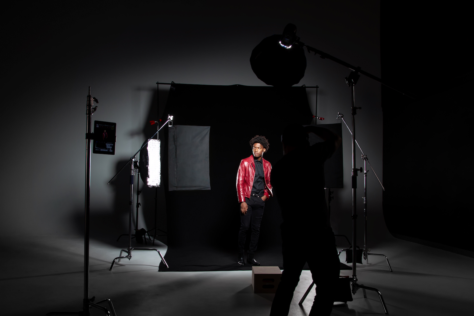
Images which have used 2 point lighting and flash –
Photos –
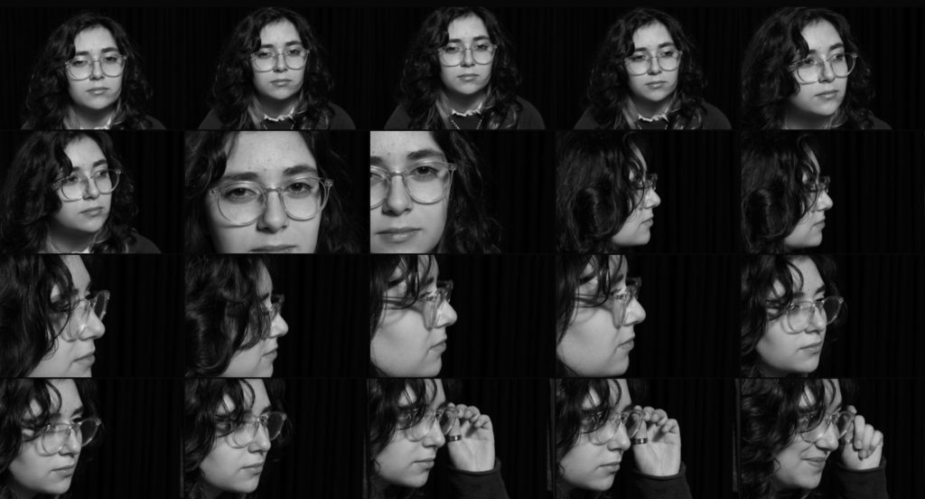
I really enjoyed this photoshoot as I was able to experiment a lot of different angles with my model, which range from; the side, front on and zoomed in. This photoshoot also helped to show different shadowed lighting techniques which were used when creating these pictures which can influence the mood/atmosphere which is created along with the variety of facial expressions which the model uses. I will choose one of these photos to edit within Adobe Lightroom, so that I can fine tune the smaller details and lighting.
Best shots –
On Adobe Lightroom I selected the images which I think are the most successful when using the 2 point lighting technique with Oliver Doran.
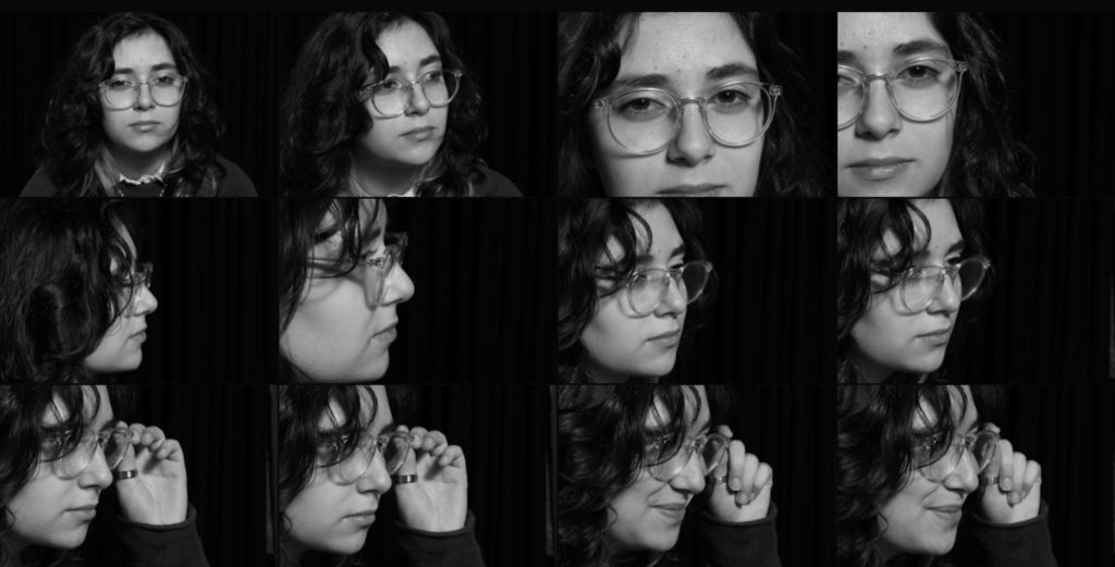
I really like these pictures because the background is really dark yet has texture from the curtain, like a night sky, which creates the illusion that the model is out during the night and a large contrast has been made with the tones due to the 2 point lighting which I used as well as the butterfly technique. I also like how some of these experiment with different angels such as up close, from the front or too the side as we get to see different features which are highlighted through lighting of the model.
Editing –
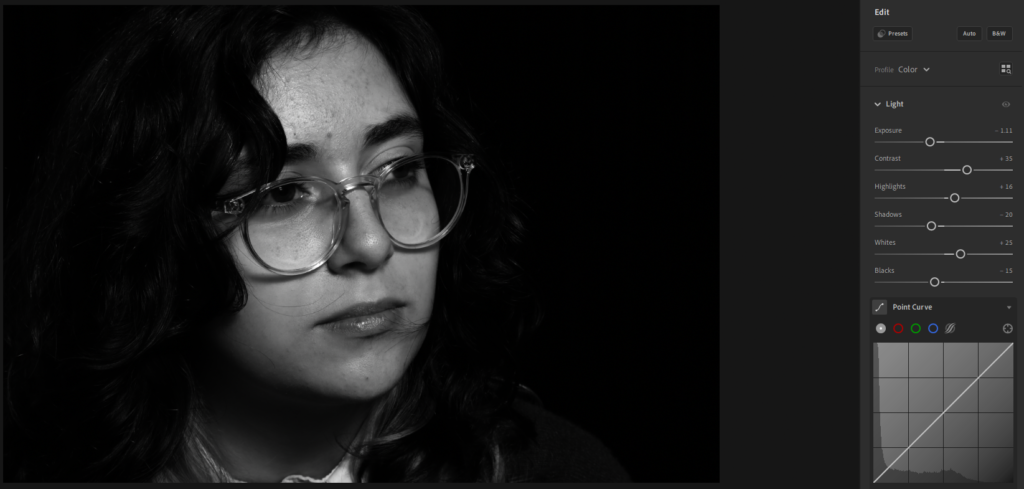
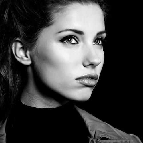
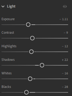
For this edit, which I started in Lightroom, I adjusted the lighting slightly so that it appeared darker. I did this by starting off by bringing down the exposure a small bit, to cast a darker tone of grey over the image. Then I used contrast to bring the light tones on the models face up, so that it would make the details on her face stand out more. This was accentuated through using the whites and highlights which made them stand out well on her face.
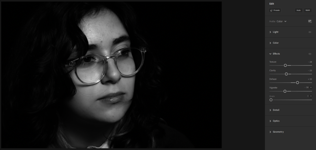
Then I went to the “Effects” section where I used the “Texture” this helped to soften the parts of the models face then looked quite dark and rough through the lighting, using the opacity I controlled this more to make it a subtle effect. Then I brought up so that the glare from the lights, I did this because it drained the black and white tones from the image, which I didn’t like, so it made them stand out well. Finally, on Lightroom I used “Vignette”, this effect casts a darker shadow around the models face, which helps to draw your attention to it well as it makes it look centred even if you have taken the picture from an angle, I really like the darker, subtle effect which this adds as it makes the background darker which contrasts highly against her face.
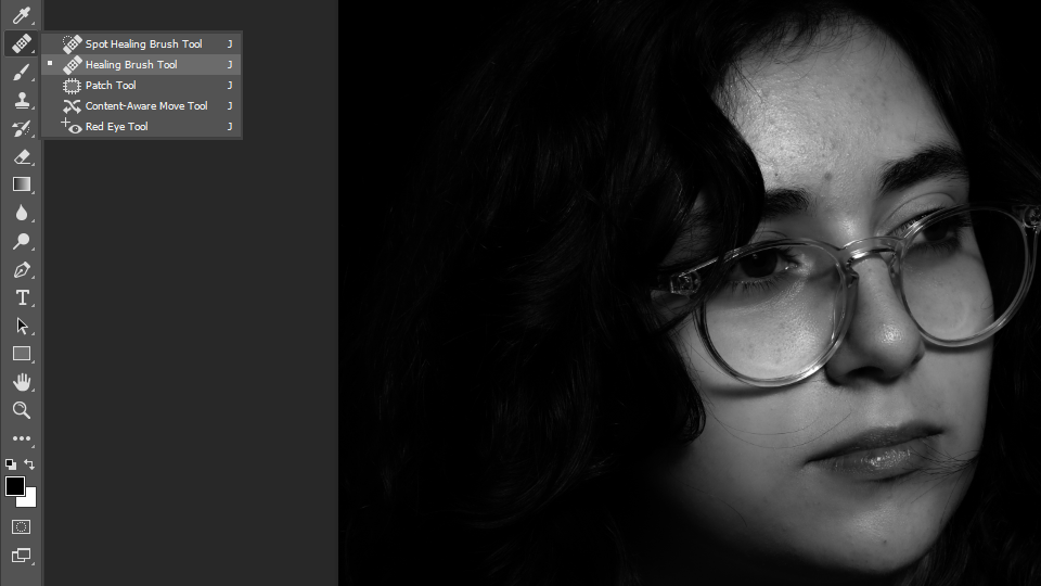
Then I brought the picture into Photoshop, this was because I wanted to fix the smaller details such as the hair which was on her face which I didn’t like because I wanted her face to appear clean and soft. I used the healing brush tool and spot healing brush tool which helped to remove the hair which was on the parts of her face as it replaced it with what could be there instead, which was her skin underneath. I really liked how well this worked as I was able to remove most of it without any difficulty and it made the picture look less messy.
Final Evaluation –
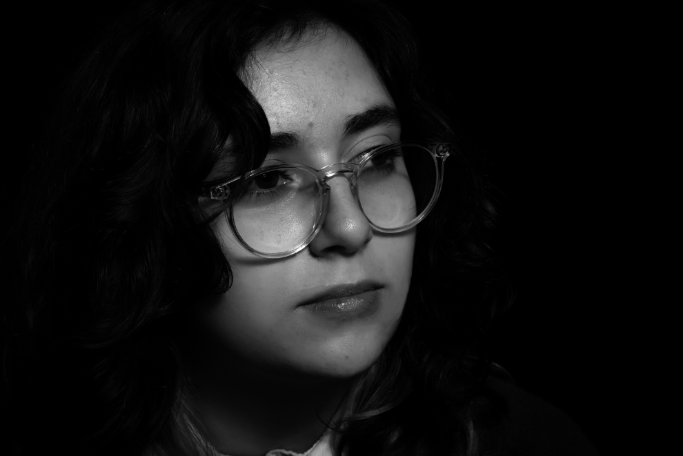
I really liked how this turned out because I think that it creates the effect of a painting which has been made by an artist, which makes it look detailed and professional. This is due to how I edited it on Lightroom which created this softer, yet contrasted tones of black, white and grey which work well with the models face. This is because the lighting which I used was 2-point with a butterfly effect to cast that darker shadow underneath and around her nose. This was my favourite lighting technique to use, which we were taught by Oliver Doran because it highlights the whole face well and makes certain parts highlighted brightly against the darker tones, in the future I think that I will use this technique again because I like how it creates a subtle yet toned effect on the face.
Therefore when I moved I moved in to Photoshop, I saved the picture as a JPEG and then opened it, I only used photoshop to help me tidy up and refine the smaller details of the hair which I wanted to remove because of how it was making the photo look quite messy which I didn’t like.
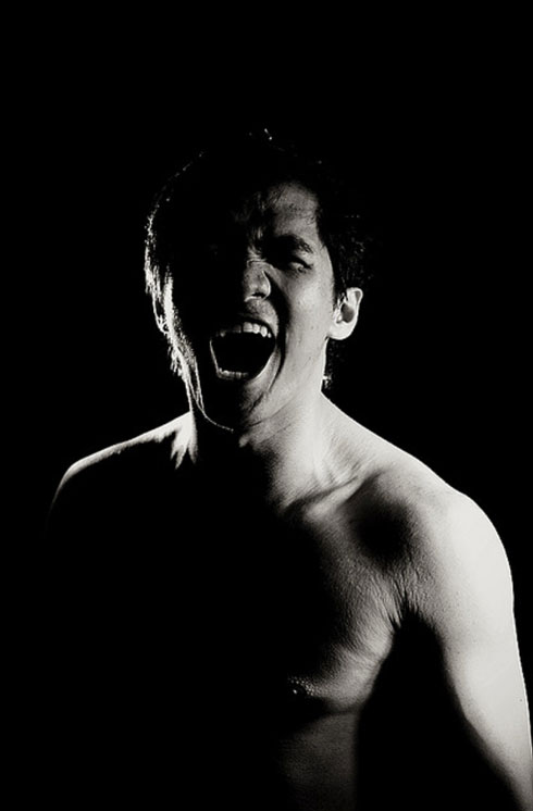
In these photoshoots, I focussed on developing my technique of using 1 point lighting which I’d known as the “Chiaroscuro” technique in photography.
The Chiaroscuro technique is often described as using high contrast lighting to create an image in black and white photography.
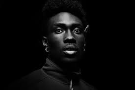
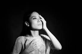
Here are some examples of the Chiaroscuro technique in photography. I think that this technique is unique and edgy because it creates a harsh, yet soft, contrast between the model and the background as they become very defined due to the lighting which highlights them as if they are under a spotlight which is due to the fact of using 1 point lighting which helps to create this effect quite well. I think that this will be a good technique to experiment with because you can use it to create dramatic portraits in black and white, which I haven’t done before, which changes the atmosphere entirely of a photo.
Photoshoot –
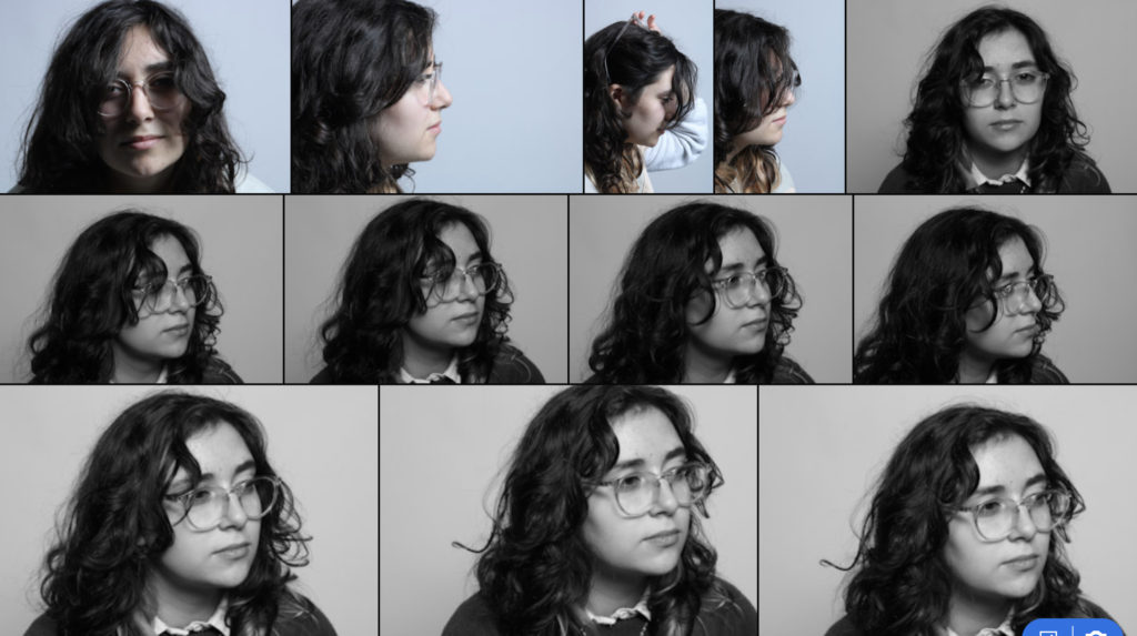
I enjoyed this Photoshoot with Oliver Doran because he showed us how important different angles and positioning of the model and lighting can be when creating a picture in black and white and how well it can help develop a photo well. He valued our opinion and kept asking how we would like to position the lighting and our model, so that we thought about it well so that we could create as good of pictures that we could.
I feel like these have reflected the Chiaroscuro technique well to an extent but when working in Adobe Lightroom I will be able to develop the lighting more to create that “high contrast” effect.
Best shots –
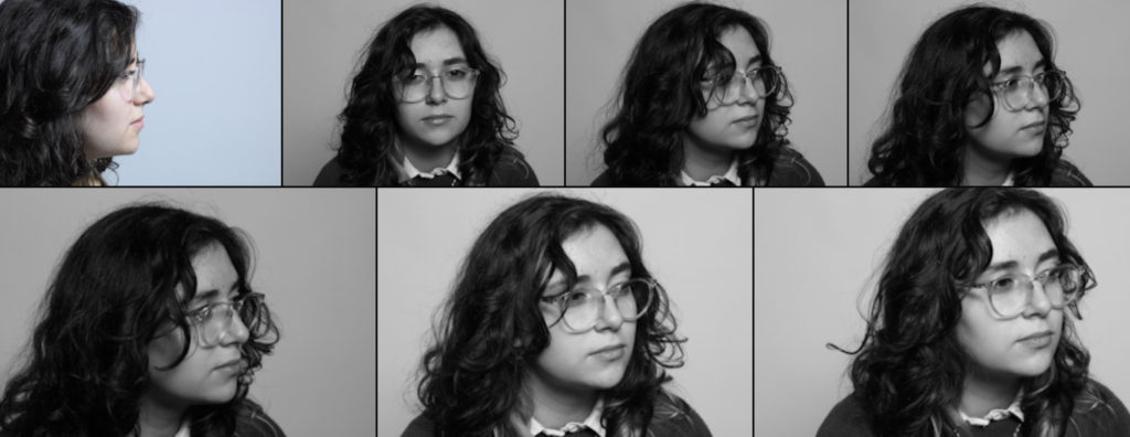
Using sub-selection on Adobe Lightroom with the letter “Z” I went through my photos which I took with Oliver Doran’s help and I chose these photographs as my best shots. This is because I like how they are positioned with the model remaining mostly in the centre of the picture, meaning that you can see them clearly. I will choose 1 of these pictures to focus and edit well on in Adobe Lightroom so that I can develop the Chiaroscuro technique into my work more.
Editing in Adobe Lightroom –
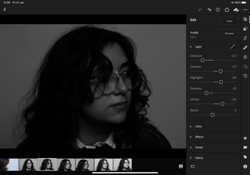
Here is the photo I decided to edit slightly on Adobe Lightroom to bring in more “Chiaroscuro” influence to the picture. I started off by Bringing the exposure down to make the lighting and tones darker even if we photographed in black and white, like Oliver Doran, I wasn’t happy with how light it still was so I wanted to change it.
Then I brought the contrast, so that the darker colours worked well against the lighter tones which I used the highlights and whites filters to make sure that this happened by brining them up. This helped to bring out the details in her face, similar to chiaroscuros, through the lighter tones as well as making them look soft and not too harsh on her face.
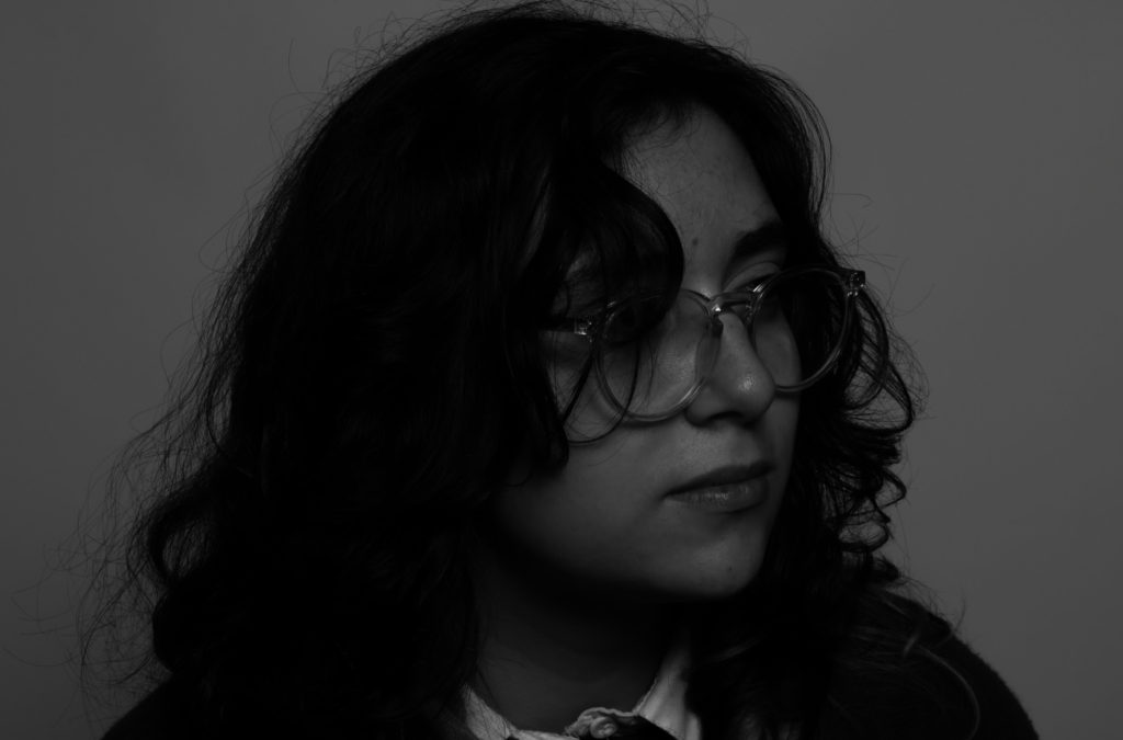
This was my final edit which I really liked how it turned out in the 1 point lighting and Chiaroscuro technique with help from Oliver Doran because, it isn’t so dark that the model isn’t able to be seen which can happen in some Chiaroscuros which creates a nice balance within the highlights and darker tones as they Willkie work well together to make sure that the picture is able to highlight her facial features while also hiding them away through the darker parts of her face such ads her hair or underneath her chin where there is a heavy influence of dark tones.
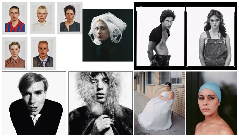
Portrait photography mood board of various photographers work –
These are the camera settings which I will experimented with for the photoshoots:
Camera settings (flash lighting)
Tripod: optional
Use transmitter on hotshoe
White balance: daylight (5000K)
ISO: 100
Exposure: Manual 1/125 shutter-speed > f/16 aperture
– check settings before shooting
Focal lenght: 105mm portrait lens
Camera settings (continuous lighting)
Tripod: recommended to avoid camera shake
Manual exposure mode
White balance: tungsten light (3200K)
ISO: 400-1600 – depending on how many light sources
Exposure: Manual 1/60-1/125 shutter-speed > f/4-f/8 aperture
– check settings before shooting
Focal length: 50mm portrait lens
Early Portrait photographers
Louis Daguerre –

Thomas Sutton –


20/21st Century approaches
Studio Lighting –
Most of the time we try and take advantage of the natural light which is produced through lightbulbs, sunlight, ‘The golden hour’, etc within our photos.
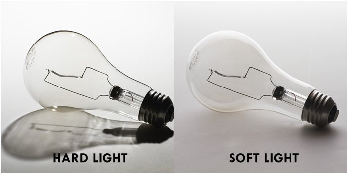
There are other variations such as ‘studio light’ and here are some features of it which we control:

Using Flash effectively –
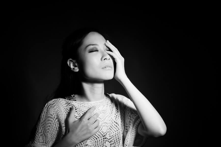
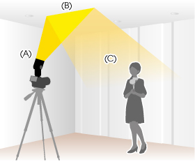
There are many different ways of using flash within your photos, these can include:
1-2-3 Points lighting technique –


Newer portrait photographers
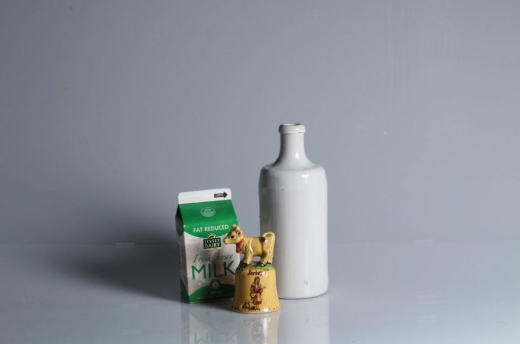
Here is one of his photoshoots which he carried out within Jersey.
Some examples of his work:
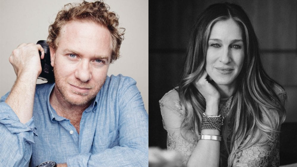
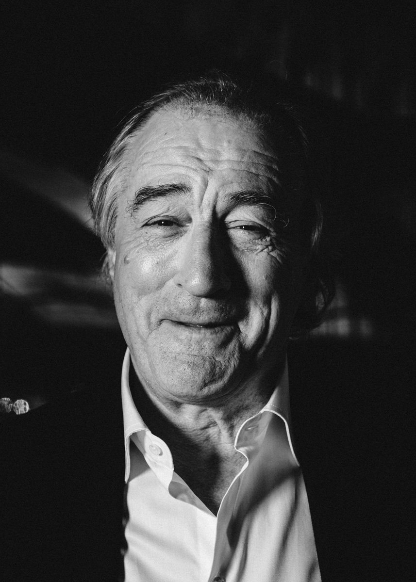
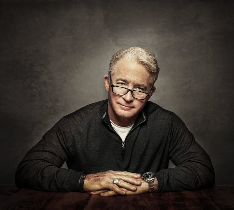
Examples of his work –


Mary-Ellen Bartley
Research –
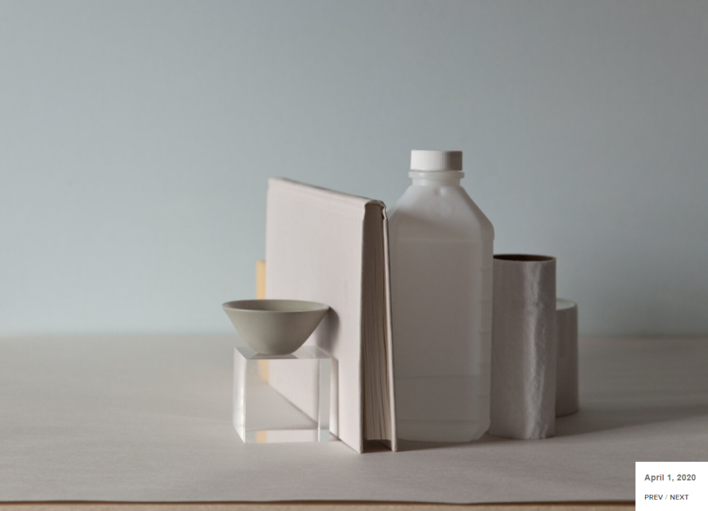
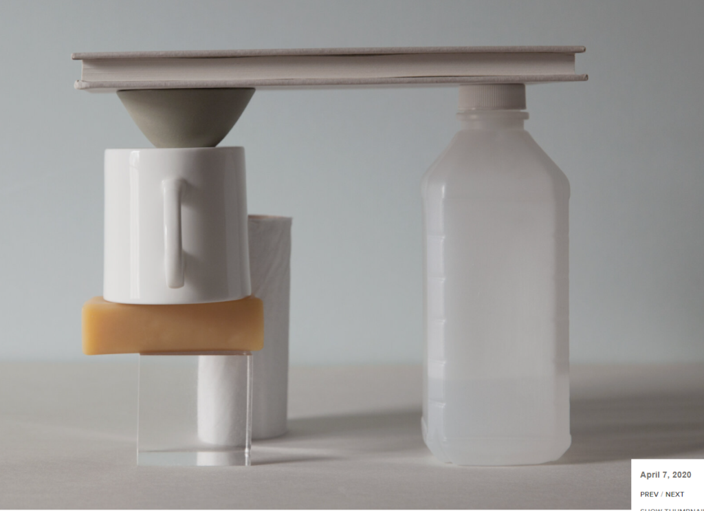
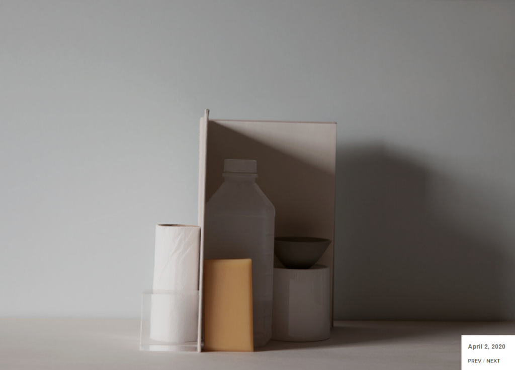
“7 things again and again” is a project which Bartley made where she uses the same 7 various objects over and over again which are photographed in different ways.
Here are some examples underneath of some of the work she has created:
Photomontages
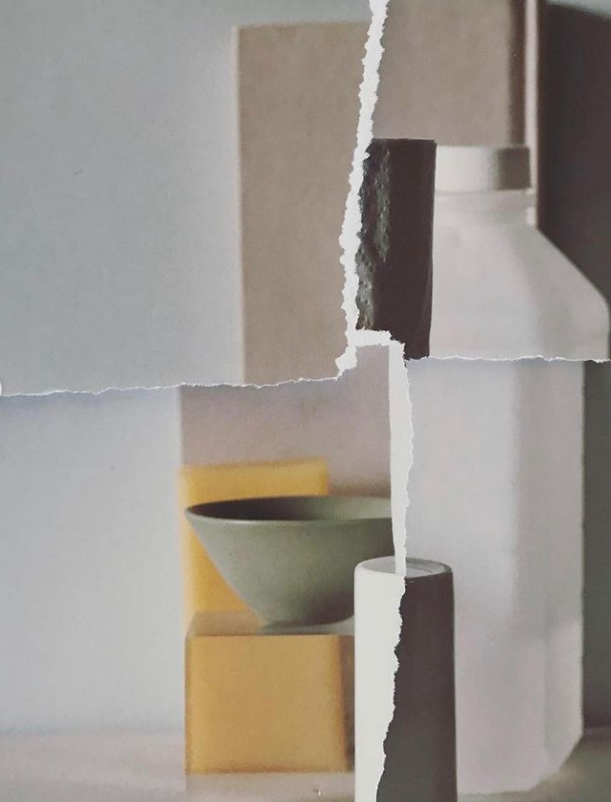
Here is an example of Bartley’s photomontage which she created that I will take inspiration from when making my own. I will create it by using the previous photos of 7 objects which I have taken from my favourites on Adobe Lightroom, printing them out and ripping them apart then sticking them back together onto a sheet of paper.
4 photos that I will use –
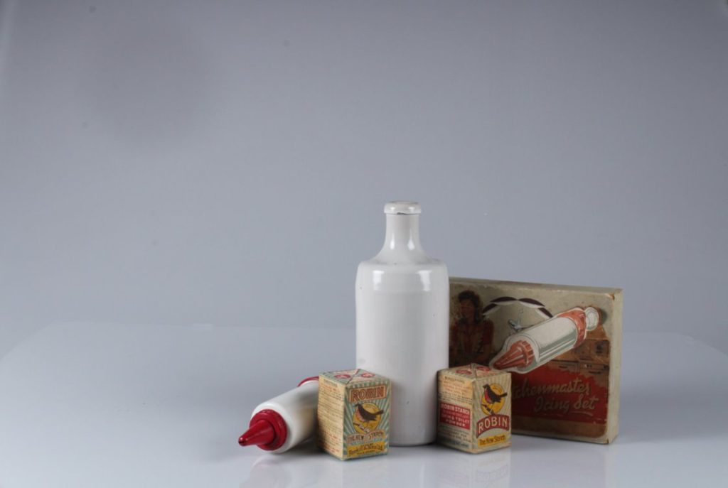
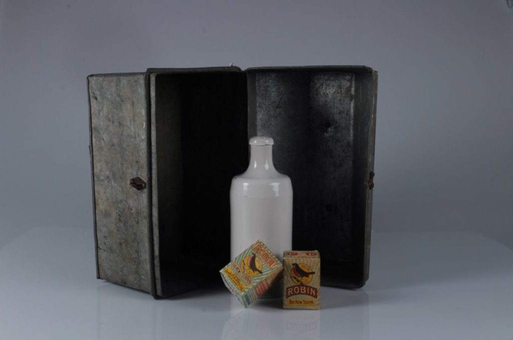
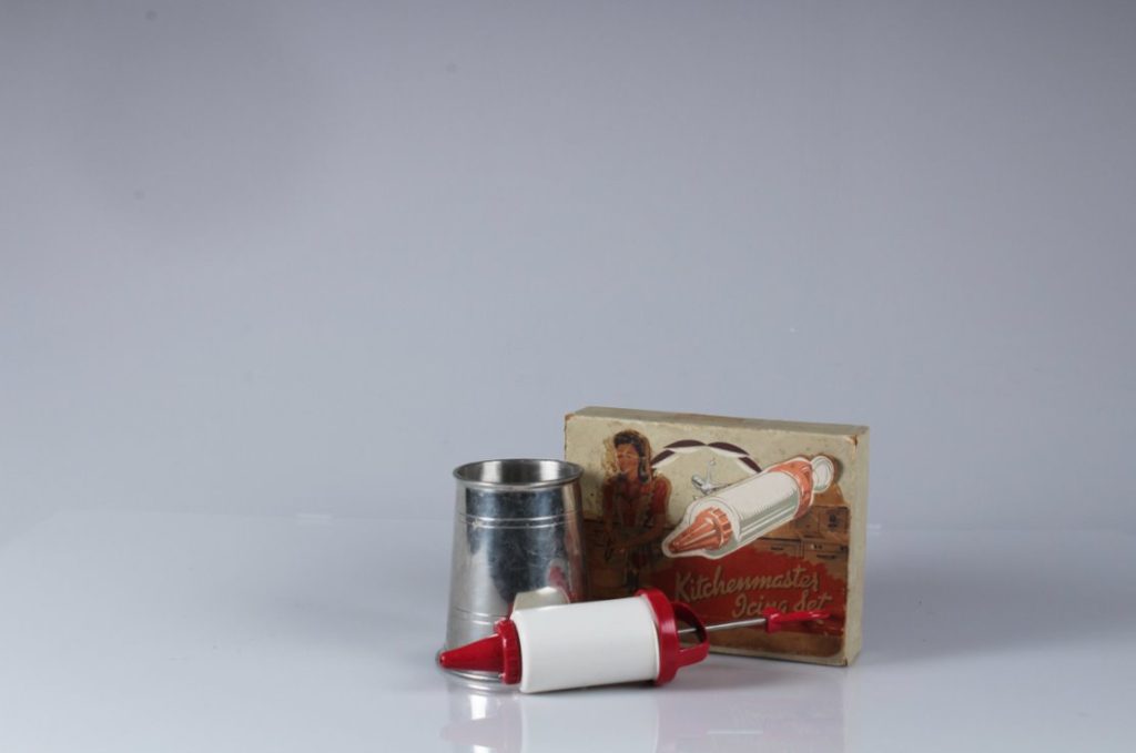
Edits –


An experiment of my work similar to theirs –
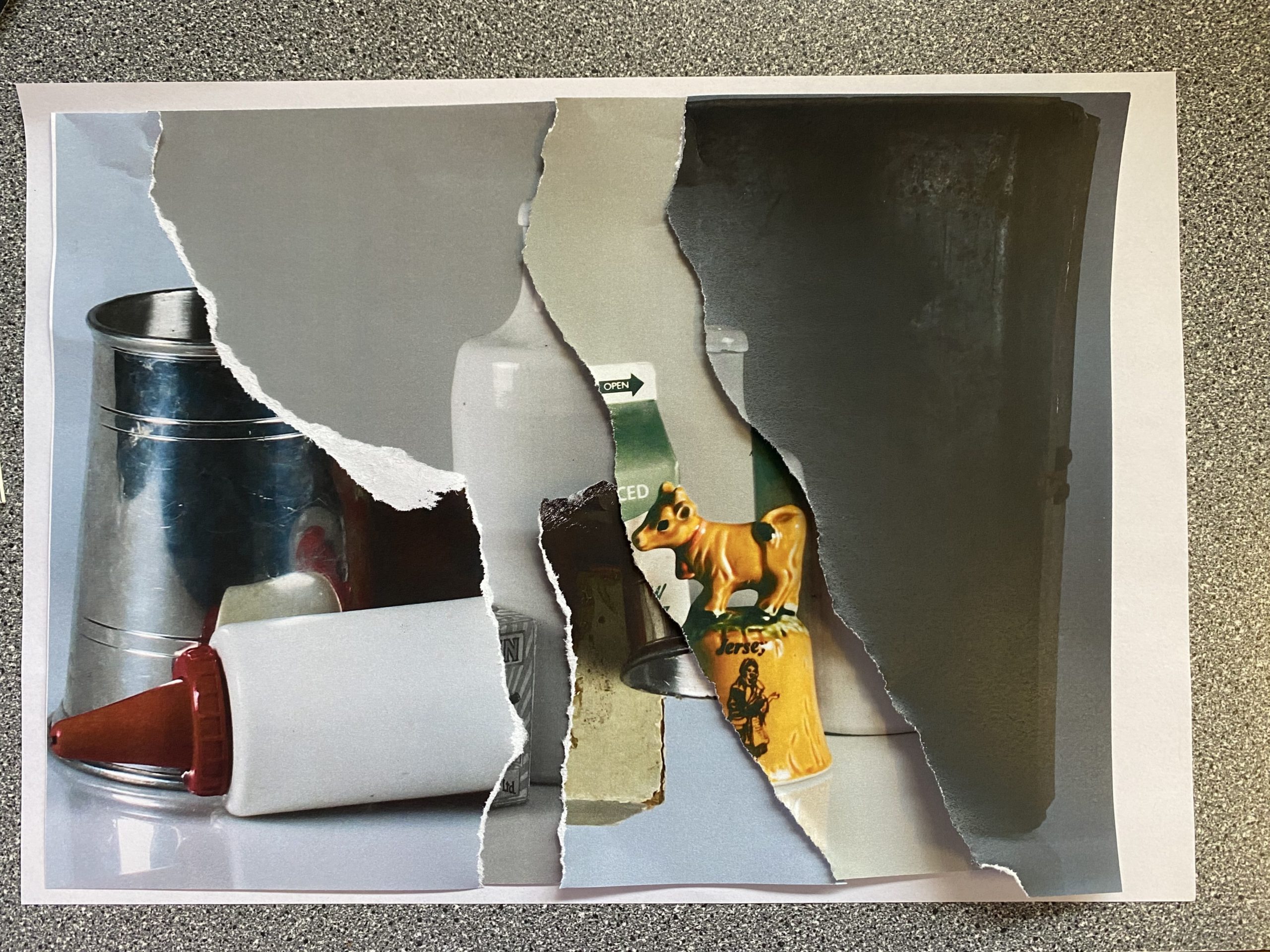
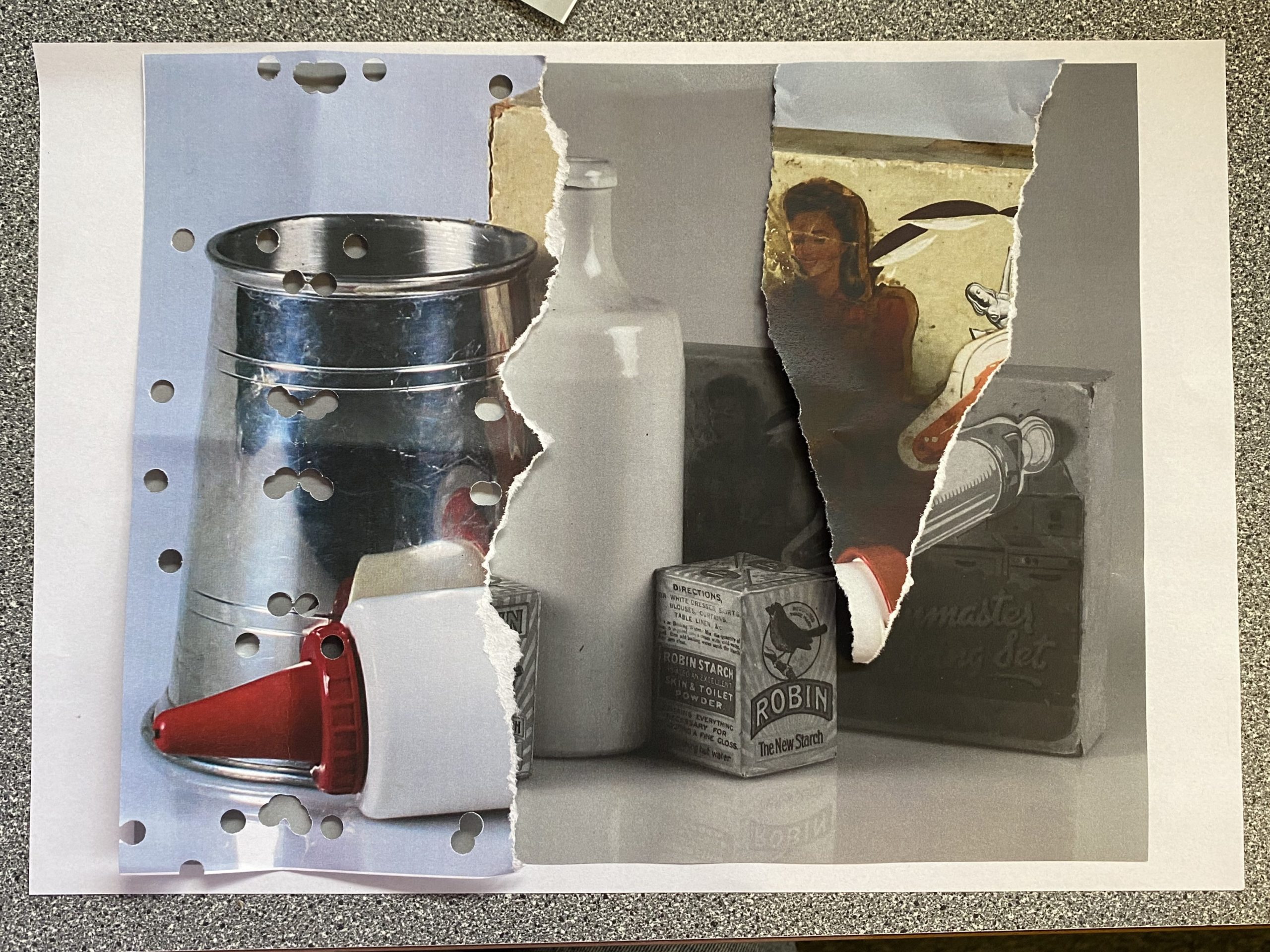
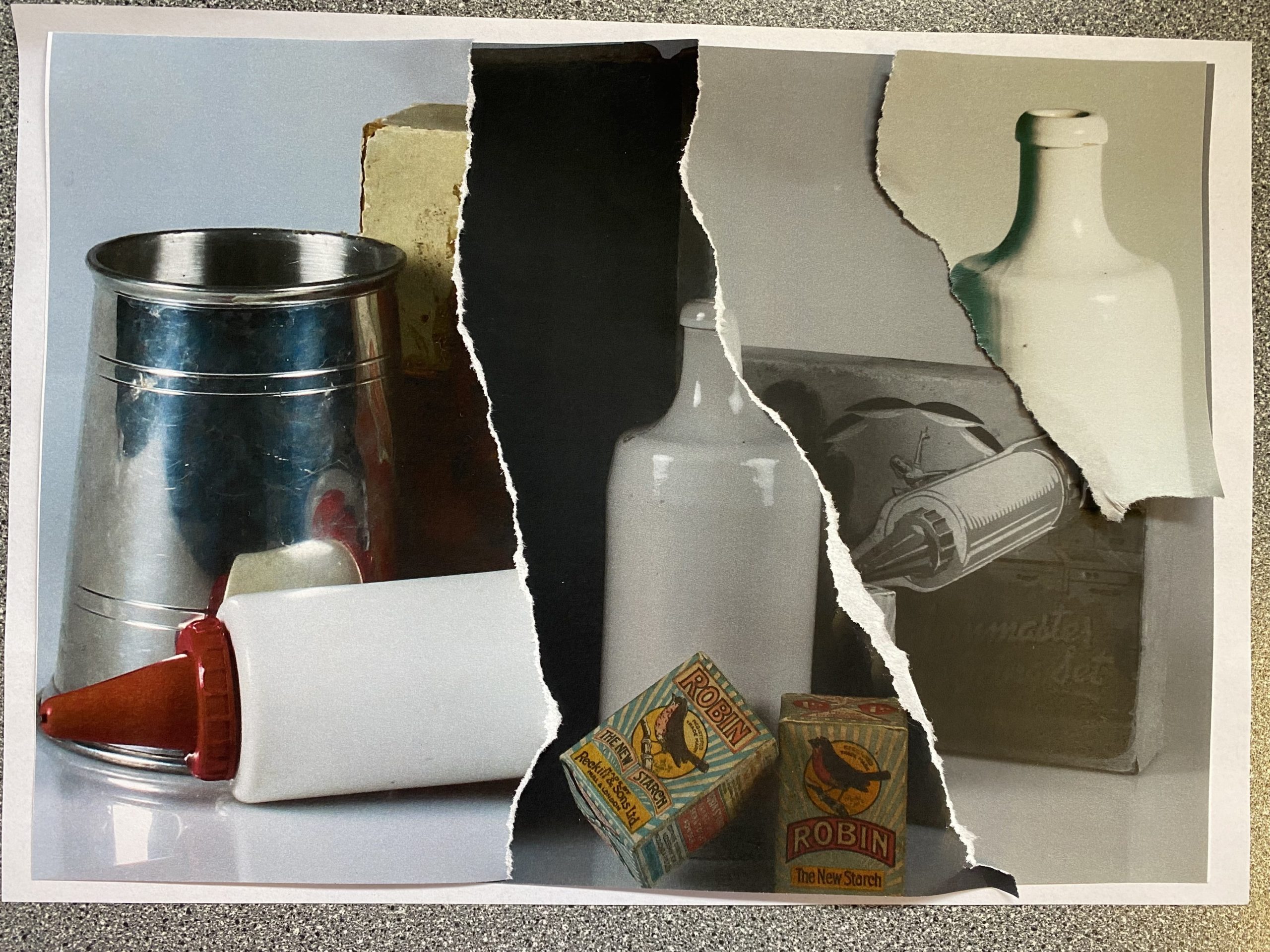
Here are the images which I created inspired by Bartley’s work. In my opinion I really like how these turned out because they all show different the different filters of the images printed which I edited on Adobe Lightroom, which makes them work well together as they create a good contrast against one another with the lighter and darker tones.
My favourite edit would be the first one because it has a 3D element to it, which I created by not sticking them down, I really like it as it shows the different layers and images which I have combined together that I have produced through me tearing and raping the images which is similar to Bartley’s work. I enjoyed creating these and using Bartley’s technique of these type of photomontages and would use it again in the future.
Letha Wilson
Example of her work –
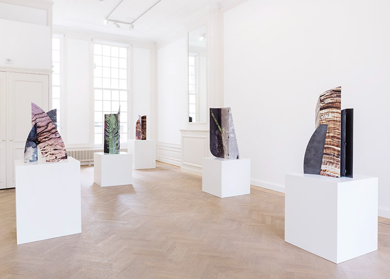
I will be using the same 4 pictures from before to create these interlocking cut outs, like Wilsons work, I will experiment with different filters on Adobe Lightroom on a couple of them to create a contrast when I edit them.
My work inspired by her –
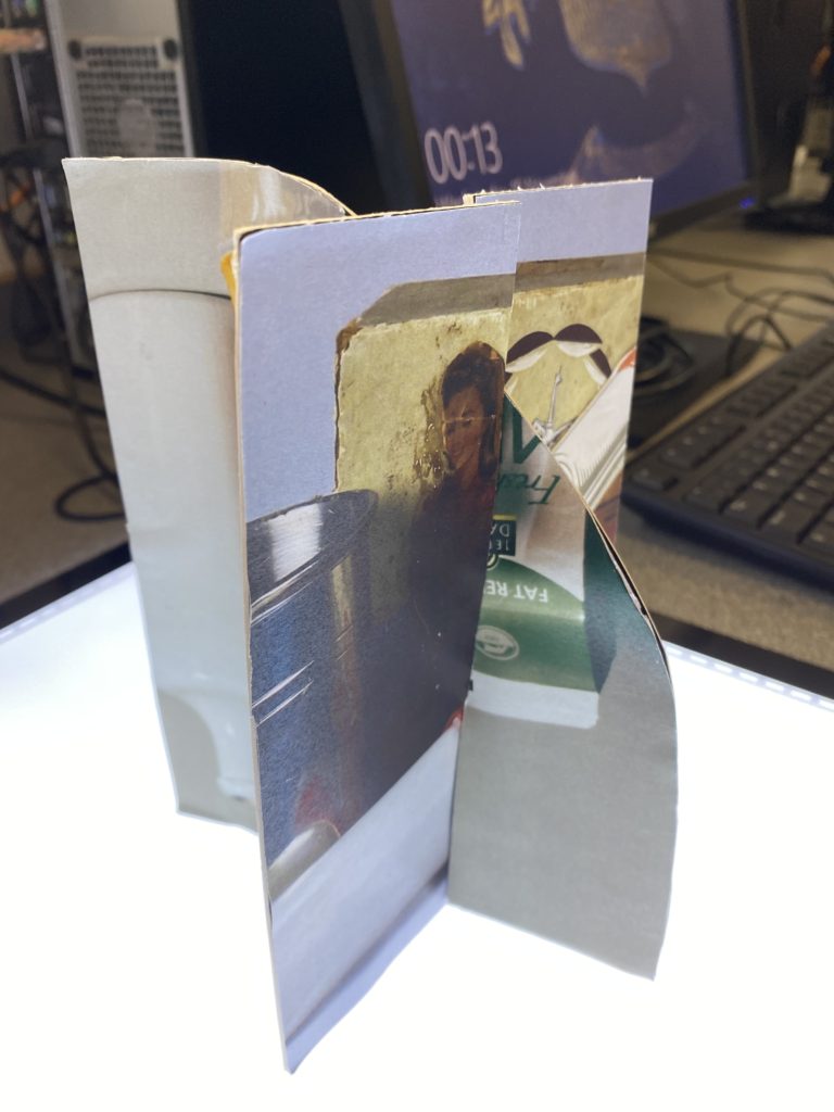
Other experimentation of photomontages
I also experimented with different variations of photomontages while editing by hand, I really like how some of them turned out as they are really unique and individual.
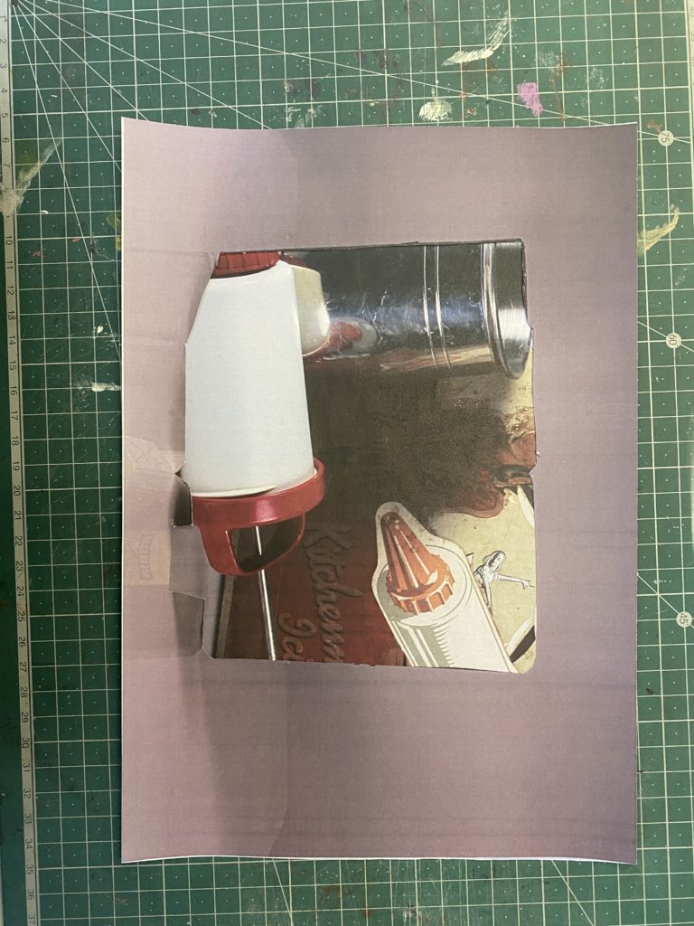
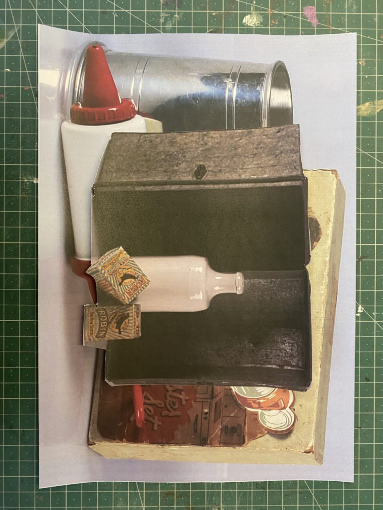
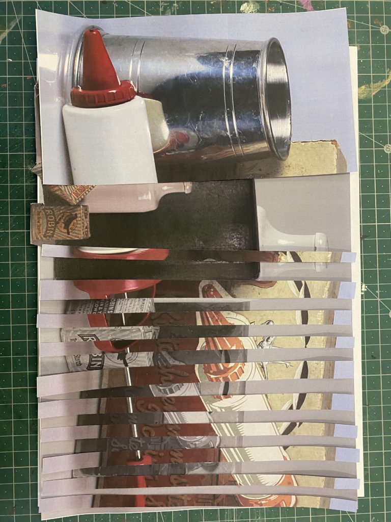
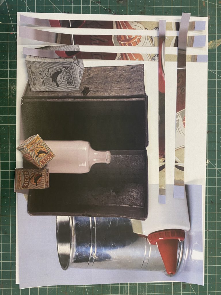
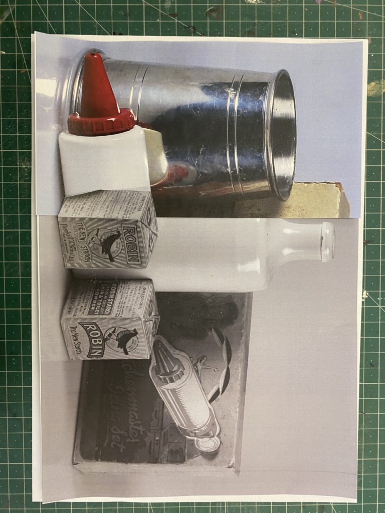
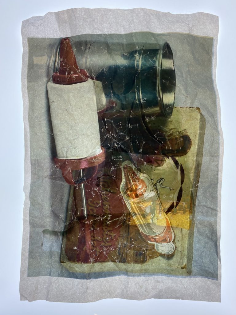
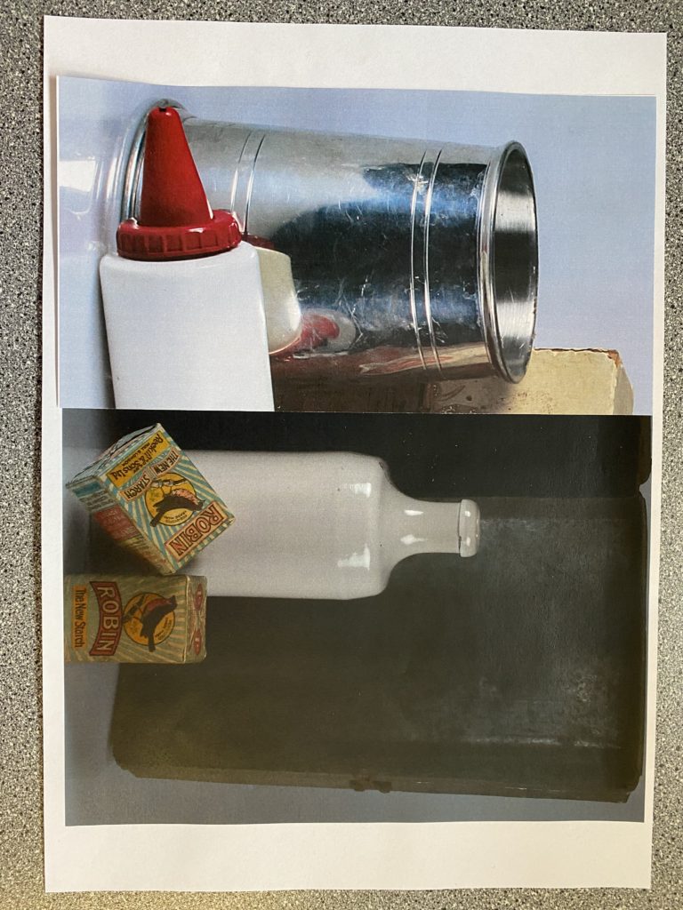
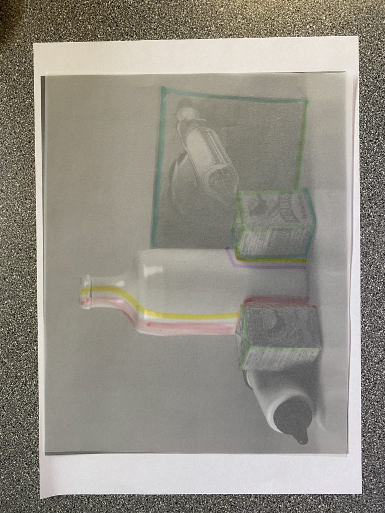
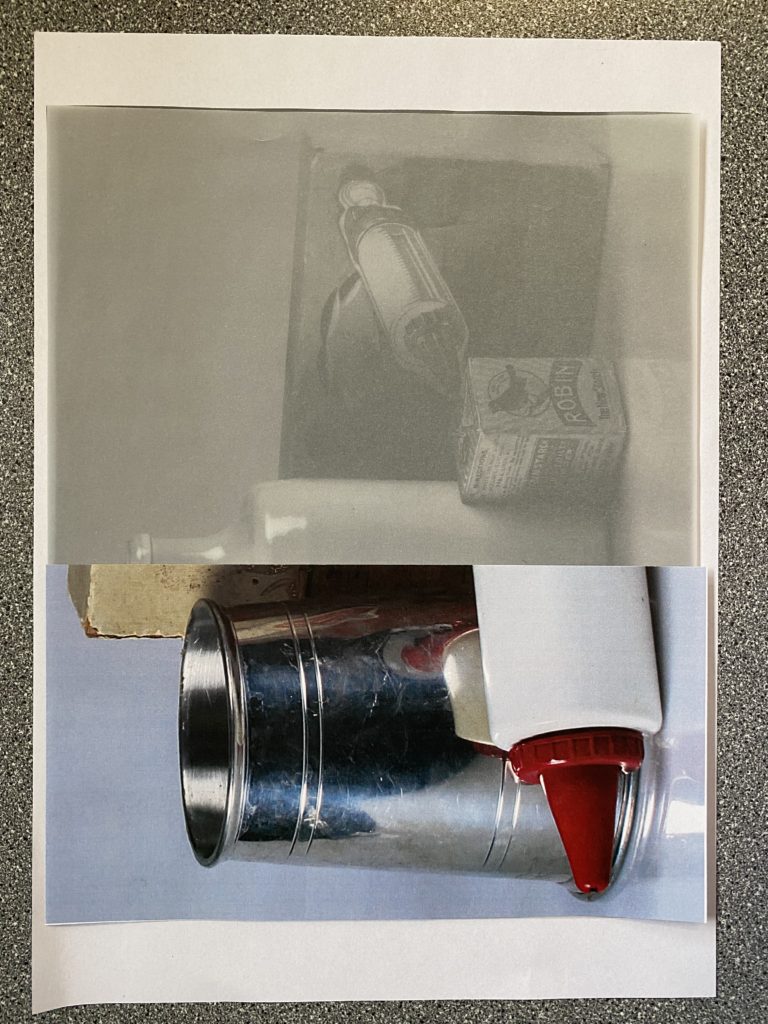
For the photos above, It shows how many variations of transforming photographs through techniques which I used in the caption.
I think that there a few successful ones such as the crumpling technique where it manipulates the photo which creates this old, crinkled look to a photograph that makes it look quite vintage, due to the objects which are used in it, and as if it was taken a long time ago. Another technique which I enjoyed experimenting with was the slicing technique as it makes the two photos look as if they have been woven together as you can see how the pieces all gradually go together throughout the photo, which resembles a puzzle.
Walker Evans
Research –

Darren Harvey-Regan
Research –

Comparison –

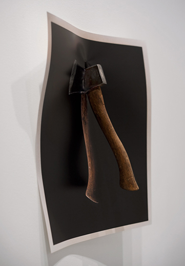
My Photos
Here are the different set ups which we used in the studio to create our photos –
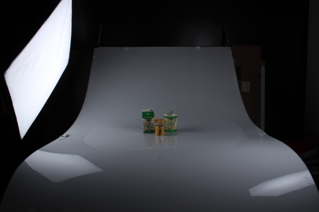
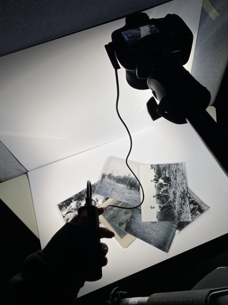
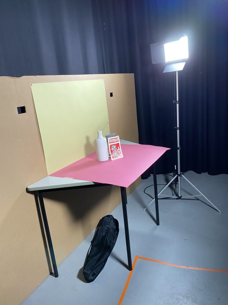
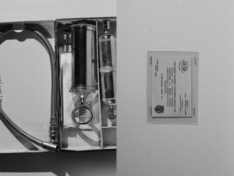
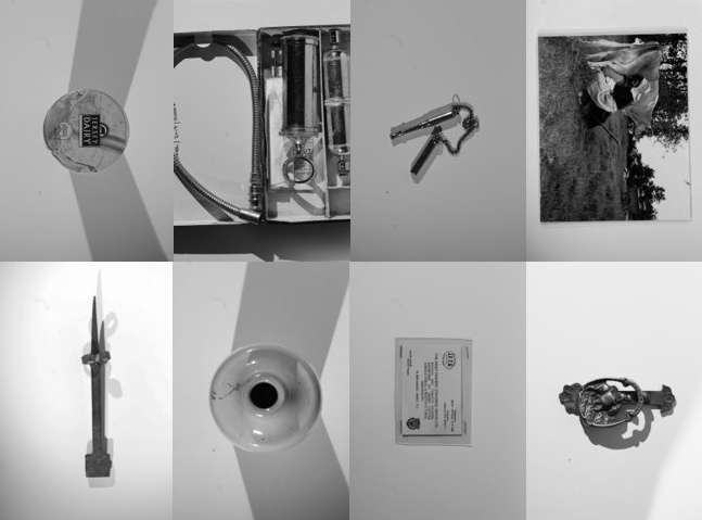
Here are photos that I have taken of vintage objects in various ways and put into adobe Lightroom, selecting my favourites to present.
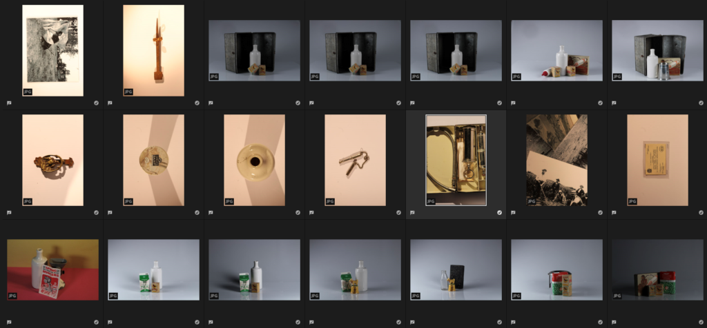
Editing
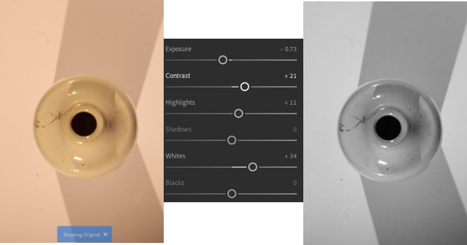
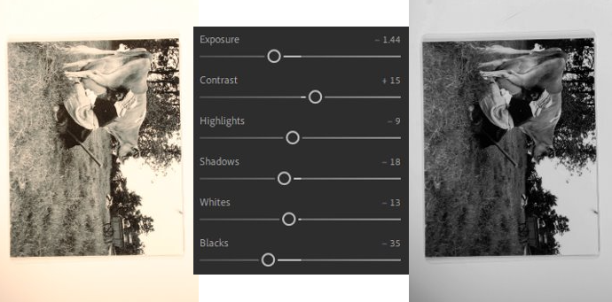
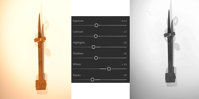
Here I edited some photos on Adobe Lightroom so that I could use them to create a piece of work which is similar to the work of Wallace Evans and Harvey-Reagans “Beauties of the common tool”.
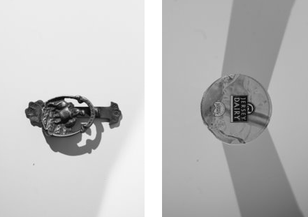
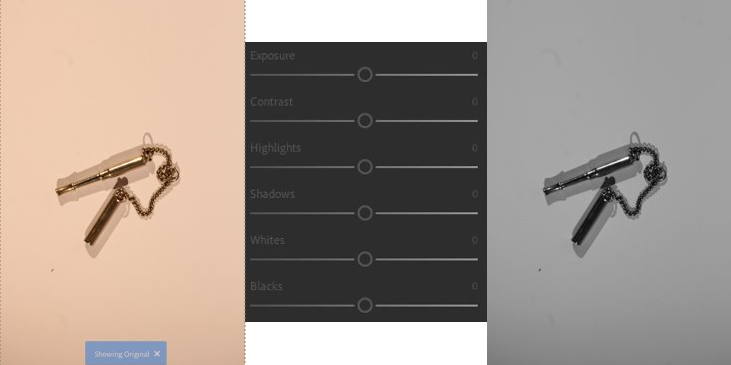
An experiment of my work similar to theirs –
Contact sheets
1st Photoshoot – Inside of one person
For this photoshoot, I used my sister who enjoys baking in the kitchen and does it in her spare time. I like these photos because they show experimentation with different angles, lighting and facial expressions.


2nd Photoshoot – 1 person outside
For this photoshoot, I used my dad who likes gardening and when he moved house has built the garden up from nothing so it is his pride and joy. I like the photos because it experiments with faceless portraits and different angles.


3rd Photoshoot – More than 1 person
For this photoshoot, my stepdad and sister are being photographed in our garage where my stepdad has all of his bikes and cars which he has an interest in and she is helping him.
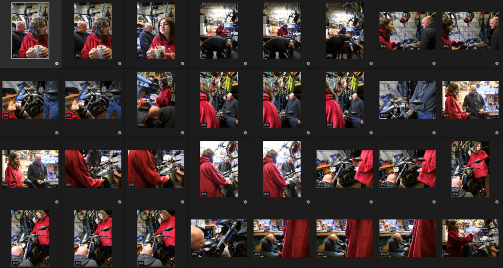

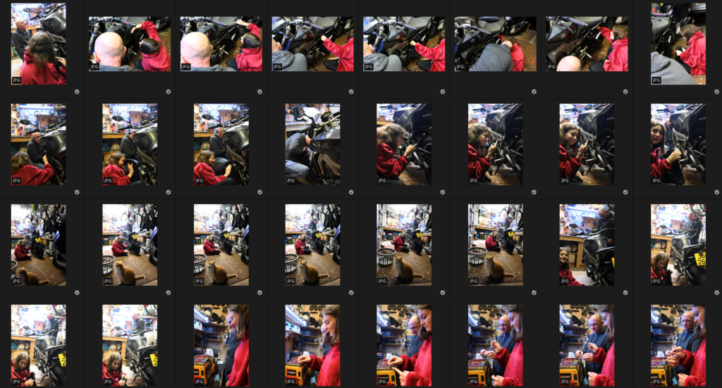

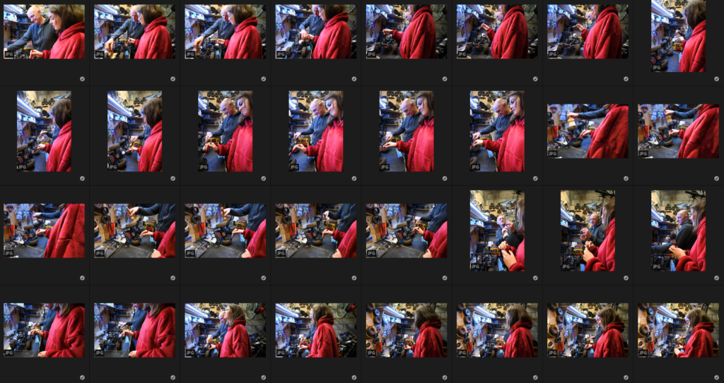

Image selection on Adobe Lightroom
These are the images which I think that are my most successful from my photoshoots. On Adobe Lightroom I used Z to pick the photos which I thought were the most successful ones which are seen below.

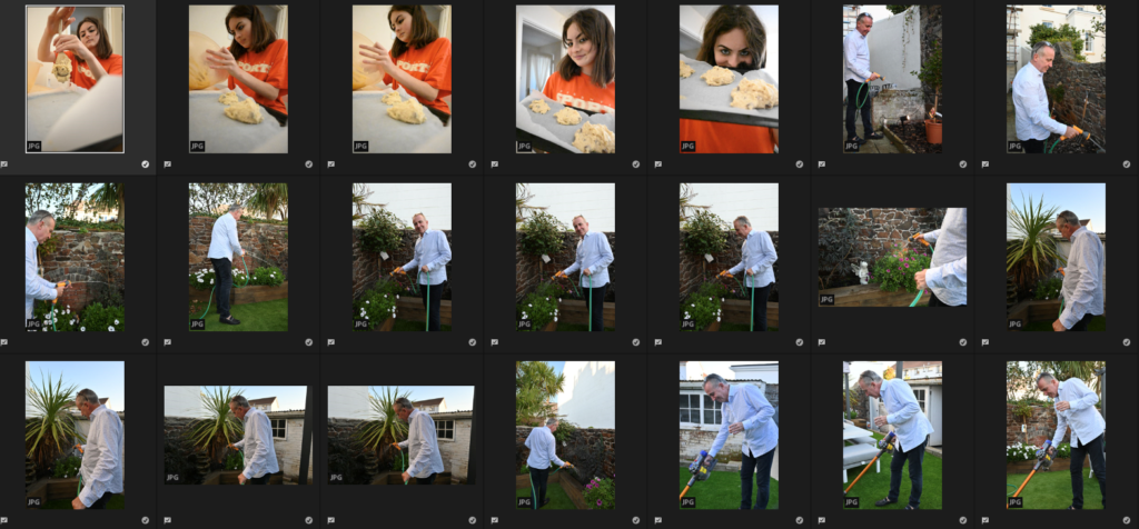
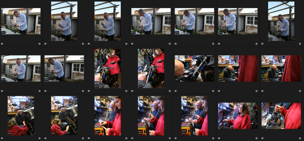

Experimenting with my successful final images
Single person inside editing on Lightroom –


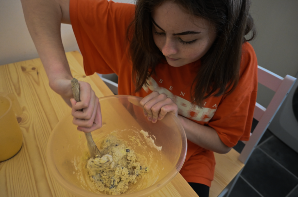
Single person outside editing on Lightroom –


More than one person editing on Lightroom –


Compared to Mary-Ellen Marks work

Mood board –
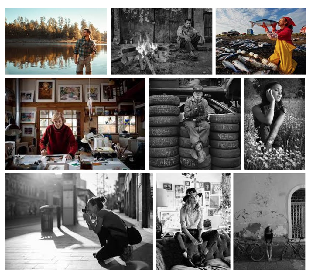
Environmental portrait ideas
What do environmental portraits say about us?
Environmental portraits help us to create strong stories for who it involves by giving further details into who they are and what they do, showing their personalities without us even knowing who they are. The objects and locations involved show how they relax, what they do in their spare time/how or who they spend it with, what they may do in their day to day lives.
What do they mean?
An environmental portrait is a type of photography which means showing someone in their natural environment which they might find to be safe and comforting.
What are environmental portraits?
Environmental portraits are photographs which are created through the filters, body-shot, compositions, angles, backgrounds and surroundings which we see through photos. This could be through the subject holding them or the viewer finding them through looking at the photo and exploring it with their eyes because they are supposed to catch peoples eyes and make them wonder and think about the subject more.
Photographer research
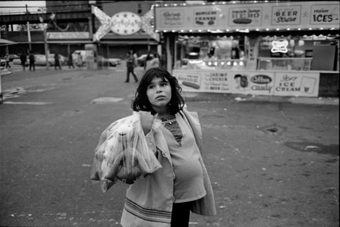
Mary Ellen Mark (1940-2015)
Research –
Here are some examples of her work:
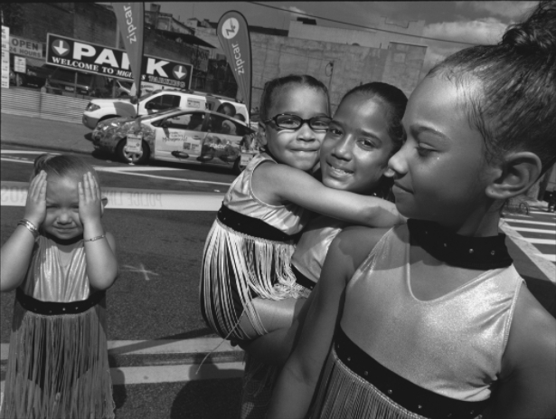
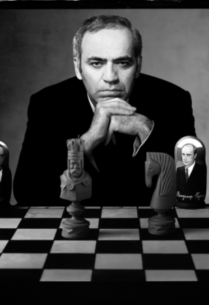
Image analysis –
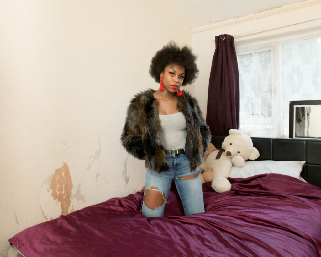
Michelle Sank
Research –
Examples of her work –
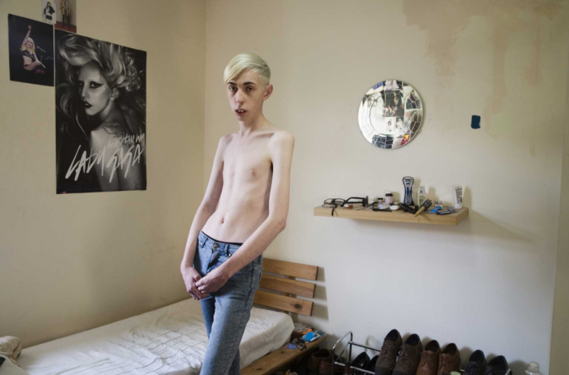
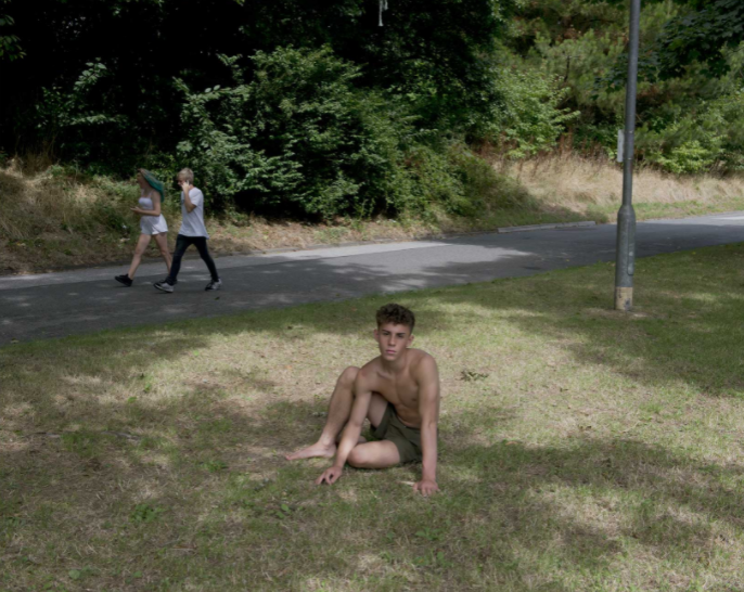
Image analysis –
On photoshop I wanted to experiment with creating a gif on photoshop, with the images of the still life objects and other various ones which I took at Hamptonne so that there is a variation of photos.

Here are the instructions of what I followed so that I could create it:
1. Create layer for each image
2. Window > timeline
3. Select > Create Frame Animation
4. Drop Menu > Make frames from Layers
5. Timeline > select Forever
6. File > Export > Save for Web Legacy > reduce image size to 720 x 720 pixels
My photos that I will use
For my 3 photos that I will use, I will choose them from my photos which I had chosen to be my most successful on Adobe Lightroom from Hamptonne and Still life objects.
Editing –
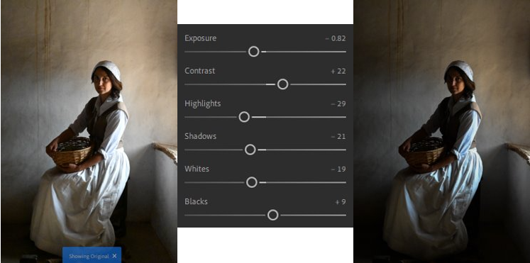
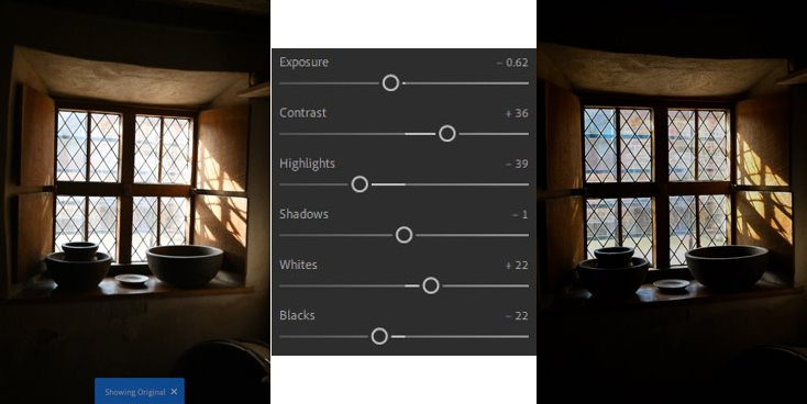
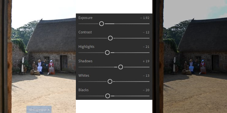
I really like the way all 3 of these images have turned put as the lighting, which was over exposed due to time of day from the sunlight, has been controlled nicely which shows them to appear more detailed and clearer which I wanted to do so that they would be able to work well within the gif.
My gif
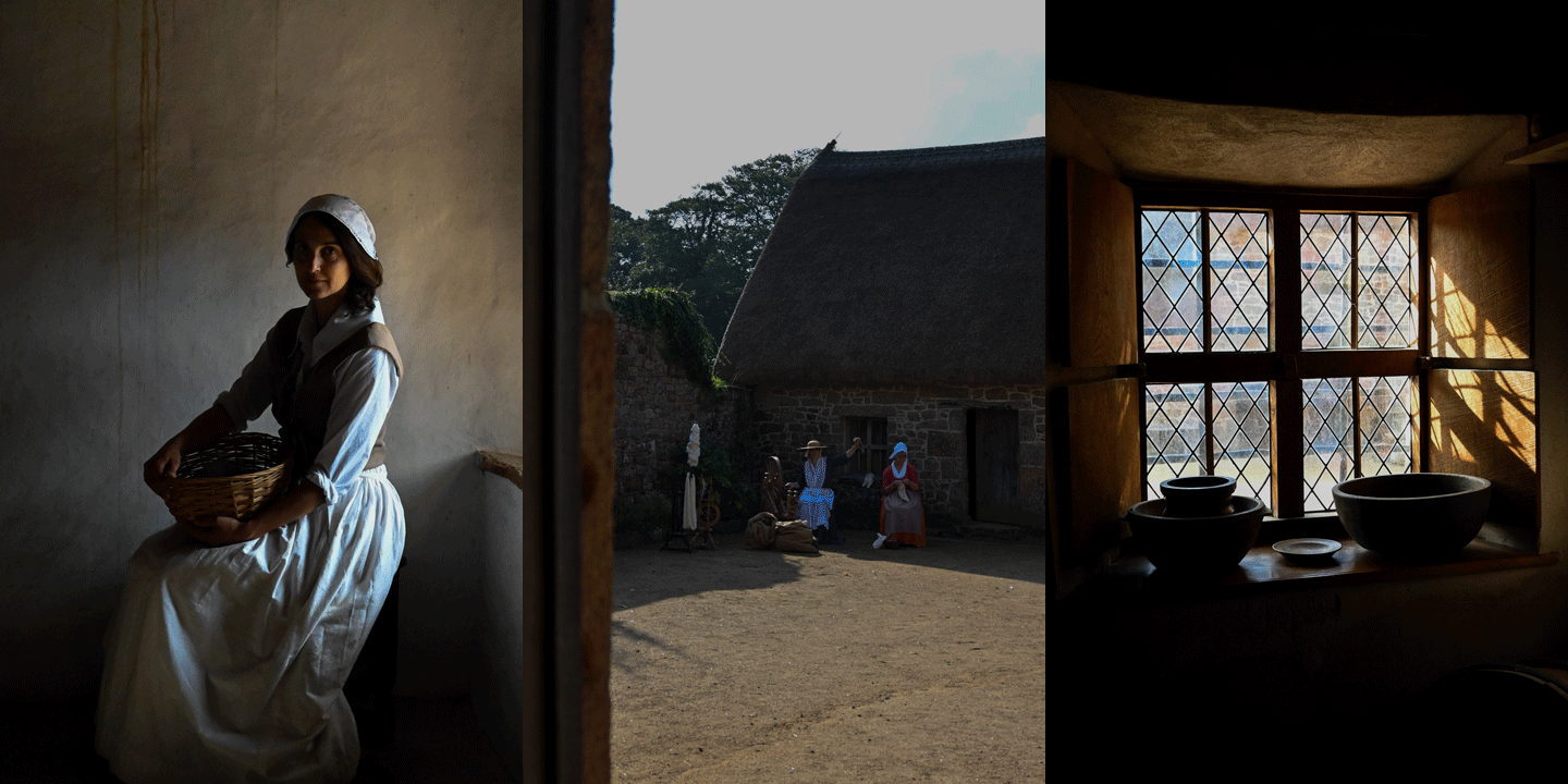
Here is the gif I made in Adobe Photoshop, I really enjoyed making it because it is able to show all of the different aspects/places which we saw at Hamptonne. It is a really unique way of revealing Hamptonnes heritage as the gif creates a story which shows the historical figures carrying out their daily activities, the lady who would look after her house in a portrait to represent her connection to the house which is linked through the picture of the interior. I also think that all of the photos compositions, filters, lighting, etc work well together as they create natural, warm tones from the sunlight which create a calm and comforting atmosphere, helping to enhance the story which the gif is creating to the viewer.