All posts by Dylan M

Filters

Author:
Category:

photo zine

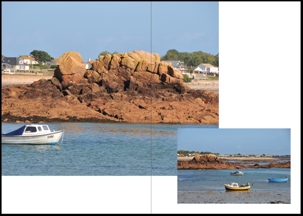
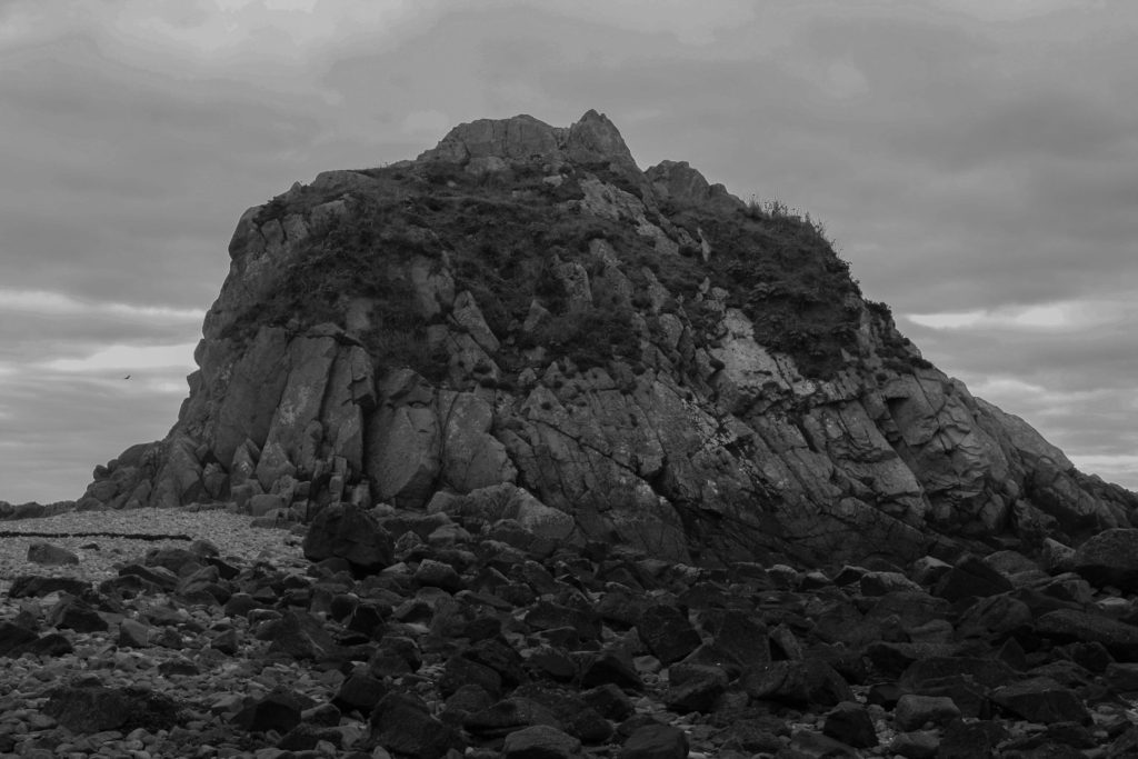
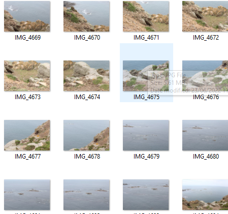
To begin creating this photo-zine I needed to take a range of images from one location. I used images from my La Hocq photo shoot to try and keep a similar theme throughout the whole zine. After editing all my images I then needed to decide which images to use in my photo-zine. i wanted all my images to try and capture the beauty of le hocq

image selection

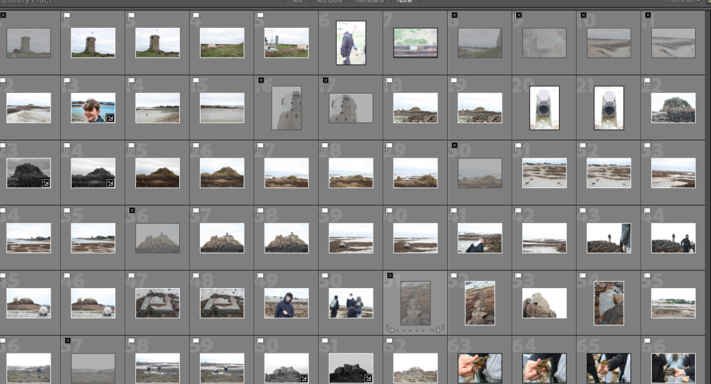
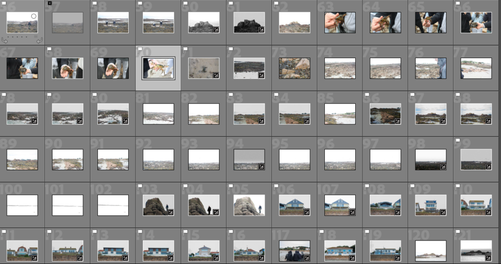
The images below are all the images contained throughout my 16 page photo-zine.

photo zine creation
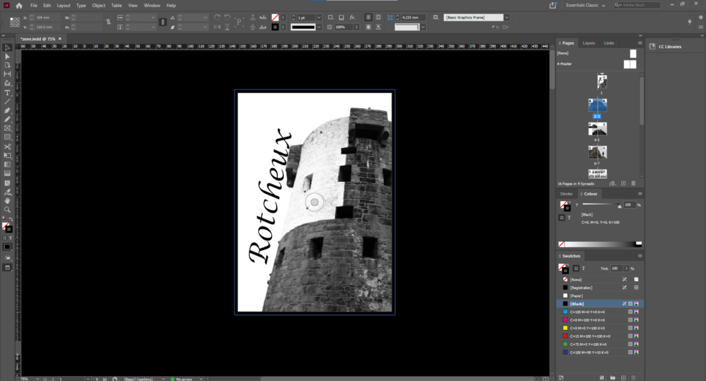
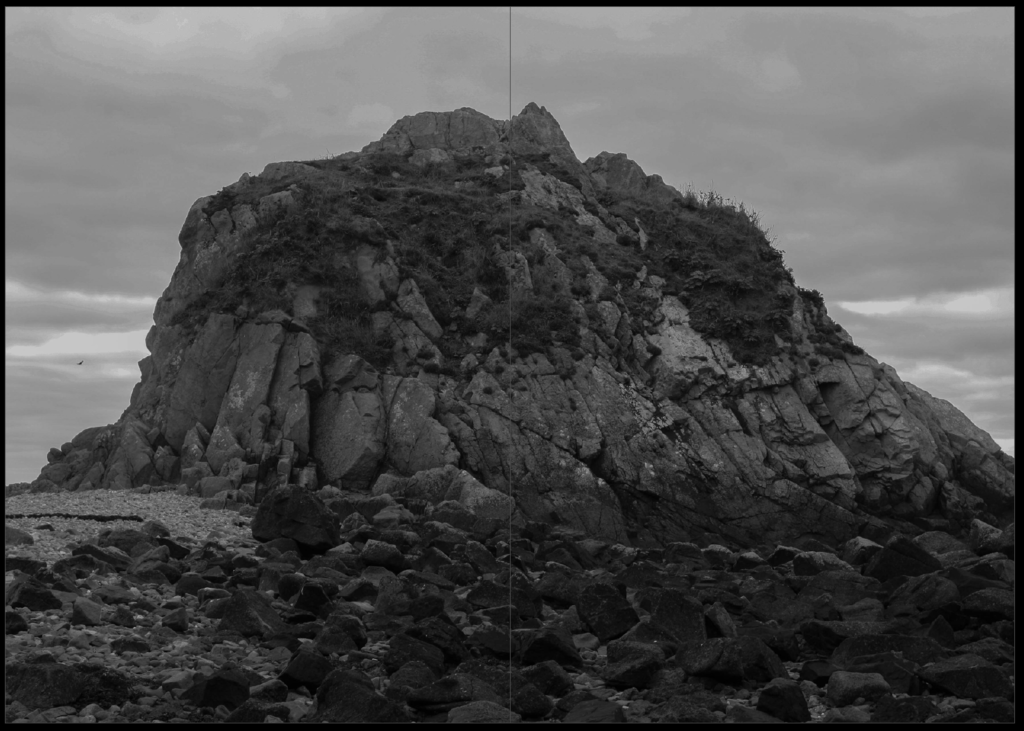
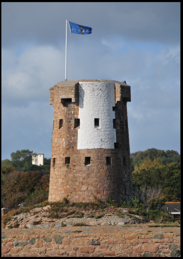
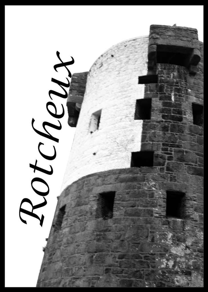
for my front page i wanted to represent le hocqs tower with a strong contrast to the sky
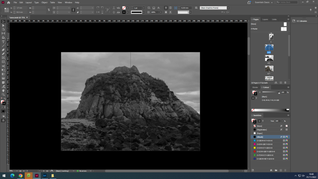
for pages 2-3 i wanted to use a strong image as a double page spread
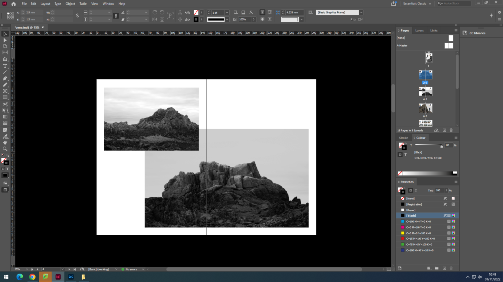
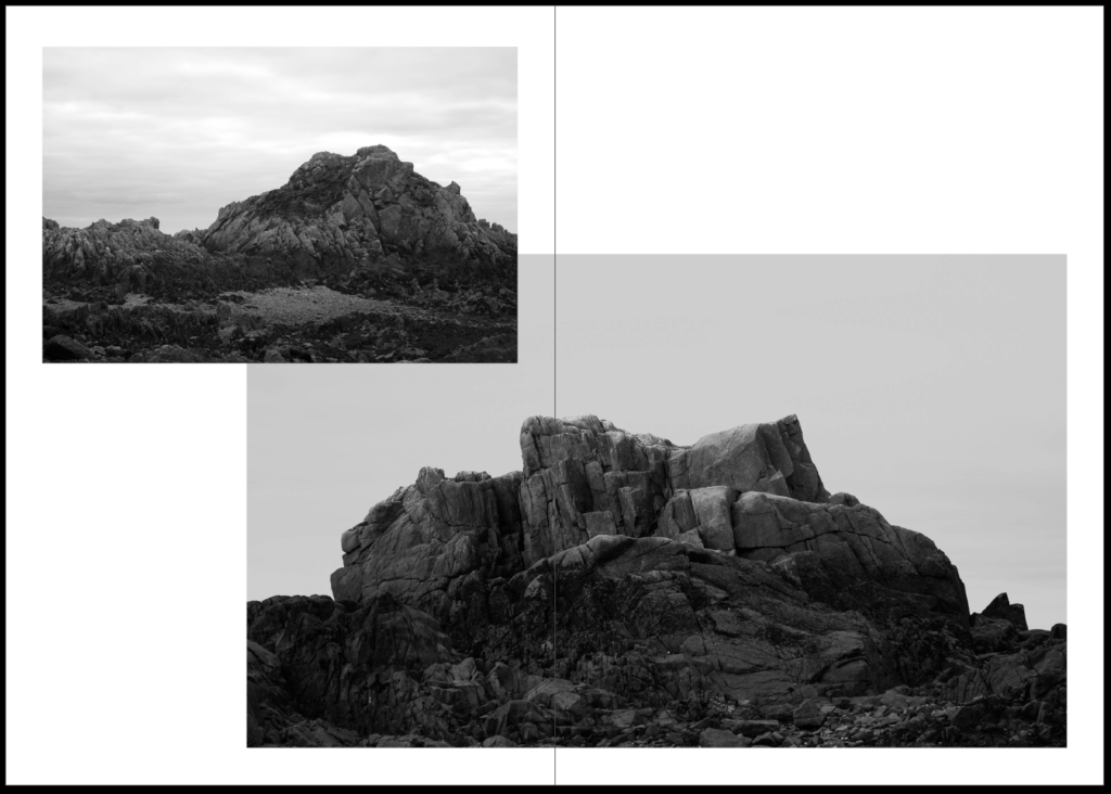
for pages 4-5 i then wanted to create an overlap of similar images the to the first double page spread
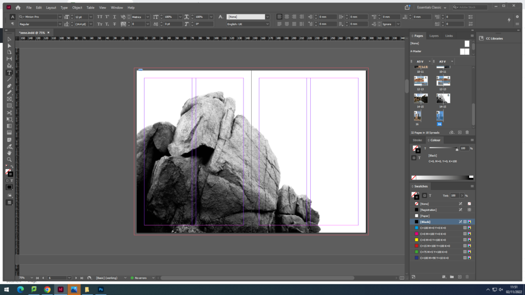
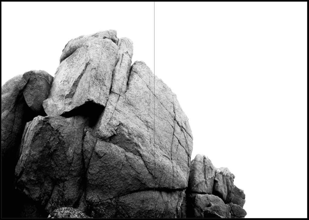
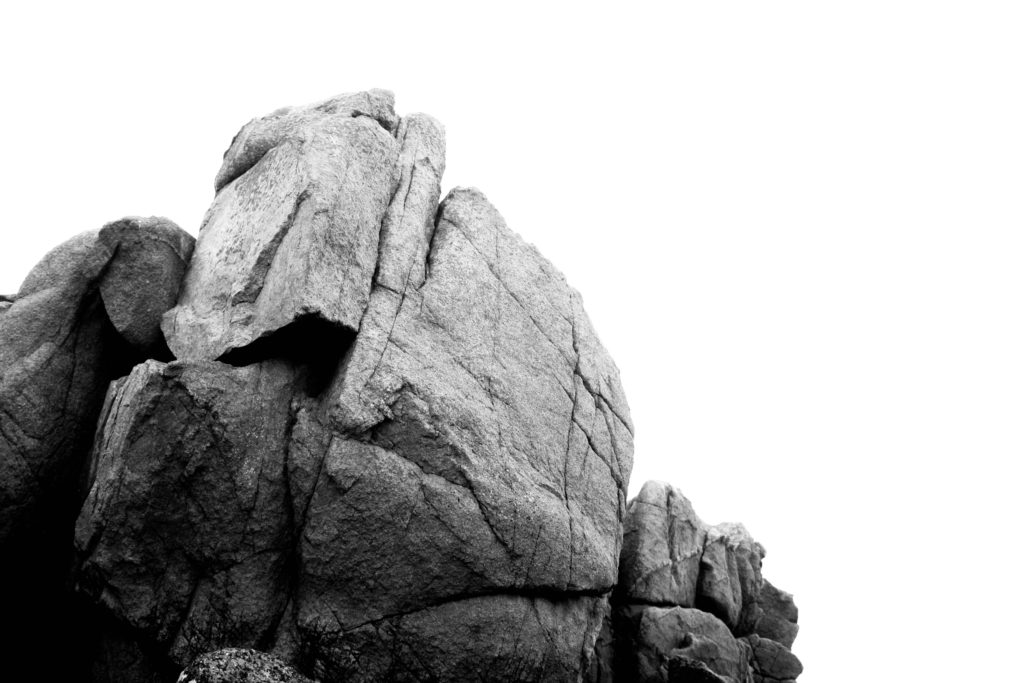
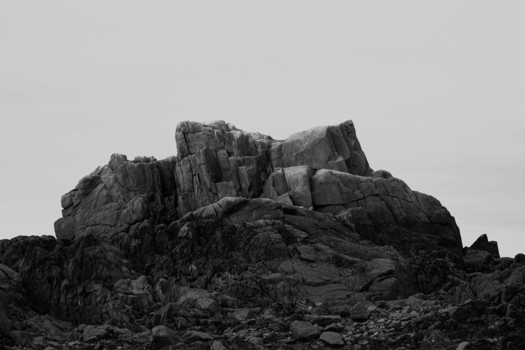
for pages 6-7 i wanted to keep to the black and white and used this image focusing on the rock with a strong contrast to the sky
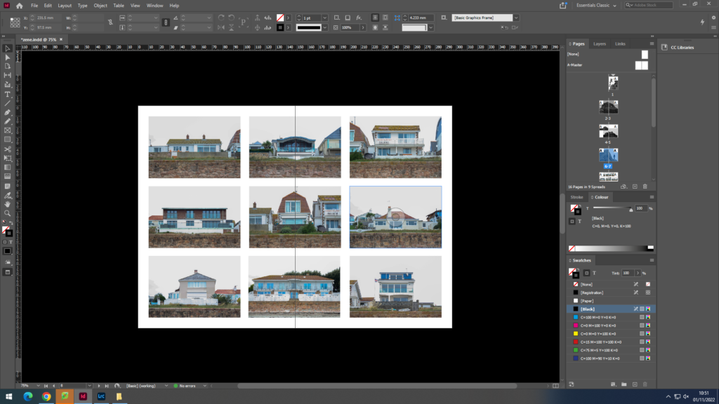
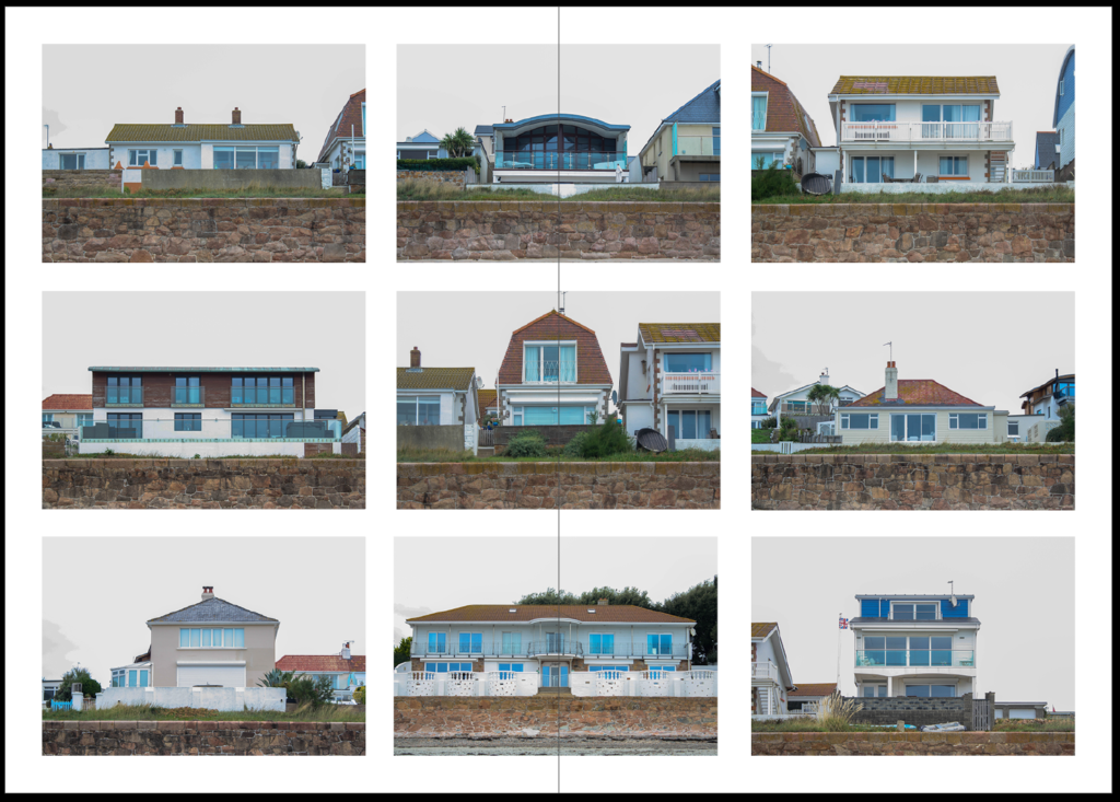
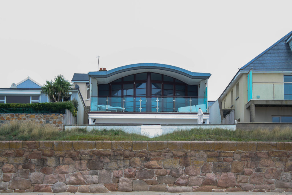
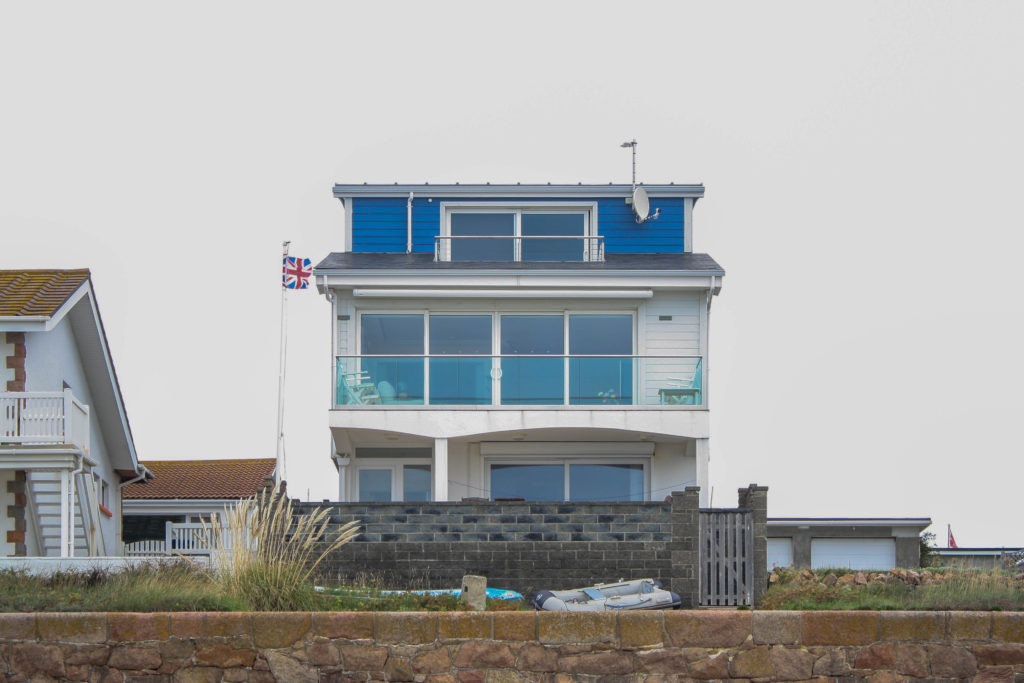
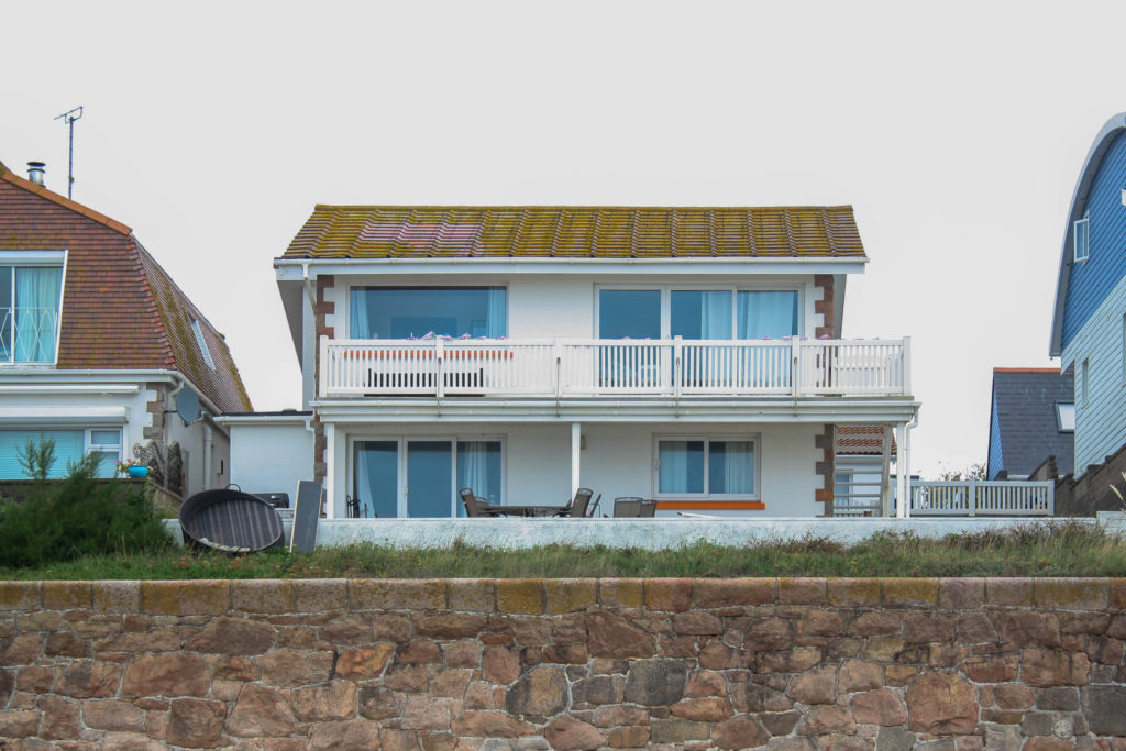
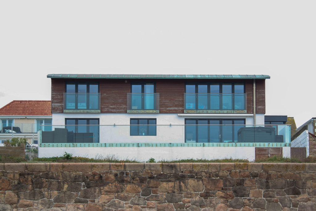
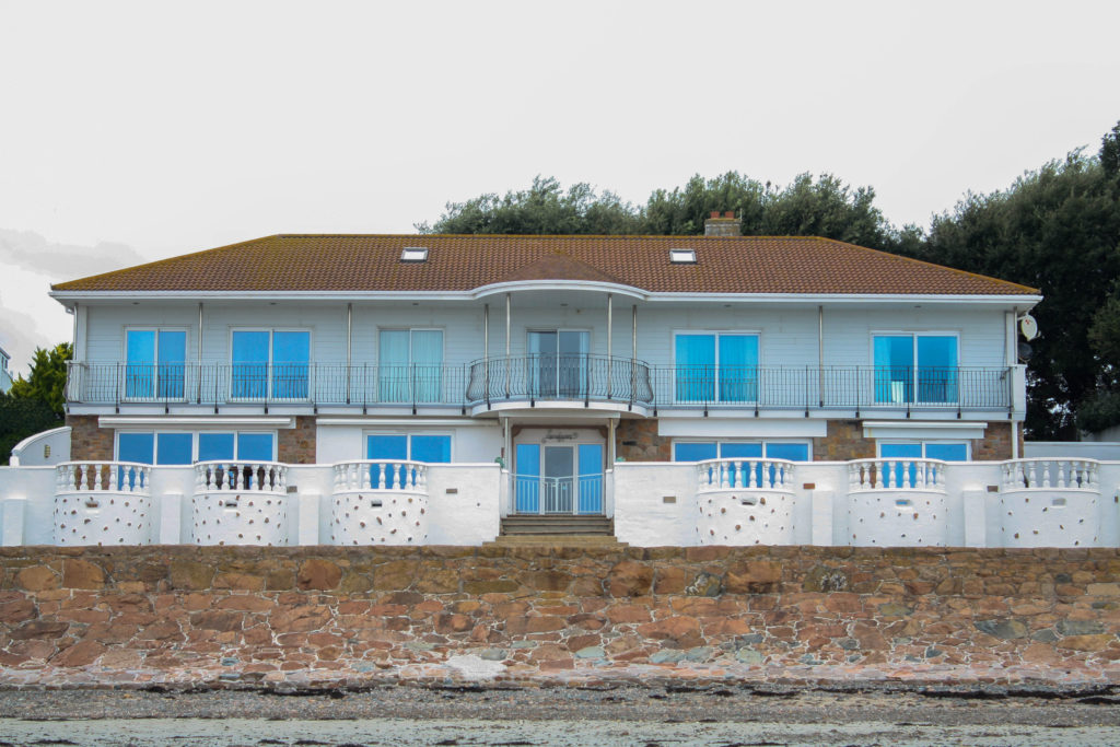
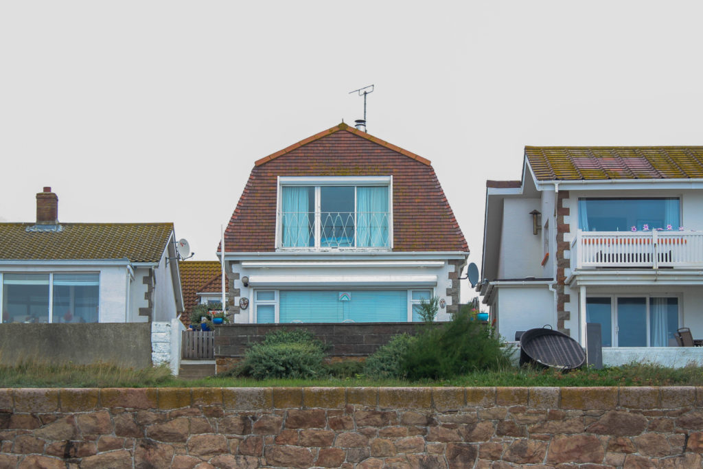
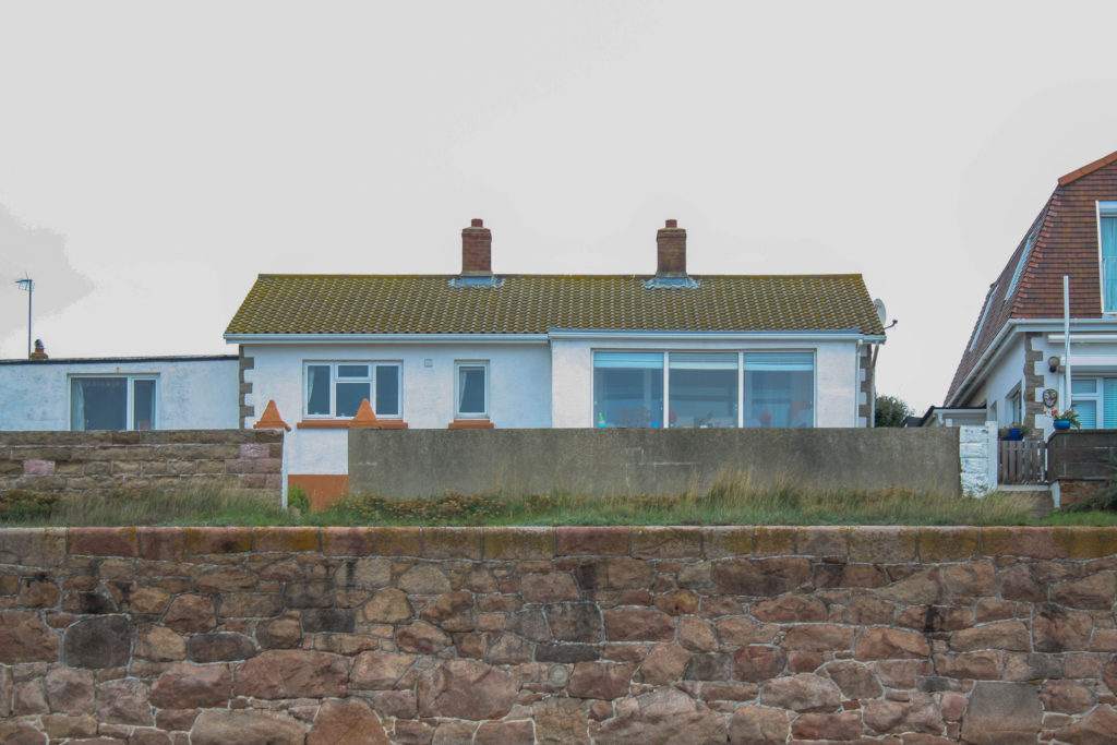
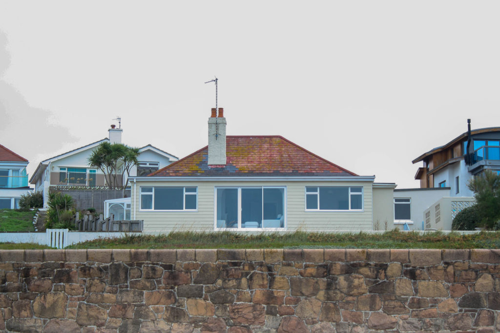
for pages 8-9 i wanted to represent the homes of the locals to le hocq in a 9 picture grid and switching the colour scheme
This image has an empty alt attribute; its file name is image-34-1024x576.png

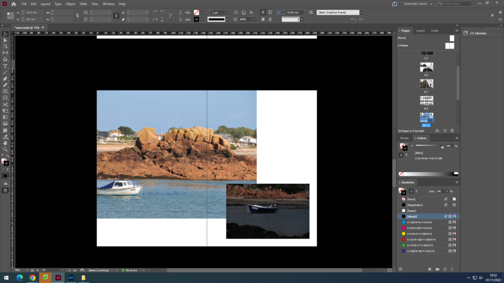
pages 10-11 i used 2 different coloured images contrasting each other showing the boats
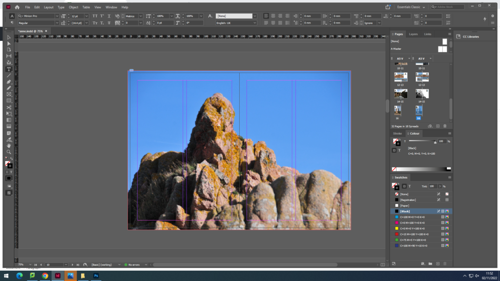
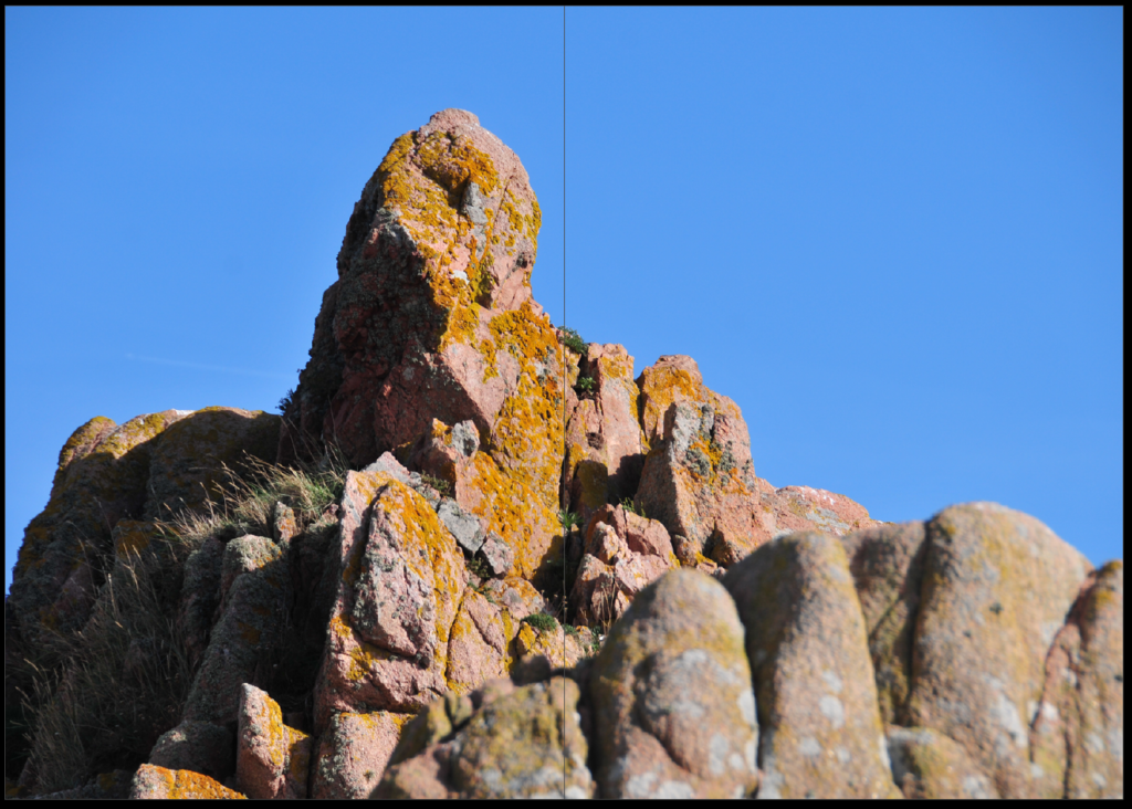
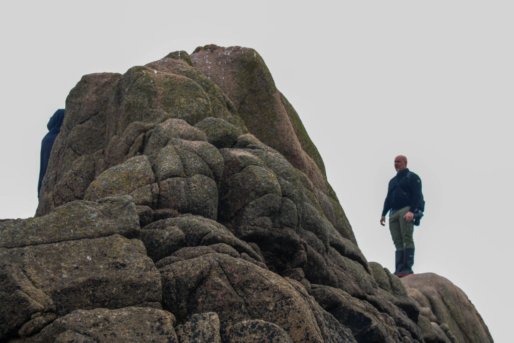
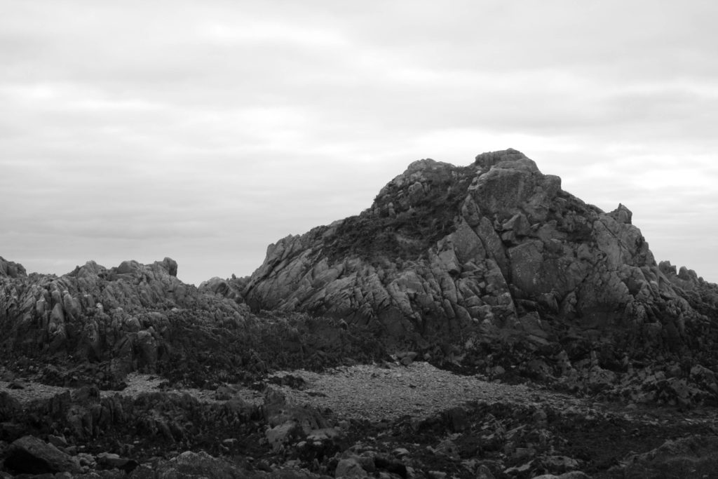
for pages 12-13 i used a double page spread focusing on the rock peak
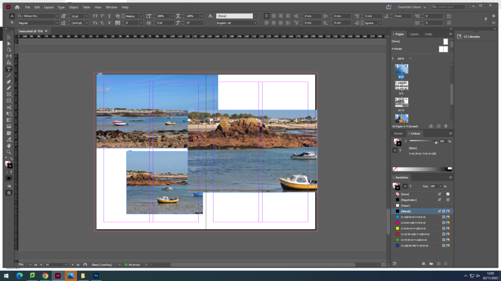
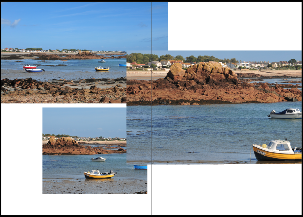
pages 14-15 i used 3 more images of boats in a juxtaposition layout showing the white spaces
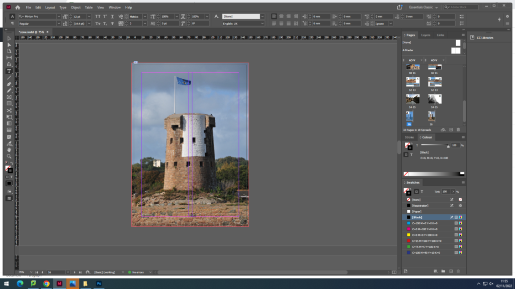
for the back cover i used another image of le hocq tower linking back to the front page

FINAL PHOTO ZINE
EVALUATION

Overall, I am very happy with how my final zine turned out. I kept a similar theme throughout the pages of the zine with every picture inside being representing le hocq. The name of my zine, Rotcheux, which is Jèrriais for rocky which i tried implementing in the way that all the images included were taken. I really like the layout of the images with some pages having a white space to create more contrast. I used juxtaposition on some pages to change up the style and layout.

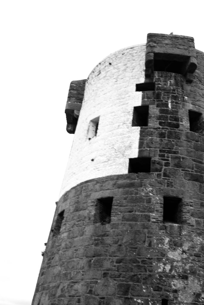
Photo sculpture

1st idea

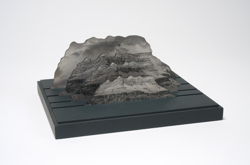
for my first idea i followed jody powells style model to create layered image

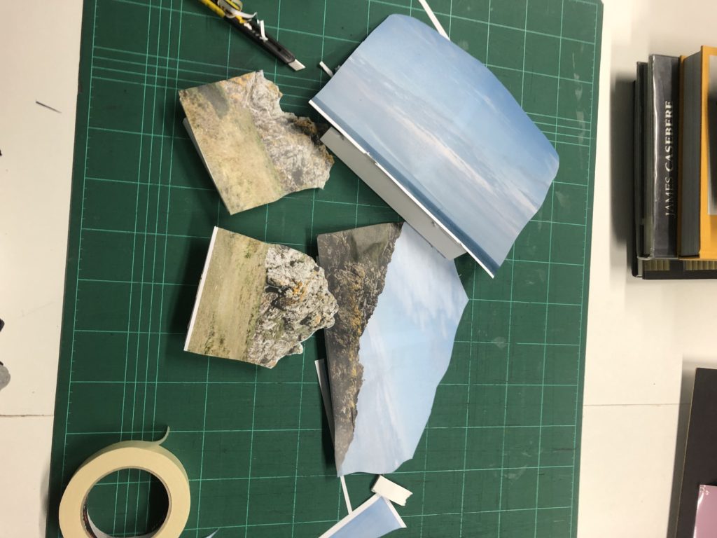
I first printed of my selected images and created a foam board sand for each to be be able to hold them up

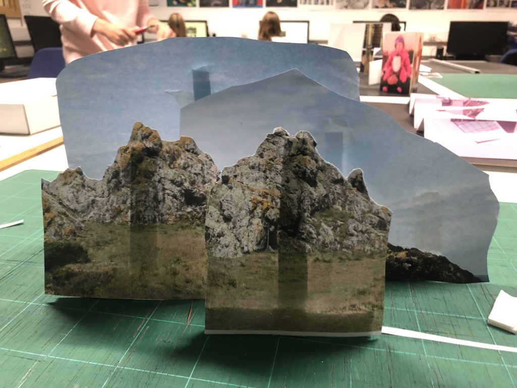
Once I done that i started to arrange the images how i wanted and found a good lay out i liked

i was happy with this idea but wanted to experiment further with more ideas

IDEA 2

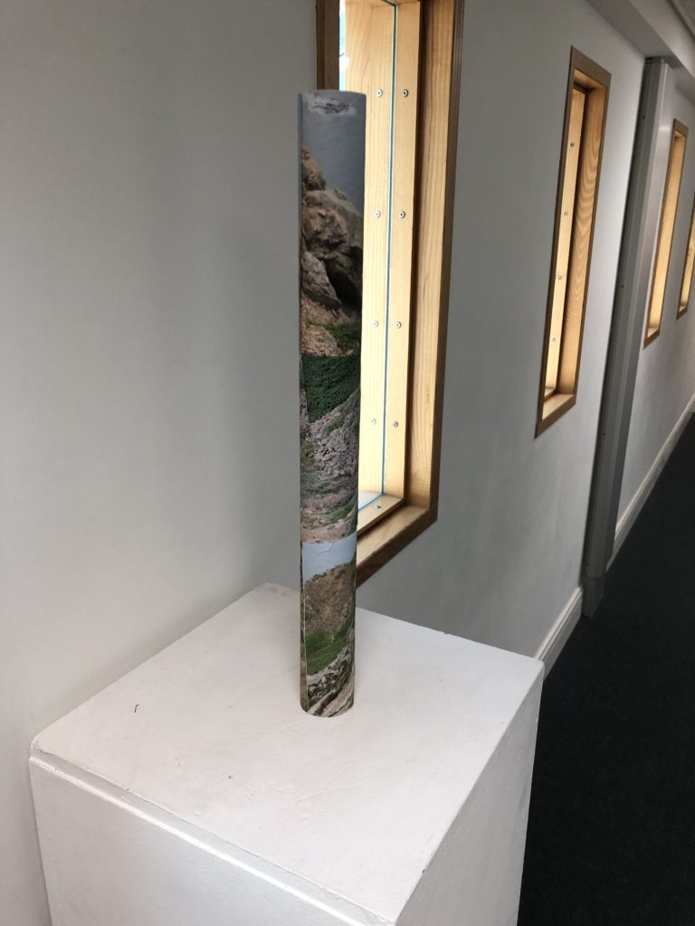
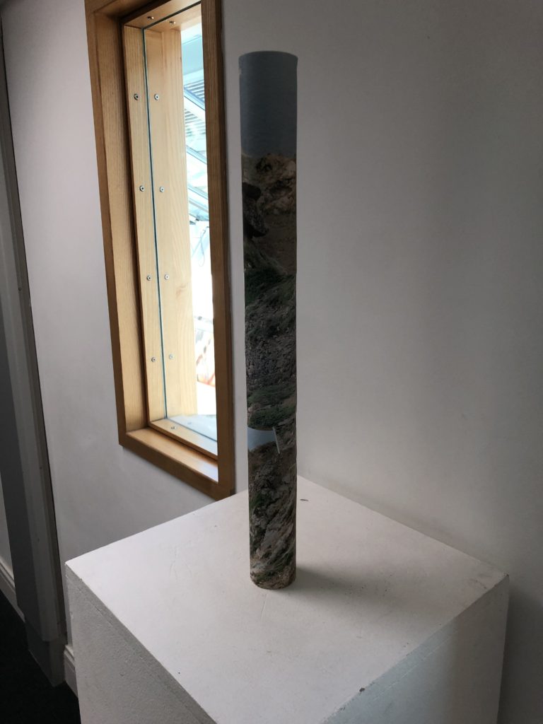
my second idea was to create a selection of tubes

i used a selection of these photos to try create a new landscape within the tube

i printed these of and started wrapping around the tube

this idea didnt turn out as well as i was thinking but still happy with it so i created a second

after these experiments i decided to stick with my first idea

3d photosculpture artist reference

Jody Powells work really interests me in the use of layers to create an image

OpenLab Art - Conjuring Tricks: a studio visit with Noémie Goudal
Noemie Goudal

Noémie Goudal is a French visual artist who currently resides in London. She works with photography, film and installation.

Goudal often works directly within the landscape, sometimes inserting photographic backdrops into a scene before re-photographing it. In addition to her photography, she makes video work that is thematically linked to her photos.

Goudal is represented by Galerie Les Filles du Calvaire and Edel Assanti.

Noemie Goudal's Journey Into The Familiar Unknown | Yatzer
Imaginary observatories by Noémie Goudal — CercleInterview with Noémi Goudal | Project PressureNoemie Goudal | Satellite I (2014) | Available for Sale | Artsy

still life historical context

History of Still Life

Still life is a work of art depicting mostly inanimate subject matter, typically commonplace objects which are either natural (food, flowers, dead animals, plants, rocks, shells, etc.) or man-made (drinking glasses, books, vases, jewelry, coins, pipes, etc.). The term ‘still life’ was coined in the Netherlands in the 17th century, but the practice itself dates back to ancient times, it began as an art form rather than photography. Some of the earliest still life artists were Giotto, Hans Memling, and Jacopo de Barbari who all helped to influence still life both in art and photography.

The earliest forms of still life dates back to Ancient Egypt and Rome. In Ancient Egypt, what is sometimes categorized as still life, may actually be more of a list of gifts as seen above. In Ancient Rome and Greece however, vegetables and game were painted as a way to depict pleasure and abundance. Throughout the 1000 years of the Middle Ages, all non-religious art largely ceased. Coins, fruits, etc were used to decorate the boarders of illuminated manuscripts and the same could be seen in small sections of religious paintings, but nothing that could truly be considered a still life in itself was created in this time.

A Brief History of Food Photography | Artsy

Fast forward to the 1500s this painting was created (Still Life with Partridge and Gauntlets by Jacopo de’ Barbari) as seen above. Considering it wasn’t until the 1600s that the term ‘still life’ came to be, this painting is considered to be one of the first still life paintings. The Netherlands invested heavily in exotic flowers and in turn, in paintings of exotic flowers. While still lives were largely of food up until this point, flowers now came to be a prime subject. With the stock market crash of 1637, painters began to shift the symbolism of abundance and the vanitas came to be. The Dutch vanitas paintings were reminders that abundance was temporary and life was fleeting. We see this in depictions of skulls, dying flowers, rotten fruit and imperfect table settings.

With the invention of photography came a big step for still life, both in an art form and exploring new forms within photography, however most early photographs of still life maintained the same aesthetic used in art, like this image above which still has the stereotypical fruit and object placement of still life art.

As time has gone on and both photography and art have developed, still life has been explored in many different ways especially with the change of art trends such as abstract or modern art having an effect on still life some still life photos nowadays may only have one object or still many.

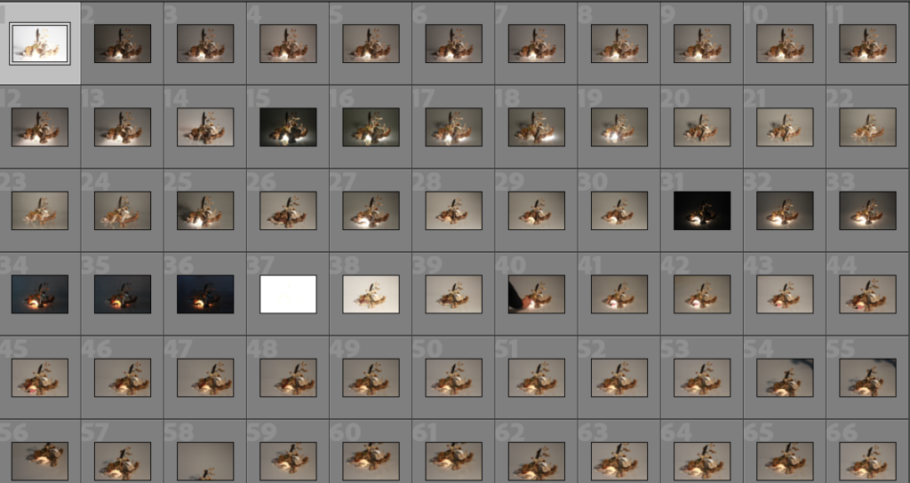
still life ideas

IMAGE ANALYSIS

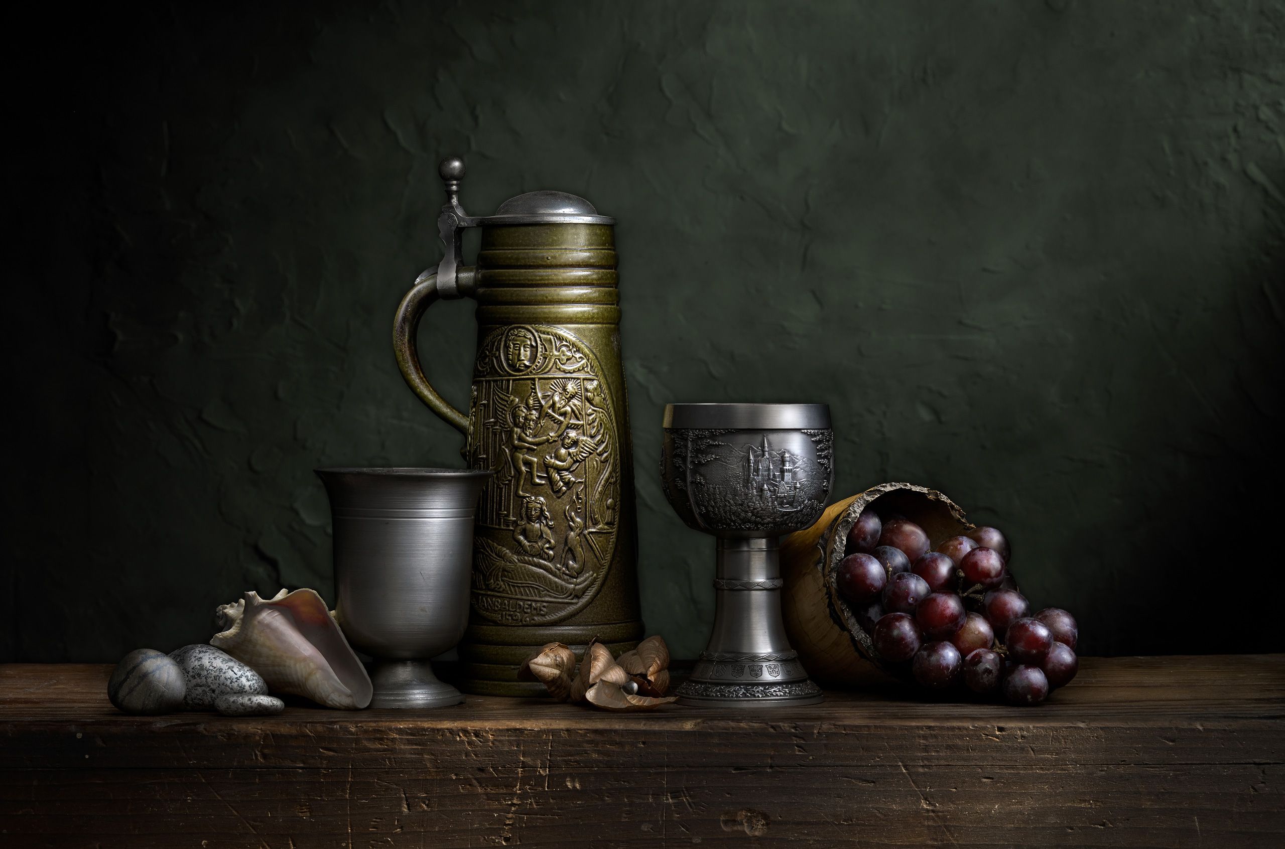
The photo above is in colour and captures a variety of objects in a dimly lit room, the only light appears to be illuminating the objects on the table, which features cups shells and grapes, grapes being typically featured in still life images and symbolizing wealth because when still life first became popular grapes were considered a delicacy to eat. The objects are organized with the smallest ones on the outside and the biggest in the middle to draw the viewers eye in. The dark background also makes the gold and silver colours stand out. Shadows are being cast over the objects so the lighting is clearly not natural and must be from an overhead light.
Geopark

A Geopark tells the whole story of an area, right from the very beginning. We think that Jersey – which has been shaped by tide and time – should have this designation because of the Island’s exceptional geology, unique heritage, amazing landscapes and special seascapes. Discover more about this new project below.
2d barcode
Every Geopark is unique. There are 169 UNESCO Global Geoparks in 44 countries around the world. United Nations Educational, Scientific and Cultural Organization (UNESCO) seeks to build peace through international cooperation in Education, the Sciences and Culture.
“UNESCO Global Geoparks are single, unified geographical areas where sites and landscapes of international geological significance are managed with a holistic concept of protection, education and sustainable development.
A UNESCO Global Geopark comprises a number of geological heritage sites of special scientific importance, rarity or beauty. These features are representative of a region’s geological history and the events and processes that formed it. It must also include important natural, historic, cultural tangible and intangible heritage sites.

ANTHROPOCENE – EVALUATION AND CRITIQUE

Evaluation

i think this project worked out well i feel that the work i have done is satisfactory and think that my choices of locations and types of final images worked well linking to Anthropocene showing the the fragility of nature in my first idea and the urbanisation of our world for my second idea

i first planned out my photo shoots picking the best locations to bring my ideas to life i also described what Anthropocene was which i feel was important to do so the viewer of my work realy understand what it is about

I then started to think about my artist refrences and what it was about there work that attracted me to do a similar project using YVES MARCHAND & ROMAIN MEFFRE and Ingrid Weyland

i then created my action plan using screen shots from google maps to show the location’s i am using and when and how i will be taking my photos

the next step was filtering out the images i was going to use to have a final selection of images the next step was editing in light room where for project 1 i enhanced the vibrancy of the colours and how they work together and for project 2 i edited them black and white as well as other small enhancements

after completing all the editing and being left with my final images which i then posted on the blog and created a virtual gallery to showcase my images

Critique-

I feel i did good with this project how ever i feel that there is room for improvements a key one being planning in advance this is because i felt i didn’t have enough images to create the vision i had i also should of fully figured out what i was going to make for my final image before taking the photos so i could of aimed to take more connected photos to each of the projects ultimately giving me a better chance at a better final image

idea 2 rapid urbanisation

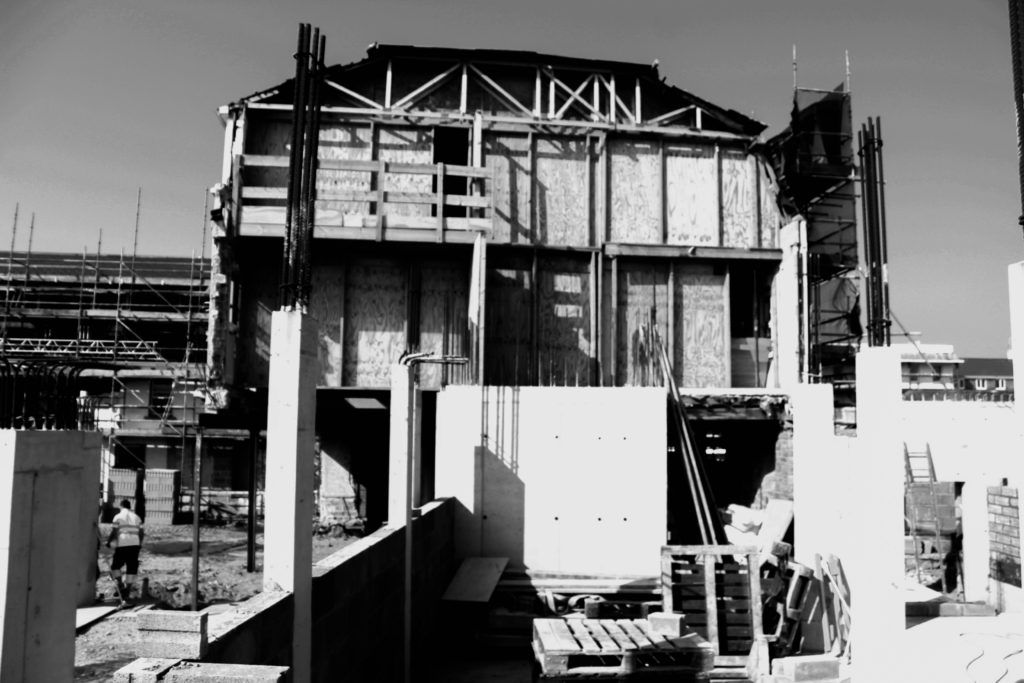
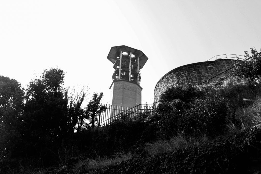
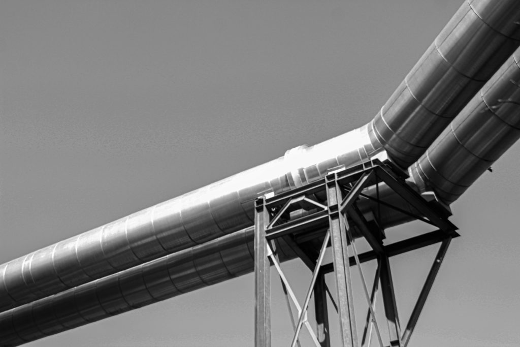
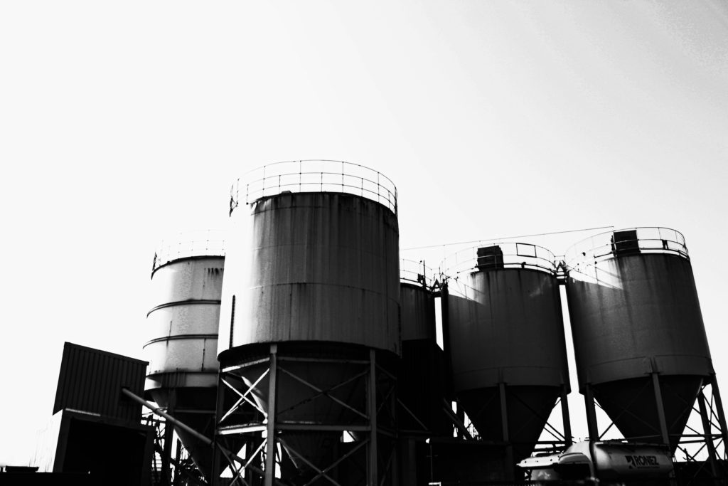
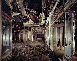
For this idea i am going to be using photos telling a story of rapid urbanisation and the left overs of the past generations and how the world is rapidly changing leaving the past behind i will be using YVES MARCHAND & ROMAIN MEFFRE as my artist reference because they photograph derelict buildings which i feel links with this strongly

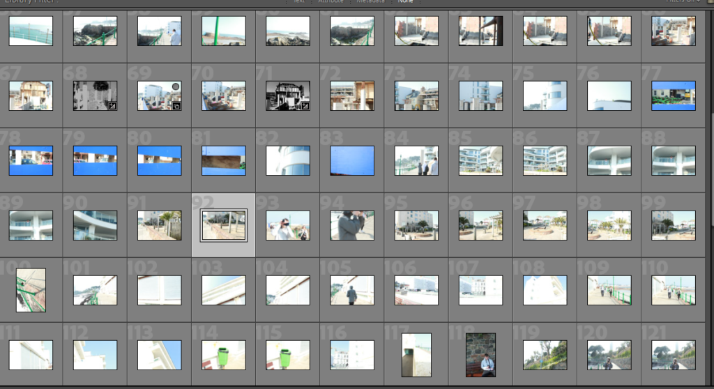
CONTACT SHEETS

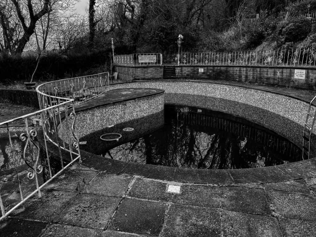
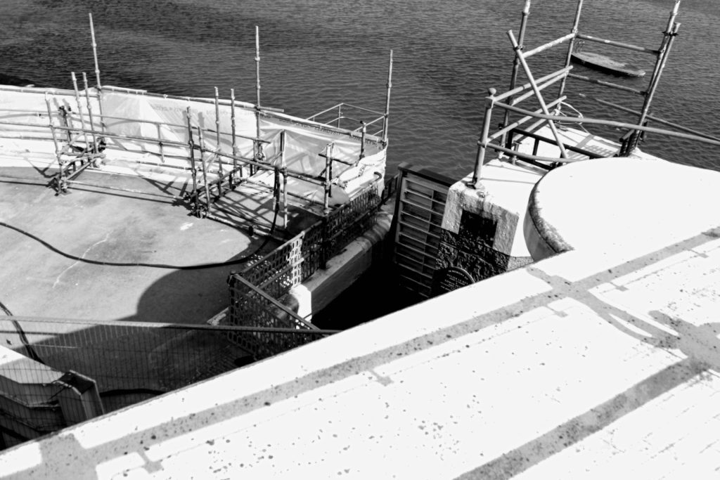
my idea – my idea is to use photos of derelict buildings and also building sites to show the speed of which our world is urbanising and changing

what i did

i started by narrowing down my images to a select few for this series

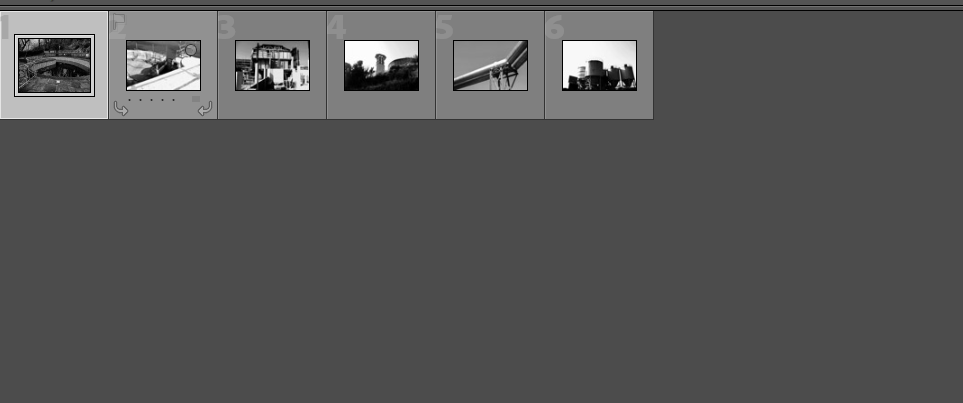
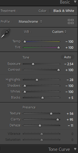
i then took the photos into light room for some editing

i decided to do something different to my artis reference by making the images black and white i then ruther edited in more detail to get the right final image

then repeating this for each one i was left with my final images

Evaluation & Comparison

overall i was happy with this idea and how it turned out I feel that i worked well with the theme of Anthropocene portraying the humans impact on the world and what’s around us which i thought to be a good way of showing this how ever i did change slightly to YVES MARCHAND & ROMAIN MEFFRE as there images are predominantly colour i decided to use black and white for my final images