EXHIBITION
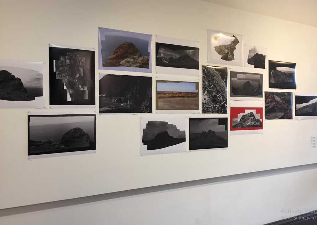
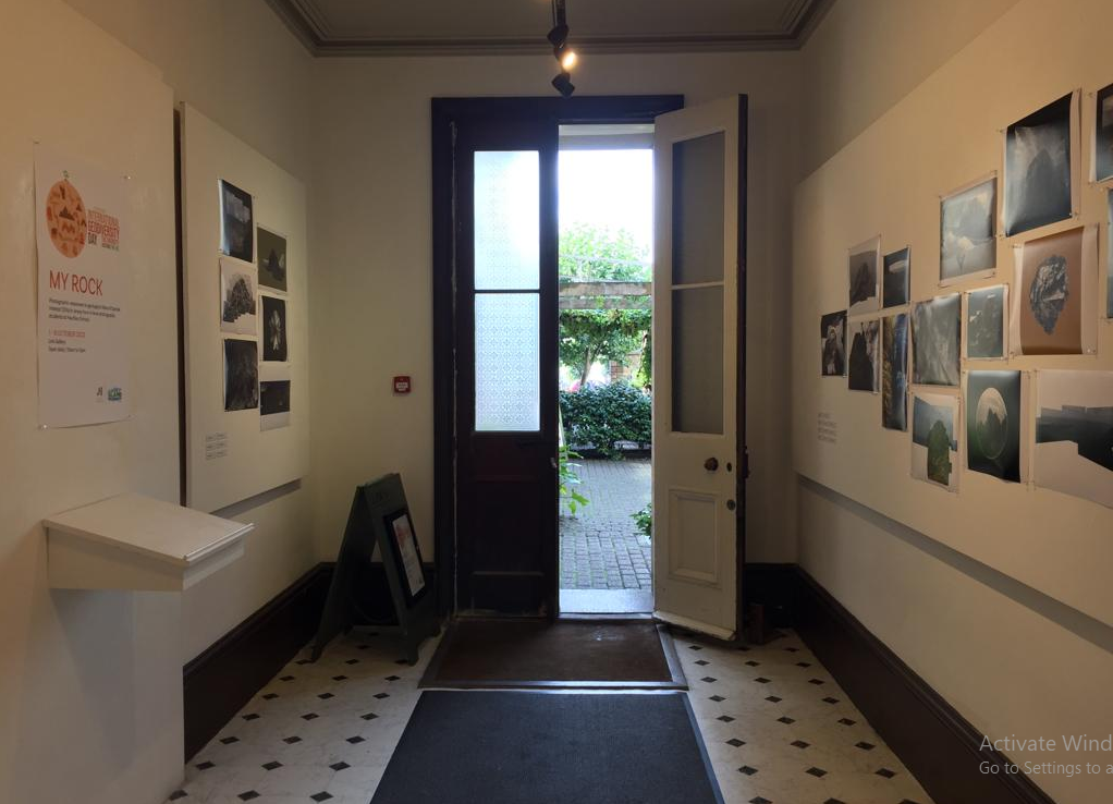
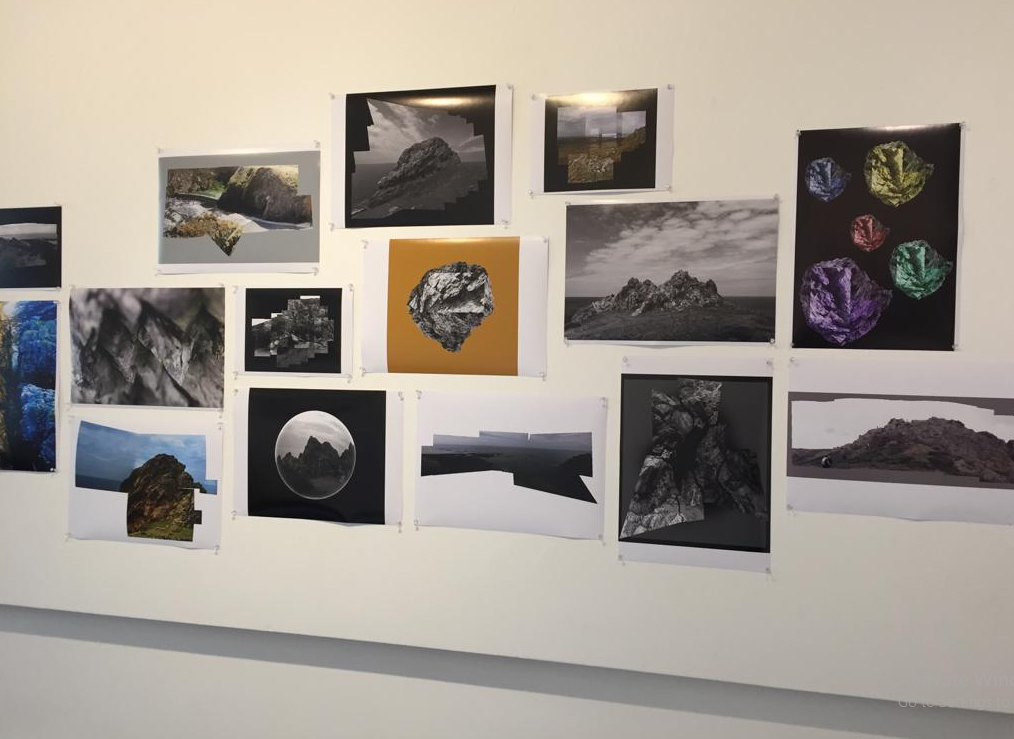
The Link Gallery is a local exhibition space which displays the work of local artists across Jersey, it is located in the Jersey Museum and Art Gallery.
Our “My Rock” work was displayed in The Link Gallery.
EXHIBITION
The Link Gallery is a local exhibition space which displays the work of local artists across Jersey, it is located in the Jersey Museum and Art Gallery.
Our “My Rock” work was displayed in The Link Gallery.


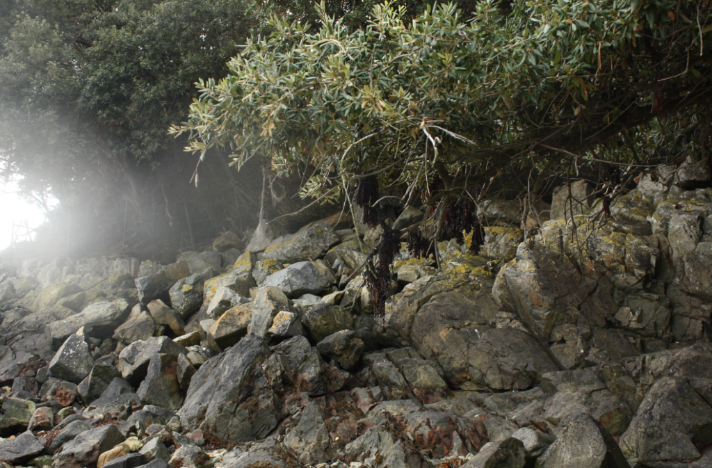
La Motte is a beach in Jersey which is known locally as “Green Island” due to the tidal island, and listed archaeological site.
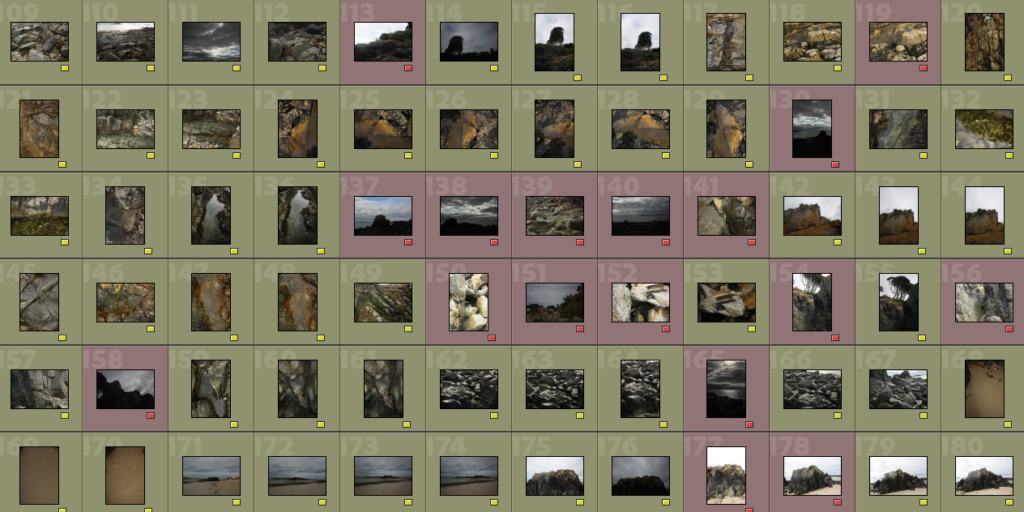
From this photoshoot I separated my images into 2 categories; images I will edit and images I will probably not use.
I had a scratch on the lens of my camera so some of my images appeared foggy and unfocused in one part of the image.
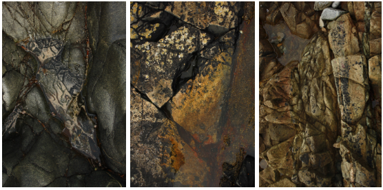
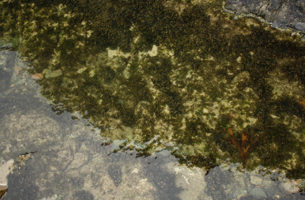
During this photoshoot I focused mostly on rockpools and colours instead of rock formations and landscape images. Below are my most successful unedited images from the photoshoot.
IMAGES
When I have fully edited and possibly collected more images from this site I plan to make a zine about rock pools and colours in nature.
I created a structure consisting of a foamboard base, sheets of Perspex and put a light behind it, the images were printed onto transparent paper so that they could be layered in front of the light.
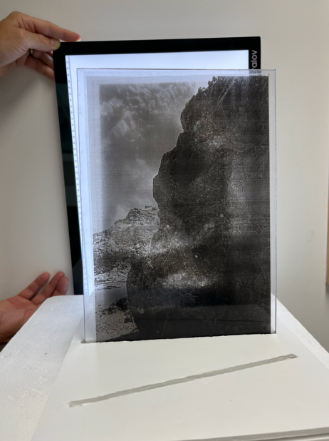
I think for a display I would need a stronger light so the images were clearly more visible, even better if I could make lighting fixtures which go in the base underneath the Perspex slides illuminating the image itself.


SON BONG CHAE
A pioneer of the 3D painting genre, Son Bong Chae was born in Hwasun County, South Korea in 1967. He received his BFA from Chosun University in Gwangju, and his MFA from the prestigious Pratt Institute in New York, USA.

Son employs a layered painting process to create ethereal landscapes reminiscent of traditional Korean landscape painting. Each work is painted in oil paint onto multiple layers of polycarbonate, a special type of bulletproof glass 300 times stronger than acrylic glass. Illuminated by a luminescent diode, a type of lighting similar to a LED, these landscapes evoke both the memory of traditional painting and the timelessness of the scene.

HAHN JEESUN
Hahn Jeesun earned her BFA from Hongik Univerity in South Korea and her MFA from the University of Utah in the US. So far, she has 20 individual exhibitions and many group exhibitions in South Korea and other countries.
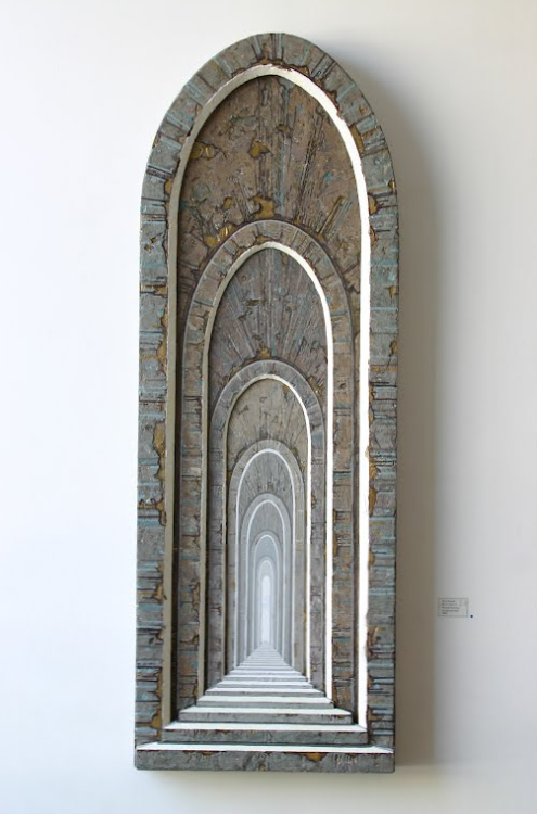
Hahn Jeesun is versatile with architectural images of multiple perspectives as well as floating objects in diverse shapes and looks. These are accented in her acrylic paintings with three-dimensional surfaces on plywood, symbolizing people, society, and relationships that interact together. Some of them represent the perceptions that should be abandoned in order to reach the ideal state. Her works are about our environment that is breaking down and our efforts to recover from it.

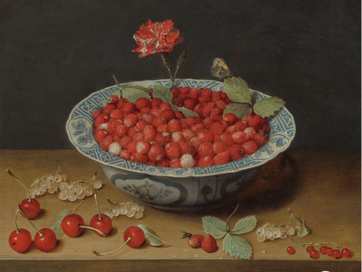
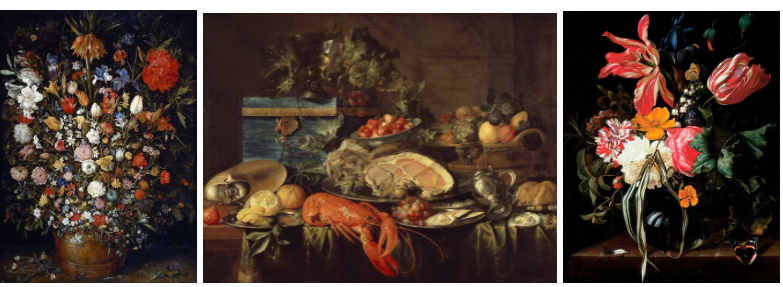
Still life is historically a genre of painting where the subject of the painting includes either dead animals and/or inanimate objects such as fruit, candlesticks, fish and cut flowers. Typically still life displays material pleasures and often a warning pointing towards hedonism. Still life can also be a display of memento mori– designed towards remind the viewer of their own morality.
HISTORY OF STILL LIFE
Still life became a dignified art genre with Netherlandish painting of the 16th and 17th centuries. The English term still life derives is translated from the Dutch word stilleven- in French, the term for Still Life is nature morte, which means “dead nature”. Early still life paintings, particularly before 1700, often contained religious and allegorical symbolism relating to the objects depicted- for example some of the earliest still life paintings were created by the Egyptians in the 15th century BCE which decorated the interior of burial tombs

Throughout history still life travelled across the globe, but finding its primary home in the Netherlands during the Dutch Renaissance (17th century) where it became a prevalent art form with many paintings displaying rich colours, hedonistic implications, religious symbols and symbols of death as a reminder of human mortality. Click on the image below for a guide on symbolism in still life.
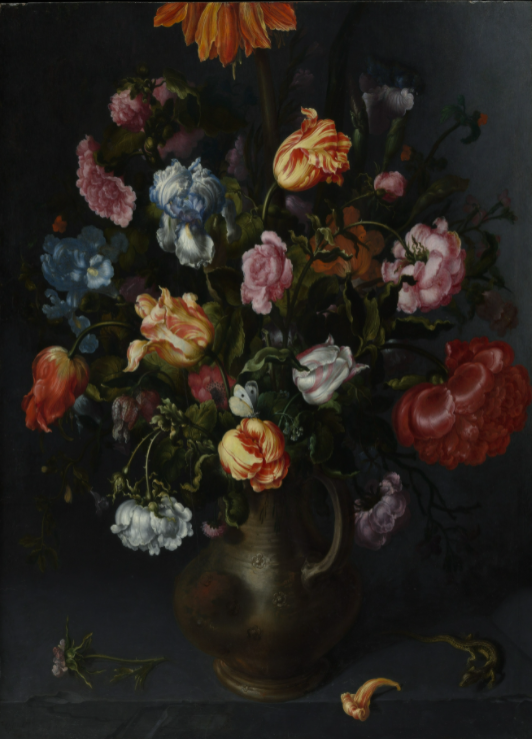
Still life was then translated to photography, with its origins residing in the early 20th century. Art photographers emerged such as Baron Adolph de Meyer who took direct inspiration from the Dutch painters of the 17th century.
ANALYSIS OF STILL LIFE

This vanitas still life painted by Pieter Claesz in 1625 displays a candlestick holding the stub of a candle, a watch, a letter, a pen and an inkpot, a flower, a skull and a walnut arranged on a table. All of these objects are part of the established language of classic vanitas paintings, engulfed with symbolism of mortality and time passing. The flower at the edge of the table is an anemone, It appears newly picked as the petals and the leaves are still fresh, however anemones have a reputation for withering quickly- the Roman poet Ovid called the anemone a ‘windflower’ because it clings to life for such a short time. In this still life, with its message of time slipping by, the flower certainly refers to the fugitive nature of life; this is further enhanced by the candle which seems as if it is about to blow out and quite obviously, the skull which is where attention is mostly drawn to as the light in the painting is coming from the left side (the candle- and possibly another light source so the painting could still be worked on) and concentrates on the skull which is outlined by shadows, defining its shape. This painting is quite interesting as the composition is quite spread out meaning the shadows are every visible which is especially unusual compared to the contrast of the quite light objects- the flower, skull and paper which are primarily white based.

EXPERIMENT #1
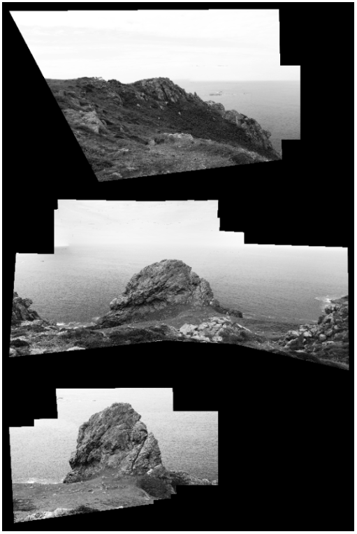
For my first experiment I am planning to create a joiner from my first photoshoot.

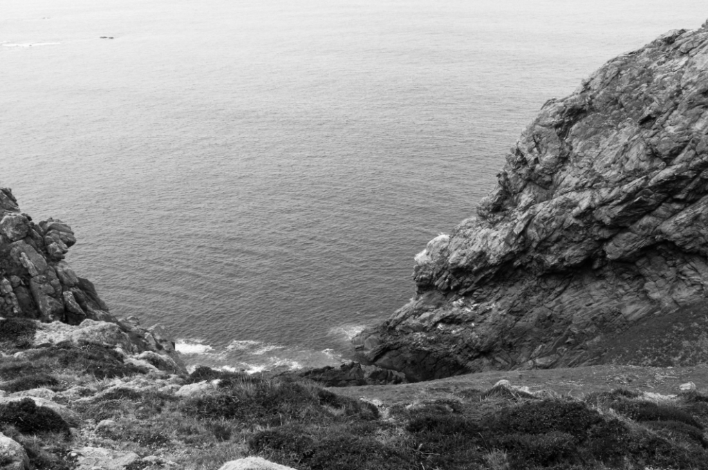
First I separated the images I took to create a joiner from the rest of my photos by changing the colour label to blue.
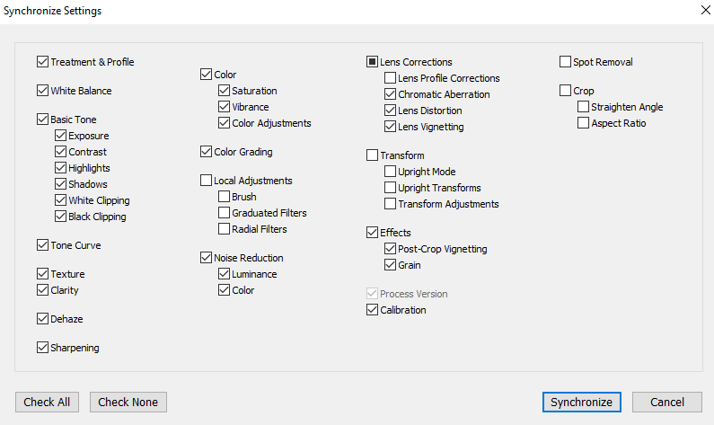
I then edited one image and synchronized the settings so all images were edited the same.
I then exported my images to Adobe photoshoot and made a joiner by clicking merge images and selecting images I wanted in my joiner.
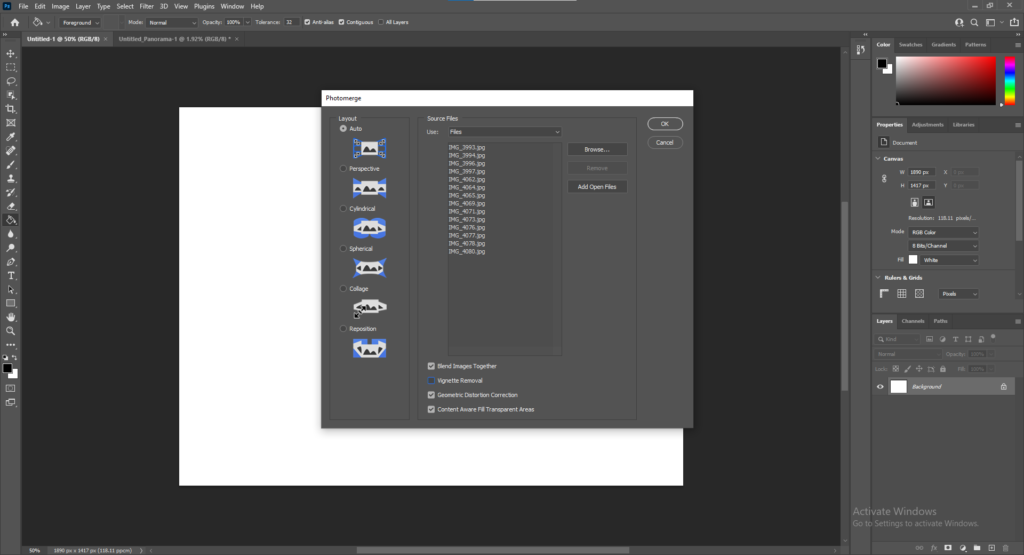
The process was automated so I could not control what the final outcome looked like. I changed the colour of the background (seen below) to black.
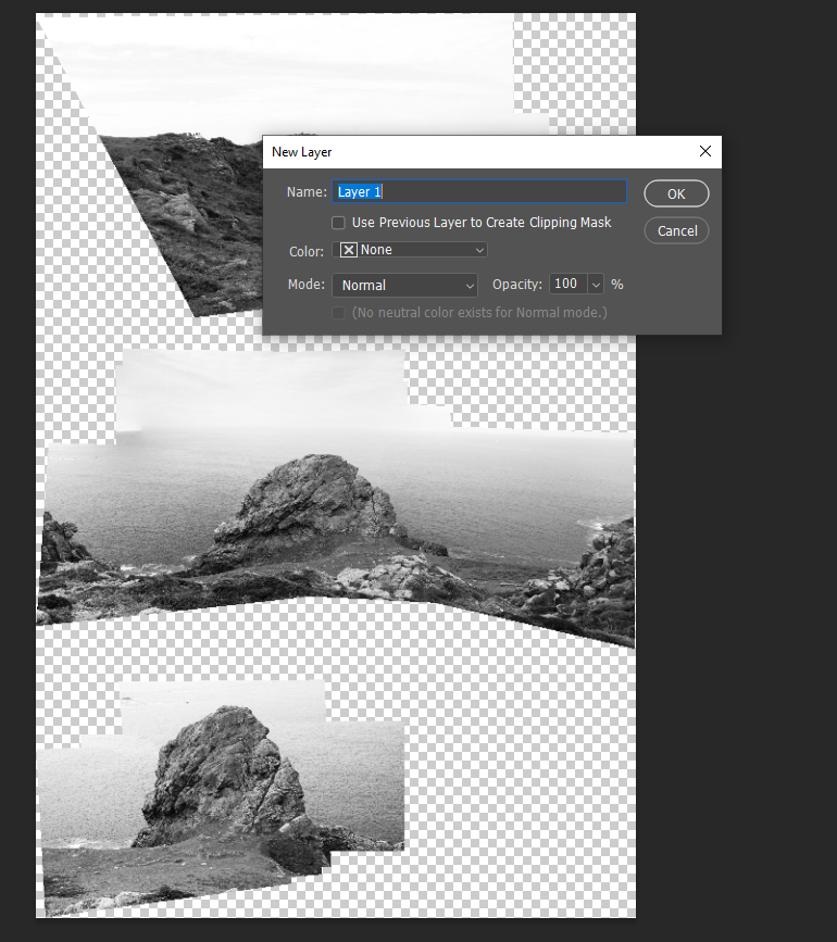
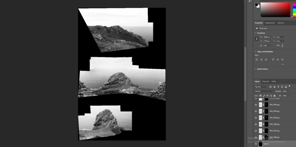
The final outcome of this joiner is seen below
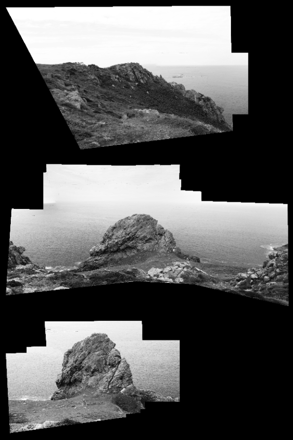
I quite like this experiment, especially how detached each image of the coast is, with the biggest image in the middle- drawing attention to it. The angles of the photos are interesting and present almost an optical illusion view contrasted against the sharp, straight lines of the edges of the image.
EXPERIMENT #2
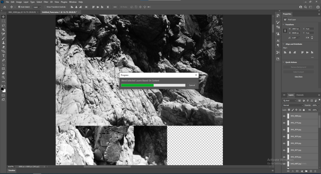
I decided to create another joiner using the same process

This joiner was not as successful as the images separated and just became sharp fragments of pieces of the image.
EXPERIMENTATION #3
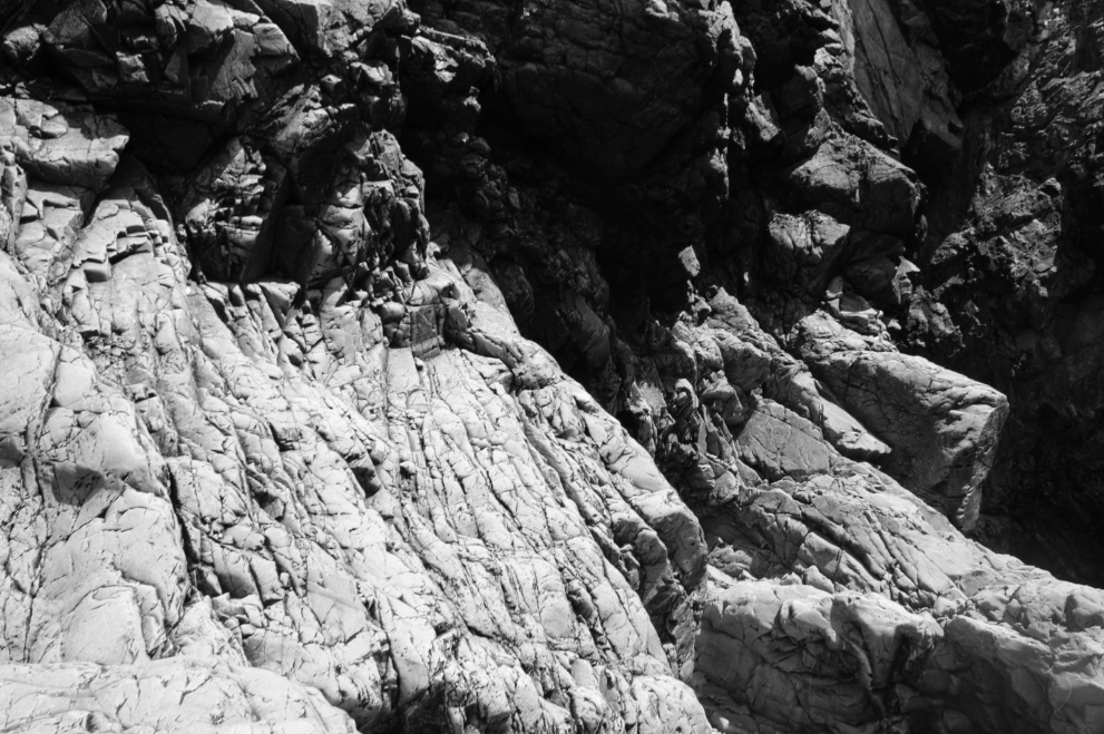
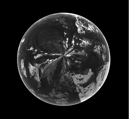
Instead of combining multiple images I decided to experiment using one image by changing it into a 3D image to decide if I should create a 3D joiner.
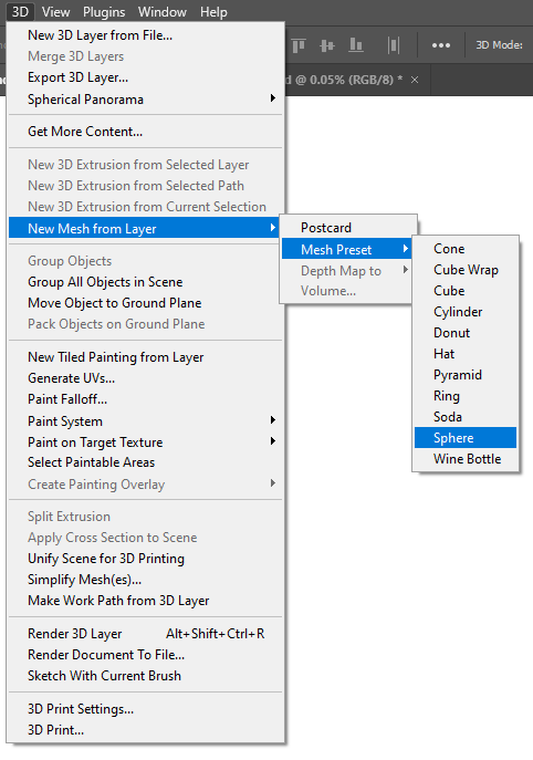
I did this by going on 3D; New mesh from layer; mesh pre-set; sphere where photoshop then merged my image into a sphere.
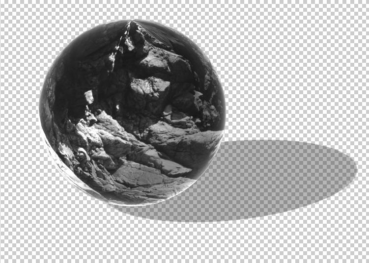
I then changed the background to black to get rid of the shadow as I believed it looked tacky and too fake.
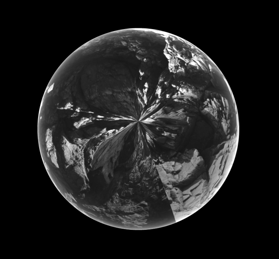
I quite like this experimentation as the image looks almost like it was taken with a fisheye lens and looks slightly magnified- distorting the structure of the rock which makes the image look more interesting overall. I really like the way the middle of the image looks like a flower as the contrast between
EXPERIMENTATION #4
I wanted to explore by merging images to make a joiner, first I selected some images on Adobe Photoshop and superimposed them on top of each other.
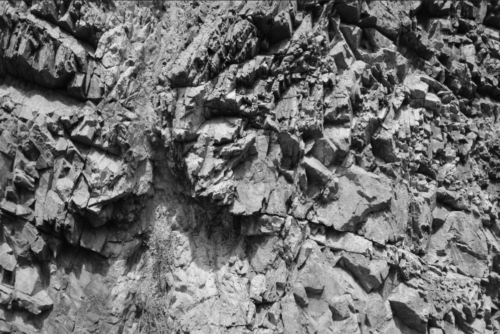
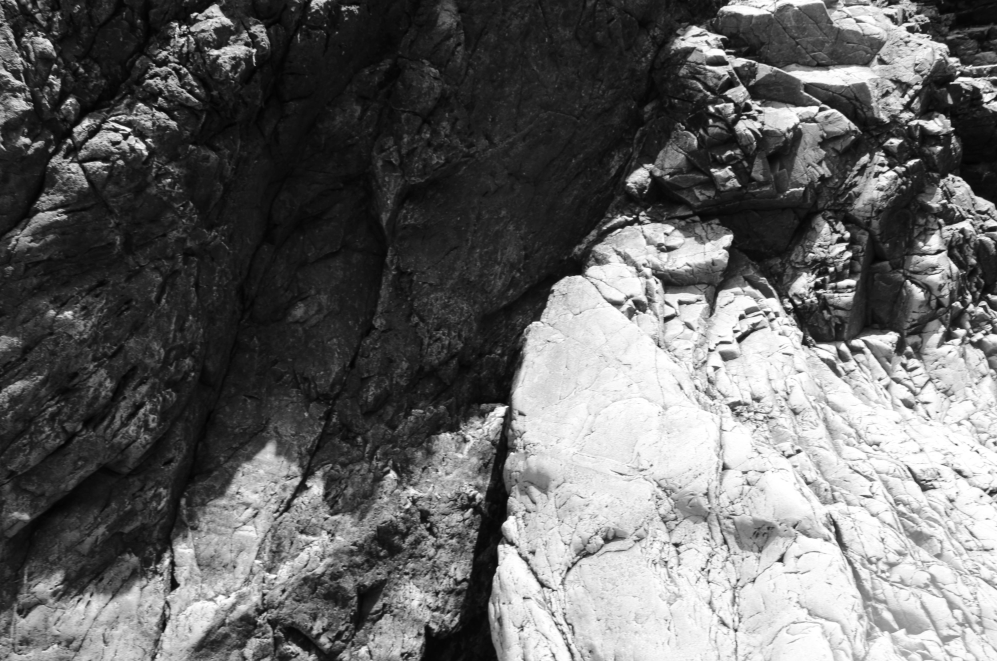
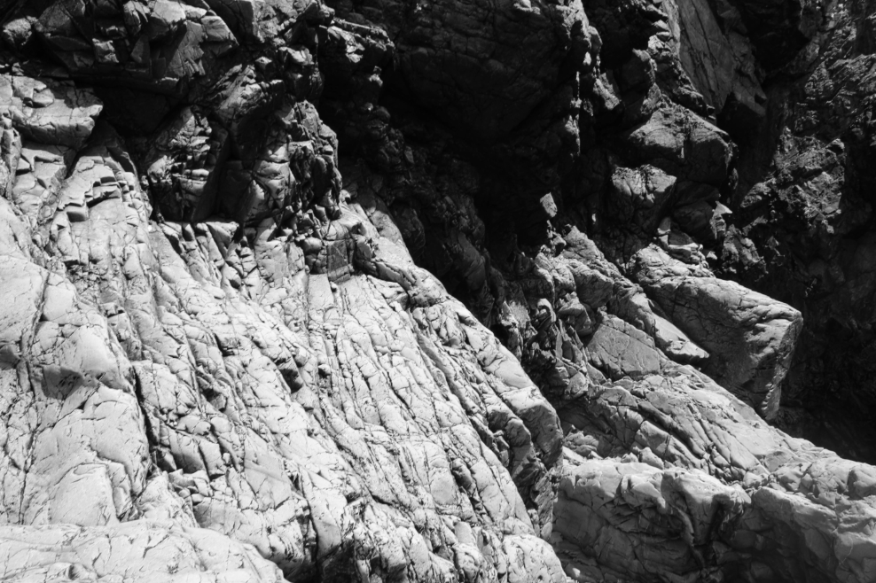
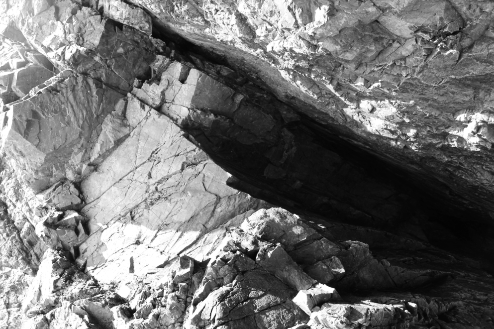
I chose images which had a large contrast between shadows and light areas so the joiner would be more varied in colour
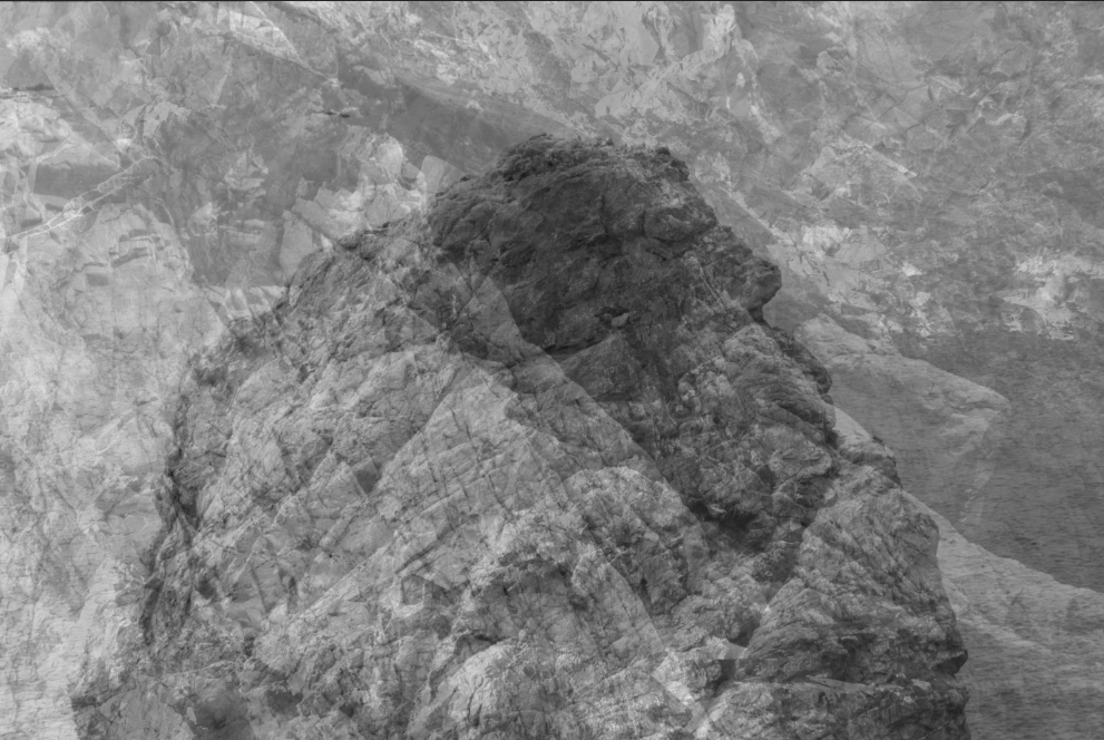
I believe this joiner is not successful as the image is too busy and there is not a large contrast in tones as the textures of the rocks are quite similar, meaning the image looks plain.
FINAL OUTCOMES
Overall I believe the two experiments below are the most successful and I plan to decide between them and display my final choice in an exhibition.
My first shoot was conducted at areas surrounding L’ Etacq, Le Pinacle and Stinky Bay, We walked around the headland but focused on taking photos of rocks- whether close up or far away.
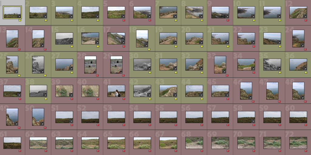
First I separated my images by colour- red meaning I am least likely to use them while yellow meaning I believe they have potential.
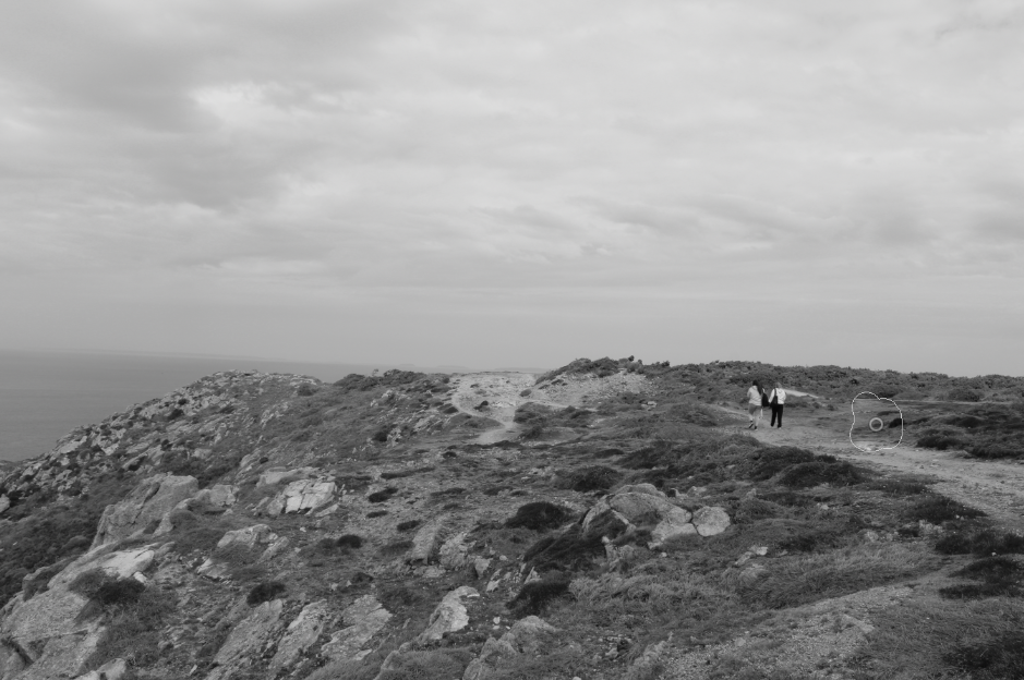
I edited all my images the same way, turning them to black and white then syncing the settings, I then went through each image individually and edited it so it suited the light etc. I also did some spot removal in some of the images as some of them had people in them (spot removal seen below)


While going through and individually editing each image, I did another sub-selection, changing images I believe are my best to green.
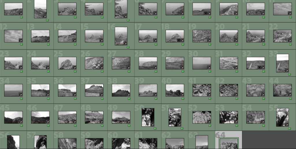
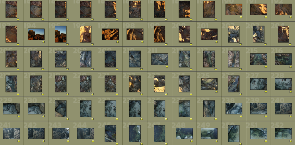
After this I then did a further sub-selection as I had ended up with 64 images I liked, this final sub selection lead me on to my best images.
BEST IMAGES FROM THE SHOOT


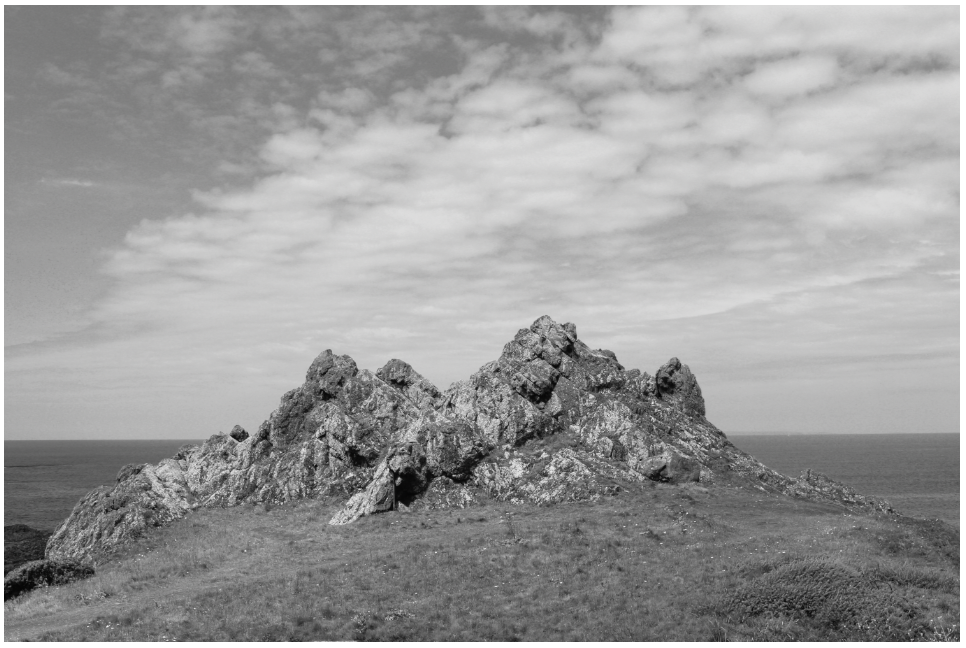
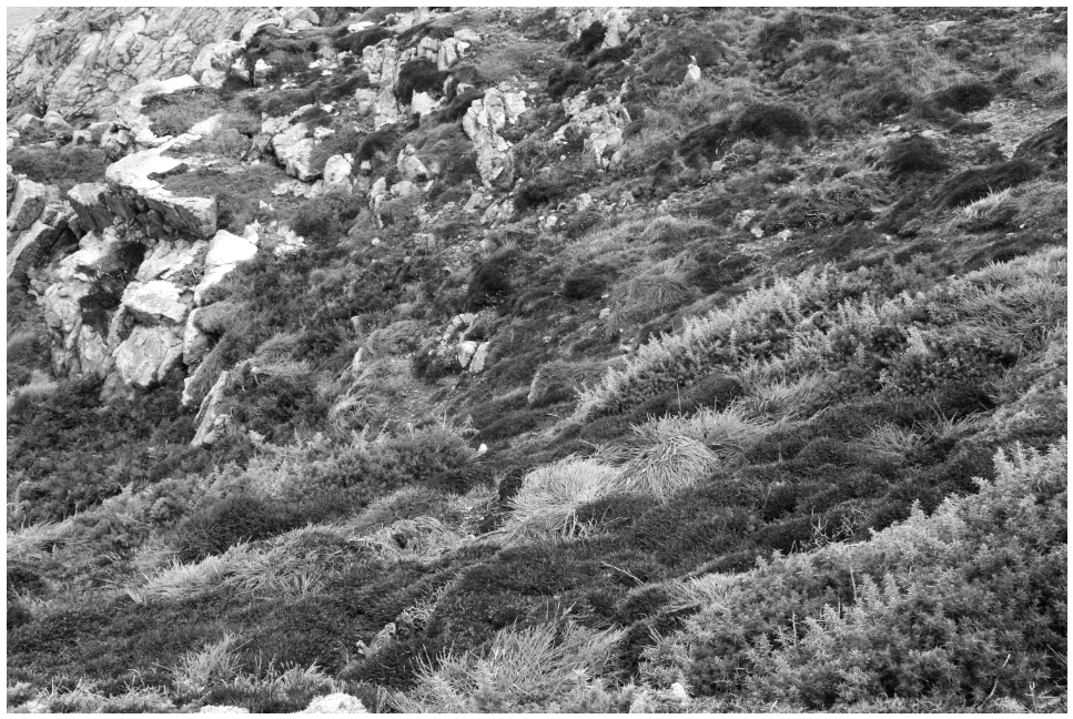
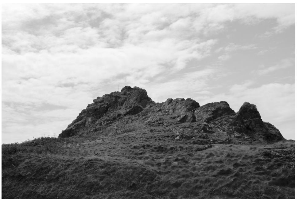
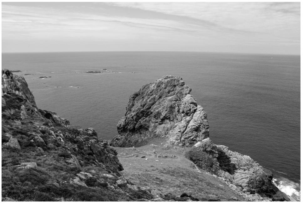
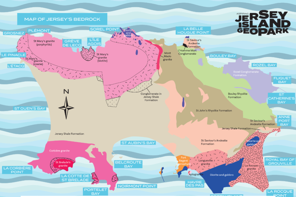
The Aspiring Jersey Island Geopark aims to educate the story of Jersey’s geological heritage, with the aim of encouraging Islanders and visitors to explore Jersey and see first-hand how geology has shaped the Island we know today.
‘The aim of the centre is to introduce the Aspiring Geopark project and encourage people to explore Jersey and discover its stories along the way. The Island has been shaped by tide and time over millions of years. Jersey’s exceptional geology and important cultural heritage form the outstanding surroundings we enjoy every day.’
With the new threats of climate change and further urban developments- Geopark sites are heavily protected and are spread around the island, they include dolmens, heritage sites-such as Gronez Castle- and rocky outcrops. All sites are significant in Jersey’s heritage- with some sites dating back to over 6,000 years ago.
WHAT IS A GEOPARK?
UNESCO defines a Geopark as:
‘Global Geoparks are single, unified geographical areas where sites and landscapes of international geological significance are managed with a holistic
concept of protection, education and sustainable development. A UNESCO Global Geopark uses its
geological heritage, in connection with all other aspects of the area’s natural and cultural heritage, to enhance awareness and understanding of key issues facing society, such as using our Earth’s resources
sustainably, mitigating the effects of climate change and reducing natural disasters-related risks. The purpose of a UNESCO Global Geopark is to explore, develop and celebrate the links between that geological heritage and all other aspects of the area’s natural, cultural and intangible heritages. It is about reconnecting human society at all levels to the planet we all call home and to celebrate how our planet and its 4,600 million year long history has shaped every aspect of our lives and our societies’. For Jersey, the intention is for the Geopark to extend across the Island and its territorial waters, including the offshore reefs.
I plan to have my first photoshoot in the areas surrounding L’ Etacq, Le Pinacle and Stinky Bay which are all Geopark sites.
SCHOOL TRIP- GEOPARK VISITOR CENTRE
We attended a talk about Jersey’s geology which was conducted by Ralph Nichols, referencing places of interest to Jersey’s Geopark sites and places that would be good for photography.
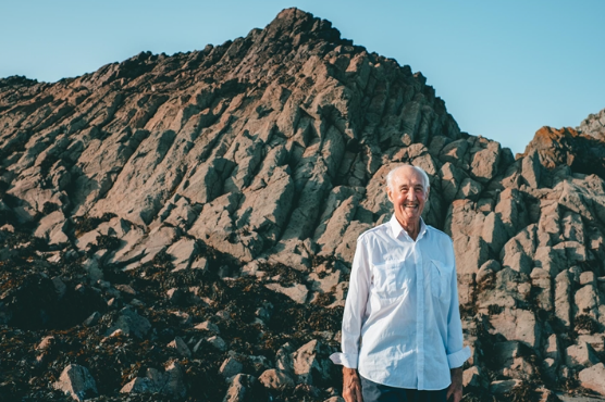
The visitor centre displayed images of the various sites around Jersey, with information about their geology such as their mineral composition and rock type (metamorphic etc). Attention was also drawn towards the sound scape which as playing in the centre- which focused on ‘natural Jersey sounds’ such as birds singing, the sound of the sea and even Jersey’s own language- Jèrriais– which can be heard on this link.

DAVID HOCKNEY
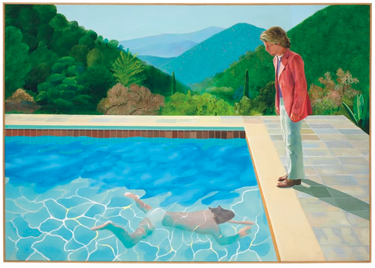
David Hockney (born 9 July 1937) is an English painter, draftsman, printmaker, stage designer, and photographer. As an important contributor to the pop art movement of the 1960s, he is considered one of the most influential British artists of the 20th century.
HOCKNEY’S JOINERS
In the early 1980’s, Hockney began creating intricate photo collages that he called “joiners”. His earlier collages consisted of grid-like compositions made up of polaroid photographs.
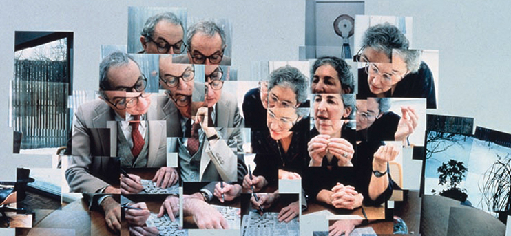
Hockney created joiners was by taking multiple and varying Polaroid shots or photolab-prints of just an individual subject. Then with these shots he would arrange them into what almost looks like a patchwork, to create on overall image.

One of Hockney’s first ‘joiners’ was a photomontage of his own mother. Inspired by Cubism, Hockney created images where a 3-dimensional space was portrayed as a 2-dimensional image. Hockney’s joiners aimed to create an image that was able to show reality how we experience it (in fragments, not as a whole), and to show the passage of time.

PHOTOSHOOT #1
My first photoshoot is from Harve de pas and the industrial estate which is on the coast near the beach.
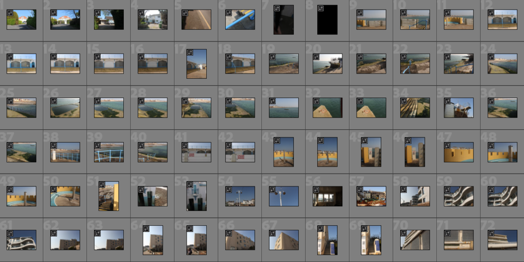
I started going through my photoshoots and creating a selection of images by colour coding images red which I believe may have potential for editing.

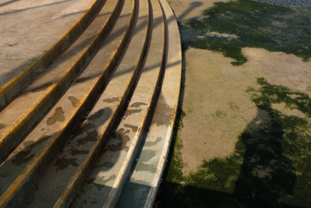
Overall, I was not massively interested in photographing Harve De Pas, I have some images which I am happy with but not a large amount, I am hoping my images from other parts of the island will be more fitting for my New Topographics project. The colours of Harve De Pas were interesting to photograph- which links to William Eggleston’s colour photography. Below are some of my favorite images from this shoot.
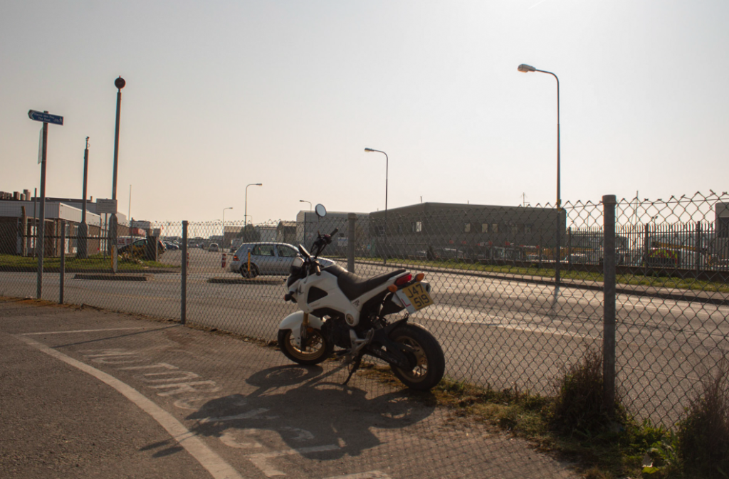
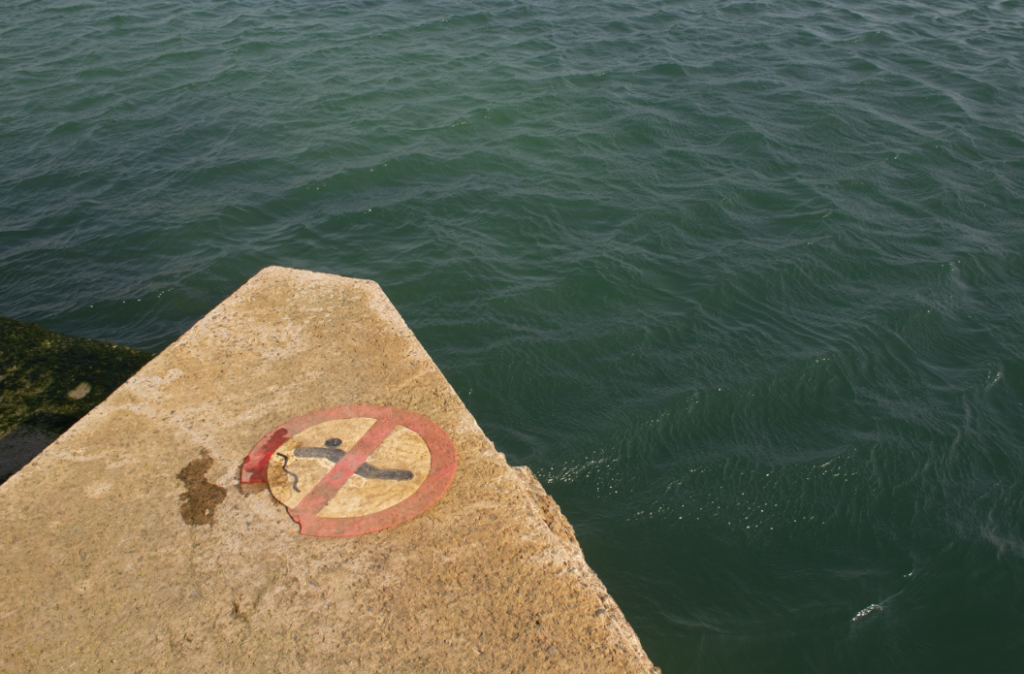
PHOTOSHOOT #2
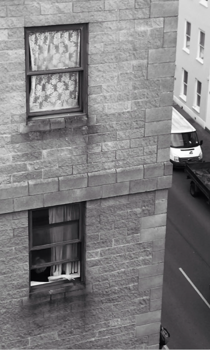
In my second photoshoot I walked through town and let chance of seeing something that reminded me of my photographers take place. I explored different vantage points by taking images from the street and from rooftops- creating some interesting images.
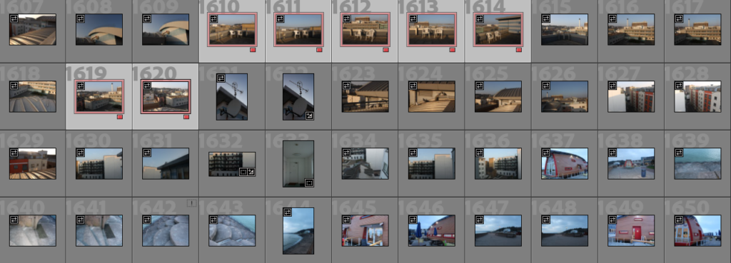
For my sub-selection I followed a similar pattern from my first photoshoot and colour-coded the images I liked the most. Below are my favourite images from this shoot.
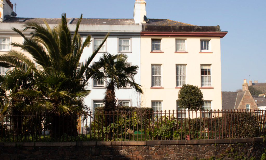
PHOTOSHOOT #3
This photoshoot was by far my biggest as I explored numerous parishes while taking pictures meaning I gained a wider variety of images than just concentrating on specific locations.
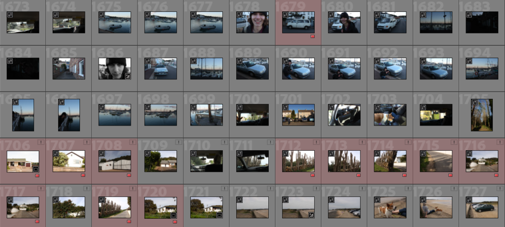
I then created a sub-selection and colour coded the images red that I am planning to edit.
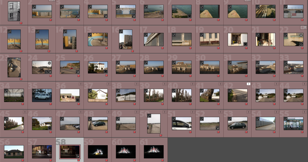
I ended up with 61 images I had to pick between while editing- I am going to edit these then make another selection of images which will be in my next blog post: Editing- New Topographics