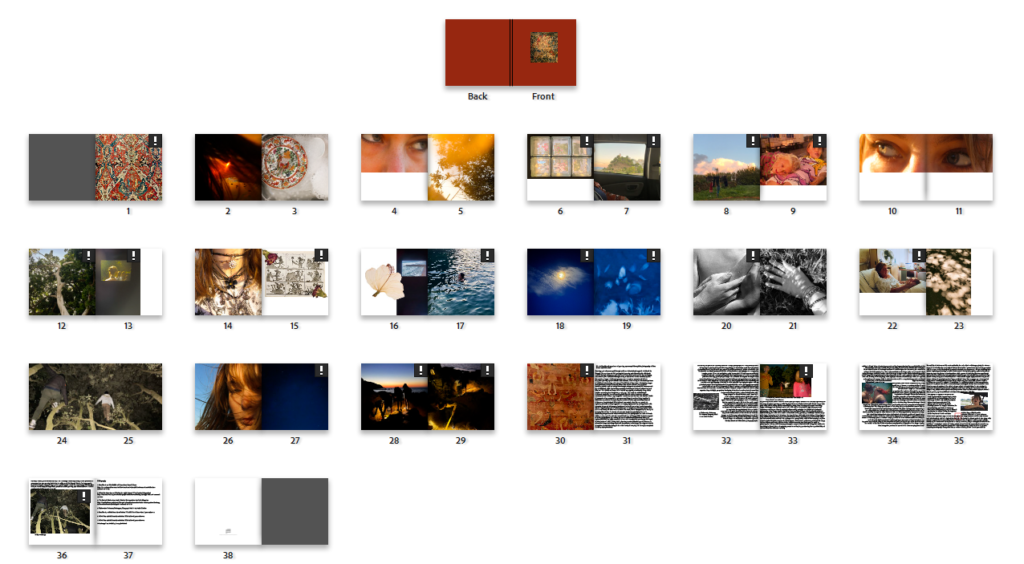
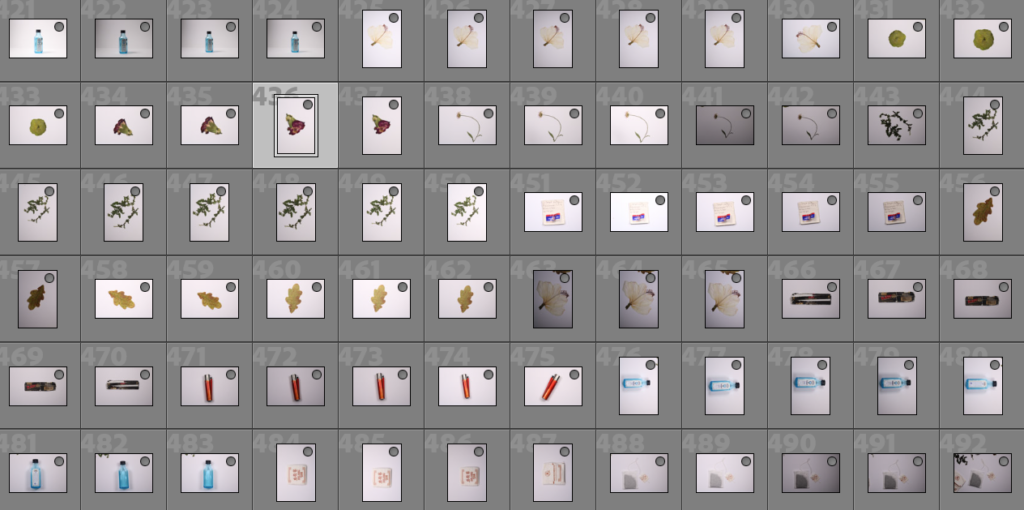
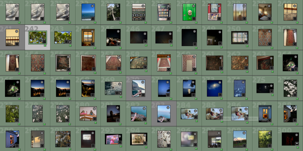
Click on the image above to view individual pages of the photobook
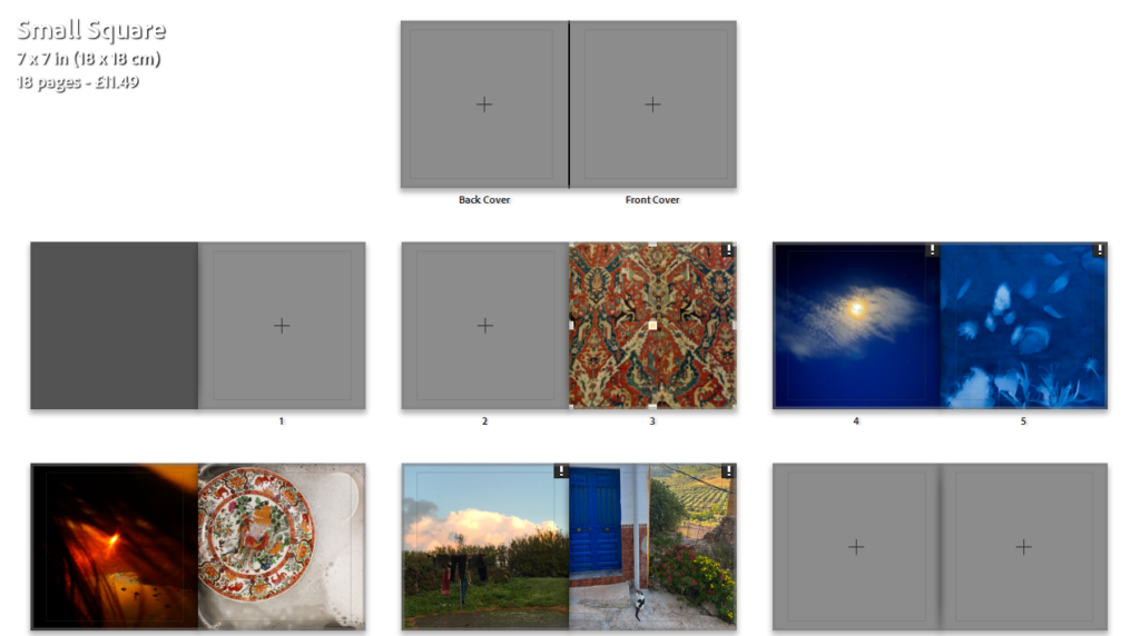
I believe my final photobook has turned out very successful and clearly relates to my artist references as well as the theme of islandness with a constant theme of nature where it is shown through flowers on the page, the content of the images including night skies, the ocean, trees, and even shadows which I believe this creates a flow through the book- there is another theme through the book which is the colour scheme: images are in a warm to cold colour gradient minus the warm pages before images where green is prevalent on the next page this is so there is some disruption, like the black and white image which breaks up the flow.
A page from my photobook
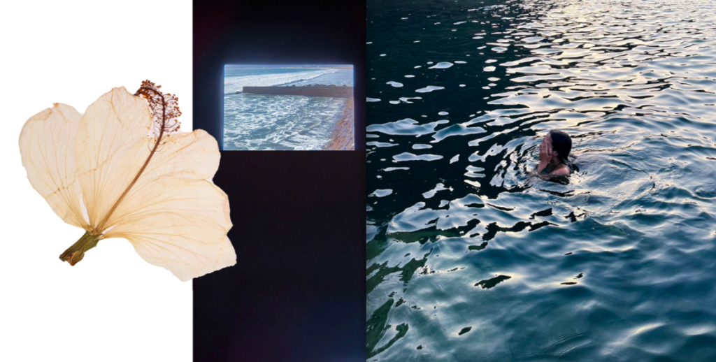
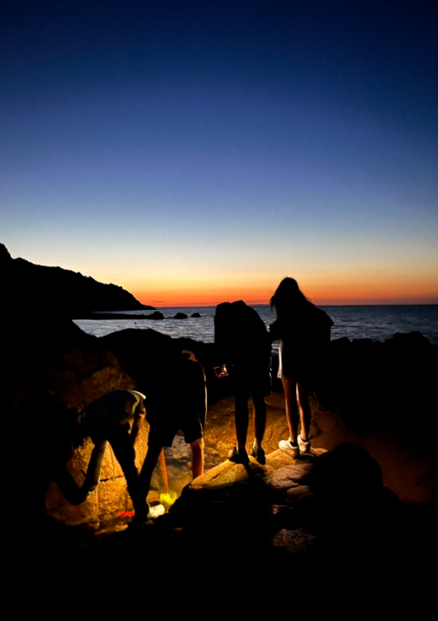
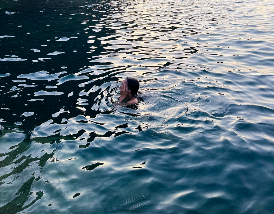
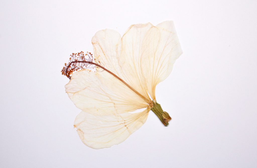
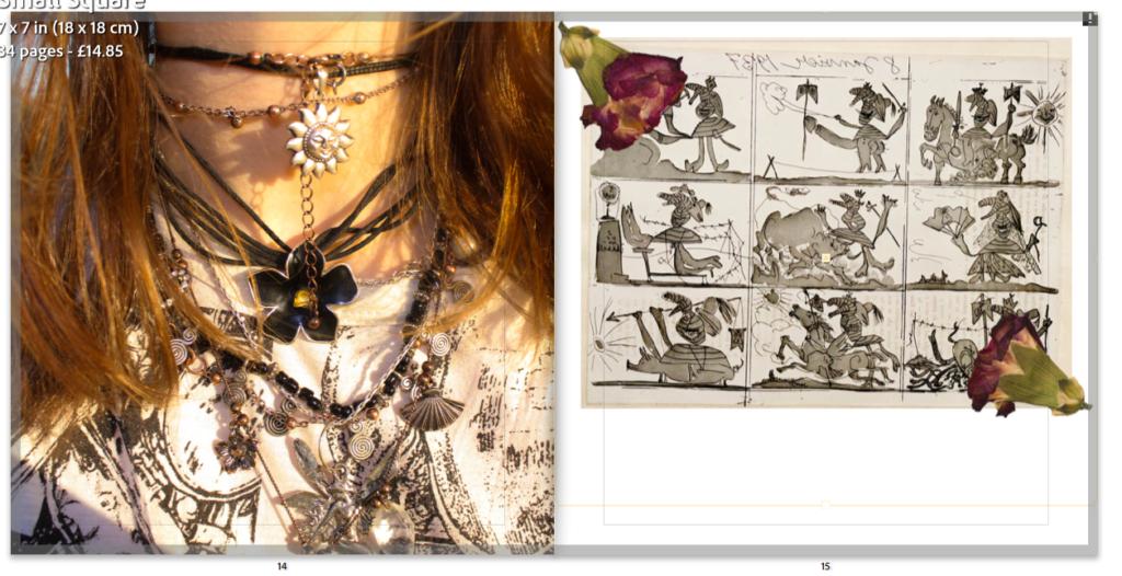
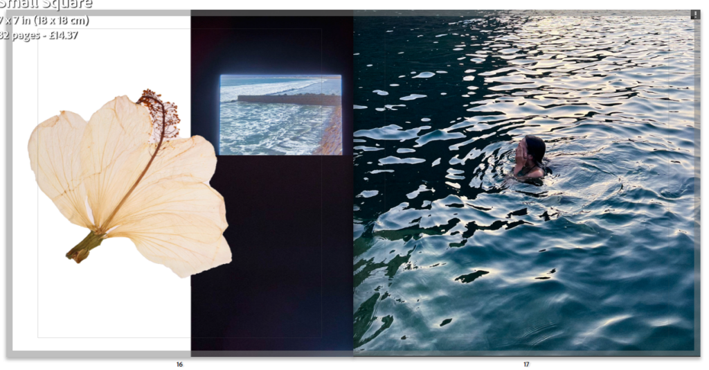
Above is my favourite page from my photobook, I feel as if shows the theme of the photobook best where it links childhood/teenagehood with a female gaze, showing the beauty of everyday life. Interpretation of these images imply island life- the sea is obviously extremely prevalent in these images as well as nature- seen in the flower, which could possibly show a more intimate side as the flower has been pressed which can imply it is dear to someone. Actual image content displays a lone female swimmer covering her face which is from an outsider perspective as there is a distance between the subject of the image and the viewer, both images in the book cover one page with a difference in tones of blues in the sea, one image of a rough sea while the other calm (and swimmable) these images together can be used as metaphors where island life is typically either smooth and calm or difficult.
For my final prints I did not chose the images which displayed the most technical ability but more the pictures which are more in tune with my artist inspirations Sam Harris and Olivia Bee. I believe my images represent the notion of growing up as portrayed by Sam Harris and emphasise everyday life- as Olivia Bee’s images do.
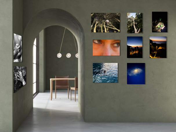
VIRTUAL GALLERY
When creating my virtual gallery I realised when generating my images I did not have professional environments such as galleries in mind (i.e. artificial lighting, white walls etc) so when creating my virtual gallery in photoshop I chose a background which was less commercial as my images are more intimate and meant for a photobook.
I opened a blank book and started inputting images in order to further refine my image choices and to create a structure in the book.
One of the layouts I immediately knew I wanted
I started by just randomly inputting my final images, finding colours that are similar in tone and presenting colour contrasts such as deep blues contrasted with dark oranges.
I also wanted to find textures that went well together- such as the tshirt and the art.
Incomplete in sequence however complete in editing of images with overlays.
I knew what images I definitely wanted to be in a sequence, such as the sea images which have an almost turquoise colour, then the deep blue of the sky and cyanotype then the rich colours heavily contrasted by the black and white.
For images like the one above I have decided I am going to put the actual object in instead of editing it in, to further the sense of a diary. All the white spaces left in the book will be physically written on with a black pen once the book is printed
When deciding what I wanted my end and beginning pages to be I wanted to have busy, colourfully rich image so I used my textural images
First page: I am planning to change the grey colour
Last page: The images are not seamless however I actually quite like it like this has the images have significance to me
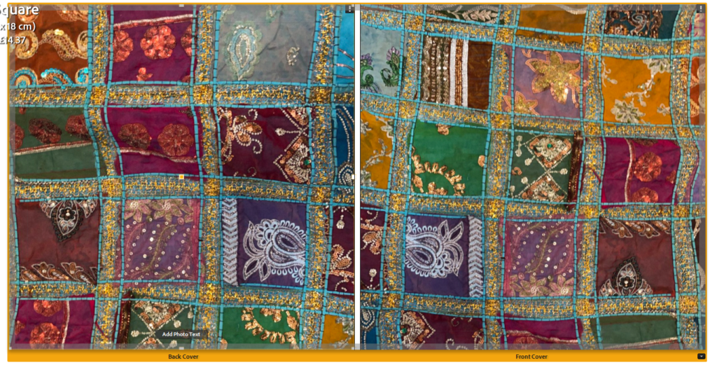
What I may have my front and back cover look like- however as the colours do not suit the pictures I may not keep this as it clashes.
I do not have much regularity in the layout of my images on a page however there is regularity in the way the images are presented- with there only being full page spreads, one two page spread and the only gaps being left to be written in either being below an image or down the side.
An page spread where writing will go down the side
I have decided this will be my final layout, I may leave the cover red and draw on it, or change it to green or blue however I am unsure as of yet.
I had to decide some design choices such as the size, the cover and paper type- I chose for the book to be in standard square format with a hard cover including matte paper
Final design
I feel as if this design is quite successful- I like the reoccurring theme of warm colours such as the “textural” pages at the beginning and the end. I do not feel as if the images “flow” however this was not exactly what I wanted, I like how the images where green is the most prominent colour almost disrupt the flow of warm into cold colours.
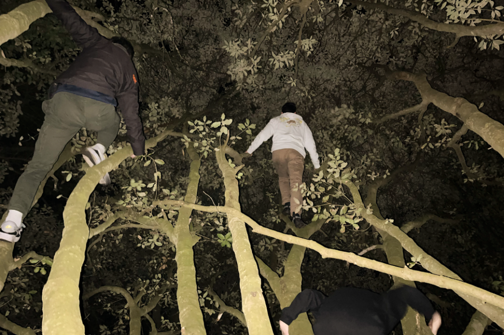
In December I started by walking through natural landscapes while it was sunny: focusing on ‘golden hour’ light, portraiture and natural landscapes. This did prove difficult in the nature of portraiture as I was photographing myself without a tripod so I actually hung my camera on a tree branch- this created some blurry, unsuccessful images so I decided to just concentrate on abstract portraiture.
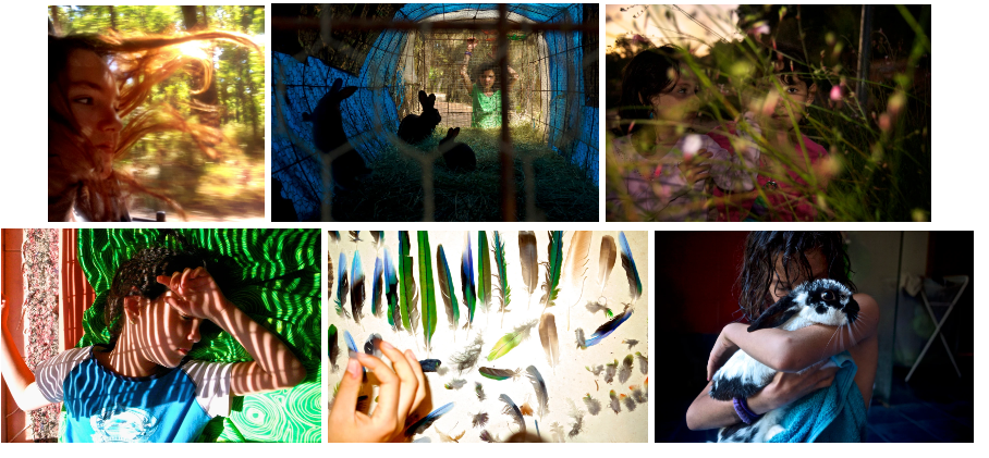
MY FAVORITE IMAGES FROM THE SHOOT
PHOTOSHOOT #2
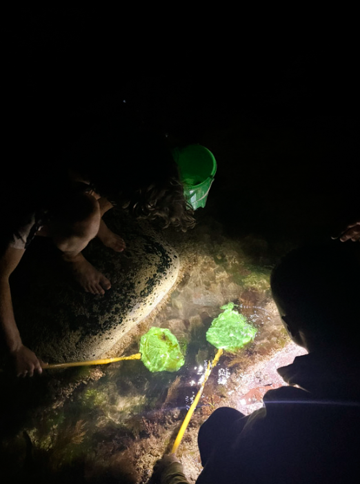
Focusing on colour- experimenting with night photography
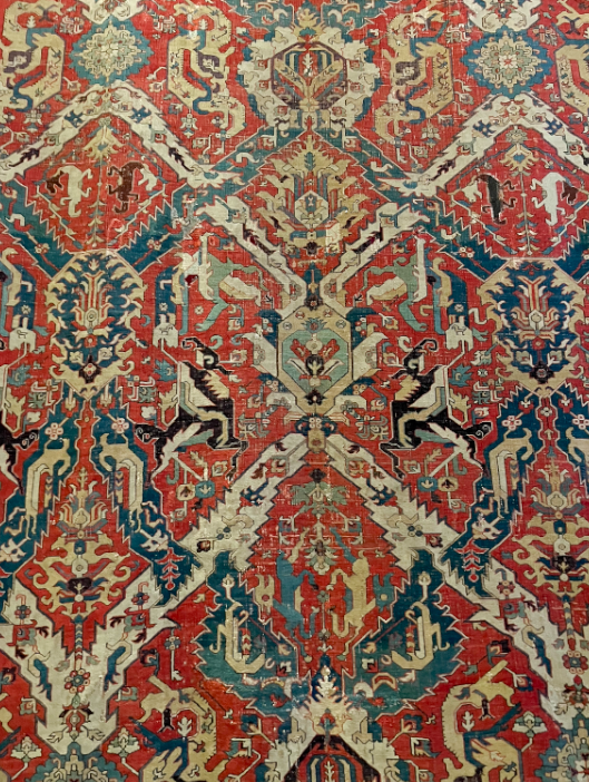
For particularly colourful images I went through my camera roll on my phone and found images from my holiday in Spain during summer- through doing this I found some images which are of patterned rugs and tapestries etc which were in museums in Spain and Glasgow. I would like to use these as textural images which colour to pages which would otherwise be blank. I also experimented with night photography however I struggled to take pictures of anything moving as I couldn’t work out the correct shutter speed and ISO- I didn’t want to use flash and this was proving difficult.
MY FAVORITE IMAGES FROM THE SHOOT
PHOTOSHOOT #3
Focusing on product-style images
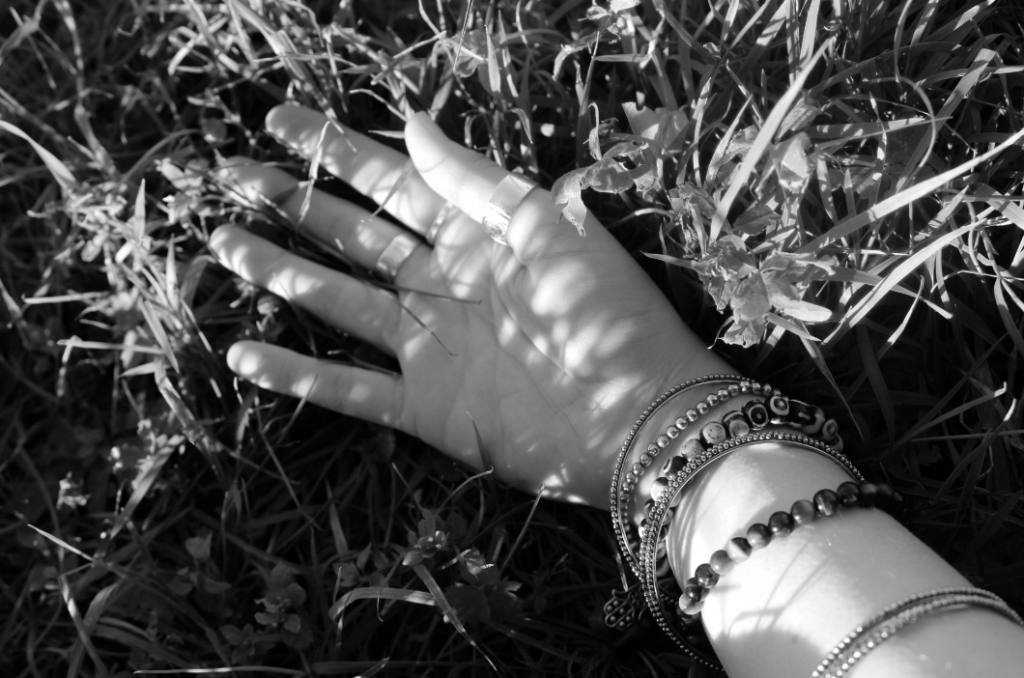
I wanted to take pictures of my own belongings such as pressed flowers, leaves, lighters and bottles to cut out on photoshop and put in the photobook layered on top of images or beside them- at home I also took pictures from my family album of my childhood and family.
MY FAVORITE IMAGES FROM THE SHOOT
PHOTOSHOOT #4
No aim
I took pictures documenting my room and my day out with friends, this is the photoshoot I took the least amount of photos on as I would forget I was meant to be taking images- I did not really have an aim with this photoshoot I just wanted to capture what I had an eye for.
First, I separated the images I am most likely to use from the images I was least likely to use, I did this using a colour-coding system where I selected images I was most likely to use in my final project- after editing I will further narrow down these images when I am choosing the layout of photos in the book.
After this I did some editing on my images- bringing out contrasts, saturating colours, levelling areas with high exposure- I’ve also added grain to some images as to make them look more nostalgic. As with Sam Harris and Olivia Bee’s work I am keeping editing to a minimum however I will be putting some images into photoshop to experiment with different more abstract and distorting editing.
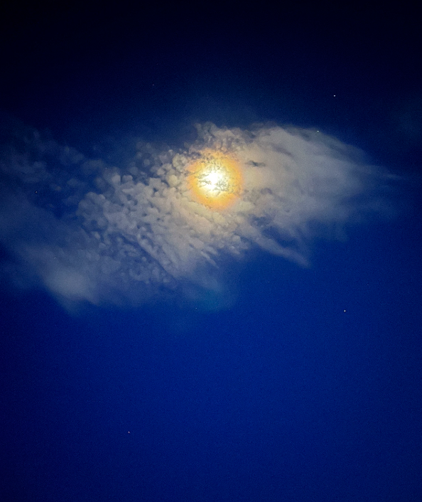
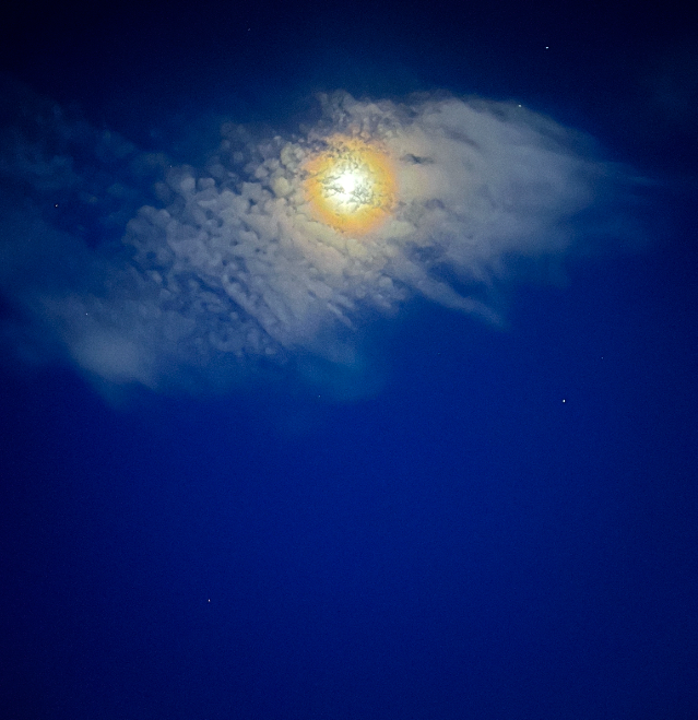
An example of an image which I have edited
Below is the editing for the image above, I have kept it to a minimum- I have turned up the saturation and vibrancy so the blue of the night sky is more visible- along with the yellow of the moon. Lowered the exposure so the light of the moon is more prevalent. I did experiment with turning down the clarity and dehaze- however this made the image look too unnatural to the extent where it would not go well with other images in the book, especially when I have some images where detail in the image is key. Not shown in the editing was where I turned up the grain to +11 amount, +25 size, +50 roughness.
Editing for above image.
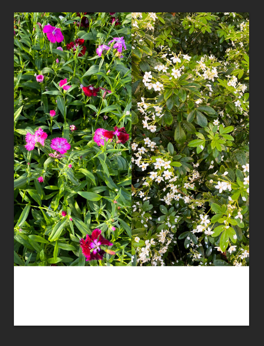
My “textural” images to further enrich textures in the book (will not be a main focus- merely accents/reoccurring themes in the book)
For my textural images I had to crop and resize them to focus on the parts of design I wanted to concentrate on- I then had to edit them so they were brighter (turning up the exposure, whites and highlights) as the environment that the pictures were taken in was dark as to preserve the colours of the rugs.
One of my textural images
Above is an image that was successful when editing- clearly it is not perfectly straight, I have decided to keep this effect as it adds to the more homemade, imperfect aspect of the book. When editing some of these images I realised that cropping and resizing them make the quality of the image worse- so I have decided not to use images where this was noticed.
I then separated my images into categories concerning the main focus of the image; including nature, textural, person and abstract. I did this using a star rating scale- 1 star being nature, 2 being textural, 3 being person and 4 being abstract.
PHOTOSHOP EXPERIMENTATION
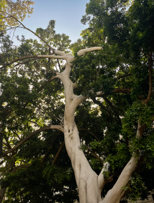
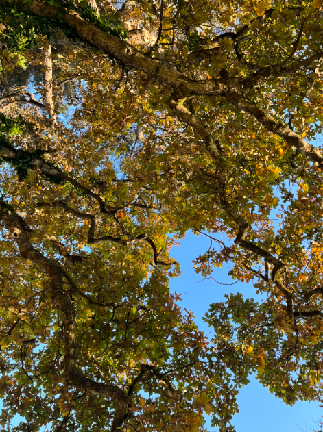
I wanted to create a fisheye effect on my nature images- specifically of pictures where I was photographing looking up through trees to see the crowns.
An image I wanted to edit to a fisheye effect
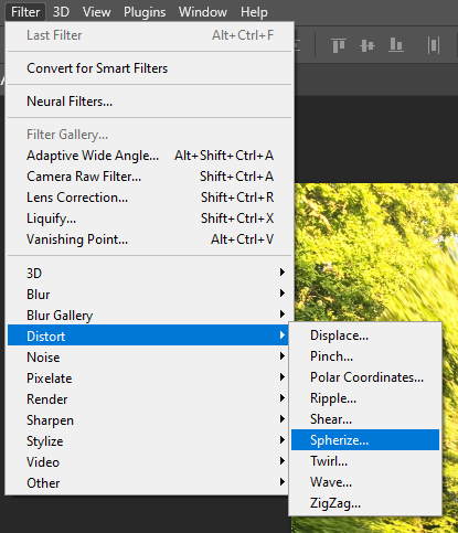
First I edited this image in Lightroom, then exported it to photoshop. I then followed the below options for editing and chose to spherize to -34
My process of editing
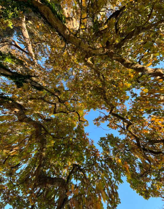
Below is the image after editing, I do not really like how it turned out, personally it gives me a headache, and further editing on photoshop has made the quality of the image diminish.
PHOTOBOOK EDITING
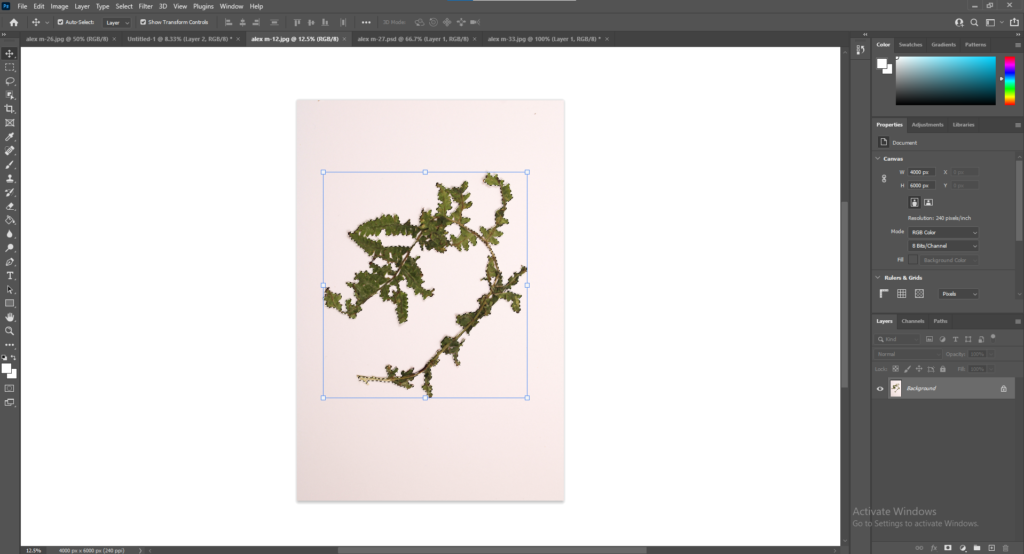
I then started “cutting out” the subject in my studio images to overlay on my photos in the book, I did this by using the object selection tool and then removing the background and importing the image I wanted the item to be over. I had to change the sizes of the images so they would look realistic and get rid of any white areas let on the image after selecting it.
By cutting out these images I created images like the one below- looking natural and homemade with pressed flowers in a book.
I went through my images further, changing duplicates and images which I was struggling to edit- i.e. overexposure tainting part of image, blur, struggling to make it level. To further make selections I am combining some of my nature images on photoshop (seen below)
A combination of images
To do this I exported the images from Lightroom onto photoshop and simply opened then dragged them onto one portrait page, making sure they are dead centre and aligned with each other. I am leaving the bottom blank white as when my photobook is printed I am going to handwrite text into it (i.e. poetry, notes, diary entries etc). I am unsure if I will use this image yet as the colours do not match any of my other colours- I may use the white flower image individually.
After I put the edited overlays on the image, some of them were not as effective as others, for the ones where it was not effective I took out the item and left the area blank so when the book is printed I can physically write and stick in the objects themselves or print the pictures onto transparent paper then stick them in.
A page where it is effective- one where I will be keeping the overlay
After doing all this I did not need to edit anymore- so I concentrated purely on photobook design, click the link to view design blogpost.
I want my book to look very personalised, almost like a diary. I have heavily considered handmaking my book yet I am still unsure about this- I do want the book to seem quite intimate instead of professionally printed.
PAPER AND INK
I would like the pages of the photobook (if possible) to only have rounded edges- I would also like the images to be printed in matte ink.
FORMAT, SIZE AND ORIENTATION
The book will be standard sized portrait, I would like to explore the possibility of the page and cover edged being curved- I would like to avoid almost straight lines anywhere in the books as there would be a heavy contrast between the style of the images and the style of the book itself- this design would also add to the personalised aspect of the book.
BINDING AND COVER
I would like the binding to seem somewhat handmade- I may handmake this book personally and sew the pages together myself. I am interested in singer sewn binding however if professionally printed I may just use PUR binding. I would like the cover of the book to be a thicker card, not a pure hard cover.
BOOK TITLE
I am heavily unsure of the title still, I would like it to be quite vague so you do not really know what to expect of the book.
STRUCTURE AND ARCHITECTURE
I would like the book to have an unpredictable flow, portrait and people based images broken up by nature images and text.
DESIGN AND LAYOUT
I would like the pages to look quite busy- I will be using a mixture of full page spreads and separate images, possibly have grids of images.
EDITING AND SEQUENCING
My editing for these images is going to be moderately basic- I may experiment with black and white images (such as the one seen below1) or go further with editing and attempt a largely dream-like style2 . What I do know for certain is that I would like my images to be predominantly warm-toned- with an emphasis of lighting and grain in the image done through editing. Sequencing will be done by image colour- I would like the book pages to be quite busy however images have to be complementary of each other otherwise it will look messy.
1. Olivia Bee: Kids in Love
2. Olivia Bee: Kids in Love
IMAGES AND TEXT
I would like there to be a mixture of images and text- including adding text to images by superimposing it on top and surrounding images with text- the text will be a mix of poetry, personal accounts, context to the images, day itineraries, notes such as recipes or postcards and letters.
Over the Winter holidays I plan to conduct at least two photoshoots, more if weather permits.
PHOTOSHOOT #1
Sam Harris; “The Middle of Somewhere”
Sun and nature orientated- images during “golden hour” and good weather (focus on warm tones). People in nature, mainly focusing on Sam Harris’ images as inspiration for this photoshoot: concentrating on colours. Photographing flowers and leaves plus staged images of people in nature unless situations permit candid images. Collect objects/leaves/flowers to press in scrapbook. Possible experimentation with fisheye lens (if not possible will experiment on photoshop with fisheye-style editing)
PHOTOSHOOT #2
Sam Harris; “The Middle of Somewhere”
Night orientated- beach at night, drives, mainly focus on blue/cold tones- Olivia Bee will be main source of inspiration for this. Experimentation with underwater/around the water images, might be a bit cold in the sea so for this photoshoot may have to find an alternative. Collect objects/leaves/flowers to press in scrapbook.
PHOTOSHOOT #3
Olivia Bee; “Kids in Love”
In my room, candid images of people hanging out (on drives, at mates houses, in curi, everyday activities) Collect objects/leaves/flowers to press in scrapbook. I would also like to experiment with producing images differently, including ripping images and also using chemical processes
I stared this project by looking through my diary for ideas, I had a rough idea of what I wanted to do already as I had been highly interested in orchestrating my own project since last year- I wanted to create a scrapbook style photobook about life on an island from the perspective of a teenage girl: concentrating on the beauty of everyday life. After doing this I then created a Pinterest board to find images which match the aesthetic I was looking for- these images serve as inspirations for all aspects of the photobook including page layouts and design, texts I may use and style of image I would like to incorporate.
My idea of islandness includes aspects of nature, I would like to play with the idea of predominantly abstract images; of people, of plants and landscapes- including almost scientific style images of plants and seaweed. I also have pressed flowers and leaves from throughout the year that I would like to include in the photobook.
With my choice of aesthetic throughout the book, I would like my images to show an aspect of the female gaze towards life, attempting gentle and intimate photos which give a feminine aura without having to clearly show the presence of a female.
For my beginning photoshoots I plan to experiment with a fisheye lens, night photography and possibly underwater photography.
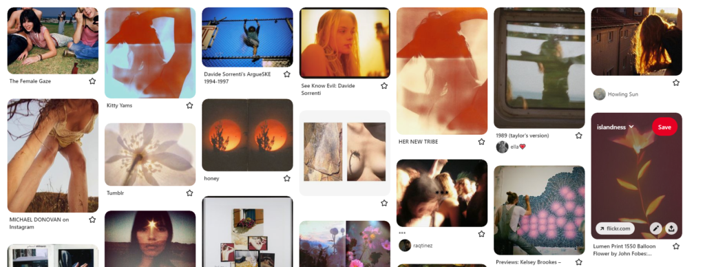
A small moodboard, click the link above to view my Pinterest moodboard
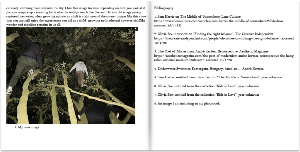
Click on the image above to see images from “The Middle of Somewhere”
“The Middle of Somewhere”, a photobook by Sam Harris contains documentary images of his wife and two daughters travelling India and Australia, focusing on capturing memories of his daughters growing up, with a large reference to growing up living off the land in rural communities. The photobook is not organised in chronological order: purely intending to capture memories, the photobook displays themes of family, fatherhood and growing up.
WHO IS THE PHOTOGRAPHER
Sam Harris created this personal photo project in order to capture memories of his young family’s travel through India and Australia, this project grew into an independently published book that won multiple awards including a Lucie Award 2015, and most recently the People’s Choice for the Australian Photobook of the Year Awards 2015.
WHAT IS THE NARRATIVE, CONCEPT AND DESIGN OF THE BOOK
The book is quite like a scrapbook in a way, deep within the pages lie an amalgamation of scribbled memories, with alternative narratives, diary entries, post-its, hastily scrawled love notes and tea stained prints: with the almost poetic title supplying intrigue to readers as it looks almost like a notebook- with the title being whimsical and vague.
The book is portrait and has a soft card, textured cover, with the look of being hand-drawn and painted with a simple small wraparound containing the name “The Middle of Somewhere” and “Sam Harris” handwritten, presumably by the photographer himself.
Inside the book, pictures are only in colour. Depth and context is added throughout the book in the form of inserts, foldouts and even an almost separate book inside called “Travelogue” containing images from travelling to India and Australia.
There are running motifs throughout the book, with images often only being warm toned and vibrant- obviously since the book is about Harris’ family, images are concentrated on his family and are in (somewhat) chronological order: with text sharing context and background of the images.
As stated before, there is an influx of fold outs and inserts in this photobook, mainly being of text; including recipes, diary entries, context for the images, post it notes written by Harris’ children and even a whole almost other separate book titled “Travelodge” containing images of the young family travelling and living in Australia and India.
The images themselves are not massively edited, it is potential they have been made more vivid or saturated however as they were taken to capture memories- it is unlikely they have been edited. There is one image in black and white featuring a particularly stormy day however all the other images are stylistically vivid in colour, mainly warm tones however rich greens and blues are presented.