All posts by Aimee M

Filters

Author:
Category:

essay writing

‘How is loneliness portrayed throughout Bill Armstrong and Pablo Caridad’s work?’

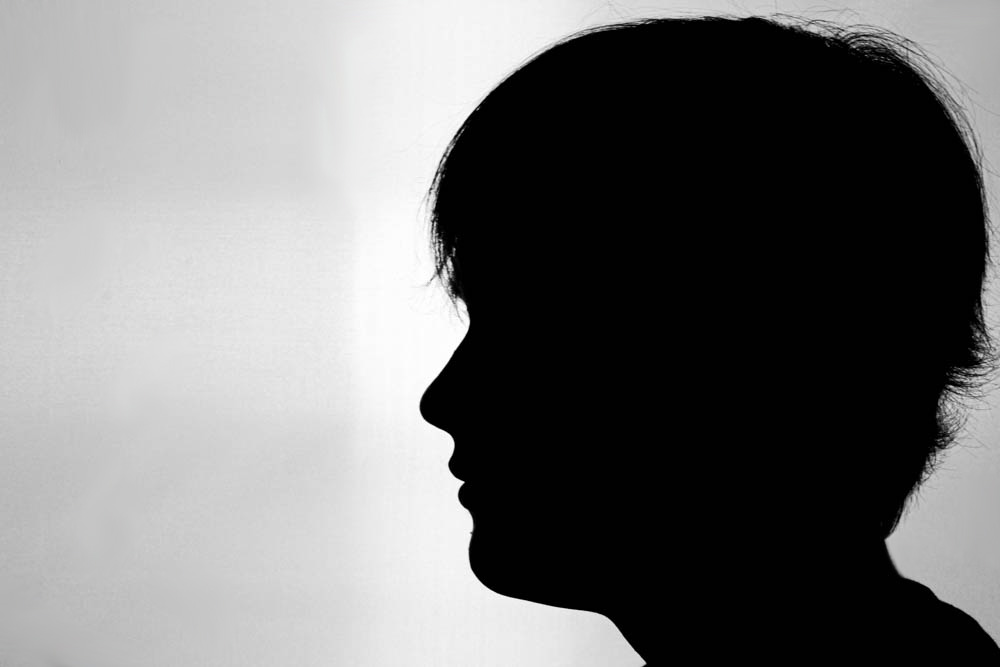
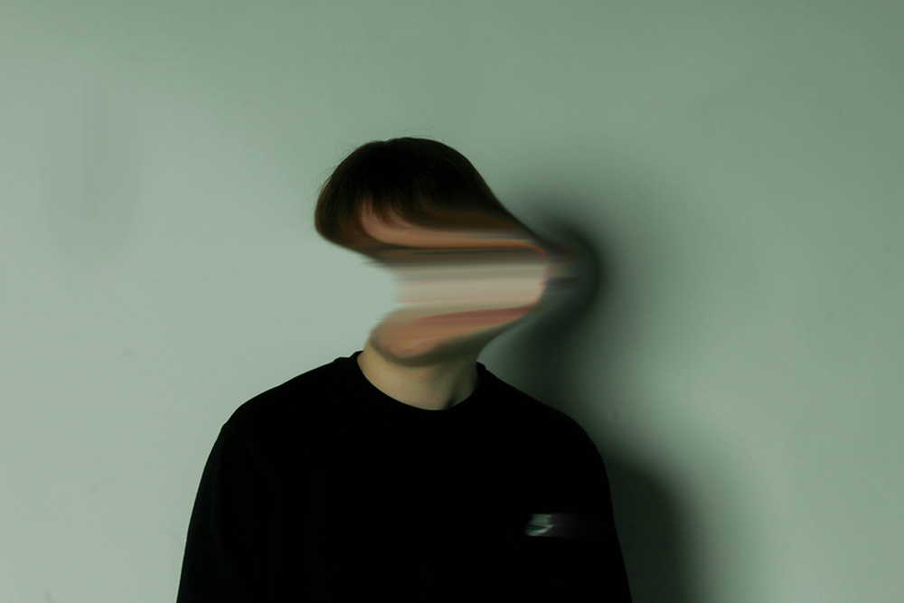
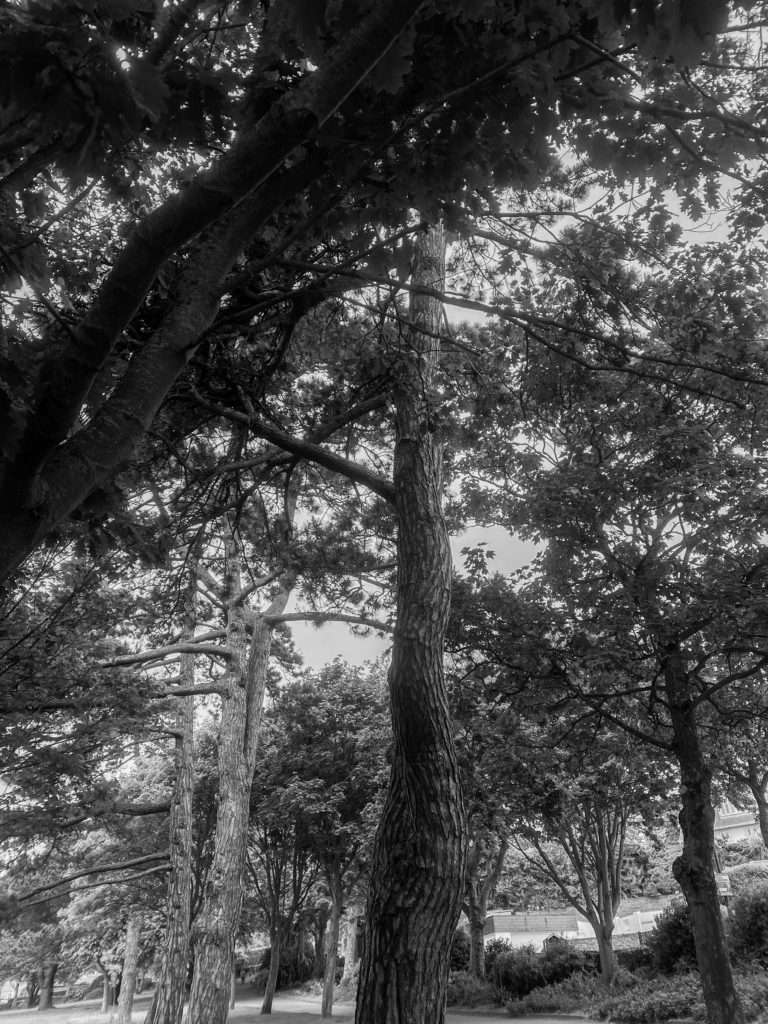
For my personal study, my project will be on ‘Island loneliness’ observing how images of derelict sites project not just an unsettling emotion but also another side such as loneliness. There will also be a range of portraits giving an understanding how our community can be affected by their own on-going issues and how their surroundings impact on their mood. My style of work will be in correlation to Bill Armstrong’s where I will follow and interpret his idea of using silhouettes and filling them with a certain colour to show the mood and Pablo Caridad’s with my landscapes. Armstrong’s work shows a great interest to me as his creations are subtle but effective and show meaning behind them by his use of contrasts and effects. I am trying to communicate responses to isolation throughout my images with my portraiture whereas my landscapes following Caridad’s work will be examining neglected residences and how overtime they slowly demolish until there is nothing left, which you could relate to a person’s emotions. My outcomes will be edited mainly with darker backgrounds so there is a bigger focus on the main subject and less distractions. My preferred way of photographing is landscape, but for this certain piece portraiture half body shots will be included more as it emphasises what I am trying to achieve a lot easier than landscape. I will be using both studio lighting and natural light, natural lighting will give a more dramatic outcome as the weather is a big factor of targeting and showing emotion. My editing on lightroom and photoshop will consist of using the blur tool with my portraits and enhancing colours in more of an abstract way whereas my landscapes the contrast and brightness will be reduced and maybe layering some images.

Armstrong is a New York based fine art photographer known for his blurred colour photographs. He grew up in Concord, Massachusetts. He is intrigued by the use of colour in exhibitions, and as a result he has been shooting with colour for three decades. Caridad was born in Buenos Aires in 1972, the Argentine photographer captures wildlife and nature in his photographs, as he studied biology, he took an interest in the flora and fauna which went towards aiding university publications. 

Infinity series

Armstrong has many solo exhibitions, one in particular during 2002 catches my eye called ‘Spirit’ this relates to a statement made in one of his biographies where he is describing how he makes some of his outcomes, ‘It is a world just beyond our grasp, where place may be suggested, but is never defined, and where the identity of the amorphous figures remains in question.  It is a world that might exist in memory, in dreams, or, perhaps, in a parallel universe yet unvisited.’ This is referring to how he transforms his original images and then photocopies, cuts and re-photographs them then uses blurring so the edges of each collage disappear so the images appear seamless to the eye creating the idea of a World which exists in memory. His title reflects this as ‘spirit’ seems to imply a secondary dimension, one in which he aims to display. This fits with my point I am trying to show with my images, the way your memory reminds you of certain things or times that you reminisce creating a sudden wave of loneliness and realisation which brings you back to the fear of reality. 

Caridad’s photographs link in with his background of education in biology as he used his knowledge to combine with his work, when he would explore the outdoors to study his degree, he would include taking photos as he also took a liking to photography and was collaborating with local magazines where his work was exhibited, he then later decided to choose his photography over his education in biology. His most recent exhibitions have been selected for the National Hall of Visual Arts of the Festival de la Luz in Argentina. He is currently working as a commercial photographer whilst doing independent projects such as fine art photography portraying post- conflict zones and environmental issues. As he grew up in a poor economy, his surroundings were rather limited, such as having more run-down buildings which improvised on his work ethic. Caridad’s project is intertwined with mine depicting a type of loneliness because his perspective on the buildings and landscapes he captures often being absent of other people. His works also capture the desolated perception that is left with the surrounding, how the isolation is worthy of being photographed as there is history and background to what it once was. Although the idea of loneliness could be seen as someone who is content with themselves and therefore looks to find solitary solitude in an escape from the urban world. 
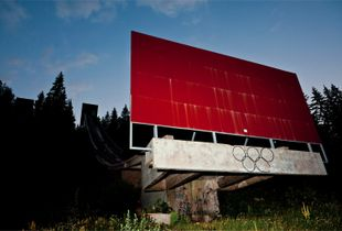
Bygone Olympic Days

Jersey infrastructure can be somewhat similar to what Caridad photographed but also has its own features. As some areas are very rural/ suburban and mostly less urban, however jersey is a very wealthy island and has a good economy, but abandoned buildings are still present which can be likened to Caridad, however this contrasts with the photographer as unlike Caridad the abandoned/rundown buildings are amongst nicer properties and offer contrast due to the fact most people who live in Jersey are professionals of the older demographic and have more disposable income when compared to the area in which Caridad takes his photos resulting in the derelict buildings being out of place in Jersey. His piece of work, ‘Bygone Olympic days’ was photographed in 2014, the isolated structures were part of the 1984 winter Olympic games, this was the first Olympic games hosted in a Slavic language speaking country. Due to weather complications the games were held back 4 days, the structures which were captured by Caridad are visibly damaged and this is not just because of how overtime it has decomposed but as there was a War which broke out in Bosnia and Herzegovina in 1992, this heavily damaged the city and the Olympic facilities. Some sites have been renovated after the war, but others remain abandoned leaving the bobsleigh track as one of the most well-known sites. This leaves the site as a place where you may go to pay respects and reminisce on the tragic incidents which took place somewhere which was once a happy environment and now a place of despair. As a former Soviet Union country Yugoslavia was tremendously underdeveloped both politically and economically which has continued to the time in which the photograph was taken. 

After a period of political and economic crisis in the 1980s, constituent republics of the Socialist Federal Republic of Yugoslavia split apart, but the unresolved issues caused bitter inter-ethnic Yugoslav wars. Furthermore, the photos apply to the modern world in the fact that there is a declining number of countries willing and able to host the Summer and Winter Olympics due to cost vs revenue, observed recently in the 2016 Olympic games held in Brazil, much of the built stadiums and facilities are abandoned and no longer utilised, similar to the ones in Sarajevo. His love for nature and the environment led to him taking photos of these out of place, manmade structures which visually polluted the environment, something in which he feels strongly about. 

Both his and Armstrong’s work links together in a way as their images both include singular focal points which you can depict and portray to fit with my theme of loneliness. Both photographers have their own unique way of how to portray an emotion that is normally just felt and not seen. My research sources for Caridad were very limited as lens culture was really the only reliable source, as his work isn’t that well known other than in Argentina. However, Armstrong had a lot more such as Wikipedia and his own websites where his different styles of work are exhibited online. I have been influenced by both styles of work as it is different way of interpreting how an emotion can deeply feel and take over you, I first started off with the idea of capturing dark settings for the effect of loneliness but then decided to get more creative and developing my unique style of work with deeper meaning and understanding of how feeling and being lonely can feel and look different to everybody inside their own mind and body. Depicting loneliness can be done in a variety of different ways, whether it be done through the use of neglected habitats in our environment by Caridad or by using bursts of colours for evaluating moods and blurred distorted effects on behalf of the headspace of an individual from Armstrong. I have learnt that expressing this topic has worked well in both styles and that there is not just one certain use of expression through photographs which can give a better understanding, though one style may be more eye catching to some and more meaningful depending on the viewer, beauty is ultimately in the eye of the beholder.

Pablo Caridad

Bill Armstrong

Bibliography

Pablo caridad- https://www.lensculture.com/pablo-caridad

Bill armstrong- https://www.billarmstrongphotography.com/

photobook specification

1. Write a book specification and describe in detail what your book will be about in terms of narrative, concept and design with reference to the same elements of bookmaking as above.

Narrative: What is your story?
Describe in:

  • 3 words
  • loneliness, forgotten, isolation
  • A sentence

how a certain place may have impacted you or been a special place but is now just a distant memory.

  • A paragraph

how perhaps the weather and certain lighting can make places feel lost and lonely.

Design: Consider the following

  • How you want your book to look and feel

hardback cover and rectangular shape. grey background on the front and back cover.

  • Paper and ink

some dark green ink colours on the text inside the book, plain white coloured pages.

  • Format, size and orientation

small text set in paragraphs beneath my images.

  • Binding and cover
  • Title 

Island loneliness

  • Structure and architecture
  • Design and layout
  • Editing and sequencing
  • Images and text

mood board-

deconstructing photobook

1. Research a photo-book and describe the story it is communicating  with reference to subject-matter, genre and approach to image-making.– visualisation of her family culture, the way the images have been altered could suggest her relationship with her family.

2. Who is the photographer? Why did he/she make it? (intentions/ reasons) Who is it for? (audience) How was it received? (any press, reviews, awards, legacy etc.)- carolle benitah,
3. Deconstruct the narrative, concept and design of the book and apply theory above when considering:

  • Book in hand: how does it feel? Smell, sniff the paper.- like a childrens book , no text only pictures.
  • Paper and ink: use of different paper/ textures/ colour or B&W or both.- use of both and textured to the eye.
  • Format, size and orientation: portraiture/ landscape/ square/ A5, A4, A3 / number of pages.- all different shapes and sizes.
  • Binding, soft/hard cover. image wrap/dust jacket. saddle stitch/swiss binding/ Japanese stab-binding/ leperello- hard back cover
  • Cover: linen/ card. graphic/ printed image. embossed/ debossed. letterpress/ silkscreen/hot-stamping.
  • Title: literal or poetic / relevant or intriguing.
  • Narrative: what is the story/ subject-matter. How is it told?
  • Structure and architecture: how design/ repeating motifs/ or specific features develops a concept or construct a narrative.

  • Design and layout: image size on pages/ single page, double-spread/ images/ grid, fold- outs/ inserts.- each image is a different size on each page
  • Editing and sequencing: selection of images/ juxtaposition of photographs/ editing process.– each page has either one or two juxtapositions.
  • Images and text: are they linked? Introduction/ essay/ statement by artists or others.  Use of captions (if any.)

UNDERSTANDING PHOTOBOOKS:
NARRATIVE, EDITING, SEQUENCING
DESIGN, FORM, FUNCTION 

Earlier in the academic year we looked at narrative in photography. Let’s refresh our memory and revisit some of the theories around visual storytelling.

art movements/ isms

Art Movements & Isms

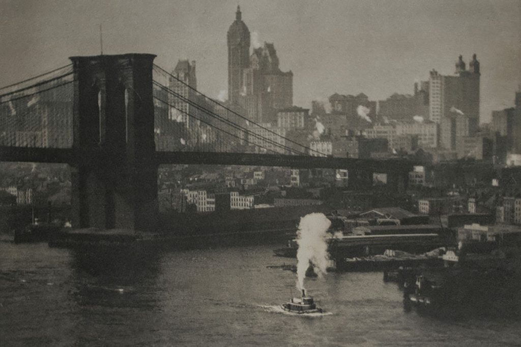
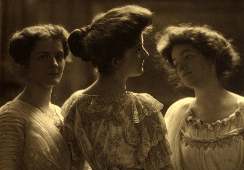
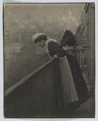
PICTORIALISM

time period : 1880s-1920s


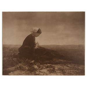
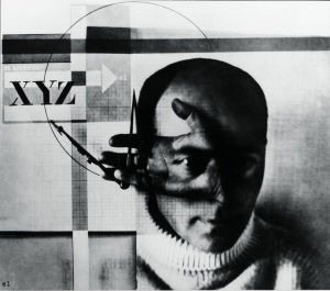
Key characteristics/ conventions : to make photography an accepted art form, the adaptation of skill, reacted against mechanization and industrialization, constructed images looking for harmony of matter, mind and spirit – subjective and spiritual motive. Pictorialism is an approach to photography that emphasizes beauty of subject matter, tonality, and composition rather than the documentation of reality. Images had a foggy, mystical-type quality of fantasy that highlighted the aesthetically pleasing elements of an image.


Artists associated: Hugo Henneberg, George Davison, Alfred Stieglitz, Henry Peach Robinson.


Key works:  (Equivalent; clouds study),  (He Never Told His Love 1884), (Reflections 1899).


Methods/ techniques/ processes: Vaseline on lens, scratching the print,  manipulating images in the darkroom, making photographs that resembled paintings

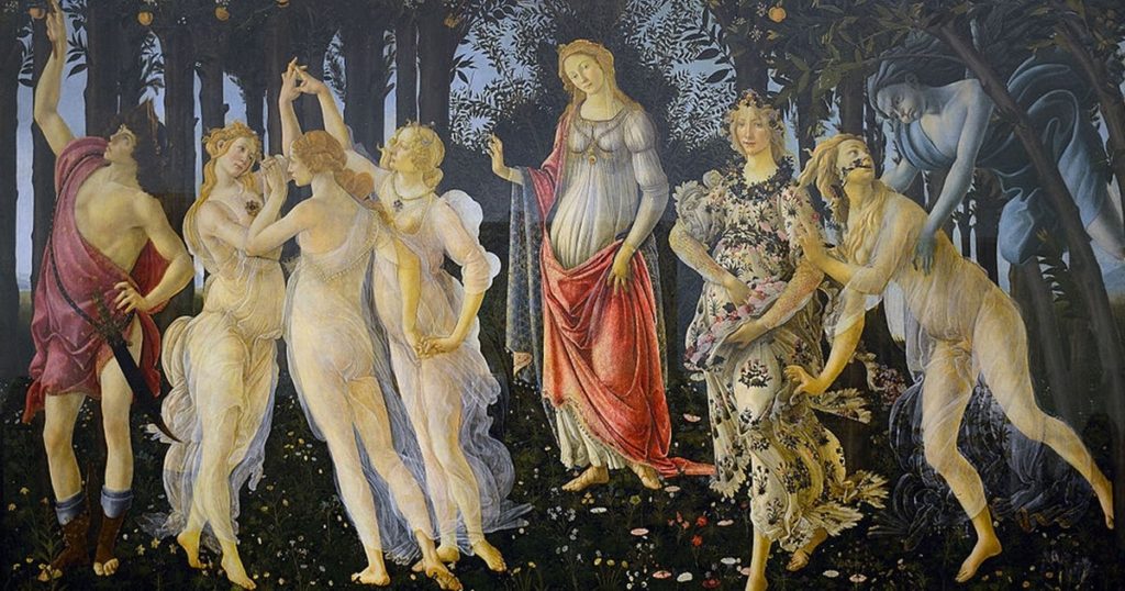
ALLEGORICAL PAINTINGS

PICTORIALISM PHOTOGRAPHY

REALISM / STRAIGHT PHOTOGRAPHY

Time period: 1920s


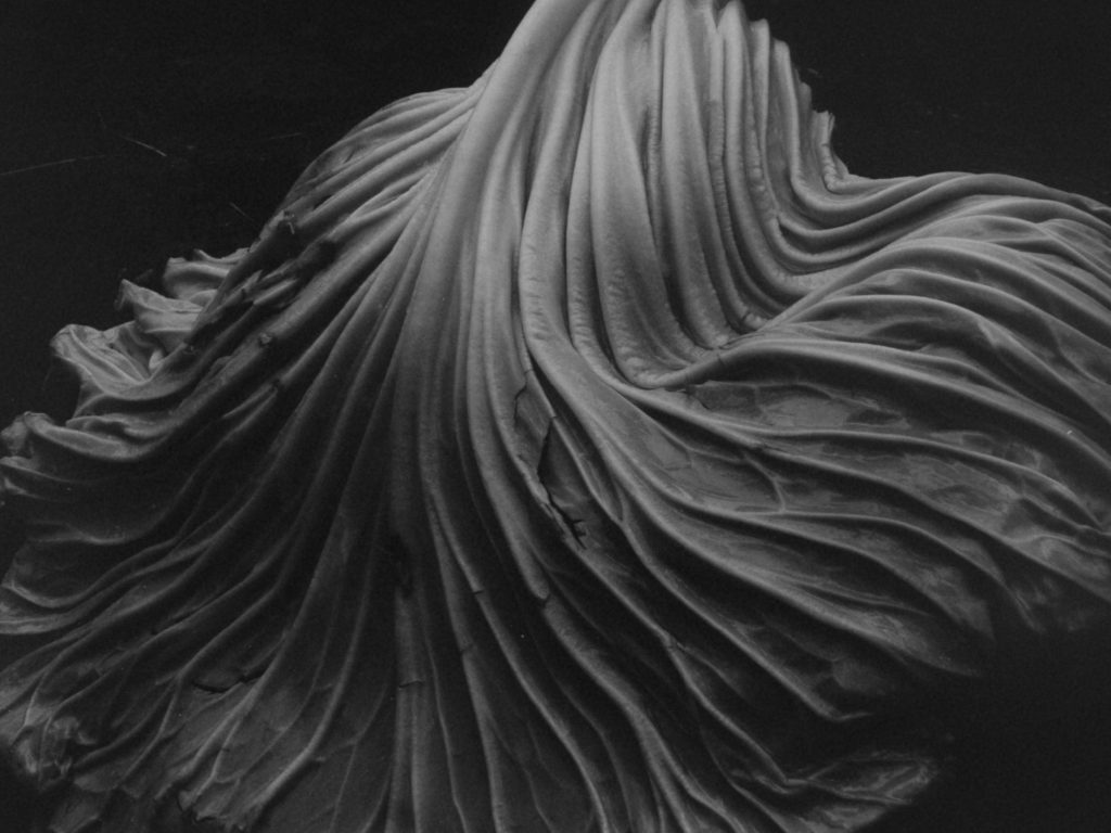
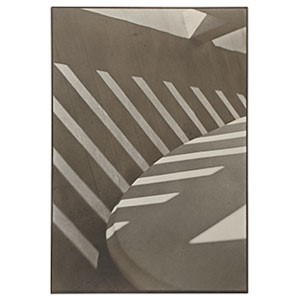
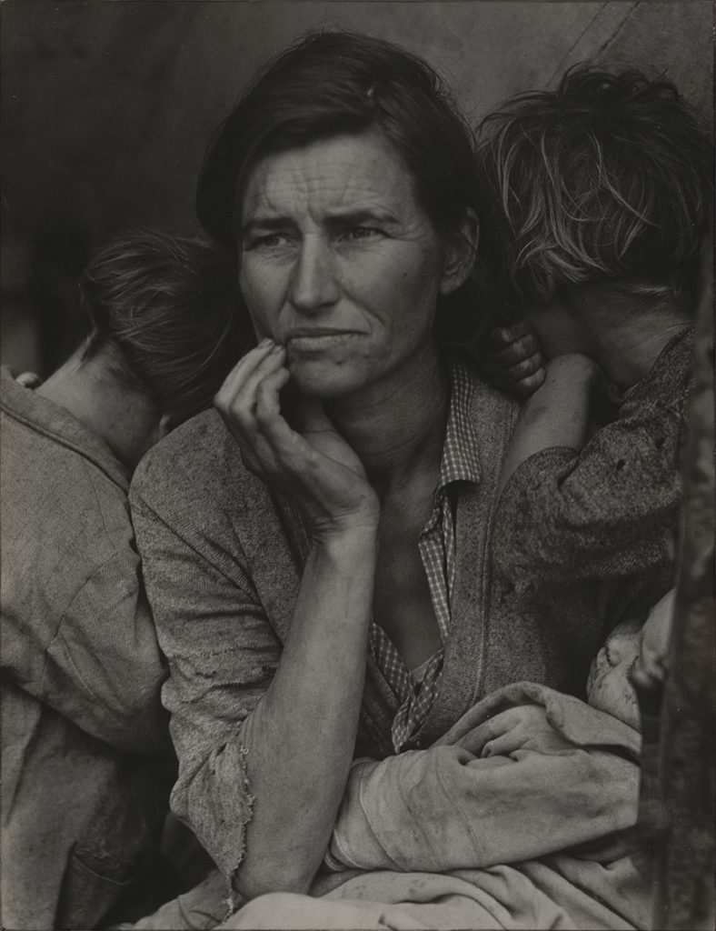
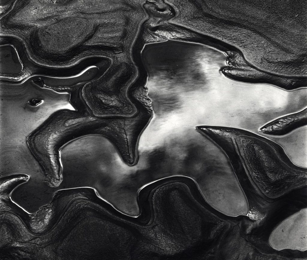
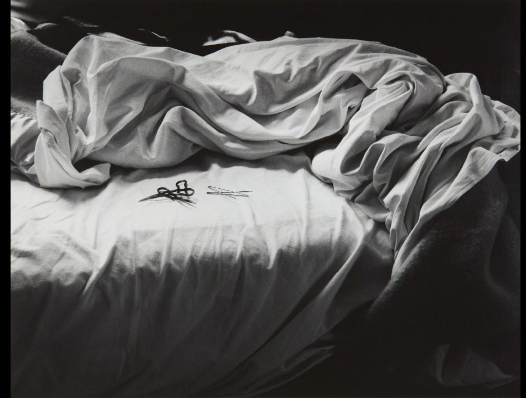
Key characteristics/ conventions : abstract, landscape, show things how they are/ were, the key characteristic of this style was to reflect a person/landscape/object with complete honesty and ‘realism., without heavy editing or manipulation.


Artists associated: Paul Strand, Walker Evans, Edward Weston, Dorothea Lange.


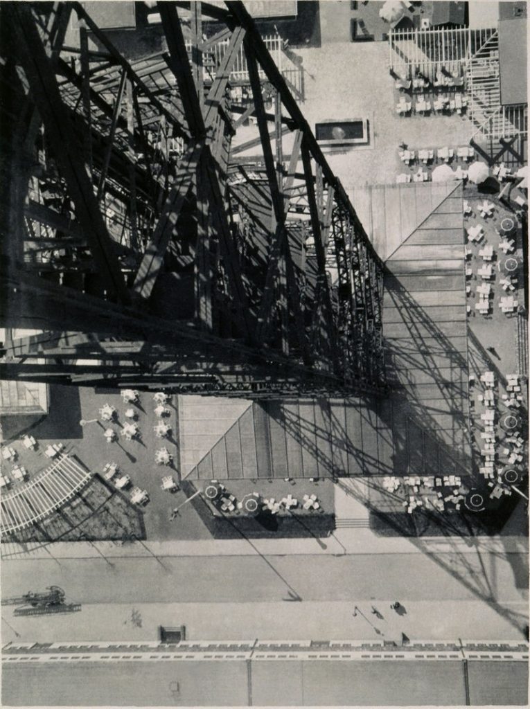
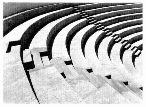
Key works:  ‘A Sea of Steps’,  Monolith, the Face of Half Dome (1927),  Ladder of Ladders (1931).


Methods/ techniques/ processes:  darkroom, digital processes, lighting, exposure.

STRAIGHT PHOTOGRAPHY

MODERNISM

Time period: 1900-1960’s


Key characteristics/ conventions :  difference between wrong and right, what will America’s future be, what is truth, and what does it mean to be an American. Break from tradition which focuses on being bold and experimenting with new style and form and the collapse of old social and behavioural norms. 


Artists associated: Dora Maar, Edward Steichen, André Kertész, , Paul Strand, Tina Modotti.


Key works:  (Metamorphosis of Narcissus), Workers Parade,  Blind, Wall Street.


Methods/ techniques/ processes:  experimentation,  abstraction,  emphasis on materials.

MODERNISM PHOTOGRAPHY

POST-MODERNISM

Time period: 1960s- 1970s


Key characteristics/ conventions : reaction against the ideas and values of modernism, scepticism, irony and philosophical critiques of the concepts of universal truths and objective reality. Modernism was based on idealism and reason, postmodernism was born of scepticism and a suspicion of reason. 


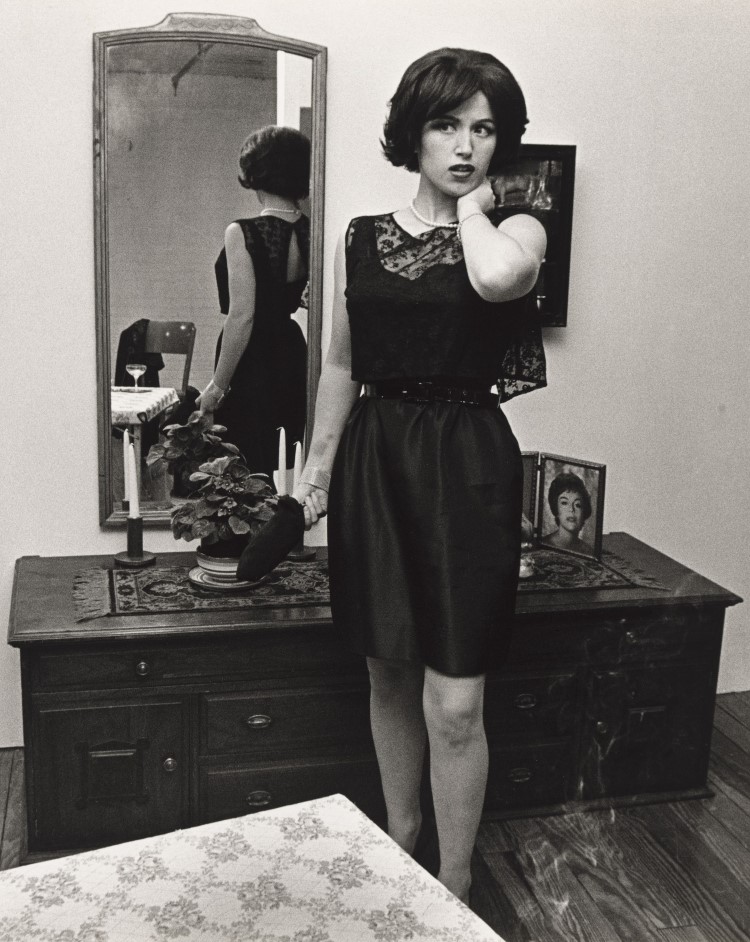
Artists associated:  William Eggleston, Cindy Sherman, Jeff Wall, Guy Bourdin, Goran Sekulovski, Lee Friedlander, Andreas Gursky, Jacky Redgate, Robyn Stacey, Yasumasa Morimura.


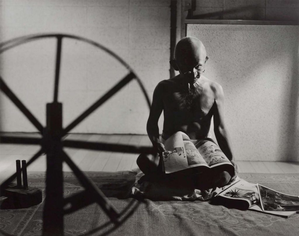
Key works: Campbells Tomato Juice Box, A requiem: spinning a thread between the light and the earth 1946, Ice.


Methods/ techniques/ processes: Can be characterized by a deliberate use of earlier styles and conventions, and an eclectic mixing of different artistic and popular styles and mediums.

POSTMODERN PHOTOGRAPHy

reviewing and reflecting past projects

Identity

With my identity project I felt I managed to depict the meaning of ‘identity’ well with my images, i went into depth with the editing of my images in Lightroom and photoshop. With my images I feel I managed to take inspiration from my artist references without directly copying them. If I could go back and redo this project I would make sure to have a much wider range of photos in different locations and different poses, facial expressions, as I only captured a few, and i would have liked to have a variation of photos taken in different lighting and setting. Because this was one of my first projects in photography, I believe I could have done more in my project to receive a better grade and final outcome.

Anthropocene

In this project i think my images could have been edited better and given a better outcome as they are plain and there is not much going on, i could have represented Anthropocene better through my development of images. However i did enjoy this project as i got to take a variety of pictures round jersey which was very enjoyable.

My Rock

This was my favourite project to take part in as photographing jerseys natural landscape is very fulfilling. I had fun creating my photo zine and editing all my different images in Lightroom motley but also photoshop, it was a very nice project going around jersey and really admiring the landscape. Learning how to use InDesign as well was interesting.

crown dependancy

There are three island territories within the British Isles that are known as Crown Dependencies; these are the Bailiwicks of Jersey and Guernsey which make up Channel Islands, and the Isle of Man. The Crown Dependencies are not part of the United Kingdom, but are self-governing possessions of the British Crown.

Briefing: UK immigration law and the British Crown Dependencies - Free  Movement

The Bailiwick of Jersey is a British Crown dependency, which means that it is not part of the UK but is rather a self-governing possession of the British Crown. However, the UK Government is constitutionally responsible for its defence and international representation. In each Bailiwick The Queen’s personal representative is the Lieutenant Governor, who since the mid-eighteenth century has acted as the channel of communication between the Sovereign and the Channel Islands’ government.

In the Channel Islands The Queen is known as The Duke of Normandy. At official functions, islanders raise the loyal toast to ‘The Duke of Normandy, our Queen’.

The Queen has visited the islands on various occasions, most recently in May 2005 to mark the 60th anniversary of their liberation from German occupation.

virtual gallery

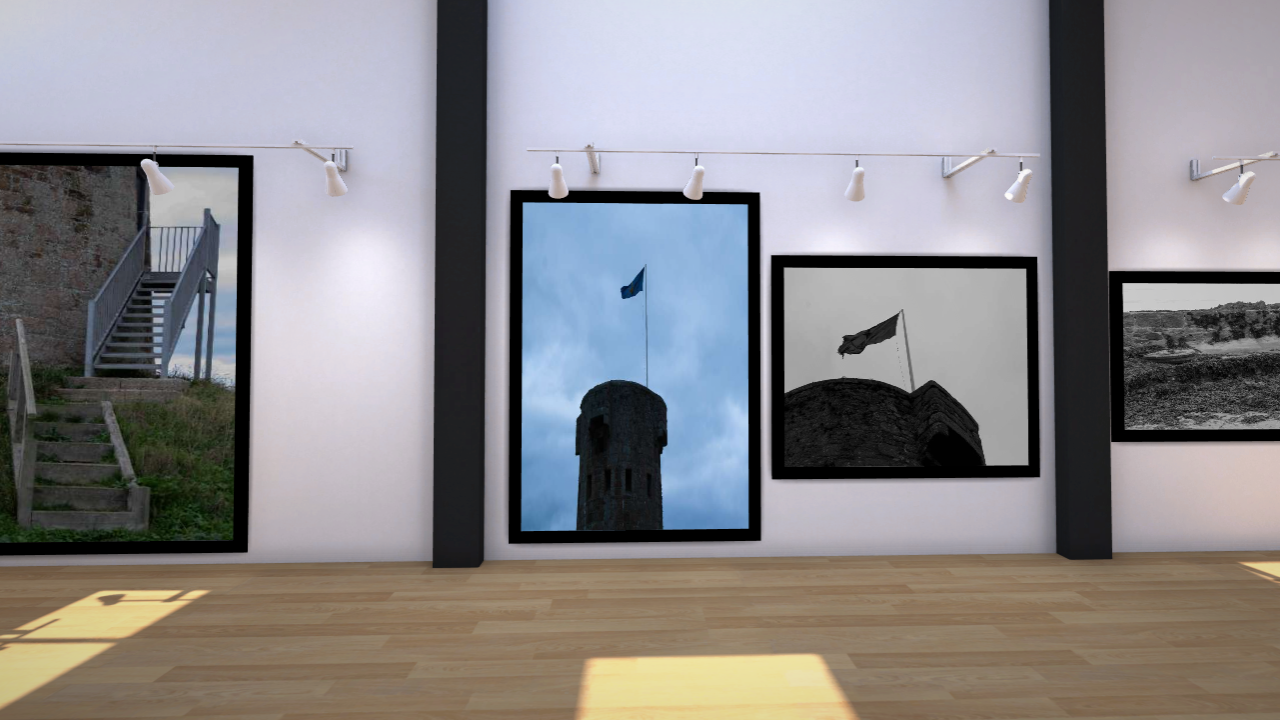
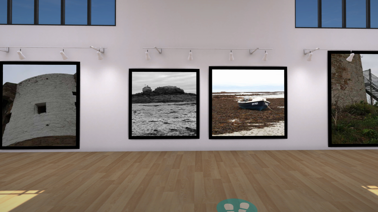
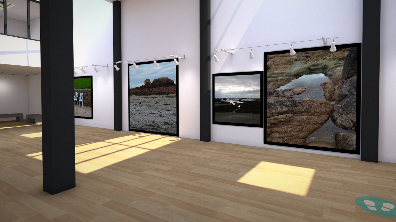
I used artsteps gallery website to create my virtual gallery, i then imported my images and adjusted the height and width to my preferred look. After i made them how i want them to look a placed them onto the wall and added a frame for more effect.

I included the images that i used in my photo zine booklet, i edited them on lightroom and some on photoshop to adapt the bold colour and sharpness to my preferred outcome.

photo zine

What is a photo zine?

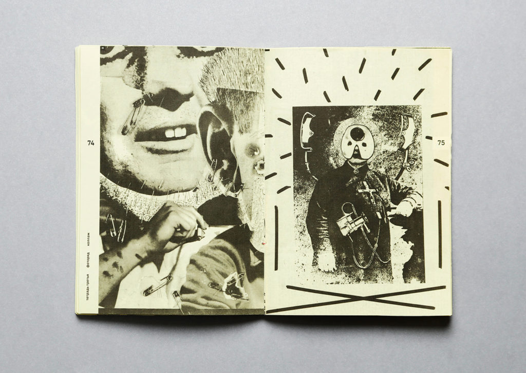
A photography zine, for example, is a tool that photographers can use to tell a visual story, to inform an audience about a specific topic or issue, to showcase and advertise a new idea or simply create a preview of an ongoing project. Zines were originally called fanzines, alluding to the fans who made them.

What is a zine example?

Some examples include newspapers, fabric, images, drawn art, stickers, washi tape, paint chips.

Examples of zines

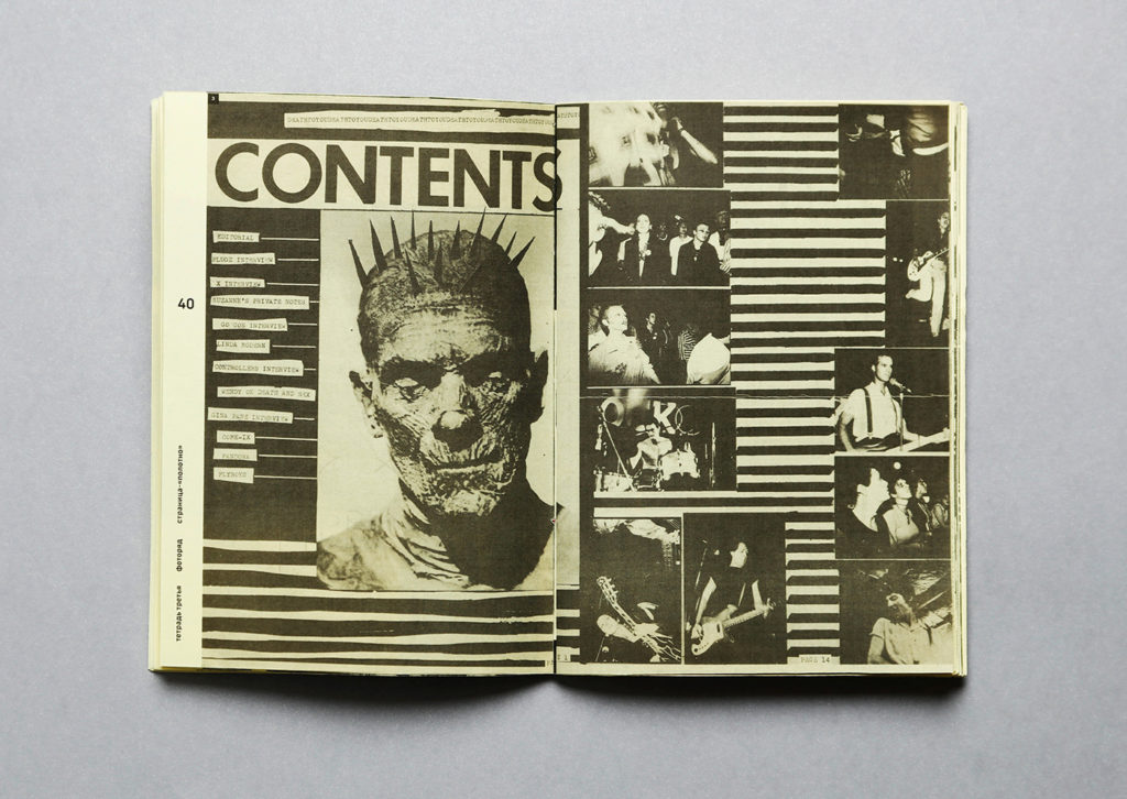
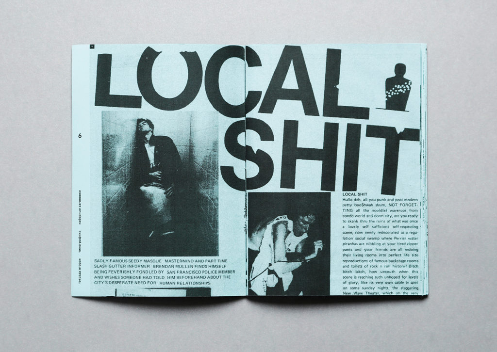
History of photo zines

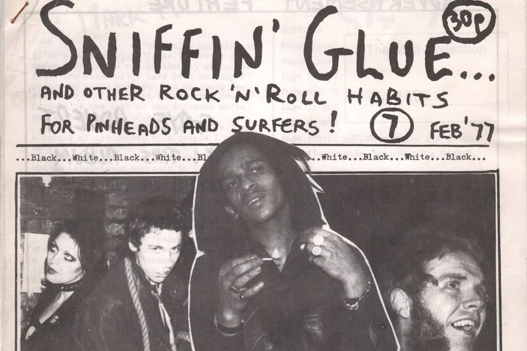
Zines were first created in the science fiction fandoms of the 1930s, taking their name from fanzine, which is short for “fan magazine.” Long before the advent of the Internet, zines allowed fans to create networks, share ideas and analyses, and collaborate on writing and artwork. The counterculture movements associated with the Beat generation of the 1950s and 1960s saw a growth of the underground press, which played an important role in connecting the people across the US. Although the underground press often involved significantly more people and resources in the production of materials, it provided a function that became a key part of zine culture in the 1980s and beyond: giving people a voice outside the scope of the mainstream media.

Art and literary magazines of the 1960s and 1970s were based on a similar need to circumvent the commercial art world, and were printed cheaply and spread through small, niche networks. Many of them combined art, politics, culture, and activism into a single eclectic publication, redefining what a magazine could be, and influencing the rise of activist artists’ magazines that shaped the punk and feminist scenes later on. The punk music scene of the 1980s expanded upon the self-published format by creating a wide of array of constantly evolving zines dedicated to the musical genre that were both fanzines and political tracts. Punk zines were more than just magazines–they represented the aesthetic and ideals of an entire subculture, a condensed version of this cultural revolt against authoritarianism.

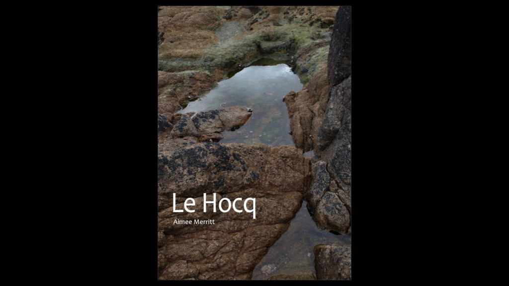
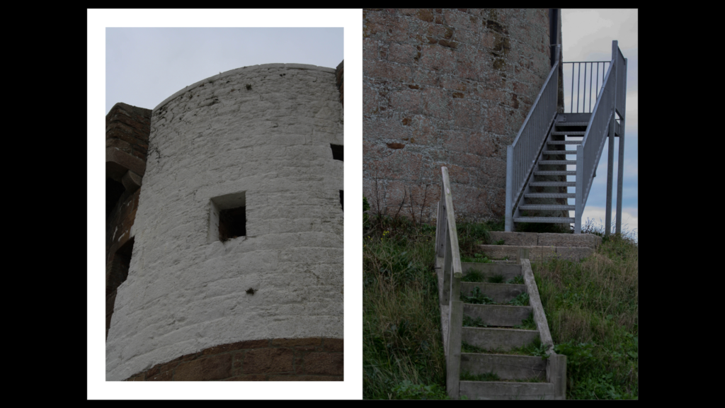
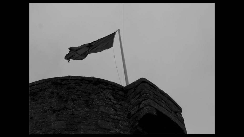
Le hocq

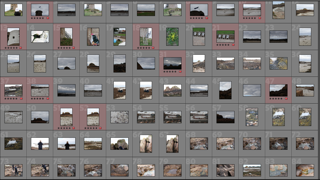
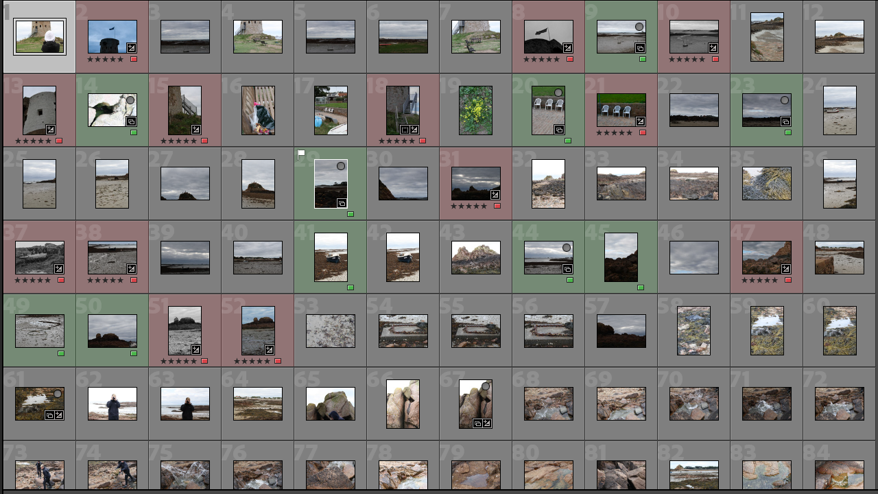
I have a total of 215 images and have labelled my preferred images in red so it is easier for me to pick out my favourites and edit them to my preferred way.

Best Images from Lightroom

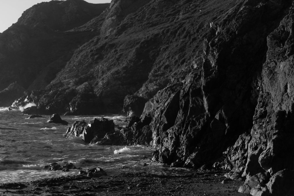
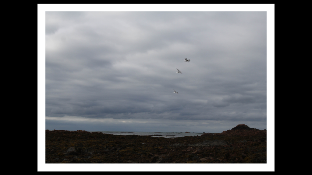
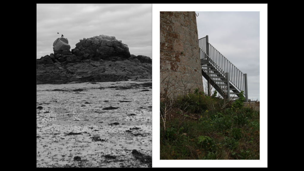
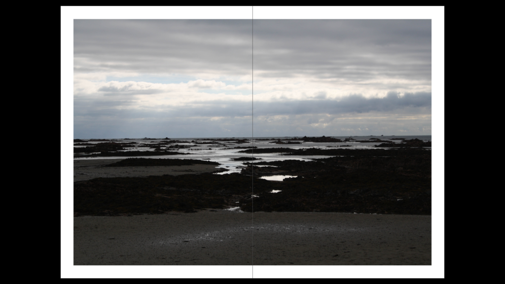
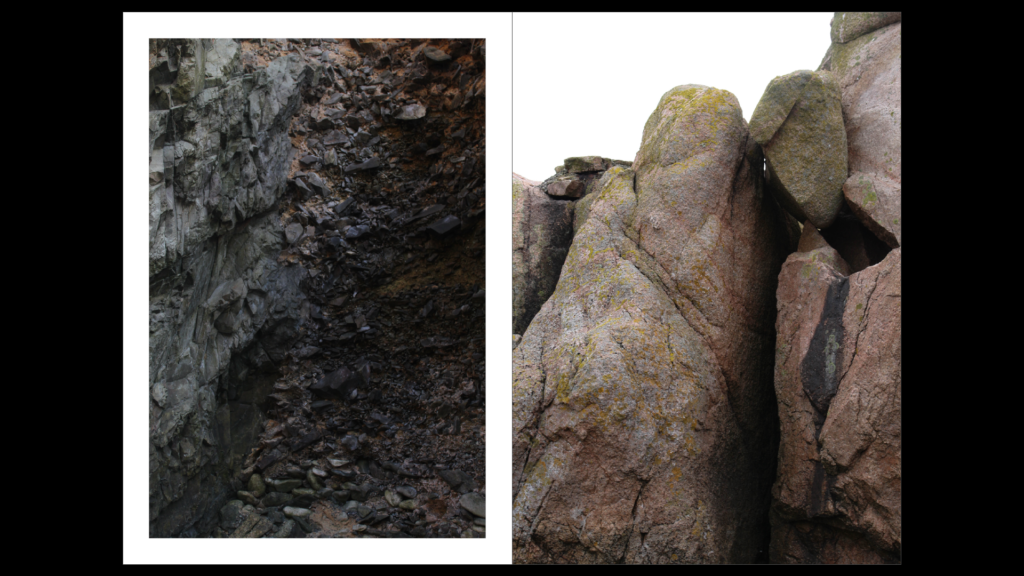
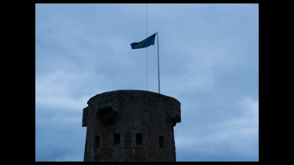
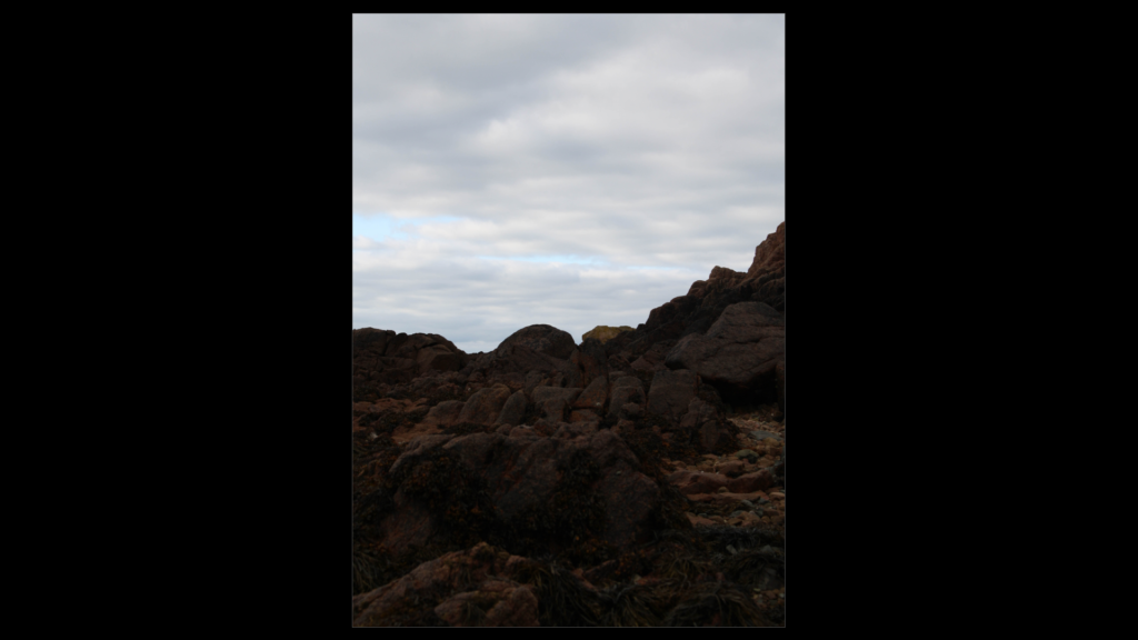
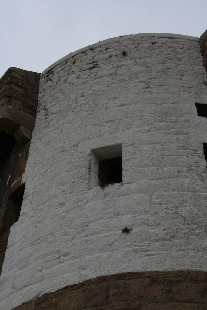
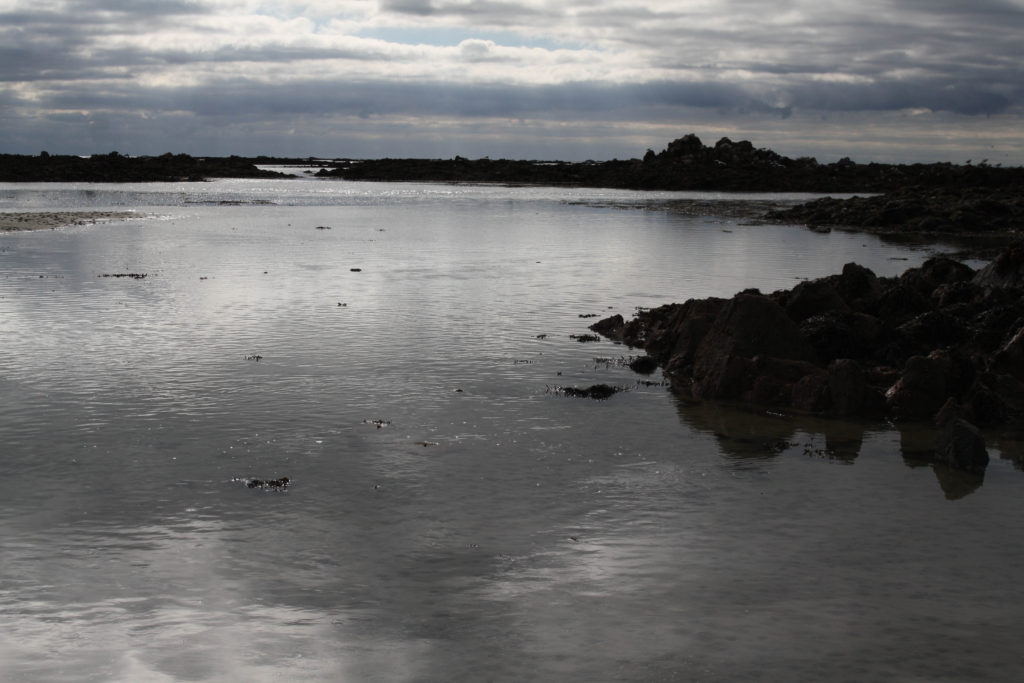
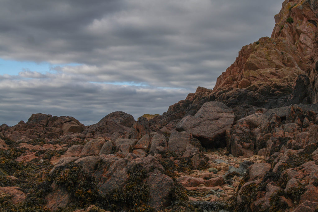
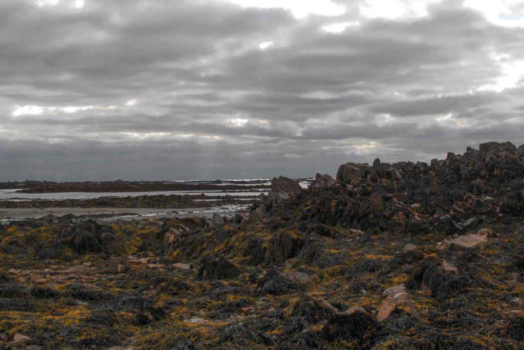
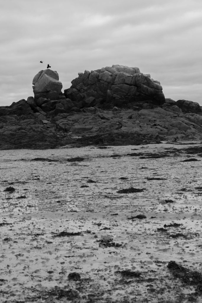
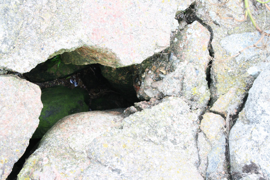
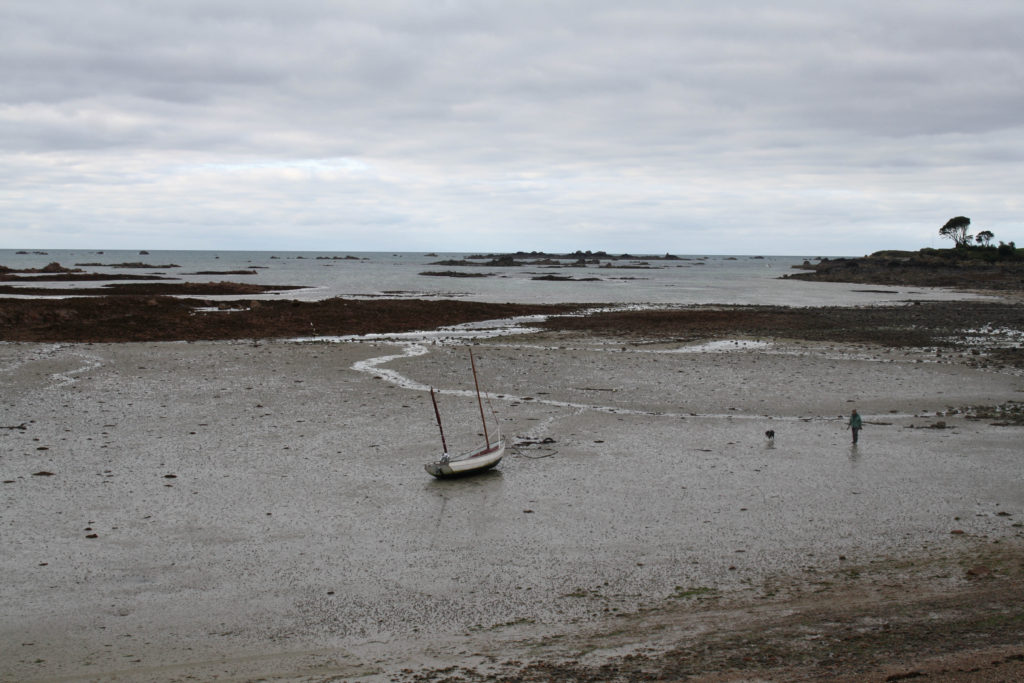
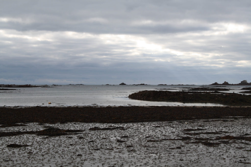
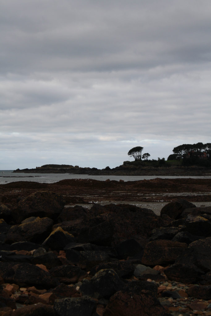
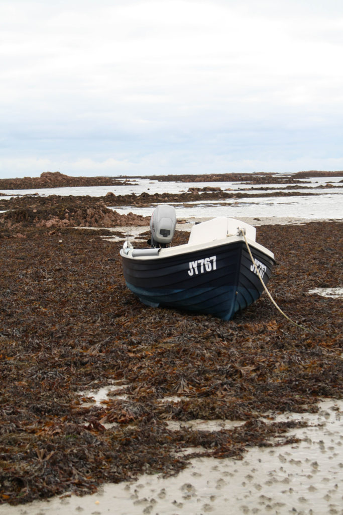
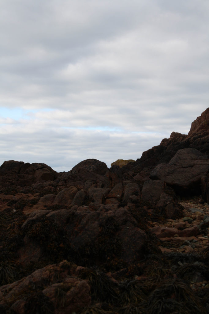
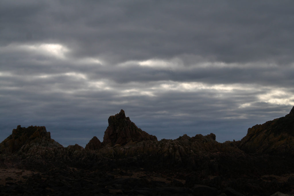
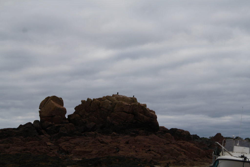
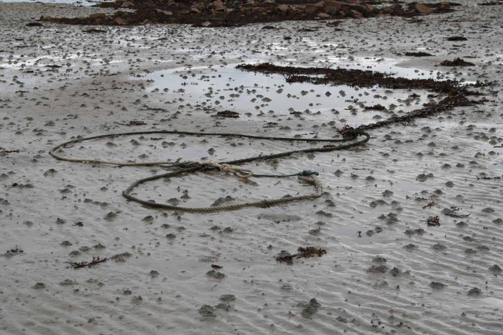
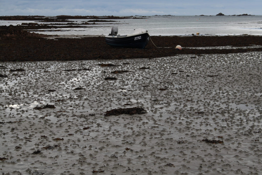
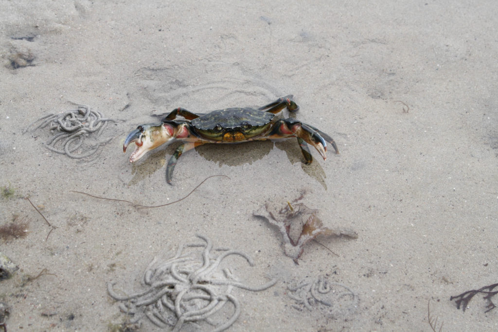
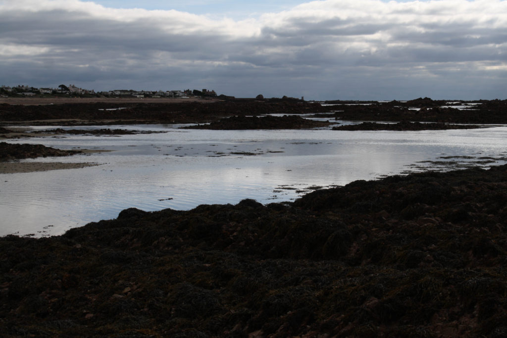
I saved these images from lightroom onto my m drive so I could access them and upload them into a gallery style for the blog. I like these images because they represent and symbolize a darker side to le hocq, the images are murky and show off the beach as mysterious as if it has a secret.

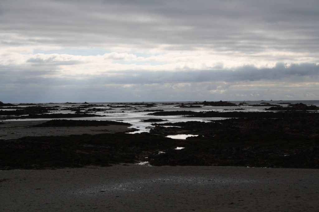
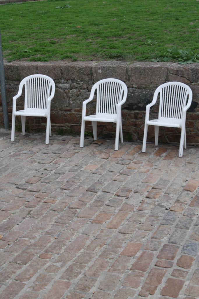
The images marked in green label my best unedited images, I have labelled them in green so I can move these selected images into my folder to upload onto the blog once again in gallery style.

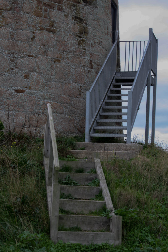
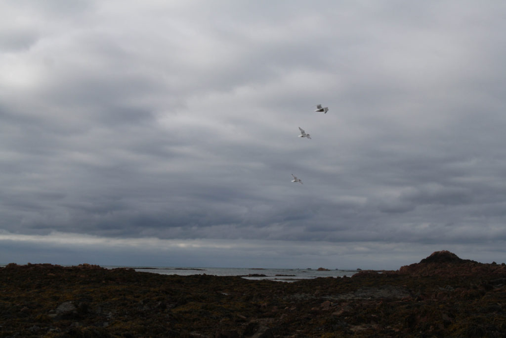
I left these images untouched as i feel they had a greater impact left unedited, the contrast of the images I felt were perfect for the outcome of the photo, the most i did was crop the image to remove un wanted people or things in the background that got in the way and ruined my photograph.

My Best Unedited Images